A-Frames
Spawned by postwar affluence, A-frame cabins became the quintessential American vacation home of the 1950s and 60s. A look at what made these icons of middle-class leisure immensely popular then, and what it is like to remodel and live in one today. “The design is intuitive,” says architectural historian Chad Randl, author of the book A-frame (Princeton Architectural Press), about the A-frame’s triangular structure. Why else would different cultures have turned to this universal, unifying building type, independently, throughout time and across the globe?
Was it intuition, too, that told Rudolf Schindler in 1936 to carry the roof down to the ground and fill both gables with glass? The Austrian-born architect needed to find a way to comply with local building codes when he was commissioned a modest vacation home suitable for the mountainside setting above Lake Arrowhead, California. The upshot was an A-frame built twenty years before its time.
By the middle of the twentieth century, architects in postwar America sought a more casual yet visually dramatic design conducive to relaxed seaside and mountain living. The A-frame was both comfortably familiar (pitched roof) and playfully novel. Because these weren’t primary homes, the architects could enjoy more freedom in designing wide-open spaces with fewer partitions and very small bedrooms and bunk rooms.
"The A-frame was both comfortably familiar (pitched roof) and playfully novel."
Genesis: The Leisure House
In 1950, Interiors magazine published an A-frame by San Francisco-based architectural designer John Carden Campbell: the Leisure House. It hit the mark on the era’s modernist style sensibility, down to the butterfly chairs. Campbell was fond of saying the house enclosed the most space in the most dramatic way for the least amount of money.
 After a full-sized model of the Leisure House was exhibited at the 1951 San Francisco Arts Festival, Campbell’s phone wouldn’t stop ringing. Fixing its dimensions to the width of a sheet of plywood reduced the cost and simplified construction so vastly, the Leisure House could now become a do-it-yourself project. Campbell deftly developed a precut kit that contained everything needed to assemble the house, from timber to nails and hammer.
For the next twenty years, photos of Campbell’s own Leisure House he built across from the Golden Gate Bridge in Mill Valley, California, appeared in countless home magazines and architectural books. The Leisure House was promoted as a natural design for the mountains or the beach, for a summer cottage or a ski cabin. The Leisure House manifested a new leisure culture.
A national phenomenon
The mushrooming popularity of A-frames was fueled by postwar prosperity, which brought owning a second home within reach of the middle class. Suddenly, people had more disposable income and more free time. The A-frame embodied an informal weekend and holiday getaway that was innovative and exciting — a recognizable, identifiable symbol of “the good life.”
“It’s interesting how people individually adapted drawings or kits for their own family’s way of living and for their own technical expertise or lack thereof,” says Randl, who now teaches at the Cornell University College of Architecture, Art, and Planning. “What I loved about A-frames was that it was such a simple design, a basic triangular form, but you had so many variations of it, and it was still recognizable as an A-frame.”
"The A-frame embodied an informal weekend and holiday getaway that was innovative and exciting — a recognizable, identifiable symbol of 'the good life.' "
The fall of an Americana archetype
While A-frames were touted as efficient in the use of materials in the 1950s and 60s, they were far from energy efficient by today’s standards. The open-floor-plan homes were notoriously difficult to heat — warm air escaped upward, leaving the downstairs chilly and the bedroom loft uncomfortably hot. Many of the early designs were not insulated at all. Thus, keeping A-frames warm became increasingly challenging with the energy crises of the 1970s. “You had that plywood building that became really expensive to heat once oil got expensive,” Randl remarks.
“That’s when it all crashed down,” says the A-frame expert. “The A-frame lost its cultural cache, and people saw it as cliché.”
A-frame Reframe
Today, Randl considers A-frame vacation cabins an “endangered species.” In the right location, however, these period pieces are still sought-after architecture, especially to design enthusiasts with a passion for modernism.
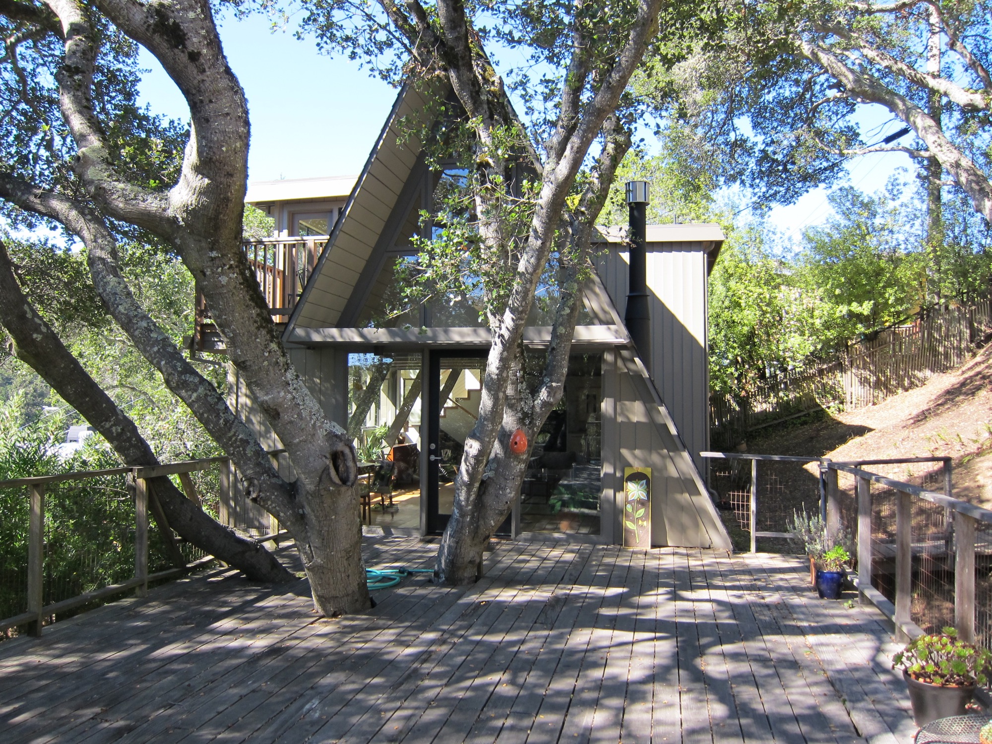
One of those aficionados is Alpine Modern correspondent Paul O’Neil. He bought a 1953 A-frame in Mill Valley across from San Francisco in 2011. The house was designed by Wally Reemelin, an industrial engineer interested in efficient architecture, and is featured in Randl’s book.

O’Neil loved the house at first sight. He liked the way it was situated in the street and on the lot, embracing oak trees. There was more than meets the eye, though. “The house spoke to us,” he recalls about the day he and his partner, Andrew Loesel, discovered the faded treasure during an unplanned stop on a road trip. “There was something special about it. It was asking us to save it. There was a story there,” O’Neil says. “The woman selling it thought we were insane.”
“There was something special about it. It was asking us to save it. There was a story there.”
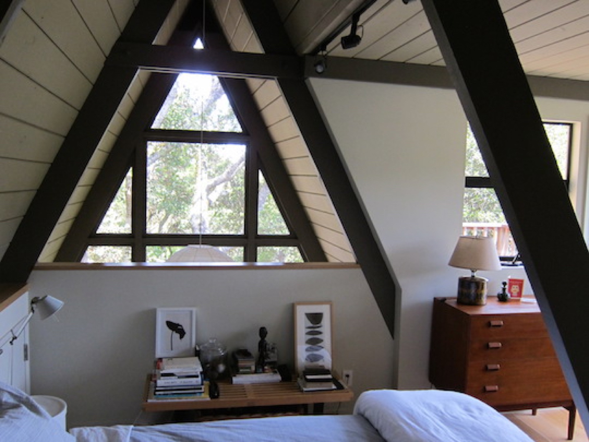
The Californian has chronicled the history and renovation of the Reemelin A-frame on his blog at aframereframe.com. But before O’Neil could bring the 1,265-square-foot (ca. 118-square-meter) house back to its beauty, he had to undo a poor renovation. An unpermitted addition built in 1964 had left the house with uneven floors and structurally unsafe. By the time O’Neil purchased the house from the third owner, it had been virtually untouched since 1980, with the exception of a new roof from twenty years ago. “We tried to understand what the house originally was like,” he says. “Our goal was to keep the integrity of the house, but make it modern.”
“Our goal was to keep the integrity of the house, but make it modern.”
Once their contractor ripped out the remnants of shoddy remodeling, the house had no structural problems. With elements like a wobbly staircase and an awkwardly placed bathroom gone, O’Neil could rethink the layout. “It was like a puzzle, once we realized what we needed to do.” After updating the electrical and plumbing, and installing insulation, they could focus on designing the house with a nod to its midcentury modern architecture and interior.

Living in San Francisco at the time, O’Neil and Loesel had bought the house for a weekend home, but later decided to live there full time, in the spirit of living smaller and simply. “If a house is well-built, it doesn’t have to be big,” O’Neil says.
“If a house is well built, it doesn’t have to be big.”
In fact, Randl agrees that in the context of the small-house movement and people’s yearning for a simpler, minimal lifestyle, the design concept of the A-frame could once again fit contemporary zeitgeist. “It’s got that reference to the past while also being modest,” the architecture expert says. “That has appeal again.” △
