Inspirations
Explore the elevated life in the mountains. This content debuted in 2015 with Alpine Modern’s printed quarterly magazine project.
Family HQ in Alaska
In the shadow of Denali mountain, amid Alaska’s meadows and icy streams, a former teacher and a four-time Iditarod winner build a modernist cabin as expansive as the Last Frontier.
 In the shadow of Denali mountain, amid Alaska’s meadows and icy streams, a former teacher and a four-time Iditarod winner built a modernist cabin as expansive as the Last Frontier.
Tens of thousands of years ago, a glacier slid its way through southern Alaska and carved out the Matanuska-Susitna Valley. Bound by three massive mountain ranges and dotted with lakes, it’s an unabashedly wild place. Hundred-pound cabbages flourish in endless summer sunshine, caribou outnumber people, and towering Denali presides over it all. "You can go 1000 miles here without crossing a road," says Martin Buser. "Most people can’t grasp that kind of freedom." A four-time winner of the Iditarod—the grueling dogsled race from Anchorage to Nome—Buser spends his days crisscrossing the landscape with his dogs. So, for his dream home with his wife, Kathy Chapoton, there was no question that the spectacularly rugged setting needed to be the driving force behind the design.
"You can go 1000 miles here without crossing a road. Most people can’t grasp that kind of freedom."
An Alaskan story
The story of how the couple met and found the site is typically Alaskan. Chapoton moved from New Orleans to Anchorage in 1979, at a time when the state government let people claim land for pennies as a way of getting back tax dollars. Soon after relocating, she joined a group of friends one day in early January to stake out the five acres allowed to each person. "It was 50 below zero, my teeth were frozen, I didn’t even know how to read a compass, and I had to walk around and literally mark the parcel," she says. "It was hilarious." Registering her claim at the office in Anchorage, she bumped into Buser, a recent Swiss transplant, and the two married not long after.
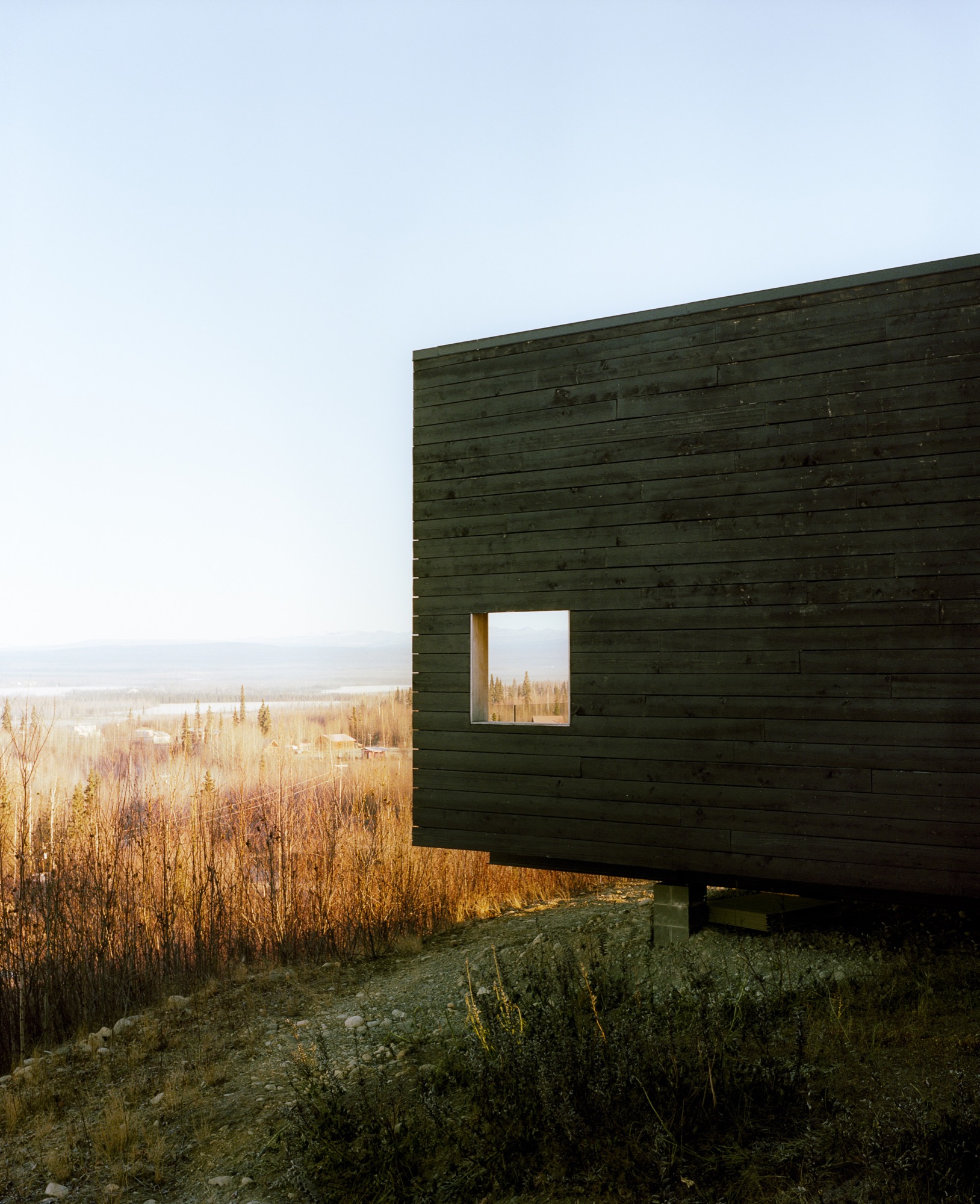
The new House for a Musher
For 20 years, the growing family (sons Nicolai and Rohn are named after Iditarod checkpoints) lived in a large house that Buser built on the land, adjacent to the kennel where his hundred-odd dogs reside. In 1996, a wildfire swept through the area: "It was pretty ugly," remembers Chapoton. As a result, people started selling off their nearby plots, and the couple snatched up 25 additional acres—including a mountaintop site that they had been eyeing for years. "It was the primo lot," says Chapoton.
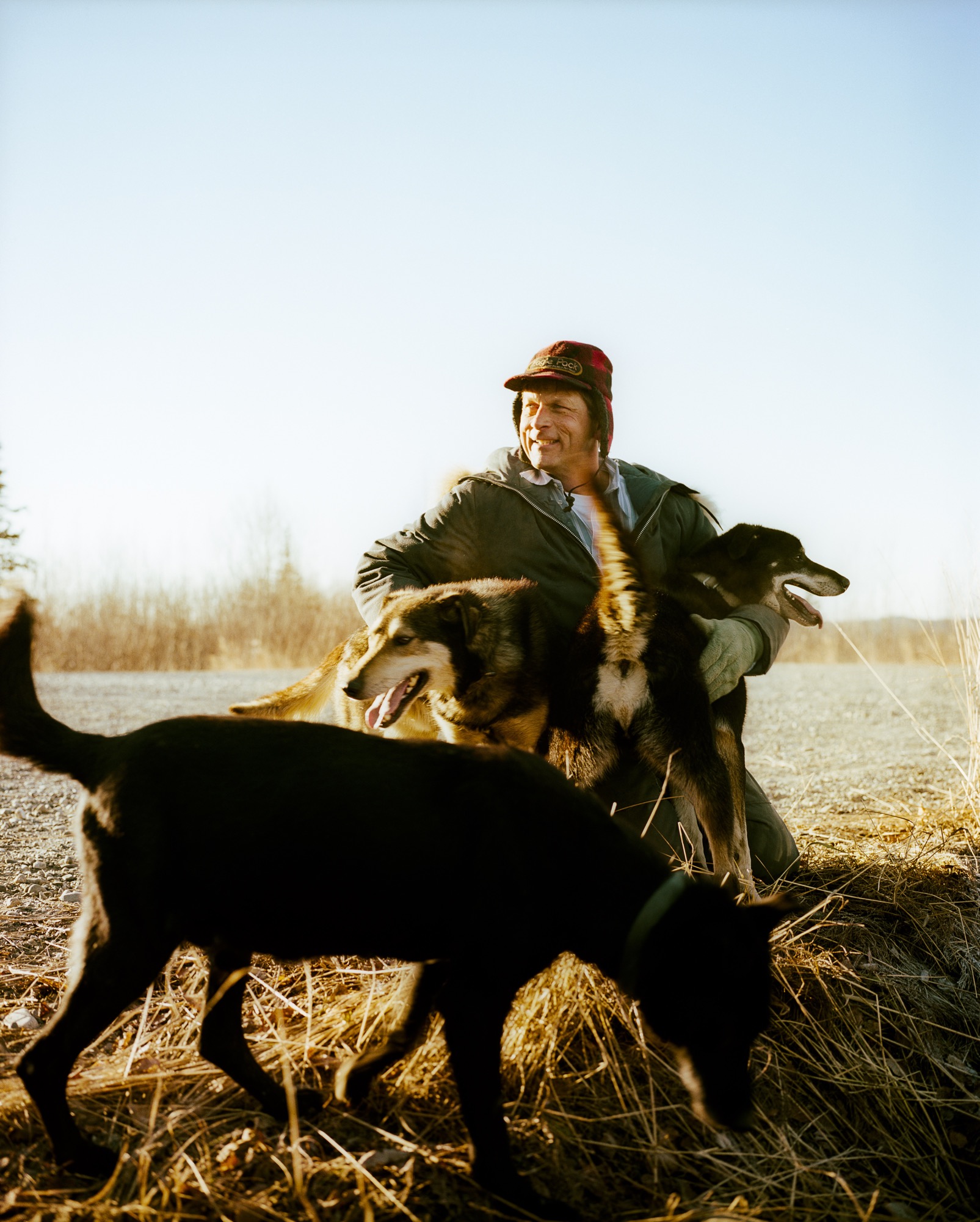
Buser built a little cabin on the top of the mountain as a weekend retreat, but the combination of killer views and the couple finding themselves empty nesters convinced the pair to make that site their permanent home. They moved the cabin by truck to a nearby site (son Rohn lives there now) and called on architects Petra Sattler-Smith and Klaus Mayer of Anchorage firm Mayer Sattler-Smith to design a house. Though Buser had built several homes, the couple knew this site deserved something special. "Because of the multitude of views, we couldn’t take advantage of the site ourselves. We knew our limitations," Chapoton says.
Denali in view
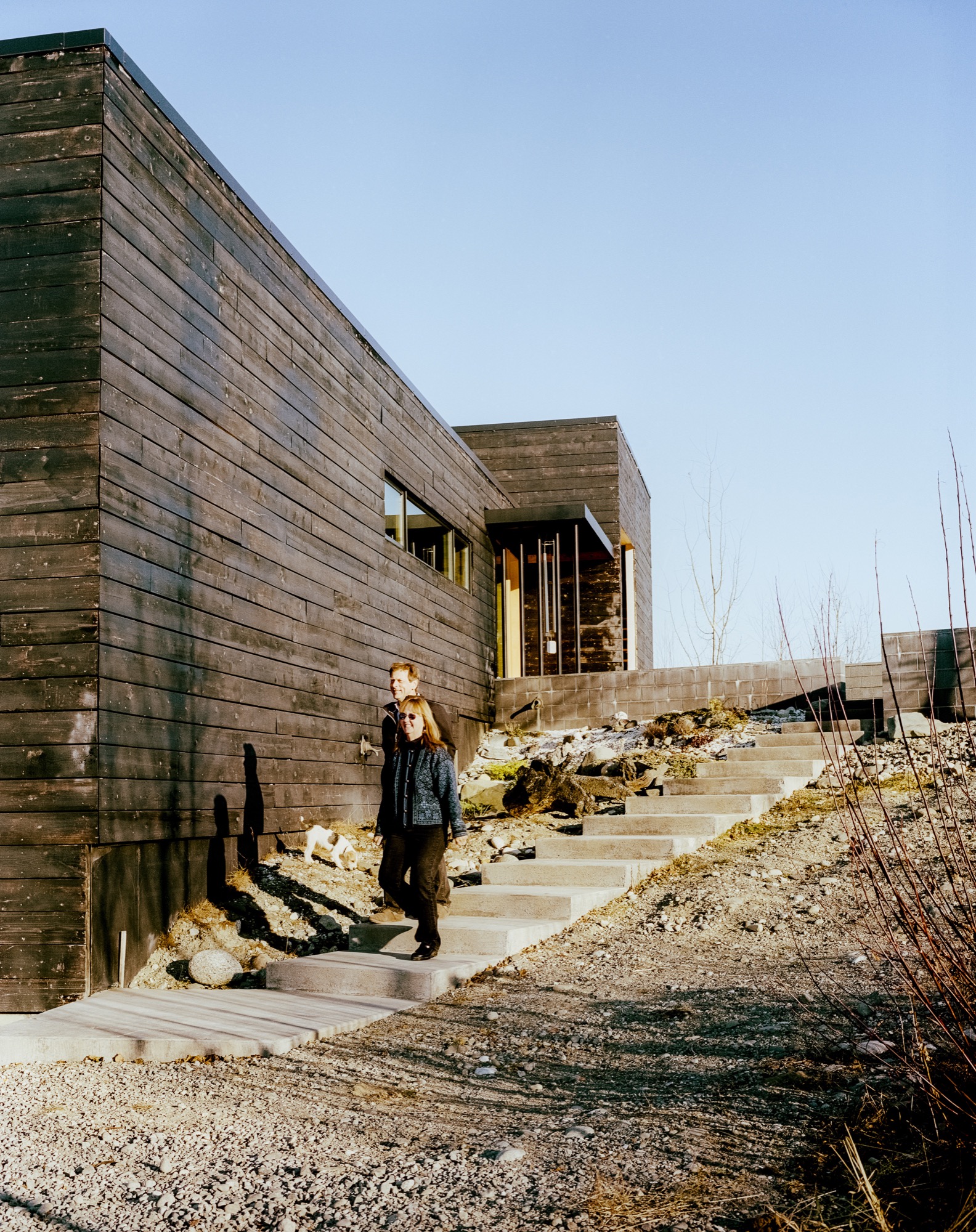
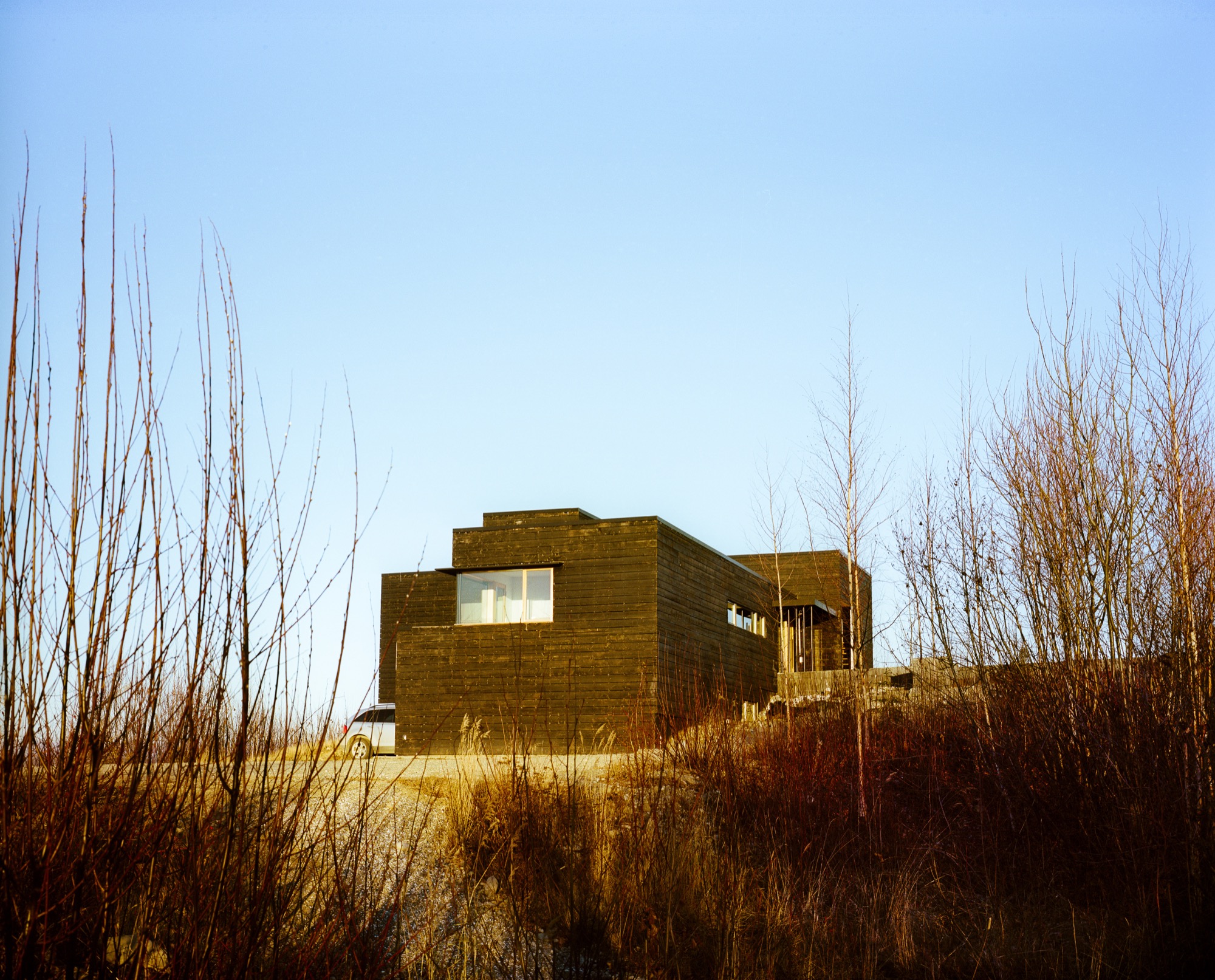
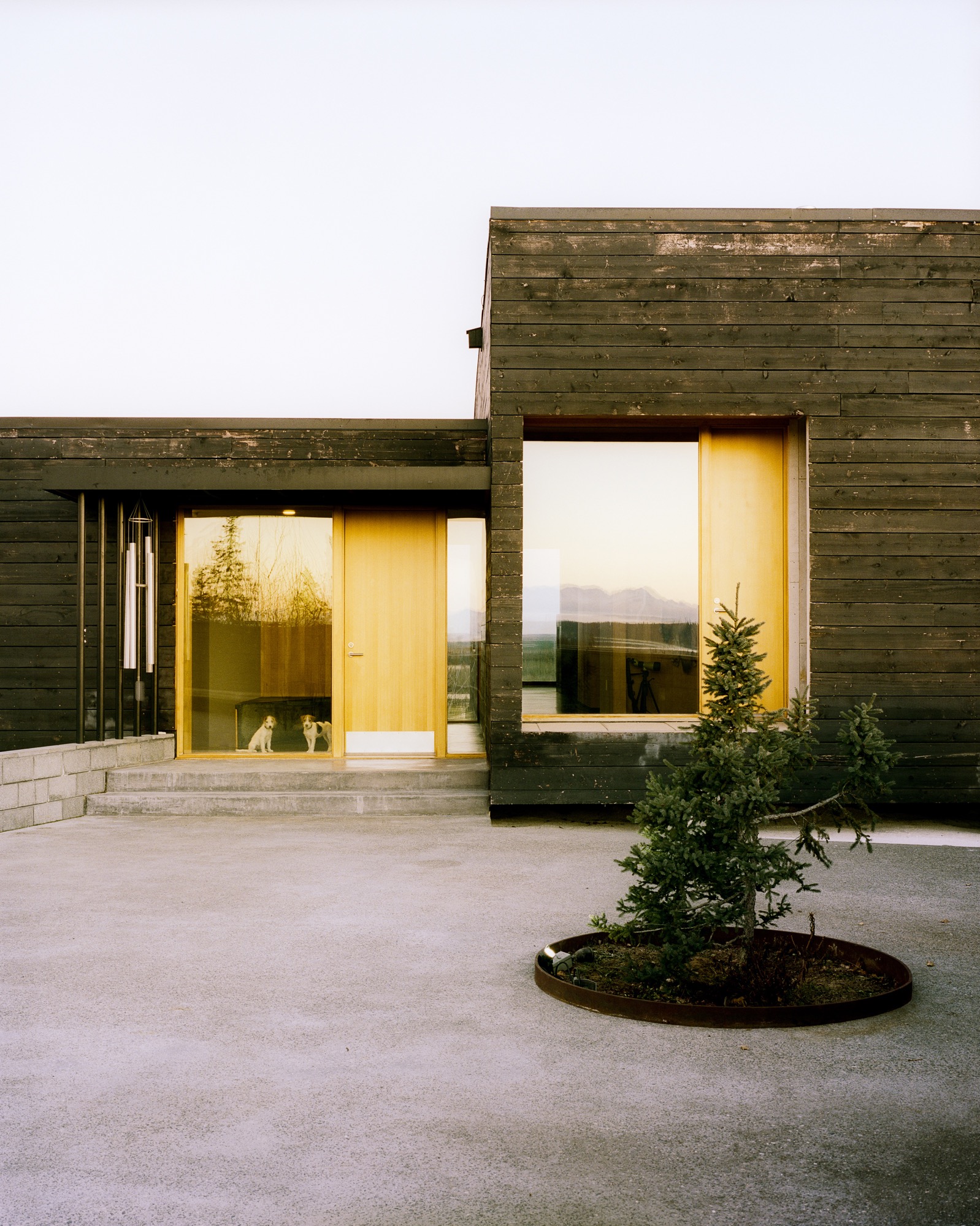
Everything about the 2,450-square-foot house centers on the natural setting. "It was important to have every room look to Denali, which is the ultimate view in Alaska," says Mayer. To do so, the architects created a long, lean, L-shaped house. The blackened, local spruce cladding pays homage to the area’s wildfire, while also mimicking a glacial erratic—a nonnative rock deposited by a moving glacier. The courtyard and part of the kitchen are slightly offset, following the lines of the site’s hilltop topography, while the rest of the house points directly to Denali National Park.
"It was important to have every room look to Denali, which is the ultimate view in Alaska."
Inside
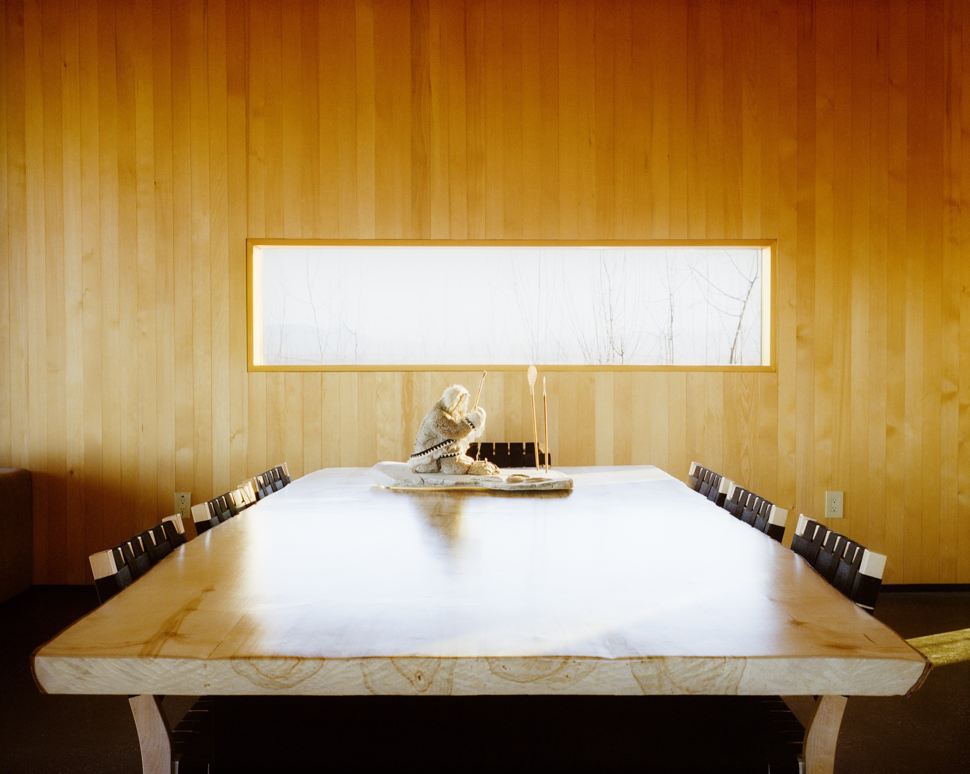
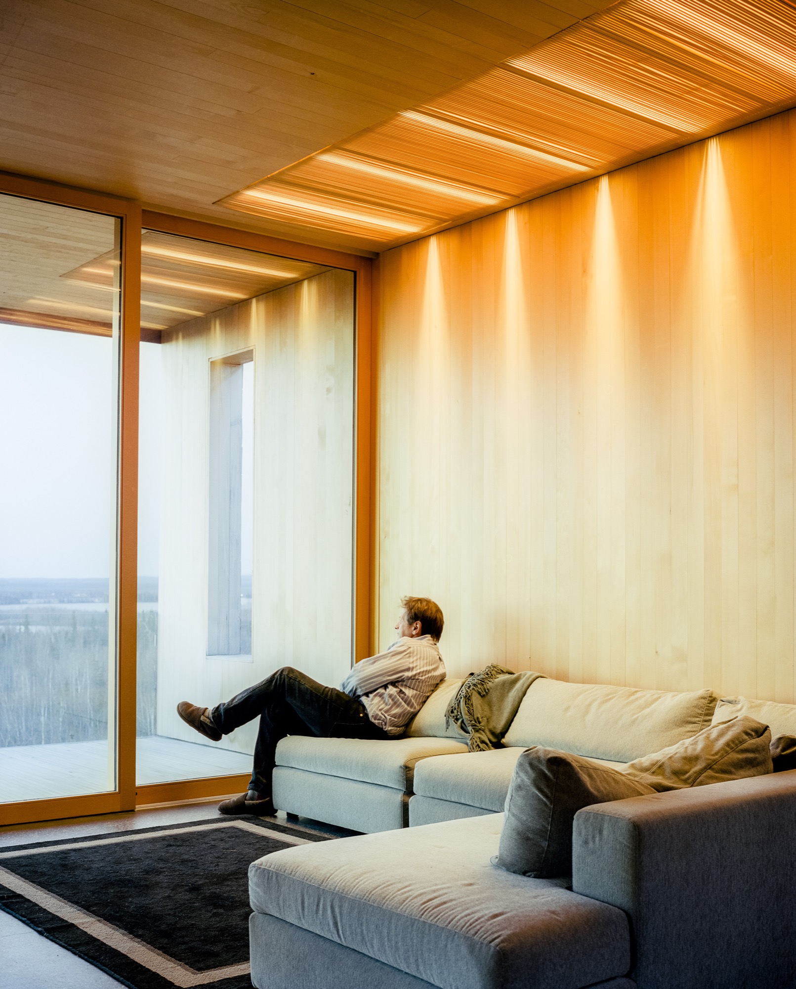
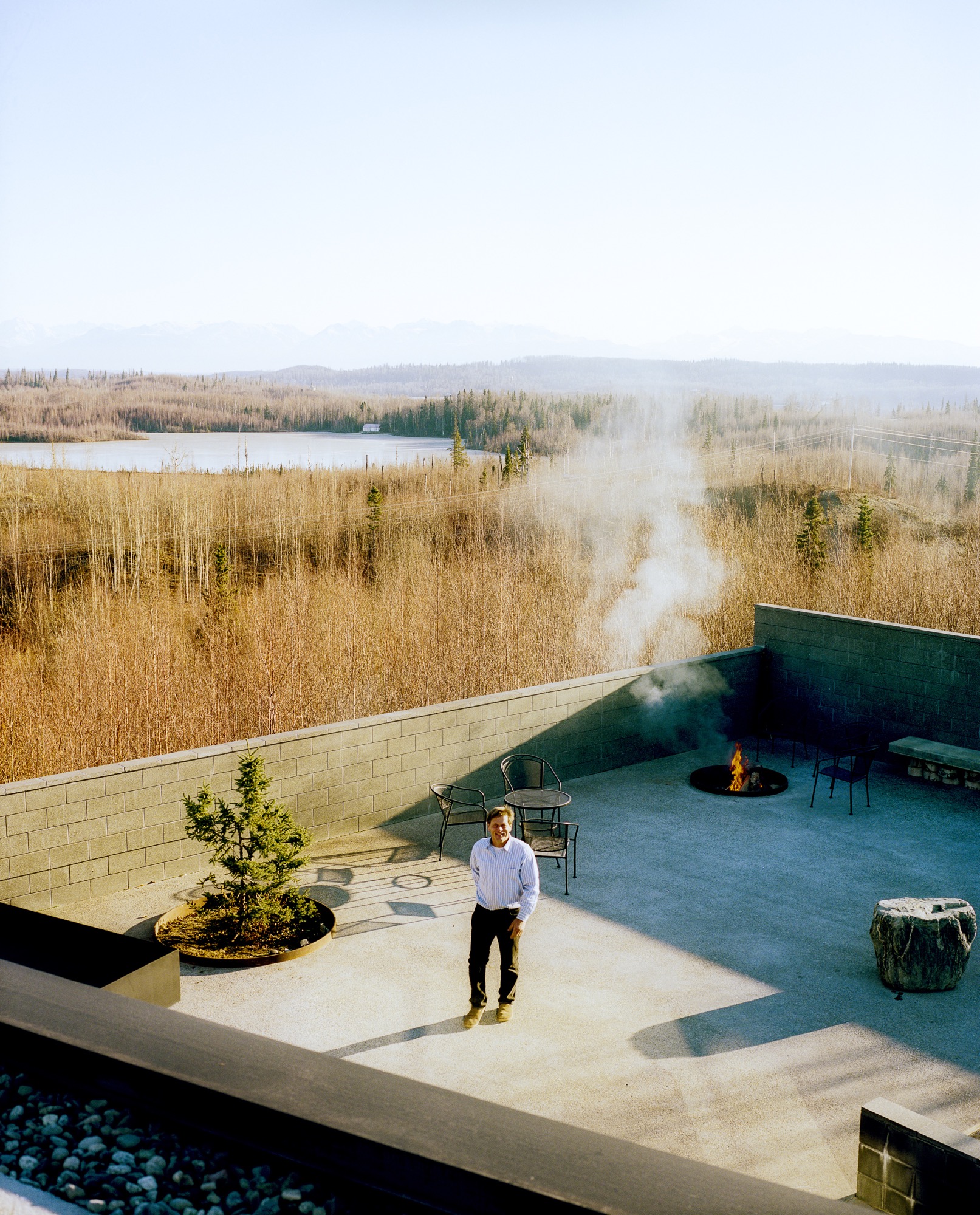
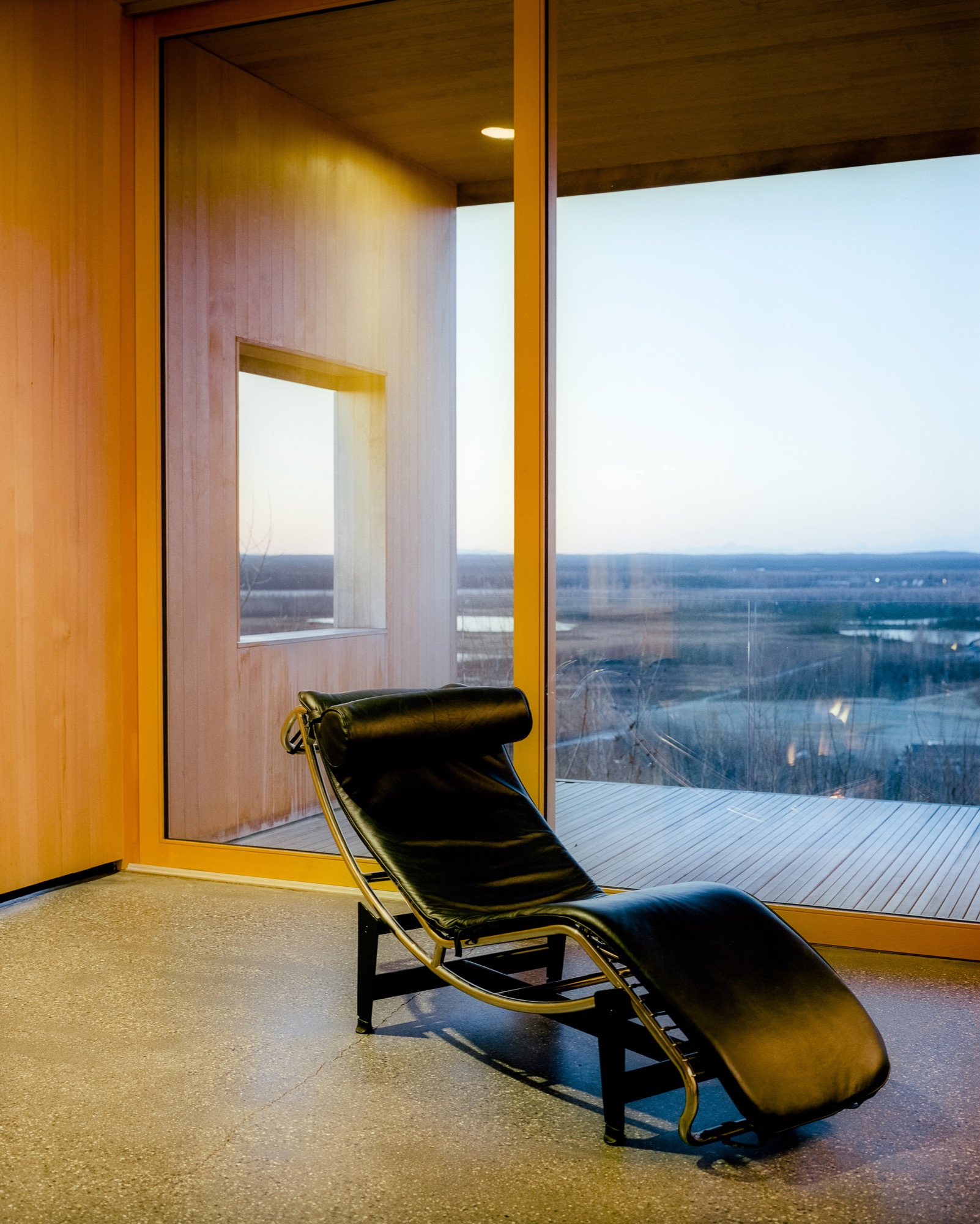
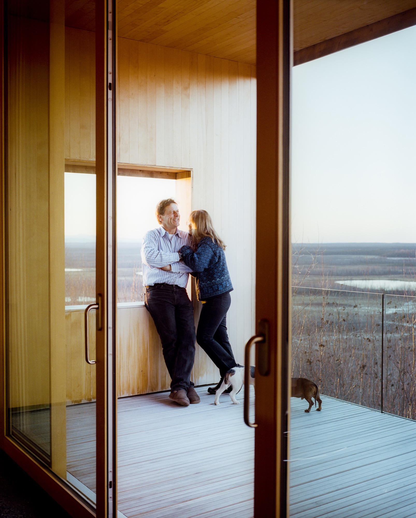
Inside, the walls are paneled in Alaskan yellow cedar, as if the charred exterior has been peeled back to reveal glowing, living wood inside. The public areas lie in one long sight line that starts in the courtyard outside, streams through the living and dining rooms and kitchen, and slips out onto the northern horizon through a wall of sliding glass. The other side of the L contains he bedrooms and bathrooms, each with its own framed outlook on Denali. Windows in the hallway and in the family room face south to let in extra sun during darker winter days. There’s also a rooftop deck, perfect for the family’s many parties—where friends grill mooseburgers and take in the star-filled sky and 360-degree views of the mountains.
Sweat equity
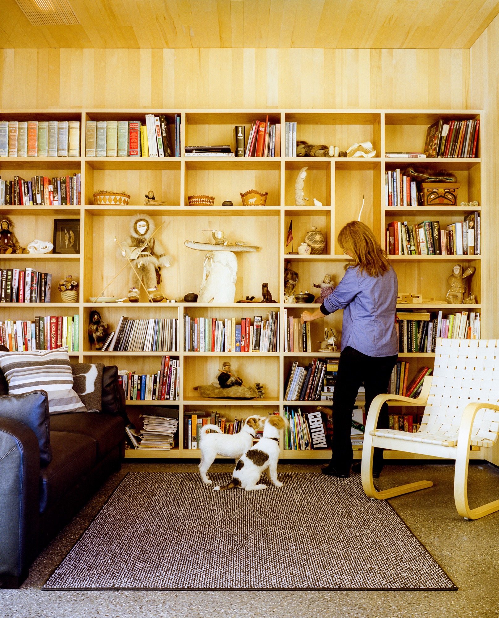
Lest the house seem too fancy for these frontier surroundings, it’s important to remember that Buser built the place himself over six years. Here, there are no construction codes in rural areas ("Building permit?" scoffs Buser. "What’s that?!"), and people prefer sweat equity to bank loans or subcontractors. "When Alaskans say they’re building a house, it means we’re swinging a hammer, digging in the dirt, and trimming it out," says Buser. Yet, this DIY ethos meant that Buser’s solutions were sometimes those of a would-be MacGyver. He and Chapoton charred the cladding using a weed burner and a garden hose; the 800-pound glass doors were lifted into place using Buser’s rigging of dogsled runners, pulleys, and brute strength; and he sliced open two birch trees to make the dining room table.
"When Alaskans say they’re building a house, it means we’re swinging a hammer, digging in the dirt, and trimming it out."
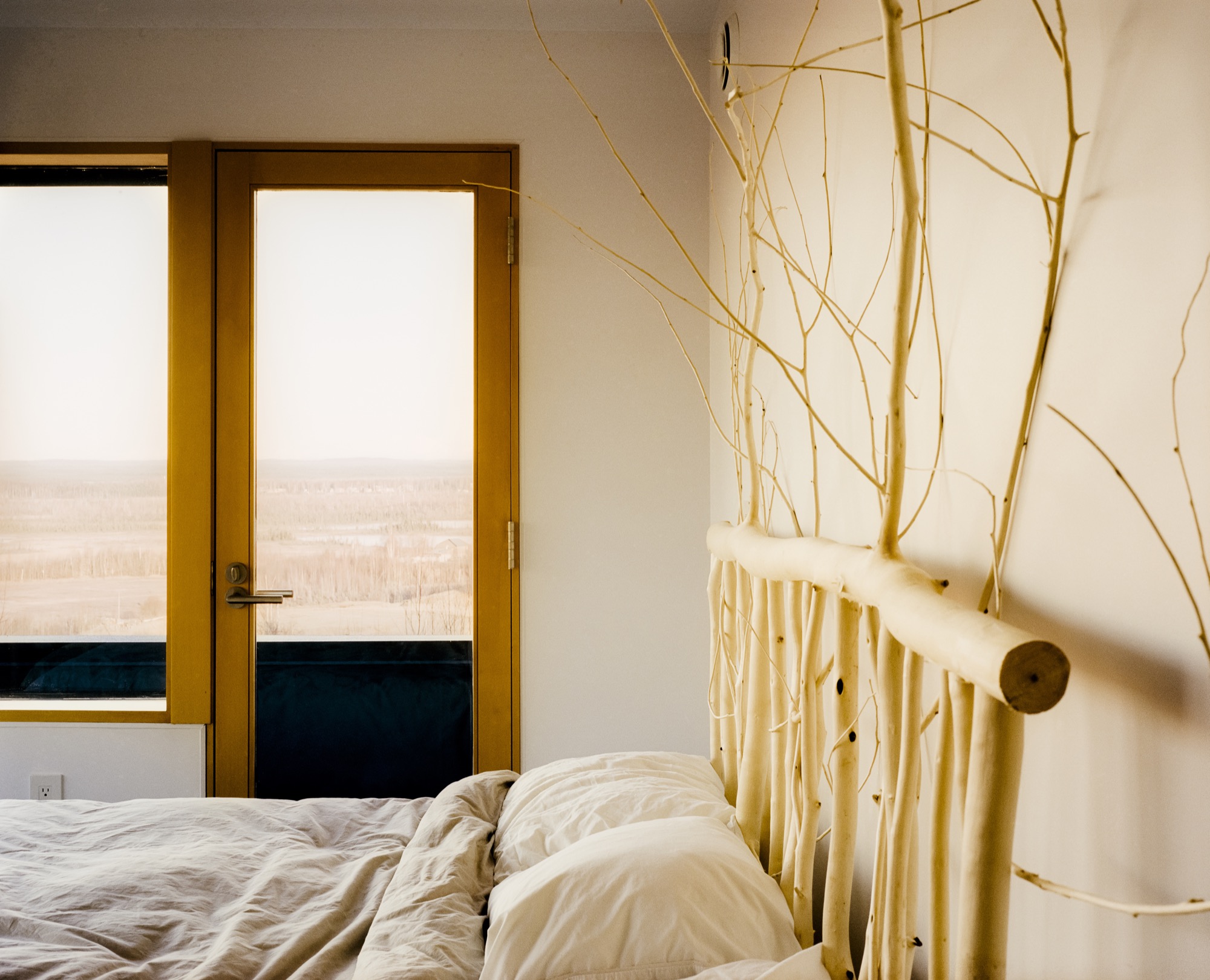
At the end of a typical day, Buser comes home from an 80-mile dogsled ride as the last rays of sun linger on the mountains. Inside, Chapoton (now retired from teaching) whips up a salmon meal for ten, and the gregarious couple shares wine with friends around a crackling fireplace. When everyone’s left, Buser and Chapoton will tuck into their bed, watching the vivid hues of the northern lights dance through the windows. Says Chapoton of her love of the house, "Maybe Einstein said it most simply: ‘Look deep into nature, and then you will understand everything better.’ " △
Up and Away: 10 dream tree houses
These ten small structures make childhood dreams come true.
Who says that grown-ups can’t have tree house goals? When the demands of daily life become too much to bear, a special hideout in the sky can be your place to escape, cool off, or brainstorm in peace. Just one look at these inspirational mini-getaways and you may find yourself looking for a sturdy tree to scale.
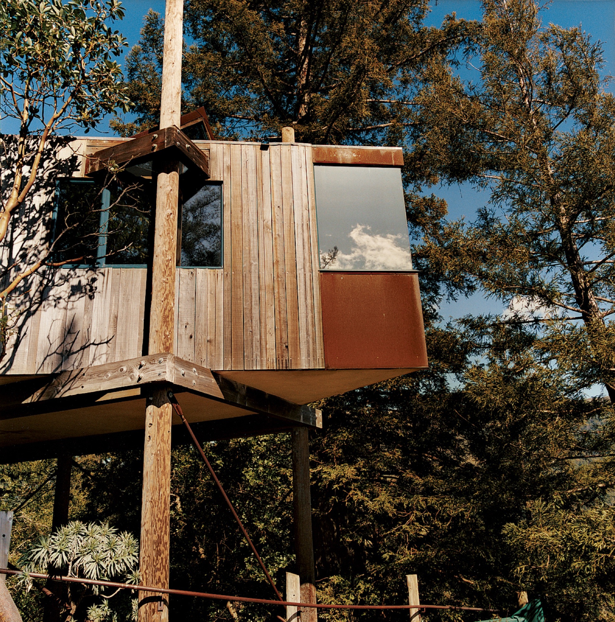
Designed by acclaimed Big Sur architect Mickey Muennig, The Post Ranch Inn consists of a series of freestanding units that showcase Muennig's contemporary organic vision. The tree houses feature Corten panels.
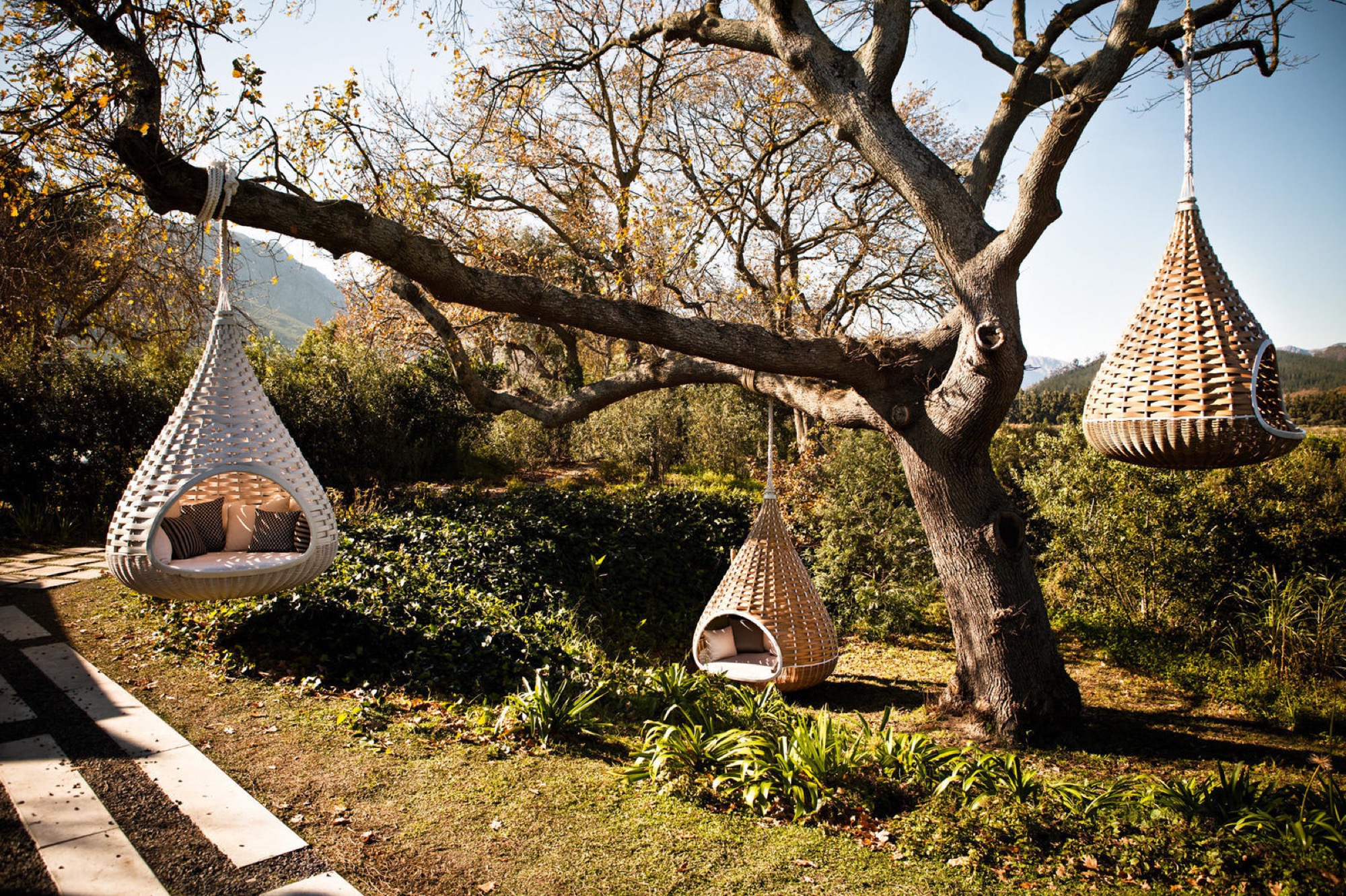
Dedon’s Hanging Lounger, designed by Daniel Pouzet and Fred Frety, can be an instant mini-tree house escape. All you need is the right tree to hang it from.
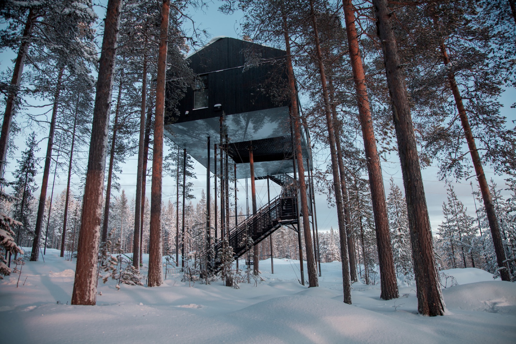
Treehotel’s 7th room in Sweden is a cabin that’s propped up in a pine canopy where guests can book a stay. To reduce the load of the trees and minimize the building's impact on the forest, 12 columns support the cabin. One tree stretches up through the net, emphasizing the connection to the outdoors.

Japanese architect Takashi Kobayashi of the Tree House People has been declared a "tree house master" by Design Made in Japan. Seamlessly integrating nature and design, this tiny tree house is certainly not just for children.

Inspired by the principle of biomimicry, Free Spirit Spheres’ goal is to "create new ways of living that are well-adapted to life on earth over the long haul." Based outside of Vancouver, the company specializes in tiny spherical tree houses that are works of art. You can even book an escape to spend the night in one at their forest hotels!
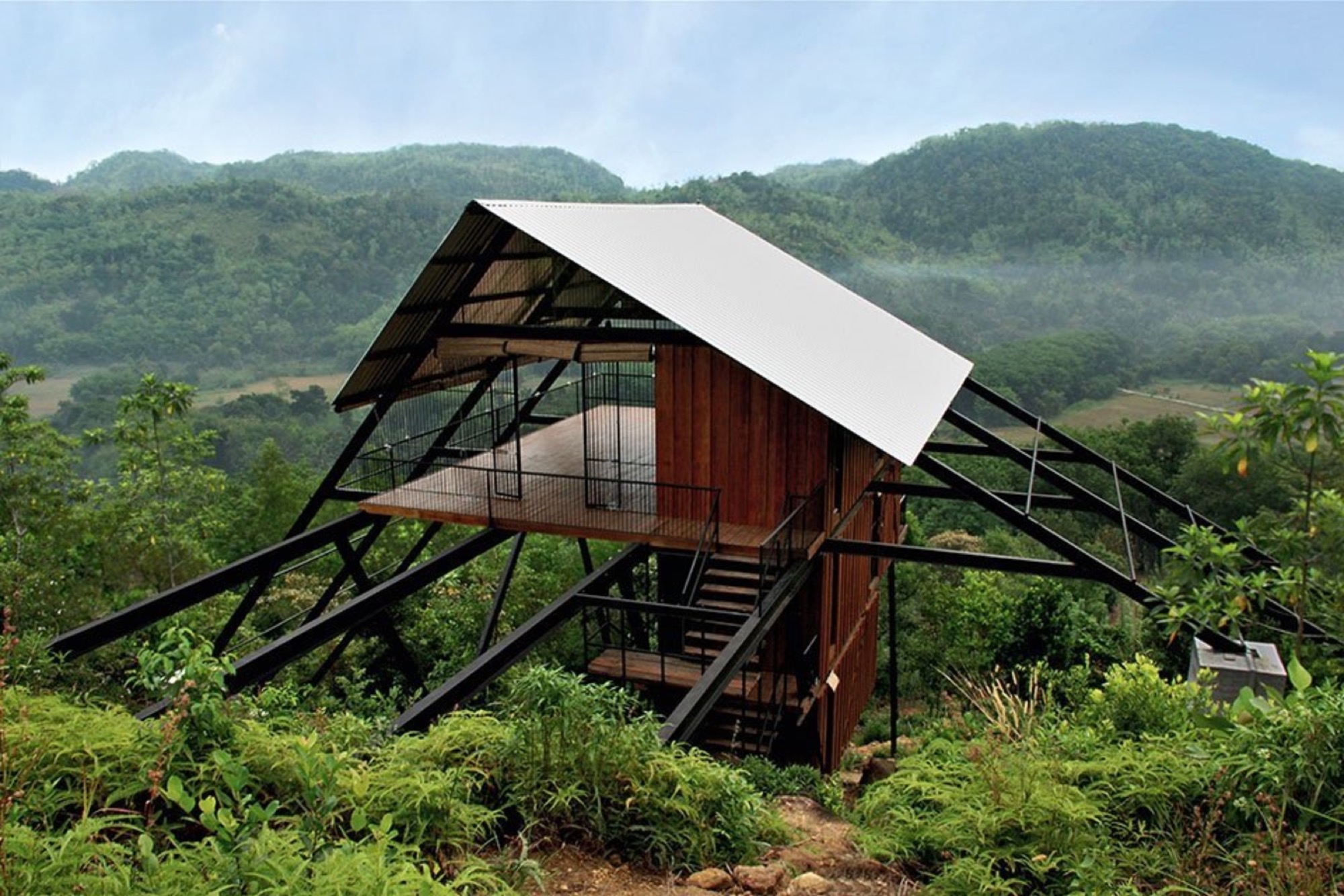
With the view from the Estate Bungalow in Matugama, Sri Lanka—designed by Narein Perara—you might just climb in and never want to leave.
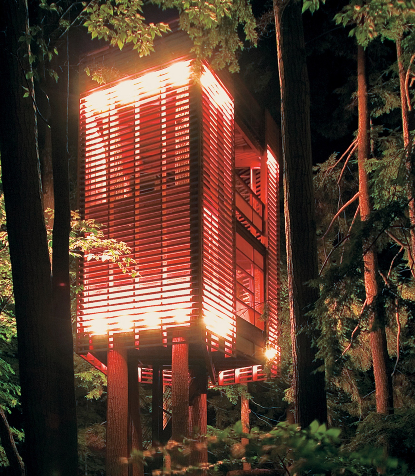
"I had to let the trees decide how the tree house would be," explains Lukasz Kos, a Toronto-based designer and cofounder of the architecture firm Testroom. The low-impact 4Treehouse is a lattice-frame structure that respects and responds to the nature surrounding it, appearing to levitate above the forest floor of Lake Muskoka, Ontario.

At only 172 square feet, this tiny tree house in the hills of Brentwood, California, was designed by Rockefeller Partners Architects and serves as a refuge, gallery, and guest cottage.

A little more on the traditional side, this tiny backyard tree house by Sticks and Bricks makes you want to disappear for a few hours with a pot of tea and a good book.
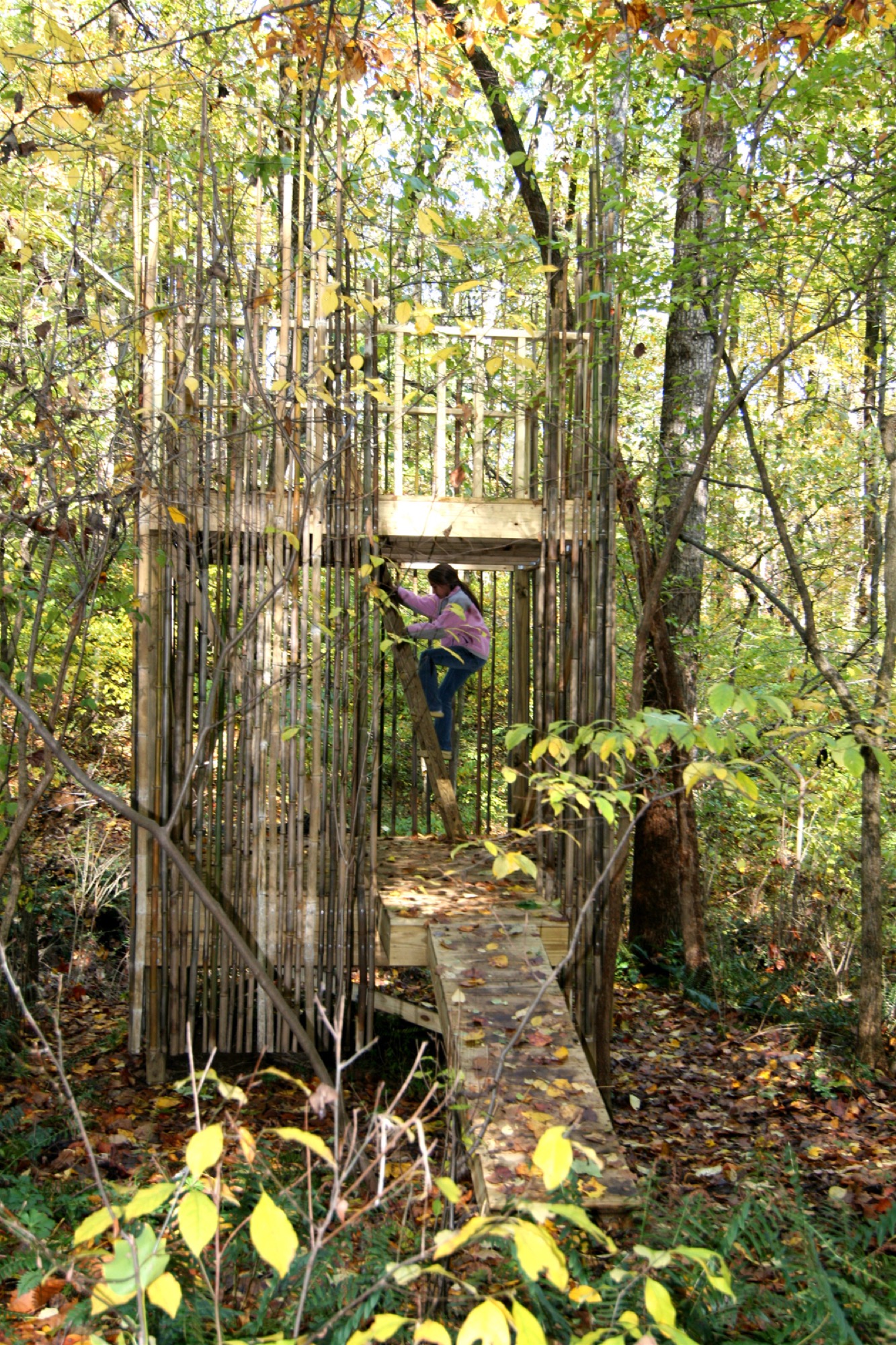
This 128-square-foot tree house outside Baltimore was designed by architects Laurie Stubb and her husband Peter. "The outdoors here are a big playground," she says. "We had always wanted to build something for the girls that looked natural." So, in the summer of 2008, they designed this structure both for the children and for themselves. "We wanted it to have a use after they're gone—a place we can sit in and read or have a drink and entertain company." △
Sense of Place: Clean as in Whistler
Chad Falkenberg of Vancouver-based Falken Reynolds talks about modern interiors in Whistler's mountain homes and cabins
In the fourth and last installment of our "Sense of Place" series, we are talking with interior designer Chad Falkenberg of the Vancouver-based interior design studio Falken Reynolds about brining Whistler style home, no matter where you live. Whistler is rich in cedar and granite. So its natural that traditional mountain homes use a lot of both. While the wood in older homes may have a raw finish, you won’t see many log cabins in the mountains of British Columbia. The trees here are simply too massive. The granite boulders are enormous, too. People incorporate them into the structure of the house. Natural stones, in fact, are a classic element of both traditional and modern homes in the Canadian resort town.
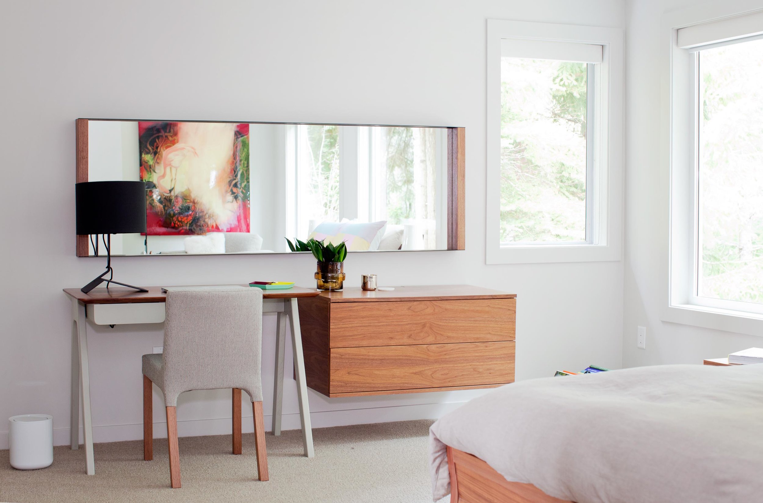
“We try to use a lot of natural materials when we are working in Whistler,” says Chad Falkenberg, one half of Falken Reynolds, a Vancouver-based interior design studio. “It feels more authentic, closer to the earth and to the outside, which is why people go up there, to get away from the city.”
Some of his projects involve sand-blasted Douglas fir to achieve very clean lines but give the wood extra texture. “The idea with all of this is that it patinas well,” says Falkenberg. “If the wood gets hit by a tree or by skis, it’s OK.”
The studio’s work in Whistler is particularly minimalistic and sophisticated yet still achieves the cozy feel of a mountain retreat. Hard textures are mixed with softer, textile surfaces. “In the bedroom of the Aspen Drive house, we used wood furniture, but we also used wool carpet, so the whole floor feels like a sweater,” Falkenberg tells about a recent project. “When you get out of bed, you shouldn’t have to put socks on.”
The designer, who draws inspiration from years of working and traveling in Scandinavia and Southern Europe, often relies on the visual warmth of the materials. “One of the easiest tricks is to mix grays and warm colors,” to achieve the clean-lined yet warm look and feel of some of the Whistler homes he has designed. Combine a warm natural wood with a gray countertop or fabric, for example. “The two things are almost juxtaposing each other,” Falkenberg says. “It’s almost like a wood next to the cool gray looks even warmer.”
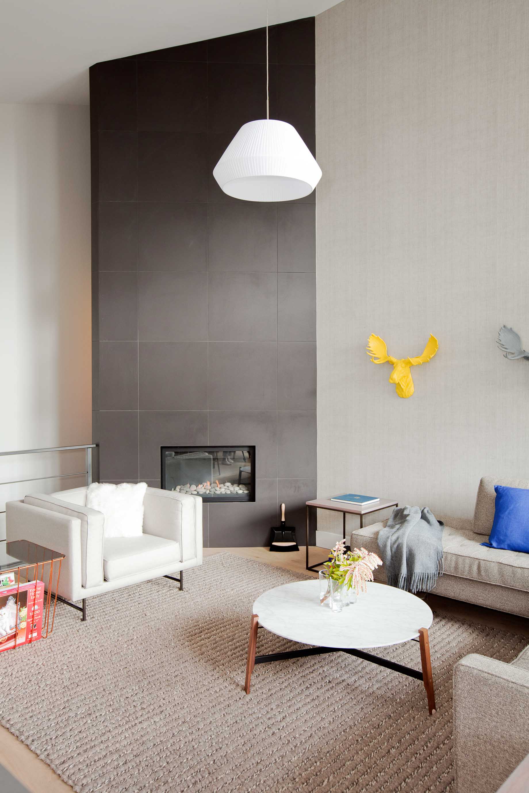
To accessorize your Whistler-inspired winter interior, go for copper and terra-cotta pots. The designer’s favorite textures are anything that feels like a sweater—the loop of a rug, wool blankets, pillows covered in chunky knits. A rougher texture, even on a hard surface like a co ee cup, also feels warmer. Leather is another great material that feels warm to the touch. It has a history to it. “Anything that evokes the natural world,” says Falkenberg.
He likes to keep things casual in a mountain retreat, as he expresses by using a wire taxidermy sculpture or resin moose heads on the wall. “I love anything that reminds me, OK I’m in a cabin, and I’m not supposed to take everything so serious.” △
Naked Naust
A dramatic cabin by Swedish architect Erik Kolman Janouch on Norway's wild Vega Island
Inspired by Norway’s traditional boathouses, Swedish architect Erik Kolman Janouch plants a cottage into Vega Island’s barren landscape—its design so minimal, it becomes dramatic.
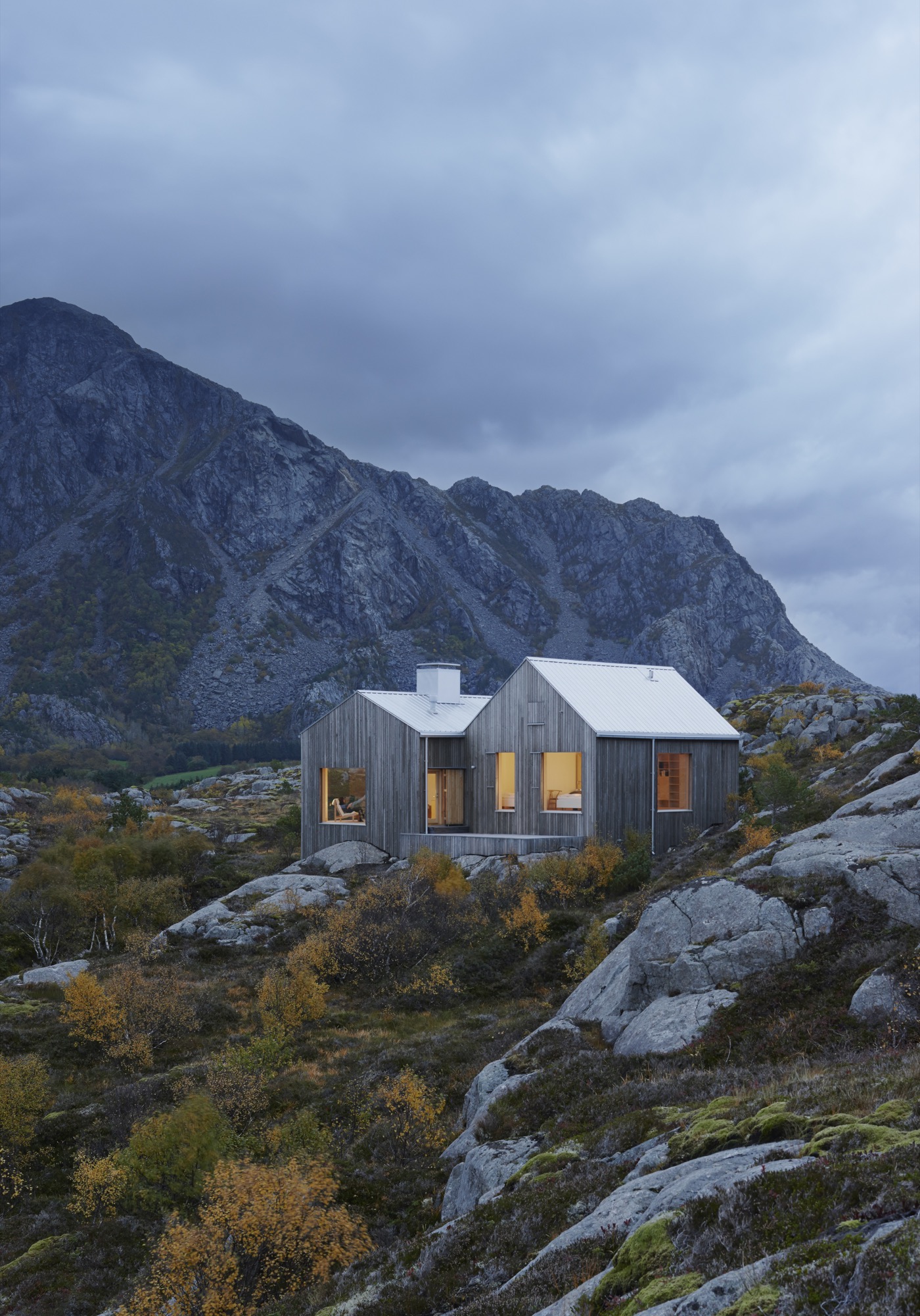
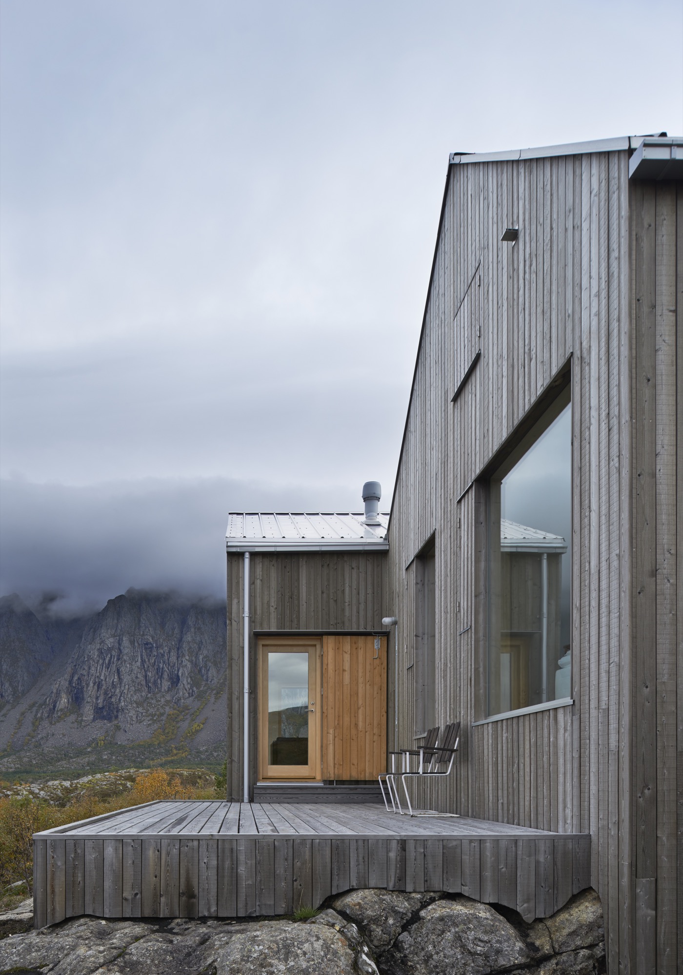
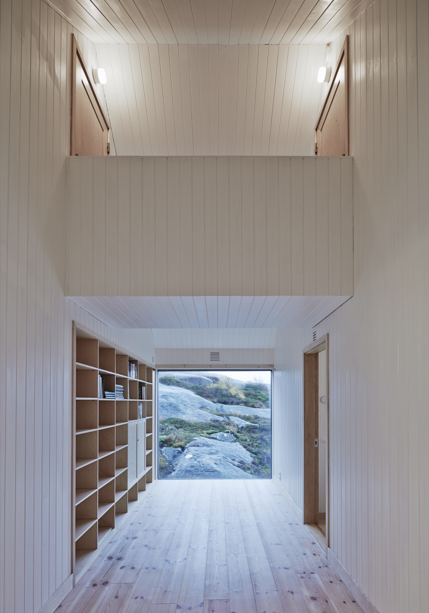
“It’s basically just two ordinary pitched roofs,” architect Erik Kolman Janouch describes the Vega Cottage on the namesake Norwegian island. But the simple elegance of this small wooden cottage that blends so perfectly with its wild and forbidding landscape is, in itself, spectacular—not to mention the boldness and care in siting it there. What’s more, it is exactly what could be expected in this coastal region of Norway.
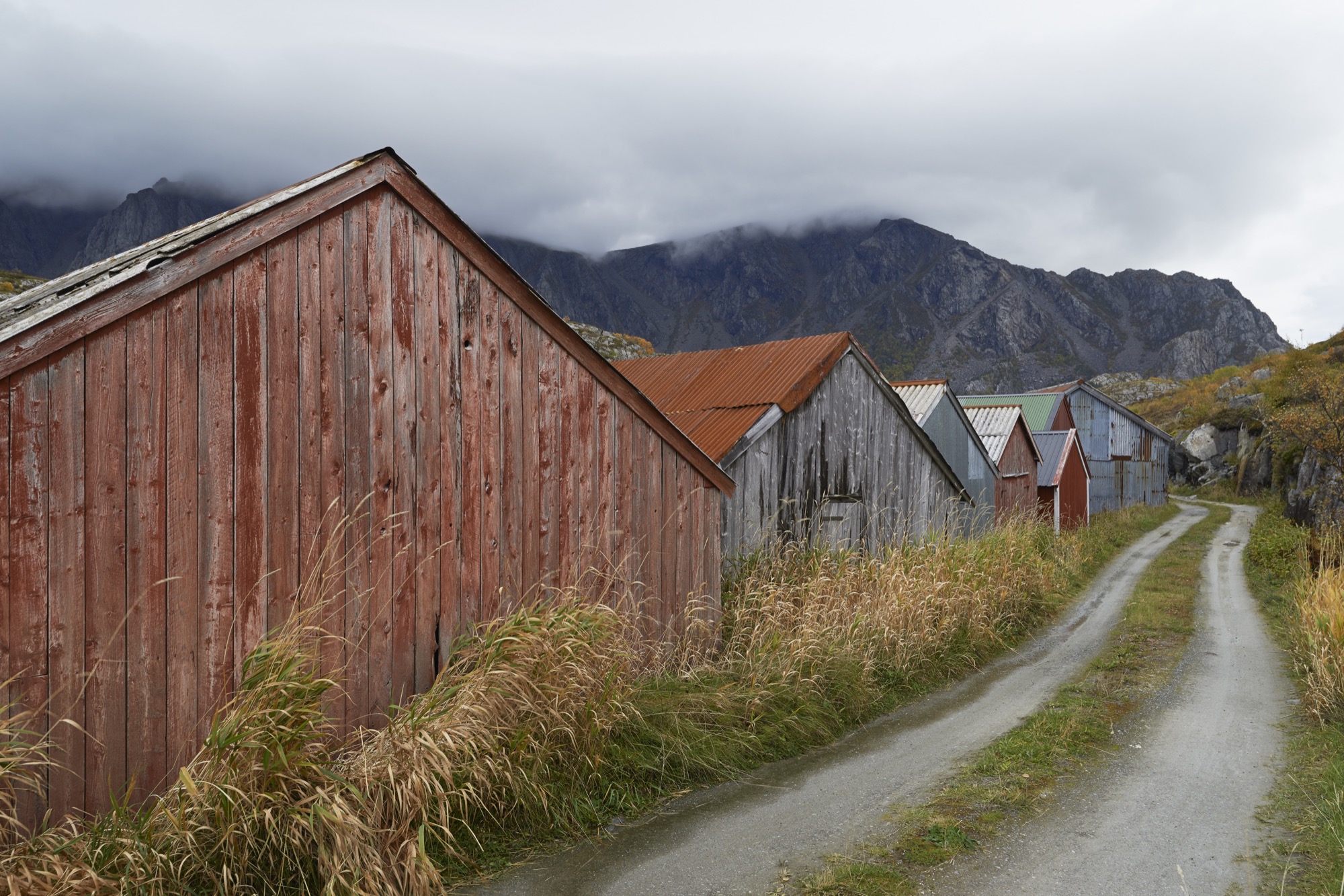
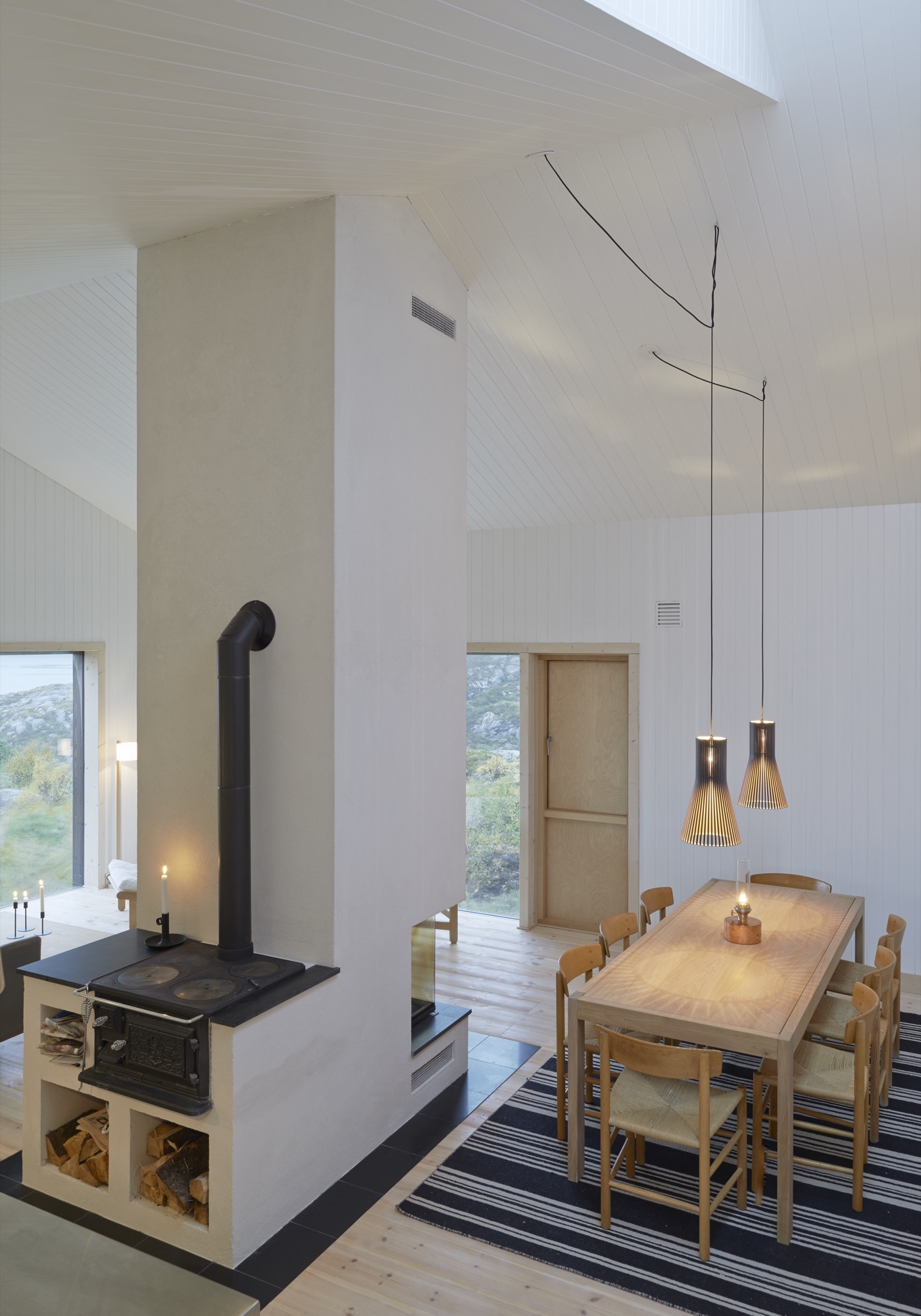
Not far from the house, by the seashore, stand a few of the colorful traditional boathouses—naust—found throughout Norway’s long Atlantic coast. With origins in the Viking era, this building type has withstood the test of time and weather with the island’s extremely rough climate. So, looking for another architectural typology for the Vega Cottage seemed like a futile enterprise for its Swedish architect of Kolman Boye Architects in Stockholm.
Casual observers might also miss the second most striking architectural feature of the Vega Cottage—its windows. At first, the house’s windows might appear like ordinary rectangular openings in a wall, covered with glass. But that’s just scale and perspective playing tricks, since the barren landscape of Vega Island offers little else of human scale for comparison. Standing directly in front of the house—where one’s cheeks quickly turn rosy from the cold Atlantic wind—an adult visitor can stand head to toe in the huge windows and absorb the majestic landscape. Buffeted by the wind and swept away with the dramatic views, one realizes that the windows are what this house is all about. They showcase the grandeur of the island.
"The windows are what this house is all about. They showcase the grandeur of the island."
A Place Apart
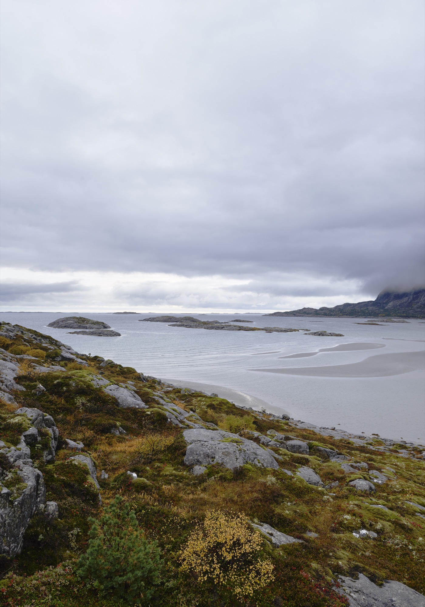
Vega is home to 1,200 people and lies roughly an hour by ferry out in the Atlantic from the tiny city of Brøn- nøysund on the west coast of Norway, just south of the Arctic Circle. The cottage’s site is not much more than a farmstead, marked on the map as Eidem.
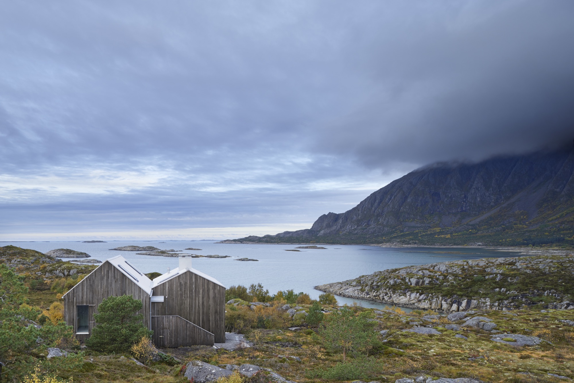
This is where the man who commissioned this house, Norwegian theatre director Alexander Mørk-Eidem, has his roots. Born on the island, he has lived most of his life on the mainland, and for the past ten years in Stockholm, Sweden. That is also where he met the architect. He approached Kolman with his idea for a country house or a cottage, commonly known in Norway as a hytte. A small and simple residence in the countryside where you go on weekends and during vacations to relax and enjoy nature... something with which Norwegians, blessed with a country of stunningly beautiful mountains and fjords, seem to be obsessed.
The end of the world, as Vega feels, seems like the obvious place for a director of the stage to seek peace and quiet and to find inspiration. Mørk-Eidem jointly owns the house with his siblings, a brother and a sister who now live in London and Oslo. The house is intended as a place for solitary retreats, but also for family gatherings, since an uncle and cousins still live on Vega.
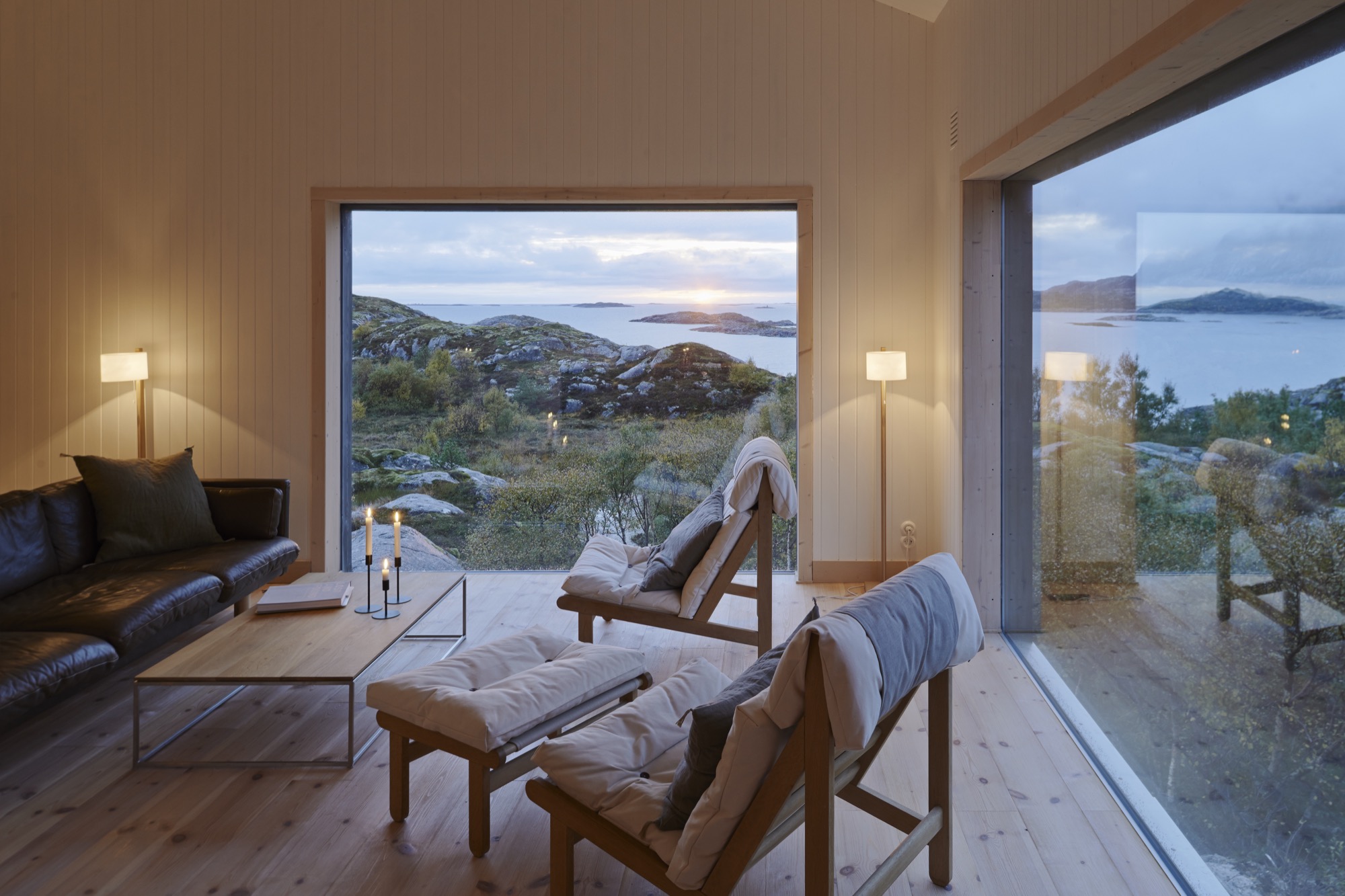
“Inside, the house is neutrally furnished to allow for nature to...” Mørk-Eidem starts to explain when I visited the house, only to get interrupted by his architect: “It’s like three paintings. There is no need to adorn the walls.”
The Cast of Characters
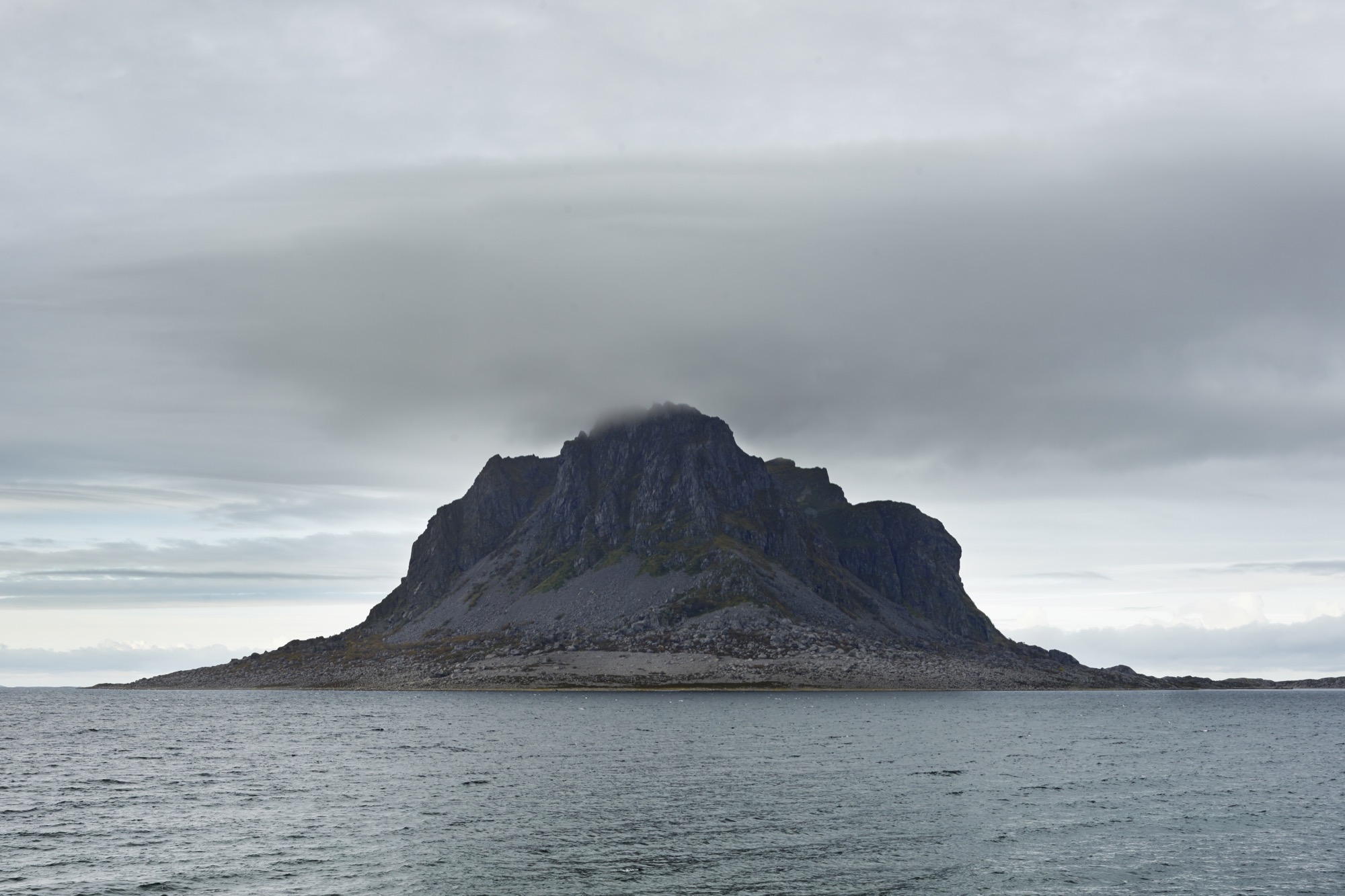
What they mean is that the house is built to be a minor character—the lead is reserved for the surrounding landscape. It doesn’t take a stage director to reach that conclusion. Trying to cast this drama in any other way would have been pointless. On the other side of the windows of the combined living and dining room lies the mighty Trollvasstind mountain, 800 meters (2,625 feet) high with a ridge that’s hidden behind milky white clouds. In the other direction the Atlantic Ocean and open sea stretch all the way to Labrador in Canada.
“What they mean is that the house is built to be a minor character—the lead is reserved for the surrounding landscape... Trying to cast this drama in any other way would have been pointless.”
Kolman recalls the first time he came to the island and the site, after having accepted the challenge of designing the house: “I went there in January, which is the worst time of year, weatherwise. It was pitch dark and freezing. Shockingly freezing, really. I wasn’t prepared for how harsh the climate would be.”
But nature can be kind on Vega, too. At milder times of the year, when the tide comes in during the day, the sand at the shoreline that had previously been heated by the sun warms the shallow water, allowing for some appreciated beach life. But the weather changes quickly here: from calm to a wind you can lean against in a matter of minutes. It is wise never to leave the house without the proper attire: mittens, Wellingtons, and a decent raincoat.
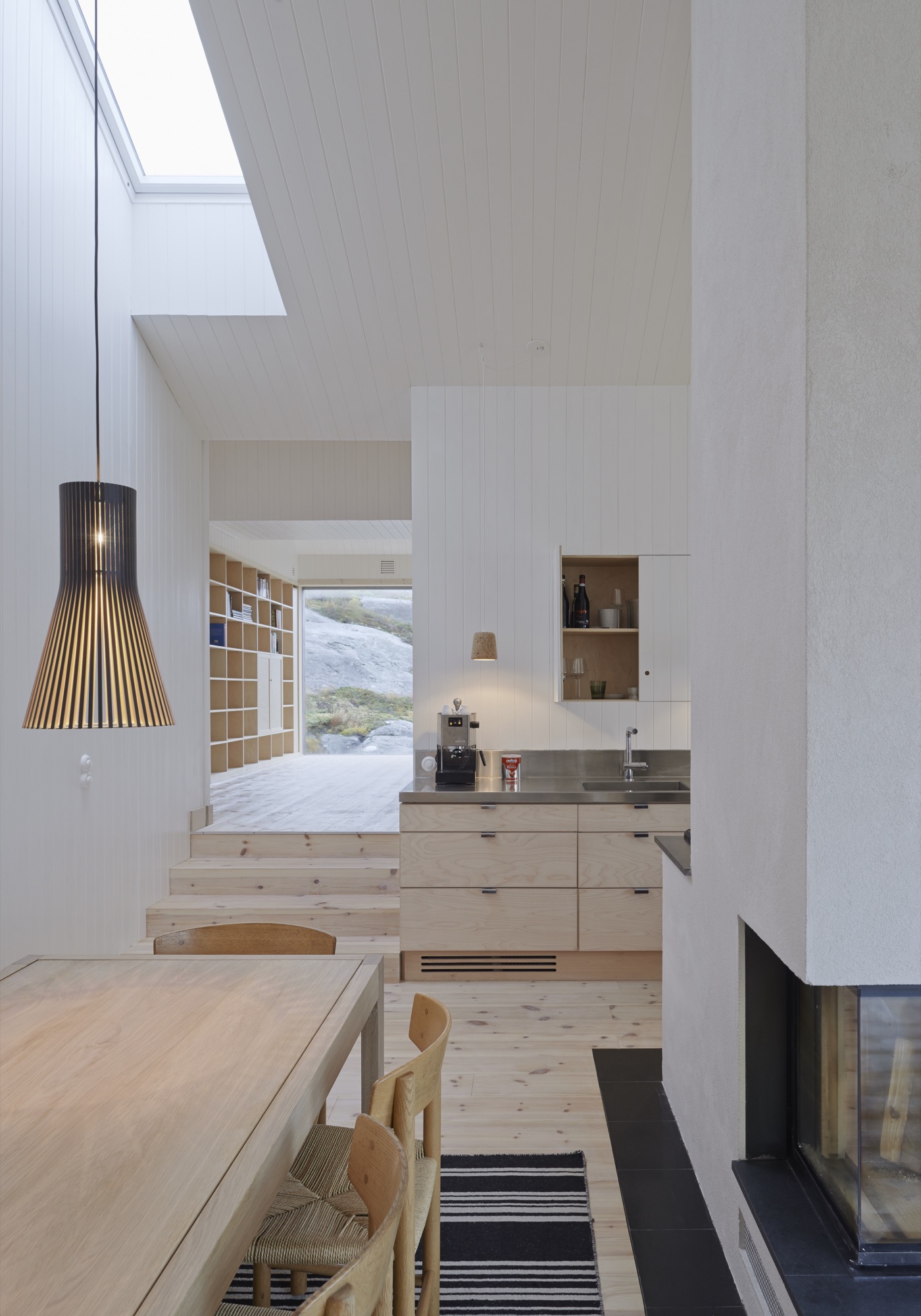
In contrast to the adventurous landscape and weather of Vega, the cottage interior is serene with a neutral color palette to enhance the tranquil atmosphere. Practically everything inside the house, from the walls to the bed linen, is white. The architect thinks it gives the house a hotel-like quality.
The Right Stuff
Kolman met his client through a mutual acquaintance in Stockholm. Mørk-Eidem had been looking for someone to build the house for quite some time. Realizing what a challenge it would be on this particular site, he pictured someone young, eager to take on the assignment for the experience, and Kolman fit the bill.
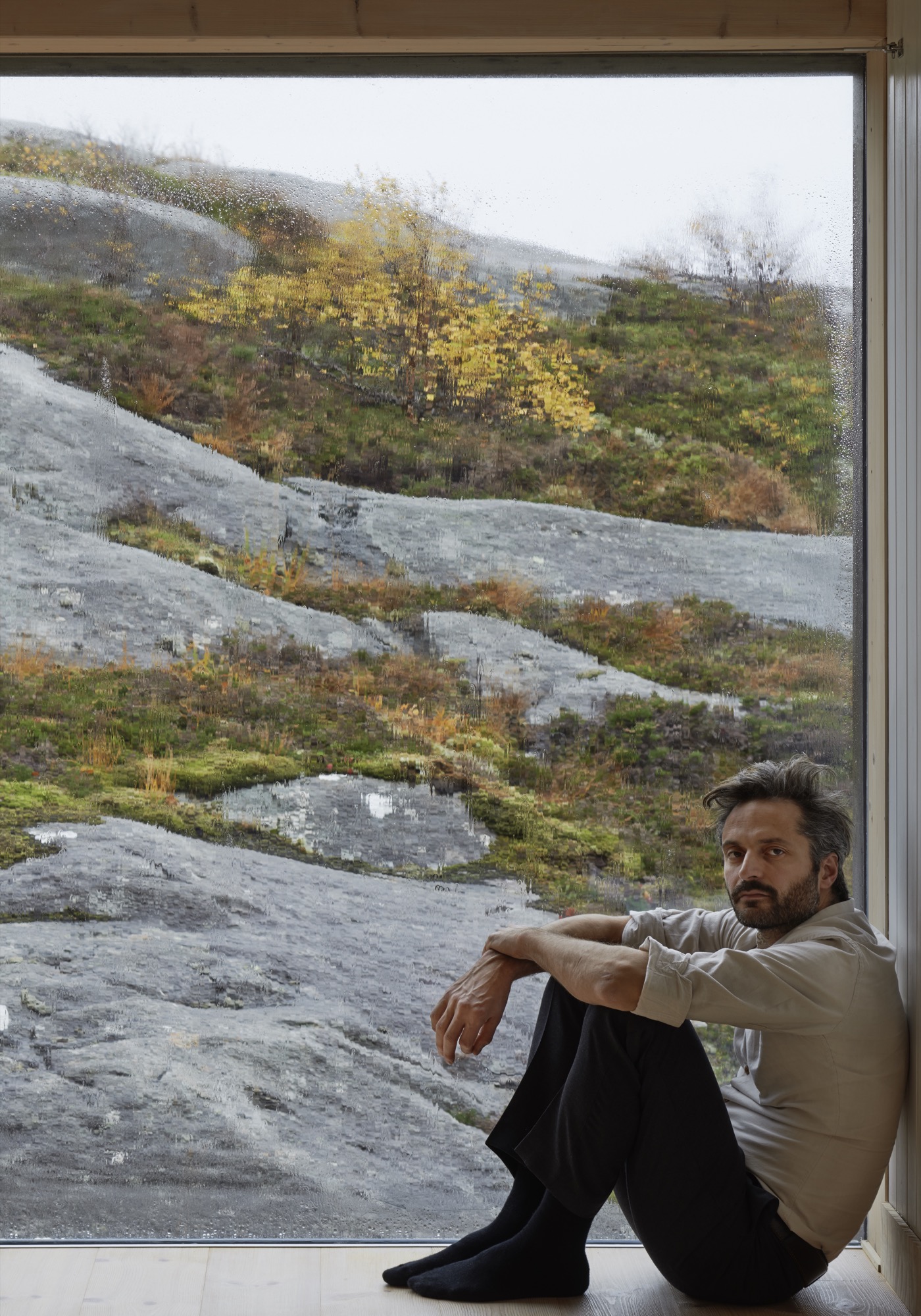
In addition to being one of the partners of Kolman Boye Architects, Kolman also runs a construction firm. A lucky combination since all the contractors Mørk-Eidem approached for a tender had simply refused to answer. “There was nobody who could see any joy in trying to do the impossible,” Mørk-Eidem explains.
Kolman proved to be different. In the Vega Cottage he saw nothing but an enticing challenge. Building the house on Vega was possible, but it took five years and twenty-three Stockholm-Vega round-trips by car for the architect. A total distance, he figures, that roughly equals a trip around the equator. True or not, one trip by car from Stockholm to Vega is long, time-consuming, and not very pleasant.
“It was really important to build the house without doing any damage to the landscape and to make it appear as if the house had always stood on this site,” Kolman says. “What fascinates most people who come here is that you get the feeling that it’s grown out of the bedrock.”
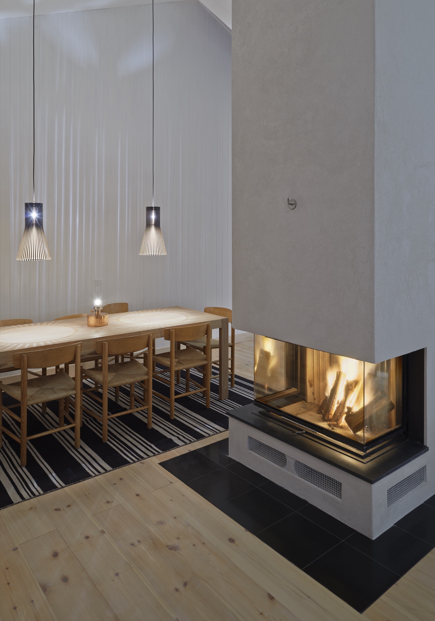
Building on the bedrock and being gentle with the landscape also made the construction difficult. A road had to be built to the site, and building material laboriously towed over the bedrock the house stands on—not to mention the efforts to transport and install the windows. The panes are 40 millimeters (1.57 inches) thick to withstand the storms and high winds that would shake and shatter thinner glass. Residents can enjoy the spectacle outside from a quiet, warm, and cozy house, cheered by the hearth that is the heart of the lower-level’s social area. “They’re not something you can break easily,” Kolman says about the windows. “In fact, you can jump on them and nothing will happen.” Staying at the Vega Cottage, I was glad the project was graced with such a persistent architect-builder—the landscape is beautiful, but I was happy to keep the elements of nature where they belong—on the other side of the glass.
“It was really important to build the house without doing any damage to the landscape and to make it appear as if the house has always stood on this site.”
Other than the pitched roof, this is a rather minimalistic house—or as Kolman says, “There is nothing that juts out, so there is nothing for the wind to grab on to.”
There is not even a railing around the terrace outside the lower level’s two bedrooms. “My sister wondered when they would be put in place,” Mørk-Eidem says. “They never will be,” he declares, adding, “This is a childproof house in the sense that nothing can be broken.”
If nothing can get broken, theoretically nothing will need to be fixed. To keep maintenance on the house to a minimum during holidays and vacations, Mørk-Eidem and his architect opted for weatherproof solutions for the house. At one stage in the project they considered black facades. But when I visited, a year after completion, the unpainted facades, which were only treated, already had their gray patina. Houses age fast on Vega.
“Houses age fast on Vega.”
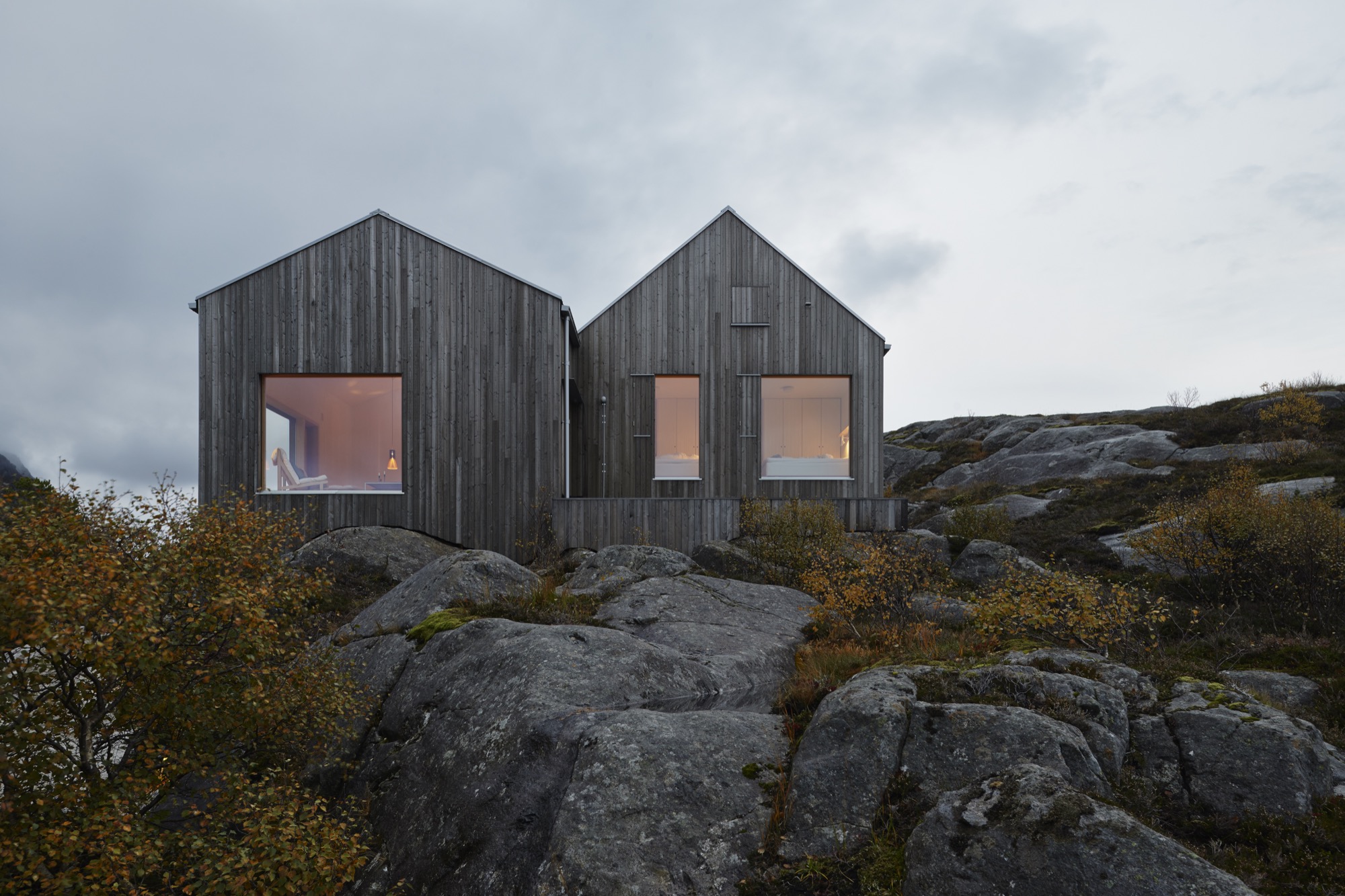
The cottage owes much to vernacular architecture, but the local building tradition has always emphasized protection from the elements of nature. The island’s old buildings, placed wherever there is shelter from the storms, all turn their backs to nature and to the extreme weather. “You get very unsentimental living out here,” Mørk-Eidem tells me. “You get used to this nature, and you look at it as a kind of antagonist.”
“You get very unsentimental living out here.”
He proceeds to tell how his father reacted when he first came to the house. As an adult, Mørk-Eidem senior moved to Oslo and hadn’t lived on the island for decades. “At first, he was suspicious,” Mørk-Eidem recalls, “because he’s never been used to sitting inside and just admiring the view. For him it was a really different experience to come to a place he knows so well but to see it from an entirely new perspective.”
Hearing that this outpost can give even natives new perspectives is a testament to the qualities of this house that makes the architect say, without the slightest hesitation, that he would gladly take on the logistical and psychological challenges of an assignment like this again. △
A Platform for Living
A weekend refuge in Japan's Chichibu mountain range consists of a simple larch wood structure and two North Face tents for bedrooms
A collaboration with Dwell.com
Setsumasa and Mami Kobayashi’s weekend retreat, two and a half hours northwest of Tokyo, is “an arresting concept,” photographer Dean Kaufman says, who documented the singular refuge in the Chichibu mountain range. “It’s finely balanced between rustic camping and feeling like the Farnsworth House.”
“It’s finely balanced between rustic camping and feeling like the Farnsworth House.”
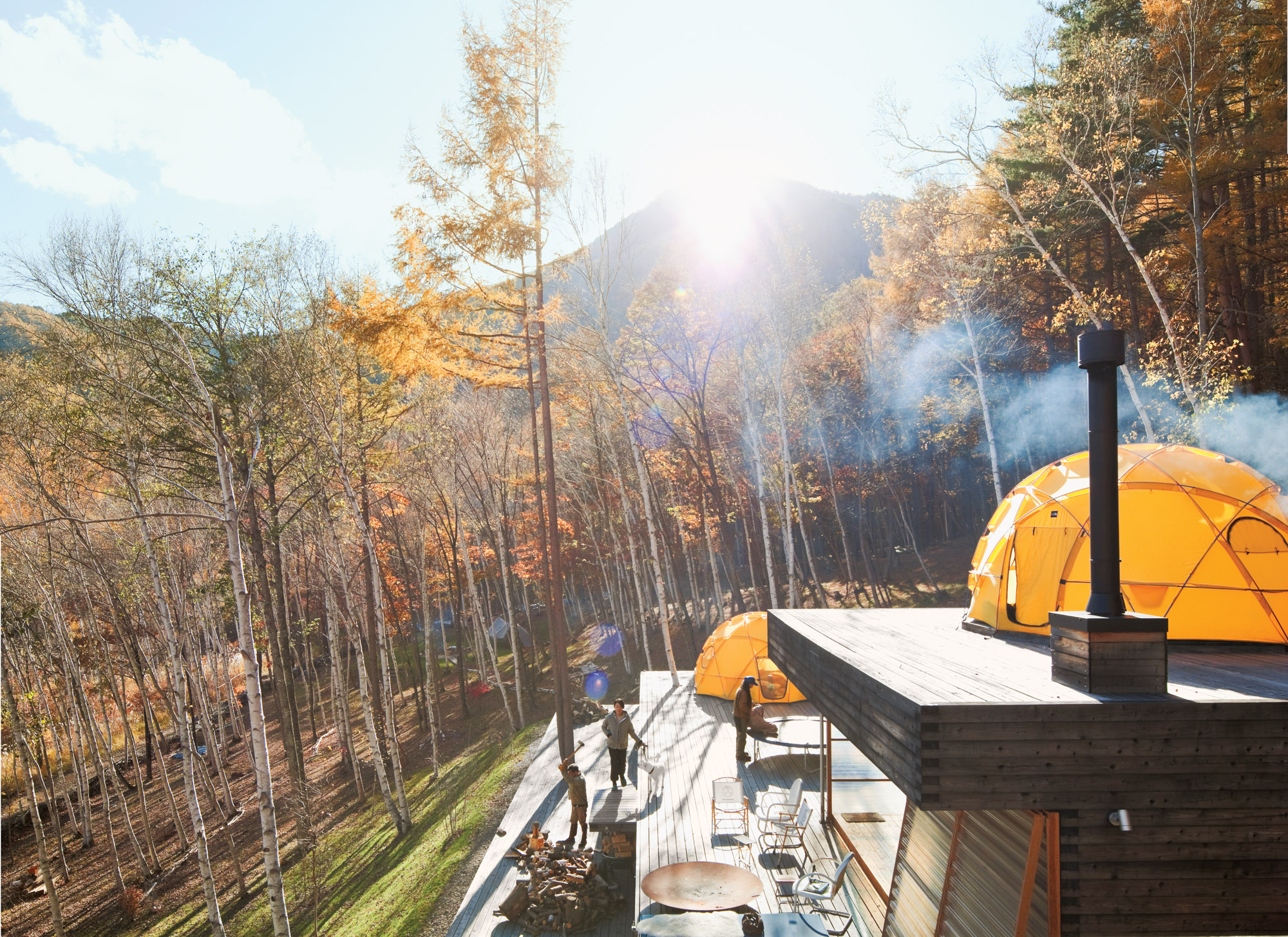
Designed by Shin Ohori of General Design, the structure—Setsumasa bristles at the word “house,” since his desire was for something that “was not a residence”—and its wooded surroundings serve as a testing ground for the Kobayashis, who design outdoor clothing and gear (as well as many other products) for their company, …….Research. The shelter is constructed from locally harvested larch wood and removable fiberplastic walls and is crowned with two yellow dome tents used as year-round bedrooms.
"His desire was for something that 'was not a residence.' "
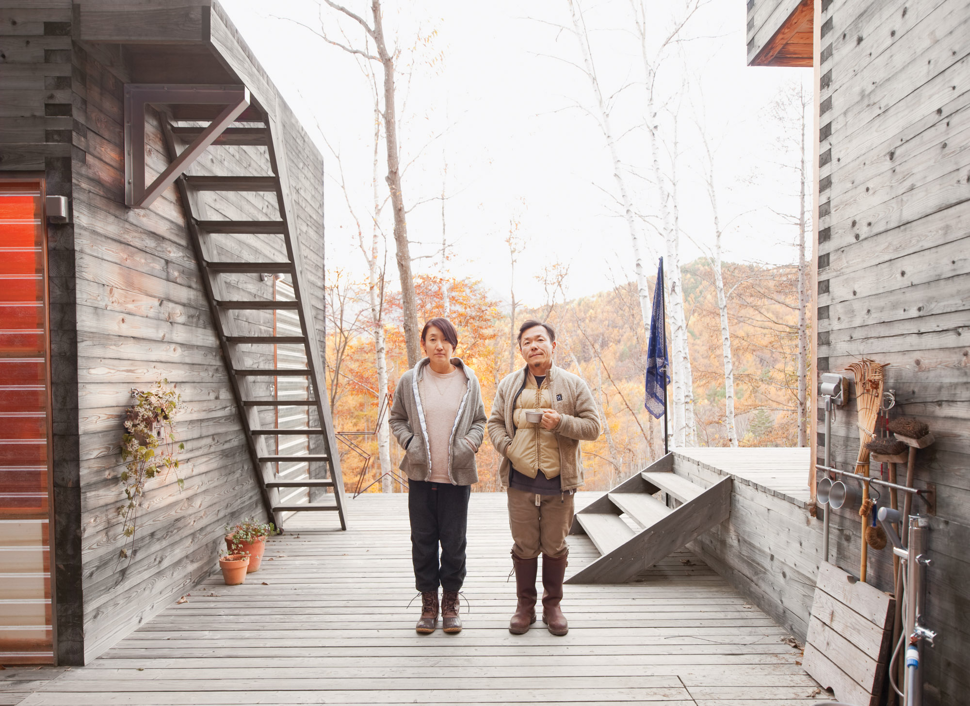 Setsumasa and Mami Kobayashi / Photo by Dean Kaufman
Still, this is no primitive lean-to. There’s electricity, hot water, and a kitchen—not to mention iPads, Internet, and a clawfoot tub. By day, the couple trims trees and chops firewood. At night, they sit around a campfire and eat Japanese curry, listen to Phish, and balance their laptops on their knees. This is what a modern back-to-the-land effort looks like.
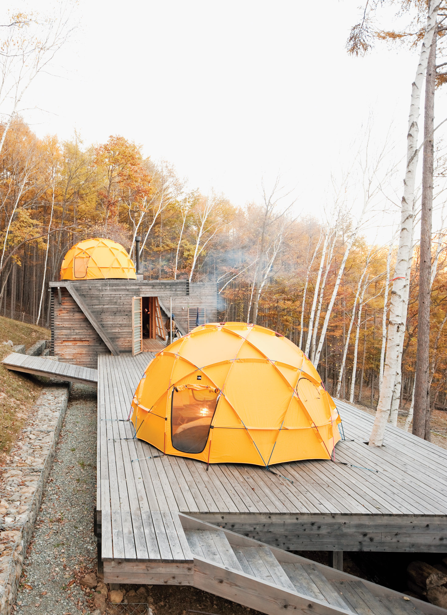
One North Face tent sits atop a deck; another caps the main building, which contains a kitchen and dining area.
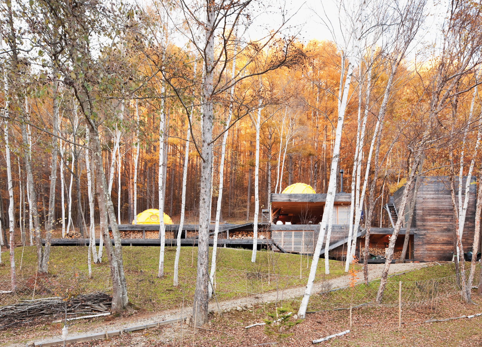
The long, lean Kobayashi complex includes a bathroom and storage room in the structure on the far right.
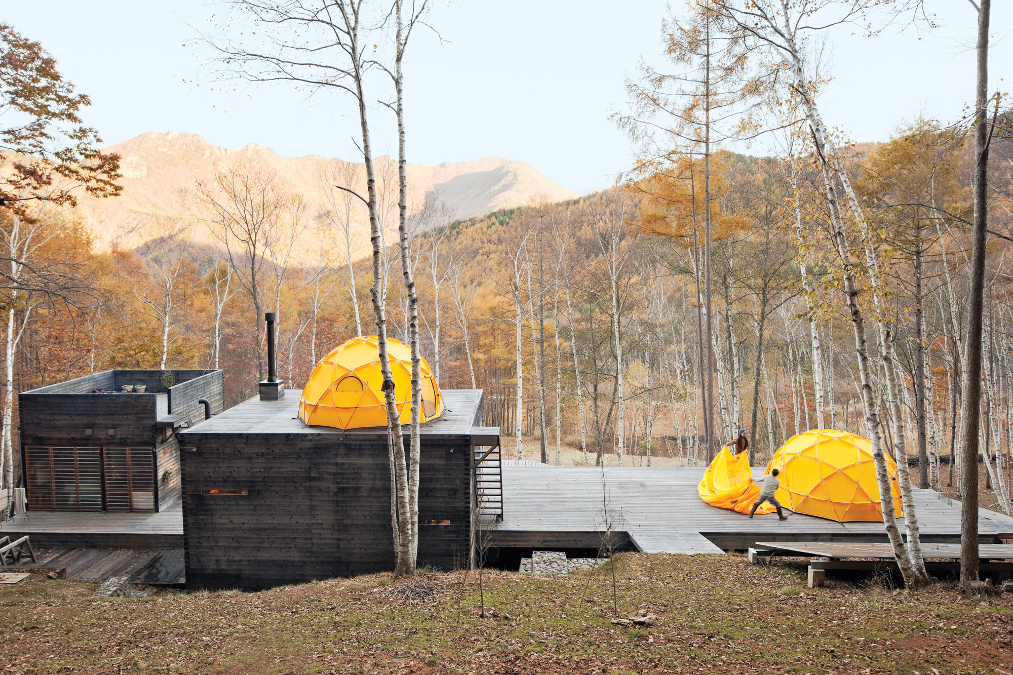
Setsumasa and Hideaki toss on the rain fly. The solar panel in the foreground supplies daytime electricity.
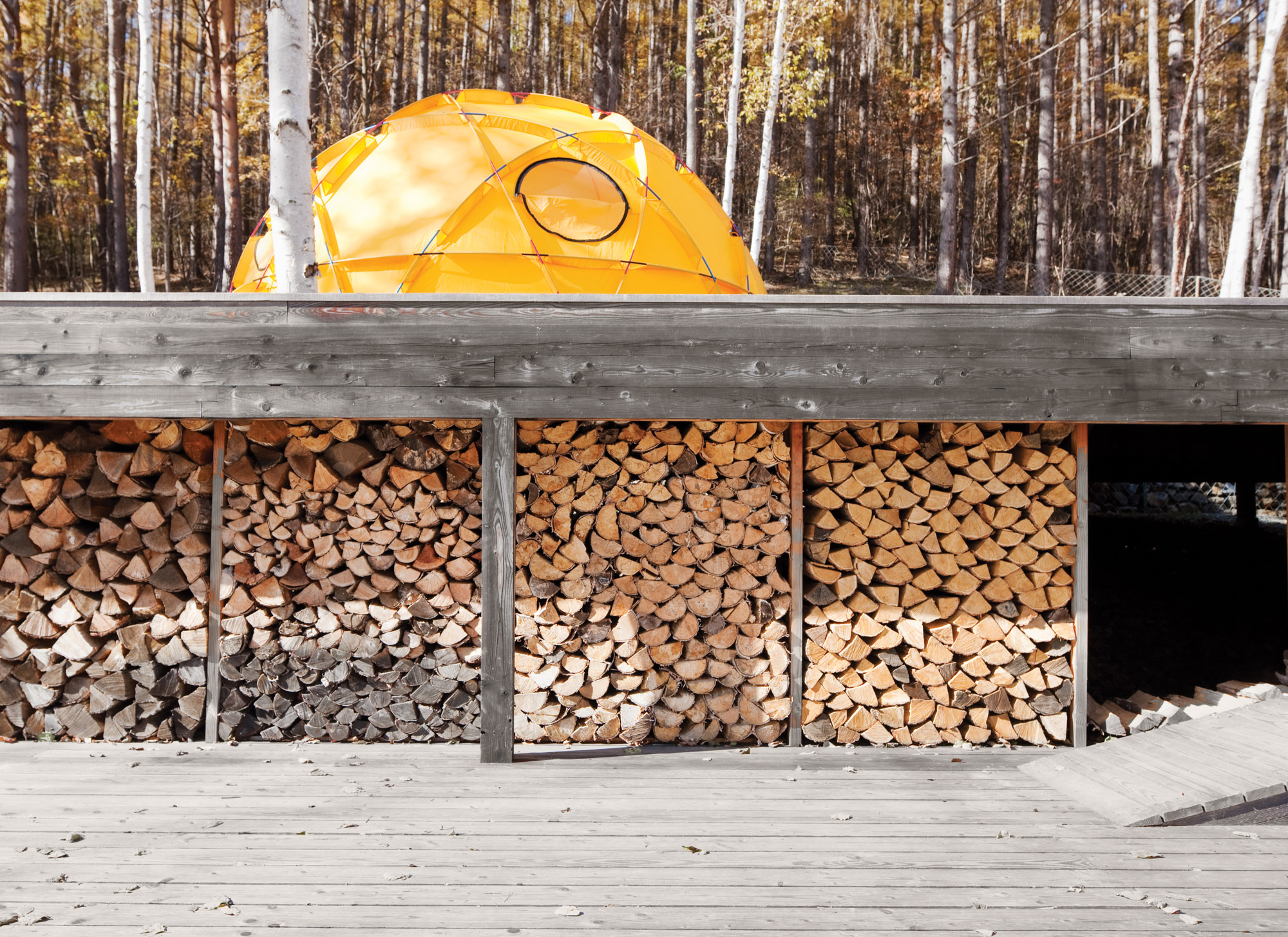
A stockpile of wood sheltered from the elements.
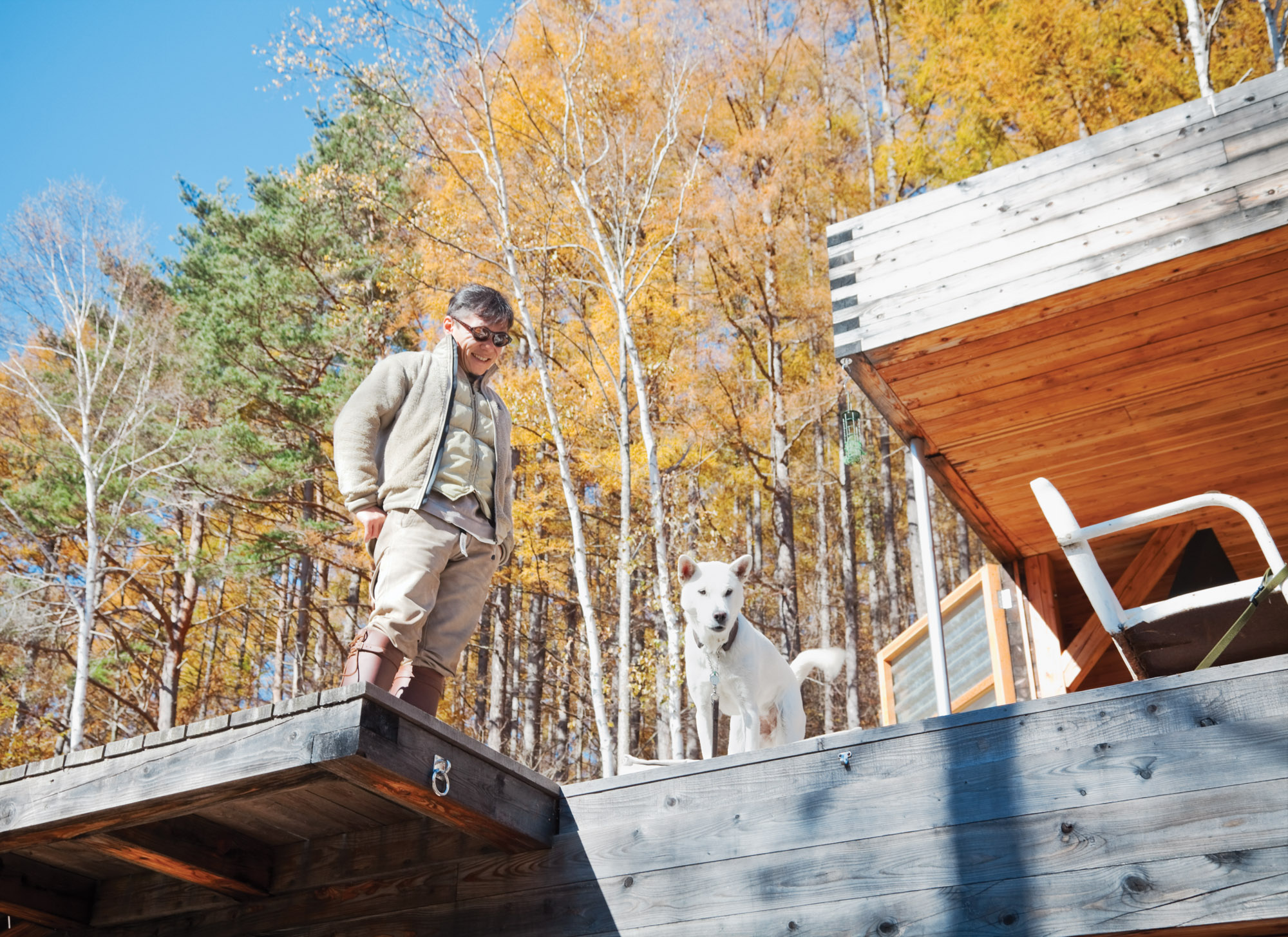
Setsumasa's desire was for something that “was not a residence”
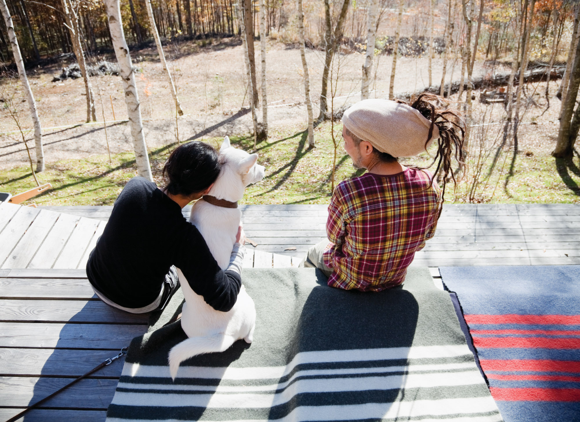
Scenes from a weekend in the woods feature many .......Research products, including camping cookware and striped wool blankets.
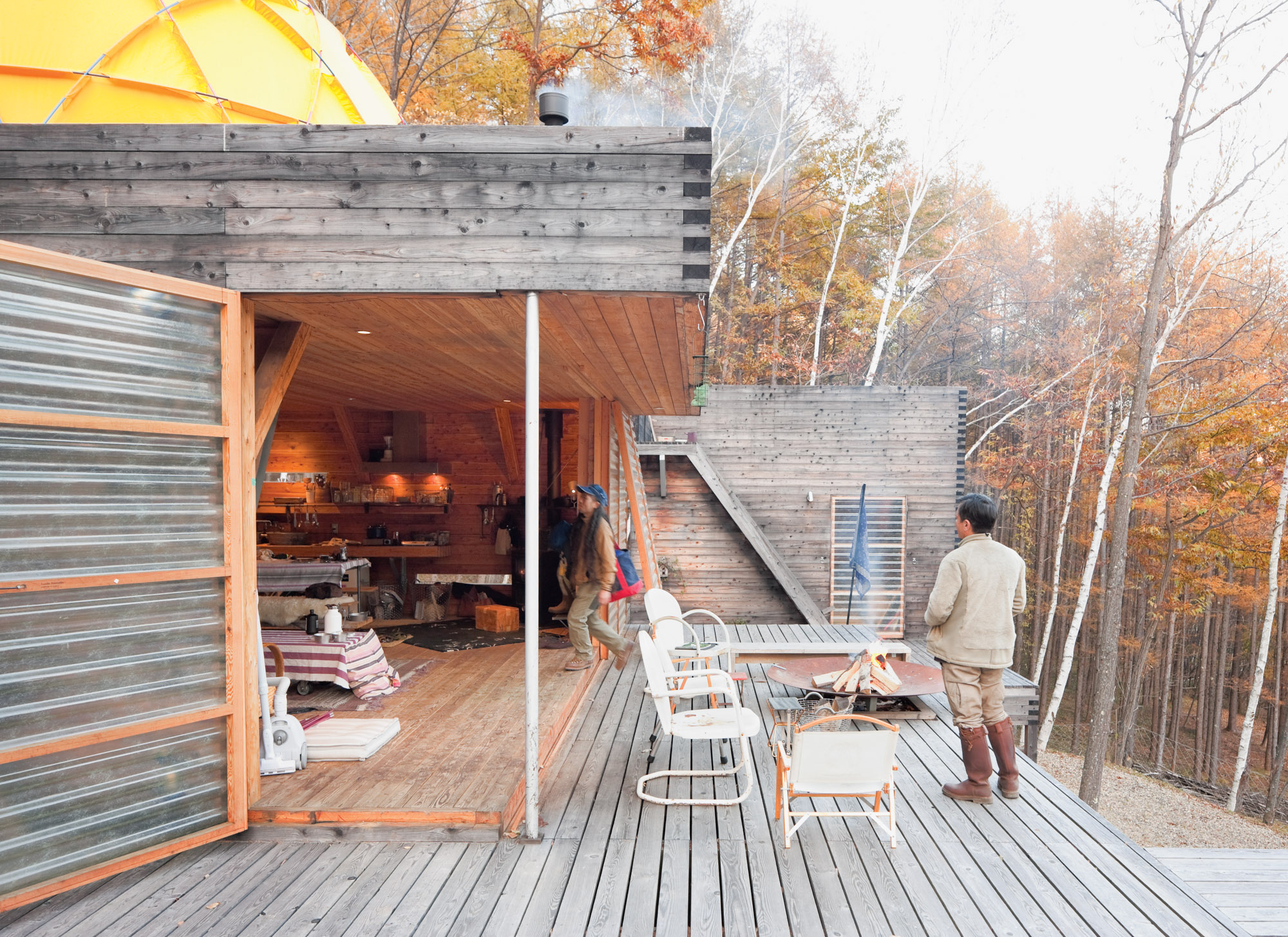
Translucent fiberglass panel walls form a permeable, fiber-reinforced plastic membrane between indoors and out.
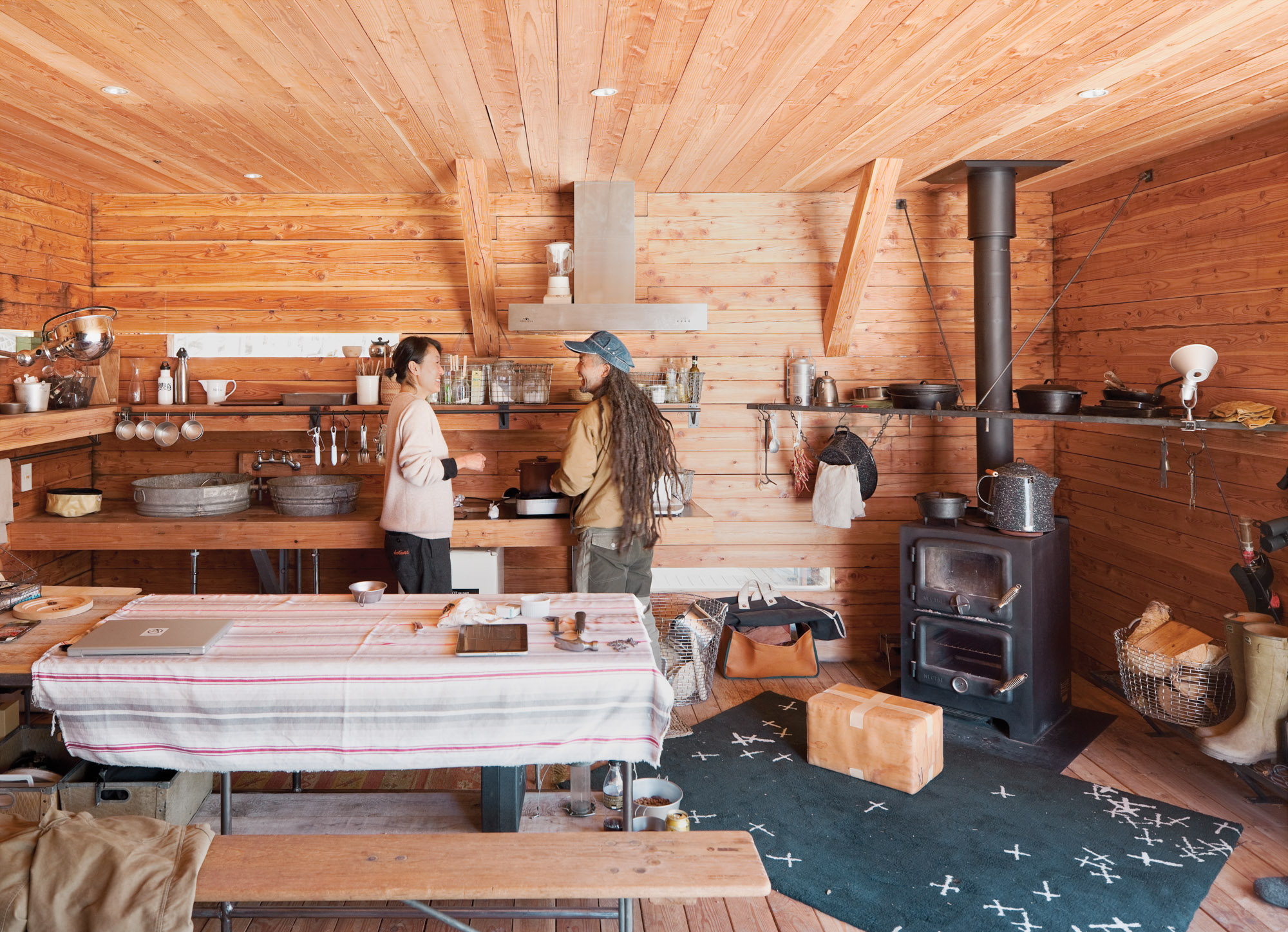
Mami and Ishii Hideaki (a friend and .......Research employee) prepare lunch in the cozy main building. The room is rustic and utilitarian, with a double-decker wood-burning stove, tons of open storage, and a sink fashioned from galvanized buckets. But there’s an underlying high-design ethos: The wire baskets are handmade classics from Korbo, a Swedish company, and what looks like a paper-wrapped box in front of the stove is actually a leather cushion by Japanese artist Nakano.

Food is served in traditional camping cookware.

A view of the surrounding tree canopy.
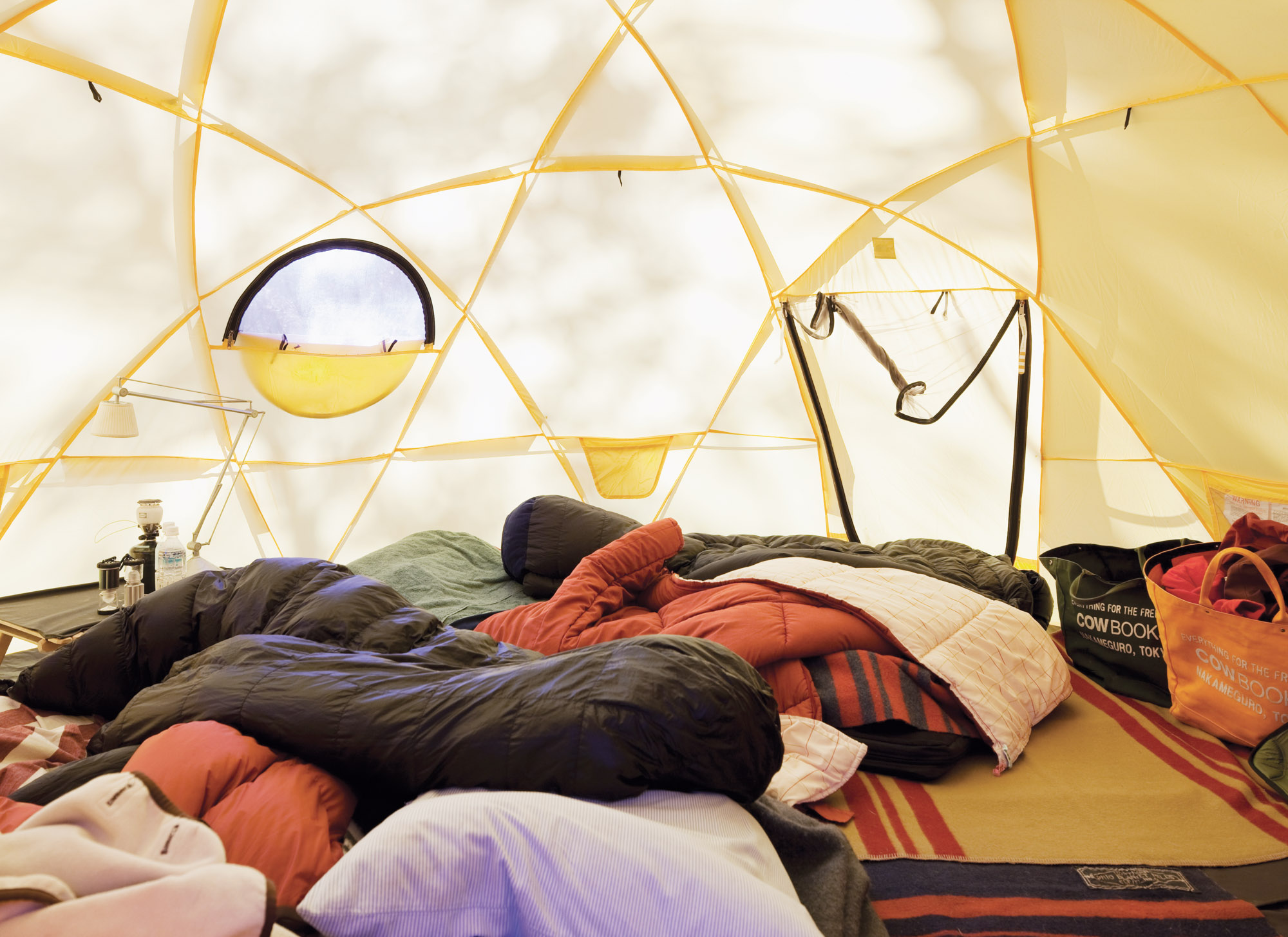
Inside one of the Kobayashis' North Face tents.
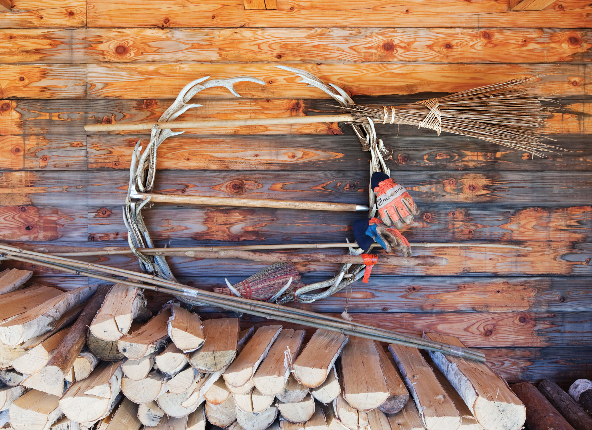
The couple stockpiles wood under the deck.
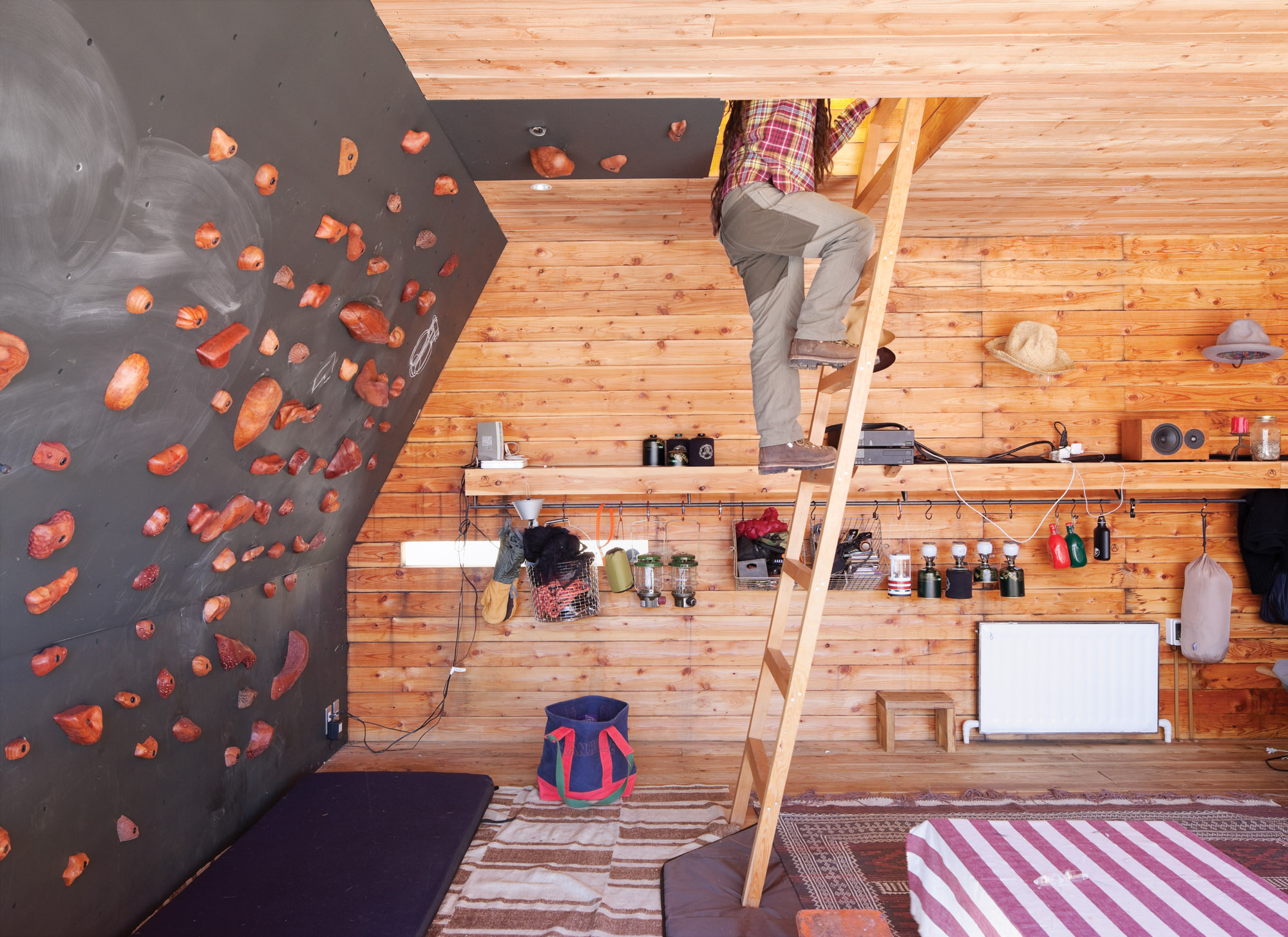
The rooftop tent can be accessed from the interior via a wooden ladder or—for the more athletic—via a series of wall-mounted climbing holds, made by Vock and carved from persimmon-tinted hardwood.
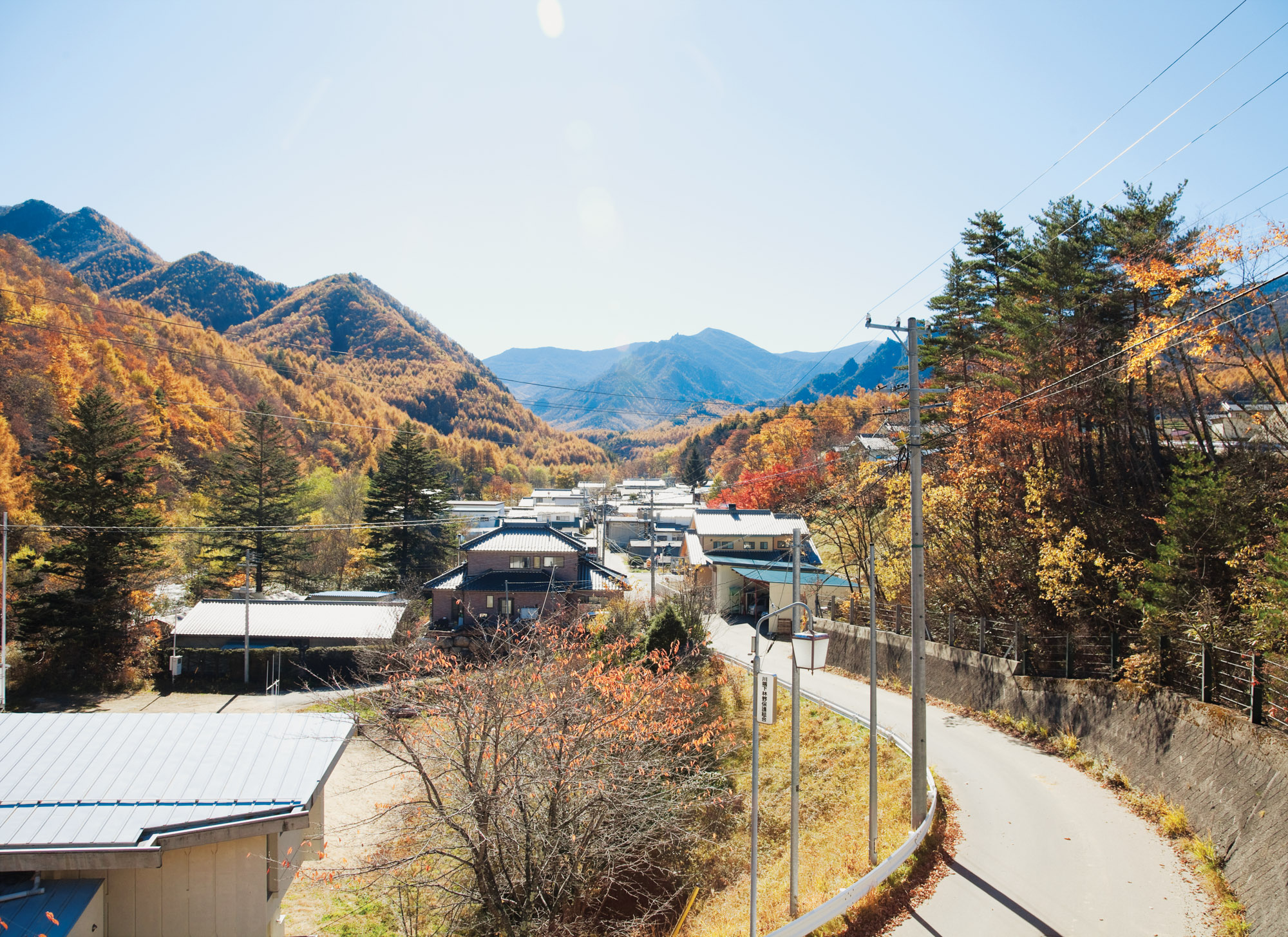
A view of the mountains from the village of Kawakami, en route to the Kobayashis’ property. △
Window to South Tyrol
An artist and sculptor returns home to South Tyrol to converts an old farmhouse
Artist and sculptor Othmar Prenner converts an old farmhouse in the mountains of his native South Tyrol and realizes his vision of an alpine dream home—between craftsman tradition and modern art.
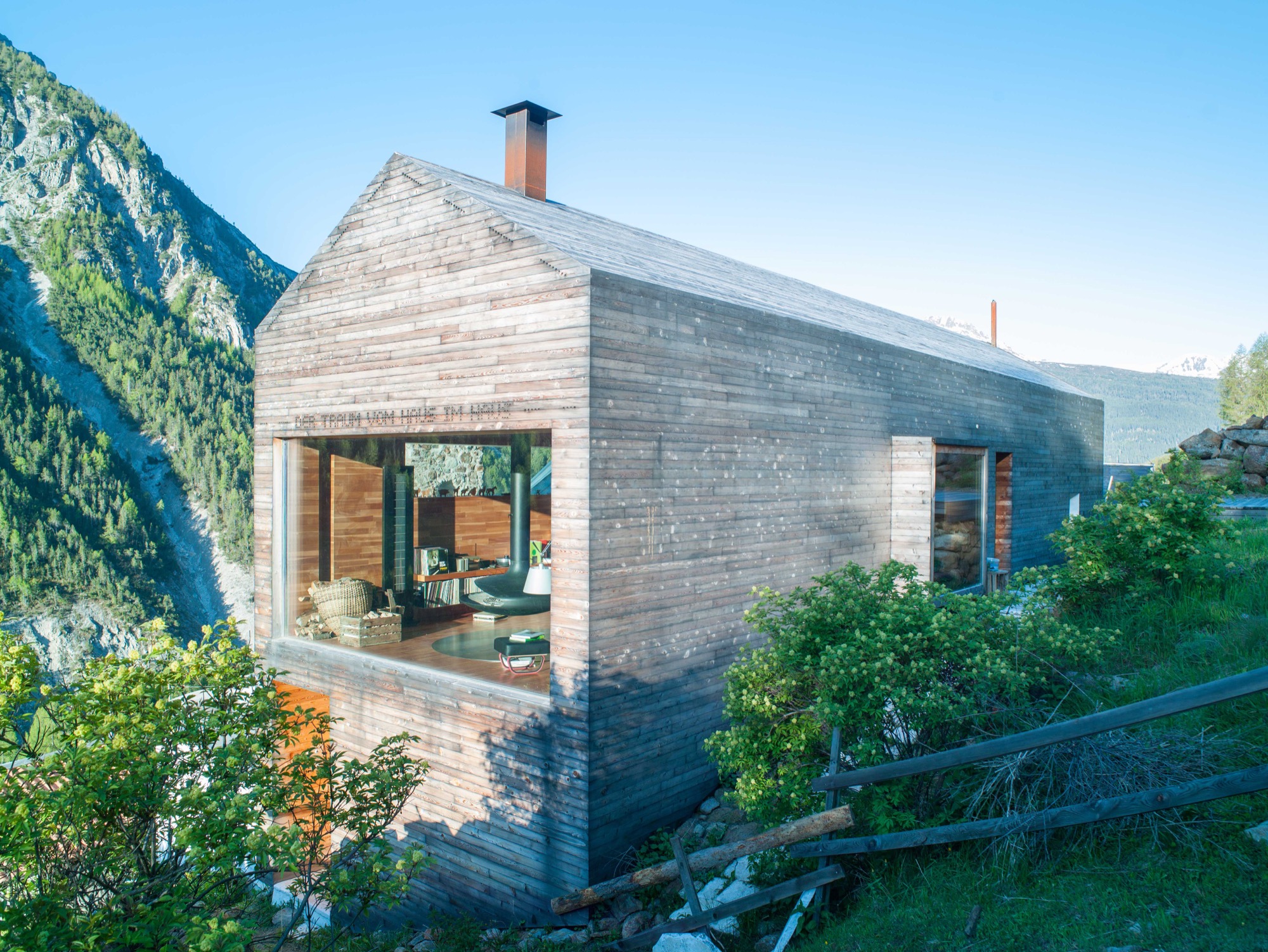
Othmar Prenner lounges by the spectacular panorama window, looking out into the pristine nature of South Tyrol. Modern fiberglass lines allow him to work up here, straight across from the massive, snow-capped peaks of Italy’s Vinschgau.
Technology and nature don’t contradict one another, if you ask the artist and sculptor. On the contrary. The Internet enables him to be in nature while developing new art projects and designing furniture and objects made of wood.
It is here, in his native South Tyrol, that Prenner found his way back to his craft and rediscovered the joy of creating something new with his own hands.
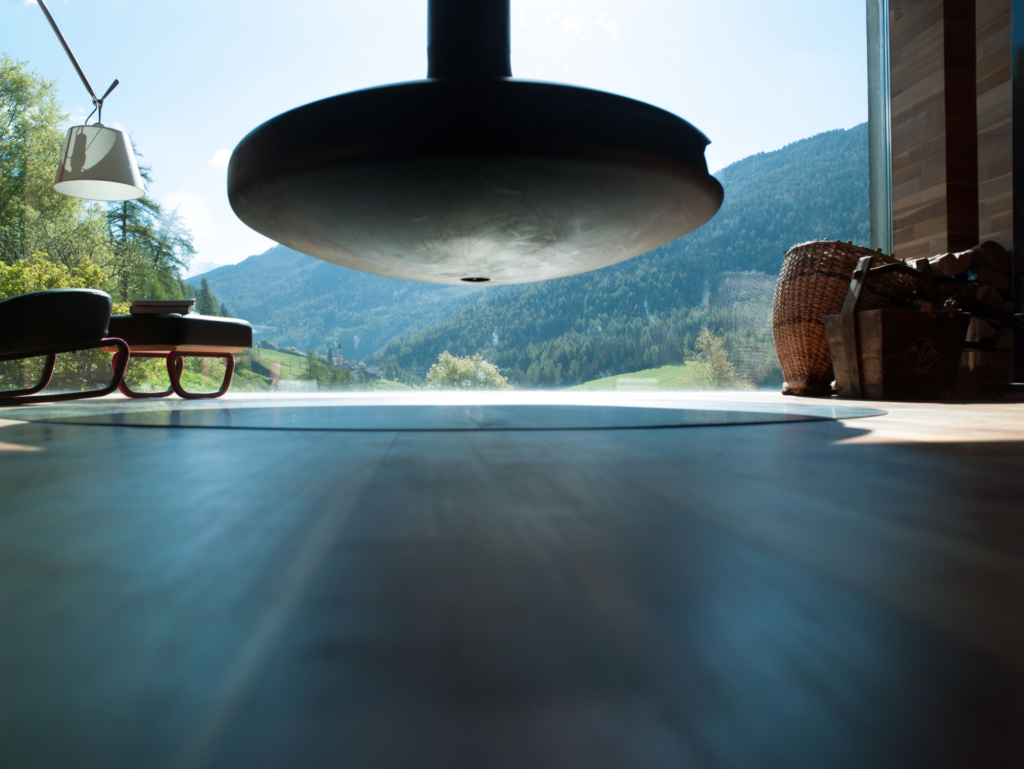
Every corner of his remodeled farmhouse, completed in 2011 and internationally published more than twenty times, is filled with tools, paintings, finished and unfinished pieces of furniture, and all sorts of arts and crafts. The home is vivid, and it’s cozy in front of the black steel fireplace—a focal point—suspended from the ceiling. Othmar Prenner loves the open flames, the feeling of sitting by a campfire in his living room. He dismisses ovens with glass doors and generally has his own and very clear ideas about architecture and interior design.
He helped build an atelier and gallery near Zurich, Switzerland. “I only do things I like 100 percent,” Prenner says. “That’s why I’m not interested in collaborating on big projects, where you have to make 1000 compromises.”
This was far from the case with his very personal project, the mountain retreat at home in South Tyrol. Here, the almost fifty year old was able to realize his design vision one to one and create a refuge that meanwhile has become his primary residence and studio. Rarely does he drive back to his apartment in Munich these days. “I never thought I would leave the city. I’ve lived there for twenty-two years,” he says. “My focus is here now. I love living in nature and don’t need the city.”
“My focus is here now. I love living in nature and don’t need the city.”
Art in the city, craft in the country
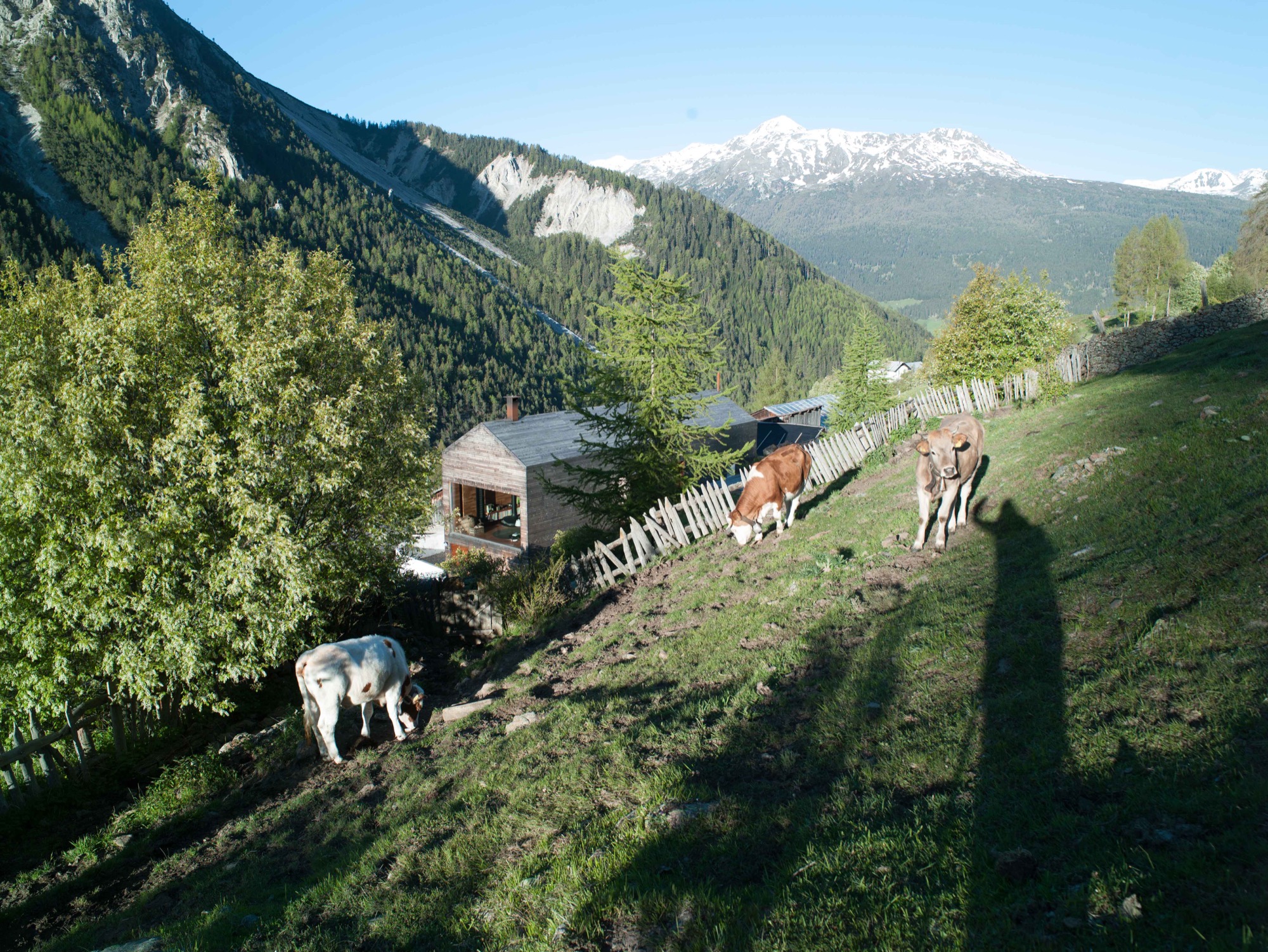
Prenner bought the old house in his native region near Mals twenty-five years ago. The property is part of a small hamlet that is still being farmed in a steep valley on the Reschen Pass near where Prenner grew up. In his stube, which is nontraditionally located on the second floor and combines the kitchen and dining room, he tells me he spent many childhood hours carving wood and that he has always wanted to become a sculptor since he was a young boy. His parents had little understanding for his artistic ambitions but agreed to a cabinetmaker apprenticeship. Prenner strived for more and afterward studied in Innsbruck and later in Munich. Today, his calling has become his profession, a mix of sculpture and designing furniture and objects for the home. “During my Munich years, it was definitely the arts, now I’m balancing both,” says Prenner, who recently returned from Salone Internazionale del Mobile, the furniture show in Milan where he introduced the lathed containers and boxes he sells under the brand Like a Box. The response to the boxes made from Swiss pine, the turned salt and pepper mills, and the forged knifes was incredibly positive, he reports. Even Vitra showed interest. Traditional craftsmanship is back in demand, and Milan showed it.
The dream of paradise
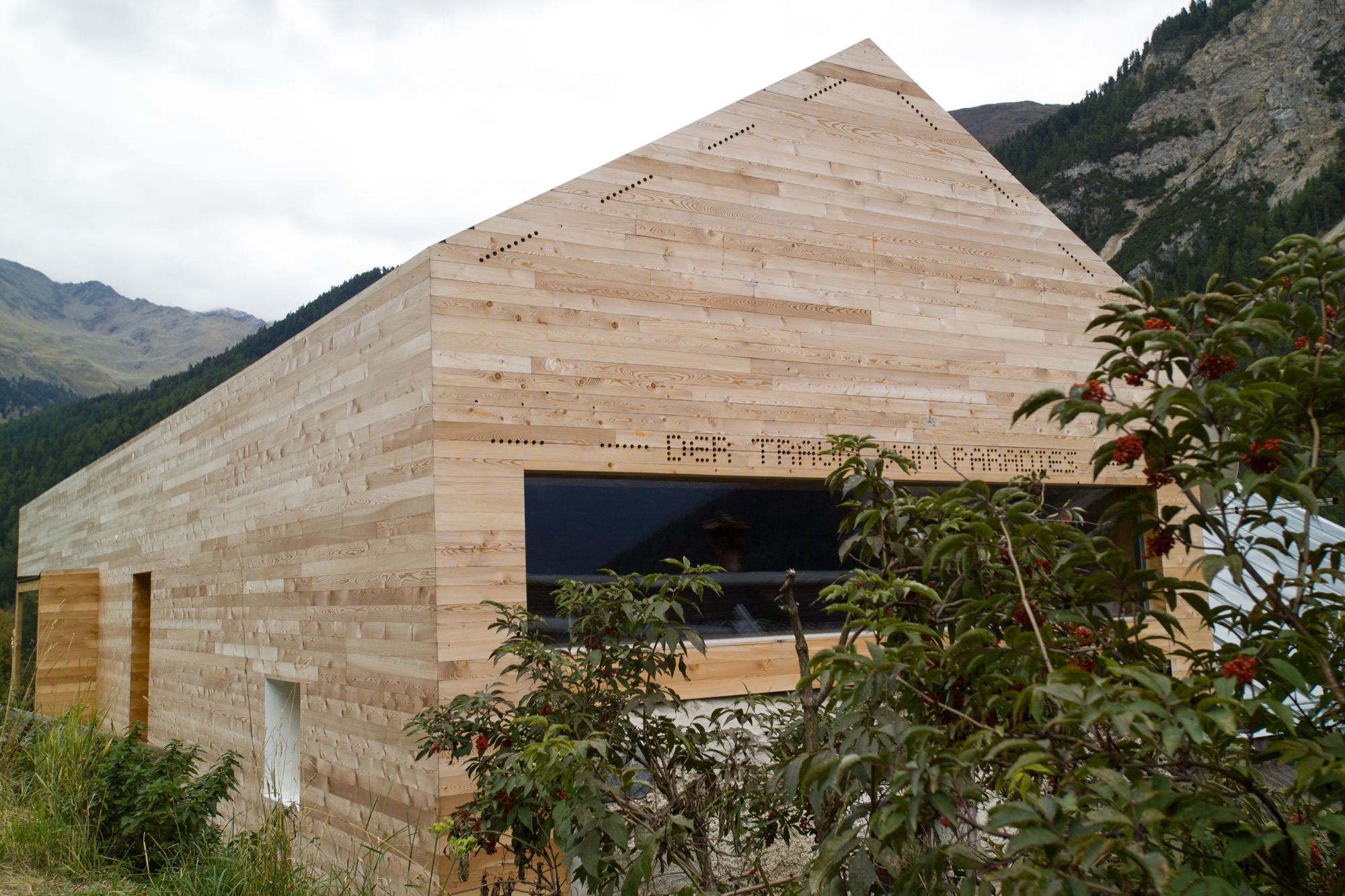
In his own alpine domicile, Prenner takes his love for wood to the extreme. The large window reflecting the mountain peaks pops out against the buildings homogenous, light exterior. The words “Der Traum vom Paradies” (the dream of paradise) are stamped into the minimalist fine wood facade. In the back of the small house, the roof was cut open to add a floor for the new living room. The house’s exterior as well as the interior of the grand stube are almost entirely clad in wood. A total of 250 square meters (2692 square feet) of finest parquet were installed. The larch wood came from the valley here and was specially cut so the pattern of annual rings would run ever so calmly and evenly. The wood was processed by Prenner’s brother, who still owned a carpentry shop at the time and was capable of delivering on Prenner’s discerning specifications: “Many craftsmen merely do custom Ikea nowadays, craft and industry become more and more intermingled. Unfortunately, the sense of artisanship gets lost.”
Wood as the central element was an obvious choice for Prenner. Many other details developed over the course of the building process, he tells. “It’s like working on a sculpture. Many people want to plan everything in advance and then execute one to one. That’s why I don’t like collaborating on other architecture projects.” Prenner likes to be inspired as his work unfolds. The entryway, for example, was so dark you could hardly find the doorknob. So Prenner, without hesitation, tore open the ceiling to create light, which now floods the hallway from the stube and living room above. The white marble floor brightens up the foyer still more. The stone was quarried 30 kilometers (ca. 19 miles) from here, in Laas, and counts among the hardest and whitest marble stones. “It should be self-evident to use materials from the region, and not stone from India,” Prenner notes. “There’s a new aspiration. People want to know where things come from, where materials are sourced. Things of permanence provide comfort in uncertain times.”
“There’s a new aspiration. People want to know where things come from, where materials are sourced. Things of permanence provide comfort in uncertain times.”
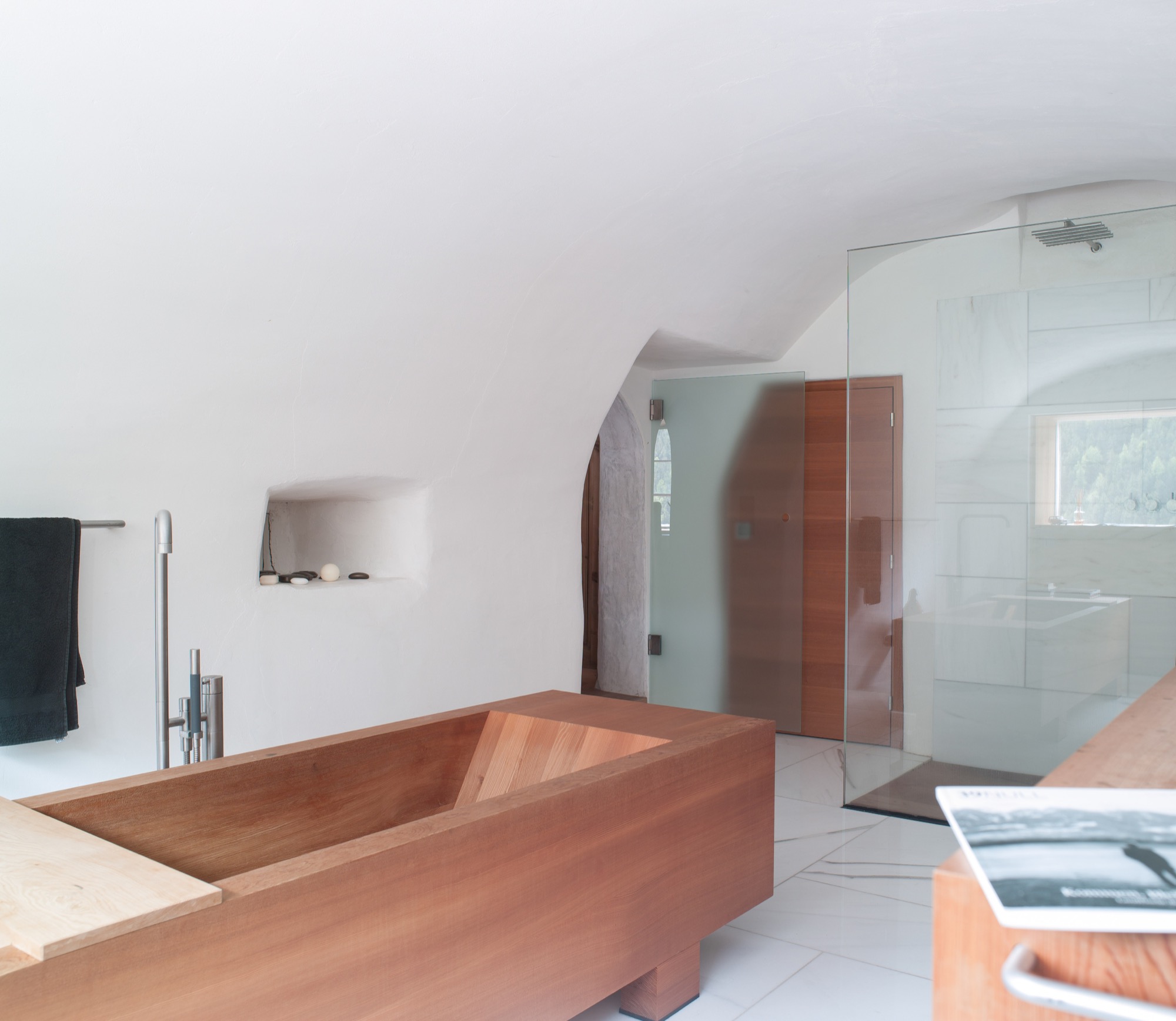
The former stube, where the original, 200-year-old wood paneling has been completely preserved, was converted to the master bedroom. After all, the house’s central theme is the view to the outside—and the ground floor affords prime views. Thus, the classic arrangement of stube downstairs and bedroom upstairs was simply flipped on its head. The master bedroom’s ensuite bathroom marvelously harmonizes the white marble and the larch wood. The freestanding wooden bathtub is the focal point.
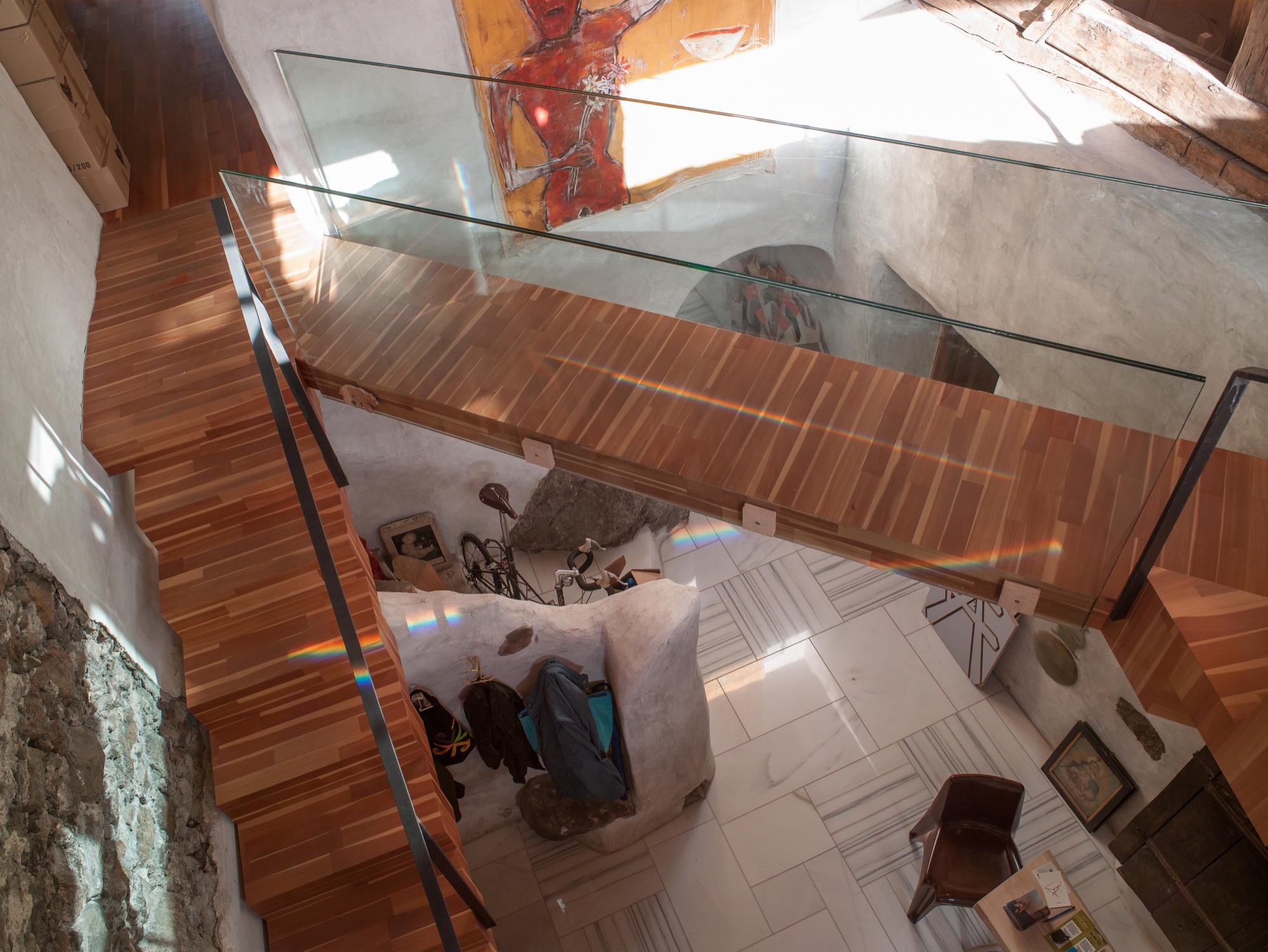
Prenner preserved the old stone staircase—or its remnants—as decorative element and a nod to the old structure of the farmhouse. The modern, floating wooden stairs and the bridge—or wooden walkway—to the living room on the second floor create the contrast. “During construction, a wood plank led across there, and I found the open crossing over the hallway interesting,” Prenner reveals.
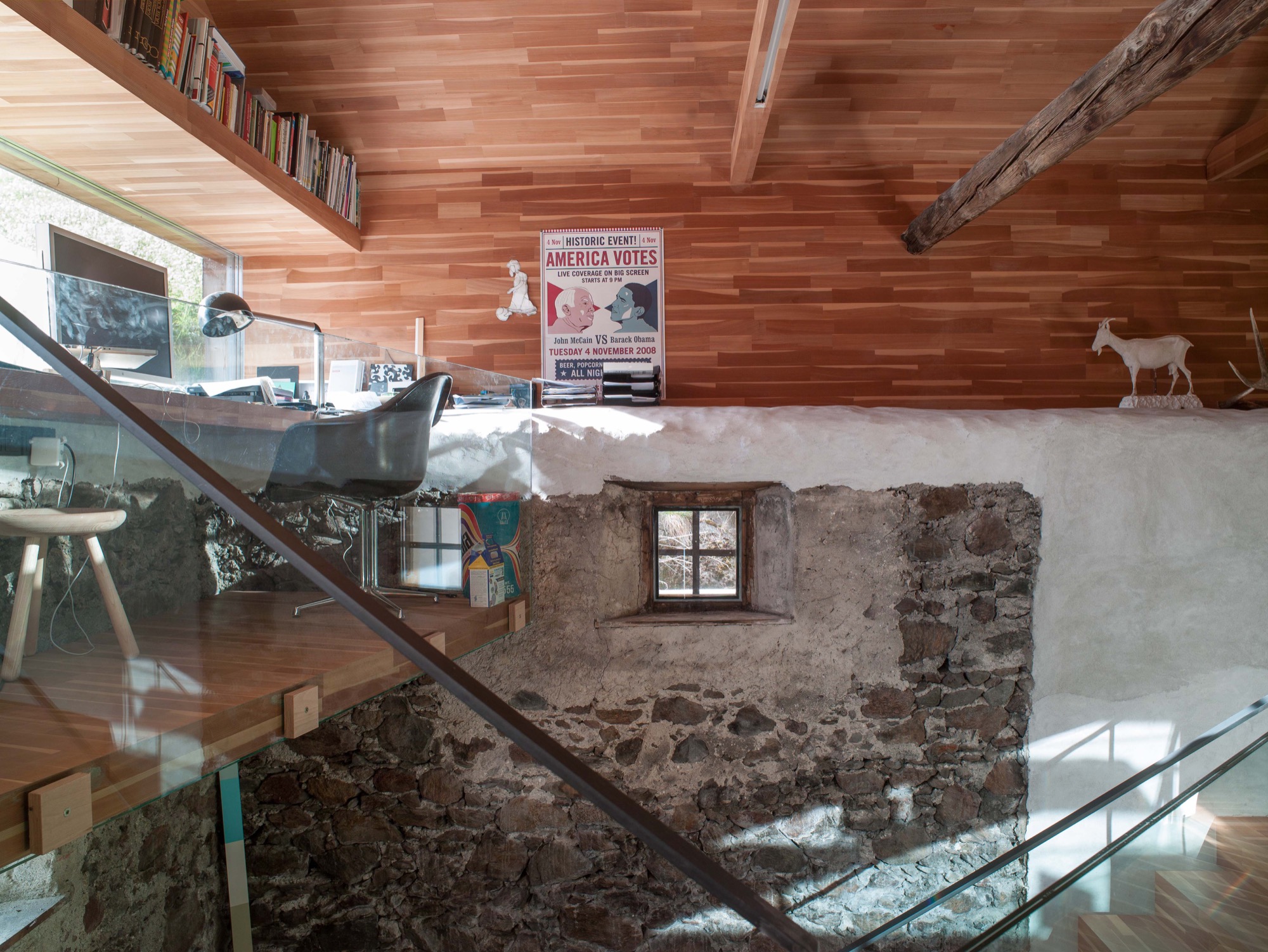
The old roof joists were preserved and support the pitch of the roof, where the living room is. Five steps lead to a narrow loft Prenner installed along the gable wall with a long panorama window, again providing spectacular views to the outside. From his desk, the artist can see the cows grazing on the lush meadow.
And the light. Prenner often missed the light when he was in Munich, particularly during the long, gray winters, he remembers. Blue skies and the special light only snow can create—here, in his house in South Tyrol, he integrates it, plays with it, lives with it.
Work and art live together
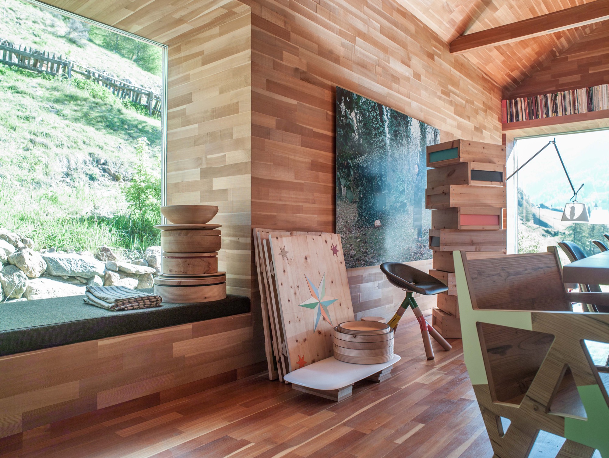
Paintings and other art objects are piled up in the living room. “This is intentional,” Prenner says. “I wanted work and art to mix. I cannot separate them anyway.” Still, he is currently building an atelier on the premises. Before, when he lived in the city, he primarily created prototypes. But now, he likes to be more hands-on in the production, together with his partner, Ingrid Seebacher. The wood for each container, which is blackened in the fire, comes from a particular tree Prenner photographed beforehand and numbered the wood sections. The photo of the marked spot from where the wood was cut is sold together with the respective object—one of the artist’s many ingenious ideas. You can discover them all over the house. Art objects made from wood waste. Leftovers from a series of chairs you assemble yourself from four pieces of wood, and which Prenner became known for. These clever chairs don’t require glue or screws. In Prenner’s home, they are part of a group of miss-matched chairs around the large dining table and around the cozy stube. “In the old days, there was no ugly furniture because it was all made from solid wood,” Prenner contemplates. “But a lot is happening now. People are sick of cheap stuff made in China.” Prenner regards sustainable and organic as standard, which shouldn’t need to be pitched on a label. Sitting by the fire, he talk about the region here around Mals, soon to be the largest community in South Tyrol that is completely pesticide free. He tells about a baker who has re-sown old spelt ears from the eighteenth century and is now selling spelt bread. Stories like this are fitting for the stube and the beautiful, pristine landscape. Looking out the window and at the mountains, I can appreciate that one man's dream of paradise has come true here. △
“In the old days, there was no ugly furniture because it was all made from solid wood.”
 Othmar Prenner was born in 1966 in Schlanders, South Tyrol, Italy. After an apprenticeship in carpentry, he studied sculpture at the HTL Innsbruck, Austria, and later at the Akademie der Bildenden Künste in Munich, Germany. The website Dinge und Ursachen lists Prenner’s many projects and exhibitions. You can purchase his Swiss pine boxes and containers from the online shop Like a Box.
Utahan Utopia
Summit Powder Mountain in Utah is a visionary colony of cabins designed by emerging Slovenian architect Srđan Nađ
A Slovenian architect’s “wooden tent” design pushes the conversation on nature-respecting modern mountain architecture and communal living on Powder Mountain, where an enigmatic group of entrepreneurs, creatives, and altruists is building a pioneering alpine village. “We bought a mountain.”
So begins the backstory of Summit Powder Mountain, a visionary colony of cabins and an alpine village being dreamed up in Utah's Wasatch Mountains.
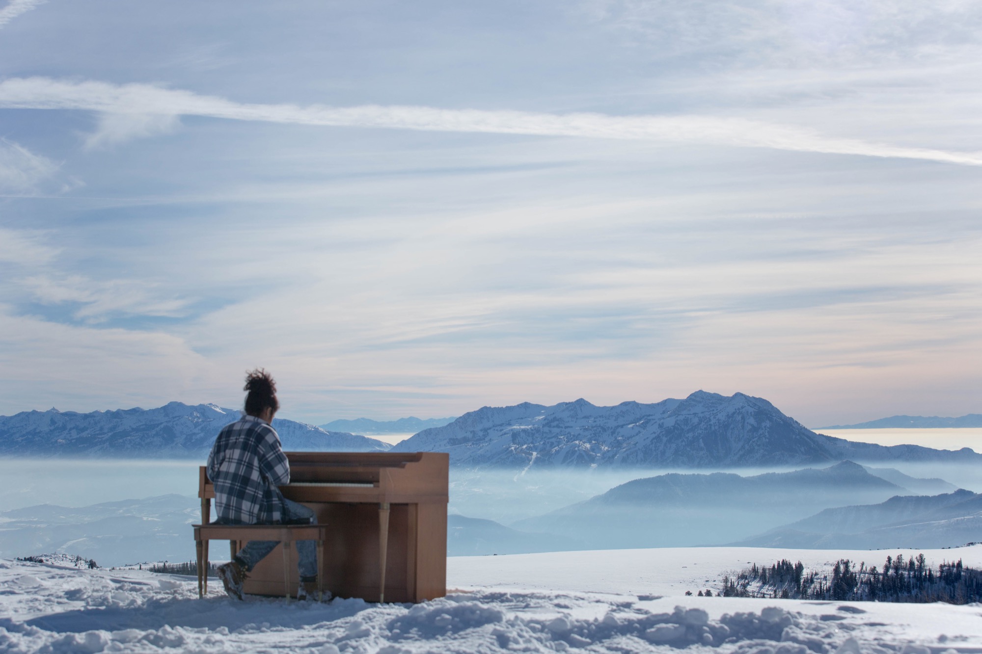
Elliott Bisnow and the Summit Series
Behind the idea is Summit, an event business started by Elliott Bisnow, a founding board member of the United Nations Foundation’s Global Entrepreneurs Council. What began as a small gathering of a few dozen investors, business whiz kids, and creatives over a short few years grew into the Summit Series: traveling invitational events that summon hundreds of thought leaders and different-thinkers from around the world. "What would it look like if Davos and Burning Man had a baby?" The Guardian rhetorically wondered in a recent article about the Summit Series. For its latest flagship event, Summit at Sea, 2,500 chosen attendees boarded a cruise ship in Miami for a four-day conference in international waters.
Rooting down in Utah
Now Summit is building a permanent base camp for its forums—a high-alpine town for its growing tribe to come home to. Summit purchased Powder Mountain, including the ski resort that has been operating there since the 1970s, with the vision to fundamentally reimagine and experiment with how people live together, shelter themselves, and converge for the greater good. “I’m very interested in what new mountain architecture looks like, acts like, feels like—how it responds to all the different stimuli in the world,” says Summit design director Sam Arthur, who moved to Utah to see the project through. Since buying the mountain in 2013, Summit has called on sundry architecture and design gurus, even sacred geometry to conceive this test bed for communal living. But the group still needed a cohesive cabin concept, a trademark design that considers the demands of living at 8,400 feet (2,560 meters) altitude, of building sensibly on historically mostly undeveloped, pristine mountain land that includes an elk reserve, natural waterways, and thriving wildlife. A sheep ranch was the only settlement on the mountain for the longest time.
“I’m very interested in what new mountain architecture looks like, acts like, feels like—how it responds to all the different stimuli in the world.”
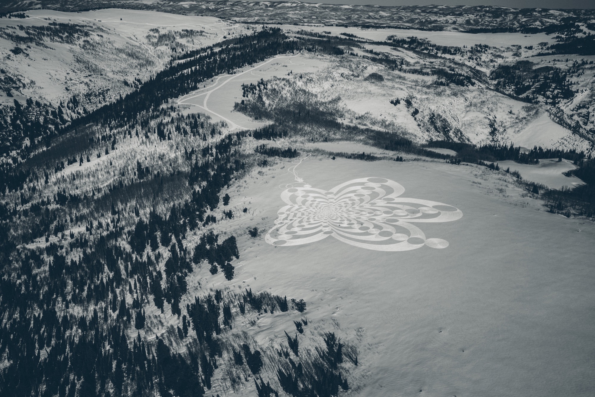
Mountain Architecture Prototype (MAP) design competition
Thus, Summit’s Mountain Architecture Prototype (MAP) design competition challenged the global guild of architects, engineers, artists—masters and students alike—to design sustainable cabins that embody the leadership’s ideals of sustainability, use of natural materials, and humble expression. The winning concept would guide the architectural ethos for more than 500 single-family homes, limited to 2,500 square feet (232 square meters) on half- to two-acre lots. Arthur says they capped the size of the homes so Summit Powder Mountain could become a democratized, harmonious environment for the community at large rather than “this über-wealthy place that is about showing off how big and bad you are.” Larger lots of up to thirty acres, however, could potentially accommodate a compound design.
Choosing a winner
The winner: Srđan Nađ, a young architect from Slovenia. His prized design was inspired by a Summit event photo he had seen—a green meadow dotted with simple white tents, pure architecture integrated within thin cloth, pitched to create shelter from weather and wilderness. His other muse was the frontier cabin of America’s past, a simple wooden structure with a great stone chimney on the outside. “Combining both was my design concept for Summit Powder Mountain—a true connection with nature,” says Nađ, who believes “95 percent luck” won him the competition. More likely, though, he convinced the international jury panel, led by Todd Saunders of Saunders Architecture (Norway) and Jenny Wu from the Oyler Wu Collaborative (Los Angeles, California), with his design’s adaptability and transformational potential. Arthur says, “Srđan did a beautiful job of meeting the criteria and applying a certain amount of aesthetic to it that really eloquently resolved that future/nostalgia-heritage/modern friction, which is at the core of what people respond to here, how they want to live in the modern age.” With its indoor/outdoor quality and what Arthur describes as “an obsession with light and views,” Nađ’s design captures the raison d’être for living on a mountain. “It’s a place to find refuge, to be inspired, to take in the natural primary source of beauty, and recreate with friends. It’s often very difficult to turn that into architecture, but Srđan took that and wrapped a building around it.”
Who is Srđan Nađ
Born to two architects in Zagreb, Croatia, in 1983, Nađ’s career choice was perhaps destined by birth. He attended a special building and engineering high school and spent his senior year abroad in upstate New York. He returned to Europe to study architecture at the University of Ljubljana, which he describes as a “boutique school” in the center of the city. “I had the opportunity to do a lot of architectural competitions and really test my ideas—and, of course, learn from my mistakes.” After practicing the craft with other studios for several years, Nađ founded Grupo H with his wife, a landscape architect. Based in Slovenia and surrounded by mountains and the outdoors, the company is dedicated equally to architecture and interdisciplinary aspects of planning and building.
“I grew up in Dubrovnik, Croatia, a great historic town by the Adriatic Sea, so I didn't have any understanding of the alpine world until my fantastic wife, a local Slovenian girl, introduced me to the alpine world of Slovenia and its natural environment,” Nađ says. “What’s special about Slovenia is that the mountains here are relatively inaccessible, and to get to know them, you need to hike a lot. Hiking is a local obsession here.”
Living in the small European country known for its mountains, outdoor recreation, and ski resorts—much like Utah—has transformed the man from the seaside. “When you have to hike for two, three hours through untamed nature to reach a summit, you start looking at nature from a different perspective,” says Nađ. “It teaches you to admire and respect the wild nature of the alpine world. In the end, when you are put into the position to design a building for such a surrounding, all your knowledge and memories come together to create this unique combination of simplicity and elegance that a building high in the mountains demands.“
“When you have to hike for two, three hours through untamed nature to reach a summit, you start looking at nature from a different perspective.”
Nađ's "Wooden Tents"
His proposed cabin design preserves that tentlike lightness and unmistakable functionality that inspired him and manifests it in a permanent, habitable structure. The architect expresses this lightness through a 1.5-inch (3.80-cm) thin “skin” made from cross-laminated prefabricated wood panels, folded to create the interior space of the cabin. This folding process leaves open the sides, which are then covered in glass. Juxtaposing the transient openness of the folded skin, a monolithic stone chimney stakes the raised cabin, grounding it into the mountainside to create the permanence a tent lacks. The chimney’s body also houses the mechanicals. On the opposite side, the cabin leans on a deck that touches down to the ground. With only the chimney and the deck as supporting elements, the cabin’s footprint is small, making large earth excavations unnecessary. The triple-glazed glass walls let the sun heat the highly insulated interior. Rainwater from the sloping roof collects into storage tanks under the deck. The goal is for the cabins to be certified according to the European passive house standard and the American LEED standard.
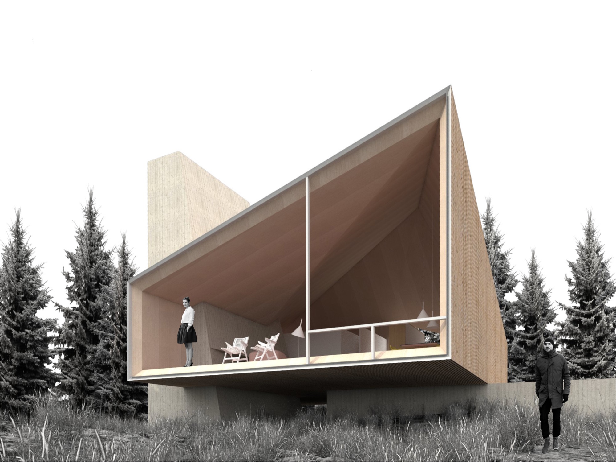
The cabin design allows for different versions of the prototype, varying from a simple one-bedroom hut to a luxurious four-bedroom chalet. The blueprint foresees an open living/dining/kitchen area with a large fireplace. The high ceiling follows the geometry of the exterior roof, mimicking the surrounding mountain silhouette. “In all, it will be a fantastic place to come back to after a full day of skiing or a long summer hike,” the architect hopes.
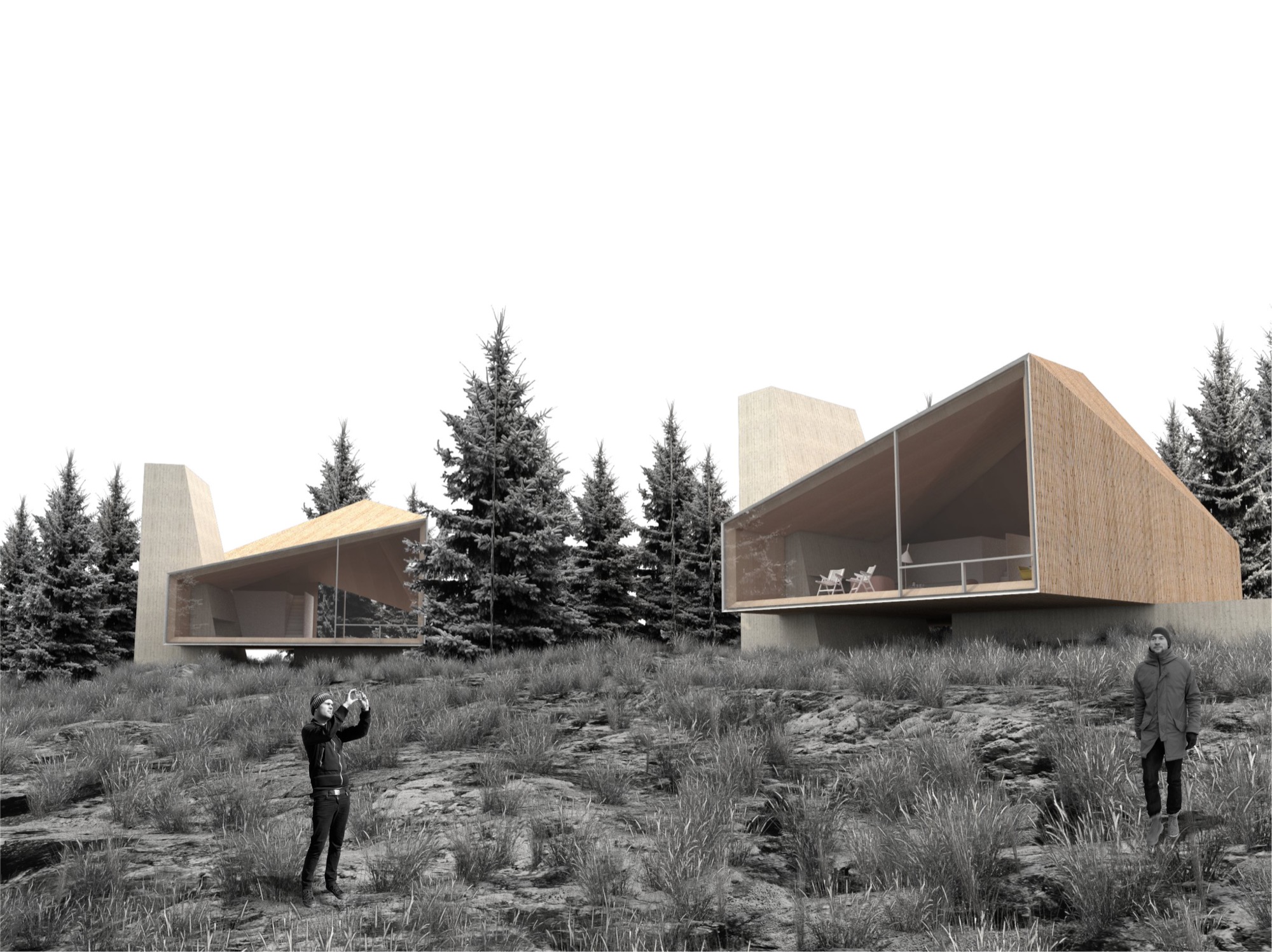
Nađ’s minimalistic “wooden tents” are designed to serve as fully functional habitable structures without creating the feel of urban settlement on Powder Mountain, and they preserve the essence of the natural surroundings. Nađ strove to convey the notion of living in nature rather than intruding upon the alpine landscape to stake out your private piece of paradise.
His sensible solution was, no doubt, spawned by his home country and culture. “We are really humble, hardworking, and resourceful people. So that guides me to find simple, functional, and long-lasting designs for my projects,” he says, adding that the alpine cabins and shelters of the Slovenian mountains influenced his “wooden tents” for Summit Powder Mountain. “They are simple, rugged, but still graceful in unforgiving nature.”
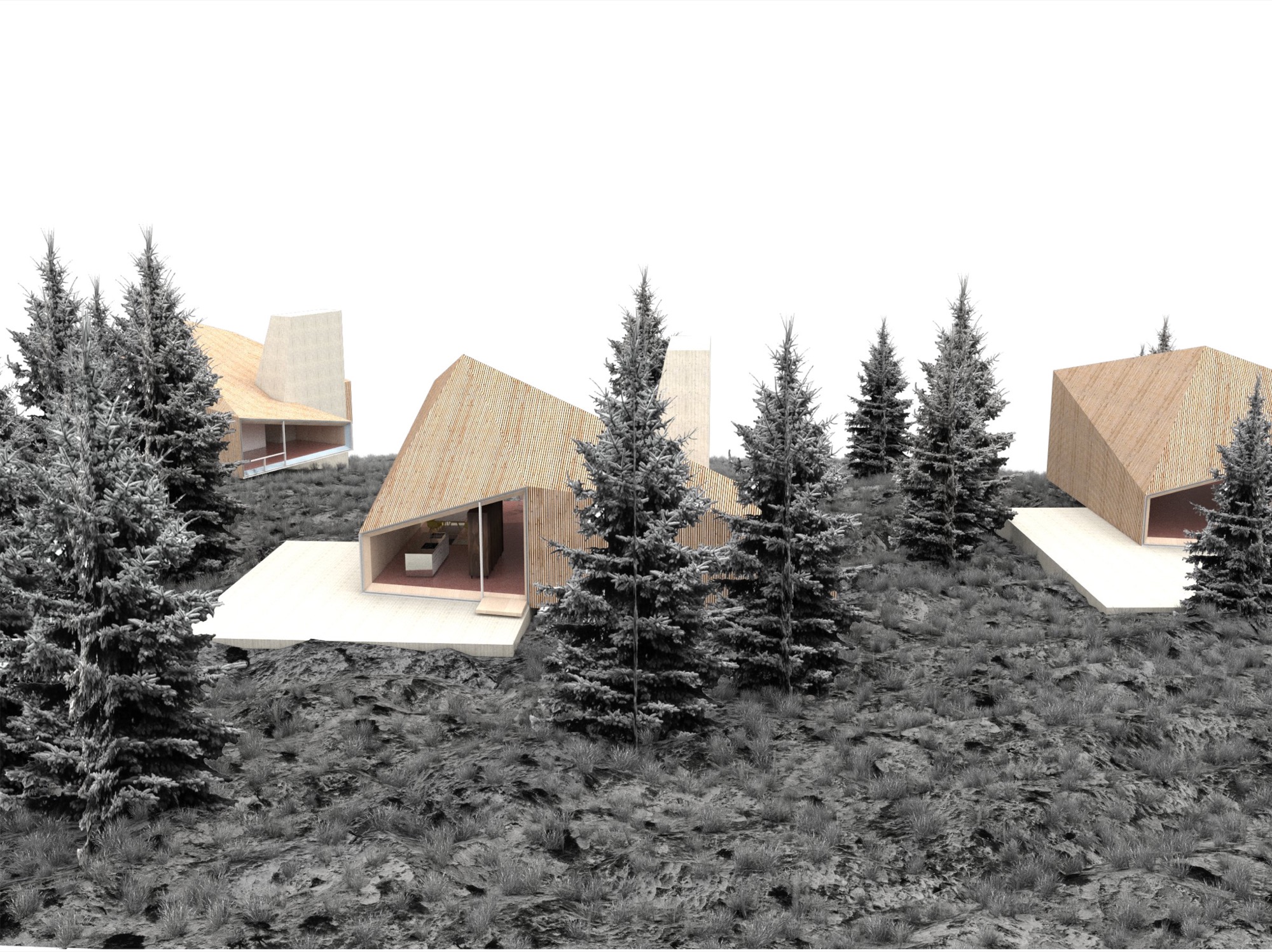

Nađ didn’t plan to enter an architecture contest at the time he learned about the MAP design competition on an architecture blog. But the subject—a cabin—intrigued him since he thought it rather uncommon for an international contest. “You usually have a competition to design a museum, library, memorials...but houses are rare.” The premise of Summit Powder Mountain eventually compelled the young architect to enter his design. “You could see that they are not planning to do a typical commercial development, but start with a clean slate and do things right.” However, he didn’t grasp the expanse of the project until he spoke with the Summit team. “I didn’t realize how important this is for the global community, as it shows a new way of planning large developments,” he says in retrospect. Nađ understood that no matter how good his cabin design was going to be, simply copying it 500 times would only create the type of cookie-cutter development that already characterizes too many mountain resort towns. “My design goal was to create a house that can be transformed—enlarged, scaled down, rearranged, have a different facade—and still preserve the overall design idea,” he explains. The “wooden tent” concept is a suggestion, one Arthur says is “a loose design that’s poetic and evocative.”
“You could see that they are not planning to do a typical commercial development, but start with a clean slate and do things right.”
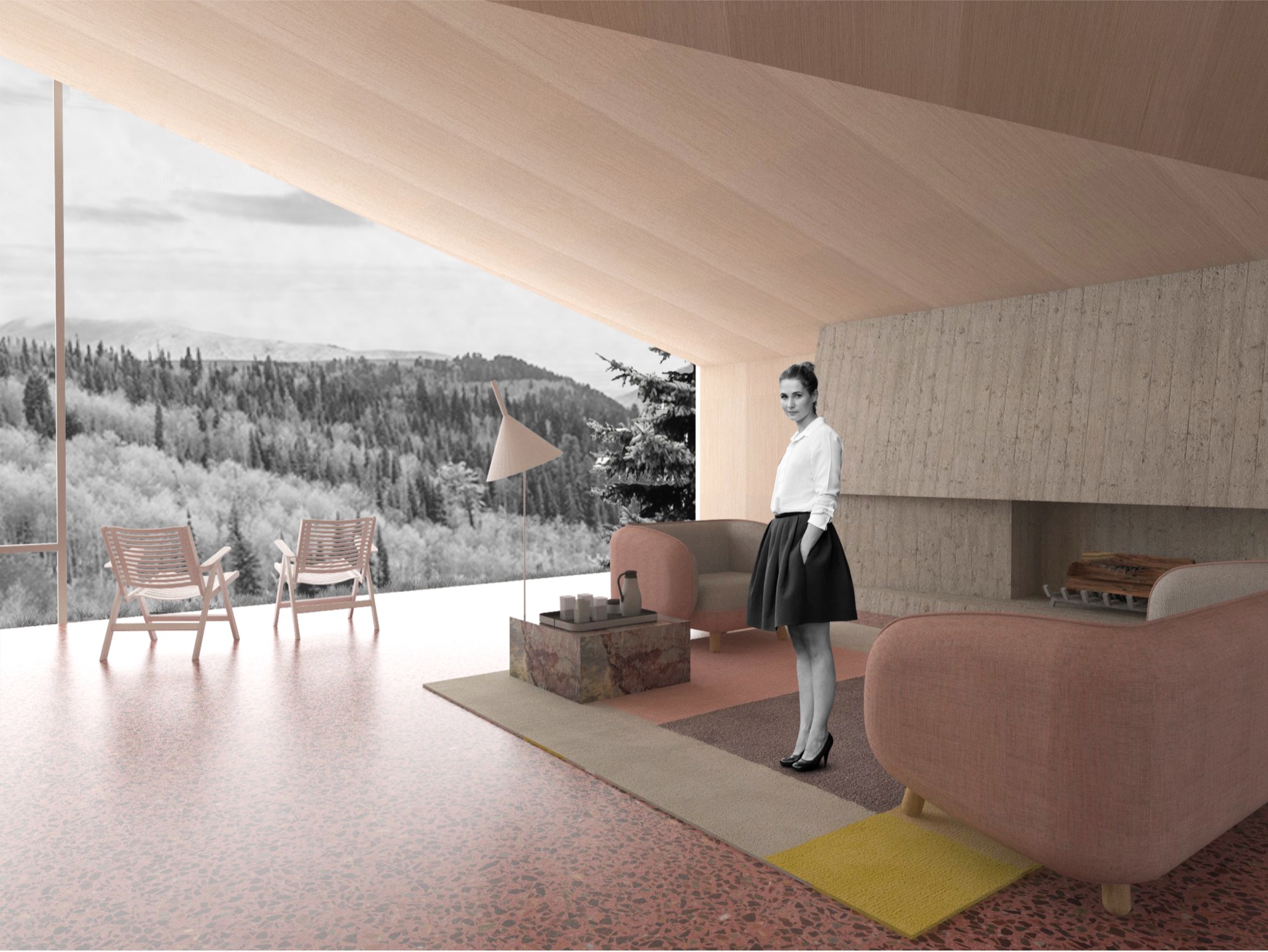
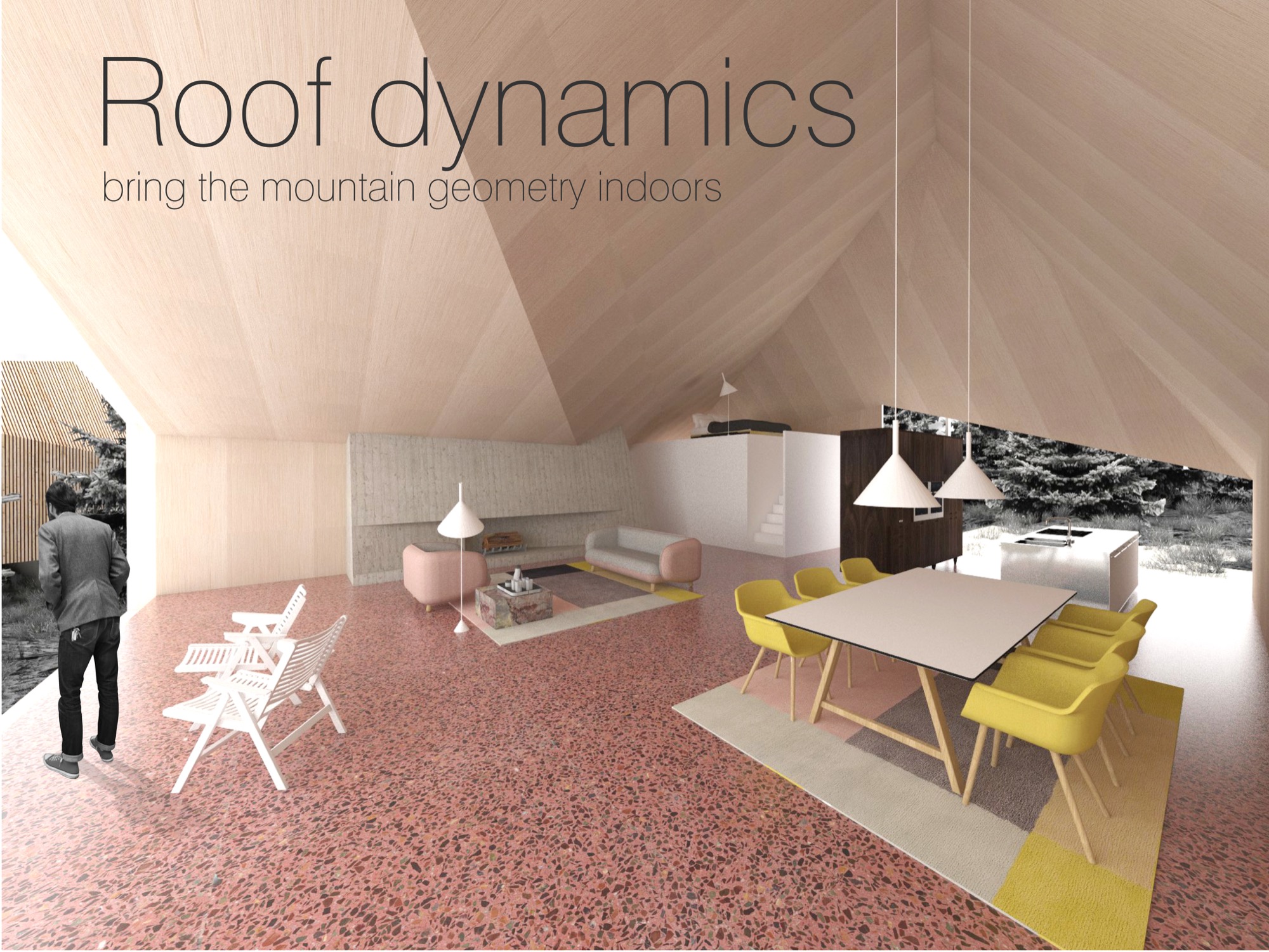
Building community
Summit is breaking ground this summer to build the first cabins on Powder Mountain. Furthermore, the company is planning the new alpine village, with shops and galleries, coffeehouses and restaurants, gathering venues, condos, and new headquarters for the ski resort they acquired. Arthur thinks seasonal skiers and hikers may visit the mountain and never know about Summit’s quest for settling an art, culture, and tech elite here, though it seems hard to imagine tourists coming to this creation of an idyll and doing their own thing. “We’re based on gathering,” Arthur emphasizes. “People gather in creativity to change the world. People don’t come up here for solitude, but for increased interaction.”
“People gather in creativity to change the world. People don’t come up here for solitude, but for increased interaction.”
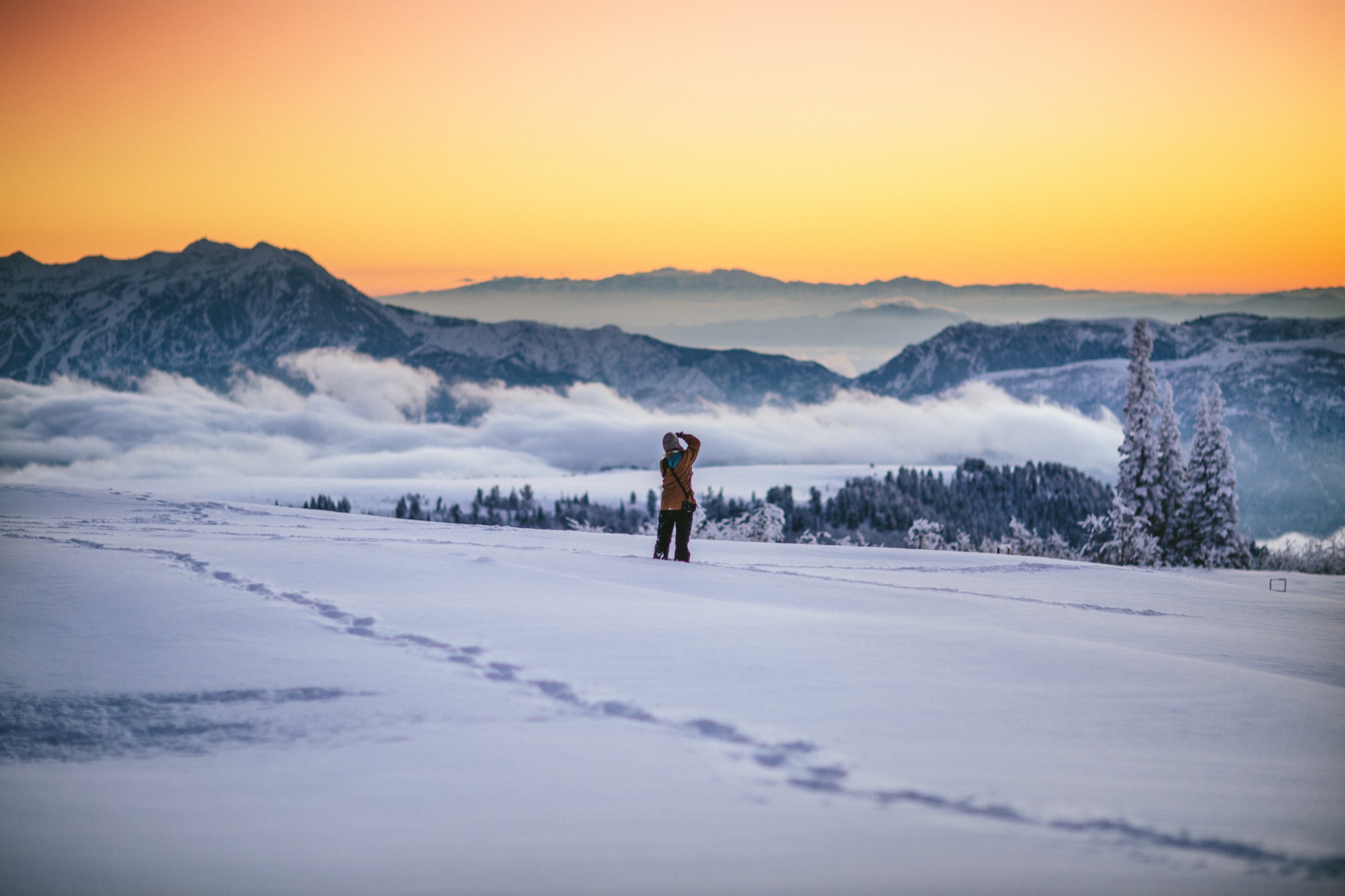
What does new mountain architecture look like, act like, feel like? Only after winning did the architect from Slovenia realize how important his design was for the global community. In fact, Arthur argues that the encouraged culture of sharing is just another expression of Summit’s tacit broader understanding of sustainable living. “This isn’t ostentatious.” He points out that most members of the Summit Powder Mountain community would actually prefer to minimize their footprint by operating in a shared social space. “Rather than building large bathrooms and kitchens in their own house, people go home to sleep and to entertain a smaller group of people. Then they go out into the larger community spaces and venues to gather together. This is about collectivism and collaboration.”
But how do you curate a genial commune where strangers “gather in creativity” to become kindred spirits, collaborators, neighbors? You don’t. “We had a blunt policy for a while, a ‘no-asshole policy,’ ” Arthur reveals. In reality, they quickly came to understand that the Summit community fosters a quite self-selecting environment. “Basically, if you were obviously egocentric or self-centered, then you probably don’t belong here. People who want to participate and are ‘others-orientated’ and have the heart to expand goodness, usually work out pretty well,” he says. To the rest, it just doesn’t feel right to be there. The Summit leadership strives to strike a balance between public atmosphere and private, curated events. In the end, Arthur says, “It’s not an exclusive membership thing—it’s an overall public realm of creating a new mountain town.” △
Architecture, Made On Site
The husband-and-wife founders of Scott and Scott Architects design-built their own off-grid cabin with the adventurous spirit of the powder boarders they both are.
Built by husband-and-wife architects for themselves, an off-grid cabin in the mountains of Vancouver Island captures the adventure and freedom of powder boarding, free of rigid ideas.
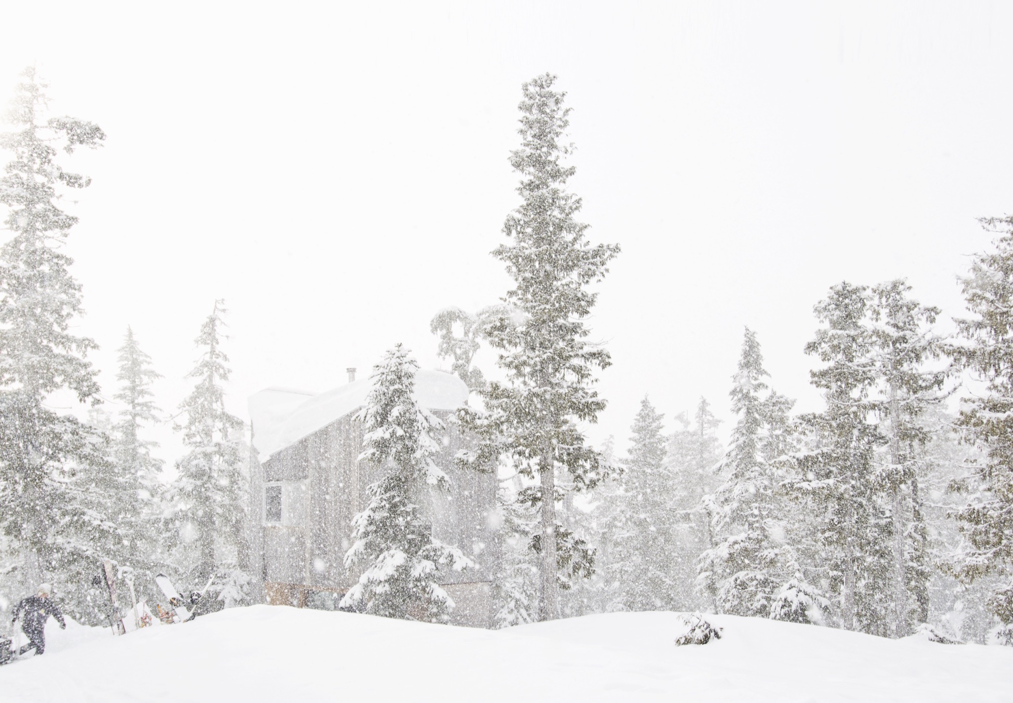
David and Susan Scott wanted to make architecture. But not in the way one imagines married architects making architecture for themselves — drawings of their dream mountain retreat, years in the drawer, just waiting for the right building site. No. Building their own alpine cabin, the Vancouver-based architects wanted to design and build in a singular act.
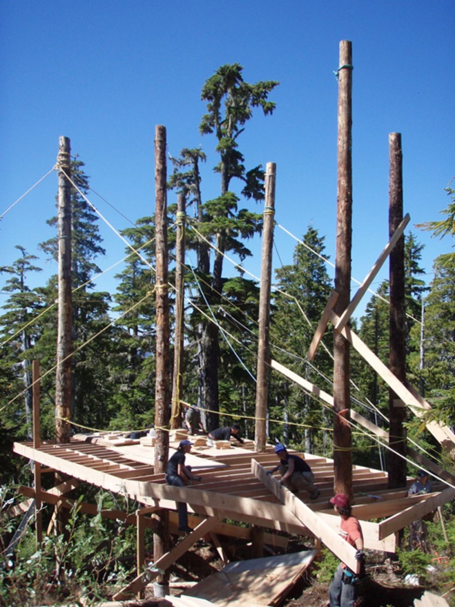
In 2006, a longtime friend led them to a piece of land he’d come upon when planting trees at 4,265 feet (1,300 m) above sea level, on the northern end of Vancouver Island in British Columbia, Canada. “We had never been on the snow in the area until acquiring the building site,” says David Scott, speaking for the adventurous couple. “We fell in love with it at first sight, and the people and terrain are really special.” With almost 50 feet (15 m) of annual snow accumulation, the remote community-operated alpine recreation area of Cain is known for legendary powder.

At the time, the couple, who met in architecture school in Halifax, Nova Scotia, worked for established firms and spent long hours in offices, drawing. “We have a love for building and being outdoors,” says Scott, who appreciates drawing as an important part of design. Now building their own off-grid cabin, however, they wanted to channel the freedom they feel when powder boarding into an immediate design process centered in adventure and not heavily in rigid plans. “We began the project with a desire to work with a greater level of freedom, where the specifics of the site and available materials would inform the work in a direct and unfiltered manner.”
Scott and his wife knew they had a narrow window in life, before having children, to complete construction on their own on long weekends and holidays, and with help from friends.
“We began the project with a desire to work with a greater level of freedom, where the specifics of the site and available materials would inform the work in a direct and unfiltered manner.”
Hand in hand: Design and construction
Inspired by the materials available around the site and the environmental conditions, construction was planned to avoid machine excavation, to withstand the very deep annual snowfall, and to resist dominant winds. Accordingly, the structure was elevated above the height of the accumulated snow on the ground. “The use of full-length, unsawn logs provided us with the ability to get height in a manner that used the wood’s strength the same way Douglas fir spar poles are used as sail masts,” Scott explains.
The cabin, primarily constructed from Douglas fir, gets more refined from the outside in. The columns are unworked logs, the beams and joists are rough, bandsaw-milled, and the walls, floors, and ceilings are clad in planed boards. The cabinetry is made from construction-grade fir plywood. The exterior is clad in cedar that has weathered to the tone of the surrounding forest. Both woods are harvested in the area.
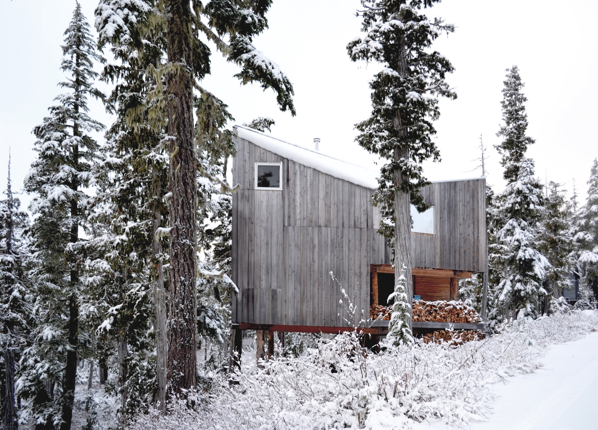
The roof form began with a simple gable, rotated to direct the snow off the back of the cabin. A half-dormer was then introduced over the entrance to direct snow away from it, funneling the snow into the prevailing winds.
Family life at the cabin
Today, childhood memories are already being made at the cabin. The Scott family now includes two young daughters, who Scott says are both on skis and love the snow.
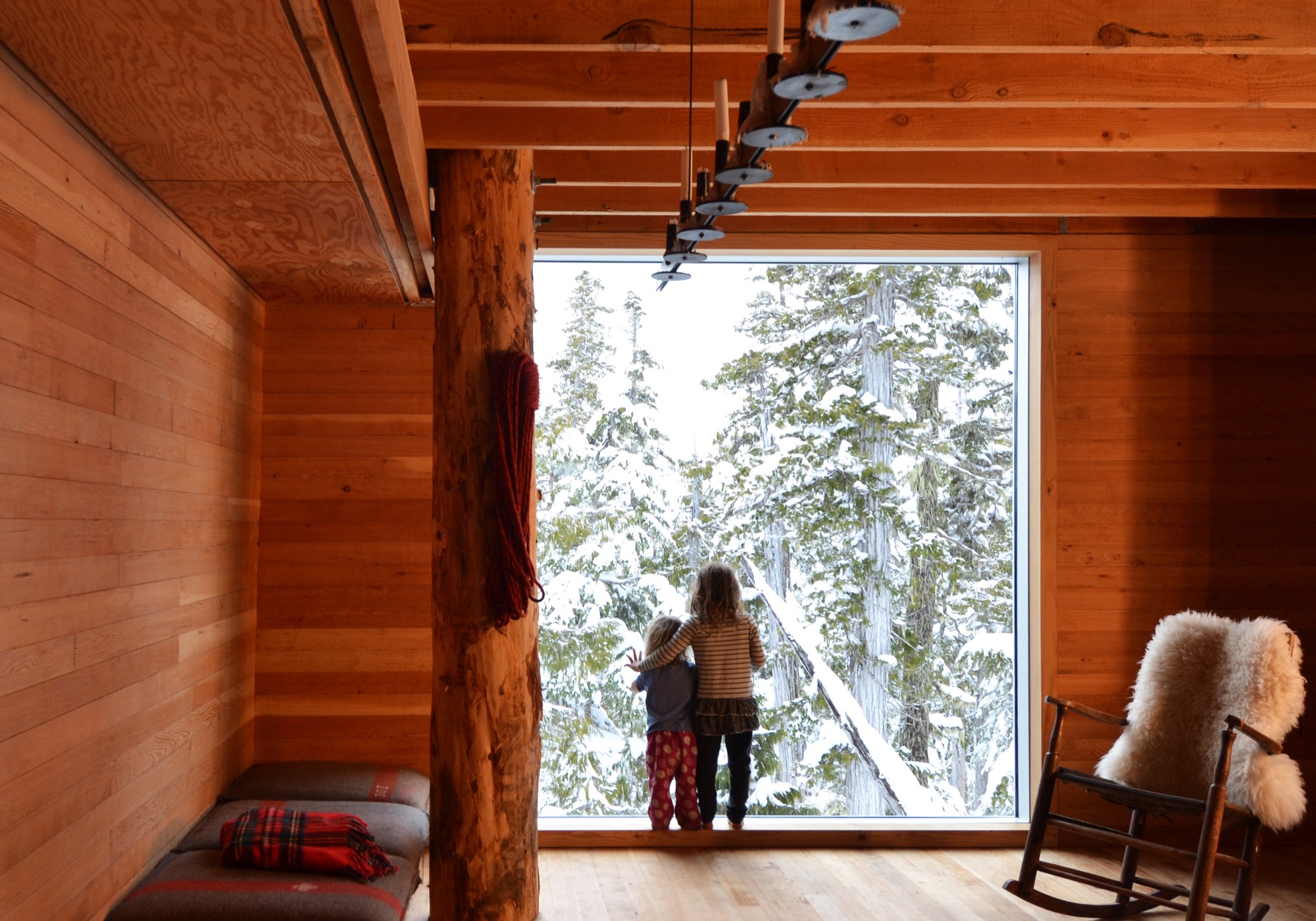
Much of the approximate 1,075-square-foot (100-sq-m) cabin’s interior is designed and made by Scott and his wife. The main living space is small, and the family spends much of the time on the long, cushioned bench eating, playing games, and relaxing from a day on the snow. “Our favorite spot is by the large window,” says Scott. “Both for the ever-changing view of the forest, but also in appreciation of the effort that went into its installation.” He drove the glass overnight on a rented flatbed and hand-positioned it with a group of friends the next day — “an incredibly smooth effort, given its size and weight.”
The remote site is directly accessible by gravel road five months of the year. During the other months, equipment and materials are brought up by toboggan. There is no electricity, and a wood stove provides the heat. Water is collected from a local source and carried in. The Scott family cherishes the simple lifestyle the mountain hideaway affords. “We enjoy the solitude of not having cell phones and gadgets around to distract us,” says the architect, who finds “a wonderful freedom” in seeing no bars of coverage on his phone. “This is an incredible place for our daughters to love being in the mountains as much as we do.”
“This is an incredible place for our daughters to love being in the mountains as much as we do.”
The powder hounds come up here as many weekends as possible during the winter, but they also love the warmer temperatures in spring when snow is still plentiful. “It’s incredibly peaceful,” Scott says. “The fall is fantastic when the blueberries are ripe, and we try to spend Thanksgivings on the mountain, splitting wood and enjoying dinners with friends.”
Adventure by design
The off-grid cabin was David and Susan Scott’s foundation project and formative in their desire to start their own architecture practice, Scott and Scott Architects, with the goal of spending more time in the mountains. To both, making architecture on site is ultimately the most direct, enjoyable way of working, and one that provides the greatest opportunity to understand materials and detail resolution and evolution. Today, the firm is working on projects in Whistler and Squamish, and in their province’s interior high country. “We love working in these challenging locations where adventure is the reward,” says Scott.
(Alpine Modern has covered the A-frame cabin Scott and Scott built in Whistler for a young family of skiers and snowboarders.)
What’s Inside?
Architect David Scott opens the door to the off-grid snowboard cabin he built with his wife on Vancouver Island to show his three most treasured artifacts hidden inside.
The cast-iron pot
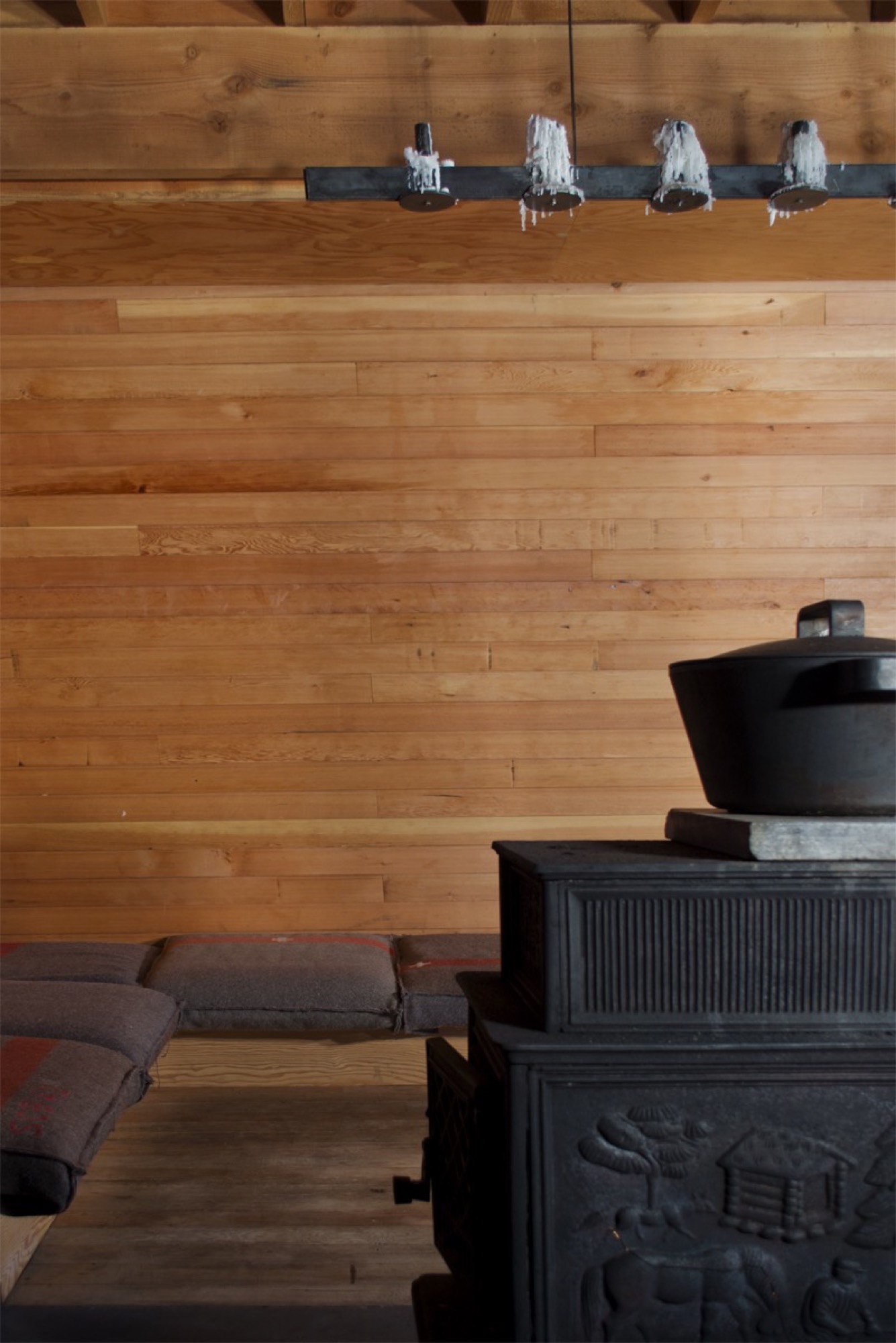
“We have a Björn Dahlström-designed cast-iron pot we slow-cook many meals in on the wood stove, which is essential to how we live when we are [at the cabin].”
Get your own: Björn Dahlström designs pots and casseroles for the Finnish company Iittala. Dahlström’s current line is stainless steel, but cast-iron pots and Dutch ovens similar to the one in the picture are available from brands like Le Creuset, Sur La Table, and Lodge.
The splitting maul
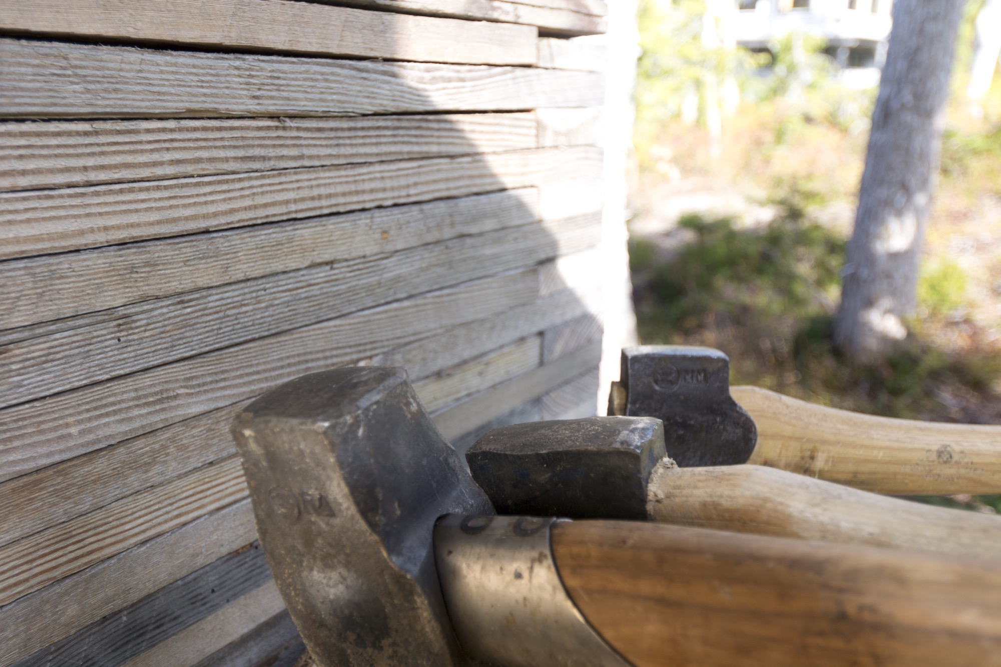
“I have a love for Swedish axes. Of my collection of over 100, the most used and loved is the Gränsfors Bruk splitting maul, which powers through the yellow cedar rounds. It is a beautiful object from a company we greatly admire. Whenever cutting wood, I look at the stamped initials of the smith that made it, with appreciation for his work and respect for a very old company which values and celebrates the workmanship of the individuals within it.”
The Gränsfors Bruk splitting maul’s head is heavier than the head of splitting axes, and the poll is designed for pounding on a splitting wedge.
The blanket
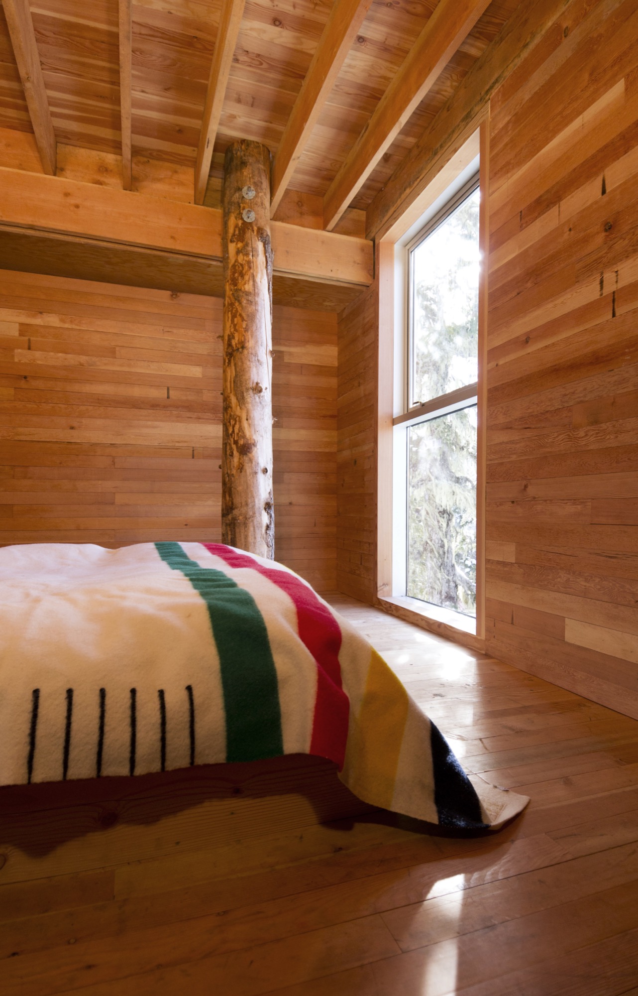
“We love our Hudson’s Bay blanket, which was a wedding gift from the architect I worked for for a number of years, before we began our own practice. I’ve often thought that a Bay blanket should never be bought for oneself and is something that carries meaning as a gift.”
Buy it for someone: Woolrich offers Hudson’s Bay Point Blankets under the offcial license of the historic Hudson’s Bay Company. The legendary blankets have kept generations of trappers, hunters, fur traders, and Native Americans warm and comfortable. 100-percent wool, loomed in England. △
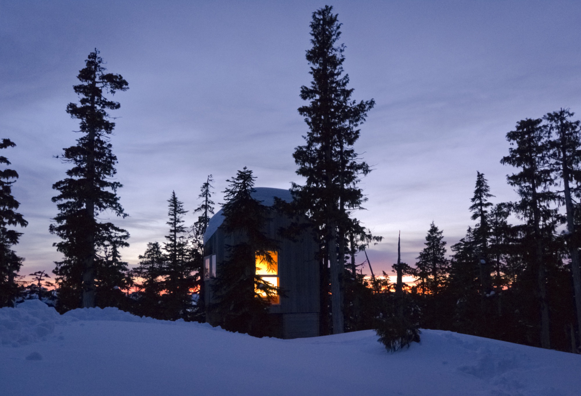
One Hundred Years of Swissness
A renovation of a 1912 chalet so beautiful it spawns an interior design company
In 2012, Virginie Confino, a photo editor, and her science journalist husband Bastien fall in love with a 100-year-old chalet in Val-d’Illiez, near the Portes du Soleil ski resort in the Swiss Alps. Without any prior knowledge in building or renovation, the couple abolishes their resolution not to entrap themselves in any kind of serious remodeling project and deconstructs the faded chalet. The result was so beautiful, it propelled Virginie into the new adventure of launching her own interior design business, Gris Souris.

The story in her own words...
We were looking for a holiday home for our family of four. We visited some chalets, but none of them felt right for us. Until we found this one. We fell in love with the balcony at first sight; its whimsical railing looks like lace.

Inside, the chalet was old and untouched since the 1960s. The walls lacked any sort of insulation, the house had no heat and a ladder in the living room was the only way to reach the upstairs, no stairs.

Intention out the window
Right away, we had a vision for how we would transform this chalet. Although, when we first began searching for a property, we had no intention to throw ourselves head-first into a renovation project. Our limited budget meant that we had to do almost all of the work ourselves. What’s more, neither of us had any experience even close to remodeling or construction — me a freelance photo editor for the press and my husband a science journalist. But Bastien has always believed, “Anything is possible.” And we did it!
My husband learned a lot from books, the Internet and YouTube videos, and I joined him at the chalet two days a week for a year and a half. We required professional help with the masonry in the entrance, because the rain was coming in, with the terrace outside, and with the heating and plumbing.
We virtually gutted the inside of the house. We just wanted to keep some of the old elements, such as the old wood floors, stairs and doors. Once we finished insulating the house from the bottom to the roof, we put the old wood back on the walls. We used a lot of wood on the inside, old wood, and slate for the bathroom floors.


1912 on the outside, Swiss modern on the inside
The chalet is a mix of old and modern. Because we have a big entrance, I wanted to do something special there. We chose a transparent door that gives view to the log wall, which is a decoy we created by cutting about 4000 logs of wood into five-centimeter pieces, 15 centimeters at the top. We dried the logs and fixed them together. The wall alone took ten days of work.

We remodeled the kitchen simply by changing the cabinet doors and painting the walls. Almost all of the furniture is from IKEA. We didn’t want to furnish the chalet with special pieces because we are renting it out when we are not using it.
Bastien built the dining room table himself, because we couldn’t find one that was three meters long and not too expensive. We painted the table top with chalkboard paint so we can write on it when we play games.
The dining chairs are old Tolix chairs that sat outside for a long time, which gave them the perfect rust-like patina for the chalet. Two Butterfly chairs and Tolomeo Artemide lights on the walls, not much else. We incorporated old sleds we found in the cellar into the decor.

Outside, we have a nice terrace with amazing mountain views of the Dents du Midi. We enjoy looking at this mountain range while we take a Swedish bath outside, even when it’s snowing.
Gris Souris
Chalet Le 1912 became my “business card.” Once the renovation was finished, friends started asking me for interior design advice and even wanted me to renovate their chalet. Soon, my new adventure began, and I created Gris Souris, my interior design company in Lausanne. △
Photos by Myriam Ramel Baechler / Lumière du jour
Haus Z2 in Bayrischzell
The modern vacation home by Beer Bembé Dellinger reinterprets traditional Bavarian-alpine forms and materials
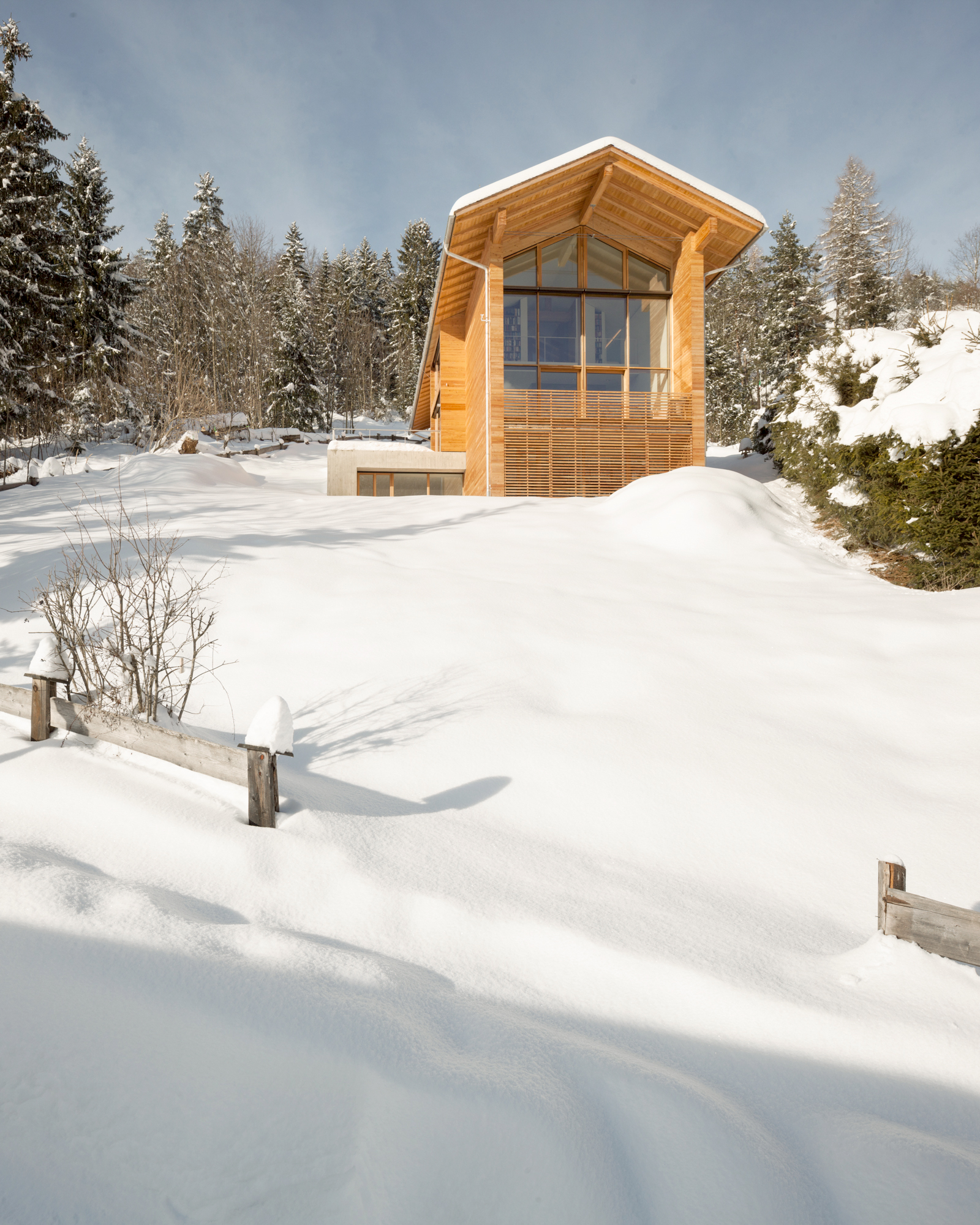
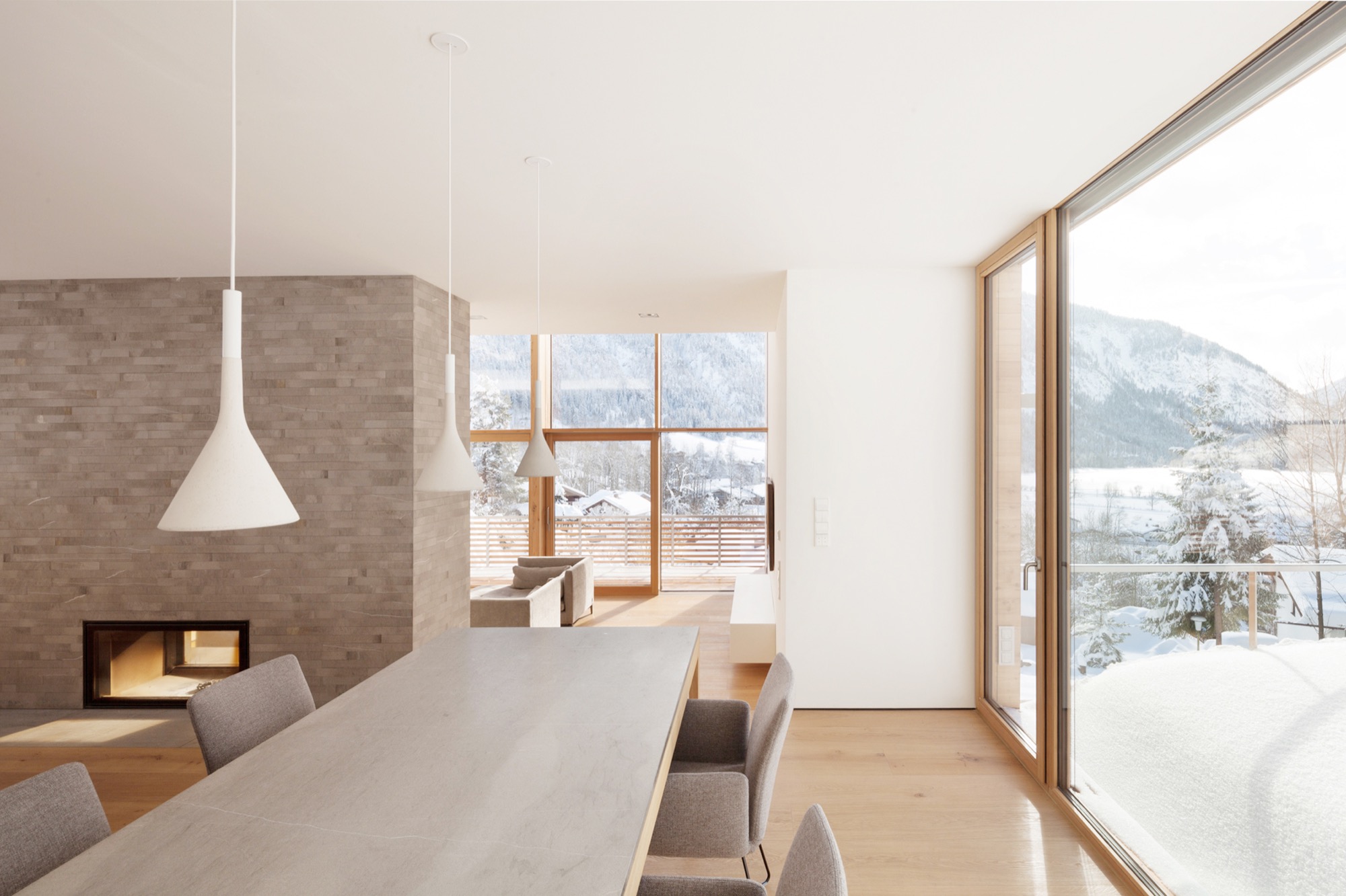
The large glass façade in the front and glass oriels on both sides of the house ensure a scenic view from the foot of the Wendelstein down to the valley from almost every room. The house's oblongness is inspired by the Alps and represents a reinterpretation of the characteristic traditional Bavarian barn. At the same time, the design concept addresses the site's narrow proportions.
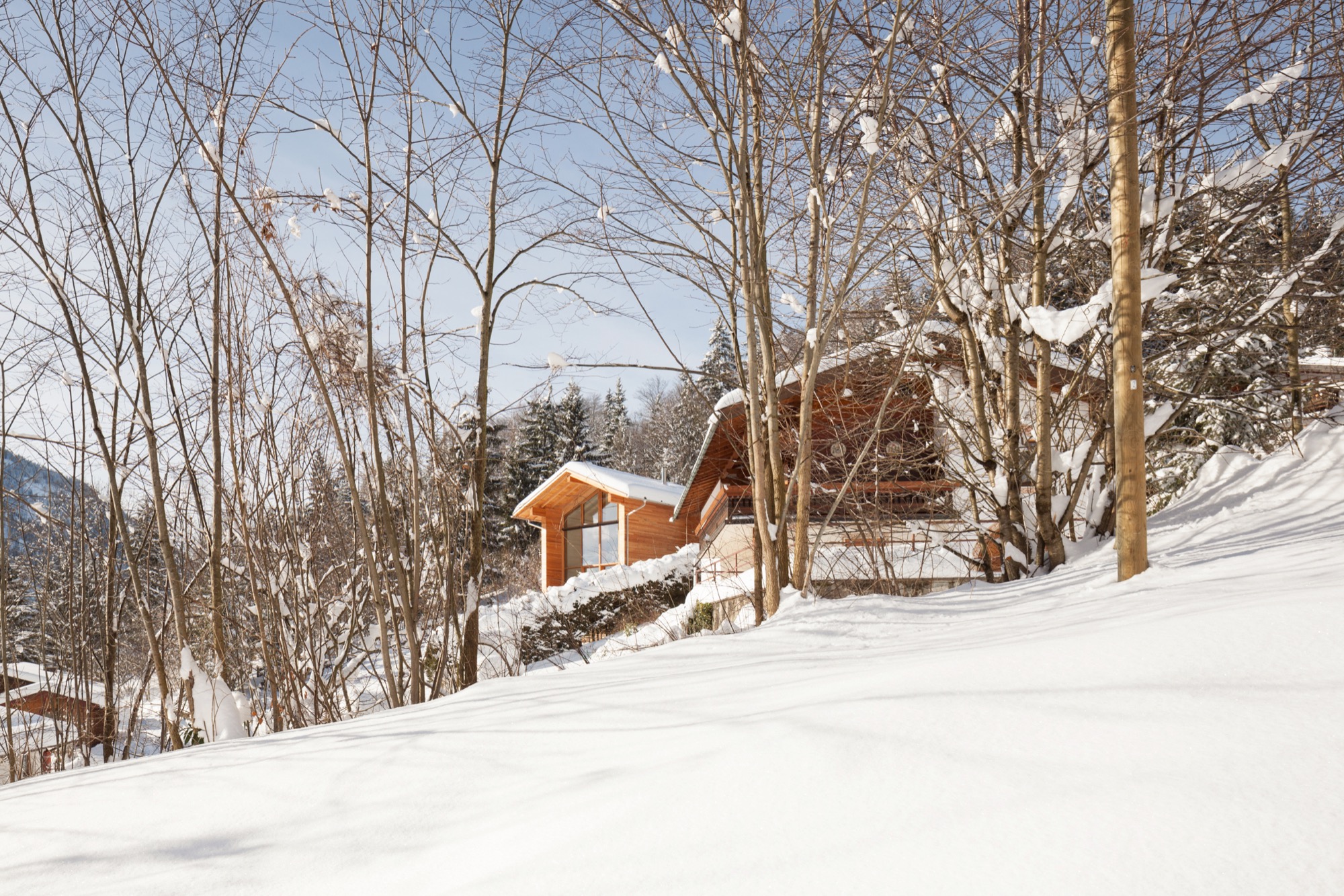
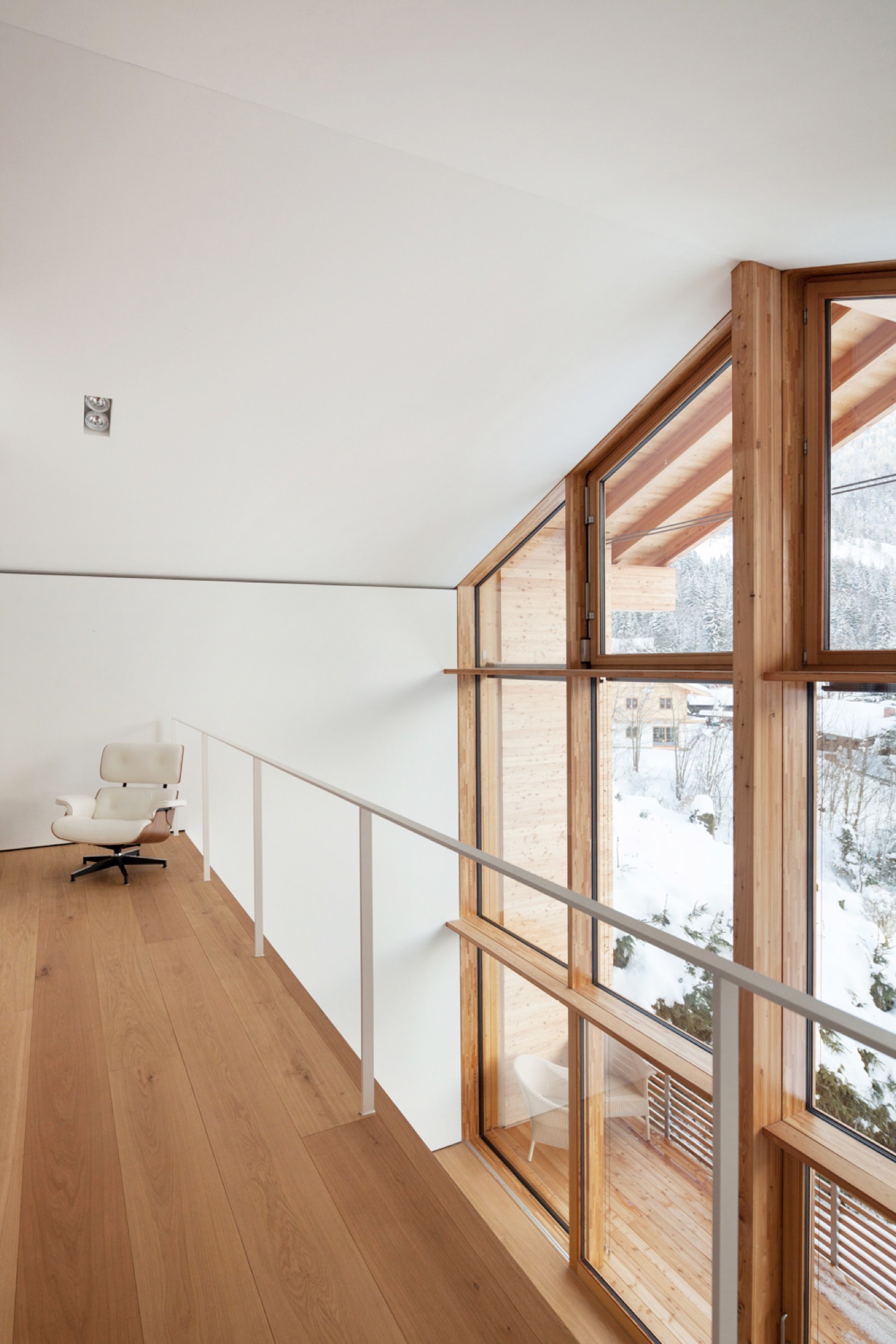
The house's materials are also influenced by Bavarian-alpine traditions — mainly larchwood in form of tongue-and-groove boards for the façade and as shingles on the roof.
Lead architects were Felix Bembé (conception) and Michael Wondre (project leader and construction supervisor). △
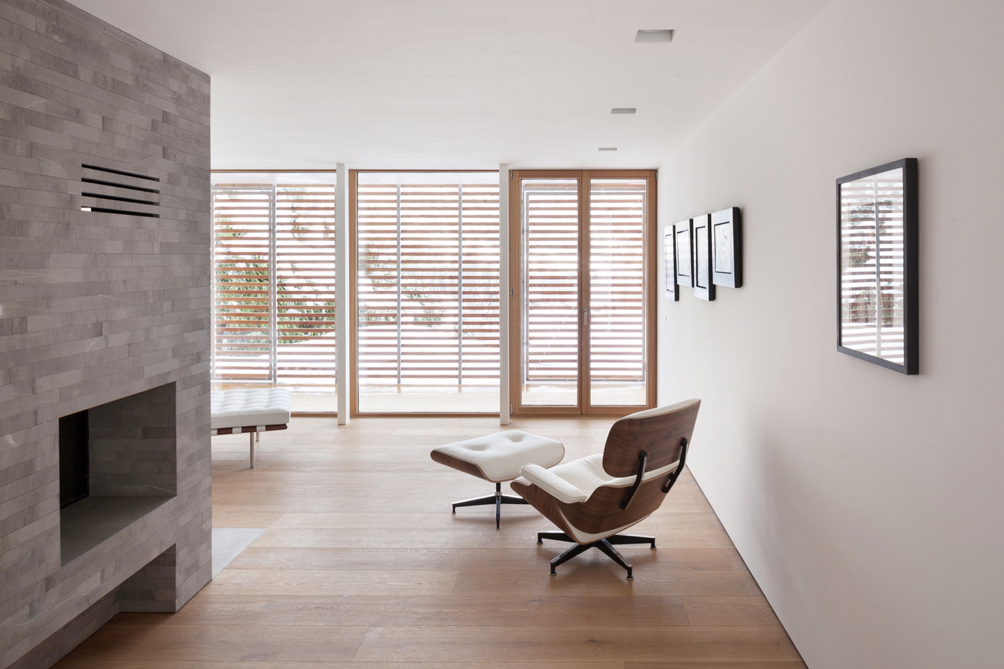
Hideaway Cabin
Åkrafjorden Hunting Lodge by Snøhetta in Norway
Seemingly growing from the mountain, the impossibly small Åkrafjorden Hunting Lodge by Snøhetta shelters up to 21 people. The Norwegian firm Snøhetta creates architecture, landscapes, interiors and brand design. And in this case, incredibly small architecture with a big task.
Family shelter
The project was commissioned on family farmland by Osvald Bjelland, who is chairman and CEO of the global business advisory Xyntéo and founder of The Performance Theatre, a leadership think tank.
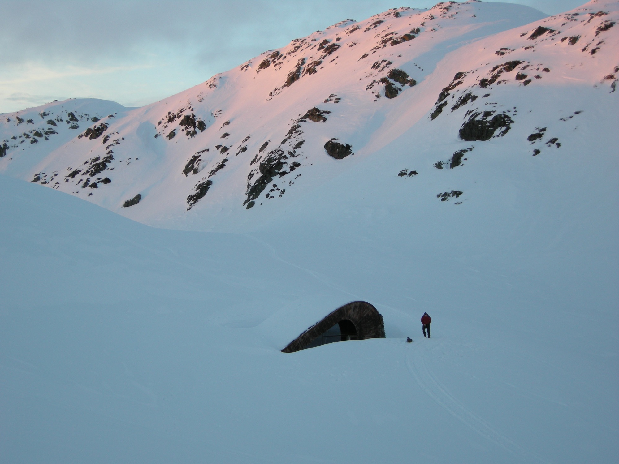
The challenge in designing the Åkrafjorden hunting lodge on a fjord, high in the mountains above the village of Etne in Hordaland, Norway, was indeed its small size in the face of its intended use: The mountain hut was to be maximum 35 square meters (ca. 377 square feet), with the capacity to shelter up to 21 people (the same number of beds as at the family's farmhouse down in the village). Plus, the off-grid structure with no running water needed to look like it had always been there.
Only accessible by foot or on horseback, the remote lodge’s setting is beautiful, isolated, beside a lake in the untouched Nordic wilderness of West Norway.
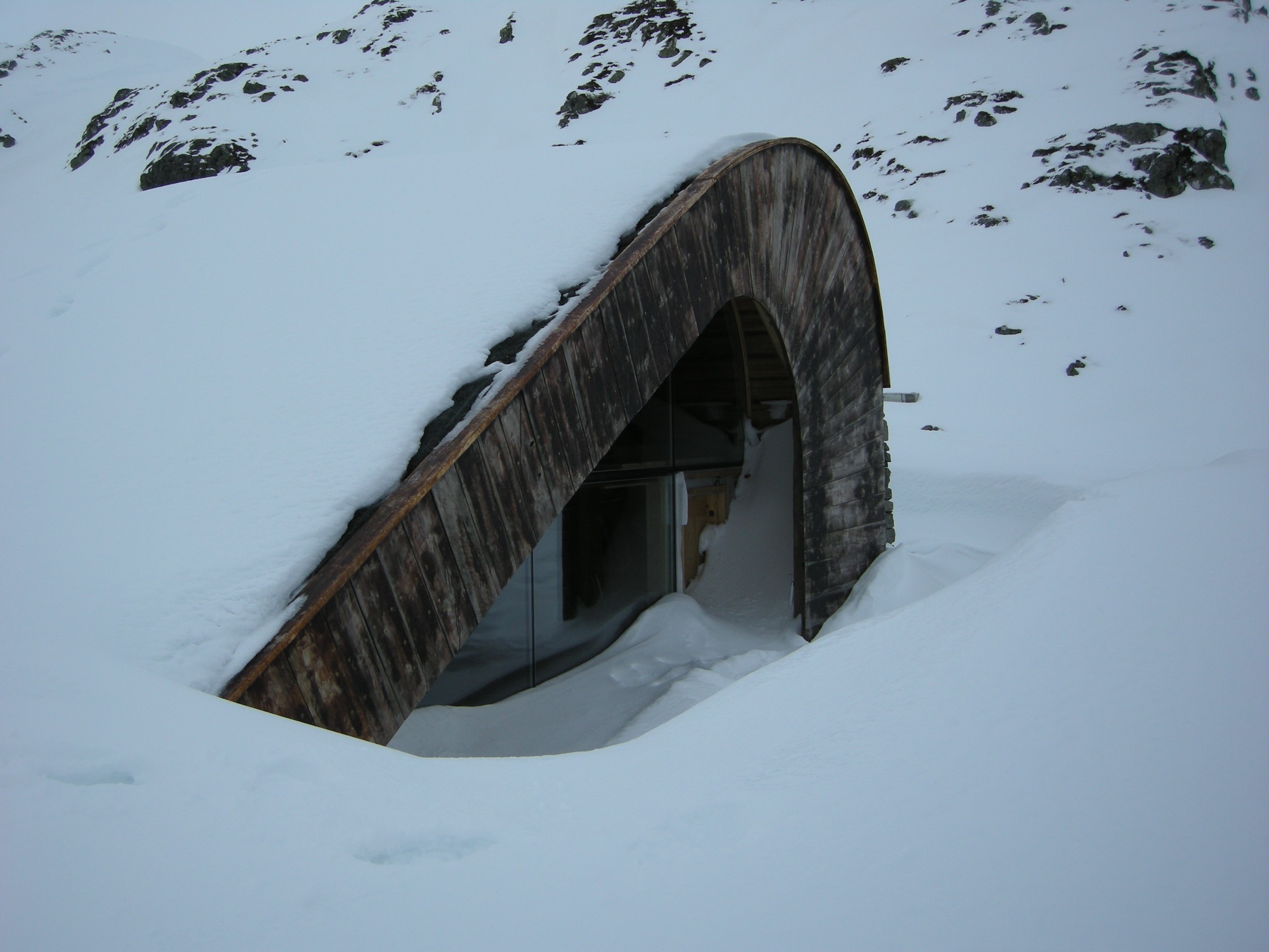
One important part of the design concept was to integrate the hut into the landscape. Thus, the small hut’s shape, orientation and materials are influenced by the terrain’s characteristic composition of grass, heather and glacial rocks. In winter, the cabin becomes another brown fleck — like the rocks — in mounds of snow.
Modern expression of ancient traditions
The structure consists of two curved steel beams, covered with a continuous layer of hand-cut logs of timber — a fusion of modern architectural expression and the style of traditional Norwegian mountain cabins. The roof, with its organic form, “grows” out of the landscape and is overgrown with grass. The materials of the facades are local stone, tar treated wood and glass.
To make room for a surprisingly large number of guests in such a tiny space, the architects found inspiration in ancient lodging traditions: The space in the center serves as gathering place, and the beds along the walls provide a spot to sit comfortably around the middle of the room in the evening — one piece of furniture for socializing, eating and sleeping. A narrow nook by the entrance accommodates cooking equipment and storage. △
Narrow Escape
Falling in love with an impossibly narrow lot on a mountain village's main street, A Denver architects builds a 15-foot-wide weekend home for his adventurous family
Incited by a seemingly impossible building site in an old railroad town above Vail Valley, Colorado, a Denver architect designs a 15-foot-wide sustainable mountain getaway as a speculative investment for sale. Then his adventurous family falls in love with the home. It was an eyesore. Passersby merely saw a ramshackle trailer overstuffing the 25-by-100-foot (7.5-by-30-m) lot on Main Street in Minturn, Colorado. Yet, André Vite spotted an opportunity.
The campus architect at the University of Colorado Denver and his wife, Ginger Borges, an oncologist at the University’s medical school, have a weakness for obscure properties. That evening three winters ago, however, they maintain they were not scoping out a new venture at all. The couple and their preteen sons, René and Niko, were headed to the old railroad town up Eagle River for dinner after a day of skiing in Vail. “We drove through Main Street Minturn, which is a town we go to all the time, and there was a mobile home for sale that was just totally wedged in and awkward looking,” Vite remembers.
Even though he didn’t know what to do with it at the time, the architect wanted that piece of land. And he got it without difficulty because the city planners had been eager to get that blot off Main Street.
The draftsman went home and started sketching.
S(e)izing the Opportunity
The lot’s appeal was twofold: It was located right on the town’s main stretch and it was zoned for mixed use. “From a planning and zoning standpoint, it was a fantastic opportunity,” says the architect and urban designer, who also heads his own practice, the Vite Collaborative. (Or, as he describes it, “A bunch of friends working on unique projects together.”) If for nothing else, Vite purchased the property at a propitious time. The shops along Main Street had been expanding in that southern direction in recent years. Thus, Vite had originally designed the project as a residential spec home with the option for retail or commercial space on the ground floor.
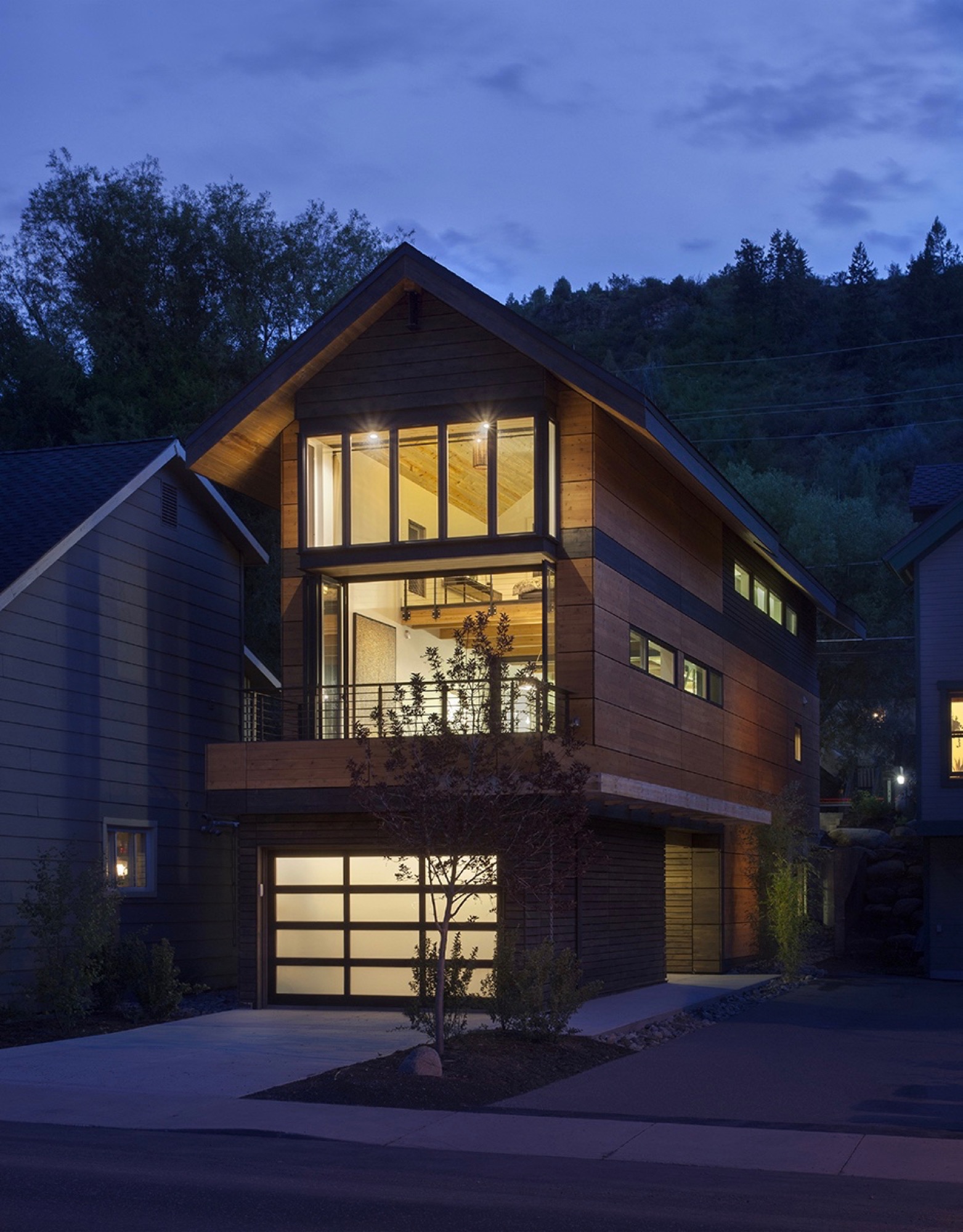
While the sliver of land overlooks the principal artery of town life on the Main Street side, the opposing end couldn’t have more different surroundings — a quiet residential street with community gardens across the way. “From an architectural design proposition, that was very exciting to see how you could work this with two faces of the building,” Vite recalls. “Both facades relate to the context of the side they are on.”
“From an architectural design proposition, that was very exciting to see how you could work this with two faces of the building.”
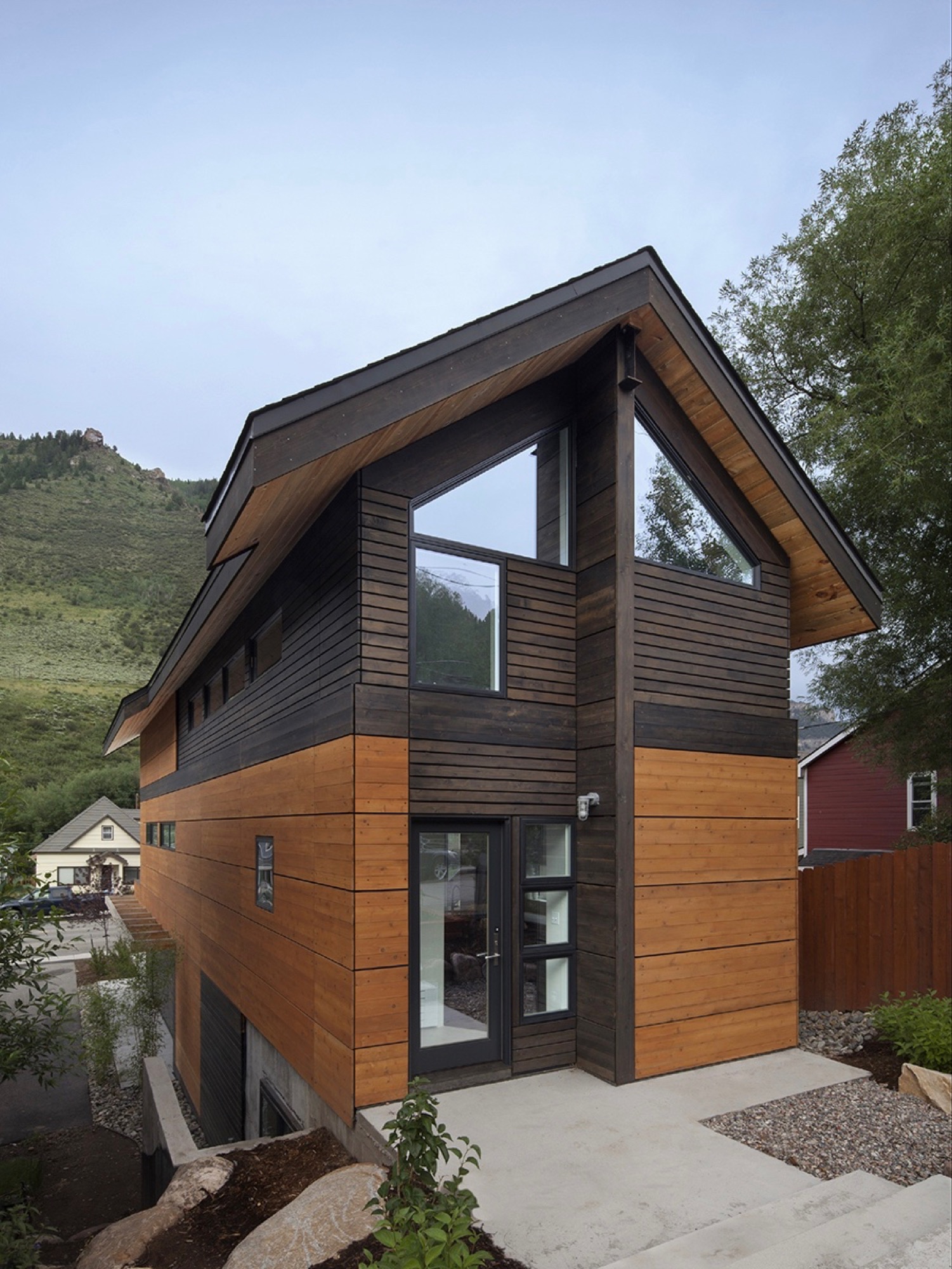
Yet another challenge the building site posed was the 10-foot grade change between the two frontages — an entire story difference, front to back. That was not all. The town’s zoning laws required a 5-foot setback from the property line. The house could be only 15 feet wide.
Fortunately, the neighbor’s garden to the south and a driveway next door to the north give the narrow site extra breathing room. “It’s true, it’s a very constricted site, and the response was a very long, narrow building, but it’s still flooded with light,” Vite says.
"It’s true, it’s a very constricted site, and the response was a very long, narrow building, but it’s still flooded with light."
Unconstrained creativity on 15 feet across
The building constraints — the narrowness, the contrasting major facades, the steep slope — only spurred Vite’s imagination and inspired innovative solutions. How did he create a modern living space — an entire three-story house — with 15 feet (4.6 m) across to work with? The architect’s answer was a structural steel frame, an element adopted from commercial construction, which gave him the structural freedom to engineer large open spaces on the inside. “It’s a steel moment frame structure with three beams that go all the way down the building. Then there is a steel beam across the top.”
The steel beams manifested what would become part of the narrow house’s legacy, and with it, a close relationship between Vite and the local builder, Brian Beckett. “When he was erecting the moment frames, Brian called me and said we can’t put the roof on tomorrow,” Vite says. One of the moment frames had been a quarter-inch off plum, which was still well within building tolerances. As might be expected from the sanguine architect, the holdup was anything but a point of contention; on the contrary. “To have a guy who takes this that seriously was just really important to me. I knew I was going to get a great building from him,” says Vite. “The main draw to this project was the relationship I developed with the builder. It became evident early on that he cared about craft. We’ve become great friends.”
“The main draw to this project was the relationship I developed with the builder. It became evident early on that he cared about craft. We’ve become great friends.”
Actually, there was one moment during construction that did stop the architect in his tracks. After Beckett put the roof on the now-perfect steel frame, he took a picture and sent it to his client in Denver. “It looked like a tube; like you wouldn’t ever want to live in anything like it,” Vite remembers his initial reaction. “It wasn’t until we started finishing it out that it turned into what we’ve got. But that was a scary point, because it was so narrow.”
Family first
By the time construction was completed, the next ski season was approaching. Vite and his family had frequently driven up from Denver to ski in the Vail Valley during previous winters. “We decided we would use the house for that ski season,” Vite says about the investment property he had just finished. “We spent that ski season there. After that, we didn’t want to lose it.”
“We spent that ski season there. After that, we didn’t want to lose it.”
The unique house itself wasn’t the only reason the family never wanted to move out. “We absolutely fell in love with Minturn. It’s the real authentic mountain community between Beaver Creek and Vail, where you have all these people who are transient and vacationing. The people in Minturn are really the ones who keep that valley going,” says Vite about the mountain town’s thousand or so residents.
What’s more, Borges not once considered her husband crazy for building this improbable house. “We’ve been married for twenty years,” Vite laughs. “She is used to that.” And attuned to narrow dwellings she was. The first home the couple restored and lived in together was a townhouse in Boston’s Beacon Hill neighborhood that was only 14 feet wide. “She’s getting an extra foot,” Vite exclaims, insisting his wife was thrilled about the idea to keep the Minturn house. Now the four escape up here nearly every weekend, year-round, to fish, drive their go-kart, hike — or ski in winter.
Open space to monkey around
Since completion, the house has evolved into a fun destination in its own right for the adventurous family. “The narrowness drove the whole architectural design in choosing a steel frame so that the interior could be completely open,” Vite says. Scarcely any interior walls partition intimate bedrooms and private bathrooms from the open, free-flowing floor plan. At the bottom, the concrete foundation encases a below-grade guest bedroom and bathroom on the dwelling’s Boulder Street side. Because of the steep slope, the opposite end is above ground, where the garage faces Main and can be extended out to the street for a future retail space.
“The narrowness drove the whole architectural design in choosing a steel frame so that the interior could be completely open.”
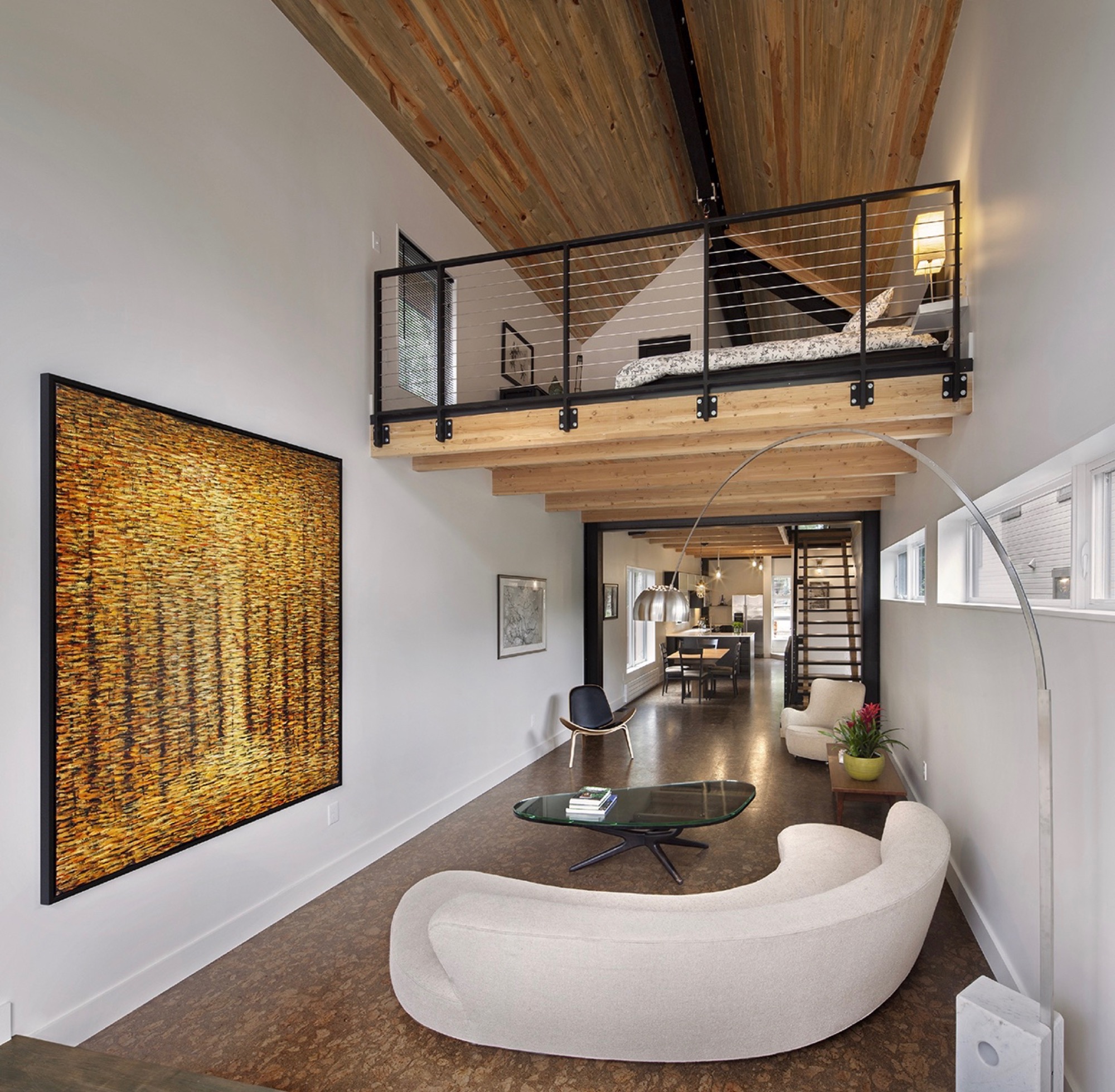
The ceiling of the modern living room on the second floor rises two stories with an overlooking loft, the parents’ open bedroom. The boys’ west-facing bedroom is tucked behind the “master” (or in front of it, depending on which frontage you interpret as the face of the house).
The family spends most of their time together in the open living space with the curved white couch. “We take this big picture off the wall and project movies onto the wall.” The cork-floored main living area flows outside through a folding glass and steel wall that opens up to the deck. A minimal dining area in the middle transitions into the kitchen, Vite’s favorite spot in the house.
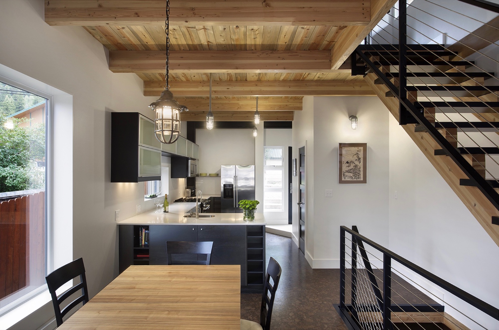
“But what the kids love is this 26-foot space here,” says Vite, pointing at the high living room ceiling, where he mounted a climbing rope. “They get to climb up this wall that’s all blocked with wood, ready to put in finger holes for a climbing wall.” Climbing is indeed the boys’ favorite indoor pastime. “They climb everything they can get to,” their father reveals, pointing to a trolley that runs down the steel beam under the roof above the master loft. “You can strap yourself onto here and then push off.”
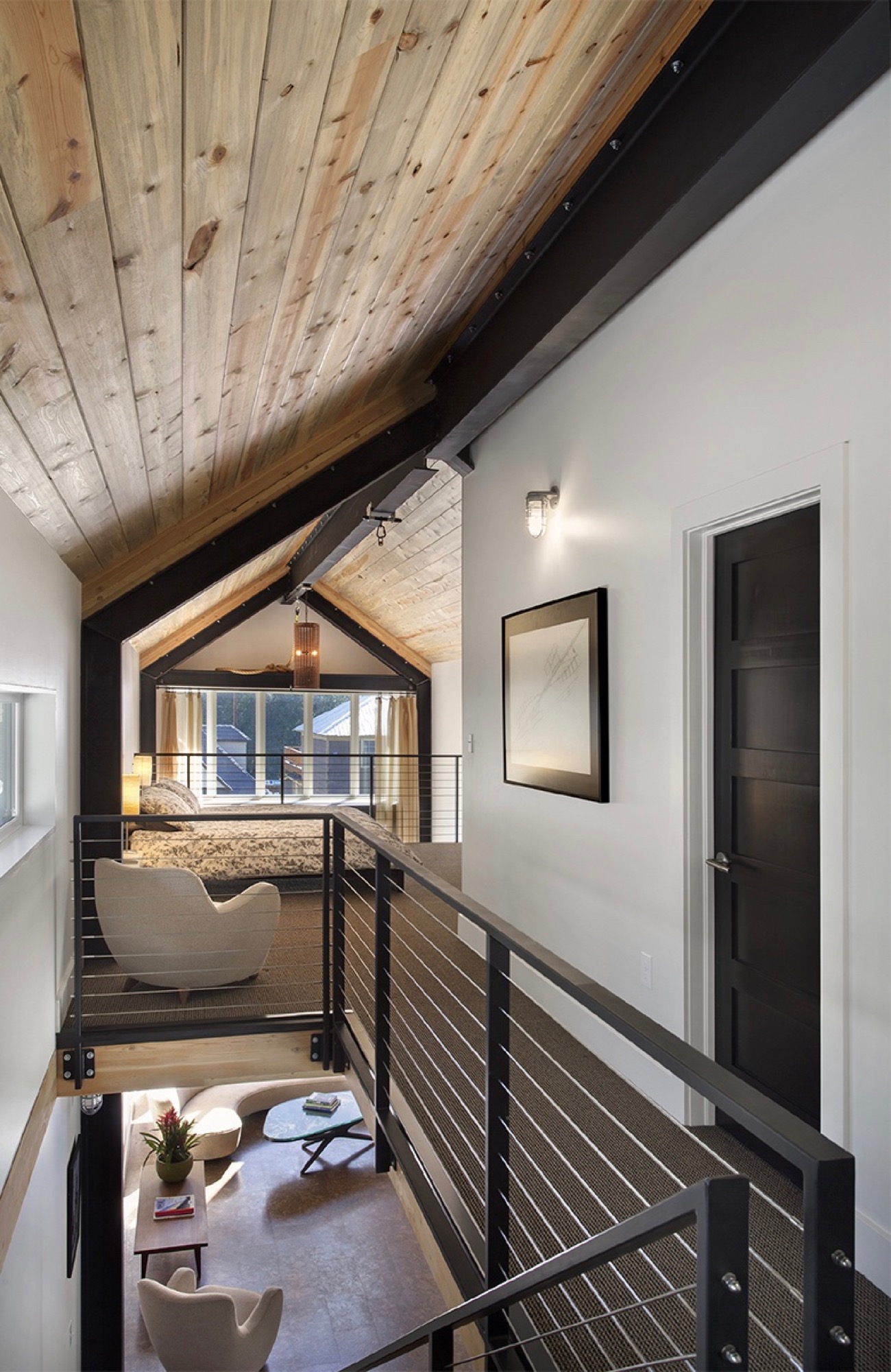
In addition to providing a place for the family to escape the city on weekends and holidays, Vite wanted to set the stage in the house for a few cherished vintage pieces he inherited from his late parents. “The interior design was all about finding a home for my father’s old furniture he had bought in the early sixties in New York. It’s all authentic midcentury-modern furniture, and I designed the interior around it.”
Sustainability as style
The LEED-accredited architect is reluctant to categorize the architectural style of his idiosyncratic house. “What they call it up here is a contemporary mountain home, because it very much has the feel of a timber frame, although it is done in steel,” he says. “But rather than talking about a style, the sustainability feature is more important to me.”
From the construction standpoint, the house is based on a standard wood module to limit material waste, which actually got Vite in trouble with one particular Minturn resident. “There is a guy up here who goes around the construction sites, picking up wood waste for his wood-burning stove at home. He would complain that we didn’t have enough wood waste and gave us a hard time.”
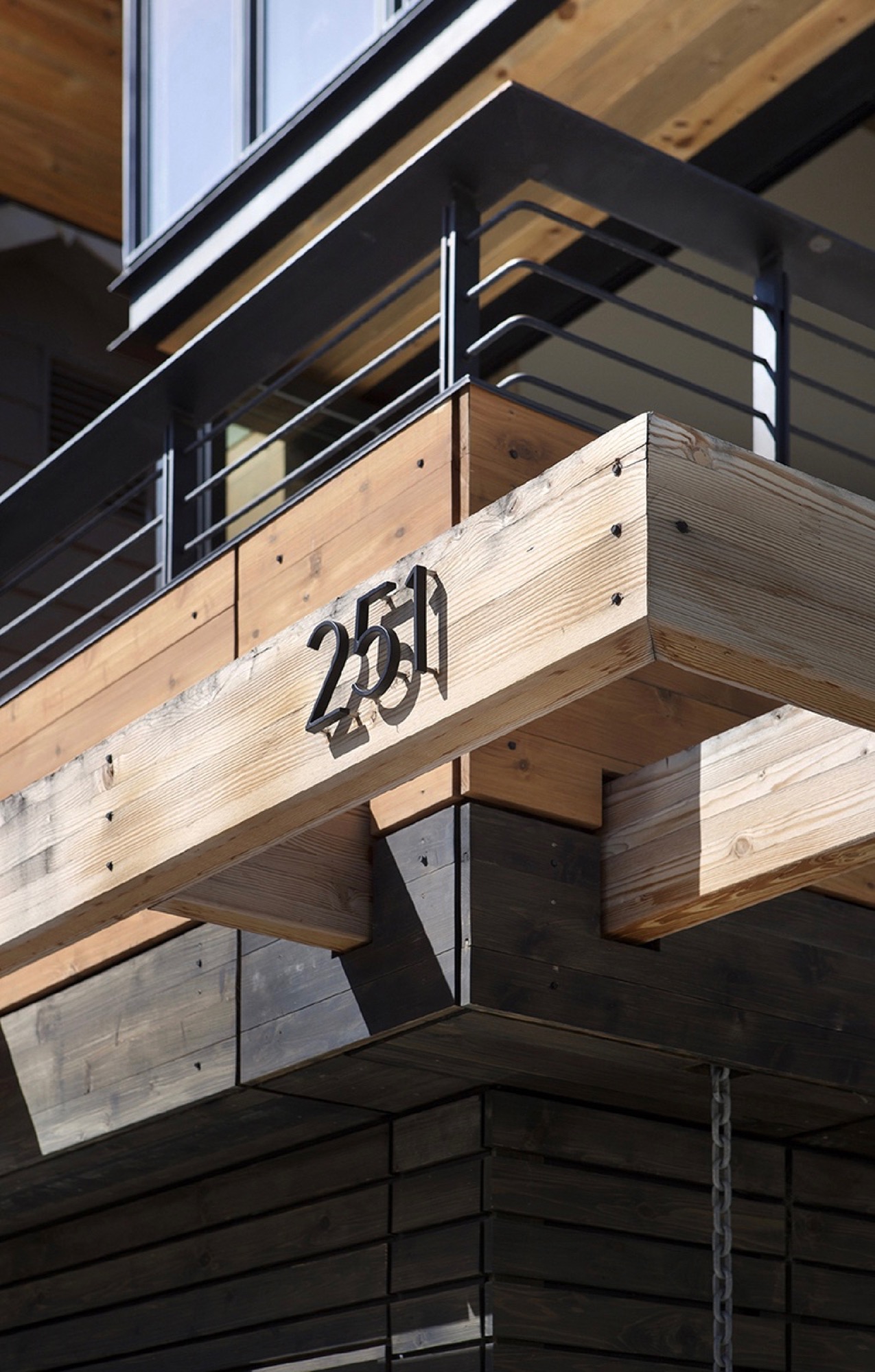
The carefully calculated use of exterior wood is to protect the building from driving rain in support of the actual weather barrier behind the wood. “All these gaps are open,” Vite shows. “It’s like the house is wearing this jacket. The wood is there for added protection, and the jacket breathes.” Air exchange is critical for a highly insulated house at this altitude, where the air is extremely dry. “You are living and cooking and doing all these things that increase the humidity inside the house,” he explains. Instead of trapping the warm, very moist air inside, the house can breathe it out. Vite also installed a heat recovery air exchanger that pushes warm, inside-air to heat colder air coming in to ventilate the house, without using the heating system.
“It’s like the house is wearing this jacket. The wood is there for added protection, and the jacket breathes.”
Vite received the 2013 Award of Citation from the American Institute of Architects for this project.
Tight house, tight Community
Being awarded such a significant professional accolade from AIA is nice, sure, but what truly warms the architect’s heart is how the locals perceive the standout structure they’ve come to call the “skinny house.” “We get compliments on it all the time. People are stopping by, saying they’ve watched it go up and want to look at the inside,” he says. “I love that the town loves the house.” △
“I love that the town loves the house.”
Sense of Place: Designed for legacy in Aspen
Mountain homes in Aspen, Colorado, are built to stay in the family for generations
Aspen is steeped in tradition. Generation after generation, families vacation at the posh resort to ski in winter and to celebrate the town's famous festivals in summer. Slope-side chalets and opulent second homes alike are built for legacy, as venues for extended family to gather and carry on traditions, season to season. A continuity that translates into architecture and decors of great depth and layering.
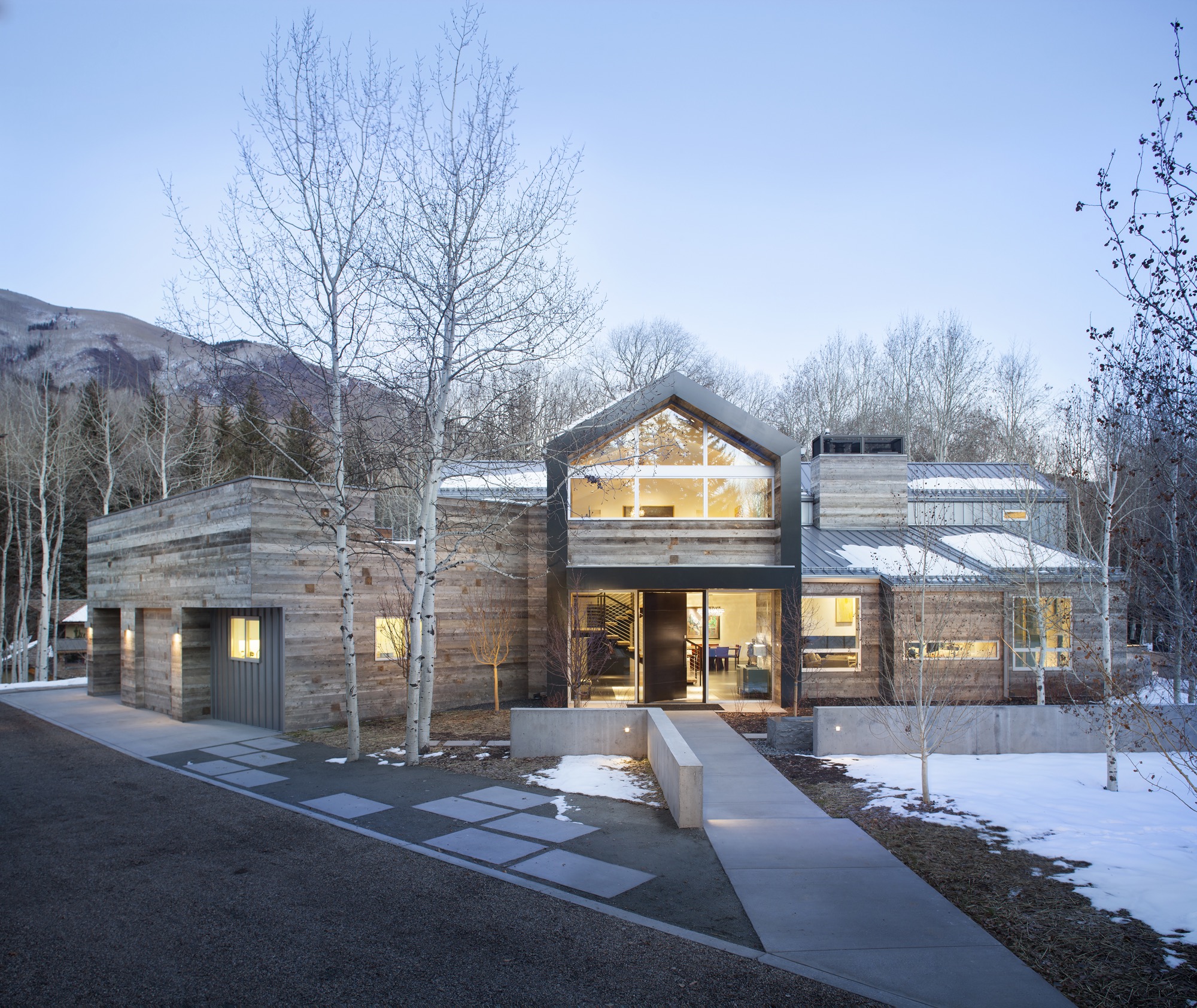
Nevertheless, even mountain folks for a fortnight must have functionality alongside style, beginning at the entry. “There is that sense of arrival at a mountain home,” says Sarah Broughton, co-owner of Rowland and Broughton (R+B), an architecture and interior design firm in Aspen and Denver. Aspen homes are planned with the understanding that one comes in from the elements. “People need to be able to knock snow off their boots.”
"Aspen homes are planned with the understanding that one comes in from the elements."
Style without borders
Many of R+B’s clients have primary homes on the beach or in big cities, all over the world. “One thing that is important to them is that they really feel they are in Aspen,” says Broughton, a modernist at heart. To achieve this sense of place, she relies on natural materials such as wood, grasscloth, and natural stone — “things you see when you look out the window.” What’s more, treating woods in surprising ways, such as planking or wire-brushing, brings out something special in a natural material.
Broughton complements mountain settings and modern, clean lines with cashmeres and wools in the furniture and textiles. She loves to add ample pillows and throws on beds and couches. “Hemp, wool, and cashmere textures and patterns can speak to a natural environment without being literal,” the award-winning architect says. The beauty of sunlight falling through an aspen forest’s canopies, for instance, can translate into a pattern. Twinkling lights become reminiscent of a starry winter night in the Rocky Mountains.
“Hemp, wool, and cashmere textures and patterns can speak to a natural environment without being literal.”
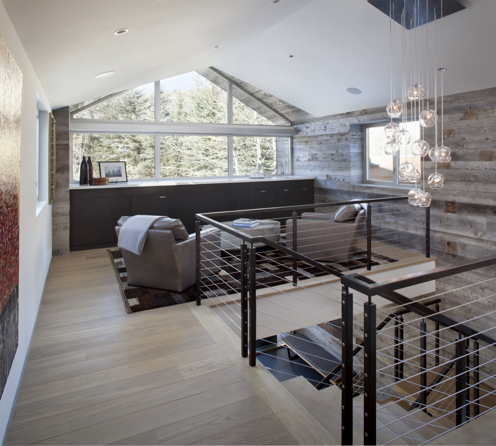
Black Birch Modern
With its clean-lined, minimal design, Black Birch Modern in Aspen is an example of a mountain retreat that not only boasts stunning alpine-modern architecture, but is warm and welcoming to boot. R+B achieved this balancing act by bringing outdoor materials inside. That, Broughton believes, is something anyone can do at home. “Carrying a material found around the outside of the house into the flooring, for example, is an effective way to blur that indoor-outdoor line, which is such a quintessential element of Aspen style.”
Bringing Aspen home
Give your home a touch of Aspen flair and make room for your own legacy. Create spaces where friends and family can gather to share food, drinks, and stories, while they sink deeper and deeper into your cashmere pillows and pull up their feet under a wool blanket.
Art from an Aspen gallery adds a fine finishing touch. “Bringing in local talent is a nice way to tie it to the place and a great way to modernize a home,” Broughton says. “Make it feel collected and not staged,” are her parting words of style wisdom. “Modern design has a lot of depth and layering to it. It’s not a one-hit wonder.” △
“Make it feel collected and not staged. Modern design has a lot of depth and layering to it. It’s not a one-hit wonder.”
A Whistler A-Frame
Scott & Scott Architects design an outdoorsy Vancouver family’s dream cabin
If the multiple languages and accents overheard in lift lines and on gondolas tell any kind of a story, it’s that everyone from everywhere with a serious interest in skiing or snowboarding is making a beeline for Whistler Blackcomb. More and more of those visitors are putting down roots with a second home in this outdoor wonderland north of Vancouver, Canada. Some buy condos in the heart of Whistler Village or townhomes with ski-in/ski-out access to the slopes. Others build luxurious heavy timber colossi in swank residential areas that have grown up around the resort’s edges.
No matter their size, most of these mountain retreats share the following design elements: wilderness building materials, either structural or decorative, and floor plans and amenities that mimic those found in city interiors.
While there is nothing wrong with having a second home in the mountains that works much like a primary one in the city, some younger ski and snowboard families have begun to question why they would want to occupy such a space when a more indigenous—and much radder—alternative is available: an iconic A-frame cabin.
Return of a classic-modern icon
Ah the A-frame, that staple of mid-twentieth-century vacation home vernacular that was massively popular across the North American outback from the 1950s through the 1970s. There is no way this odd-looking triangle-shaped structure, which got its start in ancient days as a roof hut in Japan and a storage shed in Europe, could be mistaken for anything urban. Attempts in the sixties and seventies to make it a city building resulted in churches, fast-food joints, suburban houses and motels that were novelties even then.
The classic post-Second World War A-frame cabin was a purpose-built backcountry bolthole. Its simple construction, minimal building materials and absence of fancy finishes made it a preferred DIY project for Mad Men-era handy men, and in the 1960s, A-frame cabin kits sold briskly. Most of these ready-to-assemble weekend homes shot up in snowy locales.
One reason for this is the A-frame’s radical roofline that extends down to the ground on two sides, which helps shed any snowpack. Another is its ability to capture natural light. The A-frame’s roof supports all of the building’s weight, freeing up the gable ends to be filled with wall-to-wall glass.
A third reason for its easy fit in alpine terrain is one you might not have imagined given the A-frame’s modern, inorganic appearance. In this landscape, it can be a chameleon, a slender, weathered wooden form indistinguishable from evergreen trees.
For all of its baked-in virtues and utter lack of pretense, the A-frame is enjoying a renaissance. Outdoor types who value authenticity are enthusiastically rescuing original 1960s and 1970s models, hand-building replicas (check out the Urban Outfitters online journal for directions on "How to Build an A-Frame Cabin") or commissioning fresh versions that honor the building's honest materials and original intent, which is what Vancouverites Melanie and Brenton Brown did when they gave the go-ahead for the elegant update pictured here.
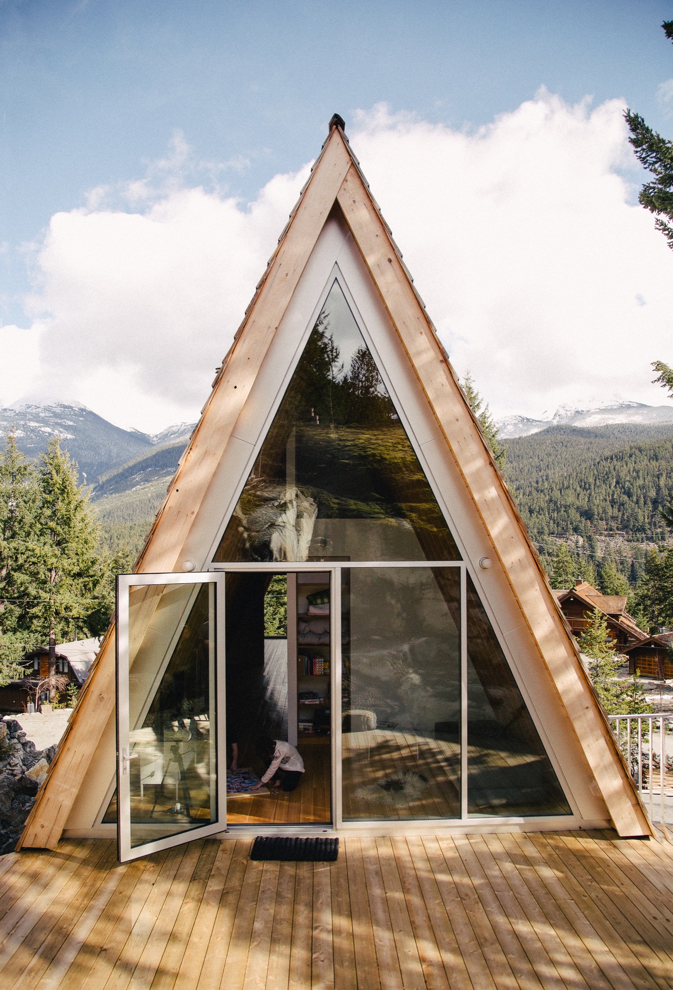
A family’s dream
For years, the outdoorsy couple and their energetic offspring, Daisy and Finn, now eight and 13 years old respectively, bunked off and on with close friends in their 1980s A-frame in Whistler’s Emerald Estates neighborhood. In 2014, the family decided to build their own variation on a property up the street from their friends. “We wanted a new cabin that would not look out of place with the older ones in this area,” says Brenton, CFO for the Vancouver-based digital commerce platform Elastic Path Software. “An A-frame felt like the perfect fit for us,” says Melanie, who is an interior designer. “It has a retro feel we love and, obviously, we knew what we were getting into with this type of building.”
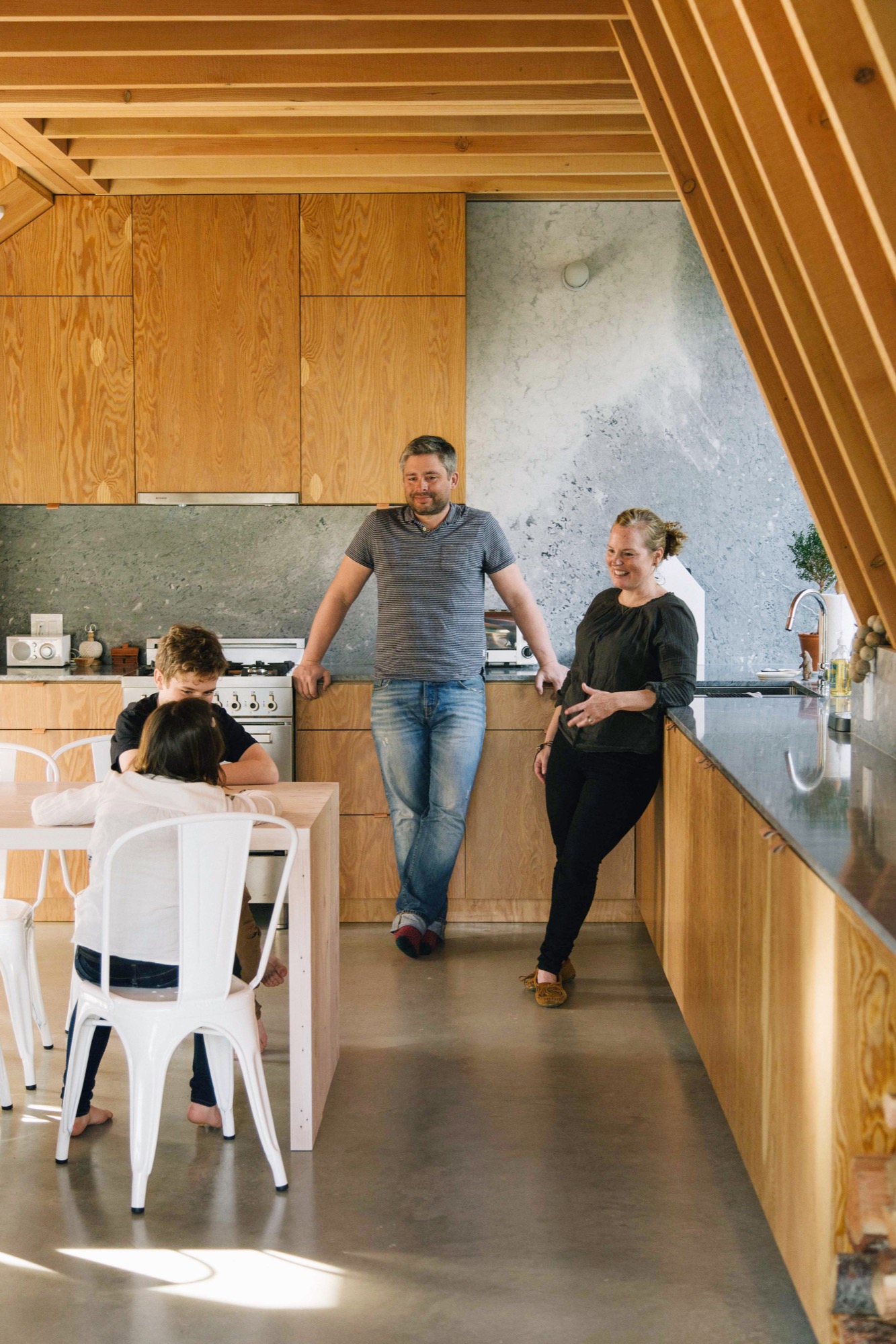
Idiosyncratic Emerald Estates
If you wanted to build a new A-frame in Whistler, idiosyncratic Emerald Estates would be the right place to do it. It is one of Whistler’s early neighborhoods, dating to the 1960s when the community mainly consisted of diehard Vancouverites willing to drive 75 miles of nasty road on weekends to ski its pristine powder, full-time construction and seasonal workers, plus assorted ski bunnies and bums.
A-frames are at home in this neck of the woods where a lot of the housing stock still has a throwback vibe. Among its early Whistler building types, Emerald boasts classic 1960s, 1970s and 1980s A-frames and Gothic-arches cabins (their bulbous bow-sided brothers), Heidi-style chalets and quirky hand-built dwellings such as Whistler’s famous “Mushroom House,” where, if Emerald Estates were a fictional fantasy world, Bilbo Baggins would want to live.
Although it is only a 10-minute drive from Whistler Village, Emerald feels off the beaten path. It is still a neighborhood more associated with local families than visitors. Most of the residents are old-timers and full-timers, “not weekend warriors,” says Melanie, laughing to think that this label could be applied to her little tribe.
Emerald’s topography is steep and wooded, with winding roadways that dip to reveal the teepee peaks of A-frames poking out above treetops and that rise to expose wide-roofed chalets juxtaposed with glacial rock formations.
The Browns’ property is open, steeply sloped and pie-shaped: wide at the front and narrow at the back where a four-story-high granite outcrop dominates. The site is high enough up the hillside that the evergreen trees, so plentiful downslope, have no effect on the view. “It’s panoramic, an unobstructed 180 degrees,” says Brenton, pointing north to Weart and Wedge mountains with Armchair Glacier sandwiched between them, then south to Whistler and Blackcomb. The family’s new cabin, designed by David and Susan Scott of Vancouver’s Scott & Scott Architects, capitalizes on all of this scenery.
The Scotts and the Browns
The Scotts are a husband-and-wife team who worked independently for years for prominent Canadian architects before forming an architecture practice together three years ago. Their office/home, which they share with two young daughters, is a converted butcher shop in the Mount Pleasant/Main Street area, currently the coolest neighborhood in Vancouver for young families to live.
Every project the Scotts have completed together has received public praise and attention either in a peer review journal, a lifestyle magazine or on a discerning design website—and sometimes all three at once. This past winter, the Scotts were recipients of the 2016 Young Architect Award from the Royal Architectural Institute of Canada. It is the first time the society has given this award to a couple.
The Browns were introduced to the Scotts through architect friends who admired their work. After seeing images of the Scotts’ own off-the-grid cabin at the north end of Vancouver Island (it appeared in the inaugural print issue of Alpine Modern magazine), the Browns were smitten with the Scotts’ understated, minimalist design and use of traditional and off-the-shelf materials in interesting and diverse ways.
Elemental, accessible design is what the Scotts are known for. “No one ever actually says this to us, but I think part of our appeal is that what we do is not outlandishly opulent,” says David, “so we end up with young families who want a holiday place in Whistler or Tofino [the surfing capital of Canada] but aren’t into building grand statements.”
“What we do is not outlandishly opulent, so we end up with young families who want a holiday place in Whistler or Tofino but aren’t into building grand statements.”
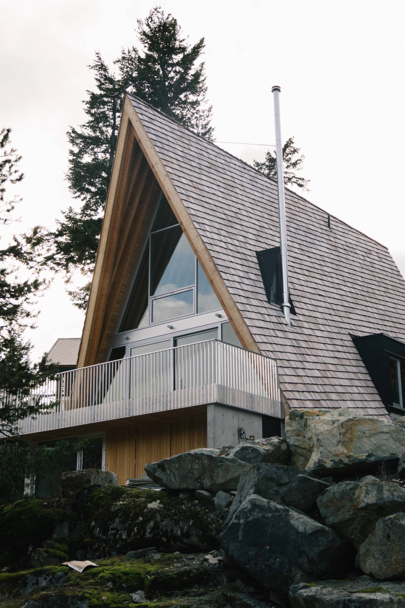
Working all angles
The Browns’ new A-frame may not be a grand statement, but it is an eye-popper, and when you begin to look closely at the design, you can see that it is an extremely intelligent and refined evolution of a basic building type.
Take the roofline, the A-frame’s defining feature. On a flat site, the roof would sit directly on top of the ground with identical triangular gables at either end. The challenge for the Scotts was how to incorporate these archetypical elements in an innovative way on a steep site.
Their response was a three-story building, narrow at the back and wide at the front just like the shape of the lot, with different-size gables at either end and roof planes that follow the grade.
As with A-frames of old, the Scotts’ roof design is a declaration—but with a difference. Level at the top, the ridge has been pushed out beyond the front façade of the building, then the gables have been pulled back at an angle so that the bottom edge of the roof is now parallel to the slope not the ridgeline. Laying the shingles at this same gradient gives the roof its rakish appearance.
From the rear, the Brown’s cabin appears to be a single story defined by a slender gable tied, in classic A-frame fashion, directly to the landscape, in this case volcanic rock. What you are really looking at is the back end of the third floor, and the space inside is a den, which opens onto the generous patio the Scott’s fashioned from a flat space in the outcrop.
This rock face, which erupts out of the ground at the entry level and slopes up an additional 20 feet behind the patio, has proven to be a huge hit with Daisy, Finn and friends. Says Melanie: “Last weekend we had 10 kids scrambling up from the patio and all over it, along with our enormous silver lab, Rosie. I would be in the kitchen [on the main level], looking out the window and see kids with big smiles on their faces coming down the rock on this side.”
From the front of the Browns’ cabin, each of the stories is clearly visible. The ground level, a rectangular box set into the rock, beautifully rendered in concrete clad in cedar at the front, provides a strong and stable platform for the soaring roof that defines the stories above it.
Design features on the front façade include extra-deep eaves and a large balcony that runs across the front with a guardrail made from aluminum bars used for snowmobile trailers “so it’s easy to sweep the snow through,” says David Scott.
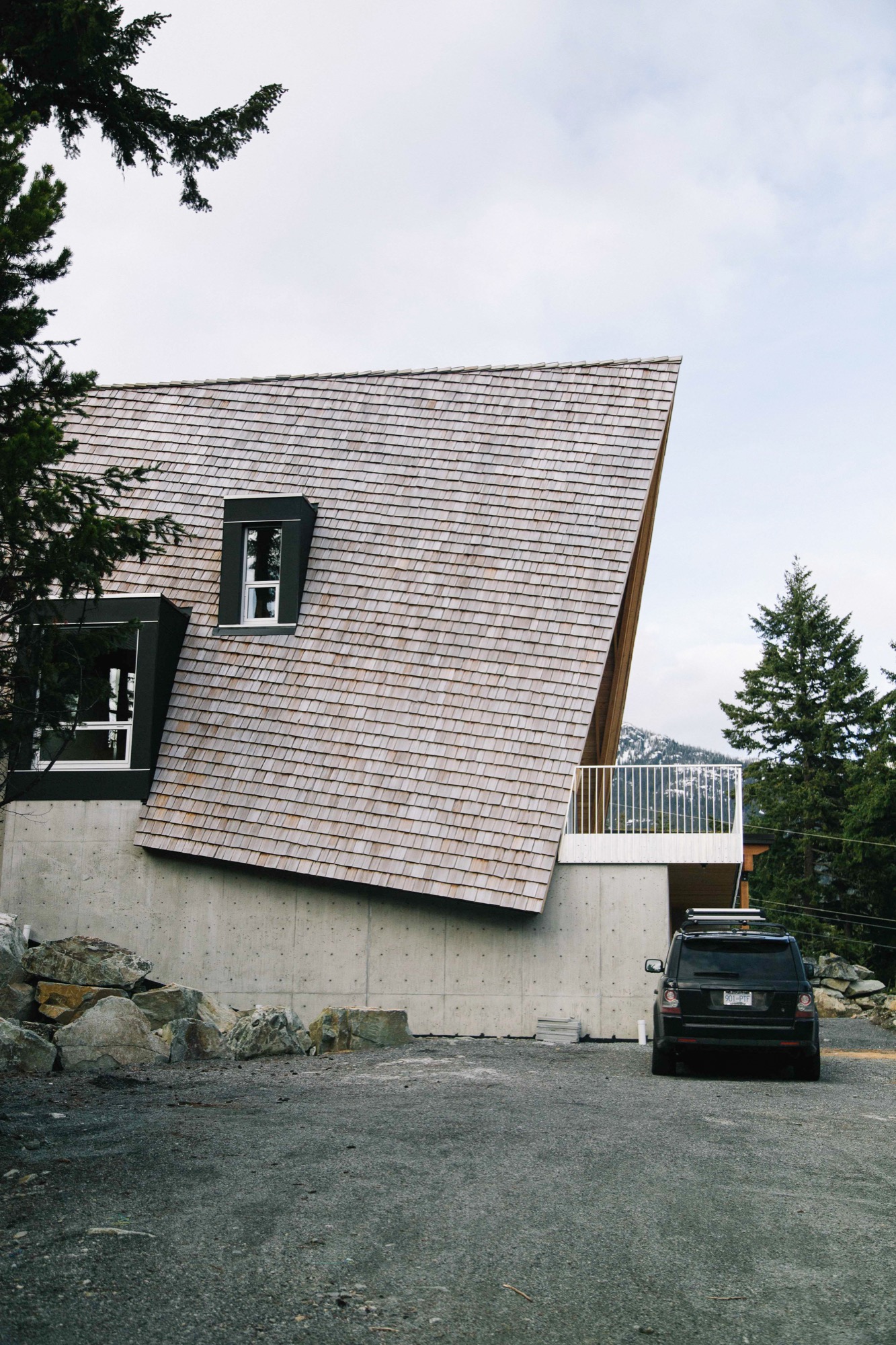
Building inside out
Judicious in their choice of materials, the Scotts prefer their wood locally harvested, their stone quarried nearby and anything ready-made to be plain and pragmatic. The roof is clad in standard red cedar shakes that will weather to the tone of the surrounding rock. Solid structural decking was applied directly on top of the joists “so it works as both floor and ceiling, the way it did in old ski cabins,” says David.
In a classic A-frame, the architectural bones are an interior design feature. The same is true here: the internally exposed frame is made of locally sourced Douglas fir, rough sawn in conventional sizes: 2 by 12 inches (ca. 5 by 30 centimeters) for the joists, 2 by 10 inches (ca. 5 by 25 centimeters) for the rafters. The lumber elements are fastened together using simple lapped joints at the floor and roof connections. “Our preference is to always keep everything consistent and the same, and to highlight the craftsmanship, not conceal it behind finishes,” says Susan.
The cabinetry was built on-site of construction-grade rotary-cut plywood; this wood also encloses stairs that are capped with the same stock aluminum used for the balcony guardrail. The only obvious built-in eye-catcher anywhere inside is the honed marble from Vancouver Island used in the kitchen and living area on the second floor.
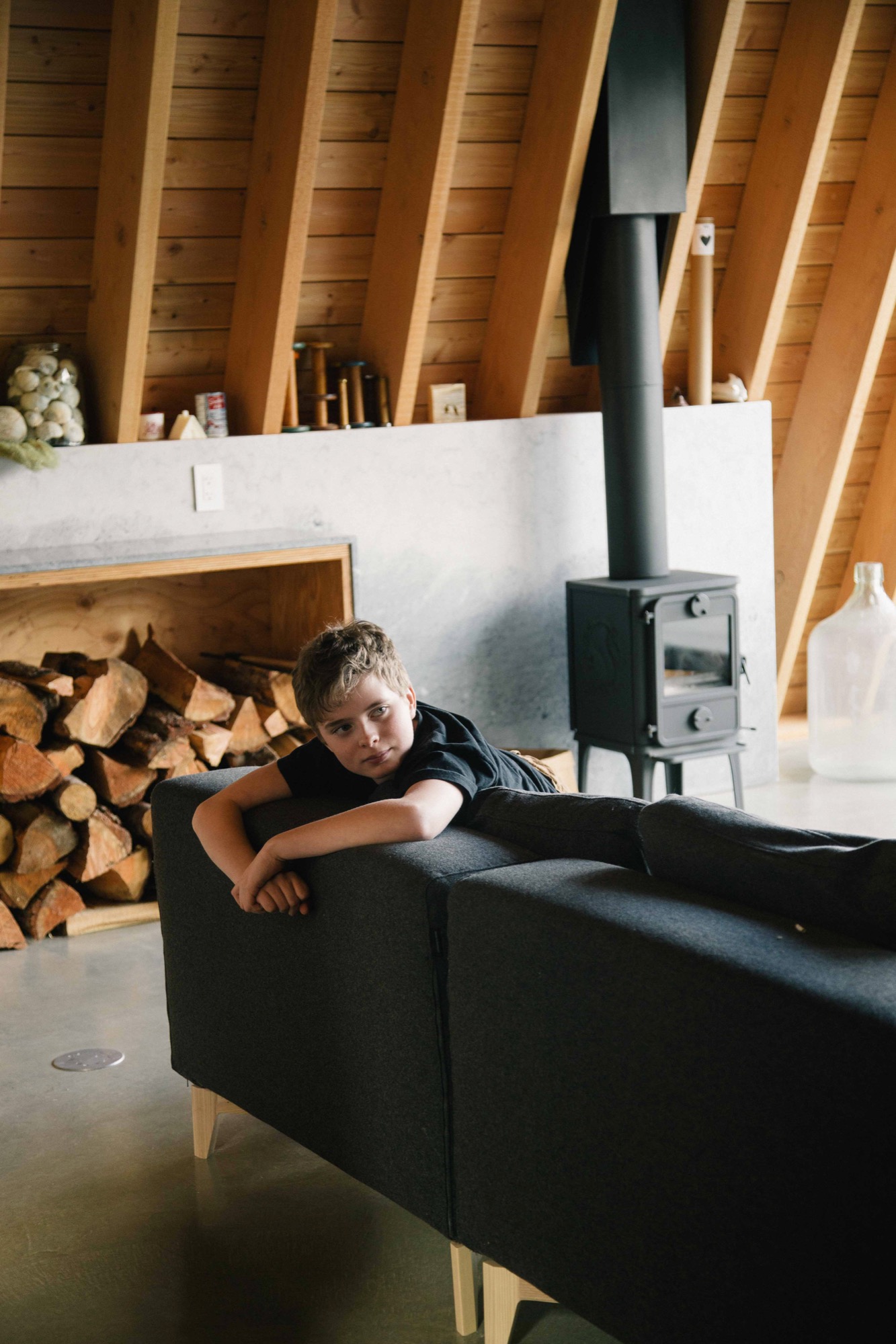
The first level is all business: “washroom, laundry, storage for bikes, skis, snowboards, surfboards leftover from our time spent in Laguna, and probably snowmobiles at some point,” says Melanie. The middle level is for communing; the top, for turning in.
One frustration with A-frame design is that it does not allow for much useable space inside; all slope, no sidewall is the common complaint. One original way the Scotts dealt with this dilemma was to put the stairs in a light-filled dormer, freeing up floor space on the third floor for a proper hallway tucked partially under the slope.
The hardy foursome and pooch moved into their cabin a few days after Christmas 2015 and have been using it nonstop ever since, often sharing their holiday home with friends.
Over the winter, Melanie skies with Daisy while Brenton snowboards with Finn. “In the summer, we like hiking with Rosie, as well as mountain biking and swimming in the various lakes. There are several hiking and mountain biking trails in Emerald, and Green Lake is right around the corner and so is the Valley Trail. We enjoy riding our bikes along it into the village,” says Melanie. “If you love being outdoors, there’s just so much to do around Whistler.” △
Sense of Place: Alpine-modern style in Tyrol
The elevated ruggedness of interior design in Austria's Zillertal
Alpine Modern talks with local interior design expert Martin Wetscher about the quintessential style of modern mountain homes in Tyrol. Wetcher is the president of the namesake interior architecture firm, carpentry workshop and furniture store his great-grandfather founded in 1912 in Fügen, Austria.
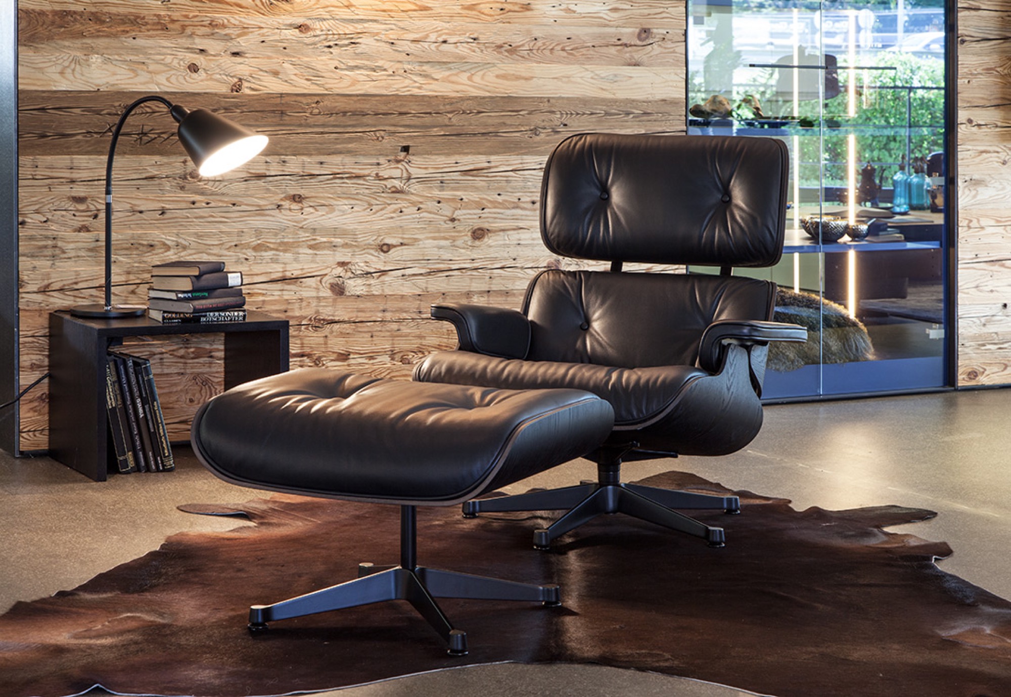
Traditional mountain living in Tyrol was simple. The Bavarian-style homes were built from materials the alpine farmer could source around the site. Dyes and paints were made from herbs and flowers; the color red derived from ox blood. Design was determined by practicality and durability. “Everything we perceive as ‘sustainable’ today inevitably gave those traditional homes a distinctly local style,” says Wetscher.
"Everything we perceive as ‘sustainable’ today inevitably gave those traditional homes a distinctly local style."
Vacation architecture in Tyrol is highly exaggerated to give visitors an immediate sense of place. “At home, that’s different,” Wetscher says. “A home has to reflect the person, with reference to where you are.” Hence, a ski chalet that dramatizes Kitzbühel — the legendary winter sports town in Tyrol, Austria — would quickly become kitschy as a permanent home.
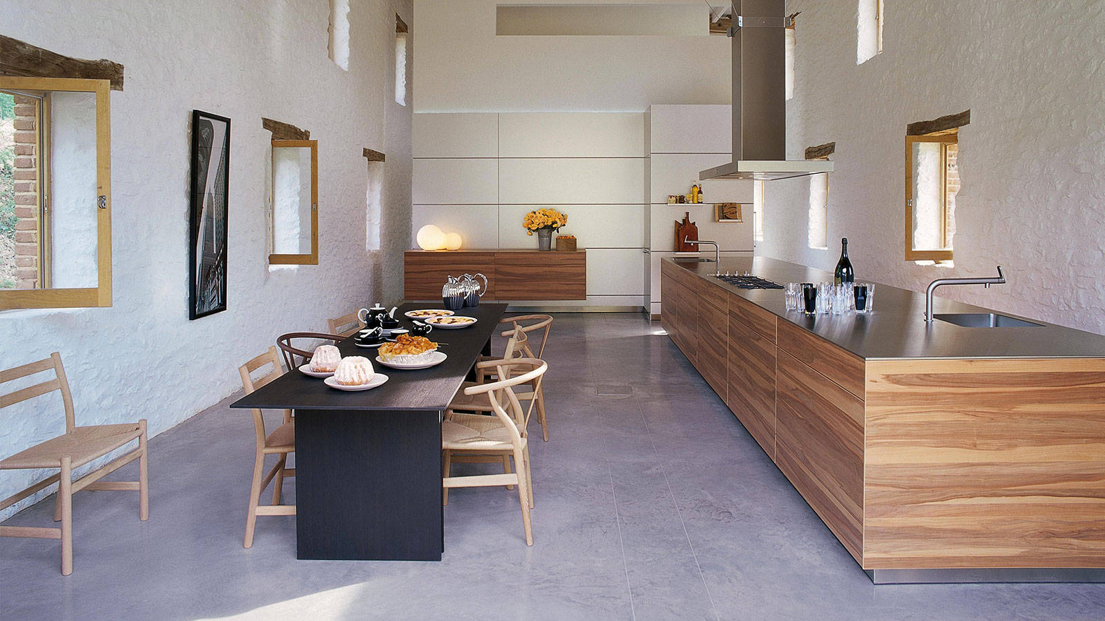
Celebrating craftsmanship
The interior concept Wetscher Chalet celebrates the Tyroleans’ ruggedness without being crude. While the craftsmanship is very much refined, materials such as oak wood (which is characteristic for the area) retain a pastoral touch. “People here in the Alps love to see that it doesn’t have to be either or, rather, that Wetscher Chalet is rich and clever, modern yet authentic,” says the head of Austria’s oldest independent furniture retailer.
In Tyrol, generations of families live in the same house for hundreds of years. Thus, it is particularly important to balance modern design with authenticity by integrating heirlooms, such as antique rugs or artisanal art, and found natural objects from the surrounding environment, such as driftwood from a nearby creek. Moreover, after an era of booming industrial manufacturing, quality craftsmanship is back in Tyrol, once again coveted and elevated.
“One has to begin where the alpine farmer left off,” Wetscher says about creating a sensible modern Tyrolean interior. To him, a beautiful mountain home has little to do with new furniture and a lot with bringing in shapes and materials found around the outside.
“One has to begin where the alpine farmer left off."
Mixing materials and eras
Mixing natural stone with oak is big right now at Wetscher. The contrast makes it chic. “Then, add deftness by bringing the present moment and the season into your home with flowers and accessories,” he says. Easily interchangeable objects, such as a coffee table or curtains, offer balance between consistency and change. In the current Wetscher Chalet line, for example, furry textiles represent that transient element. Prints, on the other hand, are passé. “We find them rather tacky.” Instead, Wetscher likes to play with materials like natural stone as patterns.
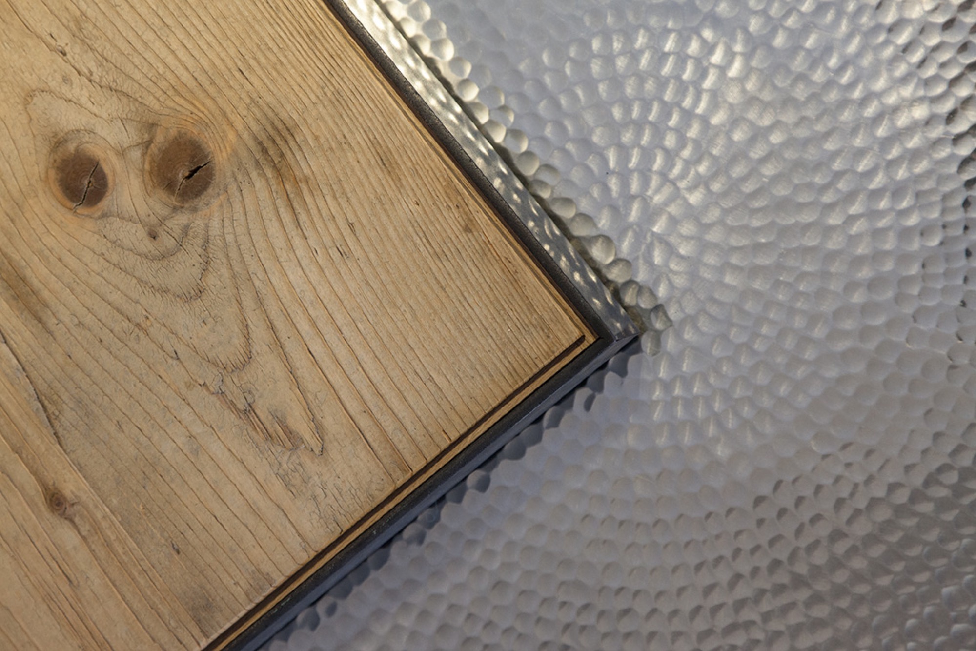
His Chalet concept is further characterized by exceedingly loungy seating furniture one can lay back and stretch out in. Various seating areas with low tables encourage conversation. Furniture low to the ground is more sophisticated and comfortable, while higher furniture can exude stiffness.
Understatement is key. A backdrop in Wetscher’s showroom, for example, is paneled in softwood reclaimed from an old corral. However, a smoothed surface adds calmness to the rustic wall. After all, Wetscher knows, “Jump too far into the Tyrol, and it will actually look like a cow stable.” △
“Jump too far into the Tyrol, and it will actually look like a cow stable.”
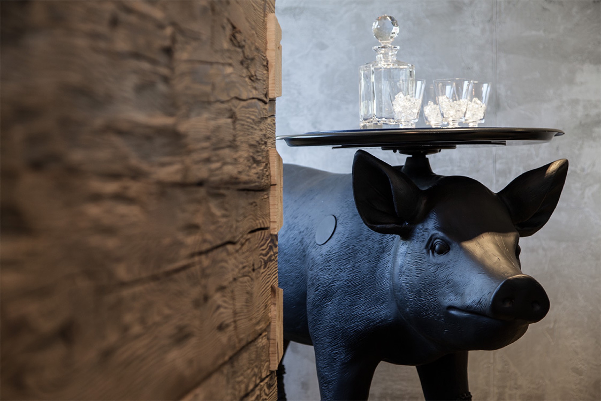
Intermission
Alpine Modern coloring page
Take a breath. Slow down, and find a sense of peace through coloring.
Download printable coloring page in PDF
A-Frames
The right form at the right time
Spawned by postwar affluence, A-frame cabins became the quintessential American vacation home of the 1950s and 60s. A look at what made these icons of middle-class leisure immensely popular then, and what it is like to remodel and live in one today. “The design is intuitive,” says architectural historian Chad Randl, author of the book A-frame (Princeton Architectural Press), about the A-frame’s triangular structure. Why else would different cultures have turned to this universal, unifying building type, independently, throughout time and across the globe?
Was it intuition, too, that told Rudolf Schindler in 1936 to carry the roof down to the ground and fill both gables with glass? The Austrian-born architect needed to find a way to comply with local building codes when he was commissioned a modest vacation home suitable for the mountainside setting above Lake Arrowhead, California. The upshot was an A-frame built twenty years before its time.
By the middle of the twentieth century, architects in postwar America sought a more casual yet visually dramatic design conducive to relaxed seaside and mountain living. The A-frame was both comfortably familiar (pitched roof) and playfully novel. Because these weren’t primary homes, the architects could enjoy more freedom in designing wide-open spaces with fewer partitions and very small bedrooms and bunk rooms.
"The A-frame was both comfortably familiar (pitched roof) and playfully novel."
Genesis: The Leisure House
In 1950, Interiors magazine published an A-frame by San Francisco-based architectural designer John Carden Campbell: the Leisure House. It hit the mark on the era’s modernist style sensibility, down to the butterfly chairs. Campbell was fond of saying the house enclosed the most space in the most dramatic way for the least amount of money.
 After a full-sized model of the Leisure House was exhibited at the 1951 San Francisco Arts Festival, Campbell’s phone wouldn’t stop ringing. Fixing its dimensions to the width of a sheet of plywood reduced the cost and simplified construction so vastly, the Leisure House could now become a do-it-yourself project. Campbell deftly developed a precut kit that contained everything needed to assemble the house, from timber to nails and hammer.
For the next twenty years, photos of Campbell’s own Leisure House he built across from the Golden Gate Bridge in Mill Valley, California, appeared in countless home magazines and architectural books. The Leisure House was promoted as a natural design for the mountains or the beach, for a summer cottage or a ski cabin. The Leisure House manifested a new leisure culture.
A national phenomenon
The mushrooming popularity of A-frames was fueled by postwar prosperity, which brought owning a second home within reach of the middle class. Suddenly, people had more disposable income and more free time. The A-frame embodied an informal weekend and holiday getaway that was innovative and exciting — a recognizable, identifiable symbol of “the good life.”
“It’s interesting how people individually adapted drawings or kits for their own family’s way of living and for their own technical expertise or lack thereof,” says Randl, who now teaches at the Cornell University College of Architecture, Art, and Planning. “What I loved about A-frames was that it was such a simple design, a basic triangular form, but you had so many variations of it, and it was still recognizable as an A-frame.”
"The A-frame embodied an informal weekend and holiday getaway that was innovative and exciting — a recognizable, identifiable symbol of 'the good life.' "
The fall of an Americana archetype
While A-frames were touted as efficient in the use of materials in the 1950s and 60s, they were far from energy efficient by today’s standards. The open-floor-plan homes were notoriously difficult to heat — warm air escaped upward, leaving the downstairs chilly and the bedroom loft uncomfortably hot. Many of the early designs were not insulated at all. Thus, keeping A-frames warm became increasingly challenging with the energy crises of the 1970s. “You had that plywood building that became really expensive to heat once oil got expensive,” Randl remarks.
“That’s when it all crashed down,” says the A-frame expert. “The A-frame lost its cultural cache, and people saw it as cliché.”
A-frame Reframe
Today, Randl considers A-frame vacation cabins an “endangered species.” In the right location, however, these period pieces are still sought-after architecture, especially to design enthusiasts with a passion for modernism.
One of those aficionados is Alpine Modern correspondent Paul O’Neil. He bought a 1953 A-frame in Mill Valley across from San Francisco in 2011. The house was designed by Wally Reemelin, an industrial engineer interested in efficient architecture, and is featured in Randl’s book.
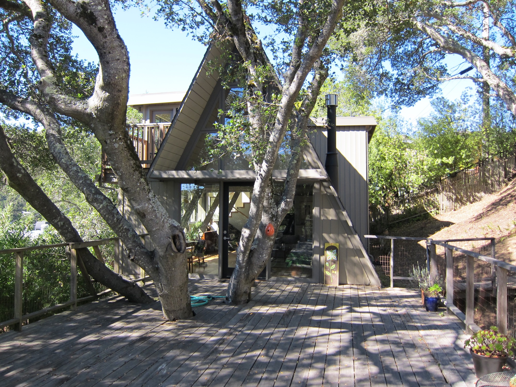
O’Neil loved the house at first sight. He liked the way it was situated in the street and on the lot, embracing oak trees. There was more than meets the eye, though. “The house spoke to us,” he recalls about the day he and his partner, Andrew Loesel, discovered the faded treasure during an unplanned stop on a road trip. “There was something special about it. It was asking us to save it. There was a story there,” O’Neil says. “The woman selling it thought we were insane.”
“There was something special about it. It was asking us to save it. There was a story there.”
The Californian has chronicled the history and renovation of the Reemelin A-frame on his blog at aframereframe.com. But before O’Neil could bring the 1,265-square-foot (ca. 118-square-meter) house back to its beauty, he had to undo a poor renovation. An unpermitted addition built in 1964 had left the house with uneven floors and structurally unsafe. By the time O’Neil purchased the house from the third owner, it had been virtually untouched since 1980, with the exception of a new roof from twenty years ago. “We tried to understand what the house originally was like,” he says. “Our goal was to keep the integrity of the house, but make it modern.”
“Our goal was to keep the integrity of the house, but make it modern.”
Once their contractor ripped out the remnants of shoddy remodeling, the house had no structural problems. With elements like a wobbly staircase and an awkwardly placed bathroom gone, O’Neil could rethink the layout. “It was like a puzzle, once we realized what we needed to do.” After updating the electrical and plumbing, and installing insulation, they could focus on designing the house with a nod to its midcentury modern architecture and interior.
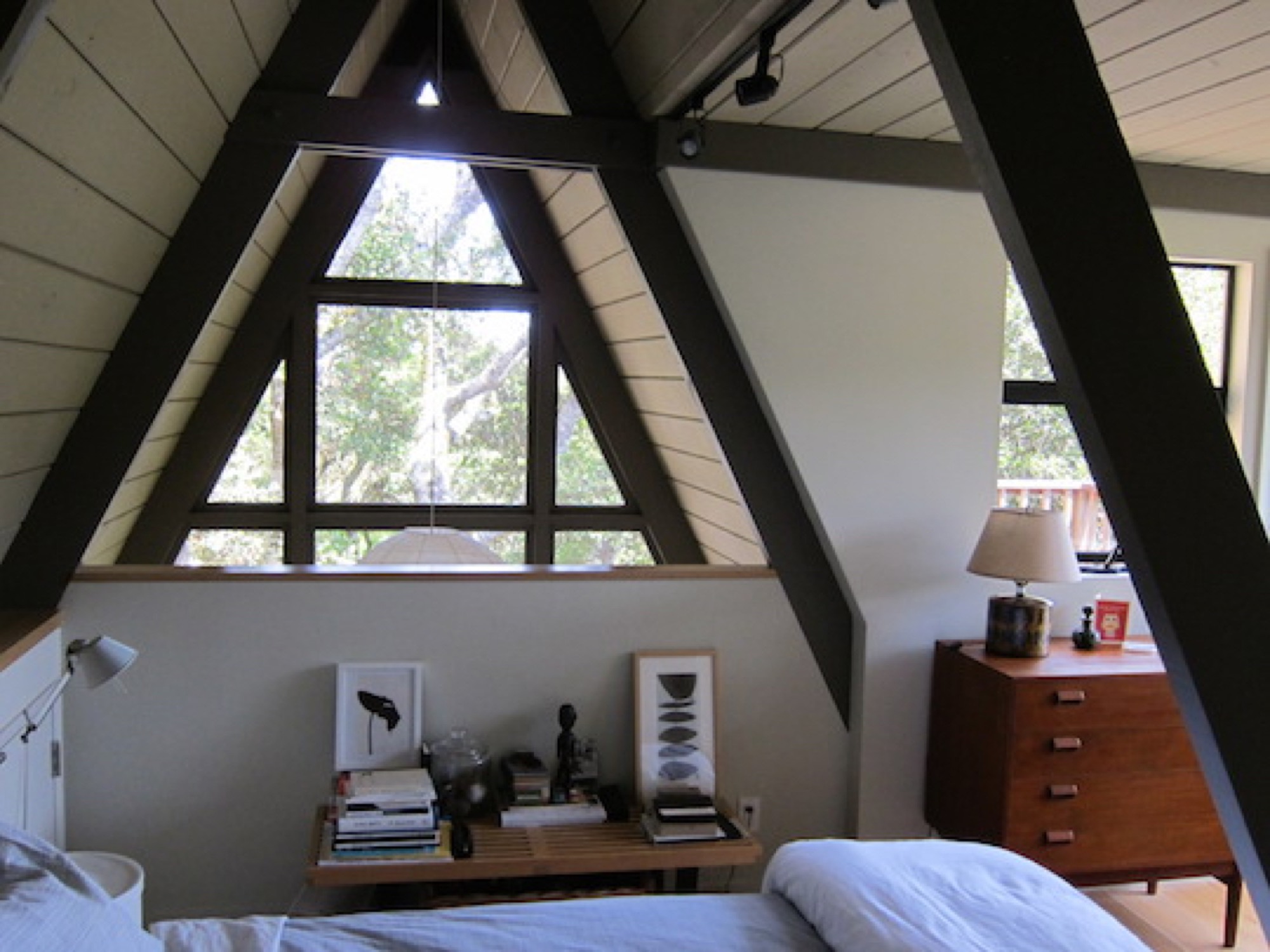
Living in San Francisco at the time, O’Neil and Loesel had bought the house for a weekend home, but later decided to live there full time, in the spirit of living smaller and simply. “If a house is well-built, it doesn’t have to be big,” O’Neil says.
“If a house is well built, it doesn’t have to be big.”
In fact, Randl agrees that in the context of the small-house movement and people’s yearning for a simpler, minimal lifestyle, the design concept of the A-frame could once again fit contemporary zeitgeist. “It’s got that reference to the past while also being modest,” the architecture expert says. “That has appeal again.” △
The Skyward House
Japanese architect Kazuhiko Kishimoto designs a human-scale house for a retired teacher
Dwelling in a tiny Tokyo apartment for decades, the school teacher had dreamed of a vegetable and flower garden with a little house—but never of the inspiring minimalist home she eventually built in the woods of her native hamlet. Architect Kazuhiko Kishimoto designed for her a white, womblike core with skylight and outward-focused spaces affording views of her passionately cultivated paradise, plus Mount Fuji and the Japan Alps at a distance. Yoko Fushimi adores her house. It is a small wooden cube set on a slope overlooking a rippling expanse of mountains rising west of Tokyo toward the crescendo of the Japan Alps. The modest exterior belies an unusual and conceptually exciting interior, composed of what architect Kazuhiko Kishimoto calls “inner and outer spaces.” Aside from a skylight at the apex of its peaked ceiling, a pure white, womblike inner space offers few glimpses of the outside world. Conversely, the low, wood-paneled outer spaces focus almost entirely on the surrounding environment. After three years, Fushimi still delights in a house full of interesting contrasts and surprising shapes.
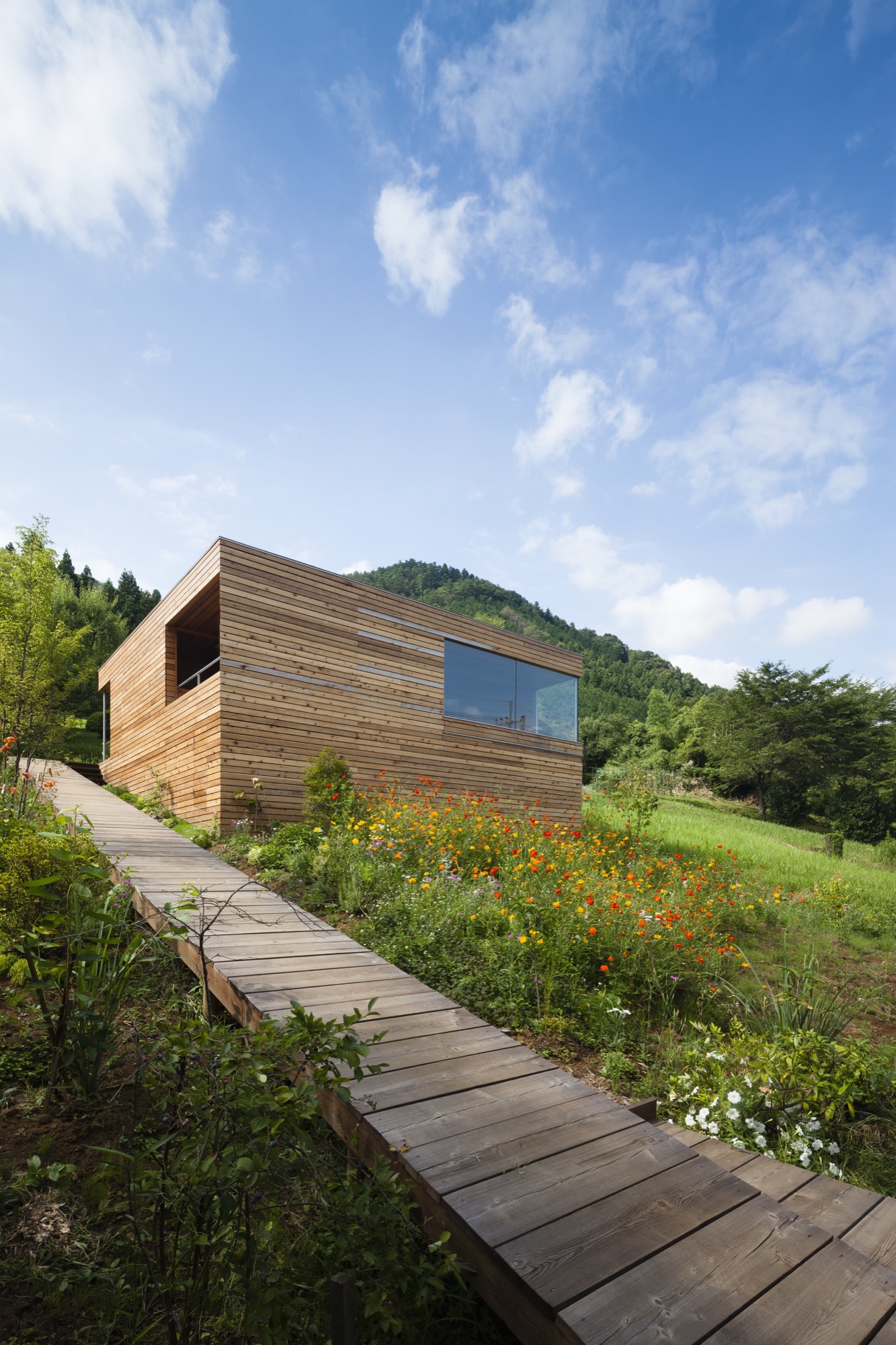
When she first set out to build a house, however, she wanted none of these things—or at least she didn’t know she wanted them. “I never dreamed I’d have a house as wonderful as this. The way the light changes on the white walls, the views at night…I didn’t request any of it,” she said on a recent afternoon. She was sitting in one of the outer spaces, a pentagon-shaped living area dominated by a large window that overlooks the mountains and creates a sense of floating in the sky. A hibiscus plant bloomed vibrantly in one corner. Across from it, on a low sofa, sat Kishimoto; the architect and his client have maintained a cordial relationship since the house was completed.
What she had initially wanted, Fushimi explained, was a garden. She grew up in a large traditional house a five-minute walk from her current home, on the eastern edge of Yamanashi prefecture. The back of the house peered down on a maze of mist-filled valleys, while the front faced a lofty stretch of the Koshu Kaido, one of the five great roads of the Edo period (1603-1868). Many of Fushimi’s neighbors grew vegetables or raised cows to supplement the occasional visit of traveling merchants. Her father, too, would rise early to tend his garden before heading to work at city hall. Mostly he grew flowers, which bloomed in succession throughout the warmer seasons. Fushimi had dreamed about having her own garden ever since. But after high school she had moved away to study education, and then settled in Tokyo, where she remained for forty years, teaching elementary school and living alone in a small apartment.
She dreamed of a garden with a house
As retirement neared, Fushimi decided to return to the hamlet where she had grown up and build herself a house with a garden (or rather, a garden with a house). “The problem was, I didn’t know how to get a house,” she admitted. When she came across an advertisement for a free seminar in downtown Tokyo about “serious home construction,” she decided to attend. Kishimoto was one of the speakers. “It was like love at first sight,” she joked. “I wanted him to design my house. I liked what he had to say.”
“It was like love at first sight. I wanted him to design my house. I liked what he had to say.”
A very human-sized home
“What all my houses have in common is their human scale,” he explained as he sat in Fushimi’s very human-sized home. “The height of the ceilings and the size of the rooms are small and compact, and as a result, the houses themselves are small. But I don’t design individual rooms. I design places that are connected with each other so that you can always sense the whole. They’re very comfortable to be in.”
“What all my houses have in common is their human scale...I design places that are connected with each other so that you can always sense the whole.”
Tiny houses abound in urban Japan, where firms such as Atelier Bow-Wow and Schemata Architects have found mind-bending uses for any chink in the crowded landscape. Most of these, however, are responses to site limitations. Kishimoto was after something different. He wanted to revive a Japanese design tradition that had always made more sense to him than conventional Western architecture, regardless of site size.
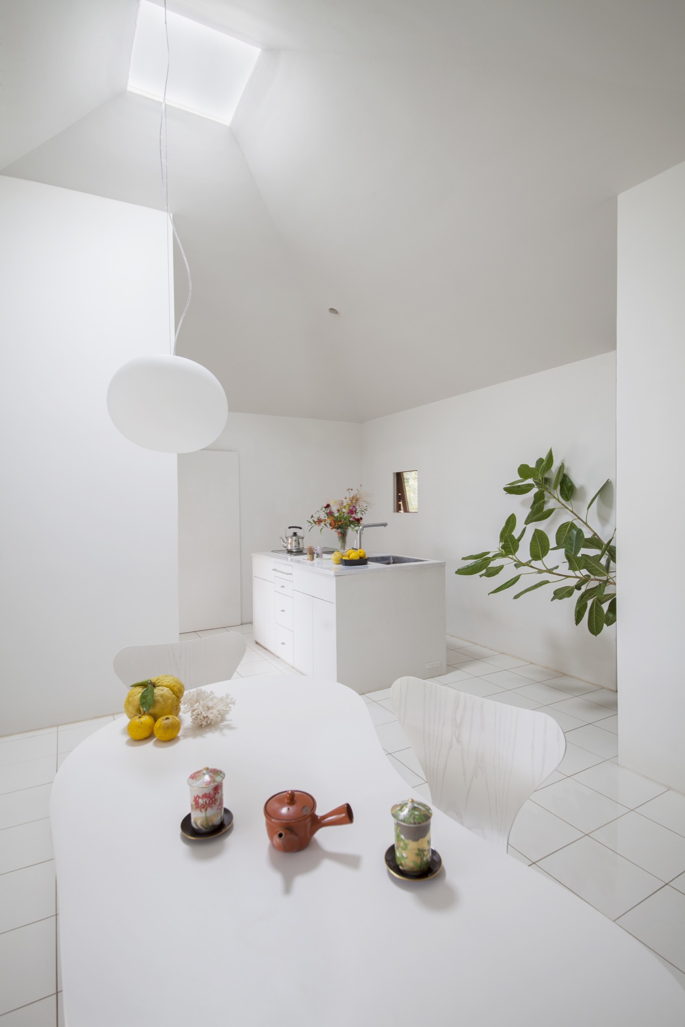
“If you enclose a room with walls, no matter how big it is, it feels small,” he said. However, this Westernized approach to home design had become increasingly common in Japan since the 1950s. Kishimoto wanted to do the opposite: make small spaces feel big through creative design. When he set up his own firm in 1998, he turned to traditional architecture for inspiration.
Japanese building tradition — on the mat
Since at least the 1500s, Japanese builders have been using a standardized set of architectural dimensions derived from the size of the human body and the inherent structural limitations of wood. For example, one key unit sets the size of a tatami mat at just under six feet by three feet, around the size of a reclining adult male; as an old proverb points out, all the space you really needs is “one mat when you’re asleep and half a mat when you’re awake.” Three of these mats might make up a tearoom, and five might make a family sleeping area.
The houses comprising these units were often small, but they contained a number of techniques for creating the sensation of spaciousness. “There was a unique way of connecting rooms, a secret hidden in the design,” Kishimoto said. By and large a house constituted a roof, a floor, some posts, and some sliding screens. Spaces were interlinked, solid walls were scant, and inside led fluidly to outside. Kishimoto wanted to translate these concepts of connectivity and human scale into the aesthetic language of modern design.
“There was a unique way of connecting rooms, a secret hidden in the design."
Fushimi hadn’t thought much about architecture until she heard Kishimoto talk about these ideas at the seminar, but what he said appealed to her instinctively. Plus, she liked the look of his houses. After the talk she decided to send him a letter. “I assumed he’d turn down such a small, low-budget project,” she said. Instead he invited her to discuss the project in person, and ultimately took it on.
The design process spanned two years, partly because of the town’s very slow-paced permitting procedure. Kishimoto began by helping Fushimi select a building site from amongst several owned by her family. The lot they settled on had very few technical limitations: there were tree-filled views on all sides, no visible neighbors, and plenty of space. They also discussed her requests. These included wheelchair accessibility so her aging father could visit, a skylight so that light would pour in like it had in a church she once saw on a trip to Europe, and in her words, “three pages crammed with detailed requests, but not a single one that got to the heart of what I wanted.”
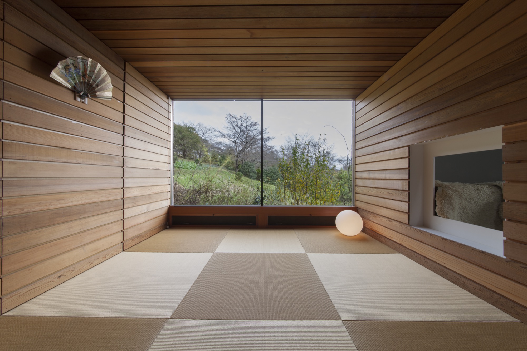
Fortunately, this gap between what clients say and the fullness of what they truly want is something Kishimoto devotes considerable thought to in his practice. “Words apply to objects, like the size of the rooms, and any contractor can meet those requests. My role is to respond to the desires people can’t express,” he said. He engages his clients in chitchat, watches their expressions, and replays conversations again and again in his head, trying to grasp what they mean by vague terms such as “beautiful” or “site-appropriate.” “You don’t draw closer to happiness or beauty in a mechanistic way, like climbing a staircase or adding one plus one,” he said.
“Words apply to objects, like the size of the rooms, and any contractor can meet those requests. My role is to respond to the desires people can’t express.”
In Fushimi’s case, Kishimoto thought about how her long years in Tokyo and her request for a churchlike skylight—“a very urban desire”—contrasted with her rural upbringing and her wish to be surrounded by greenery and gardens. Internal contradictions of this sort are common, but how to deal with them? “Modernism wants to clean things up, make them easy to understand. This is city, this is country,” he said. His response was messier: he wanted the visual and spatial contrasts of the house to reflect Fushimi’s own complexity.
A modern take on the little cabin in the woods
What emerged was a very modern take on the little cabin in the woods. The outside of the simple form is clad in unpainted red cedar planks separated by gaps of approximately four-tenths of an inch (one centimeter), which are intended to lighten the building’s visual impact on the landscape. “I thought it would melt into its surroundings as the trees in the garden grew up around it,” Kishimoto said. A wooden ramp leads up the left side of the lot, past a lush garden, and around back to the entryway. The back corner of the house has been sliced off so that the door sits at a diagonal, and the excised space serves as a small porch, now tangled with potted passion-fruit vines and avocado trees.
“I thought it would melt into its surroundings as the trees in the garden grew up around it.”
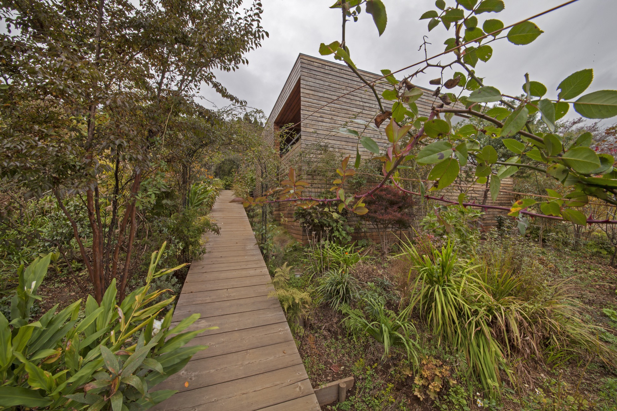
This wild, leafy space opens onto an entirely different world: the white, light-filled core of the house. Kishimoto intended this inner area to serve as a comforting cocoon where Fushimi could retreat when storms or darkness swept over the mountains. It contains the kitchen, computer area, toilet, and sleeping niche. The walls are white plaster, the floors shiny white ceramic tile, and the custom-made table and kitchen-island are white, as well. Light enters from an opening at the peak of the pyramid-shaped ceiling. Kishimoto encircled this skylight with a steel ring for structural support; the ceiling beams rest on the ring instead of on one another when they converge at the top of the pyramid.
Four “outer spaces” adjoin the inner core. One, reached by hunching through a rectangular opening of Alice-in-Wonderland proportions, is a cube-shaped tea room whose glass outer wall reveals a diagonal line of grass and cherry-blossom trees. Fushimi often uses this room to arrange flowers. Another contains a fragrant pinewood bathtub and a wood-framed window that lets in birdsong and cricket chatter. A tiny porch sits adjacent to the bath. Finally, there is the five-sided sitting area with its sweeping view across the mountains. All four of these outer spaces have much lower ceilings than the inner core, and all are finished in the same cedar panels used on the exterior; the interconnecting lines of the panels strongly accentuate the architectural geometry.
Altogether, inner and outer spaces measure only 640 square feet (ca. 59 square meters). To Fushimi that feels large: she spent decades in a 260-square-foot (ca. 24-square-meter) apartment. She continues to find surprises in her new home. “One splendid thing I recently discovered is that if I stand at the exact midpoint between the kitchen and the bed and sing, my voice echoes so beautifully I sound almost like a professional soprano,” she wrote to me in a letter.
“One splendid thing I recently discovered is that if I stand at the exact midpoint between the kitchen and the bed and sing, my voice echoes so beautifully I sound almost like a professional soprano.”
The most remarkable part of the house, however, is that which Fushimi has created herself. In three years the bare slope of the lot has become a profusion of trees, flowers, and bushes. Kiwi vines, morning glories, honeysuckle, and wild roses twine around moss-covered tree trunks and arbors. Lilies, ferns, and violet sage crowd the pathways. The garden has a wild feeling that is rare in Japan, but perfectly suited to its surroundings (while weeding, Fushimi has spotted foxes, deer, wild boars, monkeys, badgers, and three black bears). She tends to her garden most days that weather permits, and thinks of it as a present to the birds and butterflies and people who wander past. But most of all, it is a long-awaited gift to herself. “Right now,” she said, “I’m completely caught up in playing in the dirt.” △
Refuge in Concrete
Refugi Lieptgas is the negative imprint of its ancient predecessor
Using the decrepit log cabin as mold, Swiss architect Selina Walder sculpts a minimalist mountain retreat in concrete, fossilizing the texture and character of the historic hut that once stood in its sylvan spot on the meadow. From the trail, hikers may mistake Refugi Lieptgas for the inconspicuous log cabin that had stood in this very spot for decades. Yet, at second glance, the tiny refuge tucked against boulders at the edge of the Flims forest in the Swiss Canton of Graubünden reveals itself as the negative imprint of the old structure. The stunning effect of the cabin cast in concrete is incongruously sublime; details like the wood grain, the cracks, the door lock set in stone are all true impressions of the past.

Stonewalled Design
The Maiensäss mouldering on the mountain meadow had long served its purpose of sheltering pastoralists during grazing season. Years back, Guido Casty, the 1974 bobsledding FIBT World-Championship silver medalist and local restaurateur who owns the property, had planned to replace the crumbling herder’s hut with a new cabin he could rent out to vacationers. The building permit was denied. The new design needed to somehow incorporate the existing structure. He gave it a rest.
When his itch to tackle the old cabin returned, Casty tasked an architect friend in Basel with a new plan that would comply with the community’s stipulations. Since the project was small and the architect was two and a half hours away, Casty asked Selina Walder of the local Nickisch Sano Walder Architekten to manage the construction. The Flims native had been waitressing for him for many years and graduated from the renowned Accademia di Architettura di Mendrisio, where she had studied architecture under Valerio Olgiati, one of Switzerland’s foremost modern architects.
Walder agreed but didn’t like the design she was handed from the Basel architect. The twist: The building authorities had miscommunicated the structure’s prescribed maximum footprint. As a quasi apology, the local architect was allowed to rebuild from scratch, as long as her plan adhered to the original square footage, and the new design portrayed the character of the old log cabin.
What did that mean? “I struggled with that provision,” Walder admits. “Did I need to rebuild with wood?” She inquired further but was discouraged from asking too many questions that would only have to be addressed with more rules.
Walder’s reluctance to use wood lingered. “The spot was mossy, woodsy, musty,” she remembers. “You could tell the old log cabin hadn’t taken well to sitting on the forest floor.” Besides, the original had been constructed from surrounding trees. And today’s way of driving to the lumber yard and transporting the wood back to this unspoiled spot at the forest’s edge didn’t seem appropriate to her.
“The spot was mossy, woodsy, musty. You could tell the old log cabin hadn’t taken well to sitting on the forest floor.”
Serenity set in stone
Thus, the fossilization idea was born. “I did love the sylvan setting back in there, where the old cabin cowered against the boulders,” Walder says. “I wanted to preserve that, not fuss about a new design. I wanted everything to be the way it was. Except, I didn’t want to rebuild in wood.” Her answer was to cast a negative imprint of what once was, from concrete, to create a simple refuge that—now literally—mirrored the character of the derelict log cabin.
The young architect intended to capture this special place, the woods she had loved since childhood. “I wanted people staying at the cabin to understand the forest in all its beauty, all its fascination, all its facets.” In fall, for example, the new cabin's round skylight gives view to the vermillion crowns of the beech trees above. The main room’s large window is purposefully set low to provide an ideal view over the clearing when sitting at the table. “Deer come out of the woods at dusk. It’s very fairytale-like.”
“I wanted everything to be the way it was. Except, I didn’t want to rebuild in wood.”

Concrete continuance
Walder knew of artists who sculpted works of art from the composite, and she had built countless concrete models in architecture school. While the material wasn’t completely foreign to her, she didn’t know what would happen on site. Casting a concrete shell from the mold of an existing log cabin was an experiment she and, luckily, the builder were curious to dare.
To visualize the construction process for herself and to be able to articulate the steps to her crew, the architect built a model from little sticks and cast it in concrete.
The real hut was set aside by a crane and stripped of anything that wasn’t part of the structure: small laths, twigs, and rocks that inhabitants had stuffed between the logs to chink the walls. The gaps between the logs were then filled with cut-to-fit slats to gain an even leading edge and prevent the concrete mixture from leaking out. Once the foundation was finished, the old-cabin-turned-mold was heaved back in place. The builders constructed the inside of the mold structure with standard form boards. The new cabin was poured in place. After the concrete hardened, the old log cabin was removed and deconstructed.

Poured patina
The original cabin not only lent the new structure its form but also gave it marvelous detailing, most notably a beautiful wood-grain pattern, now preserved in time and stone. The concrete was even the same shade of gray as the old cabin’s weathered wood. The logs left behind a relief ideal for moss to take root and flourish again as it once had.
Walder couldn’t have envisioned all the fascinating effects in advance. “We spent so much time worrying about the construction itself. Will the concrete cling to the cracks in the old logs? Will the corners crumble off?” she remembers wondering. “I was positively surprised and really happy how precise this sculpture turned out.”
Inside, two worlds
Walder decided early on to split the living space into two levels. “Sleeping and living in one room inevitably leads to a camping atmosphere,” she says. The architect aimed instead at designing a much more luxurious retreat with two distinct worlds, upstairs and downstairs.
She wanted guests to feel sheltered in the bedroom below, tucked away in a cave rather than feeling trapped. Thus, she added a large window above the bathtub and a door that leads directly into the forest. “The world of rocks and roots back there reminds me of Alice in Wonderland,” Walder says. “Another door into another kingdom.”

Warm concrete
Concrete may seem to be a debatable material for a cozy cabin in the woods. For Walder, it was the right choice. “The forest in Flims is scattered with the kind of boulders you see from the lower level of the cabin. It’s what makes this area so magical: the caves, the moss-covered rocks. Concrete is not much different. It’s man-made stone. To me, it fits quite well into the setting.”
In fact, some interior features are cast in concrete as well: a pedestal with bathtub and a lavabo on the lower level, and a solid bench along the entire wall beneath the large window on the main floor.
“People are always afraid concrete would be cold,” Walder says. The concrete inside Refugi Lieptgas is actually heated with an under-slab radiant heating system that even loops through the tub and the bench. The concept would not work for a private cabin that’s used only occasionally, because the concrete takes a long time to warm up. With the rental cabin booked solid, however, the stone can continually retain its warmth.

Taking refuge
Literally left without a roof over their heads during the remodel of their own house last fall, Walder and her partner, Georg Nickisch, took refuge at Refugi Lieptgas for a week with their infant daughter and the dog. The architect is pleased with her firsthand experience. “Living there feels very cozy, very protected and private—and at the same time elevated,” she reminisces. “Everything is tiny, but you don’t feel the smallness. You’re in your own small kingdom, separated from the world.” △
"Living there feels very cozy, very protected and private—and at the same time elevated.”
iRetreat
The architects behind Apple stores worldwide design Lake Tahoe weekend homes for Silicon Valley's young tech elite
By creating a community of alpine-modern Lake Tahoe weekend homes, the architecture firm that designs Apple stores worldwide feeds the hunger of Silicon Valley’s young tech elite for authenticity and a real place. Gregory Mottola knows Silicon Valley's young tech elite. The principal leads Bohlin Cywinski Jackson’s San Francisco office, which designs the places where they shop (Apple), work (Square, Pixar), live (modern custom homes in the Bay Area), and play (Newport Beach Civic Center and Park).

The newly rich thirty-somethings working for technology, Internet, and media companies in California’s Bay Area are beginning to seek opportunities to invest their money. And they yearn for authenticity, for a real place, the mountains, the forest. “These folks work in very intense environments, focusing on something that is often very abstract—it’s technology, it’s writing code, it’s engineering things in a virtual space,” Mottola says. “Many of them have a desire to go back and to be connected to real things and to nature.”
Lake Tahoe, California—watersports haven in the summer, snowsports paradise in the winter—is a desirable weekend and holiday destination for the Silicon Valley set. “Some of them are flying their own jets from San Jose to Truckee and are there in a matter of an hour and a half, and the drive isn’t so bad either,” Mottola says. The problem: These urban hipsters appreciate an aesthetic much more modern than the traditional mountain architecture that dominates the Lake Tahoe resorts—Mottola calls that referential chalet and log cabin look “relentless sticks and stones architecture . . . very heavy, overly articulated.”
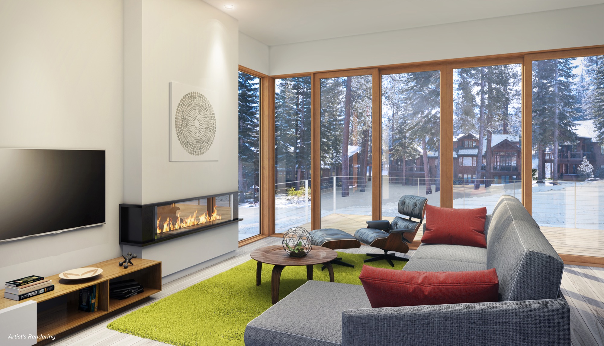
Weekend-escapists with money
Mountainside Partners, a Tahoe-area developer specializing in resort construction, picked up on the new market need and called Mottola’s team in San Francisco. Why BCJ? That the architecture firm typically doesn’t work with developers didn’t matter. With a design portfolio that boasts Square, Inc. headquarters, Pixar Animation Studios, and Apple retail outlets worldwide, including the (literally) groundbreaking Fifth Avenue store in Manhattan, Mottola and his colleagues understood the target market and the developer's vision for a planned community of progressive luxury ski-in/ski-out residences. BCJ was the ideal partner in rethinking resort living for a new generation of weekend-escapists with money, pouring in from the Bay Area on Fridays after work. And the Stellar Collection at Northstar was born.
Mottola agrees with the developer’s calculation that there is a sizable target audience of young, urban professionals looking for meaningful ways to spend their cash. “With the economy here being so focused on advancing technology, there is the thirty-something crowd, very intelligent and hungry for a connection to a real place, a real landscape, and the recreational opportunities that go along with that,” says the Carnegie Mellon University graduate. The idea of designing not the usual super high-end custom home but a series of spec homes “sounded like fun” to him—“thoughtfully detailed and spatially powerful homes . . . that was a great challenge for us.”
The Mountainside setting
The Northstar resort looks to the north, Lake Tahoe at its back, behind the ski slopes. “It’s a remarkable setting,” says Mottola. “The two ski-in/ski-out sites we are working on flank this ski run, set in such a way that you get these fantastic views of the ski run, the short view of this wooded mountain’s side, and these amazing sunlit views of the Sierra Nevada Mountains and Martis Valley as your backdrop.” In siting each home on its parcel, much thought was given to the views and the connection to the landscape. The single-family residences descend down from the driveway—“You enter into this elevated world, you feel like you are perched up in the trees, in your own little world, your own connection to this beautiful Sierra mountainscape,” Mottola says. “Even though the structures are relatively close to each other, you get this little slice of the horizon.” Exit out the lower level, and you are on the ski slope.
“These folks work in very intense environments, focusing on something that is often very abstract... Many of them have a desire to go back and to be connected to real things and to nature.”

Elemental palette of materials
“We are satisfying this appetite for authenticity by using a really elemental palette of natural materials, detailed in a simple way,” Mottola says, describing the “tension” between the natural materials, such as stone floors and wood floors, bringing the outside cedar siding inside—and the contrasting glass and metal. What’s more, Mottola knows energy efficient design appeals to the target demographic. The Stellar Collection is going to be LEED Gold certified; BCJ even hopes for platinum. “Resource efficiency is really important to the folks we design for in the Bay Area.”
Designing spec homes for a developer was a very different process for Mottola's architecture practice, which typically works directly with homeowners. Relying on each others’ respective experience and market studies, BCJ and Mountainside chose the features and amenities they thought would sell. “When we work with a homeowner, it’s a very personal, very tangible connection to them and what’s interesting to them,” says Mottola, adding that yet again some design basics remain constant, such as celebrating the attributes of the landscape by organizing a structure to take advantage of the view and the sun. “All those basic design moves are the same,” the architect notes. “Where this diverges is when you have to assume what will be desirable by buyers whom you don’t know. So we design what we think is really appealing, spatially or architecturally, the detailing in the way the space comes together. The developer has parameters in terms of what they think the market demands, but they are looking to us, our vision for this to be a successful piece of architecture.”
That vision is informed by BCJ’s first-hand experience in working directly with the young tech elite of Silicon Valley. “We do have some insights, because not only are we designing some primary residences for certain individuals in that world, but we are also designing a lot of tech companies’ office spaces,” says Mottola. Seeing what his clients are interested in at work helps him understand what they may want in a primary or secondary home. “For instance, they all crave opportunities to collaborate and share ideas, so you want to design the social aspects of a home in a way that supports that same kind of thinking about how you interact.” A “more prosaic thing” Mottola has learned from creating office spaces for his clientele? “You make a big deal out of really good-quality coffee as the draw for people,” the architect reveals. “Single-source roasted beans, artisanal, handcrafted . . . that attention to detail and interest in the story behind the experience starts to inform the design.” Similarly, his Silicon Valley clients want to know the story behind a building material or interior finish—its source, why the designer chose it, how it relates to the place and makes a homeowner’s experience more authentic. “They care about that detail way more than other demographics seem to, interestingly.”
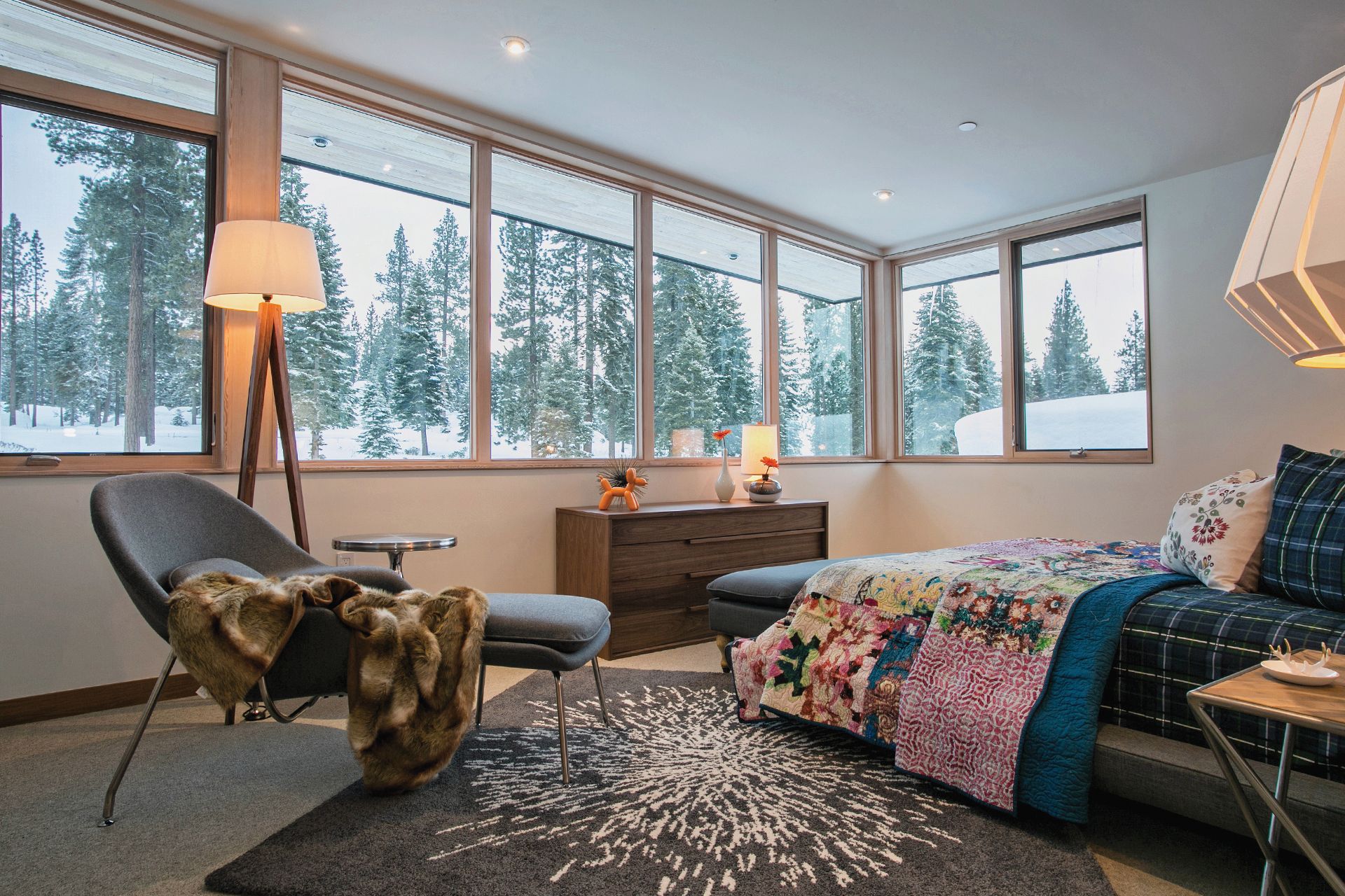
Designing Apple stores
BCJ has been designing Apple retail stores around the world for more than a dozen years. “The relationship started even before that, when my colleagues here were working with Steve Jobs, doing the Pixar Animation Studios headquarters in Emeryville here, that’s really why we ended up in California,” Mottola says. Steve Jobs purchased Lucasfilm's computer graphics division from George Lucas in 1986 and established an independent company that would later be named Pixar. “At the time, Steve was getting back involved with Apple, and they started this retail program,” Mottola recalls. “At the time, everybody was like, ‘That’s crazy. That’s never going to succeed.’ And you look back now, and you think it’s crazy that that was the prevailing wisdom at the time. But in those intervening years we have been able to collaborate with Apple, doing these remarkable stores in really diverse places, notably the one on Fifth Avenue in New York City, that’s a glass cube.”
According to the architect, who compares experiencing “these really amazing products” in an Apple retail store to “a museum-like setting,” the glass structures many Apple stores feature push the limits of construction through the innovative use of technology. “And then to take those ideas and put them into existing historic buildings all over the world, in places like London and South America and Spain and Italy . . . it’s been a unique experience for our practice, because most often we are hired to do one building for one client. It’s a one-time experience, and you kind of wish you had a chance to go back and do it again. And in the case of the Apple stores, we are constantly refining the design ideas. It’s almost more like product design.”
“In the case of the Apple stores, we are constantly refining the design ideas. It’s almost more like product design.”
Just designers
On the other hand, it seems important to Mottola, who has been with BCJ for almost a quarter of a century, to convey that his firm approaches each design assignment without preconceptions about what the final result should be and instead figures out what it wants to be once his team understands the context, the client, the site. “We want to make sure what we are designing really resonates with that place and with the clients and their dreams and their aspirations,” says Mottola, whose work has won numerous awards from the American Institute of Architects. “We don’t just want to be the Apple store architects or the people who do these great houses or the people who do these university buildings. We want to just be designers. At the end of the day, we are trying to make really compelling, emotionally powerful places for people, whether they are private homes or places where they are doing research or places where they are shopping, we want them to appeal to their hearts more than reason.”
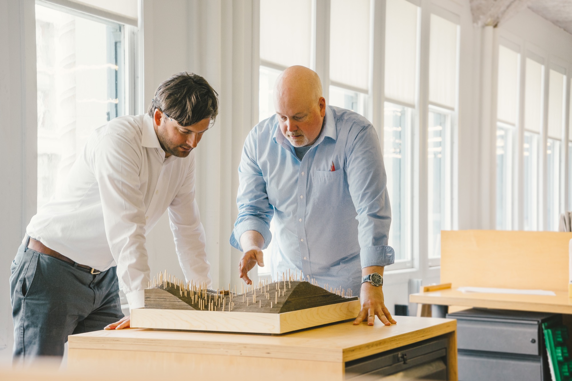
Asked how his experience with designing the Apple stores and workplaces for companies like Square, Inc. has influenced his approach to residential projects, such as the Mountainside Northstar Stellar Collection, Mottola falls contemplative. “It’s hard not to have your experiences influence what you do, absolutely, but the way we think about how a space feels and how you might put fenestration into a building . . . to me it’s just all design.” One thing he is sure his team has learned from designing Apple stores: “Using glass in some homes in remarkable ways we wouldn’t have known how to do without having the experience with Apple. And without a doubt, the research-driven investigation into materials and construction is something we have learned how to do much better, having worked with Apple.”
Designing for the heart
Mottola, who grew up just outside of New York City in Northern New Jersey, knew from a very young age that he wanted to become an architect. “I was fascinated with construction. And once I started to appreciate the way people build things, I began thinking about how do you design and shape space in a way that really resonates with people,” he says. “A lot of people are really good at doing well-considered, responsive buildings, but there is this other layer. Sometimes you walk into a space and you have an emotional reaction to it. You feel something in your heart. Those have always been the buildings I’ve been most drawn to.”
Is designing for the heart taught in design school, though? “You learn a lot in design school about multivariable problem solving, if you really want to get nerdy about it,” Mottola says. “But what I know today about this emotional aspect of design, I actually learned from my mentor here at the firm, Peter Bohlin,” Mottola says, designating the man who puts the “B” in BCJ “a master at creating space that elicits that emotional response.”
“Peter always talks about being inspired by the great Scandinavian modernists, so getting exposed to that work, too, is deeply embedded in the DNA of our practice,” Mottola says. “This idea that you make modern buildings, but you should do it in a way that they are not cold and sterile, but they are evocative and warm and livable and comfortable is something we aspire to do on every project.” △

