Inspirations
Explore the elevated life in the mountains. This content debuted in 2015 with Alpine Modern’s printed quarterly magazine project.
A Whistler A-Frame
Scott & Scott Architects design an outdoorsy Vancouver family’s dream cabin
If the multiple languages and accents overheard in lift lines and on gondolas tell any kind of a story, it’s that everyone from everywhere with a serious interest in skiing or snowboarding is making a beeline for Whistler Blackcomb. More and more of those visitors are putting down roots with a second home in this outdoor wonderland north of Vancouver, Canada. Some buy condos in the heart of Whistler Village or townhomes with ski-in/ski-out access to the slopes. Others build luxurious heavy timber colossi in swank residential areas that have grown up around the resort’s edges.
No matter their size, most of these mountain retreats share the following design elements: wilderness building materials, either structural or decorative, and floor plans and amenities that mimic those found in city interiors.
While there is nothing wrong with having a second home in the mountains that works much like a primary one in the city, some younger ski and snowboard families have begun to question why they would want to occupy such a space when a more indigenous—and much radder—alternative is available: an iconic A-frame cabin.
Return of a classic-modern icon
Ah the A-frame, that staple of mid-twentieth-century vacation home vernacular that was massively popular across the North American outback from the 1950s through the 1970s. There is no way this odd-looking triangle-shaped structure, which got its start in ancient days as a roof hut in Japan and a storage shed in Europe, could be mistaken for anything urban. Attempts in the sixties and seventies to make it a city building resulted in churches, fast-food joints, suburban houses and motels that were novelties even then.
The classic post-Second World War A-frame cabin was a purpose-built backcountry bolthole. Its simple construction, minimal building materials and absence of fancy finishes made it a preferred DIY project for Mad Men-era handy men, and in the 1960s, A-frame cabin kits sold briskly. Most of these ready-to-assemble weekend homes shot up in snowy locales.
One reason for this is the A-frame’s radical roofline that extends down to the ground on two sides, which helps shed any snowpack. Another is its ability to capture natural light. The A-frame’s roof supports all of the building’s weight, freeing up the gable ends to be filled with wall-to-wall glass.
A third reason for its easy fit in alpine terrain is one you might not have imagined given the A-frame’s modern, inorganic appearance. In this landscape, it can be a chameleon, a slender, weathered wooden form indistinguishable from evergreen trees.
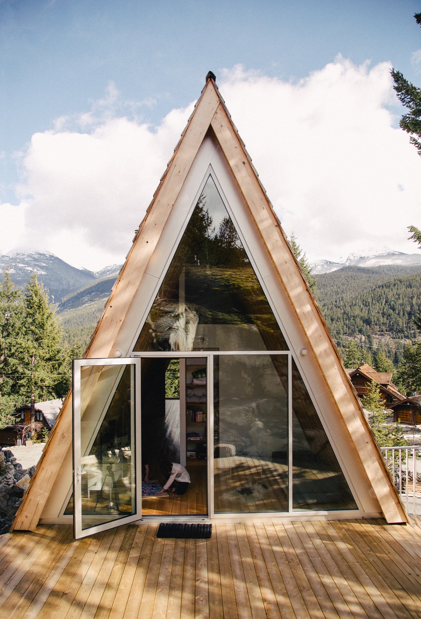
For all of its baked-in virtues and utter lack of pretense, the A-frame is enjoying a renaissance. Outdoor types who value authenticity are enthusiastically rescuing original 1960s and 1970s models, hand-building replicas (check out the Urban Outfitters online journal for directions on "How to Build an A-Frame Cabin") or commissioning fresh versions that honor the building's honest materials and original intent, which is what Vancouverites Melanie and Brenton Brown did when they gave the go-ahead for the elegant update pictured here.
A family’s dream
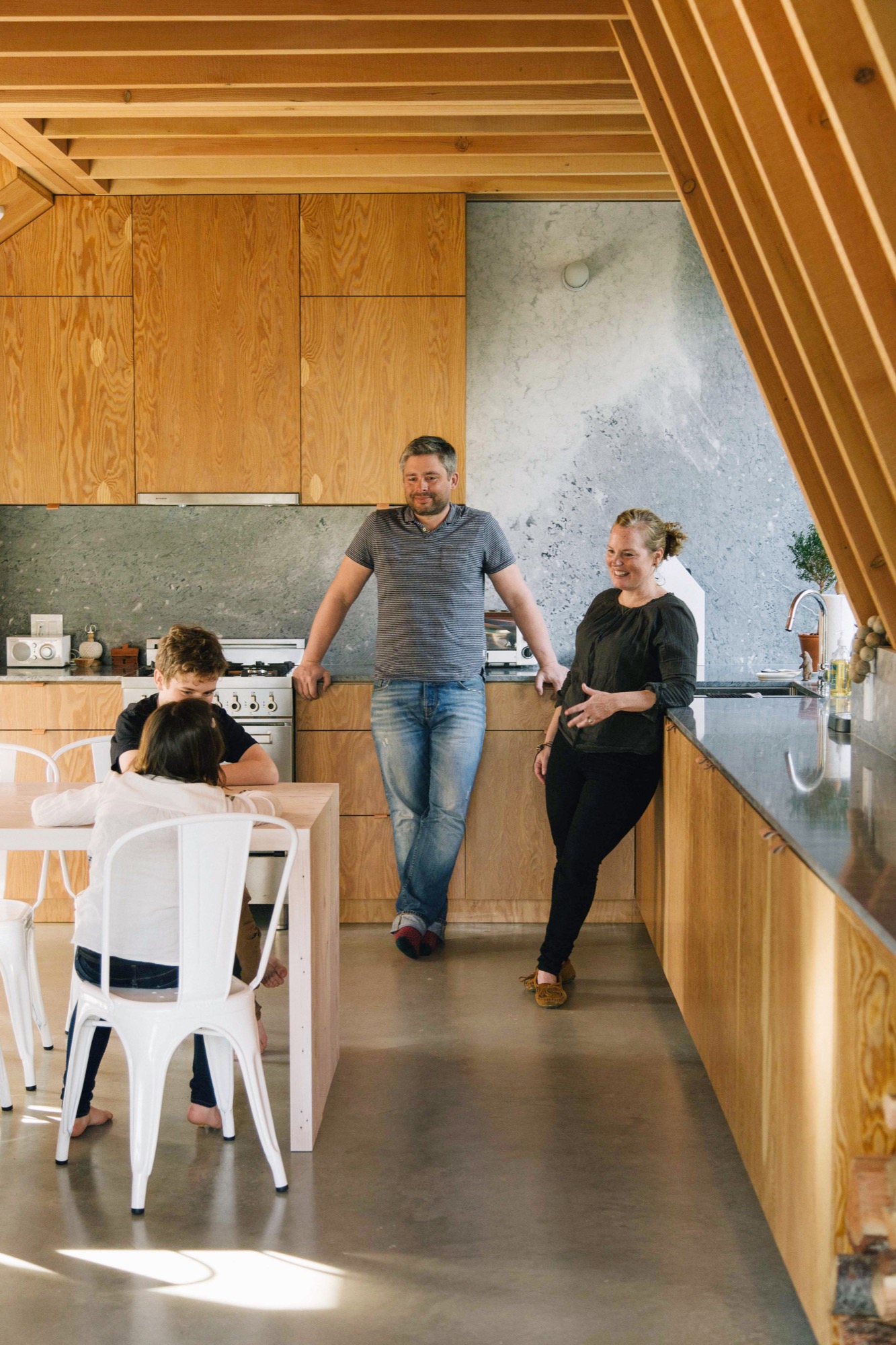
For years, the outdoorsy couple and their energetic offspring, Daisy and Finn, now eight and 13 years old respectively, bunked off and on with close friends in their 1980s A-frame in Whistler’s Emerald Estates neighborhood. In 2014, the family decided to build their own variation on a property up the street from their friends. “We wanted a new cabin that would not look out of place with the older ones in this area,” says Brenton, CFO for the Vancouver-based digital commerce platform Elastic Path Software. “An A-frame felt like the perfect fit for us,” says Melanie, who is an interior designer. “It has a retro feel we love and, obviously, we knew what we were getting into with this type of building.”
Idiosyncratic Emerald Estates
If you wanted to build a new A-frame in Whistler, idiosyncratic Emerald Estates would be the right place to do it. It is one of Whistler’s early neighborhoods, dating to the 1960s when the community mainly consisted of diehard Vancouverites willing to drive 75 miles of nasty road on weekends to ski its pristine powder, full-time construction and seasonal workers, plus assorted ski bunnies and bums.
A-frames are at home in this neck of the woods where a lot of the housing stock still has a throwback vibe. Among its early Whistler building types, Emerald boasts classic 1960s, 1970s and 1980s A-frames and Gothic-arches cabins (their bulbous bow-sided brothers), Heidi-style chalets and quirky hand-built dwellings such as Whistler’s famous “Mushroom House,” where, if Emerald Estates were a fictional fantasy world, Bilbo Baggins would want to live.
Although it is only a 10-minute drive from Whistler Village, Emerald feels off the beaten path. It is still a neighborhood more associated with local families than visitors. Most of the residents are old-timers and full-timers, “not weekend warriors,” says Melanie, laughing to think that this label could be applied to her little tribe.
Emerald’s topography is steep and wooded, with winding roadways that dip to reveal the teepee peaks of A-frames poking out above treetops and that rise to expose wide-roofed chalets juxtaposed with glacial rock formations.
The Browns’ property is open, steeply sloped and pie-shaped: wide at the front and narrow at the back where a four-story-high granite outcrop dominates. The site is high enough up the hillside that the evergreen trees, so plentiful downslope, have no effect on the view. “It’s panoramic, an unobstructed 180 degrees,” says Brenton, pointing north to Weart and Wedge mountains with Armchair Glacier sandwiched between them, then south to Whistler and Blackcomb. The family’s new cabin, designed by David and Susan Scott of Vancouver’s Scott & Scott Architects, capitalizes on all of this scenery.
The Scotts and the Browns
The Scotts are a husband-and-wife team who worked independently for years for prominent Canadian architects before forming an architecture practice together three years ago. Their office/home, which they share with two young daughters, is a converted butcher shop in the Mount Pleasant/Main Street area, currently the coolest neighborhood in Vancouver for young families to live.
Every project the Scotts have completed together has received public praise and attention either in a peer review journal, a lifestyle magazine or on a discerning design website—and sometimes all three at once. This past winter, the Scotts were recipients of the 2016 Young Architect Award from the Royal Architectural Institute of Canada. It is the first time the society has given this award to a couple.
The Browns were introduced to the Scotts through architect friends who admired their work. After seeing images of the Scotts’ own off-the-grid cabin at the north end of Vancouver Island (it appeared in the inaugural print issue of Alpine Modern magazine), the Browns were smitten with the Scotts’ understated, minimalist design and use of traditional and off-the-shelf materials in interesting and diverse ways.
Elemental, accessible design is what the Scotts are known for. “No one ever actually says this to us, but I think part of our appeal is that what we do is not outlandishly opulent,” says David, “so we end up with young families who want a holiday place in Whistler or Tofino [the surfing capital of Canada] but aren’t into building grand statements.”
“What we do is not outlandishly opulent, so we end up with young families who want a holiday place in Whistler or Tofino but aren’t into building grand statements.”
Working all angles
The Browns’ new A-frame may not be a grand statement, but it is an eye-popper, and when you begin to look closely at the design, you can see that it is an extremely intelligent and refined evolution of a basic building type.
Take the roofline, the A-frame’s defining feature. On a flat site, the roof would sit directly on top of the ground with identical triangular gables at either end. The challenge for the Scotts was how to incorporate these archetypical elements in an innovative way on a steep site.
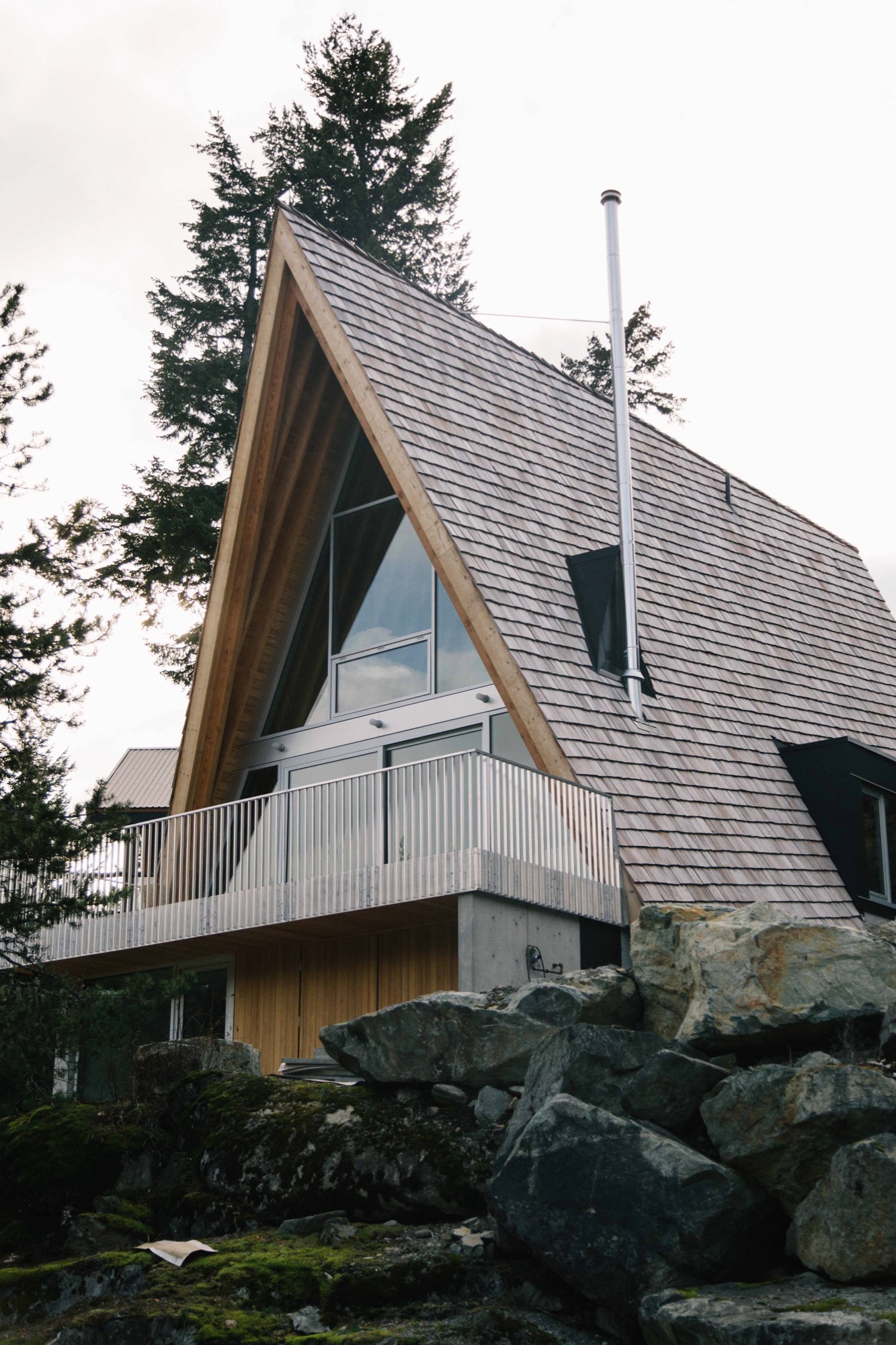
Their response was a three-story building, narrow at the back and wide at the front just like the shape of the lot, with different-size gables at either end and roof planes that follow the grade.
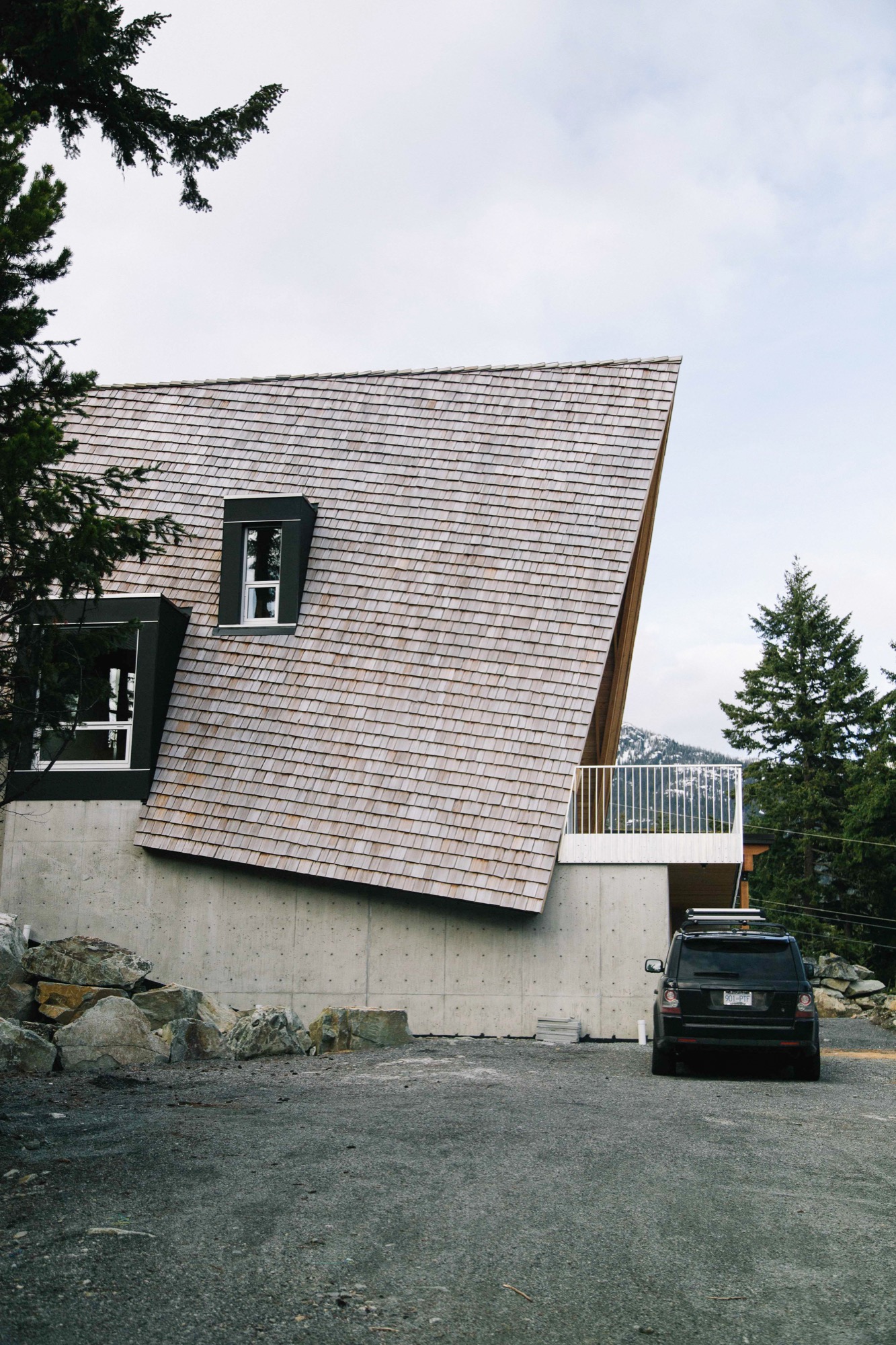
As with A-frames of old, the Scotts’ roof design is a declaration—but with a difference. Level at the top, the ridge has been pushed out beyond the front façade of the building, then the gables have been pulled back at an angle so that the bottom edge of the roof is now parallel to the slope not the ridgeline. Laying the shingles at this same gradient gives the roof its rakish appearance.
From the rear, the Brown’s cabin appears to be a single story defined by a slender gable tied, in classic A-frame fashion, directly to the landscape, in this case volcanic rock. What you are really looking at is the back end of the third floor, and the space inside is a den, which opens onto the generous patio the Scott’s fashioned from a flat space in the outcrop.
This rock face, which erupts out of the ground at the entry level and slopes up an additional 20 feet behind the patio, has proven to be a huge hit with Daisy, Finn and friends. Says Melanie: “Last weekend we had 10 kids scrambling up from the patio and all over it, along with our enormous silver lab, Rosie. I would be in the kitchen [on the main level], looking out the window and see kids with big smiles on their faces coming down the rock on this side.”
From the front of the Browns’ cabin, each of the stories is clearly visible. The ground level, a rectangular box set into the rock, beautifully rendered in concrete clad in cedar at the front, provides a strong and stable platform for the soaring roof that defines the stories above it.
Design features on the front façade include extra-deep eaves and a large balcony that runs across the front with a guardrail made from aluminum bars used for snowmobile trailers “so it’s easy to sweep the snow through,” says David Scott.
Building inside out
Judicious in their choice of materials, the Scotts prefer their wood locally harvested, their stone quarried nearby and anything ready-made to be plain and pragmatic. The roof is clad in standard red cedar shakes that will weather to the tone of the surrounding rock. Solid structural decking was applied directly on top of the joists “so it works as both floor and ceiling, the way it did in old ski cabins,” says David.
In a classic A-frame, the architectural bones are an interior design feature. The same is true here: the internally exposed frame is made of locally sourced Douglas fir, rough sawn in conventional sizes: 2 by 12 inches (ca. 5 by 30 centimeters) for the joists, 2 by 10 inches (ca. 5 by 25 centimeters) for the rafters. The lumber elements are fastened together using simple lapped joints at the floor and roof connections. “Our preference is to always keep everything consistent and the same, and to highlight the craftsmanship, not conceal it behind finishes,” says Susan.
The cabinetry was built on-site of construction-grade rotary-cut plywood; this wood also encloses stairs that are capped with the same stock aluminum used for the balcony guardrail. The only obvious built-in eye-catcher anywhere inside is the honed marble from Vancouver Island used in the kitchen and living area on the second floor.
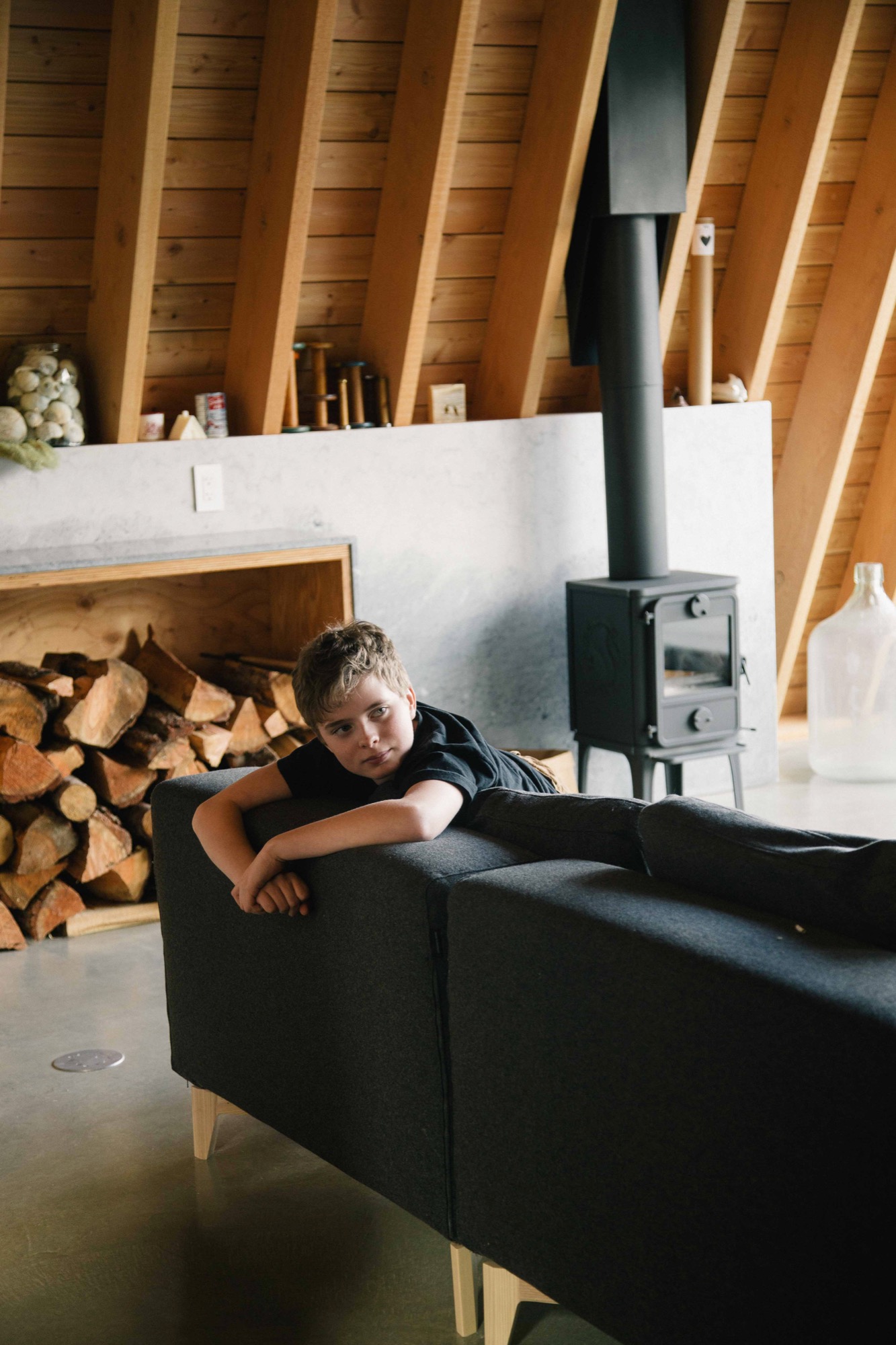
The first level is all business: “washroom, laundry, storage for bikes, skis, snowboards, surfboards leftover from our time spent in Laguna, and probably snowmobiles at some point,” says Melanie. The middle level is for communing; the top, for turning in.
One frustration with A-frame design is that it does not allow for much useable space inside; all slope, no sidewall is the common complaint. One original way the Scotts dealt with this dilemma was to put the stairs in a light-filled dormer, freeing up floor space on the third floor for a proper hallway tucked partially under the slope.
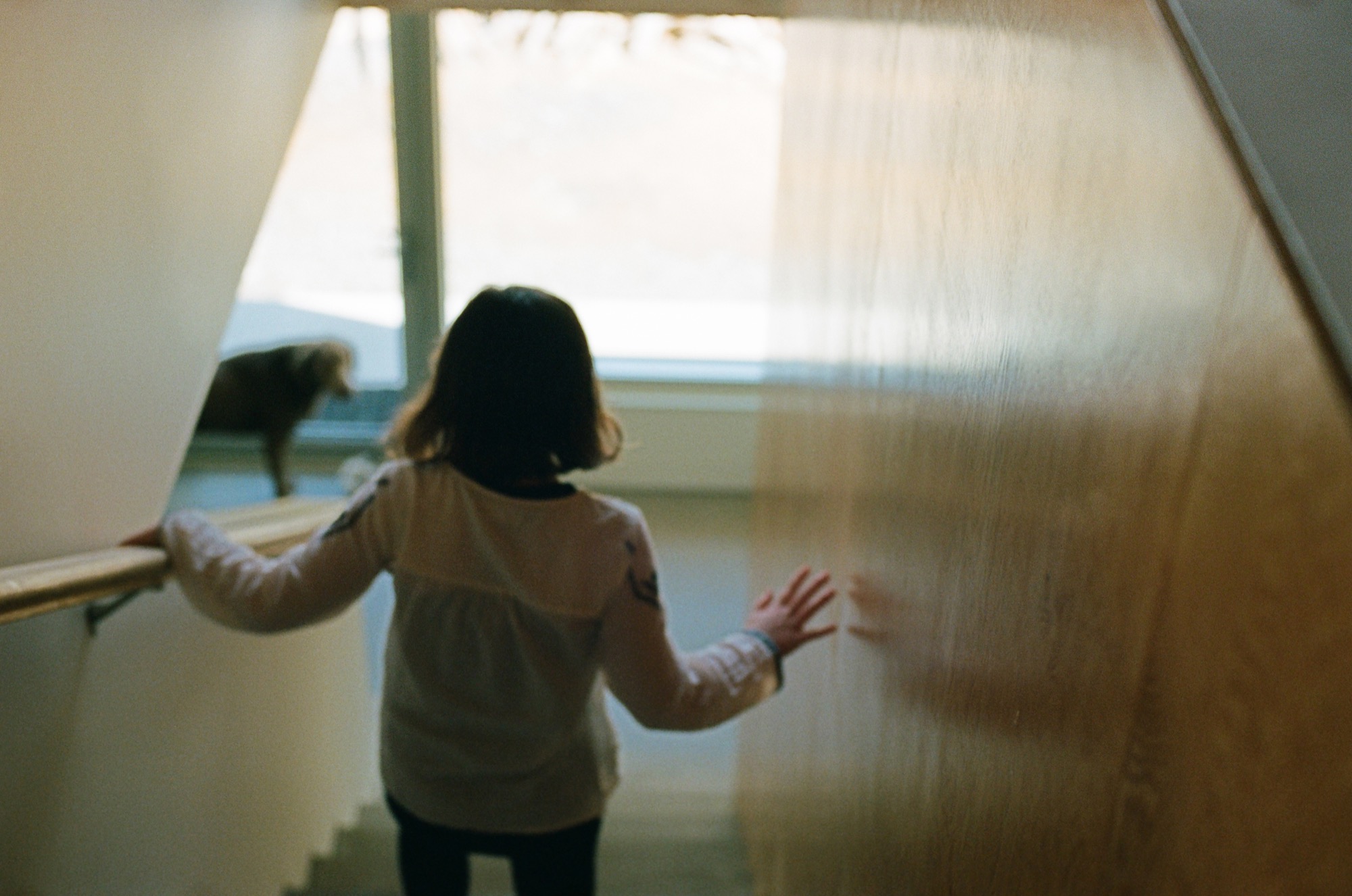
The hardy foursome and pooch moved into their cabin a few days after Christmas 2015 and have been using it nonstop ever since, often sharing their holiday home with friends.
Over the winter, Melanie skies with Daisy while Brenton snowboards with Finn. “In the summer, we like hiking with Rosie, as well as mountain biking and swimming in the various lakes. There are several hiking and mountain biking trails in Emerald, and Green Lake is right around the corner and so is the Valley Trail. We enjoy riding our bikes along it into the village,” says Melanie. “If you love being outdoors, there’s just so much to do around Whistler.” △
A-Frames
The right form at the right time
Spawned by postwar affluence, A-frame cabins became the quintessential American vacation home of the 1950s and 60s. A look at what made these icons of middle-class leisure immensely popular then, and what it is like to remodel and live in one today. “The design is intuitive,” says architectural historian Chad Randl, author of the book A-frame (Princeton Architectural Press), about the A-frame’s triangular structure. Why else would different cultures have turned to this universal, unifying building type, independently, throughout time and across the globe?
Was it intuition, too, that told Rudolf Schindler in 1936 to carry the roof down to the ground and fill both gables with glass? The Austrian-born architect needed to find a way to comply with local building codes when he was commissioned a modest vacation home suitable for the mountainside setting above Lake Arrowhead, California. The upshot was an A-frame built twenty years before its time.
By the middle of the twentieth century, architects in postwar America sought a more casual yet visually dramatic design conducive to relaxed seaside and mountain living. The A-frame was both comfortably familiar (pitched roof) and playfully novel. Because these weren’t primary homes, the architects could enjoy more freedom in designing wide-open spaces with fewer partitions and very small bedrooms and bunk rooms.
"The A-frame was both comfortably familiar (pitched roof) and playfully novel."
Genesis: The Leisure House
In 1950, Interiors magazine published an A-frame by San Francisco-based architectural designer John Carden Campbell: the Leisure House. It hit the mark on the era’s modernist style sensibility, down to the butterfly chairs. Campbell was fond of saying the house enclosed the most space in the most dramatic way for the least amount of money.
 After a full-sized model of the Leisure House was exhibited at the 1951 San Francisco Arts Festival, Campbell’s phone wouldn’t stop ringing. Fixing its dimensions to the width of a sheet of plywood reduced the cost and simplified construction so vastly, the Leisure House could now become a do-it-yourself project. Campbell deftly developed a precut kit that contained everything needed to assemble the house, from timber to nails and hammer.
For the next twenty years, photos of Campbell’s own Leisure House he built across from the Golden Gate Bridge in Mill Valley, California, appeared in countless home magazines and architectural books. The Leisure House was promoted as a natural design for the mountains or the beach, for a summer cottage or a ski cabin. The Leisure House manifested a new leisure culture.
A national phenomenon
The mushrooming popularity of A-frames was fueled by postwar prosperity, which brought owning a second home within reach of the middle class. Suddenly, people had more disposable income and more free time. The A-frame embodied an informal weekend and holiday getaway that was innovative and exciting — a recognizable, identifiable symbol of “the good life.”
“It’s interesting how people individually adapted drawings or kits for their own family’s way of living and for their own technical expertise or lack thereof,” says Randl, who now teaches at the Cornell University College of Architecture, Art, and Planning. “What I loved about A-frames was that it was such a simple design, a basic triangular form, but you had so many variations of it, and it was still recognizable as an A-frame.”
"The A-frame embodied an informal weekend and holiday getaway that was innovative and exciting — a recognizable, identifiable symbol of 'the good life.' "
The fall of an Americana archetype
While A-frames were touted as efficient in the use of materials in the 1950s and 60s, they were far from energy efficient by today’s standards. The open-floor-plan homes were notoriously difficult to heat — warm air escaped upward, leaving the downstairs chilly and the bedroom loft uncomfortably hot. Many of the early designs were not insulated at all. Thus, keeping A-frames warm became increasingly challenging with the energy crises of the 1970s. “You had that plywood building that became really expensive to heat once oil got expensive,” Randl remarks.
“That’s when it all crashed down,” says the A-frame expert. “The A-frame lost its cultural cache, and people saw it as cliché.”
A-frame Reframe
Today, Randl considers A-frame vacation cabins an “endangered species.” In the right location, however, these period pieces are still sought-after architecture, especially to design enthusiasts with a passion for modernism.
One of those aficionados is Alpine Modern correspondent Paul O’Neil. He bought a 1953 A-frame in Mill Valley across from San Francisco in 2011. The house was designed by Wally Reemelin, an industrial engineer interested in efficient architecture, and is featured in Randl’s book.
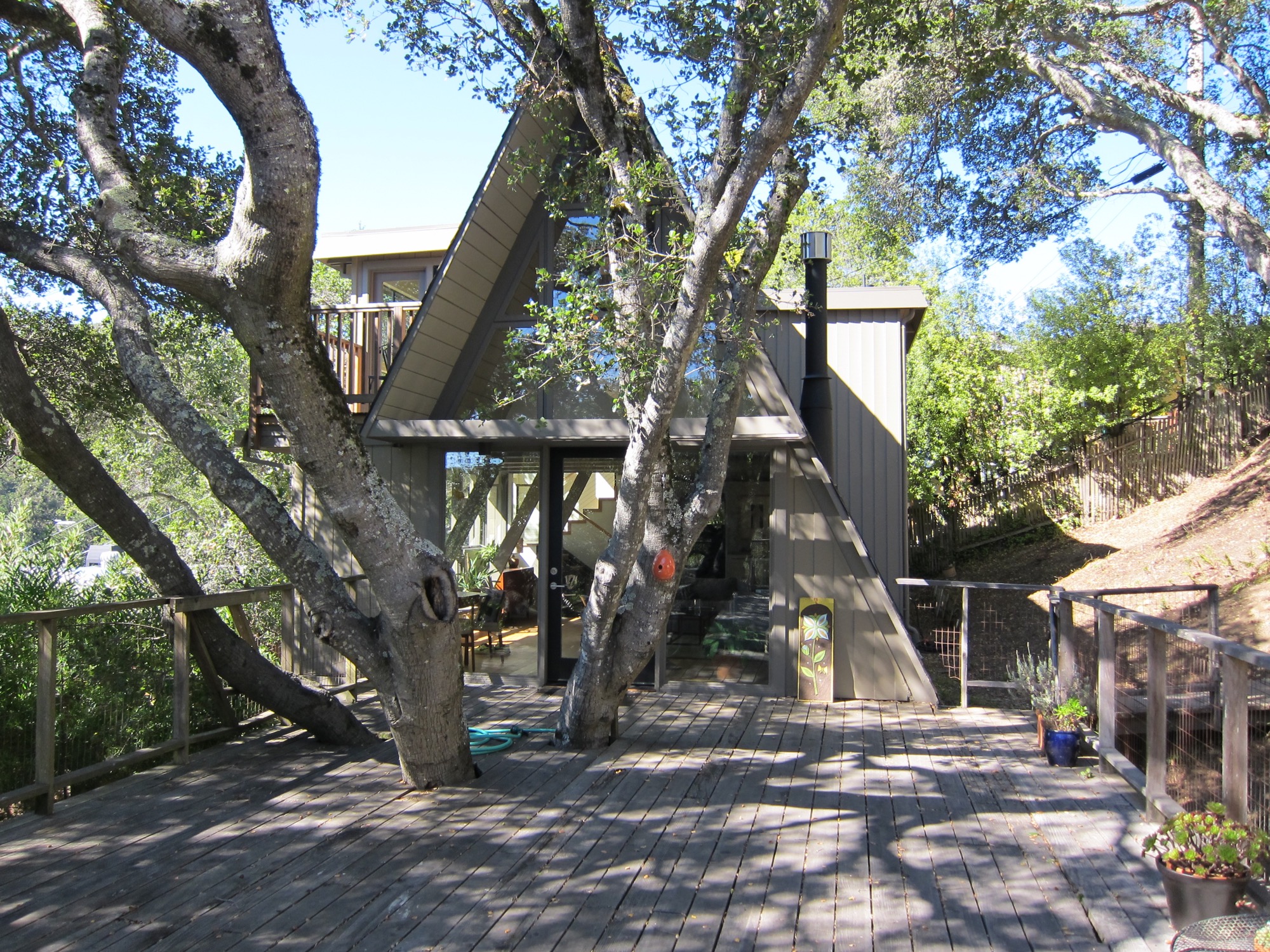
O’Neil loved the house at first sight. He liked the way it was situated in the street and on the lot, embracing oak trees. There was more than meets the eye, though. “The house spoke to us,” he recalls about the day he and his partner, Andrew Loesel, discovered the faded treasure during an unplanned stop on a road trip. “There was something special about it. It was asking us to save it. There was a story there,” O’Neil says. “The woman selling it thought we were insane.”
“There was something special about it. It was asking us to save it. There was a story there.”
The Californian has chronicled the history and renovation of the Reemelin A-frame on his blog at aframereframe.com. But before O’Neil could bring the 1,265-square-foot (ca. 118-square-meter) house back to its beauty, he had to undo a poor renovation. An unpermitted addition built in 1964 had left the house with uneven floors and structurally unsafe. By the time O’Neil purchased the house from the third owner, it had been virtually untouched since 1980, with the exception of a new roof from twenty years ago. “We tried to understand what the house originally was like,” he says. “Our goal was to keep the integrity of the house, but make it modern.”
“Our goal was to keep the integrity of the house, but make it modern.”
Once their contractor ripped out the remnants of shoddy remodeling, the house had no structural problems. With elements like a wobbly staircase and an awkwardly placed bathroom gone, O’Neil could rethink the layout. “It was like a puzzle, once we realized what we needed to do.” After updating the electrical and plumbing, and installing insulation, they could focus on designing the house with a nod to its midcentury modern architecture and interior.
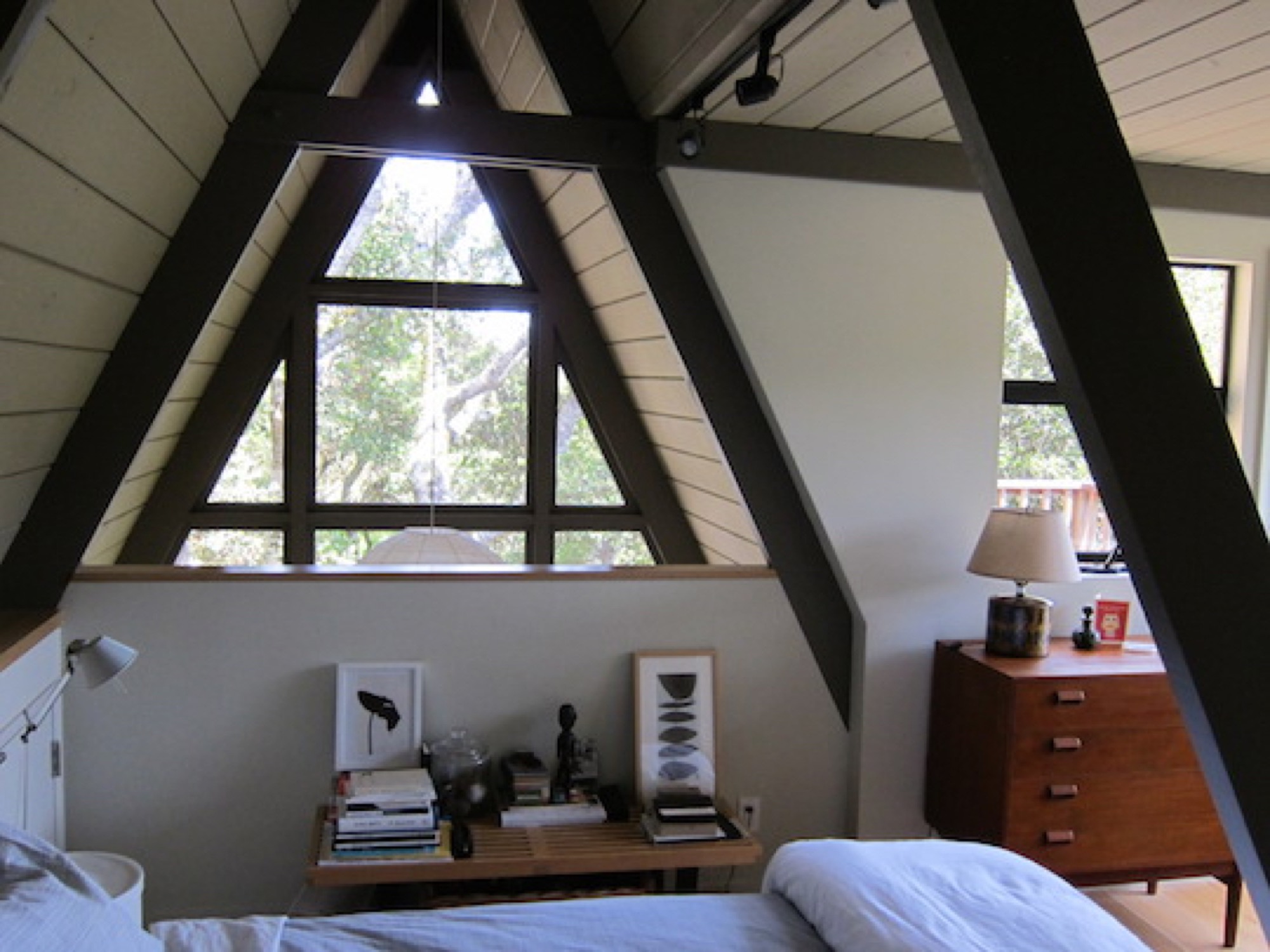
Living in San Francisco at the time, O’Neil and Loesel had bought the house for a weekend home, but later decided to live there full time, in the spirit of living smaller and simply. “If a house is well-built, it doesn’t have to be big,” O’Neil says.
“If a house is well built, it doesn’t have to be big.”
In fact, Randl agrees that in the context of the small-house movement and people’s yearning for a simpler, minimal lifestyle, the design concept of the A-frame could once again fit contemporary zeitgeist. “It’s got that reference to the past while also being modest,” the architecture expert says. “That has appeal again.” △
