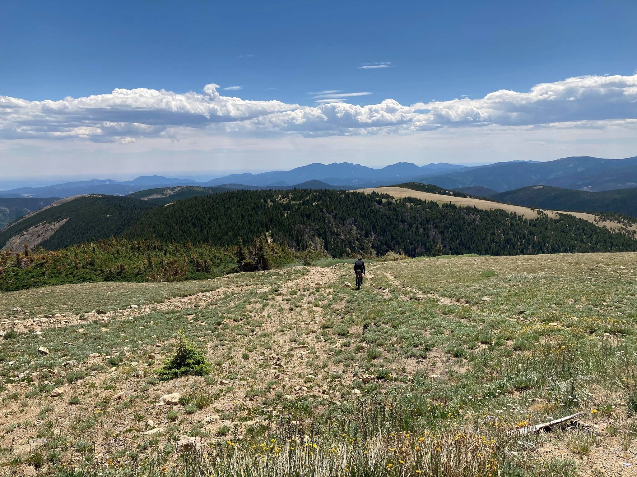
Inspirations
Explore the elevated life in the mountains. This content debuted in 2015 with Alpine Modern’s printed quarterly magazine project.
Family HQ in Alaska
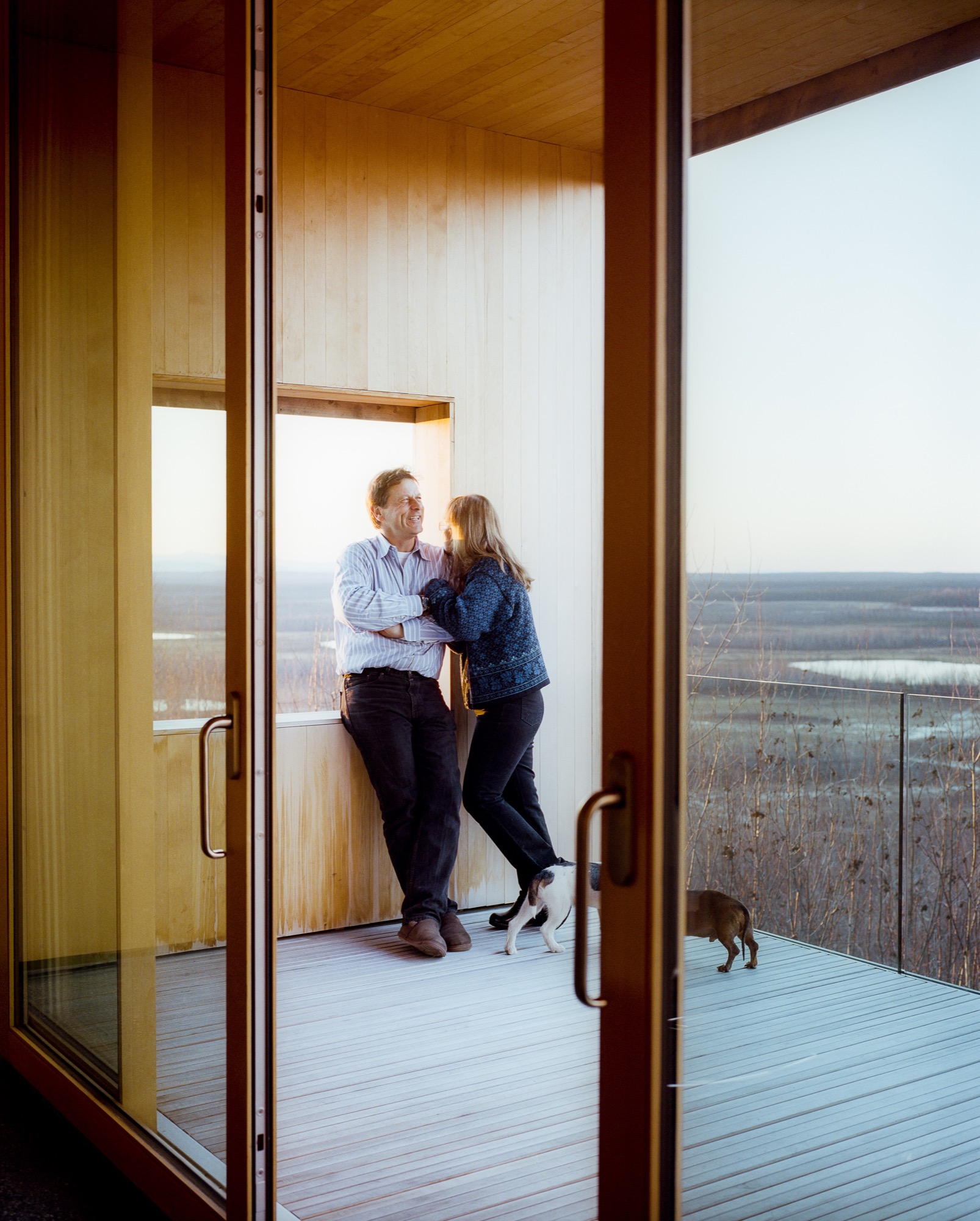
In the shadow of Denali mountain, amid Alaska’s meadows and icy streams, a former teacher and a four-time Iditarod winner build a modernist cabin as expansive as the Last Frontier.
 In the shadow of Denali mountain, amid Alaska’s meadows and icy streams, a former teacher and a four-time Iditarod winner built a modernist cabin as expansive as the Last Frontier.
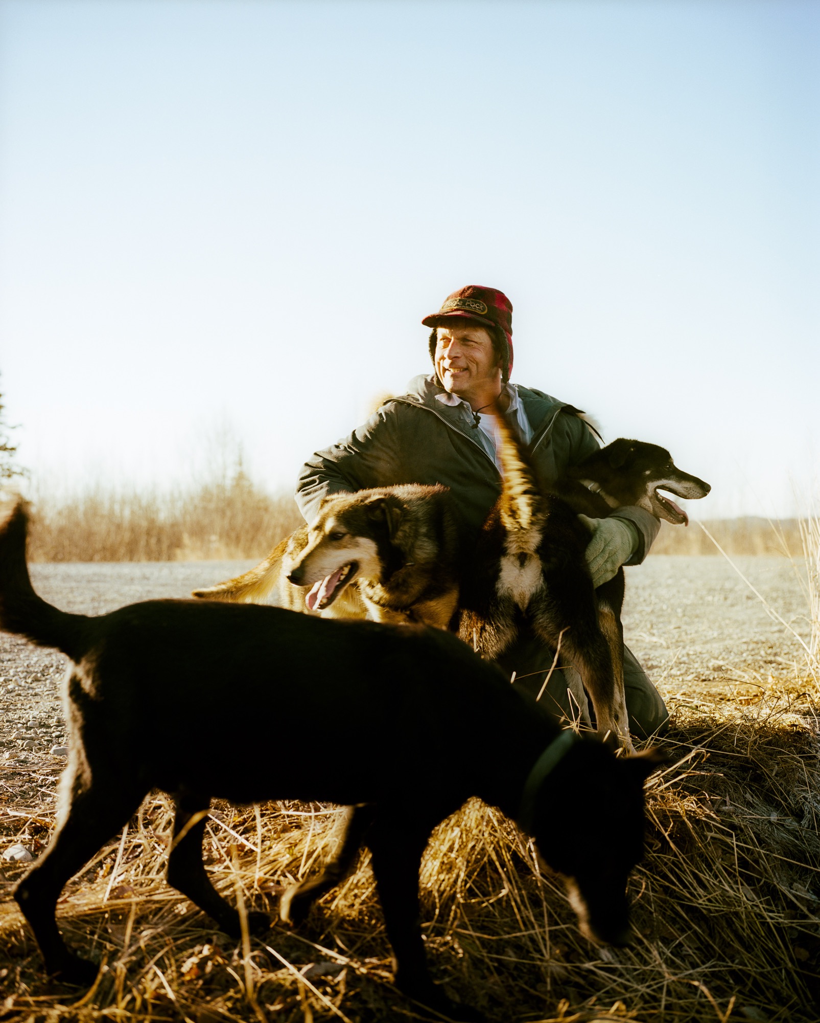
Tens of thousands of years ago, a glacier slid its way through southern Alaska and carved out the Matanuska-Susitna Valley. Bound by three massive mountain ranges and dotted with lakes, it’s an unabashedly wild place. Hundred-pound cabbages flourish in endless summer sunshine, caribou outnumber people, and towering Denali presides over it all. "You can go 1000 miles here without crossing a road," says Martin Buser. "Most people can’t grasp that kind of freedom." A four-time winner of the Iditarod—the grueling dogsled race from Anchorage to Nome—Buser spends his days crisscrossing the landscape with his dogs. So, for his dream home with his wife, Kathy Chapoton, there was no question that the spectacularly rugged setting needed to be the driving force behind the design.
"You can go 1000 miles here without crossing a road. Most people can’t grasp that kind of freedom."
An Alaskan story
The story of how the couple met and found the site is typically Alaskan. Chapoton moved from New Orleans to Anchorage in 1979, at a time when the state government let people claim land for pennies as a way of getting back tax dollars. Soon after relocating, she joined a group of friends one day in early January to stake out the five acres allowed to each person. "It was 50 below zero, my teeth were frozen, I didn’t even know how to read a compass, and I had to walk around and literally mark the parcel," she says. "It was hilarious." Registering her claim at the office in Anchorage, she bumped into Buser, a recent Swiss transplant, and the two married not long after.
The new House for a Musher
For 20 years, the growing family (sons Nicolai and Rohn are named after Iditarod checkpoints) lived in a large house that Buser built on the land, adjacent to the kennel where his hundred-odd dogs reside. In 1996, a wildfire swept through the area: "It was pretty ugly," remembers Chapoton. As a result, people started selling off their nearby plots, and the couple snatched up 25 additional acres—including a mountaintop site that they had been eyeing for years. "It was the primo lot," says Chapoton.
Buser built a little cabin on the top of the mountain as a weekend retreat, but the combination of killer views and the couple finding themselves empty nesters convinced the pair to make that site their permanent home. They moved the cabin by truck to a nearby site (son Rohn lives there now) and called on architects Petra Sattler-Smith and Klaus Mayer of Anchorage firm Mayer Sattler-Smith to design a house. Though Buser had built several homes, the couple knew this site deserved something special. "Because of the multitude of views, we couldn’t take advantage of the site ourselves. We knew our limitations," Chapoton says.
Denali in view
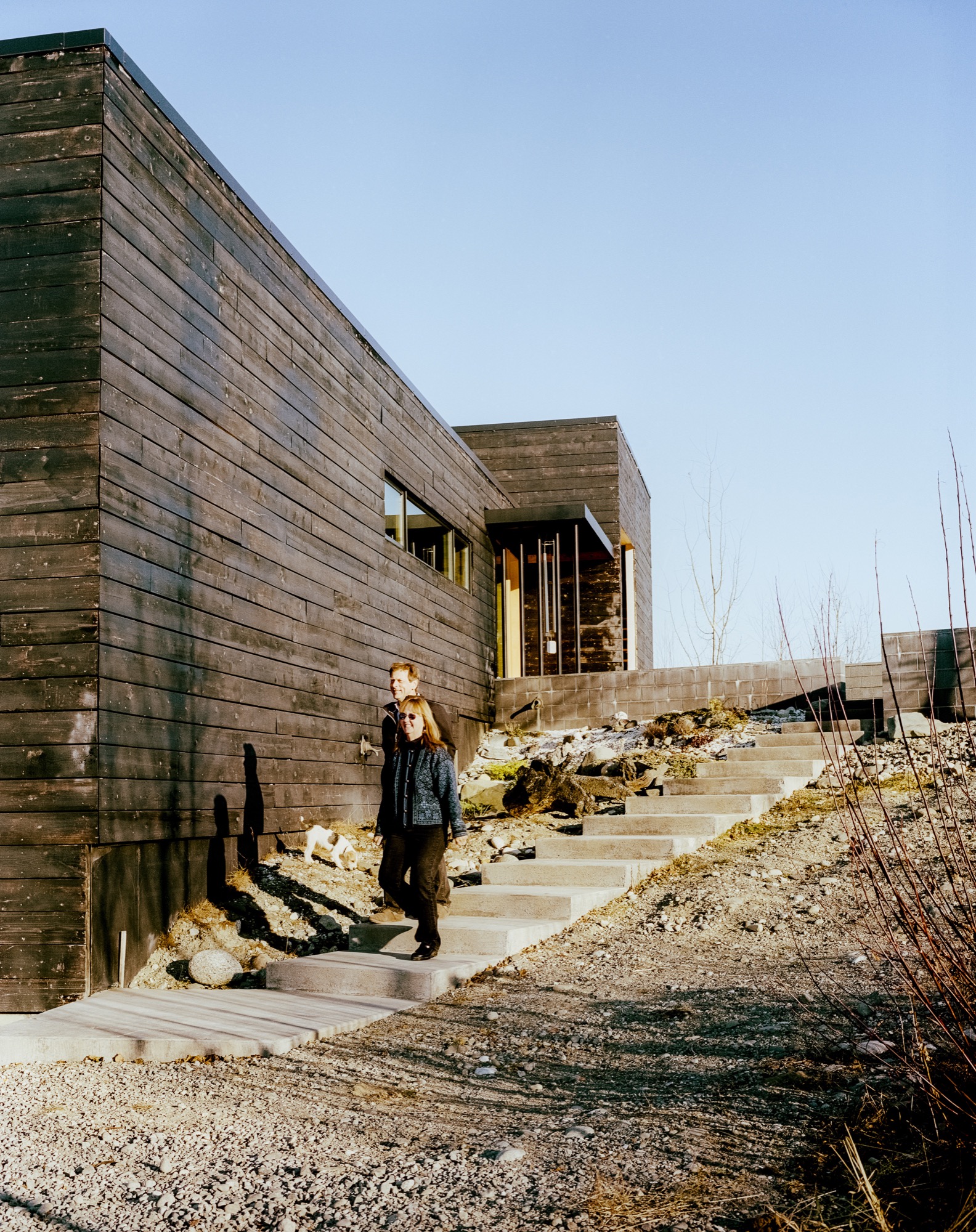
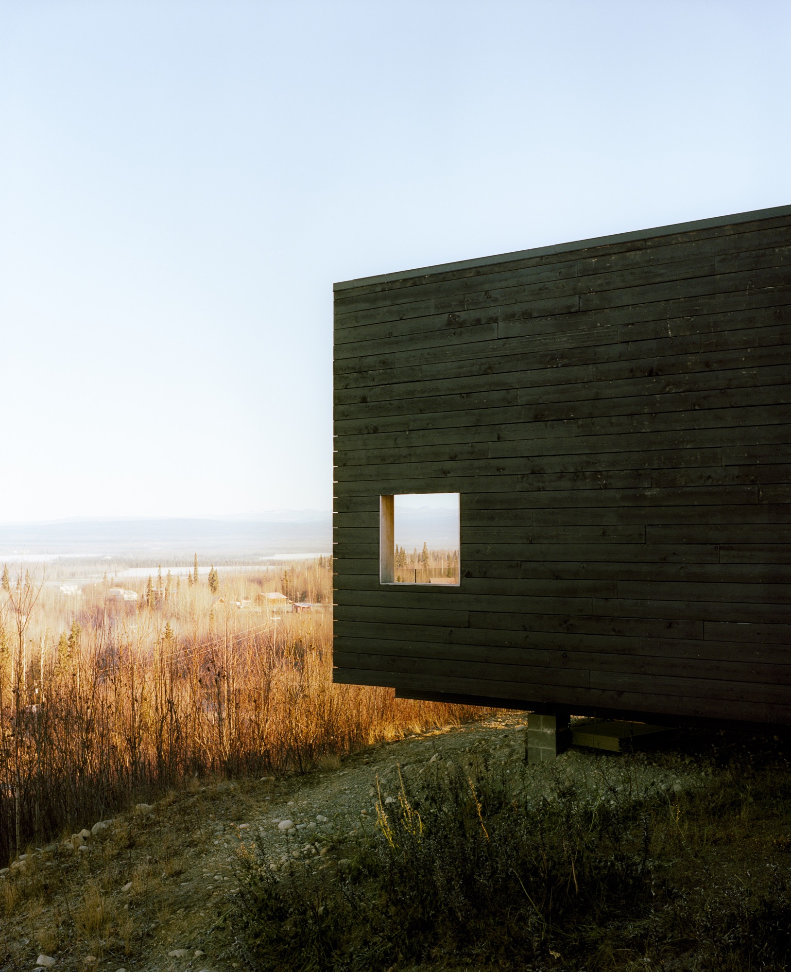
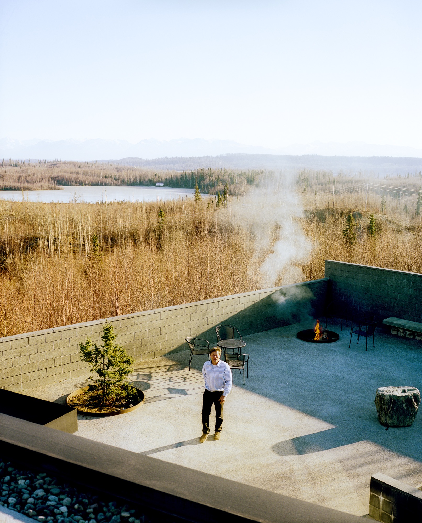
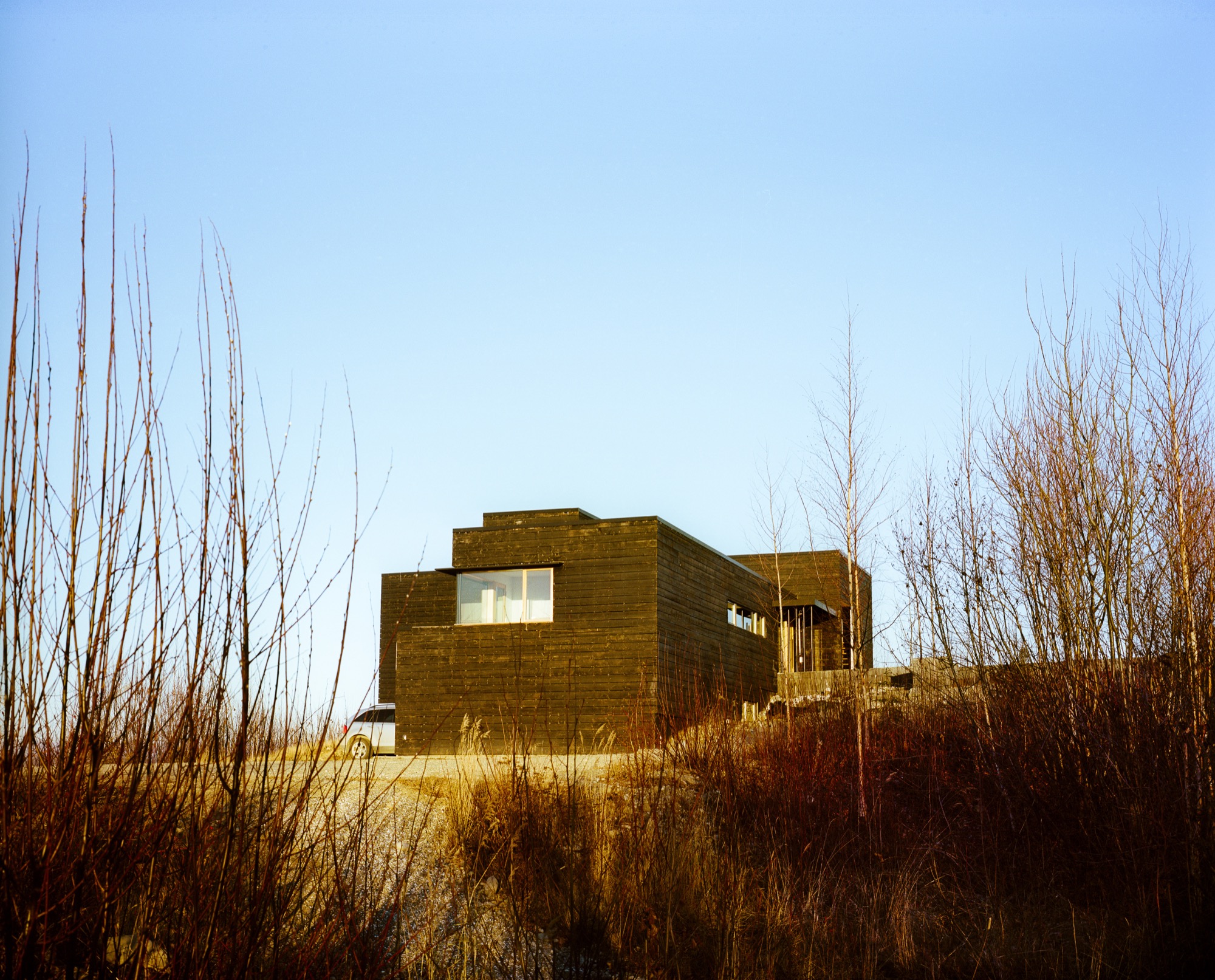
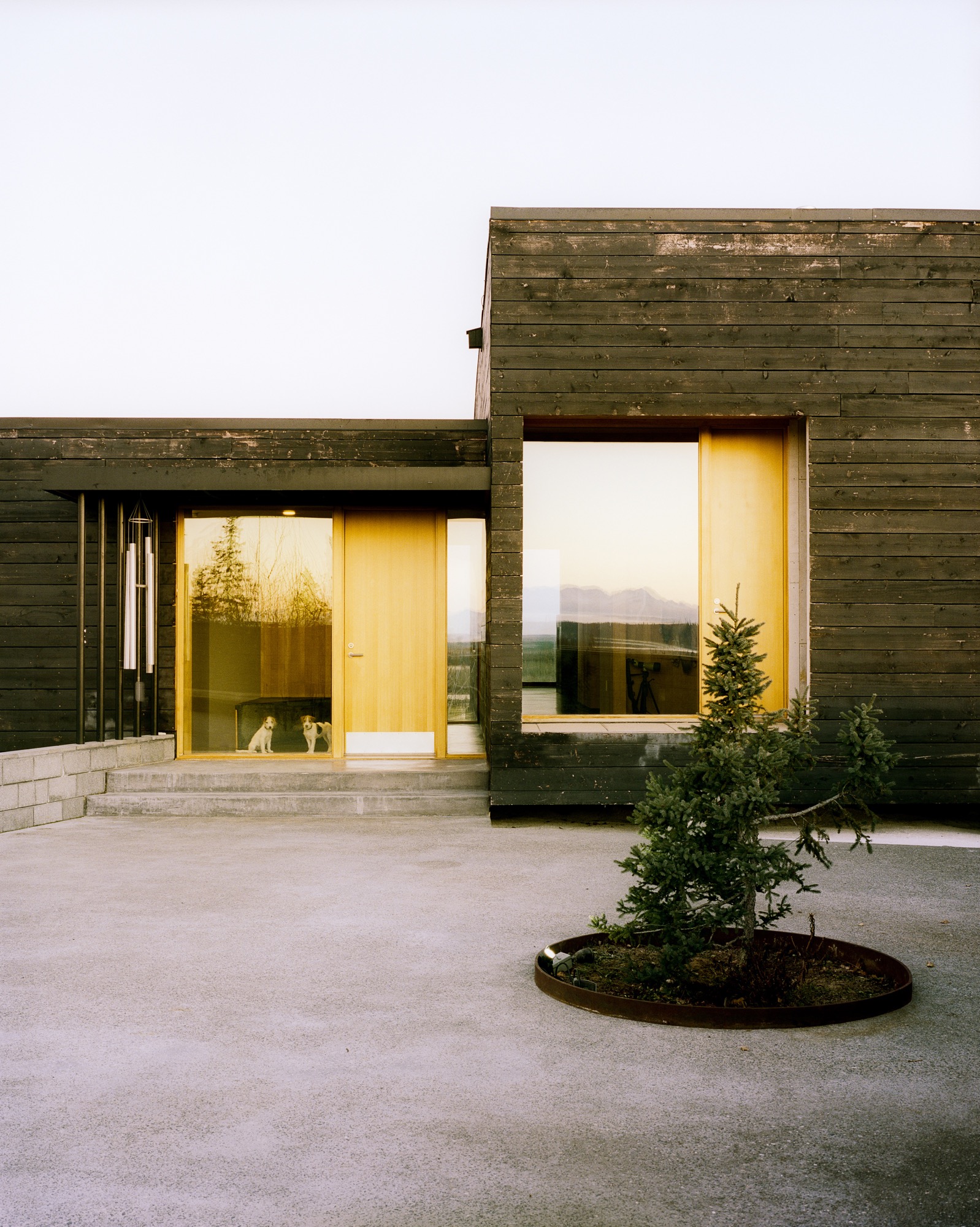
Everything about the 2,450-square-foot house centers on the natural setting. "It was important to have every room look to Denali, which is the ultimate view in Alaska," says Mayer. To do so, the architects created a long, lean, L-shaped house. The blackened, local spruce cladding pays homage to the area’s wildfire, while also mimicking a glacial erratic—a nonnative rock deposited by a moving glacier. The courtyard and part of the kitchen are slightly offset, following the lines of the site’s hilltop topography, while the rest of the house points directly to Denali National Park.
"It was important to have every room look to Denali, which is the ultimate view in Alaska."
Inside
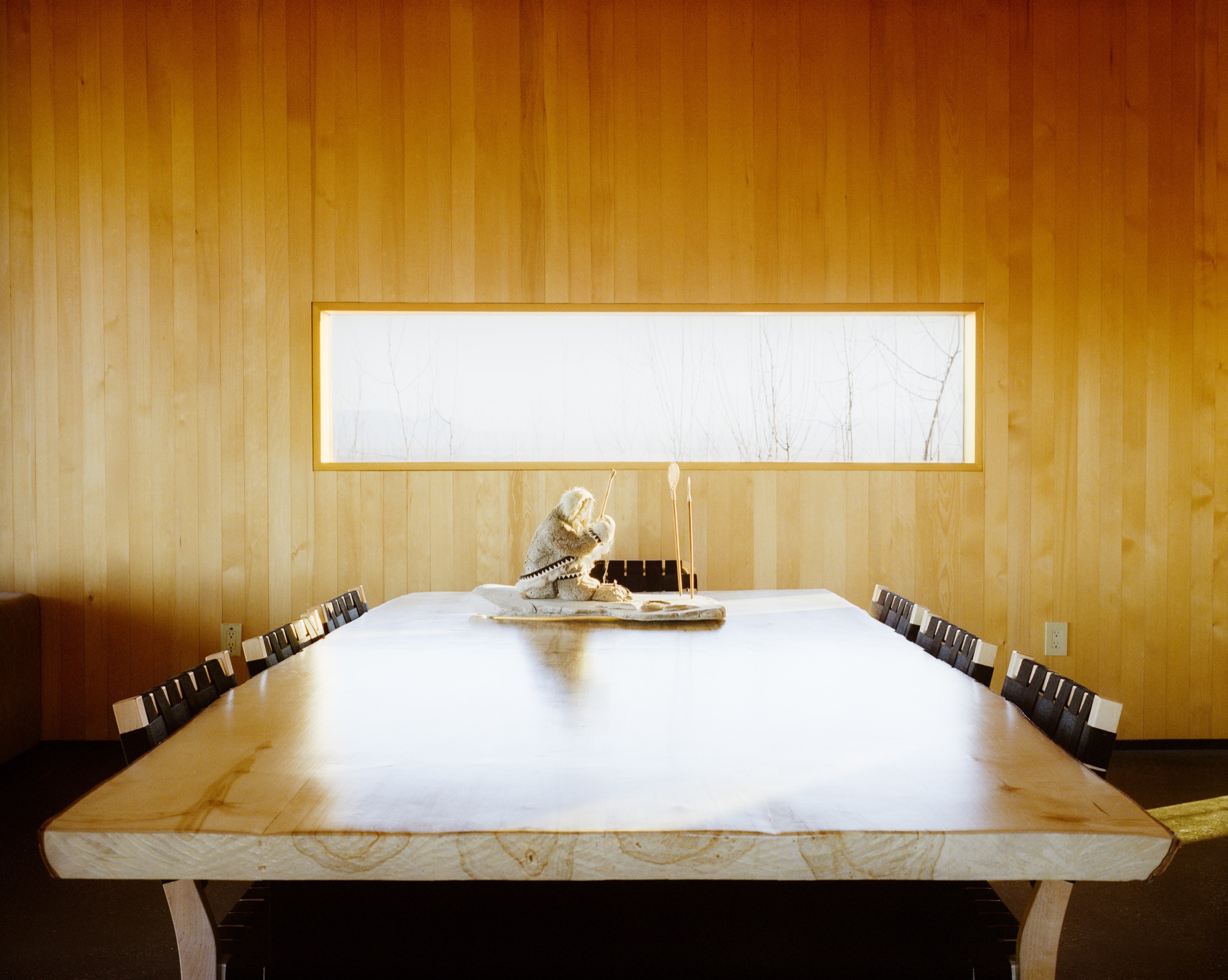
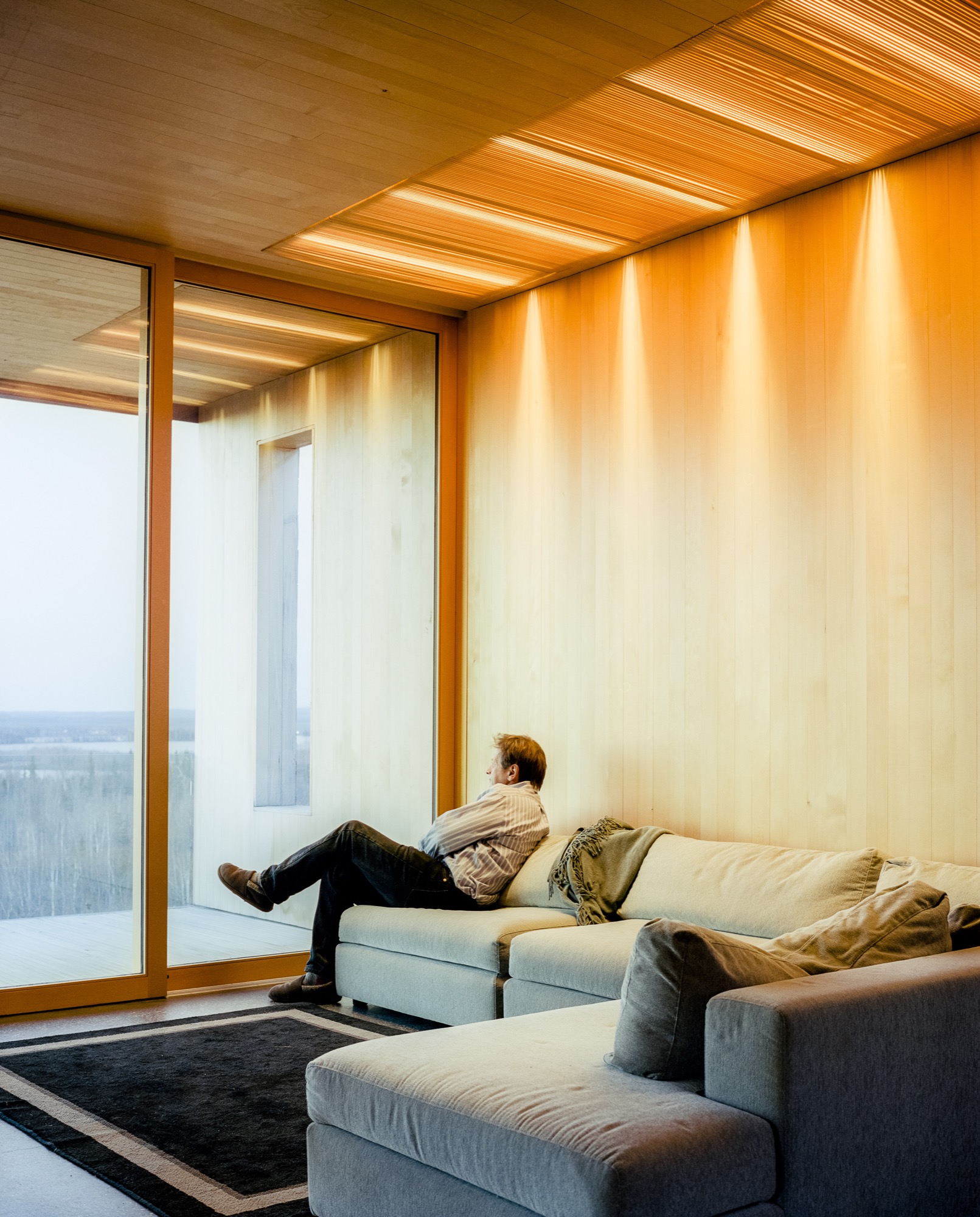
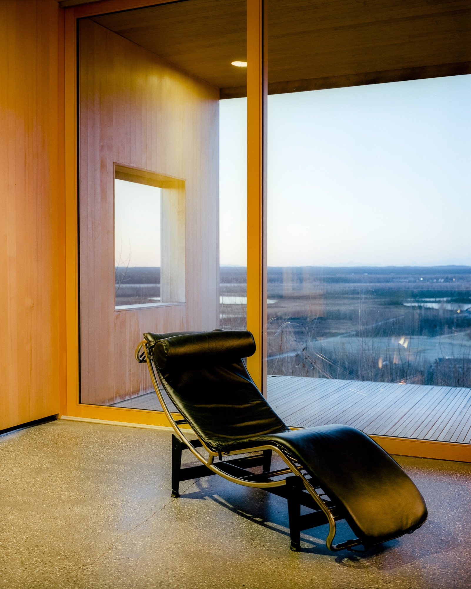
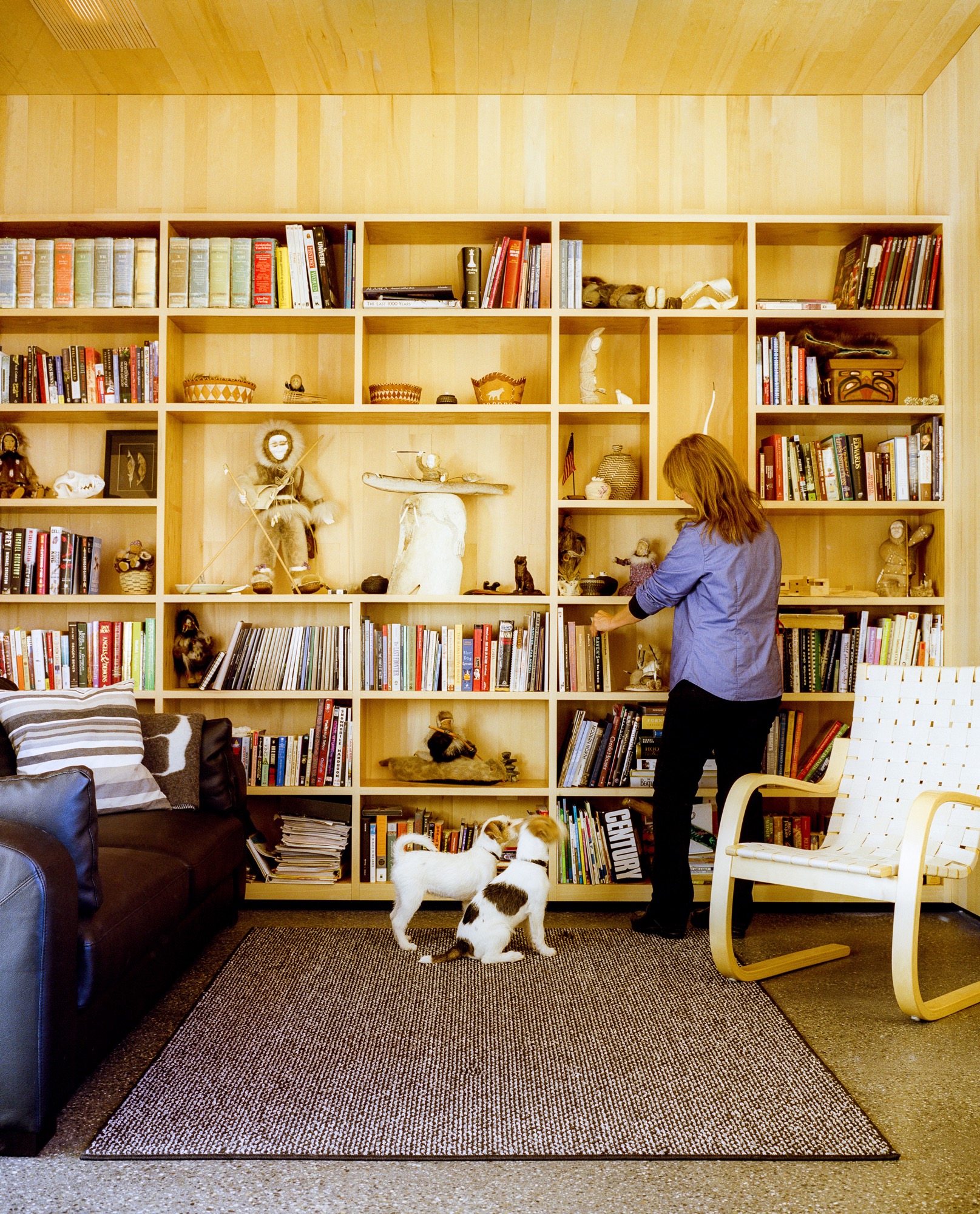
Inside, the walls are paneled in Alaskan yellow cedar, as if the charred exterior has been peeled back to reveal glowing, living wood inside. The public areas lie in one long sight line that starts in the courtyard outside, streams through the living and dining rooms and kitchen, and slips out onto the northern horizon through a wall of sliding glass. The other side of the L contains he bedrooms and bathrooms, each with its own framed outlook on Denali. Windows in the hallway and in the family room face south to let in extra sun during darker winter days. There’s also a rooftop deck, perfect for the family’s many parties—where friends grill mooseburgers and take in the star-filled sky and 360-degree views of the mountains.
Sweat equity
Lest the house seem too fancy for these frontier surroundings, it’s important to remember that Buser built the place himself over six years. Here, there are no construction codes in rural areas ("Building permit?" scoffs Buser. "What’s that?!"), and people prefer sweat equity to bank loans or subcontractors. "When Alaskans say they’re building a house, it means we’re swinging a hammer, digging in the dirt, and trimming it out," says Buser. Yet, this DIY ethos meant that Buser’s solutions were sometimes those of a would-be MacGyver. He and Chapoton charred the cladding using a weed burner and a garden hose; the 800-pound glass doors were lifted into place using Buser’s rigging of dogsled runners, pulleys, and brute strength; and he sliced open two birch trees to make the dining room table.
"When Alaskans say they’re building a house, it means we’re swinging a hammer, digging in the dirt, and trimming it out."
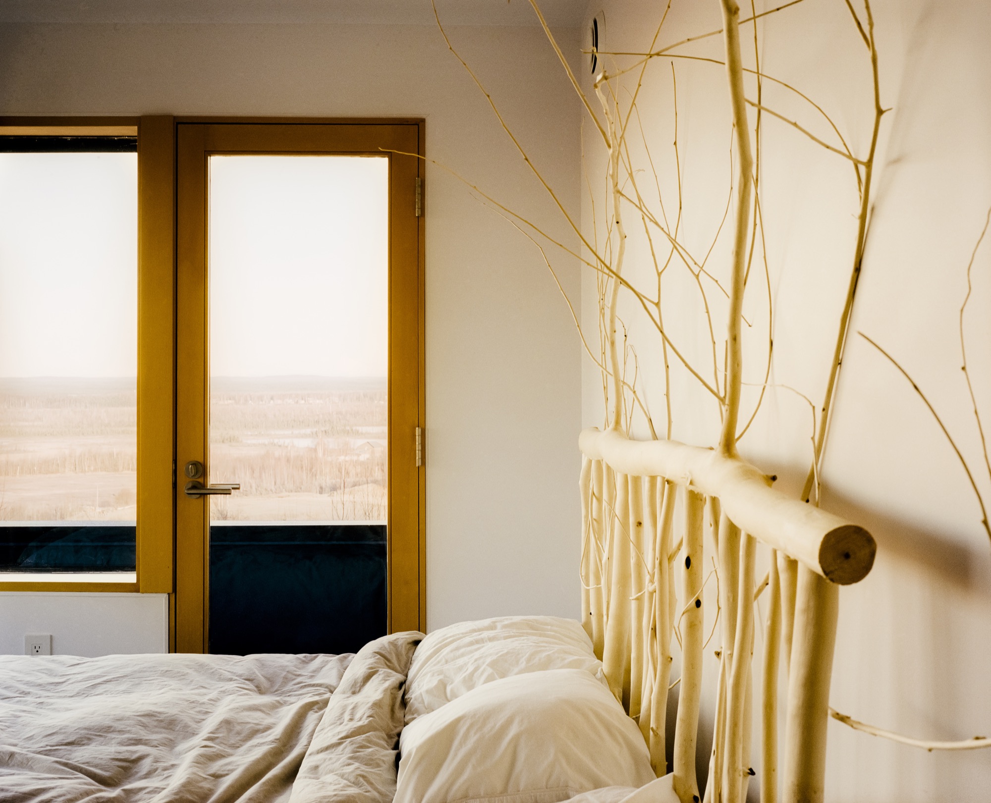
At the end of a typical day, Buser comes home from an 80-mile dogsled ride as the last rays of sun linger on the mountains. Inside, Chapoton (now retired from teaching) whips up a salmon meal for ten, and the gregarious couple shares wine with friends around a crackling fireplace. When everyone’s left, Buser and Chapoton will tuck into their bed, watching the vivid hues of the northern lights dance through the windows. Says Chapoton of her love of the house, "Maybe Einstein said it most simply: ‘Look deep into nature, and then you will understand everything better.’ " △
The Building Friendship
Friends since preschool and sharing a love for design and the mountains, the founders of MTN Lab, an experimental furniture and art studio in Colorado, have always been building things together
Harris Hine and Rudy Unrau have been best friends since preschool. Now both 27 years old, they have founded MTN Lab, an experimental furniture and art studio in Colorado. Growing up in Boulder, Colorado, the lifelong friends have been building things together since they can remember—skis, bikes, random projects. But it wasn’t until spring 2015 that the idea for MTN Lab was born. Both back in Boulder, Hine and Unrau began showing sculptures at Studio Como in Denver’s RiNo art district at the time. “Getting in there is what really materialized the company,” Unrau recalls. “That’s when we came up with our name and went from just building stuff to actually focusing on a business.”
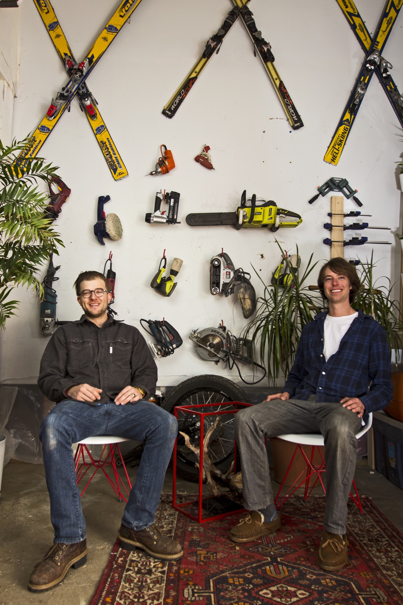
The two men, both quiet and reflective, share an ardent love for design and the mountains. Yet, they come together at MTN Lab—at the intersection of art and adventure—from opposite directions: Hine a trained designer and woodworker, Unrau a former professional mountain biker turned woodsman fighting wildfires for the Forest Service.
Harris Hine
Harris Hine grew up profoundly influenced by his father, Vienna-born modernist architect Harvey Hine, who founded HMH Architecture + Interiors in Boulder.
“I’ve always been torn between the design side of my personality and just wanting to be in the woods,” Hine shares. He went to school for design at Pratt Institute in Brooklyn before moving from New York City to Portland, Oregon, where he worked as industrial designer. “I didn’t find any fulfillment doing other people’s projects, and I didn’t really like the mass production side of product design,” he admits.
All those years, Hine pined for the woods, where his old friend was.
Rudy Unrau
Unrau, while attending college in Western Colorado, signed on with the United States Forest Service. “I was on track to becoming a smoke jumper, working for a helicopter crew down in Durango,” the long and lanky woodworker recounts. “It was a great setup because you work a ton in the summer, and then you get winter free to do whatever you want, like ski and move to Canada.”
Throughout those years, Unrau had been harboring the desire to return to making art. “Seeing the things you see when you get to fly around and travel the US and go to all of the mountain ranges... I had ideas emerge to work with the trees that had been burnt or partially burnt in fires because they get so twisted and cool.”
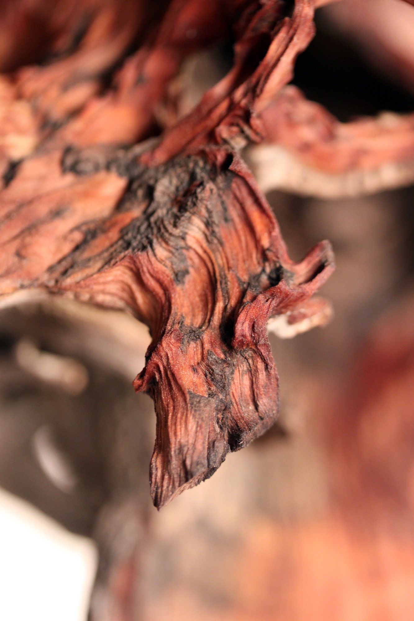
"I had ideas emerge to work with the trees that had been burnt or partially burnt in fires because they get so twisted and cool.”
Joint adventure up north
At last, one pivotal winter Hine and Unrau moved to British Columbia together to ski. Their close friendship and mutual influence would impact each man’s path. “Rudy was all in the woods,” Hine remembers, “Living together pulled him back into the design world and brought me back into the woods.”
Unrau agrees: “I’ve always been at home in the woods. Growing up, I really wanted to pursue mountain biking, so I raced mountain bikes professionally for quite a few years.” After the athlete got “a little bit tired” of mountain bike racing in world cups, he focused on skiing.
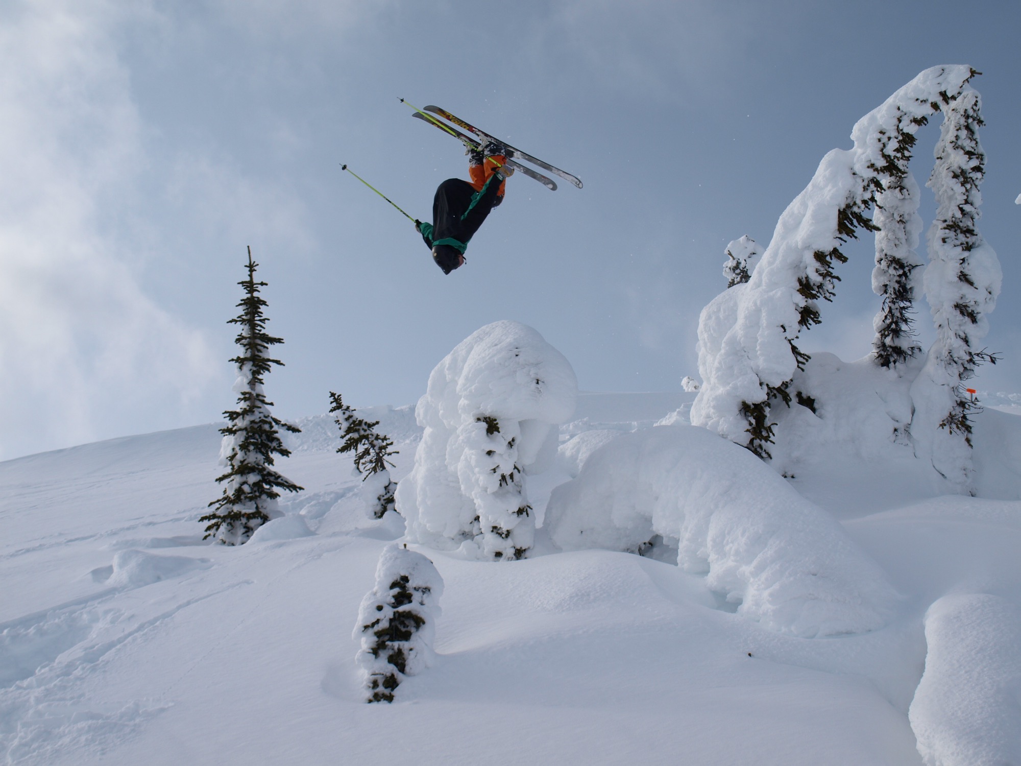
Skiing in Canada was good fun. Winter gone, however, Unrau planned to work another fire season. The outdoorsman envisioned himself carrying on that seasonal rhythm of demanding service and wild adventures in the snow for years until he had and his friend had their fill of youth and independence. “And... I crashed paragliding,” he tells, falling solemn all of a sudden. “I broke my back and almost died and spent half a year recovering.”
His loyal friend by his side, Unrau needed to reevaluate his future. “I realized, I wouldn’t be able to do fire again,” he says. “And then it was pretty natural the way MTN Lab came together—us getting our shop set up to where we could build.”
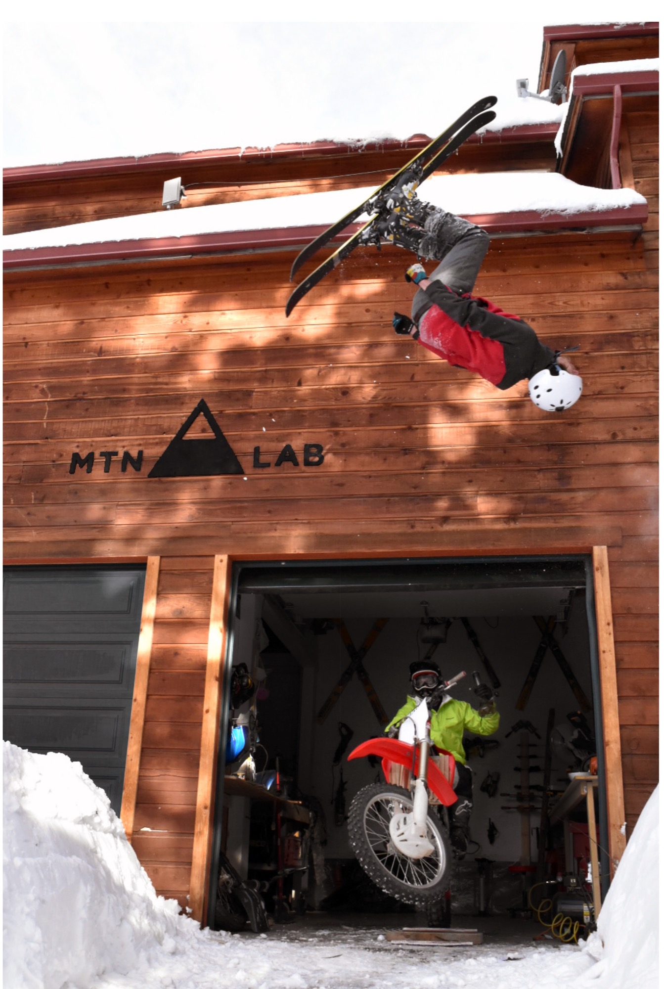
The MTN Lab process
Starting with sculptures, the duo soon began venturing into furniture. Their vision is to grow the Conifer studio into an art collective, with more creatives joining them. They are even planning to build a tiny house to accommodate visiting artists and designers.
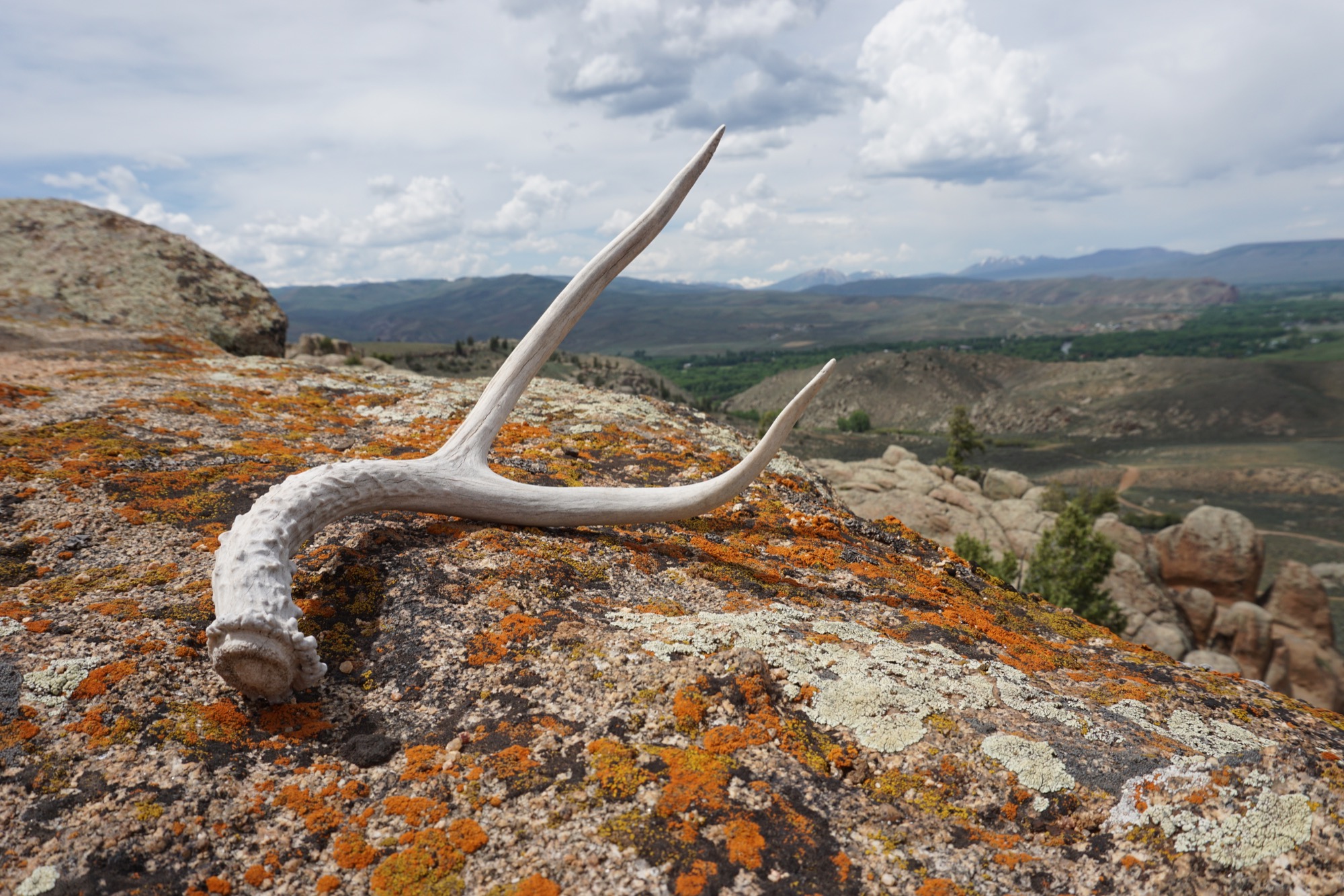
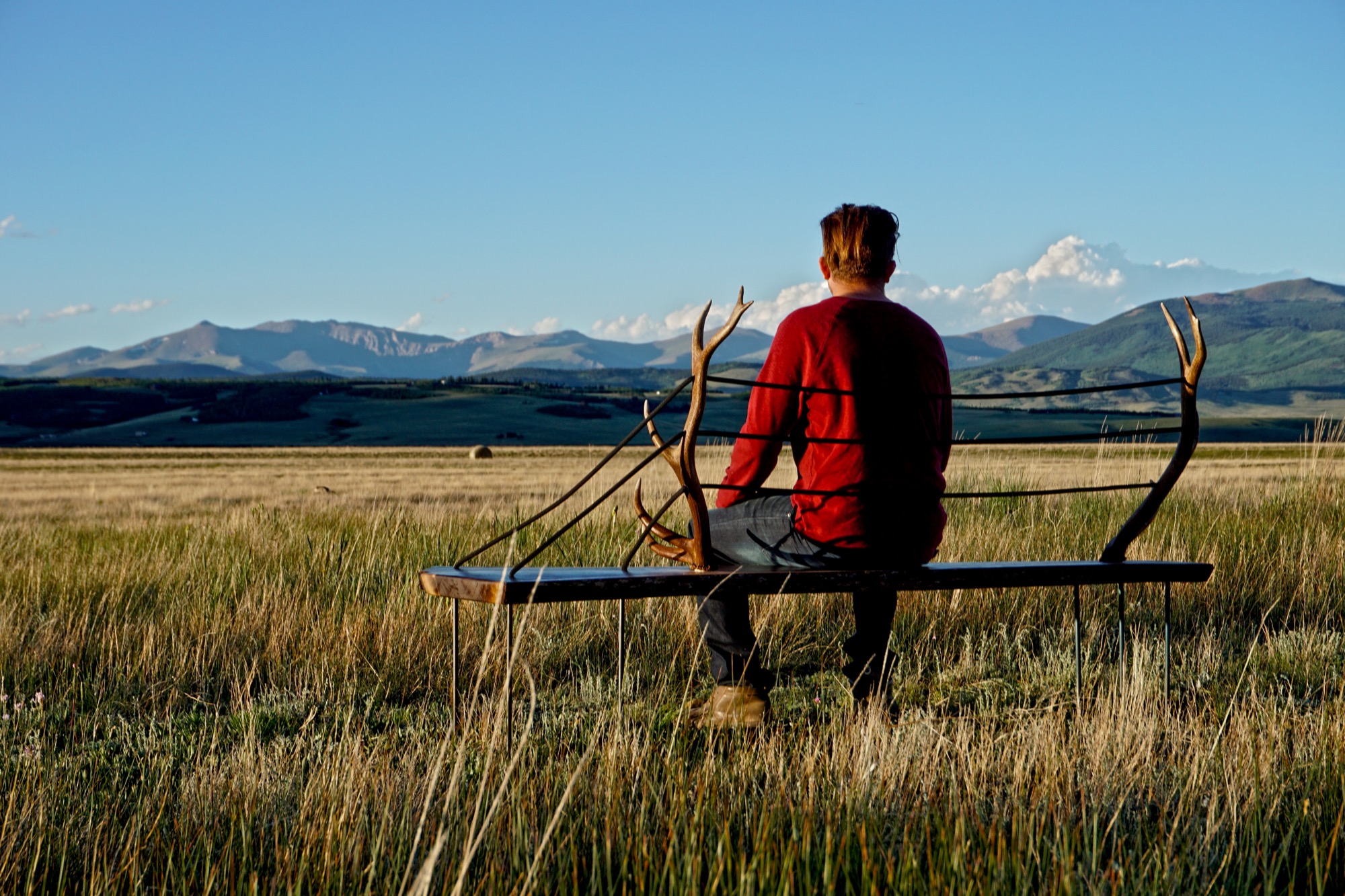
MTN Lab is as much a concept as it is a company. “Our process is the most indicative of what we make,” Hine explains. The founders source all of their materials themselves in the Colorado mountains. “We quarry our own stones to carve and collect our own wood.” Like it was for generations of makers in the mountains before them, MTN Lab’s workflow follows nature’s rhythmic swing. “Right now it’s the season for us to go get river stones because the flow just came down,” Hine tells me, when I sit down with him and his partner on that warm day in early September. “And we are doing antler stuff because we found a bunch of Elk sheds. That’s this flow that we follow.” Adds Unrau: “Our company is trying to do the whole process from sourcing, getting our materials, designing it, building it ourselves, photographing it ourselves.”
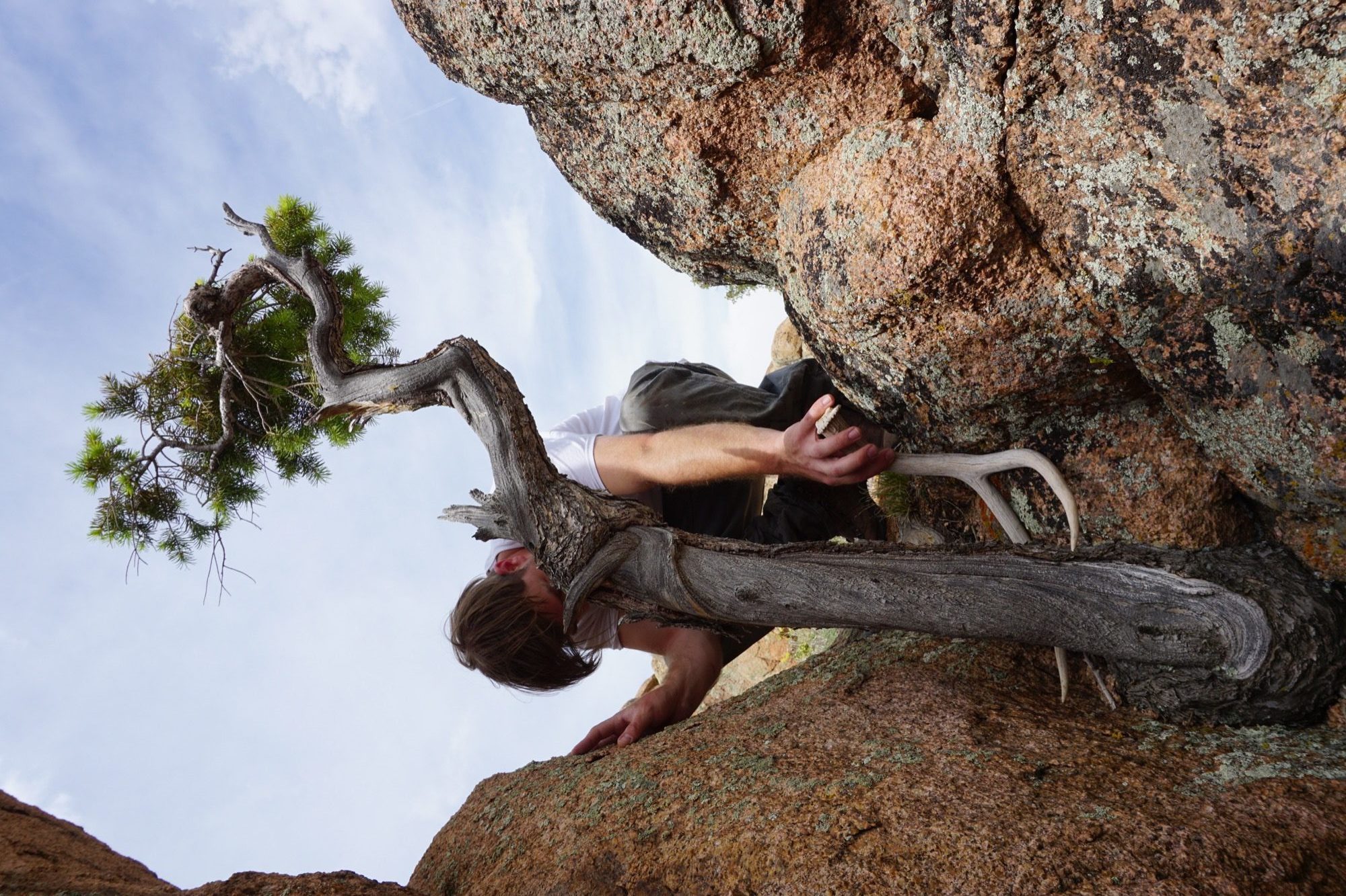
The friend believes having grown up in the mountains is what motivates them to see the entire process through, from beginning to end. “Spending all of your free time in the backcountry—you’re just so inspired by what you’re surrounded by,” Unrau says. “Initially, we were out there to ski, climbing to ski. We were dirt-biking. But when you spend that much time out there, it altered our perception of why we were there. And now it’s awesome because we get to ski, but that’s not the whole part of the process. The ski is the vessel for finding the materials—as well as the inspiration.”
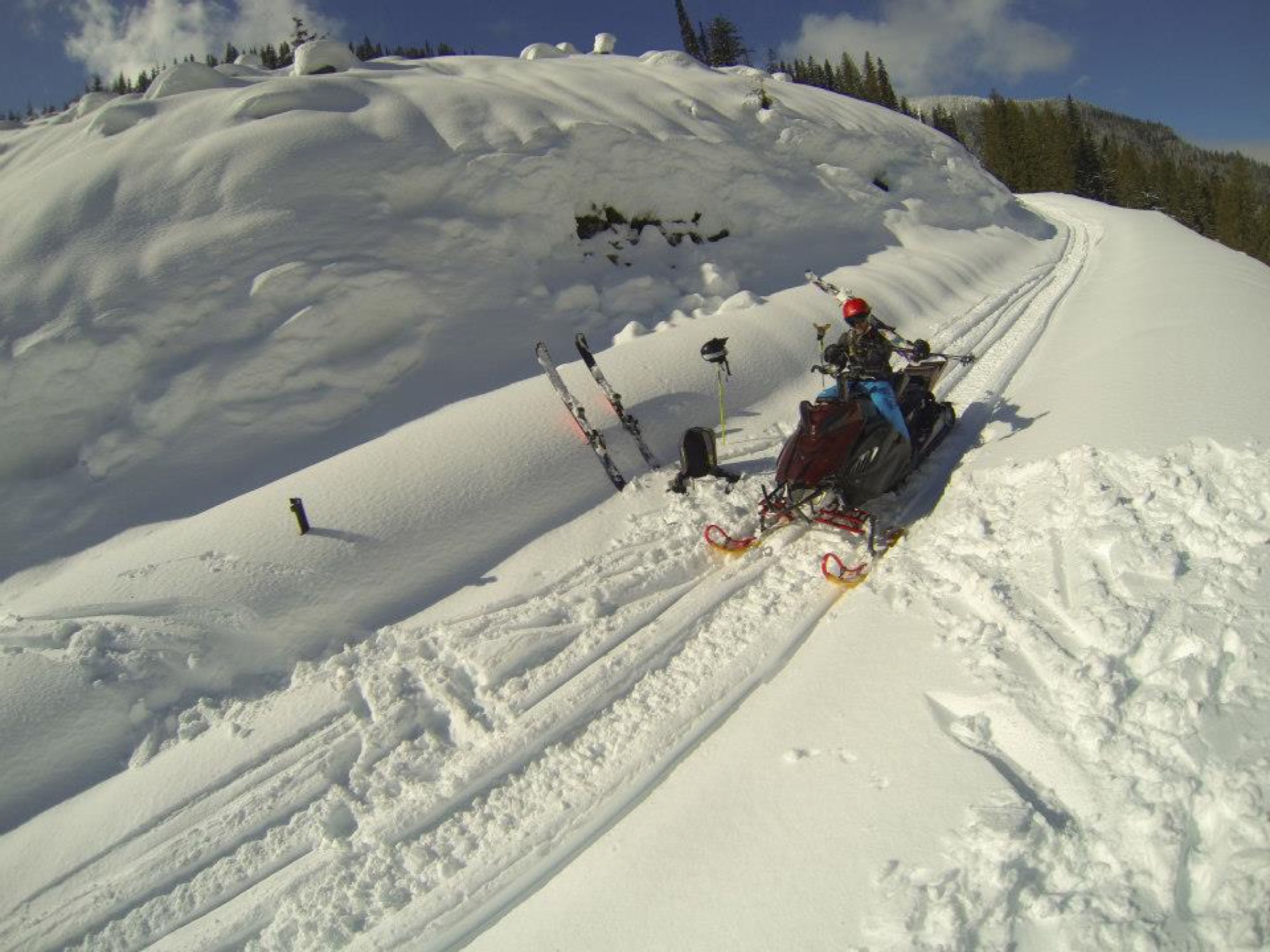
“The ski is the vessel for finding the materials—as well as the inspiration.”
Connecting nature and art
“I’ve always liked minimalist design, and I rarely see that done with natural materials,” Hine says. “You look at Bauhaus stuff, and it’s very industrialized. My dad being the modernist he is, half of me is always striving for that simplicity. But then there is the other part of me... the Colorado guy. And I see these cool pieces of wood and antlers and it naturally merged. In college, I was more on the industrial, clean-cut metal side of things, and my style has evolved more and more into a hybrid of rustic and modern.”
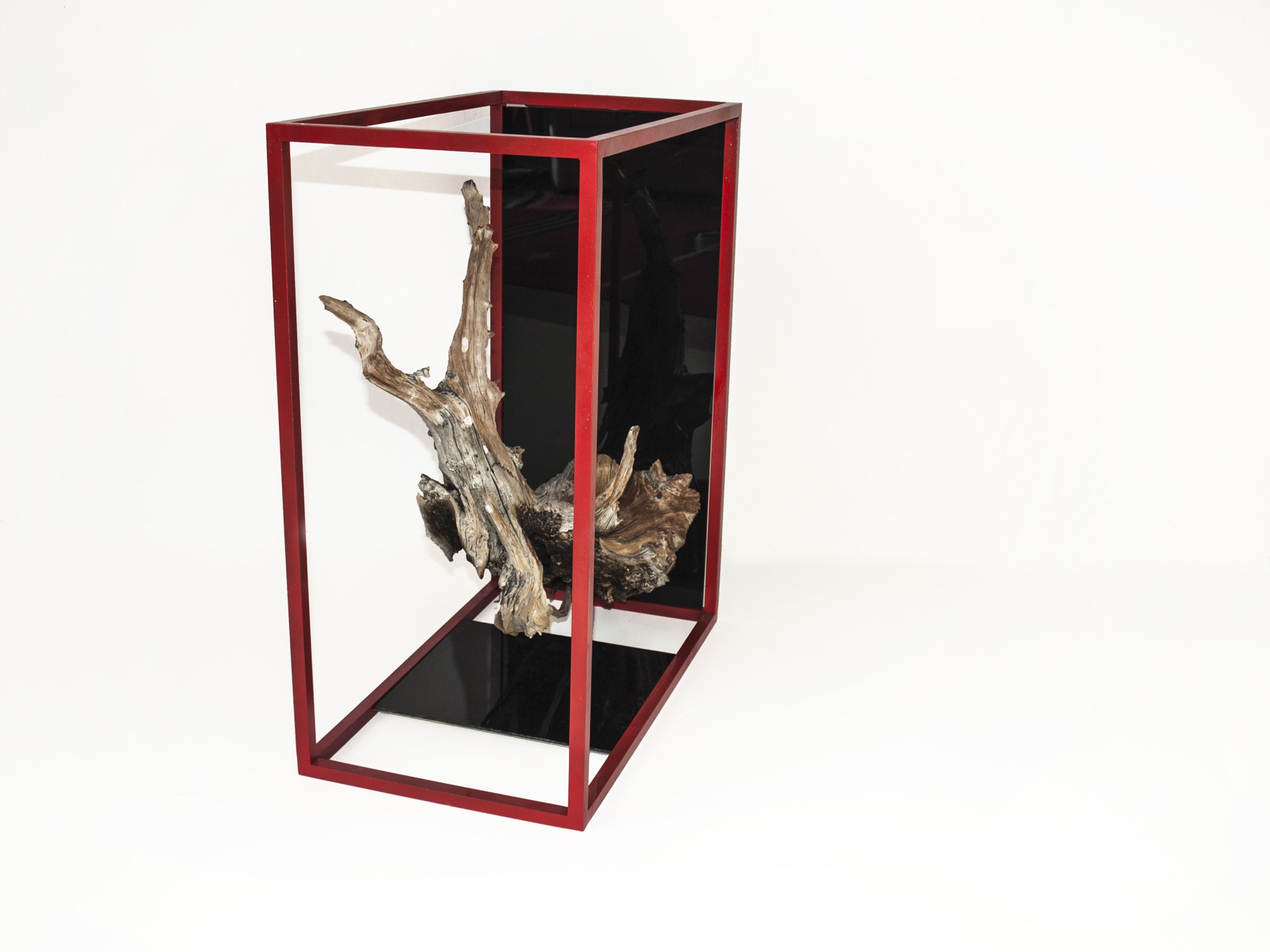
Unrau, for his part, never earned an art or design degree, nor does the lack of academic study in the field limit him in his current work. “We really do our designing when we’re out in the woods. We don’t sit down in an office to draw. We see the material, and the material almost dictates its design.”
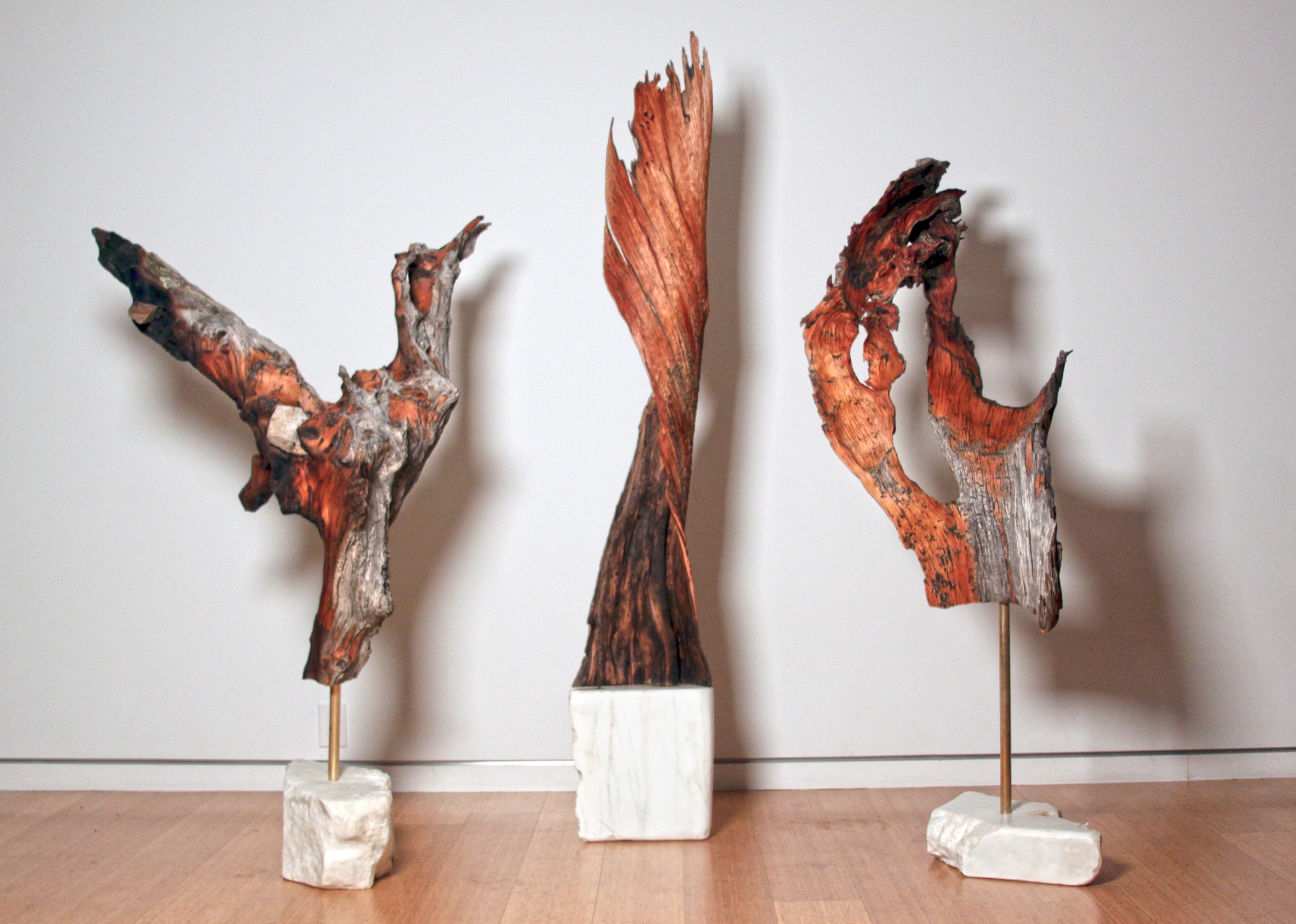
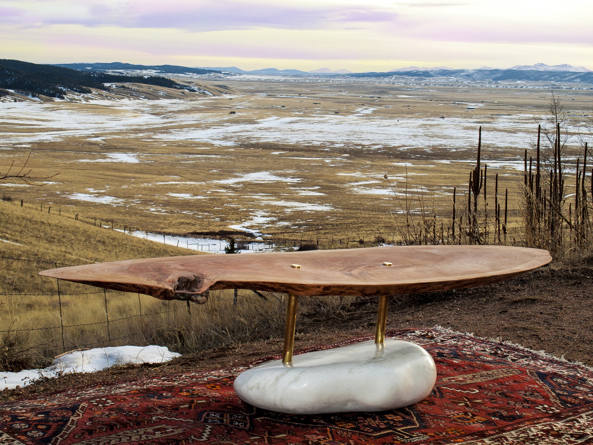
They usually know right away, if a piece of wood they come upon in the forest will transform into an art sculpture, a table, or something else entirely. Back at the studio, they combine found pieces of wood or elk shed with marble and often with contrasting metal. The final artwork or furniture piece comes together like a collage. While the sculptures are never drawn out, the furniture generally is. “We design our table bases, draw them by hand. Sometimes, we bring it into CAD.”
The day I met up with Unrau and Hine, they had come down from their studio above 8000 feet to deliver a piece of art they made for the Boulder Museum of Contemporary Art. “We had this mobile,” Hine begins, chuckling, “And then Rudy dropped it on the staircase, and we were like ‘Oh, no, we’re so crushed. And we had to quickly build it a second time yesterday, and it came out eight times better than the first. That process isn’t always easy to rely on, but sometimes when you make it again, it’s better. This is how we continuously design.”
Speaking about the synergy between Colorado’s magnificent nature, rich history and tradition, and progressive modern art, Hine notes that he is profoundly influenced by the stone carvings of American artist and landscape architect Isamu Noguchi. “It’s that blend of leaving these big natural boulders and polishing one face of it.”
Rustic designs with wood and stone are ubiquitous. “But it’s hard to find someone who has done them simple enough so that these materials individually speak for themselves,” hine says. “Antler furniture is really something we have been experimenting with, because it’s hard to find a simple antler-anything. All the chandeliers are the same hunter antler cluster. And all of a sudden, you are appreciating the simplicity of the singular antler as a sculptural element. That’s what makes it alpine modern, and not just alpine.”
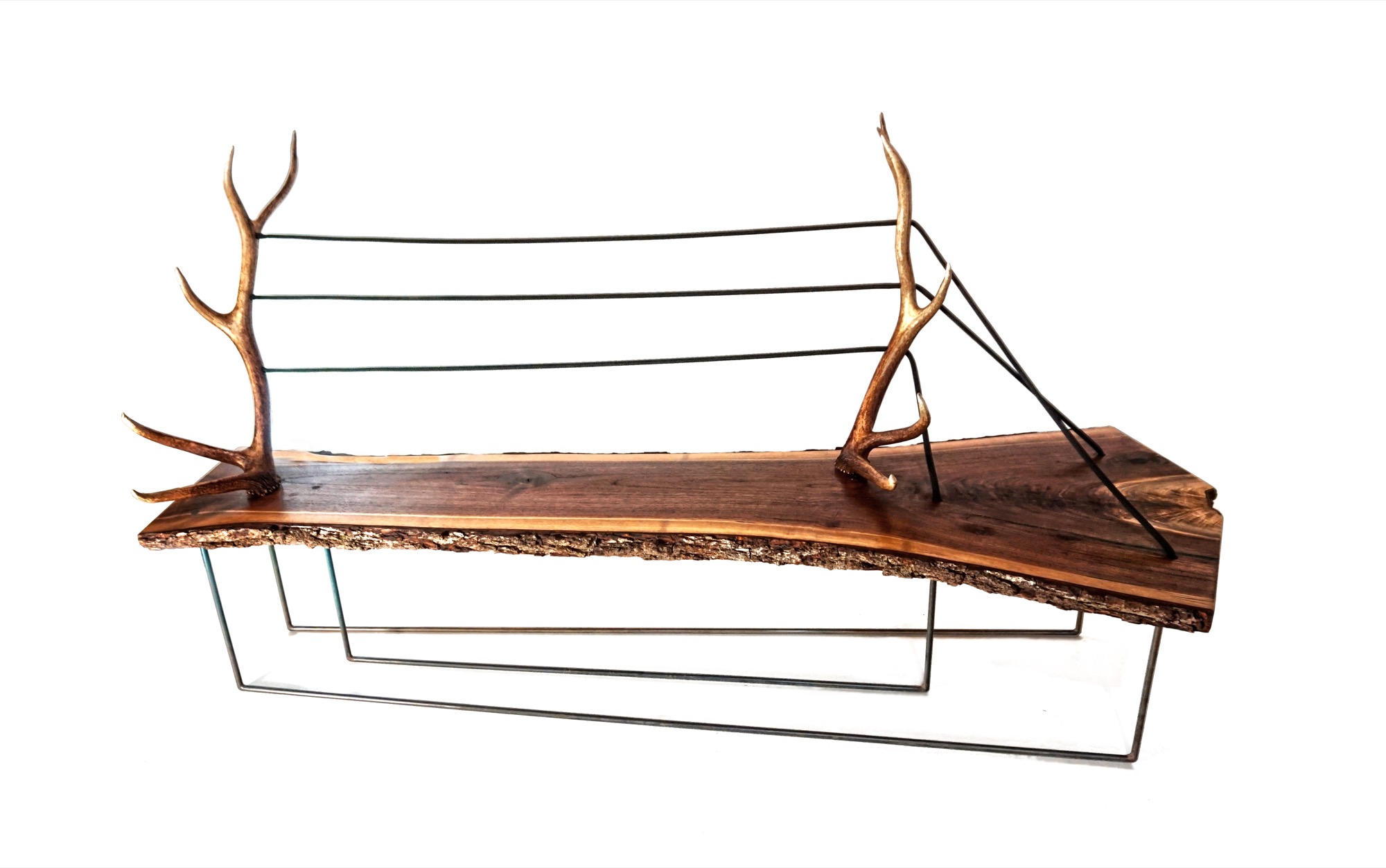
“And all of a sudden, you are appreciating the simplicity of the singular antler as a sculptural element. That’s what makes it alpine modern, and not just alpine.”
A modernists at heart, Hine still looks to the arts and crafts movement for inspiration. “Not stylistically but the whole concept of it is huge, especially since my education is in mass production and industrial design and product development. And going back to actually hand-building one-off pieces from the found materials we use, you can’t really build the same piece twice. It’s almost like we’re in an arts and crafts revival, which is weird for me because that’s the antithesis of the Bauhaus influence, of going from craft to industrial production.”
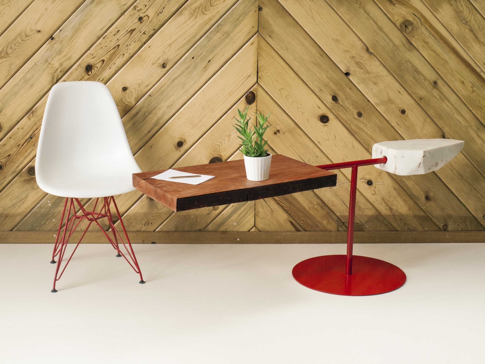
Our conversation later on reveals that the two 27 year olds are somewhat of an antithesis, too—to their fellow millennials. The Internet, they admit tittering, is their shortcoming. “Neither of us really enjoys social media, self promotion, or even doing the sales part,” Hine says. “It’s the cliché artist who doesn’t sell his stuff. We just are either in the woods or in the shop. It never feels like were working.”
MTN Lab projects
Each MTN Lab piece embodies a story of adventure and friendship.
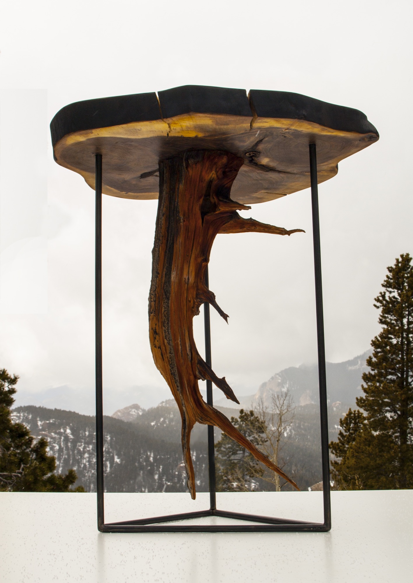
For example, Unrau says seventy years ago, many trees were cut down to make room for high-voltage lines to Fairplay, south of Breckenridge, Colorado. “The company just left them, so these big old-growth rounds have been drying up there all these years,” he says. MTN Lab milled the pine rounds into table tops. “That’s our next big design push, designing bases for those tables,” he says. “Or the motorcycle, which is a lifelong dream we’ve shared since we were little kids.”
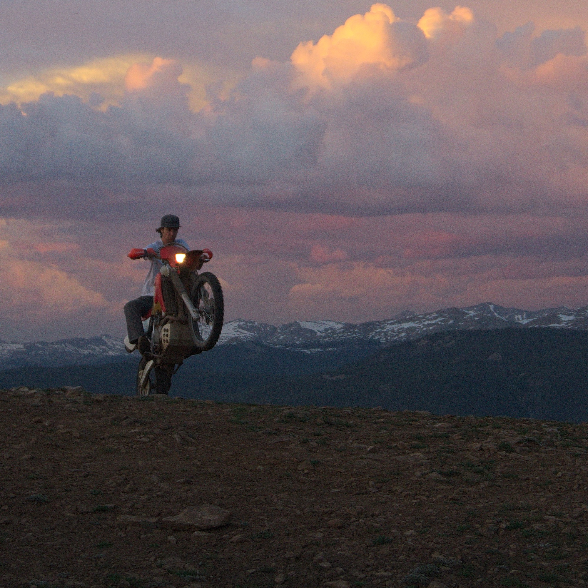
Indeed, Hine and Unrau want to build a motorcycle entirely from scratch, the back end made hand-carved in wood. Before winter, they even want to experiment with producing their our own steel, from mining the rock to crushing and melting it. Whether the resulting material will in fact be usable won’t matter as much: “At least we will be able to appreciate the process when we go to the store and buy steel.”
“The motorcycle is going to be very much like our furniture and our sculptures,” Unrau says. “I would describe it as an art bike. It’s going to be functional. It’s going to ride very well, but it’s not going to look like a conventional motorcycle. I don’t know if we’re going to be willing to sell it.” The business partners are also debating whether they will ever have the heart to sell the 1960s Airstream that once belonged to Unrau’s grandfather and they just finished restoring. “I never want to sell any of our stuff,” Unrau admits, laughing. “It’s hopeless.” △
The Adventure House
Seattle’s Olson Kundig creates an extraordinary family outpost with views of the North Cascades
Like wagons circling a campfire, a home that consists of sleek, airy pavilions embodies the concept of gathering.
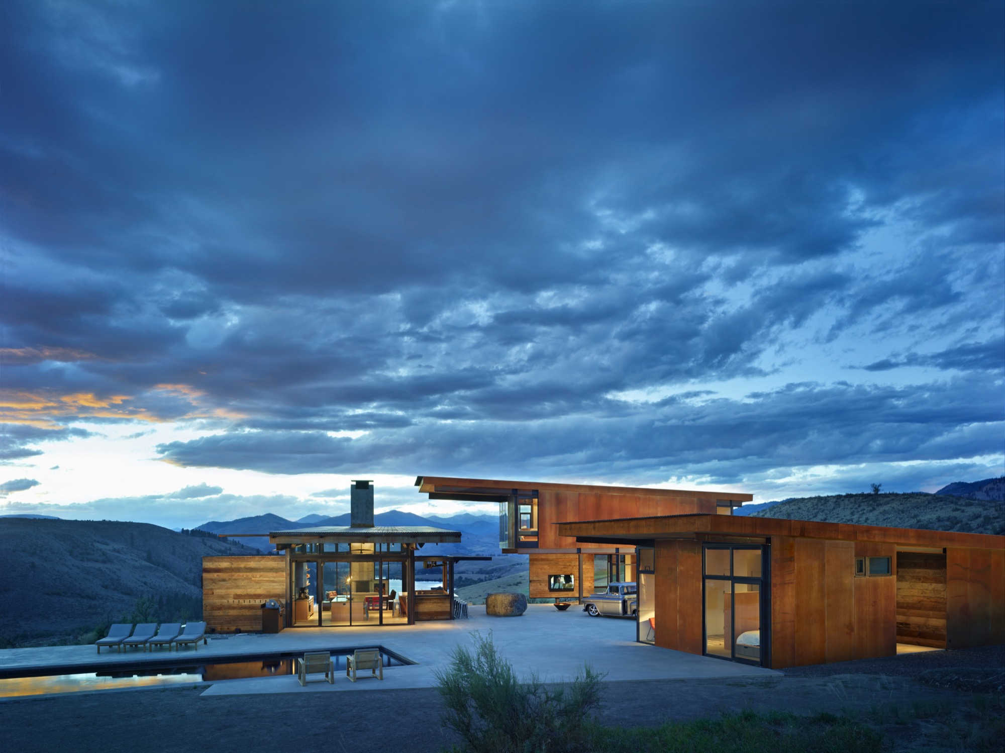
When it comes to second homes, adventure makes the heart grow fonder. At least that’s the premise—and the promise—upon which Tom Kundig, of Seattle-based Olson Kundig, based his design for the staggeringly beautiful Studhorse residence in Washington’s remote Methow Valley. “Second homes are about adventure, and they are the homes that leave the most indelible memories,” Kundig says. “The best way to do that is to make them unconventional.” And that’s when things get interesting. Because when an architect of Kundig’s caliber decides to steer design in an unconventional direction, all manner of daring surprises can occur.
These days, Tom Kundig is a much-heralded, multi-award-winning architect (fifty and counting from the American Institute of Architects alone) engaged in projects spanning the globe. Yet, despite his growing international artistic stature, Kundig’s inspiration remains rooted in the profound experiences of his mountain-climbing youth. “I can tell you from experience that while mountain climbing may seem romantic, it’s also uncomfortable and scary,” he confesses. “You’re cold, hot, and sore. Why would anyone do it, if they thought about it logically? But it’s about engaging life vigorously. So is all of my best work.”
“While mountain climbing may seem romantic, it’s also uncomfortable and scary. You’re cold, hot, and sore. Why would anyone do it, if they thought about it logically? But it’s about engaging life vigorously. So is all of my best work.”
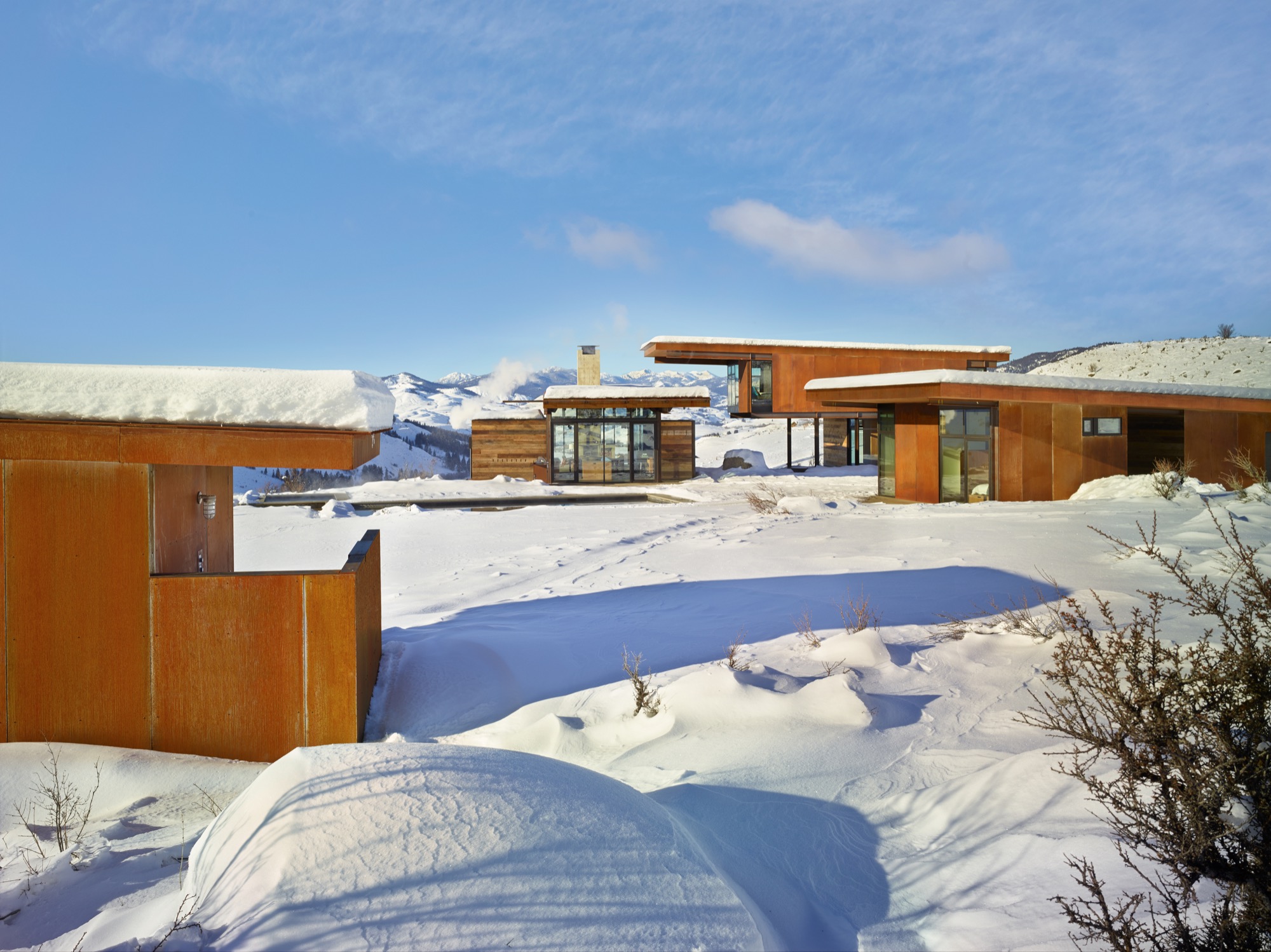
One fearless family
Fortunately, the clients who invited Kundig to design a mountain getaway for their young family on the edge of the North Cascades a few hours north-east of Seattle had a bold spirit and zest for adventure themselves. In fact, sharing adventures was part of their deliberate and mindful approach to building family memories. So it made sense that a rural retreat from their city routines would provide plenty of opportunity for outside-the-box living.
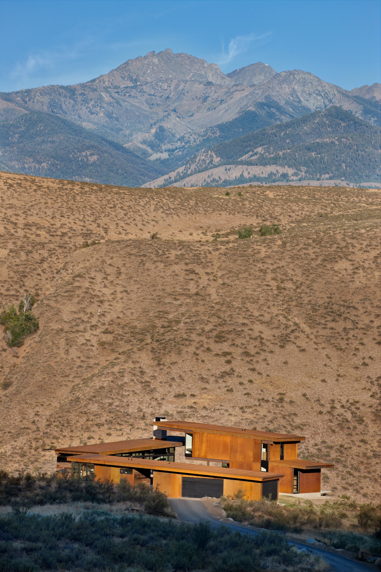
Truly life-enriching adventures are awakened by extraordinary locations, and this home’s setting is spectacular—twenty sagebrush-and-wildflower-strewn acres of rolling terrain unfurling beside Studhorse Ridge and overlooking the towering North Cascades and a lush stretch of the Methow Valley and Pearrygin Lake. It’s a quiet and peaceful perch with 360-degree views of wild Washington beauty.
Not surprisingly, the homeowners intended to spend as much time as possible outdoors, and that suited Kundig just fine. “Many of my buildings, even the public ones, involve being exposed to the elements in some way,” he notes. “And sometimes, there is even an element of risk, or daring, which is desired on the client’s part and intentional on my part.” So this home was designed expressly to provide plenty of access to fresh-air freedom. “The clients wanted a central space where the family and guests could come together in the landscape,” Kundig recalls. “We came up with the concept of the house feeling like a vintage motel with a series of buildings around a courtyard. From there, the conversation evolved into the idea of exploring the tradition of circling wagons around a campfire.” This engaging idea became the seed from which the entire home grew.
One big boulder
But first they had to deal with a rather large rock. “The site was actually completely empty when we began,” Kundig explains. “Except for the boulder that was positioned in what is now the courtyard area. It is a glacial erratic—a rock that a glacier drops as it recedes—and it was a driving element of the house composition, becoming the center point for the project.” So, in a gesture both timeless and eloquent, the home’s structural elements—and, by extension, the family’s activities—congregate around a literal and figurative touchstone. “I envisioned it as a large piece of furniture,” Kundig admits. Whatever you care to call it, the rock has become a much-loved feature of the home. “We loan the house to friends a lot, and we leave a Polaroid camera next to the guestbook,” says the homeowner. “That book probably has a hundred pictures taped inside by now, and I bet ninety of them show people on the rock. People see it and they say, ‘That’s amazing you put this rock here,’ but we say no, we built the house around the rock!”
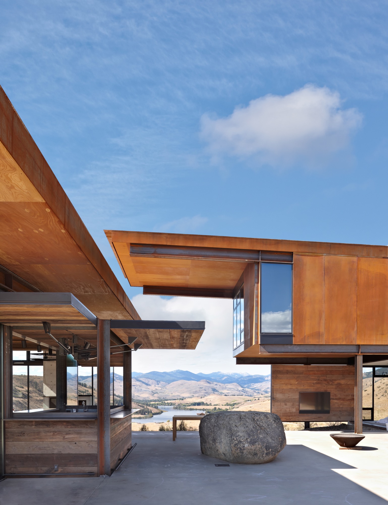
An elegant assemblage
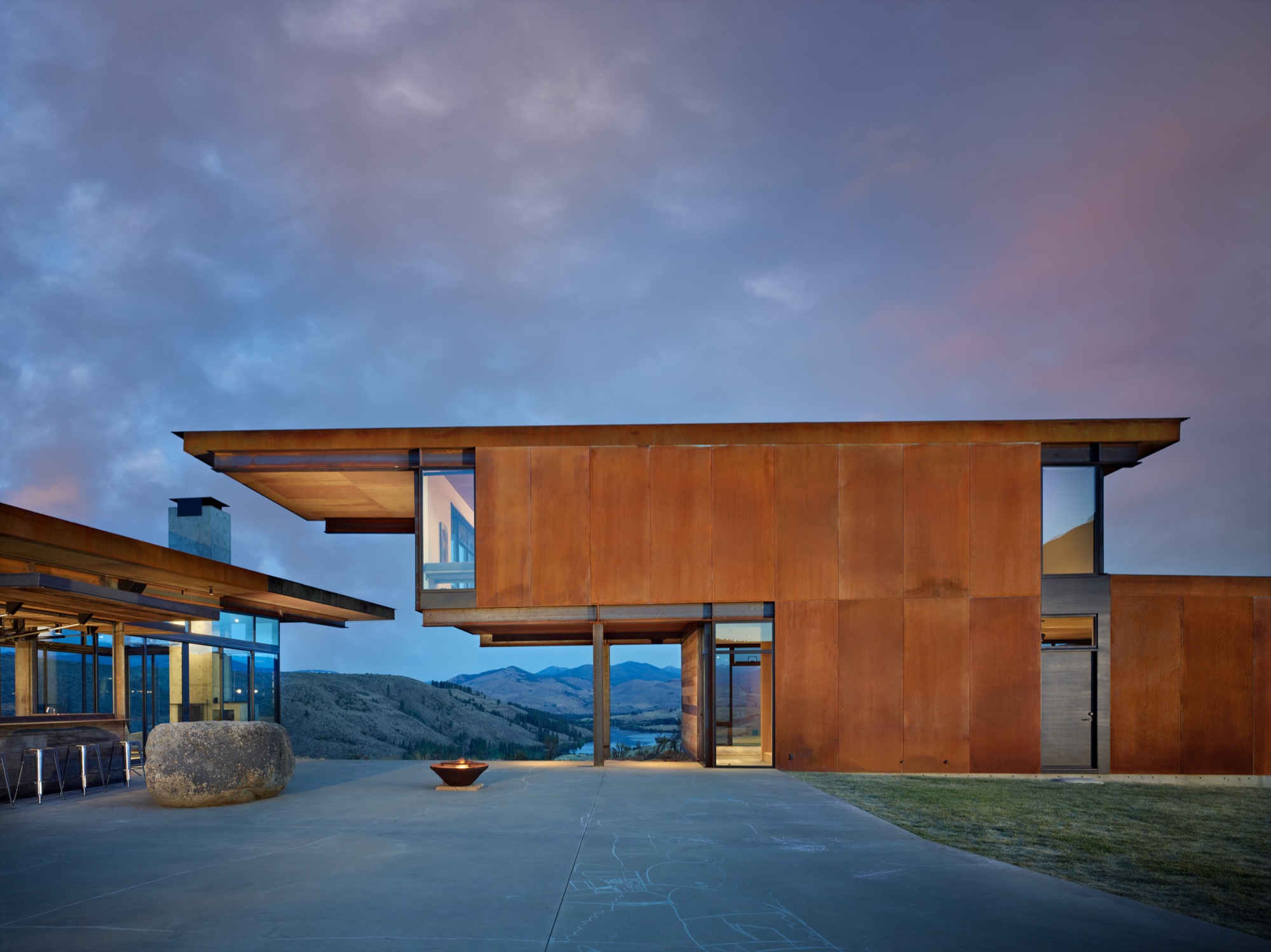
The home comprises a series of buildings clustered around a central courtyard. Viewed collectively from a distance, the constellation of structures has the striking presence of sculpture artfully arranged in a landscape, but each element is also simply practical. Each structure/pavilion has a defined purpose, and taken together they fulfill all of the family’s requirements, so residents and guests circulate among and between the buildings in daily paths dictated by their activities. The main structure is nearly entirely encased in glass. (Kundig calls it “lantern-like.”) Anchored by a massive concrete fireplace on one end, with a living room, dining area, kitchen, pantry, bar and bath—this is the main indoor gathering space. Another structure just beside it contains private family bedrooms upstairs and a guest bedroom and shared den below. Across the courtyard, a third structure offers space for the garage, storage and laundry facilities, and connects through a breezeway to an extra guest suite. The fourth and smallest building, set slightly apart and in a meadow, houses the sauna.
The structures were meticulously positioned to precisely frame gorgeous mountain and valley views, and the negative space (the open space between buildings) they create was considered with the utmost care. When vistas are framed from different angles, we perceive them in new ways, Project Manager Mark Olthoff explains, and this home’s design repeatedly plays with the idea of varying points of view. Olthoff notes that the moment of arrival is a particularly significant experience, so in this case it was important that the view greeting one’s eyes upon entering the complex from the parking area be pristine. Dazzling glimpses of landscape are framed cleanly by the built structures, with no overlapping edges of rooflines to mar the dramatic impact of the first impression.
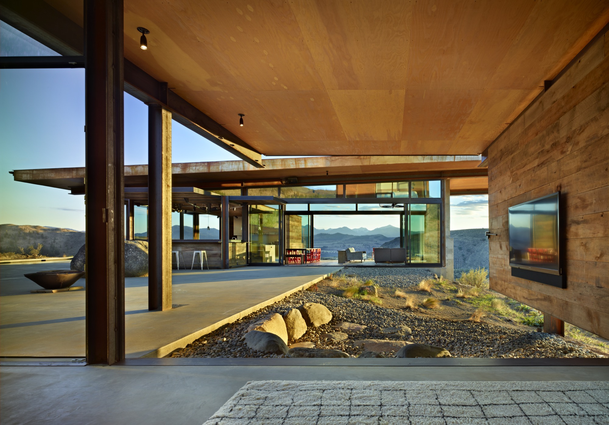
Kundig explains that the strategic arrangement of the structures, which he refers to as “lean, geometric pavilions of steel, barn wood and glass,” also puts their extended rooflines to work—providing shade and natural cooling in the heat of summer and creating a covered passageway when rain and snow fall. The central courtyard, swimming and play zone become a natural focal point at the heart of the cluster of buildings, practical for a busy family with energetic children, ideal for entertaining a group of guests, and perfectly charming as an impromptu dance floor.
Simple and solid
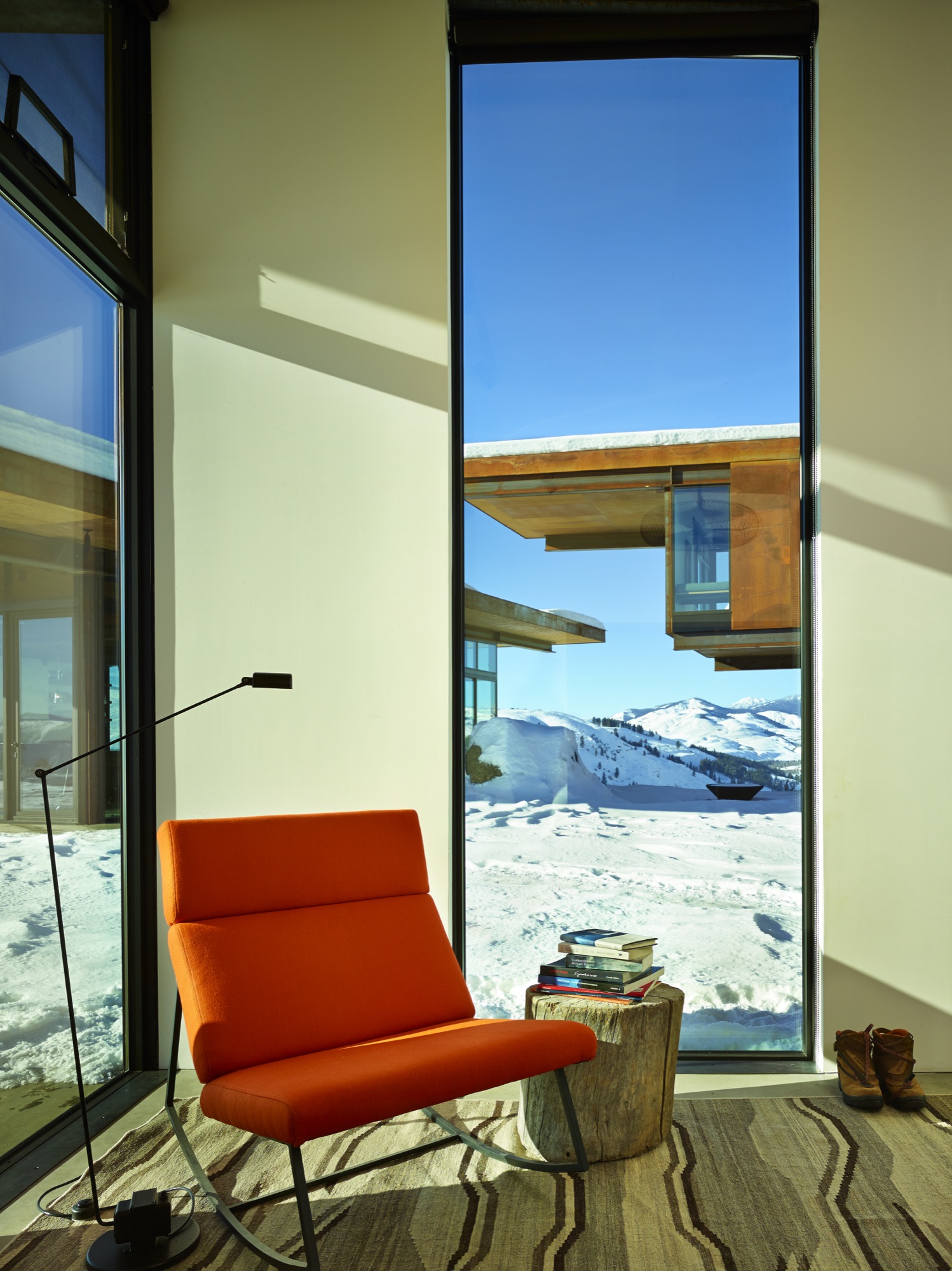
Yet, while the home is certainly gracious, it is far from grand. “We relied on everyday building materials when possible and used the common materials in uncommon ways, such as exposed plywood for flooring or walls,” Kundig explains. “The materials—mostly steel, glass, concrete and reclaimed wood—were chosen for their resilience against the scorching summer sun and freezing, windy winters that define the region. The materials are expected to weather over time with their surroundings, and to blend in.” If the wood siding shows quirks of character and age, then that’s because it was salvaged from an old barn in Spokane, Washington. And plywood is more practical than precious. “The ceilings are ACX plywood,” Kundig says. “The rest (cabinets, floor, and walls) is AB marine-grade plywood, which we used because the edges would be exposed and marine grade has tighter laminations and holds an edge better.” With a gray-toned stain, the humble boards take on a refined appearance belying their usual orange-tinged reputation. For her part, the homeowner is delighted with the home’s unfussy durability and general livability. “It’s made to stand up to the occupants,” she says admiringly, noting that the family retreat is “worked hard.”
“We relied on everyday building materials when possible and used the common materials in uncommon ways.”
Four-season comfort is assured, thanks to a series of astute climate considerations. A geothermal heating system (with electrical backup) warms the home and its concrete floors. Air conditioning is unnecessary, given the home’s elevated location, which allows breezes to filter through the rooms. And giant, industrial-sized fans in the living room and bedrooms keep the air circulating. Moreover, many of the walls and windows were designed not merely to open but to essentially disappear, blurring interior-exterior boundaries as the home and its landscape intermingle.
Kinetic elements
And here’s where some of the home’s adventurous personality really comes out to play. Kundig has developed a reputation for buildings that incorporate kinetic elements (Olson Kundig even boasts an in-house “gizmologist”), and this house is no exception. Moving parts are built into the fabric of the home, adding a functional—and undeniably fun—versatility to the spaces. The main pavilion’s floor-to-ceiling windows and giant Fleetwood sliding doors enable the expansive room to completely open to the great outdoors. Nearby, the indoor bar converts to an al fresco watering hole when the steel-and-wood back wall flips open on hydraulic pistons. (Kundig likens the experience to Coney Island.) And in a bravura demonstration of crowd-pleasing cleverness, one entire reclaimed-wood-clad den wall is designed to swivel ninety degrees outwards, so that the big-screen television becomes an outdoor movie screen, and the courtyard—and a perfectly placed semi-circle of landscaped rock seating—becomes an open-air cinema.
[video width="640" height="360" mp4="http://www.alpinemodern.com/editorial/wp-content/uploads/2016/08/400983501.mp4" loop="true" autoplay="true"][/video]
Scandinavian style meets the mountain West
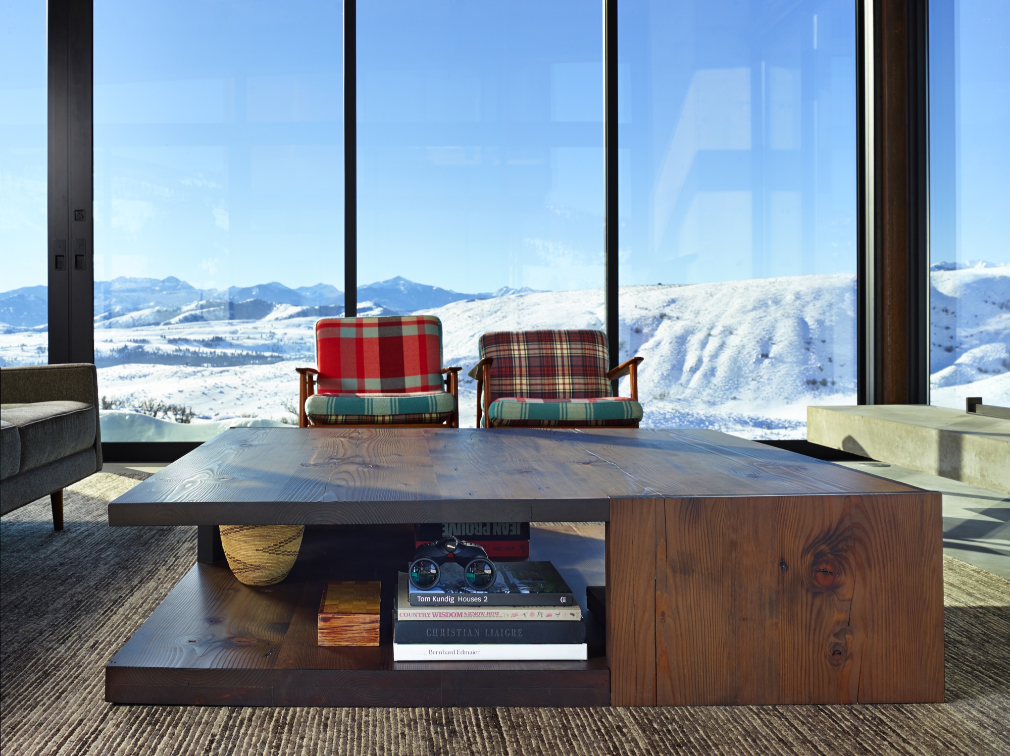
Debbie Kennedy, an interior designer with Olson Kundig, helped guide the creation and selection of furnishings and finishes for the home. “We wanted to stick to a very simple unpretentious palette of materials—materials that feel like they belong in the landscape and the interior,” she says. “Limiting the number of materials helps the spaces flow into one another.” Concrete, steel and reclaimed wood are major players both indoors and outdoors. “The clients are very drawn to Scandinavian design—both contemporary and vintage,” Kennedy explains. “In this instance, the goal was also to incorporate modern refined Western mountain references.” Kundig notes, “The focus was on beautiful yet practical pieces that would age as well as the buildings and, similarly, relate to the region and mountain landscape.”
The homeowners preferred a casual look and a welcoming feel, with occasional bright splashes. “The dining chairs presented a great opportunity to introduce a pop of color,” Kennedy notes. “And the client fell in love with a vintage-blanket chair by Maresa Patterson, so we asked her to work with us on a pair of chairs.” Kundig adds, “A few key pieces—such as the dining table, coffee table, fireplace screen, and built-in beds—were custom-designed by the team.” Kennedy singles out one example: “The folded steel console is from the Tom Kundig Collection and feels like it was ‘meant’ for the house.”
Defying easy categorization, the Studhorse residence is emphatically individual and entirely unforgettable. Perched on a prospect overlooking a breathtaking panorama, the clustered elements of the home manage to both embrace and enhance its incredible surroundings. As a hummingbird flits straight through the open walls of the living room and into the kitchen on a sunny spring afternoon, the allure of Tom Kundig’s vision is clear and complete. As he explains, “Architecture allowed me to have a foot in both places—the technical realm and the poetic realm—and in that magical intersection between the two.” △
“Architecture allowed me to have a foot in both places—the technical realm and the poetic realm—and in that magical intersection between the two.”
The Fragrance of "Out There"
A harvest walk on the wild side with the wilderness perfume crafters of Juniper Ridge
Hall Newbegin is out there. Upon first meeting him, I didn’t expect it. He seemed jovial, unintimidating, and mild-mannered. But in the first five minutes of our conversation he used the phrase “out there” eight times — “Part of what I wanted to do was to just be ‘out there’ . . . Being ‘out there’ just centered me . . . Being ‘out there’ saved me as person . . . I had no idea where this was going, but I loved being ‘out there.’ ”
Return to the wilderness
All of us go through periods of discovery in our lives when we are searching for direction, trying to find out what defines us and how it can drive our life and work. For Newbegin, the founder and head perfumer for Bay Area-based Juniper Ridge, that discovery came after a stint on the East Coast and a return to his roots in the West, a return to the wilderness — “out there” — where he feels most comfortable and alive.
Newbegin never imagined that being “out there” would lead to a burgeoning fragrance business, with his products sold in outlets around the globe. He stumbled upon the idea after trial and error — in his life, in his passions, and in his own business.
Capturing the essence of being “out there” is the driving force for the people who run Juniper Ridge, which proclaims itself the world’s only wilderness fragrance company. Headed by Newbegin and the firm’s chief storyteller and packaging designer, Obi Kaufmann, Juniper Ridge, per its website, is “built on the simple idea that nothing smells better than the forest.”
“Built on the simple idea that nothing smells better than the forest.”
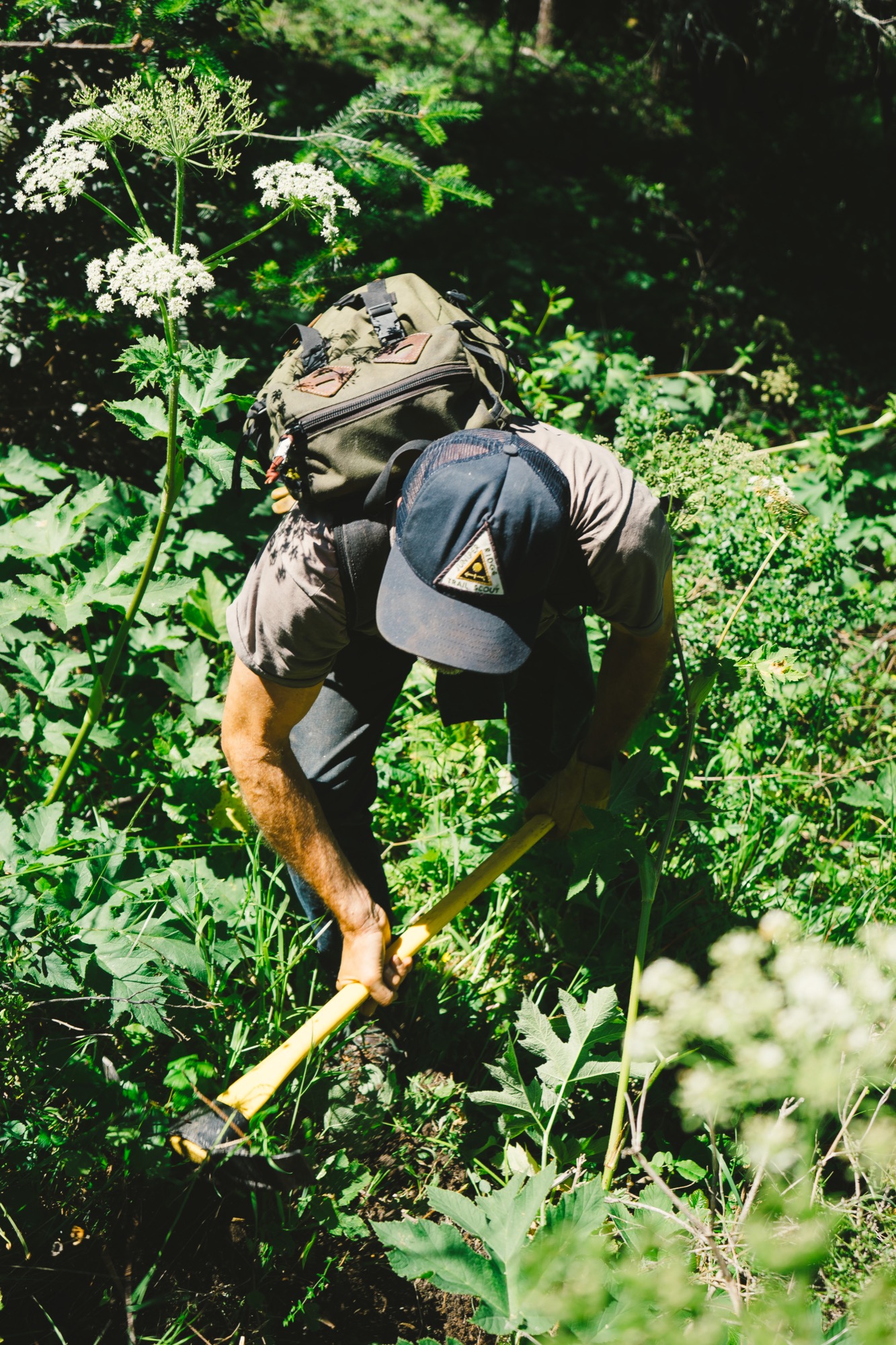
Newbegin and his team embrace this mantra through a process called wild harvesting, where they make real fragrances from the places they know and love — the trails of the rugged and diverse American West.
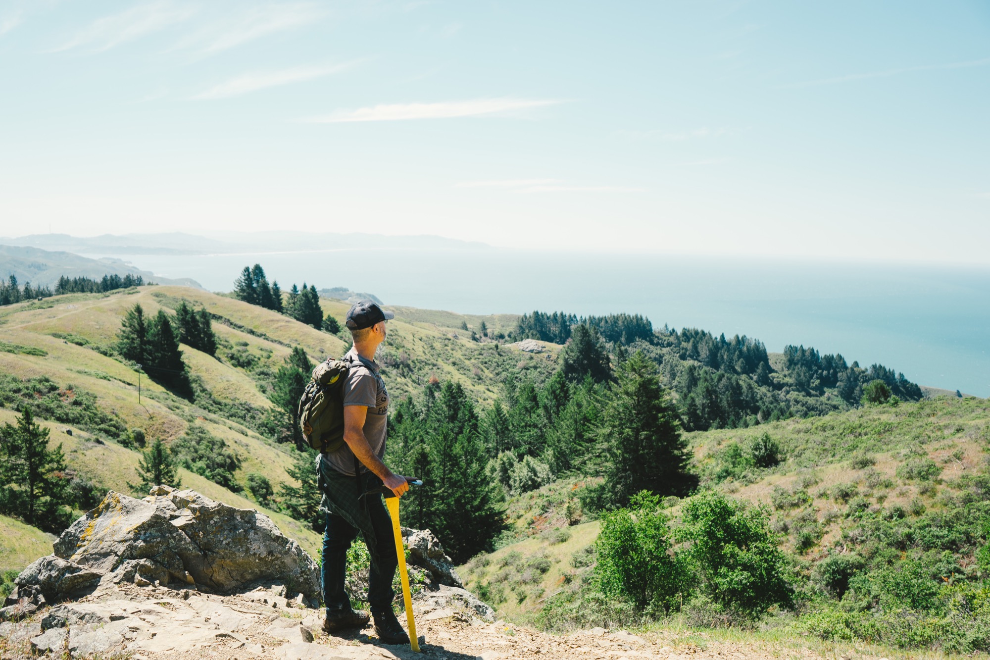
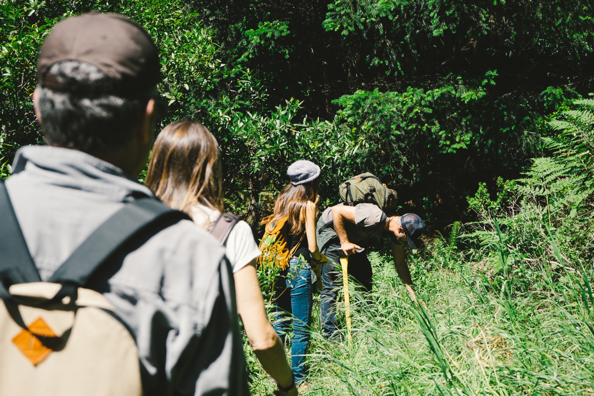
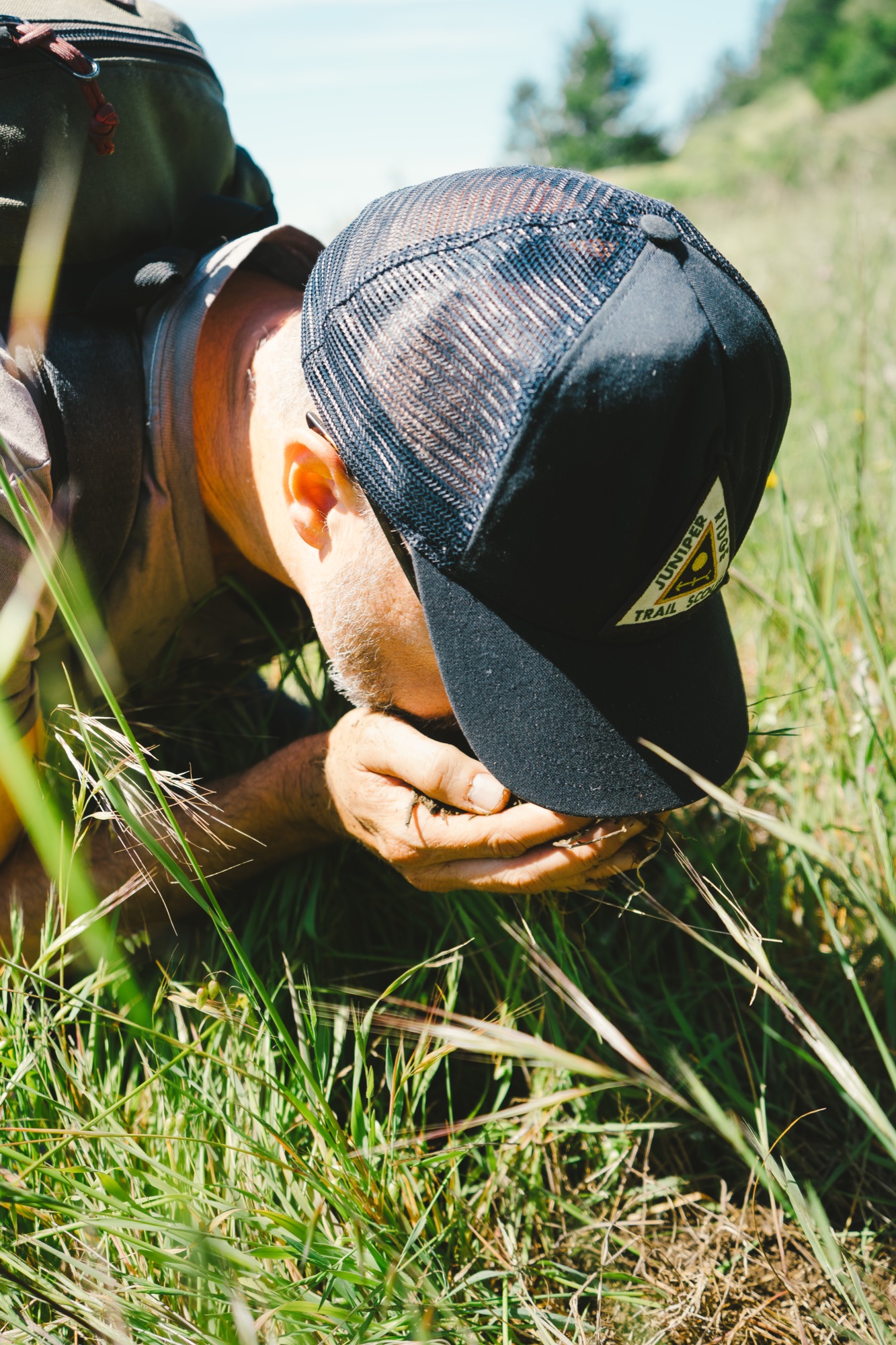
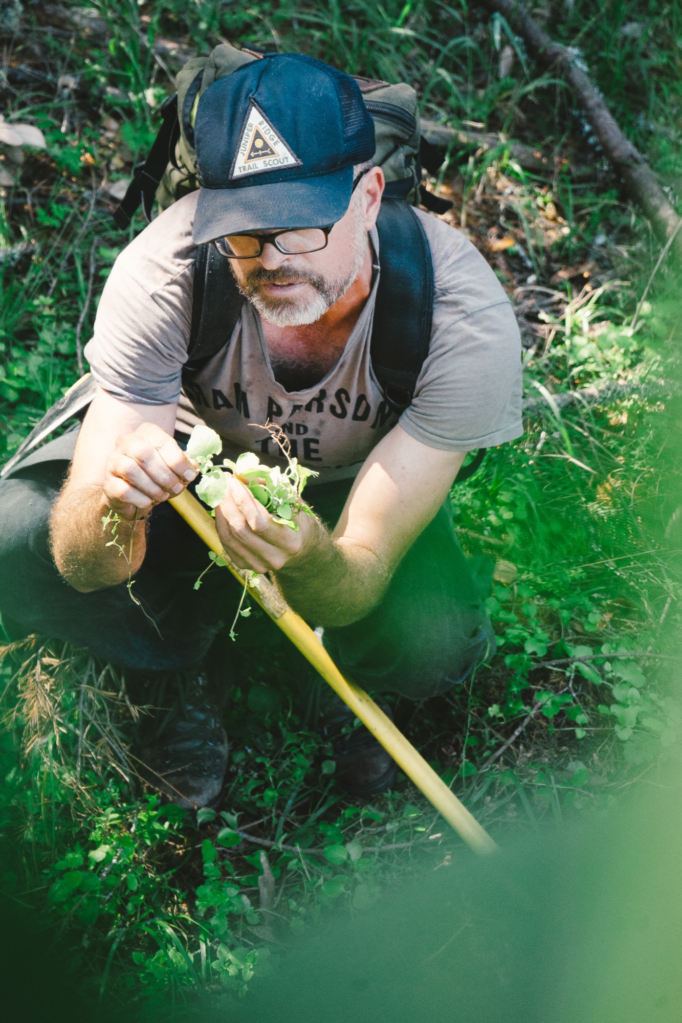
Their teams of hikers crawl through mountain meadows, smelling the earth, the wild flowers in bloom, or the moss covering the trees, then harvest the ingredients to capture the real scent of that land. Armed with public permits or private permissions, they gather wild flowers, plants, bark, moss, mushrooms, and tree trimmings, then distill and extract fragrance by employing ancient perfume-making techniques of distillation, tincturing, infusion, and enfleurage. These formulations vary yearly and by harvest, due to rainfall, temperature, specific location, and season.
“I want people to stick their faces in the ground and just get really primitive.”
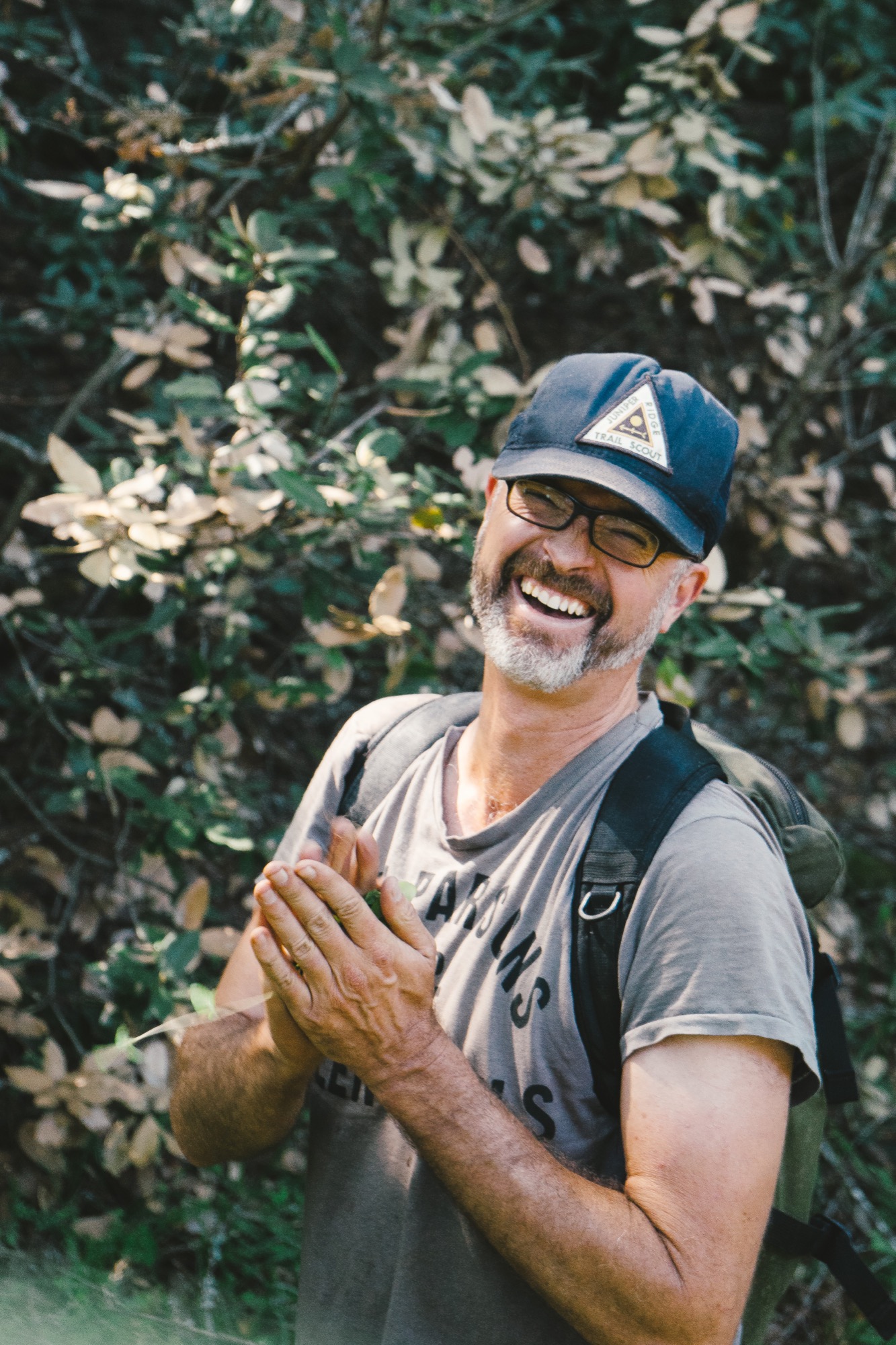
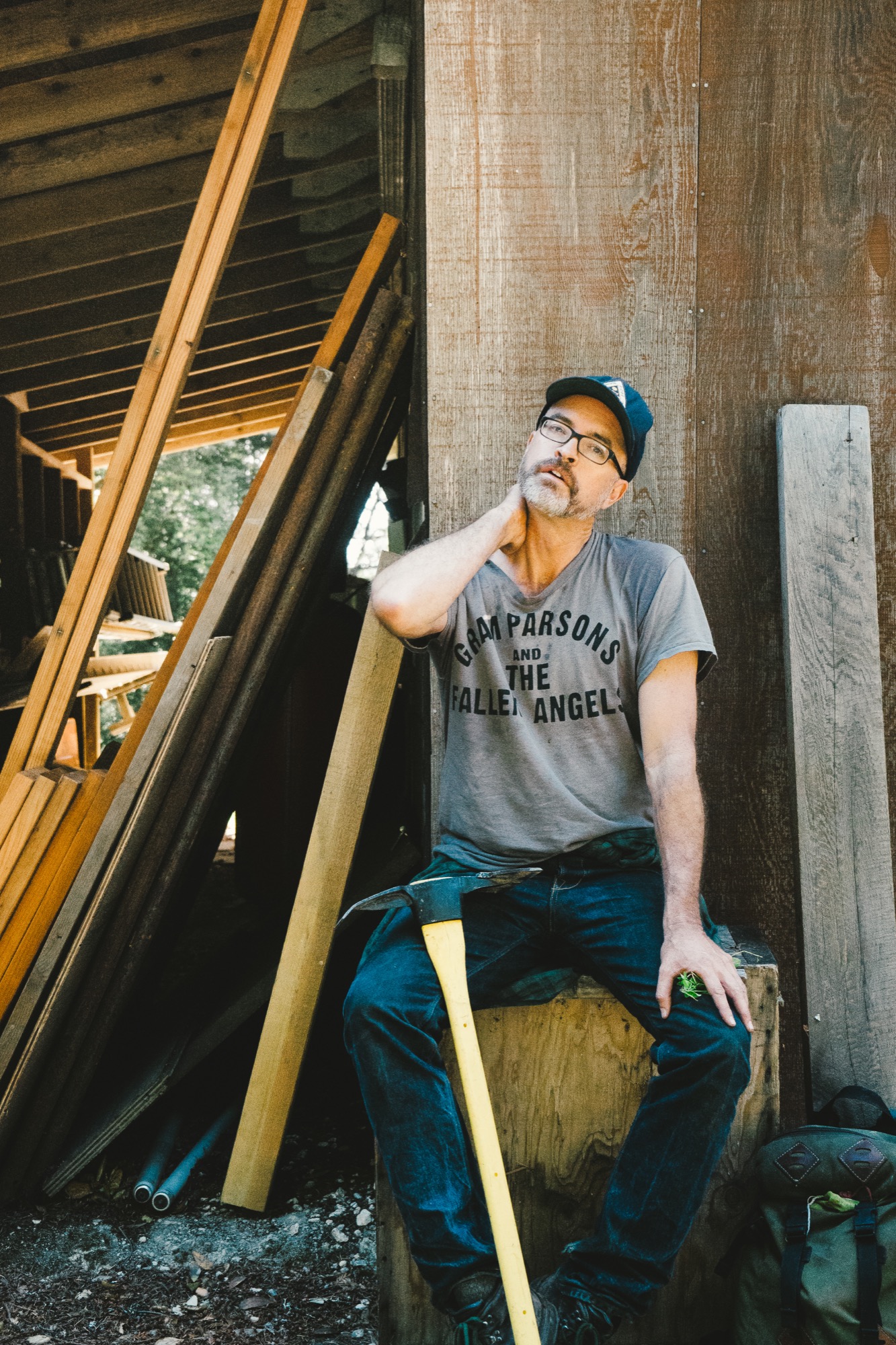
“I want people to stick their faces in the ground and just get really primitive,” says Newbegin, whose Instagram handle is @crawlonwetdirt. Yet this call to the primitive is based in fact: Our sense of smell is often called the oldest sense, the only one with a direct connection to the brain. That connection brings pleasure and sparks memory, transporting us in time and place. For the team at Juniper Ridge, the time and place is marked on every bottle of fragrance they sell. In fact, they authenticate the process of each harvest by stamping each package with a harvest number and by documenting the process through an accompanying story and photographs on the Juniper Ridge website.

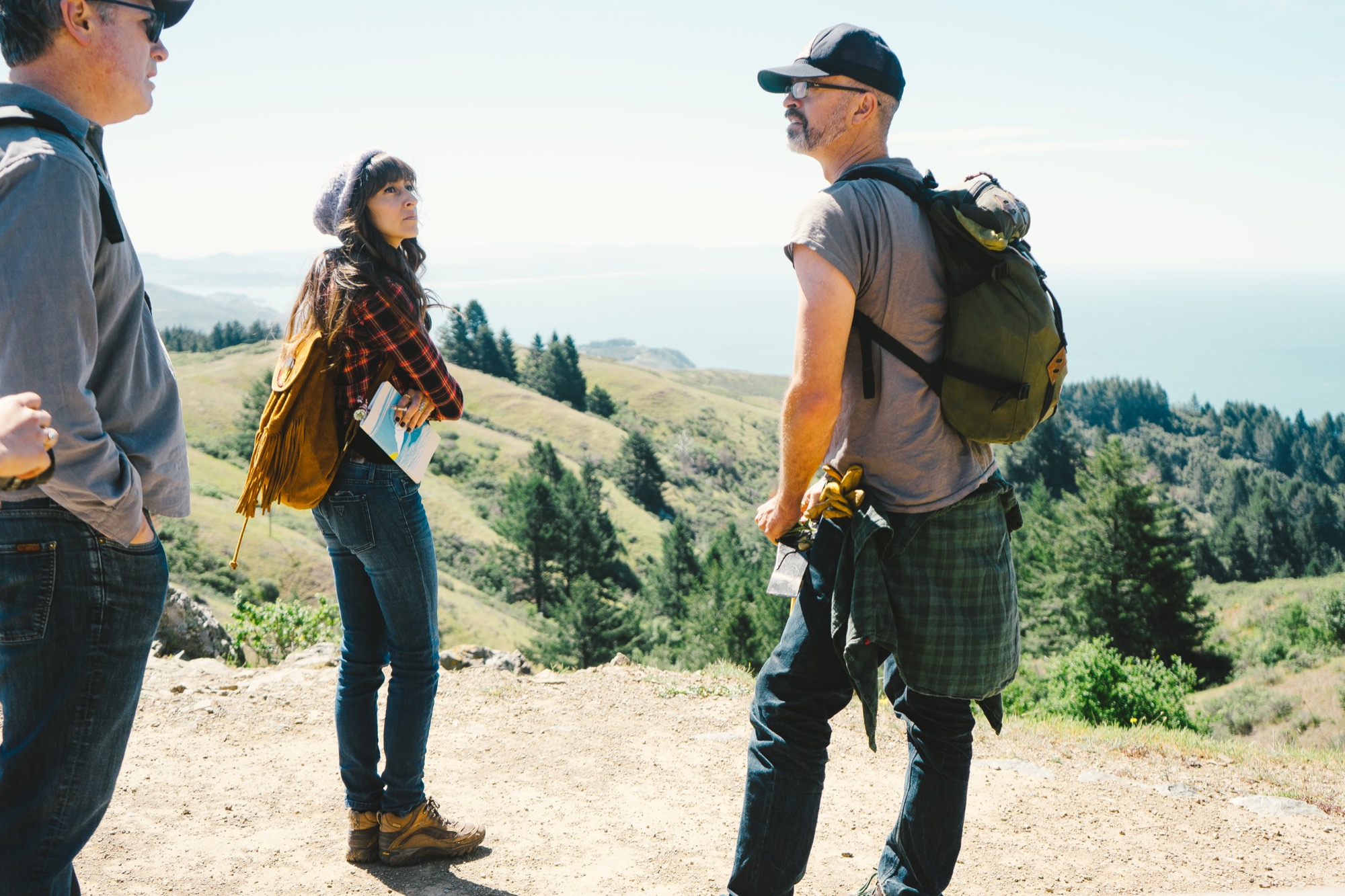
“Our muse is the place. And our job is to funnel that the best we can,” says Newbegin, pointing to a small spray bottle of Sierra Granite, a fragrance connected to California’s Sierra Nevada. “Everything in this bottle is real. Our test is always ‘Is it the real place?’ ” Some of the other places they have captured include Big Sur (California coast), Siskiyou (Oregon coast), Mojave (Mojave Desert), and Cascade Glacier (Oregon’s Mount Hood).
“Our muse is the place."
Real fragrance resonates
Kaufman notes that as the business has grown, sales have been strongest in Scandinavia and New York City. “It doesn’t matter if you’ve never been to the Sierra mountains or to Big Sur, it takes you to a place inside your own head that is common to all of us,” he says. “Ninety-nine percent of the people who buy this have never been to the Mojave Desert, but because it’s real fragrance, it resonates — this is real, it’s not Comme des Garçons, it’s not that bullshit stuff at the Nordstrom’s counter that’s made from petroleum, and that never existed on earth until ten seconds ago. Because this is real, it goes deep into our genetic past — we’re responding to something real.”
“It doesn’t matter if you’ve never been to the Sierra mountains or to Big Sur, [the fragrance] takes you to a place inside your own head that is common to all of us.”

Saved by the wild
While hiking on Marin County’s Mount Tamalpais with the sometimes loquacious but unassuming Newbegin in his worn T-shirt and jeans, it’s hard to imagine that he would describe the transcendent moment of his life as a cliché. But those are the exact words he uses when he muses on the importance of the wilderness and the outdoors: “I feel like it saved my life.”
Growing up in Oregon, with Mount Hood in his backyard, Newbegin spent most of his youth hiking and backpacking. He attended college in New York but knew there was something growing inside of him, “a hunger to get back to the West and be in the mountains . . . I had camping and being outdoors in my blood. It’s a deep West Coast/western cultural thing,” he says.
With a last name like Newbegin, it seemed inevitable that he would eventually find his true calling. That happened in Berkeley, California, after a period he deems his “hippy schooling.” He took inspiration from eco-wilderness writers including Gary Snyder, John Muir, and David Brower and studied under commercial mushroom harvesters, members of native plant societies, and herbal medicine teachers.
New beginning
The real turning point came as he was foraging native medicinal plants in the Sierra Nevada. “I dug my trowel into osha root, and the air just exploded with that smell and it’s like, ‘ahhh.’ It would just slay me,” he says. “I didn’t know what the stuff was. I wasn’t thinking about fragrance or anything. I just loved being out there. It just centered me. It brought me into this world where the big thing is there, and it just brought peace over me. You’re looking at plants, at trees, your map, and you smell the ground and suddenly it breaks. You’re just there. All that chatting in your brain just stops, and you’re just there.”
This was the beginning of an epiphany, but the path from being an outdoorsman to becoming a true perfumer has been sixteen years in the making. “You know how journeys are,” Newbegin says, “You just start taking your steps, and soon you start getting somewhere. And so, I started learning how to extract goo out of plants. I was going to the Berkeley Public Library and trying to figure out the old extraction techniques of how you get the goo out of the plants.”
Eventually, he was mixing that goo with other ingredients to make soap and selling it for four bucks a bar at the Berkeley Farmers’ Market. He describes encounters with his first customers: “They would say, ‘Oh my God, this is Big Sur in a soap.’ ” Sounding a bit like Hemingway, he would give them the authentic story of the day that it was harvested — “I got black sage goo on my arms, and I took a nap under this big black sage shrub and had dreams about it and woke up, and the sun was on my face, and the air was just filled with the cleanness of black sage and bees in the air.” Their response, according to Newbegin: “OK, I’ll take ten of those, right now.”
Goo business
After quickly selling out of his product, Newbegin also realized that he was vastly underpricing his offerings. Over the years, he and his team have refined not only the process to get very consistent quality, they have also learned how to price their product to create a sustainable business. Newbegin laughs when he says, “We make perfume for people who hate perfume. It’s the worst business model ever.” And yet, it is a business that is working — with retailers such as Barneys New York now carrying the product, and outlets as far away as Paris, Moscow, and Tokyo.
“We make perfume for people who hate perfume. It’s the worst business model ever.”
And Newbegin’s enthusiasm for his product and the process is still very evident. “When I hand this to someone, I think to myself, ‘Oh, my God, you’re getting something just unbelievable.’ All that green in there . . . This is what Mount Hood was like as of September fourth of last year. All that green goo, tree pitch. It’s just real. It’s just 100 percent real.”
The Juniper Ridge team talks about how this realness is a stark contrast to the more synthetic nature of traditional perfumes. Those classic perfume houses employ someone who is called “a nose” to help them create unique fragrances. Globally, there are around fifty “noses” who are highly sought after for their olfactory abilities.
Although this is rarefied air that Newbegin wants no part of, he does refer to himself as “the Pied Piper of the nose.” He is quick to recall the power of the sense of smell. “My message is, use this primitive thing because it will change the person you are.” The scent of nature “is everywhere, all the time. So wake up your sense of smell,” he exhorts. “I want people to do it, not because they should, but because it’s the most sensually gratifying thing they can experience. It’s wonderful.”
Try for yourself
Newbegin’s final piece of advice: “Do what we do — get outdoors, crawl around on your hands and knees, smell the wet earth beneath your feet. Or if you’re worried about embarrassing yourself (which you should be since people don’t normally crawl around on trails), just start by crushing tree needles and plants under your nose. Stay with it, keep breathing it in. You may notice yourself feeling things, feeling something about the quietness of the place. That's the power of real fragrance.” △
"Stay with it, keep breathing it in. You may notice yourself feeling things, feeling something about the quietness of the place. That's the power of real fragrance.”

Concrete Perspectives
Australian photographer Jake Weisz discovers the minimalist Amangiri Resort in Southern Utah
Through his lense and all his senses, Australian photographer Jake Weisz (@jakeling) experiences the calm luxe and the raw surrounding nature of Southern Utah’s Amangiri Resort, where minimalist architecture in monochromatic concrete lies below the buttes and mesas of Canyon Point.
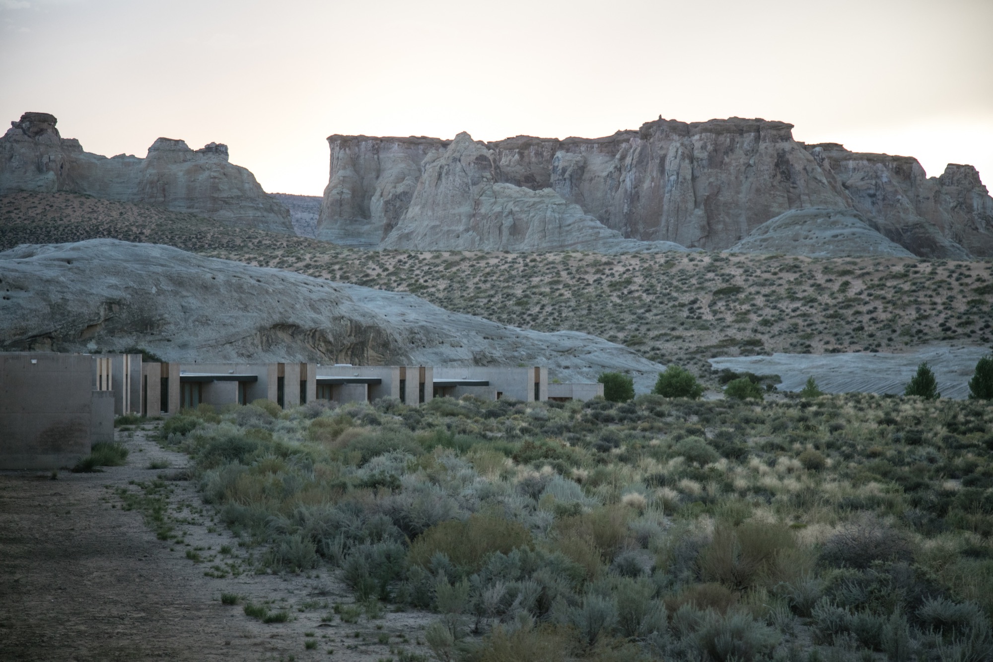
After an unforgettable, slow drive along a private, paved road between colossal ridges and across vast landscapes, we arrived at what I can only describe as a concrete castle hiding in the rocks of Southern Utah. Amangiri was and remains the greatest architectural experience of my life as a photographer. Minimalism, texture, silhouette... all unassuming until I wandered through this artistic haven of concrete walls.
A collaborative design by architects Rick Joy (Tucson, Arizona), Marwan Al-Sayed (Hollywood, California) and Wendell Burnette (Phoenix, Arizona), Amangiri spreads over 600 acres (243 hectares), with 34 suites and a four-bedroom mesa home, a lounge, several swimming pools, spa, fitness center and a central pavilion that includes a library, art gallery, and both private and public dining areas. The architects were commissioned by legendary hotelier Adrian Zecha, whose Aman Resorts have redefined luxury travel in epic proportions.
Arriving at the resort
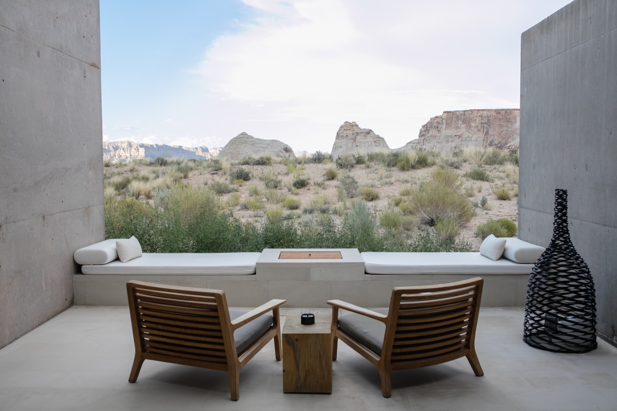
We wandered across the dramatic entrance, past the protruding canyon on the right and stepped into the first breezeway, one of numerous voluminous concrete corridors that connect each pavilion to the next, framing the valleys in the distance and creating different moments of awe every time you step inside. Throughout the day, the sun hits each breezeway at different angles, giving light and shadow new meaning, in a continuous cycle from dawn until dusk. Impressions of grandeur aside, with each stride deeper into these grand hallways, I felt closer to sublime serenity; this indescribable feeling of peace.
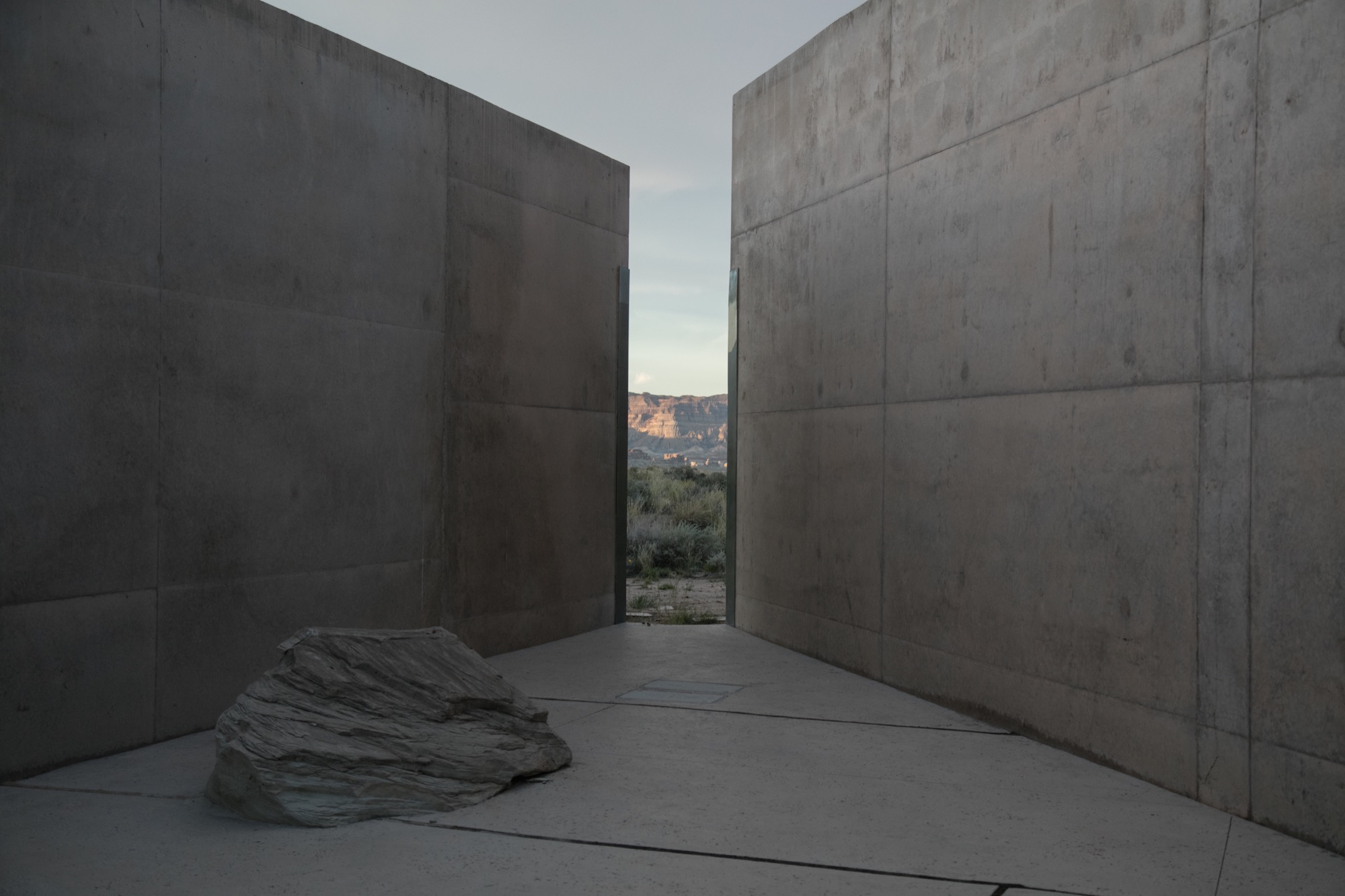
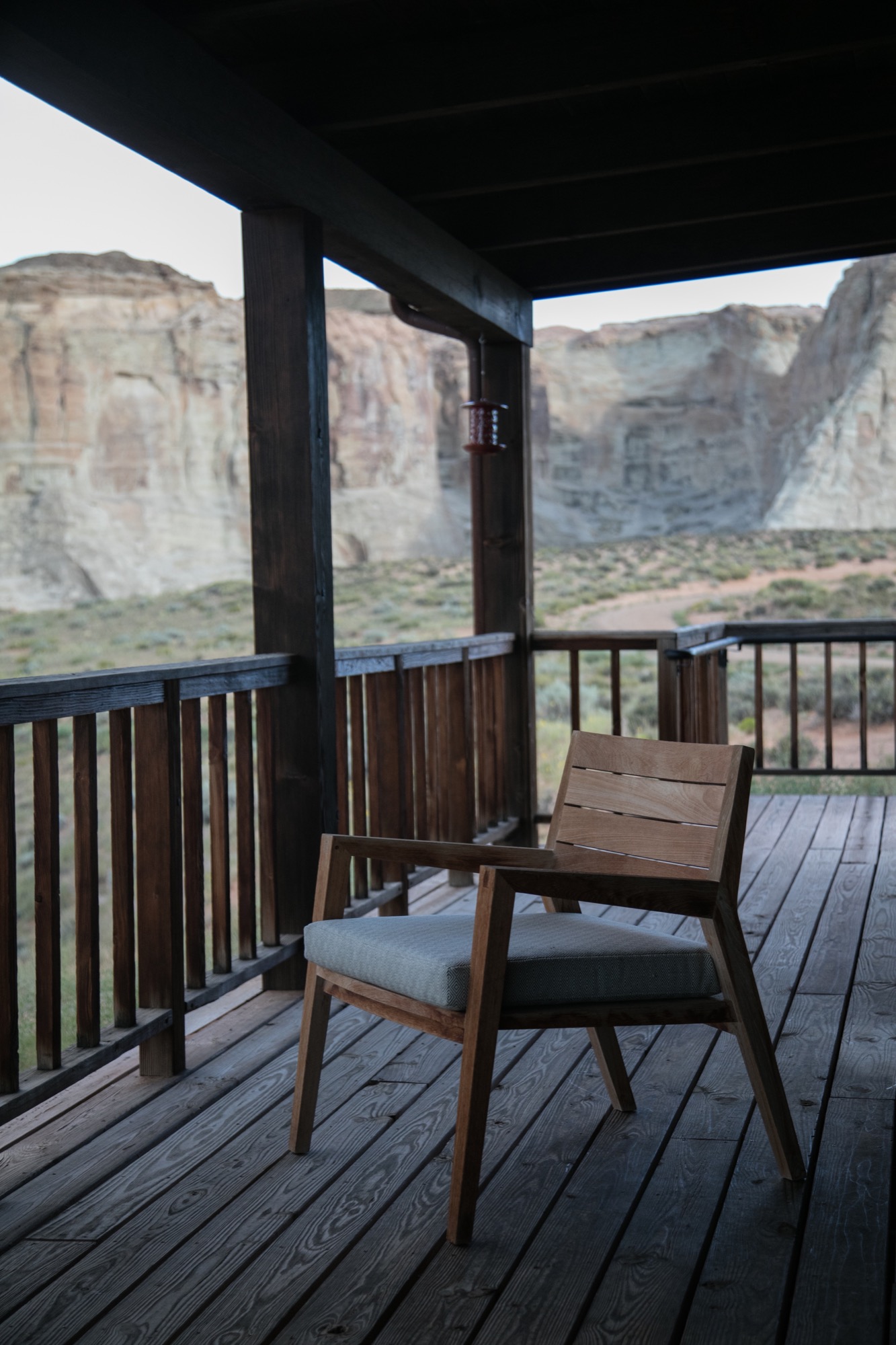
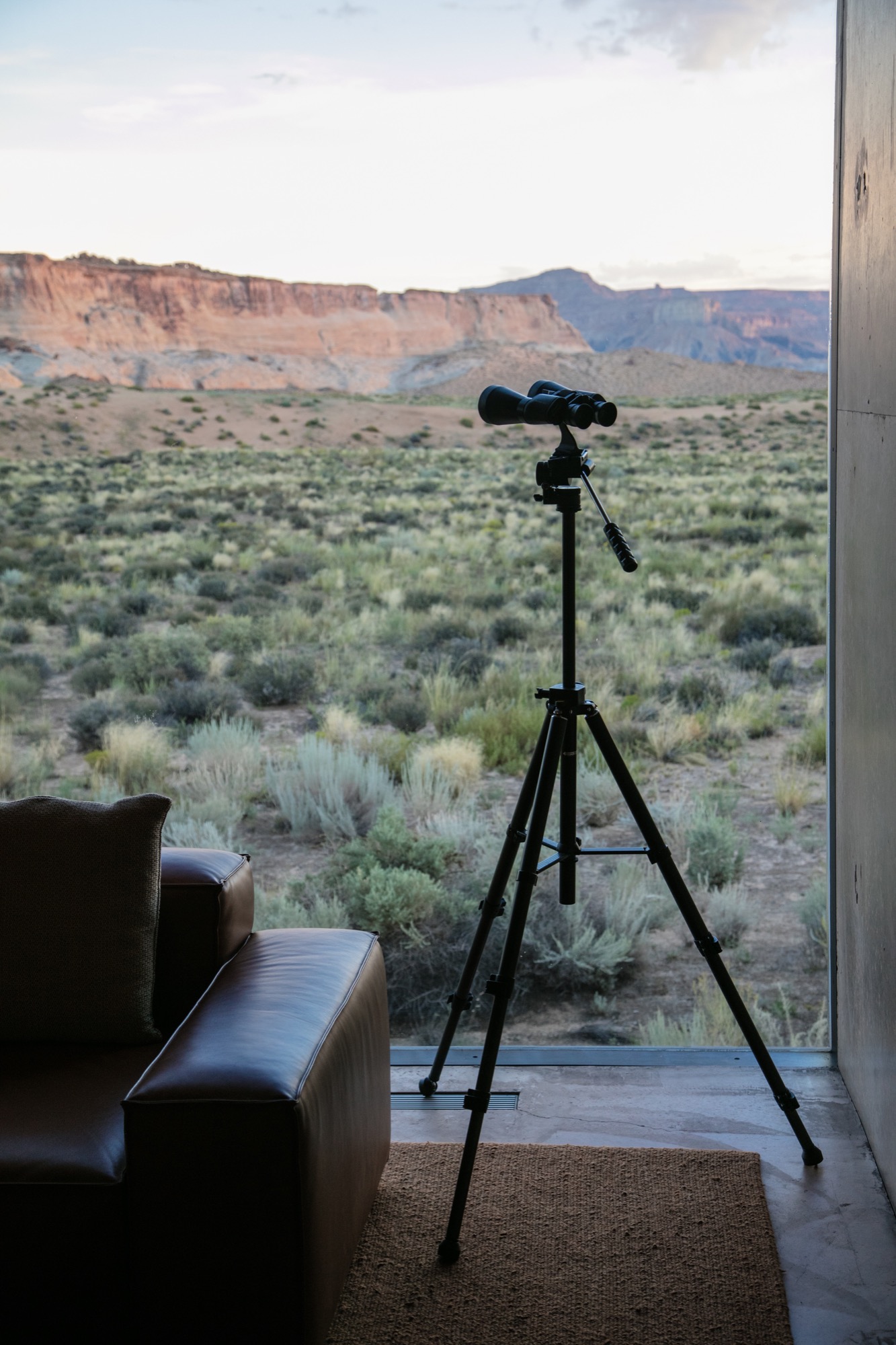
We were shown to our room, a one-bedroom suite on the edge of the property, backing to what at first glance reminded me of a set built for a spaghetti Western: rolling tumbleweeds, the squeaks of desert mice, expeditious hares scurrying about, the scene set against luminous canyons and a distant view of Broken Arrow Cave, an indigenous, spiritual sanctuary. Certainly the right place for a creative’s maniacal mind to softly seep into a slumber.
“Certainly the right place for a creative’s maniacal mind to softly seep into a slumber.”
Exploring perspectives
After some rest in our noble lodgings, the photographer in me yearned to roam the grounds, Canon in hand, and to capture the tranquil austerity surrounding us. Being here, each of the architects’ decisions made sense. Moments of monotony broken by jagged slices of deep, sweeping pastel views. The polished concrete’s organic texture caressed by soft waterfalls cascading down the walls. Brief Edenic allusions in fruitful apple trees, ripe for the picking. To grasp we were only a couple hours’ drive from Las Vegas, Nevada, was almost impossible.
Perspective became an intriguing exploration. The architecture condenses expansive canyons into splinters of light and landscape between these grand, polished concrete walls. Rather than being clinical or cold, as unknowing observers might reckon from afar, the stark concrete structure’s monochromatic elegance creates harmonious balance between the arid landscape in a desolate summer climate and shadowed walkways affording gentle breezes of desert wind.
“Perspective became an intriguing exploration. The architecture condenses expansive canyons into splinters of light and landscape between these grand, polished concrete walls.”
Fortress of luxe
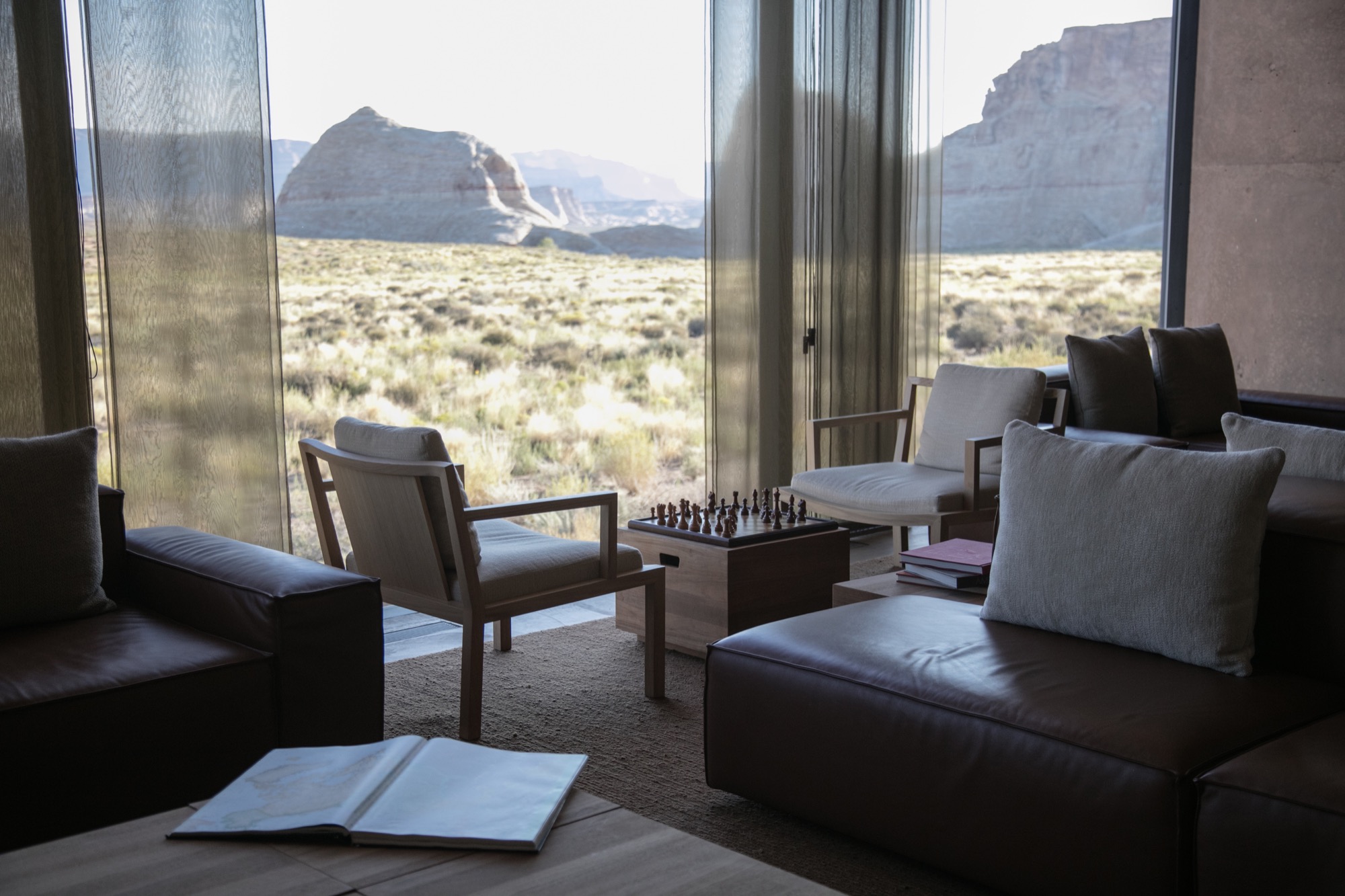
Stepping inside Amangiri superseded any notions I had of comfort and luxe. The main pavilion is a multipurpose common area scented by burning fresh sage and sunburned grain. On the walls, copious Ulrike Arnold artworks implement abstraction from the concrete’s silky texture. The interior seamlessly merges textures as if designed by rhythmic dictation. Soft leathers and animal hides, smooth oak and cement surfaces all amalgamate with the rough, rambling terrain that surrounds the resort.
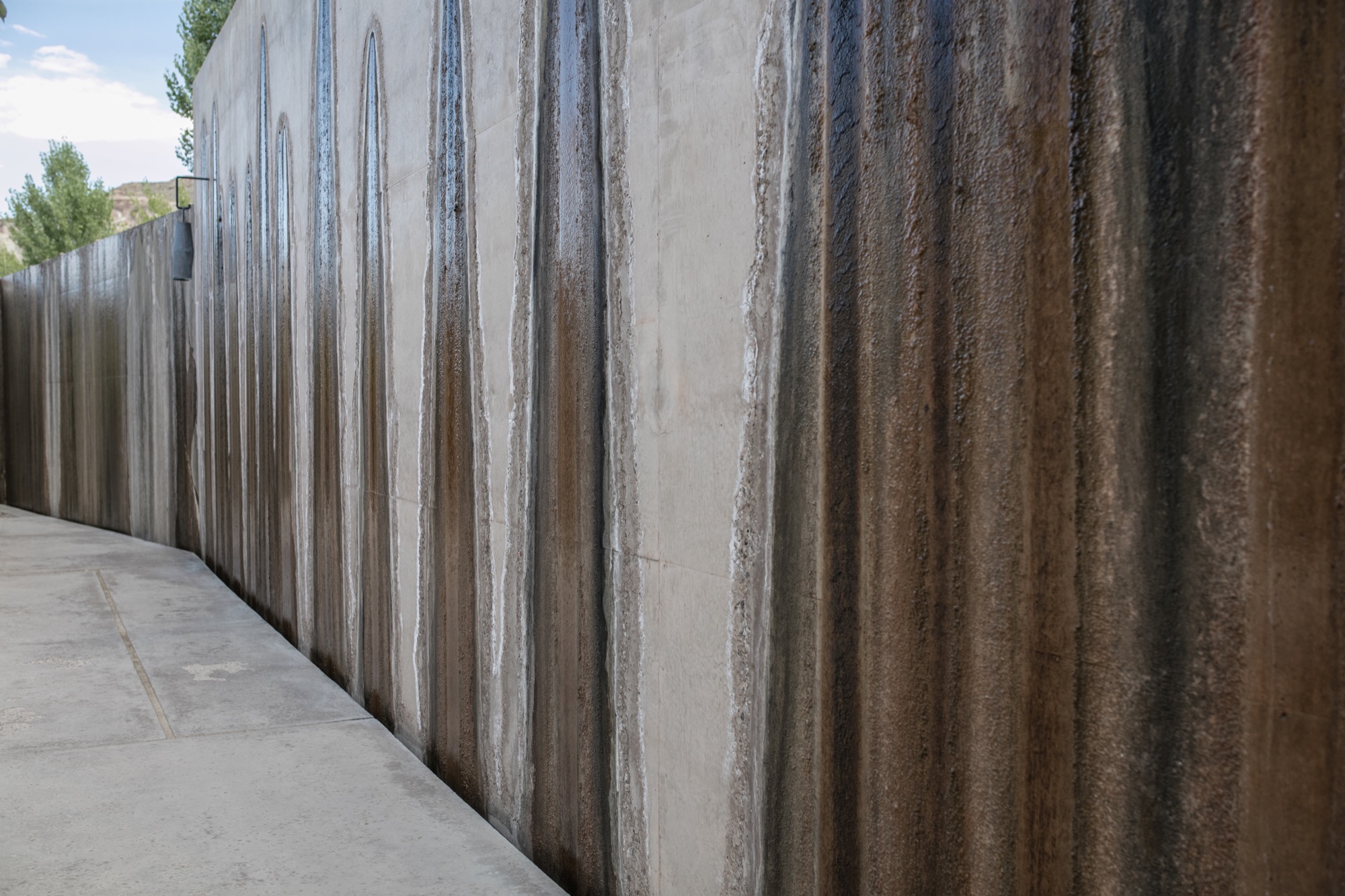
I experienced color in this place like never before—the perfectly blended gradient changes from earth tones to milky hues. The architects of Amangiri also designed all interior features; furnishings, lighting, signage… all the elements reflect the Southwestern landscape and culture with subtle, emblematic references to the Native American tribes that once inhabited Canyon Point.
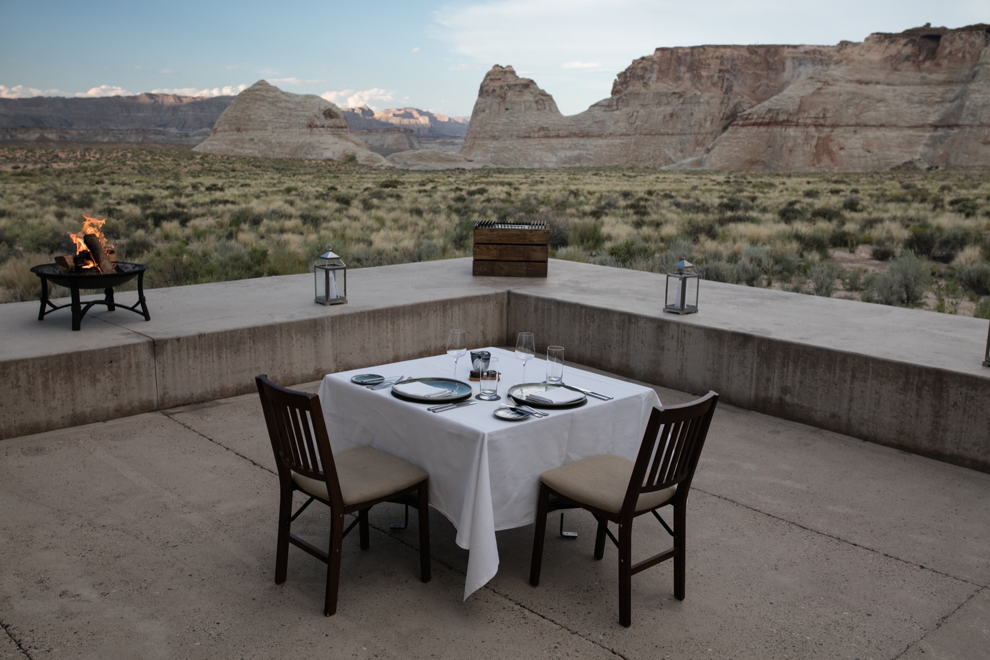
Dining at dusk
The Amangiri invited us to take our first meal alfresco in the Desert Lounge, a rather humbling setting for our dinner at dusk. Sitting across from my friend, charging our glasses of wine and looking out at the immense horizon, overcome with divine silence and calm, we couldn’t speak but simply look and listen. Within this celestial space, I discovered an understated romance in the combination of architecture, nature, and food. Amangiri presents a rather auspicious combination of locally sourced, farm-fresh produce and materials with modern interpretations of Southwestern traditions. Plate for plate, the decadent courses filled us, until we turned in for the night. First day, well spent.
“Within this celestial space, I discovered an understated romance in the combination of architecture, nature, and food.”
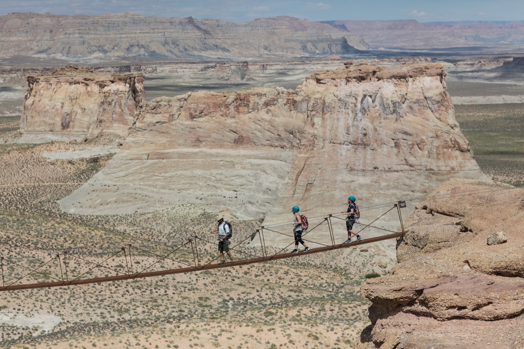
An early adventure
From the crack of dawn, Amangiri had been already awake and buzzing. We were informed to wear shoes suitable for an adventure and were later met by a car. Amangiri sits among some of the continent’s most grandiose, well-protected natural phenomena, and we were booked to experience one the resort is very proud to have on its land. At the foot of the largest of the canyons, they put us in climbing harnesses before we set off on a Via Ferrata, Italian for “Iron road.” This modern style of climbing journey involved steel cables and staples already in place for a more protected climb. The concept is to give inexperienced climbers the ability to enjoy rather dramatic and difficult peaks. And now, with my feet firmly back on the ground, I can say, the peak was indeed spectacular. Nerves aside, climbing to the top allowed me to truly experience the vastness of this beautiful place and the fragility of this natural ecosystem. I do, however, recommend taking an extra few breaths before crossing Amangiri’s signature suspension bridge between two peaks. Walking across with my camera was a rather nerve-racking experience.
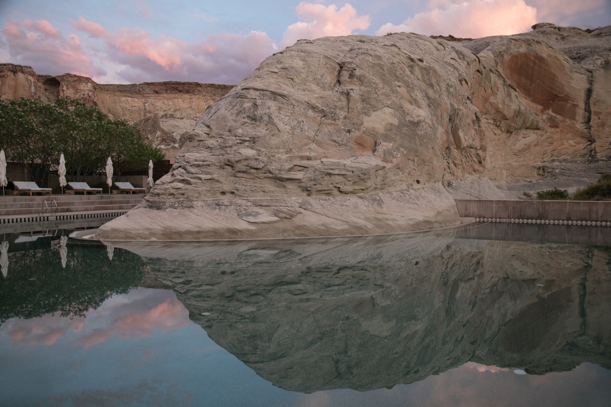
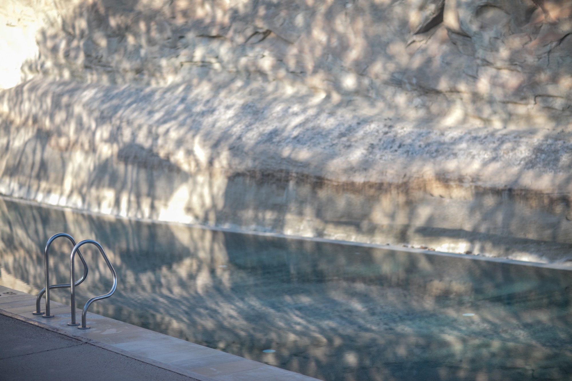
After that intense climb and exploring more of the resort’s outdoor adventures, the best decision was to spend our afternoon at the Amangiri Spa. The minimalist design of this serene adults-only oasis manifested the very concepts of relief. Instead of receiving a massage treatment, I spent most of my time self-reflecting in the floating cave’s Persian salt pool. 30 minutes of pure and simple bliss, resting on the surface of tepid water, scored by meditation melodies has become my new idea of elegant content.
Departing to return
Our departure was suitingly emblematic of our entire experience at Amangiri. As we unhurriedly drove past the minimalist concrete marvel, through the resort’s expansive acreage and past a private plane landing nearby, I began to appreciate the sheer magnitude of my weeklong stay here. The space has inspired a newfound understanding of lines and light, and a greater comprehension of the relationship between nature and man-made creations. As I left, I already longed to return. △
Utahan Utopia
Summit Powder Mountain in Utah is a visionary colony of cabins designed by emerging Slovenian architect Srđan Nađ
A Slovenian architect’s “wooden tent” design pushes the conversation on nature-respecting modern mountain architecture and communal living on Powder Mountain, where an enigmatic group of entrepreneurs, creatives, and altruists is building a pioneering alpine village. “We bought a mountain.”
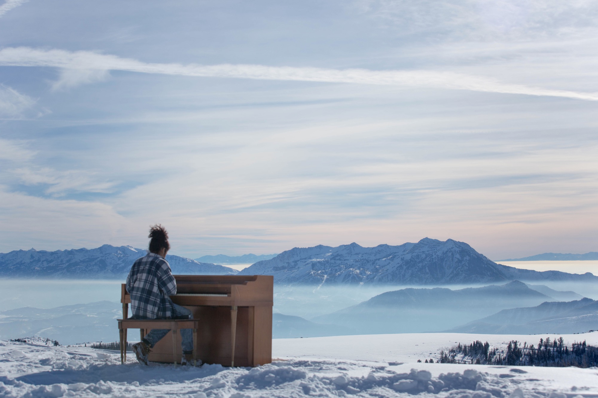
So begins the backstory of Summit Powder Mountain, a visionary colony of cabins and an alpine village being dreamed up in Utah's Wasatch Mountains.
Elliott Bisnow and the Summit Series
Behind the idea is Summit, an event business started by Elliott Bisnow, a founding board member of the United Nations Foundation’s Global Entrepreneurs Council. What began as a small gathering of a few dozen investors, business whiz kids, and creatives over a short few years grew into the Summit Series: traveling invitational events that summon hundreds of thought leaders and different-thinkers from around the world. "What would it look like if Davos and Burning Man had a baby?" The Guardian rhetorically wondered in a recent article about the Summit Series. For its latest flagship event, Summit at Sea, 2,500 chosen attendees boarded a cruise ship in Miami for a four-day conference in international waters.
Rooting down in Utah
Now Summit is building a permanent base camp for its forums—a high-alpine town for its growing tribe to come home to. Summit purchased Powder Mountain, including the ski resort that has been operating there since the 1970s, with the vision to fundamentally reimagine and experiment with how people live together, shelter themselves, and converge for the greater good. “I’m very interested in what new mountain architecture looks like, acts like, feels like—how it responds to all the different stimuli in the world,” says Summit design director Sam Arthur, who moved to Utah to see the project through. Since buying the mountain in 2013, Summit has called on sundry architecture and design gurus, even sacred geometry to conceive this test bed for communal living. But the group still needed a cohesive cabin concept, a trademark design that considers the demands of living at 8,400 feet (2,560 meters) altitude, of building sensibly on historically mostly undeveloped, pristine mountain land that includes an elk reserve, natural waterways, and thriving wildlife. A sheep ranch was the only settlement on the mountain for the longest time.
“I’m very interested in what new mountain architecture looks like, acts like, feels like—how it responds to all the different stimuli in the world.”
Mountain Architecture Prototype (MAP) design competition
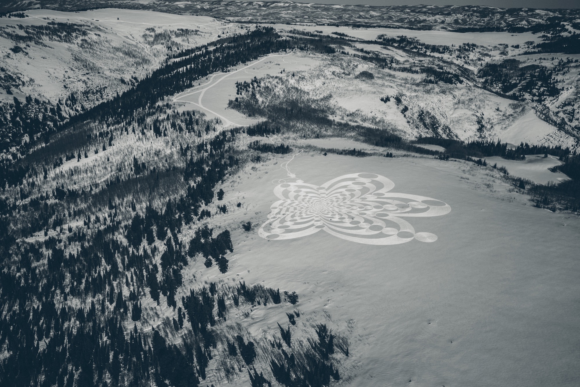
Thus, Summit’s Mountain Architecture Prototype (MAP) design competition challenged the global guild of architects, engineers, artists—masters and students alike—to design sustainable cabins that embody the leadership’s ideals of sustainability, use of natural materials, and humble expression. The winning concept would guide the architectural ethos for more than 500 single-family homes, limited to 2,500 square feet (232 square meters) on half- to two-acre lots. Arthur says they capped the size of the homes so Summit Powder Mountain could become a democratized, harmonious environment for the community at large rather than “this über-wealthy place that is about showing off how big and bad you are.” Larger lots of up to thirty acres, however, could potentially accommodate a compound design.
Choosing a winner
The winner: Srđan Nađ, a young architect from Slovenia. His prized design was inspired by a Summit event photo he had seen—a green meadow dotted with simple white tents, pure architecture integrated within thin cloth, pitched to create shelter from weather and wilderness. His other muse was the frontier cabin of America’s past, a simple wooden structure with a great stone chimney on the outside. “Combining both was my design concept for Summit Powder Mountain—a true connection with nature,” says Nađ, who believes “95 percent luck” won him the competition. More likely, though, he convinced the international jury panel, led by Todd Saunders of Saunders Architecture (Norway) and Jenny Wu from the Oyler Wu Collaborative (Los Angeles, California), with his design’s adaptability and transformational potential. Arthur says, “Srđan did a beautiful job of meeting the criteria and applying a certain amount of aesthetic to it that really eloquently resolved that future/nostalgia-heritage/modern friction, which is at the core of what people respond to here, how they want to live in the modern age.” With its indoor/outdoor quality and what Arthur describes as “an obsession with light and views,” Nađ’s design captures the raison d’être for living on a mountain. “It’s a place to find refuge, to be inspired, to take in the natural primary source of beauty, and recreate with friends. It’s often very difficult to turn that into architecture, but Srđan took that and wrapped a building around it.”
Who is Srđan Nađ
Born to two architects in Zagreb, Croatia, in 1983, Nađ’s career choice was perhaps destined by birth. He attended a special building and engineering high school and spent his senior year abroad in upstate New York. He returned to Europe to study architecture at the University of Ljubljana, which he describes as a “boutique school” in the center of the city. “I had the opportunity to do a lot of architectural competitions and really test my ideas—and, of course, learn from my mistakes.” After practicing the craft with other studios for several years, Nađ founded Grupo H with his wife, a landscape architect. Based in Slovenia and surrounded by mountains and the outdoors, the company is dedicated equally to architecture and interdisciplinary aspects of planning and building.
“I grew up in Dubrovnik, Croatia, a great historic town by the Adriatic Sea, so I didn't have any understanding of the alpine world until my fantastic wife, a local Slovenian girl, introduced me to the alpine world of Slovenia and its natural environment,” Nađ says. “What’s special about Slovenia is that the mountains here are relatively inaccessible, and to get to know them, you need to hike a lot. Hiking is a local obsession here.”
Living in the small European country known for its mountains, outdoor recreation, and ski resorts—much like Utah—has transformed the man from the seaside. “When you have to hike for two, three hours through untamed nature to reach a summit, you start looking at nature from a different perspective,” says Nađ. “It teaches you to admire and respect the wild nature of the alpine world. In the end, when you are put into the position to design a building for such a surrounding, all your knowledge and memories come together to create this unique combination of simplicity and elegance that a building high in the mountains demands.“
“When you have to hike for two, three hours through untamed nature to reach a summit, you start looking at nature from a different perspective.”
Nađ's "Wooden Tents"
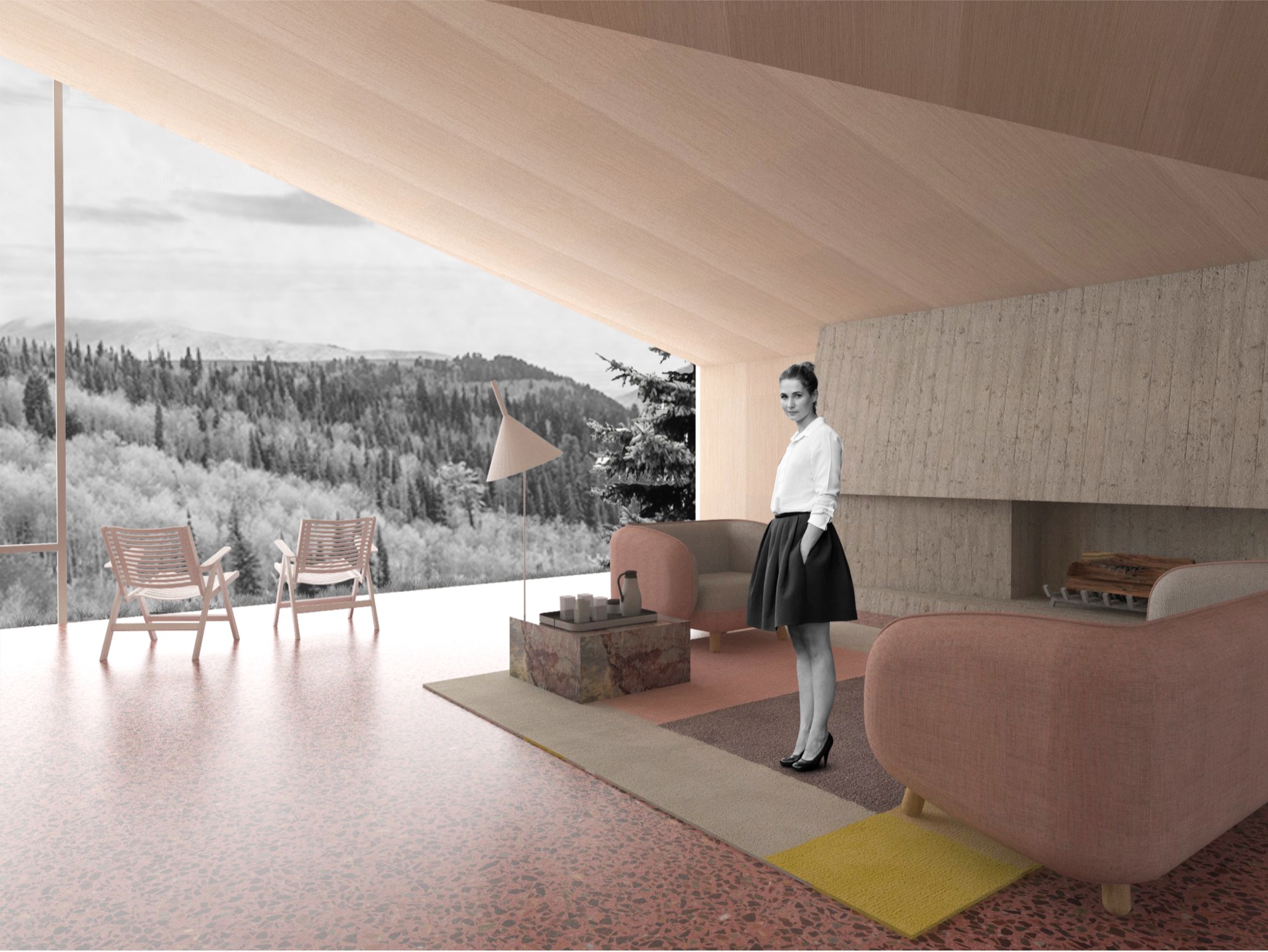
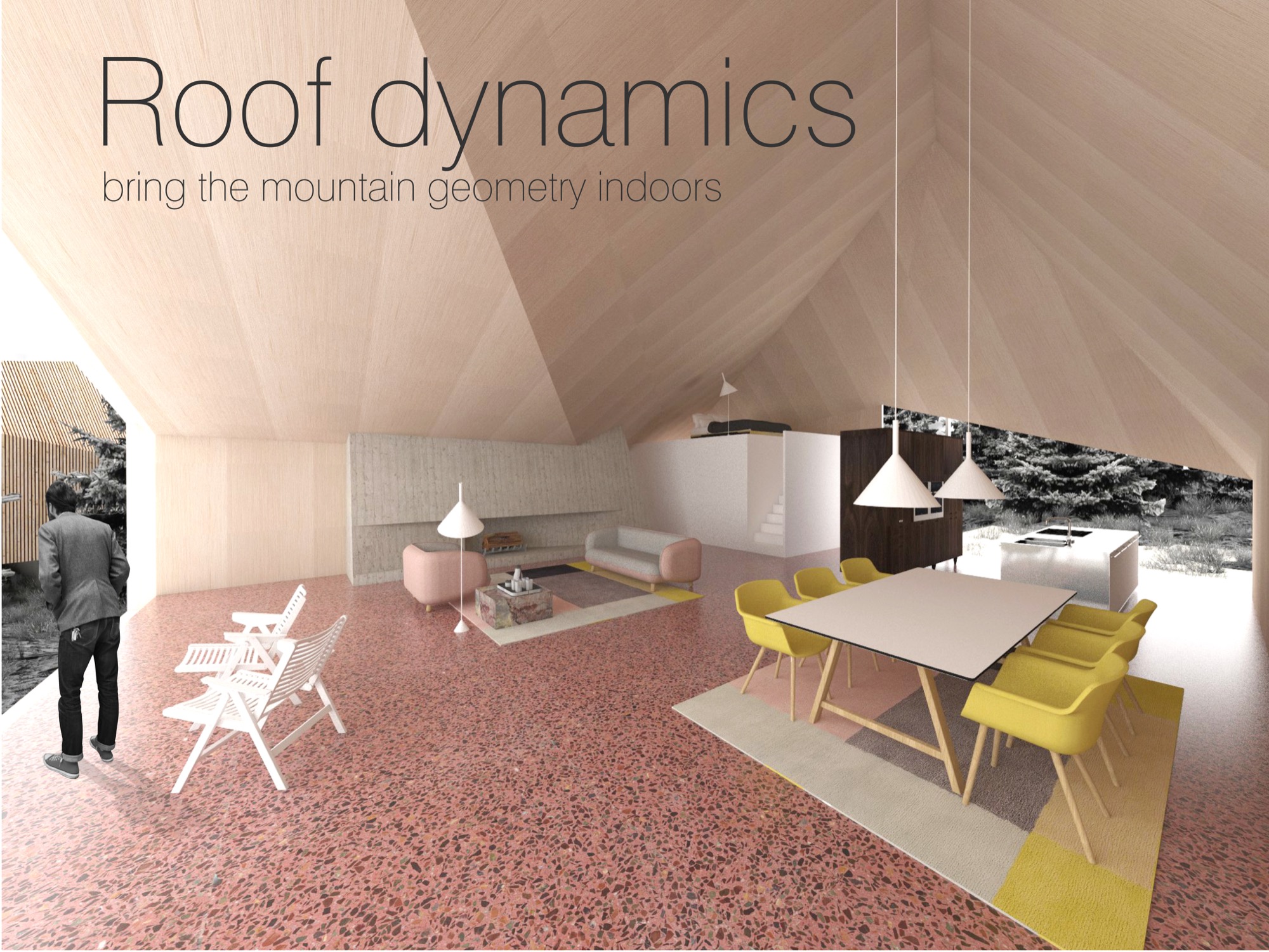
His proposed cabin design preserves that tentlike lightness and unmistakable functionality that inspired him and manifests it in a permanent, habitable structure. The architect expresses this lightness through a 1.5-inch (3.80-cm) thin “skin” made from cross-laminated prefabricated wood panels, folded to create the interior space of the cabin. This folding process leaves open the sides, which are then covered in glass. Juxtaposing the transient openness of the folded skin, a monolithic stone chimney stakes the raised cabin, grounding it into the mountainside to create the permanence a tent lacks. The chimney’s body also houses the mechanicals. On the opposite side, the cabin leans on a deck that touches down to the ground. With only the chimney and the deck as supporting elements, the cabin’s footprint is small, making large earth excavations unnecessary. The triple-glazed glass walls let the sun heat the highly insulated interior. Rainwater from the sloping roof collects into storage tanks under the deck. The goal is for the cabins to be certified according to the European passive house standard and the American LEED standard.
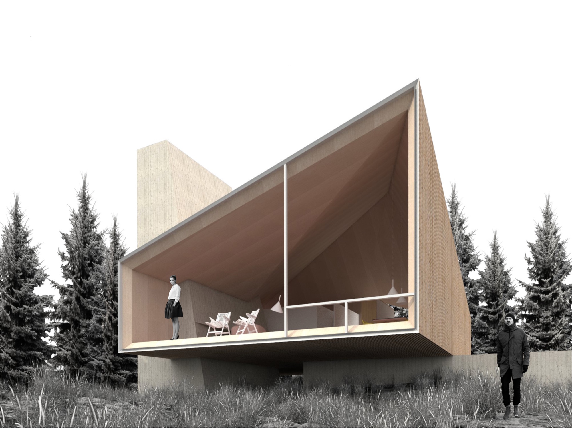
The cabin design allows for different versions of the prototype, varying from a simple one-bedroom hut to a luxurious four-bedroom chalet. The blueprint foresees an open living/dining/kitchen area with a large fireplace. The high ceiling follows the geometry of the exterior roof, mimicking the surrounding mountain silhouette. “In all, it will be a fantastic place to come back to after a full day of skiing or a long summer hike,” the architect hopes.
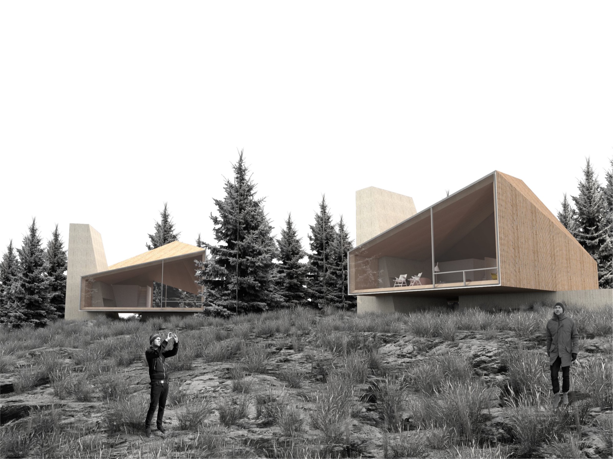
Nađ’s minimalistic “wooden tents” are designed to serve as fully functional habitable structures without creating the feel of urban settlement on Powder Mountain, and they preserve the essence of the natural surroundings. Nađ strove to convey the notion of living in nature rather than intruding upon the alpine landscape to stake out your private piece of paradise.
His sensible solution was, no doubt, spawned by his home country and culture. “We are really humble, hardworking, and resourceful people. So that guides me to find simple, functional, and long-lasting designs for my projects,” he says, adding that the alpine cabins and shelters of the Slovenian mountains influenced his “wooden tents” for Summit Powder Mountain. “They are simple, rugged, but still graceful in unforgiving nature.”
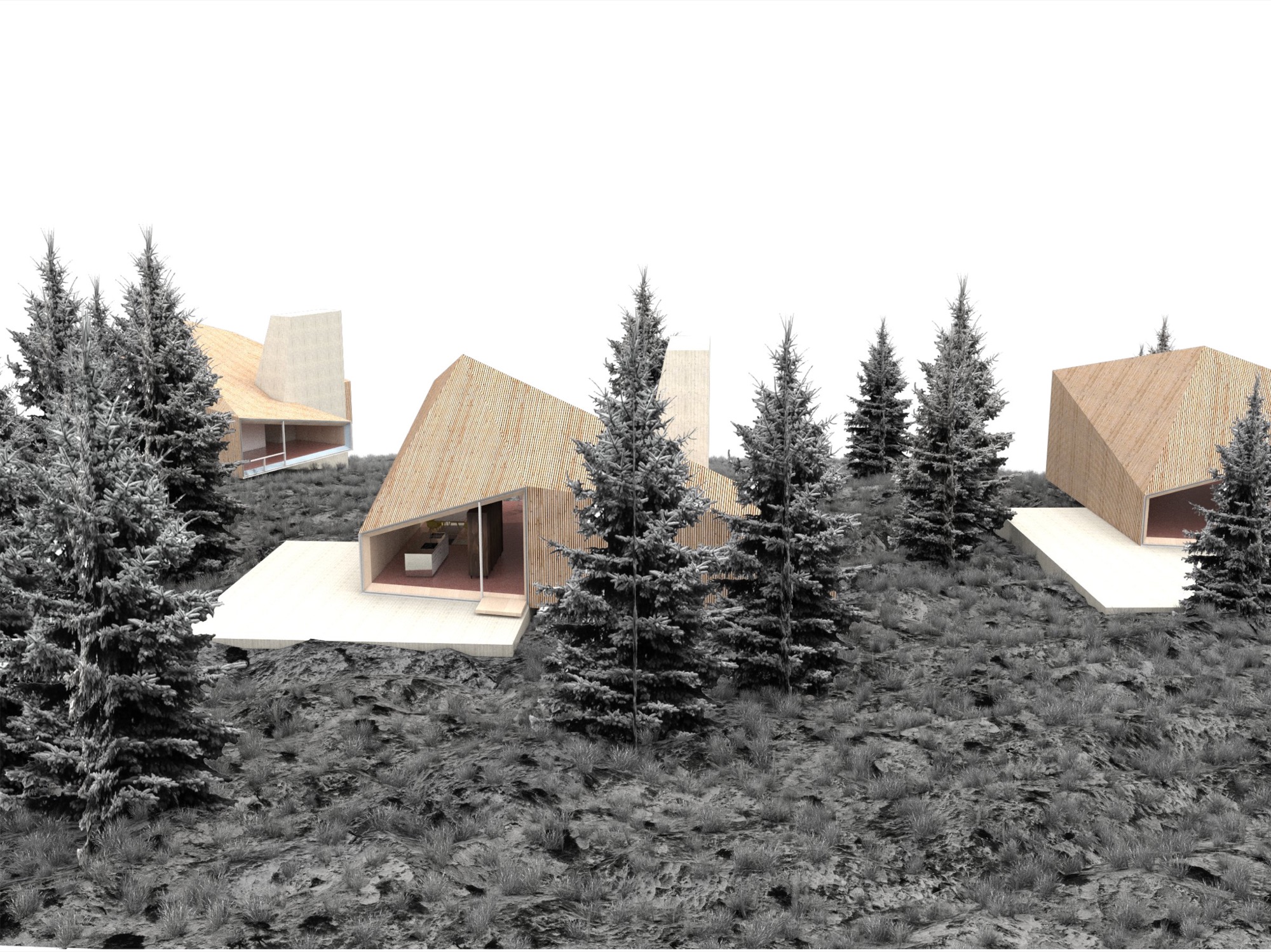

Nađ didn’t plan to enter an architecture contest at the time he learned about the MAP design competition on an architecture blog. But the subject—a cabin—intrigued him since he thought it rather uncommon for an international contest. “You usually have a competition to design a museum, library, memorials...but houses are rare.” The premise of Summit Powder Mountain eventually compelled the young architect to enter his design. “You could see that they are not planning to do a typical commercial development, but start with a clean slate and do things right.” However, he didn’t grasp the expanse of the project until he spoke with the Summit team. “I didn’t realize how important this is for the global community, as it shows a new way of planning large developments,” he says in retrospect. Nađ understood that no matter how good his cabin design was going to be, simply copying it 500 times would only create the type of cookie-cutter development that already characterizes too many mountain resort towns. “My design goal was to create a house that can be transformed—enlarged, scaled down, rearranged, have a different facade—and still preserve the overall design idea,” he explains. The “wooden tent” concept is a suggestion, one Arthur says is “a loose design that’s poetic and evocative.”
“You could see that they are not planning to do a typical commercial development, but start with a clean slate and do things right.”
Building community
Summit is breaking ground this summer to build the first cabins on Powder Mountain. Furthermore, the company is planning the new alpine village, with shops and galleries, coffeehouses and restaurants, gathering venues, condos, and new headquarters for the ski resort they acquired. Arthur thinks seasonal skiers and hikers may visit the mountain and never know about Summit’s quest for settling an art, culture, and tech elite here, though it seems hard to imagine tourists coming to this creation of an idyll and doing their own thing. “We’re based on gathering,” Arthur emphasizes. “People gather in creativity to change the world. People don’t come up here for solitude, but for increased interaction.”
“People gather in creativity to change the world. People don’t come up here for solitude, but for increased interaction.”
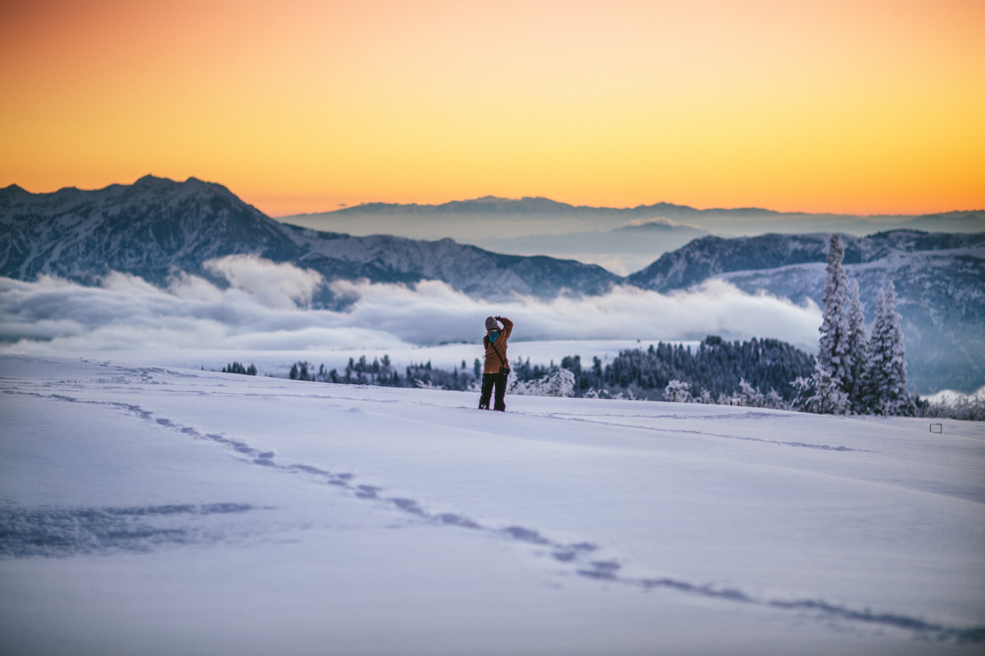
What does new mountain architecture look like, act like, feel like? Only after winning did the architect from Slovenia realize how important his design was for the global community. In fact, Arthur argues that the encouraged culture of sharing is just another expression of Summit’s tacit broader understanding of sustainable living. “This isn’t ostentatious.” He points out that most members of the Summit Powder Mountain community would actually prefer to minimize their footprint by operating in a shared social space. “Rather than building large bathrooms and kitchens in their own house, people go home to sleep and to entertain a smaller group of people. Then they go out into the larger community spaces and venues to gather together. This is about collectivism and collaboration.”
But how do you curate a genial commune where strangers “gather in creativity” to become kindred spirits, collaborators, neighbors? You don’t. “We had a blunt policy for a while, a ‘no-asshole policy,’ ” Arthur reveals. In reality, they quickly came to understand that the Summit community fosters a quite self-selecting environment. “Basically, if you were obviously egocentric or self-centered, then you probably don’t belong here. People who want to participate and are ‘others-orientated’ and have the heart to expand goodness, usually work out pretty well,” he says. To the rest, it just doesn’t feel right to be there. The Summit leadership strives to strike a balance between public atmosphere and private, curated events. In the end, Arthur says, “It’s not an exclusive membership thing—it’s an overall public realm of creating a new mountain town.” △
Sense of Place: Montana modern
Nostalgia, no kitsch: A conversation with Kelcey Bingham, the insanely gifted owner of Bear Mountain Builders, about modern design in Montana
Kelcey Bingham, owner of Bear Mountain Builders in Whitefish, Montana, finds cowboy-themed log homes “really outdated.”
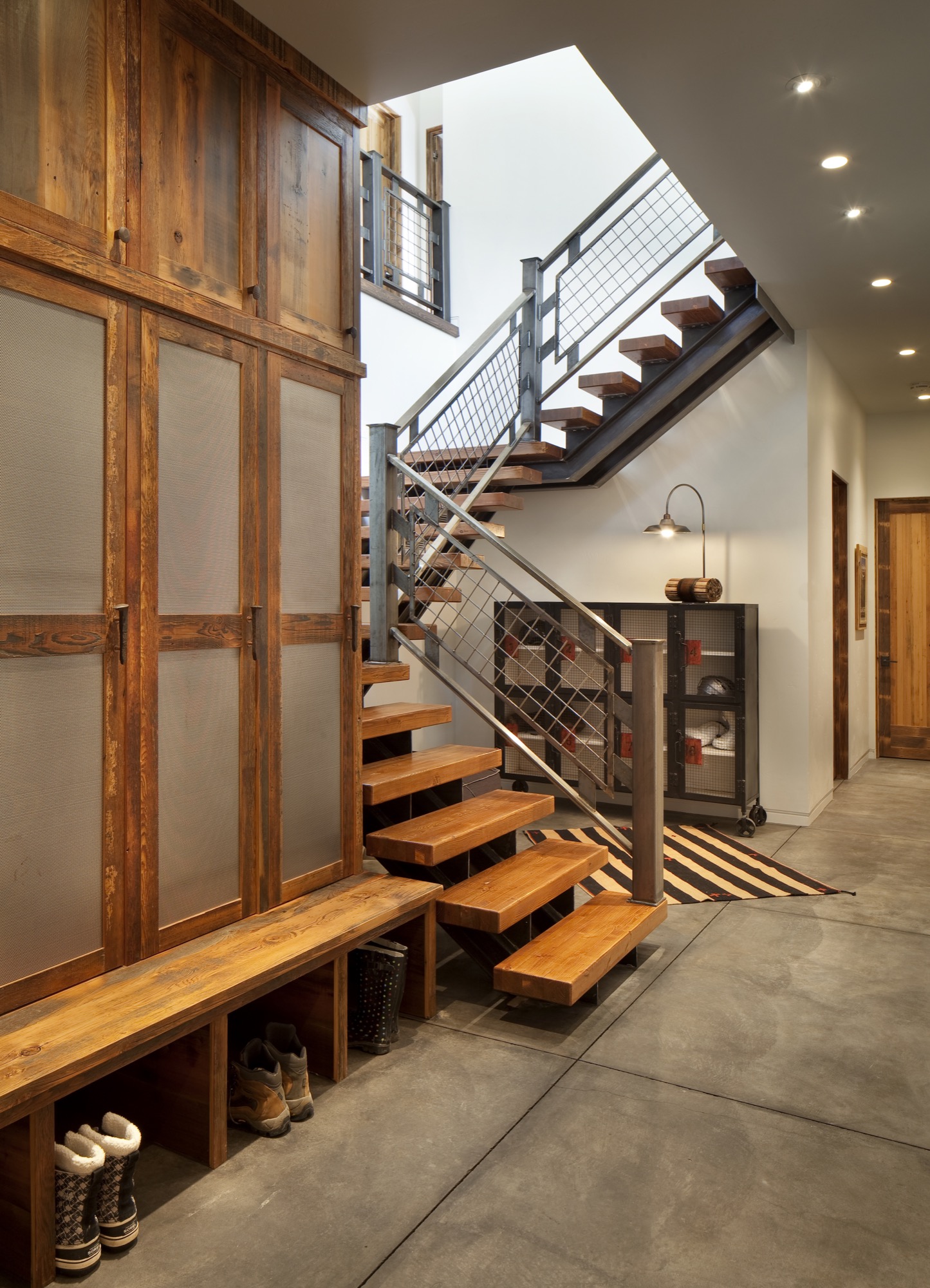
Nostalgia, No Kitsch
He still uses beams with reference to Montana’s Western architecture. Only his beams are typically steel. In the Ski Chalet, a mountain retreat inspired by nostalgia for ski vacations in the seventies, Bingham takes this adaptation further yet, turning a steel I-beam into a powder-room sink.
“Keep it light and bright and airy, and keep it high-tech,” is one of Bingham’s principles. The other — “anything that is not so rustic.” The Ski Chalet has quickly become his most popular work, and he’s already been commissioned to build more homes of that style. On the exterior, Bingham applied his credos by setting geometrical form with über-expansive areas of glass. The window frames, again, are steel, as is the front door, which he treated to rust by design. The roof is shaped to hold snow as an extra insulating blanket. Inside, energy-efficient, controlled lighting creates geometrical shapes on the ceiling. “Throwback style with modern conveniences,” he calls it.
“ Keep it light and bright and airy, and keep it high-tech.”

Bingham, who considers himself part builder, part architect, part artist, balances the glass, steel, and high-tech features with just enough earthy elements not to be cold. Cabinets and doors are made from reclaimed wood. The rest of the furniture is light in color, and the wood thin, to get away from the typical heavy timber look of the area’s typical super-sized mountain homes.
Creating your own throwback style at home is personal, inspired by your own memories of childhood winter vacations. Blues and rust-orange in the Ski Chalet’s fabrics, rugs, and bedding, for example, evoke nostalgia of that era.
“Instead of big dead animal heads on the wall, you’ve got vibrant art,” Bingham continues. “You don’t want too many knickknacks around, but having an appropriate amount of art is important.” Vivid details, such as colorful vases and vintage treasures, brighten up Big Sky Country’s many foggy winter days. “For us in the ski mountains, we try to find vintage ski posters,” Bingham says. Don’t be afraid to use shinier, mirrored pieces. Be selective in curating pieces from the past. “You want that nostalgic look of a seventies ski chalet, without being too kitschy.” He likes to keep a home current with vintage-inspired high-tech gadgets. “Rega out of Great Britain, for example, makes new turntables to look like they’re from the seventies.”
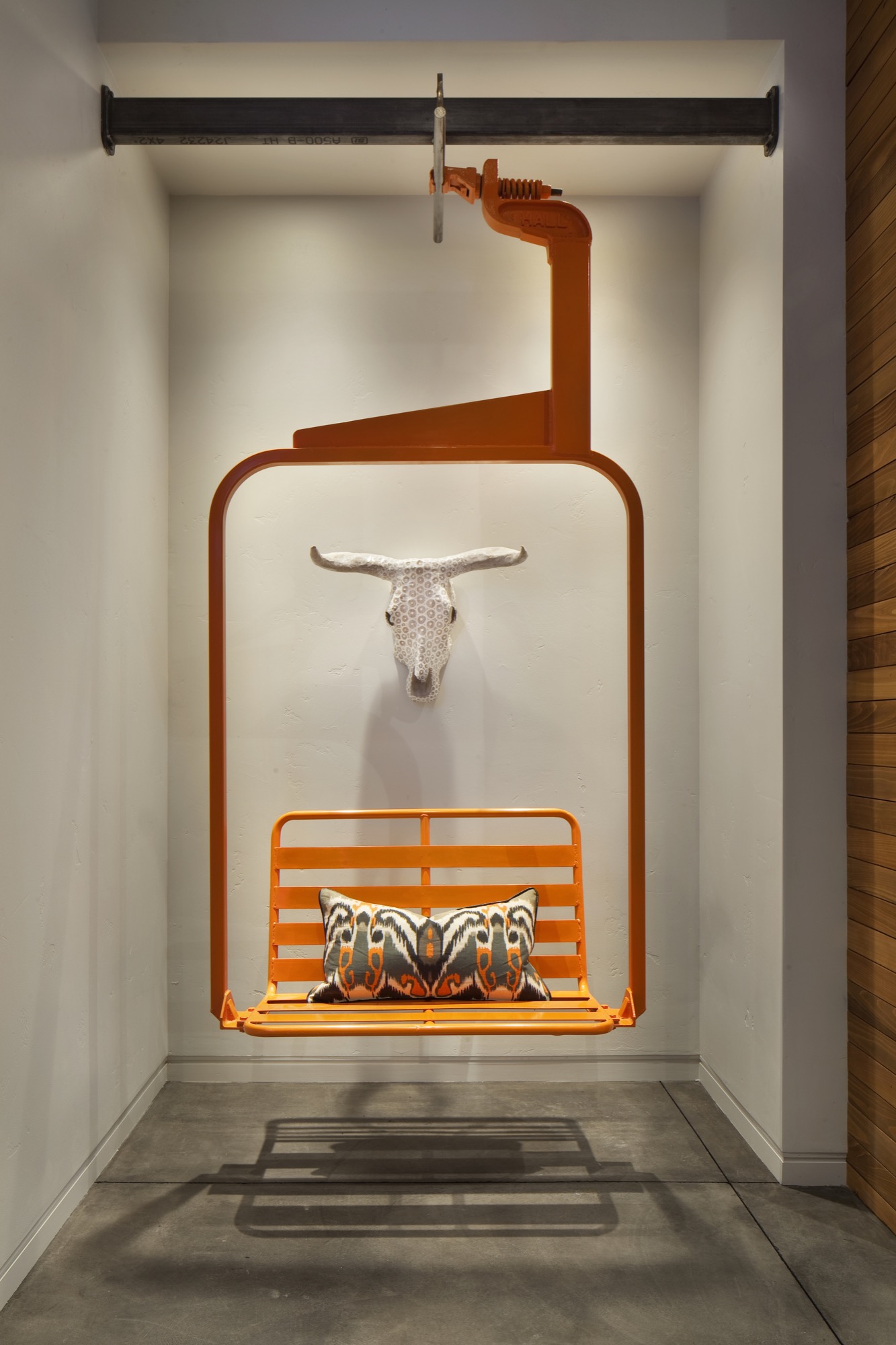
Recreating the Ski Chalet’s most unique decor will require a lot of luck, unless you already have an old-time ski lift seat sitting around, like Bingham had. Years back, a local ski resort was selling them off. He brought one home and was just waiting for the right use. The funky find now sets the stage inside the entry to the Ski Chalet. Not only does the seat swing like it once did high above the slopes, but it also has a purpose. “We installed an infrared heater above it, so you can sit down to take your ski boots off and warm up,” Bingham says. △
The Figure Sculptor
Alpine Modern visits Swiss-born artist Roger Reutimann at his studio in Boulder
Inspired by the human form, Swiss-born artist Roger Reutimann found his way to sculpting for the rich and the royal via a classical music education, curating art fairs, and product design.
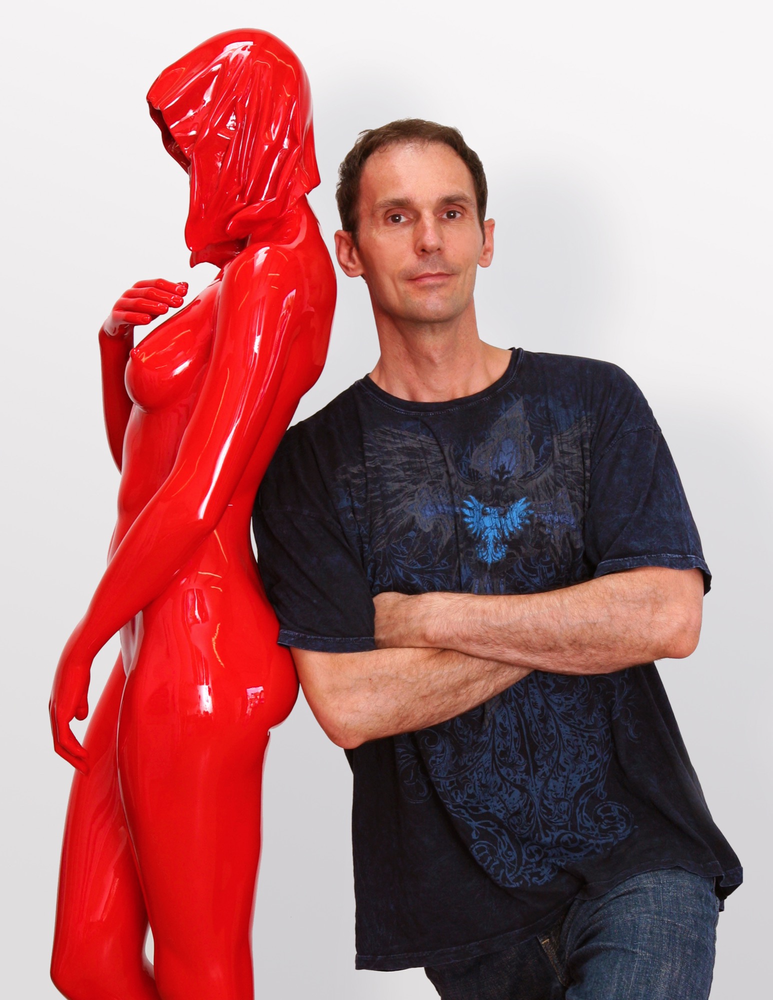
Roger Reutimann captures elegant sensuality in his sculptures of human figures. Born in a secluded village in Switzerland, the artist, a self-proclaimed Renaissance man, has devoted himself to pursuing and mastering many art forms. His evolution from classical pianist to figurative realism painter to internationally known sculptor has secured his place as one of America’s most sought-after contemporary artists.
Early Reutimann
As a young pianist, he found himself drawn to classical composers and music that stirred his soul. He studied at the Zurich Music Conservatory and was soon performing as a classical concert pianist throughout Europe and competing in international piano competitions. Traveling provided artistic influences at an early age as he experienced Europe’s rich cultural heritage.
His love of music flowed into a career as both a realist figurative painter and a co-owner in the Forum International Art Fairs in Zürich, Hamburg, and Düsseldorf. Galleries in Zürich, Milan, and London represented his paintings, and he received innumerable awards, honors, and recognitions. Relationships with gallery owners and collectors worldwide would follow him into his future calling as a sculptor and continue to advance his reputation as a world-class artist.
The Renaissance man emerged again as Reutimann turned his creativity to remodeling his first American home in Miami, Florida, with distinctive and extensive flourishes, from mosaic tiles to stained glass windows and Tudor-style ornamental plaster ceilings. The spectacular manor has been featured in architecture magazines and leased by production companies for films and commercials.
“In the midst of remodeling the house, one day I took a sculpture class to fill the time and loved it so much I gave up painting right then. To me, sculpting is like painting a thousand paintings. It has another dimension, and, therefore, it is so much more real than a two-dimensional image. A painting is only an image of life, but sculpture is life,” says Reutimann.
“To me, sculpting is like painting a thousand paintings... A painting is only an image of life, but sculpture is life.”
Coming to Colorado
Reutimann’s love of the mountains prompted a move to Boulder, Colorado, because of its similarity to Switzerland and the expansive open spaces. “I would rather sit on my back porch watching the sun set over the Rocky Mountains than in a high-rise flat in New York City,” shares Reutimann, for whom Colorado evokes memories of his native country.
Reutimann’s sculptures are unparalleled in craftsmanship and instantly recognizable worldwide. Though earlier works are relatively small, many today tower several meters high. Small sculptures weigh nearly 200 pounds, and the six- to seven-foot-high (up to two-plus-meters) sculptures weigh in at 1,600 to 1,800 pounds (726 to 816 kilograms). The internal structures of the lifelike sculptures are a complex network with steel beams for support to withstand the elements.
Rarer Reutimanns
Art galleries and private dealers from Santa Fe to New York City have represented Reutimann’s work, and his sleek, caressable, sculptures have been carefully packed and shipped to England, Switzerland, Italy, France, Hong Kong, Saudi Arabia, and South America. Today, he is represented by fewer galleries to ensure exclusivity for art patrons with his limited edition releases. Collectors include Sir Elton John, Anderson Cooper, countless private and corporate collectors worldwide, and Italian author Baroness Lucrezia de Domizio Durini, an art collector, curator, and publisher. “I see parallels between Rachmaninoff and my art. Rachmaninoff was a Russian composer and considered one of the finest pianists of all time. My art is much like music; there’s always something that can be refined,” says Reutimann. His recently completed commission for Colorado’s Arvada Center for the Arts and Humanities is a sixteen-foot (nearly five-meter) sculpture named Common Unity. It reflects the art center’s nature by presenting two identical figures who might appear to be engaged in a cultural discourse.
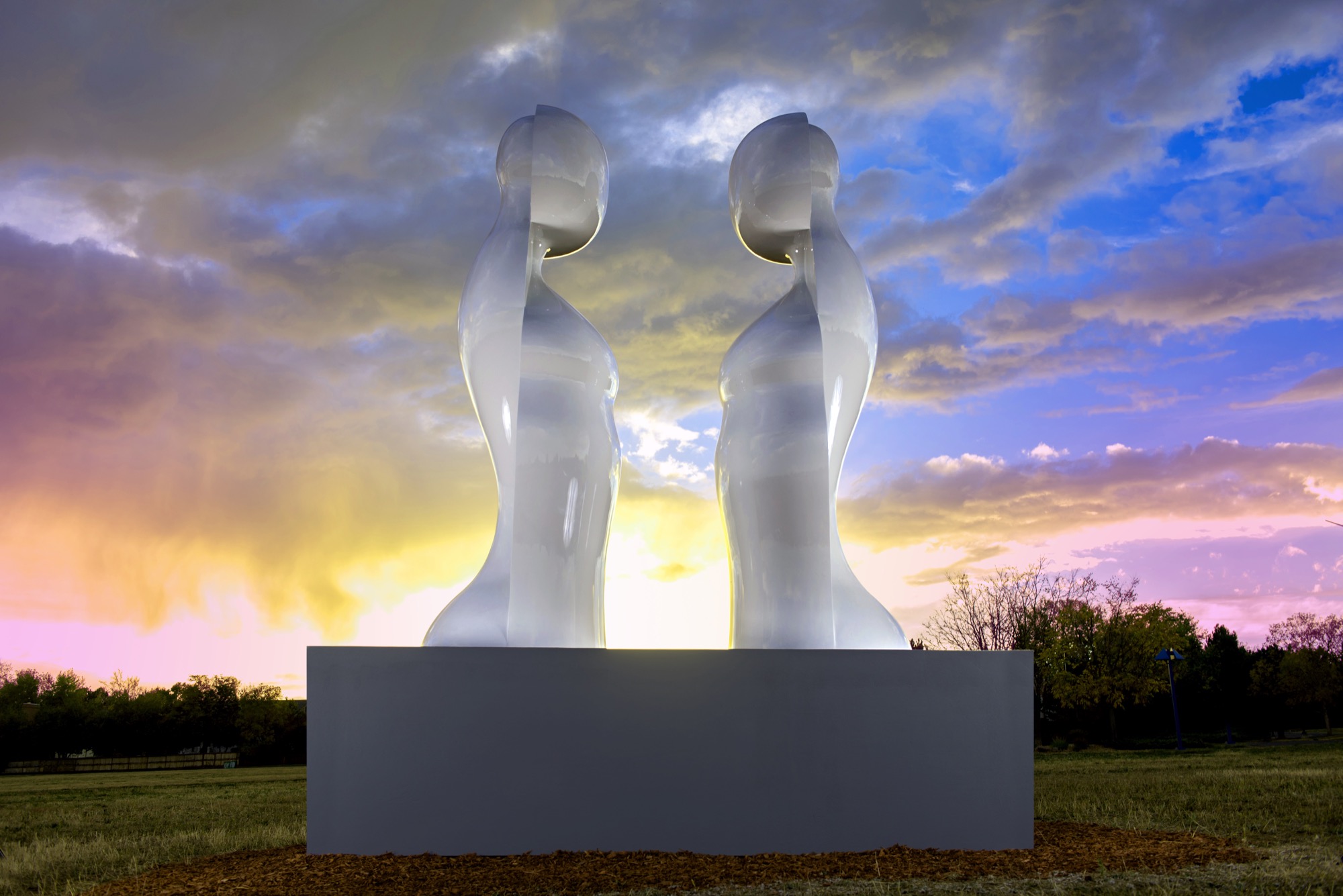
“My inspiration is the human figure, but the interpretation of it is somewhat abstract and reduced to the essential elements which help tell a story. The source of my work comes from the human body; people are drawn to that, I suppose, because we all have one. We can all relate to it in some way,” explains Reutimann. His fifteen-piece series, Dreams, was inspired by a wax mold that melted in Colorado’s hot sun and further inspired him to create sculptures that appear human at first glance, yet abstract from other angles.
“The source of my work comes from the human body; people are drawn to that, I suppose, because we all have one.”
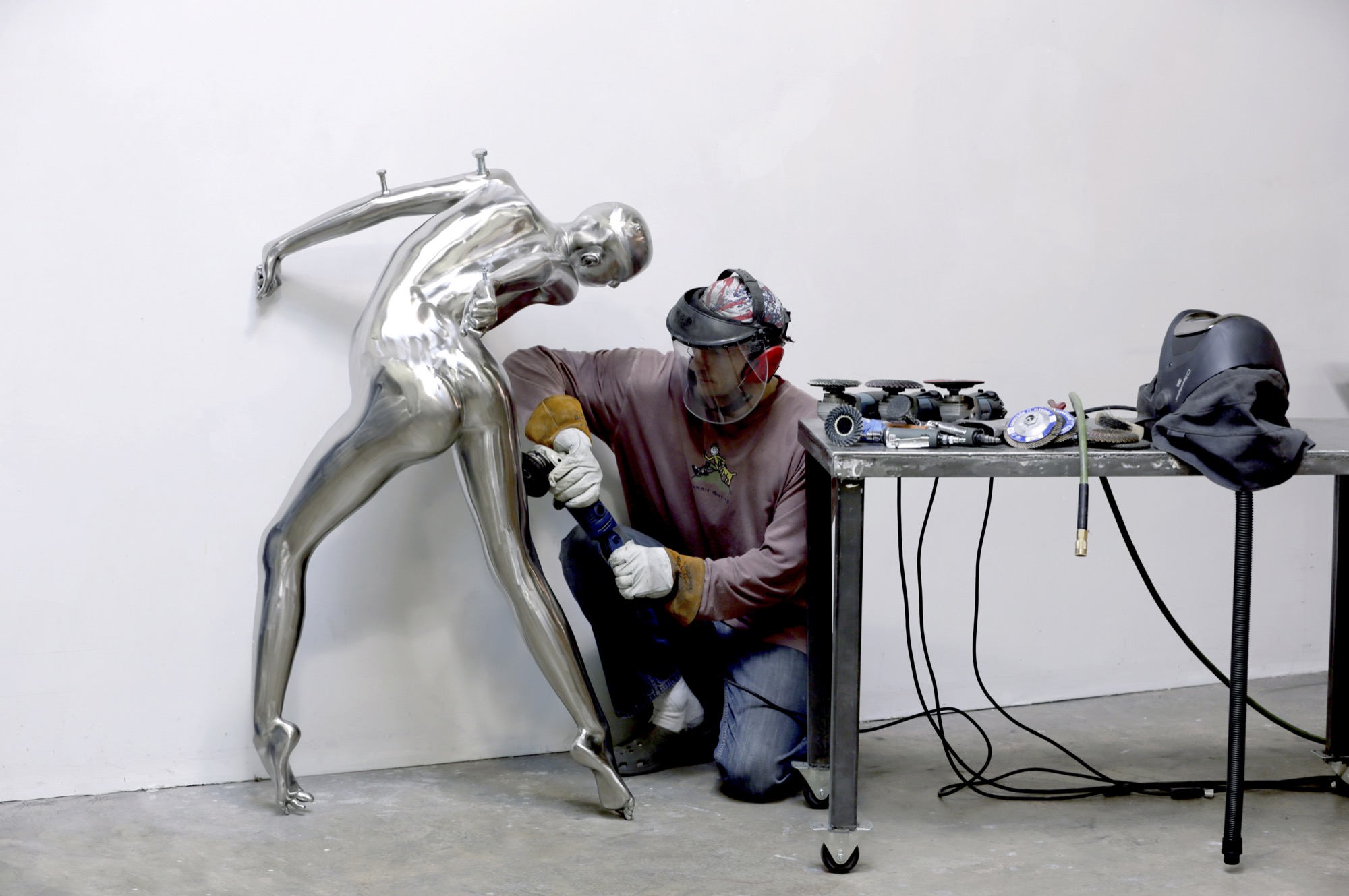
Body / art
The immensely popular Dreams series is a surreal interpretation of human emotions as figures fling themselves into contorted poses and postures—often reminiscent of a melted-wax figure. Reutimann has placed heads, torsos, and arms backward creating a jarring, disturbing effect that evokes a strong, visceral response for the viewer. He juxtaposes nearly perfect, yet severely distorted bodies as if broken and reassembled incorrectly. Body parts erupt in every direction. Figures hang upside down, suspended or cantilevered in space, as if falling or floating. Cast entirely in sleek stainless steel, the homogenous heads of the sculptures lack facial features and expressions, much like mannequins. “The focus is directed away from the face toward the body, and the complex dreamlike state personified within,” Reutimann offers.
In a world where discerning art patrons purchase paintings ten-to-one over sculptures, Nick Ryan, Havu Gallery’s administrator, notes that long-time painting collectors are purchasing Reutimann’s unusual and evocative figures. Ryan says they choose Reutimann’s work based on his inimitable technique of combining abstract realism with figuration, particularly in the Death of Venus, a six-foot (almost two-meter) sculpture painstakingly cast in bronze with surfaces flawlessly covered with sleek Ferrari-red automotive paint. Death of Venus is Reutimann’s interpretation of Botticelli’s Birth of Venus. The spectral skull is representative of cultural shifts, and the highly saturated red paint reflects the glamour and lifestyles of modern society.
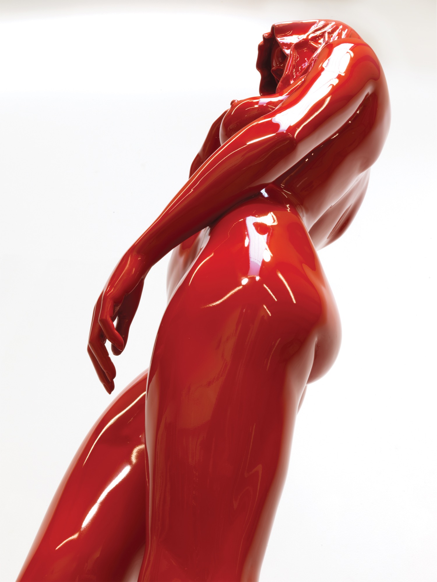
The Perception series was inspired by the artist’s visit to Egypt, and the entire series is cast in stainless steel, painted with automotive paint and buffed to a mirrorlike shine. “In keeping with abstract realism, the concept of the sculpture is about the duality of good and evil. The good has an angelic appeal and the evil has a darker character, wearing a cape with the head tucked in. My belief is that we all have these characteristics, and one can’t exist without the other,” Reutimann says.
“In keeping with abstract realism, the concept of the sculpture is about the duality of good and evil... We all have these characteristics and one can’t exist without the other.”
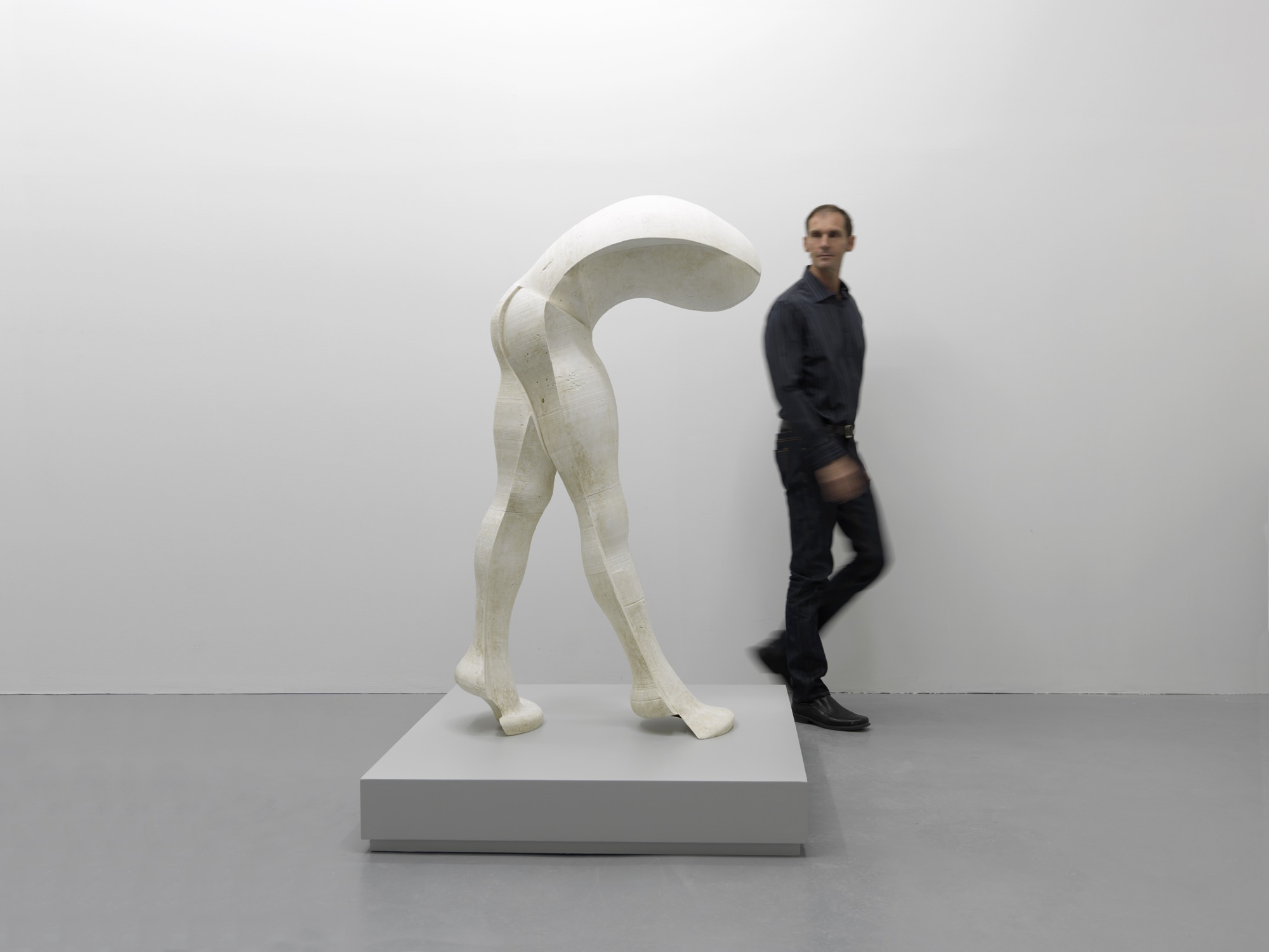
Reutimann’s fascination with automotive paint allows him innovations in the aesthetics of his creations. Automotive finishes require multiple paint layers buffed to a supersmooth polish until they shimmer and mirror one’s own reflection. The contemporary finish is extremely durable and lasts decades outdoors with only occasional buffing, whereas a traditional bronze sculpture with patina requires constant maintenance.
Reinterpreting americana
“My latest series is inspired by 1950s American automobiles. The fifties were all about space and speed and The Jetsons! The fantasy in concept cars goes wild; there are no limits, as there are none in art. The human body is much like a beautiful car—streamlined, organic, flowing like a dolphin in water—they’re imaginative. These sculptures have the shape of a woman but the spirit of a concept car. People see what they see and maybe it’s not my vision, which is perfectly fine. If someone is drawn to a sculpture, it’s a reflection of themselves and what their nature is, not that of the artist,” Reutimann says.
“These sculptures have the shape of a woman but the spirit of a concept car.”
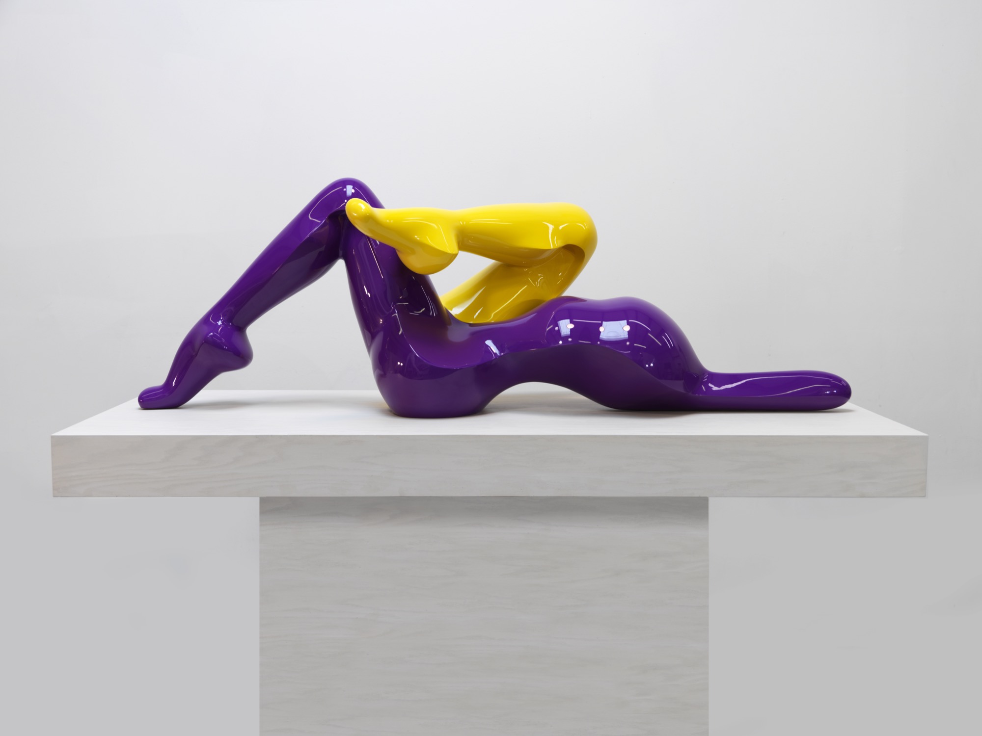
The music man
Reutimann plays piano several hours daily and declares classical music to be his biggest inspiration due to its drama and emotional depth, which allow him to follow his moods. Sergei Prokofiev’s compositions were on tap the entire year Reutimann spent creating the sculptures for the Dreams series. “You need to be in a spiritual place when you create sculptures. When people talk about inspiration, what they really mean is ‘being in spirit’ so art is not a conscious act,” Reutimann points out. “You can’t learn to be inspired. Music is my subconscious inspiration.” △
“When people talk about inspiration, what they really mean is ‘being in spirit’ so art is not a conscious act. You can’t learn to be inspired.”
The Architect Explorer
Colorado architect Larry Yaw interviewed by his journalist daughter
Colorado architect Larry Yaw, a Fellow of the American Institute of Architects, has nudged modernism forward in Aspen and beyond. An intimate conversation with his journalist daughter...
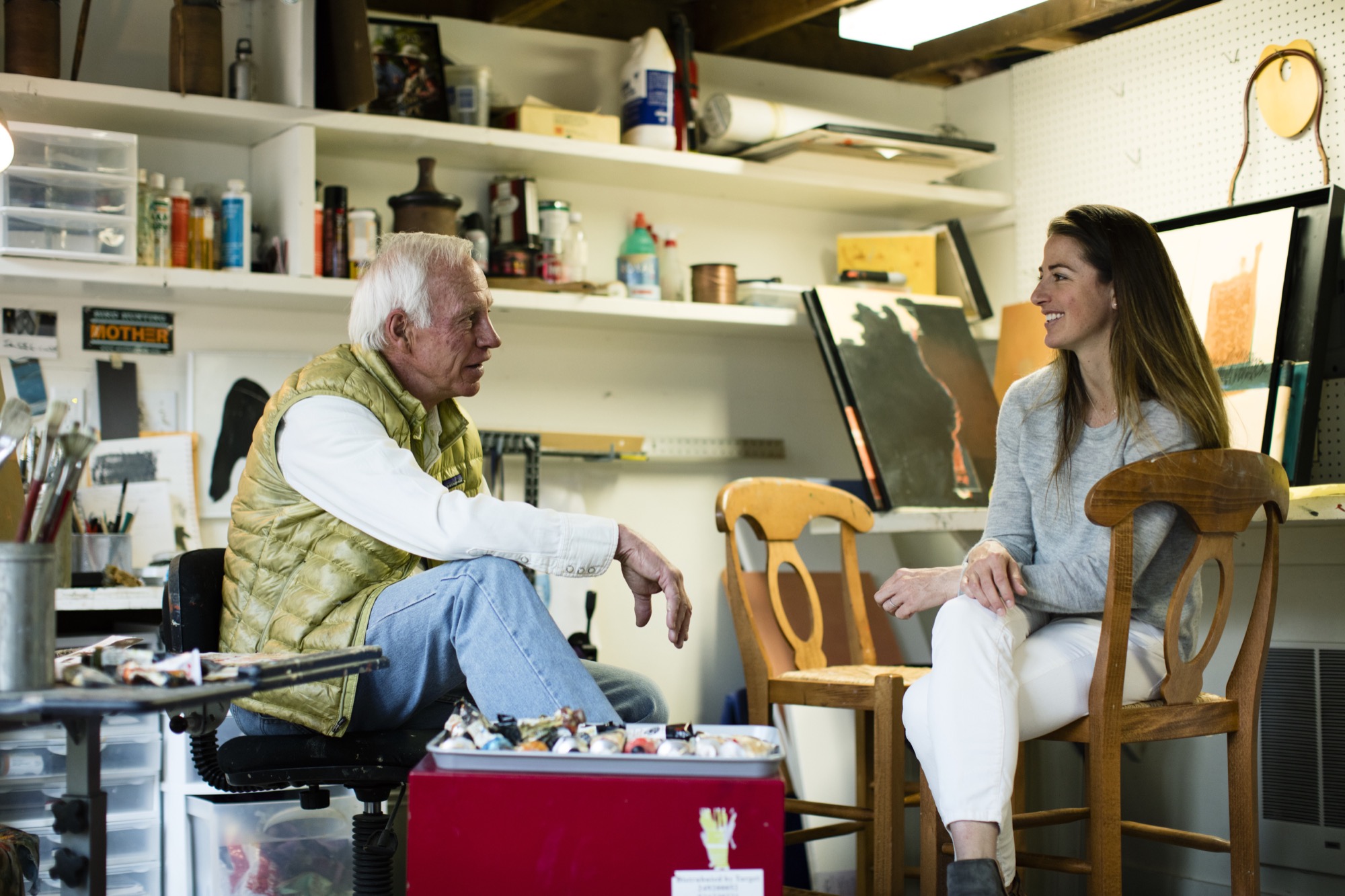
Sitting on a mossy rock in a tall stand of aspens next to my dad, a couple of hours into trying to find our way from Willow Lake back to the Maroon Bells parking lot, I started gnawing on my mom’s teriyaki beef jerky from my backpack. We had left the trail long ago, and I was convinced we were lost. I must have been about eight years old at the time.
“We’re not lost, we’re exploring,” is probably how my dad, architect Larry Yaw, responded—a claim that would echo through my young years as I followed him through the backcountry of the Elk Mountains in Colorado, across Kashmir in India, and through The Wind Rivers, The French Alps, New Zealand, and beyond, along with my mom and three siblings.
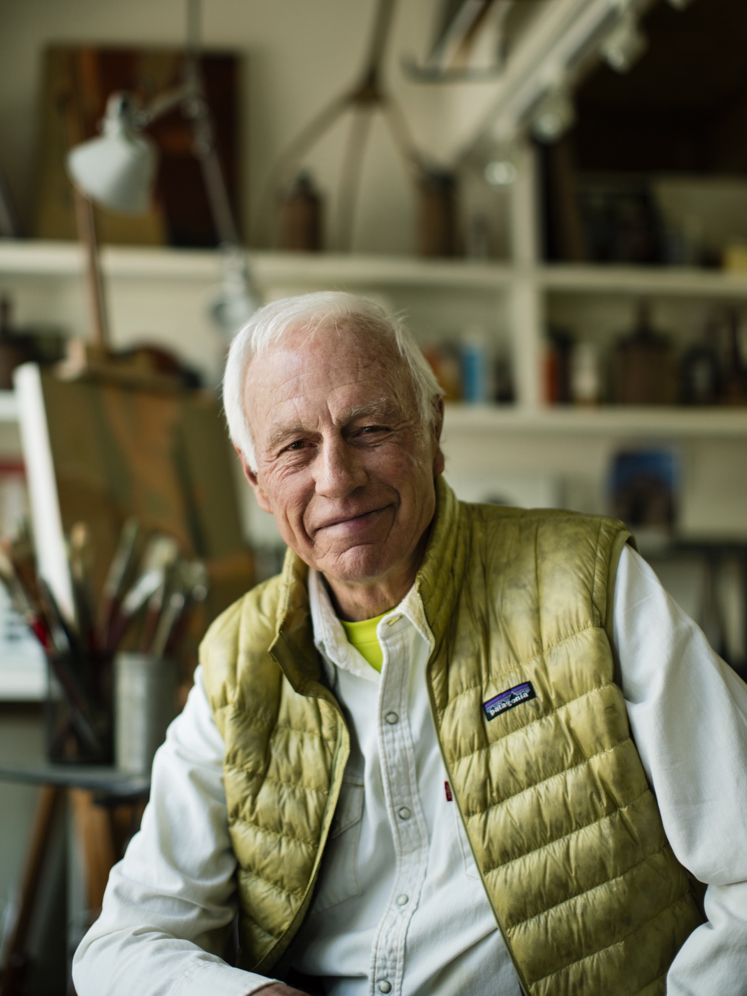
We got lost a lot, sort of on purpose, in the mountains. Yet never once did I see my dad flinch in these moments. Getting lost in the woods, in the place he calls his chapel, was merely another form of sublime and creative adventurism for him—much like his career as an architect and artist—and it fed his cowboy-style soul. I’d watch as he’d get this shrewd sparkle of excitement in his voice as he strategized on which ridge to follow, or which drainage would lead us back to the tent, all the while managing his family on the verge of the fearful discovery that our dad, really, had no idea where we were. Yet, now, as I bring my own young family into the woods to play and discover, I realize that my dad’s resourceful and poetic confidence that has intrigued me over the years has penetrated my own psyche deeply, and I strive to encourage that sensibility to seep into my kids’ sense of adventure. And, just as he did for our family, my dad has left an indelible impression on the contemporary design ethos of the Roaring Fork Valley, as well as countless alpine communities across the Mountain West.
“Getting lost in the woods, in the place he calls his chapel, was merely another form of sublime and creative adventurism for him—much like his career as an architect and artist—and it fed his cowboy-style soul.”
Since 1970, his iconic passion has manifested in his projects as he nudged modernism forward in Aspen and beyond, with an exceptional roster of clients and creative business partners as his co-conspirators; and he propelled them towards the outer edges of what’s possible. If I were to guess, his clients might sum up his character with a story similar to mine, yet the chapel would be his drafting table, and the map would be the radical ideas he has hand-sketched on camel-colored paper for the artfully crafted architecture he has envisioned. Sure, during his forty-six years creating innovative designs in the mountains, his aesthetic has shifted and grown, but his passion for the rawness of the backcountry, and for the purity of connecting people to place and to nature has remained firmly in tact.
“Since 1970, his iconic passion has manifested in his projects as he nudged modernism forward in Aspen and beyond.”
As his youngest daughter, I knew all of this, sort of, but it wasn’t until we had this conversation that I truly understood the gravity of how particular vignettes throughout his life have justified, and even come to imprint themselves, on his design, his spirituality, and his personal approach of getting lost—before finding a path.

Herein lies our recent sit-down at the kitchen table, an intimate chat between an architect and his daughter:
LYR How has living in the mountains influenced your design?
LY I’m the guy who can’t stop myself from climbing up and looking to see what’s on the other side of the ridge, or from going up to the end of a valley to see what’s there. If there’s some association with exploring, and innovating beyond the expected, I’m in. Therefore, my lifestyle has been defined by, and inspired by, active outdoor living, and attached to that is the adventure of it. Adventure is a part of everything I love to do—physical, intellectual, and spiritual adventure. And, therefore, I’ve begun to regard the artform of architecture as a basecamp for this; a basecamp that is sustainable, economic in scale, but very much connected to nature as that is so much a part of the adventure of being alive and in the now, wherever here is.
“Adventure is a part of everything I love to do ... I’ve begun to regard architecture, or habitation anyway, as a basecamp for this.”
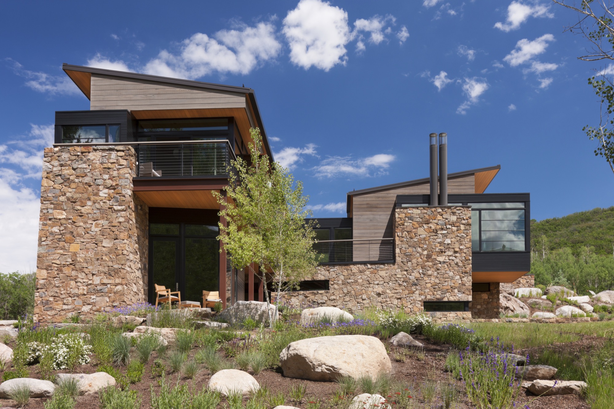
LYR Who influenced you as an architect?
LY First, the biggest influencers have been great clients of a contemporary persuasion, who relish the process of exploration and testing. There are other architects also, such as Romaldo Giurgola (“Aldo”), The Dean of Columbia School of Architecture, where I completed my Master’s studies. He would sit down and talk in these simplistic terms about the choreography that you create architecture through; the path you take and how that enriches you, and enriches the purposes of design. Louis Kahn—his work and writings inspired me.
And, the firm Morphosis Architects creates fabulous, courageous, contemporary, sculptural, and adventuresome architecture. As you traverse their spaces, you’re taken through them with this marvelous, layered, spatial experience that therefore inspires the choreography of getting from here to there.
LYR What’s your experience of being a modern architect in the Roaring Fork Valley, where opulent traditional mountain architecture is so dominant?
LY There’s opulence of thought and opulence of material—and those are two different things. Even though I’ve been involved with opulence, I design around the expectation that you don’t let the house own you. And, now, there is a cultural shift toward an awareness that we have to be stewards of the land, and be mindful of not writing out a big order for the resources. That shift has brought clients who want thoughtfully crafted, understated, simple in form, and more directly responsive design.
"There’s opulence of thought and opulence of material—and those are two different things."
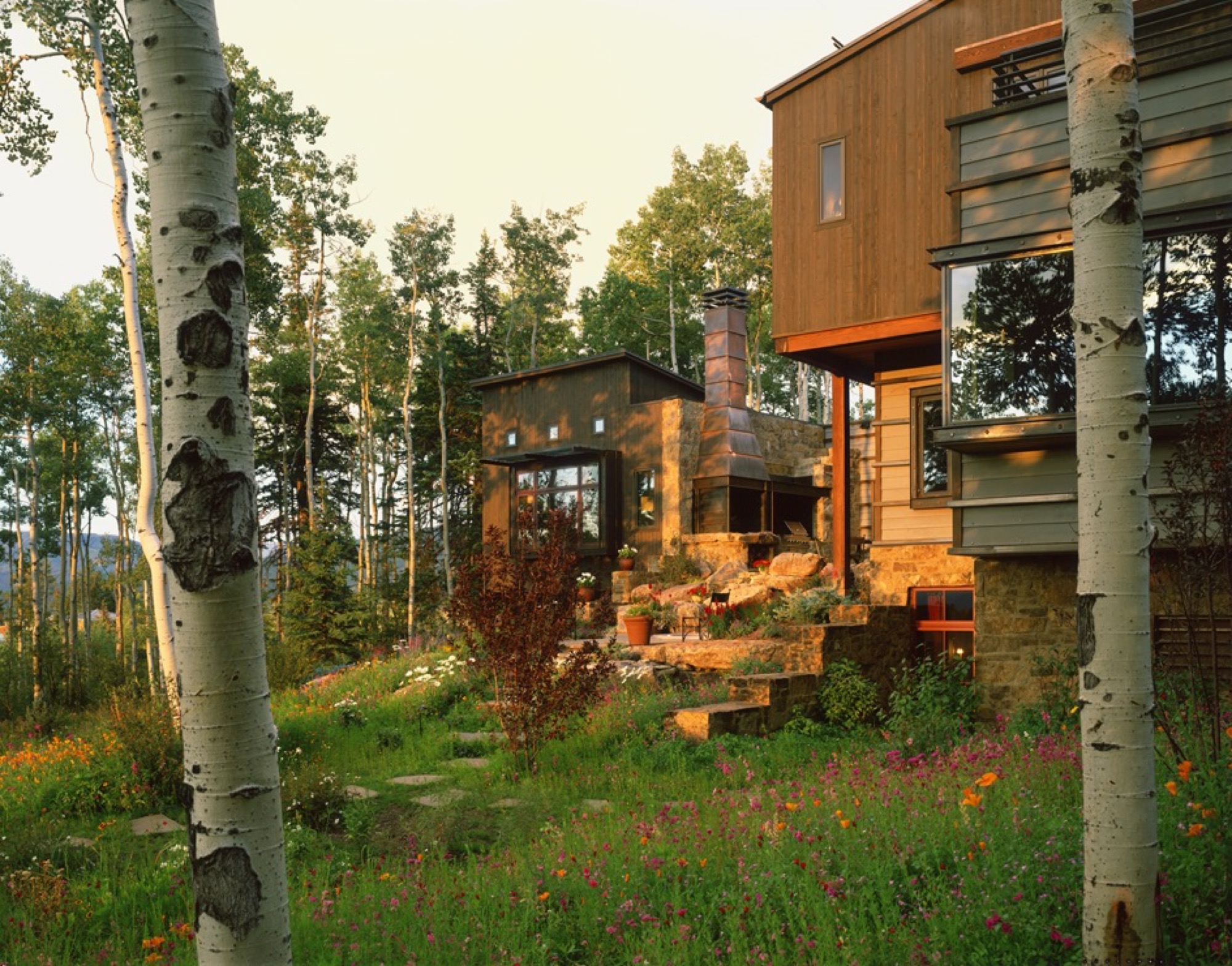
Also, a townscape is really a library of cultural expressions over time. Given that historic perspective, a log cabin is part of the miner’s time. Hopefully, what I do is an expression of my times and this culture, and doesn’t grab a crutch out of architecture’s past. Because the work of my firm significantly influenced the evolving character of architecture in the New West, I was elevated to the prestigious College of Fellows (FAIA) by the American Institute of Architecture. Our working mantra of design is that of “place-making” where architecture and nature are seamlessly integrated to the betterment of both.
“A townscape is really a library of culture preferences over time. Given that historic perspective, a log cabin is part of the miner’s time.”
LYR You were raised in rural Montana. What did that upbringing impart to you?
LY Growing up in Montana, I really experienced these rural ranch and farm compounds that were formed over generations. They were always designed by the simplest means, in simple forms, and they seemed to sit respectfully on the earth. When I started studying these things, I discovered that they were really forms that described contemporary architecture in their simplicity. They were formed in protective surrounds, and were organized around working proximities, yet there was always a place for enrichment, like a little garden near the front porch. Then, these compounds grew organically—out of inelegant purpose, and rural rationality. I didn’t appreciate it then, but as I studied architecture, I started pulling out of my experiential self, and those things all matched up—that is contemporary architecture. It did not tread heavily on the land; it embodied economy of means; it had simple forms and echoed its context—all things that are generationally taught or experientially taught. They solved problems there, out of their own devices and their own means.
LYR How has design carried into, and impacted, other areas of your life?
LY It has opened my eyes. When I travel, I see different things; I wonder about them; I take them in. And, what I’ve learned is that I like evocative things. Evocative means you hate it or you love it but it nevertheless stirs emotion in you, and takes the lethargy out of your mind. And, that’s true in architecture. The creative process and everything associated with it; the people you work with and the collaborations—they fuel my worthwhileness and my sense of adventure.
“I like evocative things…. You hate it or you love it but it stirs something in you, and takes the lethargy out of your mind.”
LYR Tell me about the Blackfeet Indians, a tribe you became close to when you were young, and their impact on you, your design, and your art.
LY When I was twelve years old, I went to Browning, Montana, in the middle of the Blackfeet reservation, and there sat this gorgeous little Indian girl. She was about my age, dressed in a traditional beaded, white doeskin dress, and I was enchanted. Her name was Virginia Home Gun. That enchantment turned into a friendship with her. It turns out that her father was the chief of the Blackfeet Tribal Council. Over time, through traditional ancient ceremony, they made me an honorary member. That really stirred me. It continued beyond that, and I started reading and studying about the rituals and legends that were the spiritual glue of their life. The Blackfeet regarded themselves as a creature of the earth, and they understood the balance of their needs with earth phenomena. They would give thanks to the buffalo, and honor a slain enemy for valor. For me, it went from the idealistic warrior image when I was young, to understanding their spiritual nourishment that kept them who they are. That translated to me later on into a series of paintings that I call “Once Proud.” That’s my way at this point in life of telling the story of westward movement and how it maimed the spirit and freedoms of our native inhabitants of this place. This made us feel sort of culturally guilty and I was inspired to tell that story.
LYR What is the status of modern architecture in the Roaring Fork Valley, and what role did you play in getting modern design where it is today?
LY Aspen has always been a place that embraced aesthetic adventurism, or tolerated it anyway, and has always fostered intellectual and artistic courage. My firm, my partners, a highly talented thirty-some staff, and our clients have allowed us to be one of the forerunners of the movement here. Personally, I haven’t pushed modernism [in the valley] for recognition; we have had clients and circumstances that permitted that kind of solution and character. But within my firm, I’m known for pushing beyond the expected, and going to a higher level of art form and different level of expression; questioning, pushing, improvising, and going beyond even what clients want. Straight competency in architecture is a mid-level solution—I advocate for artfully courageous and innovative solutions that are bigger than the problem.
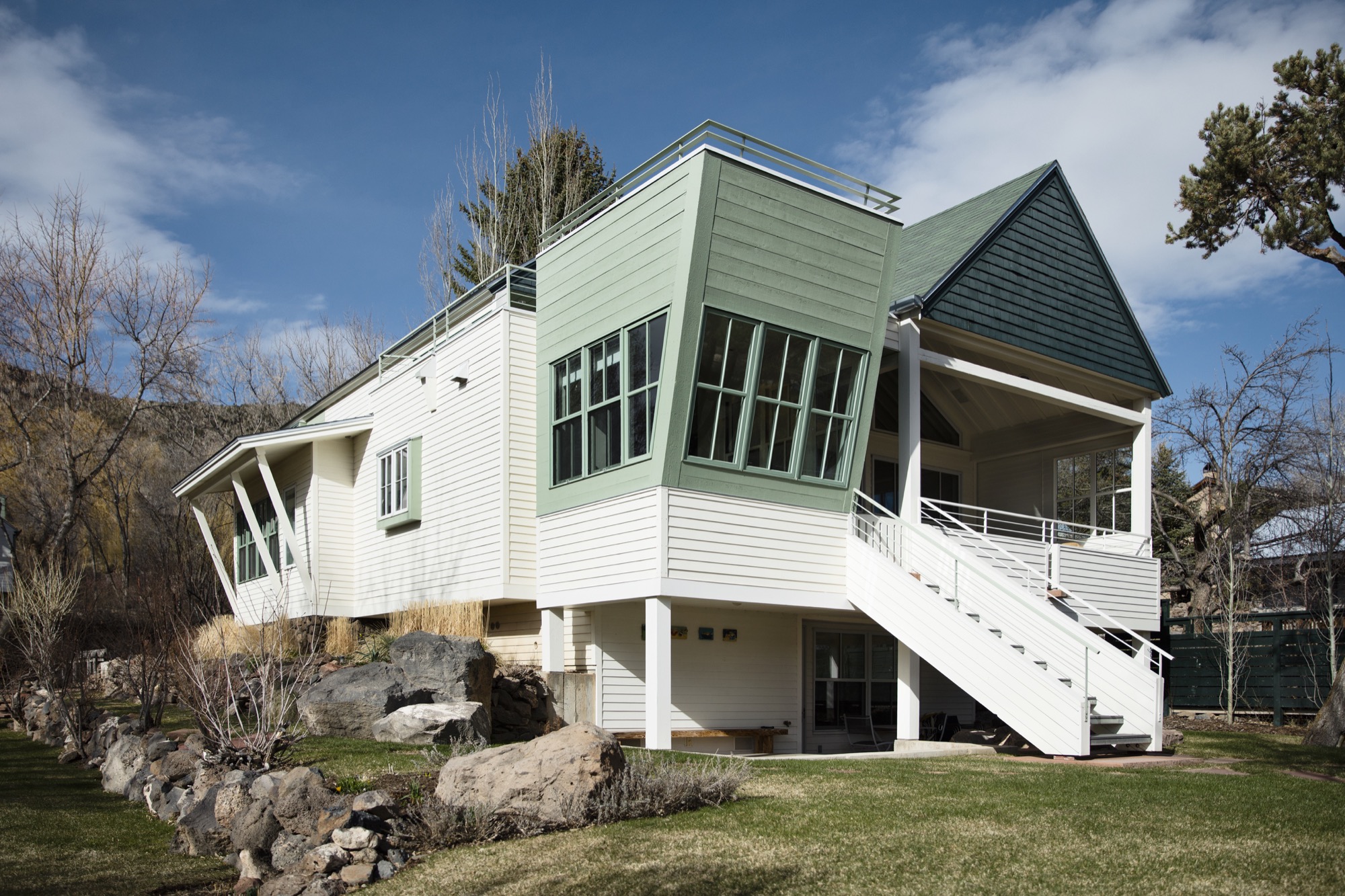
LYR Who are the people who want modern architecture in the mountains? What makes them different from the “typical” client who wants that enormous heavy log mansion that says, “I have a lot of money, and I live in Aspen?”
LY Some people are here because it is a new bar on their reputation epaulette. The people who I gravitate towards, or who gravitate towards our firm, are here for reasons I’ve sorted out—for the adventure, the backcountry, and things that support our minds, bodies, and spirits. These are all truly good characterizations of our lives, and our personal culture. To put it into context, I’m not going to design three little sitting areas around the master bedroom so you can sit inside all day. You get out of bed, you have breakfast, and you go ski; you get out there.
In that, a question I always ask is: Is architecture derived of context, or does architecture create context? The answer is both depending on where you are, but it's a question I ask of it because its one of the beginning points that I use to align my sensibilities with those of a client or a place.
“Is architecture derived of context, or does architecture create context?”
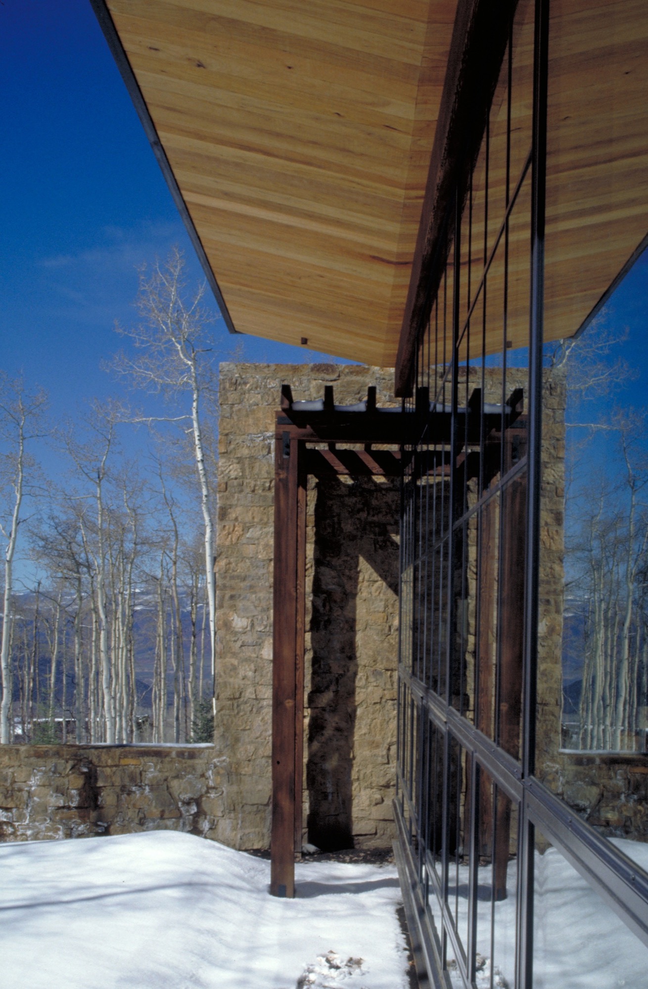
LYR You get lost on purpose, in a way, right? How has this personal quality informed your design sensibility?
LY Freud said that problems couldn’t be solved by a consciousness that created them. In other words, you cannot solve problems where there are too many givens; otherwise you just spin inside the givens. Part of the creative process is being lost, disoriented; you are seeking an answer in a way. Therefore, I never feel lost, I just feel like I entered another chapel as it engages another form of creativity, curiosity, and adventure in me. Being lost is inspiring too—when I was really young, out hiking and going to crazy places I’d never been, I marveled at earth forms, the magic to them, what got them there. As I went on, I studied geomorphology, and it all boiled down to tectonics of eruption, erosion, accumulation, weather, and all of nature’s will upon those things. It’s really compelling, and asks compelling questions, and I found some answers that I’ve portrayed in my painting.
“Part of the creative process is being lost, disoriented; you are seeking an answer in a way. Therefore, I never feel lost.”
Nature can also help you appreciate your existence, be a stimulus for enlightenment, and fuel lifelong curiosities. As architects, we must embrace that kind of creativity and spirituality, the kind that enhances who we are, so as to create well being.
And, Lindsay, I can find my way back from anywhere.
A founding partner of Cottle Carr Yaw Architects, Larry Yaw has designed many of the firm’s award-winning projects—from resort and community design to corporate buildings and private mountain homes. In 1993, Yaw was named to the American Institute of Architects College of Fellows, the highest award given to the profession’s most respected architects. His projects are regularly published in architectural books and national design magazines.
Yaw received his Master’s Degrees in both Architecture and Urban Design from Columbia University and has since been a lecturer and design critic at several western universities. Believing in the importance of civic involvement, Yaw is also a founding board member of the Aspen Art Museum.
Quietly Technical
A conversation with Aether Apparel founders Palmer West and Jonah Smith about fashion, functionality and travel
Springboarding off a career in coproducing independent films (Requiem for a Dream, Religulous), world travelers and urban explorers Palmer West and Jonah Smith founded the clothing label Aether Apparel on their shared adventure spirit and passion for functional, modern design.
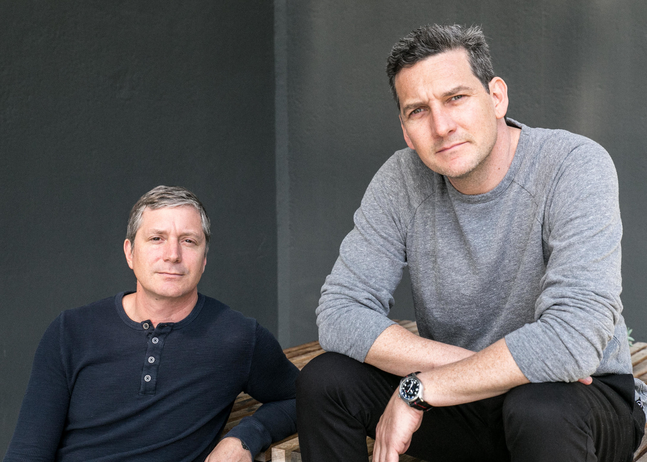
AM What inspired you to embark on this new endeavor of starting your own clothing brand?
JS Palmer and I had been working together in the film industry and had produced ten movies together over a ten-year period. We were growing tired of film and knew we wanted to do something else. Also, we were in our mid-thirties and were re-evaluating our priorities.
PW We liked working together, and we started looking for another business to start. We wanted a business that would interest us, and we set up parameters that fit our creative desires and supported a lifestyle we wanted to live.
JS As “weekend warriors,” we were tired of the clothing options we found available, and the idea of developing a clothing line resonated with us. There was nothing sophisticated enough that we could wear both out of town on the weekend and back at home in the city. We started looking around and we found a void in the marketplace—there was a big distinction between fashion and what you could find at REI.
“We found a void in the marketplace—there was a big distinction between fashion and what you could find at REI.”
PW When Jonah and I made movies, we said we strived to only make movies we would want to see on opening night. We’ve always wanted to be fans of what we do, and we’ve kept the same mantra—we build things that we will use. It helps us stay true to a singular vision. We build what we believe in.
“We’ve always wanted to be fans of what we do. We build things that we will use. It helps us stay true to a singular vision. We build what we believe in.”
AM What’s your idea of a great adventure?
PW We struggle with what most people think of as adventure. For us, adventure and travel also evoke city, not just the backcountry. Adventure in the city can also be awesome.
Adventure is stuck in a box. One destination. Being a citizen of the world requires flexibility. You’re not just one person, nor are we asking you to be one.
AM What’s your vision for the brand?
JS We are building something—an aspirational brand with imagery and travel. We’re not hippy crunchy and we’re not high fashion—we’re in between. Design and functionality is important to us, and we are trying to make a brand that’s authentic and real. We are in the space between those.
“For us, adventure and travel also evoke city, not just the backcountry.”

AM Who are you, and for whom do you design?
PW We represent the traveled individual—someone who is young at heart, with an adventurous spirit.
We use imagery to connect with people. We want people to see these images and think, “Where was that?” We want to reach out to people and have them experience the places we love.
AM Talk about your passion for exploration and discovery...
JS We want to go to new places, experience new things, and we support the adventurous spirit in others. We share our stories and images to inspire this spirit of adventure. We often talk to customers who ask for input or suggestions on trips they are planning or tell us we’ve inspired them to visit a location. This is our passion.
PW Functional design inspires us. We make clothing that is built for adventure but still looks good at home. You don’t have to have a separate wardrobe. Clothing can be beautiful but doesn’t reek of utilitarianism. It’s quietly technical.
“Clothing can be beautiful but doesn’t reek of utilitarianism. It’s quietly technical.”

AM How did your background in film prepare you for starting a clothing company?
JS We came into this business being consumers. We came with opinions and with personal needs for our wardrobe.
Being a film producer, you’re the contractor. You hire people, resolve problems and then produce and execute.
“We came into this business being consumers. We came with opinions and with personal needs for our wardrobe.”
PW Producing movies and making clothing is the same thing: There are hundreds of balls in the air. You have to come in on budget and on time. You have to come together and on point. The “production hat” is very similar. You need a clear vision and then deliver it.
“Producing movies and making clothing is the same thing—there are hundreds of balls in the air.”
The film industry is visually driven, and it was easy for us to tell our story. In fact, we want to tell the story... without making us the central character. Our goal is to be true to who we are and speak to this. We tell our story through imagery.
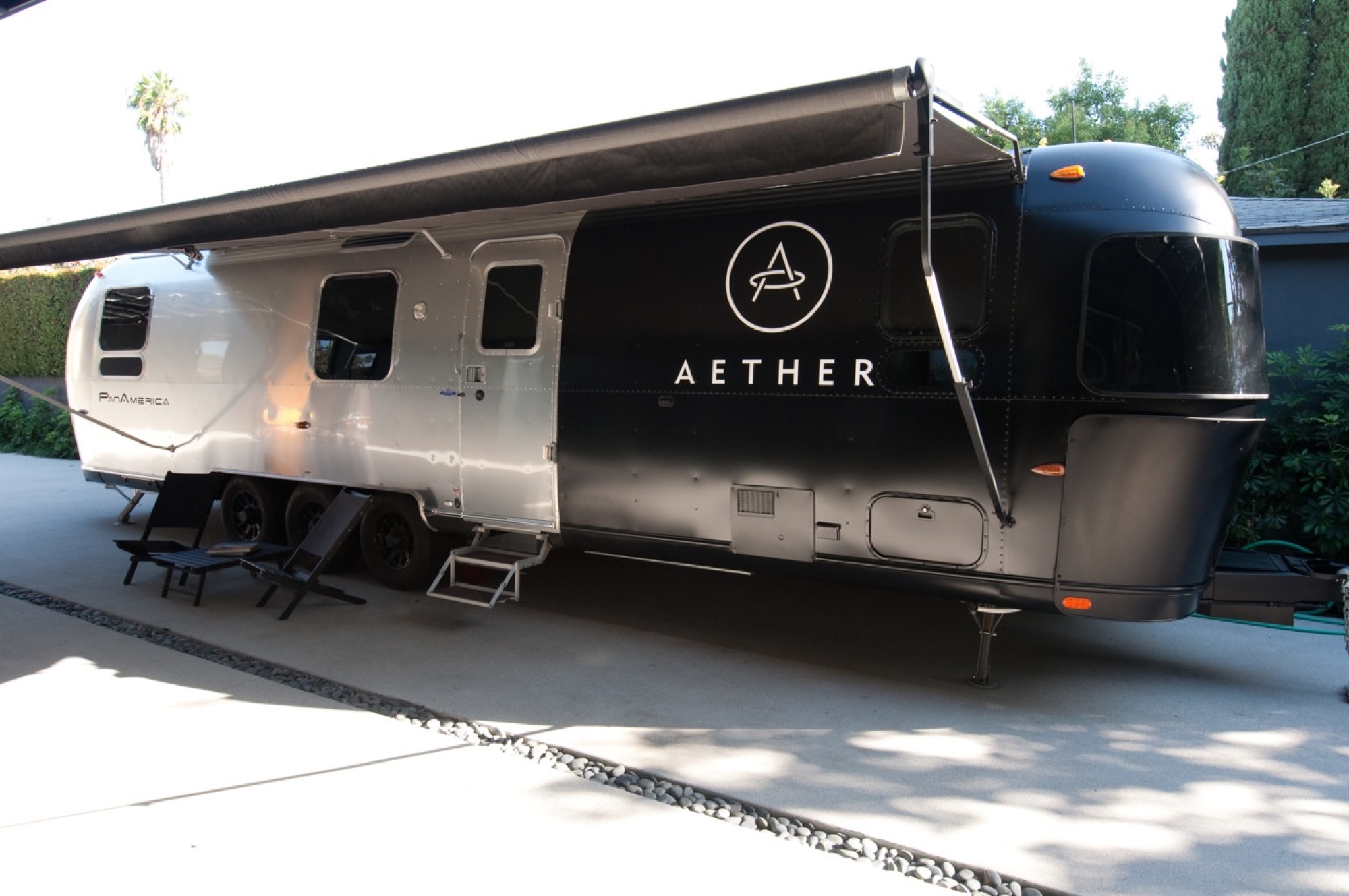
AM What makes a great design partnership? Describe your collaboration. What does each of you bring to the table?
PW We get this question a lot. We’ve worked together for twenty years, and what makes a great partnership is a similar vision and knowing that we are going to the same place.
JS We look at things completely differently, but we compliment each other. There’s a freshness in looking at someone else’s perspective. If you have enough faith and trust in each other’s viewpoint, you can get to the next level.
AM The architecture of the Aether Apparel locations is truly distinctive. What role does the design of your stores play in telling your story?
JS Our film background is two- or three-dimensional, and we wanted to build an interactive environment to display our product. We trusted that if we built our stores in a way that embraces industrial and modern, and if you like our stores, you will like our clothes.
Our San Francisco location is made from three shipping containers stacked on top of one another and has a custom-designed dry cleaner’s conveyor belt running the height of the store to get clothes from storage on the third level.
Our other locations—New York, Los Angeles, and Aspen—have elements of the San Francisco location. However, the big component in these stores is large wood containers displaying product lit from within.
PW These large containers are modular boxes that are flexible, fluid spaces. Nothing is built into the brick and mortar of the location.
We were inspired by the idea of a nomadic life, when you would pack all your stuff and move. We like the flexibility to move things around, and besides, it hints at our spirit of adventure.
It’s about curation and presentation. You need to interact with our staff. It’s important that it feels authentic. △
“We were inspired by the idea of a nomadic life, when you would pack all your stuff and move.”
Aether Apparel lookbook Winter 2015/16 & Summer 2016
Photography by Ian Allen
Narrow Escape
Falling in love with an impossibly narrow lot on a mountain village's main street, A Denver architects builds a 15-foot-wide weekend home for his adventurous family
Incited by a seemingly impossible building site in an old railroad town above Vail Valley, Colorado, a Denver architect designs a 15-foot-wide sustainable mountain getaway as a speculative investment for sale. Then his adventurous family falls in love with the home. It was an eyesore. Passersby merely saw a ramshackle trailer overstuffing the 25-by-100-foot (7.5-by-30-m) lot on Main Street in Minturn, Colorado. Yet, André Vite spotted an opportunity.
The campus architect at the University of Colorado Denver and his wife, Ginger Borges, an oncologist at the University’s medical school, have a weakness for obscure properties. That evening three winters ago, however, they maintain they were not scoping out a new venture at all. The couple and their preteen sons, René and Niko, were headed to the old railroad town up Eagle River for dinner after a day of skiing in Vail. “We drove through Main Street Minturn, which is a town we go to all the time, and there was a mobile home for sale that was just totally wedged in and awkward looking,” Vite remembers.
Even though he didn’t know what to do with it at the time, the architect wanted that piece of land. And he got it without difficulty because the city planners had been eager to get that blot off Main Street.
The draftsman went home and started sketching.
S(e)izing the Opportunity
The lot’s appeal was twofold: It was located right on the town’s main stretch and it was zoned for mixed use. “From a planning and zoning standpoint, it was a fantastic opportunity,” says the architect and urban designer, who also heads his own practice, the Vite Collaborative. (Or, as he describes it, “A bunch of friends working on unique projects together.”) If for nothing else, Vite purchased the property at a propitious time. The shops along Main Street had been expanding in that southern direction in recent years. Thus, Vite had originally designed the project as a residential spec home with the option for retail or commercial space on the ground floor.
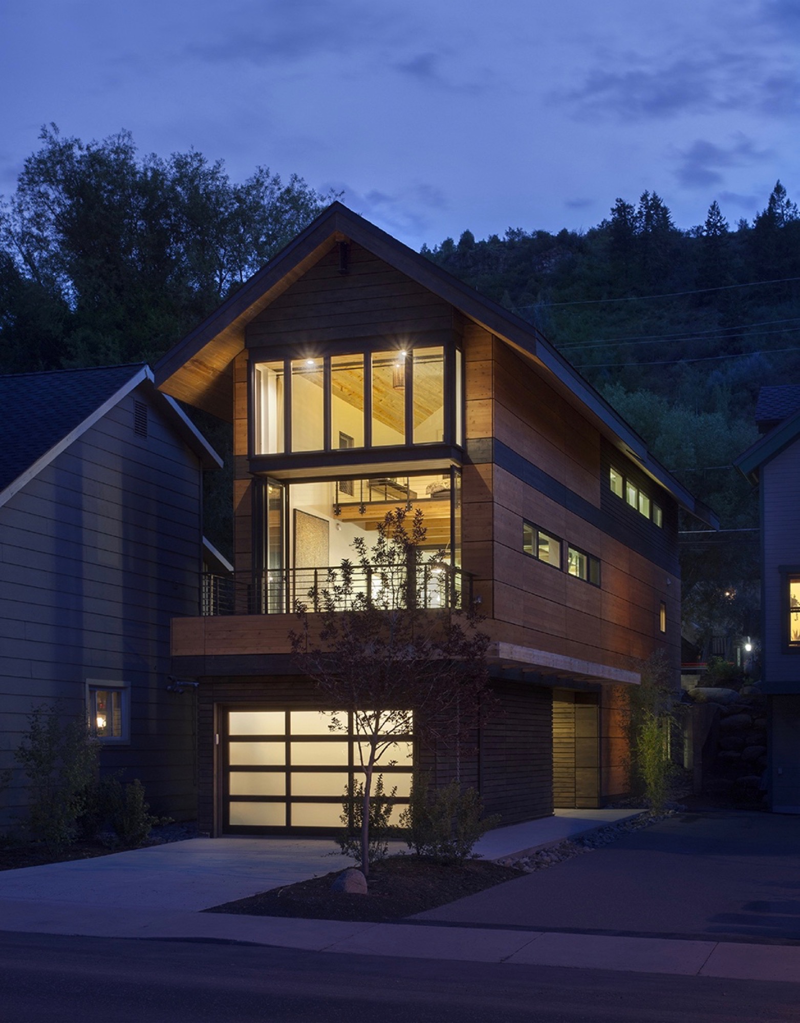
While the sliver of land overlooks the principal artery of town life on the Main Street side, the opposing end couldn’t have more different surroundings — a quiet residential street with community gardens across the way. “From an architectural design proposition, that was very exciting to see how you could work this with two faces of the building,” Vite recalls. “Both facades relate to the context of the side they are on.”
“From an architectural design proposition, that was very exciting to see how you could work this with two faces of the building.”
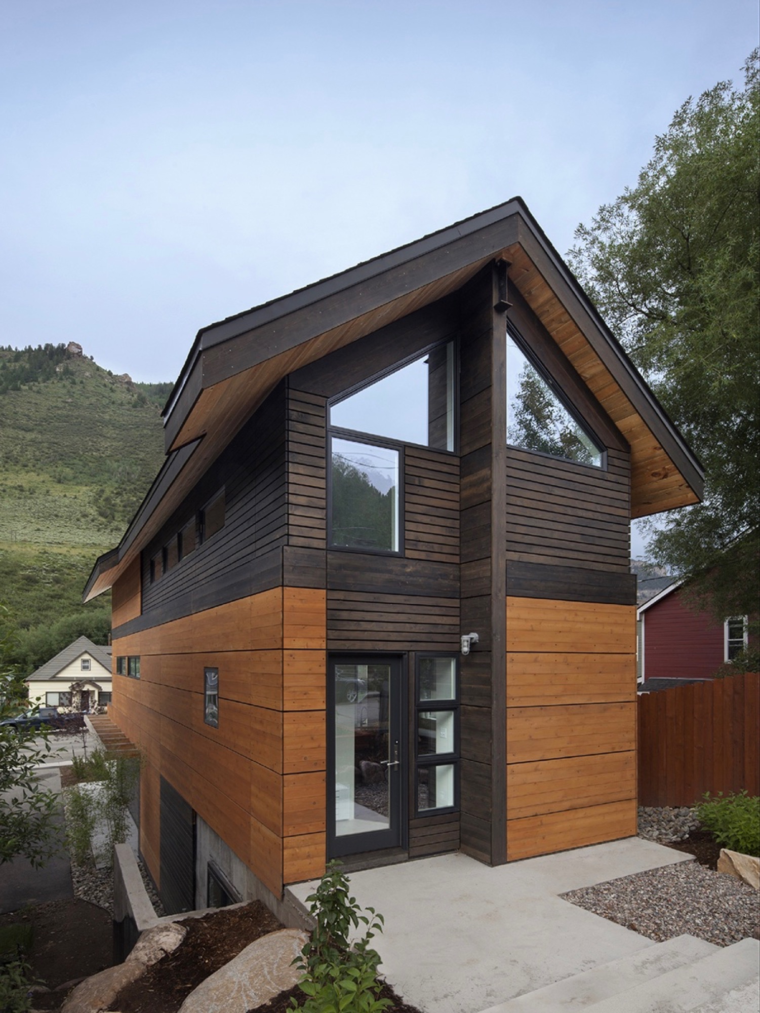
Yet another challenge the building site posed was the 10-foot grade change between the two frontages — an entire story difference, front to back. That was not all. The town’s zoning laws required a 5-foot setback from the property line. The house could be only 15 feet wide.
Fortunately, the neighbor’s garden to the south and a driveway next door to the north give the narrow site extra breathing room. “It’s true, it’s a very constricted site, and the response was a very long, narrow building, but it’s still flooded with light,” Vite says.
"It’s true, it’s a very constricted site, and the response was a very long, narrow building, but it’s still flooded with light."
Unconstrained creativity on 15 feet across
The building constraints — the narrowness, the contrasting major facades, the steep slope — only spurred Vite’s imagination and inspired innovative solutions. How did he create a modern living space — an entire three-story house — with 15 feet (4.6 m) across to work with? The architect’s answer was a structural steel frame, an element adopted from commercial construction, which gave him the structural freedom to engineer large open spaces on the inside. “It’s a steel moment frame structure with three beams that go all the way down the building. Then there is a steel beam across the top.”
The steel beams manifested what would become part of the narrow house’s legacy, and with it, a close relationship between Vite and the local builder, Brian Beckett. “When he was erecting the moment frames, Brian called me and said we can’t put the roof on tomorrow,” Vite says. One of the moment frames had been a quarter-inch off plum, which was still well within building tolerances. As might be expected from the sanguine architect, the holdup was anything but a point of contention; on the contrary. “To have a guy who takes this that seriously was just really important to me. I knew I was going to get a great building from him,” says Vite. “The main draw to this project was the relationship I developed with the builder. It became evident early on that he cared about craft. We’ve become great friends.”
“The main draw to this project was the relationship I developed with the builder. It became evident early on that he cared about craft. We’ve become great friends.”
Actually, there was one moment during construction that did stop the architect in his tracks. After Beckett put the roof on the now-perfect steel frame, he took a picture and sent it to his client in Denver. “It looked like a tube; like you wouldn’t ever want to live in anything like it,” Vite remembers his initial reaction. “It wasn’t until we started finishing it out that it turned into what we’ve got. But that was a scary point, because it was so narrow.”
Family first
By the time construction was completed, the next ski season was approaching. Vite and his family had frequently driven up from Denver to ski in the Vail Valley during previous winters. “We decided we would use the house for that ski season,” Vite says about the investment property he had just finished. “We spent that ski season there. After that, we didn’t want to lose it.”
“We spent that ski season there. After that, we didn’t want to lose it.”
The unique house itself wasn’t the only reason the family never wanted to move out. “We absolutely fell in love with Minturn. It’s the real authentic mountain community between Beaver Creek and Vail, where you have all these people who are transient and vacationing. The people in Minturn are really the ones who keep that valley going,” says Vite about the mountain town’s thousand or so residents.
What’s more, Borges not once considered her husband crazy for building this improbable house. “We’ve been married for twenty years,” Vite laughs. “She is used to that.” And attuned to narrow dwellings she was. The first home the couple restored and lived in together was a townhouse in Boston’s Beacon Hill neighborhood that was only 14 feet wide. “She’s getting an extra foot,” Vite exclaims, insisting his wife was thrilled about the idea to keep the Minturn house. Now the four escape up here nearly every weekend, year-round, to fish, drive their go-kart, hike — or ski in winter.
Open space to monkey around
Since completion, the house has evolved into a fun destination in its own right for the adventurous family. “The narrowness drove the whole architectural design in choosing a steel frame so that the interior could be completely open,” Vite says. Scarcely any interior walls partition intimate bedrooms and private bathrooms from the open, free-flowing floor plan. At the bottom, the concrete foundation encases a below-grade guest bedroom and bathroom on the dwelling’s Boulder Street side. Because of the steep slope, the opposite end is above ground, where the garage faces Main and can be extended out to the street for a future retail space.
“The narrowness drove the whole architectural design in choosing a steel frame so that the interior could be completely open.”
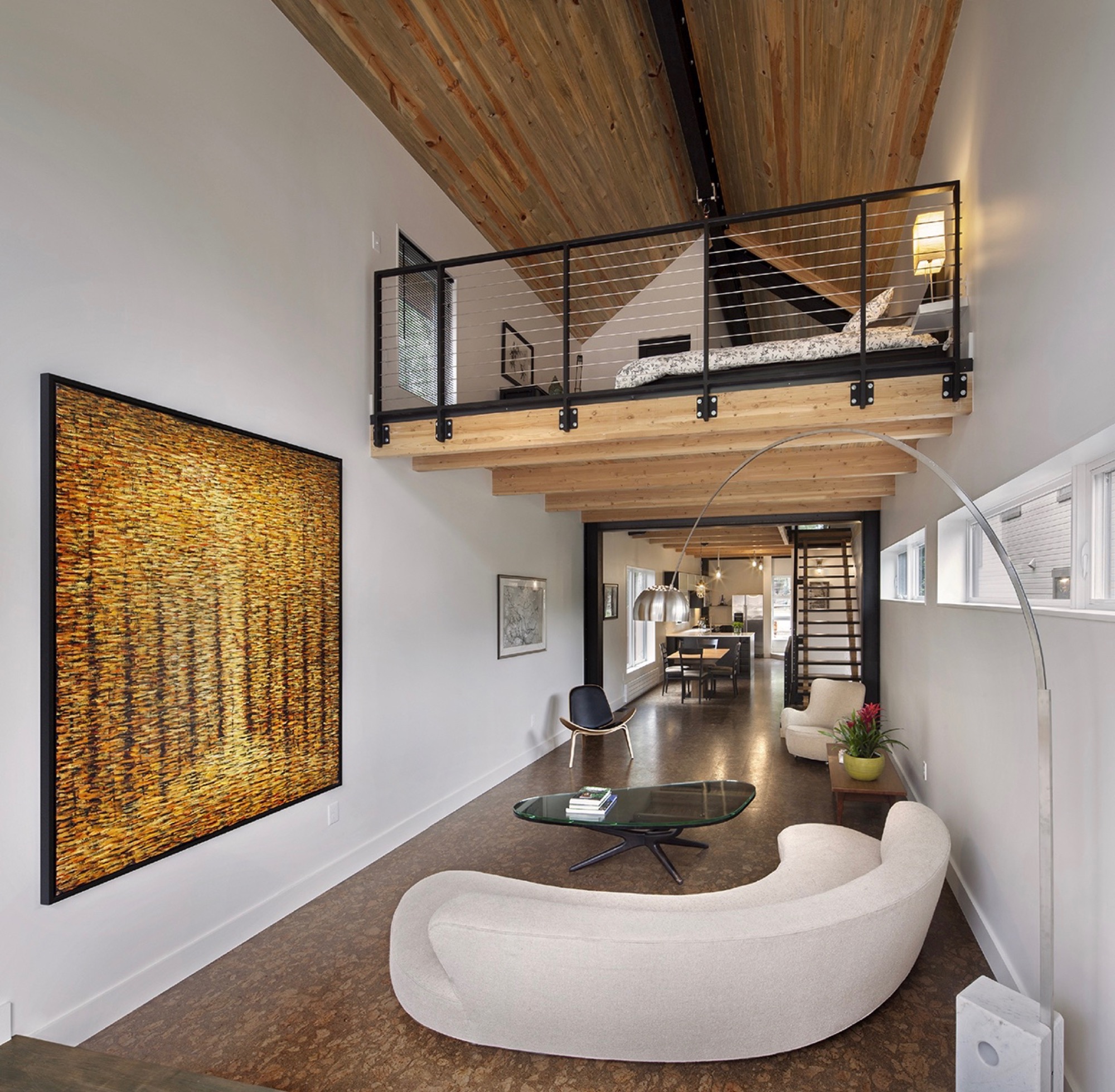
The ceiling of the modern living room on the second floor rises two stories with an overlooking loft, the parents’ open bedroom. The boys’ west-facing bedroom is tucked behind the “master” (or in front of it, depending on which frontage you interpret as the face of the house).
The family spends most of their time together in the open living space with the curved white couch. “We take this big picture off the wall and project movies onto the wall.” The cork-floored main living area flows outside through a folding glass and steel wall that opens up to the deck. A minimal dining area in the middle transitions into the kitchen, Vite’s favorite spot in the house.
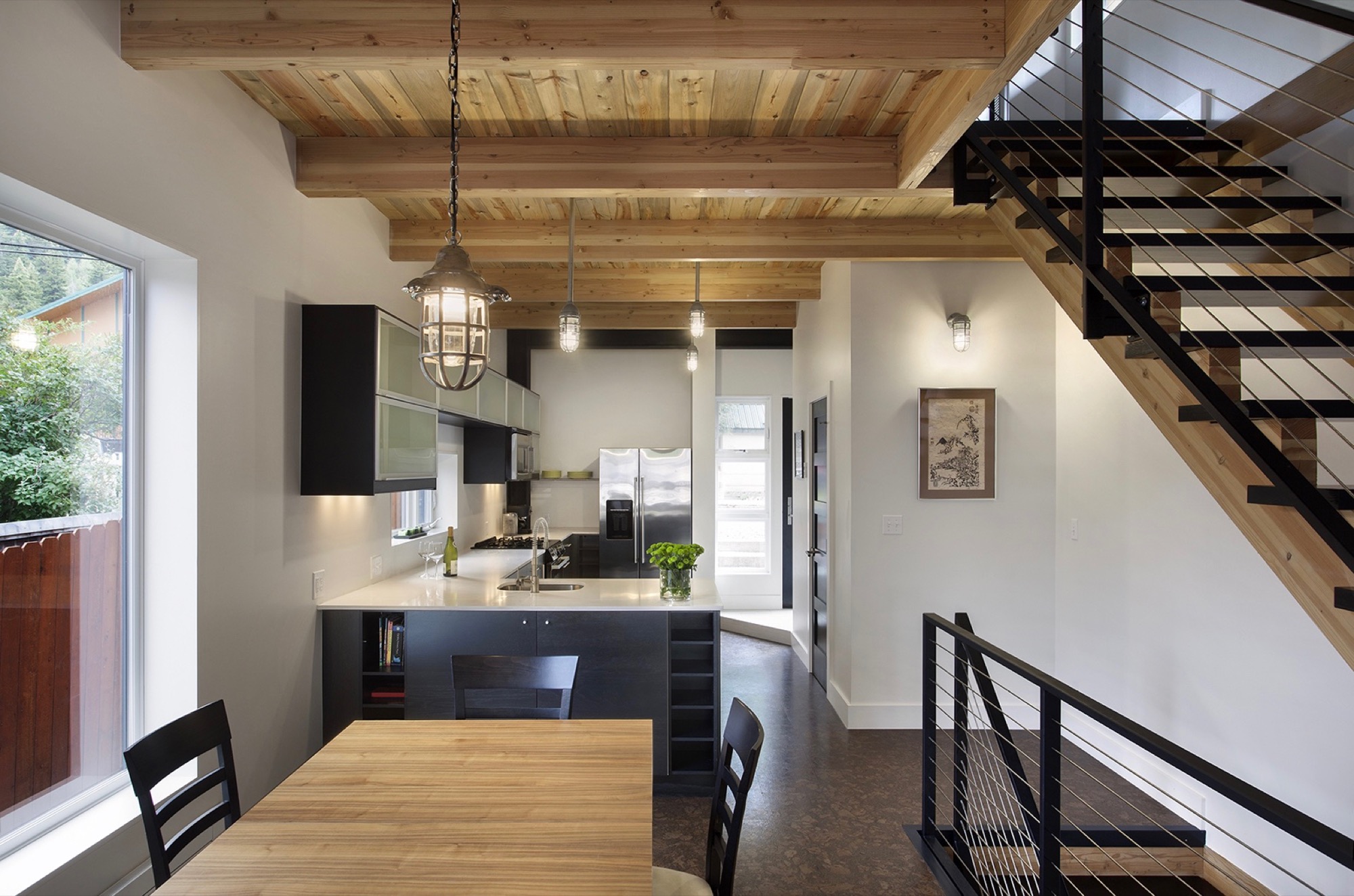
“But what the kids love is this 26-foot space here,” says Vite, pointing at the high living room ceiling, where he mounted a climbing rope. “They get to climb up this wall that’s all blocked with wood, ready to put in finger holes for a climbing wall.” Climbing is indeed the boys’ favorite indoor pastime. “They climb everything they can get to,” their father reveals, pointing to a trolley that runs down the steel beam under the roof above the master loft. “You can strap yourself onto here and then push off.”
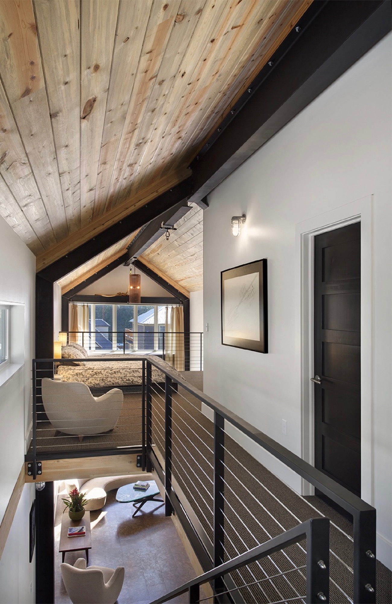
In addition to providing a place for the family to escape the city on weekends and holidays, Vite wanted to set the stage in the house for a few cherished vintage pieces he inherited from his late parents. “The interior design was all about finding a home for my father’s old furniture he had bought in the early sixties in New York. It’s all authentic midcentury-modern furniture, and I designed the interior around it.”
Sustainability as style
The LEED-accredited architect is reluctant to categorize the architectural style of his idiosyncratic house. “What they call it up here is a contemporary mountain home, because it very much has the feel of a timber frame, although it is done in steel,” he says. “But rather than talking about a style, the sustainability feature is more important to me.”
From the construction standpoint, the house is based on a standard wood module to limit material waste, which actually got Vite in trouble with one particular Minturn resident. “There is a guy up here who goes around the construction sites, picking up wood waste for his wood-burning stove at home. He would complain that we didn’t have enough wood waste and gave us a hard time.”
The carefully calculated use of exterior wood is to protect the building from driving rain in support of the actual weather barrier behind the wood. “All these gaps are open,” Vite shows. “It’s like the house is wearing this jacket. The wood is there for added protection, and the jacket breathes.” Air exchange is critical for a highly insulated house at this altitude, where the air is extremely dry. “You are living and cooking and doing all these things that increase the humidity inside the house,” he explains. Instead of trapping the warm, very moist air inside, the house can breathe it out. Vite also installed a heat recovery air exchanger that pushes warm, inside-air to heat colder air coming in to ventilate the house, without using the heating system.
“It’s like the house is wearing this jacket. The wood is there for added protection, and the jacket breathes.”
Vite received the 2013 Award of Citation from the American Institute of Architects for this project.
Tight house, tight Community
Being awarded such a significant professional accolade from AIA is nice, sure, but what truly warms the architect’s heart is how the locals perceive the standout structure they’ve come to call the “skinny house.” “We get compliments on it all the time. People are stopping by, saying they’ve watched it go up and want to look at the inside,” he says. “I love that the town loves the house.” △
“I love that the town loves the house.”
Sense of Place: Designed for legacy in Aspen
Mountain homes in Aspen, Colorado, are built to stay in the family for generations
Aspen is steeped in tradition. Generation after generation, families vacation at the posh resort to ski in winter and to celebrate the town's famous festivals in summer. Slope-side chalets and opulent second homes alike are built for legacy, as venues for extended family to gather and carry on traditions, season to season. A continuity that translates into architecture and decors of great depth and layering.
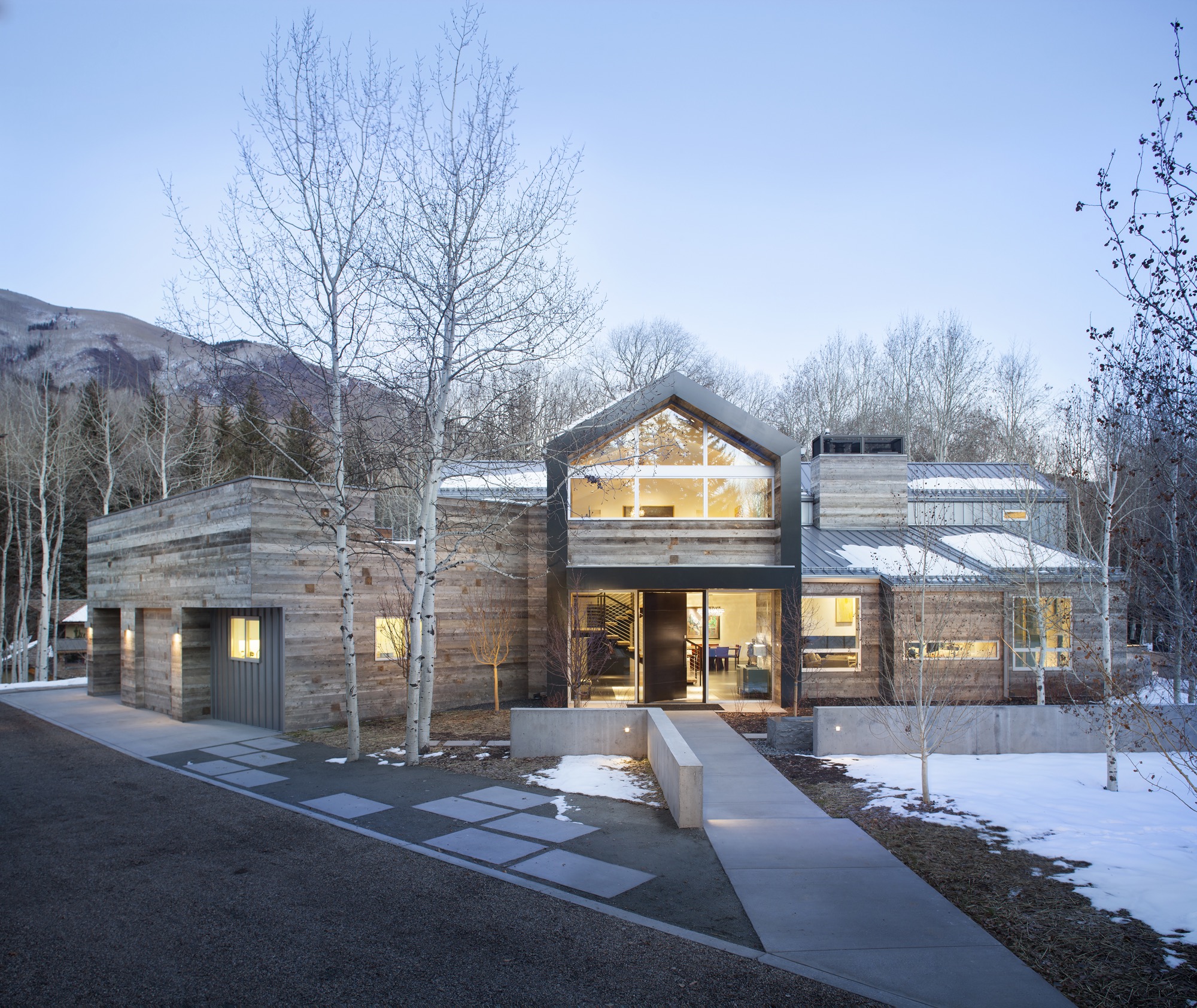
Nevertheless, even mountain folks for a fortnight must have functionality alongside style, beginning at the entry. “There is that sense of arrival at a mountain home,” says Sarah Broughton, co-owner of Rowland and Broughton (R+B), an architecture and interior design firm in Aspen and Denver. Aspen homes are planned with the understanding that one comes in from the elements. “People need to be able to knock snow off their boots.”
"Aspen homes are planned with the understanding that one comes in from the elements."
Style without borders
Many of R+B’s clients have primary homes on the beach or in big cities, all over the world. “One thing that is important to them is that they really feel they are in Aspen,” says Broughton, a modernist at heart. To achieve this sense of place, she relies on natural materials such as wood, grasscloth, and natural stone — “things you see when you look out the window.” What’s more, treating woods in surprising ways, such as planking or wire-brushing, brings out something special in a natural material.
Broughton complements mountain settings and modern, clean lines with cashmeres and wools in the furniture and textiles. She loves to add ample pillows and throws on beds and couches. “Hemp, wool, and cashmere textures and patterns can speak to a natural environment without being literal,” the award-winning architect says. The beauty of sunlight falling through an aspen forest’s canopies, for instance, can translate into a pattern. Twinkling lights become reminiscent of a starry winter night in the Rocky Mountains.
“Hemp, wool, and cashmere textures and patterns can speak to a natural environment without being literal.”
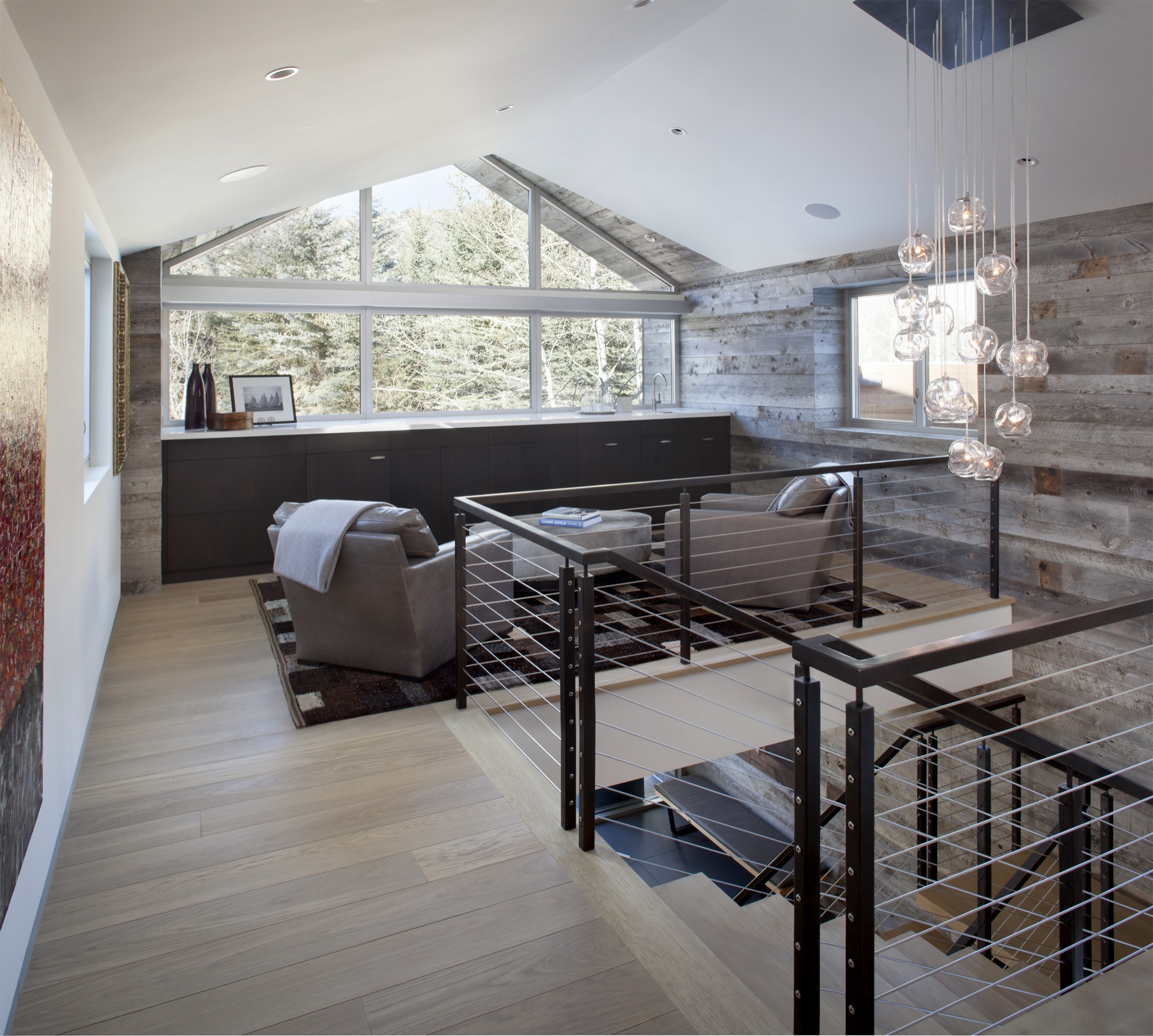
Black Birch Modern
With its clean-lined, minimal design, Black Birch Modern in Aspen is an example of a mountain retreat that not only boasts stunning alpine-modern architecture, but is warm and welcoming to boot. R+B achieved this balancing act by bringing outdoor materials inside. That, Broughton believes, is something anyone can do at home. “Carrying a material found around the outside of the house into the flooring, for example, is an effective way to blur that indoor-outdoor line, which is such a quintessential element of Aspen style.”
Bringing Aspen home
Give your home a touch of Aspen flair and make room for your own legacy. Create spaces where friends and family can gather to share food, drinks, and stories, while they sink deeper and deeper into your cashmere pillows and pull up their feet under a wool blanket.
Art from an Aspen gallery adds a fine finishing touch. “Bringing in local talent is a nice way to tie it to the place and a great way to modernize a home,” Broughton says. “Make it feel collected and not staged,” are her parting words of style wisdom. “Modern design has a lot of depth and layering to it. It’s not a one-hit wonder.” △
“Make it feel collected and not staged. Modern design has a lot of depth and layering to it. It’s not a one-hit wonder.”
Modern Architecture Ascends in Aspen
Architect Shigeru Ban's dramatic design of the Aspen Art Museum
Inspired by the up-and-down movements of the skiers on Aspen Mountain, the Pritzker Architecture Prize laureate Shigeru Ban takes modern building design to dramatic heights with the new Aspen Art Museum.
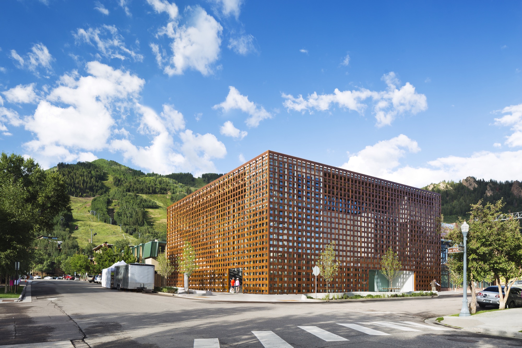
The new Aspen Art Museum, which opened in August 2014, became an instant, if controversial, landmark in the precious Colorado mountain town and beyond. Architect Shigeru Ban’s building is like no other in Aspen — or anywhere else. Think of it as a box within a box. The blocky three-story glass interior box is wrapped within an outer box made of wide strips of resin-impregnated paper woven into a grid, permitting light and air to filter in and people to look out. In daylight, the strips have a wood tone. The texture relates to old bricks, the dominant building material in downtown Aspen. The strong vertical and horizontal lines play off the glass in an ever-changing succession of light and dark, bright and shadow.
Up and down — like the skiers
Ban’s concept was to echo Aspen Mountain, the commanding presence just south of downtown. At the ski area, skiers ride lifts to the top and then make their way down. So it is at the museum. Visitors first ascend the stairs or ride a room-sized glass elevator to the only public rooftop space in Aspen, with its open sculpture garden, grand view of Aspen Mountain’s lower slope, and an indoor/outdoor café where visitors linger over a cup of coffee, a light bite, or lunch. The menu changes frequently, appropriate for a museum whose exhibitions change every few months. Then visitors work their way down. Six galleries, three above ground and three on the basement level, have already showcased the works by painters, sculptors, installationists, and multimedia artists. A show in Aspen has a way of increasing an artist’s visibility and renown.
Curating the new
The new building replaced the 7,500-square-foot (ca. 700-square-meter) former hydro-electric plant that had housed the museum since 1979. While it was of nostalgic value to the Aspen community, it had long since outlived its usefulness as a museum that showcases contemporary art and also hosts workshops, classes, music programs, lectures, and films. In this global art world, the call for design ideas was broad, but from concept to opening involved an eight-year process. Heidi Zuckerman, the museum’s visionary director, CEO, and chief curator, says that when it was time to choose an architect, the only two requirements provided to a selection consultant were that the architect had previously designed a museum and also spoke English.
Shigeru Ban came with both. As for museums, he had designed the Centre Pompidou-Metz, a regional branch of the famous Georges Pompidou Arts Centre of Paris. The Metz outlier contains exhibitions from Europe’s largest collection of twentieth- and twenty-first-century arts. He also did the Nomadic Museum to house “Ashes and Snow,” Gregory Colbert’s groundbreaking video/photo work, that launched in Venice, then traveled to New York, Santa Monica, Tokyo, and Mexico City, ending in 2008, largely due to the global recession. As for language, Tokyo-born Ban had studied at the Southern California Institute of Architecture and New York’s Cooper Union, and he now divides his time between Tokyo, New York, and also Paris.
The selection consultant had put out the call without revealing the specific client and came back with pictures submitted by thirty-six firms — “no names, no words, just pictures,” Zuckerman says. Sixteen firms were then told that the Aspen Art Museum was the client, and fourteen of those submitted plans. A committee narrowed those to five and visited three. “Shigeru came in with the highest score at every round,” Zuckerman continues. She was already familiar with Ban from his Paper Arch, erected in the courtyard of New York’s Museum of Modern Art as part of its millennium celebration.
"Shigeru came in with the highest score at every round."
Ban’s Backstory
Time magazine named Ban the 2001 Innovator of the Year for his pioneering disaster relief designs that used simple materials to build housing in afflicted areas. Ban is known for innovative and distinct designs, of course, but also for the humanitarian and sustainable aspects to his work. He has made his reputation on using simple materials, from paper and cardboard to crates and shipping containers, to help people, communities, and countries rebuild their lives after headline-making disasters.
Projects included using sandbag-filled beer crates as the foundation for quick-to-build, low-cost housing after the 1995 earthquake that devastated Kobe, Japan. Sixteen years later, following the massive quake and tsunami (think Fukushima Nuclear Plant) that left 300,000 people homeless, Ban designed homes crafted from shipping containers with cardboard tubing for interior walls. He expanded on this concept with his “cardboard cathedral” that rose from the rubble of the quake-damaged Catholic basilica in Christchurch, New Zealand. With cardboard tubing as the visible structural element, it stands as a symbol of hope and inspiration while the city contemplates whether or not to reconstruct the copper-domed classic. The cardboard tubing tradition lives modestly at the Aspen Art Museum in the form of benches.
For fifty-seven-year-old Shigeru Ban, 2014 was a landmark year. Even as his $45-million USD Aspen Art Museum was in the final stages of construction, he was awarded the prestigious Pritzker Architecture Prize, considered the most important honor in the field. It rocketed him to “starchitect” status and made the museum’s twenty-four-hour grand opening the place for well-heeled Aspenites and the art-world elite to see and be seen.
In presenting Ban with the coveted prize, Tom Pritzker, president of the sponsoring Hyatt Foundation, said: “He is an outstanding architect who, for twenty years, has been responding with creativity and high-quality design to extreme situations caused by devastating natural disasters. His buildings provide shelter, community centers, and spiritual places for those who have suffered tremendous loss and destruction.”
It may seem counterintuitive that an architect known for creating housing for refugees and disaster victims did his first U.S. building in one of the country’s priciest towns, and Zuckerman is clearly relieved that her museum snagged him pre-Pritzker. It makes sense, actually. Ban is disinterested in monumental buildings, and as one of only a handful of noncollecting museums in this country, the AAM did not require massive space. It is a mere 33,000 square feet (3,065 square meters), with three stories at and above street level and one below.
"Ban is disinterested in monumental buildings."
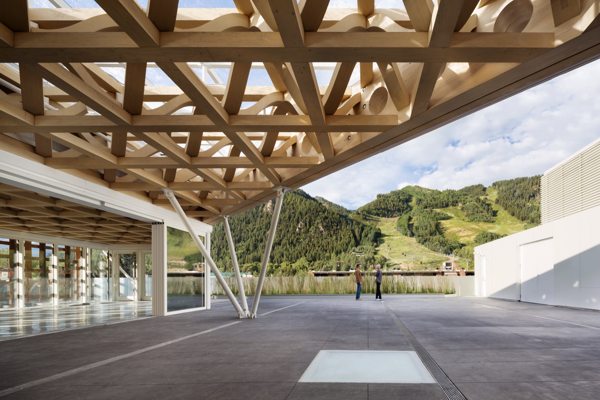
Not for everyone
The Aspen Art Museum is built to the sidewalk line, like the nearby late nineteenth- and early twentieth-century buildings, meaning that it is not out of scale with its neighbors. But the exterior materials and the see-through grid are what turned heads and shocked some locals. People love it, detest it, or are merely puzzled by it, but everyone knows it is an extraordinary community resource, especially since admission and many of its programs are free.
Zuckerman’s uncanny instinct for identifying the next hot new contemporary talent makes the Aspen Art Museum a coveted venue, even though each exhibition lasts only about three months. “I feel fortunate to have as a platform this incredible museum,” says Zuckerman, who, mindful of the controversy surrounding the design, adds, “It can be for anyone, even if it is not for everyone.” In its first six weeks, the new museum drew some 35,000 visitors — as many as the old museum did in a year.
“I feel fortunate to have as a platform this incredible museum. It can be for anyone, even if it is not for everyone."
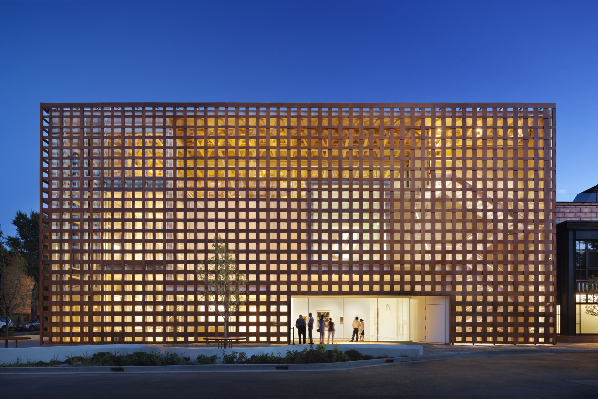
Aspen and modernism
While it values its Victorian core, Aspen has had an ambivalent relationship with modern architecture. Eero Saarinen’s original music tent for the Aspen Music Festival was replaced twice, most recently by a permanent structure designed by Aspen’s Harry Teague, and the modest concrete Given Institute by Chicago modernist architect Harry Weese was demolished in 2011.
The pure Bauhaus-era Aspen Meadows Resort on the city’s east end remains a living icon with low-slung buildings designed by Austrian-American architect Herbert Bayer. It is the home of the Aspen Institute, a humanistic think tank for leaders, artists, musicians, and thinkers. It also operates as a hotel with spacious accommodations and a fine restaurant on a forty-acre campus. Sections of the ground have been sculpted into little hills, a gentle serpentine trench to replicate a watercourse and pebbled paths plus carefully selected rocks and sculptures placed here and there. With much change in the valley, Aspen Meadows is a keeper, and so is the Aspen Art Museum. △
Summer Graze
Can you hear the sound of moo-sic? During summer, the von Trapp family grazes cows and other farm animals on their nordic ski slopes in Vermont for sustainable land management
Decades ago, Maria and Captain Georg von Trapp inspired the musical The Sound of Music. Now settled in northern Vermont, the family’s younger generations practice sustainable land management that ski resorts around the world have been experimenting with for decades: Cows, sheep, goats, and other grazers savor their summer meals on winter-sports land.
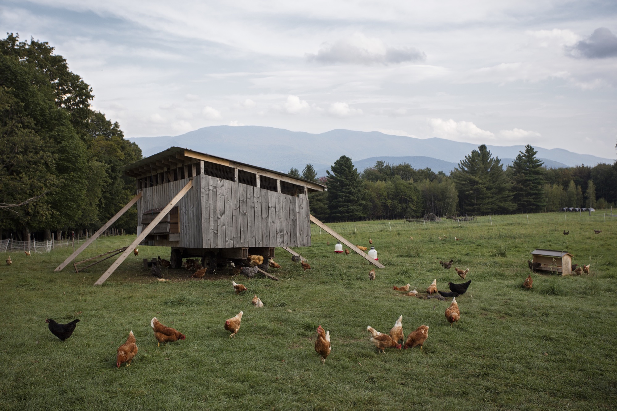
It’s an overcast afternoon at the Trapp Family Lodge in northern Vermont, and out in the Wedding Meadow, 150 chickens are taking in the views of Worcester Range spread out behind the bright-white event tents. Twenty-one sheep are enjoying a snack in front of the Austrian-style villas, half a dozen pigs are patrolling Luce Trail, and over by the practice meadow, sixty-five Scottish Highland cows with shaggy bangs and gentle eyes are trotting for cover as the sky cracks open into a midsummer storm.
Balance of system
Appearances to the contrary, this is not an alpine sequel to Animal Farm in which barnyard creatures seize the ski industry. Rather, the scene depicts new developments in an approach to sustainable land management that ski resorts around the world have been experimenting with for decades. The idea is to combine agriculture and recreation in a way that benefits farmers, resort operators, and tourists alike. When animals graze on ski slopes, fewer resources go into mowing, summer visitors get a brush with rustic mountain life, and cows, sheep, and other animals get access to the alpine plants that produce some of the tastiest cheese and meat imaginable.
“They benefit, we benefit,” says Patrick Bliss, the tanned and goateed Vermont native who has served as property manager at the Trapp Family Lodge for seven years and head turkey-herder, pig procurer, and chicken caretaker for two.
“They benefit, we benefit.”
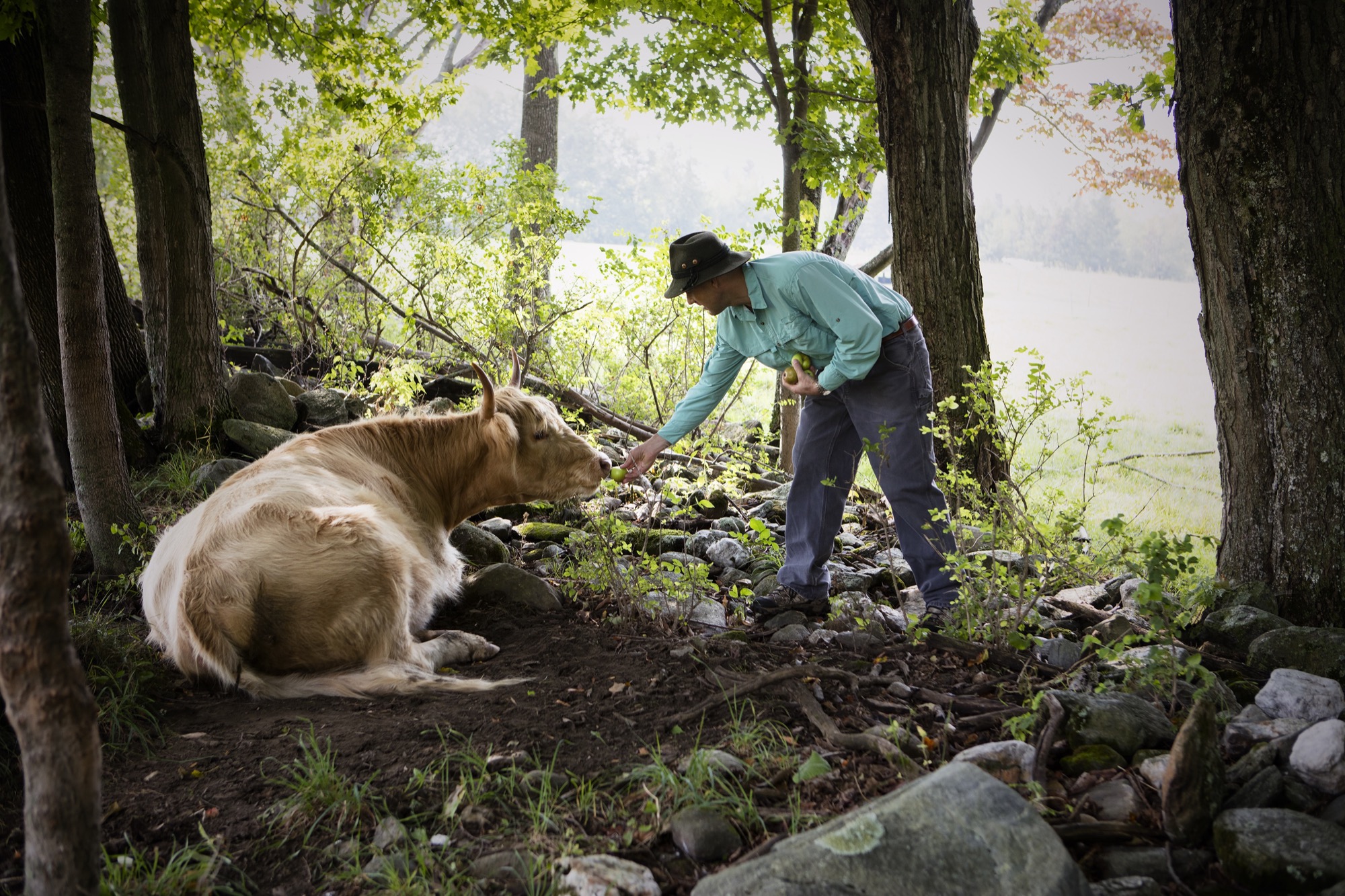
The Sound of music—where are they now?
The 2,500-acre (ca. 1,012-hectare) resort he tends is drawing attention for its innovative use of animals, but it also happens to be one of the most storied ski lodges in North America. Johannes von Trapp, who today runs the resort with his son Sam, daughter Kristina, and son-in-law Walter Frame, is the son of Maria and Captain Georg von Trapp, the real-life couple who inspired The Sound of Music. Most musical fans know that the family of singers fled Europe to escape Nazi persecution in the 1930s; fewer realize they made their new home on a verdant mountainside in Stowe, Vermont, and later opened an Austrian-style ski resort there.
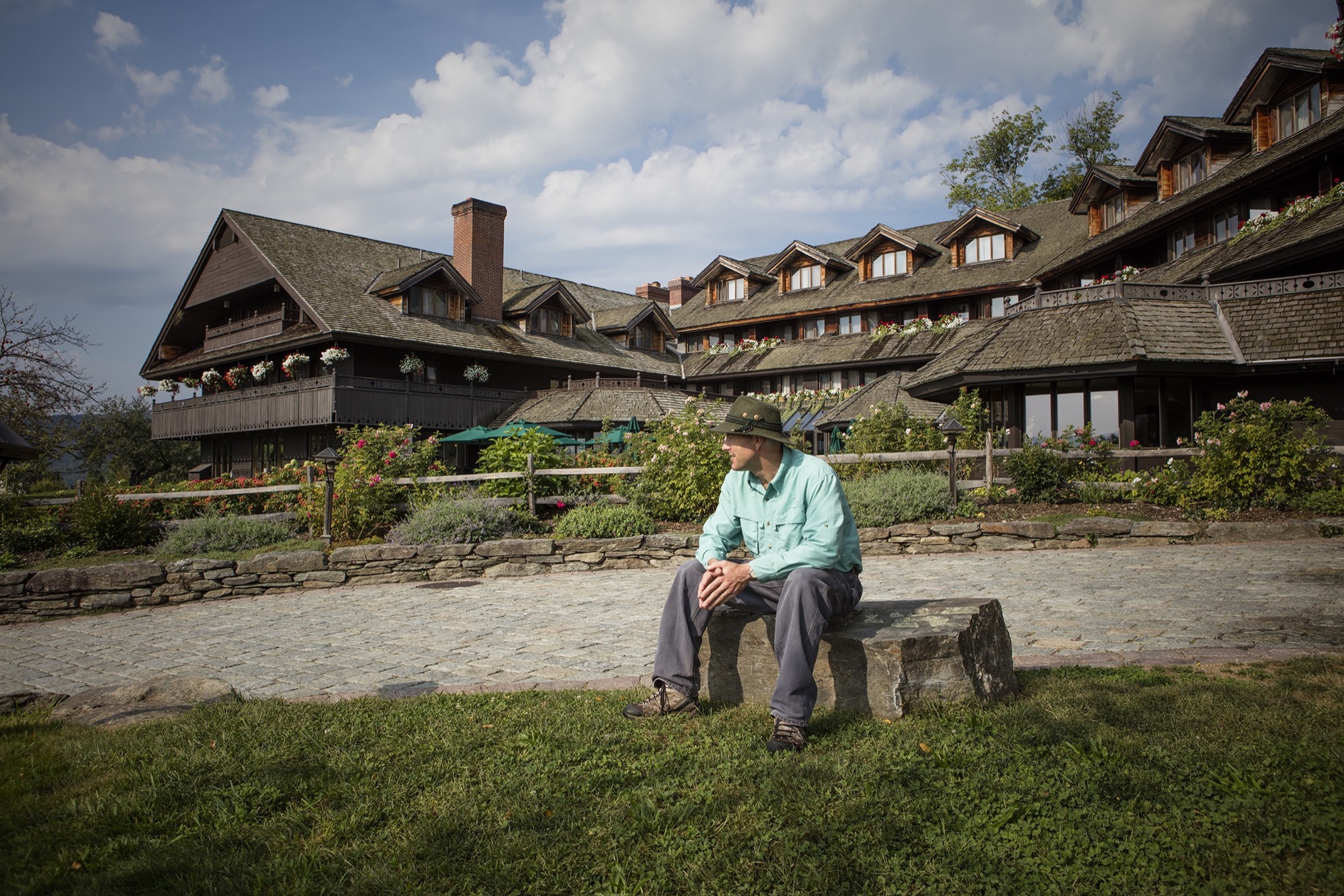
For years, Johannes kept cattle on the land as a hobby, but in 2013 the family took a cue from their state’s thriving farm-to-table movement and decided to experiment with pigs, chickens, turkeys, and sheep as well. Today, meat and eggs from the grass-fed animals go into bratwurst, sauerbraten, and other special dishes served in the dining room, much to the delight of guests. The family hopes to expand its herds in coming years, Bliss says.
Long-standing practice in the European Alps
Though the project has few parallels in the U.S., it would hardly raise an eyebrow in the European Alps where the von Trapp family once lived.
“Most of the ski areas in Europe were predated by other uses of the forest, in many cases farming,” says Michael Berry, president of the National Ski Areas Association, which represents 350 U.S. ski area owners and operators.
Mountain farmers raised small herds of dairy cows or goats (think Heidi) and transformed their milk into alpine cheeses like Gruyère and fontina. As skiing became increasingly popular throughout the twentieth century, however, resorts displaced some of these farms and damaged the fragile mountain ecosystems surrounding them. Road and slope construction caused erosion, artificial snow froze spring growth, and development brought its usual cascade of concrete and cars to quiet mountain villages.
But in other cases, farmers worked out a fruitful coexistence with their new neighbors. They leased pastures to ski operators in winter, or even became part owners of resorts themselves. The income from these arrangements gave them a way to maintain their traditional farms. “It’s a fascinating balance of two realities,” says Berry.
“It’s a fascinating balance of two realities.”
One place where this model thrives is the Swiss ski resort of Gstaad. The tony alpine village is home to dozens of celebrities (including Julie Andrews, of The Sound of Music fame), but also to 7,000 Simmentaler cows, who saunter past the designer boutiques each summer with bells on their necks and crowns of flowers on their heads, bound for ski slope pastures. Farmers boil their milk in copper kettles to make Berner Hobelkäse, a hard slicing cheese.
Importing an idea
The balance between agriculture and alpine recreation has proven trickier in North America, with its very different history and ecology. “Not to say their interests are mutually exclusive, but although the ski areas create pastureland, generally the compatibility of the two activities is not seen as beneficial,” says Berry.
One problem is that permits for grazing typically do not overlap with permits for ski use, especially in western states where resorts often operate on Forest Service land. The two types of permits come with different rules for water quality, erosion, and other environmental impacts. The recent boom in summer recreation at ski resorts (the result of new legislation allowing more off-season use) poses another challenge.
Whether the reason lies in these obstacles, or simply in the added complications that animals entail, grazing hasn’t taken hold in a big way on slopes outside of Europe. Big Rock Ski Area in Maine, Killington Resort in Vermont, and The Canyons, in Utah, all launched and then discontinued programs. In Japan, Australian snowboard-photographer-turned-farmer Rob Alexander grazed goats on a ski slope in Nagano, attracting copious media attention, but shut down the business in 2014.
One program that hasn’t fizzled out is at Vancouver’s Sun Peaks Ski Resort, which since its founding in 1962 has shared 4,000 alpine acres with local ranchers. Today 400 beef cattle graze all the alpine bowls up to the summit, says slopes manager Seth Worthen. Keeping them out of the village requires six miles of electric fencing, but Worthen says the effort of installing it each year is worthwhile. “It keeps the grass mowed down and the brush from encroaching onto the ski runs,” he says. That cuts diesel and gas use by about a quarter.
Bliss hopes to soon reap similar savings on the Trapp Family Lodge’s backcountry slopes. So far, the animals have stayed on the lower-elevation cross-country courses, but two years ago his team cleared twenty acres of steep forested land for more adventurous skiers. Keeping them sapling-free requires “hand-to-hand combat” by a team of five chain-saw-wielding men, Bliss says, since the tree stumps rule out tractor use. Sheep, on the other hand, “will pick a stump clean.”

To that end, Sam von Trapp is raising a flock of Katahdin sheep that he hopes to move onto the land next year. Originally bred to clear brush under power lines, the sheep are famously un-picky eaters, turn foliage into protein with great efficiency, and require little care aside from guarding against predators.
The project promises to add yet another layer to an already complex system. For Bliss, managing that system has been challenging but hugely rewarding. “It’s not just about farm-to-table, but how to fit it into the resort setting, which is tricky,” he says. “We’re under a microscope, but at the end of the day, that’s the best for the animals.” If the system proves equally beneficial for the owners of those animals, other ski area operators in the United States just may start to take notice. △
A-Frames
The right form at the right time
Spawned by postwar affluence, A-frame cabins became the quintessential American vacation home of the 1950s and 60s. A look at what made these icons of middle-class leisure immensely popular then, and what it is like to remodel and live in one today. “The design is intuitive,” says architectural historian Chad Randl, author of the book A-frame (Princeton Architectural Press), about the A-frame’s triangular structure. Why else would different cultures have turned to this universal, unifying building type, independently, throughout time and across the globe?
Was it intuition, too, that told Rudolf Schindler in 1936 to carry the roof down to the ground and fill both gables with glass? The Austrian-born architect needed to find a way to comply with local building codes when he was commissioned a modest vacation home suitable for the mountainside setting above Lake Arrowhead, California. The upshot was an A-frame built twenty years before its time.
By the middle of the twentieth century, architects in postwar America sought a more casual yet visually dramatic design conducive to relaxed seaside and mountain living. The A-frame was both comfortably familiar (pitched roof) and playfully novel. Because these weren’t primary homes, the architects could enjoy more freedom in designing wide-open spaces with fewer partitions and very small bedrooms and bunk rooms.
"The A-frame was both comfortably familiar (pitched roof) and playfully novel."
Genesis: The Leisure House
In 1950, Interiors magazine published an A-frame by San Francisco-based architectural designer John Carden Campbell: the Leisure House. It hit the mark on the era’s modernist style sensibility, down to the butterfly chairs. Campbell was fond of saying the house enclosed the most space in the most dramatic way for the least amount of money.
 After a full-sized model of the Leisure House was exhibited at the 1951 San Francisco Arts Festival, Campbell’s phone wouldn’t stop ringing. Fixing its dimensions to the width of a sheet of plywood reduced the cost and simplified construction so vastly, the Leisure House could now become a do-it-yourself project. Campbell deftly developed a precut kit that contained everything needed to assemble the house, from timber to nails and hammer.
For the next twenty years, photos of Campbell’s own Leisure House he built across from the Golden Gate Bridge in Mill Valley, California, appeared in countless home magazines and architectural books. The Leisure House was promoted as a natural design for the mountains or the beach, for a summer cottage or a ski cabin. The Leisure House manifested a new leisure culture.
A national phenomenon
The mushrooming popularity of A-frames was fueled by postwar prosperity, which brought owning a second home within reach of the middle class. Suddenly, people had more disposable income and more free time. The A-frame embodied an informal weekend and holiday getaway that was innovative and exciting — a recognizable, identifiable symbol of “the good life.”
“It’s interesting how people individually adapted drawings or kits for their own family’s way of living and for their own technical expertise or lack thereof,” says Randl, who now teaches at the Cornell University College of Architecture, Art, and Planning. “What I loved about A-frames was that it was such a simple design, a basic triangular form, but you had so many variations of it, and it was still recognizable as an A-frame.”
"The A-frame embodied an informal weekend and holiday getaway that was innovative and exciting — a recognizable, identifiable symbol of 'the good life.' "
The fall of an Americana archetype
While A-frames were touted as efficient in the use of materials in the 1950s and 60s, they were far from energy efficient by today’s standards. The open-floor-plan homes were notoriously difficult to heat — warm air escaped upward, leaving the downstairs chilly and the bedroom loft uncomfortably hot. Many of the early designs were not insulated at all. Thus, keeping A-frames warm became increasingly challenging with the energy crises of the 1970s. “You had that plywood building that became really expensive to heat once oil got expensive,” Randl remarks.
“That’s when it all crashed down,” says the A-frame expert. “The A-frame lost its cultural cache, and people saw it as cliché.”
A-frame Reframe
Today, Randl considers A-frame vacation cabins an “endangered species.” In the right location, however, these period pieces are still sought-after architecture, especially to design enthusiasts with a passion for modernism.
One of those aficionados is Alpine Modern correspondent Paul O’Neil. He bought a 1953 A-frame in Mill Valley across from San Francisco in 2011. The house was designed by Wally Reemelin, an industrial engineer interested in efficient architecture, and is featured in Randl’s book.
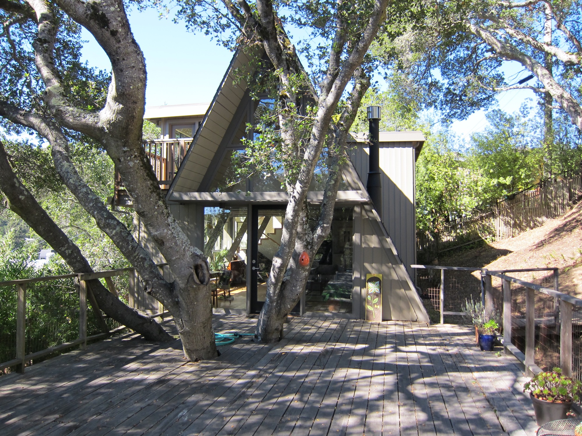
O’Neil loved the house at first sight. He liked the way it was situated in the street and on the lot, embracing oak trees. There was more than meets the eye, though. “The house spoke to us,” he recalls about the day he and his partner, Andrew Loesel, discovered the faded treasure during an unplanned stop on a road trip. “There was something special about it. It was asking us to save it. There was a story there,” O’Neil says. “The woman selling it thought we were insane.”
“There was something special about it. It was asking us to save it. There was a story there.”
The Californian has chronicled the history and renovation of the Reemelin A-frame on his blog at aframereframe.com. But before O’Neil could bring the 1,265-square-foot (ca. 118-square-meter) house back to its beauty, he had to undo a poor renovation. An unpermitted addition built in 1964 had left the house with uneven floors and structurally unsafe. By the time O’Neil purchased the house from the third owner, it had been virtually untouched since 1980, with the exception of a new roof from twenty years ago. “We tried to understand what the house originally was like,” he says. “Our goal was to keep the integrity of the house, but make it modern.”
“Our goal was to keep the integrity of the house, but make it modern.”
Once their contractor ripped out the remnants of shoddy remodeling, the house had no structural problems. With elements like a wobbly staircase and an awkwardly placed bathroom gone, O’Neil could rethink the layout. “It was like a puzzle, once we realized what we needed to do.” After updating the electrical and plumbing, and installing insulation, they could focus on designing the house with a nod to its midcentury modern architecture and interior.
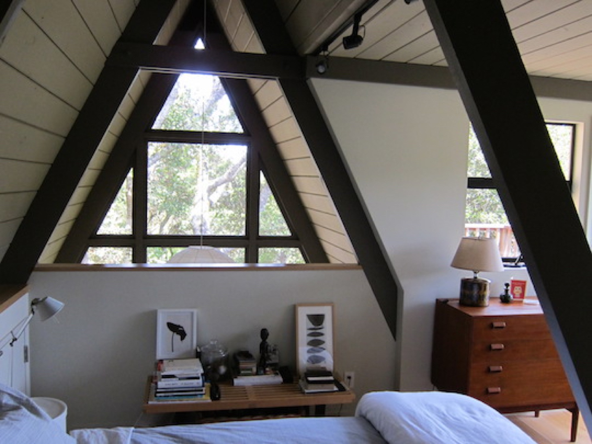
Living in San Francisco at the time, O’Neil and Loesel had bought the house for a weekend home, but later decided to live there full time, in the spirit of living smaller and simply. “If a house is well-built, it doesn’t have to be big,” O’Neil says.
“If a house is well built, it doesn’t have to be big.”
In fact, Randl agrees that in the context of the small-house movement and people’s yearning for a simpler, minimal lifestyle, the design concept of the A-frame could once again fit contemporary zeitgeist. “It’s got that reference to the past while also being modest,” the architecture expert says. “That has appeal again.” △
Nature Lovers
A photographer takes couples into the wild and shoots "Adventure Love Stories"
Marrying his love for the outdoors with his gift for putting people at ease, Seattle-based wedding and adventure photographer Greg Balkin shoots couples in the wild. The self-proclaimed professional third-wheeler takes his subjects backcountry camping and wakes them at sunrise to capture “Adventure Love Stories,” set in alpenglow.

What does a dollar still buy you today? Ask Greg Balkin and he might tell you, a future built on your passions. That’s what the soft-spoken outdoorsman bought himself when he purchased Brightwood Photography from a friend for this symbolic amount.
The happiest day — forever captured
Prior to launching his photography business, Balkin worked full time in the film industry for six months before realizing his career got off in the wrong direction. Fascinated by the fabric of relationships, he started shooting weddings in 2013, many of them outdoors. “The outdoors has been a huge part of my inspiration,” says the keen backpacker. “It’s where I find peace and love.” Nevertheless, the young man is anything but a lone wolf. His pursuit of happiness in the wilderness is fueled by a desire to mesh with fellow nature lovers. “It’s about connecting with people when they’re happy,” Balkin says. “That’s why I love shooting weddings. It’s their happiest day, and that’s awesome to experience.”
Yet he soon began to ponder how to combine his love of nature and comradeship with his passion for photography—all while making a living. “The whole idea just pieced together and made sense,” he says, looking back at how he created the photographic genre he now calls “Adventure Love Stories.” After shooting dozens of weddings over the past three years, Balkin knows the big day’s pressures and expectations can obscure a couple’s natural mien and candid moments. “Sometimes, I can get them to chill out and focus on each other,” he says. “Most times, they’re trying the best they can to hold on to the day.” So Balkin thought of a better way to help the couples be at ease with each other—and their photographer—and remember why they came together in the first place: He takes them into the wild. “When they’re outside, they get to goof off, and it pulls the stress away from them. It gives them a chance to not worry about what’s back home.”
I got you, babe
The shoots, Balkin says, sometimes feel like a relationship-building boot camp, testing a couple’s trust as he asks them to climb on top of a boulder or stand on the edge of a cliff. “I’ve definitely heard couples say, ‘I got you. I’m not letting go. We’re in this together. I’m standing right next to you, and we’re just going to hold on tight.’ ”
It doesn’t escape Balkin that there is plenty of potential for things to get awkward. “My job is watching people kiss and taking pictures,” he says, laughing. “I’m a professional third-wheeler.” From behind the lens, the photographer gets an intimate glimpse into a romantic relationship. For a short time, he joins two people on their very personal journey. Moreover, he shoots his Adventure Love Stories in remote locations, deep in the national forests or high among mountain peaks. To be there in time for the best light at dusk or alpenglow at sunrise, Balkin and his subjects typically camp together in the backcountry. Still, he knows when to retreat and give the couple space and time to be alone.
“My job is watching people kiss and taking pictures. I’m a professional third-wheeler.”
Veronica and Craig
One pictorial Adventure Love Story—set among the trails and peaks of Deer Park in Washington's Olympic National Park—tells of Veronica Vanderbeek and Craig Torgerson’s deep connection. Balkin met Vanderbeek through a mutual friend at the time she was planning her upcoming wedding. Although he wasn’t available to shoot the actual wedding, the bride-to-be was quickly enthusiastic about his idea for an engagement photo shoot in the wilderness.
When the time came to take Vanderbeek and Torgerson camping for the shoot, a flat tire set Balkin back on the eight-mile dirt road. They finally arrived at the peak just as the sun was setting. “We ran out to the big rock with the blanket and just had fun with it for twenty minutes while we still had light,” Balkin remembers. “Greg spent the whole weekend with us,” says Vanderbeek. “He set up our campsite, and he cooked us a gourmet dinner and breakfast. He was a friend hanging out with us, rather than a professional we hired.” The group sat around the campfire at night before Balkin retreated to his car for a few hours of sleep.
It rained the next morning. But Vanderbeek defied the drizzle with grace, wearing the white, flowy dress she had packed for the photo shoot. “The place was freaking gorgeous,” remembers Balkin. “For the next couple of hours, we just ran around, and I called out to them, ‘Turn around and look where we are, because it’s super pretty.’ ” With a deeper understanding of his subjects as a couple, the photographer captured something outside of visual representation. “Veronica and Craig are both quiet people, but you can tell they are willing to sacrifice a lot of themselves for the betterment of the other,” Balkin reveals. “Their love is so apparent.”
A love story set in nature
Disarming wilderness, breathtaking landscapes, and the couples’ unconcealed intimacy are protagonists in the Adventure Love Stories, too. Often, Balkin’s clients already know what place they want to explore together, and frequently choose a backdrop that perfectly reflects who they are as a couple. “I love watching people become awestruck by the places we shoot in or watching them play on rocks or run around the ocean,” he says.
The photographer wants to shoot more Adventure Love Stories, holding on to what he cherishes about wedding photography: spending a day with people and capturing their memories—minus the nuptial stress. “I love getting to celebrate them in a place that means a lot to both them and myself,” Balkin says. “I find it important to be outside. How cool is it that I get to connect with people and take their pictures and make memories in beautiful places, such as Big Sur, Joshua Tree, Deer Park? I love it.” His natural empathy and connection with others—a powerful part of humanness rendered in conscious awareness—is a landscape in itself. The camera is only a tool for the photographer’s outward expression of how he understands others.
"I love watching people become awestruck by the places we shoot in or watching them play on rocks or run around the ocean.”
The leads in Balkin’s Adventure Love Stories will forever have a special place to revisit, an adventure to relive. Looking at the framed photos in their Oregon home today, months after they tied the knot, the Torgersons revel in Balkin’s pictorial storytelling, hoping the scenes are indicative of the future they will share: a life filled with exploration—new ideas, new people, new adventures. Their favorite picture is one that shows them looking out over the mountain edge, because it reminds them about the terrain they’ve conquered to get to where they stand, while envisioning the expanse of their future lives together.
“It’s a picture that shows us supporting each other,” says Torgerson. His wife also cherishes the photos of the two of them looking at each other: “Seeing the beauty in each other and the beauty around us is really special to capture,” she says. Hungry for perpetual change, the newlyweds, who fittingly met on a hiking trip to Colorado, are anchored only in knowing they want to be together. They are each other’s idea of home, security found in a person rather than a place. As she puts it simply, “You have your sense of home going with you when you travel with the one who you love.” △
“You have your sense of home going with you when you travel with the one who you love.”

Out of Town
The modern country escape a New York City couple builds in the Catskill Mountains quickly becomes home base
When a New York City couple builds a Scandinavian-modern weekend retreat in Bovina, New York, the center of their work and social lives unexpectedly shifts to the small community in the Catskill Mountains. These days, the native Nordics use their Brooklyn apartment for short getaways to the city.
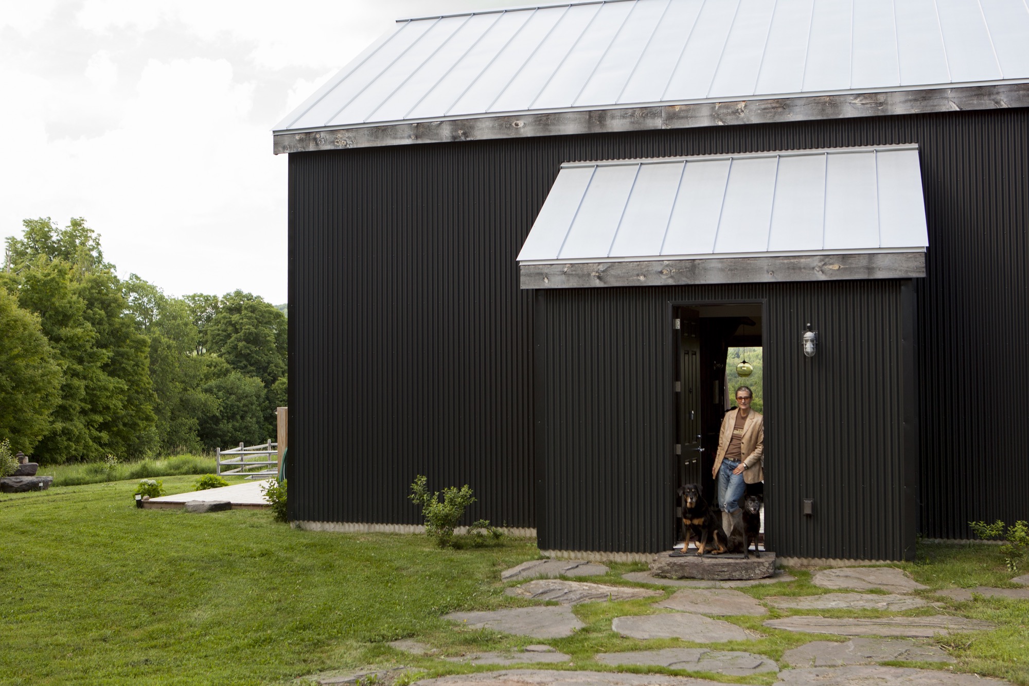
After both of her parents died of cancer, Jeanette Bronée, an interior designer in New York City, completely turned her life around. She became a health coach and founded the Path for Life Self-Nourishment Center to teach people about their own power to heal the body. Being mindful of self-nourishment and tending to your soul is never easy when living with habitual stress, especially in a metropolis of millions. For Bronée, who grew up in Denmark, reawakening that sense of taking care of oneself and the remembrance of what being outside feels like was pivotal. “Nature has always been a big part of my life, even as a child,” she says. She needed to get out of town, at least on weekends.
Two Nordics in New York
Then, six years ago, Bronée met Torkil Stavdal at a design event. The Norwegian photographer, who travels the world for advertising clients and magazines, had recently moved to New York City. “We started talking about kitchens because we both love food and cooking.” She giggles at this memory of their first encounter. The two spent the evening talking about how important the world we create around us is to feeling nourished. “So not long after we met, I told Torkil about my desire to get out of town for a weekend getaway.” Having just arrived, the newcomer to the Big Apple was reluctant at first. He craved the urban experience. But the photographer soon caught up to Bronée in needing periodic time-outs from New York City.
Their search for a country escape narrowed to the western Catskill Mountains, approximately three hours north-north-west of New York City by car. “We wanted to get far enough out of the city—not just Woodstock, which is a weekend destination—but far enough to get a sense of the area while fitting it into our budget,” Stavdal says. He admits to burning through “a lot of weird realtors” before finally connecting with an agent who smartly sent them on a drive around Bovina, New York. “We fell in love with the picturesque little town before even seeing the first property,” he remembers. “Then she showed us a place called the ‘Secret Meadow.’ When we walked in, it was like a little jewel in the middle of nature. It’s very beautiful land.” The Stavdal-Bronées were allured at first sight by the tree-rimmed rural acreage at the end of a 500-foot-long (152-meter) private driveway.
“Then she showed us a place called the ‘Secret Meadow.’ When we walked in, it was like a little jewel in the middle of nature. It’s very beautiful land.”
Creating something new
Stavdal and Bronée knew from the start that they wanted to design and build a new home rather than buying and restoring one. Bronée substantiates that decision with her European heritage: “We build stuff!” She laughs, then continues more contemplatively, “My dad always built our houses in Denmark, so I was used to creating something based on what we needed and what we wanted in our lives.”
“My dad always built our houses in Denmark, so I was used to creating something based on what we needed and what we wanted in our lives.”
To help them realize those needs and wants, the European expats enlisted New York City architect Kimberly Peck, who worked for Bronée when she had a design studio in the city. “Kimberly was sensitive to what we wanted to create because we already knew each other from the past,” Bronée says. “Part of coming up here was the distinct vision of wanting to implement design ideas I’ve had over the years for others, and now I finally had the space to create something for myself.”
The couple, who share a deep appreciation for midcentury-modern design, needed to decide on an architectural style for the Bovina house-to-be. “I’m inspired by monolithic Japanese concrete buildings,” Bronée says. “I love that very severe design.” Her husband, on the other hand, dreamed of a cozy Scandinavian cabin, modern and flooded with light. After considering (and dismissing) the idea to build a modern prefab, the two compromised on a house that Bronée says “feels like a loft and a barn, so this was the perfect combination.” On the outside, the Nordics both wanted the dramatic, modern aesthetic of a black facade that would remind them of their common Scandinavian roots. “Back home, the cabins and houses are black,” says Stavdal, referring to the traditional dark exteriors of Scandinavian homes typically brought about by a mixture of linseed oil and tar.
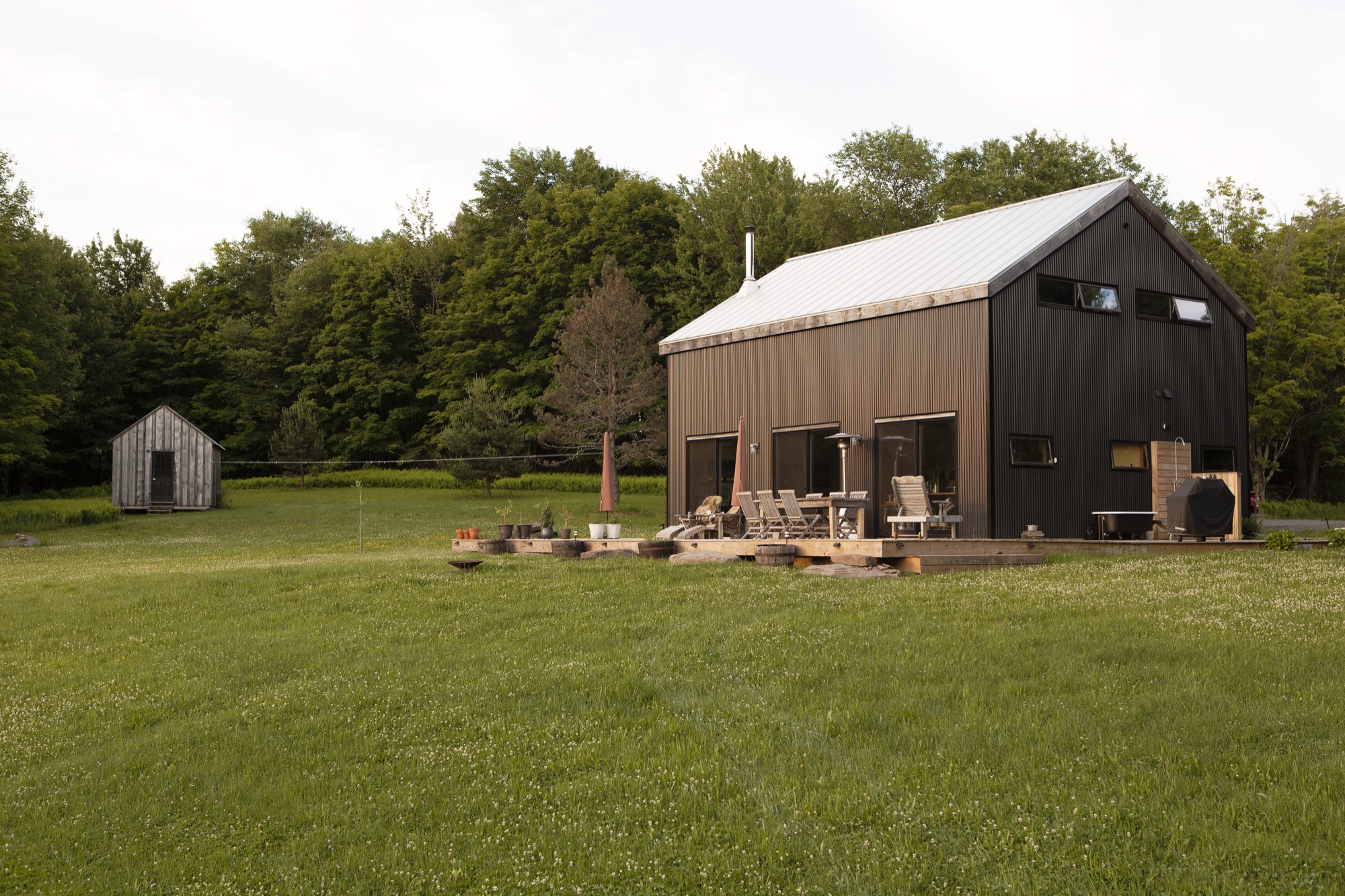
Building for light
Keeping the house low maintenance was not the only reason they chose a steel exterior. “Aesthetically, mixing this style of building with that material was fascinating,” Bronée notes. “It created this monolithic feel to it, and in certain light the house almost looks velveteen. It doesn’t look like corrugated metal—it looks strangely soft.” The former interior designer, who back in the day created contemporary spaces for fashion boutiques, showrooms, and in-store shop concepts, was also inspired by the many Dutch architects currently using corrugated metal on modern houses. But merging the Nordic-inspired modern exterior with conventionally sized American sliding windows would not have worked. “In Scandinavia, we have longer slit windows, so we were taking elements of our heritage and mixing it in. We also wanted that European idea of pushing the windows out in autumn.” After a pensive pause, Bronée adds, “I think our architect thought we were half nuts with some of the things we wanted, but she was up for it.” And Stavdal adds, “I’m Scandinavian; I’m light-dependent. Having three huge sliding doors letting nature in is a huge thing for me. I need light. Part of our living up here is that we as Scandinavians come alive as the sun comes out, so we spend most of our time outside.” Much of their everyday life happens on the spacious deck. Stavdal even installed an outdoor shower and bathtub. “As soon as the frost is gone in the spring, we don’t shower inside anymore. We have a little tub out there.”
“Part of our living up here is that we as Scandinavians come alive as the sun comes out, so we spend most of our time outside.”
The light junkies, however, elected to have no windows at all on the driveway-approach side of the house. The windowless front added further to the monolithic impression of the house. And they liked the idea of a hideout. It’s not until visitors walk into the house that they get to see the magnificent view of the secret meadow, with the Catskills beyond. “It illustrates the idea of bringing the outside in,” says Stavdal. “The land opens when you get into the house.”
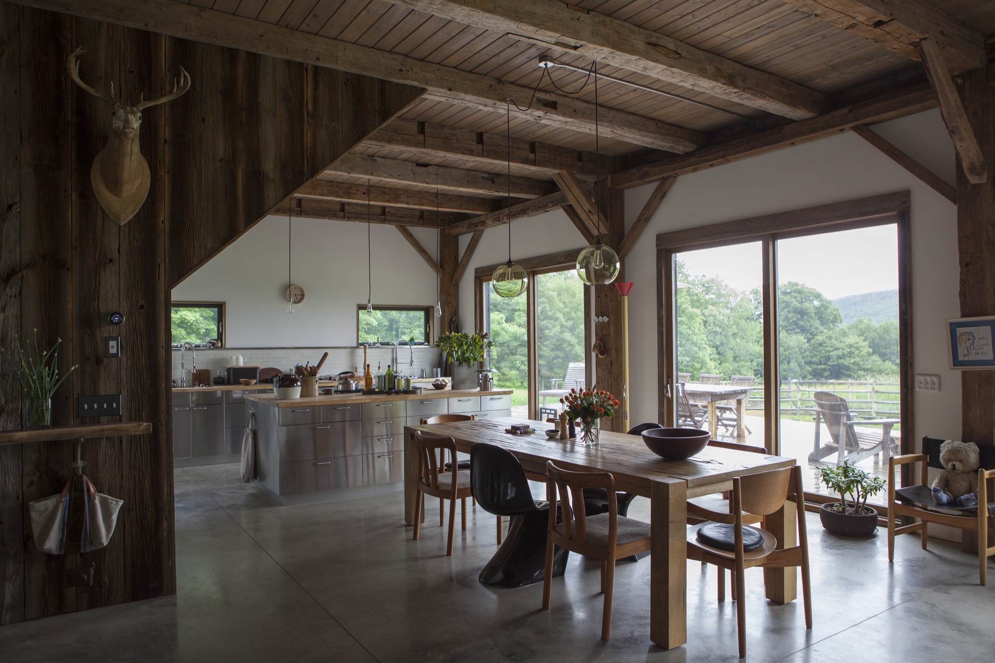
Building efficiency
Above all, the Stavdal-Bronées wanted to build an energy-efficient house from materials that were both economical and sustainable. The winters can get extremely cold in the Catskills, so insulating the house well was critical. Throughout the design and building process, Stavdal gained a tremendous amount of knowledge about building materials and their different properties, which he believes ultimately determined many choices and decisions during the construction.
A timber frame salvaged from a nineteenth-century barn, restored and transported in pieces to the building site, forms the main structure of the house. The barn frame was raised first—“the good old way,” Stavdal says. “They put it together on the ground, and then five guys raised it up with ropes. That was so cool.” The barn frame erected, they installed structurally insulated panels—or SIPs—that were prefabricated and delivered in sections. The vertical pieces, which are six inches (ca. fifteen centimeters) thick and four feet (ca. one and one-fifth meters) wide, rest on a sill around the exterior perimeter. Toward the top, the panels were cut to accommodate the shape of the gable.
“We stacked the SIPs around the house...like Legos. It’s a simple way of raising a house. The exterior of the house was completed in only three days.” Making all joints between the SIPs and around windows and door openings extremely airtight paid off: “Our house is so warm in the winter, and our heating cost is a fifth of the usual cost up here,” Stavdal says.
The 1,945-square-foot (181-square-meter) house sits on a concrete slab with integrated radiant heating. Polished and left exposed, the top of the slab serves as the interior flooring surface. Once the contractors had finished the exterior of the house, Stavdal completed all the interior work himself. He built the second story’s floors and ceiling and the stairs from reclaimed barn wood. Furnishings are sparse but comfortable. A sleek black woodstove centers the living room. On the opposite side of the wide-open great room lies the dream kitchen Stavdal and Bronée started to plan that night they met in New York City.
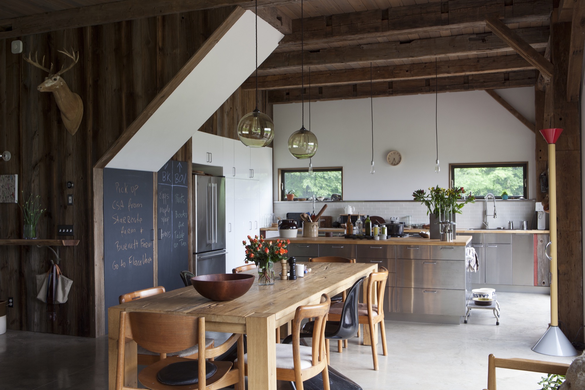
Space and time for creativity
“Being up here, I feel more creative with the things I do,” the nutritionist says. “I get ideas for articles and things I want to teach and communicate because I have more thinking time but also because I have a big kitchen—a crucial part of the house—for having people over and for sharing a meal.” Bronée, who develops recipes in her Bovina kitchen, grows her own vegetables and frequents the area’s organic and free-range farms. “It’s become a very food-oriented place,” she says. “We also built a yoga platform in the woods. The whole thing feels like it supports that nourishing lifestyle of reflection and touching base with myself when I’m here and being able to create space for thinking and not so much doing but...being”
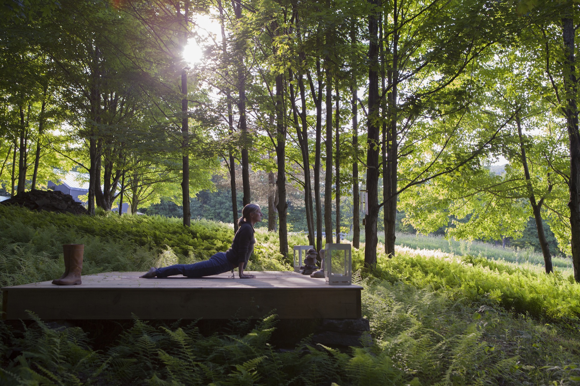
The locals are peers
At the time they bought the land, the Scandinavian couple didn’t know anything about the local community—a huge bonus, it turned out. “Our social life has just transferred to Bovina,” Stavdal says about their unexpected sea change in lifestyle. “We work from Bovina. Jeanette writes a lot here. She wrote her book up here. Literally, New York has become the getaway, and this has become our home.” The Nordic transplants quickly felt like locals in Bovina.
“I have a lot of peers here. Photographers are a dime a dozen—we are littering the place,” he quips. “This seems to be a playground for the creative community. We have a lot of friends living in the Catskills who are cinematographers, directors, photographers...we find like-minded people.” He doesn’t sorrow over losing the city folks who are unwilling to make the long drive. In Bovina, a small community of 600 or so that is still a relatively poor area compared with the rest of New York State, he doesn’t notice a big divide between weekenders and locals, and weekenders don’t expect to be catered to by the locals. “The Catskill Mountains are undeniably becoming a destination for New Yorkers. Instead of going to the Hamptons, they’re going to the Catskills,” Bronée says about the “New York expats” who flock to the area to create businesses in the hospitality industry or to take up farming. “Some of these dairy farms up here have now become artisan dairy producers who make good cheeses, all that good stuff.” She remembers worrying initially that options for buying fresh, quality food were limited, but upon discovering a small co-op, the healthy-living sage knew she could stay here. Meanwhile, the couple has cultivated a food orchard on their own property, with a 1,000-square-foot (ninety-three-square- meter) kitchen garden.
“The Catskill Mountains are undeniably becoming a destination for New Yorkers.”
Urban life, by contrast, feels more “hour to hour,” Bronée contemplates. The couple now drive to New York City for external inspiration. “We work in both places, but the city has a different energy and pace,” her husband adds. “We ended up using the Brooklyn apartment more to go to sleep and work. While here, we work and live. So this feels more like a home.” △
“We ended up using the Brooklyn apartment more to go to sleep and work. While here, we work and live. So this feels more like a home.”
Beauty from the Lab
Minimalistic ceramic labware matches the simple beauty of designer pottery
Minimalistic in form and manufactured with exquisite precision, classic laboratory ceramics, such as the tactual porcelain crucibles and skinny alumina trays by CoorsTek in Colorado, can be as strikingly decorative in a modern home as designer potteryware.

The area around the town of Golden, Colorado, feels ancient, with flat-topped mesas crowning tumble-down hills at the foot of the Front Range of the Rocky Mountains. Ridges heave up from the tilting plain like the backs of dinosaurs. Prospectors and scientists have uncovered Triceratops tracks hereabouts, petrified wood, and the fossilized bits of more than 200 plant species. The place is a beautiful old mess, its geology famous for minerals but also for clay, which is particularly fine and well suited to the making of ceramics.
Human-made
As reality is transmuted more and more into the virtual, I like to remember that everything made by humans is made from stuff pulled from earth or air. Silicon has a valley named after it, after all. Less well known is ceramic, deployed all over the high-tech landscape for its ability to insulate, resist, conduct, shield, and do other yeoman work. Ceramic traces a direct path between the most ancient manufacturing—humans were firing clay figures 24,000 years ago—and the Great iPhone Era.
I’ve loved ceramic ever since the time my mother was given a small collection of chipped and crazed Ming Dynasty bowls that had been dug up in Indonesia by Jesuit priests—friends of hers. I was ten. By their delicate feel and obvious durability, it was apparent that they were made of the same stuff—porcelain—as my mother’s English Spode china.
Ideal design from the cusp of modern
Decades later, while editing a science magazine, I started to collect laboratory ceramics. Vintage labware had begun to turn up on eBay: crucibles, funnels, casseroles, spoons, spatulas, and combustion boats. Basically: cookware for chemists. There were tiny dollhouse-scale crucibles as well as huge mortars that could hold 272 dry ounces of material. These pieces were utterly functional in shape, creamy gray or ivory in color, modern. But their modernity had a retro feel, echoing the apothecary. They had reached their ideal form and then ceased evolving: It was hard to tell a brand-new piece from one produced almost eighty years before. Modern, then, but from the cusp of modern.
“These pieces were utterly functional in shape, creamy gray or ivory in color, modern.”
My lab ceramic pieces usually sported a simple mark, “Coors U.S.A.” I didn’t think much about that until I moved to Colorado, drove through downtown Golden on the way to Vail, and passed an old brick building attached to a much newer one. A sign announced the CoorsTek advanced ceramics company, and I finally put two and two together.
Coors—a Colorado family company
Early this year, after signing documents affirming that I was not a spy and understood I was entering a facility governed by federal security laws, I got a look inside the CoorsTek plant where the labware is now made. It’s one of several CoorsTek factories in Golden, and the only one to which I was likely to gain entry: The rest of the operations, here and in Europe and Japan, are devoted to a myriad of high-tech products such as body-contouring ceramic armor plates for soldiers (also beautiful objects, by the way). It’s a billion-dollar private company, owned by the Coors family, that long ago leveraged its labware skills to make ceramic parts of exquisite precision, used in rocket nose cones and hip-replacement devices and highly specialized one-off bespoke projects like the high-intensity lights that memorialized the Twin Towers after 9/11. But it’s the labware that I was interested in anyway, the seed of the whole ceramic enterprise.
My guide around the factory was Rob Spurrier, who has been at the company for thirty-six years and is now plant operations manager. A formidable, matter-of-fact journeyman tool-and-die man, Spurrier seems to like that he works for a bleeding-edge technology company whose roots lie in methods you could learn at the community center.
“Making this product follows your fifth-grade pottery class that you might have taken at school.”
It’s true that despite the oversize scale of the kilns, casts, racks, and presses in the huge plant, there’s a handmade vibe. Pieces are generally pressed by machine, not thrown, but if two parts have to be joined together, the slip technique would be familiar to any potter. I spotted one fellow working on ceramic “furniture” (which is the name for pieces that other ceramics rest on during manufacture). A piece cracked apart in his hands; he chucked the shards into a bin and started on another. Everywhere were racks of unfired “green” labware, looking as fragile as any raw clay things, awaiting the kiln. “Pugs” of refined clay, known as body, made in a nearby Coors plant and shipped here in metal tubes, looked like enormous strands of Plasticine.
Porcelain from ancient China to 1940s America
Classic labware is made of porcelain, invented by the Chinese more than two thousand years ago and improved in the thirteenth century. It is made by pulverizing and mixing a white clay called kaolin with other materials into a paste, forming the paste into shapes, then firing it at very high temperatures until the minerals liquefy in a glasslike way and bond with the rest of the material. Not until the 1700s did the Europeans crack the formula and technique. One who succeeded was Johann Böttger, a German pharmacist-turned-alchemist. Soon, there were porcelain factories all over Europe producing housewares and decorative goods. Porcelain, improved again, proved ideal for chemistry. It resisted chemical attack. It was minimally porous. It retained its mass. It could be subjected to thermal shock. The Germans dominated its manufacture.
That last fact meant trouble for American labs when the blockade of World War I ended the importation of German goods. The US government asked local industry to fill the labware gap. One firm that responded was Herold China and Pottery, in Golden. It had been installed in a defunct bottling plant owned by Adolph Coors, founder of Coors beer, by a clay expert named John Herold. Its purpose was to make ovenproof kitchenware. The pottery did not prosper, though it had early success producing crucibles for lab use at the Colorado School of Mines, also located in Golden. Herold left, then returned in 1915 to tackle the problem of producing labware for the national market. Coors soon bought the company outright and installed his son, Adolph Jr., to run it.
Alumina brings advanced ceramics
The Coors company went on to produce much of the country’s lab ceramics. Not much changed until the 1940s, when Coors acquired technology for forming clay into shapes that were far more complex and precise than conventional porcelain techniques could achieve. Then alumina launched the era of advanced ceramics. With alumina, purified aluminum oxide powder is swapped for clay. The powder turns into a ceramic under tremendous pressure. Over the decades, the process was advanced to make ceramics from boron, silicon, tungsten, and more. The range of modern ceramics is now fantastic. They can be hard as metal yet melt at much higher temperatures than metal. They can conduct electricity, or not. They can transfer heat easily, or resist it. They have names like Y2 O3, yttria-stabilized zirconia. But one property they share is beauty. Ceramics beg to be touched.
“The range of modern ceramics is now fantastic…. But one property they share is beauty. Ceramics beg to be touched.”
“I love the surface finishes we can achieve, and the feel of ceramic,” says Harrison Hartman, who runs marketing at CoorTek headquarters and keeps a foot-long, wood-handled CoorsTek pestle in his office. “Ceramics can be heavier than metal, and more dense.”
Jessica Nall, one of the company’s de facto historians, has an IT background but after joining CoorsTek became obsessed with clay and took a pottery class to learn to throw it. She got permission to hand-throw some scrap CoorsTek lab clay outside the factory. “You can throw it,” she found, “but it’s really difficult. I had to bring it back here to get fired and glazed because a traditional hobby kiln is much lower temperature.”
As the factory tour came to a close, I found myself wanting to cut a slice of clay and take it home as a piece of advanced Play-Doh. I sensed that Rob Spurrier would rule this not only verboten—the formula is proprietary—but silly. As a man who had overseen the production of millions of pieces of labware for scientists, he seemed to find my interest in crucibles and combustion boats as objects of beauty somewhat odd.
In 2011, Darrin Alfred, Curator of architecture, design, and graphics at The Denver Art Museum, gathered sixty-four pieces of CoorsTek for a small show called Potters of Precision. Alfred was attracted to the “simple, clean, straightforward, unadorned quality of the product,” and told me that Edgar Kauffman Junior, famous director of the Industrial Design Department at the Museum of Modern Art in New York, had connected the dots between labware and the aesthetic of modern home ceramics almost seventy years ago. On page twenty of Kauffman’s small 1950 book, What is Modern Design?, there’s a photo of porcelain dinnerware by the great Eva Zeisel, next to several pieces of CoorsTek ware. The latter, Kauffman wrote, was “used widely in modern homes because of elegance, usefulness, durability and low cost. In a laboratory, beauty is not required, but [it] appeared spontaneously in vessels that serve the scientists’ precisely stated needs.” I own vintage Zeisel dinnerware, swoopy, thin and minimalist, which I keep in my kitchen. I also have a stack of sixteen little CoorsTek alumina lab trays, each about the length and width of an old matchbox, on my desk. Unglazed, with a lovely matte finish, they have a pale ivory color that indicates 99.5 percent pure alumina. I pick them up, rub them, clank them together; they give off a modern sound, somewhere between that of metal and glass. They’re not something Ming Dynasty porcelain potters could make, or Johann Friedrich Böttger, or for that matter Adolph Coors, but they are something they would all recognize and admire. Something real, and of this earth, ancient and new at once. △
