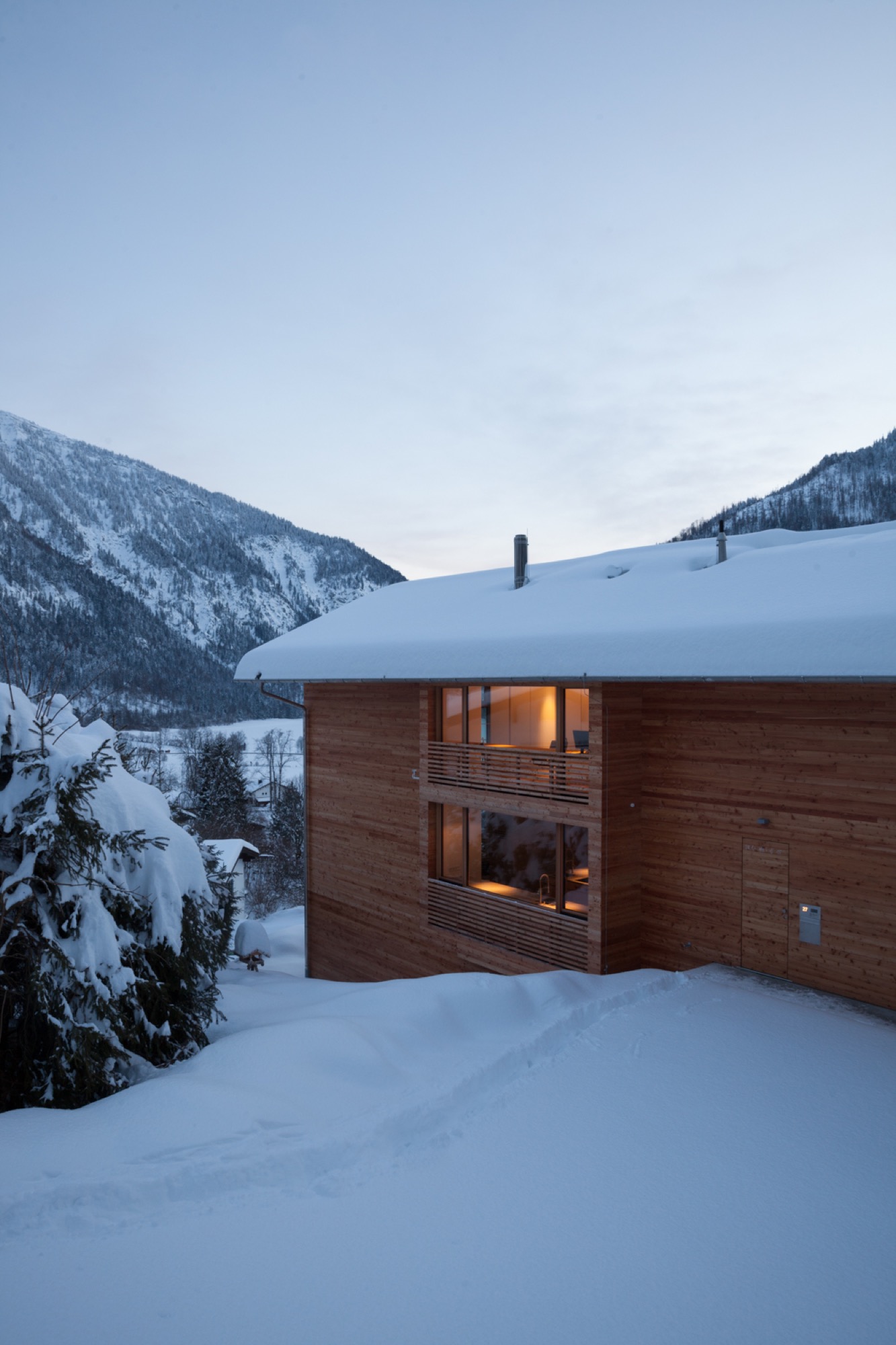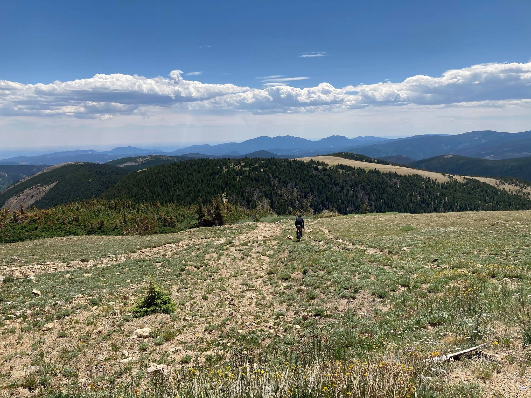
Inspirations
Explore the elevated life in the mountains. This content debuted in 2015 with Alpine Modern’s printed quarterly magazine project.
Utahan Utopia
Summit Powder Mountain in Utah is a visionary colony of cabins designed by emerging Slovenian architect Srđan Nađ
A Slovenian architect’s “wooden tent” design pushes the conversation on nature-respecting modern mountain architecture and communal living on Powder Mountain, where an enigmatic group of entrepreneurs, creatives, and altruists is building a pioneering alpine village. “We bought a mountain.”
So begins the backstory of Summit Powder Mountain, a visionary colony of cabins and an alpine village being dreamed up in Utah's Wasatch Mountains.
Elliott Bisnow and the Summit Series
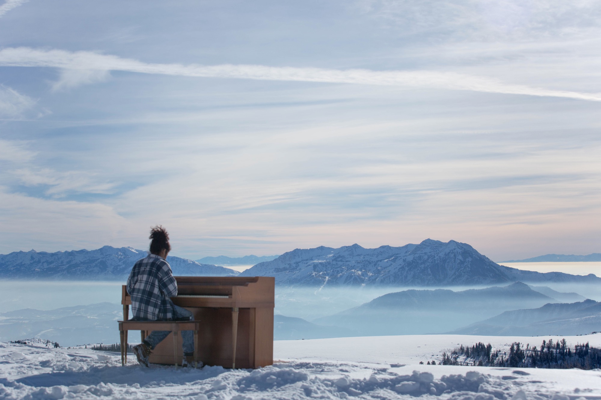
Behind the idea is Summit, an event business started by Elliott Bisnow, a founding board member of the United Nations Foundation’s Global Entrepreneurs Council. What began as a small gathering of a few dozen investors, business whiz kids, and creatives over a short few years grew into the Summit Series: traveling invitational events that summon hundreds of thought leaders and different-thinkers from around the world. "What would it look like if Davos and Burning Man had a baby?" The Guardian rhetorically wondered in a recent article about the Summit Series. For its latest flagship event, Summit at Sea, 2,500 chosen attendees boarded a cruise ship in Miami for a four-day conference in international waters.
Rooting down in Utah
Now Summit is building a permanent base camp for its forums—a high-alpine town for its growing tribe to come home to. Summit purchased Powder Mountain, including the ski resort that has been operating there since the 1970s, with the vision to fundamentally reimagine and experiment with how people live together, shelter themselves, and converge for the greater good. “I’m very interested in what new mountain architecture looks like, acts like, feels like—how it responds to all the different stimuli in the world,” says Summit design director Sam Arthur, who moved to Utah to see the project through. Since buying the mountain in 2013, Summit has called on sundry architecture and design gurus, even sacred geometry to conceive this test bed for communal living. But the group still needed a cohesive cabin concept, a trademark design that considers the demands of living at 8,400 feet (2,560 meters) altitude, of building sensibly on historically mostly undeveloped, pristine mountain land that includes an elk reserve, natural waterways, and thriving wildlife. A sheep ranch was the only settlement on the mountain for the longest time.
“I’m very interested in what new mountain architecture looks like, acts like, feels like—how it responds to all the different stimuli in the world.”
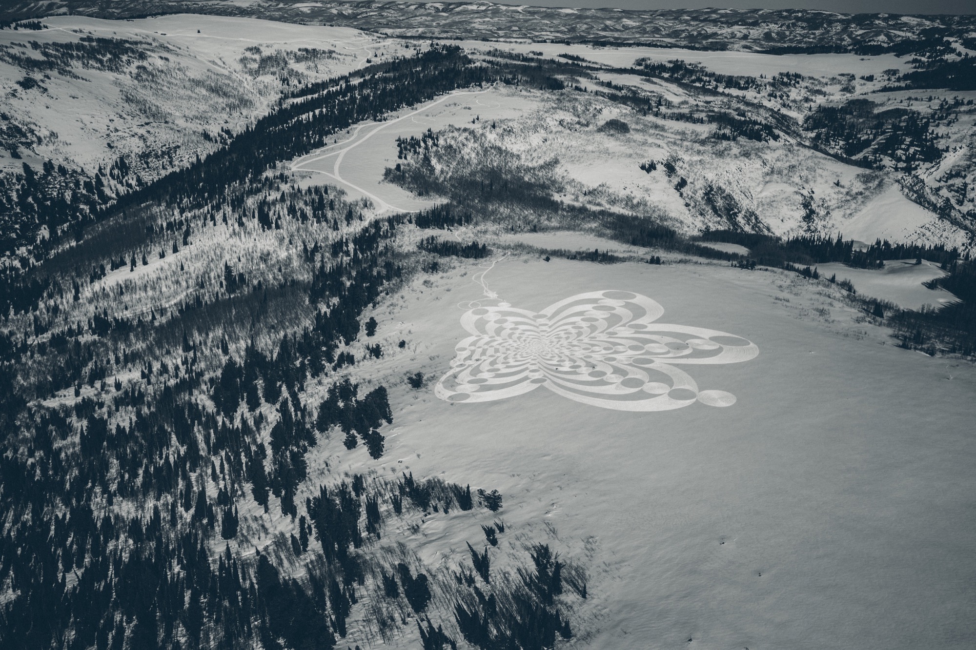
Mountain Architecture Prototype (MAP) design competition
Thus, Summit’s Mountain Architecture Prototype (MAP) design competition challenged the global guild of architects, engineers, artists—masters and students alike—to design sustainable cabins that embody the leadership’s ideals of sustainability, use of natural materials, and humble expression. The winning concept would guide the architectural ethos for more than 500 single-family homes, limited to 2,500 square feet (232 square meters) on half- to two-acre lots. Arthur says they capped the size of the homes so Summit Powder Mountain could become a democratized, harmonious environment for the community at large rather than “this über-wealthy place that is about showing off how big and bad you are.” Larger lots of up to thirty acres, however, could potentially accommodate a compound design.
Choosing a winner
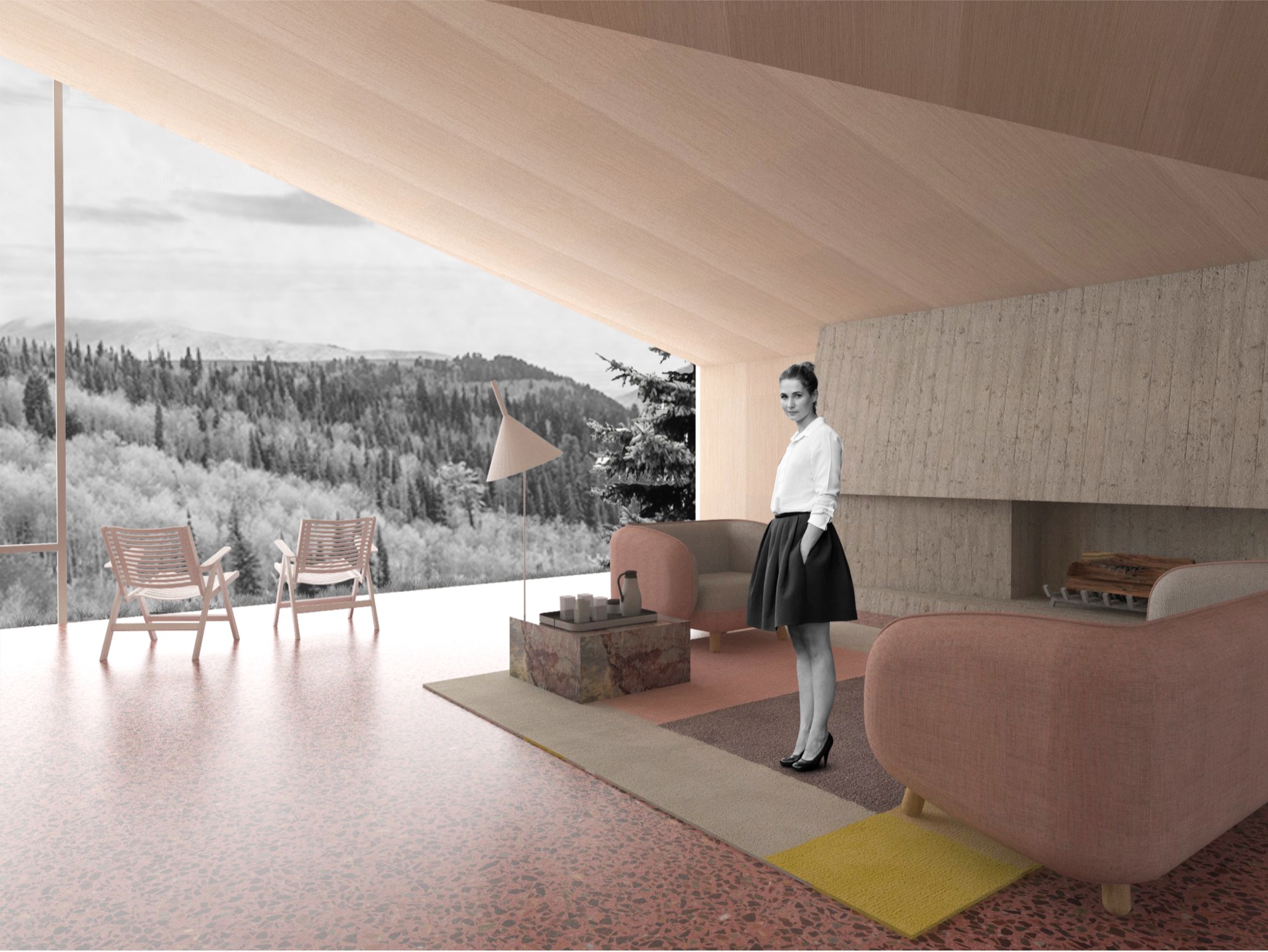
The winner: Srđan Nađ, a young architect from Slovenia. His prized design was inspired by a Summit event photo he had seen—a green meadow dotted with simple white tents, pure architecture integrated within thin cloth, pitched to create shelter from weather and wilderness. His other muse was the frontier cabin of America’s past, a simple wooden structure with a great stone chimney on the outside. “Combining both was my design concept for Summit Powder Mountain—a true connection with nature,” says Nađ, who believes “95 percent luck” won him the competition. More likely, though, he convinced the international jury panel, led by Todd Saunders of Saunders Architecture (Norway) and Jenny Wu from the Oyler Wu Collaborative (Los Angeles, California), with his design’s adaptability and transformational potential. Arthur says, “Srđan did a beautiful job of meeting the criteria and applying a certain amount of aesthetic to it that really eloquently resolved that future/nostalgia-heritage/modern friction, which is at the core of what people respond to here, how they want to live in the modern age.” With its indoor/outdoor quality and what Arthur describes as “an obsession with light and views,” Nađ’s design captures the raison d’être for living on a mountain. “It’s a place to find refuge, to be inspired, to take in the natural primary source of beauty, and recreate with friends. It’s often very difficult to turn that into architecture, but Srđan took that and wrapped a building around it.”
Who is Srđan Nađ
Born to two architects in Zagreb, Croatia, in 1983, Nađ’s career choice was perhaps destined by birth. He attended a special building and engineering high school and spent his senior year abroad in upstate New York. He returned to Europe to study architecture at the University of Ljubljana, which he describes as a “boutique school” in the center of the city. “I had the opportunity to do a lot of architectural competitions and really test my ideas—and, of course, learn from my mistakes.” After practicing the craft with other studios for several years, Nađ founded Grupo H with his wife, a landscape architect. Based in Slovenia and surrounded by mountains and the outdoors, the company is dedicated equally to architecture and interdisciplinary aspects of planning and building.
“I grew up in Dubrovnik, Croatia, a great historic town by the Adriatic Sea, so I didn't have any understanding of the alpine world until my fantastic wife, a local Slovenian girl, introduced me to the alpine world of Slovenia and its natural environment,” Nađ says. “What’s special about Slovenia is that the mountains here are relatively inaccessible, and to get to know them, you need to hike a lot. Hiking is a local obsession here.”
Living in the small European country known for its mountains, outdoor recreation, and ski resorts—much like Utah—has transformed the man from the seaside. “When you have to hike for two, three hours through untamed nature to reach a summit, you start looking at nature from a different perspective,” says Nađ. “It teaches you to admire and respect the wild nature of the alpine world. In the end, when you are put into the position to design a building for such a surrounding, all your knowledge and memories come together to create this unique combination of simplicity and elegance that a building high in the mountains demands.“
“When you have to hike for two, three hours through untamed nature to reach a summit, you start looking at nature from a different perspective.”
Nađ's "Wooden Tents"
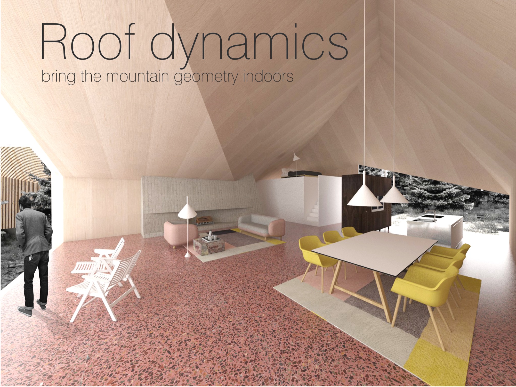
His proposed cabin design preserves that tentlike lightness and unmistakable functionality that inspired him and manifests it in a permanent, habitable structure. The architect expresses this lightness through a 1.5-inch (3.80-cm) thin “skin” made from cross-laminated prefabricated wood panels, folded to create the interior space of the cabin. This folding process leaves open the sides, which are then covered in glass. Juxtaposing the transient openness of the folded skin, a monolithic stone chimney stakes the raised cabin, grounding it into the mountainside to create the permanence a tent lacks. The chimney’s body also houses the mechanicals. On the opposite side, the cabin leans on a deck that touches down to the ground. With only the chimney and the deck as supporting elements, the cabin’s footprint is small, making large earth excavations unnecessary. The triple-glazed glass walls let the sun heat the highly insulated interior. Rainwater from the sloping roof collects into storage tanks under the deck. The goal is for the cabins to be certified according to the European passive house standard and the American LEED standard.
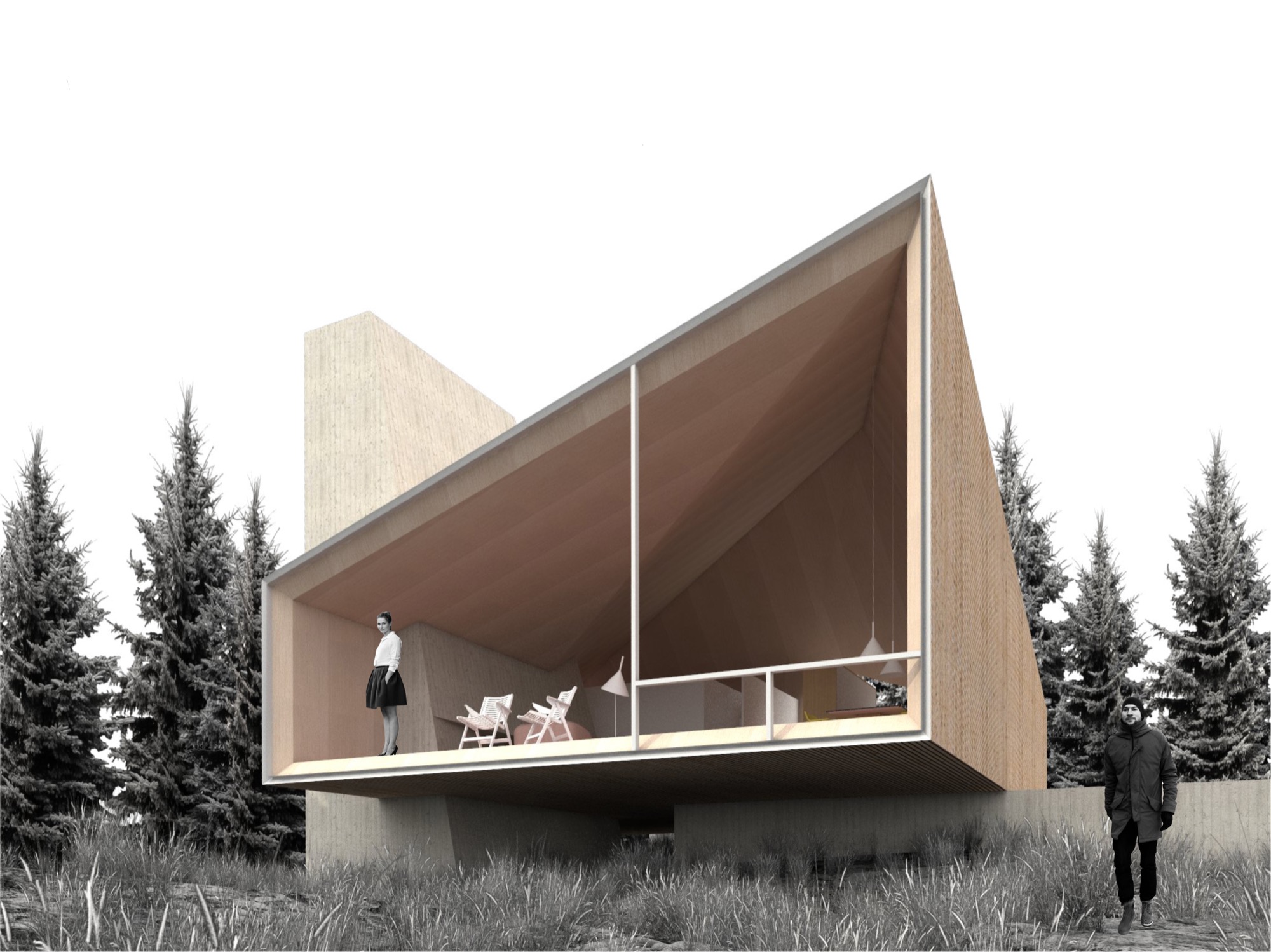
The cabin design allows for different versions of the prototype, varying from a simple one-bedroom hut to a luxurious four-bedroom chalet. The blueprint foresees an open living/dining/kitchen area with a large fireplace. The high ceiling follows the geometry of the exterior roof, mimicking the surrounding mountain silhouette. “In all, it will be a fantastic place to come back to after a full day of skiing or a long summer hike,” the architect hopes.
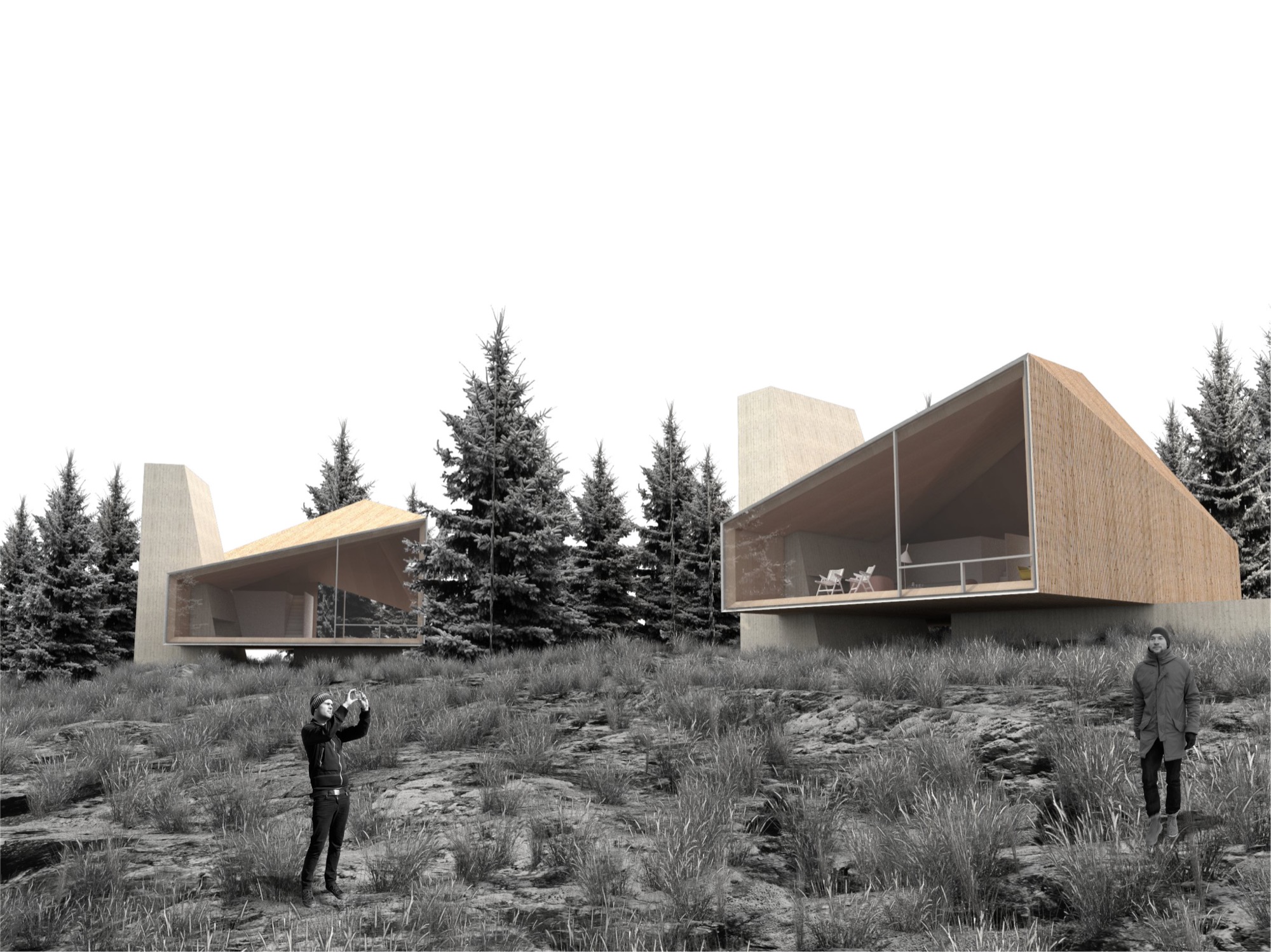
Nađ’s minimalistic “wooden tents” are designed to serve as fully functional habitable structures without creating the feel of urban settlement on Powder Mountain, and they preserve the essence of the natural surroundings. Nađ strove to convey the notion of living in nature rather than intruding upon the alpine landscape to stake out your private piece of paradise.
His sensible solution was, no doubt, spawned by his home country and culture. “We are really humble, hardworking, and resourceful people. So that guides me to find simple, functional, and long-lasting designs for my projects,” he says, adding that the alpine cabins and shelters of the Slovenian mountains influenced his “wooden tents” for Summit Powder Mountain. “They are simple, rugged, but still graceful in unforgiving nature.”
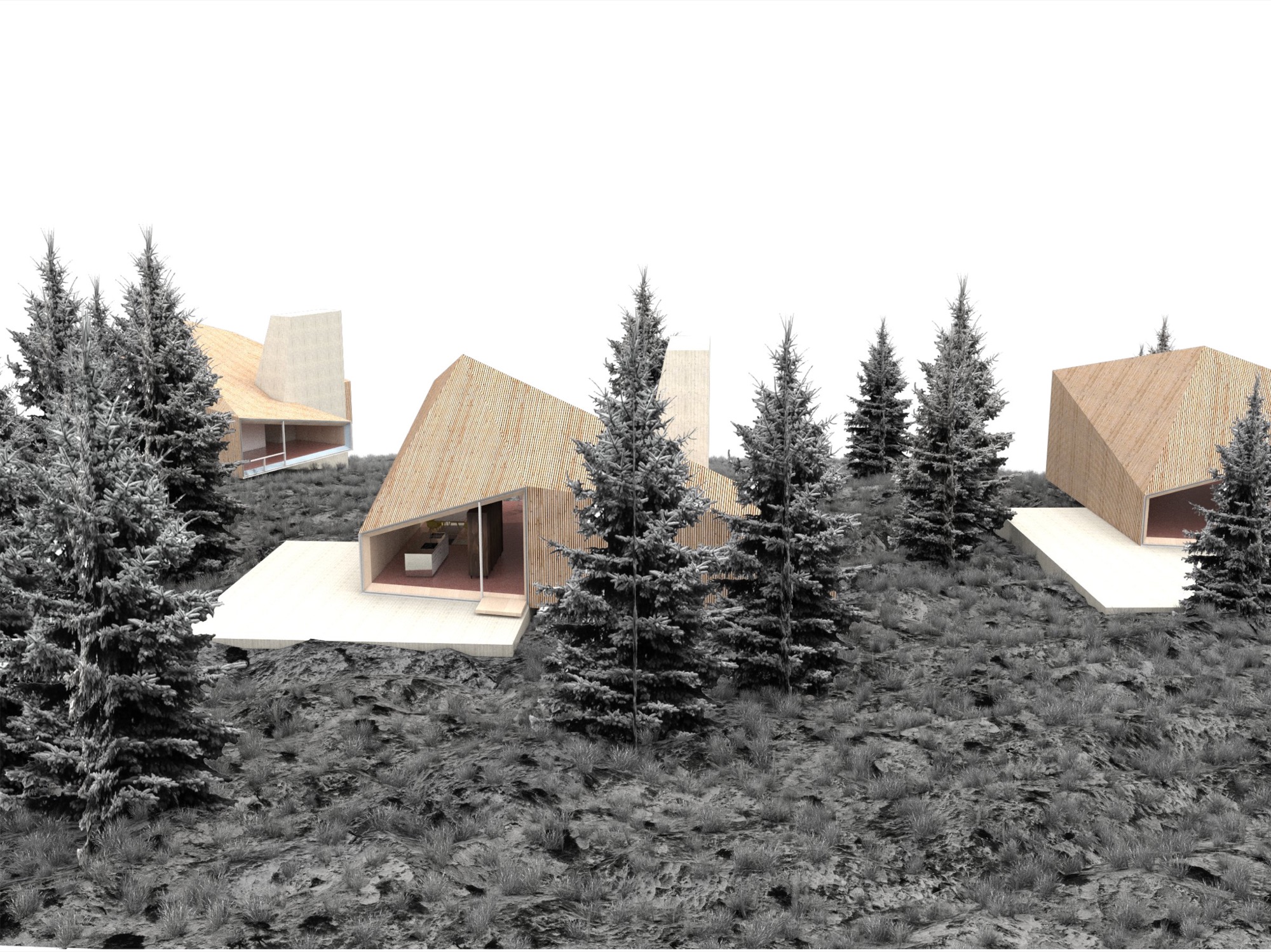

Nađ didn’t plan to enter an architecture contest at the time he learned about the MAP design competition on an architecture blog. But the subject—a cabin—intrigued him since he thought it rather uncommon for an international contest. “You usually have a competition to design a museum, library, memorials...but houses are rare.” The premise of Summit Powder Mountain eventually compelled the young architect to enter his design. “You could see that they are not planning to do a typical commercial development, but start with a clean slate and do things right.” However, he didn’t grasp the expanse of the project until he spoke with the Summit team. “I didn’t realize how important this is for the global community, as it shows a new way of planning large developments,” he says in retrospect. Nađ understood that no matter how good his cabin design was going to be, simply copying it 500 times would only create the type of cookie-cutter development that already characterizes too many mountain resort towns. “My design goal was to create a house that can be transformed—enlarged, scaled down, rearranged, have a different facade—and still preserve the overall design idea,” he explains. The “wooden tent” concept is a suggestion, one Arthur says is “a loose design that’s poetic and evocative.”
“You could see that they are not planning to do a typical commercial development, but start with a clean slate and do things right.”
Building community
Summit is breaking ground this summer to build the first cabins on Powder Mountain. Furthermore, the company is planning the new alpine village, with shops and galleries, coffeehouses and restaurants, gathering venues, condos, and new headquarters for the ski resort they acquired. Arthur thinks seasonal skiers and hikers may visit the mountain and never know about Summit’s quest for settling an art, culture, and tech elite here, though it seems hard to imagine tourists coming to this creation of an idyll and doing their own thing. “We’re based on gathering,” Arthur emphasizes. “People gather in creativity to change the world. People don’t come up here for solitude, but for increased interaction.”
“People gather in creativity to change the world. People don’t come up here for solitude, but for increased interaction.”
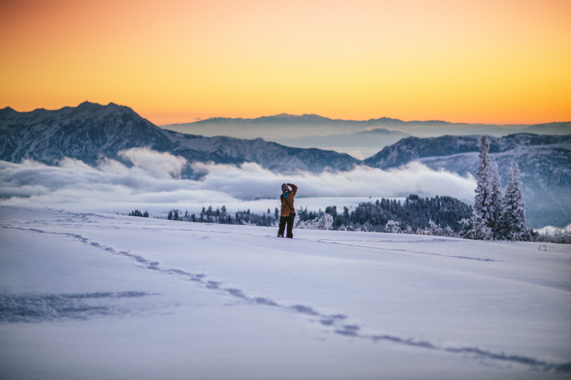
What does new mountain architecture look like, act like, feel like? Only after winning did the architect from Slovenia realize how important his design was for the global community. In fact, Arthur argues that the encouraged culture of sharing is just another expression of Summit’s tacit broader understanding of sustainable living. “This isn’t ostentatious.” He points out that most members of the Summit Powder Mountain community would actually prefer to minimize their footprint by operating in a shared social space. “Rather than building large bathrooms and kitchens in their own house, people go home to sleep and to entertain a smaller group of people. Then they go out into the larger community spaces and venues to gather together. This is about collectivism and collaboration.”
But how do you curate a genial commune where strangers “gather in creativity” to become kindred spirits, collaborators, neighbors? You don’t. “We had a blunt policy for a while, a ‘no-asshole policy,’ ” Arthur reveals. In reality, they quickly came to understand that the Summit community fosters a quite self-selecting environment. “Basically, if you were obviously egocentric or self-centered, then you probably don’t belong here. People who want to participate and are ‘others-orientated’ and have the heart to expand goodness, usually work out pretty well,” he says. To the rest, it just doesn’t feel right to be there. The Summit leadership strives to strike a balance between public atmosphere and private, curated events. In the end, Arthur says, “It’s not an exclusive membership thing—it’s an overall public realm of creating a new mountain town.” △
The Architect Explorer
Colorado architect Larry Yaw interviewed by his journalist daughter
Colorado architect Larry Yaw, a Fellow of the American Institute of Architects, has nudged modernism forward in Aspen and beyond. An intimate conversation with his journalist daughter...
Sitting on a mossy rock in a tall stand of aspens next to my dad, a couple of hours into trying to find our way from Willow Lake back to the Maroon Bells parking lot, I started gnawing on my mom’s teriyaki beef jerky from my backpack. We had left the trail long ago, and I was convinced we were lost. I must have been about eight years old at the time.
“We’re not lost, we’re exploring,” is probably how my dad, architect Larry Yaw, responded—a claim that would echo through my young years as I followed him through the backcountry of the Elk Mountains in Colorado, across Kashmir in India, and through The Wind Rivers, The French Alps, New Zealand, and beyond, along with my mom and three siblings.
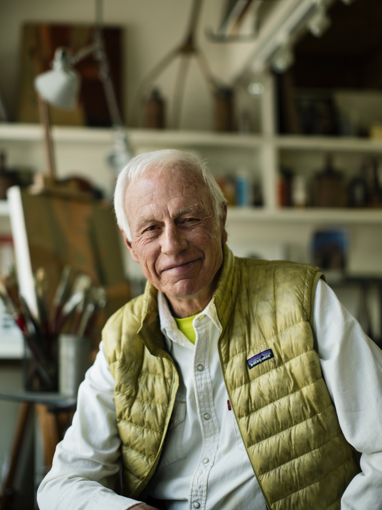
We got lost a lot, sort of on purpose, in the mountains. Yet never once did I see my dad flinch in these moments. Getting lost in the woods, in the place he calls his chapel, was merely another form of sublime and creative adventurism for him—much like his career as an architect and artist—and it fed his cowboy-style soul. I’d watch as he’d get this shrewd sparkle of excitement in his voice as he strategized on which ridge to follow, or which drainage would lead us back to the tent, all the while managing his family on the verge of the fearful discovery that our dad, really, had no idea where we were. Yet, now, as I bring my own young family into the woods to play and discover, I realize that my dad’s resourceful and poetic confidence that has intrigued me over the years has penetrated my own psyche deeply, and I strive to encourage that sensibility to seep into my kids’ sense of adventure. And, just as he did for our family, my dad has left an indelible impression on the contemporary design ethos of the Roaring Fork Valley, as well as countless alpine communities across the Mountain West.
“Getting lost in the woods, in the place he calls his chapel, was merely another form of sublime and creative adventurism for him—much like his career as an architect and artist—and it fed his cowboy-style soul.”
Since 1970, his iconic passion has manifested in his projects as he nudged modernism forward in Aspen and beyond, with an exceptional roster of clients and creative business partners as his co-conspirators; and he propelled them towards the outer edges of what’s possible. If I were to guess, his clients might sum up his character with a story similar to mine, yet the chapel would be his drafting table, and the map would be the radical ideas he has hand-sketched on camel-colored paper for the artfully crafted architecture he has envisioned. Sure, during his forty-six years creating innovative designs in the mountains, his aesthetic has shifted and grown, but his passion for the rawness of the backcountry, and for the purity of connecting people to place and to nature has remained firmly in tact.
“Since 1970, his iconic passion has manifested in his projects as he nudged modernism forward in Aspen and beyond.”
As his youngest daughter, I knew all of this, sort of, but it wasn’t until we had this conversation that I truly understood the gravity of how particular vignettes throughout his life have justified, and even come to imprint themselves, on his design, his spirituality, and his personal approach of getting lost—before finding a path.

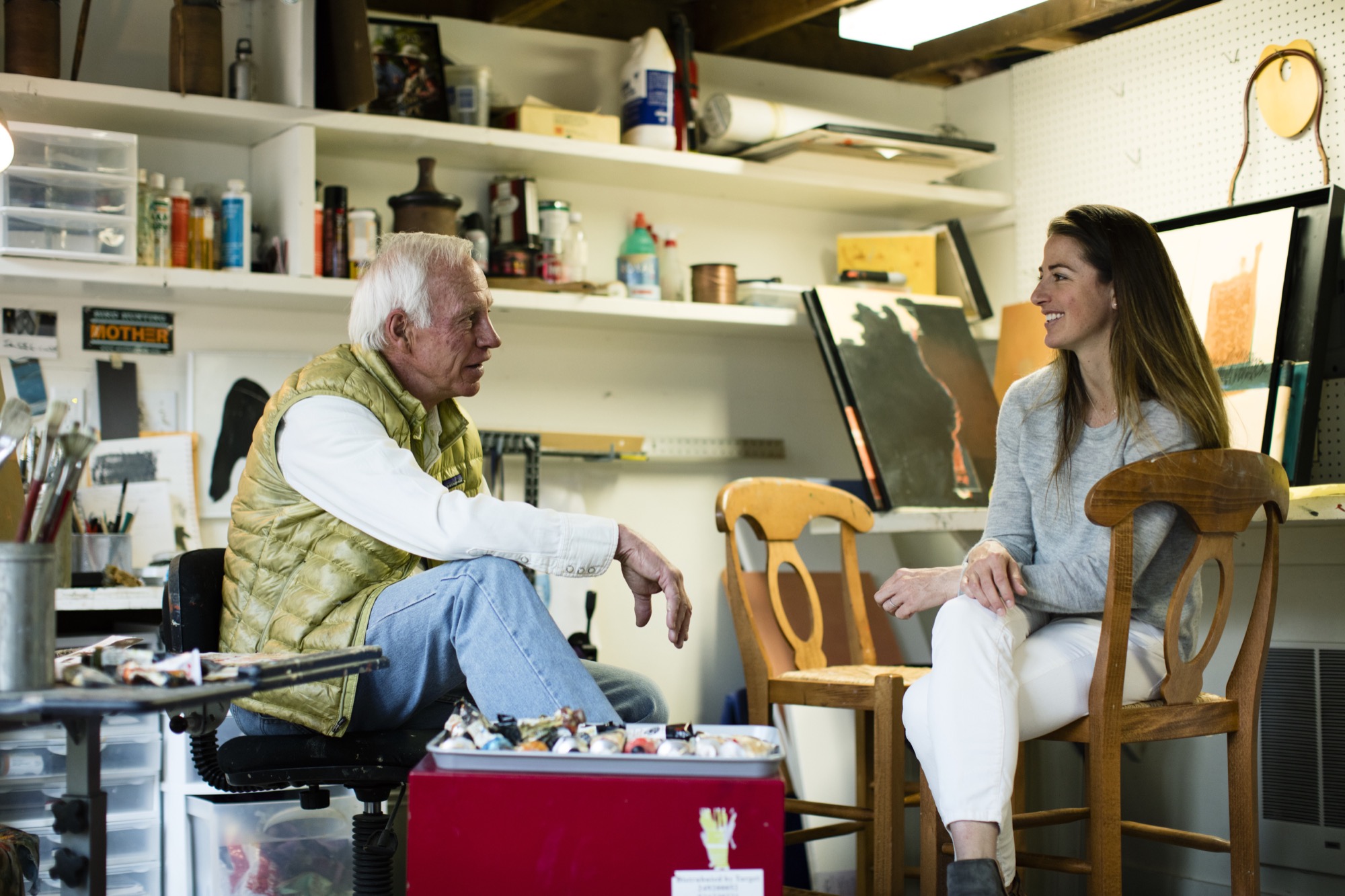
Herein lies our recent sit-down at the kitchen table, an intimate chat between an architect and his daughter:
LYR How has living in the mountains influenced your design?
LY I’m the guy who can’t stop myself from climbing up and looking to see what’s on the other side of the ridge, or from going up to the end of a valley to see what’s there. If there’s some association with exploring, and innovating beyond the expected, I’m in. Therefore, my lifestyle has been defined by, and inspired by, active outdoor living, and attached to that is the adventure of it. Adventure is a part of everything I love to do—physical, intellectual, and spiritual adventure. And, therefore, I’ve begun to regard the artform of architecture as a basecamp for this; a basecamp that is sustainable, economic in scale, but very much connected to nature as that is so much a part of the adventure of being alive and in the now, wherever here is.
“Adventure is a part of everything I love to do ... I’ve begun to regard architecture, or habitation anyway, as a basecamp for this.”
LYR Who influenced you as an architect?
LY First, the biggest influencers have been great clients of a contemporary persuasion, who relish the process of exploration and testing. There are other architects also, such as Romaldo Giurgola (“Aldo”), The Dean of Columbia School of Architecture, where I completed my Master’s studies. He would sit down and talk in these simplistic terms about the choreography that you create architecture through; the path you take and how that enriches you, and enriches the purposes of design. Louis Kahn—his work and writings inspired me.
And, the firm Morphosis Architects creates fabulous, courageous, contemporary, sculptural, and adventuresome architecture. As you traverse their spaces, you’re taken through them with this marvelous, layered, spatial experience that therefore inspires the choreography of getting from here to there.
LYR What’s your experience of being a modern architect in the Roaring Fork Valley, where opulent traditional mountain architecture is so dominant?
LY There’s opulence of thought and opulence of material—and those are two different things. Even though I’ve been involved with opulence, I design around the expectation that you don’t let the house own you. And, now, there is a cultural shift toward an awareness that we have to be stewards of the land, and be mindful of not writing out a big order for the resources. That shift has brought clients who want thoughtfully crafted, understated, simple in form, and more directly responsive design.
"There’s opulence of thought and opulence of material—and those are two different things."
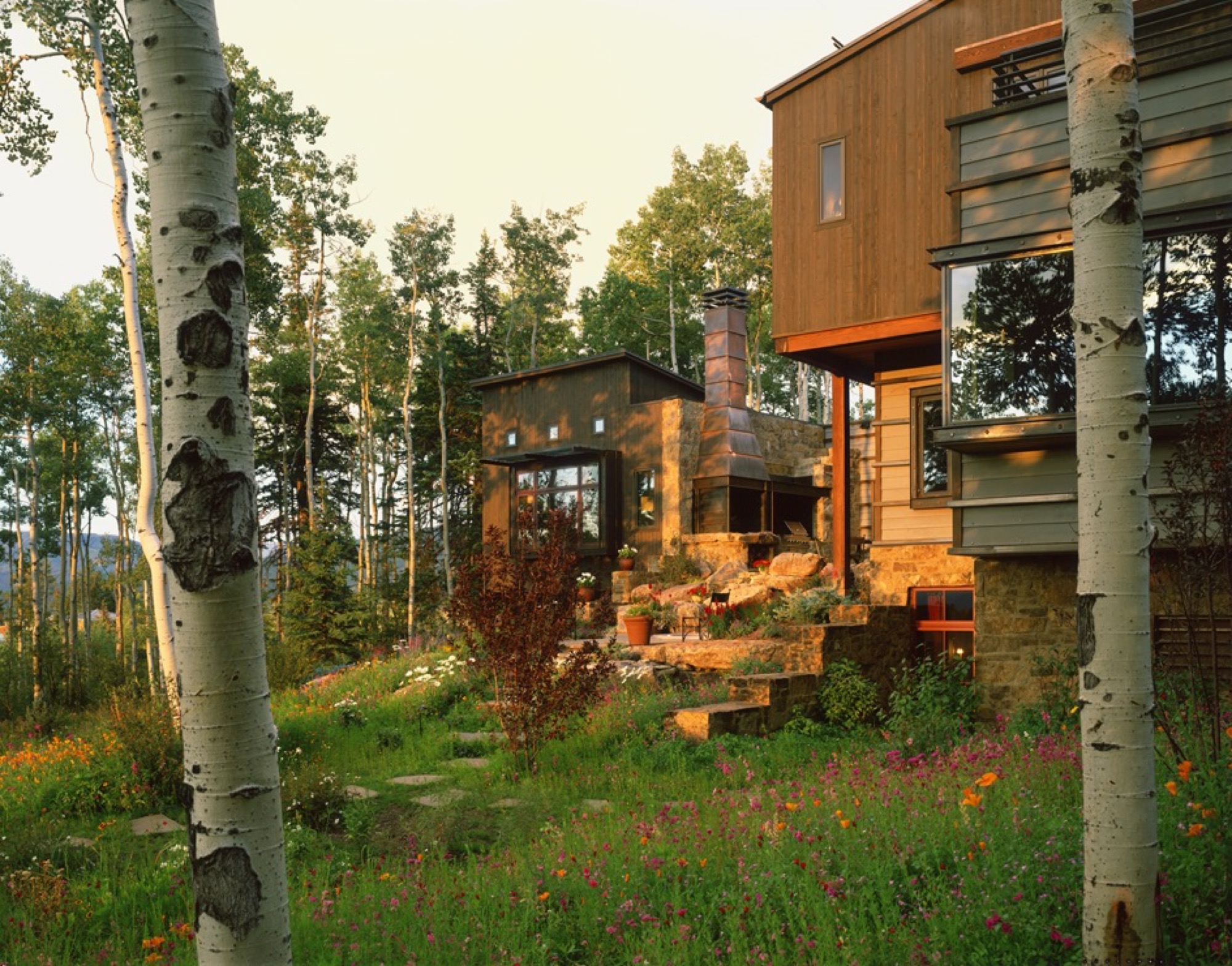
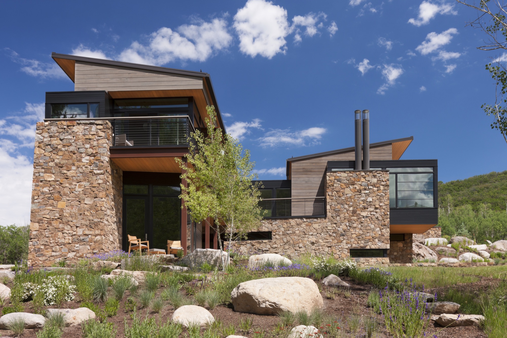
Also, a townscape is really a library of cultural expressions over time. Given that historic perspective, a log cabin is part of the miner’s time. Hopefully, what I do is an expression of my times and this culture, and doesn’t grab a crutch out of architecture’s past. Because the work of my firm significantly influenced the evolving character of architecture in the New West, I was elevated to the prestigious College of Fellows (FAIA) by the American Institute of Architecture. Our working mantra of design is that of “place-making” where architecture and nature are seamlessly integrated to the betterment of both.
“A townscape is really a library of culture preferences over time. Given that historic perspective, a log cabin is part of the miner’s time.”
LYR You were raised in rural Montana. What did that upbringing impart to you?
LY Growing up in Montana, I really experienced these rural ranch and farm compounds that were formed over generations. They were always designed by the simplest means, in simple forms, and they seemed to sit respectfully on the earth. When I started studying these things, I discovered that they were really forms that described contemporary architecture in their simplicity. They were formed in protective surrounds, and were organized around working proximities, yet there was always a place for enrichment, like a little garden near the front porch. Then, these compounds grew organically—out of inelegant purpose, and rural rationality. I didn’t appreciate it then, but as I studied architecture, I started pulling out of my experiential self, and those things all matched up—that is contemporary architecture. It did not tread heavily on the land; it embodied economy of means; it had simple forms and echoed its context—all things that are generationally taught or experientially taught. They solved problems there, out of their own devices and their own means.
LYR How has design carried into, and impacted, other areas of your life?
LY It has opened my eyes. When I travel, I see different things; I wonder about them; I take them in. And, what I’ve learned is that I like evocative things. Evocative means you hate it or you love it but it nevertheless stirs emotion in you, and takes the lethargy out of your mind. And, that’s true in architecture. The creative process and everything associated with it; the people you work with and the collaborations—they fuel my worthwhileness and my sense of adventure.
“I like evocative things…. You hate it or you love it but it stirs something in you, and takes the lethargy out of your mind.”
LYR Tell me about the Blackfeet Indians, a tribe you became close to when you were young, and their impact on you, your design, and your art.
LY When I was twelve years old, I went to Browning, Montana, in the middle of the Blackfeet reservation, and there sat this gorgeous little Indian girl. She was about my age, dressed in a traditional beaded, white doeskin dress, and I was enchanted. Her name was Virginia Home Gun. That enchantment turned into a friendship with her. It turns out that her father was the chief of the Blackfeet Tribal Council. Over time, through traditional ancient ceremony, they made me an honorary member. That really stirred me. It continued beyond that, and I started reading and studying about the rituals and legends that were the spiritual glue of their life. The Blackfeet regarded themselves as a creature of the earth, and they understood the balance of their needs with earth phenomena. They would give thanks to the buffalo, and honor a slain enemy for valor. For me, it went from the idealistic warrior image when I was young, to understanding their spiritual nourishment that kept them who they are. That translated to me later on into a series of paintings that I call “Once Proud.” That’s my way at this point in life of telling the story of westward movement and how it maimed the spirit and freedoms of our native inhabitants of this place. This made us feel sort of culturally guilty and I was inspired to tell that story.
LYR What is the status of modern architecture in the Roaring Fork Valley, and what role did you play in getting modern design where it is today?
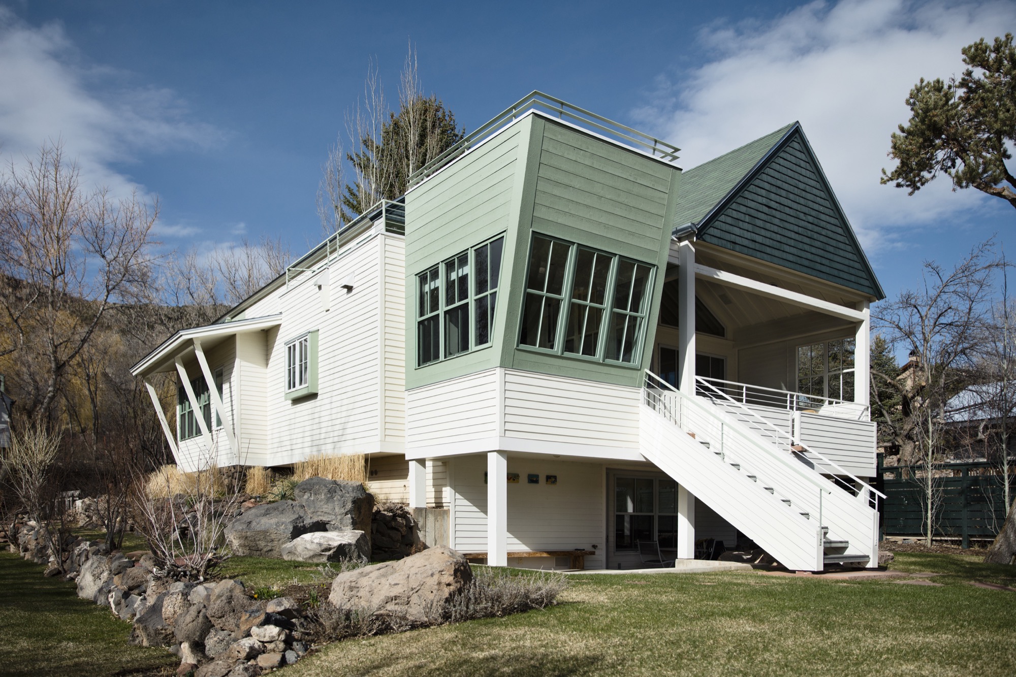
LY Aspen has always been a place that embraced aesthetic adventurism, or tolerated it anyway, and has always fostered intellectual and artistic courage. My firm, my partners, a highly talented thirty-some staff, and our clients have allowed us to be one of the forerunners of the movement here. Personally, I haven’t pushed modernism [in the valley] for recognition; we have had clients and circumstances that permitted that kind of solution and character. But within my firm, I’m known for pushing beyond the expected, and going to a higher level of art form and different level of expression; questioning, pushing, improvising, and going beyond even what clients want. Straight competency in architecture is a mid-level solution—I advocate for artfully courageous and innovative solutions that are bigger than the problem.
LYR Who are the people who want modern architecture in the mountains? What makes them different from the “typical” client who wants that enormous heavy log mansion that says, “I have a lot of money, and I live in Aspen?”
LY Some people are here because it is a new bar on their reputation epaulette. The people who I gravitate towards, or who gravitate towards our firm, are here for reasons I’ve sorted out—for the adventure, the backcountry, and things that support our minds, bodies, and spirits. These are all truly good characterizations of our lives, and our personal culture. To put it into context, I’m not going to design three little sitting areas around the master bedroom so you can sit inside all day. You get out of bed, you have breakfast, and you go ski; you get out there.
In that, a question I always ask is: Is architecture derived of context, or does architecture create context? The answer is both depending on where you are, but it's a question I ask of it because its one of the beginning points that I use to align my sensibilities with those of a client or a place.
“Is architecture derived of context, or does architecture create context?”
LYR You get lost on purpose, in a way, right? How has this personal quality informed your design sensibility?
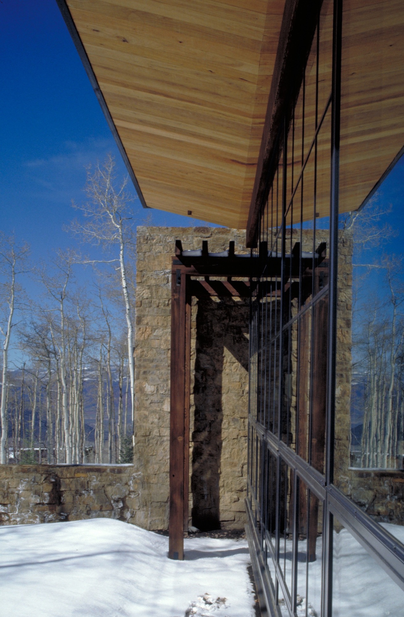
LY Freud said that problems couldn’t be solved by a consciousness that created them. In other words, you cannot solve problems where there are too many givens; otherwise you just spin inside the givens. Part of the creative process is being lost, disoriented; you are seeking an answer in a way. Therefore, I never feel lost, I just feel like I entered another chapel as it engages another form of creativity, curiosity, and adventure in me. Being lost is inspiring too—when I was really young, out hiking and going to crazy places I’d never been, I marveled at earth forms, the magic to them, what got them there. As I went on, I studied geomorphology, and it all boiled down to tectonics of eruption, erosion, accumulation, weather, and all of nature’s will upon those things. It’s really compelling, and asks compelling questions, and I found some answers that I’ve portrayed in my painting.
“Part of the creative process is being lost, disoriented; you are seeking an answer in a way. Therefore, I never feel lost.”
Nature can also help you appreciate your existence, be a stimulus for enlightenment, and fuel lifelong curiosities. As architects, we must embrace that kind of creativity and spirituality, the kind that enhances who we are, so as to create well being.
And, Lindsay, I can find my way back from anywhere.
A founding partner of Cottle Carr Yaw Architects, Larry Yaw has designed many of the firm’s award-winning projects—from resort and community design to corporate buildings and private mountain homes. In 1993, Yaw was named to the American Institute of Architects College of Fellows, the highest award given to the profession’s most respected architects. His projects are regularly published in architectural books and national design magazines.
Yaw received his Master’s Degrees in both Architecture and Urban Design from Columbia University and has since been a lecturer and design critic at several western universities. Believing in the importance of civic involvement, Yaw is also a founding board member of the Aspen Art Museum.
Architecture, Made On Site
The husband-and-wife founders of Scott and Scott Architects design-built their own off-grid cabin with the adventurous spirit of the powder boarders they both are.
Built by husband-and-wife architects for themselves, an off-grid cabin in the mountains of Vancouver Island captures the adventure and freedom of powder boarding, free of rigid ideas.
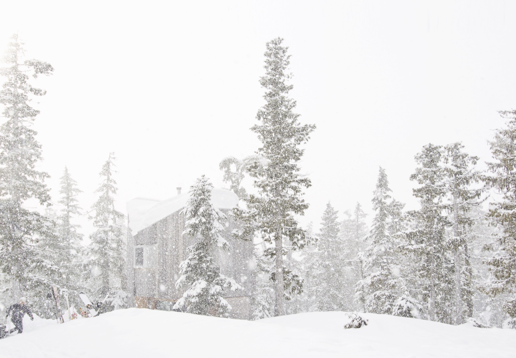
David and Susan Scott wanted to make architecture. But not in the way one imagines married architects making architecture for themselves — drawings of their dream mountain retreat, years in the drawer, just waiting for the right building site. No. Building their own alpine cabin, the Vancouver-based architects wanted to design and build in a singular act.
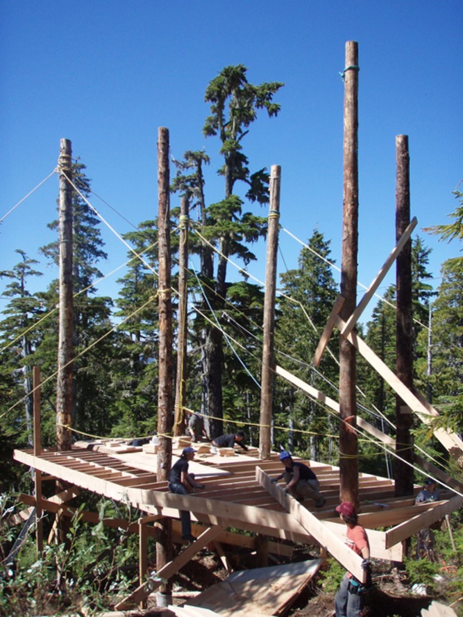
In 2006, a longtime friend led them to a piece of land he’d come upon when planting trees at 4,265 feet (1,300 m) above sea level, on the northern end of Vancouver Island in British Columbia, Canada. “We had never been on the snow in the area until acquiring the building site,” says David Scott, speaking for the adventurous couple. “We fell in love with it at first sight, and the people and terrain are really special.” With almost 50 feet (15 m) of annual snow accumulation, the remote community-operated alpine recreation area of Cain is known for legendary powder.

At the time, the couple, who met in architecture school in Halifax, Nova Scotia, worked for established firms and spent long hours in offices, drawing. “We have a love for building and being outdoors,” says Scott, who appreciates drawing as an important part of design. Now building their own off-grid cabin, however, they wanted to channel the freedom they feel when powder boarding into an immediate design process centered in adventure and not heavily in rigid plans. “We began the project with a desire to work with a greater level of freedom, where the specifics of the site and available materials would inform the work in a direct and unfiltered manner.”
Scott and his wife knew they had a narrow window in life, before having children, to complete construction on their own on long weekends and holidays, and with help from friends.
“We began the project with a desire to work with a greater level of freedom, where the specifics of the site and available materials would inform the work in a direct and unfiltered manner.”
Hand in hand: Design and construction
Inspired by the materials available around the site and the environmental conditions, construction was planned to avoid machine excavation, to withstand the very deep annual snowfall, and to resist dominant winds. Accordingly, the structure was elevated above the height of the accumulated snow on the ground. “The use of full-length, unsawn logs provided us with the ability to get height in a manner that used the wood’s strength the same way Douglas fir spar poles are used as sail masts,” Scott explains.
The cabin, primarily constructed from Douglas fir, gets more refined from the outside in. The columns are unworked logs, the beams and joists are rough, bandsaw-milled, and the walls, floors, and ceilings are clad in planed boards. The cabinetry is made from construction-grade fir plywood. The exterior is clad in cedar that has weathered to the tone of the surrounding forest. Both woods are harvested in the area.
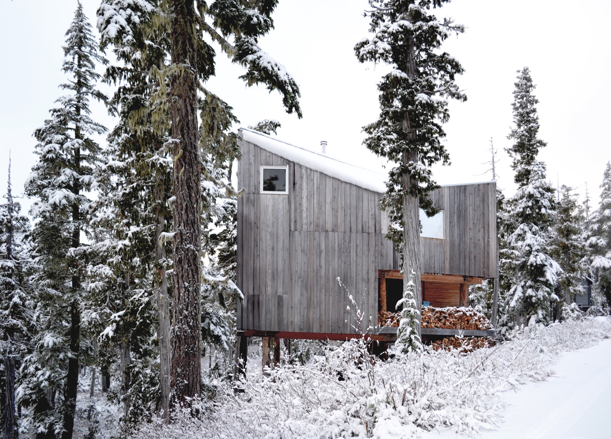
The roof form began with a simple gable, rotated to direct the snow off the back of the cabin. A half-dormer was then introduced over the entrance to direct snow away from it, funneling the snow into the prevailing winds.
Family life at the cabin
Today, childhood memories are already being made at the cabin. The Scott family now includes two young daughters, who Scott says are both on skis and love the snow.
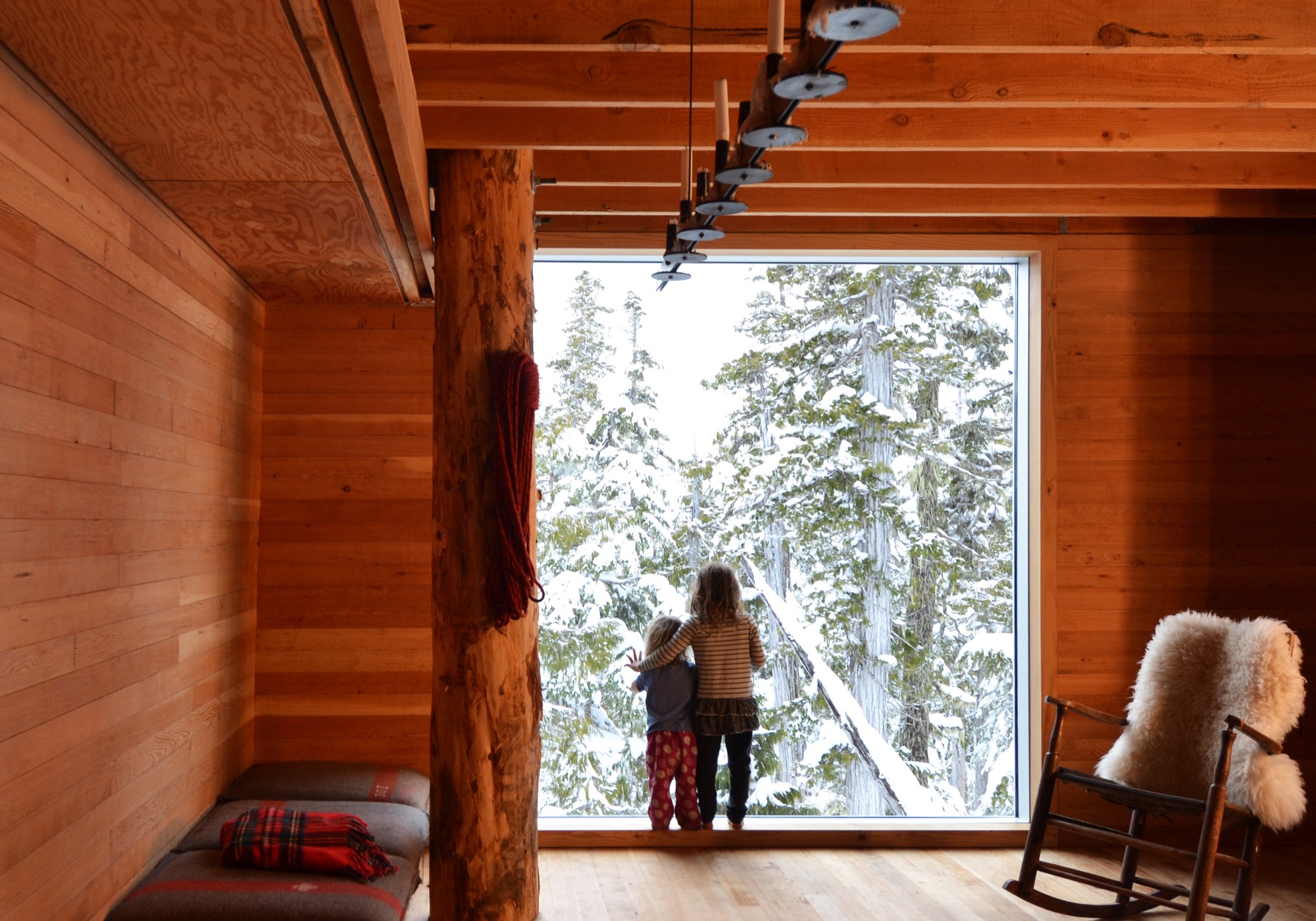
Much of the approximate 1,075-square-foot (100-sq-m) cabin’s interior is designed and made by Scott and his wife. The main living space is small, and the family spends much of the time on the long, cushioned bench eating, playing games, and relaxing from a day on the snow. “Our favorite spot is by the large window,” says Scott. “Both for the ever-changing view of the forest, but also in appreciation of the effort that went into its installation.” He drove the glass overnight on a rented flatbed and hand-positioned it with a group of friends the next day — “an incredibly smooth effort, given its size and weight.”
The remote site is directly accessible by gravel road five months of the year. During the other months, equipment and materials are brought up by toboggan. There is no electricity, and a wood stove provides the heat. Water is collected from a local source and carried in. The Scott family cherishes the simple lifestyle the mountain hideaway affords. “We enjoy the solitude of not having cell phones and gadgets around to distract us,” says the architect, who finds “a wonderful freedom” in seeing no bars of coverage on his phone. “This is an incredible place for our daughters to love being in the mountains as much as we do.”
“This is an incredible place for our daughters to love being in the mountains as much as we do.”
The powder hounds come up here as many weekends as possible during the winter, but they also love the warmer temperatures in spring when snow is still plentiful. “It’s incredibly peaceful,” Scott says. “The fall is fantastic when the blueberries are ripe, and we try to spend Thanksgivings on the mountain, splitting wood and enjoying dinners with friends.”
Adventure by design
The off-grid cabin was David and Susan Scott’s foundation project and formative in their desire to start their own architecture practice, Scott and Scott Architects, with the goal of spending more time in the mountains. To both, making architecture on site is ultimately the most direct, enjoyable way of working, and one that provides the greatest opportunity to understand materials and detail resolution and evolution. Today, the firm is working on projects in Whistler and Squamish, and in their province’s interior high country. “We love working in these challenging locations where adventure is the reward,” says Scott.
(Alpine Modern has covered the A-frame cabin Scott and Scott built in Whistler for a young family of skiers and snowboarders.)
What’s Inside?
Architect David Scott opens the door to the off-grid snowboard cabin he built with his wife on Vancouver Island to show his three most treasured artifacts hidden inside.
The cast-iron pot
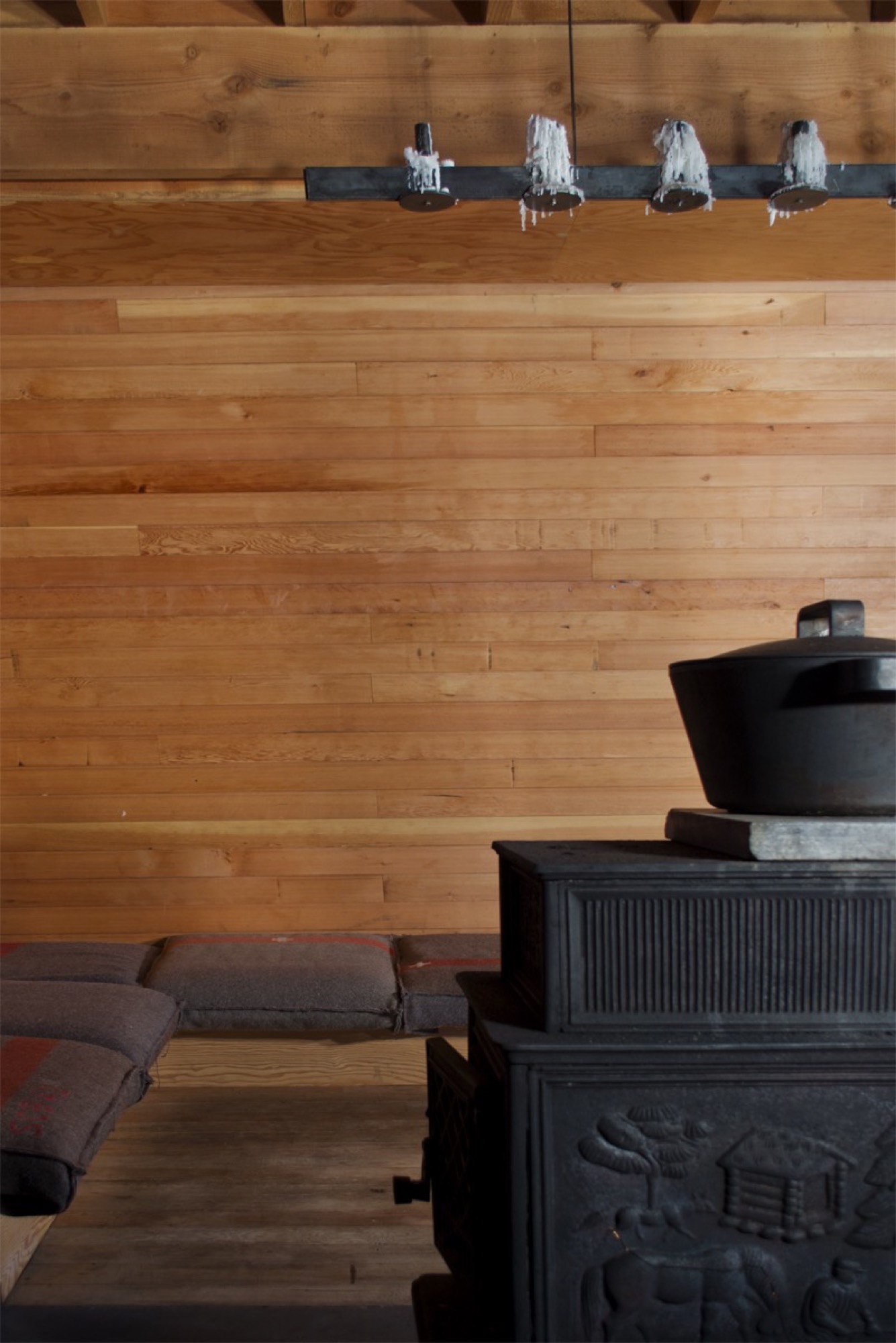
“We have a Björn Dahlström-designed cast-iron pot we slow-cook many meals in on the wood stove, which is essential to how we live when we are [at the cabin].”
Get your own: Björn Dahlström designs pots and casseroles for the Finnish company Iittala. Dahlström’s current line is stainless steel, but cast-iron pots and Dutch ovens similar to the one in the picture are available from brands like Le Creuset, Sur La Table, and Lodge.
The splitting maul
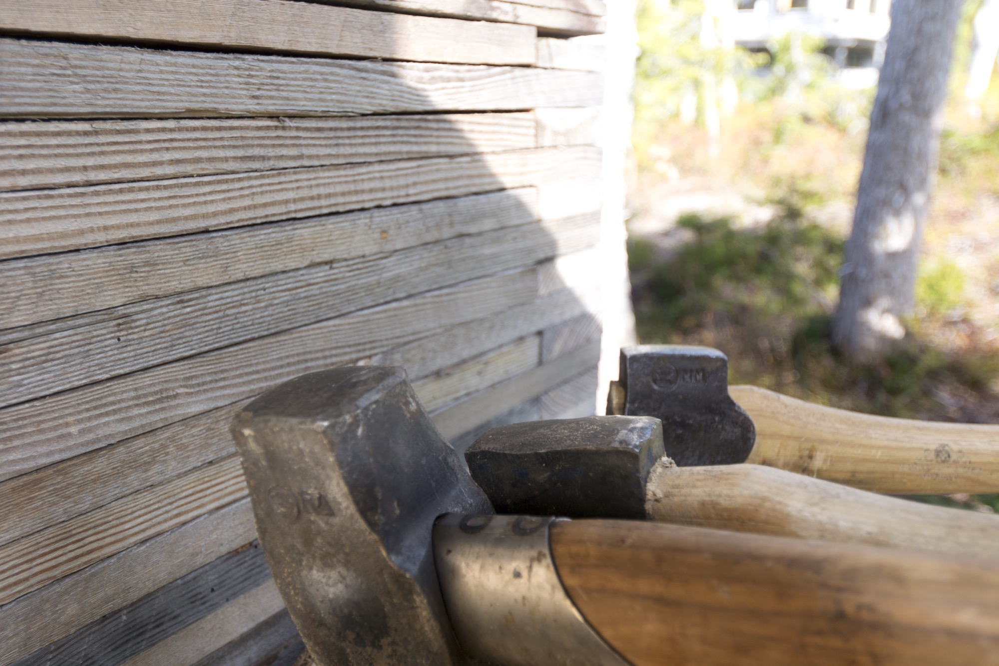
“I have a love for Swedish axes. Of my collection of over 100, the most used and loved is the Gränsfors Bruk splitting maul, which powers through the yellow cedar rounds. It is a beautiful object from a company we greatly admire. Whenever cutting wood, I look at the stamped initials of the smith that made it, with appreciation for his work and respect for a very old company which values and celebrates the workmanship of the individuals within it.”
The Gränsfors Bruk splitting maul’s head is heavier than the head of splitting axes, and the poll is designed for pounding on a splitting wedge.
The blanket
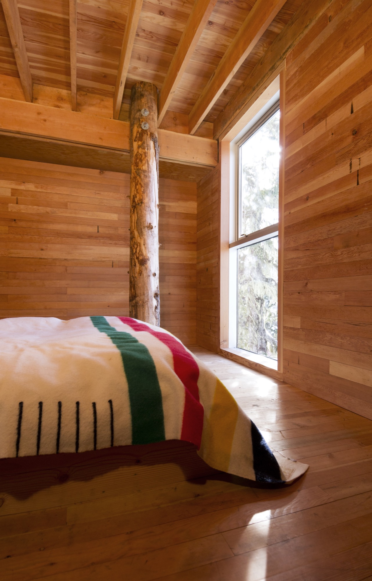
“We love our Hudson’s Bay blanket, which was a wedding gift from the architect I worked for for a number of years, before we began our own practice. I’ve often thought that a Bay blanket should never be bought for oneself and is something that carries meaning as a gift.”
Buy it for someone: Woolrich offers Hudson’s Bay Point Blankets under the offcial license of the historic Hudson’s Bay Company. The legendary blankets have kept generations of trappers, hunters, fur traders, and Native Americans warm and comfortable. 100-percent wool, loomed in England. △
Love and Loam
An Austrian artist family makes rammed-earth architecture, stoves and raku tiles
Earthen materials bond an Austrian family of artists: The applied-artist father builds with rammed earth and the ceramicist mother and graphic-designer son create tiles using an ancient Japanese pottery firing process. All their work is deeply rooted in ancient techniques, yet their designs are expressively modern.
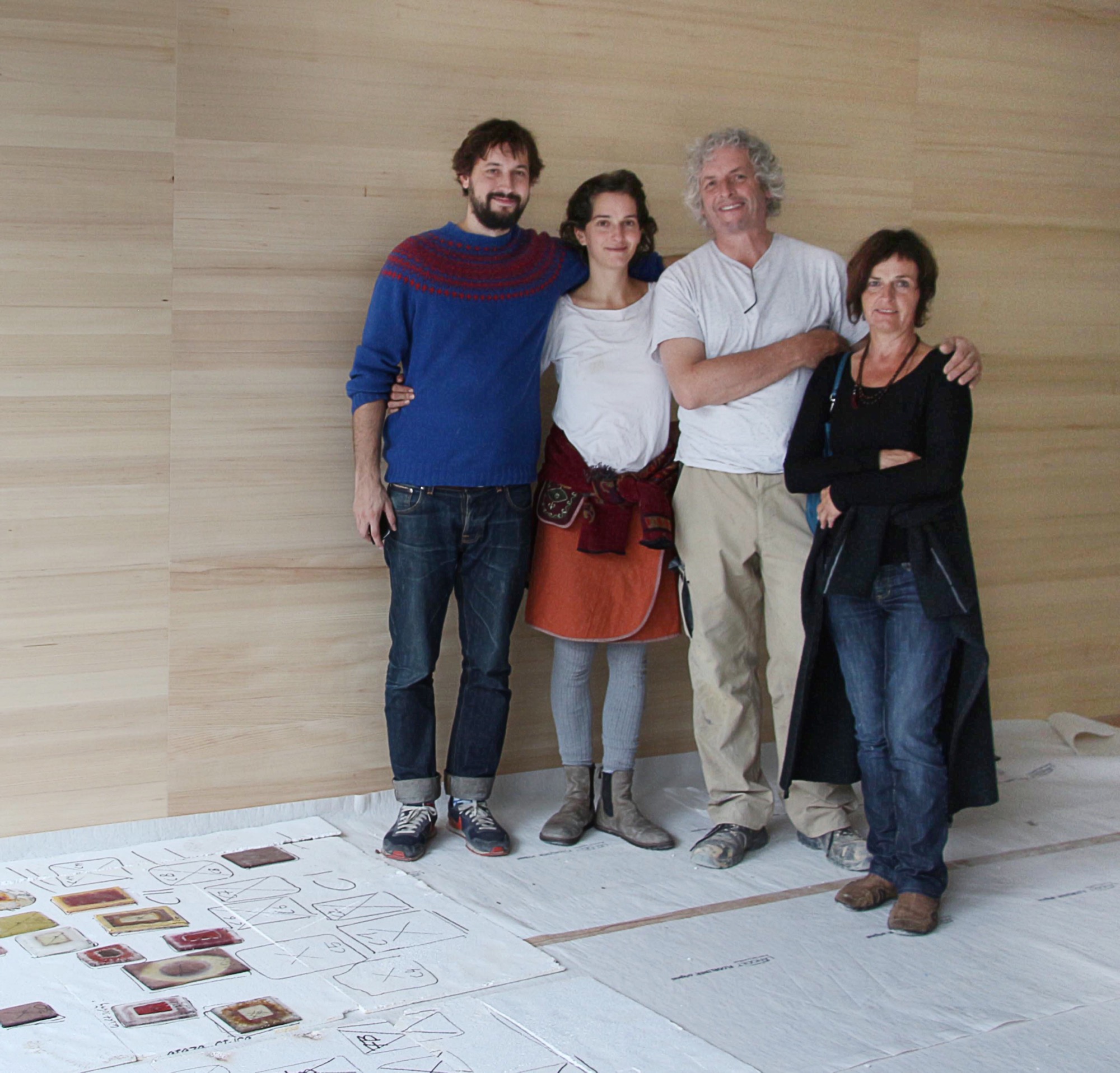
“Never.”
Trotting behind his father around countless construction sites, a teenage Sebastian Rauch convinced himself he would never follow in his artist parents’ footsteps.
Born this way
Now thirty and his hormone levels long balanced, Sebastian has succumbed to the truth: The love for elemental design, form, and earthen materials is in his DNA. His parents are ceramic artist Marta Rauch-Debevec and artist-builder Martin Rauch. She runs the tile label Karak; he heads Lehm Ton Erde (Loam Clay Earth). Together, they share a studio space in Schlins in western Austria’s Vorarlberg region, tucked between the German and Swiss borders and known for supreme skiing.
“Both my parents have art degrees and chose art as their livelihood,” Sebastian tells. “Somehow, it rubbed off on the children.” Today, he works as a graphic designer in Vienna. His sister, Anna Pia, is currently taking a maternity break from earning her degree in art pedagogy.
The son of two artisans admits that neither the material loam nor his father’s building sites interested him as a child. “I was all thumbs in construction, which led to a lot of tension between my father and me during puberty.” To his parents’ chagrin, young Sebastian preferred to spend his days in front of the computer. “I was engrossed in anything to do with science fiction and Japan, whereas my parents are much more down to earth, literally.”
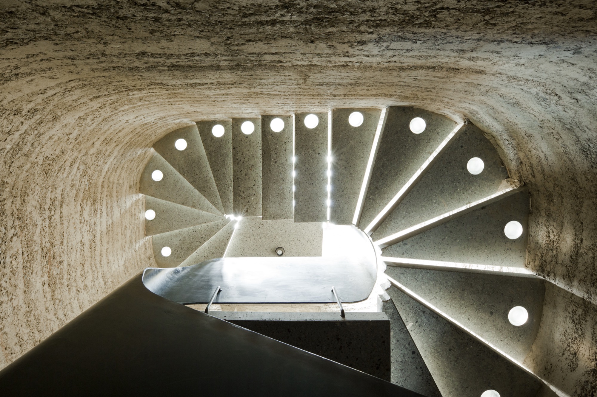
Rammed earth
Sharing a studio compels the elder Rauchs to amalgamate their crafts. “Marta and I have been working in the same space together for more than thirty years,” Martin says. “In terms of materials and processing techniques, there are many synergies between ceramics and building with loam, which help us both realize our work.”
To the family, loam, clay, and earth symbolize the holistic philosophy inherent in their art: Loam represents craftsmanship and technology, clay stands for art and design, and earth embodies the sustainability of building with loam.
Martin, who sees himself as an applied artist rather than an architect or designer, is known beyond the Vorarlberg region for practicing the ancient technique of compressing loam into a distinctive building material as sturdy as concrete. His desire to architecturally design with earth grew from his early work as a ceramicist, oven builder, and sculptor. Today, he focuses on the aboriginal rammed-earth technique, which he approaches with innovation. He builds entire buildings from loam as well as indoor components, such as wood-burning stoves, flooring, and interior walls.
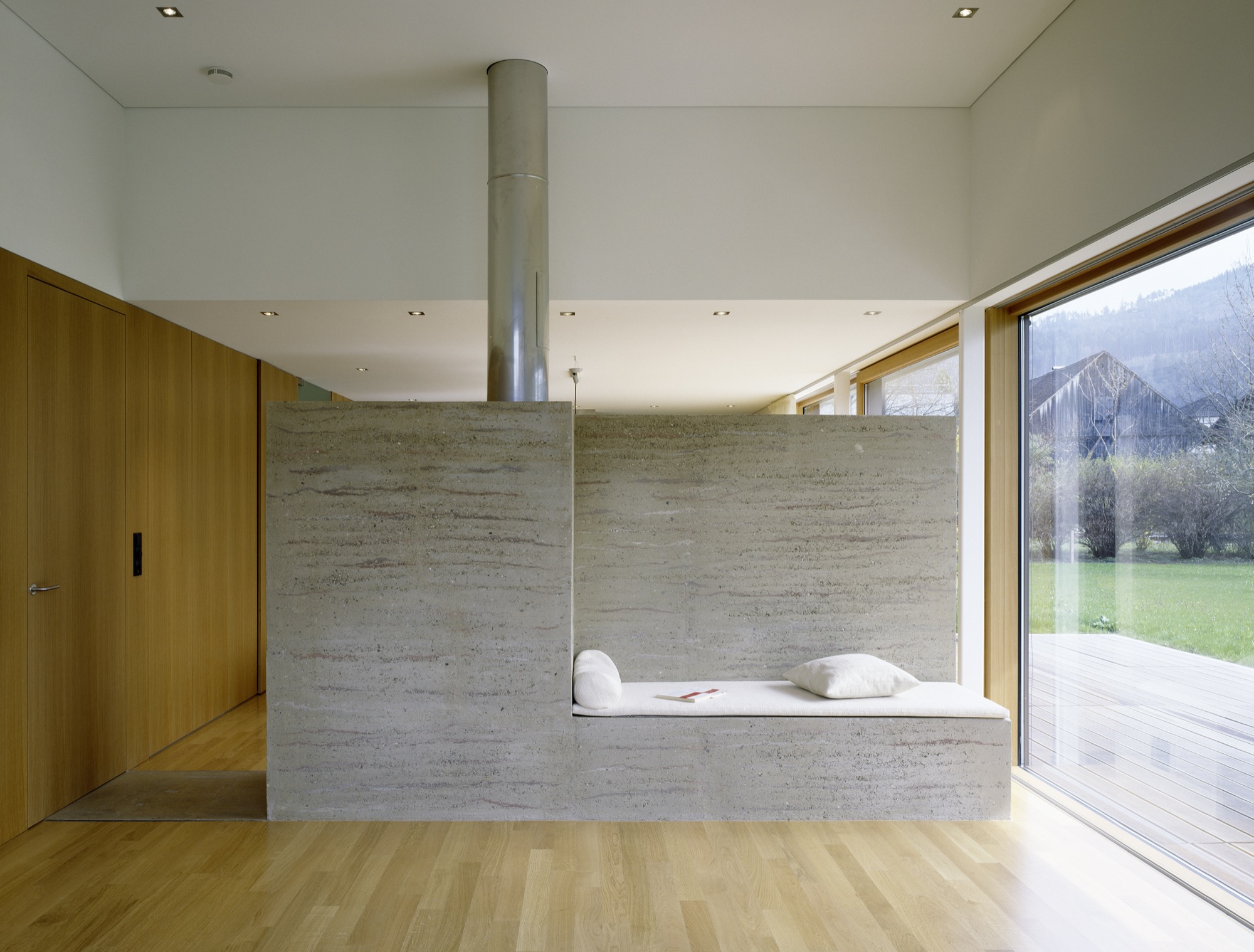
The process of compressing soil is time tested. Parts of the Great Wall of China were constructed from rammed earth. “Being able to create solid, bearing walls from such elemental materials fascinates me,” Martin says. “It requires careful study of the material but also courage. For example, one has to be able to allow the erosion.” External rammed-earth walls facing the elements will lose some surface, exposing stones and leaving a pebbled pattern. “Once we can accept the erosion, we can recognize its many benefits,” Martin explains. “We must recognize that its water solubility is really the most valuable virtue of loam as a building material.” His structures are 100 percent recyclable, often using ground dug up during a building’s own construction phase.
“Being able to create solid, bearing walls from such elemental materials fascinates me.”
His building materials and techniques are deeply rooted in tradition, yet Martin’s designs are expressively modern. “This very juxtaposition inspires me,” he says. “With the emergence of modern building methods in the last two centuries, building with loam was rarely considered, downright superseded, and degraded to the poor man’s building material.”
The Austrian artisan, who is currently cladding Saudi Arabia’s King Abdulaziz Center for World Culture in rammed loam, is confident that quality modern rammed-earth architecture with progressive, adapted techniques can once again valorize the image of building with loam.
Climate control
Breaking new ground in sustainable building spurs Martin’s creativity as artist and craftsman. “I love developing new ways of contributing to an anthroposphere that is more conscious of the environment and mankind,” he says. “Loam as building material is pure inspiration.”
Loam is available as local material almost anywhere in the world, meaning short, to no, hauling. “About 80 percent of our own home’s building material, for instance, came from its excavation pit,” Martin says. High efficiency and low primary energy are further benefits inherent in rammed-earth buildings. Locals identify with his work for these sensibilities. “It’s not unusual for our projects that the principal or the villagers join in building.”
Bringing the rammed-earth technique into the twenty-first century is a challenge the builder approaches from a business standpoint. “In Europe, it is important to react to the rationalized and industrialized building sector,” he explains. “For us, the prefabrication of rammed-earth components plays an integral role. It allows us to build much more efficiently and according to today’s construction timelines.”
Rammed-earth interior walls promote a well-tempered indoor climate. The enormous mass abates temperature extremes and superbly regulates humidity. If you have eaten a Ricola herbal cough drop, you have a connection to Martin’s work. He collaborated with Pritzker prizewinners Jacques Herzog and Pierre de Meuron, founders of the Swiss architecture firm Herzog & de Meuron Basel, on the Ricola Herb Center near Basel. Martin’s loam walls promote ideal humidity levels for storing and processing the herbs.
Haus Rauch
Though Martin has been working with rammed earth for more than three decades, the home he built for his own family was a test bed for further adapting and refining his technique.
The 200-square-meter (2,150-square-foot) home built into a steep southern hillside above Martin’s native town of Schlins was completed in 2008. The design was a collaboration with Zürich architect Roger Boltshauser.
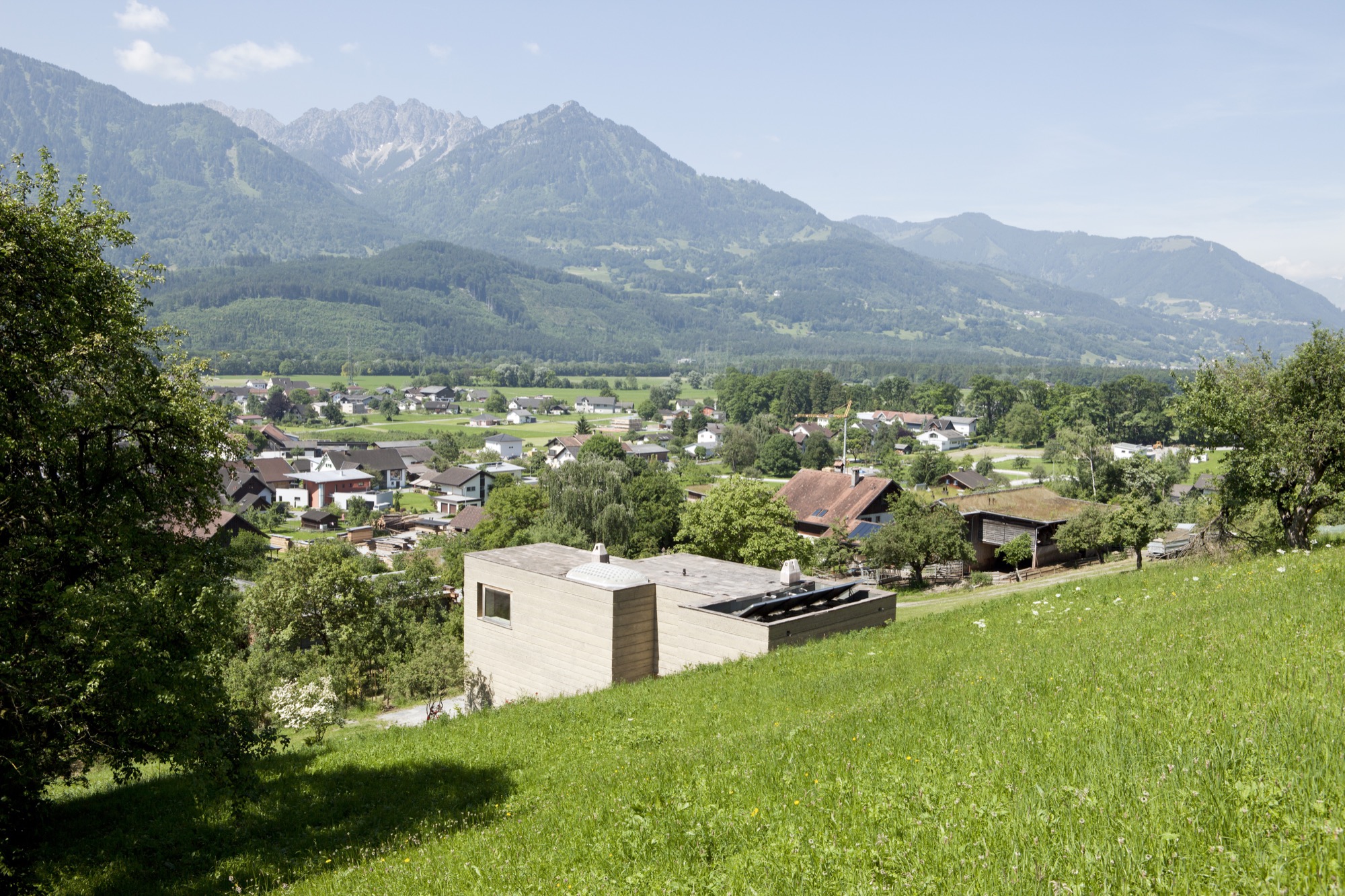
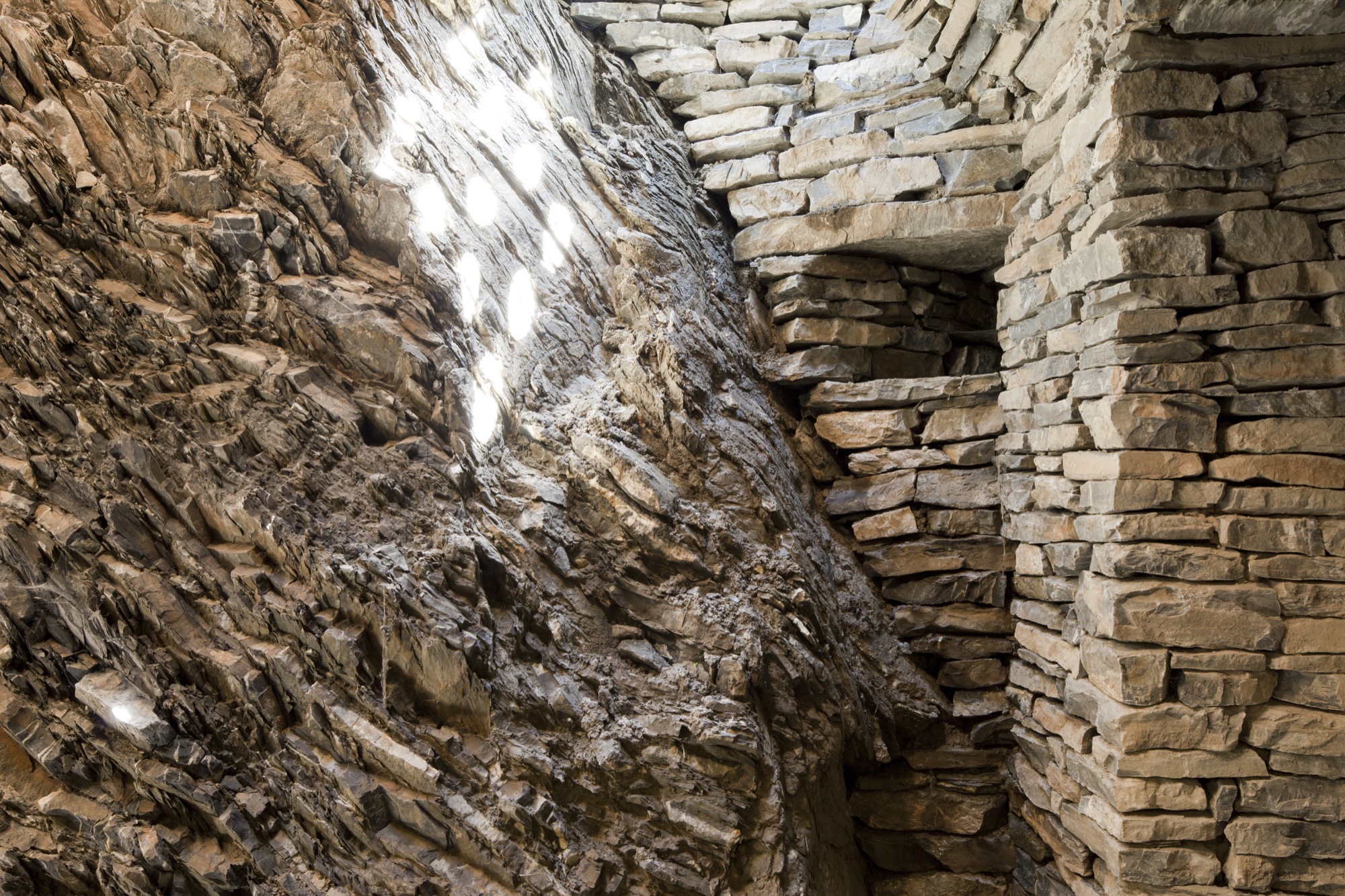
In its orientation and form, the house directly speaks to the topographic flow of the site and the context of the landscape: A monolithic structure like a sculptural block is literally pushed out of the earth. The use of solid rammed-earth walls combines this architectural intention with the desire to construct an ecological building exclusively made of natural materials.
The mother of creativity
Marta, who was born in Ljubljana, Slovenien, and studied ceramics and product design at the University of Applied Arts Vienna, never urged her son or her daughter to work with her. “Simply following in your parents’ footsteps doesn’t bring you happiness. I wanted them to cultivate their own dreams and visions, so I never thought that one of my children would one day work with me.”
Having been an independent artist working on theme-based projects for exhibitions and sculptural ceramic objects, Marta herself hadn’t planned on specializing in tiles. But she knew she wanted to incorporate ceramic art in the new house.
After working with a low-fired technique known as raku, a traditional Japanese pottery process, for twenty years, Marta wanted to explore tiles as medium. “I was looking for a tile design for the house when I discovered the beautiful patterns Sebastian was creating on his computer,” she remembers. He says he created the designs “just for fun.” Marta wondered how she could transfer her son’s digital doodling to her tiles and began experimenting with screen printing. “When I created the first samples, we were all surprised how stunning the combination of the raku tiles and Sebastian’s patterns truly was.”
“I was looking for a tile design for the house when I discovered the beautiful patterns Sebastian was creating on his computer.”
Karak tiles
The Karak brand was born. Marta and Sebastian’s Karak tiles—each a unicum—embody the elementary relationship between the Eastern and the Western world. Captivating geometric ornaments, the result of repeating, digitally created design patterns, are married with the century-old Japanese raku technique that gives the tiles an inimitable air of chance.
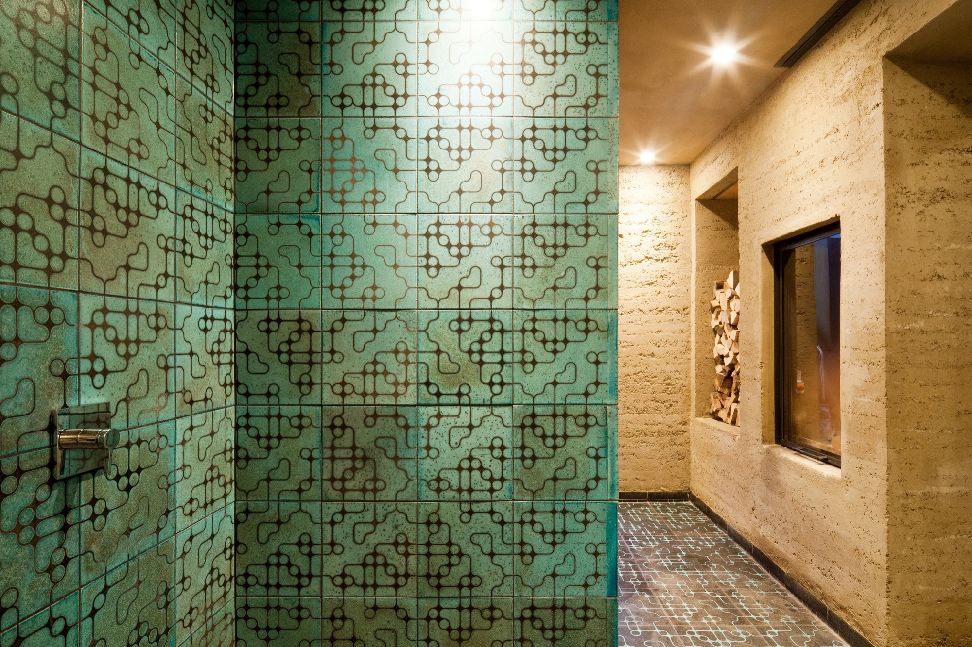
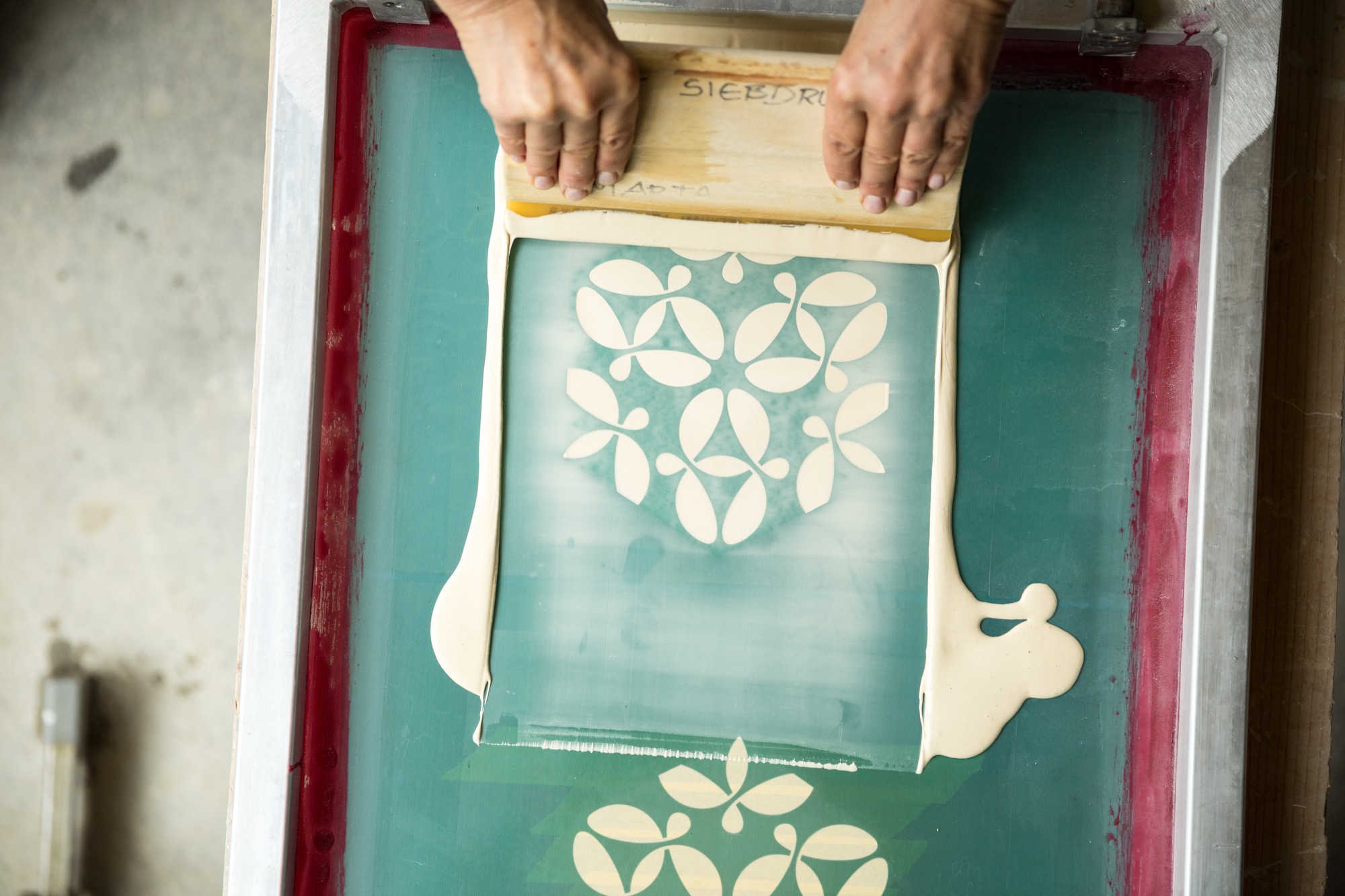
The tile material is a combination of different kinds of clay and loam mixed with quartz sand and fireclay. Pressed into shape, each tile is retouched by hand, the designs applied by silk-screening.
As the tile is red at about 1,000 degrees Celsius (ca. 1,830 degrees Fahrenheit), the material’s transforma- tion becomes palpable—the low-fired technique makes it porous and gives the final product a deep, organic sound at the touch and a warm haptic.

Still glowing, the tiles are removed from the kiln one at a time and immediately hermetically buried in sawdust. The void of oxygen and the smoke have an intense effect on the surface that varies for every piece. The color changes with the glaze; hair-thin cracks are blackened.
Finally, dunking each tile in water reveals its finished character. Transformed by the temperature shock, the glazed surface is brushed off, evincing a craquelure—like a fine net tying everything together.
Starting Karak wasn’t a conscious decision but rather a mother-son collaboration that grew organically. At first, the two intended to create the tiles only for the family’s villa. Then a book was published about the unique house. “On occasion, people began talking not about the Rauch house but about that house with the beautiful tiles,” Sebastian remembers. “People were asking us where we got those tiles...that’s when orders began coming in.”
“When we created the tiles for the house, I suddenly knew the charm of these tiles,” Marta says. “After all these years, I am still excited every time I walk in the door.”
Futuristic fantasy meets ancient technique
Sebastian’s passion for science fiction inspires the patterns he designs for the tiles. “I love to connect antipodes, things that seemingly don’t go together, the interplay between contrasts...that tipping effect.” His KuQua design, for instance, combines spheres (Kugeln in German) and squares (Quadrate). “When you deconstruct these two shapes and recombine them, they become almost unrecognizable in an entirely new shape. However, there is an underlying geometrical clarity and calmness that makes me feel like I didn’t design this shape; rather, I found it. At the same time, there is constant movement as the eye meets the pattern, like a deep mantra lancing the universe, like yin and yang.”
His mother is no less fascinated by the repetitive geometric patterns’ tipping effect. “Depending on how the eye focuses in, the design can suddenly appear three-dimensional,” she says. “In fact, we created a three-dimensional tile, the TaOk tile, a tantalizing combination of modern geometrical design and something Oriental. Then, the ancient technique adds something very primordial...a beautiful enrichment.”
The raku process gives a brand-new tile the patina of a long life. “I am intrigued by something that looks so archaic, yet you can’t really assign the object to an epoch,” Sebastian says. “I like to envision an archeological excavation site where they dig out a temple and find patterns and artifacts that don’t have a place in our past, in the human past...so you may have discovered an alien temple.” The precise patterns, the exact geometry combined with the serendipitous process make Sebastian optimistic for the future. “In science fiction the future is often depicted as extremely slick and clinical, as measured and constructed. I rather like the thought of a future that is still sensual and vivid.”
The geometric patterns are calculated and carefully designed, with precise lines. But the firing process, the smoke passing through the tile, and finally the quenching in water is so incalculable that what was once smooth becomes structured, what was once superficial gains depths. “It is a movement between order and happenstance, between repetition and uniqueness,” Marta adds.
“It is a movement between order and happenstance, between repetition and uniqueness.”
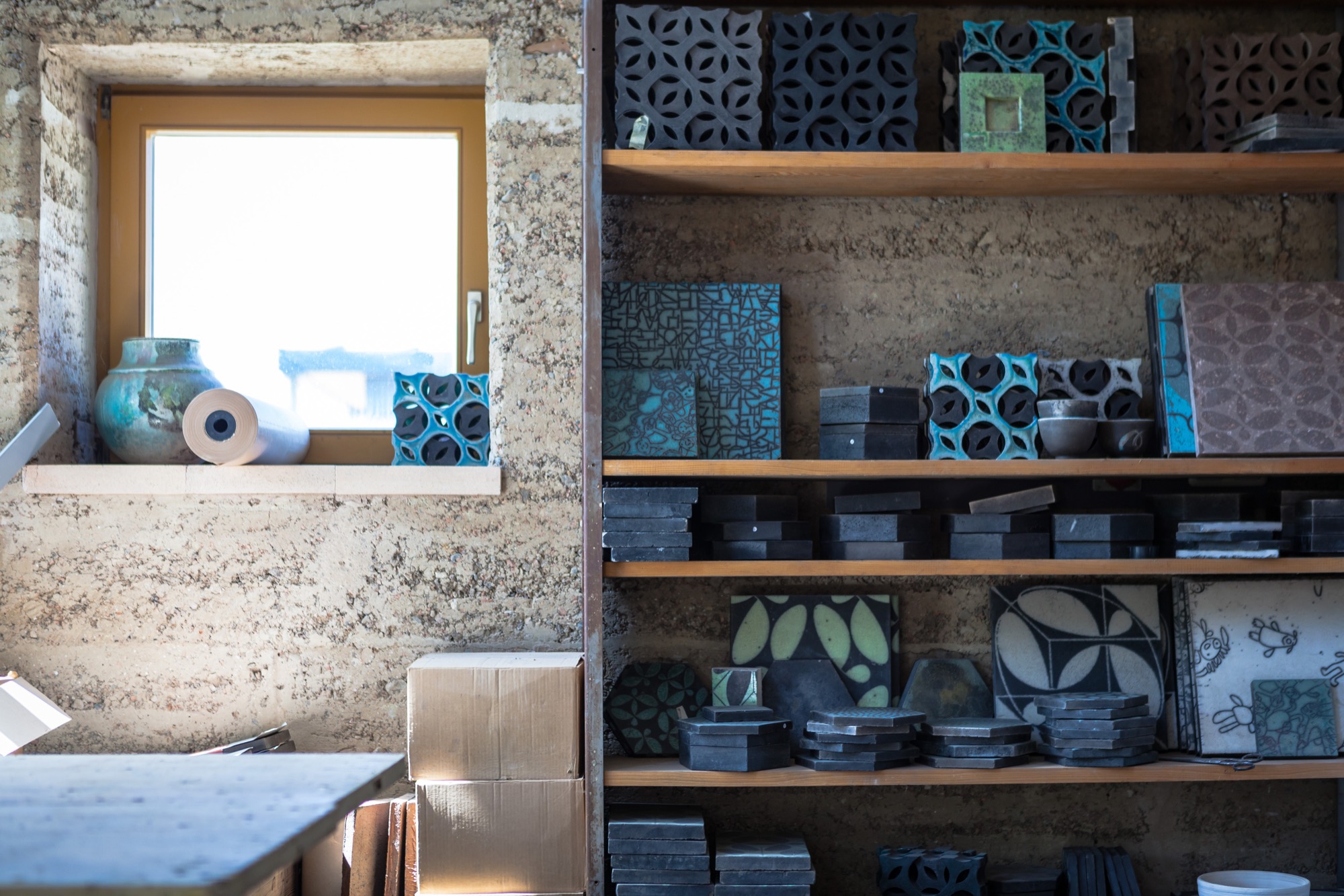
Both Marta and Sebastian appreciate the synergies and new opportunities that come with sharing the workshop and resources with Lehm Ton Erde, particularly Martin’s tinkerer skills and powerful imagination.
“Growing up, I was pretty sure I wanted nothing to do with loam,” Sebastian admits. “Funny how I found my way back to the material.” In the end, he’s grateful his parents laid the groundwork. “I couldn’t imagine working like this if it weren’t for being a family.” △
“I couldn't imagine working like this if it weren't for being a family.”
Haus Z2 in Bayrischzell
The modern vacation home by Beer Bembé Dellinger reinterprets traditional Bavarian-alpine forms and materials
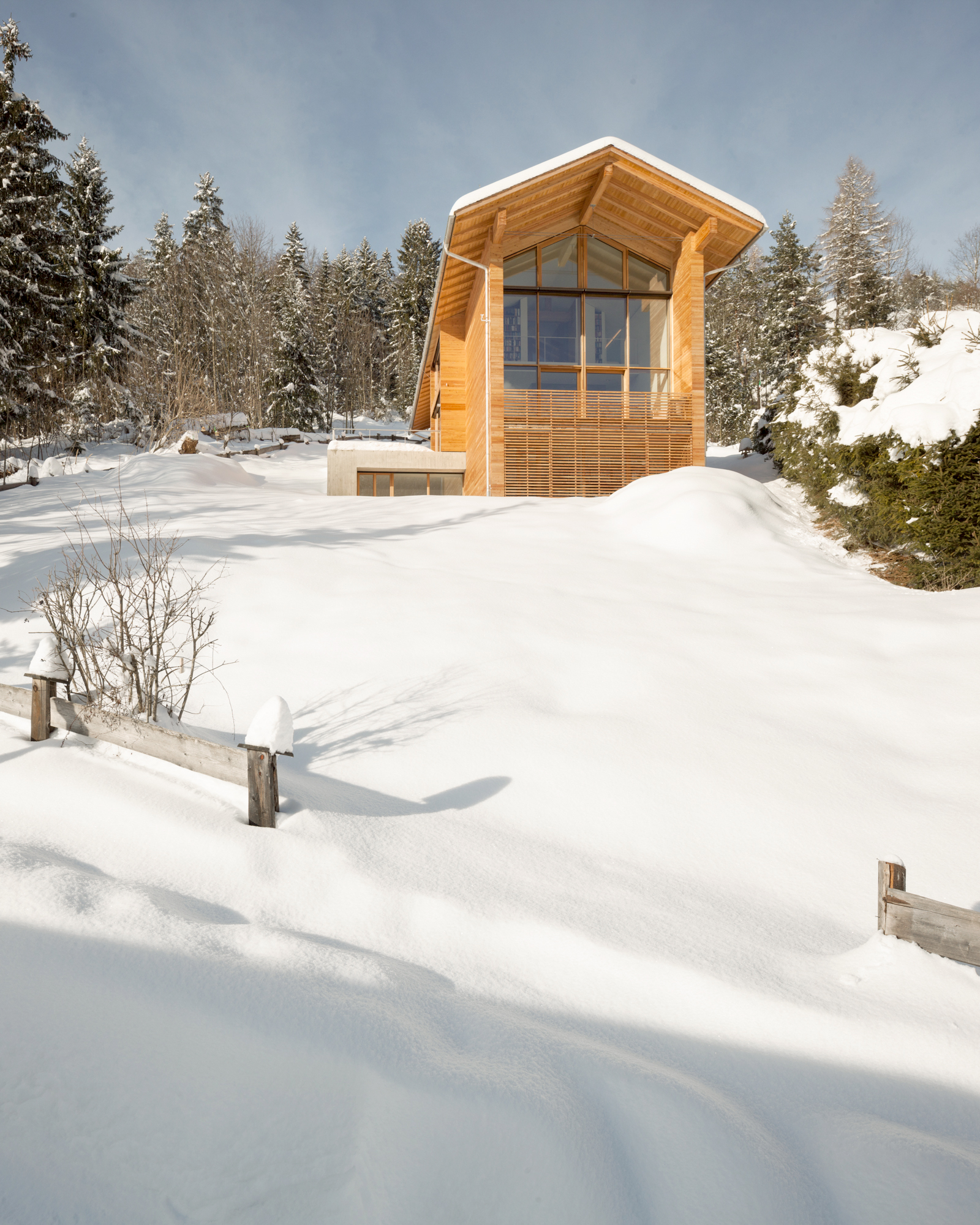
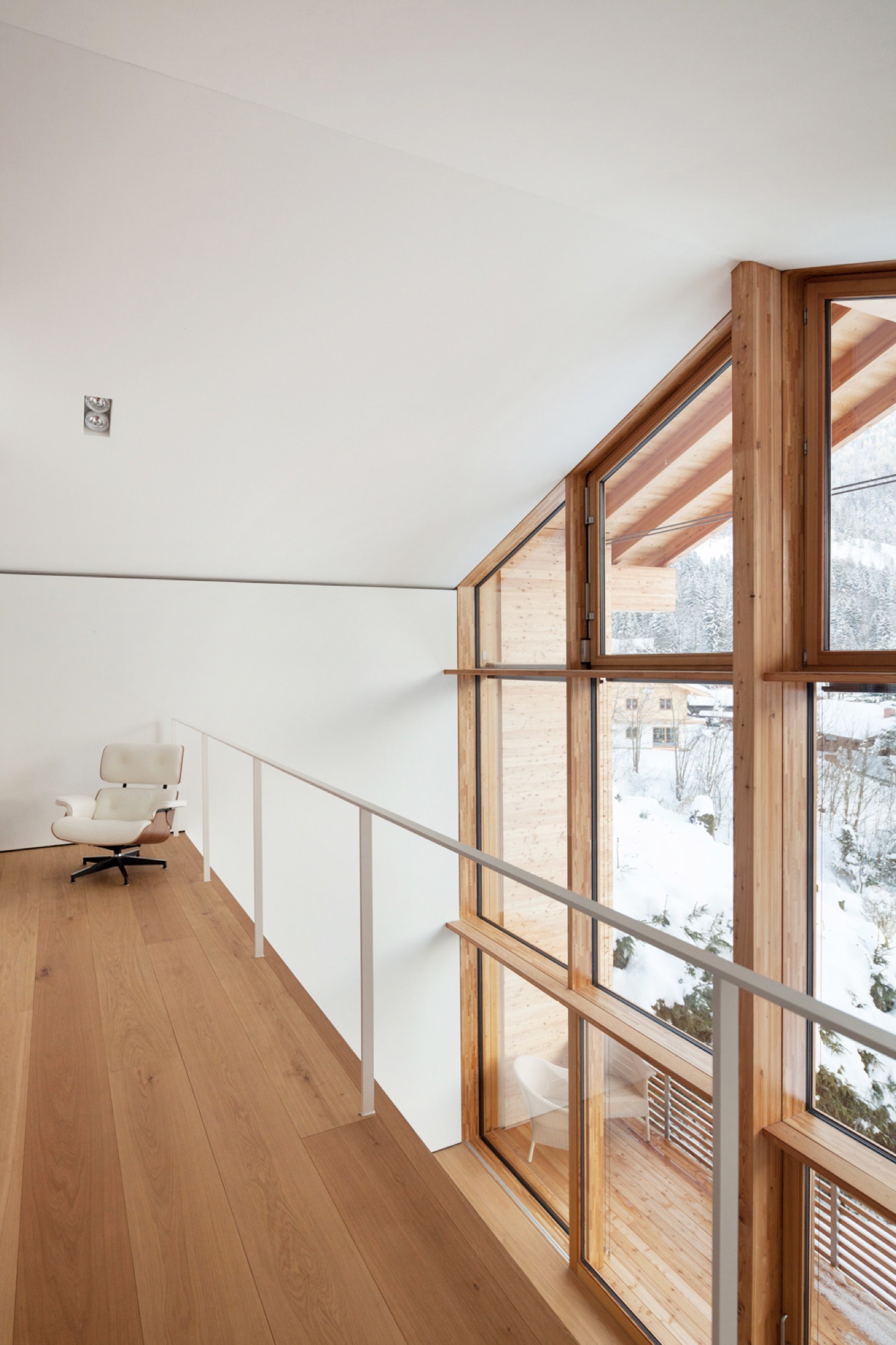
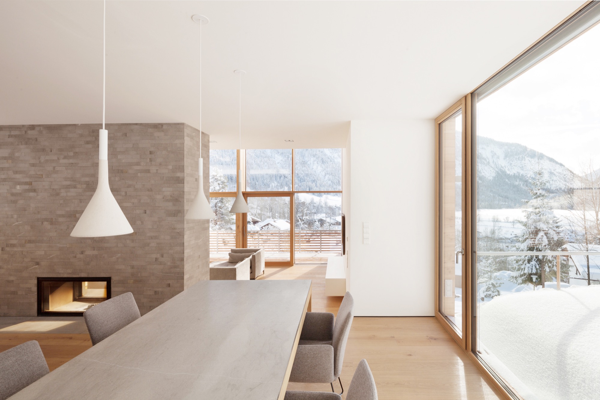
The large glass façade in the front and glass oriels on both sides of the house ensure a scenic view from the foot of the Wendelstein down to the valley from almost every room. The house's oblongness is inspired by the Alps and represents a reinterpretation of the characteristic traditional Bavarian barn. At the same time, the design concept addresses the site's narrow proportions.
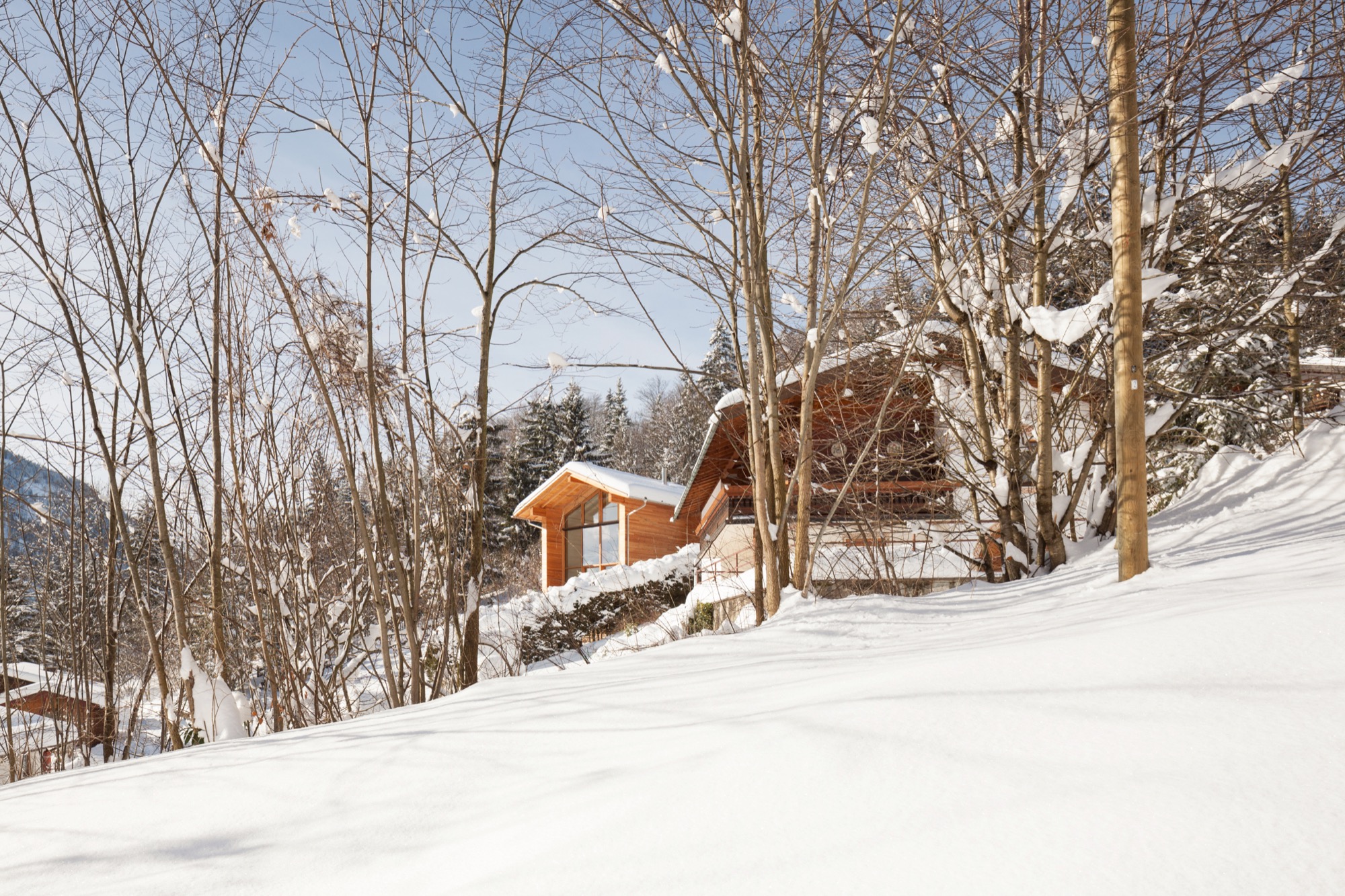
The house's materials are also influenced by Bavarian-alpine traditions — mainly larchwood in form of tongue-and-groove boards for the façade and as shingles on the roof.
Lead architects were Felix Bembé (conception) and Michael Wondre (project leader and construction supervisor). △
Hideaway Cabin
Åkrafjorden Hunting Lodge by Snøhetta in Norway
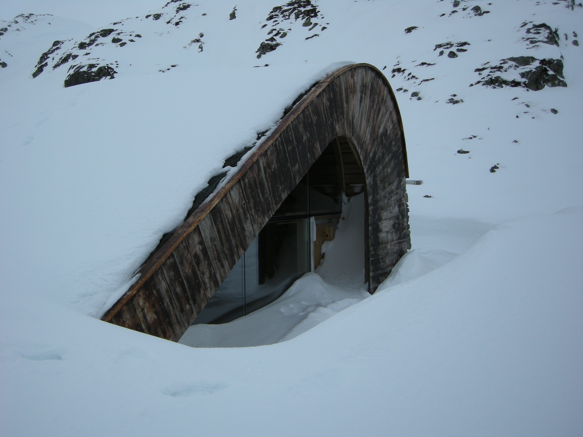
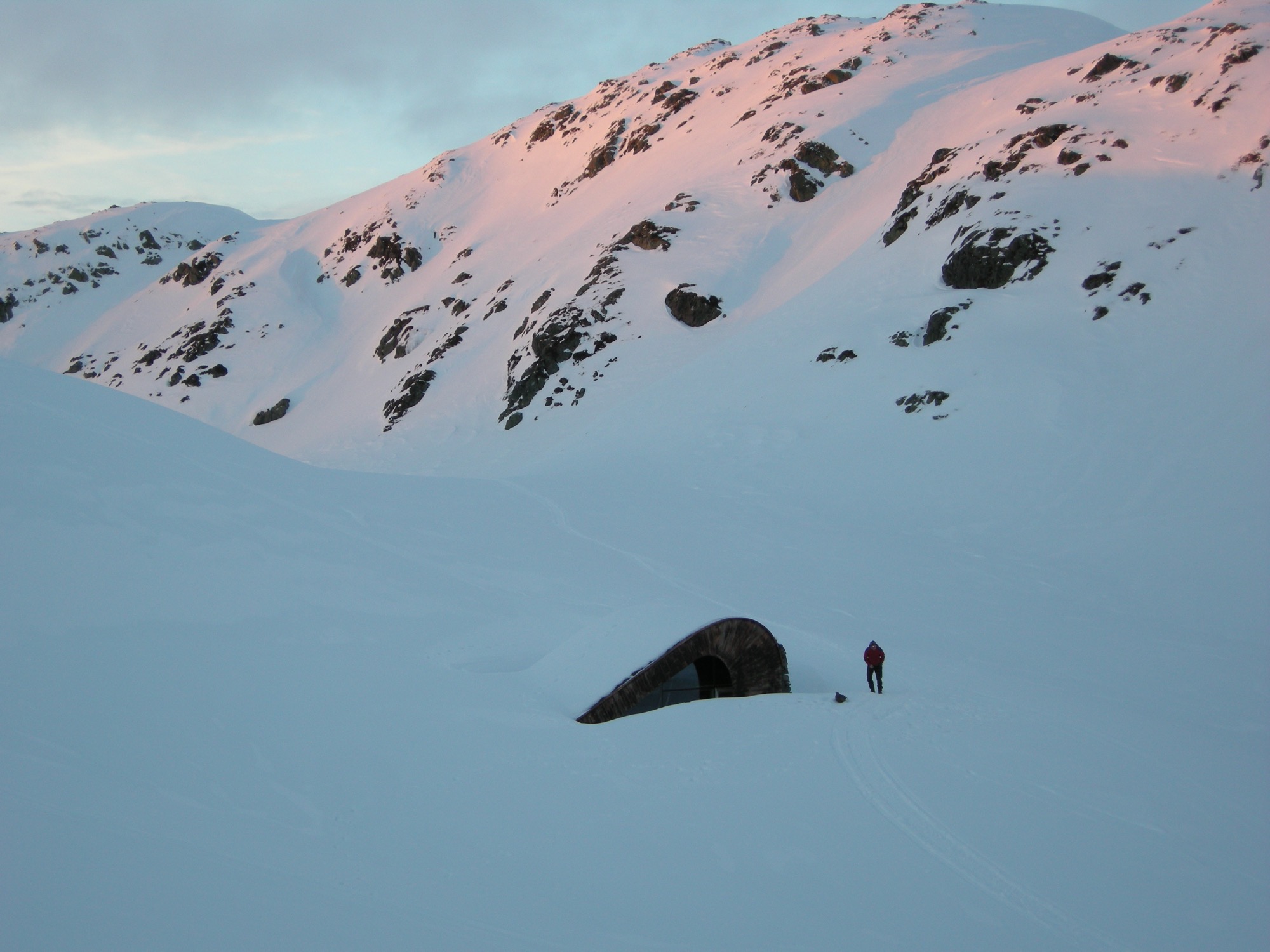
Seemingly growing from the mountain, the impossibly small Åkrafjorden Hunting Lodge by Snøhetta shelters up to 21 people. The Norwegian firm Snøhetta creates architecture, landscapes, interiors and brand design. And in this case, incredibly small architecture with a big task.
Family shelter
The project was commissioned on family farmland by Osvald Bjelland, who is chairman and CEO of the global business advisory Xyntéo and founder of The Performance Theatre, a leadership think tank.
The challenge in designing the Åkrafjorden hunting lodge on a fjord, high in the mountains above the village of Etne in Hordaland, Norway, was indeed its small size in the face of its intended use: The mountain hut was to be maximum 35 square meters (ca. 377 square feet), with the capacity to shelter up to 21 people (the same number of beds as at the family's farmhouse down in the village). Plus, the off-grid structure with no running water needed to look like it had always been there.
Only accessible by foot or on horseback, the remote lodge’s setting is beautiful, isolated, beside a lake in the untouched Nordic wilderness of West Norway.
One important part of the design concept was to integrate the hut into the landscape. Thus, the small hut’s shape, orientation and materials are influenced by the terrain’s characteristic composition of grass, heather and glacial rocks. In winter, the cabin becomes another brown fleck — like the rocks — in mounds of snow.
Modern expression of ancient traditions
The structure consists of two curved steel beams, covered with a continuous layer of hand-cut logs of timber — a fusion of modern architectural expression and the style of traditional Norwegian mountain cabins. The roof, with its organic form, “grows” out of the landscape and is overgrown with grass. The materials of the facades are local stone, tar treated wood and glass.
To make room for a surprisingly large number of guests in such a tiny space, the architects found inspiration in ancient lodging traditions: The space in the center serves as gathering place, and the beds along the walls provide a spot to sit comfortably around the middle of the room in the evening — one piece of furniture for socializing, eating and sleeping. A narrow nook by the entrance accommodates cooking equipment and storage. △
Trollstigen Visitor Center Norway
Designed by Reiulf Ramstad Architekter, the visitor center and viewing platform dramatically enhance the experience of Norway's wild nature and landscape.
Oslo-based Reiulf Ramstad Architekter (RRA) has a reputation for bold, beautifully simple Scandinavian architecture — from groundbreaking civil buildings to private Nordic holiday lodges — all bold and unhesitating in form yet free of pretense in their assertion in the landscape.

Alpine Modern has previously covered one of Ramstad's residential designs, the V-Lodge.
Now, German photographer Lars Schneider of Outdoor Visions shot one of RRA's public works for us, the Trollstigen Road Visitor Center. Opened in 1936, the Trollstigen National Tourist Route stretches 106 kilometers (66 miles) through West Norway's mighty nature. Ramstad's firm designed the visitor center to enhance the experience of rugged mountains, waterfalls and deep fjords.

Lars Schneider's report from the road
"I was on assignment in Norway, shooting for an outdoor clothing brand. The night I captured these images, after the client and the models had left for the hotel at one o'clock in the morning, my assistant and I decided to spend the rest of the night in the mountains. The sky looked promising, and the sun rose at 3:30 am that time of year.
"We lingered around the visitor center for a very long time. Besides taking in the spectacular views and the sensational light, we quite enjoyed the fact that we had all this to ourselves. During the day, droves of tourists swarm Trollstigen, eager to take tight hairpin turns winding up and down the steep mountainsides and to take in the untamed Nordic vistas. Not having to share all this with anyone was immensely gratifying.

"The architecture is grandiose. Everything very sophisticated, rectilinear, pure, considered... yet beautifully assimilated into the scenery." △


Context and Contrast in the Alps
An Austrian vacation home’s design references its mountainside setting and expansive views across the valley
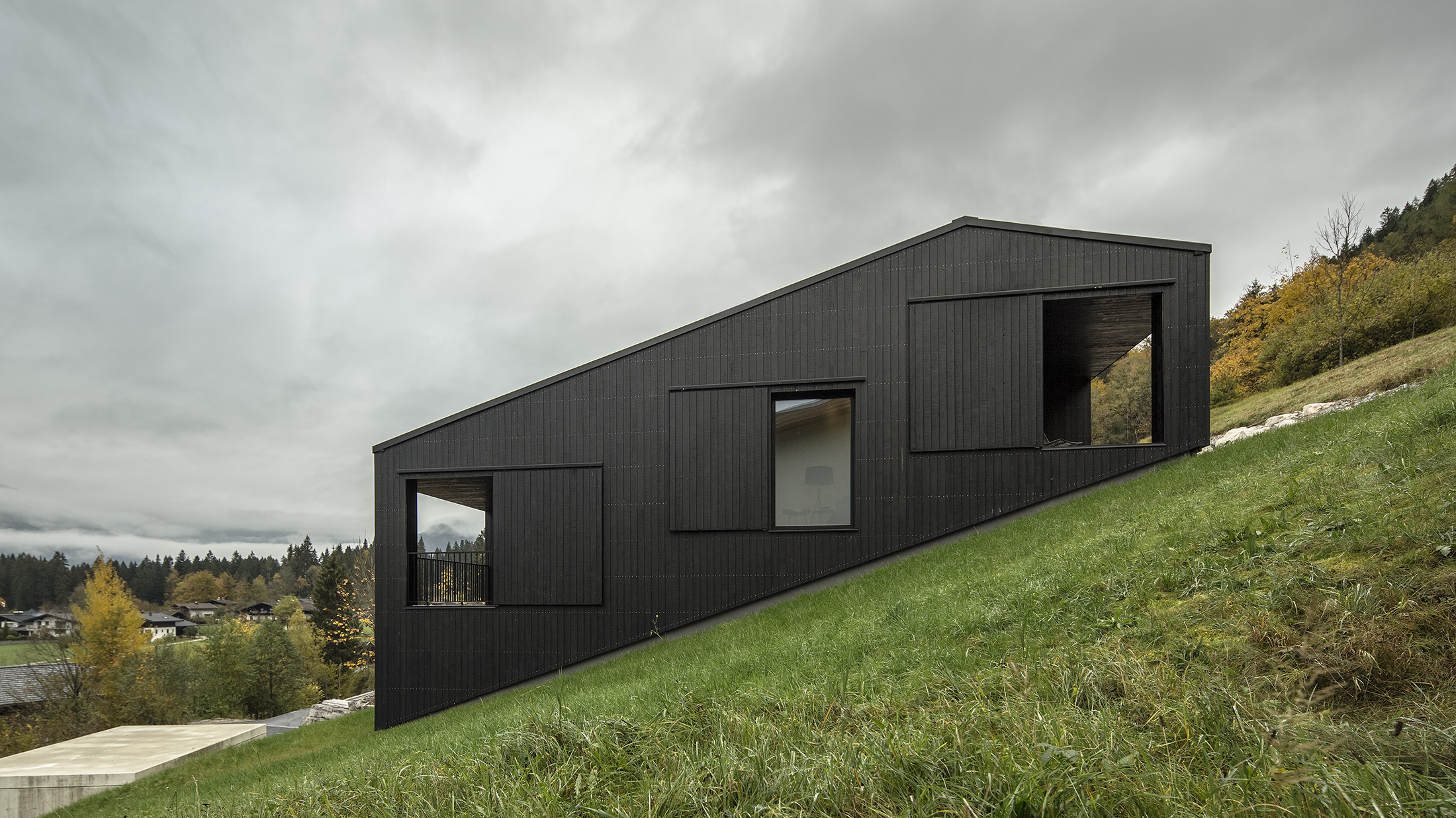
The 106-square-meter (1141 square-foot) home’s design is based on a flow of rooms that follows the terrain’s slope and an open floor plan organized on three levels. Covered loggias extend the living levels upslope and downslope, creating interfaces with the alpine surrounding. The black wood structure confidently makes its mark in a heterogenous setting.
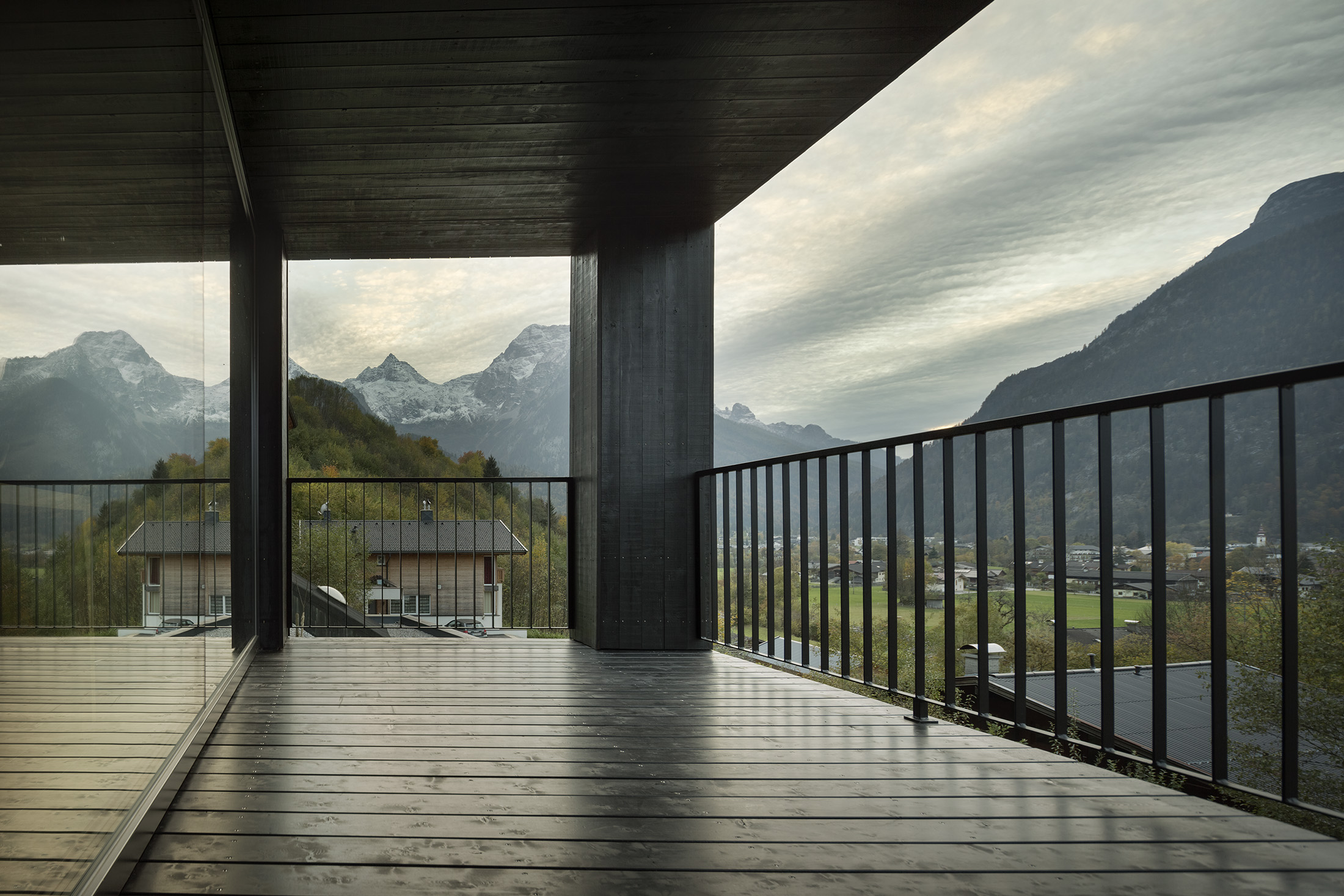
The client’s program for this vacation home near Zell am See in the Austrian state of Salzburg was simple: a great room with integrated kitchen and dining, sleeping quarters with an en-suite bathroom for each bedroom, a guest suite, and a covered outdoor space that offers mountain views from morning until evening. A carport and practical storage spaces were to round out the project.
Design trilogy
The design by architect Thomas Lechner, principal and founder of LP Architektur, is organized in three areas: arrival, function and living. Positioning the house in the context of building on a mountainside with majestic views as “counterpart” was of the essence.
The first area — arrival — is situated directly down by the street, with a carport plus storage room as prelude. Ascending to the vacation domicile, long stairs coil near the top and reorient the visitor toward the valley and the surrounding mountains.
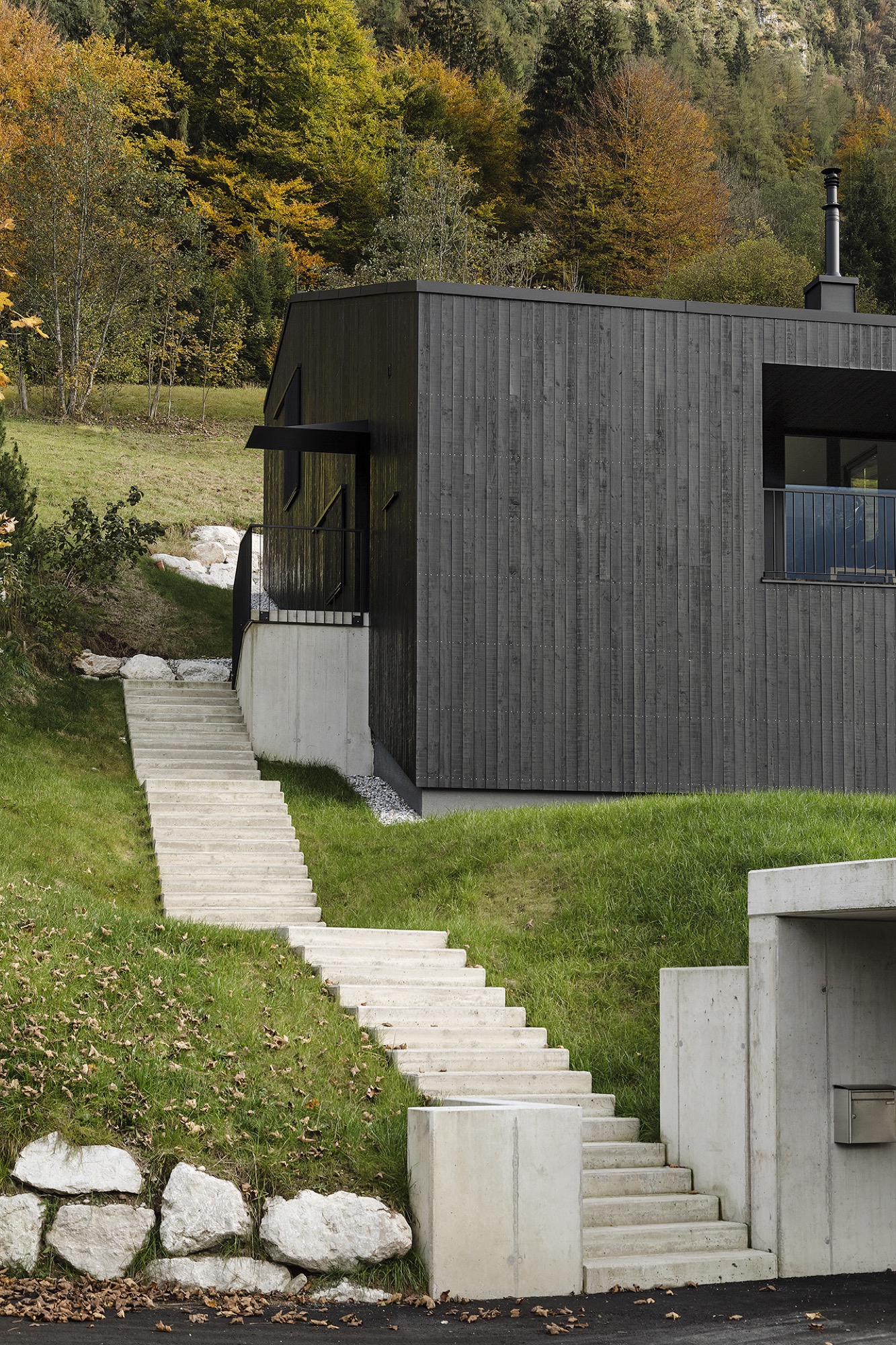
The entrance to the house creates the interface to the second area — function — with functional spaces on one level. One has arrived, may want to hang up his or her coat and perhaps use the powder room.
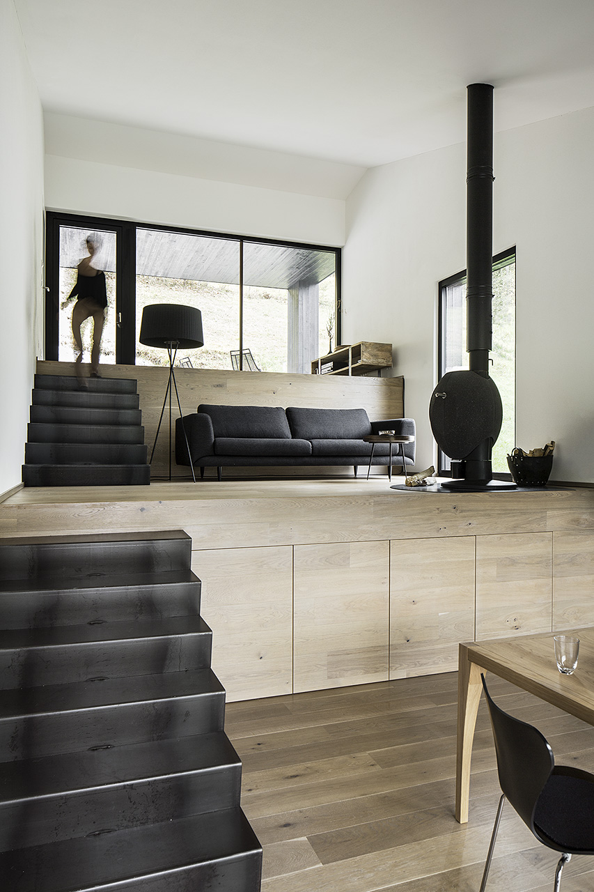
Passing through the space dedicated to the arrival, the interior opens to the third area, the great room, which is arranged and organized in three levels that follow the slope of the mountainside. Single flights of stairs connect the living levels. Kitchen and dining are in the center, a fireplace area below and a space to read above. The grading creates each area’s back, providing a sense of security. Despite the spaces’ connectedness, each level is differentiated by its distinct formulation. The center area is dominated by the view out the window dominates, with the mountains as theme, like in a painting on the wall. The levels above and below, however, can be interpreted as interfaces to the outside, with covered loggias extended each respective room to the outside and opening it up into nature. The open-sided rooms offer a protected space for being outdoors during its assigned time of day. The level with the fireplace thematizes the relationship to the surrounding mountains and the panoramic views, while the reading level signifies retreating to a confined space in reference to the immediate surroundings.
The main living area leads to the north-east-facing bedrooms, each with its en-suite bathroom, which then also belongs to the house’s function part.
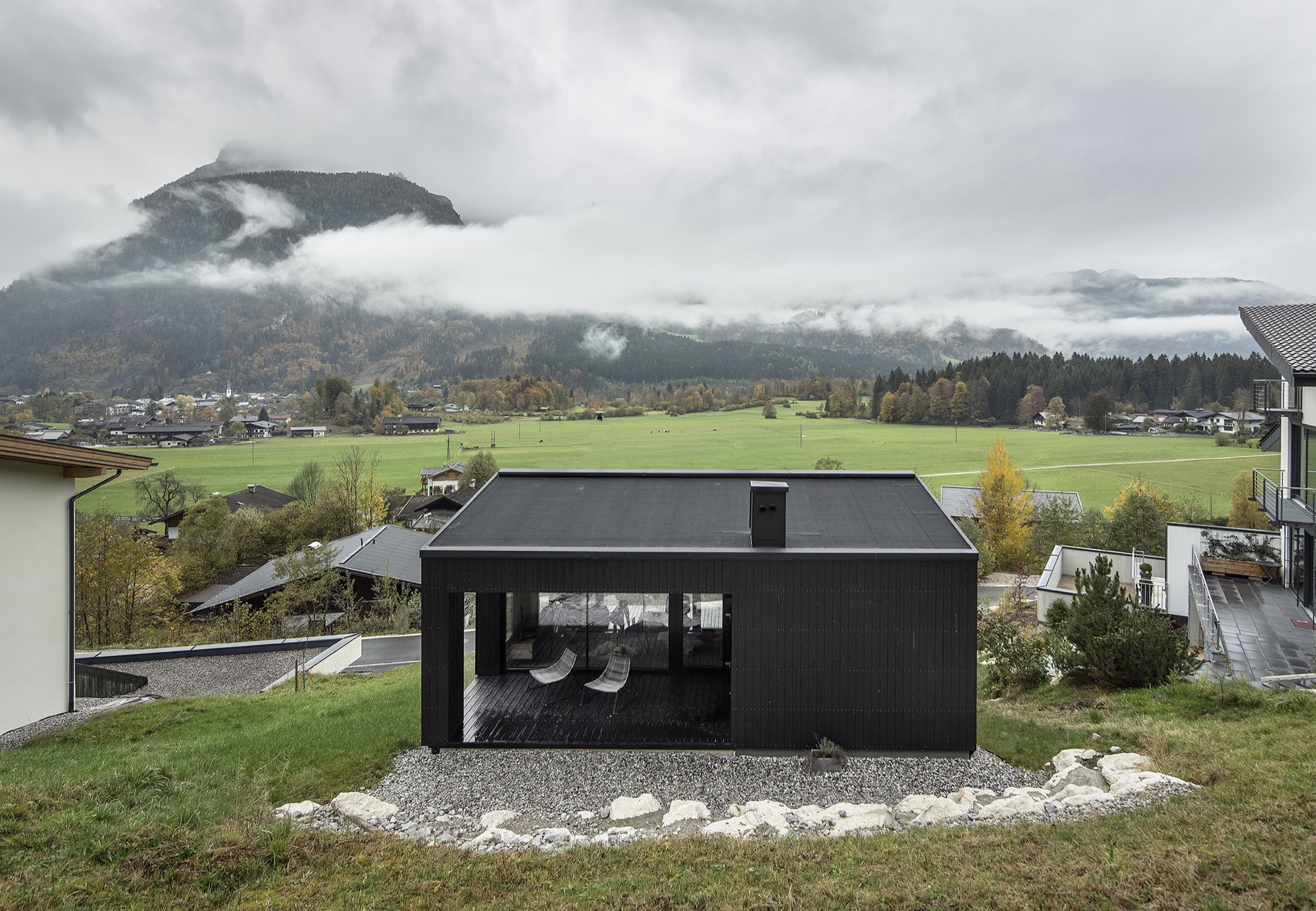
Compress and release
The house’s overall concept comprises a variety of spaces and rooms, each offering distinct individual qualities. Depending on needs and mood, one can retreat, disappear, feel snug. Yet the home also offers opportunity to experience the expanse and freedom of the alpine landscape unfolding outside.
This contrast, the polarity, is also reflected in the choice of materials. Painted black on the exterior, the timber structure confidently claims its space within its surroundings. By contrast, the light, warm interior affords a comfortable environment where one can relax and recharge. △
Narrow Escape
Falling in love with an impossibly narrow lot on a mountain village's main street, A Denver architects builds a 15-foot-wide weekend home for his adventurous family
Incited by a seemingly impossible building site in an old railroad town above Vail Valley, Colorado, a Denver architect designs a 15-foot-wide sustainable mountain getaway as a speculative investment for sale. Then his adventurous family falls in love with the home. It was an eyesore. Passersby merely saw a ramshackle trailer overstuffing the 25-by-100-foot (7.5-by-30-m) lot on Main Street in Minturn, Colorado. Yet, André Vite spotted an opportunity.
The campus architect at the University of Colorado Denver and his wife, Ginger Borges, an oncologist at the University’s medical school, have a weakness for obscure properties. That evening three winters ago, however, they maintain they were not scoping out a new venture at all. The couple and their preteen sons, René and Niko, were headed to the old railroad town up Eagle River for dinner after a day of skiing in Vail. “We drove through Main Street Minturn, which is a town we go to all the time, and there was a mobile home for sale that was just totally wedged in and awkward looking,” Vite remembers.
Even though he didn’t know what to do with it at the time, the architect wanted that piece of land. And he got it without difficulty because the city planners had been eager to get that blot off Main Street.
The draftsman went home and started sketching.
S(e)izing the Opportunity
The lot’s appeal was twofold: It was located right on the town’s main stretch and it was zoned for mixed use. “From a planning and zoning standpoint, it was a fantastic opportunity,” says the architect and urban designer, who also heads his own practice, the Vite Collaborative. (Or, as he describes it, “A bunch of friends working on unique projects together.”) If for nothing else, Vite purchased the property at a propitious time. The shops along Main Street had been expanding in that southern direction in recent years. Thus, Vite had originally designed the project as a residential spec home with the option for retail or commercial space on the ground floor.
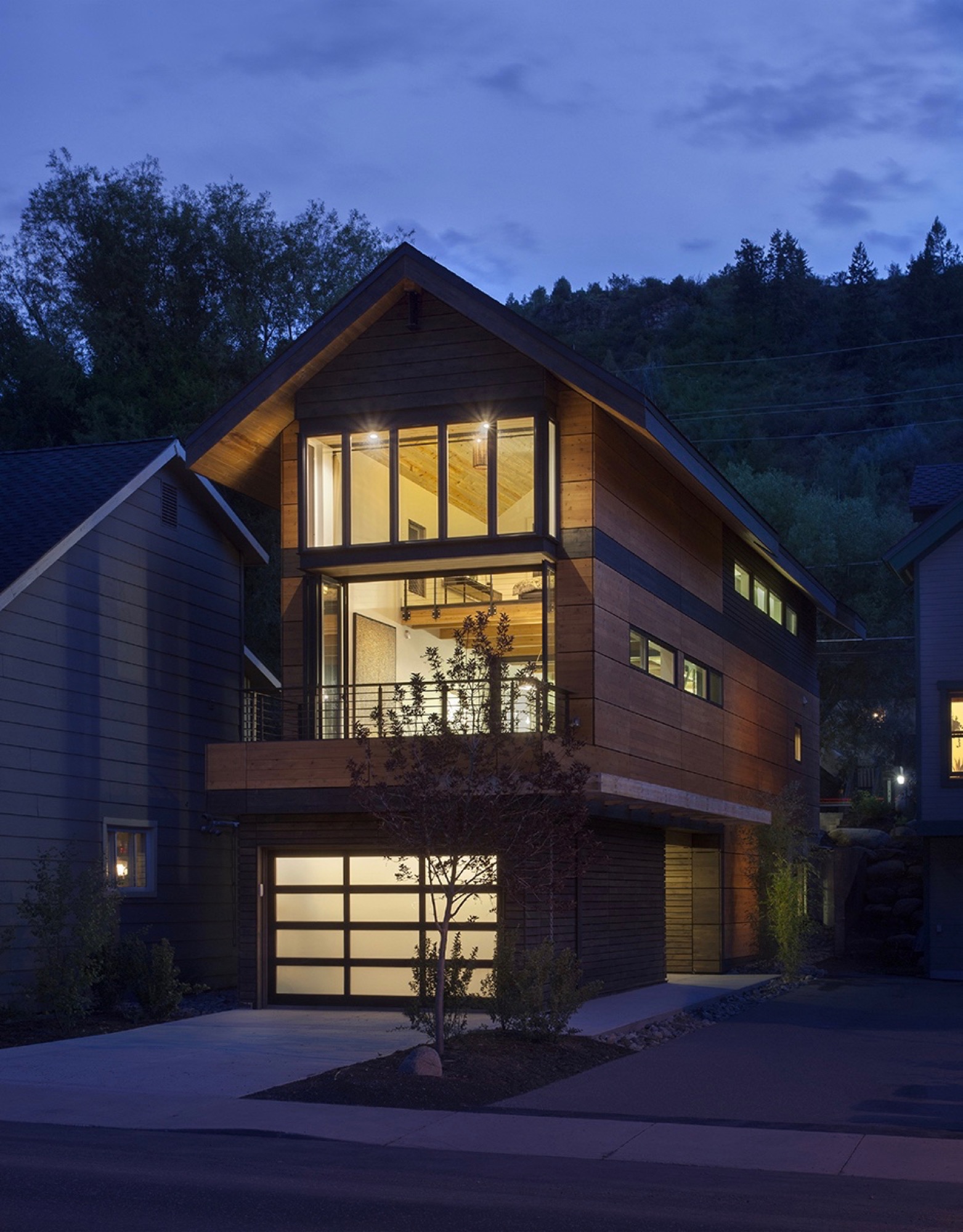
While the sliver of land overlooks the principal artery of town life on the Main Street side, the opposing end couldn’t have more different surroundings — a quiet residential street with community gardens across the way. “From an architectural design proposition, that was very exciting to see how you could work this with two faces of the building,” Vite recalls. “Both facades relate to the context of the side they are on.”
“From an architectural design proposition, that was very exciting to see how you could work this with two faces of the building.”
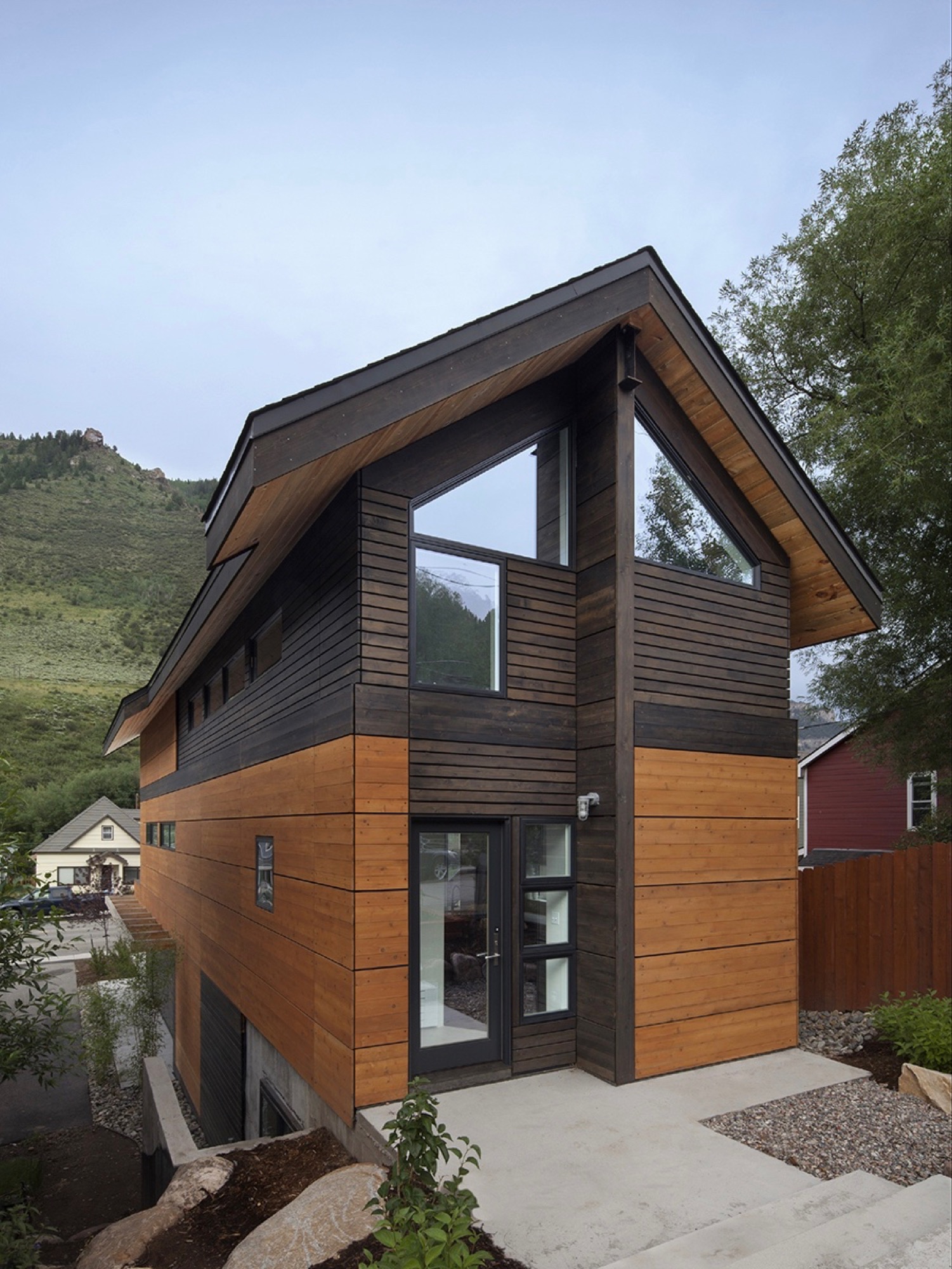
Yet another challenge the building site posed was the 10-foot grade change between the two frontages — an entire story difference, front to back. That was not all. The town’s zoning laws required a 5-foot setback from the property line. The house could be only 15 feet wide.
Fortunately, the neighbor’s garden to the south and a driveway next door to the north give the narrow site extra breathing room. “It’s true, it’s a very constricted site, and the response was a very long, narrow building, but it’s still flooded with light,” Vite says.
"It’s true, it’s a very constricted site, and the response was a very long, narrow building, but it’s still flooded with light."
Unconstrained creativity on 15 feet across
The building constraints — the narrowness, the contrasting major facades, the steep slope — only spurred Vite’s imagination and inspired innovative solutions. How did he create a modern living space — an entire three-story house — with 15 feet (4.6 m) across to work with? The architect’s answer was a structural steel frame, an element adopted from commercial construction, which gave him the structural freedom to engineer large open spaces on the inside. “It’s a steel moment frame structure with three beams that go all the way down the building. Then there is a steel beam across the top.”
The steel beams manifested what would become part of the narrow house’s legacy, and with it, a close relationship between Vite and the local builder, Brian Beckett. “When he was erecting the moment frames, Brian called me and said we can’t put the roof on tomorrow,” Vite says. One of the moment frames had been a quarter-inch off plum, which was still well within building tolerances. As might be expected from the sanguine architect, the holdup was anything but a point of contention; on the contrary. “To have a guy who takes this that seriously was just really important to me. I knew I was going to get a great building from him,” says Vite. “The main draw to this project was the relationship I developed with the builder. It became evident early on that he cared about craft. We’ve become great friends.”
“The main draw to this project was the relationship I developed with the builder. It became evident early on that he cared about craft. We’ve become great friends.”
Actually, there was one moment during construction that did stop the architect in his tracks. After Beckett put the roof on the now-perfect steel frame, he took a picture and sent it to his client in Denver. “It looked like a tube; like you wouldn’t ever want to live in anything like it,” Vite remembers his initial reaction. “It wasn’t until we started finishing it out that it turned into what we’ve got. But that was a scary point, because it was so narrow.”
Family first
By the time construction was completed, the next ski season was approaching. Vite and his family had frequently driven up from Denver to ski in the Vail Valley during previous winters. “We decided we would use the house for that ski season,” Vite says about the investment property he had just finished. “We spent that ski season there. After that, we didn’t want to lose it.”
“We spent that ski season there. After that, we didn’t want to lose it.”
The unique house itself wasn’t the only reason the family never wanted to move out. “We absolutely fell in love with Minturn. It’s the real authentic mountain community between Beaver Creek and Vail, where you have all these people who are transient and vacationing. The people in Minturn are really the ones who keep that valley going,” says Vite about the mountain town’s thousand or so residents.
What’s more, Borges not once considered her husband crazy for building this improbable house. “We’ve been married for twenty years,” Vite laughs. “She is used to that.” And attuned to narrow dwellings she was. The first home the couple restored and lived in together was a townhouse in Boston’s Beacon Hill neighborhood that was only 14 feet wide. “She’s getting an extra foot,” Vite exclaims, insisting his wife was thrilled about the idea to keep the Minturn house. Now the four escape up here nearly every weekend, year-round, to fish, drive their go-kart, hike — or ski in winter.
Open space to monkey around
Since completion, the house has evolved into a fun destination in its own right for the adventurous family. “The narrowness drove the whole architectural design in choosing a steel frame so that the interior could be completely open,” Vite says. Scarcely any interior walls partition intimate bedrooms and private bathrooms from the open, free-flowing floor plan. At the bottom, the concrete foundation encases a below-grade guest bedroom and bathroom on the dwelling’s Boulder Street side. Because of the steep slope, the opposite end is above ground, where the garage faces Main and can be extended out to the street for a future retail space.
“The narrowness drove the whole architectural design in choosing a steel frame so that the interior could be completely open.”
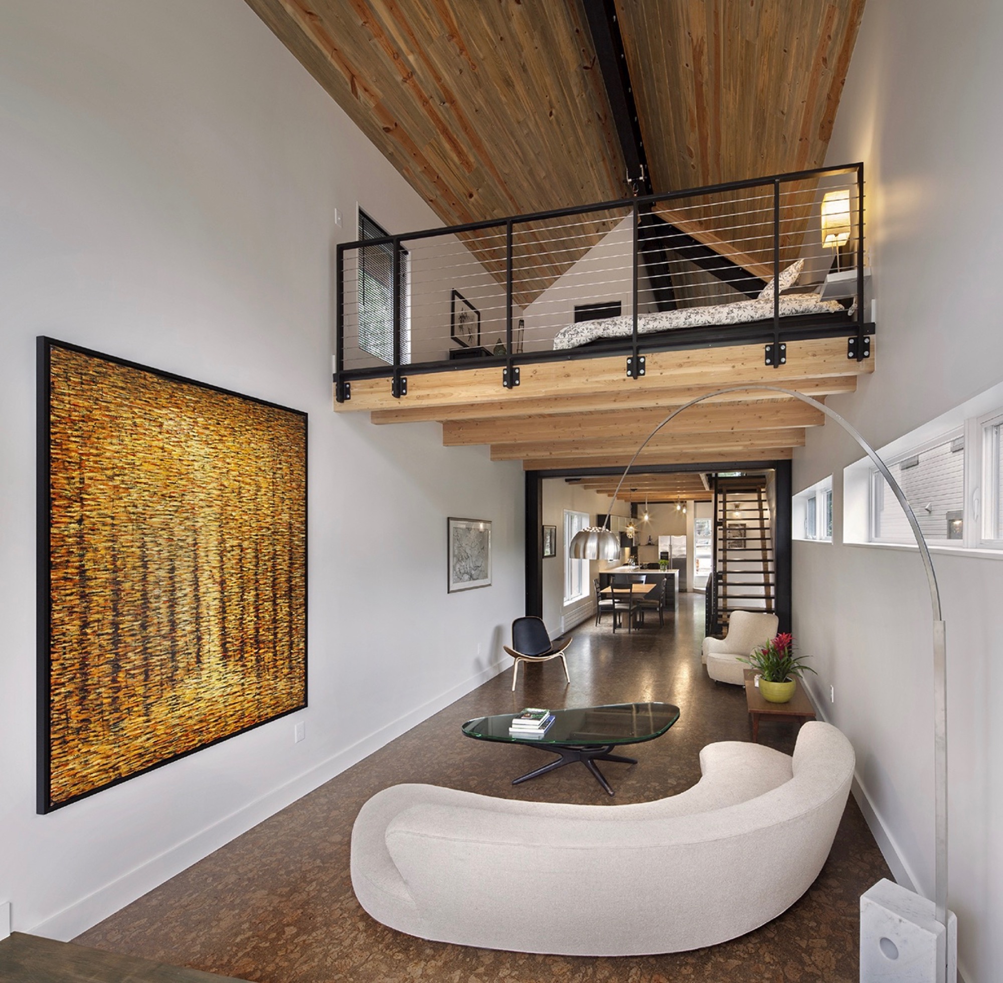
The ceiling of the modern living room on the second floor rises two stories with an overlooking loft, the parents’ open bedroom. The boys’ west-facing bedroom is tucked behind the “master” (or in front of it, depending on which frontage you interpret as the face of the house).
The family spends most of their time together in the open living space with the curved white couch. “We take this big picture off the wall and project movies onto the wall.” The cork-floored main living area flows outside through a folding glass and steel wall that opens up to the deck. A minimal dining area in the middle transitions into the kitchen, Vite’s favorite spot in the house.
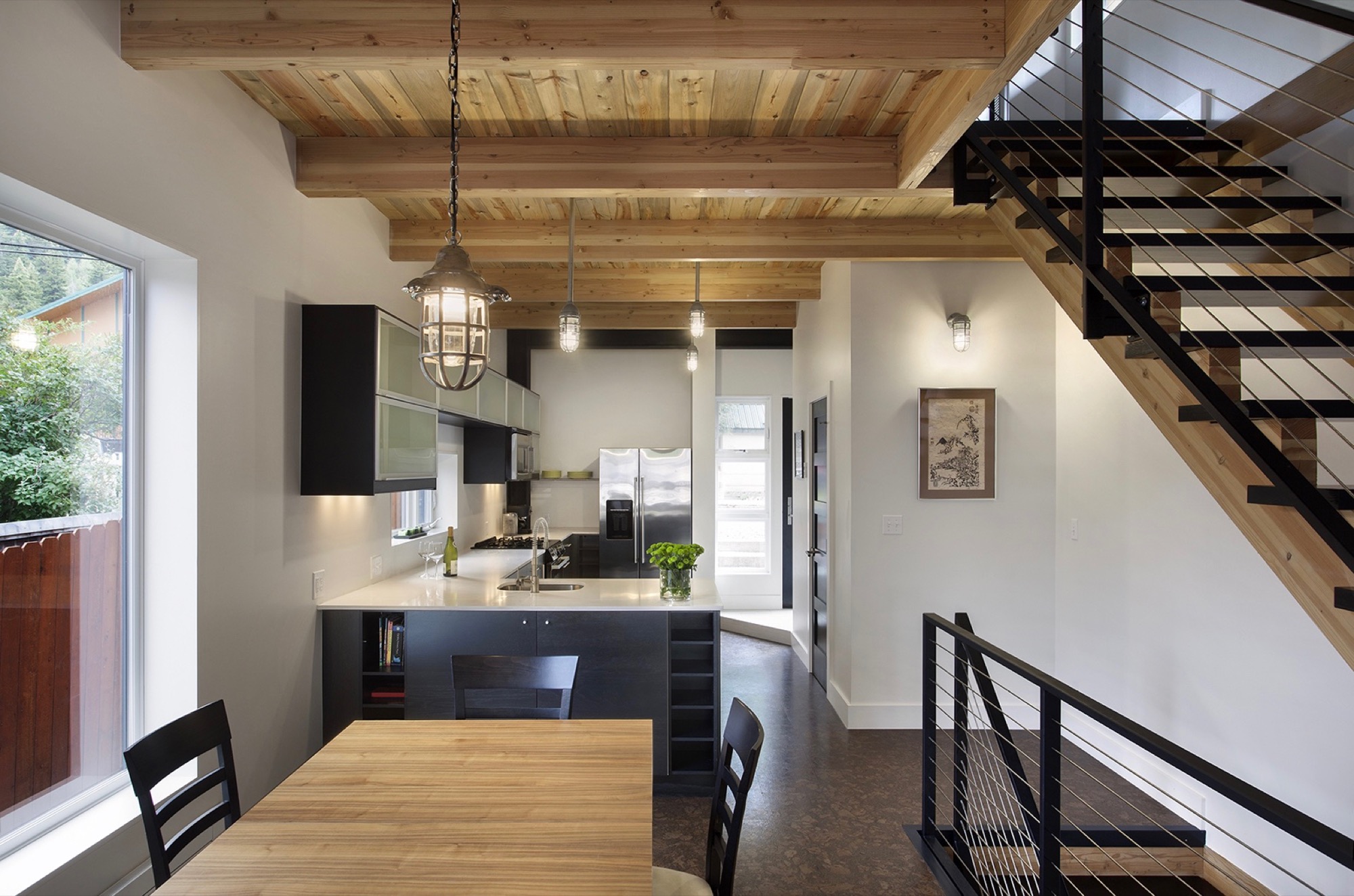
“But what the kids love is this 26-foot space here,” says Vite, pointing at the high living room ceiling, where he mounted a climbing rope. “They get to climb up this wall that’s all blocked with wood, ready to put in finger holes for a climbing wall.” Climbing is indeed the boys’ favorite indoor pastime. “They climb everything they can get to,” their father reveals, pointing to a trolley that runs down the steel beam under the roof above the master loft. “You can strap yourself onto here and then push off.”
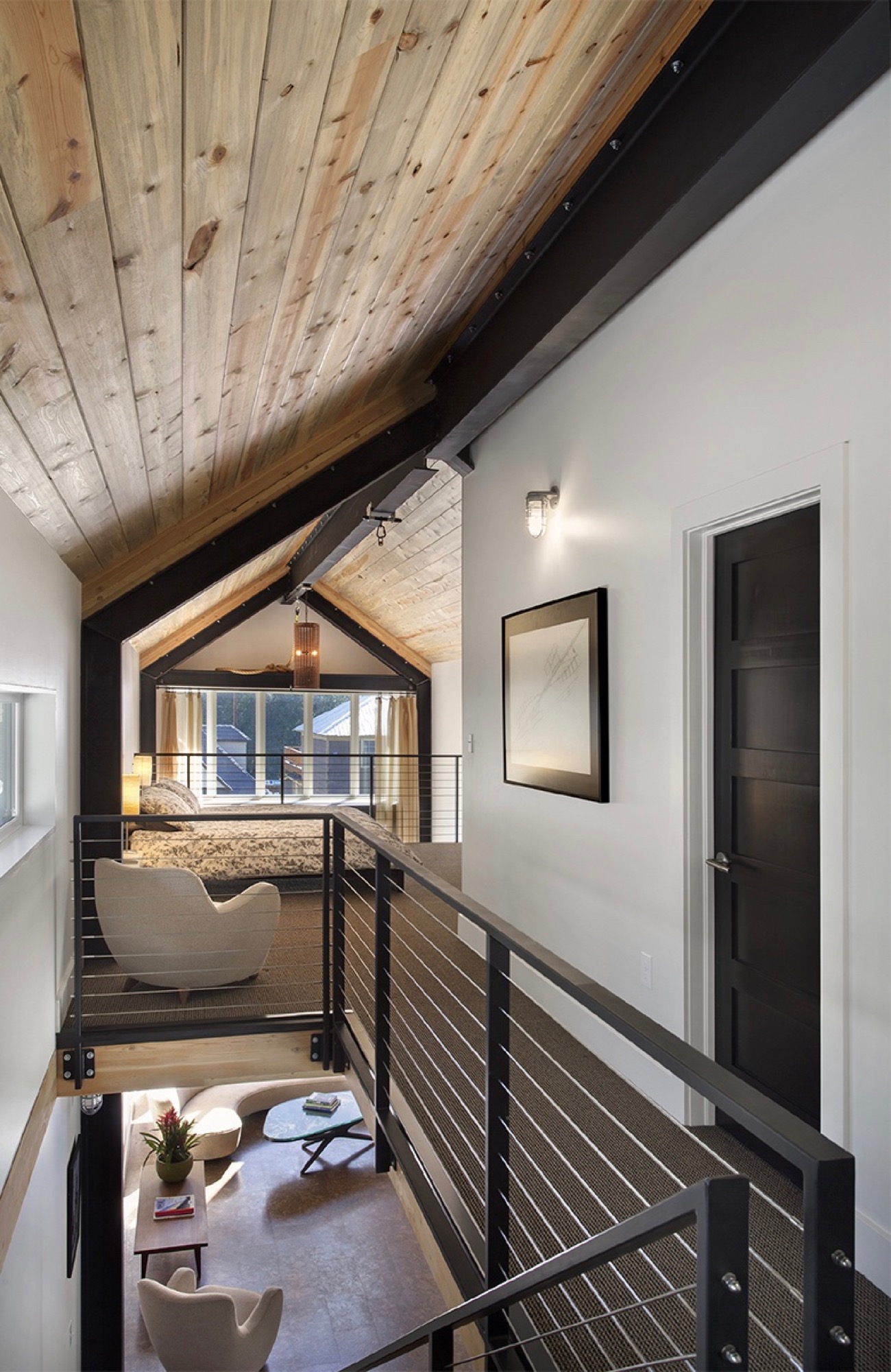
In addition to providing a place for the family to escape the city on weekends and holidays, Vite wanted to set the stage in the house for a few cherished vintage pieces he inherited from his late parents. “The interior design was all about finding a home for my father’s old furniture he had bought in the early sixties in New York. It’s all authentic midcentury-modern furniture, and I designed the interior around it.”
Sustainability as style
The LEED-accredited architect is reluctant to categorize the architectural style of his idiosyncratic house. “What they call it up here is a contemporary mountain home, because it very much has the feel of a timber frame, although it is done in steel,” he says. “But rather than talking about a style, the sustainability feature is more important to me.”
From the construction standpoint, the house is based on a standard wood module to limit material waste, which actually got Vite in trouble with one particular Minturn resident. “There is a guy up here who goes around the construction sites, picking up wood waste for his wood-burning stove at home. He would complain that we didn’t have enough wood waste and gave us a hard time.”
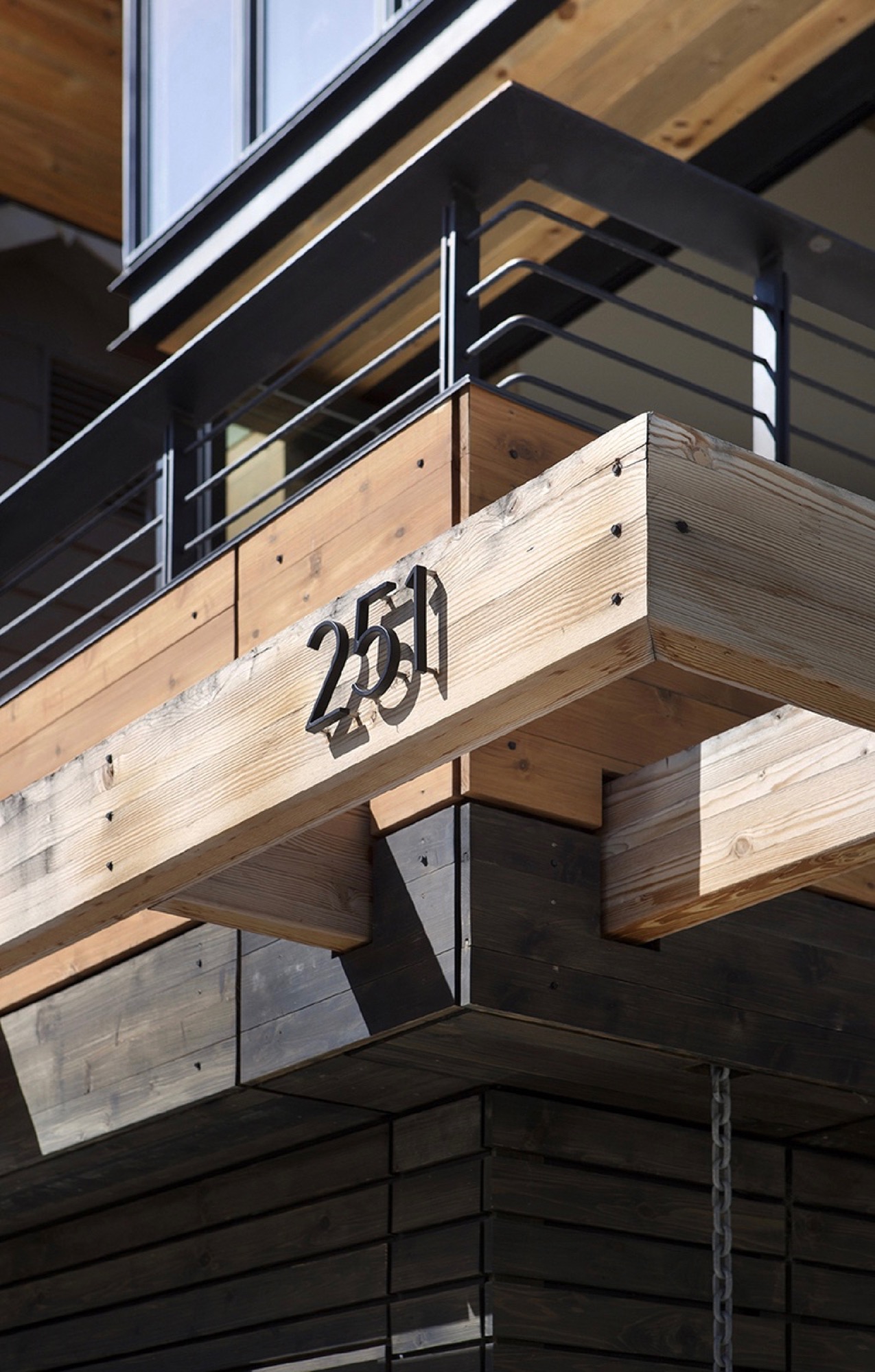
The carefully calculated use of exterior wood is to protect the building from driving rain in support of the actual weather barrier behind the wood. “All these gaps are open,” Vite shows. “It’s like the house is wearing this jacket. The wood is there for added protection, and the jacket breathes.” Air exchange is critical for a highly insulated house at this altitude, where the air is extremely dry. “You are living and cooking and doing all these things that increase the humidity inside the house,” he explains. Instead of trapping the warm, very moist air inside, the house can breathe it out. Vite also installed a heat recovery air exchanger that pushes warm, inside-air to heat colder air coming in to ventilate the house, without using the heating system.
“It’s like the house is wearing this jacket. The wood is there for added protection, and the jacket breathes.”
Vite received the 2013 Award of Citation from the American Institute of Architects for this project.
Tight house, tight Community
Being awarded such a significant professional accolade from AIA is nice, sure, but what truly warms the architect’s heart is how the locals perceive the standout structure they’ve come to call the “skinny house.” “We get compliments on it all the time. People are stopping by, saying they’ve watched it go up and want to look at the inside,” he says. “I love that the town loves the house.” △
“I love that the town loves the house.”
A Whistler A-Frame
Scott & Scott Architects design an outdoorsy Vancouver family’s dream cabin
If the multiple languages and accents overheard in lift lines and on gondolas tell any kind of a story, it’s that everyone from everywhere with a serious interest in skiing or snowboarding is making a beeline for Whistler Blackcomb. More and more of those visitors are putting down roots with a second home in this outdoor wonderland north of Vancouver, Canada. Some buy condos in the heart of Whistler Village or townhomes with ski-in/ski-out access to the slopes. Others build luxurious heavy timber colossi in swank residential areas that have grown up around the resort’s edges.
No matter their size, most of these mountain retreats share the following design elements: wilderness building materials, either structural or decorative, and floor plans and amenities that mimic those found in city interiors.
While there is nothing wrong with having a second home in the mountains that works much like a primary one in the city, some younger ski and snowboard families have begun to question why they would want to occupy such a space when a more indigenous—and much radder—alternative is available: an iconic A-frame cabin.
Return of a classic-modern icon
Ah the A-frame, that staple of mid-twentieth-century vacation home vernacular that was massively popular across the North American outback from the 1950s through the 1970s. There is no way this odd-looking triangle-shaped structure, which got its start in ancient days as a roof hut in Japan and a storage shed in Europe, could be mistaken for anything urban. Attempts in the sixties and seventies to make it a city building resulted in churches, fast-food joints, suburban houses and motels that were novelties even then.
The classic post-Second World War A-frame cabin was a purpose-built backcountry bolthole. Its simple construction, minimal building materials and absence of fancy finishes made it a preferred DIY project for Mad Men-era handy men, and in the 1960s, A-frame cabin kits sold briskly. Most of these ready-to-assemble weekend homes shot up in snowy locales.
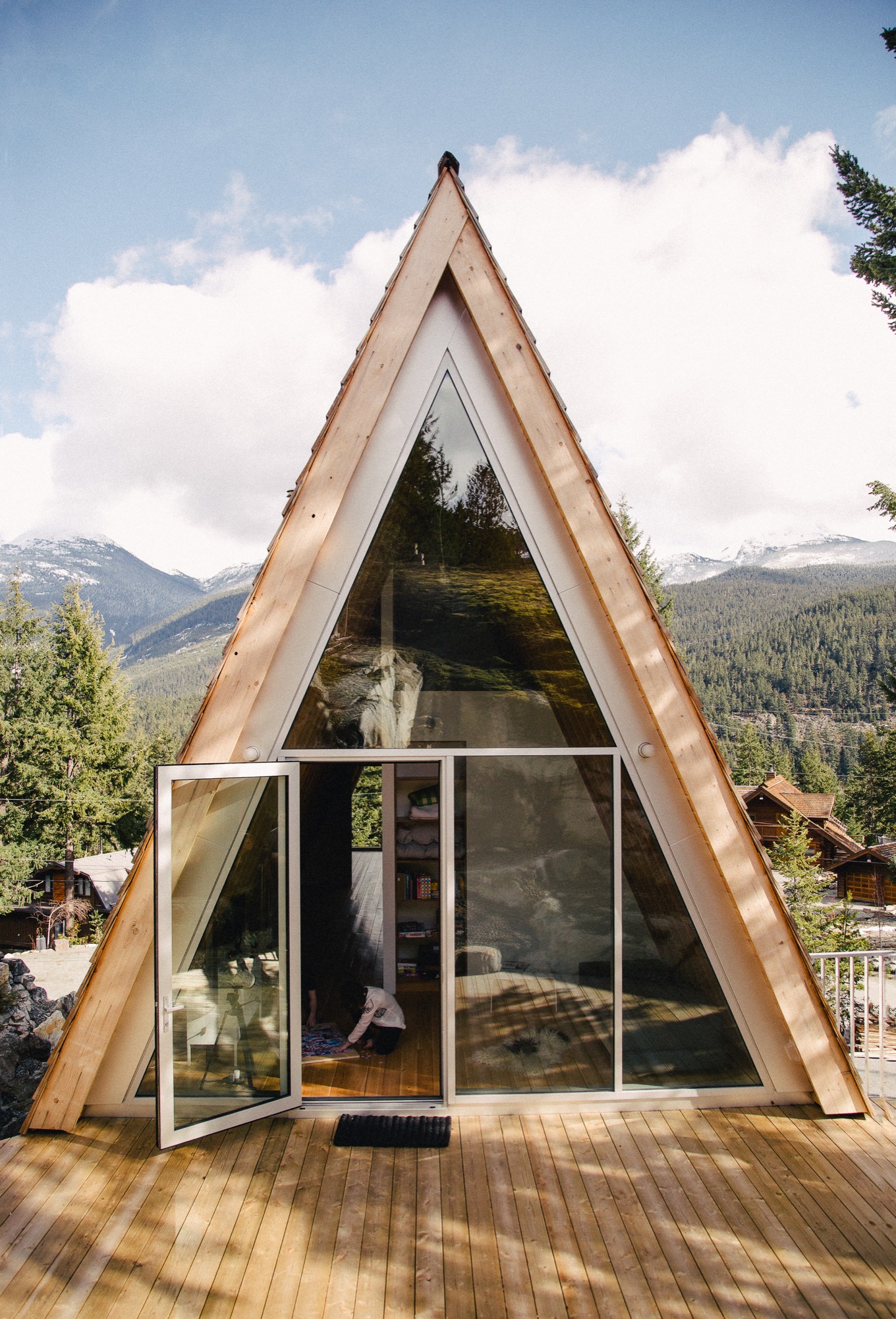
One reason for this is the A-frame’s radical roofline that extends down to the ground on two sides, which helps shed any snowpack. Another is its ability to capture natural light. The A-frame’s roof supports all of the building’s weight, freeing up the gable ends to be filled with wall-to-wall glass.
A third reason for its easy fit in alpine terrain is one you might not have imagined given the A-frame’s modern, inorganic appearance. In this landscape, it can be a chameleon, a slender, weathered wooden form indistinguishable from evergreen trees.
For all of its baked-in virtues and utter lack of pretense, the A-frame is enjoying a renaissance. Outdoor types who value authenticity are enthusiastically rescuing original 1960s and 1970s models, hand-building replicas (check out the Urban Outfitters online journal for directions on "How to Build an A-Frame Cabin") or commissioning fresh versions that honor the building's honest materials and original intent, which is what Vancouverites Melanie and Brenton Brown did when they gave the go-ahead for the elegant update pictured here.
A family’s dream
For years, the outdoorsy couple and their energetic offspring, Daisy and Finn, now eight and 13 years old respectively, bunked off and on with close friends in their 1980s A-frame in Whistler’s Emerald Estates neighborhood. In 2014, the family decided to build their own variation on a property up the street from their friends. “We wanted a new cabin that would not look out of place with the older ones in this area,” says Brenton, CFO for the Vancouver-based digital commerce platform Elastic Path Software. “An A-frame felt like the perfect fit for us,” says Melanie, who is an interior designer. “It has a retro feel we love and, obviously, we knew what we were getting into with this type of building.”
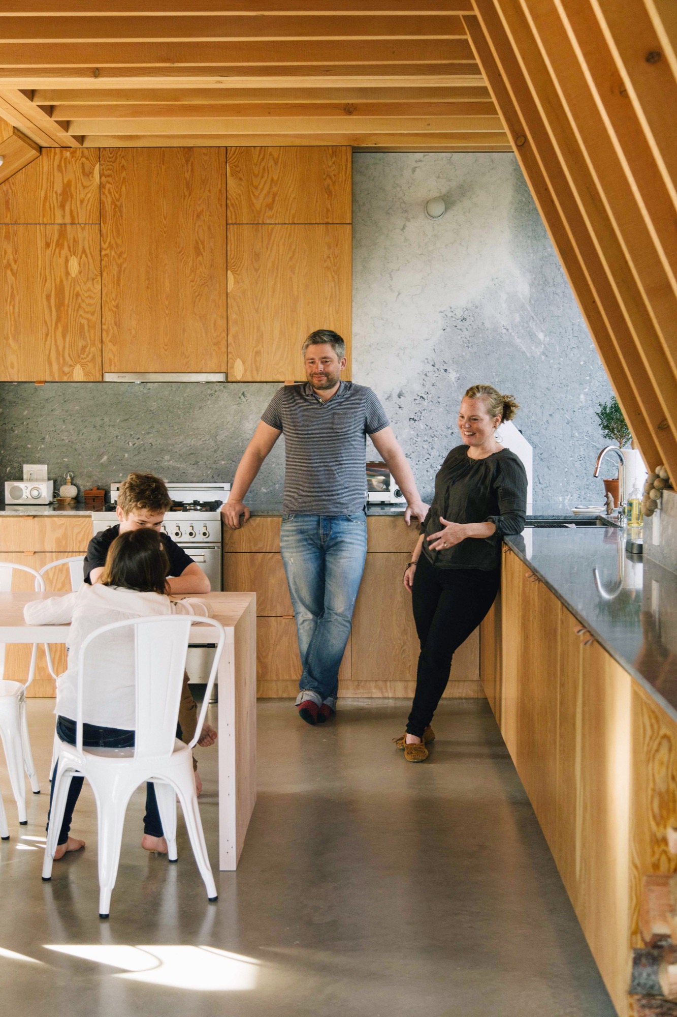
Idiosyncratic Emerald Estates
If you wanted to build a new A-frame in Whistler, idiosyncratic Emerald Estates would be the right place to do it. It is one of Whistler’s early neighborhoods, dating to the 1960s when the community mainly consisted of diehard Vancouverites willing to drive 75 miles of nasty road on weekends to ski its pristine powder, full-time construction and seasonal workers, plus assorted ski bunnies and bums.
A-frames are at home in this neck of the woods where a lot of the housing stock still has a throwback vibe. Among its early Whistler building types, Emerald boasts classic 1960s, 1970s and 1980s A-frames and Gothic-arches cabins (their bulbous bow-sided brothers), Heidi-style chalets and quirky hand-built dwellings such as Whistler’s famous “Mushroom House,” where, if Emerald Estates were a fictional fantasy world, Bilbo Baggins would want to live.
Although it is only a 10-minute drive from Whistler Village, Emerald feels off the beaten path. It is still a neighborhood more associated with local families than visitors. Most of the residents are old-timers and full-timers, “not weekend warriors,” says Melanie, laughing to think that this label could be applied to her little tribe.
Emerald’s topography is steep and wooded, with winding roadways that dip to reveal the teepee peaks of A-frames poking out above treetops and that rise to expose wide-roofed chalets juxtaposed with glacial rock formations.
The Browns’ property is open, steeply sloped and pie-shaped: wide at the front and narrow at the back where a four-story-high granite outcrop dominates. The site is high enough up the hillside that the evergreen trees, so plentiful downslope, have no effect on the view. “It’s panoramic, an unobstructed 180 degrees,” says Brenton, pointing north to Weart and Wedge mountains with Armchair Glacier sandwiched between them, then south to Whistler and Blackcomb. The family’s new cabin, designed by David and Susan Scott of Vancouver’s Scott & Scott Architects, capitalizes on all of this scenery.
The Scotts and the Browns
The Scotts are a husband-and-wife team who worked independently for years for prominent Canadian architects before forming an architecture practice together three years ago. Their office/home, which they share with two young daughters, is a converted butcher shop in the Mount Pleasant/Main Street area, currently the coolest neighborhood in Vancouver for young families to live.
Every project the Scotts have completed together has received public praise and attention either in a peer review journal, a lifestyle magazine or on a discerning design website—and sometimes all three at once. This past winter, the Scotts were recipients of the 2016 Young Architect Award from the Royal Architectural Institute of Canada. It is the first time the society has given this award to a couple.
The Browns were introduced to the Scotts through architect friends who admired their work. After seeing images of the Scotts’ own off-the-grid cabin at the north end of Vancouver Island (it appeared in the inaugural print issue of Alpine Modern magazine), the Browns were smitten with the Scotts’ understated, minimalist design and use of traditional and off-the-shelf materials in interesting and diverse ways.
Elemental, accessible design is what the Scotts are known for. “No one ever actually says this to us, but I think part of our appeal is that what we do is not outlandishly opulent,” says David, “so we end up with young families who want a holiday place in Whistler or Tofino [the surfing capital of Canada] but aren’t into building grand statements.”
“What we do is not outlandishly opulent, so we end up with young families who want a holiday place in Whistler or Tofino but aren’t into building grand statements.”
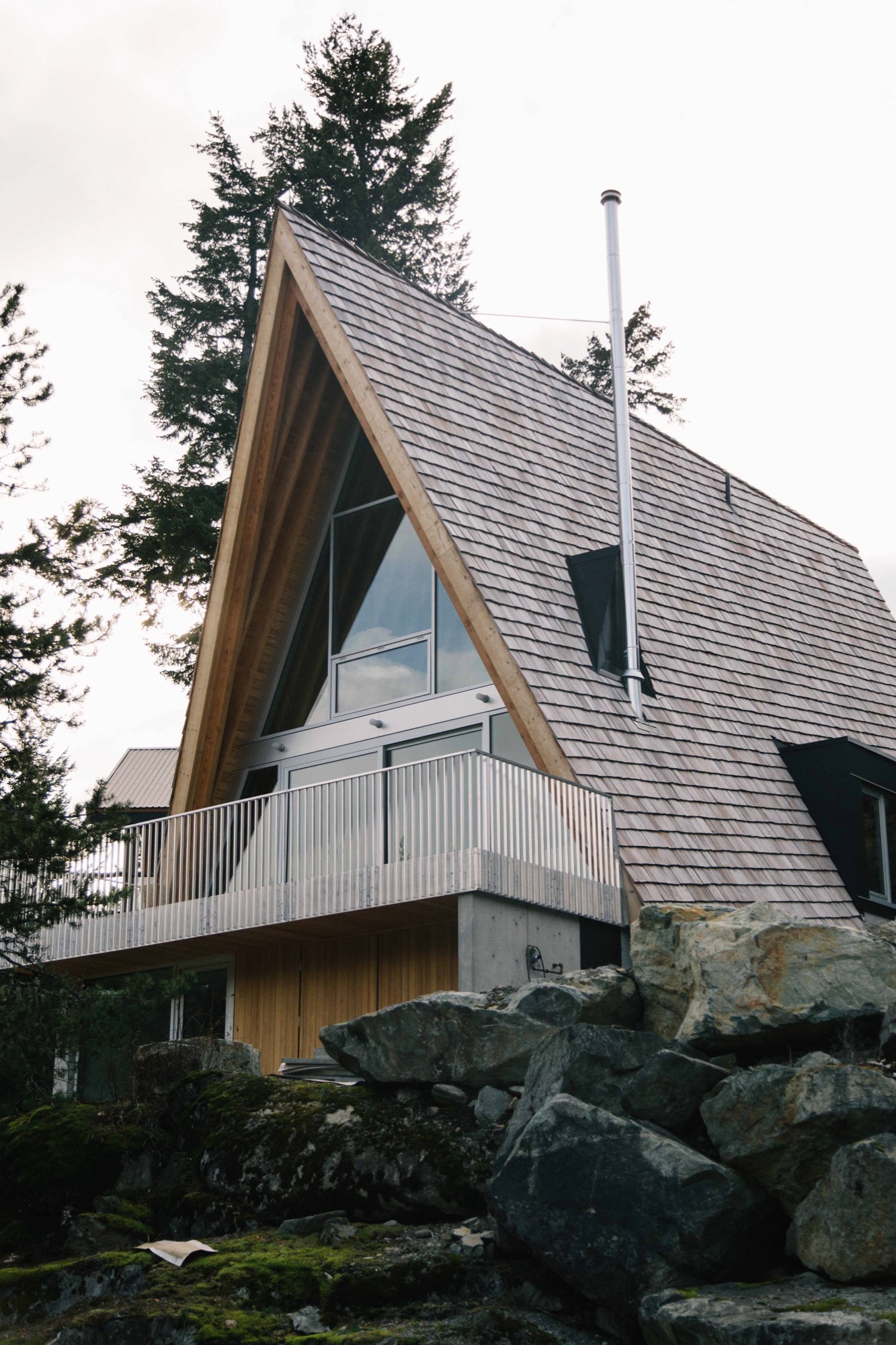
Working all angles
The Browns’ new A-frame may not be a grand statement, but it is an eye-popper, and when you begin to look closely at the design, you can see that it is an extremely intelligent and refined evolution of a basic building type.
Take the roofline, the A-frame’s defining feature. On a flat site, the roof would sit directly on top of the ground with identical triangular gables at either end. The challenge for the Scotts was how to incorporate these archetypical elements in an innovative way on a steep site.
Their response was a three-story building, narrow at the back and wide at the front just like the shape of the lot, with different-size gables at either end and roof planes that follow the grade.
As with A-frames of old, the Scotts’ roof design is a declaration—but with a difference. Level at the top, the ridge has been pushed out beyond the front façade of the building, then the gables have been pulled back at an angle so that the bottom edge of the roof is now parallel to the slope not the ridgeline. Laying the shingles at this same gradient gives the roof its rakish appearance.
From the rear, the Brown’s cabin appears to be a single story defined by a slender gable tied, in classic A-frame fashion, directly to the landscape, in this case volcanic rock. What you are really looking at is the back end of the third floor, and the space inside is a den, which opens onto the generous patio the Scott’s fashioned from a flat space in the outcrop.
This rock face, which erupts out of the ground at the entry level and slopes up an additional 20 feet behind the patio, has proven to be a huge hit with Daisy, Finn and friends. Says Melanie: “Last weekend we had 10 kids scrambling up from the patio and all over it, along with our enormous silver lab, Rosie. I would be in the kitchen [on the main level], looking out the window and see kids with big smiles on their faces coming down the rock on this side.”
From the front of the Browns’ cabin, each of the stories is clearly visible. The ground level, a rectangular box set into the rock, beautifully rendered in concrete clad in cedar at the front, provides a strong and stable platform for the soaring roof that defines the stories above it.
Design features on the front façade include extra-deep eaves and a large balcony that runs across the front with a guardrail made from aluminum bars used for snowmobile trailers “so it’s easy to sweep the snow through,” says David Scott.
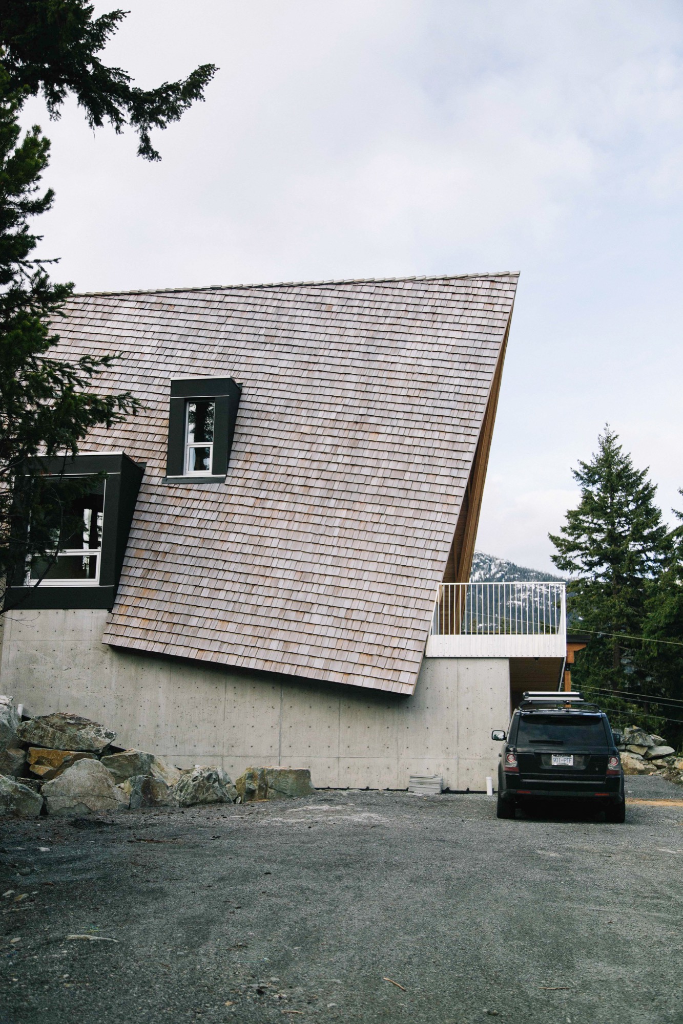
Building inside out
Judicious in their choice of materials, the Scotts prefer their wood locally harvested, their stone quarried nearby and anything ready-made to be plain and pragmatic. The roof is clad in standard red cedar shakes that will weather to the tone of the surrounding rock. Solid structural decking was applied directly on top of the joists “so it works as both floor and ceiling, the way it did in old ski cabins,” says David.
In a classic A-frame, the architectural bones are an interior design feature. The same is true here: the internally exposed frame is made of locally sourced Douglas fir, rough sawn in conventional sizes: 2 by 12 inches (ca. 5 by 30 centimeters) for the joists, 2 by 10 inches (ca. 5 by 25 centimeters) for the rafters. The lumber elements are fastened together using simple lapped joints at the floor and roof connections. “Our preference is to always keep everything consistent and the same, and to highlight the craftsmanship, not conceal it behind finishes,” says Susan.
The cabinetry was built on-site of construction-grade rotary-cut plywood; this wood also encloses stairs that are capped with the same stock aluminum used for the balcony guardrail. The only obvious built-in eye-catcher anywhere inside is the honed marble from Vancouver Island used in the kitchen and living area on the second floor.
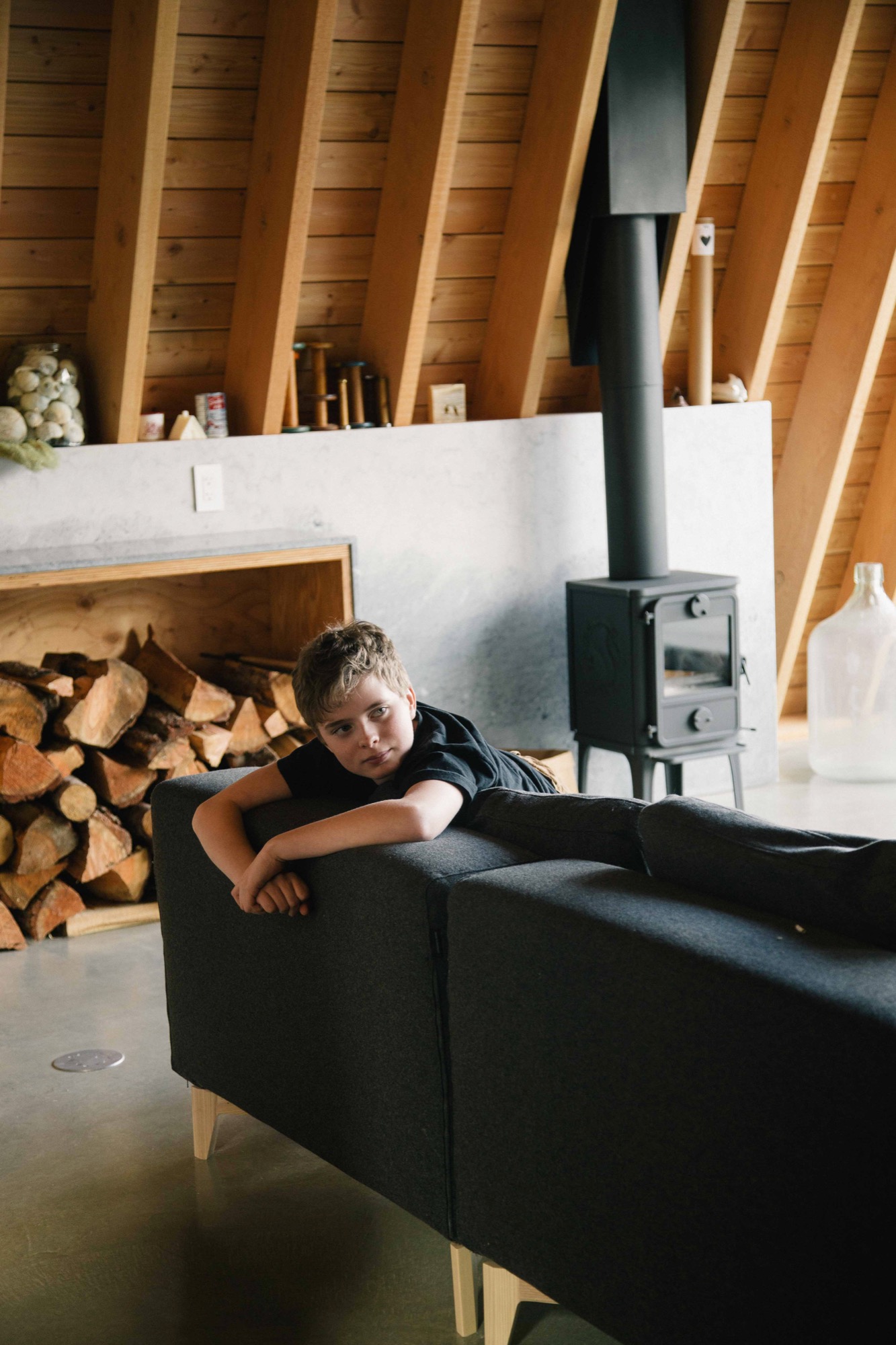
The first level is all business: “washroom, laundry, storage for bikes, skis, snowboards, surfboards leftover from our time spent in Laguna, and probably snowmobiles at some point,” says Melanie. The middle level is for communing; the top, for turning in.
One frustration with A-frame design is that it does not allow for much useable space inside; all slope, no sidewall is the common complaint. One original way the Scotts dealt with this dilemma was to put the stairs in a light-filled dormer, freeing up floor space on the third floor for a proper hallway tucked partially under the slope.
The hardy foursome and pooch moved into their cabin a few days after Christmas 2015 and have been using it nonstop ever since, often sharing their holiday home with friends.
Over the winter, Melanie skies with Daisy while Brenton snowboards with Finn. “In the summer, we like hiking with Rosie, as well as mountain biking and swimming in the various lakes. There are several hiking and mountain biking trails in Emerald, and Green Lake is right around the corner and so is the Valley Trail. We enjoy riding our bikes along it into the village,” says Melanie. “If you love being outdoors, there’s just so much to do around Whistler.” △
Simplicity on the Rocks
Built into the mountainside, a Quebec country house cantilevers over the treetops for magnificent views
A rugged mountainside plot in Quebec’s countryside impels a Montreal architect to design a cantilevered minimalist jewel that elevates the main living space above the trees for splendid views of Mount Orford and the valley below.
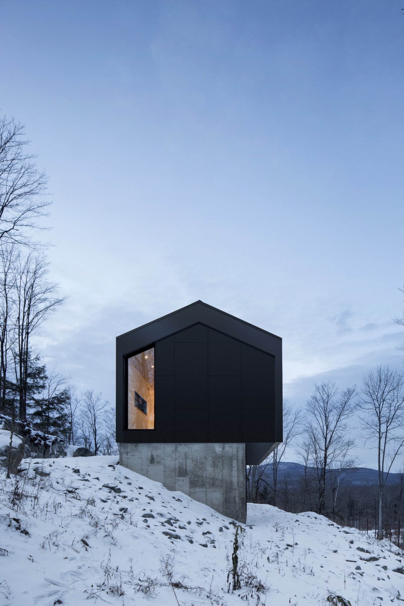
Imagine you are an architect given a limited budget to build a modest weekend home on an impossibly steep site whose topography mercifully plateaus atop a big rock. If you are brilliant, you figure out how to build the house right on top of that rock, for the best views. At least, that’s what Stéphane Rasselet of the Montreal-based architecture firm has done with the Bolton Residence.
Voilà. “A unique, timeless jewel landed on a concrete base” in the client’s own words. Alain Bernard, who works in film production, dreamed of a small, modern country house for a weekend escape and for extended breaks between intense projects. He had two directives for the designer: respect a curbed budget and maximize the spectacular mountain and valley views the plot of land offers.
These two essentials, plus the rugged wooded site on a precipitous slope above the tiny municipality of East Bolton (Bolton-Est) in Quebec’s Eastern Townships, impelled the architect to design a sculptural structure that addresses the site challenges while presenting prime panoramas of the surrounding nature. “The way Stéphane positioned the house is probably what makes it so unique: anchored in the rock on one side and completely floating at treetop height on the other side,” Bernard says.
The owner of Bolton Residence is usually alone with his two cats at the 1,540-square-foot (143-square meter) house in the country. He also has a studio in the city, where he stays while working umpteen hours during the week. But when he has two to three months off between contracts, he comes to East Bolton to enjoy the peace and take time to contemplate. “Although the house is so comfortable, soothing, and stimulating, it also brings poetic visions and enchantment,” he muses. “Every day, every season, the landscape changes. The light is different, and the colors are renewed. The house was built with the idea of glorifying nature and ultimately becoming part of that nature.”
"The house was built with the idea of glorifying nature and ultimately becoming part of that nature.”
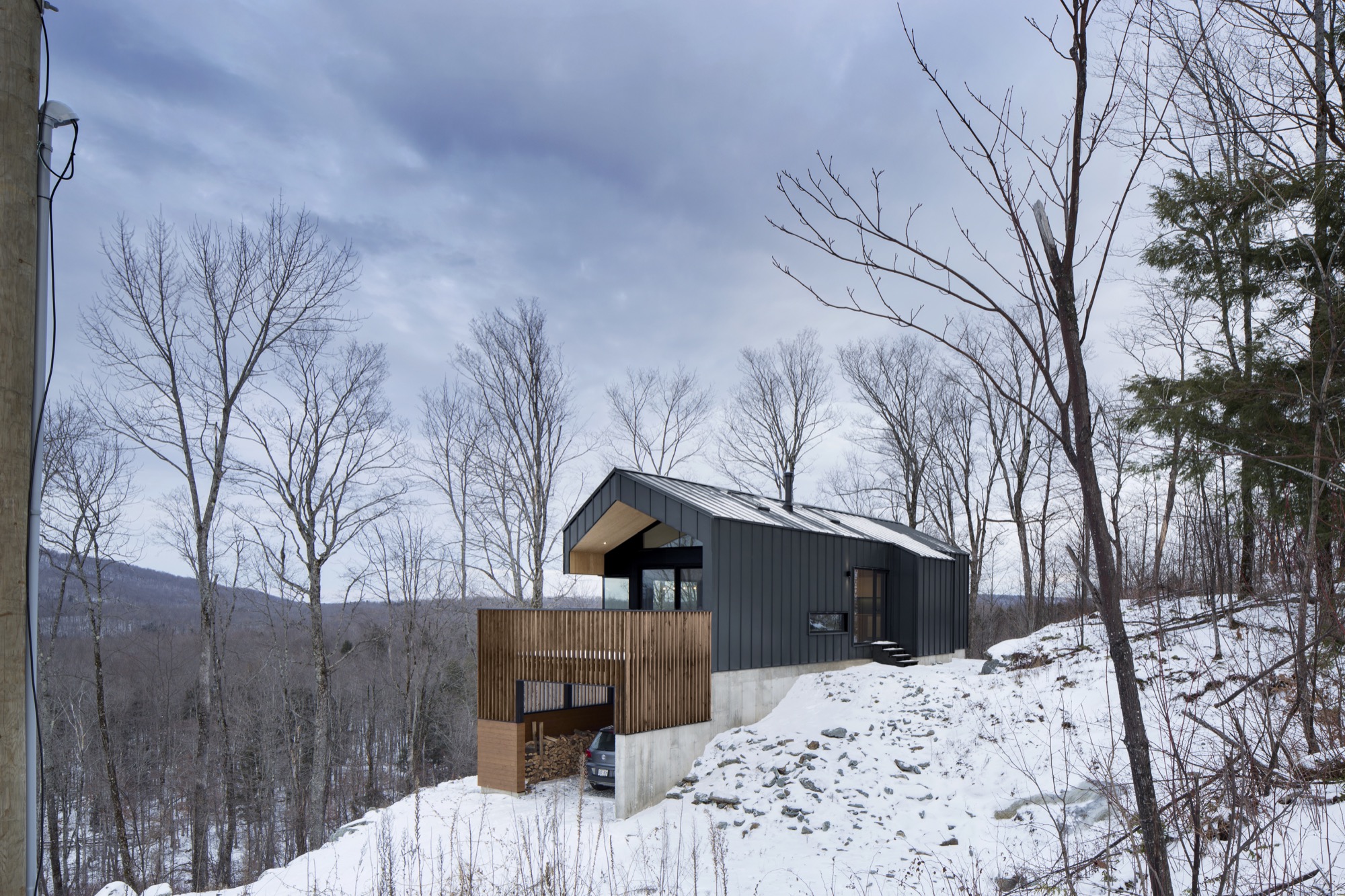
The holistic architect
When Bernard began his search for an architect, he was already familiar with _naturehumaine and loved their work. “They were my first choice, but I was convinced they’re too busy to accept such a small, limited-budget contract.” But an intrigued Rasselet wanted to meet the prospective client. The two men at once understood where each was coming from. “We talked about architecture and design,” Bernard remembers, adding that he sent his architect online to see features of cabins in nature. “I told him to capture the spirit of those cabins in a contemporary house.”
Rasselet’s answer was a strikingly simple design. Nevertheless, it was his masterly attention to the many complex details during design and construction that in the end harmonized this ode to minimalism.
Stéphane Rasselet graduated from McGill University’s School of Architecture in Canada and then worked on major projects in Paris before returning to Montreal to gain experience at local firms. He joined forces with Marc-André Plasse to found _naturehumaine architects in 2004. In 2013, Rasselet became the principal partner at the design-oriented atelier specializing in private residences.
When I ask him to describe the nuances of his design style beyond the obvious “modern,” the architect pauses. “That’s a difficult question. Often, we are absorbed in our own way of doing things, and the comments and opinions people have from the outside become the definition of what we do.”
Overall, the firm’s body of work is characterized by a clarity achieved through minimal choices in materials and colors. Never flamboyant. “We limit things that are expensive, but we push things structurally.”
“We limit things that are expensive, but we push things structurally.”
Environment in view
The Bolton house’s two exalting structural elements are cantilevers and corner windows—both employed to maximize the view.
Good comprehension of the challenging building site was essential to designing the Bolton Residence. Having skied Mount Orford many times, Rasselet was already familiar with that area east of Montreal. And although his client’s plot of land was large, the topography was extremely irregular, leaving the architect but one place to build without racking up prohibitive excavation costs: the large rock at the property’s highest point. Standing on top of that big rock on his first site visit, Rasselet took in the majestic sight of Mount Orford to the north and an expansive eastern view down a wide valley that rises up on the other side to a profile of mountains and the horizon. “It was obvious the house had to be oriented parallel to this line of mountains to the east, with the gable facing Mount Orford.” The scenic views set the structure’s two main axes in stone.

The _naturehumaine architect framed the horizontal view of the valley and distant mountain range with a linear band of glazing along the main living space and floor-to-ceiling vertical glass to maximize the views of Mount Orford on the north side of the house. “We wanted to give the illusion that the ceiling was going through the glass and out onto the terrace,” says the architect. The roof cantilevers out about six feet (1.8 meters) over the terrace.
Geometry in the treetop
Rasselet wants all his clients to think of the interior and the exterior of a house as one. The building itself and what’s inside must be in dialogue. With the Bolton Residence, the architect achieves this holistic approach—as his firm typically does—by designing both the structure as well as the interior architecture: the kitchen, the conspicuous replace at the center of the house, any built-in furniture, and all the metalwork. Steering clear of a look too slick for a country house, he chose materials with a patina and roughness: rugged gray slate tiles from Vermont for the entire main floor, a custom blackened-steel fireplace that shows the weldings, and a ceiling clad in inexpensive, rough construction plywood. A calm, monochromatic color palette without flashy design accents allows the view to become the main protagonist in a dramatically simple architectural play.
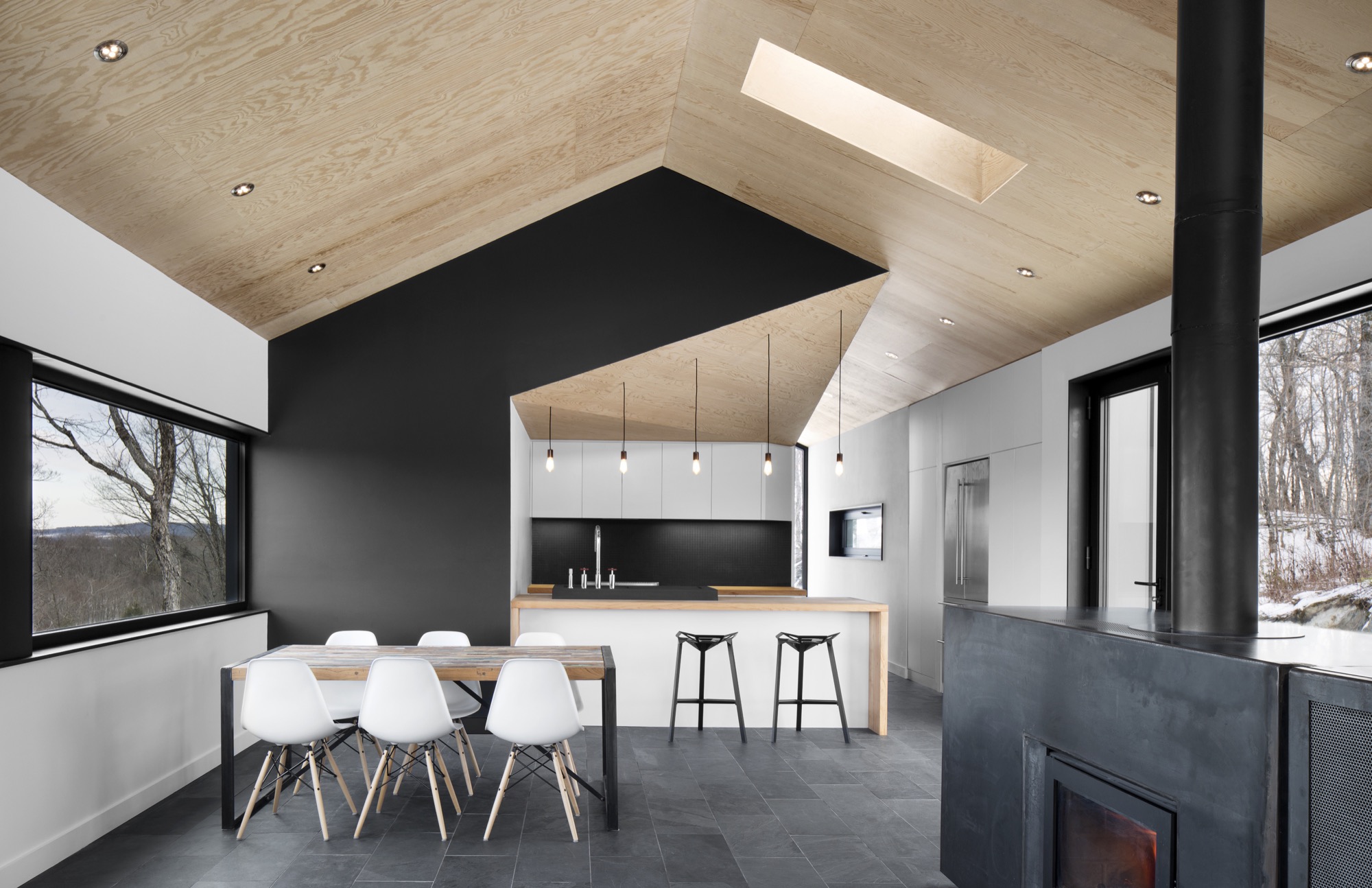
The two stacked volumes—long rectangles—hooded with a gable roof are a modern interpretation of the vernacular architecture of the region’s gabled barns. The gable roof is covered in panels of charcoal gray steel that continue down over the sides like a protective blanket. Protruding three feet (ca. 90 centimeters) over the base, the living spaces and master suite on the cantilevered top floor elevate the dweller up and out, giving a sensation of peaceful symbiosis with his natural surroundings. No surprise, this open space with the kitchen, dining room, and replace is Bernard’s favorite spot in the house. He treasures the big mountain views from the kitchen island and the 180-degree surround view that follows the landscape. “You are standing above the treetops like in a treehouse out of a child’s dream.”
“You are standing above the treetops like in a treehouse out of a child’s dream.”
The garden-level bottom volume has a smaller footprint and is a concrete plinth anchored into the mountainside and partially clad in a cedarwood skin. Tucked under the terrace at the gable and protected from rain and snow are the carport and the main entrance, which leads visitors into a small vestibule, from where a corridor leads to the downstairs guest bedroom and a bathroom, and stairs lead up to the main living space.
Big-city expectations meet country reality
When asked about the project’s biggest challenge, Rasselet and Bernard both bring up collaborating with local contractors on its execution. “I was on site every day during construction to make sure the contractors built exactly what was designed,” the homeowner says. “Every piece and part and detail of the house was designed by Stéphane. They had to redo a lot of things twice, even three times, to achieve it.” And his architect quickly agrees that the distance from the city posed a challenge. “Once you get two hours out from Montreal, trying to find people who do contemporary architecture and who do contemporary details gets quite tough,” Rasselet says. He often asked for workshop drawings before letting a craftsman build, bend, or weld what he had designed. For instance, the steps leading from the vestibule up to the living room are covered in bent steel plates that had to match up precisely. As is often the case in modern design, it takes more to achieve a simple, clean look than today’s standard—sometimes more ornamented—style does.
In the end, Rasselet says, “All the ingredients have come together to create a nice little project. It’s one of our best projects.” △
Modern Architecture Ascends in Aspen
Architect Shigeru Ban's dramatic design of the Aspen Art Museum
Inspired by the up-and-down movements of the skiers on Aspen Mountain, the Pritzker Architecture Prize laureate Shigeru Ban takes modern building design to dramatic heights with the new Aspen Art Museum.
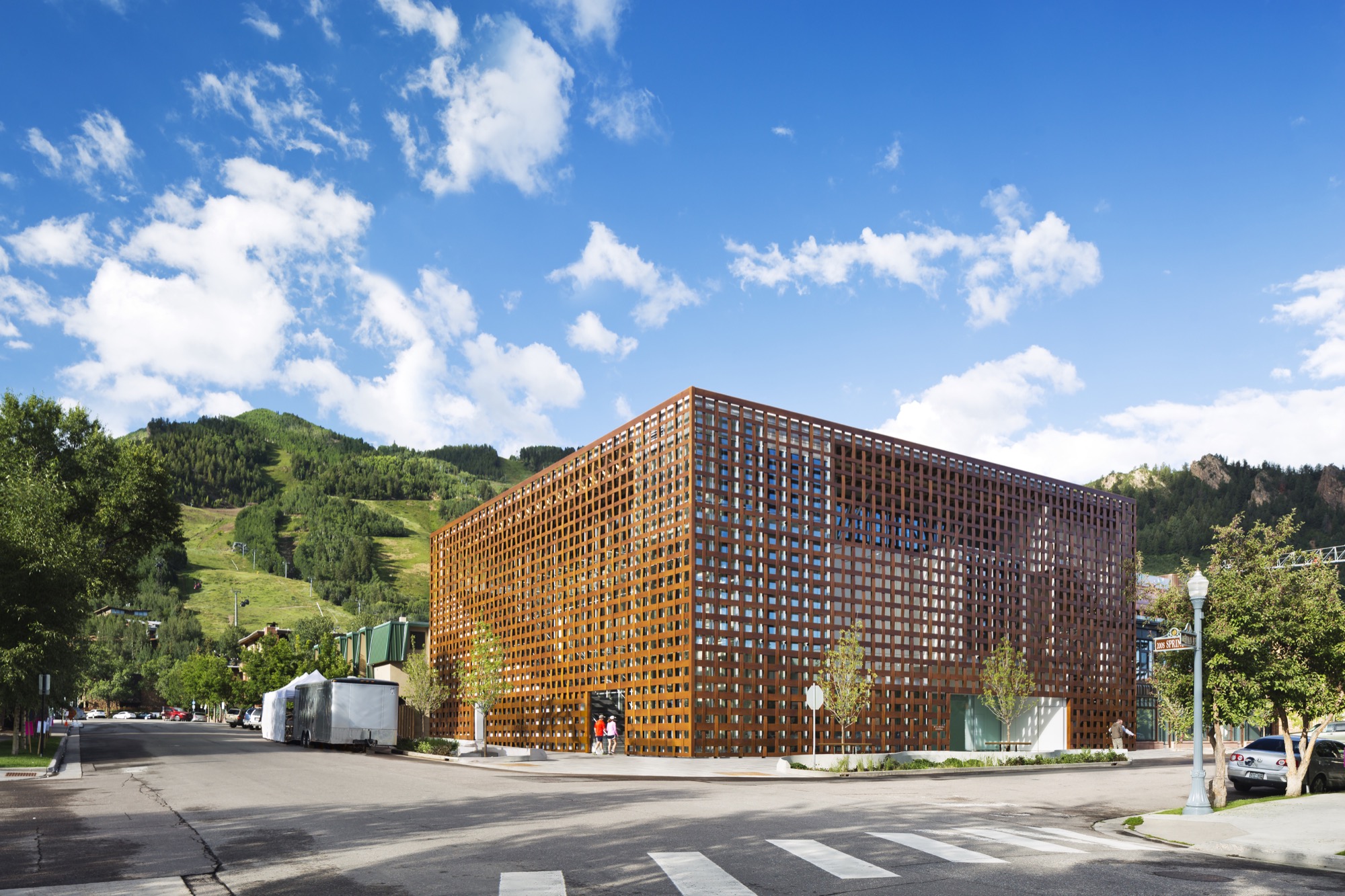
The new Aspen Art Museum, which opened in August 2014, became an instant, if controversial, landmark in the precious Colorado mountain town and beyond. Architect Shigeru Ban’s building is like no other in Aspen — or anywhere else. Think of it as a box within a box. The blocky three-story glass interior box is wrapped within an outer box made of wide strips of resin-impregnated paper woven into a grid, permitting light and air to filter in and people to look out. In daylight, the strips have a wood tone. The texture relates to old bricks, the dominant building material in downtown Aspen. The strong vertical and horizontal lines play off the glass in an ever-changing succession of light and dark, bright and shadow.
Up and down — like the skiers
Ban’s concept was to echo Aspen Mountain, the commanding presence just south of downtown. At the ski area, skiers ride lifts to the top and then make their way down. So it is at the museum. Visitors first ascend the stairs or ride a room-sized glass elevator to the only public rooftop space in Aspen, with its open sculpture garden, grand view of Aspen Mountain’s lower slope, and an indoor/outdoor café where visitors linger over a cup of coffee, a light bite, or lunch. The menu changes frequently, appropriate for a museum whose exhibitions change every few months. Then visitors work their way down. Six galleries, three above ground and three on the basement level, have already showcased the works by painters, sculptors, installationists, and multimedia artists. A show in Aspen has a way of increasing an artist’s visibility and renown.
Curating the new
The new building replaced the 7,500-square-foot (ca. 700-square-meter) former hydro-electric plant that had housed the museum since 1979. While it was of nostalgic value to the Aspen community, it had long since outlived its usefulness as a museum that showcases contemporary art and also hosts workshops, classes, music programs, lectures, and films. In this global art world, the call for design ideas was broad, but from concept to opening involved an eight-year process. Heidi Zuckerman, the museum’s visionary director, CEO, and chief curator, says that when it was time to choose an architect, the only two requirements provided to a selection consultant were that the architect had previously designed a museum and also spoke English.
Shigeru Ban came with both. As for museums, he had designed the Centre Pompidou-Metz, a regional branch of the famous Georges Pompidou Arts Centre of Paris. The Metz outlier contains exhibitions from Europe’s largest collection of twentieth- and twenty-first-century arts. He also did the Nomadic Museum to house “Ashes and Snow,” Gregory Colbert’s groundbreaking video/photo work, that launched in Venice, then traveled to New York, Santa Monica, Tokyo, and Mexico City, ending in 2008, largely due to the global recession. As for language, Tokyo-born Ban had studied at the Southern California Institute of Architecture and New York’s Cooper Union, and he now divides his time between Tokyo, New York, and also Paris.
The selection consultant had put out the call without revealing the specific client and came back with pictures submitted by thirty-six firms — “no names, no words, just pictures,” Zuckerman says. Sixteen firms were then told that the Aspen Art Museum was the client, and fourteen of those submitted plans. A committee narrowed those to five and visited three. “Shigeru came in with the highest score at every round,” Zuckerman continues. She was already familiar with Ban from his Paper Arch, erected in the courtyard of New York’s Museum of Modern Art as part of its millennium celebration.
"Shigeru came in with the highest score at every round."
Ban’s Backstory
Time magazine named Ban the 2001 Innovator of the Year for his pioneering disaster relief designs that used simple materials to build housing in afflicted areas. Ban is known for innovative and distinct designs, of course, but also for the humanitarian and sustainable aspects to his work. He has made his reputation on using simple materials, from paper and cardboard to crates and shipping containers, to help people, communities, and countries rebuild their lives after headline-making disasters.
Projects included using sandbag-filled beer crates as the foundation for quick-to-build, low-cost housing after the 1995 earthquake that devastated Kobe, Japan. Sixteen years later, following the massive quake and tsunami (think Fukushima Nuclear Plant) that left 300,000 people homeless, Ban designed homes crafted from shipping containers with cardboard tubing for interior walls. He expanded on this concept with his “cardboard cathedral” that rose from the rubble of the quake-damaged Catholic basilica in Christchurch, New Zealand. With cardboard tubing as the visible structural element, it stands as a symbol of hope and inspiration while the city contemplates whether or not to reconstruct the copper-domed classic. The cardboard tubing tradition lives modestly at the Aspen Art Museum in the form of benches.
For fifty-seven-year-old Shigeru Ban, 2014 was a landmark year. Even as his $45-million USD Aspen Art Museum was in the final stages of construction, he was awarded the prestigious Pritzker Architecture Prize, considered the most important honor in the field. It rocketed him to “starchitect” status and made the museum’s twenty-four-hour grand opening the place for well-heeled Aspenites and the art-world elite to see and be seen.
In presenting Ban with the coveted prize, Tom Pritzker, president of the sponsoring Hyatt Foundation, said: “He is an outstanding architect who, for twenty years, has been responding with creativity and high-quality design to extreme situations caused by devastating natural disasters. His buildings provide shelter, community centers, and spiritual places for those who have suffered tremendous loss and destruction.”
It may seem counterintuitive that an architect known for creating housing for refugees and disaster victims did his first U.S. building in one of the country’s priciest towns, and Zuckerman is clearly relieved that her museum snagged him pre-Pritzker. It makes sense, actually. Ban is disinterested in monumental buildings, and as one of only a handful of noncollecting museums in this country, the AAM did not require massive space. It is a mere 33,000 square feet (3,065 square meters), with three stories at and above street level and one below.
"Ban is disinterested in monumental buildings."
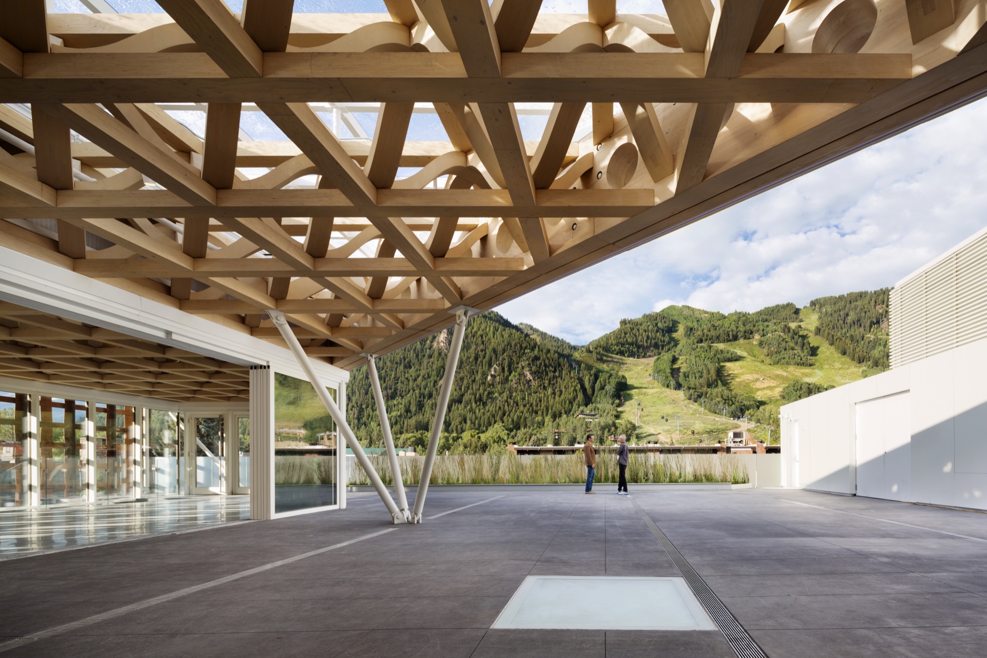
Not for everyone
The Aspen Art Museum is built to the sidewalk line, like the nearby late nineteenth- and early twentieth-century buildings, meaning that it is not out of scale with its neighbors. But the exterior materials and the see-through grid are what turned heads and shocked some locals. People love it, detest it, or are merely puzzled by it, but everyone knows it is an extraordinary community resource, especially since admission and many of its programs are free.
Zuckerman’s uncanny instinct for identifying the next hot new contemporary talent makes the Aspen Art Museum a coveted venue, even though each exhibition lasts only about three months. “I feel fortunate to have as a platform this incredible museum,” says Zuckerman, who, mindful of the controversy surrounding the design, adds, “It can be for anyone, even if it is not for everyone.” In its first six weeks, the new museum drew some 35,000 visitors — as many as the old museum did in a year.
“I feel fortunate to have as a platform this incredible museum. It can be for anyone, even if it is not for everyone."
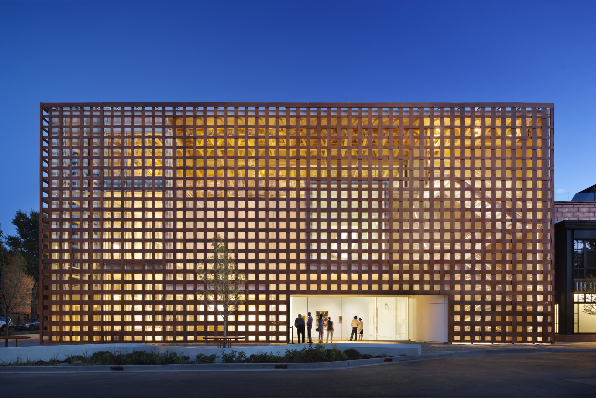
Aspen and modernism
While it values its Victorian core, Aspen has had an ambivalent relationship with modern architecture. Eero Saarinen’s original music tent for the Aspen Music Festival was replaced twice, most recently by a permanent structure designed by Aspen’s Harry Teague, and the modest concrete Given Institute by Chicago modernist architect Harry Weese was demolished in 2011.
The pure Bauhaus-era Aspen Meadows Resort on the city’s east end remains a living icon with low-slung buildings designed by Austrian-American architect Herbert Bayer. It is the home of the Aspen Institute, a humanistic think tank for leaders, artists, musicians, and thinkers. It also operates as a hotel with spacious accommodations and a fine restaurant on a forty-acre campus. Sections of the ground have been sculpted into little hills, a gentle serpentine trench to replicate a watercourse and pebbled paths plus carefully selected rocks and sculptures placed here and there. With much change in the valley, Aspen Meadows is a keeper, and so is the Aspen Art Museum. △
A-Frames
The right form at the right time
Spawned by postwar affluence, A-frame cabins became the quintessential American vacation home of the 1950s and 60s. A look at what made these icons of middle-class leisure immensely popular then, and what it is like to remodel and live in one today. “The design is intuitive,” says architectural historian Chad Randl, author of the book A-frame (Princeton Architectural Press), about the A-frame’s triangular structure. Why else would different cultures have turned to this universal, unifying building type, independently, throughout time and across the globe?
Was it intuition, too, that told Rudolf Schindler in 1936 to carry the roof down to the ground and fill both gables with glass? The Austrian-born architect needed to find a way to comply with local building codes when he was commissioned a modest vacation home suitable for the mountainside setting above Lake Arrowhead, California. The upshot was an A-frame built twenty years before its time.
By the middle of the twentieth century, architects in postwar America sought a more casual yet visually dramatic design conducive to relaxed seaside and mountain living. The A-frame was both comfortably familiar (pitched roof) and playfully novel. Because these weren’t primary homes, the architects could enjoy more freedom in designing wide-open spaces with fewer partitions and very small bedrooms and bunk rooms.
"The A-frame was both comfortably familiar (pitched roof) and playfully novel."
Genesis: The Leisure House
In 1950, Interiors magazine published an A-frame by San Francisco-based architectural designer John Carden Campbell: the Leisure House. It hit the mark on the era’s modernist style sensibility, down to the butterfly chairs. Campbell was fond of saying the house enclosed the most space in the most dramatic way for the least amount of money.
 After a full-sized model of the Leisure House was exhibited at the 1951 San Francisco Arts Festival, Campbell’s phone wouldn’t stop ringing. Fixing its dimensions to the width of a sheet of plywood reduced the cost and simplified construction so vastly, the Leisure House could now become a do-it-yourself project. Campbell deftly developed a precut kit that contained everything needed to assemble the house, from timber to nails and hammer.
For the next twenty years, photos of Campbell’s own Leisure House he built across from the Golden Gate Bridge in Mill Valley, California, appeared in countless home magazines and architectural books. The Leisure House was promoted as a natural design for the mountains or the beach, for a summer cottage or a ski cabin. The Leisure House manifested a new leisure culture.
A national phenomenon
The mushrooming popularity of A-frames was fueled by postwar prosperity, which brought owning a second home within reach of the middle class. Suddenly, people had more disposable income and more free time. The A-frame embodied an informal weekend and holiday getaway that was innovative and exciting — a recognizable, identifiable symbol of “the good life.”
“It’s interesting how people individually adapted drawings or kits for their own family’s way of living and for their own technical expertise or lack thereof,” says Randl, who now teaches at the Cornell University College of Architecture, Art, and Planning. “What I loved about A-frames was that it was such a simple design, a basic triangular form, but you had so many variations of it, and it was still recognizable as an A-frame.”
"The A-frame embodied an informal weekend and holiday getaway that was innovative and exciting — a recognizable, identifiable symbol of 'the good life.' "
The fall of an Americana archetype
While A-frames were touted as efficient in the use of materials in the 1950s and 60s, they were far from energy efficient by today’s standards. The open-floor-plan homes were notoriously difficult to heat — warm air escaped upward, leaving the downstairs chilly and the bedroom loft uncomfortably hot. Many of the early designs were not insulated at all. Thus, keeping A-frames warm became increasingly challenging with the energy crises of the 1970s. “You had that plywood building that became really expensive to heat once oil got expensive,” Randl remarks.
“That’s when it all crashed down,” says the A-frame expert. “The A-frame lost its cultural cache, and people saw it as cliché.”
A-frame Reframe
Today, Randl considers A-frame vacation cabins an “endangered species.” In the right location, however, these period pieces are still sought-after architecture, especially to design enthusiasts with a passion for modernism.
One of those aficionados is Alpine Modern correspondent Paul O’Neil. He bought a 1953 A-frame in Mill Valley across from San Francisco in 2011. The house was designed by Wally Reemelin, an industrial engineer interested in efficient architecture, and is featured in Randl’s book.
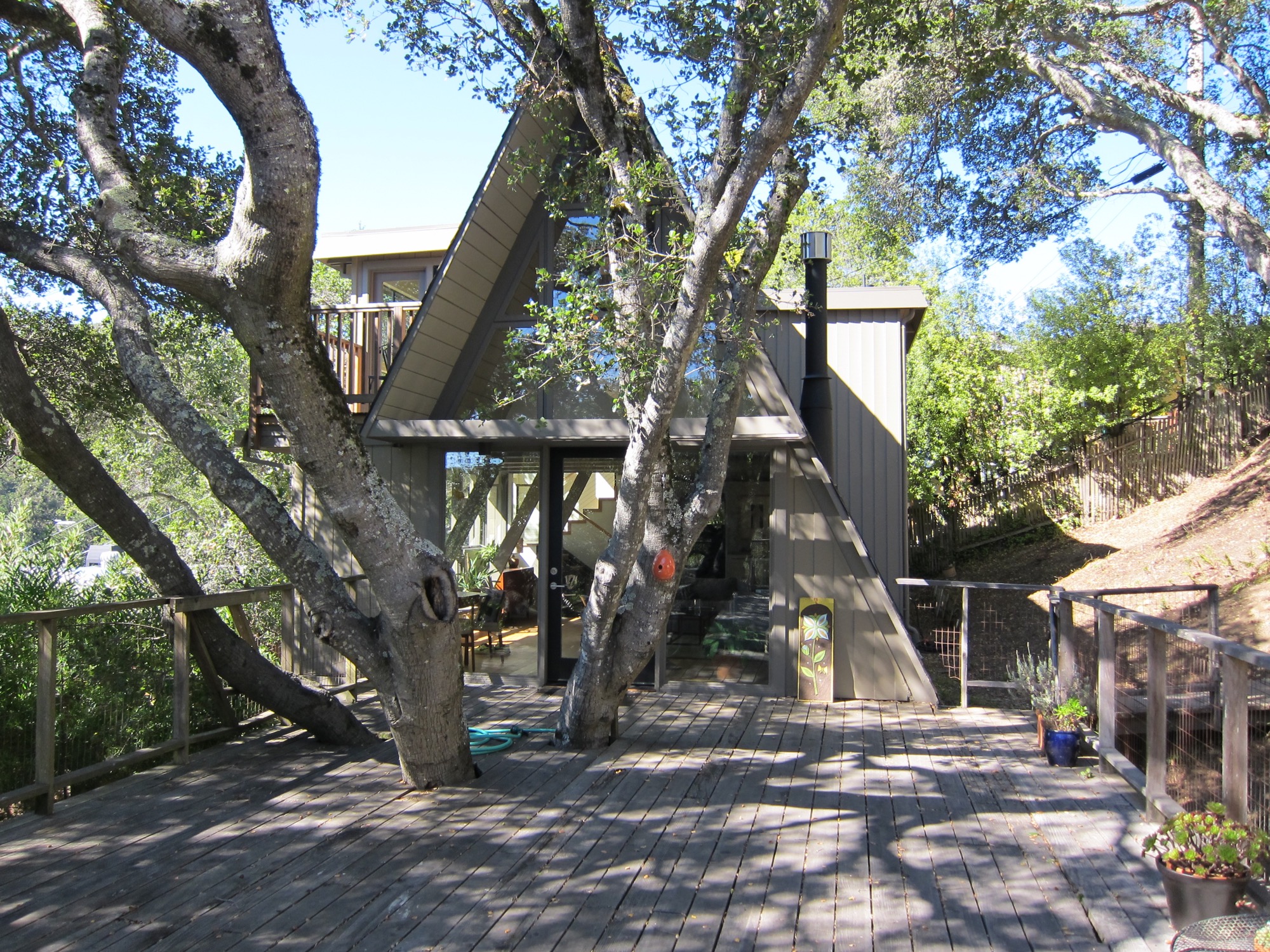
O’Neil loved the house at first sight. He liked the way it was situated in the street and on the lot, embracing oak trees. There was more than meets the eye, though. “The house spoke to us,” he recalls about the day he and his partner, Andrew Loesel, discovered the faded treasure during an unplanned stop on a road trip. “There was something special about it. It was asking us to save it. There was a story there,” O’Neil says. “The woman selling it thought we were insane.”
“There was something special about it. It was asking us to save it. There was a story there.”
The Californian has chronicled the history and renovation of the Reemelin A-frame on his blog at aframereframe.com. But before O’Neil could bring the 1,265-square-foot (ca. 118-square-meter) house back to its beauty, he had to undo a poor renovation. An unpermitted addition built in 1964 had left the house with uneven floors and structurally unsafe. By the time O’Neil purchased the house from the third owner, it had been virtually untouched since 1980, with the exception of a new roof from twenty years ago. “We tried to understand what the house originally was like,” he says. “Our goal was to keep the integrity of the house, but make it modern.”
“Our goal was to keep the integrity of the house, but make it modern.”
Once their contractor ripped out the remnants of shoddy remodeling, the house had no structural problems. With elements like a wobbly staircase and an awkwardly placed bathroom gone, O’Neil could rethink the layout. “It was like a puzzle, once we realized what we needed to do.” After updating the electrical and plumbing, and installing insulation, they could focus on designing the house with a nod to its midcentury modern architecture and interior.
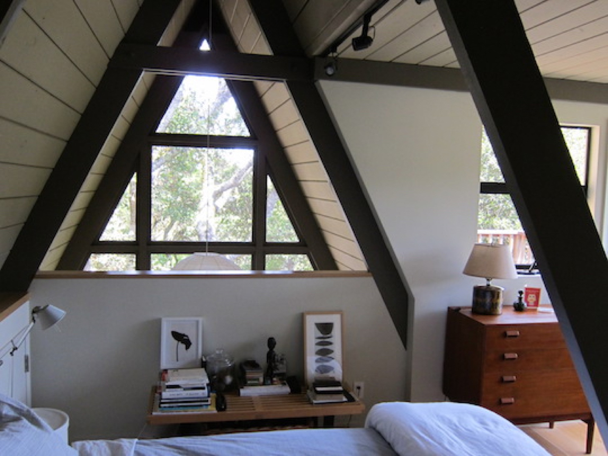
Living in San Francisco at the time, O’Neil and Loesel had bought the house for a weekend home, but later decided to live there full time, in the spirit of living smaller and simply. “If a house is well-built, it doesn’t have to be big,” O’Neil says.
“If a house is well built, it doesn’t have to be big.”
In fact, Randl agrees that in the context of the small-house movement and people’s yearning for a simpler, minimal lifestyle, the design concept of the A-frame could once again fit contemporary zeitgeist. “It’s got that reference to the past while also being modest,” the architecture expert says. “That has appeal again.” △
Out of Town
The modern country escape a New York City couple builds in the Catskill Mountains quickly becomes home base
When a New York City couple builds a Scandinavian-modern weekend retreat in Bovina, New York, the center of their work and social lives unexpectedly shifts to the small community in the Catskill Mountains. These days, the native Nordics use their Brooklyn apartment for short getaways to the city.
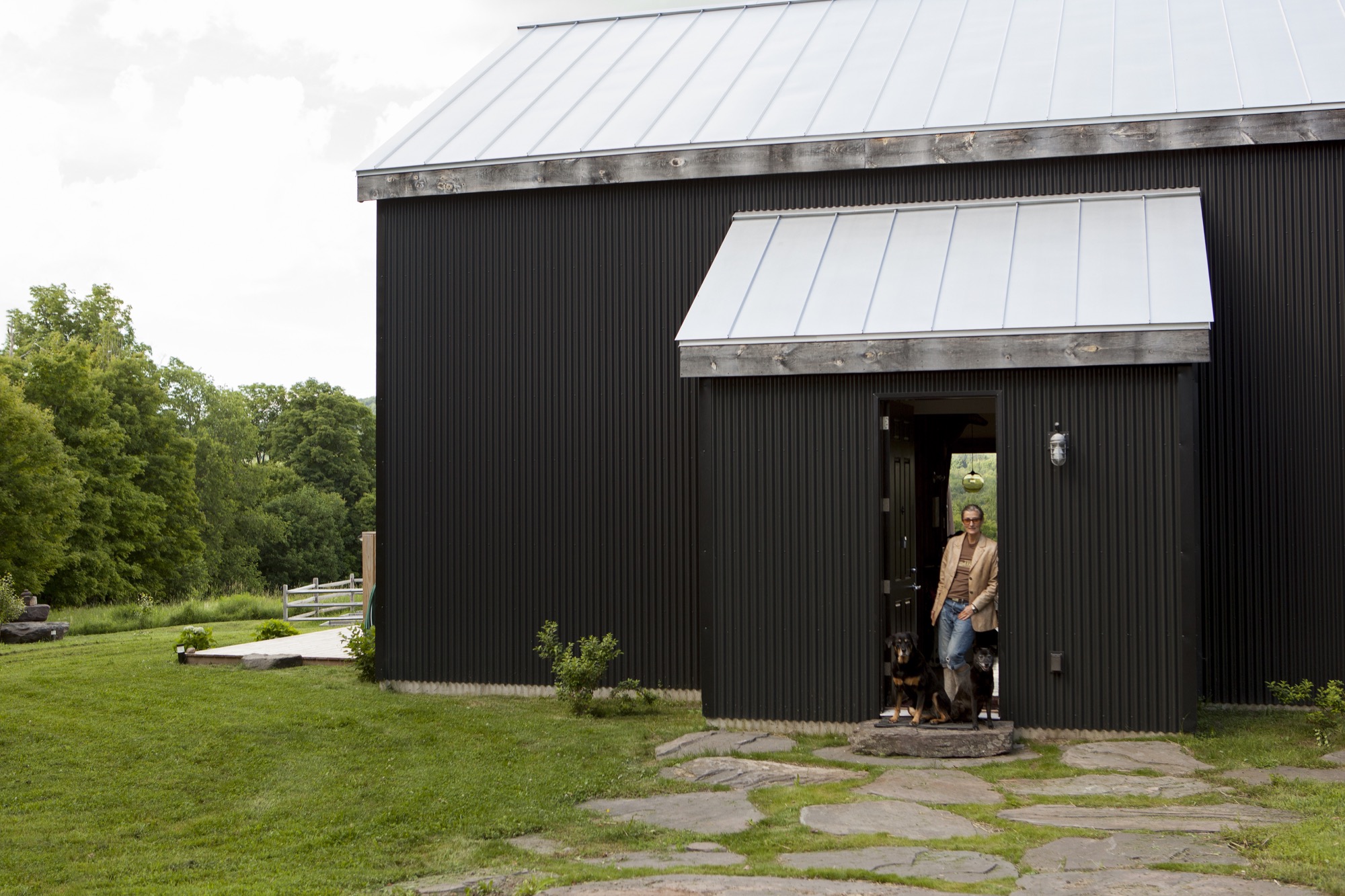
After both of her parents died of cancer, Jeanette Bronée, an interior designer in New York City, completely turned her life around. She became a health coach and founded the Path for Life Self-Nourishment Center to teach people about their own power to heal the body. Being mindful of self-nourishment and tending to your soul is never easy when living with habitual stress, especially in a metropolis of millions. For Bronée, who grew up in Denmark, reawakening that sense of taking care of oneself and the remembrance of what being outside feels like was pivotal. “Nature has always been a big part of my life, even as a child,” she says. She needed to get out of town, at least on weekends.
Two Nordics in New York
Then, six years ago, Bronée met Torkil Stavdal at a design event. The Norwegian photographer, who travels the world for advertising clients and magazines, had recently moved to New York City. “We started talking about kitchens because we both love food and cooking.” She giggles at this memory of their first encounter. The two spent the evening talking about how important the world we create around us is to feeling nourished. “So not long after we met, I told Torkil about my desire to get out of town for a weekend getaway.” Having just arrived, the newcomer to the Big Apple was reluctant at first. He craved the urban experience. But the photographer soon caught up to Bronée in needing periodic time-outs from New York City.
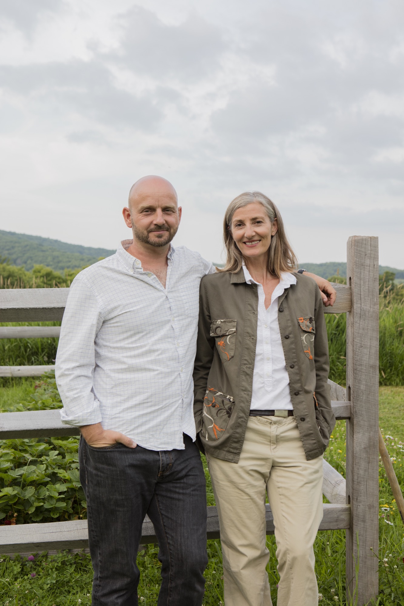
Their search for a country escape narrowed to the western Catskill Mountains, approximately three hours north-north-west of New York City by car. “We wanted to get far enough out of the city—not just Woodstock, which is a weekend destination—but far enough to get a sense of the area while fitting it into our budget,” Stavdal says. He admits to burning through “a lot of weird realtors” before finally connecting with an agent who smartly sent them on a drive around Bovina, New York. “We fell in love with the picturesque little town before even seeing the first property,” he remembers. “Then she showed us a place called the ‘Secret Meadow.’ When we walked in, it was like a little jewel in the middle of nature. It’s very beautiful land.” The Stavdal-Bronées were allured at first sight by the tree-rimmed rural acreage at the end of a 500-foot-long (152-meter) private driveway.
“Then she showed us a place called the ‘Secret Meadow.’ When we walked in, it was like a little jewel in the middle of nature. It’s very beautiful land.”
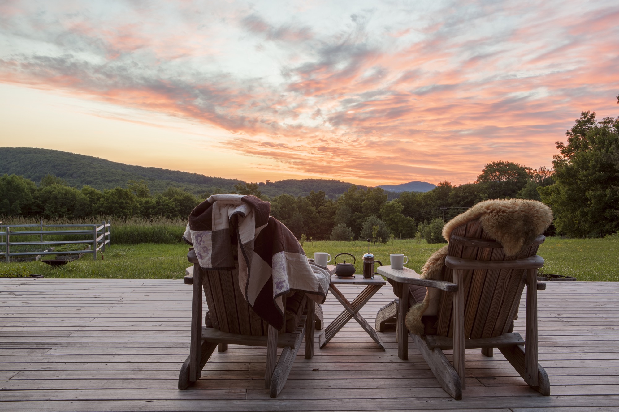
Creating something new
Stavdal and Bronée knew from the start that they wanted to design and build a new home rather than buying and restoring one. Bronée substantiates that decision with her European heritage: “We build stuff!” She laughs, then continues more contemplatively, “My dad always built our houses in Denmark, so I was used to creating something based on what we needed and what we wanted in our lives.”
“My dad always built our houses in Denmark, so I was used to creating something based on what we needed and what we wanted in our lives.”
To help them realize those needs and wants, the European expats enlisted New York City architect Kimberly Peck, who worked for Bronée when she had a design studio in the city. “Kimberly was sensitive to what we wanted to create because we already knew each other from the past,” Bronée says. “Part of coming up here was the distinct vision of wanting to implement design ideas I’ve had over the years for others, and now I finally had the space to create something for myself.”
The couple, who share a deep appreciation for midcentury-modern design, needed to decide on an architectural style for the Bovina house-to-be. “I’m inspired by monolithic Japanese concrete buildings,” Bronée says. “I love that very severe design.” Her husband, on the other hand, dreamed of a cozy Scandinavian cabin, modern and flooded with light. After considering (and dismissing) the idea to build a modern prefab, the two compromised on a house that Bronée says “feels like a loft and a barn, so this was the perfect combination.” On the outside, the Nordics both wanted the dramatic, modern aesthetic of a black facade that would remind them of their common Scandinavian roots. “Back home, the cabins and houses are black,” says Stavdal, referring to the traditional dark exteriors of Scandinavian homes typically brought about by a mixture of linseed oil and tar.
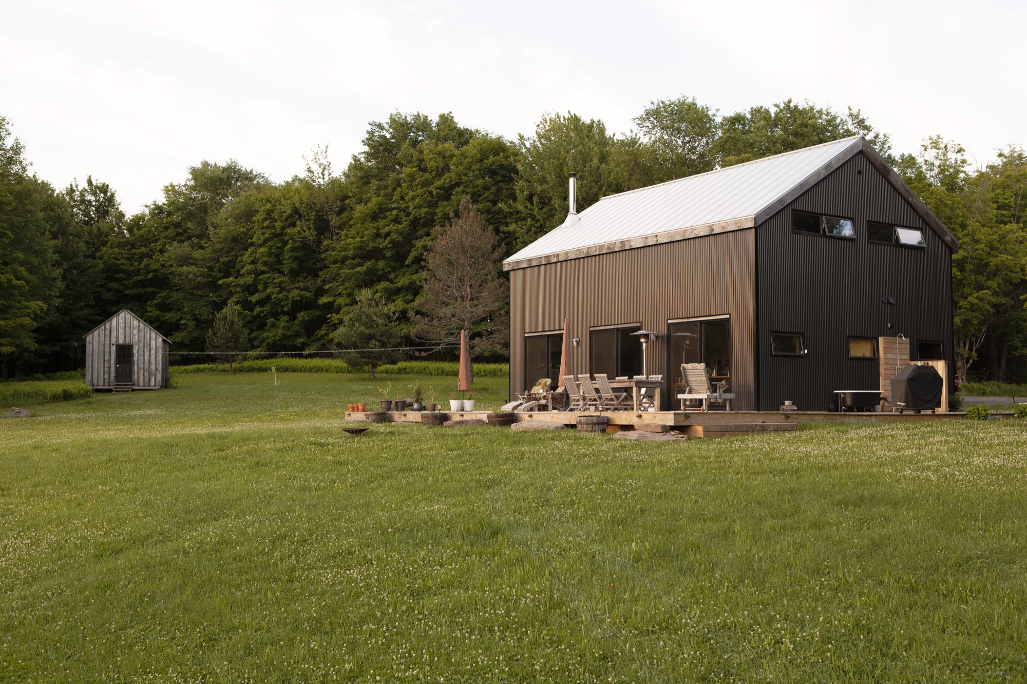
Building for light
Keeping the house low maintenance was not the only reason they chose a steel exterior. “Aesthetically, mixing this style of building with that material was fascinating,” Bronée notes. “It created this monolithic feel to it, and in certain light the house almost looks velveteen. It doesn’t look like corrugated metal—it looks strangely soft.” The former interior designer, who back in the day created contemporary spaces for fashion boutiques, showrooms, and in-store shop concepts, was also inspired by the many Dutch architects currently using corrugated metal on modern houses. But merging the Nordic-inspired modern exterior with conventionally sized American sliding windows would not have worked. “In Scandinavia, we have longer slit windows, so we were taking elements of our heritage and mixing it in. We also wanted that European idea of pushing the windows out in autumn.” After a pensive pause, Bronée adds, “I think our architect thought we were half nuts with some of the things we wanted, but she was up for it.” And Stavdal adds, “I’m Scandinavian; I’m light-dependent. Having three huge sliding doors letting nature in is a huge thing for me. I need light. Part of our living up here is that we as Scandinavians come alive as the sun comes out, so we spend most of our time outside.” Much of their everyday life happens on the spacious deck. Stavdal even installed an outdoor shower and bathtub. “As soon as the frost is gone in the spring, we don’t shower inside anymore. We have a little tub out there.”
“Part of our living up here is that we as Scandinavians come alive as the sun comes out, so we spend most of our time outside.”
The light junkies, however, elected to have no windows at all on the driveway-approach side of the house. The windowless front added further to the monolithic impression of the house. And they liked the idea of a hideout. It’s not until visitors walk into the house that they get to see the magnificent view of the secret meadow, with the Catskills beyond. “It illustrates the idea of bringing the outside in,” says Stavdal. “The land opens when you get into the house.”
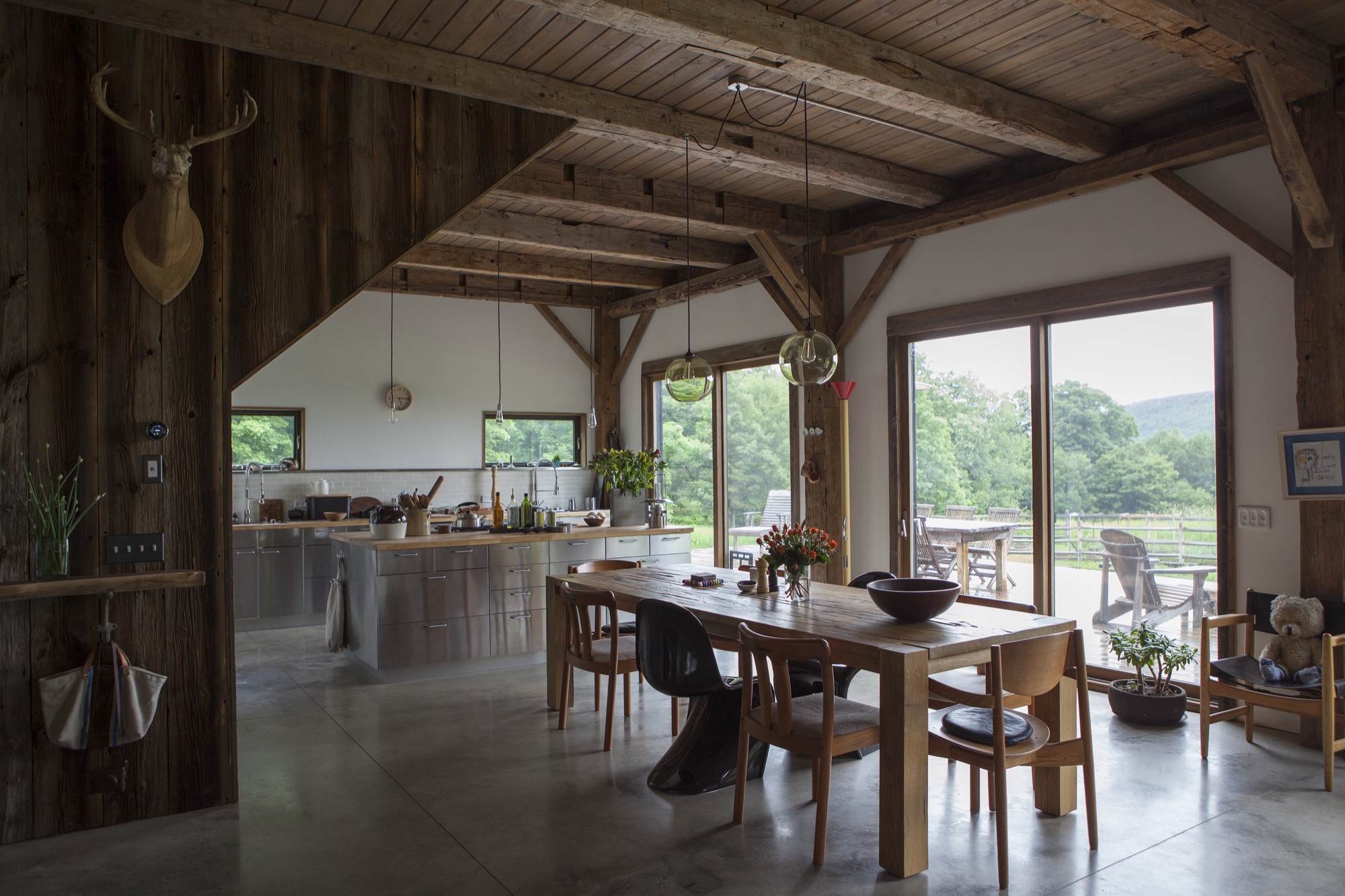
Building efficiency
Above all, the Stavdal-Bronées wanted to build an energy-efficient house from materials that were both economical and sustainable. The winters can get extremely cold in the Catskills, so insulating the house well was critical. Throughout the design and building process, Stavdal gained a tremendous amount of knowledge about building materials and their different properties, which he believes ultimately determined many choices and decisions during the construction.
A timber frame salvaged from a nineteenth-century barn, restored and transported in pieces to the building site, forms the main structure of the house. The barn frame was raised first—“the good old way,” Stavdal says. “They put it together on the ground, and then five guys raised it up with ropes. That was so cool.” The barn frame erected, they installed structurally insulated panels—or SIPs—that were prefabricated and delivered in sections. The vertical pieces, which are six inches (ca. fifteen centimeters) thick and four feet (ca. one and one-fifth meters) wide, rest on a sill around the exterior perimeter. Toward the top, the panels were cut to accommodate the shape of the gable.
“We stacked the SIPs around the house...like Legos. It’s a simple way of raising a house. The exterior of the house was completed in only three days.” Making all joints between the SIPs and around windows and door openings extremely airtight paid off: “Our house is so warm in the winter, and our heating cost is a fifth of the usual cost up here,” Stavdal says.
The 1,945-square-foot (181-square-meter) house sits on a concrete slab with integrated radiant heating. Polished and left exposed, the top of the slab serves as the interior flooring surface. Once the contractors had finished the exterior of the house, Stavdal completed all the interior work himself. He built the second story’s floors and ceiling and the stairs from reclaimed barn wood. Furnishings are sparse but comfortable. A sleek black woodstove centers the living room. On the opposite side of the wide-open great room lies the dream kitchen Stavdal and Bronée started to plan that night they met in New York City.
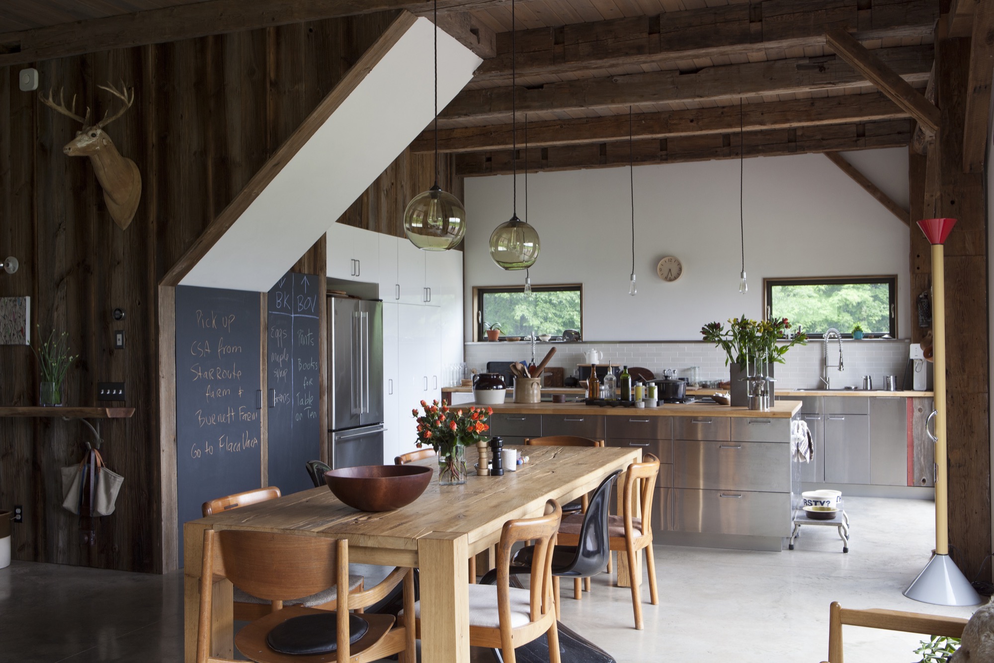
Space and time for creativity
“Being up here, I feel more creative with the things I do,” the nutritionist says. “I get ideas for articles and things I want to teach and communicate because I have more thinking time but also because I have a big kitchen—a crucial part of the house—for having people over and for sharing a meal.” Bronée, who develops recipes in her Bovina kitchen, grows her own vegetables and frequents the area’s organic and free-range farms. “It’s become a very food-oriented place,” she says. “We also built a yoga platform in the woods. The whole thing feels like it supports that nourishing lifestyle of reflection and touching base with myself when I’m here and being able to create space for thinking and not so much doing but...being”
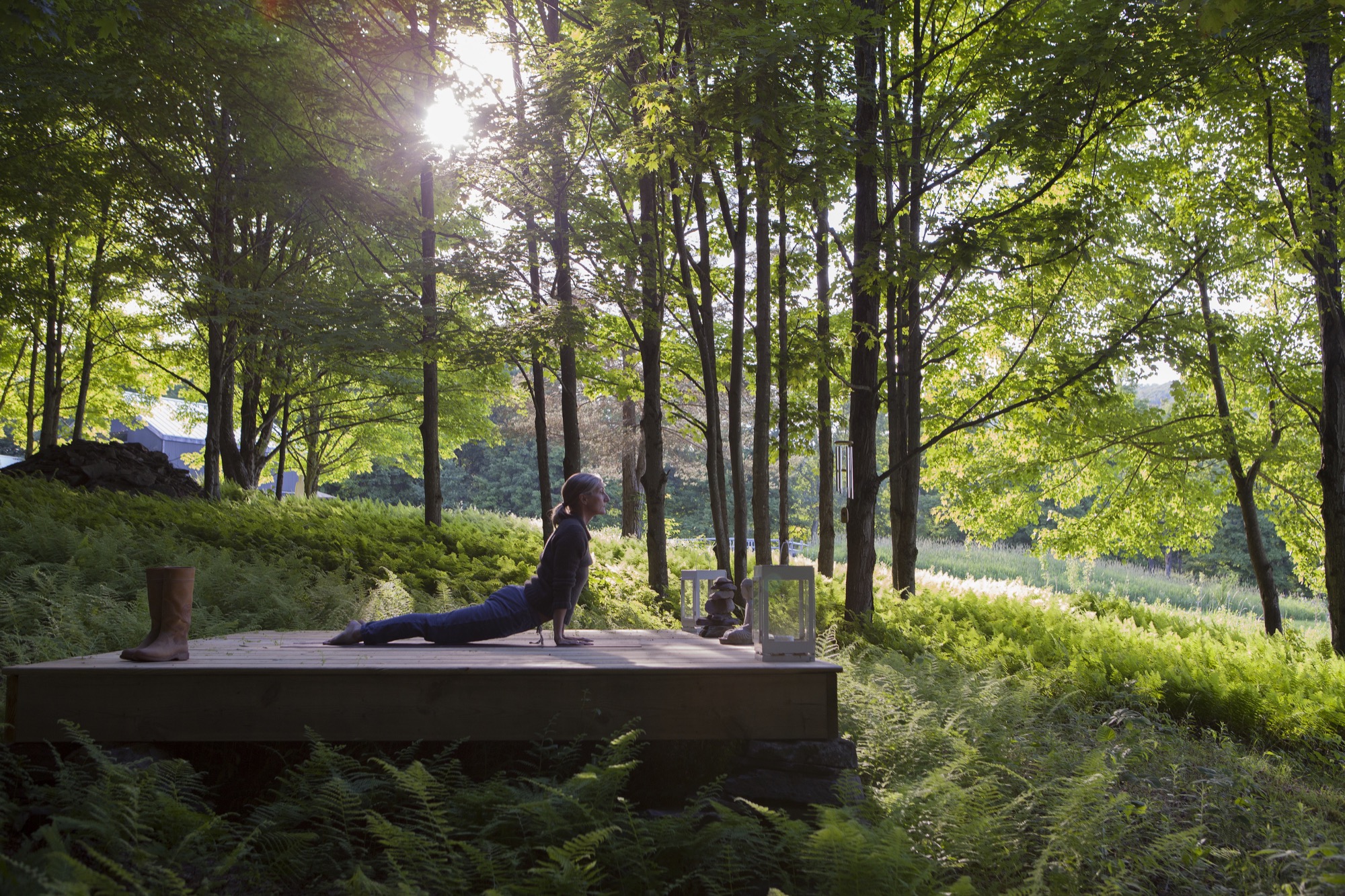
The locals are peers
At the time they bought the land, the Scandinavian couple didn’t know anything about the local community—a huge bonus, it turned out. “Our social life has just transferred to Bovina,” Stavdal says about their unexpected sea change in lifestyle. “We work from Bovina. Jeanette writes a lot here. She wrote her book up here. Literally, New York has become the getaway, and this has become our home.” The Nordic transplants quickly felt like locals in Bovina.
“I have a lot of peers here. Photographers are a dime a dozen—we are littering the place,” he quips. “This seems to be a playground for the creative community. We have a lot of friends living in the Catskills who are cinematographers, directors, photographers...we find like-minded people.” He doesn’t sorrow over losing the city folks who are unwilling to make the long drive. In Bovina, a small community of 600 or so that is still a relatively poor area compared with the rest of New York State, he doesn’t notice a big divide between weekenders and locals, and weekenders don’t expect to be catered to by the locals. “The Catskill Mountains are undeniably becoming a destination for New Yorkers. Instead of going to the Hamptons, they’re going to the Catskills,” Bronée says about the “New York expats” who flock to the area to create businesses in the hospitality industry or to take up farming. “Some of these dairy farms up here have now become artisan dairy producers who make good cheeses, all that good stuff.” She remembers worrying initially that options for buying fresh, quality food were limited, but upon discovering a small co-op, the healthy-living sage knew she could stay here. Meanwhile, the couple has cultivated a food orchard on their own property, with a 1,000-square-foot (ninety-three-square- meter) kitchen garden.
“The Catskill Mountains are undeniably becoming a destination for New Yorkers.”
Urban life, by contrast, feels more “hour to hour,” Bronée contemplates. The couple now drive to New York City for external inspiration. “We work in both places, but the city has a different energy and pace,” her husband adds. “We ended up using the Brooklyn apartment more to go to sleep and work. While here, we work and live. So this feels more like a home.” △
“We ended up using the Brooklyn apartment more to go to sleep and work. While here, we work and live. So this feels more like a home.”
The Soul Catcher
Peter Haimerl's progressive designs save derelict farmhouses
Munich architect Peter Haimerl saves the old souls of derelict farmhouses through progressive design. Garnering the German architecture prize, his concept of inserting concrete cubes inside historic facades creates modern living spaces while preserving vernacular Bavarian architecture.
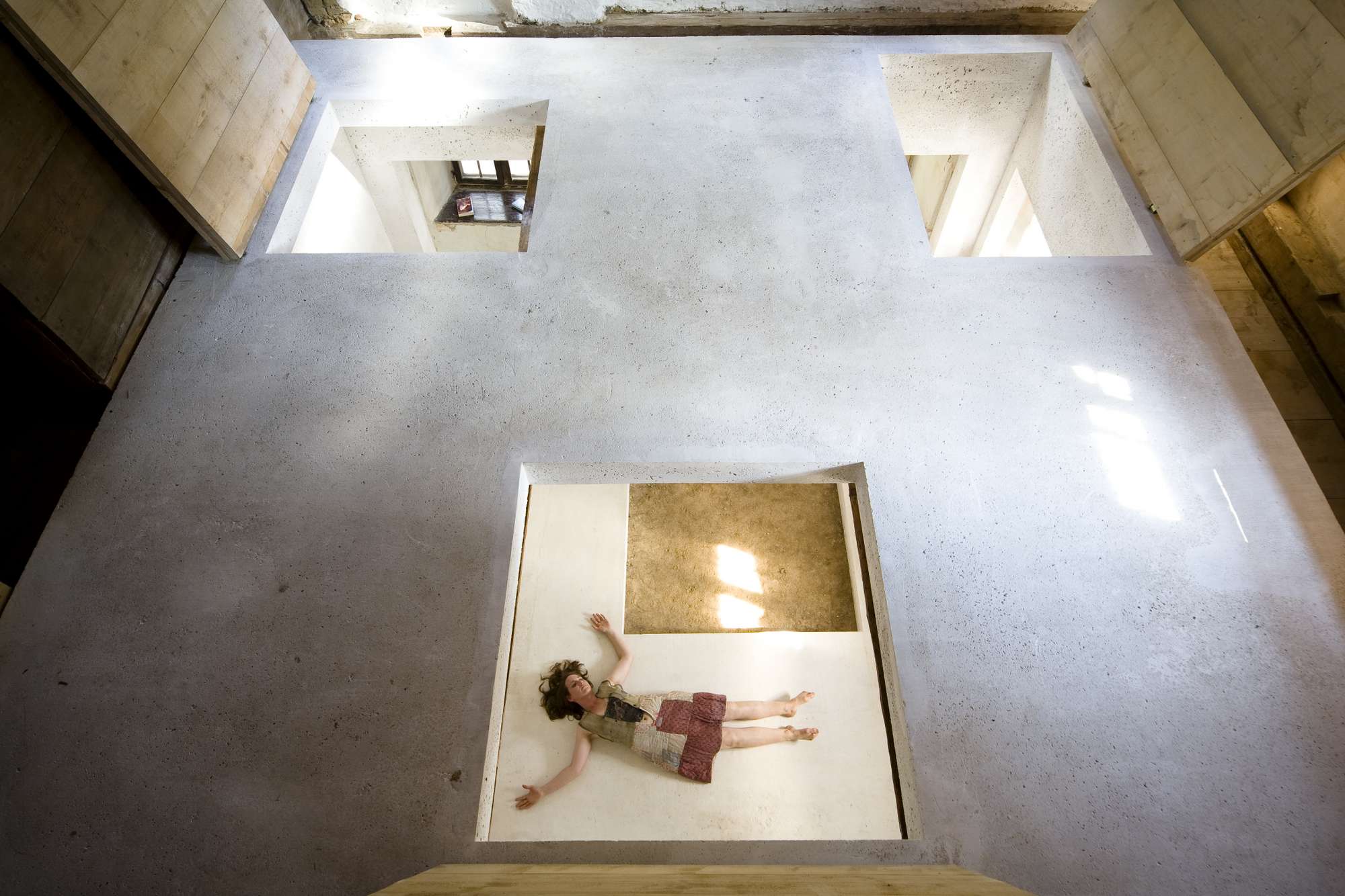
Cilli remained the last living soul in the old farmhouse built in 1840 in the Bavarian Forest. The farmer woman had inhabited the Waldler farm’s spartan living quarters at the edge of Viechtach, a small southern German town near the Czech border. When Cilli passed away in the 1970s, Peter Haimerl’s family inherited the historic farm, and young Peter resolved to someday save the building from deterioration—an endeavor that nearly two decades later would at first prove difficult for him. Haimerl had just graduated from architecture school in Munich in the early 1990s when, brimming with gusto, he ripped out the ceiling to create more space in the low-ceilinged parlor. “I interfered with the structure of the house by doing that,” Haimerl says in retrospect. “It became very clear to me that the houses here have a distinct character—that a house’s spirit lives on.” Wanting to preserve the soul of Cilli’s old farmhouse, he drafted close to 100 designs. It wasn’t until years later that Haimerl, by now a renowned architect, ventured into the actual restoration.
“It became very clear to me that the houses here have a distinct character— that a house’s spirit lives on.”
He soon discovered a hidden grid in the house’s structure; the proportions and dimensions themselves revealed a coherent picture. “To discover this took time. It appears the carpenters back then had an intuitive understanding of the framework. Many craftsmen and architects today, by contrast, are mere implementers of concepts from the home improvement store,” grouses Haimerl, who abhors Toscana-style mansions and, even more so, the romanticized yodel-cabin aesthetic often found in the Upper Bavarian and Austrian alpine regions. Fortuitously, he found himself in a particularly fitting area for his very personal project: The faraway, barren Bayerwald is miles removed from alpine kitsch and tourist hordes. In fact, the region suffers from rural exodus, since the young and educated are migrating to the cities. Country idyll meets slow decline here.
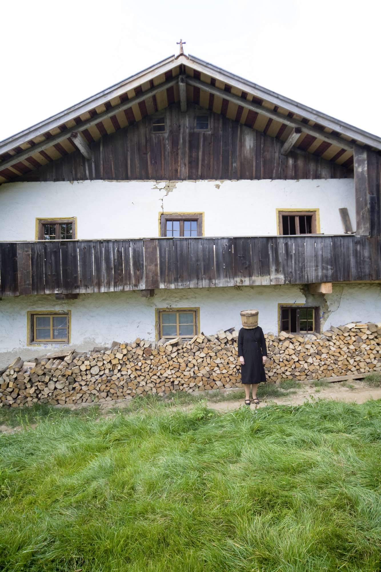
Out of stock
Many of the old houses and farms have already been torn down. Authentic historic design has become rare to find, the architect regrets. “Those were the homes of simple, poor people. They had to make do with the little they had, which characterizes the particular quality of construction.” Logs were treated rudimentarily, and artificial elements were reduced to a minimum. Haimerl is fascinated by this reduction to the essential, the individuality, the deftness of traditional Bayerwald architecture, which was soundly adapted to the given materials and setting. The old farmhouses were invariably built parallel to a geological phenomenon known as Bayerischer Pfahl, a quondam 150-kilometer- (93-mile-) long quartz vein traversing the northeastern Bavarian Forest. Ostensibly, the people in the region oriented themselves by the Pfahl.
His adoration for his native region and its peculiarities combined with his respect for traditional craftsmanship eventually drove Haimerl—who by now was practicing architecture in Munich—to entirely preserve the original exterior facade rather than “restoring the house to death,” as he phrases it. Instead, the new was to meet the old with prudence—a premise for all of Haimerl’s projects.
Set in time and concrete
Driving past the little chapel toward the forest, stately new construction projects and revamped farmhouses remain blatantly absent from the landscape. Time seemingly stands still here. Facades quietly crumble. Envisioning anyone living here is difficult.
In addition to the facade, Haimerl preserved the building’s underlying fundamental makeup—the stable in the house, the Austragskammer (a small room customarily reserved for a live-in aging relative) on the building’s north side, the granary in the attic, and the barn under a roof that extends all the way down to the ground. Haimerl poured four concrete cubes into the derelict farmhouse’s interior—lightweight concrete, to be exact, with aggregate foam-glass ballast. The foam-glass ballast, made from recycled glass bottles, is highly insulating and eco-friendly. The concrete dams the house from the inside while shielding it against the outside. The original facade remains intact; the ancestral farmhouse lives on. Haimerl received the Architekturpreis Beton (architecture prize, concrete) for this technique in 2008. Moreover, the vivid glass surface references the Bayerwald’s traditional glass industry.
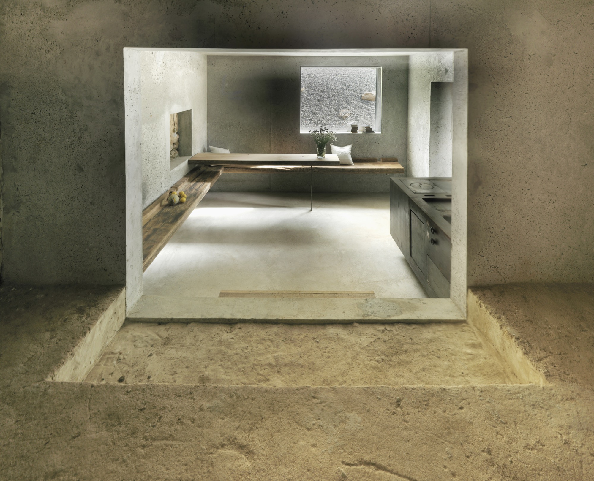
The project’s realization proved challenging, since walls and ceilings had to be poured in one piece and the concrete needed to mold to the old masonry’s somewhat crooked plaster. The former Stube (parlor) is now the Mutter-Kubus (mother cube), the only heated space in the house. The three smaller cubes—bathroom, kitchen, and bedrooms—are heated by the fireplace in the great room. “We wanted the house to be comfortable, to an extent. But this wasn’t to be a house designed to serve us. The installations needed to be adequate for the old farmhouse and conducive to its time and scale,” Haimerl explains. Big openings in the concrete give view to the old facade, the old windows, and the attic. The large attic hatches are closed in winter and opened in summer for light and air. Parts of the old loam floor stayed exposed. Time and history are integrated within. “I want the patchwork character, those pieced-together elements of the existing building, to remain visible,” says Haimerl. “You have to be able to see the places where the house needed to expand, where it needed to grow with the needs of its inhabitants.” The building’s history is evident in the layers of peeling paint, the variation in the walls’ thickness that marks different building phases, in the antiquated electrical wiring, in the feed trough in the stable. Even the sparse interior design references the farmhouse’s ordinary past. The existing part of the building is furnished exclusively with pieces that were already there before the renovation, such as the old wooden bed that Cilli, the old farmer woman, slept in, and an old dress that still hangs in the closet—a patchwork of decades and a mirror of time, like the old farmhouse itself. Haimerl’s wife, Jutta Görlich, visualizes that sentiment in artful photographs.
“You have to be able to see the places where the house needed to expand, where it needed to grow with the needs of its inhabitants.”
The new living spaces inside the concrete cubes are furnished with salvaged artifacts and pieces made from recycled materials, such as reclaimed-wood benches and an iron stove built with recycled materials in the new kitchen. It’s comfortably warm in here, and the house’s old soul is perceivable. It’s easy to see why the architect loves to spend time in his idiosyncratic vacation home.
The farmhouse also serves as the architect’s office and showroom—here, he can demonstrate his design principles, his innovative mix of old and new. Something he continues to do. His project “Birg mich, Cilli!” (Salvage Me, Cilli!) received outstanding press coverage and raised great interest among city folks longing to escape to an authentic Bayerwald house. The project is equally recognized by the locals, who value the idea of preservative restoration. For that reason, Haimerl founded the interest group Hauspaten Bayerwald—loosely translated, “a call to adopt a Bayerwald house.” The initiative brings together builders, architects, investors, craftsmen, and grantors for the salvation of these relict houses.
Concert hall Blaibach
The movement has not only catalyzed the renovation of several historic farmhouses—and with that the architectural revitalization of the Bayerwald—it also connected Haimerl with the noted German baritone Thomas Eduard Bauer. The fellow Bayerwald natives collaborated in building a “refuge” for the Kulturwald festival Bauer had established to honor and celebrate the region’s culture. In a tenacious effort, and despite initial protest from the locals, the two contrarians created a strikingly innovative concert venue in the small neighboring community of Blaibach, where world-class musicians perform today. The building in the form of a tilted granite block partially sunken into the village square and outfitted with a granite gravel facade was largely funded through Bavarian government programs.
So, too, were the new community center and city hall next door: As part of the pilot project Ort Schafft Mitte (Place Creates Center) for the revitalization of abandoned village centers, Haimerl encased the existing building with a minimalist shell made from his recycled-glass concrete. The new concert hall he built was to evoke a sense of awakening in this somewhat desolate region. An open staircase beneath the monumental lithic structure leads into the foyer. From there, concertgoers reach the steeply ascending auditorium, which seats 200 guests on wire chairs. The slotted wall of cleverly stacked concrete slabs was entirely designed according to input from acousticians. On the outside, the tilted cube was clad with granite rubble, and many residents of the former quarrymen's village lent a hand. In 2015, the jury of the Deutscher Architekturpreis (the German architecture prize) distinguished Haimerl’s firm for the concert hall in Blaibach, among more than 150 submitted projects.
Haimerl x Euroboden
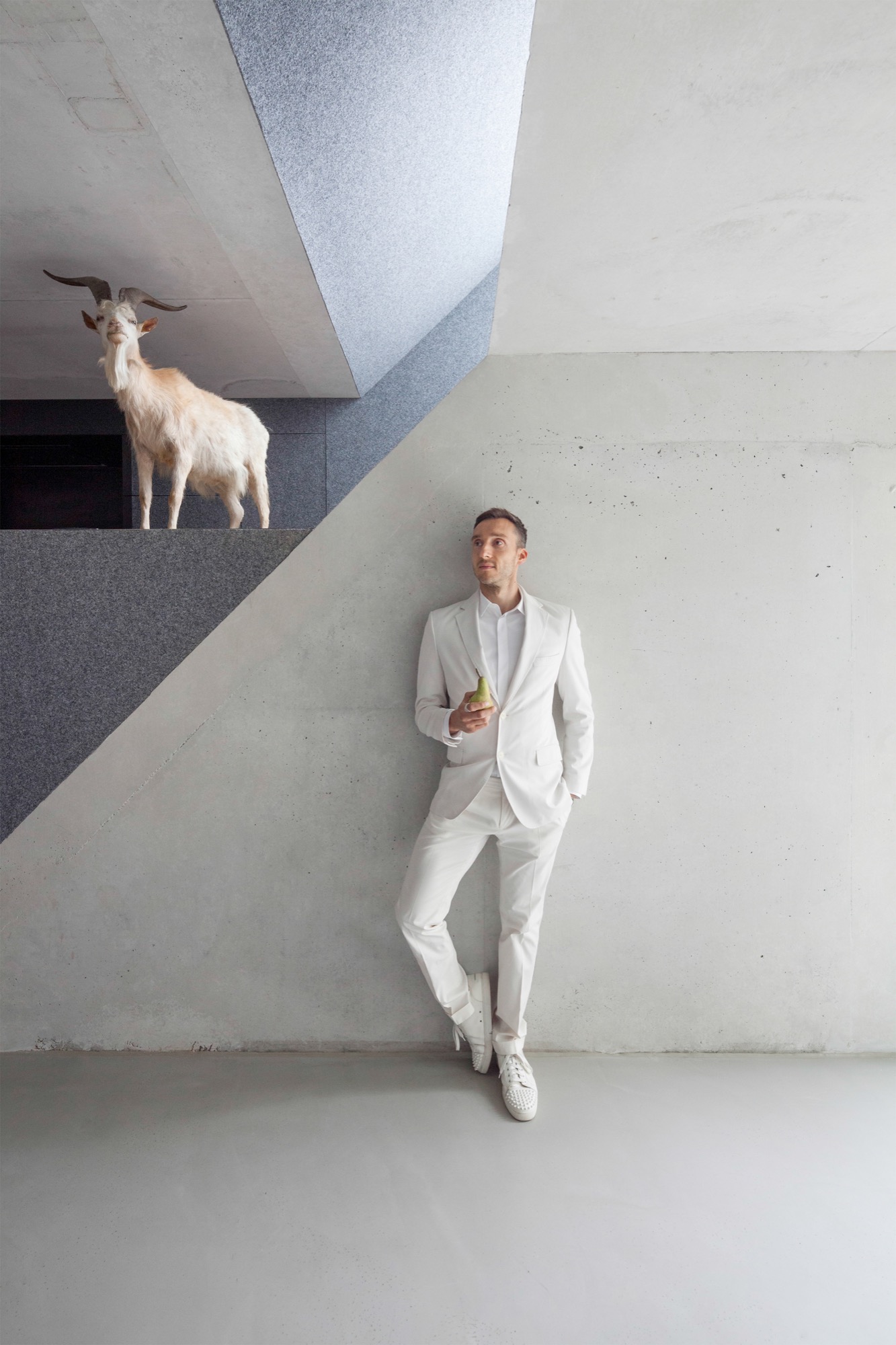
While the prestigious award was the highlight of his career so far, the unorthodox architect has no intention of stopping there. He recently completed his newest project—Verweile doch (Stay Awhile)—in collaboration with the construction and development firm Euroboden. In the Munich suburb of Riem, Haimerl applies the same preservation concept as with his Cilli project, without disregarding the peculiar characteristics of the town’s oldest estate.
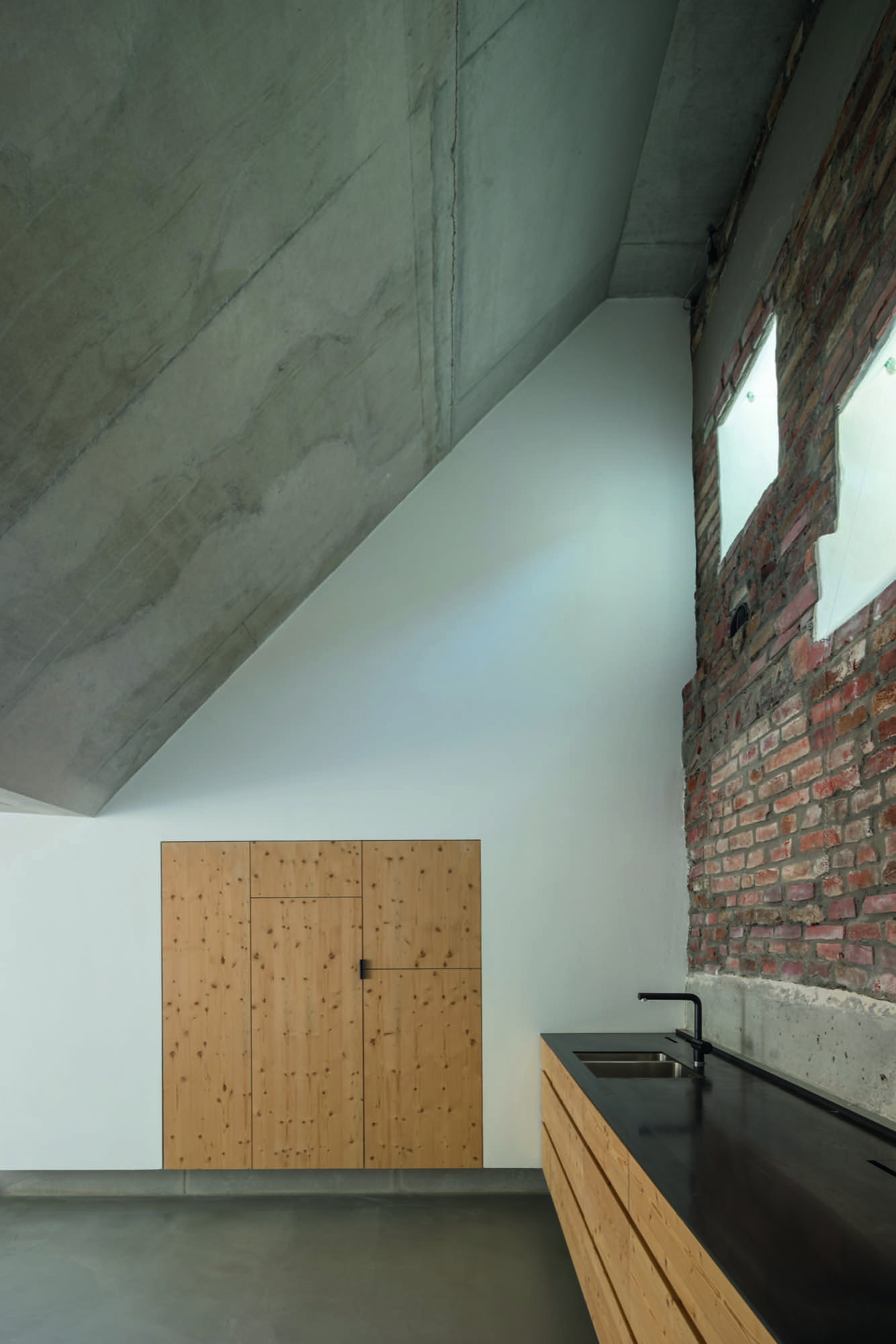
Built circa 1750, the Zendath estate consists of a farmhouse and stables. Only parts of the residential portion and remnants of the stables were left standing, though. “With the historic farmhouse’s ambitious transformation, we wanted to create a pathbreaking paradigm for dealing with architectural heritage,” says Euroboden CEO Stefan Höglmaier. He and Haimerl intensively studied the rich history of the Schusterbauern house and its inhabitants (generations of owners were shoemakers and farmers) before embarking on their installation of two family-friendly dwellings. They connected the home and the stables spectacularly by inserting a concrete cube. Set into the forty-five-degree roof, the cube creates new levels with living spaces. Its steeply angled walls are a nod to the nearby alpine peaks. While the first unit remained largely intact except for a modern kitchen and bathroom, Haimerl’s design of the second unit encroached far more radically on the old structure. From the entryway behind the old barn door, multilevel mezzanines lead to a two-story space with gallery. Beyond lie the living room with a fireplace and the bedrooms. Exposed concrete, light-colored wood, and gray felt make up the interior architecture in this part of the building—only the old barn’s collar beams reveal that the centuries are overlapping here. “My architectural concept is based on two premises: preserving historic building stock while at the same time introducing a reinvention of space,” says Haimerl. He achieved just that in Riem. Once again, he saved the house’s soul through singularly progressive architecture. Once again, he caught that old soul and grandly made his mark with minimalist yet artistic aspiration to connect tradition with modernity. △
Monolog der Schusterbäuerin / Monologue of the Shoemaker Woman
1
es wird erzählt,
hinter dem Feldstadel,
ein kleines Häuschen
Dort wuchsen die Schuhe auf seinem Grund
*
it is said,
behind the barn,
there was a little house,
and there, the shoes grew out of the ground
2
es wird erzählt,
ihr Stubenboden war so sauber,
essen konnte man darauf
*
it is said,
her living room floor was so clean,
you could eat off it
3
es wird erzählt,
die Stallschwester Nanni spielte im Sommer unter dem Birnbaum ein Grammophon
Alle Knechte der Nachbarschaft kamen zum Hören
Sahen die wilden kleinen Früchte Tanzten wild in der großen Stube
*
it is said,
in summer the stable girl Nanni played a gramophone under the pear tree
All the servants in the neighborhood came to listen.
They saw the small, wild fruits and danced wildly in the big living room
4
es wird erzählt,
dass der ganze Zehent
der Kirche zu Riem zu reichen ist
in Geld
*
it is said,
that the whole tithe
had to be paid to the church of Riem
in money
5
es wird erzählt,
der Balthasar ging 24 Mal barfuß nach Altötting
Um 3 Uhr früh weg,
abends um 6 Uhr in Altötting
Ein braver Mann!
*
it is said,
that Balthasar went to Altötting barefoot 24 times
He left at 3 in the morning,
and was in Altötting at 6 in the evening
A brave man!
6
es wird erzählt,
die Schusterbauern haben sich verdient gemacht
im Dorf, für die Kirche
und gegen das Feuer
*
it is said,
the shoemakers rendered services to the church
in the village
And against fire
7
es wird erzählt,
mit dem Flughafen verschwanden die Felder,
da verschrieb sich der Schusterbauer
dem Pferdesport
*
it is said,
with the airport the fields disappeared,
so the shoemaker turned to
equestrian sports
8
es wird erzählt,
ein Lehrbub sollte von seiner Furchtsamkeit geheilt werden
In der Ledertruhe versteckte sich einer als Leiche
Man glaubte ihm nicht und nahm ihn bei den Ohren
*
it is said,
an apprentice lad needed to be cured of his fearfulness
Someone hid in the leather trunk pretending to be a corpse
He was not believed and was grabbed by the ears
9
es wird erzählt,
nach dem Brand der Scheune
verschwanden die Schusterbauern
von dieser Erde
*
it is said,
after the fire in the barn
the shoemakers disappeared
from this Earth
Peter Haimerl was born in 1961 in Viechtach, Bavaria. He studied architecture at the University of Applied Sciences Munich. After graduating in 1987, he worked for various architecture firms (1987–1988 for Günther Domenig, Vienna/ Graz; 1988 for Raimund Abraham, Vienna/New York; and 1988 for Klaus Kada Graz/Leibnitz). In 1991, he founded his own firm in Munich. Among his best-known projects are the remodel of Munich’s Salvator garage (2006), Das Schwarze Haus in Krailling (2006), “Birg mich, Cilli!” (2009), the concert hall in Blaibach (2014), and the restoration of the Schusterbauern farmhouse in Alt-Riem, Munich.
Haimerl received the Architekturpreis Beton in 2008, the Best Architects Award in gold in 2009, and the Bayerischen Kulturpreis (Bavarian culture prize) and the Deutschen Architekturpreis for his concert hall in Blaibach. Haimerl is married and has two children.
Architecture Improv
An Interview with David Sellers, the “Father of the Design-Build Movement”
A visit with experimental architect and designer David Sellers reveals his then-radical ideas of creating a home in the 1960s. Earning the moniker “Father of the Design-Build Movement,” he established the antiestablishment commune Prickly Mountain on 450 acres (182 hectares) of farmland in Vermont.

“We really didn’t know what we were doing when we got here,” says David Sellers, describing those first days in the Mad River Valley of Vermont, when he was experimenting not only with a radical idea of what makes a home but also an entirely novel approach to the practice of design and building.
Breaking ground in the sixties
It was the early sixties, a period when art and science turned experimental and people were driven by a desire to break with the norm. Sellers and his business partner, Bill Reineke, landed in the mountains of Warren, Vermont, smack-dab in the middle of the decade and smack-dab in the middle of nowhere. The freshly minted Yale architecture graduates each had a thousand dollars in their pockets and a dream to start something completely new. They purchased 450 acres (182 hectares) of cheap land—fallow fields of blueberry bush—and convinced some students to camp out with them for a summer. They dreamed of reinvigorating the architecture discipline.
They built a series of houses, all with funny names—the Tack House, the Pyramid House, the Bridge House—and developed a community called Prickly Mountain. The goal was “to create buildings where design was the driving force in construction,” explains Sellers. Their process was described as “design-build”—instead of building to preexisting designs and plans, they designed as they built. “We wanted to make something special in our time, the twentieth century, with the materials and tools available,” says Sellers. “The chief aim was participation, learning as you go.“ It was a community of exploration and collaboration.
“The chief aim was participation, learning as you go.”

Sellers’s design-build process was organic in nature, much more like sculpturing. The unique, interactive structures were unlike anything else built at the time: Circular ladders sliced through the interior of buildings to create landings for sleeping nooks or to capture the morning sunlight; elevated walking bridges connected structures on land that was once considered unbuildable; and climbing pegs were attached to living room walls as a new means of traveling from floor to floor.
The buildings, with angled roofs and constructed from unconventional materials, not only stood out in the countryside, they attracted attention from others in the profession and were published in the likes of Forbes, Time, Progressive Architecture, and even House Beautiful.
Their first building, the Tack House, was made entirely of plywood and found objects. There were no blueprints beyond a rough sketch of the foundation based upon the remaining pilings at the site where a neighbor had previously secured equipment, or tack, for her ten Arabian horses.
You design it, you build it
Sellers’s second building, the Pyramid House, unfolds into the Vermont hillside as if it were alive and growing. The towering structure captures views of the valley and the neighboring Sugarbush ski resort. It was built with only one parameter—that its Plexiglas skylights would allow the inhabitants to sleep under the stars. This improvisational approach to building gave Sellers the designation of “Father of the Design-Build Movement.” But Sellers has never been impressed with the title. “That’s what people have been doing for 10,000 years...the person who was designing the building was also making it,” he explains.
This points to one of the essential elements of Sellers’s philosophy: The designer must know how to make things. His time interning under a prominent architect while at Yale was pivotal, as he observed the contractors and tradesmen ridiculing the architect for lacking practical construction knowledge. Sellers says of his own formal education, “I could bluff my way through construction, but I didn’t really learn what was necessary to build.” Prickly Mountain became the on-the-job training that allowed him to deliver on his philosophy.
Now, with bushy salt-and-pepper hair topped by a paint-splotched beret from the 2002 Winter Olympics in Salt Lake City, Sellers sports a relaxed, professorial air (and indeed he has had stints as a professor at Yale University, the Massachusetts Institute of Technology, and Michigan State University, among others). We met for dinner at Tracks Bar in the basement of the Pitcher Inn, a boutique hotel in Warren. Sellers played a pivotal role in its design and construction, and the bar got its name from the tracks of local animals stamped into its wet concrete by high school students. It’s this kind of whimsy that Sellers brings to his life and work. Indeed, as I look down at the tracks in the floor, I notice his bright red Puma sneakers.

Frank Lloyd Wright and a gut feeling
At seventy-seven years old, Sellers, a master craftsman, waxes nostalgic about his past and his path. He traces the beginnings of his design evolution to his childhood in Wilmette, Illinois. On his bike ride to elementary school, he would zigzag from surface streets to back alleys, taking different paths so he could discover new things. He remembers watching how the light and the shadows fell as the seasons turned, and he was especially intrigued by a black-and-white house that stuck out from all the others. That house is the Frank J. Baker House, designed by Frank Lloyd Wright, though Sellers didn’t know it at the time.
In reflecting on those bike rides, the multitalented creative draws a connection: There were rarely clear signals to get to where he was going, so he trusted his gut. He would “follow that sense and see what was there.”
His current process is not much different. “It becomes a search or exploration to unravel a direction that incorporates and holds all the clues as they emerge,” he says. He feels that every time you build, you give birth to something new. “Most of the time there was nothing other than the feeling I was on the right track,” he says. “If you plan it out in advance, it loses its energy, and you’re following some code and ideas you’ve already planned. But if it’s all up in the air, you can listen to what it tells you and change it along the way.” To illustrate his process, he describes the development of his light-filled studio, affectionately called the Temple of Dendur because it was inspired by that Egyptian structure in the Metropolitan Museum of Art in New York City: “I thought to myself, how do I hold this up? And I decided that I was going to hold it up with trees. Because we had a low budget, and we had a lot of trees we had to cut down, so let’s just use the trees. So, I put these trees up and put a beam along the trees and put a roof over it.” His design solved a problem, on the spot. “And based on that, there are a lot of choices on how to do the next thing. And that’s what I mean by the building speaking to me.” Although this sort of unpredictable building process may seem to bear risk, Sellers doesn’t look at it that way. “Risk implies that failure is one of the possible results,” he says. “Focus on the positive instead of the negative. Don’t use the word risk; look at it as an opportunity to get to a place where you can find great joy.
“You need to get comfortable with the fact that you don’t know what you are doing,” he says, “and you’re not sure where things are going, and you find joy in that uncertainty—joy in the probability of it being a success later.”
“Most of the time there was nothing other than the feeling I was on the right track.”

The joy in design as the act of building certainly reaches beyond the discipline of architecture. Sellers himself has designed everything from shoes to snow sleds, and has opened the Madsonian Museum of Industrial Design, a venture that represents a lifetime of appreciation for and devotion to good design. The building, beside a 200-year- old covered bridge in neighboring Waitsfield, Vermont, houses “the best designed and most artistic manufactured objects,” a collection that includes items including “the best wheelbarrow ever made.”
The Madsonian enterprise connects with Sellers’s commitment to things that last and a dedication to sustainability. “Industrial designers and architects have a role in deciding what we should make out of our resources. They have a huge impact on how this planet is going to last,” says Sellers. “All the easily extracted resources have already been taken. So you think, how is this going to last? It’s not, unless we rethink how we apply our creativity to the things we require.” His current project, called the Home Run House, is testament to this conviction. The project aims to deliver a building that will “last five hundred years, with no fuel bill, no cost, and no maintenance.”
In describing the Home Run House project, Sellers appears to have the same enthusiasm and sense of discovery as he did back in the sixties. The foundation of the house has been poured. “Now it has its own voice,” he says. “If you look at it—what is going on here—I try to massage it. I feed it, and I look at it again. It begins to take on a life of its own.”
As he walks onto the construction site, “It’s almost like I haven’t seen it before,” he says. “I imagine it as if it were alive. I’m mesmerized by it. At some point, in the process of looking at it, there’s a sense of order that emerges...It’s like I’m having a conversation with it, making it tell me what it wants to do, to help it become its best self.” △
The Skyward House
Japanese architect Kazuhiko Kishimoto designs a human-scale house for a retired teacher
Dwelling in a tiny Tokyo apartment for decades, the school teacher had dreamed of a vegetable and flower garden with a little house—but never of the inspiring minimalist home she eventually built in the woods of her native hamlet. Architect Kazuhiko Kishimoto designed for her a white, womblike core with skylight and outward-focused spaces affording views of her passionately cultivated paradise, plus Mount Fuji and the Japan Alps at a distance. Yoko Fushimi adores her house. It is a small wooden cube set on a slope overlooking a rippling expanse of mountains rising west of Tokyo toward the crescendo of the Japan Alps. The modest exterior belies an unusual and conceptually exciting interior, composed of what architect Kazuhiko Kishimoto calls “inner and outer spaces.” Aside from a skylight at the apex of its peaked ceiling, a pure white, womblike inner space offers few glimpses of the outside world. Conversely, the low, wood-paneled outer spaces focus almost entirely on the surrounding environment. After three years, Fushimi still delights in a house full of interesting contrasts and surprising shapes.
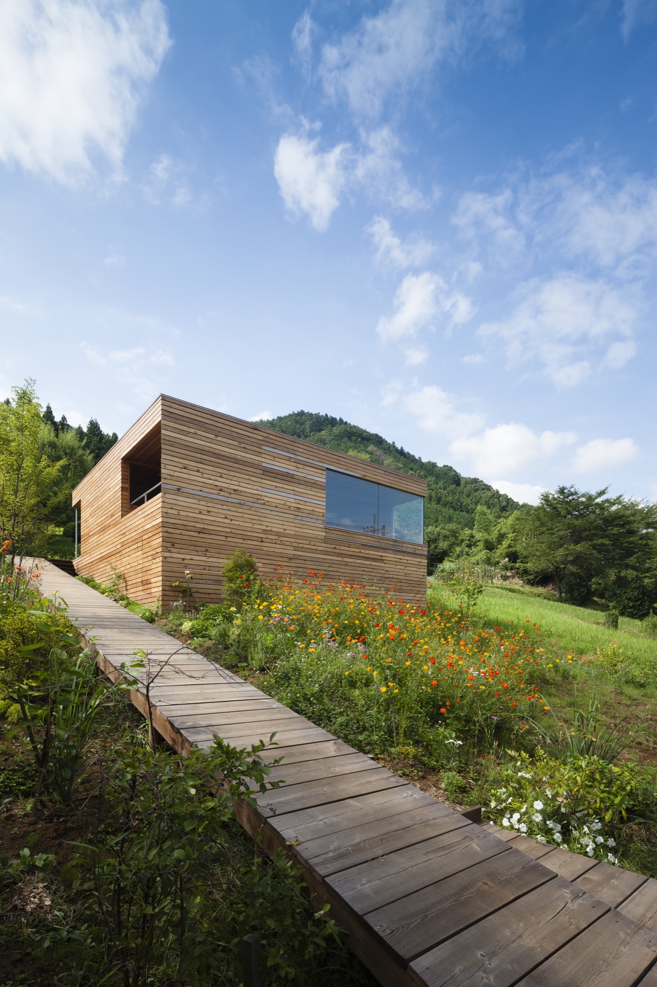
When she first set out to build a house, however, she wanted none of these things—or at least she didn’t know she wanted them. “I never dreamed I’d have a house as wonderful as this. The way the light changes on the white walls, the views at night…I didn’t request any of it,” she said on a recent afternoon. She was sitting in one of the outer spaces, a pentagon-shaped living area dominated by a large window that overlooks the mountains and creates a sense of floating in the sky. A hibiscus plant bloomed vibrantly in one corner. Across from it, on a low sofa, sat Kishimoto; the architect and his client have maintained a cordial relationship since the house was completed.
What she had initially wanted, Fushimi explained, was a garden. She grew up in a large traditional house a five-minute walk from her current home, on the eastern edge of Yamanashi prefecture. The back of the house peered down on a maze of mist-filled valleys, while the front faced a lofty stretch of the Koshu Kaido, one of the five great roads of the Edo period (1603-1868). Many of Fushimi’s neighbors grew vegetables or raised cows to supplement the occasional visit of traveling merchants. Her father, too, would rise early to tend his garden before heading to work at city hall. Mostly he grew flowers, which bloomed in succession throughout the warmer seasons. Fushimi had dreamed about having her own garden ever since. But after high school she had moved away to study education, and then settled in Tokyo, where she remained for forty years, teaching elementary school and living alone in a small apartment.
She dreamed of a garden with a house
As retirement neared, Fushimi decided to return to the hamlet where she had grown up and build herself a house with a garden (or rather, a garden with a house). “The problem was, I didn’t know how to get a house,” she admitted. When she came across an advertisement for a free seminar in downtown Tokyo about “serious home construction,” she decided to attend. Kishimoto was one of the speakers. “It was like love at first sight,” she joked. “I wanted him to design my house. I liked what he had to say.”
“It was like love at first sight. I wanted him to design my house. I liked what he had to say.”
A very human-sized home
“What all my houses have in common is their human scale,” he explained as he sat in Fushimi’s very human-sized home. “The height of the ceilings and the size of the rooms are small and compact, and as a result, the houses themselves are small. But I don’t design individual rooms. I design places that are connected with each other so that you can always sense the whole. They’re very comfortable to be in.”
“What all my houses have in common is their human scale...I design places that are connected with each other so that you can always sense the whole.”
Tiny houses abound in urban Japan, where firms such as Atelier Bow-Wow and Schemata Architects have found mind-bending uses for any chink in the crowded landscape. Most of these, however, are responses to site limitations. Kishimoto was after something different. He wanted to revive a Japanese design tradition that had always made more sense to him than conventional Western architecture, regardless of site size.
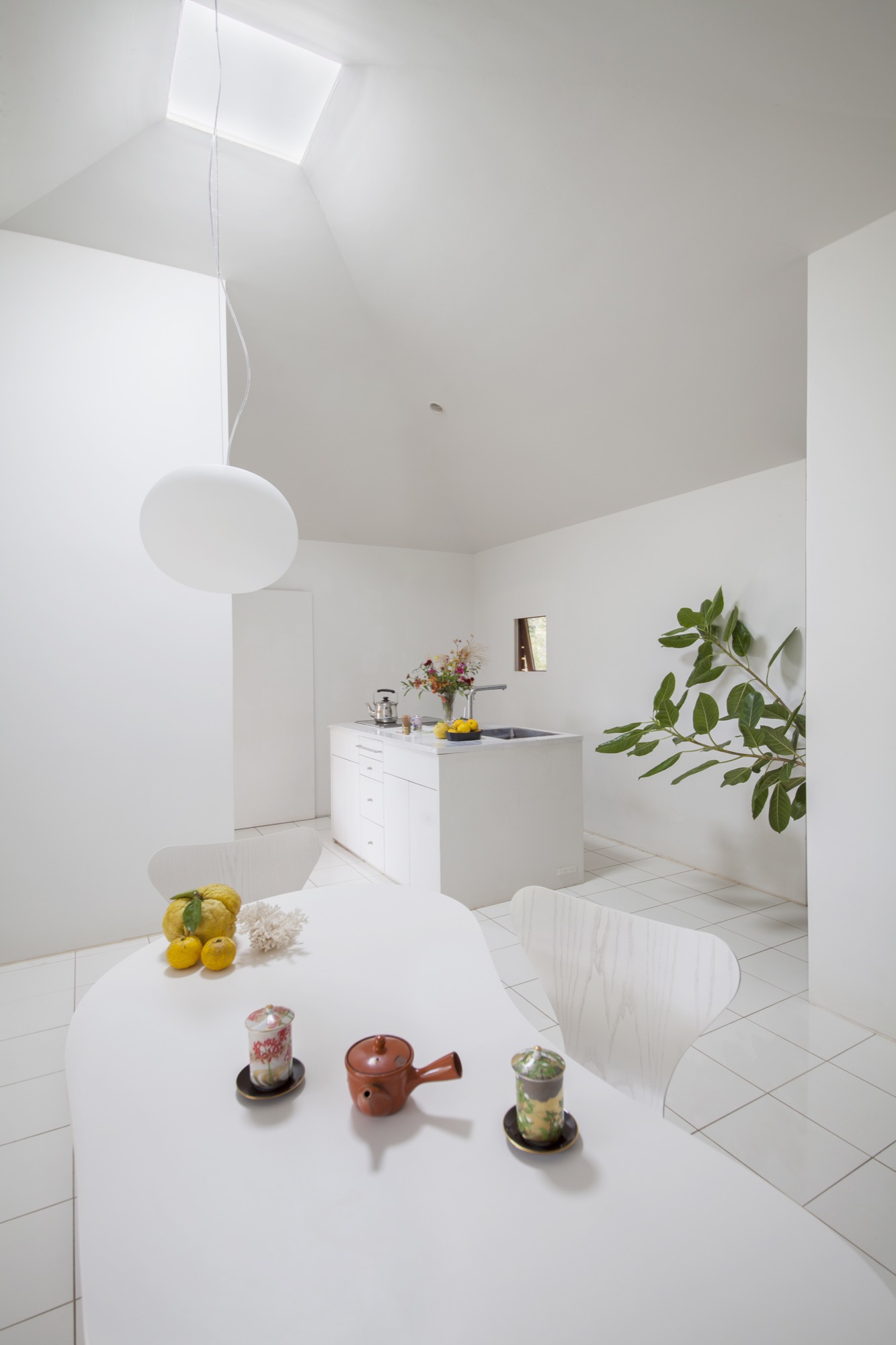
“If you enclose a room with walls, no matter how big it is, it feels small,” he said. However, this Westernized approach to home design had become increasingly common in Japan since the 1950s. Kishimoto wanted to do the opposite: make small spaces feel big through creative design. When he set up his own firm in 1998, he turned to traditional architecture for inspiration.
Japanese building tradition — on the mat
Since at least the 1500s, Japanese builders have been using a standardized set of architectural dimensions derived from the size of the human body and the inherent structural limitations of wood. For example, one key unit sets the size of a tatami mat at just under six feet by three feet, around the size of a reclining adult male; as an old proverb points out, all the space you really needs is “one mat when you’re asleep and half a mat when you’re awake.” Three of these mats might make up a tearoom, and five might make a family sleeping area.
The houses comprising these units were often small, but they contained a number of techniques for creating the sensation of spaciousness. “There was a unique way of connecting rooms, a secret hidden in the design,” Kishimoto said. By and large a house constituted a roof, a floor, some posts, and some sliding screens. Spaces were interlinked, solid walls were scant, and inside led fluidly to outside. Kishimoto wanted to translate these concepts of connectivity and human scale into the aesthetic language of modern design.
“There was a unique way of connecting rooms, a secret hidden in the design."
Fushimi hadn’t thought much about architecture until she heard Kishimoto talk about these ideas at the seminar, but what he said appealed to her instinctively. Plus, she liked the look of his houses. After the talk she decided to send him a letter. “I assumed he’d turn down such a small, low-budget project,” she said. Instead he invited her to discuss the project in person, and ultimately took it on.
The design process spanned two years, partly because of the town’s very slow-paced permitting procedure. Kishimoto began by helping Fushimi select a building site from amongst several owned by her family. The lot they settled on had very few technical limitations: there were tree-filled views on all sides, no visible neighbors, and plenty of space. They also discussed her requests. These included wheelchair accessibility so her aging father could visit, a skylight so that light would pour in like it had in a church she once saw on a trip to Europe, and in her words, “three pages crammed with detailed requests, but not a single one that got to the heart of what I wanted.”
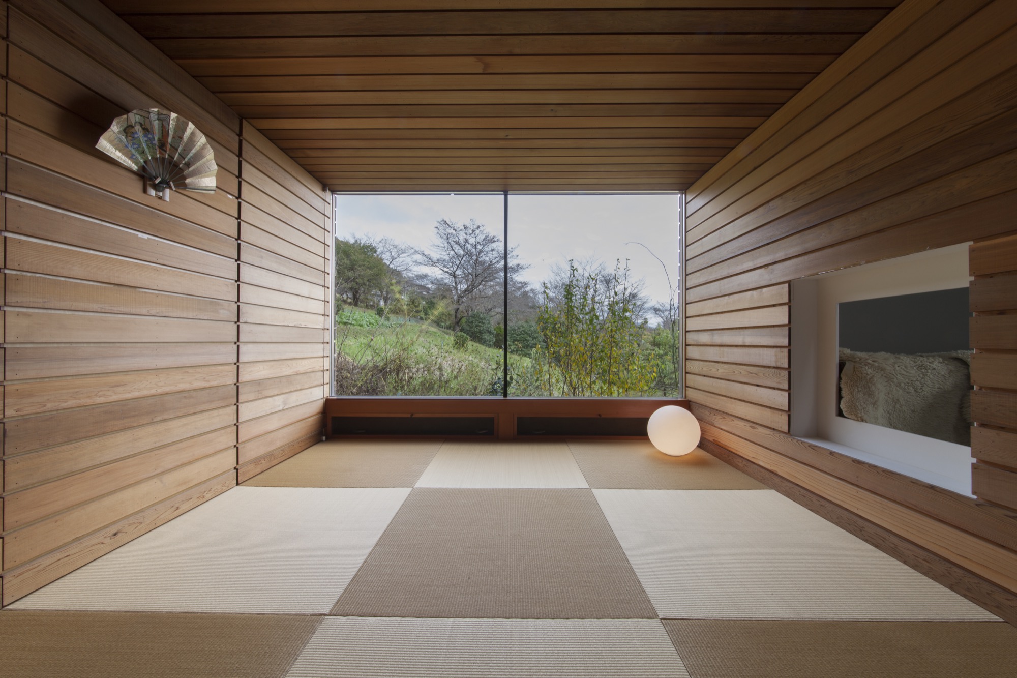
Fortunately, this gap between what clients say and the fullness of what they truly want is something Kishimoto devotes considerable thought to in his practice. “Words apply to objects, like the size of the rooms, and any contractor can meet those requests. My role is to respond to the desires people can’t express,” he said. He engages his clients in chitchat, watches their expressions, and replays conversations again and again in his head, trying to grasp what they mean by vague terms such as “beautiful” or “site-appropriate.” “You don’t draw closer to happiness or beauty in a mechanistic way, like climbing a staircase or adding one plus one,” he said.
“Words apply to objects, like the size of the rooms, and any contractor can meet those requests. My role is to respond to the desires people can’t express.”
In Fushimi’s case, Kishimoto thought about how her long years in Tokyo and her request for a churchlike skylight—“a very urban desire”—contrasted with her rural upbringing and her wish to be surrounded by greenery and gardens. Internal contradictions of this sort are common, but how to deal with them? “Modernism wants to clean things up, make them easy to understand. This is city, this is country,” he said. His response was messier: he wanted the visual and spatial contrasts of the house to reflect Fushimi’s own complexity.
A modern take on the little cabin in the woods
What emerged was a very modern take on the little cabin in the woods. The outside of the simple form is clad in unpainted red cedar planks separated by gaps of approximately four-tenths of an inch (one centimeter), which are intended to lighten the building’s visual impact on the landscape. “I thought it would melt into its surroundings as the trees in the garden grew up around it,” Kishimoto said. A wooden ramp leads up the left side of the lot, past a lush garden, and around back to the entryway. The back corner of the house has been sliced off so that the door sits at a diagonal, and the excised space serves as a small porch, now tangled with potted passion-fruit vines and avocado trees.
“I thought it would melt into its surroundings as the trees in the garden grew up around it.”
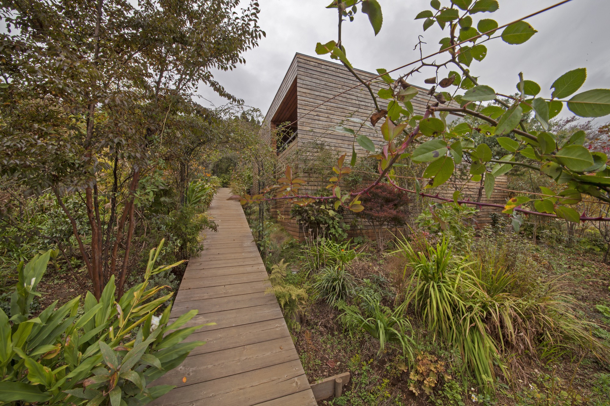
This wild, leafy space opens onto an entirely different world: the white, light-filled core of the house. Kishimoto intended this inner area to serve as a comforting cocoon where Fushimi could retreat when storms or darkness swept over the mountains. It contains the kitchen, computer area, toilet, and sleeping niche. The walls are white plaster, the floors shiny white ceramic tile, and the custom-made table and kitchen-island are white, as well. Light enters from an opening at the peak of the pyramid-shaped ceiling. Kishimoto encircled this skylight with a steel ring for structural support; the ceiling beams rest on the ring instead of on one another when they converge at the top of the pyramid.
Four “outer spaces” adjoin the inner core. One, reached by hunching through a rectangular opening of Alice-in-Wonderland proportions, is a cube-shaped tea room whose glass outer wall reveals a diagonal line of grass and cherry-blossom trees. Fushimi often uses this room to arrange flowers. Another contains a fragrant pinewood bathtub and a wood-framed window that lets in birdsong and cricket chatter. A tiny porch sits adjacent to the bath. Finally, there is the five-sided sitting area with its sweeping view across the mountains. All four of these outer spaces have much lower ceilings than the inner core, and all are finished in the same cedar panels used on the exterior; the interconnecting lines of the panels strongly accentuate the architectural geometry.
Altogether, inner and outer spaces measure only 640 square feet (ca. 59 square meters). To Fushimi that feels large: she spent decades in a 260-square-foot (ca. 24-square-meter) apartment. She continues to find surprises in her new home. “One splendid thing I recently discovered is that if I stand at the exact midpoint between the kitchen and the bed and sing, my voice echoes so beautifully I sound almost like a professional soprano,” she wrote to me in a letter.
“One splendid thing I recently discovered is that if I stand at the exact midpoint between the kitchen and the bed and sing, my voice echoes so beautifully I sound almost like a professional soprano.”
The most remarkable part of the house, however, is that which Fushimi has created herself. In three years the bare slope of the lot has become a profusion of trees, flowers, and bushes. Kiwi vines, morning glories, honeysuckle, and wild roses twine around moss-covered tree trunks and arbors. Lilies, ferns, and violet sage crowd the pathways. The garden has a wild feeling that is rare in Japan, but perfectly suited to its surroundings (while weeding, Fushimi has spotted foxes, deer, wild boars, monkeys, badgers, and three black bears). She tends to her garden most days that weather permits, and thinks of it as a present to the birds and butterflies and people who wander past. But most of all, it is a long-awaited gift to herself. “Right now,” she said, “I’m completely caught up in playing in the dirt.” △
Refuge in Concrete
Refugi Lieptgas is the negative imprint of its ancient predecessor
Using the decrepit log cabin as mold, Swiss architect Selina Walder sculpts a minimalist mountain retreat in concrete, fossilizing the texture and character of the historic hut that once stood in its sylvan spot on the meadow. From the trail, hikers may mistake Refugi Lieptgas for the inconspicuous log cabin that had stood in this very spot for decades. Yet, at second glance, the tiny refuge tucked against boulders at the edge of the Flims forest in the Swiss Canton of Graubünden reveals itself as the negative imprint of the old structure. The stunning effect of the cabin cast in concrete is incongruously sublime; details like the wood grain, the cracks, the door lock set in stone are all true impressions of the past.

Stonewalled Design
The Maiensäss mouldering on the mountain meadow had long served its purpose of sheltering pastoralists during grazing season. Years back, Guido Casty, the 1974 bobsledding FIBT World-Championship silver medalist and local restaurateur who owns the property, had planned to replace the crumbling herder’s hut with a new cabin he could rent out to vacationers. The building permit was denied. The new design needed to somehow incorporate the existing structure. He gave it a rest.
When his itch to tackle the old cabin returned, Casty tasked an architect friend in Basel with a new plan that would comply with the community’s stipulations. Since the project was small and the architect was two and a half hours away, Casty asked Selina Walder of the local Nickisch Sano Walder Architekten to manage the construction. The Flims native had been waitressing for him for many years and graduated from the renowned Accademia di Architettura di Mendrisio, where she had studied architecture under Valerio Olgiati, one of Switzerland’s foremost modern architects.
Walder agreed but didn’t like the design she was handed from the Basel architect. The twist: The building authorities had miscommunicated the structure’s prescribed maximum footprint. As a quasi apology, the local architect was allowed to rebuild from scratch, as long as her plan adhered to the original square footage, and the new design portrayed the character of the old log cabin.
What did that mean? “I struggled with that provision,” Walder admits. “Did I need to rebuild with wood?” She inquired further but was discouraged from asking too many questions that would only have to be addressed with more rules.
Walder’s reluctance to use wood lingered. “The spot was mossy, woodsy, musty,” she remembers. “You could tell the old log cabin hadn’t taken well to sitting on the forest floor.” Besides, the original had been constructed from surrounding trees. And today’s way of driving to the lumber yard and transporting the wood back to this unspoiled spot at the forest’s edge didn’t seem appropriate to her.
“The spot was mossy, woodsy, musty. You could tell the old log cabin hadn’t taken well to sitting on the forest floor.”
Serenity set in stone
Thus, the fossilization idea was born. “I did love the sylvan setting back in there, where the old cabin cowered against the boulders,” Walder says. “I wanted to preserve that, not fuss about a new design. I wanted everything to be the way it was. Except, I didn’t want to rebuild in wood.” Her answer was to cast a negative imprint of what once was, from concrete, to create a simple refuge that—now literally—mirrored the character of the derelict log cabin.
The young architect intended to capture this special place, the woods she had loved since childhood. “I wanted people staying at the cabin to understand the forest in all its beauty, all its fascination, all its facets.” In fall, for example, the new cabin's round skylight gives view to the vermillion crowns of the beech trees above. The main room’s large window is purposefully set low to provide an ideal view over the clearing when sitting at the table. “Deer come out of the woods at dusk. It’s very fairytale-like.”
“I wanted everything to be the way it was. Except, I didn’t want to rebuild in wood.”

Concrete continuance
Walder knew of artists who sculpted works of art from the composite, and she had built countless concrete models in architecture school. While the material wasn’t completely foreign to her, she didn’t know what would happen on site. Casting a concrete shell from the mold of an existing log cabin was an experiment she and, luckily, the builder were curious to dare.
To visualize the construction process for herself and to be able to articulate the steps to her crew, the architect built a model from little sticks and cast it in concrete.
The real hut was set aside by a crane and stripped of anything that wasn’t part of the structure: small laths, twigs, and rocks that inhabitants had stuffed between the logs to chink the walls. The gaps between the logs were then filled with cut-to-fit slats to gain an even leading edge and prevent the concrete mixture from leaking out. Once the foundation was finished, the old-cabin-turned-mold was heaved back in place. The builders constructed the inside of the mold structure with standard form boards. The new cabin was poured in place. After the concrete hardened, the old log cabin was removed and deconstructed.

Poured patina
The original cabin not only lent the new structure its form but also gave it marvelous detailing, most notably a beautiful wood-grain pattern, now preserved in time and stone. The concrete was even the same shade of gray as the old cabin’s weathered wood. The logs left behind a relief ideal for moss to take root and flourish again as it once had.
Walder couldn’t have envisioned all the fascinating effects in advance. “We spent so much time worrying about the construction itself. Will the concrete cling to the cracks in the old logs? Will the corners crumble off?” she remembers wondering. “I was positively surprised and really happy how precise this sculpture turned out.”
Inside, two worlds
Walder decided early on to split the living space into two levels. “Sleeping and living in one room inevitably leads to a camping atmosphere,” she says. The architect aimed instead at designing a much more luxurious retreat with two distinct worlds, upstairs and downstairs.
She wanted guests to feel sheltered in the bedroom below, tucked away in a cave rather than feeling trapped. Thus, she added a large window above the bathtub and a door that leads directly into the forest. “The world of rocks and roots back there reminds me of Alice in Wonderland,” Walder says. “Another door into another kingdom.”

Warm concrete
Concrete may seem to be a debatable material for a cozy cabin in the woods. For Walder, it was the right choice. “The forest in Flims is scattered with the kind of boulders you see from the lower level of the cabin. It’s what makes this area so magical: the caves, the moss-covered rocks. Concrete is not much different. It’s man-made stone. To me, it fits quite well into the setting.”
In fact, some interior features are cast in concrete as well: a pedestal with bathtub and a lavabo on the lower level, and a solid bench along the entire wall beneath the large window on the main floor.
“People are always afraid concrete would be cold,” Walder says. The concrete inside Refugi Lieptgas is actually heated with an under-slab radiant heating system that even loops through the tub and the bench. The concept would not work for a private cabin that’s used only occasionally, because the concrete takes a long time to warm up. With the rental cabin booked solid, however, the stone can continually retain its warmth.

Taking refuge
Literally left without a roof over their heads during the remodel of their own house last fall, Walder and her partner, Georg Nickisch, took refuge at Refugi Lieptgas for a week with their infant daughter and the dog. The architect is pleased with her firsthand experience. “Living there feels very cozy, very protected and private—and at the same time elevated,” she reminisces. “Everything is tiny, but you don’t feel the smallness. You’re in your own small kingdom, separated from the world.” △
"Living there feels very cozy, very protected and private—and at the same time elevated.”
iRetreat
The architects behind Apple stores worldwide design Lake Tahoe weekend homes for Silicon Valley's young tech elite
By creating a community of alpine-modern Lake Tahoe weekend homes, the architecture firm that designs Apple stores worldwide feeds the hunger of Silicon Valley’s young tech elite for authenticity and a real place. Gregory Mottola knows Silicon Valley's young tech elite. The principal leads Bohlin Cywinski Jackson’s San Francisco office, which designs the places where they shop (Apple), work (Square, Pixar), live (modern custom homes in the Bay Area), and play (Newport Beach Civic Center and Park).
The newly rich thirty-somethings working for technology, Internet, and media companies in California’s Bay Area are beginning to seek opportunities to invest their money. And they yearn for authenticity, for a real place, the mountains, the forest. “These folks work in very intense environments, focusing on something that is often very abstract—it’s technology, it’s writing code, it’s engineering things in a virtual space,” Mottola says. “Many of them have a desire to go back and to be connected to real things and to nature.”
Lake Tahoe, California—watersports haven in the summer, snowsports paradise in the winter—is a desirable weekend and holiday destination for the Silicon Valley set. “Some of them are flying their own jets from San Jose to Truckee and are there in a matter of an hour and a half, and the drive isn’t so bad either,” Mottola says. The problem: These urban hipsters appreciate an aesthetic much more modern than the traditional mountain architecture that dominates the Lake Tahoe resorts—Mottola calls that referential chalet and log cabin look “relentless sticks and stones architecture . . . very heavy, overly articulated.”
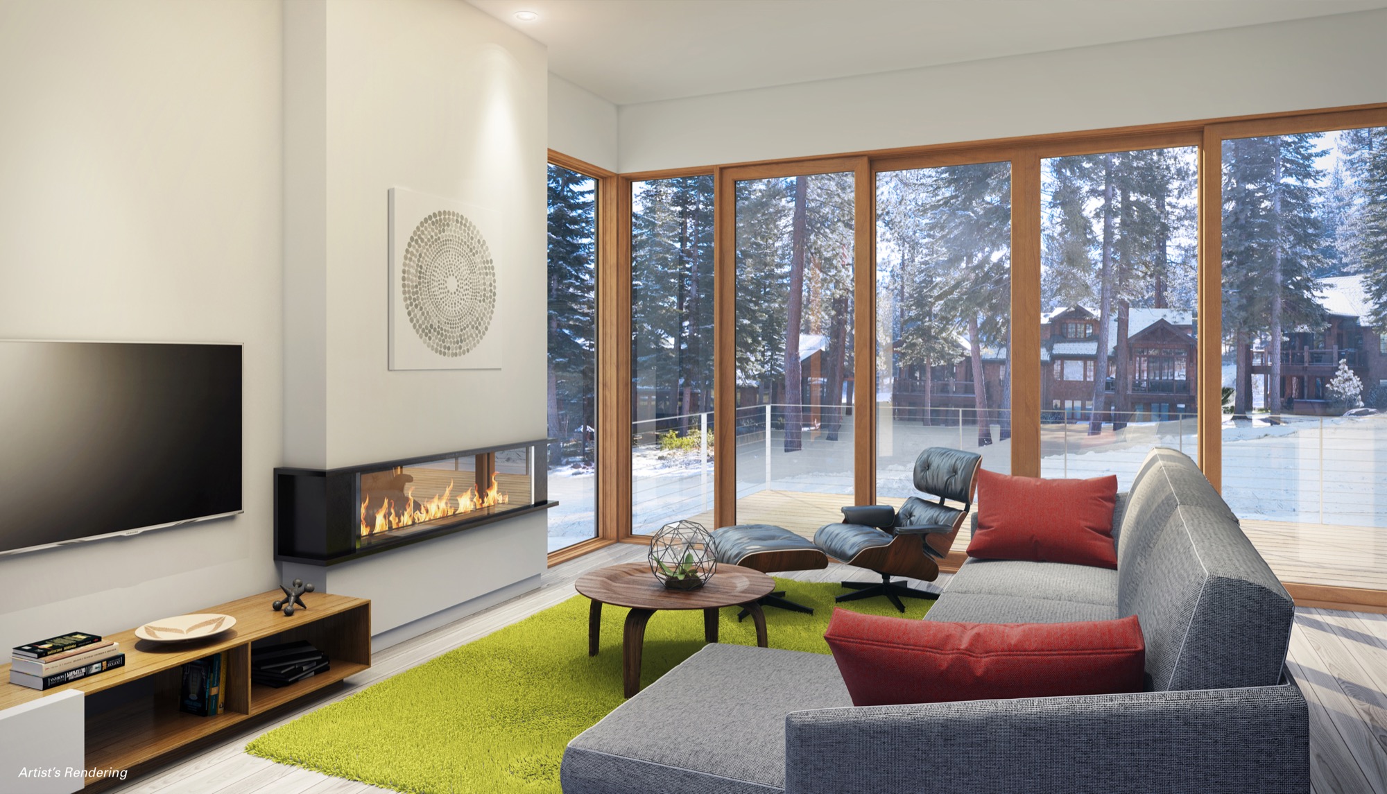
Weekend-escapists with money
Mountainside Partners, a Tahoe-area developer specializing in resort construction, picked up on the new market need and called Mottola’s team in San Francisco. Why BCJ? That the architecture firm typically doesn’t work with developers didn’t matter. With a design portfolio that boasts Square, Inc. headquarters, Pixar Animation Studios, and Apple retail outlets worldwide, including the (literally) groundbreaking Fifth Avenue store in Manhattan, Mottola and his colleagues understood the target market and the developer's vision for a planned community of progressive luxury ski-in/ski-out residences. BCJ was the ideal partner in rethinking resort living for a new generation of weekend-escapists with money, pouring in from the Bay Area on Fridays after work. And the Stellar Collection at Northstar was born.
Mottola agrees with the developer’s calculation that there is a sizable target audience of young, urban professionals looking for meaningful ways to spend their cash. “With the economy here being so focused on advancing technology, there is the thirty-something crowd, very intelligent and hungry for a connection to a real place, a real landscape, and the recreational opportunities that go along with that,” says the Carnegie Mellon University graduate. The idea of designing not the usual super high-end custom home but a series of spec homes “sounded like fun” to him—“thoughtfully detailed and spatially powerful homes . . . that was a great challenge for us.”
The Mountainside setting
The Northstar resort looks to the north, Lake Tahoe at its back, behind the ski slopes. “It’s a remarkable setting,” says Mottola. “The two ski-in/ski-out sites we are working on flank this ski run, set in such a way that you get these fantastic views of the ski run, the short view of this wooded mountain’s side, and these amazing sunlit views of the Sierra Nevada Mountains and Martis Valley as your backdrop.” In siting each home on its parcel, much thought was given to the views and the connection to the landscape. The single-family residences descend down from the driveway—“You enter into this elevated world, you feel like you are perched up in the trees, in your own little world, your own connection to this beautiful Sierra mountainscape,” Mottola says. “Even though the structures are relatively close to each other, you get this little slice of the horizon.” Exit out the lower level, and you are on the ski slope.
“These folks work in very intense environments, focusing on something that is often very abstract... Many of them have a desire to go back and to be connected to real things and to nature.”

Elemental palette of materials
“We are satisfying this appetite for authenticity by using a really elemental palette of natural materials, detailed in a simple way,” Mottola says, describing the “tension” between the natural materials, such as stone floors and wood floors, bringing the outside cedar siding inside—and the contrasting glass and metal. What’s more, Mottola knows energy efficient design appeals to the target demographic. The Stellar Collection is going to be LEED Gold certified; BCJ even hopes for platinum. “Resource efficiency is really important to the folks we design for in the Bay Area.”
Designing spec homes for a developer was a very different process for Mottola's architecture practice, which typically works directly with homeowners. Relying on each others’ respective experience and market studies, BCJ and Mountainside chose the features and amenities they thought would sell. “When we work with a homeowner, it’s a very personal, very tangible connection to them and what’s interesting to them,” says Mottola, adding that yet again some design basics remain constant, such as celebrating the attributes of the landscape by organizing a structure to take advantage of the view and the sun. “All those basic design moves are the same,” the architect notes. “Where this diverges is when you have to assume what will be desirable by buyers whom you don’t know. So we design what we think is really appealing, spatially or architecturally, the detailing in the way the space comes together. The developer has parameters in terms of what they think the market demands, but they are looking to us, our vision for this to be a successful piece of architecture.”
That vision is informed by BCJ’s first-hand experience in working directly with the young tech elite of Silicon Valley. “We do have some insights, because not only are we designing some primary residences for certain individuals in that world, but we are also designing a lot of tech companies’ office spaces,” says Mottola. Seeing what his clients are interested in at work helps him understand what they may want in a primary or secondary home. “For instance, they all crave opportunities to collaborate and share ideas, so you want to design the social aspects of a home in a way that supports that same kind of thinking about how you interact.” A “more prosaic thing” Mottola has learned from creating office spaces for his clientele? “You make a big deal out of really good-quality coffee as the draw for people,” the architect reveals. “Single-source roasted beans, artisanal, handcrafted . . . that attention to detail and interest in the story behind the experience starts to inform the design.” Similarly, his Silicon Valley clients want to know the story behind a building material or interior finish—its source, why the designer chose it, how it relates to the place and makes a homeowner’s experience more authentic. “They care about that detail way more than other demographics seem to, interestingly.”
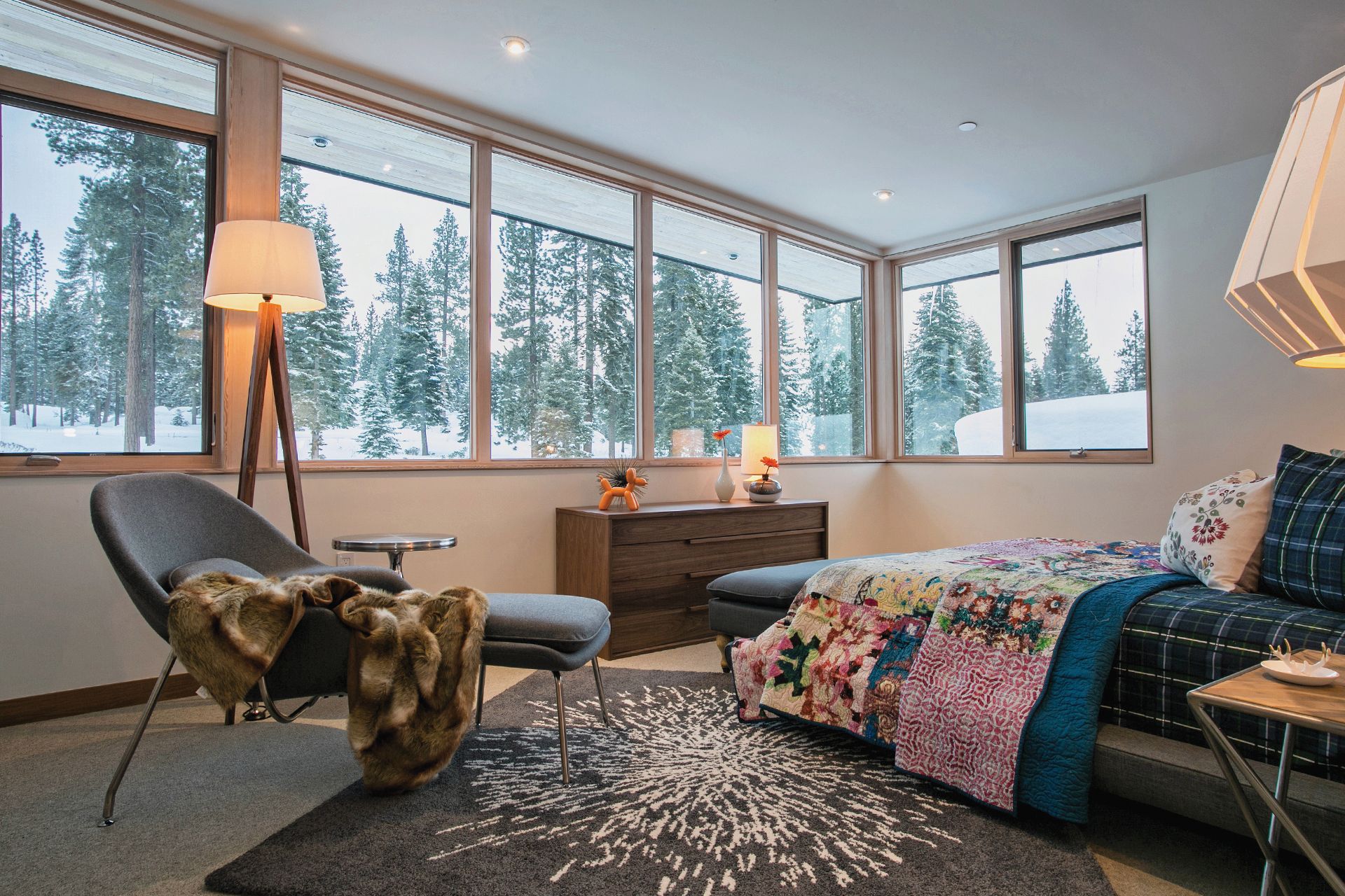
Designing Apple stores
BCJ has been designing Apple retail stores around the world for more than a dozen years. “The relationship started even before that, when my colleagues here were working with Steve Jobs, doing the Pixar Animation Studios headquarters in Emeryville here, that’s really why we ended up in California,” Mottola says. Steve Jobs purchased Lucasfilm's computer graphics division from George Lucas in 1986 and established an independent company that would later be named Pixar. “At the time, Steve was getting back involved with Apple, and they started this retail program,” Mottola recalls. “At the time, everybody was like, ‘That’s crazy. That’s never going to succeed.’ And you look back now, and you think it’s crazy that that was the prevailing wisdom at the time. But in those intervening years we have been able to collaborate with Apple, doing these remarkable stores in really diverse places, notably the one on Fifth Avenue in New York City, that’s a glass cube.”
According to the architect, who compares experiencing “these really amazing products” in an Apple retail store to “a museum-like setting,” the glass structures many Apple stores feature push the limits of construction through the innovative use of technology. “And then to take those ideas and put them into existing historic buildings all over the world, in places like London and South America and Spain and Italy . . . it’s been a unique experience for our practice, because most often we are hired to do one building for one client. It’s a one-time experience, and you kind of wish you had a chance to go back and do it again. And in the case of the Apple stores, we are constantly refining the design ideas. It’s almost more like product design.”
“In the case of the Apple stores, we are constantly refining the design ideas. It’s almost more like product design.”
Just designers
On the other hand, it seems important to Mottola, who has been with BCJ for almost a quarter of a century, to convey that his firm approaches each design assignment without preconceptions about what the final result should be and instead figures out what it wants to be once his team understands the context, the client, the site. “We want to make sure what we are designing really resonates with that place and with the clients and their dreams and their aspirations,” says Mottola, whose work has won numerous awards from the American Institute of Architects. “We don’t just want to be the Apple store architects or the people who do these great houses or the people who do these university buildings. We want to just be designers. At the end of the day, we are trying to make really compelling, emotionally powerful places for people, whether they are private homes or places where they are doing research or places where they are shopping, we want them to appeal to their hearts more than reason.”
Asked how his experience with designing the Apple stores and workplaces for companies like Square, Inc. has influenced his approach to residential projects, such as the Mountainside Northstar Stellar Collection, Mottola falls contemplative. “It’s hard not to have your experiences influence what you do, absolutely, but the way we think about how a space feels and how you might put fenestration into a building . . . to me it’s just all design.” One thing he is sure his team has learned from designing Apple stores: “Using glass in some homes in remarkable ways we wouldn’t have known how to do without having the experience with Apple. And without a doubt, the research-driven investigation into materials and construction is something we have learned how to do much better, having worked with Apple.”
Designing for the heart
Mottola, who grew up just outside of New York City in Northern New Jersey, knew from a very young age that he wanted to become an architect. “I was fascinated with construction. And once I started to appreciate the way people build things, I began thinking about how do you design and shape space in a way that really resonates with people,” he says. “A lot of people are really good at doing well-considered, responsive buildings, but there is this other layer. Sometimes you walk into a space and you have an emotional reaction to it. You feel something in your heart. Those have always been the buildings I’ve been most drawn to.”
Is designing for the heart taught in design school, though? “You learn a lot in design school about multivariable problem solving, if you really want to get nerdy about it,” Mottola says. “But what I know today about this emotional aspect of design, I actually learned from my mentor here at the firm, Peter Bohlin,” Mottola says, designating the man who puts the “B” in BCJ “a master at creating space that elicits that emotional response.”
“Peter always talks about being inspired by the great Scandinavian modernists, so getting exposed to that work, too, is deeply embedded in the DNA of our practice,” Mottola says. “This idea that you make modern buildings, but you should do it in a way that they are not cold and sterile, but they are evocative and warm and livable and comfortable is something we aspire to do on every project.” △
Reinhold Messner: A Man and His Museums
A conversation with the greatest mountaineer of all time
We met with the mountaineering legend in the Dolomites, where the late architecture icon Dame Zaha Hadid designed the last of Messner’s six mountain museums: MMM Corones. Emerging surrealistically from the earth at the top of a mountain called Corones in northern Italy are huge concrete tubes. One writer described them as resembling “a spaceship that has crashed into the peak and fused with the rock.” They are, in fact, apertures from a literally and curatively groundbreaking subterranean structure. They are the most unique features of MMM Corones, the last of six Messner Mountain Museums and the latest chapter in the extraordinary life of seventy-two-year-old Reinhold Messner, widely acknowledged as the greatest mountaineer ever.
The Italian mountaineer with the German name continues, in today’s parlance, “to give back.” His sixty or so books, films, lectures, and five-year tenure as a Green Party member of the European Parliament assure his legacy. And then, there are his museums—six of them, each with a different theme—located in northeastern Italy. Collectively known as the Messner Mountain Museums, they acknowledge and celebrate the world’s mountains and honor human relationships with them. Some have been built within the walls of ancient buildings, while others are brand new and no less than revolutionary.
The newest sits atop Corones (Kronplatz in German), which ranks as one of the Dolomites’ largest year-round recreational playgrounds. Skiers throng to it in winter, and hikers, mountain bikers, and parasailers have been dis- covering it in summer. Now MMM Corones also makes it a secular pilgrimage place for those who also revere mountains and the humans who live among them—and for the legions who worship Reinhold Messner.

Perhaps Messner became aware of Hadid’s talents from the large ski jump up the road in Innsbruck, which she designed in 1999 and which is used for the FIS Ski Jumping World Cup. Hadid later received the prestigious Pritzker Architecture Prize in 2004. For Messner, she designed MMM Corones, which opened in July 2015. Just two months later, the Royal Institute of British Architects announced her as the first female recipient of the Royal Gold Medal—instituted in 1848—for lifetime achievement. Sadly, only eight months after MMM Corones opened its doors, the museum's esteemed architect died suddenly. Hadid had contracted bronchitis in March of 2016 and suffered a heart attack while being treated in the hospital.
"The theme is rock—original, traditional mountain climbing is to rise again."
His concept was very specific: “In the first tunnel, a window looking out southwest to the peak of the Peitlerkofel mountain, in the second, another window should look south toward the Heiligkreuzkofel peak, and in the third, a balcony should face west to the Ortler and South Tyrol.”
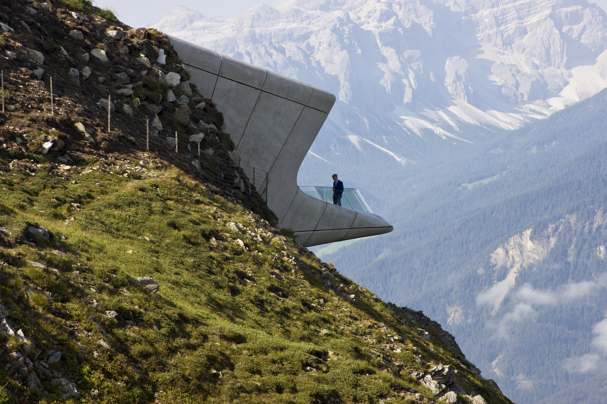
Hadid took those concepts and ran with them. Above the entrance to the three-level museum is a sharp glass canopy that evokes a fragment of glacial ice. Inside, ramps and staircases recalling mountain streams and waterfalls link concrete galleries in a flowing, organic fashion that feels like a smooth cave. The windows frame the mountains, providing constrained, controlled views. The best one opens exuberantly to a terrace cantilevered over the valley far below; the view is panoramic, simply stunning.
Hadid said of the structure, “The idea is that visitors can descend within the mountain to explore its caverns and grottos before emerging through the mountain wall on the other side, out onto the terrace overhanging the valley far below with spectacular, panoramic views.”
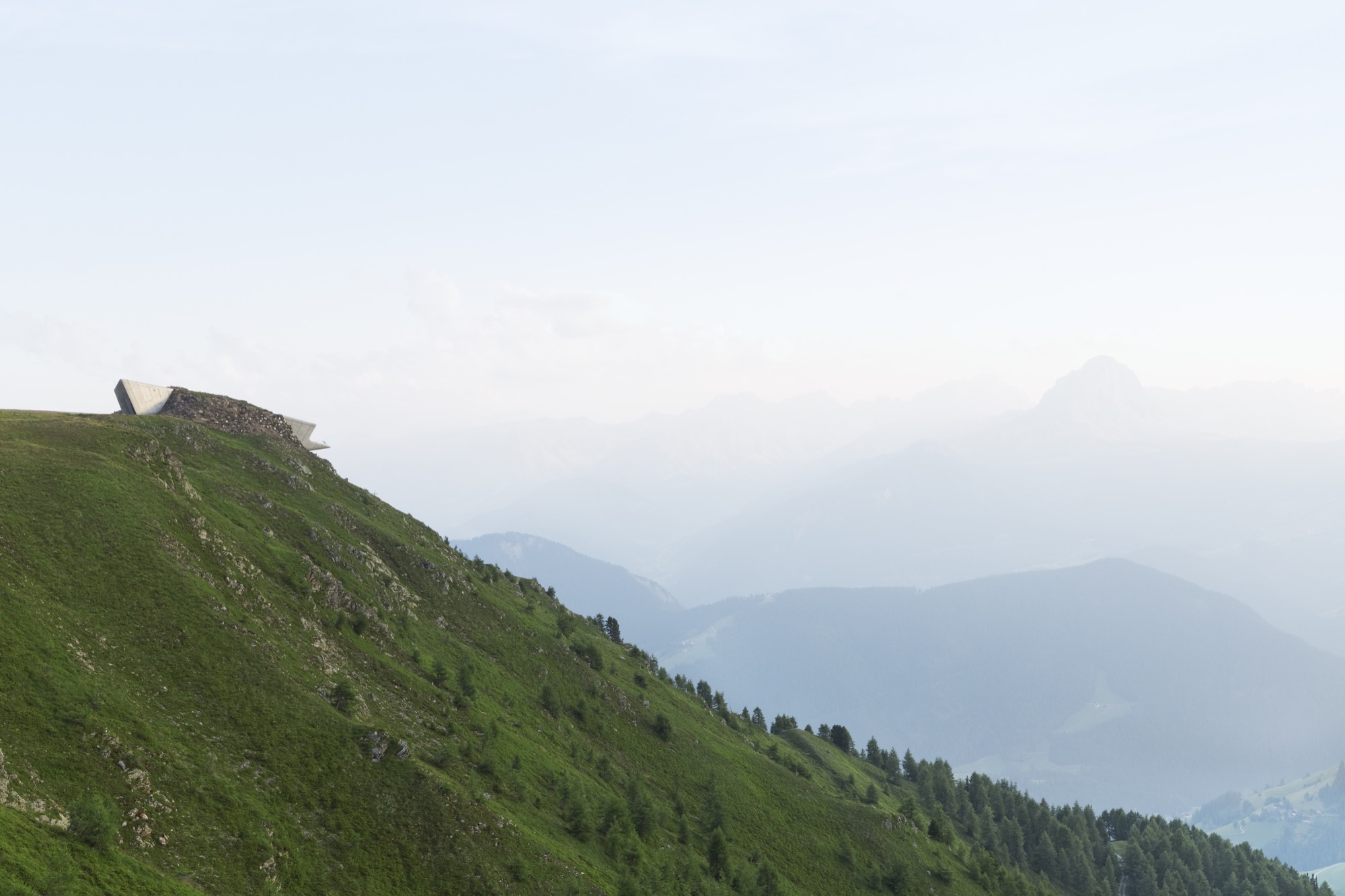
The museum is also environmentally correct. Being mostly underground, it maintains a consistent year- round temperature. An impressive 140,000 cubic feet (3,964 cubic meters) of earth was excavated and moved during the construction process, but once the building was nished, covered, and revegetated, its footprint became modest. Its design emotionally and visually links the mountains outside and the exhibits inside, which honor the tools and techniques of traditional mountaineering that are Reinhold Messner’s roots.
Messner’s Extraordinary Mountaineering Feats
None of this modern repository to the mountain heritage would exist without Messner’s unmatched feats in the high, wild, and remote parts of the world. He was the first to climb all fourteen of the world’s 8,000- meter (26,247-feet) peaks, which are known as “eight-thousanders.” He was determined to complete all of these mountains, and achieved some only on the third or fourth attempt. He also was the second to climb the legendary “seven summits” (the highest peaks on all seven continents) and the first to do so without supplemental oxygen, including Mount Everest. In fact, he stood on the top of the world’s highest mountain twice, first with his Austrian climbing partner, Peter Habeler, from the Nepalese side, and once soloing from the Tibetan side—during the monsoon season.
Messner’s first major Himalayan climb was back in 1970. He and Günther were part of an expedition to the previously unclimbed Rupal Face of Pakistan’s Nanga Parbat. Terrible weather forced them to make an emergency bivouac at the summit—no tent, no sleeping bags, no stove. In the morning, they started down in a storm via the Diamir Face, a different route. It was to be a tragic day. Reinhold lost six toes to frostbite. He also lost his brother to an avalanche. He returned to the mountain to search, unsuccessfully, for Günther’s body, which did not emerge from its icy tomb until a heat wave in 2005. That awful experience thirty-five years earlier and the harsh judgments of the mountaineering community would have been more than enough to deter a less intense man from other expeditions. But he continued exploring, achieving, and learning.
In Messner’s youth, expedition climbing pioneered by the British was the norm. He soon became convinced that such massive expeditions were not only counterproductive to the chance of success in conquering high peaks but were in his view, cheating, because guides and porters did all the hard work. He was a pioneer in what has come to be called “alpine-style climbing,” carrying everything he needed on his back and moving as quickly as possible. These climbs, either solo or done with just one or two partners, not only led to success but were less impactful on the mountains.
Over the years, Messner became increasingly captivated by mountain cultures with people’s beliefs expressed in art, spirituality, and convictions. He brought back artifacts and photographs from his expeditions to distant mountain ranges in exotic places. After a time, he turned his attention from the vertical world of mountains to the more horizontal realm of epic treks across wild, largely empty land. Long overland slogs—across the Greenland ice sheet, across Antarctica via the South Pole, and across Tibet—without snowmobiles or other machines and only the most minimal communications equipment. The miles and the vastness left time for contemplation and sometimes hallucinatory visions of what was, what might be, and what could be when he returned home.
The Tale of the Hammer
One memory that remained etched in Messner’s mind for decades involved a single climbing implement, a hammer. While still in his twenties, he wrote an essay about rock climbing whose title translates to “Murder of the Impossible,” in which he lambasted the increasing use of bolts and assorted gadgets to meet and overcome climbers’ greatest challenges. “Faith in equipment has replaced faith in oneself,” he wrote at the time.
After it was published, Messner received a letter written in a spidery hand from a then ninety-six-year-old Austrian lady. Messner recalls, “She said, ‘Reading your article, I was reminded of my boyfriend, my big love, Pauli.’ ” Pauli was Paul Preuss, an early advocate of reliance on skills and courage and not a lot of gear, as Messner would proclaim decades later. Preuss did have a hammer but, as the story goes, was opposed to pounding pitons into rock if it could be avoided. “He had two pitons in his life,” Messner told a reporter years later. “One I have, and the other is in a rock wall that I know.” Preuss was committed to such a purist approach despite its greater risks. In 1913, when he was twenty-seven, Preuss fell to his death while free-soloing the North Ridge of the Mandlkogel, a peak in Upper Austria.
He was one of Reinhold Messner’s climbing heroes. Messner was honored when the lady sent Preuss’s hammer to him because his philosophy and climbing style echoed her beloved’s. She stipulated that after Messner’s death, the precious object had to either be passed on to another like-minded climber or be put on display. Messner recalled, “I had that hammer in my cellar, and always when I saw it, I was thinking, ‘Oh, I have to begin a museum.’ Around this hammer the whole museum idea began to grow.” And that is how the Messner Mountain Museums came to be. The hammer that started it all is appropriately on display at MMM Corones.
"I had that hammer in my cellar, and always when I saw it, I was thinking, ‘Oh, I have to begin a museum.’ Around this hammer the whole museum idea began to grow."
But before Corones came five other museums. MMM Juval was the first, opening in 1995 in Juval Castle near the town of Vinschgau. Its theme is mountain myths, and in addition to proving that a mountaineer could conceive, open, and curate a museum, it serves as the Messner family’s summer residence.
MMM Dolomites, housed in a World War I fort on Monte Rite near the town of Cortina d’Ampezzo, opened in 2002. Its theme is the “vertical world” of the Dolomites, covering the opening up of this once-remote range and its history in peacetime and in war. During World War I, this was the region where mountain warfare was first conducted. Both sides’ dreadful losses came more from severe cold, rockfalls, and avalanches than combat.
MMM Ortles’s theme is the realm of snow, glaciers, and the world of ice in general, and expeditions to the poles in particular, environments that Messner has experienced intimately. Built into the mountain on a hillside near Sulden, it opened in 2004 and features art and artifacts to depict the power of avalanches and other forces of nature. When asked about global warming and climate change, Messner’s Green Party side rues what is happening to the planet these days, but his alpinist side comes out when he says, “We feel global warming in the mountains, but heat is not a problem for climbers. Cold is more of a problem.”
MMM Firmian in Sigmundskron Castle near Bolzano houses the museum’s headquarters, event space, rotating exhibitions, and a 200-seat theater. Devoted to the history and art of mountaineering, it is a modern museum built within the ruins of a fifteenth-century castle. Messner spent five years negotiating and planning Firmian, which opened in 2006. Architect Werner Tscholl, a specialist in castle conservation, created exhibition space without destroying the original. The challenge was to preserve the historical walls of the castle in such a way that the new construction can be reversed if ever required or desired. The new parts are a background for sculptures, photos, symbolic objects, and mementos that Messner collected on numerous expeditions, as well as an annual special exhibition.
MMM Ripa at Bruneck Castle, which dates from 1250, is the most intense cultural expression of Messner’s experiences. It opened in 2011 as the fifth Messner Mountain Museum. Dedicated to the mountain peoples from Asia, Africa, South America, and Europe, it focuses on cultures, religions, and even tourism. This interactive museum provides a forum for various mountain peoples to exchange experiences with the vibrant local farming community.
Reinhold Messner has spent his life seeking what he admits have been “the most difficult challenges,” not the least of them being the creation of the Messner Mountain Museums. He calls them “my fifteenth eight-thousander,” with MMM Corones the crowning achievement. His daughter Magdalena is now running the museums. But he is far from finished creating, exploring, and honoring.
In September, he set off for Africa to produce a film about a harrowing 1970 expedition to Mount Kenya. Drs. Oswald Oelz and Gert Judmaier from Innsbruck attempted to climb Africa’s second-highest mountain when disaster struck. A sudden rockfall swept Judmaier and a huge boulder down the mountain. It was a miracle that he survived at all. Grievously injured, he clung to life for nine excruciatingly painful days. Oelz ministered to him as best he could under dire conditions and with few supplies. Finally, an elite mountain rescue team flew to Nairobi, rushed to Mount Kenya, and managed to get the party off the mountain while Judmaier was still alive. It is a story that only Reinhold Messner could understand and film. He might consider its completion to be his sixteenth eight-thousander.

