Inspirations
Explore the elevated life in the mountains. This content debuted in 2015 with Alpine Modern’s printed quarterly magazine project.
How American Modernism Came to the Mountains
A daughter of America's midcentury-modern movement remembers how Chicago’s design elite settled in Aspen, giving rise to modernism in the mountains of the West.
After World War II, Chicago’s design elite flocked to Aspen for ski and summer holidays, galvanizing the then-sleepy alpine village with modern mountain chalets and avant-garde public buildings that helped transform Colorado’s Roaring Fork Valley into the glamorous destination it is today. A memoir by artist Marcia Weese, daughter of Harry Weese, a central figure in the movement we now refer to as mid-century modern.
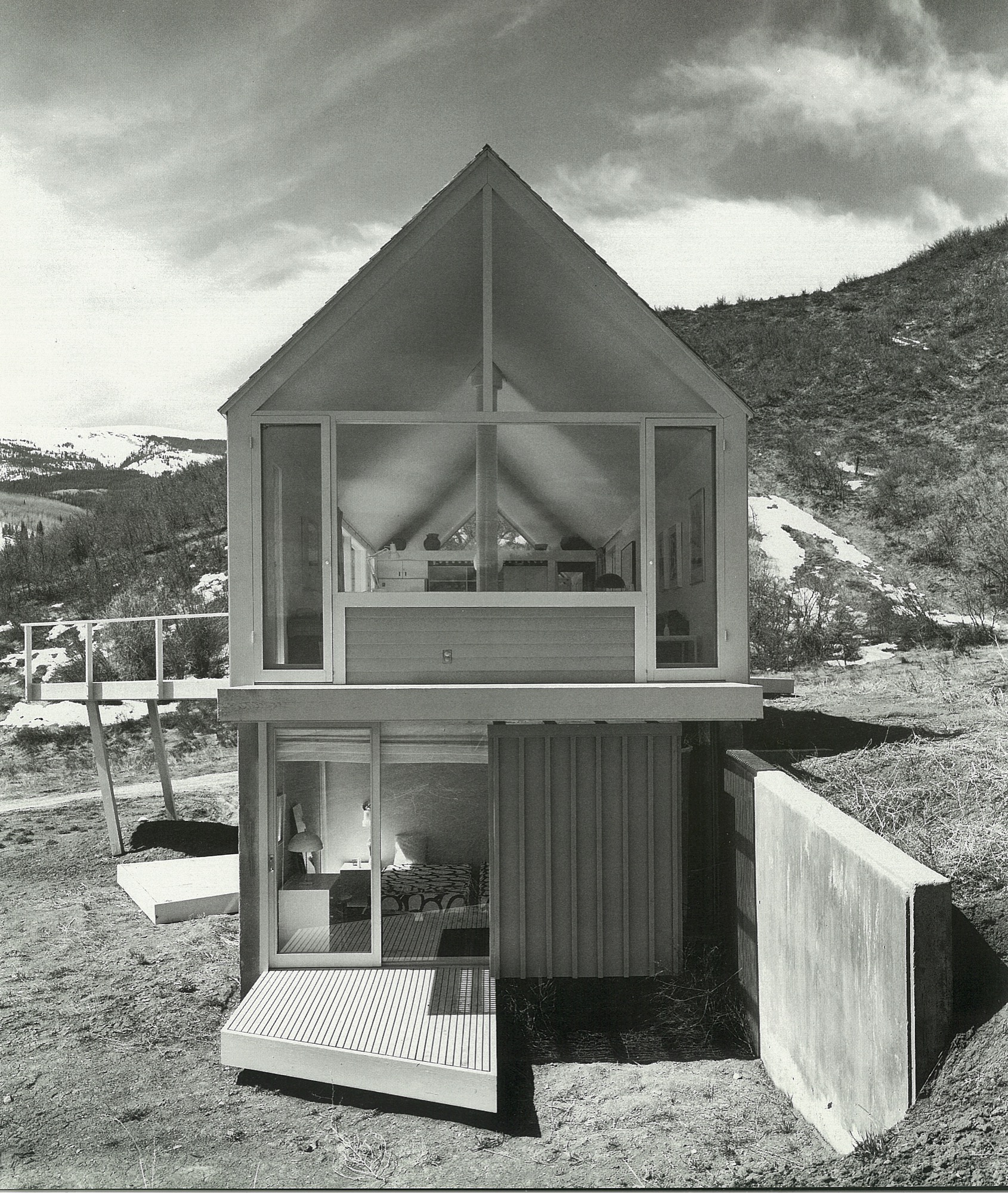
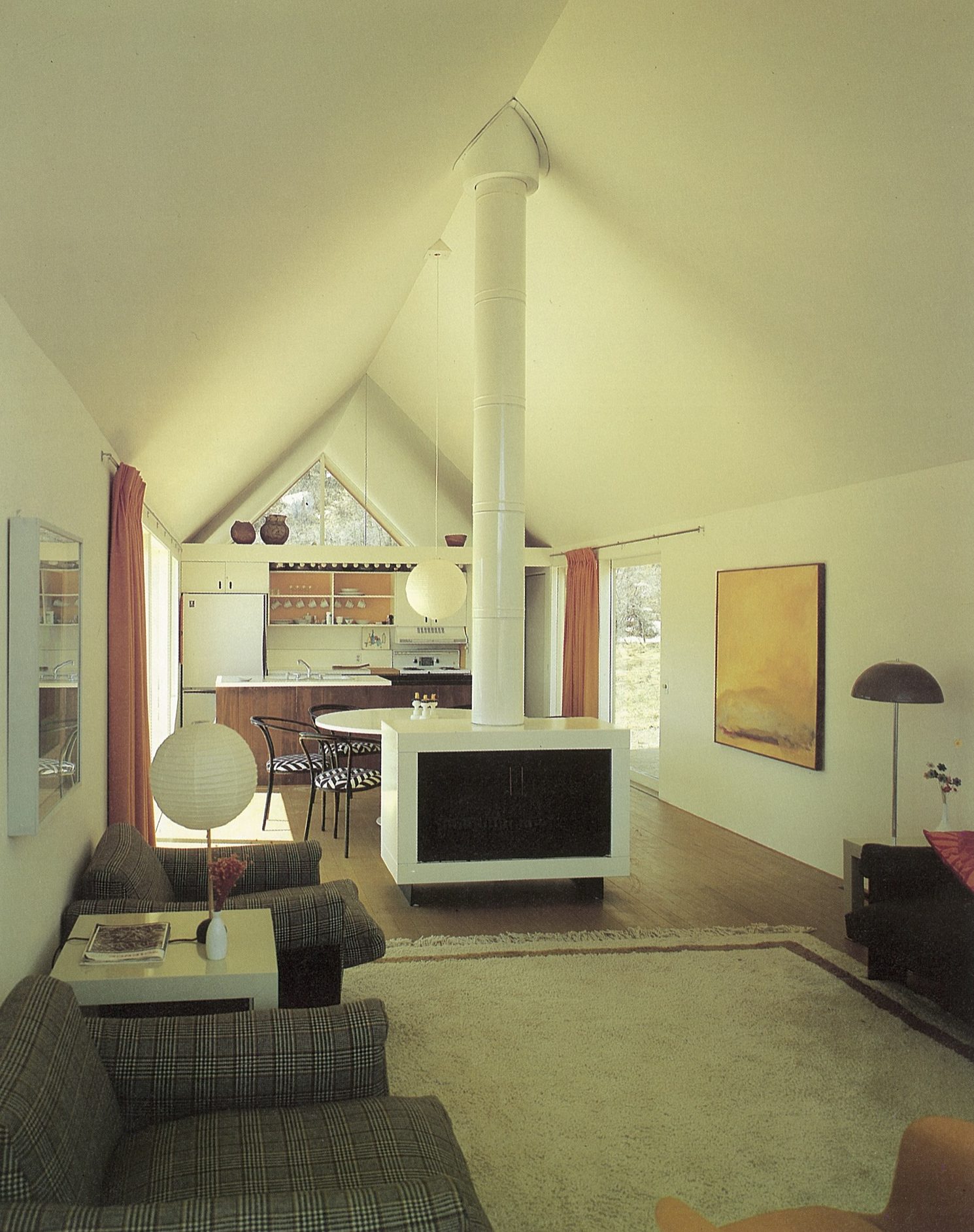
Someone recently remarked to me that I was “born to design.” Over the years, I have come to appreciate this birthright, as I realize I have tenaciously and (mostly) joyously cleaved to the creative life, and still do. I have my parents, Harry Mohr Weese and Kitty Baldwin Weese, to thank for this. The creative life is not for the faint of heart, but I wouldn’t trade it for anything.
Childhood in Chicago
It was the early 1950s in Chicago. As my mother told it,
“The war was over. No one had any money. No one had any furniture. Apartments to rent were scarce. We made do.”
When I was very young, we lived in a dim railroad flat in downtown Chicago. This was a typical inner-city apartment with a linear floor plan. The only natural light filtered through windows in the front and back. Chicago was a coal-burning city, and you could write your name on the window sills in the soot. I remember running down the dark hall that connected front to back, with crayon in hand. My parents encouraged my sisters and me to draw on the walls in that nondescript hall. What a great idea they had to spruce up the crepuscular gloom of the hallway, and how fun it was for us to break the rules.
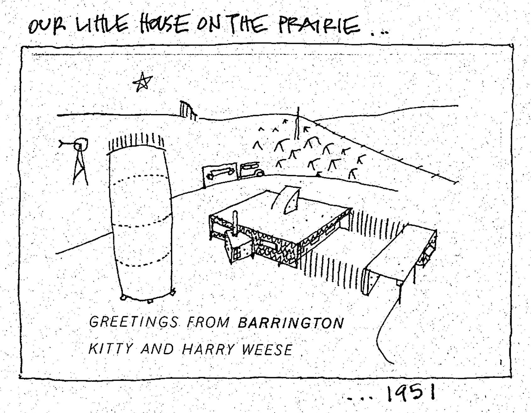
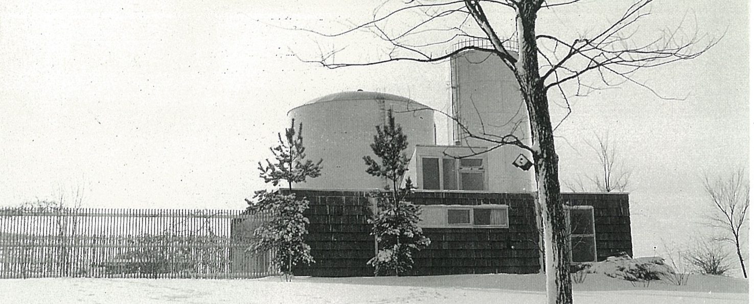
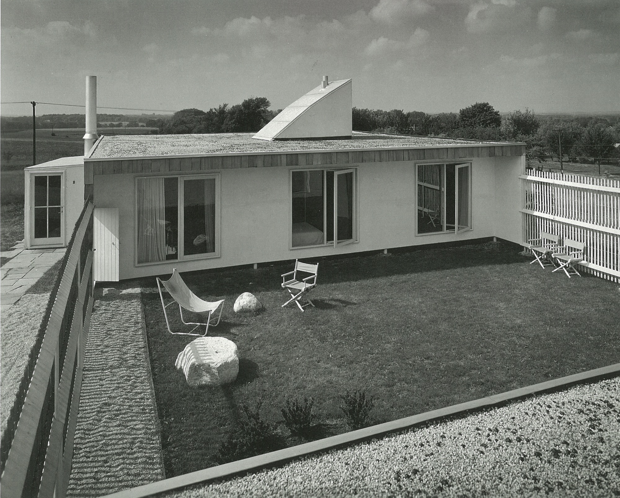
We spent weekends and summers in the country forty miles northeast of Chicago. Now it is wall-to-wall suburbia, but back then, we bundled our five-person family, one cat, two turtles, and several guinea pigs into the car and drove (pre-Kennedy expressway) through many stoplights to the little town of Barrington, Illinois. There, we lived in one of my architect father’s early houses. Built on a lot adjacent to two immense water towers belonging to the town, the house was modern and modest; a one-story house with a flat roof, carport, gravel driveway and a fenced-in garden the three bedrooms emptied into. It was sparsely furnished, and I will always remember the black-and-white linoleum floor. Mom found some dinner-plate-sized checkers pieces and we played checkers on that floor to our endless delight.
Some years later, my grandfather gave my father a nearby five-acre (two-hectare) plot of land, which consisted of a hill, many large oak and hickory trees, poison ivy everywhere, and a hand-dug lake topped off with a pet alligator. Here, my father built a wonderful and quirky house (prebuilding code) he named “The Studio.” We spent many years toggling between city and country. This was a refuge from the city for my parents, and for me, a secret garden of woodland flora and fauna.
Studying with the Eamses & Co.
After graduating from the Massachusetts Institute of Technology in architecture and engineering, Dad studied in Michigan at the Cranbrook Academy of Art with Charles and Ray Eames, Eero Saarinen, Ben Baldwin, and a host of others who were living and creating modern design at a time when the atmosphere was ripe for it.
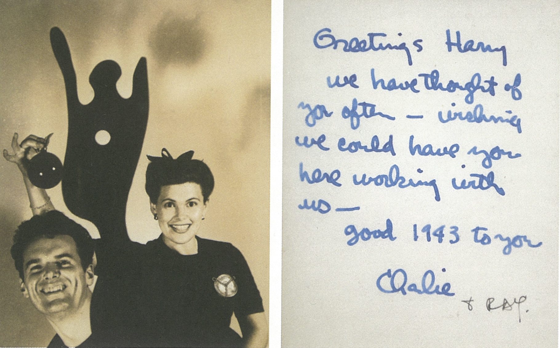
As history has revealed, many became household names, even demigods, in the movement we now refer to as mid-century modern. These people were some of my parents’ closest friends.
My father and Ben Baldwin had won a few industrial design awards from the Museum of Modern Art while at Cranbrook, so they decided after graduation to “hang a shingle”—Baldwin Weese—to practice architecture in New York City. They worked together for a year but decided to convivially go their separate ways; Ben stayed in New York, and Dad returned to his birthplace, Chicago. But first, Ben introduced my father to his sister Kitty.
When Harry met Kitty
As my father approached the house to meet Kitty for the first time, she watched him jump over the fence rather than use the gate. That did it for her. He was a nonconformist, an inventor, a man who loved to use the path less traveled. He had no use for convention as it was, in the post WWII era. The overriding spirit was “rebuild,” therefore “build anew.” This was the perfect time for him to launch his architectural career in Chicago. He founded the architecture firm Harry Weese & Associates, which lasted for fifty illustrious years. My mother, who was southern, elegant, and graceful, was over the moon for this artistic, restless spirit. Not a typical match, but it worked; he needed her organized calm and “good eye for design” to manage his ambitions.
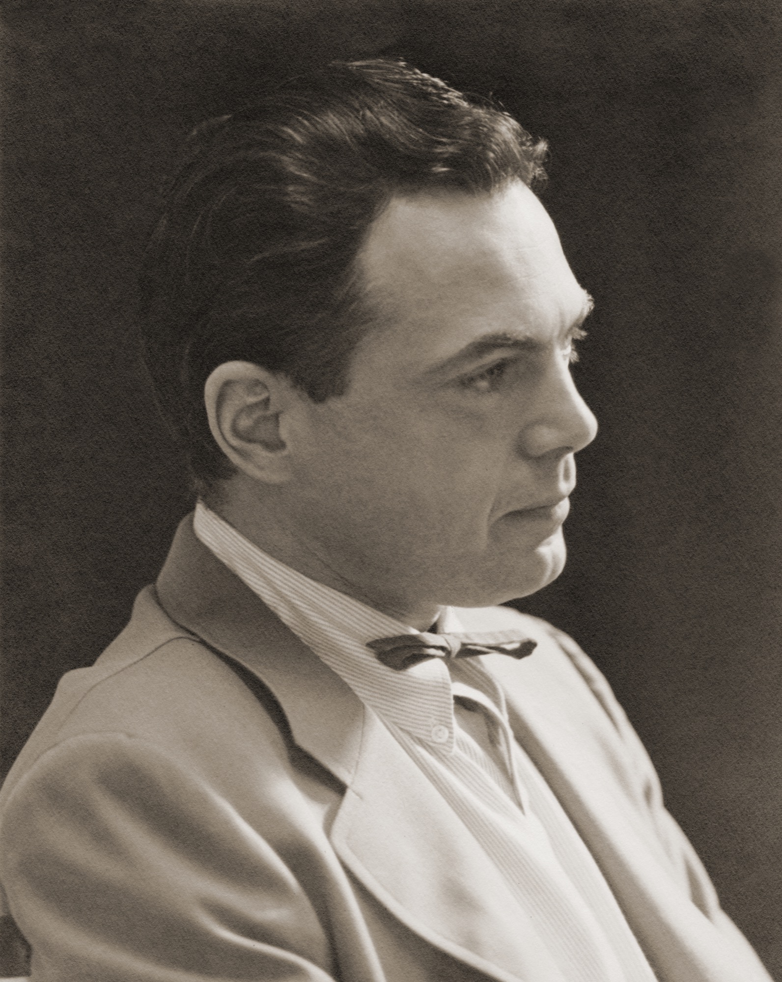
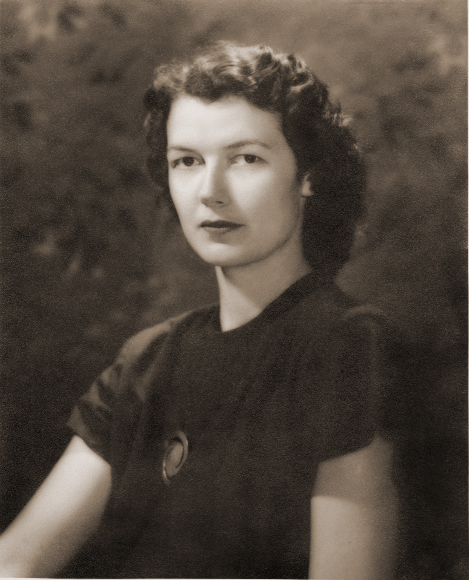
Baldwin Kingrey store in Chicago
In the early fifties, there was no modern anything to be found in the Midwest. So my mother with her partner Jody Kingrey opened a furniture store, prompted by my father. While in the navy for three long years he kept a journal that he scratched in during calmer moments at sea. Here is an excerpt describing his vision for a retail store, entered on May 26, 1943,
“Thought of the (retail furnishings salon) shop for gathering together all beautiful and useful modern objects, which could be termed ‘furnishings’... Anonymous discoveries and subcontracted and assembled pieces of my design: foam and webbed couch in church pew form, telescoping coffee tables of magnesium or plastic, ... fabrics ... grass matting to a special design ... restaurant adjacent, movies, bar, a small haven for those interested ... a trip abroad to buy imports first thing after peace.” “In the early fifties, there was no modern anything to be found in the Midwest. So my mother with her partner Jody Kingrey opened a furniture store, prompted by my father.”
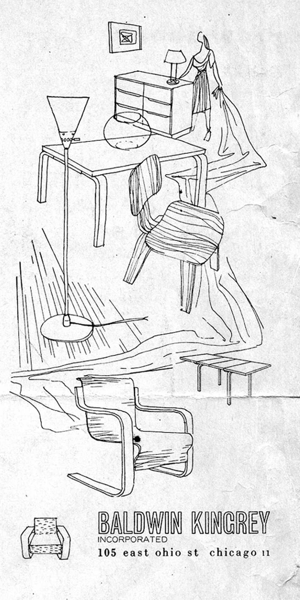
Wasting no time postwar, Dad got permission to handle the Midwestern franchise for Artek furniture from Scandinavia. Ben Baldwin designed fabrics and window displays. Harry Bertoia showed his jewelry, James Prestini sold his turned wooden bowls, artists queued up to exhibit in the space, and Baldwin Kingrey opened its doors to an eager audience hungry for modern design.
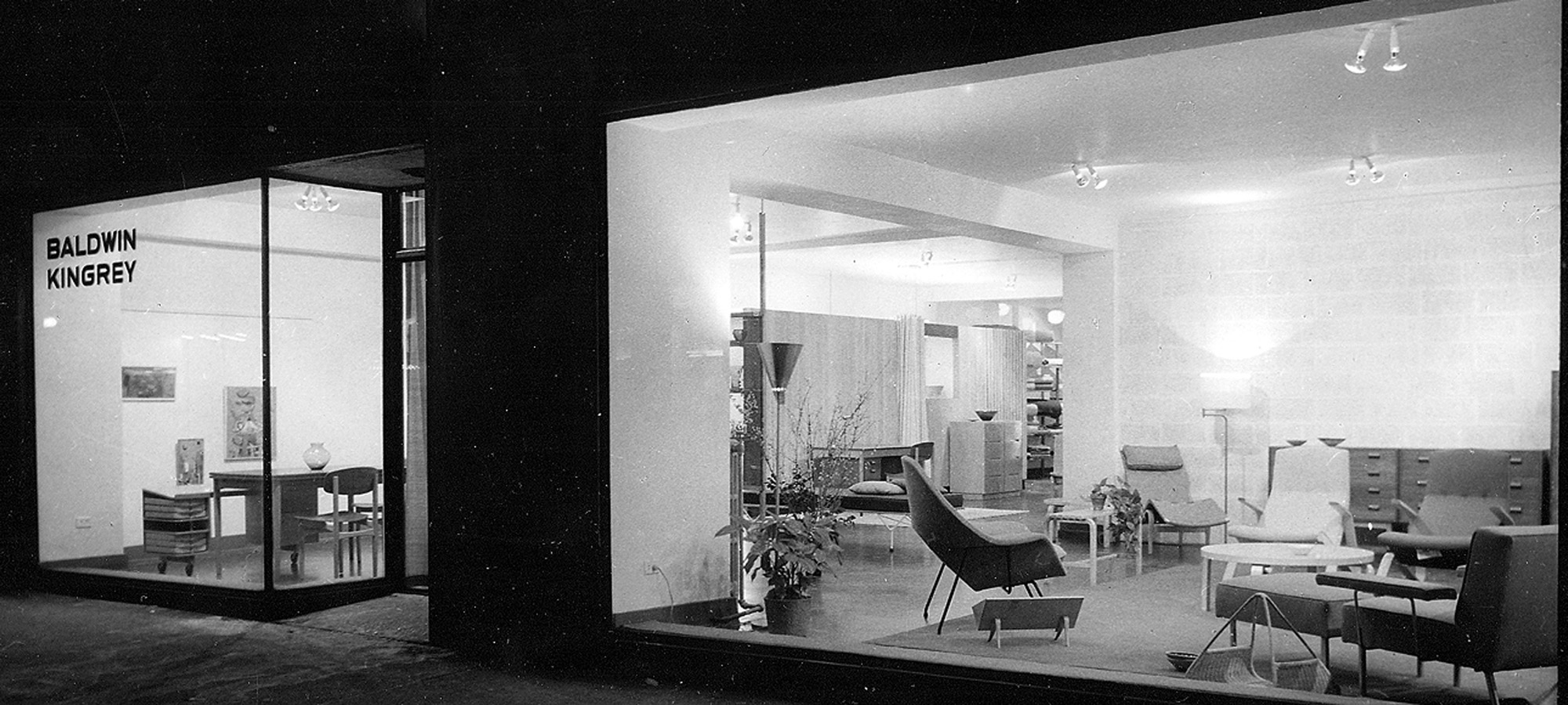
In words from John Brunetti, author of Baldwin Kingrey, Midcentury Modern in Chicago, 1947–1957,
“Baldwin Kingrey was more than a retail enterprise. It served as an informal gathering place for students and faculty from Chicago’s influential Institute of Design (ID) as well as the city’s architects and interior designers, who looked for inspiration from the store’s inventory of furniture by leading modernist designers such as Alvar Aalto, Bruno Mathsson, Charles Eames and Eero Saarinen.”
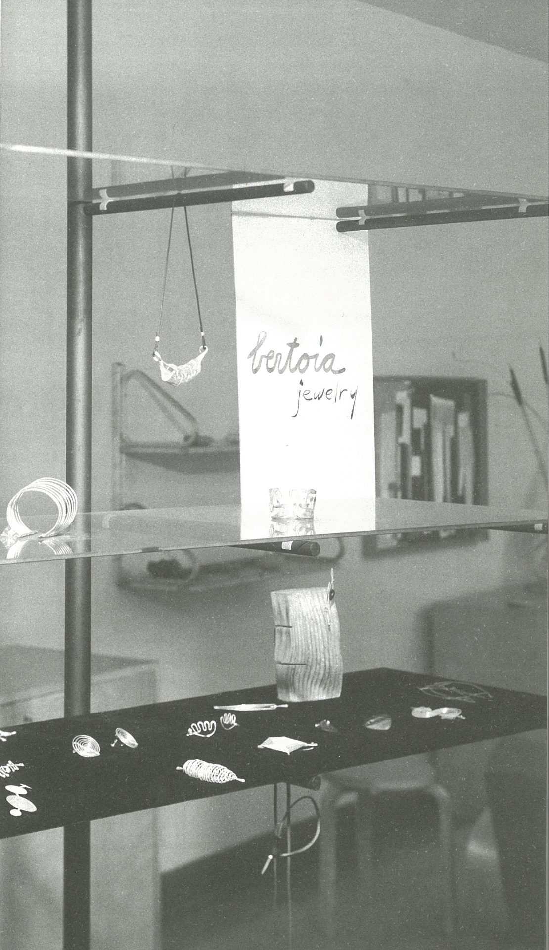
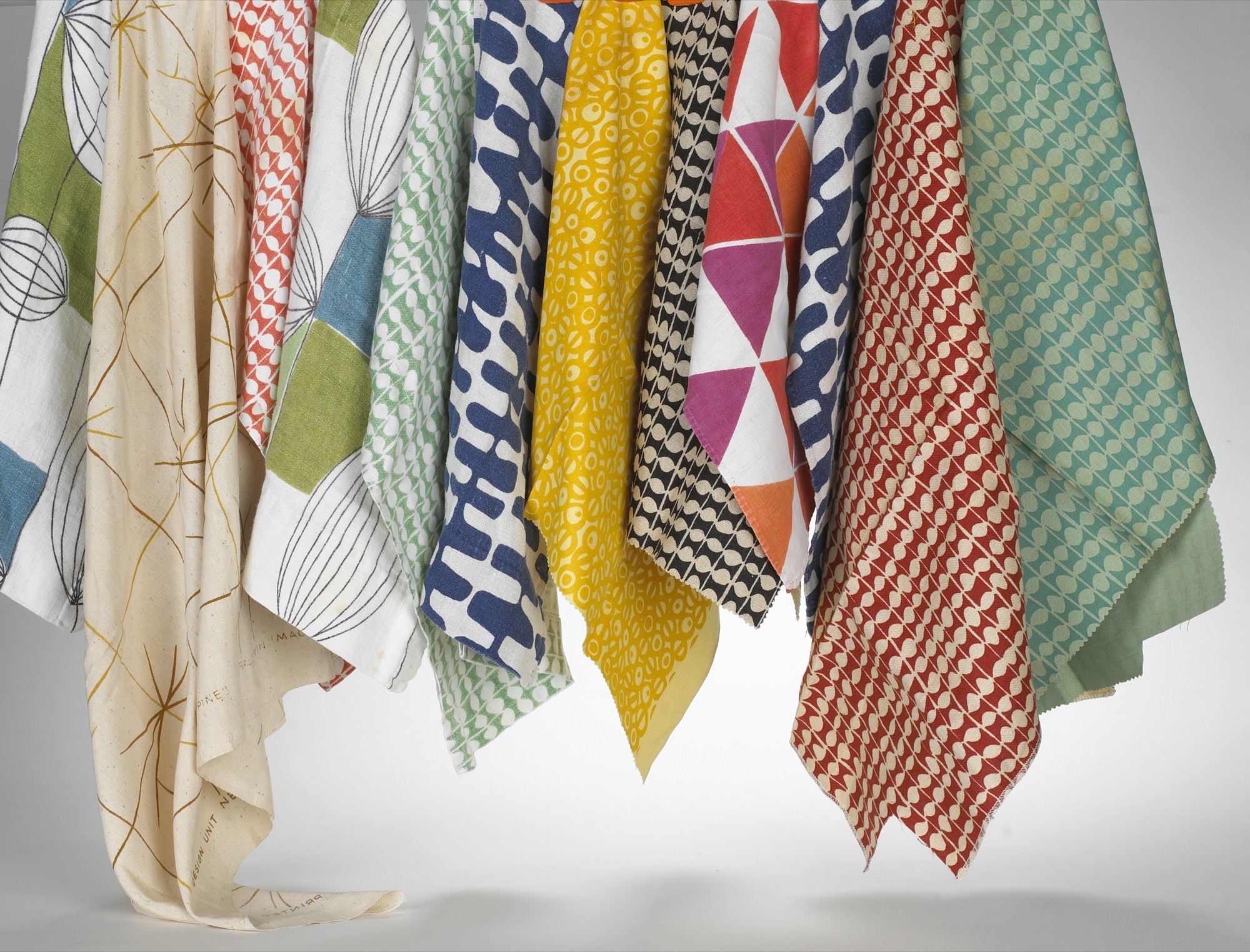
My father started his architectural practice at a drafting table in the back of the Baldwin Kingrey store. He did all the graphics for the store, designed a line of furniture and lighting he called BALDRY, designed open shelving of floating glass and steel poles to display Bertoia jewelry, Venini vases and “Chem Ware”—beakers and Petri dishes in simple, beautiful forms, that they found in the industrial section of the city. There was resourcefulness, an informality, and a frugality at play. In my mother’s words,
“Harry and I stopped at a place that sold Cadillacs on LaSalle Street. They were selling out their leather for automobiles, so we bought the whole batch. A lot of our furniture was covered in Cadillac leather! We were in a sense the precursor to Crate and Barrel. They came down to study us a lot. Carole Segal (founder of Crate and Barrel) was a friend of mine, and I gave her help. I gave her a lot of source material.”
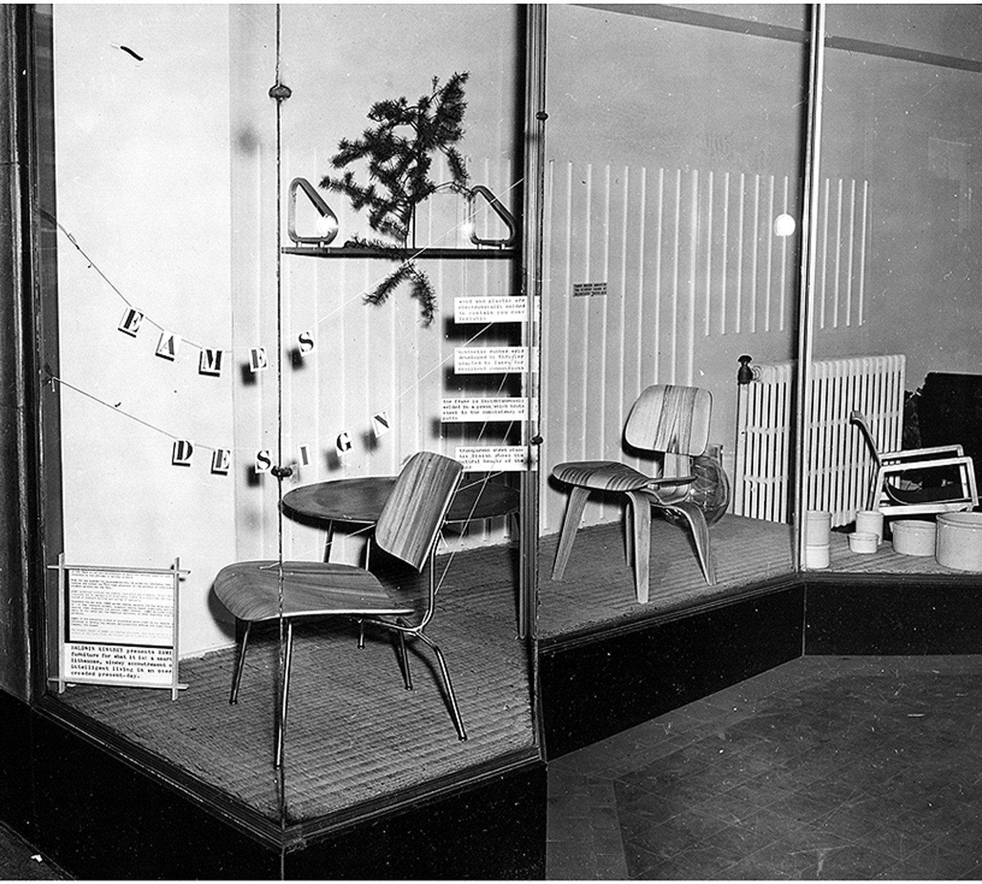
As I was growing up, there was a steady stream of visitors, all immersed in modern design. My mother reminisced,
“You couldn’t travel across the country without changing planes or trains in Chicago. Everyone would stop in Chicago. The people that rushed into Baldwin Kingrey were mostly from the city and they didn’t have much money. Instead, they had some sort of new outlook—a vision. They loved the simplicity of our ‘plain’ furniture.”
The road was unpaved, the waters uncharted, the possibilities endless. Many would visit our house to exchange ideas, talk about projects, drink a cocktail or two, even draw at the dinner table. One of these more salient meetings I remember clearly:

I must have been ten or eleven when a distinguished elderly gentleman came to visit us in Barrington. My father was notably excited to share our modern house with him. When it was time to leave, he escorted him down the walkway under the grape arbor to his car with me trailing behind. As he drove off, my father turned to me with tears streaming and whispered, “There goes my mentor. There goes the most important man in my life.” This was none other than Alvar Aalto, who had been Dad’s professor and was a great influence on his architecture and design philosophy.
First pitstop in Aspen
When peace came in 1945, Dad stepped off his ship in San Francisco and he and Mom drove eastward. On their way back to Chicago, they stopped in Aspen and took some black-and-white photographs of downtown. The town consisted of several stone and brick buildings—the Courthouse, the Wheeler Opera House, the church and Hotel Jerome. All other structures were small Victorians, a few storefronts, dirt roads, and occasional wooden lean-tos that sheltered a few dozing horses. Many of the houses had been plunked on rubble walls to speed construction for miners and their families in the boom of the late 1800s. Builders often used pattern books with a 12/12 pitch for snow load, imparting a human scale that has long since been lost.
Dad—an avid skier—fell in love with Aspen and began a tradition of visiting each winter and summer that lasted throughout his life. Luckily, he included us in this adventure, and, thus, I have precious memories of Aspen in those early days. It has been described as “the town Chicago built.”
“I have precious memories of Aspen in those early days. It has been described as ‘the town Chicago built.’ ”
In the 1940s in Chicago, my parents were friends with Walter Paepcke, a successful industrialist, philanthropist, and president of the Container Corporation of America. It was Walter’s remarkable wife Elizabeth, a notable influence on Chicago’s cultural life and one of Mom’s favorite people, who exposed Walter to modern design and artistic sensibilities. In this spirit, Paepcke consulted with Walter Gropius, brought Laszlo Maholy-Nagy to the Institute of Design, befriended Bauhaus artist and designer Herbert Bayer, and photographer Ferenc (Franz) Berko, also at ID at the time. Mom and Dad intersected with ID, as the campus was a hub for young and ambitious modernists.
In a memoir, Elizabeth Paepcke describes her first impression of Aspen after skinning up the mountain in 1939,
“At the top, we halted in frozen admiration. In all that landscape of rock, snow and ice, there was neither print of animal nor track of man. We were alone as though the world had just been created and we its first inhabitants.”
Walter Paepcke first visited Aspen in the spring of 1945 urged by Elizabeth. To him, this seemed the idyllic place to implement a new Chautauqua. The Aspen idea was to create a place, in Walter’s words, “for man’s complete life ... where he can profit by healthy, physical recreation, with facilities at hand for his enjoyment of art, music, and education.” Thus the Aspen Institute of Humanistic Studies was born. Herbert Bayer was brought in to oversee the design of the campus, and Franz Berko became the Institute’s in-house photographer. The pull to Aspen was magnetic, and as many of Chicago’s design elite began to relocate and vacation there, my parents were among them.
“The Aspen idea was to create a place, in Walter’s words, ‘for man’s complete life ... where he can profit by healthy, physical recreation, with facilities at hand for his enjoyment of art, music, and education.’ ”
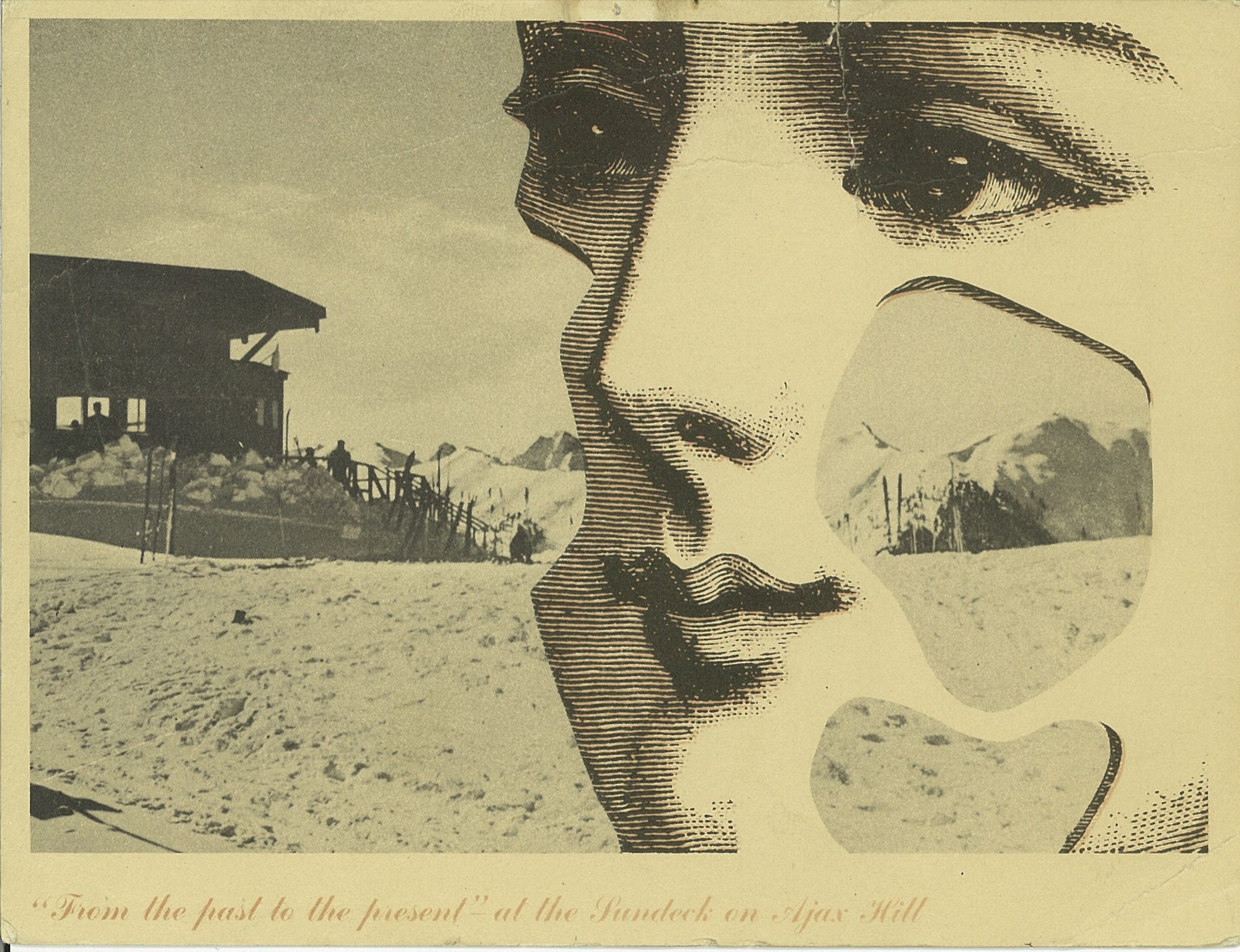
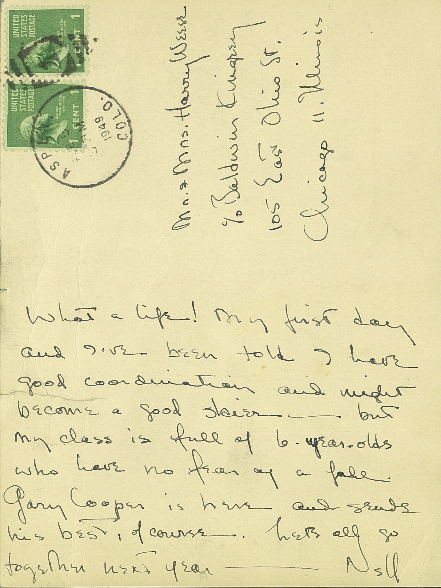
“The pull to Aspen was magnetic, and as many of Chicago’s design elite began to relocate and vacation there, my parents were among them.”


There was a palpable charm to Aspen in the fifties and sixties, which I feel so fortunate to have experienced first hand. Many Europeans returned to the town to settle after serving in the famed 10th Mountain Division during the war. Their training camp, Camp Hale, was nearby and enlisted men would often ski Aspen on the weekends. Friedl Pfeifer was one who started the Aspen Ski School; Fritz Benedict set up an architectural practice. After the war, many of these veterans taught skiing in winter and worked as carpenters in summer. Their wives typically ran the shops, bakeries, and clothing stores in town. Franz Berko stayed, continued his photographic career, and raised his family. His wife Mirte ran a toy shop that sold wooden toys from Europe. Herbert Bayer designed the early buildings at the Aspen Institute and settled in town with his wife Joella. Fritz Benedict, the noted local architect, married Joella’s sister Fabi, and he began developing Aspen. Joella and Fabi shared a famous mother—the poet Mina Loy. This was an illustrious and hearty group of early modernist settlers who loved the mountains and skiing and who brought Aspen out of its “quiet years.” My parents were in the midst of the action.
“This was an illustrious and hearty group of early modernist settlers who loved the mountains and skiing and who brought Aspen out of its ‘quiet years.’ ”
Christmases at the Hotel Jerome
Nora Berko, daughter of Franz and Mirte, remembers visiting us at the Hotel Jerome every Christmas. We always stayed in the southeast corner with full view through the Victorian lace curtains of Main Street and Ajax Mountain. As our collective parents went out to dinner and dancing, usually at the Red Onion, we had full run of the rickety hotel, much like Eloise at the Plaza. With its worn and dusty velvet furniture, Victorian floral wallpaper, and black-and-white photos of skiers sporting the reverse shoulder stance and the latest style of stretch pants, it was a far cry from our modern and minimal environment at home. We ran up and down the creaking stairs and played in the elevator—a novelty—as it was the only one in town. The rooms cost ten dollars per night, radiators clanked, and in some seasons ropes were ceremoniously draped across the room sinks warning of giardia in the water. But we loved the Jerome. It felt like an old comfortable shoe. The Paepckes leased the hotel as well as the Opera House so Elizabeth had license to paint the exterior white with light blue arches over the windows. The hotel looked like a grand Bavarian wedding cake in a perpetual wink; an impressive structure always easy to spot for a youngster finding her way home after ski school. It stayed this way for several decades.
Every Christmas we walked through snowy streets to the Berko’s for Christmas dinner. Their house was a modestly scaled and cozy Victorian in Aspen’s west end. Real candles burned on the Christmas tree, which was festooned with wooden ornaments from Mirte’s toy shop. Marzipan treats imported from Europe were served. There was no central heat. Brrrr. But for a young girl, I was sure that I was encompassed within a magical snow globe.
Aspen became our second home
In the late sixties, my mother bought a small Victorian in Aspen's west end for a mere pittance. We began to spend summers in the mountains, which was a blessed relief from the mugginess of the Midwest. My father worked on projects in and around Aspen. Many went unbuilt but some were realized, including the Given Institute. He had a plan for a new airport, and he wanted to bring light rail from Glenwood to Aspen to alleviate vehicular traffic. Always drawing, usually at the kitchen table, I rarely saw him without a pencil in hand. In 1969 Charles Moore (who taught at Yale), and Fritz Benedict lured a class of Yale architectural grad students to spend a summer in the nearby mountains and build experimental projects. When these young, handsome students appeared, they were eager to rub shoulders with my father at his kitchen table. (A few rubbed shoulders with his daughters as well!) One of these architects, Harry Teague, arrived and never left. Over four decades, he has made a significant imprint on the town, designing notable residences and many of Aspen’s most prestigious cultural buildings, including Harris Hall, the Aspen Music School campus, and the Aspen Center For Physics. He has become one of Aspen’s “own” by championing a humanist aesthetic that continues to raise the bar of modern architecture in the Roaring Fork Valley.
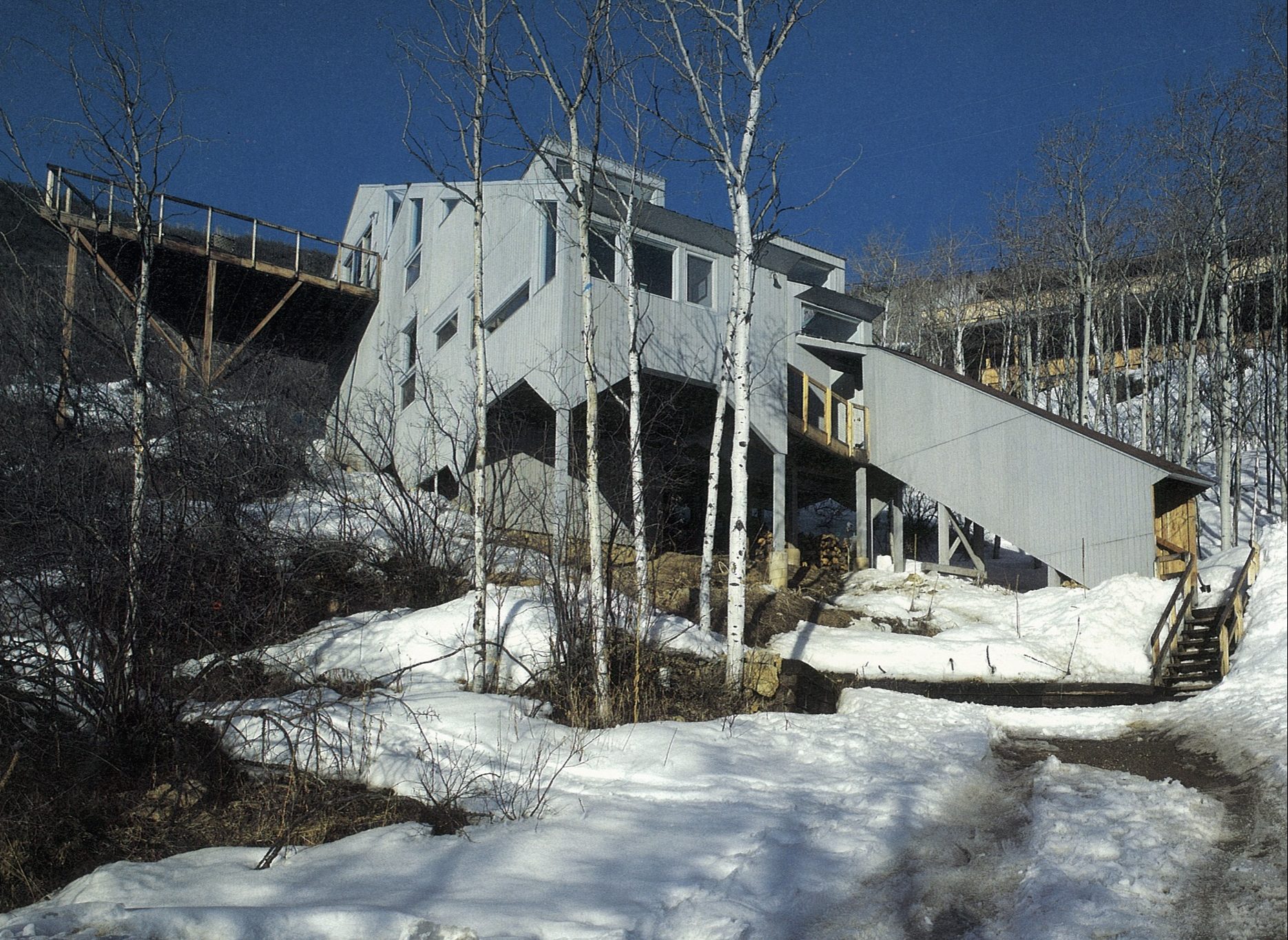
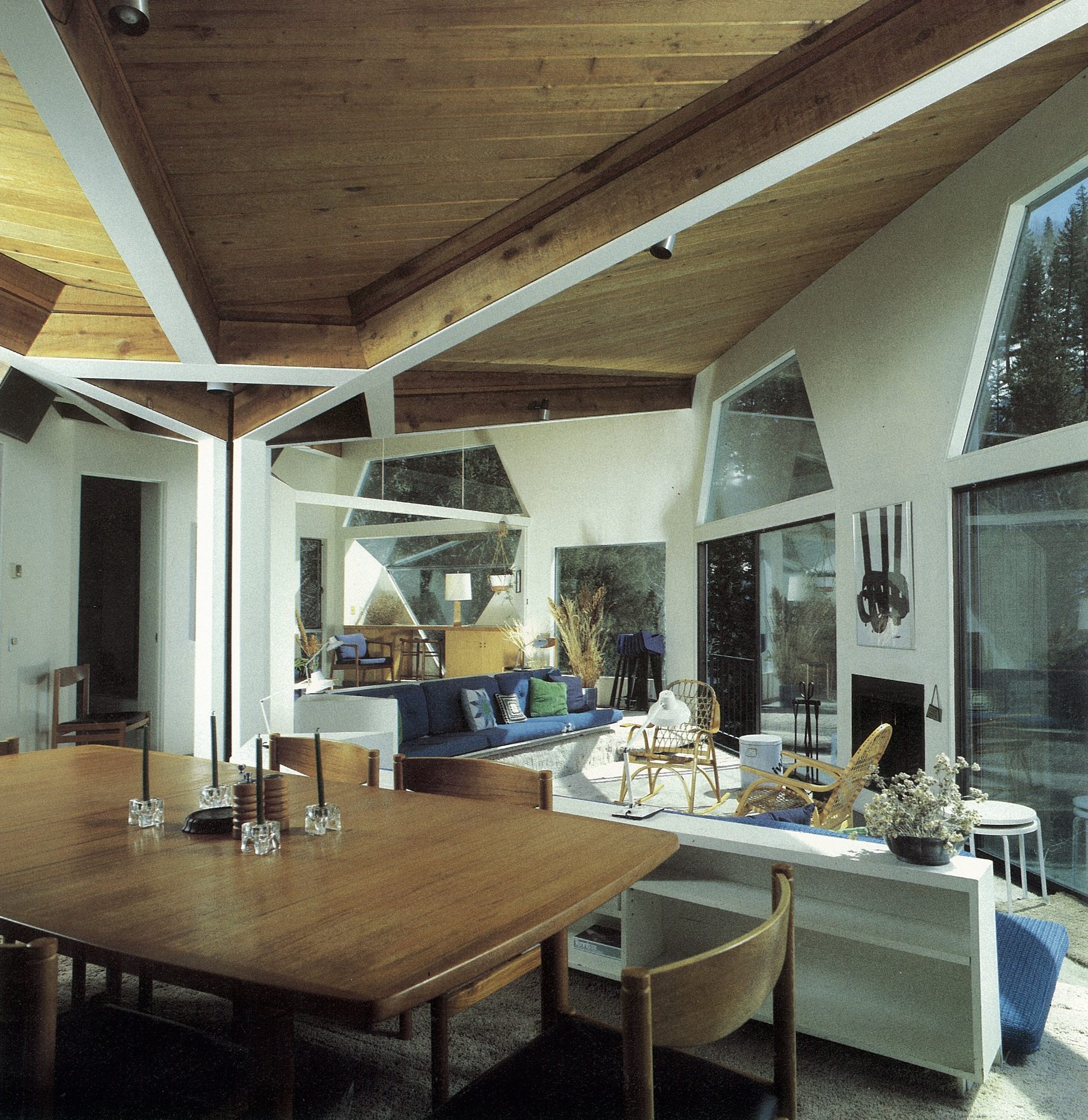
Aspen today
Though old Aspen is rapidly fading, thank goodness there are offspring. I am currently collaborating with Teague on a family compound for Nora Berko and her family that incorporates her father’s studio, now designated historic. Her daughter Mirte has dedicated much time and effort organizing her grandfather’s impressive archives of photographs for us to appreciate into perpetuity. The Aspen Institute carries on robustly while continuing to pay homage to its early founders and players. △
Read "Growing Up Weese" to find out what artist and designer Marcia Weese is up to today.
Growing Up Weese
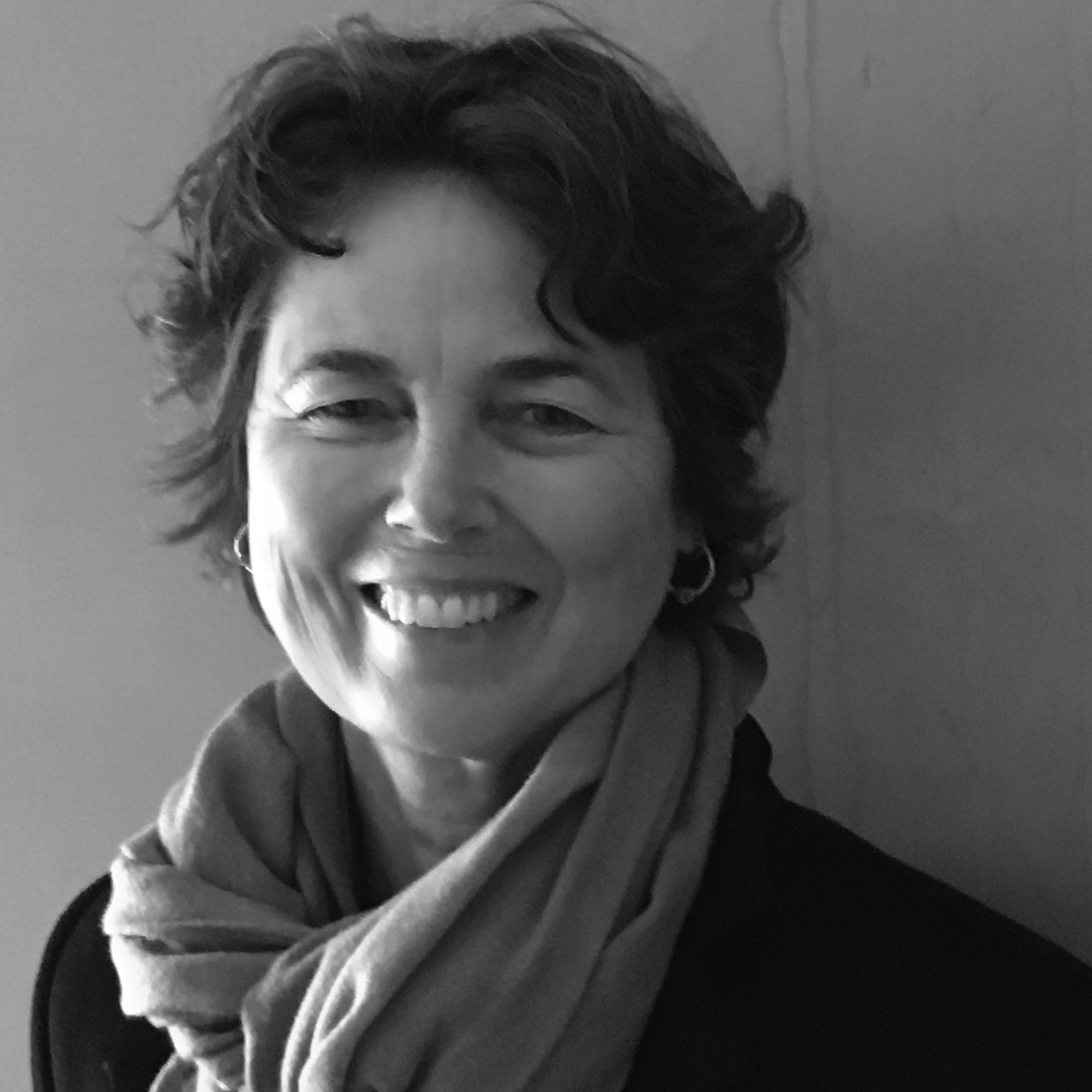
The daughter a power couple of American modernism, artist Marcia Weese was born to design
Her parents are architect Harry Weese and pioneering design shop founder Kitty Baldwin. Born into a coterie of mid-century modern architecture and design icons—Alvar Aalto, Eero Saarinen, and Charles and Ray Eames among them—artist and interior designer Marcia Weese carries on family tradition by designing modern rugs and creating fine art prints in her studio in the Colorado mountains.
I grew up on the near north side of Chicago near the lake. The endless horizon line, burning coal, bus fumes, beach sand, roller skates, sirens, frozen waves, thunderstorms, pigeons, dandelions ... Life in the inner city was complemented by summers in the country forty miles west. Crickets, lighting bugs, oaks, jays, owls, leaves, slugs, snake grass, otters, bluegills, cabbage butterflies, algae, sumacs, worms, Queen Anne’s lace, garter snakes, rabbits, clover, flies, bullfrogs ... I was lucky to dwell in both worlds. And each winter we spent the Christmas holiday in Aspen, and I fell in love with the Rocky Mountains, too. Streams, Indian paintbrush, marmots, boulders, puffballs, eagles, gentians, boiled wool, marzipan, scree fields, cumulus clouds, ravens, purple snow shadows, ermine, the smell of wet dirt...
The natural world has always been an oasis for me—a sanctuary, a place in which to marvel and explore. I borrow imagery from natural forms, weather patterns, textures, to bring a sense of balance to my world. My content often comes from the mystery and magnificence of nature—the perfect designer.
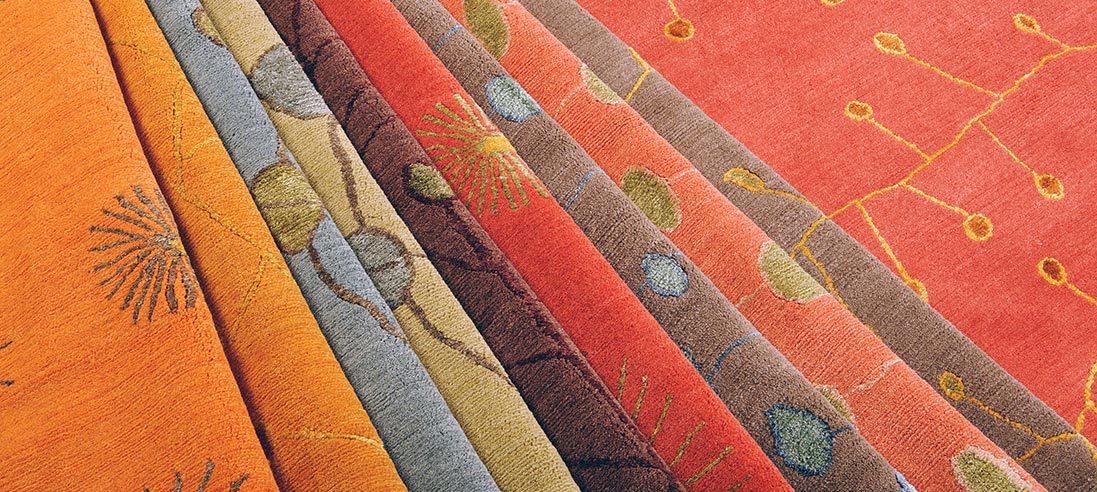
“My content often comes from the mystery and magnificence of nature—the perfect designer.”
Trained as a sculptor, I was attracted to site-specific work that often incorporated architectural elements. Printmaking was a natural antithesis to the rigor of planning and making sculpture, and as I look back, I have devoted most of my artistic life to works on paper. The ephemeral quality and the spontaneity speak to me. I am enchanted by the casual impermanence of a work on paper. And I am attracted to the minimal aesthetic, where I feel most comfortable. Less is more in my world.

“I am enchanted by the casual impermanence of a work on paper.”
As children, we would get the nod from mother that our father was coming home and it was time to "clear the decks.” All toys would be scooped up and hidden away so he could walk into a clean and serene environment. To this day, clutter confuses me and divesting is actually something I enjoy.
I moved to New York after art school to become the famous artist that is expected of all Bennington graduates. That was a nine-year lesson in humility and how to survive amid intense turmoil and fierce competition. I learned how to discern the excellent from the mediocre in art and design. I danced, made sculpture, painted, and longed for the horizon line. I found myself walking down the streets in Manhattan looking up at the rooftops. There, the sky silhouetted another cityscape of water turrets, parapets, and fire escapes. After nine years in New York, “Manhattanism” (i.e., "New York is the only place to live”), had gotten a problematic stronghold on me, so I escaped and returned to Chicago where I could breathe again. I loved walking along the lakeshore with the density of the city to the west and open water to the east.
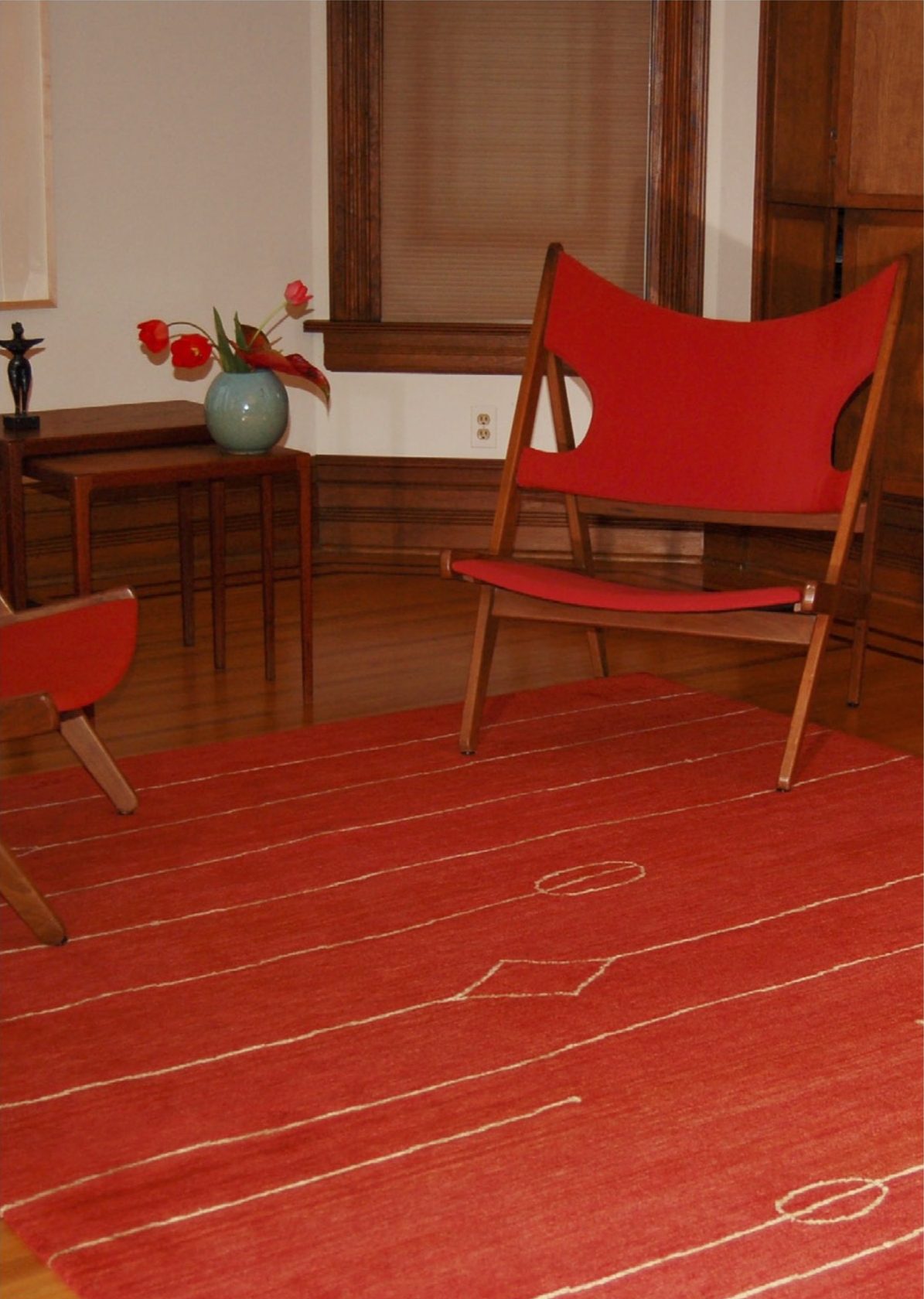
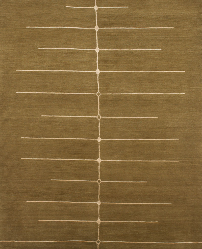
I continued making art but asked my mother to teach me the ins and outs of the interior design profession so I could more readily support myself. She taught me well, and I have worked collaboratively with architects and clients across the country over a number of decades. As an interior designer with a classical modern bent, I was always searching for the quintessential modern rug to harmonize the room. I only found beige, beige, and beige or super graphic patterns that looked like bad paintings. Serendipitously, I was introduced to a family of Tibetan sisters, who knew the rug trade and had cousins in the business in Asia. This was a happy union, and for the past fifteen years I have worked directly with Tibetans who weave rug collections to my design in Nepal. Recalling visuals of growing up on the edge of Lake Michigan and the Midwestern prairie, to hiking the crags of the Rocky Mountains, my designs stem directly from my intersections with the natural world. The patterns and color palettes present an assemblage of modern but timeless rugs.
“As an interior designer with a classical modern bent, I was always searching for the quintessential modern rug to harmonize the room.”
When I eventually grew tired of Chicago’s pink skies at night and ached to see the milky way, I moved west to the Rockies.
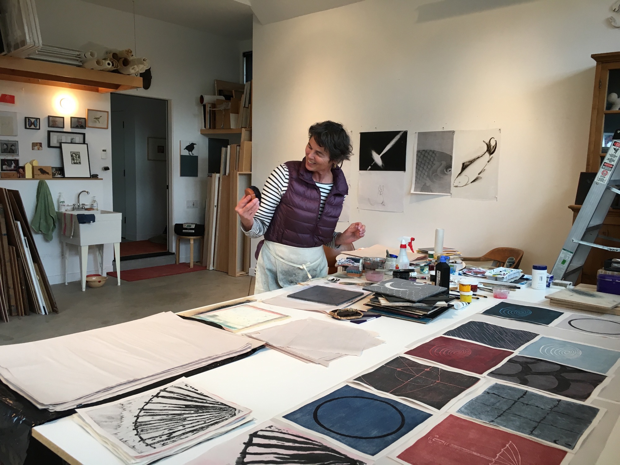
Decades have passed, and the early modernists are still in vogue. Thankfully, this is beyond fickle fashion, which warms my heart as I feel I am surrounded by old friends and family. These days, when I encounter “everyday simple,” I pause and give thanks to my parents for teaching me that less is more. And I appreciate the efforts that are being made by those who are committed to good design and who are carrying on that noble tradition.
And I am ever grateful to have been handed the baton of creativity. It is an ongoing quest, one that continues to nourish, atop the peaks and in the valleys. △
“Decades have passed, and the early modernists are still in vogue. Thankfully, this is beyond fickle fashion, which warms my heart as I feel I am surrounded by old friends and family.”
Read "How American Modernism Came to the Mountains"—a memoir by Marcia Weese as the daughter to a power couple of early American modernism. Together with fellow members of Chicago’s design elite, Harry Weese and his wife, Kitty Baldwin, flocked to Aspen for ski and summer holidays, bringing modern design and architecture to the Mountain West with them.
Zen and the Art of Knife-Making
Using skills derived from the ancient craft of samurai sword-making, a blacksmith in the Japan Alps makes knives so delicate and dangerous they turn chopping into an artful act of passion.
A blacksmith in the mountains of Japan uses skills derived from the ancient craft of samurai sword- making to forge knives from a steel that is considered the finest base material of the knife-making art.

Cutting, slicing, mincing, dicing, boning, peeling: Over time, these mundane jobs have become, for me, the most satisfying tasks in the kitchen. Now, I experience knife-work as a meditation on all that will unfold after food leaves the chopping block. With each cut, I’m trying to shape ingredients to their ideal form, whether it’s a fine mince of onion designed to melt in a pan as a base for a sauce or fifty wedges of apple that need to keep succulence while retaining their shape in an autumn pie. The key to this repetitive-motion, Zenish state is a sublime knife: balanced in the hand, dangerous, delicate, an obedient lover and assassin.

I found my sublime knife after a lot of looking. It has a blade of Aogami Super carbon steel and was hand forged in a mountain town called Niimi, 150 kilometers (93 miles) northeast of Hiroshima, at the shop of a fifty-seven-year-old blacksmith named Shosui Takeda.
My Takeda
If you lay my Takeda 180-millimeter Super Sasanoha Gyutou chef’s knife beside my shiny stainless Shuns and Globals and Henckels, it looks weathered, almost preindustrial. The thin blade has a mottled black finish called kurouchi. The blade tapers sweetly to a gunmetal gray edge whose sharpness approaches that of a razor. You can see the resin used to affix the tang as it was slid into a hole in the Indian rosewood handle during construction. The handle is octagonal, to answer the shape of enfolding fingers and palm. Near the upper rear of the blade’s spine, roughly stamped into the metal, are Japanese characters, plus a heart and the Western letters AS. The characters mean “Niimi. Shosui. Aogami Super.” The heart is something Takeda-san’s blacksmith father started to put on his blades many years ago. Takeda-san says he has never been quite sure what the heart means.
Finding the perfect blade
I have not been to Niimi. I met my Takeda—and, later, two more of them—through Google’s search power and the matchmaking tastes of an American in Tokyo named Jeremy Watson. Watson is a thirty-nine-year-old American of UK and Hong Kong ancestry who moved to Tokyo after a period teaching English in Japan (where he met his wife) and a period learning about, and selling, Japanese knives in Manhattan. In 2012, he founded Chuboknives.com, selling products he found by scouting artisan blacksmiths around Japan. Initially, he hand-wrapped each order, inserting a thank-you note into slim boxes covered in Japa- nese stamps, and sent them on their way to Australia, Europe, and the UK, where chefs and foodies were beginning to notice his trade in rare beauty. Now his business is such that he has automated the shipping. But the boxes remain lovely and intricate, befitting jewelry, and to receive a Takeda in the mail feels like a gift, even if you’ve paid for it.
“We wanted to be a small family business that was connecting small-scale artisans to chefs and home cooks,” Watson says. Big Japanese knife-makers, like Shun and Global, were taking up more and more display space in stores like Williams-Sonoma (where once German companies like Henckels had ruled), but “I realized that the smaller artisans and blacksmiths were really underrepresented. Shibata, Takeda, or Tanaka—the craftsman that we’re currently working with—weren’t really out there.”
The absence of these knives from the major retailers can be explained by the minuscule production of operations such as Takeda Hamono, as the company is called.

Takeda's workshop
“There are three blacksmiths, including me, at the shop,” says Shosui Takeda (whose answers were translated for me by Watson). “We spend eight hours a day forging, twenty-five days a month. In total, we produce 250 knives a month. If we calculate the number of hours all of us work, essentially each person is producing about three knives per day.”
The quality of a handmade knife derives from the strange mutability of steel when it’s repeatedly heated and hammered to alter its molecular structure. The blacksmith, using skills derived from the ancient craft of samurai sword-making, is always chasing an ideal: a blade strong yet somewhat exible, thin but not brittle, able to take an edge and hold it for a long time. A molecular map of a knife would reveal a variety of attributes across its form, determined by cycles of quenching (to harden the steel) and tempering (to selectively soften it). The spine may be softer than the edge. The steel that Takeda uses, Aogami Super (AS), is considered the finest base material of the knife-making art, but it’s also known to be temperamental in the forge, and few blacksmiths bother with it. Takeda has been using AS for twenty-five years, after discovering it in a steel-maker’s catalogue, and after realizing that customers would pay a premium for the uncanny thinness and edge retention that AS offers. “As far as what I’ve seen,” Watson says, “I don’t think anyone makes knives as well as he does.”
“As far as what I’ve seen, I don’t think anyone makes knives as well as [Shosui Takeda] does.”

"The steel that Takeda uses, Aogami Super (AS), is considered the finest base material of the knife-making art, but it’s also known to be temperamental in the forge, and few blacksmiths bother with it."
Watch the YouTube videos of Japanese knife-makers at work: heating steel and iron to narrow temperature tolerances in coal-fired furnaces, then beating away at the metals—using both power hammers and tools wielded by hand—until they begin to fuse and morph like slow-motion Plasticine. The shape of the knife is judged by eye—as is the temperature of the hot steel, judged by the color of its glow in the fire. Heat, hammer, cool, and repeat. Sparks fly. The blades curl out of shape, then return to form under the blacksmith’s art. I’ve never seen anything so beautiful and fine that is produced by such fierce whacking and grinding.
"I’ve never seen anything so beautiful and fine that is produced by such fierce whacking and grinding."

That said, Takeda’s approach benefits from modern insights. “I’ve learned a great deal by collaborating with the steel-makers. Through trial and error and using high-resolution microscope photography to see how the steel looks after it’s forged, I’ve been able to eliminate problems with the forging processes.” He quenches his blades in successive baths of hot oil, whose temperature is closely regulated, then sharpens the edge with wheels and stones of increasingly fine grit. His wife and two daughters fix the tangs in the handles at the end, and handle other shop duties.

Dangerous business
The work looks dangerous because it is: “When we’re working in the summer with short sleeves,” Takeda says, “we get burns on our hands and arms every day. This is just part of the job and no big deal.
“What’s more serious are the repetitive strain injuries to my back, shoulder, elbow, and knees. Eight years ago, I had back surgery, and earlier this year, I had surgery on my right knee. I’m currently doing monthly injections so I can keep working. My grip strength is also significantly weaker than it used to be.
“The most serious is the hearing and vision damage. I use earplugs, but I still have hearing damage. Also, constantly looking at the coal-burning oven while forging has damaged my sight.”
"When we’re working in the summer with short sleeves, we get burns on our hands and arms everyday. This is just part of the job and no big deal."
All that pain may explain the paradox of the knife market in Japan. The rise of the global food and chef culture has created unprecedented demand for fine knives, and Watson says artisan shops have more orders than they can fill. The Internet makes new connections between cooks and artisans possible. It would seem to be a perfect time to grow a blacksmith’s business.
“The American solution to this would be to hire more people and build a larger facility,” Watson notes, “but that’s not necessarily the mentality here. A blacksmith team consists of three or four people, and it takes years to train.” Nor are young Japanese lining up for the work. This does not surprise Takeda. He did not intend to be a blacksmith himself; he helped around his father’s shop for bowling money, and didn’t take up the work properly until he was twenty-eight. Were his father not in the trade, he would never have pursued it.
Takeda describes the paradox this way: The knife business is good, the forging business is not.
“During my father’s time,” Takeda says, “there were forty-seven blacksmiths in Niimi—most making agricultural implements [as Takeda’s shop still does]. Now, there are just a handful. The small knife-forging business is literally going extinct. There are very few blacksmiths left.”

Care and maintenance
In my knife drawer are Japanese stones that I use to keep my Takeda knives sharp. The stones, soaked in water, give up a creamy slurry as the carbon steel of the knife is drawn across it. When the knives are done, I use a special little stone to smooth the water stones for the next session. Sharpening is a calming ritual that with a little practice leads to a gleaming thin line of razor sharpness along the gray edge of the blade.
When the knives are sharp, and again after every use, I carefully dry them, because Aogami Super is extremely prone to oxidation. It rusts in minutes. The rust is removed with a light scrub, should I fail to completely dry the knife; this is another little ritual that I enjoy. Takeda is now making an AS line with stainless cladding, which he calls NAS, to prevent rust, but I shall stay old school on further orders as long as he continues to produce them. And there will be further orders, even though his knives run from $120 for a beautiful little paring knife called a “petty” to $380 for an absurdly long, wondrously light Kiritsuke slicing knife that is my favorite cooking tool in the world.

Takeda’s blades have a gentle fifty-fifty bevel, meaning that each side of the blade tapers equally to the cutting edge. This is easier to sharpen for an amateur than the single-side bevels common on many Japanese knives. Beveling and blade shape, like everything else to do with Japanese knives, are complex and relate to the food to be cut: vegetables versus meat versus fish. Some blades are designed for species of fish, others according to what the fish is going to be used for. Everything is about form: of the blade, of the food.
These sublime blades support a Japanese kitchen culture of sublime knife-work, precise almost beyond belief. One gets a glimpse of it at a very good sushi bar, while a multicourse kaiseki meal in Kyoto is like a doctoral dissertation.
"These sublime blades support a Japanese kitchen culture of sublime knife-work, precise almost beyond belief."
Wielding my Takedas, I know that I shall never have such skills. But I do have knives that allow me to meditate on the ideal every day. △

Recipe: Muscovy Duck Breast with Chanterelles, Pickled Radish, and Foie Gras Gastrique
A fine duck dish starring mushrooms and pickled garden gems preserved from summer
INGREDIENTS muscovy duck breasts: 2 breasts salt pepper grapeseed oil chanterelles: 113 g (4 oz) shallot: 1, diced butter: 28 g (2 T) thyme: 3 sprigs
GASTRIQUE
reserved apple liquid: 236 ml (1 cup) from Whiskey Preserved Apples recipe shallot: ½, diced bay leaf black peppercorns apple cider vinegar: 118 ml ( cup) rendered foie gras fat: 30 ml (2 T)
Duck Breast
Preheat oven to 180° C (350° F). Carefully score the skin with a sharp knife. Season tempered duck breast generously with salt and pepper. On medium-high heat, heat grapeseed oil until the oil is hot. Sear, skin-side down, until skin is nicely golden brown. Place pan (with the duck in it) in the oven until the duck breast reaches 54.4° C (130° F). Remove duck from the pan, let it temper for a few minutes before slicing. Finish sliced breast with sea salt and set aside.

Chanterelles
Carefully clean the mushrooms to remove excess dirt. Once clean, heat a pan, add a small amount of grapeseed oil, and add diced shallot. Once the shallot is translucent, add the mushrooms, season with salt and pepper, and cook for 3–5 minutes. Add a knob of butter and a few sprigs of thyme. Once butter is melted and mushrooms are coated, remove from pan and set aside.
Gastrique
Remove half of the liquid from the cooked apples (see recipe). Place in a saute pan with diced shallot, bay leaf, and black peppercorns. Reduce liquid by half, add apple cider vinegar. Reduce the liquid another quarter (total time 8‒10 minutes). Strain and return to cleaned sauté pan. Add a tablespoon of rendered foie gras fat for flavor. Season with salt and pepper. Stir and set aside.

Pickled Radish
See recipe for Red Wine Pickling Liquid. Set aside 3‒5 wedges.
To serve
Place the sliced duck, chanterelles, and pickled vegetables on a plate and pour the gastrique on top. Serves two.
Other garnishes include
Pickled gooseberry, green strawberries, pickled cherries. It’s easy to substitute any of these as need be. △

This recipe accompanies "Preserving Traditions."
Recipe: The Alpinist's Larder
A preserved whiskey drink spiked with the taste of the summer passed
INGREDIENTS
pickled cherries: 3 pieces preserved whiskey: 60 ml (2 oz) leopold bros. three pins herbal liquor: 20 ml (0.7 oz) lemon juice: 20 ml (0.7 oz) honey syrup: 20 ml (0.7 oz)
DIRECTIONS
1 Combine all ingredients into a shaker 2 Gently muddle the cherries 3 Shake with ice 4 Double strain over ice 5 Garnish with cherries, mint, and lemon peel.

Recipe: Alpine Hot Toddy
Enjoy a warming drink in memory of the summer harvest
INGREDIENTS herb bundle: Thyme, marjoram, sage, lemon peel, mint, sorrel whiskey preserved apples: 30 g (1 oz), diced violet flowers preserved whiskey: 60 ml (2 oz) leopold bros. three pins herbal liquor: 20 ml (0.7 oz) lemon juice: 20 ml (0.7 oz) hot water: 1 pitcher
DIRECTIONS
1 Place all ingredients into a heat-resistant pitcher 2 Add hot water to steep (1‒2 minutes) 3 Strain into a heated mug or glass 4 Garnish with apples and lemon peel.
 Photo by Ashton Ray Hansen
 Boulder bartender Jon Watsky making the Alpine Hot Toddy / Photo by Ashton Ray Hansen

This recipe accompanies "Preserving Traditions."
Recipe: Whiskey Preserved Apples
Bag summer for a little while longer. Winter is coming.
INGREDIENTS Honeycrisp or Gala Apples: 2 peeled, quartered, and cored Rye or Bourbon whiskey: 300 ml (10 oz) Honey syrup: 60 ml (2 oz)—1:1 ratio honey:water Thyme: 1 sprig Sage: 1 sprig Lemon Peel: 2 peels Orange Peel: 2 peels Fennel Seed: 3 g (⅔ tsp, 0.1 oz) Clove: 3 g (⅔ tsp, 0.1 oz) Cinnamon Stick: 1 small
DIRECTIONS
1 Blanch (for 2–3 minutes) and shock the apple quarters. 2 Place all contents into a cryovac bag and seal. 3 Using an immersion circulator, poach the contents for 3 hours at 48° C (118° F). 4 Save liquid for the Alpine Hot Toddy recipe.
This recipe accompanies "Preserving Traditions."
Preserving Traditions
Savor harvest flavors well into winter by preserving the simple traditions and the sweetest fruits of alpine summer.
Preserving fresh foods so they will provide lasting sustenance through the cold season has been the stuff of daily life since the beginnings of human civilization—nowhere more so than in the mountains and other places where winter lingers.

Cured, dried, smoked, and salted meats and fish. Buttermilk, kefir, and cheese from fresh milk. Wine, spirits, beer, and cider. Pickles, krauts, jams. Tea, coffee, and kombucha. Many of our favorite foods and drinks are created through preservation and fermentation.
Cultured heritage
Passed down through generations, these basic methods served as important tools for surviving lean times. They also served, and can still serve, as familiar rituals that weave and strengthen family and community ties—and enliven our palates, hearths, and communal tables.
Your grandmother may have canned, but with the industrialization of food in the past half-century, many of us have lost touch with this inherited knowledge. Today, people around the world are paying more attention to what they eat and where it came from, tuning in to seasonal foods grown where they live, and reclaiming the simple labors and rewards of growing, preparing, and preserving some of their own food.
Sour beers, probiotic-rich fermented foods, and artisan pickles and preserves are now mainstays at craft breweries, farm-to-table eateries, even grocery stores. In many ways, it’s the rebirth of a more handcrafted, gastronomically rich world, one you can share with your family and generations to come.
"In many ways, it’s the rebirth of a more handcrafted, gastronomically rich world, one you can share with your family and generations to come."
Craft, quality, and connection
Everyone is evidently busier than ever these days. So why this nostalgic look backward at earlier ways of life and at “slow-food” traditions? Amidst the rush, we intuit the importance of slowing down every once in a while to can, pickle, or bake a pie... or to savor a nice bottle of wine or a great cup of coffee. It’s the only way we actually live in the moment. Instant gratification is rarely authentic and ultimately without value.

Preserving basic foods is often done when there’s a surplus of a food: peak season or a bumper harvest. Gathering in a kitchen with a group of people committed to one project, like jarring ramps or canning tomatoes, is a good source of inspiration. Making your own food and creating foods you can’t easily find elsewhere creates a potent connection. People will always gravitate toward craft and quality.
"Making your own food and creating foods you can’t easily find elsewhere creates a potent connection."

Flavor alchemy
Preserved foods are transformed through alchemical processes that yield bright, distilled flavors that shift, soften, and deepen over time. They are living, breathing things. You never know exactly what you’ll get when you open the jar or the bottle.
"[Preserved foods] are living, breathing things. You never know exactly what you’ll get when you open the jar or the bottle."
Food pros like Boulder-based Chef Colin Kirby (El Bulli, Spain, 2008) know a secret: Preserving makes foods more interesting. Done right, simple methods add new life to the most basic ingredients. For instance, savory fruits pickled with varied vinegars make inspiring elements of a complex dish. The key? They create a balance between fat and acidity, a too-often-forgotten flavor component.
Here, the minimalist chef introduces a few techniques:

White Balsamic Pickling Liquid
INGREDIENTS white balsamic vinegar: 2 parts sugar: 1 part salt: 1 part
DIRECTIONS Heat all ingredients to 82° C (180° F) or higher to dissolve sugar. Let cool and set aside
Red Wine Pickling Liquid
(for Cherries and Radishes)
INGREDIENTS red wine vinegar: 1152 g (38 oz) water: 535 g (19 oz) sugar: 254 g (9 oz) peppercorn bay leaf
DIRECTIONS Heat all ingredients to 82° C (180° F) or higher to dissolve sugar. Let cool and set aside
Apple Cider Pickling Liquid
INGREDIENTS apple cider vinegar: 2 parts sugar: 1 part salt: 1 part
DIRECTIONS Heat all ingredients to 82° C (180° F) or higher to dissolve sugar. Let cool and set aside
Rice Wine Brine
(for Green Strawberries and Gooseberries)
INGREDIENTS rice wine vinegar: 340 g (12 oz) sugar: 340 g (12 oz) water: 200 g (7 oz) lime juice: 90 g (3 oz) bay leaf mustard seed peppercorn
DIRECTIONS Heat all ingredients to 82° C (180° F) or higher until sugar is dissolved. Let cool and set aside.
A note on processing, storage, and safety
The vinegar and spices in these recipes make all the difference. They give fruit and vegetables new life and provide inspiration to any chef. Pickling unique ingredients such as green strawberries and gooseberries gives great acidity and texture to classic dishes like duck and chanterelles.
The vinegar also allows for processing (boiling and sealing the jars to prevent spoilage) to occur, and it ensures the pH is below 4.6. This is very important. When any of these recipes are used for long-term storage, please follow basic canning rules: Sterilize jars and lids, test the pH (general rule is below 4.6), and carefully boil the jars before setting aside. Once these rules are followed, start canning. △
Recipe: Muscovy Duck Breast with Chanterelles, Pickled Radish, and Foie Gras Gastrique
A fine duck dish starring mushrooms and pickled garden gems preserved from summer. Go to recipe »
Recipe: Whiskey Preserved Apples
Bag summer a little while longer. Go to recipe »
Recipe: Alpine Hot Toddy
Enjoy a warming drink in memory of the summer harvest. Go to recipe »
Recipe: The Alpinist's Larder
A preserved whiskey drink spiked with the taste of the summer passed. Go to recipe »
The Tippy Brass Ballerina
A conversation with designer Eero Koivisto of Claesson Koivisto Rune about the accidental making of the dancing brass bowls
Ballerina is a series of unstable bowls in a highly polished brass plate, designed by the Swedish design studio Claesson Koivisto Rune and produced by the 400-year old metal manufacturer Skultuna, one of the oldest companies in the world.
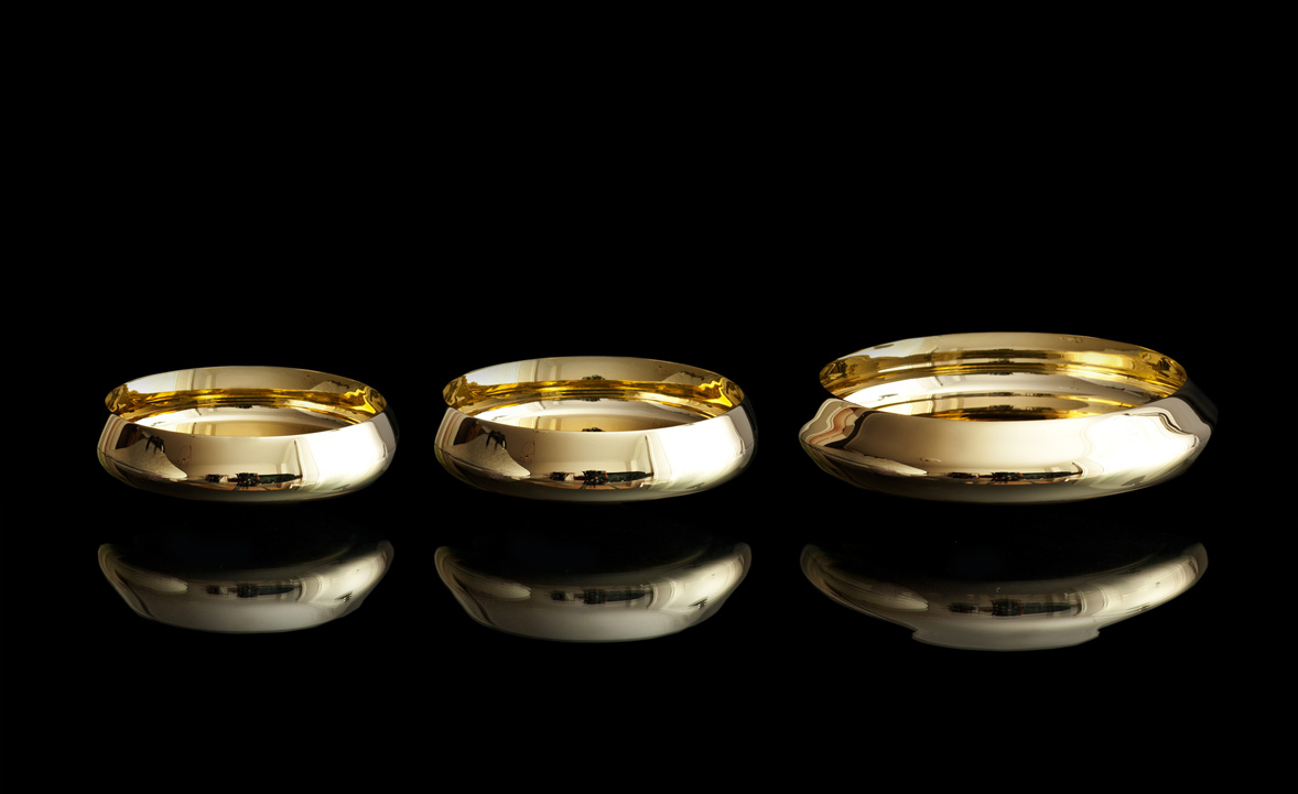
Skultuna, was founded in 1607 by King Karl IX of Sweden as a brass foundry and is still a purveyor to the Royal Court of Sweden, still in the same location. Today, Skultuna works with international designers, including the Swedish architectural partnership Claesson Koivisto Rune, founded 1995 in Stockholm by Mårten Claesson, Eero Koivisto, and Ola Rune. The firm meanwhile puts equal emphasis on architecture and the design of objects from tableware, textiles, and tiles to furniture and lighting.

One of our favorite Claesson Koivisto Rune designs are the tippy brass Ballerina bowls, manufactured by Skultuna. When looking into a bowl, the polished concave inside distorts the reflection so that the actual shape appears flat. Their convex bottoms make the bowls rock and dance when touched. When in movement, the Ballerina bowls also project “dancing” golden, glimmering light reflections around the room. We spoke with the bowls' modernist creator and co-owner of Claesson Koivisto Rune.
A conversation with architect and designer Eero Koivisto

Above, from left: Mårten Claesson, Eero Koivisto, and Ola Rune, the three founders and eponyms of Claesson Koivisto Rune Architects
What is the story behind the Ballerina bowls?
Actually, the bowls started with another product brief for Skultuna, which sort of transformed into the Ballerina bowls. What was the downside of the original design—the movement—turned into a design feature when we decided to make them into small bowls.
One can't help but touch the elegant, shiny bowls and rock them. What is the significance of their intentional movement?
We have worked with movement in usually static design objects before—for example PEBBLES seating for Cappellini, SEESAW for DeVecci, and BASSO, MOEBIUS, and BELLE, also for Skultuna. Since the bowls are fairly small, the movement comes across as playful and slightly surprising.
"Since the bowls are fairly small, the movement comes across as playful and slightly surprising."

When you hold a Ballerina bowl in your hands today—your design that came to live through craftsmanship—what goes through your mind... and heart?
What started out as an idea about movement, has turned into a quite beautiful object in itself.
You designed these bowls for Skultuna. In what way is the experience of designing for a more than 400-year-old company unique?
The owner and the CEO are fairly young, so even if there’s a lot of history involved, they are a pretty youthful company and always open to new ideas in design.
Thus far, what’s your legacy in the design world?
I’m very honoured to be asked the question regarding our work, but I wish to pass it on to others, who can see beyond our own studio, to answer it.
What makes you a modernist?
Living in a modernist society.
What does "quiet design” mean to you?
We are very attracted to the idea that objects co-exist in a given context. Our work is not brash or loud, and it functions well together with other things, which can be totally different in their approach. We don’t really like ”look-at-me” objects.
"Our work is not brash or loud... We don’t really like 'look-at-me' objects."
Usually there’s a lot of idea work in a particular design that is only obvious if you know the story behind it. But when you know the idea behind a certain object we have designed, a new depth occurs—kind of intellectual, but not in an excluding way.
On the other hand, we like the idea that you can use our designs for a lifetime without getting bored by them and without having any idea whatsoever why they look, feel, and function a certain way.
"We like the idea that you can use our designs for a lifetime without getting bored by them and without having any idea whatsoever why they look, feel, and function a certain way."
You design accessories for the home. What does “home” mean to you?
Most of our work is buildings, since we are an architectural studio, but we enjoy doing smaller objects and furniture, too. If architecture is our life’s journey, the smaller objects are the nice dinners with friends along the way. So, home is where we live our lives. Wherever that may be.
"If architecture is our life’s journey, the smaller objects are the nice dinners with friends along the way."
What’s most important to you in life?
My family and my work. In that order.
When are you happiest?
At home and at work. In the same order.
Who is your design icon?
I don’t really have icons anymore, but I do admire good work from people I know.
What inspires you as a designer?
Art and music.
What are you working on these days?
About ten different architectural projects—private houses, places for art, apartment buildings, hotels, and about 40 design projects in various stages of their design. All over the globe. △
A Dream in Detail
Sharing a deep admiration of Frank Lloyd Wright’s work and a devotion to detail, a retired couple builds the mountain home each envisioned before they even married. An intimate look at a dream come true.
Bob and Judy met on a blind date . . . What sounds like the beginning of a romantic love story—which it is—also leads into the inspiring story of two people who, on that first night discovered they shared a passion for architecture, the work of Frank Lloyd Wright in particular, and a lifelong dream of someday living in the Vail Valley, in a warm, modern house overlooking the ski runs of Colorado’s famous winter resorts.
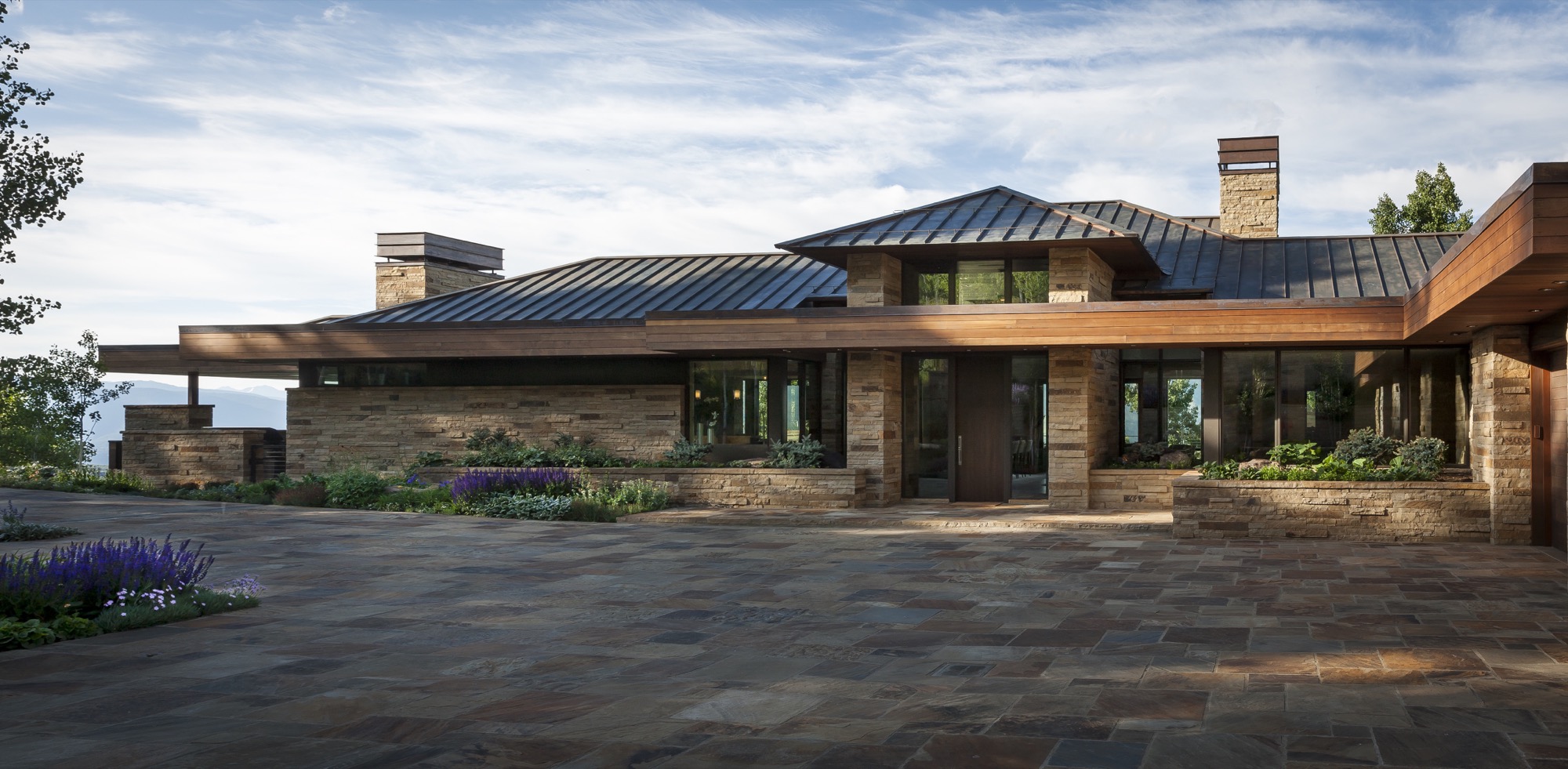
“We wake up every morning and can’t believe we get to live up here,” Bob says today. The Michigan native visited Colorado for the first time when he was seventeen, on a ski trip with his buddies. “I remember thinking, ‘Someday, I want to live out here. Not in a ski-in/ski-out place, where you are up close to the mountain, but in a house with great vistas of snowcapped mountains.”
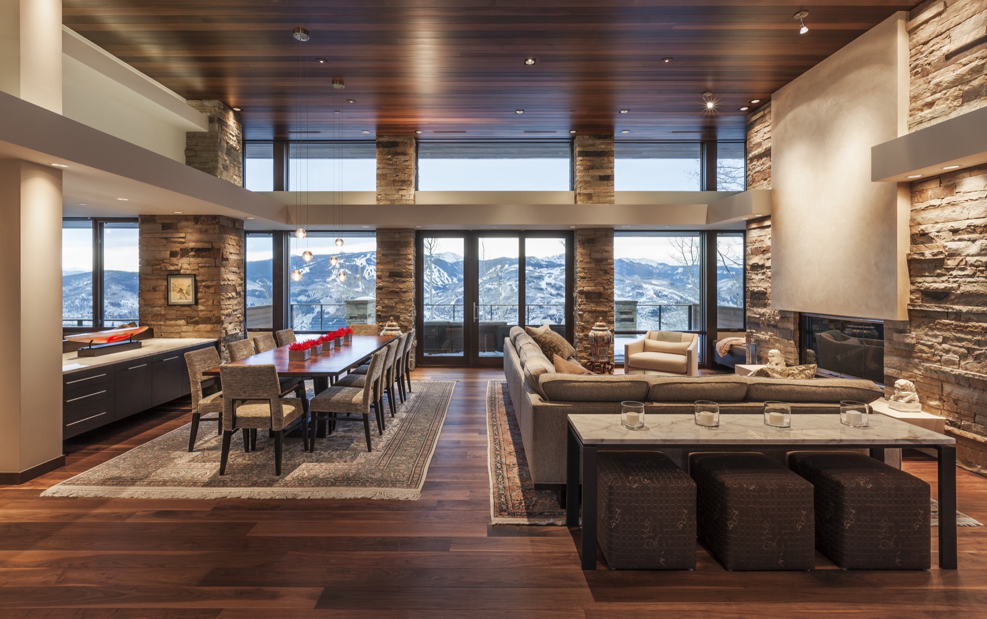
Forty years later, the man, who spent a career traveling the world as an executive for global brands, stands behind his marble kitchen counter, looking out over Beaver Creek and some of the country’s highest peaks soaring more than 14,000 feet (4,267 meters) above sea level. The dream house he built with his wife of eleven years was carefully sited so the windows of the great room frame the ski runs across the valley perfectly. “We wanted this feeling of a life-size trail map.”
“We wanted this feeling of a life-size trail map.”
Judy, for her part, grew up in Minnesota and Wisconsin. Her mother and father, too, shared a love of Frank Lloyd Wright’s architecture. “Every month, my father took my brother, my sister, and me to see a different Frank Lloyd Wright house. That had a profound effect on me, and is something we continue to like to do,” she says. “It’s also one of the strong bonds that Bob and I have, because he used to ride around Michigan and go to Frank Lloyd Wright houses, knocking at the doors and asking if he could meet the people.”
“Every month, my father took my brother, my sister, and me to see a different Frank Lloyd Wright house. That had a profound effect on me.”

The perfect plot and a modern master
It took one year to find the perfect lot, 9,125 feet (2781 meters) above sea level, at the end of a winding, aspen-lined road above Avon, Colorado. For an entire ski season after they bought the lot, the two came up from Denver on weekends. “Instead of skiing, we’d sit on the site and envision what our life would be like up here, and how we wanted to live in the house,” Judy thinks back.
“Instead of skiing, we’d sit on the site and envision what our life would be like up here, and how we wanted to live in the house.”
Then the new landowners needed to find an architect who could put their dream on paper. They hit the bookstores. “We were going through architecture magazines, pulling out pictures of homes that looked interesting to us,” says Judy. “And then we realized, it’s all the same architect.” The modern master whose work jumped out at them time again was Charles Stinson of Charles R. Stinson Archi-tecture + Design in Minnesota.
The internationally acclaimed architect had never designed a mountain home before; but having seen his previous work, Bob and Judy were confident he was capable of helping them achieve their dream. “Rare clients I know of who are such students of architecture,” Stinson says about the pair. “We hiked their site together, and we all had a harmony in the way we saw the world and the potentiality of architecture.”
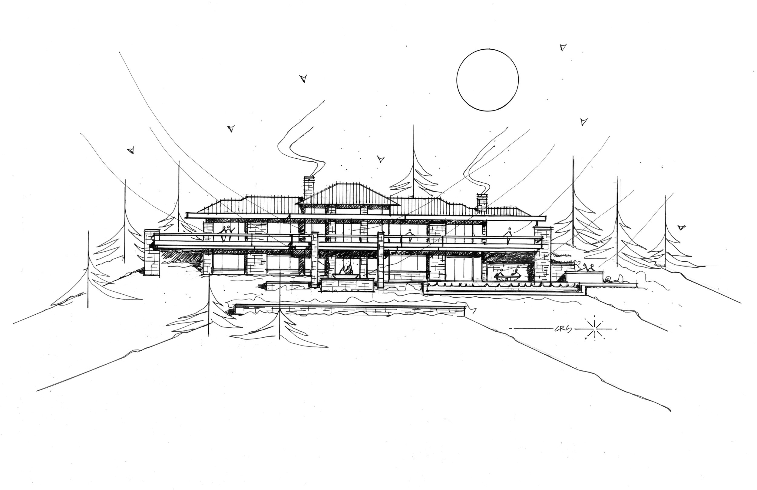
Good design takes time
The couple as well as their architect appreciate Wright’s clean, horizontal lines, his strong sense of flow between indoors and outdoors, and the use of warm materials. Nonetheless, the design was not to be an imitation of a Frank Lloyd Wright house. “Bob and Judy’s house both integrates the materials and the geometry of Wright, but it also brings in a more modern aesthetic and materials and technology,” Stinson says. “We integrated the history of Wright’s contribution with a current, modern architecture.”

The two key design objectives were to maximize the views, and for the house not to pretend to be something it was not. The creative collaboration with Stinson took another four years before the clients felt the design was right. “Good design really does take time,” says Bob. “You get something laid out, and then it takes time to react to it.”
"Good design really does take time. You get something laid out, and then it takes time to react to it."
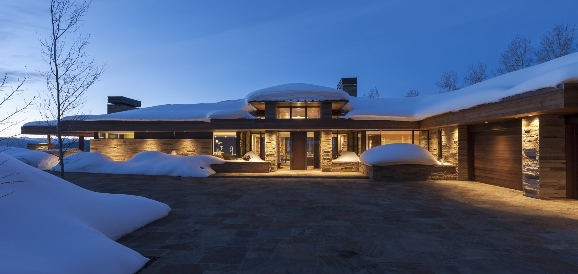
“I try not to think of it as obsessive compulsive,” says Bob, “but everything makes a difference in architecture.” He believes that paying attention to detail creates warmth and “zen-ness.” Good design is not for everyone to notice, but to recede behind form and function. Yet, a space that feels good and evokes an emotional reaction isn’t happenstance. “Attention to detail makes those details go away, and there is a calming feeling in that space,” says Bob.
Stone on stone
Stone is the protagonist among the house’s natural materials, both on the interior and the exterior. Devoted to detail, Bob and Judy wanted every stone on the interior to match the color and lines of its counterpart outside the glass panel to create unity between the outdoors and the indoors.
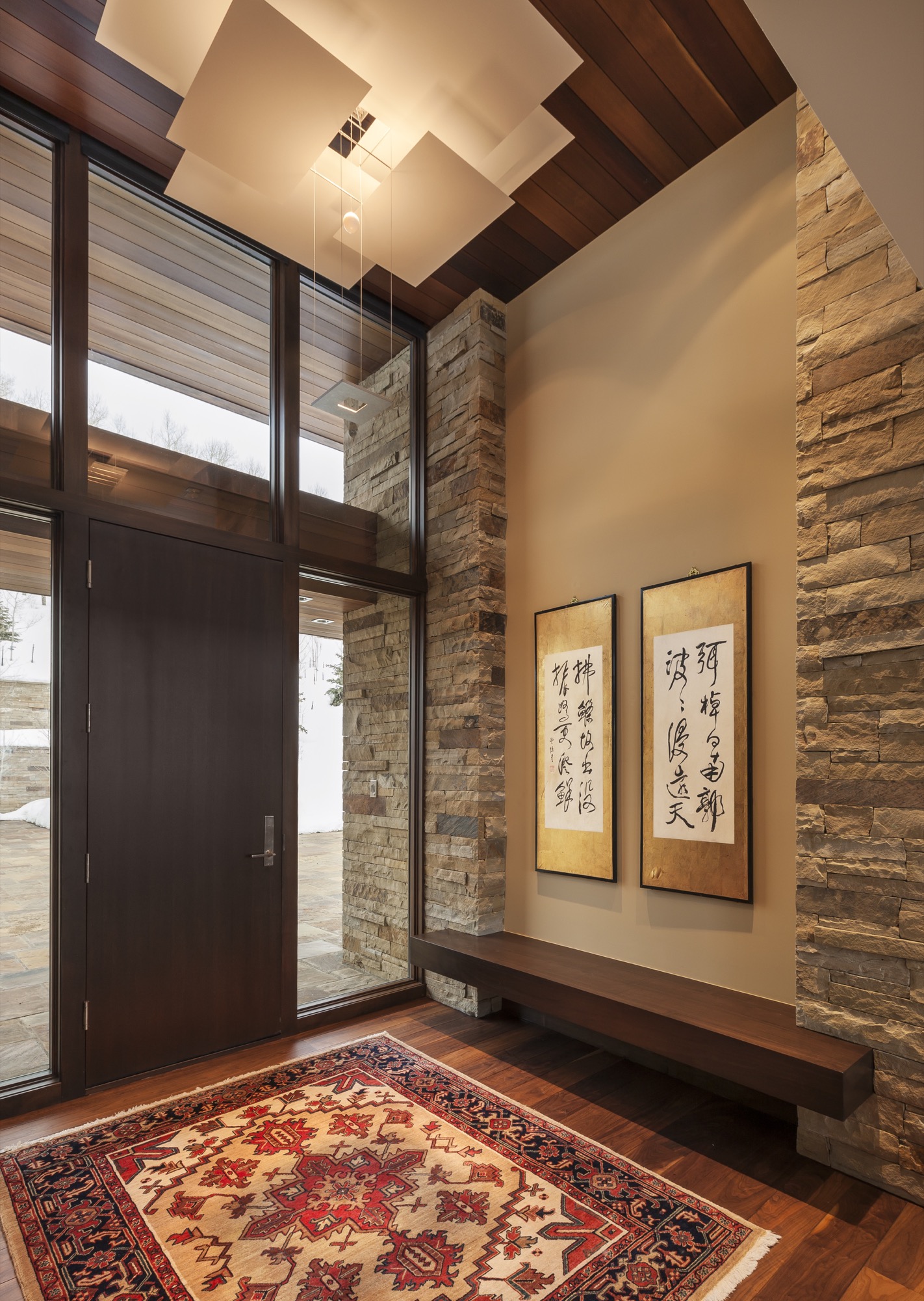
Every day for two years, up to ten stone masons worked onsite, hand-cutting and fitting hundreds of tons of stone brought in from Arkansas. “It really was a labor of love,” says Judy. “Three or four of them had been here the whole time, and they ended up being like family members.”
Adds Stinson: “All of us had such respect for each other, and for the site and materials, and a gratitude for the builders and artisans and their great workmanship.”
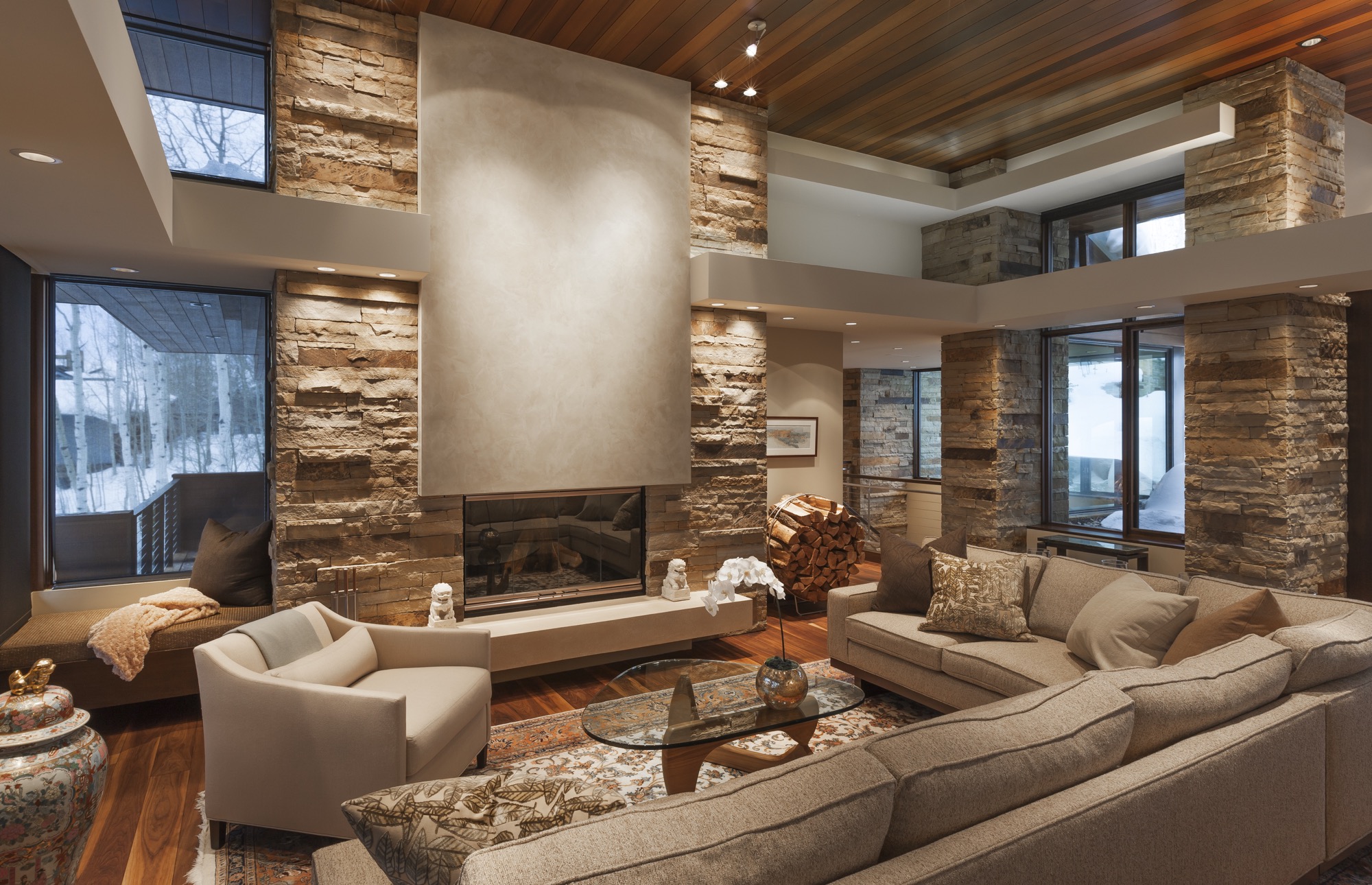
Of the hill
Constructed by Mark Fox of Fox Hunt & Partners, the 7,200 square-foot (669 square-meter) home sits on seven acres adjacent to thirty acres of open space to the south and east and borders the White River National Forest. Frank Lloyd Wright often spoke about building on the edge of the forest to achieve a sense of shelter.
The house is tucked into the steep mountainside to block the cold winds from the north. The south-facing indoor and outdoor living spaces reap warmth from the sun year round. Wrapping around the back of the house, the 125-foot upper deck over- looks the pool patio down below, providing covered and uncovered gathering spots. The resulting microclimates provide a comfortable place to sit outside, here or there, upstairs or downstairs, snow or shine.
Following Frank Lloyd Wright’s credo of not building on the hill but of the hill, the house is sited to descend down from an expansive flagstone auto court. “You literally feel more grounded with your environment,” Bob says. “The house would have felt completely different sitting up there.” Now, the home’s horizontal lines follow the horizontal ridge above.
“No house should ever be on a hill or on anything. It should be of the hill. Belonging to it. Hill and house should live together, each happier for the other.” — Frank Lloyd Wright
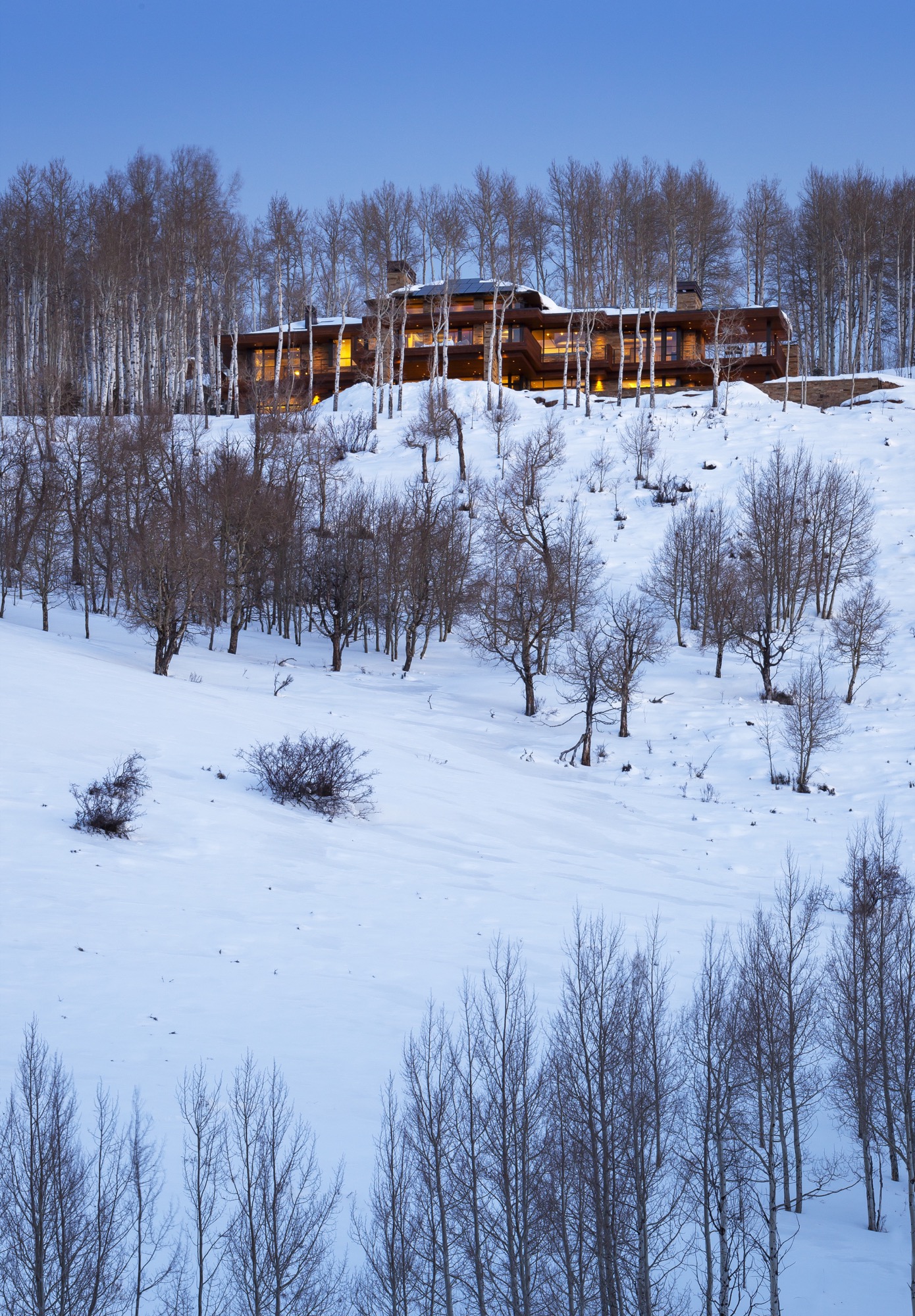
Mature aspen trees surrounding the house provide the Wrightian sense of protection and privacy at the forest’s edge.
The welcoming native Midwesterners share their land with Colorado wildlife. Mornings and evenings, deer trot along their natural path, which traverses the property. A pair of foxes likes to hang out by the pool. Because of the down-sloping landscape, birds of prey hover at eye level. “We look out and there will be this huge red-tailed hawk, just stationary, with his landing gear out,” Bob describes. “It’s amazing to watch them at eye level. Usually you only get to see these birds high up in the sky.”
Building into the side of the mountain made figuring out the approach to the house “very challenging,” according to Stinson. “We studied the grades from both directions, and Bob said, ‘Let’s flip the house around.’ It actually worked out better.” The transition from the driveway to the house, which descends down the mountain, now provides an intentional experience. The architect and his clients even climbed on a ladder before siting the house to see the views from where the main level would be. “We wanted to take advantage of a sequence of experiences, so when you are coming into the site up above, you have a glimpse of what the view is going to be,” Stinson says. “The view disappears when you are in the auto court, which is surrounded with nature—so the uphill side is a grounding experience. Then you walk into the house, and boom, the big views let the spirit soar. You see so far and down the valley that you needed that balance of shelter and release.”
Elevated living from the inside to the outside
Inside, the house offers a different experience and view corridor from nearly every room and angle. The elevated interior design reflects the warm colors and materials of the Rocky Mountains throughout.
The main level’s great room and hearth room truly maximize the expansive ski-slope views the owners hoped for. “I can’t tell you how much time we spent with the surveyor on the siting,” Bob says. “He had mapped out all the peaks and we’d literally stand with the footprint of the house, and we moved it three times before they dug the foundation.” The luxury of time and attention to detail once again paid off. “We’ll get ready to go skiing and put the local news on to see about the conditions, and I sit here and have my coffee and say, ‘Well, I can just look at the actual slopes.”
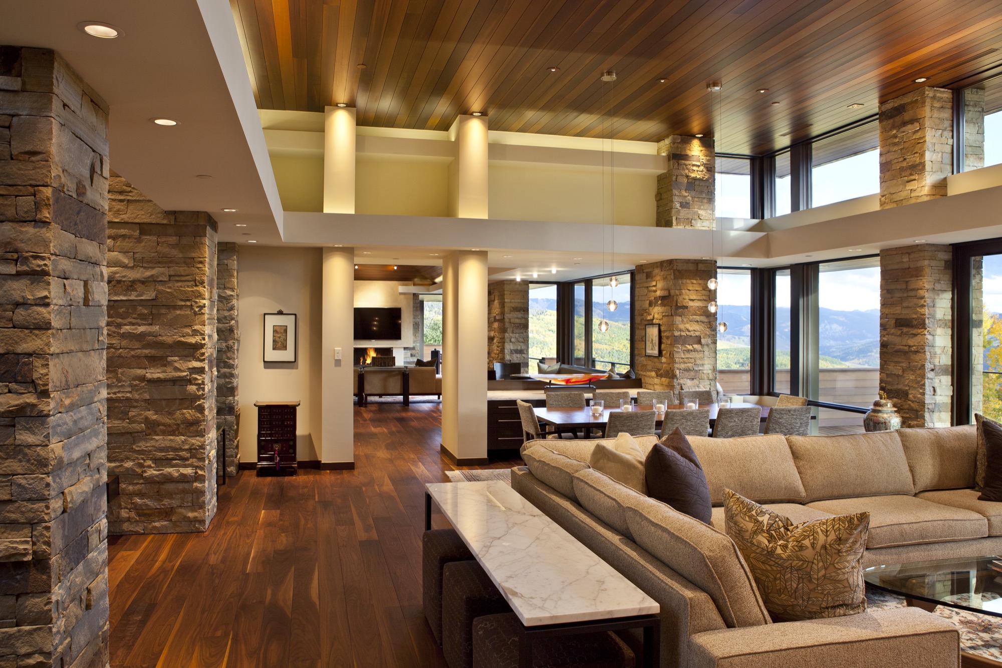
The overhangs of the roof above the main level’s south-facing windows provide architectural drama but are also part of the house’s passive solar design. “In winter, when the sun is low in the sky, the warming sunlight goes all the way to the back wall, whereas in the summer, when the sun is higher, you get a little bit of morning sun, but then it’s blocked,” Bob says. “We didn’t turn on the air conditioning at all last summer.” Roof solar panels already provided one-third of the electricity, and with the recent purchase of 100 more panels on a solar farm sixty-five miles away in Carbondale, Colorado, all the house’s electricity now comes from solar power.
Entertaining dinner guests and hosting out-of-town friends and family are an essential part of Bob and Judy’s new mountain lifestyle, now that they no longer work “crazy hours” in the city. Thus, Stinson designed the main level for the couple to live and entertain dinner guests. A floating buffet visually separates the dining room and breakfast room while maintaining an open flow so guests at both tables feel connected.
Overnight visitors are known to call the lower level “Bob and Judy’s retreat and spa.” Indeed, guests have their private quarters downstairs, with intimate suites named after the respective resort in view and decorated with vintage ski posters mirroring the very scenery outside the window.
The window seats in the downstairs living room, in fact, are Judy’s favorite spot in the house, as she says the ski slopes look even closer from down here. The communal space with an open kitchen opens up to the sweeping pool patio with an outdoor dining area in the center, a hot tub on one side, and another outdoor fire pit off to the other side, where the family loves to roast s’mores at night.
Integrated into the guest wing are also a massage room, an exercise room, and an exquisitely curated wine cellar. The opposite side of the lower level has a bunk room, where Bob and Judy’s nieces and nephews like to hang out when they come on vacation and occasionally bring along friends.
Beneath the garage and a concrete ceiling are Bob’s pride and joy: a movie theater with Whisper Walls and a high-end listening room that boasts a pair of enormous Genesis 1 speakers. Still, the window-less über-impressive “cool area for the loud things” (as Stinson calls the two rooms) are not where Bob spends most of his time. He likes to sit on the lower deck, looking out over the large saline pool and the ski slopes just beyond. This is, after all, his dream come true. △
At the request of Bob and Judy, we are not publishing their last name or identifiable details about their mountain home's location.
Villas in the Trees
Thailand's enchanted Keemala Resort — architecture hidden in the woodlands
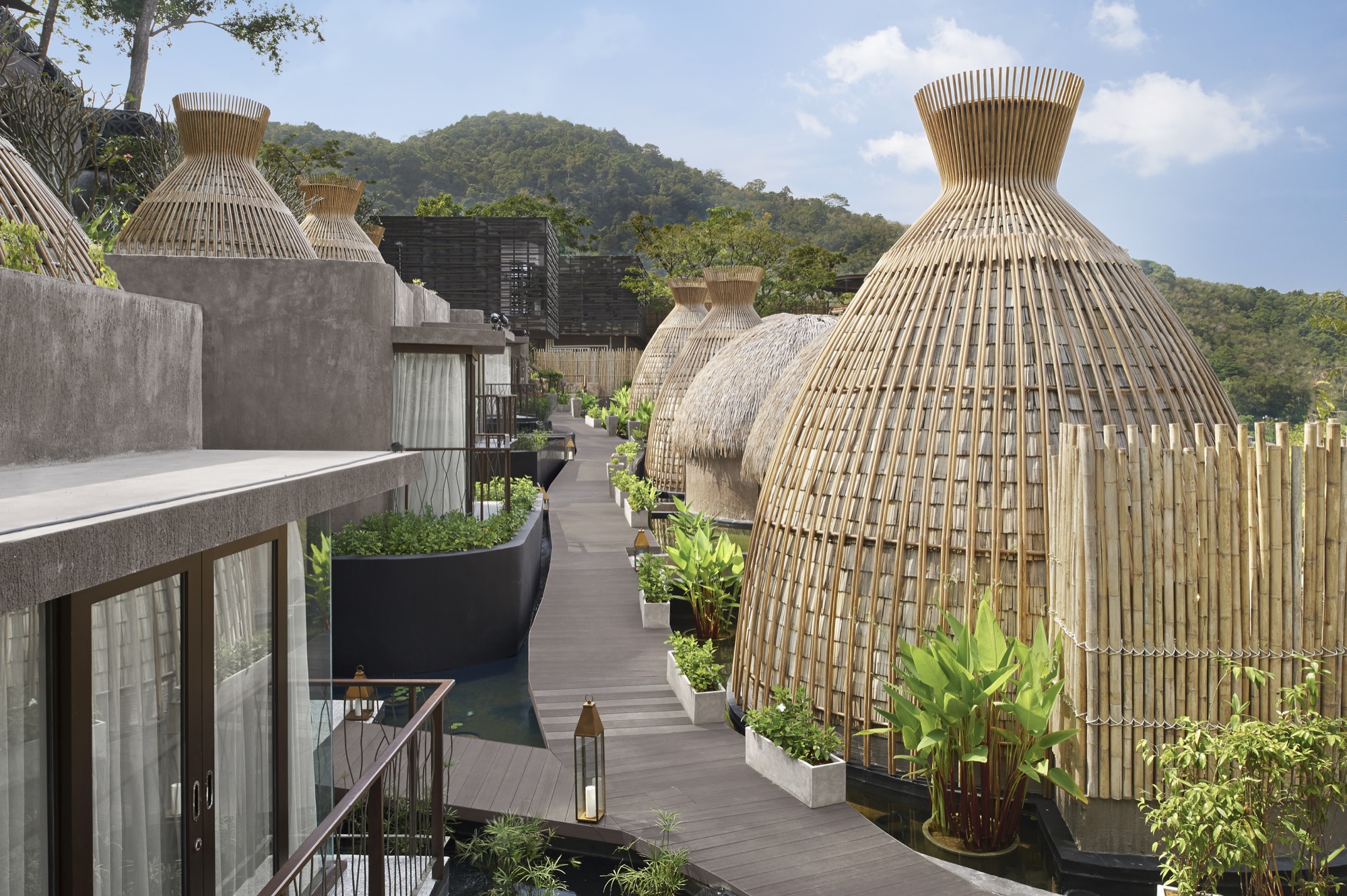
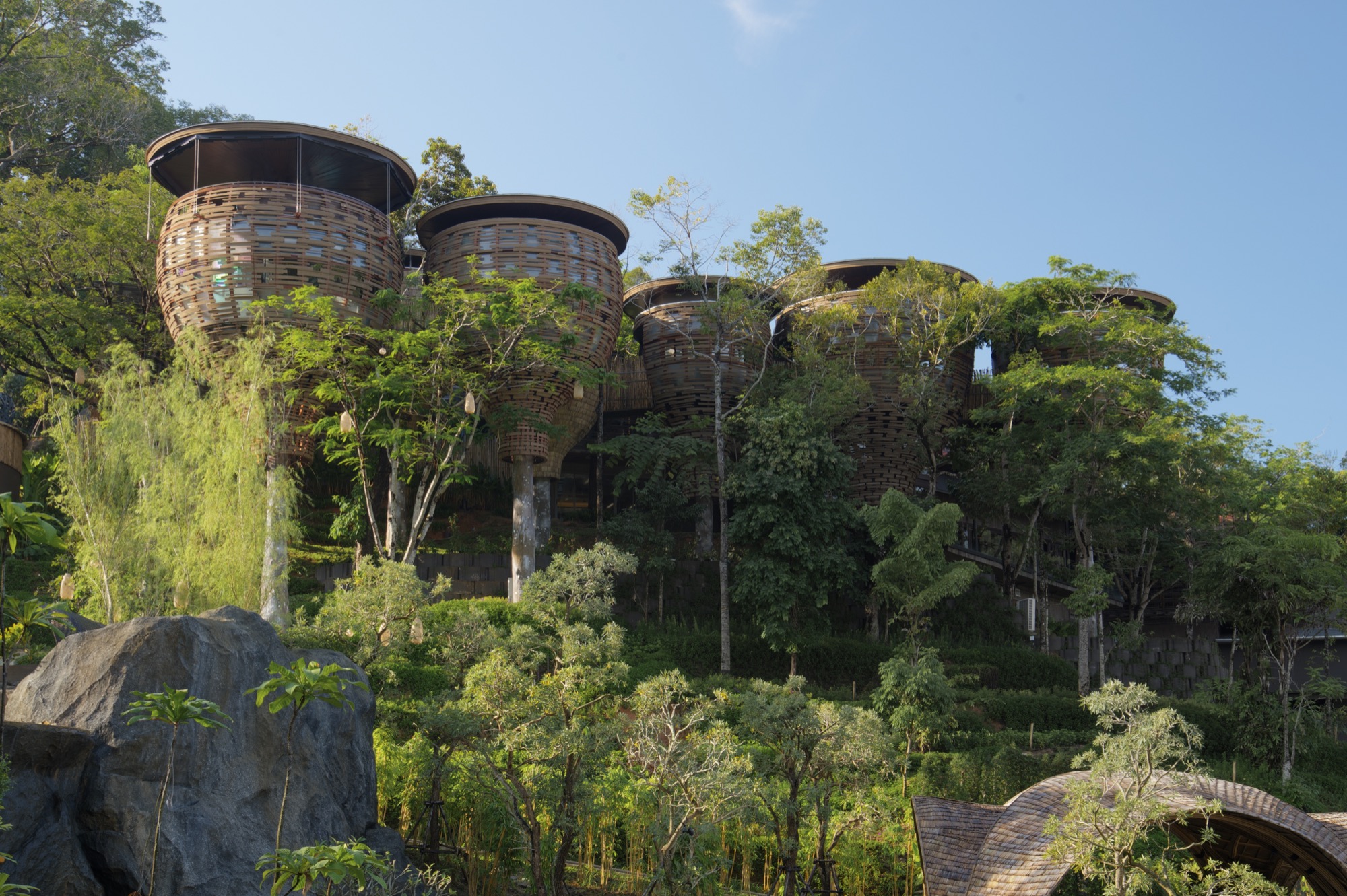
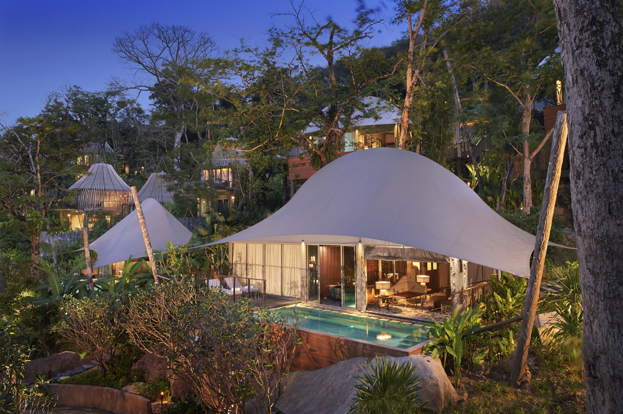
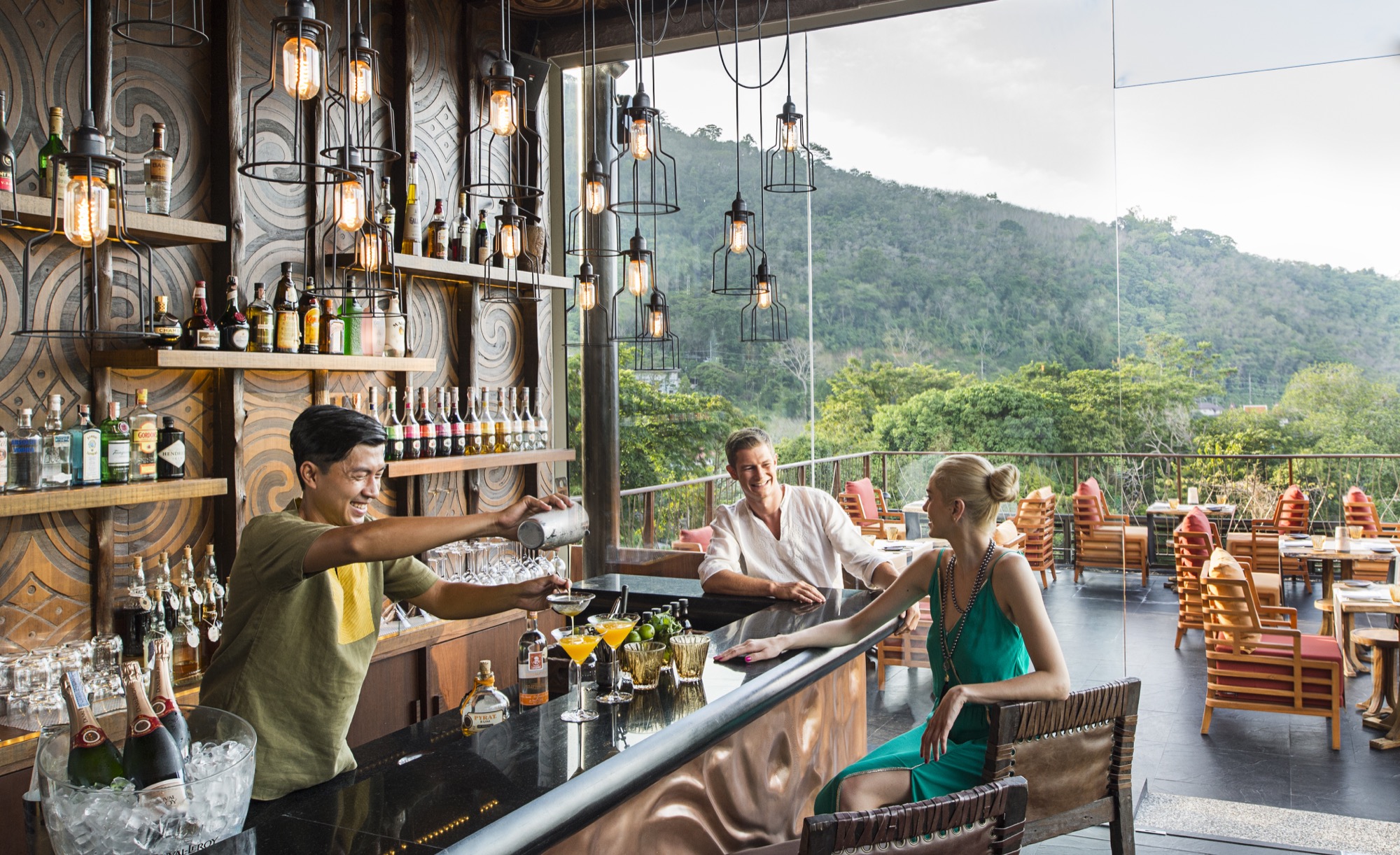
Keemala Resort on Thailand's mountainous island of Phuket features four different villa styles, pods, and pool houses by Bangkok-based Space Architects, with interior design by Pisud Design Company.
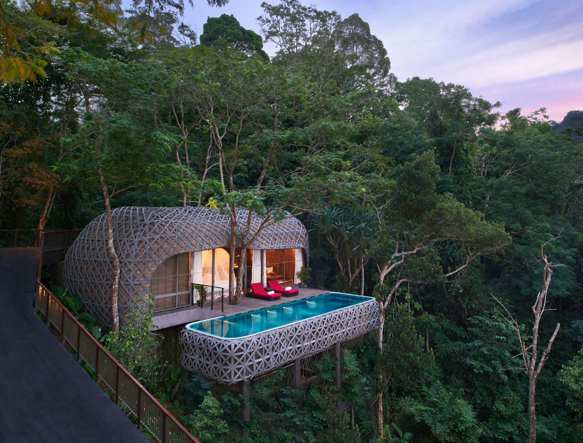
Overlooking and the Andaman Sea, Keemala harnesses the history of fictitious ancient Phuket settlers and incorporates the story of four different clans within the resort. The architecture of the four different villa types reflects the skills and way of life of each of the groups. Keemala and its grounds are designed as an expansion of the surrounding landscape, making use of natural features such as mature trees, streams and waterfalls and integrating these into the overall design.
Naked Naust
A dramatic cabin by Swedish architect Erik Kolman Janouch on Norway's wild Vega Island
Inspired by Norway’s traditional boathouses, Swedish architect Erik Kolman Janouch plants a cottage into Vega Island’s barren landscape—its design so minimal, it becomes dramatic.
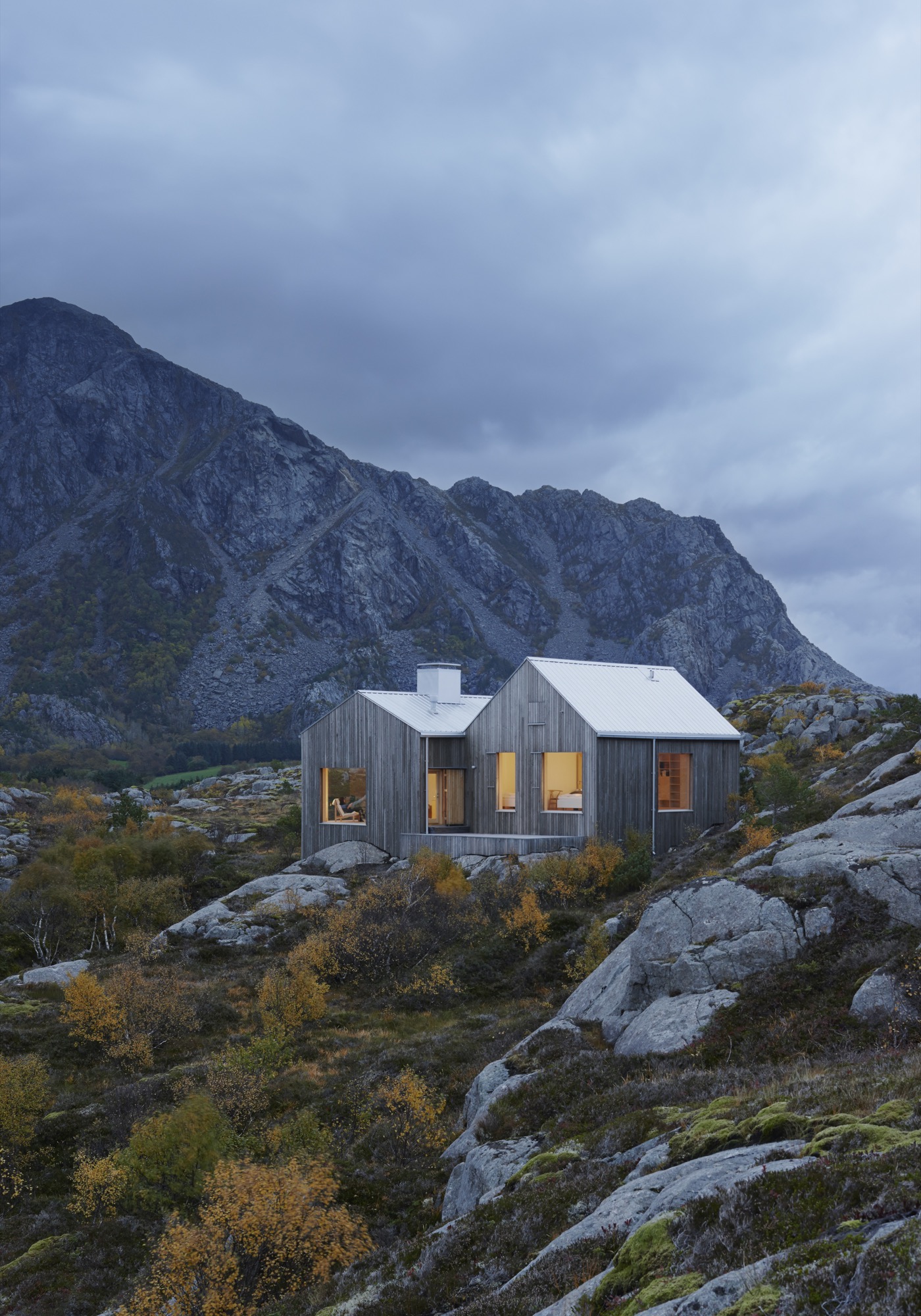
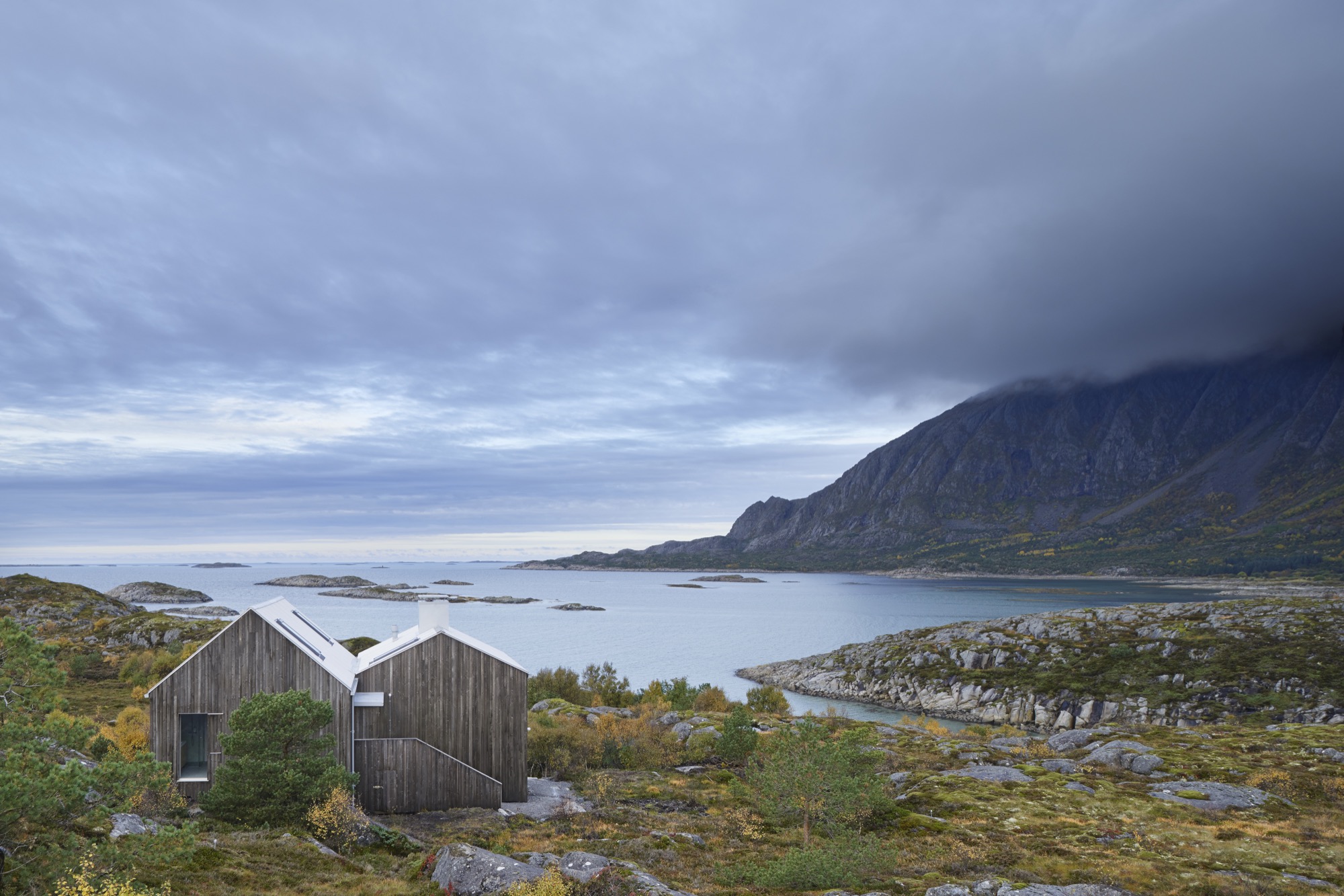
“It’s basically just two ordinary pitched roofs,” architect Erik Kolman Janouch describes the Vega Cottage on the namesake Norwegian island. But the simple elegance of this small wooden cottage that blends so perfectly with its wild and forbidding landscape is, in itself, spectacular—not to mention the boldness and care in siting it there. What’s more, it is exactly what could be expected in this coastal region of Norway.
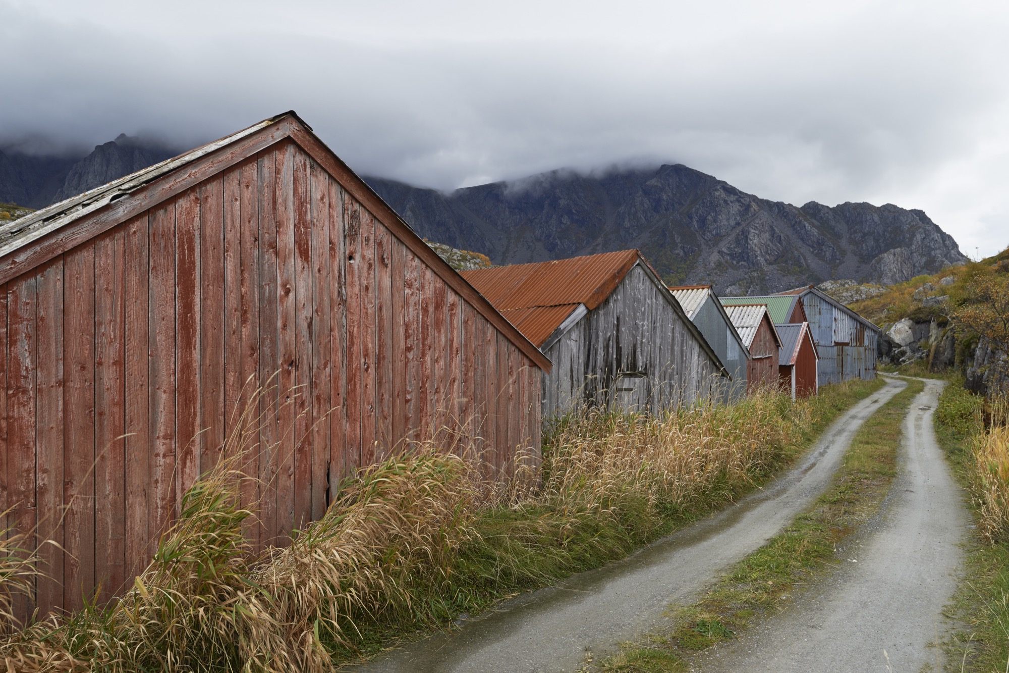
Not far from the house, by the seashore, stand a few of the colorful traditional boathouses—naust—found throughout Norway’s long Atlantic coast. With origins in the Viking era, this building type has withstood the test of time and weather with the island’s extremely rough climate. So, looking for another architectural typology for the Vega Cottage seemed like a futile enterprise for its Swedish architect of Kolman Boye Architects in Stockholm.
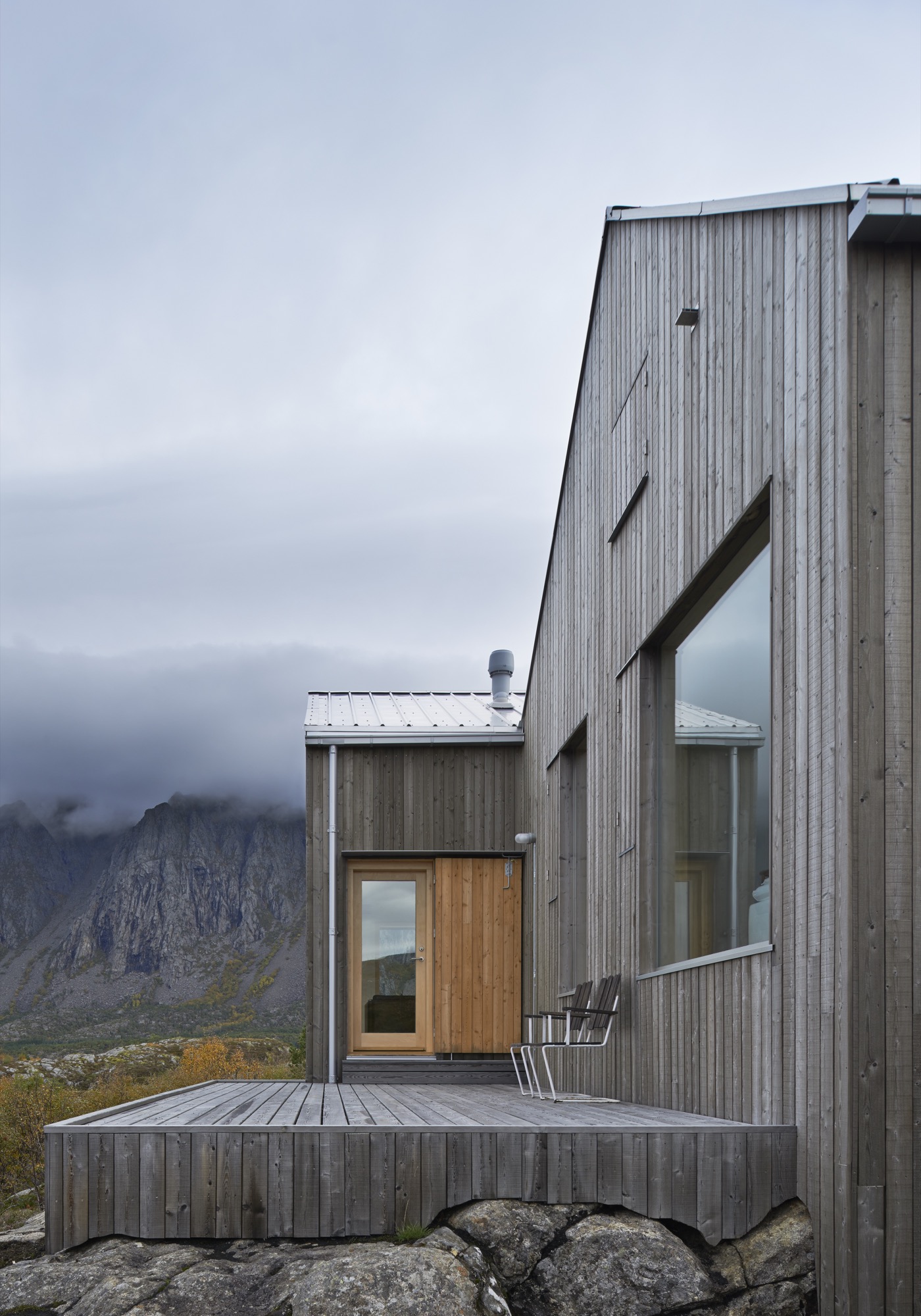
Casual observers might also miss the second most striking architectural feature of the Vega Cottage—its windows. At first, the house’s windows might appear like ordinary rectangular openings in a wall, covered with glass. But that’s just scale and perspective playing tricks, since the barren landscape of Vega Island offers little else of human scale for comparison. Standing directly in front of the house—where one’s cheeks quickly turn rosy from the cold Atlantic wind—an adult visitor can stand head to toe in the huge windows and absorb the majestic landscape. Buffeted by the wind and swept away with the dramatic views, one realizes that the windows are what this house is all about. They showcase the grandeur of the island.
"The windows are what this house is all about. They showcase the grandeur of the island."
A Place Apart
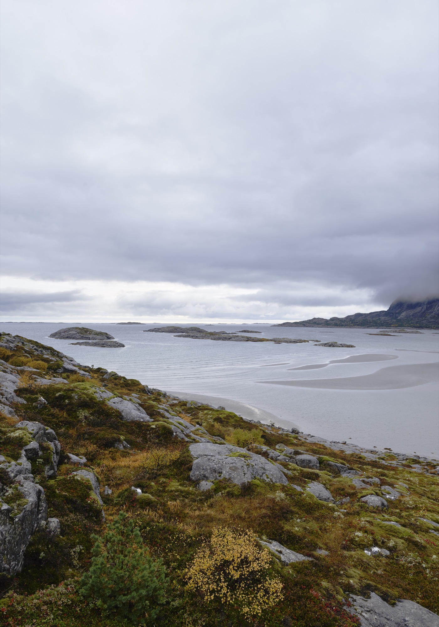
Vega is home to 1,200 people and lies roughly an hour by ferry out in the Atlantic from the tiny city of Brøn- nøysund on the west coast of Norway, just south of the Arctic Circle. The cottage’s site is not much more than a farmstead, marked on the map as Eidem.
This is where the man who commissioned this house, Norwegian theatre director Alexander Mørk-Eidem, has his roots. Born on the island, he has lived most of his life on the mainland, and for the past ten years in Stockholm, Sweden. That is also where he met the architect. He approached Kolman with his idea for a country house or a cottage, commonly known in Norway as a hytte. A small and simple residence in the countryside where you go on weekends and during vacations to relax and enjoy nature... something with which Norwegians, blessed with a country of stunningly beautiful mountains and fjords, seem to be obsessed.
The end of the world, as Vega feels, seems like the obvious place for a director of the stage to seek peace and quiet and to find inspiration. Mørk-Eidem jointly owns the house with his siblings, a brother and a sister who now live in London and Oslo. The house is intended as a place for solitary retreats, but also for family gatherings, since an uncle and cousins still live on Vega.
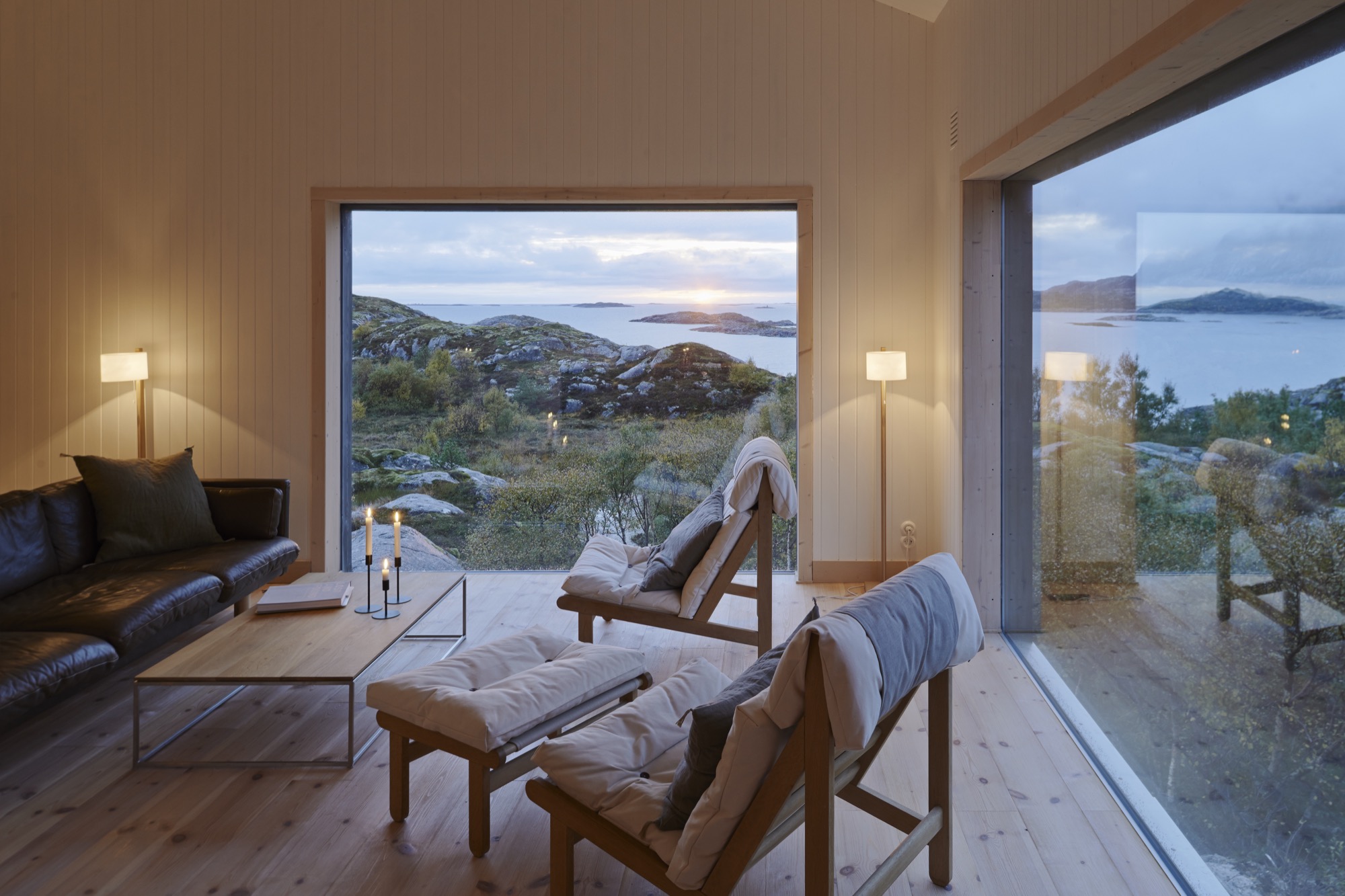
“Inside, the house is neutrally furnished to allow for nature to...” Mørk-Eidem starts to explain when I visited the house, only to get interrupted by his architect: “It’s like three paintings. There is no need to adorn the walls.”
The Cast of Characters
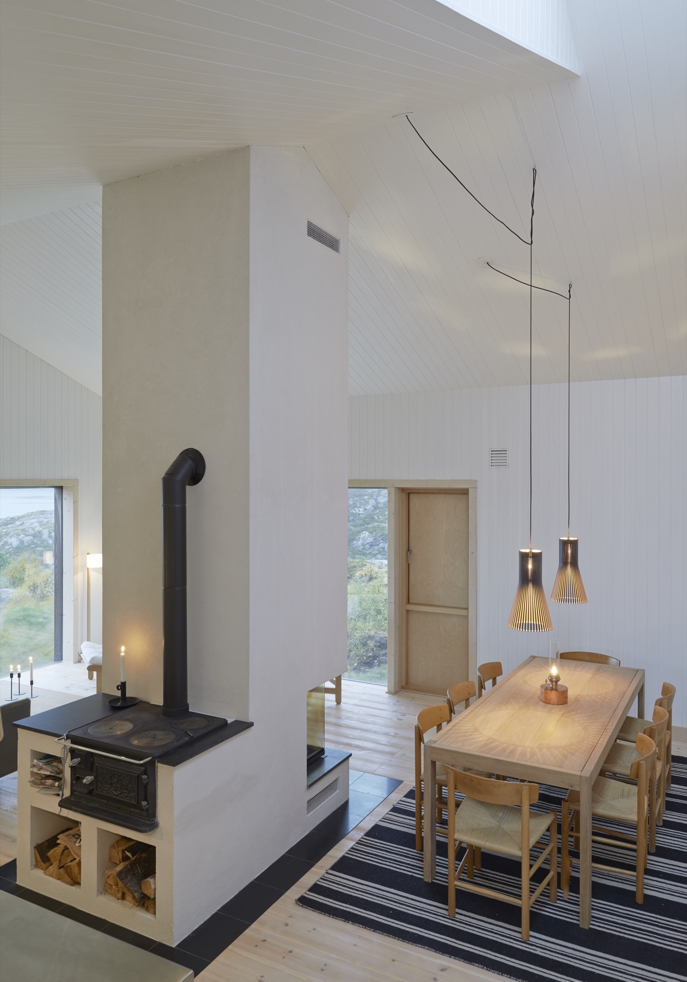
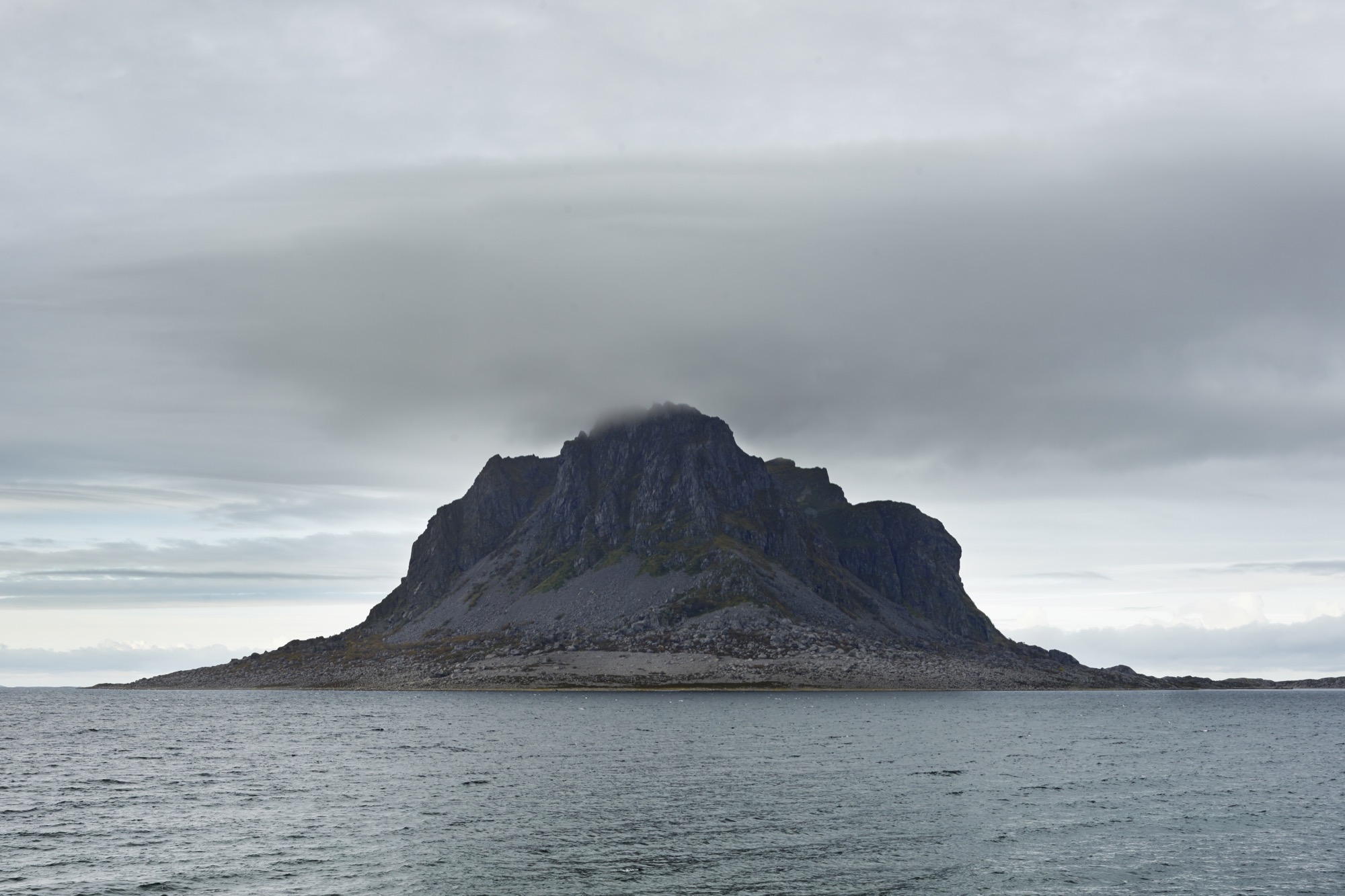
What they mean is that the house is built to be a minor character—the lead is reserved for the surrounding landscape. It doesn’t take a stage director to reach that conclusion. Trying to cast this drama in any other way would have been pointless. On the other side of the windows of the combined living and dining room lies the mighty Trollvasstind mountain, 800 meters (2,625 feet) high with a ridge that’s hidden behind milky white clouds. In the other direction the Atlantic Ocean and open sea stretch all the way to Labrador in Canada.
“What they mean is that the house is built to be a minor character—the lead is reserved for the surrounding landscape... Trying to cast this drama in any other way would have been pointless.”
Kolman recalls the first time he came to the island and the site, after having accepted the challenge of designing the house: “I went there in January, which is the worst time of year, weatherwise. It was pitch dark and freezing. Shockingly freezing, really. I wasn’t prepared for how harsh the climate would be.”
But nature can be kind on Vega, too. At milder times of the year, when the tide comes in during the day, the sand at the shoreline that had previously been heated by the sun warms the shallow water, allowing for some appreciated beach life. But the weather changes quickly here: from calm to a wind you can lean against in a matter of minutes. It is wise never to leave the house without the proper attire: mittens, Wellingtons, and a decent raincoat.
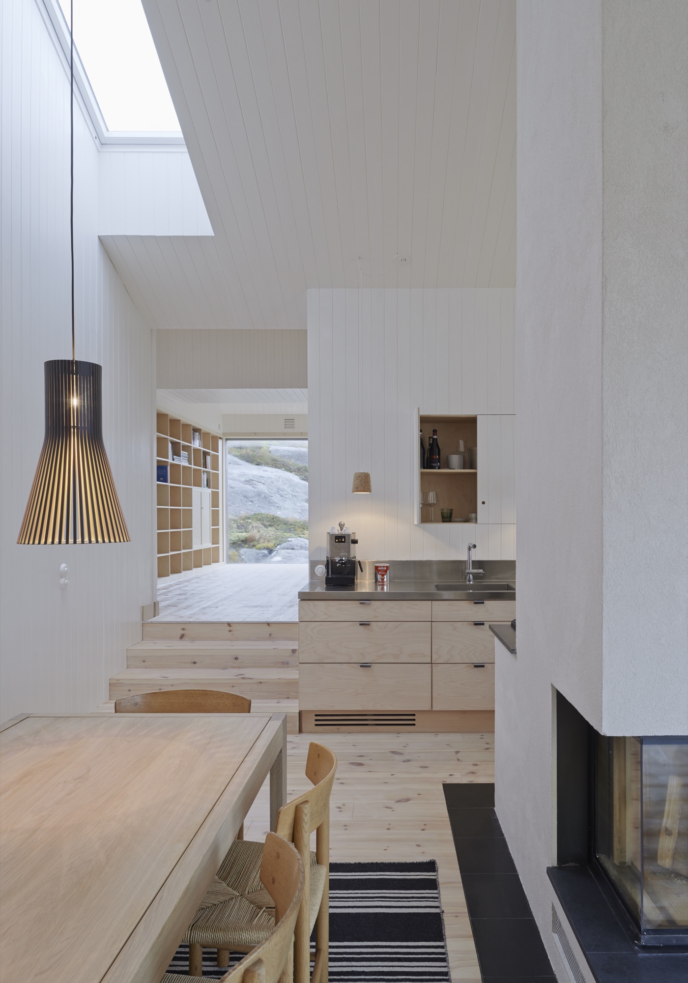
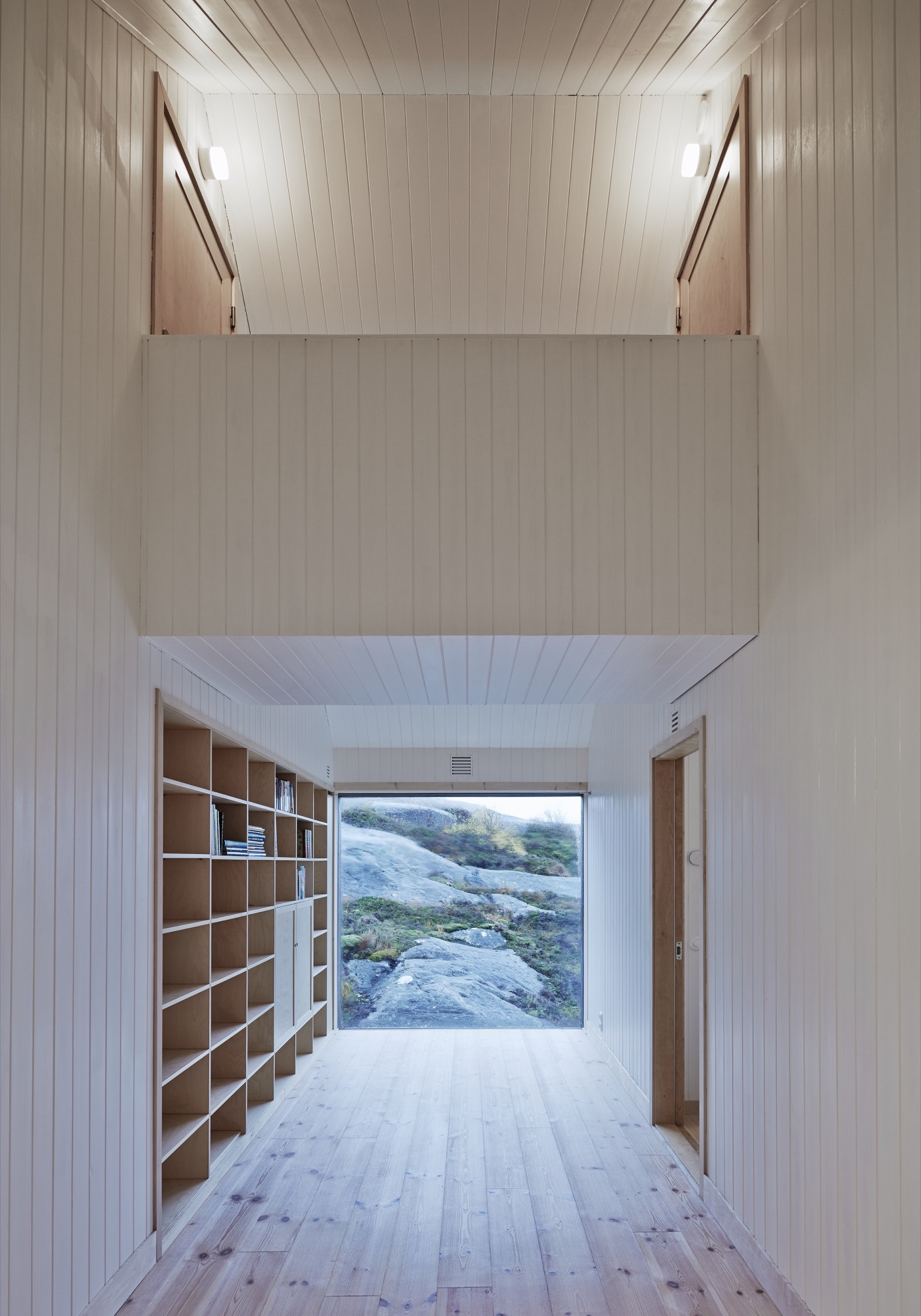
In contrast to the adventurous landscape and weather of Vega, the cottage interior is serene with a neutral color palette to enhance the tranquil atmosphere. Practically everything inside the house, from the walls to the bed linen, is white. The architect thinks it gives the house a hotel-like quality.
The Right Stuff
Kolman met his client through a mutual acquaintance in Stockholm. Mørk-Eidem had been looking for someone to build the house for quite some time. Realizing what a challenge it would be on this particular site, he pictured someone young, eager to take on the assignment for the experience, and Kolman fit the bill.
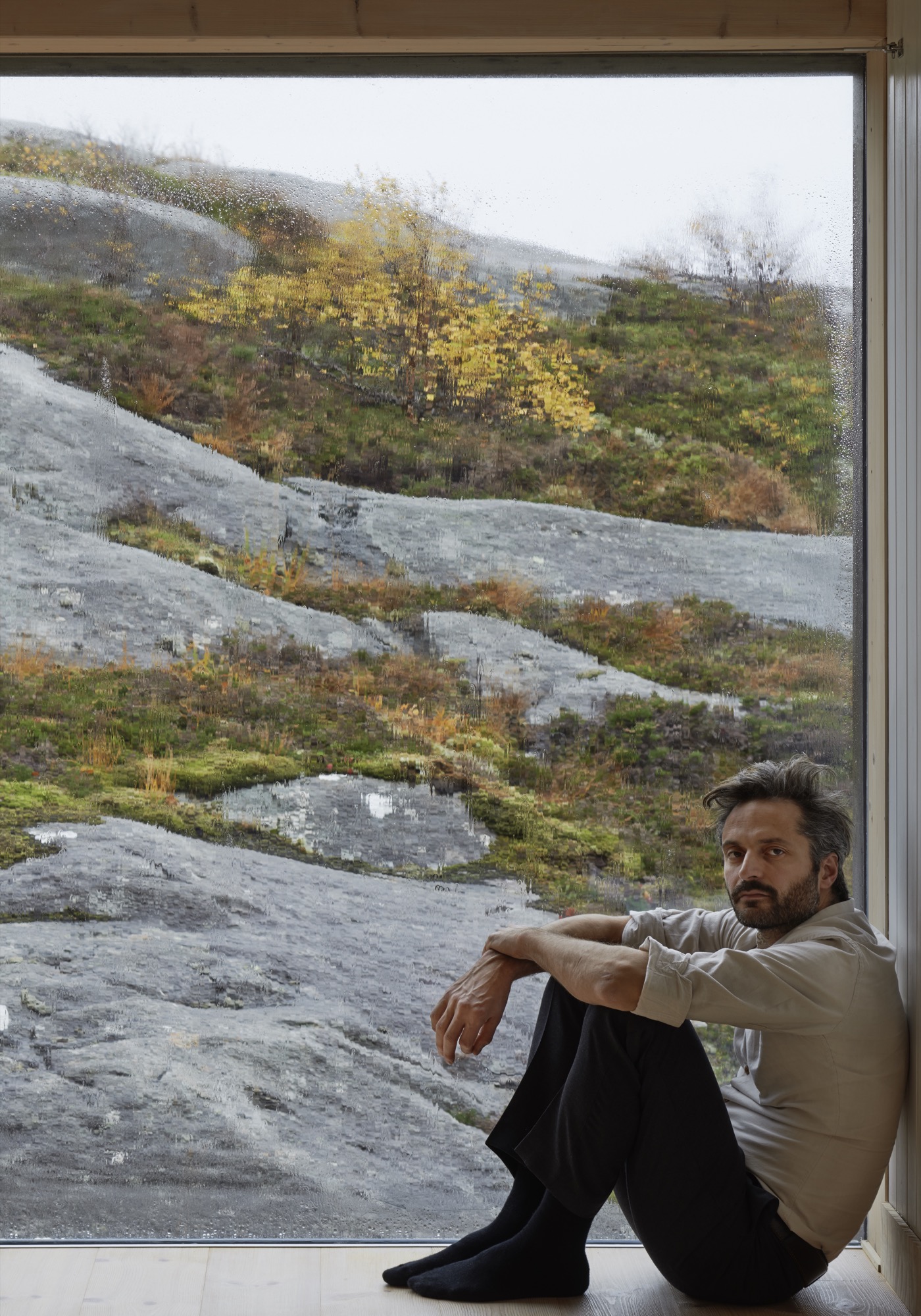
In addition to being one of the partners of Kolman Boye Architects, Kolman also runs a construction firm. A lucky combination since all the contractors Mørk-Eidem approached for a tender had simply refused to answer. “There was nobody who could see any joy in trying to do the impossible,” Mørk-Eidem explains.
Kolman proved to be different. In the Vega Cottage he saw nothing but an enticing challenge. Building the house on Vega was possible, but it took five years and twenty-three Stockholm-Vega round-trips by car for the architect. A total distance, he figures, that roughly equals a trip around the equator. True or not, one trip by car from Stockholm to Vega is long, time-consuming, and not very pleasant.
“It was really important to build the house without doing any damage to the landscape and to make it appear as if the house had always stood on this site,” Kolman says. “What fascinates most people who come here is that you get the feeling that it’s grown out of the bedrock.”
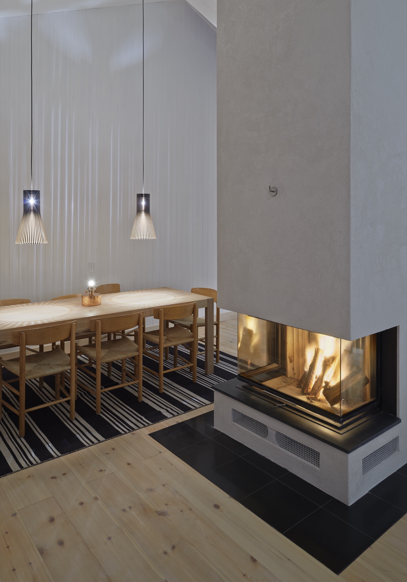
Building on the bedrock and being gentle with the landscape also made the construction difficult. A road had to be built to the site, and building material laboriously towed over the bedrock the house stands on—not to mention the efforts to transport and install the windows. The panes are 40 millimeters (1.57 inches) thick to withstand the storms and high winds that would shake and shatter thinner glass. Residents can enjoy the spectacle outside from a quiet, warm, and cozy house, cheered by the hearth that is the heart of the lower-level’s social area. “They’re not something you can break easily,” Kolman says about the windows. “In fact, you can jump on them and nothing will happen.” Staying at the Vega Cottage, I was glad the project was graced with such a persistent architect-builder—the landscape is beautiful, but I was happy to keep the elements of nature where they belong—on the other side of the glass.
“It was really important to build the house without doing any damage to the landscape and to make it appear as if the house has always stood on this site.”
Other than the pitched roof, this is a rather minimalistic house—or as Kolman says, “There is nothing that juts out, so there is nothing for the wind to grab on to.”
There is not even a railing around the terrace outside the lower level’s two bedrooms. “My sister wondered when they would be put in place,” Mørk-Eidem says. “They never will be,” he declares, adding, “This is a childproof house in the sense that nothing can be broken.”
If nothing can get broken, theoretically nothing will need to be fixed. To keep maintenance on the house to a minimum during holidays and vacations, Mørk-Eidem and his architect opted for weatherproof solutions for the house. At one stage in the project they considered black facades. But when I visited, a year after completion, the unpainted facades, which were only treated, already had their gray patina. Houses age fast on Vega.
“Houses age fast on Vega.”
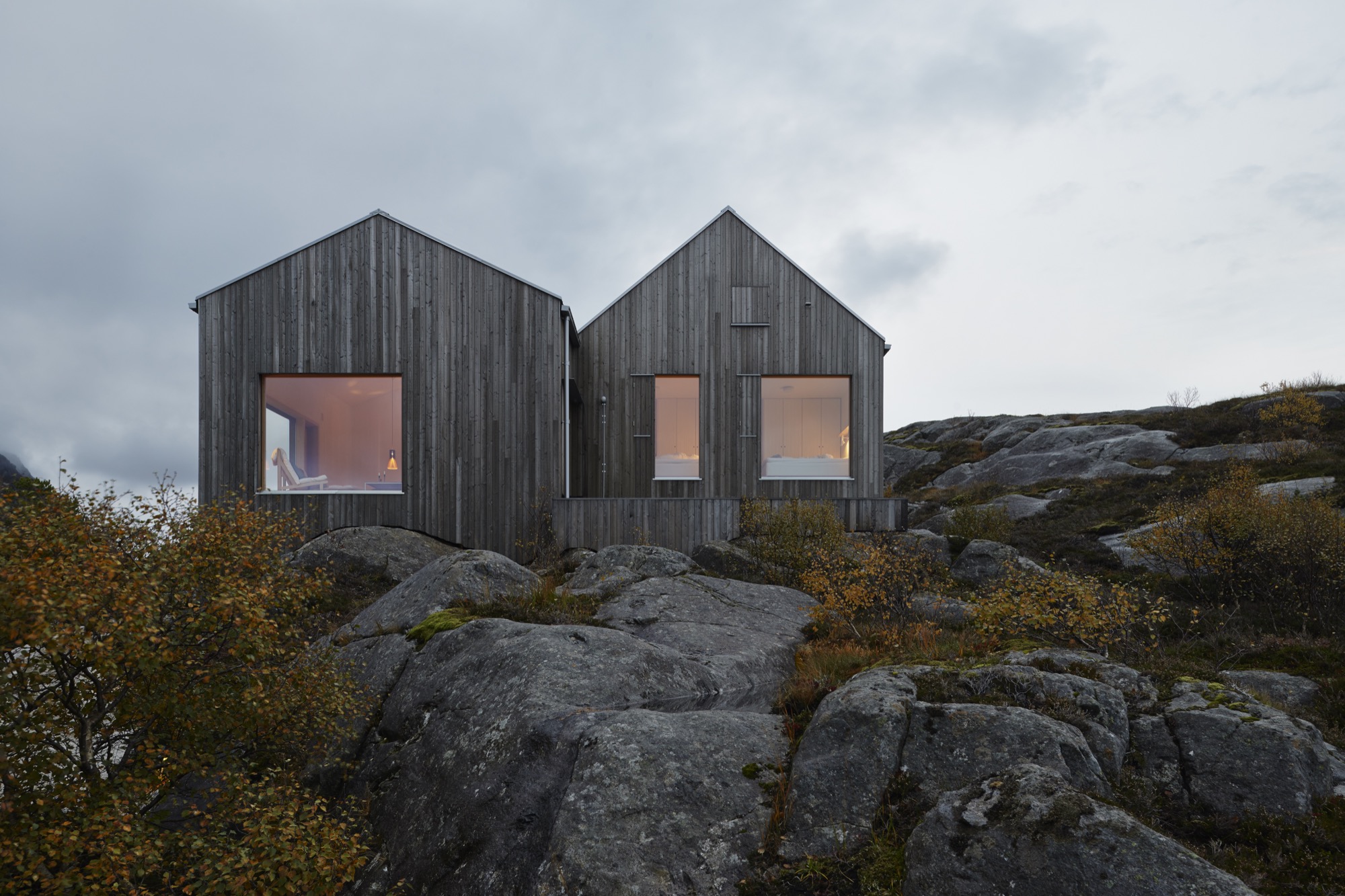
The cottage owes much to vernacular architecture, but the local building tradition has always emphasized protection from the elements of nature. The island’s old buildings, placed wherever there is shelter from the storms, all turn their backs to nature and to the extreme weather. “You get very unsentimental living out here,” Mørk-Eidem tells me. “You get used to this nature, and you look at it as a kind of antagonist.”
“You get very unsentimental living out here.”
He proceeds to tell how his father reacted when he first came to the house. As an adult, Mørk-Eidem senior moved to Oslo and hadn’t lived on the island for decades. “At first, he was suspicious,” Mørk-Eidem recalls, “because he’s never been used to sitting inside and just admiring the view. For him it was a really different experience to come to a place he knows so well but to see it from an entirely new perspective.”
Hearing that this outpost can give even natives new perspectives is a testament to the qualities of this house that makes the architect say, without the slightest hesitation, that he would gladly take on the logistical and psychological challenges of an assignment like this again. △
Fire / Wood
His Nordic German upbringing, traditional Swiss carpentry training, and the Bauhaus Manifesto deeply influence Canada-based designer and furniture-maker Nicolas Meyer as a craftsman and intellectual
Nicolas Meyer’s approach to design and craftsmanship is firmly anchored in his traditional Swiss training as a furniture maker and balanced with his Bauhaus-influenced intellect.
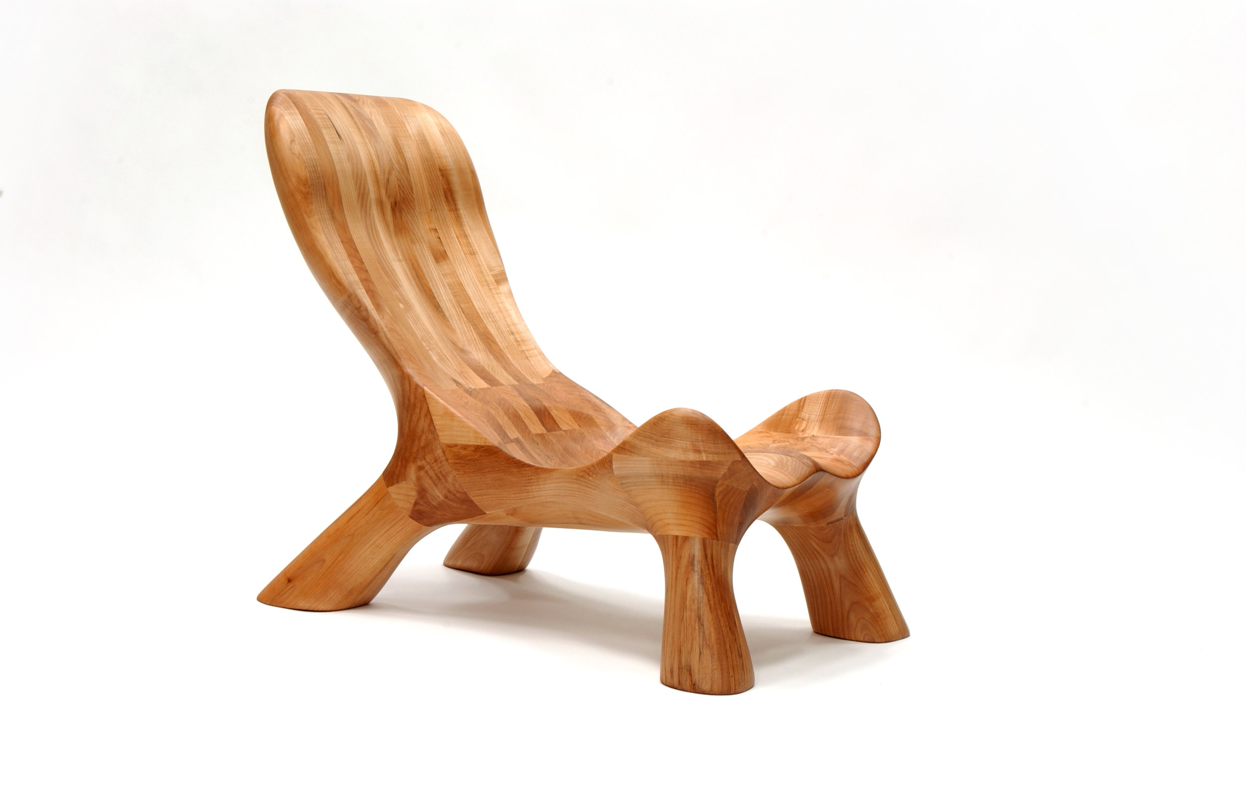
Nicolas Meyer is not one thing, not from one place. Born in Germany and raised in Switzerland, the multifaceted founder of Nico Spacecraft has put down roots as an artist, designer, woodworker, and furniture-maker in British Columbia, Canada.
A sincere dialogue about design and wood quickly reveals the man is at once both an intellectual and a craftsman. No surprise, he seeks balance in everything he does.
Meyer grew up in Hamburg, Northern Germany. With a real estate-developer father and an antique-collector mother, the boy was exposed to architecture, construction, and fine furniture throughout his childhood. The parents separated when he was ten, and he moved to Switzerland with his mother.
In 1991, Meyer lived in Vancouver for half a year to improve his English. He returned to Switzerland to complete a traditional four-year apprenticeship in furniture-making, which he finished a year early by virtue of prior education, excellent marks, and extraordinary talent. All this time, British Columbia remained on his mind.
The decision to return four years later to settle in Canada was spiritual as much as rational. “Things just feel right, and you find your place where you want to build your life,” Meyer reflects. Having spent the first ten years of his life in Hamburg, he was influenced by the ocean, water sports, the city’s harbor as “gate to the world,” the metropolitan lifestyle. In Switzerland, where he lived until age twenty-five, he later fell in love with the mountains and skiing. “Vancouver combines all of that. This is one of the few places where you can probably ski and kayak on the same day,” says the expat. “On top of that, this was my place. I grew up in this tension between Hamburg and Switzerland. As a kid who is constantly in between these two places, you wonder, what is your home.”
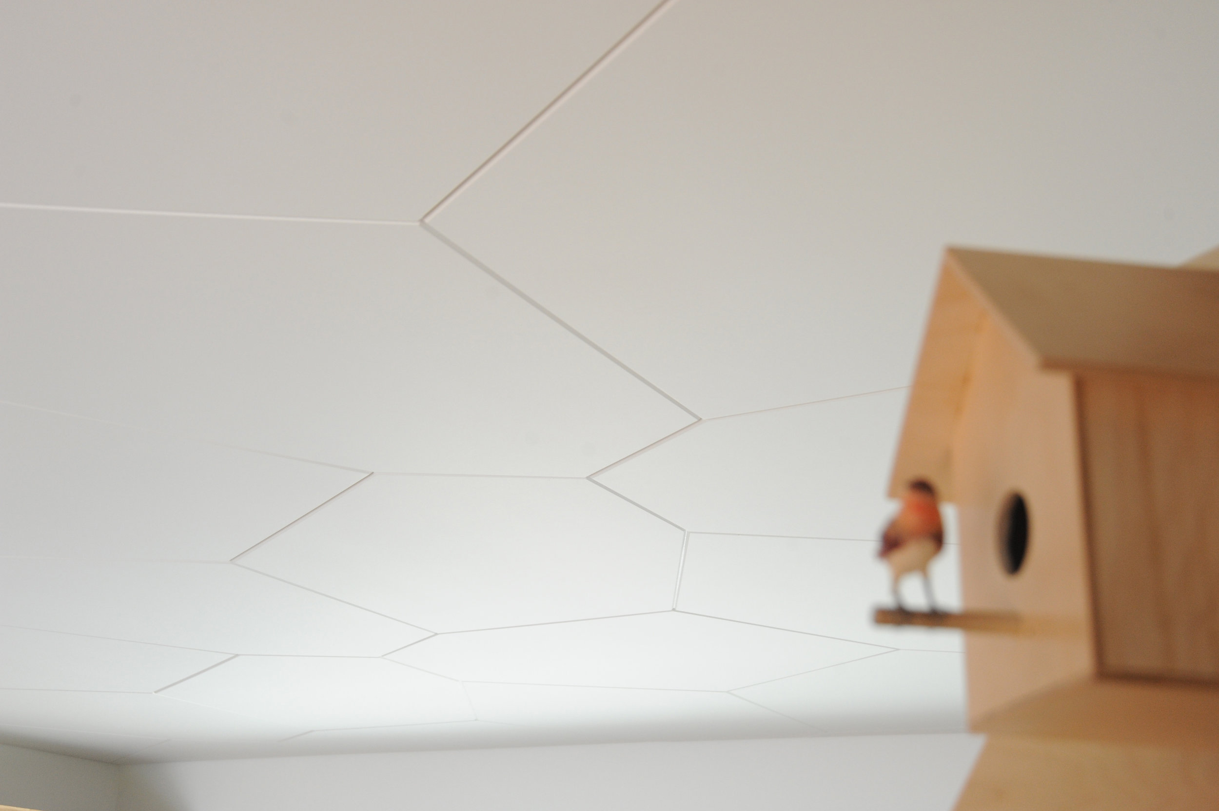
Today, Meyer is a designer, a woodworker, an artist—his creative drive the common thread. As child, he wanted to become an inventor, broke a lot of things, took them apart to understand them. In his later teens, he eventually began fixing things. “I also read a lot. I came to design and wanted to study architecture,” he says. He originally planned to study interior architecture in London after his apprenticeship in Switzerland. By that time, however, he’d already lost his heart to Vancouver. “I was too impatient and thought, I’ll go to Canada and find my way to design with what I have.”
His apprenticeship as well as the subsequent decision to practice, not study, were driven by his readings: the Bauhaus philosophy in particular—“Most of all, Walter Gropius and his manifesto, which expresses how the core of creativity can only come out of understanding a craft,” says Meyer.
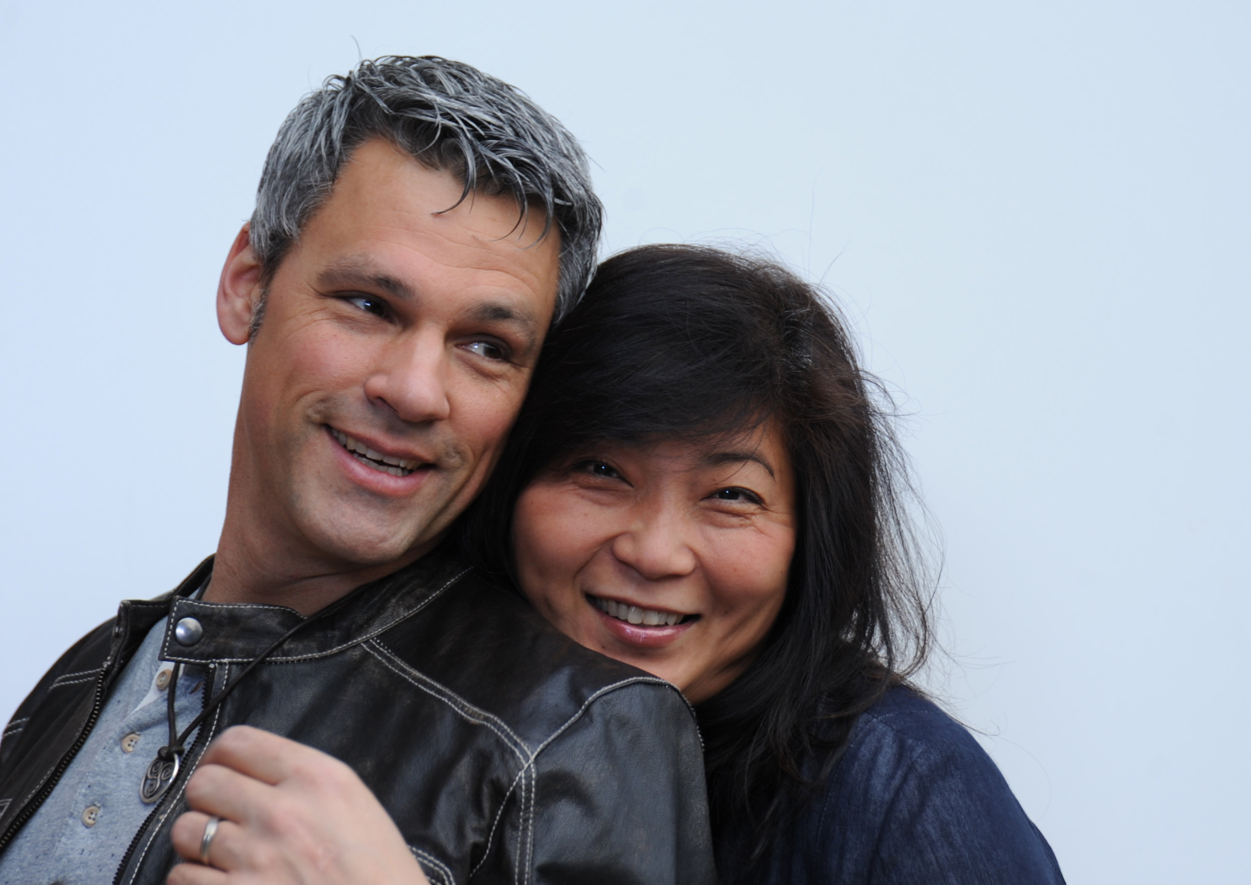
“For art is not a profession. There is no essential difference between the artist and the craftsman. The artist is an exalted craftsman.” — Walter Gropius, Bauhaus Manifesto, 1919
The Bauhaus Manifesto guides Meyer to this day, everyday. Together with his wife, Jess Meyer, he runs Nico Spacecraft, a small design studio with integrated wood workshop that produces kitchens and baths, furniture, custom spaces, and architectural elements. The company’s full-service design division has its own name: Baumhaus Atelier—presumably a nod both to Meyer’s enthusiasm for all things Bauhaus as well as to his passion for trees (Baumhaus is German for treehouse). “It’s about striking the balance between being in front of the computer screen or a sketchbook and actually being in the shop and working with materials,” he says. “When I spend too much time in the shop, building all the time, I itch to sit down and sketch out ideas, whereas when I’m in the office too much, I lose touch with the reality of structure, weight, and smell, and how things actually connect.” The creator admits he usually knows he has overextended himself at the drawing board when he starts designing things that don’t work in the real world.
“When I spend too much time in the shop, building all the time, I itch to sit down and sketch out ideas, whereas when I’m in the office too much, I lose touch with the reality of structure, weight, and smell, and how things actually connect.”
When the designer completely loses himself in the details—or, as he calls this foible, “taking the typical German-Swiss approach”—then his wife, who studied fashion design and now handles the company’s business side, provides the balance, telling him to take a step back. “When I get stuck, Jess looks at the entirety of the design perimeters and pulls my head out of my behind. We complete each other not just as life partners but also in our work.” Like her husband, Jess Meyer has called multiple places home before settling in Roberts Creek. She was born in Taiwan and brought up in Singapore and later in Tehran, Iran. The couple is raising their two children in the small beach town with a vibrant arts community on British Columbia's Sunshine Coast. Before, living in Vancouver had meant the parents missed out on all the babies’ firsts, which at the time the nanny got to experience in their place. Something needed to change. And after a one-year journey of searching for the right property, the Meyers found their home with five acres of land on which to built the shop and a garage they converted into the design studio. “Now we eat every meal together, and the kids come running to show their faces in the shop or in the office after school,” the father says.
The family also loves to travel together, often to Mexico or back to Europe. “I miss the mountains of Switzerland,” Meyer tells. “Aside from the skiing and the snow, the mountains provide me with tranquility. Sometimes, it helps to reconnect to your roots and the way you were raised.”
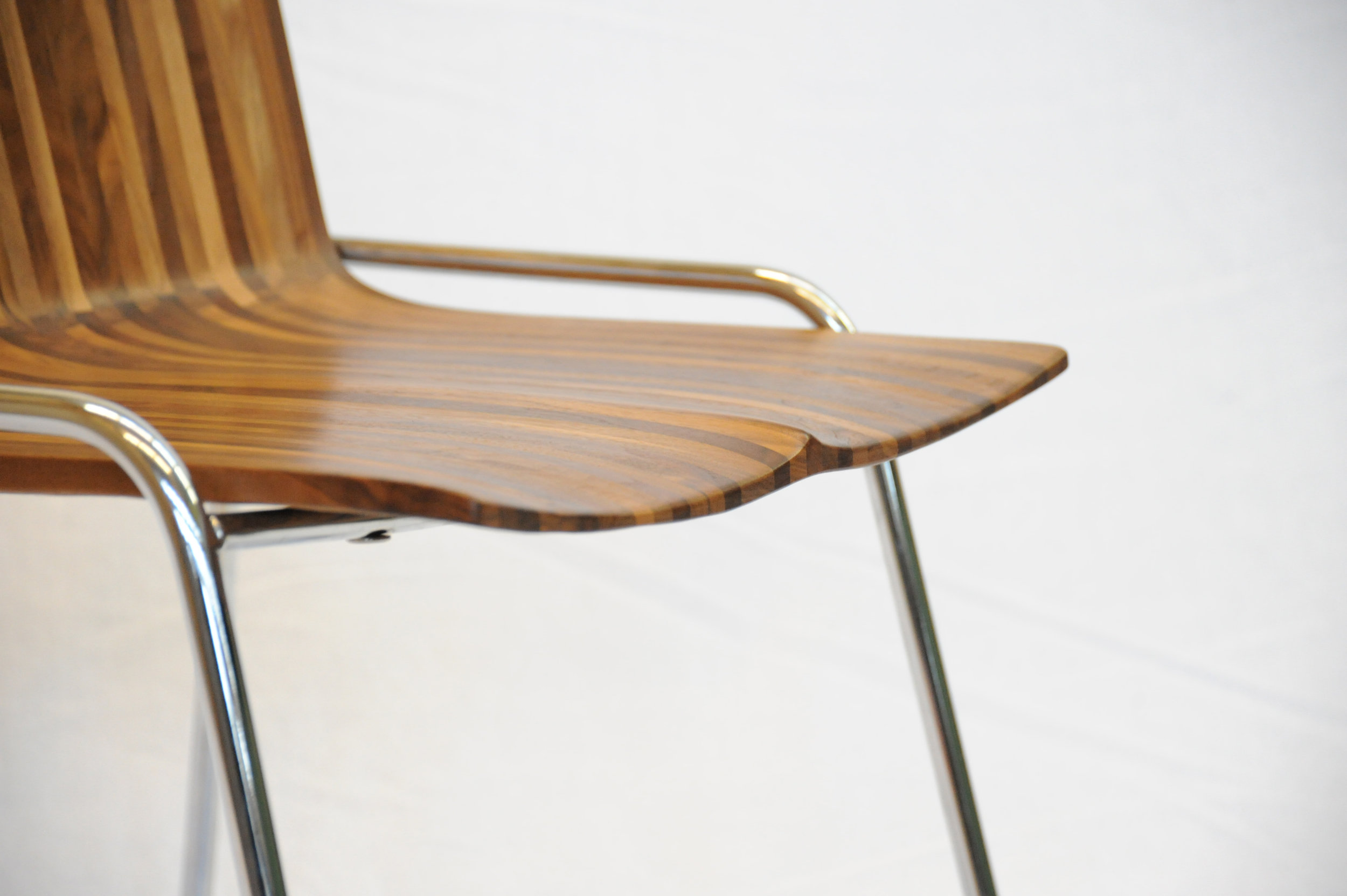
Wood Stock
“Look around, and it’s obvious—I love wood,” Meyer laughs. “Because you never really stop learning about it. Technically, when you cut down a tree, it’s dead. But wood itself continues living; it moves, it changes, it breathes, and you cannot apply any rigid rules, because no tree is like the other, and everything, everything influences its properties—where the tree grew, the minerals it fed into its system, the wind . . . If a tree sits in a wind corridor, it develops tensions on one side, and it can counterbalance these forces to find its equilibrium with the environment. All this is imprinted in the wood. Each piece you work with will react slightly differently. That teaches me humility.”
For all that, a wood whisperer he is not. Fellow woodworkers may profess driftwood, even a tree stump, speaks to them, revealing what it wants to become. The craftsmen are merely the tool. “I can respect that, but I am more intrigued by structure, structural integrity, and physics,” says Meyer. “Even a tree trunk never really inspires me to do anything. What I do want to do is cut this apart and reassemble it.” Meyer’s view of today’s common practice of kiln-drying wood is ambivalent. He understands the necessity of expediting the process and killing the creatures living inside the wood. In Switzerland, where he learned the craft, most wood is still naturally air-dried for many years, allowing the material to maintain its structural property. Meyer explains that “cooking” the wood extracts moisture at a speed that destroys the integral structure of the wood fibers, the cells collapse, and the wood becomes brittle. “I see these drawbacks when humans don’t work with the wood but force their will onto it because they have a schedule to keep, and they are pushing for high turnover, needing the cash flow.”
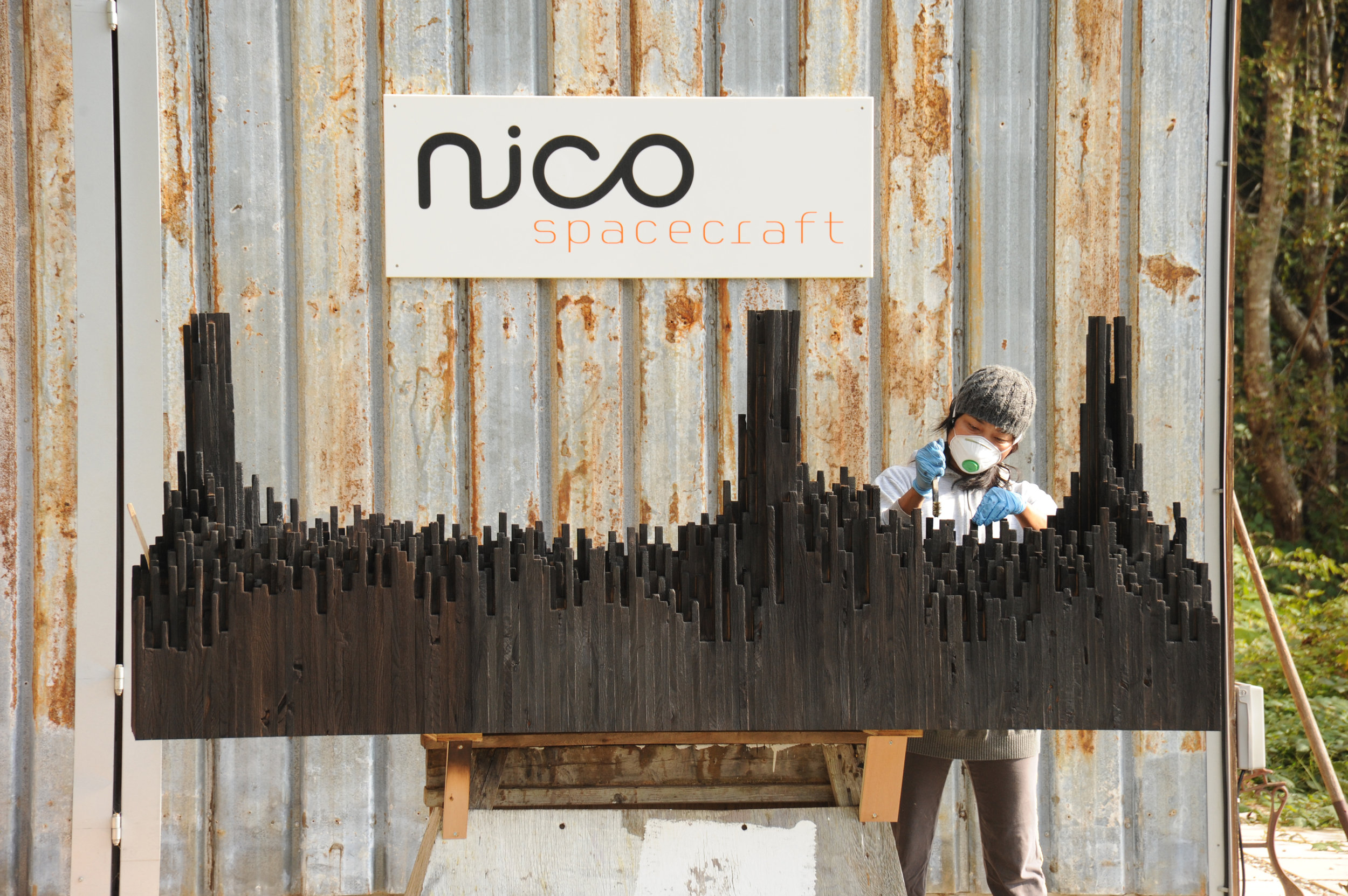
The advocate for responsible woodworking practices himself would prefer to exclusively use air-dried wood. “But it’s not feasible. It’s an ideology, and whenever I can, I do.” He also works with salvaged materials and appreciates a good story behind the wood—and so do his clients. For instance, “White oak is rare here on the West Coast,” Meyer begins a tale. “Ninety-some years ago, one of the first skippers planted this white oak tree here . . . ” Meanwhile, after splitting, the tree was deemed unsafe and destined for firewood. The community was in uproar about cutting down their heritage oak. Meyer and a miller friend arranged a crane, milled the wood, and air-dried it over the years, until a client emerged from Vancouver who appreciated the story and the historic value the tree represented.
Nordic-Swiss authenticity
His Hanseatic birthplace and Swiss training shaped not only Meyer’s design sensibility but also his work ethos, for better or worse. “When I first came to Canada, I was extremely rigid,” he reflects. His first gig was renovating a house—working out of a garage, with limited resources and tools. “In Switzerland, there is a machine for everything, and there is a way of doing everything. That’s how I was trained. But this rigidity of ‘This is how you do things, and there is no other way’ was initially hard for me to overcome.” In hindsight, that first Vancouver project taught him that there are many different practices. “That was a very valuable lesson I apply to this day and that has become an integral part of my approach. Once again, there is a fusion, a balance between the static world, the reality, and how you get to understand it. Only if I understand, I am suddenly able to discover all the different options of what this will allow me to do, and that’s where my creativity kicks in.”
“In Switzerland, there is a machine for everything, and there is a way of doing everything. That’s how I was trained. But this rigidity of ‘This is how you do things, and there is no other way’ was initially hard for me to overcome.”
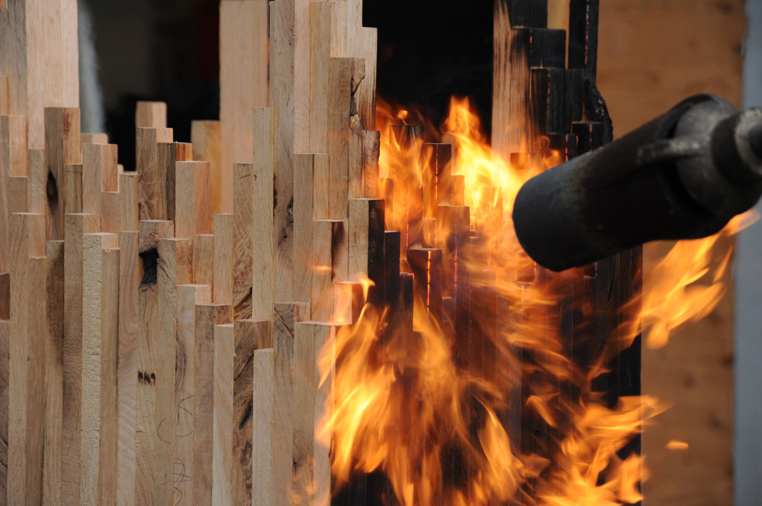
The designs of Nico Spacecraft are exquisitely modern. Sustainability is essential in everything the family-run company does, even their two-story workshop received a Green Design Award from the Canadian Wood Council in 2010. But what Meyer keeps touching upon in discussing his work is authenticity, his clients’ shared yearning to connect with what is real. “People are going back to the craftsmen, back to working with the designer, and being involved and understanding the story.”
“People are going back to the craftsmen, back to working with the designer, and being involved and understanding the story.”
Storied Pieces
Indeed, there is a story behind all of Meyer’s works and usually to the wood he’s using, too. Take the CurveChair, a piece of sculptural furniture—as well as a piece of art. For endless hours, Meyer carved the sensuous lounger by hand after a clay model he made. “That chair, in many ways, represents everything I am doing,” he says. “There is an organic process involved, there is a structural process involved, and we know where the wood came from, there is a story.” The wood came from a development site at Simon Fraser University and was made available to woodworkers of British Columbia to provide a design for an exhibition. “It was a marketing thing for them, because they had to take down quite a few trees at that site,” Meyer remarks. “One of them was this huge maple, so we got the maple wood and submitted this chair. It was on display at the Pendulum Gallery in downtown Vancouver for three months.”
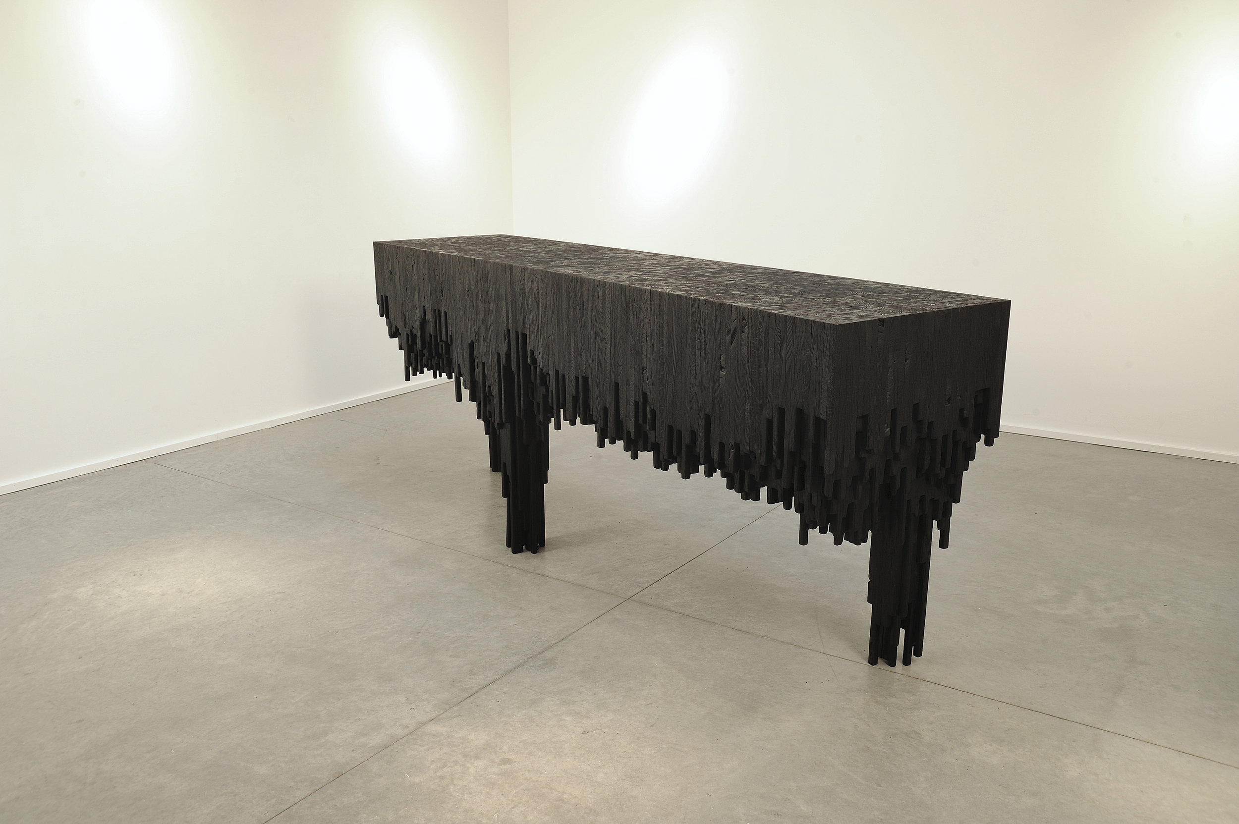
Meyer’s latest series—its cynosure a console table—is inspired by The Black Tusk, a stratovolcano and a pinnacle of rock at 2,319 meters (7,608 feet) above sea level near Whistler, British Columbia. “After a month of dynamics between Jess and me, we ended up with the Black Tusk console,” Meyer says. Individual solid sticks of oak wood were laminated to create different shapes, giving each a sculptural character. The assembled piece was then charred by flames, wire-brushed, and coated with oil. “It struck a nerve with people—and with me, because, again, there are the two elements I en- joy, a balance between art and then the design and craft.”
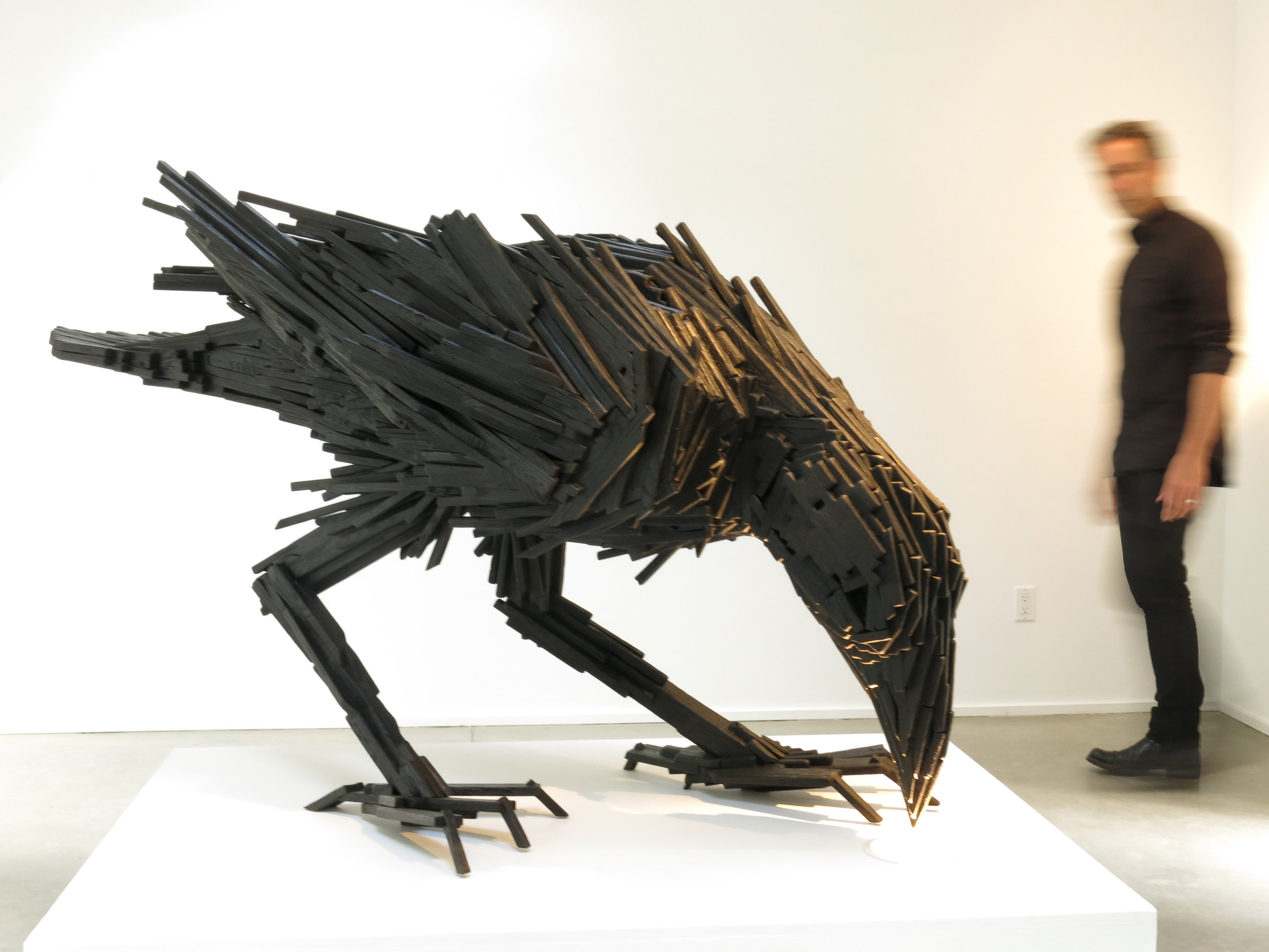
The Black Tusk console in turn inspired a collaboration with local graphic designer and artist Lee Roberts, who, after he saw the sculptural table at a photo shoot, sent Meyer a sketch of a raven, made from wooden sticks like the Black Tusk series. “I was inspired and challenged to take this technique I’ve applied to the Tusk and take that to another level to make this raven,” Meyer says. The resulting bird sculpture is titled “Sense of Silence.” △
Peaceful Panopticon
Hikers throughout the American Northwest find solace in restored historical observation towers like the Park Butte fire lookout on Mount Baker
A hike to the Park Butte fire lookout on Mount Baker, Washington, tracks the forgotten history of the sparse observation towers that were once manned year round. Throughout the American Northwest, some are now restored as overnight shelters for solace seekers.
Walk-up getaway
It’s a torrid summer day. My husband, Andrew, and I are halfway up a trail in Mount Baker’s backyard in Washington. The heather flowers show signs of mortality, their normally bright, fuchsia-colored blossoms dried up into a brown, crusty shell. The open meadows are less vibrant than normal for this time of year.
The flowers came and are almost gone, signs pointing toward the end of summer. We are on a mission to spend the night in the historic Park Butte Lookout.
The hike is a steady uphill climb to the top, where we can see Mount Baker sprawling before us with emaciated pools of shallow water and red dirt staining the meadows in the foreground. The bright reds, oranges, and coppers are signs of mineral-rich soil and the fingerprints of the receded glacier on a slowly transforming landscape. We pass small groups of hikers, many with dogs, and come across a few larger Boy Scout and summer-camp parties. It seems the lookout towers fascinate young and old, serious thrill junkies, but also solace seekers.
“ It seems the lookout towers fascinate young and old, serious thrill junkies, but also solace seekers.”
Fire lookouts — a tradition of the Northwest
Two years ago, I had no idea fire lookouts even existed. After moving to Seattle, I became obsessed with them when a friend mentioned there were numerous towers across the Northwest. Built as early detection and suppression stations for forest fires, the lookouts housed fire-lookout workers, who lived in them full-time. Usually set on the highest pinnacle, with a 360-degree view of its surroundings, the lookout tower provided a prime viewing platform with sight lines as far as the eye can see. Being an architect, I was fascinated by their iconic design, beautiful in its functionality and frugality, and a new typology for me.
"Usually set on the highest pinnacle, with a 360-degree view of its surroundings, the lookout tower provided a prime viewing platform with sight lines as far as the eye can see."
Most lookouts are made of wood and must withstand very harsh climate conditions, being located so high and exposed to the elements. So I respect the simple, straightforward design engineered for easy duplication and constructability. Thick layers of paint have been applied to the wood, protecting its wear from the weather and, hopefully, extending durability. The wooden windows no longer open, since they’ve been permanently sealed to halt the snow and rain damage, but the shutters still function with some old-fashioned elbow grease. Contrasting today’s cheap construction and design gimmicks, the towers reflect an authentic practicality that I can aspire to communicate with my architecture, and they are a humbling reminder of how we should be building our homes and cities, reclaiming a simpler time, when objects and things did not rule our lives.
"They are a humbling reminder of how we should be building our homes and cities, reclaiming a simpler time where objects and things did not rule our lives."
The lookout towers in the United States were first erected after the Great Fire of 1910, which burned three million acres of forest in Washington, Montana, and Idaho. The fire resulted in more regulations and protocols from the U.S. Forest Service, implemented to prevent this tragedy from happening again. The Civil Conservation Corps (CCC) constructed towers all across the nation in the decade following the Depression. During World War II, human lookouts also served as enemy aircraft spotters, especially on the West Coast. After about 1960, more advanced technology made most of the towers obsolete. Fires were no longer fought via human observation, but instead with radios, aircraft, and finally global positioning systems (GPS) with satellite technology. As a result, the lookout towers were no longer of use, and many fell into disrepair.
Park Butte Lookout
Our Park Butte Lookout was built in 1932 and was in service until 1961. Its style is known as an L-4, a square fourteen by fourteen-foot (about 4.27 by 4.27-meter) wood cab atop heavy timber posts with a cedar-shingled gable roof and operable shutters protecting a full width of ribbon windows at each side. It was the most popular live-in lookout design and one that was replicated across the Northwest. It perches majestically on the peak of boulders, like Foucault’s perfect panopticon, watching all of nature from its roost. What’s fun about lookout hikes is that the towers come into view not long after you set out on the trail up the mountain, hinting at the reward that awaits, though there is still much elevation to be gained before reaching the summit. I look upward to seek a vantage point, stealing glimpses of the perfectly square object perched and waiting for my arrival, and I know it will be well worth the sweat.
"It perches majestically on the peak of boulders, like Foucault’s perfect panopticon, watching all of nature from its roost."
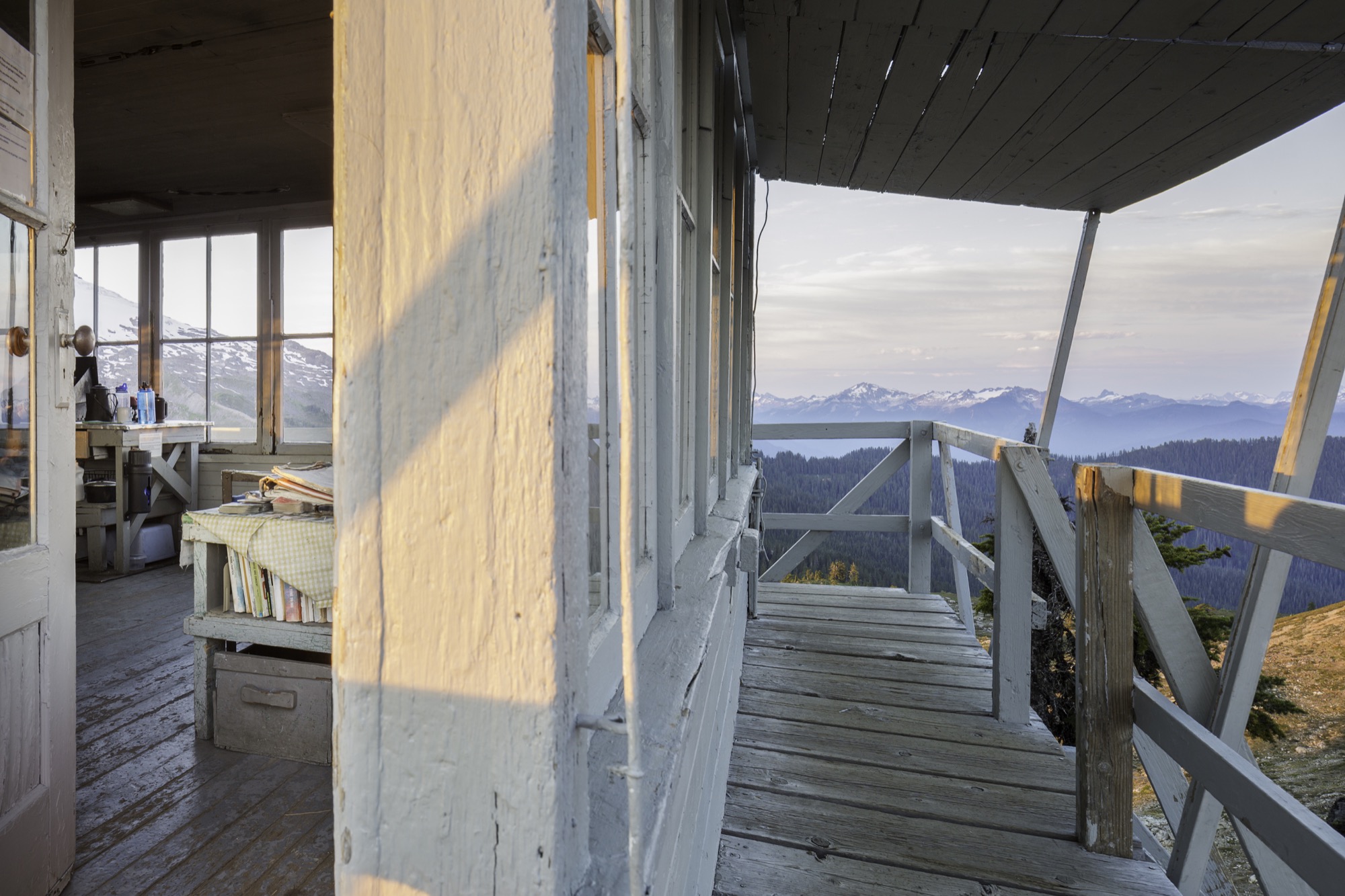
Many of these lookouts are kept in working order by local volunteer groups or organizations dedicated to preserving them. Listed on the National Register of Historic Places, Park Butte Lookout is maintained by the Skagit Alpine Club, a group of mountaineers who service the exterior, occasionally clean inside, and stock it with the bare necessities for emergencies—or even forgotten matches. I appreciate the remaining lookouts even more for this reason; they have that element of home to them because knowledgeable caretakers conserve their special historical and spiritual ambience. It’s an inspiration to us all to treat other people and things with just as much tender care.
Once ascended, my usual concerns are a memory: The bustling urban life I live in Seattle is far away, and I slip into nature’s meditative rhythm. There are no deadlines, only observations and reflections. There are no agendas, only submitting to the mountain’s siren song. Layers are peeled back, noise stops, nonessentials dissipate. Time becomes the passing sky, clouds, and breeze, not numbers on a clock or phone. I replenish myself with water and food not because it is noon, but because I listened to the thirst and to hunger rumbling in my stomach. The question of what to do next is replaced with almost no thoughts at all as I easily succumb to nature’s nonexistent curriculum.
“Once ascended, my usual concerns are a memory: The bustling urban life I live in Seattle is far away, and I slip into nature's meditative rhythm.”
These lookout towers are remote. However, some have cell phone reception at the top, which makes for interesting observations as we relax on the deck reading, writing, and reflecting. Hikers come up huffing and puffing because the last stretch of the trail is perhaps the hardest. The gravel trail gives way to larger boulders that require a scramble, and the climb is steeper than the average grade on most of the hike. The lookout is perched on these boulders, lifted with stubby wooden posts so it oats slightly above. After taking in the awe-inspiring view, many visitors to the lookout immediately pull out their cell phone and snap photos; a few even have selfie sticks to capture their group with the stunning mountain backdrop.
Our most pleasant encounter happens in the hottest hour of the afternoon. We had just come back from a mountain lake swim and climbed back up to the porch. It takes us a while to notice someone sitting at the shaded side of the balcony. We manage to sneak around the corner to find a man with binoculars, no cell phone or selfie stick. We begin talking, and before long we exchange contact information and look forward to meeting again. It amazes me what happens when we put our cell phones away and embrace the existence around us. Beautiful and inspiring moments are always presented to us. Will we stop and pay attention or move too fast and miss them? Perched on a fire lookout, you see more than the view. △
Oh La La, Très Chic: Chalet Les Gentianes
A very private ski-in/ski-out chalet in the French Alps
Courchevel / Saint-Bon-Tarentaise / France Les Gentianes is truly a ski-in/ski-out chalet amid a winter wonderland in the French Alps. The chalet is located right on Courchevel’s Bellecôte piste in the prestigious and quiet Residence de Bellecôte. The splendid vacation rental with seven bedrooms and seven bathrooms is one of three exclusive chalets at this residence. The catered chalet has a swimming pool, Jacuzzi, massage room, and gym.
The centre of Courchevel is a less than five minute’s walk away.
Retreat and Return
An essay on escaping to anywhere but here, getting messy in nature, and connecting to what is real
If you stand in the middle of an empty Downing Street, around 30th Avenue, in Denver and look straight ahead, you will see a light-rail station jettisoned beside the street and some low level buildings that litter the periphery as a long stretch of asphalt leads the eye to the horizon. Miles away, two grayish, 1980s skyscrapers frame a view of the foothills. You can make out the patches of snow and tree lines along the ridge and grasp for them. This glimpse of the mountains through the frame of the city, surrounded by civilization and commodity, creates the desire to run from the banal into the still, quiet reserves of solitude. Civilization and solitude, city and wilderness, the balance and distinctions can often be so tenuous and vague. Where does one start and one begin?
Filter of escape
When I think of escape, it’s about an ethereal atmosphere: where the light sending shafts across your face is just right, words fall with a satisfying poignancy; it’s very poetic and meaningful. It is the sort of moment where you imagine that you could probably write a play, or a memoir. It is often meticulously calculated and captured on social media. It’s this dream I sometimes have: his face clear amongst a hazy backdrop, and there is a golden glowing that moves warmly across his lips as they move. It is late summertime. I do not know what he is saying, but I feel the meaning of the words. There is a way that our photographs make things much softer, much more beautiful, much more inhabitable than they really are.
“It is the sort of moment where you imagine that you could probably write a play, or a memoir.”
How do we value the observing and interacting within landscapes without resulting in the dreamy nostalgia of escapism? What is the danger of over-romanticizing our nature, our hideaways?
Historically, “escape” denoted fleeing towards liberty, freed from an irksome or controlling reality. It was only in the 1930s that escape began to be used etymologically as a method for retreating from reality. To “escape” became “escapism”: the tendency to seek distraction and relief from unpleasant realities, especially by seeking entertainment or engaging in fantasy, modeled by escapist literature that provided a refuge for those harried by the changes in modernism.
Similarly, in the 1800s, the noun “hideaway” denoted a person running away or a fugitive but shifted in the 1900s to primarily be used to describe a place of concealment or retreat.
Modern escapism
Research on “escapism” began in the 40s and 50s, a post-war mentality in which escape was a necessity, and researchers examined the connections between media consumption and life satisfaction. In 1996, Peter Vorderer described escapism as the desire most people have, in unsatisfying circumstances, to flee reality in a cognitive, physical, or emotional way.
Geographer-cum-philosopher Yi-Fu Tuan’s book Escapism is a dazzling exploration on cultural manifestations of this desire. In Neolithic times, our ancestors may have built shelters and plated crops to escape nature’s harshness, but now we escape the urban for the suburban lawns and parks. Tuan speaks of Disneyland, glass-towers, ivory towers, and malls—all tenuous monuments to the dream, away from the uncertainties of life, often imposed by a nature we still cannot yet control. At what point, Tuan argues, is escape inescapable? How is escapism hardwired into our human makeup? If to escape reality is to create a malleable nature, then what aspect of culture is not escape?
“If to escape reality is to create a malleable nature, then what aspect of culture is not escape?”
Away, away
“The grass is greener on the other side,” runs the clichéd motto. I often search for discounted plane tickets the night before a large deadline or after a particularly nasty fight. I could move somewhere else; I could start over. I would not need to worry about these things if I ran. A sudden urge to sprint until I’m panting, until all the air has dispelled from my chest, to use my body, overcomes me. It reminds me of an Avett Brothers refrain:
The weight of lies will bring you down And follow you to every town 'cause Nothing happens here that doesn't happen there So, when you run make sure you run To something and not away from 'cause Lies don't need an aeroplane to chase you anywhere
Plainly, People want to “get away,” and I fully understand the desire. Ecotourism has exploded. We put rails along the edges of cliffs and commercialize Yosemite, all the while promoting an Airbnb in the middle of nowhere. Advertisements show us quiet beaches, toes in the sand, and shimmering waters devoid of noise and other tourists. We would be much better people, we are sure, if it were not for the distractions. A friend once told me, “Iceland is the one place on earth that looks the least like earth.” Beautiful, stark waterfalls and geysers against a backdrop of light yellows and green, an unearthly landscape, an utterly foreign nature. A place that seems to scream clarity from its minimalist landscapes. We escape to a place least like Earth; we want to stay there and soak in this alien feeling forever. We want to easily escape to places that are difficult to reach.
The desire to escape to simple and easy landscapes stems from a “milk and honey” mentality of the Promised Land that came to fruition in the literary genre of the pastoral. We’ve all heard the lines in our high school English courses from Marvell:
“Come lay with me and be my love and we will all the pleasures prove.”
Pastoral paradise
Scholars have condemned the pastoral for its flights of fancy and its tendency to oversimplify complex societal situations for a romanticized and reductionist nature. A genre predicated upon escapism, the pastoral offered a comfortable landscape to run to when society grew too weary or complex. Centered upon the notion of “Arcadia,” there was a landscape and realm of nature that remained untouched, primitive, and pure from the ravages of civilization where utopian harmony and balance reigned supreme. The shepherd sang of a “Garden,” a lost Edenic form of existence in nature. Raymond Williams, a key pastoral critic, argued that the pastoral rests upon the notion that the industrialized city has removed us from the peaceful existence we once had in the country. For him, this is “myth functioning as memory,” remembering a false past that our ideals have created, where the present looks back toward a decline of simple life in the past. We have all heard it, thought it, felt it: “Life was so much simpler back then.”
We want to escape back to the simple, when we were carefree and life had no troubles. When all we had to do during the day was watch a river lazily float by us. My friend and I plan trips to Moab, plan trips to Zion, plan trips to Yosemite. We think of the tiny homes we could purchase, the vans we could remodel, and slowly tweak our plans to escape from the grid.
“We think of the tiny homes we could purchase, the vans we could remodel, and slowly tweak our plans to escape from the grid.”
Which world is blasé?
At its core, escapism hinges on the question of the “real.” What is reality and what is fantasy? The critics tell us to blur the lines and mix them up; virtual reality asserts that these questions are passé.
But, rather, might they be blasé? Blasé came into linguistic fashion 1913 to denote when the ability to tell the distinction between particular things is lost. A haziness of atmosphere descends and mixes it all up. I often find that my escapist fantasies are dreamy: edges are blurry and details are vague, what I am reaching for isn’t concrete but an atmosphere, a feeling, that my memory has recreated for me. I am always confusing myself with my real life and the life I live in my head, the lives I could live and the person that I could be. It is easy to escape to the mind space where I have it all together; where I am writing my next work from the porch of my secluded mountain cabin.
“It is easy to escape to the mind space where I have it all together; where I am writing my next work from the porch of my secluded mountain cabin.”
Experiencing within context
When scientists speak of one’s ability to perceive, they talk about “enframing.” As we view a site or landscape, we are compelled to frame and categorize it. Our site defines our reality—we may know that other things exist because we have seen them before, but, at every moment, we are only capable of perceiving and understanding what the widths of our eyes allow us. Yi-Fu Tuan argues that modern men and women, living amongst aspiration and pretension, suffer from Milan Kundera’s “unbearable lightness of being.” Life up so high doesn’t seem so real. We want something material, something to come into contact with.
“Life up so high doesn’t seem so real.”
For Tuan, the “real” is the impact, sensation, and felt pressure of nature: callouses on feet at the end of a long, arduous hike; sweat lining our brows; dirt under our finger nails. The real exerts a feeling of “aliveness,” where habits are shaken up. It’s to come close to the ground. The Greek origin of the word humiliation stems from hummus and in its literal terminology meant “to come close to the earth,” mirroring the story of Anteaus, a Herculean type man whose strength only persisted as long as he was touching the ground. Bring Anteaus to the heights and he was helpless.
If, as Tuan argues, human restlessness looks for relief in geographical mobility, our desire to move closer to nature is a natural one. We search to escape to a place of lucidity that comes from simplification. For Tuan, if an experience brings clarity rather than just simplification, one can arguably say that they have encountered the real. This is the difference between appreciating moments, atmospheres, and landscapes, and escaping from the pressures to a “blank page.” What one needs is not escapism, but rather a middle landscape that stays in touch with the raw reality of the natural world that remembers the connection to civilization as well. False divides have never helped us. When we retreat to nature, we are never going to blank spaces, but places with a palpable, experiential essence—ecosystems with existence long before we imposed our imagination upon theses places.
What moves escapism toward the notion of retreat and return? Action, honest encounters with nature. Escapism rarely translates into action. It is usually a state of mind we hide in. Retreat, however, requires movement and action, relying on a balance between wilderness and civilization. When we only dream of escapism or see landscapes like National Parks as the locale of our get-aways, we create an abstraction that makes it easy to exploit other landscapes.
“Retreat, however, requires movement and action, relying on a balance between wilderness and civilization.”
Return with clarification
Thoreau may have secluded himself to retreat to Walden, but he returned with an answer, a prophecy for a complex and frazzled society, teetering on the uncertain brink of industrialism. George Puttenham, one of the first pastoral theorists, did not see the form as merely recording the escape to a more rustic form of life, but as a serious guise for societal discourse. It had a didactic duty to return with clarification for modern life. It was about bringing back balance between the wild and the human.
What we need is a return to dirt, to the messy physicality of nature experiences. Not the coziness that we seek to escape to, but places of deep meaning that we return to for the quiet balance we desire. As William Cronnon argues about wilderness theory: If we imagine that our true “home” is a wilderness we can escape to, we often forgive ourselves for exploiting the land that we actually live on. Instead, a quality of “wildness” might be instilled in all the landscapes we inhabit, not just the sublime we want to run away to. Escapism, in this way, can be a dangerous nostalgia: despising the real in favor for the imagined. Escapism operates off a dissatisfaction and false dualism that can actually subtly encourage environmental exploitation: instead of seeing nature, wildness, as something that continually surrounds us, we escape to “wild” places, while leaving the urban to continue to die. We forget to gently tend our gardens, when the goal of our relationship with landscape is the task of making a fulfilling home within it.
“What we need is a return to dirt, to the messy physicality of nature experiences.”
“If we imagine that our true ‘home’ is a wilderness we can escape to, we often forgive ourselves for exploiting the land that we actually live on.”
It’s the difference between a dreamy pasture and the dirt. In the dirt, there is a beauty that has forgiven its sense of idealism. It is not about the ease, though this can be a benefit. While the reconstruction of the event can be nostalgic, often the journey in the wilderness is not: one sweats, scrapes their knees, huddles under a tree from a thunderstorm, or comes into contact with an animal much larger and more powerful. What we reclaim in a retreat and return is real action and the sense of our bodies—the sense of touch, of reconnecting with the environs that surround us. The retreat into nature can remind us to be consciously aware that we are not separate from nature but a part of and subject to it. We are wrapped up, intertwined within it—where then can we escape from ourselves?
“In the dirt, there is a beauty that has forgiven its sense of idealism.”
Wilderness therapy
There are countless organizations today that rely on this sort of wilderness therapy—bringing people out into nature as an opportunity to disconnect from the virtual and remember the real. While not all of us are ready to live in a van or fend for ourselves in the wild, retreating and returning gives us the pros of a connection with landscape without falling back onto distraction, selfishness, and a misconstruction of nature. Retreating away for solace, meditation, and a clean slate, remembering the environment and mountains that sustain us, and returning to tend for others in a harried society is the beauty of the soil.
In Norway, Arne Naess, the father of the Deep Ecology movement, pioneered the “Friluftsliv” movement—a conviction that an outdoor life can provide an antidote to the stresses of urban conditions. It’s not about an either/or but a both/and. A hideaway, a landscape, an escape that connects you to the “real” can never be escapism. It is an experience that connects you to materiality, a grounding that comes closer to the earth, an eye that recognizes beauty in the particular.
So here’s to the weekend warrior, the backcountry skier, the Chautauqua walker, and the Rocky Mountain National Park junky. Here’s to the gardener, the climber-conservationist, and the trail runner. Here’s to the people who aren’t afraid to shove their hands in the dirt, who aren’t desperate for a chance to run away but longing for a connection to the still, quiet moments of reality. Here’s to the mountains that are always beckoning us to come closer, get humiliated, and find contentment. △
Dirt
Antaeus reveled in the materiality
of his strength
which became humiliation
like its root hummus
like to come close
to the level of the ridge
and feel the terra.
To know that aspens
are rhizomes,
interconnected,
roots woven through soil,
nothing left out.
To hideaway from
the dirt is to
drift toward the sun,
risking a heavy pitch
downward, mutually assured destruction.
I am trying to get close to the reality of taxonomy,
the soil, the naming, the root.
Here is best I can say,
far from despair:
From dirt we came
and dirt we shall return.
Poem by Haley Littleton / Illustration by Ben O'Brien
A Platform for Living
A weekend refuge in Japan's Chichibu mountain range consists of a simple larch wood structure and two North Face tents for bedrooms
A collaboration with Dwell.com
Setsumasa and Mami Kobayashi’s weekend retreat, two and a half hours northwest of Tokyo, is “an arresting concept,” photographer Dean Kaufman says, who documented the singular refuge in the Chichibu mountain range. “It’s finely balanced between rustic camping and feeling like the Farnsworth House.”
“It’s finely balanced between rustic camping and feeling like the Farnsworth House.”
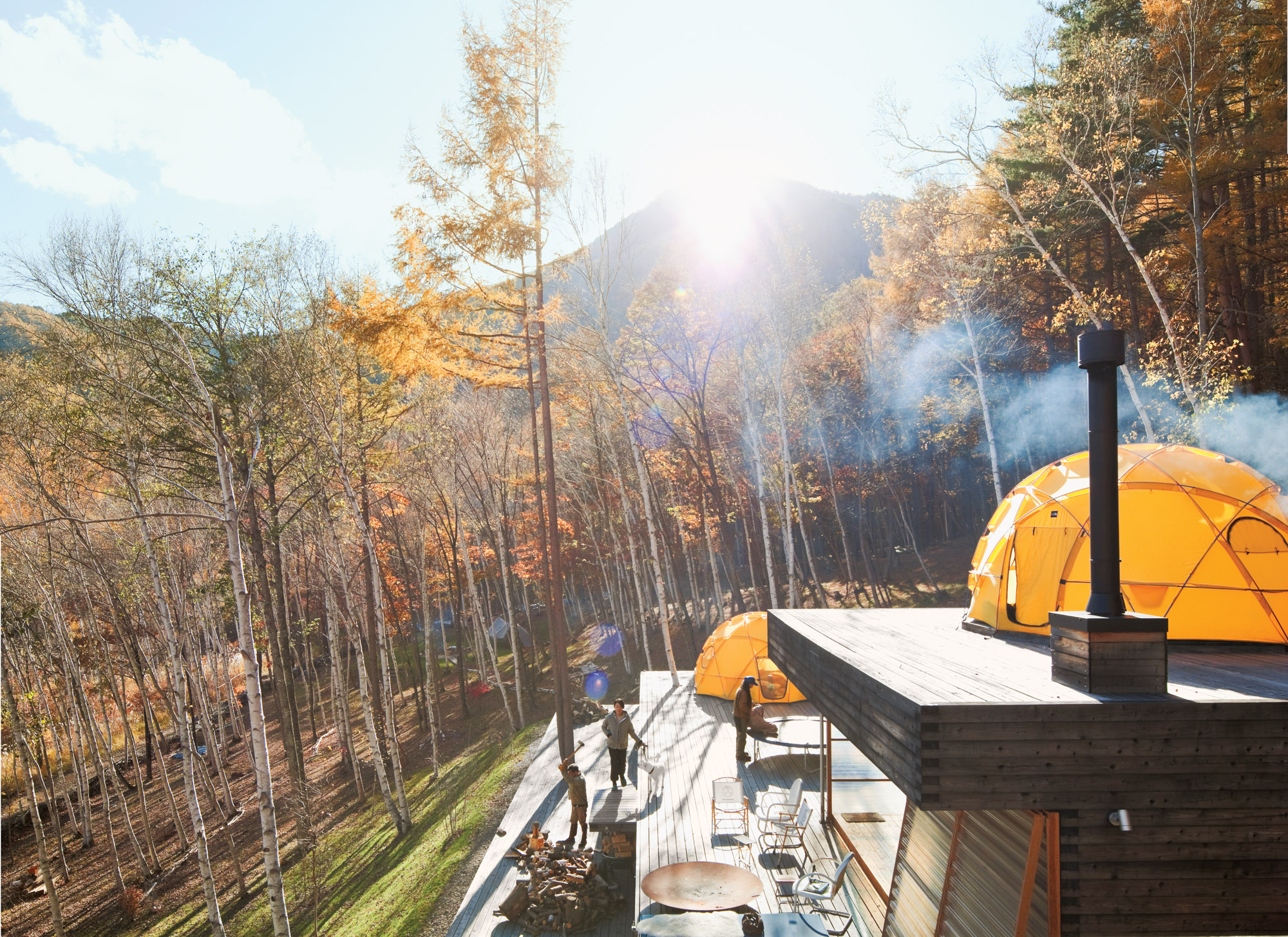
Designed by Shin Ohori of General Design, the structure—Setsumasa bristles at the word “house,” since his desire was for something that “was not a residence”—and its wooded surroundings serve as a testing ground for the Kobayashis, who design outdoor clothing and gear (as well as many other products) for their company, …….Research. The shelter is constructed from locally harvested larch wood and removable fiberplastic walls and is crowned with two yellow dome tents used as year-round bedrooms.
"His desire was for something that 'was not a residence.' "
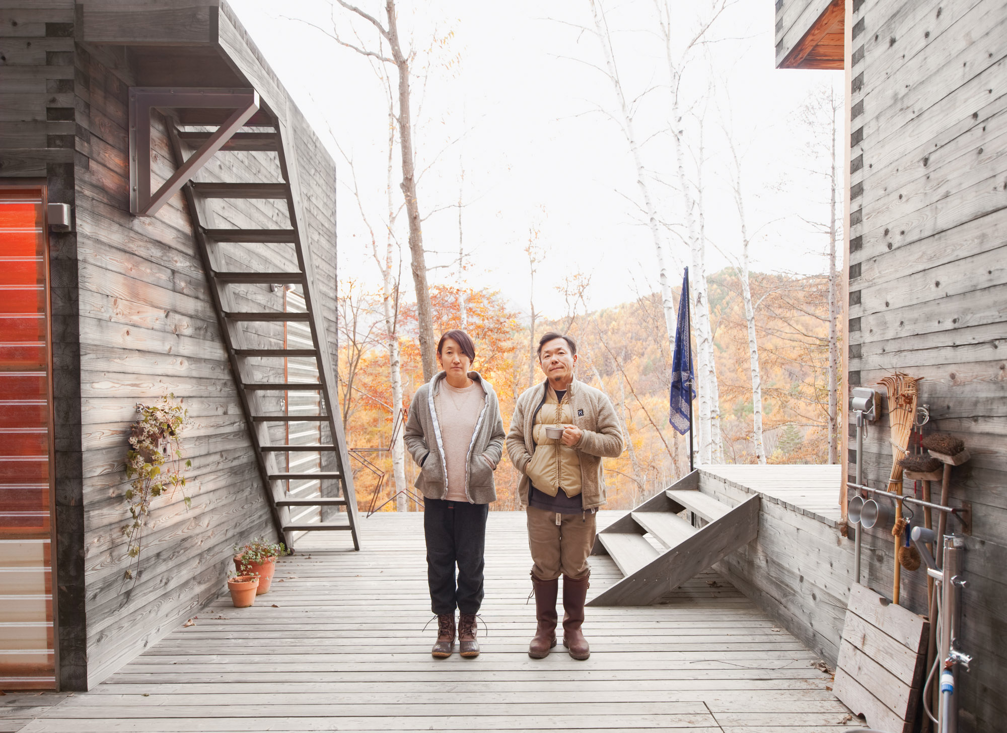 Setsumasa and Mami Kobayashi / Photo by Dean Kaufman
Still, this is no primitive lean-to. There’s electricity, hot water, and a kitchen—not to mention iPads, Internet, and a clawfoot tub. By day, the couple trims trees and chops firewood. At night, they sit around a campfire and eat Japanese curry, listen to Phish, and balance their laptops on their knees. This is what a modern back-to-the-land effort looks like.
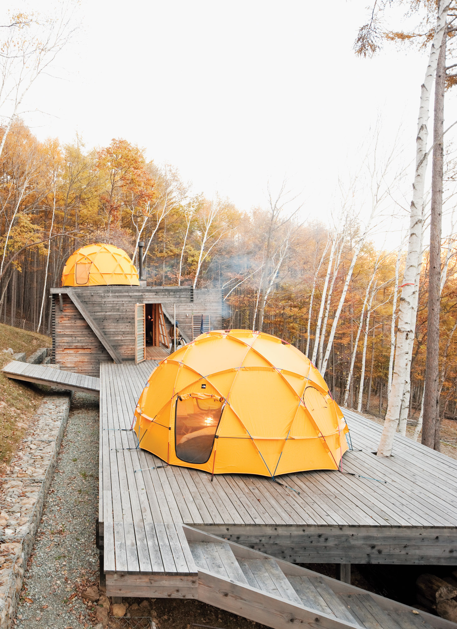
One North Face tent sits atop a deck; another caps the main building, which contains a kitchen and dining area.
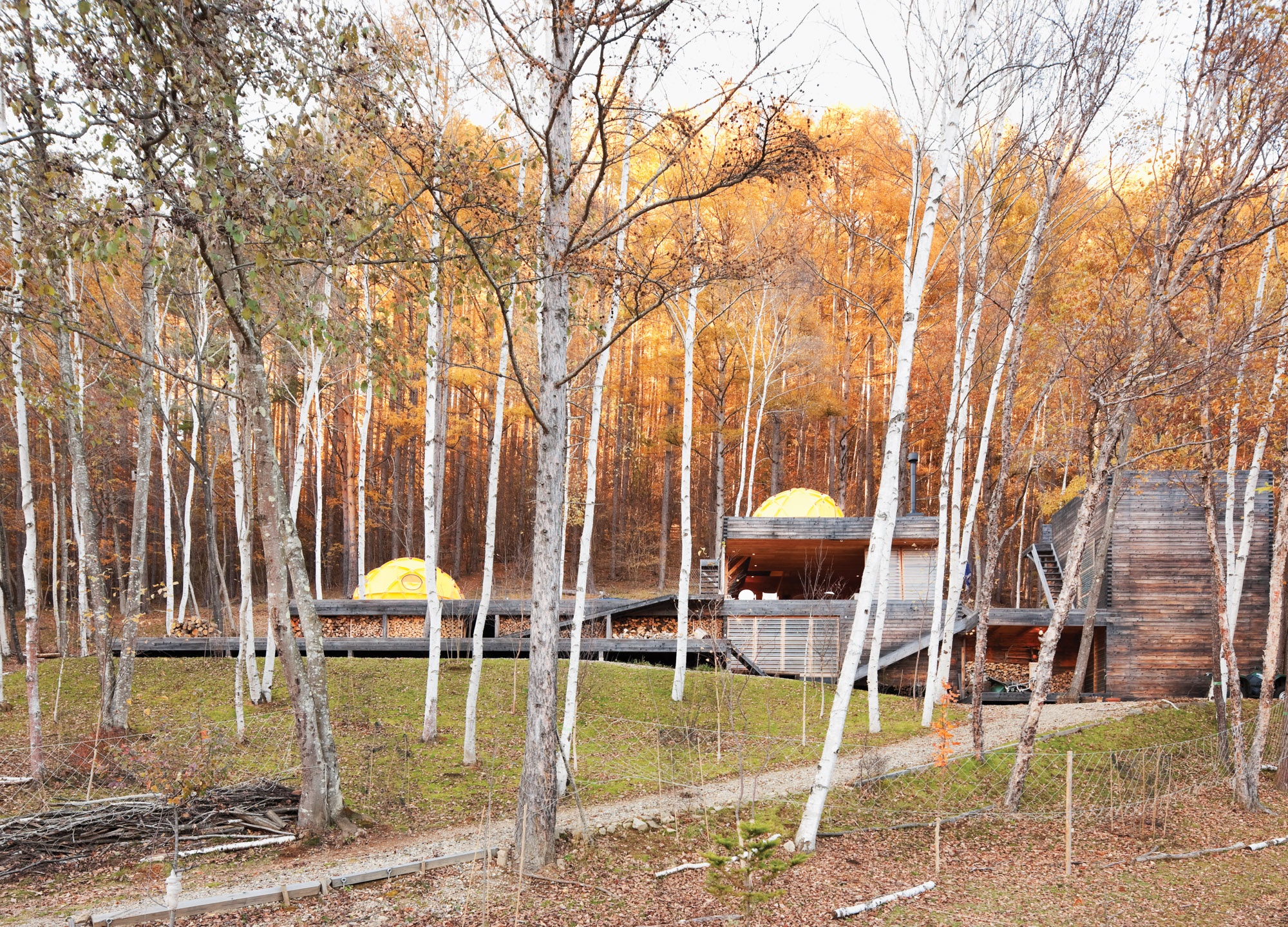
The long, lean Kobayashi complex includes a bathroom and storage room in the structure on the far right.
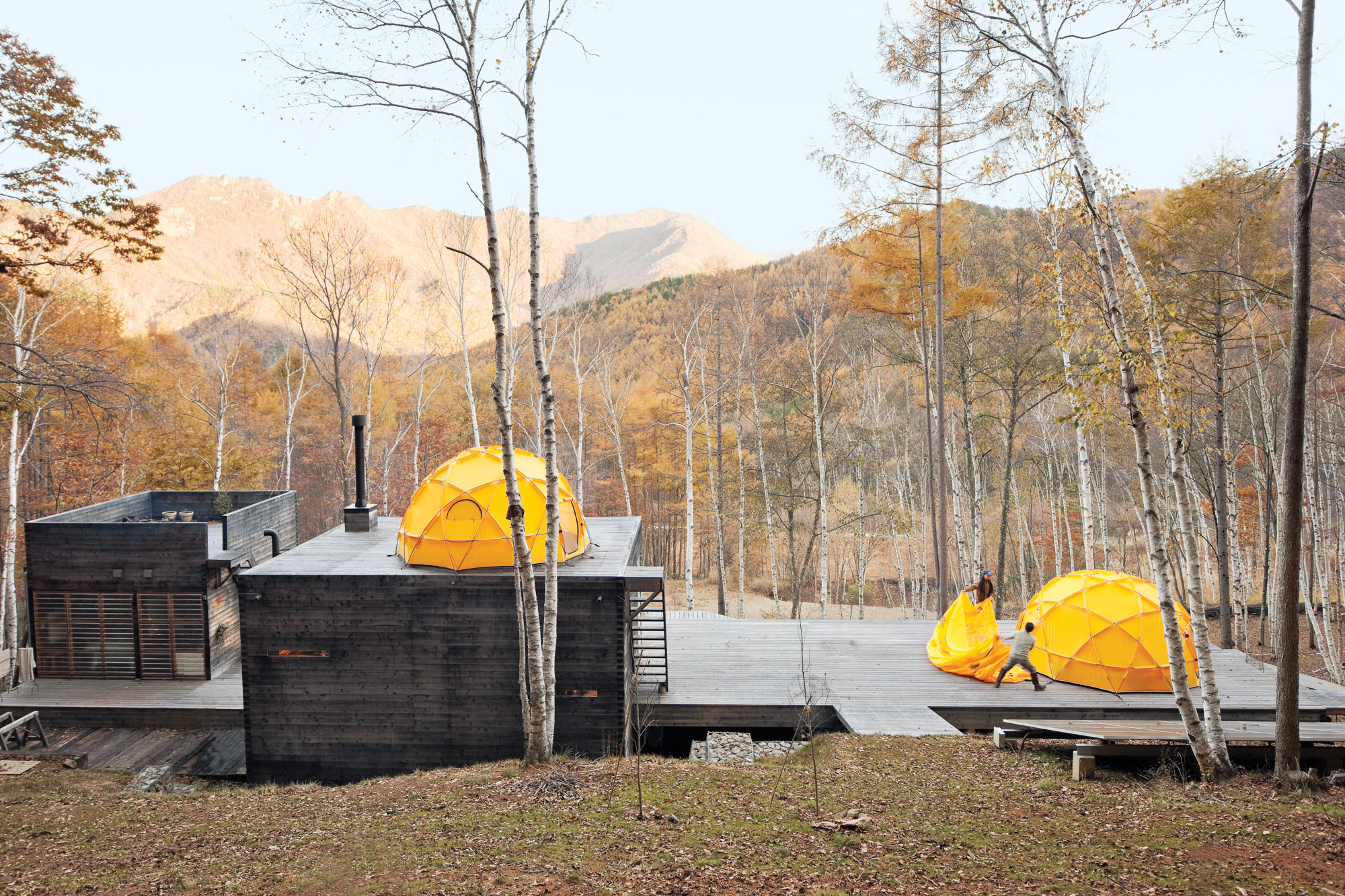
Setsumasa and Hideaki toss on the rain fly. The solar panel in the foreground supplies daytime electricity.
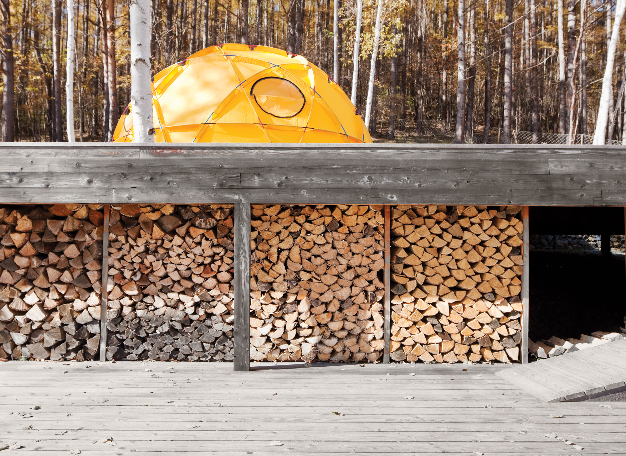
A stockpile of wood sheltered from the elements.
Setsumasa's desire was for something that “was not a residence”
Scenes from a weekend in the woods feature many .......Research products, including camping cookware and striped wool blankets.
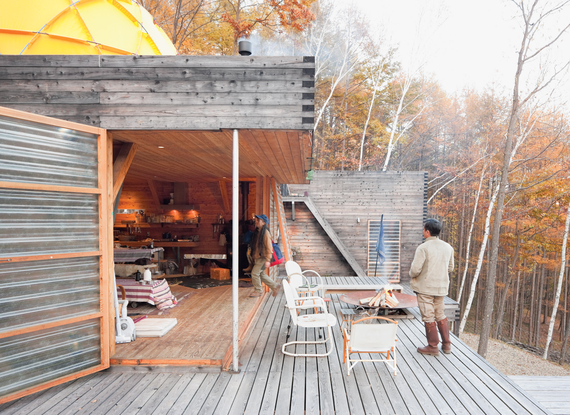
Translucent fiberglass panel walls form a permeable, fiber-reinforced plastic membrane between indoors and out.
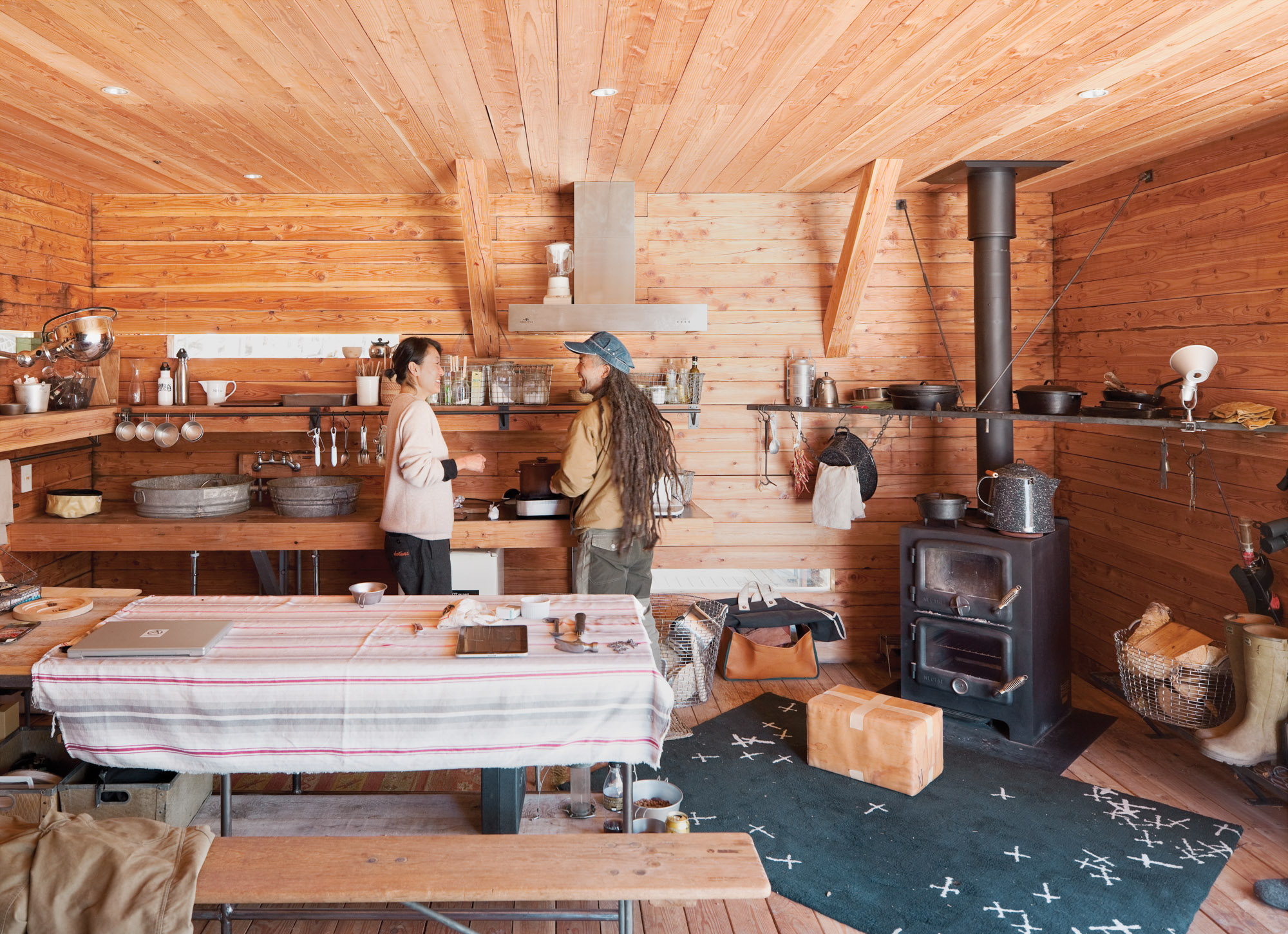
Mami and Ishii Hideaki (a friend and .......Research employee) prepare lunch in the cozy main building. The room is rustic and utilitarian, with a double-decker wood-burning stove, tons of open storage, and a sink fashioned from galvanized buckets. But there’s an underlying high-design ethos: The wire baskets are handmade classics from Korbo, a Swedish company, and what looks like a paper-wrapped box in front of the stove is actually a leather cushion by Japanese artist Nakano.
Food is served in traditional camping cookware.
A view of the surrounding tree canopy.
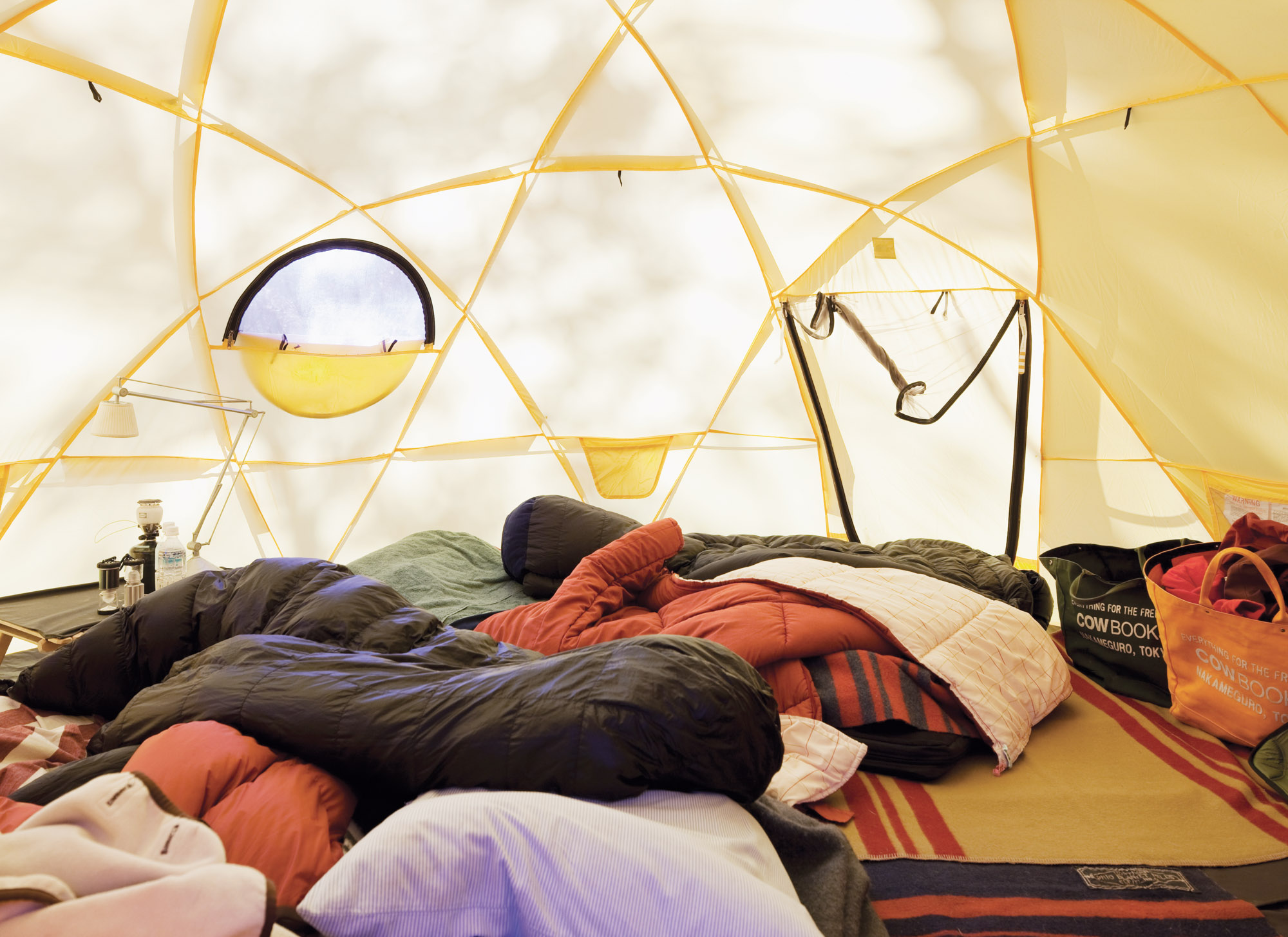
Inside one of the Kobayashis' North Face tents.
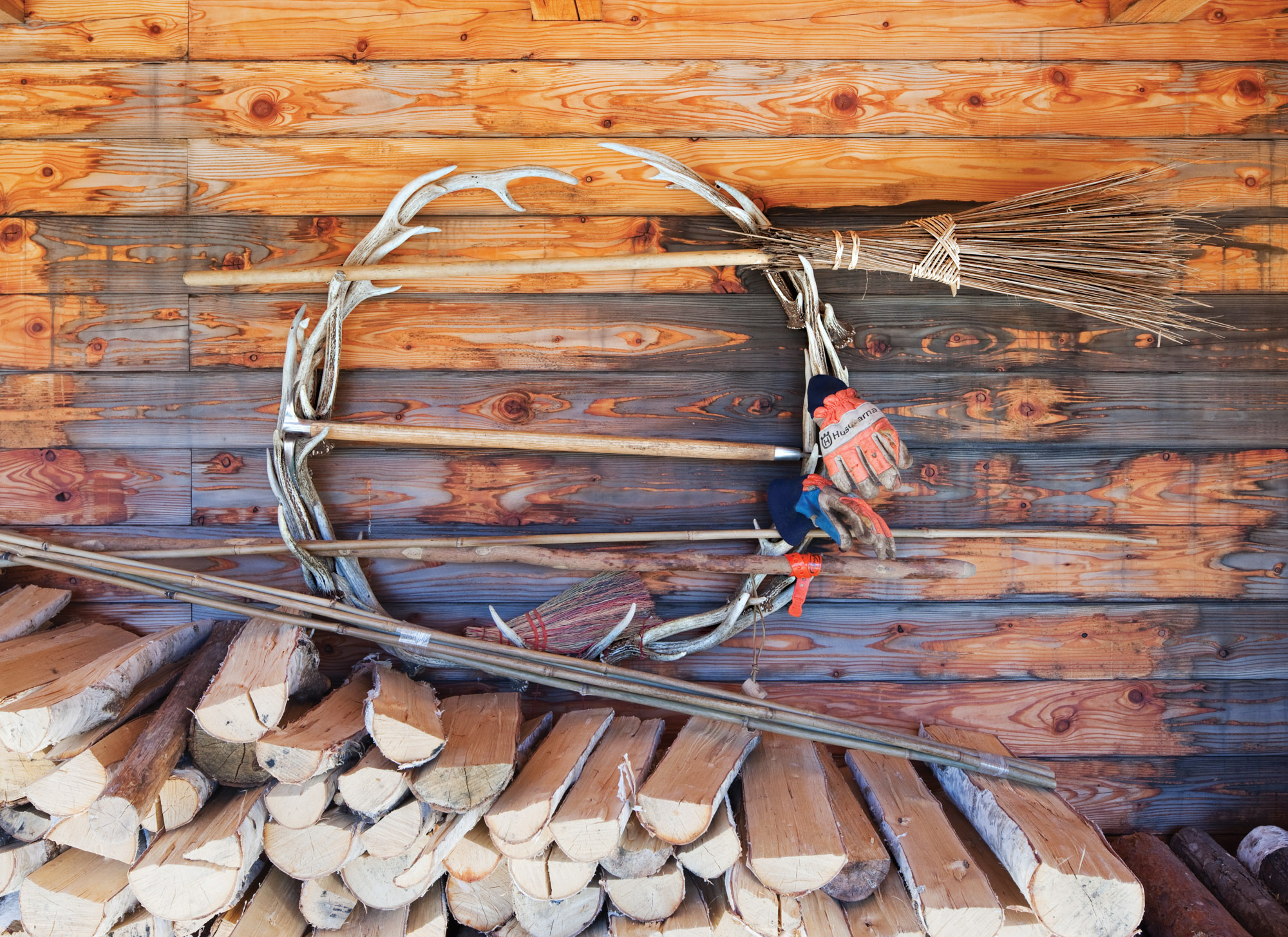
The couple stockpiles wood under the deck.
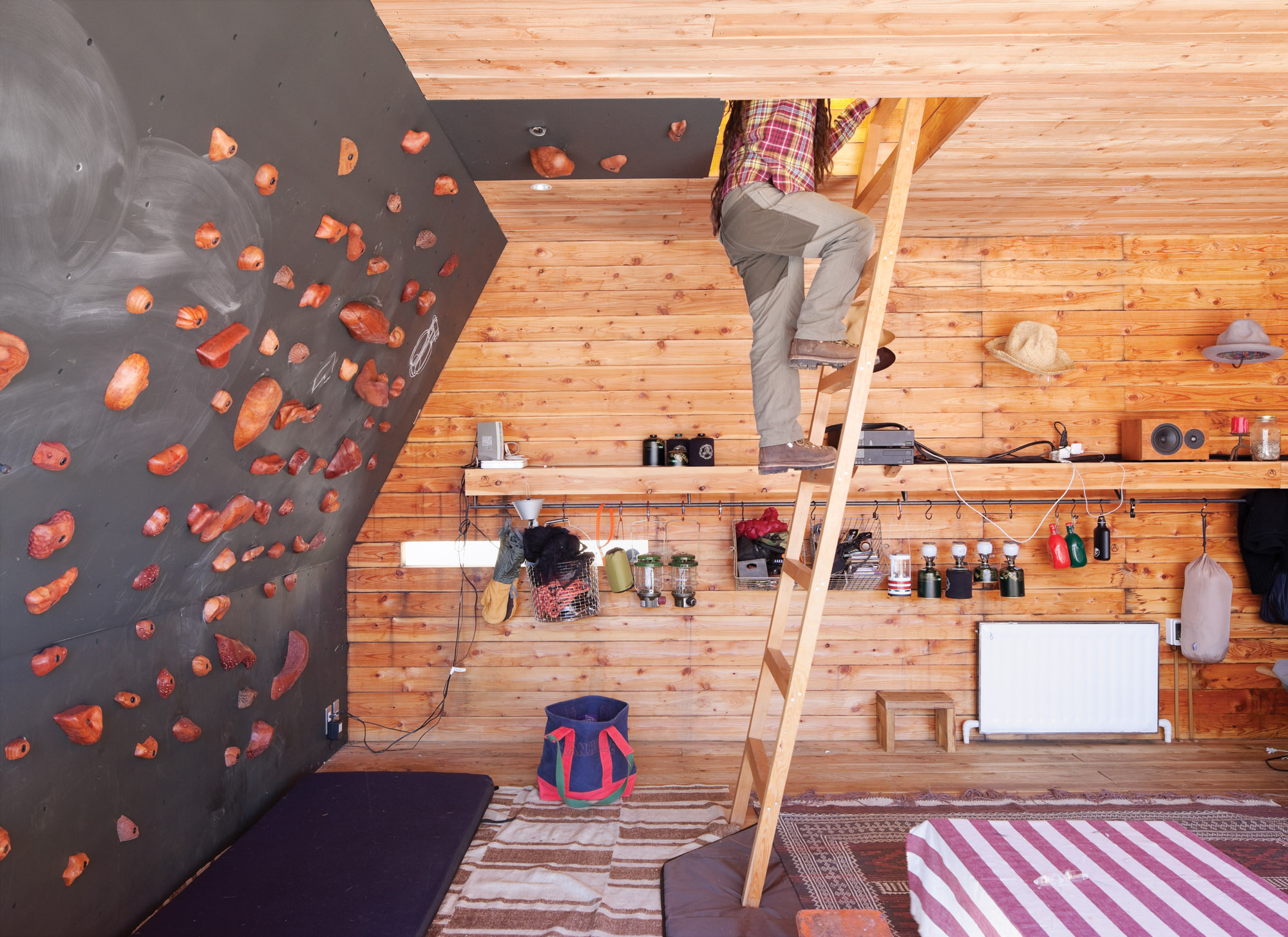
The rooftop tent can be accessed from the interior via a wooden ladder or—for the more athletic—via a series of wall-mounted climbing holds, made by Vock and carved from persimmon-tinted hardwood.
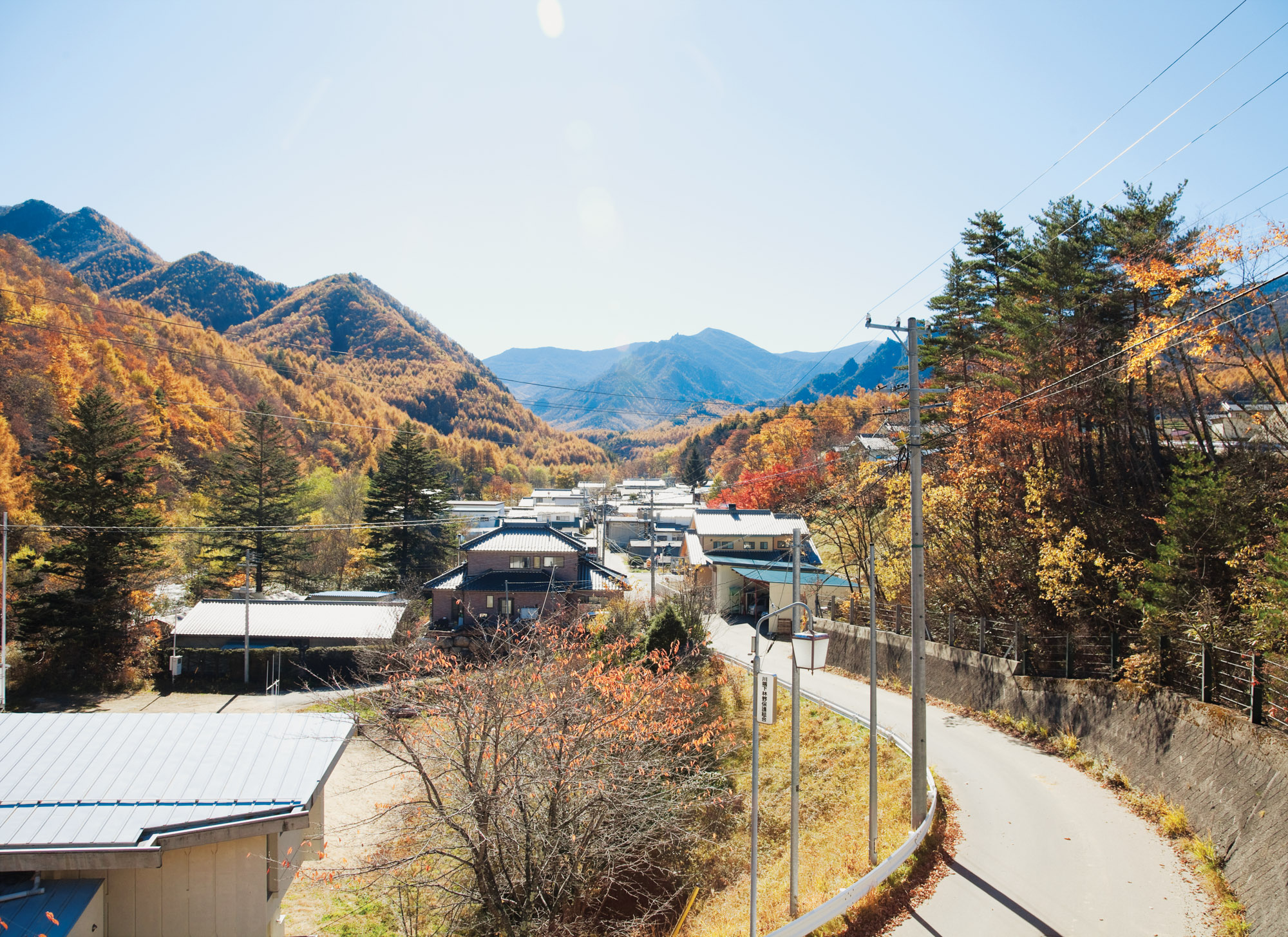
A view of the mountains from the village of Kawakami, en route to the Kobayashis’ property. △
The Nomad Behind the Lens
A conversation with photographer Garrett King, @shortstache on Instagram
Garrett King, a Colorado transplant from Texas, goes by the moniker “@shortstache” on Instagram. The name originates from a company he and a friend started after college, and while the company is no longer a part of King’s life, the tongue-in-cheek name remains and leads 119,000 followers to King’s photography.
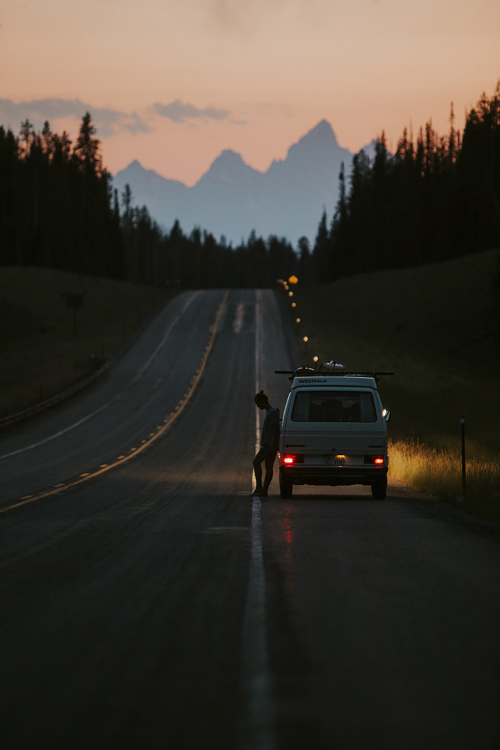
King, more comfortable with anonymity than self-promotion or marketing, worked his way from a “weekend warrior” to a full-time photographer and shares his thoughts on the longevity of the field, as well as the community he’s creating through his work in collaboration with others. King’s work emphasizes perspective and playfulness of natural landscapes, while not sacrificing composition and contrast.
A conversation with Garrett King
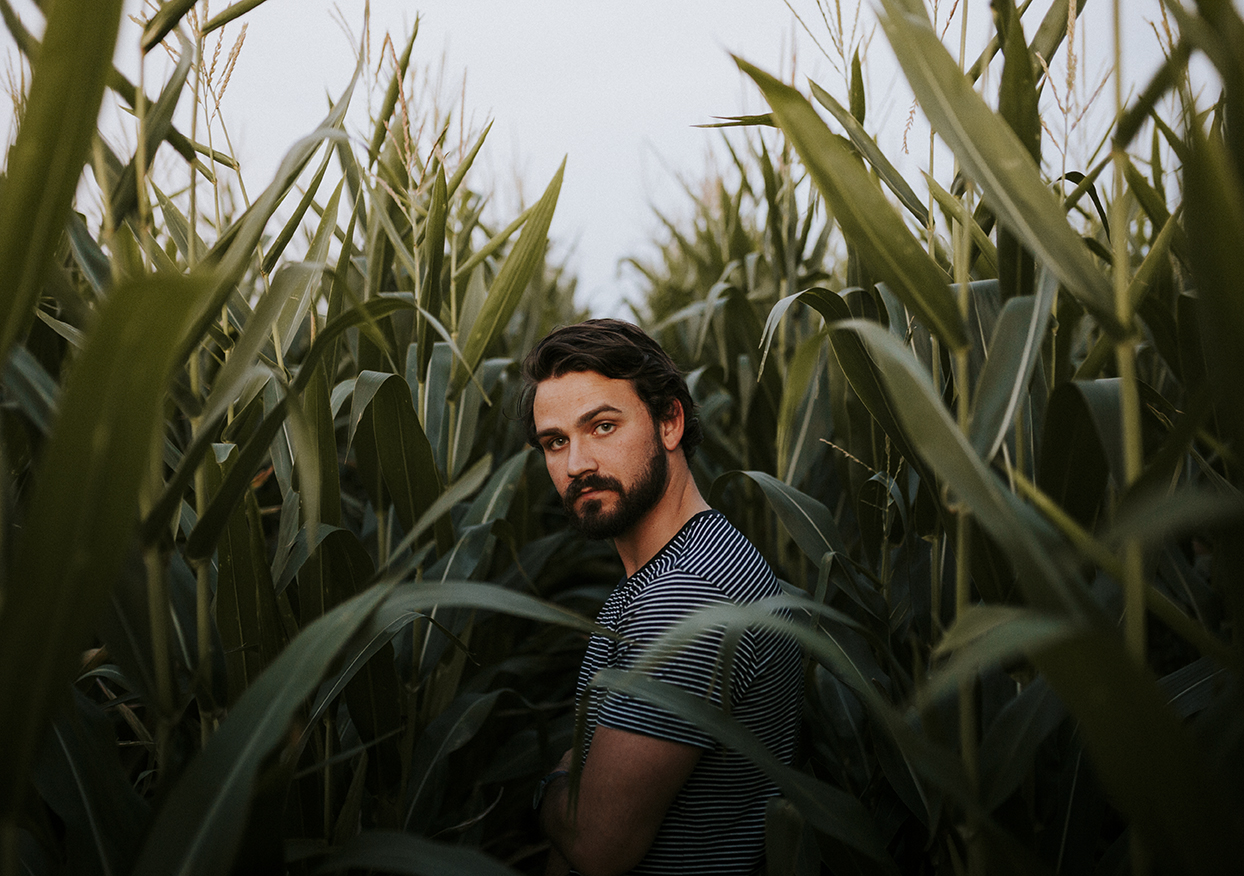
What got you into photography?
I was born in Amarillo, Texas, and studied design and fine arts at Texas Tech and West Texas A&M. I mainly focused on videography, though, not photography. My friend and I started a company called “Shortstache” where we made short films about people in Texas who inspired us, like the oldest letter-presser in the state and a woman who made bicycles out of recycled materials.
Hence the name: @shortstache?
Right. At the time, we were competing in a mustache-growing contest, and it kind of stuck. Now it’s just me.
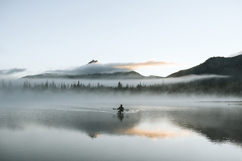
And then Instagram came along…
I joined Instagram about two years ago and never had the intention of using it as a platform to turn my photography into my career. I never intended to “make a name” for myself on Instagram. I would just respond back to everyone. They would respond; I would respond. It just kept going.
So it became a platform for community for you?
Exactly. I’ve met some of my best friends in the world through Instagram because we connected over a common goal or interest. I love that I can travel almost anywhere in the world and link up with someone through Instagram. It’s great because you can ask a question about a new place and get feedback almost immediately. Once, a few friends and I went to Portland, Oregon, and I posted that we didn’t have a car but would love to go around the city. Quickly, I got a message from a guy saying that he could be there in an hour, and I’ve been close friends with him ever since.
"I love that I can travel almost anywhere in the world and link up with someone through Instagram."
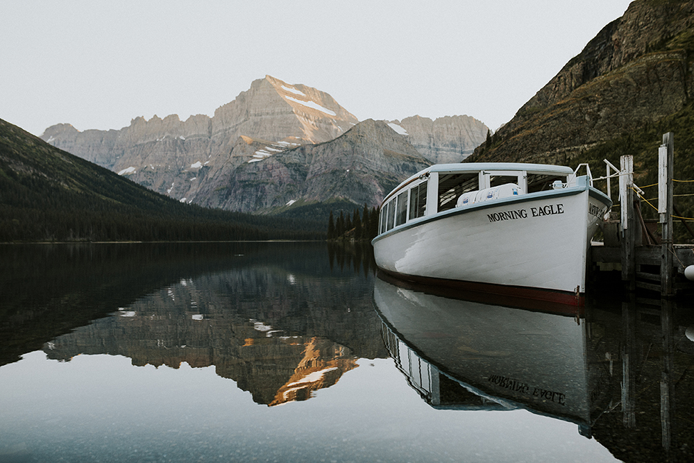
Instagram has this great way of building up trust between people, making the world smaller and traveling much easier. I’ve found a mutual respect pervades the community, and it’s been fun to see that come into fruition in my life and work.
"Instagram has this great way of building up trust between people, making the world smaller and traveling much easier."
How did you find yourself transitioning from videography and design to photography?
I’ve spent most of my working life designing. Photography was always an offshoot, a side hobby. It was interesting how things shifted: When I moved to Colorado two years ago, I quickly became a weekend warrior. I was leaving work at 5 p.m. on a Friday, driving until 2 a.m., camping and exploring and shooting wherever I could. I started posting my photos from these trips on Instagram, and, I guess, it sparked people’s interest.
Why camping and natural spaces in particular and not classic city shots or portraits?
I could only do the city thing for so long. You can get nightlife and restaurants in a lot of places, but, when I moved to Colorado, the mountains were in my backyard, and there was just so much to see and do. I found myself always escaping to the mountains to build stories or create memories. I will say, though, some of the photographers I respect the most are those who can be in the mountains, city, or middle of nowhere and produce beautiful and engaging work.
"Some of the photographers I respect the most are those who can be in the mountains, city, or middle of nowhere and produce beautiful and engaging work."
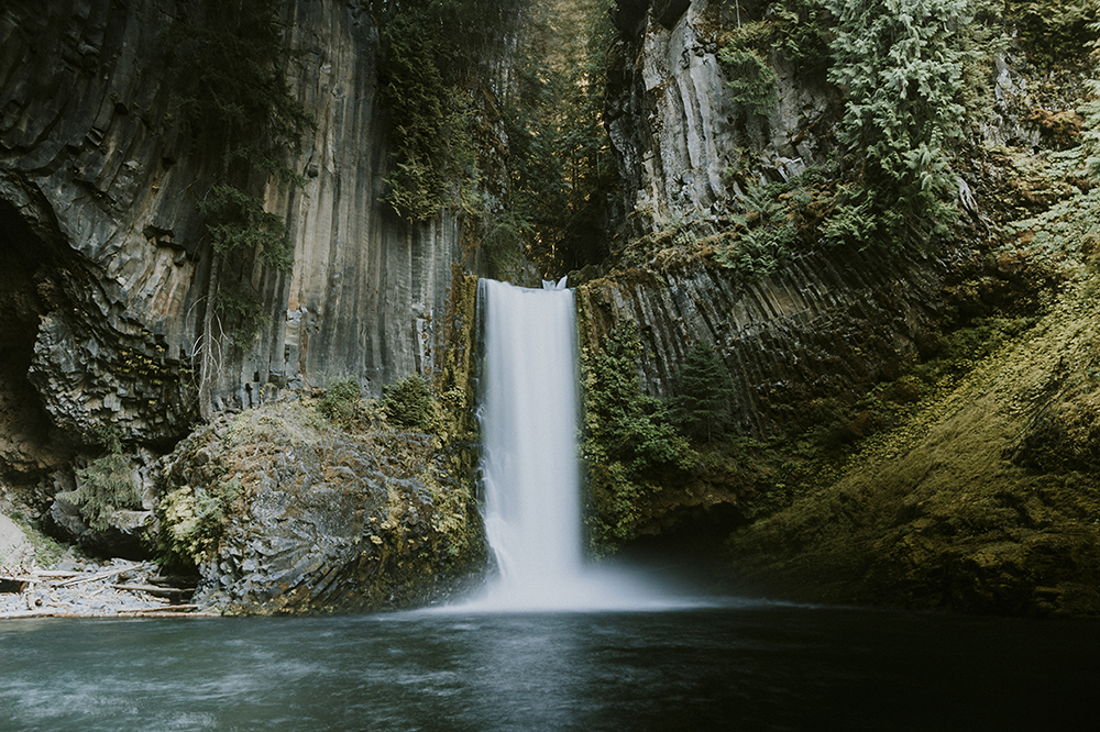
What has your focus been in developing your work?
For me, it’s always been about storytelling. You could consider me an adventure photographer, but the goal is always about capturing a moment. I want to continually get to the bare essentials and strip things down to the core. When I look at the bigger picture, I hope my work is inspiring and propelling me to see more and do more, while growing as a person. It is an extension of myself, after all. As it gets better, I want to get better. People are always asking me about what gear I use but it’s not really about gear; it’s about a developed style and whether you’re producing consistent and engaging work. I think you have to have the eyes and passion to discover good shots and you have to practice, practice, practice.
"It’s always been about storytelling."
Now that you’re a full time photographer, there must be a necessary separation between Instagram and work for you…
There definitely has to be. Anyone who asks me about their photography and how to make it big on the platform, I try to remind them that it’s a launching pad and business tool. I’ve had companies see my work through Instagram and invite me to shoot for them. It always goes back to the work. Instagram will die at some point, as much as I love it, and you can’t let it make or break your creativity. If you’re good and passionate, people will find you.
"Instagram will die at some point, as much as I love it, and you can’t let it make or break your creativity."
Any current projects?
Something I’ve been really excited about is a collaborative effort with other photographers I know, called @collectivenomads. We wanted to take creative people in different mediums and build each other up.
What do you want people to think when they stumble across your photography?
I hope they ultimately see that I’m a real person. Yeah, I want to have a consistent and built-up style, but I want people to see who I am, as a person who does the same stuff as them, and engage.
I never want my work to be dependent on a platform. I’m all about being on Instagram for the right reason: to know people and build relationships. It was never about free gear or “blowing up.” The dream was always to make my lifestyle I love into a paid job. I love design and want to continue to do that while also exploring my work as a photographer. △
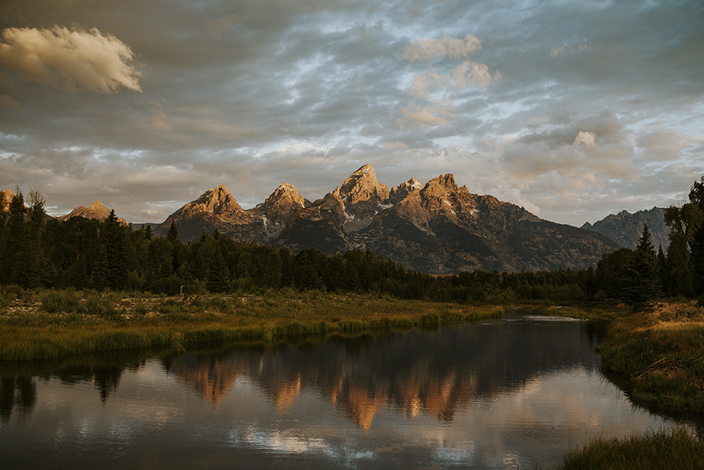
Over the Edge
French filmmaker Sébastien Montaz-Rosset goes to vertiginous hights to tell extreme athletes' heart-stopping adventure stories
French filmmaker Sébastien Montaz-Rosset dangles off cliffs and races across mountaintops to capture his swashbuckling subjects’ daring stunts but also to convey an intimate look at their fears, failures, and triumphs.
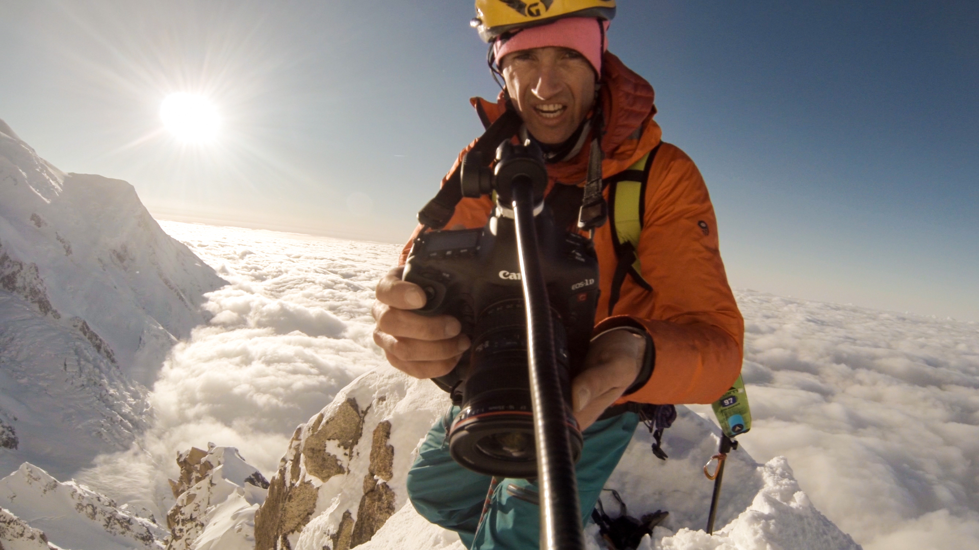
Watching the spellbinding work of French filmmaker Sébastien Montaz-Rosset, you want to cover your eyes but can’t look away all the same. The majestic mountaintop views immediately draw you in. But what mercilessly demands your soul and every fiber of your body is the heart-pounding terror that comes from witnessing death-taunting stunts; his subjects flirt with doom at every turn. This action-adventure-extreme-sports filmmaker captures shots from breathtaking angles most other filmmakers would never even dream of—say, dangling off a cliff or running along steep alpine ridges at full tilt. An athlete himself, Montaz-Rosset climbs—alongside his daredevil subjects—to virtually inaccessible locations thought to be beyond the realms of possibility.

High skill
That Montaz-Rosset is a passionate mountaineer, rock climber, runner, and skier goes along with the territory. It takes a high level of outdoor expertise and mountaineering skills coupled with innovative equipment to allow him to accompany people on their enthralling journeys. His work has been steadily gaining worldwide attention, most notably in the category of highlining, a combination of rock climbing, slacklining, and tightrope walking at treacherous heights, such as between two skyscrapers or mountain peaks. To slackliners, this is the pinnacle of the sport and something that’s attempted only after years of experience. Any small shift in weight or wind can easily send the cord into trampoline-like motion. Swift falls happen often, and while some use a fall leash to tether them to the main line, others pack only a small parachute as protection. The filmmaker and his athletes can’t plan ahead too much as the troupe pioneers this new evolution of the sport. Montaz-Rosset’s work requires quick thinking, improvising, and a remarkable amount of knowledge and training in wilderness safety.
The mountain guide turned adventure filmmaker got his start shooting clients during mountain excursions in France. “I was born in Les Arcs in the French Alps and have always lived in the mountains. Skiing and climbing was what we all did growing up, and I became a mountain guide and ski instructor, like a lot of people who grow up in these areas,” says Montaz-Rosset.
Telling stories of triumph, fear, and failure
In addition to shooting commercials, Montaz-Rosset also recently filmed the first-ever attempt at suspending a highline between two hot-air balloons high above the Pyrenees. He strives to tell extraordinary stories about real people performing acts that trigger an avalanche of emotions in the athletes and their spectators. His work is aesthetically breathtaking, but it runs much deeper than thrilling action shots. It’s about letting the viewer behind the curtain to see the laughter, fear, triumphs, and failures. It’s about finding the strength to pursue aspirations. The filmmaker’s trick is to show the athletes’ point of view—the passion—so the viewer has an emotional connection while watching their gut-wrenching maneuvers; and sheer, raw vivaciousness bleeds into every frame of his films.
While high anxiety is a natural element of any extreme sport, Montaz-Rosset’s films show how the athletes react to and embrace it. “The people I film are so expert at what they do, fear isn’t really a big factor. It’s always present, but it helps you to concentrate on what you’re doing...it brings focus.”
“The people I film are so expert at what they do, fear isn’t really a big factor. It’s always present, but it helps you to concentrate on what you’re doing...it brings focus.”
The twist is that the athletes themselves don’t know if their stunt will be successful or not. The films are about the attempt and all the internal and external obstacles that go along with the journey. “I love telling stories, and I get inspired wherever there’s an interesting and different story to tell. It doesn’t have to be adventure sports, but that’s the environment I’ve grown up and live in, so the stories I tell are about the people in this environment,” he says.
The Flying Frenchies
So who are the subjects who fuel this high-octane artwork? Enter The Flying Frenchies, a wild and gregarious bunch of twenty or so lively, flamboyant characters. All are entertainers in their own right; each is equipped with her or his own skill and zeal. Performance art marries adventure sport in Montaz-Rosset’s film The Flying Frenchies: Back to the Fjords, where this gang of extreme athletes and performers bands together to create an outdoor alpine extravaganza like no other.
“These guys are always thinking up new ideas for stunts and things to push themselves in what they do. Several of them are circus performers, or they’re climbers and mountaineers, essentially. So what I’ve filmed is just a small part of what they do.”
Engineers, along with BASE jumpers, wingsuiters, and musicians, make up the colorful pack. In Montaz-Rosset’s film, he follows the group as they travel through the fjords of Norway on a monthlong trip, embarking on various new extreme-sport-style adventures. Although at first glance it all feels very whimsical and impulsive—perhaps because they intermittently don clown costumes and props—months of painstaking preparation have gone into planning the journey, including intricate mathematical calculations and rigorous testing phases.
The Flying Frenchies travel across the country in a vintage red circus bus that has been renovated and packed to the gills with enough food for roughly a month. They also strongly value leaving zero waste as they go along, which takes additional planning. At night, the crew sleeps in tents, battling wind and rain and sometimes unexpectedly harsh elements. Montaz-Rosset captures outbursts of laughter and impromptu dancing, juxtaposing those scenes against hushed moments of stomach-knotting stunts in progress. On one rough night, gusting winds hurled a tent filled with camera equipment off the top of the mountain. “It was more of a setback timewise...we lost some things, but there was enough gear to be able to replace what was lost,” he says.

Artistry and athleticism
The worlds of performance and mountain sports collide when filming visually stunning footage of athletes running and cartwheeling off the mountain’s edge before parachuting down into the valley. Beautifully blending artistry and athleticism, the film embodies—and embraces—doing the impossible. Clowns and acrobats climb peaks; other performers BASE jump off slacklines. It’s about watching people push themselves to the brink of their physical and mental abilities—to witness what unleashes a landslide of emotion from within their souls and sets their spirits free—that we feel an incredible, intangible connection to them. “I just let them do their thing and try and be as unobtrusive as possible. You never know what you’re going to get filming them, so it’s always fun,” says Montaz-Rosset.
The summit of the adventure in Back to the Fjords occurs when The Flying Frenchies assemble and test an enormous human catapult they’ve dreamed up and meticulously engineered to launch each other off the mountain. It’s carried piece by piece up to the peak and assembled near the edge, a colossal experiment. The vision was to shoot performers skyward—all the while hoping they wouldn’t pass out from bearing up against 10 Gs—so they’d still be able to safely deploy their parachutes to float down to the valley below.
The filmmaker says, “Most of the people I film are people I know as friends, or have gotten to know from working and living in the mountains. The extreme sports are what they do, but it isn’t who they are...so filming the sports is a way of telling their stories. And, of course, these sports have a big visual impact.” There is intimacy in watching someone embark on the unknown. The viewer feels the sensation of being set free along with the performer and can experience, in tandem, a refreshing jolt of the liberation that comes from propelling at breakneck speed through the air, arms and legs flailing about.
“The extreme sports are what they do, but it isn’t who they are...so filming the sports is a way of telling their stories.”
Seeing The Frenchies feed off and inspire one another, their sense of camaraderie and friendship is palpable. Montaz-Rosset shows how these friends test the boundaries of their bodies and their relationships. The filmmaker and his subjects together push the confines of their sport and their personal lives. Pioneers in adventure-filmmaking and new sports, they transform viewers by manifesting that the impossible is possible. △
In Memoriam Tancrède Melet
With the heaviest of hearts, we are sharing with you that shortly after this story was written, we learned Flying Frenchie Tancrède Melet died while preparing for a hot-air balloon stunt in Drôme, France, in January. The 32-year-old expert slackliner, BASE jumper, and wingsuiter accidentally fell approximately 100 feet (ca. 30 meters) when the bal- loon abruptly sprang off the ground. Melet leaves behind a life companion and a young daughter. His death is a stark reminder of how all too fragile life truly is and that no matter how trained we are, how meticulous, how dynamic, how invaluable to others—the unthinkable still happens.
Window to South Tyrol
An artist and sculptor returns home to South Tyrol to converts an old farmhouse
Artist and sculptor Othmar Prenner converts an old farmhouse in the mountains of his native South Tyrol and realizes his vision of an alpine dream home—between craftsman tradition and modern art.
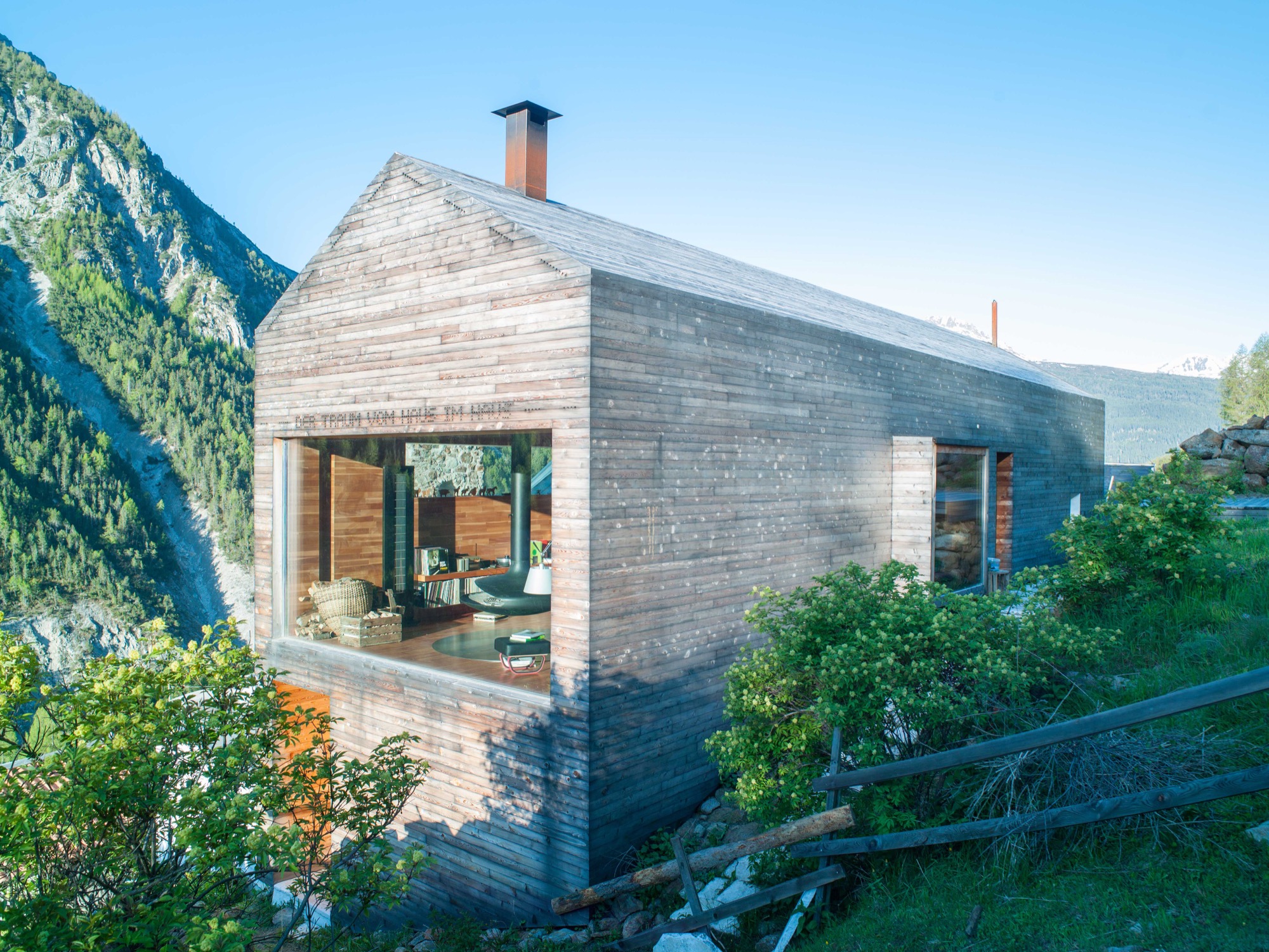
Othmar Prenner lounges by the spectacular panorama window, looking out into the pristine nature of South Tyrol. Modern fiberglass lines allow him to work up here, straight across from the massive, snow-capped peaks of Italy’s Vinschgau.
Technology and nature don’t contradict one another, if you ask the artist and sculptor. On the contrary. The Internet enables him to be in nature while developing new art projects and designing furniture and objects made of wood.
It is here, in his native South Tyrol, that Prenner found his way back to his craft and rediscovered the joy of creating something new with his own hands.
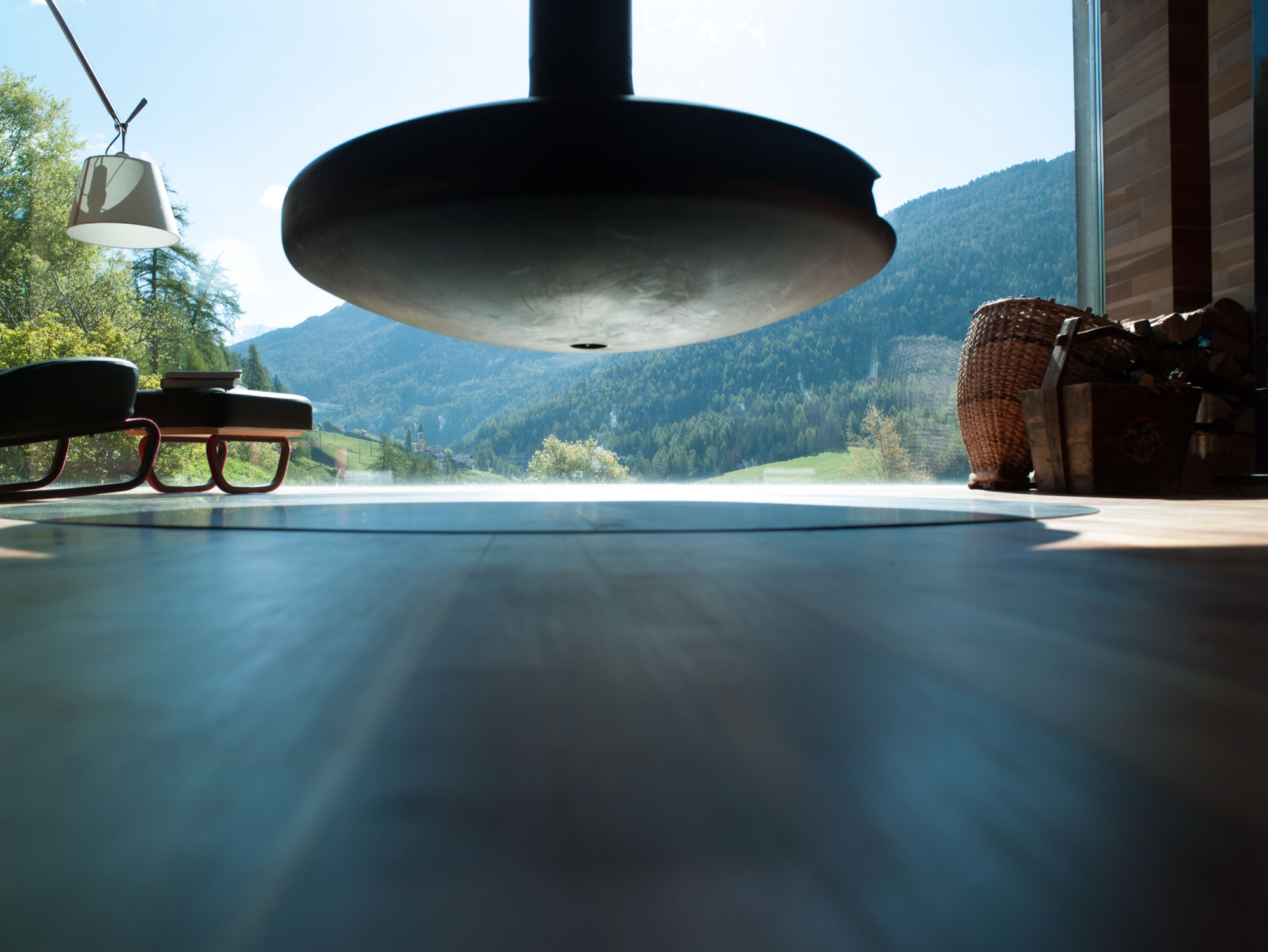
Every corner of his remodeled farmhouse, completed in 2011 and internationally published more than twenty times, is filled with tools, paintings, finished and unfinished pieces of furniture, and all sorts of arts and crafts. The home is vivid, and it’s cozy in front of the black steel fireplace—a focal point—suspended from the ceiling. Othmar Prenner loves the open flames, the feeling of sitting by a campfire in his living room. He dismisses ovens with glass doors and generally has his own and very clear ideas about architecture and interior design.
He helped build an atelier and gallery near Zurich, Switzerland. “I only do things I like 100 percent,” Prenner says. “That’s why I’m not interested in collaborating on big projects, where you have to make 1000 compromises.”
This was far from the case with his very personal project, the mountain retreat at home in South Tyrol. Here, the almost fifty year old was able to realize his design vision one to one and create a refuge that meanwhile has become his primary residence and studio. Rarely does he drive back to his apartment in Munich these days. “I never thought I would leave the city. I’ve lived there for twenty-two years,” he says. “My focus is here now. I love living in nature and don’t need the city.”
“My focus is here now. I love living in nature and don’t need the city.”
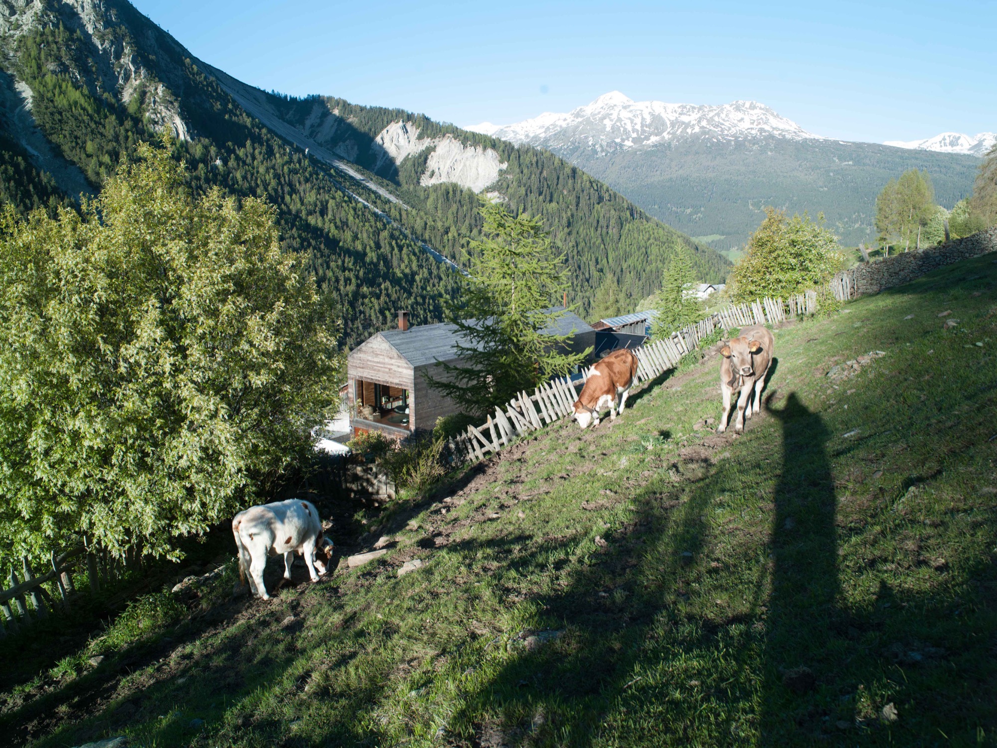
Art in the city, craft in the country
Prenner bought the old house in his native region near Mals twenty-five years ago. The property is part of a small hamlet that is still being farmed in a steep valley on the Reschen Pass near where Prenner grew up. In his stube, which is nontraditionally located on the second floor and combines the kitchen and dining room, he tells me he spent many childhood hours carving wood and that he has always wanted to become a sculptor since he was a young boy. His parents had little understanding for his artistic ambitions but agreed to a cabinetmaker apprenticeship. Prenner strived for more and afterward studied in Innsbruck and later in Munich. Today, his calling has become his profession, a mix of sculpture and designing furniture and objects for the home. “During my Munich years, it was definitely the arts, now I’m balancing both,” says Prenner, who recently returned from Salone Internazionale del Mobile, the furniture show in Milan where he introduced the lathed containers and boxes he sells under the brand Like a Box. The response to the boxes made from Swiss pine, the turned salt and pepper mills, and the forged knifes was incredibly positive, he reports. Even Vitra showed interest. Traditional craftsmanship is back in demand, and Milan showed it.
The dream of paradise
In his own alpine domicile, Prenner takes his love for wood to the extreme. The large window reflecting the mountain peaks pops out against the buildings homogenous, light exterior. The words “Der Traum vom Paradies” (the dream of paradise) are stamped into the minimalist fine wood facade. In the back of the small house, the roof was cut open to add a floor for the new living room. The house’s exterior as well as the interior of the grand stube are almost entirely clad in wood. A total of 250 square meters (2692 square feet) of finest parquet were installed. The larch wood came from the valley here and was specially cut so the pattern of annual rings would run ever so calmly and evenly. The wood was processed by Prenner’s brother, who still owned a carpentry shop at the time and was capable of delivering on Prenner’s discerning specifications: “Many craftsmen merely do custom Ikea nowadays, craft and industry become more and more intermingled. Unfortunately, the sense of artisanship gets lost.”
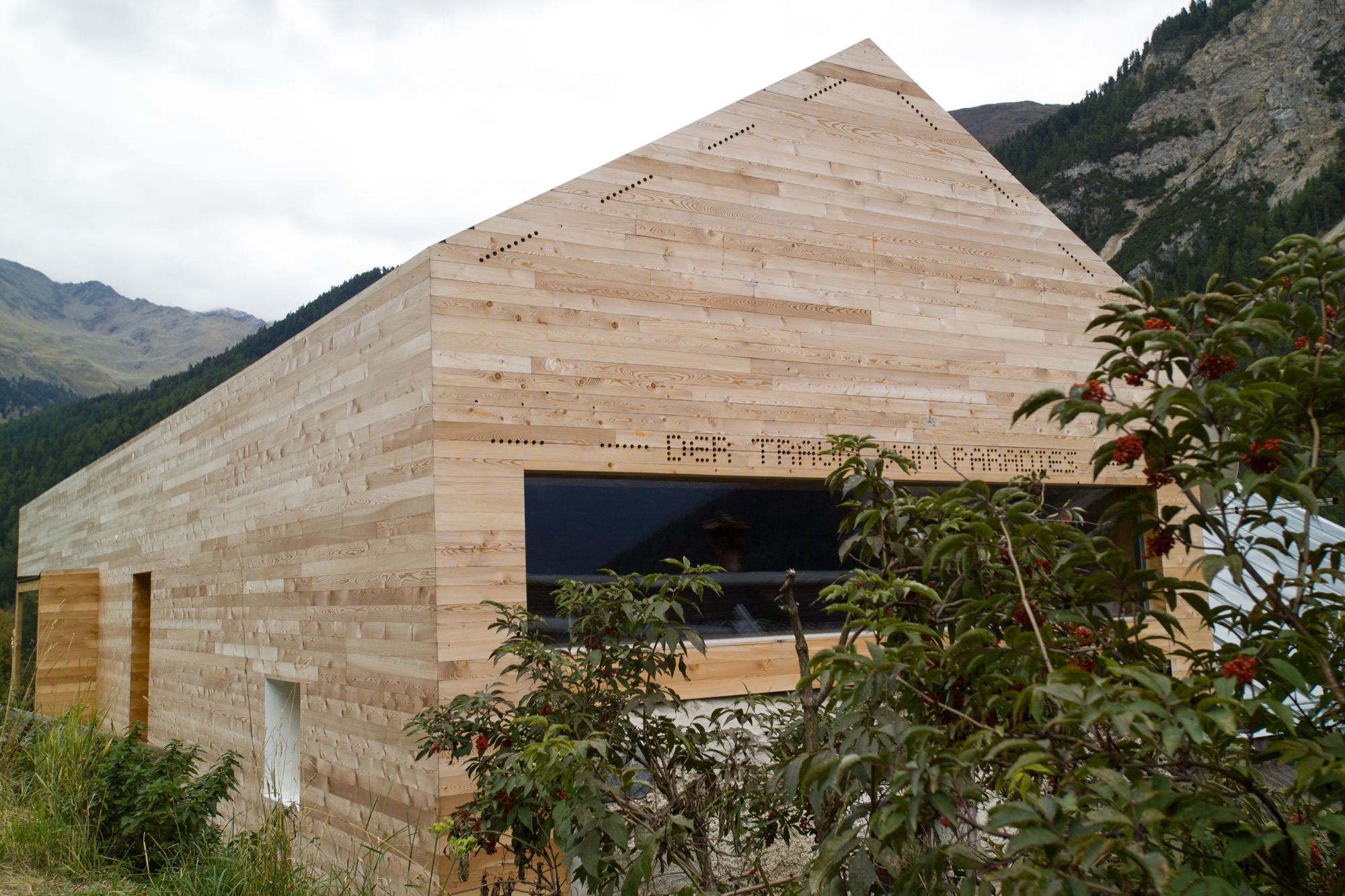
Wood as the central element was an obvious choice for Prenner. Many other details developed over the course of the building process, he tells. “It’s like working on a sculpture. Many people want to plan everything in advance and then execute one to one. That’s why I don’t like collaborating on other architecture projects.” Prenner likes to be inspired as his work unfolds. The entryway, for example, was so dark you could hardly find the doorknob. So Prenner, without hesitation, tore open the ceiling to create light, which now floods the hallway from the stube and living room above. The white marble floor brightens up the foyer still more. The stone was quarried 30 kilometers (ca. 19 miles) from here, in Laas, and counts among the hardest and whitest marble stones. “It should be self-evident to use materials from the region, and not stone from India,” Prenner notes. “There’s a new aspiration. People want to know where things come from, where materials are sourced. Things of permanence provide comfort in uncertain times.”
“There’s a new aspiration. People want to know where things come from, where materials are sourced. Things of permanence provide comfort in uncertain times.”
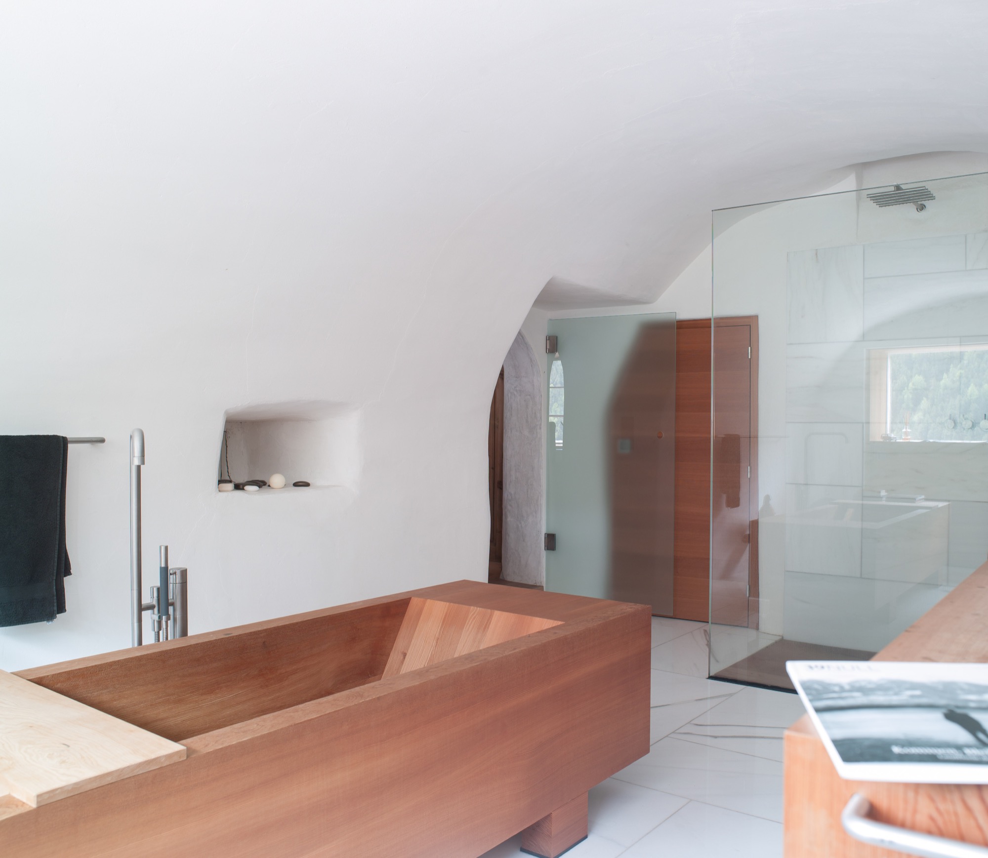
The former stube, where the original, 200-year-old wood paneling has been completely preserved, was converted to the master bedroom. After all, the house’s central theme is the view to the outside—and the ground floor affords prime views. Thus, the classic arrangement of stube downstairs and bedroom upstairs was simply flipped on its head. The master bedroom’s ensuite bathroom marvelously harmonizes the white marble and the larch wood. The freestanding wooden bathtub is the focal point.
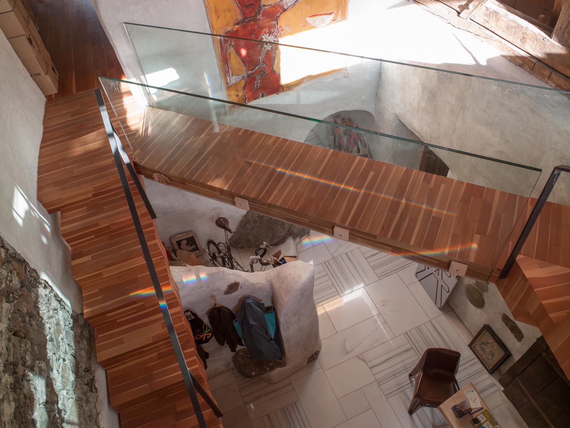
Prenner preserved the old stone staircase—or its remnants—as decorative element and a nod to the old structure of the farmhouse. The modern, floating wooden stairs and the bridge—or wooden walkway—to the living room on the second floor create the contrast. “During construction, a wood plank led across there, and I found the open crossing over the hallway interesting,” Prenner reveals.
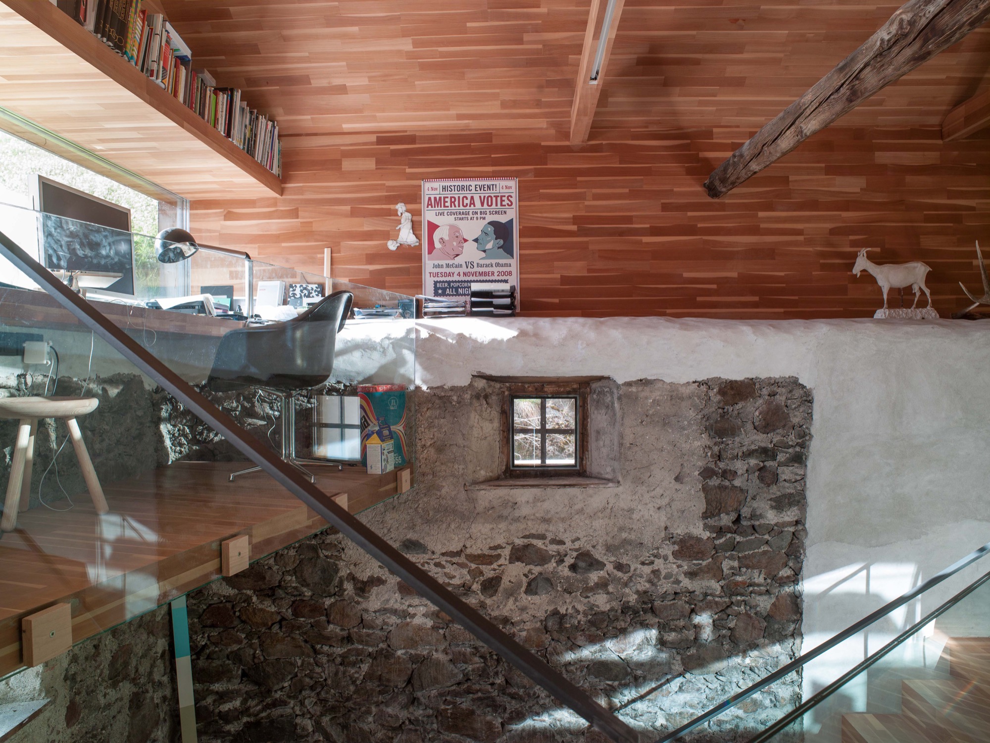
The old roof joists were preserved and support the pitch of the roof, where the living room is. Five steps lead to a narrow loft Prenner installed along the gable wall with a long panorama window, again providing spectacular views to the outside. From his desk, the artist can see the cows grazing on the lush meadow.
And the light. Prenner often missed the light when he was in Munich, particularly during the long, gray winters, he remembers. Blue skies and the special light only snow can create—here, in his house in South Tyrol, he integrates it, plays with it, lives with it.
Work and art live together
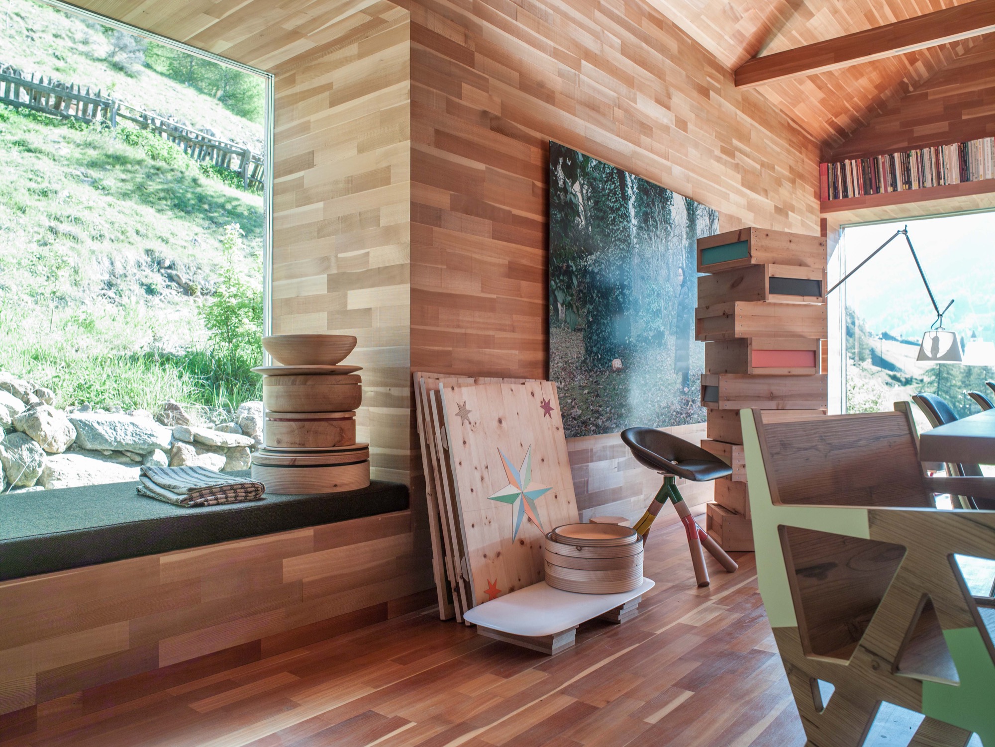
Paintings and other art objects are piled up in the living room. “This is intentional,” Prenner says. “I wanted work and art to mix. I cannot separate them anyway.” Still, he is currently building an atelier on the premises. Before, when he lived in the city, he primarily created prototypes. But now, he likes to be more hands-on in the production, together with his partner, Ingrid Seebacher. The wood for each container, which is blackened in the fire, comes from a particular tree Prenner photographed beforehand and numbered the wood sections. The photo of the marked spot from where the wood was cut is sold together with the respective object—one of the artist’s many ingenious ideas. You can discover them all over the house. Art objects made from wood waste. Leftovers from a series of chairs you assemble yourself from four pieces of wood, and which Prenner became known for. These clever chairs don’t require glue or screws. In Prenner’s home, they are part of a group of miss-matched chairs around the large dining table and around the cozy stube. “In the old days, there was no ugly furniture because it was all made from solid wood,” Prenner contemplates. “But a lot is happening now. People are sick of cheap stuff made in China.” Prenner regards sustainable and organic as standard, which shouldn’t need to be pitched on a label. Sitting by the fire, he talk about the region here around Mals, soon to be the largest community in South Tyrol that is completely pesticide free. He tells about a baker who has re-sown old spelt ears from the eighteenth century and is now selling spelt bread. Stories like this are fitting for the stube and the beautiful, pristine landscape. Looking out the window and at the mountains, I can appreciate that one man's dream of paradise has come true here. △
“In the old days, there was no ugly furniture because it was all made from solid wood.”
 Othmar Prenner was born in 1966 in Schlanders, South Tyrol, Italy. After an apprenticeship in carpentry, he studied sculpture at the HTL Innsbruck, Austria, and later at the Akademie der Bildenden Künste in Munich, Germany. The website Dinge und Ursachen lists Prenner’s many projects and exhibitions. You can purchase his Swiss pine boxes and containers from the online shop Like a Box.


