Inspirations
Explore the elevated life in the mountains. This content debuted in 2015 with Alpine Modern’s printed quarterly magazine project.
Seduction Design
Former Eames art director and CommArts co-founder Richard Foy muses on the bowerbird’s incredible construction and composition skills and human design
Design is everywhere. People have always valued design expertise, even dating back millions of years to the first tools ever used and now recently unearthed. From the harnessing of fire, clubbing of opponents, carrying water in vessels, throwing spears, and using fur blankets, to riding around in Teslas, we like and rely on design.
Daily design
Today, most everything we have, use, want, and need is designed. We have even designed robotics and programs that design things for us. Every time we dress ourselves, email, make a meal, buy things, plant gardens, do a spreadsheet, we become designers. We are making functional decisions based on what we need, what it says, and how it feels. We are reflecting ourselves and how we want to be perceived through our choices. We are designing. We do this daily for work, pleasure, and living, without pause or conscious thought.
Design is intrinsic to art, invention, and creativity. Design is different from art because it tends to focus on underlying structure, function, or purpose more than personal expression—although the best designs have or tell a story that expresses a point of view. We rely on design for practical solutions to everyday problems or issues. A lot of design is offered as a service to help people, businesses, and institutions.
Design and cultural creativity advance humanity
The professional practice of design creates solutions and makes the places, products, and market of the future. We value communities where there is a high level of design and cultural creativity that responsibly advances society. Florence emerged during the Renaissance because of its design and art contributions, which we still value 500-plus years later. Humanity, backed by theology claims dominion over all species. From the human (not particularly Biblical) view it’s based on our historically unmatched and singular ability to design, make, and use tools.
Amorous architecture
A newly recognized and different breed of designer is practicing in Australia and New Guinea. They have gained notoriety by becoming experts on the art of seduction. Their primary design passion is the field of amorous architecture, interiors, landscaping, and the courtship arts of song and dance. The places they build attract, entertain, charm, and seduce females. They are among the best in that business and are studied and respected worldwide for their thorough design approach, execution, and resulting social benefits. They have perfected their skills over thousands of years, which further attests to their expertise and effectiveness.
"Their primary design passion is the field of amorous architecture, interiors, landscaping..."

Attraction by design
Creative human designers like to wear black clothing. These designers prefer feathers, as all are members of the bowerbird family. Their closest kin on this continent are ravens and crows. Some bowerbirds are a bit larger and live a little longer, up to twenty-seven years.
Another consideration before comparing bird designers to human designers is the possibility that their design creativity may emanate from the same source. Design as a noun identifies something intentionally made or resulting from an idea or plan. Design as a verb is an act or the process of making, visualizing, creating, or turning an idea into a new reality.
The design process, whether painstakingly thoughtful or impulsively spontaneous follows a pattern. Stasis, curiosity, imagination, question, attempt, failure, learning, success, change. Change as a causal dynamic is as present in the space, time, matter, and energy of the cosmos as it is in the buzzing subatomic and atomic particles of our biological cells. The question is what or where is the intention responsible for the nonhuman-made, natural world?
Source and cause of design
There is a Zen koan that says, “Learn to listen to the wisdom inside of a rock.” Are humans and other biological creatures all part of the same dynamic forces responsible for change? Are we all variants of the same energy that cannot be created (designed) or destroyed but only transformed? Is change the cause not just the result of creative design? Does the bowerbird follow the same design impulse as do humans? Our link may be that we were all designed by the same cauldron of the cosmos 13.8 billion years ago. We are the same stardust particles that were floating around then but reconstituted by evolution, physics, gravity, thermodynamics, and chemistry. Maybe bowerbirds, rocks, and everything is caused by constant flux of creative change, at one with the universe.
"Maybe bowerbirds, rocks, and everything is caused by constant flux of creative change, at one with the universe."
Male bowerbirds are renowned for designing painstakingly ornate, complex, and personalized bachelor pads and performance routines to attract females for amorous encounters. A female bowerbird requires and insists on unlimited choice and opportunity to select her mate based solely on her assessment of how well the male earns her trust and displays his creative intelligence. The stakes are high. Seventy-five percent of females in one study area visited only the one same bower out of dozens of offerings before mating.
Older, more experienced males will succeed with dozens of females in a single breeding season while younger males will seduce only a single one of his dozens of visitors. A lot rides on the design quality of the bower; its form, color, and execution, followed by a concert and dance performance. Providing a sense of comfort in combination with self control, respect, and restraint gains reproduction rights that help determine the survival of their species. Everything is designed for the pleasure of the female and winning her mate-selection preference.
Bower architecture
A bower is defined as a secluded place, often in a garden, enclosed by foliage or an arbor. It can also be a summer house or garden cottage, an inner room, or a boudoir. Lovely.
Males build three types of bowers: “maypoles,” “mats,” and “avenues.” “Maypoles” can be single- or double-masted towers. Some are built around a young sapling that becomes its centerpiece. Others have curved walls that frame and showcase the awaiting male. They are dotted with colors that help their visibility and location of the bower below. Sometimes a roof is designed immediately below the tower, which provides shade or privacy in the bower. Towers stand out from the brush and call attention through their distinctive forms.
“Mats” are landing pads made from collected plant materials such a fresh green moss that has been carefully laid and ringed with individually selected and arranged ornaments; making, if you like, the equivalent of an oriental rug. It may contain fresh leaves, petals, owers, snail shells, bits of foil, candy wrappers, pebbles, glass shards, fruit, colored plastic utensils, bottle caps, can pull-tabs, all of the same color or predetermined mix of colors. One researcher found a glass eye in a bower, undoubtedly a very distinctive and intentional treasure piece ripe with symbolism.
“Avenues” are longer and narrower mats that seem to function as landing strips; again, they are ornately marked with color-coordinated found objects. Airport towers, landing pads, and runways would be the human architectural equivalents.
All three schemes sport specific colors that may be a single dominant color or an arrangement composed of multiple colors. Blue seems popular as evident when searching Google images. All are designed to be spotted from the air by mate-seeking females. These are not unlike the bright signs at Saturday night social gathering places and night clubs.
The colors of decorative elements that males choose for their bowers match the preferences of females. Male bowerbirds play to their audience and design for their market segment and demographics. Bowerbird species that build the most elaborate bowers are dull in color, whereas the males of species with less elaborate bowers have brighter plumage.
"The colors of decorative elements that males choose for their bowers match the preferences of females."
The design critics
Males are assessed based on the quality of their bower construction. Males with quality displays achieve mating success, suggesting that females gain important benefits from mate choice. Bowerbird ornamentation is perceived as a sexual indicator of general health, intelligence, and disease-resistant heritage.
The various twig fences, arching walls, roofs, and decorations get painted or stained by colors made by chewing plants and adding charcoal with saliva. Lastly, objects are sometimes arranged by size, large to small, that create a false perspective to hold attention and gain the advantage of more time spent. Perspective also makes the awaiting male appear to be a bigger and better mate.
Females search for mates by visiting multiple bowers, returning multiple times, watching his elaborate courtship displays, inspecting the quality, and tasting the paint the male has made and placed on the bower walls. Many females choose the same male, and many underwhelming males go without mates. Females choosing top-mating males tend to return next year and search less.
Bowers take weeks to design and build, are constantly refreshed, and their color elements are rearranged with bright, shiny ones. Males will also do recon flights to inspect their competition and steal whatever bauble would make their bower more attractive.
Showtime
Once the stage has been set and a visitor lands nearby, it's showtime. These Justin Timberlake males must know how to dance and sing in order to seal the deal. Male bowerbirds are superb vocal mimes. They have been known to imitate pigs, waterfalls, and human chatter. Some bowerbirds mimic other local bird species as part of their own concert. Then the male has to strut his stuff, and strike outlandish poses while dancing and singing to lure his guest into the bower.
A female chooses to visit only bowers that appeal to her. She will land close but far enough to avoid feeling threatened. When she comes closer and stops she may allow the male to approach and mate. A too-eager male will fail. Males only succeed when the visiting female feels comfortable and protected from more aggressive males.
Imagine if every human male had to individually design his architecture, build it alone, lay out a garden, design the interiors, furnish it, paint it, maintain it, sing, dance, and strike poses, or he wouldn’t even get a date!
The social implications of the bowerbird species have always been based on consideration of the female societal role. Only in the last few decades have some western societies realized the importance and significance of women to civilization. Today, there are more women on the planet, more women in the workforce, and in the educational system attaining higher academics than men. CEOs estimate that 80 to 95 percent of all consumer spending is determined by women—homes and their locations, insurance, appliances, furnishing, food, clothing, schools, and even tools.
Bowerbirds seem to have long designed for a sociology that has always given females due respect, something that has taken far longer in human societies.
“Bowerbirds seem to have long designed for a sociology that has always given females due respect, something that has taken far longer in human societies.”
The bowerbird model is a classic lesson on how successful design is doing the best you can, with what you’ve got, in terms of what social values you encourage through design.

Richard Foy, former art director for Charles and Ray Eames and founding partner of CommArts design firm, has designed many brand identities and places worldwide, including Madison Square Garden (New York City), O2 Dome (London, UK), Pearl Street Mall (Boulder, Colorado), LA Live (Los Angeles, California), and the branding for Spyder Sportswear, and Star Trek — The Motion Picture.
Camera Lucida
An artist's atelier becomes a looking device into the Austrian landscape
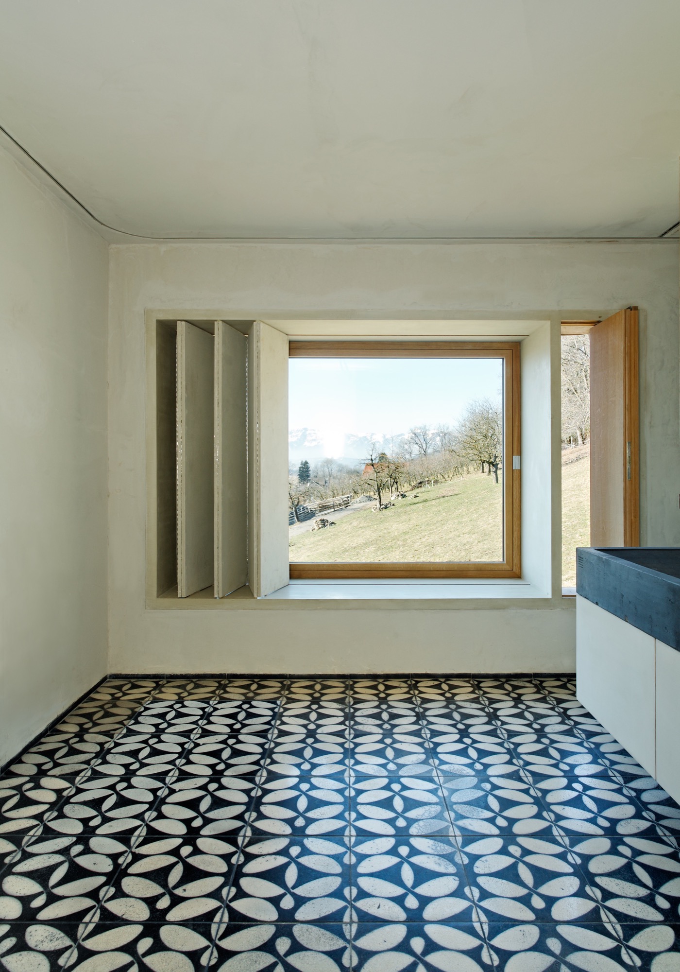
The small studio Vienna architect Christian Tonko designed for an artist friend becomes a looking device into the landscape, set in the foothills of the Austrian Alps.

The minimalist studio in Austria’s Vorarlberg region is a visual device in itself that frames the surrounding alpine landscape in two directions. In addition to a single skylight in the roof, the bilevel space has two vertical openings: The tilted glazing to the southeast lets in optimum sunlight, modulated through exterior screens. On the lower northwest end, a system of weathering steel frames allows the artist, who works in traditional media, to hoist up bronze sculptures outside and suspend them in his direct sight in front of the glass. The sculptures also receive their natural patina this way. The artist uses the upper level for sketching and painting in watercolor and the lower level for working on larger canvases and for sculpting.

Architect Christian Tonko’s choice of raw and untreated materials contributes to the character of a workshop. The interior surfaces are raw concrete, raw steel, and untreated oak. On a tectonic level, the structure responds to the descending site.
A Conversation with Christian Tonko
For whom did you design Camera Lucida?
The artist is a family friend. He recently retired and now wants to concentrate on art. The wish for his own studio has been present for many years . . . until it finally happened.

How is the space being used?
His desire was to create a space that is focused on creating art, yet, at the same time is also suitable for reading a book and looking at the landscape. It’s a small studio for drawing, painting, and sculpting for one person. It’s also intended to be a space for retreat and contemplation.
"His desire was to create a space that is focused on creating art, yet, at the same time is also suitable for reading a book and looking at the landscape."
The structure’s design is inspired by an ancient optical device, the eponymous camera lucida. What's the story behind the name?
Historically, the “camera lucida” is an optical drawing aid. It enables the artist to look at an object and a piece of paper simultaneously and, thus, facilitates tracing the object. At the same time, the term can be literally translated to signify “bright chamber.”

What was your original vision for the design of the studio?
At the beginning was the idea to build a small factory. This is where the semi-industrial character of the design stems from.
"At the beginning was the idea to build a small factory."
How did that initial idea evolve into the final design?
This idea of the small factory influenced the design on various levels. It influenced our choice of materials and surface textures but also directly informed the form-finding process. The volume is basically a box with a skylight, just like an archetypical factory building. Then it is set into the hillside and, therefore, the final appearance comes into being.
What’s it like to be and to work in the space?
It is a calm and bright place. The landscape is very present, but it is easy to focus on work and tune out everything else.

What is the synergy between Camera Lucida and its gorgeous mountain setting?
The building itself acts as an optical framing device, so the views are very clearly framed. At the same time, the building is directed towards the sunlight. A great amount of light floods in through the south-facing tilted glazing, which demands exterior sun protection. So sometimes the building is completely closed and the view is blocked.
The Alps are very close, as the site sits at the end of the Lower Rhine Valley, which means it is at the foothills of the Alps. But the building intentionally looks away from the mountains towards Lake Constance. Moreover, the site next to it is inhabited by four Cameroon mountain goats. They are grazing right in front of the window, which is a great feature as it creates a calm and relaxed atmosphere.
What’s on your drawing board right now?
I am currently working on a building that serves as a base for ski tours. It’s located close to the Camera Lucida project, but at a much higher altitude, in a great mountain setting. △


The Tree-Hugging Woodworker
A portrait of California furniture-maker Sean Woolsey
Sean Woolsey loves trees. He celebrates the perfect imperfection of the trees' inner beauty by making wood furniture by hand in California.

Woolsey, now in his early thirties, has always made things. From sewing clothes to building skateboard ramps to baking bread. In 2010, he began making furniture, out of curiosity more than anything else. He deconstructed old furniture to learn how things are made. The first real piece of furniture he built himself was a writing desk for his then-girlfriend. She liked the gift, evidently. She married him.
Woolsey’s work and life is strongly influenced by the Japanese philosophy of wabi-sabi, which recognizes the beauty of imperfection as imprint of time. To the wood artist, wabi-sabi is embodied in the naturalness of the uneven, asymetrical touches to remind us of our own and the trees' perfect imperfections. In contrast to mass-producing furniture, which can take away these imperfections, Woolsey chooses to show the truth and rawness of wood, worked by hand.

The California native, who admits to obsessing over the quality of every piece that leaves his atelier, has always been captivated by the beauty of nature’s artistry and gains inspiration from the grandeur of a mature tree and the elegance contained in its wood. In his work, he has stayed true to the same simple ideal over the years: He designs and makes things he wants in his own home. And today, that's the place the entrepreneur shares with his wife, Sara, in Costa Mesa, California.
We caught up with the designer, furniture-maker, and fine artist only a short time after the birth of his daughter, Ondine, to talk about what home means to him, what traditions make his his modern products timeless, what inspires his designs, and more.
A conversation with Sean Woolsey

Who are you, in a nutshell?
A husband, father, artist, woodworker, tinkerer, artist, businessman, creative, friend, surfer, ping pong enthusiast, amateur knife-maker, bread-maker, pizza-creator, dreamer, risk-taker, traveler, tree-lover, ever curious human.

How did you grow curious about designing and making furniture?
It started very naturally and slowly. I was burnt out on making clothing and running my own clothing line. I was drawn to creating things with my own hands and to being more connected with what I was making, instead of just designing it and having someone else make it. I have a real obsession with creating, whether it be a pizza oven in my yard, furniture, a knife, or my own house.
"I have a real obsession with creating, whether it be a pizza oven in my yard, furniture, a knife, or my own house."

What inspires your designs?
So many things and people, but mostly the inspiration is rooted in making furniture that I would like in my own house and like to own for years, not just what is on trend. Much of the inspiration comes from the act of designing and tinkering around. Designs evolve, ideas feed other ideas, and things move with movement.
"Designs evolve, ideas feed other ideas, and things move with movement."

Your modern products appear rooted in tradition. What timeless merit drives your practice?
Functionality, with an utter respect and appreciation of materials and craft.
Is there a continuous theme to your designs?
I don't think so. I think, the only theme is making the best quality products that we can. The theme of materials and design is always changing and progressing.
How do you choose and source your materials?
The wood we use is predominantly American hardwood, such as walnut, white oak, or maple. We purchase most of it locally and occasionally purchase directly from mills, usually on the East Coast. We feel honored to work with wood, and we love trees. We plant a tree for every piece of wood furniture we sell, in honor of the customer, in partnership with the Arbor Day Foundation. It is our way of giving back to nature what it has loaned to us. We also work with steel, brass, glass, leather, et cetera. And we are always looking for new and fun ways to incorporate mixed materials and creating a story with the materials. We are fortunate to have many other talented crafts people locally, who help us with these other materials.
"We feel honored to work with wood, and we love trees."

What makes you a modernist?
The way of thinking about clean, good design that is functional, beautiful, and accessible — and designing to that.
What does quiet design mean to you?
Quiet design to me means designing slowly and enjoying the process. I often enjoy the process more than the end result, as many artists would.
"Quiet design to me means designing slowly and enjoying the process."

Talk about the immensely beautiful fine art pieces in your Copper Series and their synergy with your furniture-making.
The art is a release for me. It always has been. It is the complete opposite of furniture-making, which is very accurate, wrong or right, and precise. The artwork on copper is fluid, free-flowing, expressive, and experimental. Mistakes often make it better or more interesting. The Copper Series was inspired by the ocean, and its meaning to me. The series is ongoing and ever-evolving but always the same size and always inspired by the ocean, whether it be the color, movements, or captivating calm or power it holds.

Describe your dream home...
A home that is comfortable, in a beautiful location in the mountains or desert, with treasures that we have collected all over the world, and open to sharing meals with friends and family.
What does “home” mean to you?
A refuge where we can relax, recharge, make memories, share stories, laugh, cry, and feel good about it all.
What’s your favorite place in the world?
Oh, so many. I have been fortunate to travel a lot internationally. I am really drawn to Japan, and their culture and way of life. To me, Japan is simple, humble in its design yet meticulously thought out, timeless in its approach to craft. And the Japanese are the most focused people I have ever met. The mixture of it all is super intoxicating and inspiring.
What’s most important to you in life?
God. My family. Friends. Creative pursuits. Having fun.

Who is your design icon?
There are so many. The short list is Wharton Esherick, Dieter Rams, Robert Rauscheberg, Lloyd Kahn, Sunray Kelly, Jay Nelson, and Jean Prouve.
Who inspires you to be the person you are?
My wife and my friends largely inspire me to be who I am. As iron sharpens iron, they are constantly encouraging me, whether they know it or not.
What is your life philosophy?
This quote by Mark Twain sums up a lot of my life approach: "Twenty years from now you will be more disappointed by the things that you didn’t do than by the ones you did do. So throw off the bowlines. Sail away from the safe harbor. Catch the trade winds in your sails. Explore. Dream. Discover."
What are you working on these days?
We are constantly working on new designs; right now, some chairs. I am also working on some copper art, as well as a new art series that is going to be really fun. Also, we just had a beautiful baby girl three weeks ago, so... working on that right now (laughs). △
More of Sean Woolsey's work...
Traditionally Modern
At home with Markus Meindl, the modern mountain man behind Bavaria's traditional maker of lederhosen for the new alpine lifestyle between the forest and the city.
The luxury label Meindl—known for fine, handmade lederhosen—and its CEO, Markus Meindl, deftly move between alpine costumes and fashion, between city and country, between tradition and modernity.
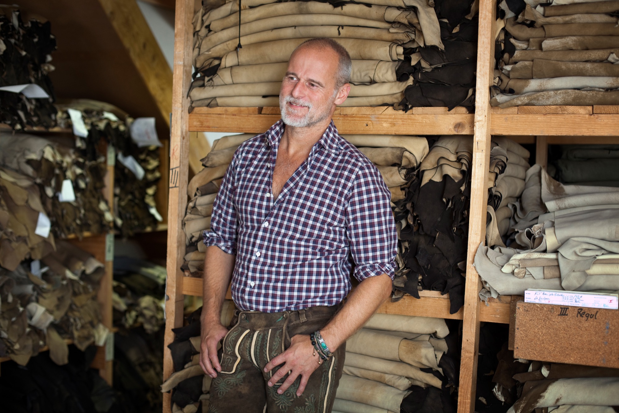
When he was only eight years old, Markus Meindl stitched himself a leather satchel for school. In all likelihood, the result was extraordinary and made the young lad stand out among his classmates. Today, in his mid-forties, the head of Meindl Fashions continues to stand for new ideas, for modernism, for innovation, although or perhaps because he works—and lives—for one of Germany’s best-known companies of tradition.
The urban country home Meindl built for his family near the Austrian border reflects his desire to blend modern and traditional. The minimalist house primarily makes use of natural materials, such as wood and leather, but also a lot of glass and concrete, contrasting with the row of picturesque houses across the River Salzach, on the Austrian side.
The man’s fervent passion for craftsmanship and natural materials is also at the core of the Meindl brand. Along with its traditional lederhosen, the Bavarian family enterprise has long built a multifaceted portfolio of well-crafted leather garments.
The first Meindl lederhosen
It all began when Lukas Meindl, a local cobbler in the idyllic village of Kirchanschöring in Upper Bavaria, tailored his first pair of lederhosen in 1935. Even then, uncompromising quality and the highest form of handcraft were paramount, an art form. The name Meindl dates back even farther, to the year 1683, when Petrus Meindl was officially documented as shoemaker. Markus Meindl is particularly proud of the long family tradition. After he graduated from high school, trained as garment engineer, and apprenticed as couturier, young Meindl didn’t have to be asked twice to join the family company. On the contrary. “That has always been the matter of course for me,” Meindl says. “I practically grew up in the company and have developed a passion for leather material and leather garments at a young age.”
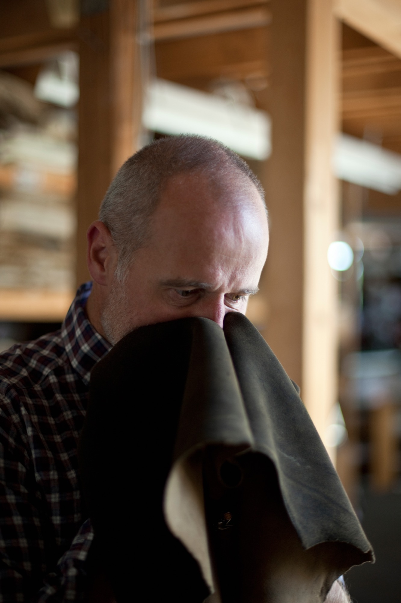
His zeal for creating something new comes from deep within. He has always wanted to develop products he loved himself. Father Hannes Meindl gave Markus the creative freedom and the space to let his youthful zest flourish. “If I’ve learned one thing from him, it’s his free-spiritedness. His honesty in working with the product. But also his honesty in leading his employees,” Meindl says of his father.
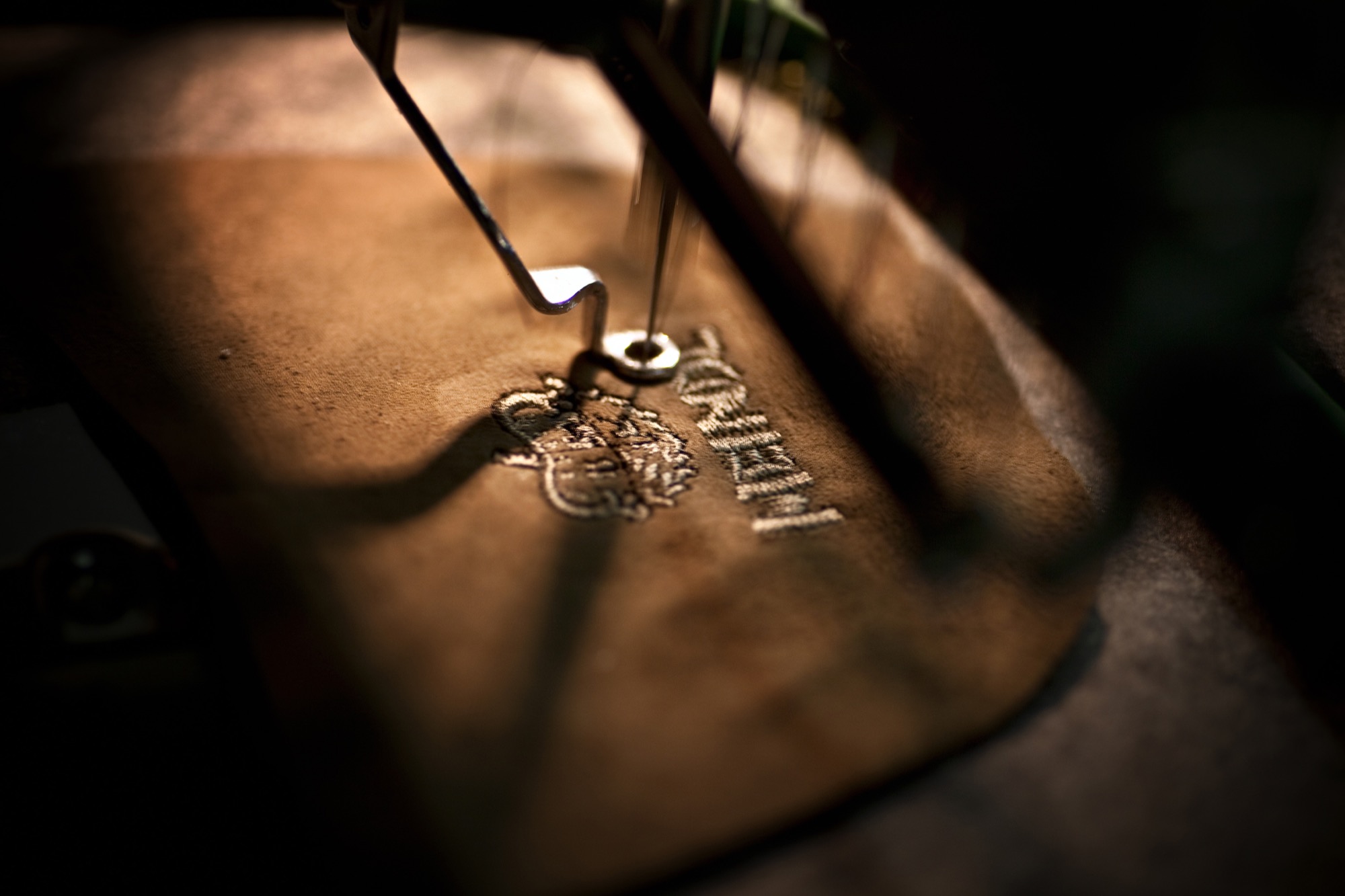
At age seventy-four, Hannes is still actively involved in the company wherever an extra hand is needed, whether that’s in sales, in production, or in design. The traditional embroidery, however, is Hannes’s favorite component. Meindl Fashions is famous for its chamois-tanned buckskin lederhosen with lavish hand-embroidered motifs, especially in the Alps, in Austria and southern Germany with their large festivals, such as the Oktoberfest in Munich. Up to sixty hours of manual labor go into handcrafting a pair of Meindl lederhosen. The work is partially done onsite by Meindl’s 120 employees and partially at production sites in nearby European countries, such as Hungary or Croatia. “Every product is designed by us; the know-how all resides in-house,” Markus Meindl says. “We have the most talented team here, the most expensive equipment, and, most importantly, the shortest distances.”
The advantages of in-house, local production are particularly valuable in the development of new products. The Meindl company has long expanded from singularly specializing in lederhosen—albeit traditional alpine costumes are currently experiencing a revival among all ages. “Lederhosen are not a trendy piece of fashion. They span the seasons and are not merely worn to folk festivals and special occasions,” Meindl says. “Lederhosen afford reliability and a sense of security. They rise above time and represent a symbol against calamitous mass production and the consumer society.”
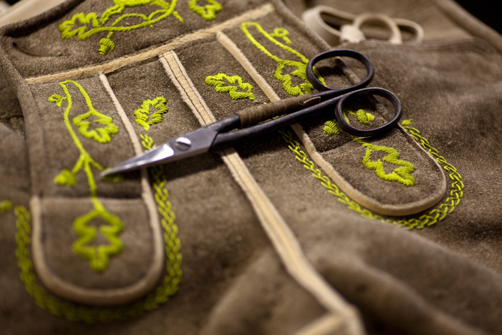
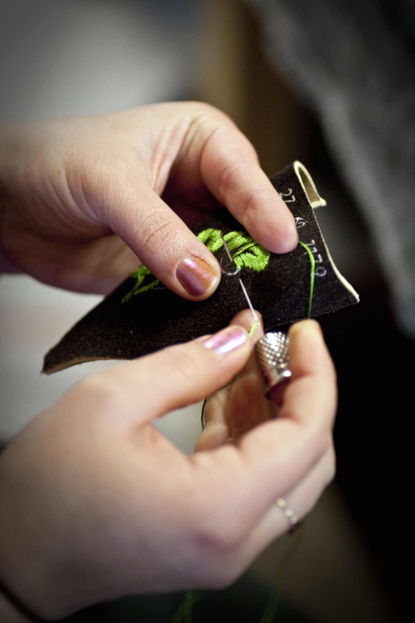
The new alpine lifestyle
Meindl Fashions, with Meindl Jr. at the helm, embodies that pinpoint propensity for this sensibility, the longing for tradition, and for significance. Markus has helped establish the term “alpine lifestyle” in the European Alps; at the very least he has fueled it with products that can be worn on the mountain and in the city: high-quality leather jackets, blazers, sports coats, knickers. Twenty-four years old at the time, Meindl got his breakthrough in 1994 with the creation of a collection for the rebel folk singer-songwriter Hubert von Goisern. It charged the label, the entire fashion industry. A new, modern style conquered the world of traditional alpine garments and found a home at fashion shows like Bread & Butter in Berlin.
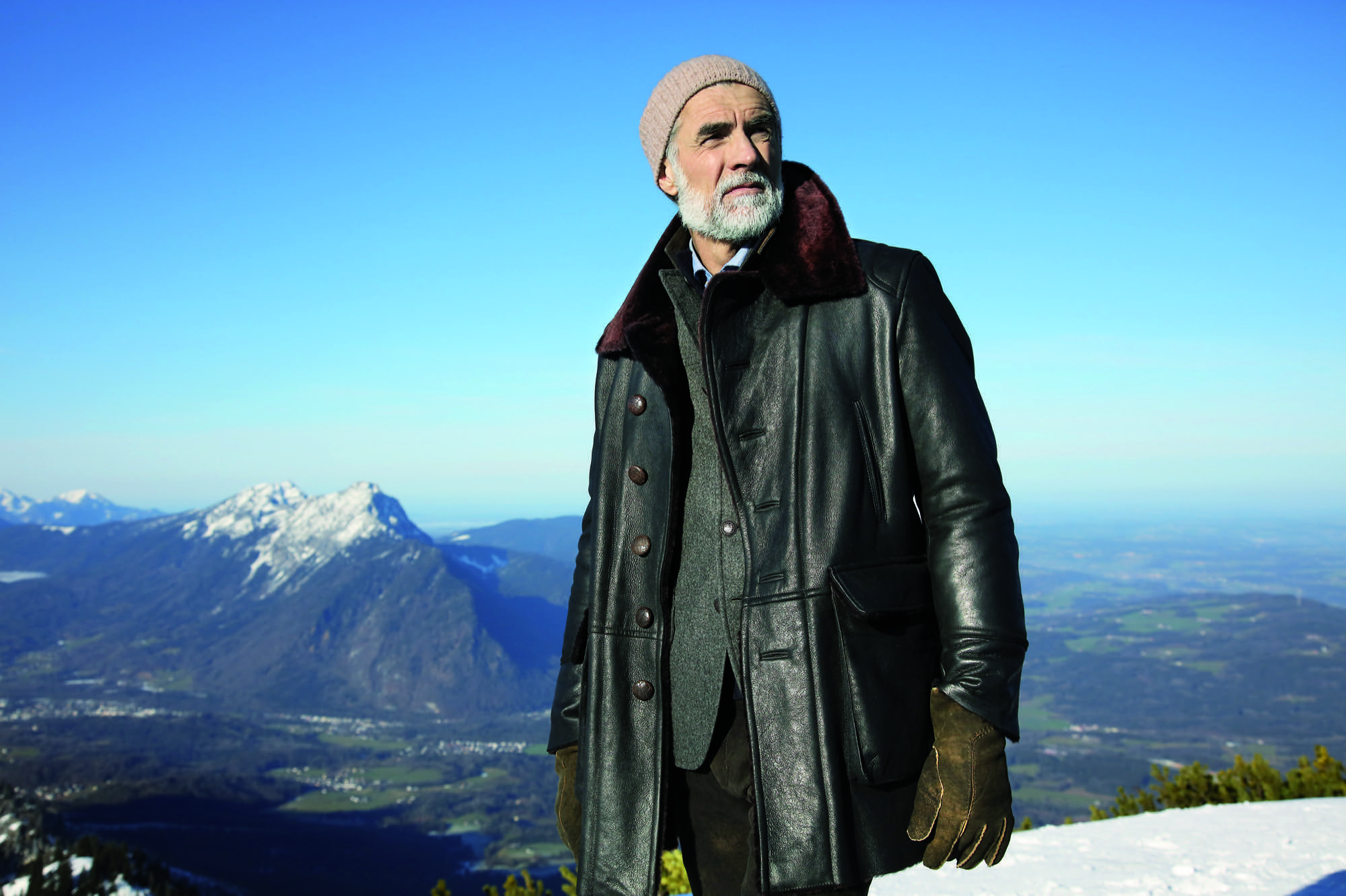
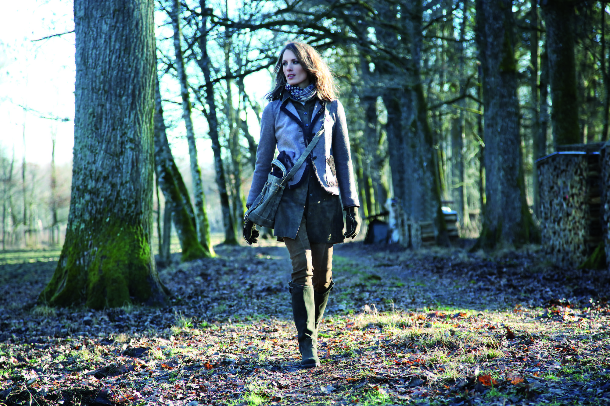
Meindl calls his style “authentic luxury”—his own language of design that derives from the combination of craftsmanship and tradition with modern fits and cuts. “Our products are authentic yet also luxurious, because they can never be mass-produced,” says Meindl. “Out of season” is Meindl’s motto. Transcending the seasons, Meindl garments can be worn in winter or on a cool summer night, adding value to each piece.

His message rings true in a fashion world that increasingly appreciates value, sustainability, and timelessness.
Nevertheless, few people really know how multifaceted Markus Meindl truly is. For instance, he designs and produces functional and innovative motorsports clothing in very limited editions for BMW. His leather jodhpurs are worn at the Spanish Riding School as well as by mounted police in Germany. His cousins run the local shoe manufactory, which makes quality mountain footwear and traditional costume shoes. A diverse product portfolio has always been the brand’s strength.
Country refuge for an urban mountain man
Quality stands above all. Timelessness, longevity—and Meindl sought to embody these values in the design and construction of his private home. “I’ve thought long and hard about how I want to design the house,” he says. “It was supposed to withstand time and still be as attractive twenty years from now as it is today.”

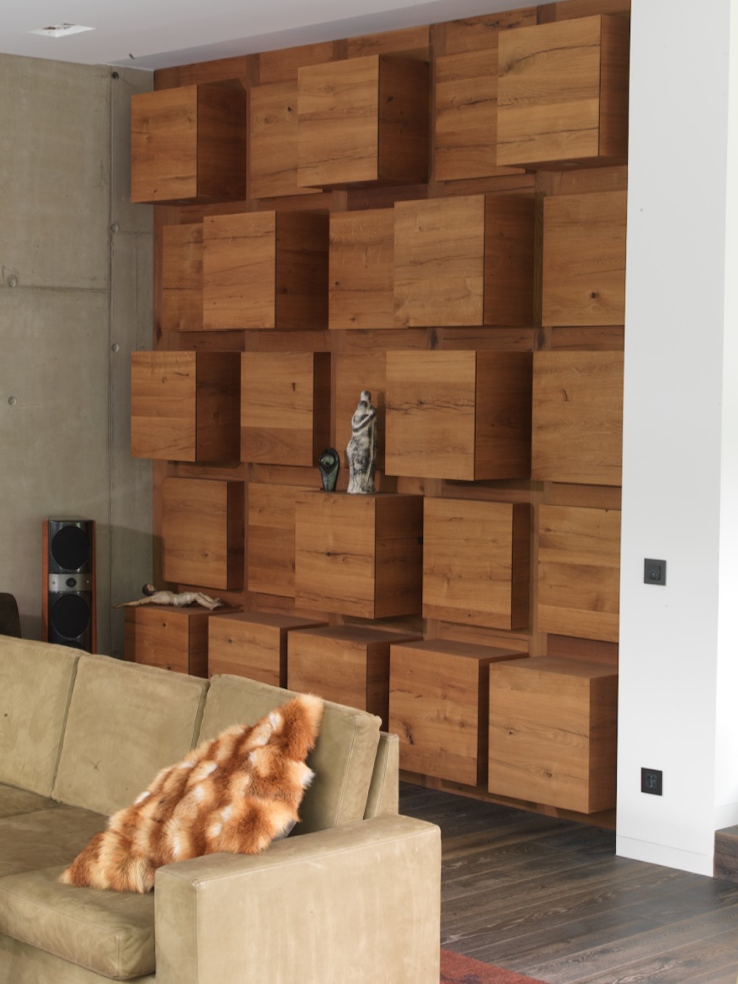
His friend Robert Blaschke of Raumbau Architekten in Salzburg, Austria, realized the project. Wood wherever you look, heated Swedish oak floors. Ceilings and walls are covered in 300-year-old oak wood reclaimed from Bavarian barns. The 3.9-meter-high (almost 13 feet) ceiling in the living room and the ceiling in the spa are lined in wooden cubes. The same element serves as armoire and shelving units in the living room and along the facade. The length of the pool—16.83 meters (55 feet)—reflects the year the Meindl company was born; a whimsical reference to tradition interrupted by modern elements. Tradition, lived modernly—that is Meindl’s philosophy. “I grew up here in the mountains. I respect the traditional way of life. I love simplicity, the value of things,” Meindl says. “But I am not a conservative man. You have to continue to develop things further, keep playing with things. That’s the only way tradition stands a chance of surviving over time.”
“I grew up here in the mountains. I respect the traditional way of life. I love simplicity, the value of things. But I am not a conservative man. You have to continue to develop things further, keep playing with things. That’s the only way tradition stands a chance of surviving over time."
Markus Meindl regards himself an “urban mountain man” who lives between the antithetical realms of an urban and a bucolic world. You work in the city during the week. And on weekends, you live in the mountains, where you go skiing, go hiking. “Clothing has to work for a meeting in the city but also be functional in the mountains and in the woods. In all of life’s circumstances. That’s the language Meindl speaks most clearly.” △
“Clothing has to work for a meeting in the city but also be functional in the mountains and in the woods. In all of life’s circumstances. That’s the language Meindl speaks most clearly.”
More from Meindl's collections...
Alpine Modern in Its Natural Habitat
Behind the scenes at the Alpine Modern Summer 2016 lookbook photoshoot
We packed up the entire Alpine Modern Summer 2016 Collection and headed up Flagstaff Mountain in Boulder, Colorado.
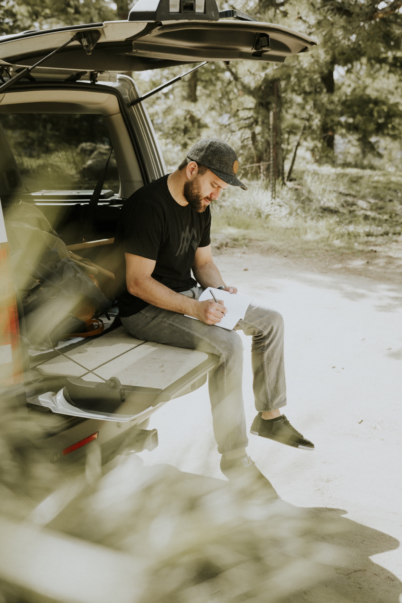
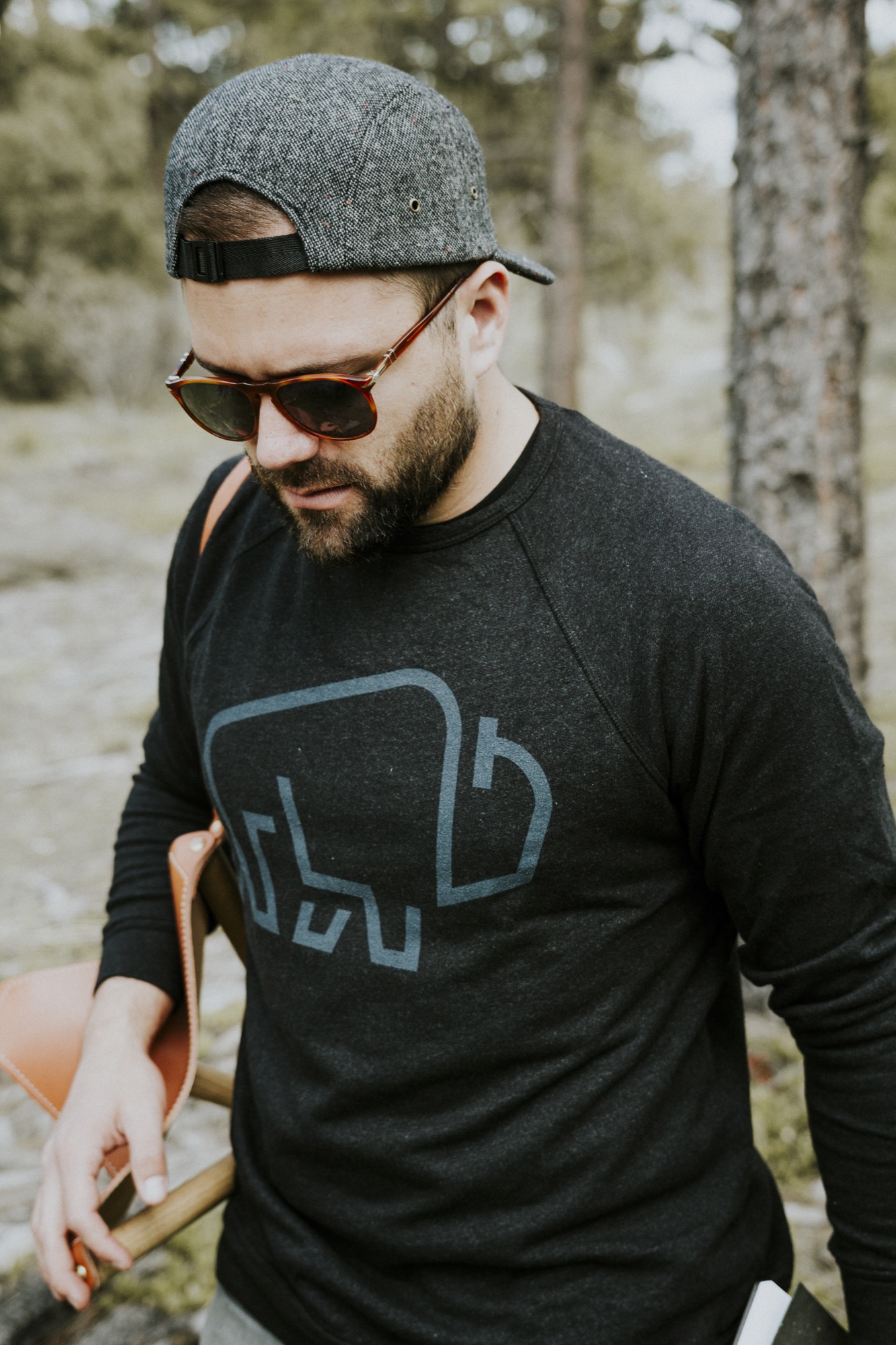
We stopped halfway up the gorgeous, winding road to the summit. The secluded spot overlooking the city was the perfect place to set up for the shoot. Our good friend Garrett King (@shortstache) behind the lens, and another good friend, talented designer and illustrator Adam Sinda, modeling.
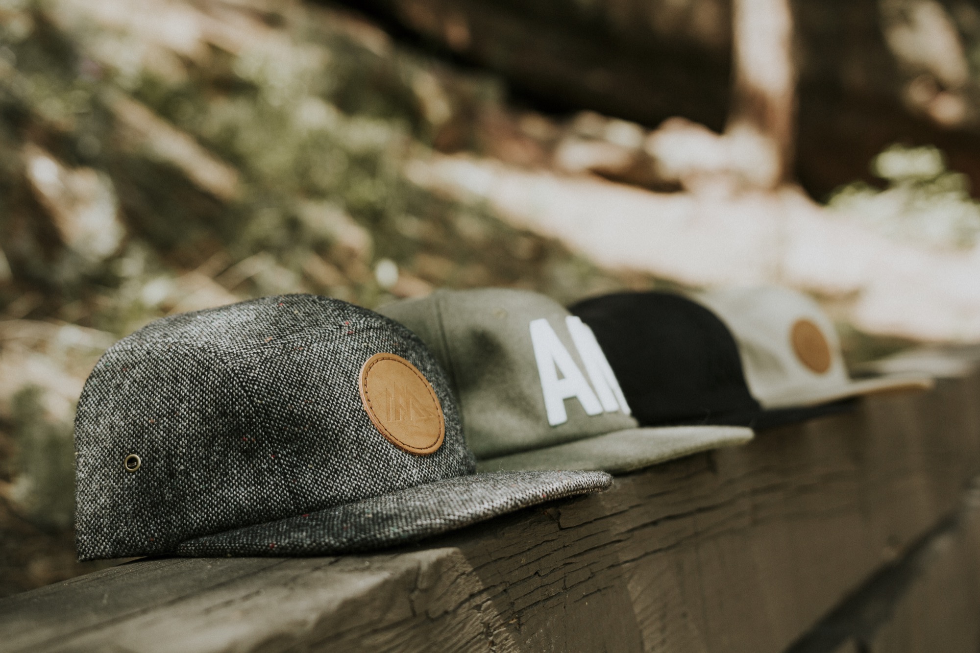
We wanted to capture our Alpine Modern Summer 2016 collection in the most natural and minimal form in which the products were designed and intended to be used. We didn't need a fancy backdrop or expensive studio. We "worked" in Boulder's beautiful backyard.
The goods we design and craft are all about elevating your life. Our mission is to bring modernism to mountain style. From our organic tees and versatile hats to our leather bags coated in an oil finish to repel the elements — our goods are crafted for the mountains but also for daily use and wear. △
More from the Alpine Modern Summer 2016 Lookbook...
Nature Is Architecture without Enclosure
Why Alpine Modern has a brief cameo in ml Robles' upcoming book "Under the Influence of Architecture"
From my upcoming book "Under the Influence of Architecture"...
So much of architecture is about replacing what exits. We remove buildings or parts of them, we scrape off land. We like new.
Then we get immensely attached to the buildings that have weathered throughout centuries. Think, Venice or historic buildings like Monticello or Westminster Cathedral. And we want to preserve them, not change a thing.
This is the discussion design enters into when we begin the critical examination of a project’s circumstances: What actually exists? Although the direction that is uncovered in the partí—the basic concept of an architectural design—holds both the physical and ephemeral, it is innumerate. Design, therefore, is a process of uncovering and illuminating the exact constructs necessary to meet the partí. And this is where the eye of the beholders produces the endless solutions to any given design problem. (Put another way, this is also where all hell breaks loose, for who is to say when a partí has been met?)
If architecture begins at the beginning of everything, and it is guided forth by secrets that cannot be told within the mind alone but are revealed by light, then it would seem that in order to uncover and illuminate the exact constructs necessary, design would have to continuously trace back to origin, to tapping the feeling that instantaneously shoots into the infinite.
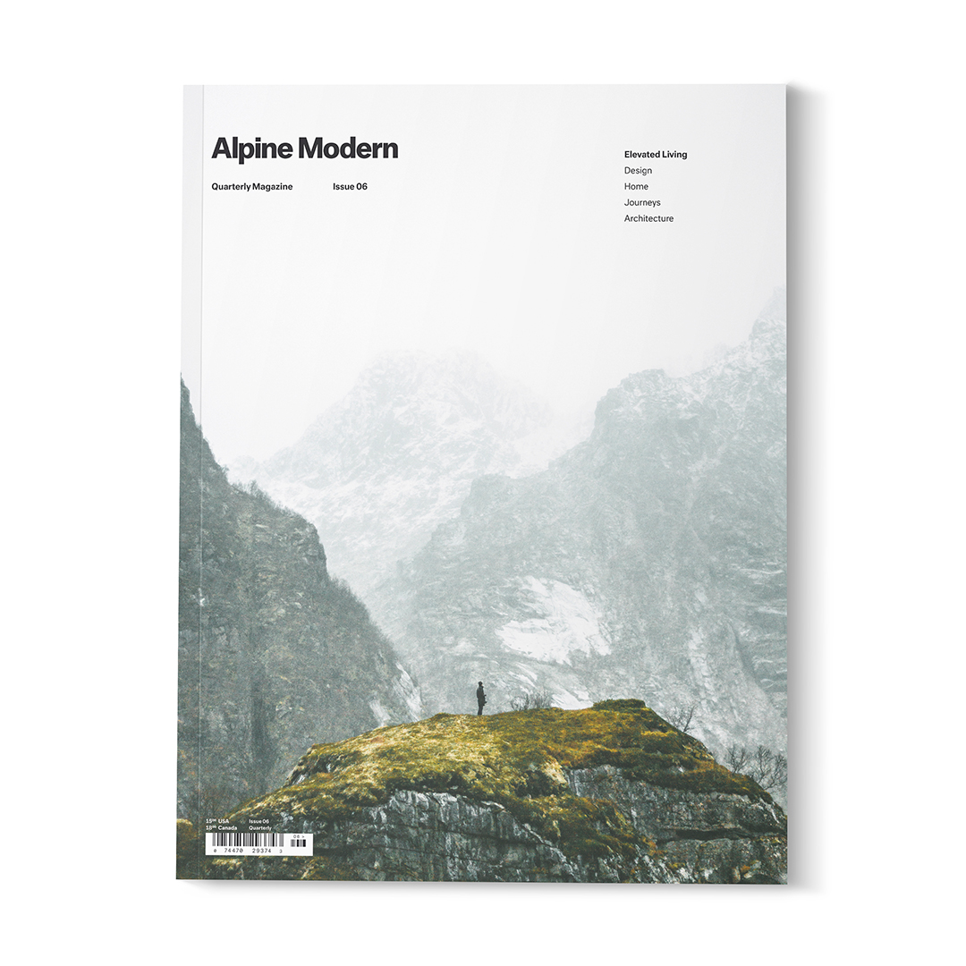
There is an image on the farewell cover of Alpine Modern’s print magazine. It is an image that fades from a near-white mountain backdrop to a dark silhouette of a lone person in profile standing on a mossy green capped rock. I stare at that cover often because it describes everything architecture is, without a shred of enclosure. △
"I stare at that cover often because it describes everything architecture is, without a shred of enclosure."
When not practicing architecture or creating singular built environments at her research-based firm Studio Points in Boulder, Colorado, ml Robles explores the source of architecture in her writings. She is currently writing her book "Under the Influence of Architecture."
The Woolly Wonderland of Donna Wilson
A conversation with the London-based creator of cashmere creatures and other wild things.
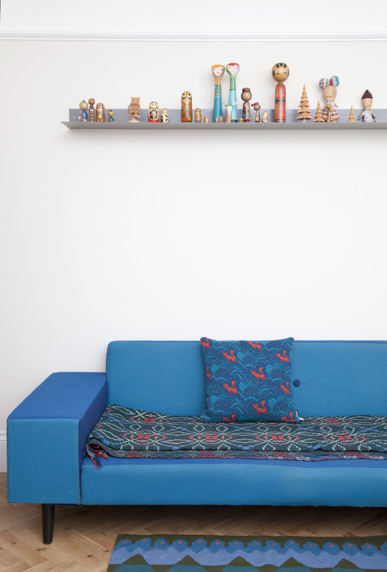
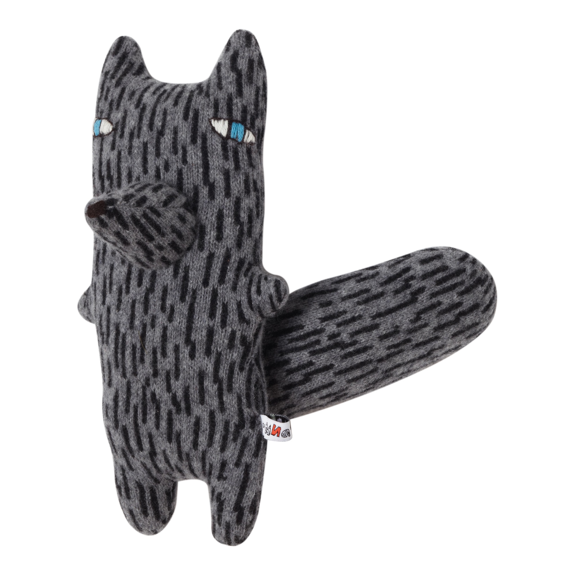
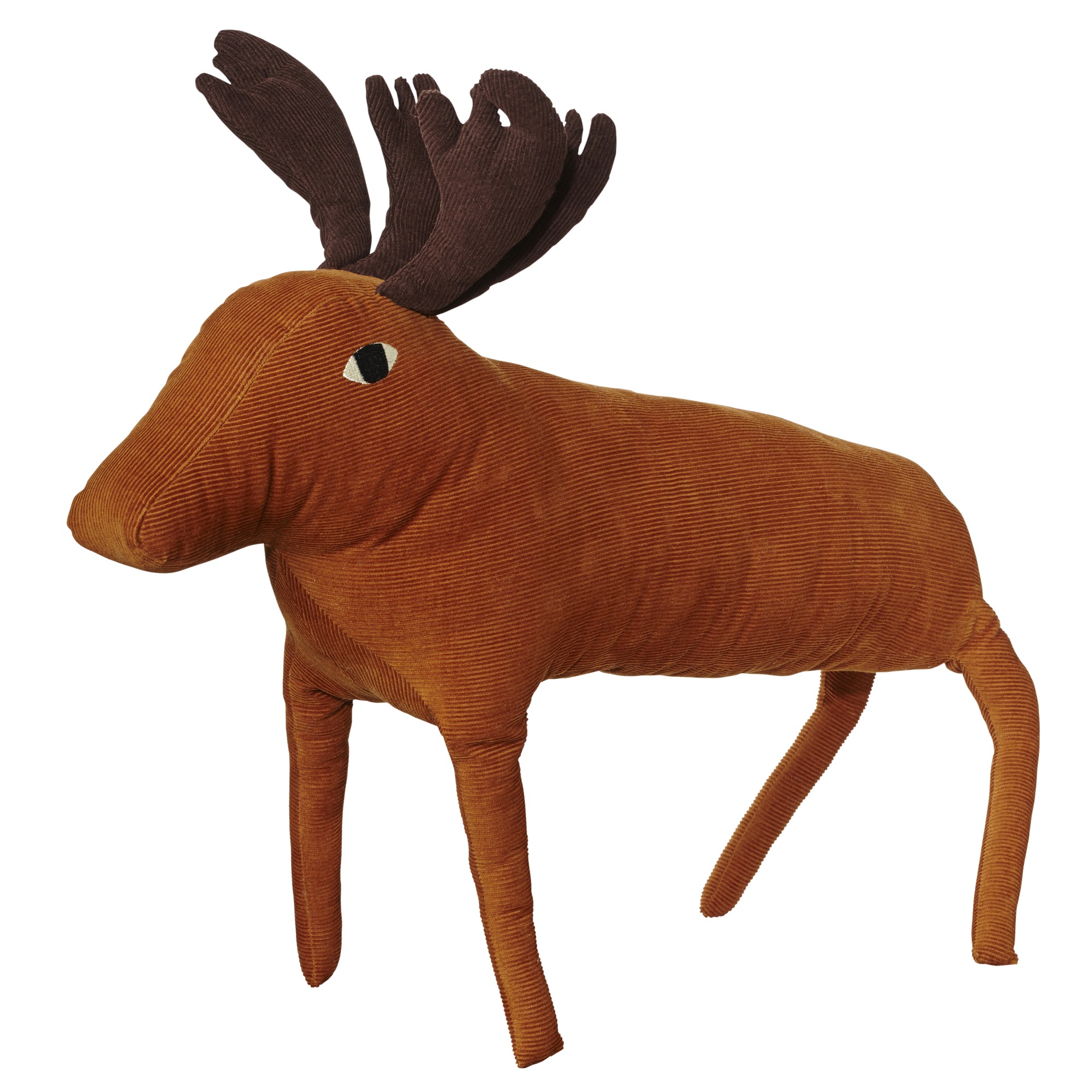
Donna Wilson's imagination runs wild. In her studio in East London, the textile and product designer, who has been named "Designer of the Year" at Elle Decoration’s British Design Awards, creates cuddly cashmere creatures and designer objects from richly textured sofas and plush cushions to hip-cute bowls and plates to the planet's most darling socks.
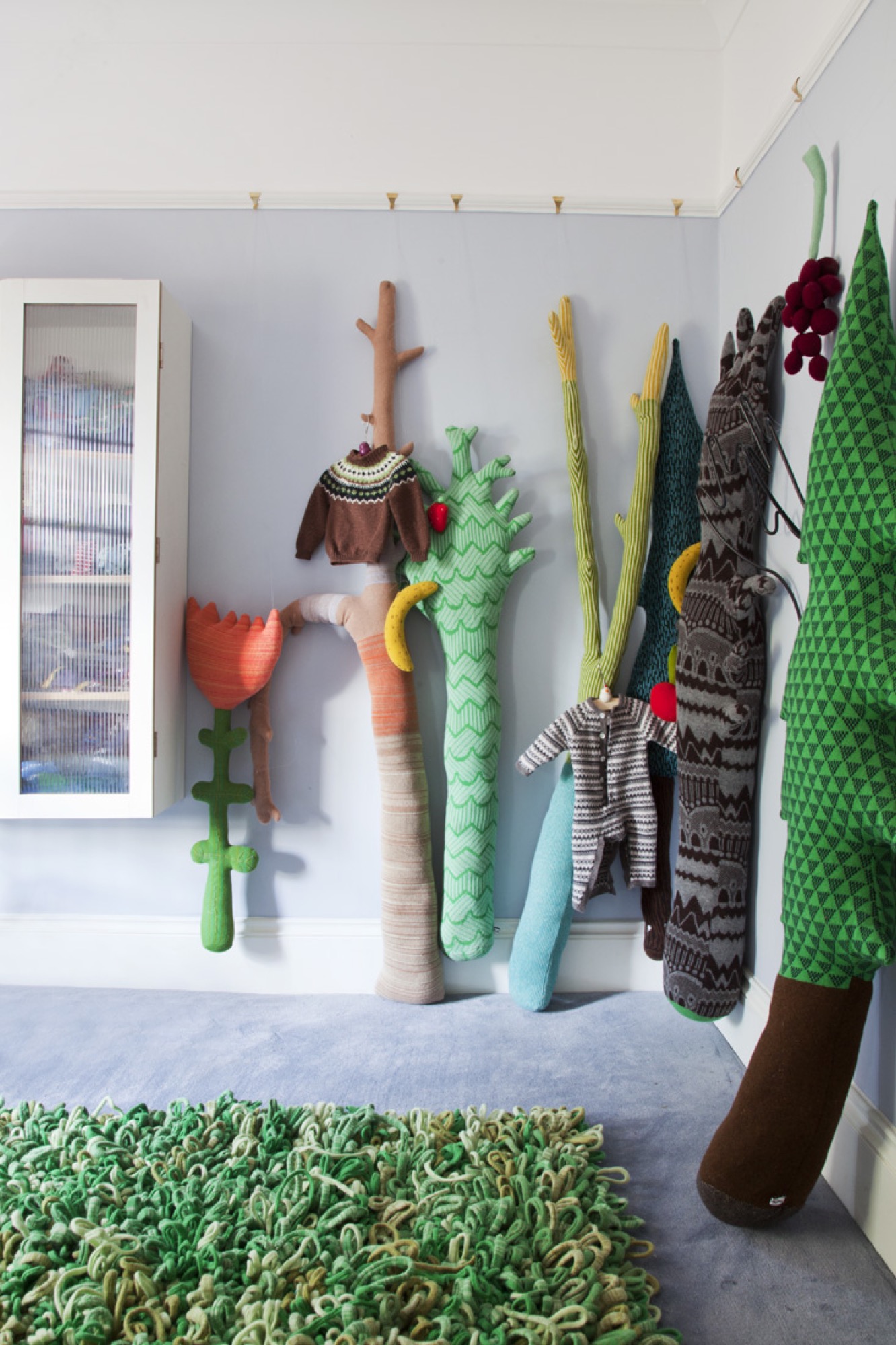
The artist and craftswoman's continuous outpour of creativity began very early in her life, on her parents’ farm in the beautiful countryside of Aberdeenshire, Scotland. Encouraged and inspired by her grandmother, young Donna soon found her happy place in an old hen-house that became a cabin of crafts.
Her unbounded passion for making things with her hands and her love for art and design impelled Wilson to attend the Royal College of Art in London. It was there she knitted her first creatures and began selling them to local shops in the city.
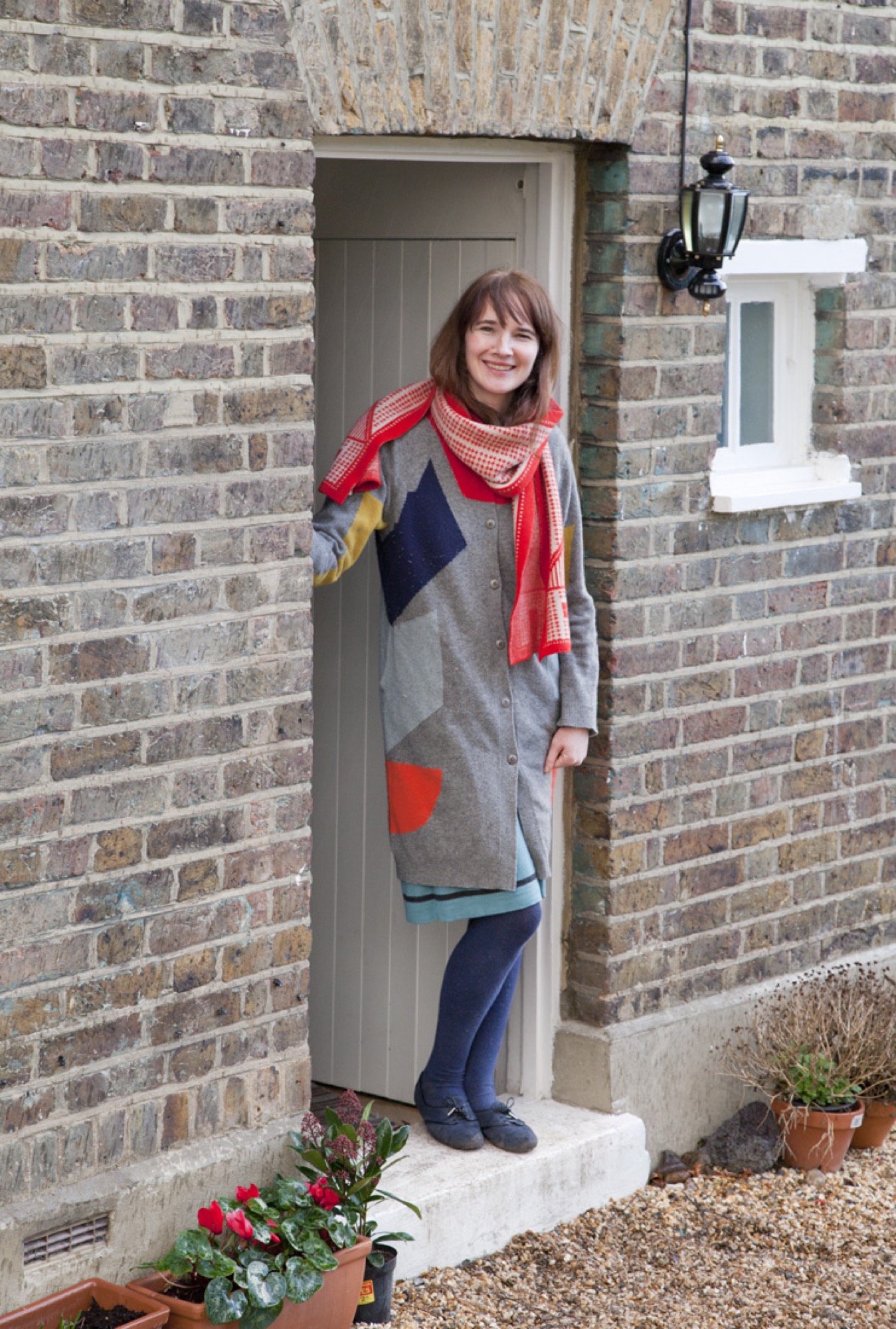
These days, she greatly enjoys turning a 1860 cottage into a home for her little boys, Eli and Logie, and her partner, Jon. And she is busy designing a new collection of woolly woodland creatures, furniture, homewares, clothing, and so many more designer goods she now sells all over the world, with help from her team of craftspeople.
A conversation with Donna Wilson
What is your vision for your brand?
To create a wooly wonderland where patterns and color collide and imagination is free to run wild. It’s important to me that people can relate to the creatures and products, and that they evoke emotion — maybe a feeling of nostalgia, sentimentality, or happiness. Even if they just induce a smile, I feel I have done my job.
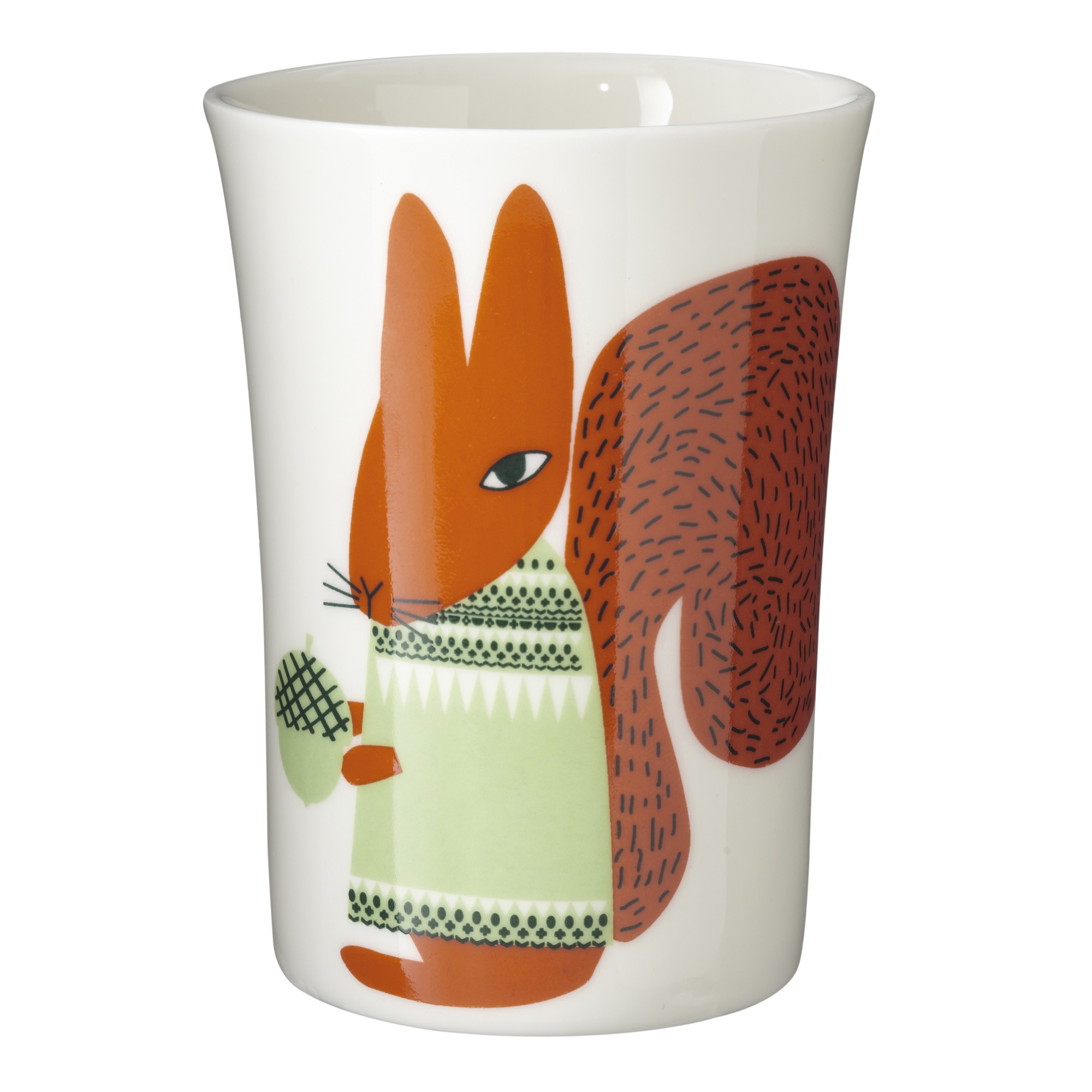
Where did the inspiration for your woolly wonderland come from?
I grew up on a farm, so I'm very familiar with natural landscapes. In my work, I find it very exciting to be able to replicate textures found in nature using wool and to try to mimic textures like moss, bark, and stone. It still amazes me that you can create a fabric from a bit of yarn.
"I find it very exciting to be able to replicate textures found in nature using wool and to try to mimic textures like moss, bark and stone."
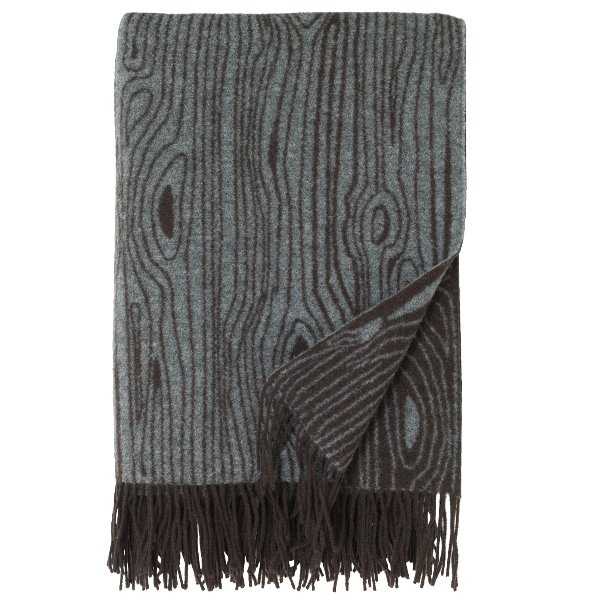
My inspirations do come from all over the place — the landscape, music, dreams, magazines, ceramics, people, Scandinavian design. Sometimes, I just see a tiny snippet of something, which triggers an idea that is then developed into a product.
How would you describe your design style?
I try not to look at trends too much and try to keep focused on creating original designs that are distinctively colorful, graphic, and figurative, with a nod to traditional crafts and a pinch of whimsy.
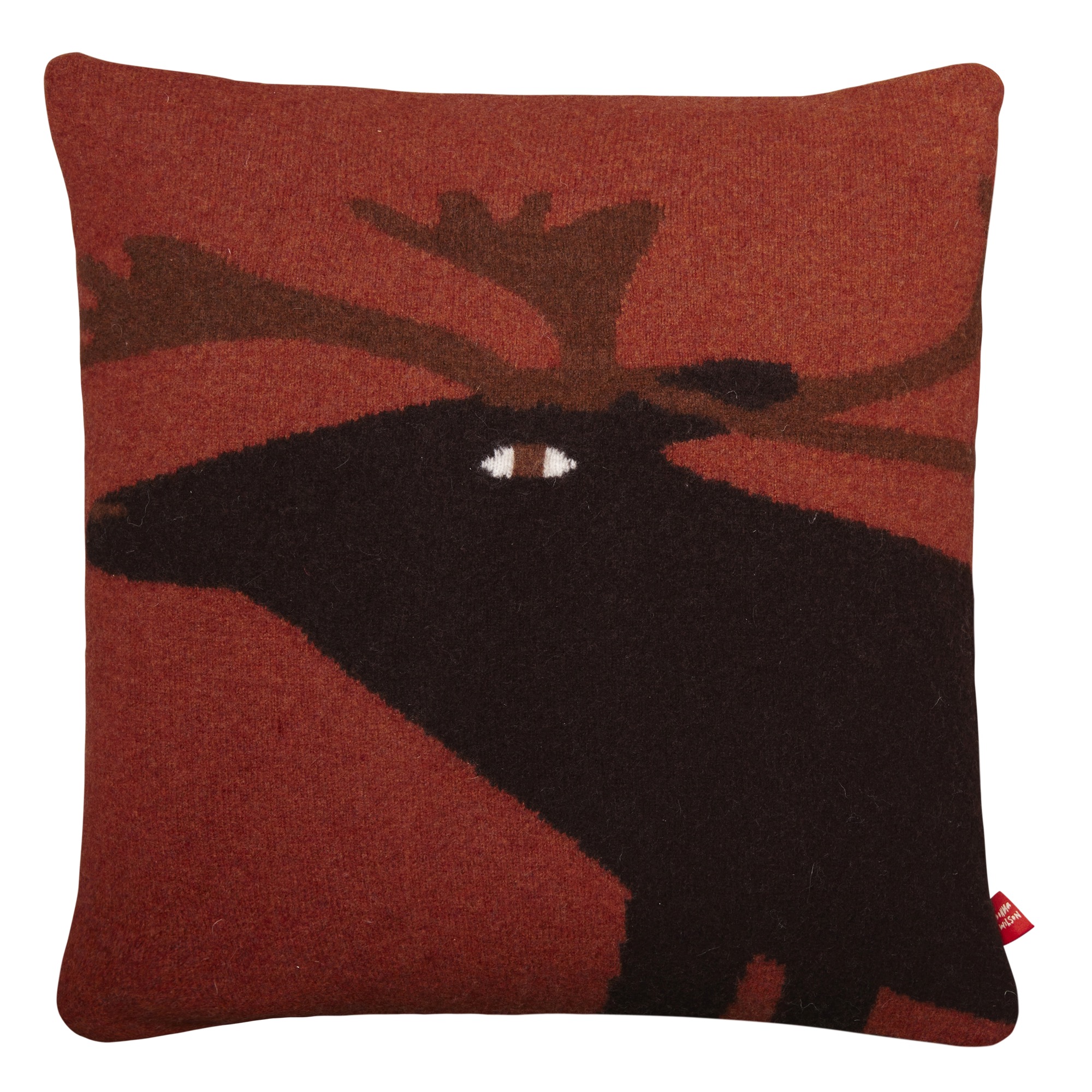
What does quiet design mean to you?
It’s a reaction to the bombardment of images, products, and design we see on social media. Quiet design is more of a classic, true, folksy take on design.
What is your legacy (for now)?
It’s very important to me to promote local manufacturing and to help keep British craftsmanship alive. There’s too much disposability in products and consumer goods nowadays, and it’s environmentally irresponsible. I believe that if you have something that is handmade and is somehow more special than something made carelessly or mass-produced, you’re more likely to keep it for years, instead of throwing it away. I want to make things that people use, keep, and treasure for years.
"It’s very important to me to promote local manufacturing and to help keep British craftsmanship alive."
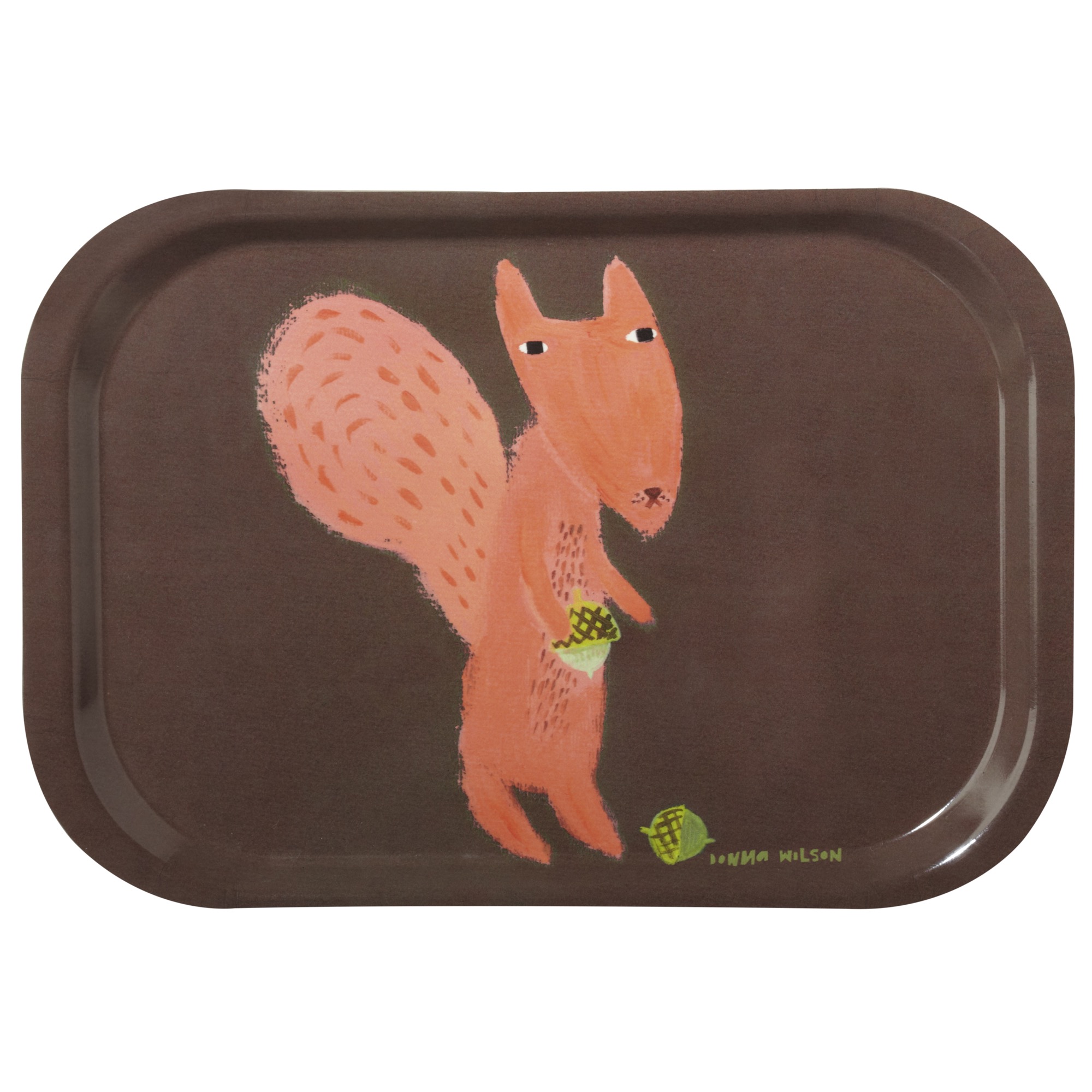
"I want to make things that people use, keep, and treasure for years."
What’s your favorite place in the world?
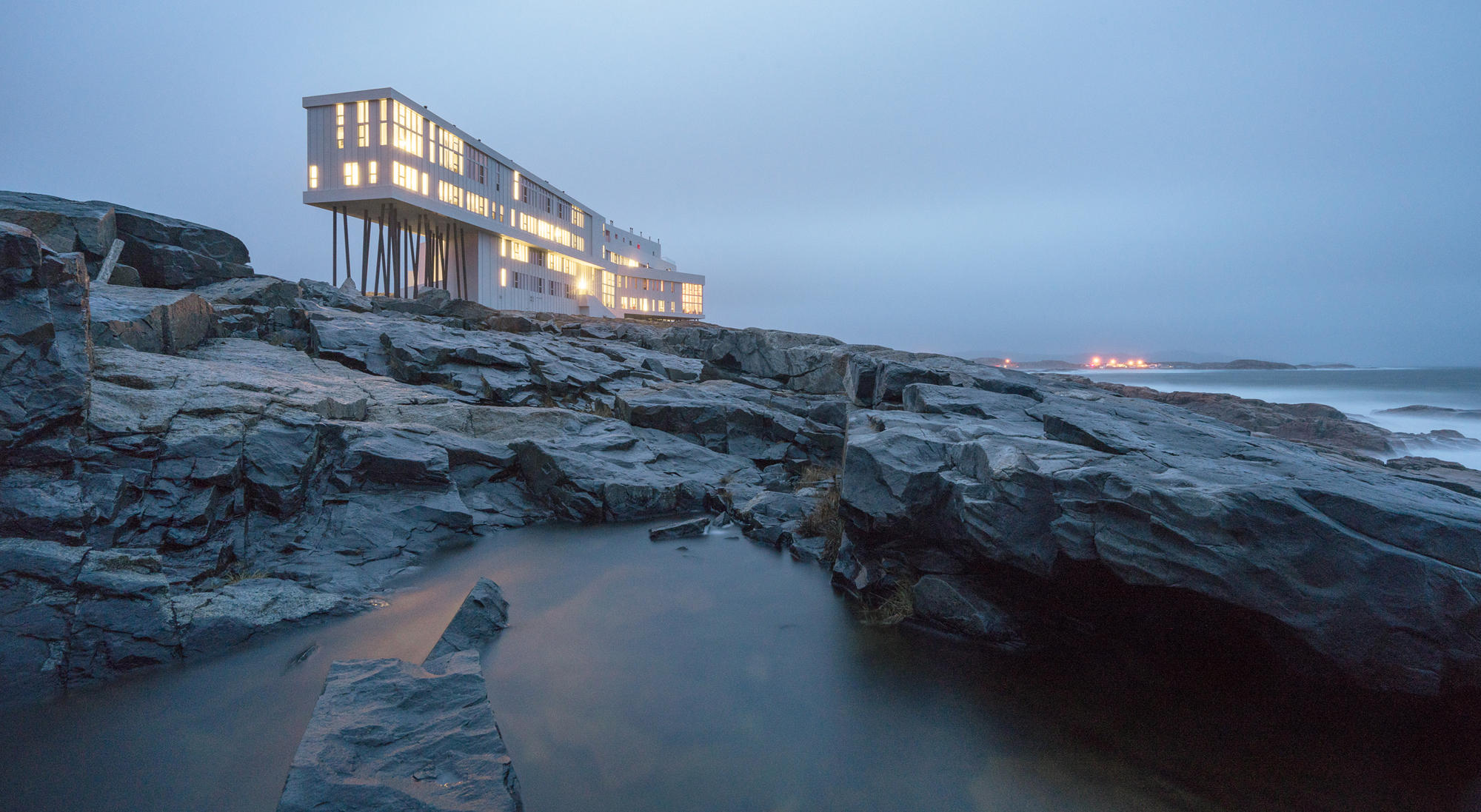
A few years ago, I was invited to design some furniture and wallpaper for a boutique inn that was being build on Fogo Island, off the coast of Newfoundland. We went as a small group of designers and stayed in an original Fogo Island house together. It was winter, and the snow was so deep it covered the cars. We drank gin-and-tonics with ice from 10,000 year old icebergs! We saw caribou and took a skidoo to remote places. The whole experience has really stuck with me and inspired my work.
"We drank gin-and-tonics with ice from 10,000 year old icebergs! We saw caribou and took a skidoo to remote places. The whole experience has really stuck with me and inspired my work."
Describe your dream home...
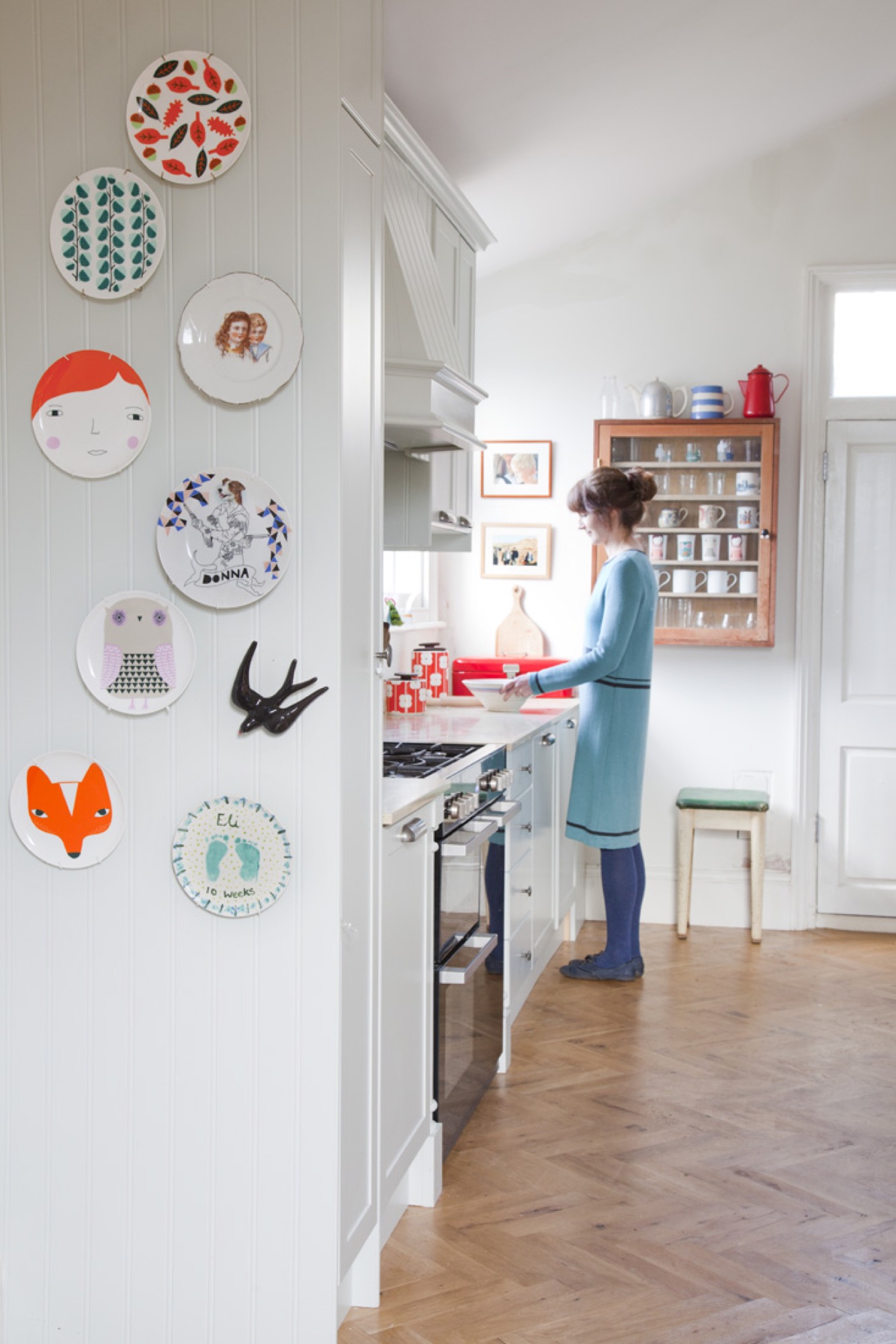
Amazingly, we live in a detached cottage with gardens and allotments surrounding it, which is pretty rare in London. It's an old building, built in 1860, and we are taking out time getting it the way we want, gradually. I'm really enjoying making this house our home. It's a lovely little house.
What does “home” mean to you?
Home is a place to have fun, make memories, play, make things, and relax. We have recently moved into our new house, so I am so aware of how much my home means to me, now more than ever. As I am finding places for my belongings, it feels like it is becoming our home more and more. A person’s home is so unique to them. We shouldn’t be afraid to express ourselves through our own decor and style. It might not be as obvious as what we wear — it’s more of a personal thing, and only our close friends get to see our homes.
"We shouldn’t be afraid to express ourselves through our own decor and style."
What’s more important to you in life?
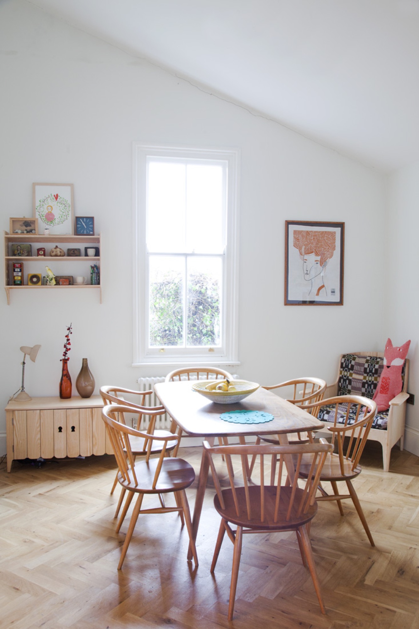
My boys. Before having children, I could never have imagined how much these little people would mean to me. It has changed everything, and strangely, I am less stressed than I used to be. I think, I put things in proportion in life.
When are you happiest?
When I’m being creative. There’s noting better than having a day just to play, make, design, and produce lots of ideas, then finally you get something you like. It’s the best feeling in the world.
"There’s noting better than having a day just to play, make, design, and produce lots of ideas, then finally you get something you like. It’s the best feeling in the world."
Who is your design icon?
I like Alexander Girard, Stig Lindberg... and my grandma! Another designer I admire is Hella Jongerius. I love the sofa she did for Vitra a long time ago, with odd buttons. I’d never seen anything like this, and I love the way she uses textiles and color a lot in her work. Her designs are clever and thoughtful and have that human element.
Who inspired you to be the person you are?
My grandmother. She encouraged me to be creative and work with my hands, She was always trying to teach me things, like how to knit and crochet. I started being creative at quite a young age. I was always drawing and making things and was always happiest with a pencil in my hand. As a child, I didn’t know what I wanted to be when I grow up, but I knew it was going to be something to do with art and design. Now that I’m a mother, I’m inspired to encourage creativity in my kids and love seeing them getting all messy and using their imaginations.
"I started being creative at quite a young age. I was always drawing and making things and was always happiest with a pencil in my hand."
What is your life philosophy?
Do what you love and love what you do.
What are you working on right now?
We are working on the new collection for spring and summer 2017. We’re developing some new designs for ceramics and glassware. We are just about to launch our autumn/winter collection at the trade shows this month. I’m really happy with it, and there are lots of fresh, new products, like odd cashmere creatures and bamboo fiber picnic ware. We also have some special creative projects in the pipeline. △
More from Donna Wilson's collection:
The Adventure House
Seattle’s Olson Kundig creates an extraordinary family outpost with views of the North Cascades
Like wagons circling a campfire, a home that consists of sleek, airy pavilions embodies the concept of gathering.
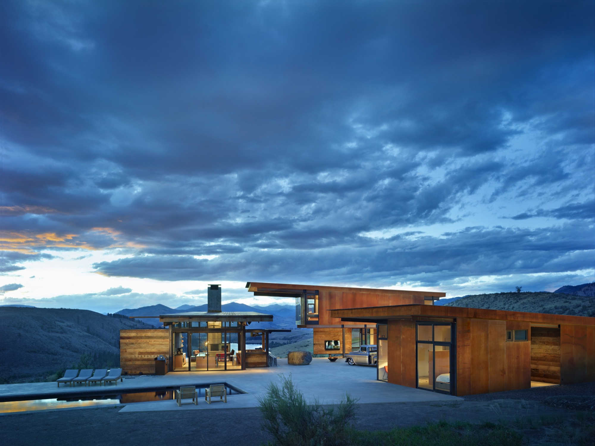
When it comes to second homes, adventure makes the heart grow fonder. At least that’s the premise—and the promise—upon which Tom Kundig, of Seattle-based Olson Kundig, based his design for the staggeringly beautiful Studhorse residence in Washington’s remote Methow Valley. “Second homes are about adventure, and they are the homes that leave the most indelible memories,” Kundig says. “The best way to do that is to make them unconventional.” And that’s when things get interesting. Because when an architect of Kundig’s caliber decides to steer design in an unconventional direction, all manner of daring surprises can occur.
These days, Tom Kundig is a much-heralded, multi-award-winning architect (fifty and counting from the American Institute of Architects alone) engaged in projects spanning the globe. Yet, despite his growing international artistic stature, Kundig’s inspiration remains rooted in the profound experiences of his mountain-climbing youth. “I can tell you from experience that while mountain climbing may seem romantic, it’s also uncomfortable and scary,” he confesses. “You’re cold, hot, and sore. Why would anyone do it, if they thought about it logically? But it’s about engaging life vigorously. So is all of my best work.”
“While mountain climbing may seem romantic, it’s also uncomfortable and scary. You’re cold, hot, and sore. Why would anyone do it, if they thought about it logically? But it’s about engaging life vigorously. So is all of my best work.”
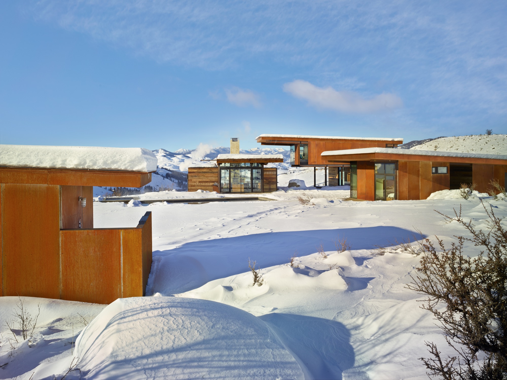
One fearless family
Fortunately, the clients who invited Kundig to design a mountain getaway for their young family on the edge of the North Cascades a few hours north-east of Seattle had a bold spirit and zest for adventure themselves. In fact, sharing adventures was part of their deliberate and mindful approach to building family memories. So it made sense that a rural retreat from their city routines would provide plenty of opportunity for outside-the-box living.
Truly life-enriching adventures are awakened by extraordinary locations, and this home’s setting is spectacular—twenty sagebrush-and-wildflower-strewn acres of rolling terrain unfurling beside Studhorse Ridge and overlooking the towering North Cascades and a lush stretch of the Methow Valley and Pearrygin Lake. It’s a quiet and peaceful perch with 360-degree views of wild Washington beauty.
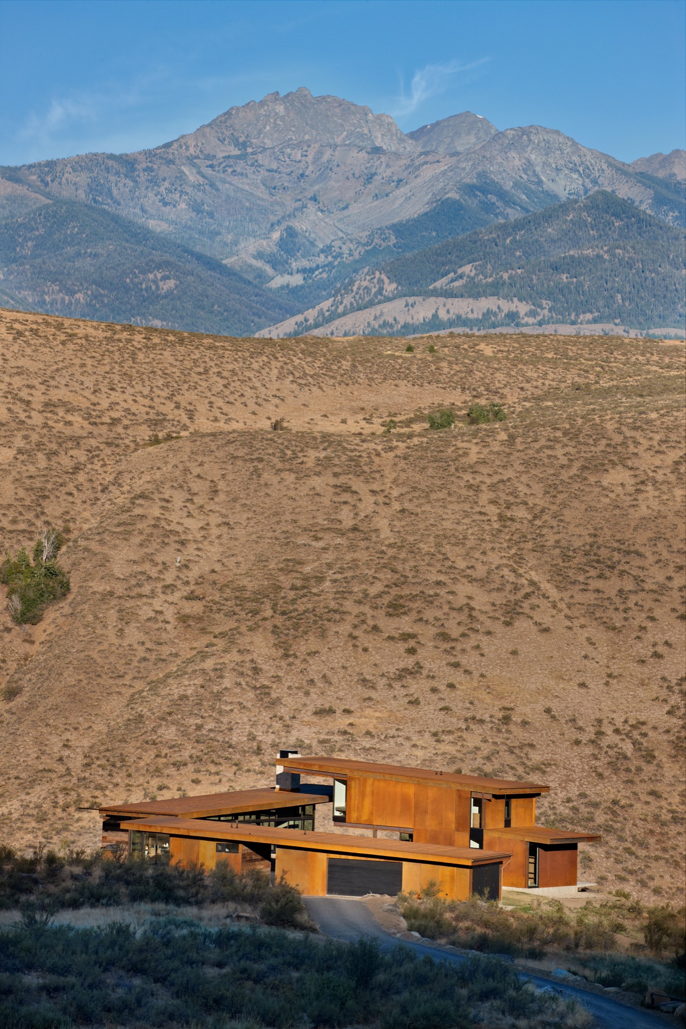
Not surprisingly, the homeowners intended to spend as much time as possible outdoors, and that suited Kundig just fine. “Many of my buildings, even the public ones, involve being exposed to the elements in some way,” he notes. “And sometimes, there is even an element of risk, or daring, which is desired on the client’s part and intentional on my part.” So this home was designed expressly to provide plenty of access to fresh-air freedom. “The clients wanted a central space where the family and guests could come together in the landscape,” Kundig recalls. “We came up with the concept of the house feeling like a vintage motel with a series of buildings around a courtyard. From there, the conversation evolved into the idea of exploring the tradition of circling wagons around a campfire.” This engaging idea became the seed from which the entire home grew.
One big boulder
But first they had to deal with a rather large rock. “The site was actually completely empty when we began,” Kundig explains. “Except for the boulder that was positioned in what is now the courtyard area. It is a glacial erratic—a rock that a glacier drops as it recedes—and it was a driving element of the house composition, becoming the center point for the project.” So, in a gesture both timeless and eloquent, the home’s structural elements—and, by extension, the family’s activities—congregate around a literal and figurative touchstone. “I envisioned it as a large piece of furniture,” Kundig admits. Whatever you care to call it, the rock has become a much-loved feature of the home. “We loan the house to friends a lot, and we leave a Polaroid camera next to the guestbook,” says the homeowner. “That book probably has a hundred pictures taped inside by now, and I bet ninety of them show people on the rock. People see it and they say, ‘That’s amazing you put this rock here,’ but we say no, we built the house around the rock!”
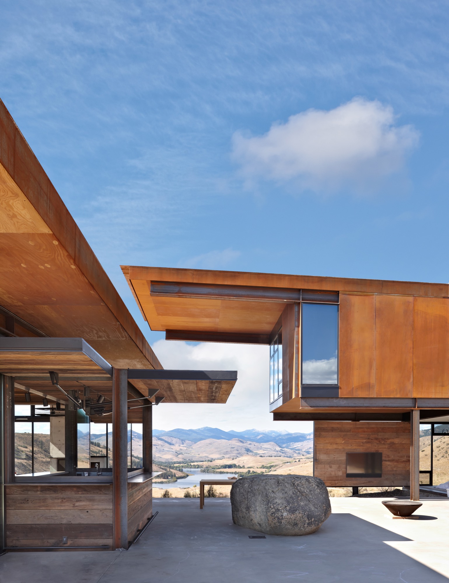
An elegant assemblage
The home comprises a series of buildings clustered around a central courtyard. Viewed collectively from a distance, the constellation of structures has the striking presence of sculpture artfully arranged in a landscape, but each element is also simply practical. Each structure/pavilion has a defined purpose, and taken together they fulfill all of the family’s requirements, so residents and guests circulate among and between the buildings in daily paths dictated by their activities. The main structure is nearly entirely encased in glass. (Kundig calls it “lantern-like.”) Anchored by a massive concrete fireplace on one end, with a living room, dining area, kitchen, pantry, bar and bath—this is the main indoor gathering space. Another structure just beside it contains private family bedrooms upstairs and a guest bedroom and shared den below. Across the courtyard, a third structure offers space for the garage, storage and laundry facilities, and connects through a breezeway to an extra guest suite. The fourth and smallest building, set slightly apart and in a meadow, houses the sauna.
The structures were meticulously positioned to precisely frame gorgeous mountain and valley views, and the negative space (the open space between buildings) they create was considered with the utmost care. When vistas are framed from different angles, we perceive them in new ways, Project Manager Mark Olthoff explains, and this home’s design repeatedly plays with the idea of varying points of view. Olthoff notes that the moment of arrival is a particularly significant experience, so in this case it was important that the view greeting one’s eyes upon entering the complex from the parking area be pristine. Dazzling glimpses of landscape are framed cleanly by the built structures, with no overlapping edges of rooflines to mar the dramatic impact of the first impression.
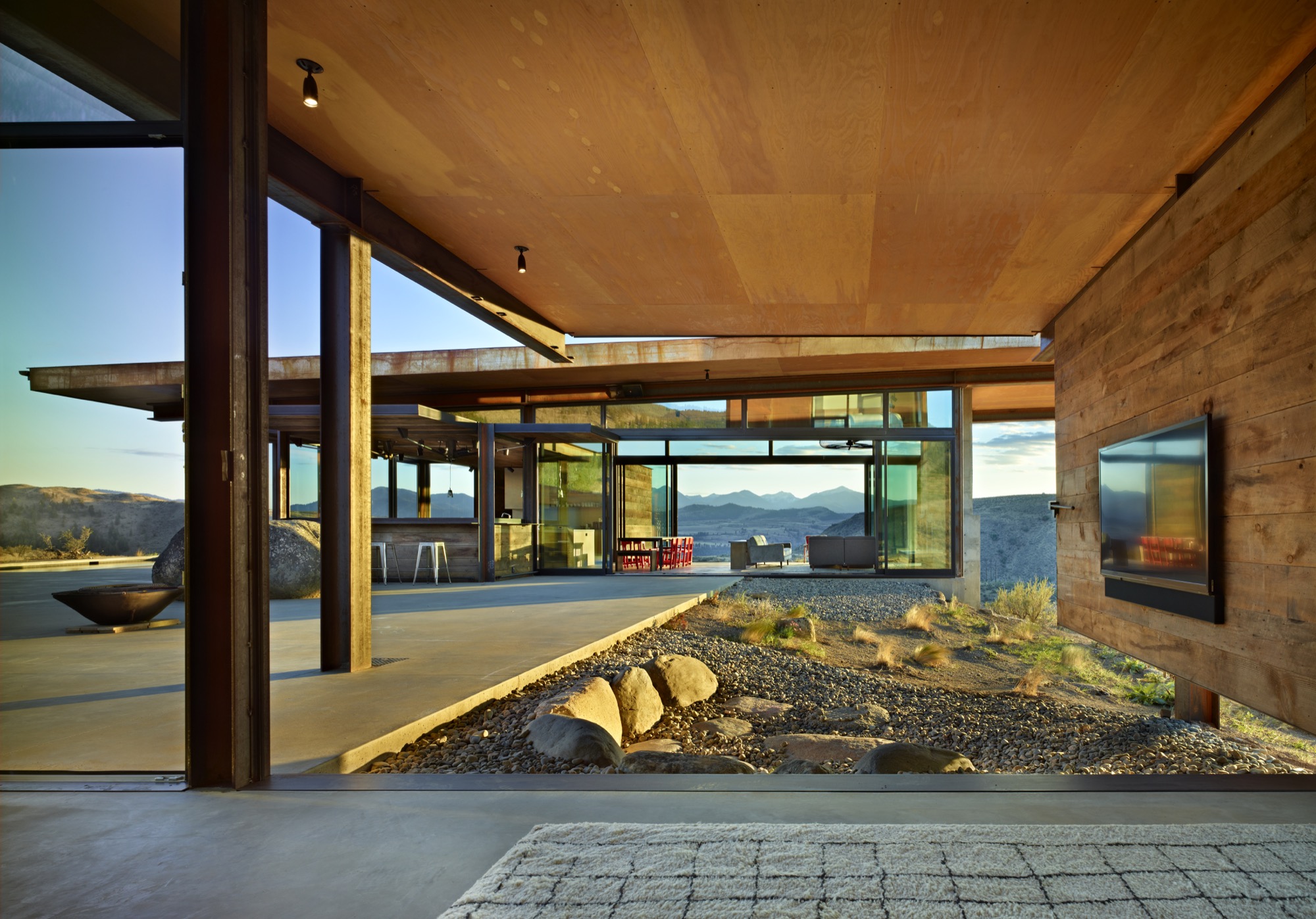
Kundig explains that the strategic arrangement of the structures, which he refers to as “lean, geometric pavilions of steel, barn wood and glass,” also puts their extended rooflines to work—providing shade and natural cooling in the heat of summer and creating a covered passageway when rain and snow fall. The central courtyard, swimming and play zone become a natural focal point at the heart of the cluster of buildings, practical for a busy family with energetic children, ideal for entertaining a group of guests, and perfectly charming as an impromptu dance floor.
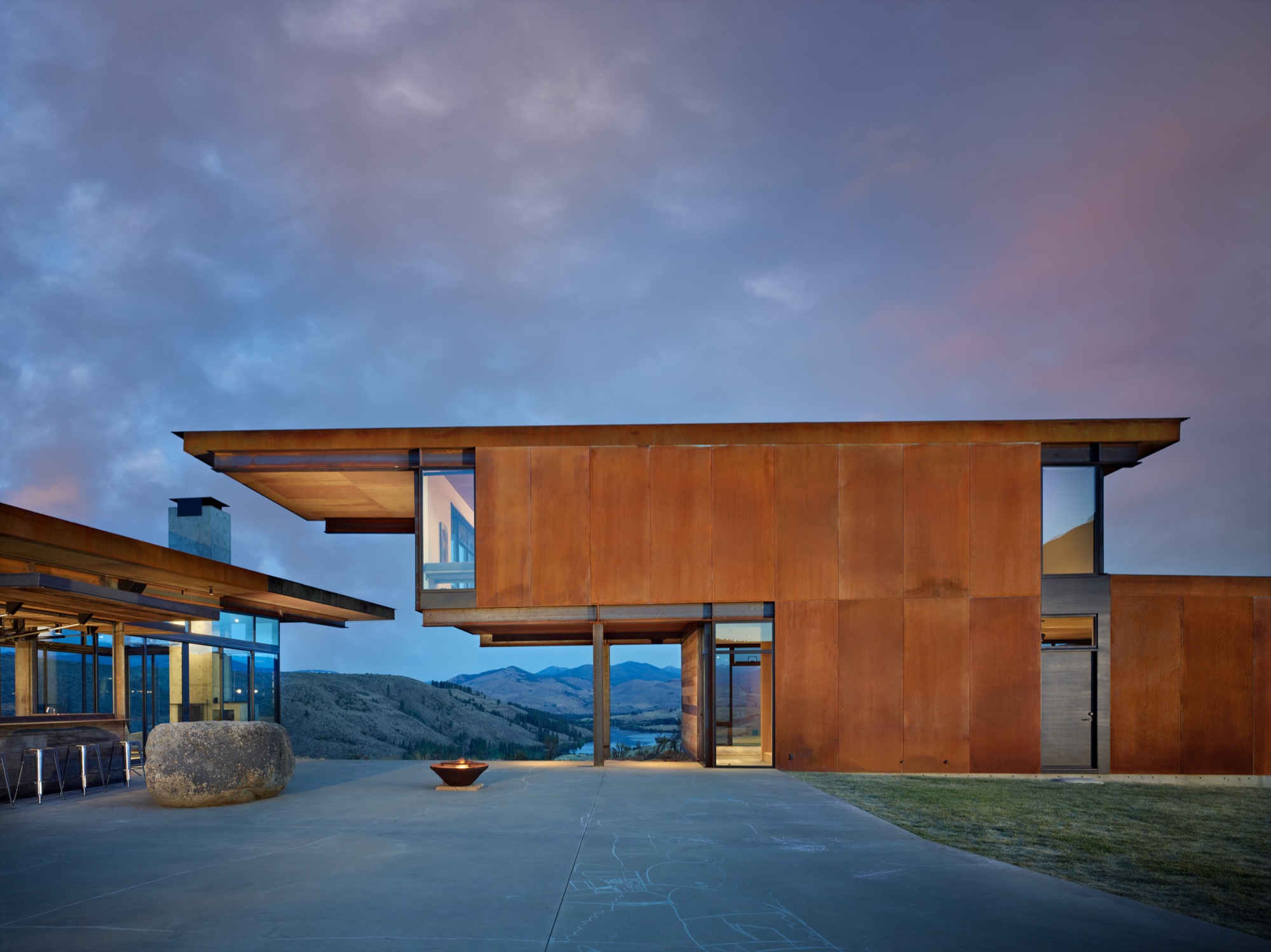
Simple and solid
Yet, while the home is certainly gracious, it is far from grand. “We relied on everyday building materials when possible and used the common materials in uncommon ways, such as exposed plywood for flooring or walls,” Kundig explains. “The materials—mostly steel, glass, concrete and reclaimed wood—were chosen for their resilience against the scorching summer sun and freezing, windy winters that define the region. The materials are expected to weather over time with their surroundings, and to blend in.” If the wood siding shows quirks of character and age, then that’s because it was salvaged from an old barn in Spokane, Washington. And plywood is more practical than precious. “The ceilings are ACX plywood,” Kundig says. “The rest (cabinets, floor, and walls) is AB marine-grade plywood, which we used because the edges would be exposed and marine grade has tighter laminations and holds an edge better.” With a gray-toned stain, the humble boards take on a refined appearance belying their usual orange-tinged reputation. For her part, the homeowner is delighted with the home’s unfussy durability and general livability. “It’s made to stand up to the occupants,” she says admiringly, noting that the family retreat is “worked hard.”
“We relied on everyday building materials when possible and used the common materials in uncommon ways.”
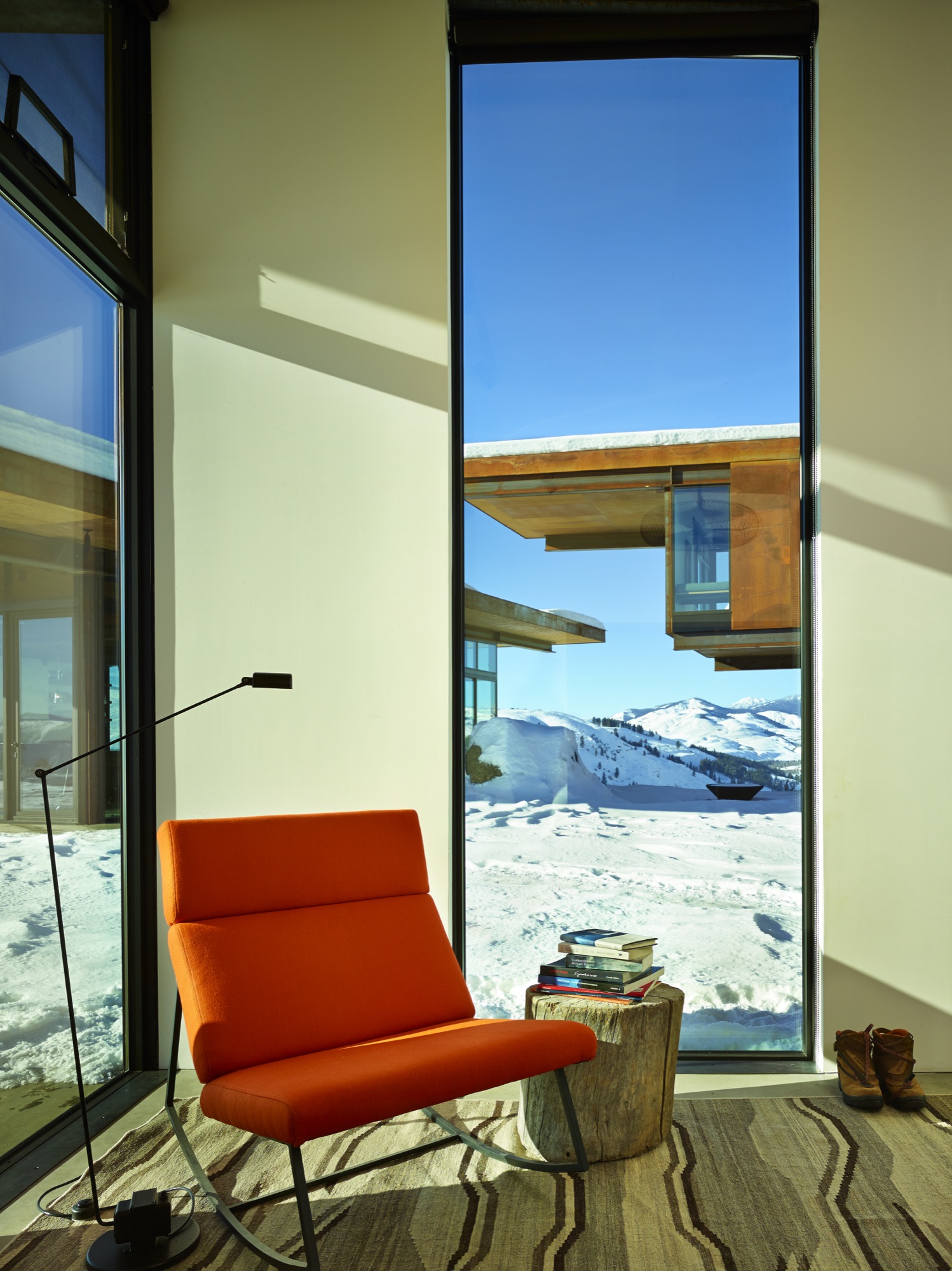
Four-season comfort is assured, thanks to a series of astute climate considerations. A geothermal heating system (with electrical backup) warms the home and its concrete floors. Air conditioning is unnecessary, given the home’s elevated location, which allows breezes to filter through the rooms. And giant, industrial-sized fans in the living room and bedrooms keep the air circulating. Moreover, many of the walls and windows were designed not merely to open but to essentially disappear, blurring interior-exterior boundaries as the home and its landscape intermingle.
Kinetic elements
And here’s where some of the home’s adventurous personality really comes out to play. Kundig has developed a reputation for buildings that incorporate kinetic elements (Olson Kundig even boasts an in-house “gizmologist”), and this house is no exception. Moving parts are built into the fabric of the home, adding a functional—and undeniably fun—versatility to the spaces. The main pavilion’s floor-to-ceiling windows and giant Fleetwood sliding doors enable the expansive room to completely open to the great outdoors. Nearby, the indoor bar converts to an al fresco watering hole when the steel-and-wood back wall flips open on hydraulic pistons. (Kundig likens the experience to Coney Island.) And in a bravura demonstration of crowd-pleasing cleverness, one entire reclaimed-wood-clad den wall is designed to swivel ninety degrees outwards, so that the big-screen television becomes an outdoor movie screen, and the courtyard—and a perfectly placed semi-circle of landscaped rock seating—becomes an open-air cinema.
[video width="640" height="360" mp4="http://www.alpinemodern.com/editorial/wp-content/uploads/2016/08/400983501.mp4" loop="true" autoplay="true"][/video]
Scandinavian style meets the mountain West
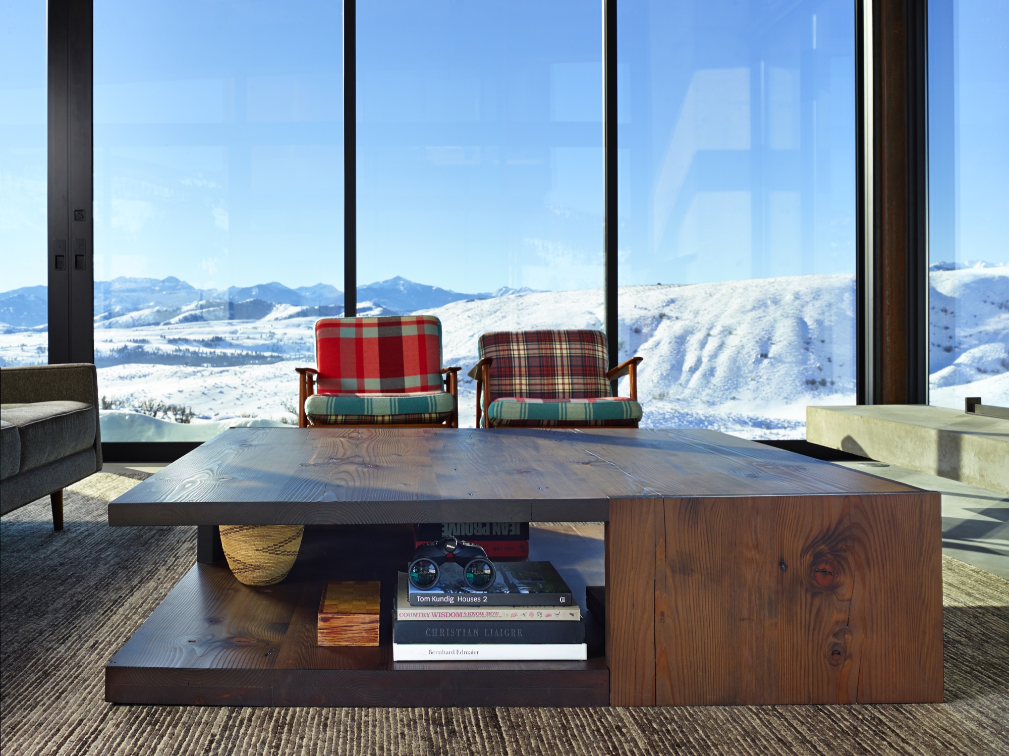
Debbie Kennedy, an interior designer with Olson Kundig, helped guide the creation and selection of furnishings and finishes for the home. “We wanted to stick to a very simple unpretentious palette of materials—materials that feel like they belong in the landscape and the interior,” she says. “Limiting the number of materials helps the spaces flow into one another.” Concrete, steel and reclaimed wood are major players both indoors and outdoors. “The clients are very drawn to Scandinavian design—both contemporary and vintage,” Kennedy explains. “In this instance, the goal was also to incorporate modern refined Western mountain references.” Kundig notes, “The focus was on beautiful yet practical pieces that would age as well as the buildings and, similarly, relate to the region and mountain landscape.”
The homeowners preferred a casual look and a welcoming feel, with occasional bright splashes. “The dining chairs presented a great opportunity to introduce a pop of color,” Kennedy notes. “And the client fell in love with a vintage-blanket chair by Maresa Patterson, so we asked her to work with us on a pair of chairs.” Kundig adds, “A few key pieces—such as the dining table, coffee table, fireplace screen, and built-in beds—were custom-designed by the team.” Kennedy singles out one example: “The folded steel console is from the Tom Kundig Collection and feels like it was ‘meant’ for the house.”
Defying easy categorization, the Studhorse residence is emphatically individual and entirely unforgettable. Perched on a prospect overlooking a breathtaking panorama, the clustered elements of the home manage to both embrace and enhance its incredible surroundings. As a hummingbird flits straight through the open walls of the living room and into the kitchen on a sunny spring afternoon, the allure of Tom Kundig’s vision is clear and complete. As he explains, “Architecture allowed me to have a foot in both places—the technical realm and the poetic realm—and in that magical intersection between the two.” △
“Architecture allowed me to have a foot in both places—the technical realm and the poetic realm—and in that magical intersection between the two.”
The Fragrance of "Out There"
A harvest walk on the wild side with the wilderness perfume crafters of Juniper Ridge
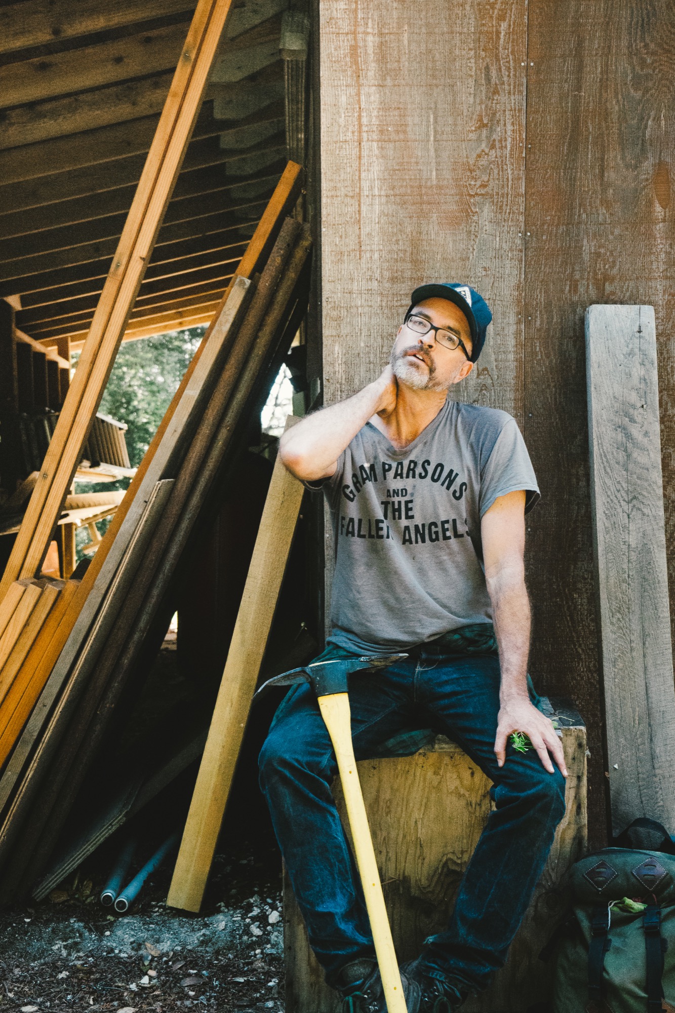
Hall Newbegin is out there. Upon first meeting him, I didn’t expect it. He seemed jovial, unintimidating, and mild-mannered. But in the first five minutes of our conversation he used the phrase “out there” eight times — “Part of what I wanted to do was to just be ‘out there’ . . . Being ‘out there’ just centered me . . . Being ‘out there’ saved me as person . . . I had no idea where this was going, but I loved being ‘out there.’ ”
Return to the wilderness
All of us go through periods of discovery in our lives when we are searching for direction, trying to find out what defines us and how it can drive our life and work. For Newbegin, the founder and head perfumer for Bay Area-based Juniper Ridge, that discovery came after a stint on the East Coast and a return to his roots in the West, a return to the wilderness — “out there” — where he feels most comfortable and alive.
Newbegin never imagined that being “out there” would lead to a burgeoning fragrance business, with his products sold in outlets around the globe. He stumbled upon the idea after trial and error — in his life, in his passions, and in his own business.
Capturing the essence of being “out there” is the driving force for the people who run Juniper Ridge, which proclaims itself the world’s only wilderness fragrance company. Headed by Newbegin and the firm’s chief storyteller and packaging designer, Obi Kaufmann, Juniper Ridge, per its website, is “built on the simple idea that nothing smells better than the forest.”
“Built on the simple idea that nothing smells better than the forest.”
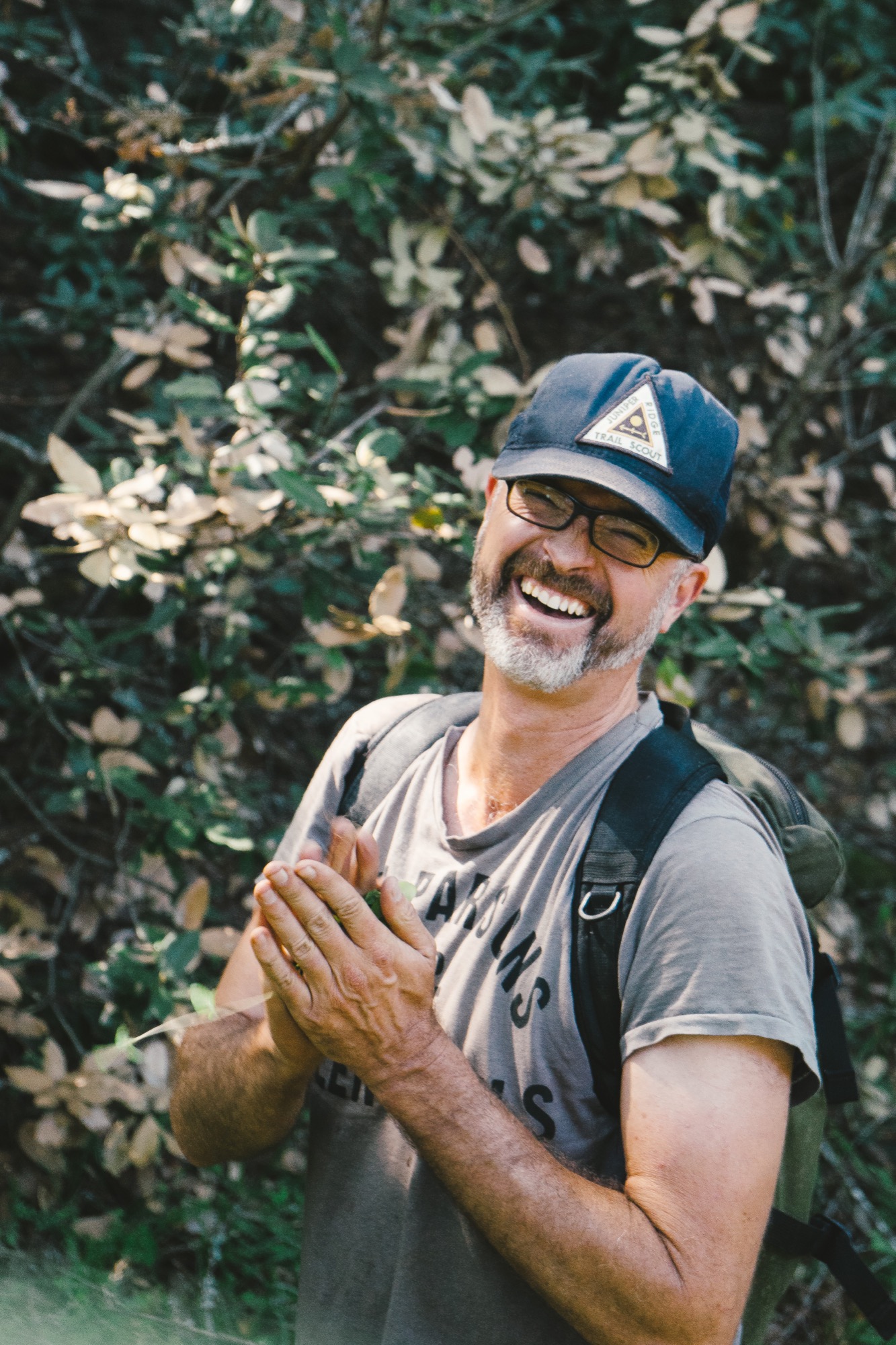
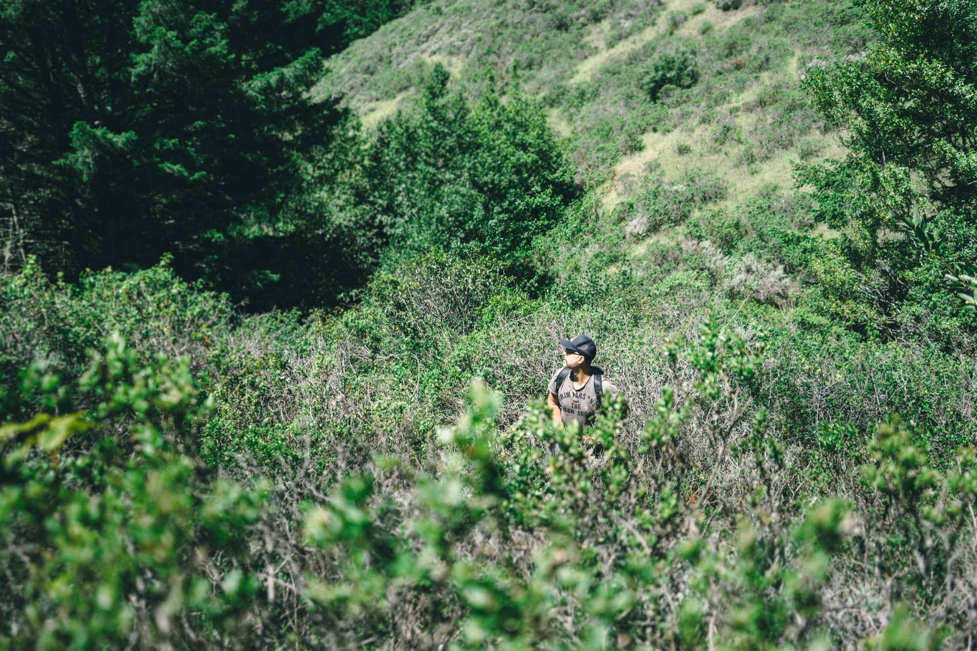
Newbegin and his team embrace this mantra through a process called wild harvesting, where they make real fragrances from the places they know and love — the trails of the rugged and diverse American West.
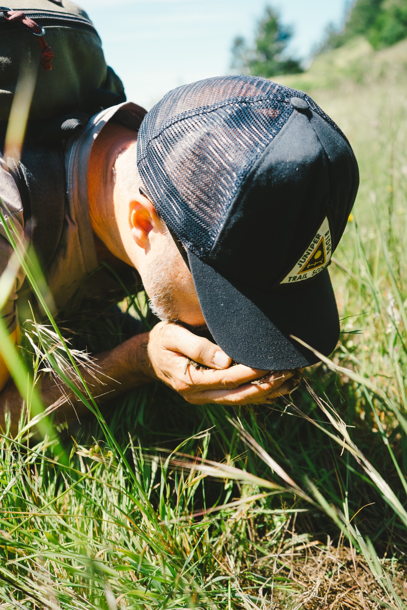
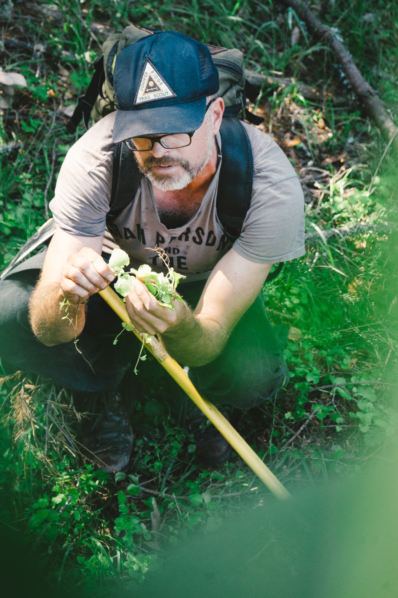
Their teams of hikers crawl through mountain meadows, smelling the earth, the wild flowers in bloom, or the moss covering the trees, then harvest the ingredients to capture the real scent of that land. Armed with public permits or private permissions, they gather wild flowers, plants, bark, moss, mushrooms, and tree trimmings, then distill and extract fragrance by employing ancient perfume-making techniques of distillation, tincturing, infusion, and enfleurage. These formulations vary yearly and by harvest, due to rainfall, temperature, specific location, and season.
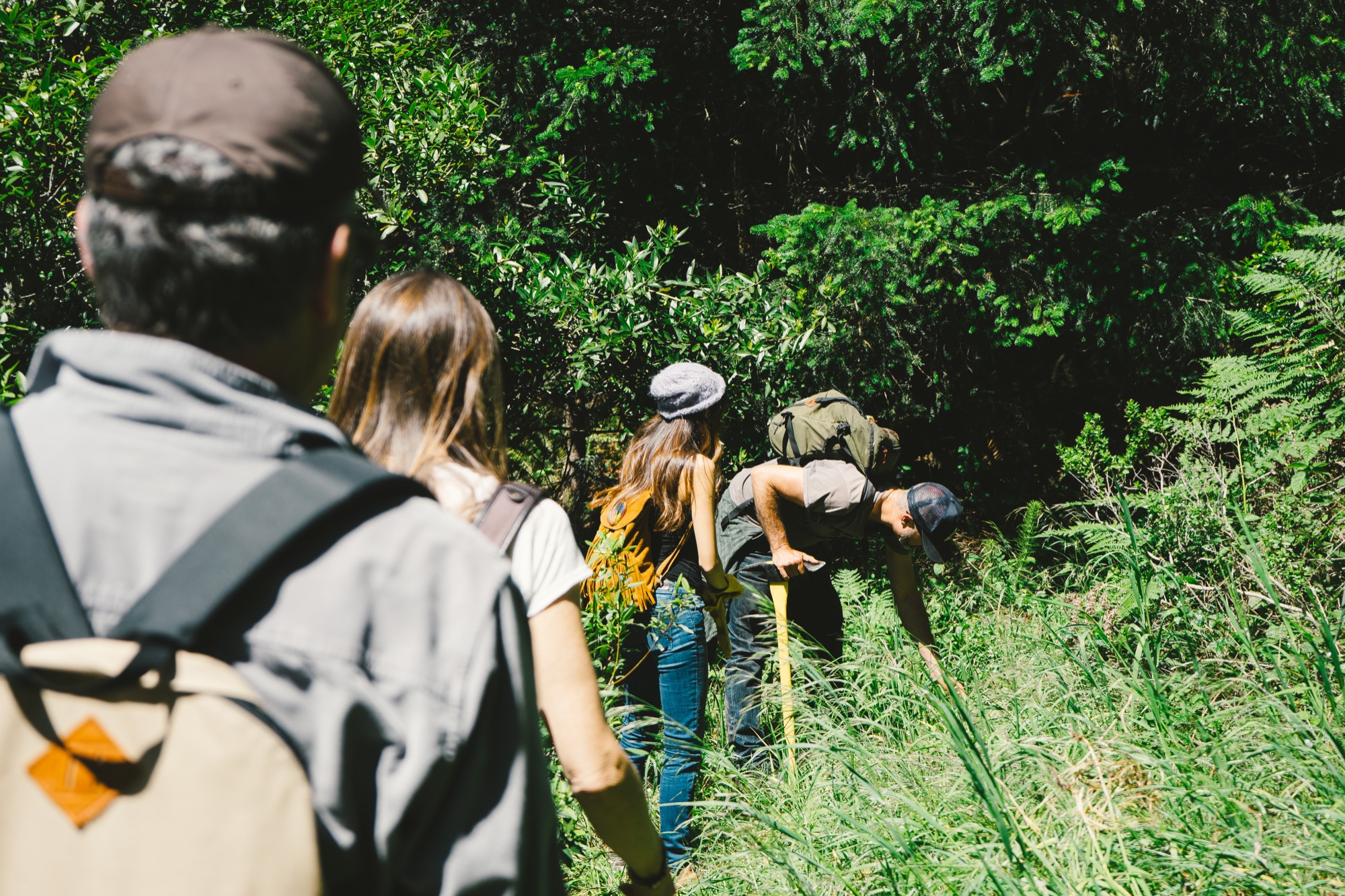
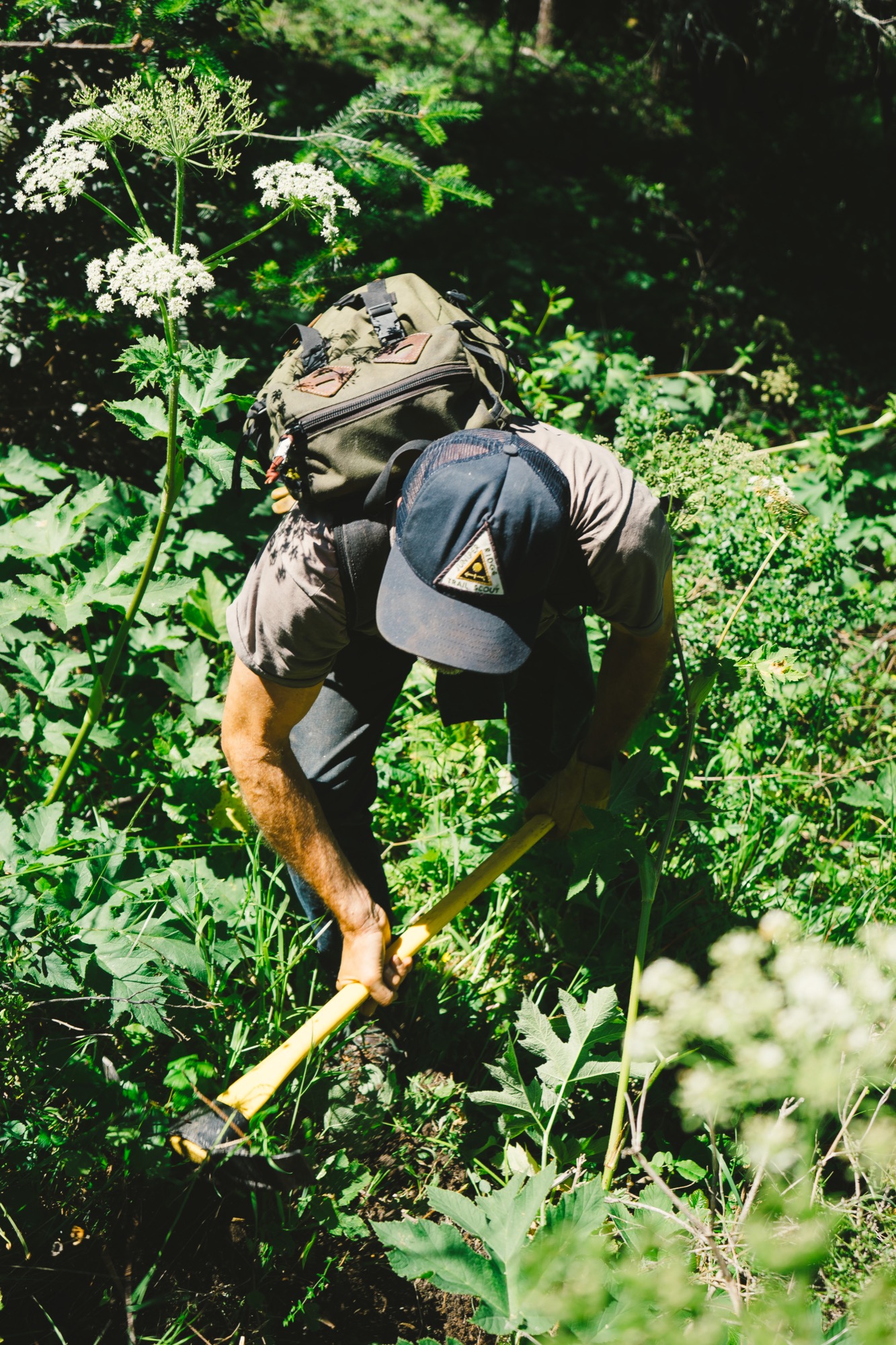
“I want people to stick their faces in the ground and just get really primitive.”
“I want people to stick their faces in the ground and just get really primitive,” says Newbegin, whose Instagram handle is @crawlonwetdirt. Yet this call to the primitive is based in fact: Our sense of smell is often called the oldest sense, the only one with a direct connection to the brain. That connection brings pleasure and sparks memory, transporting us in time and place. For the team at Juniper Ridge, the time and place is marked on every bottle of fragrance they sell. In fact, they authenticate the process of each harvest by stamping each package with a harvest number and by documenting the process through an accompanying story and photographs on the Juniper Ridge website.

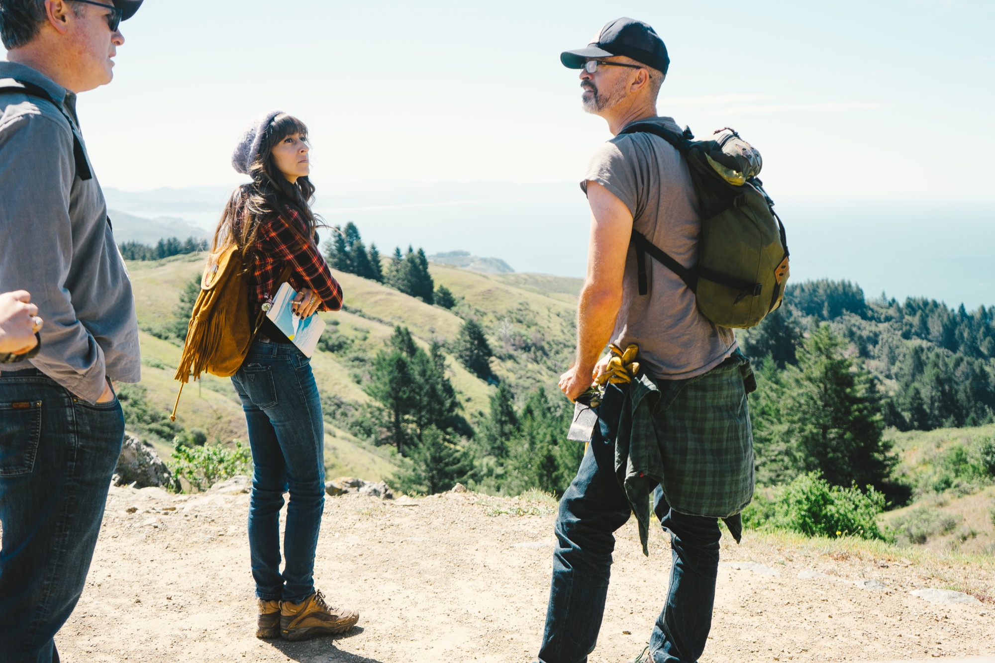
“Our muse is the place. And our job is to funnel that the best we can,” says Newbegin, pointing to a small spray bottle of Sierra Granite, a fragrance connected to California’s Sierra Nevada. “Everything in this bottle is real. Our test is always ‘Is it the real place?’ ” Some of the other places they have captured include Big Sur (California coast), Siskiyou (Oregon coast), Mojave (Mojave Desert), and Cascade Glacier (Oregon’s Mount Hood).
“Our muse is the place."
Real fragrance resonates
Kaufman notes that as the business has grown, sales have been strongest in Scandinavia and New York City. “It doesn’t matter if you’ve never been to the Sierra mountains or to Big Sur, it takes you to a place inside your own head that is common to all of us,” he says. “Ninety-nine percent of the people who buy this have never been to the Mojave Desert, but because it’s real fragrance, it resonates — this is real, it’s not Comme des Garçons, it’s not that bullshit stuff at the Nordstrom’s counter that’s made from petroleum, and that never existed on earth until ten seconds ago. Because this is real, it goes deep into our genetic past — we’re responding to something real.”
“It doesn’t matter if you’ve never been to the Sierra mountains or to Big Sur, [the fragrance] takes you to a place inside your own head that is common to all of us.”

Saved by the wild
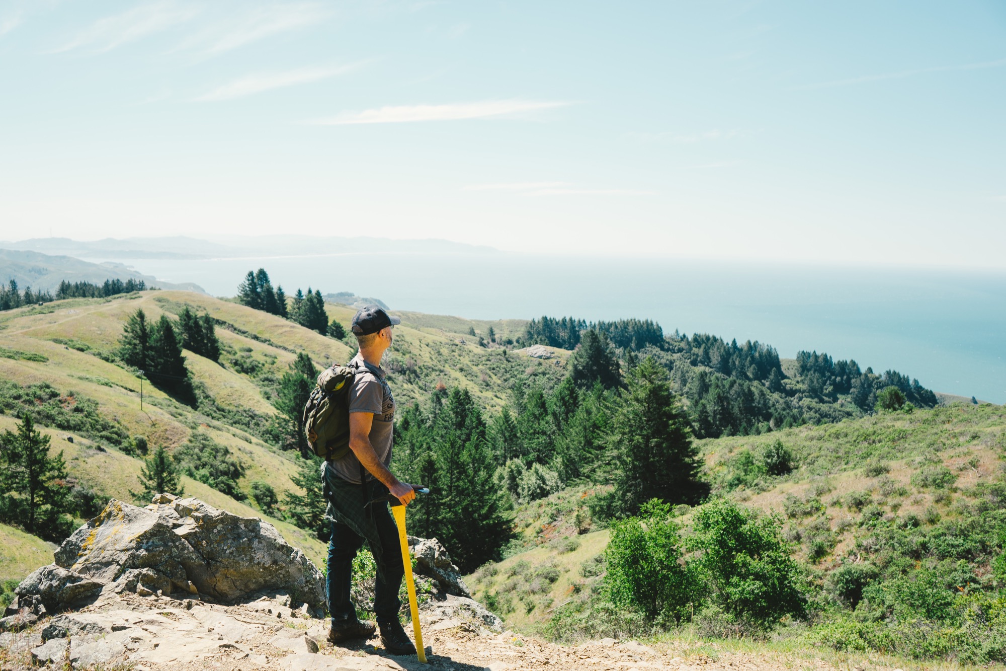
While hiking on Marin County’s Mount Tamalpais with the sometimes loquacious but unassuming Newbegin in his worn T-shirt and jeans, it’s hard to imagine that he would describe the transcendent moment of his life as a cliché. But those are the exact words he uses when he muses on the importance of the wilderness and the outdoors: “I feel like it saved my life.”
Growing up in Oregon, with Mount Hood in his backyard, Newbegin spent most of his youth hiking and backpacking. He attended college in New York but knew there was something growing inside of him, “a hunger to get back to the West and be in the mountains . . . I had camping and being outdoors in my blood. It’s a deep West Coast/western cultural thing,” he says.
With a last name like Newbegin, it seemed inevitable that he would eventually find his true calling. That happened in Berkeley, California, after a period he deems his “hippy schooling.” He took inspiration from eco-wilderness writers including Gary Snyder, John Muir, and David Brower and studied under commercial mushroom harvesters, members of native plant societies, and herbal medicine teachers.
New beginning
The real turning point came as he was foraging native medicinal plants in the Sierra Nevada. “I dug my trowel into osha root, and the air just exploded with that smell and it’s like, ‘ahhh.’ It would just slay me,” he says. “I didn’t know what the stuff was. I wasn’t thinking about fragrance or anything. I just loved being out there. It just centered me. It brought me into this world where the big thing is there, and it just brought peace over me. You’re looking at plants, at trees, your map, and you smell the ground and suddenly it breaks. You’re just there. All that chatting in your brain just stops, and you’re just there.”
This was the beginning of an epiphany, but the path from being an outdoorsman to becoming a true perfumer has been sixteen years in the making. “You know how journeys are,” Newbegin says, “You just start taking your steps, and soon you start getting somewhere. And so, I started learning how to extract goo out of plants. I was going to the Berkeley Public Library and trying to figure out the old extraction techniques of how you get the goo out of the plants.”
Eventually, he was mixing that goo with other ingredients to make soap and selling it for four bucks a bar at the Berkeley Farmers’ Market. He describes encounters with his first customers: “They would say, ‘Oh my God, this is Big Sur in a soap.’ ” Sounding a bit like Hemingway, he would give them the authentic story of the day that it was harvested — “I got black sage goo on my arms, and I took a nap under this big black sage shrub and had dreams about it and woke up, and the sun was on my face, and the air was just filled with the cleanness of black sage and bees in the air.” Their response, according to Newbegin: “OK, I’ll take ten of those, right now.”
Goo business
After quickly selling out of his product, Newbegin also realized that he was vastly underpricing his offerings. Over the years, he and his team have refined not only the process to get very consistent quality, they have also learned how to price their product to create a sustainable business. Newbegin laughs when he says, “We make perfume for people who hate perfume. It’s the worst business model ever.” And yet, it is a business that is working — with retailers such as Barneys New York now carrying the product, and outlets as far away as Paris, Moscow, and Tokyo.
“We make perfume for people who hate perfume. It’s the worst business model ever.”
And Newbegin’s enthusiasm for his product and the process is still very evident. “When I hand this to someone, I think to myself, ‘Oh, my God, you’re getting something just unbelievable.’ All that green in there . . . This is what Mount Hood was like as of September fourth of last year. All that green goo, tree pitch. It’s just real. It’s just 100 percent real.”
The Juniper Ridge team talks about how this realness is a stark contrast to the more synthetic nature of traditional perfumes. Those classic perfume houses employ someone who is called “a nose” to help them create unique fragrances. Globally, there are around fifty “noses” who are highly sought after for their olfactory abilities.
Although this is rarefied air that Newbegin wants no part of, he does refer to himself as “the Pied Piper of the nose.” He is quick to recall the power of the sense of smell. “My message is, use this primitive thing because it will change the person you are.” The scent of nature “is everywhere, all the time. So wake up your sense of smell,” he exhorts. “I want people to do it, not because they should, but because it’s the most sensually gratifying thing they can experience. It’s wonderful.”
Try for yourself
Newbegin’s final piece of advice: “Do what we do — get outdoors, crawl around on your hands and knees, smell the wet earth beneath your feet. Or if you’re worried about embarrassing yourself (which you should be since people don’t normally crawl around on trails), just start by crushing tree needles and plants under your nose. Stay with it, keep breathing it in. You may notice yourself feeling things, feeling something about the quietness of the place. That's the power of real fragrance.” △
"Stay with it, keep breathing it in. You may notice yourself feeling things, feeling something about the quietness of the place. That's the power of real fragrance.”

Concrete Perspectives
Australian photographer Jake Weisz discovers the minimalist Amangiri Resort in Southern Utah
Through his lense and all his senses, Australian photographer Jake Weisz (@jakeling) experiences the calm luxe and the raw surrounding nature of Southern Utah’s Amangiri Resort, where minimalist architecture in monochromatic concrete lies below the buttes and mesas of Canyon Point.
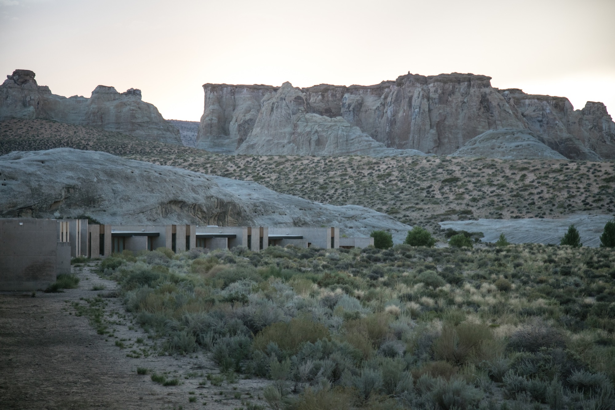
After an unforgettable, slow drive along a private, paved road between colossal ridges and across vast landscapes, we arrived at what I can only describe as a concrete castle hiding in the rocks of Southern Utah. Amangiri was and remains the greatest architectural experience of my life as a photographer. Minimalism, texture, silhouette... all unassuming until I wandered through this artistic haven of concrete walls.
A collaborative design by architects Rick Joy (Tucson, Arizona), Marwan Al-Sayed (Hollywood, California) and Wendell Burnette (Phoenix, Arizona), Amangiri spreads over 600 acres (243 hectares), with 34 suites and a four-bedroom mesa home, a lounge, several swimming pools, spa, fitness center and a central pavilion that includes a library, art gallery, and both private and public dining areas. The architects were commissioned by legendary hotelier Adrian Zecha, whose Aman Resorts have redefined luxury travel in epic proportions.
Arriving at the resort
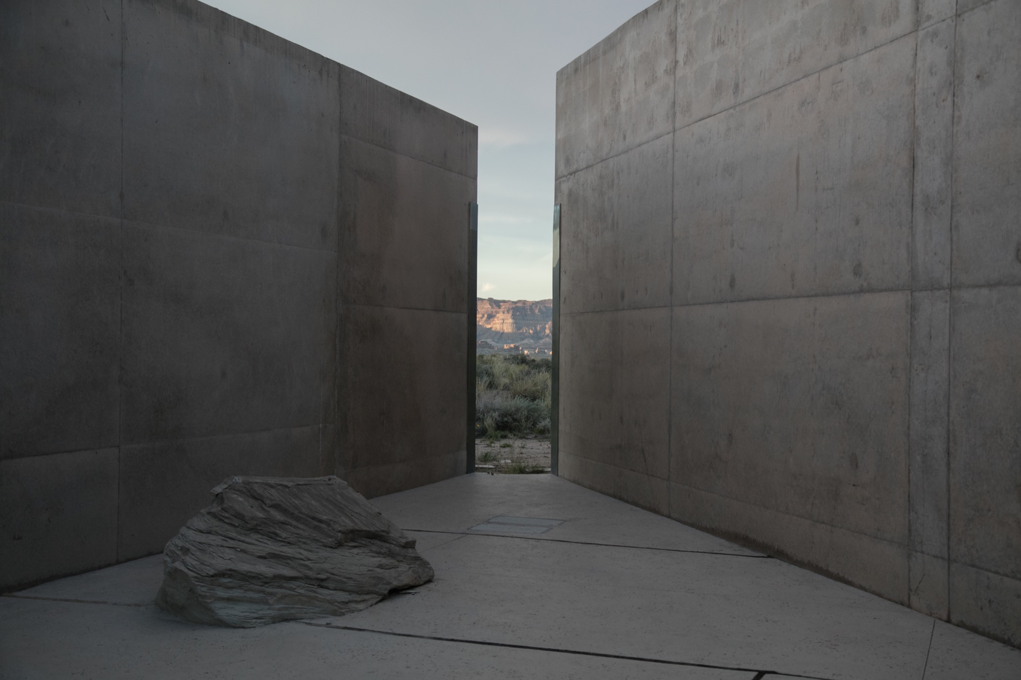
We wandered across the dramatic entrance, past the protruding canyon on the right and stepped into the first breezeway, one of numerous voluminous concrete corridors that connect each pavilion to the next, framing the valleys in the distance and creating different moments of awe every time you step inside. Throughout the day, the sun hits each breezeway at different angles, giving light and shadow new meaning, in a continuous cycle from dawn until dusk. Impressions of grandeur aside, with each stride deeper into these grand hallways, I felt closer to sublime serenity; this indescribable feeling of peace.
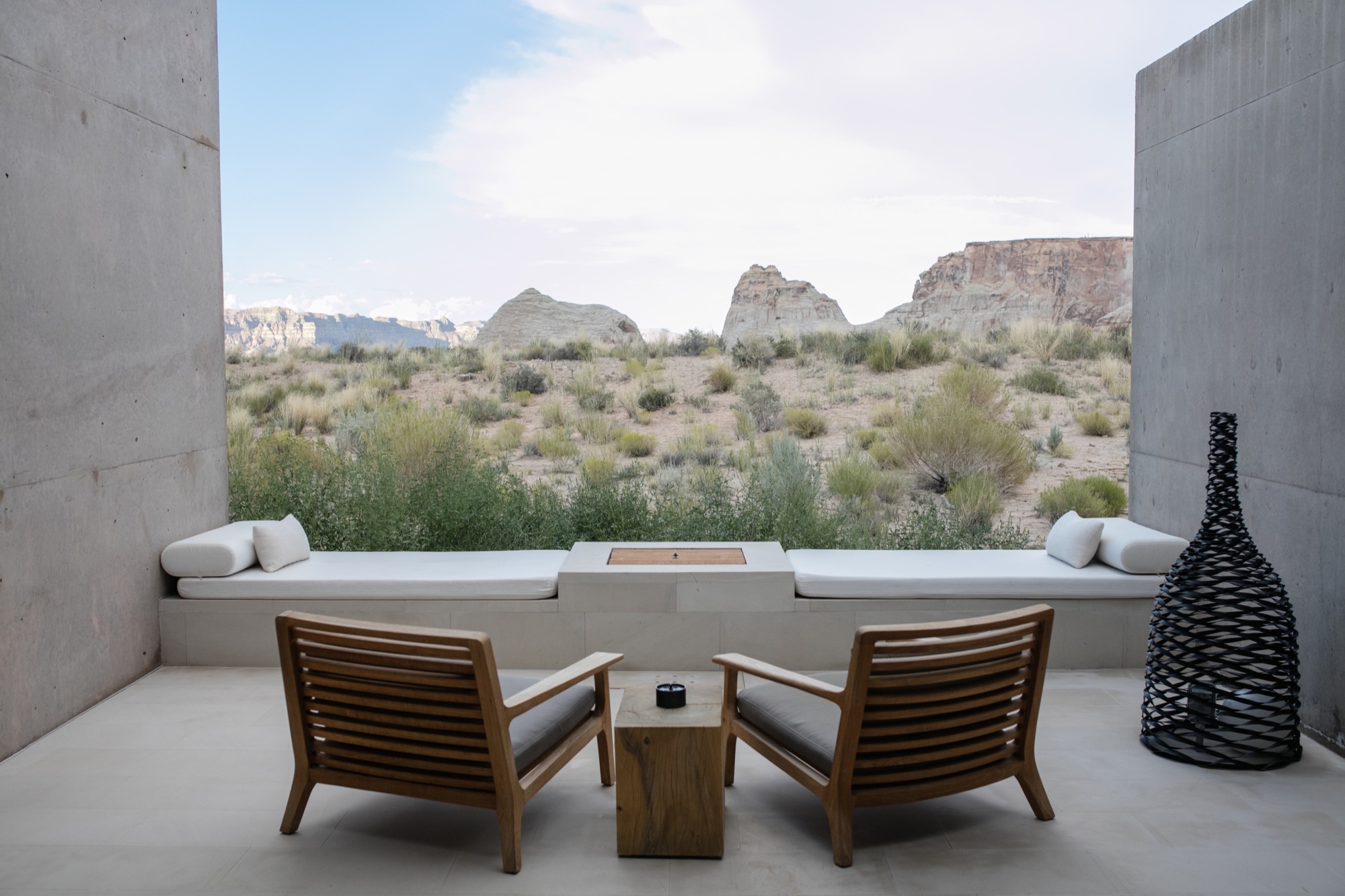
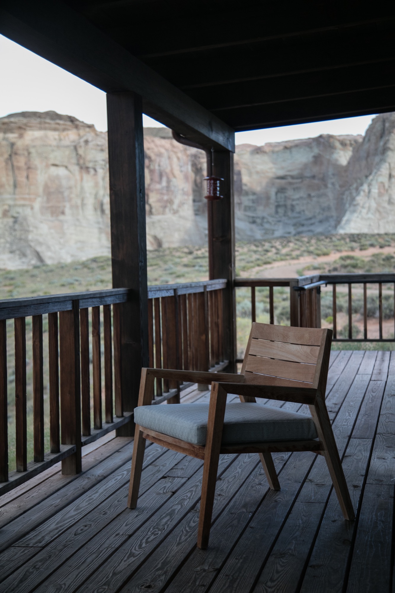
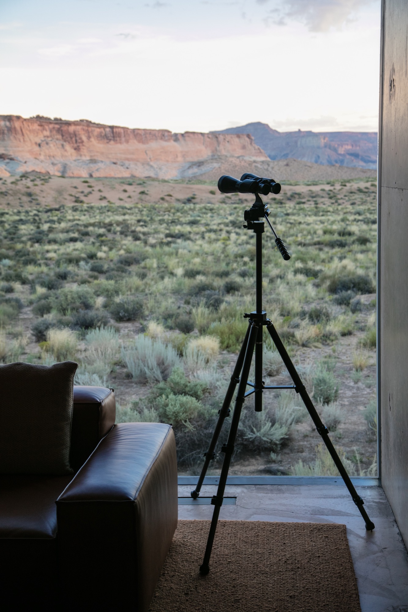
We were shown to our room, a one-bedroom suite on the edge of the property, backing to what at first glance reminded me of a set built for a spaghetti Western: rolling tumbleweeds, the squeaks of desert mice, expeditious hares scurrying about, the scene set against luminous canyons and a distant view of Broken Arrow Cave, an indigenous, spiritual sanctuary. Certainly the right place for a creative’s maniacal mind to softly seep into a slumber.
“Certainly the right place for a creative’s maniacal mind to softly seep into a slumber.”
Exploring perspectives
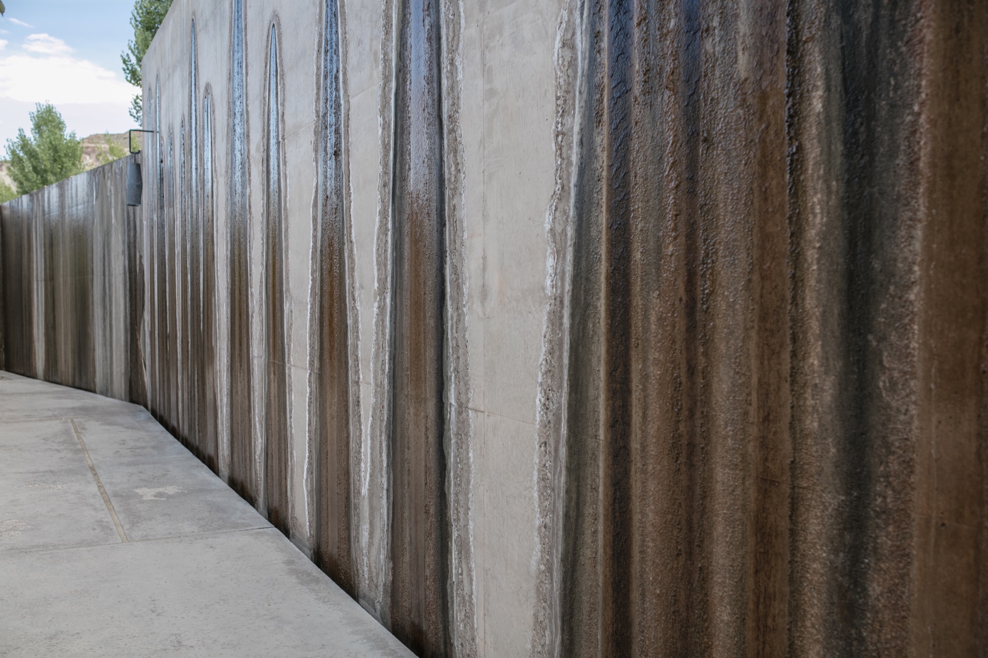
After some rest in our noble lodgings, the photographer in me yearned to roam the grounds, Canon in hand, and to capture the tranquil austerity surrounding us. Being here, each of the architects’ decisions made sense. Moments of monotony broken by jagged slices of deep, sweeping pastel views. The polished concrete’s organic texture caressed by soft waterfalls cascading down the walls. Brief Edenic allusions in fruitful apple trees, ripe for the picking. To grasp we were only a couple hours’ drive from Las Vegas, Nevada, was almost impossible.
Perspective became an intriguing exploration. The architecture condenses expansive canyons into splinters of light and landscape between these grand, polished concrete walls. Rather than being clinical or cold, as unknowing observers might reckon from afar, the stark concrete structure’s monochromatic elegance creates harmonious balance between the arid landscape in a desolate summer climate and shadowed walkways affording gentle breezes of desert wind.
“Perspective became an intriguing exploration. The architecture condenses expansive canyons into splinters of light and landscape between these grand, polished concrete walls.”
Fortress of luxe
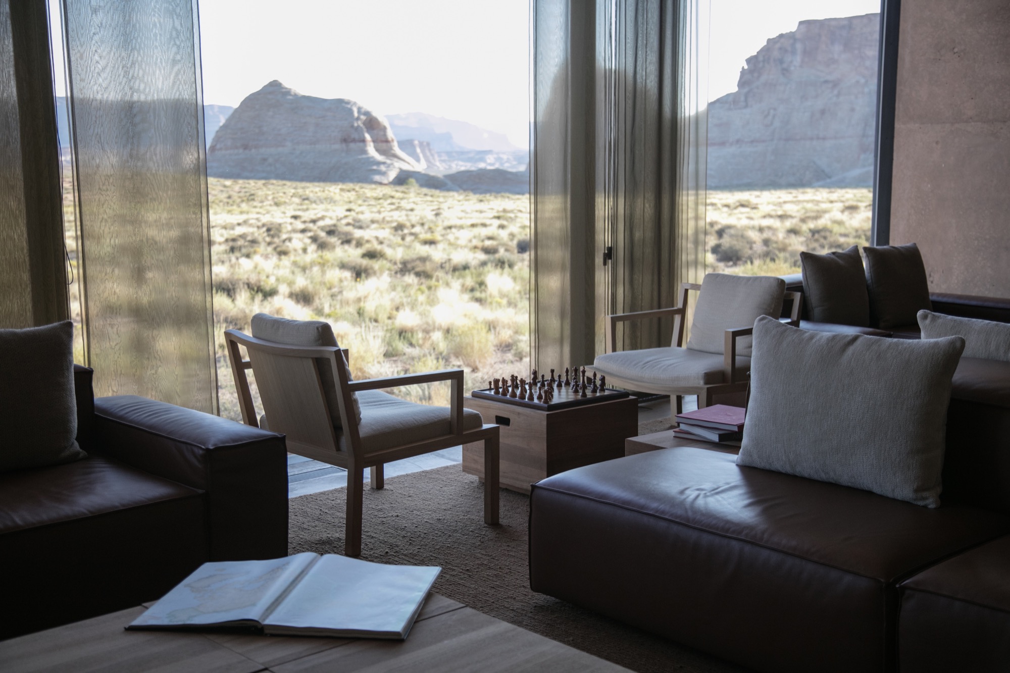
Stepping inside Amangiri superseded any notions I had of comfort and luxe. The main pavilion is a multipurpose common area scented by burning fresh sage and sunburned grain. On the walls, copious Ulrike Arnold artworks implement abstraction from the concrete’s silky texture. The interior seamlessly merges textures as if designed by rhythmic dictation. Soft leathers and animal hides, smooth oak and cement surfaces all amalgamate with the rough, rambling terrain that surrounds the resort.
I experienced color in this place like never before—the perfectly blended gradient changes from earth tones to milky hues. The architects of Amangiri also designed all interior features; furnishings, lighting, signage… all the elements reflect the Southwestern landscape and culture with subtle, emblematic references to the Native American tribes that once inhabited Canyon Point.
Dining at dusk
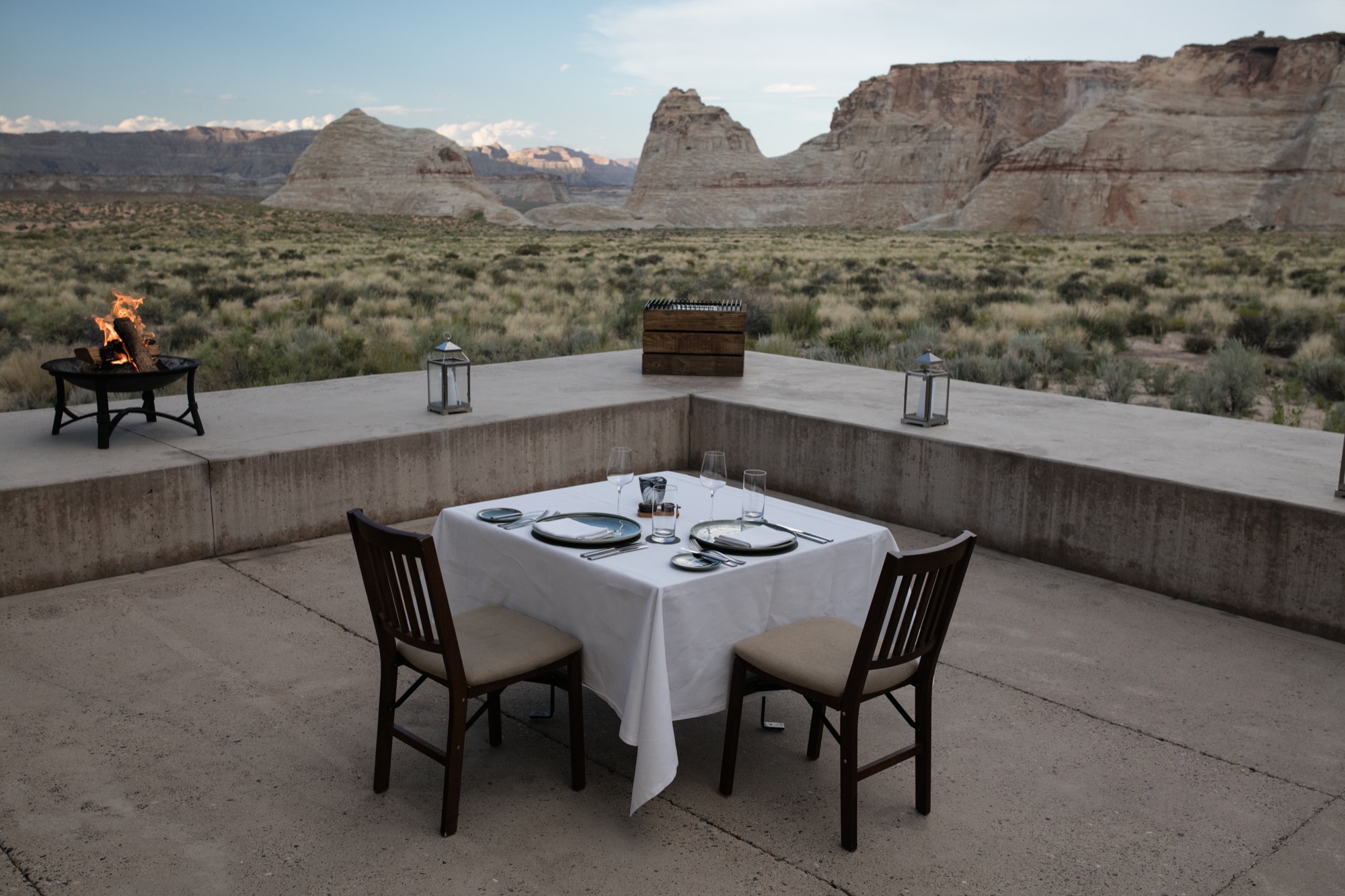
The Amangiri invited us to take our first meal alfresco in the Desert Lounge, a rather humbling setting for our dinner at dusk. Sitting across from my friend, charging our glasses of wine and looking out at the immense horizon, overcome with divine silence and calm, we couldn’t speak but simply look and listen. Within this celestial space, I discovered an understated romance in the combination of architecture, nature, and food. Amangiri presents a rather auspicious combination of locally sourced, farm-fresh produce and materials with modern interpretations of Southwestern traditions. Plate for plate, the decadent courses filled us, until we turned in for the night. First day, well spent.
“Within this celestial space, I discovered an understated romance in the combination of architecture, nature, and food.”
An early adventure
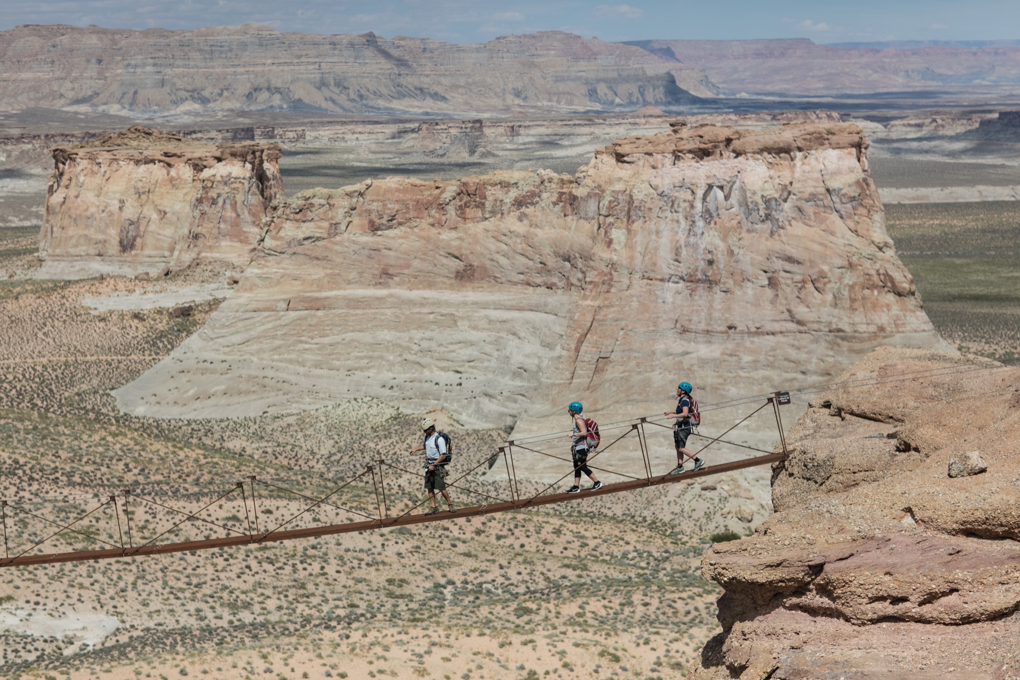
From the crack of dawn, Amangiri had been already awake and buzzing. We were informed to wear shoes suitable for an adventure and were later met by a car. Amangiri sits among some of the continent’s most grandiose, well-protected natural phenomena, and we were booked to experience one the resort is very proud to have on its land. At the foot of the largest of the canyons, they put us in climbing harnesses before we set off on a Via Ferrata, Italian for “Iron road.” This modern style of climbing journey involved steel cables and staples already in place for a more protected climb. The concept is to give inexperienced climbers the ability to enjoy rather dramatic and difficult peaks. And now, with my feet firmly back on the ground, I can say, the peak was indeed spectacular. Nerves aside, climbing to the top allowed me to truly experience the vastness of this beautiful place and the fragility of this natural ecosystem. I do, however, recommend taking an extra few breaths before crossing Amangiri’s signature suspension bridge between two peaks. Walking across with my camera was a rather nerve-racking experience.
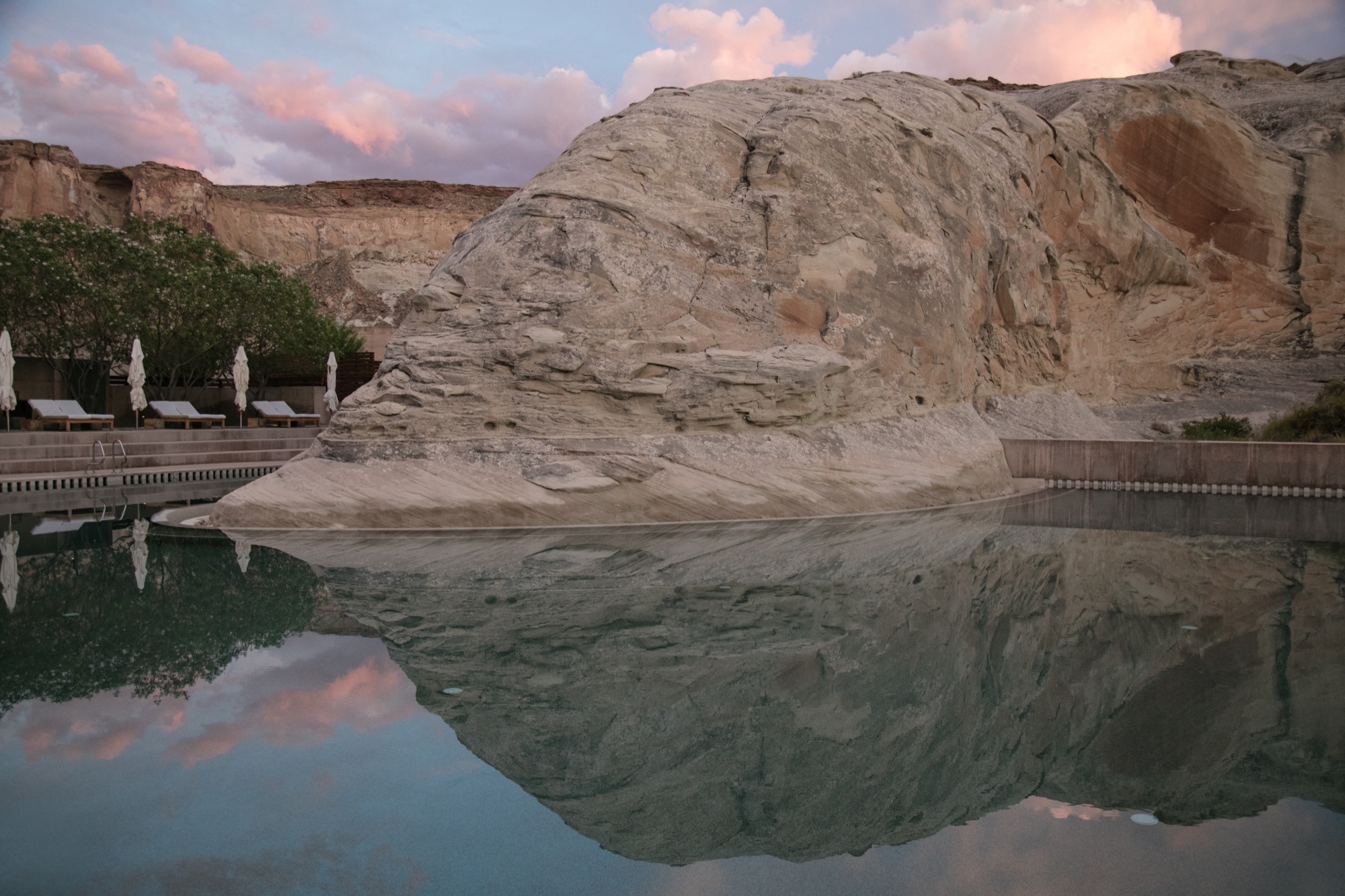
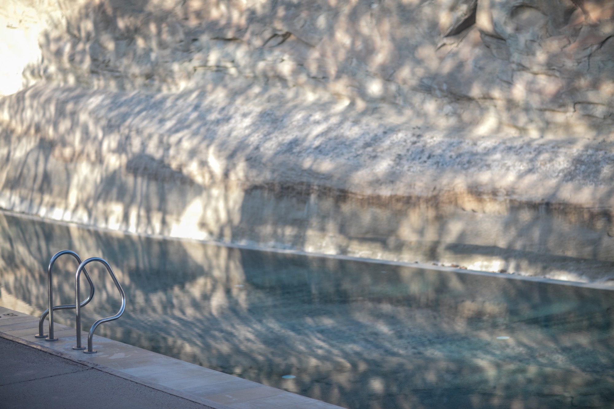
After that intense climb and exploring more of the resort’s outdoor adventures, the best decision was to spend our afternoon at the Amangiri Spa. The minimalist design of this serene adults-only oasis manifested the very concepts of relief. Instead of receiving a massage treatment, I spent most of my time self-reflecting in the floating cave’s Persian salt pool. 30 minutes of pure and simple bliss, resting on the surface of tepid water, scored by meditation melodies has become my new idea of elegant content.
Departing to return
Our departure was suitingly emblematic of our entire experience at Amangiri. As we unhurriedly drove past the minimalist concrete marvel, through the resort’s expansive acreage and past a private plane landing nearby, I began to appreciate the sheer magnitude of my weeklong stay here. The space has inspired a newfound understanding of lines and light, and a greater comprehension of the relationship between nature and man-made creations. As I left, I already longed to return. △
Dwell × Alpine Modern
We are incredibly excited to announce our partnership with Dwell
From the very beginning, as we imagined Alpine Modern to be a publication about modern architecture, design and elevated living in the mountains around the world, telling people about our vision has usually included something like "You know, like if Dwell and Cereal magazine had a lovechild in the mountains..." Dwell's authority in showcasing international modern architecture and design has inspired us in our own work. This is why we are incredibly proud to announce that today marks the beginning of our partnership with Dwell.
This means, you will see some of our editorial stories on the new (launched today!) Dwell.com, published under the banner of Alpine Modern. What's more, we will present Alpine Modern "Curations" — a new element of the redesigned Dwell.com. This can be anything from a product roundup from the Alpine Modern Shop to a themed collection of stories about cabins, art and journeys in Norway.
In return, you will read cherry-picked Dwell content on Alpine Modern Editorial.
Follow @alpine_modern along on Dwell.com as Dwell and Alpine Modern together kindle a longing for elevated living, through slow storytelling, amazing photography and tightly curated alpine-modern objects. △
The Creator of Whimsy
Danish architect and designer Hans Bølling talks with us about his iconic wooden figures, modern design and his wife and muse, Søs
Danish designer Hans Bølling is best known for his iconic humorous wooden creatures. His modern-design legend began when, early in his career, the trained advertising designer playfully crafted small figures as gifts for his beloved wife.

Thanks to the precision and personality in Bølling's objects, he quickly began selling the wooden creatures to stores. Soon thereafter, he won a design award and invested the winnings in his own carpentry machine. A fortuitous acquisition, as it kickstarted the production of Bølling's now-iconic Duck and Duckling in the 1950s. The rest is modern design history.

Bølling's classic Duck and Duckling and their wooden friends, which include Strit and the Optimist and Pessimist, are still being produced by the Danish company Architectmade.
Born 1931 in Brabrand, Denmark, Bølling now lives in Charlottenlund with his wife Søs, whose father, he tells us, is responsible for his branching out into architecture. Balling eventually graduated as an architect from The Royal Danish Art Academy.
We caught up with the prolific Dane only a few days after his 85th birthday. Astonishingly, Bølling, who says he's too busy working and having fun to retire, is still creating many more new objects in his atelier.
A conversation with Hans Bølling

Tell us about your remarkable journey from architect to product designer.
It all starts with Søs, my wife. We met when she was 16-and-a-half, and I was 21. I was going to be an advertising designer, but her father didn’t think I would be able to support her with that kind of job. So I graduated from The Royal Danish Art Academy and became an architect.
I started working in her father's design office in the very center of Copenhagen, just by Læderstrædet, Højbroplads and Amagertorv. Since then, I have been working in different places and have created a vast variety of works, ranging from town halls and living complexes to villas, furniture and wooden figures.
Actually, the wooden figures came before everything else. It was something I couldn’t help doing. I created all of them for Søs. In the beginning, I would make them out of coconut tree, Brazil nuts, bog oak and whatever material I could find. At some point, I won a competition creating a pattern that everyone thought was made by the famous Danish ceramic artist Axel Salto. I won some money and bought myself a turning lathe. This became the starting point for the figures you know today. The turning lathe inspired me to do the Duck and Duckling, Strit, Oscar, the Mermaid, the Optimist and Pessimist, and so forth.
What’s the story behind your wooden figures, why these whimsical little characters?
All of my wooden figures have been made for Søs. In that sense you can say that I built my career on love. In the beginning, I made the little Oscar out of Brazil nut. I have been making orchestras with figures playing the flute, drum, guitar. The Optimist and Pessimist were inspired by two colleagues of mine, were the one was always happy and smiling and the other was always moody and sad. For the Duck and Duckling, I was so fascinated by this story about a policeman who stopped the traffic to help a duck and her ducklings pass the street. A photographer caught it on camera, and the picture went around the world in 1959. After that amazing story, I felt inspired to create the Duck and Duckling on my turning lathe.
"All of my wooden figures have been made for Søs. In that sense you can say that I built my career on love."

What makes you a modernist at heart?
I don’t know. I have just always been doing modern things, modern buildings, modern furniture. I was influenced by Søs’ father, Axel Wanscher, her Uncle Ole Wanscher, and the whole scene they where part of.
What does “quiet design” mean to you?
I like classic and simple design, with a strong idea behind it.
What are you working on these days?
I am always working on a lot of different things. I have loads of boxes filled with figures, drawings, posters and ideas. Maybe a lot of it will never be realized, but it doesn’t matter, I am having fun. I just turned 85 this week, and I have no intention to retire. I am way to busy working and having fun. Just this year, I will launch two new products with Architectmade, so that is very exciting.
"I have loads of boxes filled with figures, drawings, posters and ideas. Maybe a lot of it will never be realized, but it doesn’t matter, I am having fun."
Describe your dream home...
My home is my dream home. I could not wish for anything else!
What does “home” mean to you?
Where I’m with Søs.
What’s your favorite place in the world?
I like my house, our summer houses on Anholt and in Hornbæk, and my atelier in Charlottenlund.
What’s most important to you in life?
Having fun, creating things and being with Søs. I feel I have been so lucky. I have made a living from what I like doing the most. My work has been a playground, and it still is.
"My work has been a playground, and it still is."
Who is your design icon, and what do you admire about her or him?
I don’t have a design icon, but I like the coffee table by Mogens Koch, the Colonial Chair by Ole Wanscher, the silverware by Kay Bojesen. I don’t see myself as a designer. I don’t like being a designer. I just love to create things.
"I don’t see myself as a designer. I don’t like being a designer. I just love to create things."
Who or what inspires you to be the person you are?
Søs. Of course. (Said with a big smile).
What is your life philosophy?
We should remember the human dimension in design. △
"We should remember the human dimension in design."
Utahan Utopia
Summit Powder Mountain in Utah is a visionary colony of cabins designed by emerging Slovenian architect Srđan Nađ
A Slovenian architect’s “wooden tent” design pushes the conversation on nature-respecting modern mountain architecture and communal living on Powder Mountain, where an enigmatic group of entrepreneurs, creatives, and altruists is building a pioneering alpine village. “We bought a mountain.”
So begins the backstory of Summit Powder Mountain, a visionary colony of cabins and an alpine village being dreamed up in Utah's Wasatch Mountains.
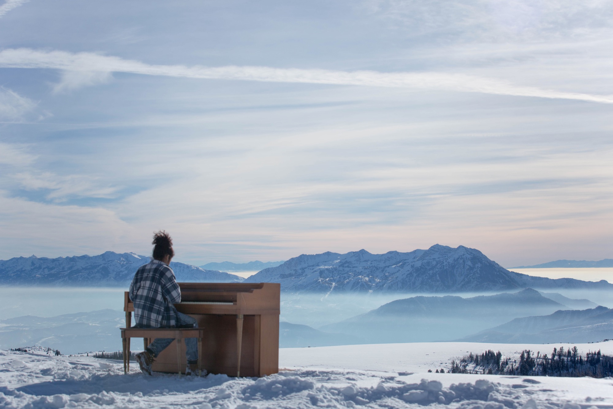
Elliott Bisnow and the Summit Series
Behind the idea is Summit, an event business started by Elliott Bisnow, a founding board member of the United Nations Foundation’s Global Entrepreneurs Council. What began as a small gathering of a few dozen investors, business whiz kids, and creatives over a short few years grew into the Summit Series: traveling invitational events that summon hundreds of thought leaders and different-thinkers from around the world. "What would it look like if Davos and Burning Man had a baby?" The Guardian rhetorically wondered in a recent article about the Summit Series. For its latest flagship event, Summit at Sea, 2,500 chosen attendees boarded a cruise ship in Miami for a four-day conference in international waters.
Rooting down in Utah
Now Summit is building a permanent base camp for its forums—a high-alpine town for its growing tribe to come home to. Summit purchased Powder Mountain, including the ski resort that has been operating there since the 1970s, with the vision to fundamentally reimagine and experiment with how people live together, shelter themselves, and converge for the greater good. “I’m very interested in what new mountain architecture looks like, acts like, feels like—how it responds to all the different stimuli in the world,” says Summit design director Sam Arthur, who moved to Utah to see the project through. Since buying the mountain in 2013, Summit has called on sundry architecture and design gurus, even sacred geometry to conceive this test bed for communal living. But the group still needed a cohesive cabin concept, a trademark design that considers the demands of living at 8,400 feet (2,560 meters) altitude, of building sensibly on historically mostly undeveloped, pristine mountain land that includes an elk reserve, natural waterways, and thriving wildlife. A sheep ranch was the only settlement on the mountain for the longest time.
“I’m very interested in what new mountain architecture looks like, acts like, feels like—how it responds to all the different stimuli in the world.”
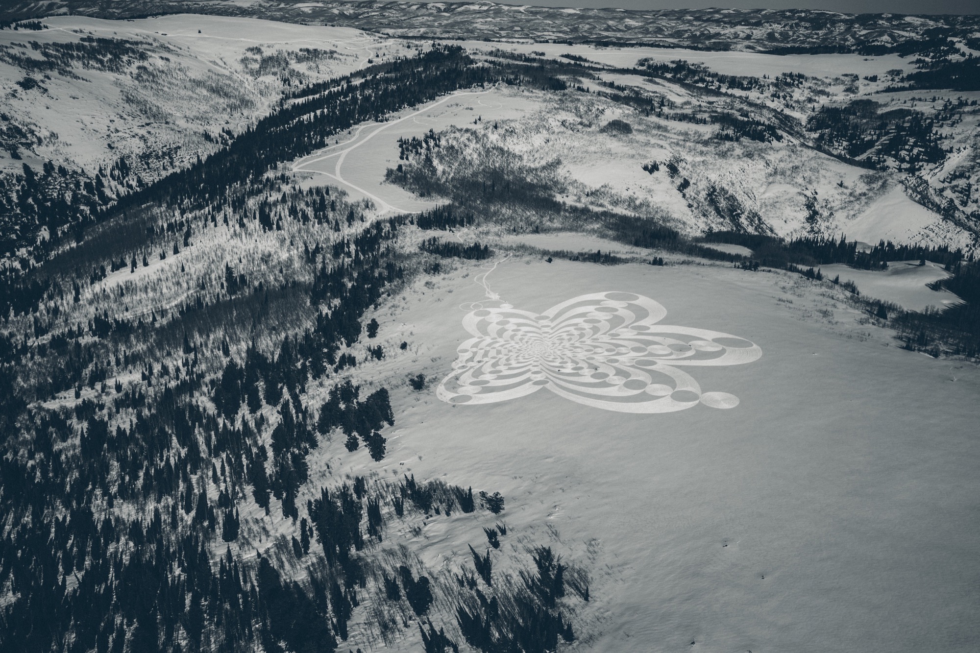
Mountain Architecture Prototype (MAP) design competition
Thus, Summit’s Mountain Architecture Prototype (MAP) design competition challenged the global guild of architects, engineers, artists—masters and students alike—to design sustainable cabins that embody the leadership’s ideals of sustainability, use of natural materials, and humble expression. The winning concept would guide the architectural ethos for more than 500 single-family homes, limited to 2,500 square feet (232 square meters) on half- to two-acre lots. Arthur says they capped the size of the homes so Summit Powder Mountain could become a democratized, harmonious environment for the community at large rather than “this über-wealthy place that is about showing off how big and bad you are.” Larger lots of up to thirty acres, however, could potentially accommodate a compound design.
Choosing a winner
The winner: Srđan Nađ, a young architect from Slovenia. His prized design was inspired by a Summit event photo he had seen—a green meadow dotted with simple white tents, pure architecture integrated within thin cloth, pitched to create shelter from weather and wilderness. His other muse was the frontier cabin of America’s past, a simple wooden structure with a great stone chimney on the outside. “Combining both was my design concept for Summit Powder Mountain—a true connection with nature,” says Nađ, who believes “95 percent luck” won him the competition. More likely, though, he convinced the international jury panel, led by Todd Saunders of Saunders Architecture (Norway) and Jenny Wu from the Oyler Wu Collaborative (Los Angeles, California), with his design’s adaptability and transformational potential. Arthur says, “Srđan did a beautiful job of meeting the criteria and applying a certain amount of aesthetic to it that really eloquently resolved that future/nostalgia-heritage/modern friction, which is at the core of what people respond to here, how they want to live in the modern age.” With its indoor/outdoor quality and what Arthur describes as “an obsession with light and views,” Nađ’s design captures the raison d’être for living on a mountain. “It’s a place to find refuge, to be inspired, to take in the natural primary source of beauty, and recreate with friends. It’s often very difficult to turn that into architecture, but Srđan took that and wrapped a building around it.”
Who is Srđan Nađ
Born to two architects in Zagreb, Croatia, in 1983, Nađ’s career choice was perhaps destined by birth. He attended a special building and engineering high school and spent his senior year abroad in upstate New York. He returned to Europe to study architecture at the University of Ljubljana, which he describes as a “boutique school” in the center of the city. “I had the opportunity to do a lot of architectural competitions and really test my ideas—and, of course, learn from my mistakes.” After practicing the craft with other studios for several years, Nađ founded Grupo H with his wife, a landscape architect. Based in Slovenia and surrounded by mountains and the outdoors, the company is dedicated equally to architecture and interdisciplinary aspects of planning and building.
“I grew up in Dubrovnik, Croatia, a great historic town by the Adriatic Sea, so I didn't have any understanding of the alpine world until my fantastic wife, a local Slovenian girl, introduced me to the alpine world of Slovenia and its natural environment,” Nađ says. “What’s special about Slovenia is that the mountains here are relatively inaccessible, and to get to know them, you need to hike a lot. Hiking is a local obsession here.”
Living in the small European country known for its mountains, outdoor recreation, and ski resorts—much like Utah—has transformed the man from the seaside. “When you have to hike for two, three hours through untamed nature to reach a summit, you start looking at nature from a different perspective,” says Nađ. “It teaches you to admire and respect the wild nature of the alpine world. In the end, when you are put into the position to design a building for such a surrounding, all your knowledge and memories come together to create this unique combination of simplicity and elegance that a building high in the mountains demands.“
“When you have to hike for two, three hours through untamed nature to reach a summit, you start looking at nature from a different perspective.”
Nađ's "Wooden Tents"
His proposed cabin design preserves that tentlike lightness and unmistakable functionality that inspired him and manifests it in a permanent, habitable structure. The architect expresses this lightness through a 1.5-inch (3.80-cm) thin “skin” made from cross-laminated prefabricated wood panels, folded to create the interior space of the cabin. This folding process leaves open the sides, which are then covered in glass. Juxtaposing the transient openness of the folded skin, a monolithic stone chimney stakes the raised cabin, grounding it into the mountainside to create the permanence a tent lacks. The chimney’s body also houses the mechanicals. On the opposite side, the cabin leans on a deck that touches down to the ground. With only the chimney and the deck as supporting elements, the cabin’s footprint is small, making large earth excavations unnecessary. The triple-glazed glass walls let the sun heat the highly insulated interior. Rainwater from the sloping roof collects into storage tanks under the deck. The goal is for the cabins to be certified according to the European passive house standard and the American LEED standard.
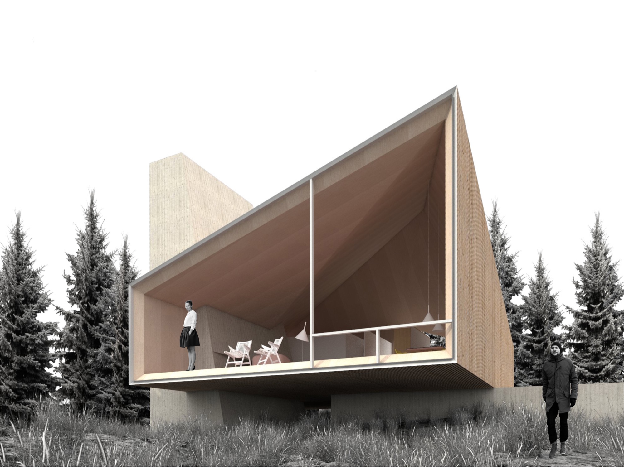
The cabin design allows for different versions of the prototype, varying from a simple one-bedroom hut to a luxurious four-bedroom chalet. The blueprint foresees an open living/dining/kitchen area with a large fireplace. The high ceiling follows the geometry of the exterior roof, mimicking the surrounding mountain silhouette. “In all, it will be a fantastic place to come back to after a full day of skiing or a long summer hike,” the architect hopes.
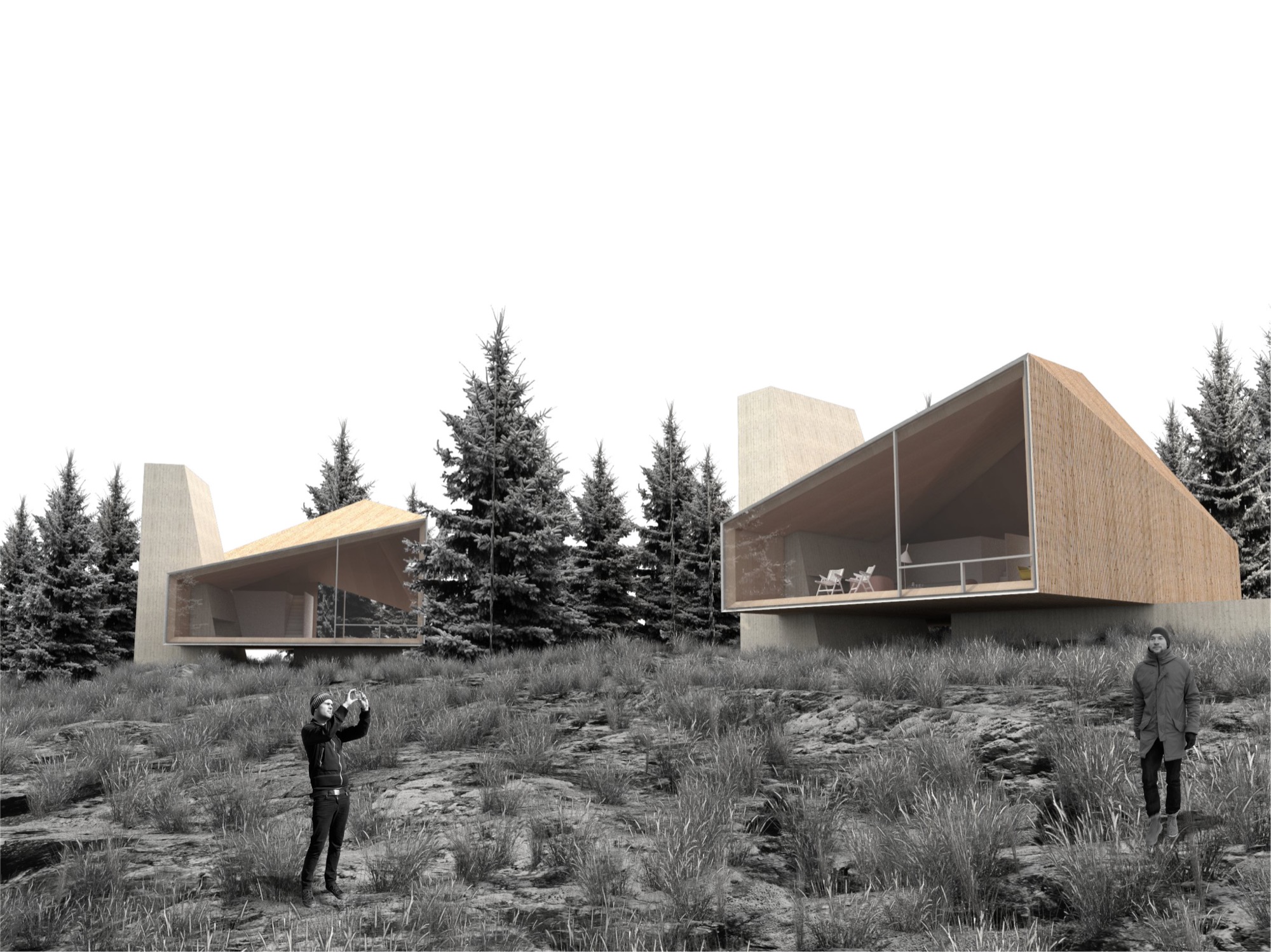
Nađ’s minimalistic “wooden tents” are designed to serve as fully functional habitable structures without creating the feel of urban settlement on Powder Mountain, and they preserve the essence of the natural surroundings. Nađ strove to convey the notion of living in nature rather than intruding upon the alpine landscape to stake out your private piece of paradise.
His sensible solution was, no doubt, spawned by his home country and culture. “We are really humble, hardworking, and resourceful people. So that guides me to find simple, functional, and long-lasting designs for my projects,” he says, adding that the alpine cabins and shelters of the Slovenian mountains influenced his “wooden tents” for Summit Powder Mountain. “They are simple, rugged, but still graceful in unforgiving nature.”
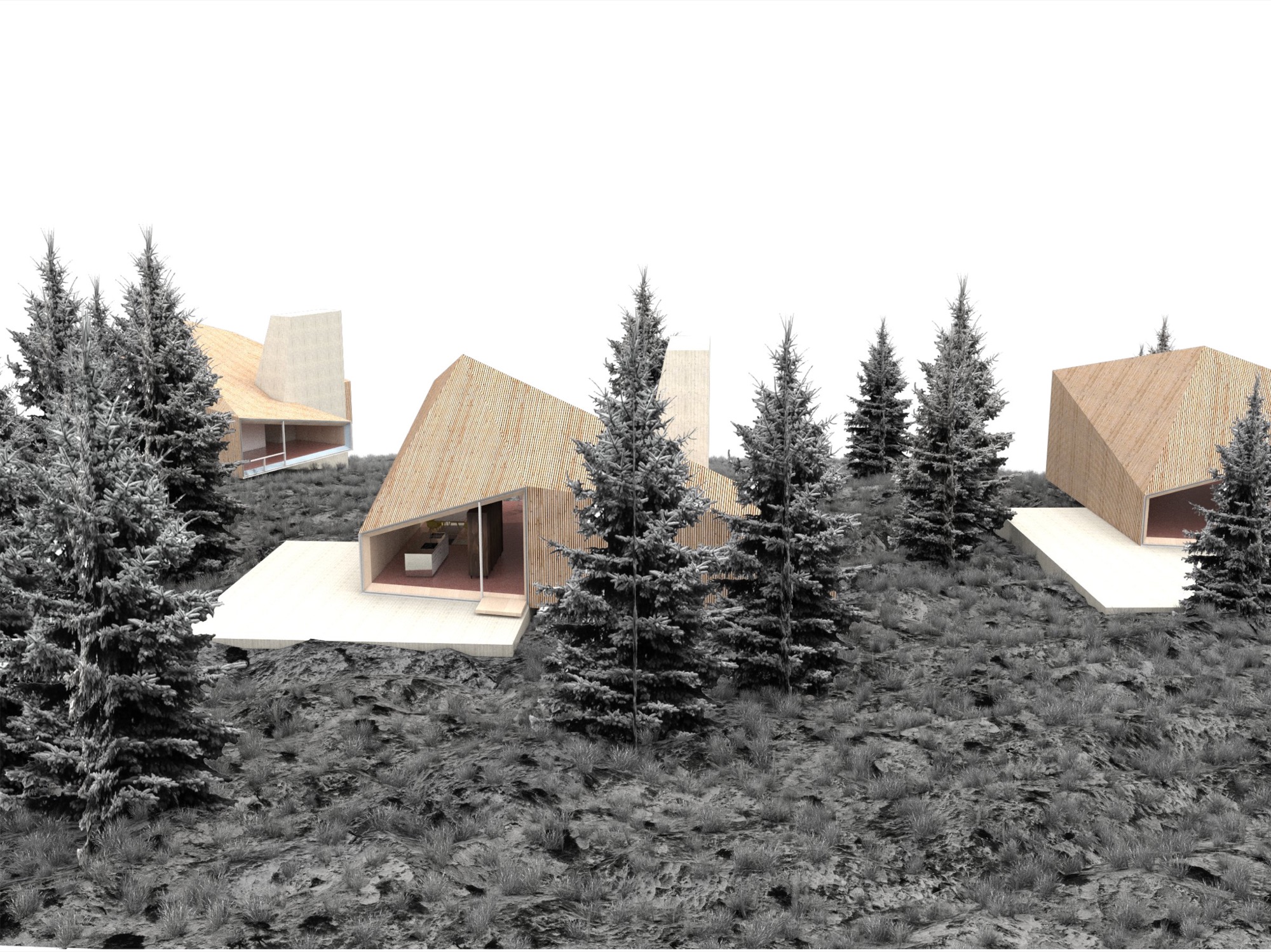

Nađ didn’t plan to enter an architecture contest at the time he learned about the MAP design competition on an architecture blog. But the subject—a cabin—intrigued him since he thought it rather uncommon for an international contest. “You usually have a competition to design a museum, library, memorials...but houses are rare.” The premise of Summit Powder Mountain eventually compelled the young architect to enter his design. “You could see that they are not planning to do a typical commercial development, but start with a clean slate and do things right.” However, he didn’t grasp the expanse of the project until he spoke with the Summit team. “I didn’t realize how important this is for the global community, as it shows a new way of planning large developments,” he says in retrospect. Nađ understood that no matter how good his cabin design was going to be, simply copying it 500 times would only create the type of cookie-cutter development that already characterizes too many mountain resort towns. “My design goal was to create a house that can be transformed—enlarged, scaled down, rearranged, have a different facade—and still preserve the overall design idea,” he explains. The “wooden tent” concept is a suggestion, one Arthur says is “a loose design that’s poetic and evocative.”
“You could see that they are not planning to do a typical commercial development, but start with a clean slate and do things right.”
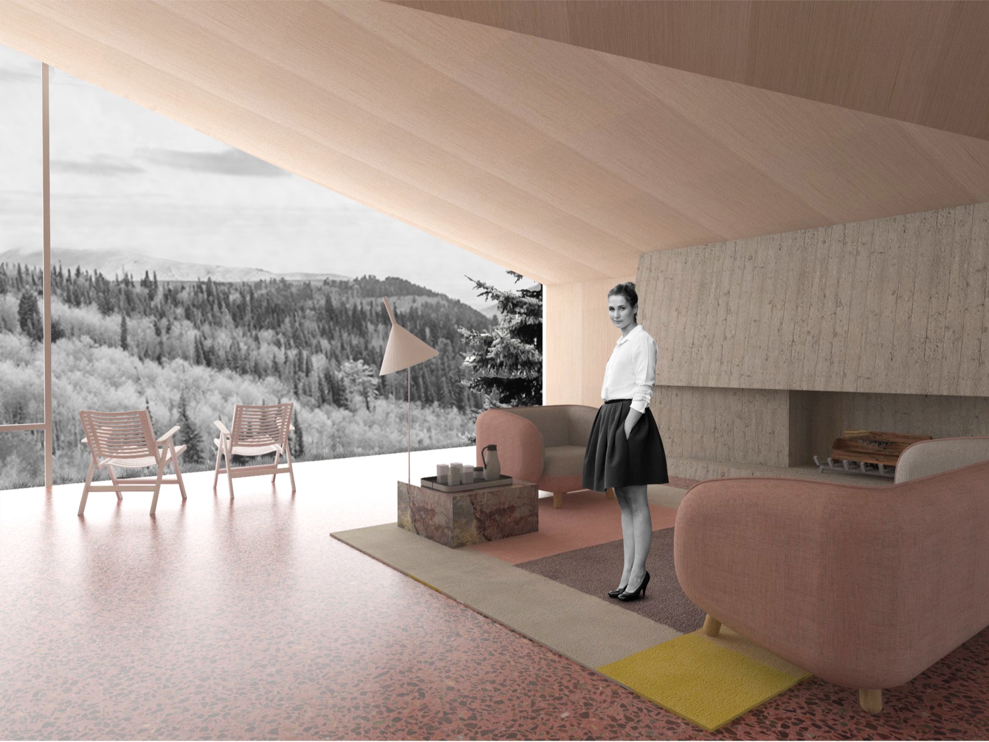
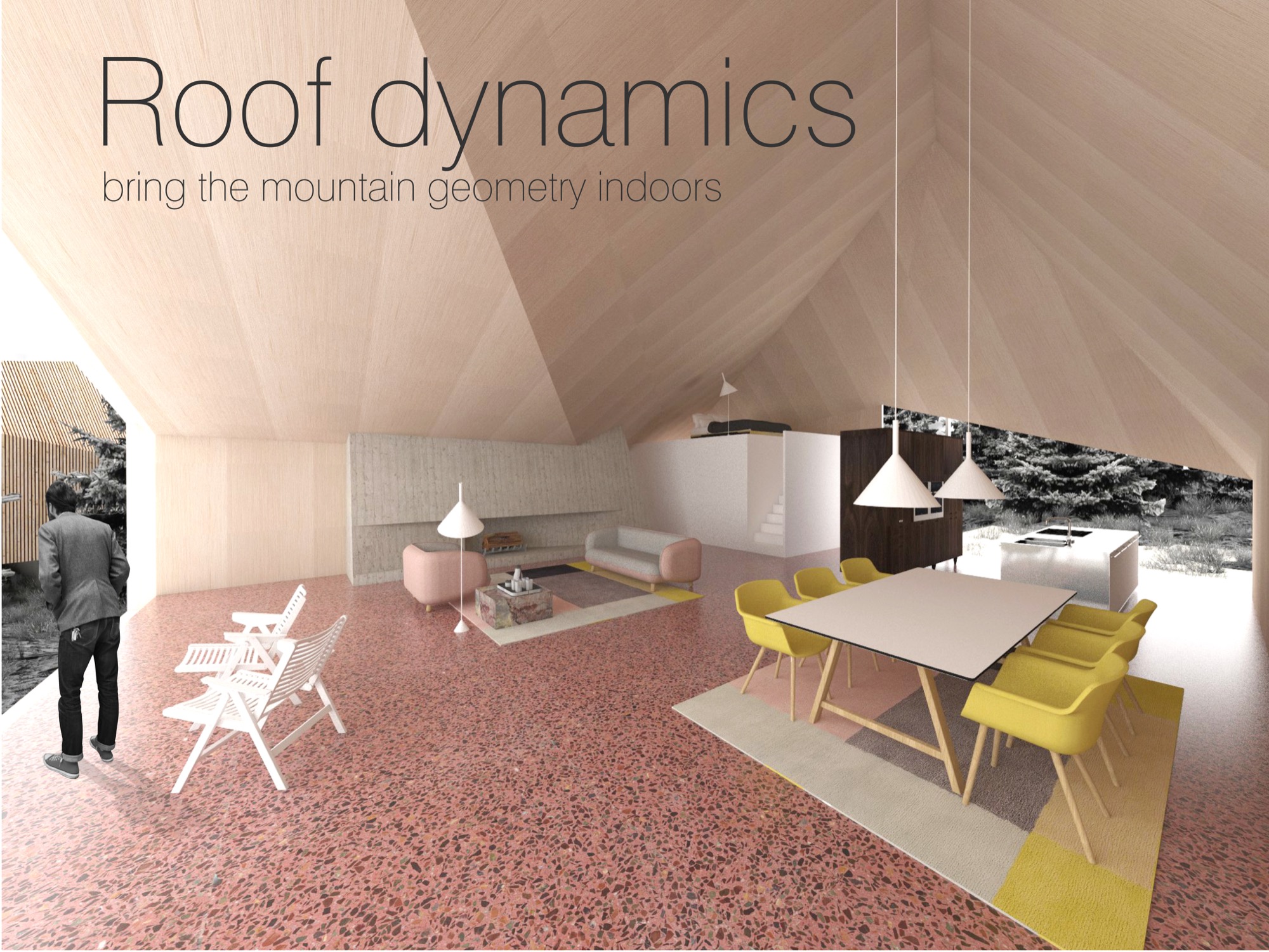
Building community
Summit is breaking ground this summer to build the first cabins on Powder Mountain. Furthermore, the company is planning the new alpine village, with shops and galleries, coffeehouses and restaurants, gathering venues, condos, and new headquarters for the ski resort they acquired. Arthur thinks seasonal skiers and hikers may visit the mountain and never know about Summit’s quest for settling an art, culture, and tech elite here, though it seems hard to imagine tourists coming to this creation of an idyll and doing their own thing. “We’re based on gathering,” Arthur emphasizes. “People gather in creativity to change the world. People don’t come up here for solitude, but for increased interaction.”
“People gather in creativity to change the world. People don’t come up here for solitude, but for increased interaction.”
What does new mountain architecture look like, act like, feel like? Only after winning did the architect from Slovenia realize how important his design was for the global community. In fact, Arthur argues that the encouraged culture of sharing is just another expression of Summit’s tacit broader understanding of sustainable living. “This isn’t ostentatious.” He points out that most members of the Summit Powder Mountain community would actually prefer to minimize their footprint by operating in a shared social space. “Rather than building large bathrooms and kitchens in their own house, people go home to sleep and to entertain a smaller group of people. Then they go out into the larger community spaces and venues to gather together. This is about collectivism and collaboration.”
But how do you curate a genial commune where strangers “gather in creativity” to become kindred spirits, collaborators, neighbors? You don’t. “We had a blunt policy for a while, a ‘no-asshole policy,’ ” Arthur reveals. In reality, they quickly came to understand that the Summit community fosters a quite self-selecting environment. “Basically, if you were obviously egocentric or self-centered, then you probably don’t belong here. People who want to participate and are ‘others-orientated’ and have the heart to expand goodness, usually work out pretty well,” he says. To the rest, it just doesn’t feel right to be there. The Summit leadership strives to strike a balance between public atmosphere and private, curated events. In the end, Arthur says, “It’s not an exclusive membership thing—it’s an overall public realm of creating a new mountain town.” △
In Search of Tenkara
The founder of Tenkara USA travels to Japan and brings back the traditional method of fly-fishing with a long rod and without a reel
Upon returning from Japan, my mind was filled with the mountain culture of tenkara, a traditional method of fly-fishing with a long rod and without a reel. I had to share my discovery with the people at home. My next journey was founding Tenkara USA.
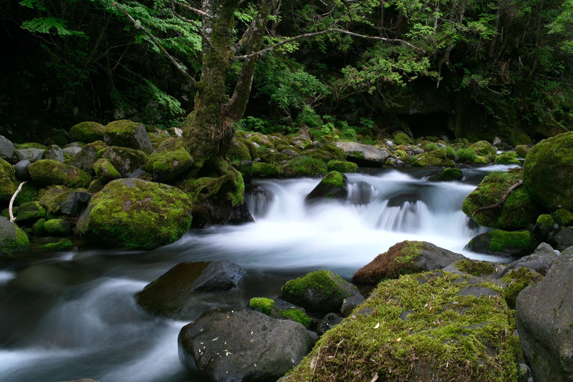
Clinging to mossy rock with half my body under a waterfall, I watched the torrent crash into a small basin fifty feet below, sending mist into the air and soaking my companions. Mr. Futamura observed apprehensively. Next to him, Mr. Kumazaki preferred to stare at the pool in front of him for any signs of iwana, the wild char found in the mountains of Japan. A fishing rod, small box of flies, and spools of line and tippet were stowed away in my backpack. No reel required.
As tends to happen with shing, we lost track of time somewhere along the way and now faced the crux of the trip. It was seven o’clock in the evening and would soon turn dark inside this lush forest. After a full day of rappelling, swimming through pools in impassable canyons, climbing rocks and waterfalls, and, of course, shing, we were all tired. The route ahead looked straightforward and within my comfort zone, the only caveat being a very wet climb.
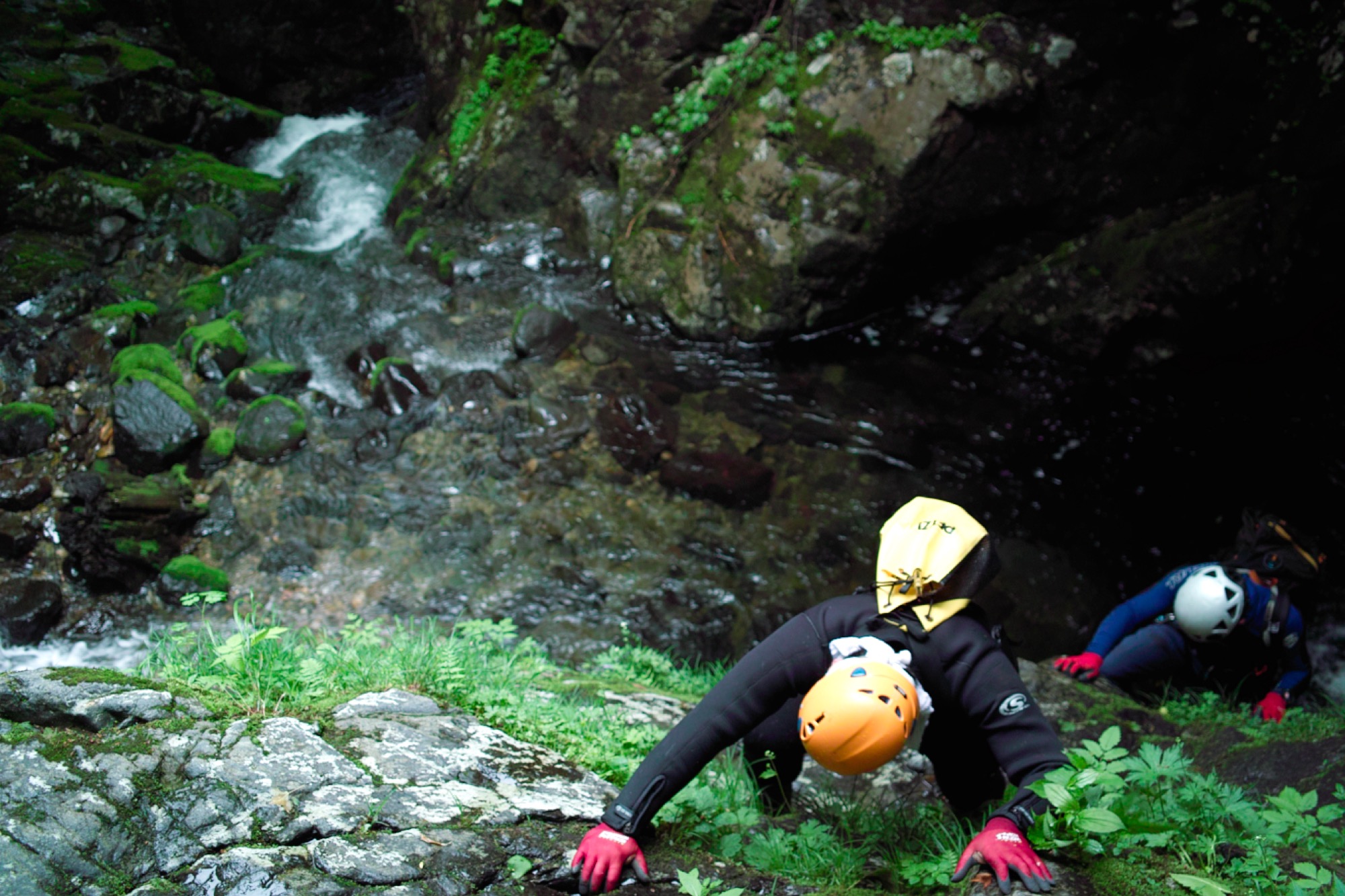
My task was to climb to the top, set up an anchor, and belay my partners up. Twenty feet from the top, features on the rock face disappeared on the drier left side and forced me closer to the waterfall, where thick moss oozed like a wet sponge. I was long past the point of no return. I pushed past the fear and focused: hands and feet, hands and feet, hands and feet. The banter between Futamura and Kumazaki suddenly stopped. All sounds, including the roaring of the waterfall, seemed to vanish.
Getting there
My trip to Japan was a journey of discovery. For two months, I stayed in a small mountain village, learning everything I could about the one thing prompting my journey: tenkara.
In reality, I already knew a lot about tenkara. Three years earlier, on my first trip to Japan, I introduced myself to this traditional Japanese method of fly-fishing that uses only a long rod, line, and fly—no reel. After returning home, all I could think about was tenkara. It offered a new way for me to challenge those mountain streams I love. I imagined how great it would be for backpacking and introducing people to fly- fishing in a simple, fun way. There were just so many possibilities.
"After returning home, all I could think about was tenkara. It offered a new way for me to challenge those mountain streams I love."
With little information and no gear available stateside, I took on the task of introducing tenkara to the United States. Over several long months, I created Tenkara USA and since 2009 have been introducing tenkara to anglers outside of Japan. However, despite the knowledge I gained in the last three years, particularly under the tutelage of Dr. Hisao Ishigaki, Japan’s leading authority on tenkara, I knew there was much more. Tenkara is a deceivingly simple form of fly-fishing that holds deep historical, cultural, and technical layers.
"Tenkara is a deceivingly simple form of fly-fishing that holds deep historical, cultural, and technical layers."
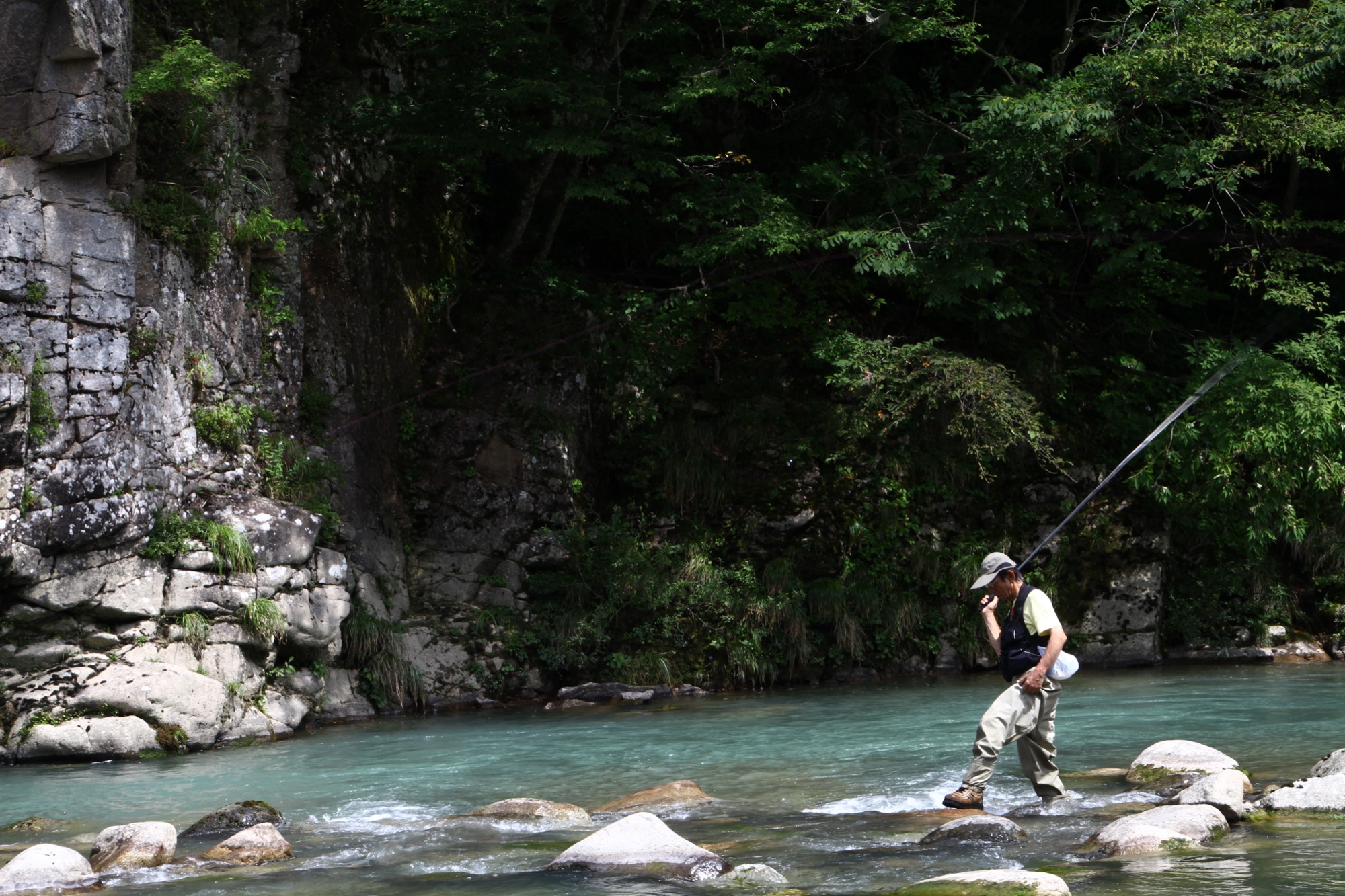
History of tenkara
Just as the practice of metalworking appeared independently in the Fertile Crescent of the Middle East and among the Incas in South America, evidence suggests that fly-fishing emerged in Europe and Japan independently of one another. Tenkara is similar to the original mechanics of fly-fishing practiced by the likes of Dame Juliana Berners and Charles Cotton, the best-known historical practitioners of fly-fishing in the West. Anglers have practiced similar fixed-line methods in many other parts of Europe, including Spain, France, Italy, and Poland. Yet, unlike the original Western fly-fishing methods, tenkara still lives in Japan.
One main distinction separating tenkara from Western fly-fishing is its origin—tenkara was an art of necessity for peasants, not a sport for the idle classes. While the West went to work designing fly patterns, weights, strike indicators, and other gadgets to control the reach of a fly or make the activity “easier,” the typical tenkara fishermen of today adhere to the original practitioners’ thrift and reliance on skill. At the risk of seeming irrational to a Western fly angler, most tenkara anglers rely on only one fly pattern, no matter where they fish or what is hatching. As the tenkara philosophy goes, attaining a mastery of skills and technique is more important and efficient than second-guessing fly choice.
"Tenkara was an art of necessity for peasants, not a sport for the idle classes."
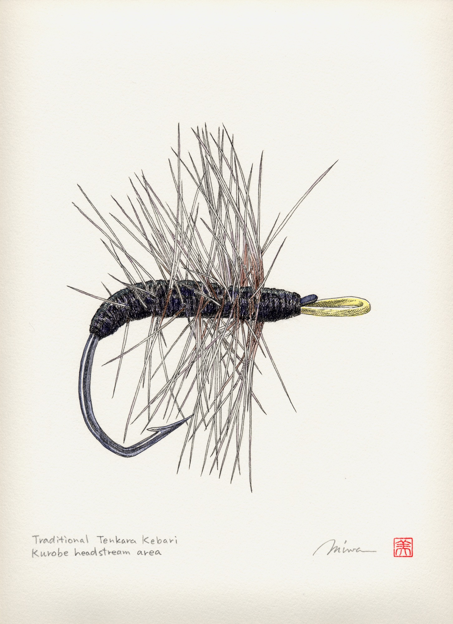
"As the tenkara philosophy goes, attaining a mastery of skills and technique is more important and efficient than second-guessing fly choice."
Ancient and mysterious origins
Tenkara felt like my own personal Machu Picchu. Here was a rich but hidden mountain culture relatively unknown to the West, so unpublicized that the coastal Japanese themselves only became more aware of it in the second half of the twentieth century. Although researchers can find numerous Western fly-fishing references going back as far as AD 200 or beyond, in Japan, records of the sport only travel back a few generations before disappearing into the forest along with the original, albeit illiterate, practitioners of tenkara.
Even the origin of the name, tenkara, is unknown. The phonetic reading of ten kara could give it the meaning of “from heaven.” However, the name is written in katakana characters, a Japanese syllabary mostly used for words of foreign or unknown origin. This leaves few clues but opens several theories on the original meaning of the word. The most common stems from the way a fly lands from a fish’s perspective, as if it were coming “from heaven.”
Until recently, in most parts of Japan, the method was referred to as kebari tsuri. Kebari means “haired hook” (artificially), and tsuri means “fishing.” In the late 1970s, as the Japanese rediscovered traditions such as tenkara that had flirted with extinction during periods of dramatic economic dislocation, a handful of tenkara enthusiasts began using the term tenkara exclusively to clearly differentiate the practice from other types of fly-fishing. Nowadays, in the appropriate context, it’s used to describe fly-fishing sans reel.

The adventure
I wasted no time getting to the mountains of Gifu prefecture, the region of Japan where tenkara possibly originated. Two friends from Tokyo met me at the airport, we loaded into a rented Nissan and immediately headed for the mountains. The suburbs of Tokyo sprawled endlessly on both ends of the city, a sea of lights with tiny rice paddies in lieu of backyards. Mountains on the horizon appeared impenetrable, abruptly bordering the suburbs as though the country were too small for foothills.
The seven-hour drive southwest was a bridge between two worlds, betraying how a mountain culture could have remained unexplored within a country the size of California. Traveling at sixty miles per hour I imagined how, just a hundred years ago, it would take a full day to cover what I did in ten minutes. I could easily envision how a mountain fishing technique could survive here, unknown to the population centers on the coast and the world beyond, for so many years.
"I could easily envision how a mountain fishing technique could survive here, unknown to the population centers on the coast and the world beyond, for so many years."
We arrived in Maze, a small mountain village of approximately 1,400 souls in the prefecture of Gifu. Kazuhiro Osaki, who goes by the name Rocky, and his wife, Ikumi, would host me during my stay. For several years, Rocky and his wife have managed the Mazegawa Fishing Center, a tourist center established on the banks of the Maze River to promote angling tourism and other activities in the area. Their home was quaint, my lodging a traditional tatami room with its typical grassy fragrance. A seat at the kitchen table provided a clear view of the mountains to the south. Being the monsoon season, sparse clouds frequently enveloped the mountains. I couldn’t have asked for a more scenic location or for better hosts—it felt like a dream.
Most mornings evolved into a pleasant routine of writing and taking care of the business side of Tenkara USA while drinking a cup of coffee and enjoying the mountain views. In the afternoons I visited the fishing center and tried to uncover the different layers of tenkara through fascinating interviews and encounters with individuals who made (and continue to make) its history. In the evenings, I’d try to fish the yumazume, loosely translated as the “evening activity period,” until it got too dark to see.
A living tradition
Perhaps the mountain culture of tenkara has always been too rich to ever really be at risk of true extinction. Talking to some early Japanese explorers of the tradition, I wonder how close Japan came to losing tenkara.
Eighty-nine-year-old Mr. Ishimaru Shotaro heard about my curiosities through the region’s social network. He came to the fishing center to meet this gaijin (foreigner) who was so interested in his tenkara. He guessed it was 1934 when he began watching a tenkara angler near his hometown of Hagiwara. He explained that approaching a stranger to ask about his techniques simply wasn’t done at the time. Keeping a subtle distance, Shotaro-san followed the angler for an entire summer, periodically going off on his own to try out the techniques he observed. This is how he learned tenkara, then taught others in the area, and is now often referred to as a tenkara meiji, or “tenkara master.” Without any records to prove otherwise, Shotaro-san may have been the rst tenkara teacher in the country.
I asked him why today’s young people think that fishing is difficult—despite the availability of books, magazines, and videos—even though Shotaro-san taught himself the practice simply through observation. He responded simply, “There were a lot more fish back then.” Mr. Shotaro described how at that time, when the damming of the rivers that accompanied Japan’s industrialization was far from complete, he often caught 100 fish a day, with a personal record of 150, numbers common and somehow sustainable among the professional tenkara anglers of the time.
“There were a lot more fish back then.”
When I met him, Shotaro-san couldn’t trust his body the way he did a decade earlier. His legs started giving out three years ago, and since that time, he had not visited the water. Nonetheless, one hour of talking about tenkara was just too much for him to bear. As he had done a hundred times in our conversation, every time he remembered a story about fishing and his youth, he smiled. But this smile was different. I could tell he wanted to fish again. In a very soft voice he turned to his nearby student and said, “Tsuri o shimashoo!”—“Let’s go shing!”
After helping him put on waders, his student and I assisted Mr. Shotaro into the waters of the Maze River. Mr. Shotaro said he wanted to fish with me, since he didn’t know if he’d ever have another chance. With a new vigor, his casting was fluid and precise, the manipulation of the fly enticing. In a stretch of river that had yielded few fish in the two months I was there, Shotaro-san got a fish to rise on his third cast.
Stolen technique
In the early 1960s, the practice of tenkara was as mysterious as it had been in the prewar period. Katsutoshi Amano, a name known to all Japanese tenkara practitioners, had to learn the sport exactly the same way Shotaro-san did before him. As Amano-san said, “Asking a man about his technique just wasn’t done at the time; I had to ‘steal’ the technique from him.” Ironically, given their age difference and the fact that both are from Hagiwara, there is a good chance the man Amano-san followed and mimicked was Shotaro-san himself.
Dr. Hisao Ishigaki, my principal tenkara teacher, and Mr. Amano were instrumental in popularizing tenkara among the Japanese starting in the late 1970s when Japan, at the height of its economic boom, began to rediscover itself and its traditions. In 1985, Japan’s largest TV network produced a segment on the sport, giving people throughout Japan an idea of what tenkara was about. Nowadays, newcomers can look it up online, watch videos, and choose from a collection of books and magazines that offer lessons on knots, flies, and techniques. A once-secretive practice that provided employment to landless peasants is now a source of fascination to urbanized Japanese and a growing number of participants in the United States and other countries.
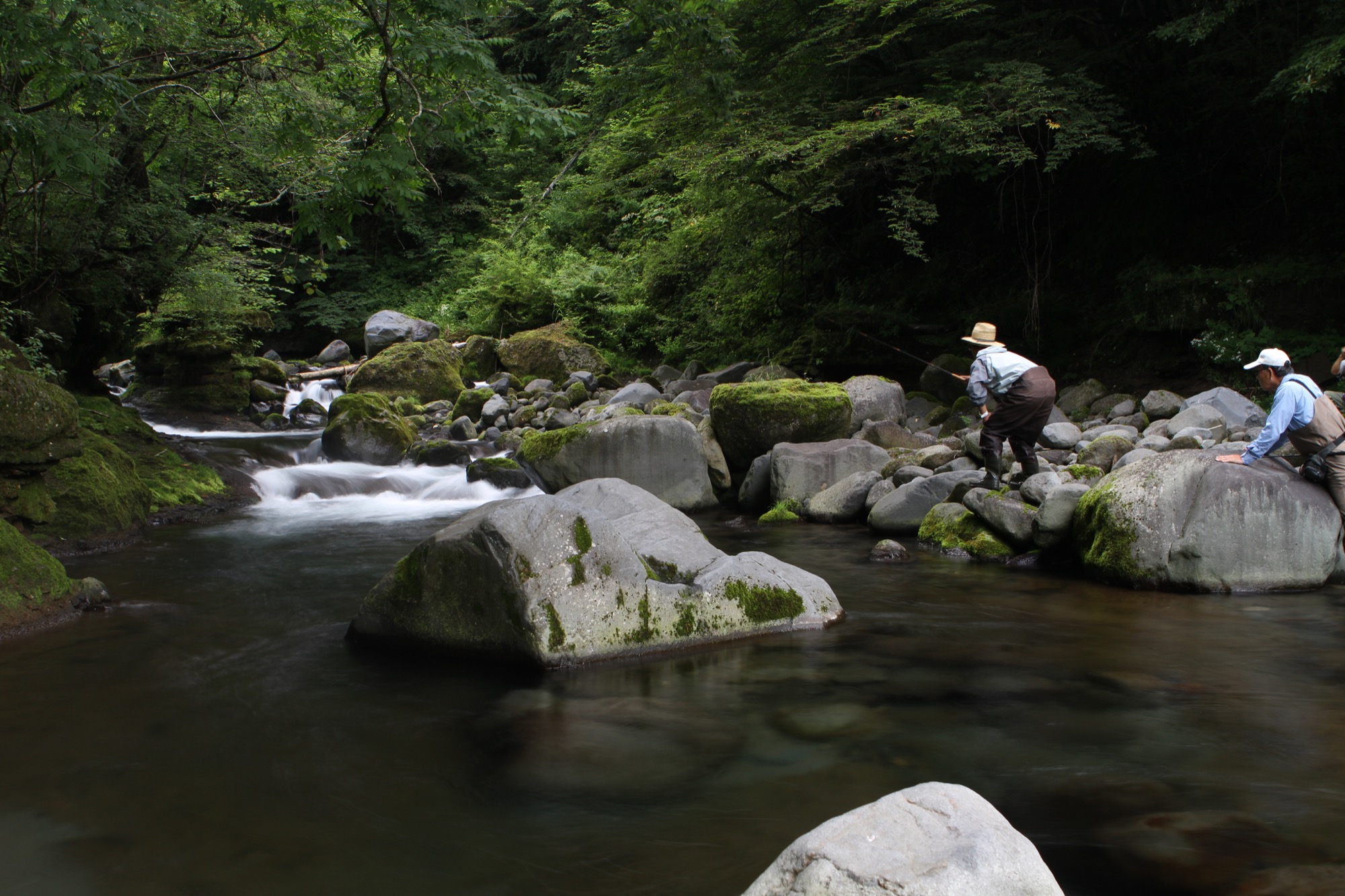
Tenkara with a twist
Two months went by faster than the glimpse of a rising trout. But I was happy I had found the time to fish a little on a daily basis. My worst fear was that I’d end the journey wasting a lot of time and not “finding tenkara.” I feared my relatively reclusive nature would send me deep into the mountain streams searching for the soul of tenkara anglers from centuries ago, rather than seeking people who are alive and carrying on the tradition.
My fear of wasting time didn’t come true. I enjoyed incredible encounters with old masters, meetings with craftsmen, a very enjoyable time with my hosts and their friends, and a lot of fishing, too. But I also craved adventure.
The same isolation early tenkara fisherman enjoyed was a little more difficult to achieve in modern Japan. So we took to the challenge with canyoneering shoes, neoprene wetsuits, ropes, and harnesses, and our tenkara kit, mixing fishing with what is known as “shower-climbing,” a mix of canyoneering with climbing waterfalls. It seemed tenkara and shower-climbing were made for each other. Our portable gear didn’t add weight to our packs, and the telescopic rods could quickly be stowed away as we prepared to climb a waterfall. By conquering wild, pristine, and remote waters, we would earn our right to practice tenkara there.
"It seemed tenkara and shower-climbing were made for each other. ... By conquering wild, pristine, and remote waters, we would earn our right to practice tenkara there."
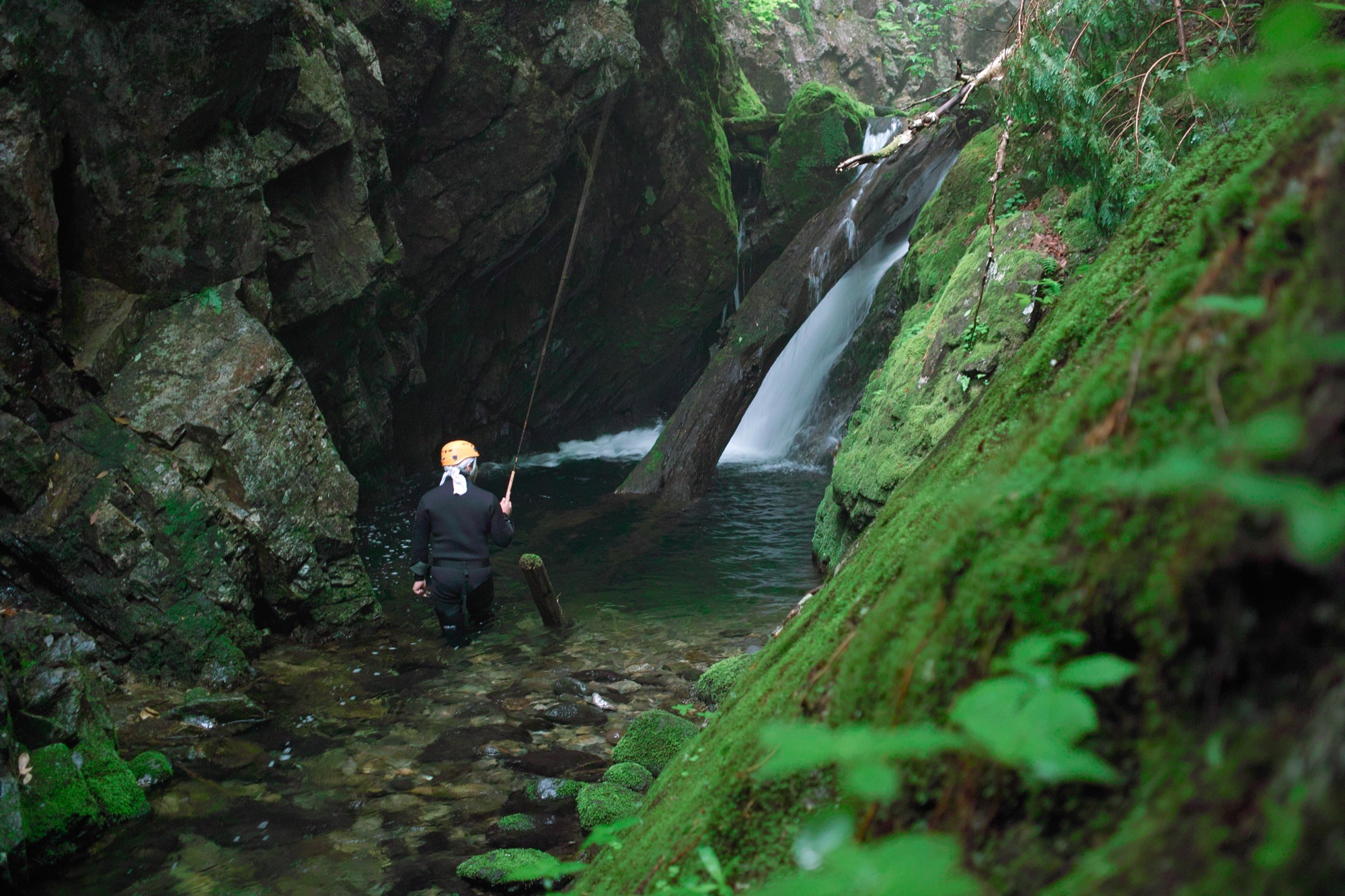
We set off on an expedition that took us to rugged tenkara-perfect mountain streams, far from the masses that leave many streams ravaged and devoid of fish. Out here, I finally felt the spirit of tenkara fishermen from eras gone by: They disappeared into the forests for weeks at a time, camping and fishing the streams, drying caught fish, and finally, when the catch threatened to be too heavy to carry out, headed back to the village markets.
We planned to build a fire by the river, where we would cook a trout “shioyaki-style”—only sea salt coating the skin, a firm branch serving as a skewer. And we would drink kotsuzake, a drink that, as I have come to appreciate, is underpinned with ceremonial and philosophical significance—though one shouldn’t picture a neat Japanese tea ceremony.
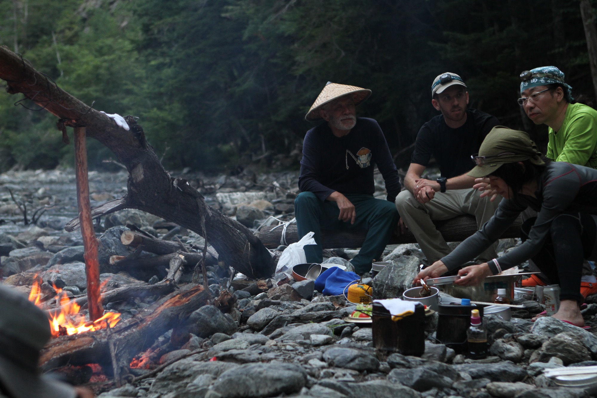
Kotsuzake is primitive and raw. Preparing and drinking it is an act of homage to the principle of not wasting the resources nature provides. After separating the bones from the meat, we placed them over the coals of the re to lightly roast and bring out oils and flavor, then immersed them into the warm sake. The result is sake with subtle and tantalizing fish flavors—all part of the Japanese mountain culture, and now a personal practice if I must eat a trout that I catch.
The cliff-hanger
Back on the treacherous, wet rock face, a small overhanging cluster of bamboo far to the left started to seem more reasonable the longer I clung immobilized by the waterfall. I normally would never trust plants to hold my weight over a fall that could potentially kill me, but at this point, adrenaline dictated my actions. I grabbed a bamboo stalk and slowly shifted the weight off my feet. I placed my trust in a root system that was out of sight under a thin veneer of soil. Through the patch of bamboo and other vines, I finally topped the cliff, beaming in relief. Under heavy rain, I wrapped an anchor rope around an ancient tree lying across the stream. When Futamura-san reached the top, he looked down at the pool below with a nervous smile and said, “Good job; difficult climb.” △
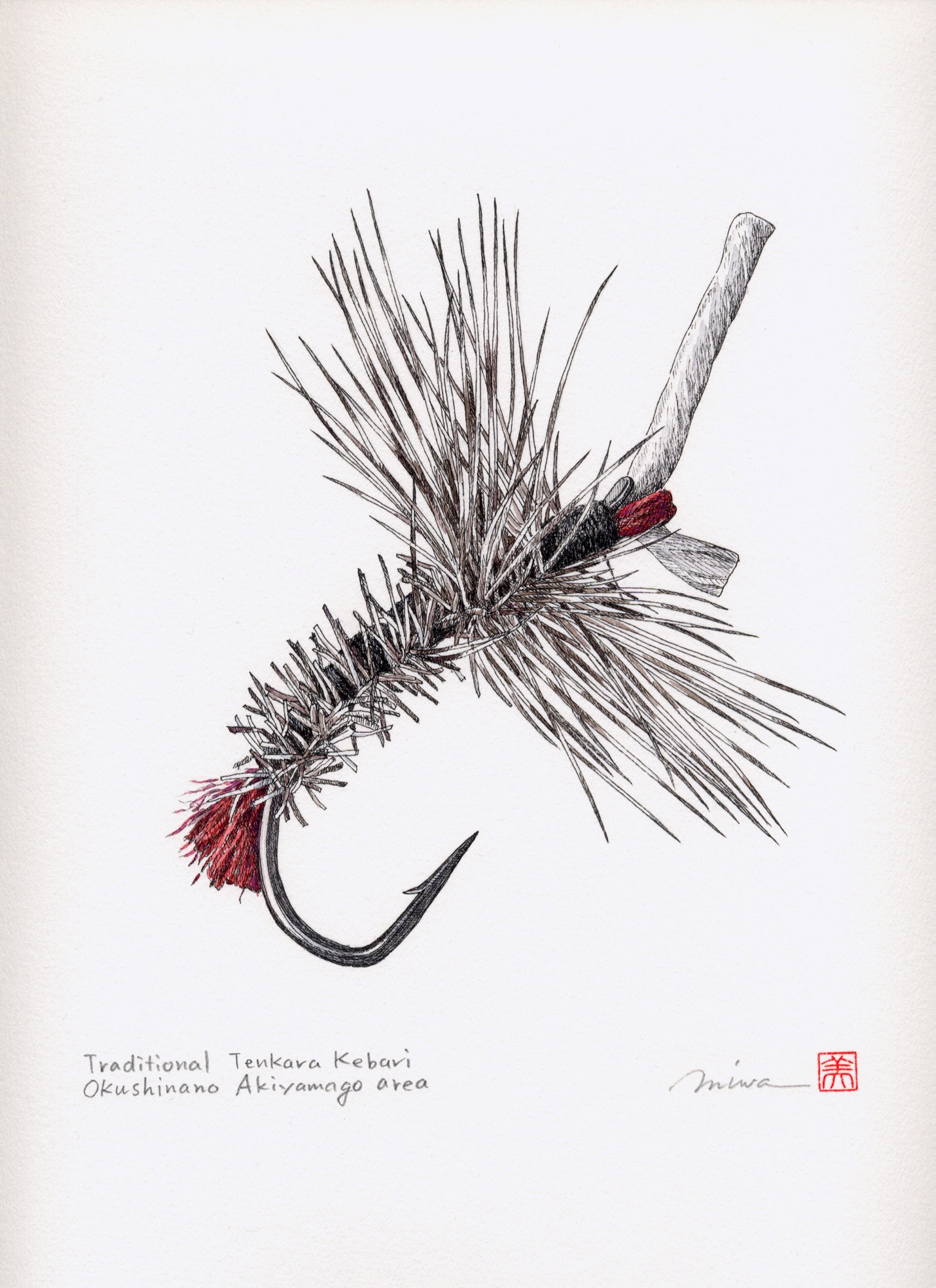

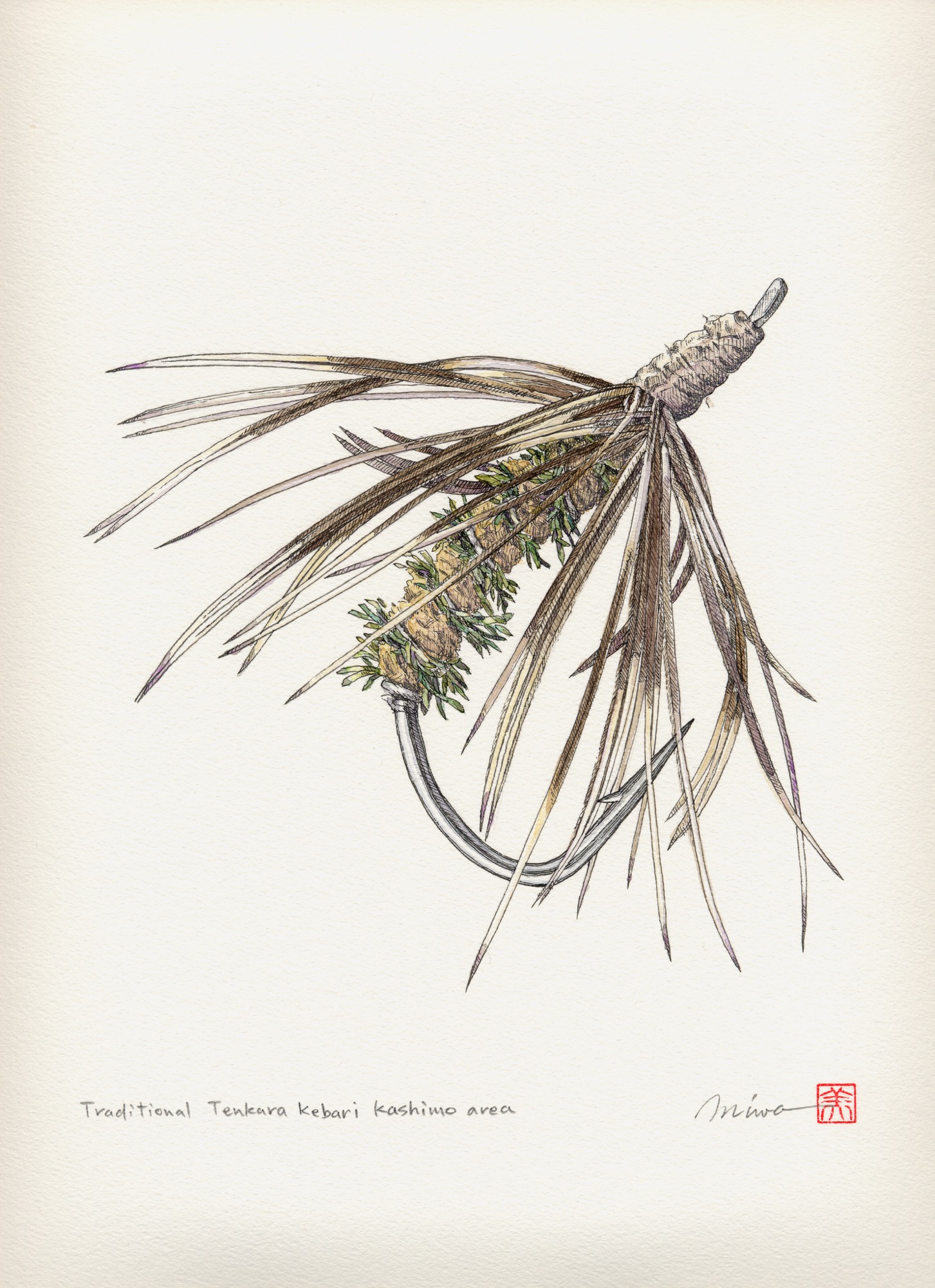
Sense of Place: Montana modern
Nostalgia, no kitsch: A conversation with Kelcey Bingham, the insanely gifted owner of Bear Mountain Builders, about modern design in Montana
Kelcey Bingham, owner of Bear Mountain Builders in Whitefish, Montana, finds cowboy-themed log homes “really outdated.”
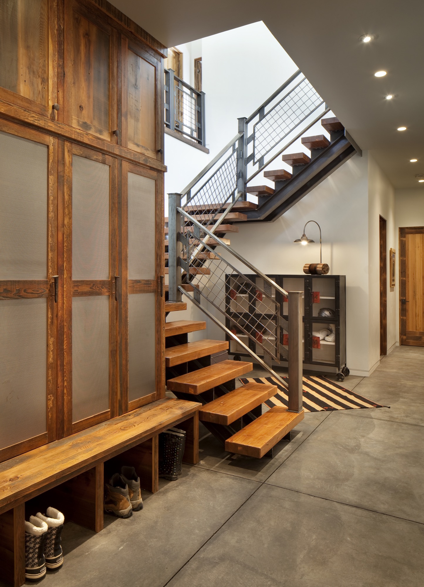
Nostalgia, No Kitsch
He still uses beams with reference to Montana’s Western architecture. Only his beams are typically steel. In the Ski Chalet, a mountain retreat inspired by nostalgia for ski vacations in the seventies, Bingham takes this adaptation further yet, turning a steel I-beam into a powder-room sink.
“Keep it light and bright and airy, and keep it high-tech,” is one of Bingham’s principles. The other — “anything that is not so rustic.” The Ski Chalet has quickly become his most popular work, and he’s already been commissioned to build more homes of that style. On the exterior, Bingham applied his credos by setting geometrical form with über-expansive areas of glass. The window frames, again, are steel, as is the front door, which he treated to rust by design. The roof is shaped to hold snow as an extra insulating blanket. Inside, energy-efficient, controlled lighting creates geometrical shapes on the ceiling. “Throwback style with modern conveniences,” he calls it.
“ Keep it light and bright and airy, and keep it high-tech.”

Bingham, who considers himself part builder, part architect, part artist, balances the glass, steel, and high-tech features with just enough earthy elements not to be cold. Cabinets and doors are made from reclaimed wood. The rest of the furniture is light in color, and the wood thin, to get away from the typical heavy timber look of the area’s typical super-sized mountain homes.
Creating your own throwback style at home is personal, inspired by your own memories of childhood winter vacations. Blues and rust-orange in the Ski Chalet’s fabrics, rugs, and bedding, for example, evoke nostalgia of that era.
“Instead of big dead animal heads on the wall, you’ve got vibrant art,” Bingham continues. “You don’t want too many knickknacks around, but having an appropriate amount of art is important.” Vivid details, such as colorful vases and vintage treasures, brighten up Big Sky Country’s many foggy winter days. “For us in the ski mountains, we try to find vintage ski posters,” Bingham says. Don’t be afraid to use shinier, mirrored pieces. Be selective in curating pieces from the past. “You want that nostalgic look of a seventies ski chalet, without being too kitschy.” He likes to keep a home current with vintage-inspired high-tech gadgets. “Rega out of Great Britain, for example, makes new turntables to look like they’re from the seventies.”
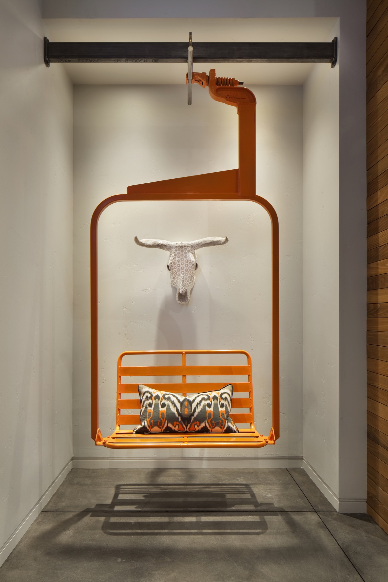
Recreating the Ski Chalet’s most unique decor will require a lot of luck, unless you already have an old-time ski lift seat sitting around, like Bingham had. Years back, a local ski resort was selling them off. He brought one home and was just waiting for the right use. The funky find now sets the stage inside the entry to the Ski Chalet. Not only does the seat swing like it once did high above the slopes, but it also has a purpose. “We installed an infrared heater above it, so you can sit down to take your ski boots off and warm up,” Bingham says. △
The Figure Sculptor
Alpine Modern visits Swiss-born artist Roger Reutimann at his studio in Boulder
Inspired by the human form, Swiss-born artist Roger Reutimann found his way to sculpting for the rich and the royal via a classical music education, curating art fairs, and product design.
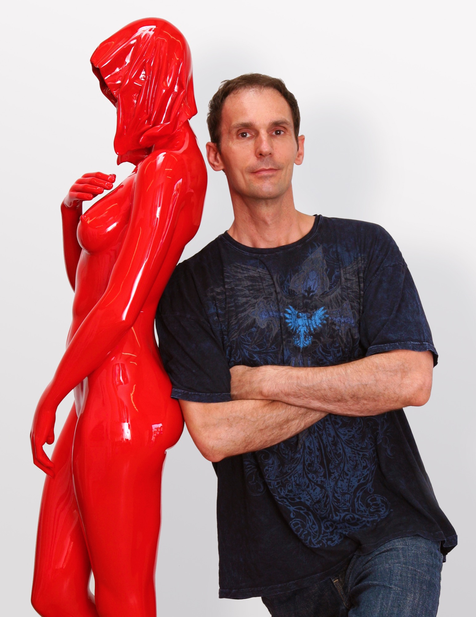
Roger Reutimann captures elegant sensuality in his sculptures of human figures. Born in a secluded village in Switzerland, the artist, a self-proclaimed Renaissance man, has devoted himself to pursuing and mastering many art forms. His evolution from classical pianist to figurative realism painter to internationally known sculptor has secured his place as one of America’s most sought-after contemporary artists.
Early Reutimann
As a young pianist, he found himself drawn to classical composers and music that stirred his soul. He studied at the Zurich Music Conservatory and was soon performing as a classical concert pianist throughout Europe and competing in international piano competitions. Traveling provided artistic influences at an early age as he experienced Europe’s rich cultural heritage.
His love of music flowed into a career as both a realist figurative painter and a co-owner in the Forum International Art Fairs in Zürich, Hamburg, and Düsseldorf. Galleries in Zürich, Milan, and London represented his paintings, and he received innumerable awards, honors, and recognitions. Relationships with gallery owners and collectors worldwide would follow him into his future calling as a sculptor and continue to advance his reputation as a world-class artist.
The Renaissance man emerged again as Reutimann turned his creativity to remodeling his first American home in Miami, Florida, with distinctive and extensive flourishes, from mosaic tiles to stained glass windows and Tudor-style ornamental plaster ceilings. The spectacular manor has been featured in architecture magazines and leased by production companies for films and commercials.
“In the midst of remodeling the house, one day I took a sculpture class to fill the time and loved it so much I gave up painting right then. To me, sculpting is like painting a thousand paintings. It has another dimension, and, therefore, it is so much more real than a two-dimensional image. A painting is only an image of life, but sculpture is life,” says Reutimann.
“To me, sculpting is like painting a thousand paintings... A painting is only an image of life, but sculpture is life.”
Coming to Colorado
Reutimann’s love of the mountains prompted a move to Boulder, Colorado, because of its similarity to Switzerland and the expansive open spaces. “I would rather sit on my back porch watching the sun set over the Rocky Mountains than in a high-rise flat in New York City,” shares Reutimann, for whom Colorado evokes memories of his native country.
Reutimann’s sculptures are unparalleled in craftsmanship and instantly recognizable worldwide. Though earlier works are relatively small, many today tower several meters high. Small sculptures weigh nearly 200 pounds, and the six- to seven-foot-high (up to two-plus-meters) sculptures weigh in at 1,600 to 1,800 pounds (726 to 816 kilograms). The internal structures of the lifelike sculptures are a complex network with steel beams for support to withstand the elements.
Rarer Reutimanns
Art galleries and private dealers from Santa Fe to New York City have represented Reutimann’s work, and his sleek, caressable, sculptures have been carefully packed and shipped to England, Switzerland, Italy, France, Hong Kong, Saudi Arabia, and South America. Today, he is represented by fewer galleries to ensure exclusivity for art patrons with his limited edition releases. Collectors include Sir Elton John, Anderson Cooper, countless private and corporate collectors worldwide, and Italian author Baroness Lucrezia de Domizio Durini, an art collector, curator, and publisher. “I see parallels between Rachmaninoff and my art. Rachmaninoff was a Russian composer and considered one of the finest pianists of all time. My art is much like music; there’s always something that can be refined,” says Reutimann. His recently completed commission for Colorado’s Arvada Center for the Arts and Humanities is a sixteen-foot (nearly five-meter) sculpture named Common Unity. It reflects the art center’s nature by presenting two identical figures who might appear to be engaged in a cultural discourse.
“My inspiration is the human figure, but the interpretation of it is somewhat abstract and reduced to the essential elements which help tell a story. The source of my work comes from the human body; people are drawn to that, I suppose, because we all have one. We can all relate to it in some way,” explains Reutimann. His fifteen-piece series, Dreams, was inspired by a wax mold that melted in Colorado’s hot sun and further inspired him to create sculptures that appear human at first glance, yet abstract from other angles.
“The source of my work comes from the human body; people are drawn to that, I suppose, because we all have one.”
Body / art
The immensely popular Dreams series is a surreal interpretation of human emotions as figures fling themselves into contorted poses and postures—often reminiscent of a melted-wax figure. Reutimann has placed heads, torsos, and arms backward creating a jarring, disturbing effect that evokes a strong, visceral response for the viewer. He juxtaposes nearly perfect, yet severely distorted bodies as if broken and reassembled incorrectly. Body parts erupt in every direction. Figures hang upside down, suspended or cantilevered in space, as if falling or floating. Cast entirely in sleek stainless steel, the homogenous heads of the sculptures lack facial features and expressions, much like mannequins. “The focus is directed away from the face toward the body, and the complex dreamlike state personified within,” Reutimann offers.
In a world where discerning art patrons purchase paintings ten-to-one over sculptures, Nick Ryan, Havu Gallery’s administrator, notes that long-time painting collectors are purchasing Reutimann’s unusual and evocative figures. Ryan says they choose Reutimann’s work based on his inimitable technique of combining abstract realism with figuration, particularly in the Death of Venus, a six-foot (almost two-meter) sculpture painstakingly cast in bronze with surfaces flawlessly covered with sleek Ferrari-red automotive paint. Death of Venus is Reutimann’s interpretation of Botticelli’s Birth of Venus. The spectral skull is representative of cultural shifts, and the highly saturated red paint reflects the glamour and lifestyles of modern society.
The Perception series was inspired by the artist’s visit to Egypt, and the entire series is cast in stainless steel, painted with automotive paint and buffed to a mirrorlike shine. “In keeping with abstract realism, the concept of the sculpture is about the duality of good and evil. The good has an angelic appeal and the evil has a darker character, wearing a cape with the head tucked in. My belief is that we all have these characteristics, and one can’t exist without the other,” Reutimann says.
“In keeping with abstract realism, the concept of the sculpture is about the duality of good and evil... We all have these characteristics and one can’t exist without the other.”
Reutimann’s fascination with automotive paint allows him innovations in the aesthetics of his creations. Automotive finishes require multiple paint layers buffed to a supersmooth polish until they shimmer and mirror one’s own reflection. The contemporary finish is extremely durable and lasts decades outdoors with only occasional buffing, whereas a traditional bronze sculpture with patina requires constant maintenance.
Reinterpreting americana
“My latest series is inspired by 1950s American automobiles. The fifties were all about space and speed and The Jetsons! The fantasy in concept cars goes wild; there are no limits, as there are none in art. The human body is much like a beautiful car—streamlined, organic, flowing like a dolphin in water—they’re imaginative. These sculptures have the shape of a woman but the spirit of a concept car. People see what they see and maybe it’s not my vision, which is perfectly fine. If someone is drawn to a sculpture, it’s a reflection of themselves and what their nature is, not that of the artist,” Reutimann says.
“These sculptures have the shape of a woman but the spirit of a concept car.”
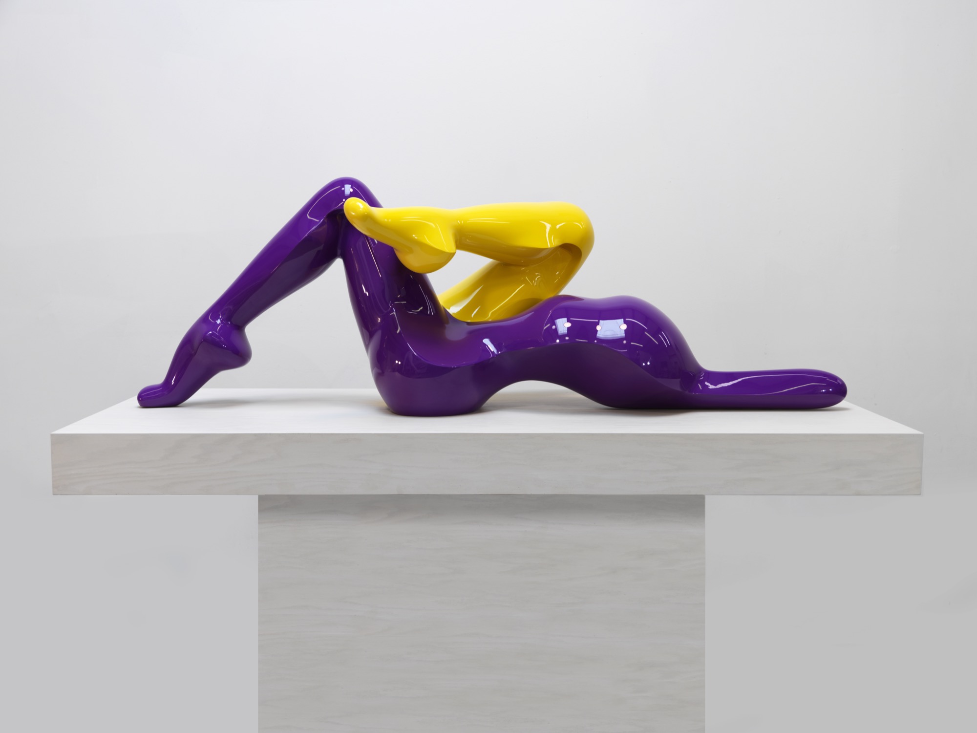
The music man
Reutimann plays piano several hours daily and declares classical music to be his biggest inspiration due to its drama and emotional depth, which allow him to follow his moods. Sergei Prokofiev’s compositions were on tap the entire year Reutimann spent creating the sculptures for the Dreams series. “You need to be in a spiritual place when you create sculptures. When people talk about inspiration, what they really mean is ‘being in spirit’ so art is not a conscious act,” Reutimann points out. “You can’t learn to be inspired. Music is my subconscious inspiration.” △
“When people talk about inspiration, what they really mean is ‘being in spirit’ so art is not a conscious act. You can’t learn to be inspired.”
The Height of Hip: Kristallhütte
A slope-side hotel and hipster après-ski hangout in Austria's Hochzillertal
Hochzillertal / Tyrol / Austria
The Kristallhütte’s slogan — “Lifestyle on the mountain” — comes to life when locals and guests from around the world chill to hip DJ acts on the tremendous sun terrace with 360-degree views. The hotel and hipster après-ski hangout sits above 7,000 feet (2,147 m), slope-side, and offers eight Panorama guest rooms and four Alpine Lodge Suites.
“Cool like a hotspot for the in-crowd, cozy like a ski lodge, and posh like a luxury hotel,” owner Stefan Eder describes the Kristallhütte.
The Architect Explorer
Colorado architect Larry Yaw interviewed by his journalist daughter
Colorado architect Larry Yaw, a Fellow of the American Institute of Architects, has nudged modernism forward in Aspen and beyond. An intimate conversation with his journalist daughter...
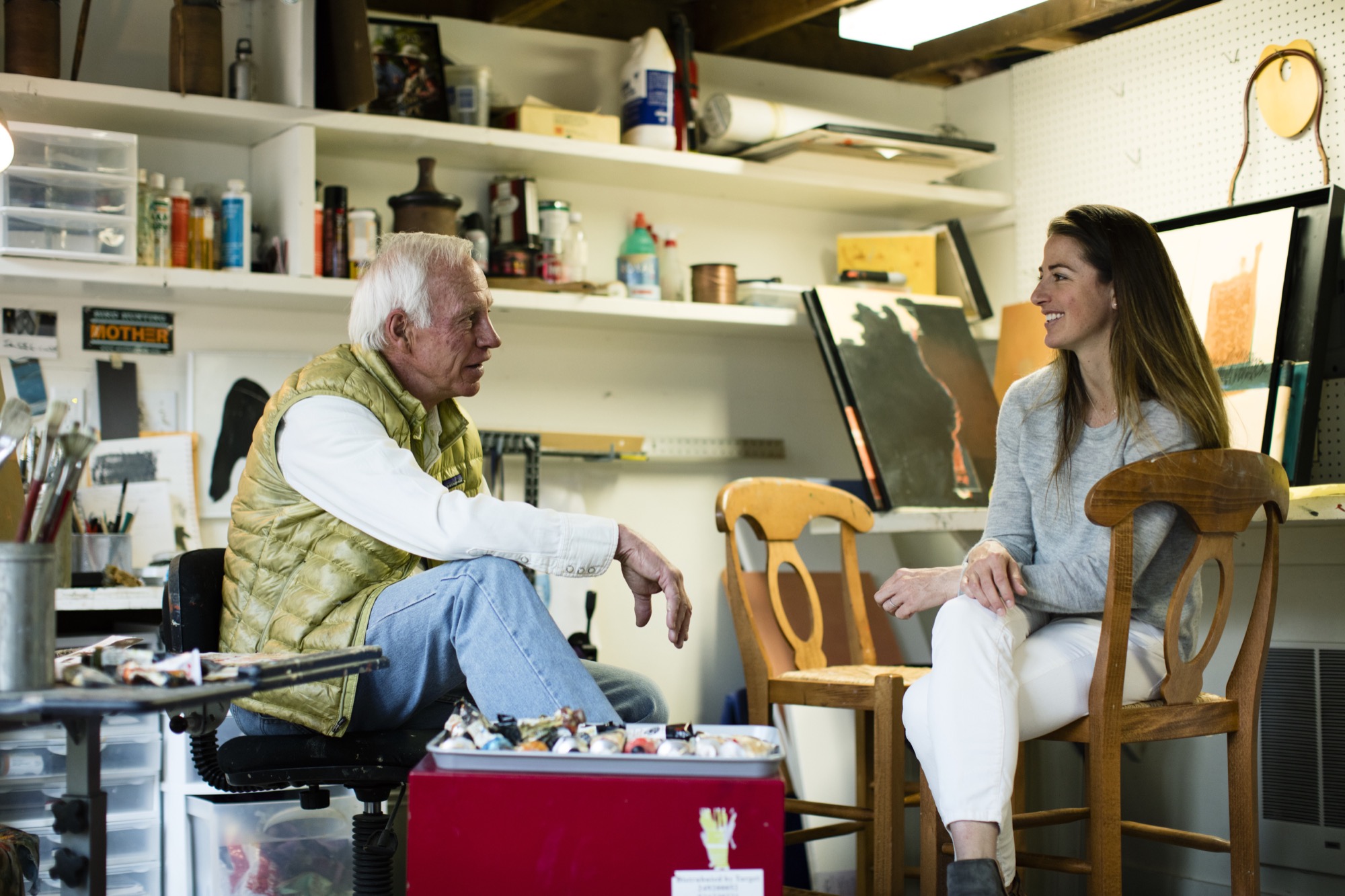
Sitting on a mossy rock in a tall stand of aspens next to my dad, a couple of hours into trying to find our way from Willow Lake back to the Maroon Bells parking lot, I started gnawing on my mom’s teriyaki beef jerky from my backpack. We had left the trail long ago, and I was convinced we were lost. I must have been about eight years old at the time.
“We’re not lost, we’re exploring,” is probably how my dad, architect Larry Yaw, responded—a claim that would echo through my young years as I followed him through the backcountry of the Elk Mountains in Colorado, across Kashmir in India, and through The Wind Rivers, The French Alps, New Zealand, and beyond, along with my mom and three siblings.
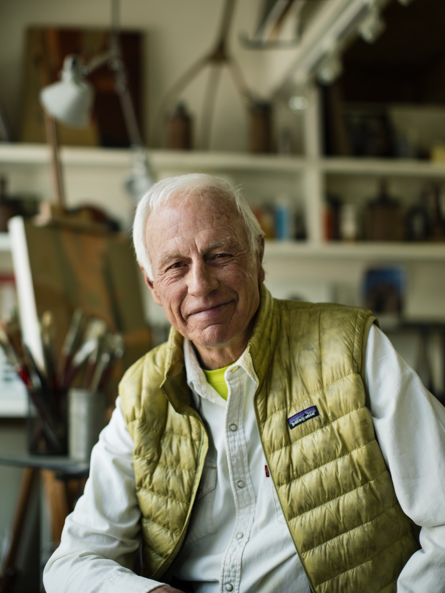
We got lost a lot, sort of on purpose, in the mountains. Yet never once did I see my dad flinch in these moments. Getting lost in the woods, in the place he calls his chapel, was merely another form of sublime and creative adventurism for him—much like his career as an architect and artist—and it fed his cowboy-style soul. I’d watch as he’d get this shrewd sparkle of excitement in his voice as he strategized on which ridge to follow, or which drainage would lead us back to the tent, all the while managing his family on the verge of the fearful discovery that our dad, really, had no idea where we were. Yet, now, as I bring my own young family into the woods to play and discover, I realize that my dad’s resourceful and poetic confidence that has intrigued me over the years has penetrated my own psyche deeply, and I strive to encourage that sensibility to seep into my kids’ sense of adventure. And, just as he did for our family, my dad has left an indelible impression on the contemporary design ethos of the Roaring Fork Valley, as well as countless alpine communities across the Mountain West.
“Getting lost in the woods, in the place he calls his chapel, was merely another form of sublime and creative adventurism for him—much like his career as an architect and artist—and it fed his cowboy-style soul.”
Since 1970, his iconic passion has manifested in his projects as he nudged modernism forward in Aspen and beyond, with an exceptional roster of clients and creative business partners as his co-conspirators; and he propelled them towards the outer edges of what’s possible. If I were to guess, his clients might sum up his character with a story similar to mine, yet the chapel would be his drafting table, and the map would be the radical ideas he has hand-sketched on camel-colored paper for the artfully crafted architecture he has envisioned. Sure, during his forty-six years creating innovative designs in the mountains, his aesthetic has shifted and grown, but his passion for the rawness of the backcountry, and for the purity of connecting people to place and to nature has remained firmly in tact.
“Since 1970, his iconic passion has manifested in his projects as he nudged modernism forward in Aspen and beyond.”
As his youngest daughter, I knew all of this, sort of, but it wasn’t until we had this conversation that I truly understood the gravity of how particular vignettes throughout his life have justified, and even come to imprint themselves, on his design, his spirituality, and his personal approach of getting lost—before finding a path.

Herein lies our recent sit-down at the kitchen table, an intimate chat between an architect and his daughter:
LYR How has living in the mountains influenced your design?
LY I’m the guy who can’t stop myself from climbing up and looking to see what’s on the other side of the ridge, or from going up to the end of a valley to see what’s there. If there’s some association with exploring, and innovating beyond the expected, I’m in. Therefore, my lifestyle has been defined by, and inspired by, active outdoor living, and attached to that is the adventure of it. Adventure is a part of everything I love to do—physical, intellectual, and spiritual adventure. And, therefore, I’ve begun to regard the artform of architecture as a basecamp for this; a basecamp that is sustainable, economic in scale, but very much connected to nature as that is so much a part of the adventure of being alive and in the now, wherever here is.
“Adventure is a part of everything I love to do ... I’ve begun to regard architecture, or habitation anyway, as a basecamp for this.”
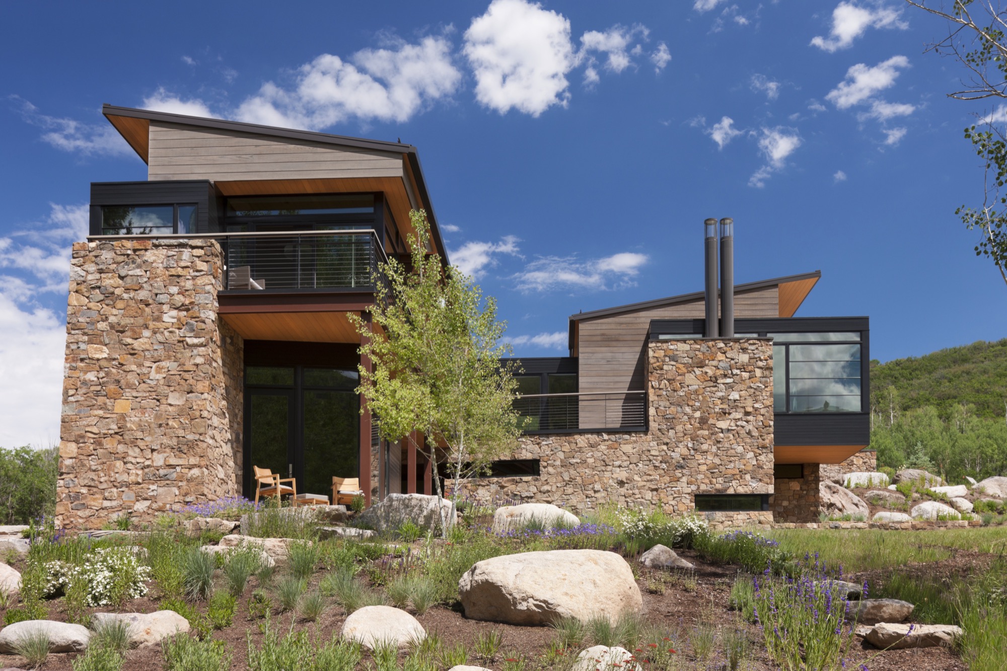
LYR Who influenced you as an architect?
LY First, the biggest influencers have been great clients of a contemporary persuasion, who relish the process of exploration and testing. There are other architects also, such as Romaldo Giurgola (“Aldo”), The Dean of Columbia School of Architecture, where I completed my Master’s studies. He would sit down and talk in these simplistic terms about the choreography that you create architecture through; the path you take and how that enriches you, and enriches the purposes of design. Louis Kahn—his work and writings inspired me.
And, the firm Morphosis Architects creates fabulous, courageous, contemporary, sculptural, and adventuresome architecture. As you traverse their spaces, you’re taken through them with this marvelous, layered, spatial experience that therefore inspires the choreography of getting from here to there.
LYR What’s your experience of being a modern architect in the Roaring Fork Valley, where opulent traditional mountain architecture is so dominant?
LY There’s opulence of thought and opulence of material—and those are two different things. Even though I’ve been involved with opulence, I design around the expectation that you don’t let the house own you. And, now, there is a cultural shift toward an awareness that we have to be stewards of the land, and be mindful of not writing out a big order for the resources. That shift has brought clients who want thoughtfully crafted, understated, simple in form, and more directly responsive design.
"There’s opulence of thought and opulence of material—and those are two different things."
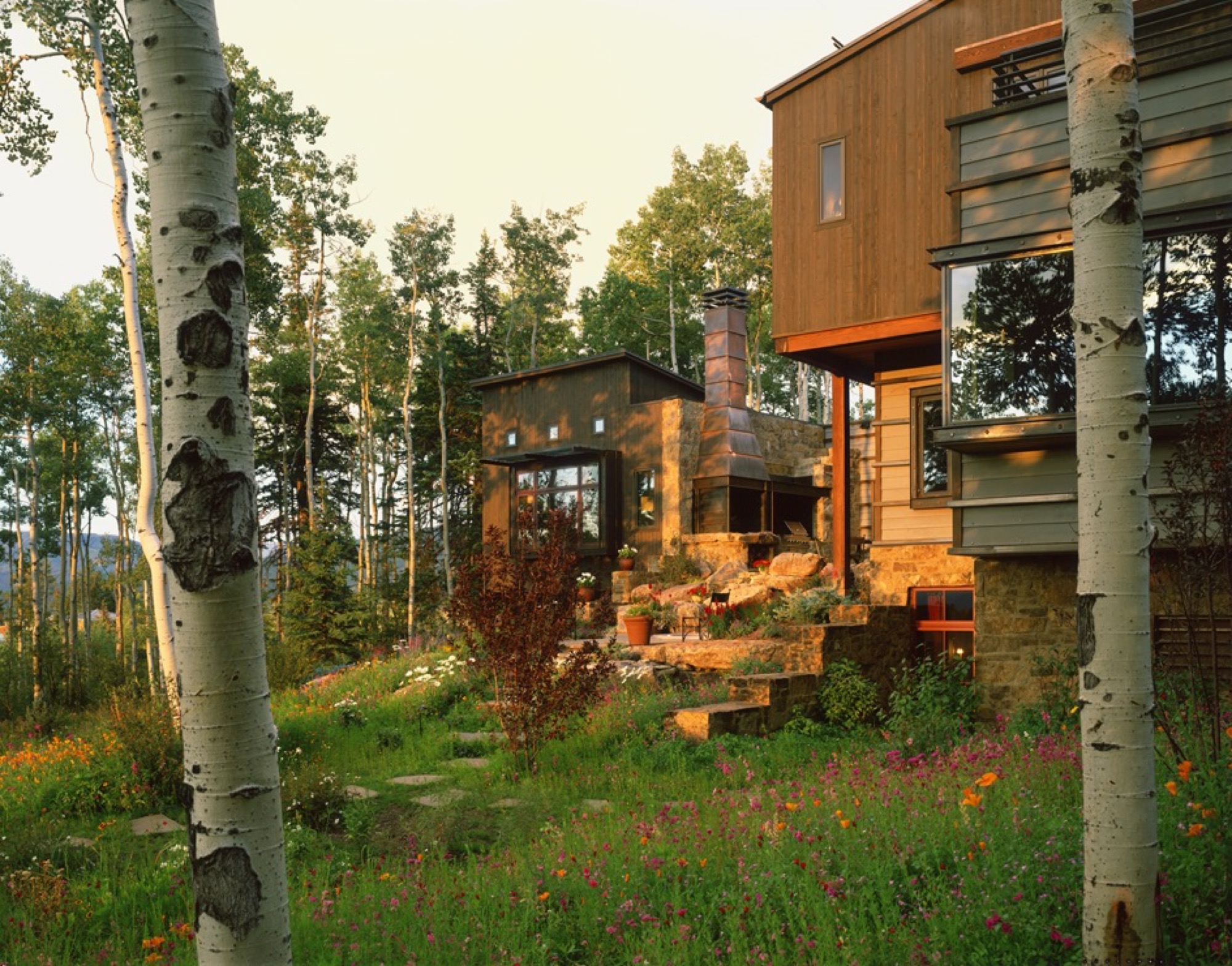
Also, a townscape is really a library of cultural expressions over time. Given that historic perspective, a log cabin is part of the miner’s time. Hopefully, what I do is an expression of my times and this culture, and doesn’t grab a crutch out of architecture’s past. Because the work of my firm significantly influenced the evolving character of architecture in the New West, I was elevated to the prestigious College of Fellows (FAIA) by the American Institute of Architecture. Our working mantra of design is that of “place-making” where architecture and nature are seamlessly integrated to the betterment of both.
“A townscape is really a library of culture preferences over time. Given that historic perspective, a log cabin is part of the miner’s time.”
LYR You were raised in rural Montana. What did that upbringing impart to you?
LY Growing up in Montana, I really experienced these rural ranch and farm compounds that were formed over generations. They were always designed by the simplest means, in simple forms, and they seemed to sit respectfully on the earth. When I started studying these things, I discovered that they were really forms that described contemporary architecture in their simplicity. They were formed in protective surrounds, and were organized around working proximities, yet there was always a place for enrichment, like a little garden near the front porch. Then, these compounds grew organically—out of inelegant purpose, and rural rationality. I didn’t appreciate it then, but as I studied architecture, I started pulling out of my experiential self, and those things all matched up—that is contemporary architecture. It did not tread heavily on the land; it embodied economy of means; it had simple forms and echoed its context—all things that are generationally taught or experientially taught. They solved problems there, out of their own devices and their own means.
LYR How has design carried into, and impacted, other areas of your life?
LY It has opened my eyes. When I travel, I see different things; I wonder about them; I take them in. And, what I’ve learned is that I like evocative things. Evocative means you hate it or you love it but it nevertheless stirs emotion in you, and takes the lethargy out of your mind. And, that’s true in architecture. The creative process and everything associated with it; the people you work with and the collaborations—they fuel my worthwhileness and my sense of adventure.
“I like evocative things…. You hate it or you love it but it stirs something in you, and takes the lethargy out of your mind.”
LYR Tell me about the Blackfeet Indians, a tribe you became close to when you were young, and their impact on you, your design, and your art.
LY When I was twelve years old, I went to Browning, Montana, in the middle of the Blackfeet reservation, and there sat this gorgeous little Indian girl. She was about my age, dressed in a traditional beaded, white doeskin dress, and I was enchanted. Her name was Virginia Home Gun. That enchantment turned into a friendship with her. It turns out that her father was the chief of the Blackfeet Tribal Council. Over time, through traditional ancient ceremony, they made me an honorary member. That really stirred me. It continued beyond that, and I started reading and studying about the rituals and legends that were the spiritual glue of their life. The Blackfeet regarded themselves as a creature of the earth, and they understood the balance of their needs with earth phenomena. They would give thanks to the buffalo, and honor a slain enemy for valor. For me, it went from the idealistic warrior image when I was young, to understanding their spiritual nourishment that kept them who they are. That translated to me later on into a series of paintings that I call “Once Proud.” That’s my way at this point in life of telling the story of westward movement and how it maimed the spirit and freedoms of our native inhabitants of this place. This made us feel sort of culturally guilty and I was inspired to tell that story.
LYR What is the status of modern architecture in the Roaring Fork Valley, and what role did you play in getting modern design where it is today?
LY Aspen has always been a place that embraced aesthetic adventurism, or tolerated it anyway, and has always fostered intellectual and artistic courage. My firm, my partners, a highly talented thirty-some staff, and our clients have allowed us to be one of the forerunners of the movement here. Personally, I haven’t pushed modernism [in the valley] for recognition; we have had clients and circumstances that permitted that kind of solution and character. But within my firm, I’m known for pushing beyond the expected, and going to a higher level of art form and different level of expression; questioning, pushing, improvising, and going beyond even what clients want. Straight competency in architecture is a mid-level solution—I advocate for artfully courageous and innovative solutions that are bigger than the problem.
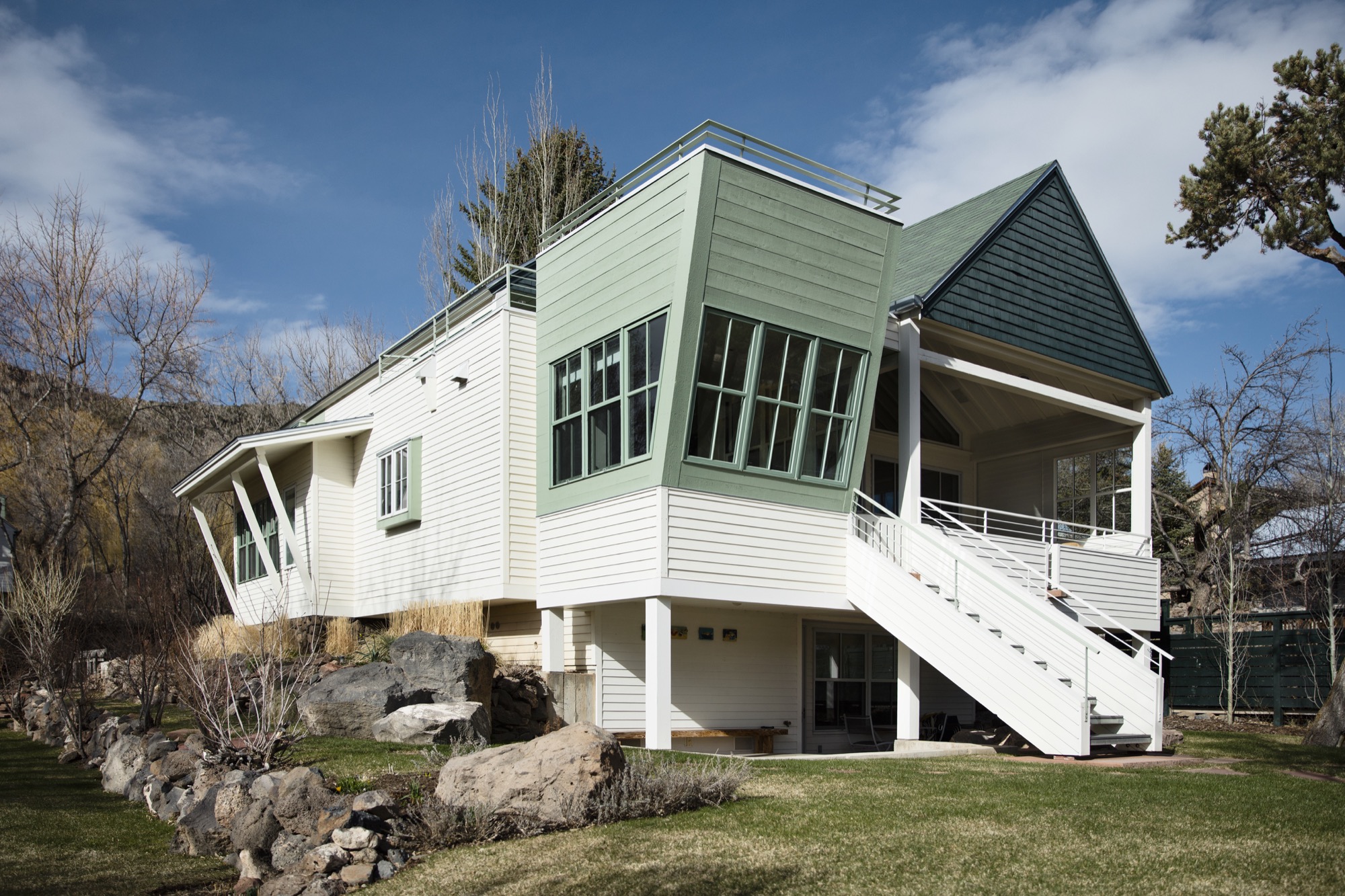
LYR Who are the people who want modern architecture in the mountains? What makes them different from the “typical” client who wants that enormous heavy log mansion that says, “I have a lot of money, and I live in Aspen?”
LY Some people are here because it is a new bar on their reputation epaulette. The people who I gravitate towards, or who gravitate towards our firm, are here for reasons I’ve sorted out—for the adventure, the backcountry, and things that support our minds, bodies, and spirits. These are all truly good characterizations of our lives, and our personal culture. To put it into context, I’m not going to design three little sitting areas around the master bedroom so you can sit inside all day. You get out of bed, you have breakfast, and you go ski; you get out there.
In that, a question I always ask is: Is architecture derived of context, or does architecture create context? The answer is both depending on where you are, but it's a question I ask of it because its one of the beginning points that I use to align my sensibilities with those of a client or a place.
“Is architecture derived of context, or does architecture create context?”
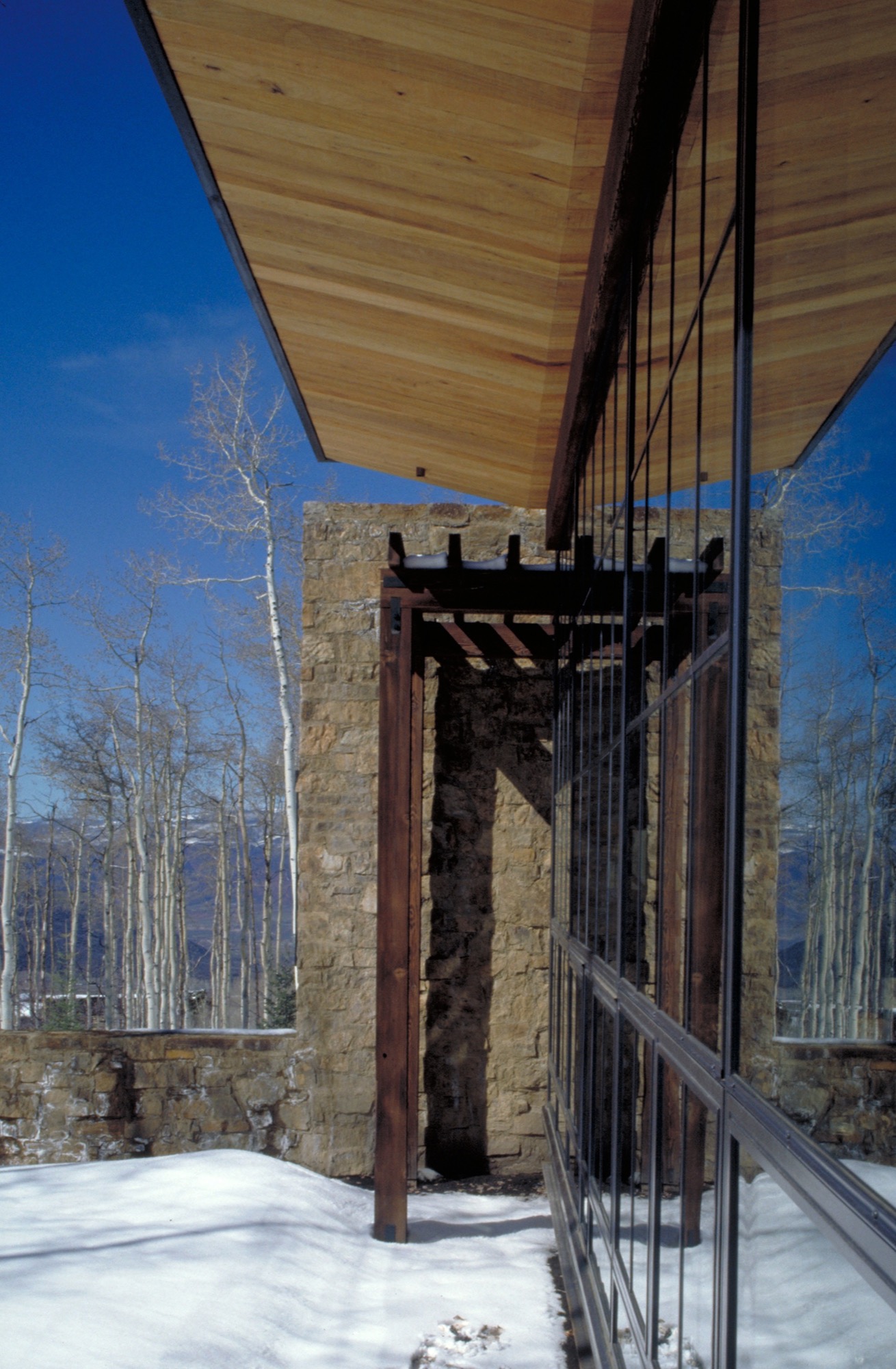
LYR You get lost on purpose, in a way, right? How has this personal quality informed your design sensibility?
LY Freud said that problems couldn’t be solved by a consciousness that created them. In other words, you cannot solve problems where there are too many givens; otherwise you just spin inside the givens. Part of the creative process is being lost, disoriented; you are seeking an answer in a way. Therefore, I never feel lost, I just feel like I entered another chapel as it engages another form of creativity, curiosity, and adventure in me. Being lost is inspiring too—when I was really young, out hiking and going to crazy places I’d never been, I marveled at earth forms, the magic to them, what got them there. As I went on, I studied geomorphology, and it all boiled down to tectonics of eruption, erosion, accumulation, weather, and all of nature’s will upon those things. It’s really compelling, and asks compelling questions, and I found some answers that I’ve portrayed in my painting.
“Part of the creative process is being lost, disoriented; you are seeking an answer in a way. Therefore, I never feel lost.”
Nature can also help you appreciate your existence, be a stimulus for enlightenment, and fuel lifelong curiosities. As architects, we must embrace that kind of creativity and spirituality, the kind that enhances who we are, so as to create well being.
And, Lindsay, I can find my way back from anywhere.
A founding partner of Cottle Carr Yaw Architects, Larry Yaw has designed many of the firm’s award-winning projects—from resort and community design to corporate buildings and private mountain homes. In 1993, Yaw was named to the American Institute of Architects College of Fellows, the highest award given to the profession’s most respected architects. His projects are regularly published in architectural books and national design magazines.
Yaw received his Master’s Degrees in both Architecture and Urban Design from Columbia University and has since been a lecturer and design critic at several western universities. Believing in the importance of civic involvement, Yaw is also a founding board member of the Aspen Art Museum.
Architecture, Made On Site
The husband-and-wife founders of Scott and Scott Architects design-built their own off-grid cabin with the adventurous spirit of the powder boarders they both are.
Built by husband-and-wife architects for themselves, an off-grid cabin in the mountains of Vancouver Island captures the adventure and freedom of powder boarding, free of rigid ideas.
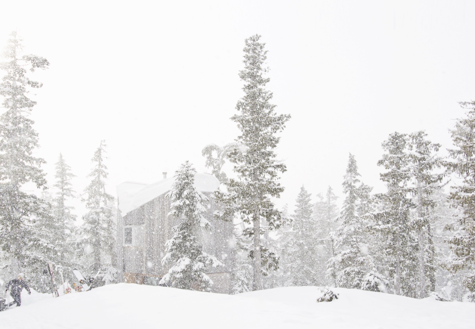
David and Susan Scott wanted to make architecture. But not in the way one imagines married architects making architecture for themselves — drawings of their dream mountain retreat, years in the drawer, just waiting for the right building site. No. Building their own alpine cabin, the Vancouver-based architects wanted to design and build in a singular act.
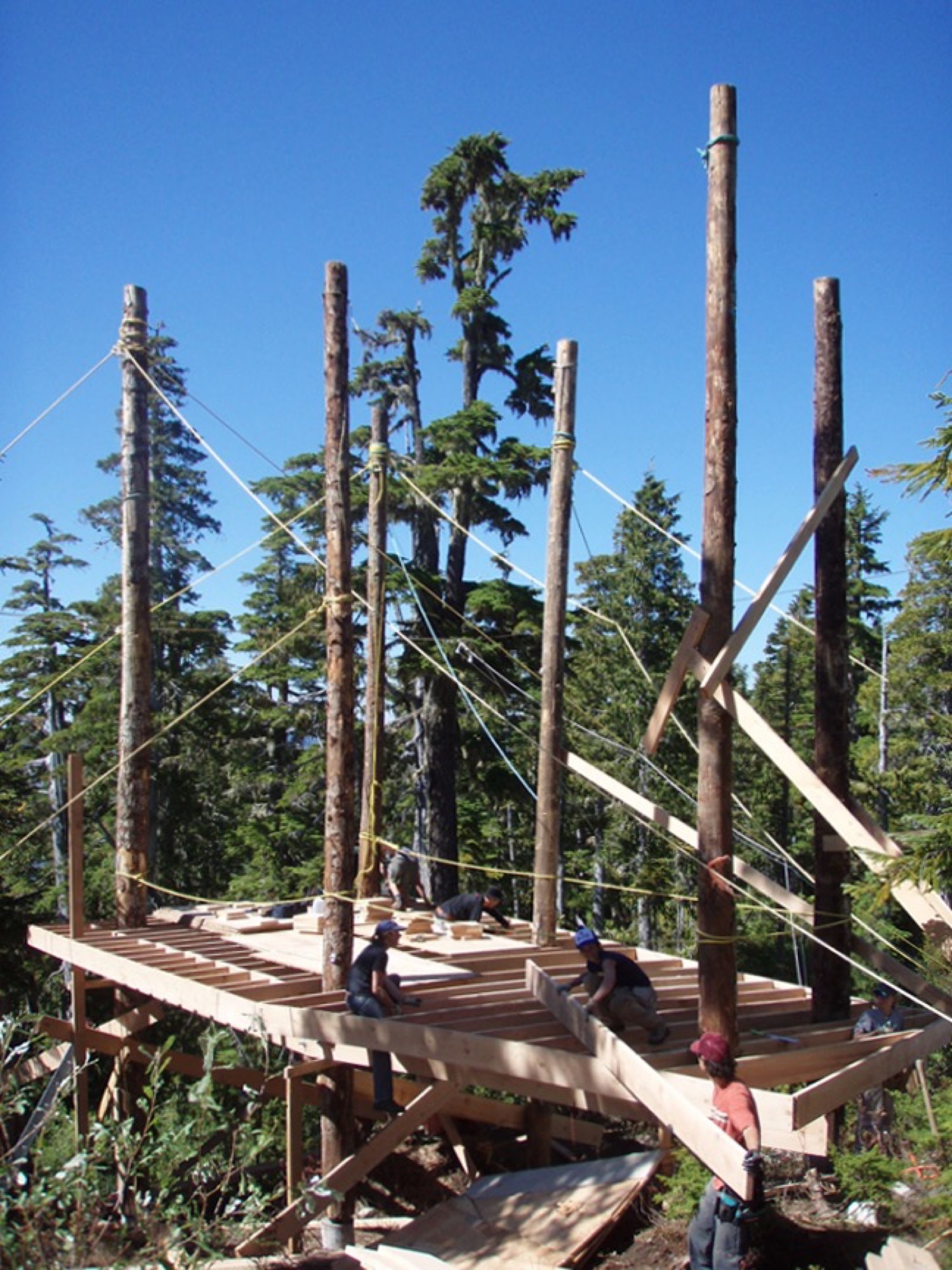
In 2006, a longtime friend led them to a piece of land he’d come upon when planting trees at 4,265 feet (1,300 m) above sea level, on the northern end of Vancouver Island in British Columbia, Canada. “We had never been on the snow in the area until acquiring the building site,” says David Scott, speaking for the adventurous couple. “We fell in love with it at first sight, and the people and terrain are really special.” With almost 50 feet (15 m) of annual snow accumulation, the remote community-operated alpine recreation area of Cain is known for legendary powder.
At the time, the couple, who met in architecture school in Halifax, Nova Scotia, worked for established firms and spent long hours in offices, drawing. “We have a love for building and being outdoors,” says Scott, who appreciates drawing as an important part of design. Now building their own off-grid cabin, however, they wanted to channel the freedom they feel when powder boarding into an immediate design process centered in adventure and not heavily in rigid plans. “We began the project with a desire to work with a greater level of freedom, where the specifics of the site and available materials would inform the work in a direct and unfiltered manner.”
Scott and his wife knew they had a narrow window in life, before having children, to complete construction on their own on long weekends and holidays, and with help from friends.
“We began the project with a desire to work with a greater level of freedom, where the specifics of the site and available materials would inform the work in a direct and unfiltered manner.”
Hand in hand: Design and construction
Inspired by the materials available around the site and the environmental conditions, construction was planned to avoid machine excavation, to withstand the very deep annual snowfall, and to resist dominant winds. Accordingly, the structure was elevated above the height of the accumulated snow on the ground. “The use of full-length, unsawn logs provided us with the ability to get height in a manner that used the wood’s strength the same way Douglas fir spar poles are used as sail masts,” Scott explains.
The cabin, primarily constructed from Douglas fir, gets more refined from the outside in. The columns are unworked logs, the beams and joists are rough, bandsaw-milled, and the walls, floors, and ceilings are clad in planed boards. The cabinetry is made from construction-grade fir plywood. The exterior is clad in cedar that has weathered to the tone of the surrounding forest. Both woods are harvested in the area.
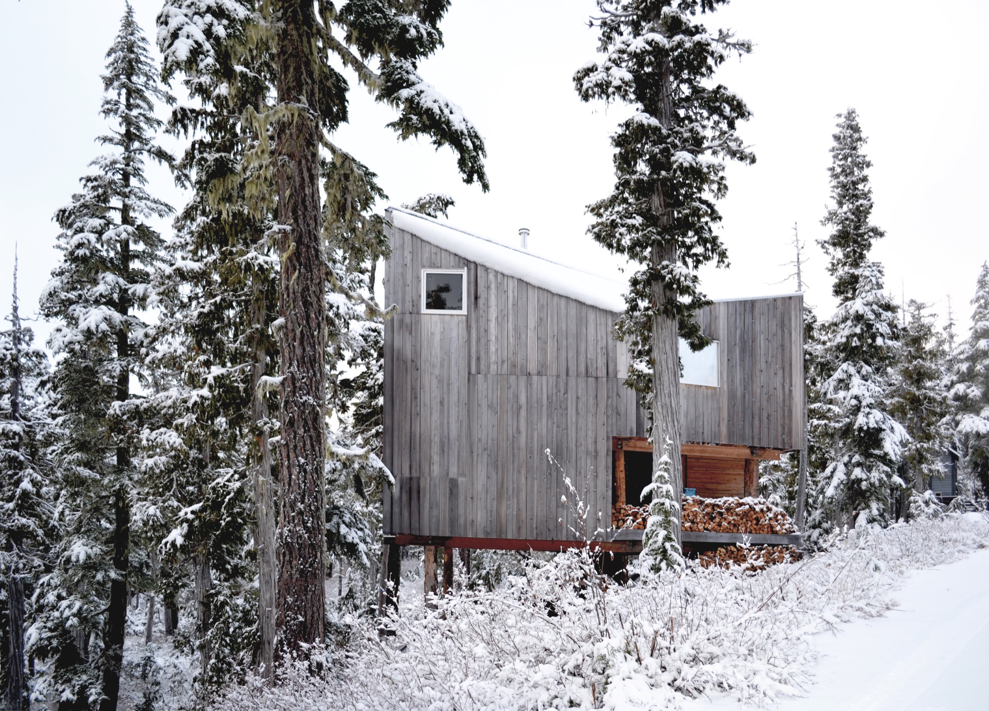
The roof form began with a simple gable, rotated to direct the snow off the back of the cabin. A half-dormer was then introduced over the entrance to direct snow away from it, funneling the snow into the prevailing winds.
Family life at the cabin
Today, childhood memories are already being made at the cabin. The Scott family now includes two young daughters, who Scott says are both on skis and love the snow.
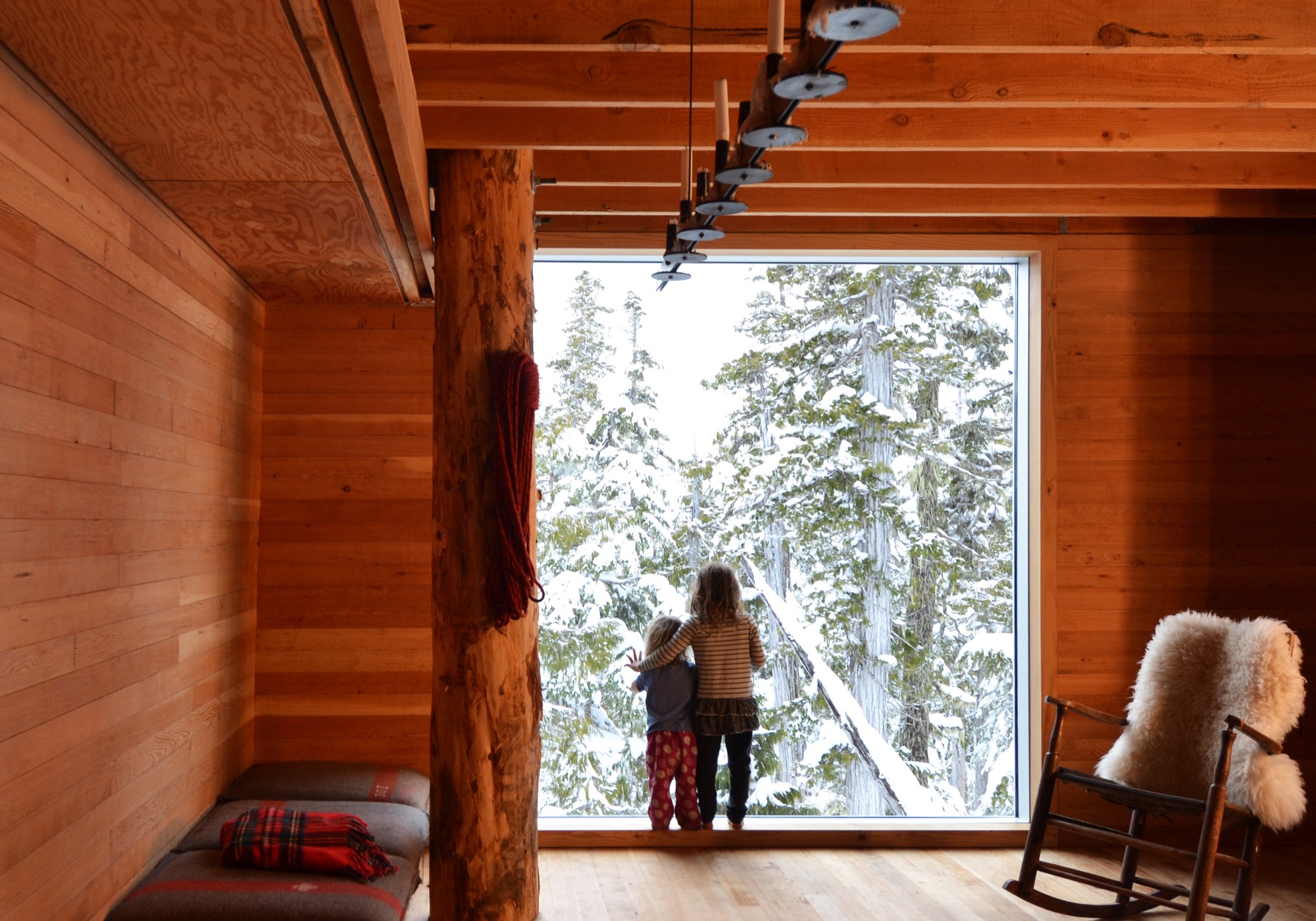
Much of the approximate 1,075-square-foot (100-sq-m) cabin’s interior is designed and made by Scott and his wife. The main living space is small, and the family spends much of the time on the long, cushioned bench eating, playing games, and relaxing from a day on the snow. “Our favorite spot is by the large window,” says Scott. “Both for the ever-changing view of the forest, but also in appreciation of the effort that went into its installation.” He drove the glass overnight on a rented flatbed and hand-positioned it with a group of friends the next day — “an incredibly smooth effort, given its size and weight.”
The remote site is directly accessible by gravel road five months of the year. During the other months, equipment and materials are brought up by toboggan. There is no electricity, and a wood stove provides the heat. Water is collected from a local source and carried in. The Scott family cherishes the simple lifestyle the mountain hideaway affords. “We enjoy the solitude of not having cell phones and gadgets around to distract us,” says the architect, who finds “a wonderful freedom” in seeing no bars of coverage on his phone. “This is an incredible place for our daughters to love being in the mountains as much as we do.”
“This is an incredible place for our daughters to love being in the mountains as much as we do.”
The powder hounds come up here as many weekends as possible during the winter, but they also love the warmer temperatures in spring when snow is still plentiful. “It’s incredibly peaceful,” Scott says. “The fall is fantastic when the blueberries are ripe, and we try to spend Thanksgivings on the mountain, splitting wood and enjoying dinners with friends.”
Adventure by design
The off-grid cabin was David and Susan Scott’s foundation project and formative in their desire to start their own architecture practice, Scott and Scott Architects, with the goal of spending more time in the mountains. To both, making architecture on site is ultimately the most direct, enjoyable way of working, and one that provides the greatest opportunity to understand materials and detail resolution and evolution. Today, the firm is working on projects in Whistler and Squamish, and in their province’s interior high country. “We love working in these challenging locations where adventure is the reward,” says Scott.
(Alpine Modern has covered the A-frame cabin Scott and Scott built in Whistler for a young family of skiers and snowboarders.)
What’s Inside?
Architect David Scott opens the door to the off-grid snowboard cabin he built with his wife on Vancouver Island to show his three most treasured artifacts hidden inside.
The cast-iron pot
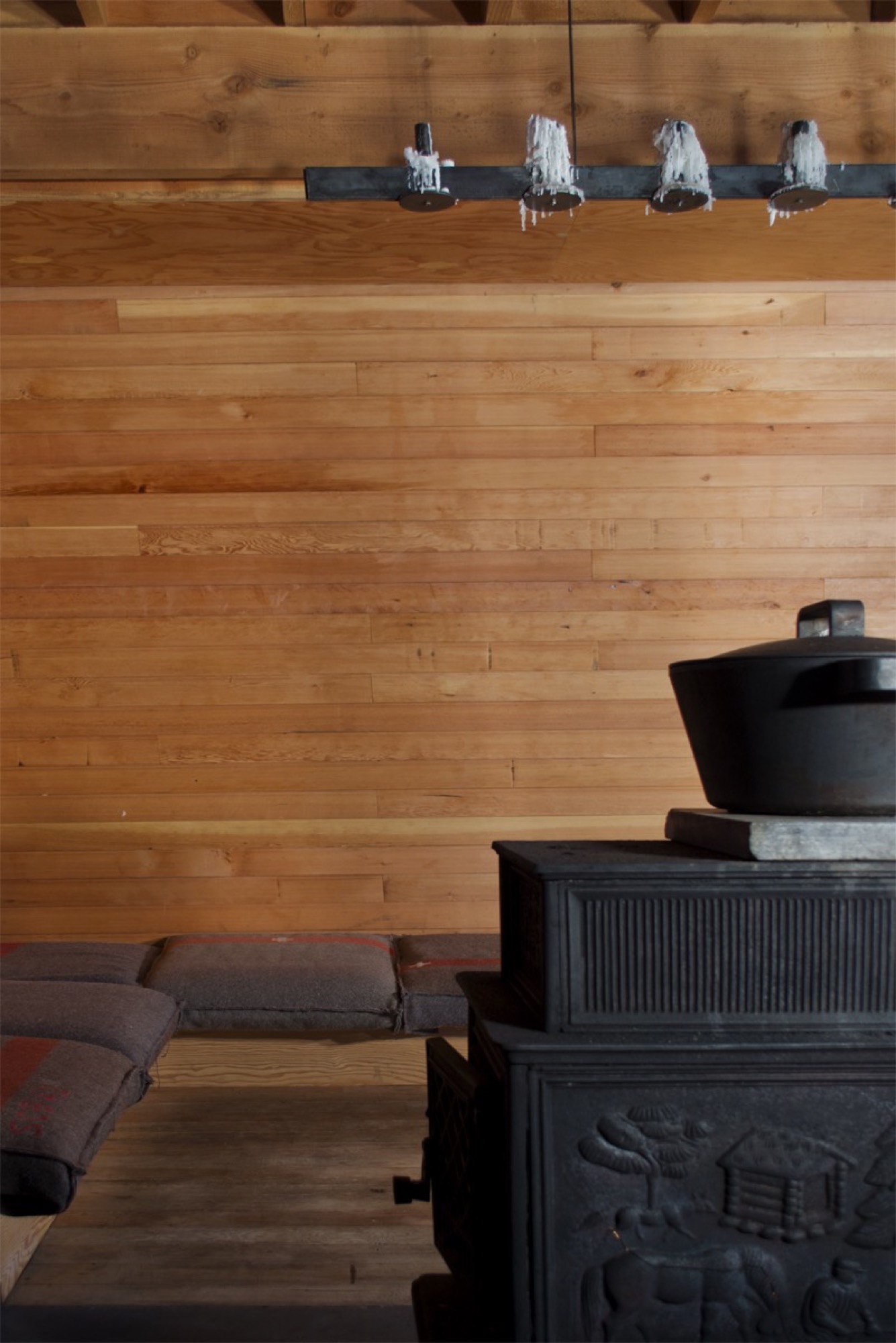
“We have a Björn Dahlström-designed cast-iron pot we slow-cook many meals in on the wood stove, which is essential to how we live when we are [at the cabin].”
Get your own: Björn Dahlström designs pots and casseroles for the Finnish company Iittala. Dahlström’s current line is stainless steel, but cast-iron pots and Dutch ovens similar to the one in the picture are available from brands like Le Creuset, Sur La Table, and Lodge.
The splitting maul
“I have a love for Swedish axes. Of my collection of over 100, the most used and loved is the Gränsfors Bruk splitting maul, which powers through the yellow cedar rounds. It is a beautiful object from a company we greatly admire. Whenever cutting wood, I look at the stamped initials of the smith that made it, with appreciation for his work and respect for a very old company which values and celebrates the workmanship of the individuals within it.”
The Gränsfors Bruk splitting maul’s head is heavier than the head of splitting axes, and the poll is designed for pounding on a splitting wedge.
The blanket
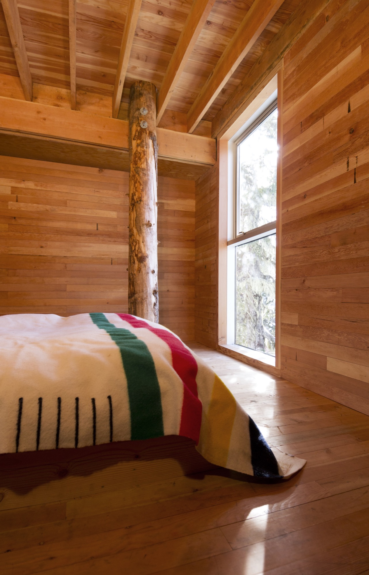
“We love our Hudson’s Bay blanket, which was a wedding gift from the architect I worked for for a number of years, before we began our own practice. I’ve often thought that a Bay blanket should never be bought for oneself and is something that carries meaning as a gift.”
Buy it for someone: Woolrich offers Hudson’s Bay Point Blankets under the offcial license of the historic Hudson’s Bay Company. The legendary blankets have kept generations of trappers, hunters, fur traders, and Native Americans warm and comfortable. 100-percent wool, loomed in England. △
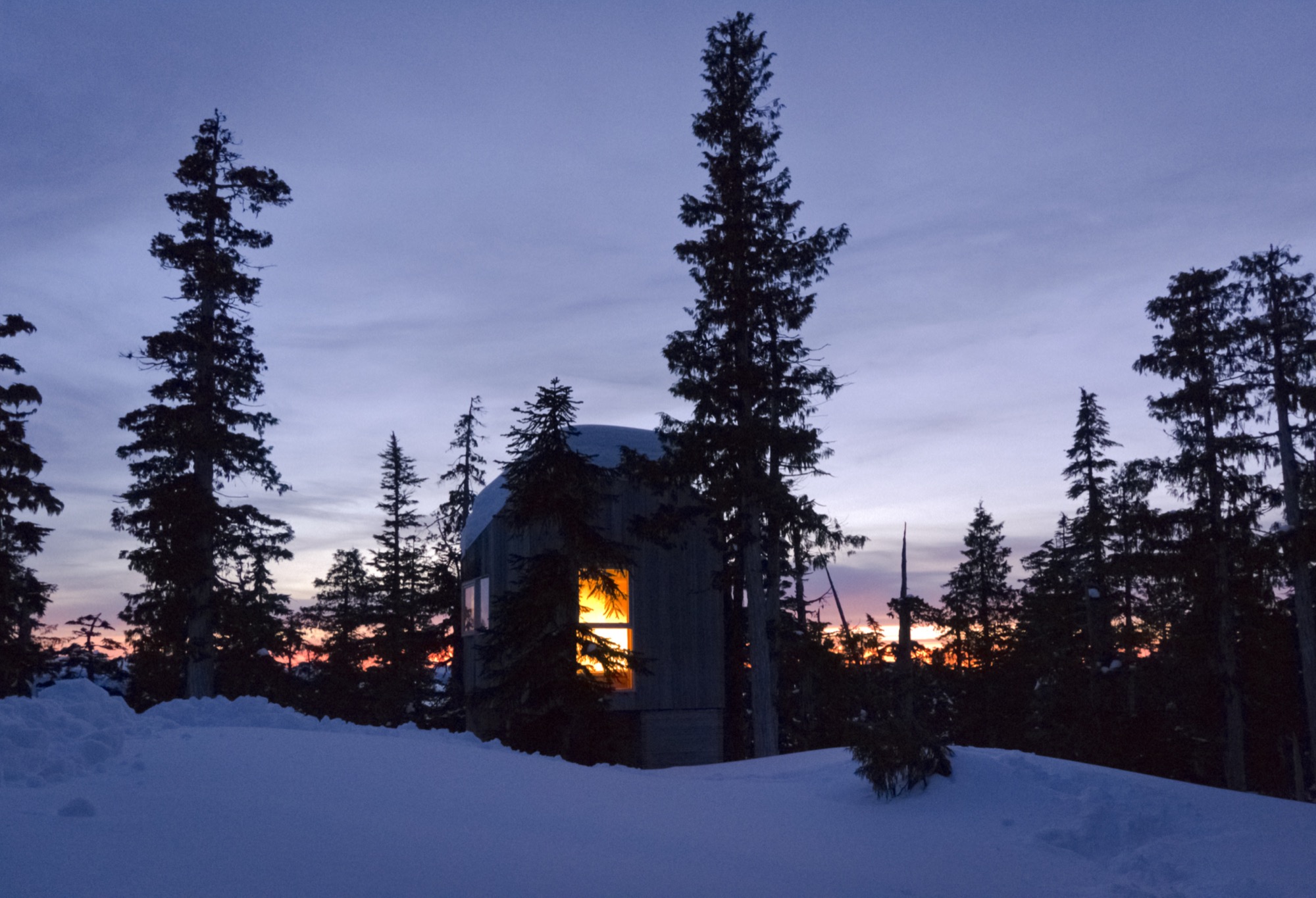
Love and Loam
An Austrian artist family makes rammed-earth architecture, stoves and raku tiles
Earthen materials bond an Austrian family of artists: The applied-artist father builds with rammed earth and the ceramicist mother and graphic-designer son create tiles using an ancient Japanese pottery firing process. All their work is deeply rooted in ancient techniques, yet their designs are expressively modern.
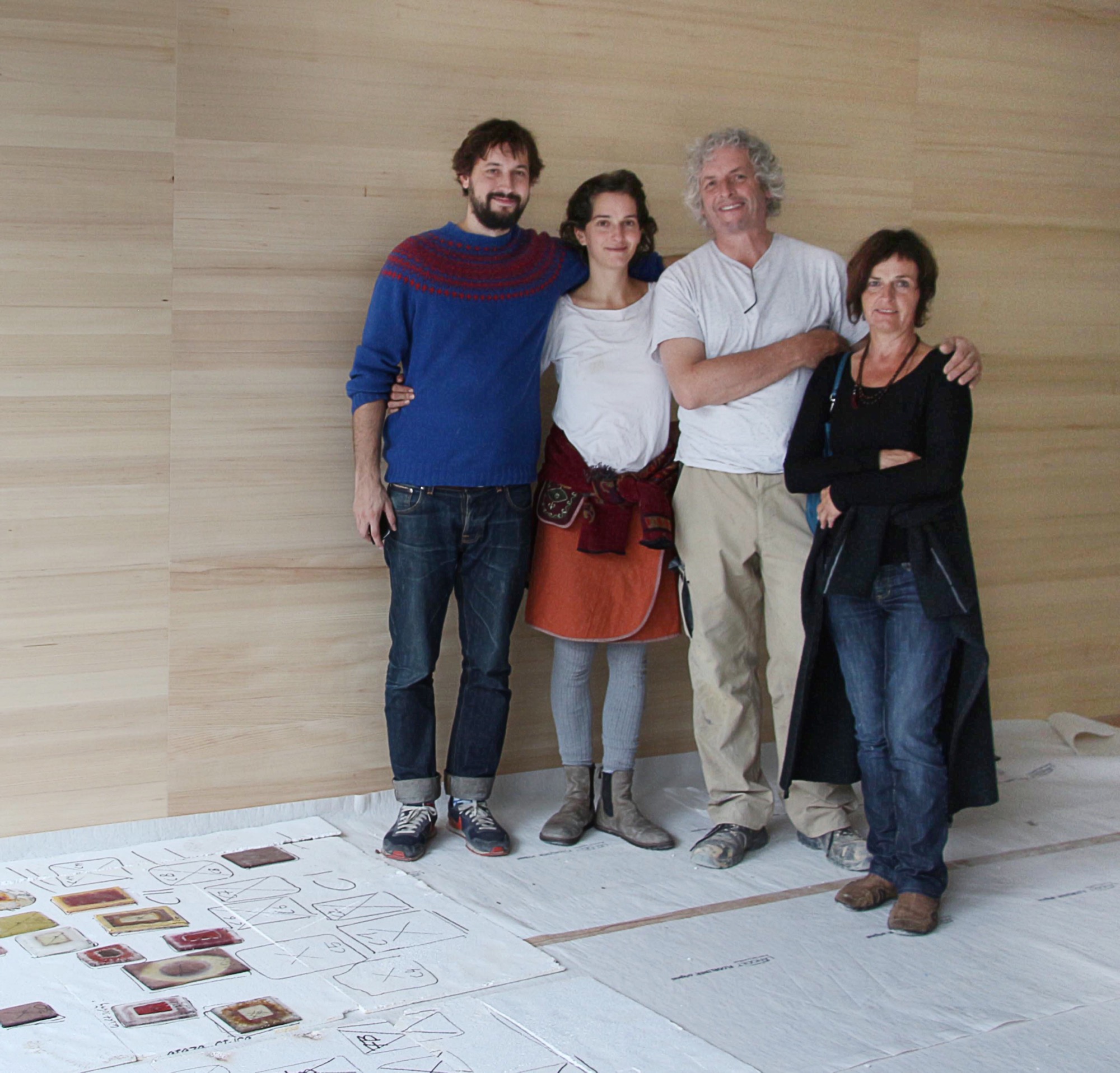
“Never.”
Trotting behind his father around countless construction sites, a teenage Sebastian Rauch convinced himself he would never follow in his artist parents’ footsteps.
Born this way
Now thirty and his hormone levels long balanced, Sebastian has succumbed to the truth: The love for elemental design, form, and earthen materials is in his DNA. His parents are ceramic artist Marta Rauch-Debevec and artist-builder Martin Rauch. She runs the tile label Karak; he heads Lehm Ton Erde (Loam Clay Earth). Together, they share a studio space in Schlins in western Austria’s Vorarlberg region, tucked between the German and Swiss borders and known for supreme skiing.
“Both my parents have art degrees and chose art as their livelihood,” Sebastian tells. “Somehow, it rubbed off on the children.” Today, he works as a graphic designer in Vienna. His sister, Anna Pia, is currently taking a maternity break from earning her degree in art pedagogy.
The son of two artisans admits that neither the material loam nor his father’s building sites interested him as a child. “I was all thumbs in construction, which led to a lot of tension between my father and me during puberty.” To his parents’ chagrin, young Sebastian preferred to spend his days in front of the computer. “I was engrossed in anything to do with science fiction and Japan, whereas my parents are much more down to earth, literally.”
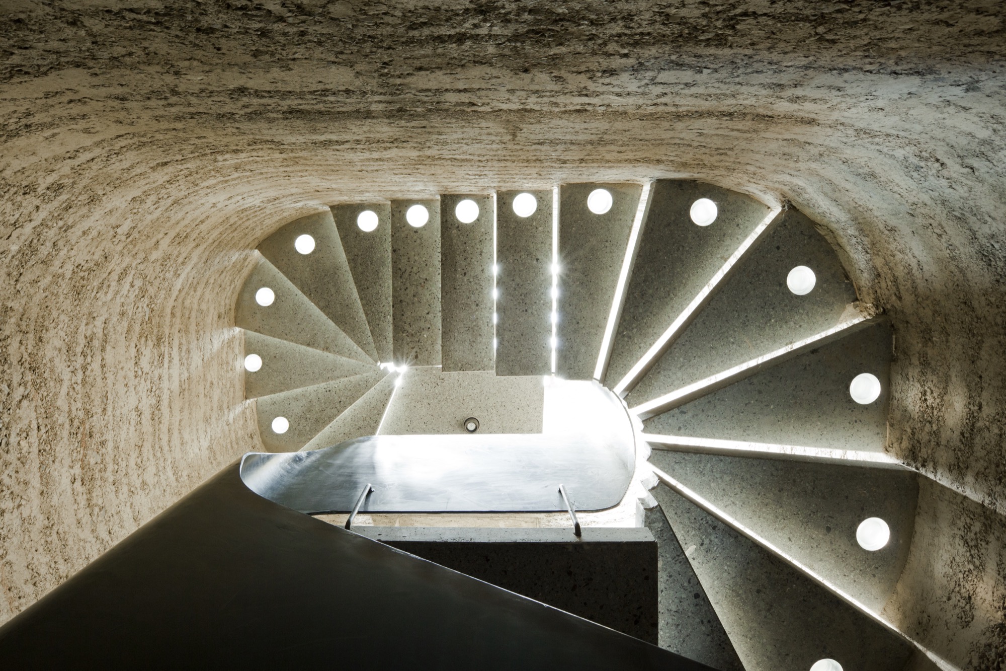
Rammed earth
Sharing a studio compels the elder Rauchs to amalgamate their crafts. “Marta and I have been working in the same space together for more than thirty years,” Martin says. “In terms of materials and processing techniques, there are many synergies between ceramics and building with loam, which help us both realize our work.”
To the family, loam, clay, and earth symbolize the holistic philosophy inherent in their art: Loam represents craftsmanship and technology, clay stands for art and design, and earth embodies the sustainability of building with loam.
Martin, who sees himself as an applied artist rather than an architect or designer, is known beyond the Vorarlberg region for practicing the ancient technique of compressing loam into a distinctive building material as sturdy as concrete. His desire to architecturally design with earth grew from his early work as a ceramicist, oven builder, and sculptor. Today, he focuses on the aboriginal rammed-earth technique, which he approaches with innovation. He builds entire buildings from loam as well as indoor components, such as wood-burning stoves, flooring, and interior walls.
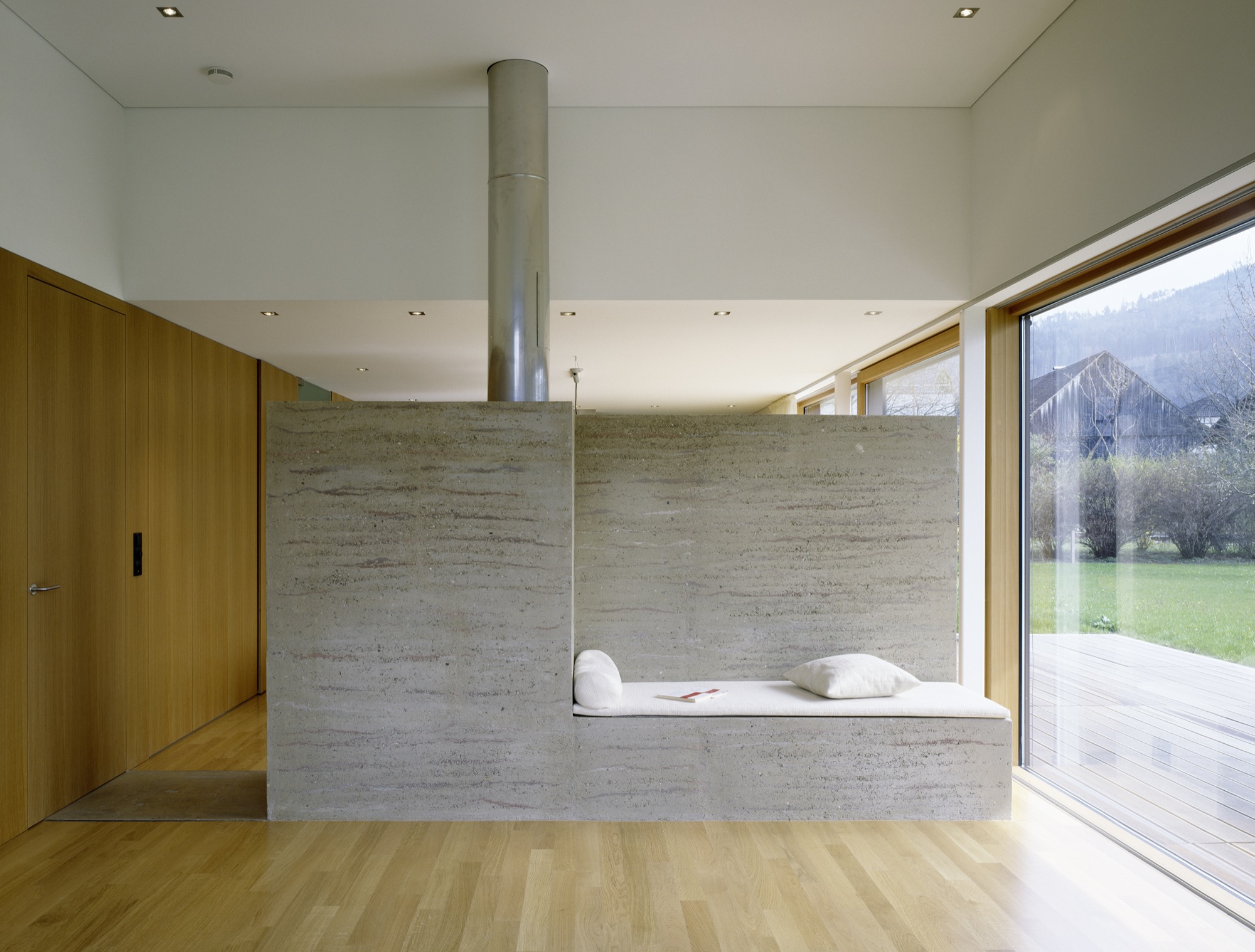
The process of compressing soil is time tested. Parts of the Great Wall of China were constructed from rammed earth. “Being able to create solid, bearing walls from such elemental materials fascinates me,” Martin says. “It requires careful study of the material but also courage. For example, one has to be able to allow the erosion.” External rammed-earth walls facing the elements will lose some surface, exposing stones and leaving a pebbled pattern. “Once we can accept the erosion, we can recognize its many benefits,” Martin explains. “We must recognize that its water solubility is really the most valuable virtue of loam as a building material.” His structures are 100 percent recyclable, often using ground dug up during a building’s own construction phase.
“Being able to create solid, bearing walls from such elemental materials fascinates me.”
His building materials and techniques are deeply rooted in tradition, yet Martin’s designs are expressively modern. “This very juxtaposition inspires me,” he says. “With the emergence of modern building methods in the last two centuries, building with loam was rarely considered, downright superseded, and degraded to the poor man’s building material.”
The Austrian artisan, who is currently cladding Saudi Arabia’s King Abdulaziz Center for World Culture in rammed loam, is confident that quality modern rammed-earth architecture with progressive, adapted techniques can once again valorize the image of building with loam.
Climate control
Breaking new ground in sustainable building spurs Martin’s creativity as artist and craftsman. “I love developing new ways of contributing to an anthroposphere that is more conscious of the environment and mankind,” he says. “Loam as building material is pure inspiration.”
Loam is available as local material almost anywhere in the world, meaning short, to no, hauling. “About 80 percent of our own home’s building material, for instance, came from its excavation pit,” Martin says. High efficiency and low primary energy are further benefits inherent in rammed-earth buildings. Locals identify with his work for these sensibilities. “It’s not unusual for our projects that the principal or the villagers join in building.”
Bringing the rammed-earth technique into the twenty-first century is a challenge the builder approaches from a business standpoint. “In Europe, it is important to react to the rationalized and industrialized building sector,” he explains. “For us, the prefabrication of rammed-earth components plays an integral role. It allows us to build much more efficiently and according to today’s construction timelines.”
Rammed-earth interior walls promote a well-tempered indoor climate. The enormous mass abates temperature extremes and superbly regulates humidity. If you have eaten a Ricola herbal cough drop, you have a connection to Martin’s work. He collaborated with Pritzker prizewinners Jacques Herzog and Pierre de Meuron, founders of the Swiss architecture firm Herzog & de Meuron Basel, on the Ricola Herb Center near Basel. Martin’s loam walls promote ideal humidity levels for storing and processing the herbs.
Haus Rauch
Though Martin has been working with rammed earth for more than three decades, the home he built for his own family was a test bed for further adapting and refining his technique.
The 200-square-meter (2,150-square-foot) home built into a steep southern hillside above Martin’s native town of Schlins was completed in 2008. The design was a collaboration with Zürich architect Roger Boltshauser.
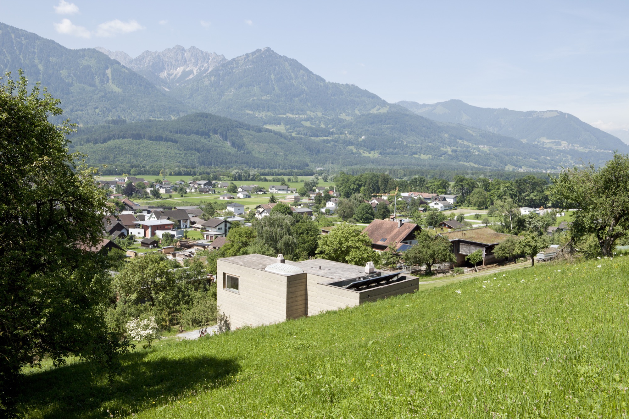
In its orientation and form, the house directly speaks to the topographic flow of the site and the context of the landscape: A monolithic structure like a sculptural block is literally pushed out of the earth. The use of solid rammed-earth walls combines this architectural intention with the desire to construct an ecological building exclusively made of natural materials.
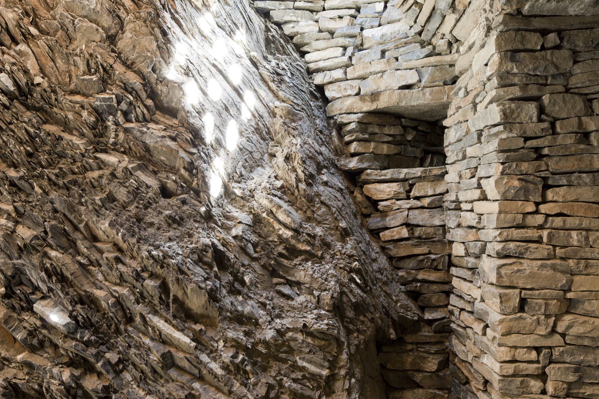
The mother of creativity
Marta, who was born in Ljubljana, Slovenien, and studied ceramics and product design at the University of Applied Arts Vienna, never urged her son or her daughter to work with her. “Simply following in your parents’ footsteps doesn’t bring you happiness. I wanted them to cultivate their own dreams and visions, so I never thought that one of my children would one day work with me.”
Having been an independent artist working on theme-based projects for exhibitions and sculptural ceramic objects, Marta herself hadn’t planned on specializing in tiles. But she knew she wanted to incorporate ceramic art in the new house.
After working with a low-fired technique known as raku, a traditional Japanese pottery process, for twenty years, Marta wanted to explore tiles as medium. “I was looking for a tile design for the house when I discovered the beautiful patterns Sebastian was creating on his computer,” she remembers. He says he created the designs “just for fun.” Marta wondered how she could transfer her son’s digital doodling to her tiles and began experimenting with screen printing. “When I created the first samples, we were all surprised how stunning the combination of the raku tiles and Sebastian’s patterns truly was.”
“I was looking for a tile design for the house when I discovered the beautiful patterns Sebastian was creating on his computer.”
Karak tiles
The Karak brand was born. Marta and Sebastian’s Karak tiles—each a unicum—embody the elementary relationship between the Eastern and the Western world. Captivating geometric ornaments, the result of repeating, digitally created design patterns, are married with the century-old Japanese raku technique that gives the tiles an inimitable air of chance.
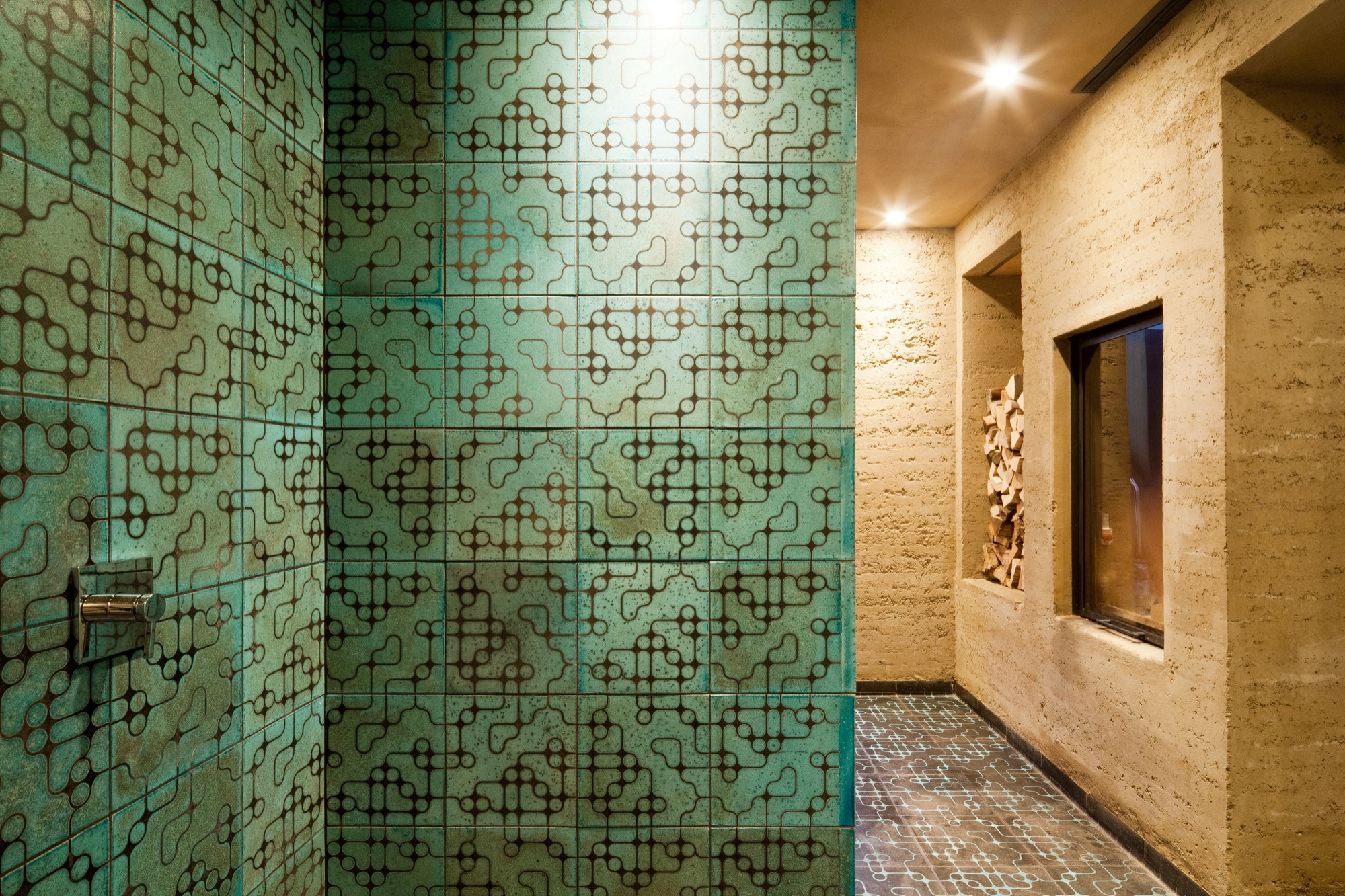
The tile material is a combination of different kinds of clay and loam mixed with quartz sand and fireclay. Pressed into shape, each tile is retouched by hand, the designs applied by silk-screening.
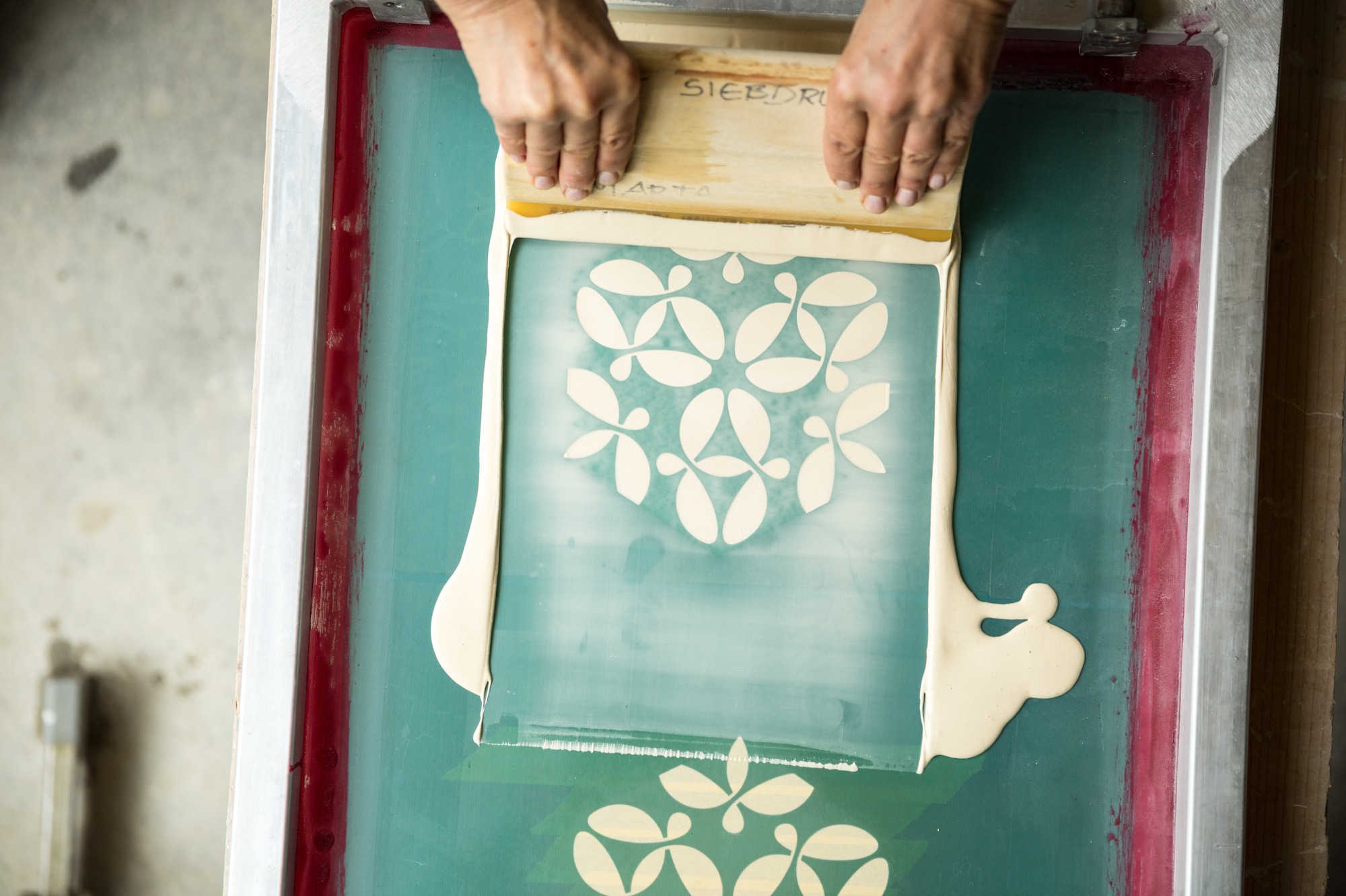
As the tile is red at about 1,000 degrees Celsius (ca. 1,830 degrees Fahrenheit), the material’s transforma- tion becomes palpable—the low-fired technique makes it porous and gives the final product a deep, organic sound at the touch and a warm haptic.

Still glowing, the tiles are removed from the kiln one at a time and immediately hermetically buried in sawdust. The void of oxygen and the smoke have an intense effect on the surface that varies for every piece. The color changes with the glaze; hair-thin cracks are blackened.
Finally, dunking each tile in water reveals its finished character. Transformed by the temperature shock, the glazed surface is brushed off, evincing a craquelure—like a fine net tying everything together.
Starting Karak wasn’t a conscious decision but rather a mother-son collaboration that grew organically. At first, the two intended to create the tiles only for the family’s villa. Then a book was published about the unique house. “On occasion, people began talking not about the Rauch house but about that house with the beautiful tiles,” Sebastian remembers. “People were asking us where we got those tiles...that’s when orders began coming in.”
“When we created the tiles for the house, I suddenly knew the charm of these tiles,” Marta says. “After all these years, I am still excited every time I walk in the door.”
Futuristic fantasy meets ancient technique
Sebastian’s passion for science fiction inspires the patterns he designs for the tiles. “I love to connect antipodes, things that seemingly don’t go together, the interplay between contrasts...that tipping effect.” His KuQua design, for instance, combines spheres (Kugeln in German) and squares (Quadrate). “When you deconstruct these two shapes and recombine them, they become almost unrecognizable in an entirely new shape. However, there is an underlying geometrical clarity and calmness that makes me feel like I didn’t design this shape; rather, I found it. At the same time, there is constant movement as the eye meets the pattern, like a deep mantra lancing the universe, like yin and yang.”
His mother is no less fascinated by the repetitive geometric patterns’ tipping effect. “Depending on how the eye focuses in, the design can suddenly appear three-dimensional,” she says. “In fact, we created a three-dimensional tile, the TaOk tile, a tantalizing combination of modern geometrical design and something Oriental. Then, the ancient technique adds something very primordial...a beautiful enrichment.”
The raku process gives a brand-new tile the patina of a long life. “I am intrigued by something that looks so archaic, yet you can’t really assign the object to an epoch,” Sebastian says. “I like to envision an archeological excavation site where they dig out a temple and find patterns and artifacts that don’t have a place in our past, in the human past...so you may have discovered an alien temple.” The precise patterns, the exact geometry combined with the serendipitous process make Sebastian optimistic for the future. “In science fiction the future is often depicted as extremely slick and clinical, as measured and constructed. I rather like the thought of a future that is still sensual and vivid.”
The geometric patterns are calculated and carefully designed, with precise lines. But the firing process, the smoke passing through the tile, and finally the quenching in water is so incalculable that what was once smooth becomes structured, what was once superficial gains depths. “It is a movement between order and happenstance, between repetition and uniqueness,” Marta adds.
“It is a movement between order and happenstance, between repetition and uniqueness.”
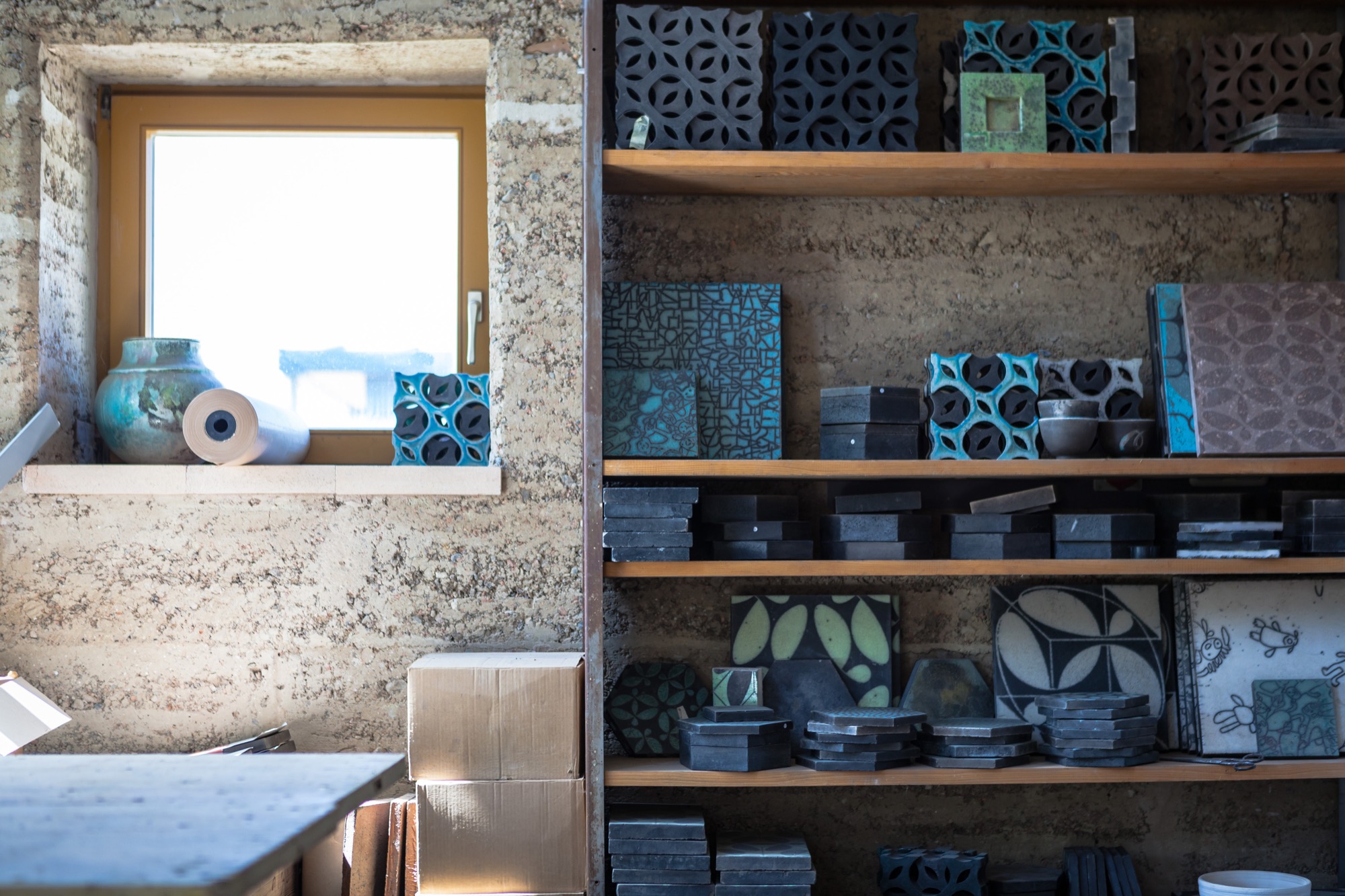
Both Marta and Sebastian appreciate the synergies and new opportunities that come with sharing the workshop and resources with Lehm Ton Erde, particularly Martin’s tinkerer skills and powerful imagination.
“Growing up, I was pretty sure I wanted nothing to do with loam,” Sebastian admits. “Funny how I found my way back to the material.” In the end, he’s grateful his parents laid the groundwork. “I couldn’t imagine working like this if it weren’t for being a family.” △
“I couldn't imagine working like this if it weren't for being a family.”
