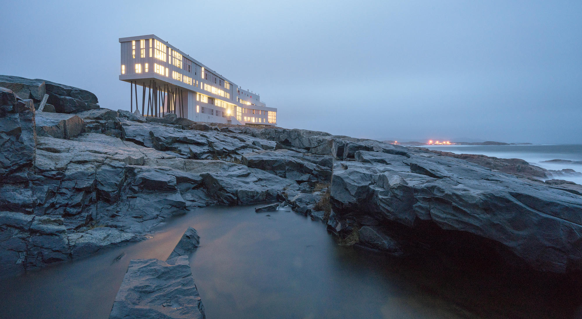
Inspirations
Explore the elevated life in the mountains. This content debuted in 2015 with Alpine Modern’s printed quarterly magazine project.
Makers on Board
Born out of passion for the ride, handcrafted snowboards, splitboards, and skis by Vancouver Island's Kindred Snowboards feature marquetry artwork.
Kindred Snowboards was born out of passion for the ride and the opportunity to grab a snowboard press off Craigslist. Meet the spirited couple who handcrafts custom snowboards, splitboards, and skis featuring marquetry artwork on Vancouver Island.
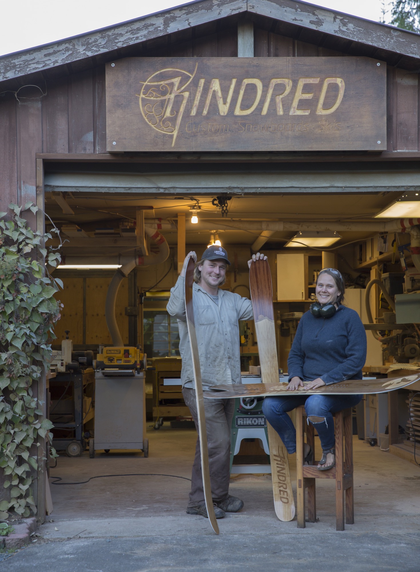
Evan Fair and Angie Farquharson have been designing and making custom snowboards and skis together in their backyard woodshop on Vancouver Island since 2010. We squeeze in a weekend visit just before the busy winter season to get a glimpse into their craft, their art, and their humble lifestyle in a rural community on the island’s east side. The couple built the Kindred Snowboards brand from scratch. They cultivated the low-impact operation out of nothing more than a passion for the ride and the desire to make a higher-quality product—yet without any background in fabrication.
Beautiful Comox Valley and Mount Washington straddle this area fifteen miles (twenty-four kilometers) north of Courtenay, British Columbia, where their home and shop are located. Weather on the east side of the island is mild and temperate year-round, a surprise given the substantial annual snowfall in the nearby mountains. The couple’s home sits at sea level in a forest, the mountains hidden from view. Land plots are large here, spreading neighbors apart. Industry in this area is a miscellany, though mostly milling timber and small-batch farming. Neighborhood homesteading makes the community largely self-sufficient—the local crops and dairy products go directly to the local population.
Pressed to jump
“How is a snowboard made?” the couple, both in their late twenties, asked each other one day before it all began. Not long after they pondered the process it may take to create the boards their life revolves around, a snowboard press came for sale on Craigslist. Fair and Farquharson, as adventurous as they are curious, grasped the opportunity. At the time, they were living out of a camper van and chasing the best snow to ride. But they made the purchase, hoping the investment would be the impetus to launch them into a more serious endeavor.
They were committed. Being avid riders themselves, they knew exactly what they wanted in a board, what their ideal board would look like, feel like. So they learned and improved upon the techniques to make a better product. Their goal was to create high-performance boards and skis that enhance, not hamper, the user’s skill, style, and fun on the snow.
“Some experienced riders know exactly what they want, down to the numbers,” Farquharson says. With others, the Canadian gear artisans spend significant time getting to know the customer’s riding style and preferences. “For the topsheet artwork the questions are a bit more ephemeral,” she says. People have asked for anything from the silhouettes of their favorite mountain to portraits of their pets or pop-culture idol, and even memorials to lost loved ones. Kindred’s Limited Edition Series, on the other hand, features artwork infused with an alpine or coastal sensibility. “I draw from my own personal experiences in nature, as it is common ground for people who spend their recreation time outdoors,” Farquharson says.
“For most people the way their gear looks is a very close second to how it rides,” she knows from experience. “People who go for a custom build impact the end product directly, which can be empowering. The ride becomes a distilled reflection of the rider and what they want out of their alpine experiences. In the end, Evan and I hope our work inspires people to be themselves and to be better riders.”
“People who go for a custom build impact the end product directly, which can be empowering.”

Shop talk
That mission to make a superior board hasn’t shifted or been compromised in the five years since Kindred began. Each board is treated with the same intense amount of care and precision. Personal connection with each customer and hands-on craftsmanship that goes into every board leave the couple remembering almost every individual product. The number of orders Kindred fulfills has been growing every year. By the end of this season, they are projecting to have made approximately 150 boards, splits, and skis.
Their search for the right place for Kindred led the couple to a tree-lined rural spot with a woodshop, old smokehouse, and former boathouse turned into a woodshed. They purchased the property with the intent to grow their business and live in the same place. “At first, we considered commercial property around the area, but it made more sense to have a shop very close to home,” says Fair. “The former owner was a cabinetmaker, so the shop already existed and was set up for woodworking.”
"Personal connection with each customer and hands-on craftsmanship with every board they make leave Fair and Farquharson remembering almost every individual product."
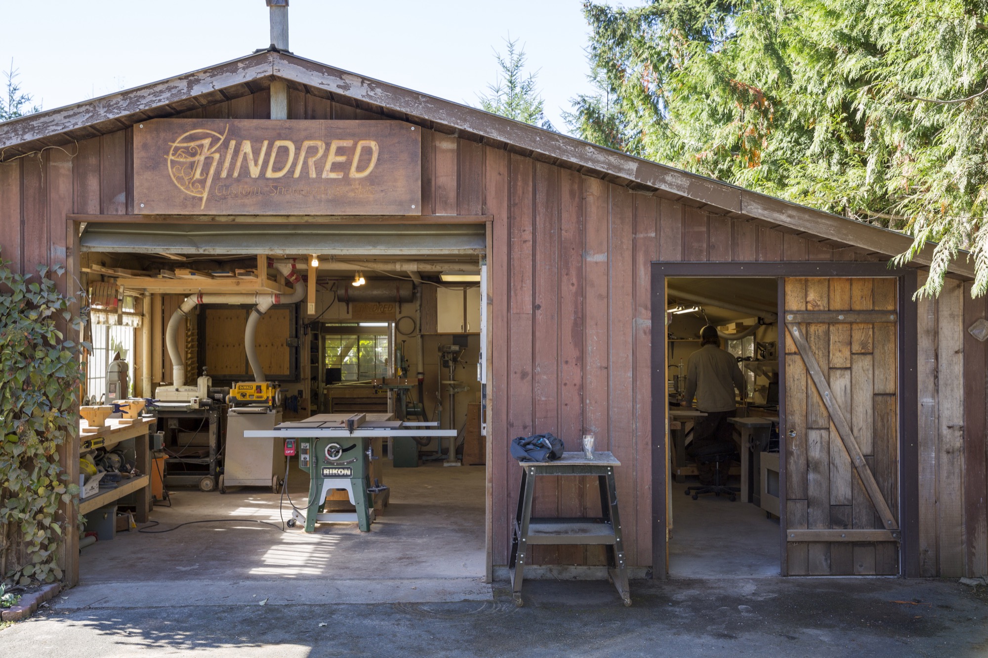
Sunlight filters into the shop through the grapevines that walk along the top of the awnings and the edge of the roof. As the gentle breeze blows, the leaves dance in the wind, making the patches of light dance on the floor. The view from the workshop doors is still lush and green this time of year; an occasional chicken races by or stops to graze for bugs in the grass. Inside, the walls are neatly laced with deliberately arranged hand tools and jars of screws and nails hanging from lids nailed to the shelves, organized according to the makers’ workflow. Fair’s homemade shelves display boards and skis in progress. It’s obvious the two designed this workshop with careful thought.
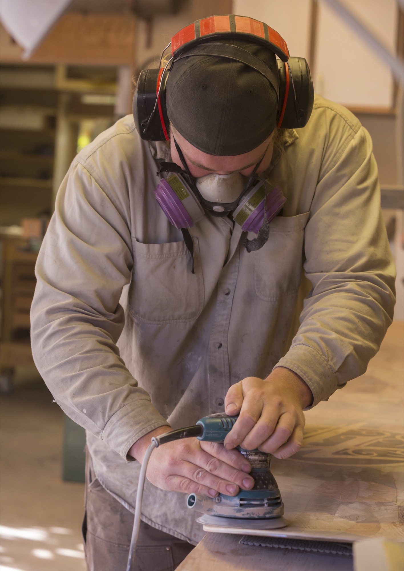
Fair puts on an album by Little Feat as the machines are slowly starting up. All of us pull on protective face masks before he begins sanding the core of a board he prepped the night before.
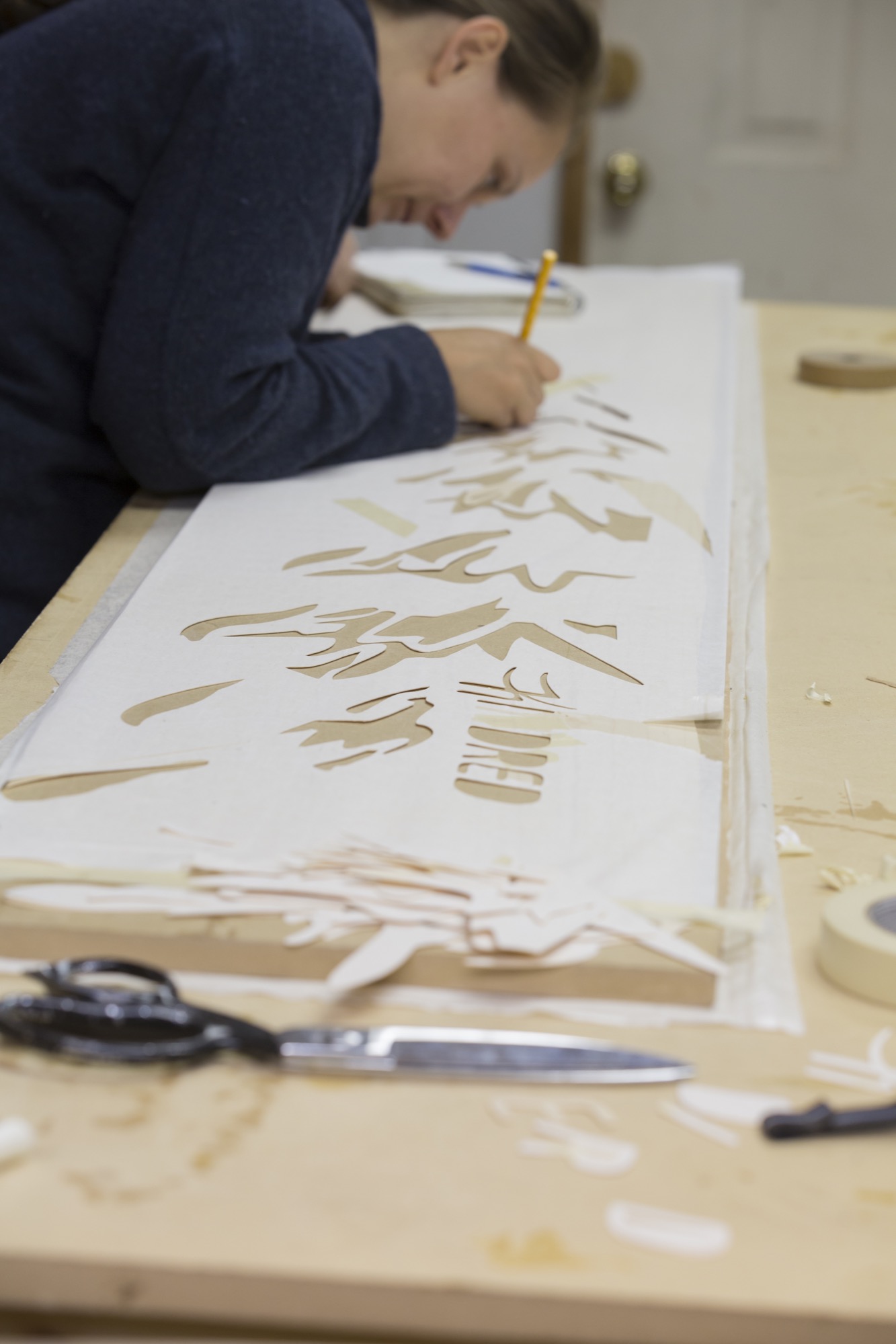
Meanwhile, at the giant table in the back of the shop, Farquharson sets up the topsheet, the piece that is most visibly “Kindred” to those familiar with the distinctive snowboards. The topsheet, a thin wood veneer, is intricately designed. The decorative patterns and graphics are meticulously cut from different woods and inlaid using a technique called marquetry. Defined by the grain and color of the woods, the outline of a fir tree begins to show light and definition in its branches, and a moon shows its craters. This detailed, time-intensive process makes Kindred boards one-of-a-kind art pieces.
Farquharson cuts the wood with her penknife. We talk about Kindred’s customer base as she carves out a moon from a delicate sheet of gorgeous black walnut.
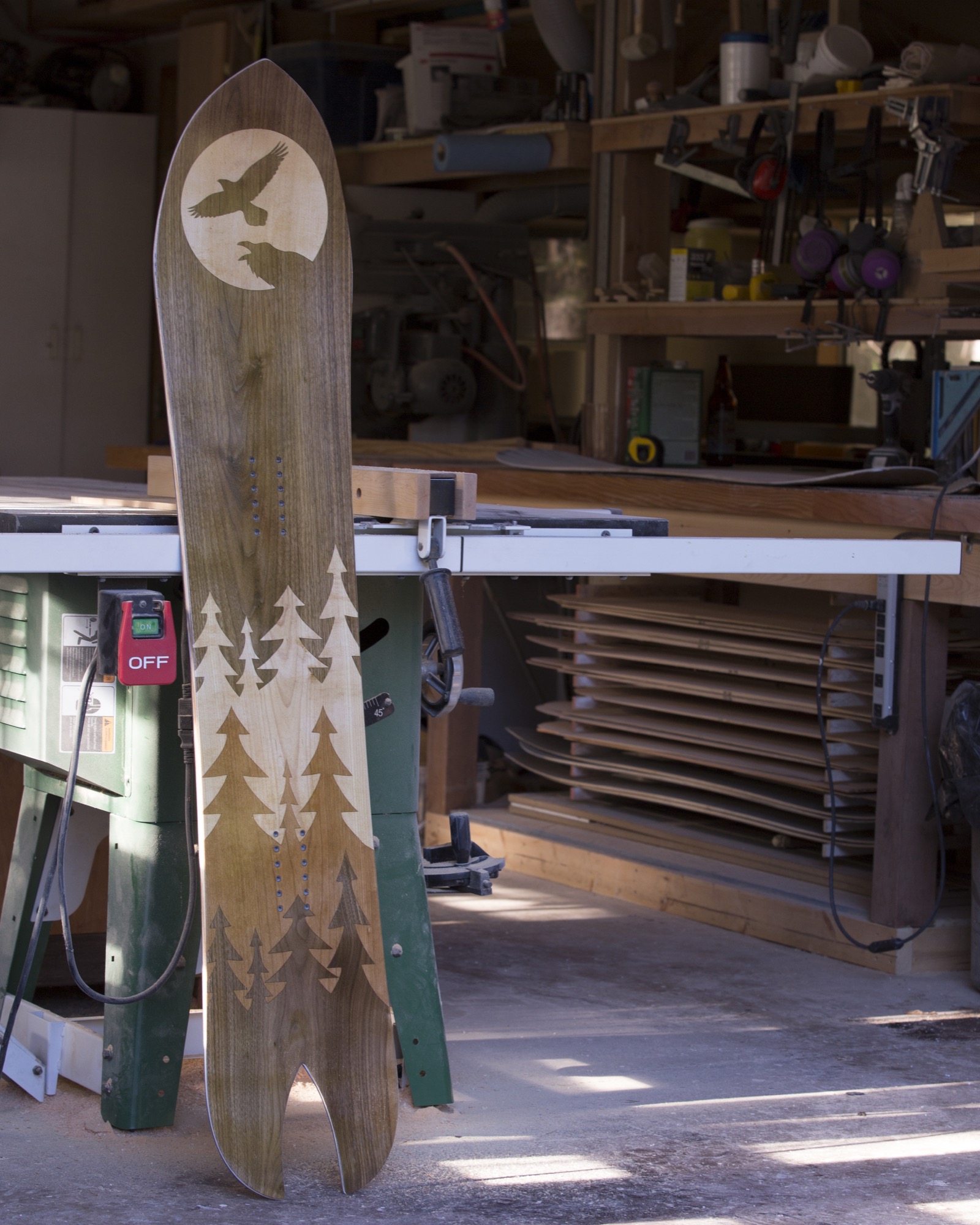
“We’ve had incredibly strong local support from shops and individuals, but we are fortunate to ship all around the world,” she says. “We even had a Japanese fellow arrive unannounced from the other side of the world who had planned his whole vacation around watching our build process...He is now a friend of ours.”
Return to the Valley
Fair sets up a bottom sheet to be cut with a drag knife mounted to a CNC machine (computer numerical control machine, or automated milling machine used to make industrial components). He tinkers with the calibration on a laptop next to it. Satisfied, he hits “start” and the knife begins to cut out the Kindred logo from the sheet. When I ask him about their initial business ideas and how things have developed through the years, he pauses. “Humble beginnings for sure,” he replies.
“The concept was founded while we were living in a truck and camper. We had left the island to travel throughout Alberta and BC looking for the next ski resort. When we decided to embark upon the snowboard-building adventure, we returned to the Comox Valley, where we already had a network of support. We initially saw a potential niche in building high-quality North American skis and snowboards, and quality and beauty remain central to every step of the process—no cutting corners.”
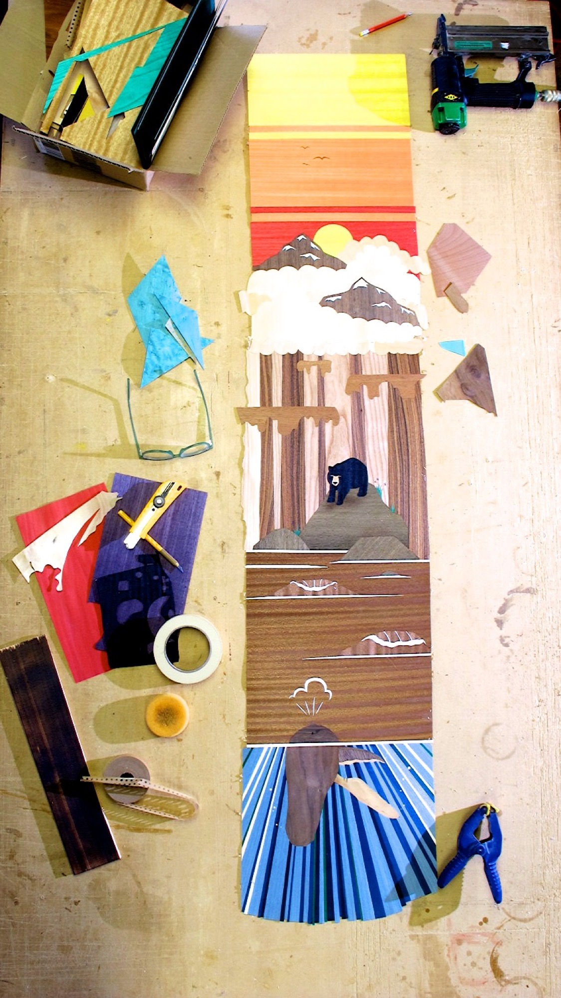
A complex custom build can take the two up to thirty work hours to design and build a board or a pair of skis, not counting drying and curing time. The Limited Edition Series builds, where Kindred makes a small number of products with similar designs, still take up to fifteen hours each.
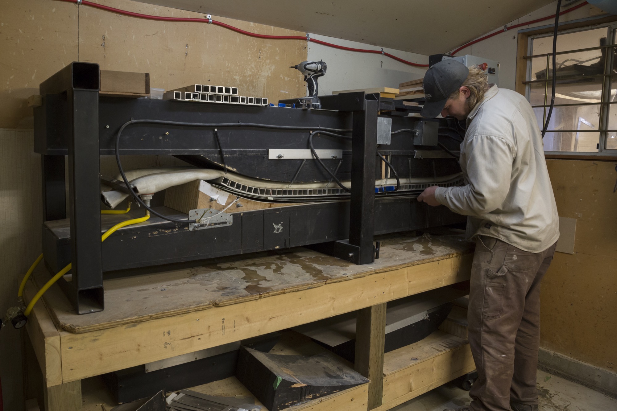
The day goes by quickly, and before we know it, the afternoon sun starts to set. The board is ready for the nal press, and all the layers are assembled with a chemical-free epoxy slathered on between each layer as the machine applies a healthy dose of heat and pressure. It’s fascinating to watch the steel tube stock apply pressure, making the epoxy ooze out the sides, slowly creating mountains on the floor. The snowboard press that started the whole operation is beautiful in its frugality—a testament to Kindred’s mindset.
"We initially saw a potential niche in building high-quality North American skis and snowboards, and quality and beauty remain central to every step of the process—no cutting corners.”
Community board
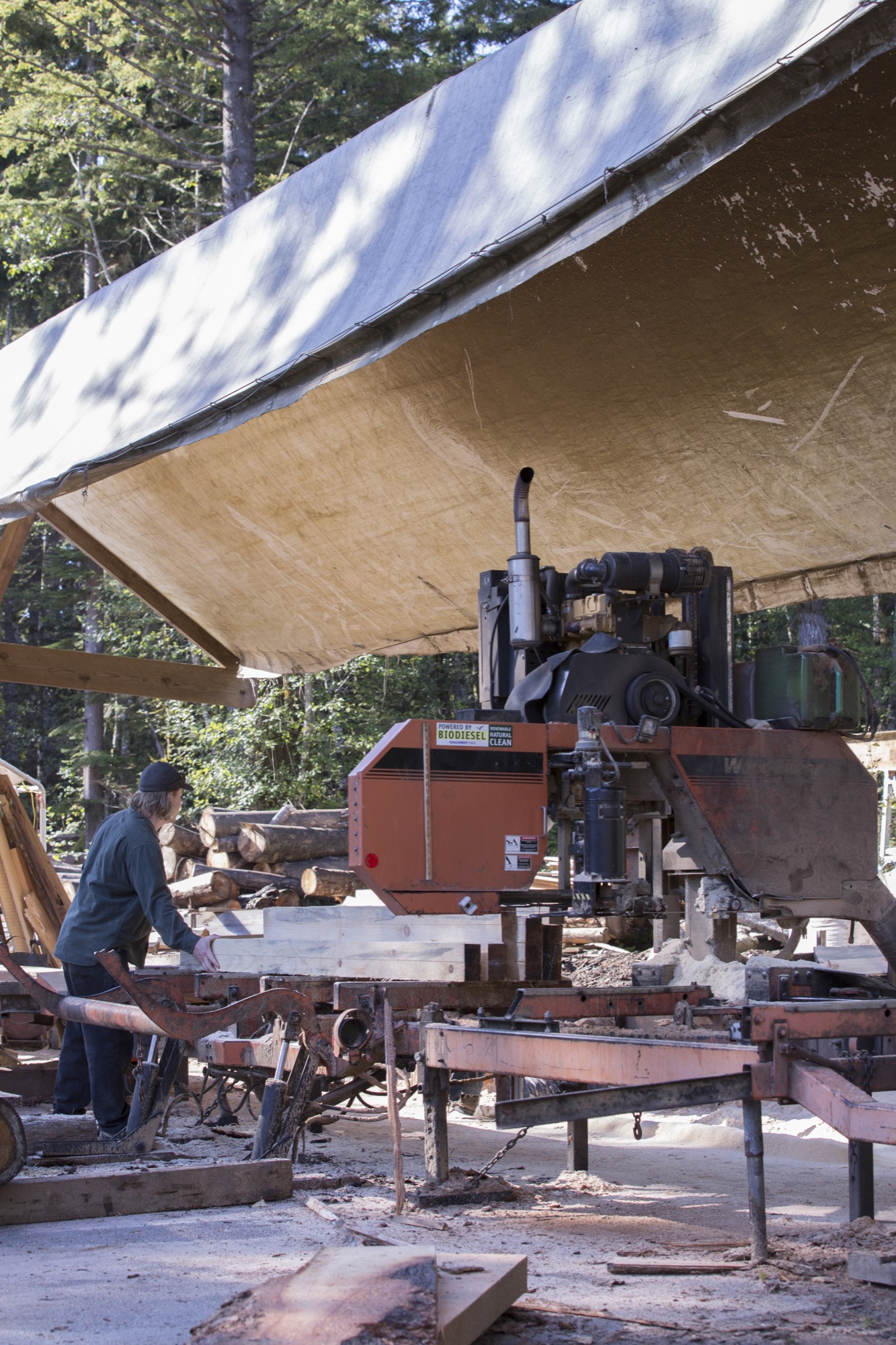
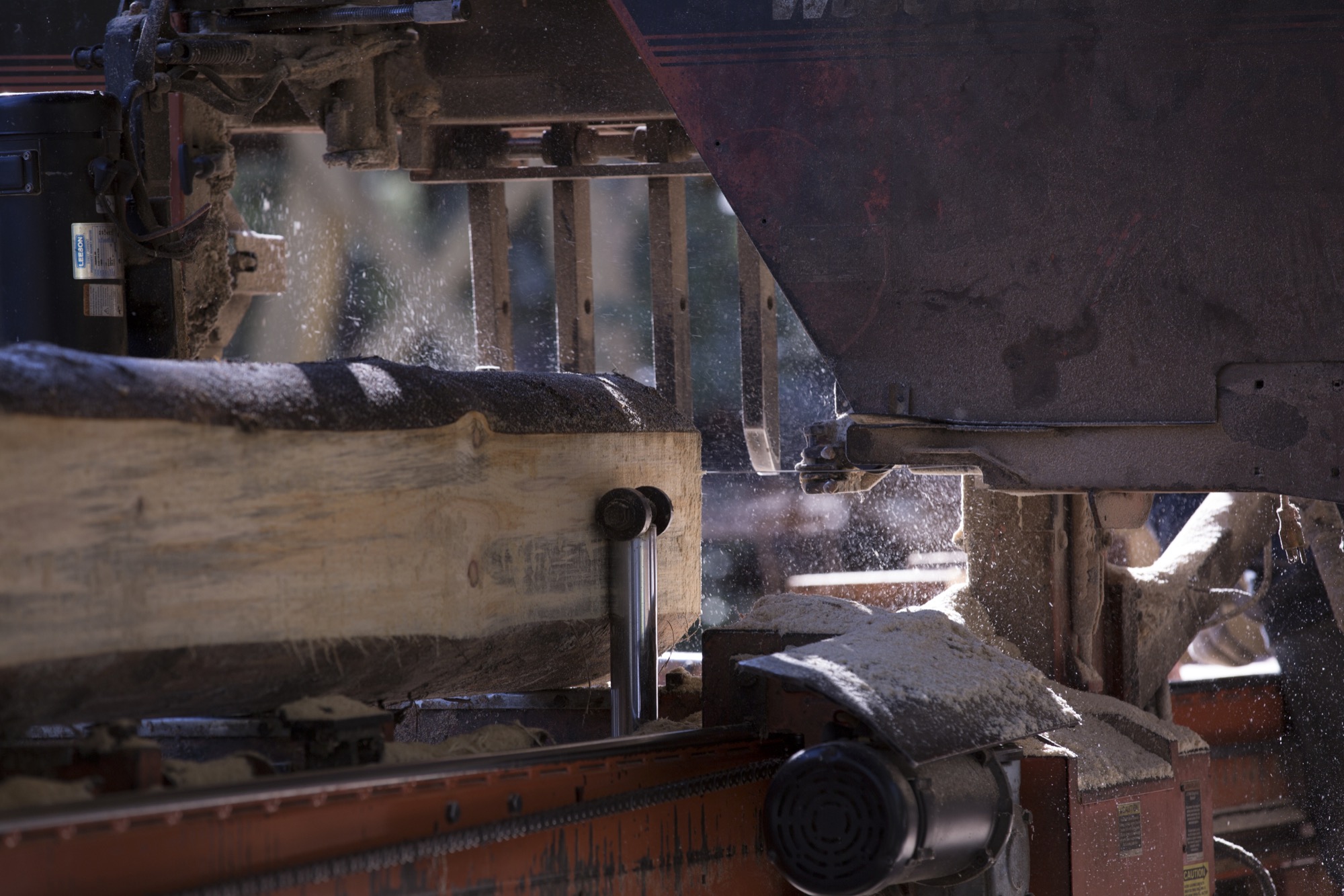
A couple of miles from the workshop, a local mill saws logs into lumber for the core pieces, the main foundation and center of each board, sandwiched between layers of fiberglass and carbon fiber. Farquharson and Fair know the owners of the mill well, and the family’s son is out working when we visit. With a population this small there is a strong reliance on others and an understanding that you are a connected member of the island community. Your actions greatly impact the local environment and its residents. Thus, good relationships with neighbors are important for businesses like Kindred to thrive.
As we observe the milling, Fair steps in to help move the last few logs on the run. “Many people are here for recreation—not specifically to ski or snowboard—they come to enjoy a work-life balance and the mild climate, fostering a slower pace overall,” he tells us.
What’s in a name?
How did the name “Kindred” originate? “We wanted to recognize how constantly blown away we are by the support of our community, friends, and family,” says Farquharson. “On another level, we give homage to the incredible relationships that are forged through alpine winter sports and lifestyle. Nothing quite compares to charging through fresh snow engulfed by the euphoric hoots and hollers of your friends. Those snowy moments, when we’re living a shared experience, feel like pure magic. When you are surrounded by people who embody that joy on and off the snow, you can’t help but feel like family. Those are our people. Kindred felt genuine and accessible, as we were sure that other skiers and snowboarders could relate.” △
Alpine Modern + JK Editions: Fall
Limited edition, museum-quality fine art prints by Boulder photographer Jamie Kripke exclusive for Alpine Modern
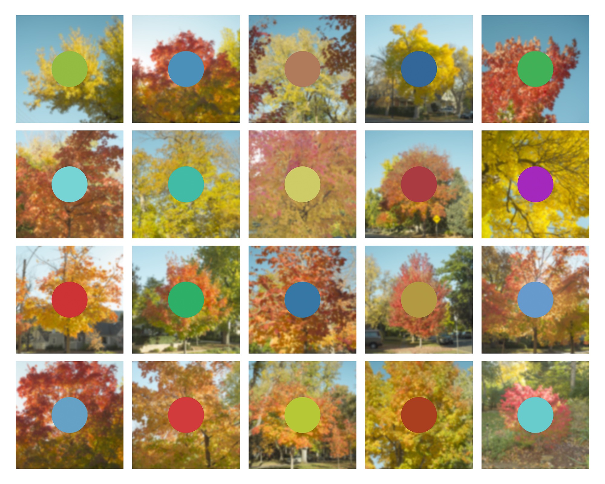
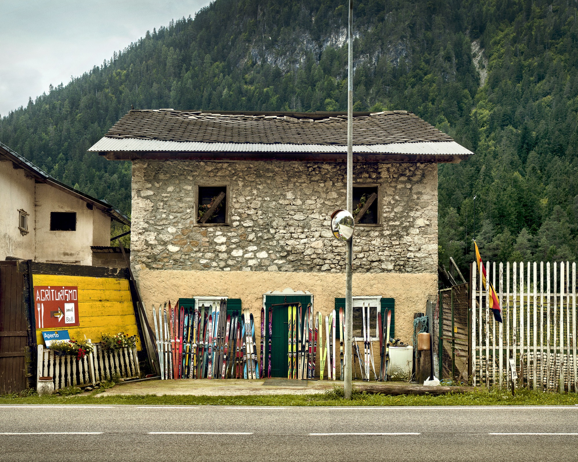
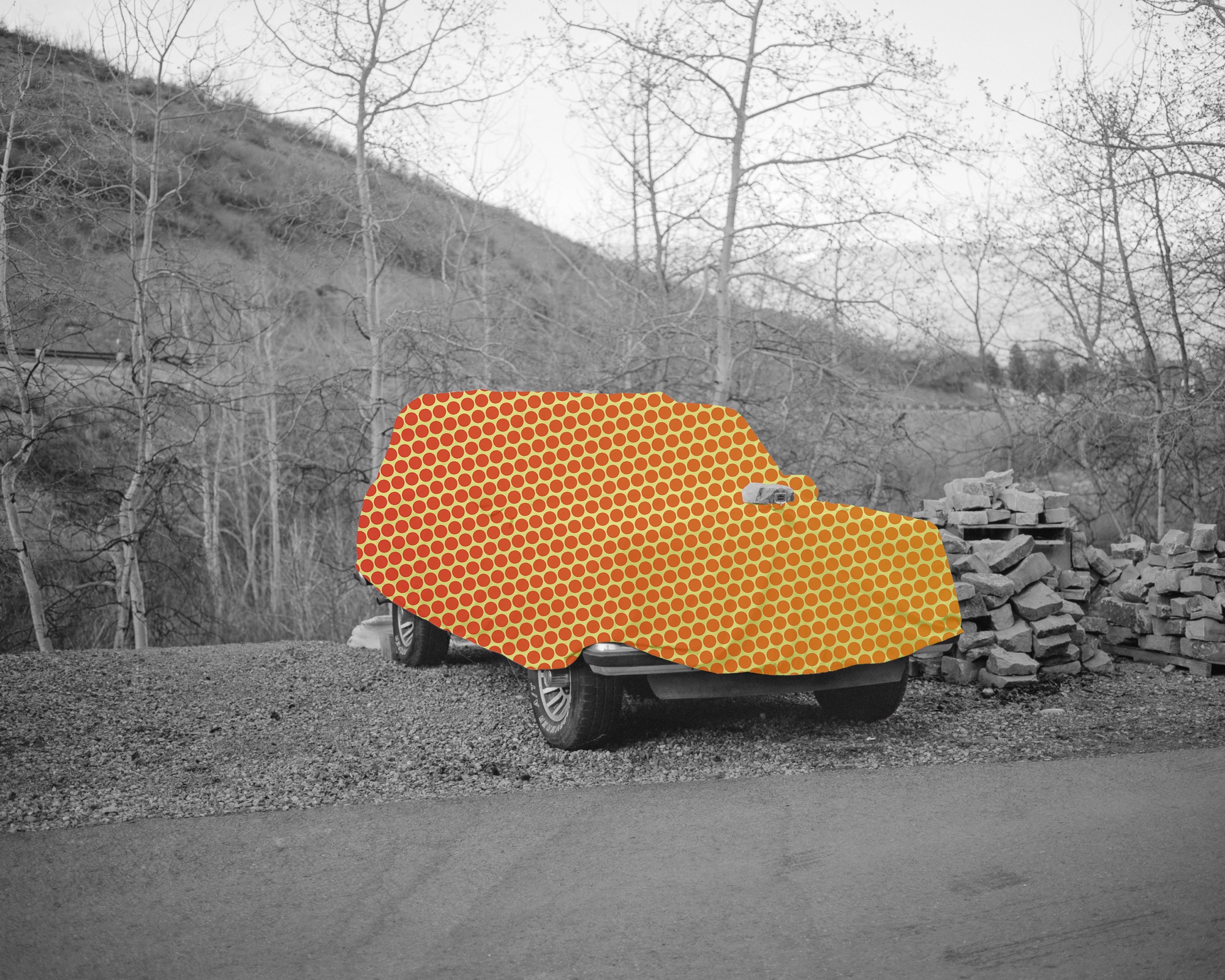
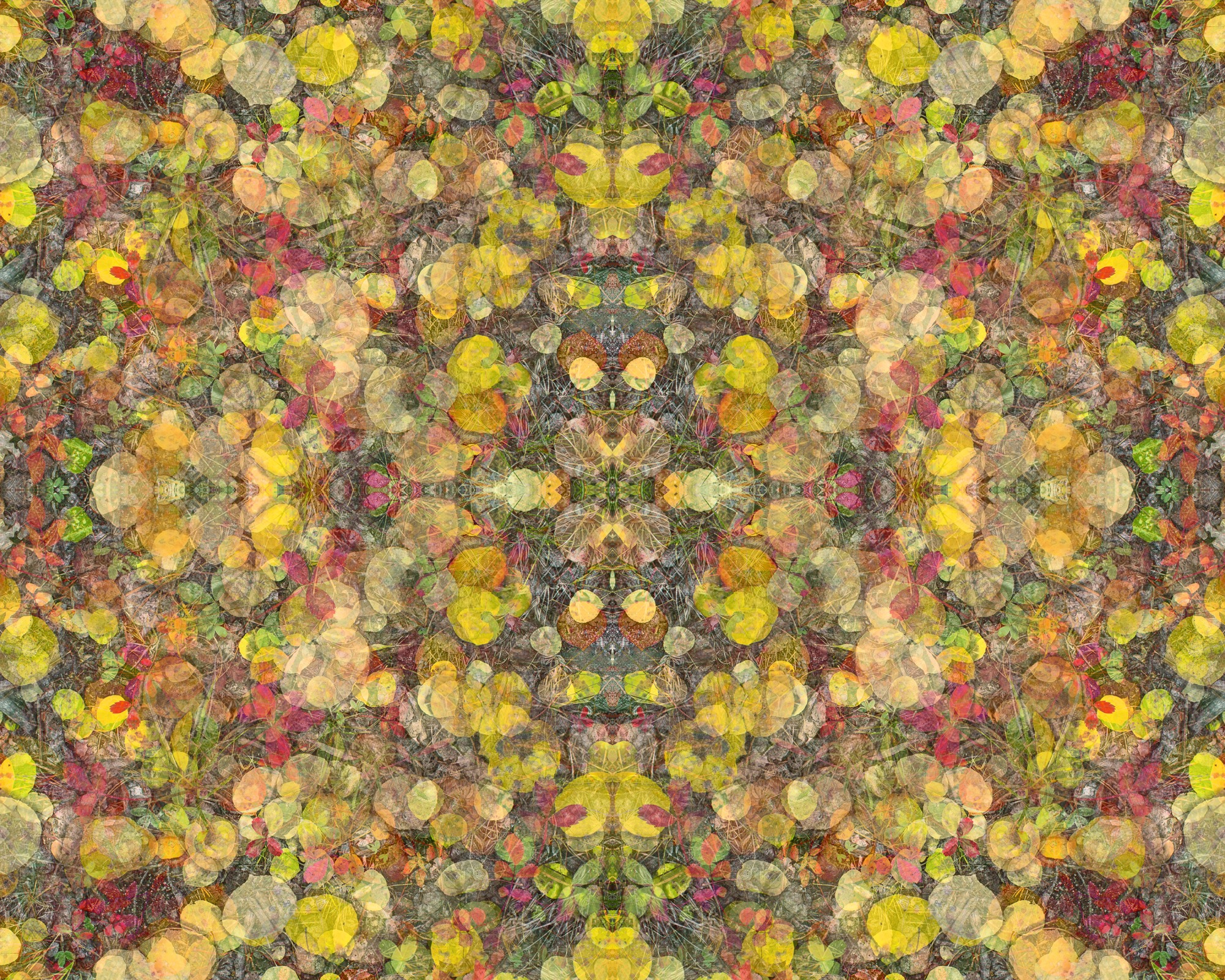
Art Photography by Jamie Kripke A portfolio of images by Boulder, Colorado-based photographer Jamie Kripke, created exclusively for Alpine Modern. An ongoing project that studies our connection to the alpine landscape.
Limited edition, museum-quality fine art prints of these images are available to purchase through Alpine Modern.
Solid Form
Shaping a clump of thought: A visual portrait of ceramicist Kelli Cain
We fell in love with Kelli Cain's pure and honest ceramics at first sight when writer Winifred Bird and photographer Torkil Stavdal visited the artist for us at her studio in the Catskill mountains. Revisit her through an artful video...

earth - air + water + force / rotation x fire = solid form
This is the formula of ceramics artist Kelli Cain's creative work. In "Breakable Minimalism," Alpine Modern discovered the many-talented maker and her earthy, minimalist tableware.
Now, filmmaker James Jenkins has created a visual portrait to showcase Kelli Cain's process through a meditative stream of consciousness. The process of thinking is taking a malleable substance—a clump of thought—and shaping it. It solidifies mid-process into a shape, perfect and imperfect, unique and personal. Cain's style is simple, beautiful, and speaks for itself.
(In)complete thoughts in response...
Solid Form - Kelli Cain from James Jenkins on Vimeo.
"The process of thinking is taking a malleable substance—a clump of thought—and shaping it."
She Felt Beautiful
Swedish designer Pia Wallén talks about her iconic Crux Blanket and the bold creations she makes from wool felt
Pia Wallén, who was born in Umeå, Sweden, and now lives and works in Stockholm, creates bold, minimalist objects from her signature wool-felted materials.
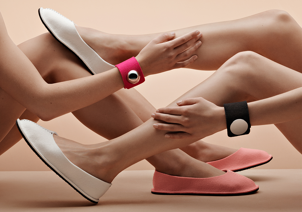
Wallén, who studied fashion design at the Beckman’s College of Design in Stockholm in the mid eighties, made an international breakthrough with her own namesake brand in the early nineties. Over the years, she has collaborated with IKEA and brands such as the Swedish design label Asplund and Italian leather manufacturers Arte & Cuoio.
Inspired by traditional Swedish folk craft techniques and patterns, her bold, minimalist designs also have a dramatic modern edge. This juxtaposition of ancestral craftsmanship and her unmistakeable, contemporary—yes, futuristic—designs have become Wallén’s trademark.

Her already iconic work is displayed in the permanent collections of Sweden’s National Museum of Fine Arts, the Röhsska Museum for Design, Fashion and Decorative Arts in Gothenburg, and the Museum für Angewandte Kunst in Cologne, Germany. She has participated in exhibitions around the globe, including at the Centre Pompidou in Paris and Victoria & Albert in London.
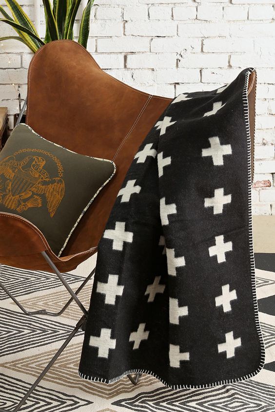
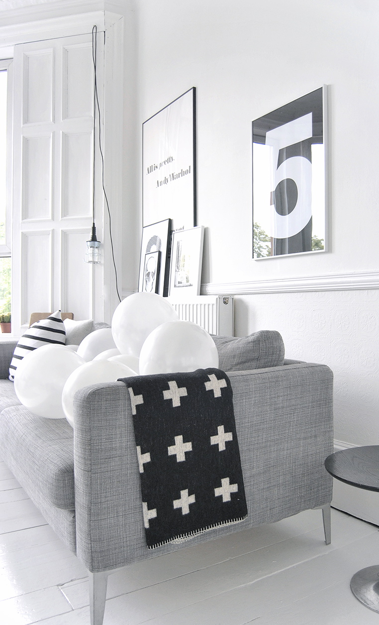
One our favorite Pia Wallén designs at Alpine Modern is the Crux Blanket, which the designer designates her “icon.” In Swedish folk art tradition, the cross (crux in Latin) is a strong symbol for hope, a meeting point of heaven and earth, plus, the designer says German artist Joseph Beuys (1921–1986) was also an influence. Introduced in 1991, the Crux Blanket has meanwhile become a classic in contemporary Swedish design history. Fostering mutually meaningful and lasting relationships with her manufacturers is very important to Pia Wallén. The original blanket is still produced by the same small family weavers in southern Sweden, using the finest wool and traditional Scandinavian felting methods.
The traditional weaving and felting process takes time, which is why supply of the handcrafted wool object is limited. Thus, Pia Wallén has introduced a new version of her treasured paragon: the new Cross Blanket in pure organic cotton, produced in collaboration with a Swedish company that manufactures in Peru.
We recently caught up with the designer to talk about her brand, her inspirations, and about life.
A conversation with Swedish designer Pia Wallén

What is your vision for the brand that bears your name?
My ambition is to create a deeper meaning, content, sympathy, and respect in the relation between the object and the user.
Your collections include accessories, jewelry, and interior objects. How do you decide what products to make?
It’s a combination of fulfilling my personal needs, ideas, and a curiosity for developing my new products as well as my old ones. It’s a lot like researching. It’s important for me to find and develop a good relationship with my manufacturers, and together with them create new techniques and products.
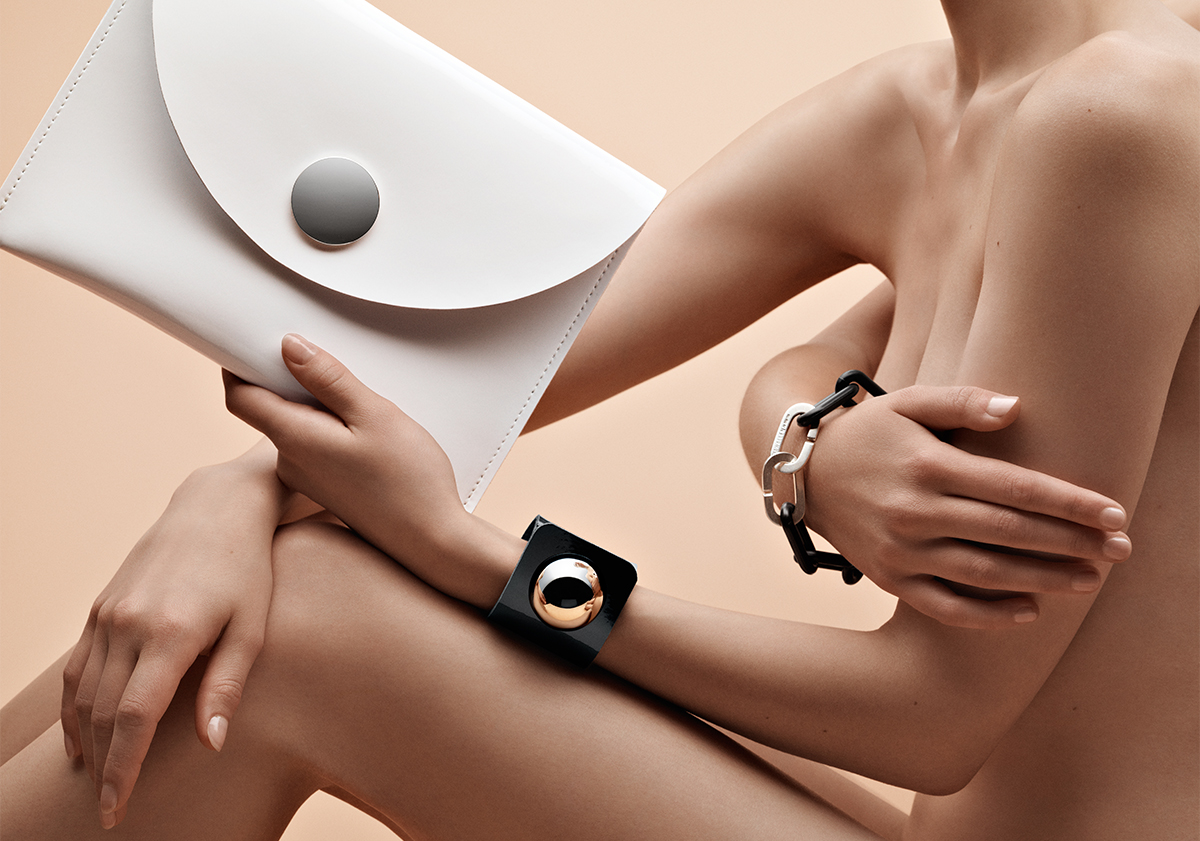
Your recent lines of accessories and jewellery have joined objects that combine felt, metal, leather, lacquer, plastic, and other materials in striking new ways. How do you choose and source your exquisite materials?
I’ve specialised in wool-felted materials and that is the main material throughout my collections. I’m inspired by materials from different cultures as well as by new, futuristic materials.

What does quiet design mean to you?
Quiet design is discrete and anonymous.
What’s your legacy (thus far)?
That my designs are objects to like, to sympathize and share a life with. My classic objects, like the Slippers and the Crux Blanket, have been in the collection for over 20 years, and I hope for many years to come.
What’s your favorite place in the world?
Paris, it’s like a second home for me.
What does “home” mean to you?
Home is where I nourish.
What’s most important to you in life?
Love and health.
When are you happiest?
When I exceed the expectation of my creations.
Who is your design icon, and what do you admire about her or him?
The artist Eva Hesse, for her work and life—a pioneer for female art. And also the artist Meret Oppenheim; she has influenced some of my work.
What are you working on these days?
Currently, I am working with the exhibition “Shapes of Fashion—Nordic Artwear” for the Textile Museum in the south of Sweden. It’s a continued work of my Capes Project, which started in 2015. △
Growing Up Weese
The daughter a power couple of American modernism, artist Marcia Weese was born to design
Her parents are architect Harry Weese and pioneering design shop founder Kitty Baldwin. Born into a coterie of mid-century modern architecture and design icons—Alvar Aalto, Eero Saarinen, and Charles and Ray Eames among them—artist and interior designer Marcia Weese carries on family tradition by designing modern rugs and creating fine art prints in her studio in the Colorado mountains.

I grew up on the near north side of Chicago near the lake. The endless horizon line, burning coal, bus fumes, beach sand, roller skates, sirens, frozen waves, thunderstorms, pigeons, dandelions ... Life in the inner city was complemented by summers in the country forty miles west. Crickets, lighting bugs, oaks, jays, owls, leaves, slugs, snake grass, otters, bluegills, cabbage butterflies, algae, sumacs, worms, Queen Anne’s lace, garter snakes, rabbits, clover, flies, bullfrogs ... I was lucky to dwell in both worlds. And each winter we spent the Christmas holiday in Aspen, and I fell in love with the Rocky Mountains, too. Streams, Indian paintbrush, marmots, boulders, puffballs, eagles, gentians, boiled wool, marzipan, scree fields, cumulus clouds, ravens, purple snow shadows, ermine, the smell of wet dirt...
The natural world has always been an oasis for me—a sanctuary, a place in which to marvel and explore. I borrow imagery from natural forms, weather patterns, textures, to bring a sense of balance to my world. My content often comes from the mystery and magnificence of nature—the perfect designer.
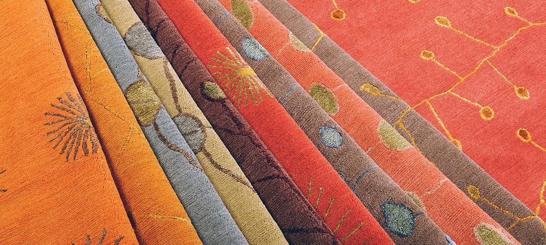
“My content often comes from the mystery and magnificence of nature—the perfect designer.”
Trained as a sculptor, I was attracted to site-specific work that often incorporated architectural elements. Printmaking was a natural antithesis to the rigor of planning and making sculpture, and as I look back, I have devoted most of my artistic life to works on paper. The ephemeral quality and the spontaneity speak to me. I am enchanted by the casual impermanence of a work on paper. And I am attracted to the minimal aesthetic, where I feel most comfortable. Less is more in my world.
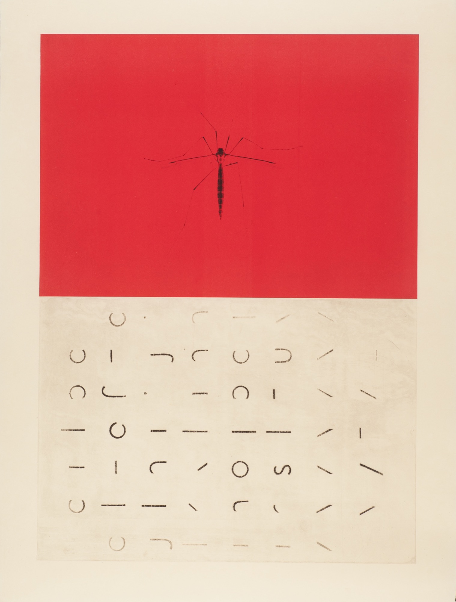
“I am enchanted by the casual impermanence of a work on paper.”
As children, we would get the nod from mother that our father was coming home and it was time to "clear the decks.” All toys would be scooped up and hidden away so he could walk into a clean and serene environment. To this day, clutter confuses me and divesting is actually something I enjoy.
I moved to New York after art school to become the famous artist that is expected of all Bennington graduates. That was a nine-year lesson in humility and how to survive amid intense turmoil and fierce competition. I learned how to discern the excellent from the mediocre in art and design. I danced, made sculpture, painted, and longed for the horizon line. I found myself walking down the streets in Manhattan looking up at the rooftops. There, the sky silhouetted another cityscape of water turrets, parapets, and fire escapes. After nine years in New York, “Manhattanism” (i.e., "New York is the only place to live”), had gotten a problematic stronghold on me, so I escaped and returned to Chicago where I could breathe again. I loved walking along the lakeshore with the density of the city to the west and open water to the east.
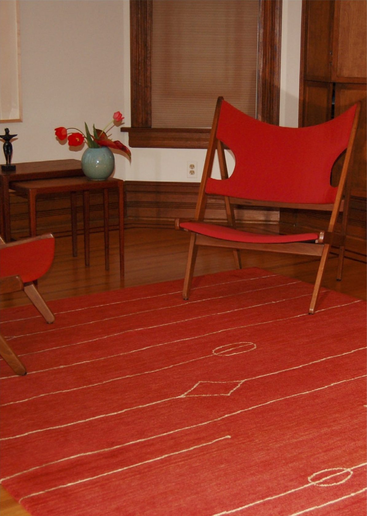
I continued making art but asked my mother to teach me the ins and outs of the interior design profession so I could more readily support myself. She taught me well, and I have worked collaboratively with architects and clients across the country over a number of decades. As an interior designer with a classical modern bent, I was always searching for the quintessential modern rug to harmonize the room. I only found beige, beige, and beige or super graphic patterns that looked like bad paintings. Serendipitously, I was introduced to a family of Tibetan sisters, who knew the rug trade and had cousins in the business in Asia. This was a happy union, and for the past fifteen years I have worked directly with Tibetans who weave rug collections to my design in Nepal. Recalling visuals of growing up on the edge of Lake Michigan and the Midwestern prairie, to hiking the crags of the Rocky Mountains, my designs stem directly from my intersections with the natural world. The patterns and color palettes present an assemblage of modern but timeless rugs.
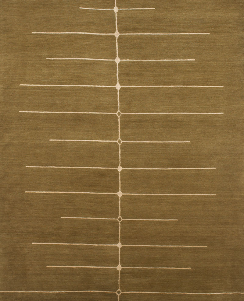
“As an interior designer with a classical modern bent, I was always searching for the quintessential modern rug to harmonize the room.”
When I eventually grew tired of Chicago’s pink skies at night and ached to see the milky way, I moved west to the Rockies.
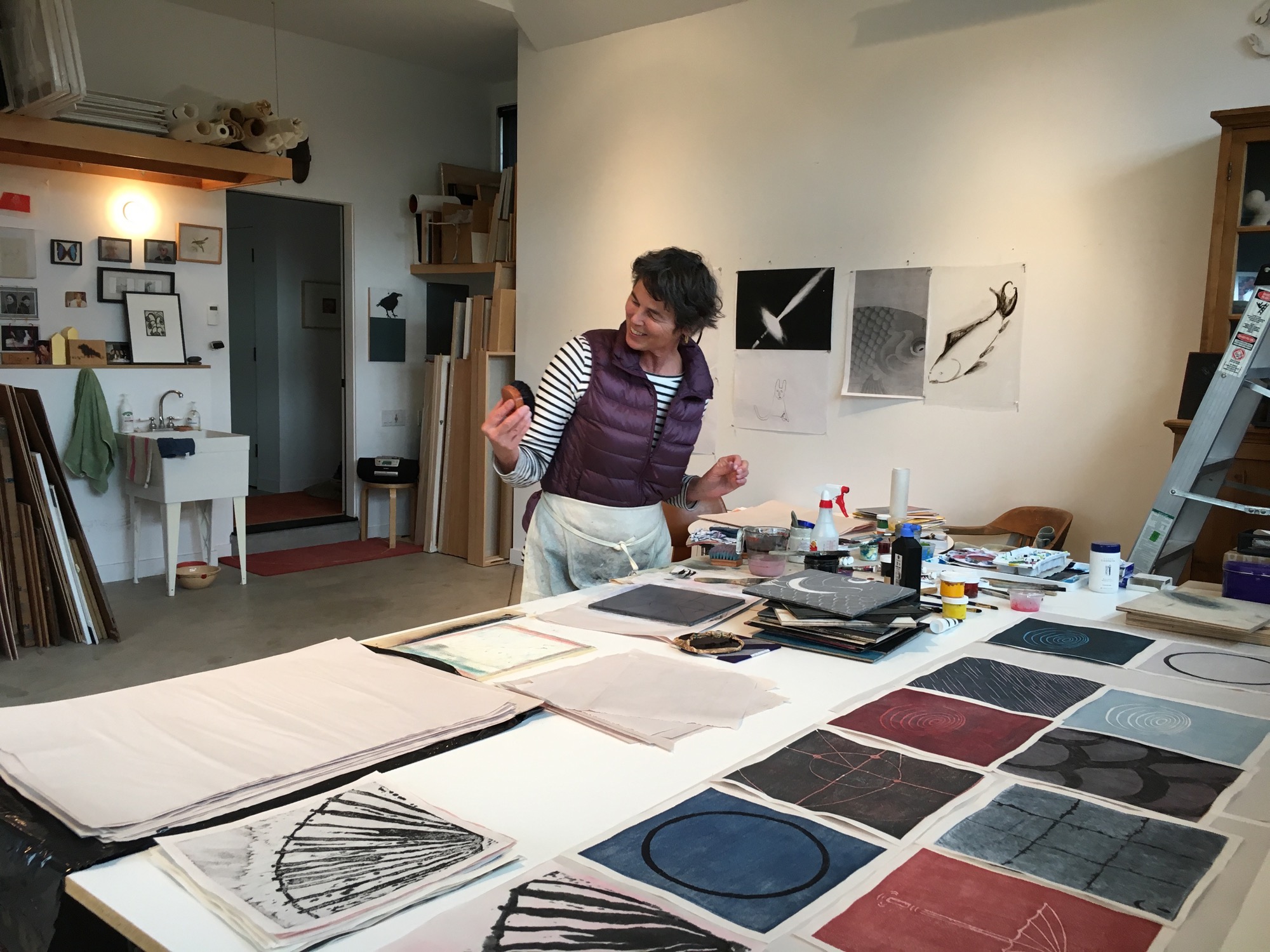
Decades have passed, and the early modernists are still in vogue. Thankfully, this is beyond fickle fashion, which warms my heart as I feel I am surrounded by old friends and family. These days, when I encounter “everyday simple,” I pause and give thanks to my parents for teaching me that less is more. And I appreciate the efforts that are being made by those who are committed to good design and who are carrying on that noble tradition.
And I am ever grateful to have been handed the baton of creativity. It is an ongoing quest, one that continues to nourish, atop the peaks and in the valleys. △
“Decades have passed, and the early modernists are still in vogue. Thankfully, this is beyond fickle fashion, which warms my heart as I feel I am surrounded by old friends and family.”
Read "How American Modernism Came to the Mountains"—a memoir by Marcia Weese as the daughter to a power couple of early American modernism. Together with fellow members of Chicago’s design elite, Harry Weese and his wife, Kitty Baldwin, flocked to Aspen for ski and summer holidays, bringing modern design and architecture to the Mountain West with them.
The Tippy Brass Ballerina
A conversation with designer Eero Koivisto of Claesson Koivisto Rune about the accidental making of the dancing brass bowls
Ballerina is a series of unstable bowls in a highly polished brass plate, designed by the Swedish design studio Claesson Koivisto Rune and produced by the 400-year old metal manufacturer Skultuna, one of the oldest companies in the world.
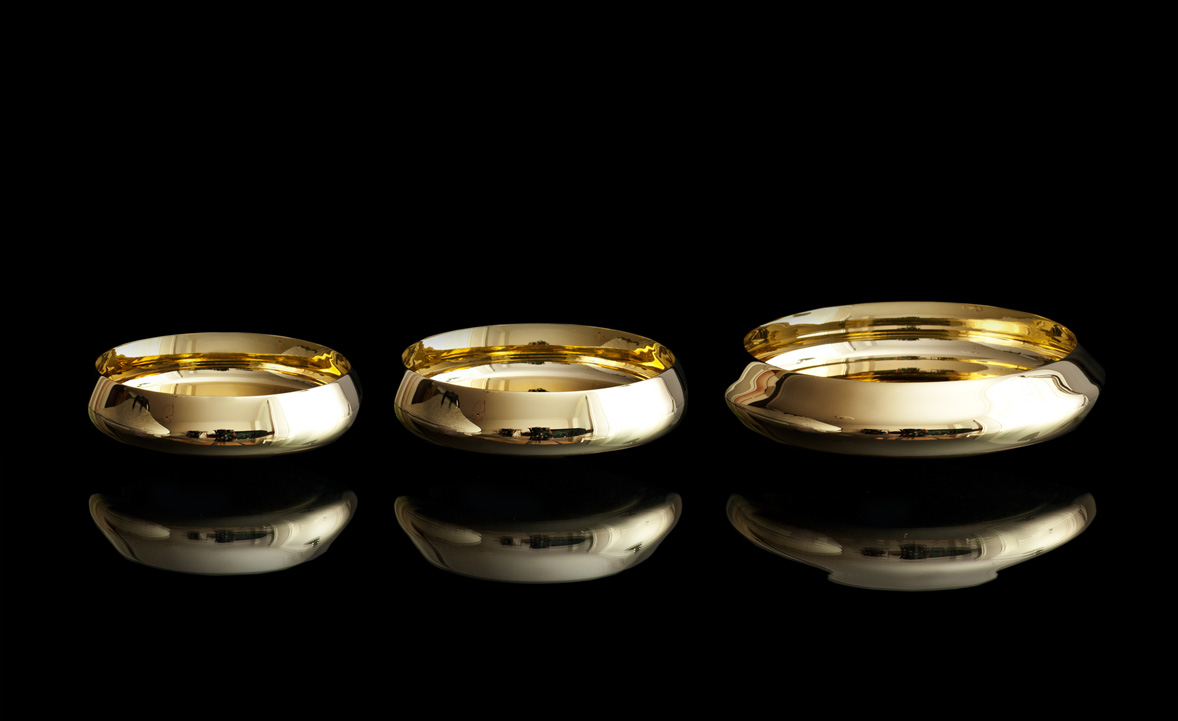
Skultuna, was founded in 1607 by King Karl IX of Sweden as a brass foundry and is still a purveyor to the Royal Court of Sweden, still in the same location. Today, Skultuna works with international designers, including the Swedish architectural partnership Claesson Koivisto Rune, founded 1995 in Stockholm by Mårten Claesson, Eero Koivisto, and Ola Rune. The firm meanwhile puts equal emphasis on architecture and the design of objects from tableware, textiles, and tiles to furniture and lighting.

One of our favorite Claesson Koivisto Rune designs are the tippy brass Ballerina bowls, manufactured by Skultuna. When looking into a bowl, the polished concave inside distorts the reflection so that the actual shape appears flat. Their convex bottoms make the bowls rock and dance when touched. When in movement, the Ballerina bowls also project “dancing” golden, glimmering light reflections around the room. We spoke with the bowls' modernist creator and co-owner of Claesson Koivisto Rune.
A conversation with architect and designer Eero Koivisto

Above, from left: Mårten Claesson, Eero Koivisto, and Ola Rune, the three founders and eponyms of Claesson Koivisto Rune Architects
What is the story behind the Ballerina bowls?
Actually, the bowls started with another product brief for Skultuna, which sort of transformed into the Ballerina bowls. What was the downside of the original design—the movement—turned into a design feature when we decided to make them into small bowls.
One can't help but touch the elegant, shiny bowls and rock them. What is the significance of their intentional movement?
We have worked with movement in usually static design objects before—for example PEBBLES seating for Cappellini, SEESAW for DeVecci, and BASSO, MOEBIUS, and BELLE, also for Skultuna. Since the bowls are fairly small, the movement comes across as playful and slightly surprising.
"Since the bowls are fairly small, the movement comes across as playful and slightly surprising."

When you hold a Ballerina bowl in your hands today—your design that came to live through craftsmanship—what goes through your mind... and heart?
What started out as an idea about movement, has turned into a quite beautiful object in itself.
You designed these bowls for Skultuna. In what way is the experience of designing for a more than 400-year-old company unique?
The owner and the CEO are fairly young, so even if there’s a lot of history involved, they are a pretty youthful company and always open to new ideas in design.
Thus far, what’s your legacy in the design world?
I’m very honoured to be asked the question regarding our work, but I wish to pass it on to others, who can see beyond our own studio, to answer it.
What makes you a modernist?
Living in a modernist society.
What does "quiet design” mean to you?
We are very attracted to the idea that objects co-exist in a given context. Our work is not brash or loud, and it functions well together with other things, which can be totally different in their approach. We don’t really like ”look-at-me” objects.
"Our work is not brash or loud... We don’t really like 'look-at-me' objects."
Usually there’s a lot of idea work in a particular design that is only obvious if you know the story behind it. But when you know the idea behind a certain object we have designed, a new depth occurs—kind of intellectual, but not in an excluding way.
On the other hand, we like the idea that you can use our designs for a lifetime without getting bored by them and without having any idea whatsoever why they look, feel, and function a certain way.
"We like the idea that you can use our designs for a lifetime without getting bored by them and without having any idea whatsoever why they look, feel, and function a certain way."
You design accessories for the home. What does “home” mean to you?
Most of our work is buildings, since we are an architectural studio, but we enjoy doing smaller objects and furniture, too. If architecture is our life’s journey, the smaller objects are the nice dinners with friends along the way. So, home is where we live our lives. Wherever that may be.
"If architecture is our life’s journey, the smaller objects are the nice dinners with friends along the way."
What’s most important to you in life?
My family and my work. In that order.
When are you happiest?
At home and at work. In the same order.
Who is your design icon?
I don’t really have icons anymore, but I do admire good work from people I know.
What inspires you as a designer?
Art and music.
What are you working on these days?
About ten different architectural projects—private houses, places for art, apartment buildings, hotels, and about 40 design projects in various stages of their design. All over the globe. △
Fire / Wood
His Nordic German upbringing, traditional Swiss carpentry training, and the Bauhaus Manifesto deeply influence Canada-based designer and furniture-maker Nicolas Meyer as a craftsman and intellectual
Nicolas Meyer’s approach to design and craftsmanship is firmly anchored in his traditional Swiss training as a furniture maker and balanced with his Bauhaus-influenced intellect.
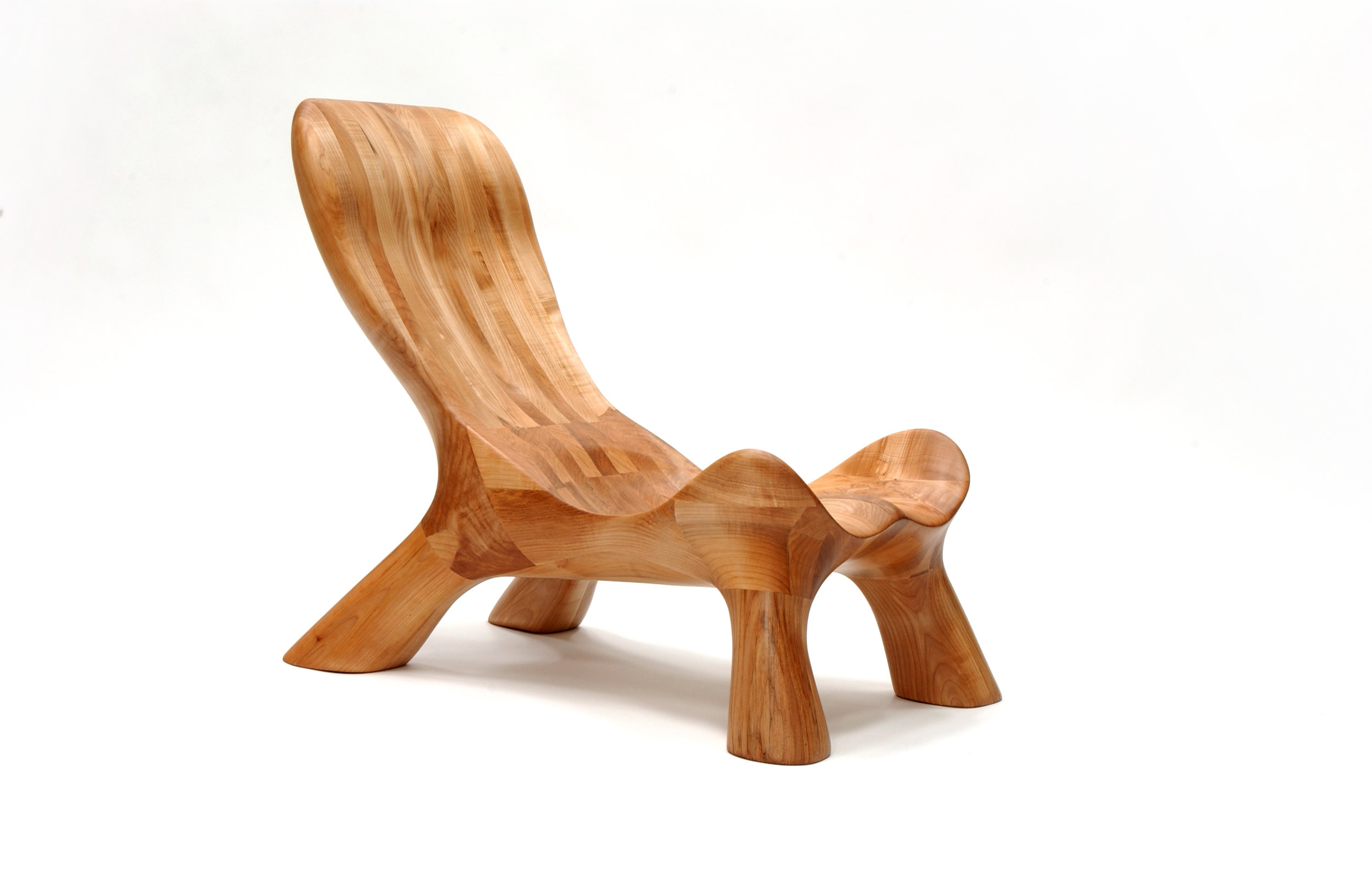
Nicolas Meyer is not one thing, not from one place. Born in Germany and raised in Switzerland, the multifaceted founder of Nico Spacecraft has put down roots as an artist, designer, woodworker, and furniture-maker in British Columbia, Canada.
A sincere dialogue about design and wood quickly reveals the man is at once both an intellectual and a craftsman. No surprise, he seeks balance in everything he does.
Meyer grew up in Hamburg, Northern Germany. With a real estate-developer father and an antique-collector mother, the boy was exposed to architecture, construction, and fine furniture throughout his childhood. The parents separated when he was ten, and he moved to Switzerland with his mother.
In 1991, Meyer lived in Vancouver for half a year to improve his English. He returned to Switzerland to complete a traditional four-year apprenticeship in furniture-making, which he finished a year early by virtue of prior education, excellent marks, and extraordinary talent. All this time, British Columbia remained on his mind.
The decision to return four years later to settle in Canada was spiritual as much as rational. “Things just feel right, and you find your place where you want to build your life,” Meyer reflects. Having spent the first ten years of his life in Hamburg, he was influenced by the ocean, water sports, the city’s harbor as “gate to the world,” the metropolitan lifestyle. In Switzerland, where he lived until age twenty-five, he later fell in love with the mountains and skiing. “Vancouver combines all of that. This is one of the few places where you can probably ski and kayak on the same day,” says the expat. “On top of that, this was my place. I grew up in this tension between Hamburg and Switzerland. As a kid who is constantly in between these two places, you wonder, what is your home.”
Today, Meyer is a designer, a woodworker, an artist—his creative drive the common thread. As child, he wanted to become an inventor, broke a lot of things, took them apart to understand them. In his later teens, he eventually began fixing things. “I also read a lot. I came to design and wanted to study architecture,” he says. He originally planned to study interior architecture in London after his apprenticeship in Switzerland. By that time, however, he’d already lost his heart to Vancouver. “I was too impatient and thought, I’ll go to Canada and find my way to design with what I have.”
His apprenticeship as well as the subsequent decision to practice, not study, were driven by his readings: the Bauhaus philosophy in particular—“Most of all, Walter Gropius and his manifesto, which expresses how the core of creativity can only come out of understanding a craft,” says Meyer.
“For art is not a profession. There is no essential difference between the artist and the craftsman. The artist is an exalted craftsman.” — Walter Gropius, Bauhaus Manifesto, 1919
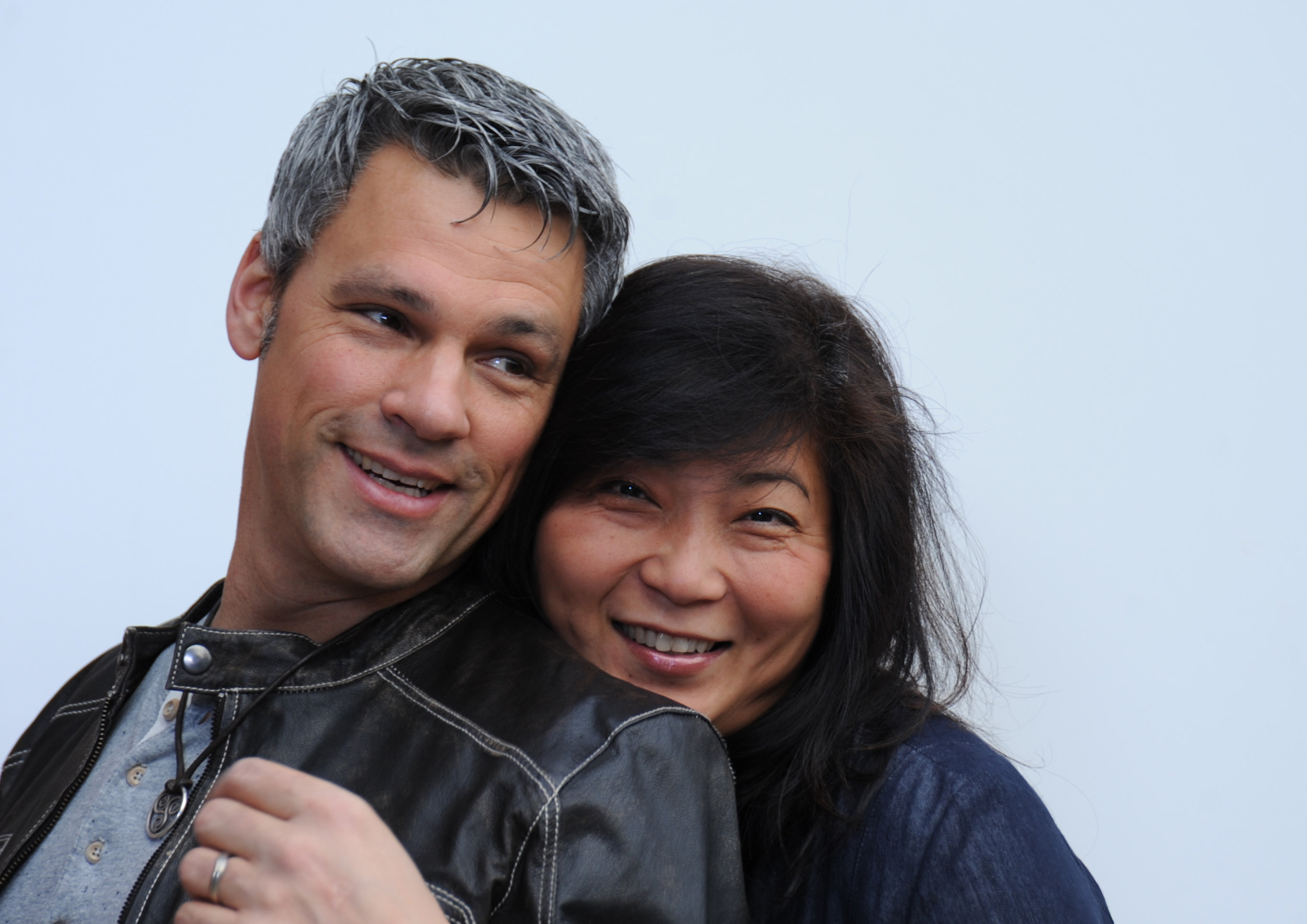
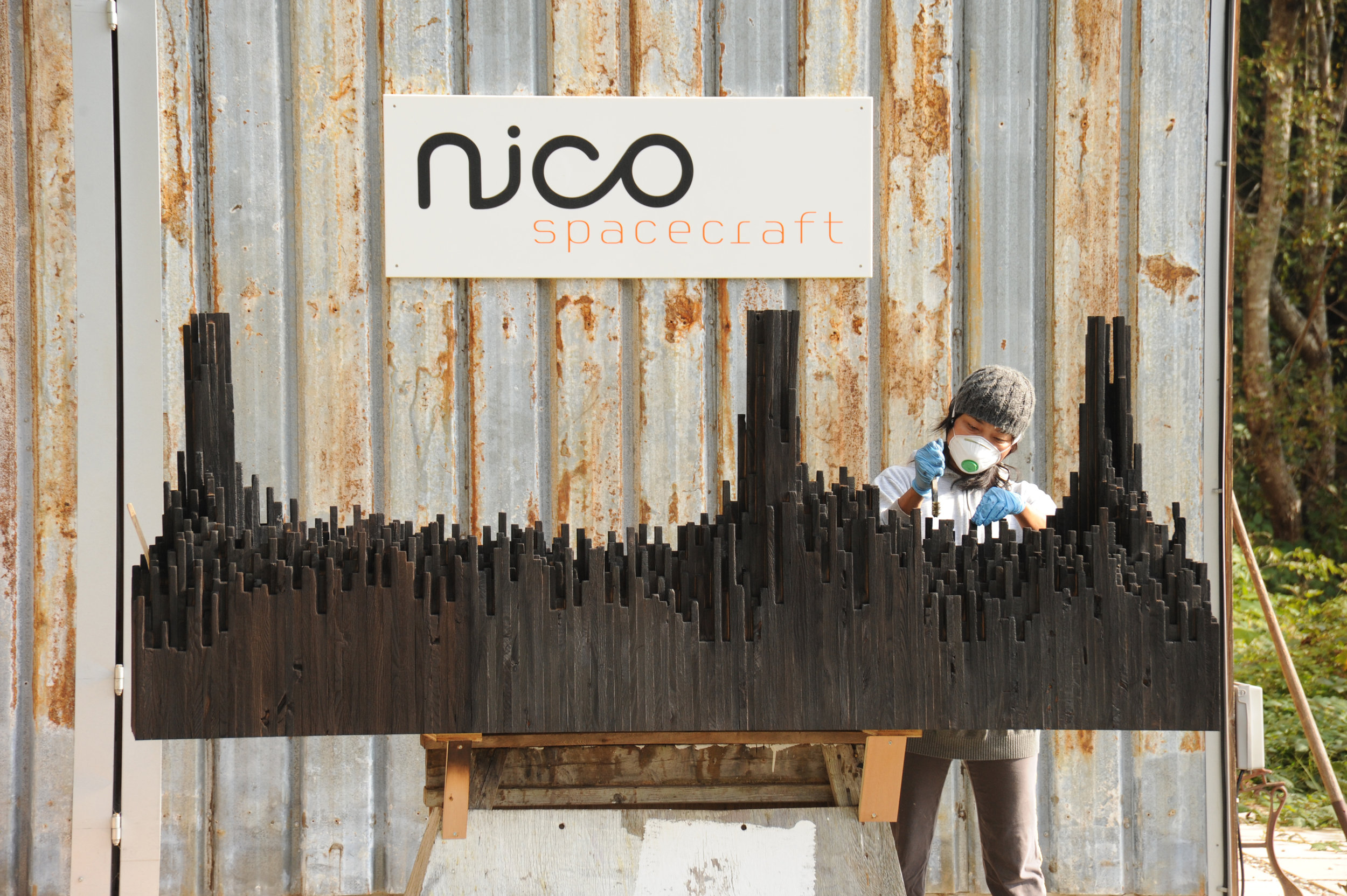
The Bauhaus Manifesto guides Meyer to this day, everyday. Together with his wife, Jess Meyer, he runs Nico Spacecraft, a small design studio with integrated wood workshop that produces kitchens and baths, furniture, custom spaces, and architectural elements. The company’s full-service design division has its own name: Baumhaus Atelier—presumably a nod both to Meyer’s enthusiasm for all things Bauhaus as well as to his passion for trees (Baumhaus is German for treehouse). “It’s about striking the balance between being in front of the computer screen or a sketchbook and actually being in the shop and working with materials,” he says. “When I spend too much time in the shop, building all the time, I itch to sit down and sketch out ideas, whereas when I’m in the office too much, I lose touch with the reality of structure, weight, and smell, and how things actually connect.” The creator admits he usually knows he has overextended himself at the drawing board when he starts designing things that don’t work in the real world.
“When I spend too much time in the shop, building all the time, I itch to sit down and sketch out ideas, whereas when I’m in the office too much, I lose touch with the reality of structure, weight, and smell, and how things actually connect.”
When the designer completely loses himself in the details—or, as he calls this foible, “taking the typical German-Swiss approach”—then his wife, who studied fashion design and now handles the company’s business side, provides the balance, telling him to take a step back. “When I get stuck, Jess looks at the entirety of the design perimeters and pulls my head out of my behind. We complete each other not just as life partners but also in our work.” Like her husband, Jess Meyer has called multiple places home before settling in Roberts Creek. She was born in Taiwan and brought up in Singapore and later in Tehran, Iran. The couple is raising their two children in the small beach town with a vibrant arts community on British Columbia's Sunshine Coast. Before, living in Vancouver had meant the parents missed out on all the babies’ firsts, which at the time the nanny got to experience in their place. Something needed to change. And after a one-year journey of searching for the right property, the Meyers found their home with five acres of land on which to built the shop and a garage they converted into the design studio. “Now we eat every meal together, and the kids come running to show their faces in the shop or in the office after school,” the father says.
The family also loves to travel together, often to Mexico or back to Europe. “I miss the mountains of Switzerland,” Meyer tells. “Aside from the skiing and the snow, the mountains provide me with tranquility. Sometimes, it helps to reconnect to your roots and the way you were raised.”
Wood Stock
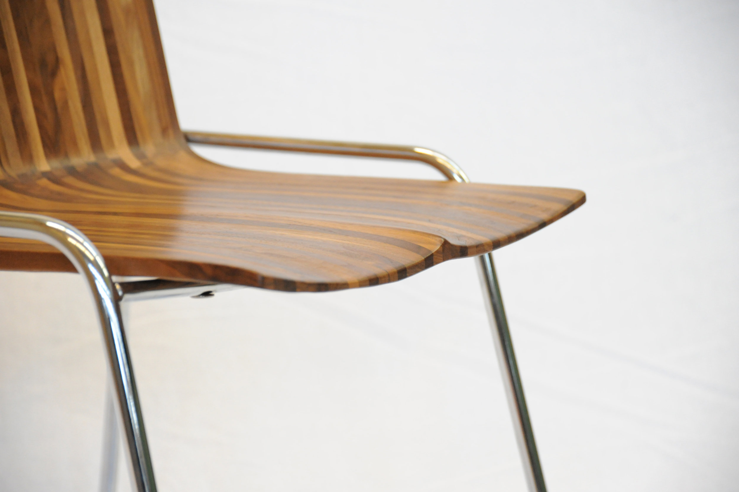
“Look around, and it’s obvious—I love wood,” Meyer laughs. “Because you never really stop learning about it. Technically, when you cut down a tree, it’s dead. But wood itself continues living; it moves, it changes, it breathes, and you cannot apply any rigid rules, because no tree is like the other, and everything, everything influences its properties—where the tree grew, the minerals it fed into its system, the wind . . . If a tree sits in a wind corridor, it develops tensions on one side, and it can counterbalance these forces to find its equilibrium with the environment. All this is imprinted in the wood. Each piece you work with will react slightly differently. That teaches me humility.”
For all that, a wood whisperer he is not. Fellow woodworkers may profess driftwood, even a tree stump, speaks to them, revealing what it wants to become. The craftsmen are merely the tool. “I can respect that, but I am more intrigued by structure, structural integrity, and physics,” says Meyer. “Even a tree trunk never really inspires me to do anything. What I do want to do is cut this apart and reassemble it.” Meyer’s view of today’s common practice of kiln-drying wood is ambivalent. He understands the necessity of expediting the process and killing the creatures living inside the wood. In Switzerland, where he learned the craft, most wood is still naturally air-dried for many years, allowing the material to maintain its structural property. Meyer explains that “cooking” the wood extracts moisture at a speed that destroys the integral structure of the wood fibers, the cells collapse, and the wood becomes brittle. “I see these drawbacks when humans don’t work with the wood but force their will onto it because they have a schedule to keep, and they are pushing for high turnover, needing the cash flow.”
The advocate for responsible woodworking practices himself would prefer to exclusively use air-dried wood. “But it’s not feasible. It’s an ideology, and whenever I can, I do.” He also works with salvaged materials and appreciates a good story behind the wood—and so do his clients. For instance, “White oak is rare here on the West Coast,” Meyer begins a tale. “Ninety-some years ago, one of the first skippers planted this white oak tree here . . . ” Meanwhile, after splitting, the tree was deemed unsafe and destined for firewood. The community was in uproar about cutting down their heritage oak. Meyer and a miller friend arranged a crane, milled the wood, and air-dried it over the years, until a client emerged from Vancouver who appreciated the story and the historic value the tree represented.
Nordic-Swiss authenticity
His Hanseatic birthplace and Swiss training shaped not only Meyer’s design sensibility but also his work ethos, for better or worse. “When I first came to Canada, I was extremely rigid,” he reflects. His first gig was renovating a house—working out of a garage, with limited resources and tools. “In Switzerland, there is a machine for everything, and there is a way of doing everything. That’s how I was trained. But this rigidity of ‘This is how you do things, and there is no other way’ was initially hard for me to overcome.” In hindsight, that first Vancouver project taught him that there are many different practices. “That was a very valuable lesson I apply to this day and that has become an integral part of my approach. Once again, there is a fusion, a balance between the static world, the reality, and how you get to understand it. Only if I understand, I am suddenly able to discover all the different options of what this will allow me to do, and that’s where my creativity kicks in.”
“In Switzerland, there is a machine for everything, and there is a way of doing everything. That’s how I was trained. But this rigidity of ‘This is how you do things, and there is no other way’ was initially hard for me to overcome.”
The designs of Nico Spacecraft are exquisitely modern. Sustainability is essential in everything the family-run company does, even their two-story workshop received a Green Design Award from the Canadian Wood Council in 2010. But what Meyer keeps touching upon in discussing his work is authenticity, his clients’ shared yearning to connect with what is real. “People are going back to the craftsmen, back to working with the designer, and being involved and understanding the story.”
“People are going back to the craftsmen, back to working with the designer, and being involved and understanding the story.”
Storied Pieces
Indeed, there is a story behind all of Meyer’s works and usually to the wood he’s using, too. Take the CurveChair, a piece of sculptural furniture—as well as a piece of art. For endless hours, Meyer carved the sensuous lounger by hand after a clay model he made. “That chair, in many ways, represents everything I am doing,” he says. “There is an organic process involved, there is a structural process involved, and we know where the wood came from, there is a story.” The wood came from a development site at Simon Fraser University and was made available to woodworkers of British Columbia to provide a design for an exhibition. “It was a marketing thing for them, because they had to take down quite a few trees at that site,” Meyer remarks. “One of them was this huge maple, so we got the maple wood and submitted this chair. It was on display at the Pendulum Gallery in downtown Vancouver for three months.”
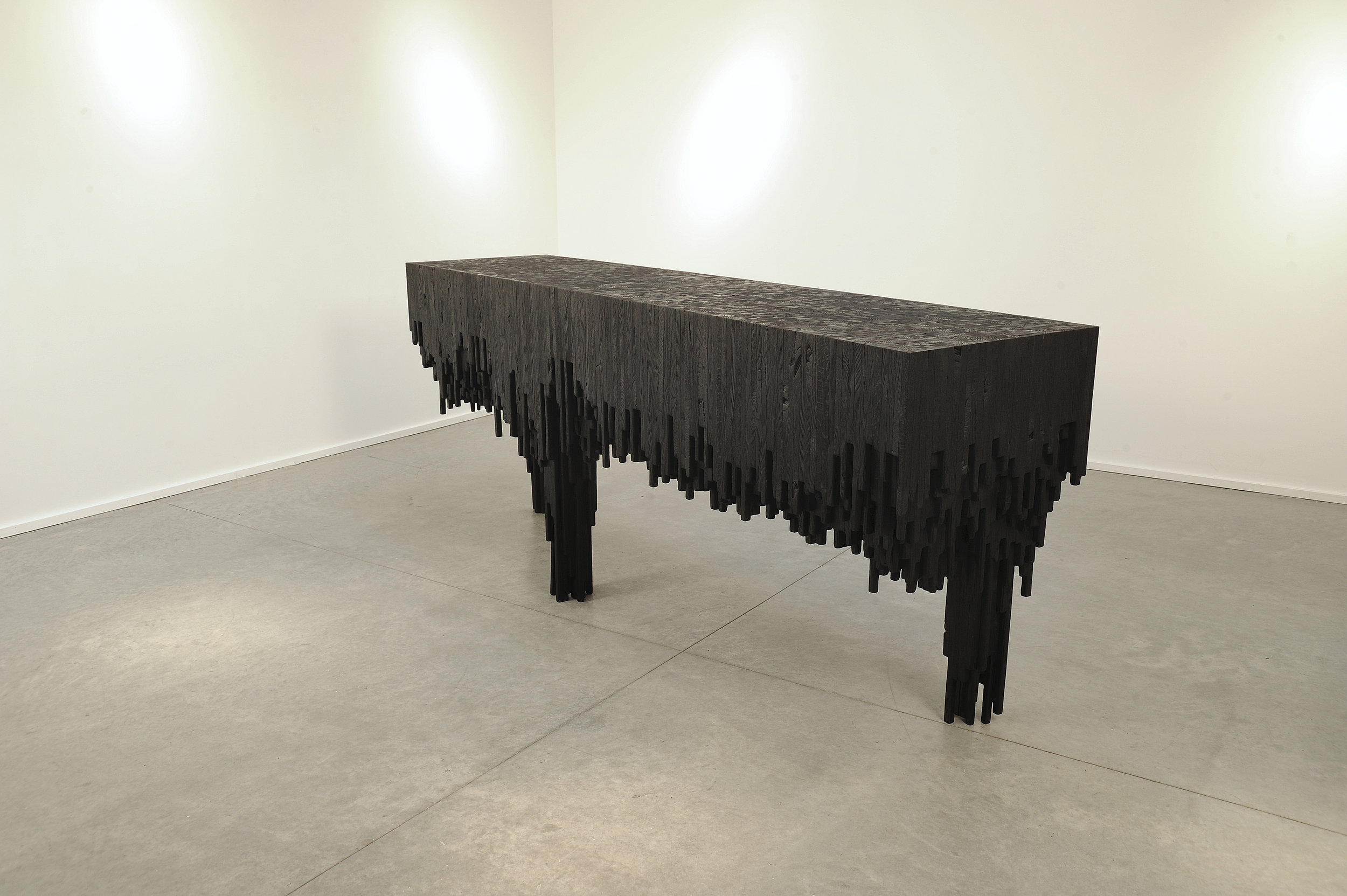
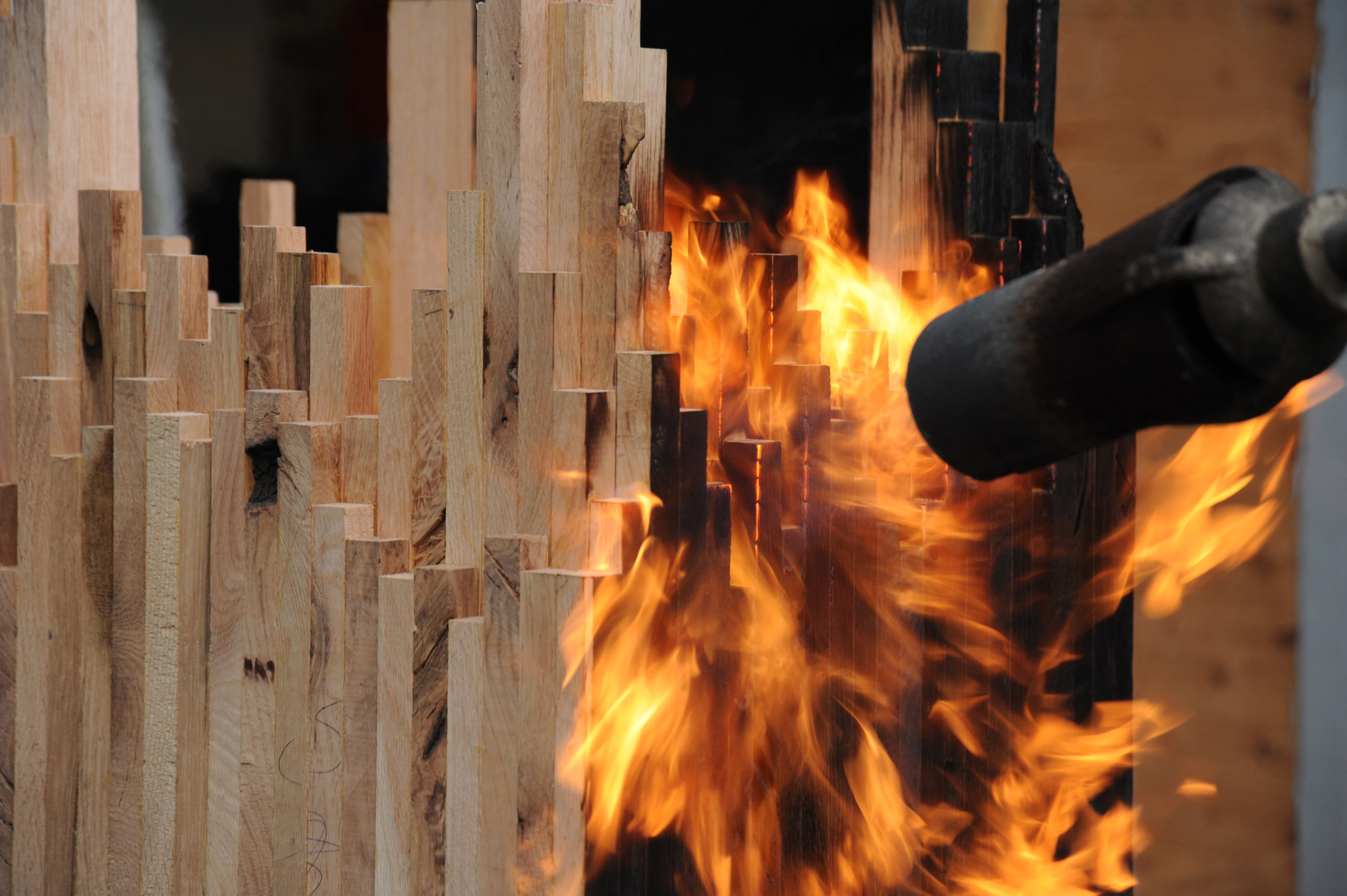
Meyer’s latest series—its cynosure a console table—is inspired by The Black Tusk, a stratovolcano and a pinnacle of rock at 2,319 meters (7,608 feet) above sea level near Whistler, British Columbia. “After a month of dynamics between Jess and me, we ended up with the Black Tusk console,” Meyer says. Individual solid sticks of oak wood were laminated to create different shapes, giving each a sculptural character. The assembled piece was then charred by flames, wire-brushed, and coated with oil. “It struck a nerve with people—and with me, because, again, there are the two elements I en- joy, a balance between art and then the design and craft.”
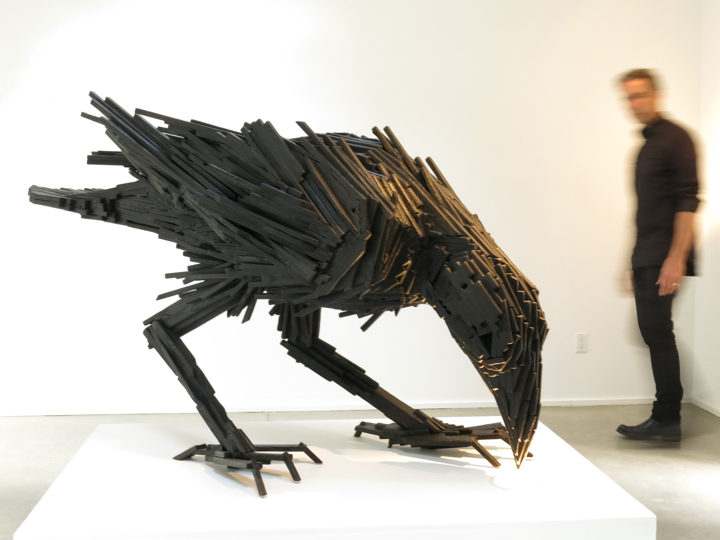
The Black Tusk console in turn inspired a collaboration with local graphic designer and artist Lee Roberts, who, after he saw the sculptural table at a photo shoot, sent Meyer a sketch of a raven, made from wooden sticks like the Black Tusk series. “I was inspired and challenged to take this technique I’ve applied to the Tusk and take that to another level to make this raven,” Meyer says. The resulting bird sculpture is titled “Sense of Silence.” △
Seduction Design
Former Eames art director and CommArts co-founder Richard Foy muses on the bowerbird’s incredible construction and composition skills and human design
Design is everywhere. People have always valued design expertise, even dating back millions of years to the first tools ever used and now recently unearthed. From the harnessing of fire, clubbing of opponents, carrying water in vessels, throwing spears, and using fur blankets, to riding around in Teslas, we like and rely on design.
Daily design
Today, most everything we have, use, want, and need is designed. We have even designed robotics and programs that design things for us. Every time we dress ourselves, email, make a meal, buy things, plant gardens, do a spreadsheet, we become designers. We are making functional decisions based on what we need, what it says, and how it feels. We are reflecting ourselves and how we want to be perceived through our choices. We are designing. We do this daily for work, pleasure, and living, without pause or conscious thought.
Design is intrinsic to art, invention, and creativity. Design is different from art because it tends to focus on underlying structure, function, or purpose more than personal expression—although the best designs have or tell a story that expresses a point of view. We rely on design for practical solutions to everyday problems or issues. A lot of design is offered as a service to help people, businesses, and institutions.
Design and cultural creativity advance humanity
The professional practice of design creates solutions and makes the places, products, and market of the future. We value communities where there is a high level of design and cultural creativity that responsibly advances society. Florence emerged during the Renaissance because of its design and art contributions, which we still value 500-plus years later. Humanity, backed by theology claims dominion over all species. From the human (not particularly Biblical) view it’s based on our historically unmatched and singular ability to design, make, and use tools.
Amorous architecture
A newly recognized and different breed of designer is practicing in Australia and New Guinea. They have gained notoriety by becoming experts on the art of seduction. Their primary design passion is the field of amorous architecture, interiors, landscaping, and the courtship arts of song and dance. The places they build attract, entertain, charm, and seduce females. They are among the best in that business and are studied and respected worldwide for their thorough design approach, execution, and resulting social benefits. They have perfected their skills over thousands of years, which further attests to their expertise and effectiveness.
"Their primary design passion is the field of amorous architecture, interiors, landscaping..."

Attraction by design
Creative human designers like to wear black clothing. These designers prefer feathers, as all are members of the bowerbird family. Their closest kin on this continent are ravens and crows. Some bowerbirds are a bit larger and live a little longer, up to twenty-seven years.
Another consideration before comparing bird designers to human designers is the possibility that their design creativity may emanate from the same source. Design as a noun identifies something intentionally made or resulting from an idea or plan. Design as a verb is an act or the process of making, visualizing, creating, or turning an idea into a new reality.
The design process, whether painstakingly thoughtful or impulsively spontaneous follows a pattern. Stasis, curiosity, imagination, question, attempt, failure, learning, success, change. Change as a causal dynamic is as present in the space, time, matter, and energy of the cosmos as it is in the buzzing subatomic and atomic particles of our biological cells. The question is what or where is the intention responsible for the nonhuman-made, natural world?
Source and cause of design
There is a Zen koan that says, “Learn to listen to the wisdom inside of a rock.” Are humans and other biological creatures all part of the same dynamic forces responsible for change? Are we all variants of the same energy that cannot be created (designed) or destroyed but only transformed? Is change the cause not just the result of creative design? Does the bowerbird follow the same design impulse as do humans? Our link may be that we were all designed by the same cauldron of the cosmos 13.8 billion years ago. We are the same stardust particles that were floating around then but reconstituted by evolution, physics, gravity, thermodynamics, and chemistry. Maybe bowerbirds, rocks, and everything is caused by constant flux of creative change, at one with the universe.
"Maybe bowerbirds, rocks, and everything is caused by constant flux of creative change, at one with the universe."
Male bowerbirds are renowned for designing painstakingly ornate, complex, and personalized bachelor pads and performance routines to attract females for amorous encounters. A female bowerbird requires and insists on unlimited choice and opportunity to select her mate based solely on her assessment of how well the male earns her trust and displays his creative intelligence. The stakes are high. Seventy-five percent of females in one study area visited only the one same bower out of dozens of offerings before mating.
Older, more experienced males will succeed with dozens of females in a single breeding season while younger males will seduce only a single one of his dozens of visitors. A lot rides on the design quality of the bower; its form, color, and execution, followed by a concert and dance performance. Providing a sense of comfort in combination with self control, respect, and restraint gains reproduction rights that help determine the survival of their species. Everything is designed for the pleasure of the female and winning her mate-selection preference.
Bower architecture
A bower is defined as a secluded place, often in a garden, enclosed by foliage or an arbor. It can also be a summer house or garden cottage, an inner room, or a boudoir. Lovely.
Males build three types of bowers: “maypoles,” “mats,” and “avenues.” “Maypoles” can be single- or double-masted towers. Some are built around a young sapling that becomes its centerpiece. Others have curved walls that frame and showcase the awaiting male. They are dotted with colors that help their visibility and location of the bower below. Sometimes a roof is designed immediately below the tower, which provides shade or privacy in the bower. Towers stand out from the brush and call attention through their distinctive forms.
“Mats” are landing pads made from collected plant materials such a fresh green moss that has been carefully laid and ringed with individually selected and arranged ornaments; making, if you like, the equivalent of an oriental rug. It may contain fresh leaves, petals, owers, snail shells, bits of foil, candy wrappers, pebbles, glass shards, fruit, colored plastic utensils, bottle caps, can pull-tabs, all of the same color or predetermined mix of colors. One researcher found a glass eye in a bower, undoubtedly a very distinctive and intentional treasure piece ripe with symbolism.
“Avenues” are longer and narrower mats that seem to function as landing strips; again, they are ornately marked with color-coordinated found objects. Airport towers, landing pads, and runways would be the human architectural equivalents.
All three schemes sport specific colors that may be a single dominant color or an arrangement composed of multiple colors. Blue seems popular as evident when searching Google images. All are designed to be spotted from the air by mate-seeking females. These are not unlike the bright signs at Saturday night social gathering places and night clubs.
The colors of decorative elements that males choose for their bowers match the preferences of females. Male bowerbirds play to their audience and design for their market segment and demographics. Bowerbird species that build the most elaborate bowers are dull in color, whereas the males of species with less elaborate bowers have brighter plumage.
"The colors of decorative elements that males choose for their bowers match the preferences of females."
The design critics
Males are assessed based on the quality of their bower construction. Males with quality displays achieve mating success, suggesting that females gain important benefits from mate choice. Bowerbird ornamentation is perceived as a sexual indicator of general health, intelligence, and disease-resistant heritage.
The various twig fences, arching walls, roofs, and decorations get painted or stained by colors made by chewing plants and adding charcoal with saliva. Lastly, objects are sometimes arranged by size, large to small, that create a false perspective to hold attention and gain the advantage of more time spent. Perspective also makes the awaiting male appear to be a bigger and better mate.
Females search for mates by visiting multiple bowers, returning multiple times, watching his elaborate courtship displays, inspecting the quality, and tasting the paint the male has made and placed on the bower walls. Many females choose the same male, and many underwhelming males go without mates. Females choosing top-mating males tend to return next year and search less.
Bowers take weeks to design and build, are constantly refreshed, and their color elements are rearranged with bright, shiny ones. Males will also do recon flights to inspect their competition and steal whatever bauble would make their bower more attractive.
Showtime
Once the stage has been set and a visitor lands nearby, it's showtime. These Justin Timberlake males must know how to dance and sing in order to seal the deal. Male bowerbirds are superb vocal mimes. They have been known to imitate pigs, waterfalls, and human chatter. Some bowerbirds mimic other local bird species as part of their own concert. Then the male has to strut his stuff, and strike outlandish poses while dancing and singing to lure his guest into the bower.
A female chooses to visit only bowers that appeal to her. She will land close but far enough to avoid feeling threatened. When she comes closer and stops she may allow the male to approach and mate. A too-eager male will fail. Males only succeed when the visiting female feels comfortable and protected from more aggressive males.
Imagine if every human male had to individually design his architecture, build it alone, lay out a garden, design the interiors, furnish it, paint it, maintain it, sing, dance, and strike poses, or he wouldn’t even get a date!
The social implications of the bowerbird species have always been based on consideration of the female societal role. Only in the last few decades have some western societies realized the importance and significance of women to civilization. Today, there are more women on the planet, more women in the workforce, and in the educational system attaining higher academics than men. CEOs estimate that 80 to 95 percent of all consumer spending is determined by women—homes and their locations, insurance, appliances, furnishing, food, clothing, schools, and even tools.
Bowerbirds seem to have long designed for a sociology that has always given females due respect, something that has taken far longer in human societies.
“Bowerbirds seem to have long designed for a sociology that has always given females due respect, something that has taken far longer in human societies.”
The bowerbird model is a classic lesson on how successful design is doing the best you can, with what you’ve got, in terms of what social values you encourage through design.

Richard Foy, former art director for Charles and Ray Eames and founding partner of CommArts design firm, has designed many brand identities and places worldwide, including Madison Square Garden (New York City), O2 Dome (London, UK), Pearl Street Mall (Boulder, Colorado), LA Live (Los Angeles, California), and the branding for Spyder Sportswear, and Star Trek — The Motion Picture.
The Tree-Hugging Woodworker
A portrait of California furniture-maker Sean Woolsey
Sean Woolsey loves trees. He celebrates the perfect imperfection of the trees' inner beauty by making wood furniture by hand in California.

Woolsey, now in his early thirties, has always made things. From sewing clothes to building skateboard ramps to baking bread. In 2010, he began making furniture, out of curiosity more than anything else. He deconstructed old furniture to learn how things are made. The first real piece of furniture he built himself was a writing desk for his then-girlfriend. She liked the gift, evidently. She married him.
Woolsey’s work and life is strongly influenced by the Japanese philosophy of wabi-sabi, which recognizes the beauty of imperfection as imprint of time. To the wood artist, wabi-sabi is embodied in the naturalness of the uneven, asymetrical touches to remind us of our own and the trees' perfect imperfections. In contrast to mass-producing furniture, which can take away these imperfections, Woolsey chooses to show the truth and rawness of wood, worked by hand.

The California native, who admits to obsessing over the quality of every piece that leaves his atelier, has always been captivated by the beauty of nature’s artistry and gains inspiration from the grandeur of a mature tree and the elegance contained in its wood. In his work, he has stayed true to the same simple ideal over the years: He designs and makes things he wants in his own home. And today, that's the place the entrepreneur shares with his wife, Sara, in Costa Mesa, California.
We caught up with the designer, furniture-maker, and fine artist only a short time after the birth of his daughter, Ondine, to talk about what home means to him, what traditions make his his modern products timeless, what inspires his designs, and more.
A conversation with Sean Woolsey

Who are you, in a nutshell?
A husband, father, artist, woodworker, tinkerer, artist, businessman, creative, friend, surfer, ping pong enthusiast, amateur knife-maker, bread-maker, pizza-creator, dreamer, risk-taker, traveler, tree-lover, ever curious human.

How did you grow curious about designing and making furniture?
It started very naturally and slowly. I was burnt out on making clothing and running my own clothing line. I was drawn to creating things with my own hands and to being more connected with what I was making, instead of just designing it and having someone else make it. I have a real obsession with creating, whether it be a pizza oven in my yard, furniture, a knife, or my own house.
"I have a real obsession with creating, whether it be a pizza oven in my yard, furniture, a knife, or my own house."

What inspires your designs?
So many things and people, but mostly the inspiration is rooted in making furniture that I would like in my own house and like to own for years, not just what is on trend. Much of the inspiration comes from the act of designing and tinkering around. Designs evolve, ideas feed other ideas, and things move with movement.
"Designs evolve, ideas feed other ideas, and things move with movement."

Your modern products appear rooted in tradition. What timeless merit drives your practice?
Functionality, with an utter respect and appreciation of materials and craft.
Is there a continuous theme to your designs?
I don't think so. I think, the only theme is making the best quality products that we can. The theme of materials and design is always changing and progressing.
How do you choose and source your materials?
The wood we use is predominantly American hardwood, such as walnut, white oak, or maple. We purchase most of it locally and occasionally purchase directly from mills, usually on the East Coast. We feel honored to work with wood, and we love trees. We plant a tree for every piece of wood furniture we sell, in honor of the customer, in partnership with the Arbor Day Foundation. It is our way of giving back to nature what it has loaned to us. We also work with steel, brass, glass, leather, et cetera. And we are always looking for new and fun ways to incorporate mixed materials and creating a story with the materials. We are fortunate to have many other talented crafts people locally, who help us with these other materials.
"We feel honored to work with wood, and we love trees."

What makes you a modernist?
The way of thinking about clean, good design that is functional, beautiful, and accessible — and designing to that.
What does quiet design mean to you?
Quiet design to me means designing slowly and enjoying the process. I often enjoy the process more than the end result, as many artists would.
"Quiet design to me means designing slowly and enjoying the process."

Talk about the immensely beautiful fine art pieces in your Copper Series and their synergy with your furniture-making.
The art is a release for me. It always has been. It is the complete opposite of furniture-making, which is very accurate, wrong or right, and precise. The artwork on copper is fluid, free-flowing, expressive, and experimental. Mistakes often make it better or more interesting. The Copper Series was inspired by the ocean, and its meaning to me. The series is ongoing and ever-evolving but always the same size and always inspired by the ocean, whether it be the color, movements, or captivating calm or power it holds.

Describe your dream home...
A home that is comfortable, in a beautiful location in the mountains or desert, with treasures that we have collected all over the world, and open to sharing meals with friends and family.
What does “home” mean to you?
A refuge where we can relax, recharge, make memories, share stories, laugh, cry, and feel good about it all.
What’s your favorite place in the world?
Oh, so many. I have been fortunate to travel a lot internationally. I am really drawn to Japan, and their culture and way of life. To me, Japan is simple, humble in its design yet meticulously thought out, timeless in its approach to craft. And the Japanese are the most focused people I have ever met. The mixture of it all is super intoxicating and inspiring.
What’s most important to you in life?
God. My family. Friends. Creative pursuits. Having fun.

Who is your design icon?
There are so many. The short list is Wharton Esherick, Dieter Rams, Robert Rauscheberg, Lloyd Kahn, Sunray Kelly, Jay Nelson, and Jean Prouve.
Who inspires you to be the person you are?
My wife and my friends largely inspire me to be who I am. As iron sharpens iron, they are constantly encouraging me, whether they know it or not.
What is your life philosophy?
This quote by Mark Twain sums up a lot of my life approach: "Twenty years from now you will be more disappointed by the things that you didn’t do than by the ones you did do. So throw off the bowlines. Sail away from the safe harbor. Catch the trade winds in your sails. Explore. Dream. Discover."
What are you working on these days?
We are constantly working on new designs; right now, some chairs. I am also working on some copper art, as well as a new art series that is going to be really fun. Also, we just had a beautiful baby girl three weeks ago, so... working on that right now (laughs). △
More of Sean Woolsey's work...
Traditionally Modern
At home with Markus Meindl, the modern mountain man behind Bavaria's traditional maker of lederhosen for the new alpine lifestyle between the forest and the city.
The luxury label Meindl—known for fine, handmade lederhosen—and its CEO, Markus Meindl, deftly move between alpine costumes and fashion, between city and country, between tradition and modernity.
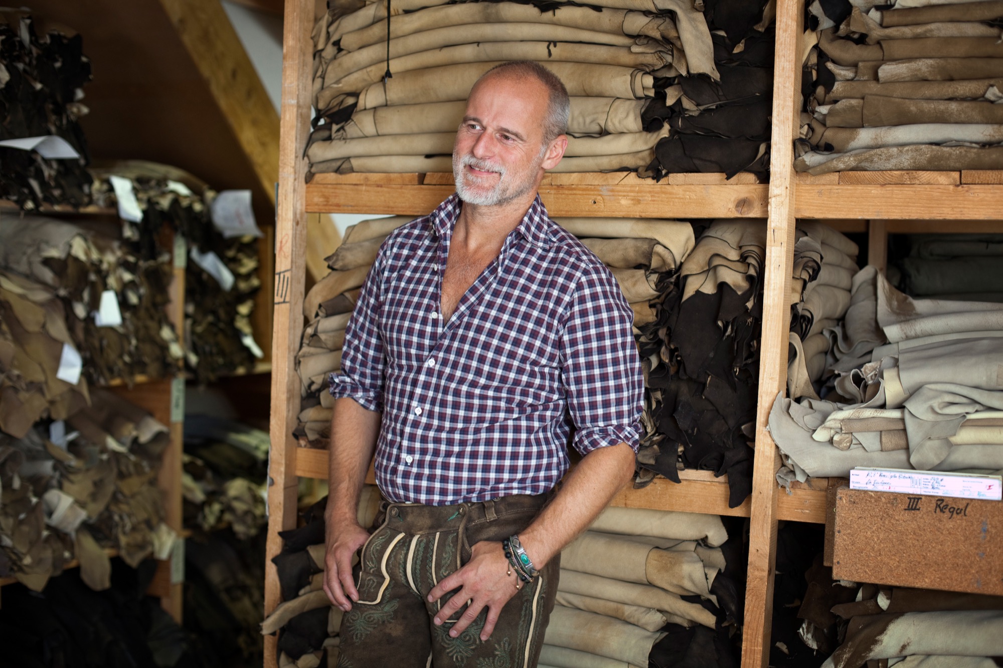
When he was only eight years old, Markus Meindl stitched himself a leather satchel for school. In all likelihood, the result was extraordinary and made the young lad stand out among his classmates. Today, in his mid-forties, the head of Meindl Fashions continues to stand for new ideas, for modernism, for innovation, although or perhaps because he works—and lives—for one of Germany’s best-known companies of tradition.
The urban country home Meindl built for his family near the Austrian border reflects his desire to blend modern and traditional. The minimalist house primarily makes use of natural materials, such as wood and leather, but also a lot of glass and concrete, contrasting with the row of picturesque houses across the River Salzach, on the Austrian side.
The man’s fervent passion for craftsmanship and natural materials is also at the core of the Meindl brand. Along with its traditional lederhosen, the Bavarian family enterprise has long built a multifaceted portfolio of well-crafted leather garments.
The first Meindl lederhosen
It all began when Lukas Meindl, a local cobbler in the idyllic village of Kirchanschöring in Upper Bavaria, tailored his first pair of lederhosen in 1935. Even then, uncompromising quality and the highest form of handcraft were paramount, an art form. The name Meindl dates back even farther, to the year 1683, when Petrus Meindl was officially documented as shoemaker. Markus Meindl is particularly proud of the long family tradition. After he graduated from high school, trained as garment engineer, and apprenticed as couturier, young Meindl didn’t have to be asked twice to join the family company. On the contrary. “That has always been the matter of course for me,” Meindl says. “I practically grew up in the company and have developed a passion for leather material and leather garments at a young age.”
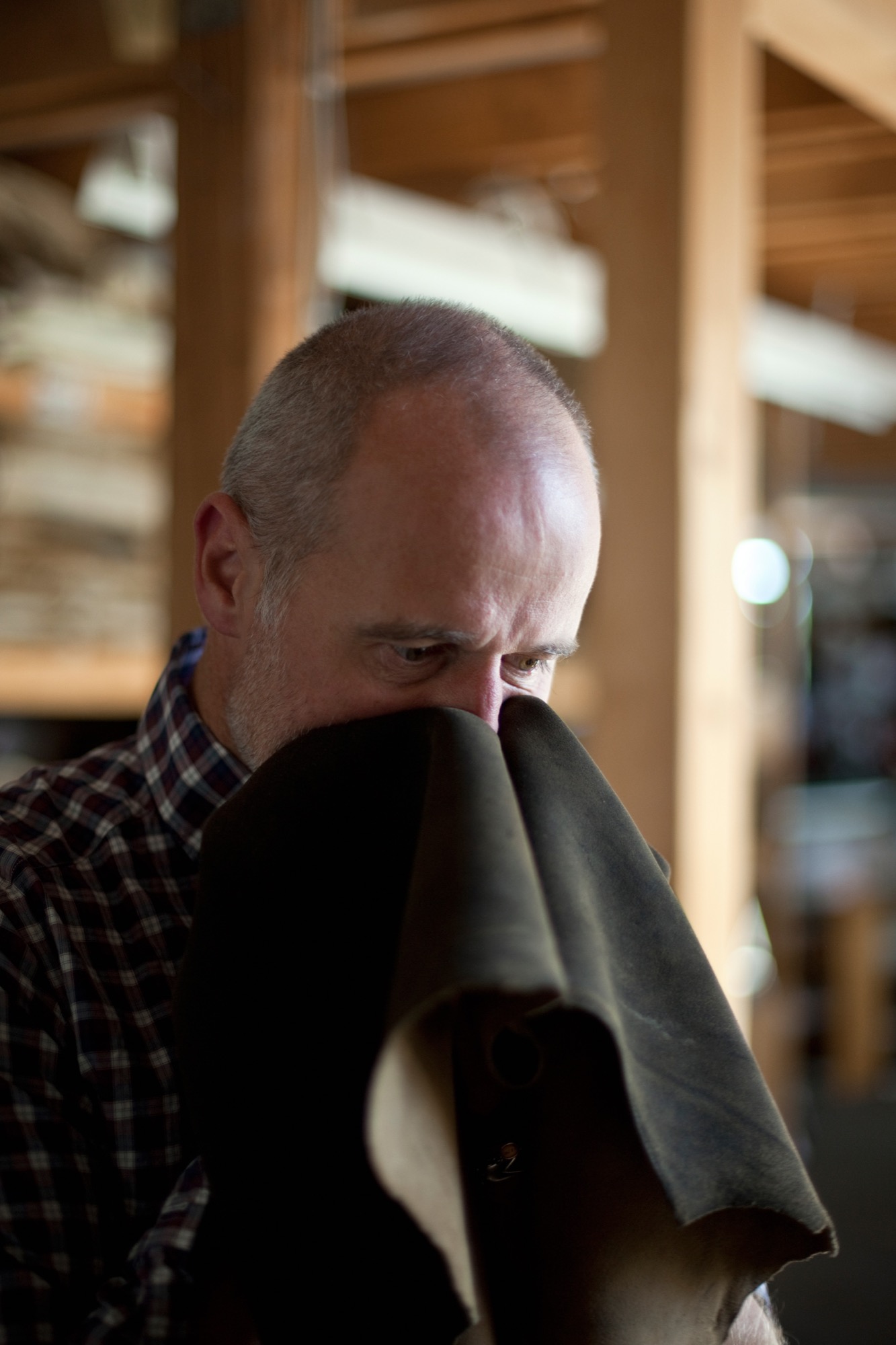
His zeal for creating something new comes from deep within. He has always wanted to develop products he loved himself. Father Hannes Meindl gave Markus the creative freedom and the space to let his youthful zest flourish. “If I’ve learned one thing from him, it’s his free-spiritedness. His honesty in working with the product. But also his honesty in leading his employees,” Meindl says of his father.
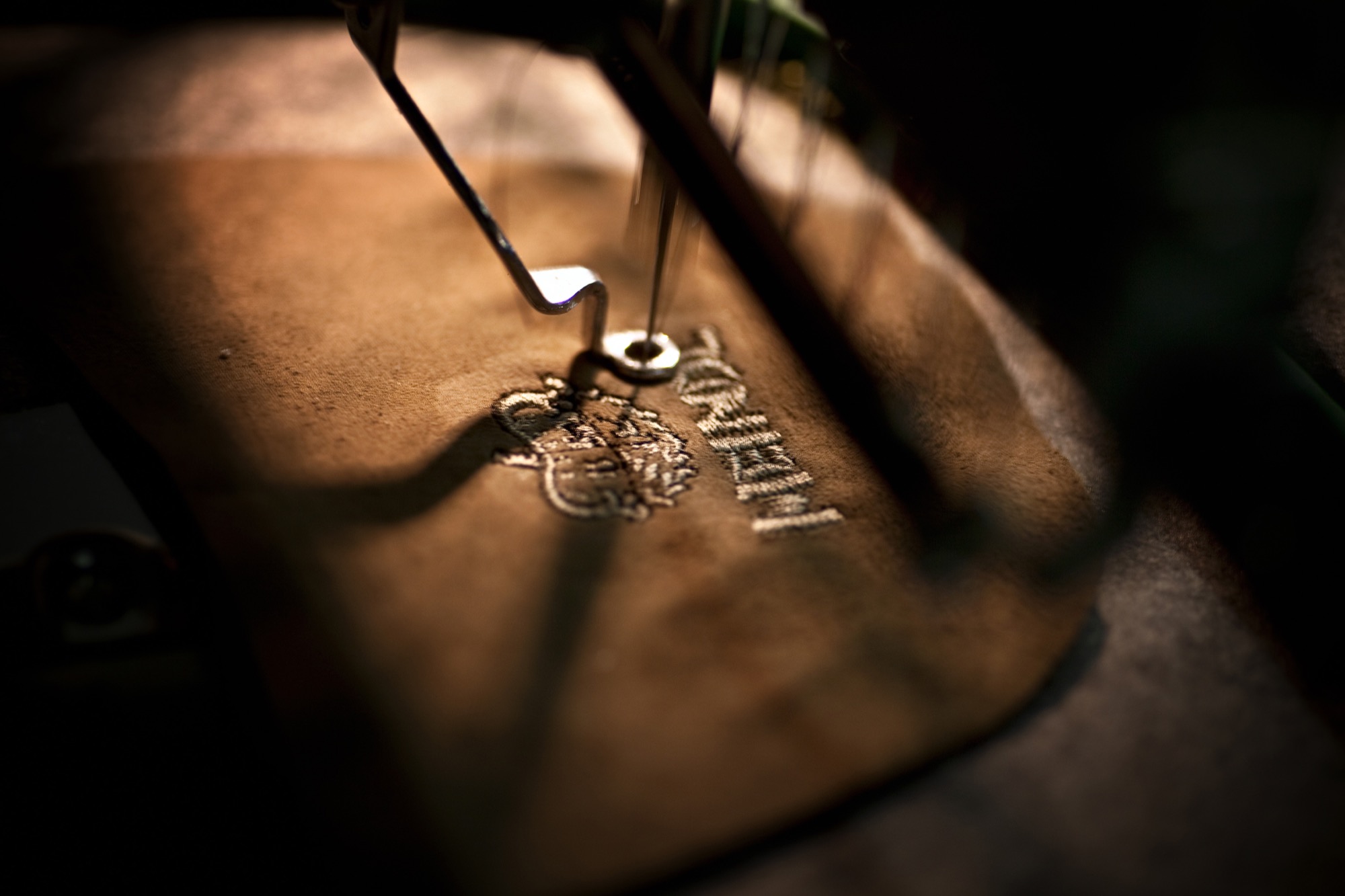
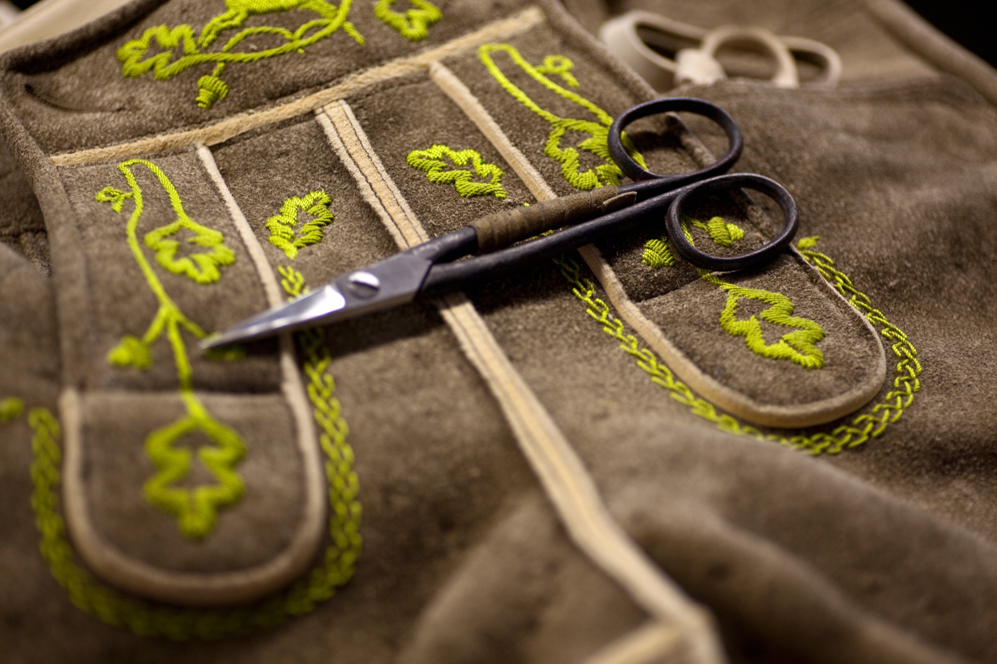
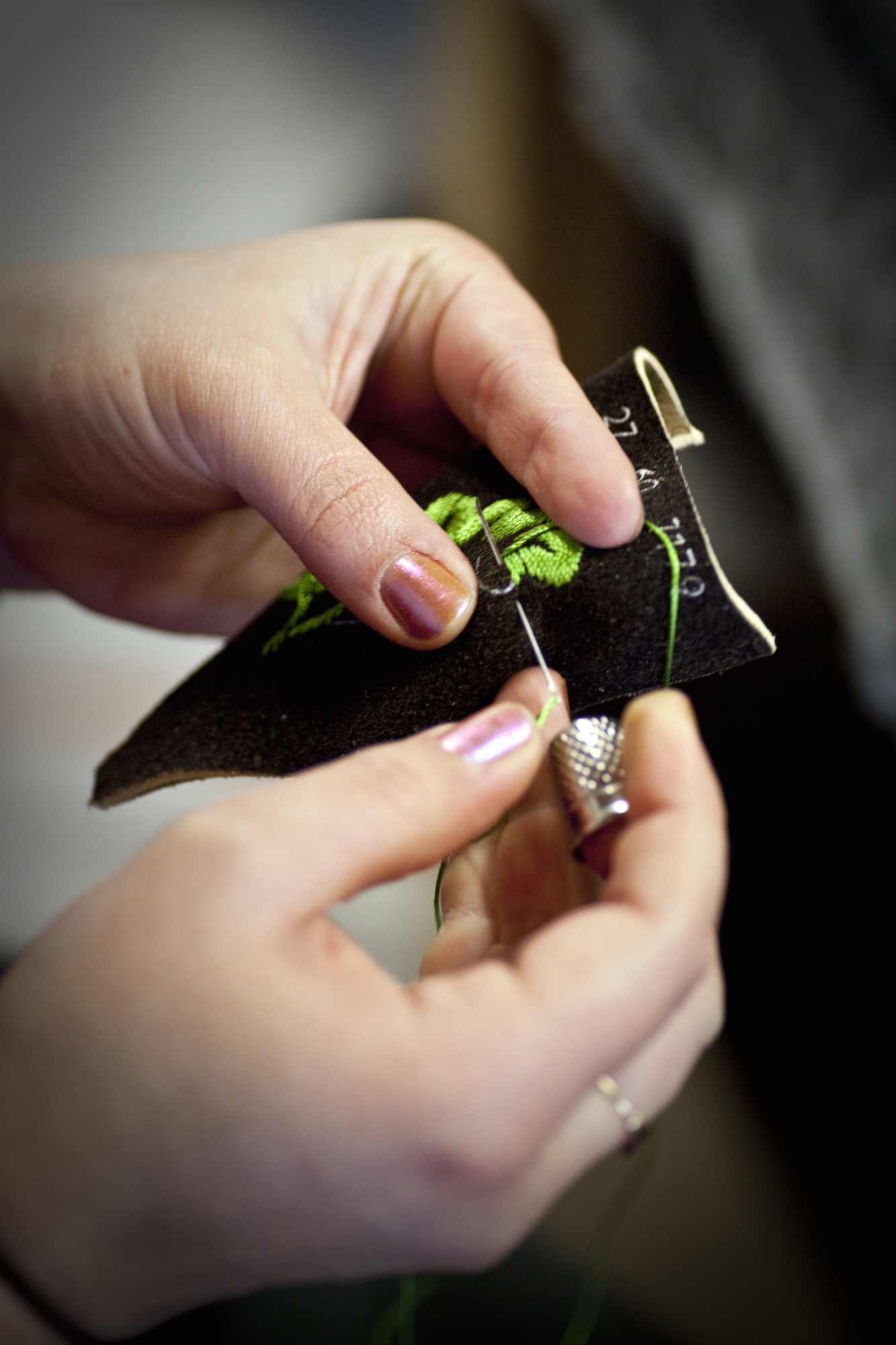
At age seventy-four, Hannes is still actively involved in the company wherever an extra hand is needed, whether that’s in sales, in production, or in design. The traditional embroidery, however, is Hannes’s favorite component. Meindl Fashions is famous for its chamois-tanned buckskin lederhosen with lavish hand-embroidered motifs, especially in the Alps, in Austria and southern Germany with their large festivals, such as the Oktoberfest in Munich. Up to sixty hours of manual labor go into handcrafting a pair of Meindl lederhosen. The work is partially done onsite by Meindl’s 120 employees and partially at production sites in nearby European countries, such as Hungary or Croatia. “Every product is designed by us; the know-how all resides in-house,” Markus Meindl says. “We have the most talented team here, the most expensive equipment, and, most importantly, the shortest distances.”
The advantages of in-house, local production are particularly valuable in the development of new products. The Meindl company has long expanded from singularly specializing in lederhosen—albeit traditional alpine costumes are currently experiencing a revival among all ages. “Lederhosen are not a trendy piece of fashion. They span the seasons and are not merely worn to folk festivals and special occasions,” Meindl says. “Lederhosen afford reliability and a sense of security. They rise above time and represent a symbol against calamitous mass production and the consumer society.”
The new alpine lifestyle
Meindl Fashions, with Meindl Jr. at the helm, embodies that pinpoint propensity for this sensibility, the longing for tradition, and for significance. Markus has helped establish the term “alpine lifestyle” in the European Alps; at the very least he has fueled it with products that can be worn on the mountain and in the city: high-quality leather jackets, blazers, sports coats, knickers. Twenty-four years old at the time, Meindl got his breakthrough in 1994 with the creation of a collection for the rebel folk singer-songwriter Hubert von Goisern. It charged the label, the entire fashion industry. A new, modern style conquered the world of traditional alpine garments and found a home at fashion shows like Bread & Butter in Berlin.
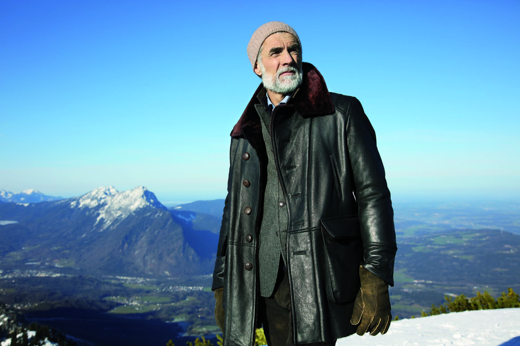
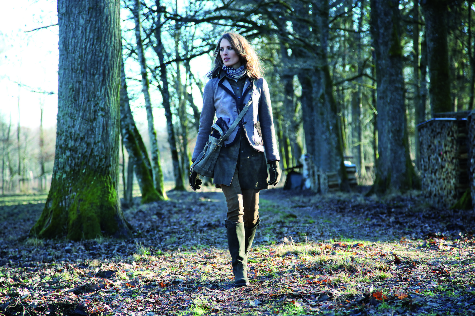
Meindl calls his style “authentic luxury”—his own language of design that derives from the combination of craftsmanship and tradition with modern fits and cuts. “Our products are authentic yet also luxurious, because they can never be mass-produced,” says Meindl. “Out of season” is Meindl’s motto. Transcending the seasons, Meindl garments can be worn in winter or on a cool summer night, adding value to each piece.
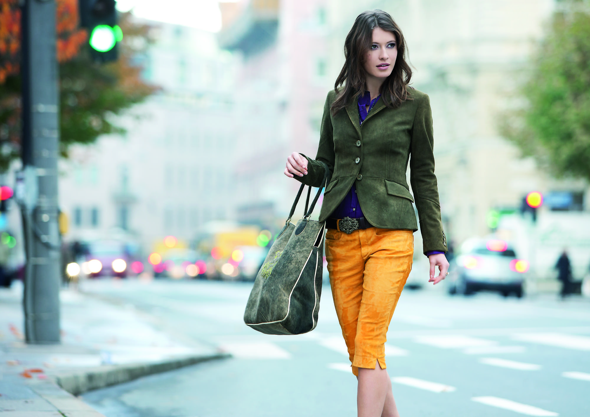
His message rings true in a fashion world that increasingly appreciates value, sustainability, and timelessness.
Nevertheless, few people really know how multifaceted Markus Meindl truly is. For instance, he designs and produces functional and innovative motorsports clothing in very limited editions for BMW. His leather jodhpurs are worn at the Spanish Riding School as well as by mounted police in Germany. His cousins run the local shoe manufactory, which makes quality mountain footwear and traditional costume shoes. A diverse product portfolio has always been the brand’s strength.
Country refuge for an urban mountain man
Quality stands above all. Timelessness, longevity—and Meindl sought to embody these values in the design and construction of his private home. “I’ve thought long and hard about how I want to design the house,” he says. “It was supposed to withstand time and still be as attractive twenty years from now as it is today.”

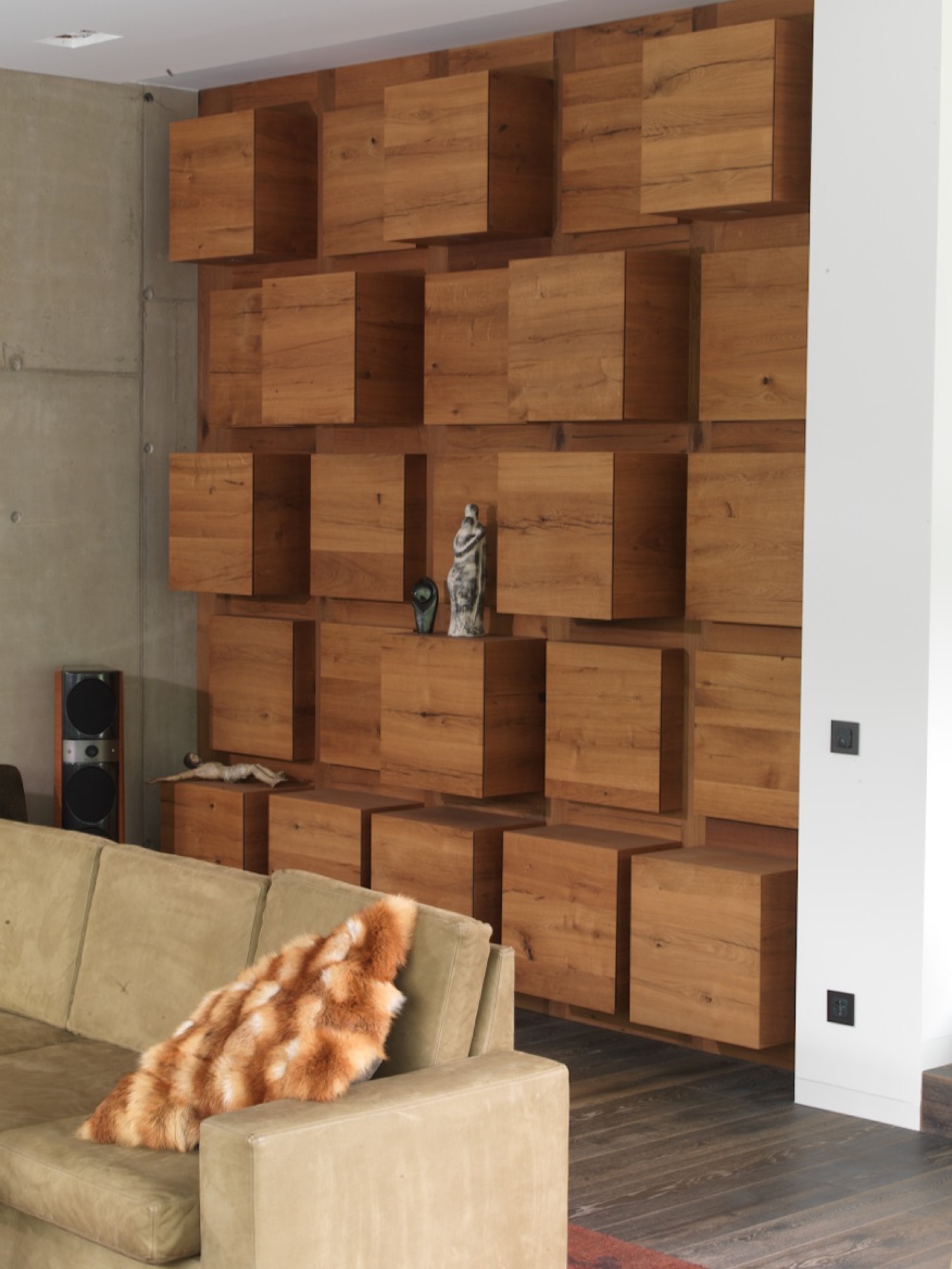
His friend Robert Blaschke of Raumbau Architekten in Salzburg, Austria, realized the project. Wood wherever you look, heated Swedish oak floors. Ceilings and walls are covered in 300-year-old oak wood reclaimed from Bavarian barns. The 3.9-meter-high (almost 13 feet) ceiling in the living room and the ceiling in the spa are lined in wooden cubes. The same element serves as armoire and shelving units in the living room and along the facade. The length of the pool—16.83 meters (55 feet)—reflects the year the Meindl company was born; a whimsical reference to tradition interrupted by modern elements. Tradition, lived modernly—that is Meindl’s philosophy. “I grew up here in the mountains. I respect the traditional way of life. I love simplicity, the value of things,” Meindl says. “But I am not a conservative man. You have to continue to develop things further, keep playing with things. That’s the only way tradition stands a chance of surviving over time.”
“I grew up here in the mountains. I respect the traditional way of life. I love simplicity, the value of things. But I am not a conservative man. You have to continue to develop things further, keep playing with things. That’s the only way tradition stands a chance of surviving over time."
Markus Meindl regards himself an “urban mountain man” who lives between the antithetical realms of an urban and a bucolic world. You work in the city during the week. And on weekends, you live in the mountains, where you go skiing, go hiking. “Clothing has to work for a meeting in the city but also be functional in the mountains and in the woods. In all of life’s circumstances. That’s the language Meindl speaks most clearly.” △
“Clothing has to work for a meeting in the city but also be functional in the mountains and in the woods. In all of life’s circumstances. That’s the language Meindl speaks most clearly.”
More from Meindl's collections...
Alpine Modern in Its Natural Habitat
Behind the scenes at the Alpine Modern Summer 2016 lookbook photoshoot
We packed up the entire Alpine Modern Summer 2016 Collection and headed up Flagstaff Mountain in Boulder, Colorado.
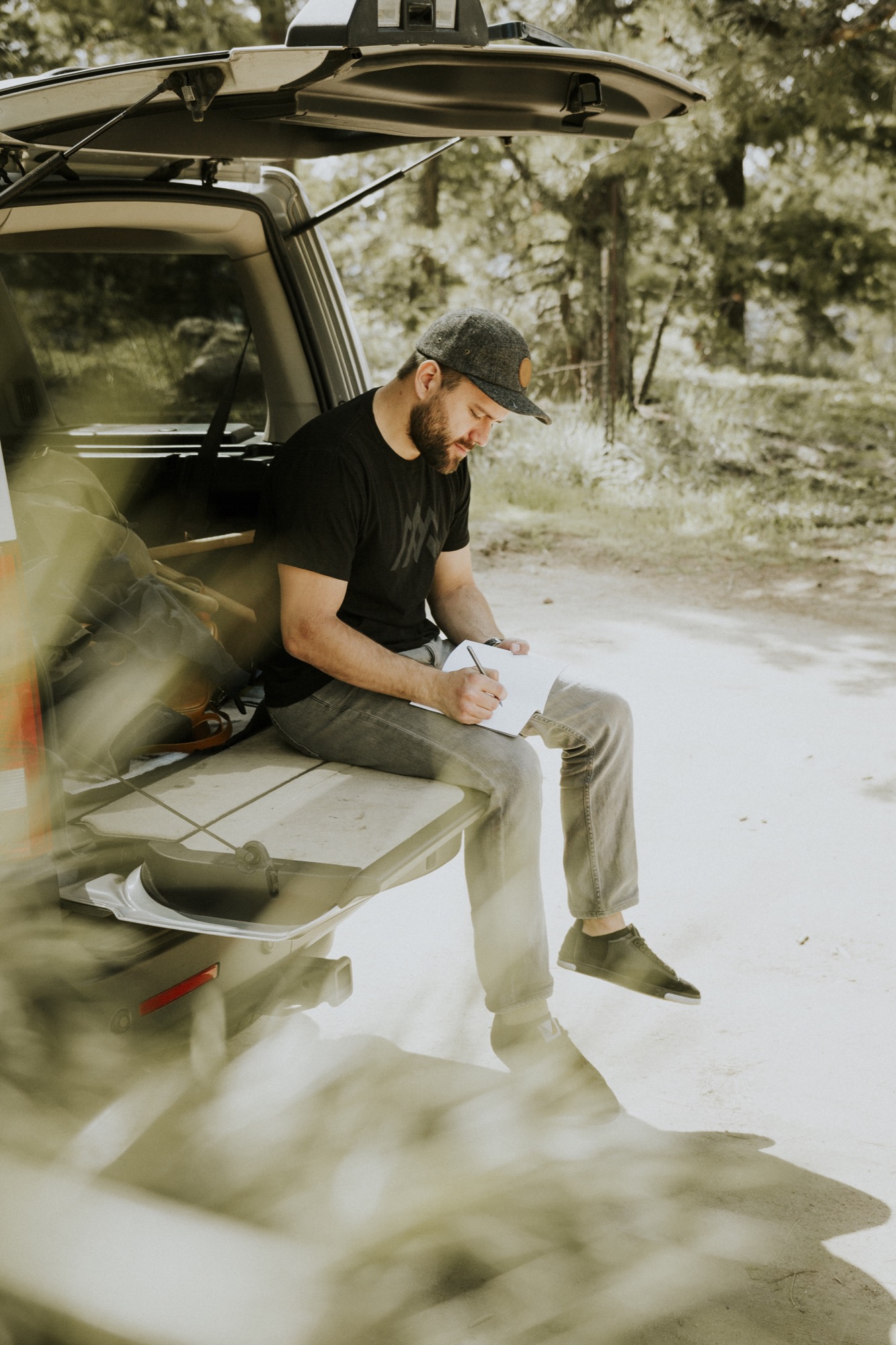
We stopped halfway up the gorgeous, winding road to the summit. The secluded spot overlooking the city was the perfect place to set up for the shoot. Our good friend Garrett King (@shortstache) behind the lens, and another good friend, talented designer and illustrator Adam Sinda, modeling.
We wanted to capture our Alpine Modern Summer 2016 collection in the most natural and minimal form in which the products were designed and intended to be used. We didn't need a fancy backdrop or expensive studio. We "worked" in Boulder's beautiful backyard.
The goods we design and craft are all about elevating your life. Our mission is to bring modernism to mountain style. From our organic tees and versatile hats to our leather bags coated in an oil finish to repel the elements — our goods are crafted for the mountains but also for daily use and wear. △
More from the Alpine Modern Summer 2016 Lookbook...
The Woolly Wonderland of Donna Wilson
A conversation with the London-based creator of cashmere creatures and other wild things.
Donna Wilson's imagination runs wild. In her studio in East London, the textile and product designer, who has been named "Designer of the Year" at Elle Decoration’s British Design Awards, creates cuddly cashmere creatures and designer objects from richly textured sofas and plush cushions to hip-cute bowls and plates to the planet's most darling socks.
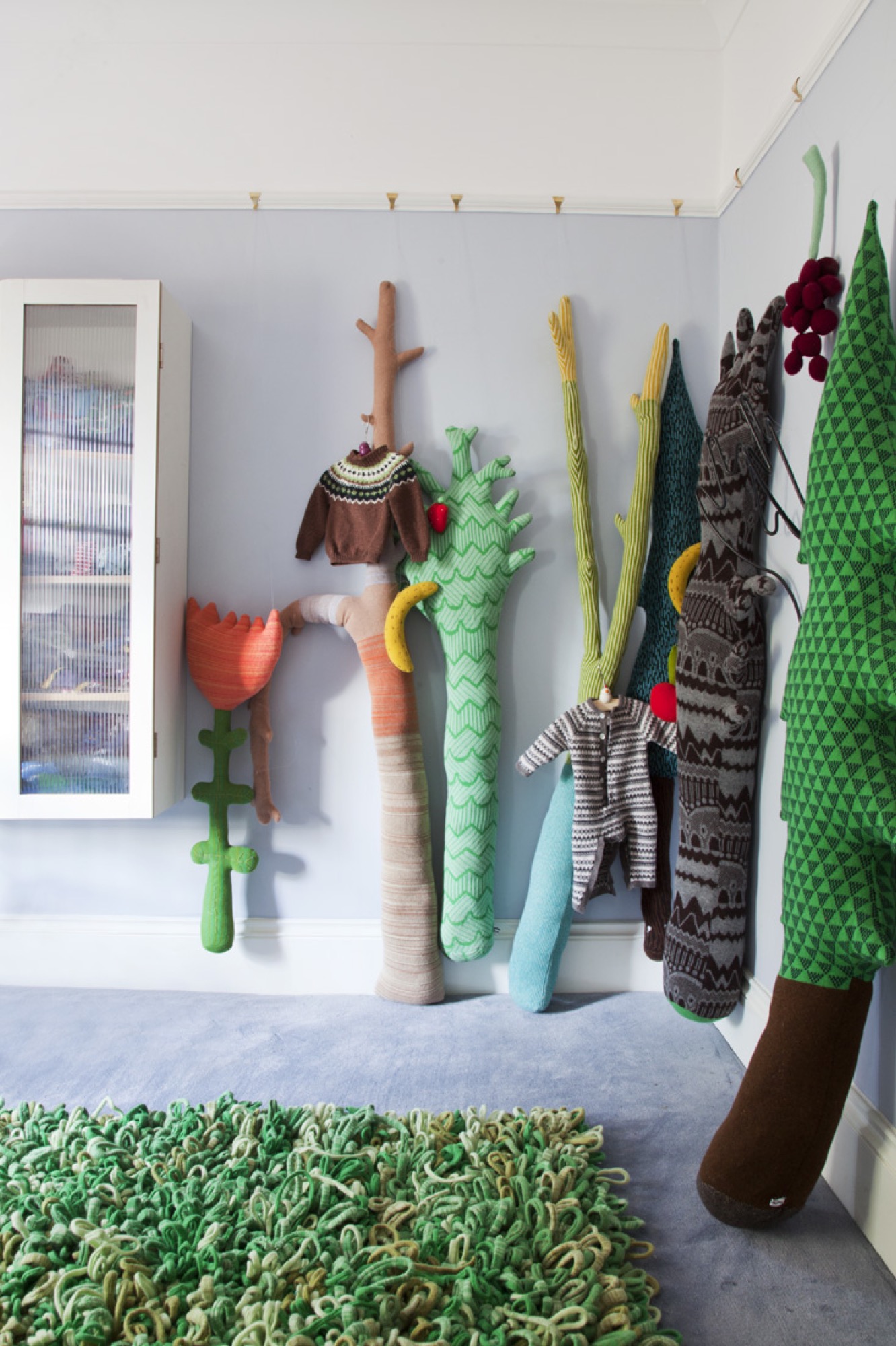
The artist and craftswoman's continuous outpour of creativity began very early in her life, on her parents’ farm in the beautiful countryside of Aberdeenshire, Scotland. Encouraged and inspired by her grandmother, young Donna soon found her happy place in an old hen-house that became a cabin of crafts.
Her unbounded passion for making things with her hands and her love for art and design impelled Wilson to attend the Royal College of Art in London. It was there she knitted her first creatures and began selling them to local shops in the city.
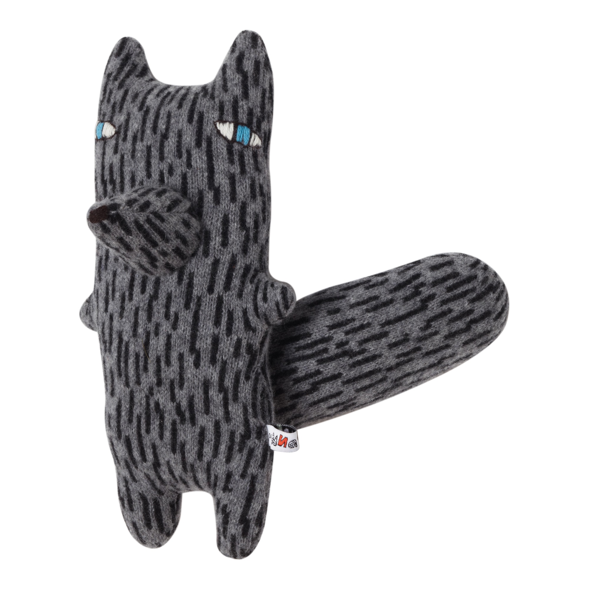
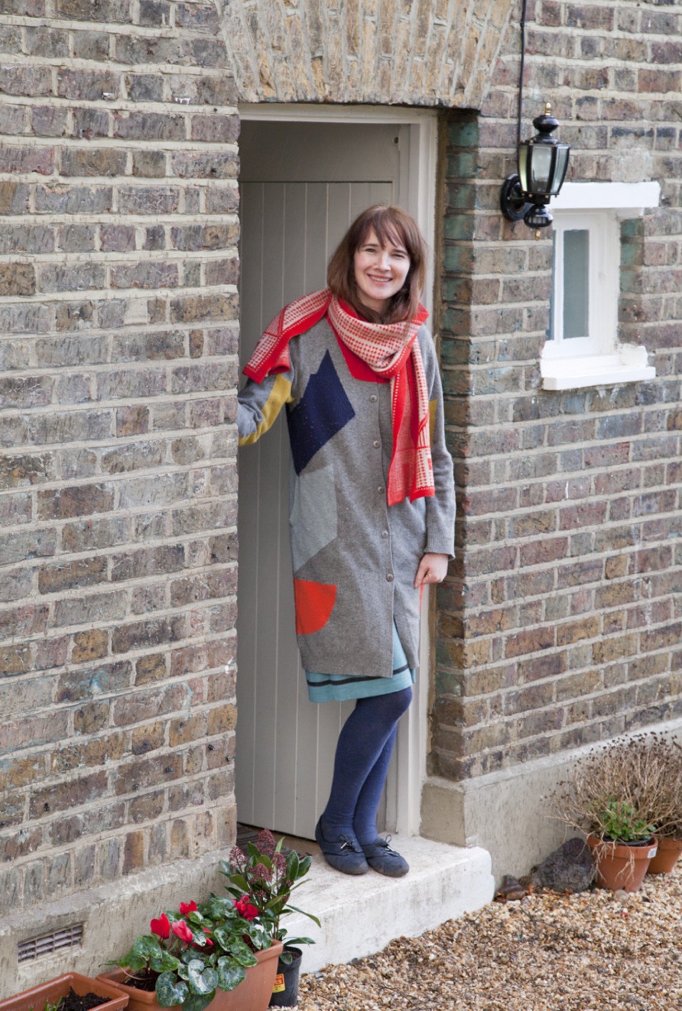
These days, she greatly enjoys turning a 1860 cottage into a home for her little boys, Eli and Logie, and her partner, Jon. And she is busy designing a new collection of woolly woodland creatures, furniture, homewares, clothing, and so many more designer goods she now sells all over the world, with help from her team of craftspeople.
A conversation with Donna Wilson
What is your vision for your brand?
To create a wooly wonderland where patterns and color collide and imagination is free to run wild. It’s important to me that people can relate to the creatures and products, and that they evoke emotion — maybe a feeling of nostalgia, sentimentality, or happiness. Even if they just induce a smile, I feel I have done my job.
Where did the inspiration for your woolly wonderland come from?
I grew up on a farm, so I'm very familiar with natural landscapes. In my work, I find it very exciting to be able to replicate textures found in nature using wool and to try to mimic textures like moss, bark, and stone. It still amazes me that you can create a fabric from a bit of yarn.
"I find it very exciting to be able to replicate textures found in nature using wool and to try to mimic textures like moss, bark and stone."
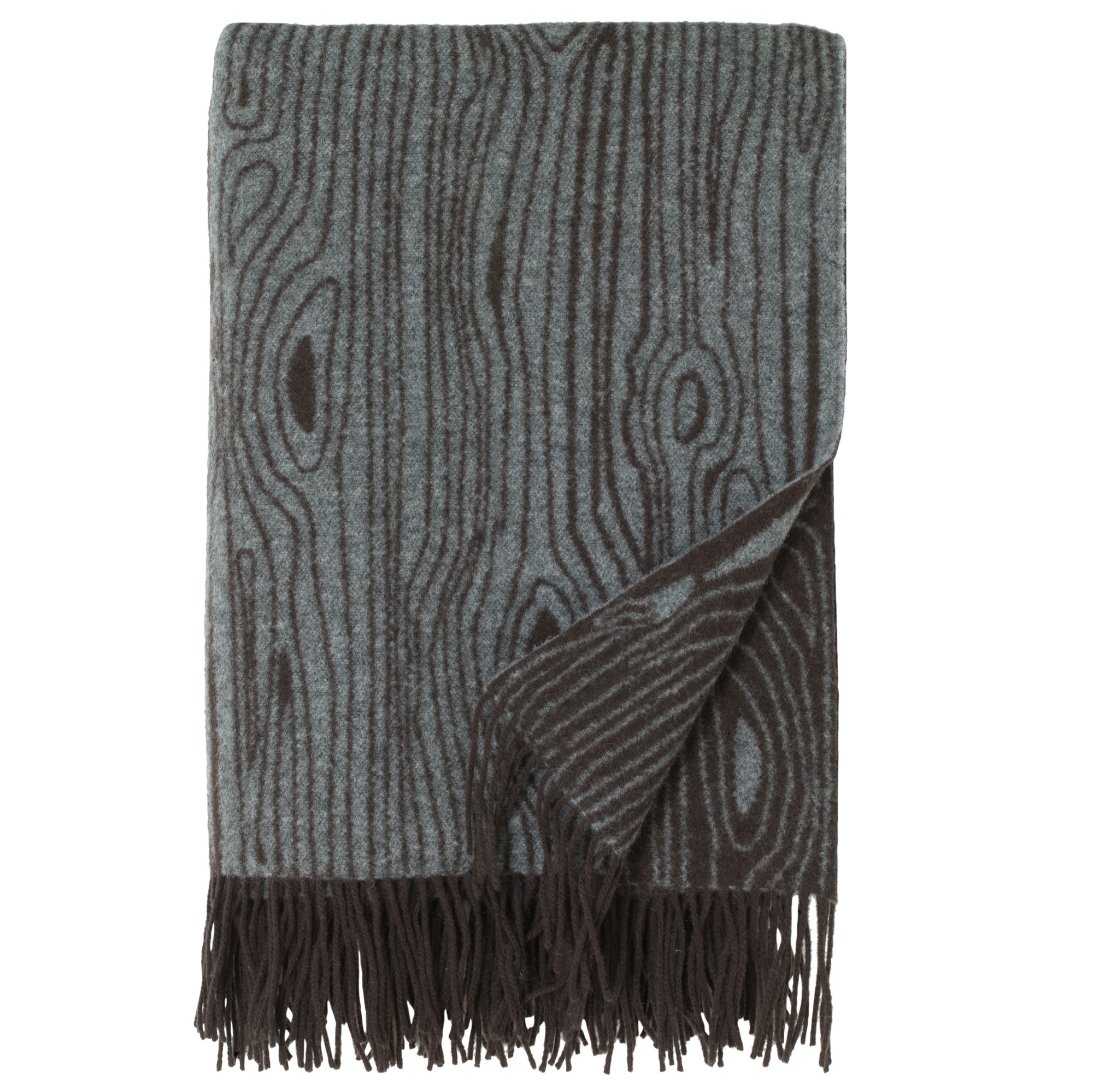
My inspirations do come from all over the place — the landscape, music, dreams, magazines, ceramics, people, Scandinavian design. Sometimes, I just see a tiny snippet of something, which triggers an idea that is then developed into a product.
How would you describe your design style?
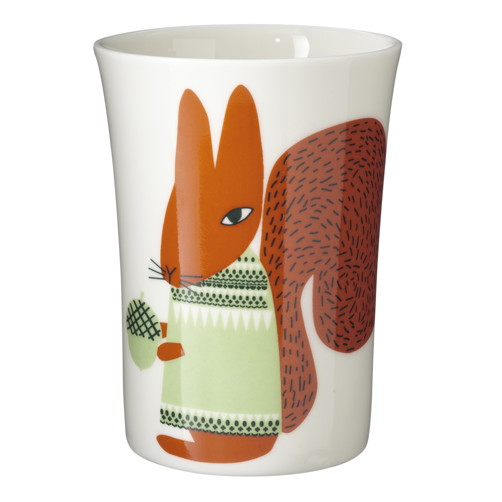
I try not to look at trends too much and try to keep focused on creating original designs that are distinctively colorful, graphic, and figurative, with a nod to traditional crafts and a pinch of whimsy.
What does quiet design mean to you?
It’s a reaction to the bombardment of images, products, and design we see on social media. Quiet design is more of a classic, true, folksy take on design.
What is your legacy (for now)?
It’s very important to me to promote local manufacturing and to help keep British craftsmanship alive. There’s too much disposability in products and consumer goods nowadays, and it’s environmentally irresponsible. I believe that if you have something that is handmade and is somehow more special than something made carelessly or mass-produced, you’re more likely to keep it for years, instead of throwing it away. I want to make things that people use, keep, and treasure for years.
"It’s very important to me to promote local manufacturing and to help keep British craftsmanship alive."
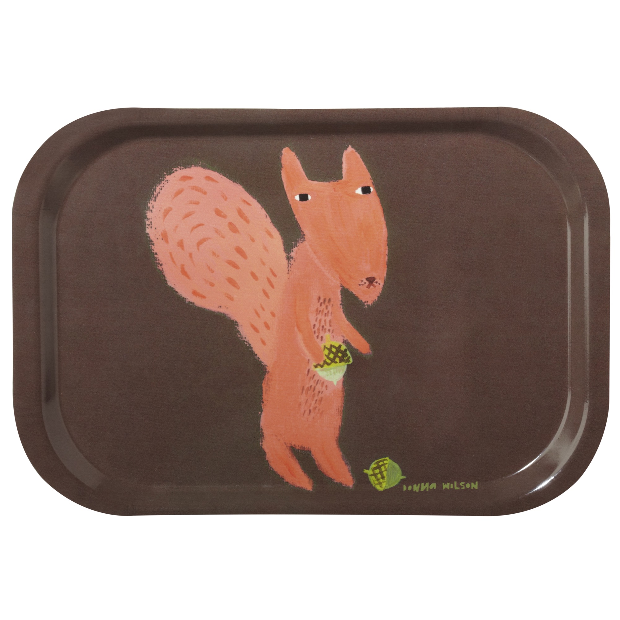
"I want to make things that people use, keep, and treasure for years."
What’s your favorite place in the world?
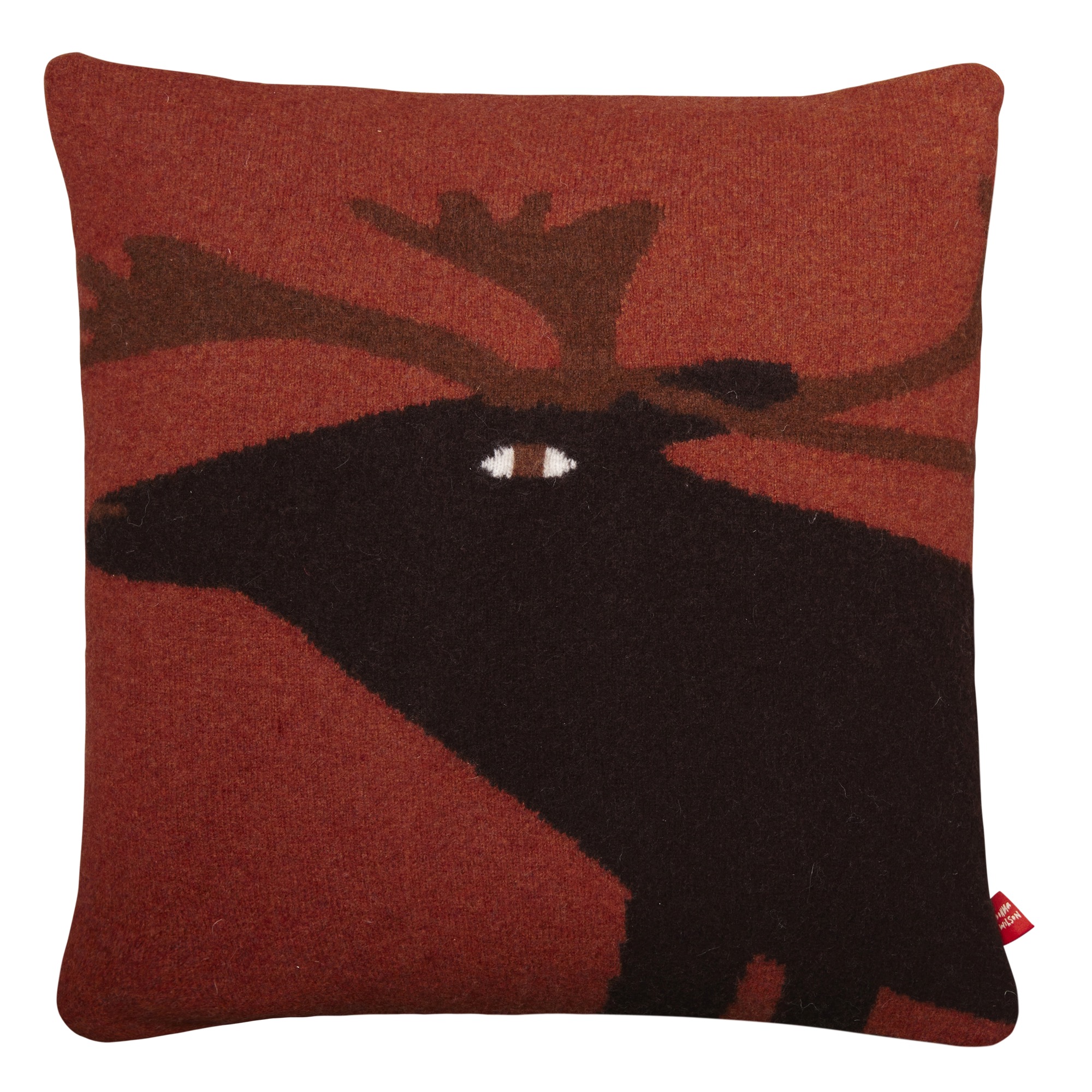
A few years ago, I was invited to design some furniture and wallpaper for a boutique inn that was being build on Fogo Island, off the coast of Newfoundland. We went as a small group of designers and stayed in an original Fogo Island house together. It was winter, and the snow was so deep it covered the cars. We drank gin-and-tonics with ice from 10,000 year old icebergs! We saw caribou and took a skidoo to remote places. The whole experience has really stuck with me and inspired my work.
"We drank gin-and-tonics with ice from 10,000 year old icebergs! We saw caribou and took a skidoo to remote places. The whole experience has really stuck with me and inspired my work."
Describe your dream home...
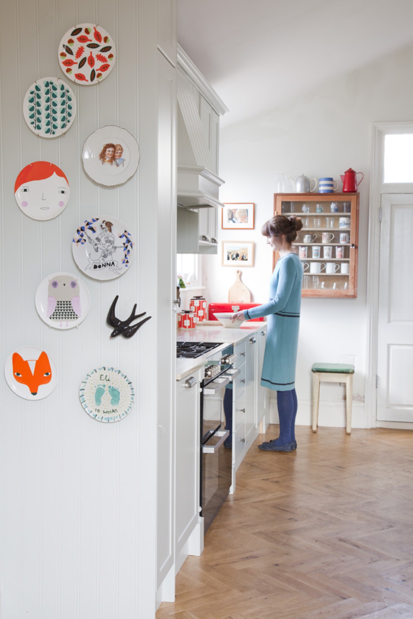
Amazingly, we live in a detached cottage with gardens and allotments surrounding it, which is pretty rare in London. It's an old building, built in 1860, and we are taking out time getting it the way we want, gradually. I'm really enjoying making this house our home. It's a lovely little house.
What does “home” mean to you?
Home is a place to have fun, make memories, play, make things, and relax. We have recently moved into our new house, so I am so aware of how much my home means to me, now more than ever. As I am finding places for my belongings, it feels like it is becoming our home more and more. A person’s home is so unique to them. We shouldn’t be afraid to express ourselves through our own decor and style. It might not be as obvious as what we wear — it’s more of a personal thing, and only our close friends get to see our homes.
"We shouldn’t be afraid to express ourselves through our own decor and style."
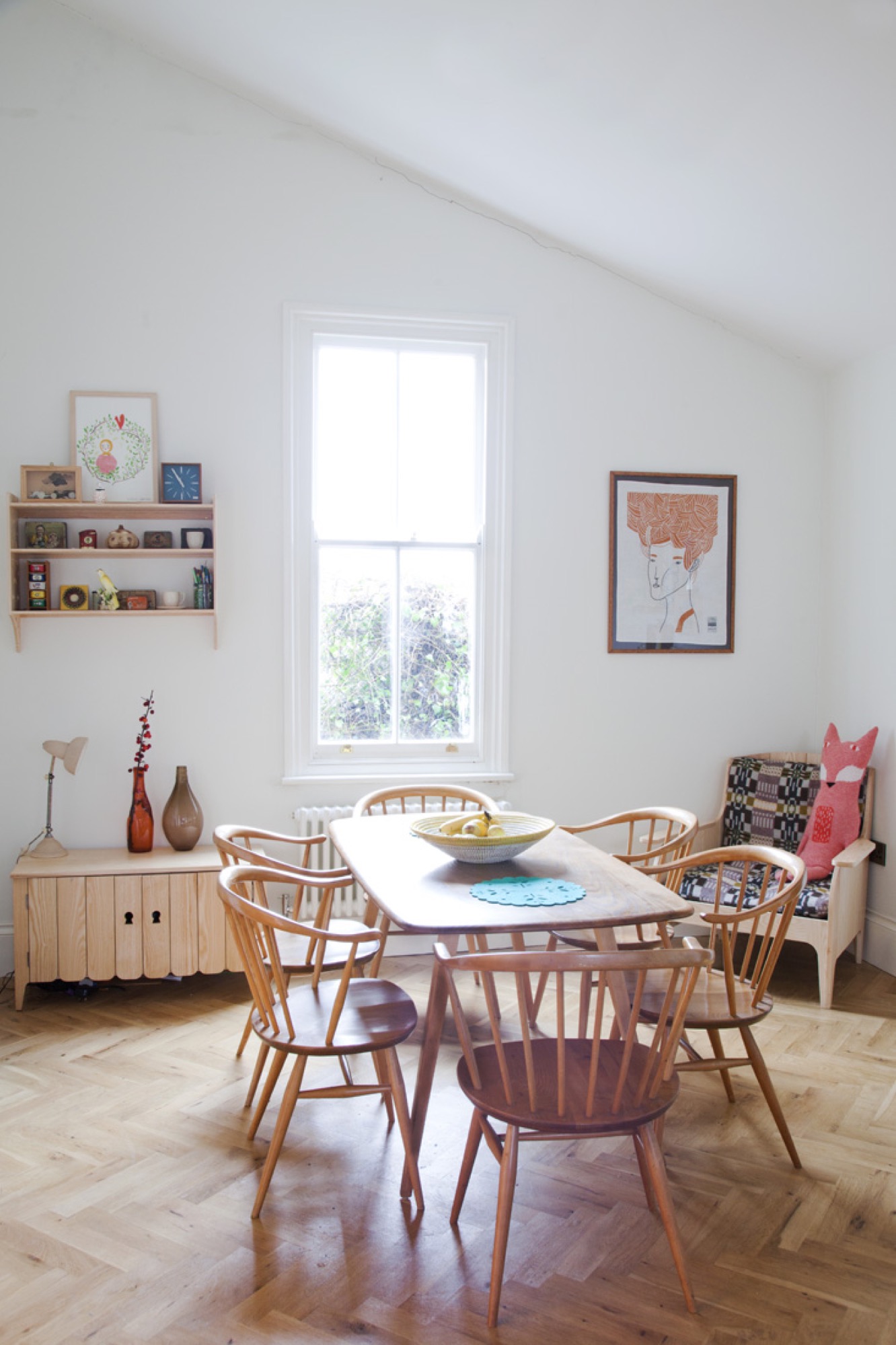
What’s more important to you in life?
My boys. Before having children, I could never have imagined how much these little people would mean to me. It has changed everything, and strangely, I am less stressed than I used to be. I think, I put things in proportion in life.
When are you happiest?
When I’m being creative. There’s noting better than having a day just to play, make, design, and produce lots of ideas, then finally you get something you like. It’s the best feeling in the world.
"There’s noting better than having a day just to play, make, design, and produce lots of ideas, then finally you get something you like. It’s the best feeling in the world."
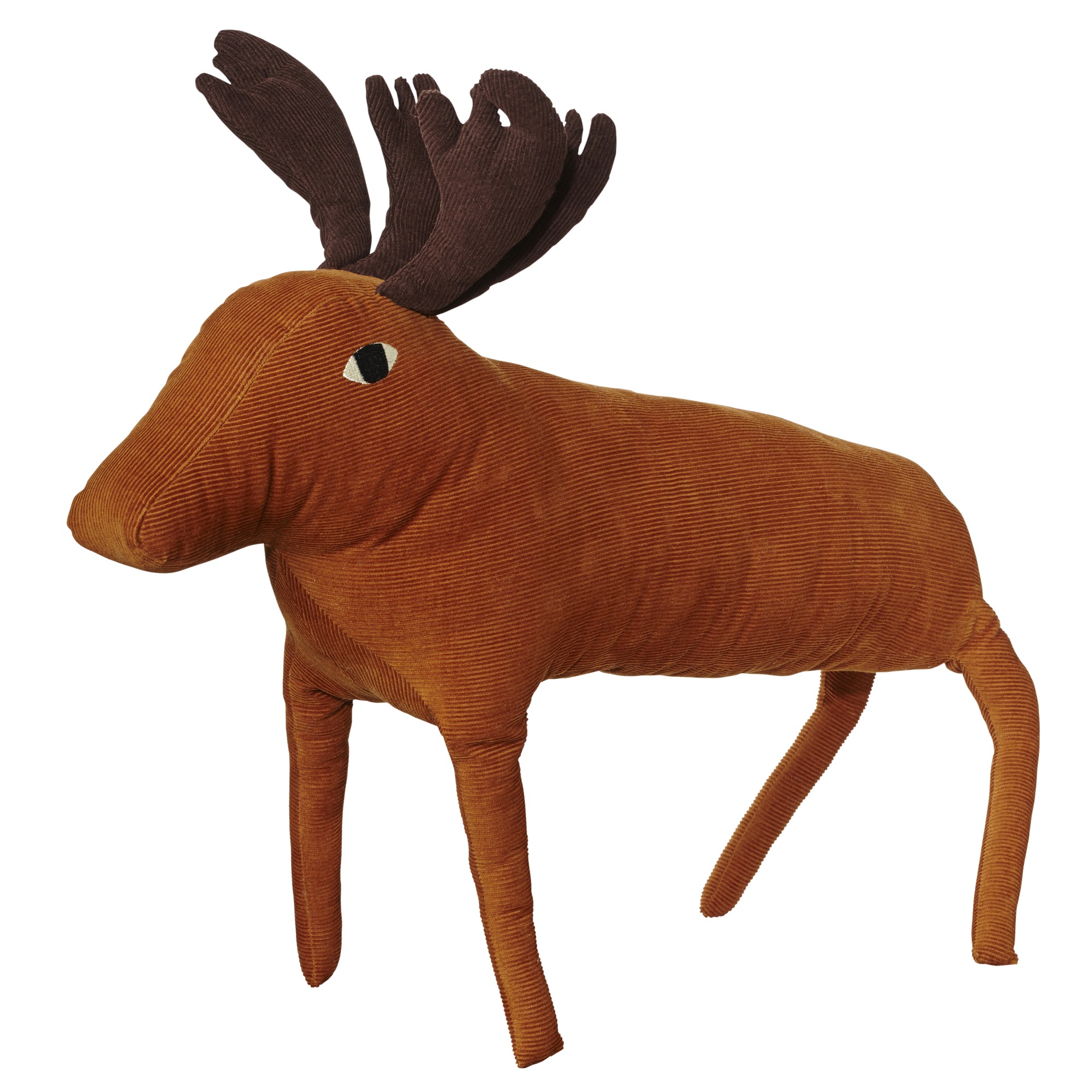
Who is your design icon?
I like Alexander Girard, Stig Lindberg... and my grandma! Another designer I admire is Hella Jongerius. I love the sofa she did for Vitra a long time ago, with odd buttons. I’d never seen anything like this, and I love the way she uses textiles and color a lot in her work. Her designs are clever and thoughtful and have that human element.
Who inspired you to be the person you are?
My grandmother. She encouraged me to be creative and work with my hands, She was always trying to teach me things, like how to knit and crochet. I started being creative at quite a young age. I was always drawing and making things and was always happiest with a pencil in my hand. As a child, I didn’t know what I wanted to be when I grow up, but I knew it was going to be something to do with art and design. Now that I’m a mother, I’m inspired to encourage creativity in my kids and love seeing them getting all messy and using their imaginations.
"I started being creative at quite a young age. I was always drawing and making things and was always happiest with a pencil in my hand."
What is your life philosophy?
Do what you love and love what you do.
What are you working on right now?
We are working on the new collection for spring and summer 2017. We’re developing some new designs for ceramics and glassware. We are just about to launch our autumn/winter collection at the trade shows this month. I’m really happy with it, and there are lots of fresh, new products, like odd cashmere creatures and bamboo fiber picnic ware. We also have some special creative projects in the pipeline. △
More from Donna Wilson's collection:
Dwell × Alpine Modern
We are incredibly excited to announce our partnership with Dwell
From the very beginning, as we imagined Alpine Modern to be a publication about modern architecture, design and elevated living in the mountains around the world, telling people about our vision has usually included something like "You know, like if Dwell and Cereal magazine had a lovechild in the mountains..." Dwell's authority in showcasing international modern architecture and design has inspired us in our own work. This is why we are incredibly proud to announce that today marks the beginning of our partnership with Dwell.
This means, you will see some of our editorial stories on the new (launched today!) Dwell.com, published under the banner of Alpine Modern. What's more, we will present Alpine Modern "Curations" — a new element of the redesigned Dwell.com. This can be anything from a product roundup from the Alpine Modern Shop to a themed collection of stories about cabins, art and journeys in Norway.
In return, you will read cherry-picked Dwell content on Alpine Modern Editorial.
Follow @alpine_modern along on Dwell.com as Dwell and Alpine Modern together kindle a longing for elevated living, through slow storytelling, amazing photography and tightly curated alpine-modern objects. △
The Creator of Whimsy
Danish architect and designer Hans Bølling talks with us about his iconic wooden figures, modern design and his wife and muse, Søs
Danish designer Hans Bølling is best known for his iconic humorous wooden creatures. His modern-design legend began when, early in his career, the trained advertising designer playfully crafted small figures as gifts for his beloved wife.

Thanks to the precision and personality in Bølling's objects, he quickly began selling the wooden creatures to stores. Soon thereafter, he won a design award and invested the winnings in his own carpentry machine. A fortuitous acquisition, as it kickstarted the production of Bølling's now-iconic Duck and Duckling in the 1950s. The rest is modern design history.

Bølling's classic Duck and Duckling and their wooden friends, which include Strit and the Optimist and Pessimist, are still being produced by the Danish company Architectmade.
Born 1931 in Brabrand, Denmark, Bølling now lives in Charlottenlund with his wife Søs, whose father, he tells us, is responsible for his branching out into architecture. Balling eventually graduated as an architect from The Royal Danish Art Academy.
We caught up with the prolific Dane only a few days after his 85th birthday. Astonishingly, Bølling, who says he's too busy working and having fun to retire, is still creating many more new objects in his atelier.
A conversation with Hans Bølling

Tell us about your remarkable journey from architect to product designer.
It all starts with Søs, my wife. We met when she was 16-and-a-half, and I was 21. I was going to be an advertising designer, but her father didn’t think I would be able to support her with that kind of job. So I graduated from The Royal Danish Art Academy and became an architect.
I started working in her father's design office in the very center of Copenhagen, just by Læderstrædet, Højbroplads and Amagertorv. Since then, I have been working in different places and have created a vast variety of works, ranging from town halls and living complexes to villas, furniture and wooden figures.
Actually, the wooden figures came before everything else. It was something I couldn’t help doing. I created all of them for Søs. In the beginning, I would make them out of coconut tree, Brazil nuts, bog oak and whatever material I could find. At some point, I won a competition creating a pattern that everyone thought was made by the famous Danish ceramic artist Axel Salto. I won some money and bought myself a turning lathe. This became the starting point for the figures you know today. The turning lathe inspired me to do the Duck and Duckling, Strit, Oscar, the Mermaid, the Optimist and Pessimist, and so forth.
What’s the story behind your wooden figures, why these whimsical little characters?
All of my wooden figures have been made for Søs. In that sense you can say that I built my career on love. In the beginning, I made the little Oscar out of Brazil nut. I have been making orchestras with figures playing the flute, drum, guitar. The Optimist and Pessimist were inspired by two colleagues of mine, were the one was always happy and smiling and the other was always moody and sad. For the Duck and Duckling, I was so fascinated by this story about a policeman who stopped the traffic to help a duck and her ducklings pass the street. A photographer caught it on camera, and the picture went around the world in 1959. After that amazing story, I felt inspired to create the Duck and Duckling on my turning lathe.
"All of my wooden figures have been made for Søs. In that sense you can say that I built my career on love."

What makes you a modernist at heart?
I don’t know. I have just always been doing modern things, modern buildings, modern furniture. I was influenced by Søs’ father, Axel Wanscher, her Uncle Ole Wanscher, and the whole scene they where part of.
What does “quiet design” mean to you?
I like classic and simple design, with a strong idea behind it.
What are you working on these days?
I am always working on a lot of different things. I have loads of boxes filled with figures, drawings, posters and ideas. Maybe a lot of it will never be realized, but it doesn’t matter, I am having fun. I just turned 85 this week, and I have no intention to retire. I am way to busy working and having fun. Just this year, I will launch two new products with Architectmade, so that is very exciting.
"I have loads of boxes filled with figures, drawings, posters and ideas. Maybe a lot of it will never be realized, but it doesn’t matter, I am having fun."
Describe your dream home...
My home is my dream home. I could not wish for anything else!
What does “home” mean to you?
Where I’m with Søs.
What’s your favorite place in the world?
I like my house, our summer houses on Anholt and in Hornbæk, and my atelier in Charlottenlund.
What’s most important to you in life?
Having fun, creating things and being with Søs. I feel I have been so lucky. I have made a living from what I like doing the most. My work has been a playground, and it still is.
"My work has been a playground, and it still is."
Who is your design icon, and what do you admire about her or him?
I don’t have a design icon, but I like the coffee table by Mogens Koch, the Colonial Chair by Ole Wanscher, the silverware by Kay Bojesen. I don’t see myself as a designer. I don’t like being a designer. I just love to create things.
"I don’t see myself as a designer. I don’t like being a designer. I just love to create things."
Who or what inspires you to be the person you are?
Søs. Of course. (Said with a big smile).
What is your life philosophy?
We should remember the human dimension in design. △
"We should remember the human dimension in design."
Sense of Place: Montana modern
Nostalgia, no kitsch: A conversation with Kelcey Bingham, the insanely gifted owner of Bear Mountain Builders, about modern design in Montana
Kelcey Bingham, owner of Bear Mountain Builders in Whitefish, Montana, finds cowboy-themed log homes “really outdated.”
Nostalgia, No Kitsch
He still uses beams with reference to Montana’s Western architecture. Only his beams are typically steel. In the Ski Chalet, a mountain retreat inspired by nostalgia for ski vacations in the seventies, Bingham takes this adaptation further yet, turning a steel I-beam into a powder-room sink.
“Keep it light and bright and airy, and keep it high-tech,” is one of Bingham’s principles. The other — “anything that is not so rustic.” The Ski Chalet has quickly become his most popular work, and he’s already been commissioned to build more homes of that style. On the exterior, Bingham applied his credos by setting geometrical form with über-expansive areas of glass. The window frames, again, are steel, as is the front door, which he treated to rust by design. The roof is shaped to hold snow as an extra insulating blanket. Inside, energy-efficient, controlled lighting creates geometrical shapes on the ceiling. “Throwback style with modern conveniences,” he calls it.
“ Keep it light and bright and airy, and keep it high-tech.”

Bingham, who considers himself part builder, part architect, part artist, balances the glass, steel, and high-tech features with just enough earthy elements not to be cold. Cabinets and doors are made from reclaimed wood. The rest of the furniture is light in color, and the wood thin, to get away from the typical heavy timber look of the area’s typical super-sized mountain homes.
Creating your own throwback style at home is personal, inspired by your own memories of childhood winter vacations. Blues and rust-orange in the Ski Chalet’s fabrics, rugs, and bedding, for example, evoke nostalgia of that era.
“Instead of big dead animal heads on the wall, you’ve got vibrant art,” Bingham continues. “You don’t want too many knickknacks around, but having an appropriate amount of art is important.” Vivid details, such as colorful vases and vintage treasures, brighten up Big Sky Country’s many foggy winter days. “For us in the ski mountains, we try to find vintage ski posters,” Bingham says. Don’t be afraid to use shinier, mirrored pieces. Be selective in curating pieces from the past. “You want that nostalgic look of a seventies ski chalet, without being too kitschy.” He likes to keep a home current with vintage-inspired high-tech gadgets. “Rega out of Great Britain, for example, makes new turntables to look like they’re from the seventies.”
Recreating the Ski Chalet’s most unique decor will require a lot of luck, unless you already have an old-time ski lift seat sitting around, like Bingham had. Years back, a local ski resort was selling them off. He brought one home and was just waiting for the right use. The funky find now sets the stage inside the entry to the Ski Chalet. Not only does the seat swing like it once did high above the slopes, but it also has a purpose. “We installed an infrared heater above it, so you can sit down to take your ski boots off and warm up,” Bingham says. △
The Figure Sculptor
Alpine Modern visits Swiss-born artist Roger Reutimann at his studio in Boulder
Inspired by the human form, Swiss-born artist Roger Reutimann found his way to sculpting for the rich and the royal via a classical music education, curating art fairs, and product design.
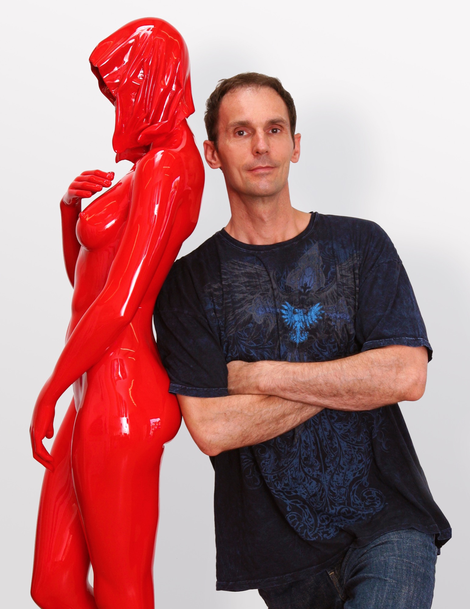
Roger Reutimann captures elegant sensuality in his sculptures of human figures. Born in a secluded village in Switzerland, the artist, a self-proclaimed Renaissance man, has devoted himself to pursuing and mastering many art forms. His evolution from classical pianist to figurative realism painter to internationally known sculptor has secured his place as one of America’s most sought-after contemporary artists.
Early Reutimann
As a young pianist, he found himself drawn to classical composers and music that stirred his soul. He studied at the Zurich Music Conservatory and was soon performing as a classical concert pianist throughout Europe and competing in international piano competitions. Traveling provided artistic influences at an early age as he experienced Europe’s rich cultural heritage.
His love of music flowed into a career as both a realist figurative painter and a co-owner in the Forum International Art Fairs in Zürich, Hamburg, and Düsseldorf. Galleries in Zürich, Milan, and London represented his paintings, and he received innumerable awards, honors, and recognitions. Relationships with gallery owners and collectors worldwide would follow him into his future calling as a sculptor and continue to advance his reputation as a world-class artist.
The Renaissance man emerged again as Reutimann turned his creativity to remodeling his first American home in Miami, Florida, with distinctive and extensive flourishes, from mosaic tiles to stained glass windows and Tudor-style ornamental plaster ceilings. The spectacular manor has been featured in architecture magazines and leased by production companies for films and commercials.
“In the midst of remodeling the house, one day I took a sculpture class to fill the time and loved it so much I gave up painting right then. To me, sculpting is like painting a thousand paintings. It has another dimension, and, therefore, it is so much more real than a two-dimensional image. A painting is only an image of life, but sculpture is life,” says Reutimann.
“To me, sculpting is like painting a thousand paintings... A painting is only an image of life, but sculpture is life.”
Coming to Colorado
Reutimann’s love of the mountains prompted a move to Boulder, Colorado, because of its similarity to Switzerland and the expansive open spaces. “I would rather sit on my back porch watching the sun set over the Rocky Mountains than in a high-rise flat in New York City,” shares Reutimann, for whom Colorado evokes memories of his native country.
Reutimann’s sculptures are unparalleled in craftsmanship and instantly recognizable worldwide. Though earlier works are relatively small, many today tower several meters high. Small sculptures weigh nearly 200 pounds, and the six- to seven-foot-high (up to two-plus-meters) sculptures weigh in at 1,600 to 1,800 pounds (726 to 816 kilograms). The internal structures of the lifelike sculptures are a complex network with steel beams for support to withstand the elements.
Rarer Reutimanns
Art galleries and private dealers from Santa Fe to New York City have represented Reutimann’s work, and his sleek, caressable, sculptures have been carefully packed and shipped to England, Switzerland, Italy, France, Hong Kong, Saudi Arabia, and South America. Today, he is represented by fewer galleries to ensure exclusivity for art patrons with his limited edition releases. Collectors include Sir Elton John, Anderson Cooper, countless private and corporate collectors worldwide, and Italian author Baroness Lucrezia de Domizio Durini, an art collector, curator, and publisher. “I see parallels between Rachmaninoff and my art. Rachmaninoff was a Russian composer and considered one of the finest pianists of all time. My art is much like music; there’s always something that can be refined,” says Reutimann. His recently completed commission for Colorado’s Arvada Center for the Arts and Humanities is a sixteen-foot (nearly five-meter) sculpture named Common Unity. It reflects the art center’s nature by presenting two identical figures who might appear to be engaged in a cultural discourse.
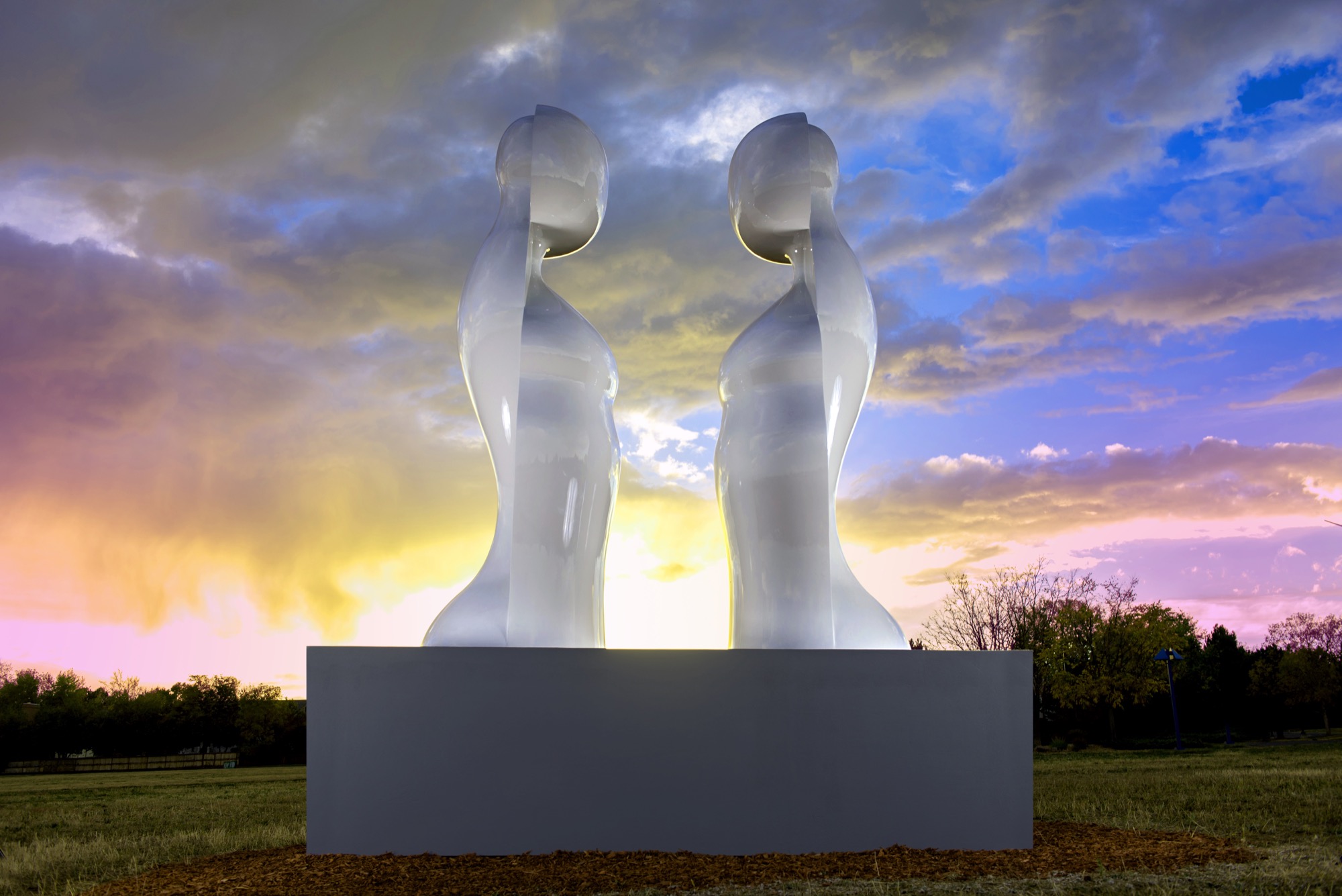
“My inspiration is the human figure, but the interpretation of it is somewhat abstract and reduced to the essential elements which help tell a story. The source of my work comes from the human body; people are drawn to that, I suppose, because we all have one. We can all relate to it in some way,” explains Reutimann. His fifteen-piece series, Dreams, was inspired by a wax mold that melted in Colorado’s hot sun and further inspired him to create sculptures that appear human at first glance, yet abstract from other angles.
“The source of my work comes from the human body; people are drawn to that, I suppose, because we all have one.”
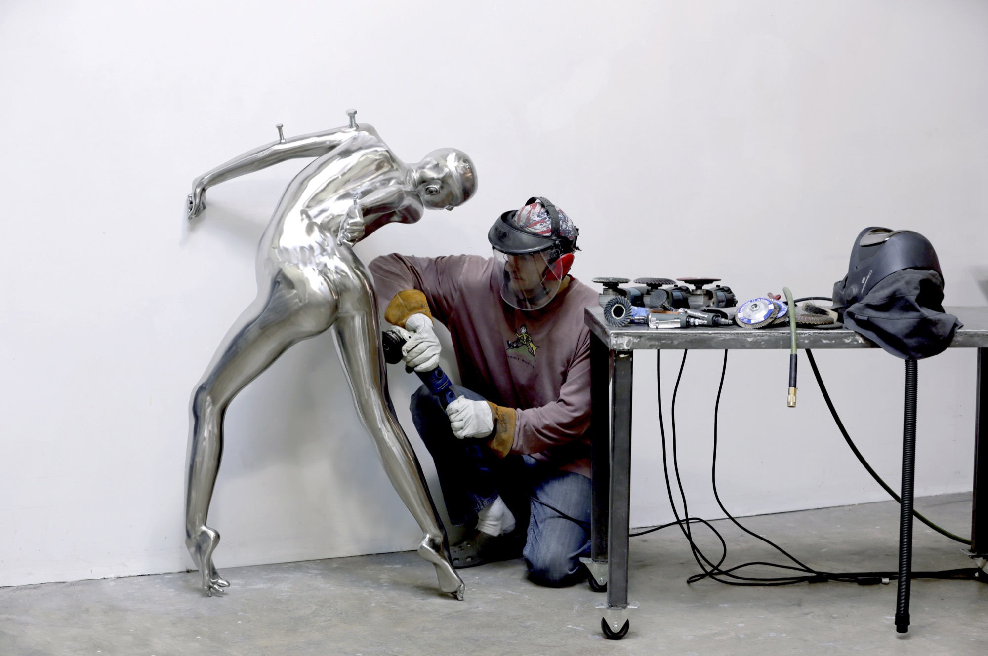
Body / art
The immensely popular Dreams series is a surreal interpretation of human emotions as figures fling themselves into contorted poses and postures—often reminiscent of a melted-wax figure. Reutimann has placed heads, torsos, and arms backward creating a jarring, disturbing effect that evokes a strong, visceral response for the viewer. He juxtaposes nearly perfect, yet severely distorted bodies as if broken and reassembled incorrectly. Body parts erupt in every direction. Figures hang upside down, suspended or cantilevered in space, as if falling or floating. Cast entirely in sleek stainless steel, the homogenous heads of the sculptures lack facial features and expressions, much like mannequins. “The focus is directed away from the face toward the body, and the complex dreamlike state personified within,” Reutimann offers.
In a world where discerning art patrons purchase paintings ten-to-one over sculptures, Nick Ryan, Havu Gallery’s administrator, notes that long-time painting collectors are purchasing Reutimann’s unusual and evocative figures. Ryan says they choose Reutimann’s work based on his inimitable technique of combining abstract realism with figuration, particularly in the Death of Venus, a six-foot (almost two-meter) sculpture painstakingly cast in bronze with surfaces flawlessly covered with sleek Ferrari-red automotive paint. Death of Venus is Reutimann’s interpretation of Botticelli’s Birth of Venus. The spectral skull is representative of cultural shifts, and the highly saturated red paint reflects the glamour and lifestyles of modern society.
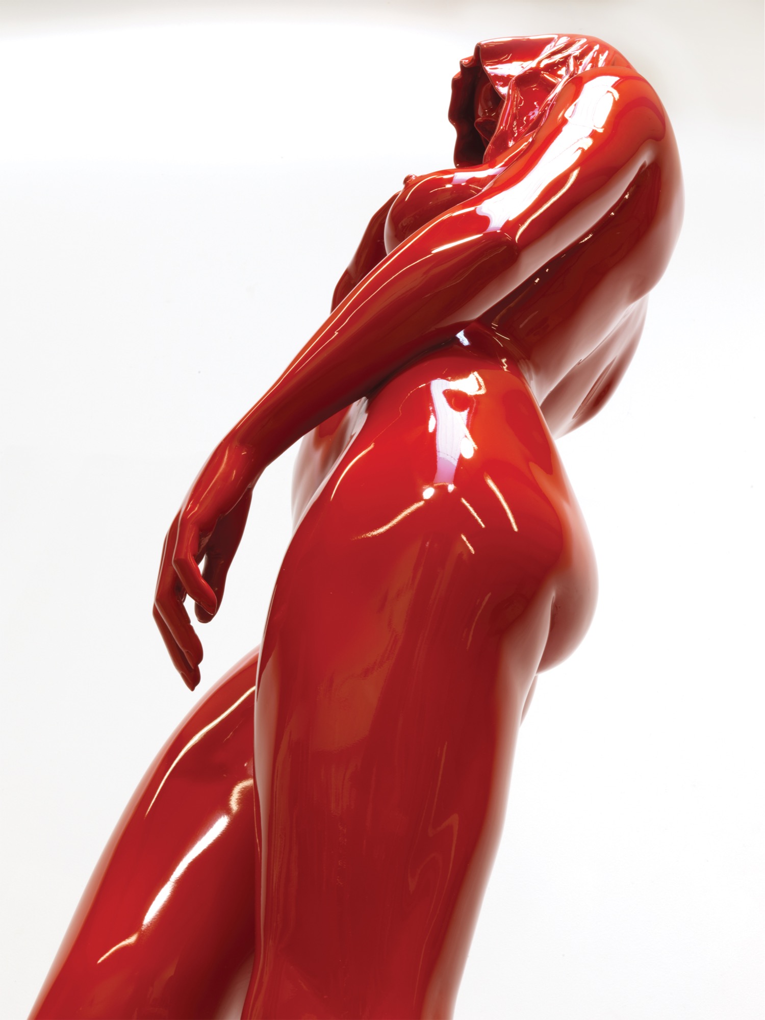
The Perception series was inspired by the artist’s visit to Egypt, and the entire series is cast in stainless steel, painted with automotive paint and buffed to a mirrorlike shine. “In keeping with abstract realism, the concept of the sculpture is about the duality of good and evil. The good has an angelic appeal and the evil has a darker character, wearing a cape with the head tucked in. My belief is that we all have these characteristics, and one can’t exist without the other,” Reutimann says.
“In keeping with abstract realism, the concept of the sculpture is about the duality of good and evil... We all have these characteristics and one can’t exist without the other.”
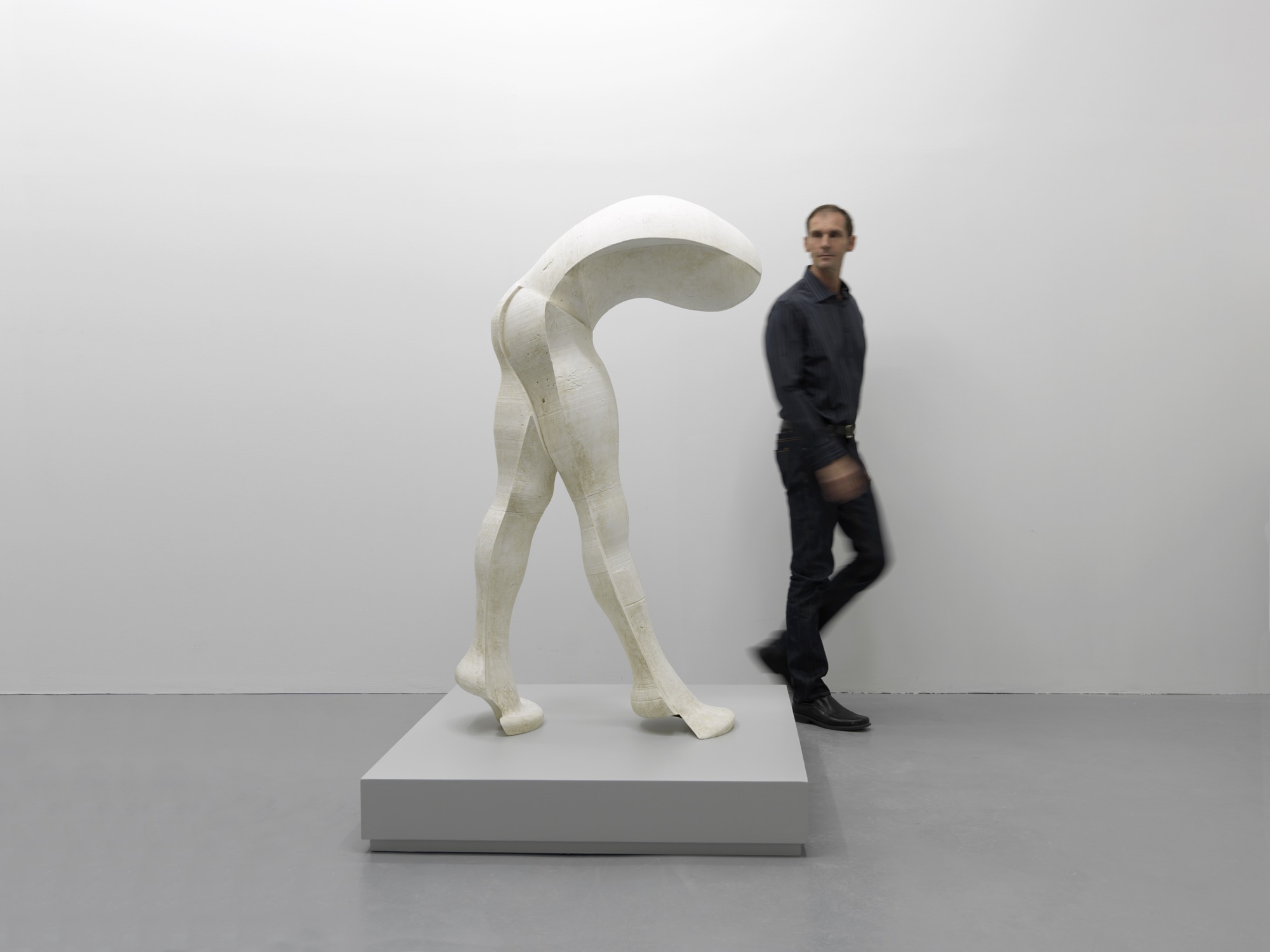
Reutimann’s fascination with automotive paint allows him innovations in the aesthetics of his creations. Automotive finishes require multiple paint layers buffed to a supersmooth polish until they shimmer and mirror one’s own reflection. The contemporary finish is extremely durable and lasts decades outdoors with only occasional buffing, whereas a traditional bronze sculpture with patina requires constant maintenance.
Reinterpreting americana
“My latest series is inspired by 1950s American automobiles. The fifties were all about space and speed and The Jetsons! The fantasy in concept cars goes wild; there are no limits, as there are none in art. The human body is much like a beautiful car—streamlined, organic, flowing like a dolphin in water—they’re imaginative. These sculptures have the shape of a woman but the spirit of a concept car. People see what they see and maybe it’s not my vision, which is perfectly fine. If someone is drawn to a sculpture, it’s a reflection of themselves and what their nature is, not that of the artist,” Reutimann says.
“These sculptures have the shape of a woman but the spirit of a concept car.”
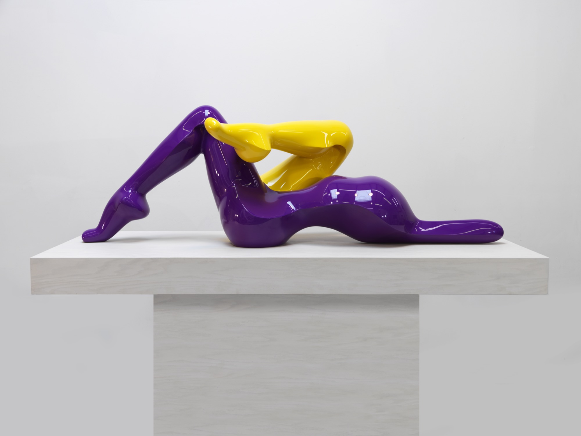
The music man
Reutimann plays piano several hours daily and declares classical music to be his biggest inspiration due to its drama and emotional depth, which allow him to follow his moods. Sergei Prokofiev’s compositions were on tap the entire year Reutimann spent creating the sculptures for the Dreams series. “You need to be in a spiritual place when you create sculptures. When people talk about inspiration, what they really mean is ‘being in spirit’ so art is not a conscious act,” Reutimann points out. “You can’t learn to be inspired. Music is my subconscious inspiration.” △
“When people talk about inspiration, what they really mean is ‘being in spirit’ so art is not a conscious act. You can’t learn to be inspired.”
Love and Loam
An Austrian artist family makes rammed-earth architecture, stoves and raku tiles
Earthen materials bond an Austrian family of artists: The applied-artist father builds with rammed earth and the ceramicist mother and graphic-designer son create tiles using an ancient Japanese pottery firing process. All their work is deeply rooted in ancient techniques, yet their designs are expressively modern.
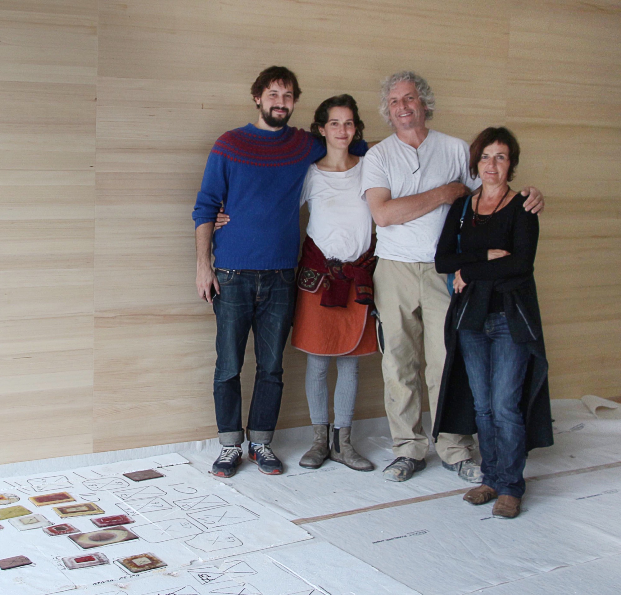
“Never.”
Trotting behind his father around countless construction sites, a teenage Sebastian Rauch convinced himself he would never follow in his artist parents’ footsteps.
Born this way
Now thirty and his hormone levels long balanced, Sebastian has succumbed to the truth: The love for elemental design, form, and earthen materials is in his DNA. His parents are ceramic artist Marta Rauch-Debevec and artist-builder Martin Rauch. She runs the tile label Karak; he heads Lehm Ton Erde (Loam Clay Earth). Together, they share a studio space in Schlins in western Austria’s Vorarlberg region, tucked between the German and Swiss borders and known for supreme skiing.
“Both my parents have art degrees and chose art as their livelihood,” Sebastian tells. “Somehow, it rubbed off on the children.” Today, he works as a graphic designer in Vienna. His sister, Anna Pia, is currently taking a maternity break from earning her degree in art pedagogy.
The son of two artisans admits that neither the material loam nor his father’s building sites interested him as a child. “I was all thumbs in construction, which led to a lot of tension between my father and me during puberty.” To his parents’ chagrin, young Sebastian preferred to spend his days in front of the computer. “I was engrossed in anything to do with science fiction and Japan, whereas my parents are much more down to earth, literally.”
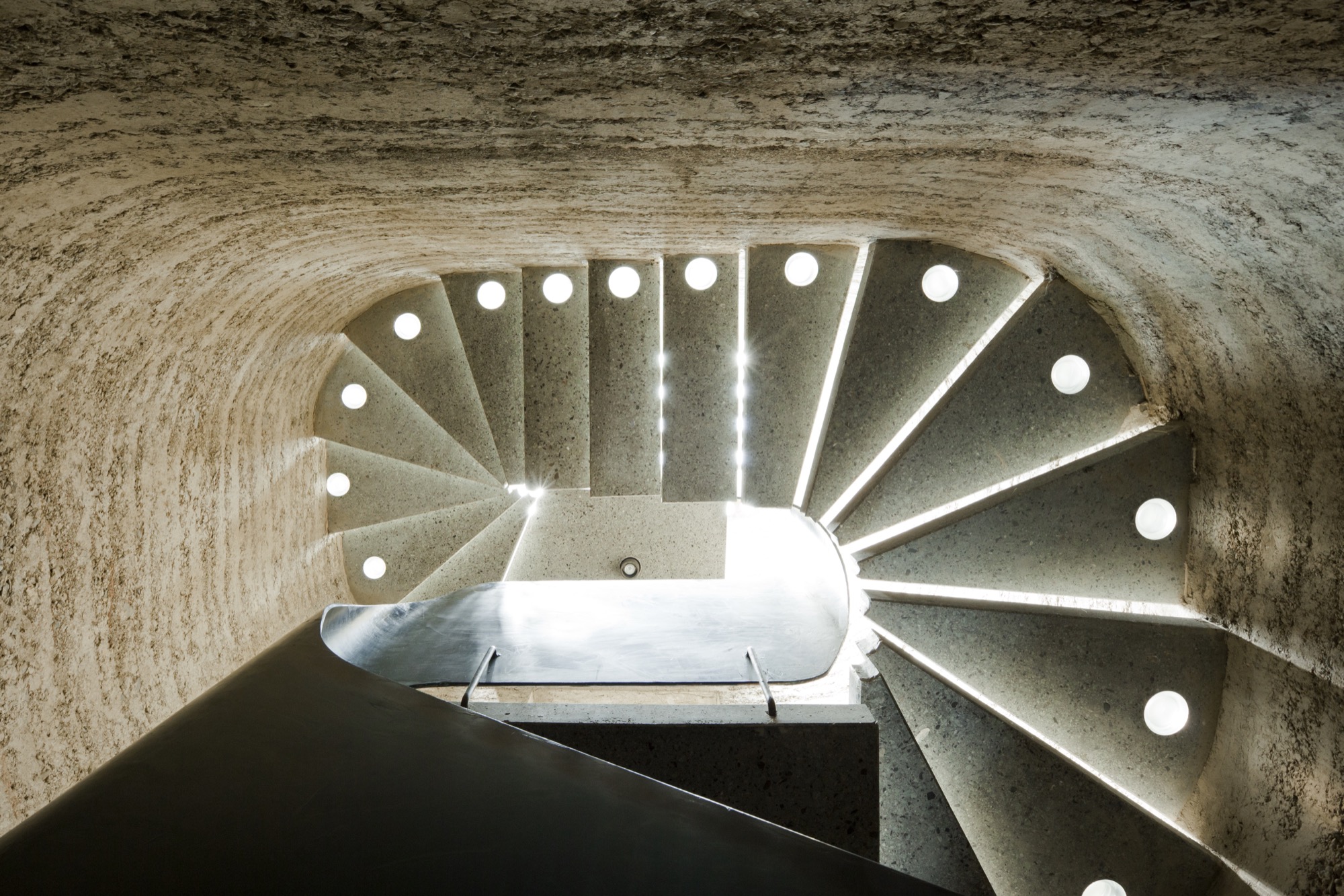
Rammed earth
Sharing a studio compels the elder Rauchs to amalgamate their crafts. “Marta and I have been working in the same space together for more than thirty years,” Martin says. “In terms of materials and processing techniques, there are many synergies between ceramics and building with loam, which help us both realize our work.”
To the family, loam, clay, and earth symbolize the holistic philosophy inherent in their art: Loam represents craftsmanship and technology, clay stands for art and design, and earth embodies the sustainability of building with loam.
Martin, who sees himself as an applied artist rather than an architect or designer, is known beyond the Vorarlberg region for practicing the ancient technique of compressing loam into a distinctive building material as sturdy as concrete. His desire to architecturally design with earth grew from his early work as a ceramicist, oven builder, and sculptor. Today, he focuses on the aboriginal rammed-earth technique, which he approaches with innovation. He builds entire buildings from loam as well as indoor components, such as wood-burning stoves, flooring, and interior walls.
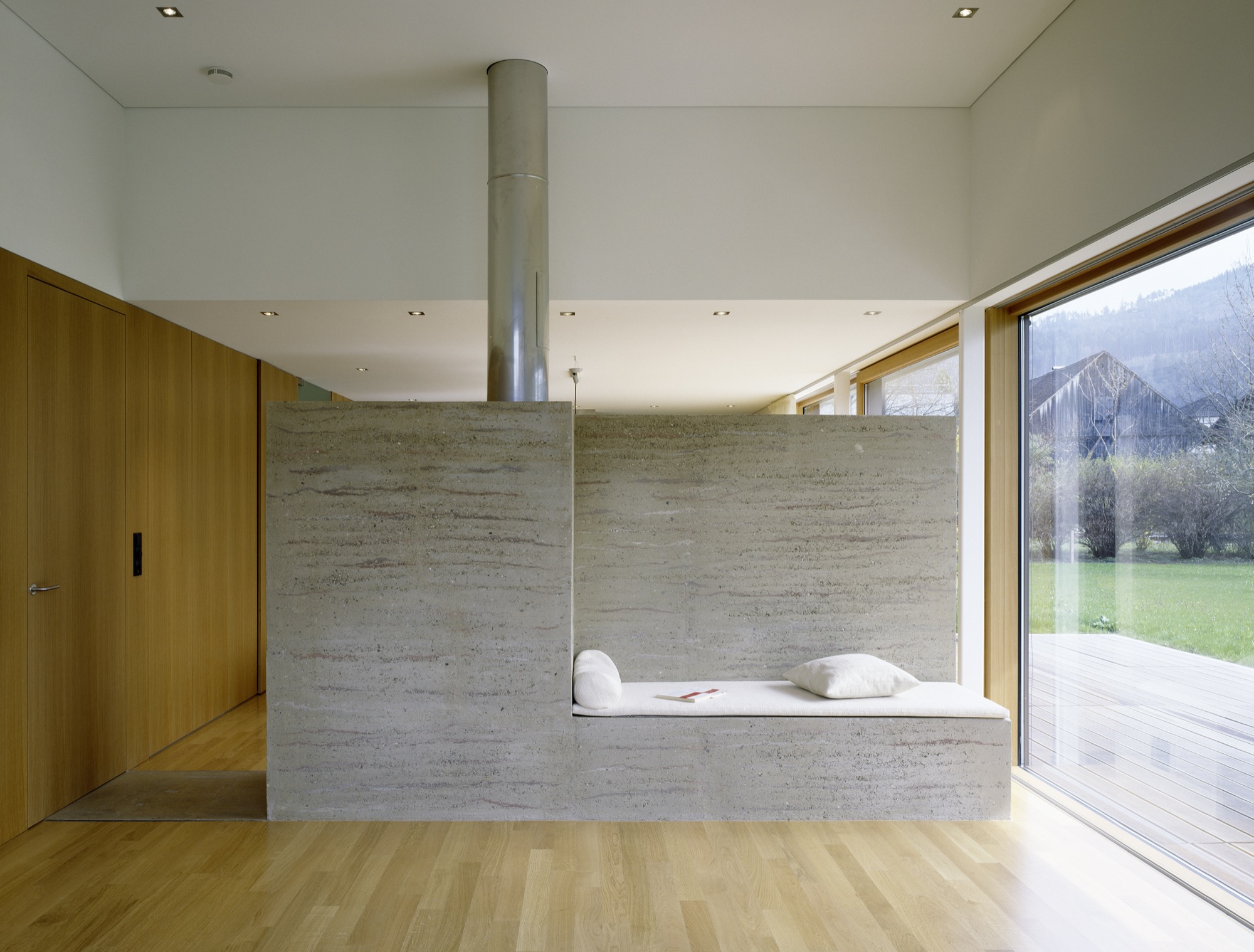
The process of compressing soil is time tested. Parts of the Great Wall of China were constructed from rammed earth. “Being able to create solid, bearing walls from such elemental materials fascinates me,” Martin says. “It requires careful study of the material but also courage. For example, one has to be able to allow the erosion.” External rammed-earth walls facing the elements will lose some surface, exposing stones and leaving a pebbled pattern. “Once we can accept the erosion, we can recognize its many benefits,” Martin explains. “We must recognize that its water solubility is really the most valuable virtue of loam as a building material.” His structures are 100 percent recyclable, often using ground dug up during a building’s own construction phase.
“Being able to create solid, bearing walls from such elemental materials fascinates me.”
His building materials and techniques are deeply rooted in tradition, yet Martin’s designs are expressively modern. “This very juxtaposition inspires me,” he says. “With the emergence of modern building methods in the last two centuries, building with loam was rarely considered, downright superseded, and degraded to the poor man’s building material.”
The Austrian artisan, who is currently cladding Saudi Arabia’s King Abdulaziz Center for World Culture in rammed loam, is confident that quality modern rammed-earth architecture with progressive, adapted techniques can once again valorize the image of building with loam.
Climate control
Breaking new ground in sustainable building spurs Martin’s creativity as artist and craftsman. “I love developing new ways of contributing to an anthroposphere that is more conscious of the environment and mankind,” he says. “Loam as building material is pure inspiration.”
Loam is available as local material almost anywhere in the world, meaning short, to no, hauling. “About 80 percent of our own home’s building material, for instance, came from its excavation pit,” Martin says. High efficiency and low primary energy are further benefits inherent in rammed-earth buildings. Locals identify with his work for these sensibilities. “It’s not unusual for our projects that the principal or the villagers join in building.”
Bringing the rammed-earth technique into the twenty-first century is a challenge the builder approaches from a business standpoint. “In Europe, it is important to react to the rationalized and industrialized building sector,” he explains. “For us, the prefabrication of rammed-earth components plays an integral role. It allows us to build much more efficiently and according to today’s construction timelines.”
Rammed-earth interior walls promote a well-tempered indoor climate. The enormous mass abates temperature extremes and superbly regulates humidity. If you have eaten a Ricola herbal cough drop, you have a connection to Martin’s work. He collaborated with Pritzker prizewinners Jacques Herzog and Pierre de Meuron, founders of the Swiss architecture firm Herzog & de Meuron Basel, on the Ricola Herb Center near Basel. Martin’s loam walls promote ideal humidity levels for storing and processing the herbs.
Haus Rauch
Though Martin has been working with rammed earth for more than three decades, the home he built for his own family was a test bed for further adapting and refining his technique.
The 200-square-meter (2,150-square-foot) home built into a steep southern hillside above Martin’s native town of Schlins was completed in 2008. The design was a collaboration with Zürich architect Roger Boltshauser.
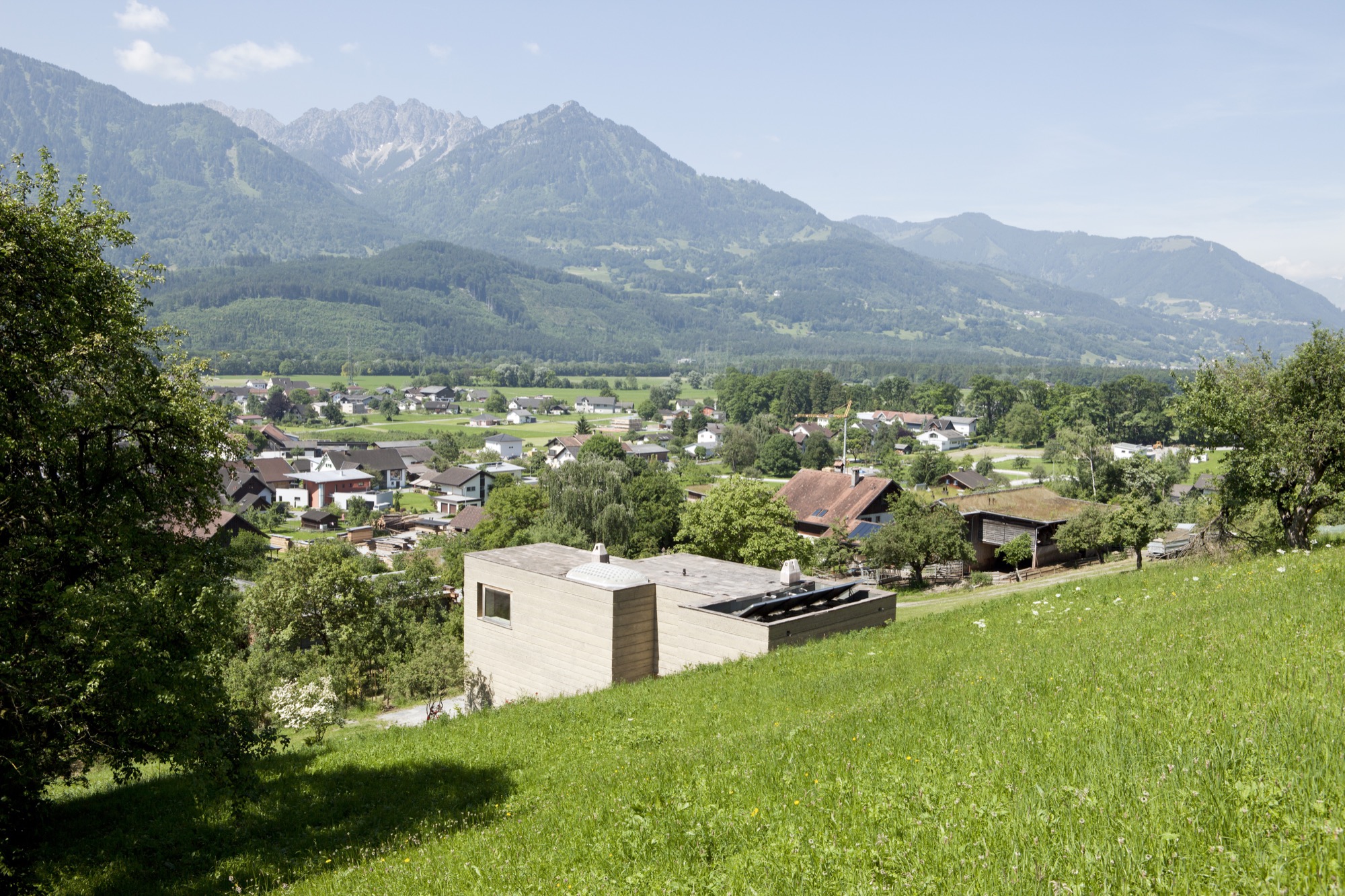
In its orientation and form, the house directly speaks to the topographic flow of the site and the context of the landscape: A monolithic structure like a sculptural block is literally pushed out of the earth. The use of solid rammed-earth walls combines this architectural intention with the desire to construct an ecological building exclusively made of natural materials.
The mother of creativity
Marta, who was born in Ljubljana, Slovenien, and studied ceramics and product design at the University of Applied Arts Vienna, never urged her son or her daughter to work with her. “Simply following in your parents’ footsteps doesn’t bring you happiness. I wanted them to cultivate their own dreams and visions, so I never thought that one of my children would one day work with me.”
Having been an independent artist working on theme-based projects for exhibitions and sculptural ceramic objects, Marta herself hadn’t planned on specializing in tiles. But she knew she wanted to incorporate ceramic art in the new house.
After working with a low-fired technique known as raku, a traditional Japanese pottery process, for twenty years, Marta wanted to explore tiles as medium. “I was looking for a tile design for the house when I discovered the beautiful patterns Sebastian was creating on his computer,” she remembers. He says he created the designs “just for fun.” Marta wondered how she could transfer her son’s digital doodling to her tiles and began experimenting with screen printing. “When I created the first samples, we were all surprised how stunning the combination of the raku tiles and Sebastian’s patterns truly was.”
“I was looking for a tile design for the house when I discovered the beautiful patterns Sebastian was creating on his computer.”
Karak tiles
The Karak brand was born. Marta and Sebastian’s Karak tiles—each a unicum—embody the elementary relationship between the Eastern and the Western world. Captivating geometric ornaments, the result of repeating, digitally created design patterns, are married with the century-old Japanese raku technique that gives the tiles an inimitable air of chance.
The tile material is a combination of different kinds of clay and loam mixed with quartz sand and fireclay. Pressed into shape, each tile is retouched by hand, the designs applied by silk-screening.
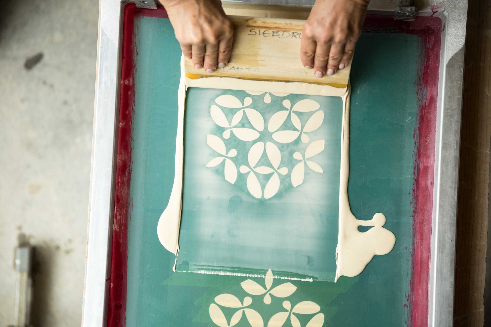
As the tile is red at about 1,000 degrees Celsius (ca. 1,830 degrees Fahrenheit), the material’s transforma- tion becomes palpable—the low-fired technique makes it porous and gives the final product a deep, organic sound at the touch and a warm haptic.

Still glowing, the tiles are removed from the kiln one at a time and immediately hermetically buried in sawdust. The void of oxygen and the smoke have an intense effect on the surface that varies for every piece. The color changes with the glaze; hair-thin cracks are blackened.
Finally, dunking each tile in water reveals its finished character. Transformed by the temperature shock, the glazed surface is brushed off, evincing a craquelure—like a fine net tying everything together.
Starting Karak wasn’t a conscious decision but rather a mother-son collaboration that grew organically. At first, the two intended to create the tiles only for the family’s villa. Then a book was published about the unique house. “On occasion, people began talking not about the Rauch house but about that house with the beautiful tiles,” Sebastian remembers. “People were asking us where we got those tiles...that’s when orders began coming in.”
“When we created the tiles for the house, I suddenly knew the charm of these tiles,” Marta says. “After all these years, I am still excited every time I walk in the door.”
Futuristic fantasy meets ancient technique
Sebastian’s passion for science fiction inspires the patterns he designs for the tiles. “I love to connect antipodes, things that seemingly don’t go together, the interplay between contrasts...that tipping effect.” His KuQua design, for instance, combines spheres (Kugeln in German) and squares (Quadrate). “When you deconstruct these two shapes and recombine them, they become almost unrecognizable in an entirely new shape. However, there is an underlying geometrical clarity and calmness that makes me feel like I didn’t design this shape; rather, I found it. At the same time, there is constant movement as the eye meets the pattern, like a deep mantra lancing the universe, like yin and yang.”
His mother is no less fascinated by the repetitive geometric patterns’ tipping effect. “Depending on how the eye focuses in, the design can suddenly appear three-dimensional,” she says. “In fact, we created a three-dimensional tile, the TaOk tile, a tantalizing combination of modern geometrical design and something Oriental. Then, the ancient technique adds something very primordial...a beautiful enrichment.”
The raku process gives a brand-new tile the patina of a long life. “I am intrigued by something that looks so archaic, yet you can’t really assign the object to an epoch,” Sebastian says. “I like to envision an archeological excavation site where they dig out a temple and find patterns and artifacts that don’t have a place in our past, in the human past...so you may have discovered an alien temple.” The precise patterns, the exact geometry combined with the serendipitous process make Sebastian optimistic for the future. “In science fiction the future is often depicted as extremely slick and clinical, as measured and constructed. I rather like the thought of a future that is still sensual and vivid.”
The geometric patterns are calculated and carefully designed, with precise lines. But the firing process, the smoke passing through the tile, and finally the quenching in water is so incalculable that what was once smooth becomes structured, what was once superficial gains depths. “It is a movement between order and happenstance, between repetition and uniqueness,” Marta adds.
“It is a movement between order and happenstance, between repetition and uniqueness.”
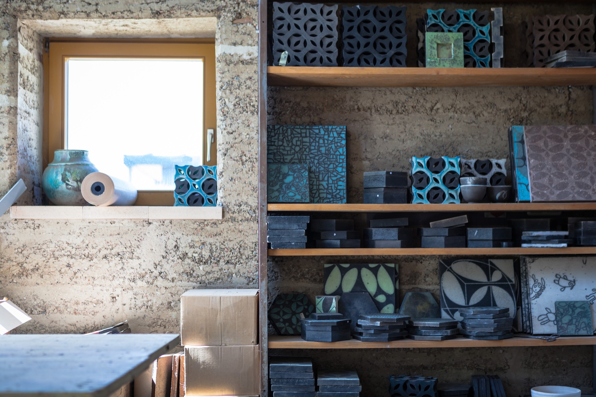
Both Marta and Sebastian appreciate the synergies and new opportunities that come with sharing the workshop and resources with Lehm Ton Erde, particularly Martin’s tinkerer skills and powerful imagination.
“Growing up, I was pretty sure I wanted nothing to do with loam,” Sebastian admits. “Funny how I found my way back to the material.” In the end, he’s grateful his parents laid the groundwork. “I couldn’t imagine working like this if it weren’t for being a family.” △
“I couldn't imagine working like this if it weren't for being a family.”
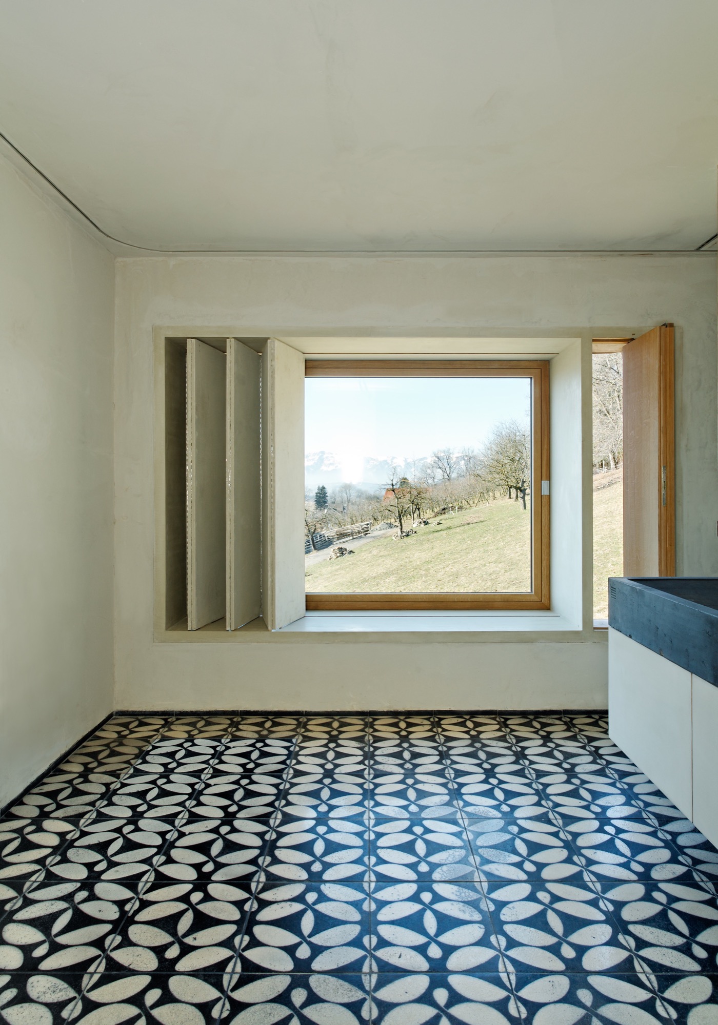
One Hundred Years of Swissness
A renovation of a 1912 chalet so beautiful it spawns an interior design company
In 2012, Virginie Confino, a photo editor, and her science journalist husband Bastien fall in love with a 100-year-old chalet in Val-d’Illiez, near the Portes du Soleil ski resort in the Swiss Alps. Without any prior knowledge in building or renovation, the couple abolishes their resolution not to entrap themselves in any kind of serious remodeling project and deconstructs the faded chalet. The result was so beautiful, it propelled Virginie into the new adventure of launching her own interior design business, Gris Souris.

The story in her own words...
We were looking for a holiday home for our family of four. We visited some chalets, but none of them felt right for us. Until we found this one. We fell in love with the balcony at first sight; its whimsical railing looks like lace.

Inside, the chalet was old and untouched since the 1960s. The walls lacked any sort of insulation, the house had no heat and a ladder in the living room was the only way to reach the upstairs, no stairs.

Intention out the window
Right away, we had a vision for how we would transform this chalet. Although, when we first began searching for a property, we had no intention to throw ourselves head-first into a renovation project. Our limited budget meant that we had to do almost all of the work ourselves. What’s more, neither of us had any experience even close to remodeling or construction — me a freelance photo editor for the press and my husband a science journalist. But Bastien has always believed, “Anything is possible.” And we did it!
My husband learned a lot from books, the Internet and YouTube videos, and I joined him at the chalet two days a week for a year and a half. We required professional help with the masonry in the entrance, because the rain was coming in, with the terrace outside, and with the heating and plumbing.
We virtually gutted the inside of the house. We just wanted to keep some of the old elements, such as the old wood floors, stairs and doors. Once we finished insulating the house from the bottom to the roof, we put the old wood back on the walls. We used a lot of wood on the inside, old wood, and slate for the bathroom floors.


1912 on the outside, Swiss modern on the inside
The chalet is a mix of old and modern. Because we have a big entrance, I wanted to do something special there. We chose a transparent door that gives view to the log wall, which is a decoy we created by cutting about 4000 logs of wood into five-centimeter pieces, 15 centimeters at the top. We dried the logs and fixed them together. The wall alone took ten days of work.

We remodeled the kitchen simply by changing the cabinet doors and painting the walls. Almost all of the furniture is from IKEA. We didn’t want to furnish the chalet with special pieces because we are renting it out when we are not using it.
Bastien built the dining room table himself, because we couldn’t find one that was three meters long and not too expensive. We painted the table top with chalkboard paint so we can write on it when we play games.
The dining chairs are old Tolix chairs that sat outside for a long time, which gave them the perfect rust-like patina for the chalet. Two Butterfly chairs and Tolomeo Artemide lights on the walls, not much else. We incorporated old sleds we found in the cellar into the decor.

Outside, we have a nice terrace with amazing mountain views of the Dents du Midi. We enjoy looking at this mountain range while we take a Swedish bath outside, even when it’s snowing.
Gris Souris
Chalet Le 1912 became my “business card.” Once the renovation was finished, friends started asking me for interior design advice and even wanted me to renovate their chalet. Soon, my new adventure began, and I created Gris Souris, my interior design company in Lausanne. △
Photos by Myriam Ramel Baechler / Lumière du jour
The Beauty of Use
Hidden in the Japan Alps, a Czech-born artist makes woodstoves that match the simplicity ofJapanese interiors.
Secluded in the Japanese Alps, a Czech oven-maker and his Japanese artist wife find creativity in daily life as she weaves rugs from goat hair and he smiths minimalist woodstoves that are as much modern steel sculptures as they are functioning furnaces.
“In November, the mountain puts on her autumn kimono, and it is lovely around a burning stove...”

The first time I saw one of Jirka Wein’s stoves, I was visiting friends in Matsumoto, a city in the valley that stretches along the eastern flank of the Japan Alps a few hours west of Tokyo. It was March, and I had arrived from California braced for the icy floors and bone-chilling drafts typical of Japanese houses built in the traditional style, which is to say without insulation or central heating. Instead, I stepped into a deliciously warm and cozy enclave. There in the entryway sat a fat black stove unlike any I had seen before. Woodstoves are not unusual in heavily forested rural Japan—I had owned one myself when I lived there, as had a number of my more rustic friends—but this one was glossy and sleek, stripped of any frill that might obstruct its absolute simplicity. It looked as much like a sculpture as a functioning furnace. A lively fire flickered against the round glass door, and above that, behind a second door, a pan of pasta baked in a brick-lined oven.
"It looked as much like a sculpture as a functioning furnace."
My friends were quite taken with their stove. It was like a pet, they told me, or a fifth family member with a knack for bringing together visitors and residents alike in toasty communion. Its origin was equally interesting: It came from a remote valley in the mountains south of Matsumoto where Jirka Wein, a seventy-three-year-old Prague-born artist, shaped steel while his wife, Etsuko Seki, wove rugs from goat hair. My friends had driven out to pick up their new acquisition and ended up staying to talk about poetry and pottery and wine—all, of course, while gathered around the inviting flames of a woodstove.

Visiting the oven-maker
I was so intrigued by this story that on returning home I called Wein to ask if I could visit the next time I was in Japan. He agreed, and six months later I found myself sitting beside him as he drove east toward his house from the small train station where I’d arrived. By then it was early November. It had rained the previous night, and as we climbed into the hills, the damp tree trunks stood out like black fault lines against the brilliant foliage. Wein, a grandfatherly man in suspenders and a plaid shirt, seemed as overwhelmed by the beauty of the landscape as I was. “We see the color descending from the top of the mountain, and one day it swallows the place where we are,” he said. His parents had been avid mountaineers, he told me, and the family spent summers in the mountains of Bohemia, instilling in him a lifelong love for alpine wilderness.
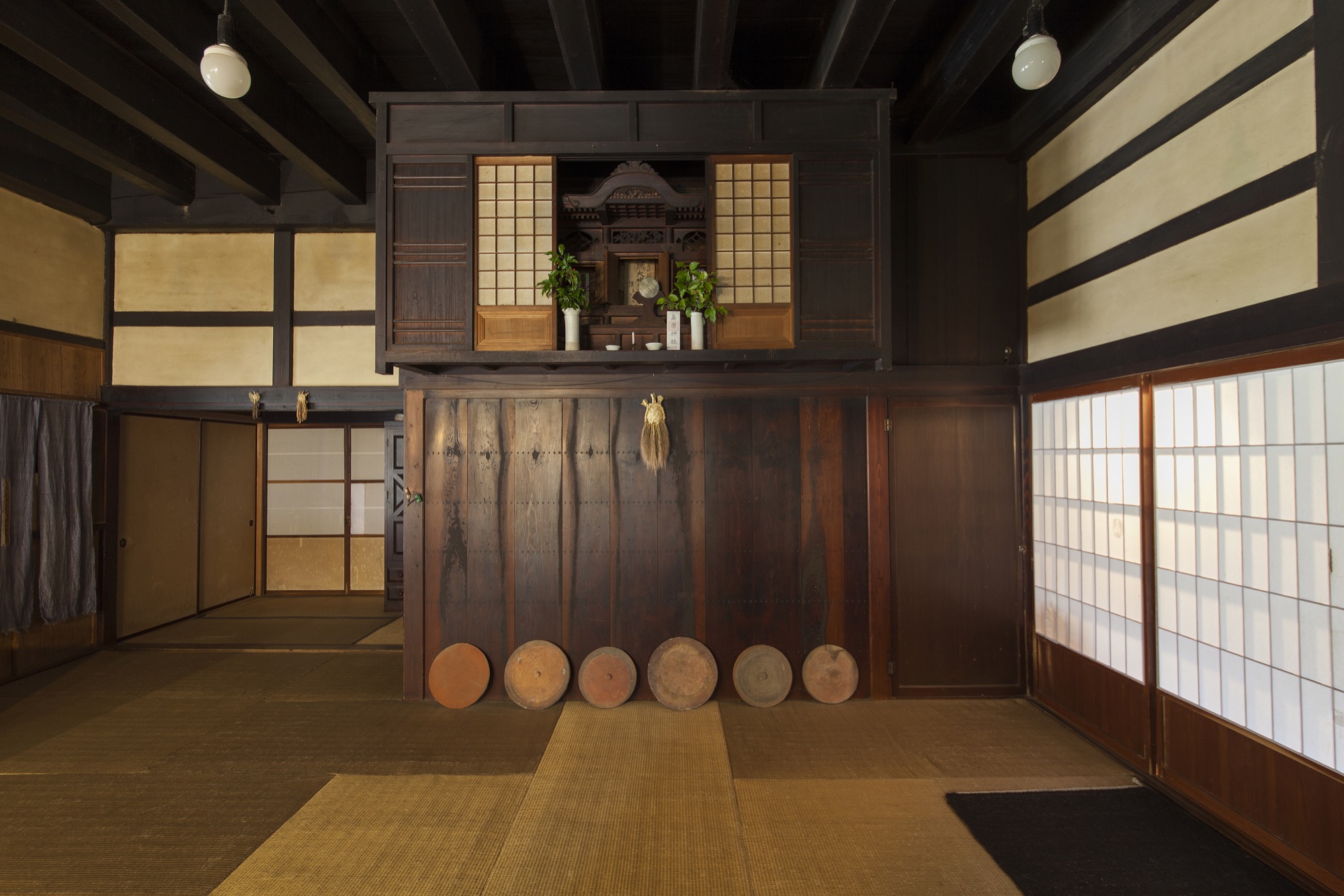
A life journey from Bohemia to the Japan Alps
His path from those mountains to these was far from direct. Wein grew up in the suburbs of Prague and studied stage design there before moving to southern France to pursue a master’s degree in art history and archaeology. By the time he graduated in 1973, the political situation in Soviet-occupied Czechoslovakia had made returning home impossible. He spent the subsequent decade as a wandering scholar, artist, and spiritual seeker. At a Gandhian ashram in India he learned to spin, and in Santa Cruz, California, he taught weaving. By the early 1980s, he was living at a commune in New Mexico. It was there that he met the itinerant poet and environmentalist Nanao Sakaki, who eventually led him to Japan.
“Nanao was living up in the mountains in an abandoned bear den, writing a play,” Wein recounted as he turned onto a narrower branch of the winding road. “He would come down to the commune to restock. We’d spend all night drinking and singing, and then he would go back up the mountain.” The two became friends and eventually traveled the western United States together, staying with the likes of Allen Ginsberg and Gary Snyder. When Sakaki returned to Japan, he wrote to Wein, inviting him to follow. “So I came. It was winter. Then spring came and the mountain was so beautiful I couldn’t believe it,” he said. Thirty years later, he hadn’t left.
At home with Seki
Wein rounded a final curve and pulled up in front of a large old-fashioned house hemmed in by wooded slopes. It was a perfect mild morning, the sky clear, the smell of smoke mixing with the sunlight. From somewhere far below, I could hear an invisible creek rushing past. Wein led me inside a cavernous entryway. The 140-year-old house had belonged to a powerful landowning family, he explained, but by the time he and Seki arrived with their daughter in the mid-1990s, it had been abandoned for decades. A flood had washed away all of the other homes in the hamlet, leaving only monkeys, deer, and wild boar for neighbors. Now, restored, the house was spare and majestic, composed of age-darkened wood and dusty plaster pierced by shafts of light. Gazing out at the wall of trees that pressed in from every window, I asked him if he ever tired of the mountain. “No, never,” he replied, deep smile lines radiating from the corners of his eyes. “I hope it doesn’t get tired of me.”
In the kitchen, Seki, a small, reserved woman in indigo farmer’s pantaloons and a blocky top, was arranging slices of cheese and tomato on top of pizza dough for our lunch. She nodded hello, then carried the pan over to the large stove in the center of the room, opened a side door, and slid it in. Wein donned a pair of black-rimmed glasses and joined her beside the stove.

“You see these two holes on the top?” he asked, pointing to pipes embedded on either side of the chimney. “These suck in warm air from above so that it creates turbulence.” He struck a wooden match and held it above one of the holes; the flame was instantly pulled straight down by the draft. He walked around to the front and told me to look in through the glass window. Behind the crackling flames, I could just glimpse rows of yellow firebricks similar to those used in ceramic kilns. “Wood flames at 600 degrees Celsius. Firebricks accumulate heat, and after they reach 600 it’s hard for things not to burn,” Wein explained. Together with the air system, the brick lining ensures that his striking stoves burn well, which is why they are as popular with his elderly neighbors as they are with design-conscious urban architects.

Wein has been refining this design nearly as long as he has been in Japan. Not long after he accepted Sakaki’s invitation to cross the Pacific, he met Seki, who at the time was weaving rugs in Tokyo (she has exhibited them nationwide). The pair soon moved to a small village not far from their current home. They grew most of their own food and made what they could by hand, learning from their self-sufficient neighbors. “We wove rugs and grew wheat and rye, and when we wanted to make bread, I thought about making a stove,” Wein said.
“We wove rugs and grew wheat and rye, and when we wanted to make bread, I thought about making a stove.”
He found himself fascinated by both the engineering challenges and the aesthetic ones. Older stoves were made of cast-iron parts assembled with screws. Newer ones had heat-resistant sealing materials between the parts and other additions such as catalytic converters that needed periodic maintenance. Wein imagined something completely different. “I wanted to make one without many technical tricks, that was simple, efficient—and for me this is very important—it had to be beautiful and fit well with the simplicity of Japanese interiors,” he said.
“It had to be beautiful and fit well with the simplicity of Japanese interiors.”
His solution was to weld rolled steel into simple forms assembled with the absolute minimum of fixtures (rolled-steel stoves are now available from many companies in Europe and the United States). The steel sheets are made by compressing hot metal between rollers and cooling it in an oil bath, which produces a rust-resistant surface that does not require paint. Since there are no small passages to become blocked by soot, his stoves can burn soft woods such as cedar that are plentiful in Japan. They are also durable and easy to maintain. He patterns their forms on the asymmetries of the natural world, because “if they were perfect circles or rectangles, you would get tired of them.” Each model is named after a plant or animal: peach, wolf, acorn, Japanese plum.
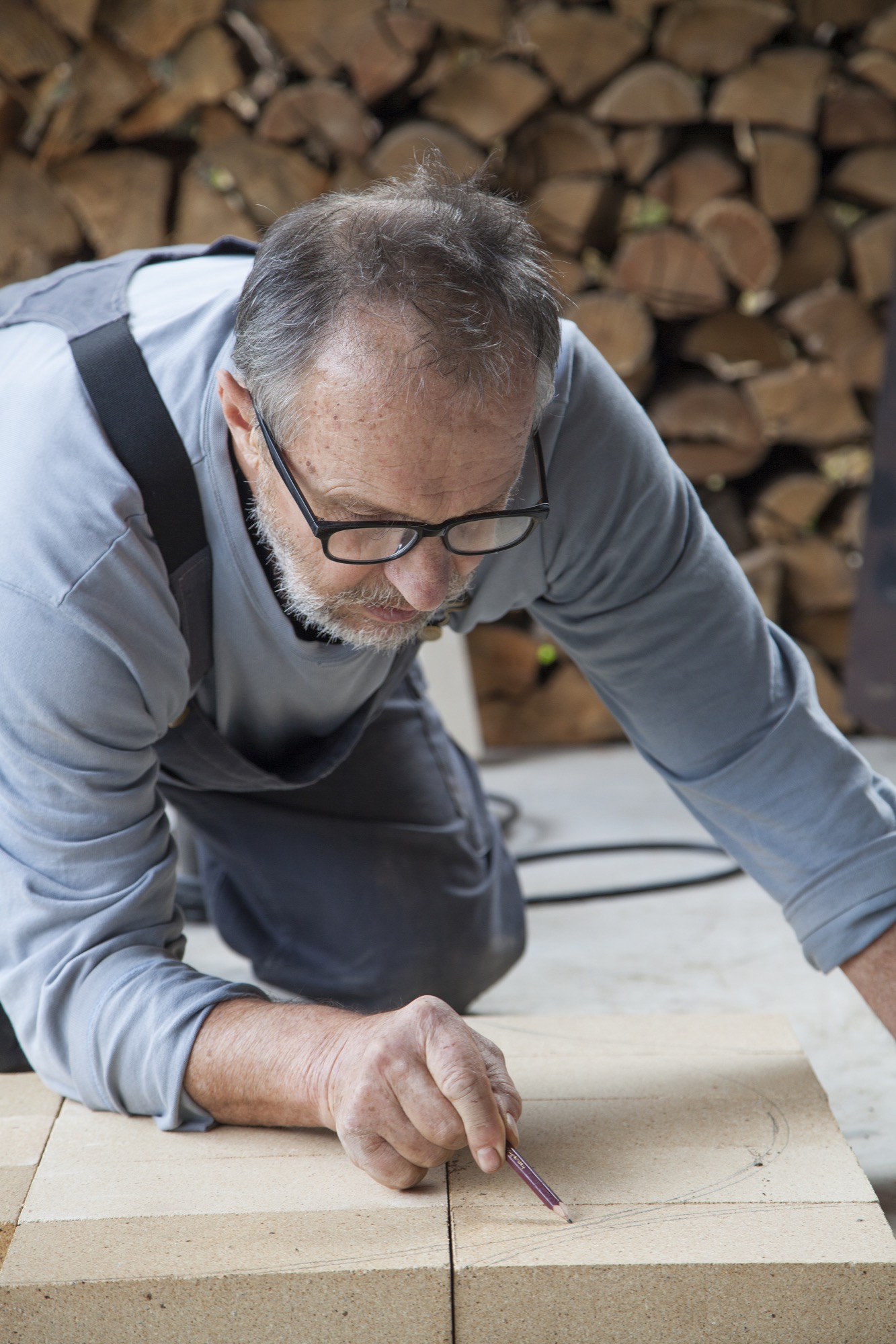
At first Wein did nearly all of the manufacturing himself while continuing to weave alongside Seki. By the early 2000s, however, he was making stoves full time in order to meet demand. Today he splits production between his home and several small family-owned factories in the prefecture: One laser-cuts the steel based on his designs, another rolls it, and a third handles the welding, with his help. The wooden handles come from a craftsman in the Tohoku region of northern Honshu. Wein cuts the firebricks and finishes the stoves himself, at the rate of about one per week, in an open workspace tucked against a lush hillside behind his house. He told me he likes this division of labor.
“When I’m here, I’m like a wild monkey. When I go there [to the welding factory], a bell rings at 10:00 and it’s teatime,” he said, settling into a bench beside the large slab of wood that serves as a kitchen table. Seki opened the door on the side of the stove and pulled out the pizza, releasing a gust of garlic and seared dough into the warm kitchen. She set the pan on the table next to a large bowl of salad greens and sat down across from Wein. As we ate, she talked about her work as a weaver, and I realized that although she is the quieter of the two, her clarity and strength of vision easily match his.
“We make functional things. When people use them, they create the beauty. In Japanese we say yo-no-bi,” she told me. Wein nodded: The expression, which literally means “the beauty of use,” is essential to him as well. It describes the tracks of rust that bloom from scratches on his stoves, the resonance of her earth-toned rugs against the wooden floors, the way their handmade dishes come to life when piled with food.
“We make functional things. When people use them, they create the beauty.”
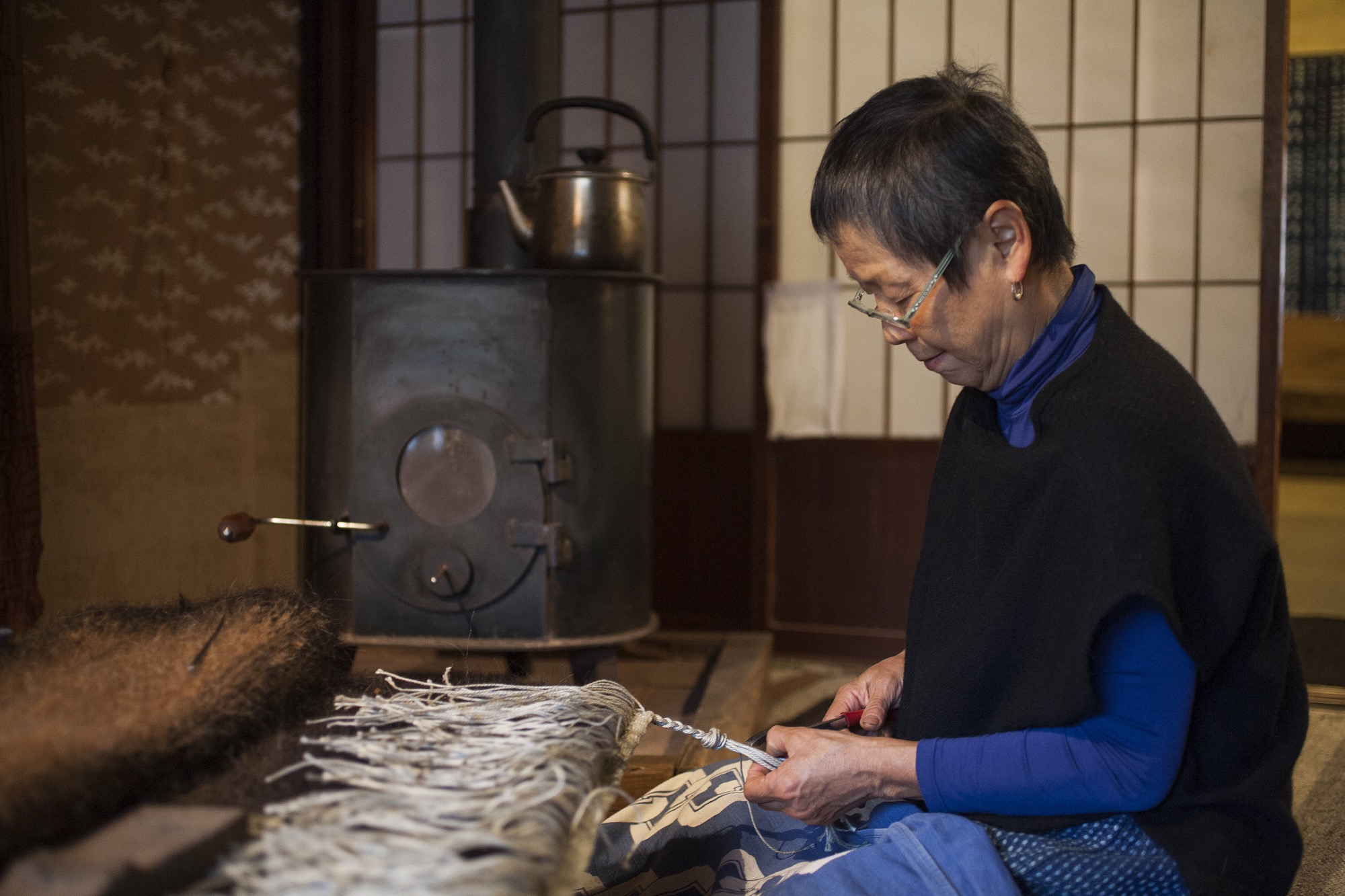
“Daily life is quite a creative thing,” Seki continued. “Beauty is very important for our heart and spirit, so how we live is important. When I was thirty-nine, I came to live in the mountains. At first I was so shocked. It was too different, and Jirka was quite strict.” He interrupted: “In the beginning I didn’t want to have a fridge, because when you have one you don’t eat fresh things.” Seki continued. “Those ten years made me very strong, and they changed me. After ten years, nature became very close. Lately, Jirka goes to sleep early, and I’m up late. I hear deer crying, and I feel like we belong to the same community of living things in nature. I feel deep joy.”
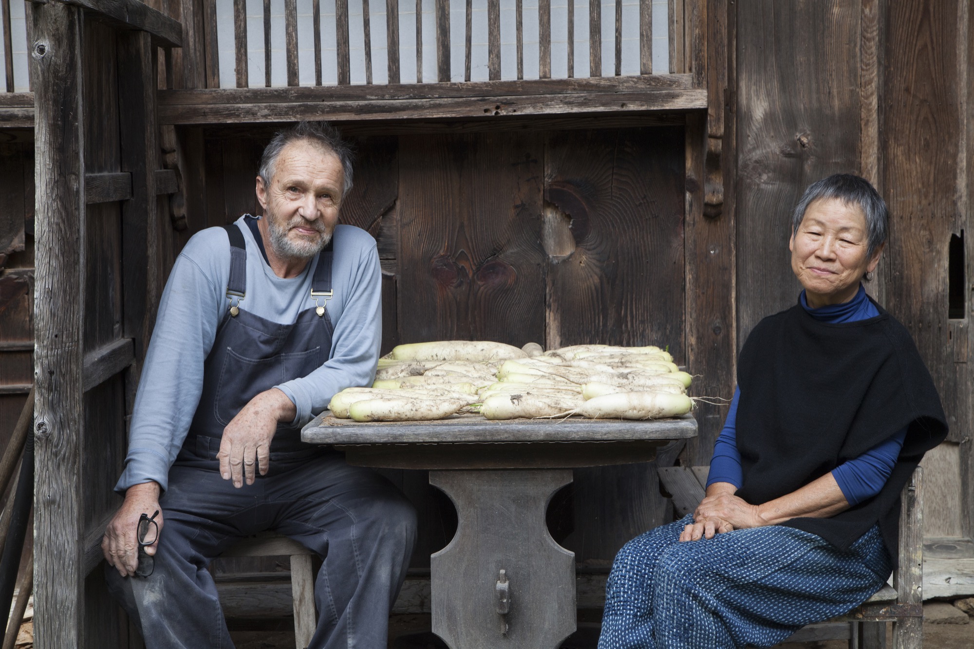
Lunch had ended, and our conversation was winding down. “Jirka, should we make coffee?” Seki asked. “I’ll grind some,” he replied. They moved together to the kitchen counter, where Wein pulled out a hand grinder. Seki filled a pot with water and placed it on top of the woodstove. Imperceptibly, the beauty of use settled another layer onto its smooth black surface. △
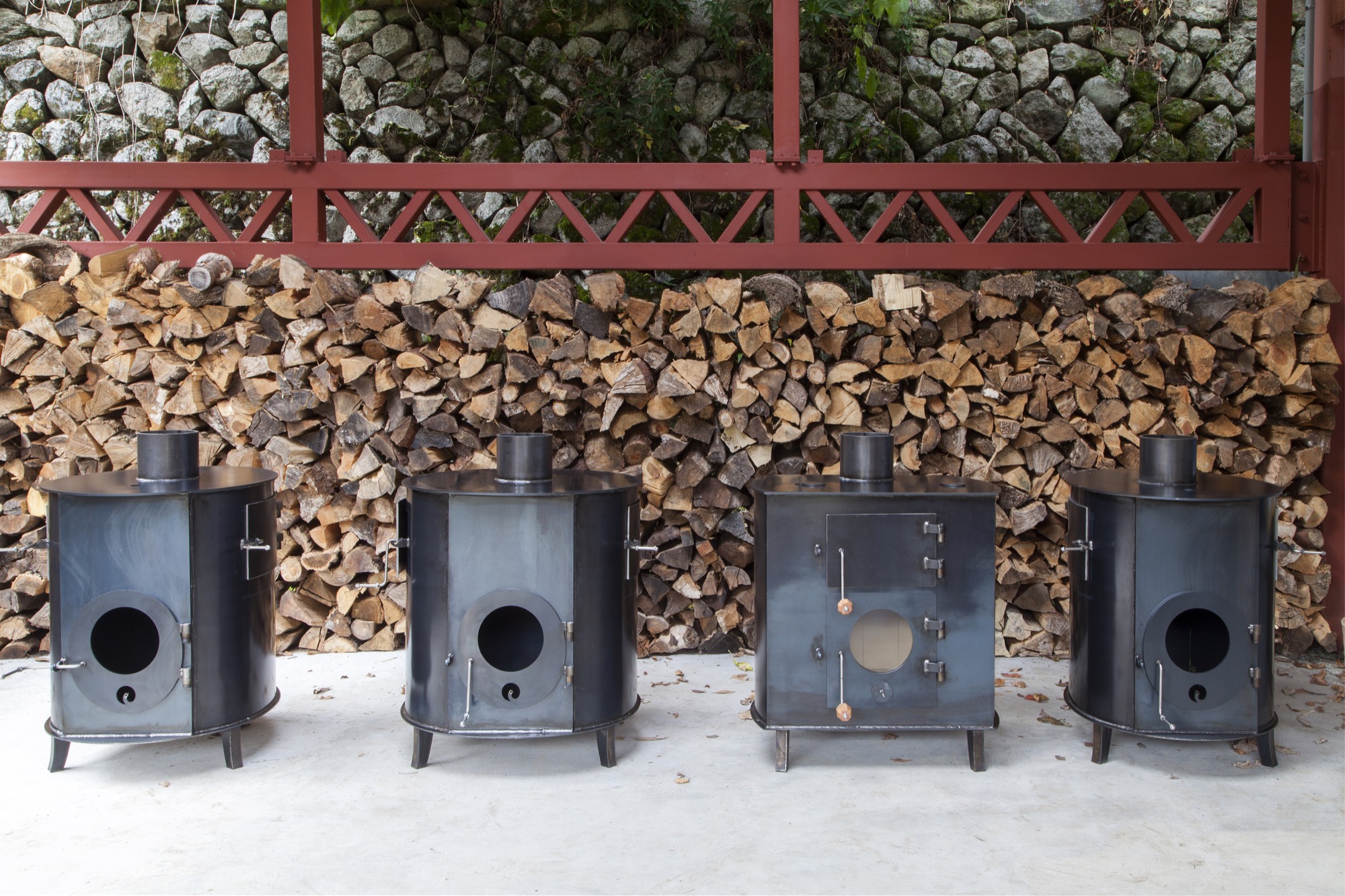
Bavarian Rebel
Avant-garde artist Bernhard Rieger — master of Lüftlmalerei, inventor of alpine pop art
A master of Lüftlmalerei, the traditional fresco technique characteristic of the Bavarian Alps, avant-garde artist Bernhard Rieger now revivifies authenticity with his invention of alpine pop art.
"Schau, wie die Sonn' aufgeht. Vom Berg ins Tal. Und von der Alm in die Stadt."
(Watch the sun rise. From the mountain to the valley. And from the pasture to the city.)
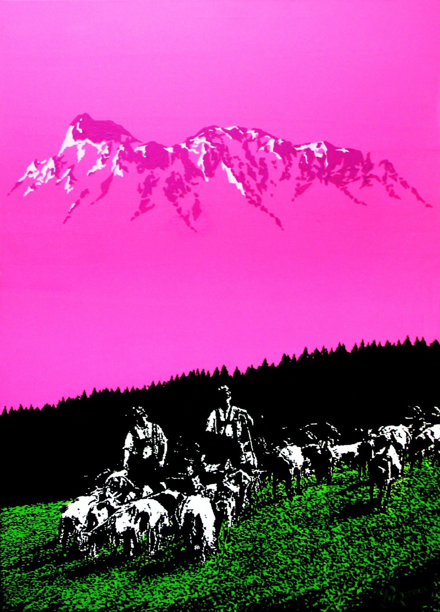
The artistic wunderkind
The funky music and the visuals on Bernhard Rieger’s website, alpenterieur.com [editor's note: for the best experience, open the link and listen to that intro beat and indigenous vernacular as you continue reading...], unmistakably manifest the Garmisch-Partenkirchen-based artist’s unusual style, which interweaves ancient tradition with modern design and sound to create something altogether original. The alpine electro beat he composed himself is just one example of the eccentric mountain rebel’s eclectic work. From his traditional Lüftlmalerei to alpine pop art to his modern designs with reclaimed wood, Rieger chooses a bold new approach to traditional art forms and materials. The man himself is a Gesamtkunstwerk, a walking paradigm of the young, wild generation of the European Alps.
Rieger’s website intro mixes original digital music—house, electro, lounge, and dump beats his musician friends composed—with acoustics like the cowbells he recorded in a pasture. The instrumentals are overlaid with his father’s voice speaking in the indigenous dialect of the Upper Isar Valley. The music, says Rieger, is his interpretation of the tightrope walk between cultural roots, modernity, and urbanization. He passionately philosophizes about society’s rekindled longing for regional culture and tradition. Rieger himself has never turned his back on the ancestral lifestyle. Growing up in the mountains surrounding the legendary tourist town of Garmisch-Partenkirchen in Upper Bavaria, he was deeply rooted to his native soil. He has never lost that authentic sense of life people now long for again.

Alpine minimalism
The idiosyncratic artist hails from a 400-year-old farmstead his parents lovingly restored and renovated in his childhood. Rieger’s father, a carpenter and sculptor who learned the trade at the Garmischer Schnitzschule (woodworking school of Garmisch), passed down his passion for South Tyrolean culture and style and for working with natural materials, wood in particular. Like his father, Bernhard Rieger is fascinated with the alpine farmers’ minimalist way of life, which continues to inspire him. Rieger grew up among folks who live by nature’s rules and rhythms. And even little Bernhard was blessed with a talent for painting.
“I painted gigantic murals with wooden pencils when I was only four years old,” Rieger remembers. Not to say that his affinity with local traditions has always been unshakable. As a youngster, he wore the baggiest jeans he could find and was more interested in his skateboard and punk rock than lederhosen and cowbell music. Nevertheless, he continued to express himself creatively throughout adolescence, whether it was through drawing tattoos and band logos for his classmates or designing skateboards and snowboards for himself and his buddies.
Flunking fine arts
He secured his first commissioned work at age fourteen. “I earned my first money designing certificates and painting wall murals,” Rieger recalls. What’s more, an odd job at a junkyard exposed him to old materials he took home to build lamps and other objects. After he graduated and completed his military service, Rieger was not accepted by the Akademie der Bildenden Künst München, where he wanted to study interior architecture. Instead, he trained as an interior designer and started his own business. “My unconventional style and my maverick projects were a thorn in the academy’s side,” Rieger reckons.
Lüftlmalerei
His original style fully flourished during that time. He practiced traditional Lüftlmalerei alongside his work as an interior designer. The large-format murals rooted in the Italian Renaissance first found their way to Bavaria via wealthy merchants in Augsburg who wanted their city houses adorned, and later they spread to the villages and the countryside. “Until 1850, this style, inspired by the fresco technique, was tremendously popular in the foothills of the Alps, from Arlberg to Salzburg,” Rieger says about the profane art style with its sacral motifs.
“My work is my contribution to preserving and keeping alive our traditions.” Rieger also paints maypoles with traditional patterns and pictures, one example being the famous maypole at the Munich Viktualienmarkt. “You can’t reinvent the wheel with Lüftlmalerei, though. It’s practiced the way it always has been, drawing inspiration from historic buildings.”
“My work is my contribution to preserving and keeping alive our traditions.”

The beginning of alpine pop art
In recent years, Rieger needed to break away from the rigid images and patterns. And he did. Since then, he has been successful with his own distinctive interpretation of alpine art. One of his works was a large hotel facade in Garmisch. The sixty-square-meter (646-square-foot) fresco depicts a mountain-climbing scene—very modern, very abstract, very bright red. “It’s despairing if you don’t stir things up as an artist,” Rieger proclaims. “Then you don’t understand your calling.” His alpine pop art was born from this mindset. It’s a modern interpretation of the nostalgic, schmaltzy scenes from his parents’ and grandparents’ era, in jarring colors. The small-town conservatives declared him crazy for it. That didn’t bother him. No doubt Rieger remains a colorful character in the region, not least due to his appearance, distinctly reminiscent of a young King Ludwig II of Bavaria.
“It’s despairing if you don’t stir things up as an artist. Then you don’t understand your calling.”
Alpenterieur
When it comes to Europe's modern alpine art, there is no way around Rieger. This is also true of his interior designs. Since 2007, the artist has been uniquely reinterpreting alpine living under the label Alpenterieur. While his lines are modern, his rugged reclaimed surfaces tell legends of the past, like the lines on an old mountain farmer’s face.

He knows not everyone can afford the elaborate artisanal designs he creates from natural materials. That’s why he added affordable Alpen Kult Quadrate, made from reclaimed wood and felt, to his collection. “You can find them hanging in the quaint living rooms of old Garmisch ladies and the fanciest homes in Kitzbühel,” Rieger says. He’s already made thousands of the squares, not mass-produced but handmade—and he’s making more. He believes everyone should have a piece of his creativity. And his artistry is blossoming. Right now, he says, he senses a rush of emotions again like he did during puberty, a sign something new is on the horizon for him. What exactly it will be, he doesn’t know yet. But he imagines it will have something to do with ancient custom and tradition. The trend of modern design inspired by the simple mountain style of the past is growing. “Our parents thought of the traditional alpine style as old-fashioned and antiquated,” Rieger says. “Then the hype began a few years ago. Especially younger folks want everything to be more original and authentic and more sustainable.”
This lifestyle trend is Rieger’s livelihood. But even more so, the Bavarian rebel walks the talk. His bohemian persona and alpine pop art certainly do marry the mountains and the valley, the pasture and the city. △
“Our parents thought of the traditional alpine style as old-fashioned and antiquated. Then the hype began a few years ago. Especially younger folks want everything to be more original and authentic and more sustainable.”

