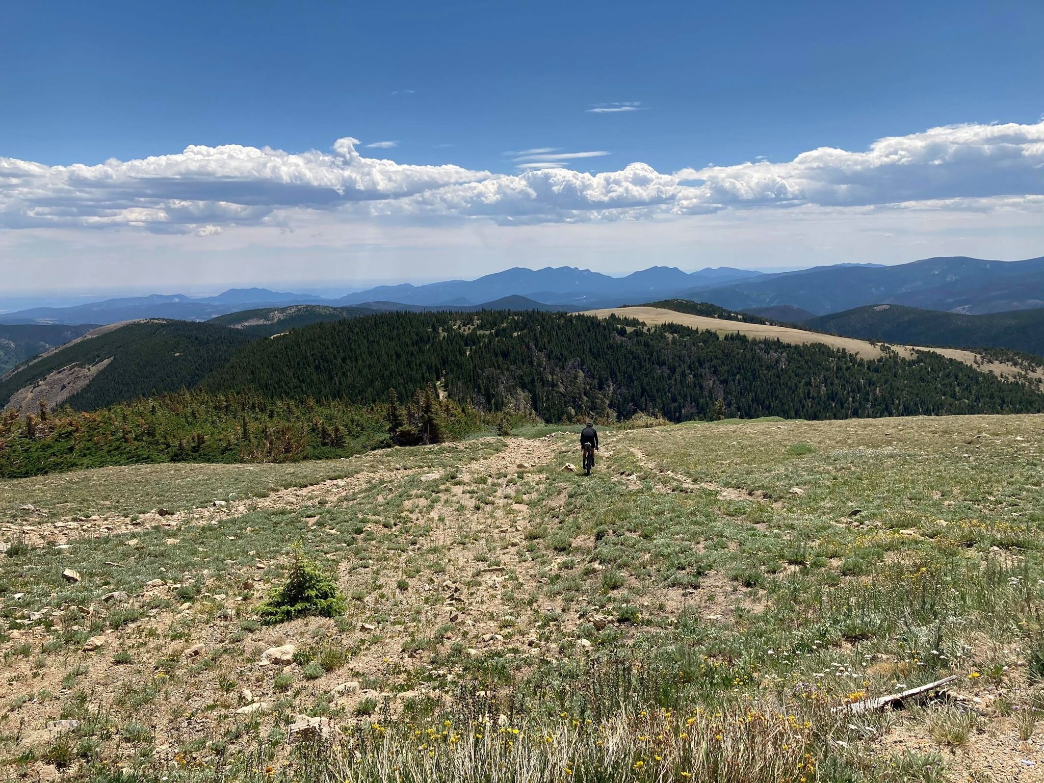
Inspirations
Explore the elevated life in the mountains. This content debuted in 2015 with Alpine Modern’s printed quarterly magazine project.
Sense of Place: Designed for legacy in Aspen
Mountain homes in Aspen, Colorado, are built to stay in the family for generations
Aspen is steeped in tradition. Generation after generation, families vacation at the posh resort to ski in winter and to celebrate the town's famous festivals in summer. Slope-side chalets and opulent second homes alike are built for legacy, as venues for extended family to gather and carry on traditions, season to season. A continuity that translates into architecture and decors of great depth and layering.
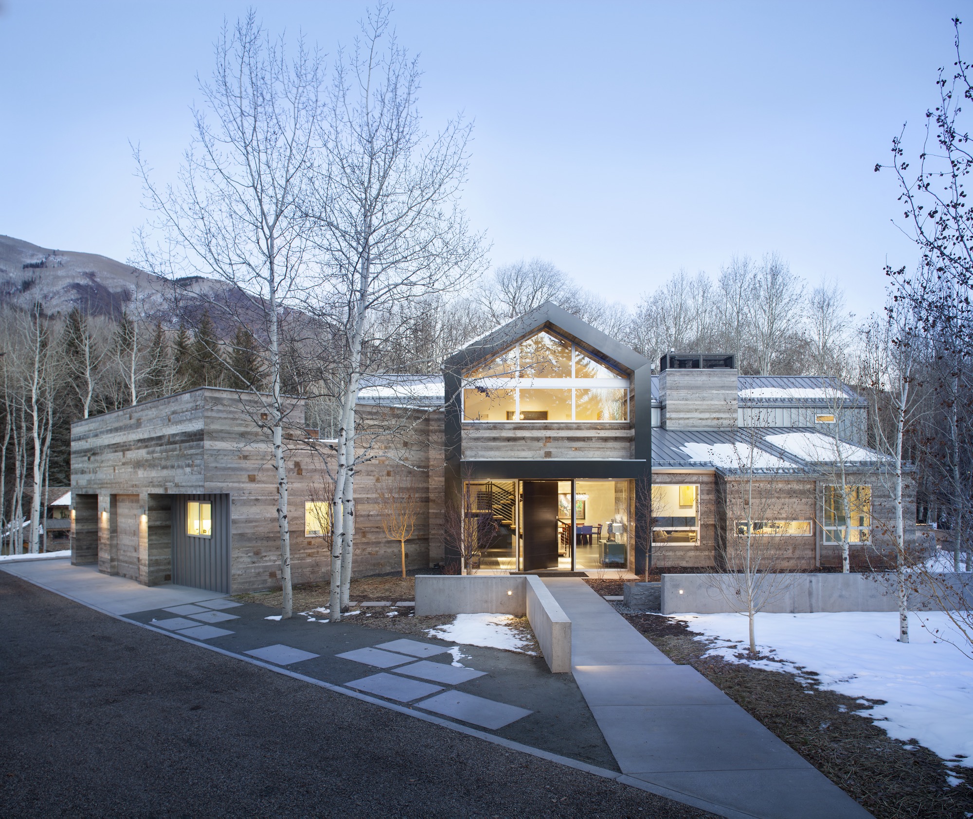
Nevertheless, even mountain folks for a fortnight must have functionality alongside style, beginning at the entry. “There is that sense of arrival at a mountain home,” says Sarah Broughton, co-owner of Rowland and Broughton (R+B), an architecture and interior design firm in Aspen and Denver. Aspen homes are planned with the understanding that one comes in from the elements. “People need to be able to knock snow off their boots.”
"Aspen homes are planned with the understanding that one comes in from the elements."
Style without borders
Many of R+B’s clients have primary homes on the beach or in big cities, all over the world. “One thing that is important to them is that they really feel they are in Aspen,” says Broughton, a modernist at heart. To achieve this sense of place, she relies on natural materials such as wood, grasscloth, and natural stone — “things you see when you look out the window.” What’s more, treating woods in surprising ways, such as planking or wire-brushing, brings out something special in a natural material.
Broughton complements mountain settings and modern, clean lines with cashmeres and wools in the furniture and textiles. She loves to add ample pillows and throws on beds and couches. “Hemp, wool, and cashmere textures and patterns can speak to a natural environment without being literal,” the award-winning architect says. The beauty of sunlight falling through an aspen forest’s canopies, for instance, can translate into a pattern. Twinkling lights become reminiscent of a starry winter night in the Rocky Mountains.
“Hemp, wool, and cashmere textures and patterns can speak to a natural environment without being literal.”
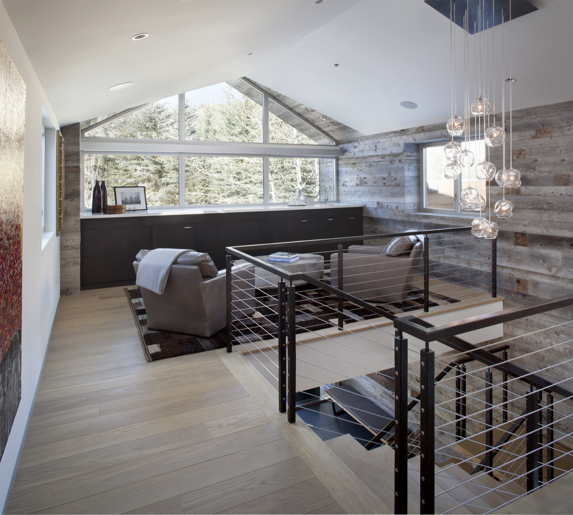
Black Birch Modern
With its clean-lined, minimal design, Black Birch Modern in Aspen is an example of a mountain retreat that not only boasts stunning alpine-modern architecture, but is warm and welcoming to boot. R+B achieved this balancing act by bringing outdoor materials inside. That, Broughton believes, is something anyone can do at home. “Carrying a material found around the outside of the house into the flooring, for example, is an effective way to blur that indoor-outdoor line, which is such a quintessential element of Aspen style.”
Bringing Aspen home
Give your home a touch of Aspen flair and make room for your own legacy. Create spaces where friends and family can gather to share food, drinks, and stories, while they sink deeper and deeper into your cashmere pillows and pull up their feet under a wool blanket.
Art from an Aspen gallery adds a fine finishing touch. “Bringing in local talent is a nice way to tie it to the place and a great way to modernize a home,” Broughton says. “Make it feel collected and not staged,” are her parting words of style wisdom. “Modern design has a lot of depth and layering to it. It’s not a one-hit wonder.” △
“Make it feel collected and not staged. Modern design has a lot of depth and layering to it. It’s not a one-hit wonder.”
Sense of Place: Alpine-modern style in Tyrol
The elevated ruggedness of interior design in Austria's Zillertal
Alpine Modern talks with local interior design expert Martin Wetscher about the quintessential style of modern mountain homes in Tyrol. Wetcher is the president of the namesake interior architecture firm, carpentry workshop and furniture store his great-grandfather founded in 1912 in Fügen, Austria.
Traditional mountain living in Tyrol was simple. The Bavarian-style homes were built from materials the alpine farmer could source around the site. Dyes and paints were made from herbs and flowers; the color red derived from ox blood. Design was determined by practicality and durability. “Everything we perceive as ‘sustainable’ today inevitably gave those traditional homes a distinctly local style,” says Wetscher.
"Everything we perceive as ‘sustainable’ today inevitably gave those traditional homes a distinctly local style."
Vacation architecture in Tyrol is highly exaggerated to give visitors an immediate sense of place. “At home, that’s different,” Wetscher says. “A home has to reflect the person, with reference to where you are.” Hence, a ski chalet that dramatizes Kitzbühel — the legendary winter sports town in Tyrol, Austria — would quickly become kitschy as a permanent home.
Celebrating craftsmanship
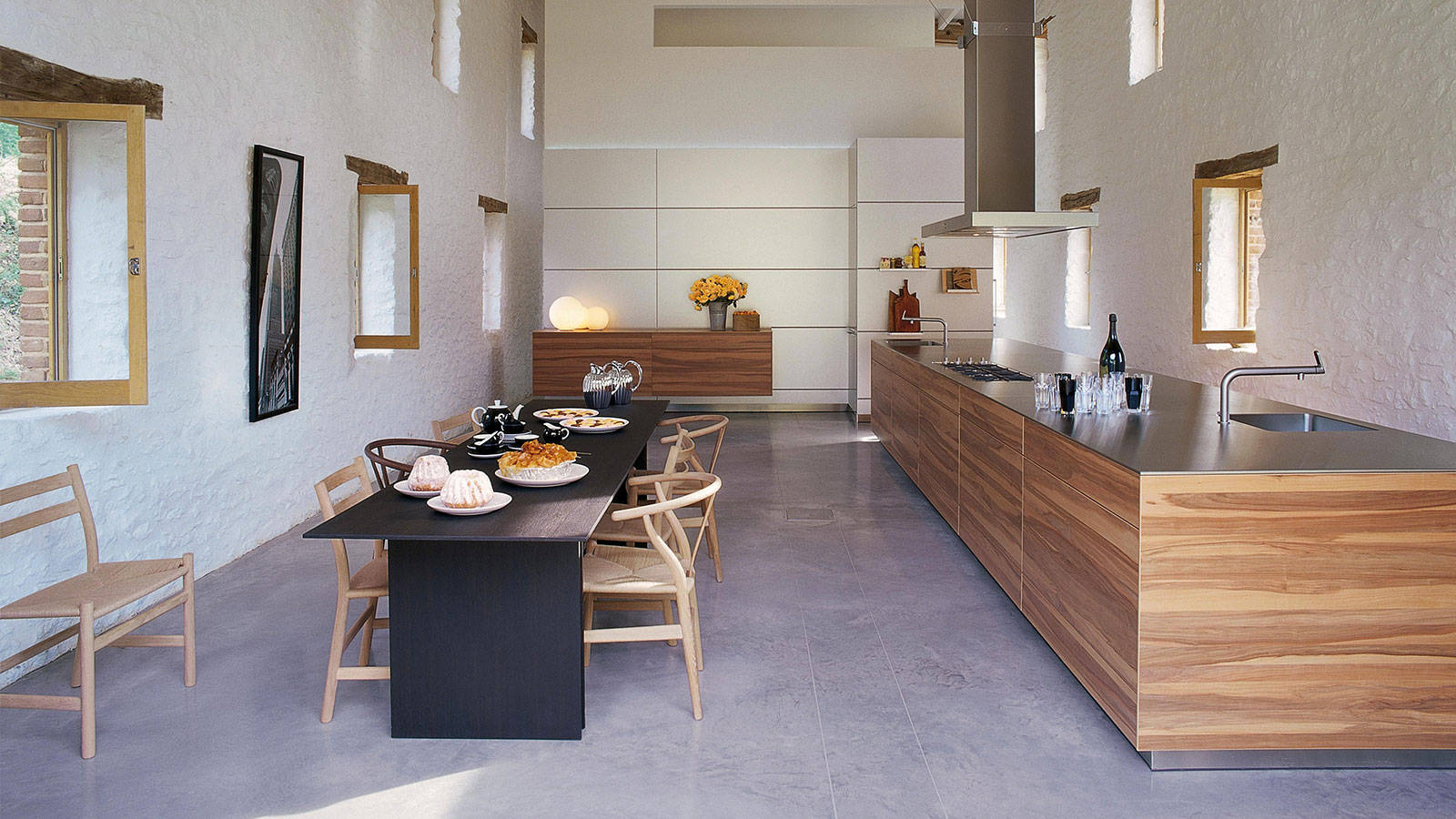
The interior concept Wetscher Chalet celebrates the Tyroleans’ ruggedness without being crude. While the craftsmanship is very much refined, materials such as oak wood (which is characteristic for the area) retain a pastoral touch. “People here in the Alps love to see that it doesn’t have to be either or, rather, that Wetscher Chalet is rich and clever, modern yet authentic,” says the head of Austria’s oldest independent furniture retailer.
In Tyrol, generations of families live in the same house for hundreds of years. Thus, it is particularly important to balance modern design with authenticity by integrating heirlooms, such as antique rugs or artisanal art, and found natural objects from the surrounding environment, such as driftwood from a nearby creek. Moreover, after an era of booming industrial manufacturing, quality craftsmanship is back in Tyrol, once again coveted and elevated.
“One has to begin where the alpine farmer left off,” Wetscher says about creating a sensible modern Tyrolean interior. To him, a beautiful mountain home has little to do with new furniture and a lot with bringing in shapes and materials found around the outside.
“One has to begin where the alpine farmer left off."
Mixing materials and eras
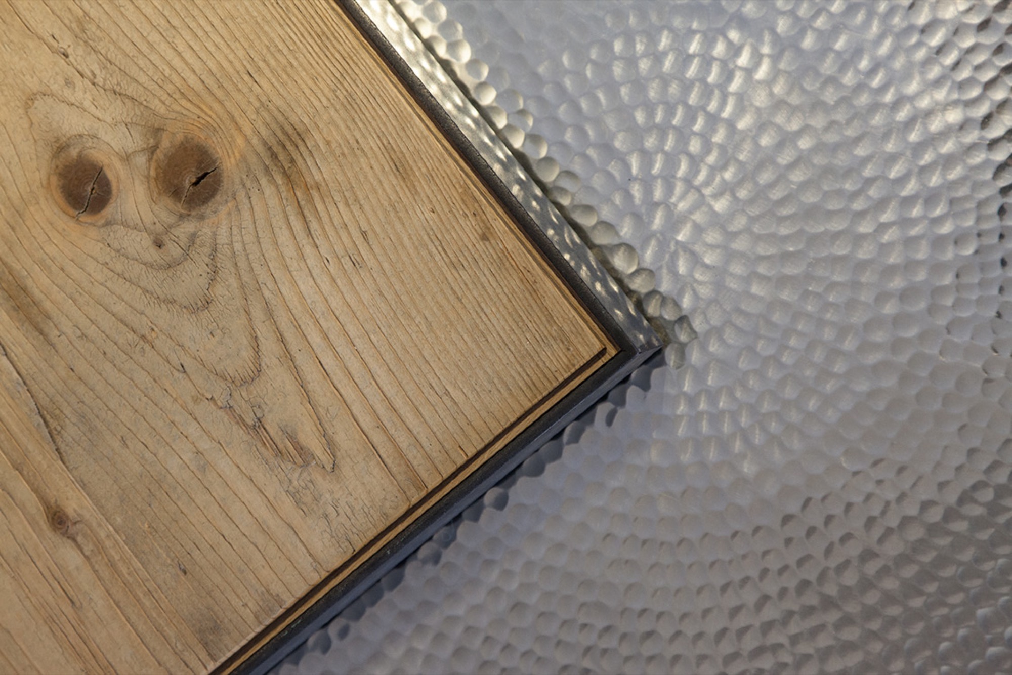
Mixing natural stone with oak is big right now at Wetscher. The contrast makes it chic. “Then, add deftness by bringing the present moment and the season into your home with flowers and accessories,” he says. Easily interchangeable objects, such as a coffee table or curtains, offer balance between consistency and change. In the current Wetscher Chalet line, for example, furry textiles represent that transient element. Prints, on the other hand, are passé. “We find them rather tacky.” Instead, Wetscher likes to play with materials like natural stone as patterns.
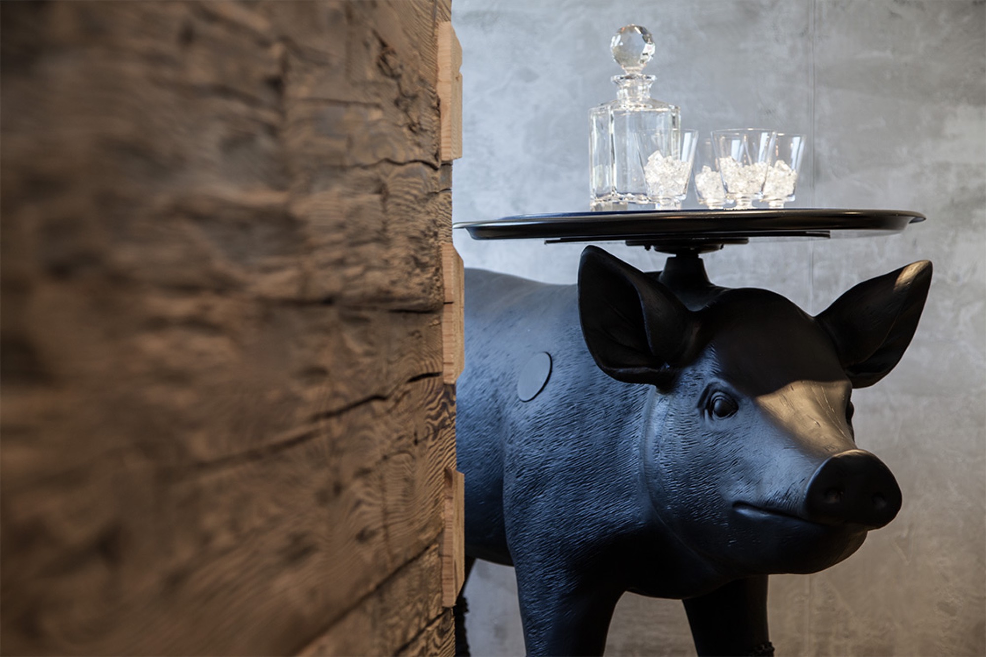
His Chalet concept is further characterized by exceedingly loungy seating furniture one can lay back and stretch out in. Various seating areas with low tables encourage conversation. Furniture low to the ground is more sophisticated and comfortable, while higher furniture can exude stiffness.
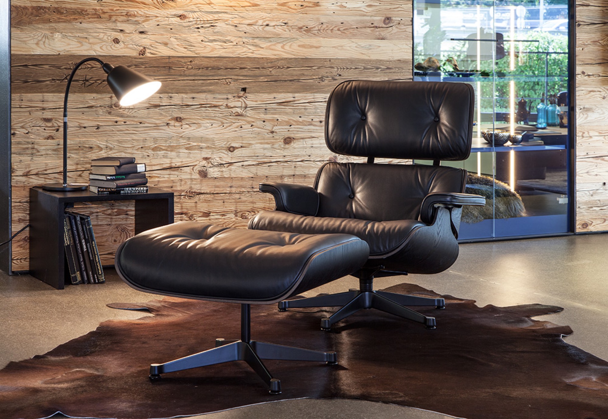
Understatement is key. A backdrop in Wetscher’s showroom, for example, is paneled in softwood reclaimed from an old corral. However, a smoothed surface adds calmness to the rustic wall. After all, Wetscher knows, “Jump too far into the Tyrol, and it will actually look like a cow stable.” △
“Jump too far into the Tyrol, and it will actually look like a cow stable.”
Intermission
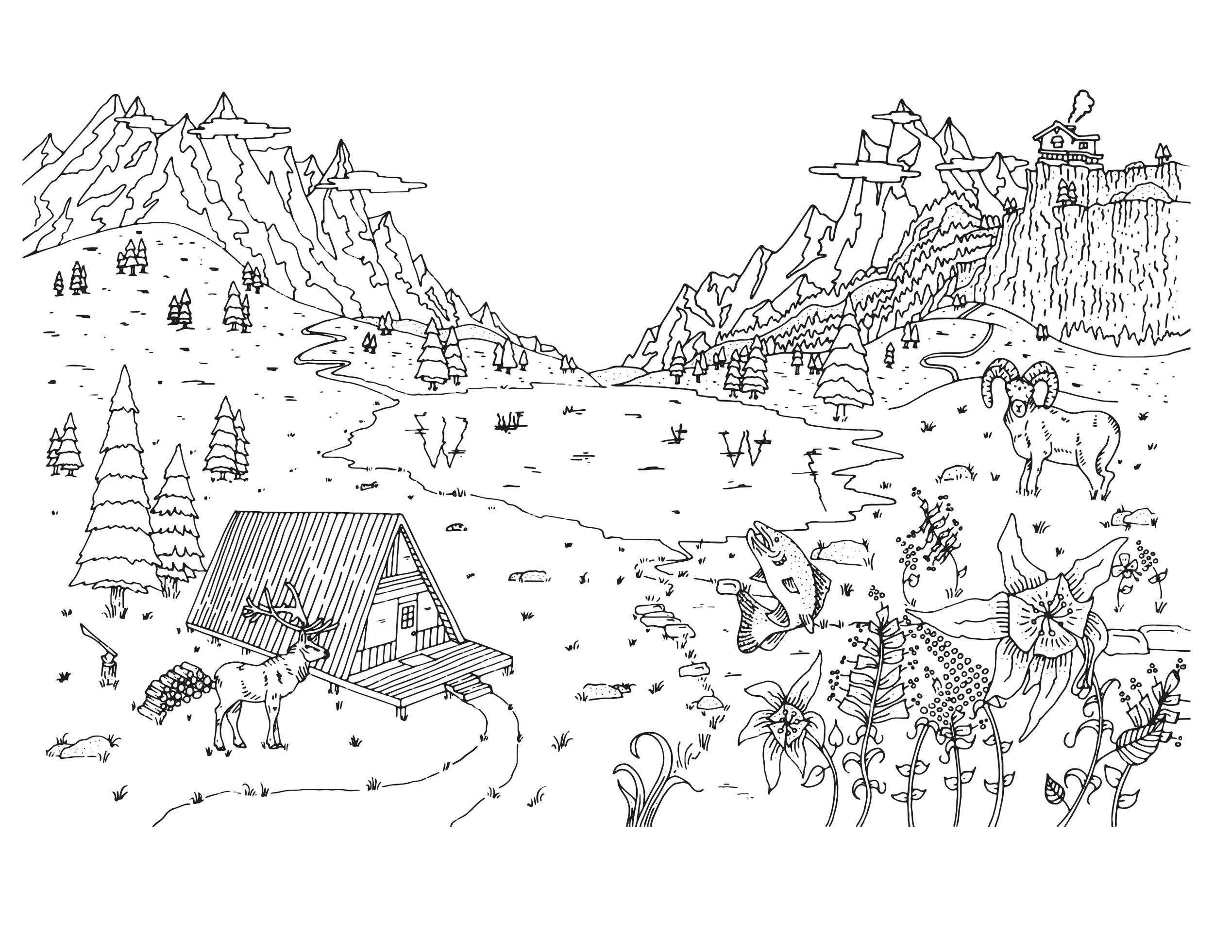
Alpine Modern coloring page
Take a breath. Slow down, and find a sense of peace through coloring.
Download printable coloring page in PDF
Beauty from the Lab
Minimalistic ceramic labware matches the simple beauty of designer pottery
Minimalistic in form and manufactured with exquisite precision, classic laboratory ceramics, such as the tactual porcelain crucibles and skinny alumina trays by CoorsTek in Colorado, can be as strikingly decorative in a modern home as designer potteryware.
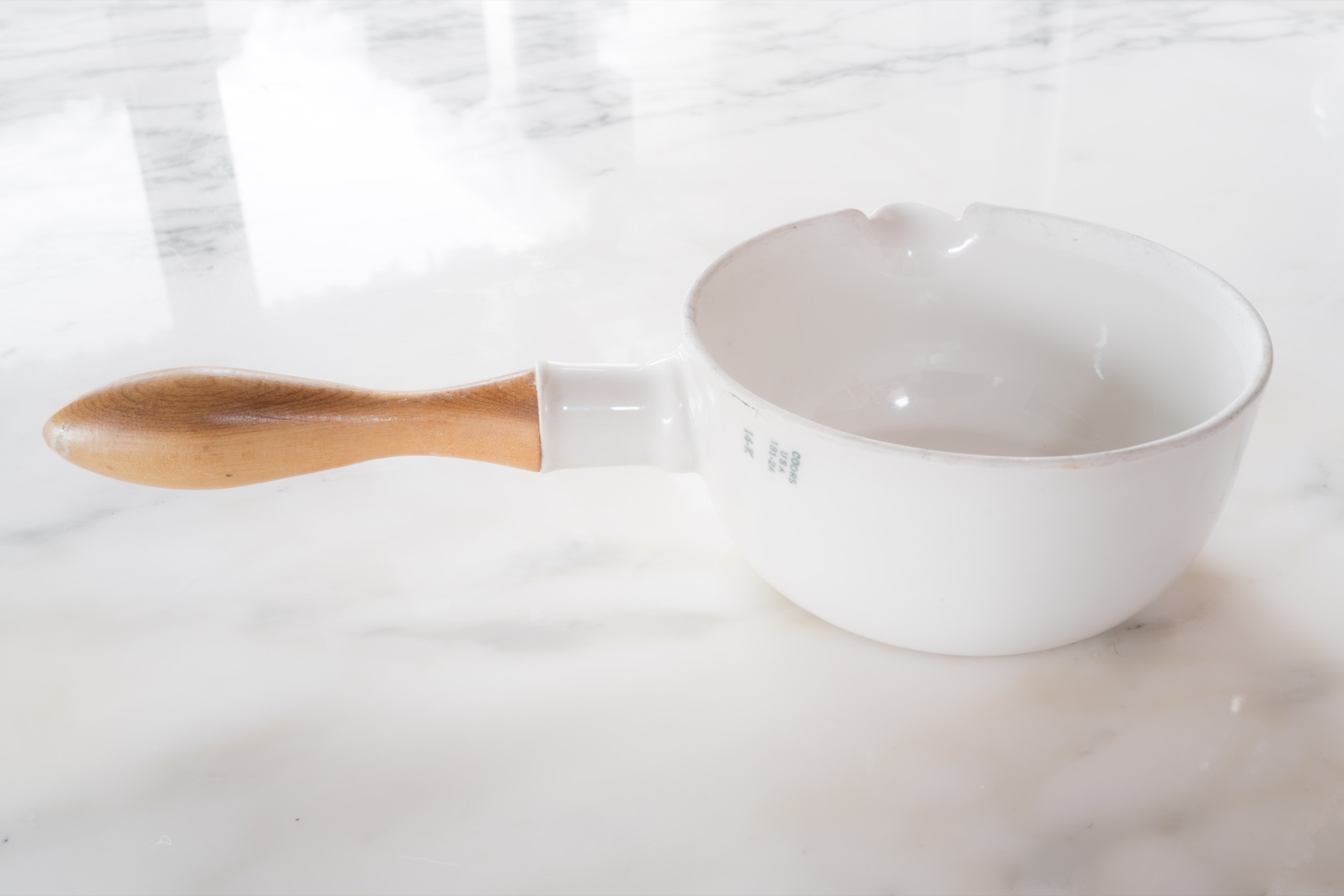
The area around the town of Golden, Colorado, feels ancient, with flat-topped mesas crowning tumble-down hills at the foot of the Front Range of the Rocky Mountains. Ridges heave up from the tilting plain like the backs of dinosaurs. Prospectors and scientists have uncovered Triceratops tracks hereabouts, petrified wood, and the fossilized bits of more than 200 plant species. The place is a beautiful old mess, its geology famous for minerals but also for clay, which is particularly fine and well suited to the making of ceramics.
Human-made
As reality is transmuted more and more into the virtual, I like to remember that everything made by humans is made from stuff pulled from earth or air. Silicon has a valley named after it, after all. Less well known is ceramic, deployed all over the high-tech landscape for its ability to insulate, resist, conduct, shield, and do other yeoman work. Ceramic traces a direct path between the most ancient manufacturing—humans were firing clay figures 24,000 years ago—and the Great iPhone Era.
I’ve loved ceramic ever since the time my mother was given a small collection of chipped and crazed Ming Dynasty bowls that had been dug up in Indonesia by Jesuit priests—friends of hers. I was ten. By their delicate feel and obvious durability, it was apparent that they were made of the same stuff—porcelain—as my mother’s English Spode china.
Ideal design from the cusp of modern
Decades later, while editing a science magazine, I started to collect laboratory ceramics. Vintage labware had begun to turn up on eBay: crucibles, funnels, casseroles, spoons, spatulas, and combustion boats. Basically: cookware for chemists. There were tiny dollhouse-scale crucibles as well as huge mortars that could hold 272 dry ounces of material. These pieces were utterly functional in shape, creamy gray or ivory in color, modern. But their modernity had a retro feel, echoing the apothecary. They had reached their ideal form and then ceased evolving: It was hard to tell a brand-new piece from one produced almost eighty years before. Modern, then, but from the cusp of modern.
“These pieces were utterly functional in shape, creamy gray or ivory in color, modern.”
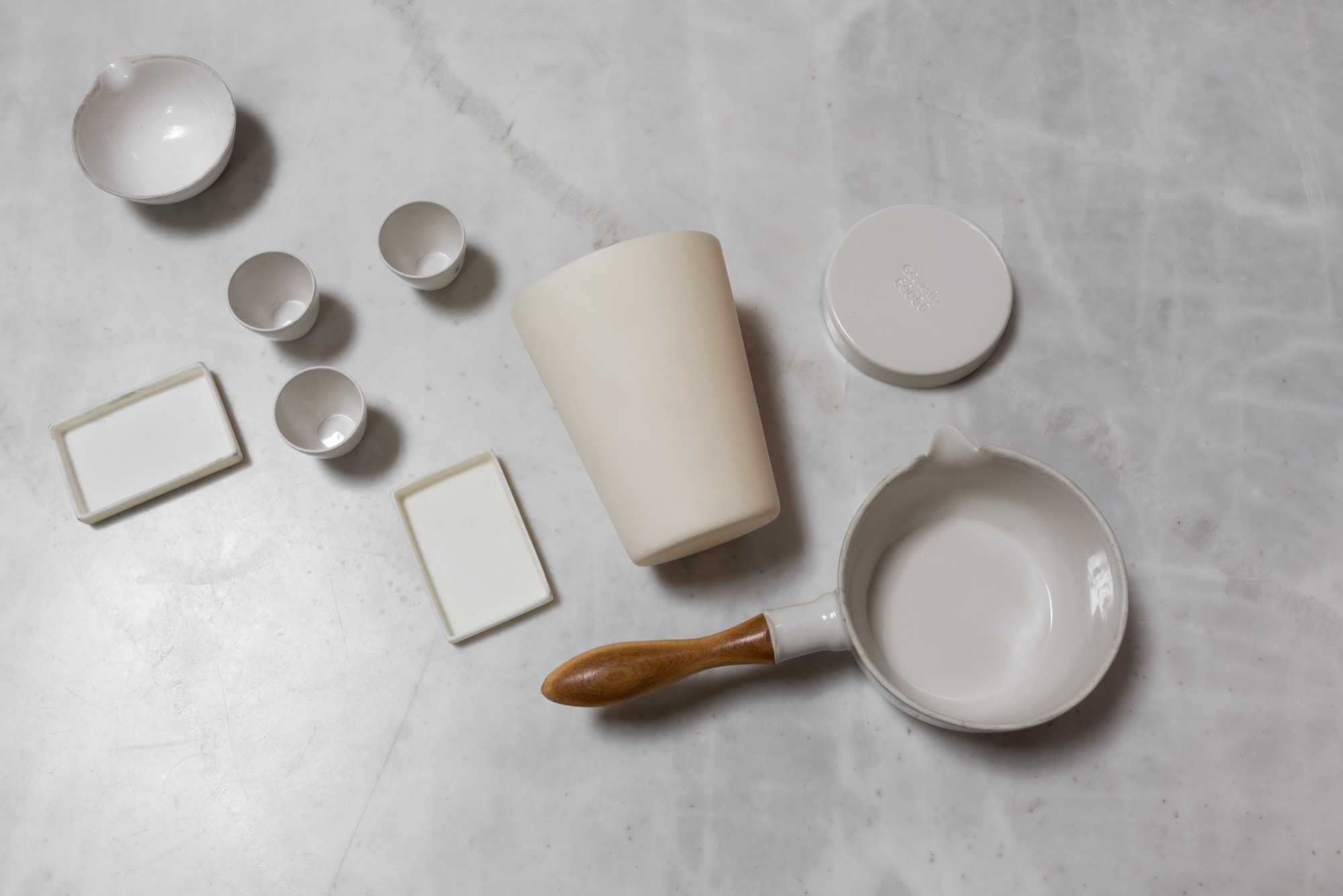
My lab ceramic pieces usually sported a simple mark, “Coors U.S.A.” I didn’t think much about that until I moved to Colorado, drove through downtown Golden on the way to Vail, and passed an old brick building attached to a much newer one. A sign announced the CoorsTek advanced ceramics company, and I finally put two and two together.
Coors—a Colorado family company
Early this year, after signing documents affirming that I was not a spy and understood I was entering a facility governed by federal security laws, I got a look inside the CoorsTek plant where the labware is now made. It’s one of several CoorsTek factories in Golden, and the only one to which I was likely to gain entry: The rest of the operations, here and in Europe and Japan, are devoted to a myriad of high-tech products such as body-contouring ceramic armor plates for soldiers (also beautiful objects, by the way). It’s a billion-dollar private company, owned by the Coors family, that long ago leveraged its labware skills to make ceramic parts of exquisite precision, used in rocket nose cones and hip-replacement devices and highly specialized one-off bespoke projects like the high-intensity lights that memorialized the Twin Towers after 9/11. But it’s the labware that I was interested in anyway, the seed of the whole ceramic enterprise.
My guide around the factory was Rob Spurrier, who has been at the company for thirty-six years and is now plant operations manager. A formidable, matter-of-fact journeyman tool-and-die man, Spurrier seems to like that he works for a bleeding-edge technology company whose roots lie in methods you could learn at the community center.
“Making this product follows your fifth-grade pottery class that you might have taken at school.”
It’s true that despite the oversize scale of the kilns, casts, racks, and presses in the huge plant, there’s a handmade vibe. Pieces are generally pressed by machine, not thrown, but if two parts have to be joined together, the slip technique would be familiar to any potter. I spotted one fellow working on ceramic “furniture” (which is the name for pieces that other ceramics rest on during manufacture). A piece cracked apart in his hands; he chucked the shards into a bin and started on another. Everywhere were racks of unfired “green” labware, looking as fragile as any raw clay things, awaiting the kiln. “Pugs” of refined clay, known as body, made in a nearby Coors plant and shipped here in metal tubes, looked like enormous strands of Plasticine.
Porcelain from ancient China to 1940s America
Classic labware is made of porcelain, invented by the Chinese more than two thousand years ago and improved in the thirteenth century. It is made by pulverizing and mixing a white clay called kaolin with other materials into a paste, forming the paste into shapes, then firing it at very high temperatures until the minerals liquefy in a glasslike way and bond with the rest of the material. Not until the 1700s did the Europeans crack the formula and technique. One who succeeded was Johann Böttger, a German pharmacist-turned-alchemist. Soon, there were porcelain factories all over Europe producing housewares and decorative goods. Porcelain, improved again, proved ideal for chemistry. It resisted chemical attack. It was minimally porous. It retained its mass. It could be subjected to thermal shock. The Germans dominated its manufacture.
That last fact meant trouble for American labs when the blockade of World War I ended the importation of German goods. The US government asked local industry to fill the labware gap. One firm that responded was Herold China and Pottery, in Golden. It had been installed in a defunct bottling plant owned by Adolph Coors, founder of Coors beer, by a clay expert named John Herold. Its purpose was to make ovenproof kitchenware. The pottery did not prosper, though it had early success producing crucibles for lab use at the Colorado School of Mines, also located in Golden. Herold left, then returned in 1915 to tackle the problem of producing labware for the national market. Coors soon bought the company outright and installed his son, Adolph Jr., to run it.
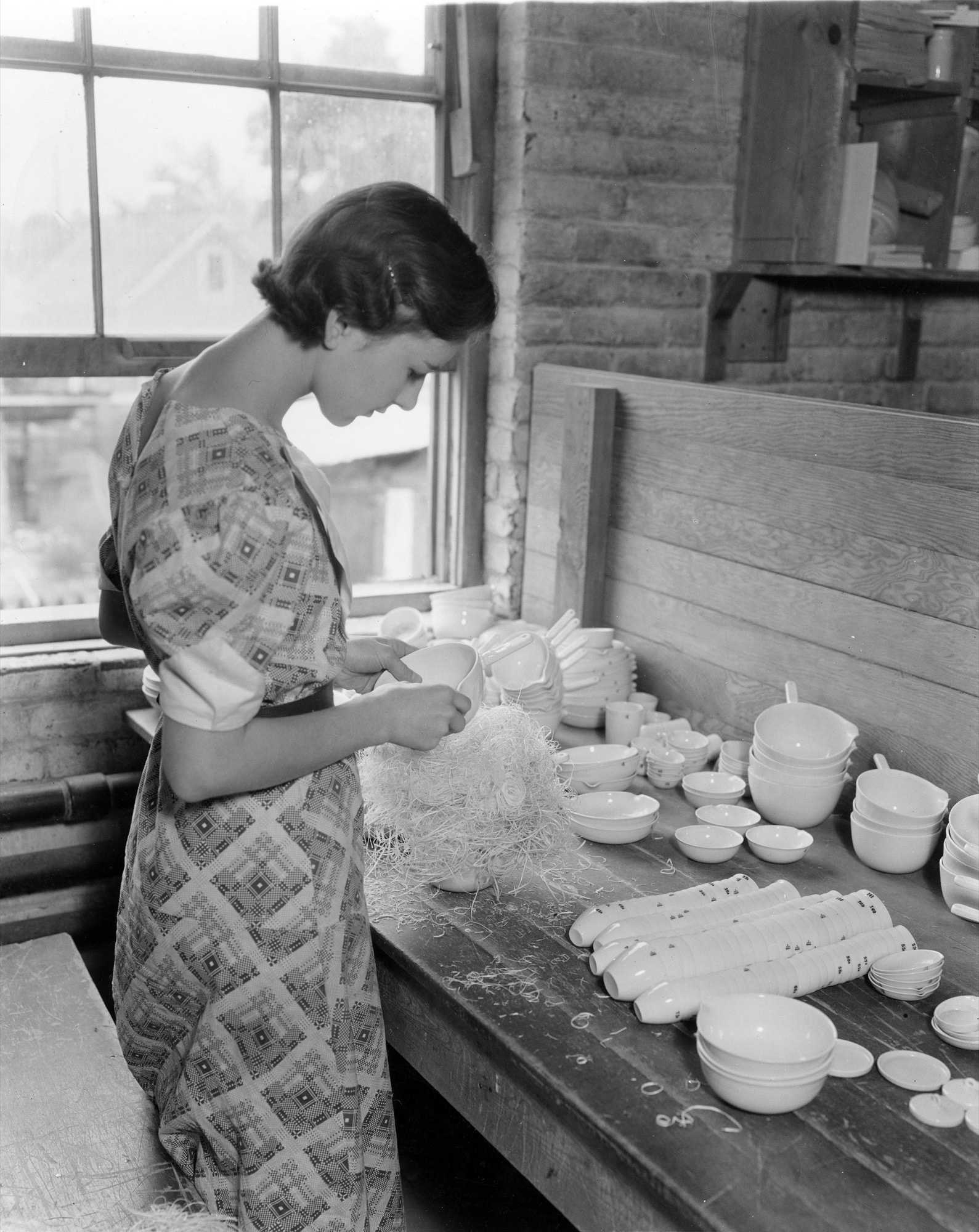
Alumina brings advanced ceramics
The Coors company went on to produce much of the country’s lab ceramics. Not much changed until the 1940s, when Coors acquired technology for forming clay into shapes that were far more complex and precise than conventional porcelain techniques could achieve. Then alumina launched the era of advanced ceramics. With alumina, purified aluminum oxide powder is swapped for clay. The powder turns into a ceramic under tremendous pressure. Over the decades, the process was advanced to make ceramics from boron, silicon, tungsten, and more. The range of modern ceramics is now fantastic. They can be hard as metal yet melt at much higher temperatures than metal. They can conduct electricity, or not. They can transfer heat easily, or resist it. They have names like Y2 O3, yttria-stabilized zirconia. But one property they share is beauty. Ceramics beg to be touched.
“The range of modern ceramics is now fantastic…. But one property they share is beauty. Ceramics beg to be touched.”
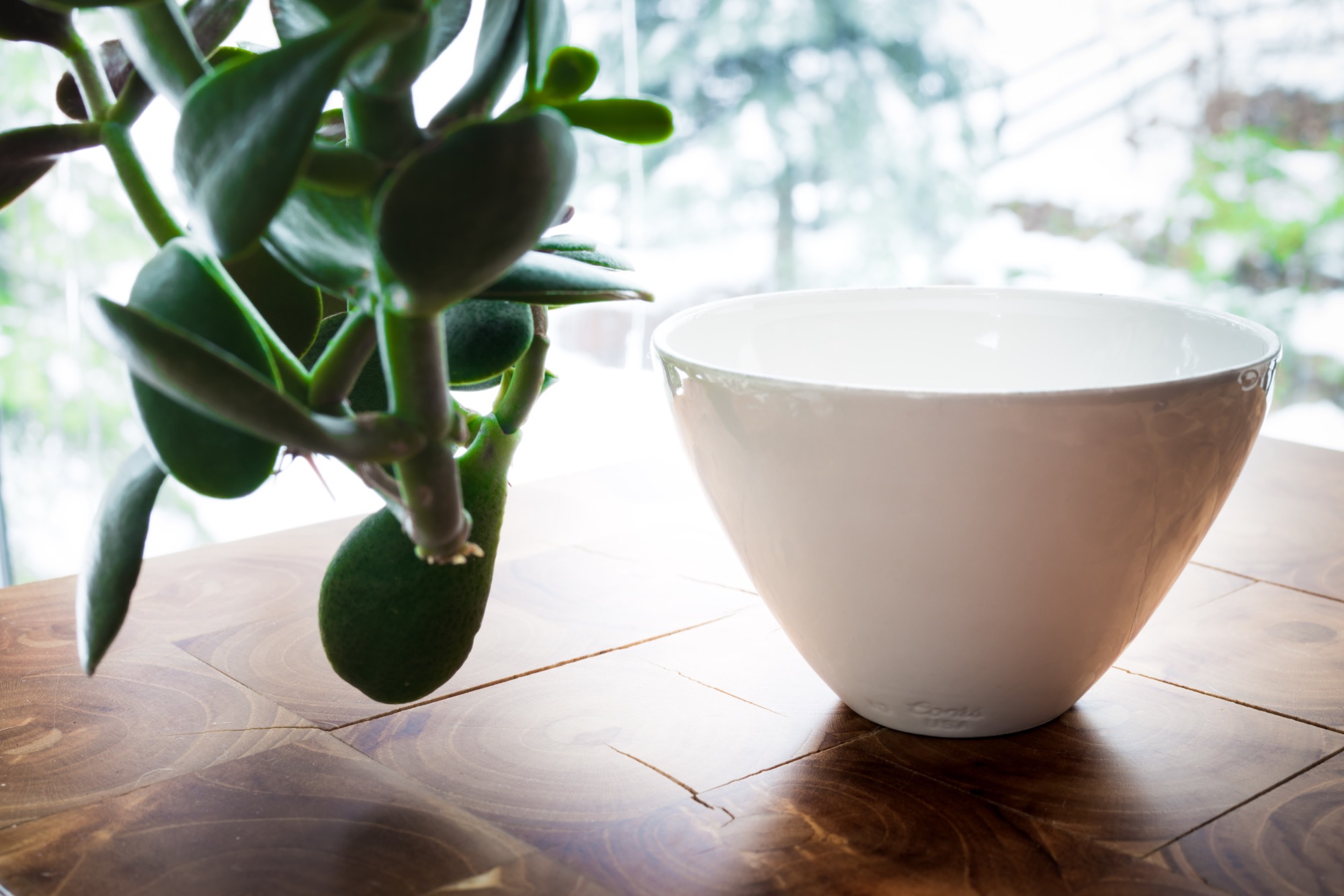
“I love the surface finishes we can achieve, and the feel of ceramic,” says Harrison Hartman, who runs marketing at CoorTek headquarters and keeps a foot-long, wood-handled CoorsTek pestle in his office. “Ceramics can be heavier than metal, and more dense.”
Jessica Nall, one of the company’s de facto historians, has an IT background but after joining CoorsTek became obsessed with clay and took a pottery class to learn to throw it. She got permission to hand-throw some scrap CoorsTek lab clay outside the factory. “You can throw it,” she found, “but it’s really difficult. I had to bring it back here to get fired and glazed because a traditional hobby kiln is much lower temperature.”
As the factory tour came to a close, I found myself wanting to cut a slice of clay and take it home as a piece of advanced Play-Doh. I sensed that Rob Spurrier would rule this not only verboten—the formula is proprietary—but silly. As a man who had overseen the production of millions of pieces of labware for scientists, he seemed to find my interest in crucibles and combustion boats as objects of beauty somewhat odd.
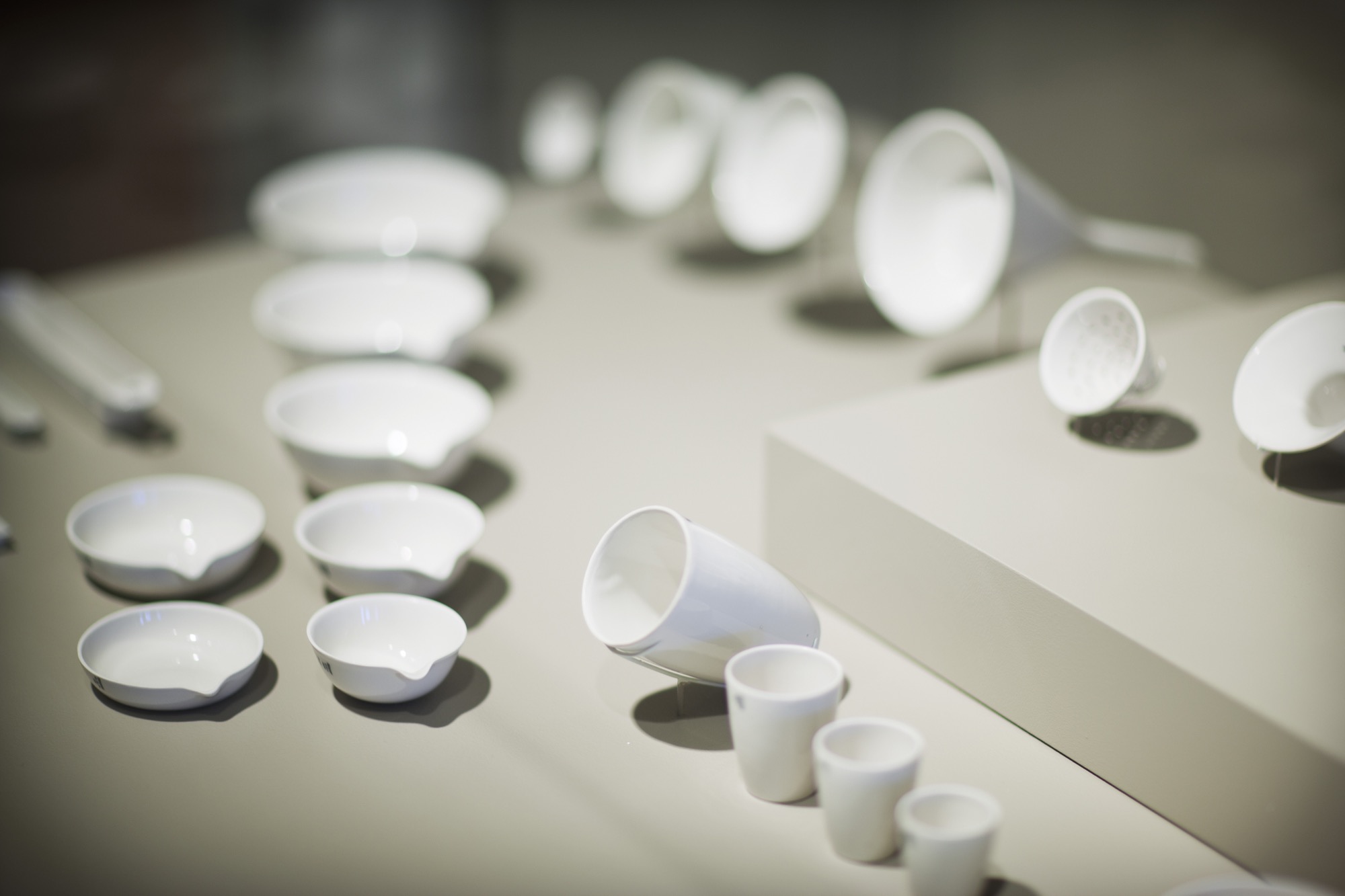
In 2011, Darrin Alfred, Curator of architecture, design, and graphics at The Denver Art Museum, gathered sixty-four pieces of CoorsTek for a small show called Potters of Precision. Alfred was attracted to the “simple, clean, straightforward, unadorned quality of the product,” and told me that Edgar Kauffman Junior, famous director of the Industrial Design Department at the Museum of Modern Art in New York, had connected the dots between labware and the aesthetic of modern home ceramics almost seventy years ago. On page twenty of Kauffman’s small 1950 book, What is Modern Design?, there’s a photo of porcelain dinnerware by the great Eva Zeisel, next to several pieces of CoorsTek ware. The latter, Kauffman wrote, was “used widely in modern homes because of elegance, usefulness, durability and low cost. In a laboratory, beauty is not required, but [it] appeared spontaneously in vessels that serve the scientists’ precisely stated needs.” I own vintage Zeisel dinnerware, swoopy, thin and minimalist, which I keep in my kitchen. I also have a stack of sixteen little CoorsTek alumina lab trays, each about the length and width of an old matchbox, on my desk. Unglazed, with a lovely matte finish, they have a pale ivory color that indicates 99.5 percent pure alumina. I pick them up, rub them, clank them together; they give off a modern sound, somewhere between that of metal and glass. They’re not something Ming Dynasty porcelain potters could make, or Johann Friedrich Böttger, or for that matter Adolph Coors, but they are something they would all recognize and admire. Something real, and of this earth, ancient and new at once. △
Morning Light
Boulder, Colorado-based designer and CommArts cofounder Richard Foy reflects on the gifts daybreak brings
We are lucky to live in a place of sublime beauty. Navajo people have a prayer chant where they wish that you may “walk in beauty.” May beauty be before you, behind you, above, below, and to your sides. How true, how wise, how kind to wish beauty upon others. Morning light gives credence to this chant. It envelops you from the moment a new day emerges from the night. Morning light rains kinetic showers of warm pinks, peaches, yellows, crimson reds, purples, and grays across the blue sky, on what would be the world’s grandest abstract canvas.
We are seeing a continuously changing assembly of atmospherics. Heat, condensation, moisture, particles, clouds, objects, reflections, highlights, washes, gradations, and shadows are all building into a crescendo that peaks with the sun’s appearance.
Morning light starts in the middle of the night, when the sun’s penumbral rays start to dispel the dark night sky. As Earth rotates, bringing our location on the globe closer to those rays, the sky lightens and morning begins. Each minute as we get closer, morning light collides with atmospherics and intensifies silent celestial fireworks.
When the sun finally appears, it often announces itself with bright beams of gold shot between clouds to signal exactly where it will emerge. Soon, there is a blinding, brilliant blade of searing light that cuts a line between the horizon and sky. Drivers reach for their window sun-flaps, then their Ray-Bans. That direct light just traveled ninety-three million miles from our sun in about 500 seconds at more than 670 million miles per hour to enter our retinas and wake up our brains.
Dimensionality
Many days begin and end with awe-inspiring skies. Sunrise starts with a beauty that can inspire our productive hours with creativity and meaning. Sunsets, at day’s end, settle us down for evening hours, meals, pleasure, rest, and dreams. Morning light is a wake-up call of excitement and drama. It sends light to the side of a form, texture, or pattern. Objects become sandwiched between intense, warm light and deep, cool shadows adding depth and volume. Morning light increases visibility by accentuating dimensionality. The use of warm and cool light together draws a wider range of emotional responses. This broad spectrum of colors enhances both what is in focus and the surrounding aura. Natural and built worlds are made more vivid and emotive by this light. Artists, including Rembrandt, Raphael, and Rubens, used a similar light quality called chiaroscuro to heighten appeal for their work.
Many metaphors are drawn from morning light and mornings. They permeate the arts and humanities: painting, sculpture, music, poetry, literature, philosophy, psychology, and cinema. Morning light signifies many qualities of life. New beginnings, restarting, refreshing, reviving, replenishing, recovery. “Things will be better in the morning.” “There’s light at the end of the tunnel.” Each morning provides a new chance to redo and renew, the opportunity to be better, be more, or just be.
“Each morning provides a new chance to redo and renew, the opportunity to be better, be more, or just be.”
The quest for improvement and realizing positive outcomes is essential for our personal and evolutionary progress. Mornings and morning light symbolize hope for betterment.
Emotions are fueled by sensations. Morning light clearly sets the stage for our daily lives, experiences, and dramas. It also cues the transition from night sounds to morning sounds. There is a quiet nightly dissolve from the crescendo of cricket choruses to the gentle cooing of doves at daybreak. Morning light further signals the end to night sounds and the start of human and urban cacophony.
What are the flavors of morning light? Fresh as oranges, lemons, or mint. The crunch of an apple, crisp as cucumber, or the tart, pure flavor burst of pomegranate seeds. Mornings are cool, clean, and as subtle as the flavor of fresh chilled water from a stream. Morning light is the flavor of fine, smooth, cold saki.
As morning light activates temperature and pressure zones, it draws the mountain perfume scents of meadows and forests to lower elevations. Prevailing winds carry scents farther. Fresh oxygen just extracted from forests, meadows, lakes, rivers, and glaciers energizes us. We breathe deeply of the crisp, clean fortifying mountain air, scented with pine, spruce, and wildflowers, that accompanies morning light.
Vincent van Gogh was drawn to the distinct quality of light he found in Arles, France. He was inspired, as was Gauguin, to capture its colors in his paintings. The morning light of the mountains stimulates our desire for beauty and the sublime. The clarity of morning light feels tangible, visceral, as though we are looking at something cast into a clear crystal cube.
Morning shadows
Morning light throws the longest shadows, which become abstractions of their sources. These shadows move as silent serpents would over land, leaving no trace. Shadows are cool, often painted in violets, while their origins are warm, colored by the full beam of sunlight.
Winter morning light on frosted plants sitting in mounds of soft snow creates a sculptural garden. Beautiful tableaux can be found everywhere. A patch of crooked dried brown stems emerging from a rolling base of pure white snow with extended blue shadows makes a perfect composition. Morning light invites exploration and curiosity just when our day is beginning and before the midday sun reduces shadows, melts forms, and erases what the winter night has gently placed for our discovery.
Morning light reinvigorates an experience with dynamic and stimulating sensations. Visually dazzling crisp, clean air, fresh scents, soothing sounds make a compelling day’s start. Morning light gives us a dose of beauty, meaning, and connection, just at the right time. △

Richard Foy, former art director for Charles and Ray Eames and founding partner of CommArts design firm, has designed many brand identities and places worldwide, including Madison Square Garden (New York City), O2 Dome (London, UK), Pearl Street Mall (Boulder, Colorado), LA Live (Los Angeles, California), as well as the branding for Spyder Sportswear, and Star Trek — The Motion Picture.
Breakable Minimalism
Maker in the Catskill Mountains: Ceramics artist Kelli Cain creates earthy, minimalist tableware
As she creates earthy, minimalist tableware, Kelli Cain often muses on the people who will sip from her cups and slurp from her bowls. A visit with the many-talented maker in the Catskill Mountains, New York. What is a cup? Is it simply a container for our morning coffee or afternoon tea? Or is it a vessel for more ethereal brews as well—memories of hot chocolates past, aesthetic preferences, even our imagined ties to the person who shaped the cup and the patch of ground where its clay was dug?

These are questions that potter Kelli Cain ponders often as she sits in a sun-filled corner of her farmhouse in the Catskills, throwing cups and plates, coffee pour-overs, and lemon juicers. Cain is thirty-six and—though her earthy, comfortingly simple tableware belies it—just two-and-a-half years into a career as a commercial potter. Before that, she was (and still is) a video artist, composer, and industrial designer. With her husband, Brian Crabtree, she developed a highly successful line of electronic instruments, which the two manufacture under the name Monome from their eighty-year-old refurbished dairy barn. Pottery is one form of creation among many for Cain, and she probes it with the same intense inquiry she applies to them all.
Utilitarian beauty
“I do believe in utilitarian beauty,” she said on a recent afternoon, leaning her red-brown curls against the bank of windows behind her dining table and fixing her clear gray eyes on me. Beyond her, willows, apple trees, and meadow grass formed layer upon layer of green, ensconcing us in a private, summery world that felt much more than its three hours from New York City. “I think it’s really important that we have a respect for everyday objects, and I think the more energy put into a thing, generally the more we have respect for it.”
“I think it’s really important that we have a respect for everyday objects, and I think the more energy put into a thing, generally the more we have respect for it.”

I had driven up to the farm earlier that day, winding into the mountains on Highway 10 past the little town of Delhi with its peeling Victorians and weekend vacationers, and finally down a gravel drive into a valley where a man with buzzed hair and a long red beard stood knee-deep in garlic stalks, clipping off their spiraled tops (this turned out to be Crabtree). Cain was inside, boiling udon noodles and ladling broth into handmade bowls for our lunch.
“These are such magical little nuggets of flavor,” she announced, spooning a sweet-and-sour pickled shiitake from a Ball jar and slicing it into one of the bowls. She and Crabtree grew the mushrooms themselves in a stack of sugar-maple logs below the house. They also cultivate an apple and pear orchard for cider, grow vegetables, raise chickens, hold concerts, make music and art, and run their ceramics and electronic instrument businesses. On the wall of Crabtree’s workshop hangs a beach-towel-sized print by the Minneapolis-based artist Piotr Szyhalski that exclaims, “We are working all the time!” When I asked Cain if the slogan reflected her life with Crabtree, she replied, “If by work you mean doing things we enjoy, then yes.”

That life of shared creation stretches back almost to the day they met, in their first week of graduate school at the California Institute of the Arts. Cain was studying film and experimental animation, Crabtree, musical composition; they met at the library, where Cain was checking out a book on papier-mâché puppets. Very soon, she said, they became “everything”— friends, co-creators, romantic partners. Their first project together was a mechanical installation involving microsculptures and videos. Years later, a similar joint project led Cain to ceramics.
Finding ceramics
For that project, she and Crabtree wanted to make a group of tiny robots tap on clay sculptures inspired by bee and wasp architecture. Despite Cain’s complete lack of ceramic experience, she decided to make the sculptures herself—which, she noted as we slurped our noodles, “was a hilariously naïve thing to do.” Her three-month crash course in ceramics went forward, however, and it turned out Cain was a natural. An elderly classmate even commented that she should do it for a living. Cain brushed the comment off: She was just starting to build up Monome with Crabtree, and couldn’t imagine a life making cups.
Six years later, she reconsidered. By then she and Crabtree had fallen in love with the Catskills, bought their farm, and started to renovate its dilapidated buildings and plant its fallow fields. Around that time Cain fell seriously ill and was forced to spend an extended period in the hospital.
“When I came out,” she recalled, “I had a little bit of an epiphany that I needed to do something physical, to make things out of physical materials.” Encouraged by the comment from her former classmate, she decided to buy a wheel, kiln, and other equipment to set up a pottery studio.
“I had a little bit of an epiphany that I needed to do something physical, to make things out of physical materials.”

The first project she set for herself was throwing a series of bells. To get the tone right, she had to learn how to create continuous shapes with handles and walls of even thickness. From those she progressed to objects she wanted to use herself: deep, cone-shaped bowls to ladle her beloved udon noodles into, squat coffee pour-overs for her morning brew, glossy bottles to hold the milk from the goats she and Crabtree raised for several years.
The day I visited, her orderly studio was filled with projects at various stages of completion. On a large worktable sat two custom-order bowls (commissions from studio visitors account for the bulk of sales, she said), an assortment of juicers, cups, and bowls to restock inventory, and several prototypes for a line of candleholders. Finished tableware glazed mostly in whites and earth tones lined two large shelves.
Cain mixes her own glazes and combines them in her work with raw surfaces that rub pleasantly against the hand. Often, the farm’s landscape inspires her palettes. Cool whites evoke sky reflected off snow, and browns recall patches of bare earth (snow covers the farm for five months of the year). She told me she had recently tested sixty different shades of white, and had plans to try out more.
“I’m going back to white,” Cain said, taking a small corked vessel into her hands and rotating it to show me the gentle play of textures and tints. “I like minimalism. The variation of one color is such a beautiful thing.”
“I like minimalism. The variation of one color is such a beautiful thing.”
The ghost
Despite her current absorption in utilitarian beauty, Cain sees tableware production primarily as a way to acquire the skills she needs in order to incorporate ceramics more fully into her art. She has already begun to do so. Over the past two years she has created a series of ceramic spheres for use by the Stockholm-based master juggler Jay Gilligan. In performances filmed against the gorgeous frozen landscapes of Iceland and set to music by Cain, Gilligan lets the spheres drop and shatter, toying with the audience’s nervous hope that he will preserve the fragile objects. “My whole point was to inadvertently be in the room with him and almost choreograph his movement, because fear is now an element,” Cain said.
In a way, the concept echoes her fascination with ceramics as a secret bridge between herself and the people who use her cups and bowls in their daily lives. When I mentioned the parallel, she laughed. “Maybe it’s my obsession with being the invisible force in the room. I really think I might have a problem with needing to be the ghost,” she said. She was half joking, but as I said goodbye and drove away into the hills, I wondered: Perhaps the ghost was precisely what gave her objects their quiet, distinct beauty. △
Becoming JK
Meet the immensely talented photographer and artist behind our JK Editions
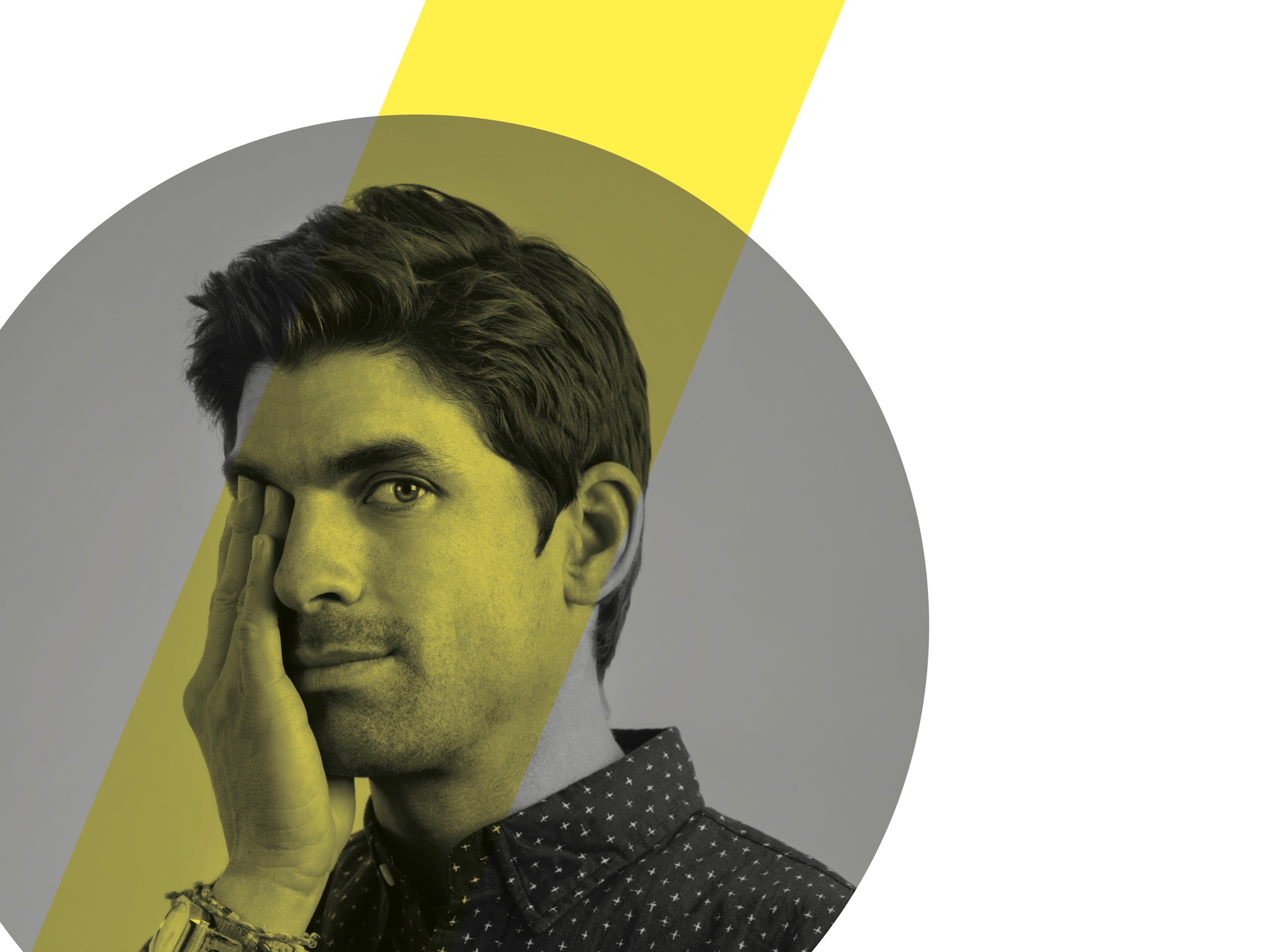
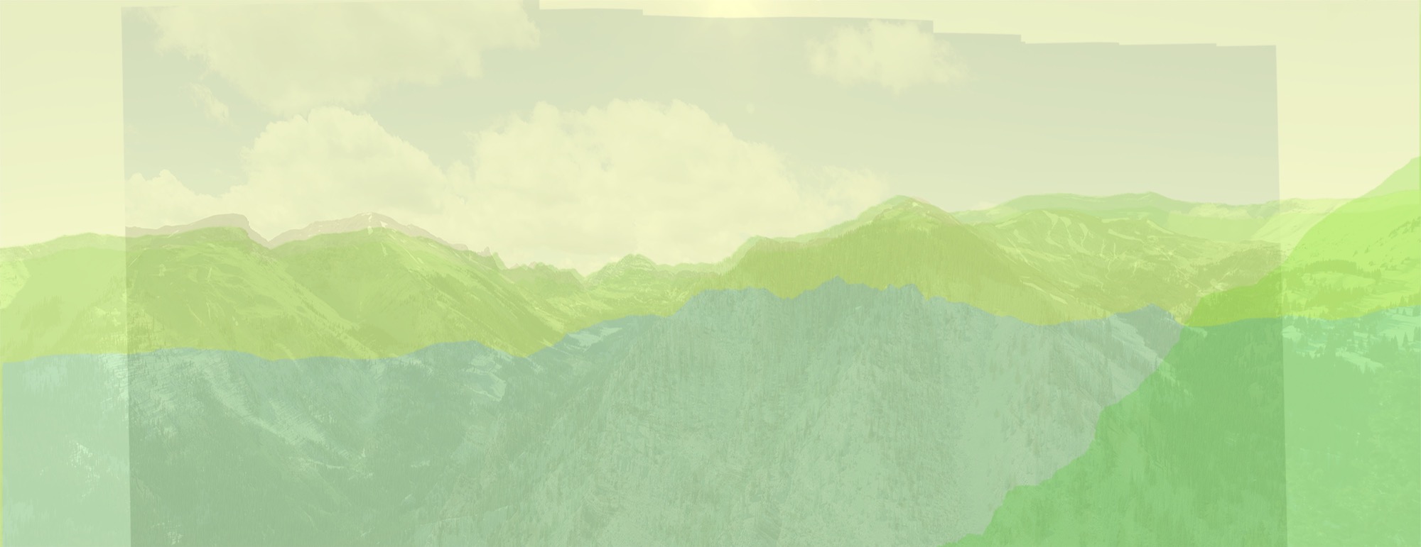
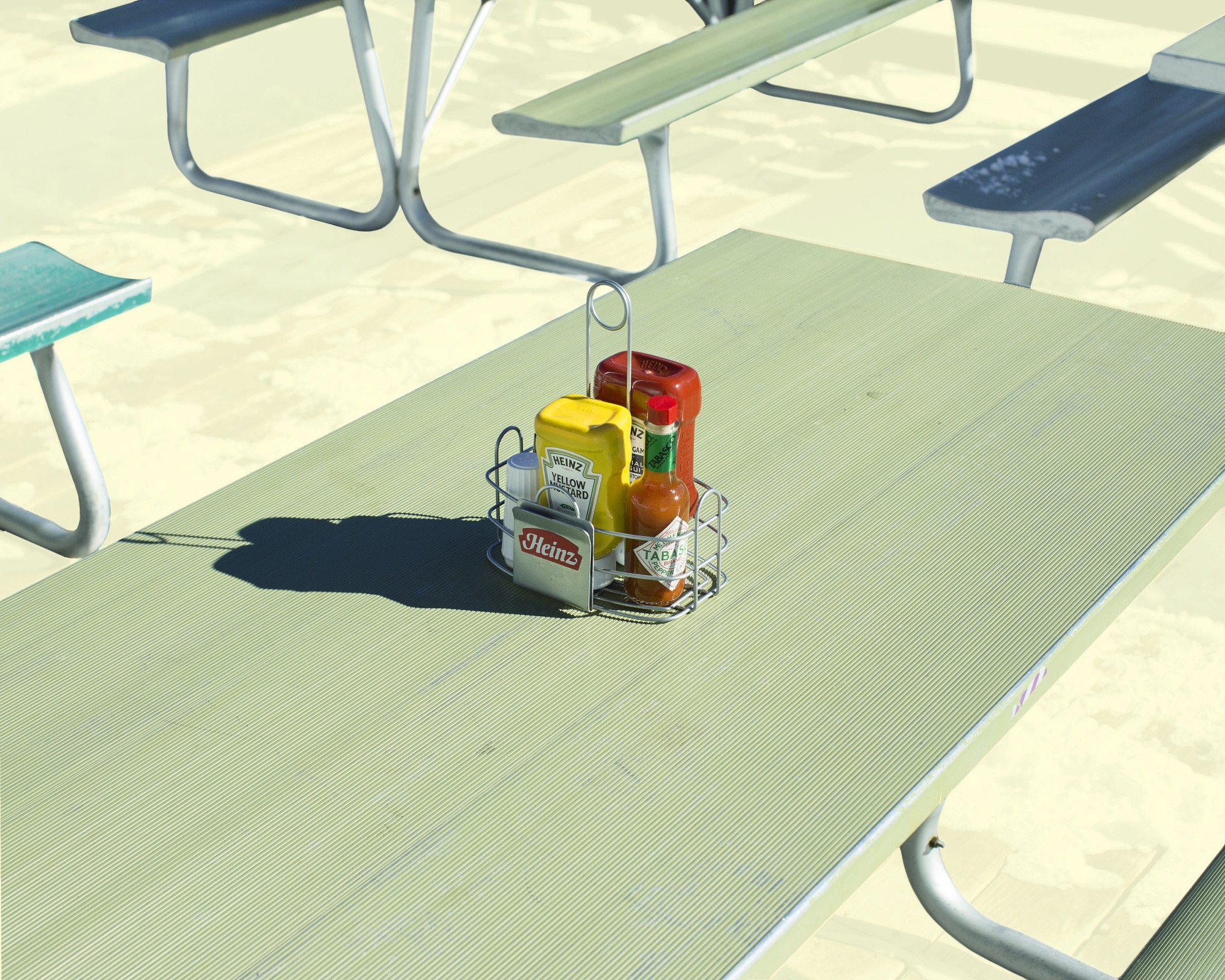
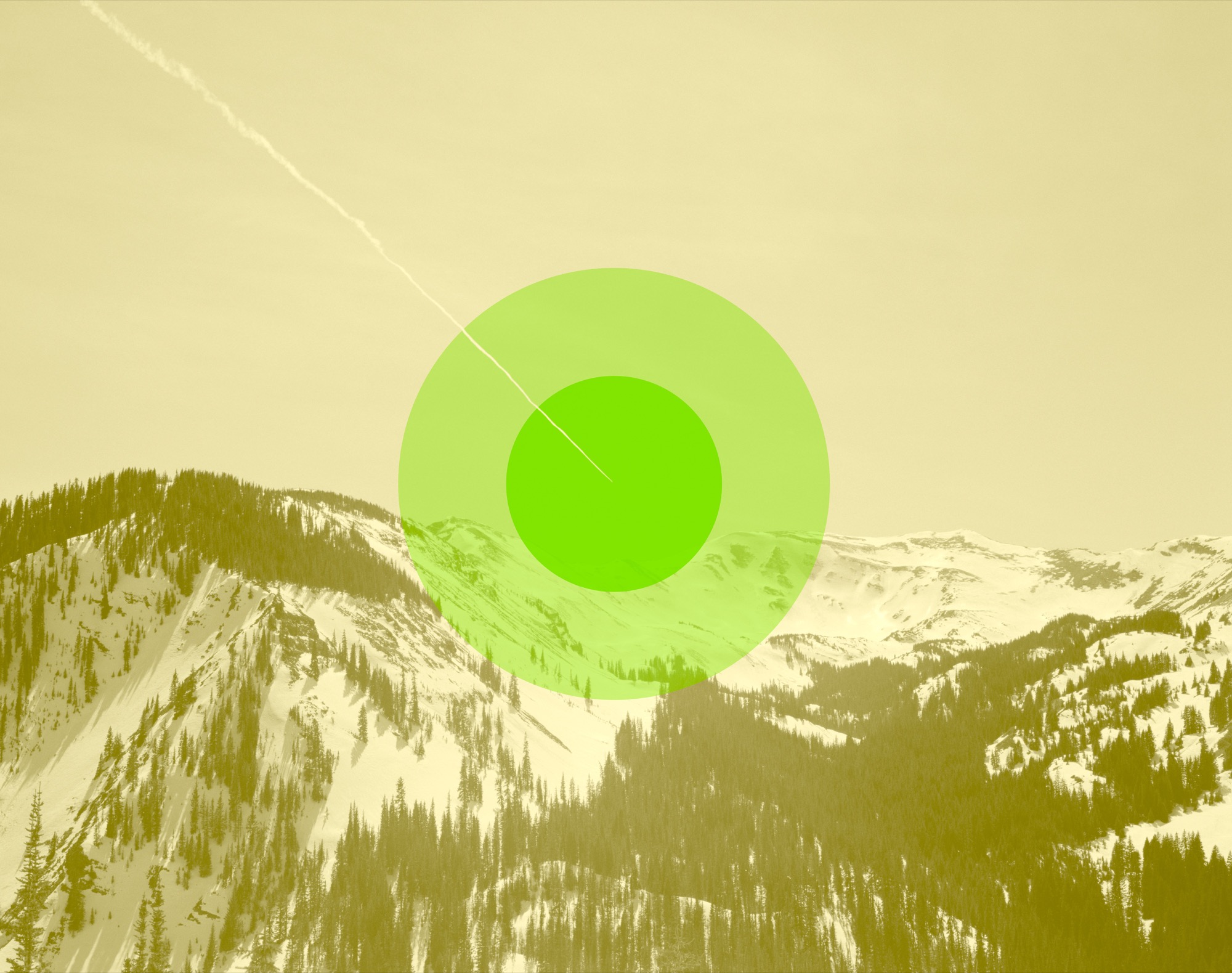
A studio visit with Colorado photographer and artist Jamie Kripke, who experiments with layers of images and color to create JK Editions.
Growing up in northwest Ohio, Jamie Kripke received mixed messages about making a career out of his love for photography. His mother, herself an artist, passed down her old Minolta camera to her son when he was fifteen. His father’s decision to buy a condo in Snowmass, Colorado, when Kripke was three jump-started a lifelong love affair with the mountains at a young age.
Kripke started snapping photos for the school newspaper at his Toledo high school. At the time, his mother’s 1973 Minolta XG-M with the macramé strap was “a gnarly camera to have for a kid,” he tells me. While his peers were playing with point-and-shoots with flashcubes or Kodak Instamatics, Kripke was teaching himself how to vary aperture and shutter speed for the perfect shot. He developed his own film and made prints in the school’s darkroom. His first published photo is a slim black-and-white of the high school football coach jogging toward the lens. And yet, Kripke put thoughts of pursuing a photography career out of his mind because “when you grow up in the Midwest, being an artist isn’t really on the list of things your parents want you to do.”
“When you grow up in the Midwest, being an artist isn’t really on the list of things your parents want you to do.”
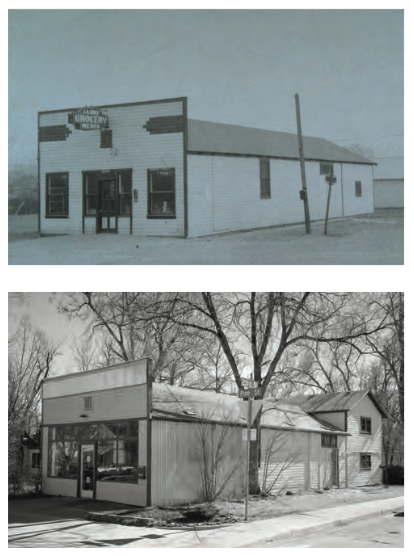
Today, Kripke is a professional photographer whose clients include Hewlett-Packard, Sony, Mini Cooper, and Visa. His editorial work has appeared in Dwell, Esquire, Outside, The New Yorker, Wired, and other publications. I join him at his Boulder, Colorado, studio on an unseasonably warm January day to learn more about his journey from high school newspaper photographer to successful independent artist. His corner studio has a deep history in the community, formerly operating as the local grocery, and before that, a horse stable. He’s been told that ghosts linger in the space. The white-walled studio is open and bright. We sit across from each other on facing vintage couches: mine a stormy gray with a mustard-yellow throw pillow, his a popping pink with a jade accent.
A simple white coffee table sits between us on a colorful striped rug. My eyes are drawn to a round clock hanging on the wall to my left; in place of numerals are songbirds—curiously, my own grandmother, mother, and aunts in Ohio all own one of these very clocks (my interviewee and I share the same home state). When I ask Kripke about the peculiar timepiece, he tells me that his father’s company in Toledo developed the original bird clock. “It has always been on the wall wherever I work as a reminder of my dad, his work ethic, and his business savvy,” he shares. Four mismatched desks of varying heights line the wall under the clock; there are no typical office chairs, but one desk has a short neon-orange children’s stool pulled up to it. The opposite wall is covered in framed black-and-white landscapes.
Kripke is a calm man; he sits cross-legged in jeans and a plaid shirt, answering my questions in a slow and intentional cadence. He explains that adventuring in the mountains of Colorado from a young age led him to the natural choice of moving to Boulder for college, where he dabbled in majors including pre-med and business before settling on philosophy. All those years, he was shooting photos with his old Minolta. In his bedroom back in Ohio, he had a poster of Bill Johnson, the downhill skier. He describes the image as a razor-sharp shot of the skier, airborne in a tuck and looking right into your eyes. As a kid, he’d often stare at the poster, wondering how on earth someone got that shot. On weekend ski trips to the mountains during college, he’d play around with photographing his friends:
“I was burning tons and tons of film to get one picture that didn’t suck.”
Kripke’s first breakthrough came a year or two after graduation, when Powder Magazine offered him seventy-five dollars for one of his images. This was a landmark moment in his photography journey; he recalls thinking, “Whoa, you can shoot pictures and get paid? That’s awesome.” The check and the letter from the magazine editor confirmed his deep longing to capture the world around him with his lens. He followed his curiosity to San Francisco, where he began assisting established studio photographers, a learning experience he likens to his graduate school. Spending much of his free time at the San Francisco Museum of Modern Art, he began diving into the world of fine art.
Observing other photographers and artists led to a natural curiosity about their techniques and guided him in finding his own approach. “[Photographer William] Eggleston was one of the first guys to pay attention to everyday stuff and to the ugly stuff. All of a sudden, I fully grasped this idea that photos are everywhere around us all the time, and it’s a little overwhelming.” Kripke’s interest in composition was sparked by Stephen Shore, who had a “gift for finding these compositions where your eye follows the path through the image. For me it’s like a seven-course meal.” And Jeff Wall, a Vancouver-based photographer who spent an entire year constructing one photograph, inspired Kripke to make the move from “something you find that already exists to something that you create from scratch yourself—taking versus making.” If he wanted to get serious about photography, he knew he needed to be able to make.
One day, while living in California, Kripke saw an old car with a mattress tied onto the hood driving on the highway. He laughed out loud at the curious sight and instantly knew he wanted to re-create that scene in a photograph. He left a note on his neighbor’s station wagon, got an old mattress from a homeless shelter, and researched how to light a moving vehicle. “It was the first picture I really feel like I made, that I fully put all the pieces together.” He still keeps that photo in his portfolio, even though it is ten years old. He reflects on the elements he pulled together from his role models: Gregory Crewdson’s moody lighting, Robert Bechtle’s nostalgic subject matter, Stephen Shore’s composition. “In some ways this picture encapsulated all this stuff that I had been paying attention to up until that moment, and I was lucky to be able to turn it into a single image.”
The plunge
All the while, Kripke still had one foot in and one foot out of photography as a profession. “There are different stages of commitment. There’s the first stage where you think, ‘Hey, maybe I should try this.’ But there’s another stage, much farther down the road, when you have to be really serious and make a real commitment to not turn back.” While working as an assistant to other photographers in his twenties, Kripke had a paycheck to count on. But could he build a viable career on his own? Unsure, he met with a career counselor when he was around the age of thirty. “I was at a point where it was time to decide,” he remembers. That’s when he got the push he needed: “The career counselor asked me what’s been the longest relationship I’ve ever been in, and I said, ‘About a year.’ Then she asked me how long I had been taking pictures, and I said, ‘Since I was fifteen, so fifteen years.’ And she looked at me and said, ‘It’s time to get married, Jamie—to photography.’ That was the moment I knew it was time to go all in—not look back.”
Kripke decided to make the leap and commit to supporting himself with his craft, so he continued to self-educate by following his curiosity and seeking out teachers. He took photography trips. He drove a VW Bus around Europe in 2004, chasing inspiration until the van broke down, stranding him in the “Des Moines of Spain,” which provided new photography challenges for a long three weeks. Back in the States, he traveled to Santa Fe to study with Dan Winters, a portrait photographer whose work Kripke first saw in The New York Times Magazine. Finding an agent in San Francisco allowed him the flexibility to move back to Boulder. He now lives a block away from his studio with his wife, Kate, a psychotherapist, and his two daughters: nine-year-old Kinley (nicknamed “Nugget”) and six-year-old Bridger (aka “Hot Sauce”).
When I ask Kripke about his favorite creative project, he laughs: “Am I allowed to say Alpine Modern?” In addition to cover art and a black-and-white photo essay—“Alps // 40”— Kripke’s fine art photography series “JK Editions” has been featured in our printed magazine, issues 03 through 06. “I’ve really loved creating these landscapes for Alpine Modern because it brings together so many things that I enjoy—skiing, photography, art, being outside, exploring, creativity.” Kripke has come to the Rocky Mountains since he was three, and now as a Colorado resident, the alpine landscape continues to inspire his art: “The mountains are like my sanctuary. The mountains are where I go to recharge and be inspired and to exercise and to push myself and to build friendships and to scare myself. They offer so many ways to make us better people—or make me a better person.”
Color connections
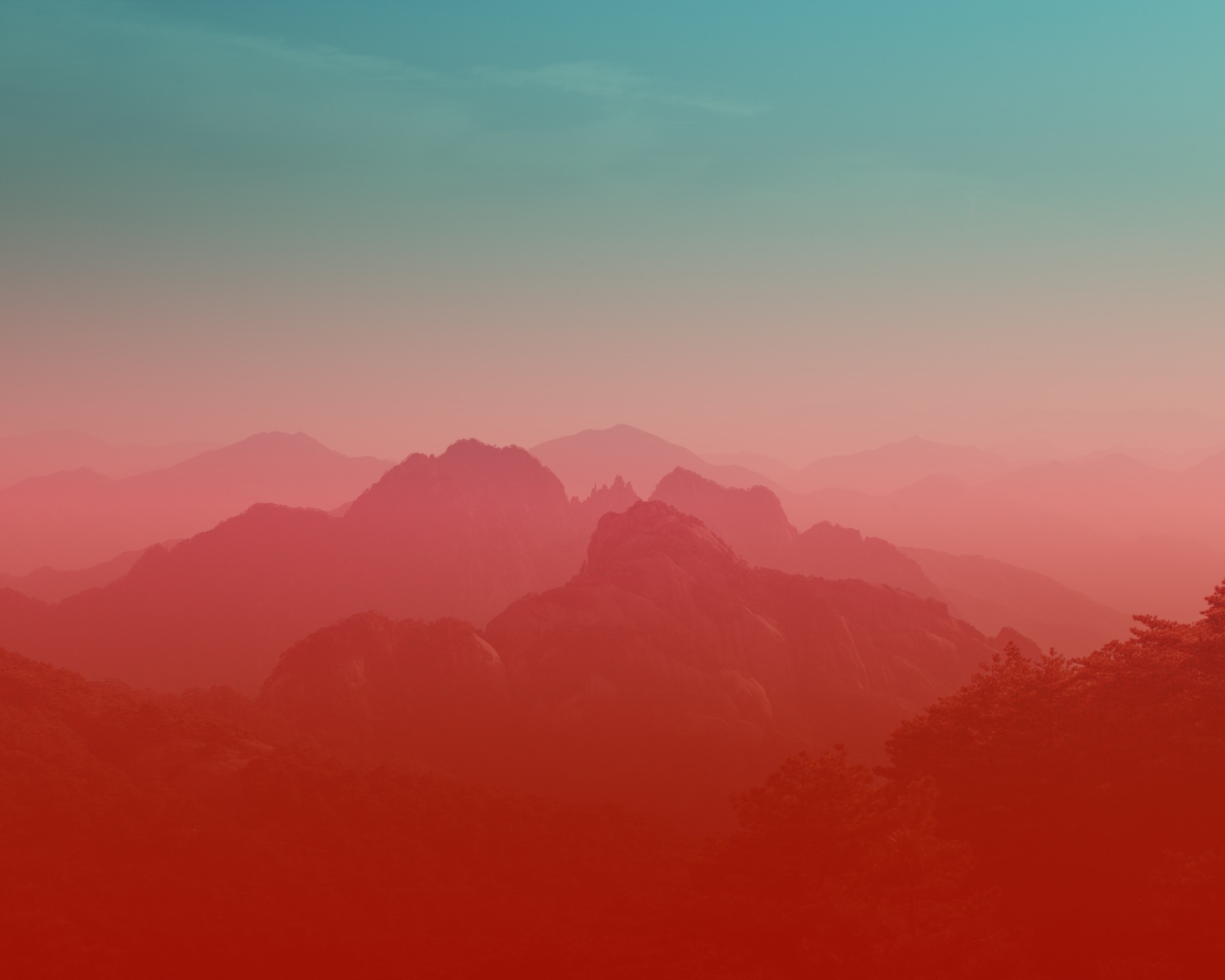
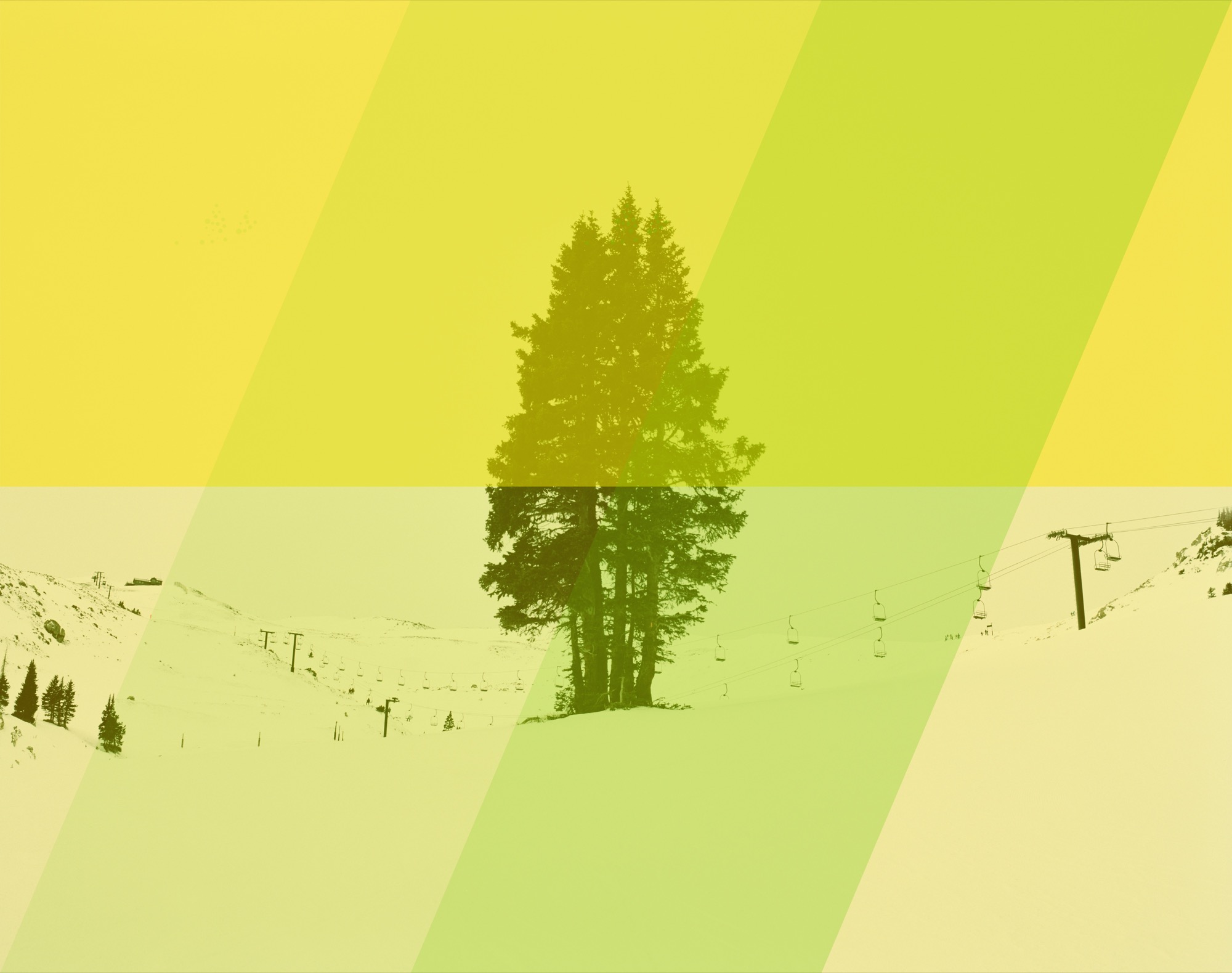
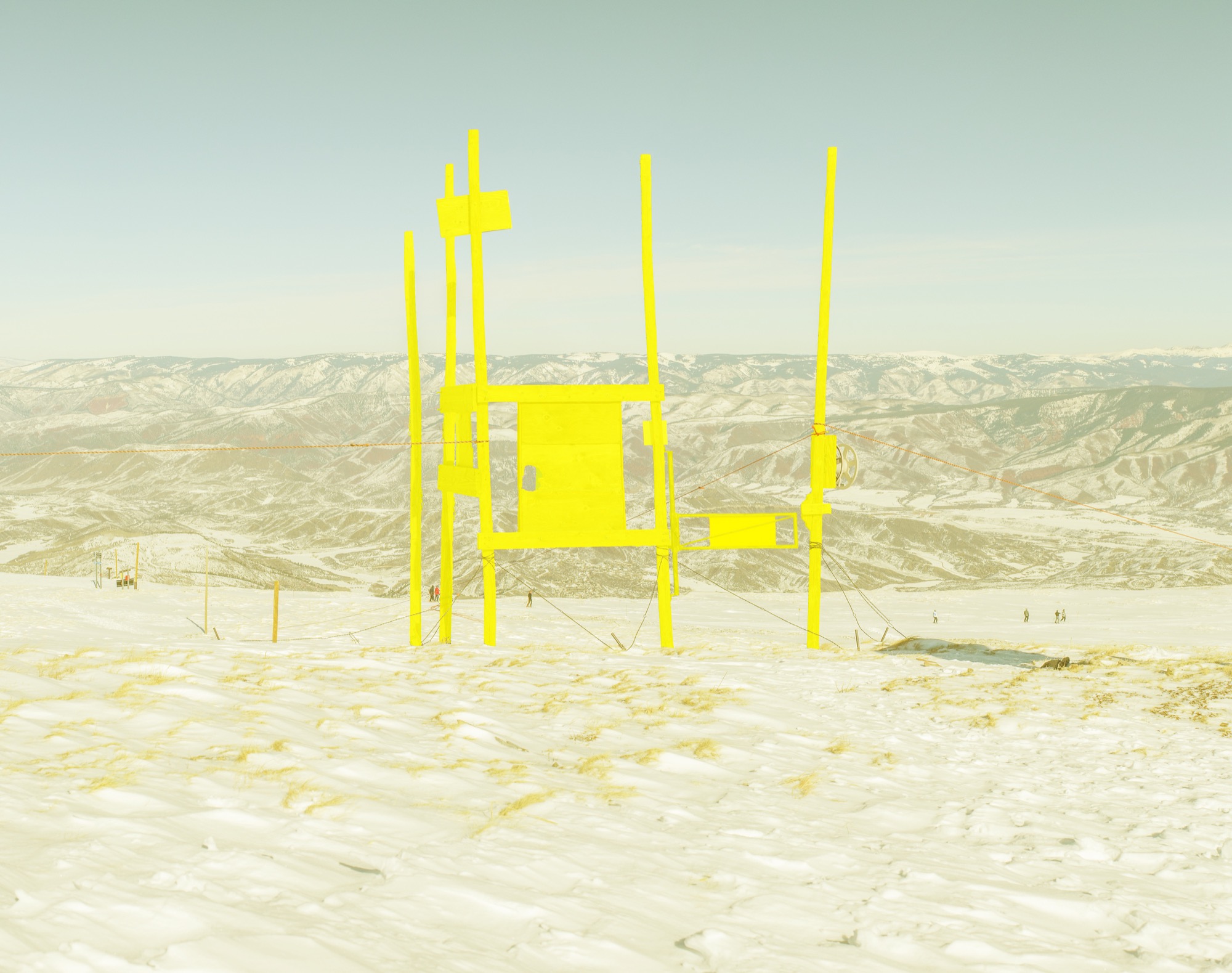
The JK Editions use layers of photography, art-driven references, and color. Kripke begins each project by photographing architecture or landscapes. Back at the studio, he zeros in on what captured his attention in the first place and layers these elements with color: “We have emotional connections to certain colors, so the color is about trying to create that connection.” We walk over to the desk, where Kripke shows me his recent work for Alpine Modern: He layered six or seven photos of the same landscape in different seasons one on top of the other to create one complex image. The winter and summer scenes are stitched together, artistically suggesting spring.
He describes the experience of displaying his work: “When I put images up, I like to think of them as windows. If you treat it like a window instead of a print hanging on the wall, it behaves differently, and it offers you a way to transport yourself somewhere for a moment.”
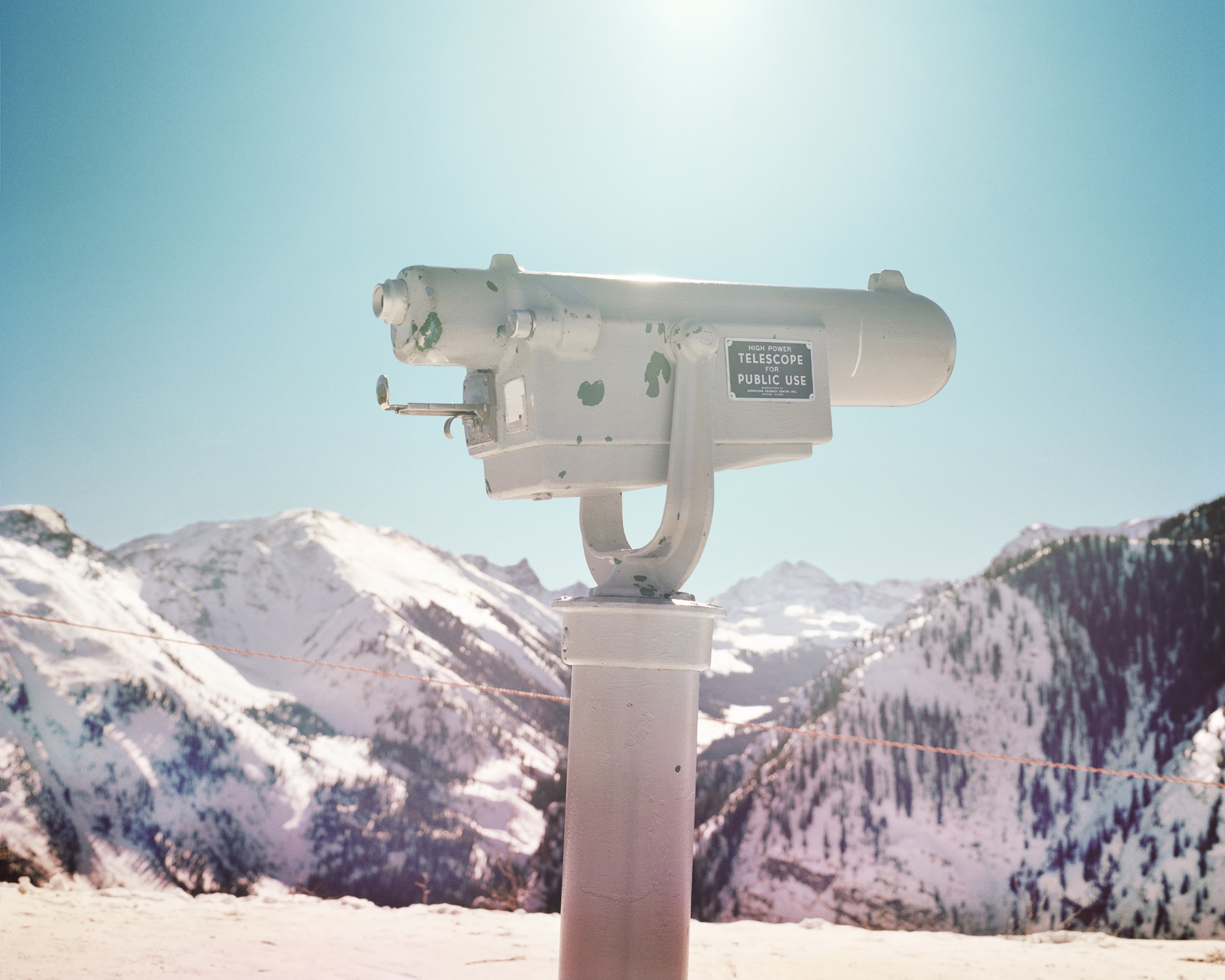
Some of the best advice Kripke has received as an artist is to “change up your inputs.” He continues to look beyond photography for inspiration, seeking out painting, sculpture, music, books, and podcasts to avoid stagnating in one medium. His work is a reflection of this: “I think inspiration comes from unlikely places or maybe the combination of two things that you didn’t expect to see together.” He seeks to make something new by combining photos and mediums to progress a project “somewhere it hadn’t been before.”
“When I put images up, I like to think of them as windows. If you treat it like a window instead of a print hanging on the wall, it behaves differently, and it offers you a way to transport yourself somewhere for a moment.”
Kripke’s philosophy on life? “Just be honest with yourself, and be honest about what makes you happy.” When I ask him if there is anything else he would like to share, he laughs: “Everything’s for sale.” △
Alpine Modern + JK Editions: Winter
Limited edition fine art prints by Jamie Kripke
Photos and Art by Jamie Kripke A portfolio of images by Boulder, Colorado-based photographer Jamie Kripke, created exclusively for Alpine Modern. An ongoing project that studies our connection to the alpine landscape.
Limited edition, museum-quality fine art prints of these images are available to purchase at the Alpine Modern online shop.
Art ± Geology
A studio visit with modern painter Sarah Winkler
Contemporary artist Sarah Winkler’s experimental painting technique mimics the addition and subtraction of geological processes in nature. Iceland’s geological drama and Alpine-Nordic design ethos inspired her current winter series of fantastical alpine landscapes. It was a cupboard drawer full of Mars bars that lured Sarah Winkler into the world of art. She was five years old and lived in Manchester, England. The cache of hiking treats belonged to an impassioned artist living next door. Sarah and her brother liked to visit him and eat his chocolate. Eventually, the little girl became fascinated with the neighbor and his lifeway. The man had worked at a bank his entire life. But on the weekends, he would ramble across England and over mountains. In his seventies, even, he climbed in the Himalayas. “He was an incredible adventurer,” Winkler recalls about the former neighbor, who had most of his house converted into a studio. “He would sketch all his travels and come back and translate the sketches into detailed drawings.”

And that’s what Winkler does today. The British-born painter remembers being “absolutely captivated” by her childhood idol’s way of traveling and then documenting the things he saw along the way, his journey. “That’s who this guy was, and being around him was enough to start that bug in me, the love of travel and adventure and painting.”

The Travel Painter
Much like a travel writer brings back stories from afar, this wanderlust-bitten painter must travel to make art at home. “Experiencing new things, seeing things for the first time...you’re really open and raw, so you are absorbing a lot easier. I travel and then come back and work, based on the memory of that place,” she says. “I take vacations in search of solar eclipses, exploding volcanoes, or the northern lights.”
Just don’t call her a landscape painter. “I don’t want people to think I do nice little landscapes...of places that actually exist.” Her invented vistas disregard human imprint on landscape. They do, however, consider what landscape does to us humans. “These are wild, untouched spaces. They almost become psychological spaces.” Her scenes interpret the human relationship with the outdoors. Why do we go to the forest? Why do we climb mountains? Why do we hike trails? Why do we still go into wilderness this far into our evolutionary progress? “Sometimes, you have to go into the darkness of nature to really know yourself,” the spirited artist says.
Wild, untrodden landscapes mesmerize her. “The horizon line is this boundary between what you know, your reality as it is, and what you don’t know...what’s coming,” she philosophizes. “A strong horizon line signifies this moment when you’re going off the deep end, into an abyss. It’s that wanderlust kind of feeling of a journey, of traveling, of submitting to something challenging that you have to go towards and overcome.” Her art tells of survival in wilderness, accented by peaceful moments of pure consciousness in nature. “You forget all the humdrum of life, but at the same time, there is a fear factor. You have to be brave, Zen-like, and really present.”
A strong horizon line is the common characteristic in Winkler’s landscapes. That giant glaciers and rugged peaks, which inspired her current winter series, don’t typically make for an obvious horizon line doesn’t deter this willful woman. “Because the horizon line is very important to me, I decided I’m going to force a horizon line in these paintings, even though it doesn’t exist,” she says, eyes twinkling. What’s more, the ebullient blonde places the horizon line dead center. “That’s such a no-no in painting, I love it,” she laughs. “In abstract painting, the joke, the idea is that you don’t know which way is up.” Realistic landscape paintings, on the other hand, always have a definite top and bottom, a rule Winkler bends. “You can actually flip these paintings one way or the other and they will still read correctly as a landscape painting.”
"I don’t want people to think I do nice little landscapes...of places that actually exist."

Her make-believe horizon lines become a divide of above and below—the alpine reality we see above, all formed by a geology below that we can’t see. “It ties in with the Continental Divide here in Colorado. It’s very dramatic, two plates crushing together and mountains are growing,” she says. “It’s about landscape that’s growing, that’s forming, that’s eroding, that’s expanding.”
A Place to Paint
With a father whose jobs in aviation moved the family around the globe, the artist lived an adventurous childhood in Africa, where her mother first encouraged her to draw her unfamiliar surroundings, and later in different places across Southeast Asia. In 1989, the world-wandering family immigrated to the United States, where the expat graduated with a bachelor of arts degree in studio art, creative writing, and earth science from William Paterson University, New Jersey, in 1994.
The environment the transplant lives in is very indicative of her art’s colors and moods. Today, the forty-two-year-old lives and works in a three-story mountain home perched in an aspen grove at the summit of an 8,500-foot (2,591-meter) peak above Denver, in the Front Range of the Colorado Rockies. Husband Jason and their pooch also live in the matte black house with white trim.
In Winkler’s current body of work, the influence of her new mountain domicile converges with memories of a pivotal journey to Iceland. “A very geologically dramatic island...the colors, black and cobalt blues, and these very stark, surreal, empty landscapes,” she reminisces about the volcanically active country. The artist’s painted Nordic landscapes use neutrals and calming spots, an aesthetic she discerned during design week in Iceland. “They usually have pops of color or strong moments of interest, and then everything is quite calm and minimal around it.”
The worldly-wise Brit and her travel companions drove in Jeeps over glaciers, watching the northern lights. She photographed nature’s night spectacle with long exposure. Afterwards, the pictures revealed what happened between the aurora borealis displays. “I saw these very dark, cobalt skies, and then this amazing landscape in the middle was popping out, because the bright snow and the glacial moraines and the ice were overexposed, of course. So working from that imagery was how I came up with this winter series.”
Winkler’s landscapes, fantastical and abstract, don’t depict real places. The outlines of mountains aren’t existing ranges or peaks one could pinpoint on a map. Yet Instagram followers from Iceland instinctively recognize their own country when the artist posts snaps of her latest works on the site.
Rather than the likeness of real-life scenery she surveyed, Winkler wants to render the emotion a landscape evoked in her. “Working from the memory of those forms and colors and textures is how I came up with the sketches, and now I am translating them into really abstract paintings,” she says. The winter series draws on Winkler’s memory of Iceland’s Blue Lagoon in particular, where the artist bathed in the warm, otherworldly milky-blue water. “You have the black lava fields and the bright turquoise tide pools, and the ground is covered in the white silica minerals from the water.”
"This whole painting process is about adding and subtracting, like the erosion process in nature."
Each scene takes time to ferment in her mind. “Because I am not painting realistic scenes, nostalgia is always a little bit more interesting than what’s fresh in your mind, when you know all the details,” she says, admitting that forgetting a few details helps her get down to the essence of an experience. “Remembering only the most interesting part makes it this haiku moment in the landscape. Boom.”
Winkler’s creativity is fueled by a sense of place within her surroundings. At the time of her Iceland travels, she still resided in California—and painting icy Nordic landscapes in such an agreeable one-season environment felt incongruous. “Iceland was such an extremely different experience, a very Nordic, alpine, Arctic Circle kind of place,” she says. “When I came back to California, I couldn’t get my head into it. It was the wrong place to work on it.” She shelved the Iceland-inspired series. But when she and her husband relocated to Colorado in early 2015, the artist absorbed a wintry experience, and the alpine wilderness there that reminded her of Iceland’s rugged terrain. “That’s how these colors started coming back to me. It made sense now, and now it just owed out.”
"Remembering only the most interesting part makes it this haiku moment in the landscape. Boom."
Emulating Geology
Winkler at first experiments in ink on transparent foil, using the same solvents and resists she later uses with the paint media. When “something interesting” happens, she scans the plastic swatch, magnifies it, and prints it in archival inks on acid-free coated papers she then rips to pieces. Each landscape begins as a small collage made from those paper scraps. When I comment that these collages she calls her “sketches” are beautiful small works of art in their own right, the creative says this was indeed what she sold as her final pieces for many years. Only this year she began translating the collages into large-scale paintings. But could she simply paint a landscape that’s not copied from a paper-assemblage sketch? “I’ve actually tried a painting without any collage references, without any sketch reference at all, and it was a total disaster,” she admits. “The collage creates the look of a painting. This hard-edged torn-paper effect gives a very graphic feel to the painting. It’s very painterly, but it’s very graphic at the same time.”
"The collage creates the look of a painting, this hard-edged torn-paper effect gives a very graphic feel to the painting. It’s very painterly, but it’s very graphic at the same time."

Winkler’s final paintings are acrylics on wood panel. Each large wood board is first treated with a sealant and several layers of the artist’s own mix of ground marble dust gesso, and then wet-sanded between applications to attain a polished, ice-like finish. She works in stages, using different techniques in different sections, which she masks off. Her experimental approach involves solvents, resists, and carving tools to mimic geological effects in nature, such as abrasion, corrosion, sediments, wind ripples, pooling water. It’s yet another layer in her abstract interpretation of landscape. “It’s not just that I am painting geological textures. It’s digging deeper into the process of the landscape, because the minerals I use in my paint mixes, the marble, the mica, the iron oxide, all come from the rocks.”
"This whole painting process is about adding and subtracting, like the erosion process in nature."
Winkler immersed herself in the study of geology and quickly discovered that the colored pigments in her paints also come from crushed rock and the earth. “What if the pigments in the paint would do the same thing as rocks and dirt and landscapes do in nature?” The artist manipulates textured paint media with water, oil, salt, wind, heat, and sanding tools. “You apply a layer of paint, and then you take some of it away,” she explains. “This whole painting process is about adding and subtracting, like the erosion process in nature.” △
Photos by Christopher Mueller
