Inspirations
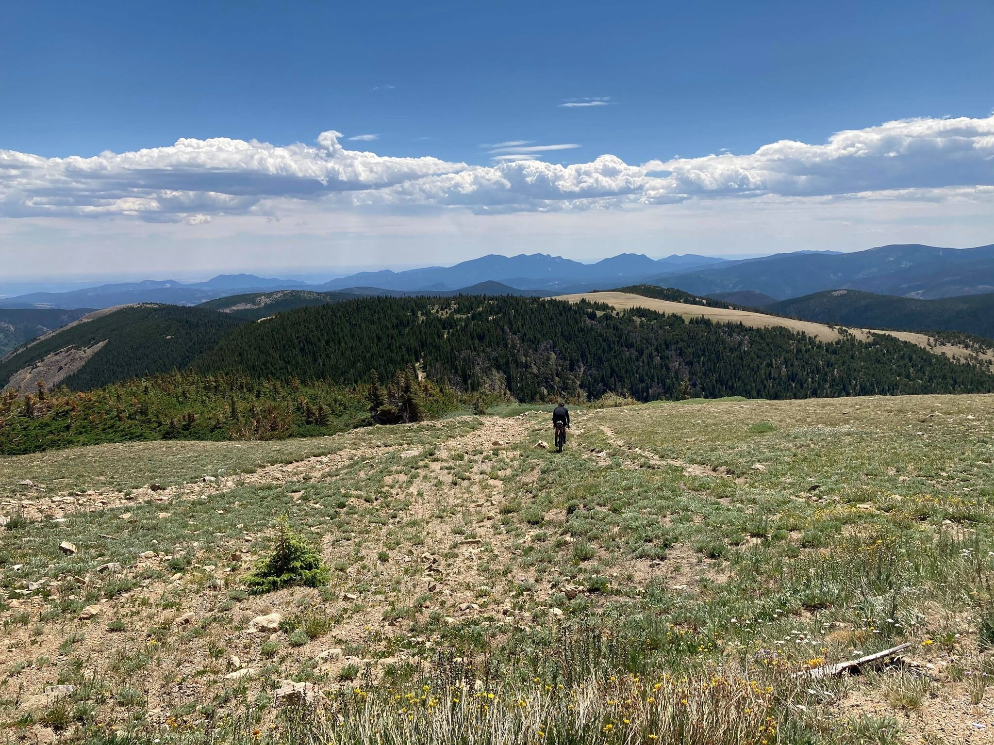
Explore the elevated life in the mountains. This content debuted in 2015 with Alpine Modern’s printed quarterly magazine project.
Sense of Place: Clean as in Whistler
Chad Falkenberg of Vancouver-based Falken Reynolds talks about modern interiors in Whistler's mountain homes and cabins
In the fourth and last installment of our "Sense of Place" series, we are talking with interior designer Chad Falkenberg of the Vancouver-based interior design studio Falken Reynolds about brining Whistler style home, no matter where you live. Whistler is rich in cedar and granite. So its natural that traditional mountain homes use a lot of both. While the wood in older homes may have a raw finish, you won’t see many log cabins in the mountains of British Columbia. The trees here are simply too massive. The granite boulders are enormous, too. People incorporate them into the structure of the house. Natural stones, in fact, are a classic element of both traditional and modern homes in the Canadian resort town.
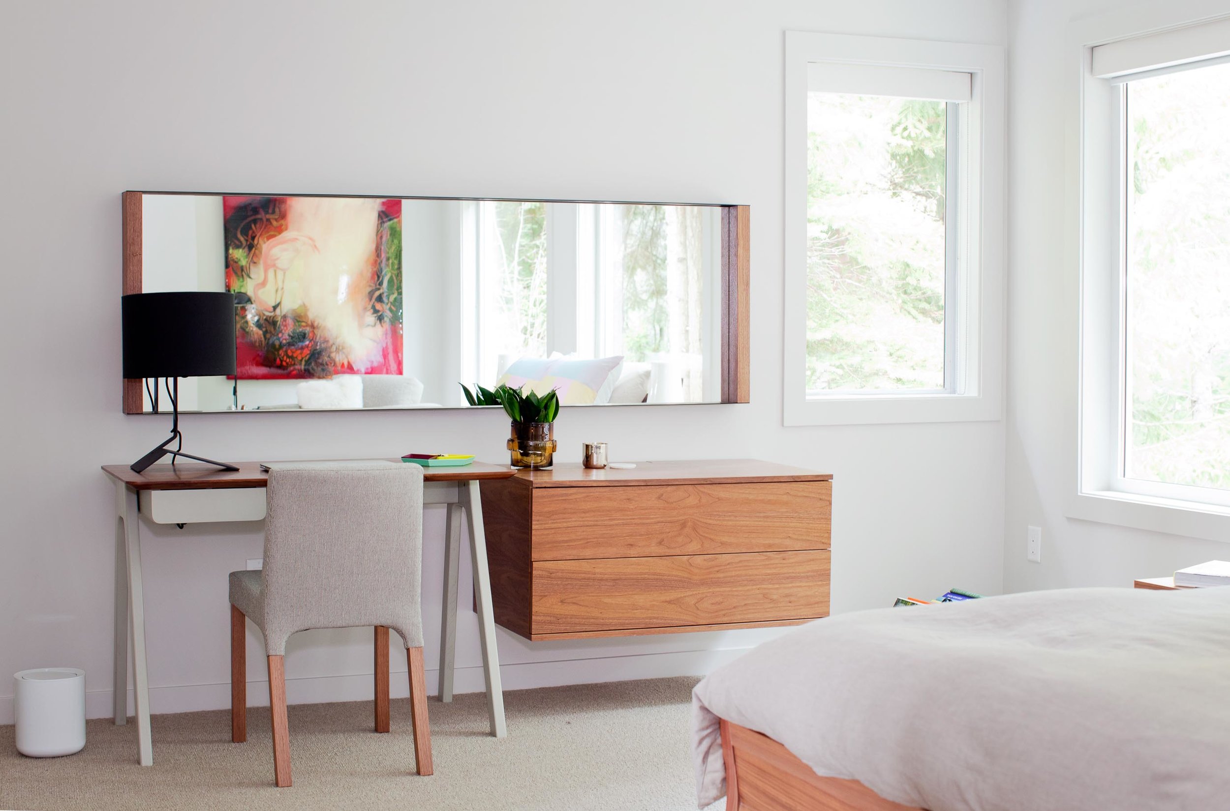
“We try to use a lot of natural materials when we are working in Whistler,” says Chad Falkenberg, one half of Falken Reynolds, a Vancouver-based interior design studio. “It feels more authentic, closer to the earth and to the outside, which is why people go up there, to get away from the city.”
Some of his projects involve sand-blasted Douglas fir to achieve very clean lines but give the wood extra texture. “The idea with all of this is that it patinas well,” says Falkenberg. “If the wood gets hit by a tree or by skis, it’s OK.”
The studio’s work in Whistler is particularly minimalistic and sophisticated yet still achieves the cozy feel of a mountain retreat. Hard textures are mixed with softer, textile surfaces. “In the bedroom of the Aspen Drive house, we used wood furniture, but we also used wool carpet, so the whole floor feels like a sweater,” Falkenberg tells about a recent project. “When you get out of bed, you shouldn’t have to put socks on.”
The designer, who draws inspiration from years of working and traveling in Scandinavia and Southern Europe, often relies on the visual warmth of the materials. “One of the easiest tricks is to mix grays and warm colors,” to achieve the clean-lined yet warm look and feel of some of the Whistler homes he has designed. Combine a warm natural wood with a gray countertop or fabric, for example. “The two things are almost juxtaposing each other,” Falkenberg says. “It’s almost like a wood next to the cool gray looks even warmer.”
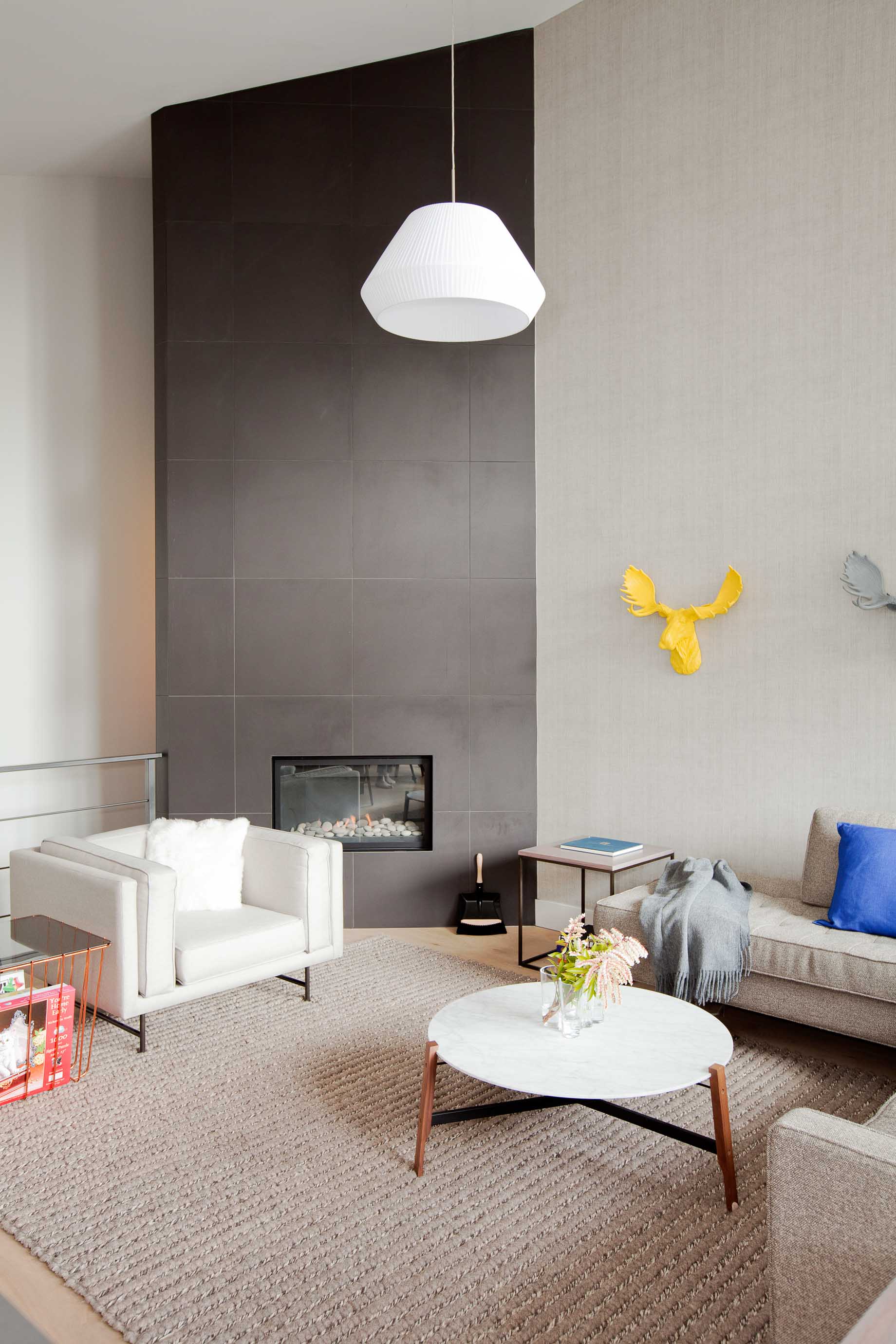
To accessorize your Whistler-inspired winter interior, go for copper and terra-cotta pots. The designer’s favorite textures are anything that feels like a sweater—the loop of a rug, wool blankets, pillows covered in chunky knits. A rougher texture, even on a hard surface like a co ee cup, also feels warmer. Leather is another great material that feels warm to the touch. It has a history to it. “Anything that evokes the natural world,” says Falkenberg.
He likes to keep things casual in a mountain retreat, as he expresses by using a wire taxidermy sculpture or resin moose heads on the wall. “I love anything that reminds me, OK I’m in a cabin, and I’m not supposed to take everything so serious.” △
Fifteen and Focused on the World
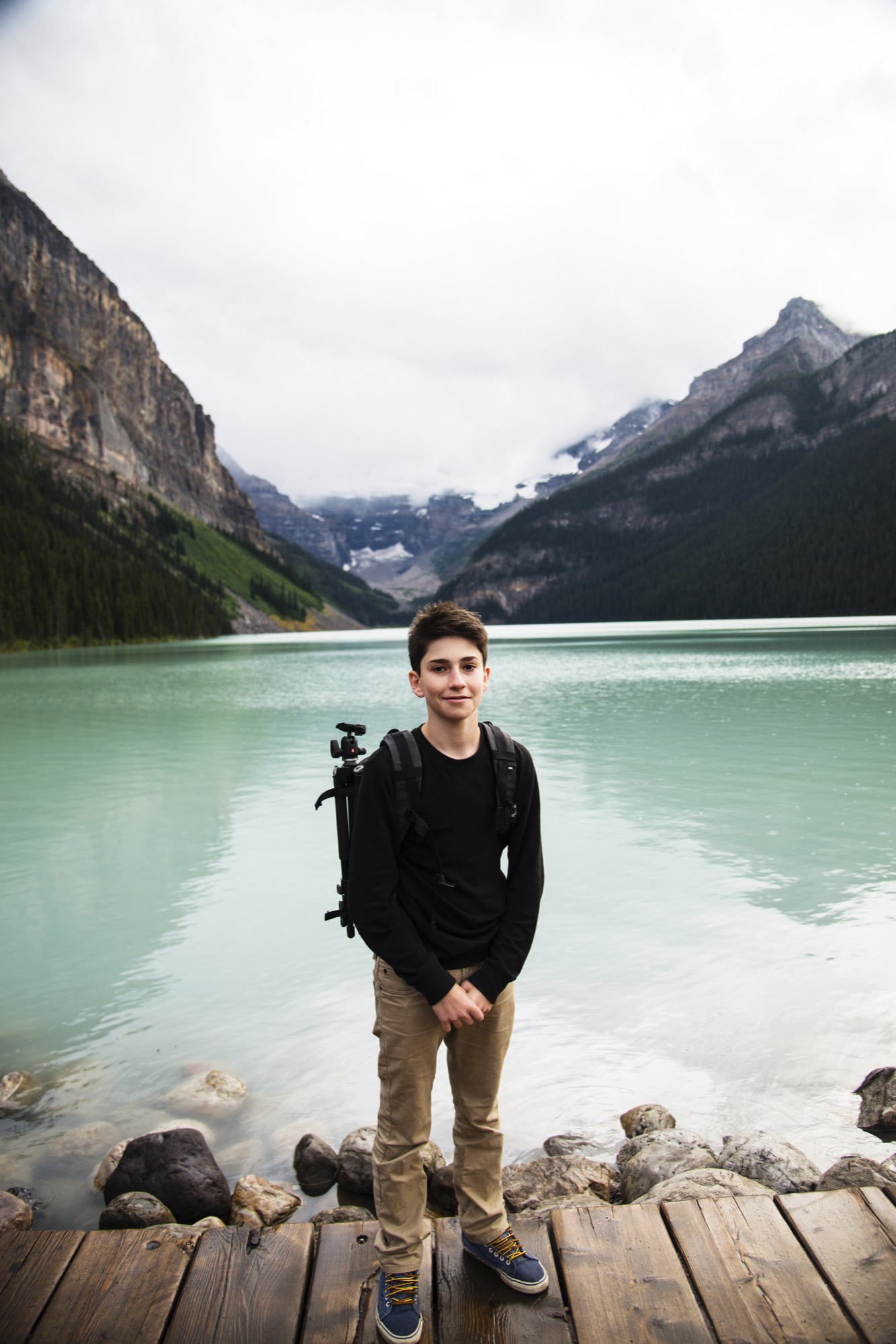
Only fifteen years old, Joe Goldberg travels to explore the world through his camera lens. The photographer hopes his photos will inspire others to get out and see for themselves.
Upon returning from a life-changing trip to Costa Rica when he was only eleven years old, Joe Goldberg (joe_goldberg on Instagram) decided to spend his bar mitzvah money on his first camera. Now fifteen, the high schooler, who lives with his parents in Washington, D.C., expresses his teenage self through the art of photography.

What’s more, the young adventurer wants to inspire others to travel and explore the world, too. At an age when his peers may search for their raison d'être on the Internet, this millennial gets out and uses photography to bring life into perspective.

A conversation with teen photographer Joe Goldberg
AM Who are you in a nutshell?
JG I am a fun and energetic fifteen year old who loves to travel to the wildest places, take photos, and explore.
AM How did you find your way to photography?
JG I was eleven years old when I went to Costa Rica and really discovered some of the most natural beauty in the world. I then realized capturing memories with photography is a really cool thing. I realized how passionate I am about photography, so I decided to purchase a camera with the money I received after my bar mitzvah.
"I then realized capturing memories with photography is a really cool thing."
AM What does being fifteen mean for your creative work?
JG I think the role my young age plays in my creative work is having this constant urge as a young kid to travel and see things most people won’t be able to see in a lifetime.
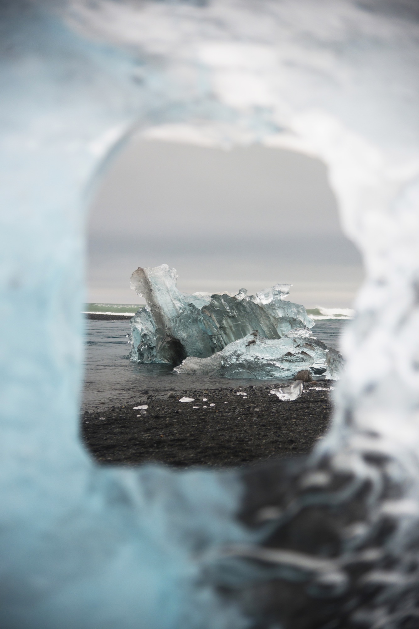
AM How do you balance school, teenage life, and your work as a pro photographer?
JG I attempt to get the best grades I can, so I can afford to miss a couple days of school here and there when I travel. I hang out with friends and family when I can. And when I get the chance to go out on an adventure, I will take the opportunity and then return to my normal, everyday life in Washington D.C.
AM What do the mountains mean to you?
JG The mountains play a big role in my photography. Probably, because I believe mountains make for the coolest photographs. My favorite activity also has to do with mountains, which is hiking. To see those insane views after a strenuous hike is one of the best feelings!
"I believe mountains make for the coolest photographs."

AM What inspires you in your work as photographer?
JG What inspires me is being able to share the beauty of the world with everyone. I love to capture memories and to look back on these incredible experiences I have been lucky enough to have. I love to hear how impressed people are with my work, which is a really big motivation to bring back the best work I can from these adventures I take. I also use my photos to try to encourage people to go out and explore.
AM What’s your favorite place in the world?
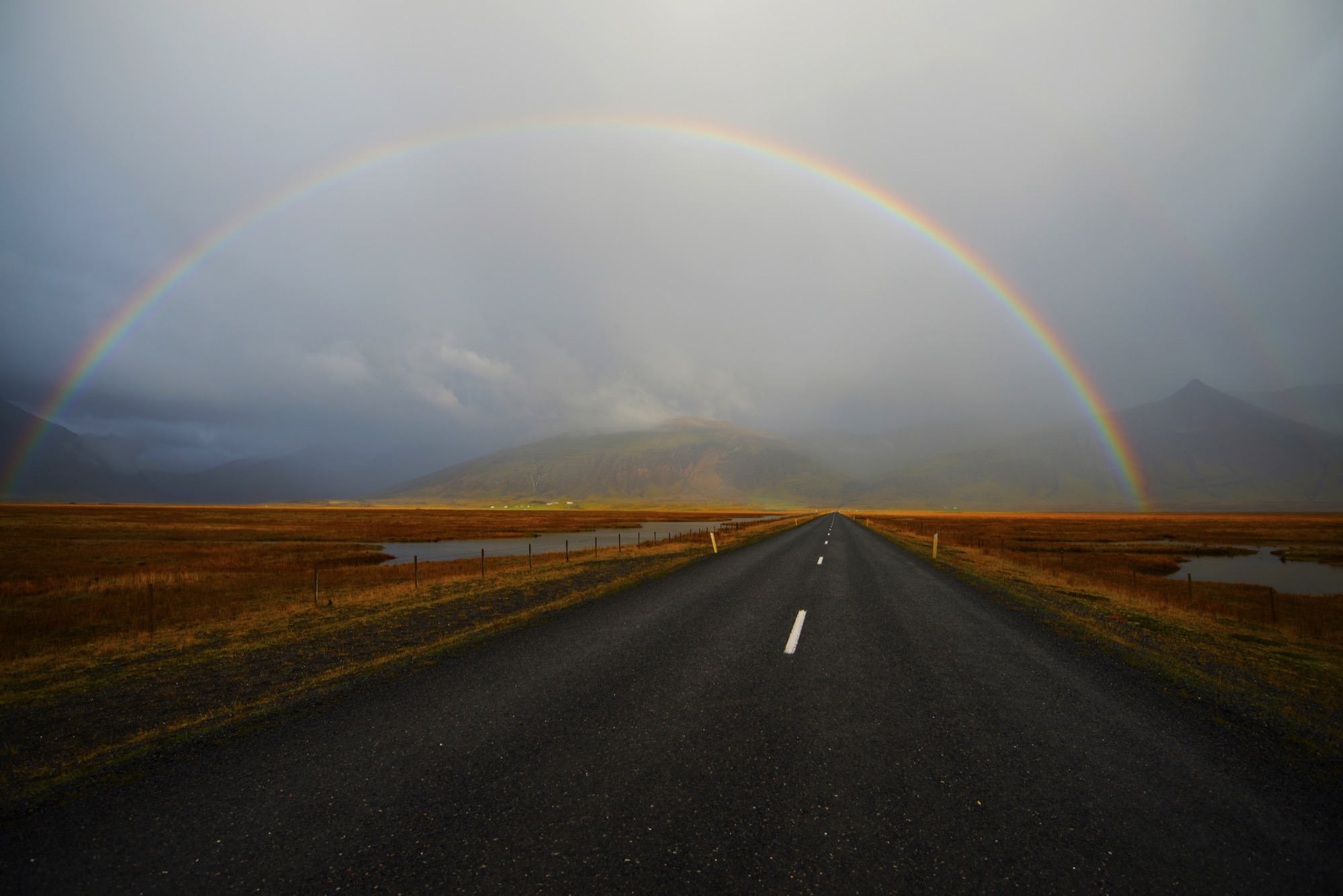
JG My favorite places I have been to have to be Iceland and Alberta. Alberta because the number of lakes and the abundant wildlife just blow my mind. You never know what to expect in the Canadian Rockies, and that is why I decided to go back over the summer after having gone during Spring Break. My other favorite place has to be Iceland. Every five minutes, you see a totally different landscape. I would love to return soon.

AM What’s most important to you in life?
JG The most important things in my life are my family and friends. However, being able to see the beauty in this world and pursue my dreams of being a the best professional photographer I can be is also something very important to me.
AM When are you the happiest?
JG I am the happiest when I am in nature, experiencing the amazing sights the world has to offer.
AM What are you up to next?
JG I just finished traveling to Iceland in October. Iceland is a place I wanted to go to for years now. The waterfalls, wildlife, volcanoes, glaciers, geysirs, unique landscapes, and the incredible Northern Lights are the reasons why it was on the top of my bucket list. △
The Building Friendship
Friends since preschool and sharing a love for design and the mountains, the founders of MTN Lab, an experimental furniture and art studio in Colorado, have always been building things together
Harris Hine and Rudy Unrau have been best friends since preschool. Now both 27 years old, they have founded MTN Lab, an experimental furniture and art studio in Colorado. Growing up in Boulder, Colorado, the lifelong friends have been building things together since they can remember—skis, bikes, random projects. But it wasn’t until spring 2015 that the idea for MTN Lab was born. Both back in Boulder, Hine and Unrau began showing sculptures at Studio Como in Denver’s RiNo art district at the time. “Getting in there is what really materialized the company,” Unrau recalls. “That’s when we came up with our name and went from just building stuff to actually focusing on a business.”
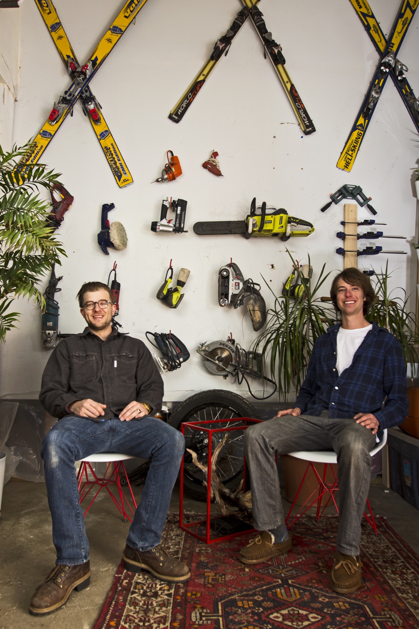
The two men, both quiet and reflective, share an ardent love for design and the mountains. Yet, they come together at MTN Lab—at the intersection of art and adventure—from opposite directions: Hine a trained designer and woodworker, Unrau a former professional mountain biker turned woodsman fighting wildfires for the Forest Service.
Harris Hine
Harris Hine grew up profoundly influenced by his father, Vienna-born modernist architect Harvey Hine, who founded HMH Architecture + Interiors in Boulder.
“I’ve always been torn between the design side of my personality and just wanting to be in the woods,” Hine shares. He went to school for design at Pratt Institute in Brooklyn before moving from New York City to Portland, Oregon, where he worked as industrial designer. “I didn’t find any fulfillment doing other people’s projects, and I didn’t really like the mass production side of product design,” he admits.
All those years, Hine pined for the woods, where his old friend was.
Rudy Unrau
Unrau, while attending college in Western Colorado, signed on with the United States Forest Service. “I was on track to becoming a smoke jumper, working for a helicopter crew down in Durango,” the long and lanky woodworker recounts. “It was a great setup because you work a ton in the summer, and then you get winter free to do whatever you want, like ski and move to Canada.”
Throughout those years, Unrau had been harboring the desire to return to making art. “Seeing the things you see when you get to fly around and travel the US and go to all of the mountain ranges... I had ideas emerge to work with the trees that had been burnt or partially burnt in fires because they get so twisted and cool.”
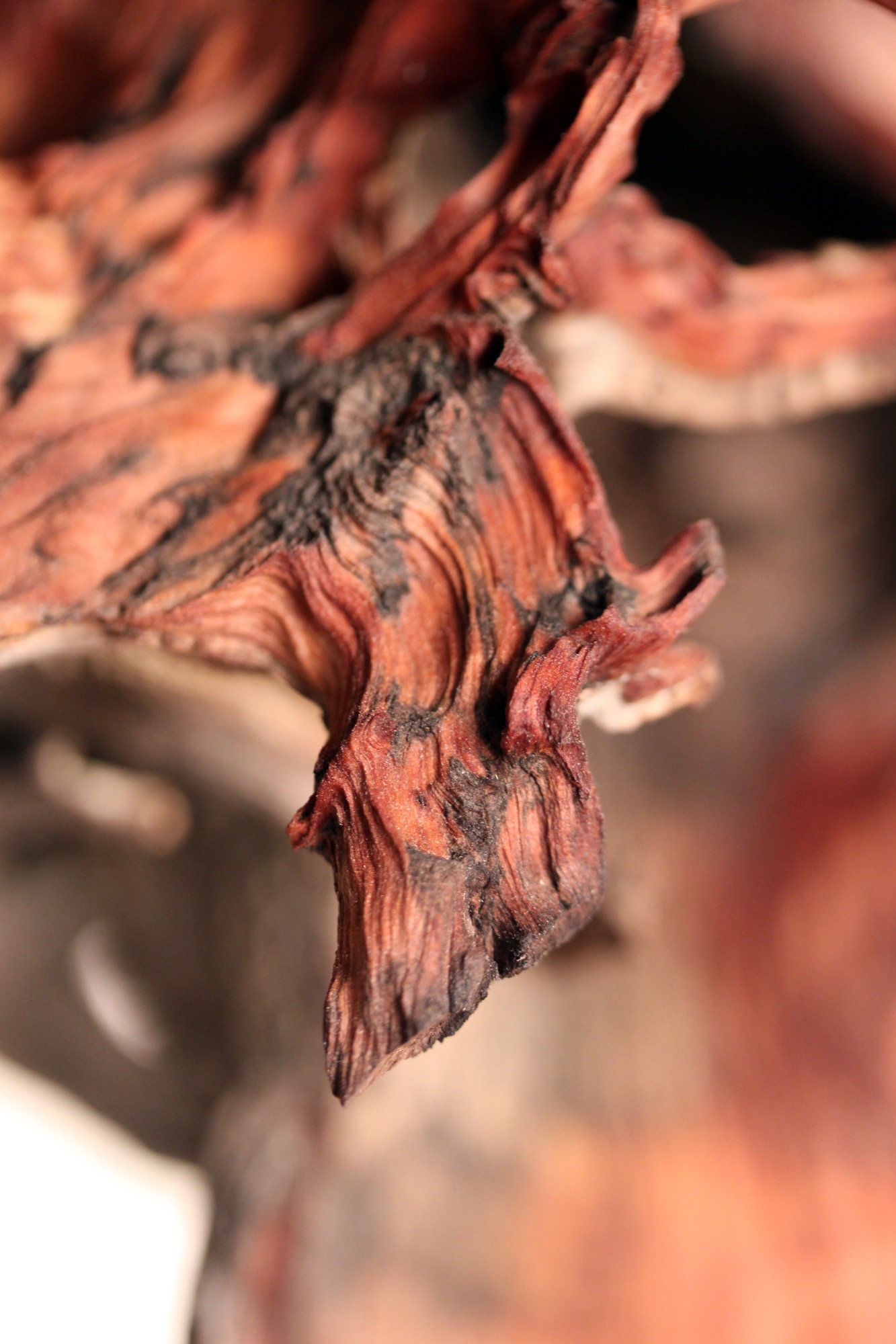
"I had ideas emerge to work with the trees that had been burnt or partially burnt in fires because they get so twisted and cool.”
Joint adventure up north
At last, one pivotal winter Hine and Unrau moved to British Columbia together to ski. Their close friendship and mutual influence would impact each man’s path. “Rudy was all in the woods,” Hine remembers, “Living together pulled him back into the design world and brought me back into the woods.”
Unrau agrees: “I’ve always been at home in the woods. Growing up, I really wanted to pursue mountain biking, so I raced mountain bikes professionally for quite a few years.” After the athlete got “a little bit tired” of mountain bike racing in world cups, he focused on skiing.
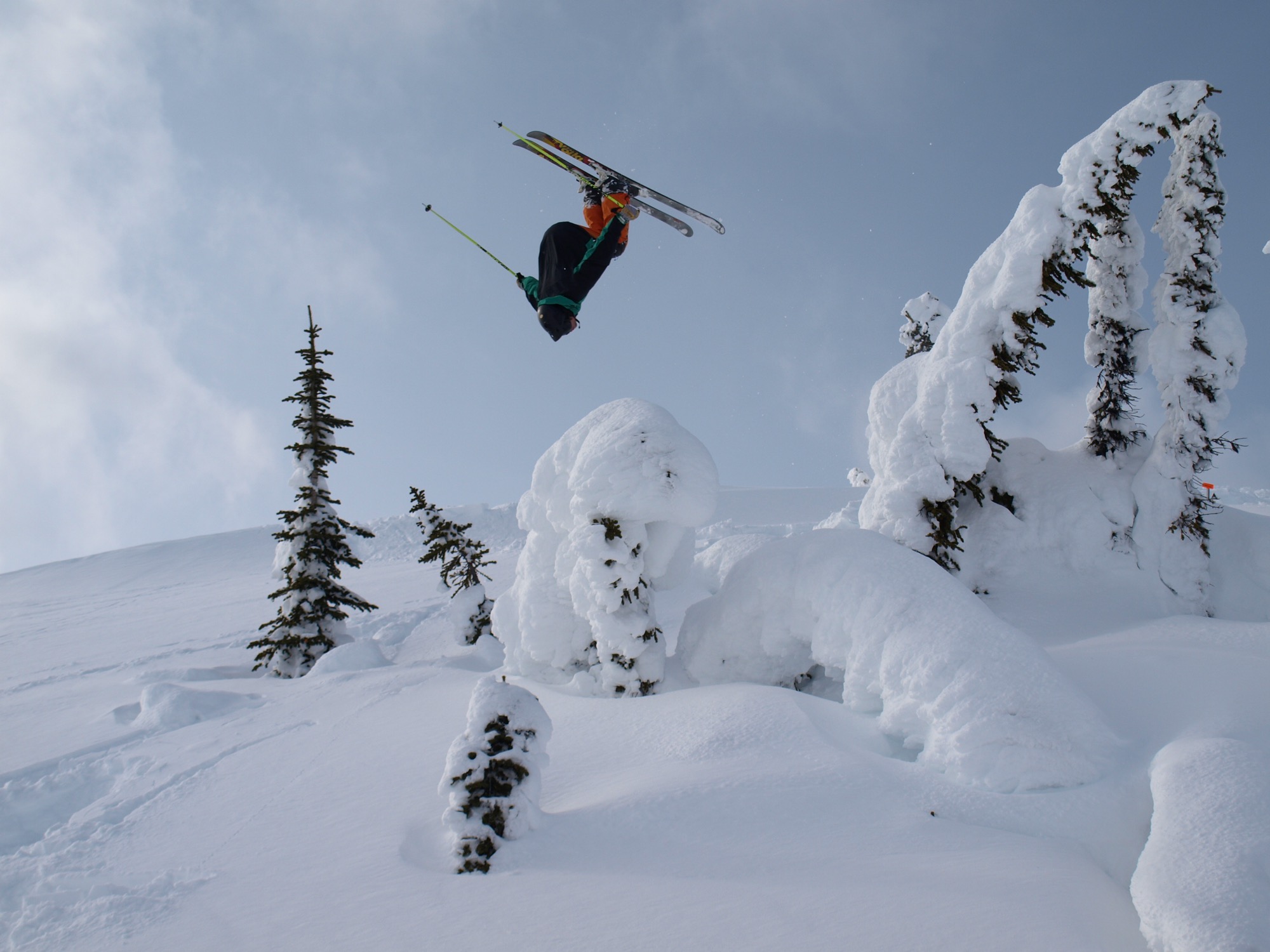
Skiing in Canada was good fun. Winter gone, however, Unrau planned to work another fire season. The outdoorsman envisioned himself carrying on that seasonal rhythm of demanding service and wild adventures in the snow for years until he had and his friend had their fill of youth and independence. “And... I crashed paragliding,” he tells, falling solemn all of a sudden. “I broke my back and almost died and spent half a year recovering.”
His loyal friend by his side, Unrau needed to reevaluate his future. “I realized, I wouldn’t be able to do fire again,” he says. “And then it was pretty natural the way MTN Lab came together—us getting our shop set up to where we could build.”
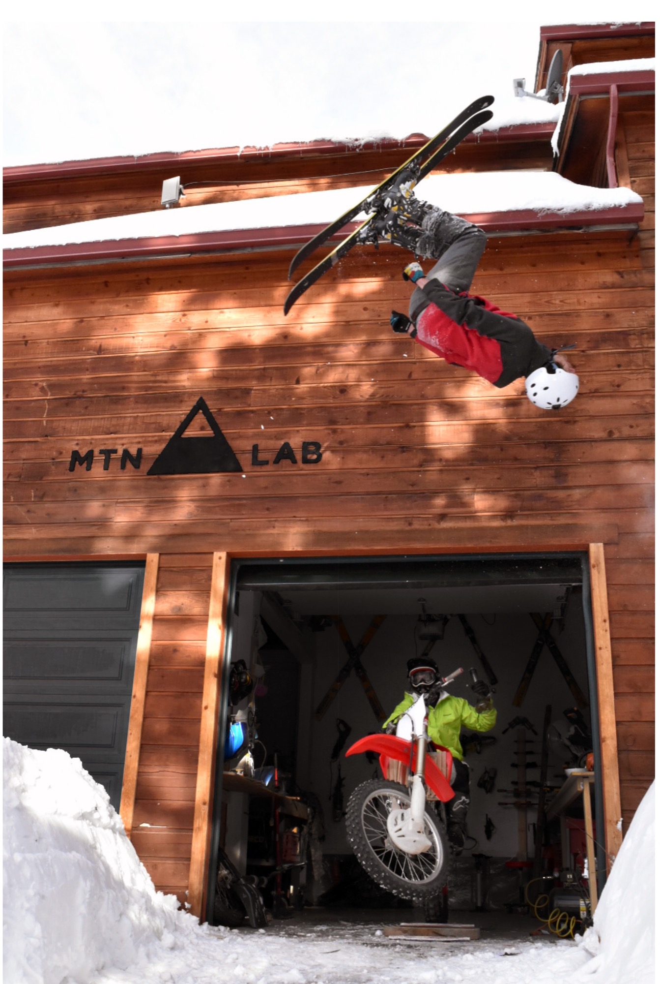
The MTN Lab process
Starting with sculptures, the duo soon began venturing into furniture. Their vision is to grow the Conifer studio into an art collective, with more creatives joining them. They are even planning to build a tiny house to accommodate visiting artists and designers.
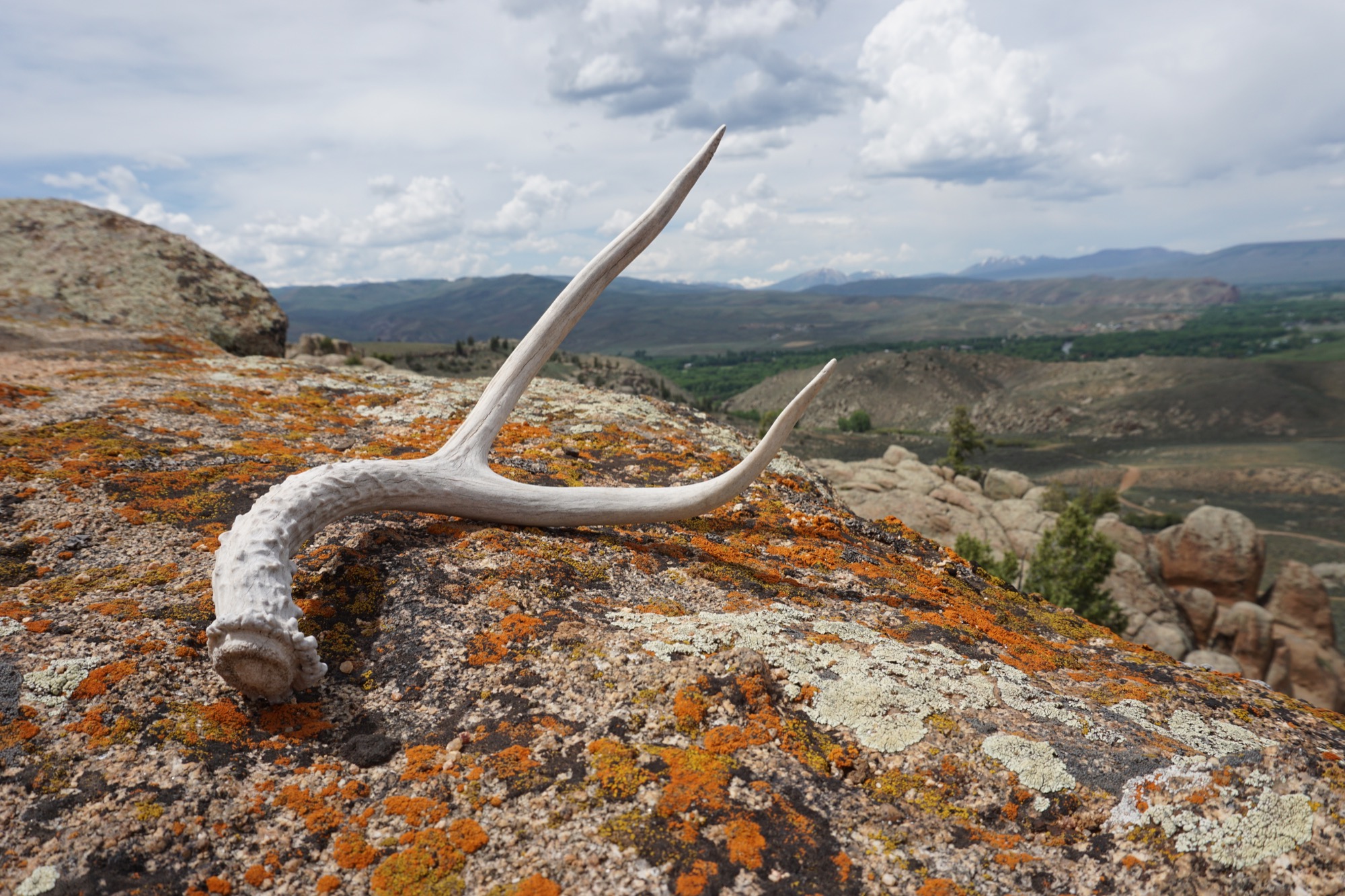
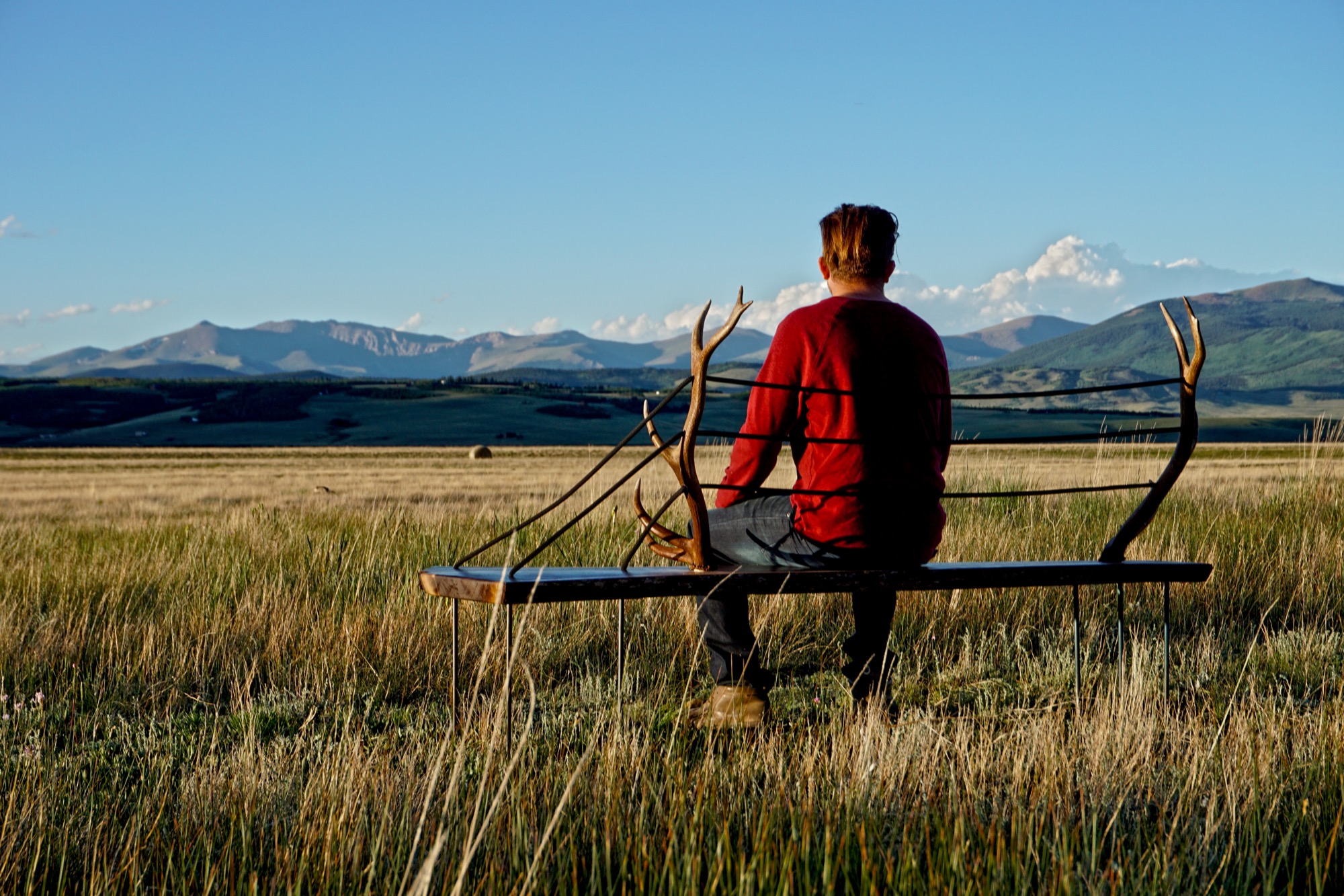
MTN Lab is as much a concept as it is a company. “Our process is the most indicative of what we make,” Hine explains. The founders source all of their materials themselves in the Colorado mountains. “We quarry our own stones to carve and collect our own wood.” Like it was for generations of makers in the mountains before them, MTN Lab’s workflow follows nature’s rhythmic swing. “Right now it’s the season for us to go get river stones because the flow just came down,” Hine tells me, when I sit down with him and his partner on that warm day in early September. “And we are doing antler stuff because we found a bunch of Elk sheds. That’s this flow that we follow.” Adds Unrau: “Our company is trying to do the whole process from sourcing, getting our materials, designing it, building it ourselves, photographing it ourselves.”
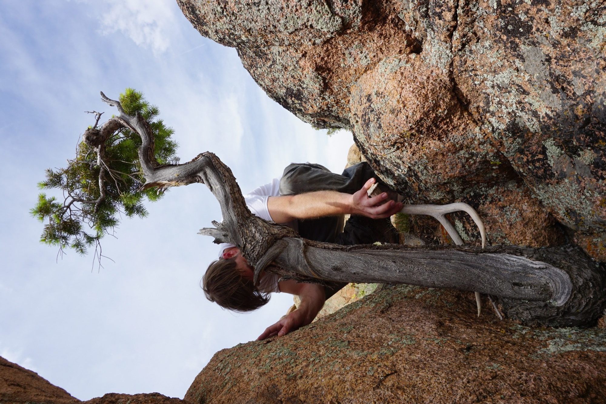
The friend believes having grown up in the mountains is what motivates them to see the entire process through, from beginning to end. “Spending all of your free time in the backcountry—you’re just so inspired by what you’re surrounded by,” Unrau says. “Initially, we were out there to ski, climbing to ski. We were dirt-biking. But when you spend that much time out there, it altered our perception of why we were there. And now it’s awesome because we get to ski, but that’s not the whole part of the process. The ski is the vessel for finding the materials—as well as the inspiration.”
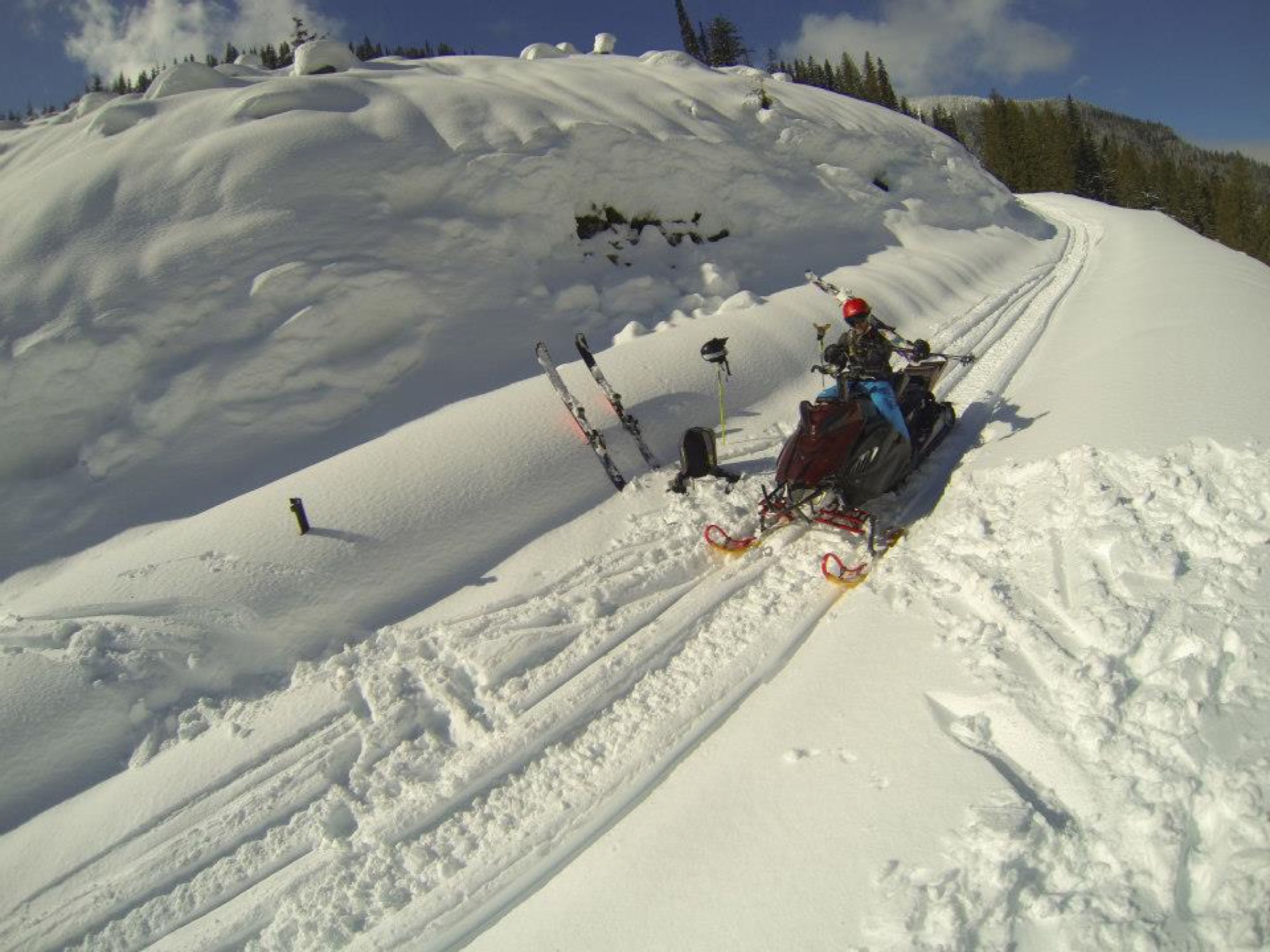
“The ski is the vessel for finding the materials—as well as the inspiration.”
Connecting nature and art
“I’ve always liked minimalist design, and I rarely see that done with natural materials,” Hine says. “You look at Bauhaus stuff, and it’s very industrialized. My dad being the modernist he is, half of me is always striving for that simplicity. But then there is the other part of me... the Colorado guy. And I see these cool pieces of wood and antlers and it naturally merged. In college, I was more on the industrial, clean-cut metal side of things, and my style has evolved more and more into a hybrid of rustic and modern.”
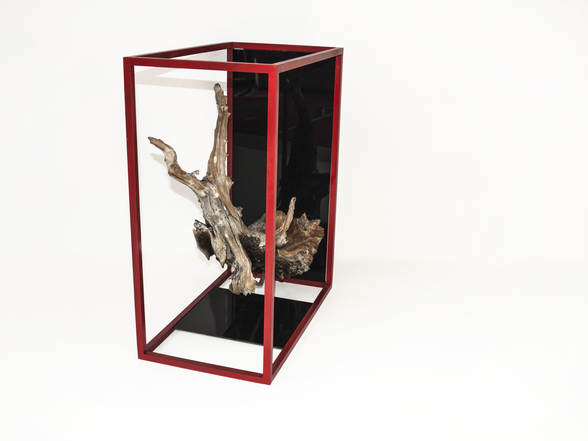
Unrau, for his part, never earned an art or design degree, nor does the lack of academic study in the field limit him in his current work. “We really do our designing when we’re out in the woods. We don’t sit down in an office to draw. We see the material, and the material almost dictates its design.”
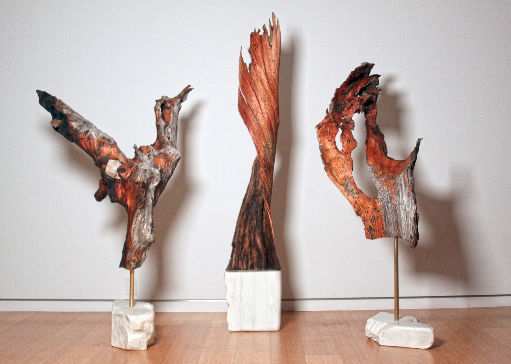
They usually know right away, if a piece of wood they come upon in the forest will transform into an art sculpture, a table, or something else entirely. Back at the studio, they combine found pieces of wood or elk shed with marble and often with contrasting metal. The final artwork or furniture piece comes together like a collage. While the sculptures are never drawn out, the furniture generally is. “We design our table bases, draw them by hand. Sometimes, we bring it into CAD.”
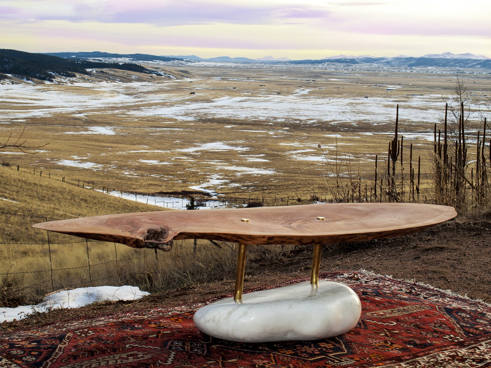
The day I met up with Unrau and Hine, they had come down from their studio above 8000 feet to deliver a piece of art they made for the Boulder Museum of Contemporary Art. “We had this mobile,” Hine begins, chuckling, “And then Rudy dropped it on the staircase, and we were like ‘Oh, no, we’re so crushed. And we had to quickly build it a second time yesterday, and it came out eight times better than the first. That process isn’t always easy to rely on, but sometimes when you make it again, it’s better. This is how we continuously design.”
Speaking about the synergy between Colorado’s magnificent nature, rich history and tradition, and progressive modern art, Hine notes that he is profoundly influenced by the stone carvings of American artist and landscape architect Isamu Noguchi. “It’s that blend of leaving these big natural boulders and polishing one face of it.”
Rustic designs with wood and stone are ubiquitous. “But it’s hard to find someone who has done them simple enough so that these materials individually speak for themselves,” hine says. “Antler furniture is really something we have been experimenting with, because it’s hard to find a simple antler-anything. All the chandeliers are the same hunter antler cluster. And all of a sudden, you are appreciating the simplicity of the singular antler as a sculptural element. That’s what makes it alpine modern, and not just alpine.”
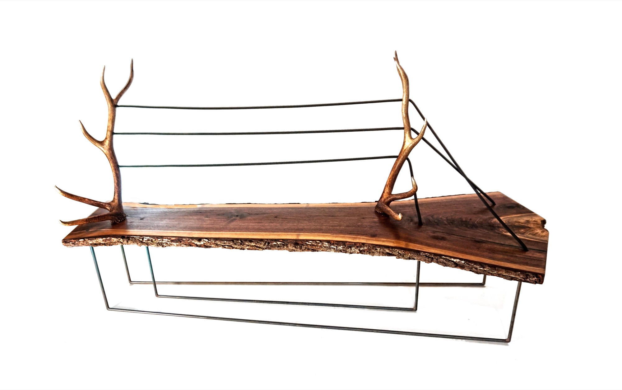
“And all of a sudden, you are appreciating the simplicity of the singular antler as a sculptural element. That’s what makes it alpine modern, and not just alpine.”
A modernists at heart, Hine still looks to the arts and crafts movement for inspiration. “Not stylistically but the whole concept of it is huge, especially since my education is in mass production and industrial design and product development. And going back to actually hand-building one-off pieces from the found materials we use, you can’t really build the same piece twice. It’s almost like we’re in an arts and crafts revival, which is weird for me because that’s the antithesis of the Bauhaus influence, of going from craft to industrial production.”
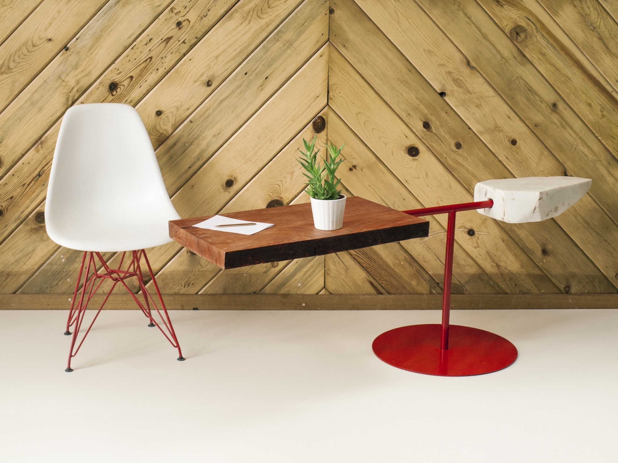
Our conversation later on reveals that the two 27 year olds are somewhat of an antithesis, too—to their fellow millennials. The Internet, they admit tittering, is their shortcoming. “Neither of us really enjoys social media, self promotion, or even doing the sales part,” Hine says. “It’s the cliché artist who doesn’t sell his stuff. We just are either in the woods or in the shop. It never feels like were working.”
MTN Lab projects
Each MTN Lab piece embodies a story of adventure and friendship.
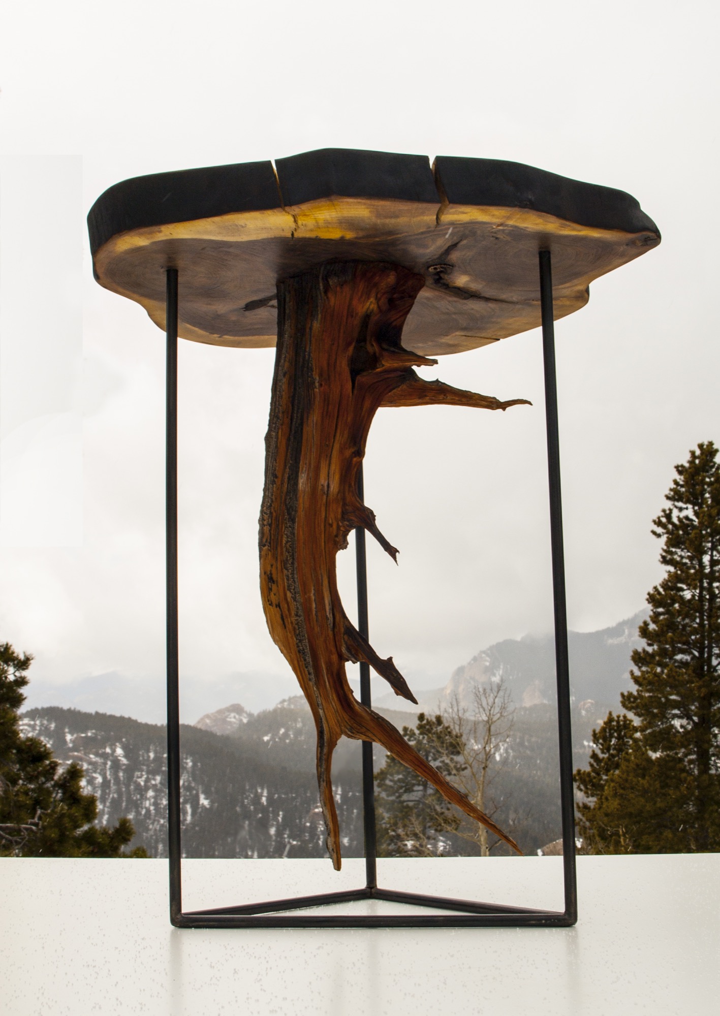
For example, Unrau says seventy years ago, many trees were cut down to make room for high-voltage lines to Fairplay, south of Breckenridge, Colorado. “The company just left them, so these big old-growth rounds have been drying up there all these years,” he says. MTN Lab milled the pine rounds into table tops. “That’s our next big design push, designing bases for those tables,” he says. “Or the motorcycle, which is a lifelong dream we’ve shared since we were little kids.”
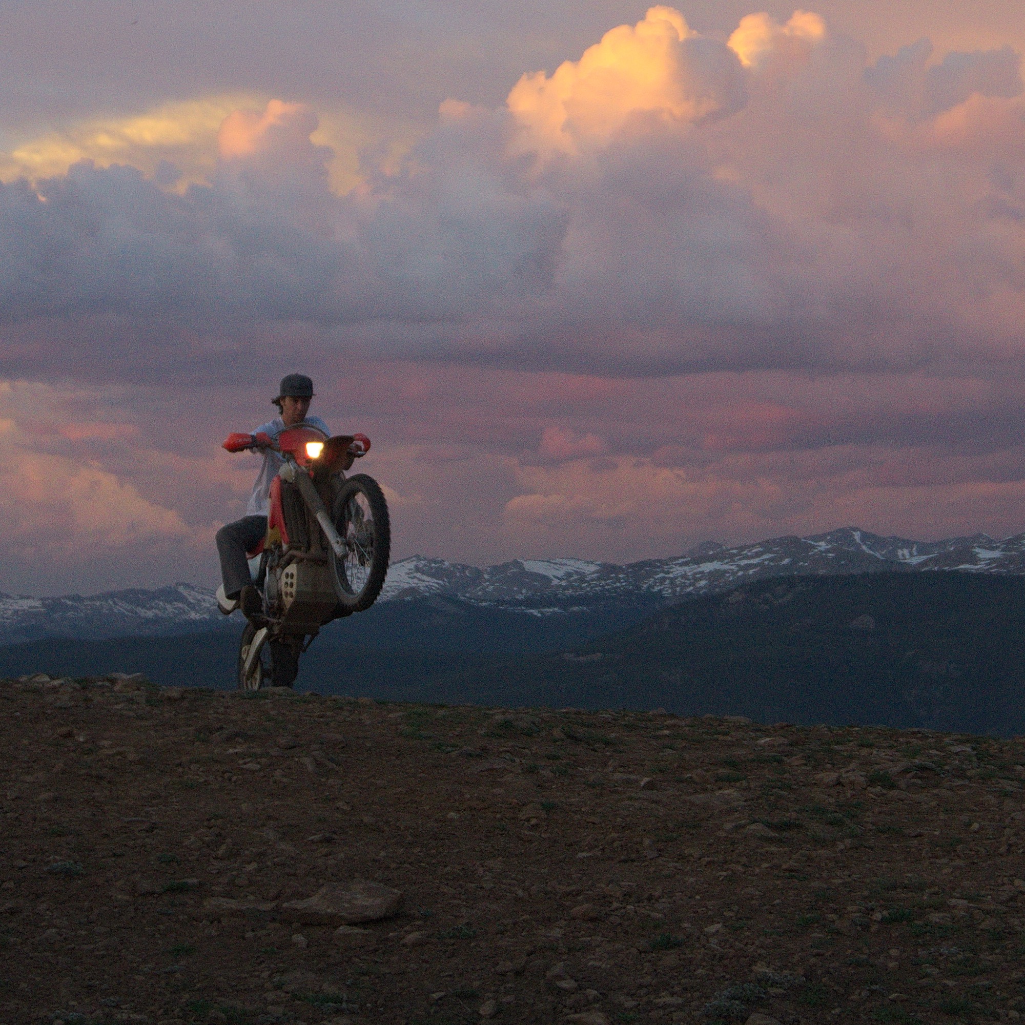
Indeed, Hine and Unrau want to build a motorcycle entirely from scratch, the back end made hand-carved in wood. Before winter, they even want to experiment with producing their our own steel, from mining the rock to crushing and melting it. Whether the resulting material will in fact be usable won’t matter as much: “At least we will be able to appreciate the process when we go to the store and buy steel.”
“The motorcycle is going to be very much like our furniture and our sculptures,” Unrau says. “I would describe it as an art bike. It’s going to be functional. It’s going to ride very well, but it’s not going to look like a conventional motorcycle. I don’t know if we’re going to be willing to sell it.” The business partners are also debating whether they will ever have the heart to sell the 1960s Airstream that once belonged to Unrau’s grandfather and they just finished restoring. “I never want to sell any of our stuff,” Unrau admits, laughing. “It’s hopeless.” △
Northern Lights Optic × Alex Strohl
Canadian Northern Lights Optic collaborates with French photographer Alex Strohl
Northern Lights Optic collaborates with Madrid-born, French photographer Alex Strohl.

Orion Anthony didn’t just create a product when he launched Northern Lights Optic in 2015. He created a lifestyle.

The brand is championed by its NL-6 and acetate NL-7 glacier glasses—which were inspired by Anthony’s own exploration of British Columbia’s rugged Coast Mountains.
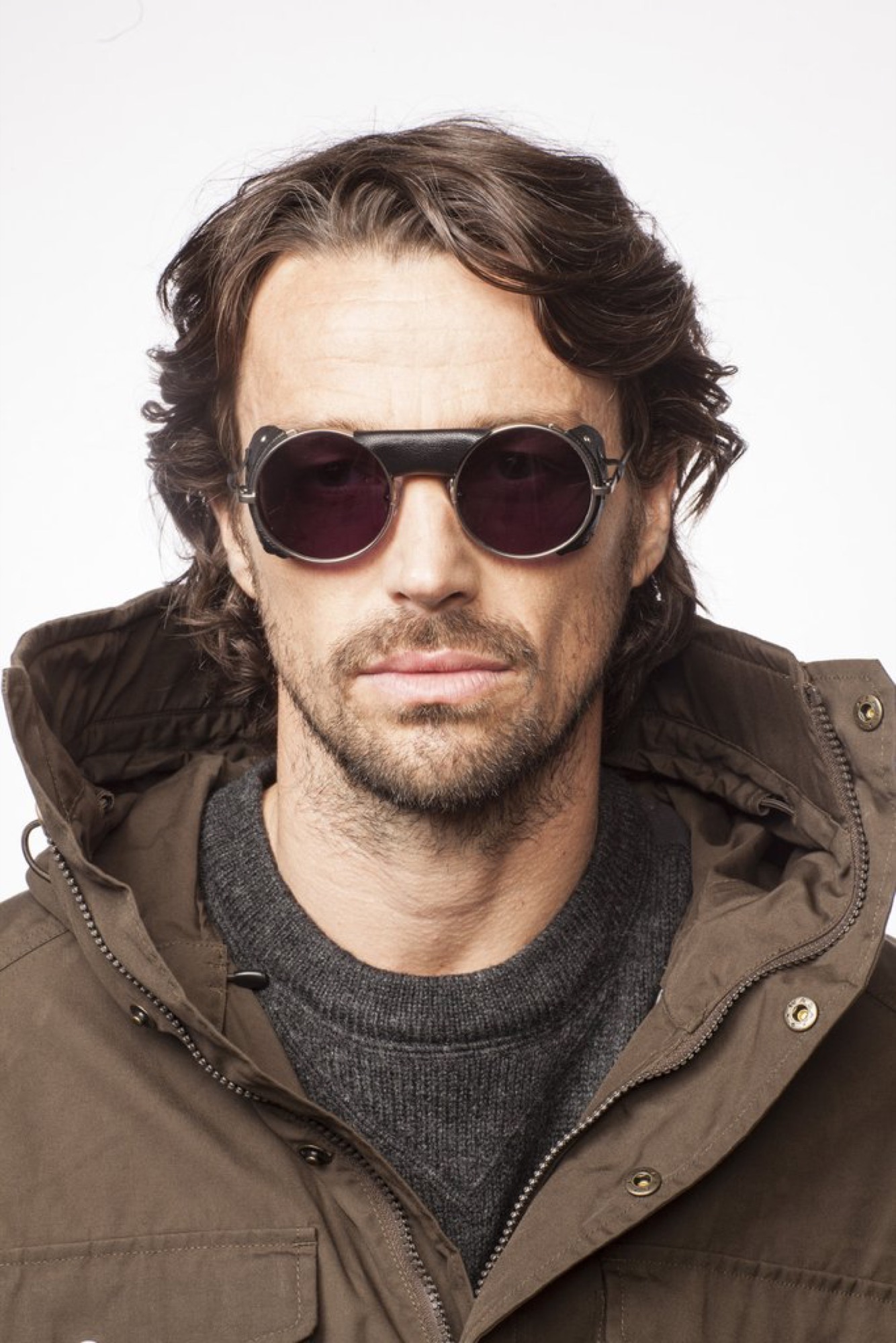
With their lightweight frames, classic circular lenses, and removable leather side shields—the optics pay tribute to the golden age of mountaineering; albeit with a modern twist. These signature models set the tone for the brand.

As an ode to the alpine ways of old, Anthony operates a vintage 1974 Spryte snowcat—a charismatic and unstoppable behemoth, which can often be found parked in the same mountains where the brand was conceived. Anthony works out of those confines (a space that expands into a classic canvas outfitter tent, complete with a wood-burning stove) during the winter—pulling inspiration directly from the elements for which Northern Lights Optic was developed.

It was there at NLO Basecamp where a new vision was born—one that would combine the talents and vision of French photographer Alex Strohl with the alpine heritage lifestyle created by Anthony through Northern Lights Optic. △
Makers on Board
Born out of passion for the ride, handcrafted snowboards, splitboards, and skis by Vancouver Island's Kindred Snowboards feature marquetry artwork.
Kindred Snowboards was born out of passion for the ride and the opportunity to grab a snowboard press off Craigslist. Meet the spirited couple who handcrafts custom snowboards, splitboards, and skis featuring marquetry artwork on Vancouver Island.
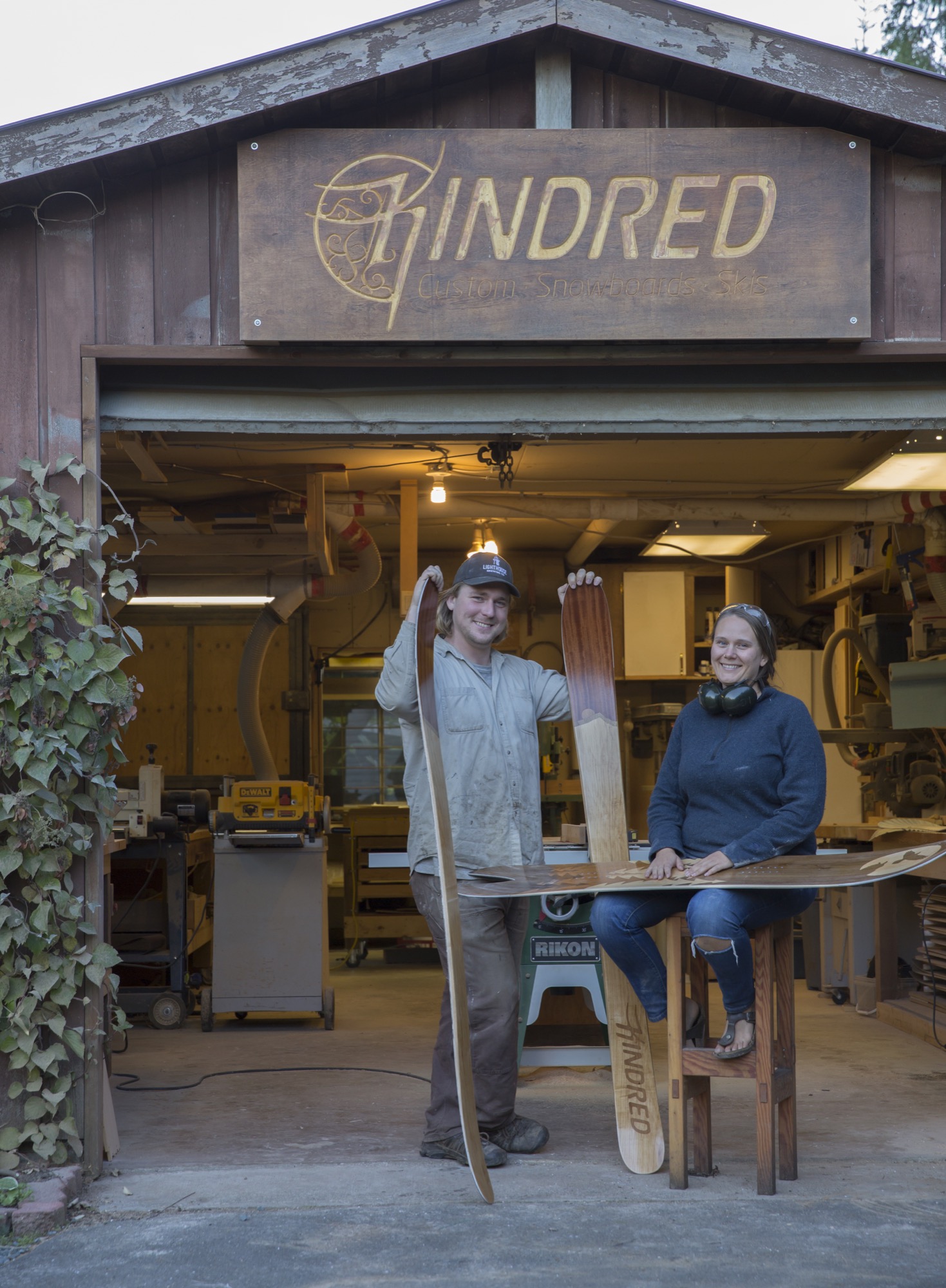
Evan Fair and Angie Farquharson have been designing and making custom snowboards and skis together in their backyard woodshop on Vancouver Island since 2010. We squeeze in a weekend visit just before the busy winter season to get a glimpse into their craft, their art, and their humble lifestyle in a rural community on the island’s east side. The couple built the Kindred Snowboards brand from scratch. They cultivated the low-impact operation out of nothing more than a passion for the ride and the desire to make a higher-quality product—yet without any background in fabrication.
Beautiful Comox Valley and Mount Washington straddle this area fifteen miles (twenty-four kilometers) north of Courtenay, British Columbia, where their home and shop are located. Weather on the east side of the island is mild and temperate year-round, a surprise given the substantial annual snowfall in the nearby mountains. The couple’s home sits at sea level in a forest, the mountains hidden from view. Land plots are large here, spreading neighbors apart. Industry in this area is a miscellany, though mostly milling timber and small-batch farming. Neighborhood homesteading makes the community largely self-sufficient—the local crops and dairy products go directly to the local population.
Pressed to jump
“How is a snowboard made?” the couple, both in their late twenties, asked each other one day before it all began. Not long after they pondered the process it may take to create the boards their life revolves around, a snowboard press came for sale on Craigslist. Fair and Farquharson, as adventurous as they are curious, grasped the opportunity. At the time, they were living out of a camper van and chasing the best snow to ride. But they made the purchase, hoping the investment would be the impetus to launch them into a more serious endeavor.
They were committed. Being avid riders themselves, they knew exactly what they wanted in a board, what their ideal board would look like, feel like. So they learned and improved upon the techniques to make a better product. Their goal was to create high-performance boards and skis that enhance, not hamper, the user’s skill, style, and fun on the snow.
“Some experienced riders know exactly what they want, down to the numbers,” Farquharson says. With others, the Canadian gear artisans spend significant time getting to know the customer’s riding style and preferences. “For the topsheet artwork the questions are a bit more ephemeral,” she says. People have asked for anything from the silhouettes of their favorite mountain to portraits of their pets or pop-culture idol, and even memorials to lost loved ones. Kindred’s Limited Edition Series, on the other hand, features artwork infused with an alpine or coastal sensibility. “I draw from my own personal experiences in nature, as it is common ground for people who spend their recreation time outdoors,” Farquharson says.
“For most people the way their gear looks is a very close second to how it rides,” she knows from experience. “People who go for a custom build impact the end product directly, which can be empowering. The ride becomes a distilled reflection of the rider and what they want out of their alpine experiences. In the end, Evan and I hope our work inspires people to be themselves and to be better riders.”
“People who go for a custom build impact the end product directly, which can be empowering.”

Shop talk
That mission to make a superior board hasn’t shifted or been compromised in the five years since Kindred began. Each board is treated with the same intense amount of care and precision. Personal connection with each customer and hands-on craftsmanship that goes into every board leave the couple remembering almost every individual product. The number of orders Kindred fulfills has been growing every year. By the end of this season, they are projecting to have made approximately 150 boards, splits, and skis.
Their search for the right place for Kindred led the couple to a tree-lined rural spot with a woodshop, old smokehouse, and former boathouse turned into a woodshed. They purchased the property with the intent to grow their business and live in the same place. “At first, we considered commercial property around the area, but it made more sense to have a shop very close to home,” says Fair. “The former owner was a cabinetmaker, so the shop already existed and was set up for woodworking.”
"Personal connection with each customer and hands-on craftsmanship with every board they make leave Fair and Farquharson remembering almost every individual product."
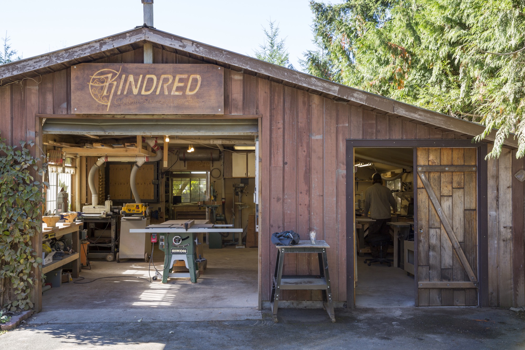
Sunlight filters into the shop through the grapevines that walk along the top of the awnings and the edge of the roof. As the gentle breeze blows, the leaves dance in the wind, making the patches of light dance on the floor. The view from the workshop doors is still lush and green this time of year; an occasional chicken races by or stops to graze for bugs in the grass. Inside, the walls are neatly laced with deliberately arranged hand tools and jars of screws and nails hanging from lids nailed to the shelves, organized according to the makers’ workflow. Fair’s homemade shelves display boards and skis in progress. It’s obvious the two designed this workshop with careful thought.
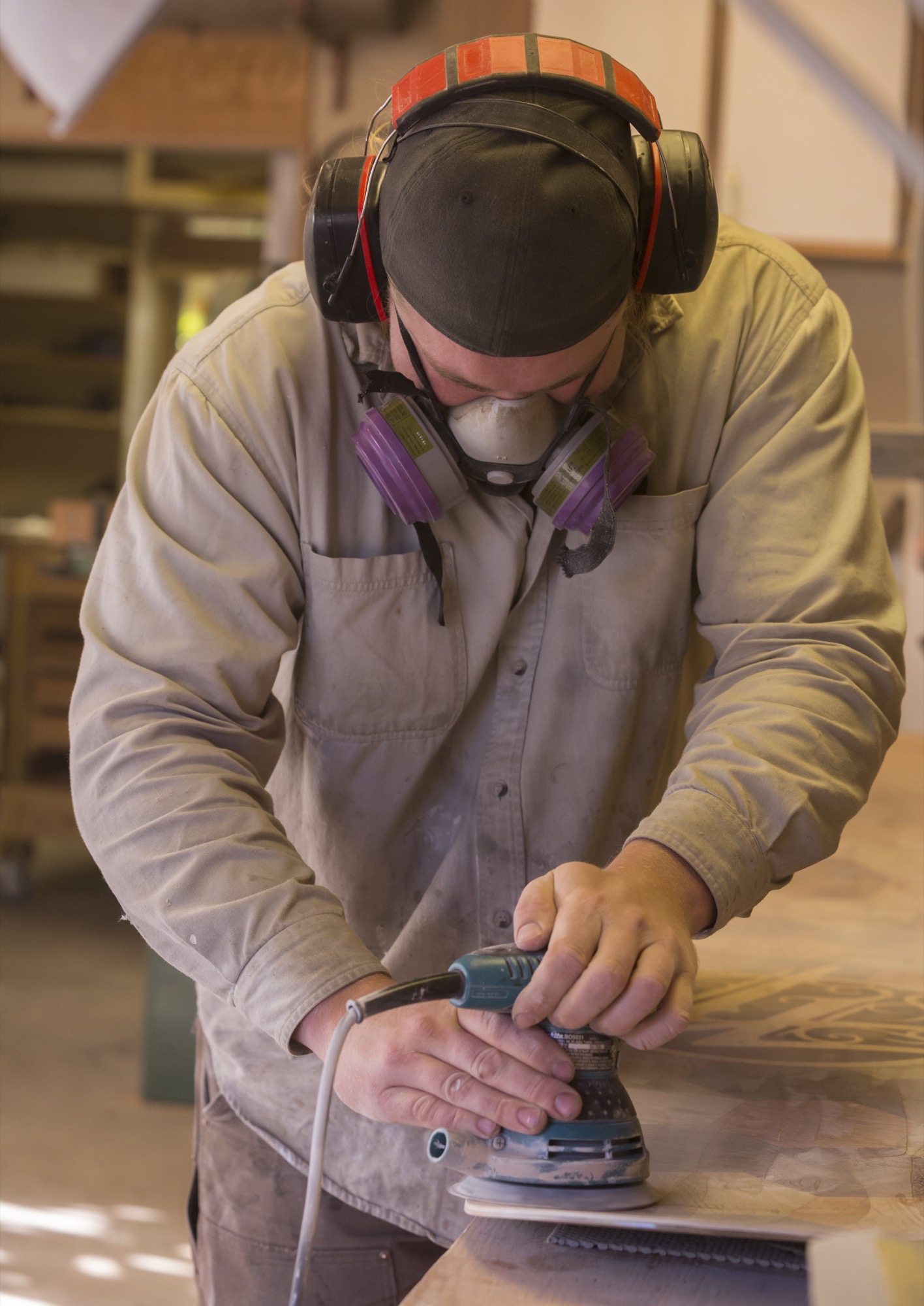
Fair puts on an album by Little Feat as the machines are slowly starting up. All of us pull on protective face masks before he begins sanding the core of a board he prepped the night before.
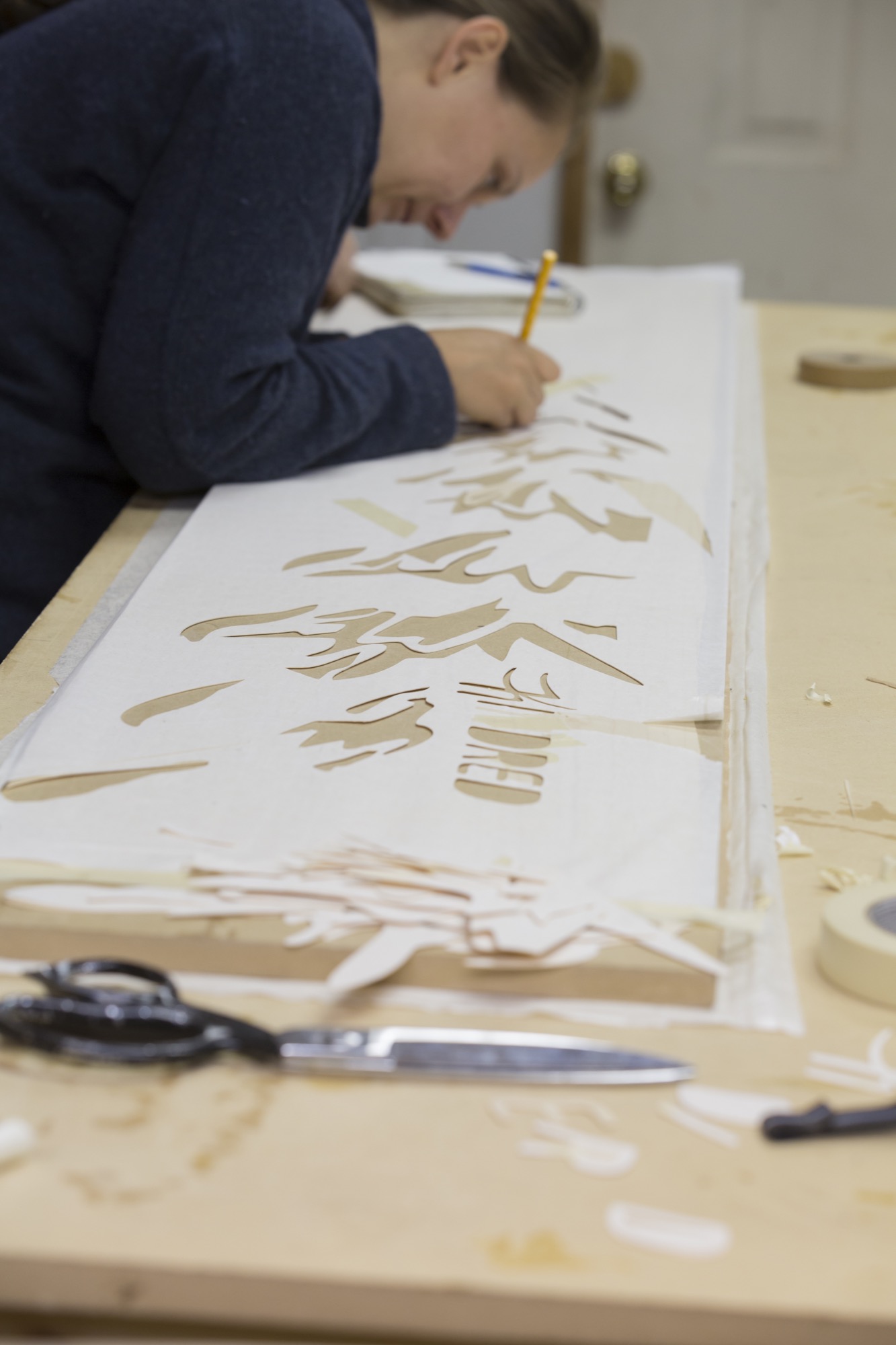
Meanwhile, at the giant table in the back of the shop, Farquharson sets up the topsheet, the piece that is most visibly “Kindred” to those familiar with the distinctive snowboards. The topsheet, a thin wood veneer, is intricately designed. The decorative patterns and graphics are meticulously cut from different woods and inlaid using a technique called marquetry. Defined by the grain and color of the woods, the outline of a fir tree begins to show light and definition in its branches, and a moon shows its craters. This detailed, time-intensive process makes Kindred boards one-of-a-kind art pieces.
Farquharson cuts the wood with her penknife. We talk about Kindred’s customer base as she carves out a moon from a delicate sheet of gorgeous black walnut.
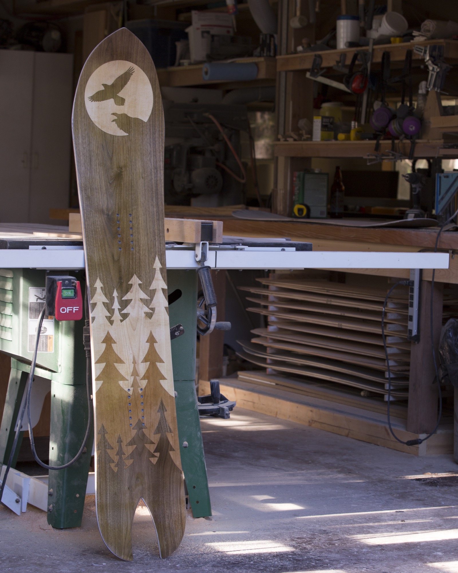
“We’ve had incredibly strong local support from shops and individuals, but we are fortunate to ship all around the world,” she says. “We even had a Japanese fellow arrive unannounced from the other side of the world who had planned his whole vacation around watching our build process...He is now a friend of ours.”
Return to the Valley
Fair sets up a bottom sheet to be cut with a drag knife mounted to a CNC machine (computer numerical control machine, or automated milling machine used to make industrial components). He tinkers with the calibration on a laptop next to it. Satisfied, he hits “start” and the knife begins to cut out the Kindred logo from the sheet. When I ask him about their initial business ideas and how things have developed through the years, he pauses. “Humble beginnings for sure,” he replies.
“The concept was founded while we were living in a truck and camper. We had left the island to travel throughout Alberta and BC looking for the next ski resort. When we decided to embark upon the snowboard-building adventure, we returned to the Comox Valley, where we already had a network of support. We initially saw a potential niche in building high-quality North American skis and snowboards, and quality and beauty remain central to every step of the process—no cutting corners.”
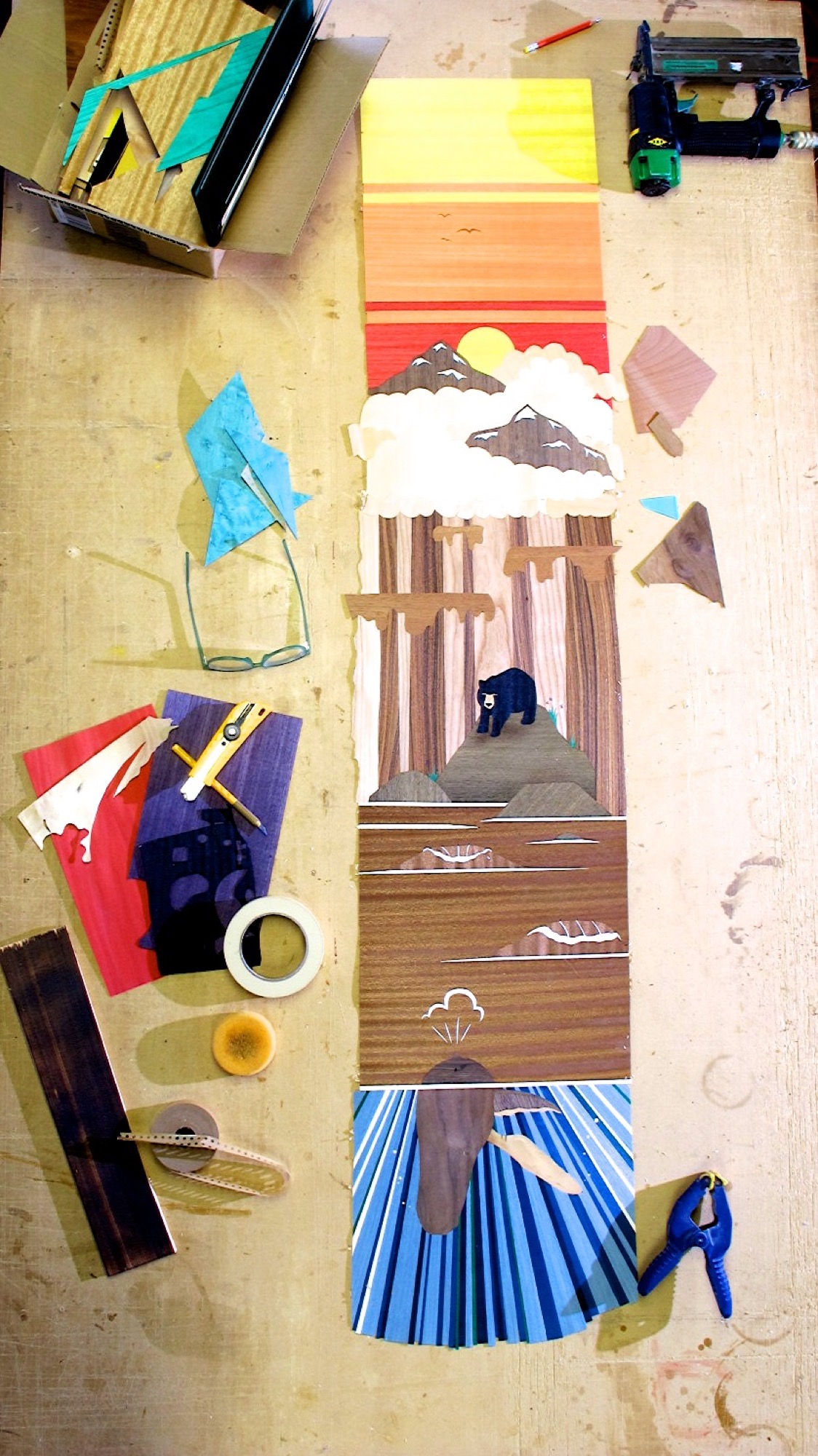
A complex custom build can take the two up to thirty work hours to design and build a board or a pair of skis, not counting drying and curing time. The Limited Edition Series builds, where Kindred makes a small number of products with similar designs, still take up to fifteen hours each.
The day goes by quickly, and before we know it, the afternoon sun starts to set. The board is ready for the nal press, and all the layers are assembled with a chemical-free epoxy slathered on between each layer as the machine applies a healthy dose of heat and pressure. It’s fascinating to watch the steel tube stock apply pressure, making the epoxy ooze out the sides, slowly creating mountains on the floor. The snowboard press that started the whole operation is beautiful in its frugality—a testament to Kindred’s mindset.
"We initially saw a potential niche in building high-quality North American skis and snowboards, and quality and beauty remain central to every step of the process—no cutting corners.”
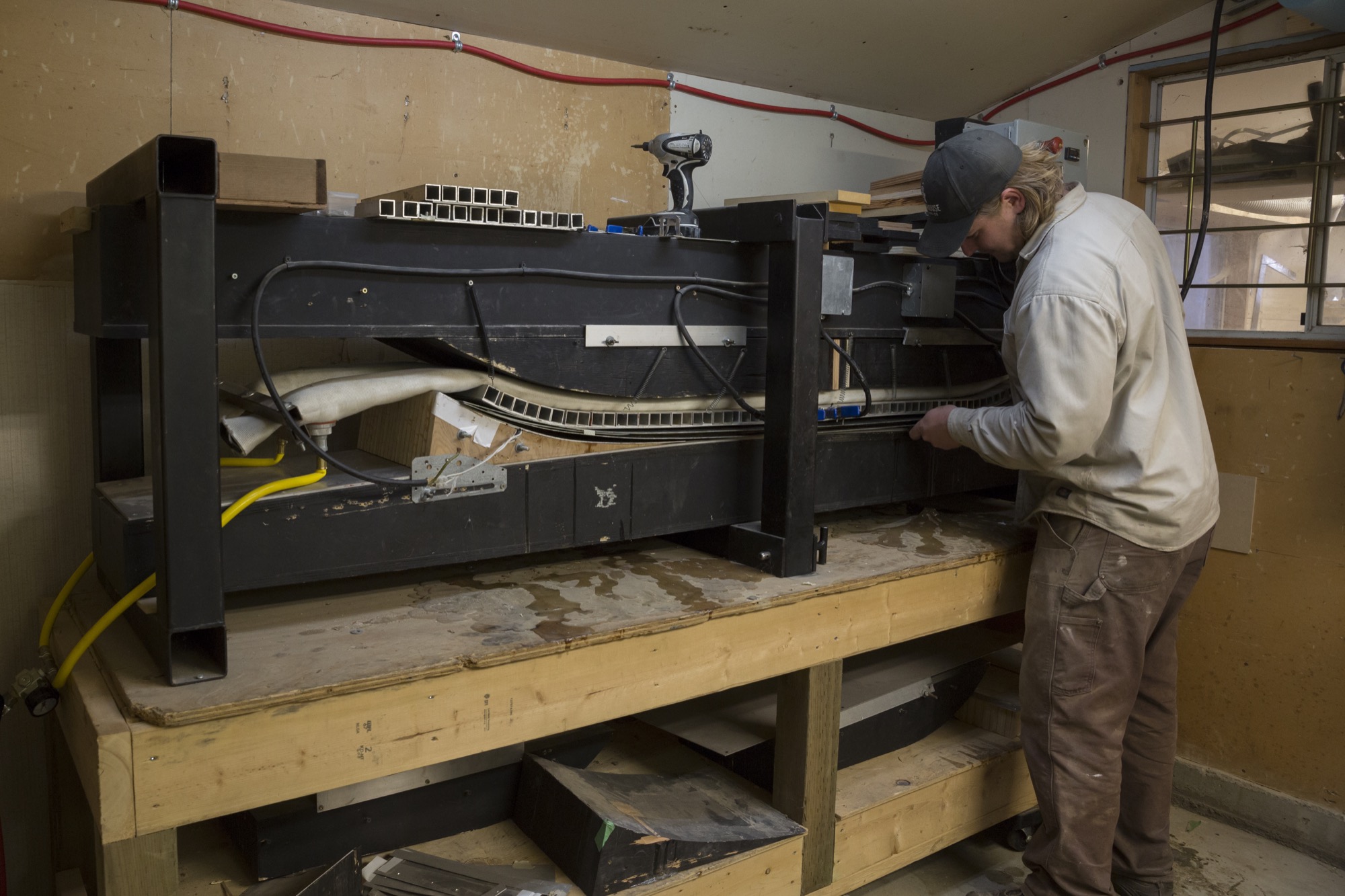
Community board
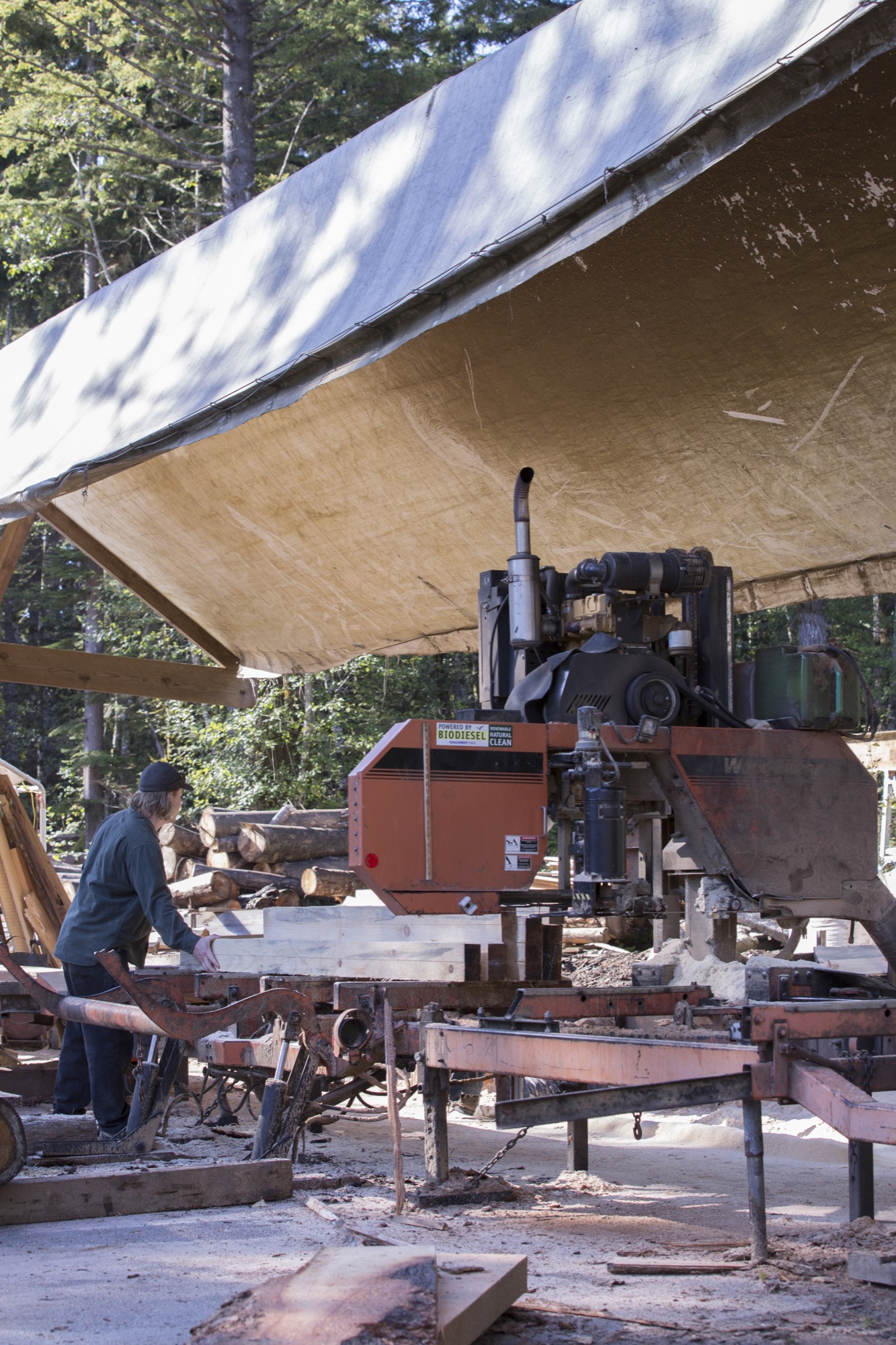
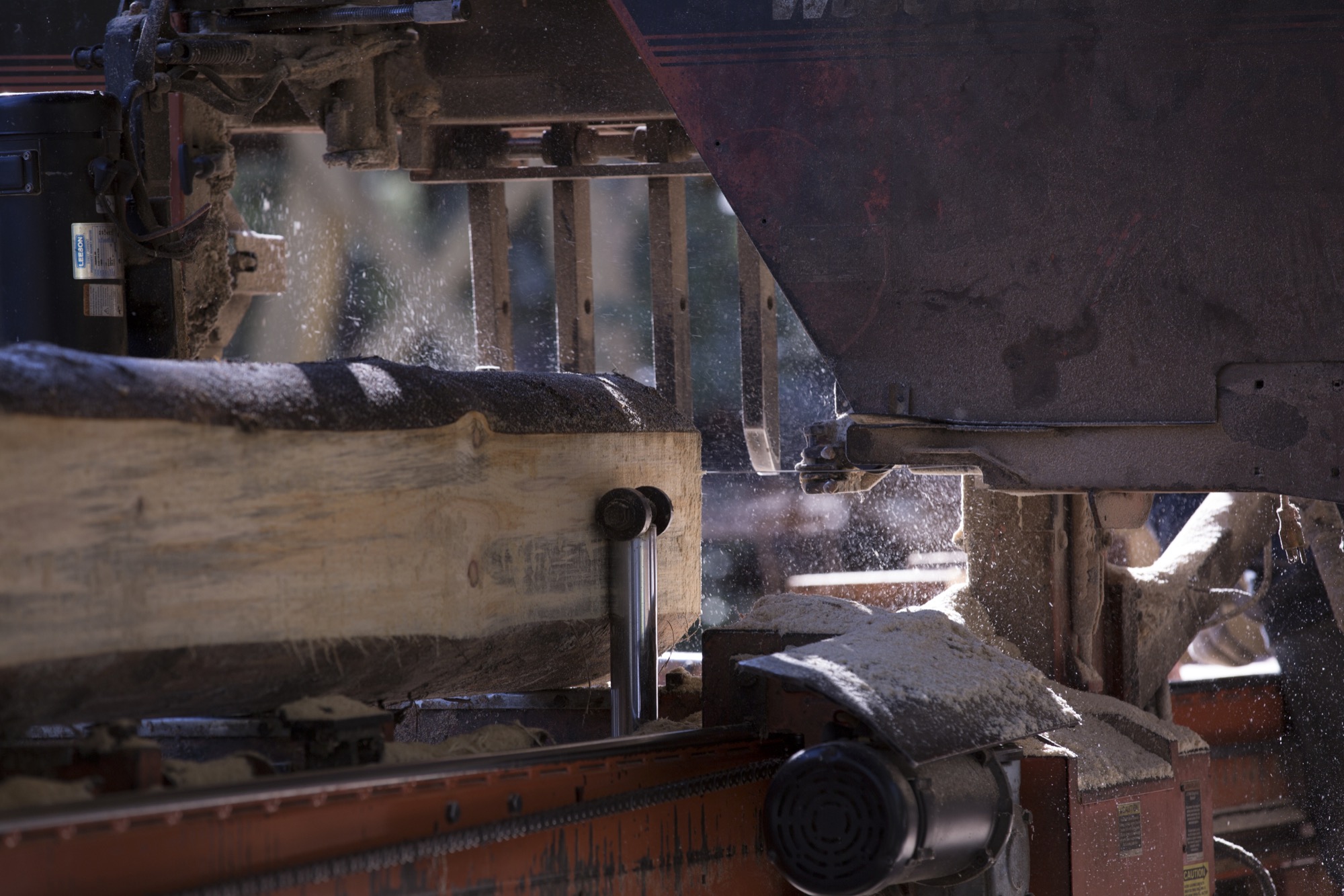
A couple of miles from the workshop, a local mill saws logs into lumber for the core pieces, the main foundation and center of each board, sandwiched between layers of fiberglass and carbon fiber. Farquharson and Fair know the owners of the mill well, and the family’s son is out working when we visit. With a population this small there is a strong reliance on others and an understanding that you are a connected member of the island community. Your actions greatly impact the local environment and its residents. Thus, good relationships with neighbors are important for businesses like Kindred to thrive.
As we observe the milling, Fair steps in to help move the last few logs on the run. “Many people are here for recreation—not specifically to ski or snowboard—they come to enjoy a work-life balance and the mild climate, fostering a slower pace overall,” he tells us.
What’s in a name?
How did the name “Kindred” originate? “We wanted to recognize how constantly blown away we are by the support of our community, friends, and family,” says Farquharson. “On another level, we give homage to the incredible relationships that are forged through alpine winter sports and lifestyle. Nothing quite compares to charging through fresh snow engulfed by the euphoric hoots and hollers of your friends. Those snowy moments, when we’re living a shared experience, feel like pure magic. When you are surrounded by people who embody that joy on and off the snow, you can’t help but feel like family. Those are our people. Kindred felt genuine and accessible, as we were sure that other skiers and snowboarders could relate.” △
Fire / Wood
His Nordic German upbringing, traditional Swiss carpentry training, and the Bauhaus Manifesto deeply influence Canada-based designer and furniture-maker Nicolas Meyer as a craftsman and intellectual
Nicolas Meyer’s approach to design and craftsmanship is firmly anchored in his traditional Swiss training as a furniture maker and balanced with his Bauhaus-influenced intellect.
Nicolas Meyer is not one thing, not from one place. Born in Germany and raised in Switzerland, the multifaceted founder of Nico Spacecraft has put down roots as an artist, designer, woodworker, and furniture-maker in British Columbia, Canada.
A sincere dialogue about design and wood quickly reveals the man is at once both an intellectual and a craftsman. No surprise, he seeks balance in everything he does.
Meyer grew up in Hamburg, Northern Germany. With a real estate-developer father and an antique-collector mother, the boy was exposed to architecture, construction, and fine furniture throughout his childhood. The parents separated when he was ten, and he moved to Switzerland with his mother.
In 1991, Meyer lived in Vancouver for half a year to improve his English. He returned to Switzerland to complete a traditional four-year apprenticeship in furniture-making, which he finished a year early by virtue of prior education, excellent marks, and extraordinary talent. All this time, British Columbia remained on his mind.
The decision to return four years later to settle in Canada was spiritual as much as rational. “Things just feel right, and you find your place where you want to build your life,” Meyer reflects. Having spent the first ten years of his life in Hamburg, he was influenced by the ocean, water sports, the city’s harbor as “gate to the world,” the metropolitan lifestyle. In Switzerland, where he lived until age twenty-five, he later fell in love with the mountains and skiing. “Vancouver combines all of that. This is one of the few places where you can probably ski and kayak on the same day,” says the expat. “On top of that, this was my place. I grew up in this tension between Hamburg and Switzerland. As a kid who is constantly in between these two places, you wonder, what is your home.”
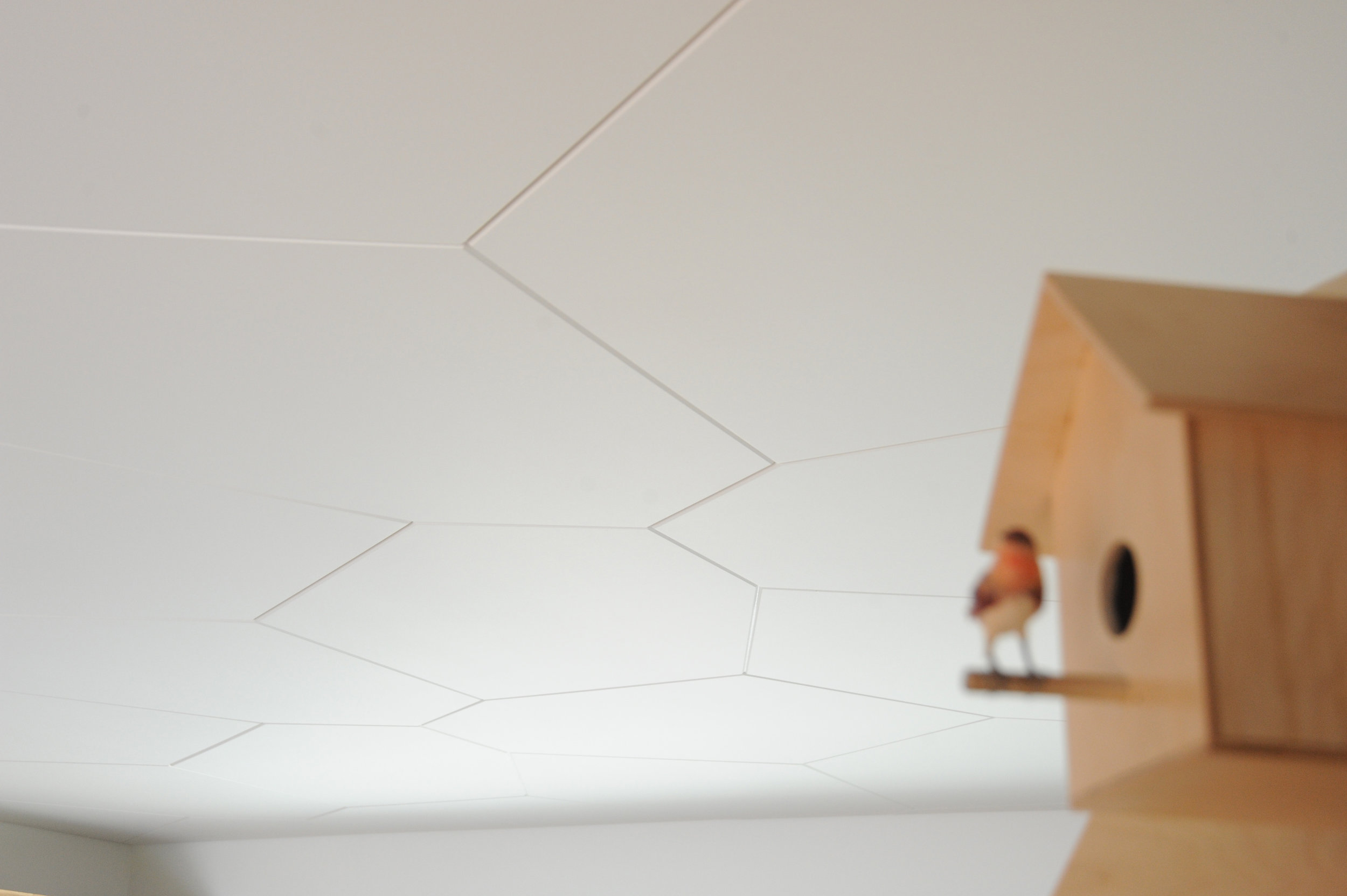
Today, Meyer is a designer, a woodworker, an artist—his creative drive the common thread. As child, he wanted to become an inventor, broke a lot of things, took them apart to understand them. In his later teens, he eventually began fixing things. “I also read a lot. I came to design and wanted to study architecture,” he says. He originally planned to study interior architecture in London after his apprenticeship in Switzerland. By that time, however, he’d already lost his heart to Vancouver. “I was too impatient and thought, I’ll go to Canada and find my way to design with what I have.”
His apprenticeship as well as the subsequent decision to practice, not study, were driven by his readings: the Bauhaus philosophy in particular—“Most of all, Walter Gropius and his manifesto, which expresses how the core of creativity can only come out of understanding a craft,” says Meyer.
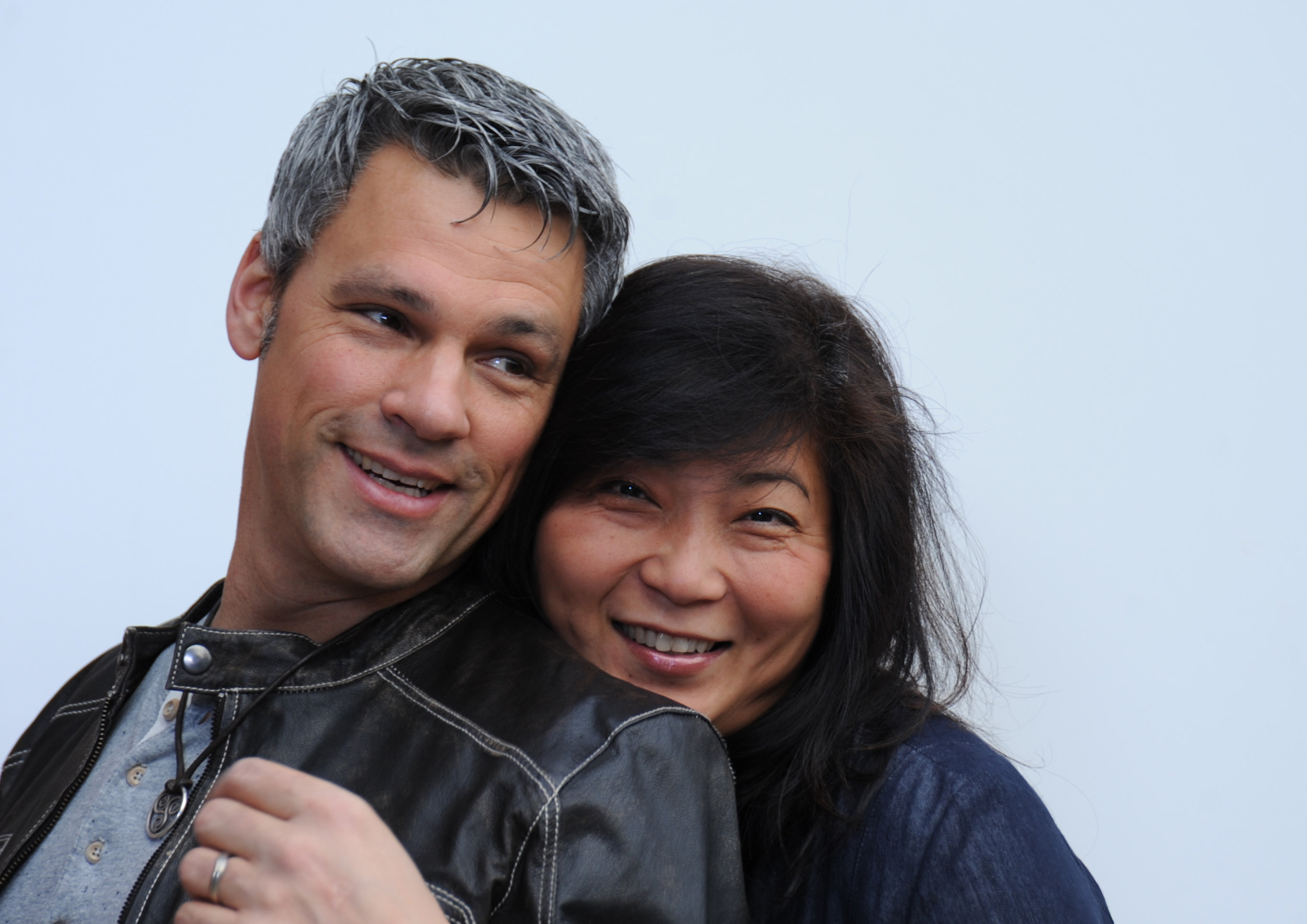
“For art is not a profession. There is no essential difference between the artist and the craftsman. The artist is an exalted craftsman.” — Walter Gropius, Bauhaus Manifesto, 1919
The Bauhaus Manifesto guides Meyer to this day, everyday. Together with his wife, Jess Meyer, he runs Nico Spacecraft, a small design studio with integrated wood workshop that produces kitchens and baths, furniture, custom spaces, and architectural elements. The company’s full-service design division has its own name: Baumhaus Atelier—presumably a nod both to Meyer’s enthusiasm for all things Bauhaus as well as to his passion for trees (Baumhaus is German for treehouse). “It’s about striking the balance between being in front of the computer screen or a sketchbook and actually being in the shop and working with materials,” he says. “When I spend too much time in the shop, building all the time, I itch to sit down and sketch out ideas, whereas when I’m in the office too much, I lose touch with the reality of structure, weight, and smell, and how things actually connect.” The creator admits he usually knows he has overextended himself at the drawing board when he starts designing things that don’t work in the real world.
“When I spend too much time in the shop, building all the time, I itch to sit down and sketch out ideas, whereas when I’m in the office too much, I lose touch with the reality of structure, weight, and smell, and how things actually connect.”
When the designer completely loses himself in the details—or, as he calls this foible, “taking the typical German-Swiss approach”—then his wife, who studied fashion design and now handles the company’s business side, provides the balance, telling him to take a step back. “When I get stuck, Jess looks at the entirety of the design perimeters and pulls my head out of my behind. We complete each other not just as life partners but also in our work.” Like her husband, Jess Meyer has called multiple places home before settling in Roberts Creek. She was born in Taiwan and brought up in Singapore and later in Tehran, Iran. The couple is raising their two children in the small beach town with a vibrant arts community on British Columbia's Sunshine Coast. Before, living in Vancouver had meant the parents missed out on all the babies’ firsts, which at the time the nanny got to experience in their place. Something needed to change. And after a one-year journey of searching for the right property, the Meyers found their home with five acres of land on which to built the shop and a garage they converted into the design studio. “Now we eat every meal together, and the kids come running to show their faces in the shop or in the office after school,” the father says.
The family also loves to travel together, often to Mexico or back to Europe. “I miss the mountains of Switzerland,” Meyer tells. “Aside from the skiing and the snow, the mountains provide me with tranquility. Sometimes, it helps to reconnect to your roots and the way you were raised.”
Wood Stock
“Look around, and it’s obvious—I love wood,” Meyer laughs. “Because you never really stop learning about it. Technically, when you cut down a tree, it’s dead. But wood itself continues living; it moves, it changes, it breathes, and you cannot apply any rigid rules, because no tree is like the other, and everything, everything influences its properties—where the tree grew, the minerals it fed into its system, the wind . . . If a tree sits in a wind corridor, it develops tensions on one side, and it can counterbalance these forces to find its equilibrium with the environment. All this is imprinted in the wood. Each piece you work with will react slightly differently. That teaches me humility.”
For all that, a wood whisperer he is not. Fellow woodworkers may profess driftwood, even a tree stump, speaks to them, revealing what it wants to become. The craftsmen are merely the tool. “I can respect that, but I am more intrigued by structure, structural integrity, and physics,” says Meyer. “Even a tree trunk never really inspires me to do anything. What I do want to do is cut this apart and reassemble it.” Meyer’s view of today’s common practice of kiln-drying wood is ambivalent. He understands the necessity of expediting the process and killing the creatures living inside the wood. In Switzerland, where he learned the craft, most wood is still naturally air-dried for many years, allowing the material to maintain its structural property. Meyer explains that “cooking” the wood extracts moisture at a speed that destroys the integral structure of the wood fibers, the cells collapse, and the wood becomes brittle. “I see these drawbacks when humans don’t work with the wood but force their will onto it because they have a schedule to keep, and they are pushing for high turnover, needing the cash flow.”
The advocate for responsible woodworking practices himself would prefer to exclusively use air-dried wood. “But it’s not feasible. It’s an ideology, and whenever I can, I do.” He also works with salvaged materials and appreciates a good story behind the wood—and so do his clients. For instance, “White oak is rare here on the West Coast,” Meyer begins a tale. “Ninety-some years ago, one of the first skippers planted this white oak tree here . . . ” Meanwhile, after splitting, the tree was deemed unsafe and destined for firewood. The community was in uproar about cutting down their heritage oak. Meyer and a miller friend arranged a crane, milled the wood, and air-dried it over the years, until a client emerged from Vancouver who appreciated the story and the historic value the tree represented.
Nordic-Swiss authenticity
His Hanseatic birthplace and Swiss training shaped not only Meyer’s design sensibility but also his work ethos, for better or worse. “When I first came to Canada, I was extremely rigid,” he reflects. His first gig was renovating a house—working out of a garage, with limited resources and tools. “In Switzerland, there is a machine for everything, and there is a way of doing everything. That’s how I was trained. But this rigidity of ‘This is how you do things, and there is no other way’ was initially hard for me to overcome.” In hindsight, that first Vancouver project taught him that there are many different practices. “That was a very valuable lesson I apply to this day and that has become an integral part of my approach. Once again, there is a fusion, a balance between the static world, the reality, and how you get to understand it. Only if I understand, I am suddenly able to discover all the different options of what this will allow me to do, and that’s where my creativity kicks in.”
“In Switzerland, there is a machine for everything, and there is a way of doing everything. That’s how I was trained. But this rigidity of ‘This is how you do things, and there is no other way’ was initially hard for me to overcome.”
The designs of Nico Spacecraft are exquisitely modern. Sustainability is essential in everything the family-run company does, even their two-story workshop received a Green Design Award from the Canadian Wood Council in 2010. But what Meyer keeps touching upon in discussing his work is authenticity, his clients’ shared yearning to connect with what is real. “People are going back to the craftsmen, back to working with the designer, and being involved and understanding the story.”
“People are going back to the craftsmen, back to working with the designer, and being involved and understanding the story.”
Storied Pieces
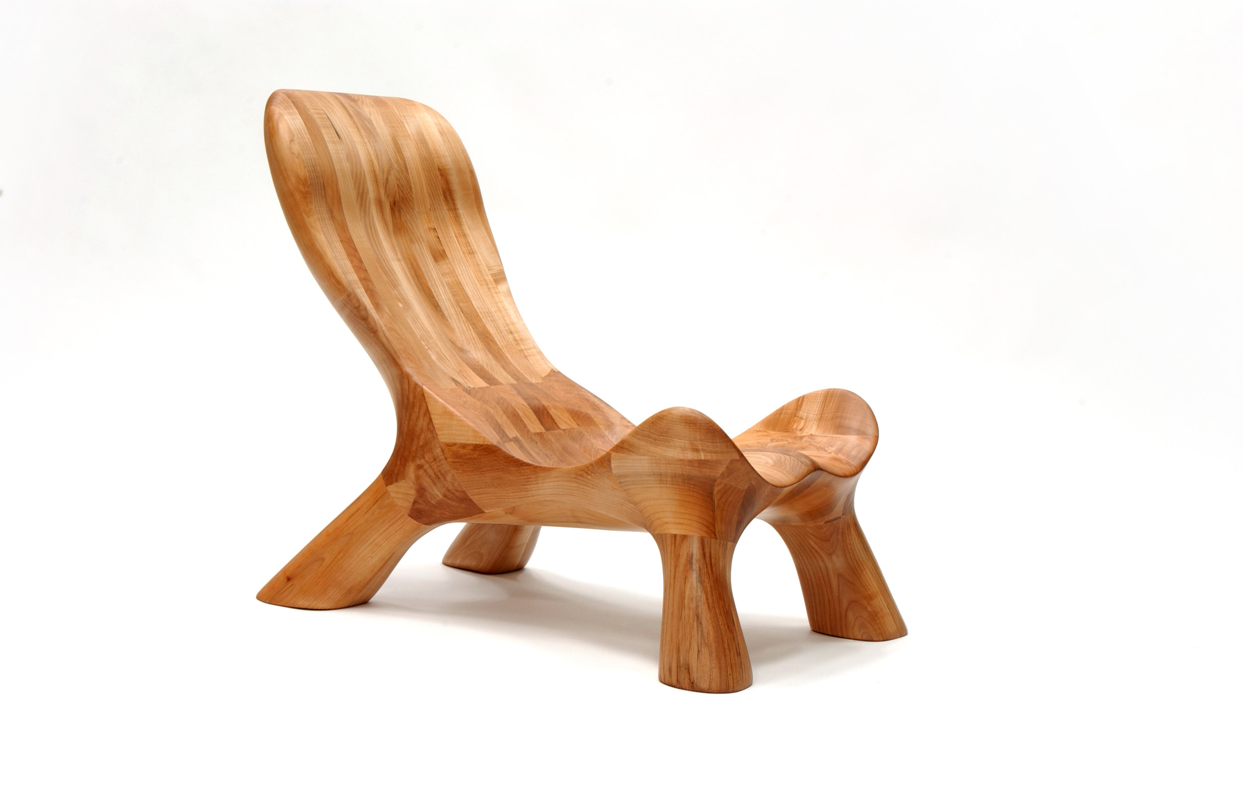
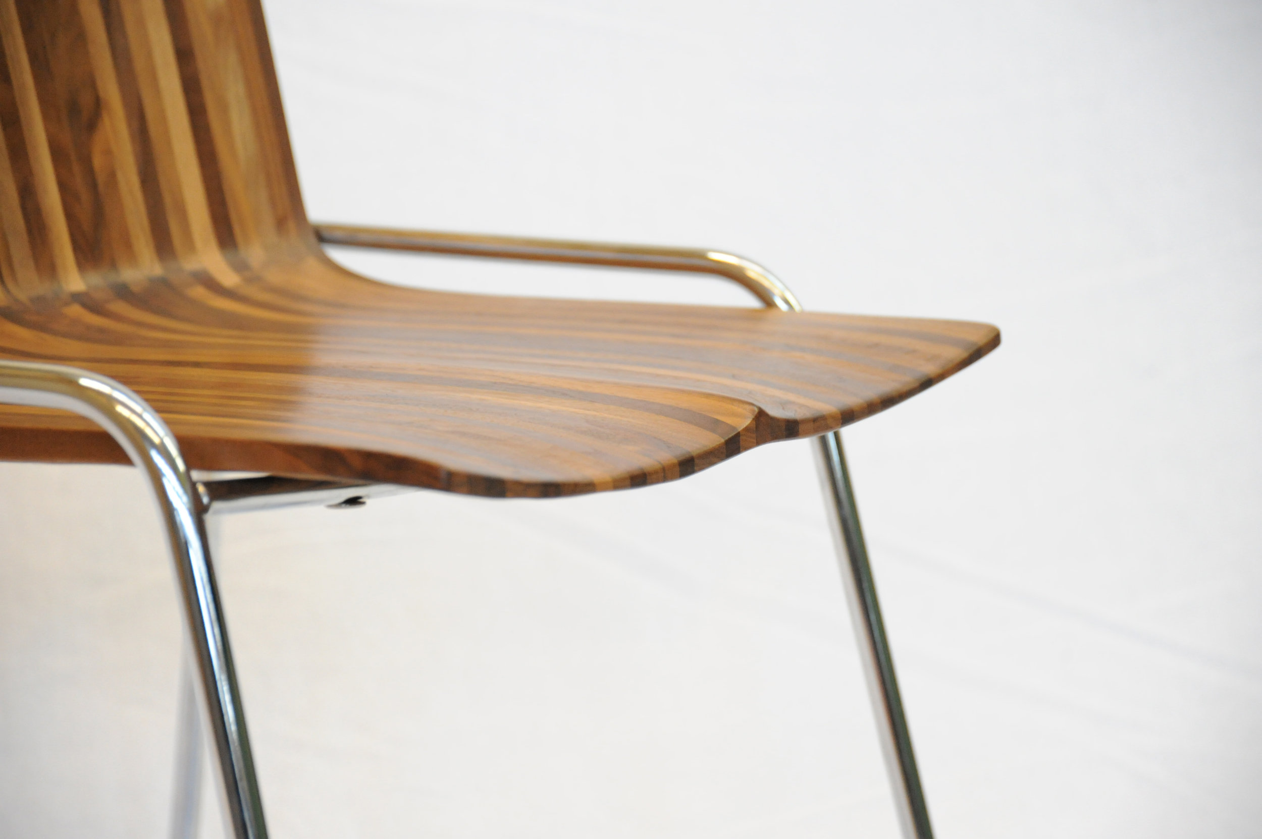
Indeed, there is a story behind all of Meyer’s works and usually to the wood he’s using, too. Take the CurveChair, a piece of sculptural furniture—as well as a piece of art. For endless hours, Meyer carved the sensuous lounger by hand after a clay model he made. “That chair, in many ways, represents everything I am doing,” he says. “There is an organic process involved, there is a structural process involved, and we know where the wood came from, there is a story.” The wood came from a development site at Simon Fraser University and was made available to woodworkers of British Columbia to provide a design for an exhibition. “It was a marketing thing for them, because they had to take down quite a few trees at that site,” Meyer remarks. “One of them was this huge maple, so we got the maple wood and submitted this chair. It was on display at the Pendulum Gallery in downtown Vancouver for three months.”
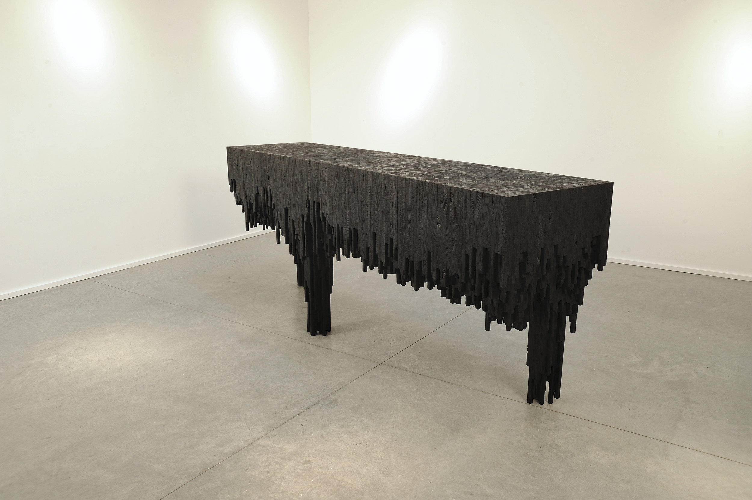
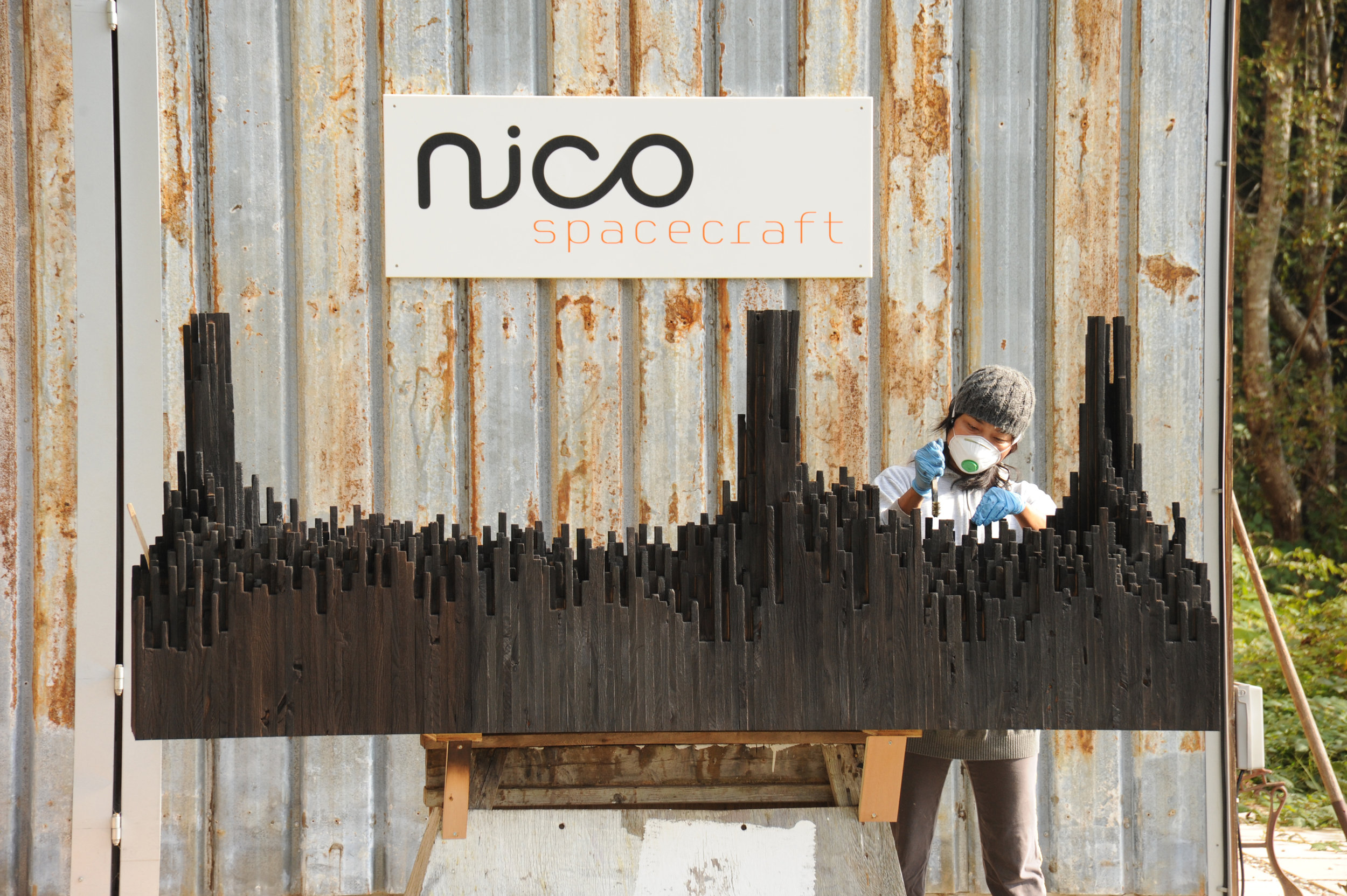
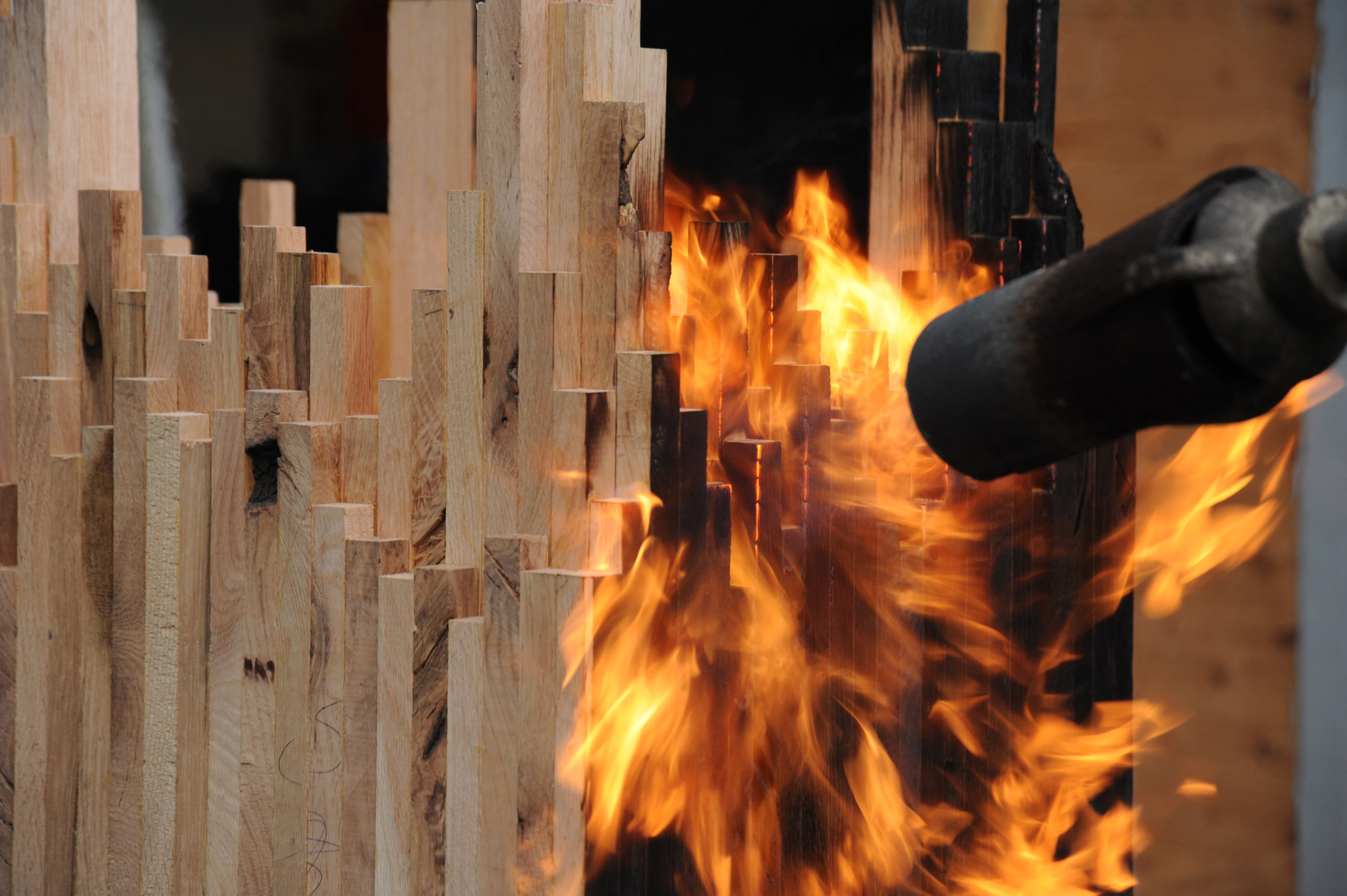
Meyer’s latest series—its cynosure a console table—is inspired by The Black Tusk, a stratovolcano and a pinnacle of rock at 2,319 meters (7,608 feet) above sea level near Whistler, British Columbia. “After a month of dynamics between Jess and me, we ended up with the Black Tusk console,” Meyer says. Individual solid sticks of oak wood were laminated to create different shapes, giving each a sculptural character. The assembled piece was then charred by flames, wire-brushed, and coated with oil. “It struck a nerve with people—and with me, because, again, there are the two elements I en- joy, a balance between art and then the design and craft.”
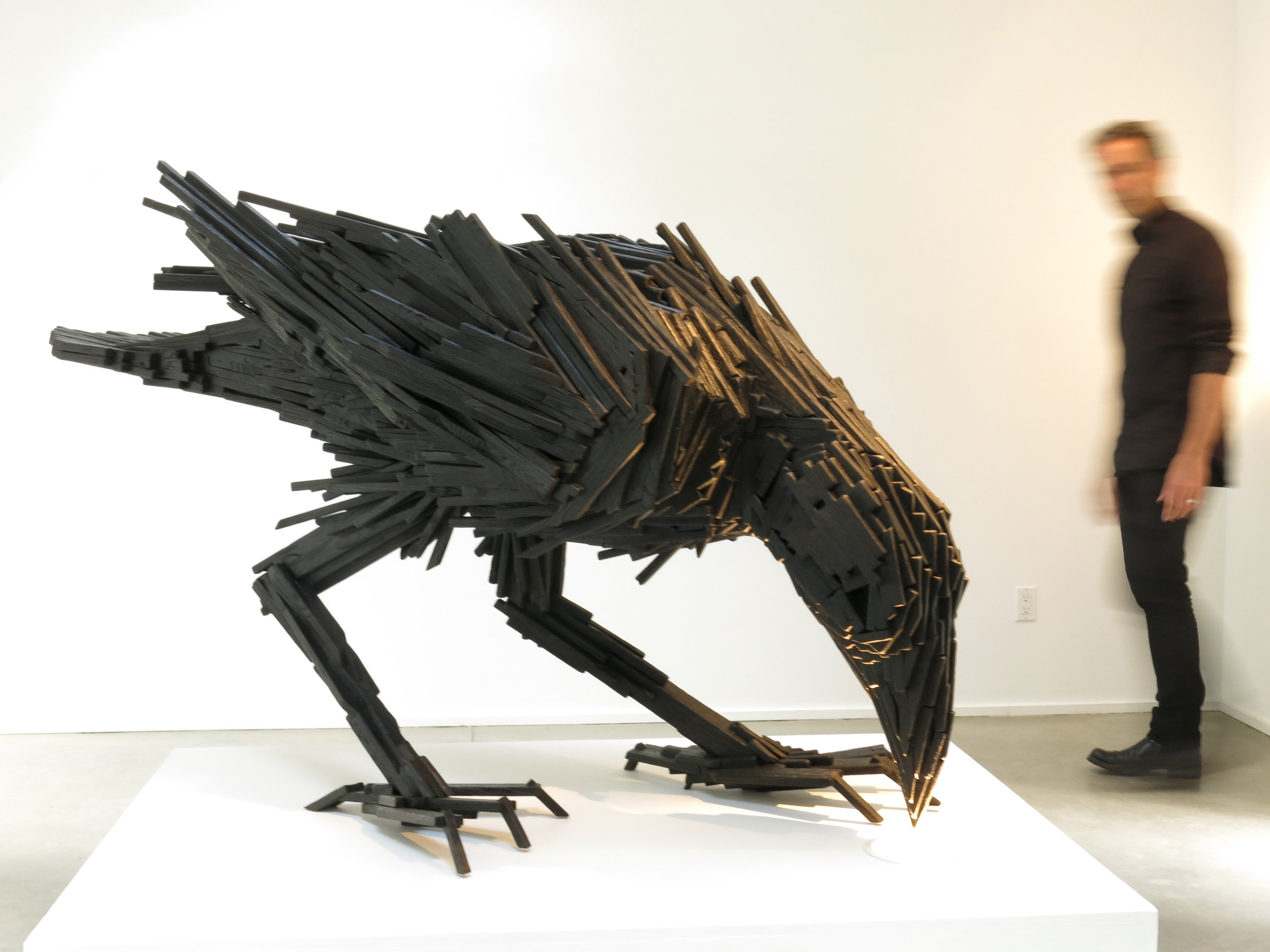
The Black Tusk console in turn inspired a collaboration with local graphic designer and artist Lee Roberts, who, after he saw the sculptural table at a photo shoot, sent Meyer a sketch of a raven, made from wooden sticks like the Black Tusk series. “I was inspired and challenged to take this technique I’ve applied to the Tusk and take that to another level to make this raven,” Meyer says. The resulting bird sculpture is titled “Sense of Silence.” △
Architecture, Made On Site
The husband-and-wife founders of Scott and Scott Architects design-built their own off-grid cabin with the adventurous spirit of the powder boarders they both are.
Built by husband-and-wife architects for themselves, an off-grid cabin in the mountains of Vancouver Island captures the adventure and freedom of powder boarding, free of rigid ideas.
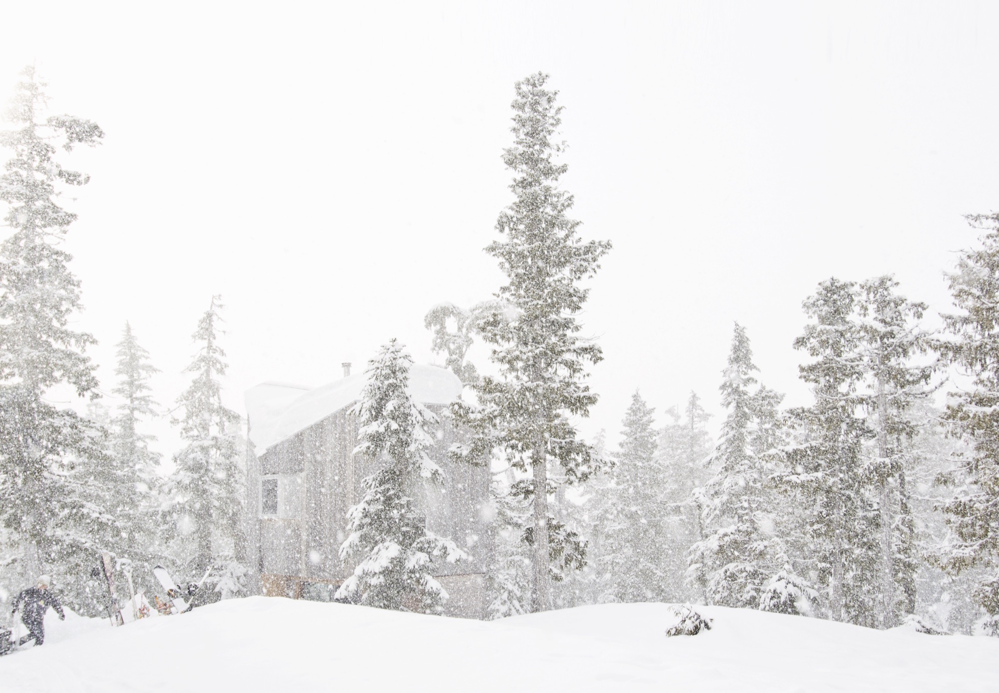
David and Susan Scott wanted to make architecture. But not in the way one imagines married architects making architecture for themselves — drawings of their dream mountain retreat, years in the drawer, just waiting for the right building site. No. Building their own alpine cabin, the Vancouver-based architects wanted to design and build in a singular act.
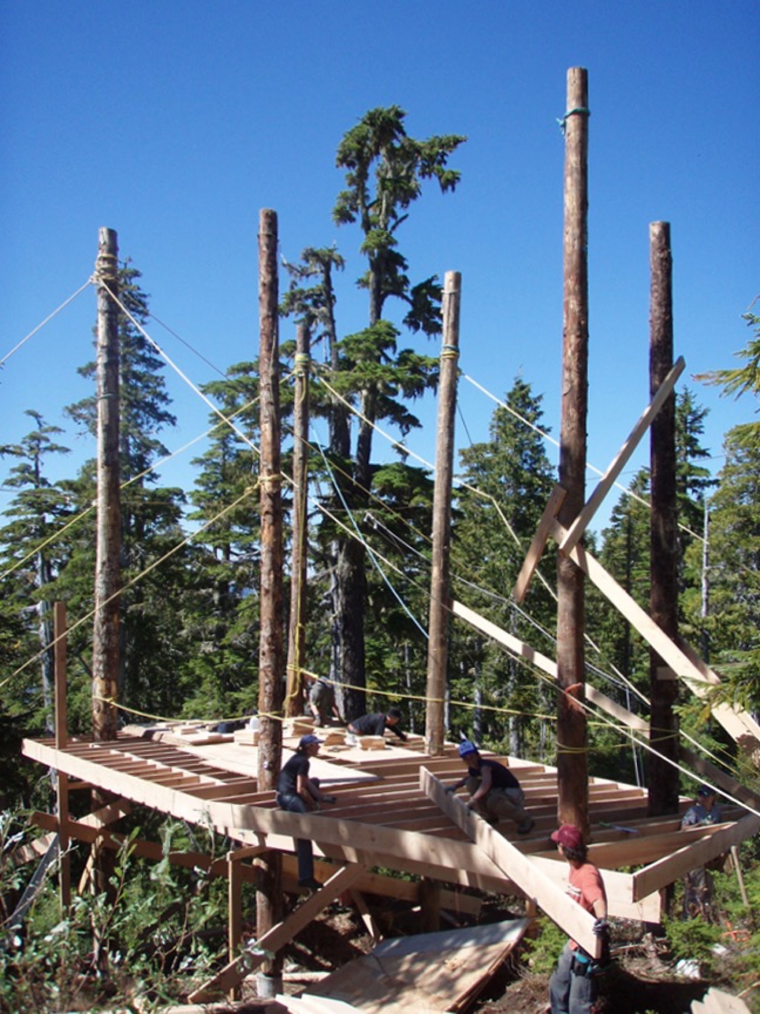
In 2006, a longtime friend led them to a piece of land he’d come upon when planting trees at 4,265 feet (1,300 m) above sea level, on the northern end of Vancouver Island in British Columbia, Canada. “We had never been on the snow in the area until acquiring the building site,” says David Scott, speaking for the adventurous couple. “We fell in love with it at first sight, and the people and terrain are really special.” With almost 50 feet (15 m) of annual snow accumulation, the remote community-operated alpine recreation area of Cain is known for legendary powder.
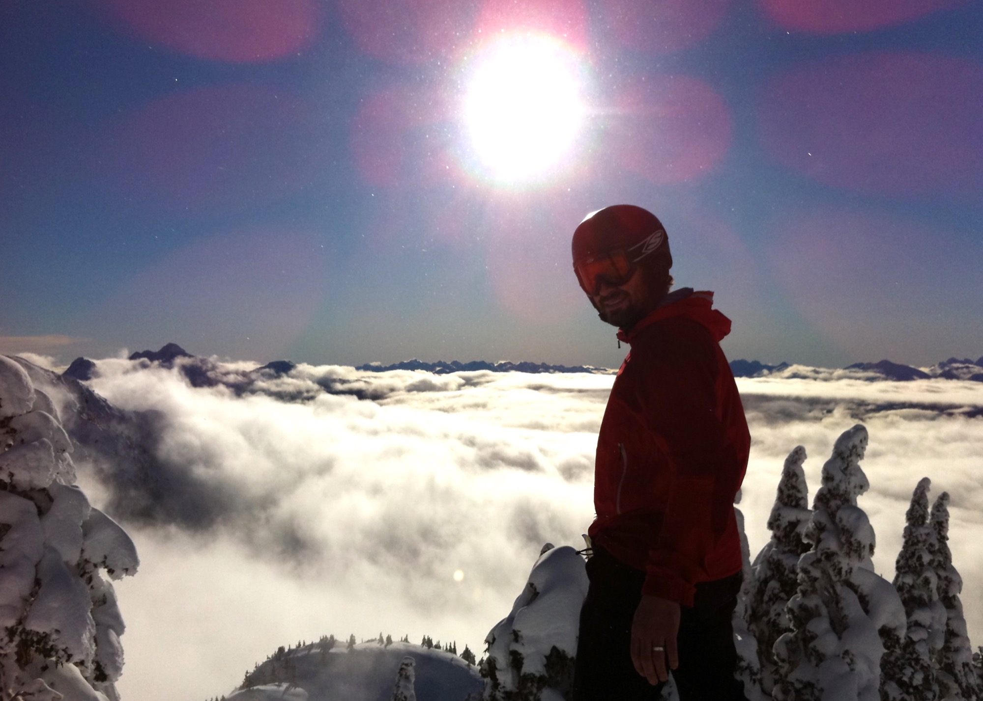
At the time, the couple, who met in architecture school in Halifax, Nova Scotia, worked for established firms and spent long hours in offices, drawing. “We have a love for building and being outdoors,” says Scott, who appreciates drawing as an important part of design. Now building their own off-grid cabin, however, they wanted to channel the freedom they feel when powder boarding into an immediate design process centered in adventure and not heavily in rigid plans. “We began the project with a desire to work with a greater level of freedom, where the specifics of the site and available materials would inform the work in a direct and unfiltered manner.”
Scott and his wife knew they had a narrow window in life, before having children, to complete construction on their own on long weekends and holidays, and with help from friends.
“We began the project with a desire to work with a greater level of freedom, where the specifics of the site and available materials would inform the work in a direct and unfiltered manner.”
Hand in hand: Design and construction
Inspired by the materials available around the site and the environmental conditions, construction was planned to avoid machine excavation, to withstand the very deep annual snowfall, and to resist dominant winds. Accordingly, the structure was elevated above the height of the accumulated snow on the ground. “The use of full-length, unsawn logs provided us with the ability to get height in a manner that used the wood’s strength the same way Douglas fir spar poles are used as sail masts,” Scott explains.
The cabin, primarily constructed from Douglas fir, gets more refined from the outside in. The columns are unworked logs, the beams and joists are rough, bandsaw-milled, and the walls, floors, and ceilings are clad in planed boards. The cabinetry is made from construction-grade fir plywood. The exterior is clad in cedar that has weathered to the tone of the surrounding forest. Both woods are harvested in the area.
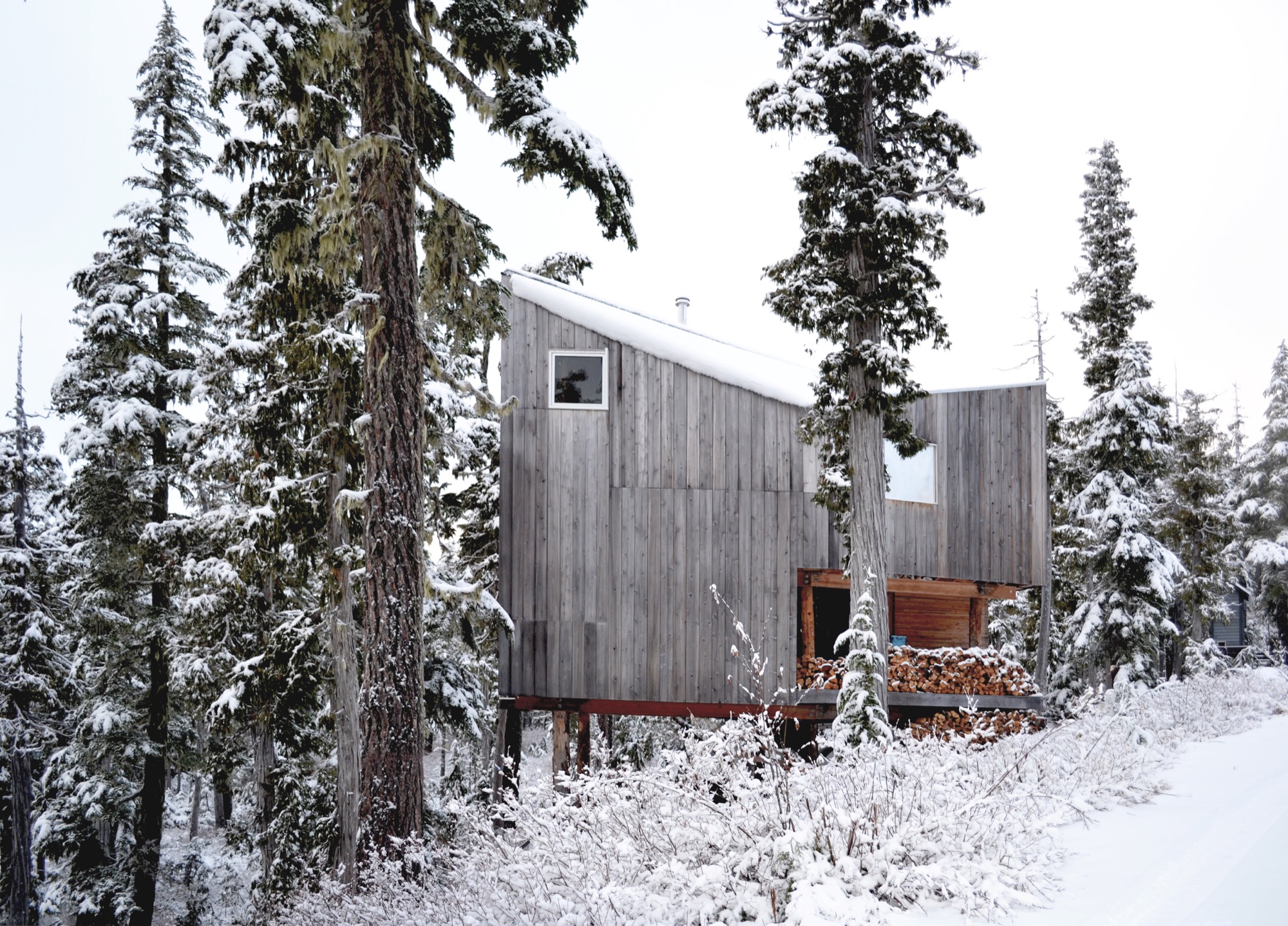
The roof form began with a simple gable, rotated to direct the snow off the back of the cabin. A half-dormer was then introduced over the entrance to direct snow away from it, funneling the snow into the prevailing winds.
Family life at the cabin
Today, childhood memories are already being made at the cabin. The Scott family now includes two young daughters, who Scott says are both on skis and love the snow.
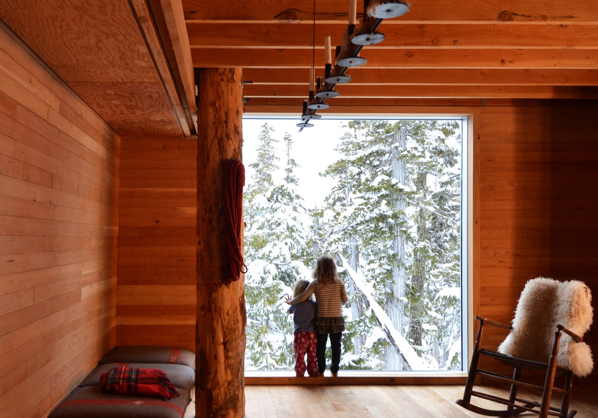
Much of the approximate 1,075-square-foot (100-sq-m) cabin’s interior is designed and made by Scott and his wife. The main living space is small, and the family spends much of the time on the long, cushioned bench eating, playing games, and relaxing from a day on the snow. “Our favorite spot is by the large window,” says Scott. “Both for the ever-changing view of the forest, but also in appreciation of the effort that went into its installation.” He drove the glass overnight on a rented flatbed and hand-positioned it with a group of friends the next day — “an incredibly smooth effort, given its size and weight.”
The remote site is directly accessible by gravel road five months of the year. During the other months, equipment and materials are brought up by toboggan. There is no electricity, and a wood stove provides the heat. Water is collected from a local source and carried in. The Scott family cherishes the simple lifestyle the mountain hideaway affords. “We enjoy the solitude of not having cell phones and gadgets around to distract us,” says the architect, who finds “a wonderful freedom” in seeing no bars of coverage on his phone. “This is an incredible place for our daughters to love being in the mountains as much as we do.”
“This is an incredible place for our daughters to love being in the mountains as much as we do.”
The powder hounds come up here as many weekends as possible during the winter, but they also love the warmer temperatures in spring when snow is still plentiful. “It’s incredibly peaceful,” Scott says. “The fall is fantastic when the blueberries are ripe, and we try to spend Thanksgivings on the mountain, splitting wood and enjoying dinners with friends.”
Adventure by design
The off-grid cabin was David and Susan Scott’s foundation project and formative in their desire to start their own architecture practice, Scott and Scott Architects, with the goal of spending more time in the mountains. To both, making architecture on site is ultimately the most direct, enjoyable way of working, and one that provides the greatest opportunity to understand materials and detail resolution and evolution. Today, the firm is working on projects in Whistler and Squamish, and in their province’s interior high country. “We love working in these challenging locations where adventure is the reward,” says Scott.
(Alpine Modern has covered the A-frame cabin Scott and Scott built in Whistler for a young family of skiers and snowboarders.)
What’s Inside?
Architect David Scott opens the door to the off-grid snowboard cabin he built with his wife on Vancouver Island to show his three most treasured artifacts hidden inside.
The cast-iron pot
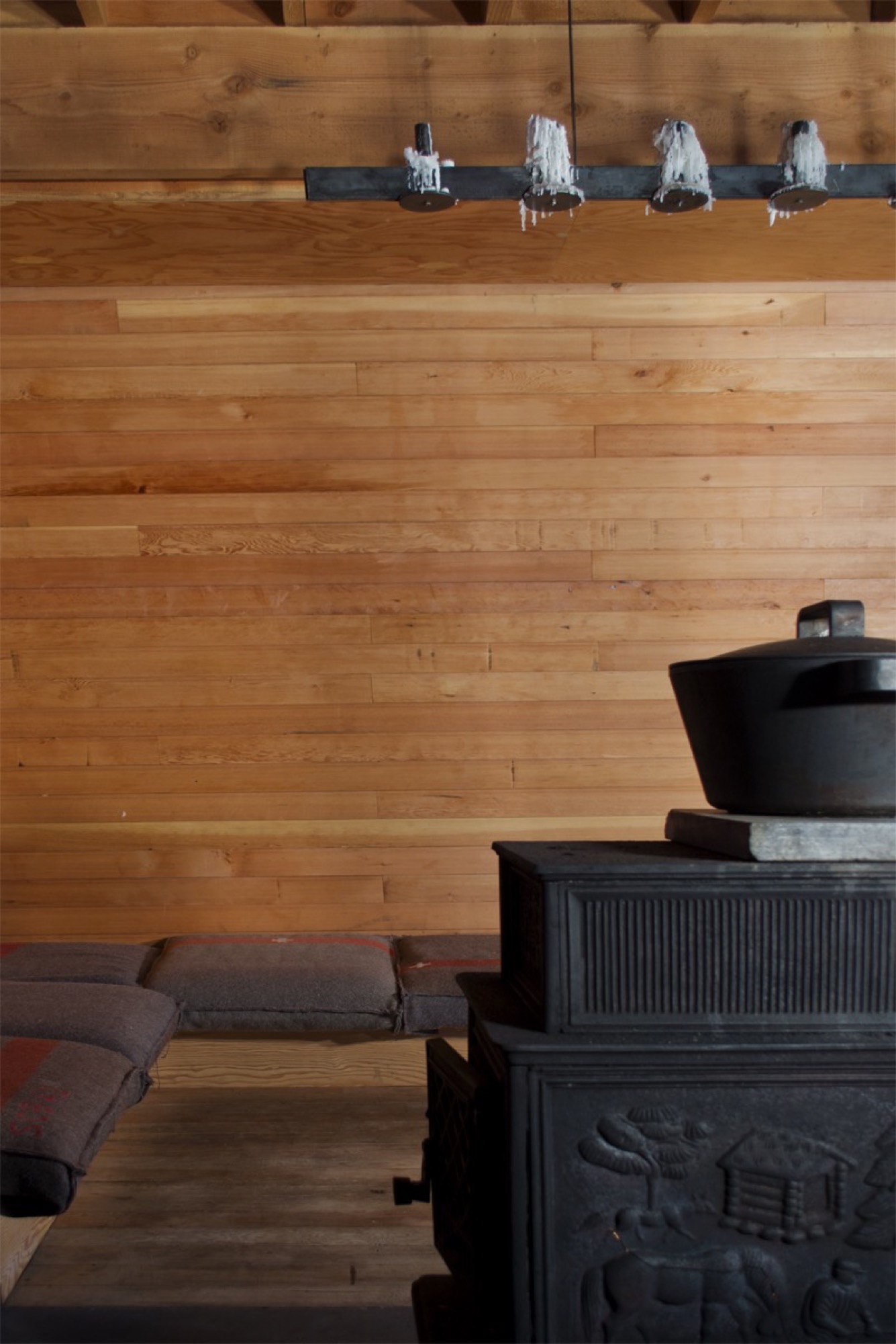
“We have a Björn Dahlström-designed cast-iron pot we slow-cook many meals in on the wood stove, which is essential to how we live when we are [at the cabin].”
Get your own: Björn Dahlström designs pots and casseroles for the Finnish company Iittala. Dahlström’s current line is stainless steel, but cast-iron pots and Dutch ovens similar to the one in the picture are available from brands like Le Creuset, Sur La Table, and Lodge.
The splitting maul
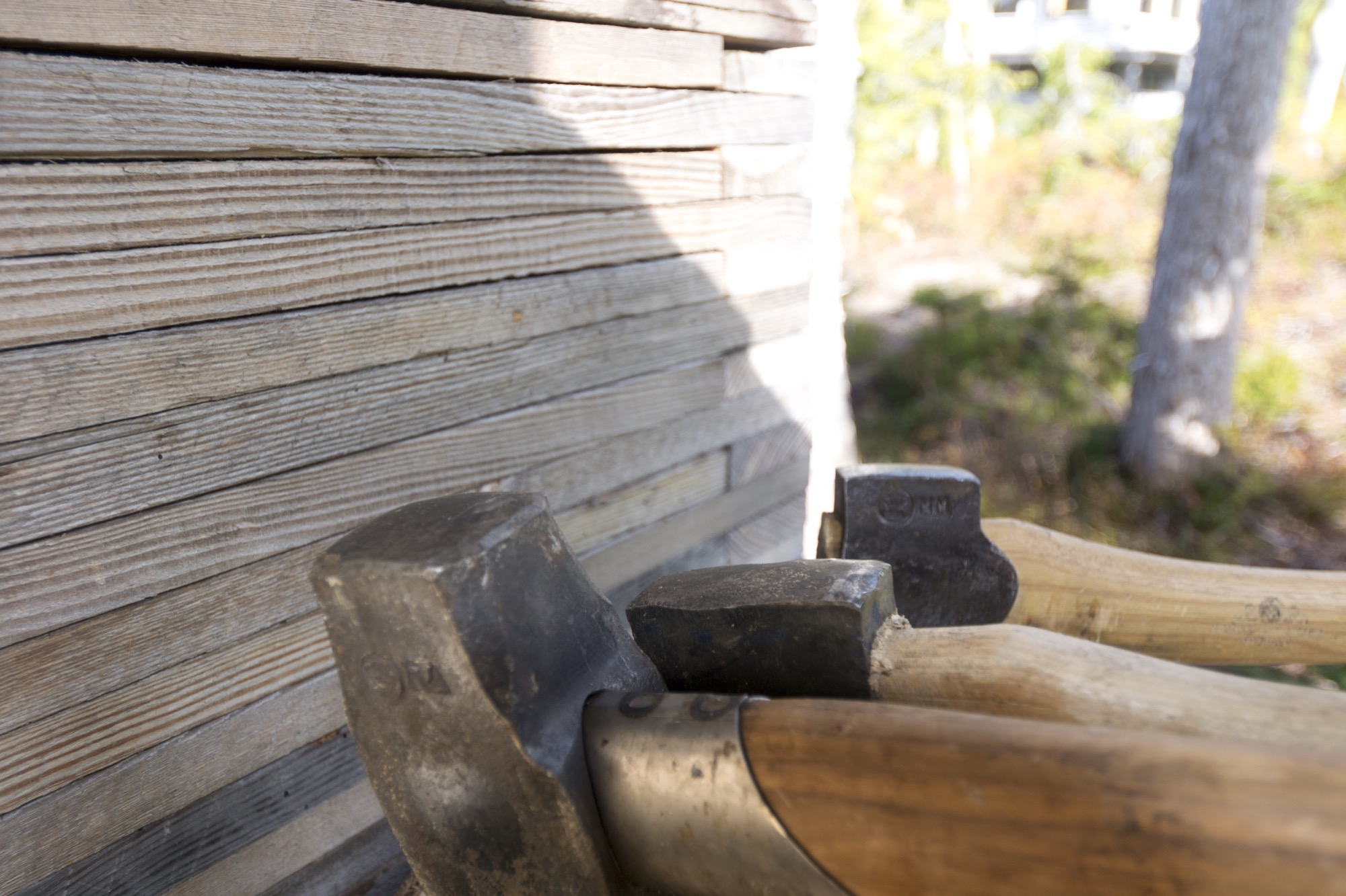
“I have a love for Swedish axes. Of my collection of over 100, the most used and loved is the Gränsfors Bruk splitting maul, which powers through the yellow cedar rounds. It is a beautiful object from a company we greatly admire. Whenever cutting wood, I look at the stamped initials of the smith that made it, with appreciation for his work and respect for a very old company which values and celebrates the workmanship of the individuals within it.”
The Gränsfors Bruk splitting maul’s head is heavier than the head of splitting axes, and the poll is designed for pounding on a splitting wedge.
The blanket
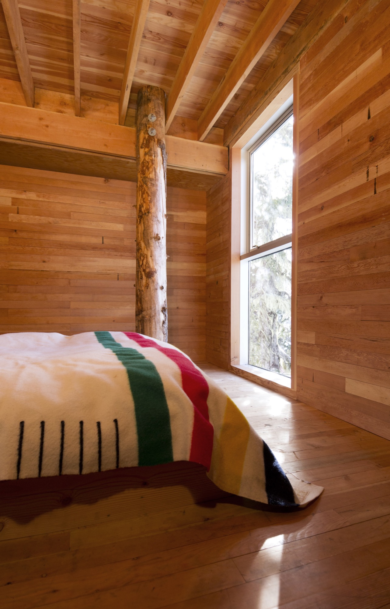
“We love our Hudson’s Bay blanket, which was a wedding gift from the architect I worked for for a number of years, before we began our own practice. I’ve often thought that a Bay blanket should never be bought for oneself and is something that carries meaning as a gift.”
Buy it for someone: Woolrich offers Hudson’s Bay Point Blankets under the offcial license of the historic Hudson’s Bay Company. The legendary blankets have kept generations of trappers, hunters, fur traders, and Native Americans warm and comfortable. 100-percent wool, loomed in England. △
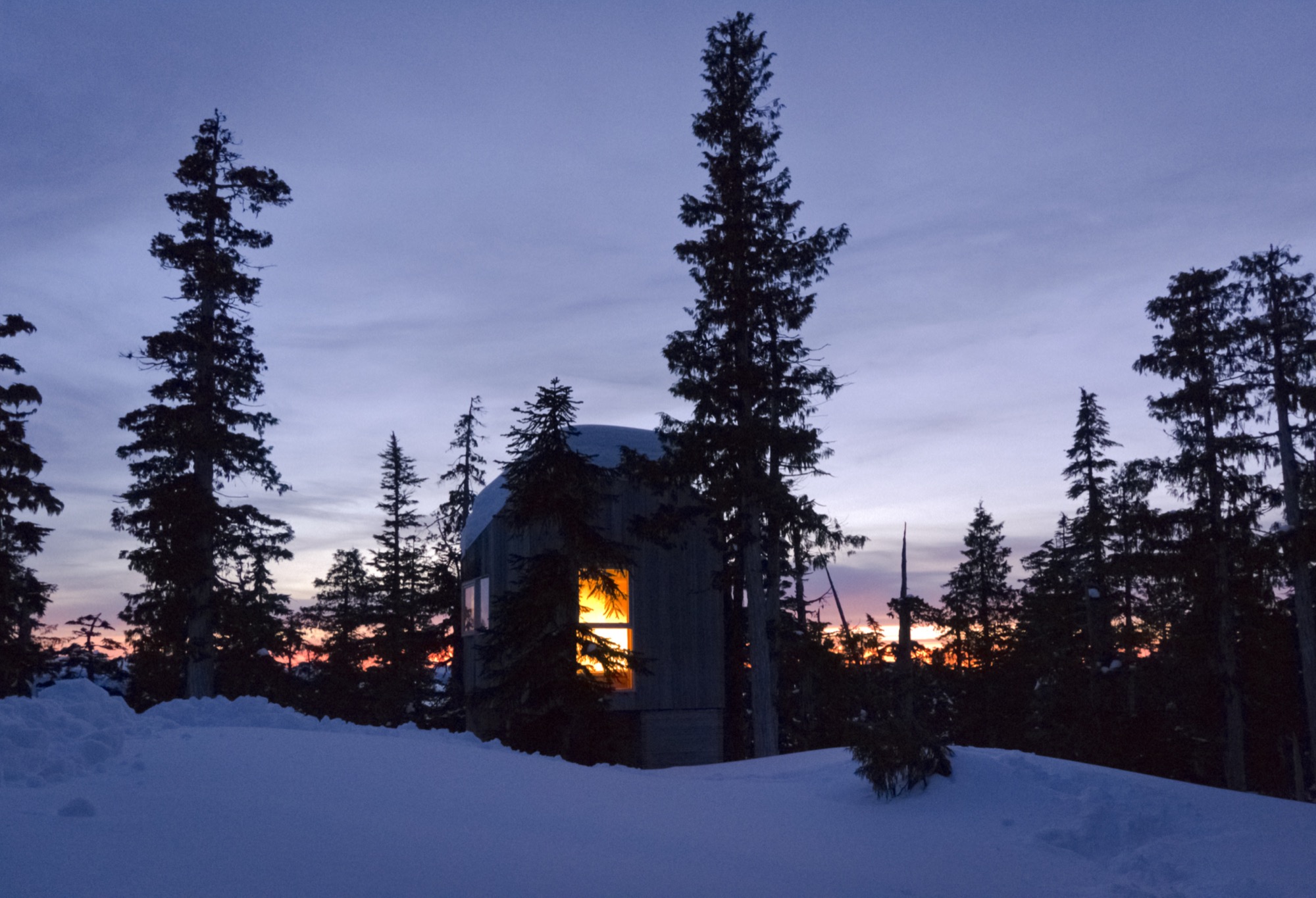
A Whistler A-Frame
Scott & Scott Architects design an outdoorsy Vancouver family’s dream cabin
If the multiple languages and accents overheard in lift lines and on gondolas tell any kind of a story, it’s that everyone from everywhere with a serious interest in skiing or snowboarding is making a beeline for Whistler Blackcomb. More and more of those visitors are putting down roots with a second home in this outdoor wonderland north of Vancouver, Canada. Some buy condos in the heart of Whistler Village or townhomes with ski-in/ski-out access to the slopes. Others build luxurious heavy timber colossi in swank residential areas that have grown up around the resort’s edges.
No matter their size, most of these mountain retreats share the following design elements: wilderness building materials, either structural or decorative, and floor plans and amenities that mimic those found in city interiors.
While there is nothing wrong with having a second home in the mountains that works much like a primary one in the city, some younger ski and snowboard families have begun to question why they would want to occupy such a space when a more indigenous—and much radder—alternative is available: an iconic A-frame cabin.
Return of a classic-modern icon
Ah the A-frame, that staple of mid-twentieth-century vacation home vernacular that was massively popular across the North American outback from the 1950s through the 1970s. There is no way this odd-looking triangle-shaped structure, which got its start in ancient days as a roof hut in Japan and a storage shed in Europe, could be mistaken for anything urban. Attempts in the sixties and seventies to make it a city building resulted in churches, fast-food joints, suburban houses and motels that were novelties even then.
The classic post-Second World War A-frame cabin was a purpose-built backcountry bolthole. Its simple construction, minimal building materials and absence of fancy finishes made it a preferred DIY project for Mad Men-era handy men, and in the 1960s, A-frame cabin kits sold briskly. Most of these ready-to-assemble weekend homes shot up in snowy locales.
One reason for this is the A-frame’s radical roofline that extends down to the ground on two sides, which helps shed any snowpack. Another is its ability to capture natural light. The A-frame’s roof supports all of the building’s weight, freeing up the gable ends to be filled with wall-to-wall glass.
A third reason for its easy fit in alpine terrain is one you might not have imagined given the A-frame’s modern, inorganic appearance. In this landscape, it can be a chameleon, a slender, weathered wooden form indistinguishable from evergreen trees.
For all of its baked-in virtues and utter lack of pretense, the A-frame is enjoying a renaissance. Outdoor types who value authenticity are enthusiastically rescuing original 1960s and 1970s models, hand-building replicas (check out the Urban Outfitters online journal for directions on "How to Build an A-Frame Cabin") or commissioning fresh versions that honor the building's honest materials and original intent, which is what Vancouverites Melanie and Brenton Brown did when they gave the go-ahead for the elegant update pictured here.
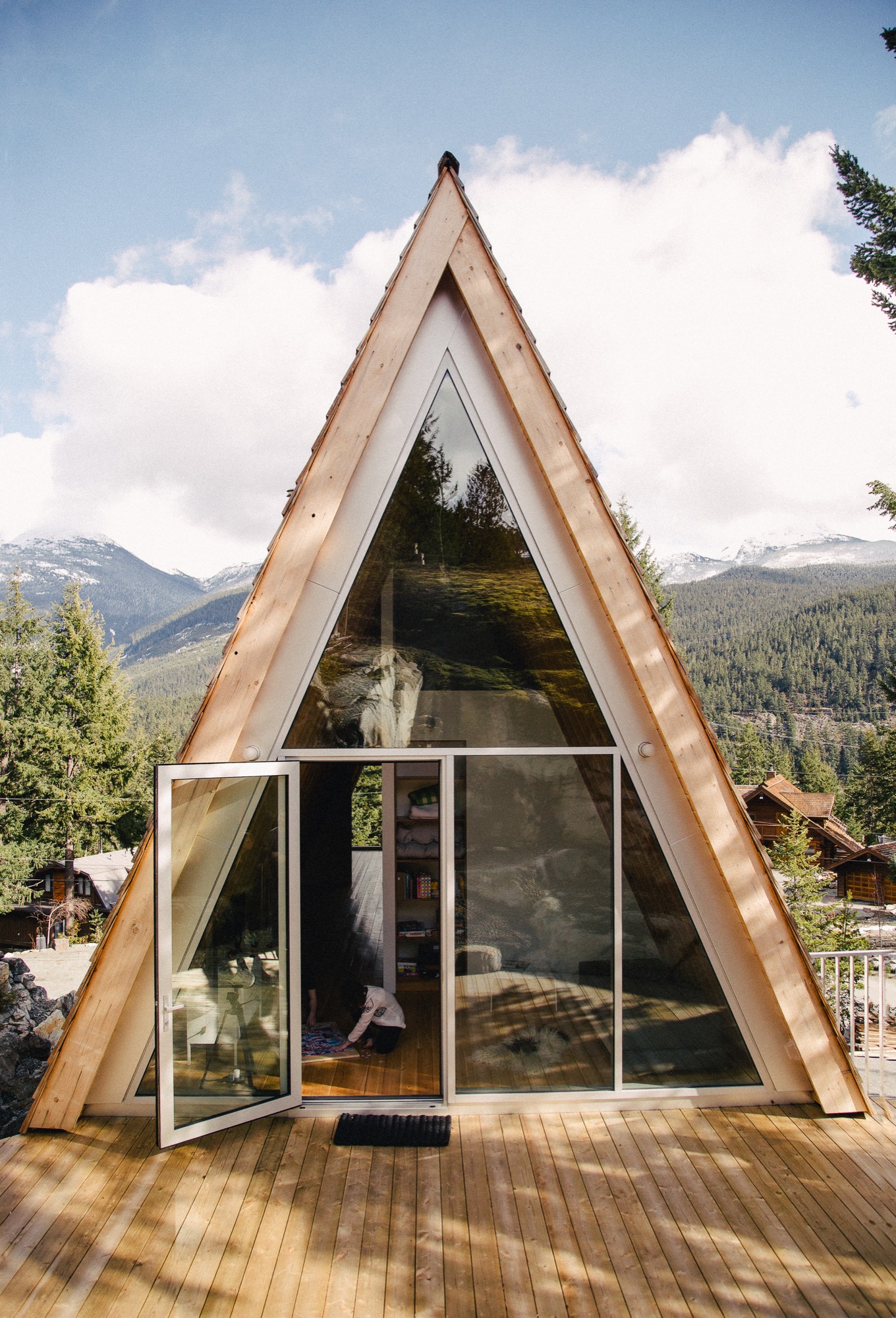
A family’s dream
For years, the outdoorsy couple and their energetic offspring, Daisy and Finn, now eight and 13 years old respectively, bunked off and on with close friends in their 1980s A-frame in Whistler’s Emerald Estates neighborhood. In 2014, the family decided to build their own variation on a property up the street from their friends. “We wanted a new cabin that would not look out of place with the older ones in this area,” says Brenton, CFO for the Vancouver-based digital commerce platform Elastic Path Software. “An A-frame felt like the perfect fit for us,” says Melanie, who is an interior designer. “It has a retro feel we love and, obviously, we knew what we were getting into with this type of building.”
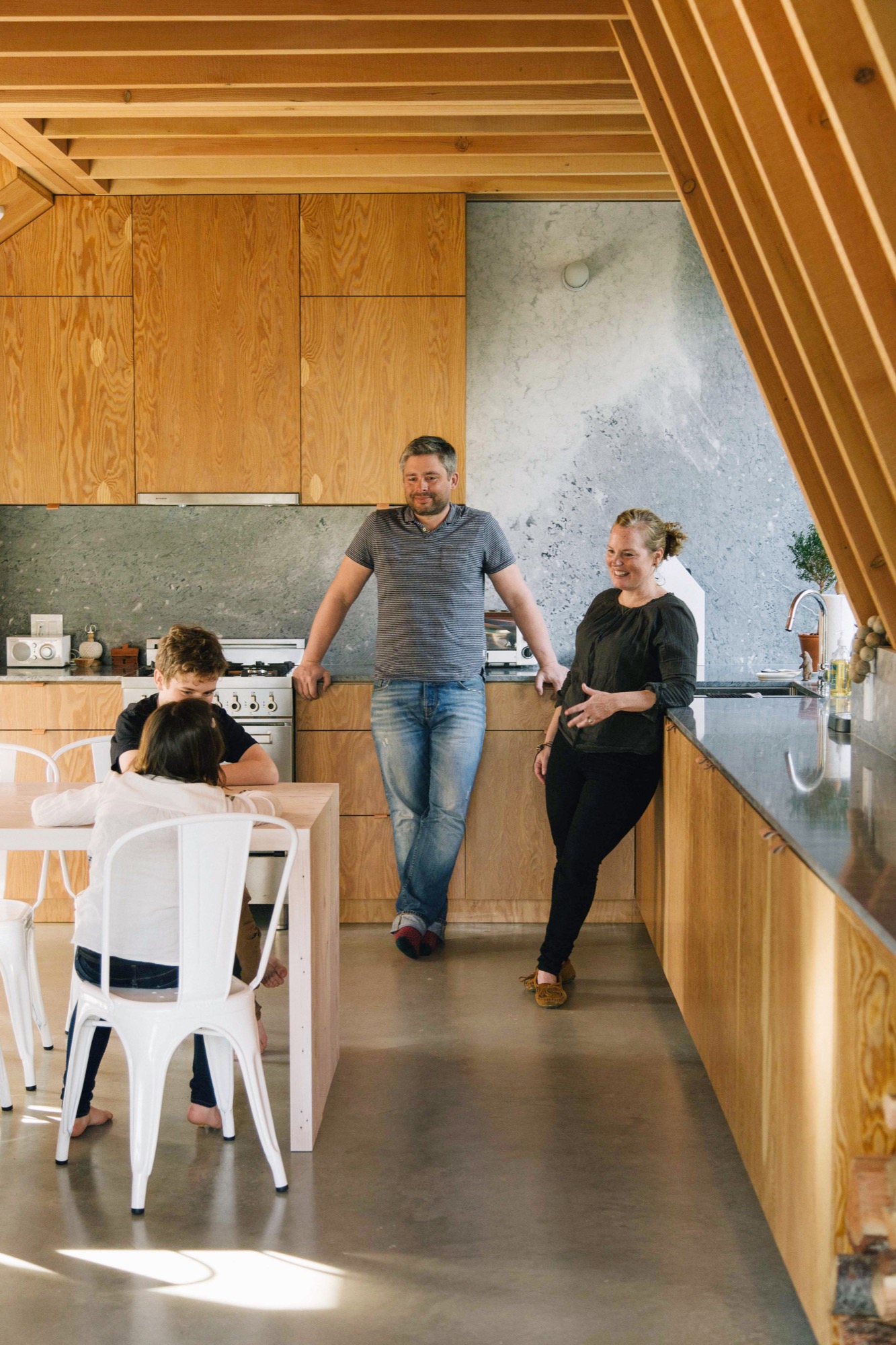
Idiosyncratic Emerald Estates
If you wanted to build a new A-frame in Whistler, idiosyncratic Emerald Estates would be the right place to do it. It is one of Whistler’s early neighborhoods, dating to the 1960s when the community mainly consisted of diehard Vancouverites willing to drive 75 miles of nasty road on weekends to ski its pristine powder, full-time construction and seasonal workers, plus assorted ski bunnies and bums.
A-frames are at home in this neck of the woods where a lot of the housing stock still has a throwback vibe. Among its early Whistler building types, Emerald boasts classic 1960s, 1970s and 1980s A-frames and Gothic-arches cabins (their bulbous bow-sided brothers), Heidi-style chalets and quirky hand-built dwellings such as Whistler’s famous “Mushroom House,” where, if Emerald Estates were a fictional fantasy world, Bilbo Baggins would want to live.
Although it is only a 10-minute drive from Whistler Village, Emerald feels off the beaten path. It is still a neighborhood more associated with local families than visitors. Most of the residents are old-timers and full-timers, “not weekend warriors,” says Melanie, laughing to think that this label could be applied to her little tribe.
Emerald’s topography is steep and wooded, with winding roadways that dip to reveal the teepee peaks of A-frames poking out above treetops and that rise to expose wide-roofed chalets juxtaposed with glacial rock formations.
The Browns’ property is open, steeply sloped and pie-shaped: wide at the front and narrow at the back where a four-story-high granite outcrop dominates. The site is high enough up the hillside that the evergreen trees, so plentiful downslope, have no effect on the view. “It’s panoramic, an unobstructed 180 degrees,” says Brenton, pointing north to Weart and Wedge mountains with Armchair Glacier sandwiched between them, then south to Whistler and Blackcomb. The family’s new cabin, designed by David and Susan Scott of Vancouver’s Scott & Scott Architects, capitalizes on all of this scenery.
The Scotts and the Browns
The Scotts are a husband-and-wife team who worked independently for years for prominent Canadian architects before forming an architecture practice together three years ago. Their office/home, which they share with two young daughters, is a converted butcher shop in the Mount Pleasant/Main Street area, currently the coolest neighborhood in Vancouver for young families to live.
Every project the Scotts have completed together has received public praise and attention either in a peer review journal, a lifestyle magazine or on a discerning design website—and sometimes all three at once. This past winter, the Scotts were recipients of the 2016 Young Architect Award from the Royal Architectural Institute of Canada. It is the first time the society has given this award to a couple.
The Browns were introduced to the Scotts through architect friends who admired their work. After seeing images of the Scotts’ own off-the-grid cabin at the north end of Vancouver Island (it appeared in the inaugural print issue of Alpine Modern magazine), the Browns were smitten with the Scotts’ understated, minimalist design and use of traditional and off-the-shelf materials in interesting and diverse ways.
Elemental, accessible design is what the Scotts are known for. “No one ever actually says this to us, but I think part of our appeal is that what we do is not outlandishly opulent,” says David, “so we end up with young families who want a holiday place in Whistler or Tofino [the surfing capital of Canada] but aren’t into building grand statements.”
“What we do is not outlandishly opulent, so we end up with young families who want a holiday place in Whistler or Tofino but aren’t into building grand statements.”
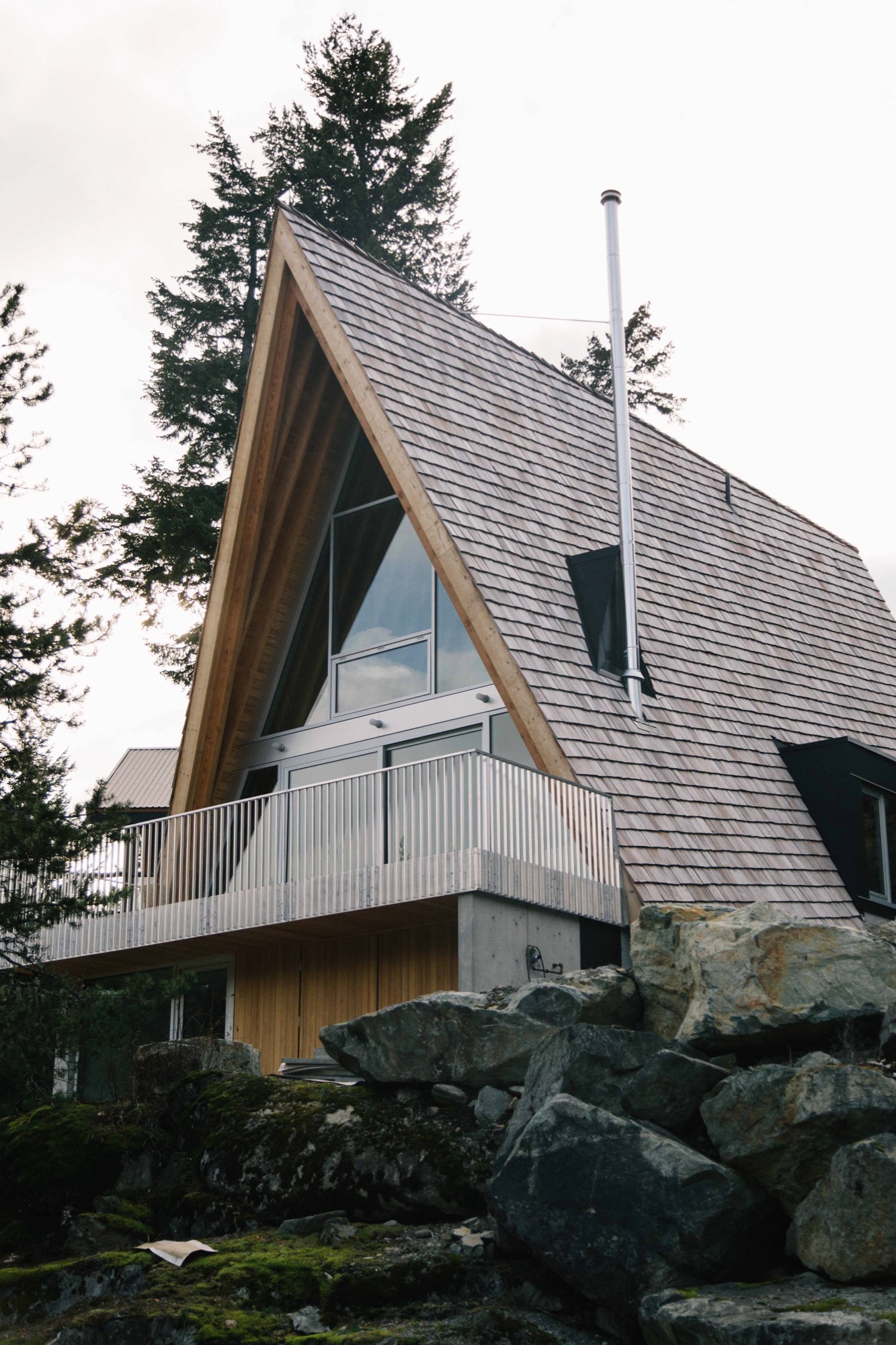
Working all angles
The Browns’ new A-frame may not be a grand statement, but it is an eye-popper, and when you begin to look closely at the design, you can see that it is an extremely intelligent and refined evolution of a basic building type.
Take the roofline, the A-frame’s defining feature. On a flat site, the roof would sit directly on top of the ground with identical triangular gables at either end. The challenge for the Scotts was how to incorporate these archetypical elements in an innovative way on a steep site.
Their response was a three-story building, narrow at the back and wide at the front just like the shape of the lot, with different-size gables at either end and roof planes that follow the grade.
As with A-frames of old, the Scotts’ roof design is a declaration—but with a difference. Level at the top, the ridge has been pushed out beyond the front façade of the building, then the gables have been pulled back at an angle so that the bottom edge of the roof is now parallel to the slope not the ridgeline. Laying the shingles at this same gradient gives the roof its rakish appearance.
From the rear, the Brown’s cabin appears to be a single story defined by a slender gable tied, in classic A-frame fashion, directly to the landscape, in this case volcanic rock. What you are really looking at is the back end of the third floor, and the space inside is a den, which opens onto the generous patio the Scott’s fashioned from a flat space in the outcrop.
This rock face, which erupts out of the ground at the entry level and slopes up an additional 20 feet behind the patio, has proven to be a huge hit with Daisy, Finn and friends. Says Melanie: “Last weekend we had 10 kids scrambling up from the patio and all over it, along with our enormous silver lab, Rosie. I would be in the kitchen [on the main level], looking out the window and see kids with big smiles on their faces coming down the rock on this side.”
From the front of the Browns’ cabin, each of the stories is clearly visible. The ground level, a rectangular box set into the rock, beautifully rendered in concrete clad in cedar at the front, provides a strong and stable platform for the soaring roof that defines the stories above it.
Design features on the front façade include extra-deep eaves and a large balcony that runs across the front with a guardrail made from aluminum bars used for snowmobile trailers “so it’s easy to sweep the snow through,” says David Scott.
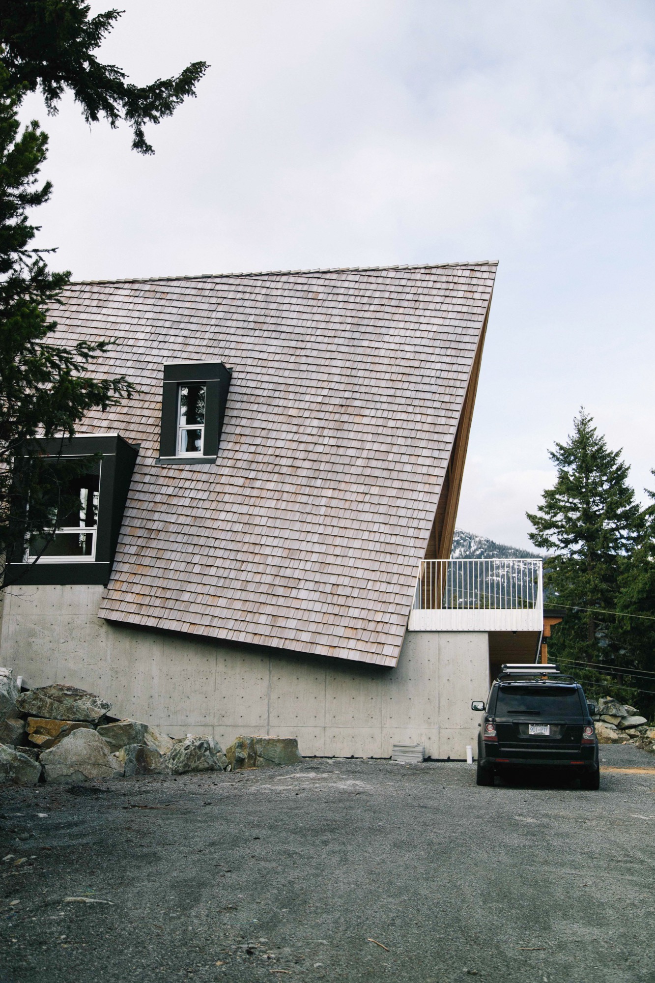
Building inside out
Judicious in their choice of materials, the Scotts prefer their wood locally harvested, their stone quarried nearby and anything ready-made to be plain and pragmatic. The roof is clad in standard red cedar shakes that will weather to the tone of the surrounding rock. Solid structural decking was applied directly on top of the joists “so it works as both floor and ceiling, the way it did in old ski cabins,” says David.
In a classic A-frame, the architectural bones are an interior design feature. The same is true here: the internally exposed frame is made of locally sourced Douglas fir, rough sawn in conventional sizes: 2 by 12 inches (ca. 5 by 30 centimeters) for the joists, 2 by 10 inches (ca. 5 by 25 centimeters) for the rafters. The lumber elements are fastened together using simple lapped joints at the floor and roof connections. “Our preference is to always keep everything consistent and the same, and to highlight the craftsmanship, not conceal it behind finishes,” says Susan.
The cabinetry was built on-site of construction-grade rotary-cut plywood; this wood also encloses stairs that are capped with the same stock aluminum used for the balcony guardrail. The only obvious built-in eye-catcher anywhere inside is the honed marble from Vancouver Island used in the kitchen and living area on the second floor.
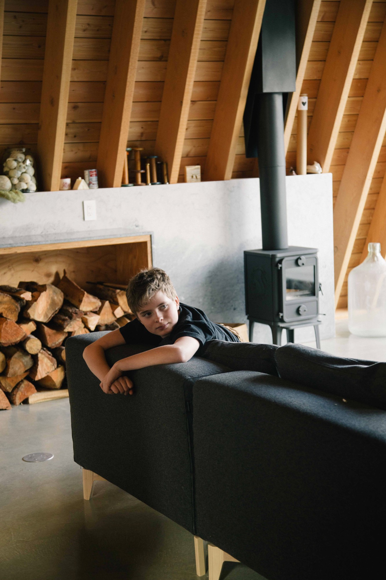
The first level is all business: “washroom, laundry, storage for bikes, skis, snowboards, surfboards leftover from our time spent in Laguna, and probably snowmobiles at some point,” says Melanie. The middle level is for communing; the top, for turning in.
One frustration with A-frame design is that it does not allow for much useable space inside; all slope, no sidewall is the common complaint. One original way the Scotts dealt with this dilemma was to put the stairs in a light-filled dormer, freeing up floor space on the third floor for a proper hallway tucked partially under the slope.
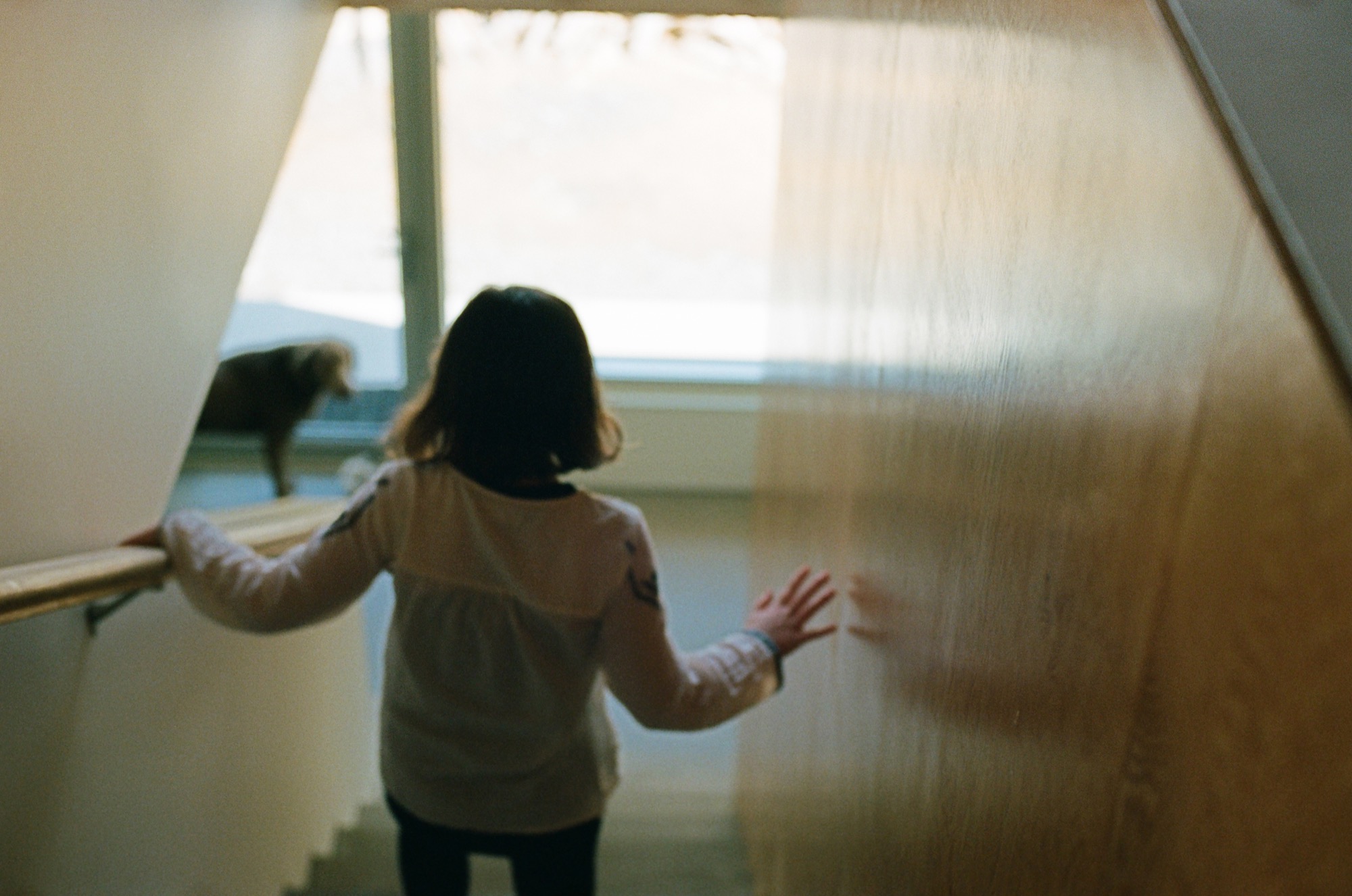
The hardy foursome and pooch moved into their cabin a few days after Christmas 2015 and have been using it nonstop ever since, often sharing their holiday home with friends.
Over the winter, Melanie skies with Daisy while Brenton snowboards with Finn. “In the summer, we like hiking with Rosie, as well as mountain biking and swimming in the various lakes. There are several hiking and mountain biking trails in Emerald, and Green Lake is right around the corner and so is the Valley Trail. We enjoy riding our bikes along it into the village,” says Melanie. “If you love being outdoors, there’s just so much to do around Whistler.” △
Simplicity on the Rocks
Built into the mountainside, a Quebec country house cantilevers over the treetops for magnificent views
A rugged mountainside plot in Quebec’s countryside impels a Montreal architect to design a cantilevered minimalist jewel that elevates the main living space above the trees for splendid views of Mount Orford and the valley below.
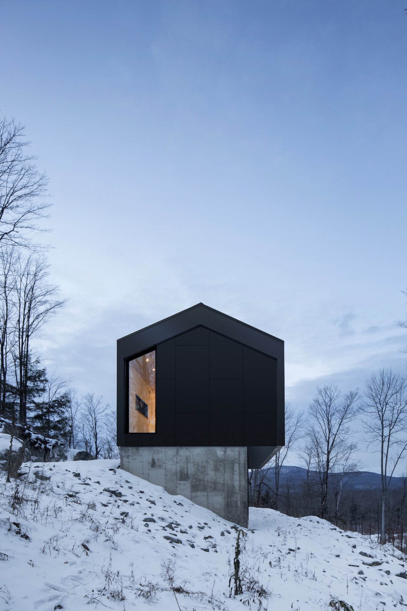
Imagine you are an architect given a limited budget to build a modest weekend home on an impossibly steep site whose topography mercifully plateaus atop a big rock. If you are brilliant, you figure out how to build the house right on top of that rock, for the best views. At least, that’s what Stéphane Rasselet of the Montreal-based architecture firm has done with the Bolton Residence.
Voilà. “A unique, timeless jewel landed on a concrete base” in the client’s own words. Alain Bernard, who works in film production, dreamed of a small, modern country house for a weekend escape and for extended breaks between intense projects. He had two directives for the designer: respect a curbed budget and maximize the spectacular mountain and valley views the plot of land offers.
These two essentials, plus the rugged wooded site on a precipitous slope above the tiny municipality of East Bolton (Bolton-Est) in Quebec’s Eastern Townships, impelled the architect to design a sculptural structure that addresses the site challenges while presenting prime panoramas of the surrounding nature. “The way Stéphane positioned the house is probably what makes it so unique: anchored in the rock on one side and completely floating at treetop height on the other side,” Bernard says.
The owner of Bolton Residence is usually alone with his two cats at the 1,540-square-foot (143-square meter) house in the country. He also has a studio in the city, where he stays while working umpteen hours during the week. But when he has two to three months off between contracts, he comes to East Bolton to enjoy the peace and take time to contemplate. “Although the house is so comfortable, soothing, and stimulating, it also brings poetic visions and enchantment,” he muses. “Every day, every season, the landscape changes. The light is different, and the colors are renewed. The house was built with the idea of glorifying nature and ultimately becoming part of that nature.”
"The house was built with the idea of glorifying nature and ultimately becoming part of that nature.”
The holistic architect
When Bernard began his search for an architect, he was already familiar with _naturehumaine and loved their work. “They were my first choice, but I was convinced they’re too busy to accept such a small, limited-budget contract.” But an intrigued Rasselet wanted to meet the prospective client. The two men at once understood where each was coming from. “We talked about architecture and design,” Bernard remembers, adding that he sent his architect online to see features of cabins in nature. “I told him to capture the spirit of those cabins in a contemporary house.”
Rasselet’s answer was a strikingly simple design. Nevertheless, it was his masterly attention to the many complex details during design and construction that in the end harmonized this ode to minimalism.
Stéphane Rasselet graduated from McGill University’s School of Architecture in Canada and then worked on major projects in Paris before returning to Montreal to gain experience at local firms. He joined forces with Marc-André Plasse to found _naturehumaine architects in 2004. In 2013, Rasselet became the principal partner at the design-oriented atelier specializing in private residences.
When I ask him to describe the nuances of his design style beyond the obvious “modern,” the architect pauses. “That’s a difficult question. Often, we are absorbed in our own way of doing things, and the comments and opinions people have from the outside become the definition of what we do.”
Overall, the firm’s body of work is characterized by a clarity achieved through minimal choices in materials and colors. Never flamboyant. “We limit things that are expensive, but we push things structurally.”
“We limit things that are expensive, but we push things structurally.”
Environment in view
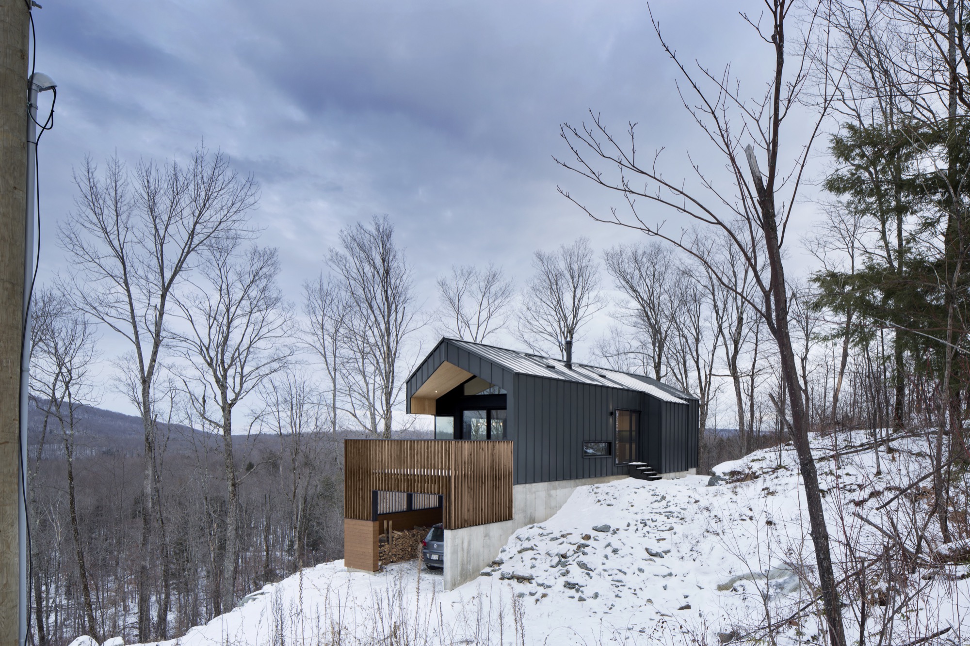
The Bolton house’s two exalting structural elements are cantilevers and corner windows—both employed to maximize the view.
Good comprehension of the challenging building site was essential to designing the Bolton Residence. Having skied Mount Orford many times, Rasselet was already familiar with that area east of Montreal. And although his client’s plot of land was large, the topography was extremely irregular, leaving the architect but one place to build without racking up prohibitive excavation costs: the large rock at the property’s highest point. Standing on top of that big rock on his first site visit, Rasselet took in the majestic sight of Mount Orford to the north and an expansive eastern view down a wide valley that rises up on the other side to a profile of mountains and the horizon. “It was obvious the house had to be oriented parallel to this line of mountains to the east, with the gable facing Mount Orford.” The scenic views set the structure’s two main axes in stone.

The _naturehumaine architect framed the horizontal view of the valley and distant mountain range with a linear band of glazing along the main living space and floor-to-ceiling vertical glass to maximize the views of Mount Orford on the north side of the house. “We wanted to give the illusion that the ceiling was going through the glass and out onto the terrace,” says the architect. The roof cantilevers out about six feet (1.8 meters) over the terrace.
Geometry in the treetop
Rasselet wants all his clients to think of the interior and the exterior of a house as one. The building itself and what’s inside must be in dialogue. With the Bolton Residence, the architect achieves this holistic approach—as his firm typically does—by designing both the structure as well as the interior architecture: the kitchen, the conspicuous replace at the center of the house, any built-in furniture, and all the metalwork. Steering clear of a look too slick for a country house, he chose materials with a patina and roughness: rugged gray slate tiles from Vermont for the entire main floor, a custom blackened-steel fireplace that shows the weldings, and a ceiling clad in inexpensive, rough construction plywood. A calm, monochromatic color palette without flashy design accents allows the view to become the main protagonist in a dramatically simple architectural play.
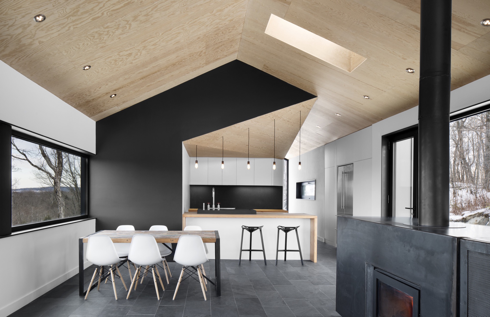
The two stacked volumes—long rectangles—hooded with a gable roof are a modern interpretation of the vernacular architecture of the region’s gabled barns. The gable roof is covered in panels of charcoal gray steel that continue down over the sides like a protective blanket. Protruding three feet (ca. 90 centimeters) over the base, the living spaces and master suite on the cantilevered top floor elevate the dweller up and out, giving a sensation of peaceful symbiosis with his natural surroundings. No surprise, this open space with the kitchen, dining room, and replace is Bernard’s favorite spot in the house. He treasures the big mountain views from the kitchen island and the 180-degree surround view that follows the landscape. “You are standing above the treetops like in a treehouse out of a child’s dream.”
“You are standing above the treetops like in a treehouse out of a child’s dream.”
The garden-level bottom volume has a smaller footprint and is a concrete plinth anchored into the mountainside and partially clad in a cedarwood skin. Tucked under the terrace at the gable and protected from rain and snow are the carport and the main entrance, which leads visitors into a small vestibule, from where a corridor leads to the downstairs guest bedroom and a bathroom, and stairs lead up to the main living space.
Big-city expectations meet country reality
When asked about the project’s biggest challenge, Rasselet and Bernard both bring up collaborating with local contractors on its execution. “I was on site every day during construction to make sure the contractors built exactly what was designed,” the homeowner says. “Every piece and part and detail of the house was designed by Stéphane. They had to redo a lot of things twice, even three times, to achieve it.” And his architect quickly agrees that the distance from the city posed a challenge. “Once you get two hours out from Montreal, trying to find people who do contemporary architecture and who do contemporary details gets quite tough,” Rasselet says. He often asked for workshop drawings before letting a craftsman build, bend, or weld what he had designed. For instance, the steps leading from the vestibule up to the living room are covered in bent steel plates that had to match up precisely. As is often the case in modern design, it takes more to achieve a simple, clean look than today’s standard—sometimes more ornamented—style does.
In the end, Rasselet says, “All the ingredients have come together to create a nice little project. It’s one of our best projects.” △
Taking a Shot
A conversation with photographer Jeff Spackman
Three years ago, Jeff Spackman was on track to become a dentist. Then he bought his first camera and learned how to use it from YouTube videos. Today, @namkcaps has more than 150-thousand followers on Instagram. Bidding dental school farewell, the Canadian now goes on photography trips all over the world.
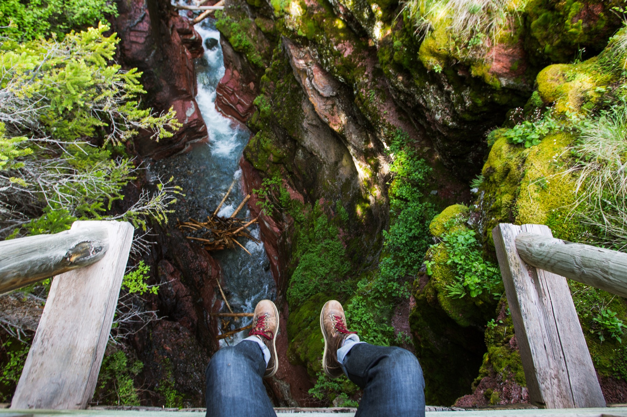
A M You were on a completely different path when you boldly jumped into photography on a professional level . . .
J S Photography crept up on me. I had never considered it as a career. I had never even known any photographers. My family barely took pictures of birthdays growing up. I’d never taken photography classes. I’d never owned a decent camera. I never saw it coming. I had a terribly difficult time trying to decide what to do professionally. I had wanted to be everything from a plumber to an architect. At some point, though, I decided I was going to be a dentist. Working in peoples’ mouths didn’t seem terrible to me, and it looked rewarding enough. University was difficult, but with the sacrifice of my social life, relationships, and hobbies, I did well academically. Eventually, I graduated in chemistry near the top of my class and began applying to dental schools. In the summers, I had been washing windows to pay for school, so I kept that up after graduation. It was only a matter of time before I got accepted into dental school.
A M And then, what happened? J S While I was in my last year of school, I did something that would turn out to be my first step to becoming a photographer. I bought a used iPhone 4. A couple of months later, a friend told me about an app called “Instagram.” It didn’t seem that interesting to me, but whatever. I downloaded it and followed a few friends.
"I did something that would turn out to be my first step to becoming a photographer. I bought a used iPhone 4."
Turned out, Instagram was the other big step. I have always loved expressing myself artistically. I noticed that having a creative outlet makes me feel like myself. It calms me, helps me think, makes me happy. I downloaded all the free photo editing apps I could get my hands on to my iPhone. I posted all kinds of weird things on Instagram. All those old photos are still up on my account.
My iPhone started to present limitations to what I wanted to capture. I loved shooting in the Rockies here in Alberta, but I wanted wider angles. I wanted sharper images. I wanted to shoot in low light. I wanted more editing ability. In January 2013, I got my first real camera. I learned how to use it from YouTube clips. I became fiercely passionate about my hobby. I took my camera with me everywhere. I played with it at home, while I was hiking up mountains, and when I walked to the corner store.
All this time, my Instagram following had been growing slowly, mostly among locals who love the mountains like I do. Working for myself washing windows also gave me time to do what I loved—climbing mountains, swimming in freezing lakes, and taking pictures along the way. I entered my photos in small contests on Instagram. I also followed professional photographers and adventurers to see what they created. In the summer of 2013, Instagram came across my account and endorsed me as a “suggested user” to follow, twice. I gained around ten thousand new followers a week at that time.
I’ve never before found a passion I connected with like this. Still though, I was going to be a dentist, just now a dentist who really liked taking pictures.
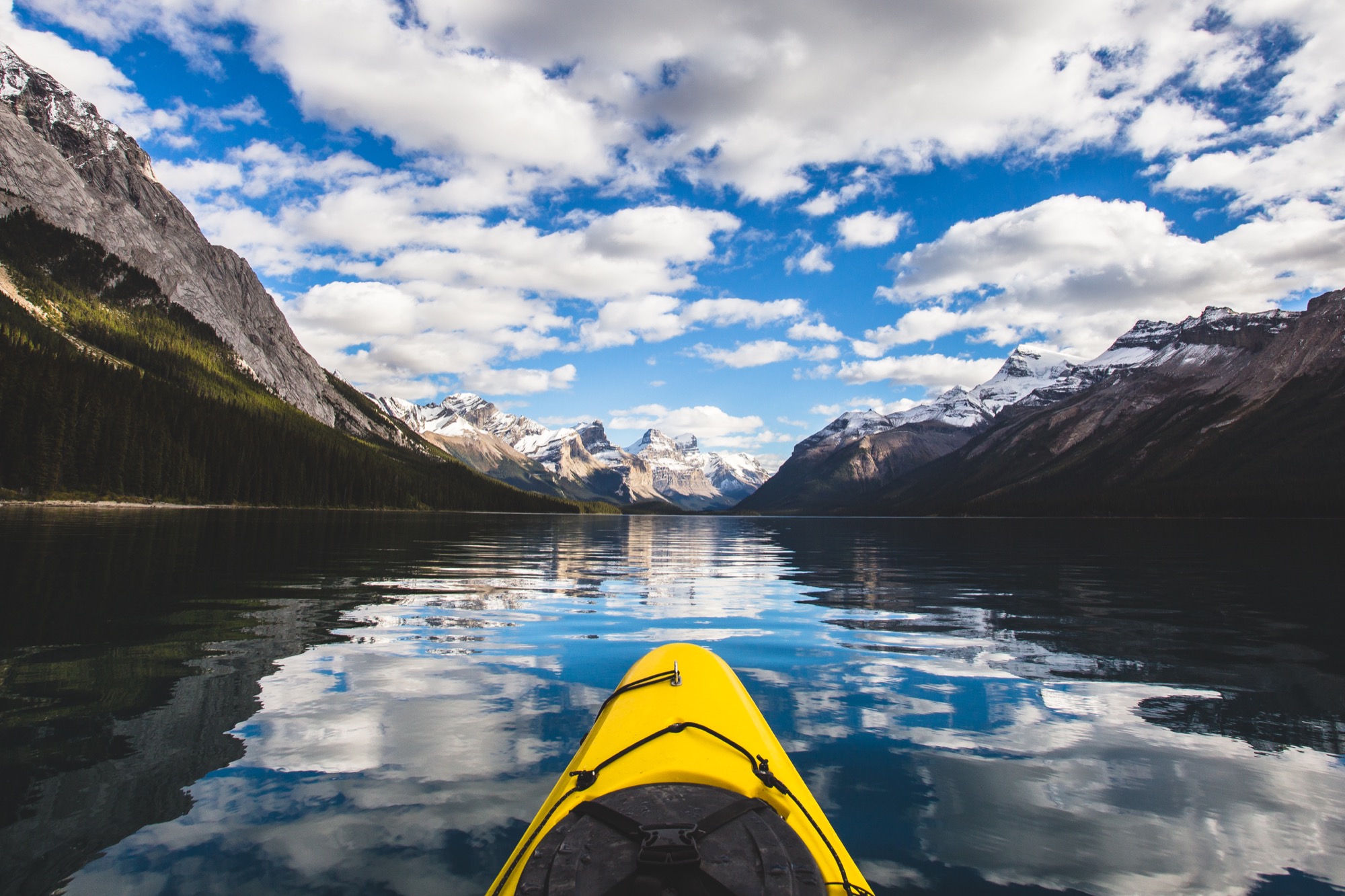
A M You bought your first camera just over three years ago. How did you learn to be so good so quickly?
J S I went on YouTube to learn about all the buttons on my camera. I was thirsty to learn and I spent long hours reading online about lenses and cameras. I studied the pictures of the photographers I followed on Instagram, trying to understand how they did it. I’ve always loved nature, so it felt natural to try to capture in photos the way being outdoors made me feel. It was like I remembered who I had always been.
A M When and how did you know you no longer wanted to become a dentist and, instead, be a professional photographer?
J S I don’t know when the transition from dentistry to photography really happened. Perhaps the biggest jump was when I decided to stop washing windows and put everything into taking pictures. That was two years ago. I knew I couldn’t properly give photography a chance without jumping in with both feet. That was scary. I really had no idea if I’d just run myself into debt in the first couple of years, but I needed to satisfy something I couldn’t describe.
A M Share your emotions when you made this big leap—the fear, the thrill, and everything in between.
J S It has been an emotional rollercoaster and often still is. Making money with photography is not easy. And washing windows was good, steady work. Dentistry ain’t half bad either. My photography career started out incredibly slow. I had never had any training in it. Camera equipment costs a fortune. The whole business side of photography was completely new to me. I had a million reasons to not do it, and people close to me urged me to stick to dentistry. At least, with dentistry I knew exactly what steps to take. I knew timelines, the grades I needed, how much debt it would put me in. With photography, I no longer knew what to do. I would try new things that didn’t work out. Big plans with clients, forged over months, suddenly fell apart. At times, I was terribly discouraged. For a long time, my goal was just to pay off my camera equipment.
At the same time, I was exhilarated. People admired my work and were impressed that I’ve learned so much in only one short year. Those professional photographers I admired on Instagram? They began following my account and praising my work. I even got to go on photography trips with a few of them and ask them how they started, what equipment they use, how they edit, how they find business. And they encouraged me.
A M Any words of wisdom for others considering a bold, career- and life-changing move?
J S I don’t think being bold means making quick or uneducated decisions. Success comes not only from passion, but also from hard work. In the end, no one can answer those questions for us. Hopeful- ly, we are listening intently enough to hear the answer from within, even if it’s a no. And we need to know and trust ourselves when it’s a yes.
A M How has your life changed since taking a shot at photography?
J S I have learned an enormous amount. I’m naturally drawn to learning about photography. Learning about marketing, software, networking, negotiations, and how to write proposals is much more difficult, but just as important. It’s incredibly rewarding to make your weaknesses your strengths.
"It’s incredibly rewarding to make your weaknesses your strengths."
A M What has been your favorite assignment so far?
J S Ever since I downloaded Instagram, I had a favorite photographer, Chris Burkard. I loved his work so much. When he responded to my comment on one of his photos, I took a screenshot of it. As my photography improved, Chris eventually started following me back and we exchanged comments from time to time. He really was an inspiration to me.
One day, the Alberta Tourism Board asked me if I wanted to plan and guide a visit to Alberta for Chris Burkard. My heart skipped a beat. It was so much fun to explore my own province with him. Chris pushed me not only physically but in my ability and goals. We became good friends through the experience.
A M What do you love most about being a photographer?
J S That I get to be creative and spend time in nature. I love both of these things more than I could ever get across in an image. Maybe someday, everything I have done will give a glimpse of how I feel about it. I feel a reverence for natural spaces, and my photography is how I try to let others feel that, too. △
"I feel a reverence for natural spaces, and my photography is how I try to let others feel that, too."
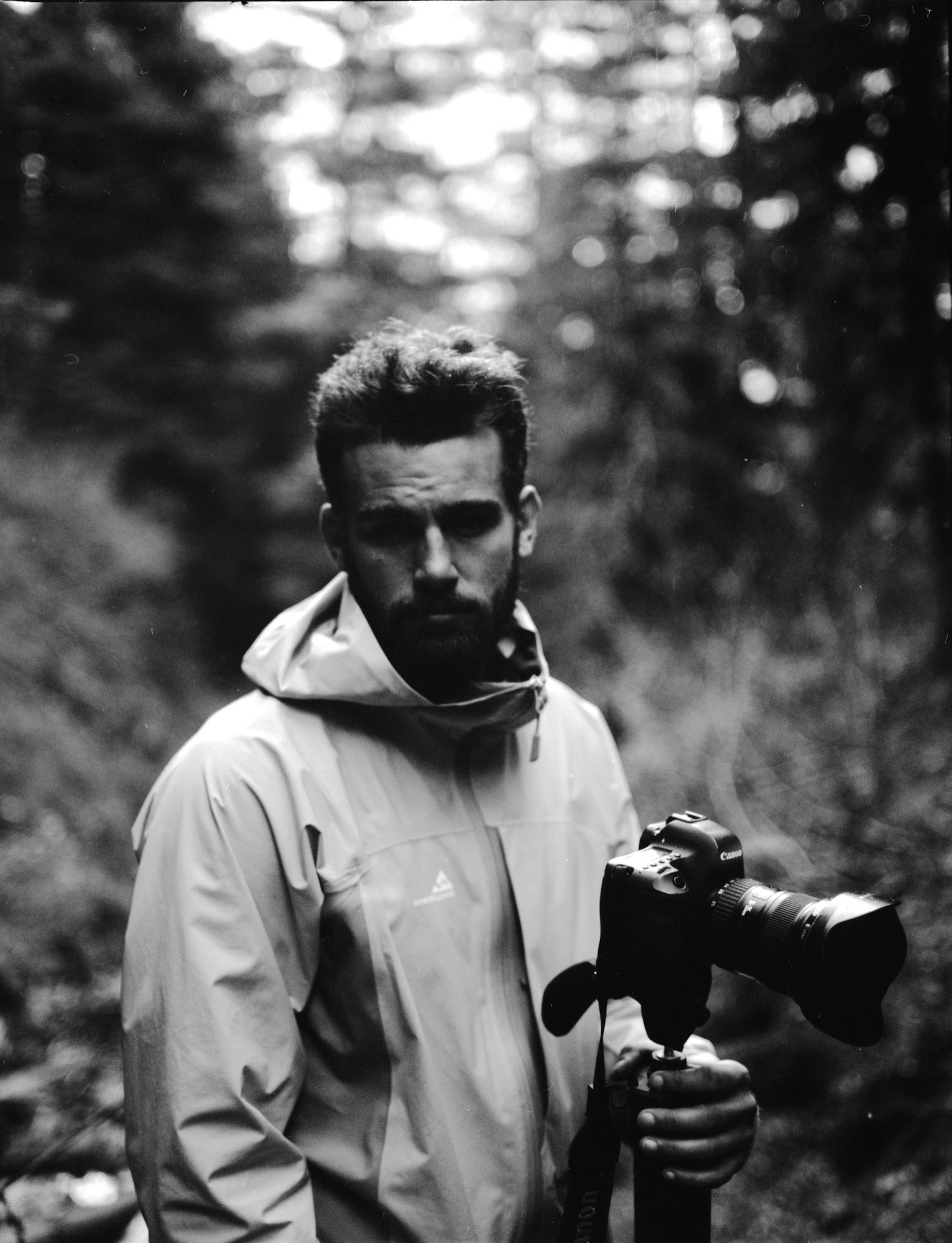
Personal brief
BORN: Calgary, Alberta, Canada, 1985
EDUCATION: I was never officially accepted into dental school. I have a very high GPA and did very well on my DAT tests both in Canada and in the United States. It was just a matter of time . . .
NOW LIVES: Edmonton, Alberta, Canada
FAVORITE PLACE ON EARTH: Waterton Lakes National Park, Alberta, Canada. It’s where I’ve come my whole life. It’s where I first started to take pictures of nature. I plan to go there regularly until the day I die.
WHAT MAKES YOU HAPPY? I love to be active in nature. I love to be with my family. I love to take pictures.
MOST IMPORTANT IN LIFE: Family. Family has the potential to be our greatest source of happiness. It grounds us, teaches us, and reminds us what’s important.
MOTTO: Life is ten percent what happens to me and ninety percent how I react to it.
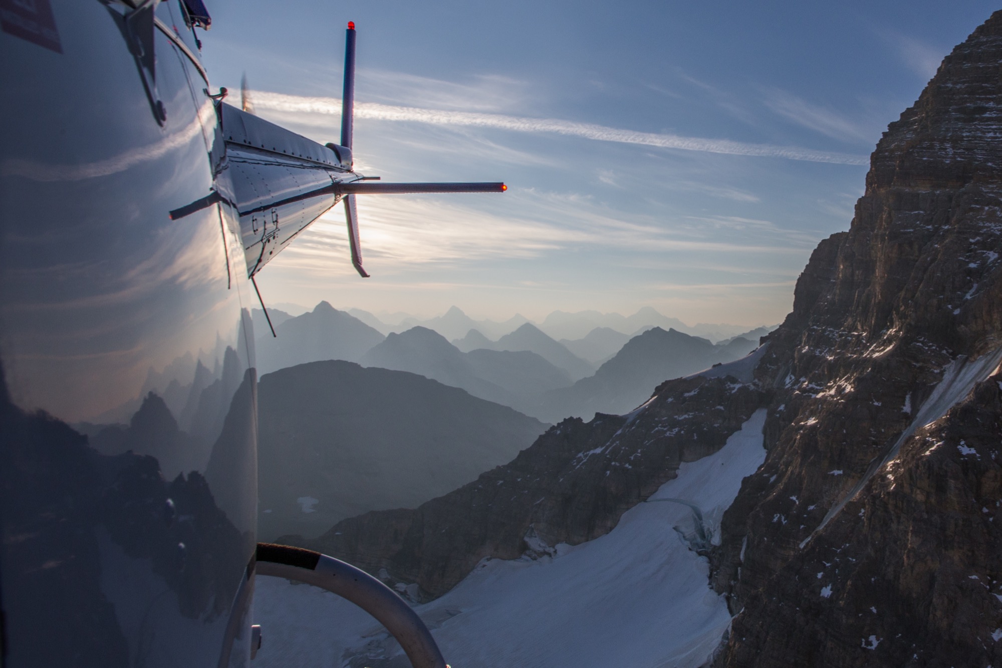
Scandinavian Inspiration in the Canadian Woods
Villa Boréale by CARGO Architecture
Villa Boréale by CARGO Architecture is set in the heart of Québec's Boreal forest and near the ski area Le Massif de Charlevoix. The simplicity of Scandinavian design, the vision of a contemporary interpretation of a Québec cottage and a modern barn, and the materials in their raw appearance influenced the concept for Villa Boréale by CARGO Architecture. The matte black metal cladding contrasts the pale tones of the Eastern white cedar, the concrete and the white interiors.
