Inspirations
Explore the elevated life in the mountains. This content debuted in 2015 with Alpine Modern’s printed quarterly magazine project.
Minimalist Pottery in the Kyoto Mountains
An intimate visit with husband-and-wife pottery artists Momoko and Tetsuya Otani at their home and studio in Japan
The Shinkansen bullet train from Tokyo to Kyoto departs not one minute late, travels almost 200 miles an hour, passes Mount Fuji on the way, and pulls into Kyoto’s vaulting modern station not one minute early. From there it’s 40 kilometers by car to Shigaraki, an industrial mountain town, where I’ve come to visit a ceramic artist whose work has transfixed me on Instagram for the past ten months.
Shigaraki is home to one of Japan’s “six old kilns.” The most admired pottery here—tea bowls and sake cups made from local iron-rich clay—is often misshapen and haphazardly glazed. Much is left to the felicitous violence of earth and fire in wood-fueled kilns. These clay items, used in the exquisitely calibrated tea ceremony, are prized for their imperfections, reflecting the wabi-sabi philosophy in which earthiness, transience, roughness and decay reveal the essential nature of the world.
Such is Japan: hyper-curated, thrillingly modern, clockwork precise—then offering you a tea bowl that seems primeval.
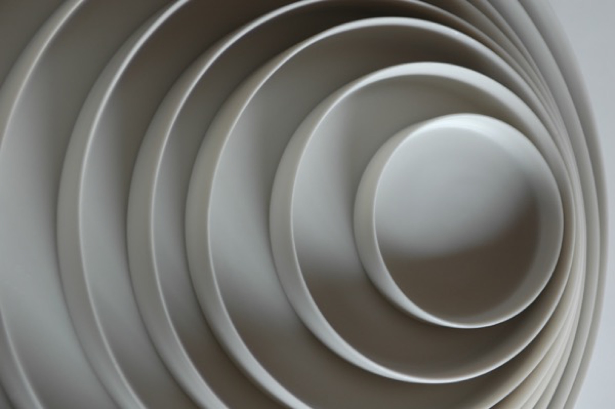
The ceramic artist I’ve come to see, however, is Tetsuya Otani, whose work departs so thoroughly from the Shigaraki style as to seem from another world. Otani’s hand-thrown porcelain chases the precision of machine manufacture. Its skin is smooth and naked, like that of a baby. I wanted to know why he was making such beautiful but plain stuff.
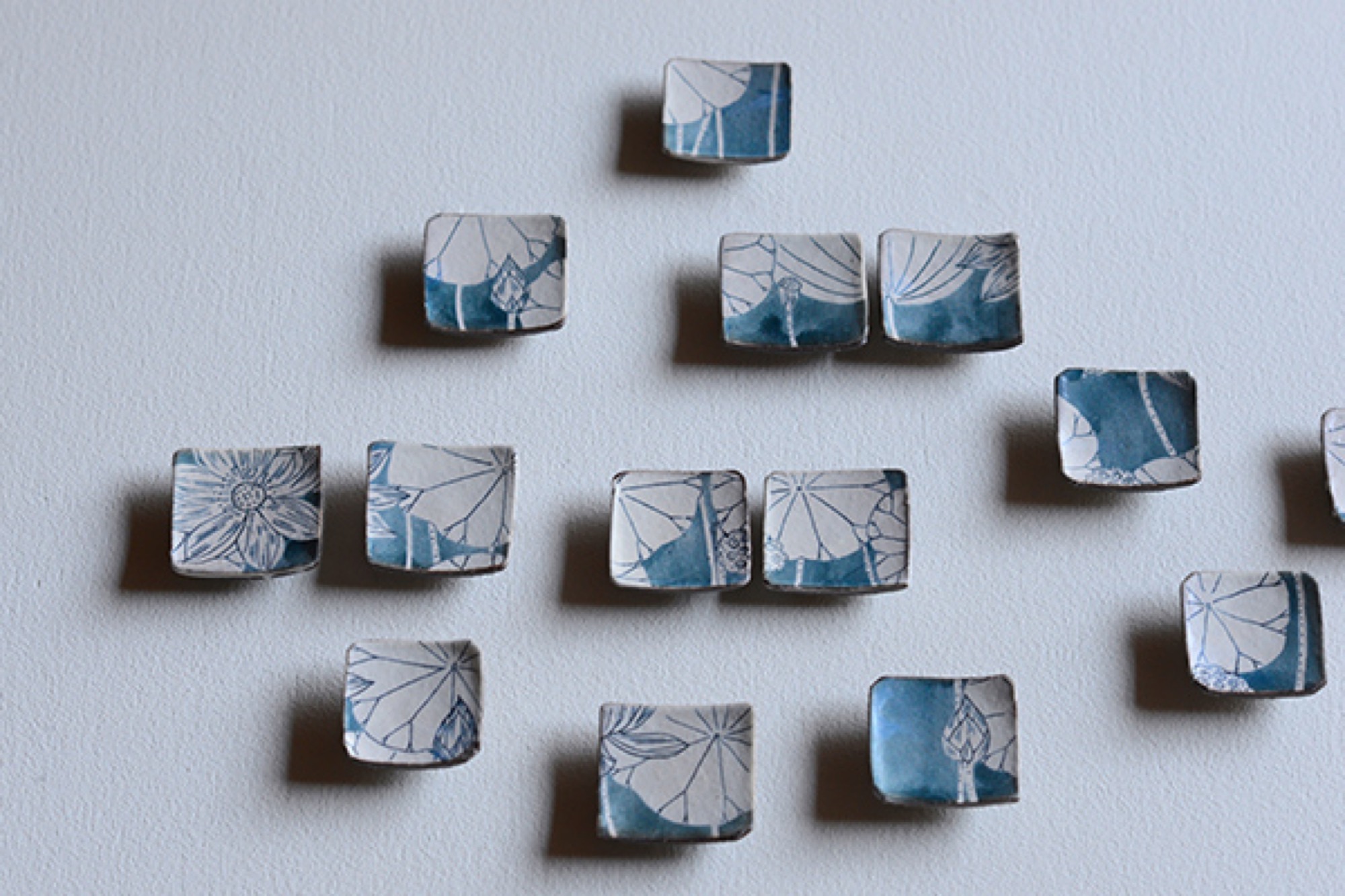
Right now, though, I have a few hours to kill, so I drive into the mountains to find the I.M. Pei-designed Miho Museum. The Miho is a kind of Japanese Getty, opened in 1997. It’s perched on a thick-forested mountain top like something a hermit might build if the hermit had several hundred million dollars. To reach it you walk through a hill via a gleaming, curving science-fiction-y pedestrian tunnel and emerge on a bridge that’s supported by a harp-string array of steel cables. The Miho was commissioned by an industrial-fortune heiress who also made time to found a sect in the 1970s, variously described as an art-centric religion and a sinister cult.
As traveler’s luck would have it, the museum is showing an astounding collection of ceramics by the 18th-century artist Ogata Kenzan, whose name means “northwest mountains.” His painted cups, bowls, and trays leave the viewer giddy, so varied and playful are they in style and form.
At home with Momoko and Tetsuya Otani
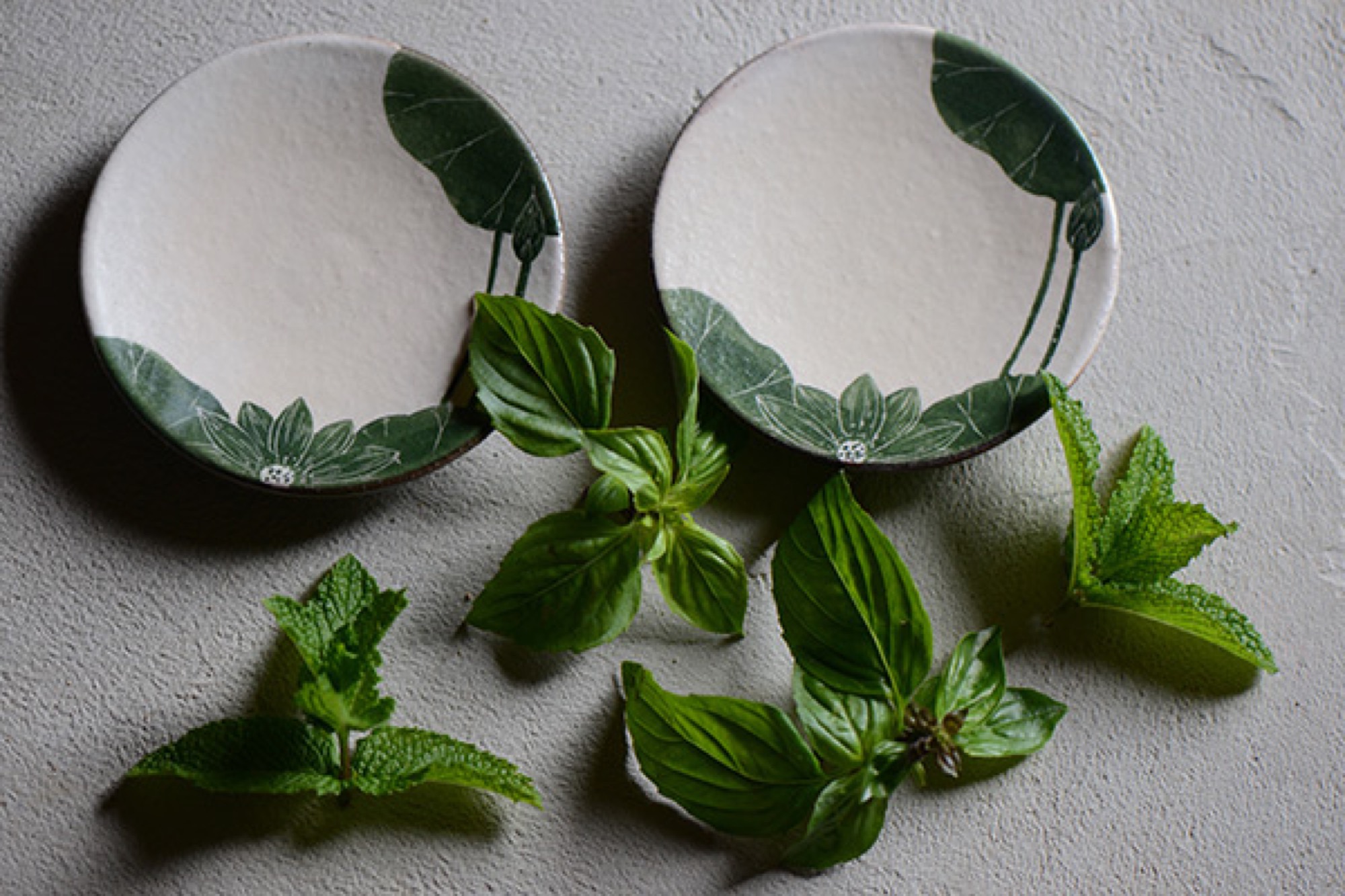
Five or so kilometers from the Miho is the home that Tetsuya Otani shares with his wife Momoko—also a gifted ceramic artist—and their three girls and a dog. It’s beautiful, with farmhouse mud walls and high wood beams that employ traditional temple joinery. Everything on the main floor revolves around the kitchen, which is far larger than usual in a Japanese house, reflecting the Otanis’ passion for communal cooking and eating with friends, many of whom also make pottery. The shelves, in the dining area and kitchen, are filled with both Tetsuya’s and Momoko’s pieces.
The work of Tetsuya Otani
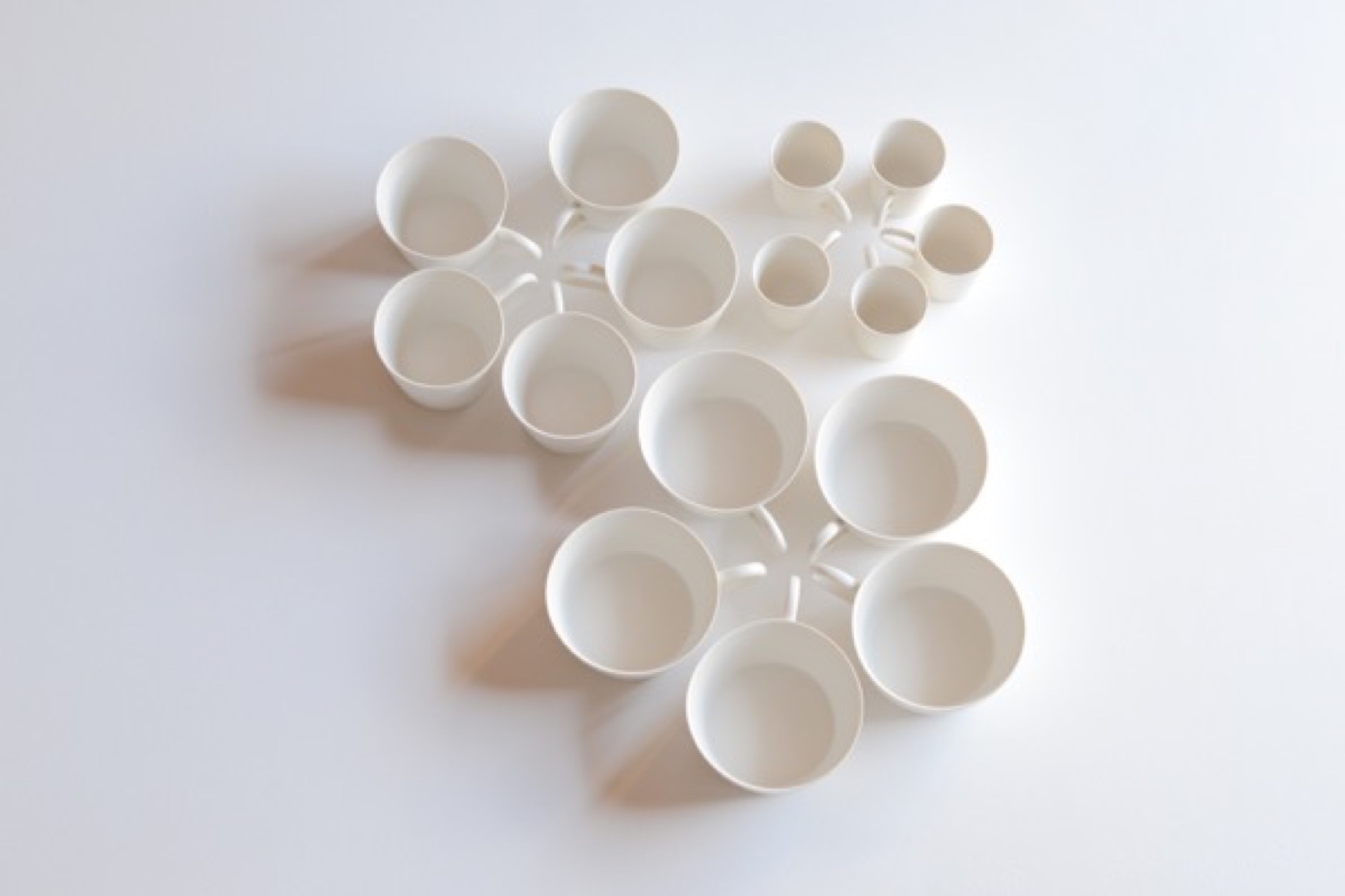
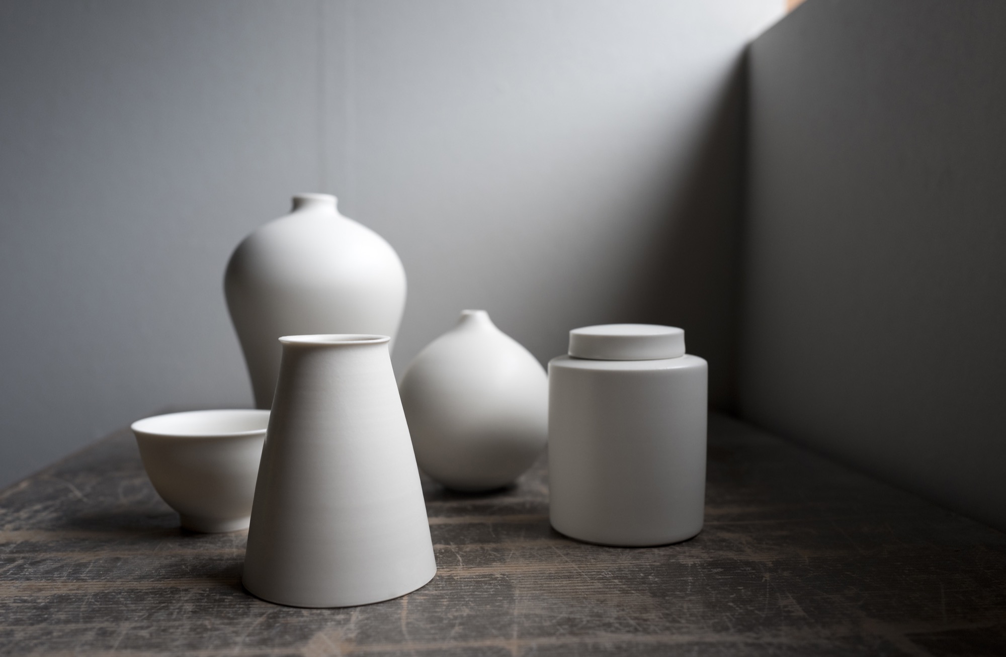
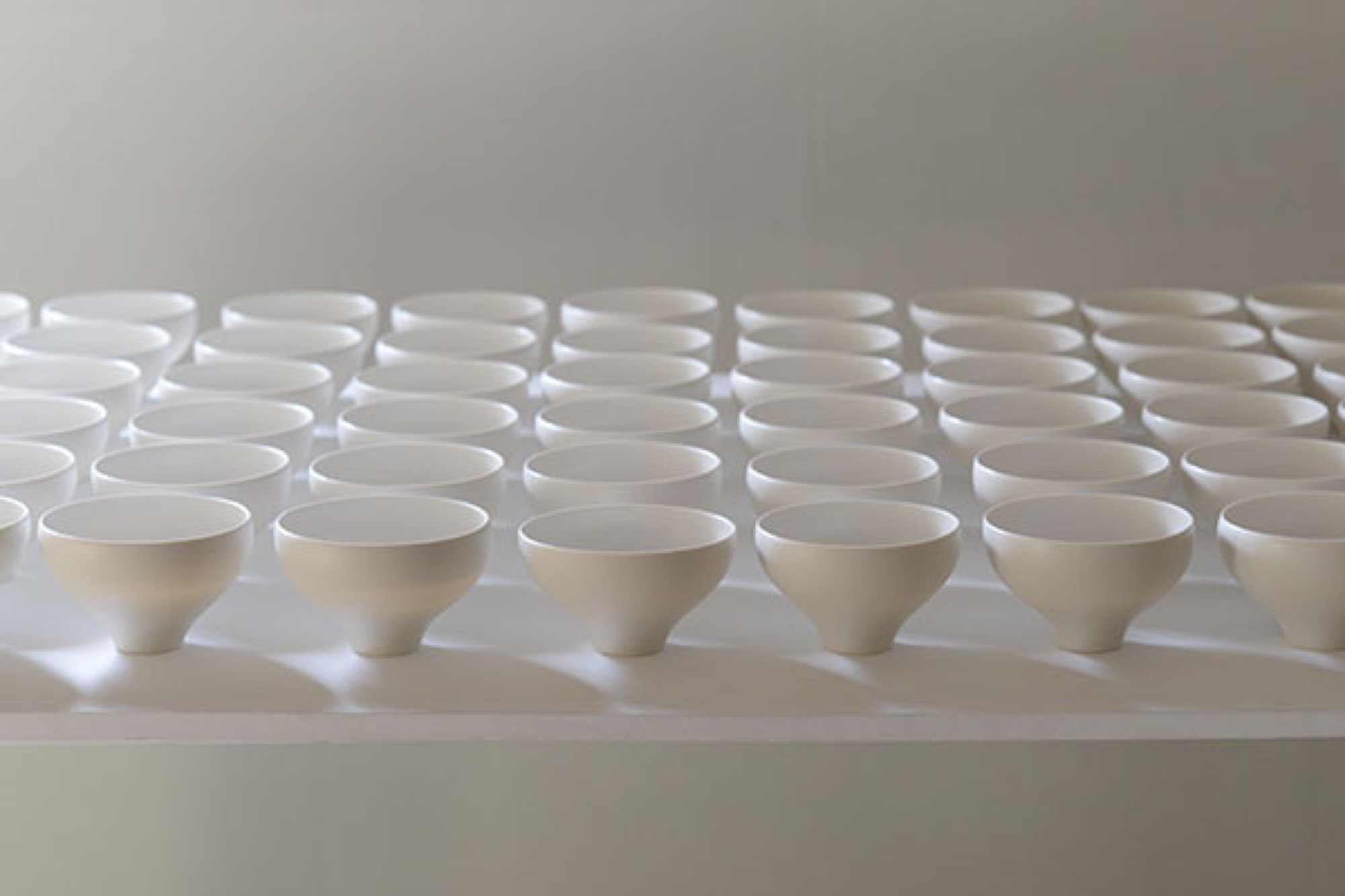
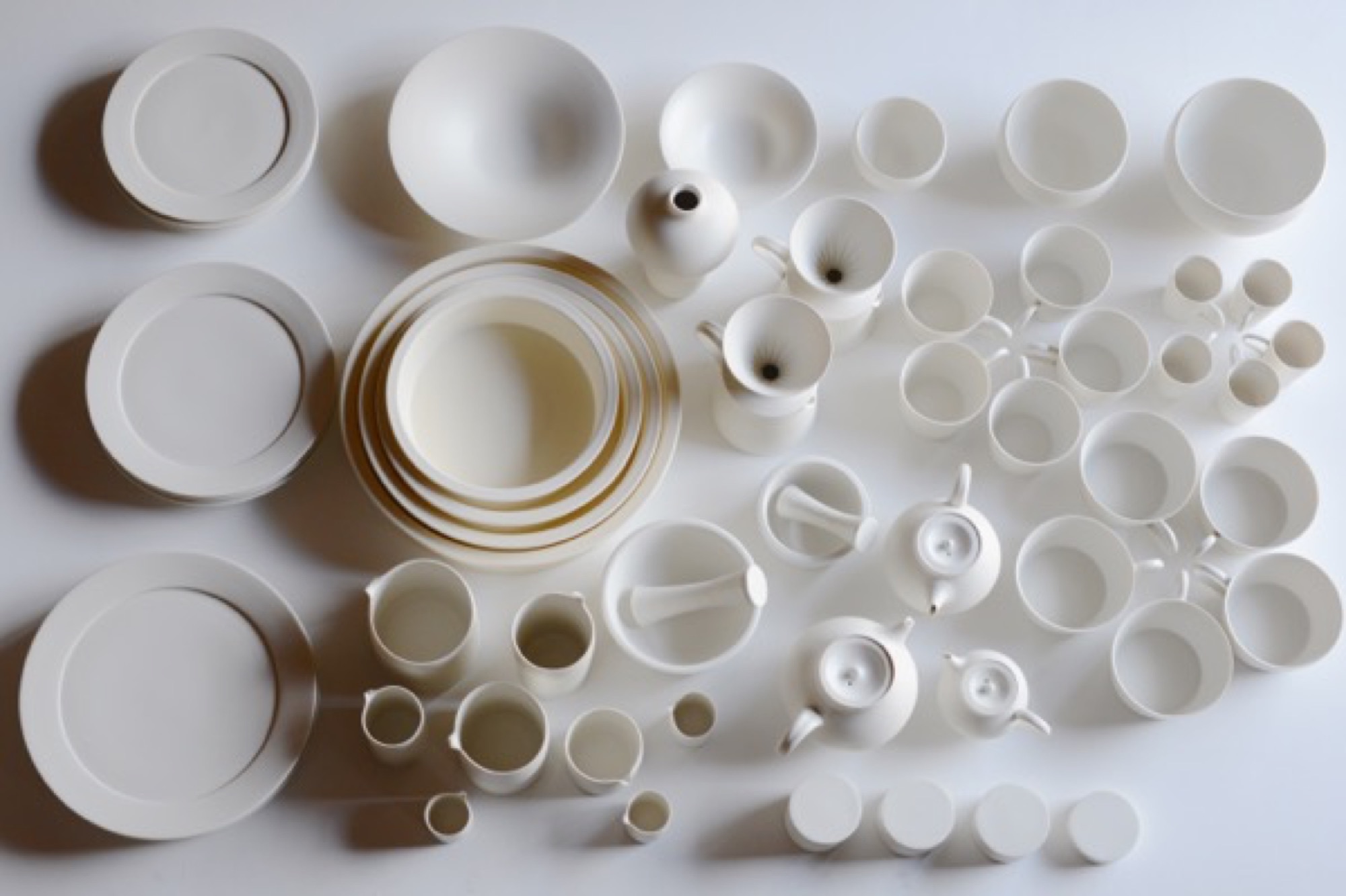
Lately attracting attention among collectors in Beijing, Shanghai, and Taiwan, Tetsuya shuns both wabi-sabi imperfection and Kenzan decorative exuberance. Everything he makes is to be used, mostly in the kitchen or at the table: tiny matcha urns with clinking lids, curved-belly flower vases, delicately spouted teapots, tiny soy dispensers, little round boxes. The pieces are finely lipped and polished to a supple smoothness; their creamy matte glaze begs to be caressed.
Tetsuya’s pottery has thrown off all temptation toward decoration. The potter’s goal, he says, is to remove as much information as possible from his ceramics, seeking pure functional forms, because “things that work give pleasure.”
"The potter’s goal, he says, is to remove as much information as possible from his ceramics, seeking pure functional forms, because 'things that work give pleasure.' ”
He studied in Kyoto, hoping to design cars, but when the economy skidded in the nineties, he shifted to graphics and ended up teaching product design (“how to make molds”) at the Ceramic Institute in Shigaraki, where he met Momoko and, on the side, learned throwing and glazing clay. By 2008, their house was built and he embarked on a ceramic career. He’s now in his late thirties.
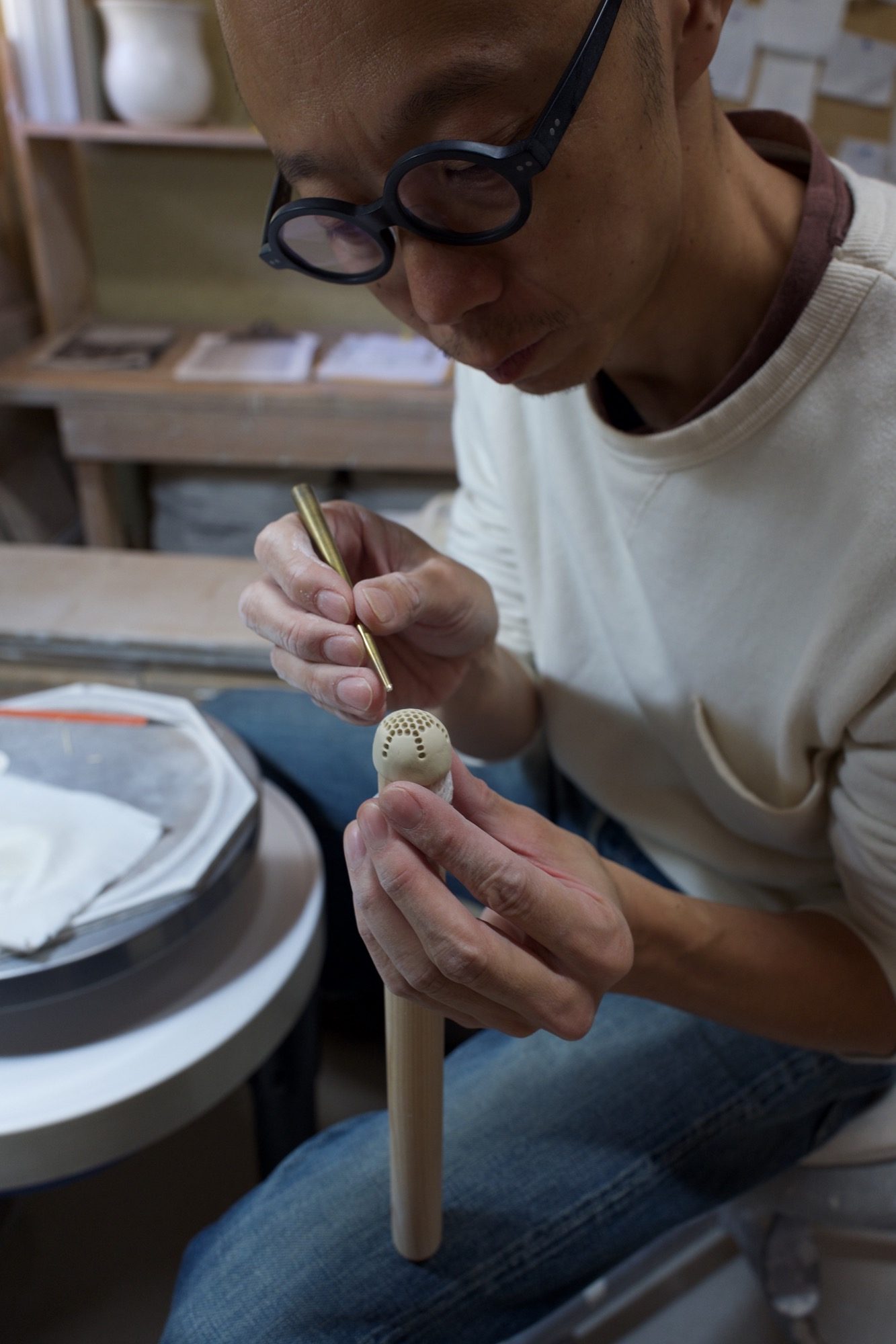
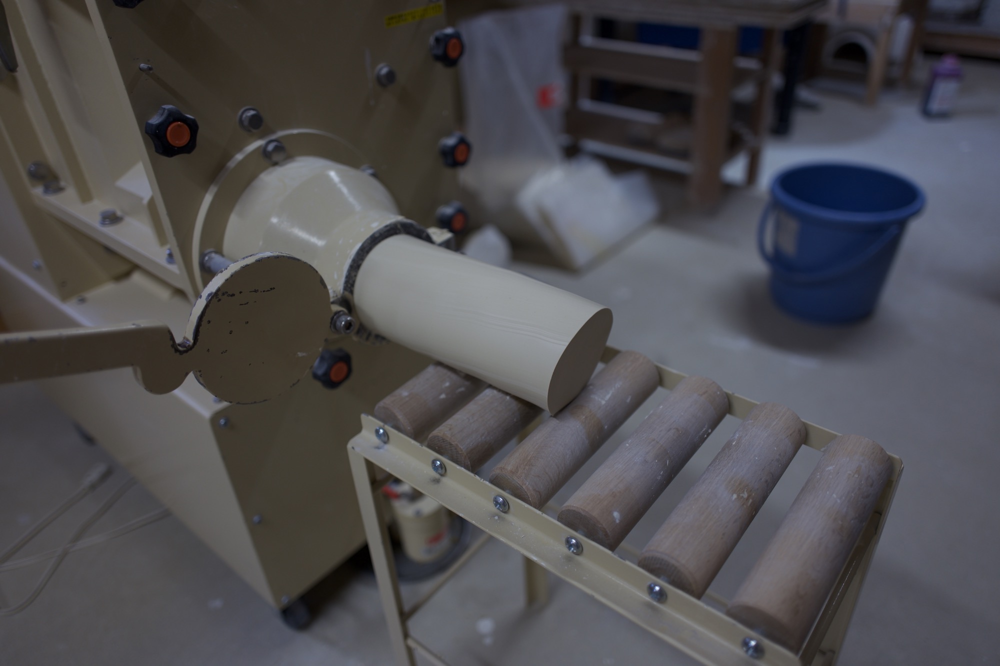
I watch him work in the studio, which has wheels for him and Momoko, as he forms and pokes a bit of clay that will become a tiny strainer inside a teapot. A few feet away, a large machine mixes clay while sucking air from it, then extrudes large, irresistibly smooth noodles of the stuff. The machine is close to the same color as the clay. Tetsuya grins and admits he had it custom-painted to obliterate the standard industrial green. A clue to his fastidious brain.
The pure cup and the pure bowl
Later, we sit at the long kitchen table and look at bowls and cups and teapots and plates and discuss this idea of removing information from one’s work.
“The pure cup,” Tetsuya says, through Momoko’s translating, “and the pure bowl: They can accept anything, become a vessel for anything. Cultural information is eliminated. And then the cup or bowl can be applied to any culture.”
“The pure cup and the pure bowl: They can accept anything, become a vessel for anything. Cultural information is eliminated. And then the cup or bowl can be applied to any culture.”
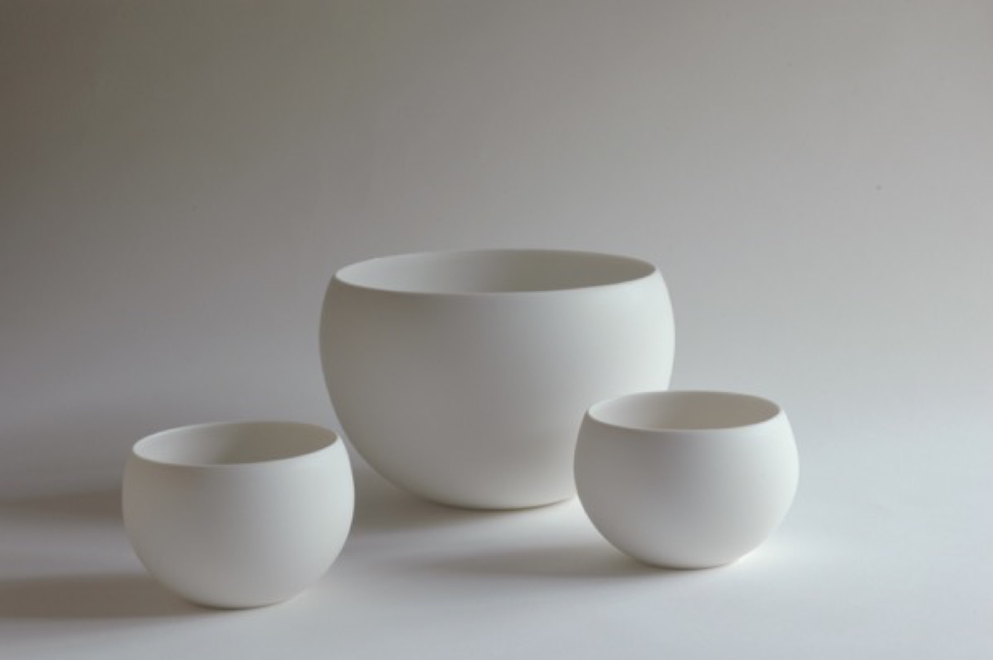
One may begin with the form of a traditional Japanese offering bowl. Decorative motifs are removed until it approaches neutrality. Eventually you “come down to the point where we can use it on our table, not for the gods’ offerings.”
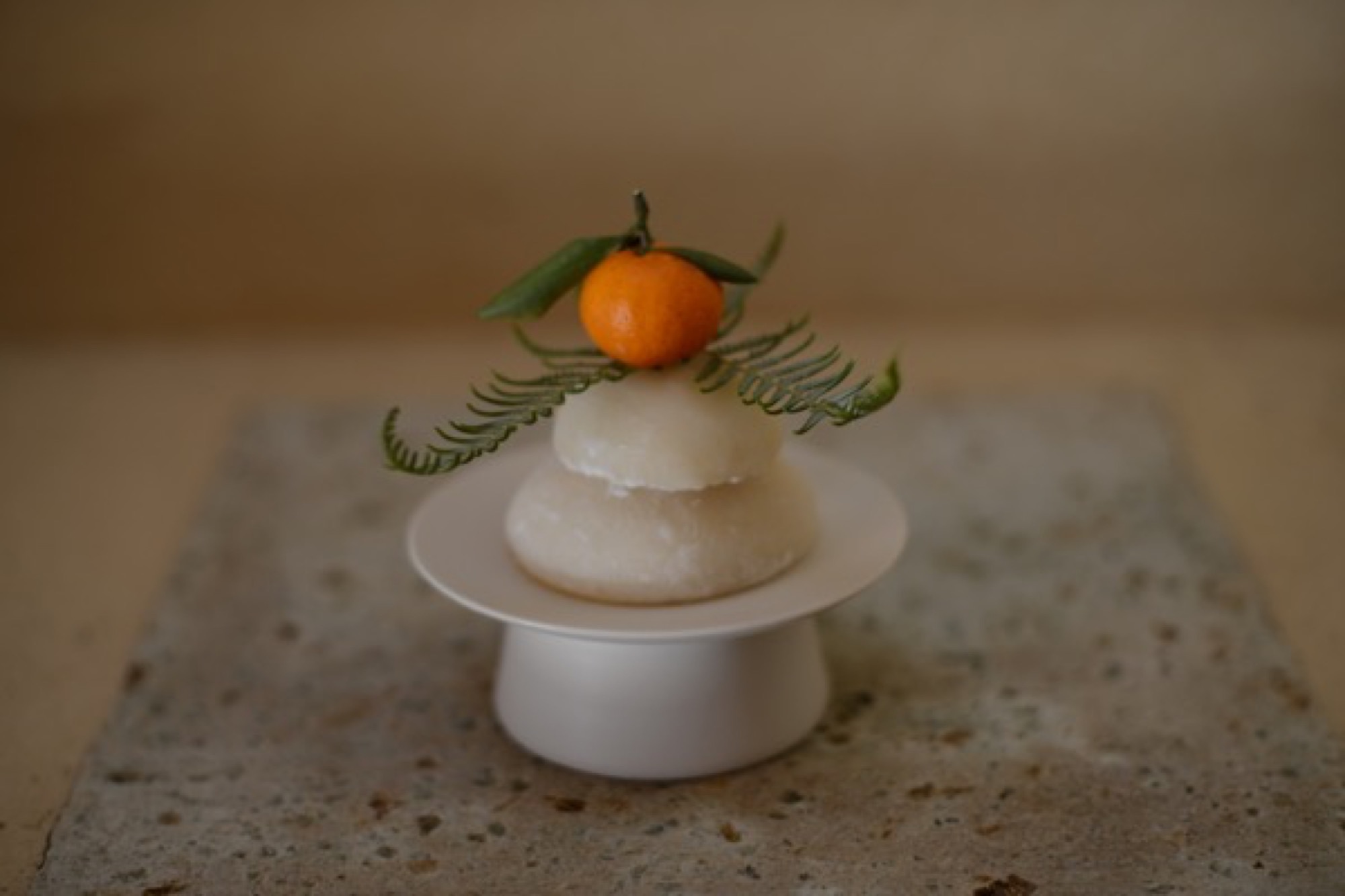
Momoko adds: “Tetsuya strips the bowl of the divine.” He produces smooth dinner plates as blank canvasses for food—altars, really. They’re used in fancy Osaka and Kyoto restaurants to showcase chef art. His works are unsigned, unmarked.
“Tetsuya strips the bowl of the divine.”
But cultural negation negates a specific culture, and Tetsuya says he has lately realized, when showing his works in China, that they are in some way indelibly, irreducibly Japanese. “I now feel that,” he says, “but I don’t have the answer yet about why I feel that way.”
The potter approaches, but never finds, ideal functionality. Tetsuya tweaks the ancient teacup form a wee bit from batch to batch, always seeking the right feel of cup in hand, the right curve of handle against thumb and finger. This lonely, incremental search for ideal form, endlessly repeated, is itself very Japanese.
The motivation is pleasure, however, not denial. Tetsuya and Momoko are exuberant foodies, and have found that their table-centric philosophy resonates globally through their gorgeous Instagram feeds, @otntty and @otnmmk, with more than 20,000 followers between the two for their pictures of utensils and food.
Tetsuya is also funny. He calls the clay mixing machine Mr. Hiroshira, “my only employee.” What about the beautiful industrial kiln in the next room, I ask? “No,” he says, “I work for it.”
Return to Kyoto
A few nights later, in Kyoto, my wife and I visit a little chocolatier and bakery called Assemblages Kakimoto, near the Imperial Palace. In the minimalist showroom up front I buy a box of orange biscuits enrobed in dark chocolate, each biscuit not much bigger than a postage stamp. Beyond the front space is a narrow, pretty room with a half-dozen seats or so against a counter, facing a tiny kitchen. We order chocolates and cakes and glasses of thirty-year-old palo cortado sherry. Two women to our right—the only other customers in the café—have come for the chef’s omakase dinner. With each course they look gobsmacked, enraptured by the treats placed in front of them. It’s beautiful food, for that is the Kyoto style. Each composition sits on the pale canvass of an Otani plate.
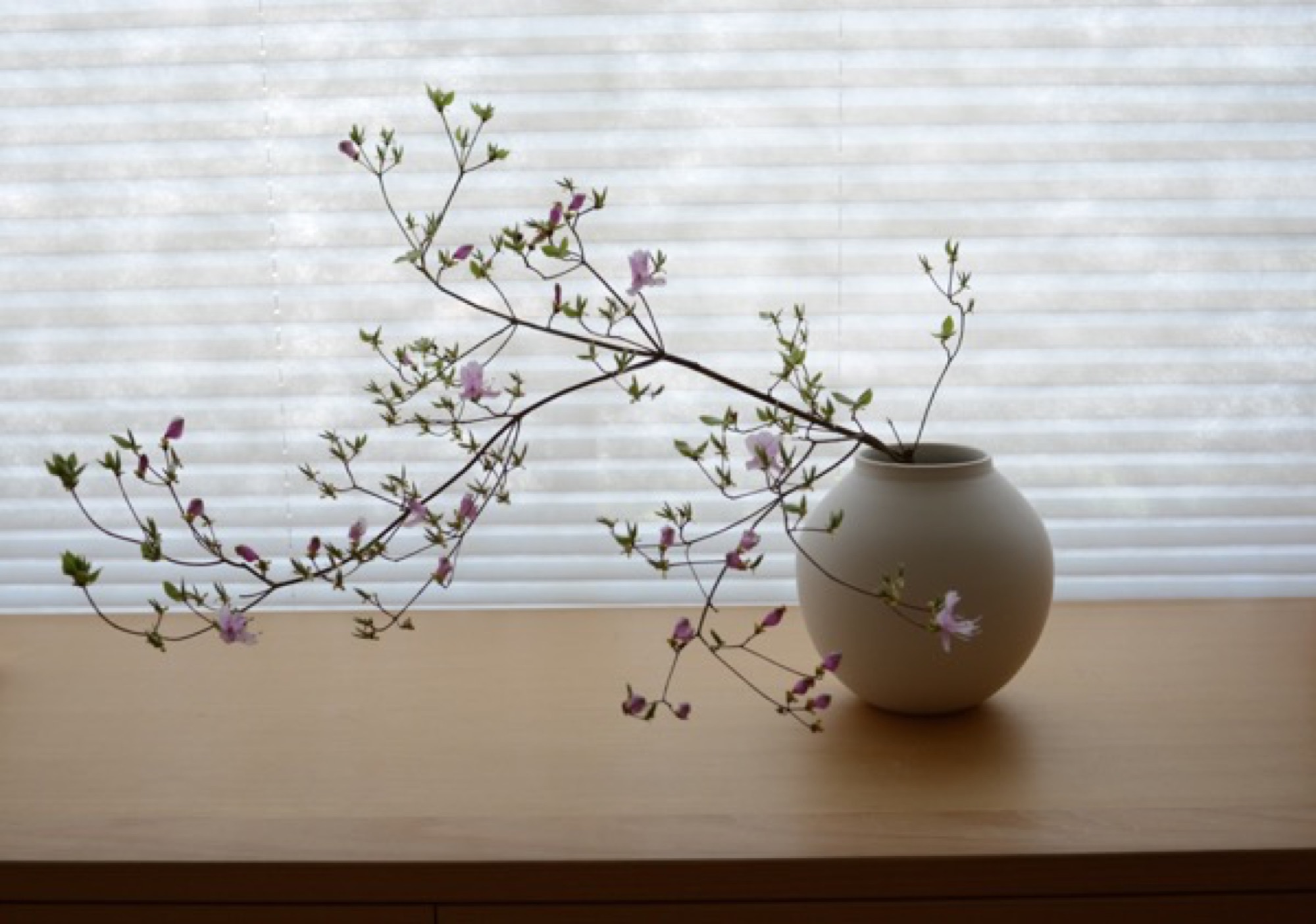
The entanglement of much fuss and no fuss that lies at the heart of many things Japanese is hard to describe, but when I palm one of the Otani pieces that we brought back from Japan, it seems to embody that contradiction. My favorite is a little round vase, the size of a tennis ball, whose satin smooth sides curve up to a sharp-lipped hole that’s big enough to accommodate the stem of a single bud. In weight and delicacy and touch and every other aspect the vase seems, to me, as close to perfect as it can get. It holds a lot of information about Japan. △
Mountain Minimalism—The Next Level
Emerging Boulder artist and graphic designer Adam Sinda contemplates what’s next in Colorado’s art and design scene
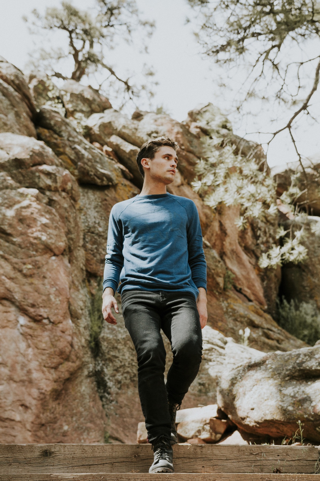
Emerging Boulder artist and graphic designer Adam Sinda spends his days working at Made Movement, an ad agency in town. But the Colorado native also loves to paint in his free time and has created original art for two Alpine Modern t-shirts—which he personally modeled for us during a photoshoot set in our own alpine backyard. When he’s not designing or painting, the twenty-four year old loves to get out on the trails and run, alone.

We caught up with Sinda at the Alpine Modern Café to talk about Denver and Boulder’s art and design scene and how Alpine Modern is pushing the envelope on what defines Colorado.
A conversation with trail-running designer Adam Sinda
AM What’s your creative process?
AS Typically, I photograph outdoors; landscapes or anything I am inspired by. Then I bring it back to my room and try to simplify the form as much as possible—and add color. I’ve been working with color, lately.
AM What was your path to becoming a graphic designer?
AS I got a graphic design degree from Western State Colorado University in Gunnison, but I loved to take oil painting classes. That was probably my favorite art class. Design to me is so restricting, sometimes. And walking into an oil painting studio, you can just be yourself and experiment and play and get dirty. Most of my world is making stuff that’s going to be sold, and when I am painting, it’s for me.
AM Meanwhile, you are a graphic designer at Made Movement...
AS Yes, it’s an agency, and we work with brands like Lyft. Typically, we do everything from apps to web banners to illustration.
AM But you also do your own designs, and you have created art for Alpine Modern...
AS When I find a brand I can relate to and I want to be a part of, I jump in, anytime. I really feel Alpine Modern meets my ethics and aesthetics. I was working with photographer Garrett King, and we were just getting out there and going for hikes, just living in the moment.
AM You have designed two t-shirts for Alpine Modern. What makes that medium interesting to you?
AS The fact that other people are going to be wearing it and expressing themselves with it. Though they may never know who made that t-shirt.
AM What inspired those two particular designs?
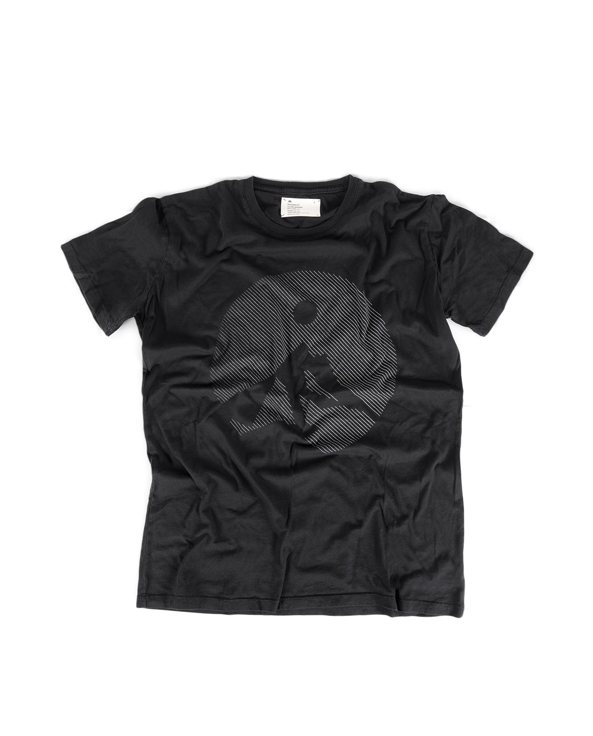
AS For the Circular tee, what was inspiring me at the time was Alpine Modern’s Instagram. The motif is an abstract pulled from a photograph, and I started sketching and minimizing what I saw, just keeping it clean, simple, modern.
The second tee was the Typography t-shirt. It’s always fun to organize type in a particular way. I traded a mood board with the Alpine Modern team, and that shirt evolved from there.
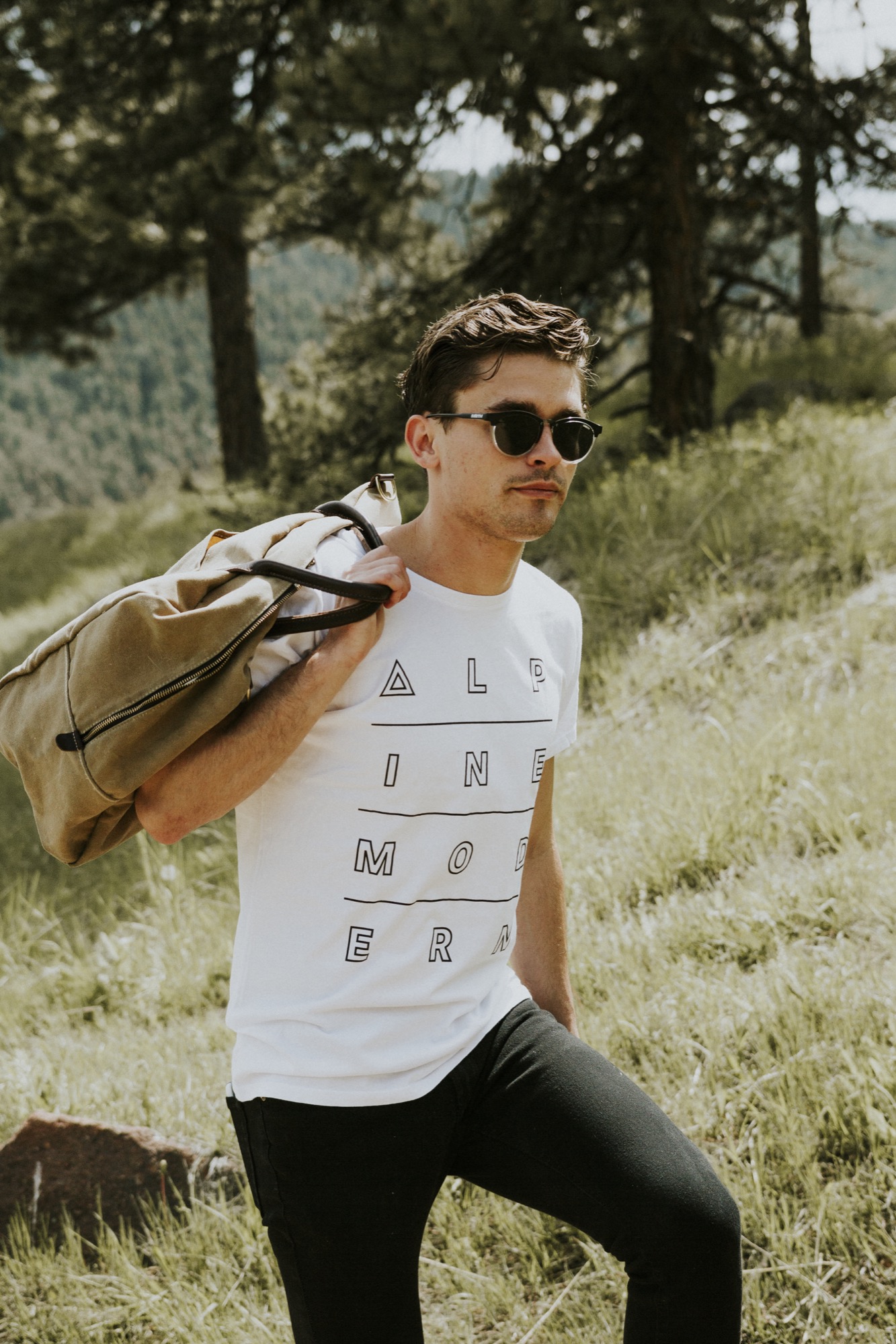
AM What does it feel like to now see your shirts at the Alpine Modern Shop on Pearl Street?
AS It makes me feel good, happy. Mainly, it makes me feel like I am part of a culture that’s growing right now. A shirt is a simple thing. People build buildings, and people build houses. But sometimes it takes t-shirts and art to make you feel part of a culture. When you’re a developing artist, what you strive for every day is just to be heard, whatever medium it is.
“A shirt is a simple thing. People build buildings, and people build houses. But sometimes it takes t-shirts and art to make you feel part of a culture.”
AM What’s your message you want to be heard?
AS Wherever you are, when you are in a very attractive scenery in the mountains or in a landscape, you’re backpacking somewhere in the woods, take advantage of that moment and remember it because when times get rough, it is nice to pull from those images, and that’s what I would like to say, live in the moment when you feel it’s right. Take a mental photograph.
AM You say your Alpine Modern t-shirts makes you feel you are part of an emerging culture...
AS Right now you can see Denver developing this art culture. But to be honest, I think it is still refining what it wants to be. And Boulder has a huge opportunity to be a part of what downtown Denver is doing right now. And I think Alpine Modern can play into that world and really push the envelope on what Colorado is seen as. It’s cool to see Alpine Modern developing that image right now and really altering what artists are doing today.
AM Describe the Colorado art and design scene for someone from perhaps Berlin or Japan, who has never been here.
AS Art and design here is currently very minimal, very clean, but there are sparks of an identity evolving, and I think we are going to see a shift here. Clean and simple is fun, but what is the next level? What’s after that? Do we start developing some play with color or abstract forms? What’s that next shift? Because if everyone starts doing minimalism in Colorado, you will start seeing it get stale. I think in Colorado in general, we want to create a better culture, we need to spark something a little bit stronger, but I think we are still figuring out what that is.
AM Where will your next spark come from, building on that clean mountain minimalism?
AS Im really inspired by the 3D world right now. It’s fun to take these minimal objects and shapes and use 3D software programs to see behind them and see around them. A lot of designers these days just use Illustrator and very flat design. If you can design and know what’s behind objects, you start to see different light and that’s really interesting to me right now, so I’ve been experimenting with those programs.
AM What is the connection here to being in real landscapes and real nature? Hiking in the mountains is this quintessential three-dimensional experience because you do go behind the trees and behind the mountains and behind the next bend...
AS You’re spot on. When you’re out there with your friends, you’re moving towards an object and you’re reaching a goal. You are achieving something while you are hiking, going from A to B. And it’s fun to see how our designs are going to change with time. We have these VR headsets come out, and it’s gonna be fun to see how 3D plays into Colorado’s art culture. Colorado is such a good place to be right now as a graphic designer and an artist in general, and it’s just going to be even better.
AM What do you do when you are in the mountains?
AS I’m a huge runner. I used to compete in college, in the steeplechase. It has always been my escape. You just put on your running shoes and short shorts and get out the door and run. I love hiking, don’t get me wrong, but there is something cool about just going out and going for a jog by yourself for an hour and then come back and feel refreshed and ready to go. The cool thing about Boulder is you are really never that far away from a really sweet trail.
AM How has your love for the mountains influenced your design work?
AS Greatly. Growing up here and having lived here my whole life, seeing the mountains is comforting. And I think the they say a lot. △
The Building Friendship
Friends since preschool and sharing a love for design and the mountains, the founders of MTN Lab, an experimental furniture and art studio in Colorado, have always been building things together
Harris Hine and Rudy Unrau have been best friends since preschool. Now both 27 years old, they have founded MTN Lab, an experimental furniture and art studio in Colorado. Growing up in Boulder, Colorado, the lifelong friends have been building things together since they can remember—skis, bikes, random projects. But it wasn’t until spring 2015 that the idea for MTN Lab was born. Both back in Boulder, Hine and Unrau began showing sculptures at Studio Como in Denver’s RiNo art district at the time. “Getting in there is what really materialized the company,” Unrau recalls. “That’s when we came up with our name and went from just building stuff to actually focusing on a business.”
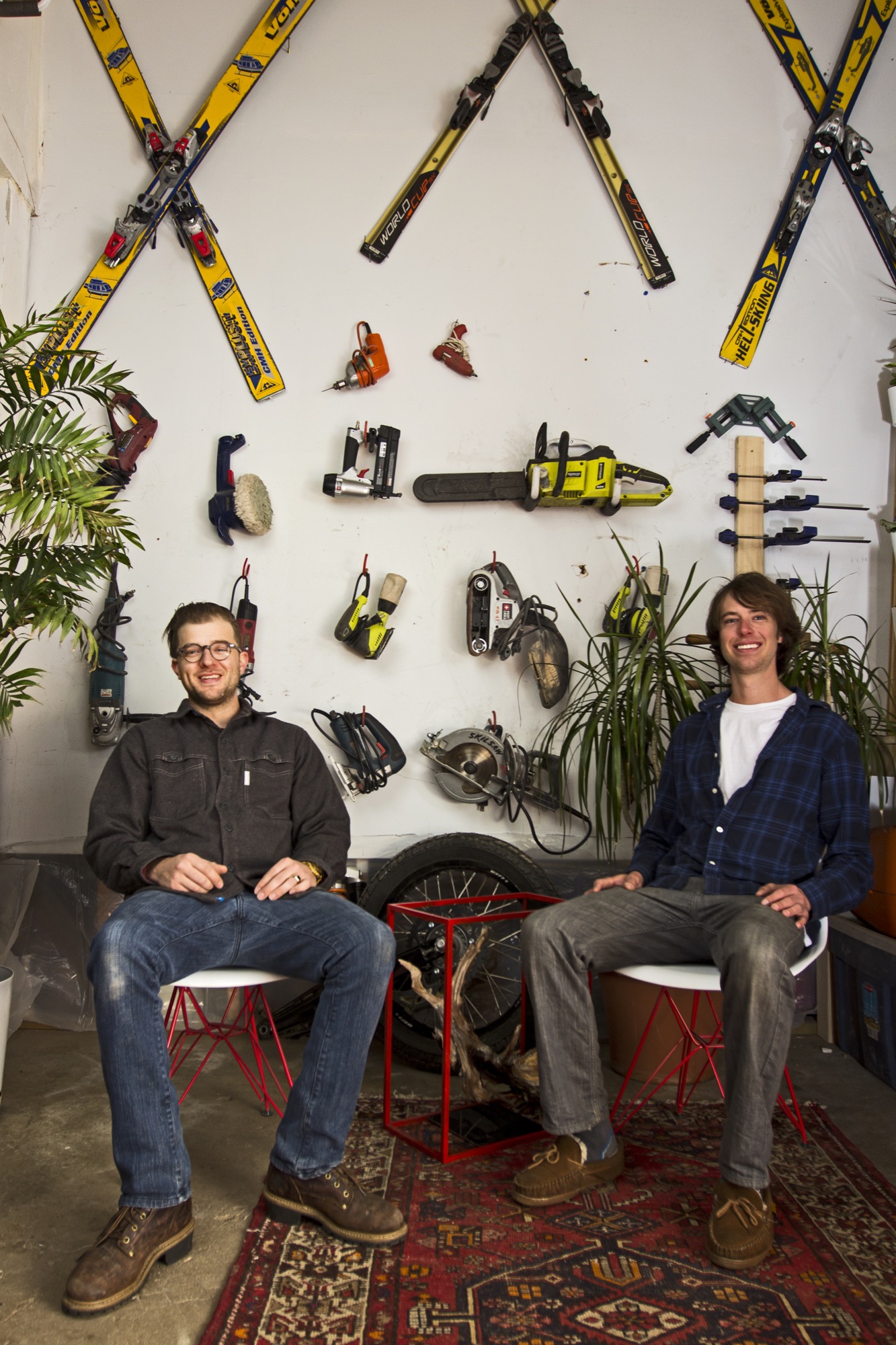
The two men, both quiet and reflective, share an ardent love for design and the mountains. Yet, they come together at MTN Lab—at the intersection of art and adventure—from opposite directions: Hine a trained designer and woodworker, Unrau a former professional mountain biker turned woodsman fighting wildfires for the Forest Service.
Harris Hine
Harris Hine grew up profoundly influenced by his father, Vienna-born modernist architect Harvey Hine, who founded HMH Architecture + Interiors in Boulder.
“I’ve always been torn between the design side of my personality and just wanting to be in the woods,” Hine shares. He went to school for design at Pratt Institute in Brooklyn before moving from New York City to Portland, Oregon, where he worked as industrial designer. “I didn’t find any fulfillment doing other people’s projects, and I didn’t really like the mass production side of product design,” he admits.
All those years, Hine pined for the woods, where his old friend was.
Rudy Unrau
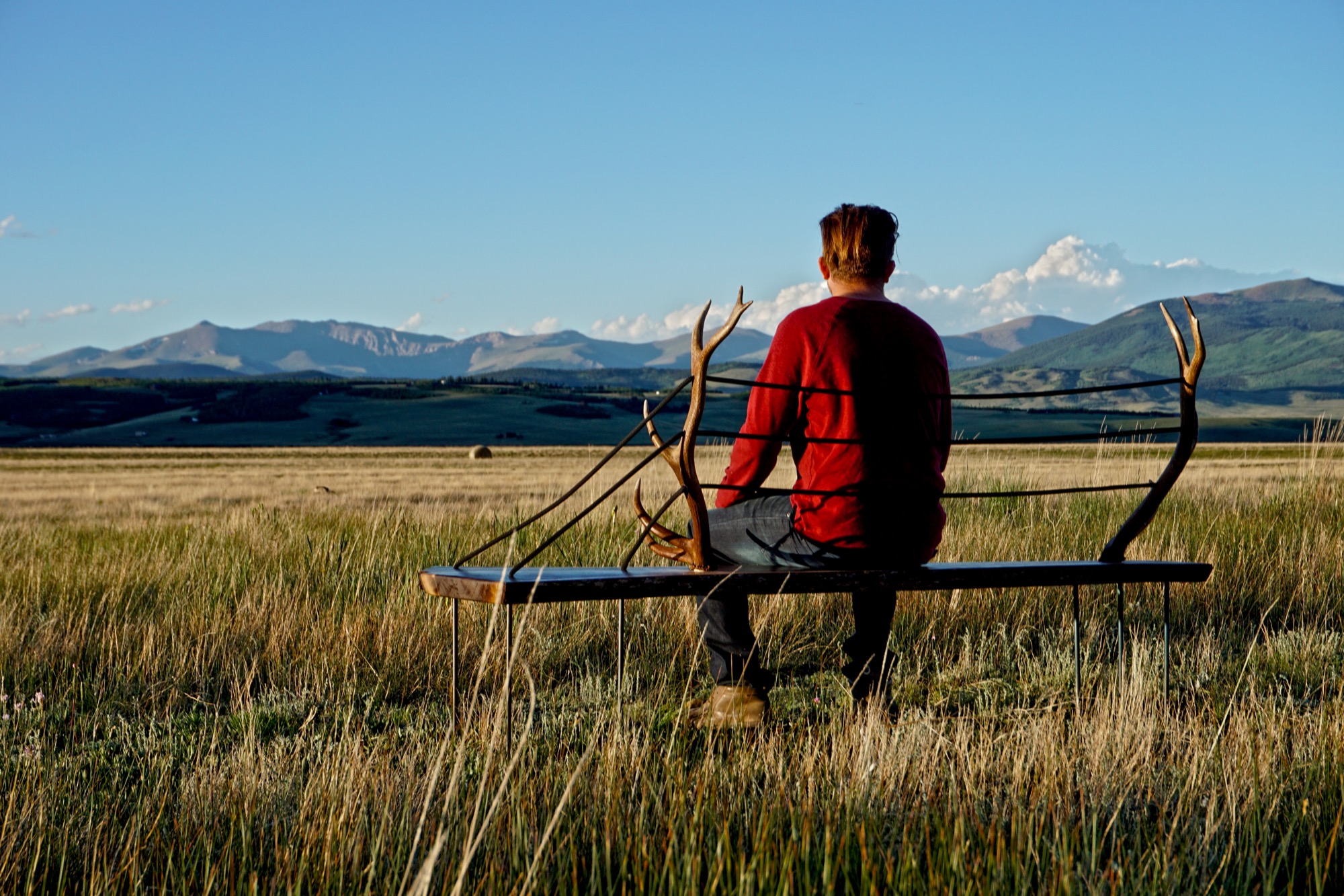
Unrau, while attending college in Western Colorado, signed on with the United States Forest Service. “I was on track to becoming a smoke jumper, working for a helicopter crew down in Durango,” the long and lanky woodworker recounts. “It was a great setup because you work a ton in the summer, and then you get winter free to do whatever you want, like ski and move to Canada.”
Throughout those years, Unrau had been harboring the desire to return to making art. “Seeing the things you see when you get to fly around and travel the US and go to all of the mountain ranges... I had ideas emerge to work with the trees that had been burnt or partially burnt in fires because they get so twisted and cool.”
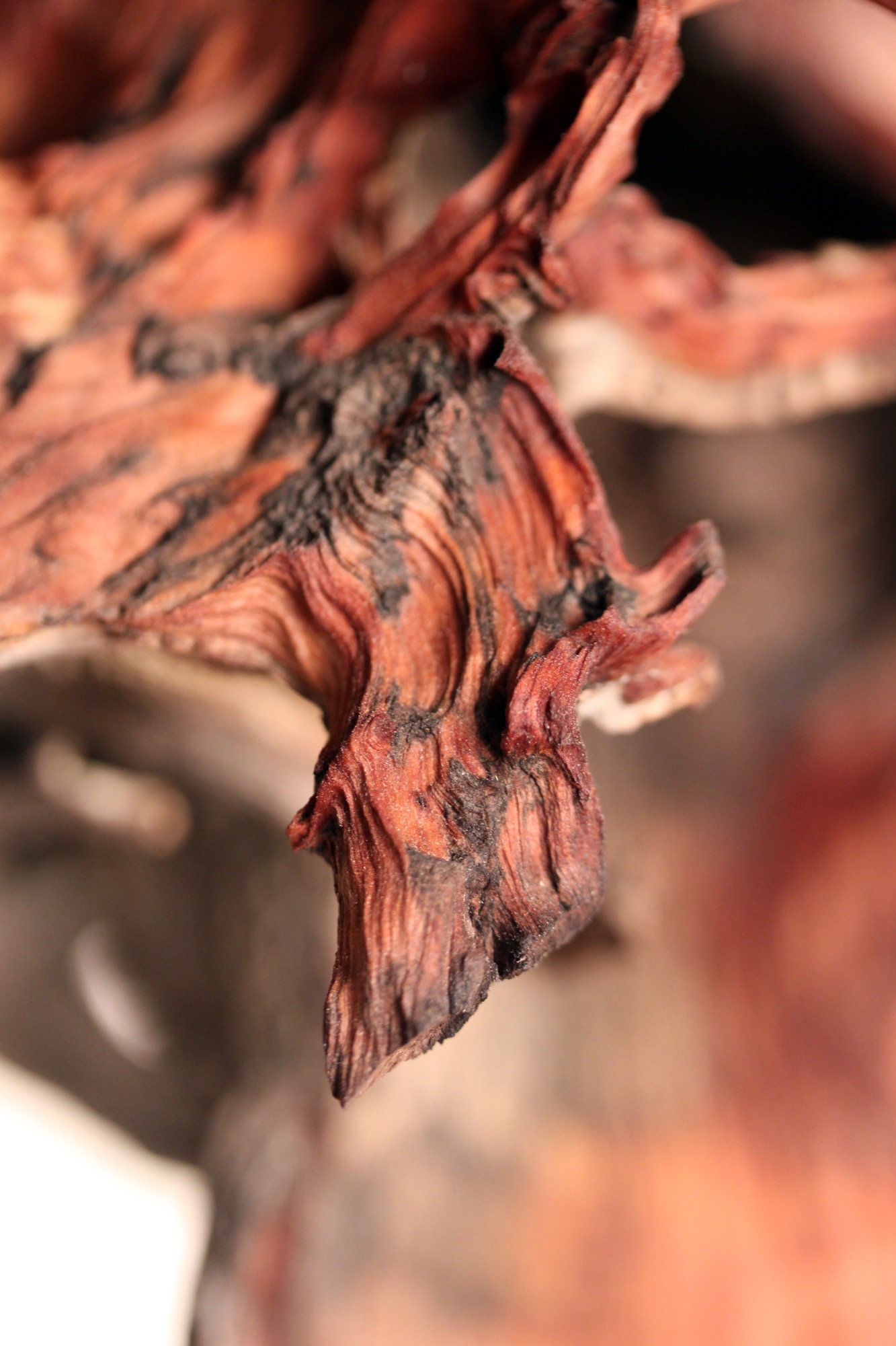
"I had ideas emerge to work with the trees that had been burnt or partially burnt in fires because they get so twisted and cool.”
Joint adventure up north
At last, one pivotal winter Hine and Unrau moved to British Columbia together to ski. Their close friendship and mutual influence would impact each man’s path. “Rudy was all in the woods,” Hine remembers, “Living together pulled him back into the design world and brought me back into the woods.”
Unrau agrees: “I’ve always been at home in the woods. Growing up, I really wanted to pursue mountain biking, so I raced mountain bikes professionally for quite a few years.” After the athlete got “a little bit tired” of mountain bike racing in world cups, he focused on skiing.
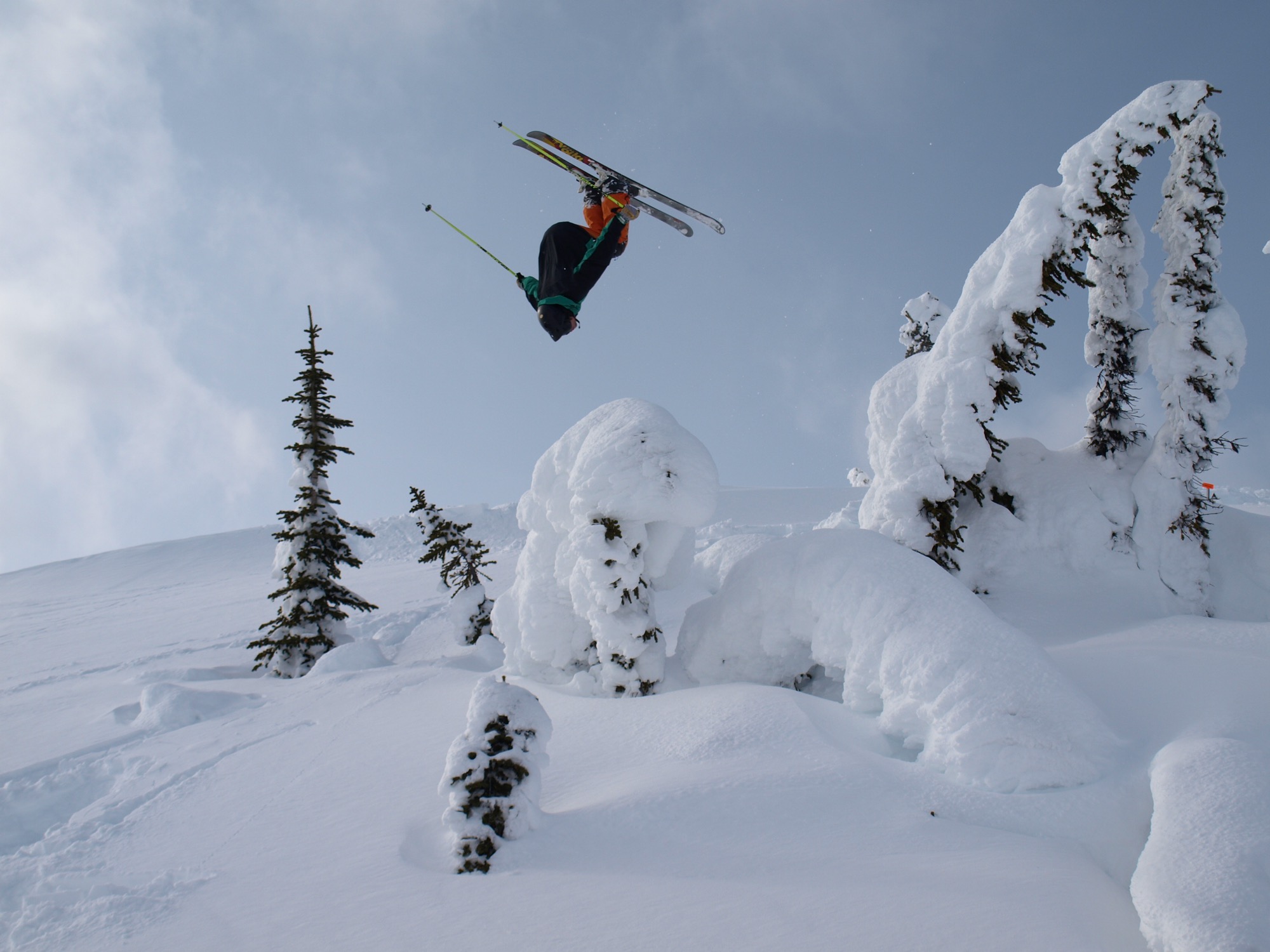
Skiing in Canada was good fun. Winter gone, however, Unrau planned to work another fire season. The outdoorsman envisioned himself carrying on that seasonal rhythm of demanding service and wild adventures in the snow for years until he had and his friend had their fill of youth and independence. “And... I crashed paragliding,” he tells, falling solemn all of a sudden. “I broke my back and almost died and spent half a year recovering.”
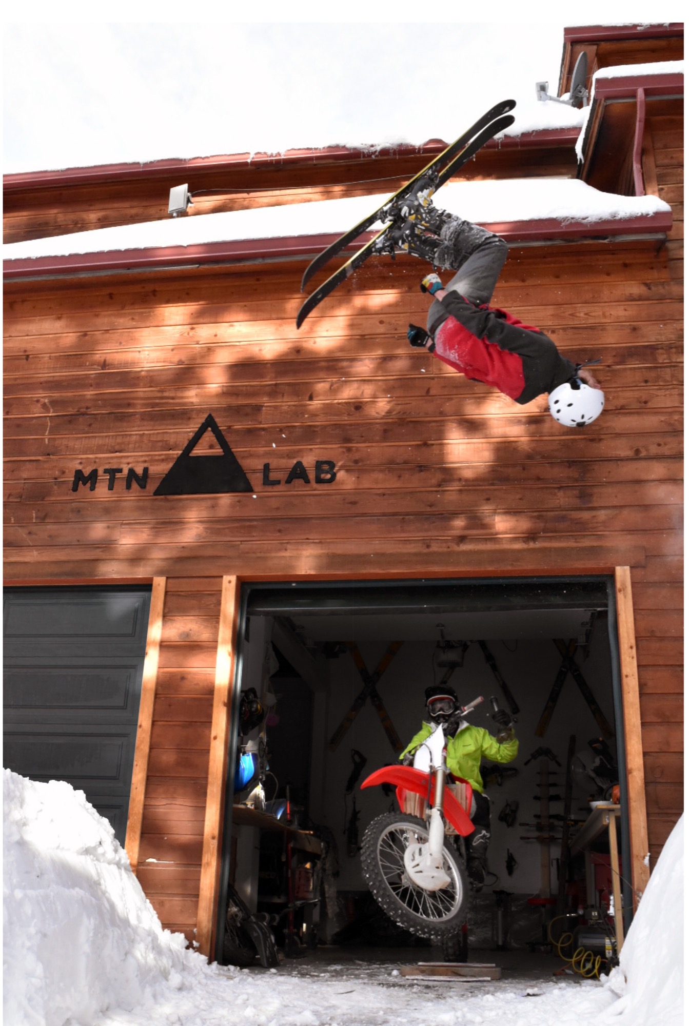
His loyal friend by his side, Unrau needed to reevaluate his future. “I realized, I wouldn’t be able to do fire again,” he says. “And then it was pretty natural the way MTN Lab came together—us getting our shop set up to where we could build.”
The MTN Lab process
Starting with sculptures, the duo soon began venturing into furniture. Their vision is to grow the Conifer studio into an art collective, with more creatives joining them. They are even planning to build a tiny house to accommodate visiting artists and designers.
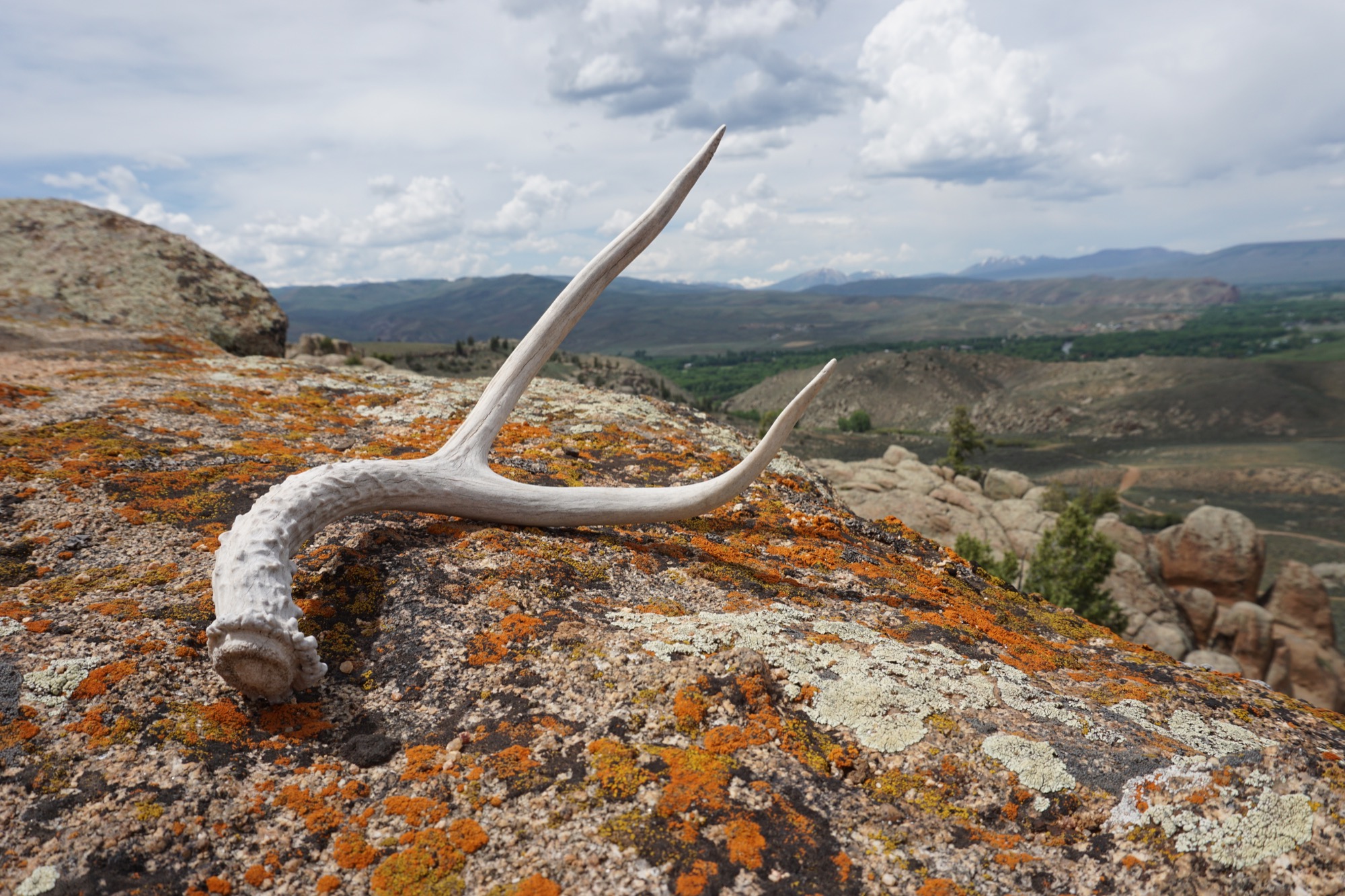
MTN Lab is as much a concept as it is a company. “Our process is the most indicative of what we make,” Hine explains. The founders source all of their materials themselves in the Colorado mountains. “We quarry our own stones to carve and collect our own wood.” Like it was for generations of makers in the mountains before them, MTN Lab’s workflow follows nature’s rhythmic swing. “Right now it’s the season for us to go get river stones because the flow just came down,” Hine tells me, when I sit down with him and his partner on that warm day in early September. “And we are doing antler stuff because we found a bunch of Elk sheds. That’s this flow that we follow.” Adds Unrau: “Our company is trying to do the whole process from sourcing, getting our materials, designing it, building it ourselves, photographing it ourselves.”
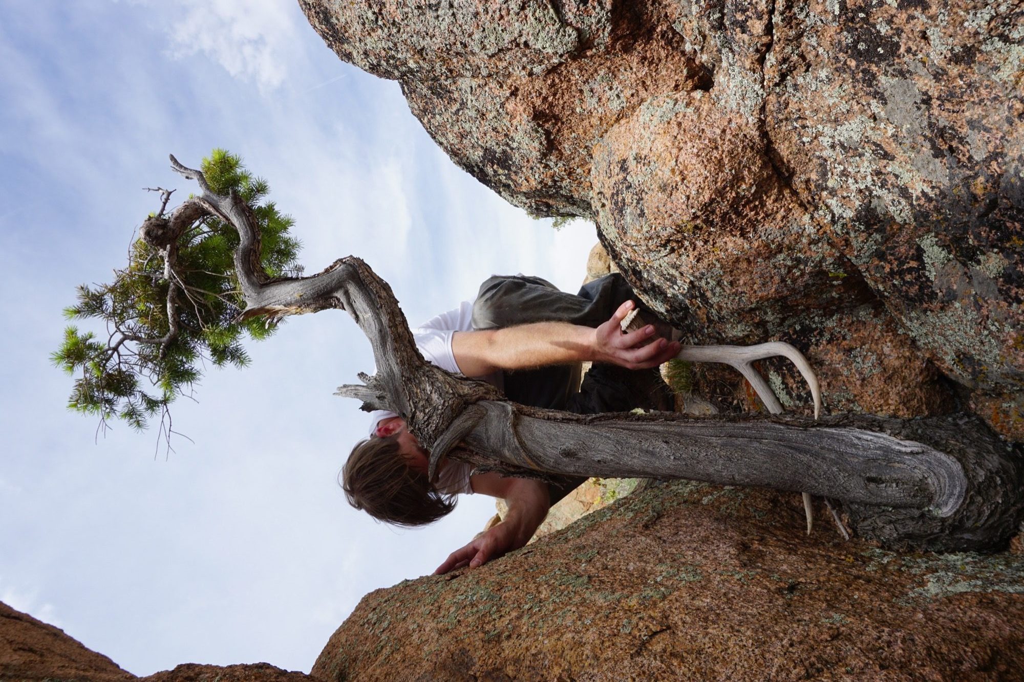
The friend believes having grown up in the mountains is what motivates them to see the entire process through, from beginning to end. “Spending all of your free time in the backcountry—you’re just so inspired by what you’re surrounded by,” Unrau says. “Initially, we were out there to ski, climbing to ski. We were dirt-biking. But when you spend that much time out there, it altered our perception of why we were there. And now it’s awesome because we get to ski, but that’s not the whole part of the process. The ski is the vessel for finding the materials—as well as the inspiration.”
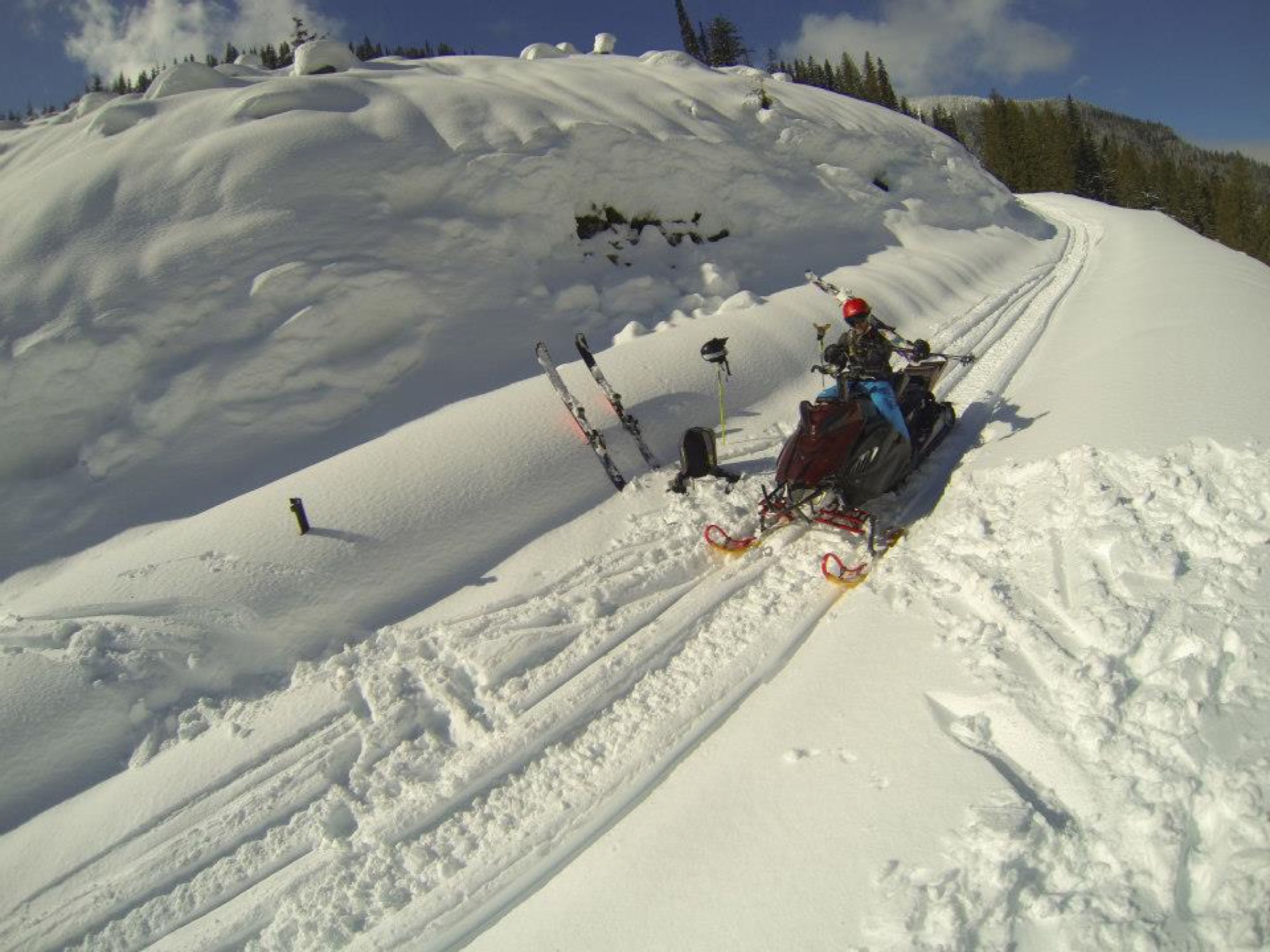
“The ski is the vessel for finding the materials—as well as the inspiration.”
Connecting nature and art
“I’ve always liked minimalist design, and I rarely see that done with natural materials,” Hine says. “You look at Bauhaus stuff, and it’s very industrialized. My dad being the modernist he is, half of me is always striving for that simplicity. But then there is the other part of me... the Colorado guy. And I see these cool pieces of wood and antlers and it naturally merged. In college, I was more on the industrial, clean-cut metal side of things, and my style has evolved more and more into a hybrid of rustic and modern.”
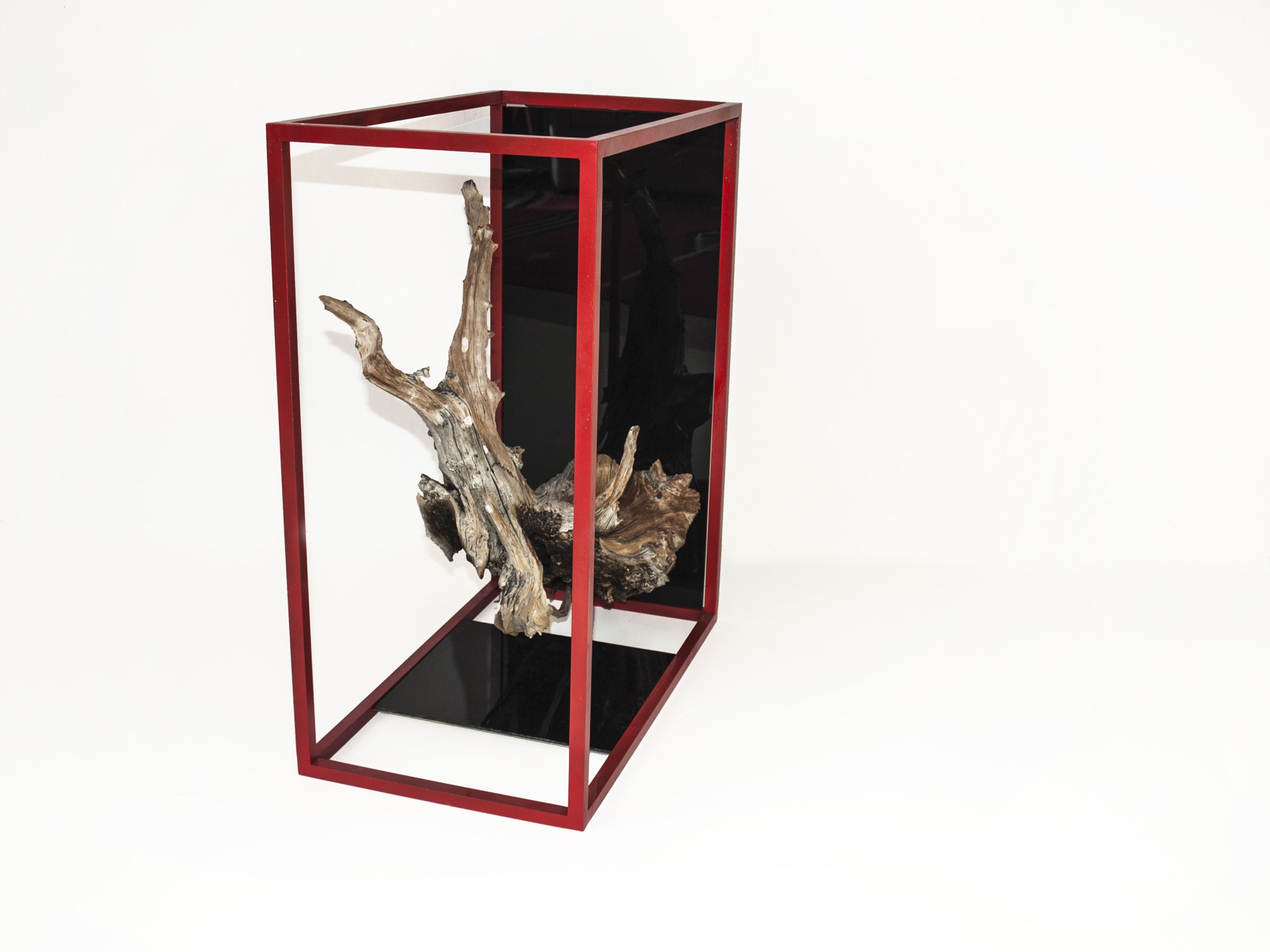
Unrau, for his part, never earned an art or design degree, nor does the lack of academic study in the field limit him in his current work. “We really do our designing when we’re out in the woods. We don’t sit down in an office to draw. We see the material, and the material almost dictates its design.”
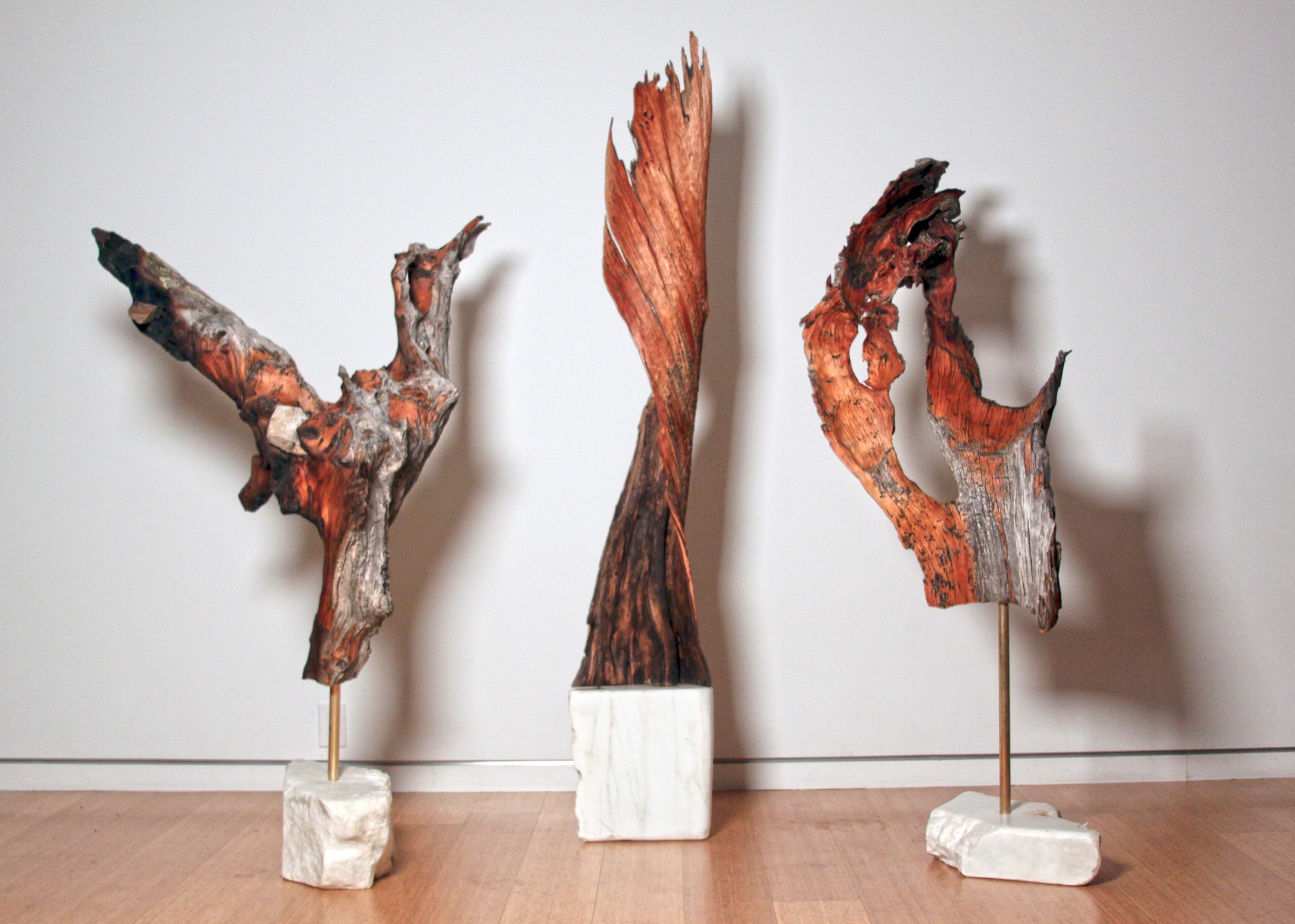
They usually know right away, if a piece of wood they come upon in the forest will transform into an art sculpture, a table, or something else entirely. Back at the studio, they combine found pieces of wood or elk shed with marble and often with contrasting metal. The final artwork or furniture piece comes together like a collage. While the sculptures are never drawn out, the furniture generally is. “We design our table bases, draw them by hand. Sometimes, we bring it into CAD.”
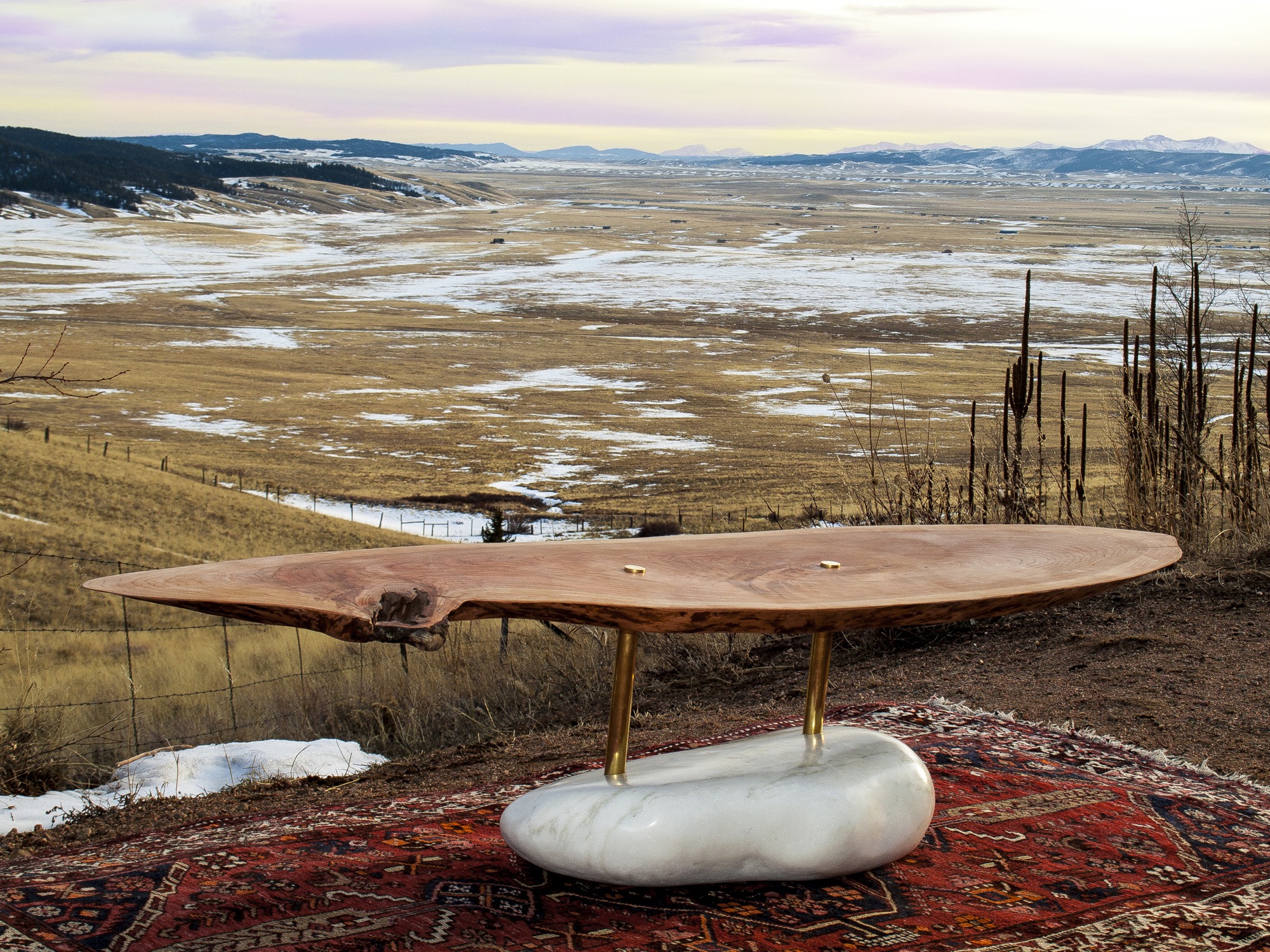
The day I met up with Unrau and Hine, they had come down from their studio above 8000 feet to deliver a piece of art they made for the Boulder Museum of Contemporary Art. “We had this mobile,” Hine begins, chuckling, “And then Rudy dropped it on the staircase, and we were like ‘Oh, no, we’re so crushed. And we had to quickly build it a second time yesterday, and it came out eight times better than the first. That process isn’t always easy to rely on, but sometimes when you make it again, it’s better. This is how we continuously design.”
Speaking about the synergy between Colorado’s magnificent nature, rich history and tradition, and progressive modern art, Hine notes that he is profoundly influenced by the stone carvings of American artist and landscape architect Isamu Noguchi. “It’s that blend of leaving these big natural boulders and polishing one face of it.”
Rustic designs with wood and stone are ubiquitous. “But it’s hard to find someone who has done them simple enough so that these materials individually speak for themselves,” hine says. “Antler furniture is really something we have been experimenting with, because it’s hard to find a simple antler-anything. All the chandeliers are the same hunter antler cluster. And all of a sudden, you are appreciating the simplicity of the singular antler as a sculptural element. That’s what makes it alpine modern, and not just alpine.”
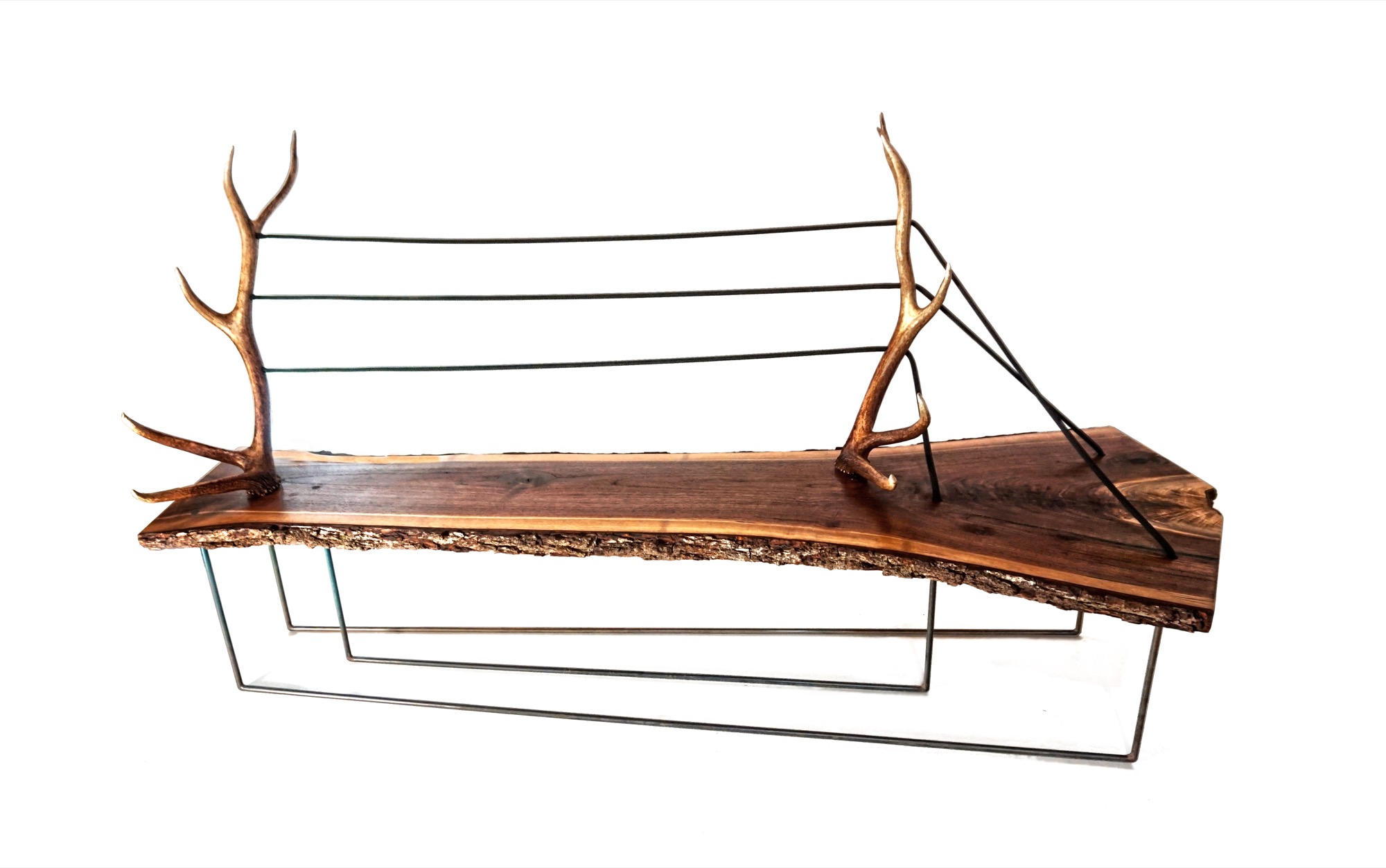
“And all of a sudden, you are appreciating the simplicity of the singular antler as a sculptural element. That’s what makes it alpine modern, and not just alpine.”
A modernists at heart, Hine still looks to the arts and crafts movement for inspiration. “Not stylistically but the whole concept of it is huge, especially since my education is in mass production and industrial design and product development. And going back to actually hand-building one-off pieces from the found materials we use, you can’t really build the same piece twice. It’s almost like we’re in an arts and crafts revival, which is weird for me because that’s the antithesis of the Bauhaus influence, of going from craft to industrial production.”
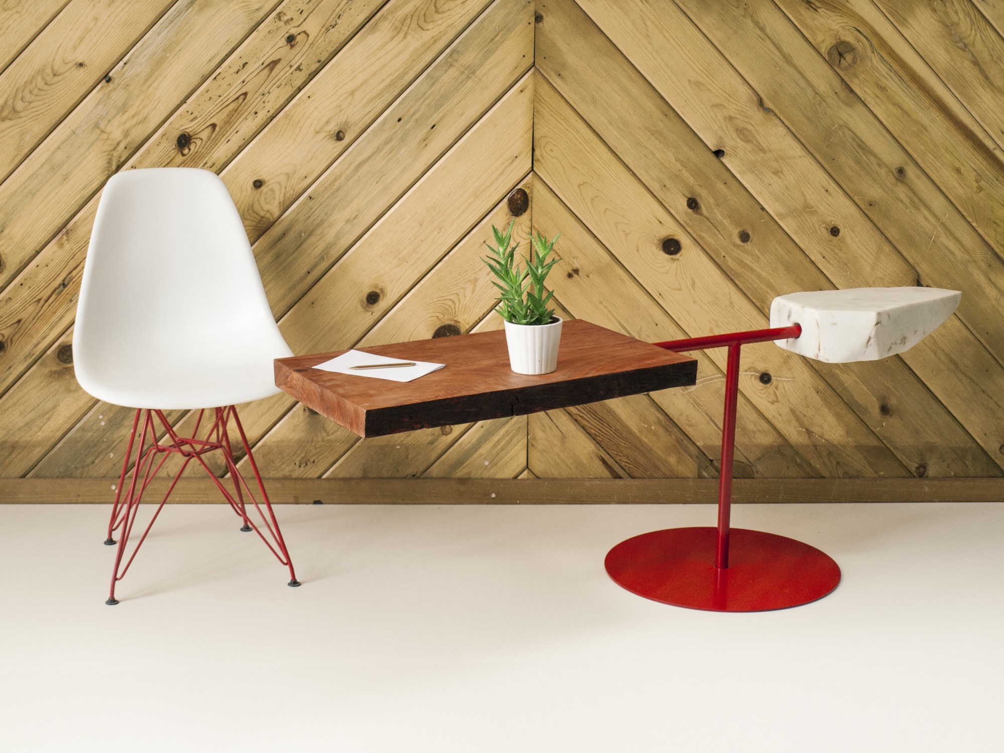
Our conversation later on reveals that the two 27 year olds are somewhat of an antithesis, too—to their fellow millennials. The Internet, they admit tittering, is their shortcoming. “Neither of us really enjoys social media, self promotion, or even doing the sales part,” Hine says. “It’s the cliché artist who doesn’t sell his stuff. We just are either in the woods or in the shop. It never feels like were working.”
MTN Lab projects
Each MTN Lab piece embodies a story of adventure and friendship.
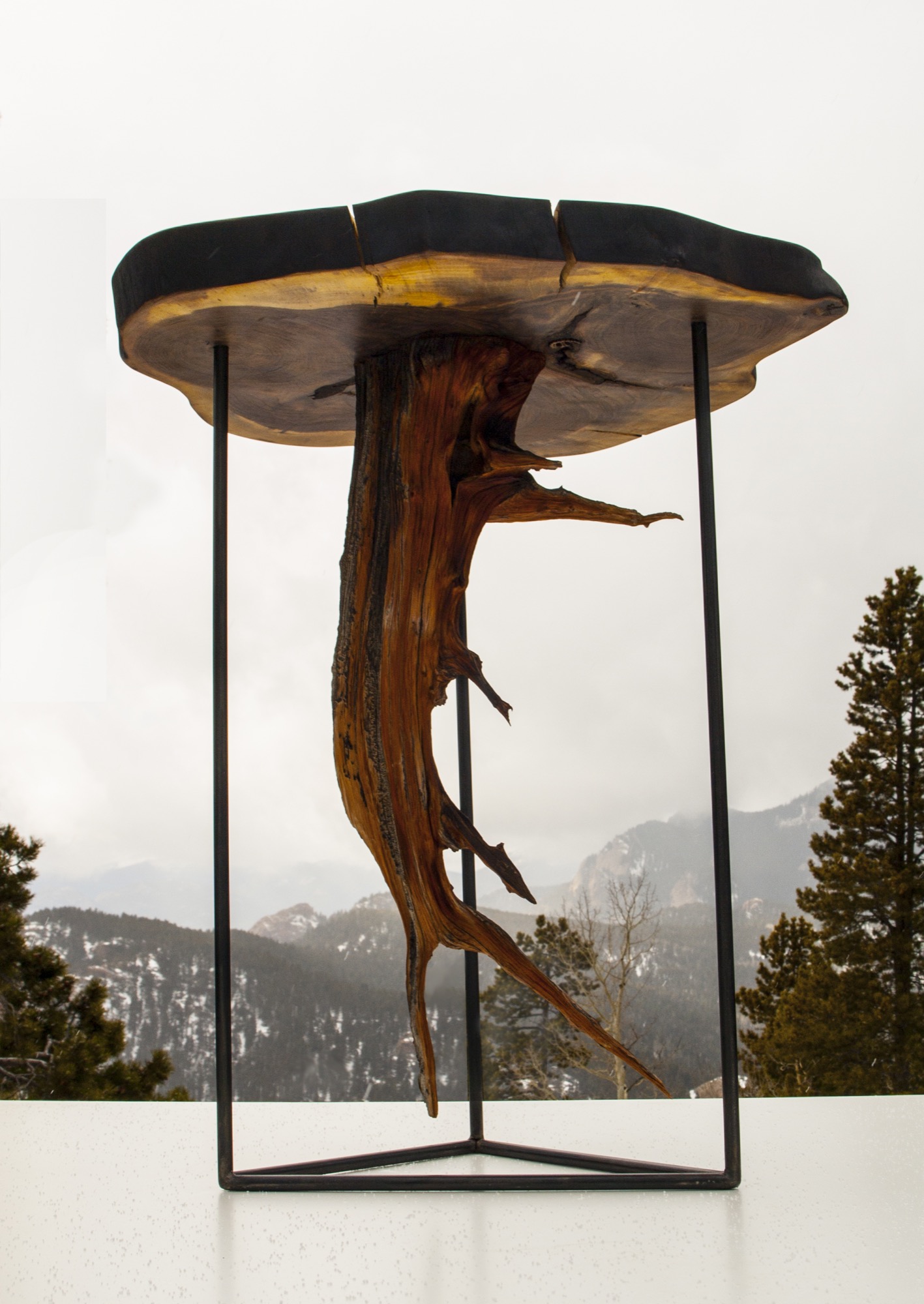
For example, Unrau says seventy years ago, many trees were cut down to make room for high-voltage lines to Fairplay, south of Breckenridge, Colorado. “The company just left them, so these big old-growth rounds have been drying up there all these years,” he says. MTN Lab milled the pine rounds into table tops. “That’s our next big design push, designing bases for those tables,” he says. “Or the motorcycle, which is a lifelong dream we’ve shared since we were little kids.”
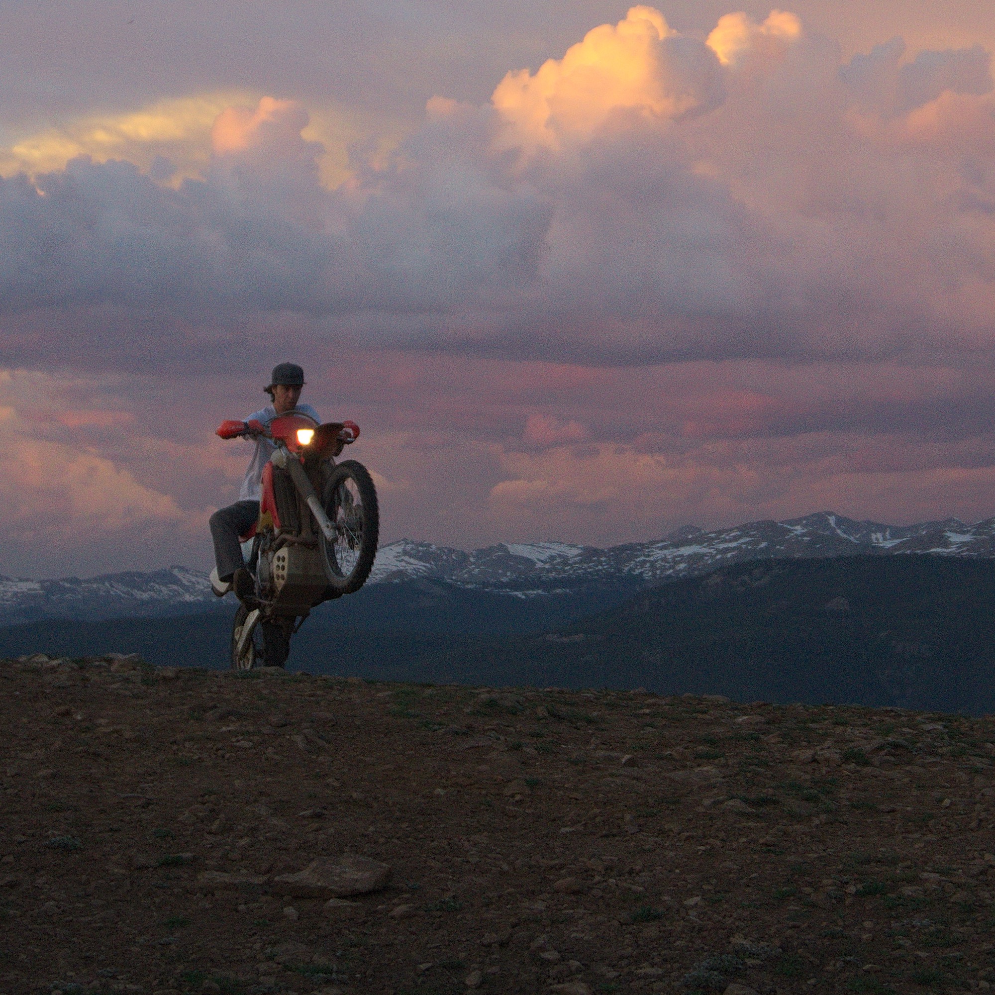
Indeed, Hine and Unrau want to build a motorcycle entirely from scratch, the back end made hand-carved in wood. Before winter, they even want to experiment with producing their our own steel, from mining the rock to crushing and melting it. Whether the resulting material will in fact be usable won’t matter as much: “At least we will be able to appreciate the process when we go to the store and buy steel.”
“The motorcycle is going to be very much like our furniture and our sculptures,” Unrau says. “I would describe it as an art bike. It’s going to be functional. It’s going to ride very well, but it’s not going to look like a conventional motorcycle. I don’t know if we’re going to be willing to sell it.” The business partners are also debating whether they will ever have the heart to sell the 1960s Airstream that once belonged to Unrau’s grandfather and they just finished restoring. “I never want to sell any of our stuff,” Unrau admits, laughing. “It’s hopeless.” △
A Drawn-Out Hike
Seemingly so cumbersome compared with instagramming your every adventure, contemplative sketching in nature slows you down enough to see all the details.
In times of Instagramming every outdoor adventure in, well, an instant, slowing down to sketch a nature scene, seemingly so cumbersome by comparison, becomes a contemplative process, the details more significant for the effort.
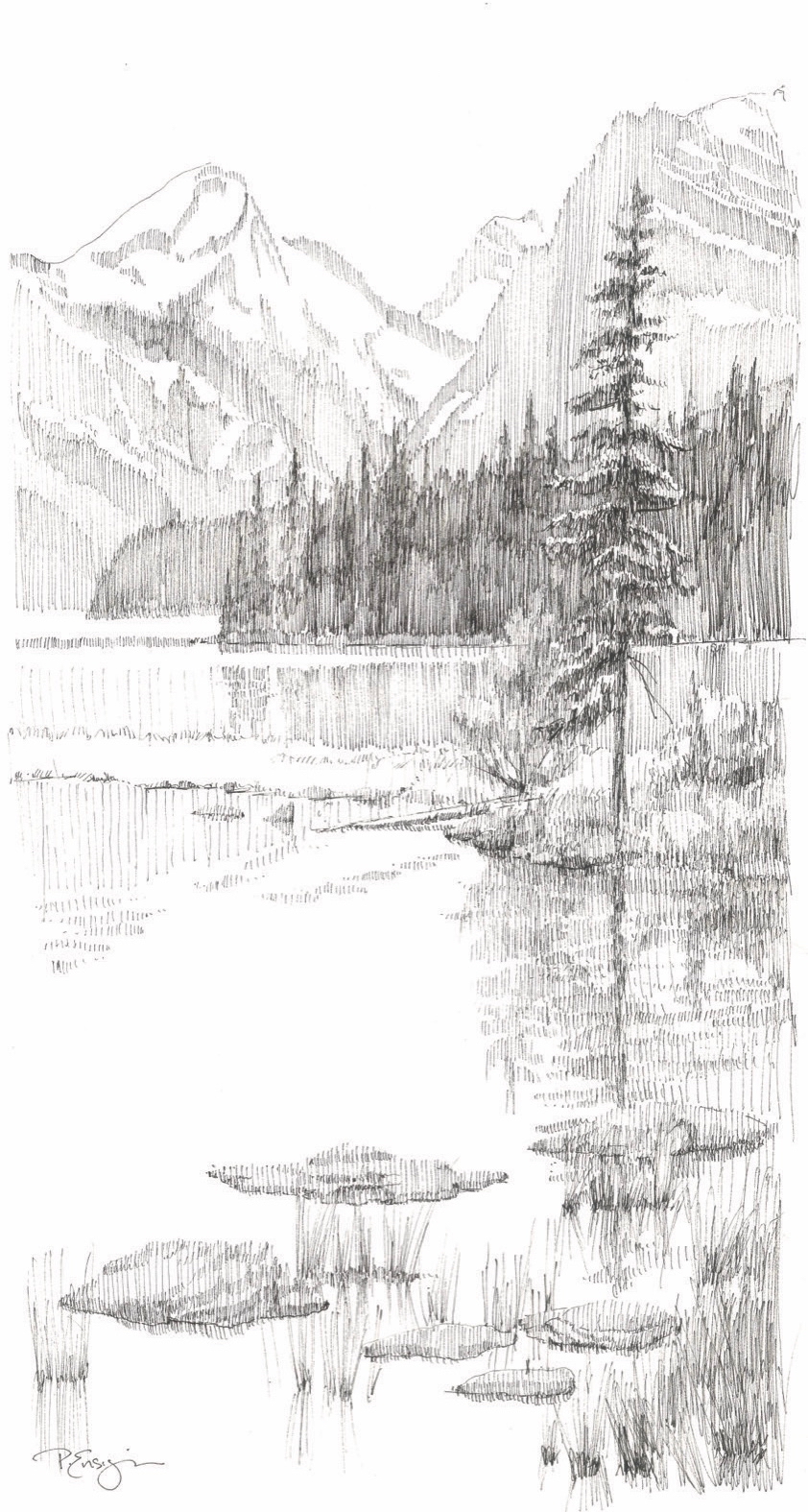
Down a short path to the water’s edge, I find a spot beneath a lodgepole pine. I sit down on my folding stool and take in the scene before me, rugged mountain peaks descending steeply, rimming Bow Lake in the Canadian Rockies. For a few moments, I simply look. It’s a powerful and grand view. While most people might take a series of photos to document the beauty of this vista, I prefer to draw.
Drawing is quiet work. It’s my favorite way to connect with the mountains. First, I study my subject carefully. I examine each ridge and crag. I study layers of rock and sand, discover the nooks and crannies and the remnants of snow. Looking intently, I seek out proportions and relationships, consider the depths and heights, and pay close attention to the movement of light and shadow. To draw effectively is to see, really see, what’s in view. But even more than seeing, drawing on location is a total experience. Sitting on this quiet bank, away from picnickers and tourists, I hear the gentle lap of water against the shore and the birds in nearby branches. I feel the soft breeze against my face and smell the damp ground at the water’s edge along with the sweet scent of pine needles. Immersing myself in my surroundings, as I begin to draw, I let my hand and my thoughts reflect the grace of the moment.
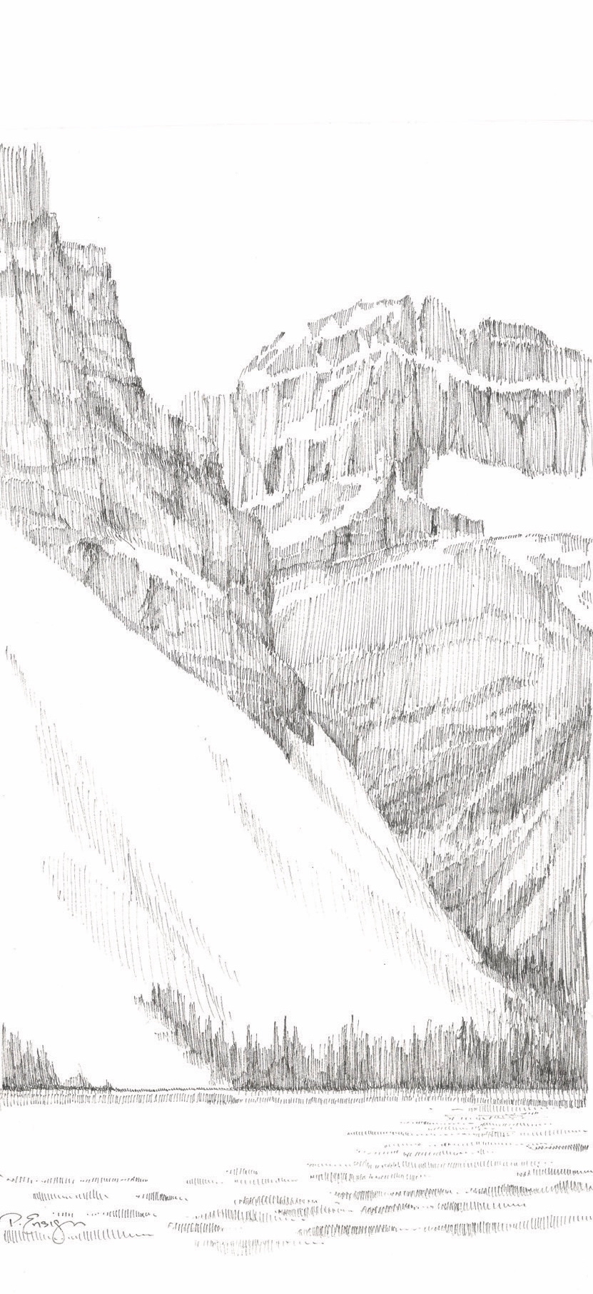
Splendor, line by line
No special talent is needed for this task. Drawing is simply putting marks on a surface to illustrate where one’s eye goes. Anyone can experience the joy of drawing a scene before them. All that’s needed is a paper, a pencil, and a little time. Today, I start with a line drawing that identifies the big shapes, the overlap of one ridge against another. Next, I look for dark and light areas—known as values. As my drawing develops, I stay focused on my subject, constantly verifying angles and details. Lastly, I take care not to overdo the minutiae and make a point to stop before too many lines spoil the intention.
Glacier-hopping
Earlier in the day, I stopped at a pullout on the Icefields Parkway with a fabulous view of Crowfoot Glacier. The parking lot was filled with cars, campers, and buses. Tourists hopped out of their vehicles, snapped a few pictures, then jumped back into their cars to speed down the road to the next viewpoint. How will they know one glacier from the next? What memories will linger long after they have left this grand landscape?
Yes, the quiet deliberation of drawing is slow and methodical. It takes time. What could be more valuable in our hurry-up world of instant everything than to open the senses and make a lasting imprint on the soul? Take just one hour to study, absorb, and look carefully at a scene, and you will never forget it. A relationship will form, a lasting memory will be etched in consciousness. I never forget a location where I have spent time sketching.
“What could be more valuable in our hurry-up world of instant everything than to open the senses and make a lasting imprint on the soul?”
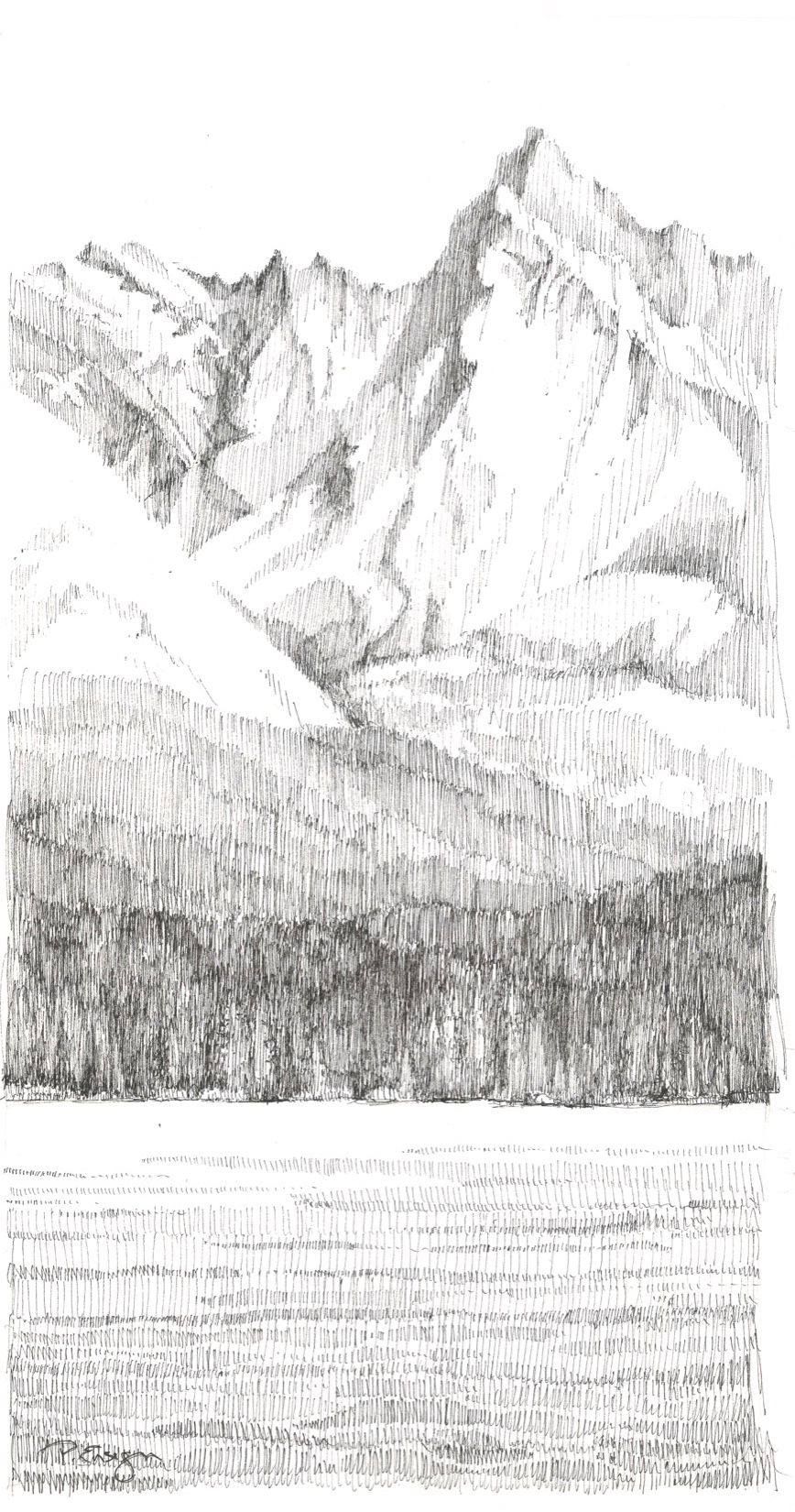
Drawing is a wonderful way to hold on to our travels and experiences. It’s never about the success or failure of the end result. It’s not about technique or individual style. It’s about the process. It’s about the time, the connection, and the quiet communion between artist and subject. △
“Drawing is a wonderful way to hold on to our travels and experiences.”
Makers on Board
Born out of passion for the ride, handcrafted snowboards, splitboards, and skis by Vancouver Island's Kindred Snowboards feature marquetry artwork.
Kindred Snowboards was born out of passion for the ride and the opportunity to grab a snowboard press off Craigslist. Meet the spirited couple who handcrafts custom snowboards, splitboards, and skis featuring marquetry artwork on Vancouver Island.
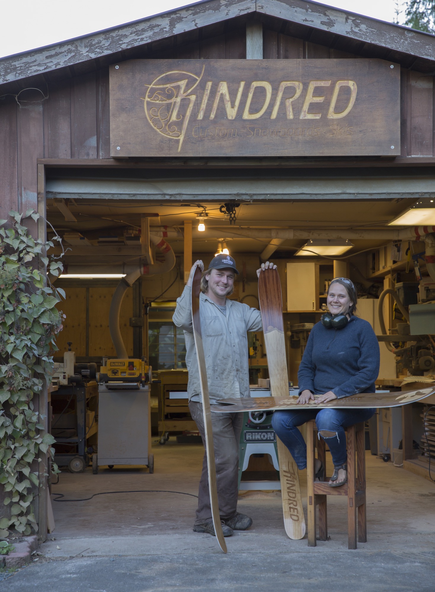
Evan Fair and Angie Farquharson have been designing and making custom snowboards and skis together in their backyard woodshop on Vancouver Island since 2010. We squeeze in a weekend visit just before the busy winter season to get a glimpse into their craft, their art, and their humble lifestyle in a rural community on the island’s east side. The couple built the Kindred Snowboards brand from scratch. They cultivated the low-impact operation out of nothing more than a passion for the ride and the desire to make a higher-quality product—yet without any background in fabrication.
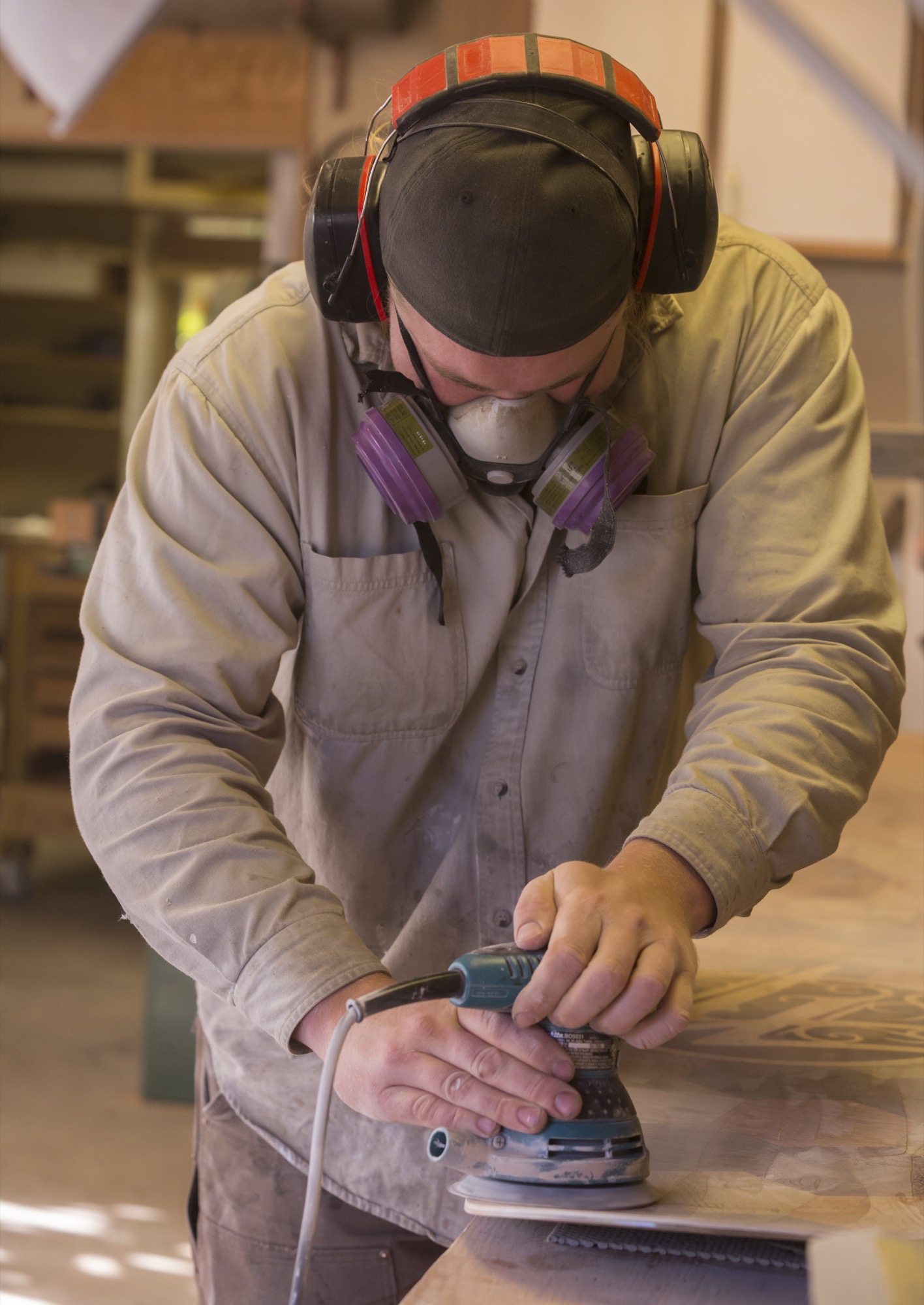
Beautiful Comox Valley and Mount Washington straddle this area fifteen miles (twenty-four kilometers) north of Courtenay, British Columbia, where their home and shop are located. Weather on the east side of the island is mild and temperate year-round, a surprise given the substantial annual snowfall in the nearby mountains. The couple’s home sits at sea level in a forest, the mountains hidden from view. Land plots are large here, spreading neighbors apart. Industry in this area is a miscellany, though mostly milling timber and small-batch farming. Neighborhood homesteading makes the community largely self-sufficient—the local crops and dairy products go directly to the local population.
Pressed to jump
“How is a snowboard made?” the couple, both in their late twenties, asked each other one day before it all began. Not long after they pondered the process it may take to create the boards their life revolves around, a snowboard press came for sale on Craigslist. Fair and Farquharson, as adventurous as they are curious, grasped the opportunity. At the time, they were living out of a camper van and chasing the best snow to ride. But they made the purchase, hoping the investment would be the impetus to launch them into a more serious endeavor.
They were committed. Being avid riders themselves, they knew exactly what they wanted in a board, what their ideal board would look like, feel like. So they learned and improved upon the techniques to make a better product. Their goal was to create high-performance boards and skis that enhance, not hamper, the user’s skill, style, and fun on the snow.
“Some experienced riders know exactly what they want, down to the numbers,” Farquharson says. With others, the Canadian gear artisans spend significant time getting to know the customer’s riding style and preferences. “For the topsheet artwork the questions are a bit more ephemeral,” she says. People have asked for anything from the silhouettes of their favorite mountain to portraits of their pets or pop-culture idol, and even memorials to lost loved ones. Kindred’s Limited Edition Series, on the other hand, features artwork infused with an alpine or coastal sensibility. “I draw from my own personal experiences in nature, as it is common ground for people who spend their recreation time outdoors,” Farquharson says.
“For most people the way their gear looks is a very close second to how it rides,” she knows from experience. “People who go for a custom build impact the end product directly, which can be empowering. The ride becomes a distilled reflection of the rider and what they want out of their alpine experiences. In the end, Evan and I hope our work inspires people to be themselves and to be better riders.”
“People who go for a custom build impact the end product directly, which can be empowering.”

Shop talk
That mission to make a superior board hasn’t shifted or been compromised in the five years since Kindred began. Each board is treated with the same intense amount of care and precision. Personal connection with each customer and hands-on craftsmanship that goes into every board leave the couple remembering almost every individual product. The number of orders Kindred fulfills has been growing every year. By the end of this season, they are projecting to have made approximately 150 boards, splits, and skis.
Their search for the right place for Kindred led the couple to a tree-lined rural spot with a woodshop, old smokehouse, and former boathouse turned into a woodshed. They purchased the property with the intent to grow their business and live in the same place. “At first, we considered commercial property around the area, but it made more sense to have a shop very close to home,” says Fair. “The former owner was a cabinetmaker, so the shop already existed and was set up for woodworking.”
"Personal connection with each customer and hands-on craftsmanship with every board they make leave Fair and Farquharson remembering almost every individual product."
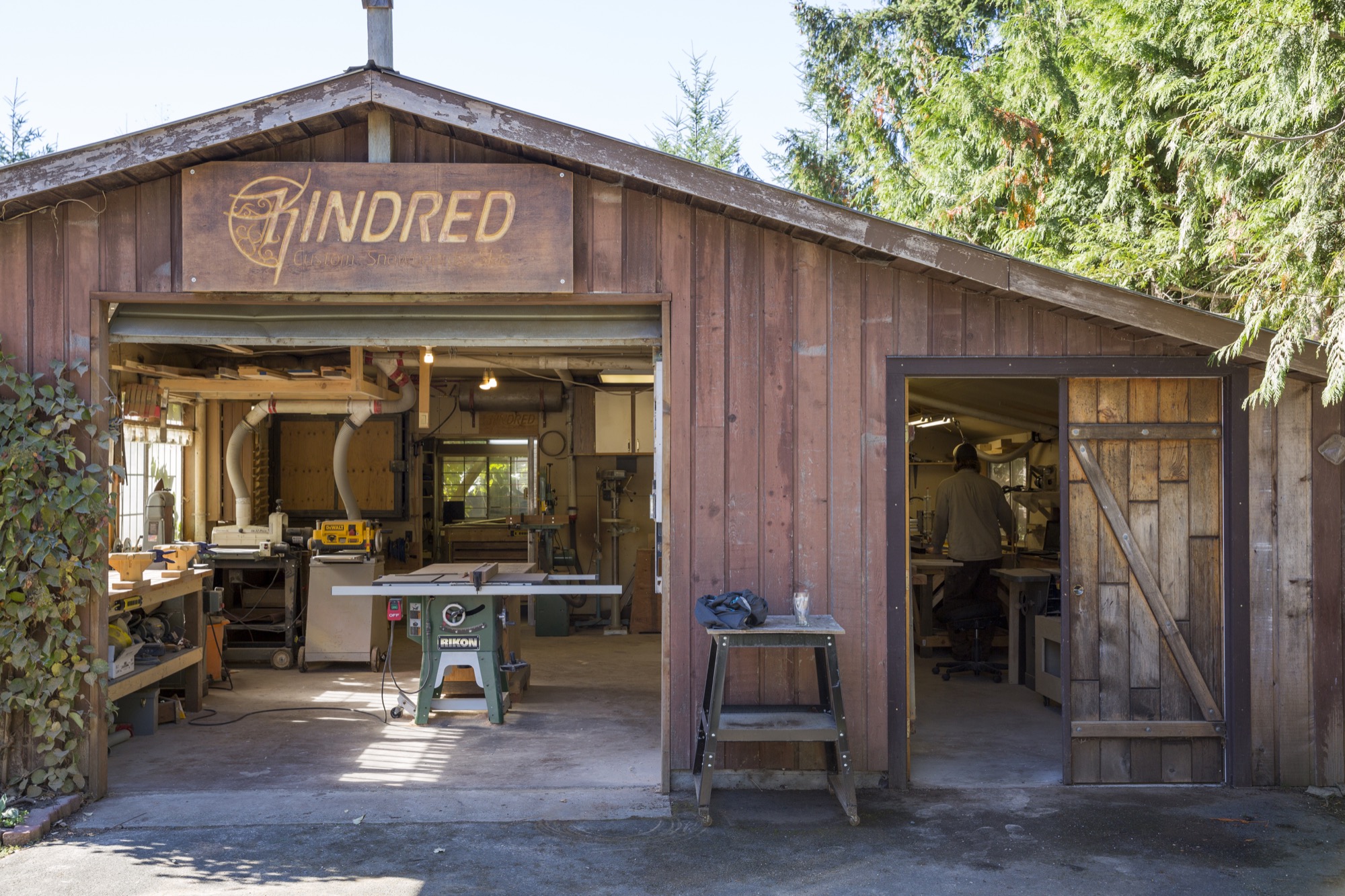
Sunlight filters into the shop through the grapevines that walk along the top of the awnings and the edge of the roof. As the gentle breeze blows, the leaves dance in the wind, making the patches of light dance on the floor. The view from the workshop doors is still lush and green this time of year; an occasional chicken races by or stops to graze for bugs in the grass. Inside, the walls are neatly laced with deliberately arranged hand tools and jars of screws and nails hanging from lids nailed to the shelves, organized according to the makers’ workflow. Fair’s homemade shelves display boards and skis in progress. It’s obvious the two designed this workshop with careful thought.
Fair puts on an album by Little Feat as the machines are slowly starting up. All of us pull on protective face masks before he begins sanding the core of a board he prepped the night before.
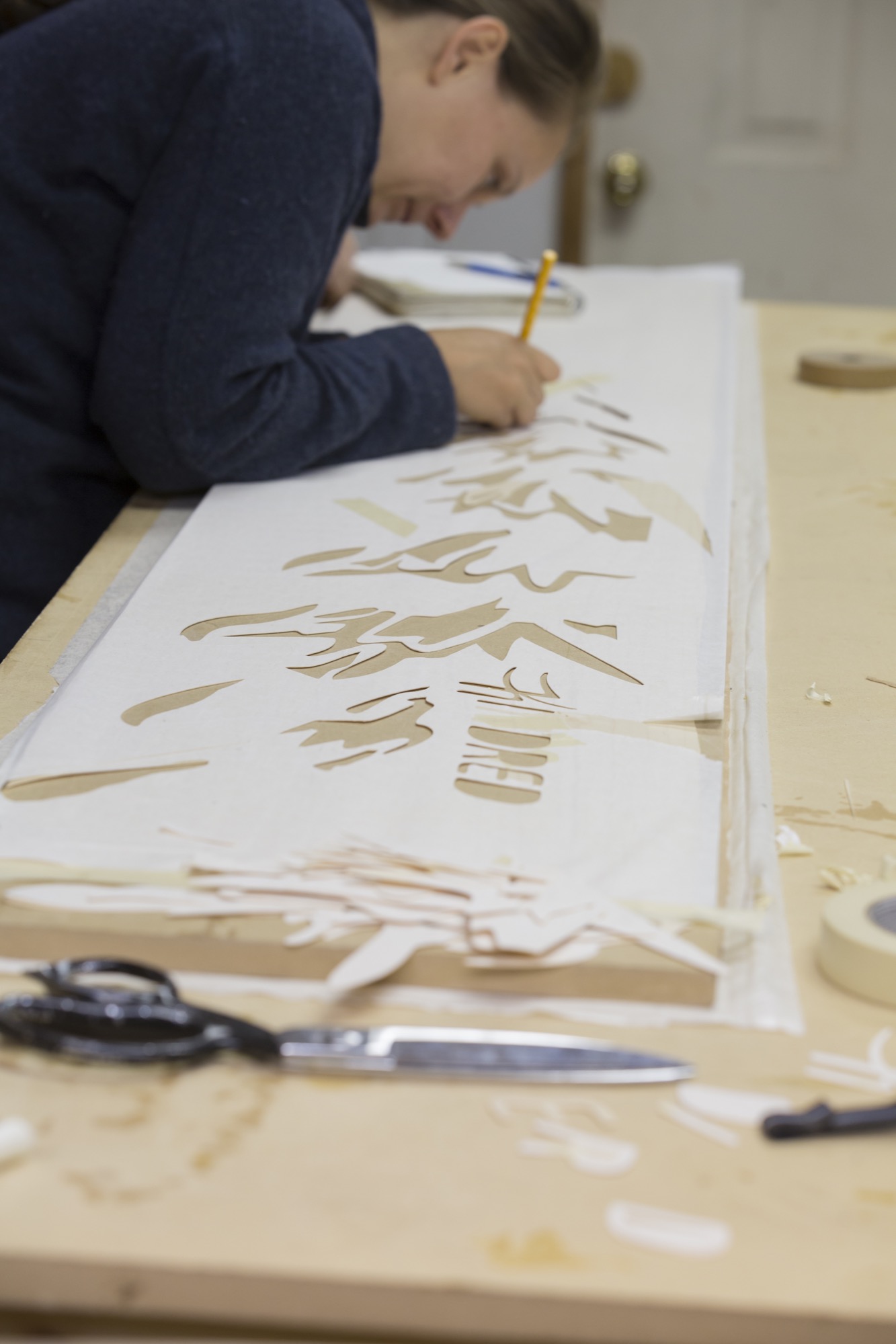
Meanwhile, at the giant table in the back of the shop, Farquharson sets up the topsheet, the piece that is most visibly “Kindred” to those familiar with the distinctive snowboards. The topsheet, a thin wood veneer, is intricately designed. The decorative patterns and graphics are meticulously cut from different woods and inlaid using a technique called marquetry. Defined by the grain and color of the woods, the outline of a fir tree begins to show light and definition in its branches, and a moon shows its craters. This detailed, time-intensive process makes Kindred boards one-of-a-kind art pieces.
Farquharson cuts the wood with her penknife. We talk about Kindred’s customer base as she carves out a moon from a delicate sheet of gorgeous black walnut.
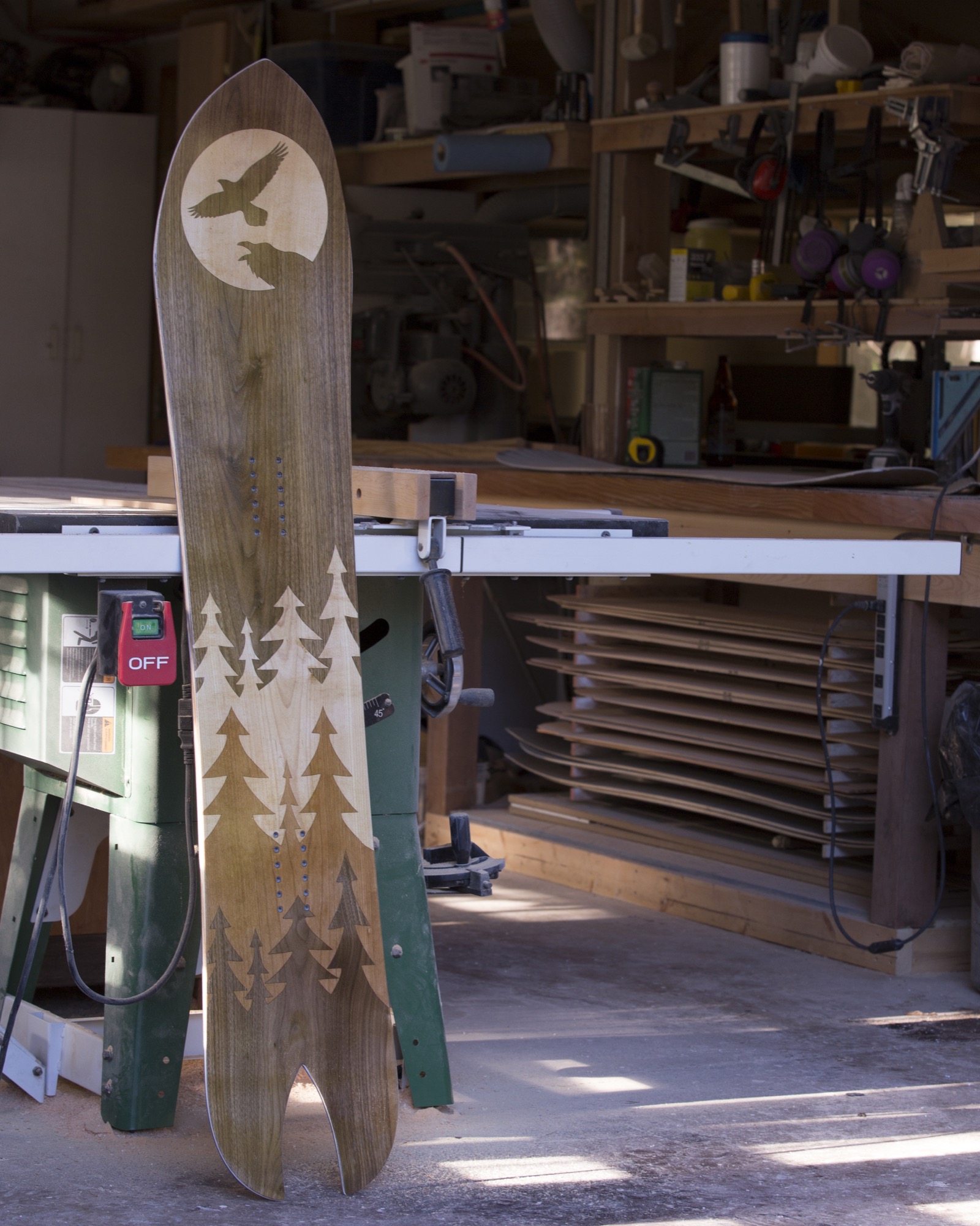
“We’ve had incredibly strong local support from shops and individuals, but we are fortunate to ship all around the world,” she says. “We even had a Japanese fellow arrive unannounced from the other side of the world who had planned his whole vacation around watching our build process...He is now a friend of ours.”
Return to the Valley
Fair sets up a bottom sheet to be cut with a drag knife mounted to a CNC machine (computer numerical control machine, or automated milling machine used to make industrial components). He tinkers with the calibration on a laptop next to it. Satisfied, he hits “start” and the knife begins to cut out the Kindred logo from the sheet. When I ask him about their initial business ideas and how things have developed through the years, he pauses. “Humble beginnings for sure,” he replies.
“The concept was founded while we were living in a truck and camper. We had left the island to travel throughout Alberta and BC looking for the next ski resort. When we decided to embark upon the snowboard-building adventure, we returned to the Comox Valley, where we already had a network of support. We initially saw a potential niche in building high-quality North American skis and snowboards, and quality and beauty remain central to every step of the process—no cutting corners.”
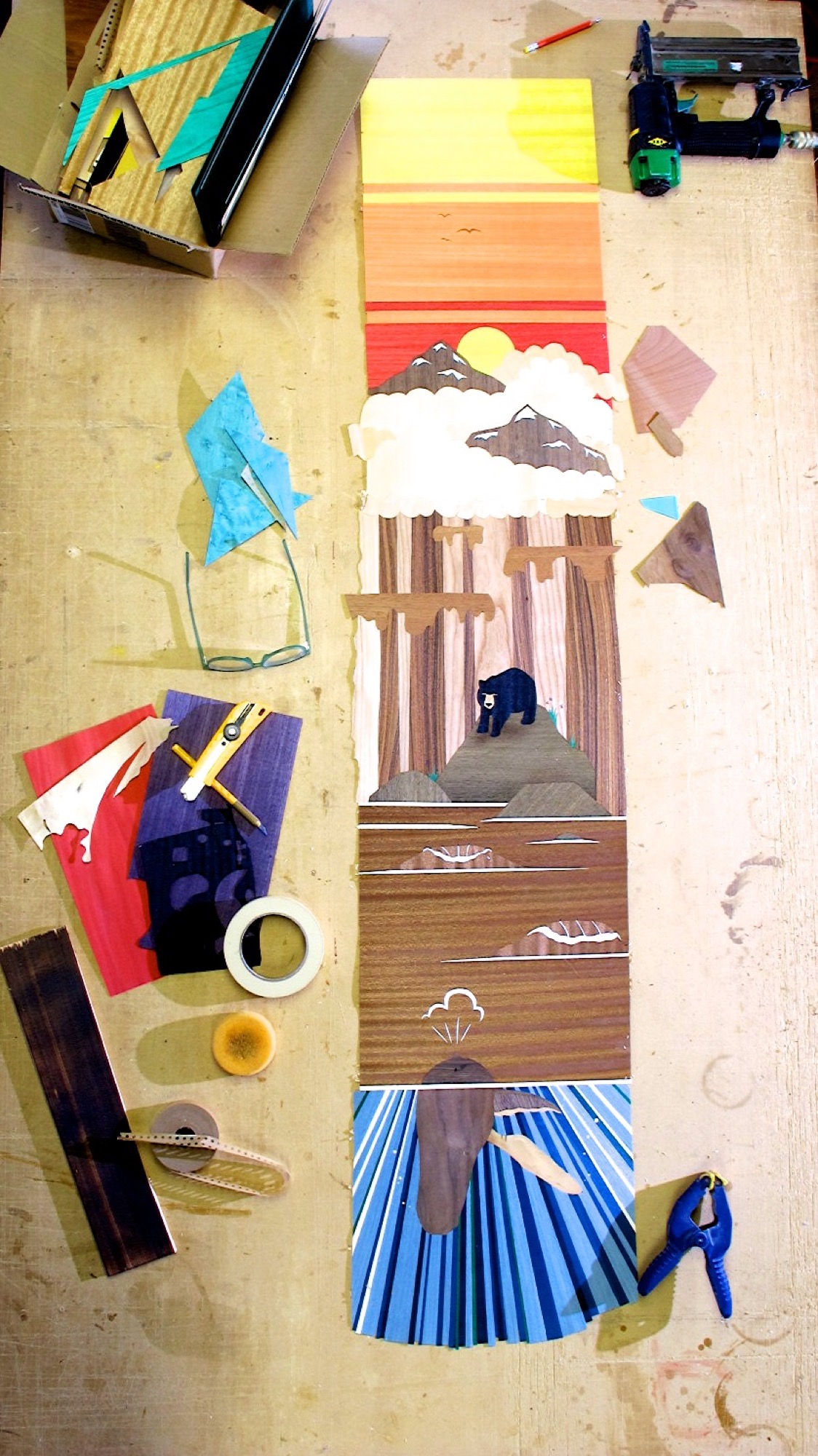
A complex custom build can take the two up to thirty work hours to design and build a board or a pair of skis, not counting drying and curing time. The Limited Edition Series builds, where Kindred makes a small number of products with similar designs, still take up to fifteen hours each.
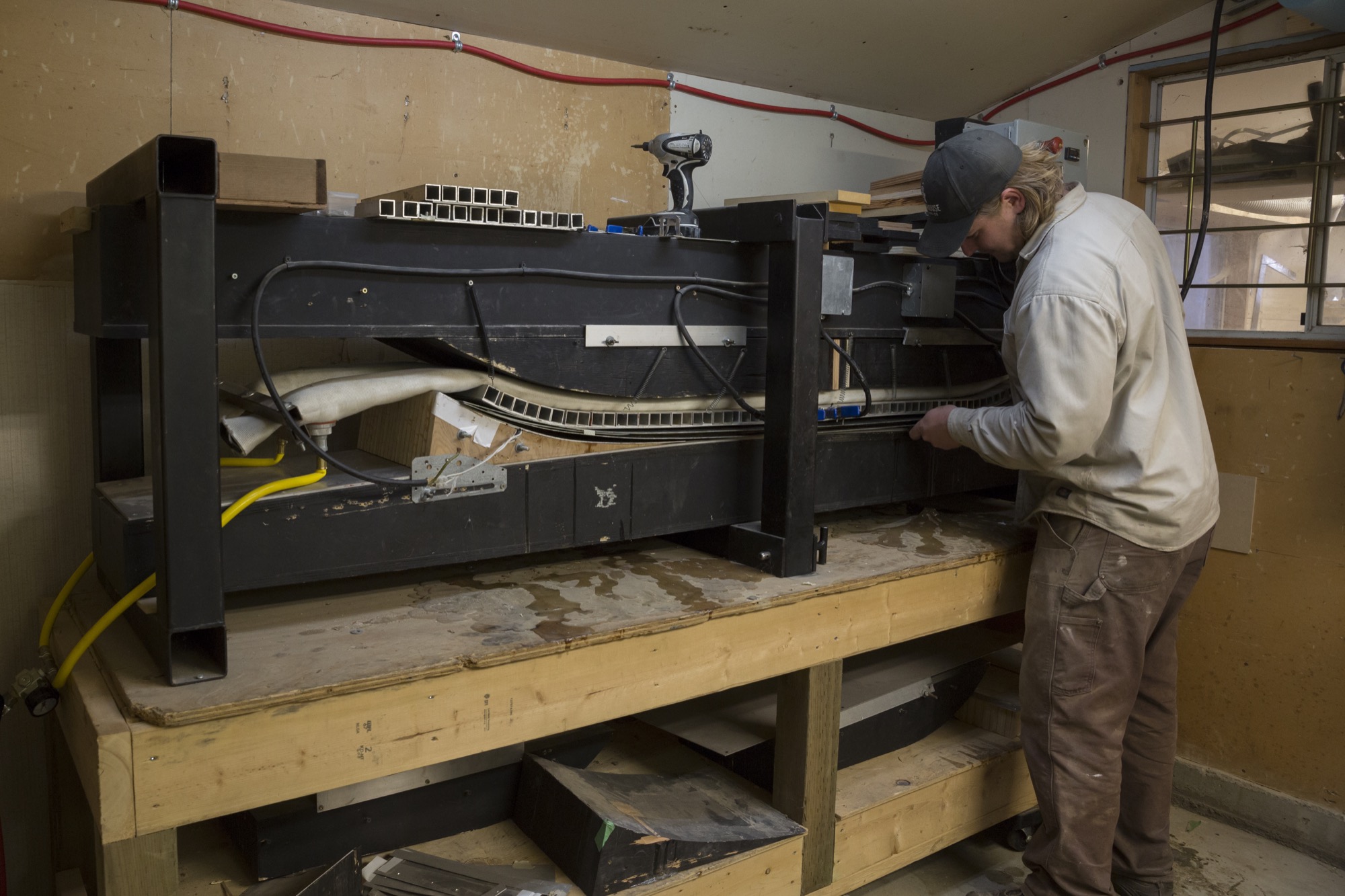
The day goes by quickly, and before we know it, the afternoon sun starts to set. The board is ready for the nal press, and all the layers are assembled with a chemical-free epoxy slathered on between each layer as the machine applies a healthy dose of heat and pressure. It’s fascinating to watch the steel tube stock apply pressure, making the epoxy ooze out the sides, slowly creating mountains on the floor. The snowboard press that started the whole operation is beautiful in its frugality—a testament to Kindred’s mindset.
"We initially saw a potential niche in building high-quality North American skis and snowboards, and quality and beauty remain central to every step of the process—no cutting corners.”
Community board
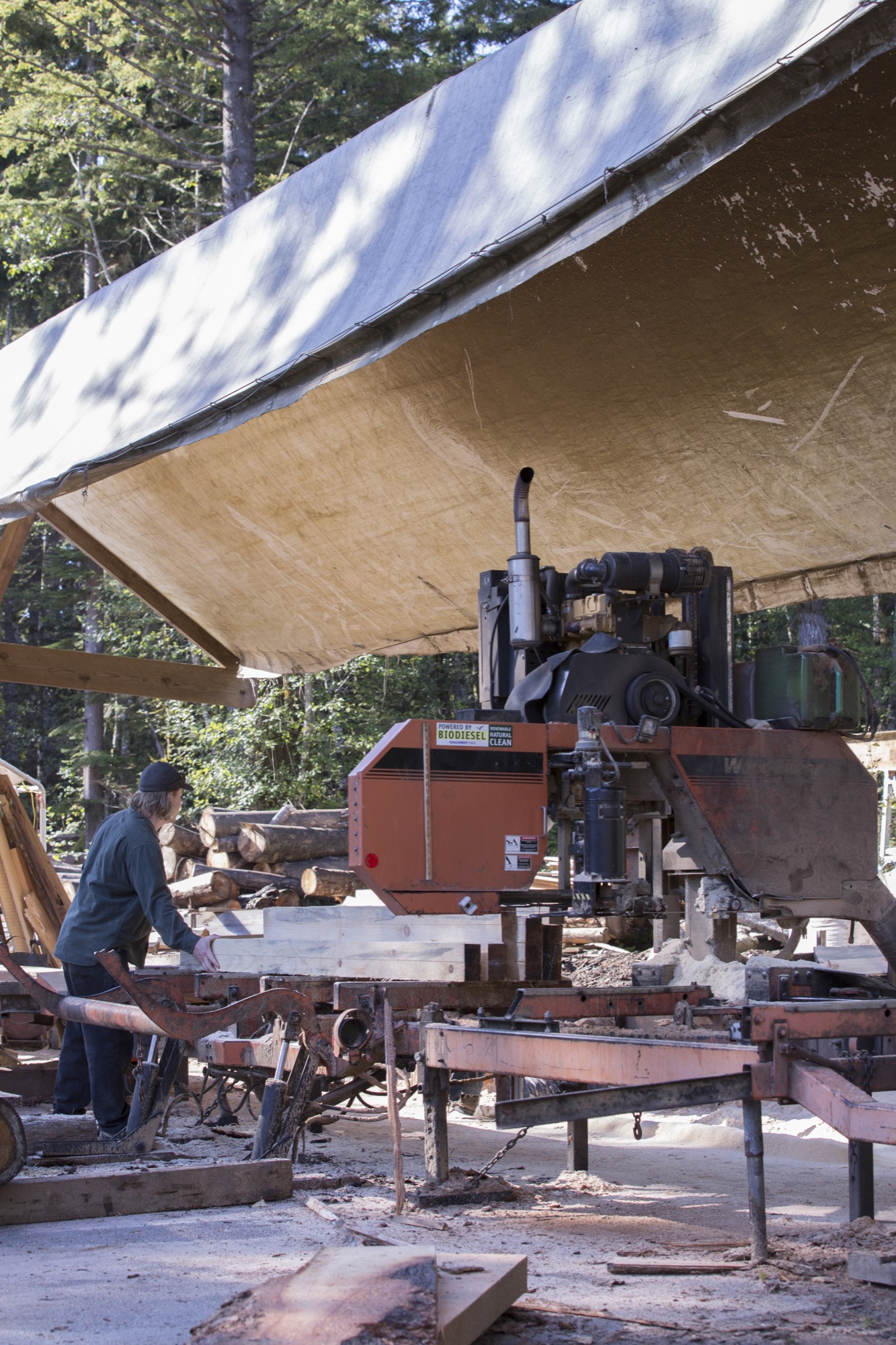
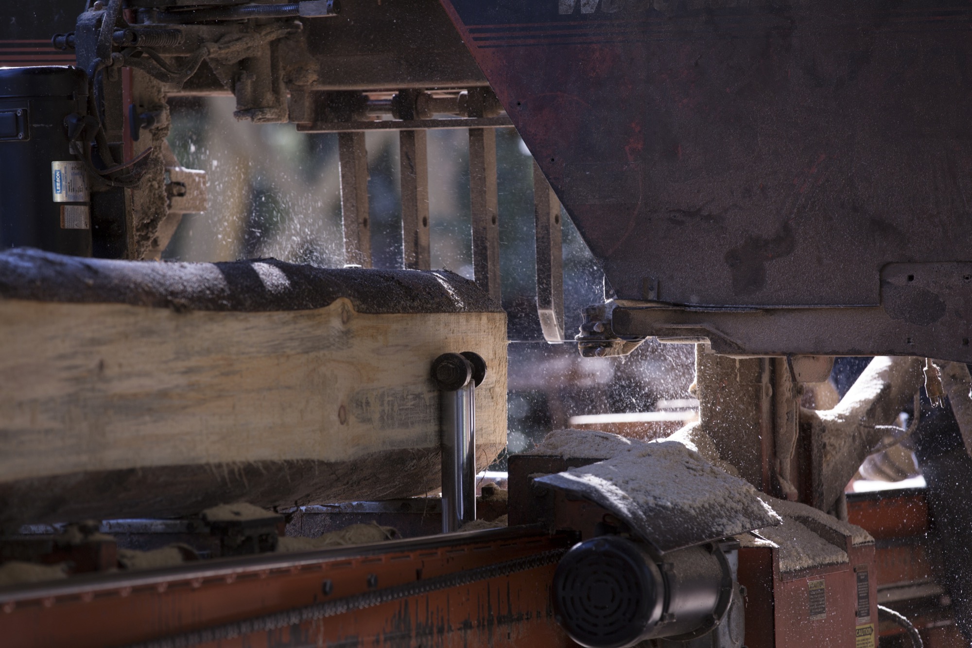
A couple of miles from the workshop, a local mill saws logs into lumber for the core pieces, the main foundation and center of each board, sandwiched between layers of fiberglass and carbon fiber. Farquharson and Fair know the owners of the mill well, and the family’s son is out working when we visit. With a population this small there is a strong reliance on others and an understanding that you are a connected member of the island community. Your actions greatly impact the local environment and its residents. Thus, good relationships with neighbors are important for businesses like Kindred to thrive.
As we observe the milling, Fair steps in to help move the last few logs on the run. “Many people are here for recreation—not specifically to ski or snowboard—they come to enjoy a work-life balance and the mild climate, fostering a slower pace overall,” he tells us.
What’s in a name?
How did the name “Kindred” originate? “We wanted to recognize how constantly blown away we are by the support of our community, friends, and family,” says Farquharson. “On another level, we give homage to the incredible relationships that are forged through alpine winter sports and lifestyle. Nothing quite compares to charging through fresh snow engulfed by the euphoric hoots and hollers of your friends. Those snowy moments, when we’re living a shared experience, feel like pure magic. When you are surrounded by people who embody that joy on and off the snow, you can’t help but feel like family. Those are our people. Kindred felt genuine and accessible, as we were sure that other skiers and snowboarders could relate.” △
Alpine Modern + JK Editions: Fall
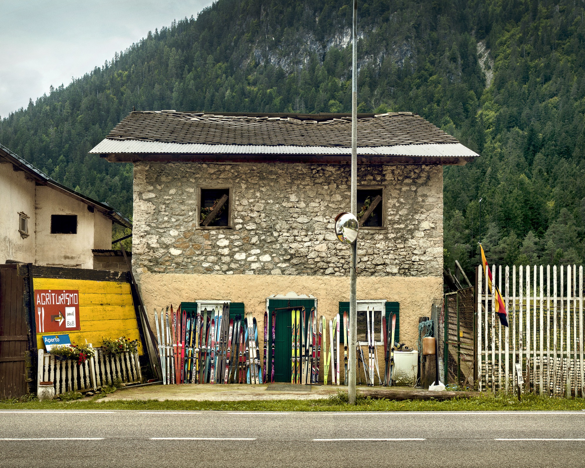
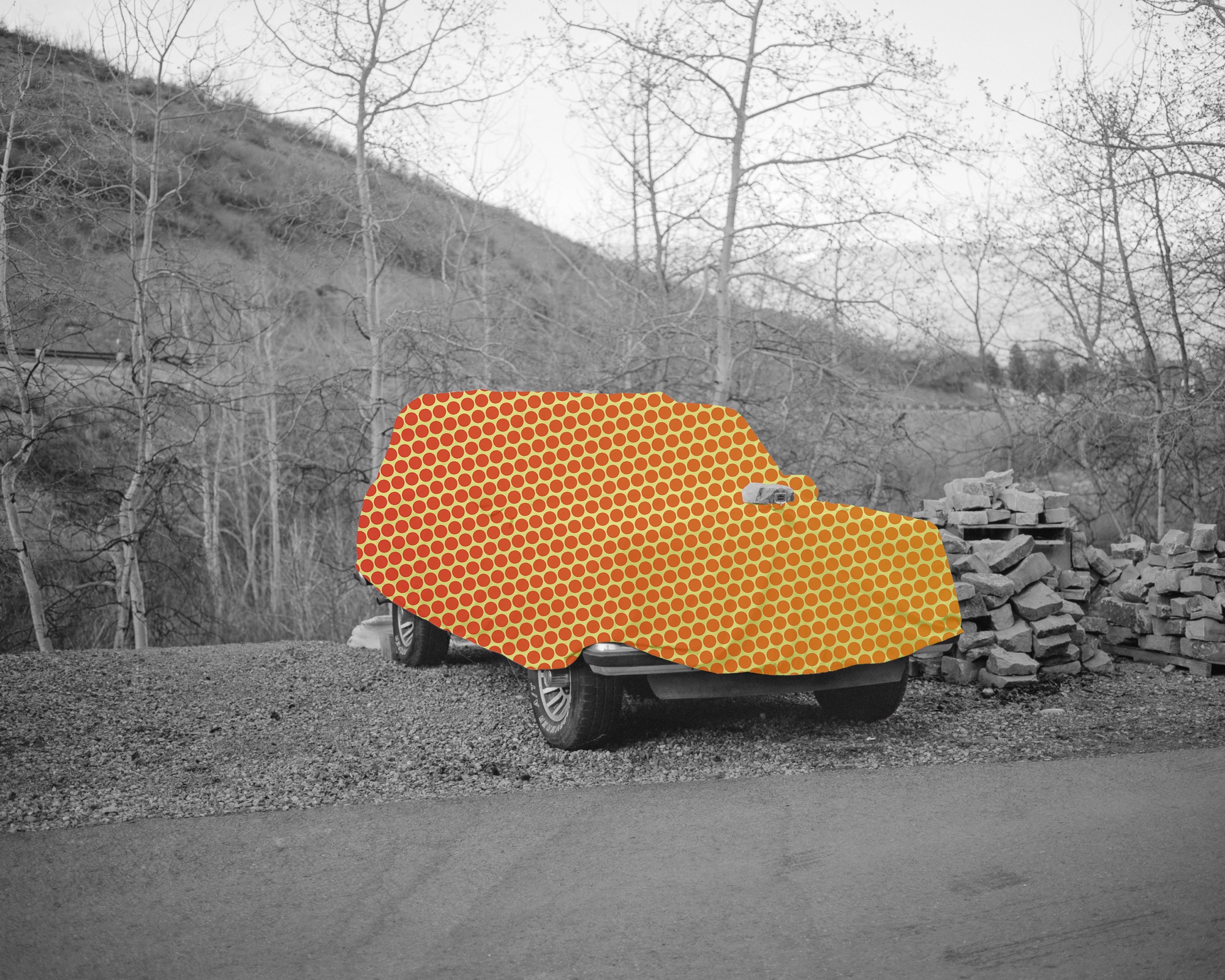
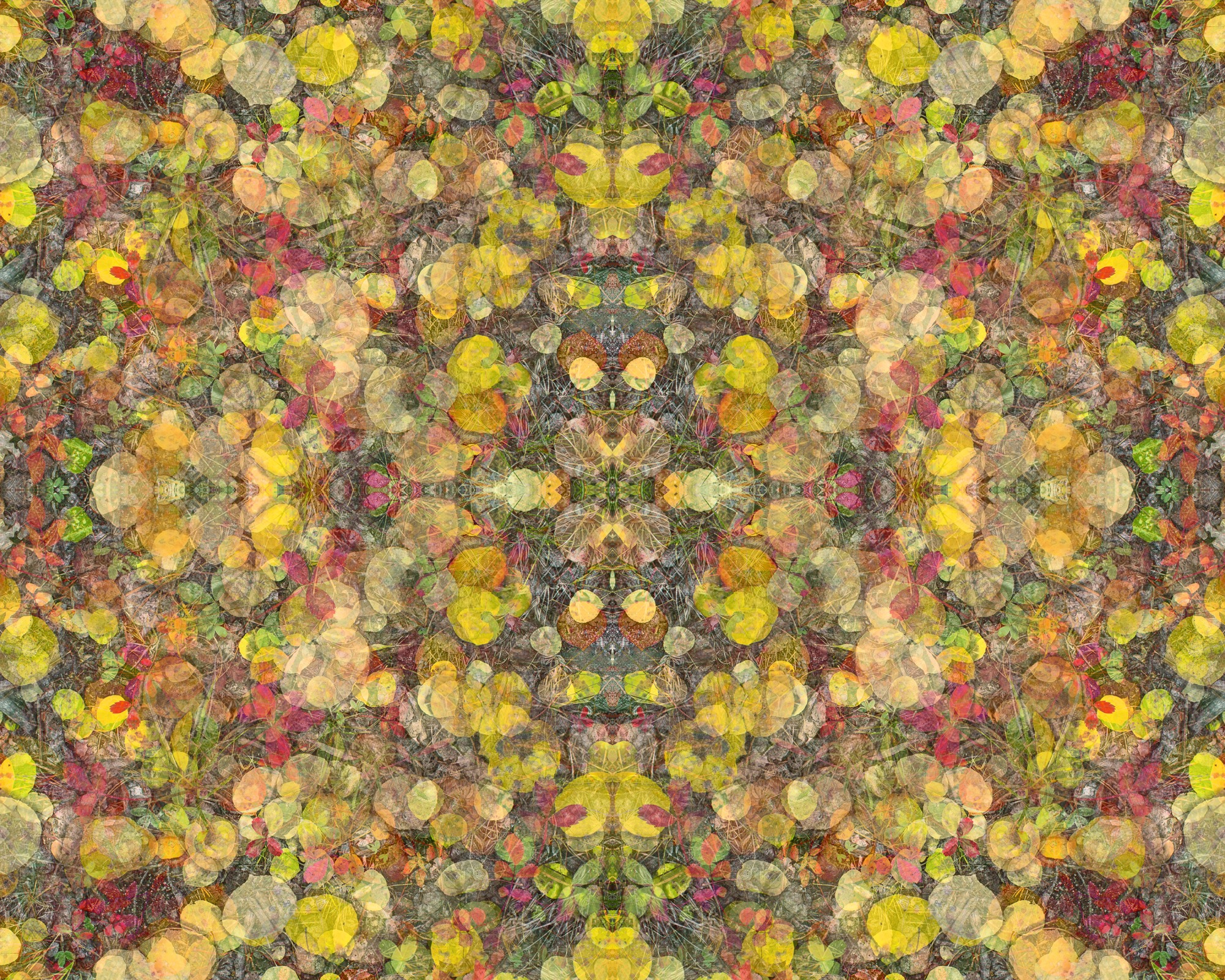
Limited edition, museum-quality fine art prints by Boulder photographer Jamie Kripke exclusive for Alpine Modern
Art Photography by Jamie Kripke A portfolio of images by Boulder, Colorado-based photographer Jamie Kripke, created exclusively for Alpine Modern. An ongoing project that studies our connection to the alpine landscape.
Limited edition, museum-quality fine art prints of these images are available to purchase through Alpine Modern.
Zen and the Art of Knife-Making
Using skills derived from the ancient craft of samurai sword-making, a blacksmith in the Japan Alps makes knives so delicate and dangerous they turn chopping into an artful act of passion.
A blacksmith in the mountains of Japan uses skills derived from the ancient craft of samurai sword- making to forge knives from a steel that is considered the finest base material of the knife-making art.

Cutting, slicing, mincing, dicing, boning, peeling: Over time, these mundane jobs have become, for me, the most satisfying tasks in the kitchen. Now, I experience knife-work as a meditation on all that will unfold after food leaves the chopping block. With each cut, I’m trying to shape ingredients to their ideal form, whether it’s a fine mince of onion designed to melt in a pan as a base for a sauce or fifty wedges of apple that need to keep succulence while retaining their shape in an autumn pie. The key to this repetitive-motion, Zenish state is a sublime knife: balanced in the hand, dangerous, delicate, an obedient lover and assassin.

I found my sublime knife after a lot of looking. It has a blade of Aogami Super carbon steel and was hand forged in a mountain town called Niimi, 150 kilometers (93 miles) northeast of Hiroshima, at the shop of a fifty-seven-year-old blacksmith named Shosui Takeda.
My Takeda
If you lay my Takeda 180-millimeter Super Sasanoha Gyutou chef’s knife beside my shiny stainless Shuns and Globals and Henckels, it looks weathered, almost preindustrial. The thin blade has a mottled black finish called kurouchi. The blade tapers sweetly to a gunmetal gray edge whose sharpness approaches that of a razor. You can see the resin used to affix the tang as it was slid into a hole in the Indian rosewood handle during construction. The handle is octagonal, to answer the shape of enfolding fingers and palm. Near the upper rear of the blade’s spine, roughly stamped into the metal, are Japanese characters, plus a heart and the Western letters AS. The characters mean “Niimi. Shosui. Aogami Super.” The heart is something Takeda-san’s blacksmith father started to put on his blades many years ago. Takeda-san says he has never been quite sure what the heart means.
Finding the perfect blade
I have not been to Niimi. I met my Takeda—and, later, two more of them—through Google’s search power and the matchmaking tastes of an American in Tokyo named Jeremy Watson. Watson is a thirty-nine-year-old American of UK and Hong Kong ancestry who moved to Tokyo after a period teaching English in Japan (where he met his wife) and a period learning about, and selling, Japanese knives in Manhattan. In 2012, he founded Chuboknives.com, selling products he found by scouting artisan blacksmiths around Japan. Initially, he hand-wrapped each order, inserting a thank-you note into slim boxes covered in Japa- nese stamps, and sent them on their way to Australia, Europe, and the UK, where chefs and foodies were beginning to notice his trade in rare beauty. Now his business is such that he has automated the shipping. But the boxes remain lovely and intricate, befitting jewelry, and to receive a Takeda in the mail feels like a gift, even if you’ve paid for it.
“We wanted to be a small family business that was connecting small-scale artisans to chefs and home cooks,” Watson says. Big Japanese knife-makers, like Shun and Global, were taking up more and more display space in stores like Williams-Sonoma (where once German companies like Henckels had ruled), but “I realized that the smaller artisans and blacksmiths were really underrepresented. Shibata, Takeda, or Tanaka—the craftsman that we’re currently working with—weren’t really out there.”
The absence of these knives from the major retailers can be explained by the minuscule production of operations such as Takeda Hamono, as the company is called.

Takeda's workshop
“There are three blacksmiths, including me, at the shop,” says Shosui Takeda (whose answers were translated for me by Watson). “We spend eight hours a day forging, twenty-five days a month. In total, we produce 250 knives a month. If we calculate the number of hours all of us work, essentially each person is producing about three knives per day.”
The quality of a handmade knife derives from the strange mutability of steel when it’s repeatedly heated and hammered to alter its molecular structure. The blacksmith, using skills derived from the ancient craft of samurai sword-making, is always chasing an ideal: a blade strong yet somewhat exible, thin but not brittle, able to take an edge and hold it for a long time. A molecular map of a knife would reveal a variety of attributes across its form, determined by cycles of quenching (to harden the steel) and tempering (to selectively soften it). The spine may be softer than the edge. The steel that Takeda uses, Aogami Super (AS), is considered the finest base material of the knife-making art, but it’s also known to be temperamental in the forge, and few blacksmiths bother with it. Takeda has been using AS for twenty-five years, after discovering it in a steel-maker’s catalogue, and after realizing that customers would pay a premium for the uncanny thinness and edge retention that AS offers. “As far as what I’ve seen,” Watson says, “I don’t think anyone makes knives as well as he does.”
“As far as what I’ve seen, I don’t think anyone makes knives as well as [Shosui Takeda] does.”

"The steel that Takeda uses, Aogami Super (AS), is considered the finest base material of the knife-making art, but it’s also known to be temperamental in the forge, and few blacksmiths bother with it."
Watch the YouTube videos of Japanese knife-makers at work: heating steel and iron to narrow temperature tolerances in coal-fired furnaces, then beating away at the metals—using both power hammers and tools wielded by hand—until they begin to fuse and morph like slow-motion Plasticine. The shape of the knife is judged by eye—as is the temperature of the hot steel, judged by the color of its glow in the fire. Heat, hammer, cool, and repeat. Sparks fly. The blades curl out of shape, then return to form under the blacksmith’s art. I’ve never seen anything so beautiful and fine that is produced by such fierce whacking and grinding.
"I’ve never seen anything so beautiful and fine that is produced by such fierce whacking and grinding."

That said, Takeda’s approach benefits from modern insights. “I’ve learned a great deal by collaborating with the steel-makers. Through trial and error and using high-resolution microscope photography to see how the steel looks after it’s forged, I’ve been able to eliminate problems with the forging processes.” He quenches his blades in successive baths of hot oil, whose temperature is closely regulated, then sharpens the edge with wheels and stones of increasingly fine grit. His wife and two daughters fix the tangs in the handles at the end, and handle other shop duties.

Dangerous business
The work looks dangerous because it is: “When we’re working in the summer with short sleeves,” Takeda says, “we get burns on our hands and arms every day. This is just part of the job and no big deal.
“What’s more serious are the repetitive strain injuries to my back, shoulder, elbow, and knees. Eight years ago, I had back surgery, and earlier this year, I had surgery on my right knee. I’m currently doing monthly injections so I can keep working. My grip strength is also significantly weaker than it used to be.
“The most serious is the hearing and vision damage. I use earplugs, but I still have hearing damage. Also, constantly looking at the coal-burning oven while forging has damaged my sight.”
"When we’re working in the summer with short sleeves, we get burns on our hands and arms everyday. This is just part of the job and no big deal."
All that pain may explain the paradox of the knife market in Japan. The rise of the global food and chef culture has created unprecedented demand for fine knives, and Watson says artisan shops have more orders than they can fill. The Internet makes new connections between cooks and artisans possible. It would seem to be a perfect time to grow a blacksmith’s business.
“The American solution to this would be to hire more people and build a larger facility,” Watson notes, “but that’s not necessarily the mentality here. A blacksmith team consists of three or four people, and it takes years to train.” Nor are young Japanese lining up for the work. This does not surprise Takeda. He did not intend to be a blacksmith himself; he helped around his father’s shop for bowling money, and didn’t take up the work properly until he was twenty-eight. Were his father not in the trade, he would never have pursued it.
Takeda describes the paradox this way: The knife business is good, the forging business is not.
“During my father’s time,” Takeda says, “there were forty-seven blacksmiths in Niimi—most making agricultural implements [as Takeda’s shop still does]. Now, there are just a handful. The small knife-forging business is literally going extinct. There are very few blacksmiths left.”

Care and maintenance
In my knife drawer are Japanese stones that I use to keep my Takeda knives sharp. The stones, soaked in water, give up a creamy slurry as the carbon steel of the knife is drawn across it. When the knives are done, I use a special little stone to smooth the water stones for the next session. Sharpening is a calming ritual that with a little practice leads to a gleaming thin line of razor sharpness along the gray edge of the blade.
When the knives are sharp, and again after every use, I carefully dry them, because Aogami Super is extremely prone to oxidation. It rusts in minutes. The rust is removed with a light scrub, should I fail to completely dry the knife; this is another little ritual that I enjoy. Takeda is now making an AS line with stainless cladding, which he calls NAS, to prevent rust, but I shall stay old school on further orders as long as he continues to produce them. And there will be further orders, even though his knives run from $120 for a beautiful little paring knife called a “petty” to $380 for an absurdly long, wondrously light Kiritsuke slicing knife that is my favorite cooking tool in the world.

Takeda’s blades have a gentle fifty-fifty bevel, meaning that each side of the blade tapers equally to the cutting edge. This is easier to sharpen for an amateur than the single-side bevels common on many Japanese knives. Beveling and blade shape, like everything else to do with Japanese knives, are complex and relate to the food to be cut: vegetables versus meat versus fish. Some blades are designed for species of fish, others according to what the fish is going to be used for. Everything is about form: of the blade, of the food.
These sublime blades support a Japanese kitchen culture of sublime knife-work, precise almost beyond belief. One gets a glimpse of it at a very good sushi bar, while a multicourse kaiseki meal in Kyoto is like a doctoral dissertation.
"These sublime blades support a Japanese kitchen culture of sublime knife-work, precise almost beyond belief."
Wielding my Takedas, I know that I shall never have such skills. But I do have knives that allow me to meditate on the ideal every day. △

Modern Architecture Ascends in Aspen
Architect Shigeru Ban's dramatic design of the Aspen Art Museum
Inspired by the up-and-down movements of the skiers on Aspen Mountain, the Pritzker Architecture Prize laureate Shigeru Ban takes modern building design to dramatic heights with the new Aspen Art Museum.
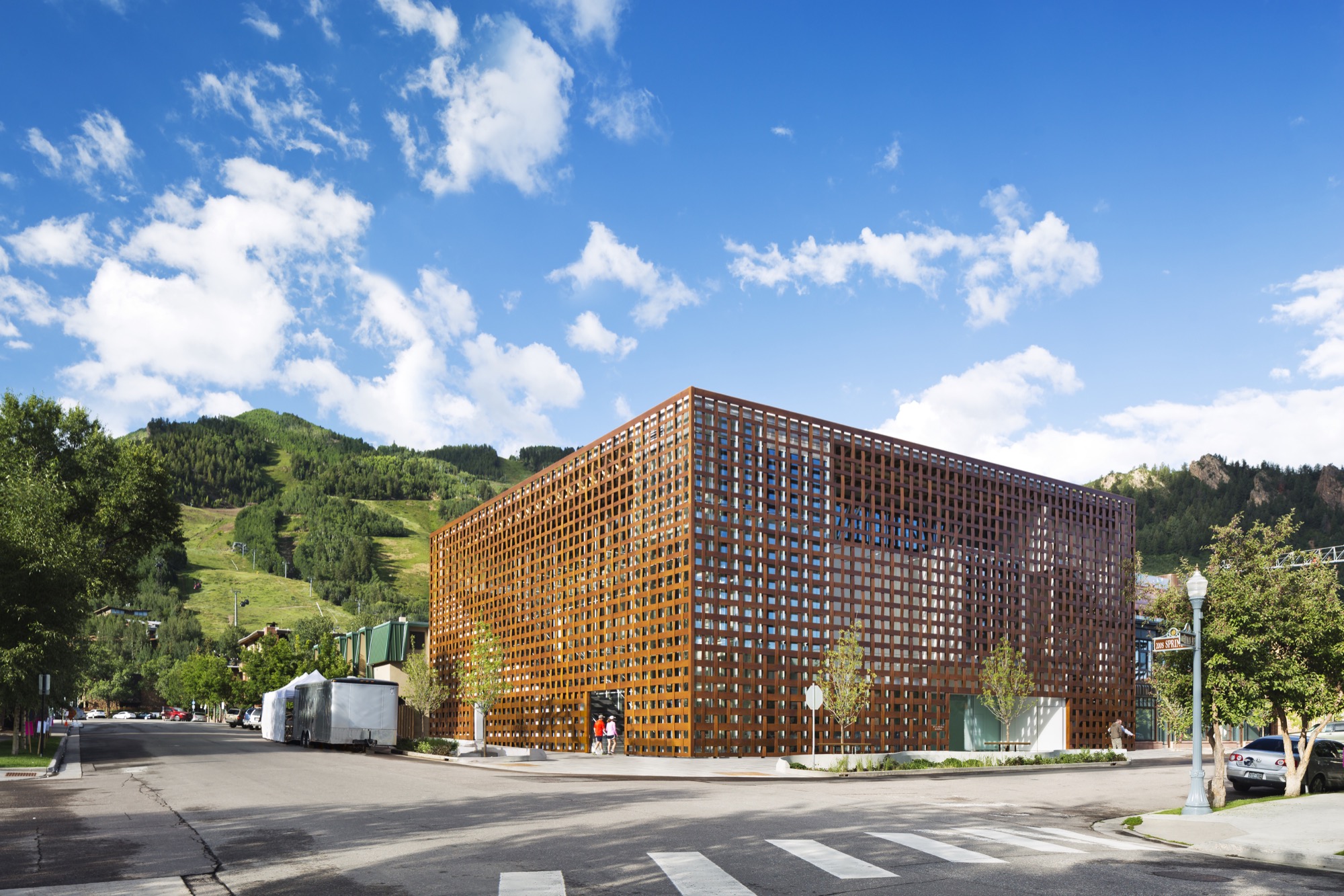
The new Aspen Art Museum, which opened in August 2014, became an instant, if controversial, landmark in the precious Colorado mountain town and beyond. Architect Shigeru Ban’s building is like no other in Aspen — or anywhere else. Think of it as a box within a box. The blocky three-story glass interior box is wrapped within an outer box made of wide strips of resin-impregnated paper woven into a grid, permitting light and air to filter in and people to look out. In daylight, the strips have a wood tone. The texture relates to old bricks, the dominant building material in downtown Aspen. The strong vertical and horizontal lines play off the glass in an ever-changing succession of light and dark, bright and shadow.
Up and down — like the skiers
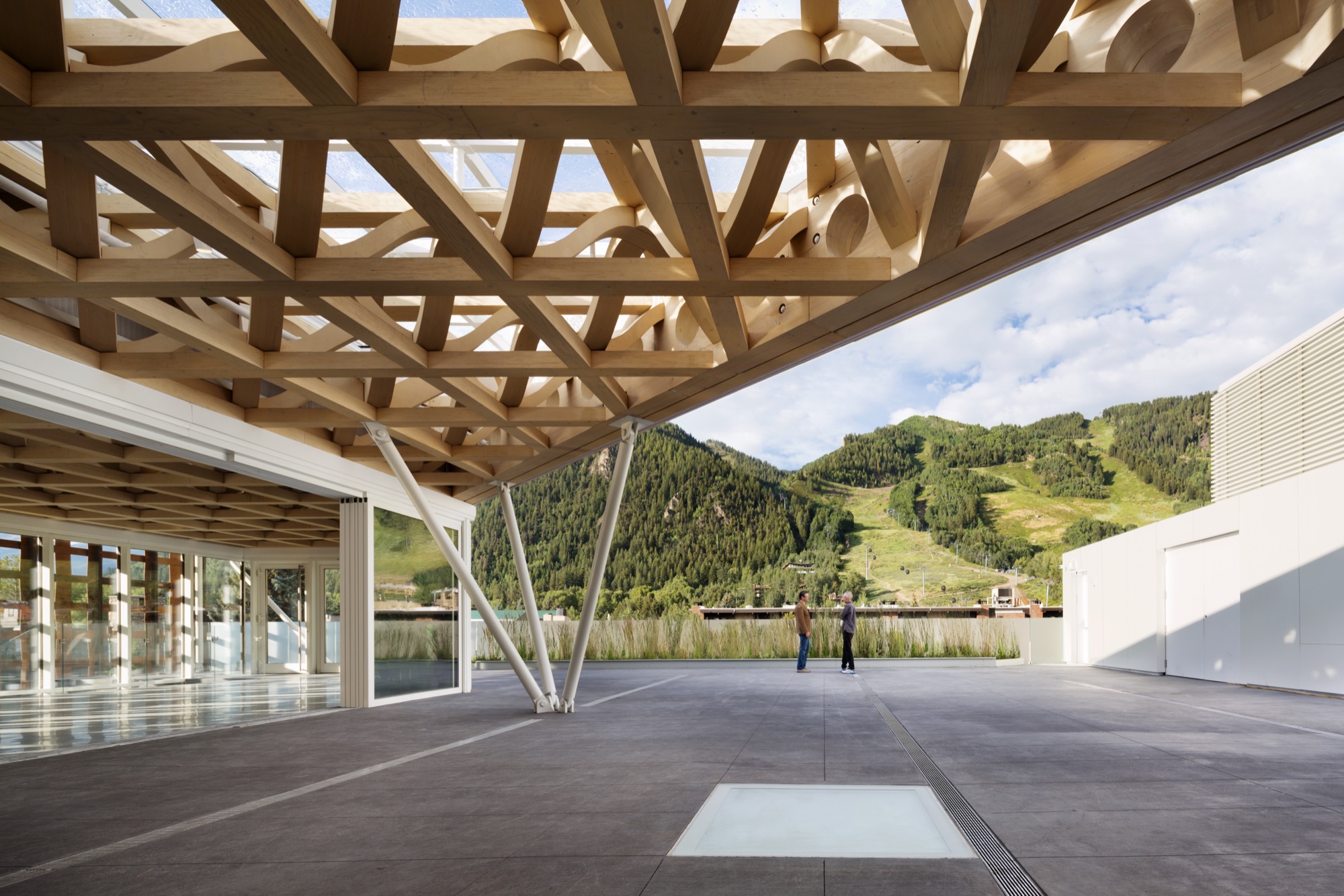
Ban’s concept was to echo Aspen Mountain, the commanding presence just south of downtown. At the ski area, skiers ride lifts to the top and then make their way down. So it is at the museum. Visitors first ascend the stairs or ride a room-sized glass elevator to the only public rooftop space in Aspen, with its open sculpture garden, grand view of Aspen Mountain’s lower slope, and an indoor/outdoor café where visitors linger over a cup of coffee, a light bite, or lunch. The menu changes frequently, appropriate for a museum whose exhibitions change every few months. Then visitors work their way down. Six galleries, three above ground and three on the basement level, have already showcased the works by painters, sculptors, installationists, and multimedia artists. A show in Aspen has a way of increasing an artist’s visibility and renown.
Curating the new
The new building replaced the 7,500-square-foot (ca. 700-square-meter) former hydro-electric plant that had housed the museum since 1979. While it was of nostalgic value to the Aspen community, it had long since outlived its usefulness as a museum that showcases contemporary art and also hosts workshops, classes, music programs, lectures, and films. In this global art world, the call for design ideas was broad, but from concept to opening involved an eight-year process. Heidi Zuckerman, the museum’s visionary director, CEO, and chief curator, says that when it was time to choose an architect, the only two requirements provided to a selection consultant were that the architect had previously designed a museum and also spoke English.
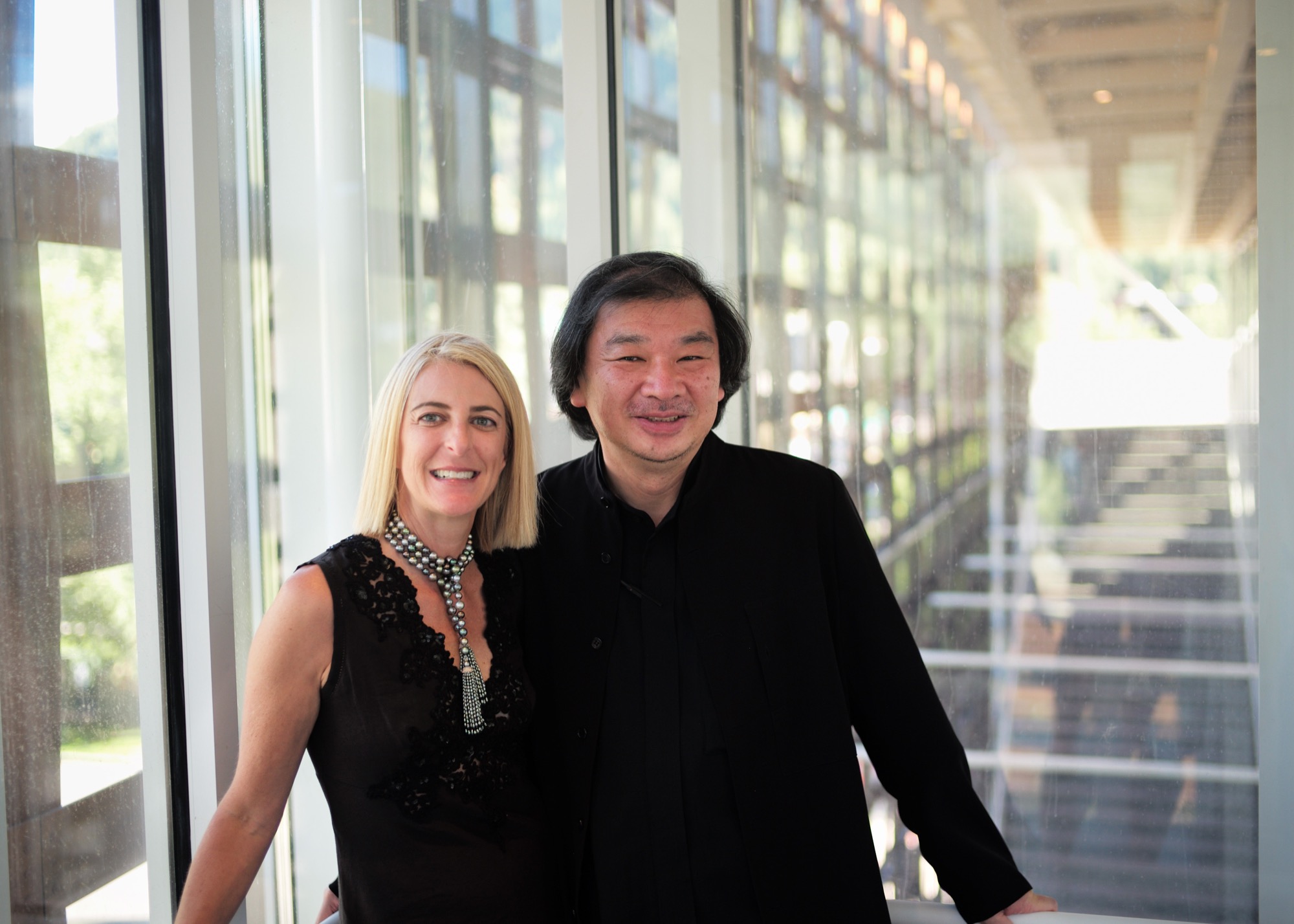
Shigeru Ban came with both. As for museums, he had designed the Centre Pompidou-Metz, a regional branch of the famous Georges Pompidou Arts Centre of Paris. The Metz outlier contains exhibitions from Europe’s largest collection of twentieth- and twenty-first-century arts. He also did the Nomadic Museum to house “Ashes and Snow,” Gregory Colbert’s groundbreaking video/photo work, that launched in Venice, then traveled to New York, Santa Monica, Tokyo, and Mexico City, ending in 2008, largely due to the global recession. As for language, Tokyo-born Ban had studied at the Southern California Institute of Architecture and New York’s Cooper Union, and he now divides his time between Tokyo, New York, and also Paris.
The selection consultant had put out the call without revealing the specific client and came back with pictures submitted by thirty-six firms — “no names, no words, just pictures,” Zuckerman says. Sixteen firms were then told that the Aspen Art Museum was the client, and fourteen of those submitted plans. A committee narrowed those to five and visited three. “Shigeru came in with the highest score at every round,” Zuckerman continues. She was already familiar with Ban from his Paper Arch, erected in the courtyard of New York’s Museum of Modern Art as part of its millennium celebration.
"Shigeru came in with the highest score at every round."
Ban’s Backstory
Time magazine named Ban the 2001 Innovator of the Year for his pioneering disaster relief designs that used simple materials to build housing in afflicted areas. Ban is known for innovative and distinct designs, of course, but also for the humanitarian and sustainable aspects to his work. He has made his reputation on using simple materials, from paper and cardboard to crates and shipping containers, to help people, communities, and countries rebuild their lives after headline-making disasters.
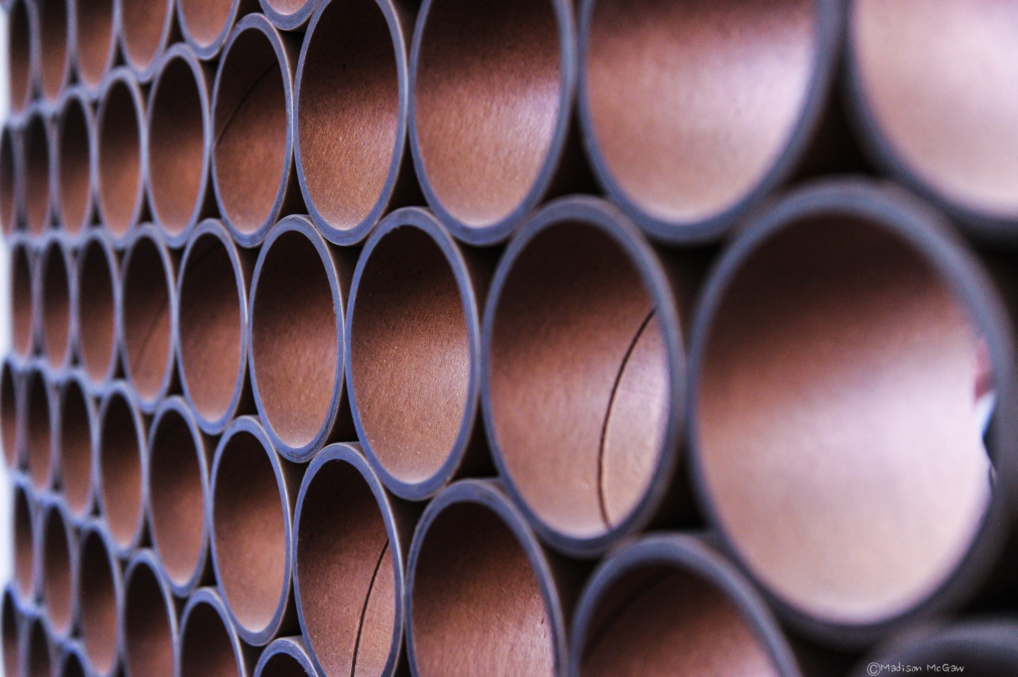
Projects included using sandbag-filled beer crates as the foundation for quick-to-build, low-cost housing after the 1995 earthquake that devastated Kobe, Japan. Sixteen years later, following the massive quake and tsunami (think Fukushima Nuclear Plant) that left 300,000 people homeless, Ban designed homes crafted from shipping containers with cardboard tubing for interior walls. He expanded on this concept with his “cardboard cathedral” that rose from the rubble of the quake-damaged Catholic basilica in Christchurch, New Zealand. With cardboard tubing as the visible structural element, it stands as a symbol of hope and inspiration while the city contemplates whether or not to reconstruct the copper-domed classic. The cardboard tubing tradition lives modestly at the Aspen Art Museum in the form of benches.
For fifty-seven-year-old Shigeru Ban, 2014 was a landmark year. Even as his $45-million USD Aspen Art Museum was in the final stages of construction, he was awarded the prestigious Pritzker Architecture Prize, considered the most important honor in the field. It rocketed him to “starchitect” status and made the museum’s twenty-four-hour grand opening the place for well-heeled Aspenites and the art-world elite to see and be seen.
In presenting Ban with the coveted prize, Tom Pritzker, president of the sponsoring Hyatt Foundation, said: “He is an outstanding architect who, for twenty years, has been responding with creativity and high-quality design to extreme situations caused by devastating natural disasters. His buildings provide shelter, community centers, and spiritual places for those who have suffered tremendous loss and destruction.”
It may seem counterintuitive that an architect known for creating housing for refugees and disaster victims did his first U.S. building in one of the country’s priciest towns, and Zuckerman is clearly relieved that her museum snagged him pre-Pritzker. It makes sense, actually. Ban is disinterested in monumental buildings, and as one of only a handful of noncollecting museums in this country, the AAM did not require massive space. It is a mere 33,000 square feet (3,065 square meters), with three stories at and above street level and one below.
"Ban is disinterested in monumental buildings."
Not for everyone
The Aspen Art Museum is built to the sidewalk line, like the nearby late nineteenth- and early twentieth-century buildings, meaning that it is not out of scale with its neighbors. But the exterior materials and the see-through grid are what turned heads and shocked some locals. People love it, detest it, or are merely puzzled by it, but everyone knows it is an extraordinary community resource, especially since admission and many of its programs are free.
Zuckerman’s uncanny instinct for identifying the next hot new contemporary talent makes the Aspen Art Museum a coveted venue, even though each exhibition lasts only about three months. “I feel fortunate to have as a platform this incredible museum,” says Zuckerman, who, mindful of the controversy surrounding the design, adds, “It can be for anyone, even if it is not for everyone.” In its first six weeks, the new museum drew some 35,000 visitors — as many as the old museum did in a year.
“I feel fortunate to have as a platform this incredible museum. It can be for anyone, even if it is not for everyone."
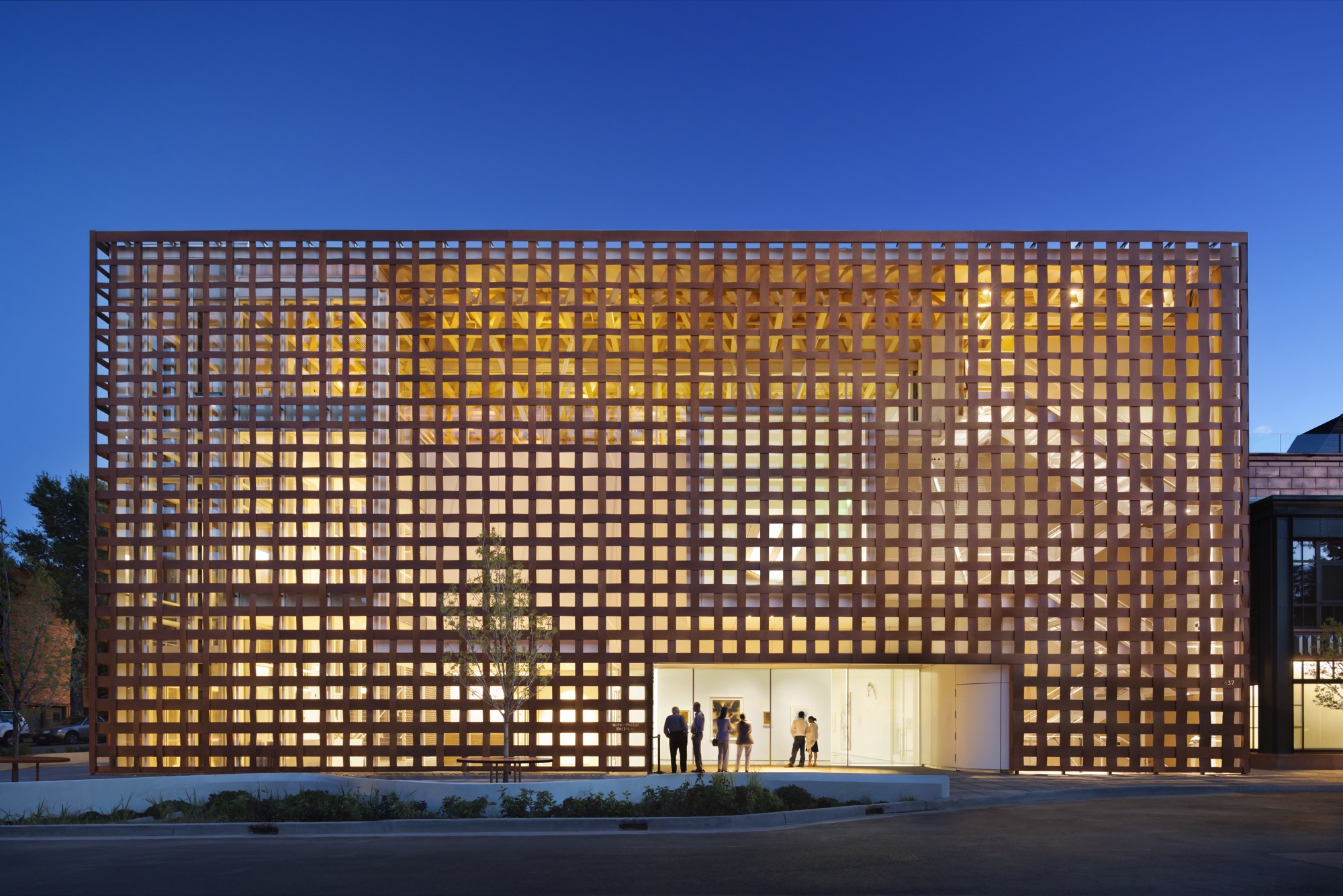
Aspen and modernism
While it values its Victorian core, Aspen has had an ambivalent relationship with modern architecture. Eero Saarinen’s original music tent for the Aspen Music Festival was replaced twice, most recently by a permanent structure designed by Aspen’s Harry Teague, and the modest concrete Given Institute by Chicago modernist architect Harry Weese was demolished in 2011.
The pure Bauhaus-era Aspen Meadows Resort on the city’s east end remains a living icon with low-slung buildings designed by Austrian-American architect Herbert Bayer. It is the home of the Aspen Institute, a humanistic think tank for leaders, artists, musicians, and thinkers. It also operates as a hotel with spacious accommodations and a fine restaurant on a forty-acre campus. Sections of the ground have been sculpted into little hills, a gentle serpentine trench to replicate a watercourse and pebbled paths plus carefully selected rocks and sculptures placed here and there. With much change in the valley, Aspen Meadows is a keeper, and so is the Aspen Art Museum. △
Intermission
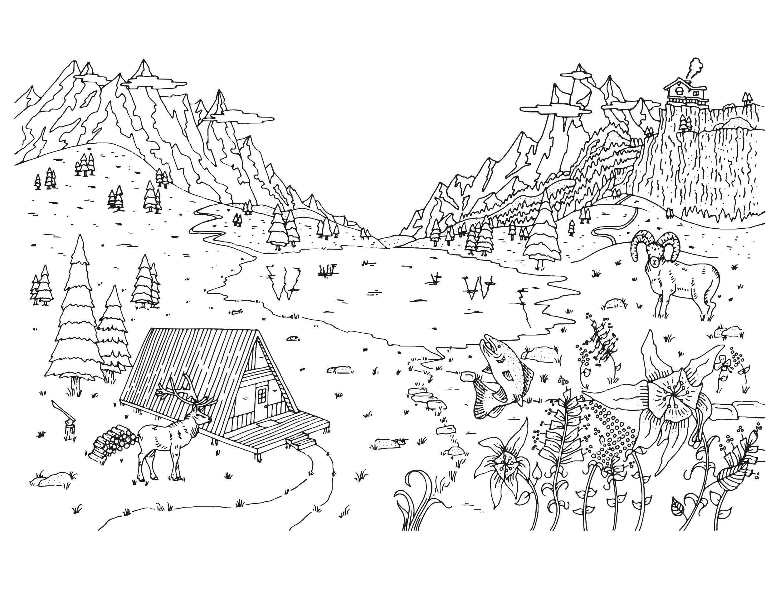
Alpine Modern coloring page
Take a breath. Slow down, and find a sense of peace through coloring.
Download printable coloring page in PDF
Becoming JK
Meet the immensely talented photographer and artist behind our JK Editions
A studio visit with Colorado photographer and artist Jamie Kripke, who experiments with layers of images and color to create JK Editions.
Growing up in northwest Ohio, Jamie Kripke received mixed messages about making a career out of his love for photography. His mother, herself an artist, passed down her old Minolta camera to her son when he was fifteen. His father’s decision to buy a condo in Snowmass, Colorado, when Kripke was three jump-started a lifelong love affair with the mountains at a young age.
Kripke started snapping photos for the school newspaper at his Toledo high school. At the time, his mother’s 1973 Minolta XG-M with the macramé strap was “a gnarly camera to have for a kid,” he tells me. While his peers were playing with point-and-shoots with flashcubes or Kodak Instamatics, Kripke was teaching himself how to vary aperture and shutter speed for the perfect shot. He developed his own film and made prints in the school’s darkroom. His first published photo is a slim black-and-white of the high school football coach jogging toward the lens. And yet, Kripke put thoughts of pursuing a photography career out of his mind because “when you grow up in the Midwest, being an artist isn’t really on the list of things your parents want you to do.”
“When you grow up in the Midwest, being an artist isn’t really on the list of things your parents want you to do.”
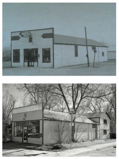
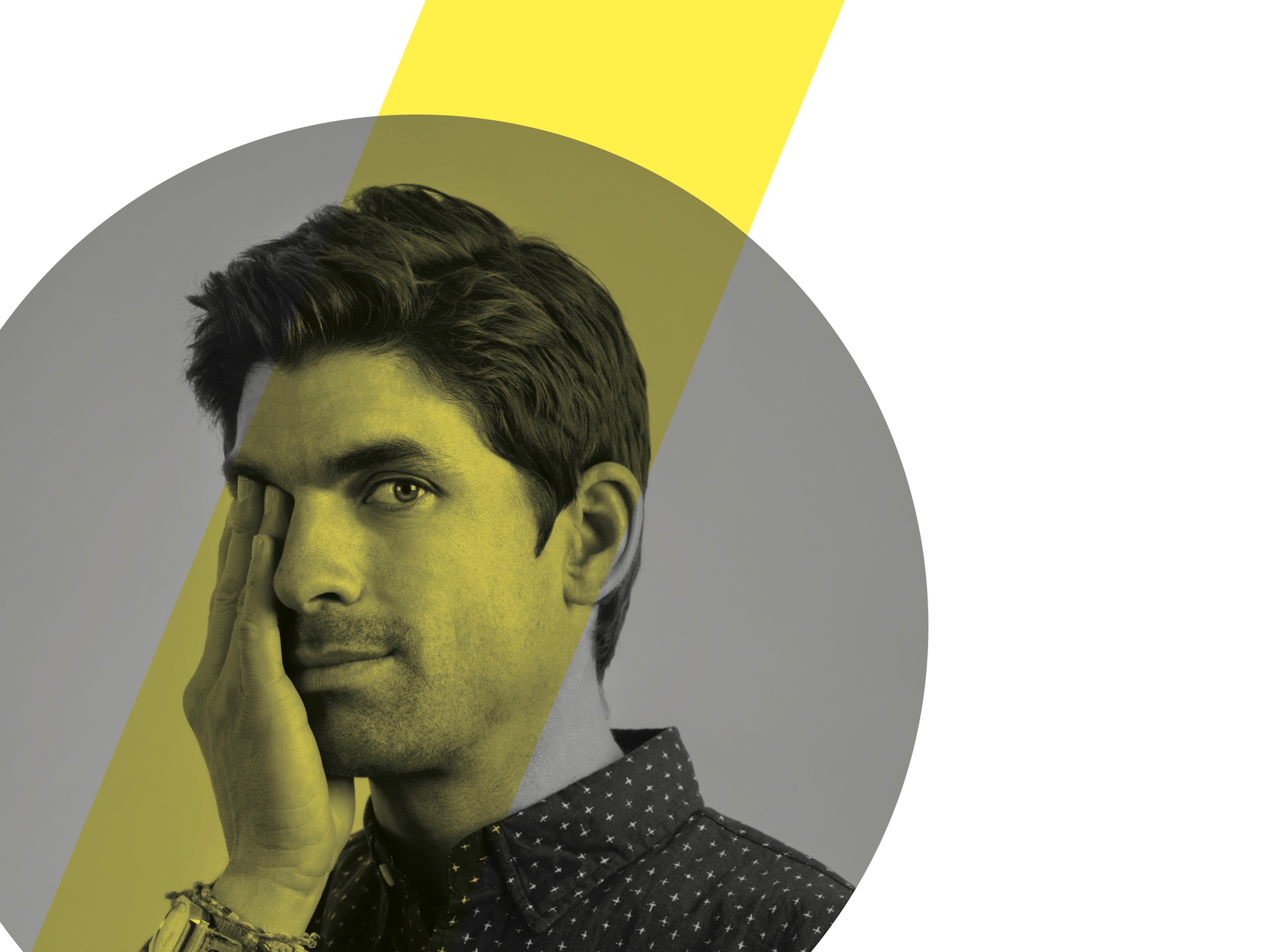
Today, Kripke is a professional photographer whose clients include Hewlett-Packard, Sony, Mini Cooper, and Visa. His editorial work has appeared in Dwell, Esquire, Outside, The New Yorker, Wired, and other publications. I join him at his Boulder, Colorado, studio on an unseasonably warm January day to learn more about his journey from high school newspaper photographer to successful independent artist. His corner studio has a deep history in the community, formerly operating as the local grocery, and before that, a horse stable. He’s been told that ghosts linger in the space. The white-walled studio is open and bright. We sit across from each other on facing vintage couches: mine a stormy gray with a mustard-yellow throw pillow, his a popping pink with a jade accent.
A simple white coffee table sits between us on a colorful striped rug. My eyes are drawn to a round clock hanging on the wall to my left; in place of numerals are songbirds—curiously, my own grandmother, mother, and aunts in Ohio all own one of these very clocks (my interviewee and I share the same home state). When I ask Kripke about the peculiar timepiece, he tells me that his father’s company in Toledo developed the original bird clock. “It has always been on the wall wherever I work as a reminder of my dad, his work ethic, and his business savvy,” he shares. Four mismatched desks of varying heights line the wall under the clock; there are no typical office chairs, but one desk has a short neon-orange children’s stool pulled up to it. The opposite wall is covered in framed black-and-white landscapes.
Kripke is a calm man; he sits cross-legged in jeans and a plaid shirt, answering my questions in a slow and intentional cadence. He explains that adventuring in the mountains of Colorado from a young age led him to the natural choice of moving to Boulder for college, where he dabbled in majors including pre-med and business before settling on philosophy. All those years, he was shooting photos with his old Minolta. In his bedroom back in Ohio, he had a poster of Bill Johnson, the downhill skier. He describes the image as a razor-sharp shot of the skier, airborne in a tuck and looking right into your eyes. As a kid, he’d often stare at the poster, wondering how on earth someone got that shot. On weekend ski trips to the mountains during college, he’d play around with photographing his friends:
“I was burning tons and tons of film to get one picture that didn’t suck.”
Kripke’s first breakthrough came a year or two after graduation, when Powder Magazine offered him seventy-five dollars for one of his images. This was a landmark moment in his photography journey; he recalls thinking, “Whoa, you can shoot pictures and get paid? That’s awesome.” The check and the letter from the magazine editor confirmed his deep longing to capture the world around him with his lens. He followed his curiosity to San Francisco, where he began assisting established studio photographers, a learning experience he likens to his graduate school. Spending much of his free time at the San Francisco Museum of Modern Art, he began diving into the world of fine art.
Observing other photographers and artists led to a natural curiosity about their techniques and guided him in finding his own approach. “[Photographer William] Eggleston was one of the first guys to pay attention to everyday stuff and to the ugly stuff. All of a sudden, I fully grasped this idea that photos are everywhere around us all the time, and it’s a little overwhelming.” Kripke’s interest in composition was sparked by Stephen Shore, who had a “gift for finding these compositions where your eye follows the path through the image. For me it’s like a seven-course meal.” And Jeff Wall, a Vancouver-based photographer who spent an entire year constructing one photograph, inspired Kripke to make the move from “something you find that already exists to something that you create from scratch yourself—taking versus making.” If he wanted to get serious about photography, he knew he needed to be able to make.
One day, while living in California, Kripke saw an old car with a mattress tied onto the hood driving on the highway. He laughed out loud at the curious sight and instantly knew he wanted to re-create that scene in a photograph. He left a note on his neighbor’s station wagon, got an old mattress from a homeless shelter, and researched how to light a moving vehicle. “It was the first picture I really feel like I made, that I fully put all the pieces together.” He still keeps that photo in his portfolio, even though it is ten years old. He reflects on the elements he pulled together from his role models: Gregory Crewdson’s moody lighting, Robert Bechtle’s nostalgic subject matter, Stephen Shore’s composition. “In some ways this picture encapsulated all this stuff that I had been paying attention to up until that moment, and I was lucky to be able to turn it into a single image.”
The plunge
All the while, Kripke still had one foot in and one foot out of photography as a profession. “There are different stages of commitment. There’s the first stage where you think, ‘Hey, maybe I should try this.’ But there’s another stage, much farther down the road, when you have to be really serious and make a real commitment to not turn back.” While working as an assistant to other photographers in his twenties, Kripke had a paycheck to count on. But could he build a viable career on his own? Unsure, he met with a career counselor when he was around the age of thirty. “I was at a point where it was time to decide,” he remembers. That’s when he got the push he needed: “The career counselor asked me what’s been the longest relationship I’ve ever been in, and I said, ‘About a year.’ Then she asked me how long I had been taking pictures, and I said, ‘Since I was fifteen, so fifteen years.’ And she looked at me and said, ‘It’s time to get married, Jamie—to photography.’ That was the moment I knew it was time to go all in—not look back.”
Kripke decided to make the leap and commit to supporting himself with his craft, so he continued to self-educate by following his curiosity and seeking out teachers. He took photography trips. He drove a VW Bus around Europe in 2004, chasing inspiration until the van broke down, stranding him in the “Des Moines of Spain,” which provided new photography challenges for a long three weeks. Back in the States, he traveled to Santa Fe to study with Dan Winters, a portrait photographer whose work Kripke first saw in The New York Times Magazine. Finding an agent in San Francisco allowed him the flexibility to move back to Boulder. He now lives a block away from his studio with his wife, Kate, a psychotherapist, and his two daughters: nine-year-old Kinley (nicknamed “Nugget”) and six-year-old Bridger (aka “Hot Sauce”).
When I ask Kripke about his favorite creative project, he laughs: “Am I allowed to say Alpine Modern?” In addition to cover art and a black-and-white photo essay—“Alps // 40”— Kripke’s fine art photography series “JK Editions” has been featured in our printed magazine, issues 03 through 06. “I’ve really loved creating these landscapes for Alpine Modern because it brings together so many things that I enjoy—skiing, photography, art, being outside, exploring, creativity.” Kripke has come to the Rocky Mountains since he was three, and now as a Colorado resident, the alpine landscape continues to inspire his art: “The mountains are like my sanctuary. The mountains are where I go to recharge and be inspired and to exercise and to push myself and to build friendships and to scare myself. They offer so many ways to make us better people—or make me a better person.”
Color connections
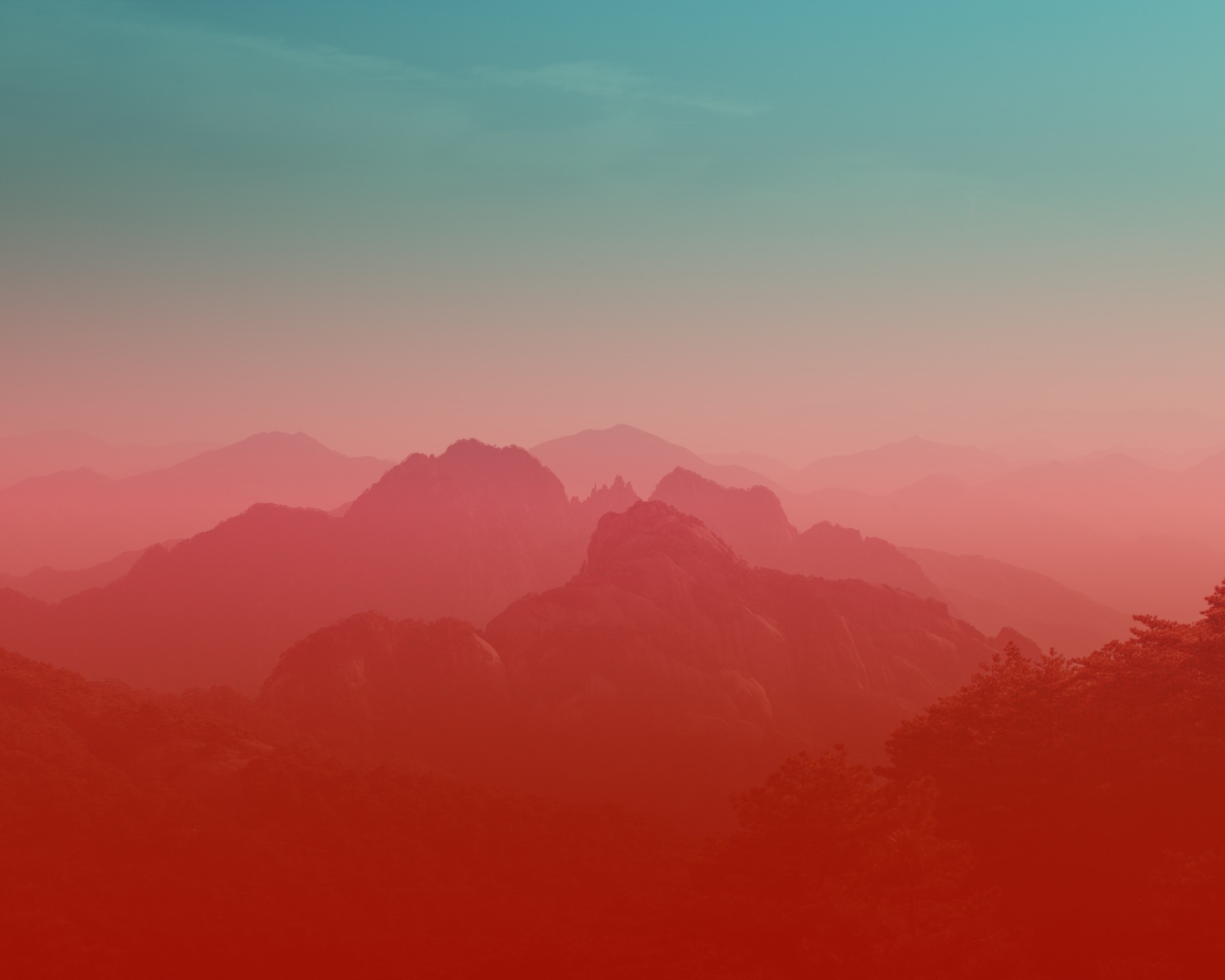
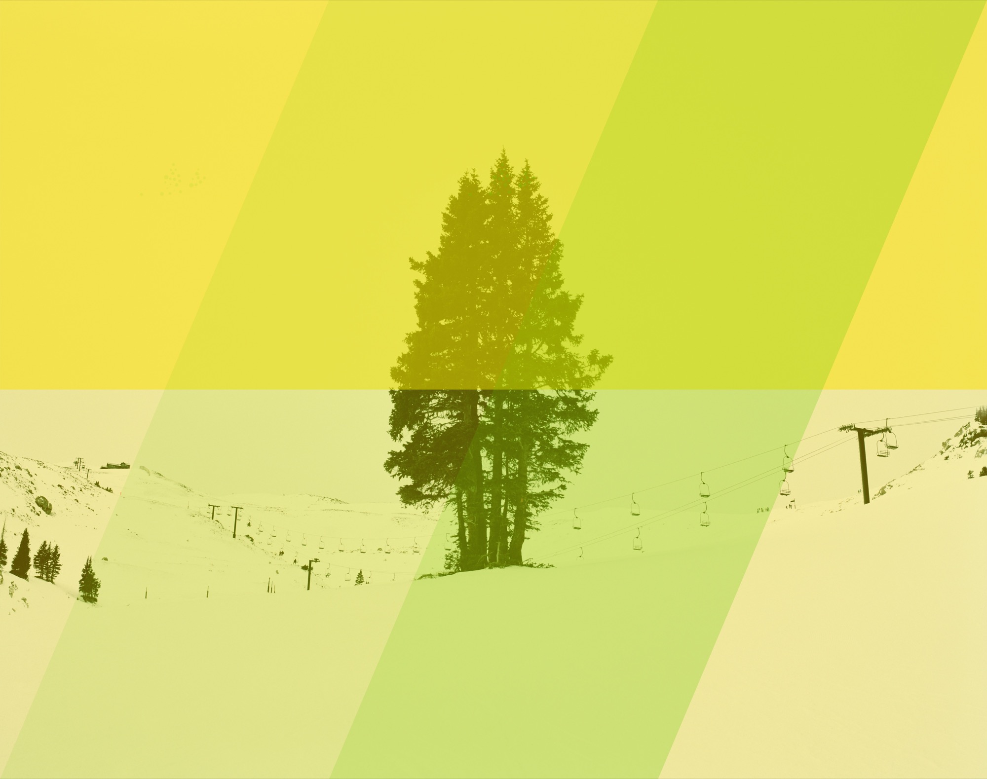
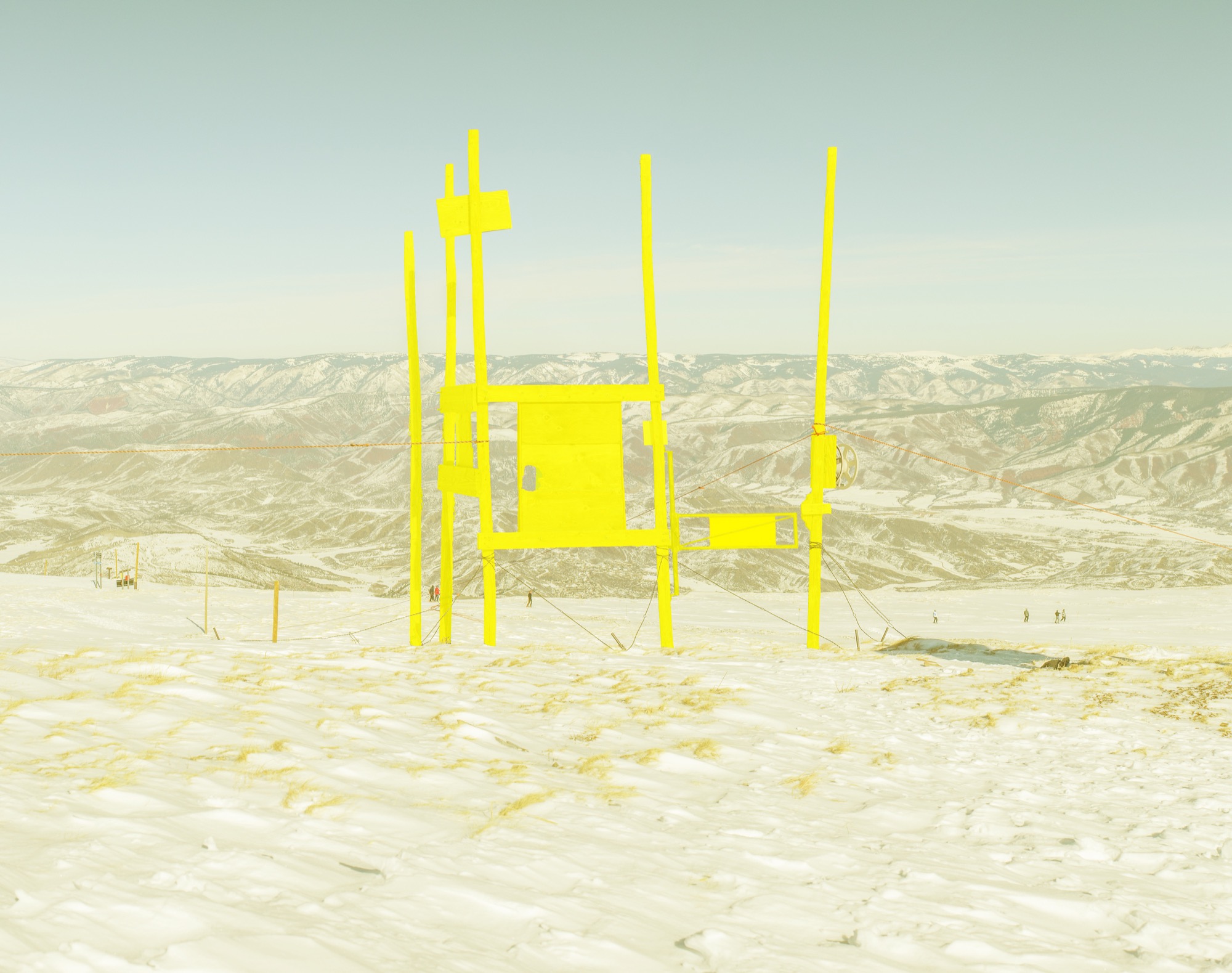
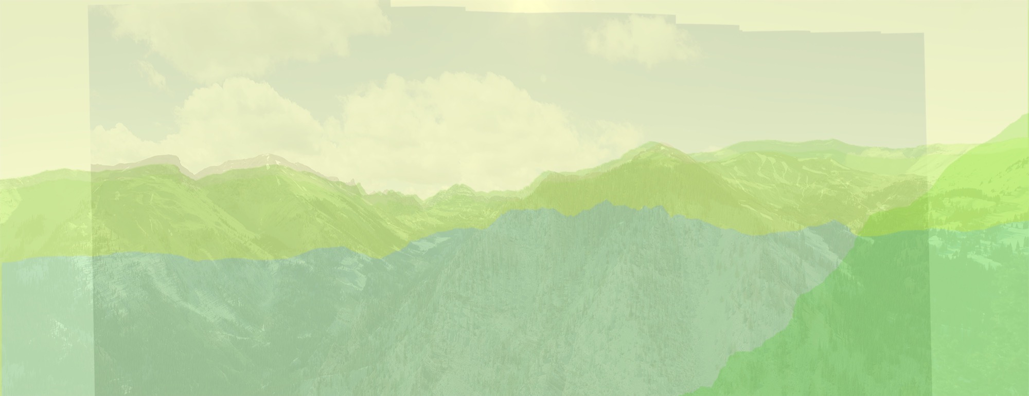
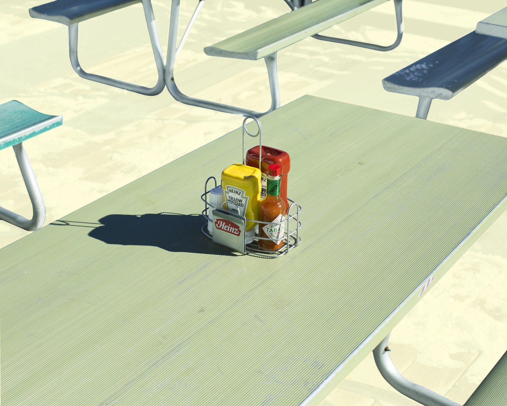
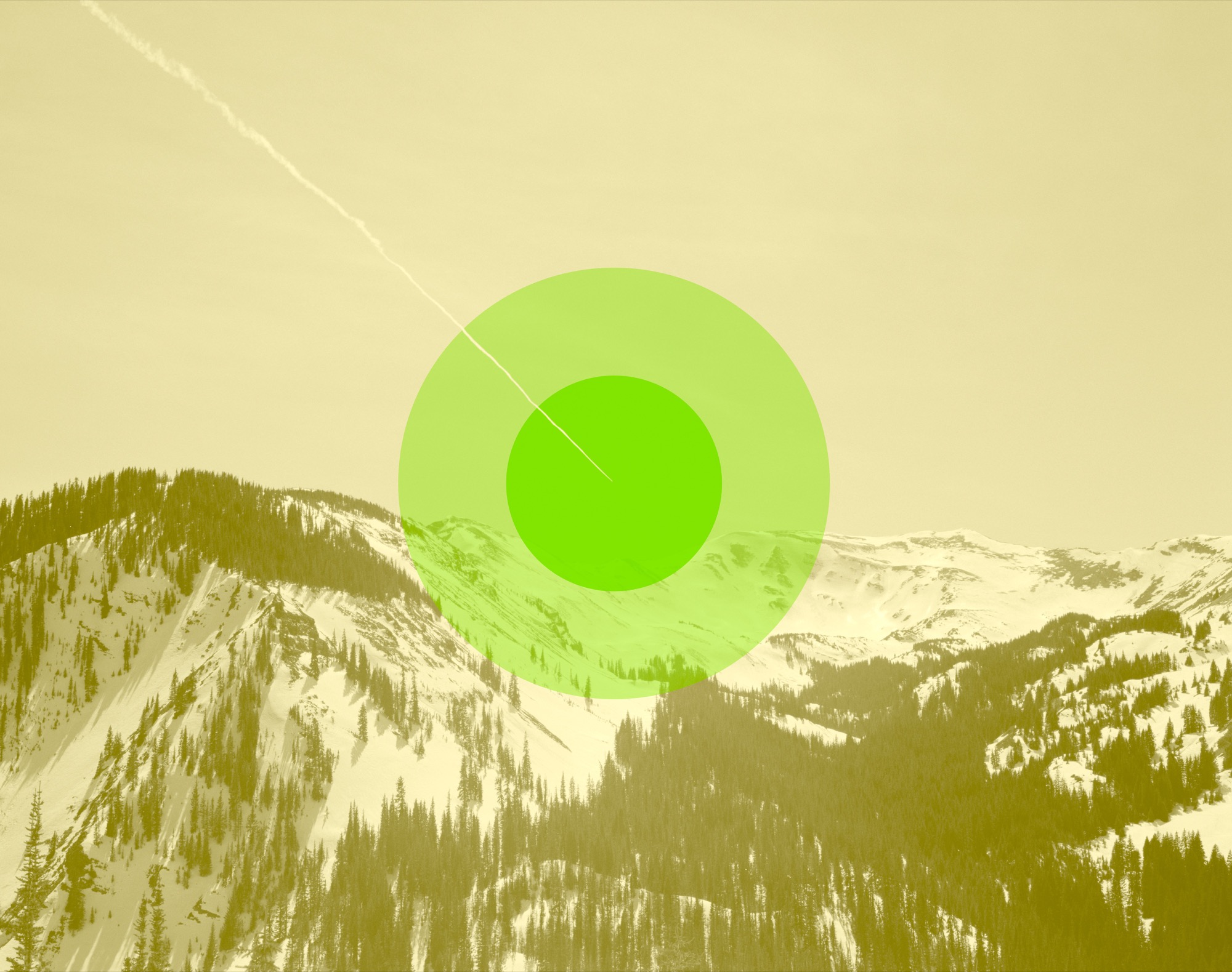
The JK Editions use layers of photography, art-driven references, and color. Kripke begins each project by photographing architecture or landscapes. Back at the studio, he zeros in on what captured his attention in the first place and layers these elements with color: “We have emotional connections to certain colors, so the color is about trying to create that connection.” We walk over to the desk, where Kripke shows me his recent work for Alpine Modern: He layered six or seven photos of the same landscape in different seasons one on top of the other to create one complex image. The winter and summer scenes are stitched together, artistically suggesting spring.
He describes the experience of displaying his work: “When I put images up, I like to think of them as windows. If you treat it like a window instead of a print hanging on the wall, it behaves differently, and it offers you a way to transport yourself somewhere for a moment.”
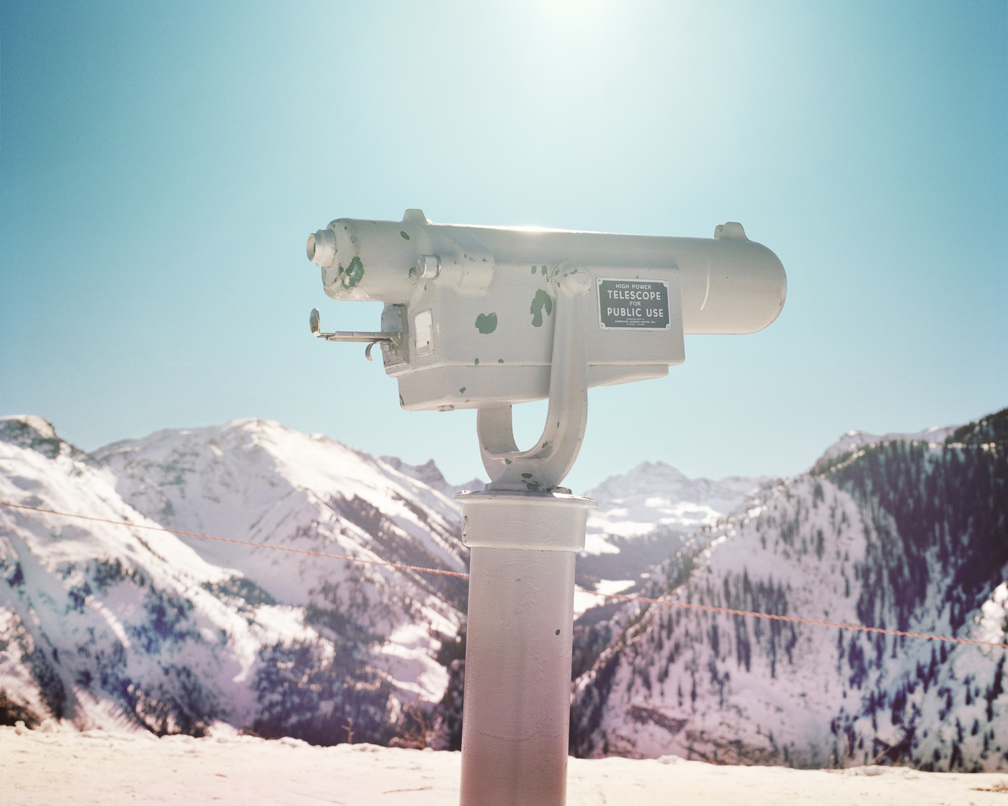
Some of the best advice Kripke has received as an artist is to “change up your inputs.” He continues to look beyond photography for inspiration, seeking out painting, sculpture, music, books, and podcasts to avoid stagnating in one medium. His work is a reflection of this: “I think inspiration comes from unlikely places or maybe the combination of two things that you didn’t expect to see together.” He seeks to make something new by combining photos and mediums to progress a project “somewhere it hadn’t been before.”
“When I put images up, I like to think of them as windows. If you treat it like a window instead of a print hanging on the wall, it behaves differently, and it offers you a way to transport yourself somewhere for a moment.”
Kripke’s philosophy on life? “Just be honest with yourself, and be honest about what makes you happy.” When I ask him if there is anything else he would like to share, he laughs: “Everything’s for sale.” △
Alpine Modern + JK Editions: Winter
Limited edition fine art prints by Jamie Kripke
Photos and Art by Jamie Kripke A portfolio of images by Boulder, Colorado-based photographer Jamie Kripke, created exclusively for Alpine Modern. An ongoing project that studies our connection to the alpine landscape.
Limited edition, museum-quality fine art prints of these images are available to purchase at the Alpine Modern online shop.
Art ± Geology
A studio visit with modern painter Sarah Winkler
Contemporary artist Sarah Winkler’s experimental painting technique mimics the addition and subtraction of geological processes in nature. Iceland’s geological drama and Alpine-Nordic design ethos inspired her current winter series of fantastical alpine landscapes. It was a cupboard drawer full of Mars bars that lured Sarah Winkler into the world of art. She was five years old and lived in Manchester, England. The cache of hiking treats belonged to an impassioned artist living next door. Sarah and her brother liked to visit him and eat his chocolate. Eventually, the little girl became fascinated with the neighbor and his lifeway. The man had worked at a bank his entire life. But on the weekends, he would ramble across England and over mountains. In his seventies, even, he climbed in the Himalayas. “He was an incredible adventurer,” Winkler recalls about the former neighbor, who had most of his house converted into a studio. “He would sketch all his travels and come back and translate the sketches into detailed drawings.”

And that’s what Winkler does today. The British-born painter remembers being “absolutely captivated” by her childhood idol’s way of traveling and then documenting the things he saw along the way, his journey. “That’s who this guy was, and being around him was enough to start that bug in me, the love of travel and adventure and painting.”

The Travel Painter
Much like a travel writer brings back stories from afar, this wanderlust-bitten painter must travel to make art at home. “Experiencing new things, seeing things for the first time...you’re really open and raw, so you are absorbing a lot easier. I travel and then come back and work, based on the memory of that place,” she says. “I take vacations in search of solar eclipses, exploding volcanoes, or the northern lights.”
Just don’t call her a landscape painter. “I don’t want people to think I do nice little landscapes...of places that actually exist.” Her invented vistas disregard human imprint on landscape. They do, however, consider what landscape does to us humans. “These are wild, untouched spaces. They almost become psychological spaces.” Her scenes interpret the human relationship with the outdoors. Why do we go to the forest? Why do we climb mountains? Why do we hike trails? Why do we still go into wilderness this far into our evolutionary progress? “Sometimes, you have to go into the darkness of nature to really know yourself,” the spirited artist says.
Wild, untrodden landscapes mesmerize her. “The horizon line is this boundary between what you know, your reality as it is, and what you don’t know...what’s coming,” she philosophizes. “A strong horizon line signifies this moment when you’re going off the deep end, into an abyss. It’s that wanderlust kind of feeling of a journey, of traveling, of submitting to something challenging that you have to go towards and overcome.” Her art tells of survival in wilderness, accented by peaceful moments of pure consciousness in nature. “You forget all the humdrum of life, but at the same time, there is a fear factor. You have to be brave, Zen-like, and really present.”
A strong horizon line is the common characteristic in Winkler’s landscapes. That giant glaciers and rugged peaks, which inspired her current winter series, don’t typically make for an obvious horizon line doesn’t deter this willful woman. “Because the horizon line is very important to me, I decided I’m going to force a horizon line in these paintings, even though it doesn’t exist,” she says, eyes twinkling. What’s more, the ebullient blonde places the horizon line dead center. “That’s such a no-no in painting, I love it,” she laughs. “In abstract painting, the joke, the idea is that you don’t know which way is up.” Realistic landscape paintings, on the other hand, always have a definite top and bottom, a rule Winkler bends. “You can actually flip these paintings one way or the other and they will still read correctly as a landscape painting.”
"I don’t want people to think I do nice little landscapes...of places that actually exist."

Her make-believe horizon lines become a divide of above and below—the alpine reality we see above, all formed by a geology below that we can’t see. “It ties in with the Continental Divide here in Colorado. It’s very dramatic, two plates crushing together and mountains are growing,” she says. “It’s about landscape that’s growing, that’s forming, that’s eroding, that’s expanding.”
A Place to Paint
With a father whose jobs in aviation moved the family around the globe, the artist lived an adventurous childhood in Africa, where her mother first encouraged her to draw her unfamiliar surroundings, and later in different places across Southeast Asia. In 1989, the world-wandering family immigrated to the United States, where the expat graduated with a bachelor of arts degree in studio art, creative writing, and earth science from William Paterson University, New Jersey, in 1994.
The environment the transplant lives in is very indicative of her art’s colors and moods. Today, the forty-two-year-old lives and works in a three-story mountain home perched in an aspen grove at the summit of an 8,500-foot (2,591-meter) peak above Denver, in the Front Range of the Colorado Rockies. Husband Jason and their pooch also live in the matte black house with white trim.
In Winkler’s current body of work, the influence of her new mountain domicile converges with memories of a pivotal journey to Iceland. “A very geologically dramatic island...the colors, black and cobalt blues, and these very stark, surreal, empty landscapes,” she reminisces about the volcanically active country. The artist’s painted Nordic landscapes use neutrals and calming spots, an aesthetic she discerned during design week in Iceland. “They usually have pops of color or strong moments of interest, and then everything is quite calm and minimal around it.”
The worldly-wise Brit and her travel companions drove in Jeeps over glaciers, watching the northern lights. She photographed nature’s night spectacle with long exposure. Afterwards, the pictures revealed what happened between the aurora borealis displays. “I saw these very dark, cobalt skies, and then this amazing landscape in the middle was popping out, because the bright snow and the glacial moraines and the ice were overexposed, of course. So working from that imagery was how I came up with this winter series.”
Winkler’s landscapes, fantastical and abstract, don’t depict real places. The outlines of mountains aren’t existing ranges or peaks one could pinpoint on a map. Yet Instagram followers from Iceland instinctively recognize their own country when the artist posts snaps of her latest works on the site.
Rather than the likeness of real-life scenery she surveyed, Winkler wants to render the emotion a landscape evoked in her. “Working from the memory of those forms and colors and textures is how I came up with the sketches, and now I am translating them into really abstract paintings,” she says. The winter series draws on Winkler’s memory of Iceland’s Blue Lagoon in particular, where the artist bathed in the warm, otherworldly milky-blue water. “You have the black lava fields and the bright turquoise tide pools, and the ground is covered in the white silica minerals from the water.”
"This whole painting process is about adding and subtracting, like the erosion process in nature."
Each scene takes time to ferment in her mind. “Because I am not painting realistic scenes, nostalgia is always a little bit more interesting than what’s fresh in your mind, when you know all the details,” she says, admitting that forgetting a few details helps her get down to the essence of an experience. “Remembering only the most interesting part makes it this haiku moment in the landscape. Boom.”
Winkler’s creativity is fueled by a sense of place within her surroundings. At the time of her Iceland travels, she still resided in California—and painting icy Nordic landscapes in such an agreeable one-season environment felt incongruous. “Iceland was such an extremely different experience, a very Nordic, alpine, Arctic Circle kind of place,” she says. “When I came back to California, I couldn’t get my head into it. It was the wrong place to work on it.” She shelved the Iceland-inspired series. But when she and her husband relocated to Colorado in early 2015, the artist absorbed a wintry experience, and the alpine wilderness there that reminded her of Iceland’s rugged terrain. “That’s how these colors started coming back to me. It made sense now, and now it just owed out.”
"Remembering only the most interesting part makes it this haiku moment in the landscape. Boom."
Emulating Geology
Winkler at first experiments in ink on transparent foil, using the same solvents and resists she later uses with the paint media. When “something interesting” happens, she scans the plastic swatch, magnifies it, and prints it in archival inks on acid-free coated papers she then rips to pieces. Each landscape begins as a small collage made from those paper scraps. When I comment that these collages she calls her “sketches” are beautiful small works of art in their own right, the creative says this was indeed what she sold as her final pieces for many years. Only this year she began translating the collages into large-scale paintings. But could she simply paint a landscape that’s not copied from a paper-assemblage sketch? “I’ve actually tried a painting without any collage references, without any sketch reference at all, and it was a total disaster,” she admits. “The collage creates the look of a painting. This hard-edged torn-paper effect gives a very graphic feel to the painting. It’s very painterly, but it’s very graphic at the same time.”
"The collage creates the look of a painting, this hard-edged torn-paper effect gives a very graphic feel to the painting. It’s very painterly, but it’s very graphic at the same time."

Winkler’s final paintings are acrylics on wood panel. Each large wood board is first treated with a sealant and several layers of the artist’s own mix of ground marble dust gesso, and then wet-sanded between applications to attain a polished, ice-like finish. She works in stages, using different techniques in different sections, which she masks off. Her experimental approach involves solvents, resists, and carving tools to mimic geological effects in nature, such as abrasion, corrosion, sediments, wind ripples, pooling water. It’s yet another layer in her abstract interpretation of landscape. “It’s not just that I am painting geological textures. It’s digging deeper into the process of the landscape, because the minerals I use in my paint mixes, the marble, the mica, the iron oxide, all come from the rocks.”
"This whole painting process is about adding and subtracting, like the erosion process in nature."
Winkler immersed herself in the study of geology and quickly discovered that the colored pigments in her paints also come from crushed rock and the earth. “What if the pigments in the paint would do the same thing as rocks and dirt and landscapes do in nature?” The artist manipulates textured paint media with water, oil, salt, wind, heat, and sanding tools. “You apply a layer of paint, and then you take some of it away,” she explains. “This whole painting process is about adding and subtracting, like the erosion process in nature.” △
Photos by Christopher Mueller

