Inspirations
Explore the elevated life in the mountains. This content debuted in 2015 with Alpine Modern’s printed quarterly magazine project.
Morning at Home
“I’m going to make everything around me beautiful — that will be my life.”
— Elsie de Wolfe (1865–1950), interior designer, United States
Surrounding yourself with delightful everyday objects you love makes everyday life more beautiful. Items you look at and touch all of the time carry significance in creating life’s simple pleasures. Both form and function are important. When a knife, a kitchen cloth, a teapot, a mug are so impeccably designed, so sensuously textured, and so faultless in their utility, all but their overt beauty is rendered unnoticable. Good design makes your day, begin it in beauty.
Quite similarly, a strengthened body harbors a nourished soul. Taking time to mindfully prepare real food for yourself and those who wake up with you feeds self-respect and manifests regard for the well-being of family and friends gathered at your table. Good food makes your day, begin it in strength.
Curation for an alpine-modern morning

Recipe: The Perfect Egg Sandwich
A simple dish to remind you to try new new things in life. Make→

Glass French Press
This Glass French Press (available in gray or clear) is an evolution of the classic press pot. The press brews a perfect full-bodied pot of coffee or tea in the traditional French Press method. Made of premium heat-proof borosilicate glass, it is durable and able to withstand extreme temperatures. Shop at Alpine Modern→
Recipe: Kale and Potato Pancakes with Gravlax and Nordic Yogurt
Alpine Modern Executive Chef Ellory Abels created a delicious dish to make for your weekend brunch. Make→

Recipe: Alpine Granola
A morning at home with a simple bowl of toasted oats and nuts. Make→

Alishan Jin Xuan High Mountain Spring Oolong Tea / Taiwan
The name Jin Xuan refers to a specific tea varietal developed by the Taiwan Research and Experiment Station (TRES), which is dedicated to the improvement of the tea industry of Taiwan. Jin Xuan teas are satisfying as they offer good amplitude in texture and taste. With mild floral notes, they have the greatest potential for sweetness, with hints of exotic fruit. Teas elaborated with Jin Xuan leaves have a particularly creamy texture with a distinctive milky smoothness and sweetness. Jin Xuan has typical green, crisp pastoral notes with hints of mountain flowers that charm the nose. The perfect cup of tea to begin the day. From Taiwan Tea Crafts.

Tetsubin Tea Vessel / Japan
A tetsubin is a Japanese vessel for preparing tea. This beautiful cast-iron tetsubin is adorned with the traditional “snow pellets,” or dots. An added benefit of the cast-iron is that iron is transferred from the kettle to the drink, providing the body with the healthy mineral. From Ikenaga Iron Works Japan.

Recipe: Grapefruit Brulée
Broiled in the oven, the grapefruit forms a delicious golden brown and crispy surface. Make→

Forest Honey / Italy
Dark amber color, rich taste, though not overpowering, this honey is great spread on bread. Born from the nectar of flowers in the wilderness of the fragrant, humid forests of northern Italy, this honey has the fresh and delicate scent of the mountains. From Rigoni di Asiago.

Fox In The Leaves Tray
Beautifully printed melamine tea tray featuring Donna Wilson’s watercolour illustration of a fox in a leafy woodland. Made in a small factory in Belgium. Shop at Alpine Modern→
Editor's Choice: Concrete Beauty
5 brilliant examples of use of the quintessential building material that helped to define the aesthetics of modern architecture.
Where would modern construction be without concrete? The building material is not only an essential element of modern architecture, it helped to define it's aesthetic. Equally, the cabins, homes, and resorts in these stories—collected from the printed Alpine Modern magazine as well as this Editorial—are unique for their use of concrete.

Refuge in Concrete
Refugi Lieptgas is the negative imprint of its ancient predecessor. Read the story→
The Swiss Art of Alpine Luxury
Jonathan Ducrest’s photo essay portrays the luxury hotel 7132 in Vals, Switzerland, with its iconic thermal baths designed by Pritzker Prize-winning Swiss architect Peter Zumthor. Read the story→
The Soul Catcher
Peter Haimerl’s progressive designs save derelict farmhouses. Read the story→
 Camera Lucida by Christian Tonko / Photo by Eduard Hueber
Camera Lucida
An artist’s atelier becomes a looking device into the Austrian landscape. Read the story→
Concrete Perspectives
Australian photographer Jake Weisz discovers the minimalist Amangiri Resort in Southern Utah. Read the story→ △
Family HQ in Alaska
In the shadow of Denali mountain, amid Alaska’s meadows and icy streams, a former teacher and a four-time Iditarod winner build a modernist cabin as expansive as the Last Frontier.
 In the shadow of Denali mountain, amid Alaska’s meadows and icy streams, a former teacher and a four-time Iditarod winner built a modernist cabin as expansive as the Last Frontier.
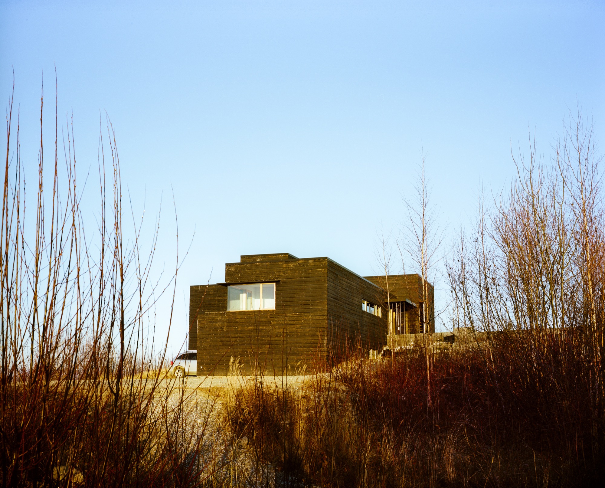
Tens of thousands of years ago, a glacier slid its way through southern Alaska and carved out the Matanuska-Susitna Valley. Bound by three massive mountain ranges and dotted with lakes, it’s an unabashedly wild place. Hundred-pound cabbages flourish in endless summer sunshine, caribou outnumber people, and towering Denali presides over it all. "You can go 1000 miles here without crossing a road," says Martin Buser. "Most people can’t grasp that kind of freedom." A four-time winner of the Iditarod—the grueling dogsled race from Anchorage to Nome—Buser spends his days crisscrossing the landscape with his dogs. So, for his dream home with his wife, Kathy Chapoton, there was no question that the spectacularly rugged setting needed to be the driving force behind the design.
"You can go 1000 miles here without crossing a road. Most people can’t grasp that kind of freedom."
An Alaskan story
The story of how the couple met and found the site is typically Alaskan. Chapoton moved from New Orleans to Anchorage in 1979, at a time when the state government let people claim land for pennies as a way of getting back tax dollars. Soon after relocating, she joined a group of friends one day in early January to stake out the five acres allowed to each person. "It was 50 below zero, my teeth were frozen, I didn’t even know how to read a compass, and I had to walk around and literally mark the parcel," she says. "It was hilarious." Registering her claim at the office in Anchorage, she bumped into Buser, a recent Swiss transplant, and the two married not long after.
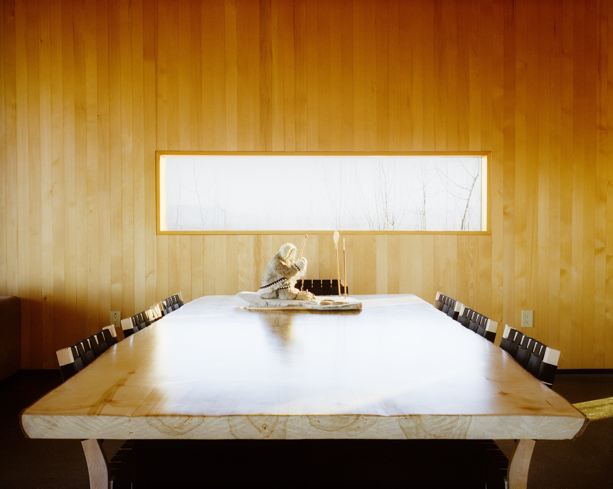
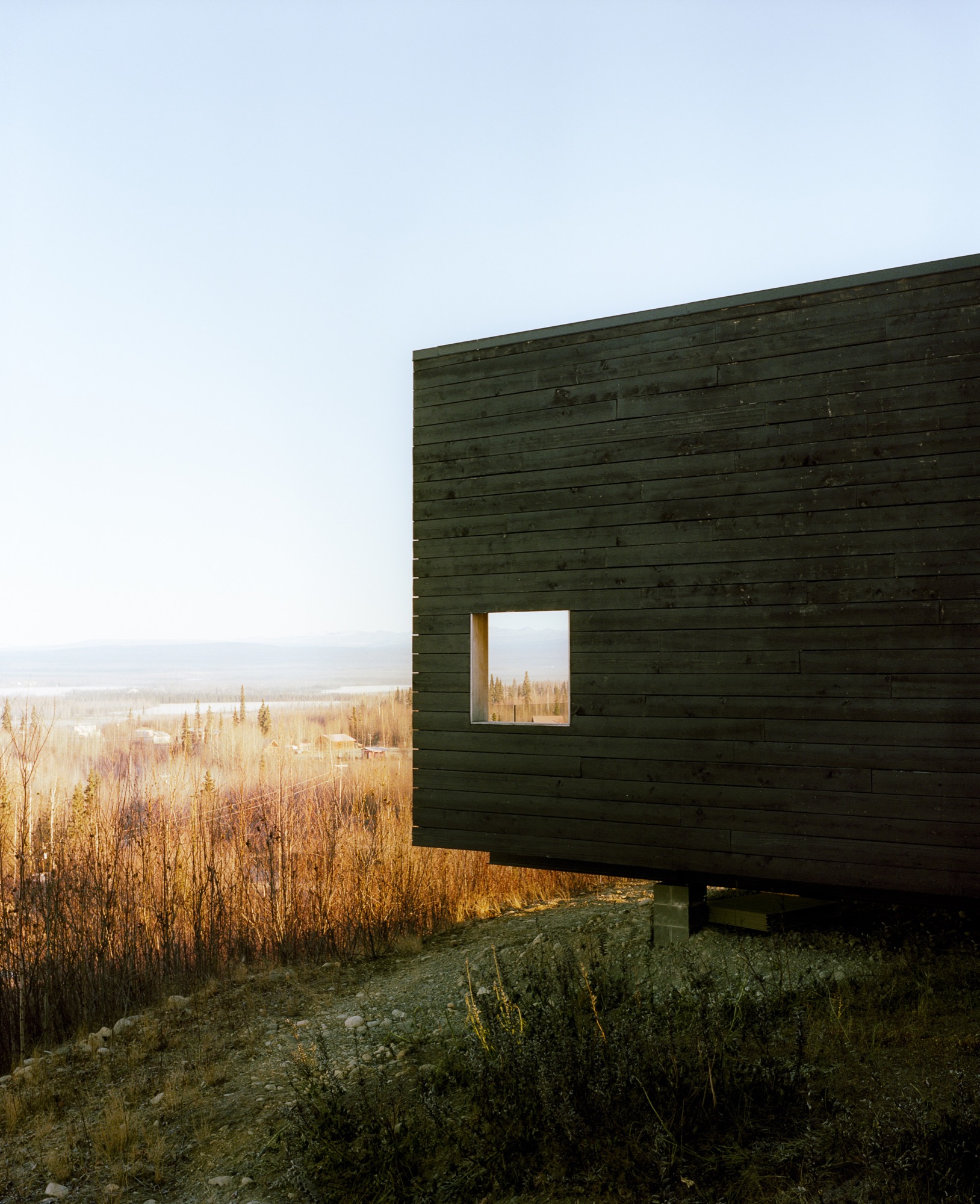
The new House for a Musher
For 20 years, the growing family (sons Nicolai and Rohn are named after Iditarod checkpoints) lived in a large house that Buser built on the land, adjacent to the kennel where his hundred-odd dogs reside. In 1996, a wildfire swept through the area: "It was pretty ugly," remembers Chapoton. As a result, people started selling off their nearby plots, and the couple snatched up 25 additional acres—including a mountaintop site that they had been eyeing for years. "It was the primo lot," says Chapoton.
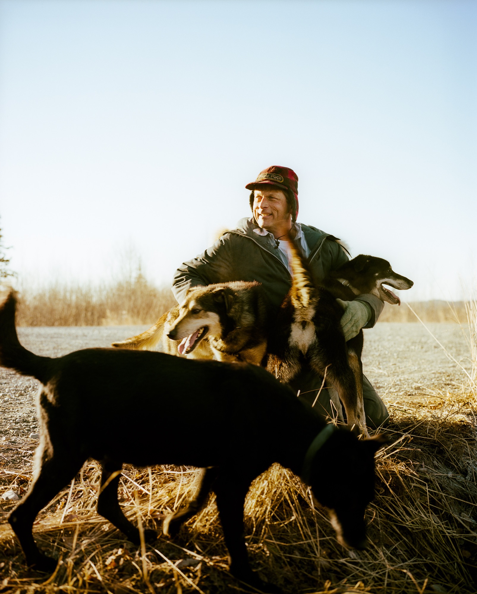
Buser built a little cabin on the top of the mountain as a weekend retreat, but the combination of killer views and the couple finding themselves empty nesters convinced the pair to make that site their permanent home. They moved the cabin by truck to a nearby site (son Rohn lives there now) and called on architects Petra Sattler-Smith and Klaus Mayer of Anchorage firm Mayer Sattler-Smith to design a house. Though Buser had built several homes, the couple knew this site deserved something special. "Because of the multitude of views, we couldn’t take advantage of the site ourselves. We knew our limitations," Chapoton says.
Denali in view
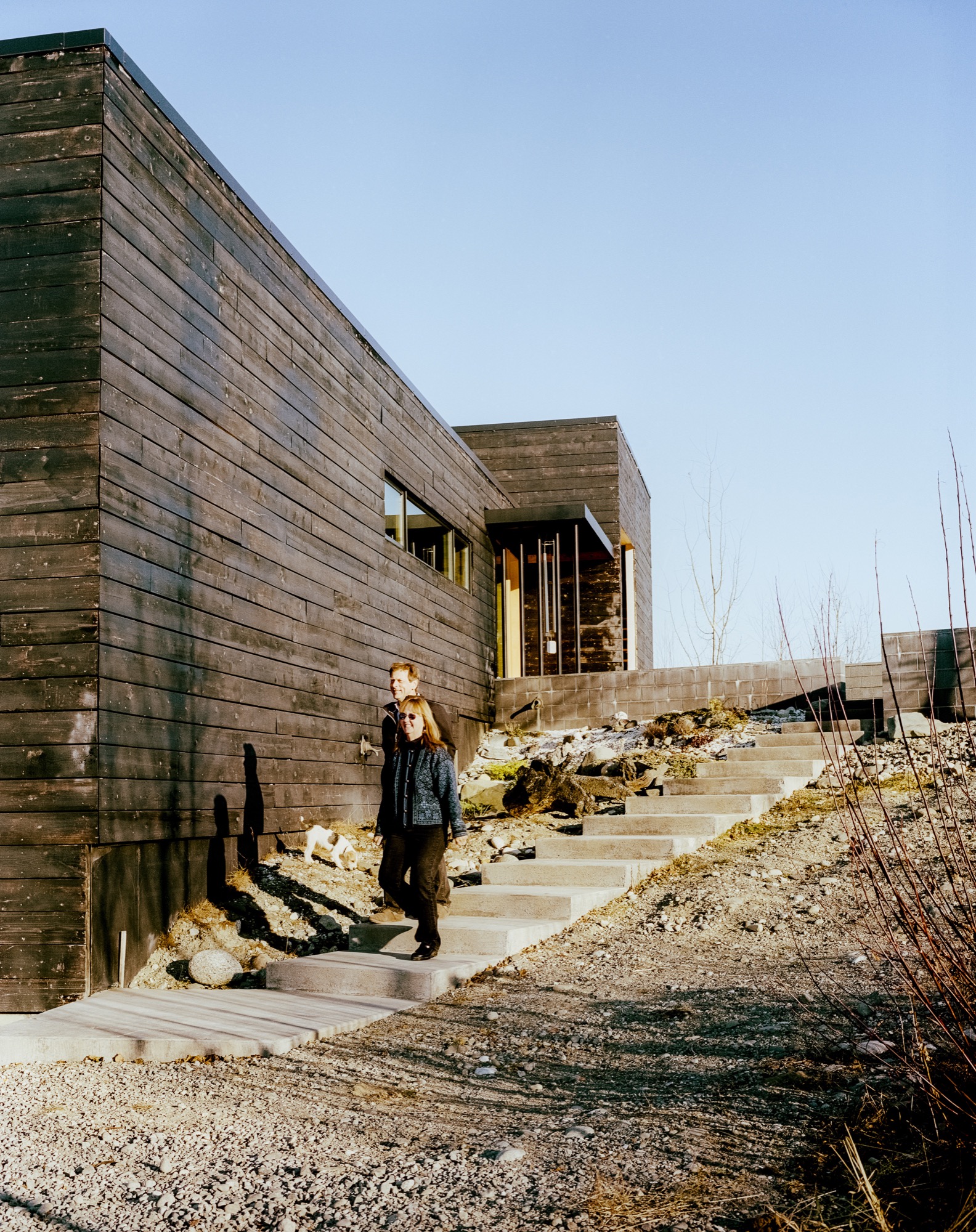
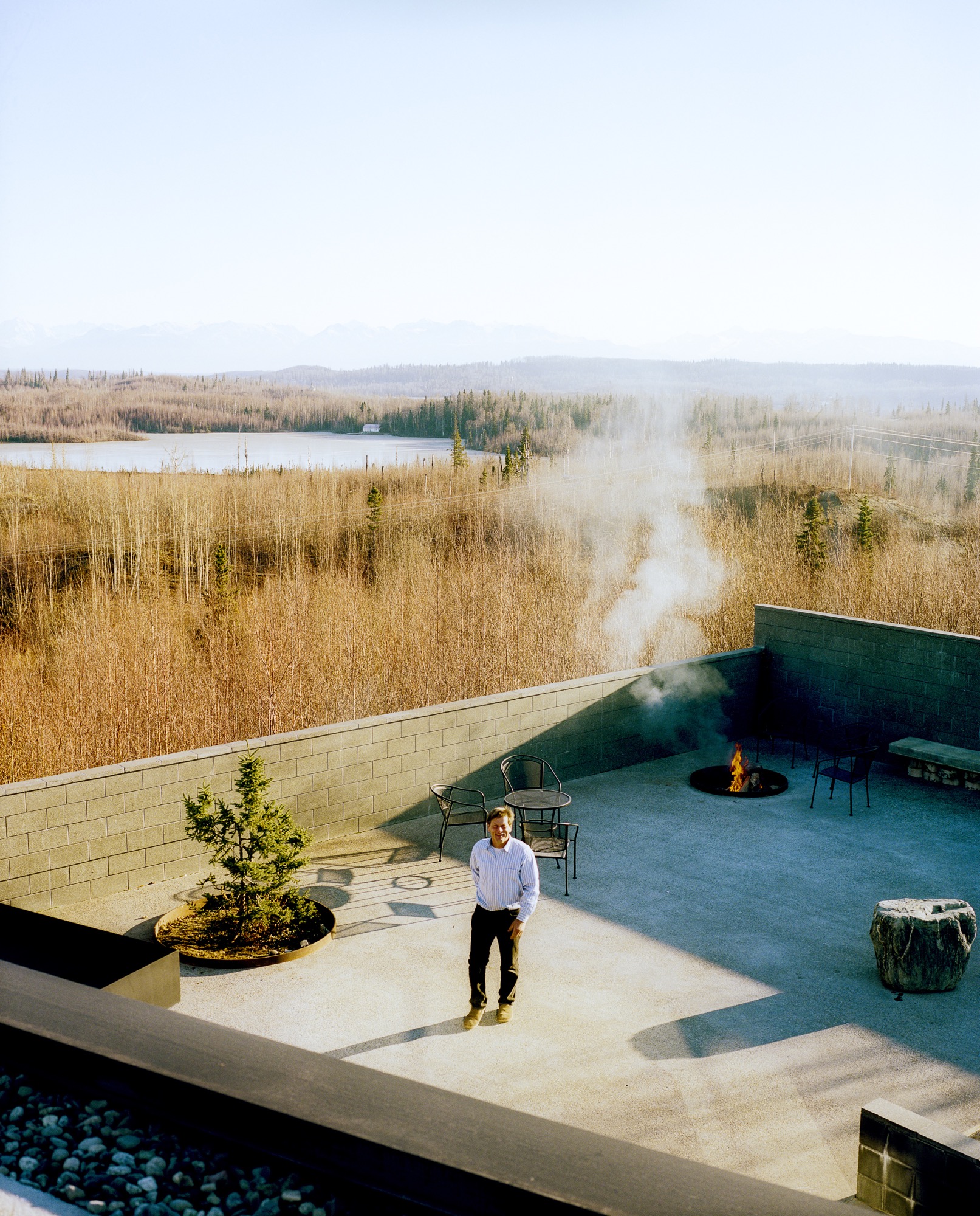
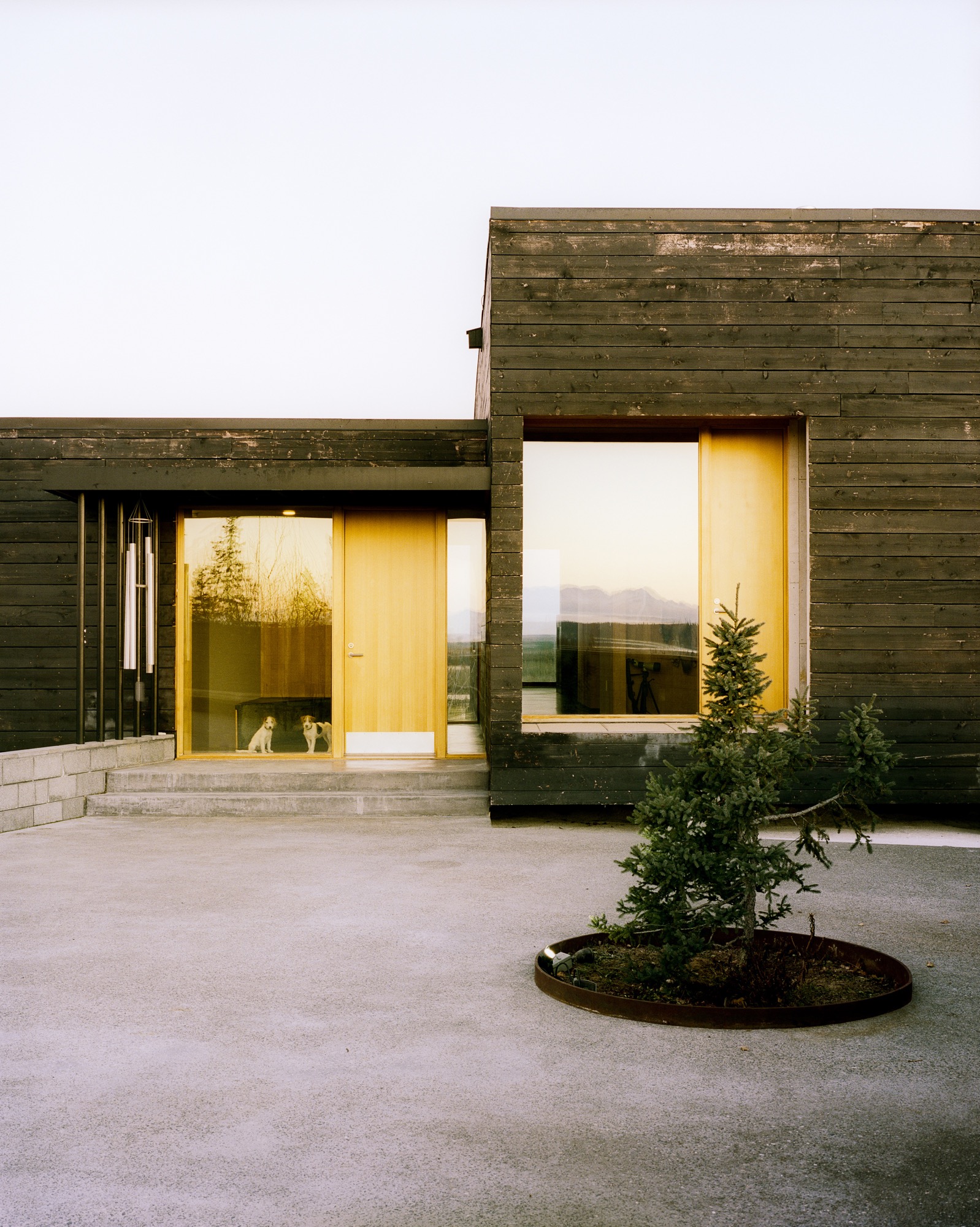
Everything about the 2,450-square-foot house centers on the natural setting. "It was important to have every room look to Denali, which is the ultimate view in Alaska," says Mayer. To do so, the architects created a long, lean, L-shaped house. The blackened, local spruce cladding pays homage to the area’s wildfire, while also mimicking a glacial erratic—a nonnative rock deposited by a moving glacier. The courtyard and part of the kitchen are slightly offset, following the lines of the site’s hilltop topography, while the rest of the house points directly to Denali National Park.
"It was important to have every room look to Denali, which is the ultimate view in Alaska."
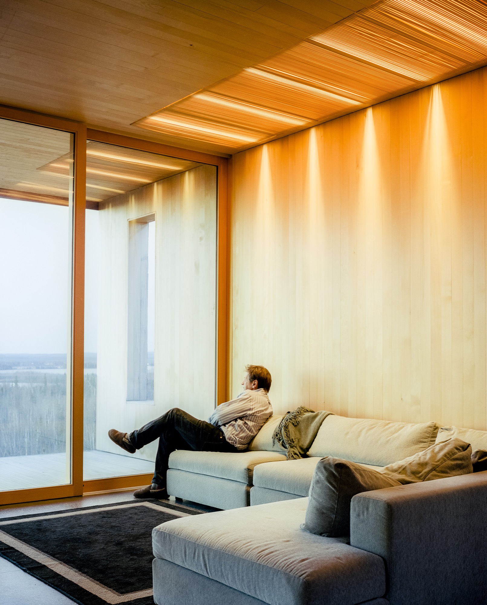
Inside
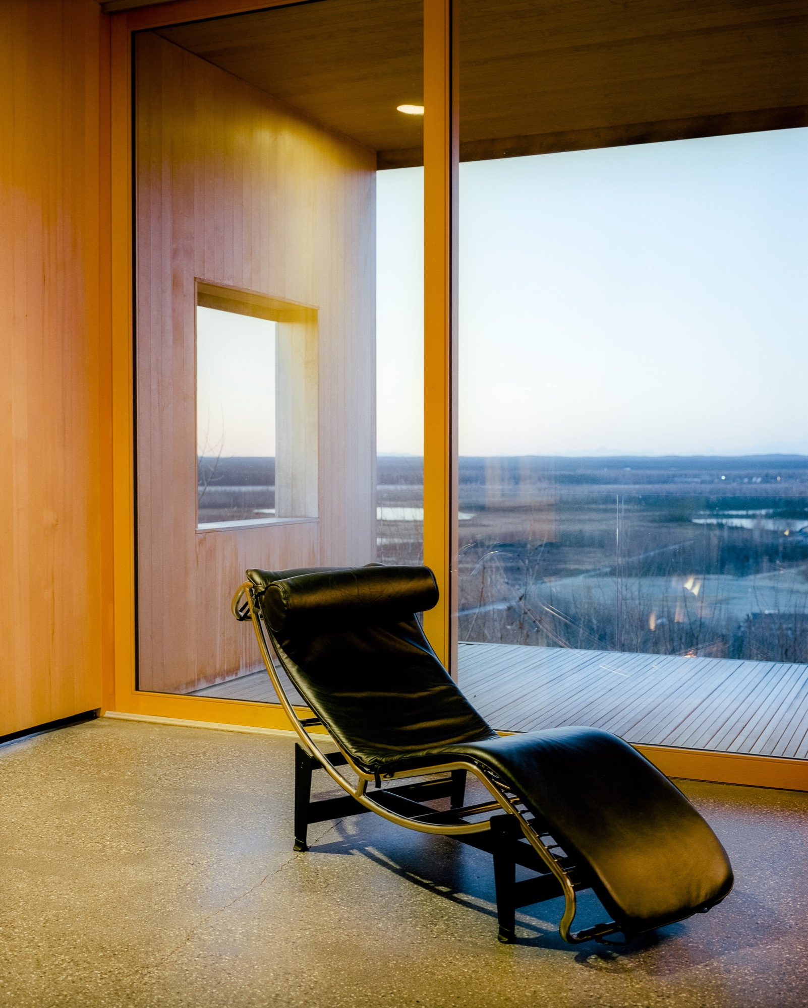
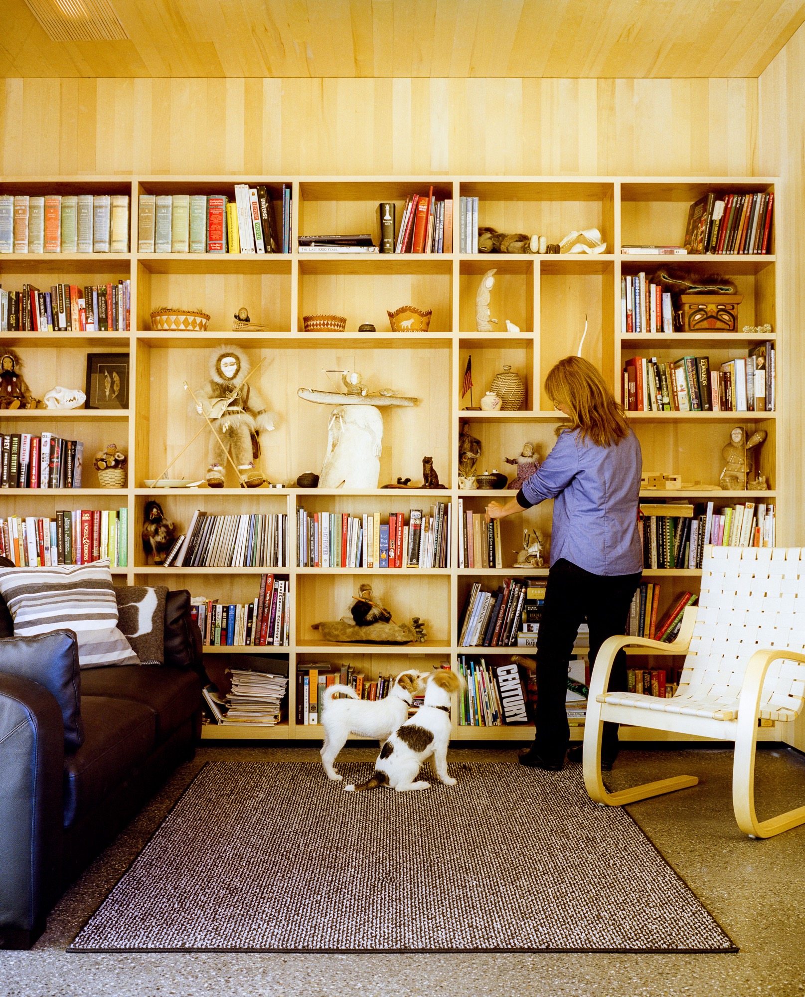
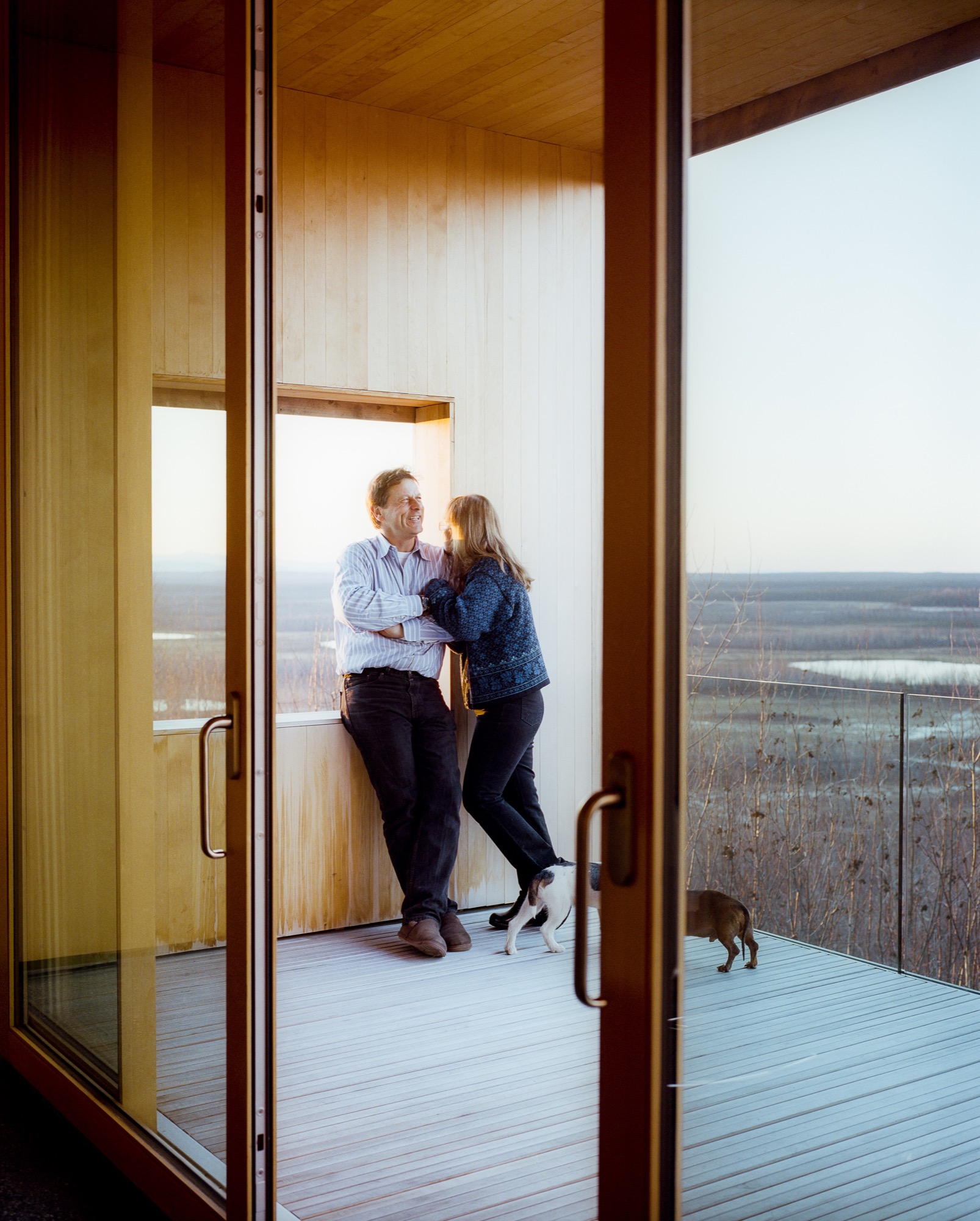
Inside, the walls are paneled in Alaskan yellow cedar, as if the charred exterior has been peeled back to reveal glowing, living wood inside. The public areas lie in one long sight line that starts in the courtyard outside, streams through the living and dining rooms and kitchen, and slips out onto the northern horizon through a wall of sliding glass. The other side of the L contains he bedrooms and bathrooms, each with its own framed outlook on Denali. Windows in the hallway and in the family room face south to let in extra sun during darker winter days. There’s also a rooftop deck, perfect for the family’s many parties—where friends grill mooseburgers and take in the star-filled sky and 360-degree views of the mountains.
Sweat equity
Lest the house seem too fancy for these frontier surroundings, it’s important to remember that Buser built the place himself over six years. Here, there are no construction codes in rural areas ("Building permit?" scoffs Buser. "What’s that?!"), and people prefer sweat equity to bank loans or subcontractors. "When Alaskans say they’re building a house, it means we’re swinging a hammer, digging in the dirt, and trimming it out," says Buser. Yet, this DIY ethos meant that Buser’s solutions were sometimes those of a would-be MacGyver. He and Chapoton charred the cladding using a weed burner and a garden hose; the 800-pound glass doors were lifted into place using Buser’s rigging of dogsled runners, pulleys, and brute strength; and he sliced open two birch trees to make the dining room table.
"When Alaskans say they’re building a house, it means we’re swinging a hammer, digging in the dirt, and trimming it out."
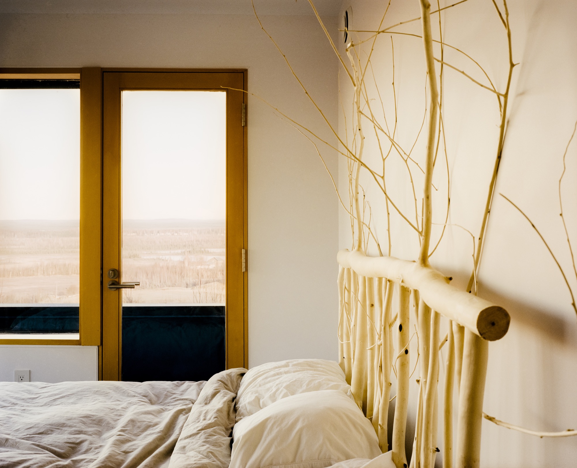
At the end of a typical day, Buser comes home from an 80-mile dogsled ride as the last rays of sun linger on the mountains. Inside, Chapoton (now retired from teaching) whips up a salmon meal for ten, and the gregarious couple shares wine with friends around a crackling fireplace. When everyone’s left, Buser and Chapoton will tuck into their bed, watching the vivid hues of the northern lights dance through the windows. Says Chapoton of her love of the house, "Maybe Einstein said it most simply: ‘Look deep into nature, and then you will understand everything better.’ " △
Recipe: Grapefruit Brulée
Broiled in the oven, the grapefruit forms a delicious golden brown and crispy surface.
Halve each grapefruit crosswise and cut a thin slice of peel from the bottom of each half to stabilize the pieces. Remove all seeds from the grapefruit and loosen the segments with a paring knife. Sprinkle each half evenly with sugar and a pinch of salt. Broil in an oven on high to form a golden brown and crispy surface. Serve immediately. △
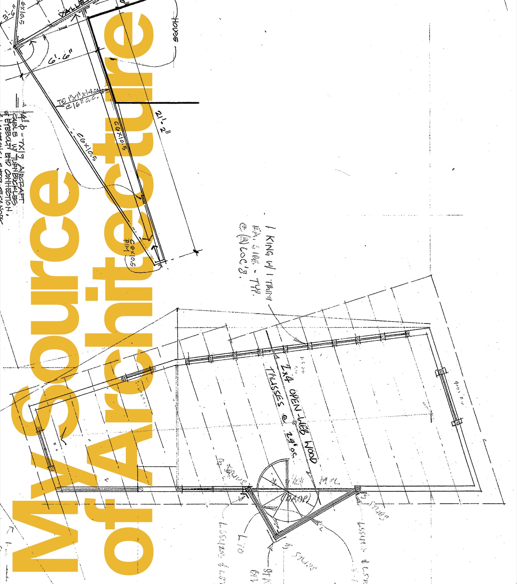
My Source of Architecture
A structural impossibility impels Colorado architect ml Robles to deconstruct her design and rethink the source of architecture. Surrendering to the house’s revelation ignites a deeper means to practice her métier.
Our finite world evaporates every single day as the dusk we have learned to overlook withdraws the light and dissolves form, transforming the day to night. The infinity that is our universe begins to appear, one star at a time, until the lid of our blue atmosphere evaporates and we enter the continuum within which everything exists. In this big picture, the earth holds its finite position for only a blink. In that blink, we build, but it is in the infinite continuum that architecture is sourced; from there a vibrating intelligence strikes our ideas with intuition and inspires our thinking.
This is why some places make us feel so profoundly alive. I seek those places, I want to stand in spaces that make me fall to my emotional knees, I want to feel light pulsing through my veins, I want to be so profoundly anchored in place that time stops and space expands. I want that here, now. To get that, as an architect, I must look directly into the source and accept those unnamable vibrations that ignite intuition and spark inspiration. I must be willing to step into the unexplainable and know it is undeniable.
The power of constructing
My exploration into the source of architecture begins with a small group of deer, three, maybe four, that stood puzzling at the edge of the upturned earth where the craggy foothills’ belly lay gouged open under the pure blue Colorado sky. Violent excavation into the land is the first in a chain of aggressions made when we build. I was stunned silent when I came upon that small herd of deer staring into the gaping hole where waving grass had clung just hours before. The power we assume in constructing is never more apparent than in the destruction that marks the beginning. Watching those deer reconsider that site was burned deeply into my architectural thinking, for that is what we architects do: We alter what was. This realization was one of my first steps into the source of architecture: Respect what exists.
"The power we assume in constructing is never more apparent than in the destruction that marks the beginning."
Working with what is
The small ranch house would have been a scrape-off to most sensible people. The builder and I, however, decided to work with the house and its detached garage, more from a perspective of “There is nothing wrong with its structure; let’s reuse it,” than any nod to its intrinsic qualities. The site was one of those hidden jewels in a nondescript part of Boulder, Colorado, that backed up to a parkway where the deep drainage ditch in front of the house made its way into a local watershed. Beyond that open area was a spectacularly clear view of the foothills curving along the horizon. I proceeded with designing a two-story, 3,500-square-foot (325-square-meter) house around, on top of, and including the existing ranch. It was all perfectly usual until the soils test, required to verify the capacity of the earth to carry the structural loads, said otherwise. The existing foundation would be unable to carry a second floor. The soils test is usually a nonevent, done for confirmation of what is already suspected rather than to dispute anything; this one, however, told us we needed a new foundation. We may as well have demolished the existing house since the newly recognized structural requirements were going to severely deconstruct the house.
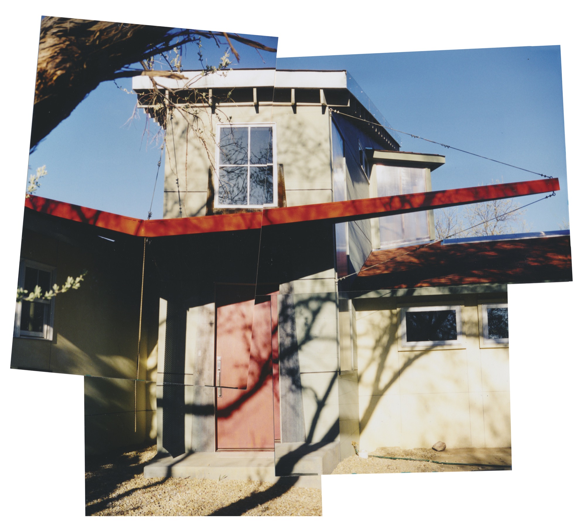
Going up
I sat with the cardboard model I had made of the house and garage. I had taped a collage of photos showing the magnificent view of the Flatirons—Boulder’s dramatic vertical rock-slab backdrop—onto the west edge of the model and was overcome by an insistence to build a second floor on that site to capture the view. Short of demolishing the existing house to build a proper foundation, I had to find another solution to going up. After wrangling with structural concepts, I sat down with my engineer and, using the model to illustrate, reasoned that if a tree could go up and out, why not a building? We would solve the problem by placing two piers between the house and garage to avoid disturbing the existing foundations, and then span back and front with steel beams to new foundation walls away from the existing structures. The framing spread over to the existing buildings, maintaining all the structural loads from the new construction to bear onto the two piers and new foundation walls. Like a gopher poking his head above the ground, the new two-story tower shot up from between the house and its garage structure with a spectacular 360-degree view.
We expanded the existing structure—both house and garage—to accommodate the new house with its tower shooting from the center. The only glitch was that the existing roof drained directly into the side of the new tower—a complete construction no-no, since the snow and rain draining off that roof into the side of the wall would eventually corrupt it. The standard way to deal with this is to build what is called a “cricket,” or hip roof, which is overframed on top of the existing roof at the wall intersection and stretches across it to lead water off to either side. This is what happens when construction creates a messy situation: The problem area is spirited away by trim false ceilings, overframing, and any number of other standard methods.
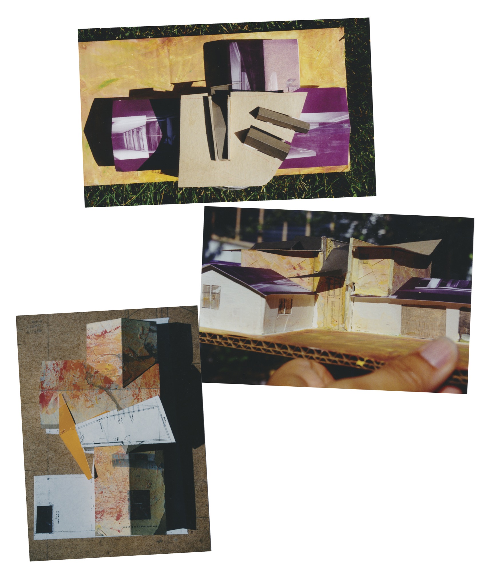
As I fiddled with that cricket roof on my model, imagining the tide of floodwaters raging against the tower wall, I became mesmerized by the idea of flowing water with its dancing light. What if we could experience that dancing light inside the house rather than scuttle it off the roof in obscurity? I was washed away with the inspired notion that we might be able to see this display of water.
What I resolved was to build a glass gutter—basically a slender inverted fold along that roof-wall intersection, furthermore sloping the whole thing to shed the water to the front of the house, right to the front door. I would capture the water in a big inverted wing that was anchored to the house roof on one side and flew into the sky on the other, creating a sheltering entry canopy. At the center seam, the low point of the inverted wing catching the water from the glass gutter, I sliced a gap and inserted a perforated sheet of weathering steel whose rust is managed in its composition. The rush of flowing water would fall through the perforations and drain into a gravel bed leading to the deep ditch along the front of the house. Mimicking nature, the water’s instinctive rush to the low point would be magnified, as in a waterfall with all its sparkling, glistening effect as it shoots to its destination. “You cannot build that,” they would say about the glass gutter. The big entry wing was less mystifying, and the weathering steel apparently not an issue at all as it was seen to be decoration.

Inspiration down the gutter (in a good way)
This would not be the first or last time I would hear those words, you cannot build that, but I could so clearly see the effect of the glass gutter on the inside of the house that there would be no turning back. Lucky for the house, the builder was also the owner, and he trusted the inspired gutter to deliver what was proposed. The house was built out with the kitchen spilling over into a dining area and outdoor patio and a living room with a face of windows articulating views of the Front Range—the eastern view of the Rockies. A see-through fireplace connected the living and dining rooms. Two bedrooms, a bathroom, and play area made the house family friendly. In the master suite, ceiling slots caught the glass-gutter reflections. A winding staircase led up to the tower room, which featured a sloping roof that jutted out to create shading overhangs for the wall of windows. We hosted an open house to celebrate the project and activated the glass gutter with a hose pouring onto the roof. Our “ship” launched with a cascade of water sheeting down the steel panel as the guests squealed with delight.
Over a decade later, I received an email from the latest owner of that house who had traced me through another house I had designed. This was the best house he had ever lived in, he wrote, and after living there, they discovered “wonderful, wonderful details,” such as the moonlight falling through the series of skylights.
When I read that note, I realized that I had never even considered the possibility of the moonlight casting onto that glass gutter and delivering itself through the ceiling slots. Astounding what shows up when unhindered inspiration leads to such unimaginable largesse. Making architecture is never a linear journey, less so a totally rational one, as the journey traverses land that always has a unique story and an atmosphere filled with a vibrating intelligence.
"Making architecture is never a linear journey, less so a totally rational one, as the journey traverses land that always has a unique story and an atmosphere filled with a vibrating intelligence."
Listen to what shows up
I have learned to embrace the marvelously unpredictable environment of design by working with physical models that take me out of my rational, calculating mind and drop me into an intuitive, three-dimensional state. Thanks to this project I got my second step into the source of architecture: Listen to what shows up. In this case the failed soils test and cricket roof changed what would have been an unremarkable construction into one that is able to lift the lid of our blue atmosphere and connect us to something so much bigger, something we might never have imagined, like the moonlight casting through the slots, awakening our senses and imaginations even more.
It is said that the dream is realized where the dream is sourced. If we do not dare to dream, to touch something within ourselves that ignites our passion, we will never see that dream realized. This certainly seems to be the case with places that make us feel fabulously alive—they touch something within us that we may have only known in dreams. And that is why, above all else, in the little blink we have on our finite earth, I am an architect. △
* * *
When not practicing architecture or creating singular built environments at her research-based firm Studio Points in Boulder, Colorado, ml Robles explores the source of architecture in her writings. She is currently completing her first book in which she tells the story of how she came to be Under the Influence of Architecture.
Up and Away: 10 dream tree houses
These ten small structures make childhood dreams come true.
Who says that grown-ups can’t have tree house goals? When the demands of daily life become too much to bear, a special hideout in the sky can be your place to escape, cool off, or brainstorm in peace. Just one look at these inspirational mini-getaways and you may find yourself looking for a sturdy tree to scale.
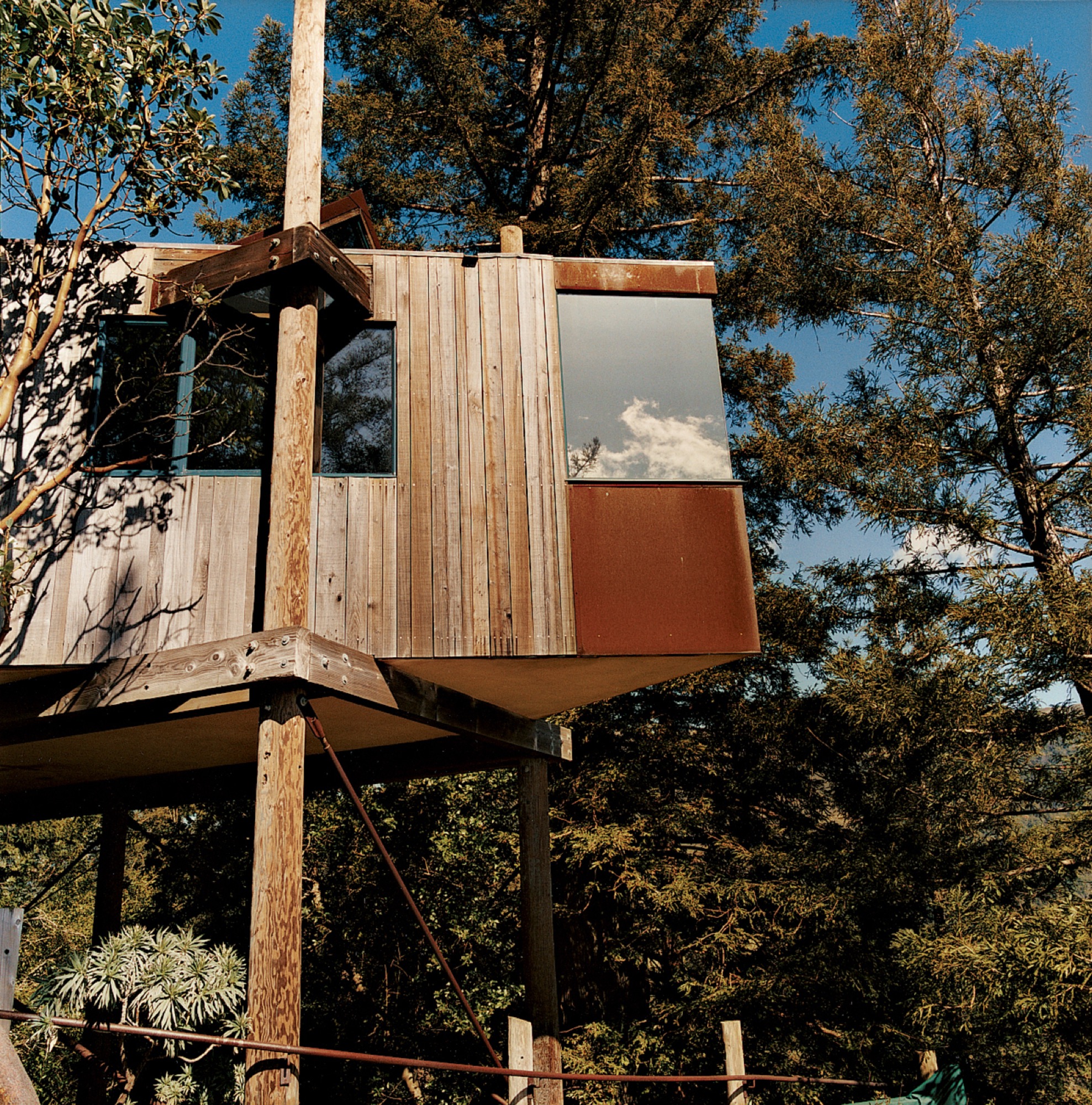
Designed by acclaimed Big Sur architect Mickey Muennig, The Post Ranch Inn consists of a series of freestanding units that showcase Muennig's contemporary organic vision. The tree houses feature Corten panels.
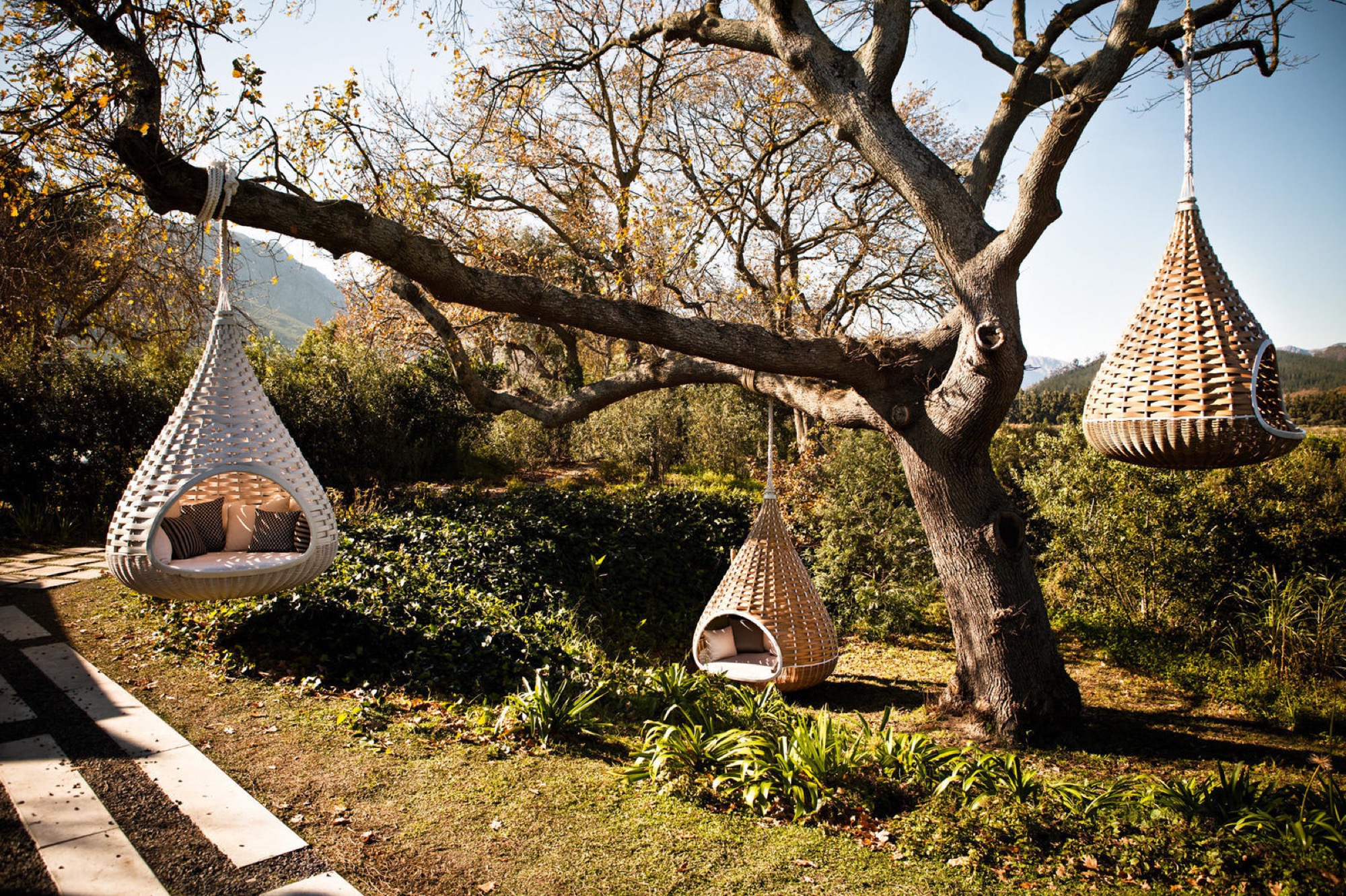
Dedon’s Hanging Lounger, designed by Daniel Pouzet and Fred Frety, can be an instant mini-tree house escape. All you need is the right tree to hang it from.
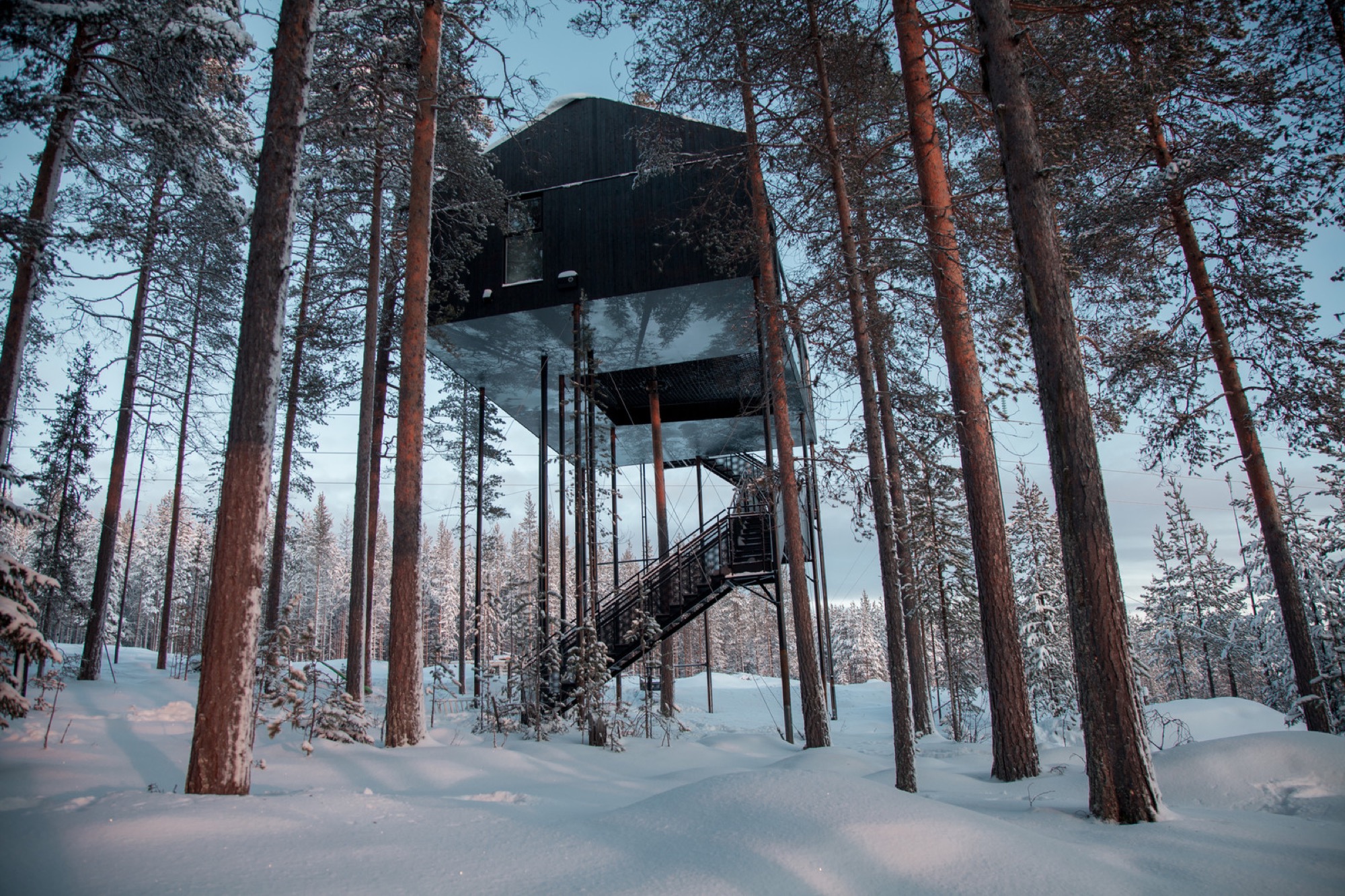
Treehotel’s 7th room in Sweden is a cabin that’s propped up in a pine canopy where guests can book a stay. To reduce the load of the trees and minimize the building's impact on the forest, 12 columns support the cabin. One tree stretches up through the net, emphasizing the connection to the outdoors.

Japanese architect Takashi Kobayashi of the Tree House People has been declared a "tree house master" by Design Made in Japan. Seamlessly integrating nature and design, this tiny tree house is certainly not just for children.

Inspired by the principle of biomimicry, Free Spirit Spheres’ goal is to "create new ways of living that are well-adapted to life on earth over the long haul." Based outside of Vancouver, the company specializes in tiny spherical tree houses that are works of art. You can even book an escape to spend the night in one at their forest hotels!
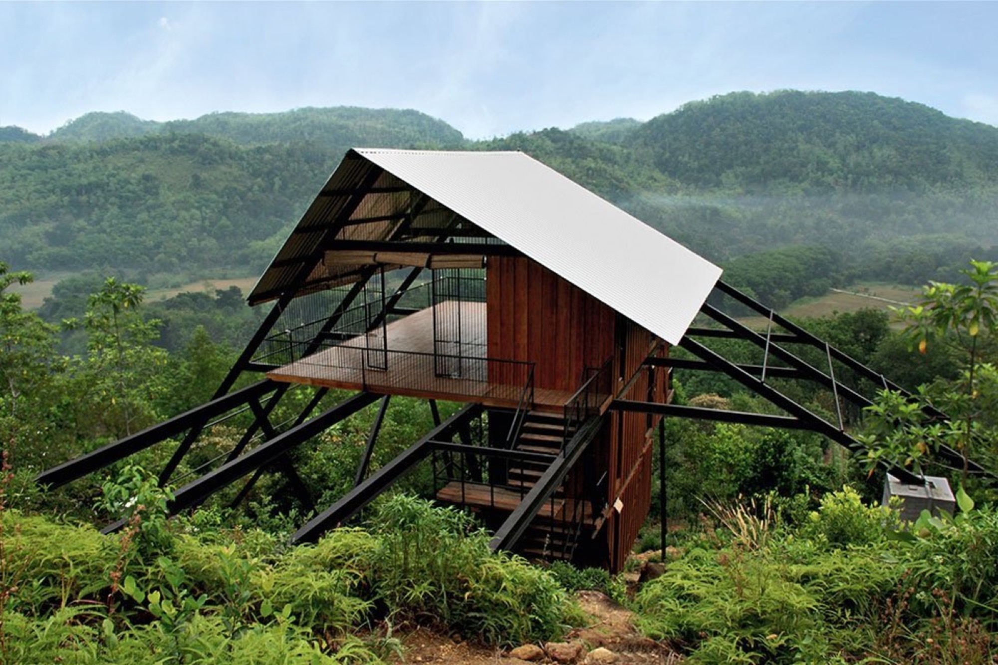
With the view from the Estate Bungalow in Matugama, Sri Lanka—designed by Narein Perara—you might just climb in and never want to leave.
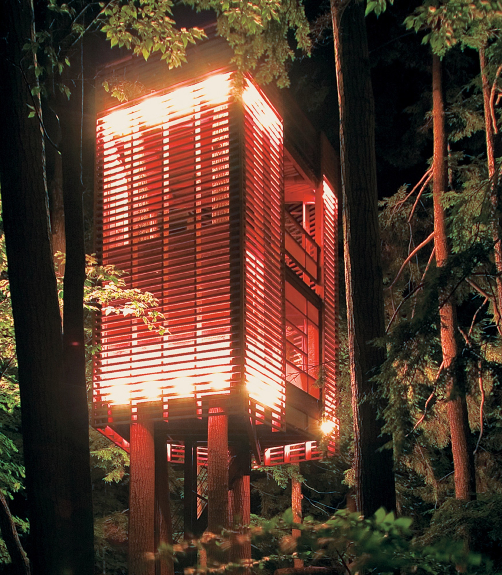
"I had to let the trees decide how the tree house would be," explains Lukasz Kos, a Toronto-based designer and cofounder of the architecture firm Testroom. The low-impact 4Treehouse is a lattice-frame structure that respects and responds to the nature surrounding it, appearing to levitate above the forest floor of Lake Muskoka, Ontario.

At only 172 square feet, this tiny tree house in the hills of Brentwood, California, was designed by Rockefeller Partners Architects and serves as a refuge, gallery, and guest cottage.

A little more on the traditional side, this tiny backyard tree house by Sticks and Bricks makes you want to disappear for a few hours with a pot of tea and a good book.
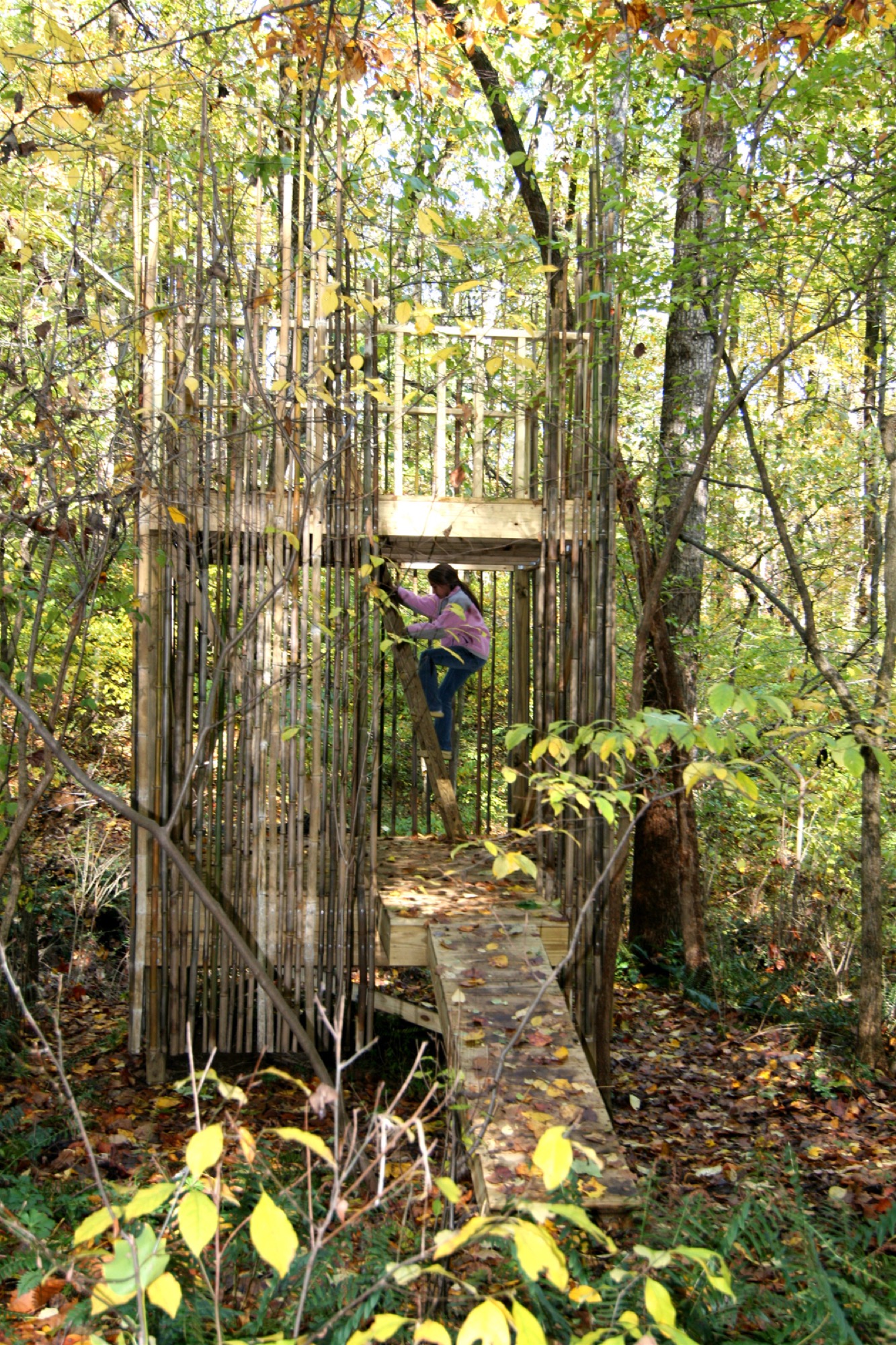
This 128-square-foot tree house outside Baltimore was designed by architects Laurie Stubb and her husband Peter. "The outdoors here are a big playground," she says. "We had always wanted to build something for the girls that looked natural." So, in the summer of 2008, they designed this structure both for the children and for themselves. "We wanted it to have a use after they're gone—a place we can sit in and read or have a drink and entertain company." △
Art Photography in the Shoemaker's Farmhouse
From the Photo Archives...
The shoemaker’s farmhouse in Alt-Riem near Munich was built in the 18th century. Stefan Höglmaier, founder of the Euroboden Group, bought the historical structure in 2013 and converted it into a a two-family house in collaboration with architect Peter Haimerl.
The architectural concept of the Stockerweg project is based on the premise of preserving the historical structure while innovating the space. The defining element is a concrete cube, rotated 45 degrees, that was inserted into the attic and extends along the entire length of the building. The design created surprising angles of light and shadow, old and new, concrete and wood...
Read our full story on architect Peter Haimerl—"The Soul Catcher."
As part of the Stockerweg project, Haimerl's wife, photographer Jutta Görlich, together with Edward Beierle captured the transformation during construction through artistic photography. At the time, the result was showcased in the photo exhibition „Verweile doch!“ (stay a while!) in the Architekturgalerie München. Here, some phenomenal images from our photo archives...
"Verweile Doch!"


Editor's Choice: Journey to Japan
The Beauty of Use
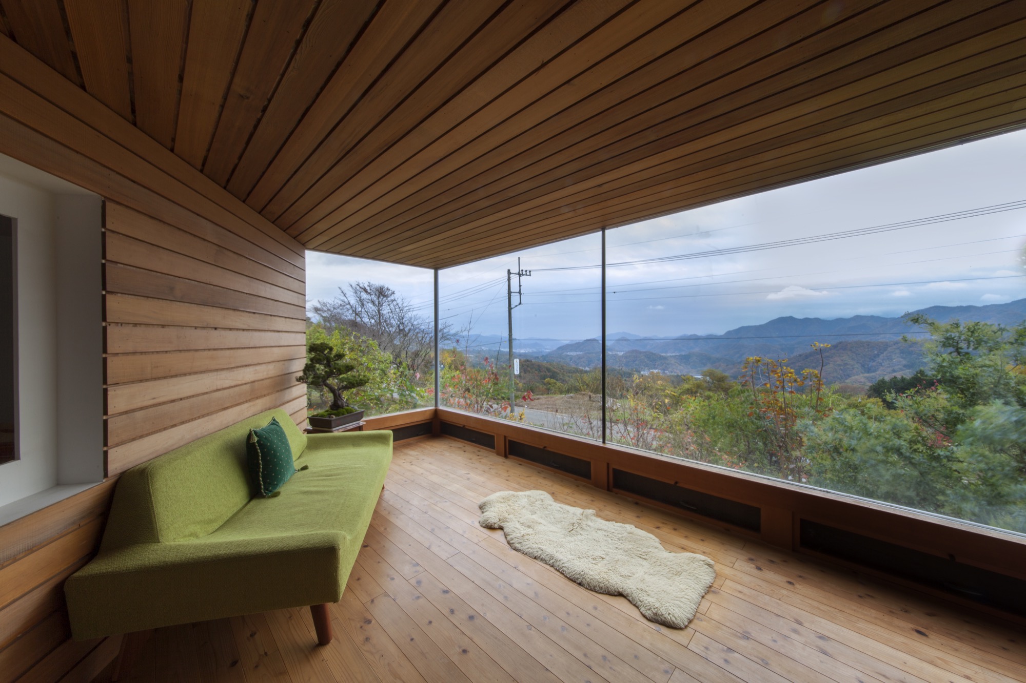
Hidden in the Japan Alps, a Czech-born artist makes woodstoves that match the simplicity of Japanese interiors. Read more »
The Skyward House
Japanese architect Kazuhiko Kishimoto designs a human-scale house for a retired teacher. Read more »
Repair With Gold
The Japanese tradition of wabi-sabi. Read more »
A Platform for Living
A weekend refuge in Japan’s Chichibu mountain range consists of a simple larch wood structure and two North Face tents for bedrooms. Read more »
Zen and the Art of Knife-Making
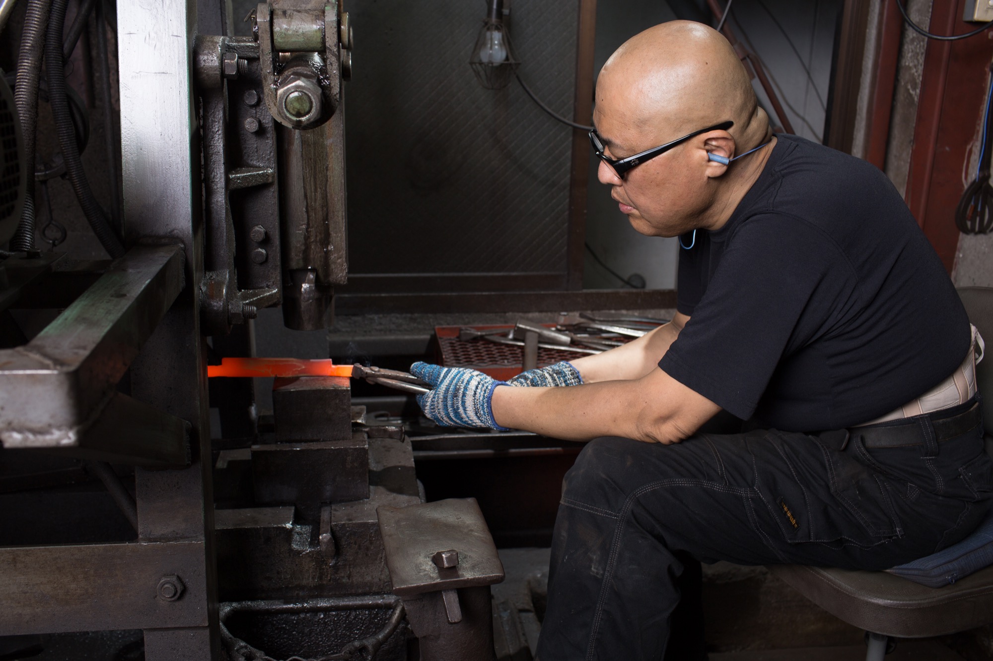
Using skills derived from the ancient craft of samurai sword-making, a blacksmith in the Japan Alps makes knives so delicate and dangerous they turn chopping into an artful act of passion. Read more »
In Search of Tenkara
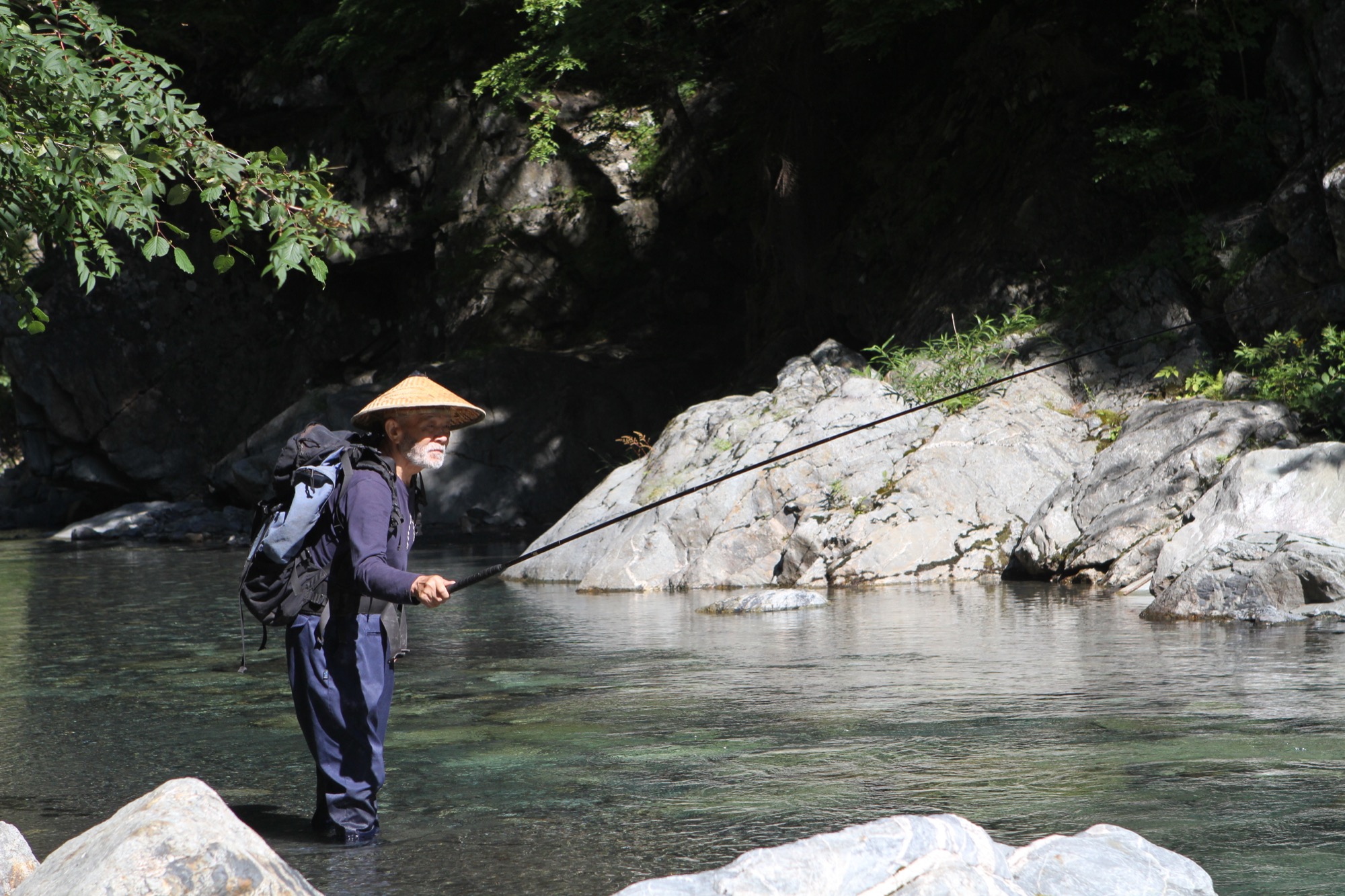
The founder of Tenkara USA travels to Japan and brings back the traditional method of fly-fishing with a long rod and without a reel. Read more » △
Rugs and Furniture in Felt
A warm and fuzzy curation by Boulder interior designer Jennifer Rhode
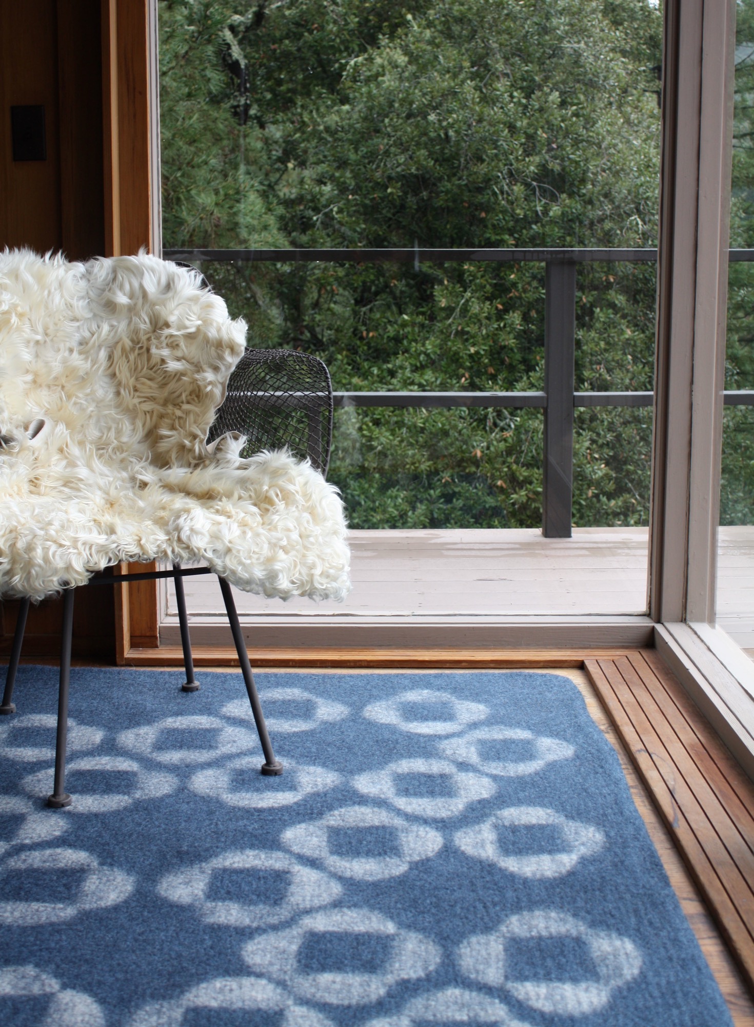
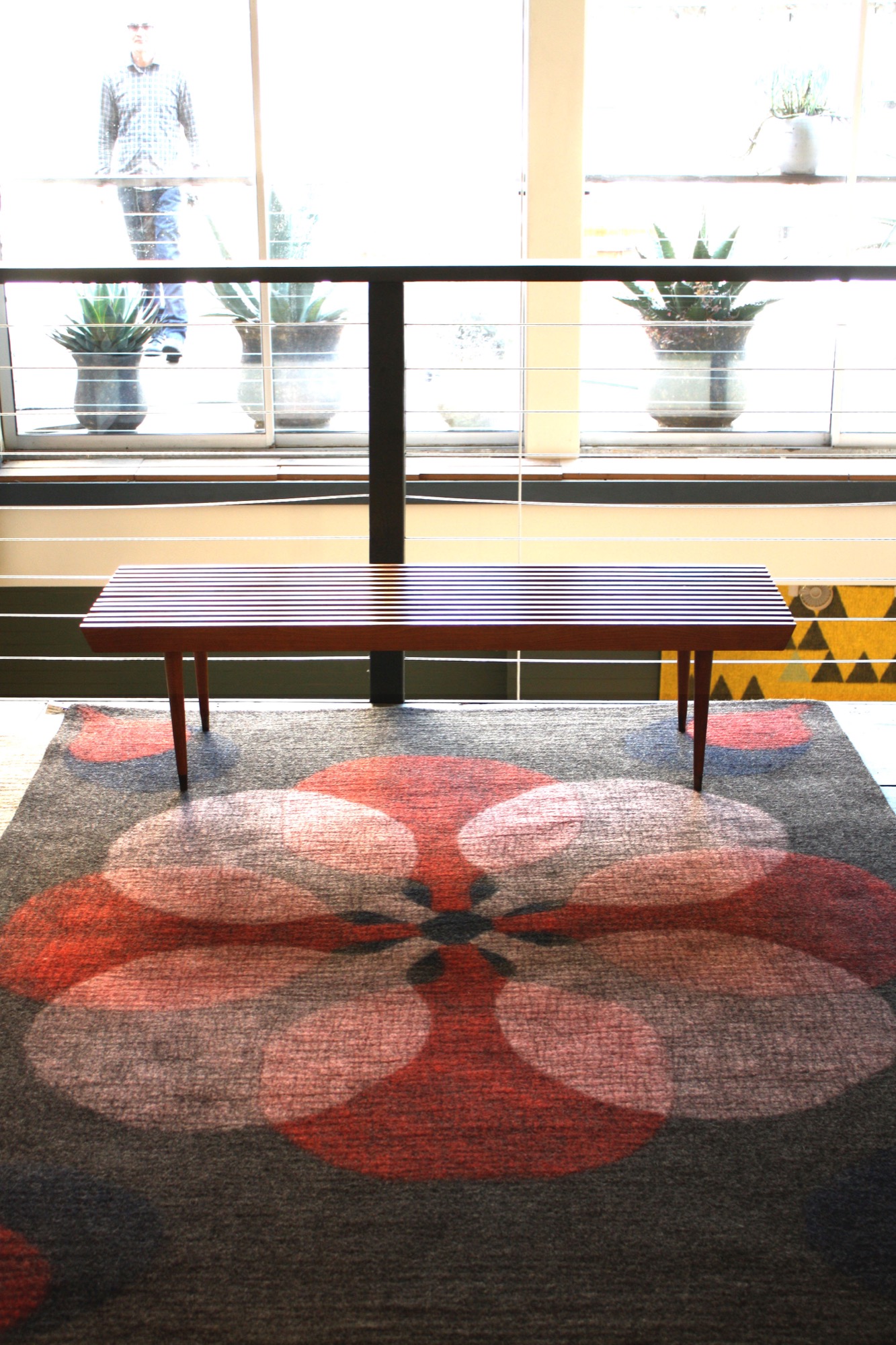
Felt has a longer history than people may know. It is considered to be the oldest known woolen textile. The Sumerians have myths about its origins, and several felt shops were discovered in ancient Pompeii. Today, felt is being revived as a construction material for modern furniture and accessories that are inherently warm.
Rugs handmade in Iran
The felt of ancient Pompeii was created by matting and compressing wool fibers, and today’s felted rugs are produced in much the same way. The area rugs of Peace Industry are handmade in a workshop in Iran. The rugs are traditional in their time-honored production process, but the simple, geometric designs are thoroughly modern.
Braid pattern rug
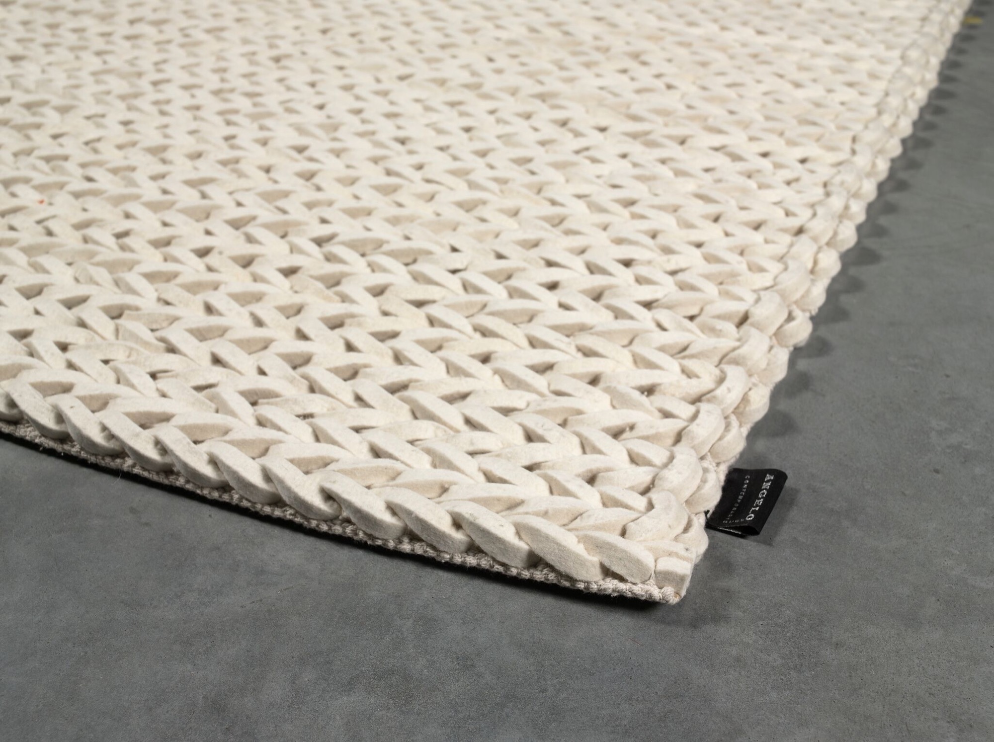
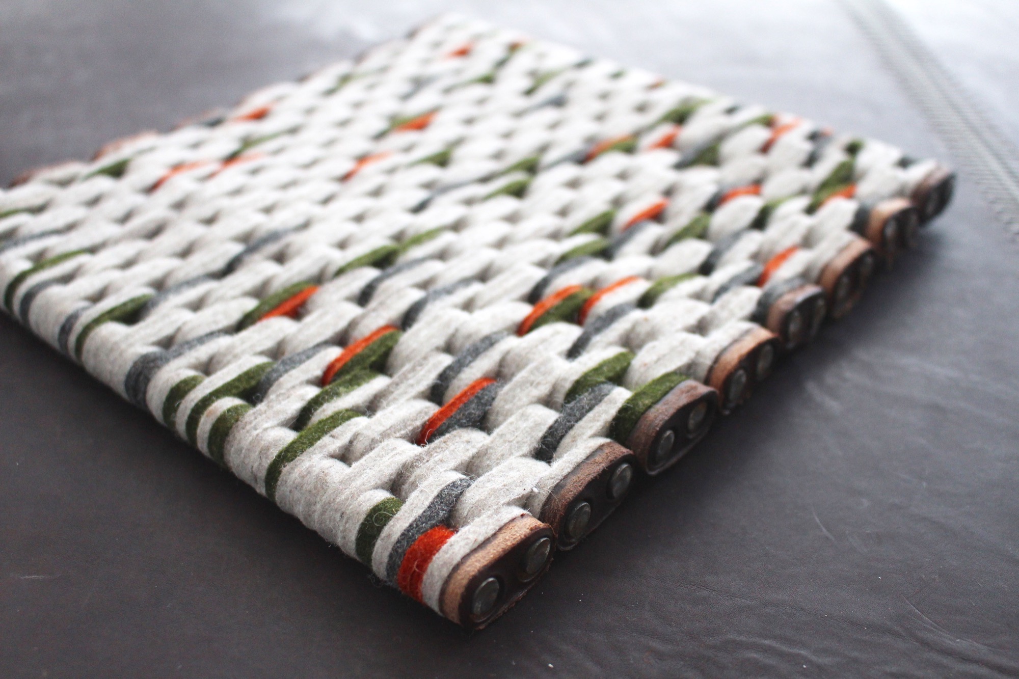
The braided felt rugs of Angelo Rugs’ Highland Collection also celebrate heritage with the classical braid design, but the square, die-cut strand execution is crisp and fresh.
Colorful felt ball rugs
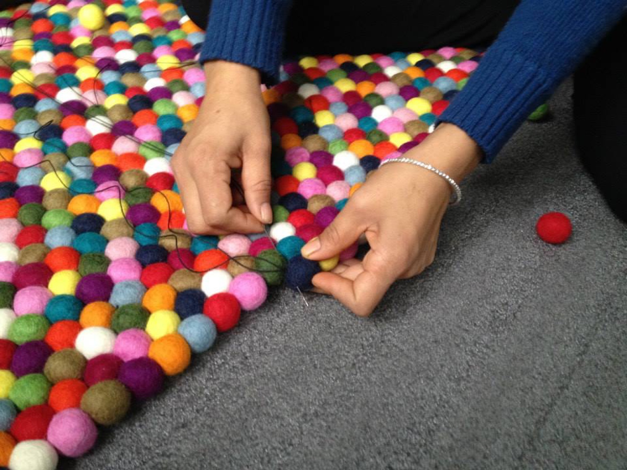
The felt ball rugs of Nepal resemble woolly marbles in a kaleidoscope of colors, stitched together. These whimsical rugs invite you to remove your shoes and engage.
Industrial felt rugs
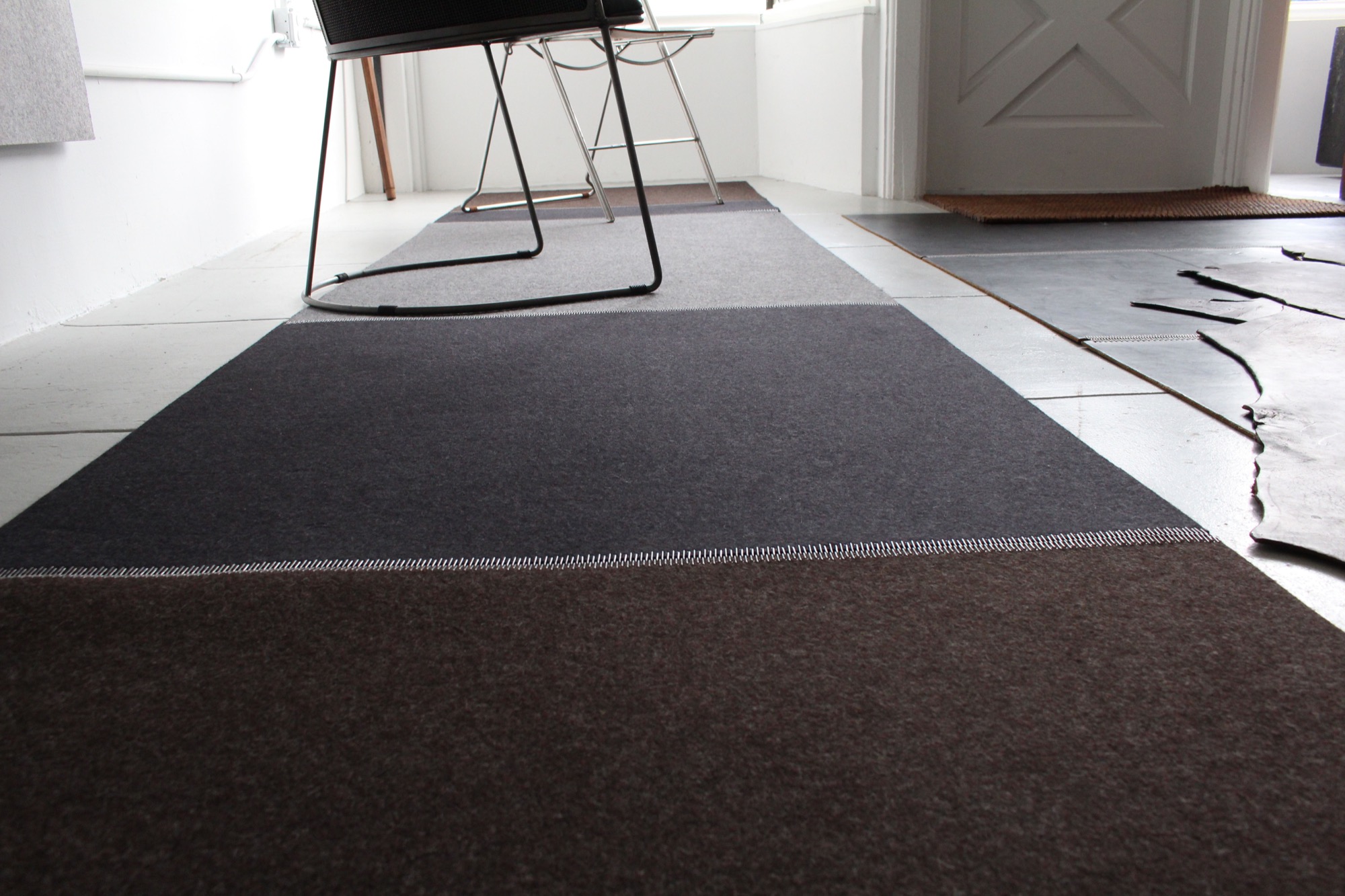
Jim Zivic puts an industrial twist on both of his felt wool rug collections. For one, he attaches multiple colored felt panels with steel hinges, melding soft and mechanical. Zivic’s newest line features rugs created with felt strips linked together in random color ways, making each leather bound rug unique.
Die-cut bench
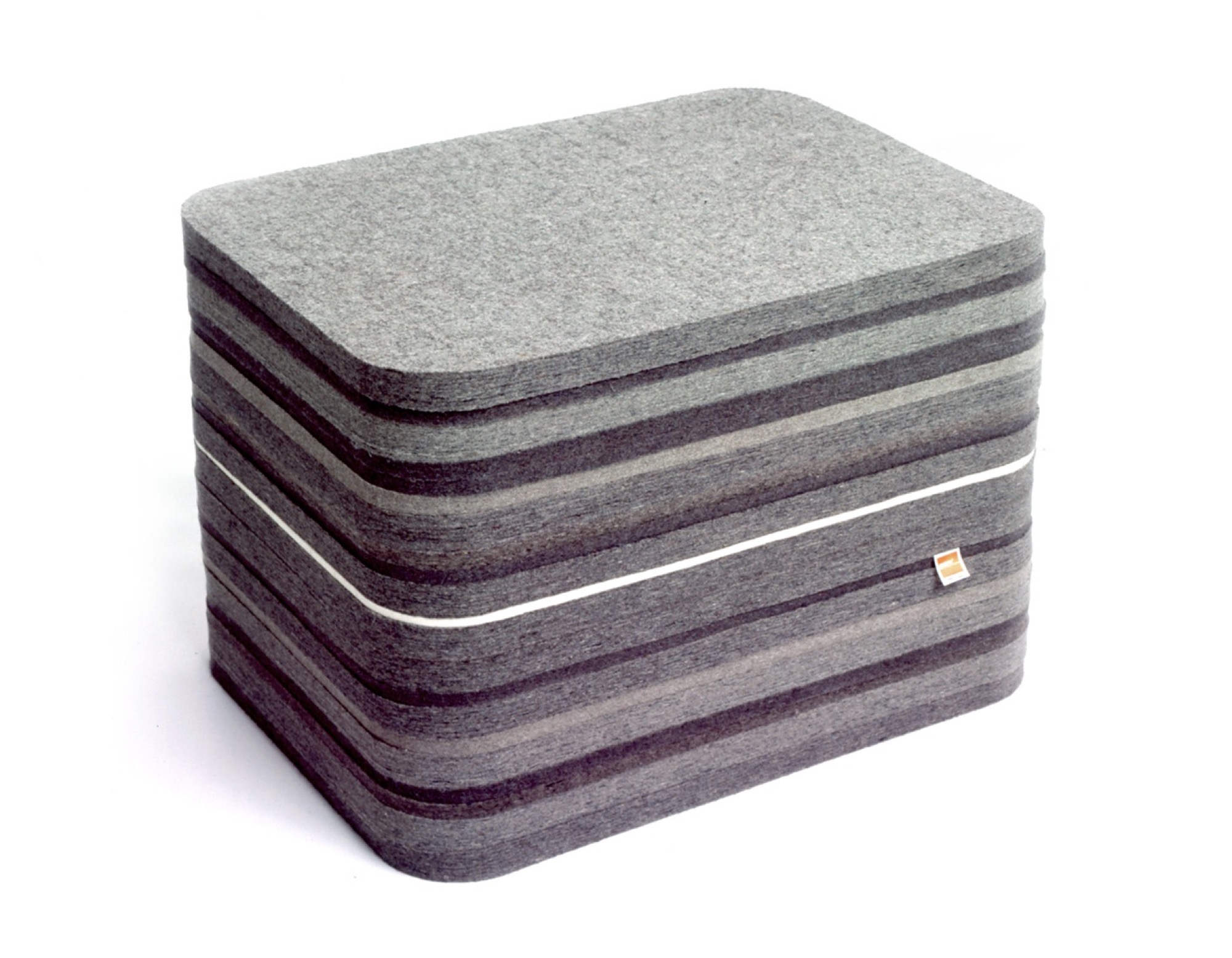
Felt is also being used to construct seating. The die-cut felt Joseph bench by Chris Ferebee is elegant in its simplicity, but exudes earnestness and warmth with its stacked, striped, woolen texture.
Felted chairs
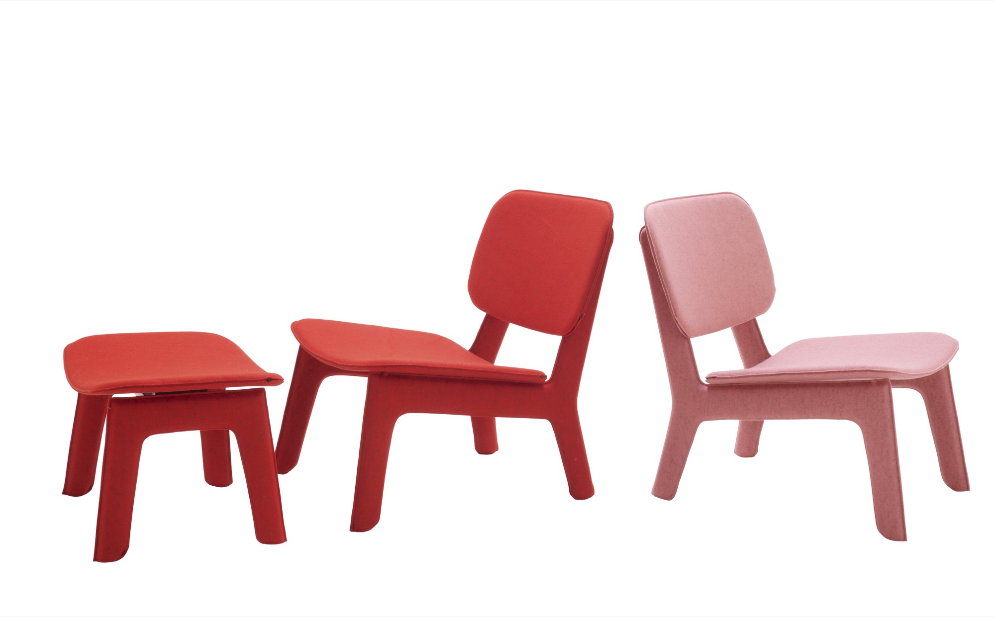
The Felt Chairs by Ligne Roset are campy and sweet in their bright bubble gum colors, complemented by the clean, pared lines of the chair frame.
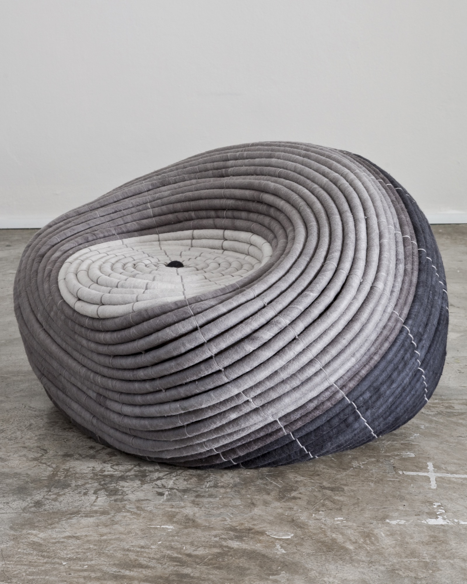
Coiled felt pouf
South African designer Ronel Jordaan’s Ndebele Chair is a circular, flexible seat created by stitching together a long felted wool coil. The serpentine design entices you to relax right into the center.
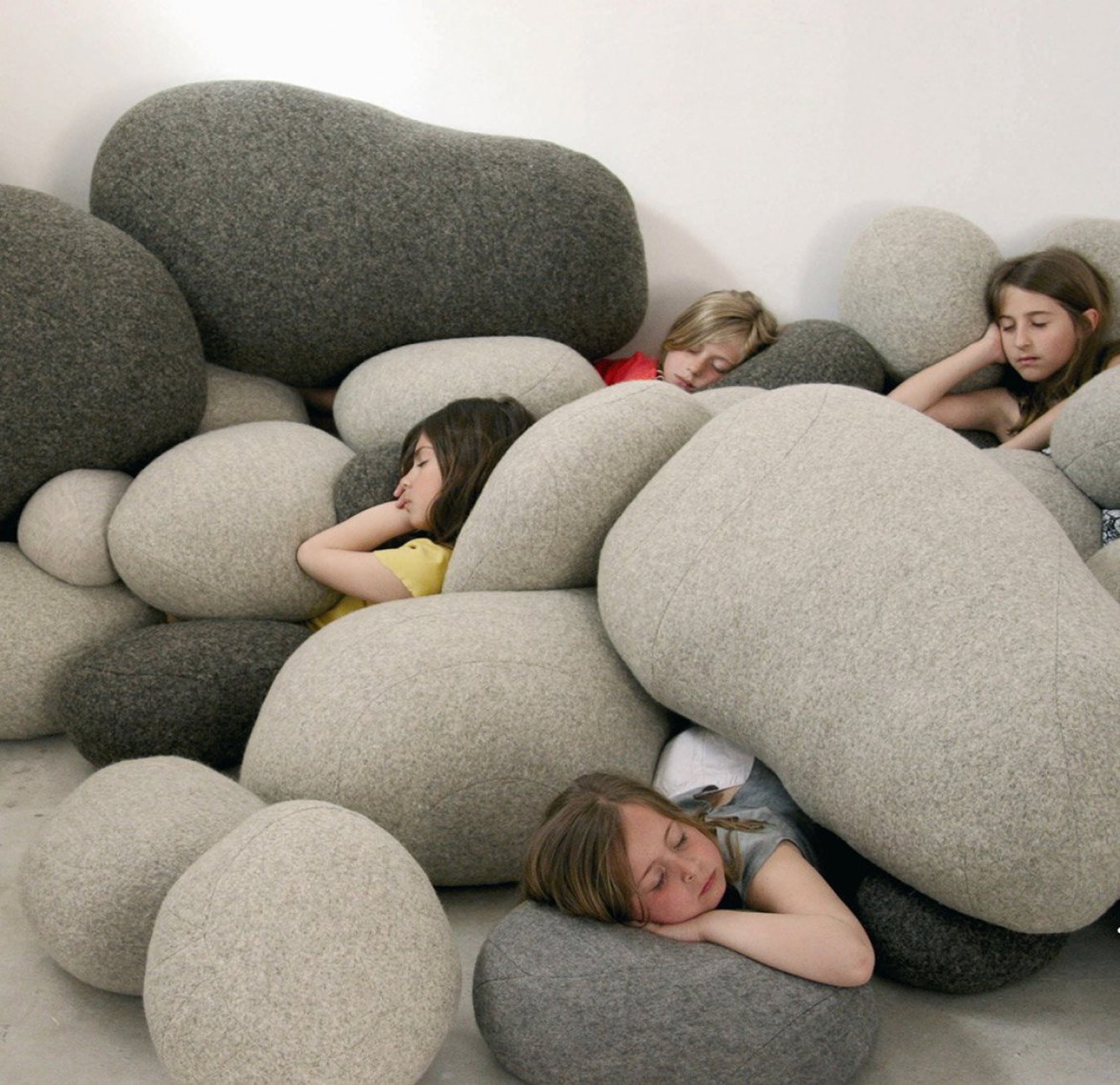
Felt stones
Stephanie Marin’s Living Stones are an unexpected contrast of soft, appealing textile and shape, depicting a natural element that is typically cold and hard. The stones beckon you to cuddle up and participate.
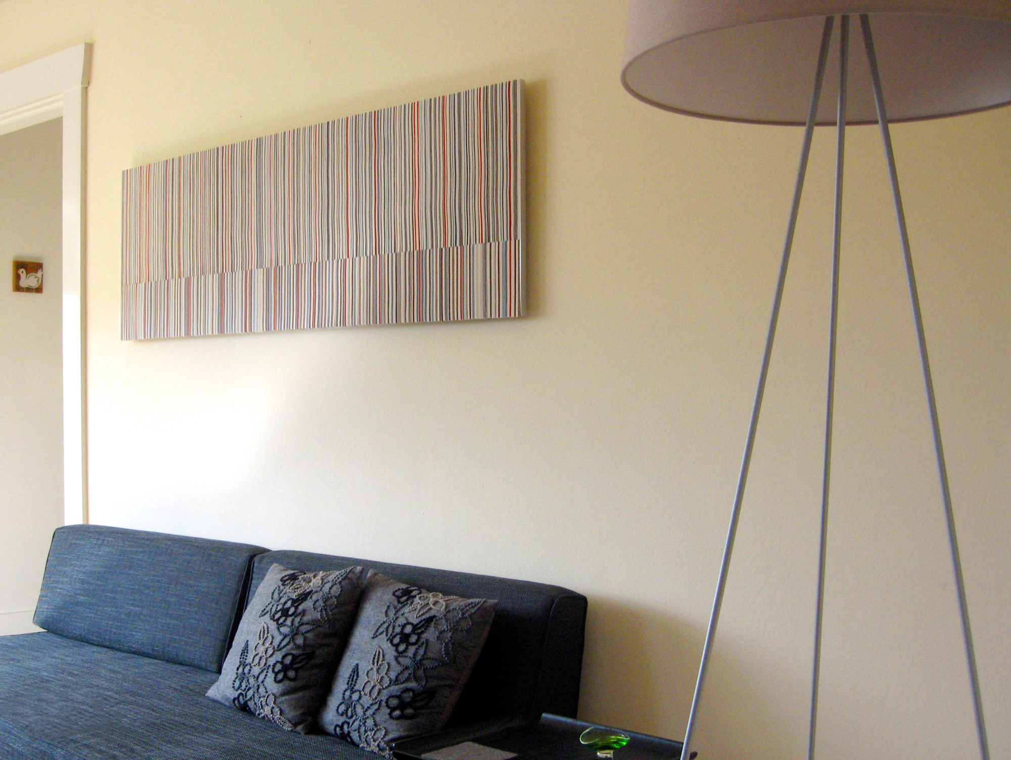
Felt Wall Art
The anodized, acoustic felt wall sculptures of Submaterial are creative collections of felt pieces arranged in colorful striped or geometric compositions—warm and modern.
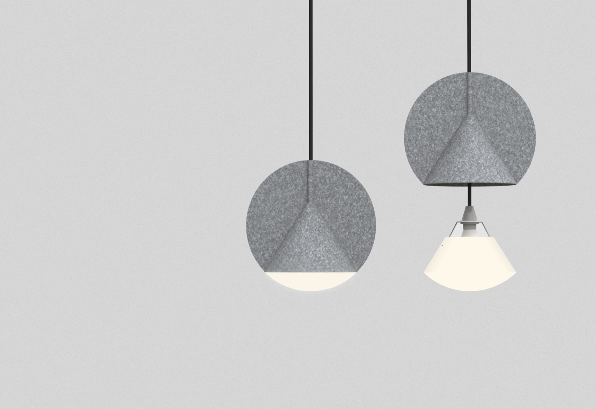
Felted lamp shades
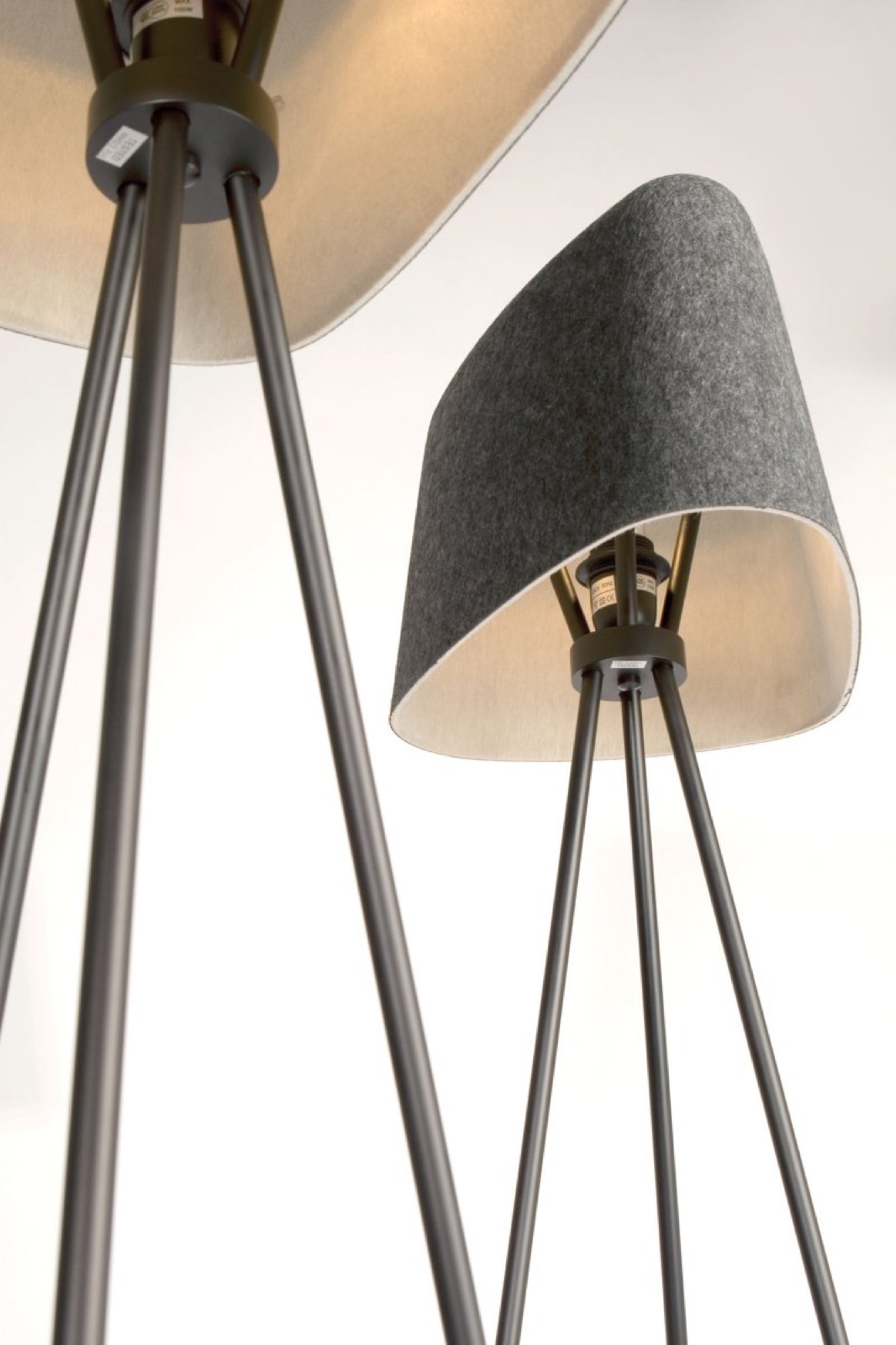
Outofstock’s pendant Stamp lamp and Tom Dixon’s Felt Floor Lamp surprise by using a thin layer of felt on their shades, providing both light and cozy comfort. Surely, the Sumerians would have appreciated such illumination when stamping out cuneiform on their clay tablets in the evening. △
Alpine Modern Feature Wins Silver Award From North American Travel Journalists Association
Alpine Modern contributor Claire Walter receives prestigious journalism award for her feature "Reinhold Messner: A Man and His Museums"
BIG NEWS from behind-the-scenes at Alpine Modern
We are incredibly honored to share with you that our editorial contributor Claire Walter has won a Silver Award from the North American Travel Journalists Association in the category "Special Travel Focus Personalities and Profiles."
The seasoned Boulder writer received this prestigious award for her Alpine Modern article "Reinhold Messner: A Man and His Museums." The piece was originally published in our printed magazine, issue 05, and later also featured on our Editorial online.
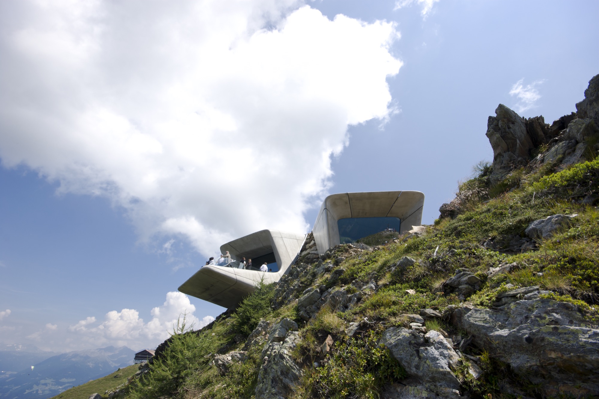
Claire had traveled to Italy to meet with the mountaineering legend in the Dolomites, where the late architecture icon Dame Zaha Hadid had designed the last of Messner’s six mountain museums: MMM Corones.
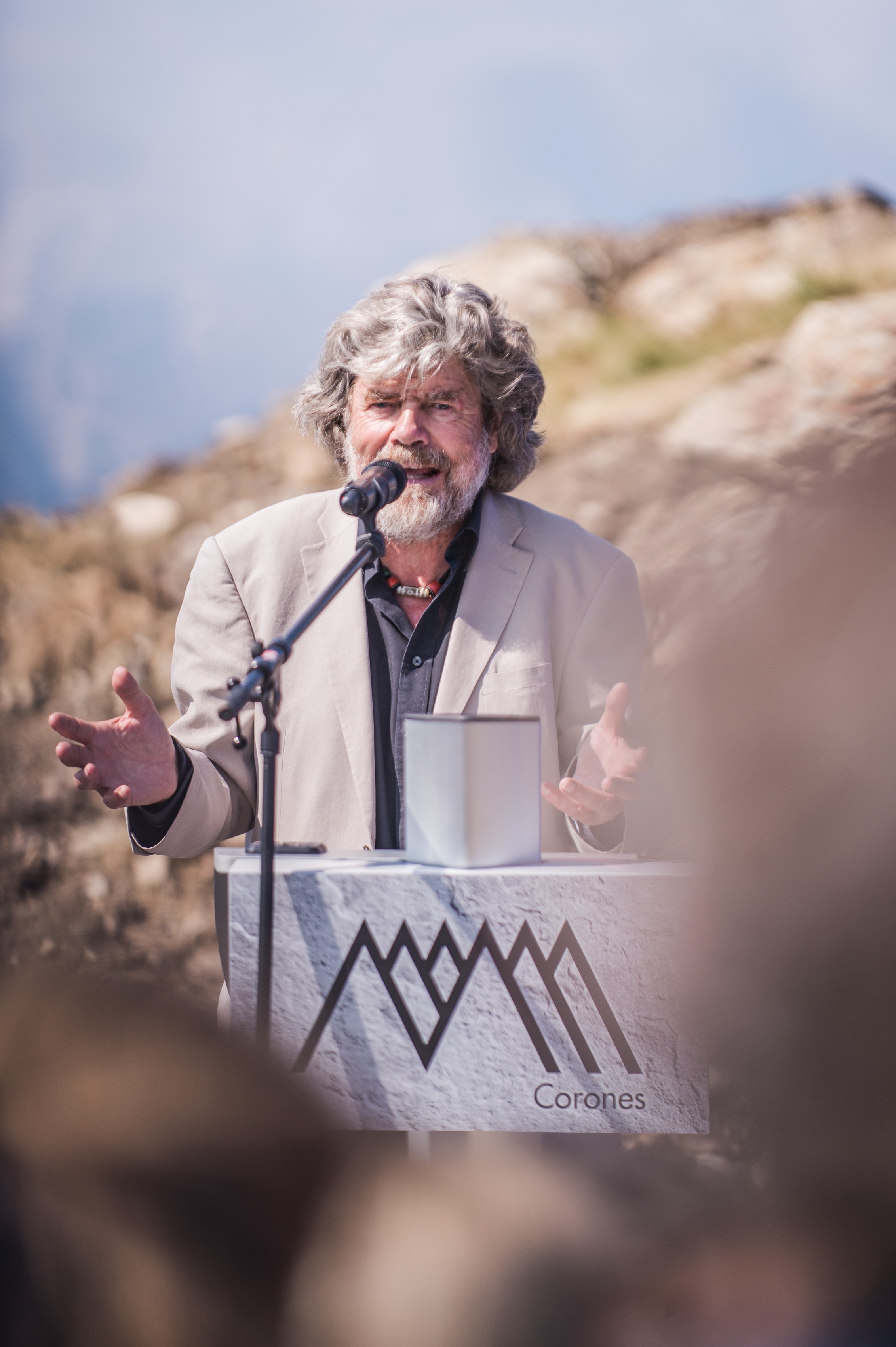
A story of adventure and architecture
Once more, read our riveting and now award-winning feature about the greatest mountaineer of all time and his mountains museum that sadly would become one of the final masterpieces of architecture icon Zaha Hadid, who passed away only weeks after we first published the story. △

Editor's Choice: Modern design in the Austrian Alps
Stable in the Landscape
An award-winning Austrian architect ennobles vernacular alpine building tradition to sophisticated minimalism. Read more »
***
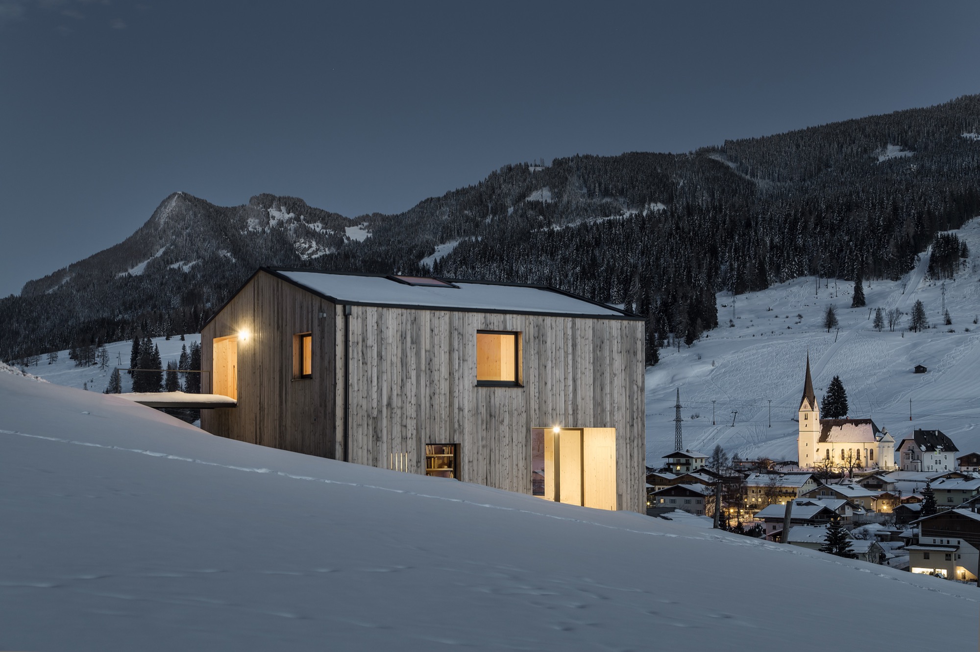
Snow-Proofed Hillside Family Home in Austria
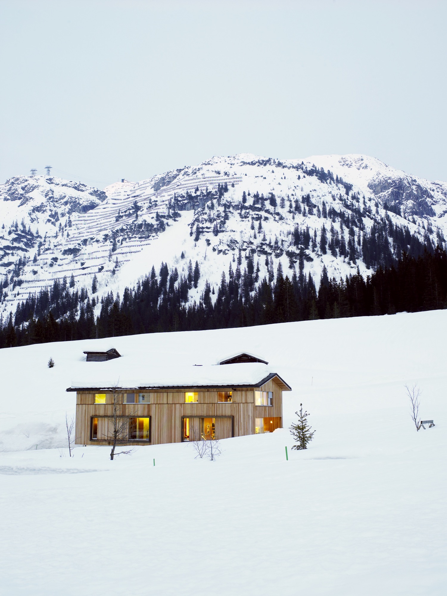
This house can weather even the fiercest winter storm and an avalanche. Read more »
***
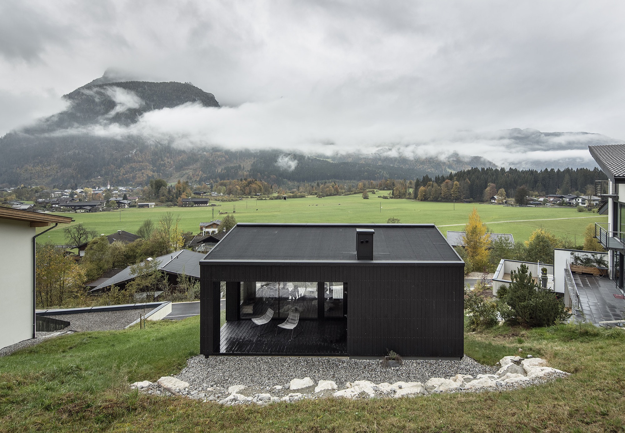
Context and Contrast in the Alps
An Austrian vacation home’s design references its mountainside setting and expansive views across the valley. Read more »
***
Camera Lucida
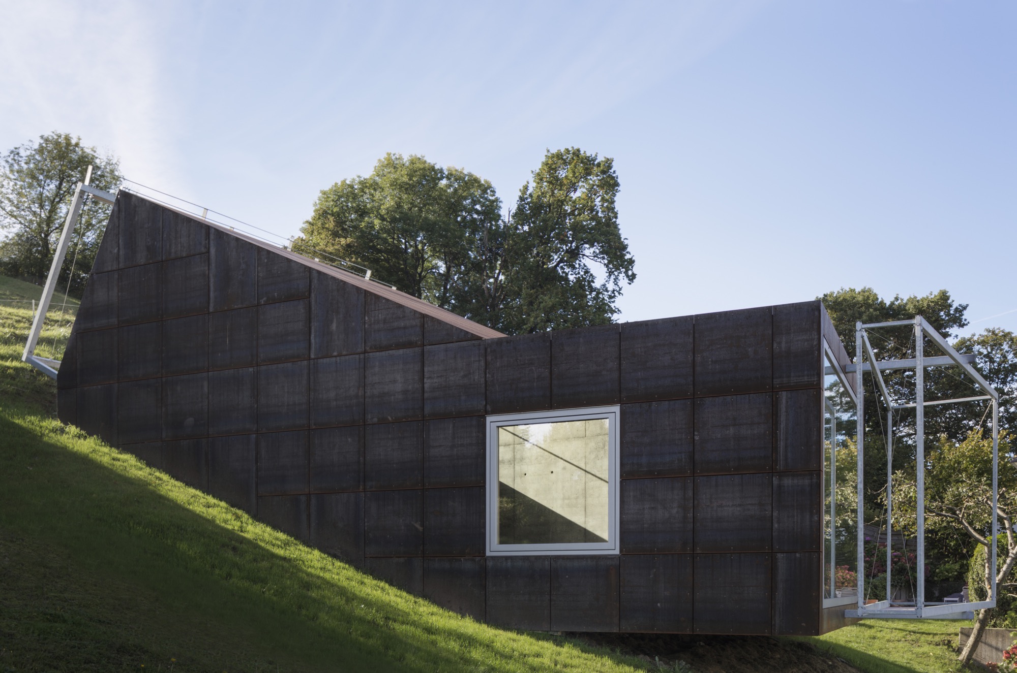
The small studio Vienna architect Christian Tonko designed for an artist friend becomes a looking device into the landscape, set in the foothills of the Austrian Alps. Read more »
***
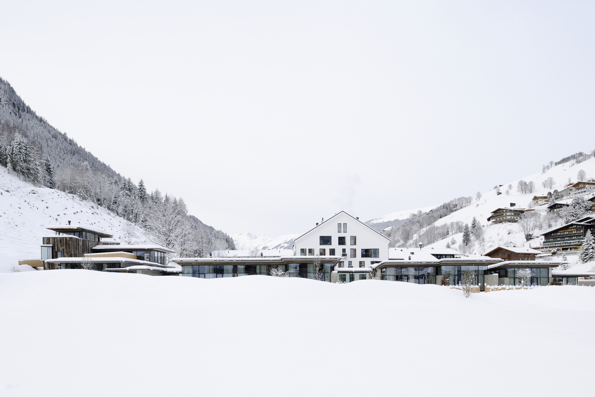
They Call It Happiness: Hotel Wiesergut
A serene retreat in the Salzburger Land, set against ski slopes and hiking trails. Read more »
***
The Height of Hip: Kristallhütte
A slope-side hotel and hipster après-ski hangout in Austria’s Hochzillertal. Read more »
A Cabin Cluster in the Quarry
Three small pavilions connected by a deck form a summer retreat in Maine that balances privacy with a panoramic view—all in less than 900 square feet.
 It’s perhaps misleading to call three structures a summer house. But measuring 890 square feet (ca. 83 square meters) altogether, referring to them as a set of summer houses would imply something grander than three cabins tucked into a defunct granite quarry. From a distance, the buildings look like a cluster of bait shacks you might see on the harbor side of Vinalhaven, the island where they sit.
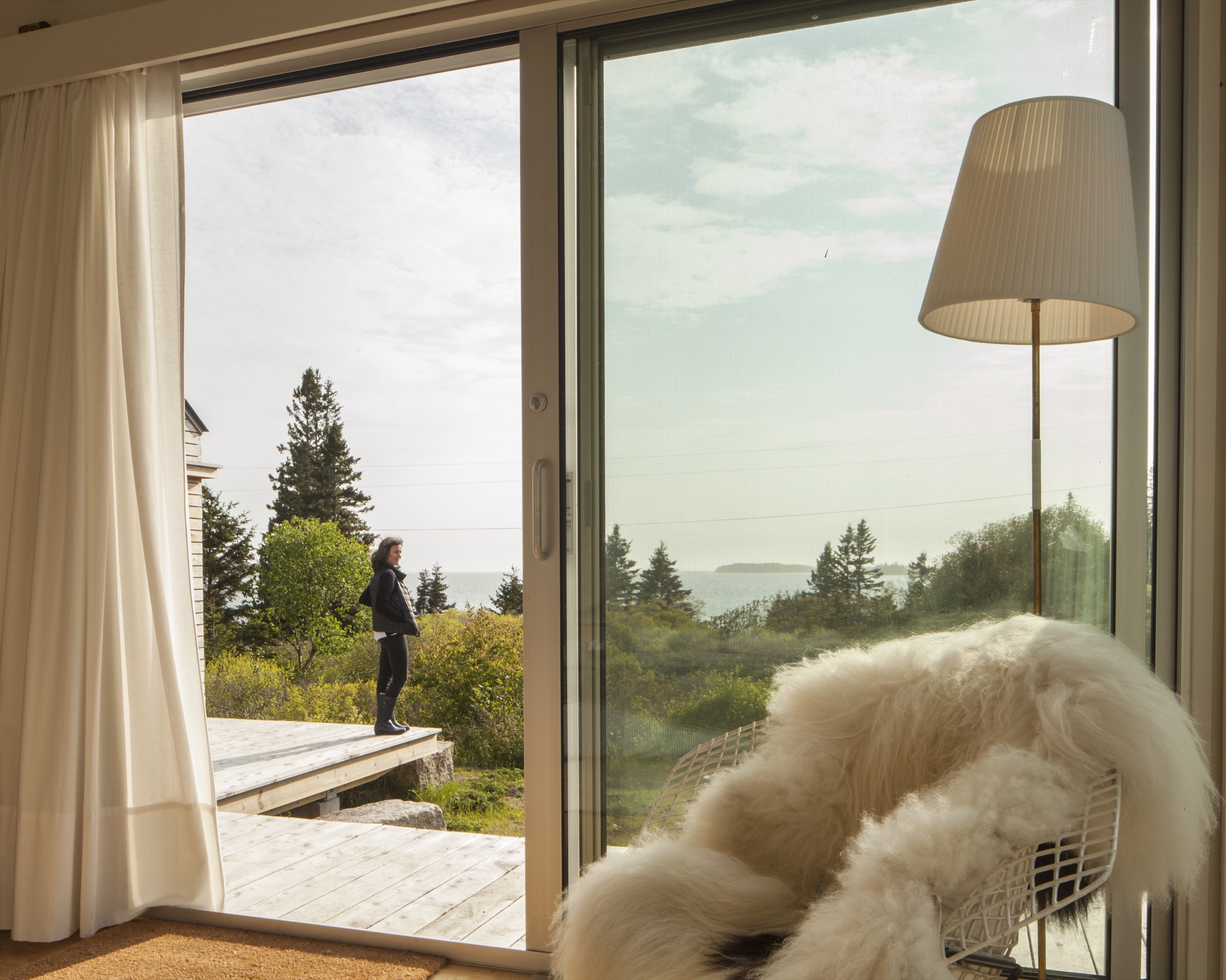
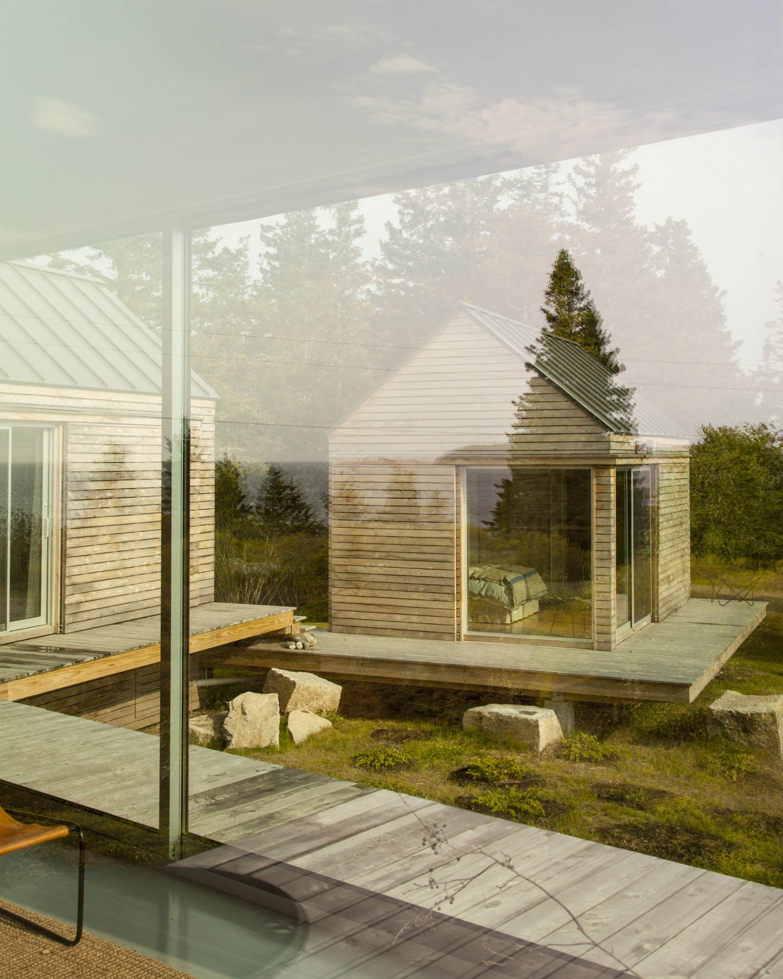
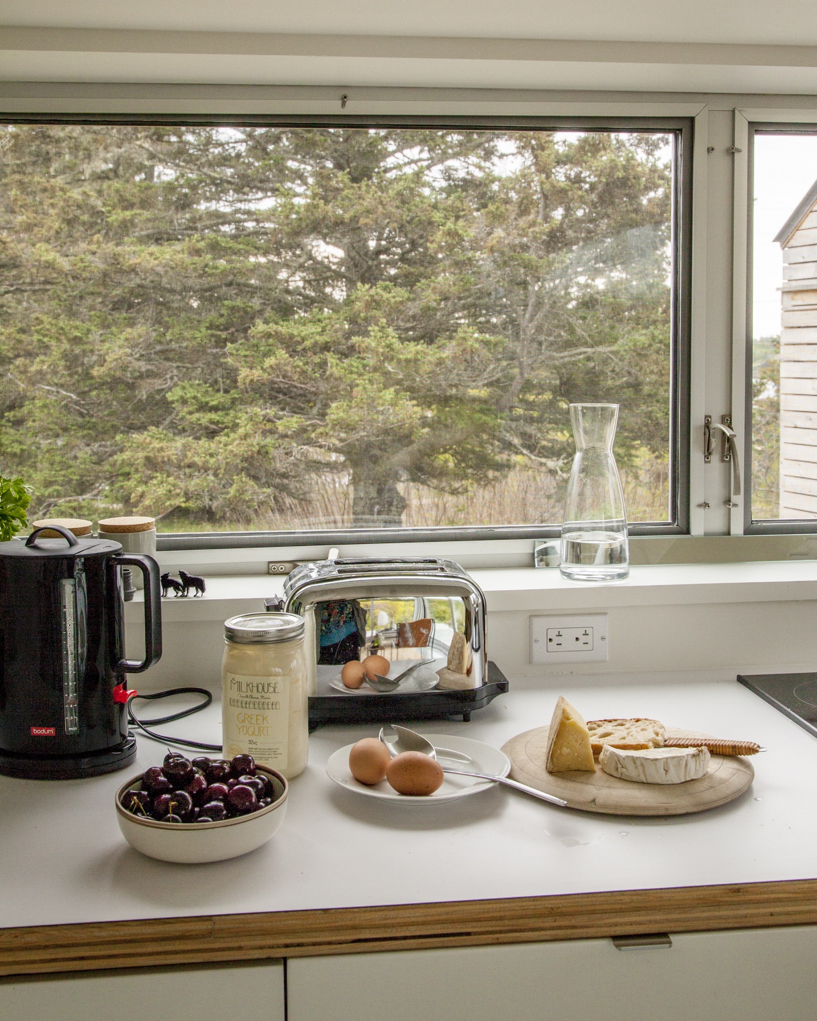
On a sloping site near a defunct rock quarry on the remote lobster-fishing island of Vinalhaven, Maine, a three-part summer home overlooks a framed view of Penobscot Bay. Working around the site’s unique topography, design-build firm GO Logic created each structure at varying elevations.
Fifteen miles offshore from the town of Rockland, Maine, the island is its own world, its very separateness a part of its magic: It can win people over in one visit, which is all it took for Nick and Nadja van Praag. Both expats—he from England, she from Austria—they’d only just arrived when a photo in a Realtor’s window caught Nick’s eye.
“We came to the island of Vinalhaven several years ago and immediately, totally fell in love.”—Nadja van Praag, resident
Restless in DC
At the time, Nick’s work with the World Bank had brought the couple to Washington, D.C., where they had a classic Georgetown house, yet felt a persistent sense of unrest. It drove Nadja crazy to be in America, where, as she says, "the inside/outside thing was invented!" Living like center-city Europeans in a four-floor building, the van Praags daydreamed about an open, single-story home, while Nadja kept close watch on a Richard Neutra house nearby, hoping a For Sale sign would go up.
A fateful trip to Vinalhaven
"Then we came to Maine, and didn’t expect anything like that," says Nadja. But there it was, for sale, a "little box" on Vinalhaven. "Nobody else wanted this house," she recalls. "They were all looking for the perfect New England shingled-whatever."
However, their tiny square overlooked a tiny rectangle: a 700-square-foot mobile home. The van Praags realized that if another family purchased the trailer to build a larger home facing the channel, the quiet setting of the disused quarry would significantly change character.
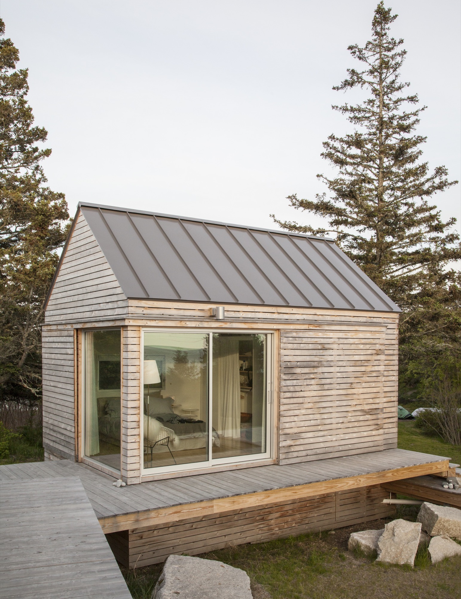
“We did our best to tuck the buildings into the site—the goal was to get up high on a perch. It was a matter of setting that elevation and working back down with the topography.”—Riley Pratt, architectural designer
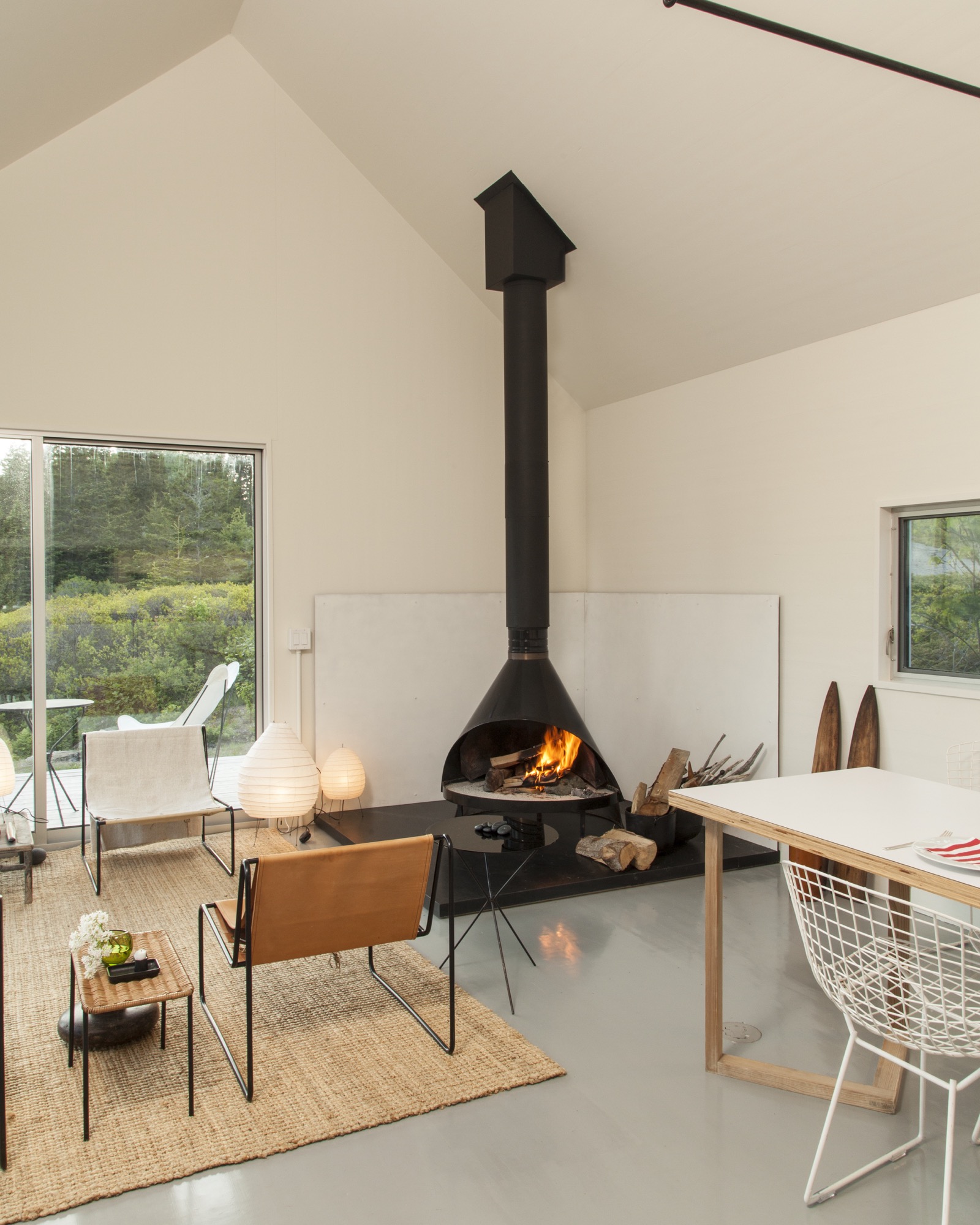
Building over time
A few years passed, the van Praags made interior renovations to the home with local builder, caretaker, and lifelong resident Mont Conway, then—when it became available—they bought the plot of land where the mobile home once sat, less than 100 yards down the path. Around the same time, they met Riley Pratt, an architectural designer who summers up the road. Pratt, of the Belfast, Maine–based firm GO Logic, knew Conway from pickup soccer games on Vinalhaven but also by way of his reputation.
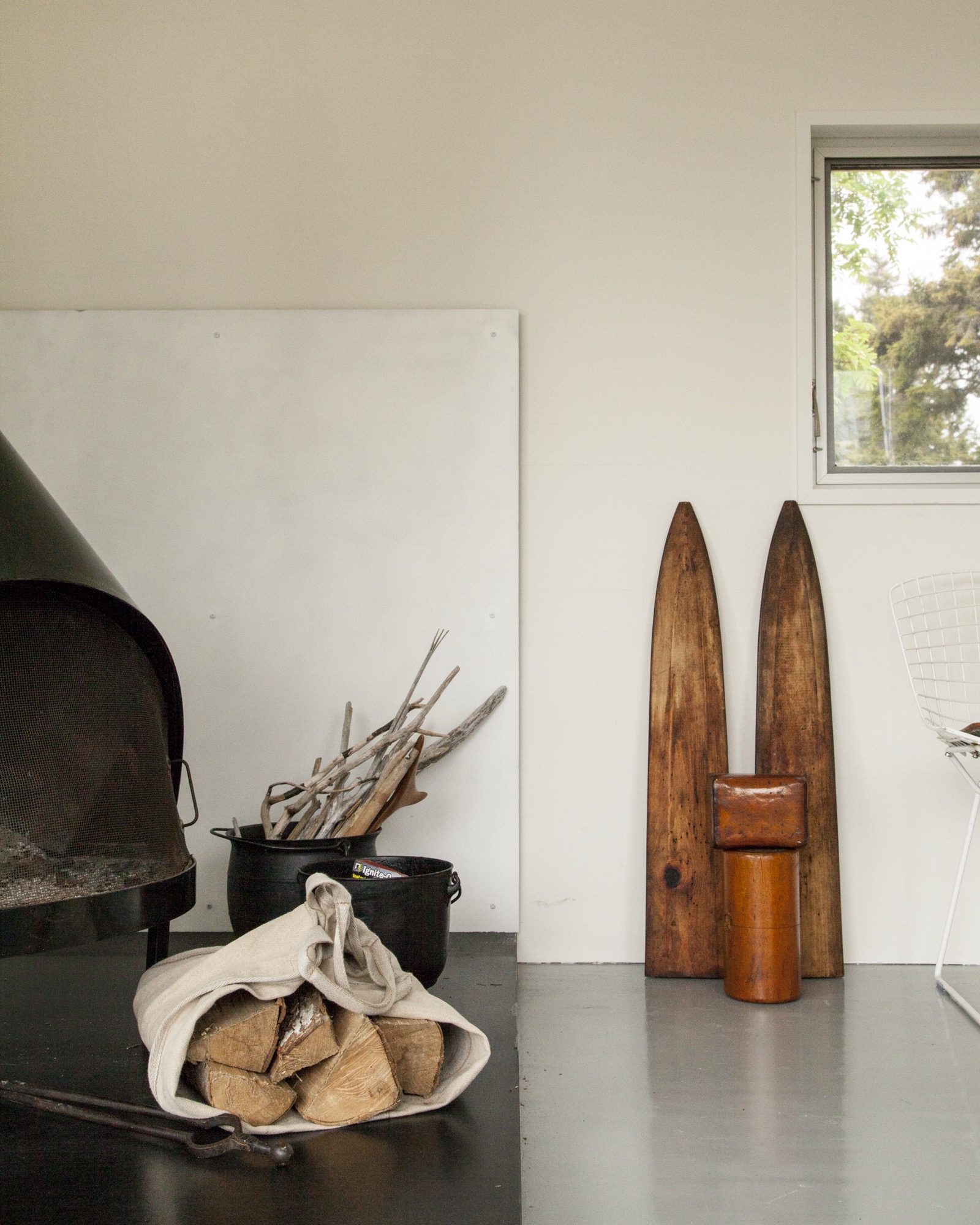
Inspired by Alvar Aalto sketches and the quirky quarry site
When the van Praags expressed interest in building a new structure on the extended property, Pratt mentioned Alvar Aalto sketches he had seen for a deconstructed summer cottage in Finland, where the rooms (and, of course, a sauna) were broken out as separate buildings focused around a courtyard. Nadja took to the idea of a peeled-apart, three-volume structure immediately: The design was an exploded version of their house, also a three-part structure, and building it would mean their three grown children could have a place to stay when they visited.
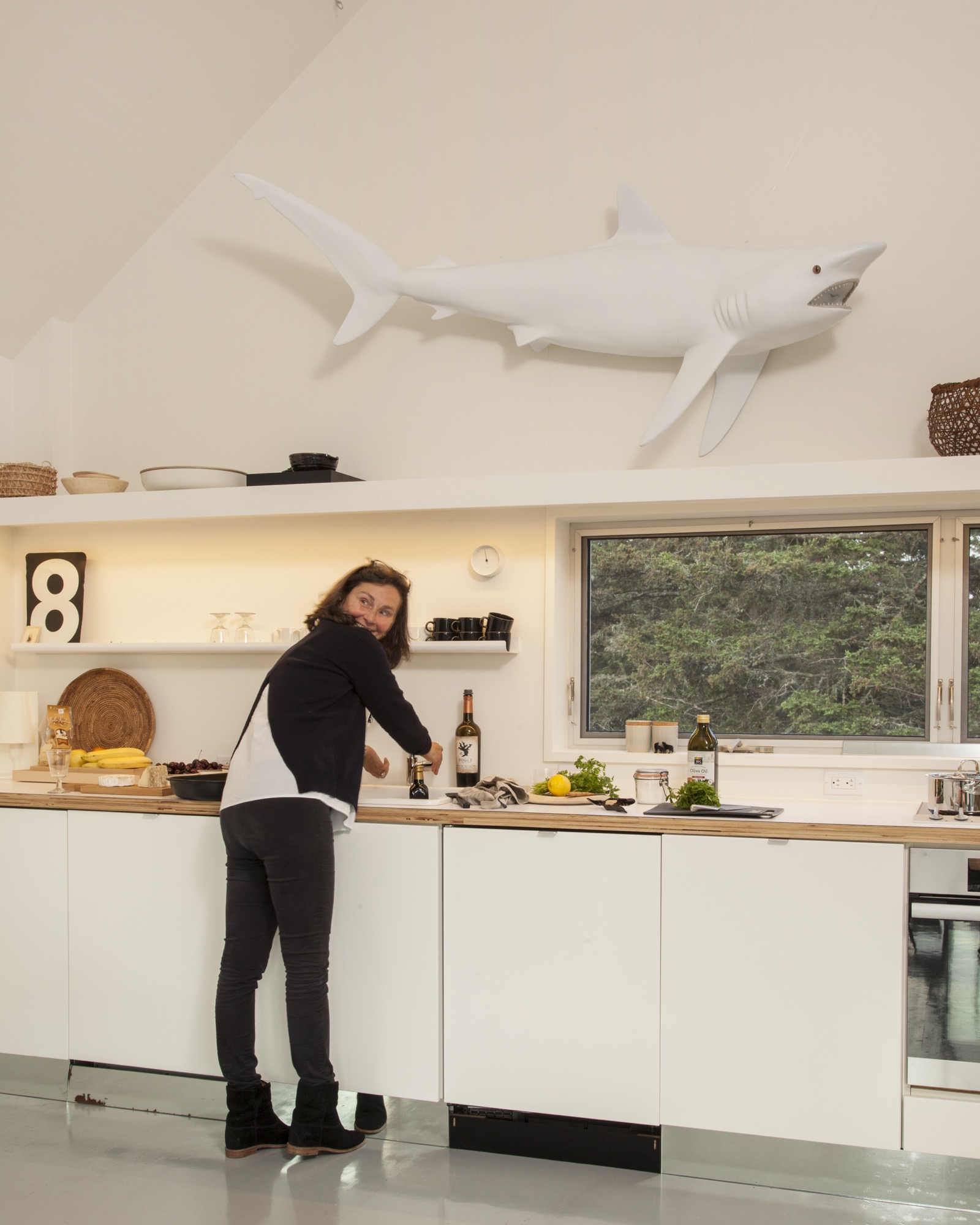
The town of Vinalhaven considered the lot, with its jumble of rejected granite scraps, "substandard" and therefore granted the Van Praags up to 30 percent more square footage and volume over the previous structure. While the site posed challenges, it also inspired. GO Logic paid special care to the topography and geometry of the quarry. Every angle—of both the structure and the interior lines of sight—is in purposeful alignment with the surrounding stone, trees, and water views.
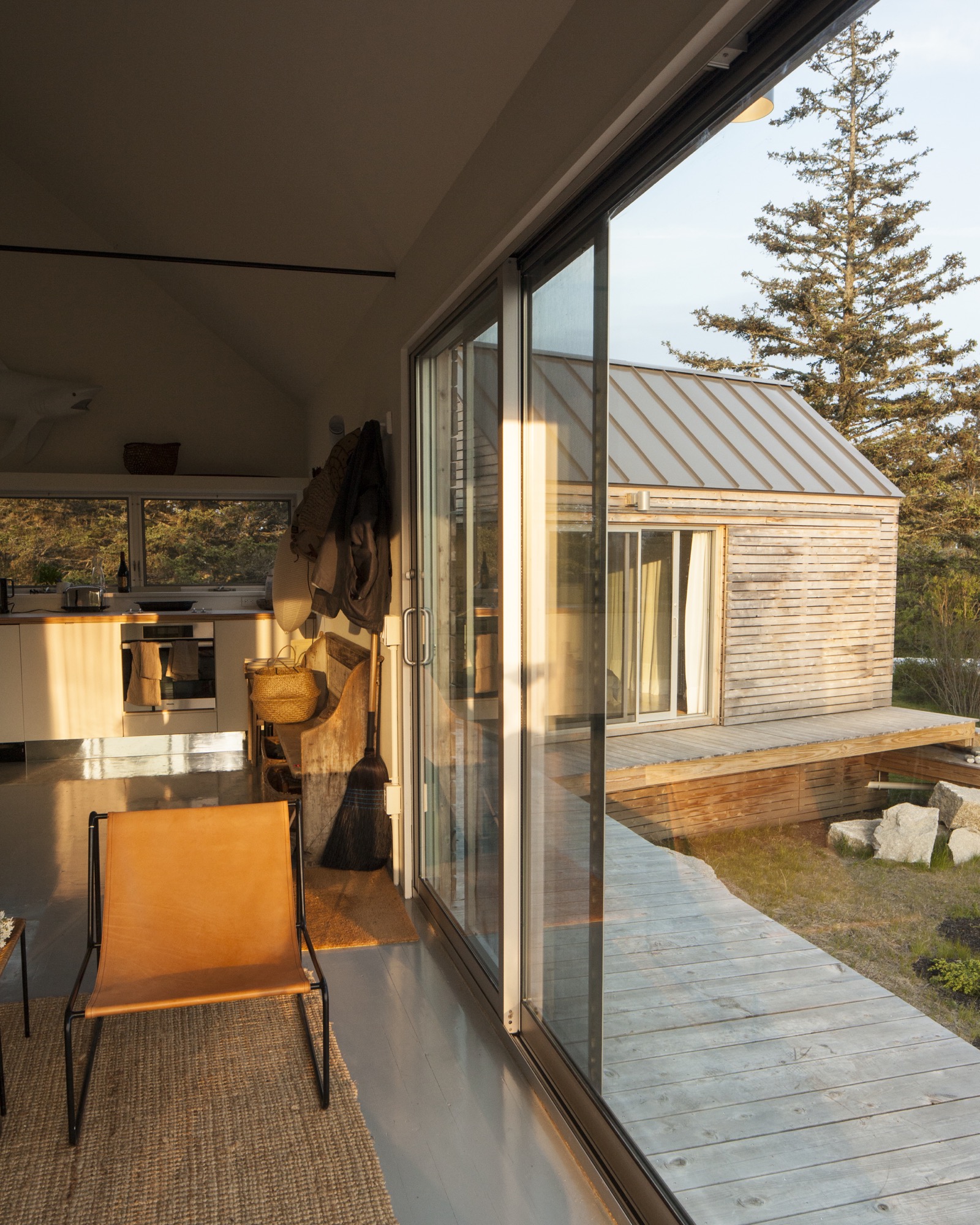
The town approved the plan for multiple structures because a single deck connected them, and the van Praags were thrilled because the design maximizes both privacy for overnight visitors and a connection with the outdoors.
“We’re here for almost three months every summer—and it works so well that you never feel it’s a small space. The separation and steps between each perfect little box create a great flow.”—Nadja van Praag
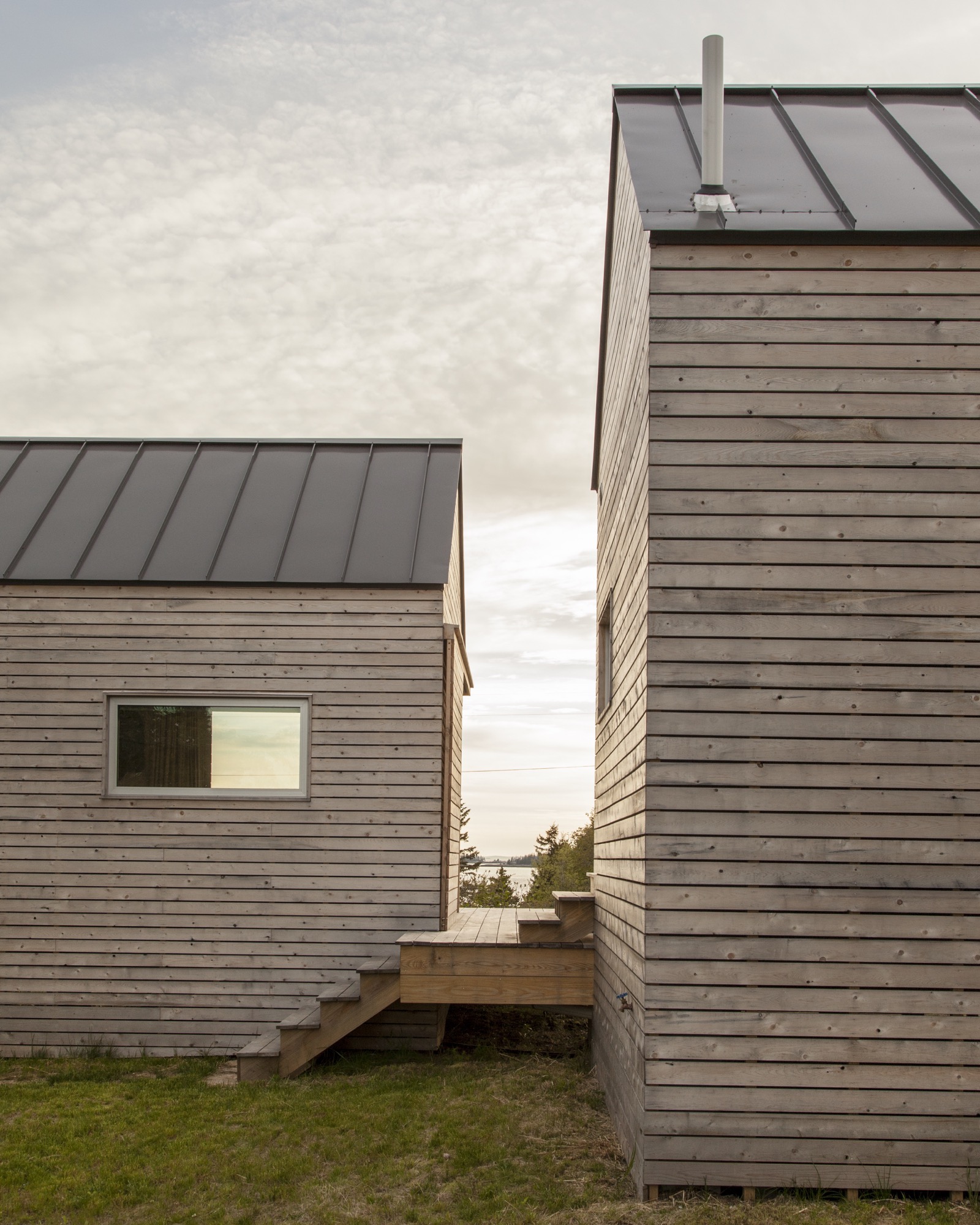
The spare aesthetic—inside and out—at once suits the austere island and reflects a judicious building process that was as much about choreography as construction. GO Logic used an emerging technology—cross-laminated timber (CLT)—to reduce waste and on-site labor. The design-build firm, working with Conway and his crew, carefully sequenced the packing, transport, and assembly of the black spruce panels shipped from Quebec. The panels form the entire enclosure—floors, walls, and roof—a practical and sustainable solution that provides both structure and finish. Conway’s crew sided the buildings with mitered white pine that will turn hoary with time, matching both the granite landscape and the local cottage vernacular. They also used white pine to create sliding barn doors that offer shade and privacy as needed in the summer, and protection in the off-season.
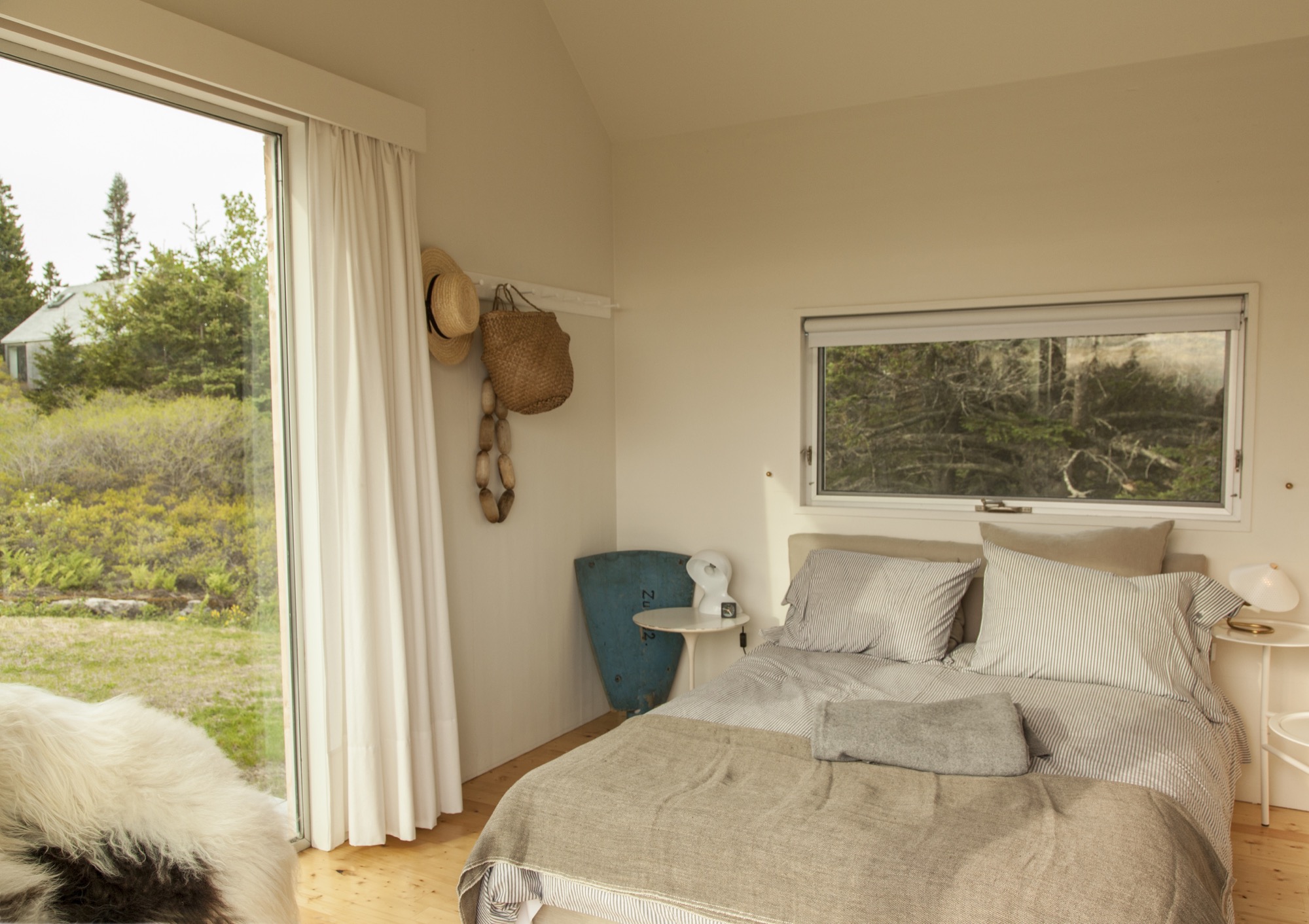
Clustered escape
Although they’re just a short walk from each other, the van Praags’ two homes—the "little box" and the new trio of cabins—feel worlds apart. "The old house looks over Old Harbor Bay, protected and speckled with boats. It’s sort of domesticated, in as much as the islands of Maine do domesticated," Nick says. "The new house is out there. It feels wild and remote, with the old quarry rising gently behind the house and the ocean stretching away in front."
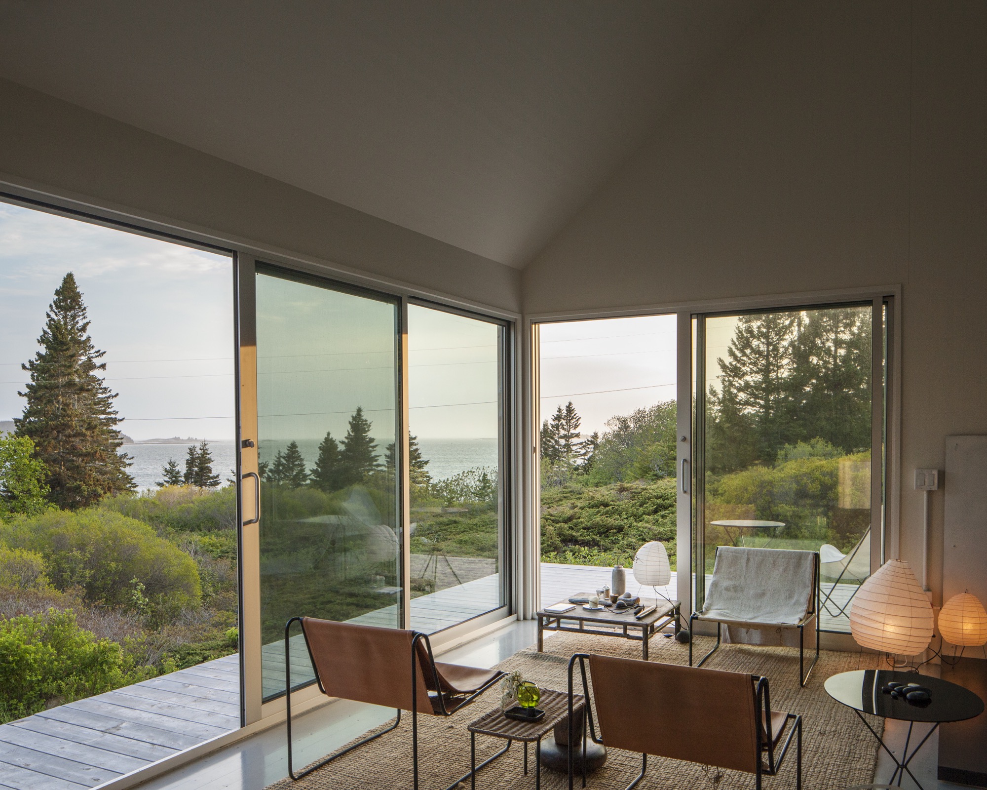
By day, the three connected pavilions sit lightly on the land. At night, they float above their concrete piers, a U-shaped harbor that beckons guests with its warm light, the platform at once a dock and a deck.
"For me, the most amazing thing is the way Riley sited the place," Nick says. "It was always a beautiful spot, but by raising and angling the buildings, it embraces the landscape and the ocean in a way that I could not have imagined." When guests ascend the stairs to the deck, popping up into a framed view of Penobscot Bay, they all stop in the same place. "I realize now that siting a building is a very special talent," he adds. △
Retreat in the Aspen Grove
Cottage Black by Colorado-based architecture and interior design practice Studio B counterbalances the grand main house in Aspen’s countryside
Studio B, a Colorado based architecture and interior design practice with offices in Boulder and Aspen, first designed the grandiose main residence in the backcountry a twenty-minute drive from Aspen, Colorado.

“We really wanted to explore a heightened experience of those aspen trees.”
“The main house sits up on a ridge and is all about connecting to those long views, the big mountain views,” says Piché, describing what he calls a “more extroverted” approach, compared with the cabin down in the grove. “When we started working on the little guest retreat, we wanted to experience the trees in a completely different way. These views are much more embedded in the grove.” To better understand what design and placement would make the most out of Cottage Black’s distinct surroundings, Studio B took time to study how the aspen trees’ foliage changes with the seasons. “One thing we really liked about it was that the trunk feels really consistent throughout.”
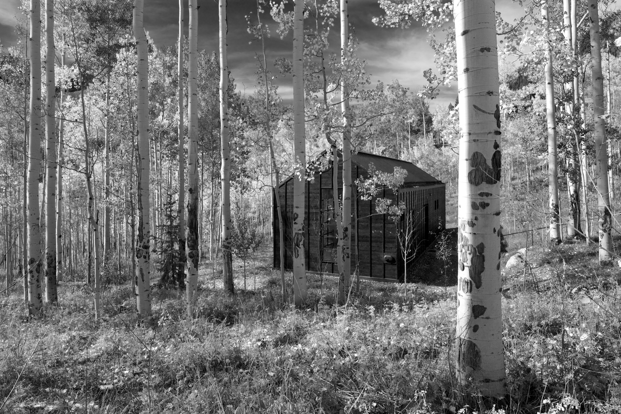
The monochromatic aspen tree bark ultimately inspired the intimate retreat’s all-black exterior and all-white interior.
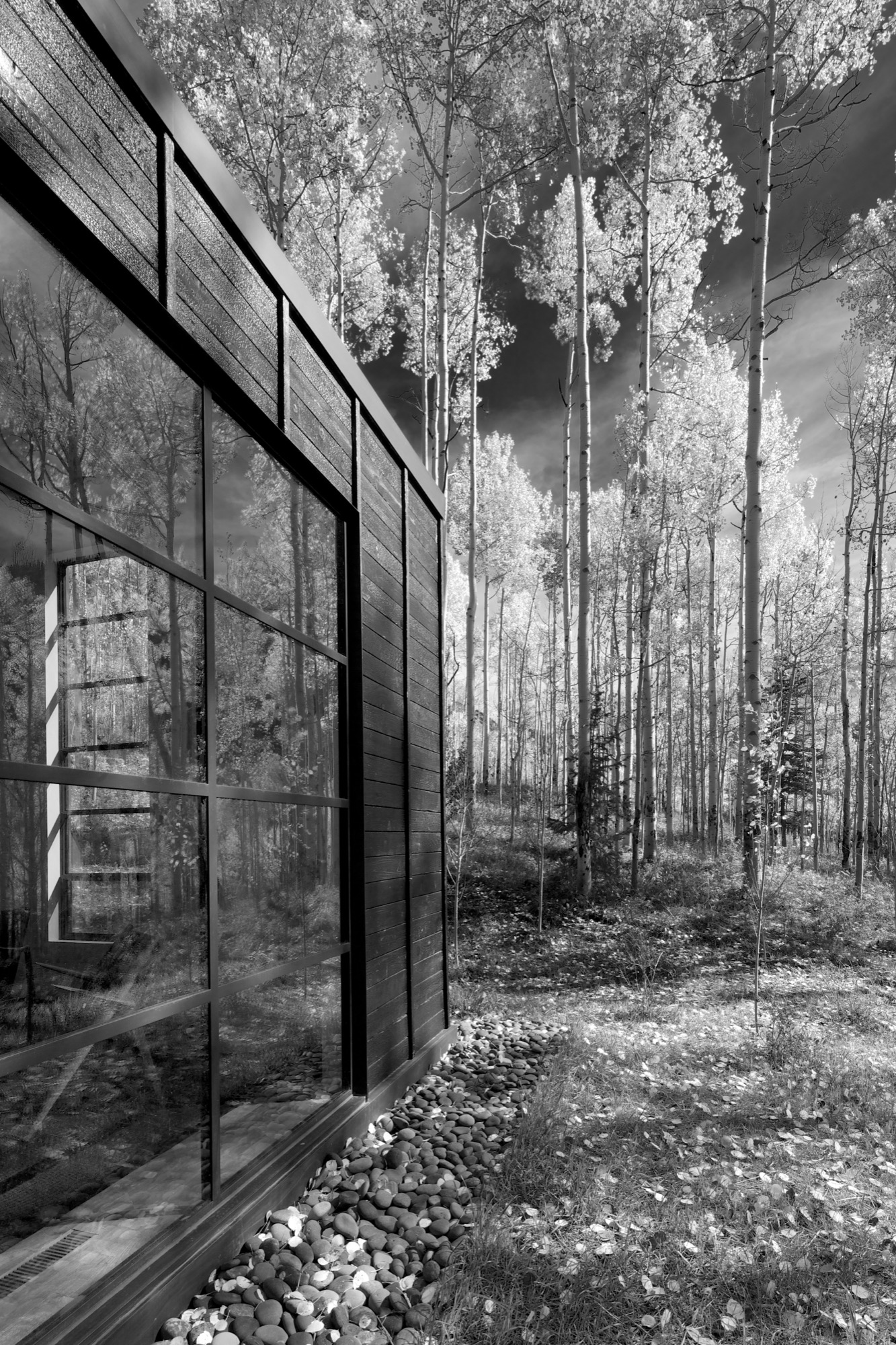
“The standing seams on the roof and the vertical joints of the interior wood ceiling were chosen to relate to the immense verticality established by the trees,” the placid architecture master notes. Approaching the house, simple stairs weave their way through the trees to the front door.
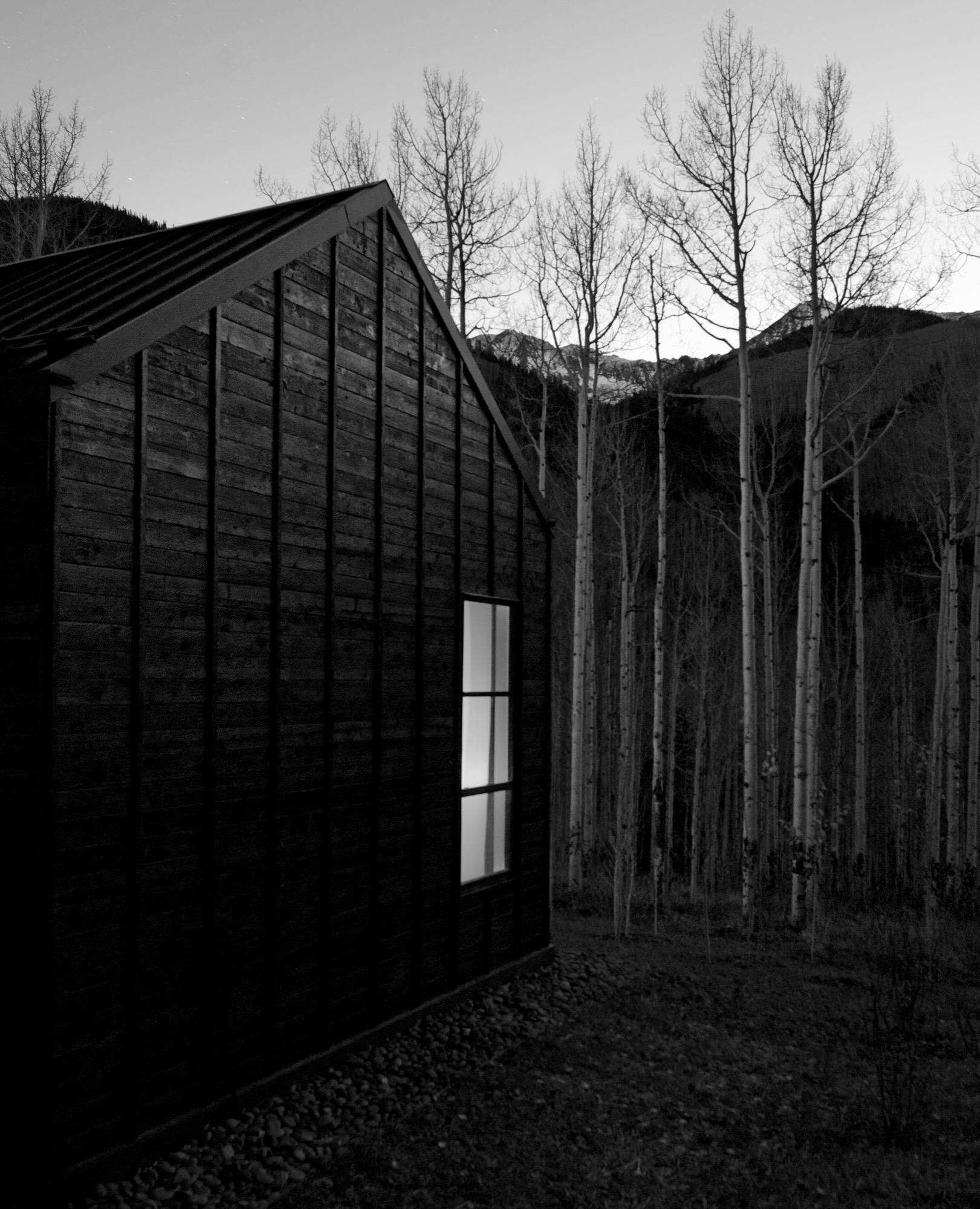
The black exterior
Heavily charred cedar wood gives the cottage’s exterior a rougher, bark-like texture. The orientation of the boards and the battens picks up on the verticality of the trees and the shadows. Looking at “that box” with its horizontal boards at one point during construction, Piché says they had an epiphany: “You wouldn’t think that black has the shadows and the depth that it does, but it seems it almost has more. When the sun hits, the black wood goes from gray to dark and it really feels like it transforms quite a bit.”
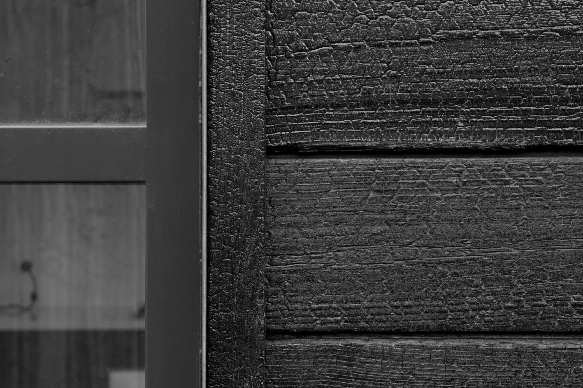
“You wouldn’t think that black has the shadows and the depth that it does.”
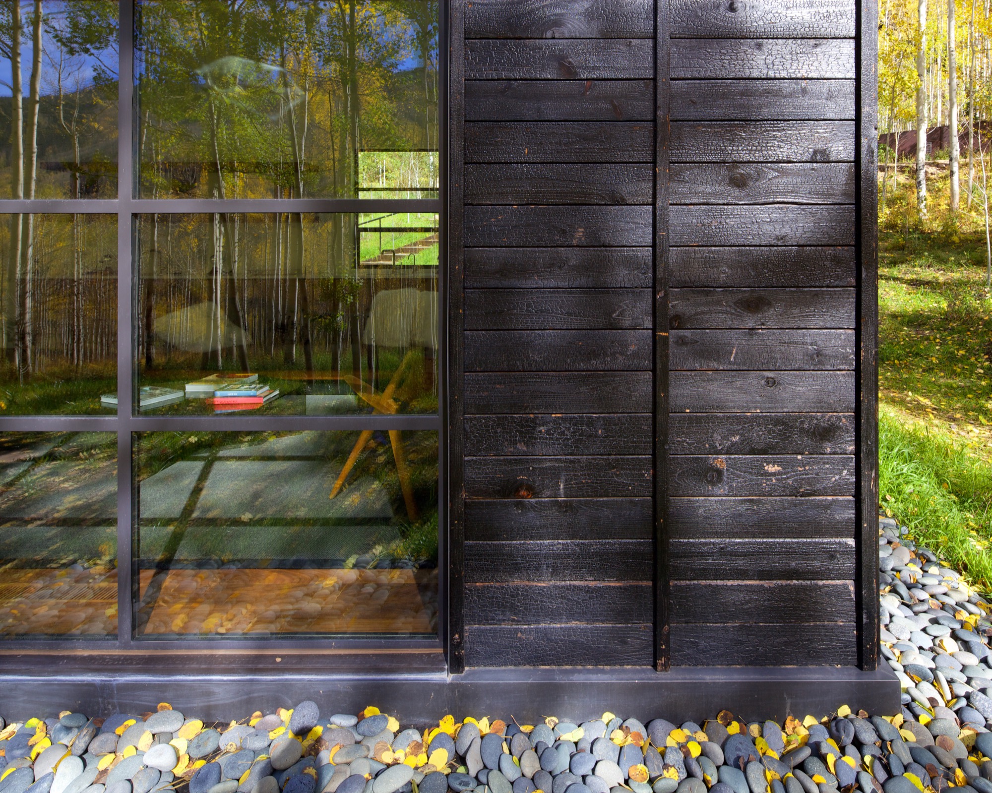
What’s more, the charred exterior gives Cottage Black the air of having been there for a long time. “And in spring and summer, when all the trees are fully leaved, people don’t even see the cottage. It disappears, and it reappears in the fall, too,” says the distinctly analytical architect, pointing out that no driveway leads to the retreat and guests cannot park right next to it. “The cottage is packed into the trees, and it’s kind of a journey down there.”
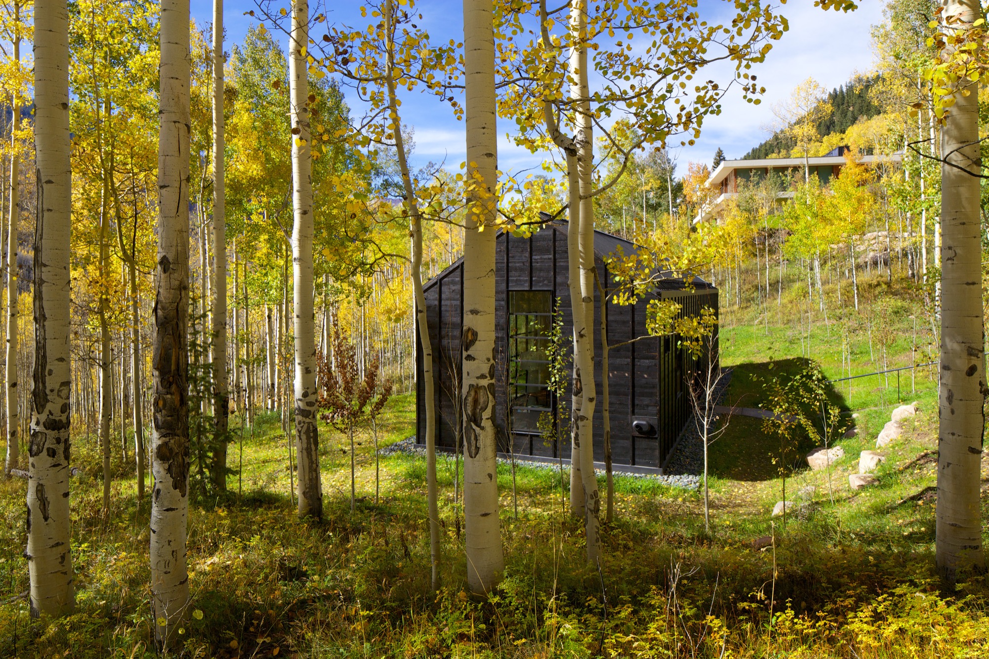
The Studio B team intently placed the steel windows to achieve a minimal sight line that only highlights a few select views. “We added a tall window that emphasizes some great trees on that side, a couple of little corner windows that just frame the tree trunks, and then one big window in the living room that is more about walking outside onto the patio and connecting to all the trees there,” the architect says. “But you are not getting those big mountain views. Just these little glimpses of the outside, which creates that more intimate feel when you walk up to the window. It is more about enclosure and intimacy than the broader expansive things. It is a little bit more inward than outward.”
"It is more about enclosure and intimacy than the broader expansive things. It is a little bit more inward than outward.”
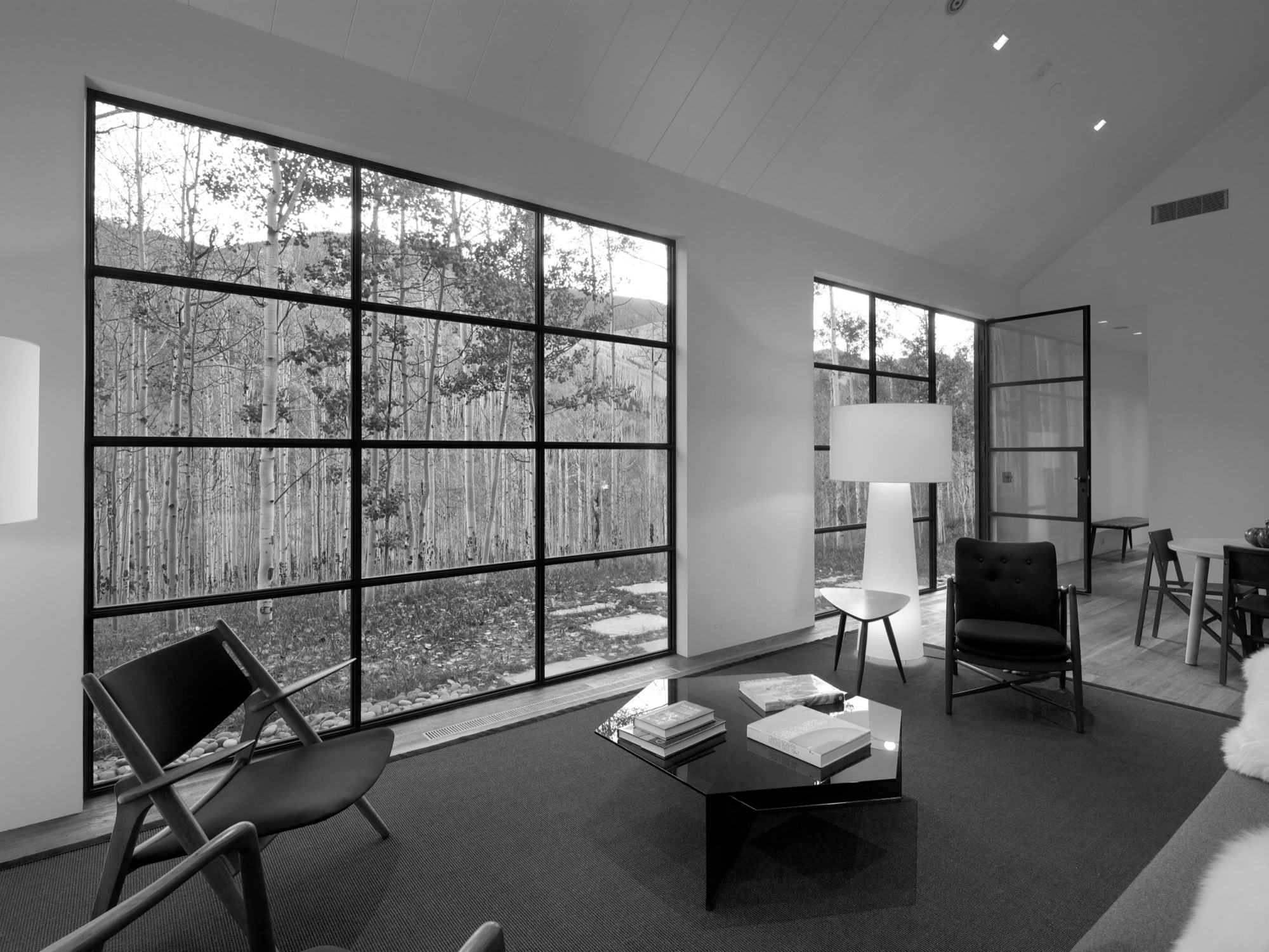
The white interior
Walnut floors lend warmth to the primarily white, minimalistic inside. “The monochromatic interior, again, is a counterpoint to the main house, which has a lot more materiality coming through and more complicated detailing,” Piché says. Cottage Black, by contrast, is very simple, with much more subtle detailing: “There is the wood ceiling, for example, where each of the joints lines up with the joint on the exterior in a subtle inversion of it.”
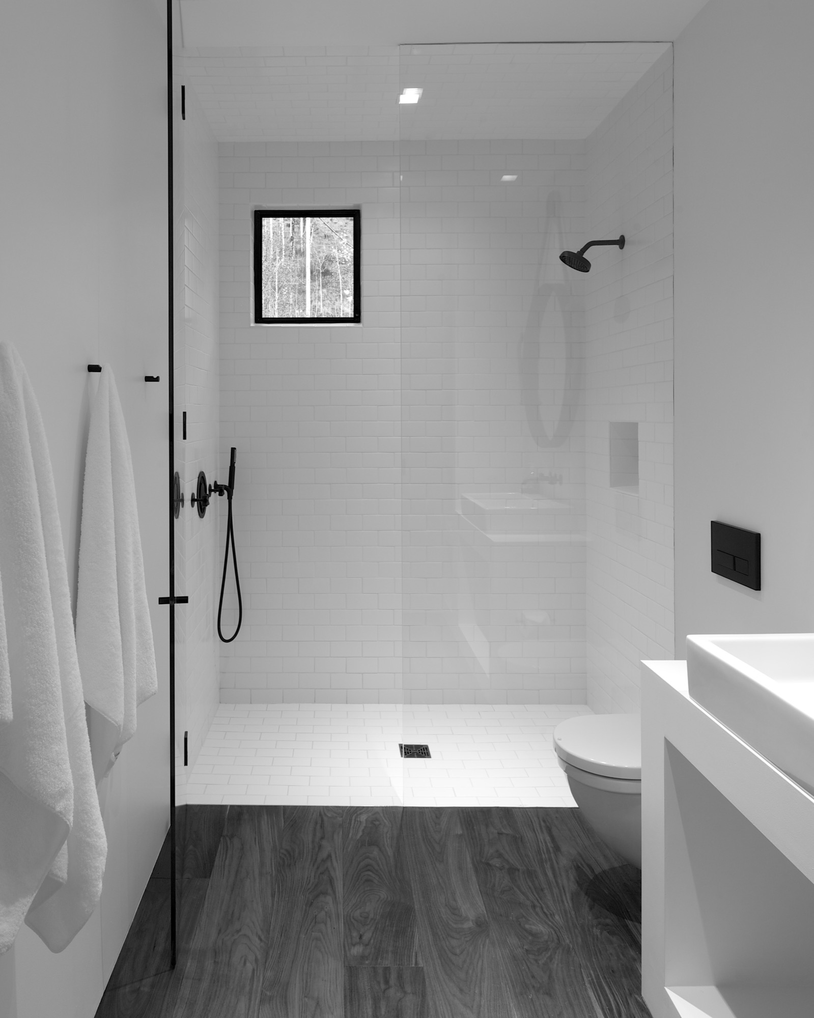
A bathroom at the center separates the sleeping area from the living space, which also includes a little kitchen to allow guests some autonomy, if they desire. “There isn’t any kind of door,” Piché says about the intimate studio layout.
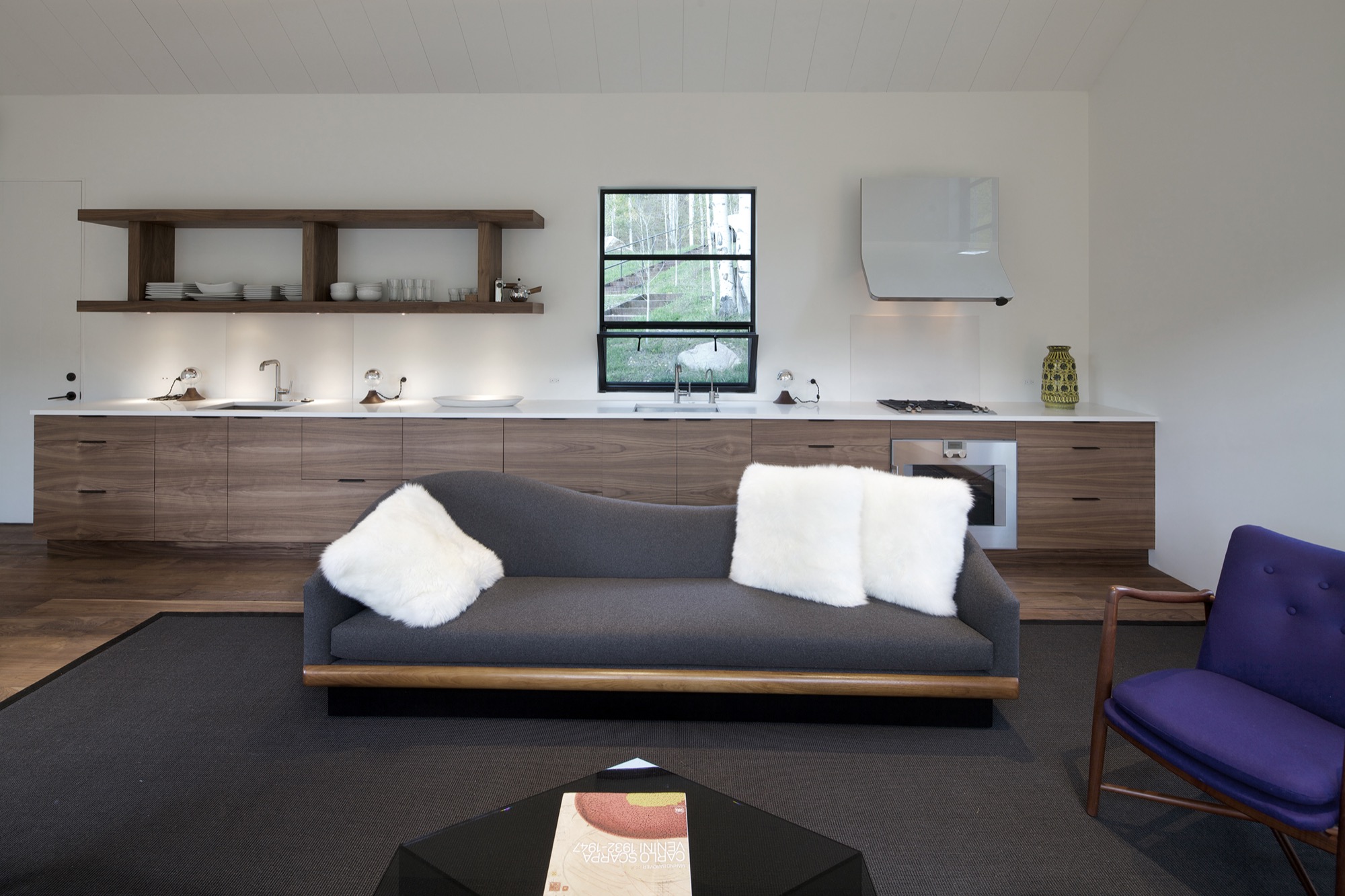
A counterpoint for solitude
Should the guest retreat complement or rather juxtapose the main house? After much collaborative consideration, the design team and the client decided Cottage Black was to be a distinct counterpoint to the luxurious primary residence up above on the ridge. One consequential feature of this objective ended up being the orientation of the structure. “The one window that you see when you stand up in the living room lights up, and that’s it,” Piché says. “All the other things... we shifted it quite a bit to make sure you couldn’t see it from the main house—that there is that black object.”
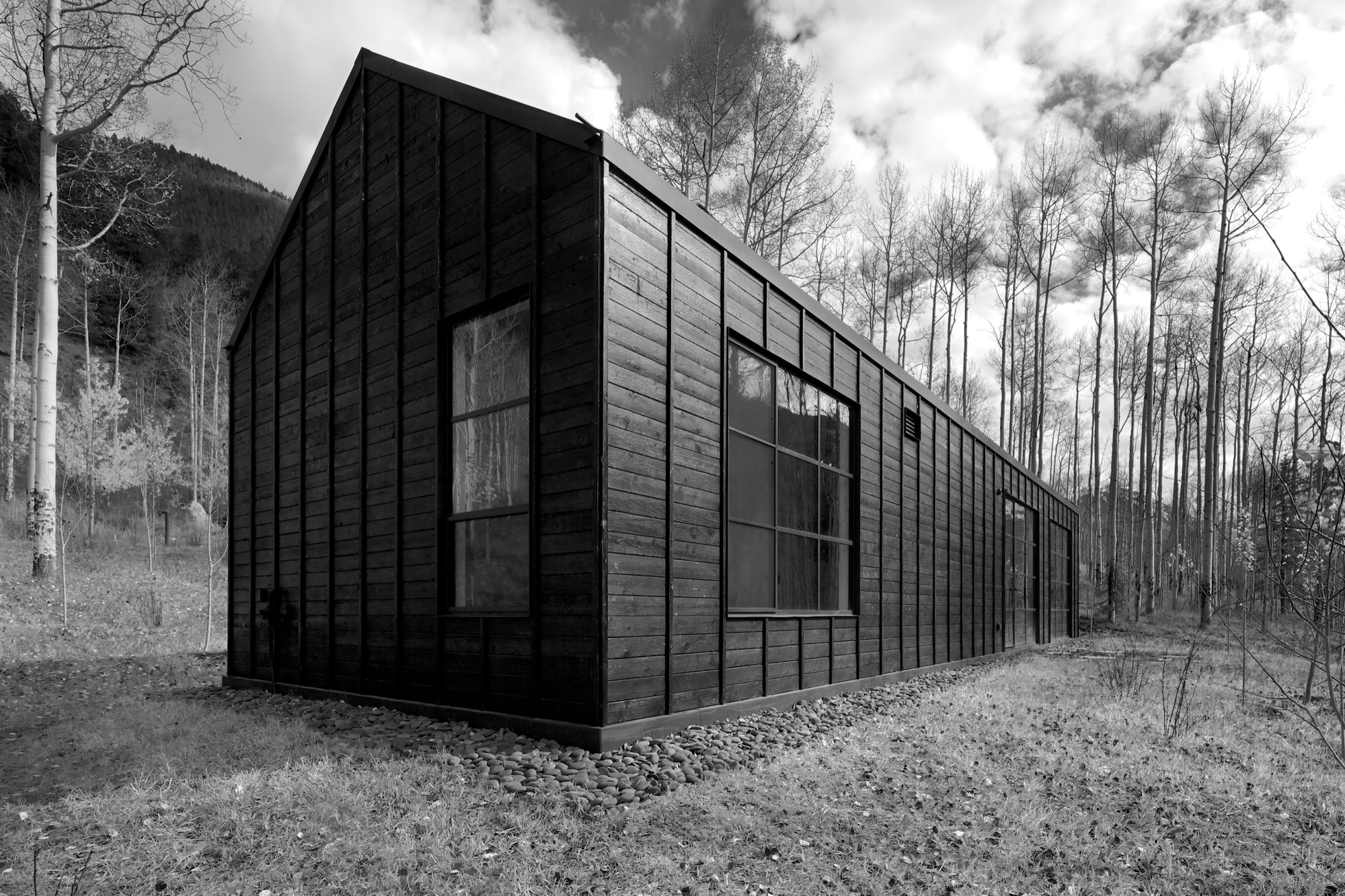
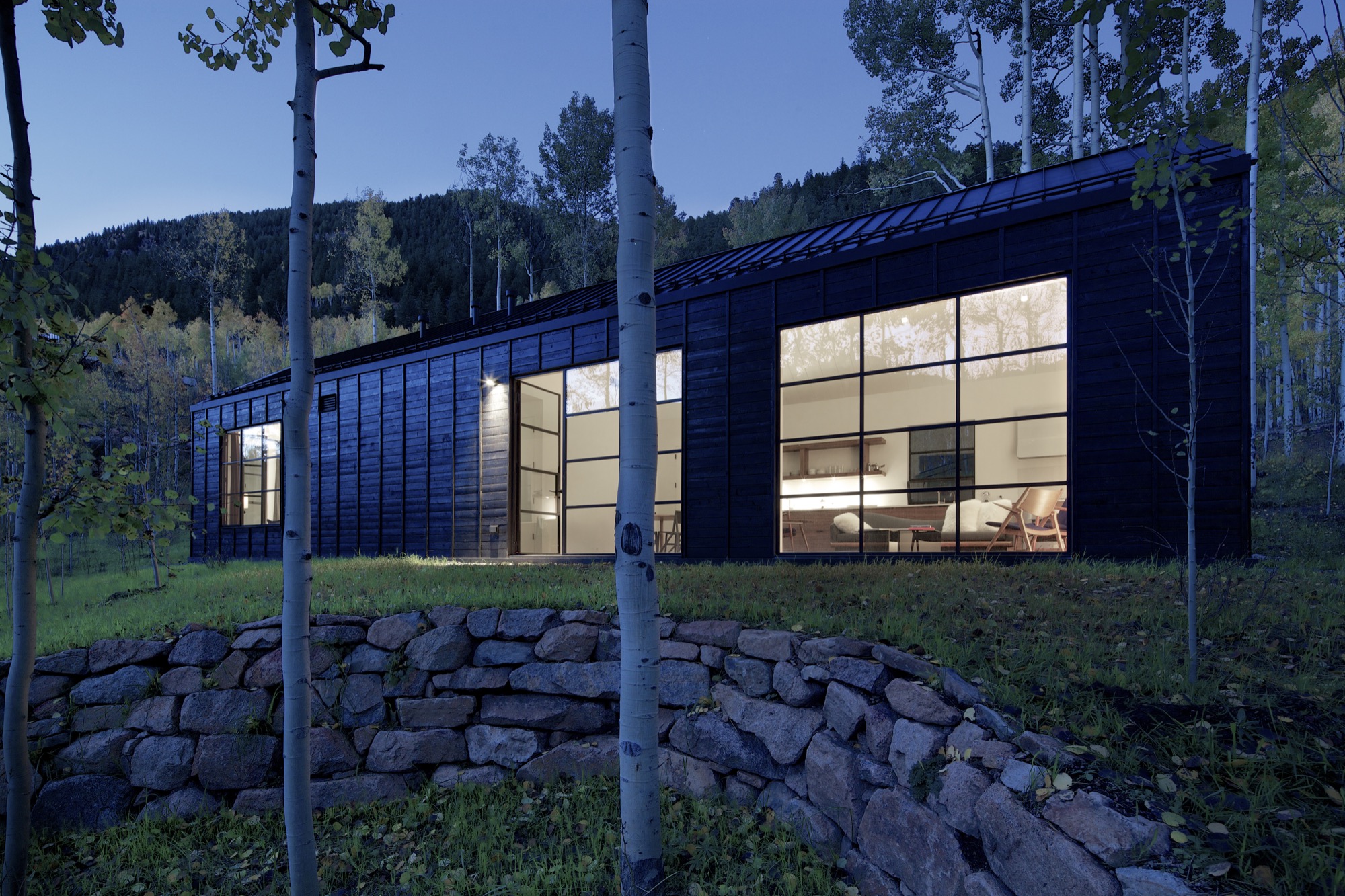
Furthermore, the team had added transitional materials throughout the main house to add texture and interest in various places. Cottage Black’s architecture and interior design, on the other hand, are very much characterized by deleting details, according to the architect. “This house is a lot about editing,” he says in reference to the design process. “In the beginning, we had a lot more adventurous solutions, and we distilled it and made it into a better and more powerful piece of architecture. It doesn’t need to be a lot.” △
The Vindheim Cabin: Snowbound in Norway
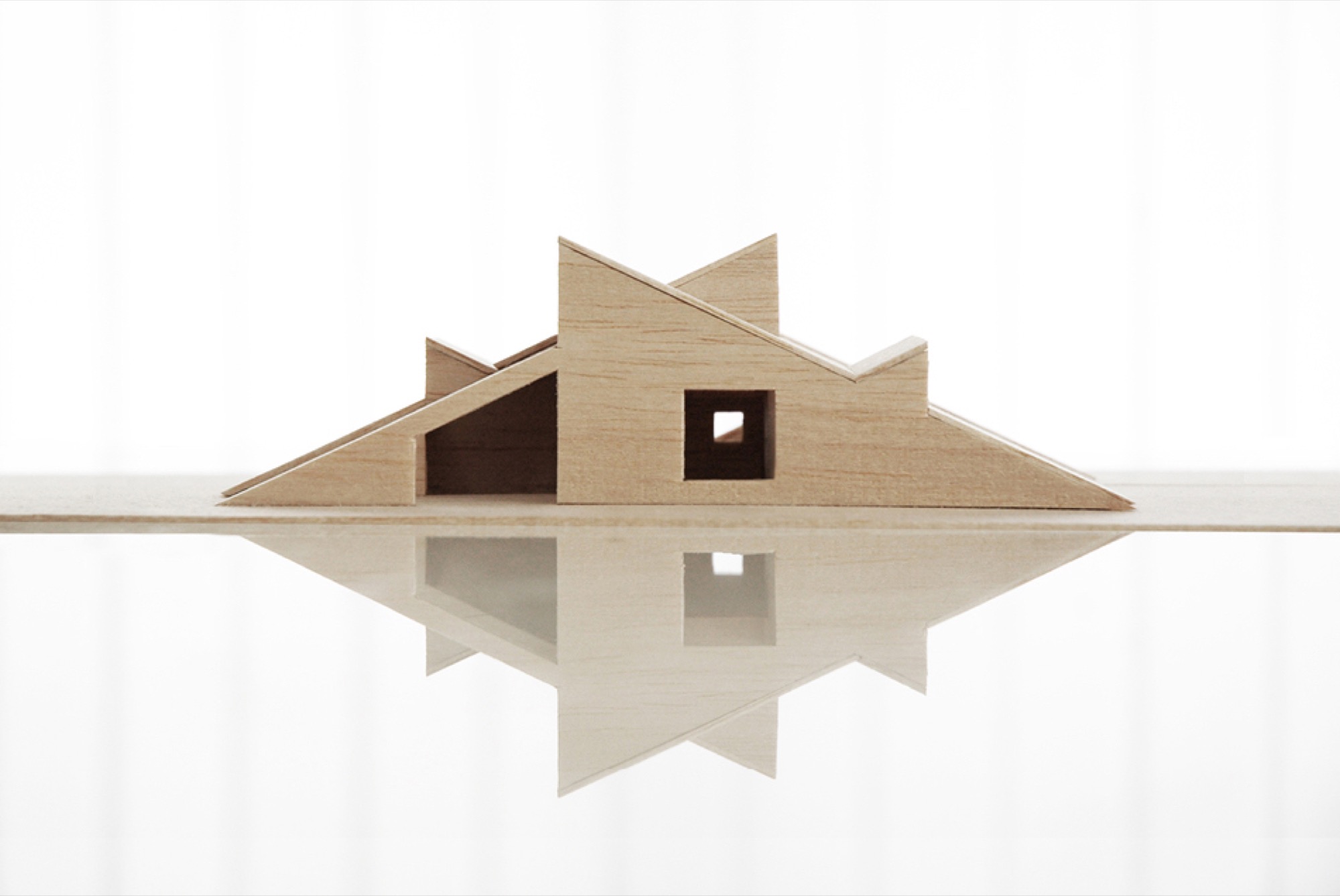
The Vindheim cabin in Lillehammer, Norway, is inspired by the classic motif of snowbound cabins, with only the roof protruding through the snow.
Architect Håkon Matre Aasarød, partner at Oslo-based studio Vardehaugen Architects, led the design of Cabin Vindheim, situated deep in the forest in the alpine landscape near Lillehammer, Norway. The cabin’s concept was simple: To create a cabin that is small and sparse yet spatially rich. The 55-quare-meter (592-square-foot) cabin, commissioned by a private client and completed in 2016, comprises a large living room, bedroom, ski room, and small annex with a utility room. It functions off the water and electricity grids.
Håkon, who earned his master of architecture degree from the Oslo School of Architecture and Design, where he is also teaching today, has been telling us about this project from its very beginning, keeping us abreast of the building progress in emails and photos. What’s more, the Norwegian Broadcasting Corporation followed the design and construction of the cabin and documented it in a one-hour episode of the program “Grand Designs”. Thus, we are excited to finally show you the result and introduce you to its lead designer, who lives in Oslo, with his wife, Sigrid, and with his two boys, Syver and August.
A conversation with architect Håkon Matre Aasarød
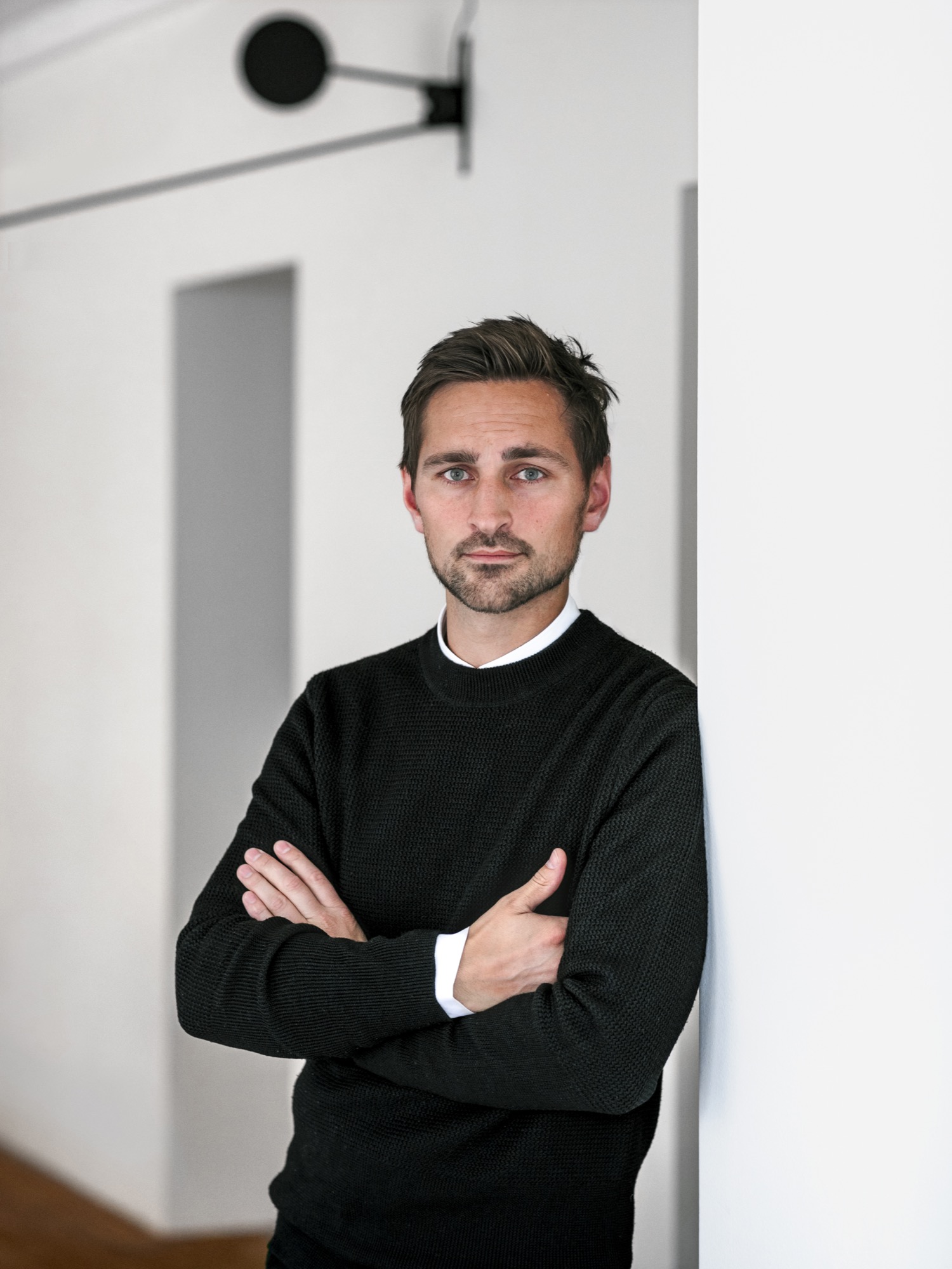
AM When and how did you know you wanted to become an architect?
HMA I’ve always been passionate about drawing. I can easily recall the wonderful and almost hypnotic feeling I had while drawing Star Wars space ships for hours in my childhood. As soon as I got older and realized that drawing houses and objects was a real job, and not just a hobby, I knew I wanted to be an architect. Today, from time to time, I can still get that wonderful, almost meditative feeling while drawing.
“As soon as I got older and realized that drawing houses and objects was a real job, and not just a hobby, I knew I wanted to be an architect.”
AM What professional path led you to where you are today?
HMA Immediately after finishing architecture school, I started my first office, Fantastic Norway, together with my good friend Erlend Blakstad Haffner. Our studio was a red caravan. We drove from town to town for more than three years, giving architectural aid and inviting the locals to participate in creating new strategies and projects for their hometowns. We had a wonderful adventure and got a lot of attention and won many prices for our method of working. But life on the road was also a bit tiring, so in the end, we had to park our ambulant architectural office.
Then we were invited to make a TV series about architecture for the Norwegian Broadcasting Corporation (NRK) and worked as television hosts for a couple of years.
After spending so much time on the participation processes and communication, I felt the need to focus on the building part of our profession and, as a response to this, started Vardehaugen Architects.
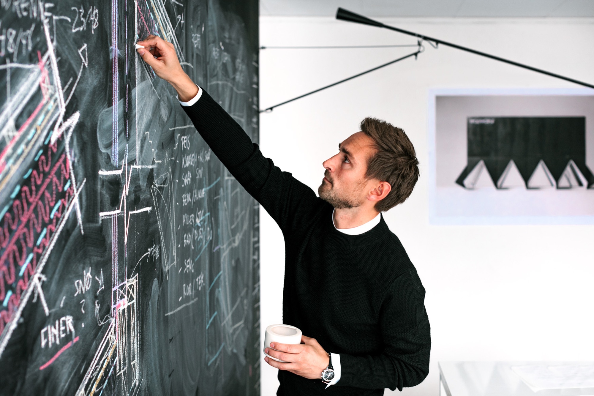
AM What’s your design style?
HMA When starting a new project, I try hard not to have preconceived ideas about the style or looks of it. I try to focus on the client’s need and on creating interesting spaces and let the style evolve through this.
AM Where do you draw inspiration for your designs?
HMA Our greatest source of inspiration is our clients and the sites we work on. Every client is different; every place is in some way peculiar and unique. We aim to embrace this in all of our projects.
AM What does “home” mean to you?
HMA Home is the feeling of belonging somewhere. The feeling could be connected to a house, a specific landscape, a mountain, or even a group of people. Places where your story lives.
AM What makes you a mountain man?
HMA Growing up in Norway it’s hard not to have a close relationship to the mountains. Throughout my childhood, we spent a lot of our holidays hiking or skiing. Every Easter, my family still goes hiking in the mountains, and every autumn, we collect sheep for my parents-in-law in the mountains of Norway’s West Coast.
AM When are you the happiest?
HMA Nothing beats spending a day with my two kids at our small summerhouse on the West Coast of Norway.
AM What’s on your drawing board right now?
HMA We work with a fairly wide range of projects. In addition to some cabins and villas, we are currently designing a small chapel next to Norway’s second largest glacier, the Black Glacier, a coastal museum on the island of Frøya, and an observation deck at Norway’s most spectacular waterfall, the 280-meter-tall (ca. 920 ft.) Vettisfossen.
The Project: Cabin Vindheim
AM Who are the clients?
HMA A couple in their mid 50s, both of them passionately interested in architecture and design—in addition to skiing and hiking in the mountains.
AM Describe the design in your own words...
HMA The cabin is a basically a gabled roof where the edges of the roof stretch all the way down to the ground. The ceiling runs uninterrupted through the cabin and connects the different rooms. A series of uplifts creates a rich variety of spatial qualities underneath it.


AM What was the client’s premise at the beginning of the project?
HMA They wanted a small cabin that was sparse and compact but at the same time spatially rich and generous.
AM How did you translate the client’s vision into this design?
HMA With the ambition of creating a compact cabin that at the same time had exceptional spatial qualities, we focused a lot on the physical sensation of scale and space. When is a space too tight? When is it too big? We did this by creating real-scale mock-ups of our design solutions in our backyard to ensure a greater understanding of size and proportions in our project. This enabled us to simply take a stroll through our project and get a sense of dimensions and spatial sequences–even before the cabin was built.
AM What was your inspiration for this particular design?
HMA The external shape of the cabin is inspired by the classic motif of snowbound cabins that have only the roof protruding through the snow. When snow covers the structure, the contrast between architecture and nature becomes blurred.
AM What makes this cabin truly special?
HMA During winter, the roof becomes a man-made slope for ski jumping, toboggan runs, and other snow-based activities.

AM Take us there...
HMA The site is deep in the forest in the alpine landscape close to Lillehammer in Norway. The cabin sits between some tall spruce trees, with a nice view toward a lake. During winter, it’s extremely cold there and hard to get to by car, so you have to cross-country ski for a few kilometers to get there.
AM How did the setting and the site influence your design?
HMA The frosty forests in the region are both beautiful and mysterious, and they’re closely connected to traditional folklore and stories about trolls and other strange creatures. When snow covers the trees and stones, they morph into something new. They become characters, sometimes trolls, sometimes just a beautiful and unique sculpture. I find this notion truly inspirational.

“When snow covers the trees and stones, they morph into something new. They become characters, sometimes trolls, sometimes just a beautiful and unique sculpture.”
AM What are the main materials you used, and why?
HMA The classic Norwegian mountain lodges are covered in dark wood, making them seem both solid and grounded. Inspired by this, the cabin is clad in black-stained ore pine. The interior is lighter, fully covered in waxed poplar veneer.

AM Take us inside...
HMA The sloping roof connects the different spaces, making the entire cabin feel more like one large room.
From the main bedroom and the mezzanine, you can even gaze up at the stars and enjoy the northern light, while lying in bed. When resting in the cabin's bedroom, a large 4-m-long (ca. 13 feet) window creates the impression of sleeping above the treetops and underneath the stars. The main living room is also small but has a ceiling height of 4.7 (ca. 15.4 feet) meters under the roof.
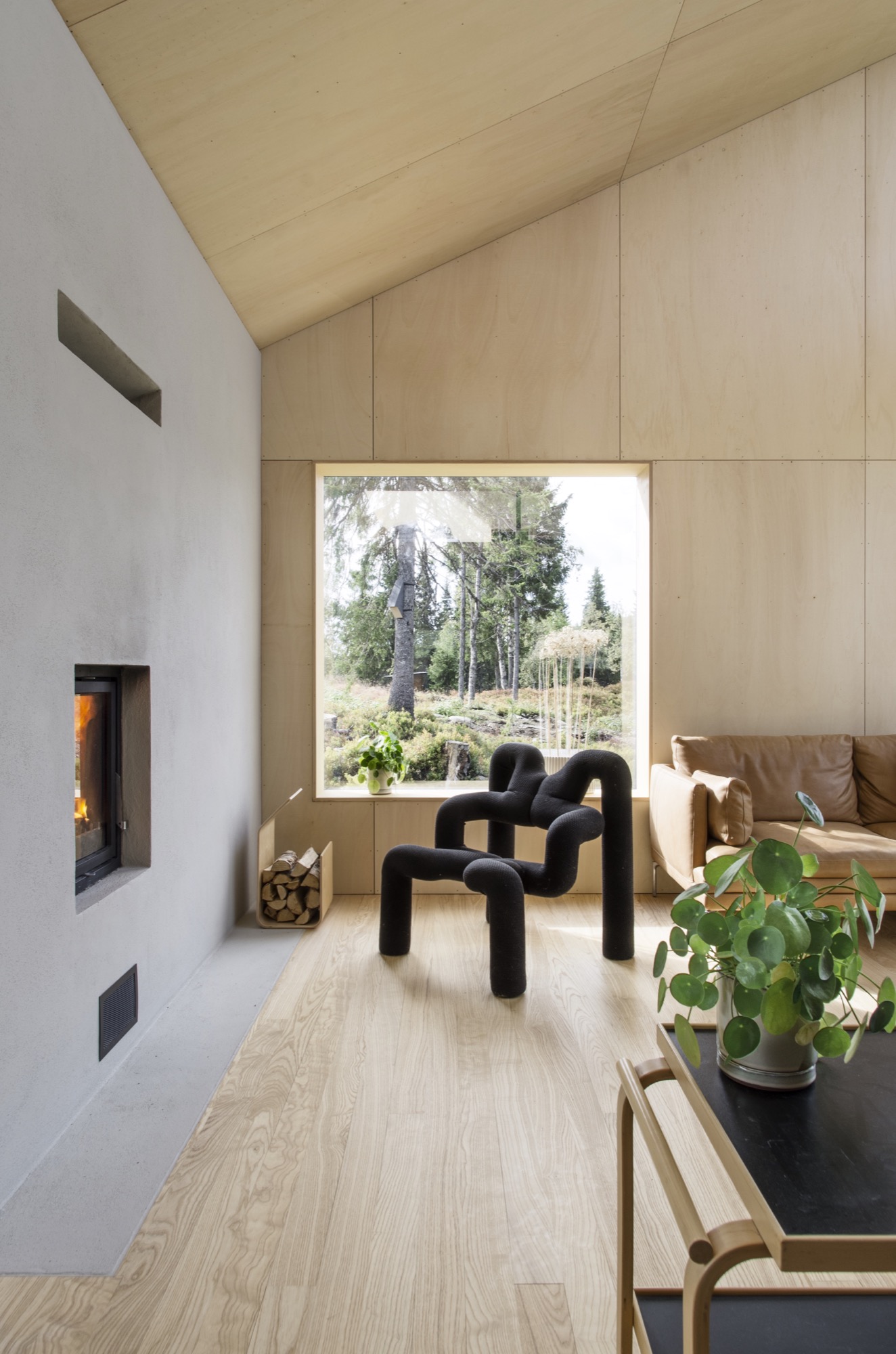
AM What was your biggest challenge with this project, and how did you overcome it?
HMA The site is very far off the grid, and simply getting the materials to the site was quite a challenge. But we managed by always planning with close consideration of the local weather forecast.
AM What is your favorite thing about the cabin, now that it is finished?
HMA Lying in bed watching the northern lights above the snowy spruce trees is a really nice experience.
AM What do the clients tell you, now that they have been living in your architecture for a while?
HMA They enjoy the cabin and spend time there every weekend. The only issue is that they’ve had problems with sheep climbing up the roof. However, I’m sure the sheep enjoy it.
AM Final impressions of the cabin?
HMA We designed a couple of birdhouses for the birds living next to the cabin. Local sparrows and starlings enter the nesting box from a small opening underneath the flexible top hatch. △
The Swiss Art of Alpine Luxury
Jonathan Ducrest’s photo essay portrays the luxury hotel 7132 in Vals, Switzerland, with its iconic thermal baths designed by Pritzker Prize-winning Swiss architect Peter Zumthor.
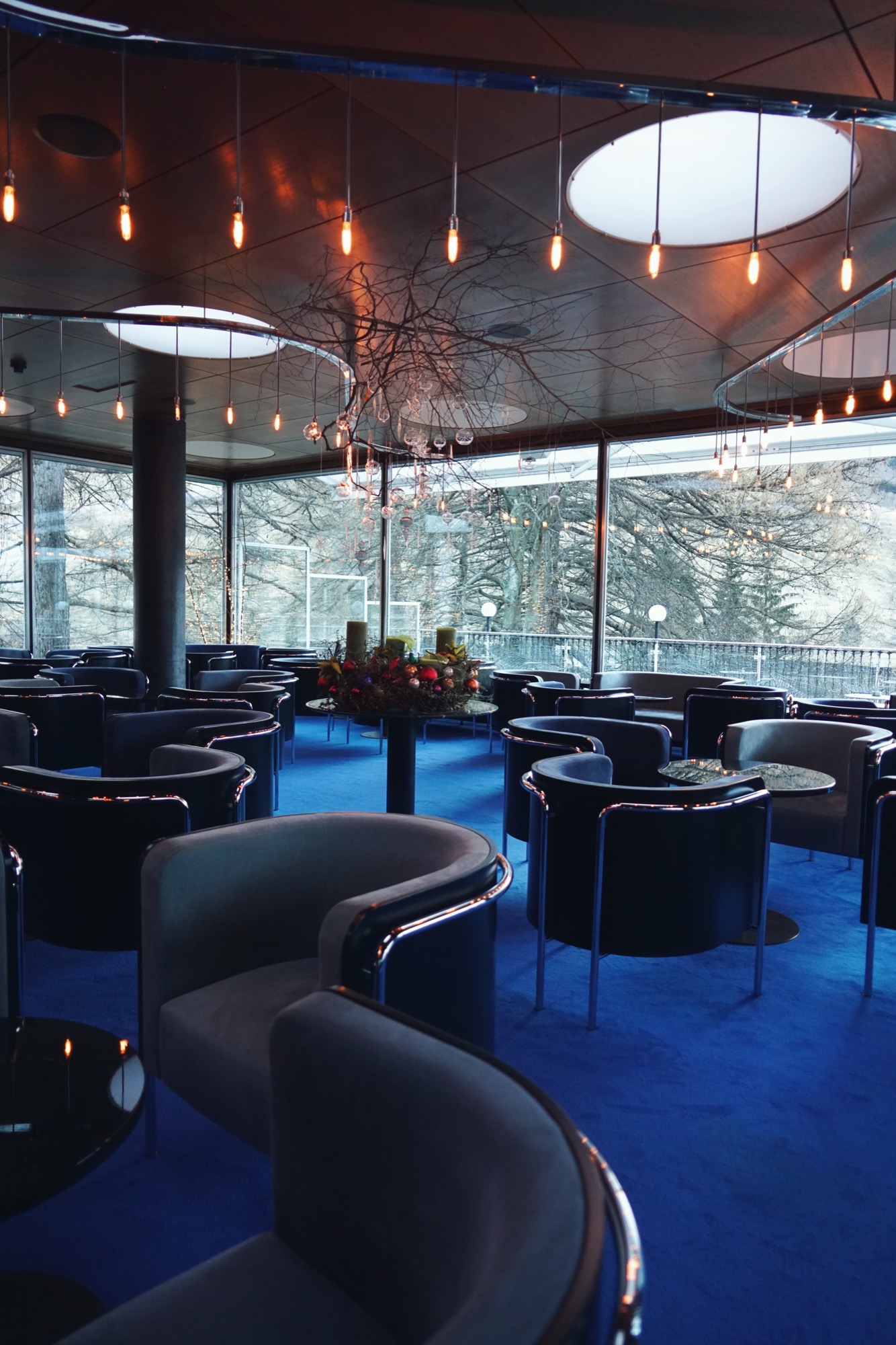
Jonathan Ducrest’s photo essay portrays the luxury hotel 7132 in Vals, Switzerland, with its iconic thermal baths designed by Pritzker Prize-winning Swiss architect Peter Zumthor. The moment we pulled up to the 7132 Hotel (named after the village’s postal code) in one of their chauffeured Mercedes, I thought I was in the latest Bond movie. The sleek redesigned entrance, dark lighting, and thick blue carpeting have this feeling of 1970s heydays, where James would meet one of his assets. The main building contrasts the square, monochrome design of the hotel’s famous thermal baths.
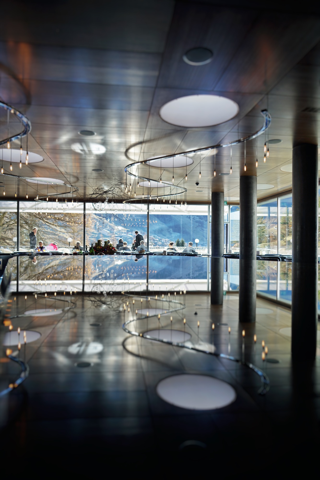
Zumthor’s thermal baths
Nestled at the end of a small valley in the Swiss Canton of the Grisons, the village of Vals became a must-see destination in the late 90s, when the thermal baths designed by Peter Zumthor opened.
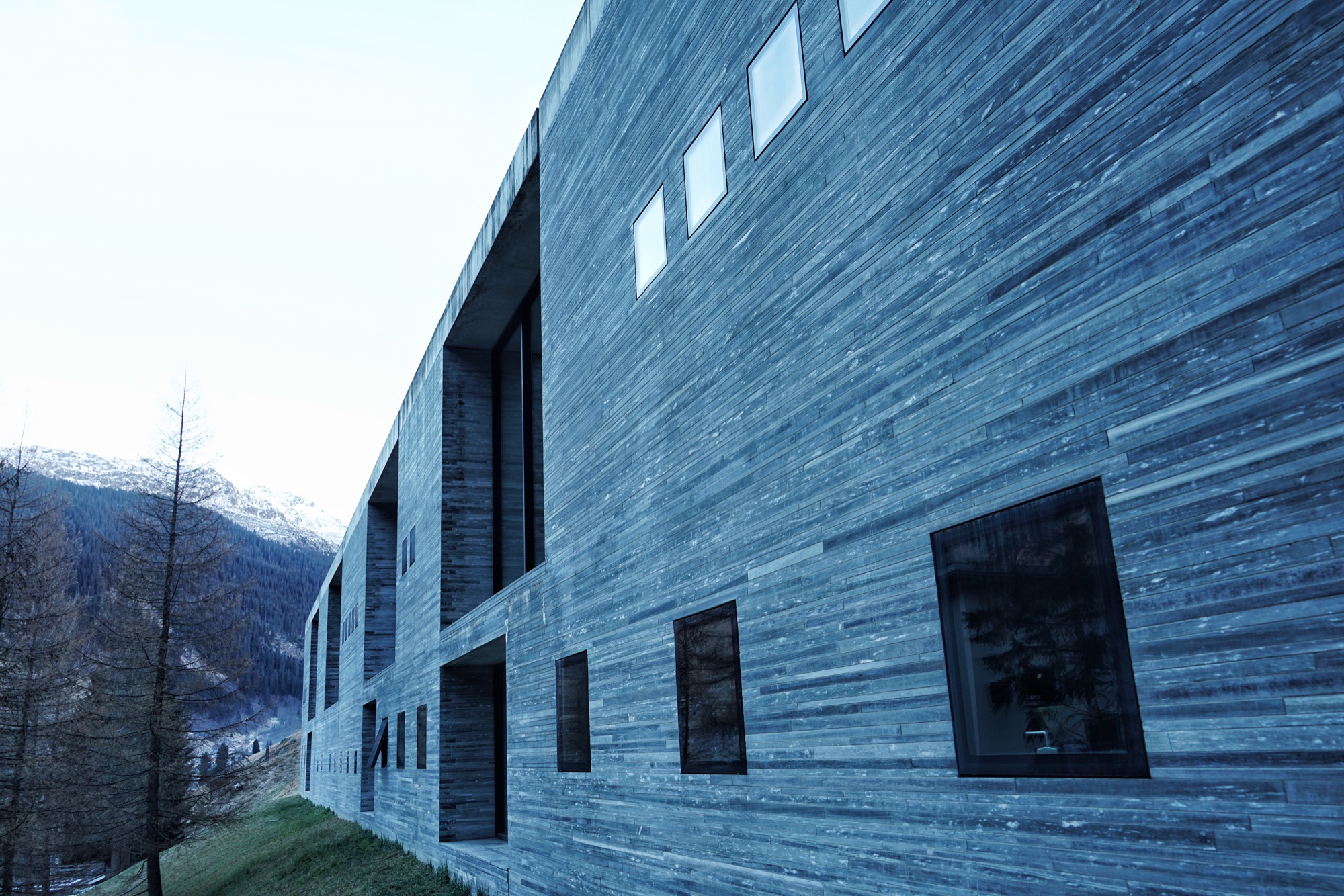
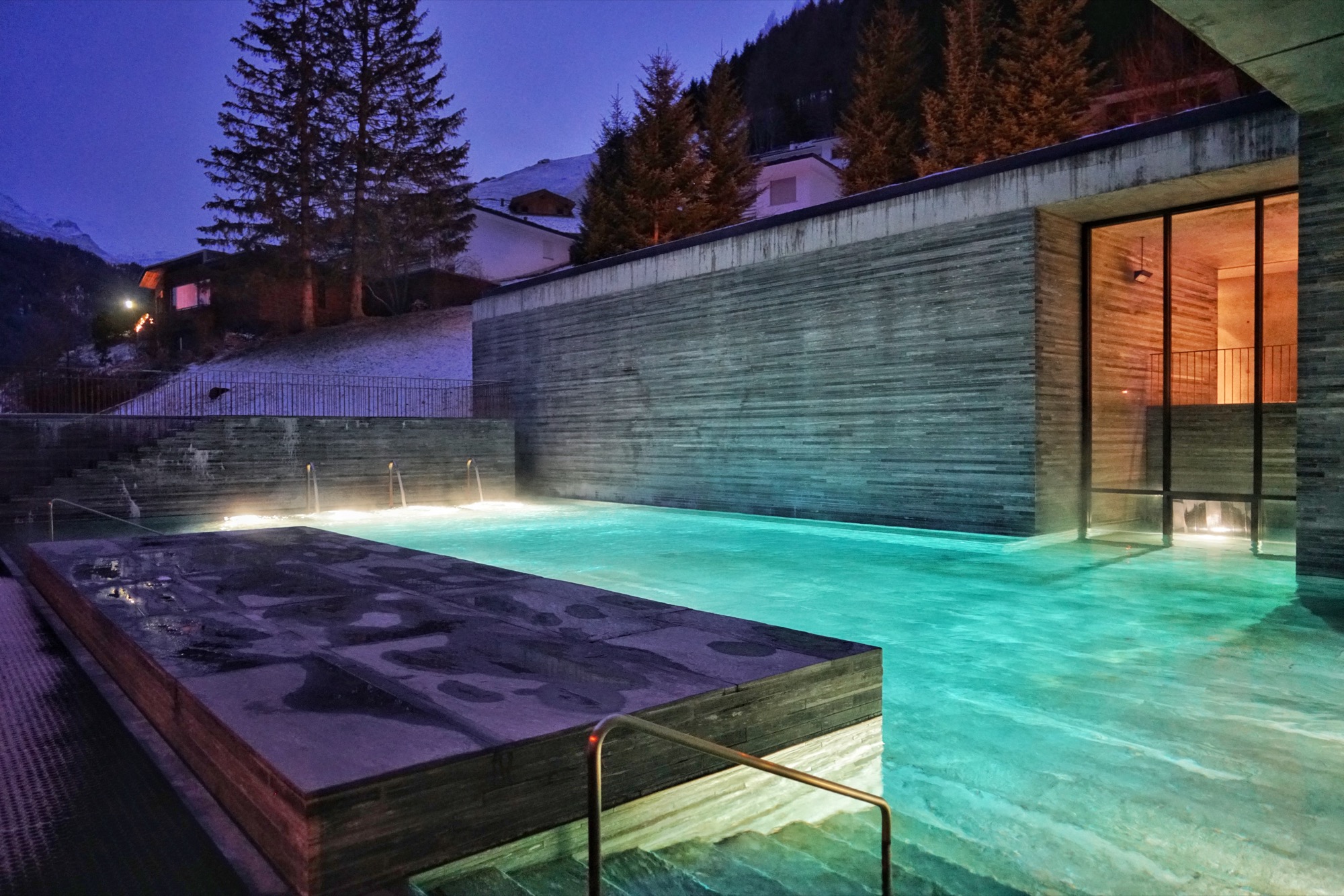
Built using only locally quarried slabs of quartzite, the minimalist spa evokes a cave and gives the impression to pre-date the hotel, which was originally built in the 60s.
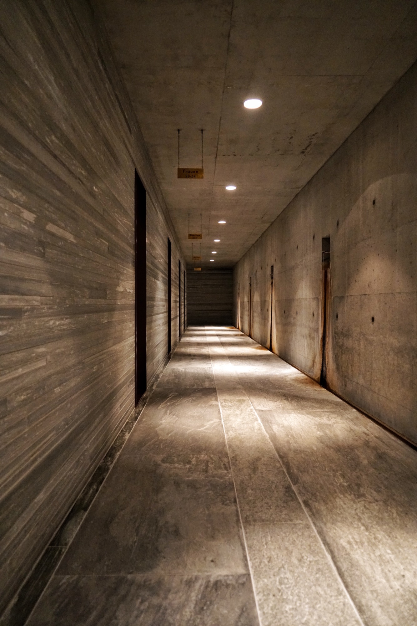
After walking through a dark, tunnel-like hallway and tapping the bracelet I was given at check-in onto the brass turnstile, I reached a larger concrete hall. On one side, thick leather tapestries curtain off the changing rooms with their glossy red lockers. On the other side, rusty pipes coming out of the wall are dripping water from the thermal spring.
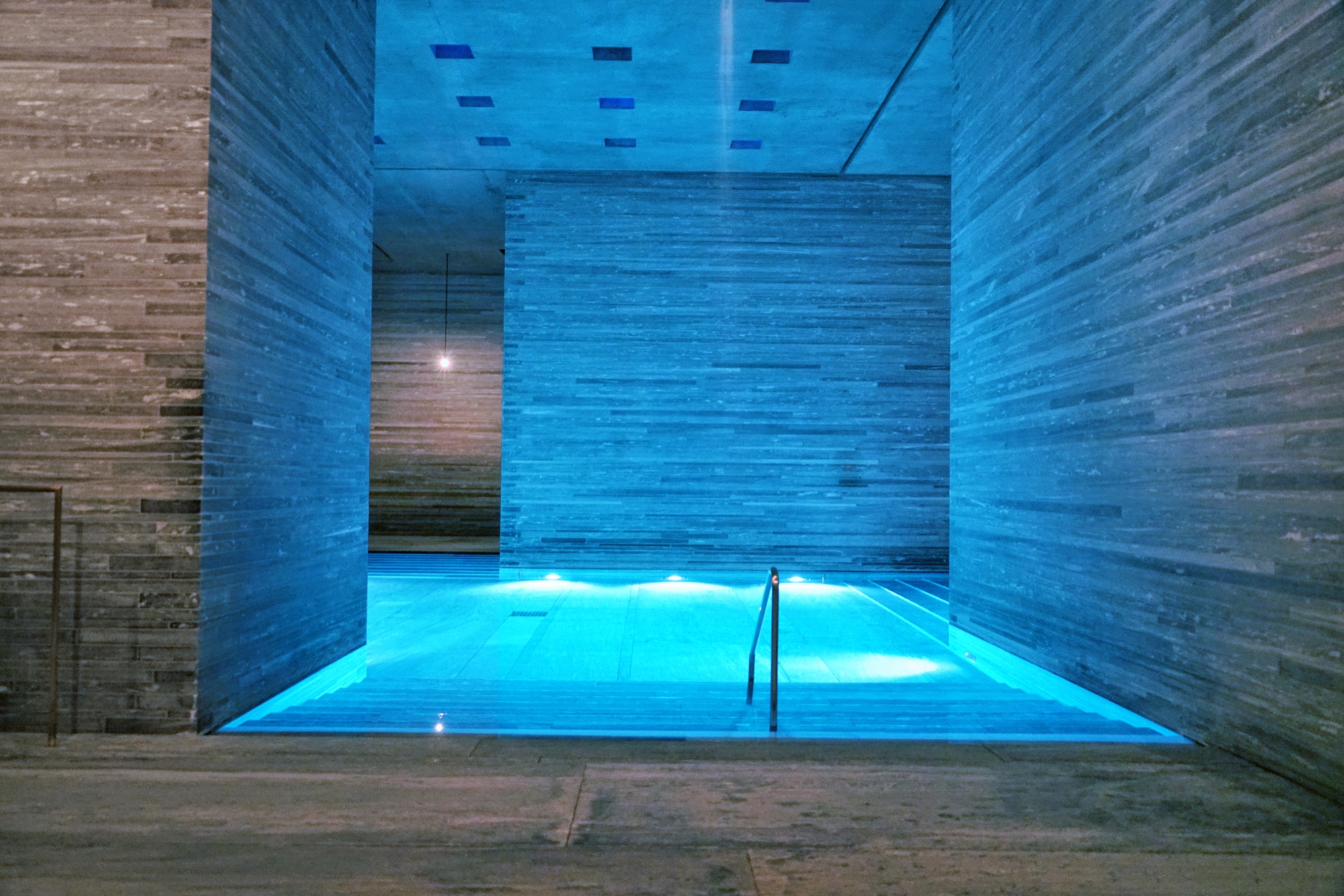
I stepped out on the other side of the changing room to find myself on the upper level, overlooking the main indoor pool in the center of the structure.
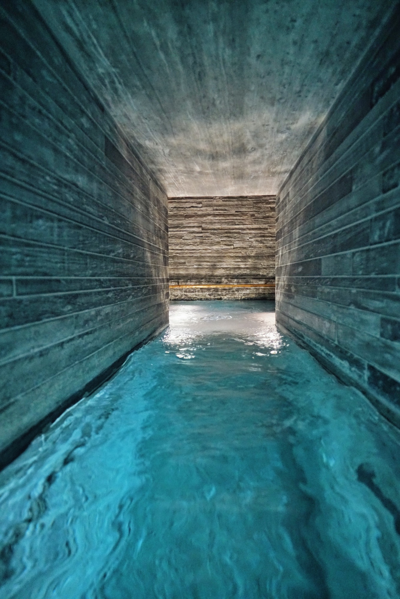
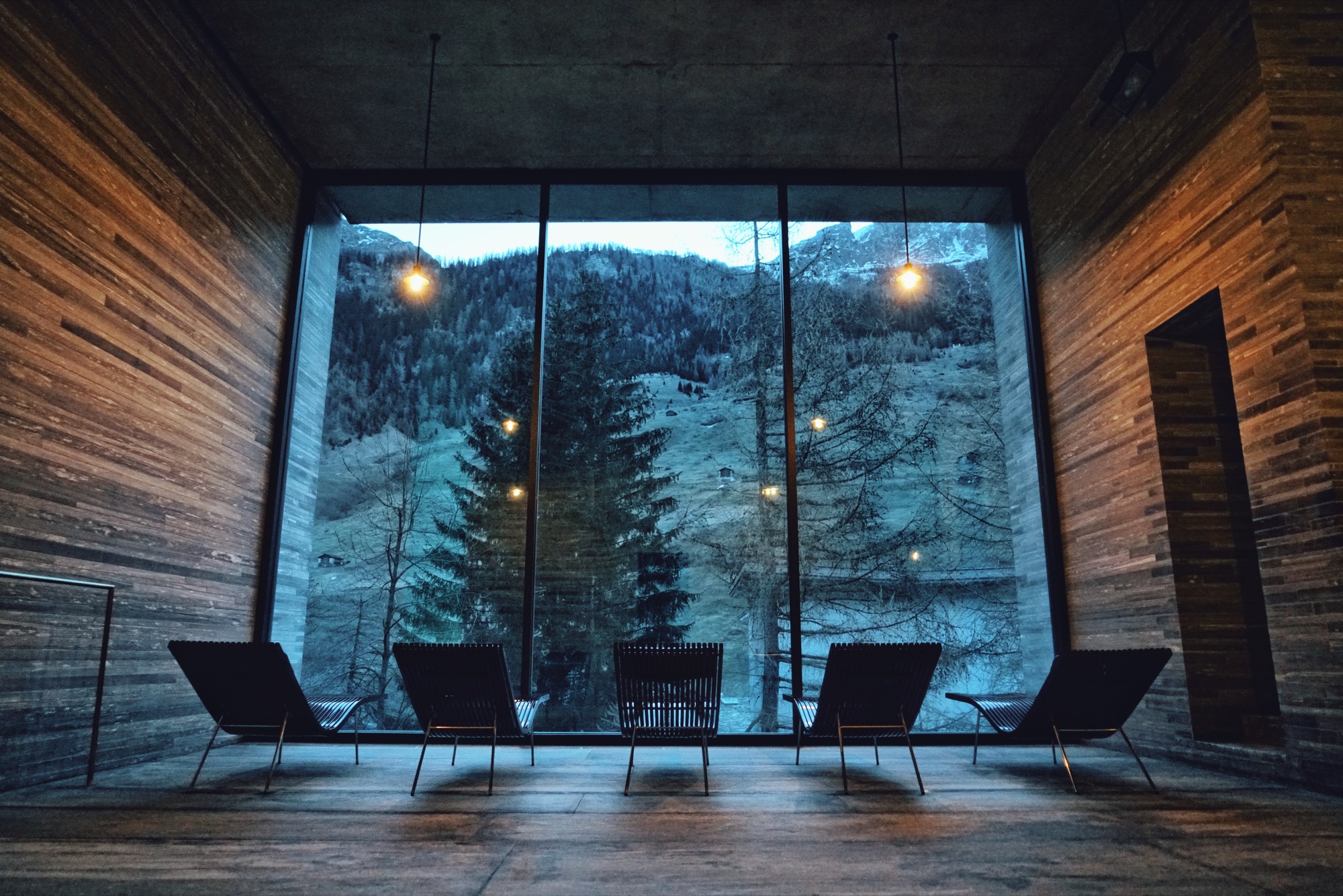
Smaller pools with different water temperatures, including one with floating flower petals, pushed me to explore every corner. An outdoor pool is accessible from the inside. Lounge chairs facing gigantic windows invited me to disconnect from my digital life and stare at the pine trees and the mountain across.
The hotel
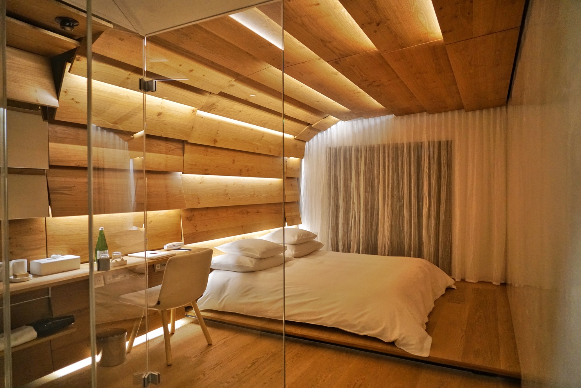
Since the village of Vals sold the hotel and spa to a private investor in 2012, many of the rooms have been redesigned, including a dramatic penthouse suite at the top of the main building. One of the luxury hotel’s five structures is called the House of Architects and features rooms designed by Tadao Ando, Kengo Kuma, Thom Mayne and, naturally, the master of Swiss minimalism himself, Peter Zumthor. The room I stayed in was designed by Japanese architect Tadao Ando. Its large Swiss oak panels enveloped me like a cocoon.
The lobby bar, where you can sip on an Aperol spritz, and the terrace, where you can take your afternoon tea cuddled under a thick sheepskin blanket, act as the hotel’s living room, where it’s easy to socialize with fellow guests.
I devoured the regional cheeses and cured meats from the breakfast buffet after my swim in the outside pool under the stars at dawn.
The village is a quick stroll from the hotel. I had the opportunity to visit Vals both in winter and in summer. It’s a completely different experience. Do both, if you can. △
After It, Covered
After a cold night stranded in their van, Wylie Robinson and his friend and co-founder Nick Polinko created Rumpl, a sleeping-bag blanket.
After a cold night stranded in their van, Wylie Robinson and his friend and co-founder Nick Polinko created Rumpl, a sleeping-bag blanket.
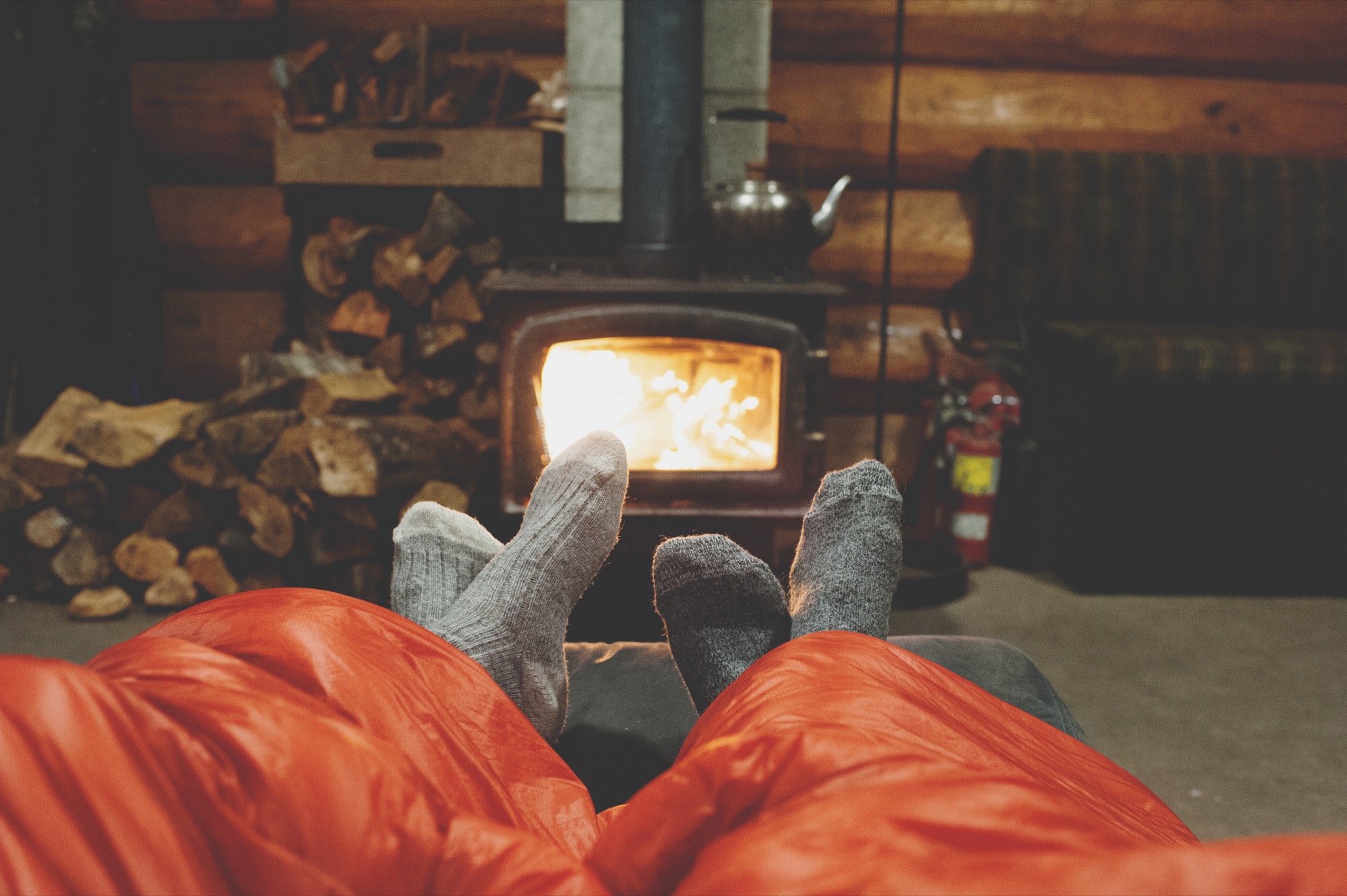
The San Francisco native studied environmental design at the University of Colorado Boulder and graduated in 2007 with an emphasis in architecture and business. Robinson stayed in Boulder, where he worked as a designer at Communication Arts for a couple of years, before returning to California to work for MKTG and later for Landor Associates. Today, the thirty-one year old lives at Ocean Beach in San Francisco with his fiancé.
Alpine Modern caught up with the entrepreneur to talk about the making the first Rumpls, what “home” means to the designer, and the little things in life that make him happy.
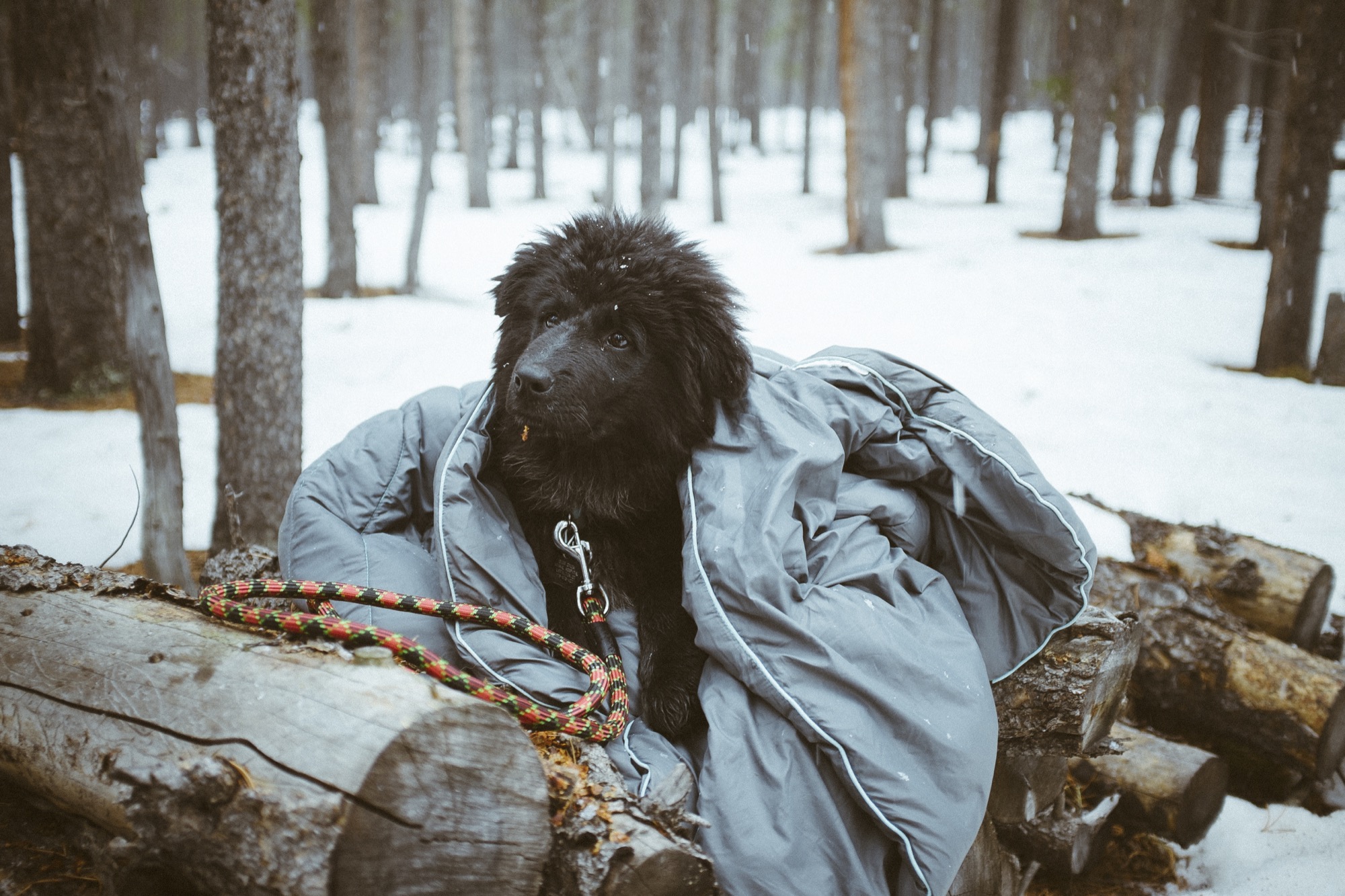
A conversation with Rumpl Founder Wylie Robinson
AM Who are you, in a nutshell?
WR I am an easily inspired creative person who loves the outdoors. I spend most of my time obsessing over my business while fantasizing about being in remote places with no internet. And one does not help the other!
AM Along your path, what experiences and encounters made you who you are today?
WR Growing up in San Francisco and living in Colorado for seven years was huge. In San Francisco, there is so much creative energy and entrepreneurship, and in Colorado there is such passion for healthy living and access to the outdoors. These places have both heavily influenced my personality. I’ve met so many people in both places who inspire me to carve my own path and blend my work with my hobbies.
AM What’s the story behind Rumpl?
WR The idea for Rumpl began with two dudes trapped in a frozen van. My friend Nick and I were on a surf trip down in San Diego in December 2012, when we got word of a big storm coming through Mammoth. We happened to have our ski gear with us, so we decided to head east into the Sierras for some early-season backcountry skiing. We camped out at some hot springs near Bishop, California, and woke up the next morning to a car that wouldn’t start. Too far from the main road and without cell phone service, we had to wait around for someone to show up at the hot springs, so we bundled up in our sleeping bags and started drinking whiskey.
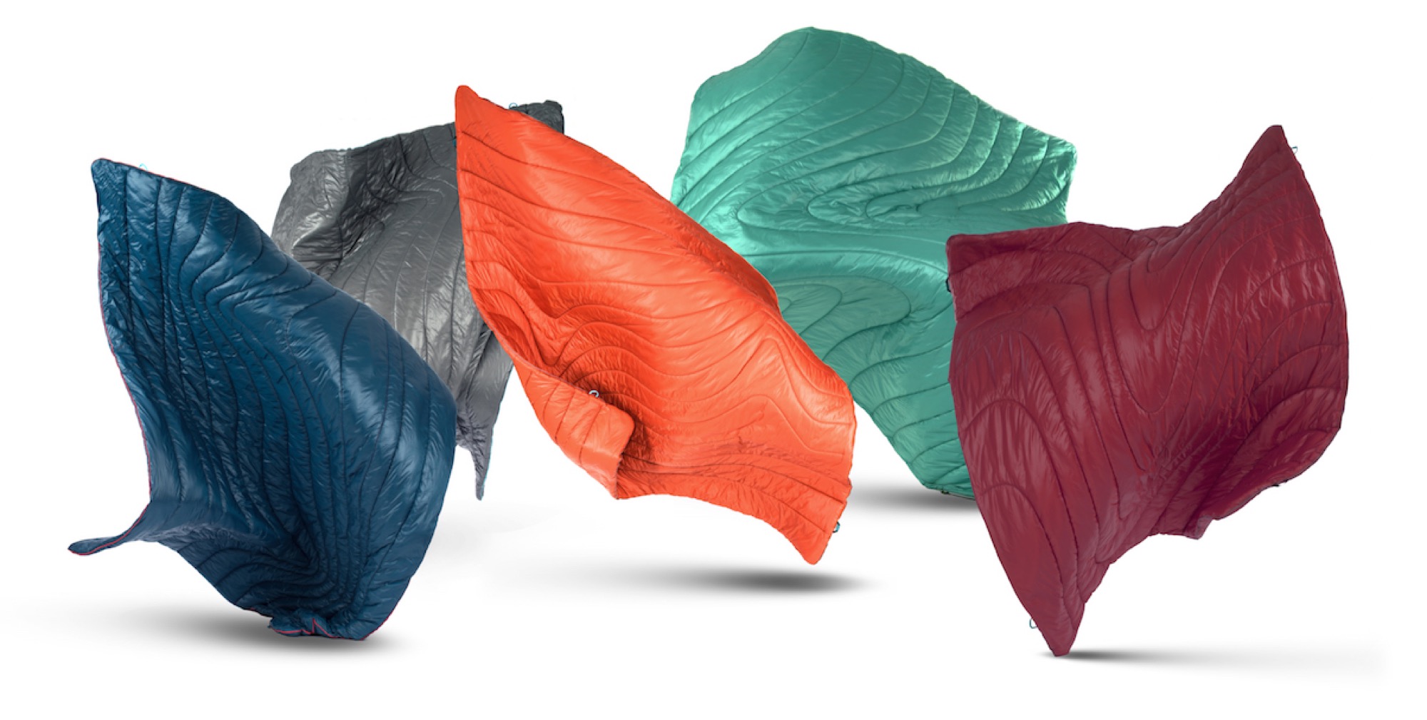
After several hours, the conversation turned to the unlikely subject of bedding. We both realized that we liked our sleeping bags more than our comforters back home. We decided that once we got out of our situation, we’d make “sleeping-bag blankets” to replace the comforters on our beds.
Once we got back to San Francisco, we met with a few friends who worked for companies like Mountain Hardwear, Patagonia, and Marmot to get more info about construction and material specs. They helped us pick materials and sew up our first blankets by hand. Still unsure if the idea was viable, we turned to Kickstarter, where we had a really successful crowdfunding campaign. That validated the idea and allowed us to quit our jobs to pursue Rumpl full-time.
“We decided that once we got out of our situation, we’d make ‘sleeping-bag blankets’ to replace the comforters on our beds.”
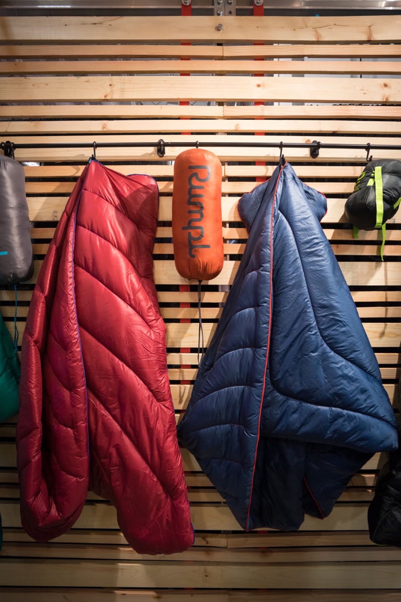
AM Why blankets, and why no other products?
WR More will come out of Rumpl that goes beyond blankets, but for now we’re just focusing on doing blankets really well and familiarizing people with our brand.
In general though, I think, consumers like and appreciate brands that focus on owning one thing. It sends a really clear message and makes every action by the brand intentional.
AM What’s the story behind the brand name?
WR It’s an onomatopoeia—“Rumpl” sounds like how the product behaves. You’d never neatly fold a Rumpl blanket, you just kinda crumple it up and stuff it in the stuff sack. We’ve also developed the word to mean a few things when spoken from our brand voice. “Rumpl” can be a noun, a verb, and an adjective… My Rumpl stays in my car, I rumpl under the stars, I keep my bed messy and rumpled.
AM In what traditions are your modern products rooted?
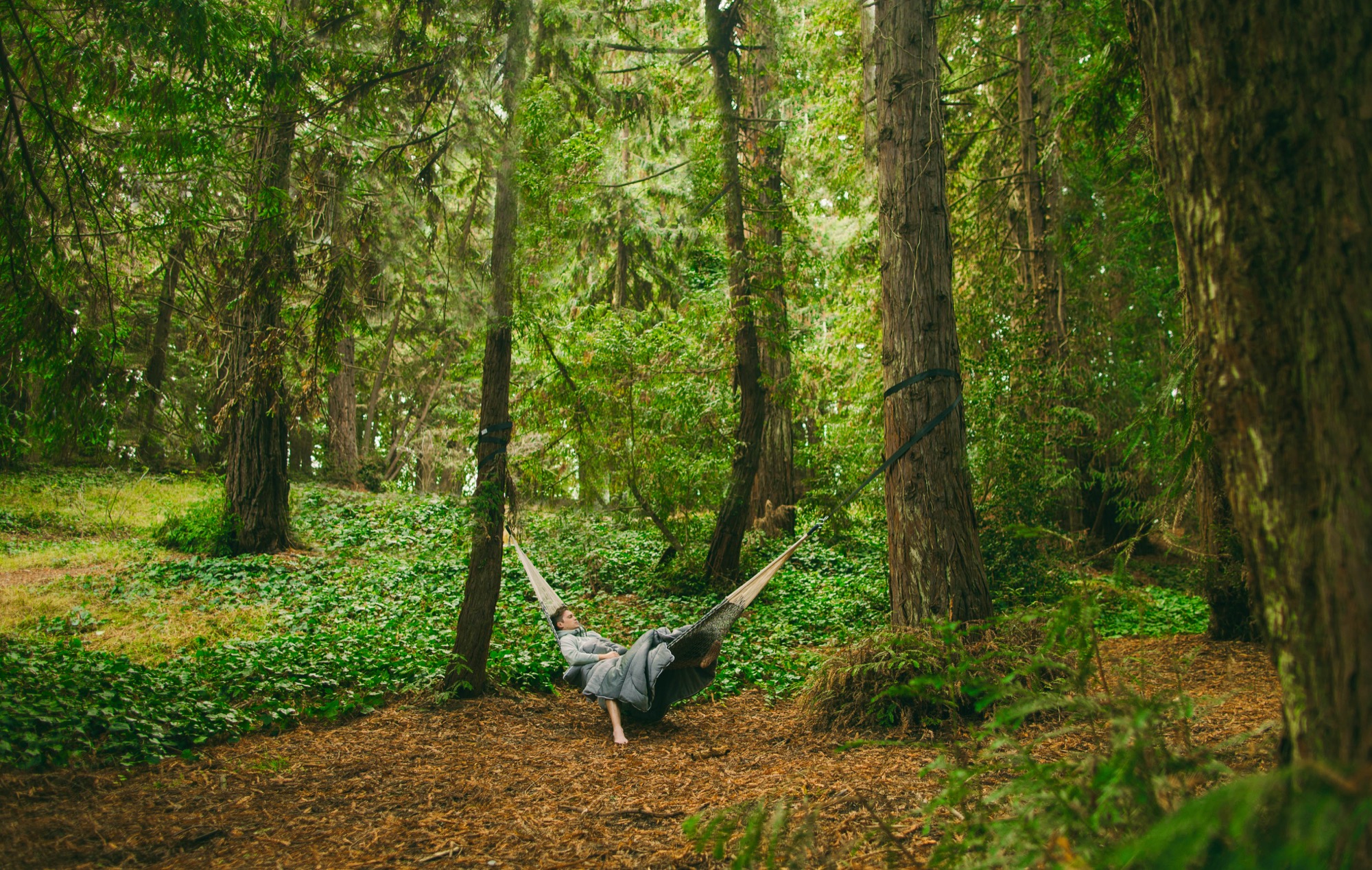
WR The nostalgic feeling of cozy warmth that you’d find in a sleeping bag. We all know the feeling of being toasty warm in a sleeping bag, with just the tip of your nose poking out and feeling the chilly air. The tactile experience with Rumpl blankets takes you back to those moments outside, cuddled up under the stars.
AM How do you choose and source your materials?
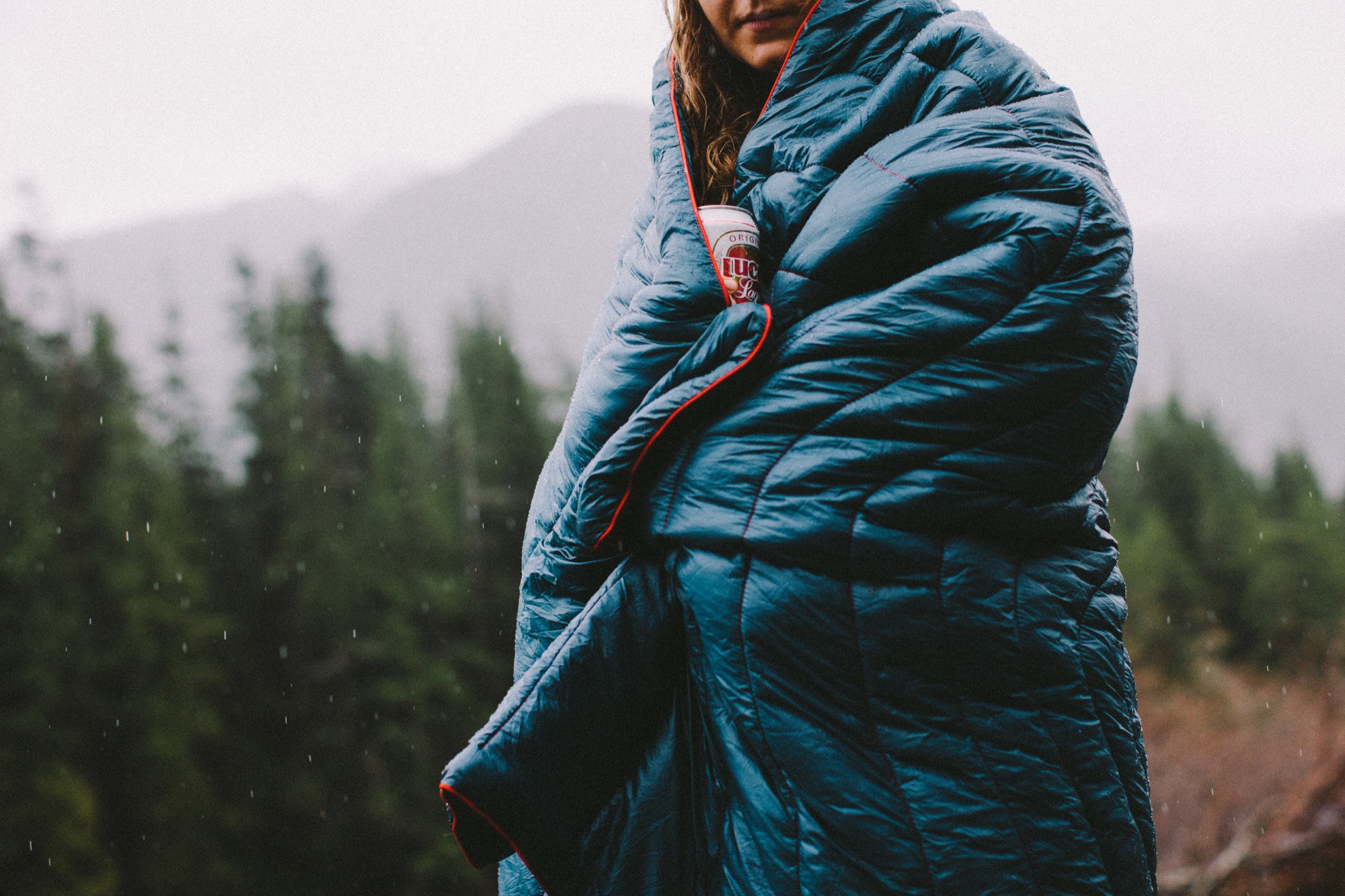
WR Beyond the nostalgic tactile factor, the materials work really well. We source a really nice insulation that was developed by our factory and regulates temperature perfectly, so you’re never too hot. The nylon shell is super durable and sheds water. The whole thing is machine-washable.
We have an amazing factory partner that sources materials from over 200 different mills in Asia. We’ve visited them in China a number of times and their facility is beautiful and spotless. Workers are treated very well, and everyone we spoke with was excited about working with us. We tell them what our goals are, and they find several materials that suit our needs. We narrow that down based on hand-feel and costing and move forward with the right tool for the job.
AM What makes Rumple alpine modern?
WR Rumpl is a modern take on everyday homewear as seen through the eyes of an outdoor enthusiast. We find inspiration from the gear we use to stay comfortable outside and apply the same design principles to our blankets. The whole project is a blend of equal parts alpine style, modern design, and lifestyle communication.
“The whole project is a blend of equal parts alpine style, modern design, and lifestyle communication.”
AM What makes you an outdoorsman at heart?
WR My simple love for being outside and connected to nature. I can get the feeling of interacting with nature from being just about anywhere. Whether I’m gardening in my yard in San Francisco or I’m twenty-five miles deep in the backcountry, I can still smell, taste, hear, and feel my surroundings, and that brings me joy.
AM What do you do when you’re in the mountains?
WR While I was in school at CU Boulder and working at CommArts in Boulder, I raced downhill mountain bikes pretty seriously. I raced on the school’s team and eventually raced in the pro category throughout the United States, so mountain biking is really close to my heart. I also camp, hike, ski, climb, and surf whenever possible.
AM What does quiet design mean to you?
Design that is so well done you don’t even notice it.
AM What’s your favorite place in the world, and why?
WR Whistler, British Columbia. The mountains are huge, the terrain is amazing, the town is so fun, the locals are super nice, and the overall vibe is so positive. It’s not the most exotic or distant place on Earth but the good energy is second to none.
AM What does “home” mean to you?
WR We talk about “home” all the time at Rumpl. To us, it’s a headspace, not a physical location. Home is where you’re comfortable. Whether that’s indoors sitting in a comfy chair with a cup of coffee, sticking your toes out the back of a van on the side of a desolate road overlooking an expansive valley, or deep in the backcountry rested up on a rock next to a campfire, it’s where you feel comfortable, relaxed, and safe.
AM What’s most important to you in life?
WR Trying to stay balanced between working and taking time away from my desk. It’s really tough for me because I can get pretty obsessed with what I’m working on—but I’m improving. That and surrounding myself with good people who energize me.
AM What makes you happy?
WR Lots of little things… My fiancé’s dimples, being alone on my bike in the mountains, a cold beer after a surf, a hot cup of coffee on a wintery morning. Generally speaking, very small things make me happy.
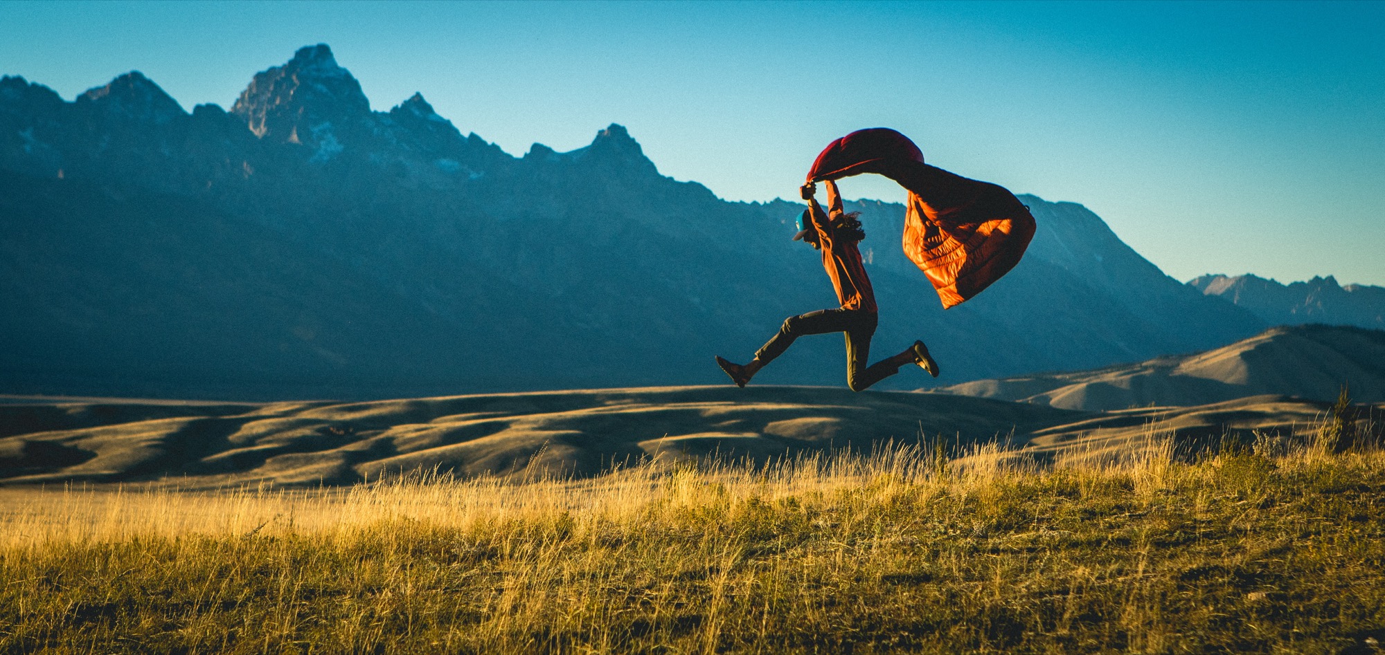
AM Who is your design icon, and what do you admire about her/him?
WR Tim Brown of IDEO is pretty inspiring to me. Before learning his interpretation of the creative process I thought it was bad to let ideas flow off-track. He made me realize that’s OK—to let your mind wander in directions that may not perfectly relate to the problem you’re trying to solve. A tangential train of thought will still teach you something that can be used to better inform the final solution. I recommend his book Change By Design to any young designer or entrepreneur.
AM What are you working on these days?
WR Rumpl keeps me busy 24/7. There’s just so much to do at a small company with limited resources. Specifically though my biggest goal for 2017 is to make the company more automated and scheduled. Right now we’re shooting from the hip in a lot of ways and I want to set clearer goals and work off a more defined calendar. That means saying no to a lot of opportunities and only focusing on the main objectives. It’s tough to say no to great opportunities but in order to grow up, every company needs to do that. △

Mountain Minimalism—The Next Level
Emerging Boulder artist and graphic designer Adam Sinda contemplates what’s next in Colorado’s art and design scene
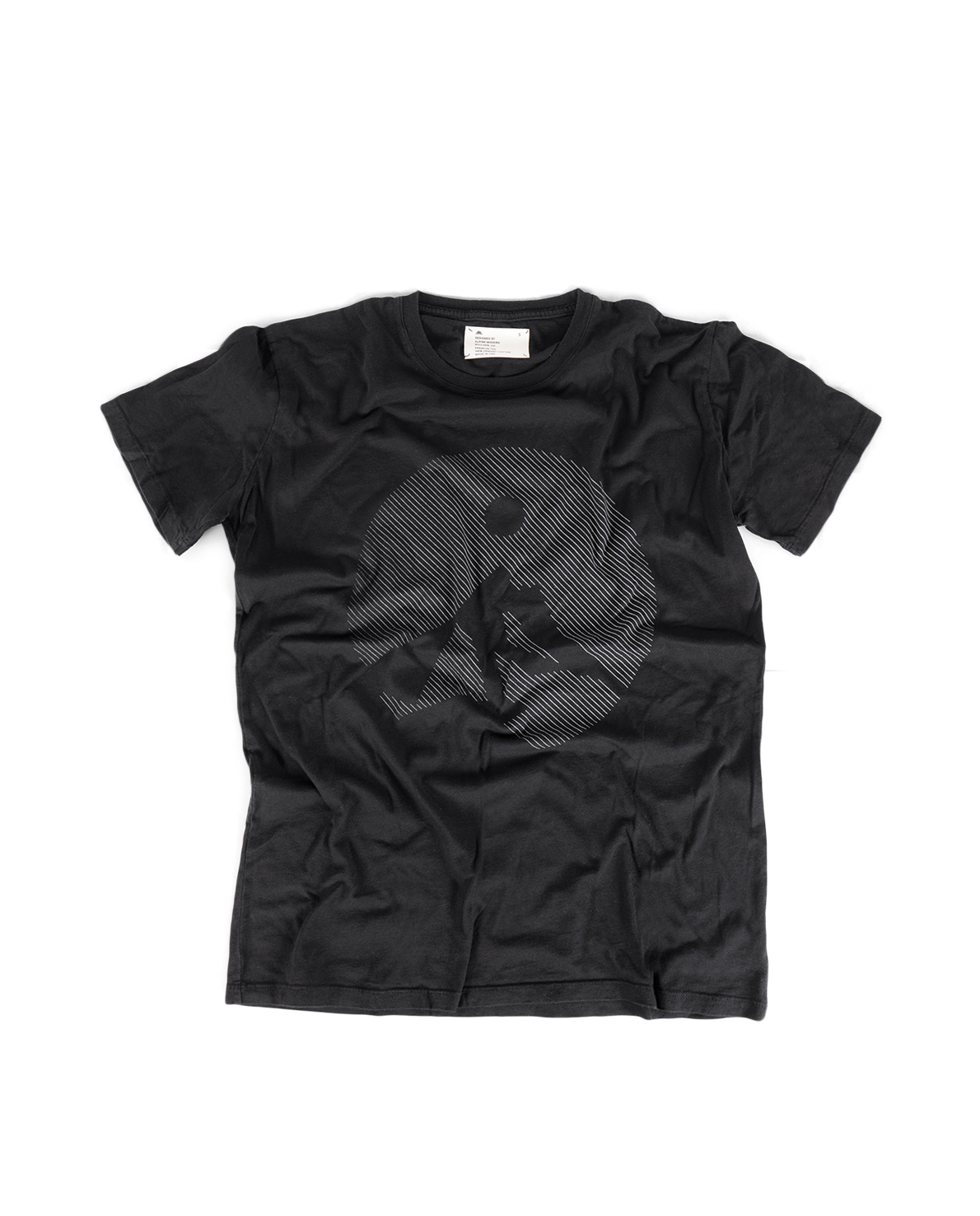
Emerging Boulder artist and graphic designer Adam Sinda spends his days working at Made Movement, an ad agency in town. But the Colorado native also loves to paint in his free time and has created original art for two Alpine Modern t-shirts—which he personally modeled for us during a photoshoot set in our own alpine backyard. When he’s not designing or painting, the twenty-four year old loves to get out on the trails and run, alone.

We caught up with Sinda at the Alpine Modern Café to talk about Denver and Boulder’s art and design scene and how Alpine Modern is pushing the envelope on what defines Colorado.
A conversation with trail-running designer Adam Sinda
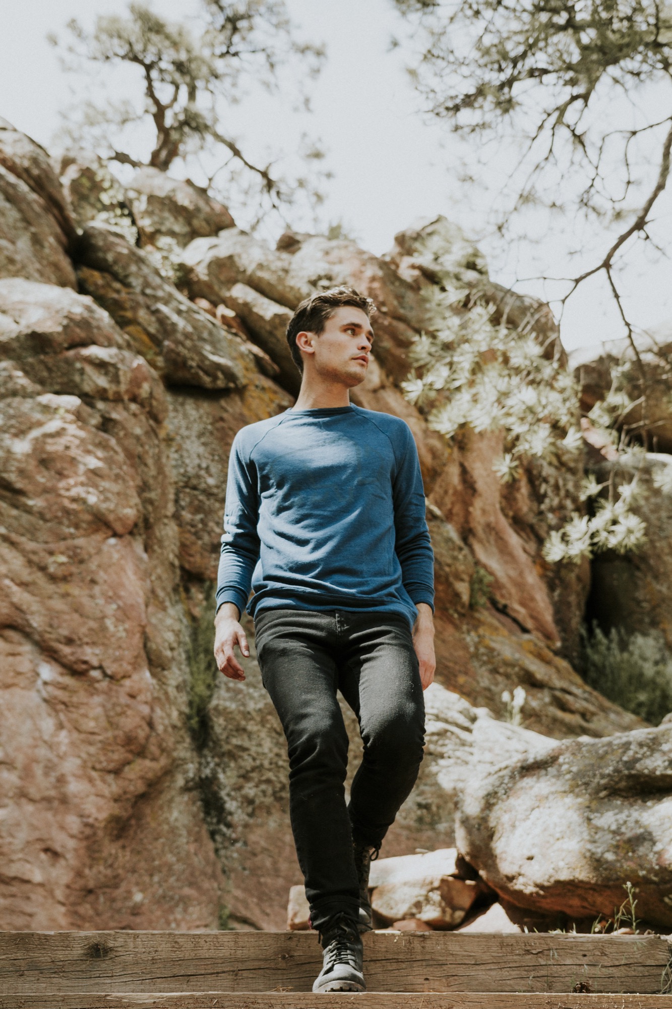
AM What’s your creative process?
AS Typically, I photograph outdoors; landscapes or anything I am inspired by. Then I bring it back to my room and try to simplify the form as much as possible—and add color. I’ve been working with color, lately.
AM What was your path to becoming a graphic designer?
AS I got a graphic design degree from Western State Colorado University in Gunnison, but I loved to take oil painting classes. That was probably my favorite art class. Design to me is so restricting, sometimes. And walking into an oil painting studio, you can just be yourself and experiment and play and get dirty. Most of my world is making stuff that’s going to be sold, and when I am painting, it’s for me.
AM Meanwhile, you are a graphic designer at Made Movement...
AS Yes, it’s an agency, and we work with brands like Lyft. Typically, we do everything from apps to web banners to illustration.
AM But you also do your own designs, and you have created art for Alpine Modern...
AS When I find a brand I can relate to and I want to be a part of, I jump in, anytime. I really feel Alpine Modern meets my ethics and aesthetics. I was working with photographer Garrett King, and we were just getting out there and going for hikes, just living in the moment.
AM You have designed two t-shirts for Alpine Modern. What makes that medium interesting to you?
AS The fact that other people are going to be wearing it and expressing themselves with it. Though they may never know who made that t-shirt.
AM What inspired those two particular designs?
AS For the Circular tee, what was inspiring me at the time was Alpine Modern’s Instagram. The motif is an abstract pulled from a photograph, and I started sketching and minimizing what I saw, just keeping it clean, simple, modern.
The second tee was the Typography t-shirt. It’s always fun to organize type in a particular way. I traded a mood board with the Alpine Modern team, and that shirt evolved from there.

AM What does it feel like to now see your shirts at the Alpine Modern Shop on Pearl Street?
AS It makes me feel good, happy. Mainly, it makes me feel like I am part of a culture that’s growing right now. A shirt is a simple thing. People build buildings, and people build houses. But sometimes it takes t-shirts and art to make you feel part of a culture. When you’re a developing artist, what you strive for every day is just to be heard, whatever medium it is.
“A shirt is a simple thing. People build buildings, and people build houses. But sometimes it takes t-shirts and art to make you feel part of a culture.”
AM What’s your message you want to be heard?
AS Wherever you are, when you are in a very attractive scenery in the mountains or in a landscape, you’re backpacking somewhere in the woods, take advantage of that moment and remember it because when times get rough, it is nice to pull from those images, and that’s what I would like to say, live in the moment when you feel it’s right. Take a mental photograph.
AM You say your Alpine Modern t-shirts makes you feel you are part of an emerging culture...
AS Right now you can see Denver developing this art culture. But to be honest, I think it is still refining what it wants to be. And Boulder has a huge opportunity to be a part of what downtown Denver is doing right now. And I think Alpine Modern can play into that world and really push the envelope on what Colorado is seen as. It’s cool to see Alpine Modern developing that image right now and really altering what artists are doing today.
AM Describe the Colorado art and design scene for someone from perhaps Berlin or Japan, who has never been here.
AS Art and design here is currently very minimal, very clean, but there are sparks of an identity evolving, and I think we are going to see a shift here. Clean and simple is fun, but what is the next level? What’s after that? Do we start developing some play with color or abstract forms? What’s that next shift? Because if everyone starts doing minimalism in Colorado, you will start seeing it get stale. I think in Colorado in general, we want to create a better culture, we need to spark something a little bit stronger, but I think we are still figuring out what that is.
AM Where will your next spark come from, building on that clean mountain minimalism?
AS Im really inspired by the 3D world right now. It’s fun to take these minimal objects and shapes and use 3D software programs to see behind them and see around them. A lot of designers these days just use Illustrator and very flat design. If you can design and know what’s behind objects, you start to see different light and that’s really interesting to me right now, so I’ve been experimenting with those programs.
AM What is the connection here to being in real landscapes and real nature? Hiking in the mountains is this quintessential three-dimensional experience because you do go behind the trees and behind the mountains and behind the next bend...
AS You’re spot on. When you’re out there with your friends, you’re moving towards an object and you’re reaching a goal. You are achieving something while you are hiking, going from A to B. And it’s fun to see how our designs are going to change with time. We have these VR headsets come out, and it’s gonna be fun to see how 3D plays into Colorado’s art culture. Colorado is such a good place to be right now as a graphic designer and an artist in general, and it’s just going to be even better.
AM What do you do when you are in the mountains?
AS I’m a huge runner. I used to compete in college, in the steeplechase. It has always been my escape. You just put on your running shoes and short shorts and get out the door and run. I love hiking, don’t get me wrong, but there is something cool about just going out and going for a jog by yourself for an hour and then come back and feel refreshed and ready to go. The cool thing about Boulder is you are really never that far away from a really sweet trail.
AM How has your love for the mountains influenced your design work?
AS Greatly. Growing up here and having lived here my whole life, seeing the mountains is comforting. And I think the they say a lot. △
Waking Up to Adventure
Zack Giffin, professional freeskier and cohost of the television series Tiny House Nation, builds himself a mobile 112-square-foot (10-square-meter) ski-in, ski-out chalet so winsome it wipes out the ski bum stigma.
Zack Giffin, professional freeskier and cohost of the television series Tiny House Nation, builds himself a mobile 112-square-foot (10-square-meter) ski-in, ski-out chalet so winsome it wipes out the ski bum stigma.
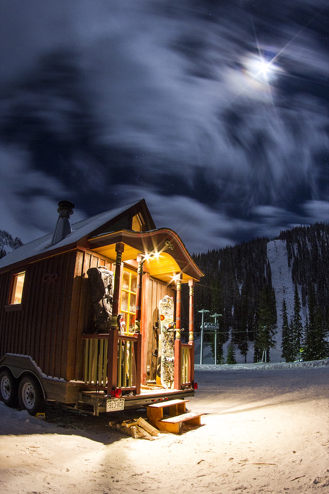
“My love for the mountains comes from my family. My whole identity was to be that mountain kid,” Zack Giffin says about growing up in Gold Hill, Colorado. His parents had moved to the tiny mountain community ten miles above Boulder to raise their three sons (Zack is the middle child) to revere the outdoors as much as they did. His mother, a university professor, was an avid backpacker. His father, a ceramics artist and prolific inventor, was a fisherman and a rock climber.
The parents’ plan worked. Giffin blossomed into a professional skier, hungry for adventure and romantic evenings in the mountains.
Young Giffin embraced another passion of his father’s: working with wood. Like Giffin Senior, Zack is not a carpenter by trade. Nevertheless, “My dad instilled in me that you can make things yourself, and that you are the only one you can really rely on.”
That paternal sagacity resonates with Giffin whether he builds tiny houses or is about to drop down the face of a glacier. “The development in both those areas is in learning how to believe in yourself, to trust you’re making the right call.” He’s had mentors on the snow and in the shop, but he, like everyone, came to a point when there was no one to reference. “When you are on your own, that’s when a lot of growing up happens.”
“My dad instilled in me that you can make things yourself, and that you are the only one you can really rely on.”

Alone
The tragedy that changed Giffin’s life in an instant happened neither on the big mountain nor on television. It happened in the home he shared with a roommate in Boulder. It forever altered what home meant to him. “I had a gnarly incident with a friend,” Giffin reveals, his voice suddenly somber. The young man who had been like a little brother to Giffin, accidentally shot himself to death. “It was pretty dramatic. I was in the house, and all of a sudden I no longer felt the security of home in that space.”
He no longer wanted to live there. “It was this catalyst in my life for making a change. There was sadness, and I really wanted to pursue my dream of being a skier.” All at once grasping life’s preciousness, Giffin bought an RV and persuaded his little brother to move to Mount Baker, Washington—a place he was “absolutely in love with” at the time. “That was a big shift, and I experienced a lot of stigmatism.” He’s talking about being perceived as “the guy who lives in an RV.” No soul asked him about his motivation to uproot and chase his dream. The following winter, Giffin pushed himself yet nearer the fringe of venal bourgeoisie. He moved into a van that he outfitted with a wood stove.
Boyfriend material
Then, he fell in love with fellow snow gypsy Molly Baker, who is also a professional skier. “She was so cool and totally would have done it, but I had experienced that stigma and couldn’t bring her into that world with a good conscience,” he admits. “No girl wants to go back to her parents and explain that her new boyfriend actually lives in a van.”
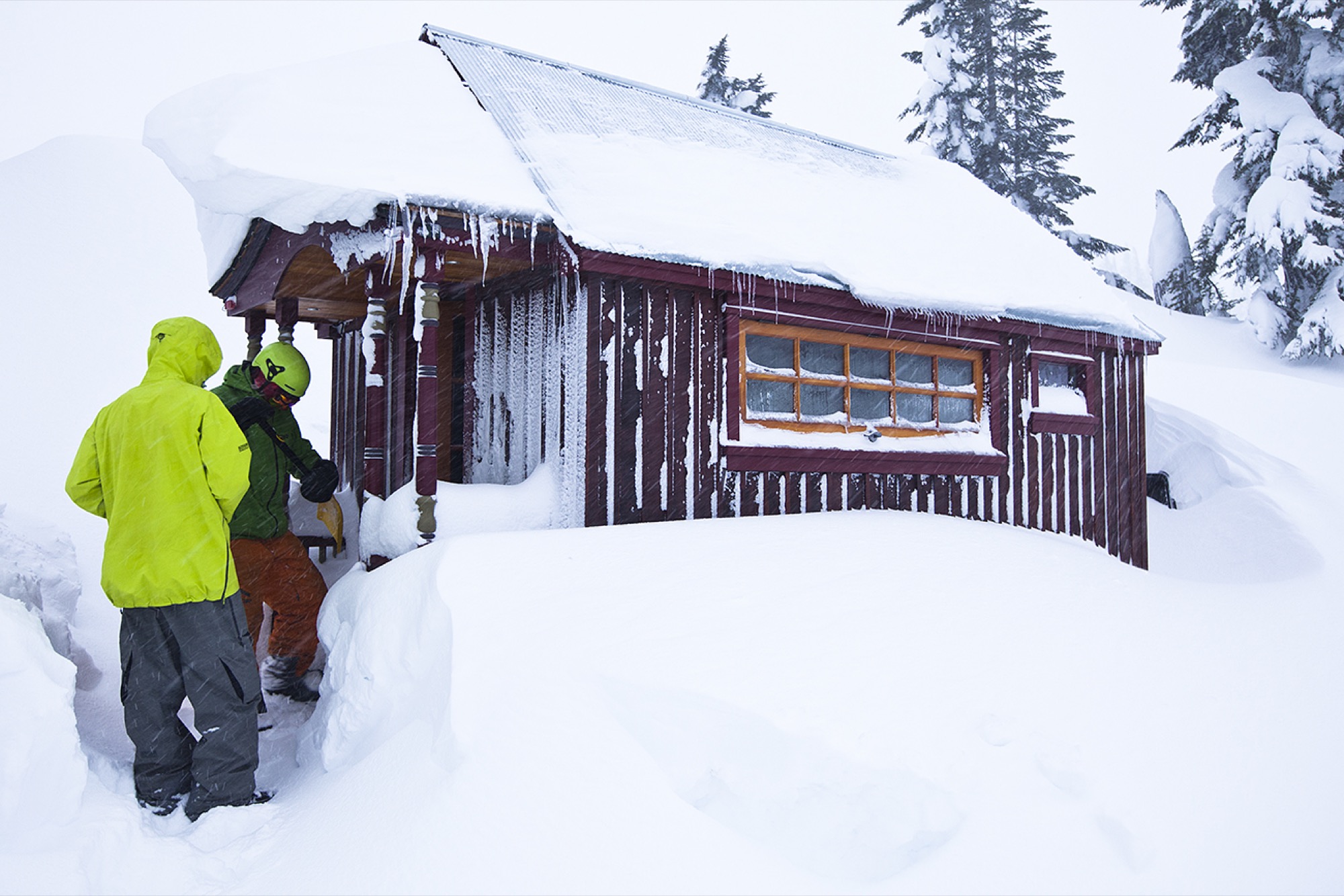
So he built a 112-square-foot (10-square-meter) tiny house on wheels for Baker and himself. It became more than a vehicle to keep living expenses low. Giffin once again owned a place he wanted to come home to and could take pride in. “It’s human nature. It’s a disorienting feeling to be out there, floating around, and not have this idea of where home is,” he says. “With a tiny house, you can provide that for yourself with a lot less money and without this ridiculous classist stigma.”
Looking back on how differently people reacted to his RV or van compared with the tiny house, Giffin is astounded. “I would park my RV at a friend’s, and the neighbor would come over within a day, asking me how long it’s going to be there,” he remembers. “Now, the neighbors still come over. But now they want a tour. They want to meet the person who’s built such a cool thing.”
“No girl wants to go back to her parents and explain that her new boyfriend actually lives in a van.”
Returning time, restoring pride
Keen on helping others feel that sense of pride, Giffin, in his mid-thirties, now builds tiny houses all across the country on his television show Tiny House Nation. The movement hits a nerve with the nation. Along with irrepressible concerns about the environment and the economy, Giffin senses a growing disdain for global materialism, amplified in increasing average home sizes. Living minimally speaks to all those fears. “I see that pendulum swinging back in the tiny house movement.”
He passionately wants to help people get out of the trap of imbalanced wages versus home prices. “So many people in my generation are going through school and have all these dreams and passions, and then economic reality forces them into jobs that have nothing to do with what they studied,” he says. “As time goes on, that turns into their reality, and hopes get left behind.”
Leaving behind material things and abundant living space instead of dreams, on the other hand, has one tremendous reward: returned time. “I love to watch people make that transition, because it’s not just about the physical detachment from the things that were controlling your life, it’s also this big decision that takes a lot of courage. And you can be so proud of yourself for making it through to the other side.”
Free-skier
Freedom from being forced to work longer hours to afford a bigger house is one important appeal of tiny-house living. The other one is mobility. When Giffin is not filming, he pulls his ski chalet on wheels right up to the mountain. “The desire to wake up where your next adventure is, this immediacy, is a universal understanding within the ski culture,” he says. “With skiing, half of the process is the commute. Only unbelievably rich people get to stay right at the mountain.”
Or, you’re living in the parking lot.
“The desire to wake up where your next adventure is, this immediacy, is a universal understanding within the ski culture.”
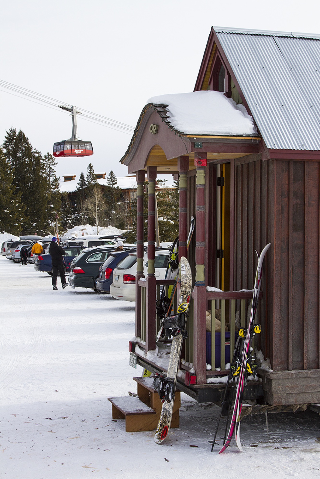
Giffin values being on the mountain before anyone else, and, at the end of the day, not being stuck in traffic, sitting in the car in his wet gear. Instead, he skis right up to the place he calls home. “One of the most beautiful things about tiny-house living are these incredibly romantic situations. You’re collecting all these little tidbits of extra time. It’s the end of a beautiful ski day, and it’s such a satisfying feeling to be in a place you love, that feels like home, and that’s in the mountains. But you have to fill that time or you are going to experience this crazy thing called boredom. And that’s just beautiful. It turns into my time for reading books, stretching, playing guitar, and having intense conversations with Molly . . . or a dance party. All these things lead into a quality of life worth living for.” △
“One of the most beautiful things about tiny-house living are these incredibly romantic situations. You’re collecting all these little tidbits of extra time.”
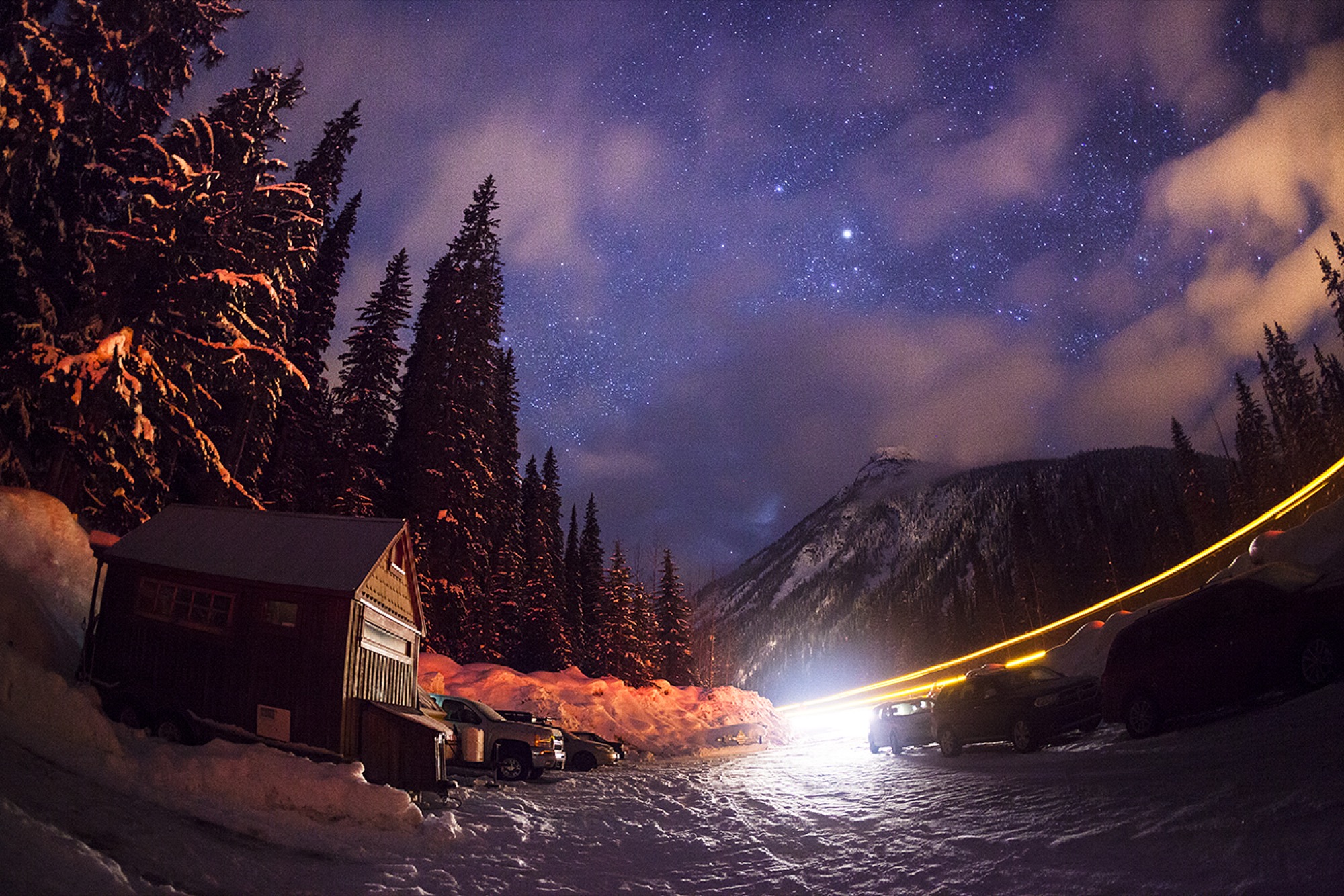
This story was originally published in winter 2014/15, in our printed Alpine Modern quarterly.
Recipe: Kale and Potato Pancakes with Gravlax and Nordic Yogurt
Alpine Modern Executive Chef Ellory Abels creates a delicious dish to make for your weekend brunch
Alpine Modern Executive Chef Ellory Abels created this dish for your New Year's brunch—or any Sunday morning of the new year. Yield: 2 portions/6 cakes Prep Time: 10 mins Cook Time: 10 mins

Ingredients
1 cup chopped kale ¼ cup minced red onion ½ cup shredded chef potatoes 2 whisked eggs ½ tsp dill 2 tbsp brown rice flour ½ tsp lemon zest ¼ cup of preferred frying oil 6oz Gravlax ¼ cup nordic yogurt 1 lemon sliced salt and pepper to season
Tools
Medium Bowl Non-Stick Pan Spatula Whisk Zester Knife Cutting Board

Method
Combine chopped kale, red onion, potatoes, eggs, dill, flour, and lemon zest in bowl.
Mix together and season to your liking.
Use non-stick pan with frying oil and heat up on medium heat. Once oil is smoking put make medium size cake and cook till crisp on each side.
Finish with a dollop of nordic yogurt on each cake with gravlax and a squeeze of some fresh lemon juice and enjoy! △

The Fire Shelter
Simon Hjermind Jensen of SHJWORKS creates a tent-like plywood structure as a transient beacon of light
Simon Hjermind Jensen, founder and lead designer at SHJWORKS, created the Fire Shelter together with a team of architect colleagues.
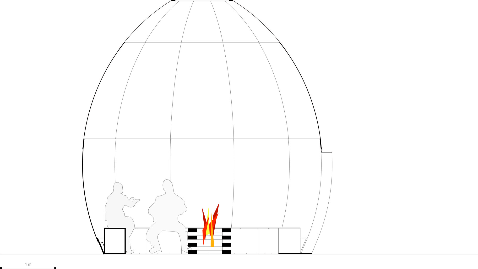
A well-traveled student, Jensen studied all over the world to develop his unique taste in design. The top schools he attended inclueded the Royal Danish Academy of Fine Arts School of Architecture in Copenhagen, Denmark, and RMIT in Melbourne, Australia. After college, Jensen worked at a variety of firms in Copenhagen and London. While many architects find great inspiration in world travel, Jensen claims nature to be his leading muse. In our interview, Jensen says, “Nature inspires me a lot. Right now, I am especially looking at trees. Mainly, I am looking at form and shapes in nature. Folklore, regarding cultural ornaments, inspires me, and then social situations are also a big source of inspiration.”
A place built for no one in particular—to be used by everyone
SHJWORKS proudly stands as a firm that merges people and places in a single design. Though, the design of Fire Shelter: 01 strays from this practice somewhat. This piece was made for no one in particular, but acts as a place for people to come together from all over. Jensen says, “I did not want a client for the Fire Shelter: 01. I had a huge interest in doing a project without any kind of compromises. So, I guess in this case, you can say I was the client, too. I paid production and material myself.” Jensen built this shelter independently, without any guidelines or constraints. That the place was built illegally just adds to the appeal. Because of this, modern day conveniences of building were not accessible—materials were hauled to the site by trolley and ladders were nonexistent.
Glow in the dark
Fire Shelter: 01 is located just twenty minutes from downtown in Sydhavnstippen area of Copenhagen. Built from plywood and polycarbonate, the shelter uses CNC technology to maintain its shape. Simple in design yet elegant with details, this shelter has no windows, only two openings for coming and going. There is a hole at the top of the structure to let in more light and allow for smoke ventilation should a fire be lit inside. From first glance, the exterior of the shelter is simple plywood, but at night, the place glows. With a fire lit inside, the shelter illuminates the dark sky with a bright orange glow.
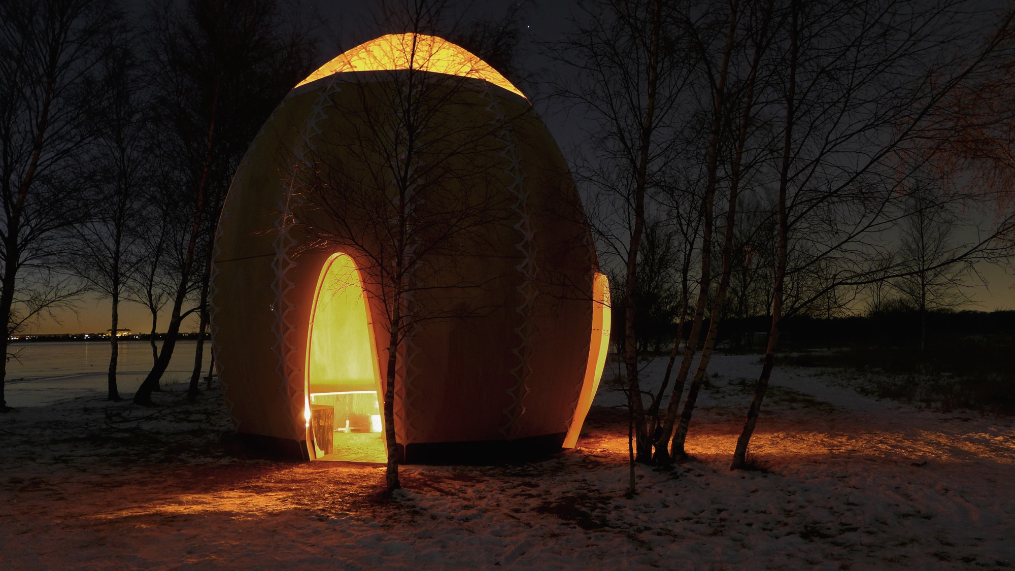
Open inside
Inside, the shelter is completely open. A bench lines the walls to accompany visitors. A single fire place is centrally located to heat the space during the cooler months. Looking up, a white transparent polycarbonate material makes up the tip of the shelter to lighten up the interior. Simplicity is key both inside and out of this shelter.
Jensen holds a high regard for the land on which the shelter was placed. Though the project is only temporary, Jensen made it a point to not risk the lands original setting. A piece that may have been a wild card at first is now one of SJHWORKS most celebrated works. △
