Inspirations
Explore the elevated life in the mountains. This content debuted in 2015 with Alpine Modern’s printed quarterly magazine project.
Minimalist Metamorphosis: Cowshed turns cultural center
A local hotelier turns his family's old barn into a beautiful center of cultural life — the Allmeinde — in Lech, Austria
Most people must choose to live amongst urban intellect or natural beauty. Gerold Schneider and Katia Polletin, founders of Allmeinde Commongrounds cultural center, are proof that you can be surrounded by both.

Schneider grew up in the tiny Austrian mountain village of Lech, also known as the cradle of Alpine skiing. His parents owned and operated Almhof, one of the ski town’s top five-star hotels, and his childhood revolved around skiing and helping with the family business. Like many small town kids, Schneider fled the mountains for the city and moved to Vienna to study art, architecture, and philosophy. “A lot of people from rural areas move to cities and get a taste of art, music, design, food, and they never return,” he says. But the sudden death of his father and illness of his older brother drew Schneider—and his architect-wife Polletin—back home to help his mother, Hannelore, run the family hotel.
“A lot of people from rural areas move to cities and get a taste of art, music, design, food, and they never return.”
Old cowshed turns splendid cultural center
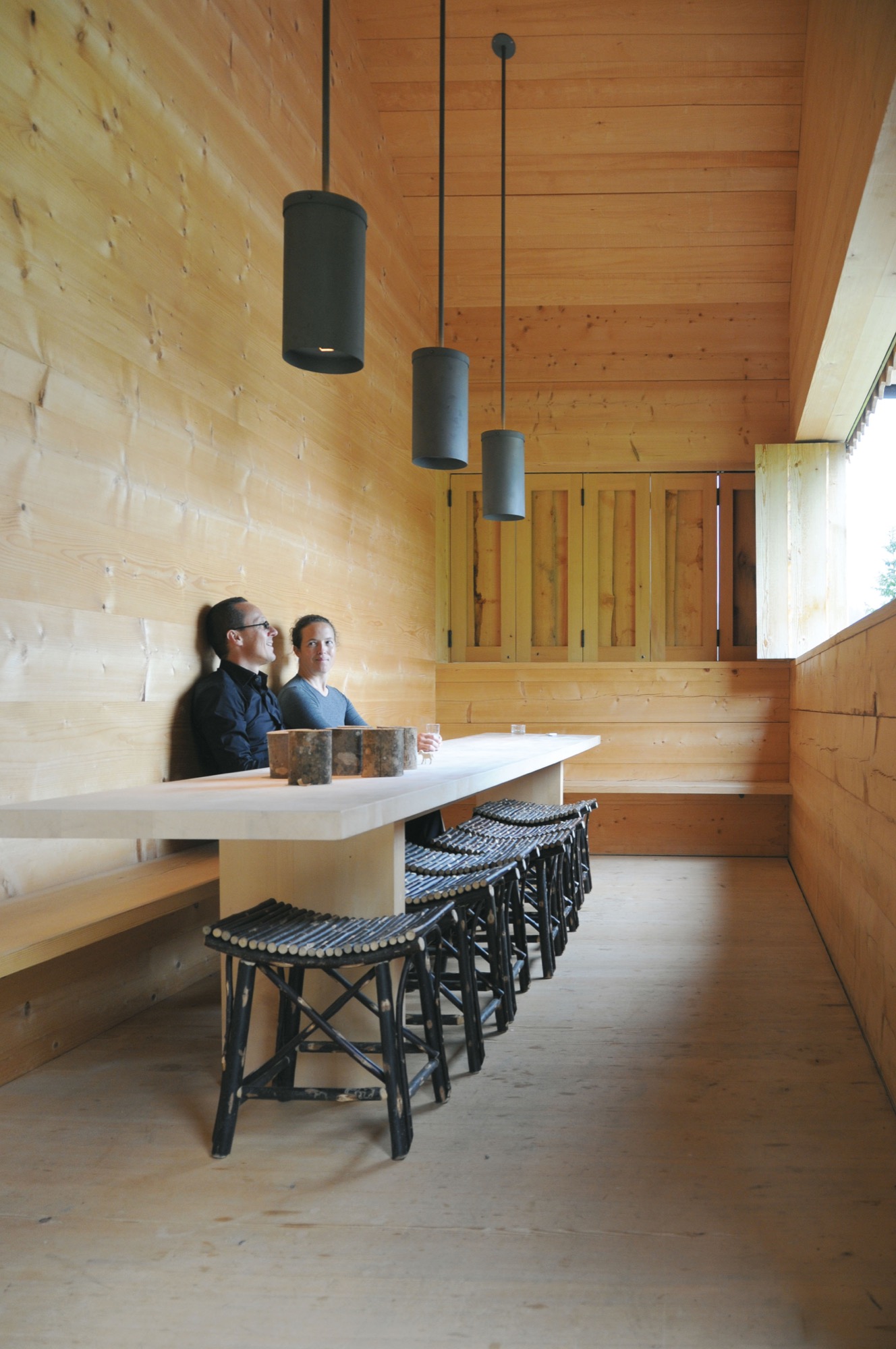
While Schneider never intended on becoming a hotelier, he did toy with the idea of one day doing something with the arts in Lech. As he and Polletin set about respectfully updating the hotel they also set their sights on a rustic, family-owned barn just up the road from the Almhof. The cosmopolitan couple’s plans to convert the old cowshed into a cultural center for exhibitions and artists in residence were met with small-town mentality suspicion. “There are many things I love about Lech, but locals have an aversion to change,” says Schneider. “They are stuck in the past.” Each winter, Lech attracts an international, discreet (compared to Courchevel or Aspen) jet set crowd that Schneider believed would welcome a dose of culture to complement the powder-dusted slopes and après-ski cocktails.
The barn—functional, minimalist Alpine design
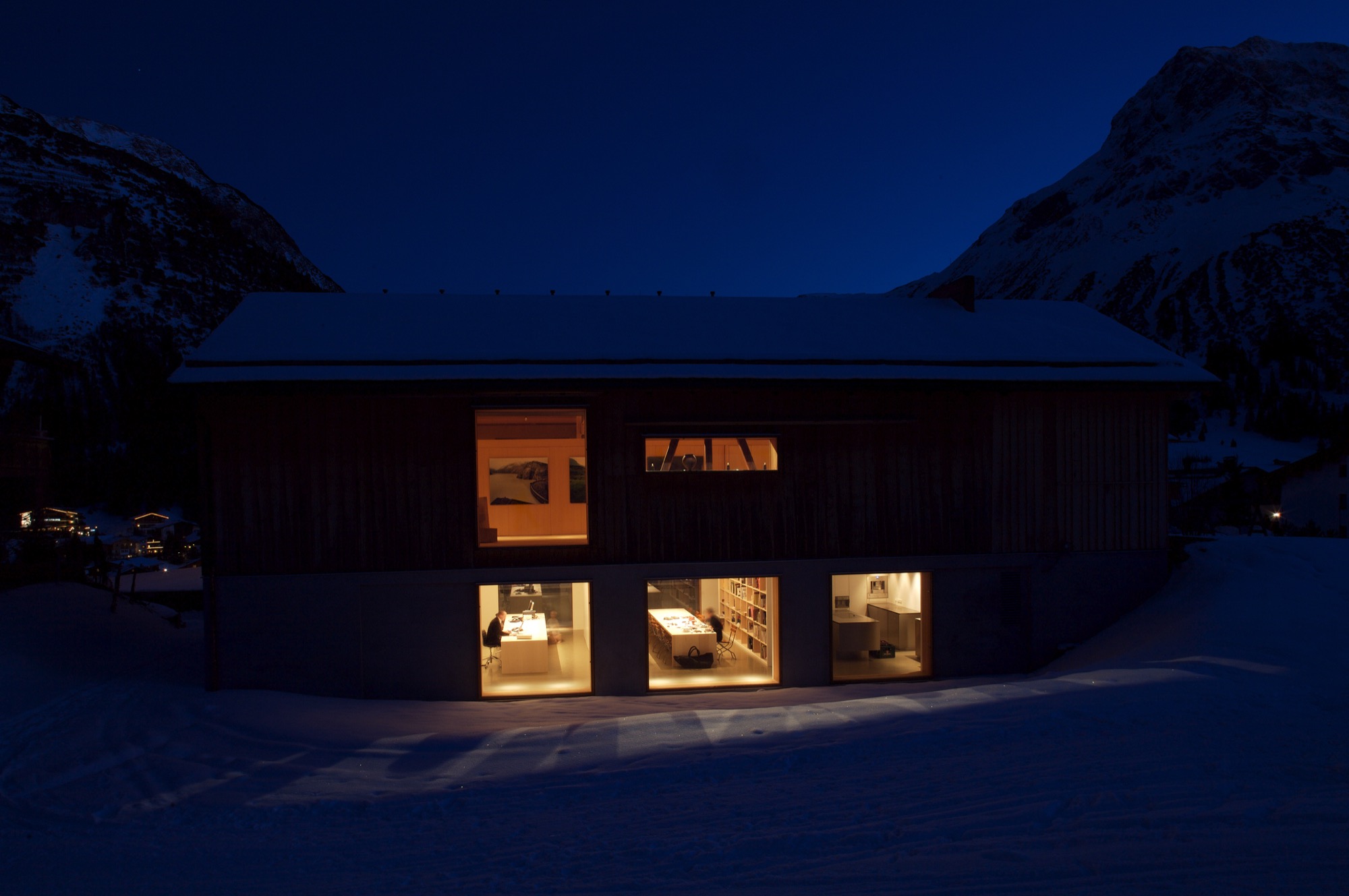
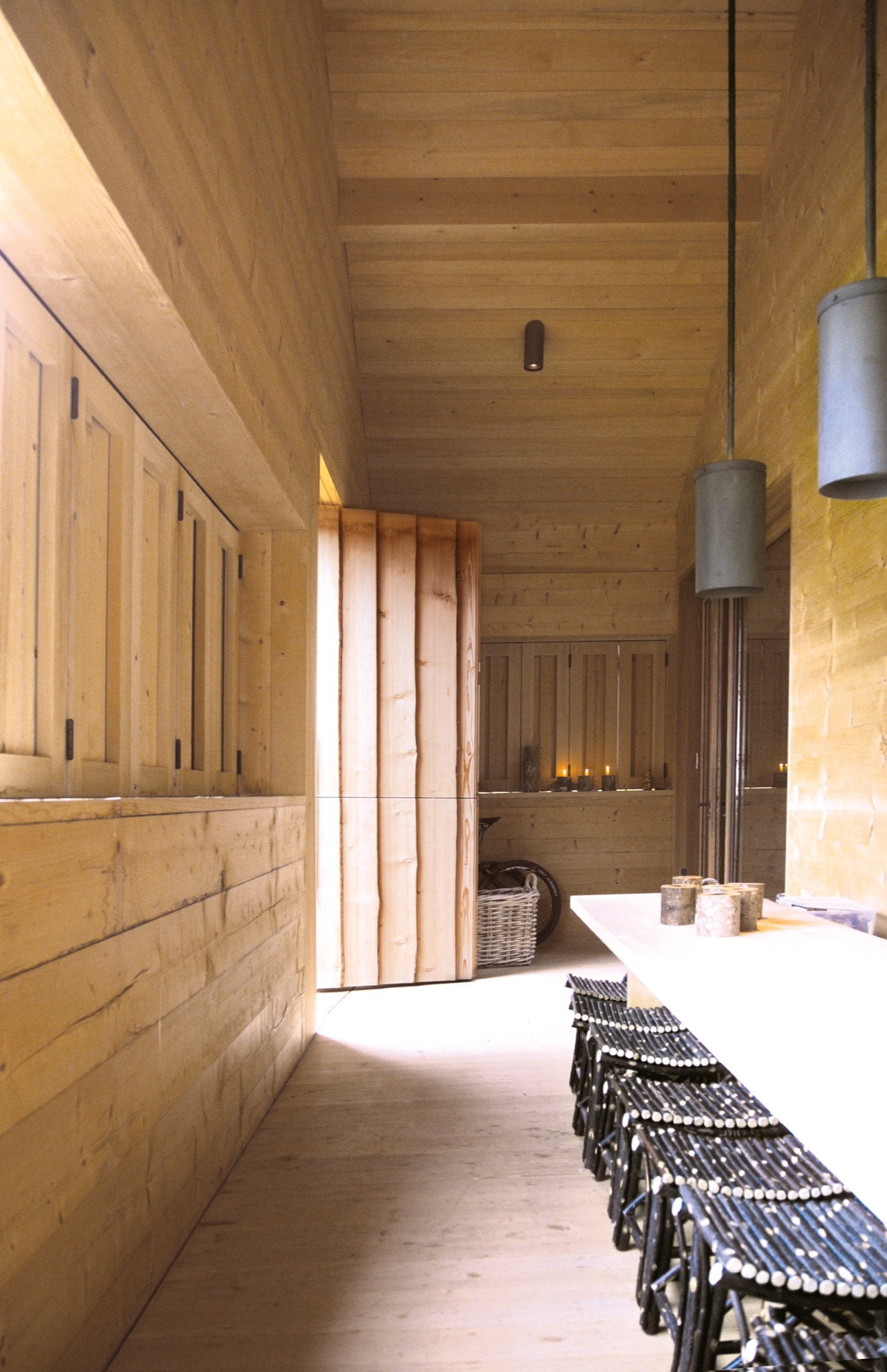
In 2000, Schneider and Polletin began transforming the two-story barn into the Allmeinde, an Austrian word that means a public, open pasture. Sensitive to the ski town’s postcard perfect landscape, the pine wood exterior of the Allmeinde is nearly indistinguishable from any other neighboring weathered barn. The only difference is the sliding barn doors have been turned into an enormous window that rolls open to views of the Schlegelkopf mountain ski runs. The interiors, however, are an ingenious example of minimalist Alpine design and functional, fluid living space. On the second floor, the original vaulted beams frame a 1,500-square-foot (ca. 140-square-meter) space divided by a birch cabinet unit. At first glance, it looks like a stark gallery space, sparsely decorated with a few rough-hewn wood chairs and framed alpine-inspired photographs. But, the cabinet unit is like a perfectly packaged gift that neatly unfolds like origami to reveal a studio apartment living space complete with a kitchen, bathroom, shelving, desk area, and Murphy bed.

The atelier-inspired downstairs space holds a private library curated with nearly 2,000 books on music, philosophy, travel, and art. There’s also an office and screening room as well as a kitchen and bedroom, which are used by the family in the summer and visiting artists in the winter. The Allmeinde hosts one exhibition per winter season—all free to the public. Past exhibitions have included British sculptor Antony Gormley, American artist James Turrell, and most recently Italian photographer Walter Niedermayer, whose images brilliantly dissect the landscape of alpine tourism.
An evolution of tradition
While some locals have viewed the Allmeinde as a threat to tradition, Schneider and Polletin see it as an evolution of tradition, bringing a fresh, international aesthetic to local materials and craft. “Just because you live in the mountains, does not mean you have to be cut off from the world,” says Polletin. “The Allmeinde is part of our identity in Lech. It’s important for us to have this outlet. It’s a celebration of the space we live in—manmade and natural.” △
“Just because you live in the mountains, does not mean you have to be cut off from the world.”
The Vindheim Cabin: Snowbound in Norway
The Vindheim cabin in Lillehammer, Norway, is inspired by the classic motif of snowbound cabins, with only the roof protruding through the snow.
Architect Håkon Matre Aasarød, partner at Oslo-based studio Vardehaugen Architects, led the design of Cabin Vindheim, situated deep in the forest in the alpine landscape near Lillehammer, Norway. The cabin’s concept was simple: To create a cabin that is small and sparse yet spatially rich. The 55-quare-meter (592-square-foot) cabin, commissioned by a private client and completed in 2016, comprises a large living room, bedroom, ski room, and small annex with a utility room. It functions off the water and electricity grids.
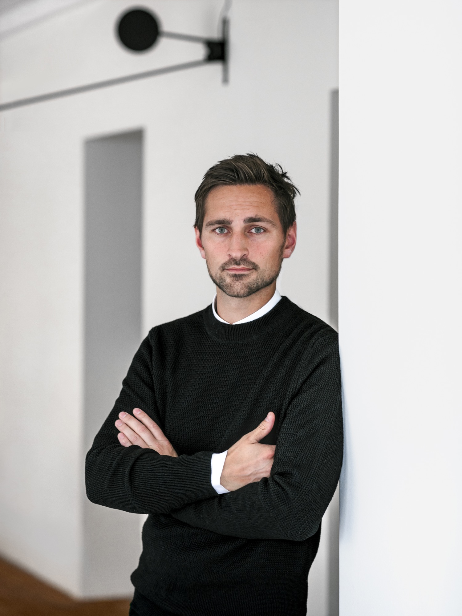
Håkon, who earned his master of architecture degree from the Oslo School of Architecture and Design, where he is also teaching today, has been telling us about this project from its very beginning, keeping us abreast of the building progress in emails and photos. What’s more, the Norwegian Broadcasting Corporation followed the design and construction of the cabin and documented it in a one-hour episode of the program “Grand Designs”. Thus, we are excited to finally show you the result and introduce you to its lead designer, who lives in Oslo, with his wife, Sigrid, and with his two boys, Syver and August.
A conversation with architect Håkon Matre Aasarød
AM When and how did you know you wanted to become an architect?
HMA I’ve always been passionate about drawing. I can easily recall the wonderful and almost hypnotic feeling I had while drawing Star Wars space ships for hours in my childhood. As soon as I got older and realized that drawing houses and objects was a real job, and not just a hobby, I knew I wanted to be an architect. Today, from time to time, I can still get that wonderful, almost meditative feeling while drawing.
“As soon as I got older and realized that drawing houses and objects was a real job, and not just a hobby, I knew I wanted to be an architect.”
AM What professional path led you to where you are today?
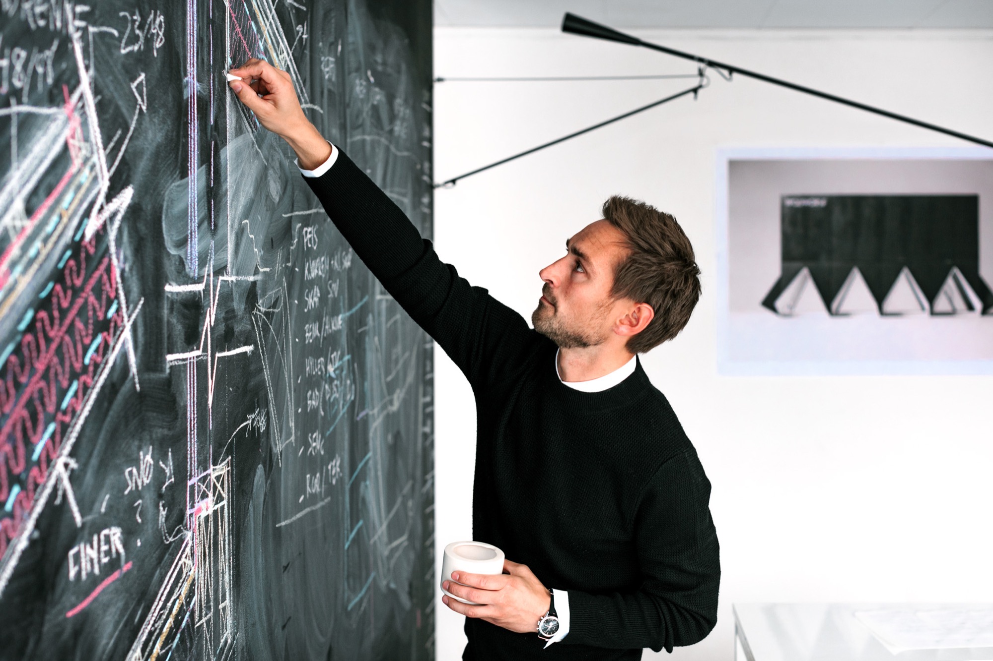
HMA Immediately after finishing architecture school, I started my first office, Fantastic Norway, together with my good friend Erlend Blakstad Haffner. Our studio was a red caravan. We drove from town to town for more than three years, giving architectural aid and inviting the locals to participate in creating new strategies and projects for their hometowns. We had a wonderful adventure and got a lot of attention and won many prices for our method of working. But life on the road was also a bit tiring, so in the end, we had to park our ambulant architectural office.
Then we were invited to make a TV series about architecture for the Norwegian Broadcasting Corporation (NRK) and worked as television hosts for a couple of years.
After spending so much time on the participation processes and communication, I felt the need to focus on the building part of our profession and, as a response to this, started Vardehaugen Architects.
AM What’s your design style?
HMA When starting a new project, I try hard not to have preconceived ideas about the style or looks of it. I try to focus on the client’s need and on creating interesting spaces and let the style evolve through this.
AM Where do you draw inspiration for your designs?
HMA Our greatest source of inspiration is our clients and the sites we work on. Every client is different; every place is in some way peculiar and unique. We aim to embrace this in all of our projects.
AM What does “home” mean to you?
HMA Home is the feeling of belonging somewhere. The feeling could be connected to a house, a specific landscape, a mountain, or even a group of people. Places where your story lives.
AM What makes you a mountain man?
HMA Growing up in Norway it’s hard not to have a close relationship to the mountains. Throughout my childhood, we spent a lot of our holidays hiking or skiing. Every Easter, my family still goes hiking in the mountains, and every autumn, we collect sheep for my parents-in-law in the mountains of Norway’s West Coast.
AM When are you the happiest?
HMA Nothing beats spending a day with my two kids at our small summerhouse on the West Coast of Norway.
AM What’s on your drawing board right now?
HMA We work with a fairly wide range of projects. In addition to some cabins and villas, we are currently designing a small chapel next to Norway’s second largest glacier, the Black Glacier, a coastal museum on the island of Frøya, and an observation deck at Norway’s most spectacular waterfall, the 280-meter-tall (ca. 920 ft.) Vettisfossen.
The Project: Cabin Vindheim
AM Who are the clients?
HMA A couple in their mid 50s, both of them passionately interested in architecture and design—in addition to skiing and hiking in the mountains.
AM Describe the design in your own words...
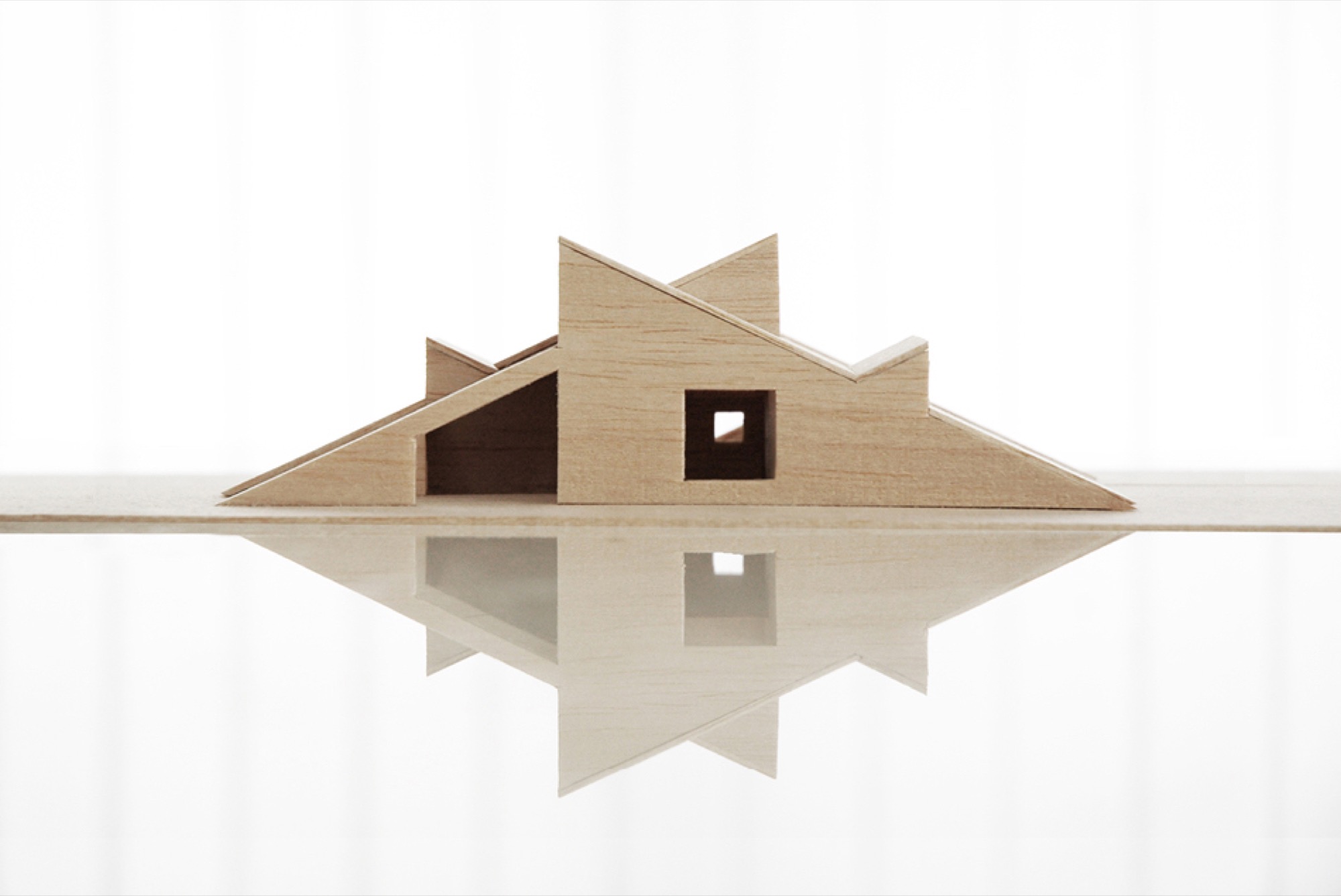
HMA The cabin is a basically a gabled roof where the edges of the roof stretch all the way down to the ground. The ceiling runs uninterrupted through the cabin and connects the different rooms. A series of uplifts creates a rich variety of spatial qualities underneath it.


AM What was the client’s premise at the beginning of the project?
HMA They wanted a small cabin that was sparse and compact but at the same time spatially rich and generous.
AM How did you translate the client’s vision into this design?
HMA With the ambition of creating a compact cabin that at the same time had exceptional spatial qualities, we focused a lot on the physical sensation of scale and space. When is a space too tight? When is it too big? We did this by creating real-scale mock-ups of our design solutions in our backyard to ensure a greater understanding of size and proportions in our project. This enabled us to simply take a stroll through our project and get a sense of dimensions and spatial sequences–even before the cabin was built.
AM What was your inspiration for this particular design?
HMA The external shape of the cabin is inspired by the classic motif of snowbound cabins that have only the roof protruding through the snow. When snow covers the structure, the contrast between architecture and nature becomes blurred.
AM What makes this cabin truly special?
HMA During winter, the roof becomes a man-made slope for ski jumping, toboggan runs, and other snow-based activities.

AM Take us there...
HMA The site is deep in the forest in the alpine landscape close to Lillehammer in Norway. The cabin sits between some tall spruce trees, with a nice view toward a lake. During winter, it’s extremely cold there and hard to get to by car, so you have to cross-country ski for a few kilometers to get there.
AM How did the setting and the site influence your design?
HMA The frosty forests in the region are both beautiful and mysterious, and they’re closely connected to traditional folklore and stories about trolls and other strange creatures. When snow covers the trees and stones, they morph into something new. They become characters, sometimes trolls, sometimes just a beautiful and unique sculpture. I find this notion truly inspirational.

“When snow covers the trees and stones, they morph into something new. They become characters, sometimes trolls, sometimes just a beautiful and unique sculpture.”
AM What are the main materials you used, and why?
HMA The classic Norwegian mountain lodges are covered in dark wood, making them seem both solid and grounded. Inspired by this, the cabin is clad in black-stained ore pine. The interior is lighter, fully covered in waxed poplar veneer.

AM Take us inside...
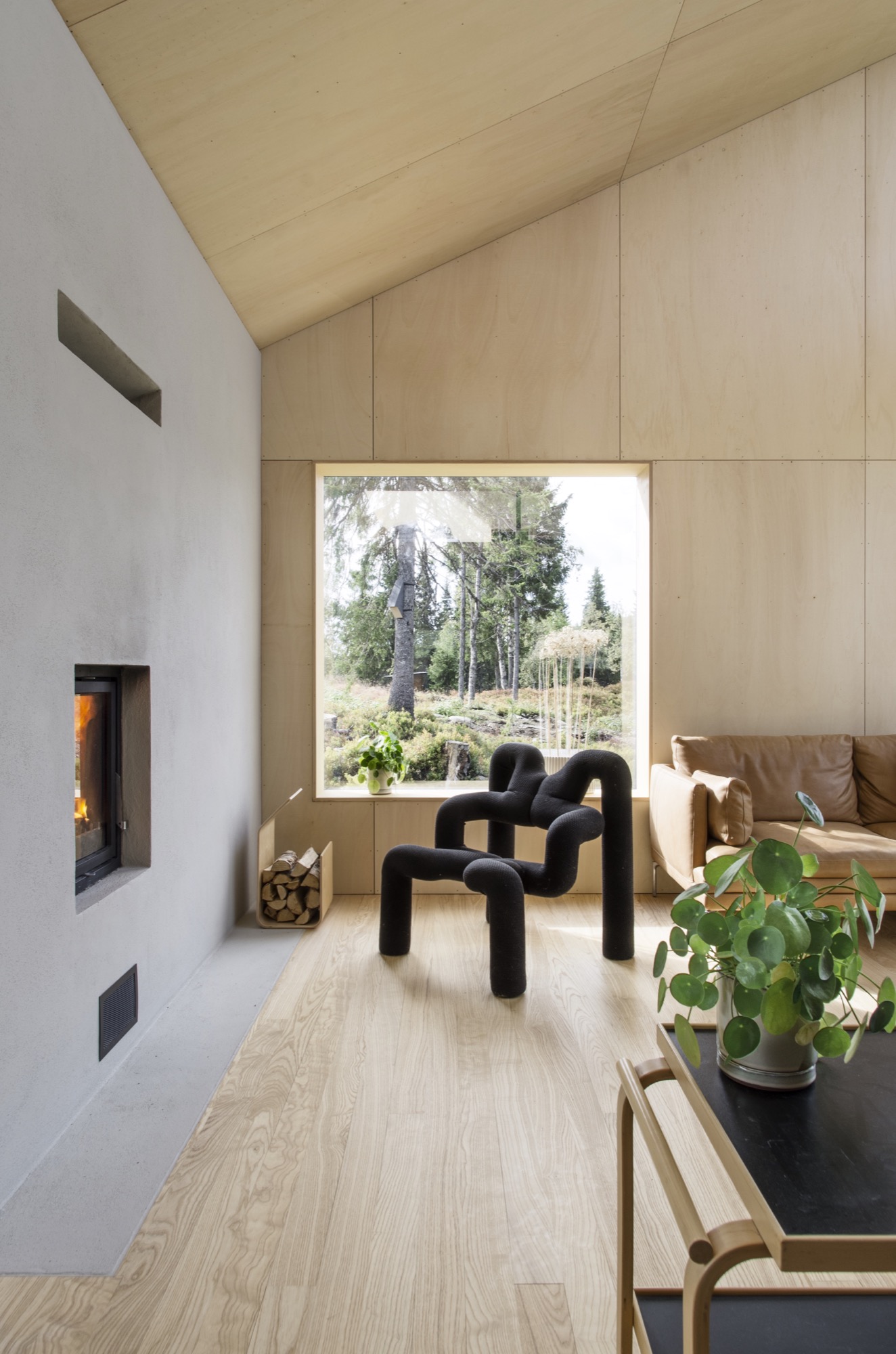
HMA The sloping roof connects the different spaces, making the entire cabin feel more like one large room.
From the main bedroom and the mezzanine, you can even gaze up at the stars and enjoy the northern light, while lying in bed. When resting in the cabin's bedroom, a large 4-m-long (ca. 13 feet) window creates the impression of sleeping above the treetops and underneath the stars. The main living room is also small but has a ceiling height of 4.7 (ca. 15.4 feet) meters under the roof.
AM What was your biggest challenge with this project, and how did you overcome it?
HMA The site is very far off the grid, and simply getting the materials to the site was quite a challenge. But we managed by always planning with close consideration of the local weather forecast.
AM What is your favorite thing about the cabin, now that it is finished?
HMA Lying in bed watching the northern lights above the snowy spruce trees is a really nice experience.
AM What do the clients tell you, now that they have been living in your architecture for a while?
HMA They enjoy the cabin and spend time there every weekend. The only issue is that they’ve had problems with sheep climbing up the roof. However, I’m sure the sheep enjoy it.
AM Final impressions of the cabin?
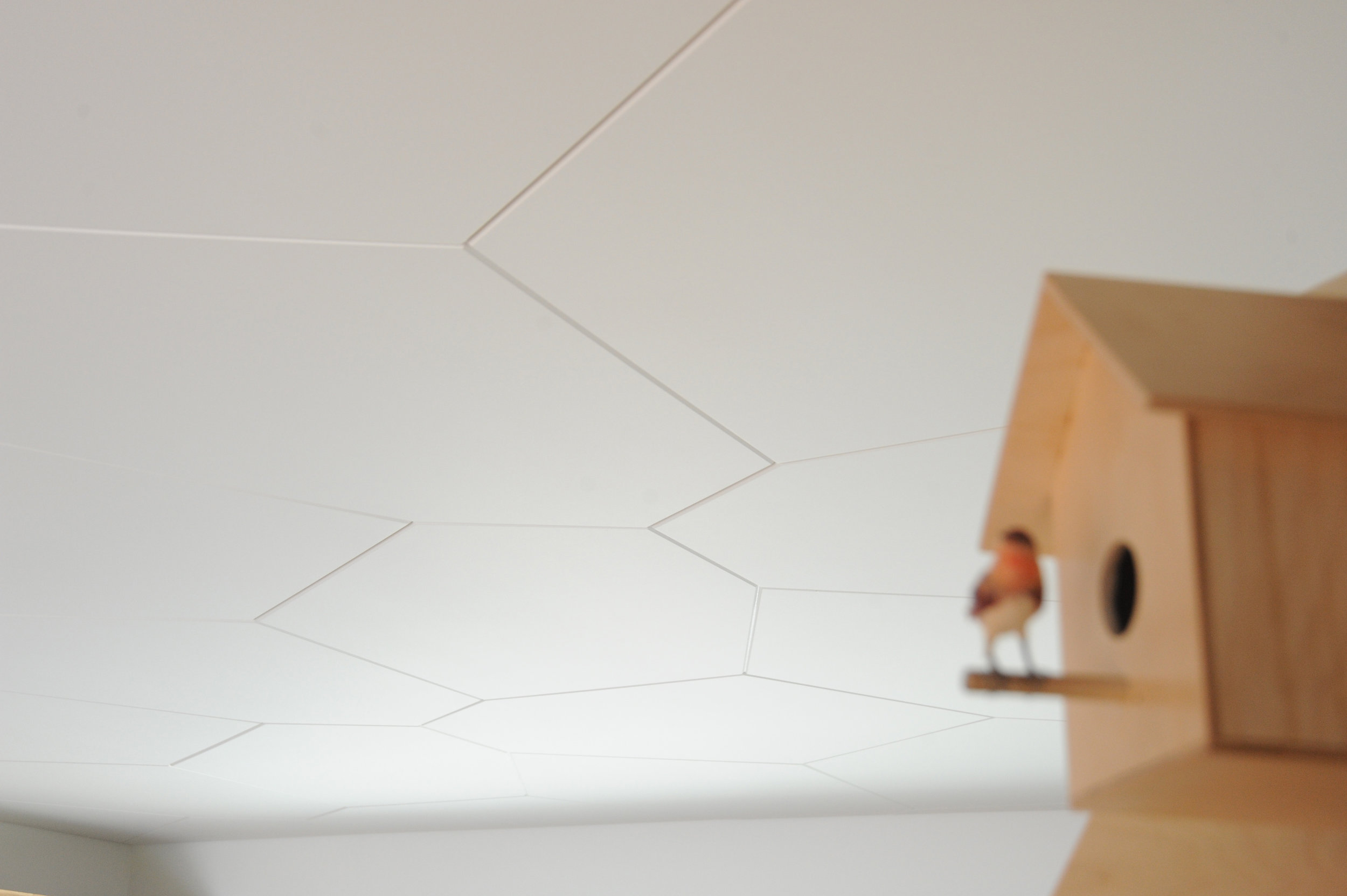
HMA We designed a couple of birdhouses for the birds living next to the cabin. Local sparrows and starlings enter the nesting box from a small opening underneath the flexible top hatch. △
Hillside Holidays
Near the Austrian border in Germany’s Allgäu, Haus P by Yonder boldly reinterprets the region’s traditional mountain architecture
Nestled into the hilly landscape of Southern Germany’s Allgäu, Haus P by Studio Yonder für Architektur und Design is a holiday home for a family of seven from Hamburg. The irregular shaped structure with a traditional 16-degree roof pitch embodies a thoroughgoing reinterpretation of the region’s farmhouse vernacular.

The supporting base of the 249-square-meter (2680-square-foot) home is made of core-insulated, exposed concrete. Above, black charred timber siding offsets the concrete and the gentle landscape. Clean lines and distinct angles are the dominant features of the home’s geometric design. The home comprises two separate buildings—the living area and a storage shed—united by a sheltered central courtyard, where the entrance is located. The orientation of the buildings lends privacy for the family while spending time outdoors.

Spaces
Open and bright, the interior has a harmonious flow of natural light wood and a wall of picture windows extending from floor to ceiling. These windows allow for majestic views of the mountain landscape.
The main level flows from room to room with no interruption except a wrap-around fireplace marking the beginning of the living and dining area off of the kitchen. The fireplace gives a feeling of warmth from every area on the main level.


An open staircase, which juts out of the side of the building to covers the exterior stairway beneath, ascends to the loft—simple in design, yet functional—above the kitchen. This is an area made to relax, unwind, and take in more of the surroundings, with deep-set ceiling windows letting in light and starry night views.
Set in the concrete base, the spacious lower level has two private bedrooms, a bathroom, and a sauna. △
Fire / Wood
His Nordic German upbringing, traditional Swiss carpentry training, and the Bauhaus Manifesto deeply influence Canada-based designer and furniture-maker Nicolas Meyer as a craftsman and intellectual
Nicolas Meyer’s approach to design and craftsmanship is firmly anchored in his traditional Swiss training as a furniture maker and balanced with his Bauhaus-influenced intellect.
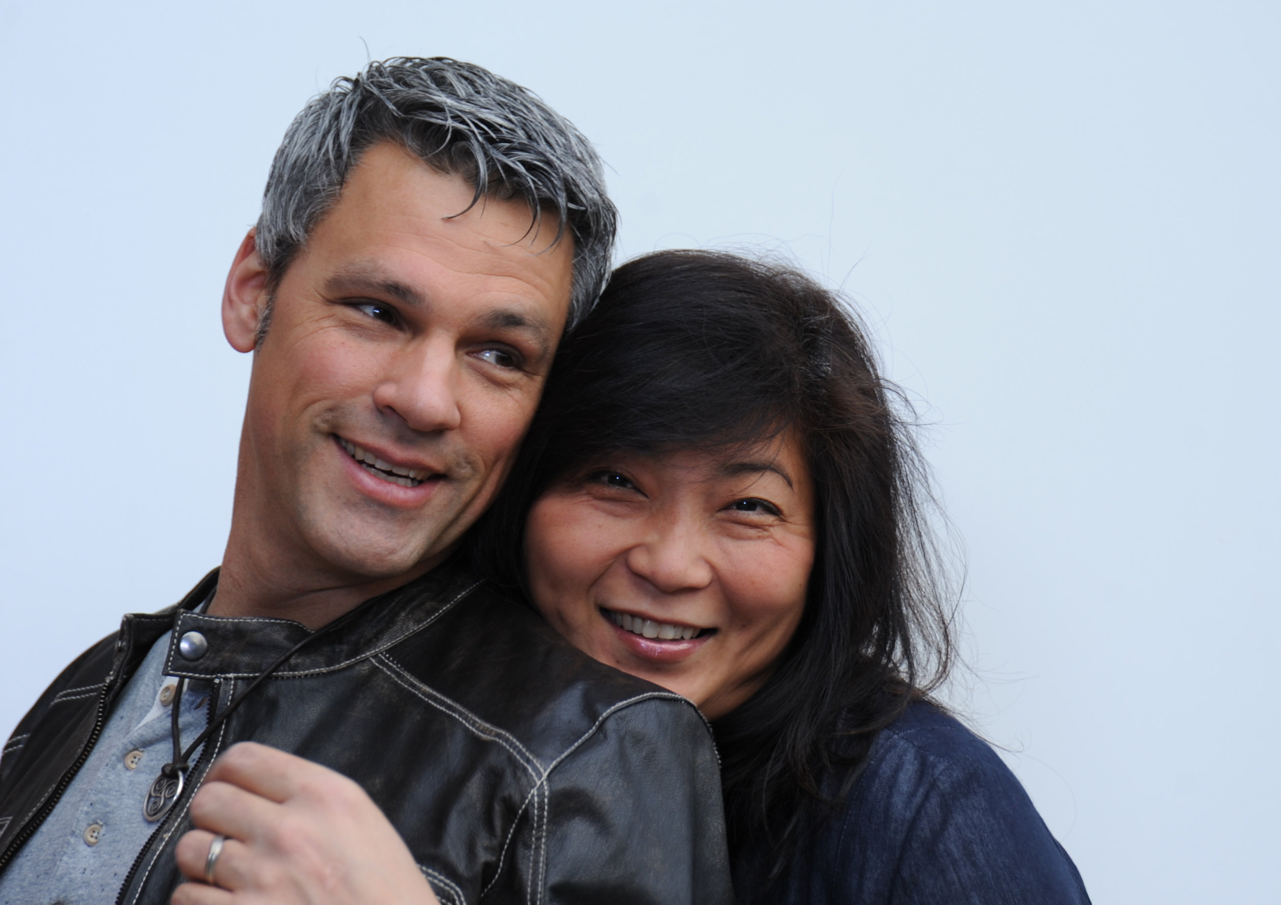
Nicolas Meyer is not one thing, not from one place. Born in Germany and raised in Switzerland, the multifaceted founder of Nico Spacecraft has put down roots as an artist, designer, woodworker, and furniture-maker in British Columbia, Canada.
A sincere dialogue about design and wood quickly reveals the man is at once both an intellectual and a craftsman. No surprise, he seeks balance in everything he does.
Meyer grew up in Hamburg, Northern Germany. With a real estate-developer father and an antique-collector mother, the boy was exposed to architecture, construction, and fine furniture throughout his childhood. The parents separated when he was ten, and he moved to Switzerland with his mother.
In 1991, Meyer lived in Vancouver for half a year to improve his English. He returned to Switzerland to complete a traditional four-year apprenticeship in furniture-making, which he finished a year early by virtue of prior education, excellent marks, and extraordinary talent. All this time, British Columbia remained on his mind.
The decision to return four years later to settle in Canada was spiritual as much as rational. “Things just feel right, and you find your place where you want to build your life,” Meyer reflects. Having spent the first ten years of his life in Hamburg, he was influenced by the ocean, water sports, the city’s harbor as “gate to the world,” the metropolitan lifestyle. In Switzerland, where he lived until age twenty-five, he later fell in love with the mountains and skiing. “Vancouver combines all of that. This is one of the few places where you can probably ski and kayak on the same day,” says the expat. “On top of that, this was my place. I grew up in this tension between Hamburg and Switzerland. As a kid who is constantly in between these two places, you wonder, what is your home.”
Today, Meyer is a designer, a woodworker, an artist—his creative drive the common thread. As child, he wanted to become an inventor, broke a lot of things, took them apart to understand them. In his later teens, he eventually began fixing things. “I also read a lot. I came to design and wanted to study architecture,” he says. He originally planned to study interior architecture in London after his apprenticeship in Switzerland. By that time, however, he’d already lost his heart to Vancouver. “I was too impatient and thought, I’ll go to Canada and find my way to design with what I have.”
His apprenticeship as well as the subsequent decision to practice, not study, were driven by his readings: the Bauhaus philosophy in particular—“Most of all, Walter Gropius and his manifesto, which expresses how the core of creativity can only come out of understanding a craft,” says Meyer.
“For art is not a profession. There is no essential difference between the artist and the craftsman. The artist is an exalted craftsman.” — Walter Gropius, Bauhaus Manifesto, 1919
The Bauhaus Manifesto guides Meyer to this day, everyday. Together with his wife, Jess Meyer, he runs Nico Spacecraft, a small design studio with integrated wood workshop that produces kitchens and baths, furniture, custom spaces, and architectural elements. The company’s full-service design division has its own name: Baumhaus Atelier—presumably a nod both to Meyer’s enthusiasm for all things Bauhaus as well as to his passion for trees (Baumhaus is German for treehouse). “It’s about striking the balance between being in front of the computer screen or a sketchbook and actually being in the shop and working with materials,” he says. “When I spend too much time in the shop, building all the time, I itch to sit down and sketch out ideas, whereas when I’m in the office too much, I lose touch with the reality of structure, weight, and smell, and how things actually connect.” The creator admits he usually knows he has overextended himself at the drawing board when he starts designing things that don’t work in the real world.
“When I spend too much time in the shop, building all the time, I itch to sit down and sketch out ideas, whereas when I’m in the office too much, I lose touch with the reality of structure, weight, and smell, and how things actually connect.”
When the designer completely loses himself in the details—or, as he calls this foible, “taking the typical German-Swiss approach”—then his wife, who studied fashion design and now handles the company’s business side, provides the balance, telling him to take a step back. “When I get stuck, Jess looks at the entirety of the design perimeters and pulls my head out of my behind. We complete each other not just as life partners but also in our work.” Like her husband, Jess Meyer has called multiple places home before settling in Roberts Creek. She was born in Taiwan and brought up in Singapore and later in Tehran, Iran. The couple is raising their two children in the small beach town with a vibrant arts community on British Columbia's Sunshine Coast. Before, living in Vancouver had meant the parents missed out on all the babies’ firsts, which at the time the nanny got to experience in their place. Something needed to change. And after a one-year journey of searching for the right property, the Meyers found their home with five acres of land on which to built the shop and a garage they converted into the design studio. “Now we eat every meal together, and the kids come running to show their faces in the shop or in the office after school,” the father says.
The family also loves to travel together, often to Mexico or back to Europe. “I miss the mountains of Switzerland,” Meyer tells. “Aside from the skiing and the snow, the mountains provide me with tranquility. Sometimes, it helps to reconnect to your roots and the way you were raised.”
Wood Stock
“Look around, and it’s obvious—I love wood,” Meyer laughs. “Because you never really stop learning about it. Technically, when you cut down a tree, it’s dead. But wood itself continues living; it moves, it changes, it breathes, and you cannot apply any rigid rules, because no tree is like the other, and everything, everything influences its properties—where the tree grew, the minerals it fed into its system, the wind . . . If a tree sits in a wind corridor, it develops tensions on one side, and it can counterbalance these forces to find its equilibrium with the environment. All this is imprinted in the wood. Each piece you work with will react slightly differently. That teaches me humility.”
For all that, a wood whisperer he is not. Fellow woodworkers may profess driftwood, even a tree stump, speaks to them, revealing what it wants to become. The craftsmen are merely the tool. “I can respect that, but I am more intrigued by structure, structural integrity, and physics,” says Meyer. “Even a tree trunk never really inspires me to do anything. What I do want to do is cut this apart and reassemble it.” Meyer’s view of today’s common practice of kiln-drying wood is ambivalent. He understands the necessity of expediting the process and killing the creatures living inside the wood. In Switzerland, where he learned the craft, most wood is still naturally air-dried for many years, allowing the material to maintain its structural property. Meyer explains that “cooking” the wood extracts moisture at a speed that destroys the integral structure of the wood fibers, the cells collapse, and the wood becomes brittle. “I see these drawbacks when humans don’t work with the wood but force their will onto it because they have a schedule to keep, and they are pushing for high turnover, needing the cash flow.”
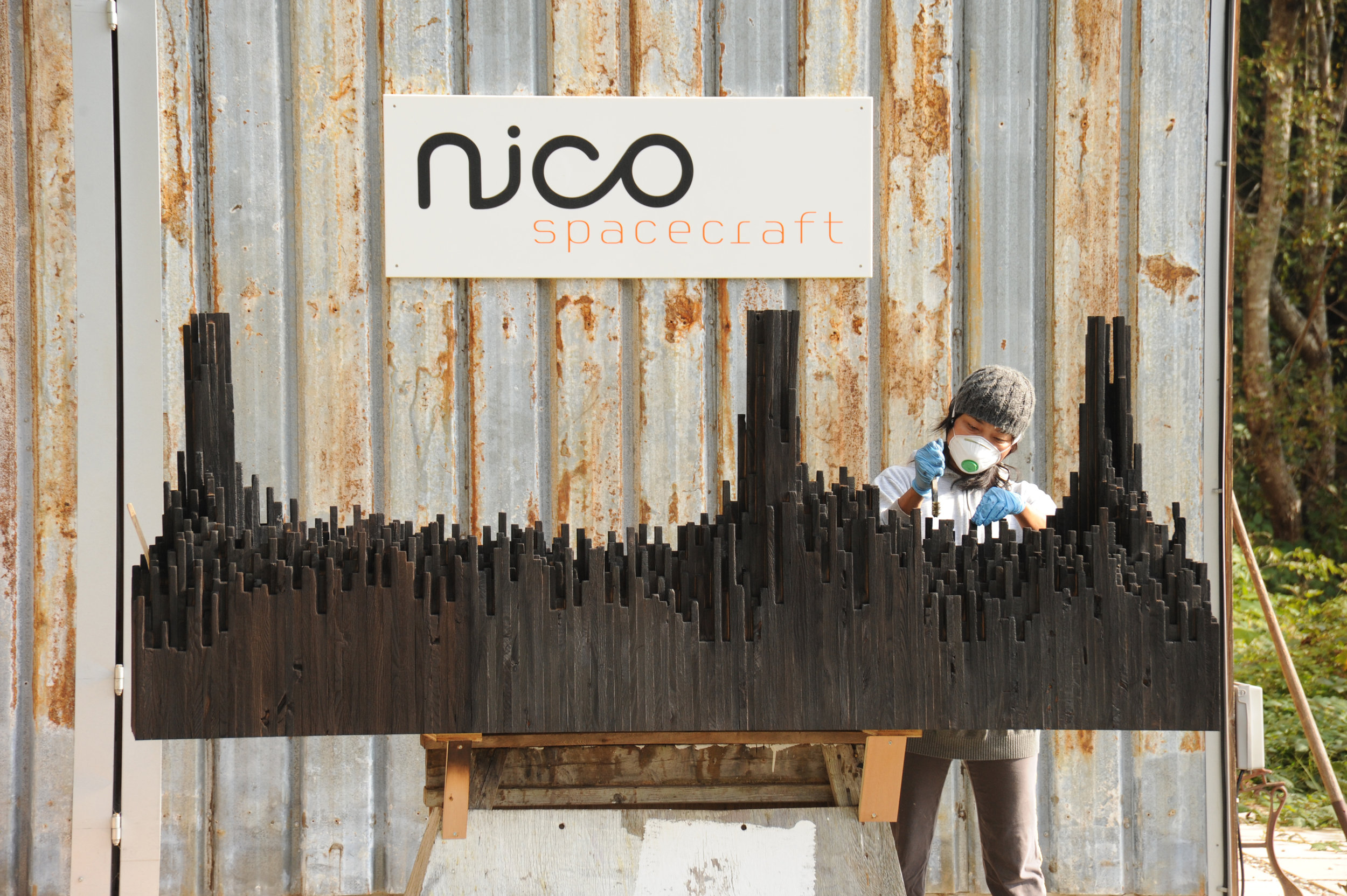
The advocate for responsible woodworking practices himself would prefer to exclusively use air-dried wood. “But it’s not feasible. It’s an ideology, and whenever I can, I do.” He also works with salvaged materials and appreciates a good story behind the wood—and so do his clients. For instance, “White oak is rare here on the West Coast,” Meyer begins a tale. “Ninety-some years ago, one of the first skippers planted this white oak tree here . . . ” Meanwhile, after splitting, the tree was deemed unsafe and destined for firewood. The community was in uproar about cutting down their heritage oak. Meyer and a miller friend arranged a crane, milled the wood, and air-dried it over the years, until a client emerged from Vancouver who appreciated the story and the historic value the tree represented.
Nordic-Swiss authenticity
His Hanseatic birthplace and Swiss training shaped not only Meyer’s design sensibility but also his work ethos, for better or worse. “When I first came to Canada, I was extremely rigid,” he reflects. His first gig was renovating a house—working out of a garage, with limited resources and tools. “In Switzerland, there is a machine for everything, and there is a way of doing everything. That’s how I was trained. But this rigidity of ‘This is how you do things, and there is no other way’ was initially hard for me to overcome.” In hindsight, that first Vancouver project taught him that there are many different practices. “That was a very valuable lesson I apply to this day and that has become an integral part of my approach. Once again, there is a fusion, a balance between the static world, the reality, and how you get to understand it. Only if I understand, I am suddenly able to discover all the different options of what this will allow me to do, and that’s where my creativity kicks in.”
“In Switzerland, there is a machine for everything, and there is a way of doing everything. That’s how I was trained. But this rigidity of ‘This is how you do things, and there is no other way’ was initially hard for me to overcome.”
The designs of Nico Spacecraft are exquisitely modern. Sustainability is essential in everything the family-run company does, even their two-story workshop received a Green Design Award from the Canadian Wood Council in 2010. But what Meyer keeps touching upon in discussing his work is authenticity, his clients’ shared yearning to connect with what is real. “People are going back to the craftsmen, back to working with the designer, and being involved and understanding the story.”
“People are going back to the craftsmen, back to working with the designer, and being involved and understanding the story.”
Storied Pieces
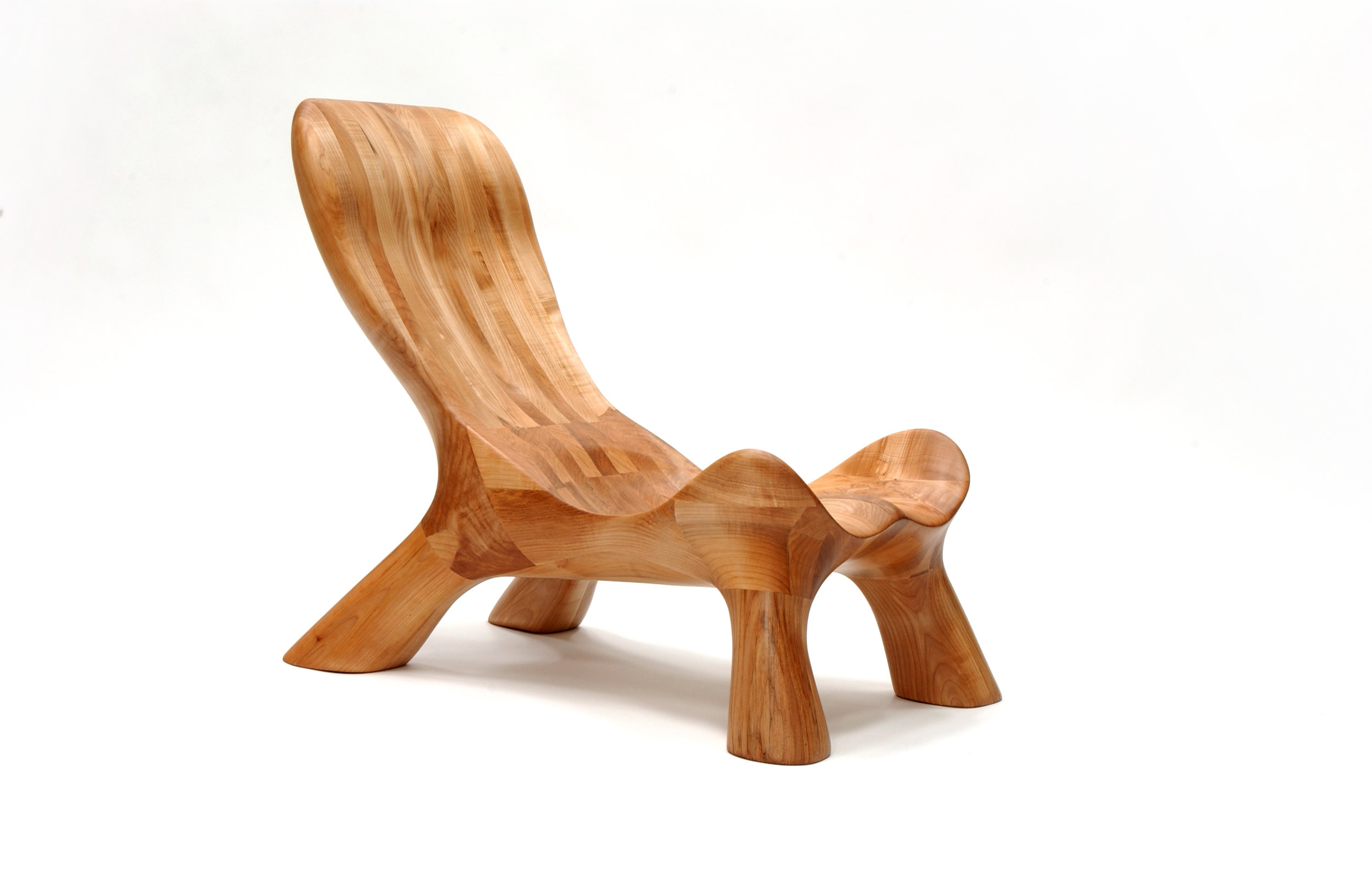
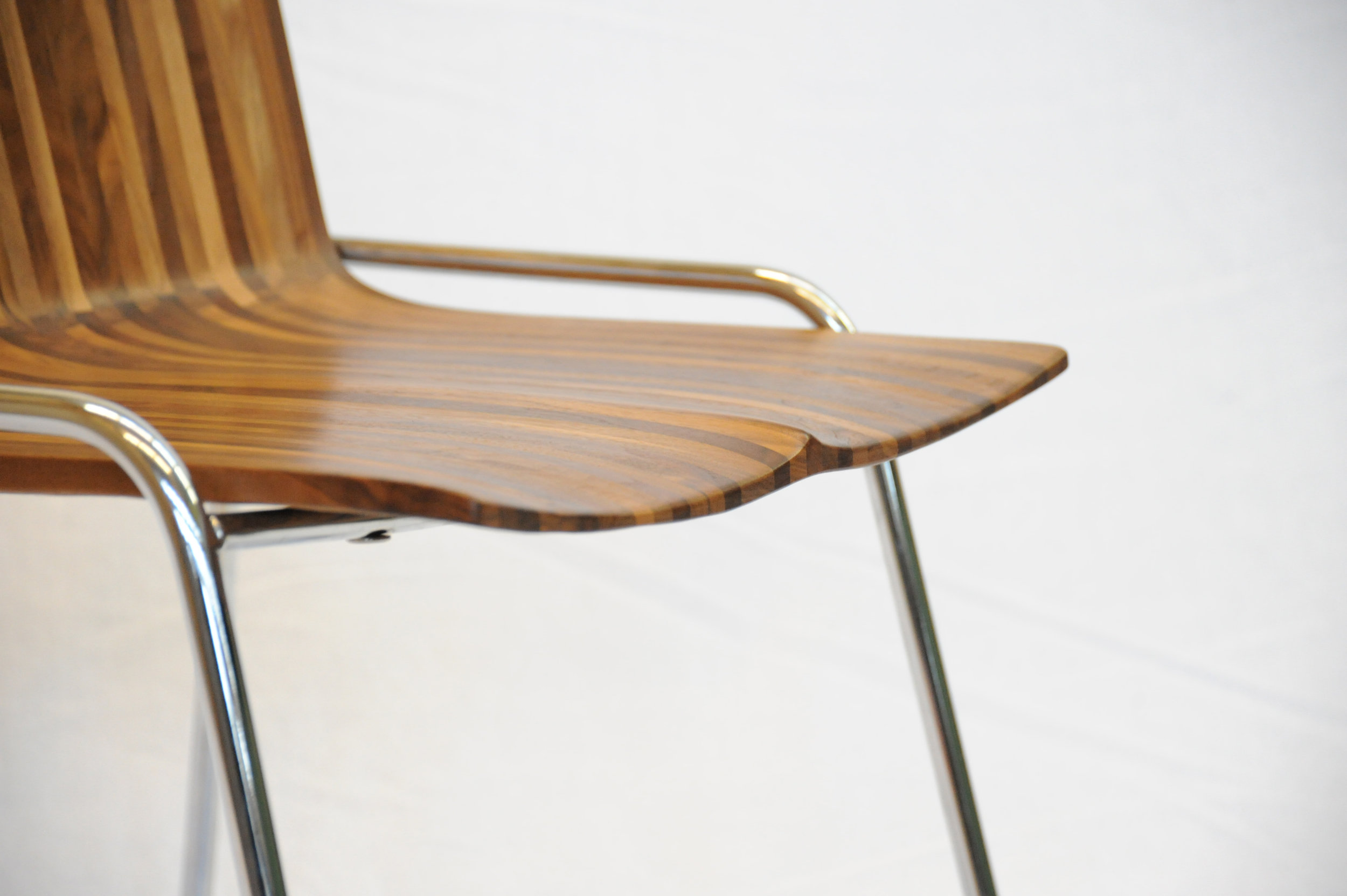
Indeed, there is a story behind all of Meyer’s works and usually to the wood he’s using, too. Take the CurveChair, a piece of sculptural furniture—as well as a piece of art. For endless hours, Meyer carved the sensuous lounger by hand after a clay model he made. “That chair, in many ways, represents everything I am doing,” he says. “There is an organic process involved, there is a structural process involved, and we know where the wood came from, there is a story.” The wood came from a development site at Simon Fraser University and was made available to woodworkers of British Columbia to provide a design for an exhibition. “It was a marketing thing for them, because they had to take down quite a few trees at that site,” Meyer remarks. “One of them was this huge maple, so we got the maple wood and submitted this chair. It was on display at the Pendulum Gallery in downtown Vancouver for three months.”
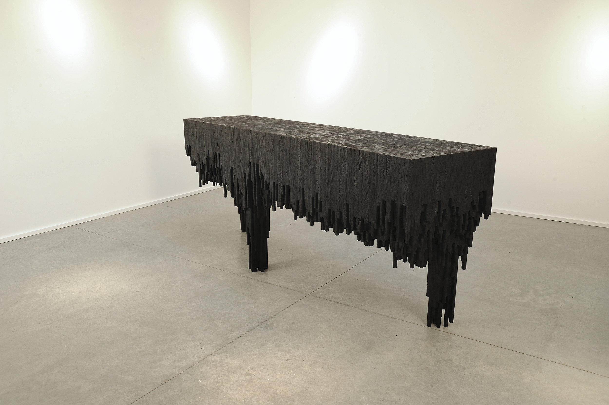
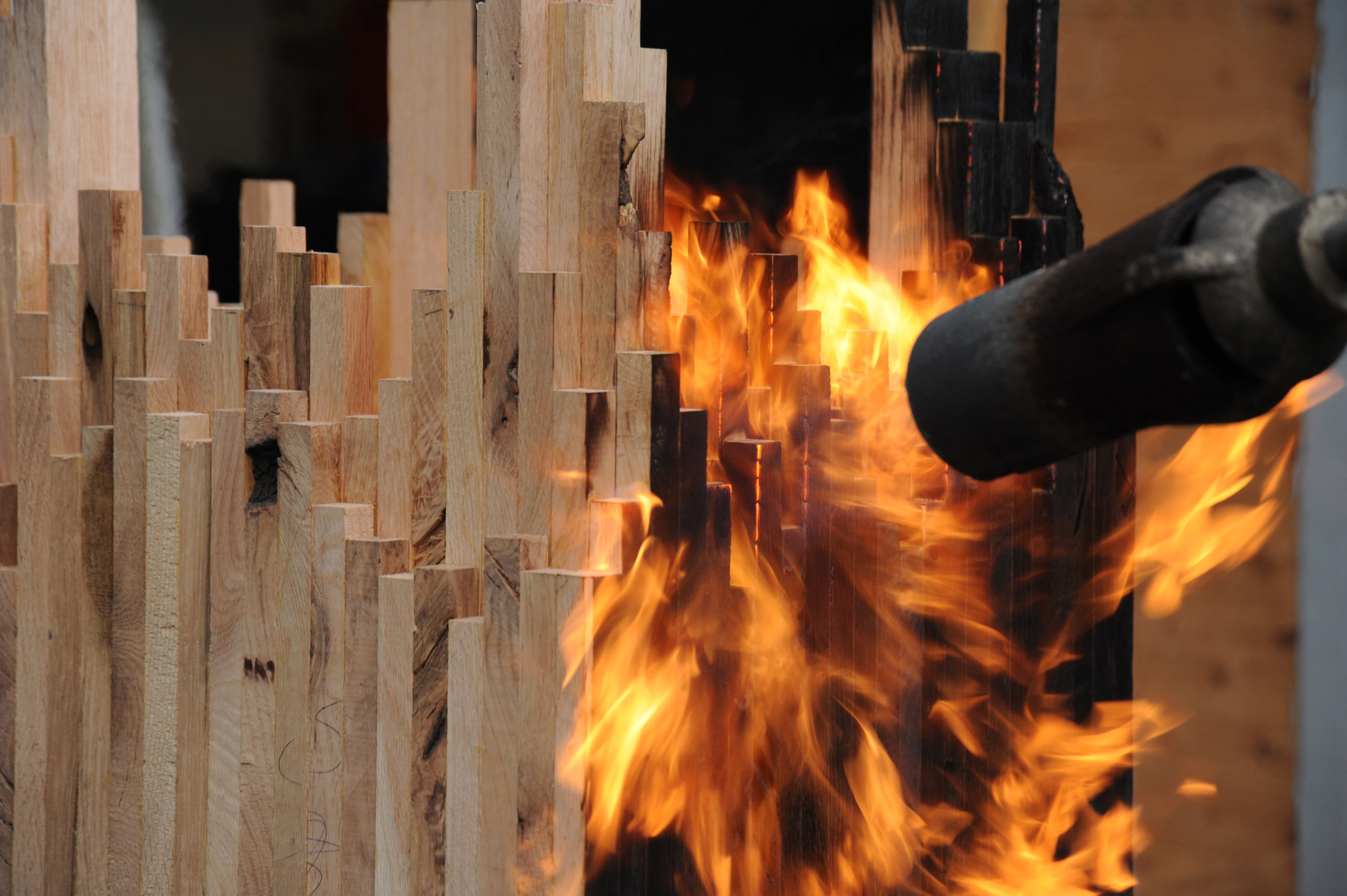
Meyer’s latest series—its cynosure a console table—is inspired by The Black Tusk, a stratovolcano and a pinnacle of rock at 2,319 meters (7,608 feet) above sea level near Whistler, British Columbia. “After a month of dynamics between Jess and me, we ended up with the Black Tusk console,” Meyer says. Individual solid sticks of oak wood were laminated to create different shapes, giving each a sculptural character. The assembled piece was then charred by flames, wire-brushed, and coated with oil. “It struck a nerve with people—and with me, because, again, there are the two elements I en- joy, a balance between art and then the design and craft.”
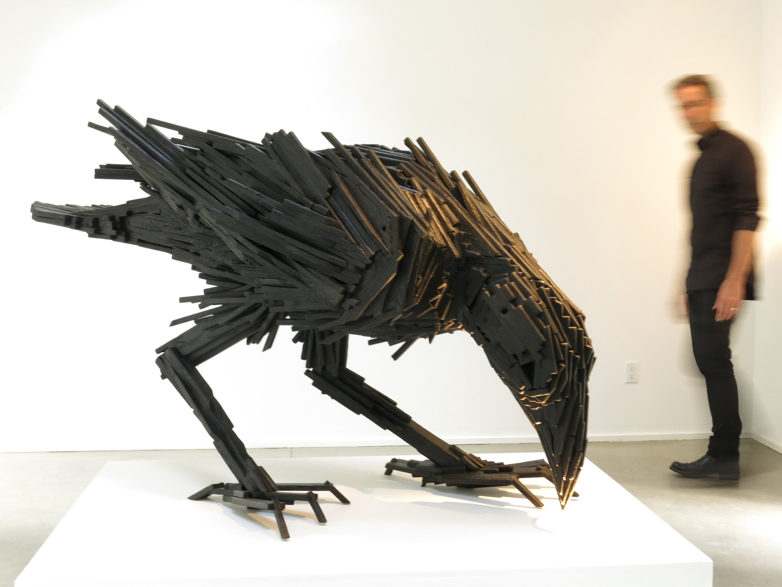
The Black Tusk console in turn inspired a collaboration with local graphic designer and artist Lee Roberts, who, after he saw the sculptural table at a photo shoot, sent Meyer a sketch of a raven, made from wooden sticks like the Black Tusk series. “I was inspired and challenged to take this technique I’ve applied to the Tusk and take that to another level to make this raven,” Meyer says. The resulting bird sculpture is titled “Sense of Silence.” △
Window to South Tyrol
An artist and sculptor returns home to South Tyrol to converts an old farmhouse
Artist and sculptor Othmar Prenner converts an old farmhouse in the mountains of his native South Tyrol and realizes his vision of an alpine dream home—between craftsman tradition and modern art.
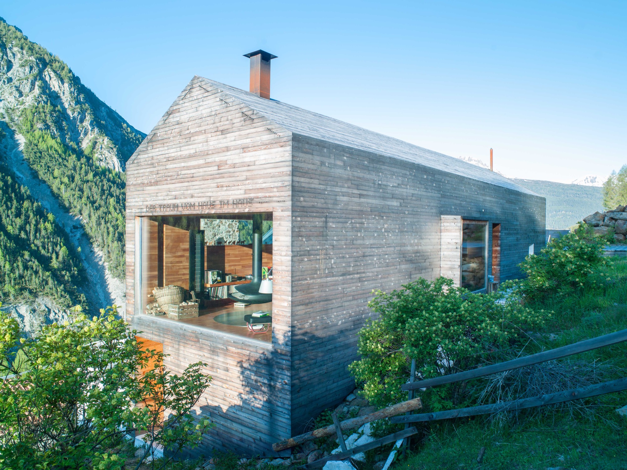
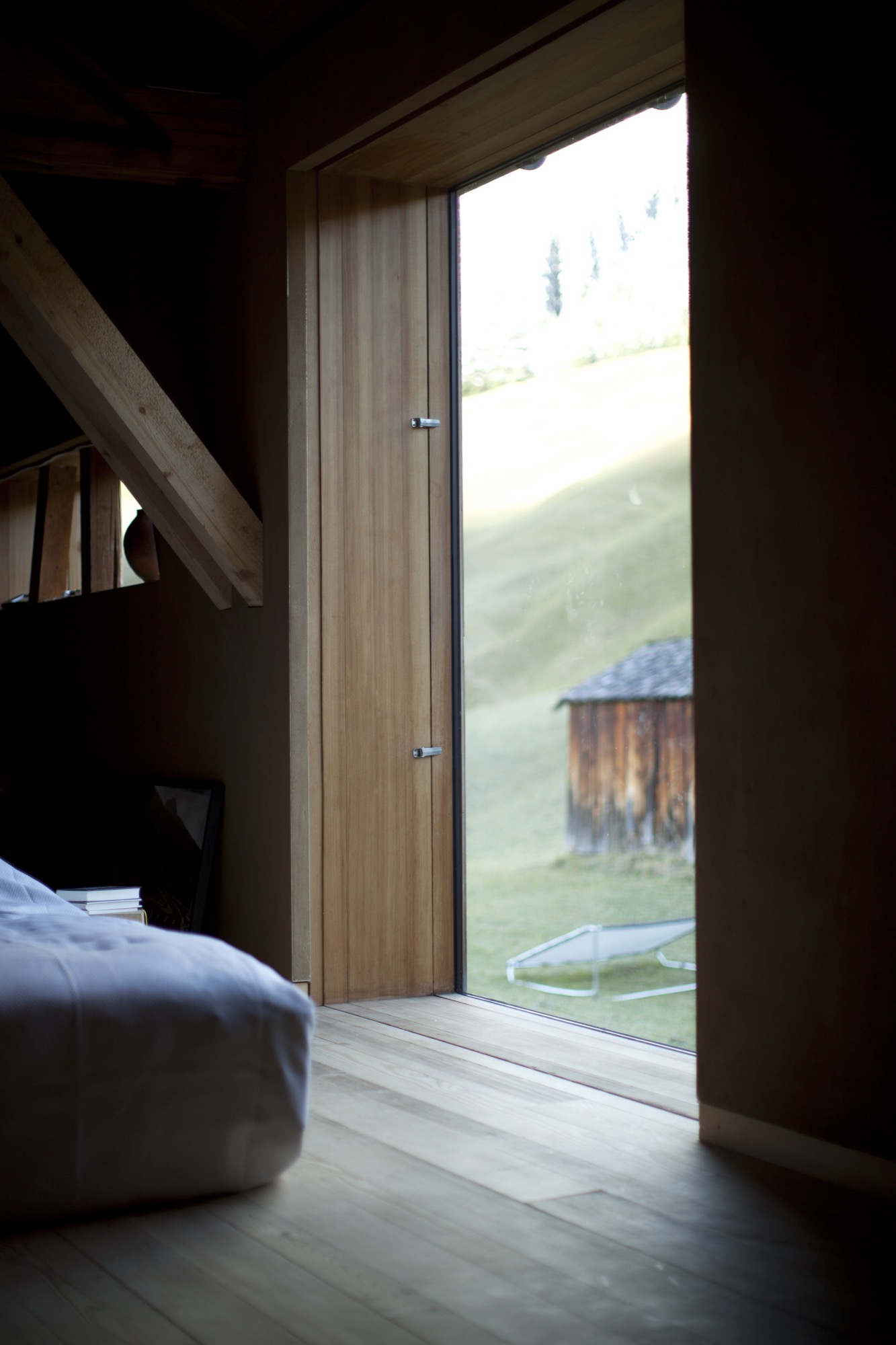
Othmar Prenner lounges by the spectacular panorama window, looking out into the pristine nature of South Tyrol. Modern fiberglass lines allow him to work up here, straight across from the massive, snow-capped peaks of Italy’s Vinschgau.
Technology and nature don’t contradict one another, if you ask the artist and sculptor. On the contrary. The Internet enables him to be in nature while developing new art projects and designing furniture and objects made of wood.
It is here, in his native South Tyrol, that Prenner found his way back to his craft and rediscovered the joy of creating something new with his own hands.
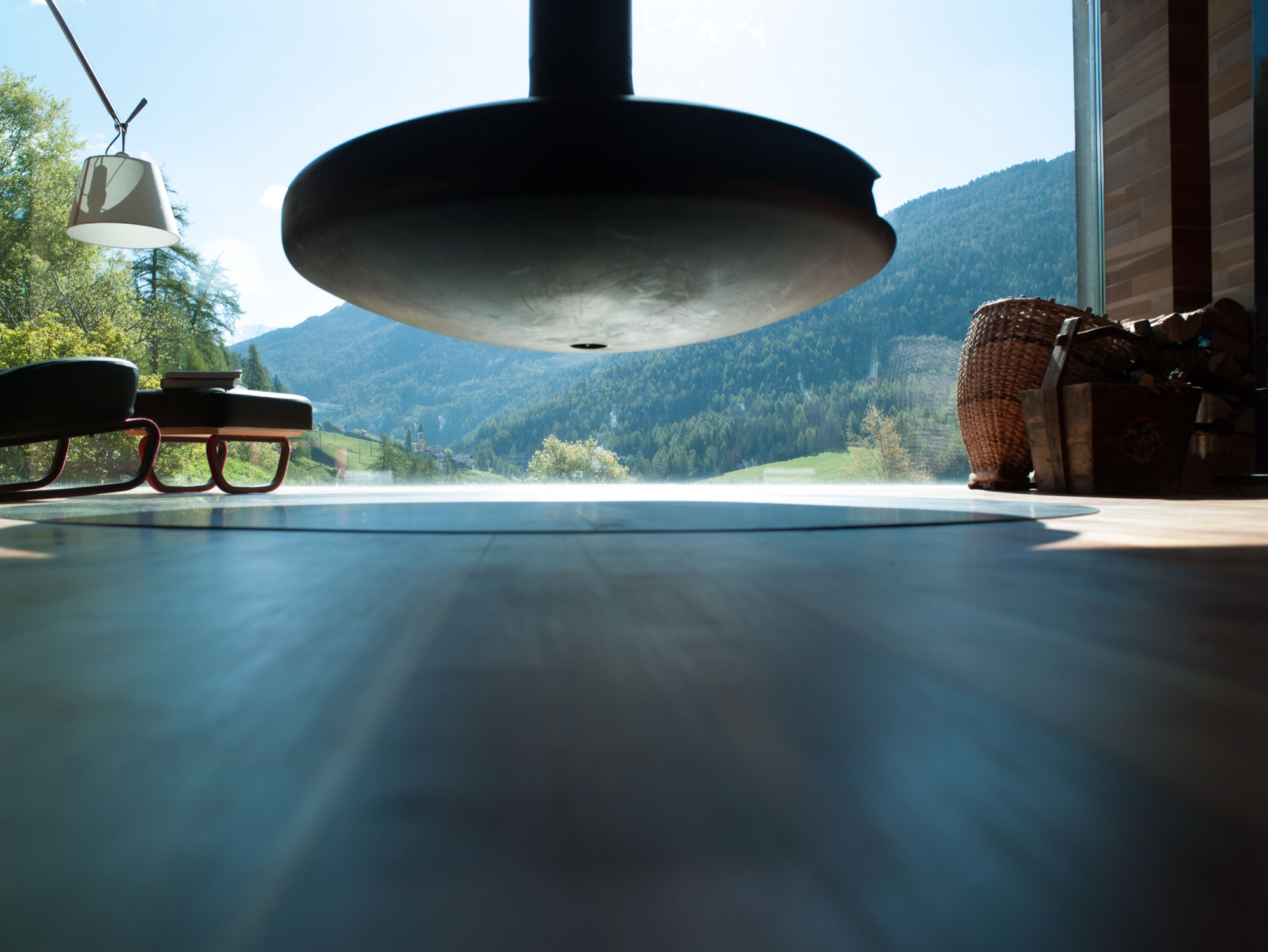
Every corner of his remodeled farmhouse, completed in 2011 and internationally published more than twenty times, is filled with tools, paintings, finished and unfinished pieces of furniture, and all sorts of arts and crafts. The home is vivid, and it’s cozy in front of the black steel fireplace—a focal point—suspended from the ceiling. Othmar Prenner loves the open flames, the feeling of sitting by a campfire in his living room. He dismisses ovens with glass doors and generally has his own and very clear ideas about architecture and interior design.
He helped build an atelier and gallery near Zurich, Switzerland. “I only do things I like 100 percent,” Prenner says. “That’s why I’m not interested in collaborating on big projects, where you have to make 1000 compromises.”
This was far from the case with his very personal project, the mountain retreat at home in South Tyrol. Here, the almost fifty year old was able to realize his design vision one to one and create a refuge that meanwhile has become his primary residence and studio. Rarely does he drive back to his apartment in Munich these days. “I never thought I would leave the city. I’ve lived there for twenty-two years,” he says. “My focus is here now. I love living in nature and don’t need the city.”
“My focus is here now. I love living in nature and don’t need the city.”
Art in the city, craft in the country
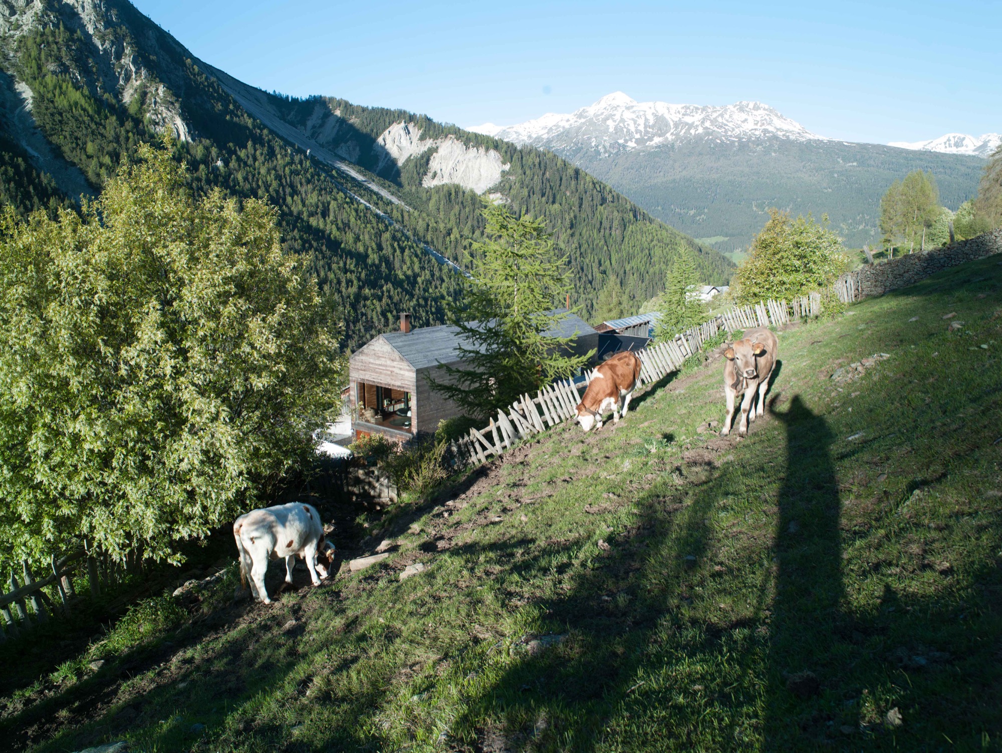
Prenner bought the old house in his native region near Mals twenty-five years ago. The property is part of a small hamlet that is still being farmed in a steep valley on the Reschen Pass near where Prenner grew up. In his stube, which is nontraditionally located on the second floor and combines the kitchen and dining room, he tells me he spent many childhood hours carving wood and that he has always wanted to become a sculptor since he was a young boy. His parents had little understanding for his artistic ambitions but agreed to a cabinetmaker apprenticeship. Prenner strived for more and afterward studied in Innsbruck and later in Munich. Today, his calling has become his profession, a mix of sculpture and designing furniture and objects for the home. “During my Munich years, it was definitely the arts, now I’m balancing both,” says Prenner, who recently returned from Salone Internazionale del Mobile, the furniture show in Milan where he introduced the lathed containers and boxes he sells under the brand Like a Box. The response to the boxes made from Swiss pine, the turned salt and pepper mills, and the forged knifes was incredibly positive, he reports. Even Vitra showed interest. Traditional craftsmanship is back in demand, and Milan showed it.
The dream of paradise
In his own alpine domicile, Prenner takes his love for wood to the extreme. The large window reflecting the mountain peaks pops out against the buildings homogenous, light exterior. The words “Der Traum vom Paradies” (the dream of paradise) are stamped into the minimalist fine wood facade. In the back of the small house, the roof was cut open to add a floor for the new living room. The house’s exterior as well as the interior of the grand stube are almost entirely clad in wood. A total of 250 square meters (2692 square feet) of finest parquet were installed. The larch wood came from the valley here and was specially cut so the pattern of annual rings would run ever so calmly and evenly. The wood was processed by Prenner’s brother, who still owned a carpentry shop at the time and was capable of delivering on Prenner’s discerning specifications: “Many craftsmen merely do custom Ikea nowadays, craft and industry become more and more intermingled. Unfortunately, the sense of artisanship gets lost.”
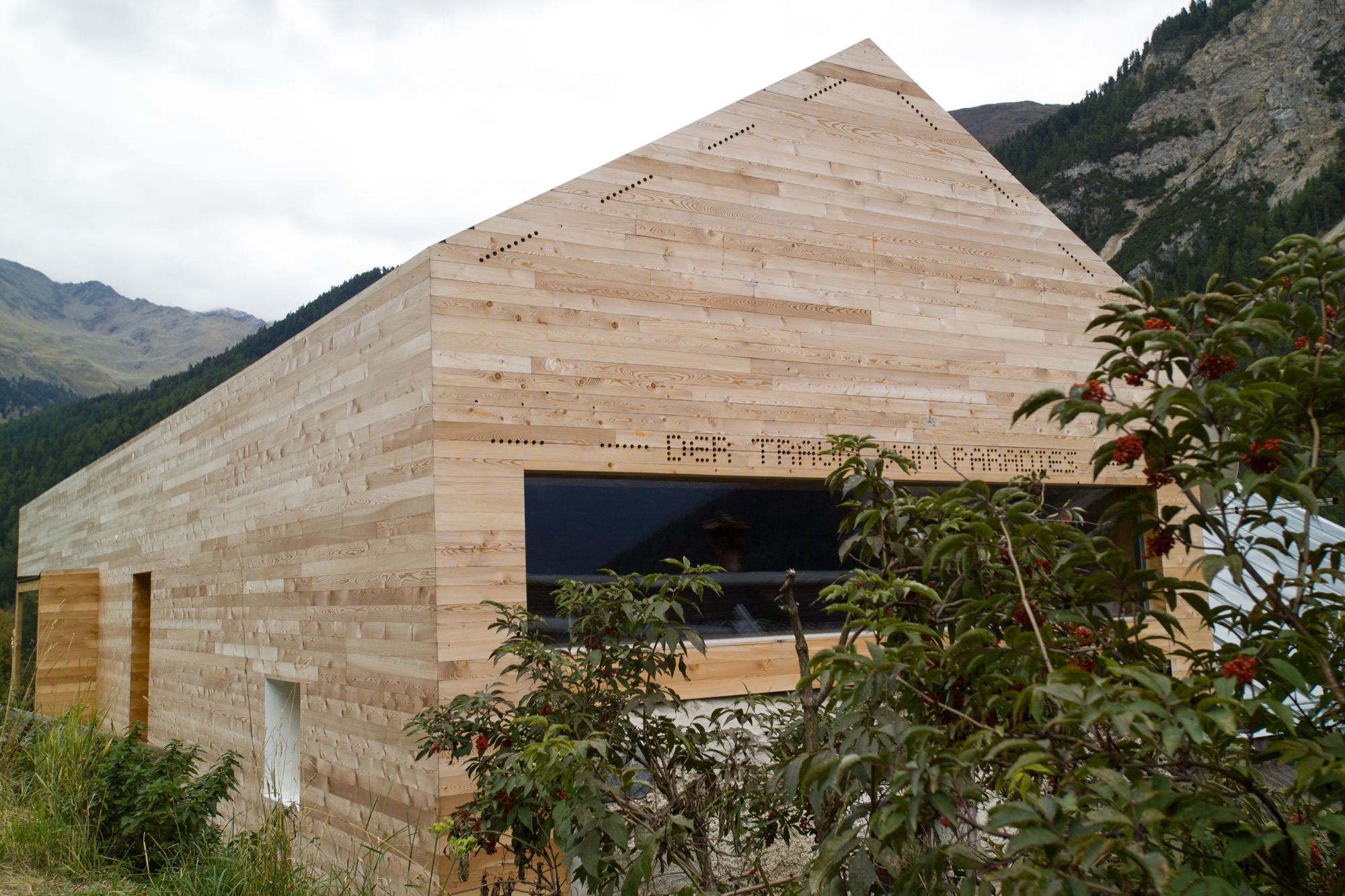
Wood as the central element was an obvious choice for Prenner. Many other details developed over the course of the building process, he tells. “It’s like working on a sculpture. Many people want to plan everything in advance and then execute one to one. That’s why I don’t like collaborating on other architecture projects.” Prenner likes to be inspired as his work unfolds. The entryway, for example, was so dark you could hardly find the doorknob. So Prenner, without hesitation, tore open the ceiling to create light, which now floods the hallway from the stube and living room above. The white marble floor brightens up the foyer still more. The stone was quarried 30 kilometers (ca. 19 miles) from here, in Laas, and counts among the hardest and whitest marble stones. “It should be self-evident to use materials from the region, and not stone from India,” Prenner notes. “There’s a new aspiration. People want to know where things come from, where materials are sourced. Things of permanence provide comfort in uncertain times.”
“There’s a new aspiration. People want to know where things come from, where materials are sourced. Things of permanence provide comfort in uncertain times.”
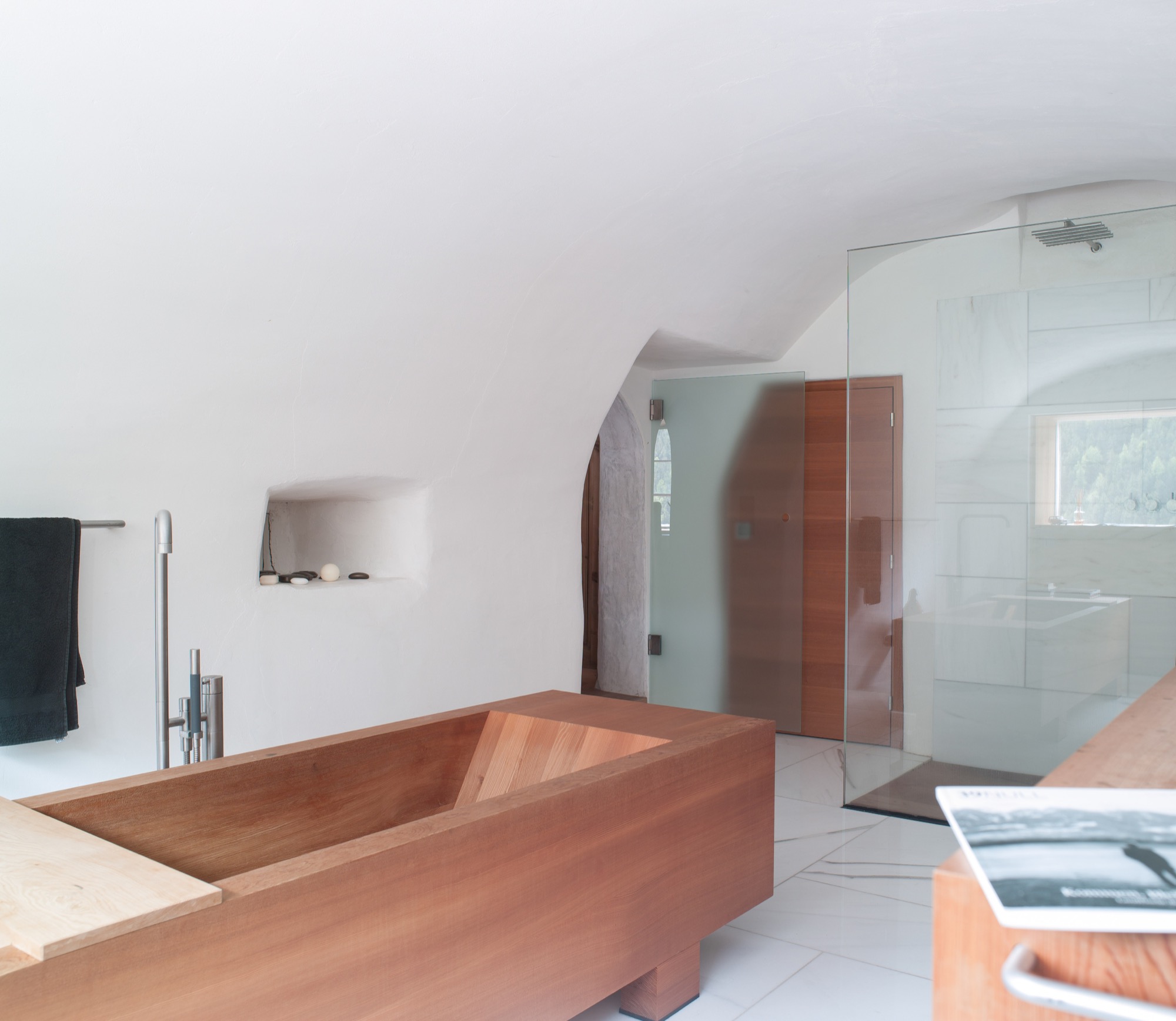
The former stube, where the original, 200-year-old wood paneling has been completely preserved, was converted to the master bedroom. After all, the house’s central theme is the view to the outside—and the ground floor affords prime views. Thus, the classic arrangement of stube downstairs and bedroom upstairs was simply flipped on its head. The master bedroom’s ensuite bathroom marvelously harmonizes the white marble and the larch wood. The freestanding wooden bathtub is the focal point.
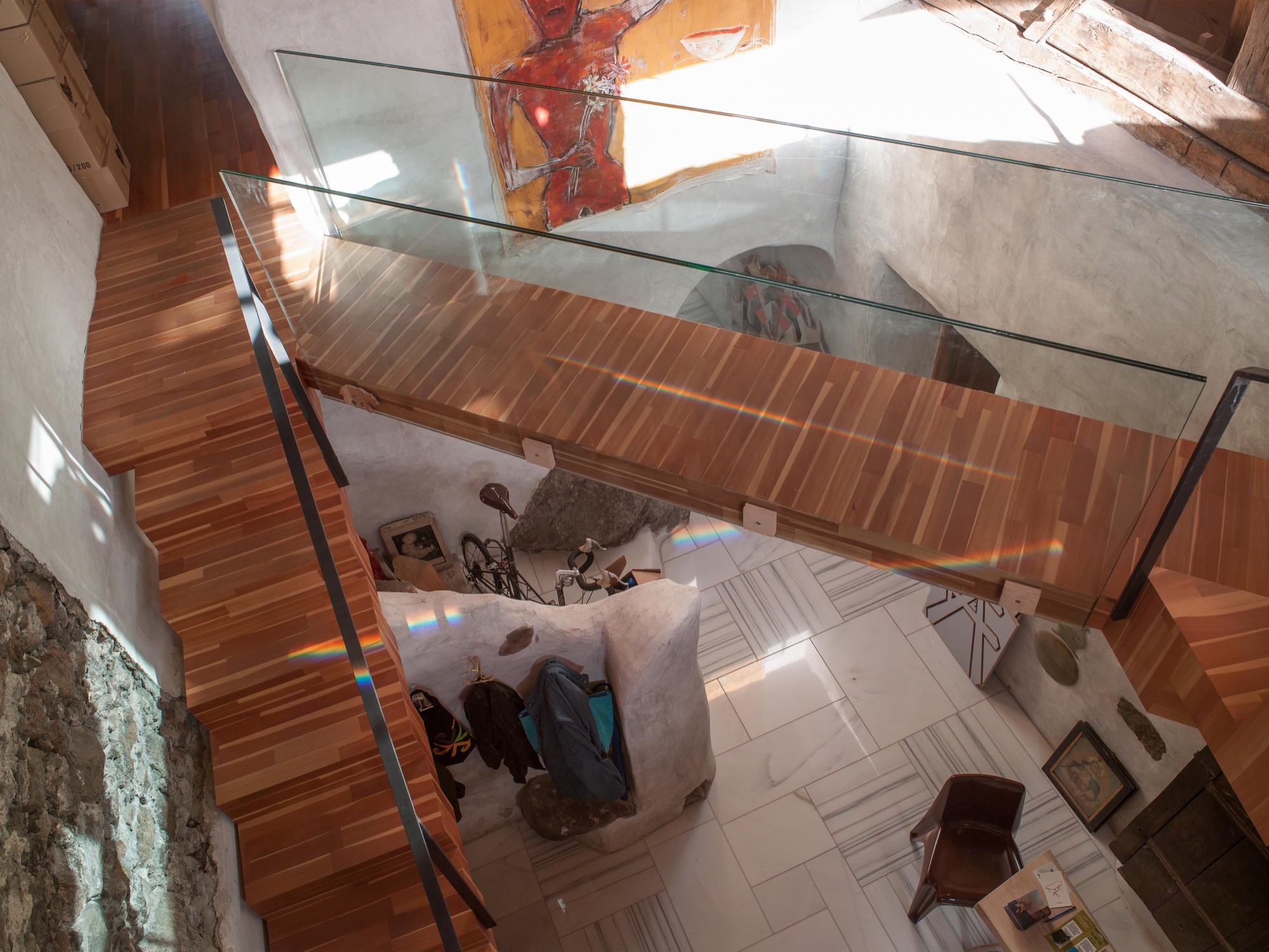
Prenner preserved the old stone staircase—or its remnants—as decorative element and a nod to the old structure of the farmhouse. The modern, floating wooden stairs and the bridge—or wooden walkway—to the living room on the second floor create the contrast. “During construction, a wood plank led across there, and I found the open crossing over the hallway interesting,” Prenner reveals.
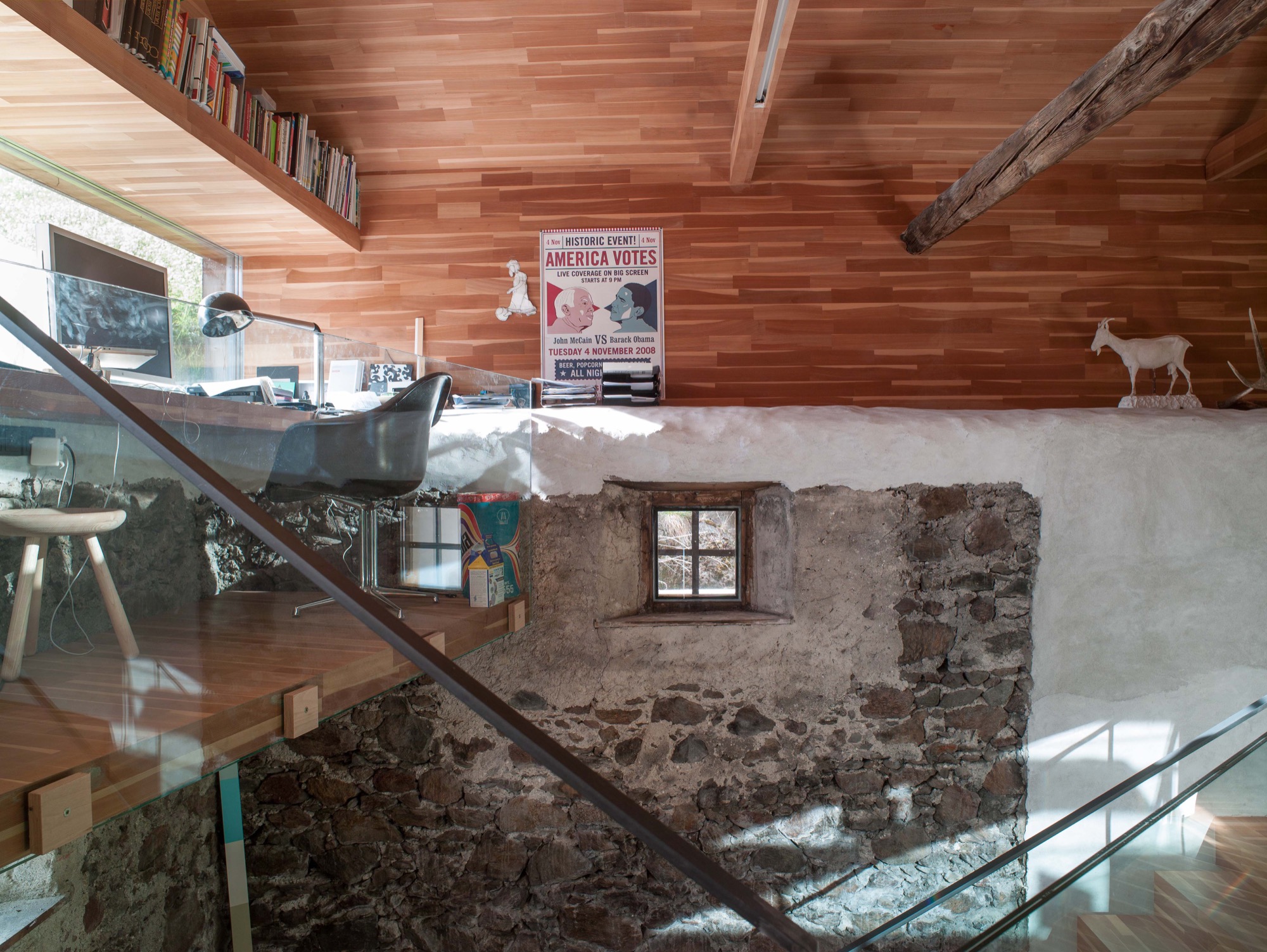
The old roof joists were preserved and support the pitch of the roof, where the living room is. Five steps lead to a narrow loft Prenner installed along the gable wall with a long panorama window, again providing spectacular views to the outside. From his desk, the artist can see the cows grazing on the lush meadow.
And the light. Prenner often missed the light when he was in Munich, particularly during the long, gray winters, he remembers. Blue skies and the special light only snow can create—here, in his house in South Tyrol, he integrates it, plays with it, lives with it.
Work and art live together
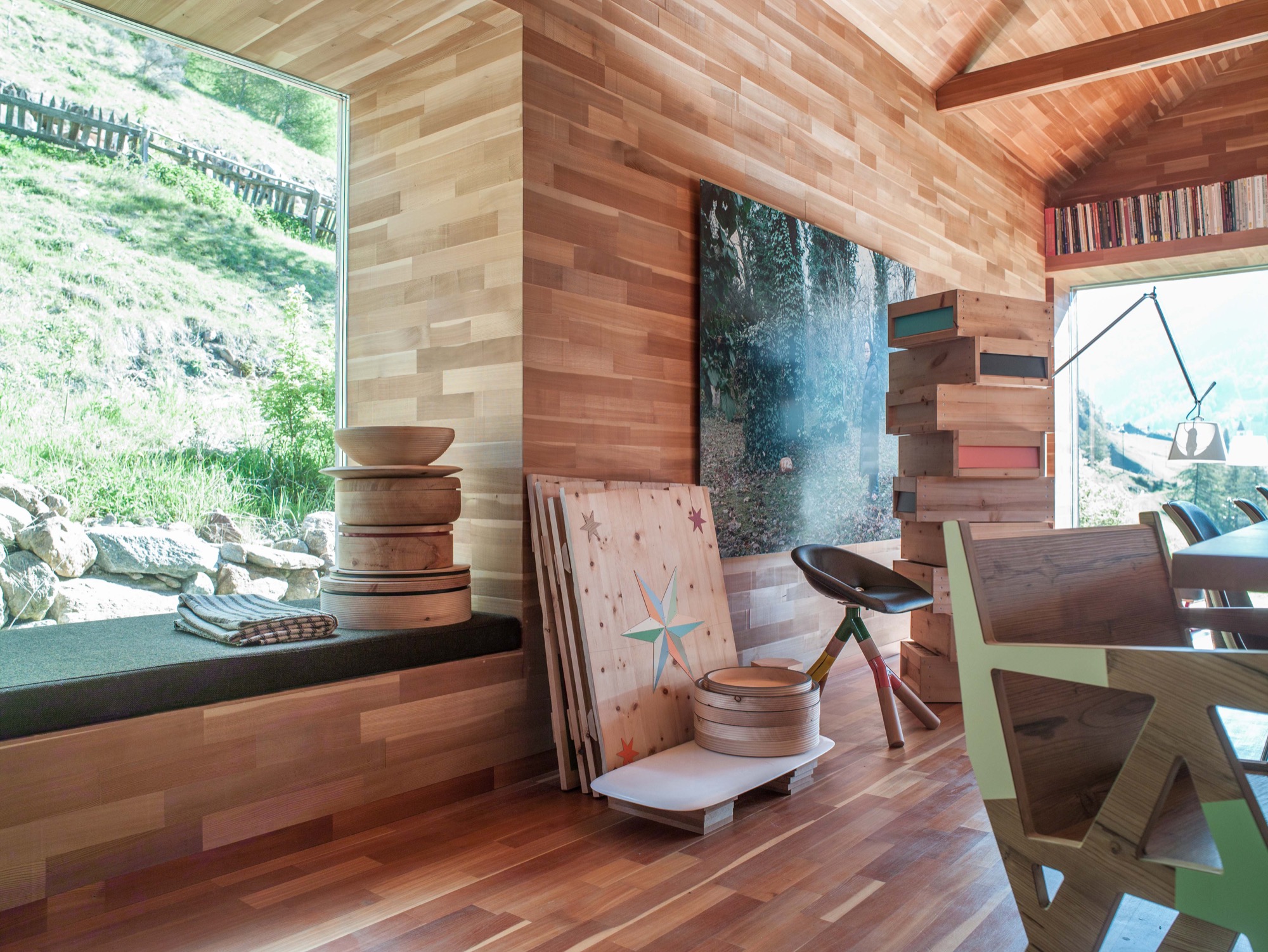
Paintings and other art objects are piled up in the living room. “This is intentional,” Prenner says. “I wanted work and art to mix. I cannot separate them anyway.” Still, he is currently building an atelier on the premises. Before, when he lived in the city, he primarily created prototypes. But now, he likes to be more hands-on in the production, together with his partner, Ingrid Seebacher. The wood for each container, which is blackened in the fire, comes from a particular tree Prenner photographed beforehand and numbered the wood sections. The photo of the marked spot from where the wood was cut is sold together with the respective object—one of the artist’s many ingenious ideas. You can discover them all over the house. Art objects made from wood waste. Leftovers from a series of chairs you assemble yourself from four pieces of wood, and which Prenner became known for. These clever chairs don’t require glue or screws. In Prenner’s home, they are part of a group of miss-matched chairs around the large dining table and around the cozy stube. “In the old days, there was no ugly furniture because it was all made from solid wood,” Prenner contemplates. “But a lot is happening now. People are sick of cheap stuff made in China.” Prenner regards sustainable and organic as standard, which shouldn’t need to be pitched on a label. Sitting by the fire, he talk about the region here around Mals, soon to be the largest community in South Tyrol that is completely pesticide free. He tells about a baker who has re-sown old spelt ears from the eighteenth century and is now selling spelt bread. Stories like this are fitting for the stube and the beautiful, pristine landscape. Looking out the window and at the mountains, I can appreciate that one man's dream of paradise has come true here. △
“In the old days, there was no ugly furniture because it was all made from solid wood.”
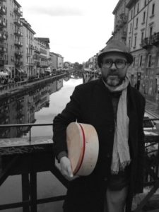 Othmar Prenner was born in 1966 in Schlanders, South Tyrol, Italy. After an apprenticeship in carpentry, he studied sculpture at the HTL Innsbruck, Austria, and later at the Akademie der Bildenden Künste in Munich, Germany. The website Dinge und Ursachen lists Prenner’s many projects and exhibitions. You can purchase his Swiss pine boxes and containers from the online shop Like a Box.
The Tree-Hugging Woodworker
A portrait of California furniture-maker Sean Woolsey
Sean Woolsey loves trees. He celebrates the perfect imperfection of the trees' inner beauty by making wood furniture by hand in California.

Woolsey, now in his early thirties, has always made things. From sewing clothes to building skateboard ramps to baking bread. In 2010, he began making furniture, out of curiosity more than anything else. He deconstructed old furniture to learn how things are made. The first real piece of furniture he built himself was a writing desk for his then-girlfriend. She liked the gift, evidently. She married him.
Woolsey’s work and life is strongly influenced by the Japanese philosophy of wabi-sabi, which recognizes the beauty of imperfection as imprint of time. To the wood artist, wabi-sabi is embodied in the naturalness of the uneven, asymetrical touches to remind us of our own and the trees' perfect imperfections. In contrast to mass-producing furniture, which can take away these imperfections, Woolsey chooses to show the truth and rawness of wood, worked by hand.

The California native, who admits to obsessing over the quality of every piece that leaves his atelier, has always been captivated by the beauty of nature’s artistry and gains inspiration from the grandeur of a mature tree and the elegance contained in its wood. In his work, he has stayed true to the same simple ideal over the years: He designs and makes things he wants in his own home. And today, that's the place the entrepreneur shares with his wife, Sara, in Costa Mesa, California.
We caught up with the designer, furniture-maker, and fine artist only a short time after the birth of his daughter, Ondine, to talk about what home means to him, what traditions make his his modern products timeless, what inspires his designs, and more.
A conversation with Sean Woolsey

Who are you, in a nutshell?
A husband, father, artist, woodworker, tinkerer, artist, businessman, creative, friend, surfer, ping pong enthusiast, amateur knife-maker, bread-maker, pizza-creator, dreamer, risk-taker, traveler, tree-lover, ever curious human.

How did you grow curious about designing and making furniture?
It started very naturally and slowly. I was burnt out on making clothing and running my own clothing line. I was drawn to creating things with my own hands and to being more connected with what I was making, instead of just designing it and having someone else make it. I have a real obsession with creating, whether it be a pizza oven in my yard, furniture, a knife, or my own house.
"I have a real obsession with creating, whether it be a pizza oven in my yard, furniture, a knife, or my own house."

What inspires your designs?
So many things and people, but mostly the inspiration is rooted in making furniture that I would like in my own house and like to own for years, not just what is on trend. Much of the inspiration comes from the act of designing and tinkering around. Designs evolve, ideas feed other ideas, and things move with movement.
"Designs evolve, ideas feed other ideas, and things move with movement."

Your modern products appear rooted in tradition. What timeless merit drives your practice?
Functionality, with an utter respect and appreciation of materials and craft.
Is there a continuous theme to your designs?
I don't think so. I think, the only theme is making the best quality products that we can. The theme of materials and design is always changing and progressing.
How do you choose and source your materials?
The wood we use is predominantly American hardwood, such as walnut, white oak, or maple. We purchase most of it locally and occasionally purchase directly from mills, usually on the East Coast. We feel honored to work with wood, and we love trees. We plant a tree for every piece of wood furniture we sell, in honor of the customer, in partnership with the Arbor Day Foundation. It is our way of giving back to nature what it has loaned to us. We also work with steel, brass, glass, leather, et cetera. And we are always looking for new and fun ways to incorporate mixed materials and creating a story with the materials. We are fortunate to have many other talented crafts people locally, who help us with these other materials.
"We feel honored to work with wood, and we love trees."

What makes you a modernist?
The way of thinking about clean, good design that is functional, beautiful, and accessible — and designing to that.
What does quiet design mean to you?
Quiet design to me means designing slowly and enjoying the process. I often enjoy the process more than the end result, as many artists would.
"Quiet design to me means designing slowly and enjoying the process."

Talk about the immensely beautiful fine art pieces in your Copper Series and their synergy with your furniture-making.
The art is a release for me. It always has been. It is the complete opposite of furniture-making, which is very accurate, wrong or right, and precise. The artwork on copper is fluid, free-flowing, expressive, and experimental. Mistakes often make it better or more interesting. The Copper Series was inspired by the ocean, and its meaning to me. The series is ongoing and ever-evolving but always the same size and always inspired by the ocean, whether it be the color, movements, or captivating calm or power it holds.

Describe your dream home...
A home that is comfortable, in a beautiful location in the mountains or desert, with treasures that we have collected all over the world, and open to sharing meals with friends and family.
What does “home” mean to you?
A refuge where we can relax, recharge, make memories, share stories, laugh, cry, and feel good about it all.
What’s your favorite place in the world?
Oh, so many. I have been fortunate to travel a lot internationally. I am really drawn to Japan, and their culture and way of life. To me, Japan is simple, humble in its design yet meticulously thought out, timeless in its approach to craft. And the Japanese are the most focused people I have ever met. The mixture of it all is super intoxicating and inspiring.
What’s most important to you in life?
God. My family. Friends. Creative pursuits. Having fun.

Who is your design icon?
There are so many. The short list is Wharton Esherick, Dieter Rams, Robert Rauscheberg, Lloyd Kahn, Sunray Kelly, Jay Nelson, and Jean Prouve.
Who inspires you to be the person you are?
My wife and my friends largely inspire me to be who I am. As iron sharpens iron, they are constantly encouraging me, whether they know it or not.
What is your life philosophy?
This quote by Mark Twain sums up a lot of my life approach: "Twenty years from now you will be more disappointed by the things that you didn’t do than by the ones you did do. So throw off the bowlines. Sail away from the safe harbor. Catch the trade winds in your sails. Explore. Dream. Discover."
What are you working on these days?
We are constantly working on new designs; right now, some chairs. I am also working on some copper art, as well as a new art series that is going to be really fun. Also, we just had a beautiful baby girl three weeks ago, so... working on that right now (laughs). △
More of Sean Woolsey's work...
Sense of Place: Designed for legacy in Aspen
Mountain homes in Aspen, Colorado, are built to stay in the family for generations
Aspen is steeped in tradition. Generation after generation, families vacation at the posh resort to ski in winter and to celebrate the town's famous festivals in summer. Slope-side chalets and opulent second homes alike are built for legacy, as venues for extended family to gather and carry on traditions, season to season. A continuity that translates into architecture and decors of great depth and layering.
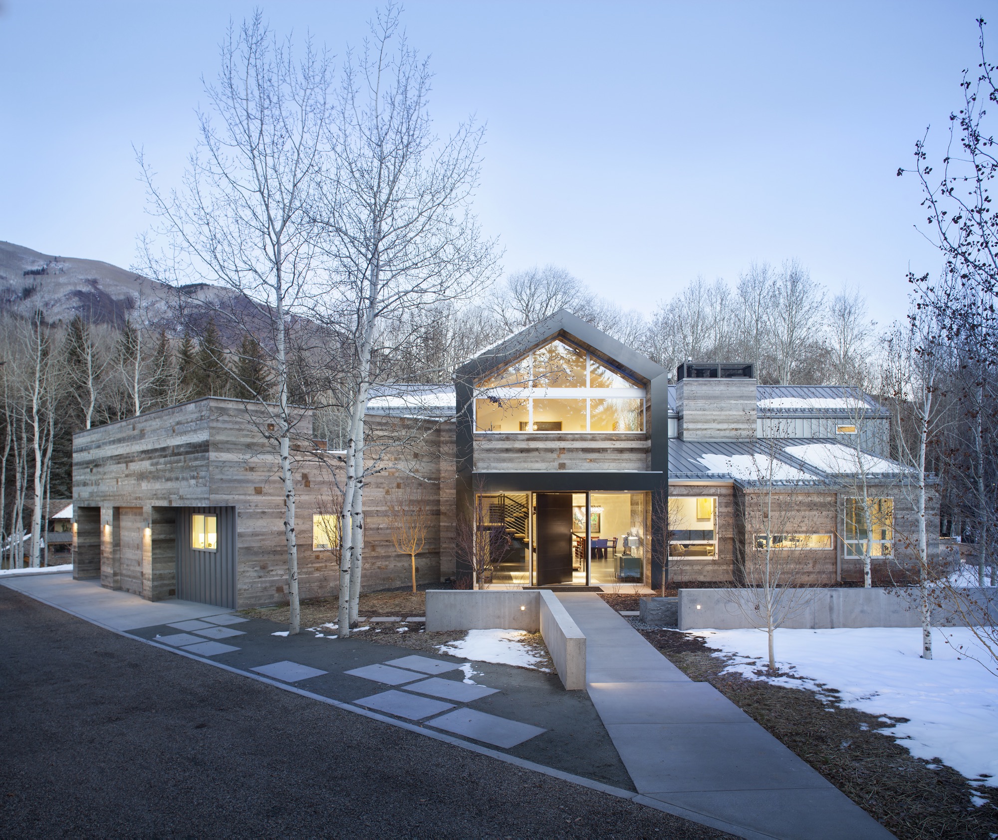
Nevertheless, even mountain folks for a fortnight must have functionality alongside style, beginning at the entry. “There is that sense of arrival at a mountain home,” says Sarah Broughton, co-owner of Rowland and Broughton (R+B), an architecture and interior design firm in Aspen and Denver. Aspen homes are planned with the understanding that one comes in from the elements. “People need to be able to knock snow off their boots.”
"Aspen homes are planned with the understanding that one comes in from the elements."
Style without borders
Many of R+B’s clients have primary homes on the beach or in big cities, all over the world. “One thing that is important to them is that they really feel they are in Aspen,” says Broughton, a modernist at heart. To achieve this sense of place, she relies on natural materials such as wood, grasscloth, and natural stone — “things you see when you look out the window.” What’s more, treating woods in surprising ways, such as planking or wire-brushing, brings out something special in a natural material.
Broughton complements mountain settings and modern, clean lines with cashmeres and wools in the furniture and textiles. She loves to add ample pillows and throws on beds and couches. “Hemp, wool, and cashmere textures and patterns can speak to a natural environment without being literal,” the award-winning architect says. The beauty of sunlight falling through an aspen forest’s canopies, for instance, can translate into a pattern. Twinkling lights become reminiscent of a starry winter night in the Rocky Mountains.
“Hemp, wool, and cashmere textures and patterns can speak to a natural environment without being literal.”
Black Birch Modern
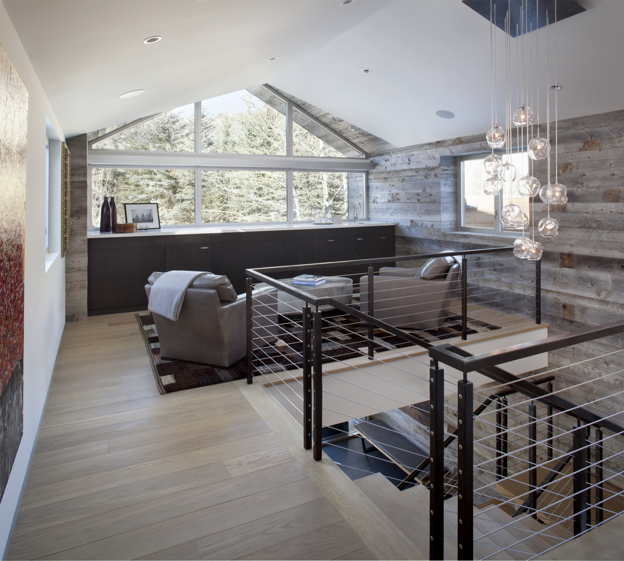
With its clean-lined, minimal design, Black Birch Modern in Aspen is an example of a mountain retreat that not only boasts stunning alpine-modern architecture, but is warm and welcoming to boot. R+B achieved this balancing act by bringing outdoor materials inside. That, Broughton believes, is something anyone can do at home. “Carrying a material found around the outside of the house into the flooring, for example, is an effective way to blur that indoor-outdoor line, which is such a quintessential element of Aspen style.”
Bringing Aspen home
Give your home a touch of Aspen flair and make room for your own legacy. Create spaces where friends and family can gather to share food, drinks, and stories, while they sink deeper and deeper into your cashmere pillows and pull up their feet under a wool blanket.
Art from an Aspen gallery adds a fine finishing touch. “Bringing in local talent is a nice way to tie it to the place and a great way to modernize a home,” Broughton says. “Make it feel collected and not staged,” are her parting words of style wisdom. “Modern design has a lot of depth and layering to it. It’s not a one-hit wonder.” △
“Make it feel collected and not staged. Modern design has a lot of depth and layering to it. It’s not a one-hit wonder.”
