Inspirations
Explore the elevated life in the mountains. This content debuted in 2015 with Alpine Modern’s printed quarterly magazine project.
Minimalist Pottery in the Kyoto Mountains
An intimate visit with husband-and-wife pottery artists Momoko and Tetsuya Otani at their home and studio in Japan
The Shinkansen bullet train from Tokyo to Kyoto departs not one minute late, travels almost 200 miles an hour, passes Mount Fuji on the way, and pulls into Kyoto’s vaulting modern station not one minute early. From there it’s 40 kilometers by car to Shigaraki, an industrial mountain town, where I’ve come to visit a ceramic artist whose work has transfixed me on Instagram for the past ten months.
Shigaraki is home to one of Japan’s “six old kilns.” The most admired pottery here—tea bowls and sake cups made from local iron-rich clay—is often misshapen and haphazardly glazed. Much is left to the felicitous violence of earth and fire in wood-fueled kilns. These clay items, used in the exquisitely calibrated tea ceremony, are prized for their imperfections, reflecting the wabi-sabi philosophy in which earthiness, transience, roughness and decay reveal the essential nature of the world.
Such is Japan: hyper-curated, thrillingly modern, clockwork precise—then offering you a tea bowl that seems primeval.
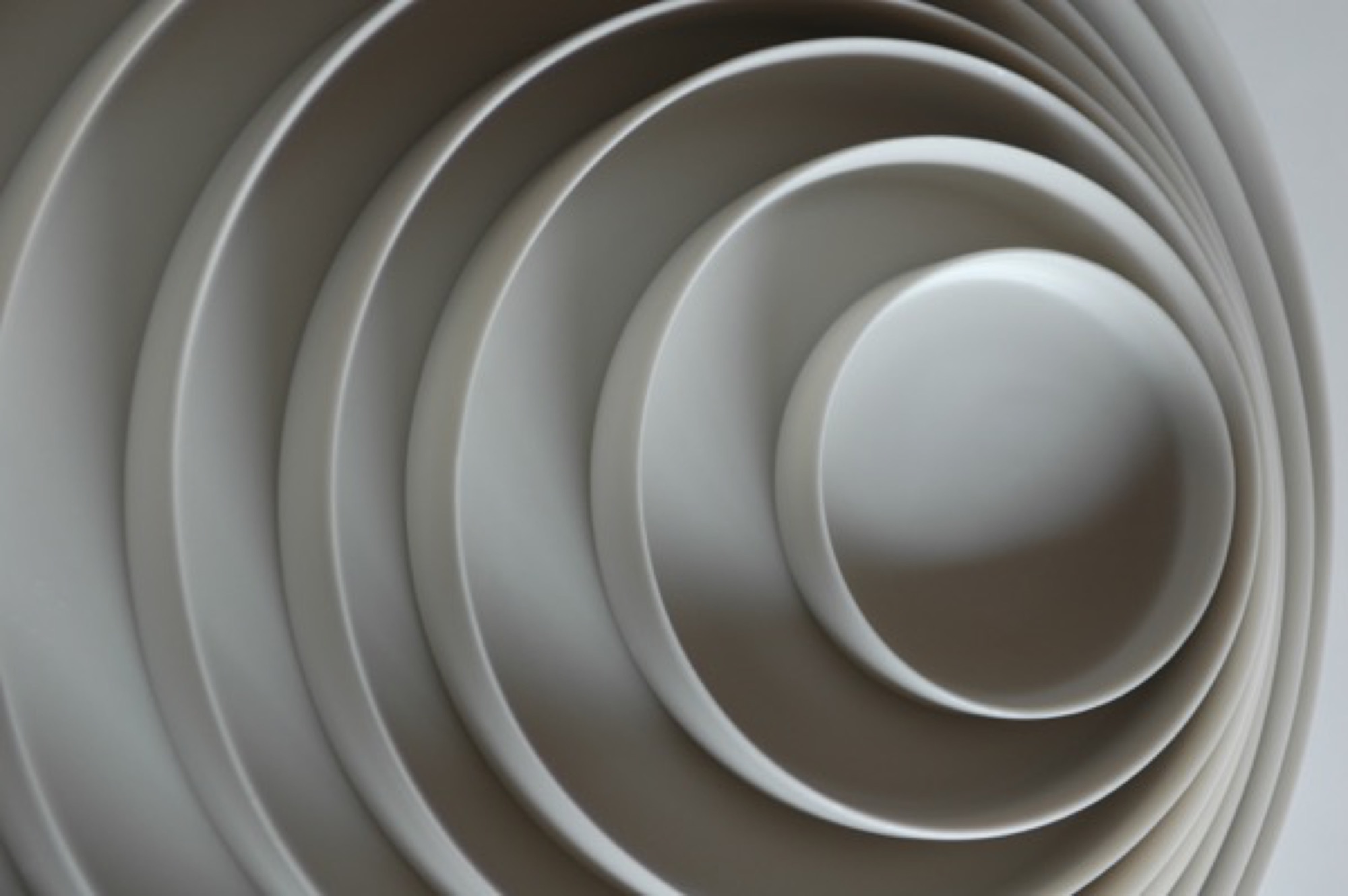
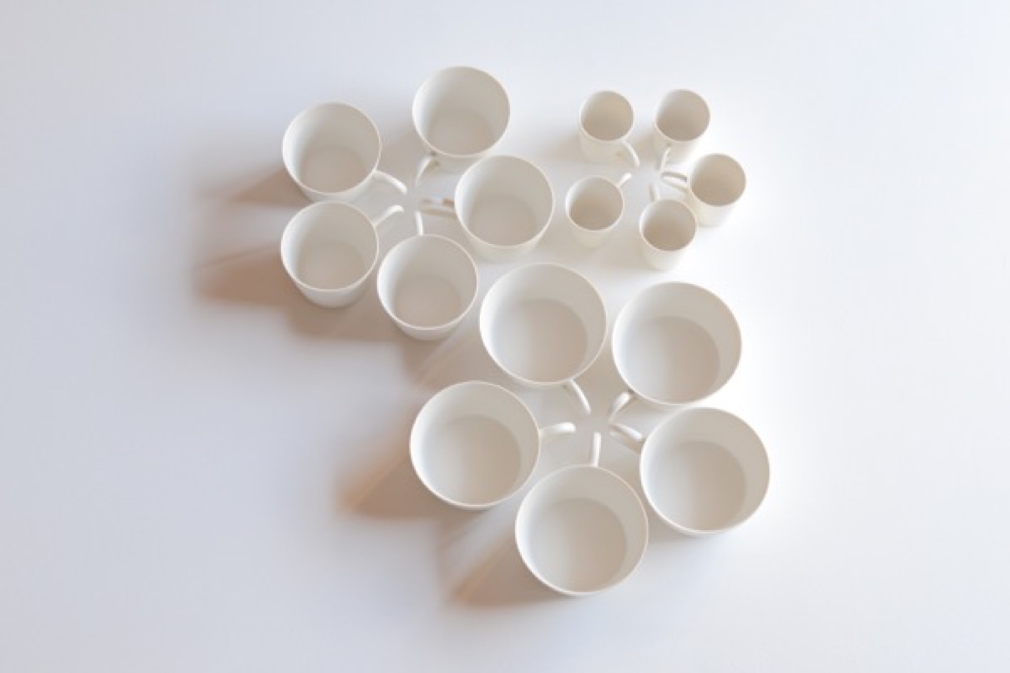
The ceramic artist I’ve come to see, however, is Tetsuya Otani, whose work departs so thoroughly from the Shigaraki style as to seem from another world. Otani’s hand-thrown porcelain chases the precision of machine manufacture. Its skin is smooth and naked, like that of a baby. I wanted to know why he was making such beautiful but plain stuff.
Right now, though, I have a few hours to kill, so I drive into the mountains to find the I.M. Pei-designed Miho Museum. The Miho is a kind of Japanese Getty, opened in 1997. It’s perched on a thick-forested mountain top like something a hermit might build if the hermit had several hundred million dollars. To reach it you walk through a hill via a gleaming, curving science-fiction-y pedestrian tunnel and emerge on a bridge that’s supported by a harp-string array of steel cables. The Miho was commissioned by an industrial-fortune heiress who also made time to found a sect in the 1970s, variously described as an art-centric religion and a sinister cult.
As traveler’s luck would have it, the museum is showing an astounding collection of ceramics by the 18th-century artist Ogata Kenzan, whose name means “northwest mountains.” His painted cups, bowls, and trays leave the viewer giddy, so varied and playful are they in style and form.
At home with Momoko and Tetsuya Otani
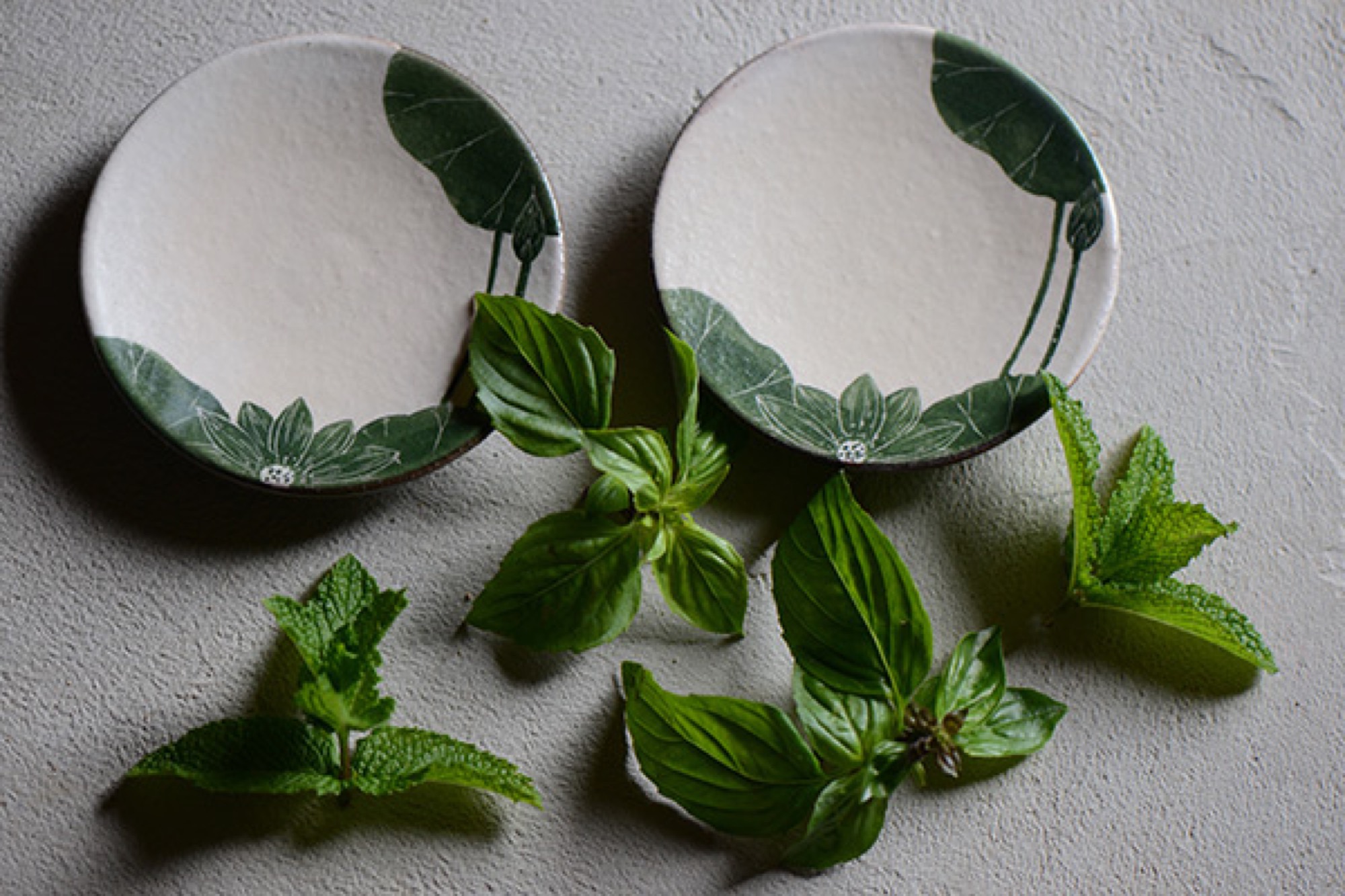
Five or so kilometers from the Miho is the home that Tetsuya Otani shares with his wife Momoko—also a gifted ceramic artist—and their three girls and a dog. It’s beautiful, with farmhouse mud walls and high wood beams that employ traditional temple joinery. Everything on the main floor revolves around the kitchen, which is far larger than usual in a Japanese house, reflecting the Otanis’ passion for communal cooking and eating with friends, many of whom also make pottery. The shelves, in the dining area and kitchen, are filled with both Tetsuya’s and Momoko’s pieces.
The work of Tetsuya Otani
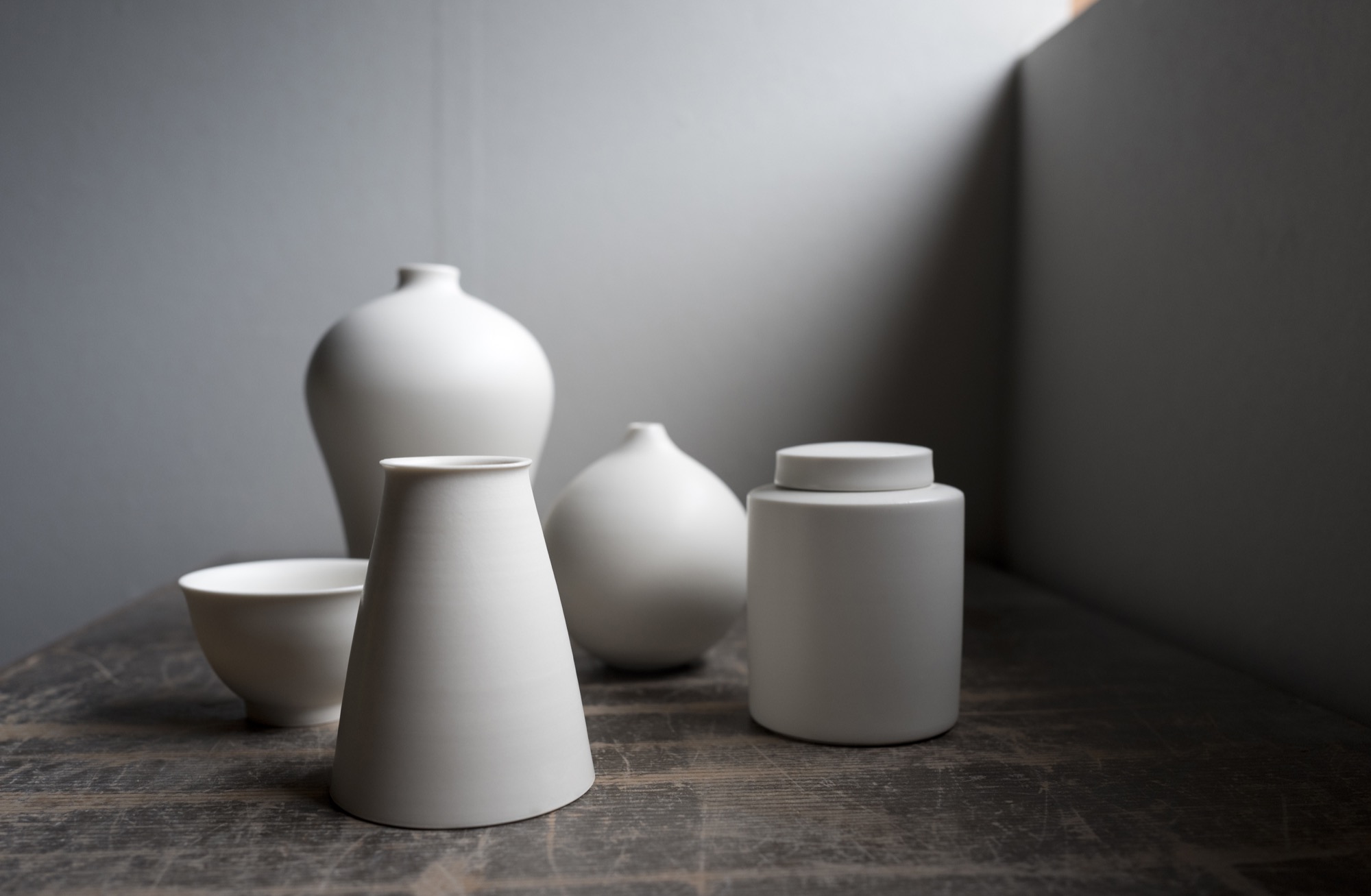
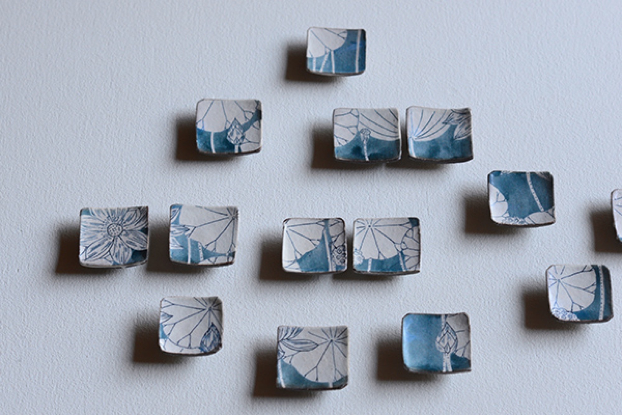
Lately attracting attention among collectors in Beijing, Shanghai, and Taiwan, Tetsuya shuns both wabi-sabi imperfection and Kenzan decorative exuberance. Everything he makes is to be used, mostly in the kitchen or at the table: tiny matcha urns with clinking lids, curved-belly flower vases, delicately spouted teapots, tiny soy dispensers, little round boxes. The pieces are finely lipped and polished to a supple smoothness; their creamy matte glaze begs to be caressed.
Tetsuya’s pottery has thrown off all temptation toward decoration. The potter’s goal, he says, is to remove as much information as possible from his ceramics, seeking pure functional forms, because “things that work give pleasure.”
"The potter’s goal, he says, is to remove as much information as possible from his ceramics, seeking pure functional forms, because 'things that work give pleasure.' ”
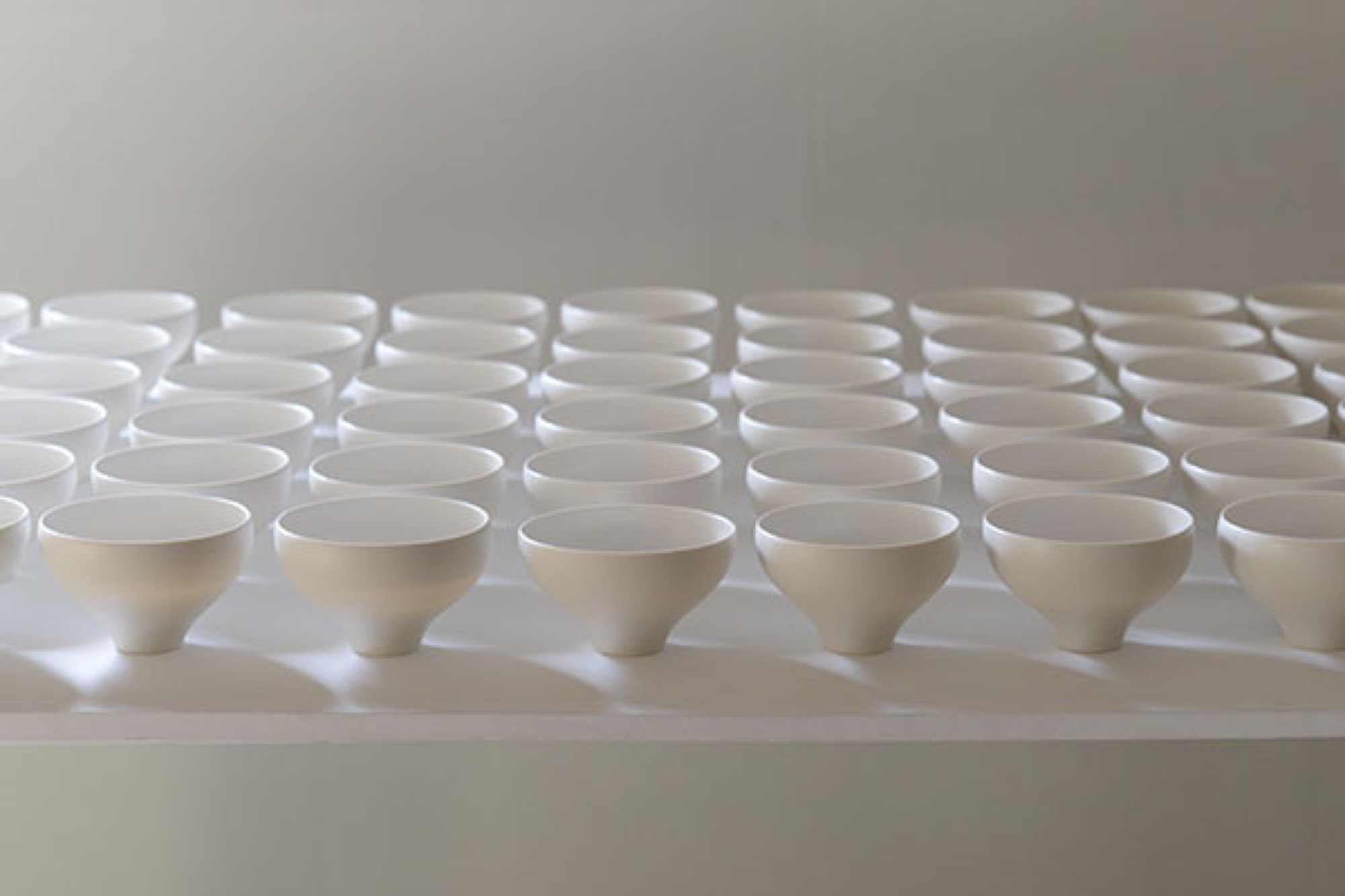
He studied in Kyoto, hoping to design cars, but when the economy skidded in the nineties, he shifted to graphics and ended up teaching product design (“how to make molds”) at the Ceramic Institute in Shigaraki, where he met Momoko and, on the side, learned throwing and glazing clay. By 2008, their house was built and he embarked on a ceramic career. He’s now in his late thirties.
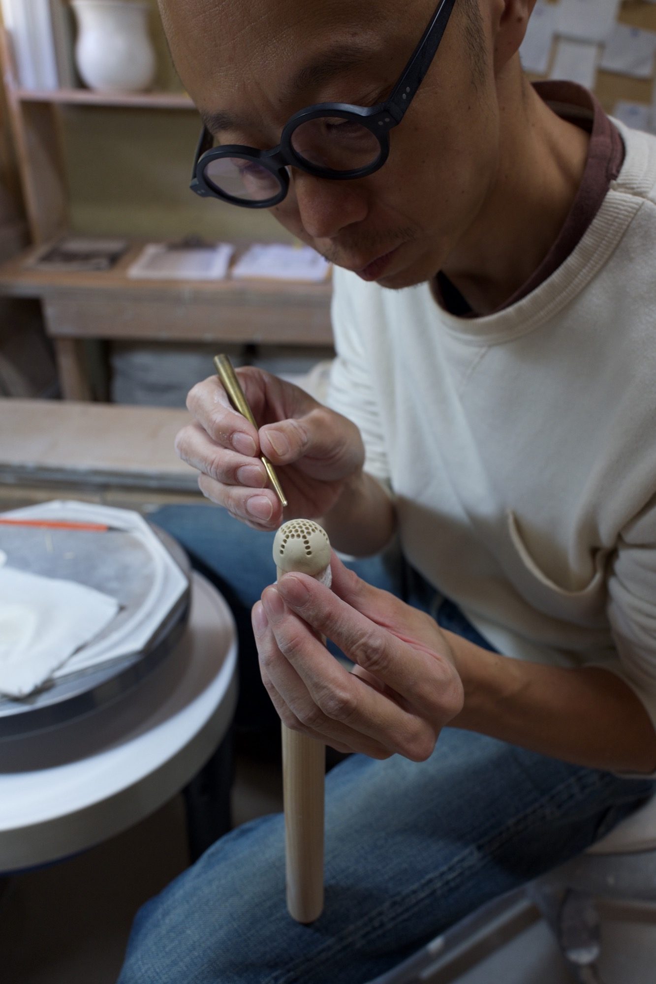
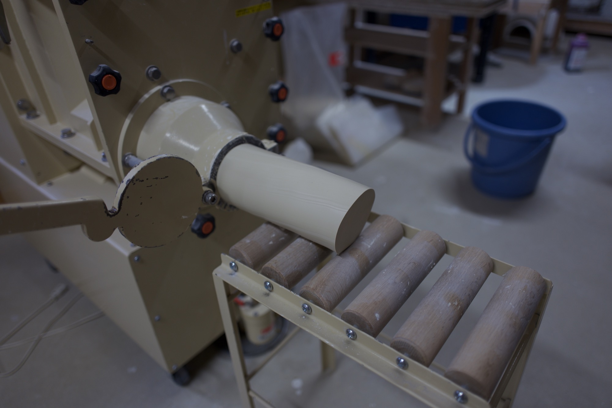
I watch him work in the studio, which has wheels for him and Momoko, as he forms and pokes a bit of clay that will become a tiny strainer inside a teapot. A few feet away, a large machine mixes clay while sucking air from it, then extrudes large, irresistibly smooth noodles of the stuff. The machine is close to the same color as the clay. Tetsuya grins and admits he had it custom-painted to obliterate the standard industrial green. A clue to his fastidious brain.
The pure cup and the pure bowl
Later, we sit at the long kitchen table and look at bowls and cups and teapots and plates and discuss this idea of removing information from one’s work.
“The pure cup,” Tetsuya says, through Momoko’s translating, “and the pure bowl: They can accept anything, become a vessel for anything. Cultural information is eliminated. And then the cup or bowl can be applied to any culture.”
“The pure cup and the pure bowl: They can accept anything, become a vessel for anything. Cultural information is eliminated. And then the cup or bowl can be applied to any culture.”
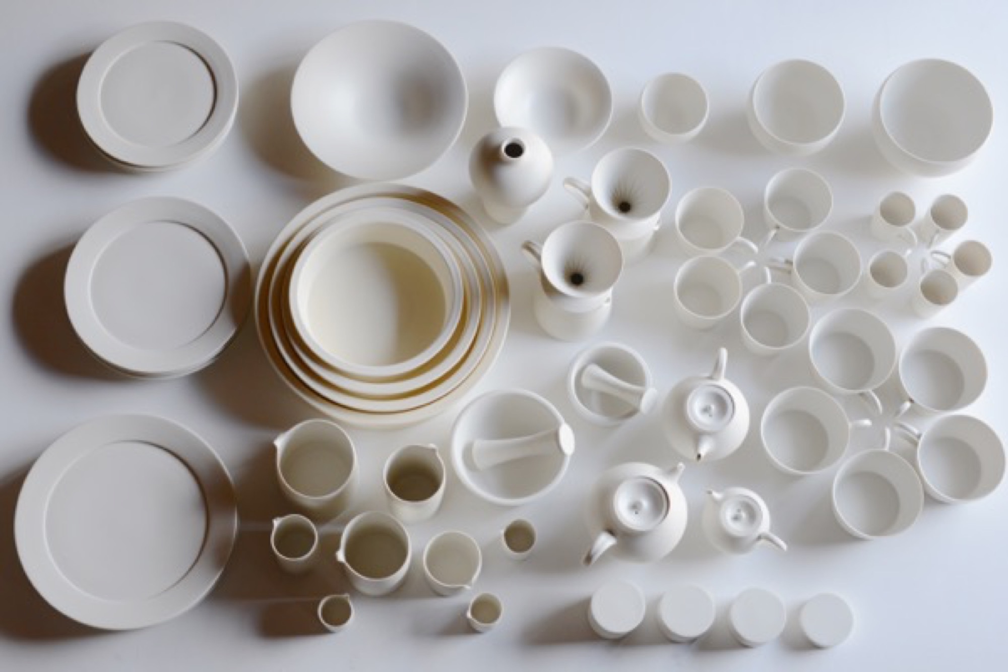
One may begin with the form of a traditional Japanese offering bowl. Decorative motifs are removed until it approaches neutrality. Eventually you “come down to the point where we can use it on our table, not for the gods’ offerings.”
Momoko adds: “Tetsuya strips the bowl of the divine.” He produces smooth dinner plates as blank canvasses for food—altars, really. They’re used in fancy Osaka and Kyoto restaurants to showcase chef art. His works are unsigned, unmarked.
“Tetsuya strips the bowl of the divine.”
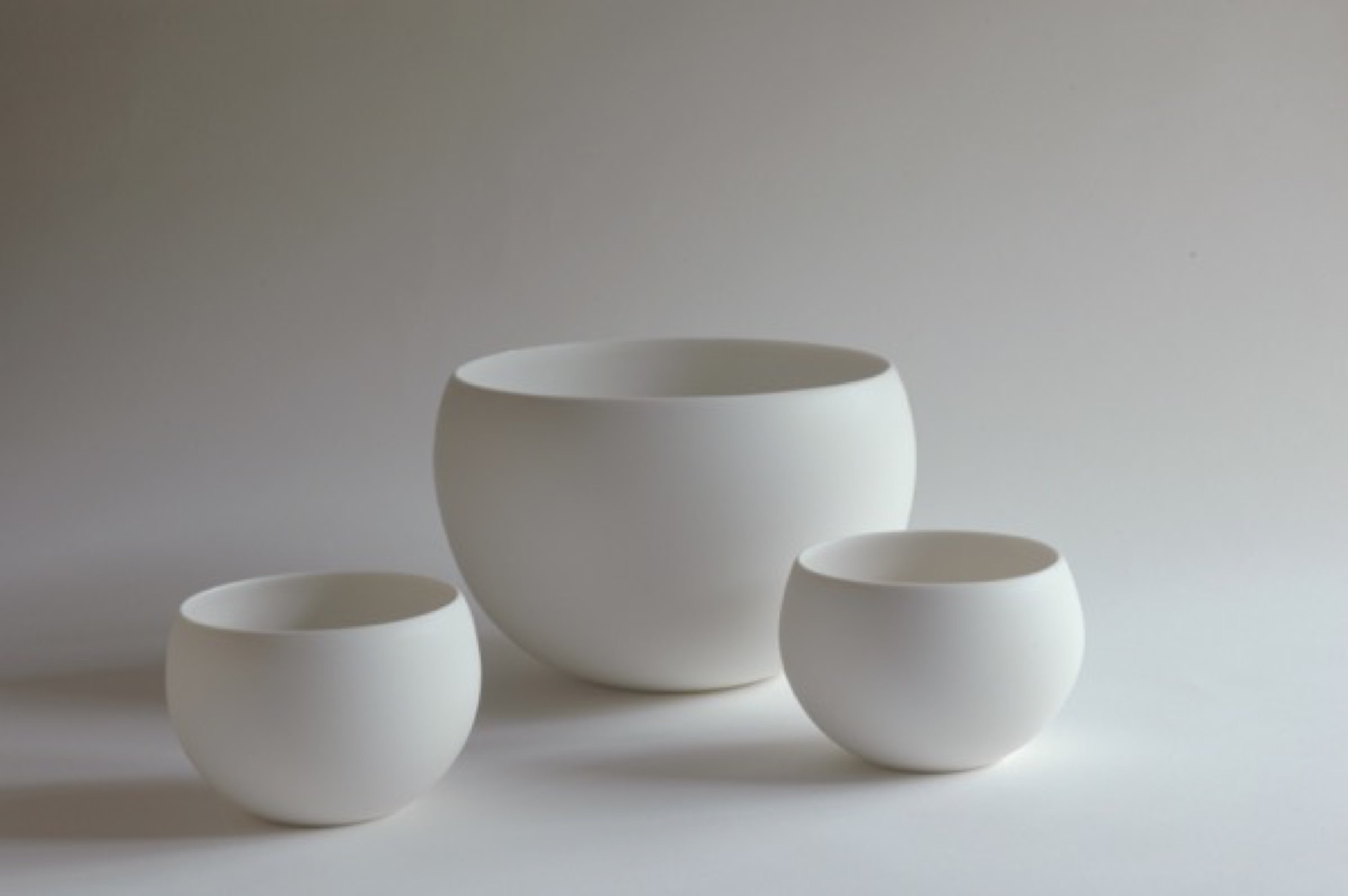
But cultural negation negates a specific culture, and Tetsuya says he has lately realized, when showing his works in China, that they are in some way indelibly, irreducibly Japanese. “I now feel that,” he says, “but I don’t have the answer yet about why I feel that way.”
The potter approaches, but never finds, ideal functionality. Tetsuya tweaks the ancient teacup form a wee bit from batch to batch, always seeking the right feel of cup in hand, the right curve of handle against thumb and finger. This lonely, incremental search for ideal form, endlessly repeated, is itself very Japanese.
The motivation is pleasure, however, not denial. Tetsuya and Momoko are exuberant foodies, and have found that their table-centric philosophy resonates globally through their gorgeous Instagram feeds, @otntty and @otnmmk, with more than 20,000 followers between the two for their pictures of utensils and food.
Tetsuya is also funny. He calls the clay mixing machine Mr. Hiroshira, “my only employee.” What about the beautiful industrial kiln in the next room, I ask? “No,” he says, “I work for it.”
Return to Kyoto
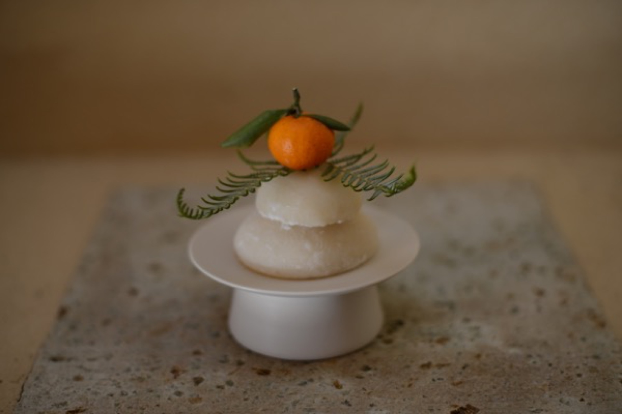
A few nights later, in Kyoto, my wife and I visit a little chocolatier and bakery called Assemblages Kakimoto, near the Imperial Palace. In the minimalist showroom up front I buy a box of orange biscuits enrobed in dark chocolate, each biscuit not much bigger than a postage stamp. Beyond the front space is a narrow, pretty room with a half-dozen seats or so against a counter, facing a tiny kitchen. We order chocolates and cakes and glasses of thirty-year-old palo cortado sherry. Two women to our right—the only other customers in the café—have come for the chef’s omakase dinner. With each course they look gobsmacked, enraptured by the treats placed in front of them. It’s beautiful food, for that is the Kyoto style. Each composition sits on the pale canvass of an Otani plate.
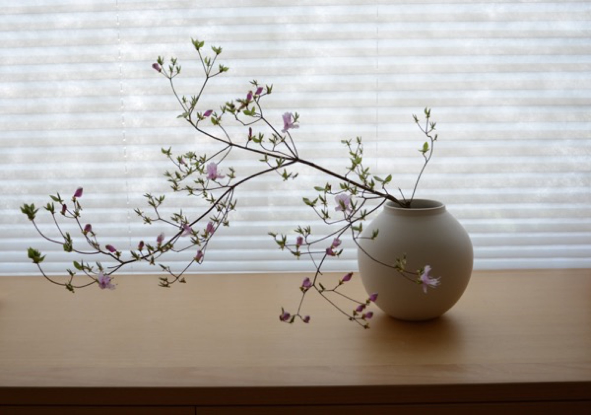
The entanglement of much fuss and no fuss that lies at the heart of many things Japanese is hard to describe, but when I palm one of the Otani pieces that we brought back from Japan, it seems to embody that contradiction. My favorite is a little round vase, the size of a tennis ball, whose satin smooth sides curve up to a sharp-lipped hole that’s big enough to accommodate the stem of a single bud. In weight and delicacy and touch and every other aspect the vase seems, to me, as close to perfect as it can get. It holds a lot of information about Japan. △
Minimalist Metamorphosis: Cowshed turns cultural center
A local hotelier turns his family's old barn into a beautiful center of cultural life — the Allmeinde — in Lech, Austria
Most people must choose to live amongst urban intellect or natural beauty. Gerold Schneider and Katia Polletin, founders of Allmeinde Commongrounds cultural center, are proof that you can be surrounded by both.

Schneider grew up in the tiny Austrian mountain village of Lech, also known as the cradle of Alpine skiing. His parents owned and operated Almhof, one of the ski town’s top five-star hotels, and his childhood revolved around skiing and helping with the family business. Like many small town kids, Schneider fled the mountains for the city and moved to Vienna to study art, architecture, and philosophy. “A lot of people from rural areas move to cities and get a taste of art, music, design, food, and they never return,” he says. But the sudden death of his father and illness of his older brother drew Schneider—and his architect-wife Polletin—back home to help his mother, Hannelore, run the family hotel.
“A lot of people from rural areas move to cities and get a taste of art, music, design, food, and they never return.”
Old cowshed turns splendid cultural center
While Schneider never intended on becoming a hotelier, he did toy with the idea of one day doing something with the arts in Lech. As he and Polletin set about respectfully updating the hotel they also set their sights on a rustic, family-owned barn just up the road from the Almhof. The cosmopolitan couple’s plans to convert the old cowshed into a cultural center for exhibitions and artists in residence were met with small-town mentality suspicion. “There are many things I love about Lech, but locals have an aversion to change,” says Schneider. “They are stuck in the past.” Each winter, Lech attracts an international, discreet (compared to Courchevel or Aspen) jet set crowd that Schneider believed would welcome a dose of culture to complement the powder-dusted slopes and après-ski cocktails.
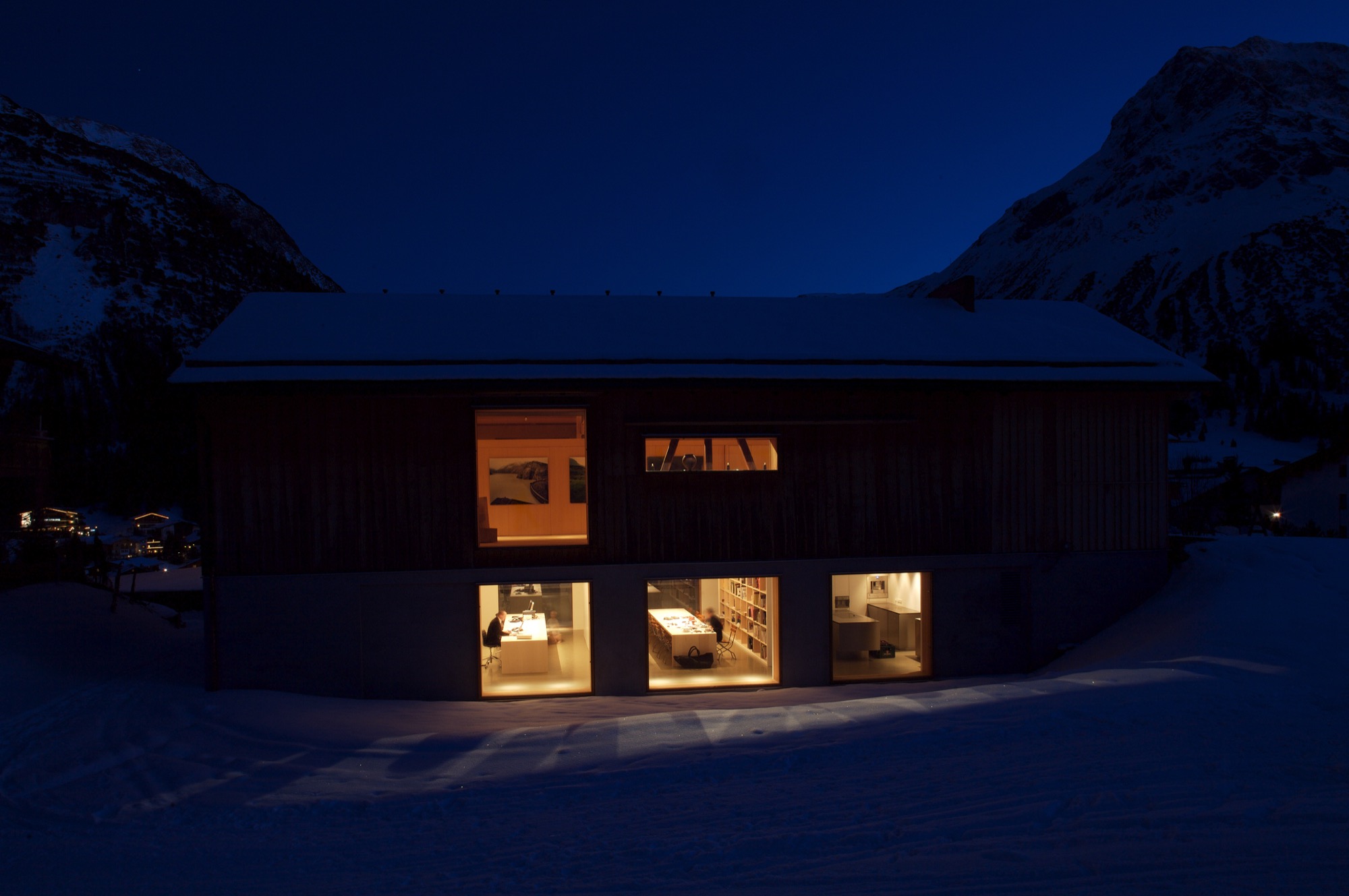
The barn—functional, minimalist Alpine design
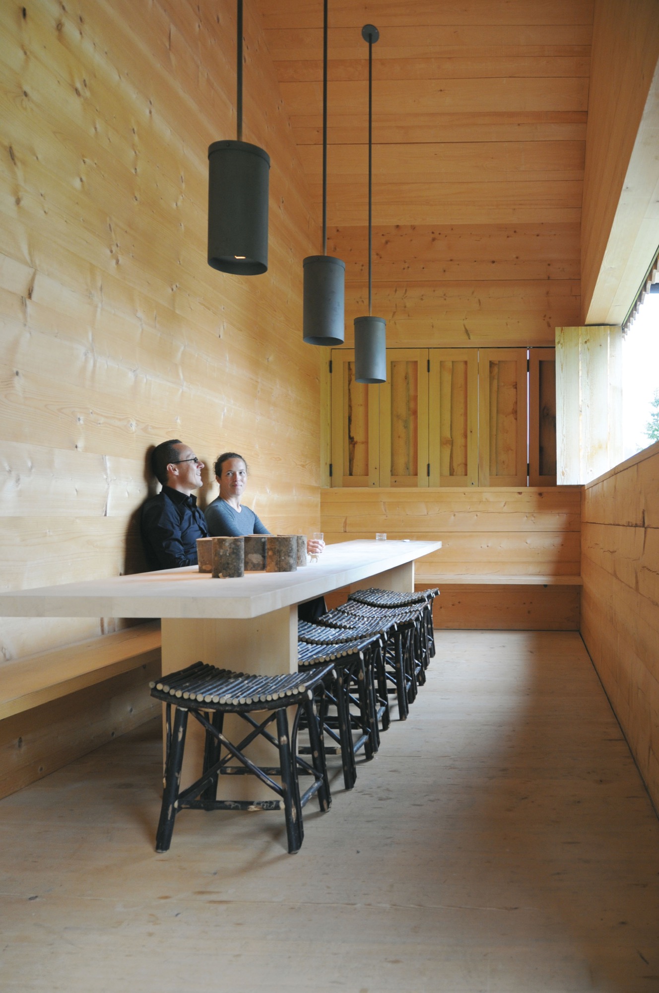
In 2000, Schneider and Polletin began transforming the two-story barn into the Allmeinde, an Austrian word that means a public, open pasture. Sensitive to the ski town’s postcard perfect landscape, the pine wood exterior of the Allmeinde is nearly indistinguishable from any other neighboring weathered barn. The only difference is the sliding barn doors have been turned into an enormous window that rolls open to views of the Schlegelkopf mountain ski runs. The interiors, however, are an ingenious example of minimalist Alpine design and functional, fluid living space. On the second floor, the original vaulted beams frame a 1,500-square-foot (ca. 140-square-meter) space divided by a birch cabinet unit. At first glance, it looks like a stark gallery space, sparsely decorated with a few rough-hewn wood chairs and framed alpine-inspired photographs. But, the cabinet unit is like a perfectly packaged gift that neatly unfolds like origami to reveal a studio apartment living space complete with a kitchen, bathroom, shelving, desk area, and Murphy bed.

The atelier-inspired downstairs space holds a private library curated with nearly 2,000 books on music, philosophy, travel, and art. There’s also an office and screening room as well as a kitchen and bedroom, which are used by the family in the summer and visiting artists in the winter. The Allmeinde hosts one exhibition per winter season—all free to the public. Past exhibitions have included British sculptor Antony Gormley, American artist James Turrell, and most recently Italian photographer Walter Niedermayer, whose images brilliantly dissect the landscape of alpine tourism.
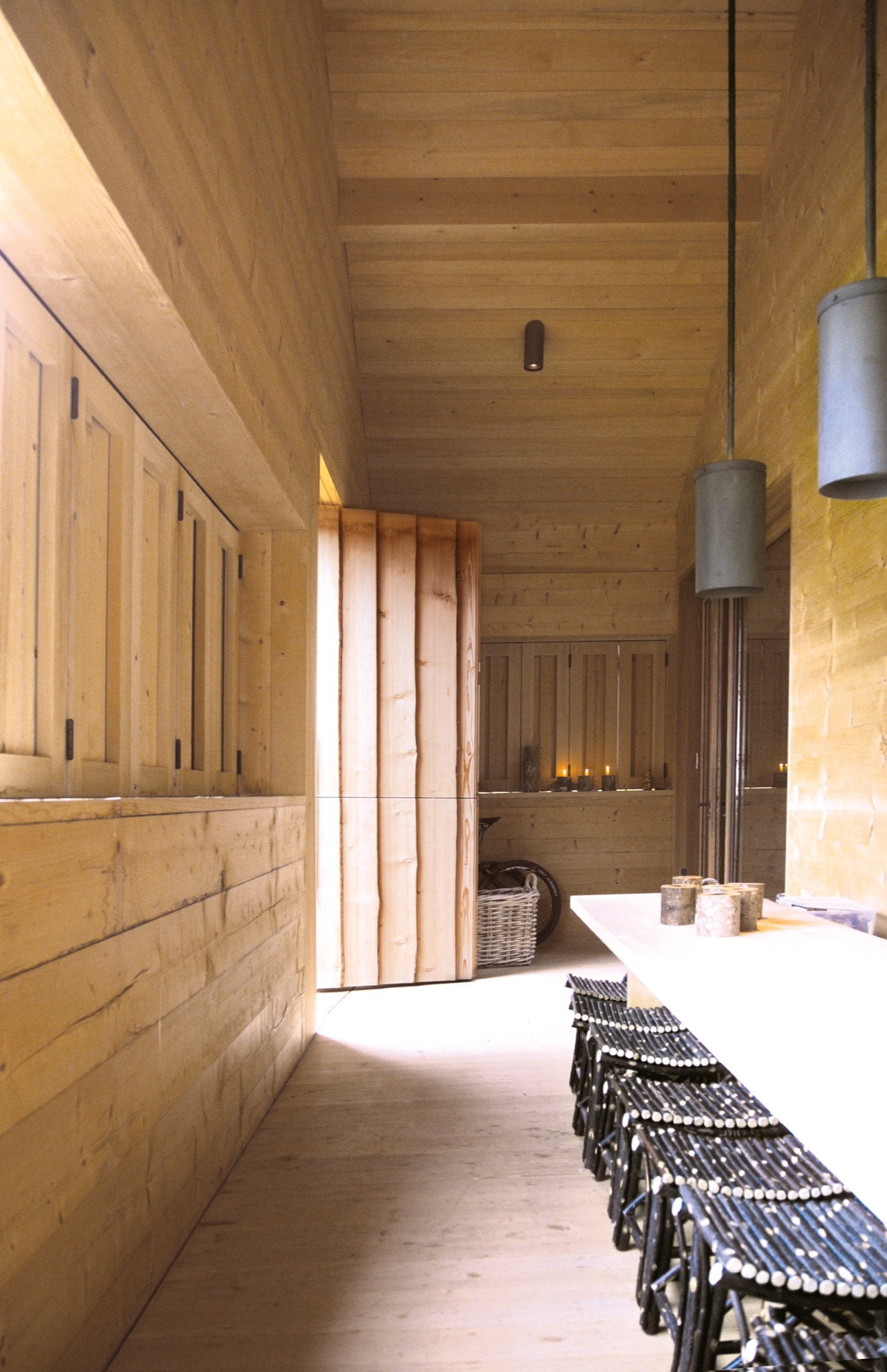
An evolution of tradition
While some locals have viewed the Allmeinde as a threat to tradition, Schneider and Polletin see it as an evolution of tradition, bringing a fresh, international aesthetic to local materials and craft. “Just because you live in the mountains, does not mean you have to be cut off from the world,” says Polletin. “The Allmeinde is part of our identity in Lech. It’s important for us to have this outlet. It’s a celebration of the space we live in—manmade and natural.” △
“Just because you live in the mountains, does not mean you have to be cut off from the world.”
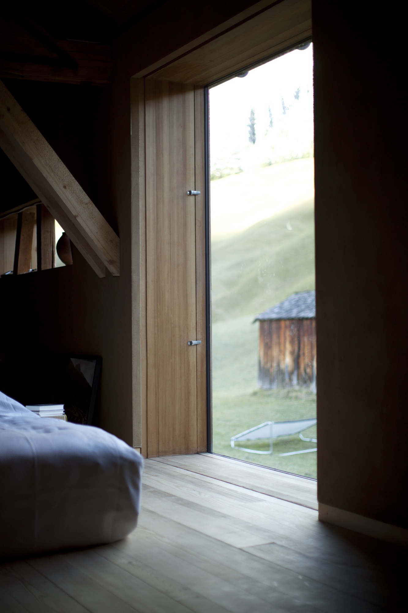
A Cabin Cluster in the Quarry
Three small pavilions connected by a deck form a summer retreat in Maine that balances privacy with a panoramic view—all in less than 900 square feet.
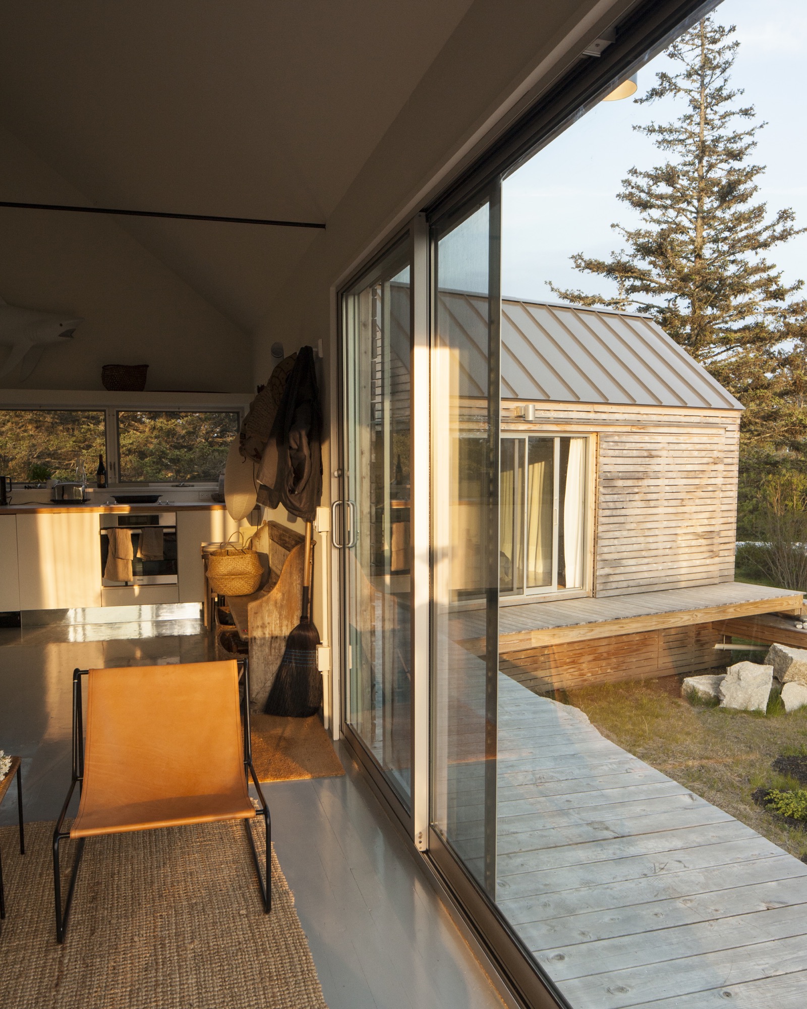
 It’s perhaps misleading to call three structures a summer house. But measuring 890 square feet (ca. 83 square meters) altogether, referring to them as a set of summer houses would imply something grander than three cabins tucked into a defunct granite quarry. From a distance, the buildings look like a cluster of bait shacks you might see on the harbor side of Vinalhaven, the island where they sit.
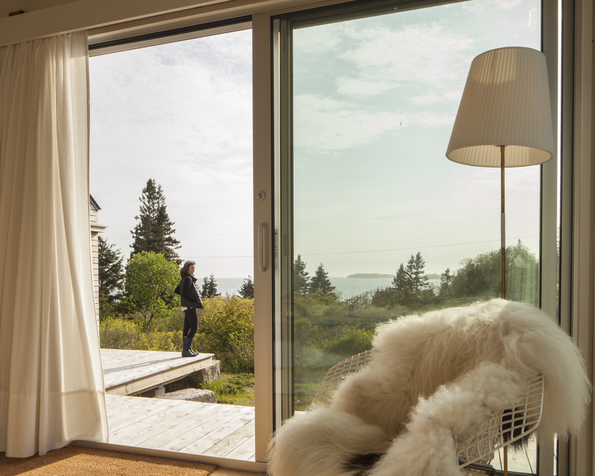
On a sloping site near a defunct rock quarry on the remote lobster-fishing island of Vinalhaven, Maine, a three-part summer home overlooks a framed view of Penobscot Bay. Working around the site’s unique topography, design-build firm GO Logic created each structure at varying elevations.
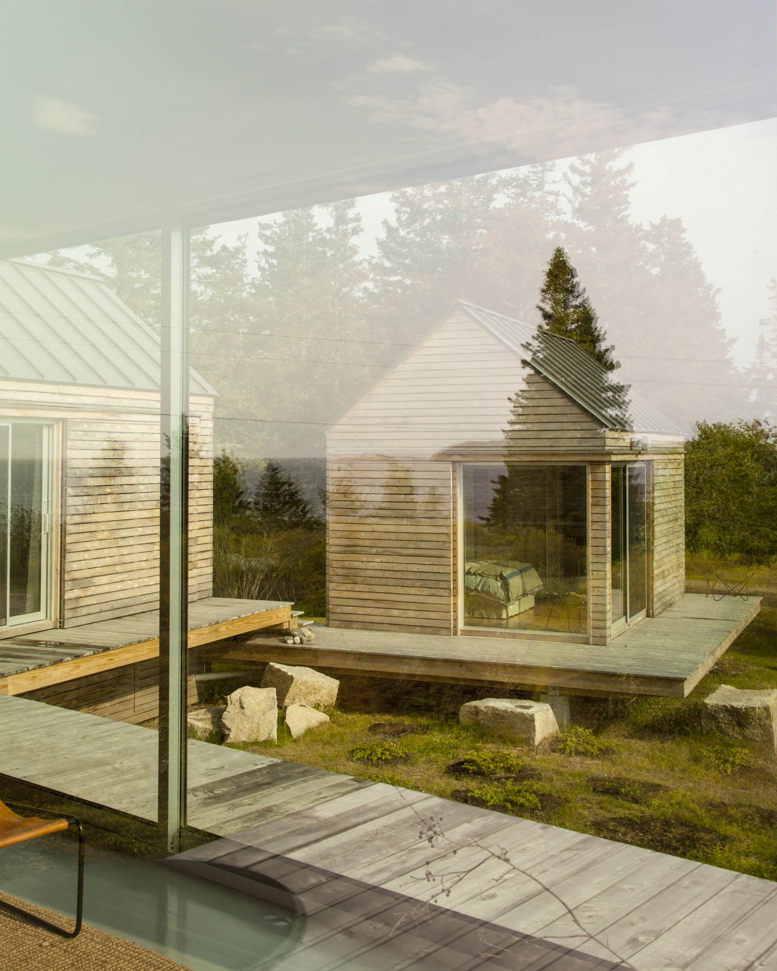
Fifteen miles offshore from the town of Rockland, Maine, the island is its own world, its very separateness a part of its magic: It can win people over in one visit, which is all it took for Nick and Nadja van Praag. Both expats—he from England, she from Austria—they’d only just arrived when a photo in a Realtor’s window caught Nick’s eye.
“We came to the island of Vinalhaven several years ago and immediately, totally fell in love.”—Nadja van Praag, resident
Restless in DC
At the time, Nick’s work with the World Bank had brought the couple to Washington, D.C., where they had a classic Georgetown house, yet felt a persistent sense of unrest. It drove Nadja crazy to be in America, where, as she says, "the inside/outside thing was invented!" Living like center-city Europeans in a four-floor building, the van Praags daydreamed about an open, single-story home, while Nadja kept close watch on a Richard Neutra house nearby, hoping a For Sale sign would go up.
A fateful trip to Vinalhaven
"Then we came to Maine, and didn’t expect anything like that," says Nadja. But there it was, for sale, a "little box" on Vinalhaven. "Nobody else wanted this house," she recalls. "They were all looking for the perfect New England shingled-whatever."
However, their tiny square overlooked a tiny rectangle: a 700-square-foot mobile home. The van Praags realized that if another family purchased the trailer to build a larger home facing the channel, the quiet setting of the disused quarry would significantly change character.
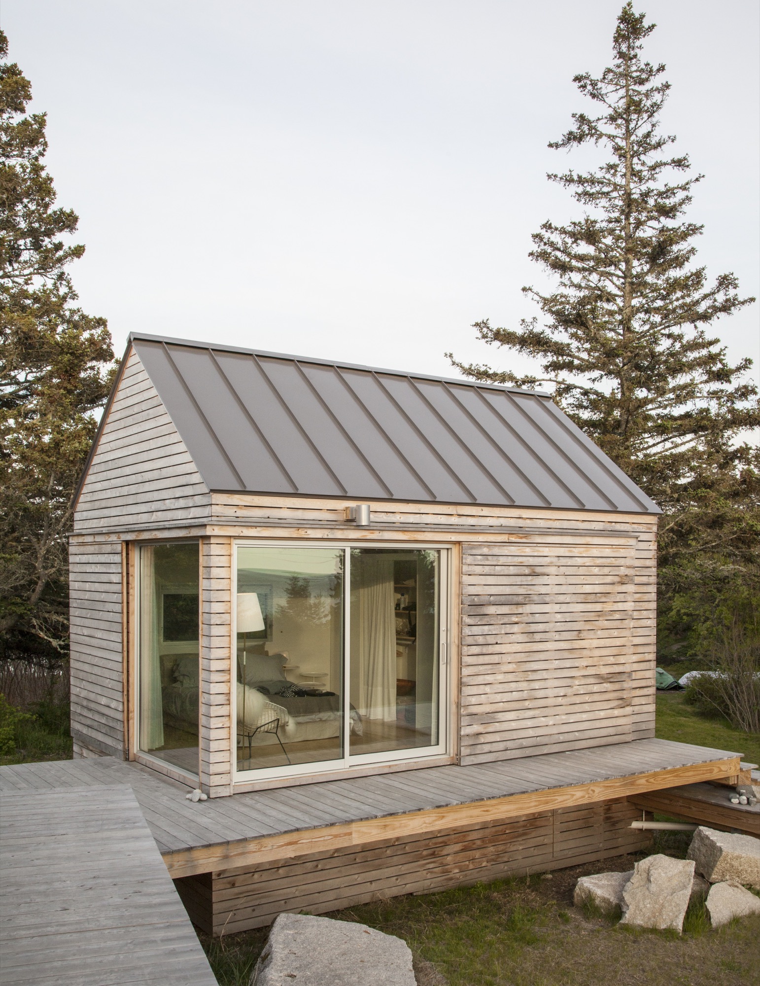
“We did our best to tuck the buildings into the site—the goal was to get up high on a perch. It was a matter of setting that elevation and working back down with the topography.”—Riley Pratt, architectural designer
Building over time
A few years passed, the van Praags made interior renovations to the home with local builder, caretaker, and lifelong resident Mont Conway, then—when it became available—they bought the plot of land where the mobile home once sat, less than 100 yards down the path. Around the same time, they met Riley Pratt, an architectural designer who summers up the road. Pratt, of the Belfast, Maine–based firm GO Logic, knew Conway from pickup soccer games on Vinalhaven but also by way of his reputation.
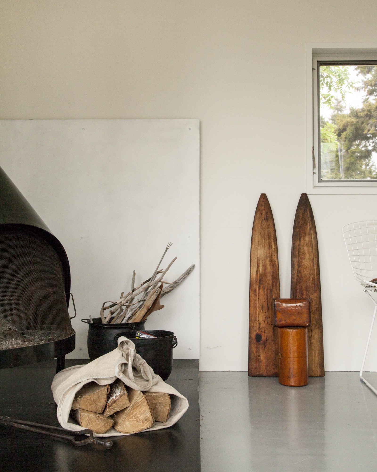
Inspired by Alvar Aalto sketches and the quirky quarry site
When the van Praags expressed interest in building a new structure on the extended property, Pratt mentioned Alvar Aalto sketches he had seen for a deconstructed summer cottage in Finland, where the rooms (and, of course, a sauna) were broken out as separate buildings focused around a courtyard. Nadja took to the idea of a peeled-apart, three-volume structure immediately: The design was an exploded version of their house, also a three-part structure, and building it would mean their three grown children could have a place to stay when they visited.
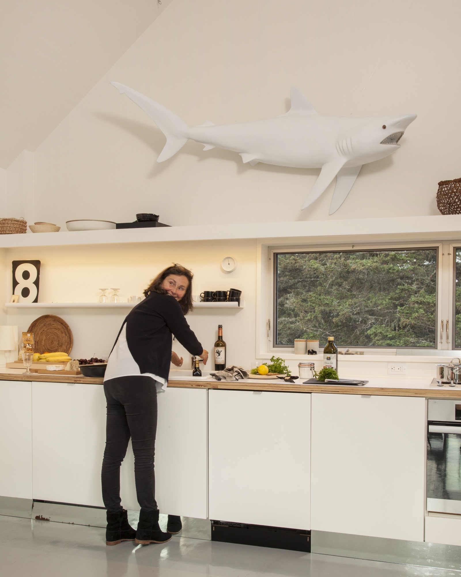
The town of Vinalhaven considered the lot, with its jumble of rejected granite scraps, "substandard" and therefore granted the Van Praags up to 30 percent more square footage and volume over the previous structure. While the site posed challenges, it also inspired. GO Logic paid special care to the topography and geometry of the quarry. Every angle—of both the structure and the interior lines of sight—is in purposeful alignment with the surrounding stone, trees, and water views.
The town approved the plan for multiple structures because a single deck connected them, and the van Praags were thrilled because the design maximizes both privacy for overnight visitors and a connection with the outdoors.
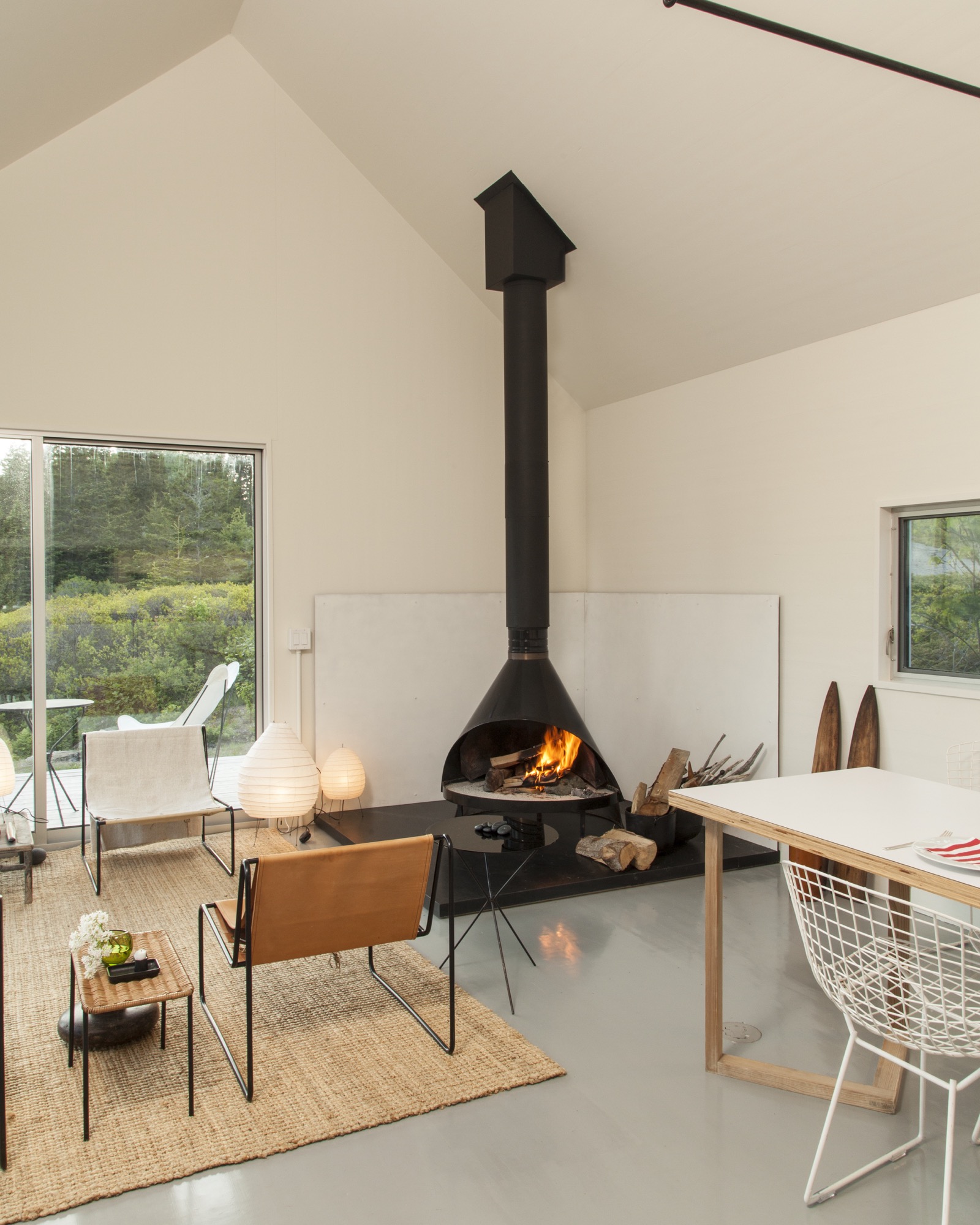
“We’re here for almost three months every summer—and it works so well that you never feel it’s a small space. The separation and steps between each perfect little box create a great flow.”—Nadja van Praag
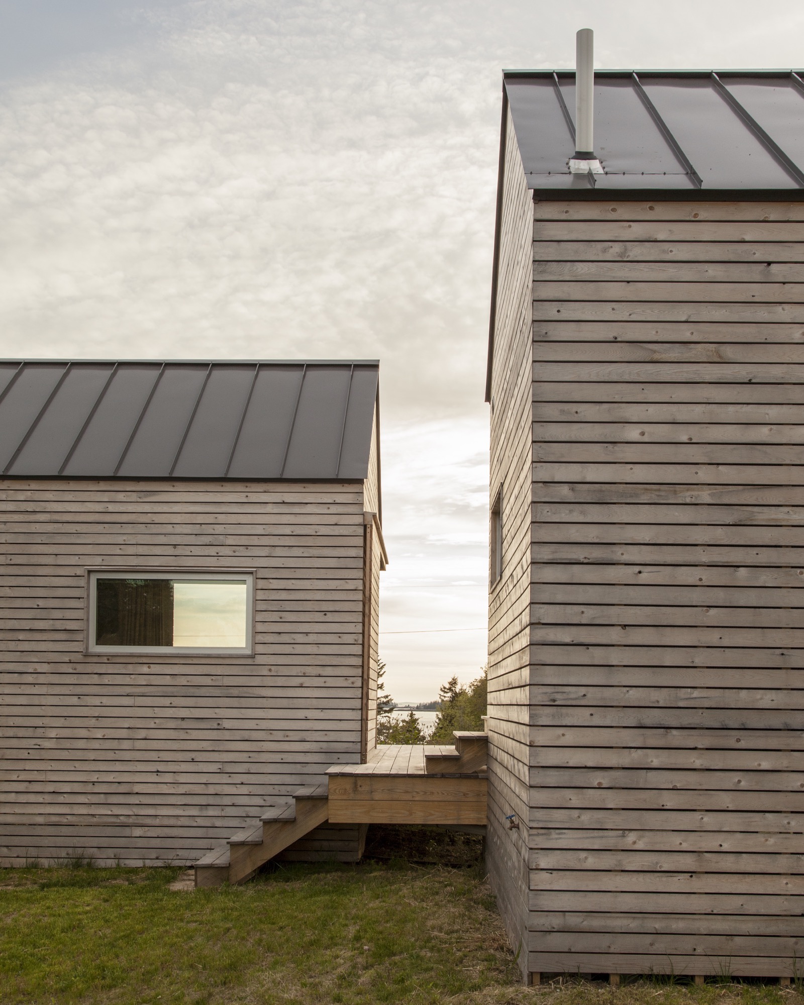
The spare aesthetic—inside and out—at once suits the austere island and reflects a judicious building process that was as much about choreography as construction. GO Logic used an emerging technology—cross-laminated timber (CLT)—to reduce waste and on-site labor. The design-build firm, working with Conway and his crew, carefully sequenced the packing, transport, and assembly of the black spruce panels shipped from Quebec. The panels form the entire enclosure—floors, walls, and roof—a practical and sustainable solution that provides both structure and finish. Conway’s crew sided the buildings with mitered white pine that will turn hoary with time, matching both the granite landscape and the local cottage vernacular. They also used white pine to create sliding barn doors that offer shade and privacy as needed in the summer, and protection in the off-season.
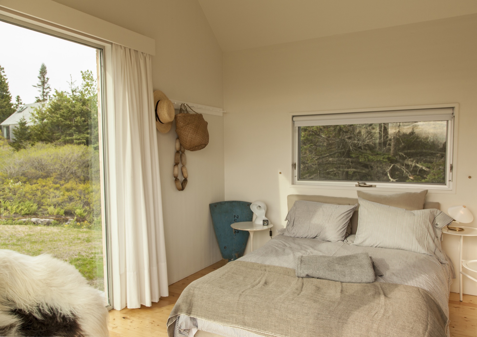
Clustered escape
Although they’re just a short walk from each other, the van Praags’ two homes—the "little box" and the new trio of cabins—feel worlds apart. "The old house looks over Old Harbor Bay, protected and speckled with boats. It’s sort of domesticated, in as much as the islands of Maine do domesticated," Nick says. "The new house is out there. It feels wild and remote, with the old quarry rising gently behind the house and the ocean stretching away in front."
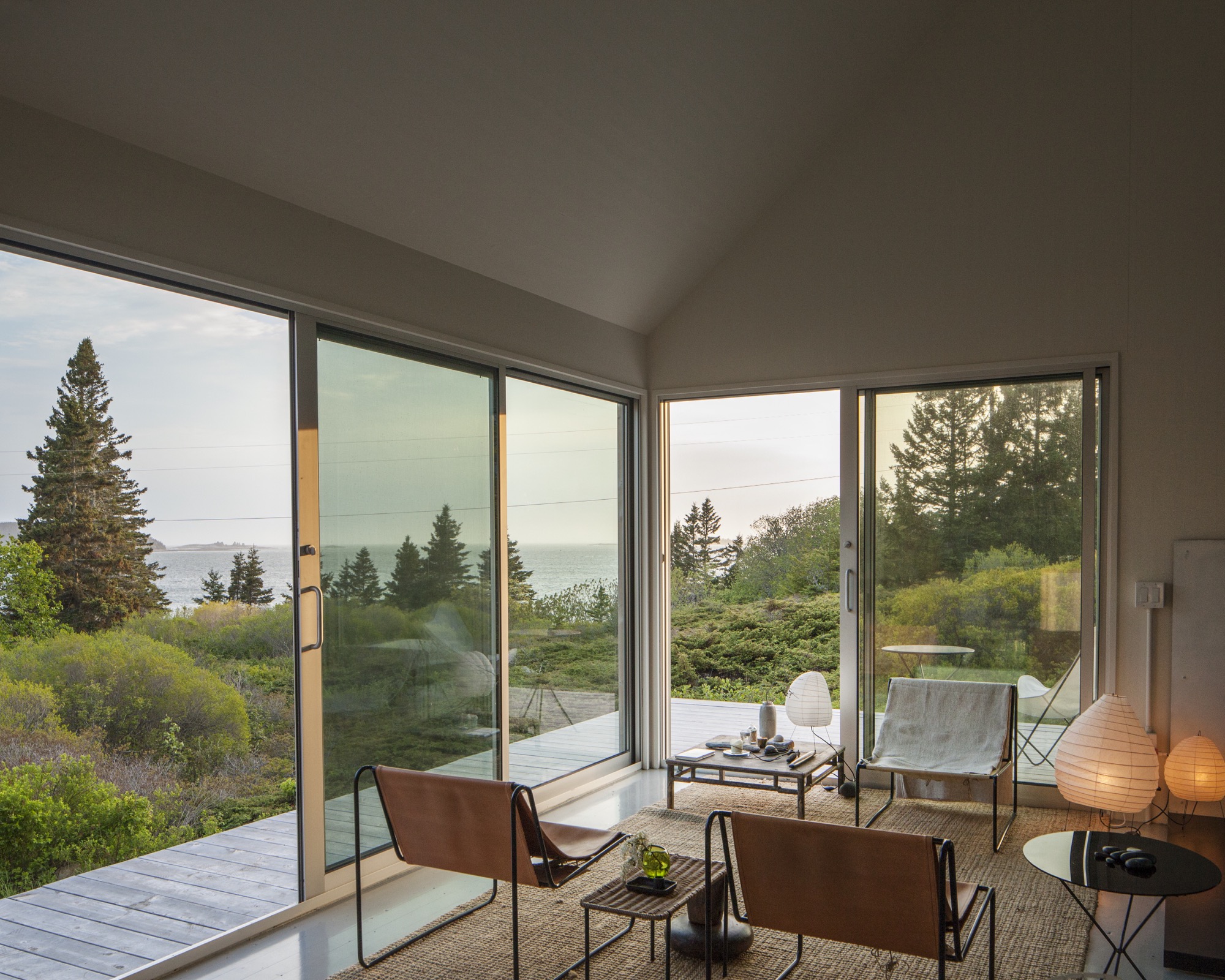
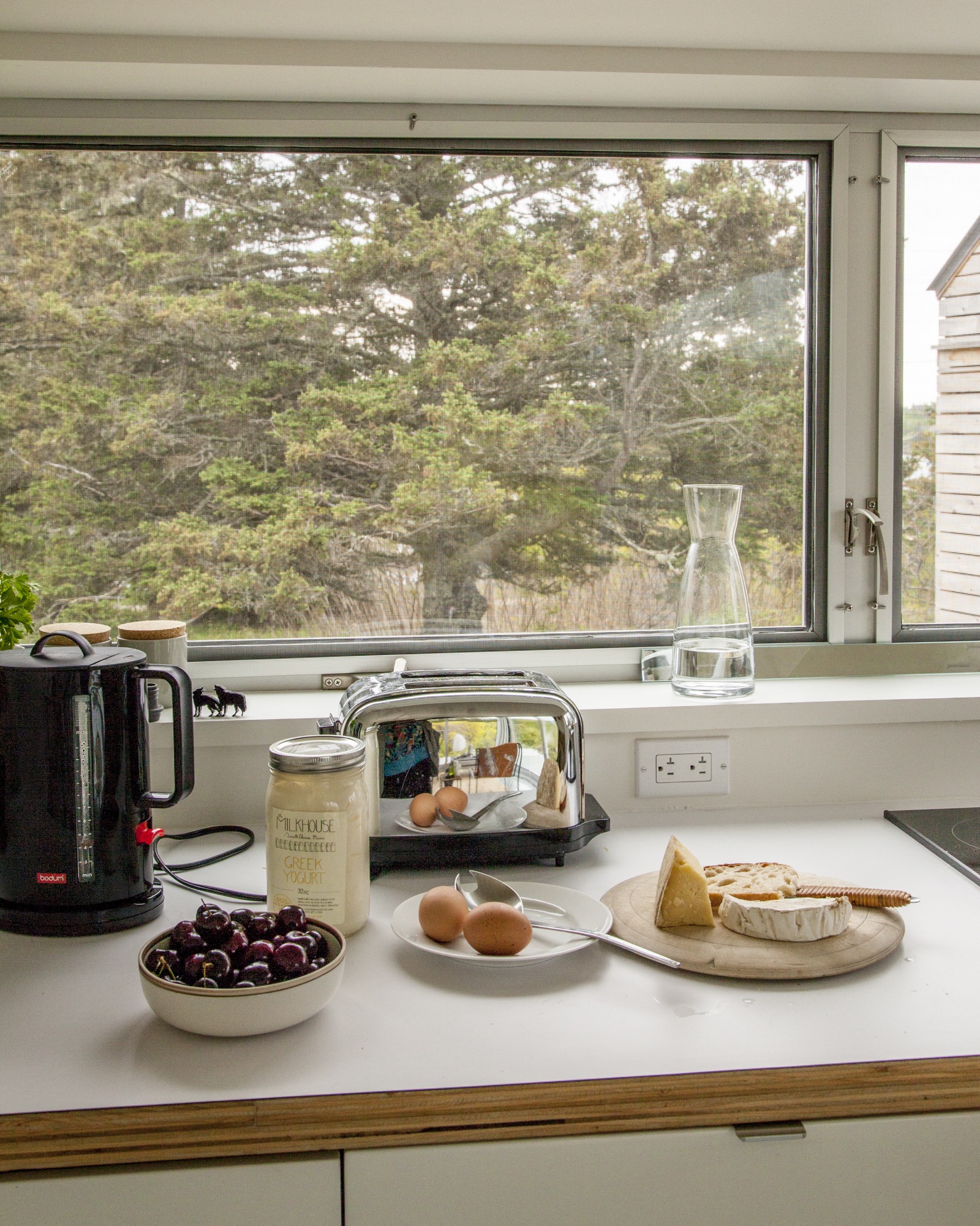
By day, the three connected pavilions sit lightly on the land. At night, they float above their concrete piers, a U-shaped harbor that beckons guests with its warm light, the platform at once a dock and a deck.
"For me, the most amazing thing is the way Riley sited the place," Nick says. "It was always a beautiful spot, but by raising and angling the buildings, it embraces the landscape and the ocean in a way that I could not have imagined." When guests ascend the stairs to the deck, popping up into a framed view of Penobscot Bay, they all stop in the same place. "I realize now that siting a building is a very special talent," he adds. △
Retreat in the Aspen Grove
Cottage Black by Colorado-based architecture and interior design practice Studio B counterbalances the grand main house in Aspen’s countryside
Studio B, a Colorado based architecture and interior design practice with offices in Boulder and Aspen, first designed the grandiose main residence in the backcountry a twenty-minute drive from Aspen, Colorado.

“We really wanted to explore a heightened experience of those aspen trees.”
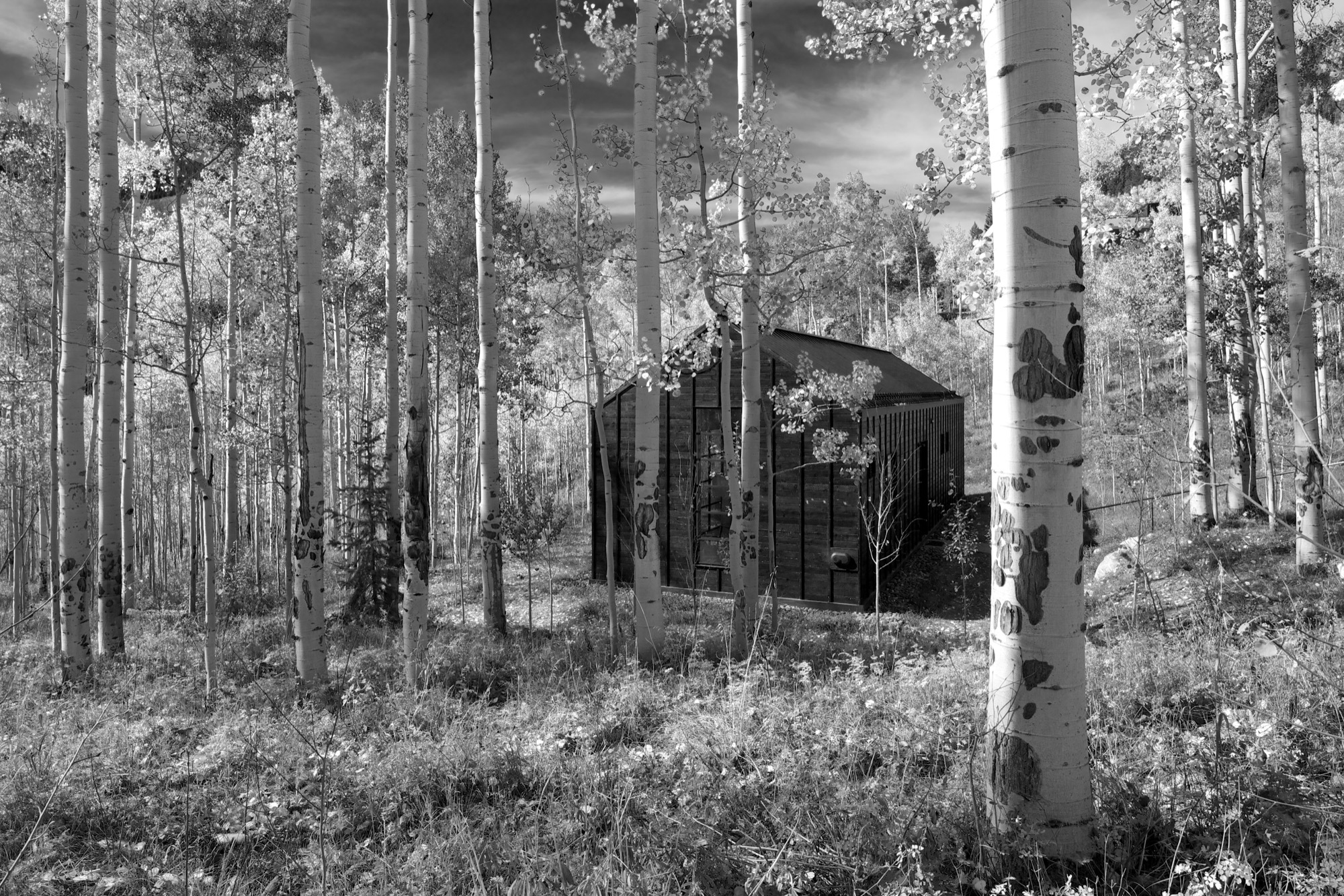
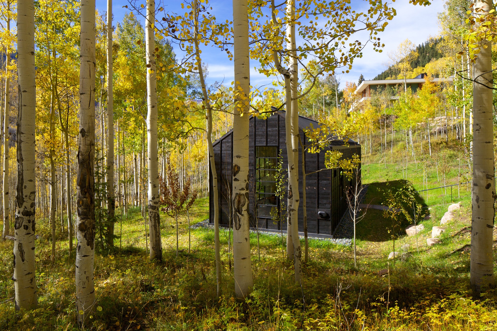
“The main house sits up on a ridge and is all about connecting to those long views, the big mountain views,” says Piché, describing what he calls a “more extroverted” approach, compared with the cabin down in the grove. “When we started working on the little guest retreat, we wanted to experience the trees in a completely different way. These views are much more embedded in the grove.” To better understand what design and placement would make the most out of Cottage Black’s distinct surroundings, Studio B took time to study how the aspen trees’ foliage changes with the seasons. “One thing we really liked about it was that the trunk feels really consistent throughout.”
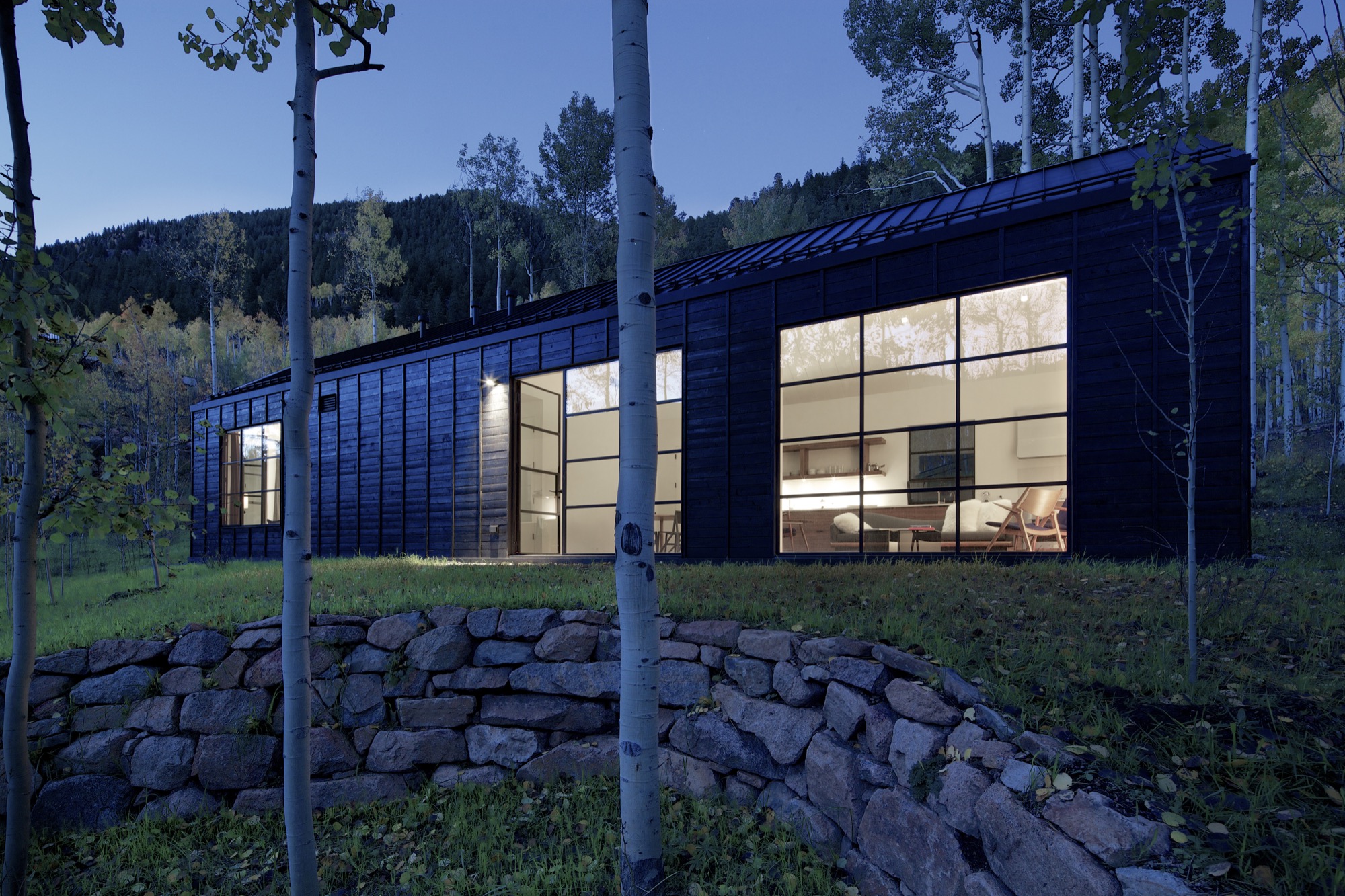
The monochromatic aspen tree bark ultimately inspired the intimate retreat’s all-black exterior and all-white interior.
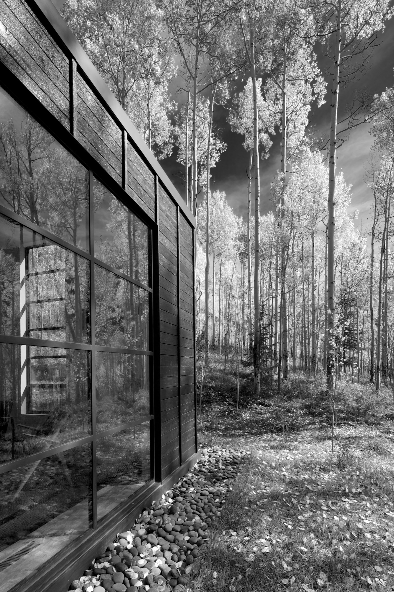
“The standing seams on the roof and the vertical joints of the interior wood ceiling were chosen to relate to the immense verticality established by the trees,” the placid architecture master notes. Approaching the house, simple stairs weave their way through the trees to the front door.
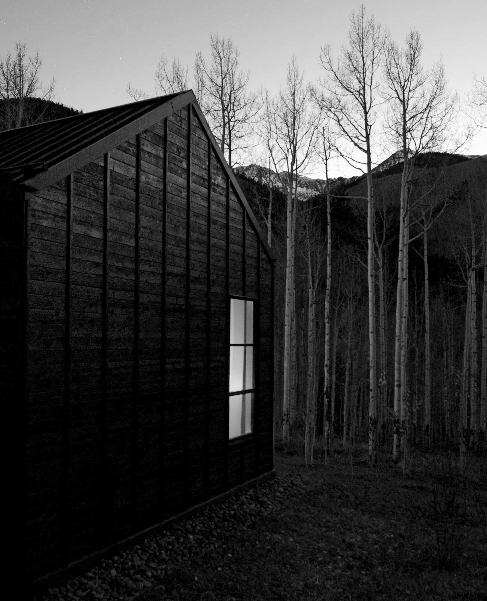
The black exterior
Heavily charred cedar wood gives the cottage’s exterior a rougher, bark-like texture. The orientation of the boards and the battens picks up on the verticality of the trees and the shadows. Looking at “that box” with its horizontal boards at one point during construction, Piché says they had an epiphany: “You wouldn’t think that black has the shadows and the depth that it does, but it seems it almost has more. When the sun hits, the black wood goes from gray to dark and it really feels like it transforms quite a bit.”
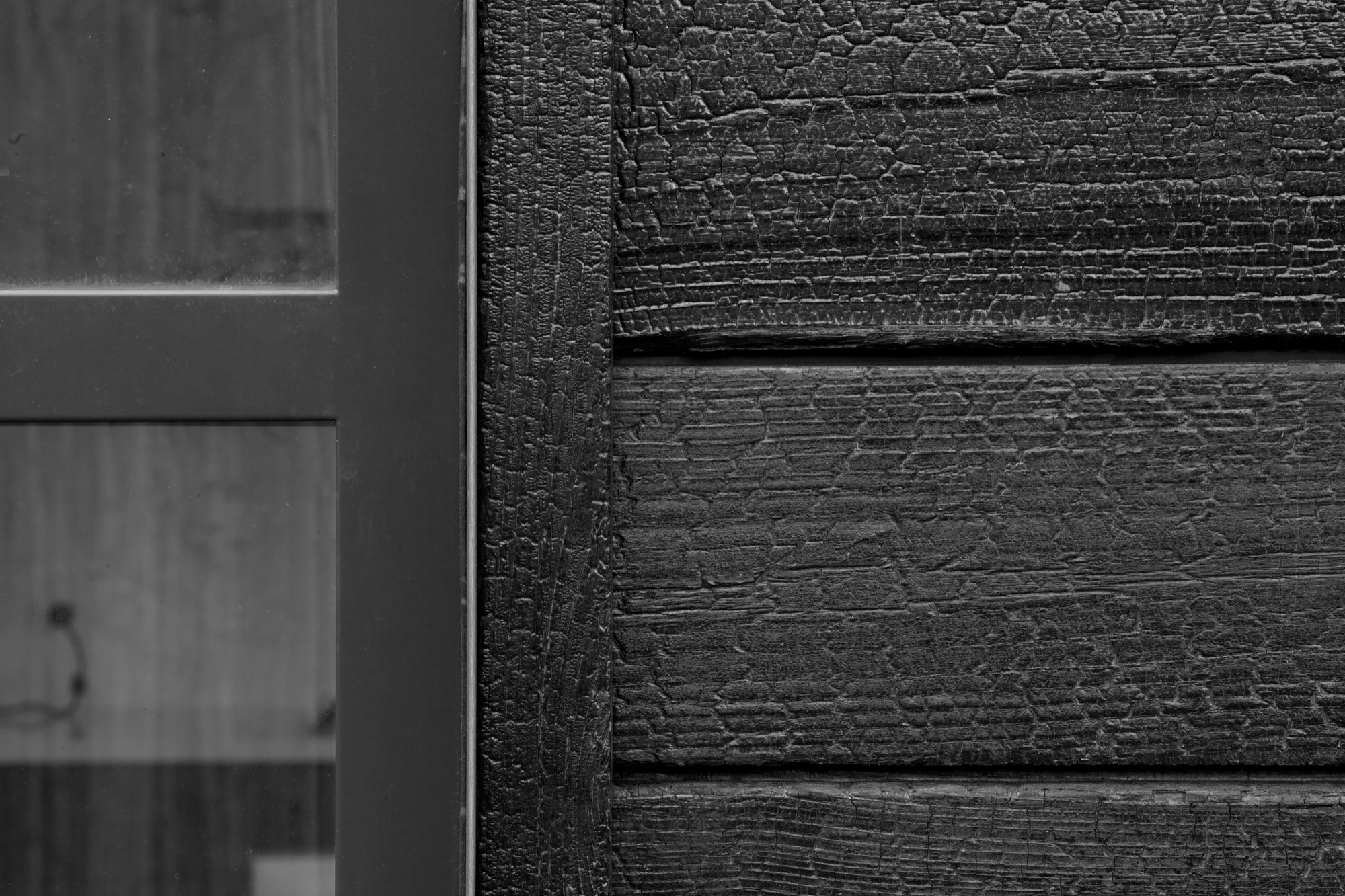
“You wouldn’t think that black has the shadows and the depth that it does.”
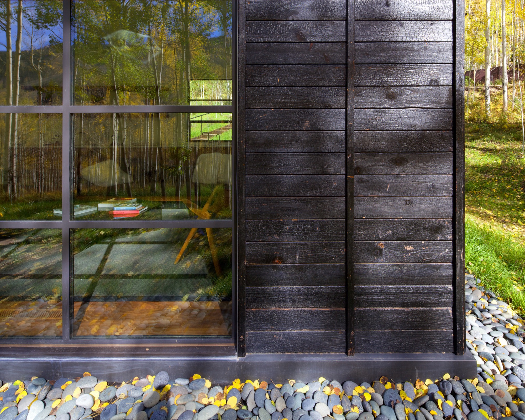
What’s more, the charred exterior gives Cottage Black the air of having been there for a long time. “And in spring and summer, when all the trees are fully leaved, people don’t even see the cottage. It disappears, and it reappears in the fall, too,” says the distinctly analytical architect, pointing out that no driveway leads to the retreat and guests cannot park right next to it. “The cottage is packed into the trees, and it’s kind of a journey down there.”
The Studio B team intently placed the steel windows to achieve a minimal sight line that only highlights a few select views. “We added a tall window that emphasizes some great trees on that side, a couple of little corner windows that just frame the tree trunks, and then one big window in the living room that is more about walking outside onto the patio and connecting to all the trees there,” the architect says. “But you are not getting those big mountain views. Just these little glimpses of the outside, which creates that more intimate feel when you walk up to the window. It is more about enclosure and intimacy than the broader expansive things. It is a little bit more inward than outward.”
"It is more about enclosure and intimacy than the broader expansive things. It is a little bit more inward than outward.”
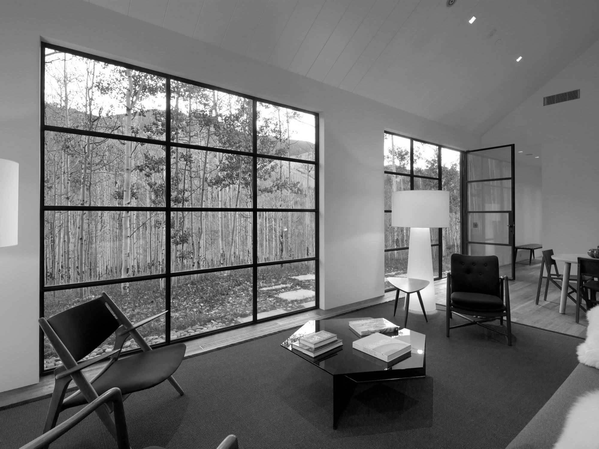
The white interior
Walnut floors lend warmth to the primarily white, minimalistic inside. “The monochromatic interior, again, is a counterpoint to the main house, which has a lot more materiality coming through and more complicated detailing,” Piché says. Cottage Black, by contrast, is very simple, with much more subtle detailing: “There is the wood ceiling, for example, where each of the joints lines up with the joint on the exterior in a subtle inversion of it.”
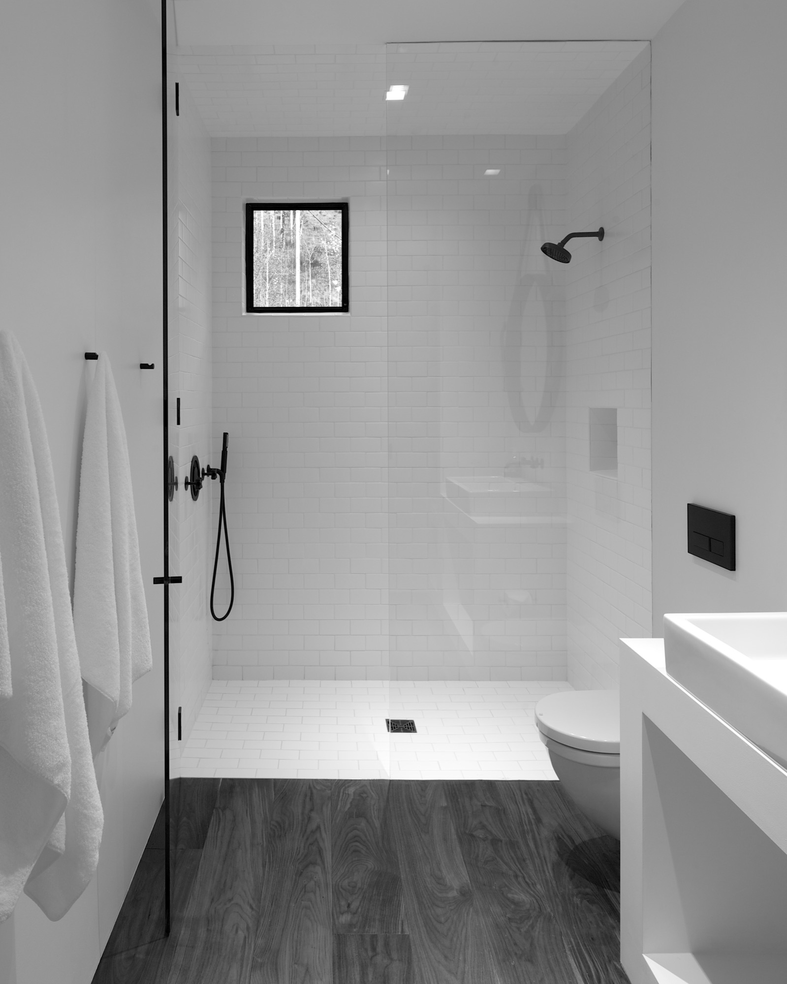
A bathroom at the center separates the sleeping area from the living space, which also includes a little kitchen to allow guests some autonomy, if they desire. “There isn’t any kind of door,” Piché says about the intimate studio layout.
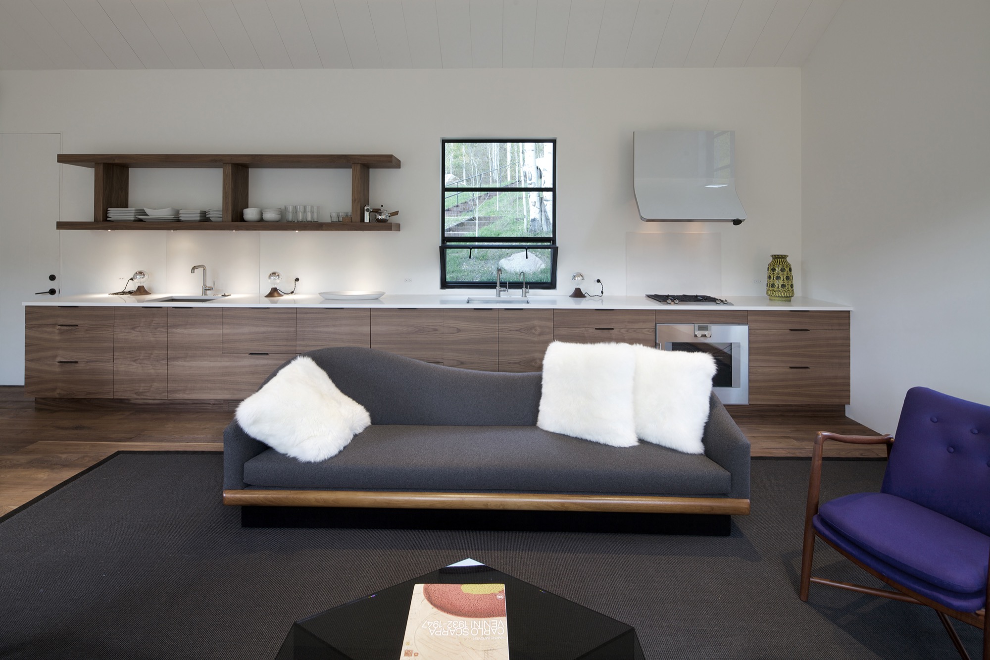
A counterpoint for solitude
Should the guest retreat complement or rather juxtapose the main house? After much collaborative consideration, the design team and the client decided Cottage Black was to be a distinct counterpoint to the luxurious primary residence up above on the ridge. One consequential feature of this objective ended up being the orientation of the structure. “The one window that you see when you stand up in the living room lights up, and that’s it,” Piché says. “All the other things... we shifted it quite a bit to make sure you couldn’t see it from the main house—that there is that black object.”
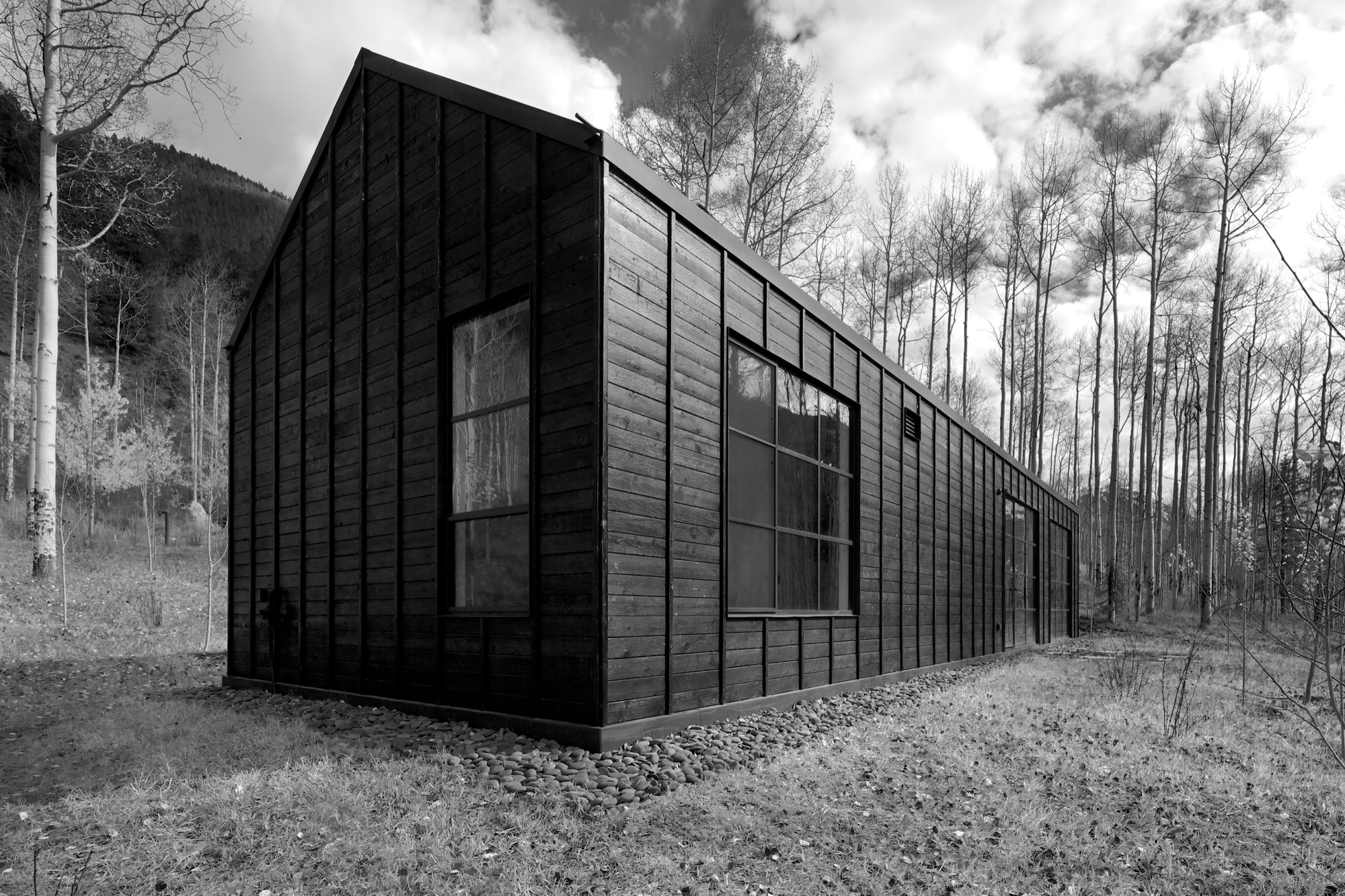
Furthermore, the team had added transitional materials throughout the main house to add texture and interest in various places. Cottage Black’s architecture and interior design, on the other hand, are very much characterized by deleting details, according to the architect. “This house is a lot about editing,” he says in reference to the design process. “In the beginning, we had a lot more adventurous solutions, and we distilled it and made it into a better and more powerful piece of architecture. It doesn’t need to be a lot.” △
The Vindheim Cabin: Snowbound in Norway
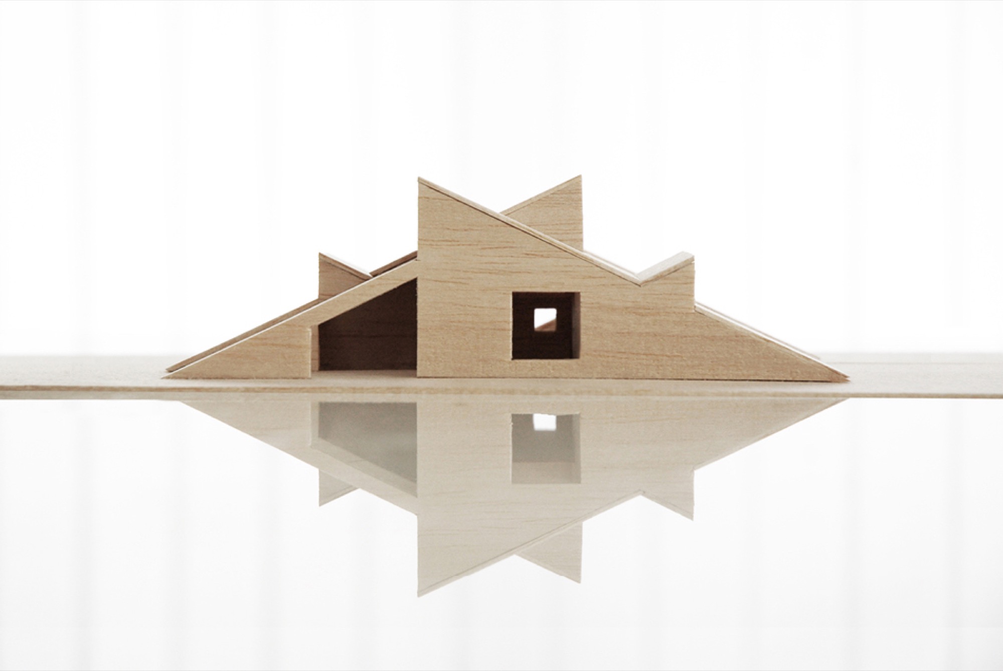
The Vindheim cabin in Lillehammer, Norway, is inspired by the classic motif of snowbound cabins, with only the roof protruding through the snow.
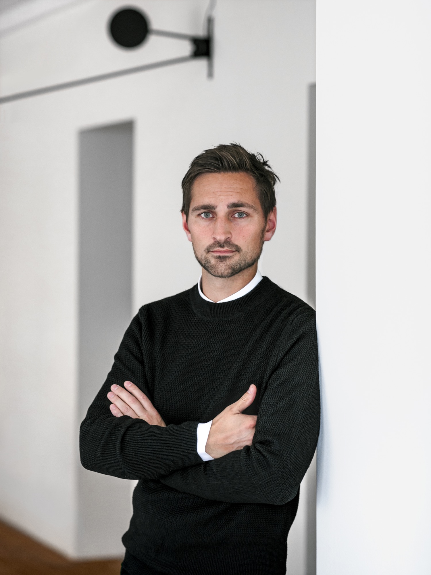
Architect Håkon Matre Aasarød, partner at Oslo-based studio Vardehaugen Architects, led the design of Cabin Vindheim, situated deep in the forest in the alpine landscape near Lillehammer, Norway. The cabin’s concept was simple: To create a cabin that is small and sparse yet spatially rich. The 55-quare-meter (592-square-foot) cabin, commissioned by a private client and completed in 2016, comprises a large living room, bedroom, ski room, and small annex with a utility room. It functions off the water and electricity grids.
Håkon, who earned his master of architecture degree from the Oslo School of Architecture and Design, where he is also teaching today, has been telling us about this project from its very beginning, keeping us abreast of the building progress in emails and photos. What’s more, the Norwegian Broadcasting Corporation followed the design and construction of the cabin and documented it in a one-hour episode of the program “Grand Designs”. Thus, we are excited to finally show you the result and introduce you to its lead designer, who lives in Oslo, with his wife, Sigrid, and with his two boys, Syver and August.
A conversation with architect Håkon Matre Aasarød
AM When and how did you know you wanted to become an architect?
HMA I’ve always been passionate about drawing. I can easily recall the wonderful and almost hypnotic feeling I had while drawing Star Wars space ships for hours in my childhood. As soon as I got older and realized that drawing houses and objects was a real job, and not just a hobby, I knew I wanted to be an architect. Today, from time to time, I can still get that wonderful, almost meditative feeling while drawing.
“As soon as I got older and realized that drawing houses and objects was a real job, and not just a hobby, I knew I wanted to be an architect.”
AM What professional path led you to where you are today?
HMA Immediately after finishing architecture school, I started my first office, Fantastic Norway, together with my good friend Erlend Blakstad Haffner. Our studio was a red caravan. We drove from town to town for more than three years, giving architectural aid and inviting the locals to participate in creating new strategies and projects for their hometowns. We had a wonderful adventure and got a lot of attention and won many prices for our method of working. But life on the road was also a bit tiring, so in the end, we had to park our ambulant architectural office.
Then we were invited to make a TV series about architecture for the Norwegian Broadcasting Corporation (NRK) and worked as television hosts for a couple of years.
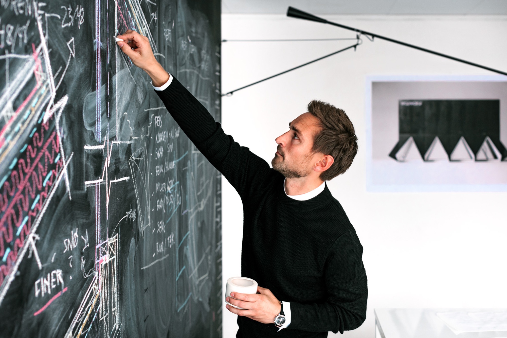
After spending so much time on the participation processes and communication, I felt the need to focus on the building part of our profession and, as a response to this, started Vardehaugen Architects.
AM What’s your design style?
HMA When starting a new project, I try hard not to have preconceived ideas about the style or looks of it. I try to focus on the client’s need and on creating interesting spaces and let the style evolve through this.
AM Where do you draw inspiration for your designs?
HMA Our greatest source of inspiration is our clients and the sites we work on. Every client is different; every place is in some way peculiar and unique. We aim to embrace this in all of our projects.
AM What does “home” mean to you?
HMA Home is the feeling of belonging somewhere. The feeling could be connected to a house, a specific landscape, a mountain, or even a group of people. Places where your story lives.
AM What makes you a mountain man?
HMA Growing up in Norway it’s hard not to have a close relationship to the mountains. Throughout my childhood, we spent a lot of our holidays hiking or skiing. Every Easter, my family still goes hiking in the mountains, and every autumn, we collect sheep for my parents-in-law in the mountains of Norway’s West Coast.
AM When are you the happiest?
HMA Nothing beats spending a day with my two kids at our small summerhouse on the West Coast of Norway.
AM What’s on your drawing board right now?
HMA We work with a fairly wide range of projects. In addition to some cabins and villas, we are currently designing a small chapel next to Norway’s second largest glacier, the Black Glacier, a coastal museum on the island of Frøya, and an observation deck at Norway’s most spectacular waterfall, the 280-meter-tall (ca. 920 ft.) Vettisfossen.
The Project: Cabin Vindheim
AM Who are the clients?
HMA A couple in their mid 50s, both of them passionately interested in architecture and design—in addition to skiing and hiking in the mountains.
AM Describe the design in your own words...
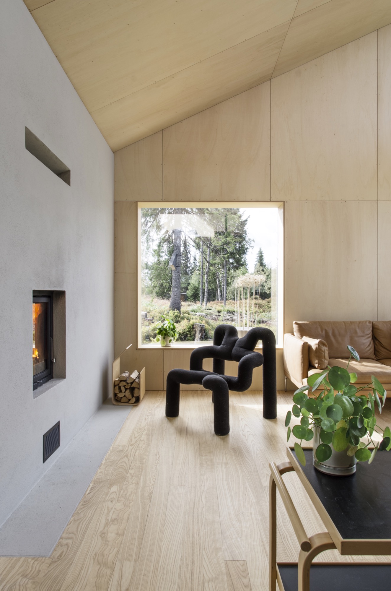
HMA The cabin is a basically a gabled roof where the edges of the roof stretch all the way down to the ground. The ceiling runs uninterrupted through the cabin and connects the different rooms. A series of uplifts creates a rich variety of spatial qualities underneath it.


AM What was the client’s premise at the beginning of the project?
HMA They wanted a small cabin that was sparse and compact but at the same time spatially rich and generous.
AM How did you translate the client’s vision into this design?
HMA With the ambition of creating a compact cabin that at the same time had exceptional spatial qualities, we focused a lot on the physical sensation of scale and space. When is a space too tight? When is it too big? We did this by creating real-scale mock-ups of our design solutions in our backyard to ensure a greater understanding of size and proportions in our project. This enabled us to simply take a stroll through our project and get a sense of dimensions and spatial sequences–even before the cabin was built.
AM What was your inspiration for this particular design?
HMA The external shape of the cabin is inspired by the classic motif of snowbound cabins that have only the roof protruding through the snow. When snow covers the structure, the contrast between architecture and nature becomes blurred.
AM What makes this cabin truly special?
HMA During winter, the roof becomes a man-made slope for ski jumping, toboggan runs, and other snow-based activities.

AM Take us there...
HMA The site is deep in the forest in the alpine landscape close to Lillehammer in Norway. The cabin sits between some tall spruce trees, with a nice view toward a lake. During winter, it’s extremely cold there and hard to get to by car, so you have to cross-country ski for a few kilometers to get there.
AM How did the setting and the site influence your design?
HMA The frosty forests in the region are both beautiful and mysterious, and they’re closely connected to traditional folklore and stories about trolls and other strange creatures. When snow covers the trees and stones, they morph into something new. They become characters, sometimes trolls, sometimes just a beautiful and unique sculpture. I find this notion truly inspirational.

“When snow covers the trees and stones, they morph into something new. They become characters, sometimes trolls, sometimes just a beautiful and unique sculpture.”
AM What are the main materials you used, and why?
HMA The classic Norwegian mountain lodges are covered in dark wood, making them seem both solid and grounded. Inspired by this, the cabin is clad in black-stained ore pine. The interior is lighter, fully covered in waxed poplar veneer.

AM Take us inside...
HMA The sloping roof connects the different spaces, making the entire cabin feel more like one large room.
From the main bedroom and the mezzanine, you can even gaze up at the stars and enjoy the northern light, while lying in bed. When resting in the cabin's bedroom, a large 4-m-long (ca. 13 feet) window creates the impression of sleeping above the treetops and underneath the stars. The main living room is also small but has a ceiling height of 4.7 (ca. 15.4 feet) meters under the roof.
AM What was your biggest challenge with this project, and how did you overcome it?
HMA The site is very far off the grid, and simply getting the materials to the site was quite a challenge. But we managed by always planning with close consideration of the local weather forecast.
AM What is your favorite thing about the cabin, now that it is finished?
HMA Lying in bed watching the northern lights above the snowy spruce trees is a really nice experience.
AM What do the clients tell you, now that they have been living in your architecture for a while?
HMA They enjoy the cabin and spend time there every weekend. The only issue is that they’ve had problems with sheep climbing up the roof. However, I’m sure the sheep enjoy it.
AM Final impressions of the cabin?
HMA We designed a couple of birdhouses for the birds living next to the cabin. Local sparrows and starlings enter the nesting box from a small opening underneath the flexible top hatch. △
Sense of Place: Clean as in Whistler
Chad Falkenberg of Vancouver-based Falken Reynolds talks about modern interiors in Whistler's mountain homes and cabins
In the fourth and last installment of our "Sense of Place" series, we are talking with interior designer Chad Falkenberg of the Vancouver-based interior design studio Falken Reynolds about brining Whistler style home, no matter where you live. Whistler is rich in cedar and granite. So its natural that traditional mountain homes use a lot of both. While the wood in older homes may have a raw finish, you won’t see many log cabins in the mountains of British Columbia. The trees here are simply too massive. The granite boulders are enormous, too. People incorporate them into the structure of the house. Natural stones, in fact, are a classic element of both traditional and modern homes in the Canadian resort town.
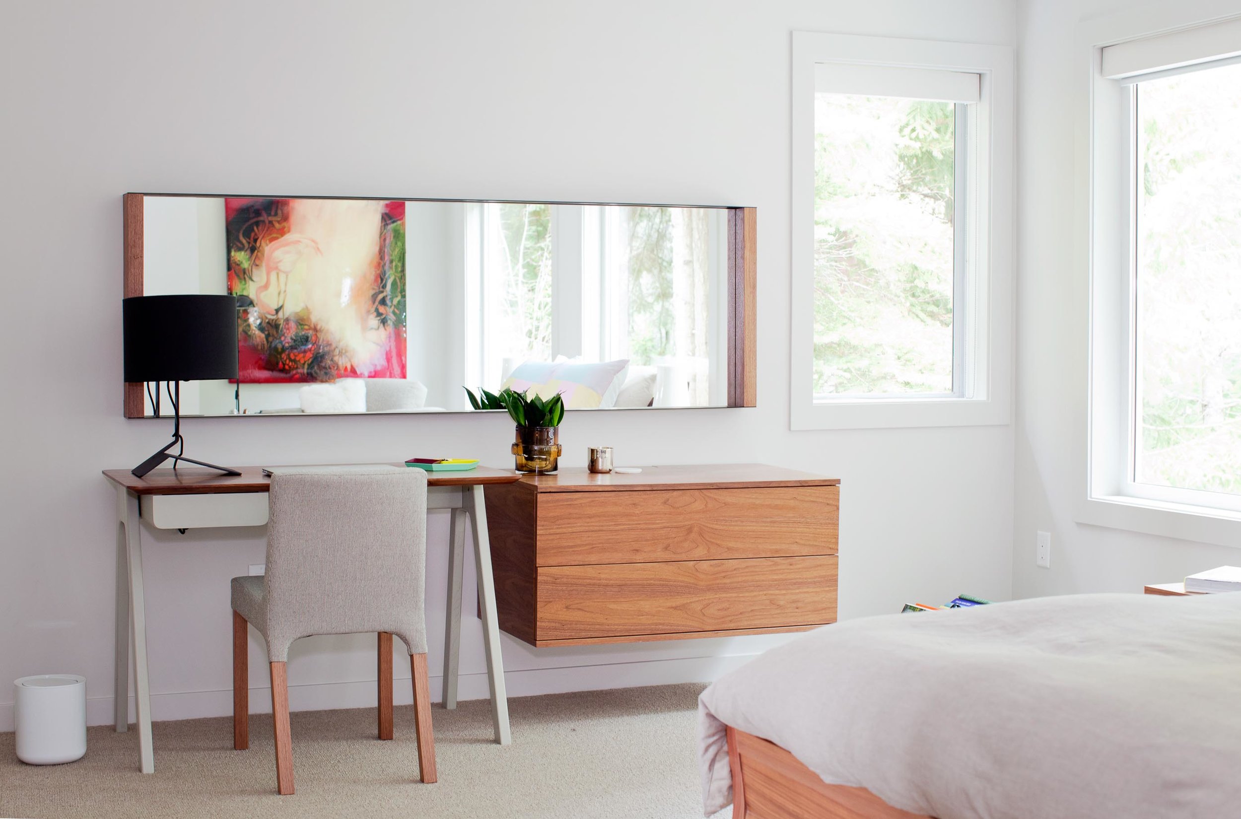
“We try to use a lot of natural materials when we are working in Whistler,” says Chad Falkenberg, one half of Falken Reynolds, a Vancouver-based interior design studio. “It feels more authentic, closer to the earth and to the outside, which is why people go up there, to get away from the city.”
Some of his projects involve sand-blasted Douglas fir to achieve very clean lines but give the wood extra texture. “The idea with all of this is that it patinas well,” says Falkenberg. “If the wood gets hit by a tree or by skis, it’s OK.”
The studio’s work in Whistler is particularly minimalistic and sophisticated yet still achieves the cozy feel of a mountain retreat. Hard textures are mixed with softer, textile surfaces. “In the bedroom of the Aspen Drive house, we used wood furniture, but we also used wool carpet, so the whole floor feels like a sweater,” Falkenberg tells about a recent project. “When you get out of bed, you shouldn’t have to put socks on.”
The designer, who draws inspiration from years of working and traveling in Scandinavia and Southern Europe, often relies on the visual warmth of the materials. “One of the easiest tricks is to mix grays and warm colors,” to achieve the clean-lined yet warm look and feel of some of the Whistler homes he has designed. Combine a warm natural wood with a gray countertop or fabric, for example. “The two things are almost juxtaposing each other,” Falkenberg says. “It’s almost like a wood next to the cool gray looks even warmer.”
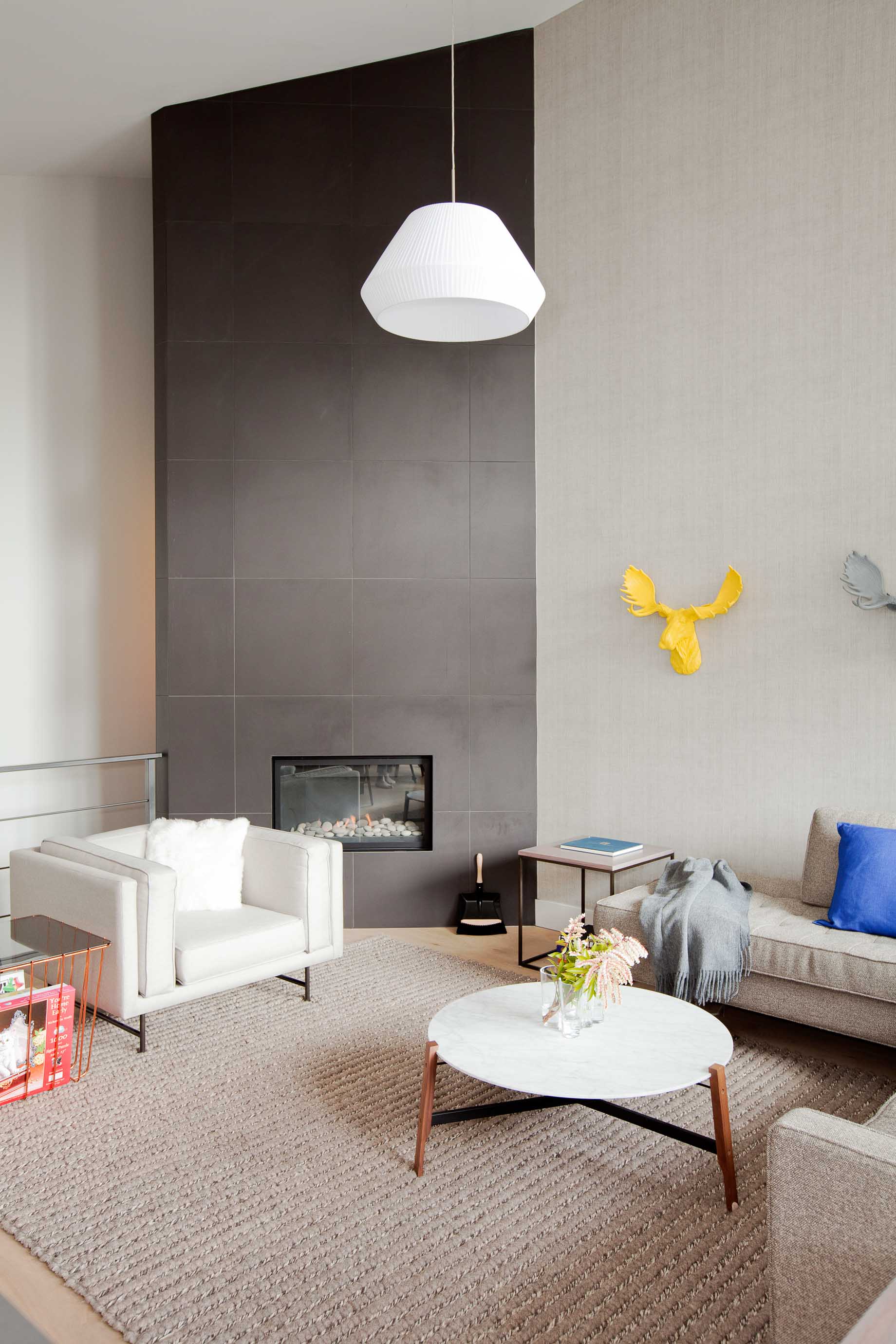
To accessorize your Whistler-inspired winter interior, go for copper and terra-cotta pots. The designer’s favorite textures are anything that feels like a sweater—the loop of a rug, wool blankets, pillows covered in chunky knits. A rougher texture, even on a hard surface like a co ee cup, also feels warmer. Leather is another great material that feels warm to the touch. It has a history to it. “Anything that evokes the natural world,” says Falkenberg.
He likes to keep things casual in a mountain retreat, as he expresses by using a wire taxidermy sculpture or resin moose heads on the wall. “I love anything that reminds me, OK I’m in a cabin, and I’m not supposed to take everything so serious.” △
Cozy and Knit
Winter interiors: Bring warmth into your home with tufted or knit accessories and furniture
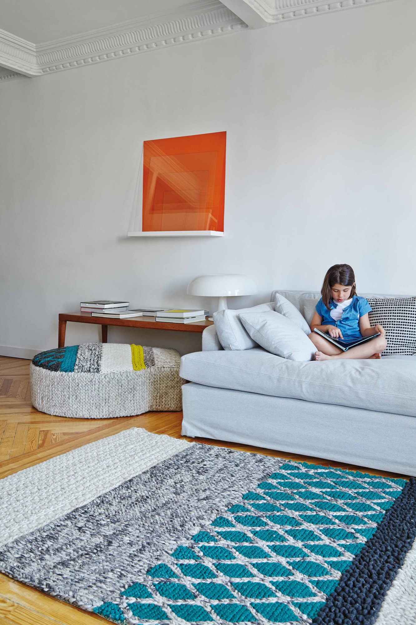
Coziness and chunky textures are not just for your grandma’s homemade afghans anymore. These tufted or knit accessories and furniture options have all the warmth of a storybook cottage, but they couldn’t be more modern.
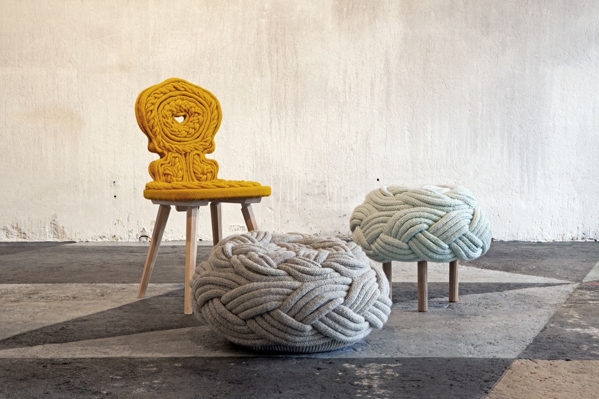
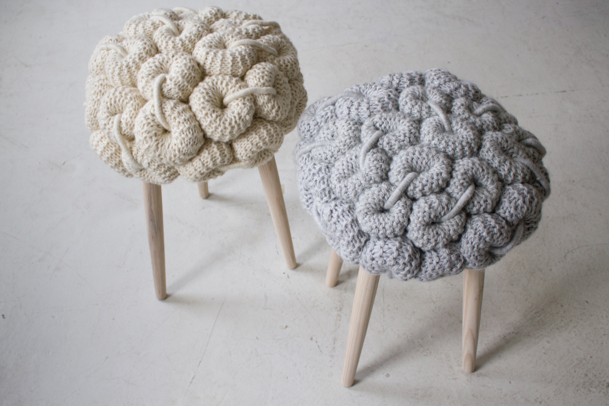
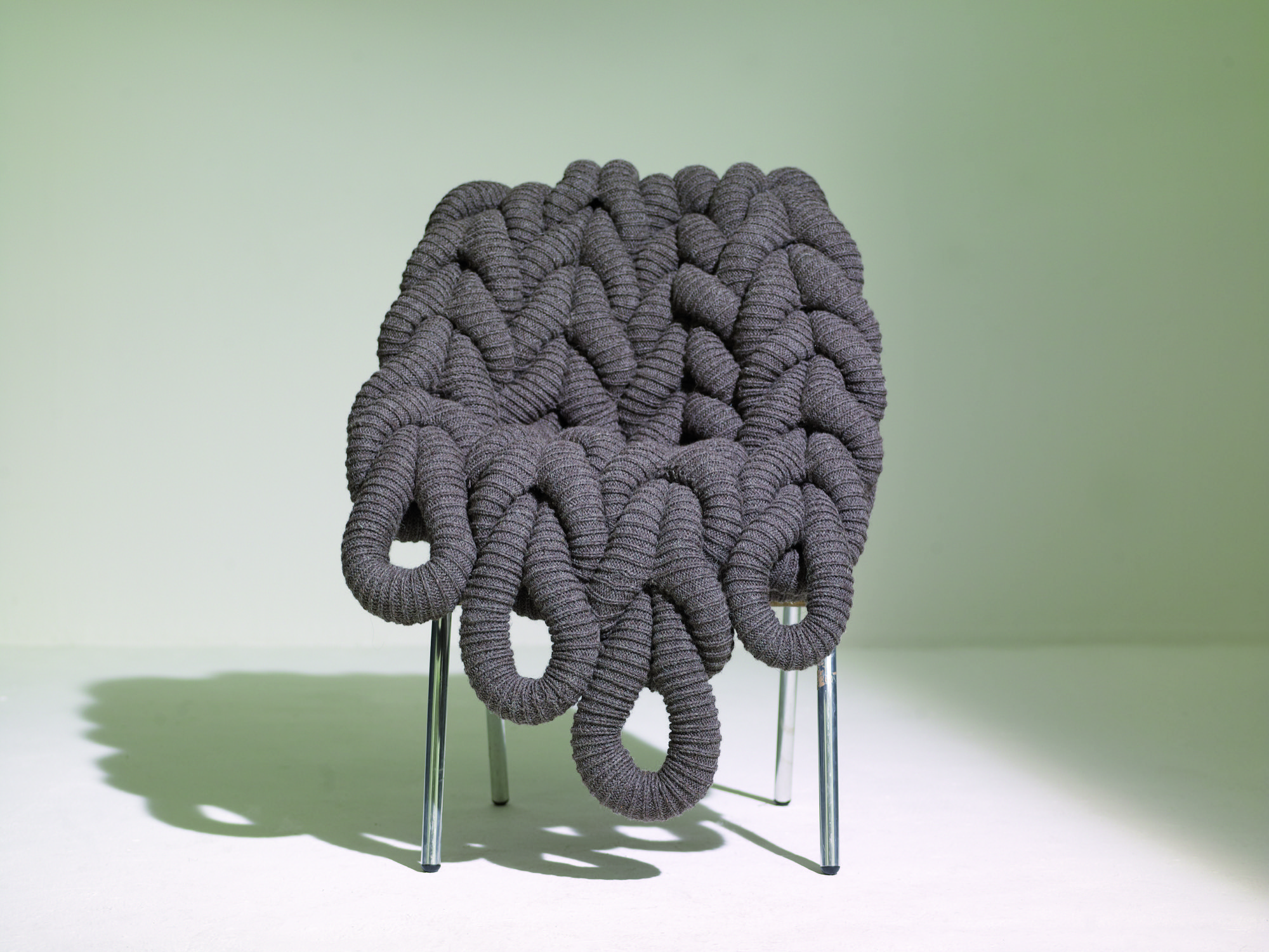
Sculptural skein seats
Claire Anne O’Brien’s stools, poufs and chairs are knit into giant skeins and then woven into a variety of loops, donut shapes and traditional patterns. The resulting seats are both whimsical and chic, surprising in their reinvented use of knitting.
Ruched beds and seating
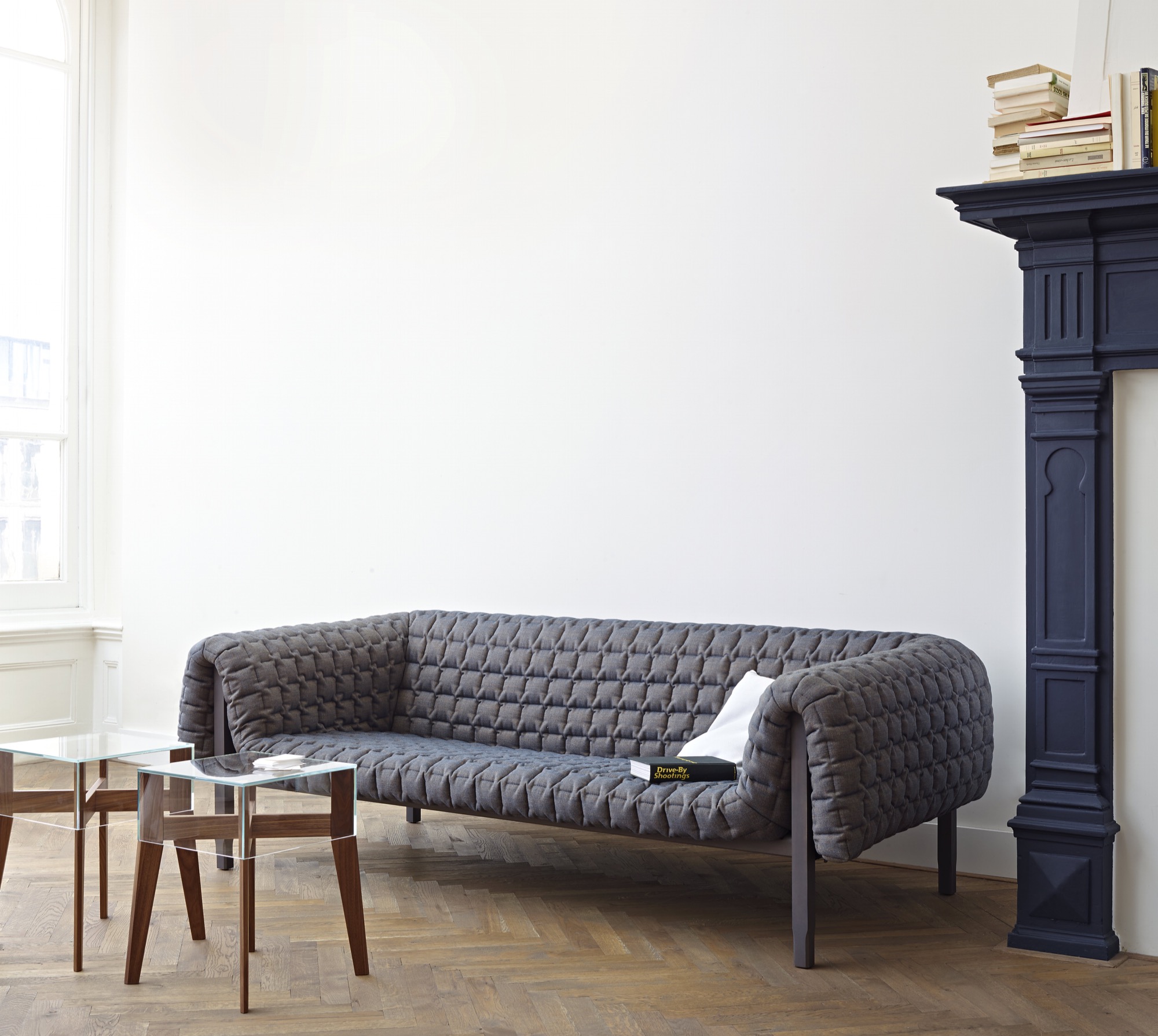
Ligne Roset’s Ruché Collection features beds and seating covered in an even, square, ruched design, with spare wooden frames. The soft, quilted fabric complements the simple legs, melding a traditional sewing pattern with modern structure.
Giant hot-water-bottle shapes
Playing with size and intention in the following rugs and poufs add both warmth and whimsy to modern spaces. The unexpected hot-water-bottle shapes of the Mangas Collection from GAN brings together heritage and modernity.
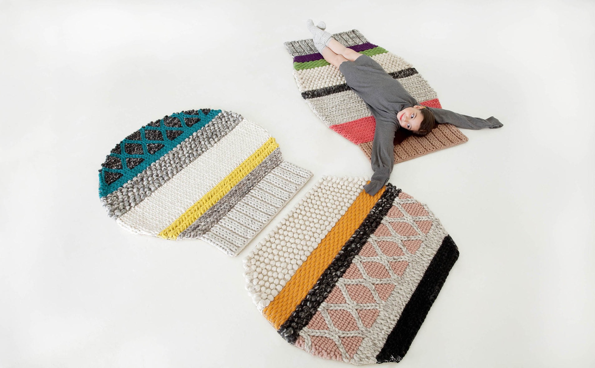
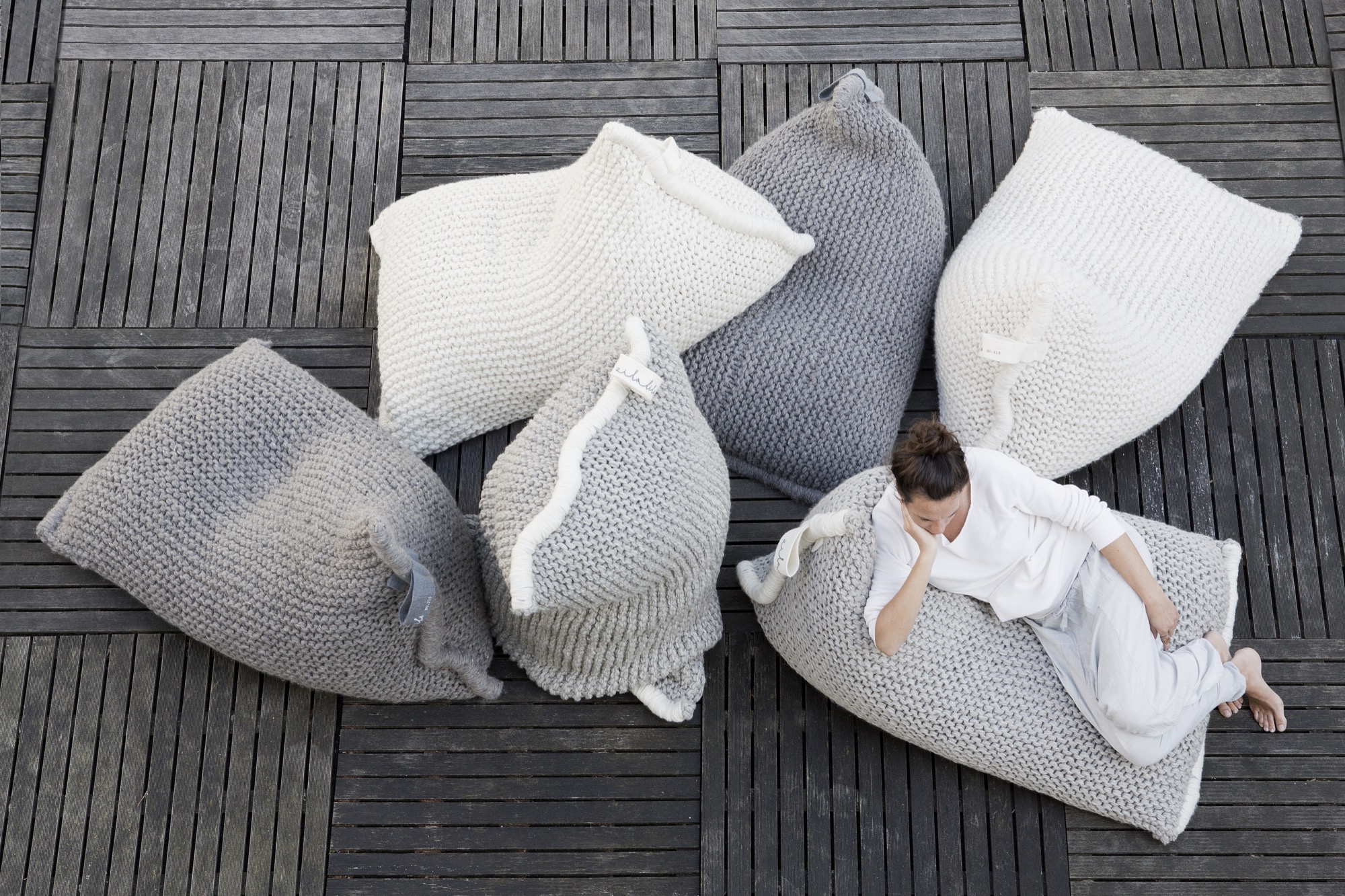
Knit bean bags
Zilalila’s Nest knitted bean bags are just that… a cozy nest to cuddle into. The knitted construction evokes another era, but the shape and feeling are wholly new and sophisticated—enriching the modern living room.
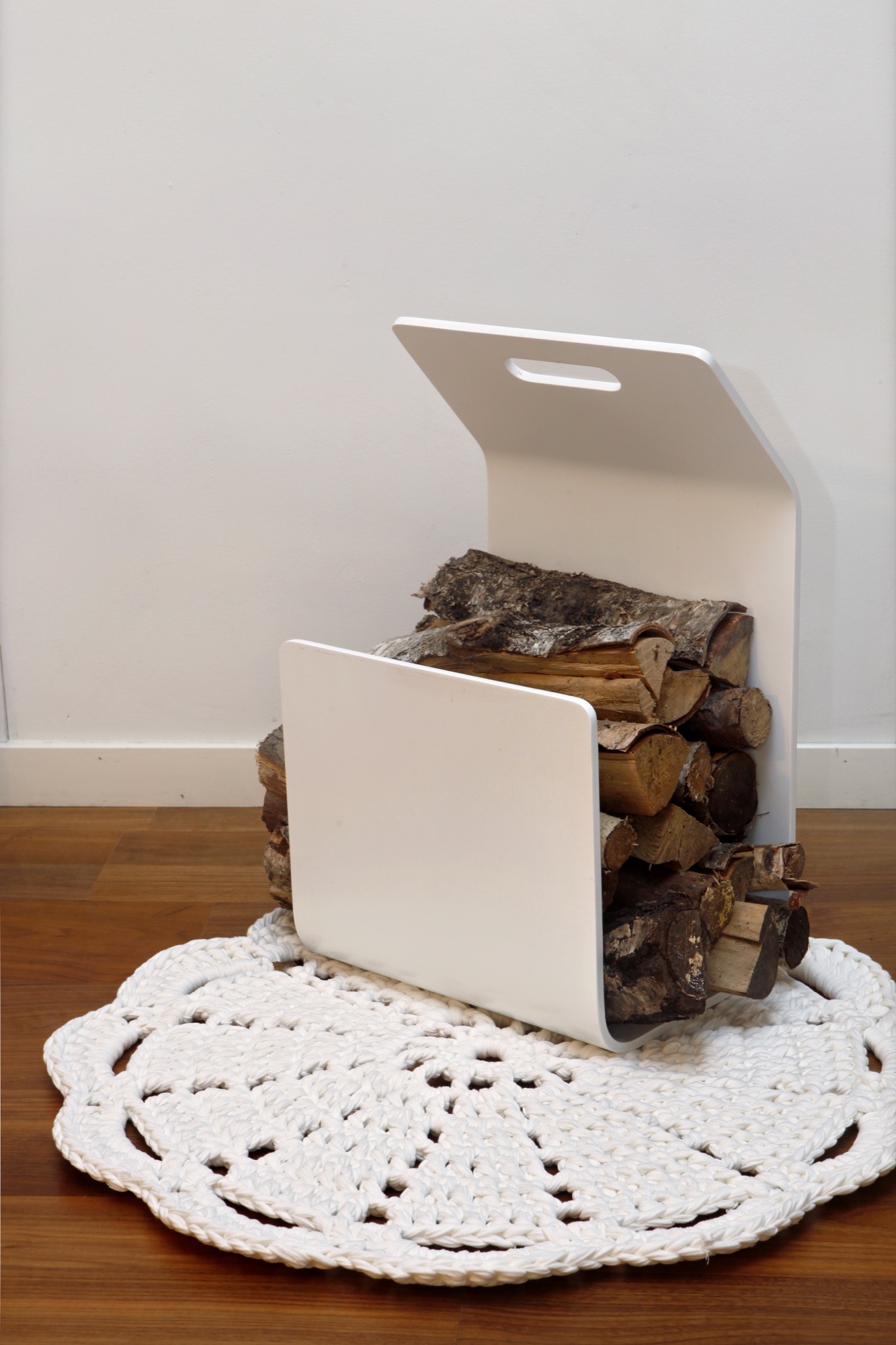
Doily rugs
Hooked Design’s doily rugs surprise by transforming something typically seen on an armrest and enlarging it for the floor.
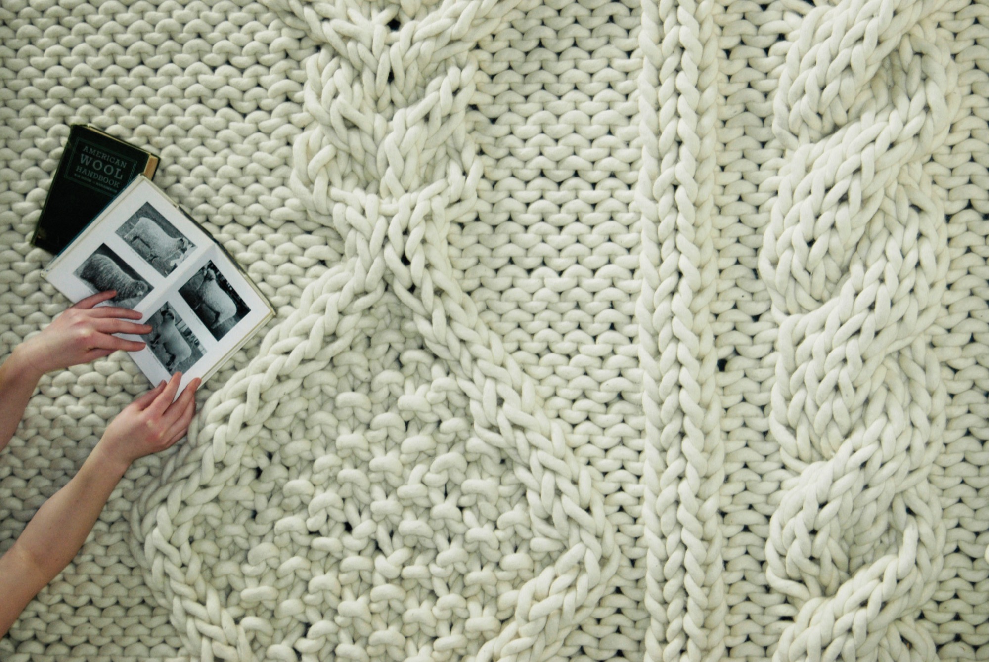
Sweater-sleeve rugs
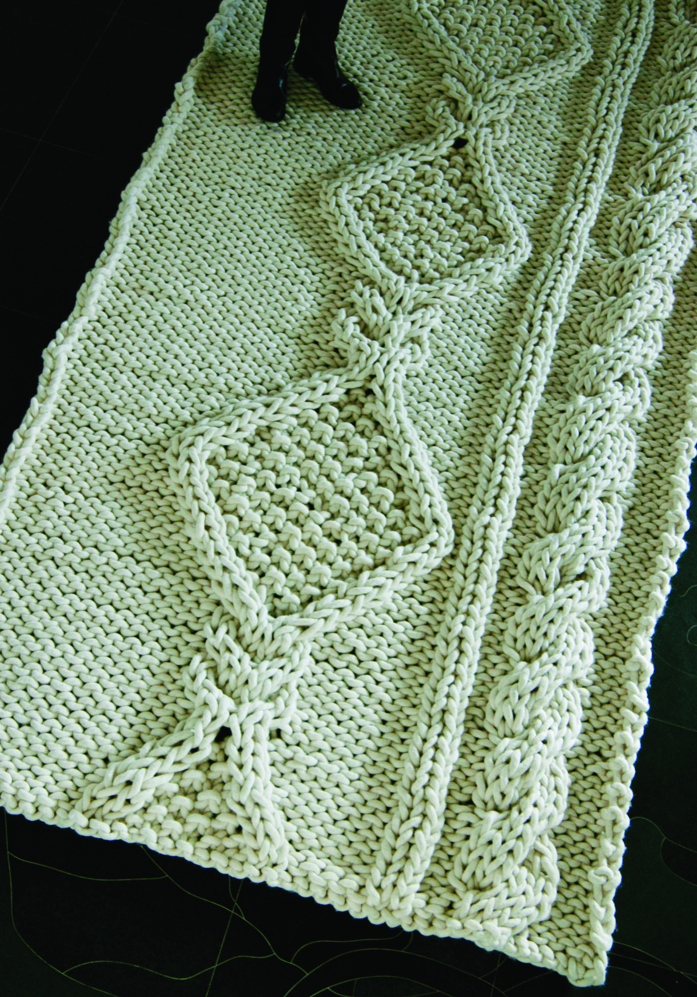
Christien Meindertsma’s Aran rug is like an oversized sleeve of your favorite fisherman sweater, inviting you to relax right into the cables.
Stories with Granny under the throw
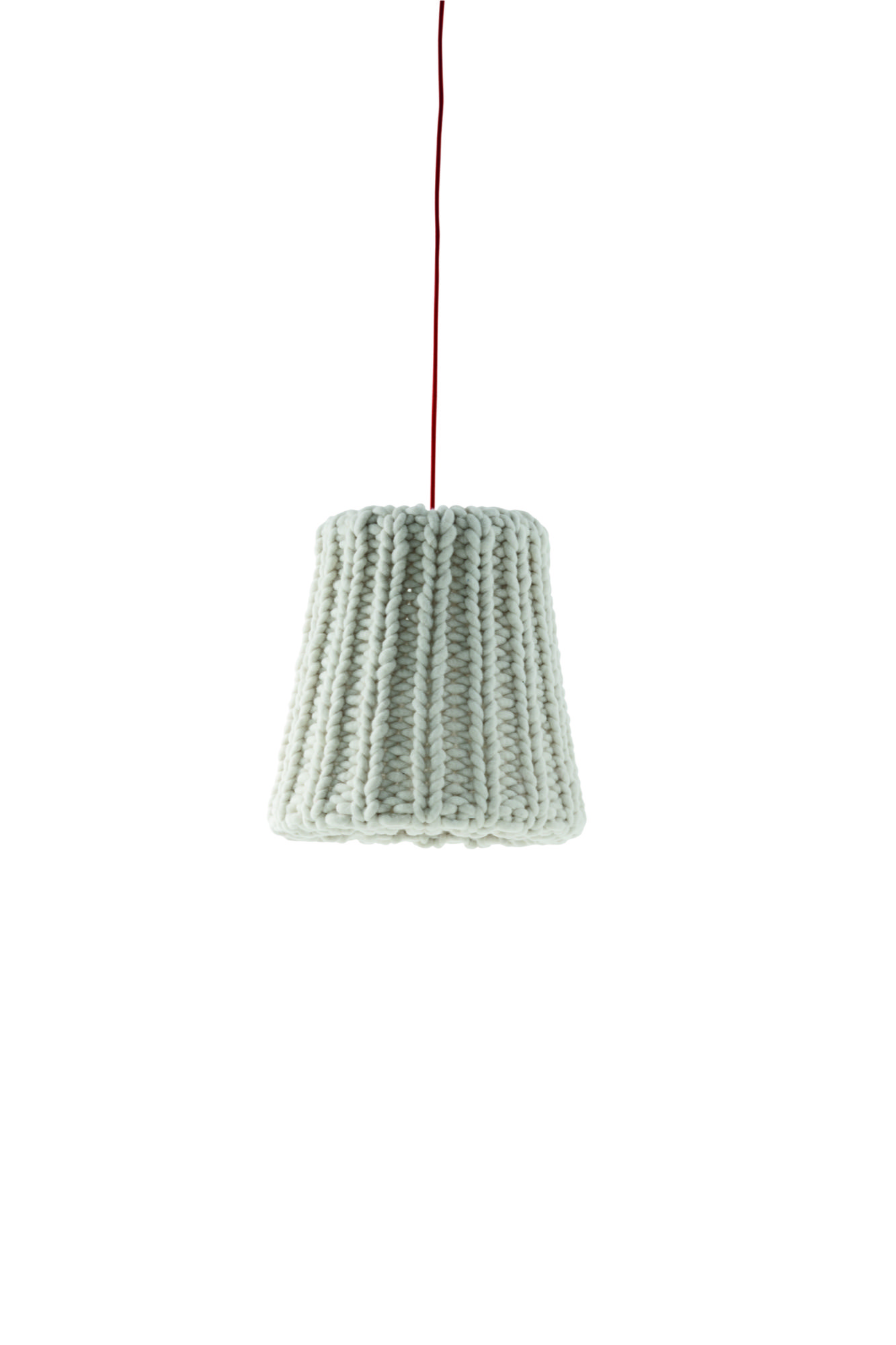
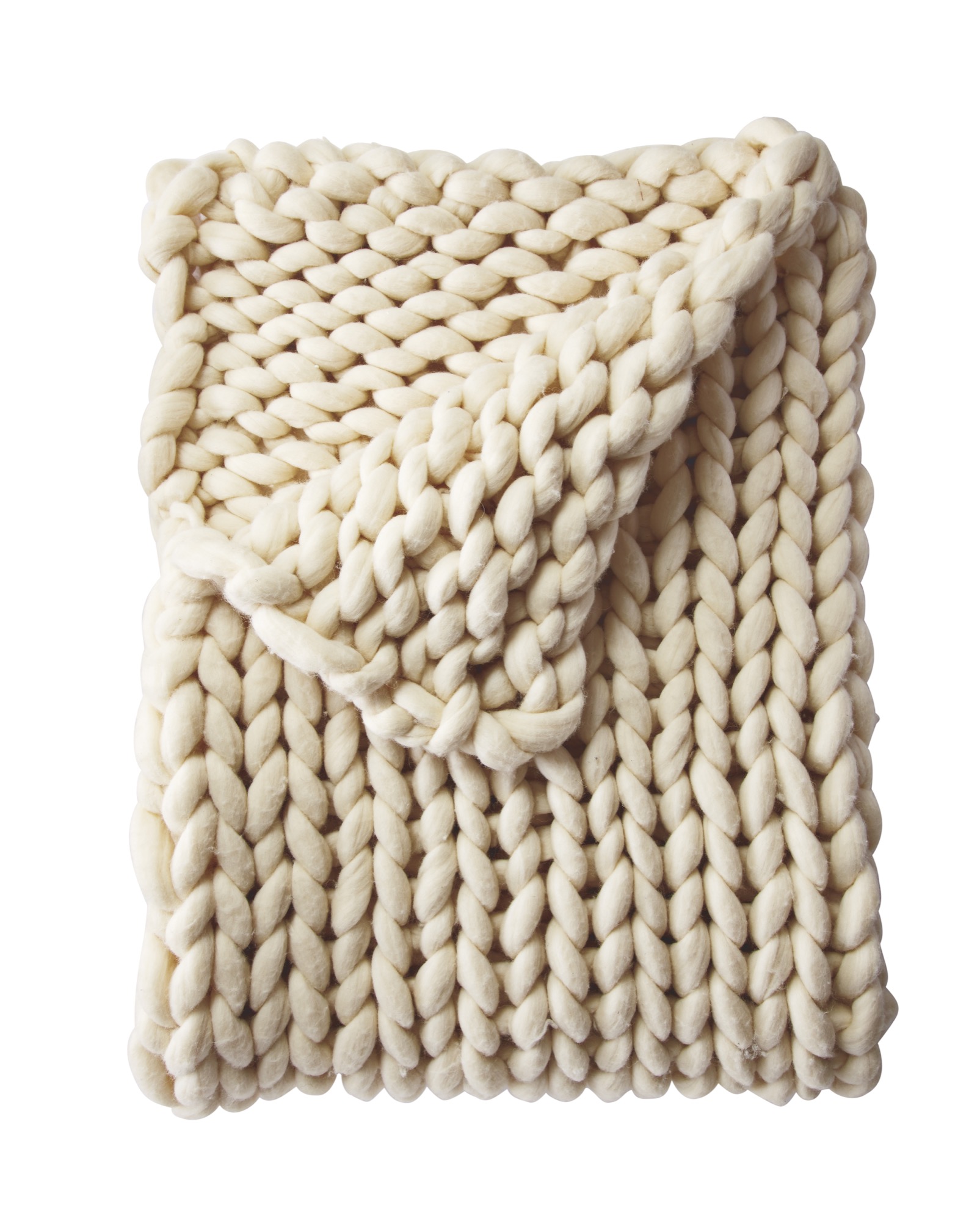
Finally, the knitted Granny Pendant of Casamania… the ideal light to sit under, while reading your favorite book, cuddled up under Serena and Lily’s Henley Wool Throw, the modern version of your grandma’s afghan. △
This snuggly roundup is curated by our interior design contributor Jennifer Rhode. Meet the Boulder interior designer and contributor.
Introducing Jennifer Rhode
Our new interior design contributor will share her insights on creating an alpine-modern home
Meet Jennifer Rhode, a fresh voice on Alpine Modern Editorial. Based in Boulder, Colorado, the cosmopolitan interior designer and writer will regularly share her insights on making your home alpine modern through considered, quiet design. Her thoughtful narratives and approachable decorating tips will inspire you to move past the idea of “more” and focus on creating beautiful spaces with less. The California native will curate elevated styles and objects from the international world of design that embody functionality and quality craftsmanship.

At home with Jennifer
One sunny afternoon this fall, Jennifer invited me into her bright, modern home in North Boulder. We instantly bonded over raising fifth-graders and missing life in Europe. The petite brunette exudes a warm intelligence that at once makes you trustfully open your mind to what she has to show and tell you. The self-proclaimed “nester” surprised me with a delightful spread of fruit and cheese... and a dining table covered in notes and visuals on inspiring ideas for upcoming interior design stories and roundups, which we can’t wait to share with you—beginning next week with a collection of chunkily knitted home goods that are equally cozy and modern.
Jennifer Rhode’s design background
Jennifer began her career in fashion and wardrobe styling, working on television commercials and shows in New York City and then moving into window design in San Francisco. The mother of two has spent the last ten years working on interior spaces in San Francisco, Amsterdam, and Boulder. The designer draws inspiration from the many cities and environments she has lived in. She loves the dichotomy of mixing antique and modern, blank areas with pops of color, simple structures with a striking piece. And she always loves some whimsy thrown in. △
Title image: Interior design by Jennifer Rhode / Photo by Bob Carmichael
Hygge Life
A conversation with Alexandra Gove—collector of beautiful moments and things—about slowing down and being hygge in the present... like the Danish do.
When Alexandra Gove—the founder of Colorado-based Hygge Life and a spirited collector of beautiful moments and things—followed her boyfriend to Amsterdam, the Colorado native fell in love with a Northern European way of life that has no name in the English language. A conversation about slowing down and being hygge in the present.

A Conversation with Alexandra Gove
A M How did you end up in Amsterdam?
A G My boyfriend, Koen, is Dutch. We skied our way to love in Vail, Colorado, a few winters ago and moved to Amsterdam together a year later.
A M You didn’t stay put there for very long . . .
AG No. That following summer, we embarked on a life-changing adventure. We bought a 1971 Opel Blitz camper, painted it blue, hitched up our bicycles, and toured Europe, selling poffertjes (mini Dutch pancakes) and collecting European vintage treasures. We stamped “Hygge Life” on the camper and called it the “Hygge Bus.”
A M What’s hygge?
AG The Danish word hygge (pronounced “hoo-ga”) has no direct translation in English. “Cozy” may come close. Hygge is the euphoric feeling when you are completely content in the present moment. Loved ones, good food, and drinks are likely contributors, as are candlelight and conversation. It’s the art of creating special moments out of daily routines and rituals, whether it’s lighting a candle over breakfast, buying fresh flowers weekly, posting handwritten invitations for your backyard summer party, or breaking out the good wine when your friends are over for dinner. It’s owning things you truly love and choosing authenticity over practicality. Hygge is about realizing the opportunity we all have to make the ordinary aspects of our lives extraordinary; to add that extra sparkle to moments, big or small.
“Hygge is the euphoric feeling when you are completely content in the present moment.”
A M At the time, you lived in Amsterdam, yet you chose a Danish name for your blog and shop . . .
A G The Dutch call this feeling “gezellig,” and the Germans “gemütlich,” but I adopted the Danish version to represent the bus tour, lifestyle, and collection of vintage household objects and wares. Not only because “hygge” is easier to pronounce but because Danish design is simple, inspiring, timeless, and just so hygge.
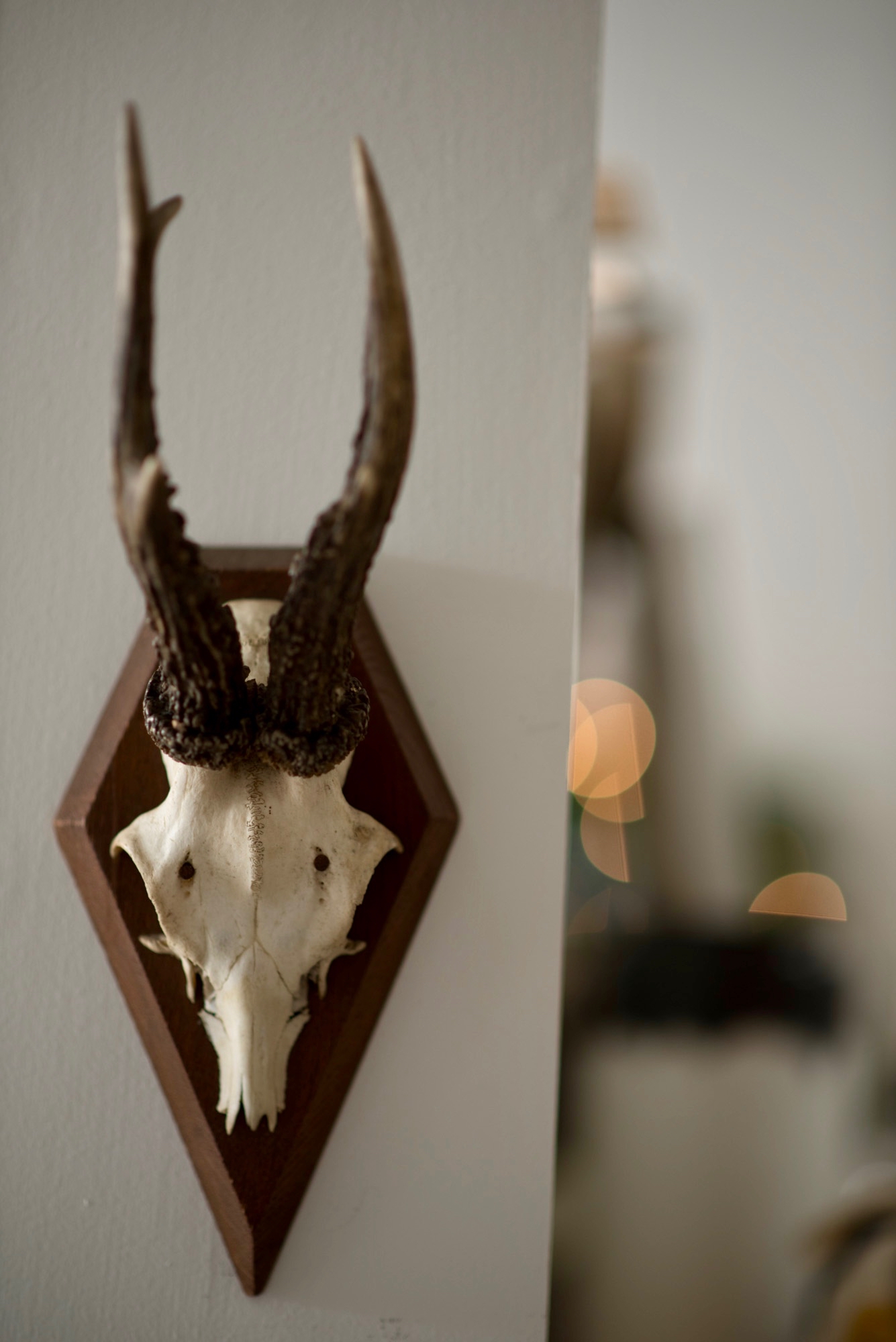
A M Where did you come by your unique antler collection?
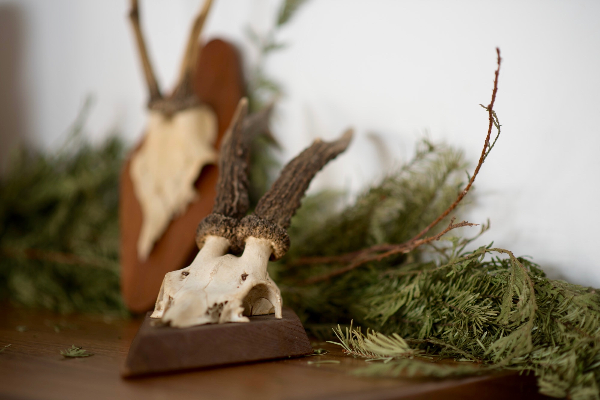
A G Driving the Hygge Bus up and down the windy roads in the Alps across France, Switzerland, and Germany, we discovered these mounted roe deer antlers among other alpine artifacts. The roe deer is typical for Europe, and the small and delicate antlers are rare in the United States, so I felt the urge for sharing my assortment with the people at home. We began buying them at flea markets, antique barns, and auctions along the way until we had a beautifully unique collection.
A M What have you been up to since the Hygge Bus tour?
A G Hygge Life has evolved into an online shop of new and vintage items from all over Europe that help create hygge spaces and moments. After lovely shared meals at our table, an evening filled with smiles, conversation, and warmth, we now have a word to describe the experience . . . hygge. △
Alpine Modern Holidays
Alpine Modern editor in chief Sandra Henderson shares her guide to a Bavarian-Coloradan Holiday
 This holiday season, Dwell is handing over the mic to some of their publishers on the new Dwell.com. We are tremendously thrilled that our editor in chief, Sandra Henderson, got to share her favorite picks for the season with the Dwell community—and now we are sharing them with you.
Our editor's Guide to a Bavarian-Coloradan Season

I grew up in Bavaria, hiking, skiing, and loving the Alps. With masters degree in political science and sociology in my pocket, I began my journalistic career at a German women’s magazine. On a trip to Washington, DC, I fell in love with my now-husband and eventually moved to the US. I began dreaming about starting a magazine that combines my two passions: modern architecture and the mountains. Meanwhile, living in Colorado, I serendipitously connected with Lon McGowan, an entrepreneur who at the time already owned an impeccably curated design shop in Boulder and shared my vision for a similar publication. Three short months later, we launched Alpine Modern magazine. We printed six beautiful issues before taking our content entirely online.
"Being a minimalist, I love to give beautiful things that are also useful and wearable—or are a treat to eat or drink."
Give

Three Peak Mountain Pillow for $75 from Alpine Modern—Hug a mountain! The handcrafted cushions—inspired by the maker’s yearly summer trips to Bend, Oregon and Three Sisters Wilderness—add a whimsical touch, whether you live in a mountain cabin or an urban condo.
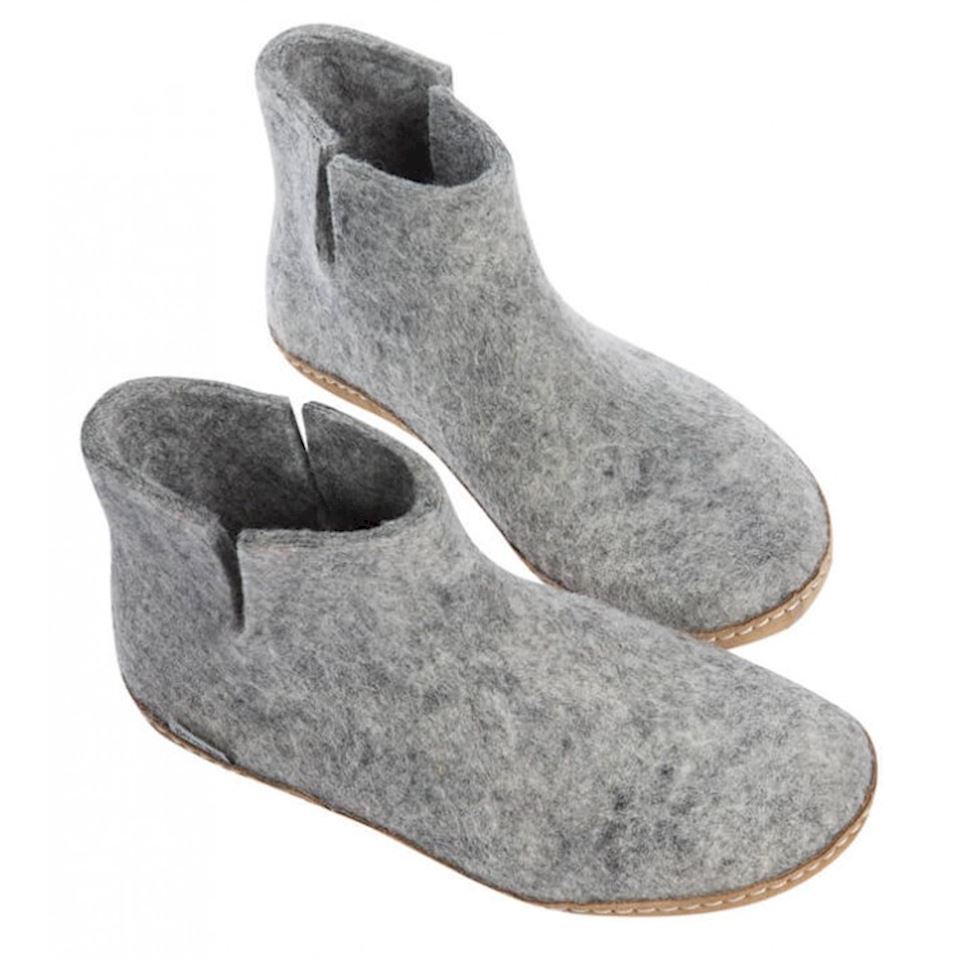
Glerups felt ankle boots for $125—Because you can’t get cozy when your feet are cold. These warm felt house shoes are made of 100 percent pure natural wool and come in all sizes—from baby to grandpa.

Santal Woods Candle for $30 from Alpine Modern—Handmade in the USA, this soy candle fills my house with a wonderful smell of the woods. At the same time, the aroma is elevated and lovely for a festive dinner party.

Keep Cups for $24—For the busy body. Everyone already has a travel mug for on-the-go, but these cute and practical glass cups with lids are made for running up and down the stairs at home without spilling your morning coffee.
Drink
My favorite bubbly and bourbon to share with friends...

Meinklang Pinot Noir Frizzante Rosé from Austria for $18.99—You can pick this up from Whole Foods or order online.

Breckenridge Distillery Whiskey for $45.99—Make your mountainman happy with a bottle of Breckenridge Blend of Straight Bourbon Whiskeys. It’s made with Rocky Mountain snowmelt.
Listen

If on a Winter’s Night by Sting from Amazon for $11.23—The album is a stirring collection of earthy winter songs, with a couple originals composed by Sting. The others include folk songs, lullabies, and hymns from decades and centuries past that were recorded with friends and guest musicians. The haunting sounds transport you deep into a snowy forest. My favorite tune on the album is “Soul Cake,” a traditional English beggar’s song.
Want
On my own wish list this year...

Transcendent Mitts by Outdoor Research for $59—I trust nature’s wisdom, so I usually choose wool or down to keep me warm. These puffy mittens are blissfully light and pack down perfectly in a bag.

Gold Ear Conch Cuff by Loren Stewart from Goop for $285—The idea of wearing an ear cuff is so ‘80s—I know—but this minimalist luxe version, designed by Loren Stewart, is definitely happening now. Beautiful and sophisticated. No piercing required.
Go

Home for the Holidays! What’s a more magical place to be for the Holidays than Bavaria? Lela Rose, my 10-year-old daughter, has never seen my native Germany in winter. I am beyond excited she finally gets to experience the Christmas market in my romantic home town of Dinkelsbühl in December.
And finally—our tree? Always real, with a vintage hand-blown glass top.
Do you have any suggestions on what else you'd need to create a cozy alpine-inspired holiday? Let us know in the comments!
The Building Friendship
Friends since preschool and sharing a love for design and the mountains, the founders of MTN Lab, an experimental furniture and art studio in Colorado, have always been building things together
Harris Hine and Rudy Unrau have been best friends since preschool. Now both 27 years old, they have founded MTN Lab, an experimental furniture and art studio in Colorado. Growing up in Boulder, Colorado, the lifelong friends have been building things together since they can remember—skis, bikes, random projects. But it wasn’t until spring 2015 that the idea for MTN Lab was born. Both back in Boulder, Hine and Unrau began showing sculptures at Studio Como in Denver’s RiNo art district at the time. “Getting in there is what really materialized the company,” Unrau recalls. “That’s when we came up with our name and went from just building stuff to actually focusing on a business.”
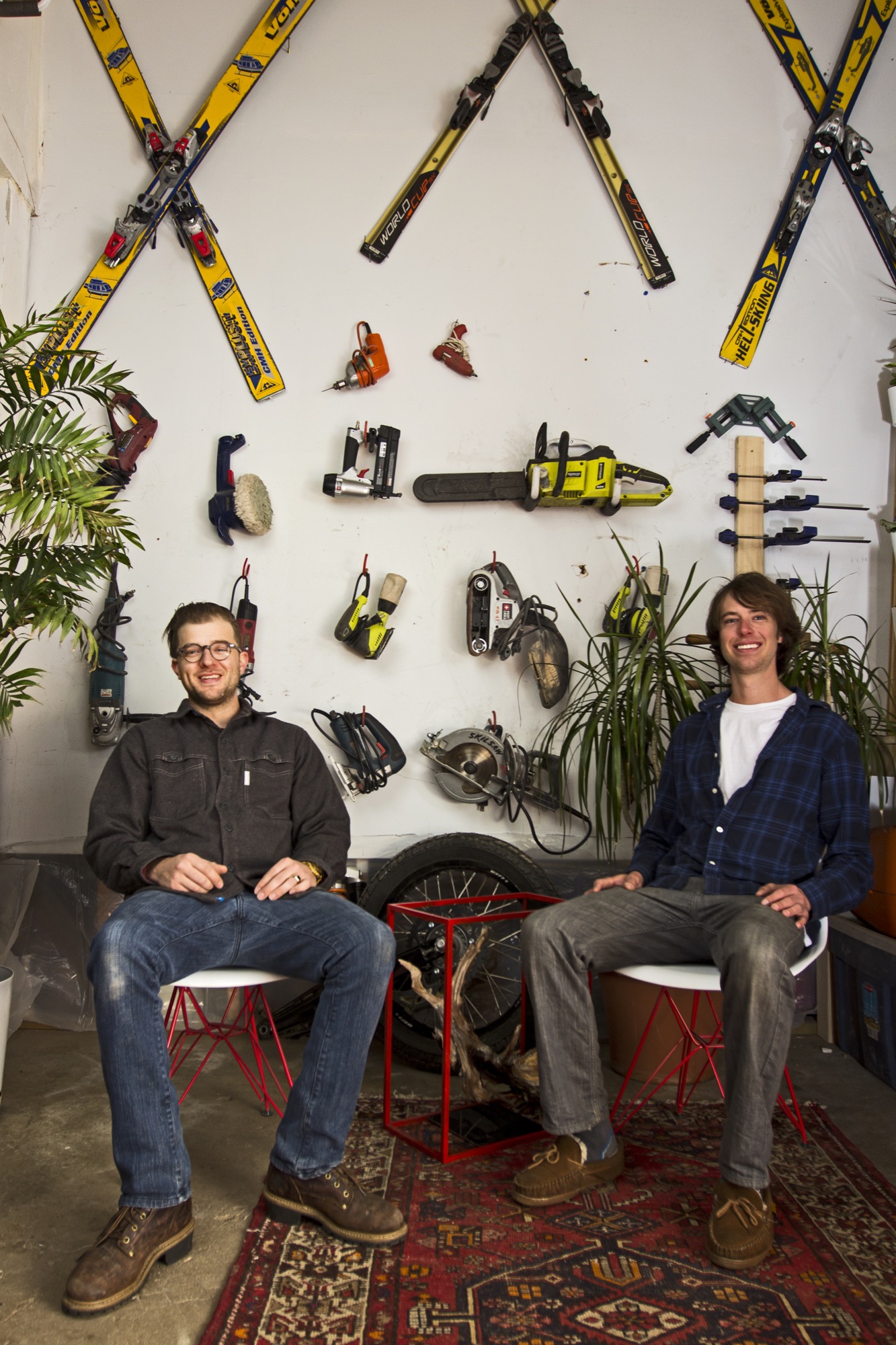
The two men, both quiet and reflective, share an ardent love for design and the mountains. Yet, they come together at MTN Lab—at the intersection of art and adventure—from opposite directions: Hine a trained designer and woodworker, Unrau a former professional mountain biker turned woodsman fighting wildfires for the Forest Service.
Harris Hine
Harris Hine grew up profoundly influenced by his father, Vienna-born modernist architect Harvey Hine, who founded HMH Architecture + Interiors in Boulder.
“I’ve always been torn between the design side of my personality and just wanting to be in the woods,” Hine shares. He went to school for design at Pratt Institute in Brooklyn before moving from New York City to Portland, Oregon, where he worked as industrial designer. “I didn’t find any fulfillment doing other people’s projects, and I didn’t really like the mass production side of product design,” he admits.
All those years, Hine pined for the woods, where his old friend was.
Rudy Unrau
Unrau, while attending college in Western Colorado, signed on with the United States Forest Service. “I was on track to becoming a smoke jumper, working for a helicopter crew down in Durango,” the long and lanky woodworker recounts. “It was a great setup because you work a ton in the summer, and then you get winter free to do whatever you want, like ski and move to Canada.”
Throughout those years, Unrau had been harboring the desire to return to making art. “Seeing the things you see when you get to fly around and travel the US and go to all of the mountain ranges... I had ideas emerge to work with the trees that had been burnt or partially burnt in fires because they get so twisted and cool.”
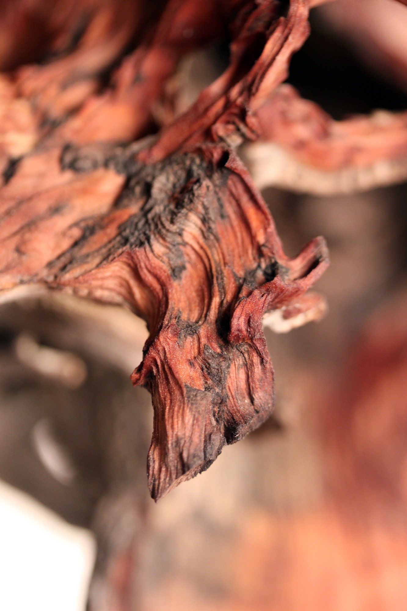
"I had ideas emerge to work with the trees that had been burnt or partially burnt in fires because they get so twisted and cool.”
Joint adventure up north
At last, one pivotal winter Hine and Unrau moved to British Columbia together to ski. Their close friendship and mutual influence would impact each man’s path. “Rudy was all in the woods,” Hine remembers, “Living together pulled him back into the design world and brought me back into the woods.”
Unrau agrees: “I’ve always been at home in the woods. Growing up, I really wanted to pursue mountain biking, so I raced mountain bikes professionally for quite a few years.” After the athlete got “a little bit tired” of mountain bike racing in world cups, he focused on skiing.
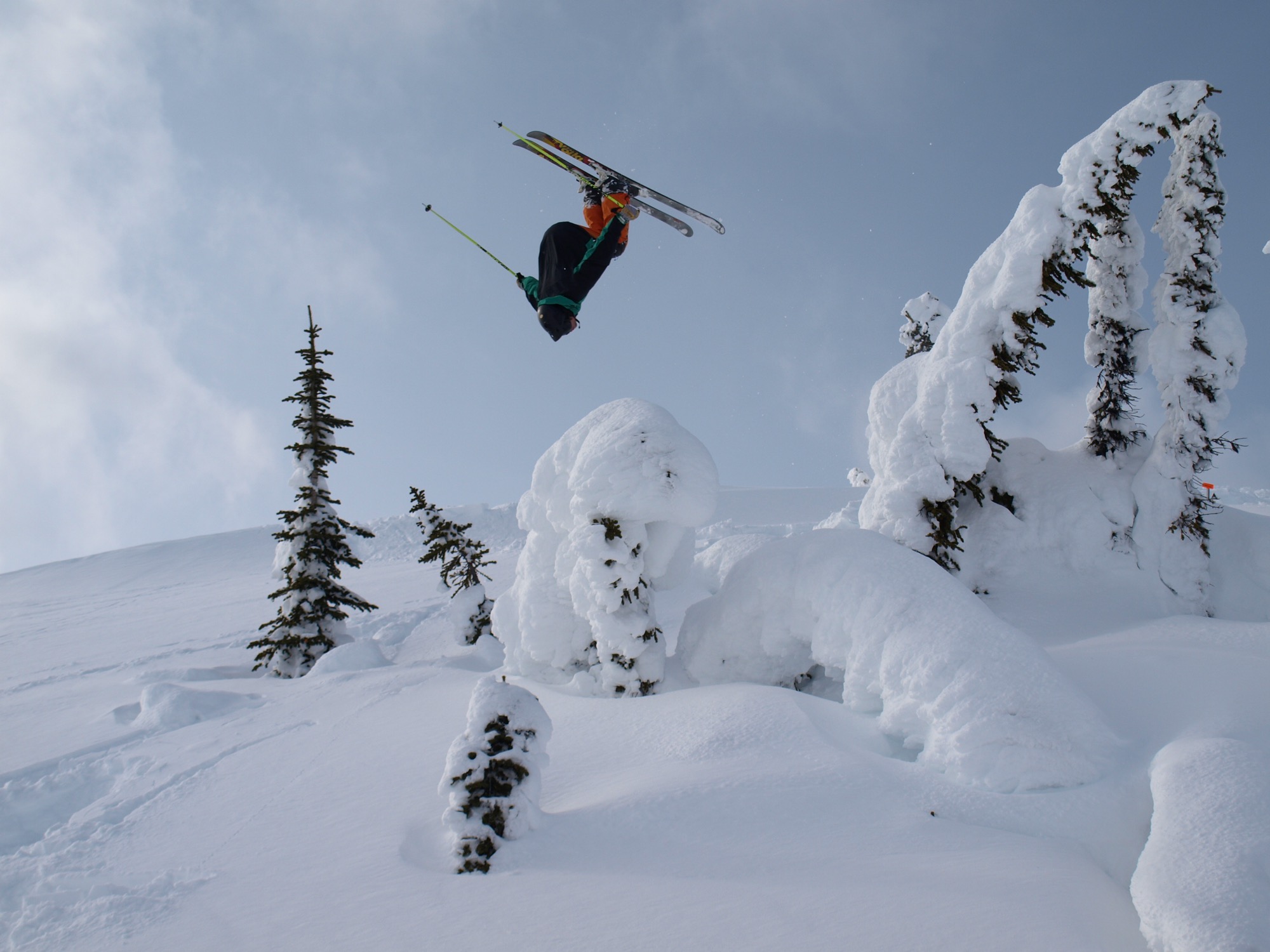
Skiing in Canada was good fun. Winter gone, however, Unrau planned to work another fire season. The outdoorsman envisioned himself carrying on that seasonal rhythm of demanding service and wild adventures in the snow for years until he had and his friend had their fill of youth and independence. “And... I crashed paragliding,” he tells, falling solemn all of a sudden. “I broke my back and almost died and spent half a year recovering.”
His loyal friend by his side, Unrau needed to reevaluate his future. “I realized, I wouldn’t be able to do fire again,” he says. “And then it was pretty natural the way MTN Lab came together—us getting our shop set up to where we could build.”
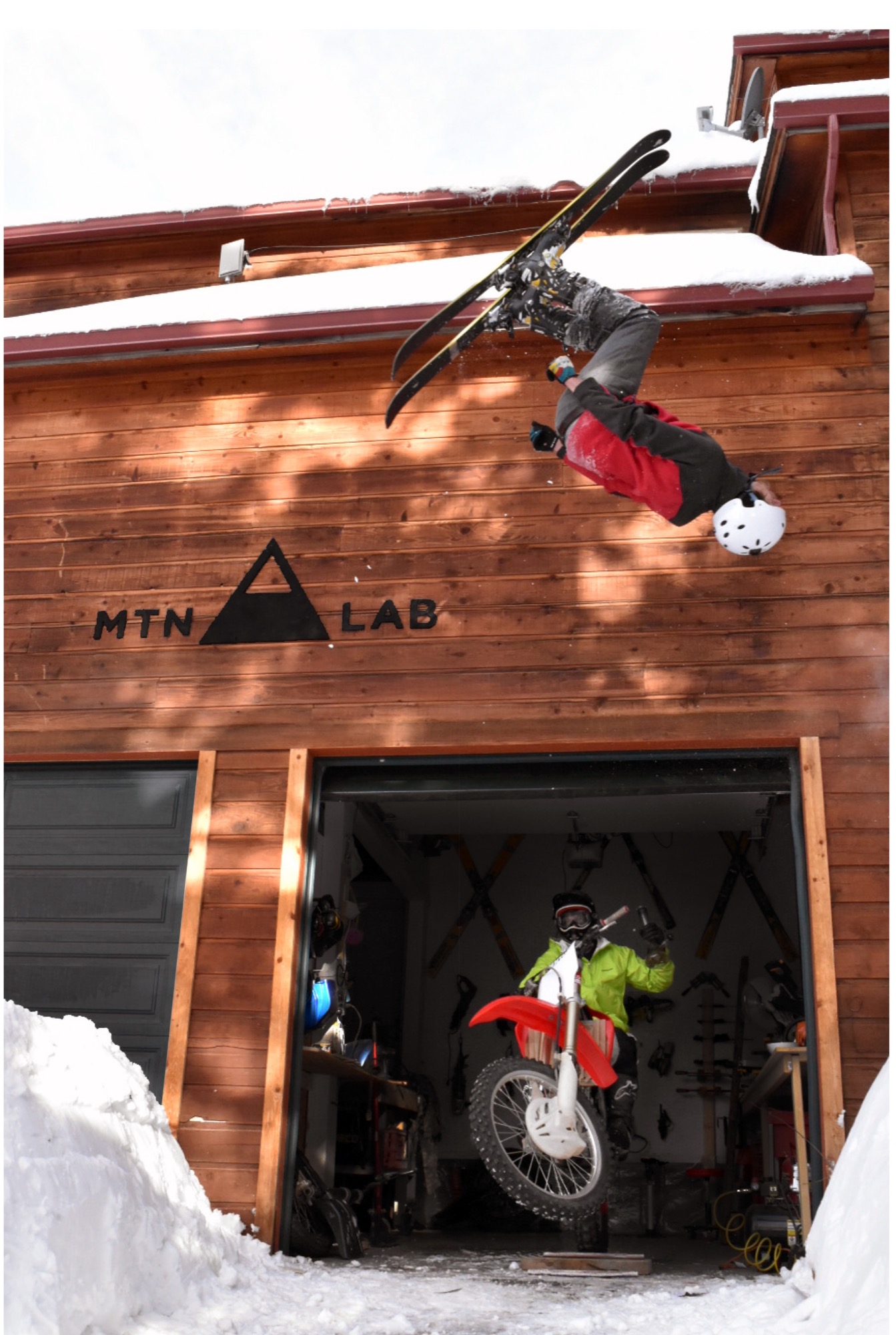
The MTN Lab process
Starting with sculptures, the duo soon began venturing into furniture. Their vision is to grow the Conifer studio into an art collective, with more creatives joining them. They are even planning to build a tiny house to accommodate visiting artists and designers.

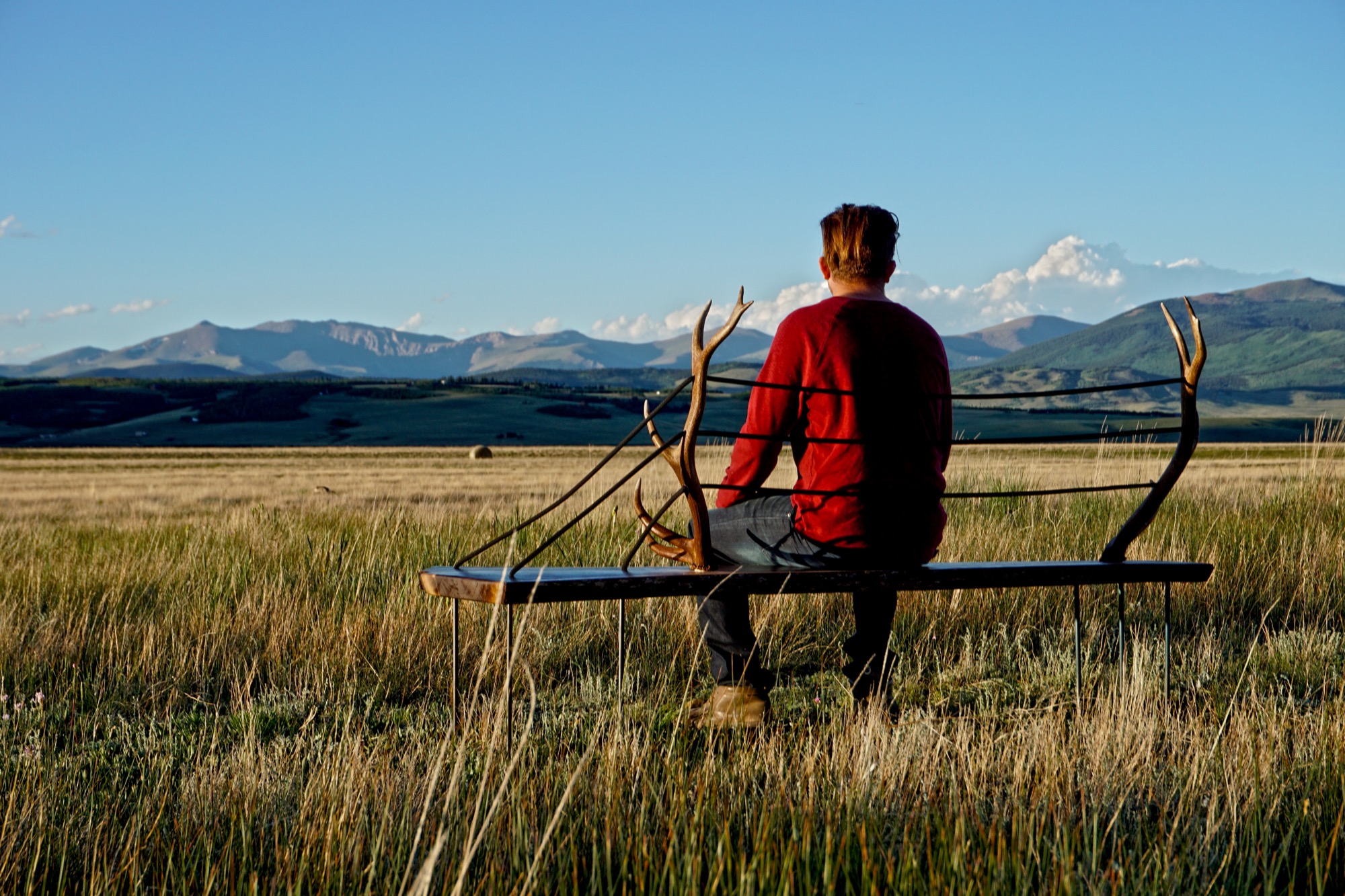
MTN Lab is as much a concept as it is a company. “Our process is the most indicative of what we make,” Hine explains. The founders source all of their materials themselves in the Colorado mountains. “We quarry our own stones to carve and collect our own wood.” Like it was for generations of makers in the mountains before them, MTN Lab’s workflow follows nature’s rhythmic swing. “Right now it’s the season for us to go get river stones because the flow just came down,” Hine tells me, when I sit down with him and his partner on that warm day in early September. “And we are doing antler stuff because we found a bunch of Elk sheds. That’s this flow that we follow.” Adds Unrau: “Our company is trying to do the whole process from sourcing, getting our materials, designing it, building it ourselves, photographing it ourselves.”
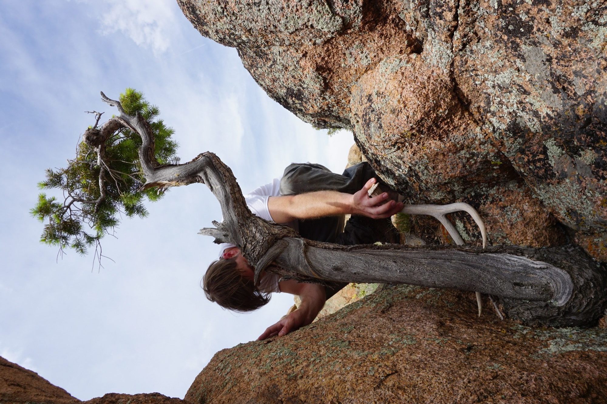
The friend believes having grown up in the mountains is what motivates them to see the entire process through, from beginning to end. “Spending all of your free time in the backcountry—you’re just so inspired by what you’re surrounded by,” Unrau says. “Initially, we were out there to ski, climbing to ski. We were dirt-biking. But when you spend that much time out there, it altered our perception of why we were there. And now it’s awesome because we get to ski, but that’s not the whole part of the process. The ski is the vessel for finding the materials—as well as the inspiration.”
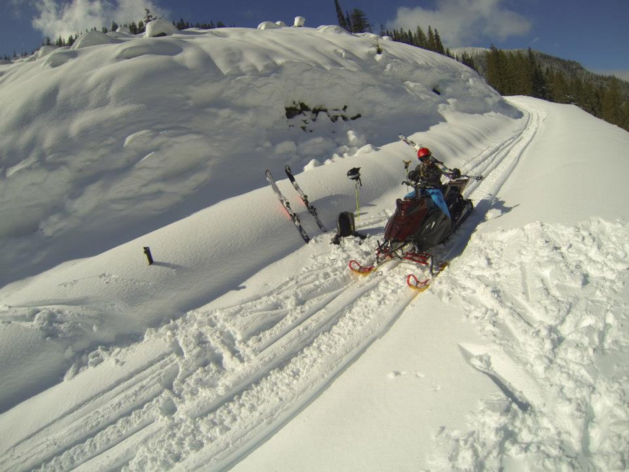
“The ski is the vessel for finding the materials—as well as the inspiration.”
Connecting nature and art
“I’ve always liked minimalist design, and I rarely see that done with natural materials,” Hine says. “You look at Bauhaus stuff, and it’s very industrialized. My dad being the modernist he is, half of me is always striving for that simplicity. But then there is the other part of me... the Colorado guy. And I see these cool pieces of wood and antlers and it naturally merged. In college, I was more on the industrial, clean-cut metal side of things, and my style has evolved more and more into a hybrid of rustic and modern.”
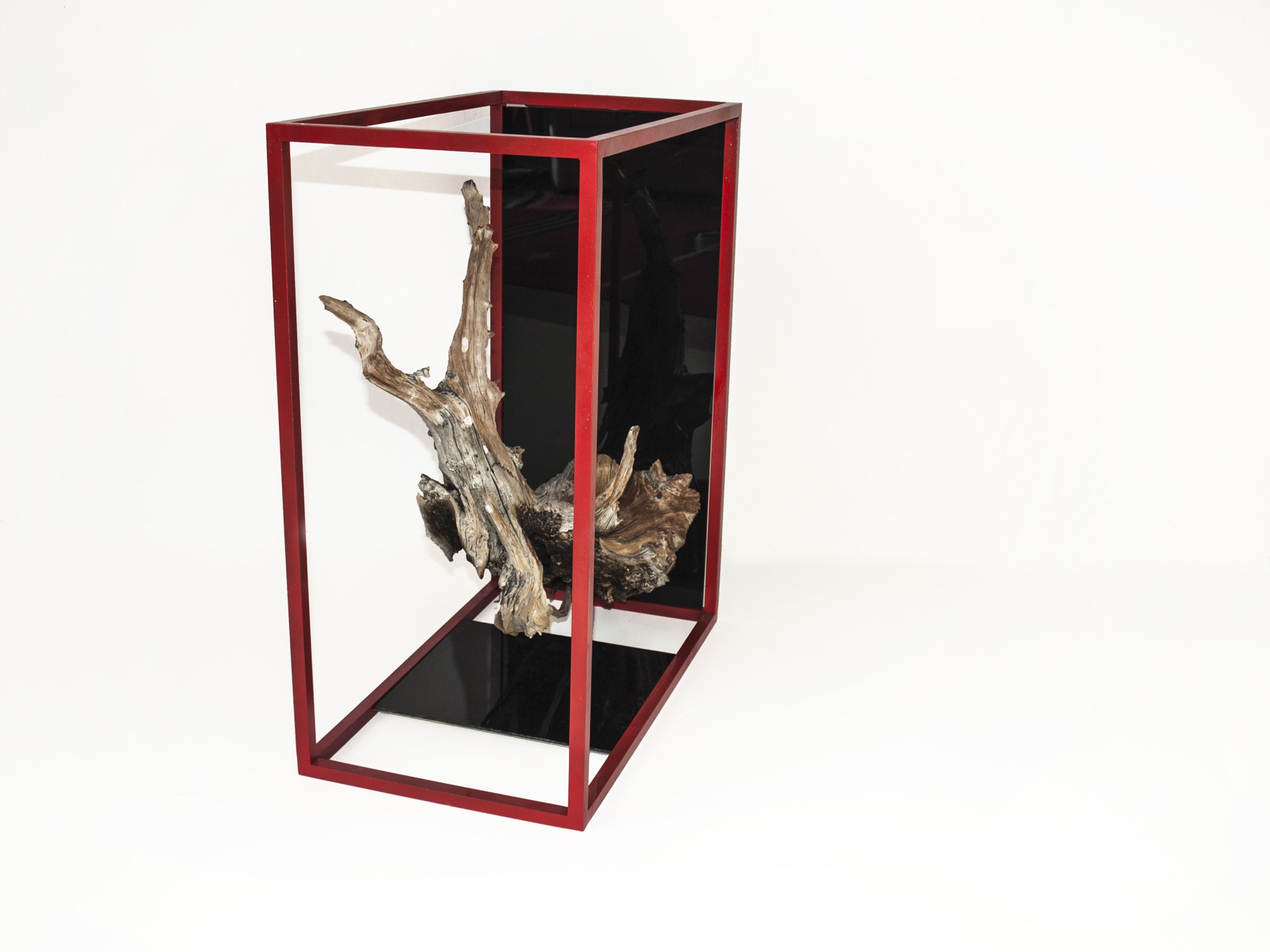
Unrau, for his part, never earned an art or design degree, nor does the lack of academic study in the field limit him in his current work. “We really do our designing when we’re out in the woods. We don’t sit down in an office to draw. We see the material, and the material almost dictates its design.”
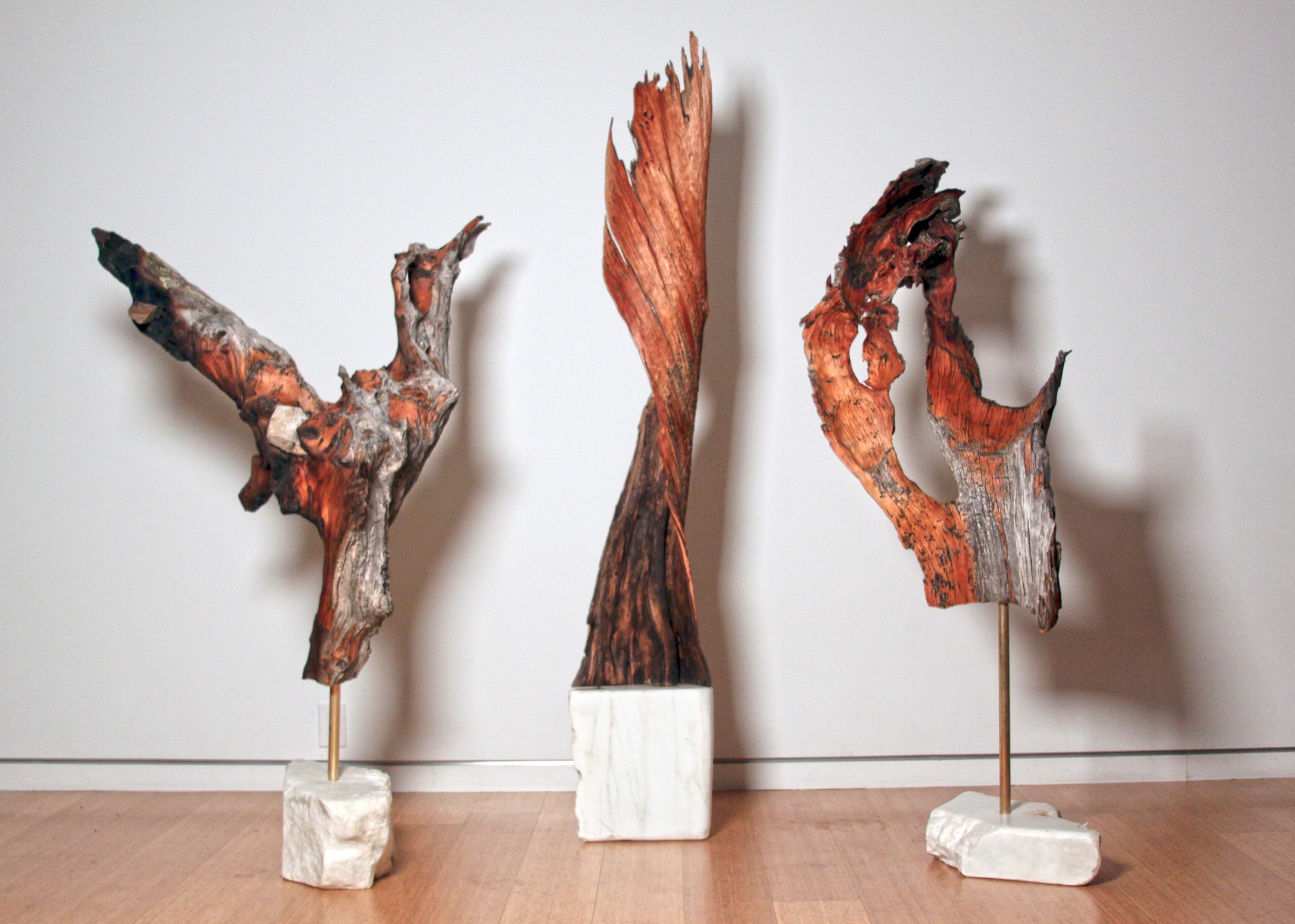
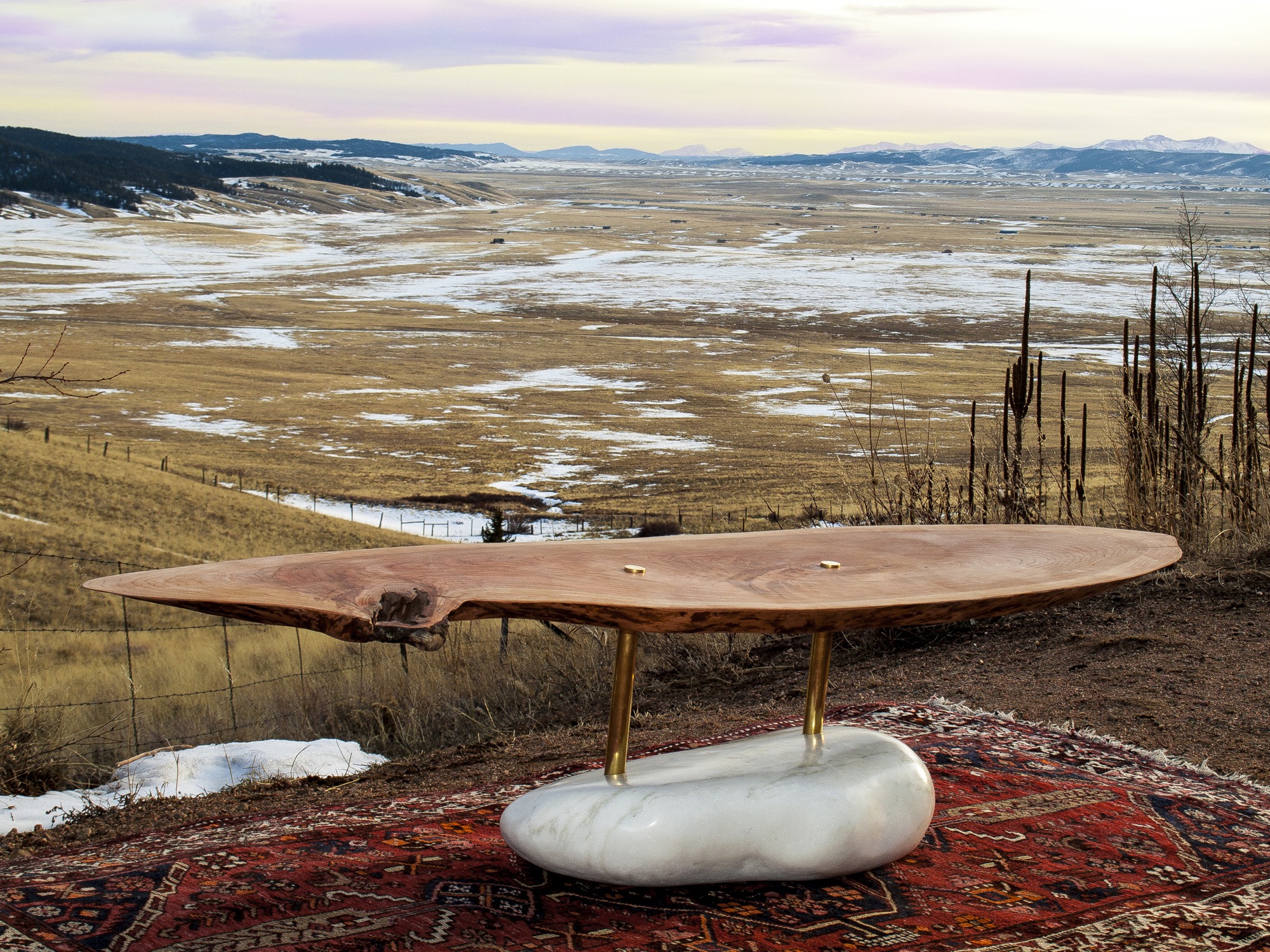
They usually know right away, if a piece of wood they come upon in the forest will transform into an art sculpture, a table, or something else entirely. Back at the studio, they combine found pieces of wood or elk shed with marble and often with contrasting metal. The final artwork or furniture piece comes together like a collage. While the sculptures are never drawn out, the furniture generally is. “We design our table bases, draw them by hand. Sometimes, we bring it into CAD.”
The day I met up with Unrau and Hine, they had come down from their studio above 8000 feet to deliver a piece of art they made for the Boulder Museum of Contemporary Art. “We had this mobile,” Hine begins, chuckling, “And then Rudy dropped it on the staircase, and we were like ‘Oh, no, we’re so crushed. And we had to quickly build it a second time yesterday, and it came out eight times better than the first. That process isn’t always easy to rely on, but sometimes when you make it again, it’s better. This is how we continuously design.”
Speaking about the synergy between Colorado’s magnificent nature, rich history and tradition, and progressive modern art, Hine notes that he is profoundly influenced by the stone carvings of American artist and landscape architect Isamu Noguchi. “It’s that blend of leaving these big natural boulders and polishing one face of it.”
Rustic designs with wood and stone are ubiquitous. “But it’s hard to find someone who has done them simple enough so that these materials individually speak for themselves,” hine says. “Antler furniture is really something we have been experimenting with, because it’s hard to find a simple antler-anything. All the chandeliers are the same hunter antler cluster. And all of a sudden, you are appreciating the simplicity of the singular antler as a sculptural element. That’s what makes it alpine modern, and not just alpine.”
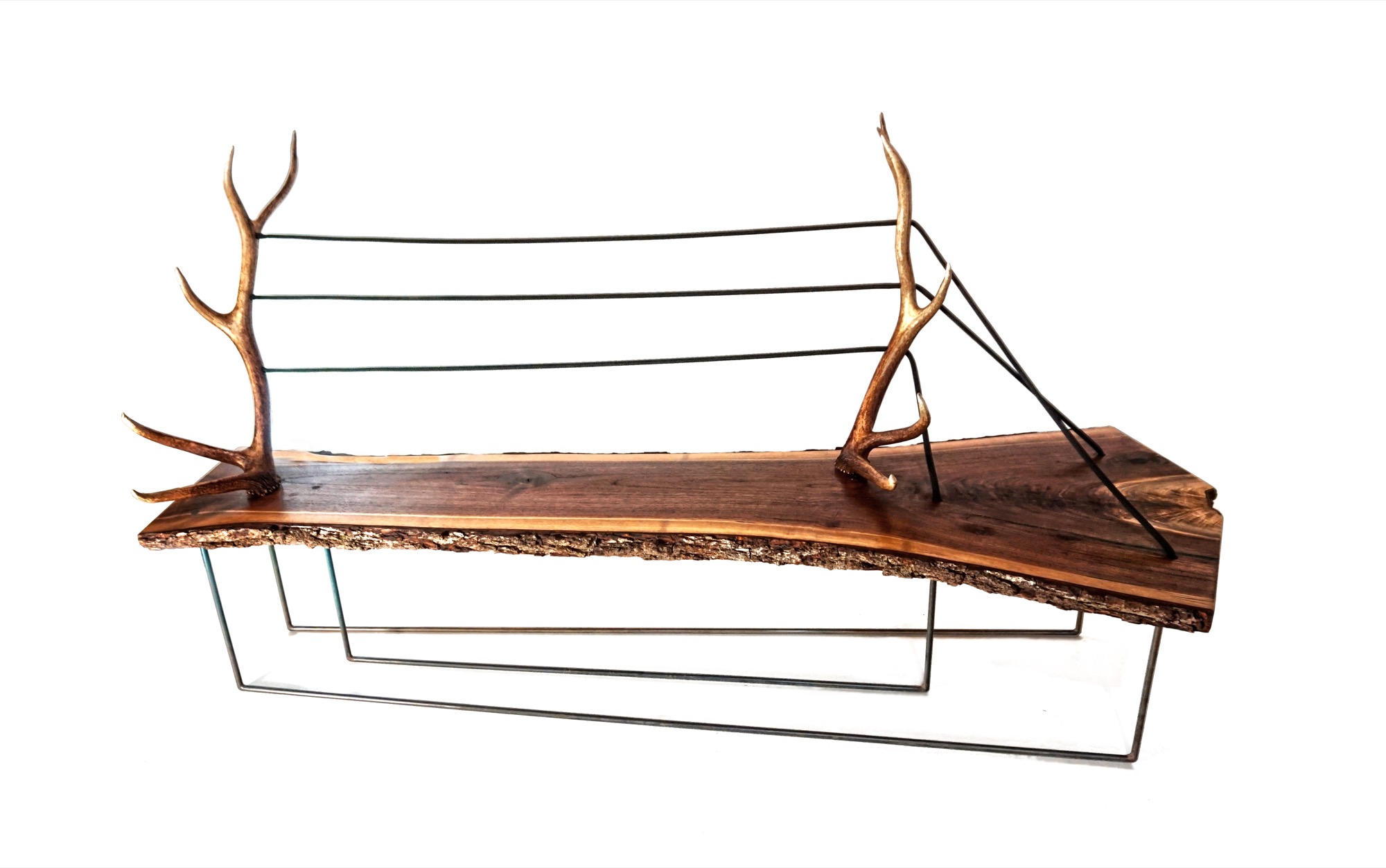
“And all of a sudden, you are appreciating the simplicity of the singular antler as a sculptural element. That’s what makes it alpine modern, and not just alpine.”
A modernists at heart, Hine still looks to the arts and crafts movement for inspiration. “Not stylistically but the whole concept of it is huge, especially since my education is in mass production and industrial design and product development. And going back to actually hand-building one-off pieces from the found materials we use, you can’t really build the same piece twice. It’s almost like we’re in an arts and crafts revival, which is weird for me because that’s the antithesis of the Bauhaus influence, of going from craft to industrial production.”
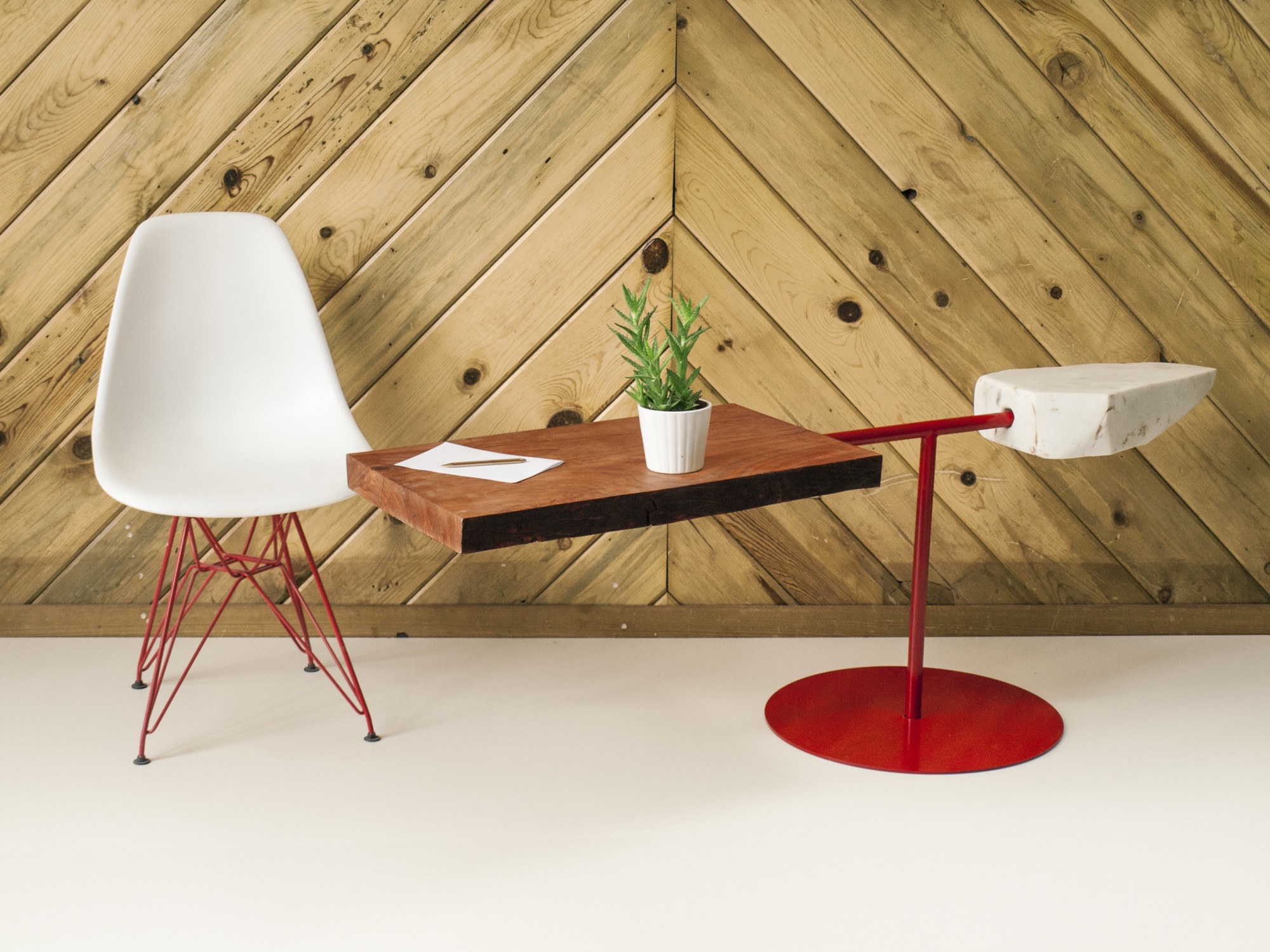
Our conversation later on reveals that the two 27 year olds are somewhat of an antithesis, too—to their fellow millennials. The Internet, they admit tittering, is their shortcoming. “Neither of us really enjoys social media, self promotion, or even doing the sales part,” Hine says. “It’s the cliché artist who doesn’t sell his stuff. We just are either in the woods or in the shop. It never feels like were working.”
MTN Lab projects
Each MTN Lab piece embodies a story of adventure and friendship.
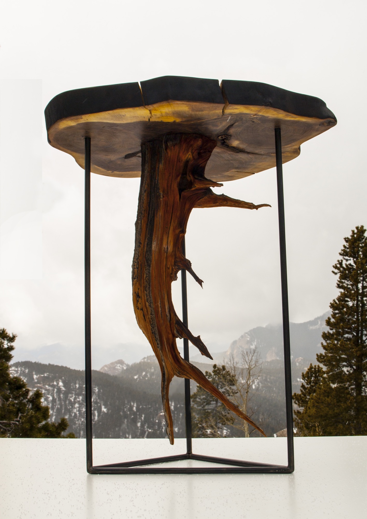
For example, Unrau says seventy years ago, many trees were cut down to make room for high-voltage lines to Fairplay, south of Breckenridge, Colorado. “The company just left them, so these big old-growth rounds have been drying up there all these years,” he says. MTN Lab milled the pine rounds into table tops. “That’s our next big design push, designing bases for those tables,” he says. “Or the motorcycle, which is a lifelong dream we’ve shared since we were little kids.”
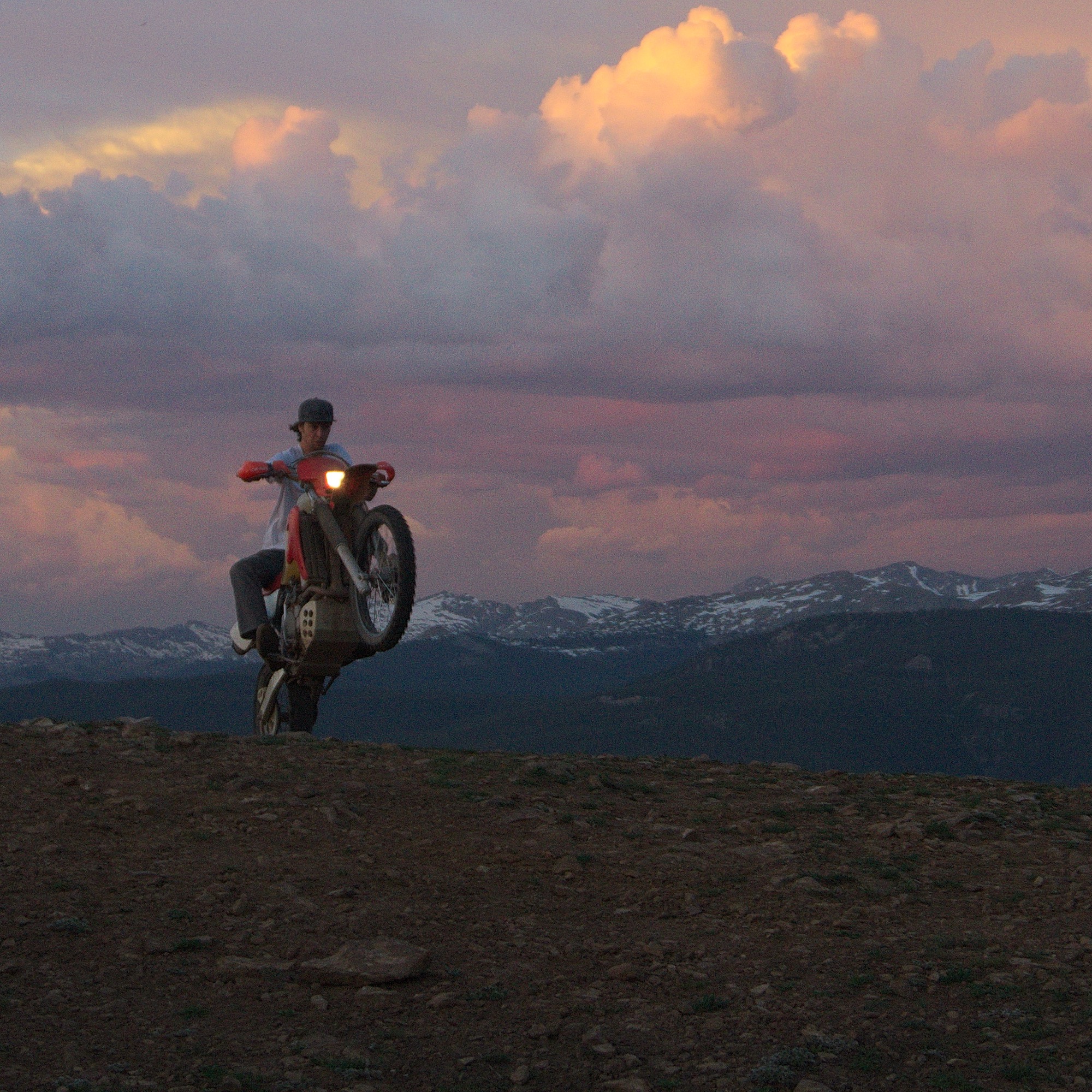
Indeed, Hine and Unrau want to build a motorcycle entirely from scratch, the back end made hand-carved in wood. Before winter, they even want to experiment with producing their our own steel, from mining the rock to crushing and melting it. Whether the resulting material will in fact be usable won’t matter as much: “At least we will be able to appreciate the process when we go to the store and buy steel.”
“The motorcycle is going to be very much like our furniture and our sculptures,” Unrau says. “I would describe it as an art bike. It’s going to be functional. It’s going to ride very well, but it’s not going to look like a conventional motorcycle. I don’t know if we’re going to be willing to sell it.” The business partners are also debating whether they will ever have the heart to sell the 1960s Airstream that once belonged to Unrau’s grandfather and they just finished restoring. “I never want to sell any of our stuff,” Unrau admits, laughing. “It’s hopeless.” △
Slow Architecture
Spawned by the slow food movement, slow architecture reflects a return to the roots of the master architect tradition
When Italy’s first McDonald’s poised to open in 1986—a stone’s throw from the fabled Spanish Steps in Rome, no less—it ignited not only a protest but a counter-revolution. Italians, so proud and protective of their exquisite centuries-old cuisine and culinary traditions, rebelled against not only the first McDonald’s in their iconic city but the decades of culinary collapse spawned by the “fast-food revolution” of the 1950s—that reduced food, along with its preparation and consumption, to its lowest common denominator. Political activist and journalist Carlo Petrini took part in the initial protest and is credited with the creation of the slow food movement. Three years later, in 1989, the manifesto of the International Slow Food Organization was signed in Paris by delegates from fifteen countries with the goal of promoting local foods and time-honored traditions of gastronomy and food production. It opposed fast food, industrial food production, and globalization, with the goal of preserving traditional and regional cuisine, and encouraging farming of plants, seeds, and livestock characteristic of the local ecosystem.
From slow food came the whole “slow” movement, with slow cities, slow living, slow travel, slow design, and slow architecture—a label credited to the Japanese.
“It is a cultural revolution against the notion that faster is always better. The Slow philosophy is not about doing everything at a snail’s pace. It’s about seeking to do everything at the right speed. Savoring the hours and minutes rather than just counting them. Doing everything as well as possible, instead of as fast as possible. It’s about quality over quantity in everything from work to food to parenting,” writes Carl Honoré in his 2004 book In Praise of Slowness, which has become the new-millennium bible of the movement.
"The Slow philosophy is not about doing everything at a snail’s pace. It’s about seeking to do everything at the right speed."
Environmental roots and “deep ecology”

So what is slow architecture? The Tvergastein Hut in the Hallingskarvet massif in Norway epitomizes the concept. It’s a simple wooden mountain cabin in harmony with its surroundings that took several years to build with appropriate, readily available local materials—think small carbon footprint. The idea of slow architecture includes proper context, materials, sustainability, and affordability while still retaining aesthetics.
A lifelong mountain climber and Norway’s most famous philosopher and a professor of philosophy at the University of Oslo, Arne Næss was influenced by the writings of seventeenth-century Dutch philosopher Spinoza and twentieth-century ecologist Rachel Carson, author of Silent Spring, the ground-breaking environmental science book published in 1960. Silent Spring documented pollution from the chemical industry and its detrimental effects on the environment, particularly birds, along with other negative human-caused environmental impacts. The book cartwheeled into scripture for the environmental movement of the 1960s.
Næss was convinced of the impending ecological disaster for planet Earth, and in 1969, he retired from his university position and built his Tvergastein Hut, where he lived and developed the philosophy of “deep ecology,” which sees the complex interconnection and web of all life-forms, objects, and events. Shallow ecology seeks solutions to economic problems through technological fixes; deep ecology demands fundamental economic, political, cultural—and spiritual—changes.

“It’s a whole different perspective of our place on Earth,” says Carolyn Strauss, a California-born, Columbia-educated architect who created the Amsterdam-based slowLab, a research platform for slow knowledge in design thinking and practice. “We work with individuals, architectural firms, architects, and students,” she says. “Næss’s hut isn’t an aestheticized version of anything. For him the beauty and quality comes from the environment. And understanding himself as one small part, and not a native of that ecosystem.
“It’s about understanding ourselves as part of larger systems and moving humans out of the center of things. We’re part of a much larger, complex system, which we can never fully understand. We tend to ignore that fact. And this leads to our fragmentation of the world, versus gestalt thinking—perception of the whole and interdependence. This type of human-centered thinking and fragmentation has generated a lot of the problems in the world,” Strauss says.
“[Arne] Næss’s hut isn’t an aestheticized version of anything. For him the beauty and quality comes from the environment....It’s about understanding ourselves as part of larger systems and moving humans out of the center of things.”
— Carolyn Strauss

Næss’s hut was built from 1937 to 1943, the pieces carried by horse and sled in sixty-two trips up the mountain. He also built a smaller climbing hut on the very edge of a cliff that required one to enter by climbing up through a trapdoor in the floor. Næss and his mountaineer companions climbed and dragged the planks and other materials up the mountain wall to build it. Næss died in 2009 at the age of 96. He lived at his cabin full time—this was no second home.
"The idea of slow architecture includes proper context, materials, sustainability, and affordability while still retaining aesthetics."
Spas and churches
On the opposite end of the slow-architecture spectrum is Therme Vals, a hotel/spa complex in Vals, Switzerland, built over the only thermal springs in the Graubünden canton. The architect was Peter Zumthor, who received the prestigious Pritzker Architecture Prize in 2009. Completed from 1993 to 1996, the building is made from stone taken from the mountain, plus concrete and glass. Designed to look like a cave or quarry-like structure, it has a turf roof and resembles the foundations of an archeological site, half buried into the hillside.

The locally quarried Valser quartzite was the driving inspiration for the design, and the building’s cladding is made from 60,000 one-meter-long thin slabs of the greenish-gray stone. Zumthor was fascinated by the mystic qualities of a world of stone within the mountain. He wanted to capture the light and darkness, the light reflections on the water and steam-saturated air, the unique acoustics of the bubbling water in a world of stone, the feeling of warm stones and naked skin—all to enhance the ritual of bathing. So that time would be suspended for those enjoying the baths, Zumthor wanted no clocks in the spa, but three months after the opening, he was pressured to install two small clocks. Zumthor carefully designed a path of circulation to lead bathers to certain predetermined points with areas and views to enjoy along the way. “The meander, as we call it, is a designed negative space between the blocks, a space that connects everything as it flows throughout the entire building, creating a peacefully pulsating rhythm. Moving around this space means making discoveries. You are walking as if in the woods. Everyone there is looking for a path of their own,” Zumthor explains.

A Spanish icon and UNESCO World Heritage Site, Barcelona’s extraterrestrial-looking Sagrada Familia basilica and Roman Catholic church is a classic and very literal example of slow architecture—still under construction 120 years after architect Antoni Gaudi first began it.

Urban and third-world slow architecture
Japan is among the leaders in slow architecture, and a renowned, award-winning example is Hillside Terrace in Tokyo’s trendy Daikanyama neighborhood. This internationally famous residential-commercial complex spanned three decades in its construction and evolution. Its creator, Japanese architect Fumihiko Maki, was awarded the Prince of Wales Prize in Urban Design for reflecting the changes of time and giving life to the urban scenery. He also received the Pritzker Architecture Prize in 1993—a year after completion of Hillside Terrace.

“The flow of time can be measured against its diverse buildings and their relationship to the city of Tokyo as it grew to envelop them,” writes Maki. “The singular sense of place that people strolling among the various buildings and outdoor spaces of Hillside Terrace feel is no accident. It is the result of a deliberate design approach that has created continuous unfolding sequences of spaces and views, taking advantage of the site’s natural topography and, indeed, enhancing it with subtle shifts in the architectural ground plane.”
Butterfly houses
From the Norwegian Alps to the rainy highlands of northern Thailand, the architectural firm TYIN tegnestue, based in Trondheim, Norway, performs humanitarian aid through architecture. Their slogan is “architecture of necessity,” but that still embodies aesthetics. Started by five architect students from the Norwegian University of Science and Technology, the firm’s third-world projects are financed by more than sixty Norwegian companies, as well as private contributions. TYIN has worked with planning and constructing small-scale projects in Thailand. “We aim to build strategic projects that can improve the lives for people in difficult situations. Through extensive collaboration with locals, and mutual learning, we hope that our projects can have an impact beyond the physical structures.” The architects use such readily available materials as old tires and locally grown bamboo.


“The Soe Ker Tie House is a blend between local skills and TYIN’s architectural knowledge. Because of their appearance, the buildings were named ‘The Butterfly Houses’ by the Karen workers [an ethnic group from southeast Myanmar]. The most prominent feature is the bamboo weaving technique, which was used on the side and back facades of the houses. The same technique can be found within the construction of the local houses and crafts. All of the bamboo was harvested within a few kilometres of the site,” write the architects on their website, tyinarchitects.com. “The majority of the inhabitants are Karen refugees, many of them children. These were the people we wanted to work for.” The architects hoped to foster a more sustainable building tradition for the Karen people in the future.
Form follows function
“Anybody who is practicing architecture right now, and has been practicing the last thirty years, has seen the profession become so much about style, form-making,” says Colorado architect ml Robles of Studio Points Architecture + Research in Boulder. “Form is the result of special interactions of space. If you start with form, it’s very limited.”
“Form follows function,” was the mantra of twentieth-century “starchitect” Louis Sullivan, who admired Henry David Thoreau and Roman architect Marcus Vitruvius Pollio (80–70 BC), who said a structure must be solid, useful, and beautiful. Sullivan’s assistant was Frank Lloyd Wright.
“Form is the result of special interactions of space. If you start with form, it’s very limited.”
— ml Robles
“You don’t start with the box and stuff everything in it,” says Robles, who explains that the three-dimensional modeling computer program SketchUp has become the fast food of architectural design for too many versus careful, thoughtful design.
“So much of what’s happened in the last thirty to forty years was about consumption,” says Robles. “What’s happened is that architecture has become a commodity. So you’ve got, sort of built in, this turnaround—anything that’s a style is going to be out of style...and that’s why we have the crazy environments that we have, and most people are so dissatisfied with their built environments. It’s because they have been designed for a little tiny space in time, with little regard for the past, or really, a long-term future. They’ve been designed for the moment.”
Given all that, Robles says, “Slow architecture, I think, was a pushback to architecture that was about a trend, a pushback to architecture or urban development that was about erasure, and it was a pushback to the commodification of interior finishes and furniture.”

Sustainability and sensibility
The other thing that happened, says Robles, was the sustainability movement, “which was trying to reground the built environment—to be responsible.” So there are LEED buildings, green buildings, and gold buildings. “I think what is happening—and slow architecture is illuminating this—the thoughtfulness of doing what architecture has always been doing is becoming important again. It’s kind of sad that that’s the way the profession has gone.
“The idea of thoughtful, responsible, meaningful—that’s what architecture is. That is the definition of architecture in the master tradition, period. That those things now show up under a label is an interesting reflection of our time, in that we need to be reminded of what architecture is. Those of us who practice architecture in this way have always known.
“The idea of thoughtful, responsible, meaningful—that’s what architecture is. That is the definition of architecture in the master tradition, period."
— ml Robles

“If you’ve ever entered a building and you catch yourself and realize you have slowed down just to be in that building; you’re in wonder, awe, you’re pulled through the space, usually by light, and you’re changed,” Robles says. “This happens to people when they go into cathedrals. Amazing places where people just, ‘Whoa.’ It happens when you go into a museum, or Union Station downtown in L.A., or Grand Central Station in New York. That’s the essence of slow architecture. What it does to the world. That’s what great architecture does. It causes you to pause and be present.” △
“If you’ve ever entered a building and you catch yourself and realize you have slowed down just to be in that building...that’s the essence of slow architecture.”
— ml Robles
Geometric Cabins on the Steep
Reiulf Ramstad Architects' Røldal Cabin design preserves as much of the surrounding Norwegian landscape as possible
Anytime an email from Reiulf Ramstad Architects (RRA) shows up in our inbox that mentions the Oslo-based architect and "cabin" in the same sentence, we are all ears. He had us as "preserving the surrounding landscape"... again.

This time, RRA has designed a set of two cabins in Røldal, Norway. Once again, Ramstad's architecture stands simple yet bold. The Røldal family vacation home is recognizable for its compact, defined, and geometric shape. The objective of preserving as much of the surrounding landscape as possible resulted in the design of two volumes: a main cabin (63 square meters; 678 square feet) and a much smaller annex (11 square meters; 118 square feet) that keep a dialogue with the encompassing nature.

Dividing the structures also answers the need for the flexibility of being able to accommodate different family compositions in separate spaces. The articulated section is adapted to the steep terrain and is assigned to create interconnected floors and capture the views of both the forest and the hillside. △

Monolith on the Mountain
In the Slovenian Alps, Bivak Pavla Kemperla sticks up for alpinists
Bivak Pavla Kemperla, a black beacon for mountaineers in the rugged landscape of the Slovenian Alps, was designed by Slovenian architect and alpinist Miha Kajzelj of the firm MODULAR arhitekti in Ljubljana, Slovenia.
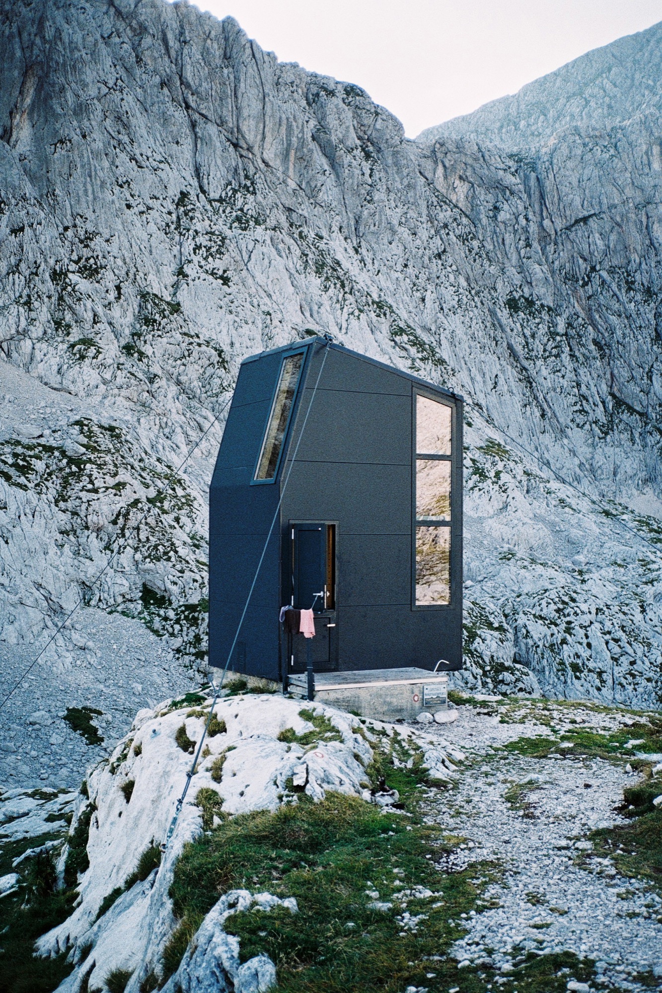
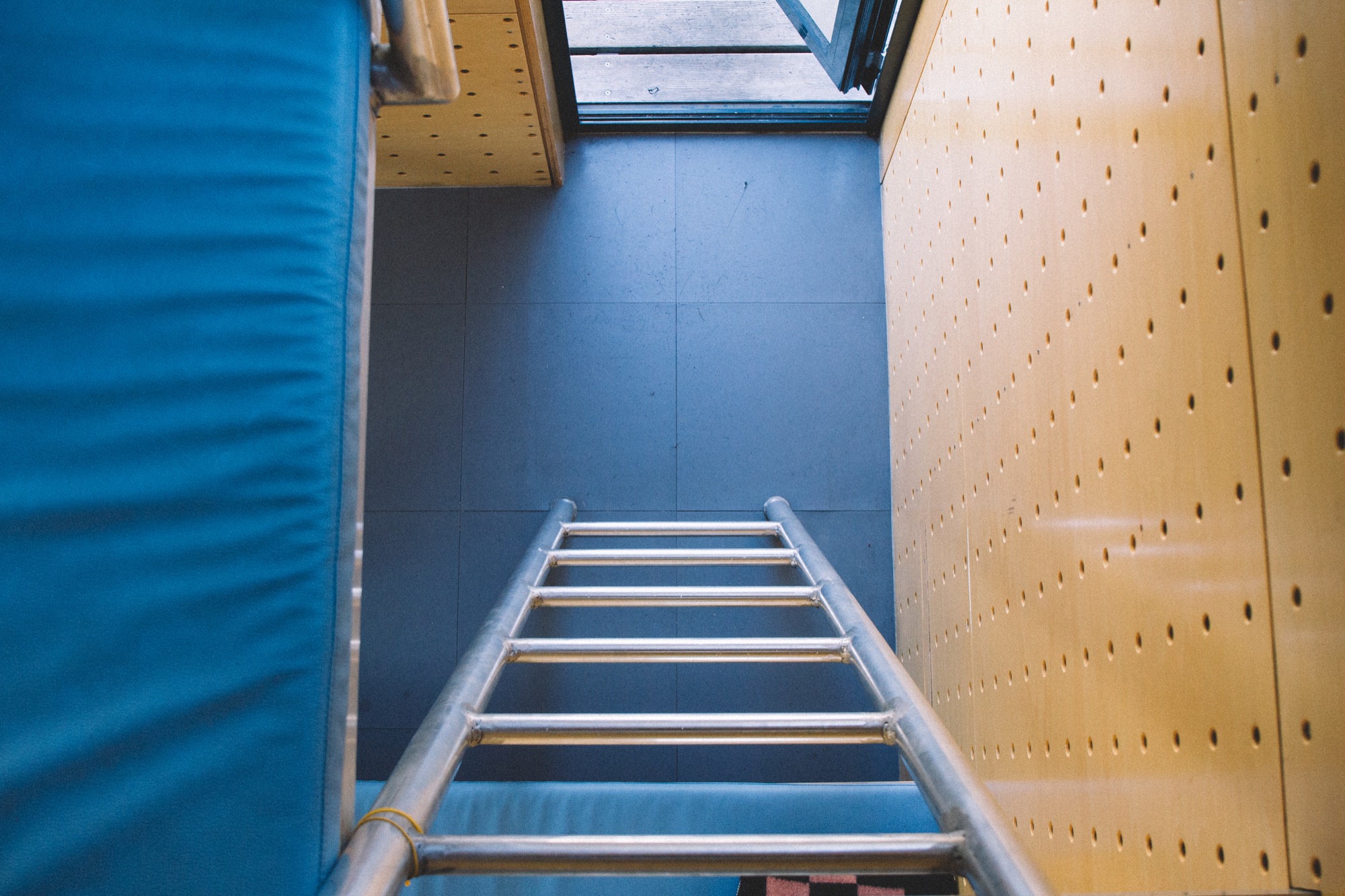
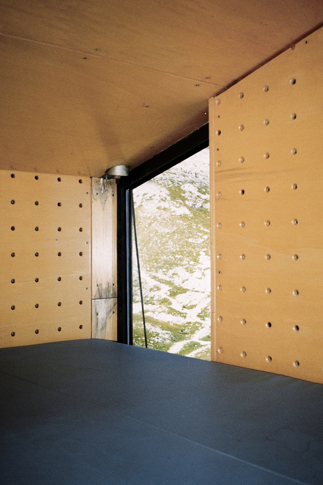
Situated at 2104 meters (6903 feet) above sea level in the Kamnik Alps north of Ljubljana, the bivouac under Grintovec was built in 2009 to replace an old shelter that stood there since 1973. The three-level structure is built on a concrete base. The long, vertical windows maximize the magnificent mountain views.
Its outer skin, made of aluminum isolating panels, is designed to prevent loss of the heat produced by the people inside. The inner skin is made of perforated wooden panels designed to wick body moisture out; so the interior always feels dry and warm. As a result of the vertical three-level concept, the upper sleeping level is warm, as the heat from below rises up.
The tiny, simple volume—2 × 3 × 4.5 meters (6.6 x 9.8 x 14.8 feet)—sleeps eight people.
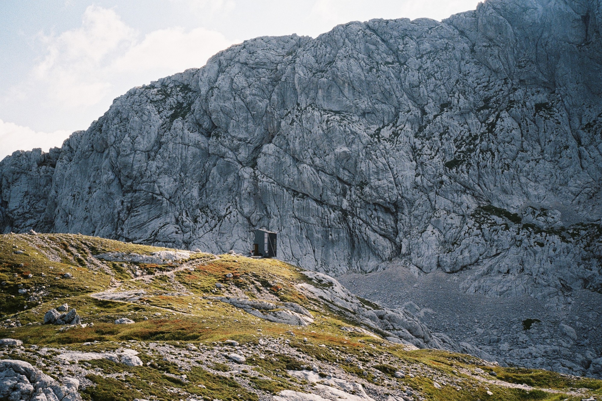
Bivak Pavla Kemperla is dedicated to Pavle Kemperle, a Slovenian alpinist.
Photographer Jaka Bulc (@jakabulc) discovered the bivouac for us with his lens
He writes about his experience:
The first part of the marked trail to this bivouac is usually very crowded, since it leads to a popular mountain hut on the Kokra Saddle and then onwards to Grintovec, one of Slovenia's most frequently visited mountains.
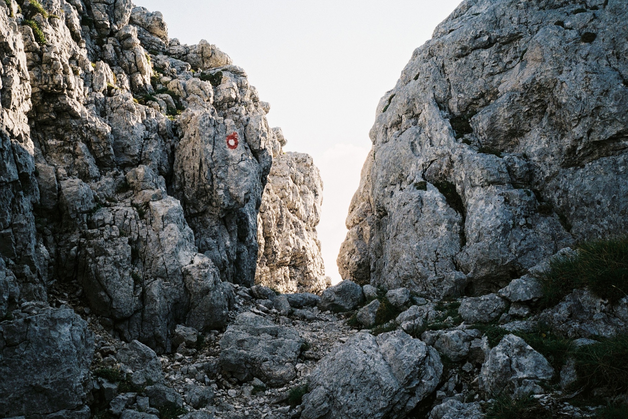
The trail to the bivouac gradually veers off and goes through an interesting passage to a scenic path that winds its way across the steep rocky slopes of Grintovec. We reached the bivouac late in the afternoon and bumped into two other hikers, who were just getting ready to summit a couple of nearby peaks.
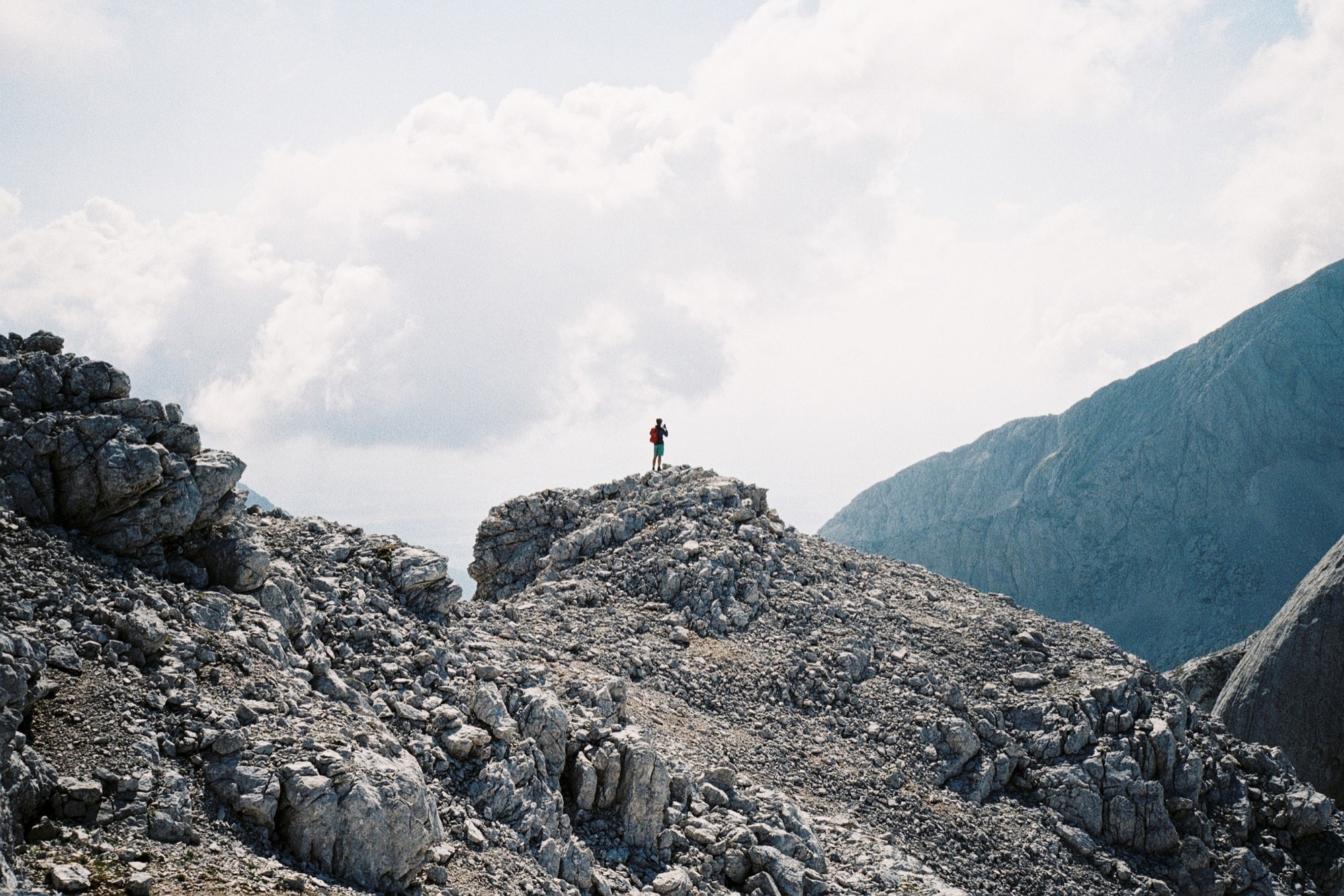
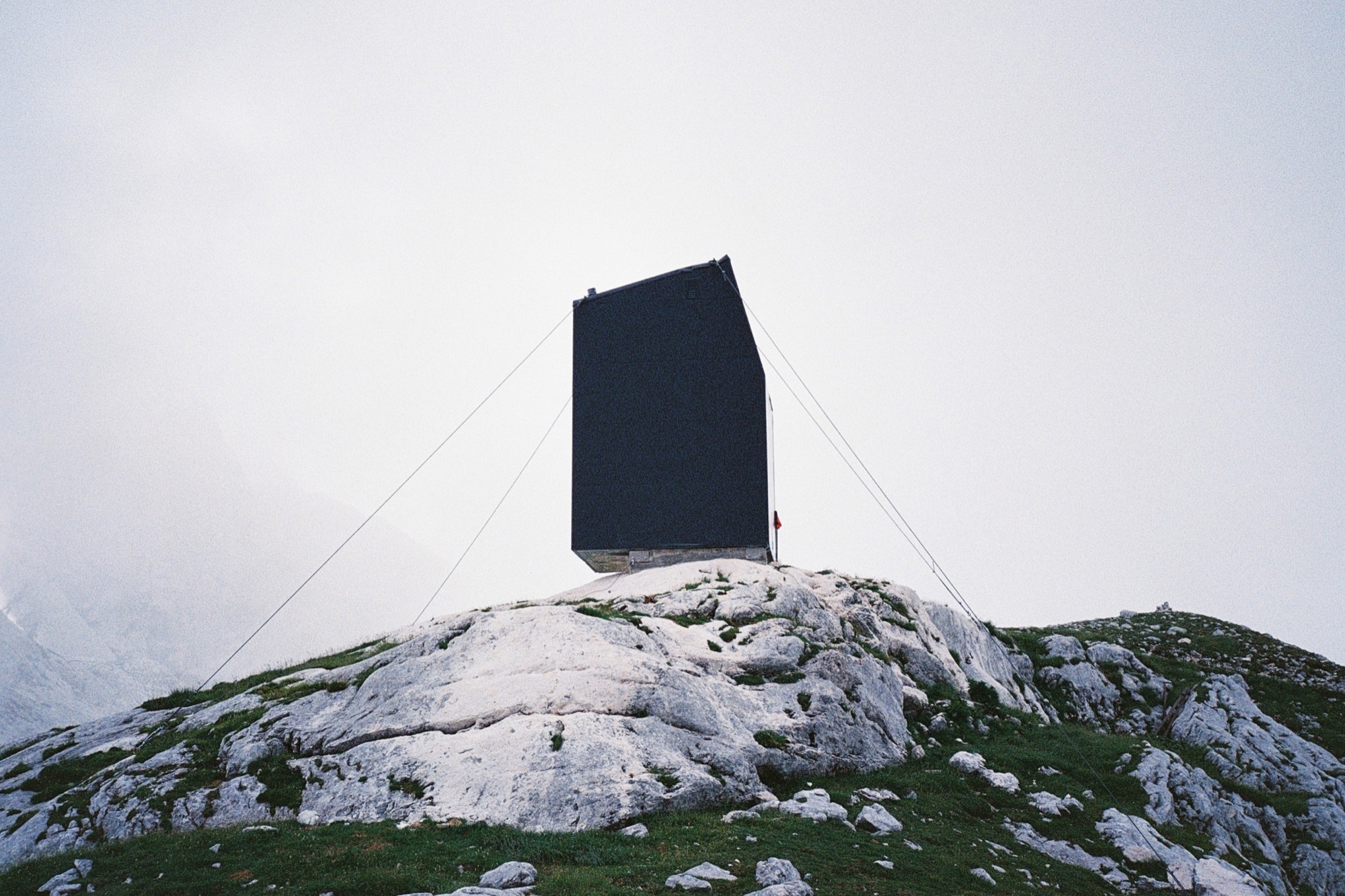
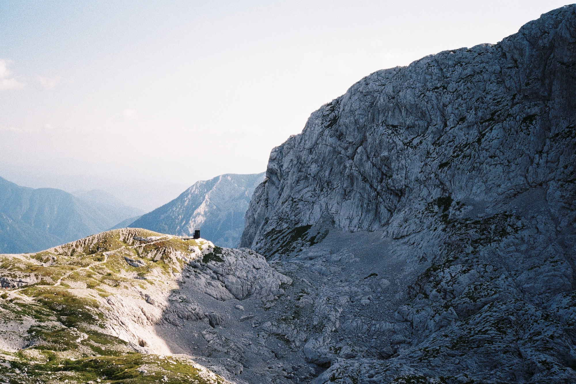
The monolithic building gives the impression of being sheltered by the natural amphitheatre of rock walls, although the bivouac sits on a knoll that gently rises over the surrounding landscape. △
Snow-Proofed Hillside Family Home in Austria
This house can weather even the fiercest winter storm and an avalanche
 Most homeowners would avoid living within striking distance of an avalanche, but Marcell Strolz and Uli Alber embrace alpine extremes. They built a house that could weather even the fiercest storm.
With its world-class skiing and picturesque alpine setting, the Austrian village of Lech seems ripe to become a buzzing tourist destination. But due to strict regulations against second homes and a high risk of winter avalanches, very little building takes place in this small community. Marcell Strolz and Uli Alber were aware of these limitations when they set out to build a family home, and they knew their modern tastes might be contentious in the slow-changing town. The site they chose at the edge of the village afforded them creative freedom with one inherent condition: The house would have to withstand the forceful blows of sliding snow.
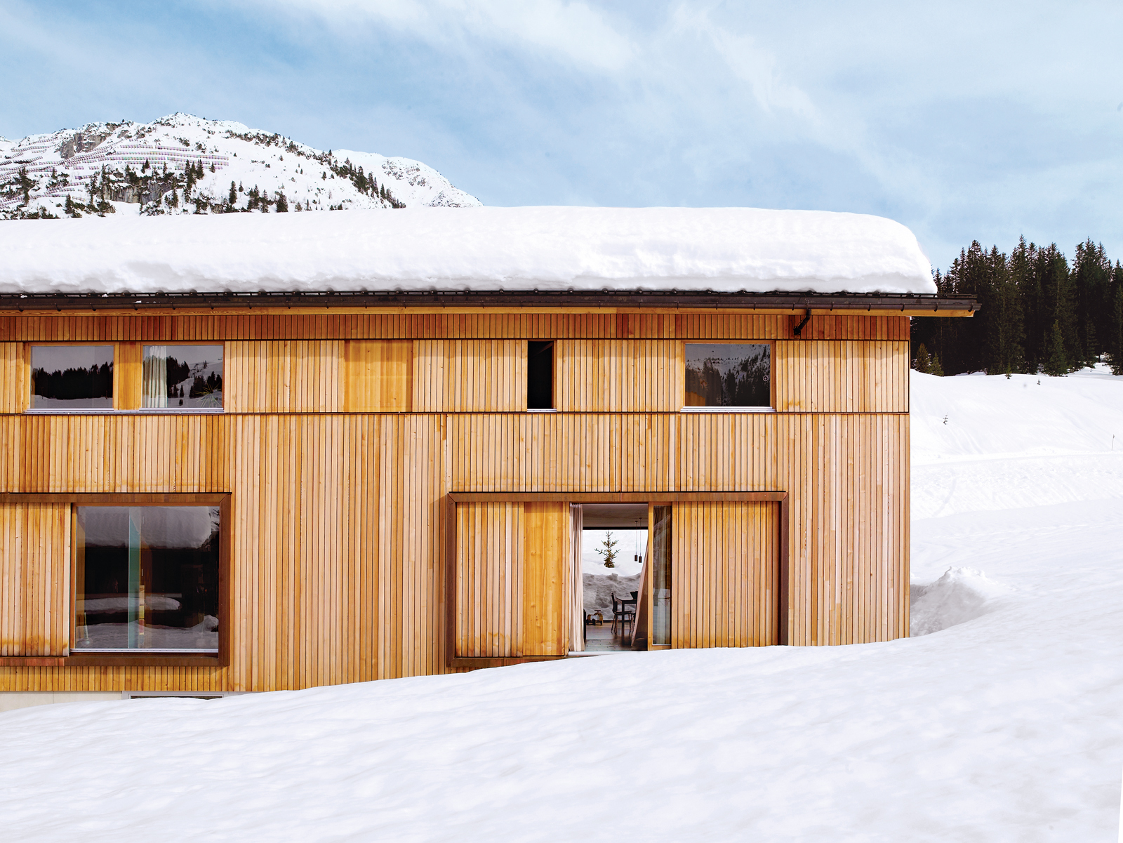
Land slope-side
“It is very difficult to get land here for building,” says Strolz. “Beyond us is a pasture where there will never be any other homes.” Having grown up in Lech and having spent many winters volunteering in avalanche protection, Strolz, who works year-round as a project manager for engineering and building contracts around the village, was ready to live a stone’s throw from the ski runs. He and his wife, Uli, a physical therapist and sports trainer, took preparedness seriously as they designed a place to live with their young children, Felix and Emilia.
“We used some steelwork in addition to the timber frame to strengthen the house,” says Strolz. “A series of sliding wooden shutters protects the building, as does specially strengthened glass around the kitchen.” These shutters can be closed off to seal the windows against avalanches or during the annual “snow roll” fromthe nearby Omesberg mountain, when a controlled explosion shoots snow downhill past the house. There is also a retractable wooden wall, which disappears into the floor, to protect the open veranda.
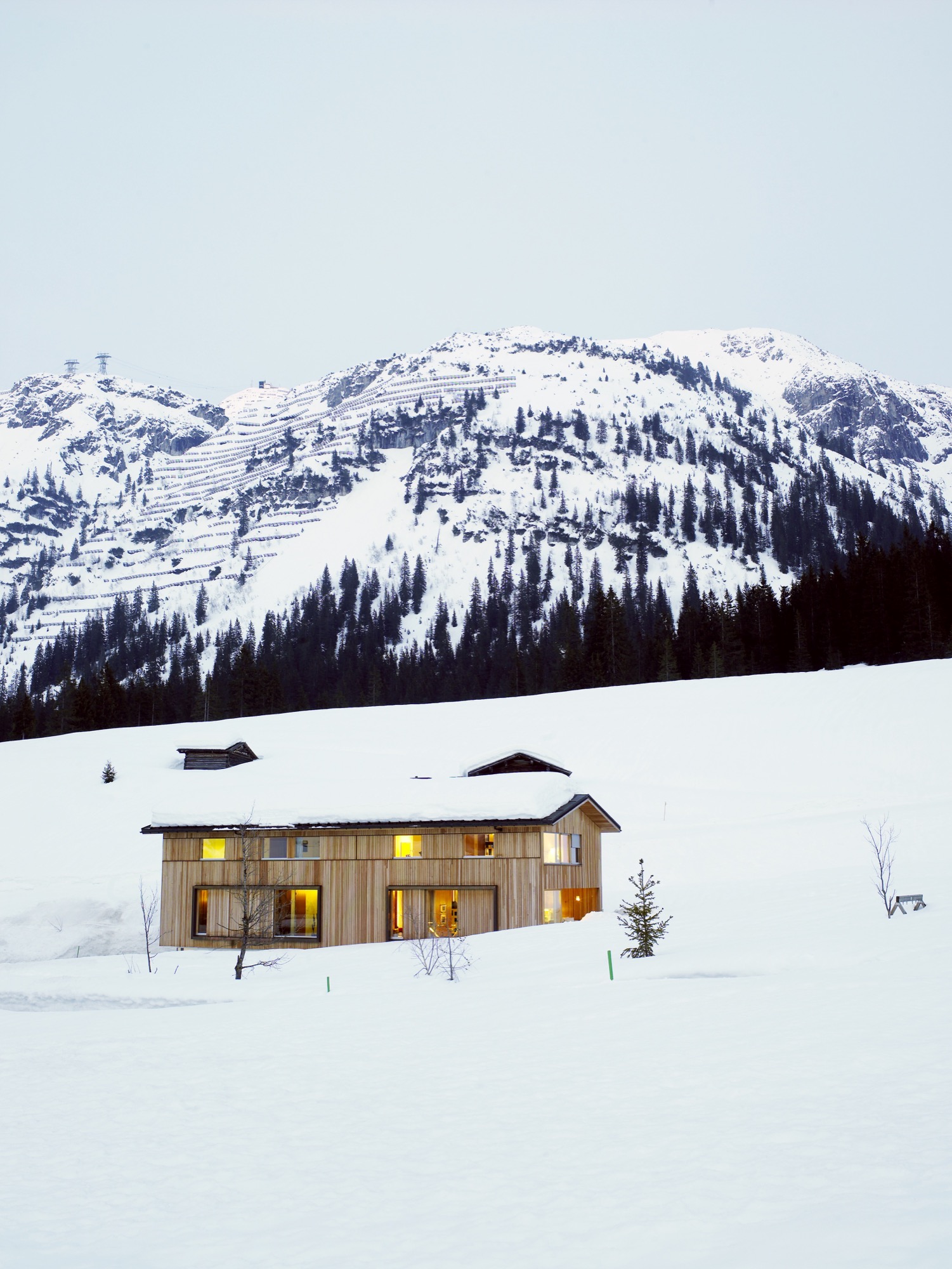
Sustainably designed by Helmut Dietrich
The house was designed by Helmut Dietrich of Dietrich Untertrifaller Architekten, an Austrian practice known for its sustainable and sensitive approach to design. “It was very important to all of us that the house have a relationship to the mountains rather than other buildings,” says Dietrich. “It was the connections with nature—and framing the views—that interested me most. It was also important to us to be able to use timber construction, despite the avalanche risks.”
“It was very important to all of us that the house have a relationship to the mountains rather than other buildings."
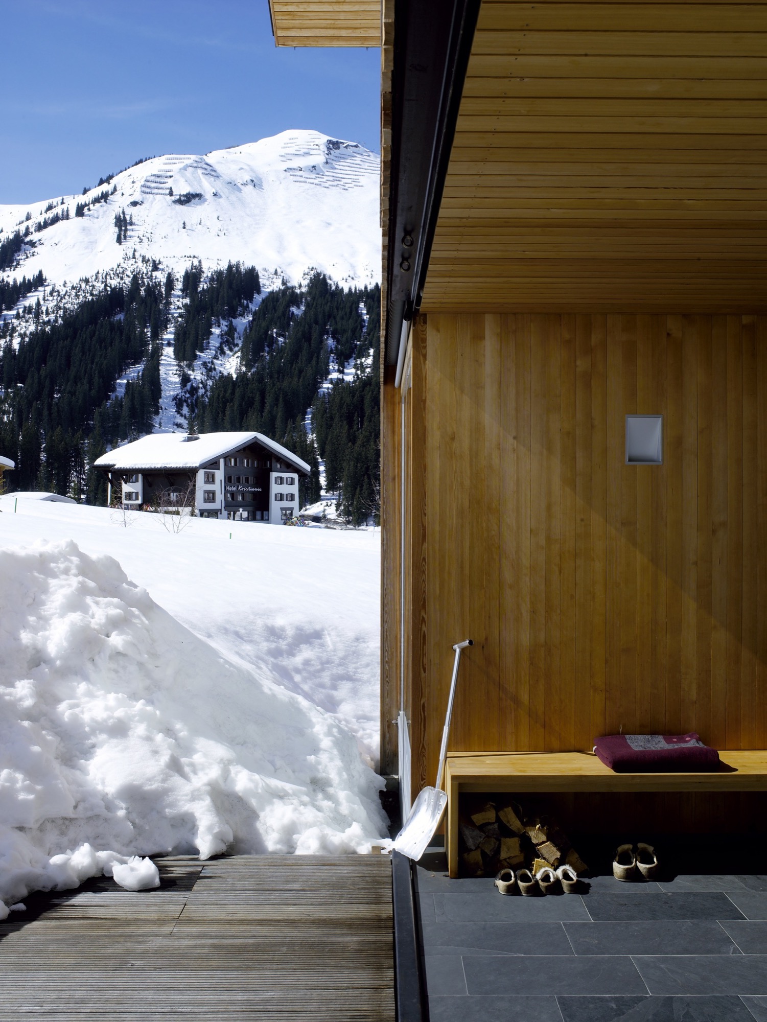
Strolz worked closely with Dietrich throughout the design process, and he managed and participated in the building’s construction. “I got very involved in the preparation of the site, the digging of the foundations, and the concrete base of the house,” he says. “The wooden frame was prefabricated by a local construction company and went up in two days. I also did the drywalling, the floors, some of the electrical—it was quite a lot of work.”
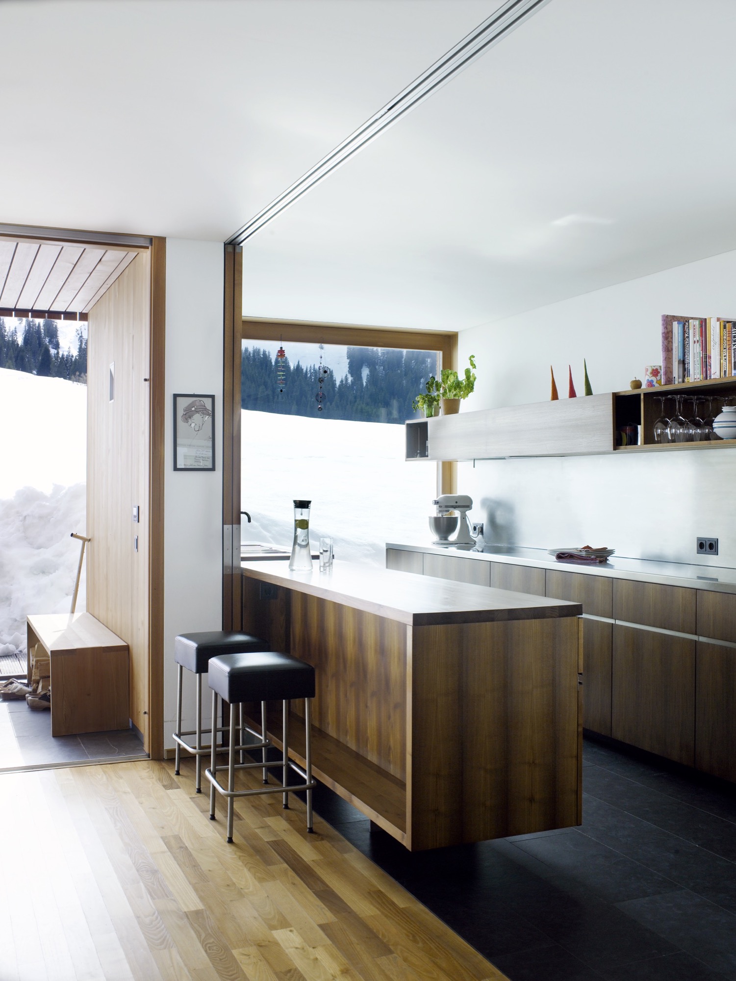
Flexible for family living
Flexibility was a key part of the design. Two separate apartments—one for rental and one for a nanny—are integrated into the building alongside the family’s two-story space. The main living area has an open plan leading out to the veranda, with bedrooms and a study on the floor above. All of the timber for the frame and cladding was sourced from sustainably managed forests.
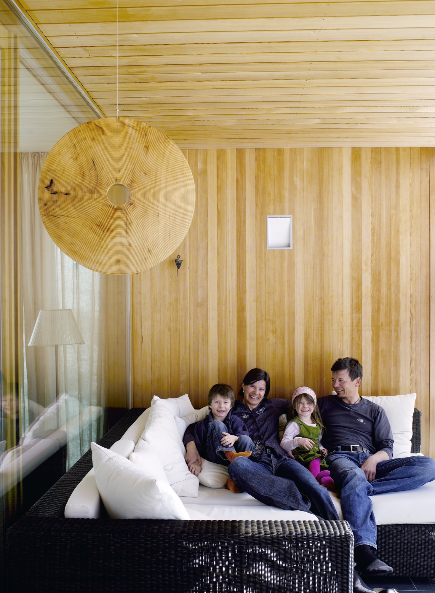
On the roof, Strolz installed solar panels, which are cleared of snow during the winter so that they can function year-round. “The house holds heat very well,” he says. In the summer, excess heat is mitigated through natural cross-ventilation. The shutters that protect the windows from damage double as sun shades, and some rooms of the house have additional internal blinds.
“Most of the new houses in the region address sustainability,” says Dietrich. “In Marcell’s case it was particularly important because of the climate in Lech, where there are long winters with cold temperatures. The house had to cope with the climate while using as little energy as possible.”
"The house had to cope with the climate while using as little energy as possible.”

Their power strategy was supported by one of Strolz’s earlier projects, the construction of a biomass plant for the town of Lech, which was completed ten years ago. Designed by architect Hermann Kaufmann, the plant is sited in a sleek timber-clad building on the road into the village. Its large industrial boilers supply heat and hot water to homes throughout the village.
Progressive architecture in Vorarlberg
The Strolz house is unusual in this rather conservative community, and some compromises were required in order to get the plans approved. “At first, I was told that the house was too long and too high and that the shape of the roof was wrong,” says Strolz.
“So we redesigned it to a certain point and then they said yes.” Despite the changes, the house sits well within the progressive architecture of the Vorarlberg region as a whole, which is famous for its approach to modern design.
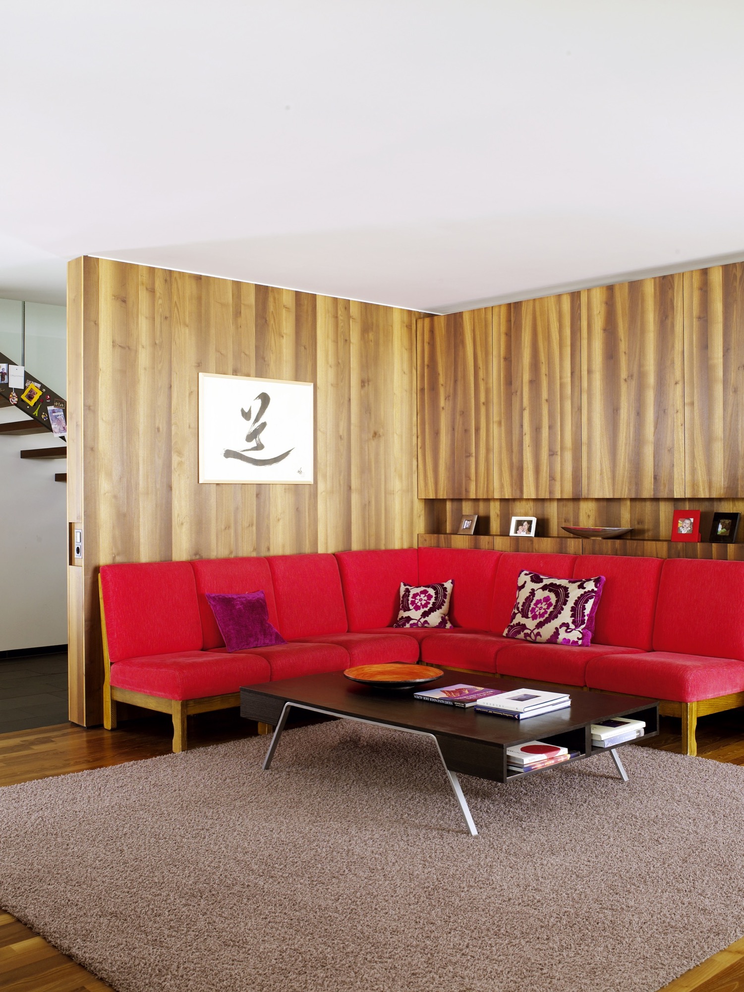
When the weather is fair and the shades are open, one would never know that this graceful house is capable of becoming a fortress. The light-filled building and stretches of open space beyond are ideal places for the kids to play. But when cold weather comes, the family takes comfort in a design that keeps them safe, even if the mountains shake loose a season’s worth of snow. △
Stable in the Landscape
An award-winning Austrian architect ennobles vernacular alpine building tradition to sophisticated minimalism
Austrian architect Thomas Lechner reduces the idea of vernacular alpine architecture to a design so consequentially essential in what is left that his minimalist structures become sophisticated and sexy.

The Hochleitner house in Embach is no exception. The project’s objective was notably elemental: The client wanted a house for himself and his books; a building void of any status. “To realize this vision, we referenced the surrounding area’s simple Heustadln (hay barns) and conceived an honest wooden structure,” says Lechner, co-founder and principal at LP Architektur.
A modern mountain man of tradition
“The mountains mean a tremendous deal to me because they astonish me time and again, demand my respect, and give me a lot of energy.”

Lechner was Born in Altenmarkt in Austria’s Pongau region in 1970. After earning his architecture degree from the Technical University Graz and practicing at several firms in Salzburg and Berlin, he returned to his native alpine town to open his own atelier.
When I ask who is his idol in the architecture and design world, Lechner, whose firm is nominated for the Mies van der Rohe Award 2017, replies there is no reason to apotheosize anyone or anything—“But you can regard fellows in your field and their accomplishments with respect and joy.”
The architect is happiest when he is able to be self-aware and live in the present moment. “That’s the honest life—it feels good,” he says.
The surrounding peaks profoundly inspire Lechner as a man and architect: “The mountains mean a tremendous deal to me because they astonish me time and again, demand my respect, and give me a lot of energy,” he says. “They relativize much of everyday life to what is essential.”
The Hochleitner house
Extracting what is essential also drove his design of the Hochleitner house. Completed in 2016, the 105-square-meter (1130-sqare-foot) primary residence is set in a meadow that borders a neighborhood to the north but is largely undeveloped to the south.

“The site is somewhat exposed in the landscape and requires sensibility,” Lechner says. “The architecture refers to the surrounding landscape by referencing local vernacular building tradition—a wood construction with a weathered facade, pitched roof, etc.”

Looking back at the project, the architect is proud of how the house innately adapts to its bucolic setting, and that no secondary structures, such as a carport, obscure the architecture or unnecessarily bring the form into question.
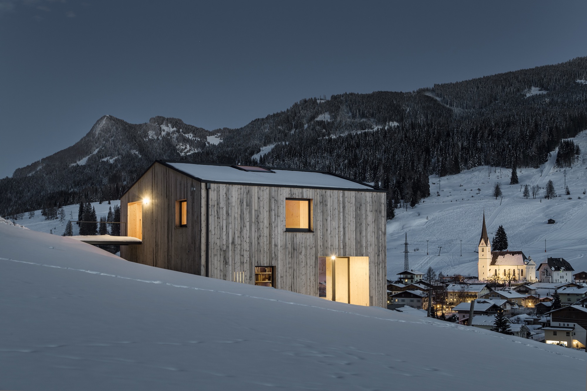
House tour

The primary building material is wood, which was used in the construction and for all surfaces on the inside. “A central stairway and varying floor levels divide a sequences of spaces—rooms that flow into one another,” Lechner describes. “This creates living zones of different qualities and internal and external contexts reduced to the essential in their formulation. All furniture and storage areas are wall elements, and the central focus is reserved for the book collection.”

The project’s biggest challenge, reveals the architect, was “the proverbial tightrope walk between reduction and banality—to continually look at the challenges of construction and functionality in reference to the targeted solution, which was to model the functional architecture of the regions farmsteads.”
"[A] proverbial tightrope walk between reduction and banality."
Lechner mastered the balancing act. The house won him the Best Architects Award 2017.

“Perhaps there is such as thing as an ‘energy’ that brings together certain people for certain tasks,” the architect notes about the design process and close collaboration with the client. “This project represents an approach where architecture is not defined through a creative will but instead through a relevant response to the place and the purpose—a simple wooden house, no more yet no less.” △
“This project represents an approach where architecture is not defined through a creative will but instead through a relevant response to the place and the purpose—a simple wooden house, no more yet no less.”
Solid Form
Shaping a clump of thought: A visual portrait of ceramicist Kelli Cain
We fell in love with Kelli Cain's pure and honest ceramics at first sight when writer Winifred Bird and photographer Torkil Stavdal visited the artist for us at her studio in the Catskill mountains. Revisit her through an artful video...

earth - air + water + force / rotation x fire = solid form
This is the formula of ceramics artist Kelli Cain's creative work. In "Breakable Minimalism," Alpine Modern discovered the many-talented maker and her earthy, minimalist tableware.
Now, filmmaker James Jenkins has created a visual portrait to showcase Kelli Cain's process through a meditative stream of consciousness. The process of thinking is taking a malleable substance—a clump of thought—and shaping it. It solidifies mid-process into a shape, perfect and imperfect, unique and personal. Cain's style is simple, beautiful, and speaks for itself.
(In)complete thoughts in response...
Solid Form - Kelli Cain from James Jenkins on Vimeo.
"The process of thinking is taking a malleable substance—a clump of thought—and shaping it."
She Felt Beautiful
Swedish designer Pia Wallén talks about her iconic Crux Blanket and the bold creations she makes from wool felt
Pia Wallén, who was born in Umeå, Sweden, and now lives and works in Stockholm, creates bold, minimalist objects from her signature wool-felted materials.

Wallén, who studied fashion design at the Beckman’s College of Design in Stockholm in the mid eighties, made an international breakthrough with her own namesake brand in the early nineties. Over the years, she has collaborated with IKEA and brands such as the Swedish design label Asplund and Italian leather manufacturers Arte & Cuoio.
Inspired by traditional Swedish folk craft techniques and patterns, her bold, minimalist designs also have a dramatic modern edge. This juxtaposition of ancestral craftsmanship and her unmistakeable, contemporary—yes, futuristic—designs have become Wallén’s trademark.

Her already iconic work is displayed in the permanent collections of Sweden’s National Museum of Fine Arts, the Röhsska Museum for Design, Fashion and Decorative Arts in Gothenburg, and the Museum für Angewandte Kunst in Cologne, Germany. She has participated in exhibitions around the globe, including at the Centre Pompidou in Paris and Victoria & Albert in London.
One our favorite Pia Wallén designs at Alpine Modern is the Crux Blanket, which the designer designates her “icon.” In Swedish folk art tradition, the cross (crux in Latin) is a strong symbol for hope, a meeting point of heaven and earth, plus, the designer says German artist Joseph Beuys (1921–1986) was also an influence. Introduced in 1991, the Crux Blanket has meanwhile become a classic in contemporary Swedish design history. Fostering mutually meaningful and lasting relationships with her manufacturers is very important to Pia Wallén. The original blanket is still produced by the same small family weavers in southern Sweden, using the finest wool and traditional Scandinavian felting methods.
The traditional weaving and felting process takes time, which is why supply of the handcrafted wool object is limited. Thus, Pia Wallén has introduced a new version of her treasured paragon: the new Cross Blanket in pure organic cotton, produced in collaboration with a Swedish company that manufactures in Peru.
We recently caught up with the designer to talk about her brand, her inspirations, and about life.
A conversation with Swedish designer Pia Wallén

What is your vision for the brand that bears your name?
My ambition is to create a deeper meaning, content, sympathy, and respect in the relation between the object and the user.
Your collections include accessories, jewelry, and interior objects. How do you decide what products to make?
It’s a combination of fulfilling my personal needs, ideas, and a curiosity for developing my new products as well as my old ones. It’s a lot like researching. It’s important for me to find and develop a good relationship with my manufacturers, and together with them create new techniques and products.
Your recent lines of accessories and jewellery have joined objects that combine felt, metal, leather, lacquer, plastic, and other materials in striking new ways. How do you choose and source your exquisite materials?
I’ve specialised in wool-felted materials and that is the main material throughout my collections. I’m inspired by materials from different cultures as well as by new, futuristic materials.

What does quiet design mean to you?
Quiet design is discrete and anonymous.
What’s your legacy (thus far)?
That my designs are objects to like, to sympathize and share a life with. My classic objects, like the Slippers and the Crux Blanket, have been in the collection for over 20 years, and I hope for many years to come.
What’s your favorite place in the world?
Paris, it’s like a second home for me.
What does “home” mean to you?
Home is where I nourish.
What’s most important to you in life?
Love and health.
When are you happiest?
When I exceed the expectation of my creations.

Who is your design icon, and what do you admire about her or him?
The artist Eva Hesse, for her work and life—a pioneer for female art. And also the artist Meret Oppenheim; she has influenced some of my work.
What are you working on these days?
Currently, I am working with the exhibition “Shapes of Fashion—Nordic Artwear” for the Textile Museum in the south of Sweden. It’s a continued work of my Capes Project, which started in 2015. △
Minimal Design, Maximum Protection
Bivak Pod Skuto—an alpine shelter high up on Skuta Mountain in Slovenia
Icy, pelting rain, blinding snowstorms, radically shifting temperatures—Ljubljana-based OFIS Architects and structural engineers from London-based AKT II, in collaboration with students from the Harvard University Graduate School of Design and Rieder, designed Bivak Pod Skuto to withstand extreme weather conditions on Slovenia's Skuta Mountain.
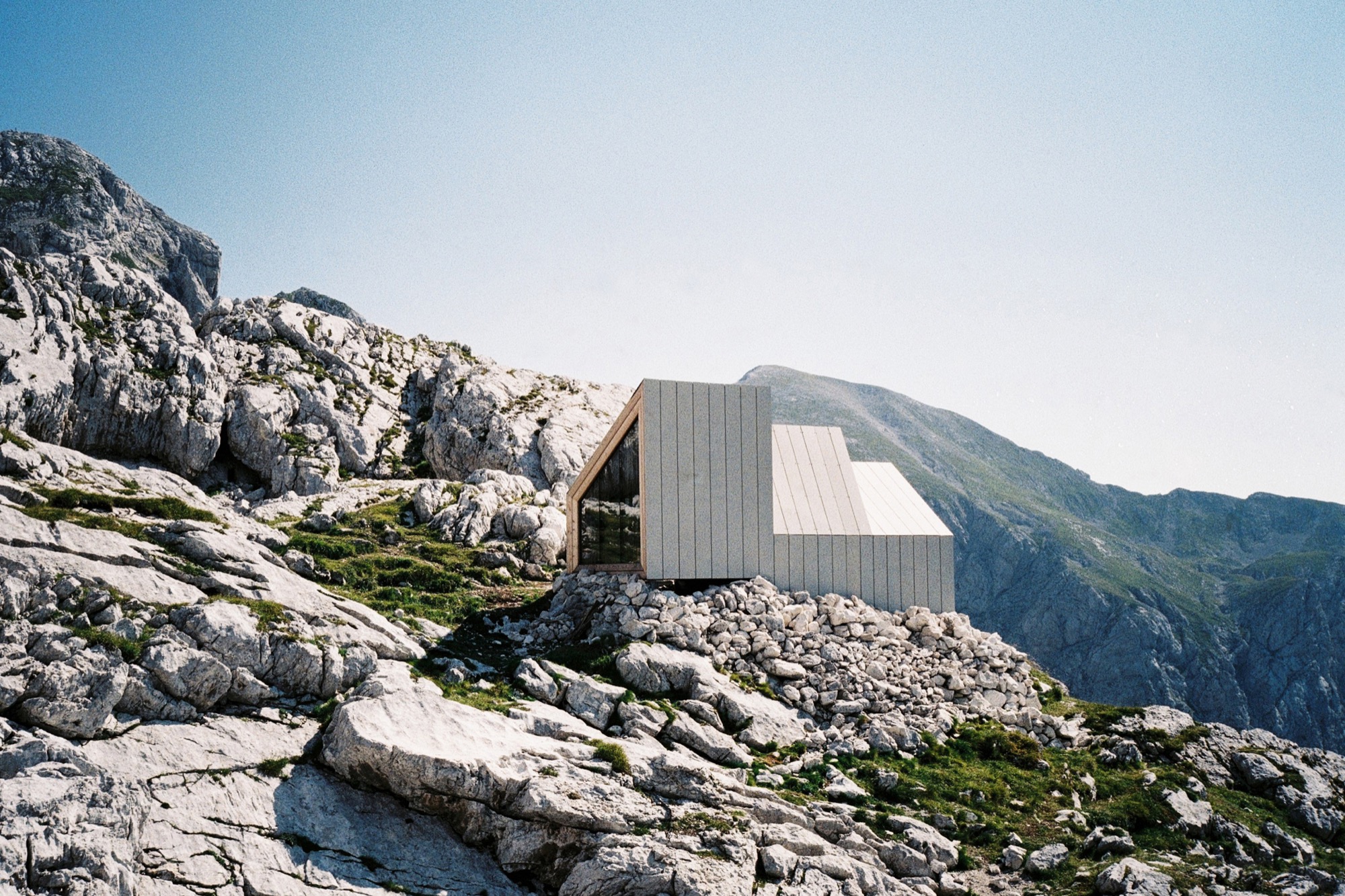
The remote bivouac's three modules allowed for helicopter transport up the mountain and functionally divide the space into entrance and storage, eating and socializing, and sleeping. The interior design bows to the function of sheltering up to eight mountaineers. With a nod to traditional alpine architecture and input from mountaineers, form and materials were chosen to respectfully respond to the extreme mountain conditions but also to provide panoramic views of the majestic wilderness.
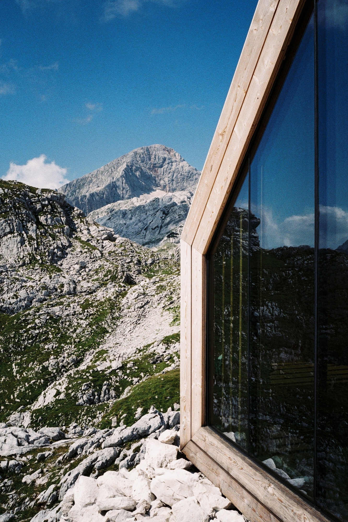
Constructing the frames off-site and fastening the structure onto pin connections allowed for a less invasive foundation (only the pins penetrate the rock) and left the mountain site as undisturbed as possible. The installation was completed in a single day. Although small, more than sixty people were involved in the demanding project, most of them volunteers and sponsors.
Photographer Jaka Bulc (@jakabulc) scaled the tremendously rugged terrain to discover the hauntingly cool bivouac
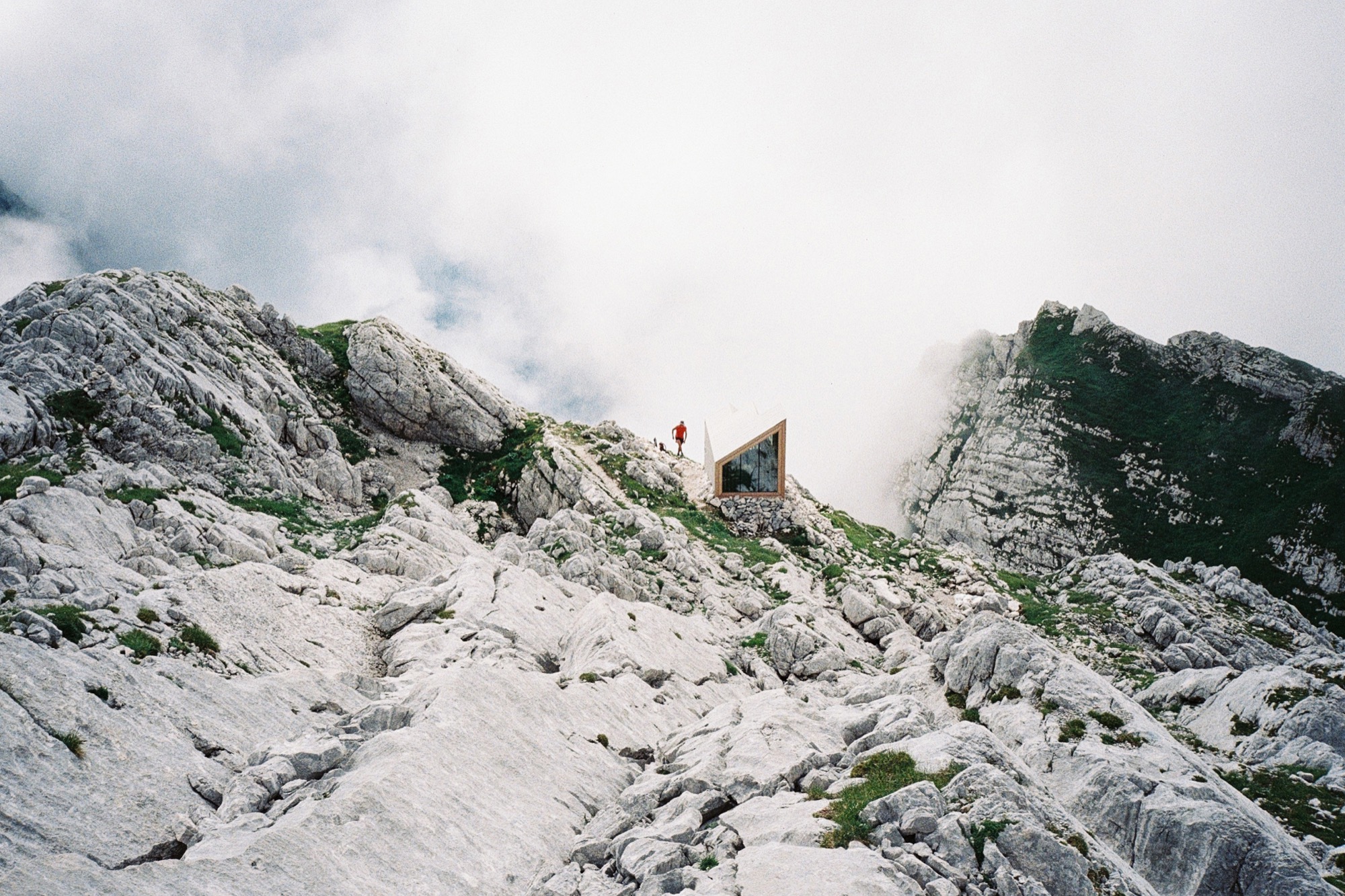
The hike up
The unmarked trail that leads to this bivouac starts in the Kamniška Bistrica valley, just a short drive from the Slovenian capital of Ljubljana.
The gravel road to the trailhead is bumpy and the trailhead itself is somewhat hard to find. The actual hike is not difficult technically, but it is very steep and relatively strenuous. The first part of the hike leads through a deciduous forest that eventually gives way to a sea of mountain pine. Above the tree line, the terrain mostly consists of scree and steep, grassy slopes. The last part of the hike is the prettiest: it winds its way through the alpine karst, full of interesting surface features.
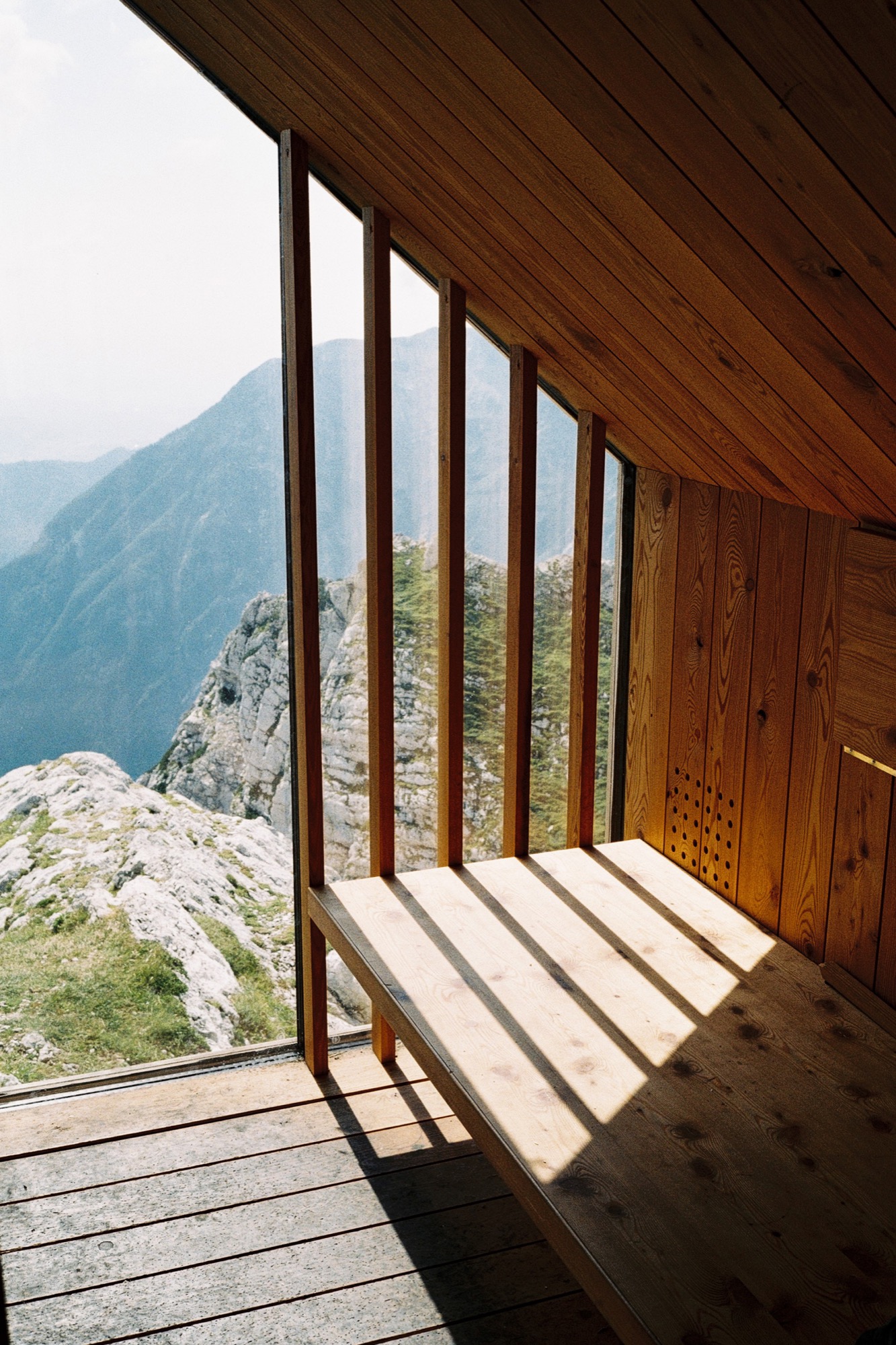
The bivouac was built in 2015 as a replacement for an older structure that occupied the same location in the previous decades. It is situated at 2045 meters (6709 feet) above sea level, underneath the southern walls of Skuta Mountain. The bivouac comprises three modules made out of glass, larch wood and various recycled materials that blend into its surroundings. It offers spectacular views of the Ljubljana Basin and the surrounding peaks, to which a couple of marked trails lead from the bivouac's vicinity.
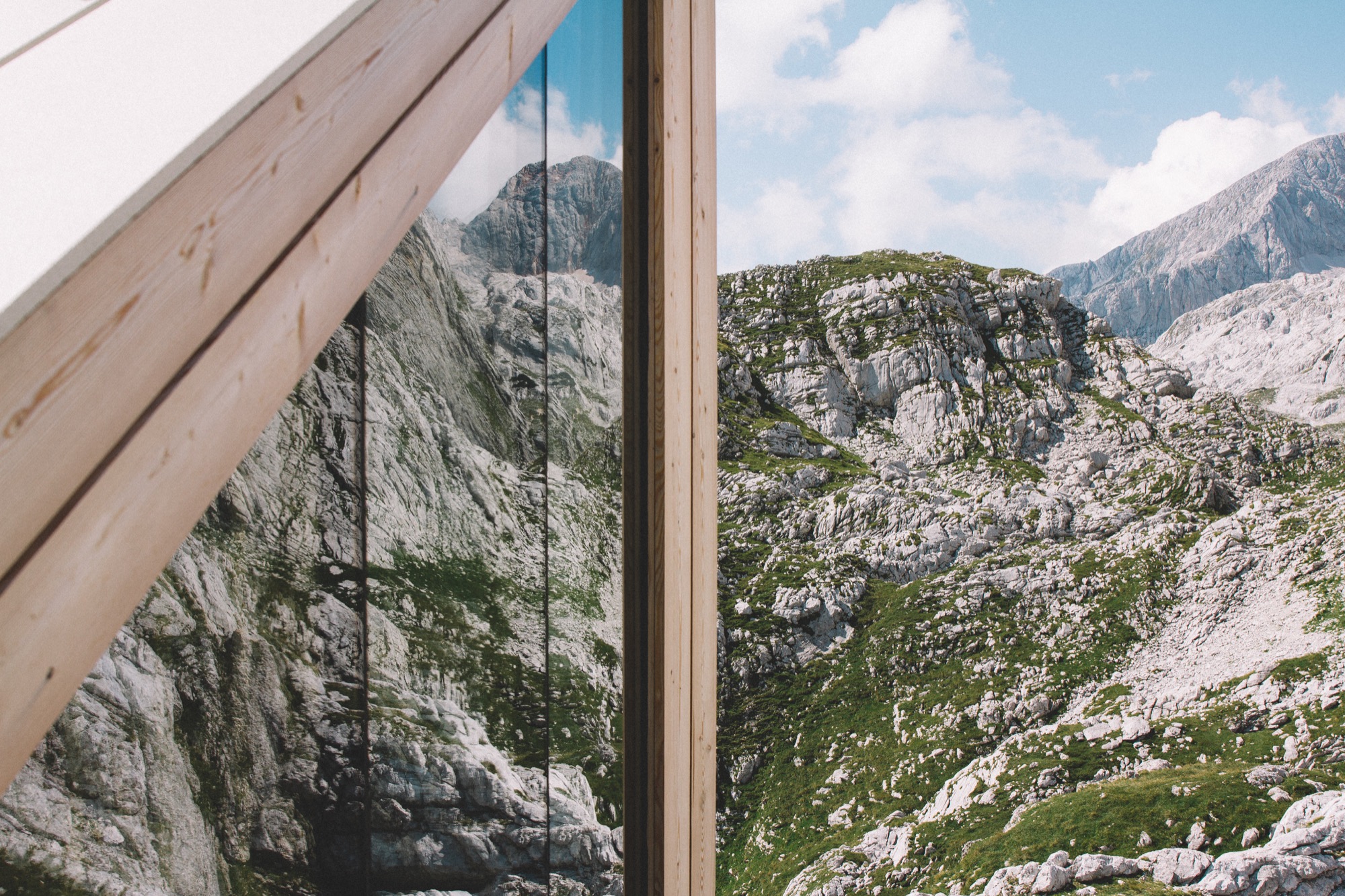
We hiked to the bivouac on a perfect September weekday, met very few people on the trail and even had the summit of Skuta all to ourselves. △
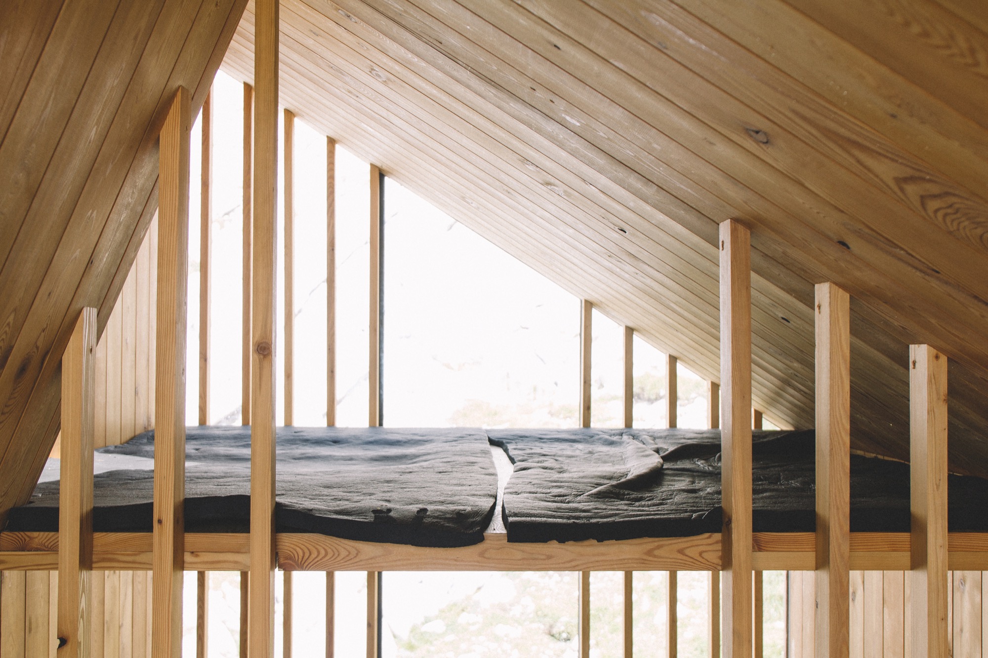
Growing Up Weese
The daughter a power couple of American modernism, artist Marcia Weese was born to design
Her parents are architect Harry Weese and pioneering design shop founder Kitty Baldwin. Born into a coterie of mid-century modern architecture and design icons—Alvar Aalto, Eero Saarinen, and Charles and Ray Eames among them—artist and interior designer Marcia Weese carries on family tradition by designing modern rugs and creating fine art prints in her studio in the Colorado mountains.
I grew up on the near north side of Chicago near the lake. The endless horizon line, burning coal, bus fumes, beach sand, roller skates, sirens, frozen waves, thunderstorms, pigeons, dandelions ... Life in the inner city was complemented by summers in the country forty miles west. Crickets, lighting bugs, oaks, jays, owls, leaves, slugs, snake grass, otters, bluegills, cabbage butterflies, algae, sumacs, worms, Queen Anne’s lace, garter snakes, rabbits, clover, flies, bullfrogs ... I was lucky to dwell in both worlds. And each winter we spent the Christmas holiday in Aspen, and I fell in love with the Rocky Mountains, too. Streams, Indian paintbrush, marmots, boulders, puffballs, eagles, gentians, boiled wool, marzipan, scree fields, cumulus clouds, ravens, purple snow shadows, ermine, the smell of wet dirt...
The natural world has always been an oasis for me—a sanctuary, a place in which to marvel and explore. I borrow imagery from natural forms, weather patterns, textures, to bring a sense of balance to my world. My content often comes from the mystery and magnificence of nature—the perfect designer.
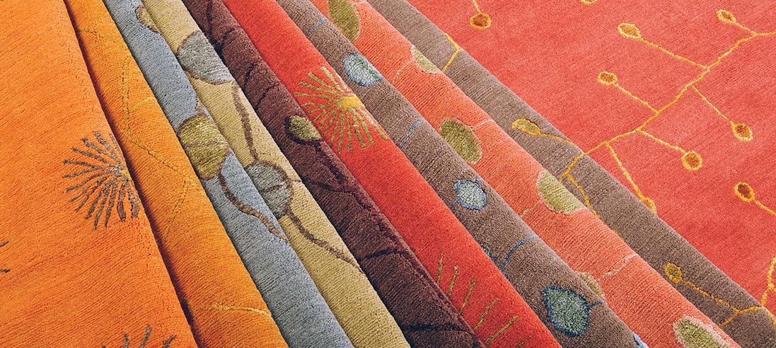
“My content often comes from the mystery and magnificence of nature—the perfect designer.”
Trained as a sculptor, I was attracted to site-specific work that often incorporated architectural elements. Printmaking was a natural antithesis to the rigor of planning and making sculpture, and as I look back, I have devoted most of my artistic life to works on paper. The ephemeral quality and the spontaneity speak to me. I am enchanted by the casual impermanence of a work on paper. And I am attracted to the minimal aesthetic, where I feel most comfortable. Less is more in my world.
“I am enchanted by the casual impermanence of a work on paper.”
As children, we would get the nod from mother that our father was coming home and it was time to "clear the decks.” All toys would be scooped up and hidden away so he could walk into a clean and serene environment. To this day, clutter confuses me and divesting is actually something I enjoy.
I moved to New York after art school to become the famous artist that is expected of all Bennington graduates. That was a nine-year lesson in humility and how to survive amid intense turmoil and fierce competition. I learned how to discern the excellent from the mediocre in art and design. I danced, made sculpture, painted, and longed for the horizon line. I found myself walking down the streets in Manhattan looking up at the rooftops. There, the sky silhouetted another cityscape of water turrets, parapets, and fire escapes. After nine years in New York, “Manhattanism” (i.e., "New York is the only place to live”), had gotten a problematic stronghold on me, so I escaped and returned to Chicago where I could breathe again. I loved walking along the lakeshore with the density of the city to the west and open water to the east.
I continued making art but asked my mother to teach me the ins and outs of the interior design profession so I could more readily support myself. She taught me well, and I have worked collaboratively with architects and clients across the country over a number of decades. As an interior designer with a classical modern bent, I was always searching for the quintessential modern rug to harmonize the room. I only found beige, beige, and beige or super graphic patterns that looked like bad paintings. Serendipitously, I was introduced to a family of Tibetan sisters, who knew the rug trade and had cousins in the business in Asia. This was a happy union, and for the past fifteen years I have worked directly with Tibetans who weave rug collections to my design in Nepal. Recalling visuals of growing up on the edge of Lake Michigan and the Midwestern prairie, to hiking the crags of the Rocky Mountains, my designs stem directly from my intersections with the natural world. The patterns and color palettes present an assemblage of modern but timeless rugs.
“As an interior designer with a classical modern bent, I was always searching for the quintessential modern rug to harmonize the room.”
When I eventually grew tired of Chicago’s pink skies at night and ached to see the milky way, I moved west to the Rockies.
Decades have passed, and the early modernists are still in vogue. Thankfully, this is beyond fickle fashion, which warms my heart as I feel I am surrounded by old friends and family. These days, when I encounter “everyday simple,” I pause and give thanks to my parents for teaching me that less is more. And I appreciate the efforts that are being made by those who are committed to good design and who are carrying on that noble tradition.
And I am ever grateful to have been handed the baton of creativity. It is an ongoing quest, one that continues to nourish, atop the peaks and in the valleys. △
“Decades have passed, and the early modernists are still in vogue. Thankfully, this is beyond fickle fashion, which warms my heart as I feel I am surrounded by old friends and family.”
Read "How American Modernism Came to the Mountains"—a memoir by Marcia Weese as the daughter to a power couple of early American modernism. Together with fellow members of Chicago’s design elite, Harry Weese and his wife, Kitty Baldwin, flocked to Aspen for ski and summer holidays, bringing modern design and architecture to the Mountain West with them.

