Inspirations
Explore the elevated life in the mountains. This content debuted in 2015 with Alpine Modern’s printed quarterly magazine project.
Retreat in the Aspen Grove
Cottage Black by Colorado-based architecture and interior design practice Studio B counterbalances the grand main house in Aspen’s countryside
Studio B, a Colorado based architecture and interior design practice with offices in Boulder and Aspen, first designed the grandiose main residence in the backcountry a twenty-minute drive from Aspen, Colorado.

“We really wanted to explore a heightened experience of those aspen trees.”
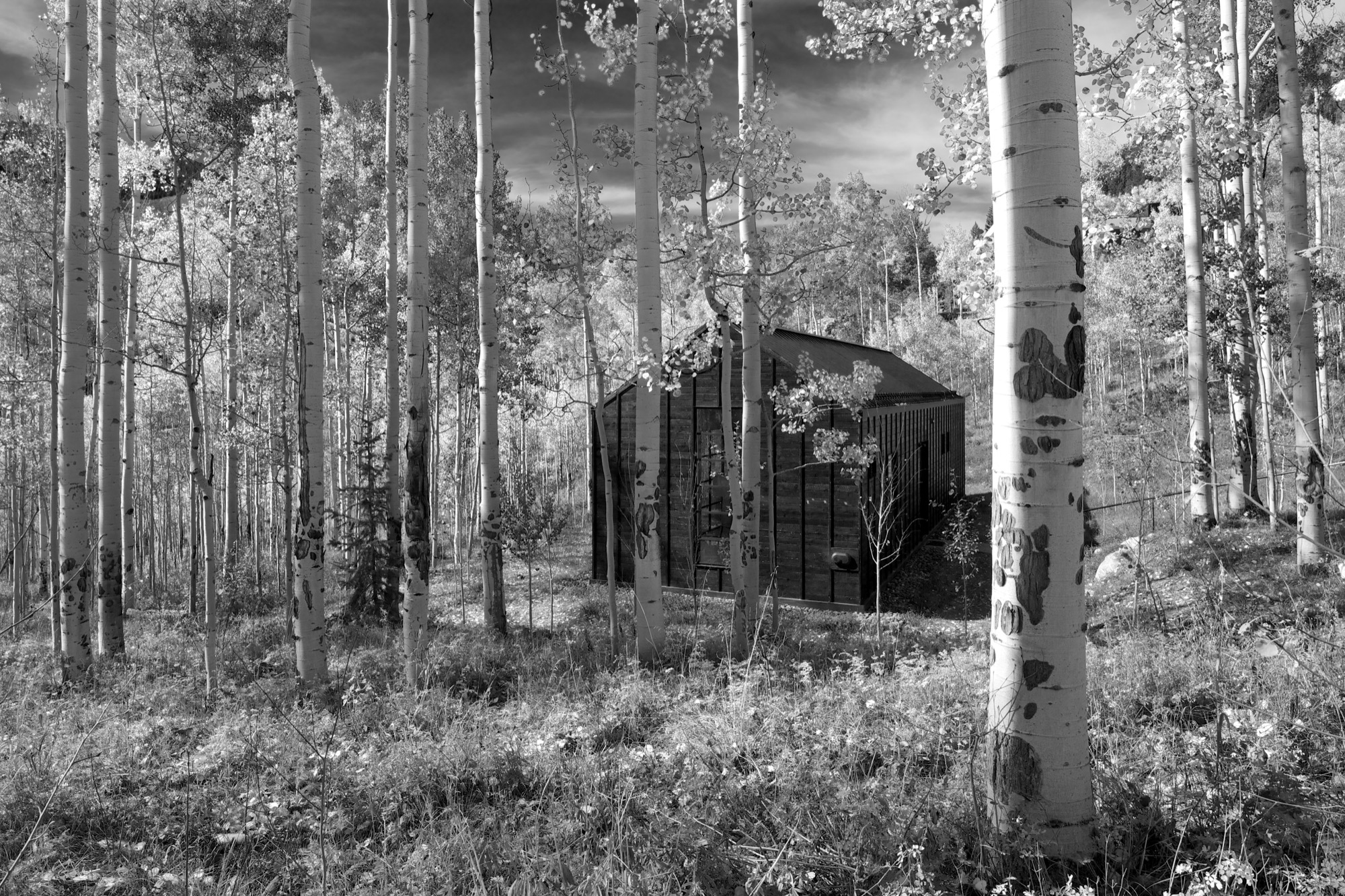
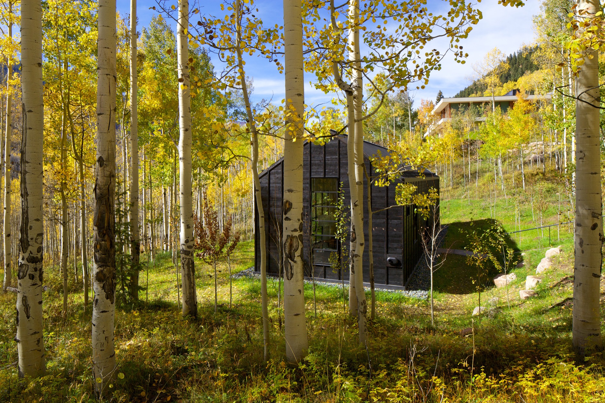
“The main house sits up on a ridge and is all about connecting to those long views, the big mountain views,” says Piché, describing what he calls a “more extroverted” approach, compared with the cabin down in the grove. “When we started working on the little guest retreat, we wanted to experience the trees in a completely different way. These views are much more embedded in the grove.” To better understand what design and placement would make the most out of Cottage Black’s distinct surroundings, Studio B took time to study how the aspen trees’ foliage changes with the seasons. “One thing we really liked about it was that the trunk feels really consistent throughout.”
The monochromatic aspen tree bark ultimately inspired the intimate retreat’s all-black exterior and all-white interior.
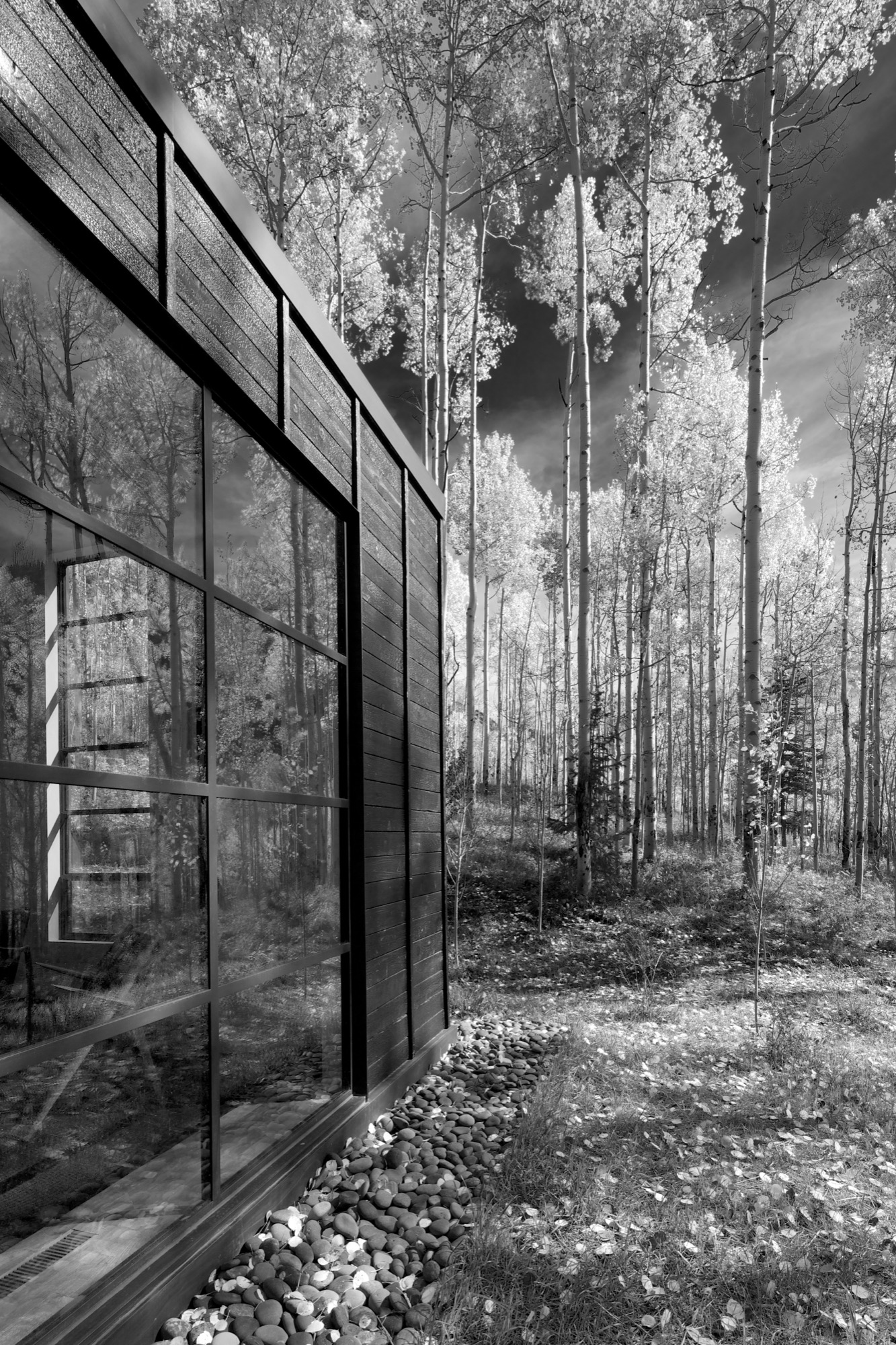
“The standing seams on the roof and the vertical joints of the interior wood ceiling were chosen to relate to the immense verticality established by the trees,” the placid architecture master notes. Approaching the house, simple stairs weave their way through the trees to the front door.
The black exterior
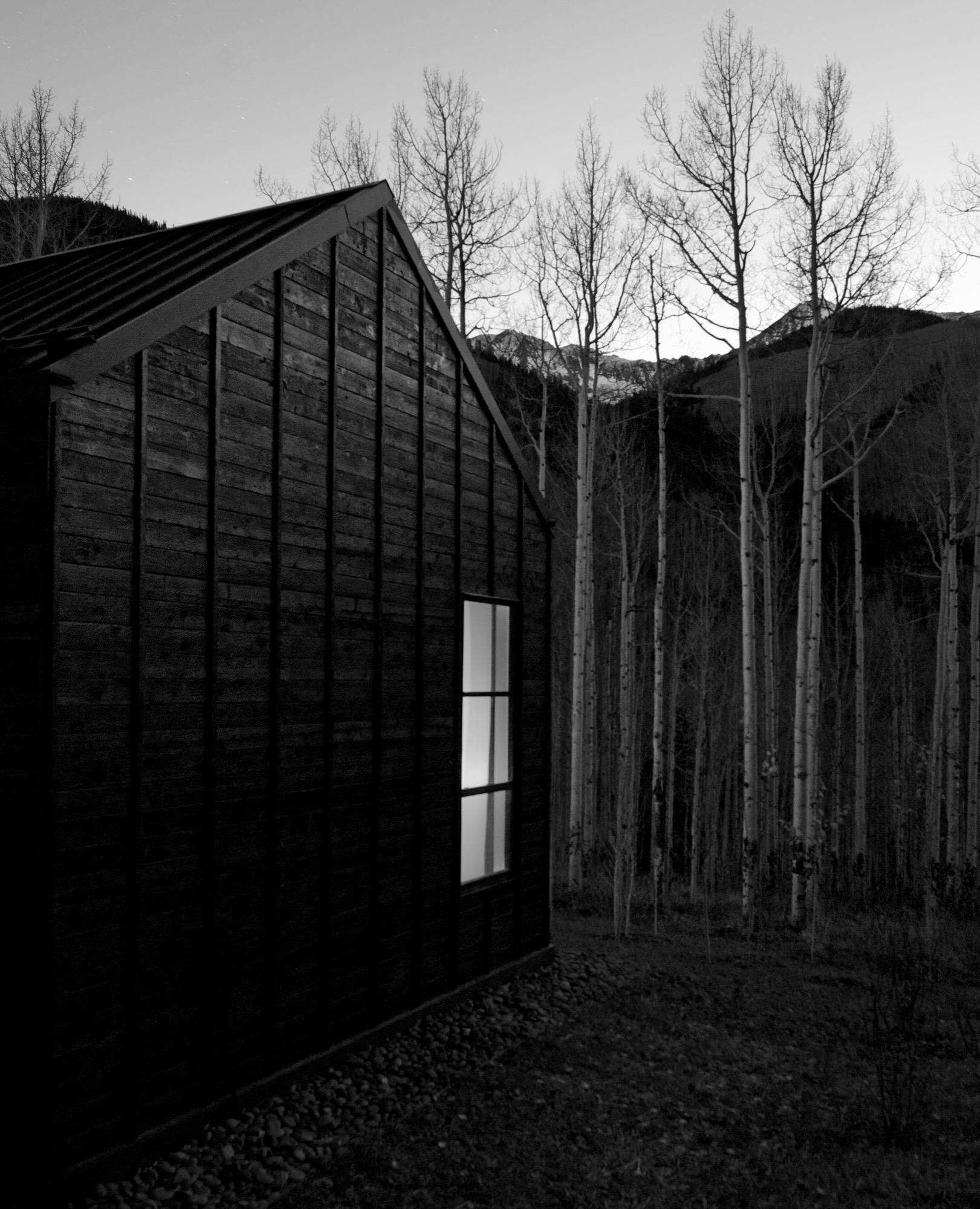
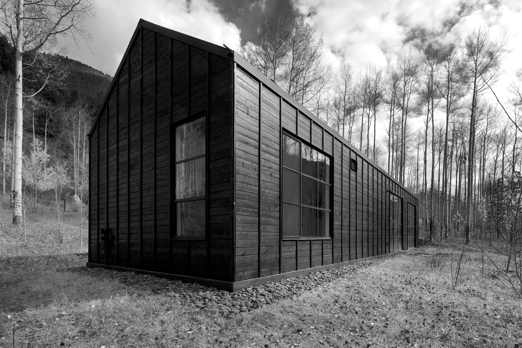
Heavily charred cedar wood gives the cottage’s exterior a rougher, bark-like texture. The orientation of the boards and the battens picks up on the verticality of the trees and the shadows. Looking at “that box” with its horizontal boards at one point during construction, Piché says they had an epiphany: “You wouldn’t think that black has the shadows and the depth that it does, but it seems it almost has more. When the sun hits, the black wood goes from gray to dark and it really feels like it transforms quite a bit.”
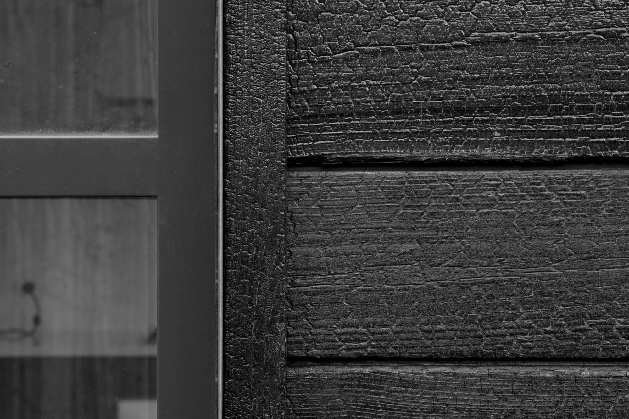
“You wouldn’t think that black has the shadows and the depth that it does.”
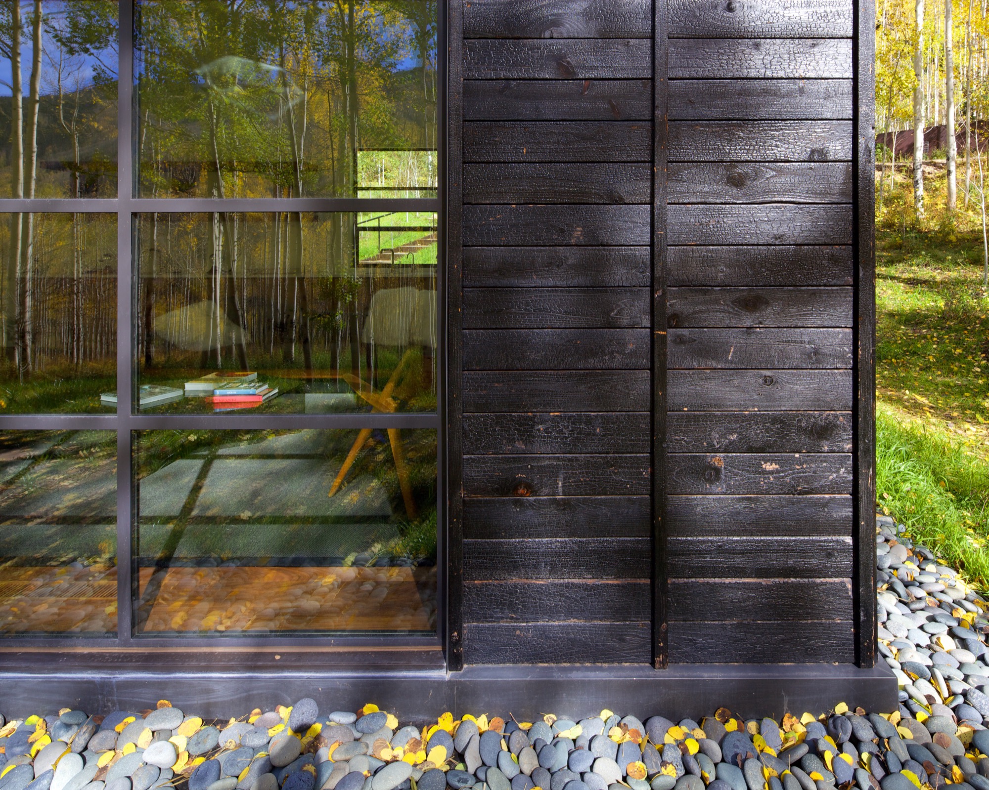
What’s more, the charred exterior gives Cottage Black the air of having been there for a long time. “And in spring and summer, when all the trees are fully leaved, people don’t even see the cottage. It disappears, and it reappears in the fall, too,” says the distinctly analytical architect, pointing out that no driveway leads to the retreat and guests cannot park right next to it. “The cottage is packed into the trees, and it’s kind of a journey down there.”
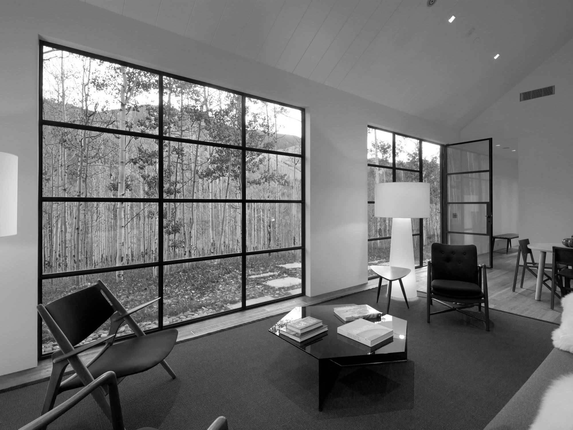
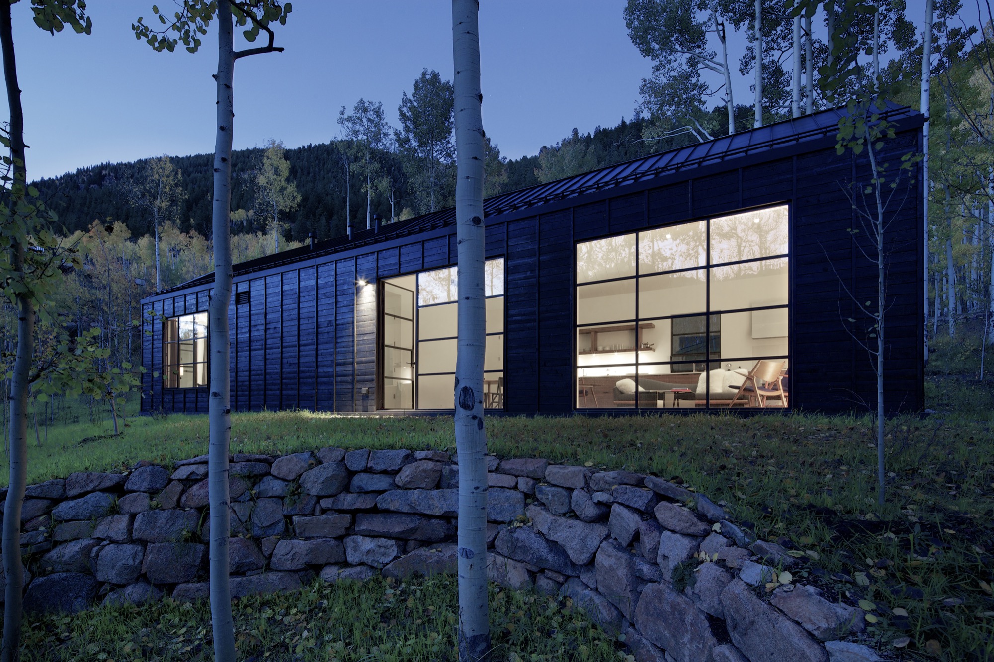
The Studio B team intently placed the steel windows to achieve a minimal sight line that only highlights a few select views. “We added a tall window that emphasizes some great trees on that side, a couple of little corner windows that just frame the tree trunks, and then one big window in the living room that is more about walking outside onto the patio and connecting to all the trees there,” the architect says. “But you are not getting those big mountain views. Just these little glimpses of the outside, which creates that more intimate feel when you walk up to the window. It is more about enclosure and intimacy than the broader expansive things. It is a little bit more inward than outward.”
"It is more about enclosure and intimacy than the broader expansive things. It is a little bit more inward than outward.”
The white interior
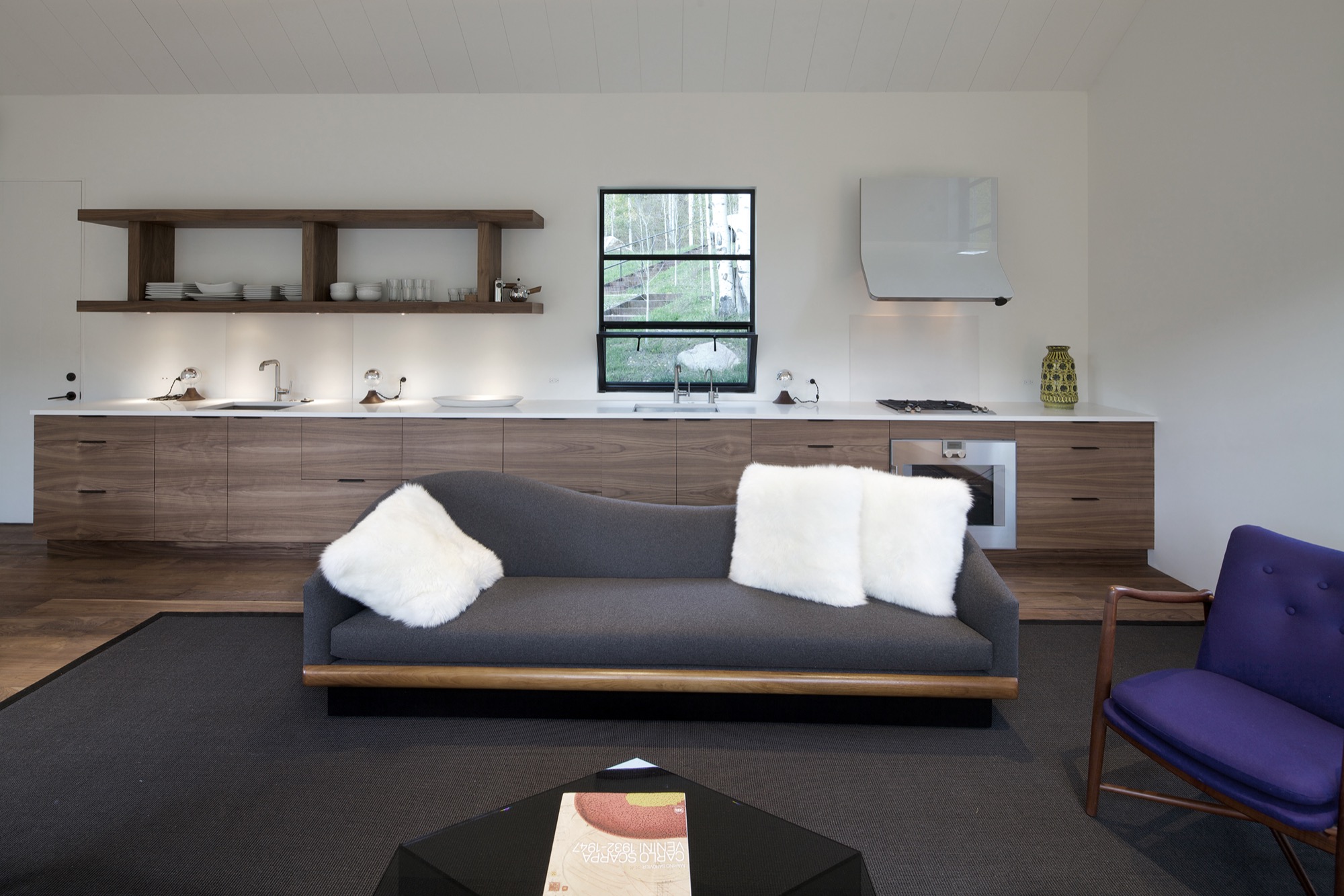
Walnut floors lend warmth to the primarily white, minimalistic inside. “The monochromatic interior, again, is a counterpoint to the main house, which has a lot more materiality coming through and more complicated detailing,” Piché says. Cottage Black, by contrast, is very simple, with much more subtle detailing: “There is the wood ceiling, for example, where each of the joints lines up with the joint on the exterior in a subtle inversion of it.”
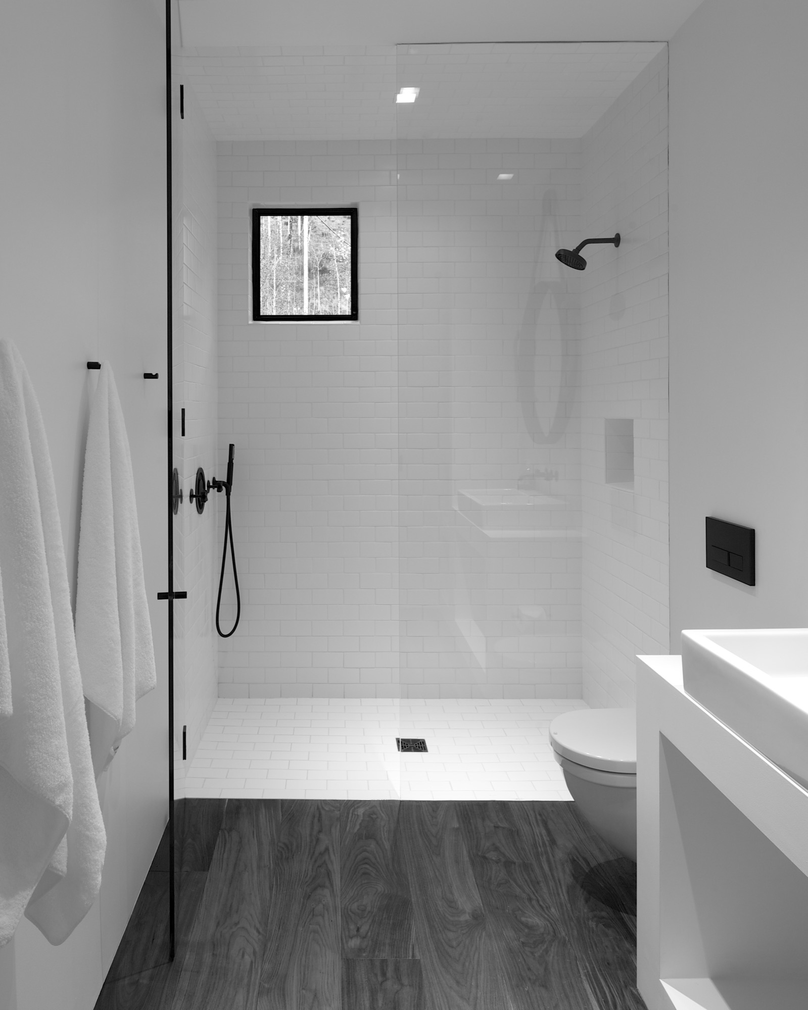
A bathroom at the center separates the sleeping area from the living space, which also includes a little kitchen to allow guests some autonomy, if they desire. “There isn’t any kind of door,” Piché says about the intimate studio layout.
A counterpoint for solitude
Should the guest retreat complement or rather juxtapose the main house? After much collaborative consideration, the design team and the client decided Cottage Black was to be a distinct counterpoint to the luxurious primary residence up above on the ridge. One consequential feature of this objective ended up being the orientation of the structure. “The one window that you see when you stand up in the living room lights up, and that’s it,” Piché says. “All the other things... we shifted it quite a bit to make sure you couldn’t see it from the main house—that there is that black object.”
Furthermore, the team had added transitional materials throughout the main house to add texture and interest in various places. Cottage Black’s architecture and interior design, on the other hand, are very much characterized by deleting details, according to the architect. “This house is a lot about editing,” he says in reference to the design process. “In the beginning, we had a lot more adventurous solutions, and we distilled it and made it into a better and more powerful piece of architecture. It doesn’t need to be a lot.” △
Sense of Place: Clean as in Whistler
Chad Falkenberg of Vancouver-based Falken Reynolds talks about modern interiors in Whistler's mountain homes and cabins
In the fourth and last installment of our "Sense of Place" series, we are talking with interior designer Chad Falkenberg of the Vancouver-based interior design studio Falken Reynolds about brining Whistler style home, no matter where you live. Whistler is rich in cedar and granite. So its natural that traditional mountain homes use a lot of both. While the wood in older homes may have a raw finish, you won’t see many log cabins in the mountains of British Columbia. The trees here are simply too massive. The granite boulders are enormous, too. People incorporate them into the structure of the house. Natural stones, in fact, are a classic element of both traditional and modern homes in the Canadian resort town.
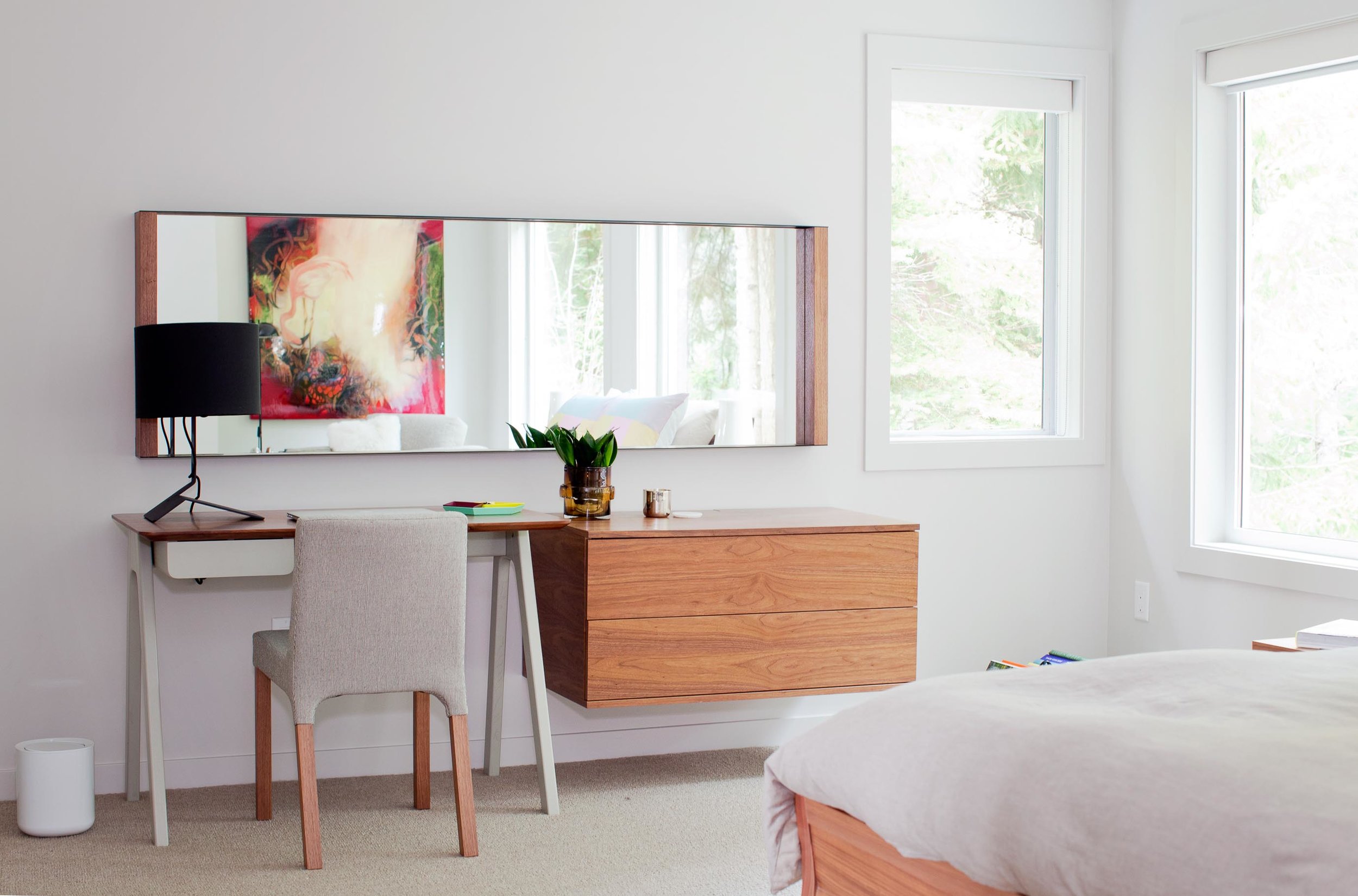
“We try to use a lot of natural materials when we are working in Whistler,” says Chad Falkenberg, one half of Falken Reynolds, a Vancouver-based interior design studio. “It feels more authentic, closer to the earth and to the outside, which is why people go up there, to get away from the city.”
Some of his projects involve sand-blasted Douglas fir to achieve very clean lines but give the wood extra texture. “The idea with all of this is that it patinas well,” says Falkenberg. “If the wood gets hit by a tree or by skis, it’s OK.”
The studio’s work in Whistler is particularly minimalistic and sophisticated yet still achieves the cozy feel of a mountain retreat. Hard textures are mixed with softer, textile surfaces. “In the bedroom of the Aspen Drive house, we used wood furniture, but we also used wool carpet, so the whole floor feels like a sweater,” Falkenberg tells about a recent project. “When you get out of bed, you shouldn’t have to put socks on.”
The designer, who draws inspiration from years of working and traveling in Scandinavia and Southern Europe, often relies on the visual warmth of the materials. “One of the easiest tricks is to mix grays and warm colors,” to achieve the clean-lined yet warm look and feel of some of the Whistler homes he has designed. Combine a warm natural wood with a gray countertop or fabric, for example. “The two things are almost juxtaposing each other,” Falkenberg says. “It’s almost like a wood next to the cool gray looks even warmer.”
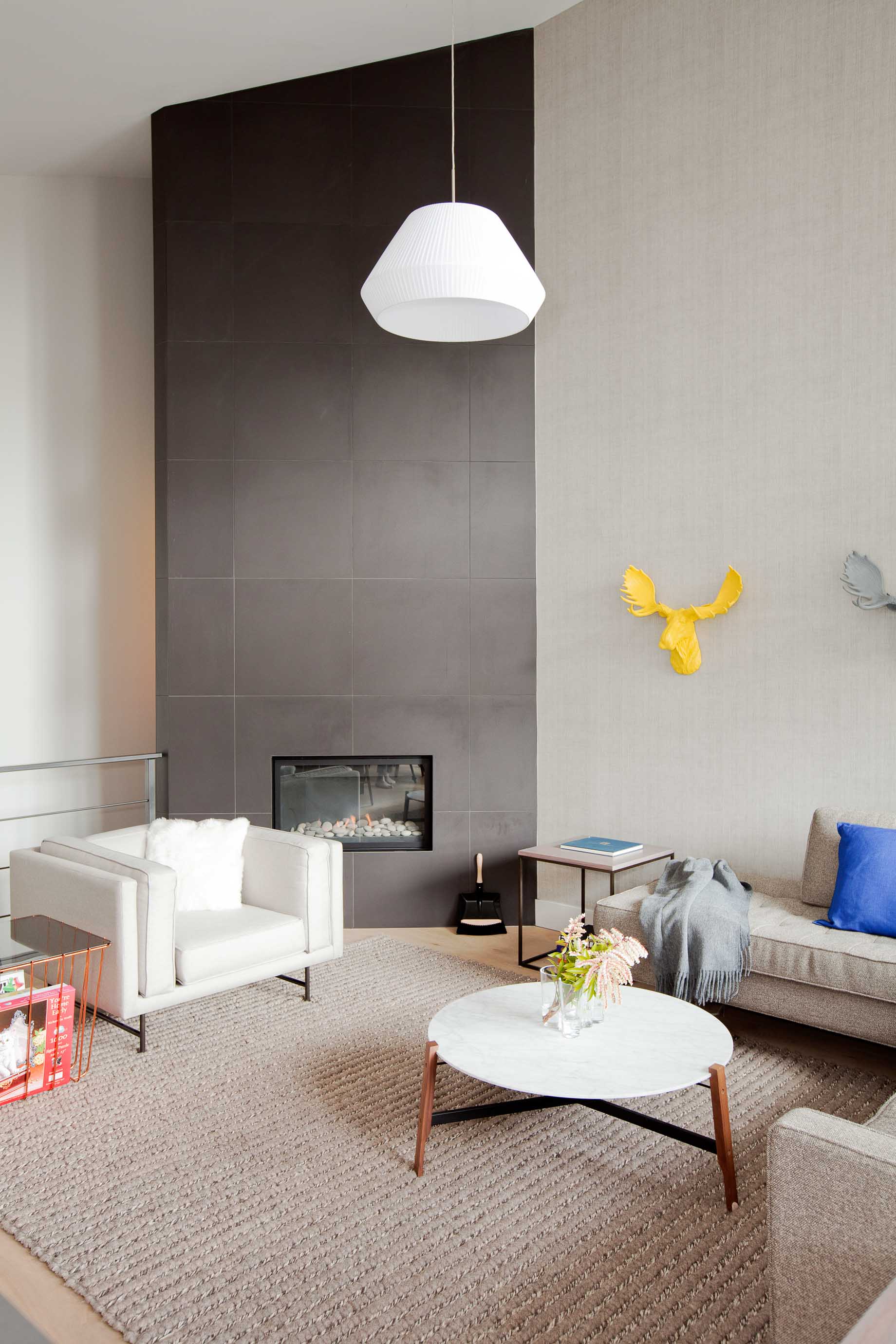
To accessorize your Whistler-inspired winter interior, go for copper and terra-cotta pots. The designer’s favorite textures are anything that feels like a sweater—the loop of a rug, wool blankets, pillows covered in chunky knits. A rougher texture, even on a hard surface like a co ee cup, also feels warmer. Leather is another great material that feels warm to the touch. It has a history to it. “Anything that evokes the natural world,” says Falkenberg.
He likes to keep things casual in a mountain retreat, as he expresses by using a wire taxidermy sculpture or resin moose heads on the wall. “I love anything that reminds me, OK I’m in a cabin, and I’m not supposed to take everything so serious.” △
Hillside Holidays
Near the Austrian border in Germany’s Allgäu, Haus P by Yonder boldly reinterprets the region’s traditional mountain architecture
Nestled into the hilly landscape of Southern Germany’s Allgäu, Haus P by Studio Yonder für Architektur und Design is a holiday home for a family of seven from Hamburg. The irregular shaped structure with a traditional 16-degree roof pitch embodies a thoroughgoing reinterpretation of the region’s farmhouse vernacular.

The supporting base of the 249-square-meter (2680-square-foot) home is made of core-insulated, exposed concrete. Above, black charred timber siding offsets the concrete and the gentle landscape. Clean lines and distinct angles are the dominant features of the home’s geometric design. The home comprises two separate buildings—the living area and a storage shed—united by a sheltered central courtyard, where the entrance is located. The orientation of the buildings lends privacy for the family while spending time outdoors.

Spaces
Open and bright, the interior has a harmonious flow of natural light wood and a wall of picture windows extending from floor to ceiling. These windows allow for majestic views of the mountain landscape.
The main level flows from room to room with no interruption except a wrap-around fireplace marking the beginning of the living and dining area off of the kitchen. The fireplace gives a feeling of warmth from every area on the main level.


An open staircase, which juts out of the side of the building to covers the exterior stairway beneath, ascends to the loft—simple in design, yet functional—above the kitchen. This is an area made to relax, unwind, and take in more of the surroundings, with deep-set ceiling windows letting in light and starry night views.
Set in the concrete base, the spacious lower level has two private bedrooms, a bathroom, and a sauna. △
Snow-Proofed Hillside Family Home in Austria
This house can weather even the fiercest winter storm and an avalanche
 Most homeowners would avoid living within striking distance of an avalanche, but Marcell Strolz and Uli Alber embrace alpine extremes. They built a house that could weather even the fiercest storm.
With its world-class skiing and picturesque alpine setting, the Austrian village of Lech seems ripe to become a buzzing tourist destination. But due to strict regulations against second homes and a high risk of winter avalanches, very little building takes place in this small community. Marcell Strolz and Uli Alber were aware of these limitations when they set out to build a family home, and they knew their modern tastes might be contentious in the slow-changing town. The site they chose at the edge of the village afforded them creative freedom with one inherent condition: The house would have to withstand the forceful blows of sliding snow.
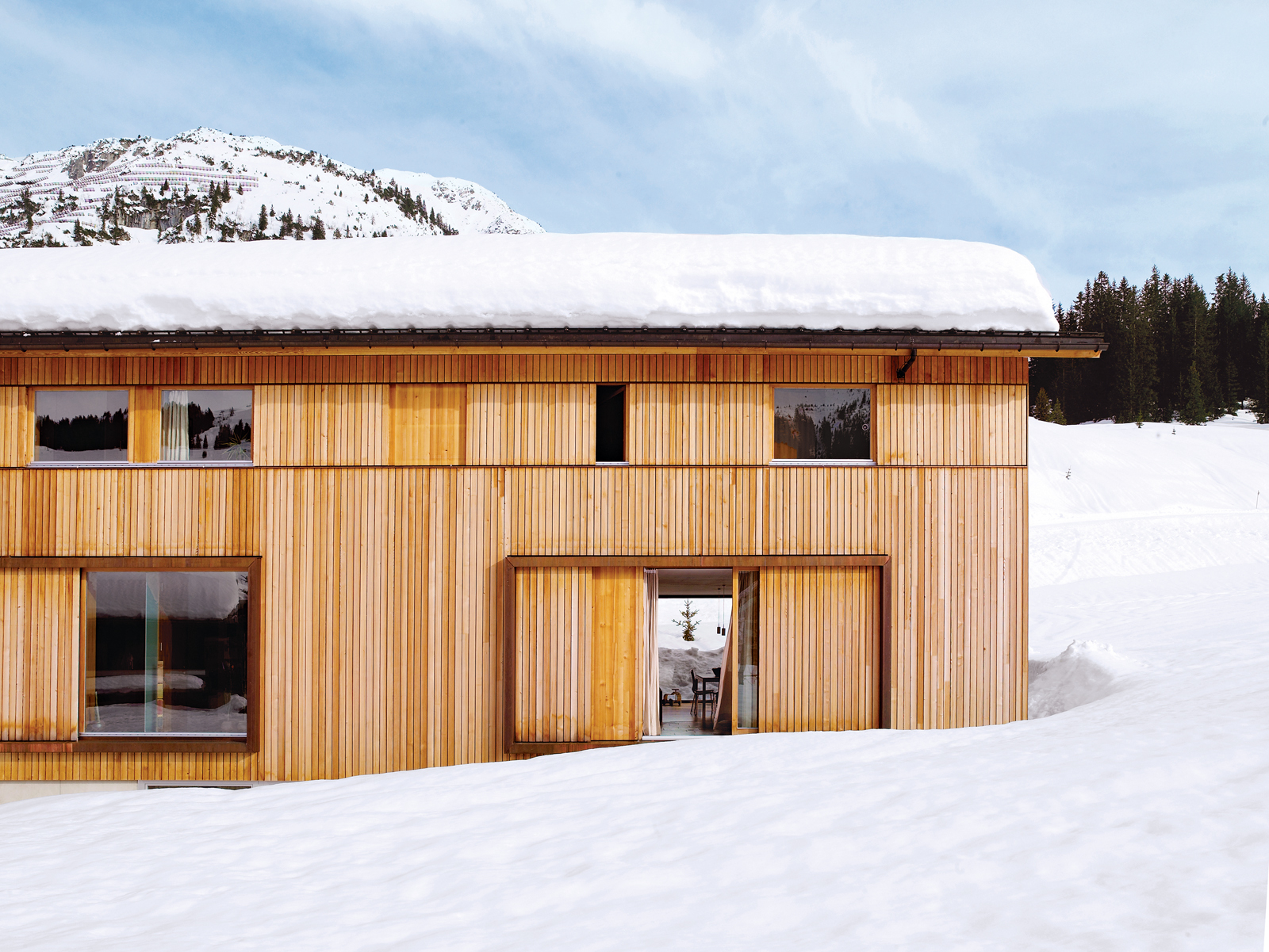
Land slope-side
“It is very difficult to get land here for building,” says Strolz. “Beyond us is a pasture where there will never be any other homes.” Having grown up in Lech and having spent many winters volunteering in avalanche protection, Strolz, who works year-round as a project manager for engineering and building contracts around the village, was ready to live a stone’s throw from the ski runs. He and his wife, Uli, a physical therapist and sports trainer, took preparedness seriously as they designed a place to live with their young children, Felix and Emilia.
“We used some steelwork in addition to the timber frame to strengthen the house,” says Strolz. “A series of sliding wooden shutters protects the building, as does specially strengthened glass around the kitchen.” These shutters can be closed off to seal the windows against avalanches or during the annual “snow roll” fromthe nearby Omesberg mountain, when a controlled explosion shoots snow downhill past the house. There is also a retractable wooden wall, which disappears into the floor, to protect the open veranda.
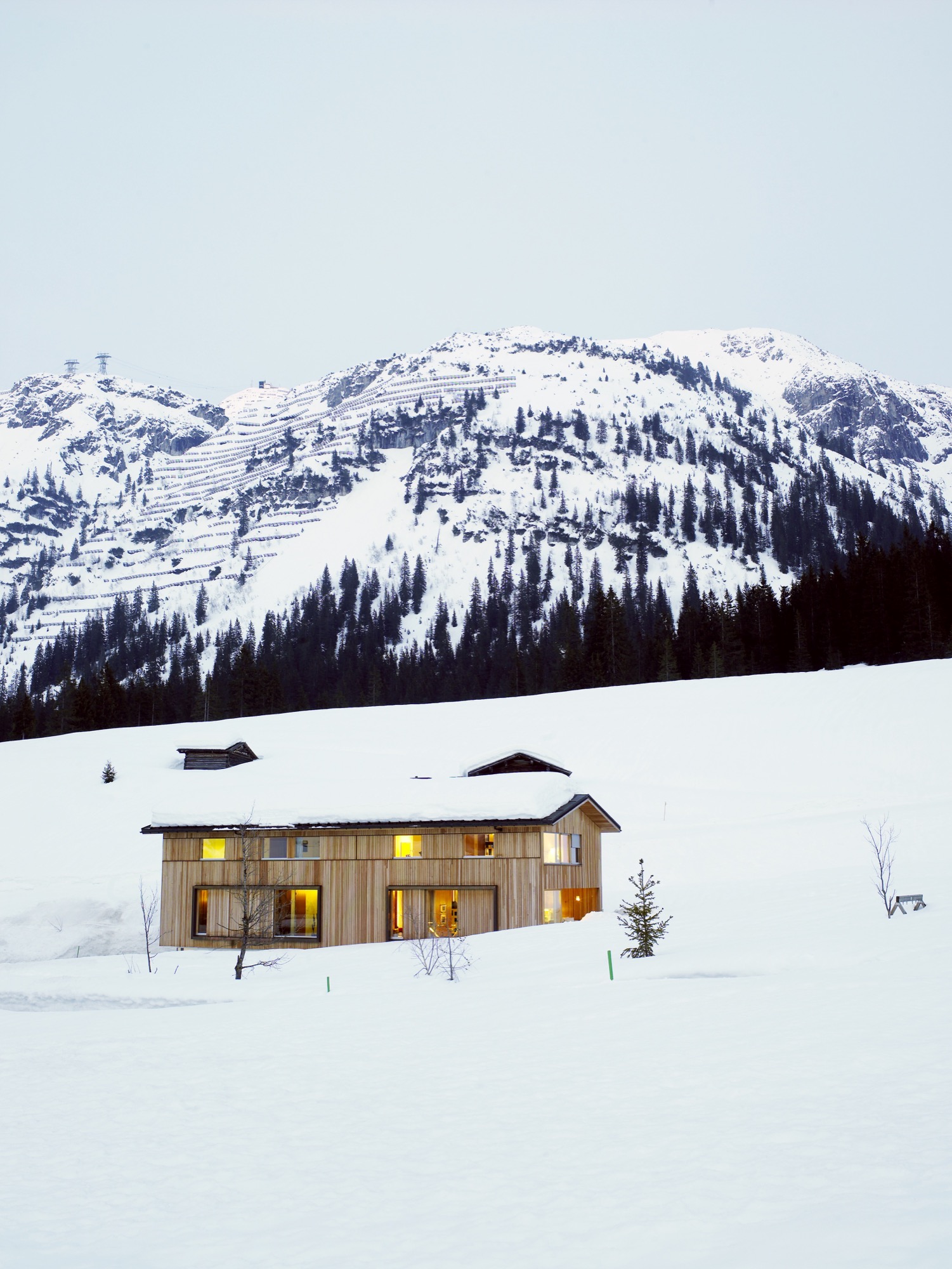
Sustainably designed by Helmut Dietrich
The house was designed by Helmut Dietrich of Dietrich Untertrifaller Architekten, an Austrian practice known for its sustainable and sensitive approach to design. “It was very important to all of us that the house have a relationship to the mountains rather than other buildings,” says Dietrich. “It was the connections with nature—and framing the views—that interested me most. It was also important to us to be able to use timber construction, despite the avalanche risks.”
“It was very important to all of us that the house have a relationship to the mountains rather than other buildings."
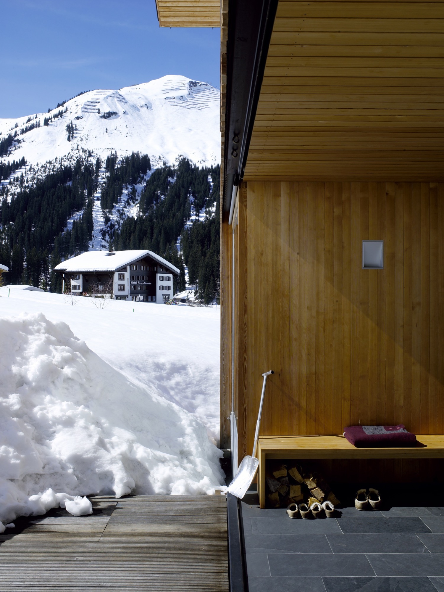
Strolz worked closely with Dietrich throughout the design process, and he managed and participated in the building’s construction. “I got very involved in the preparation of the site, the digging of the foundations, and the concrete base of the house,” he says. “The wooden frame was prefabricated by a local construction company and went up in two days. I also did the drywalling, the floors, some of the electrical—it was quite a lot of work.”
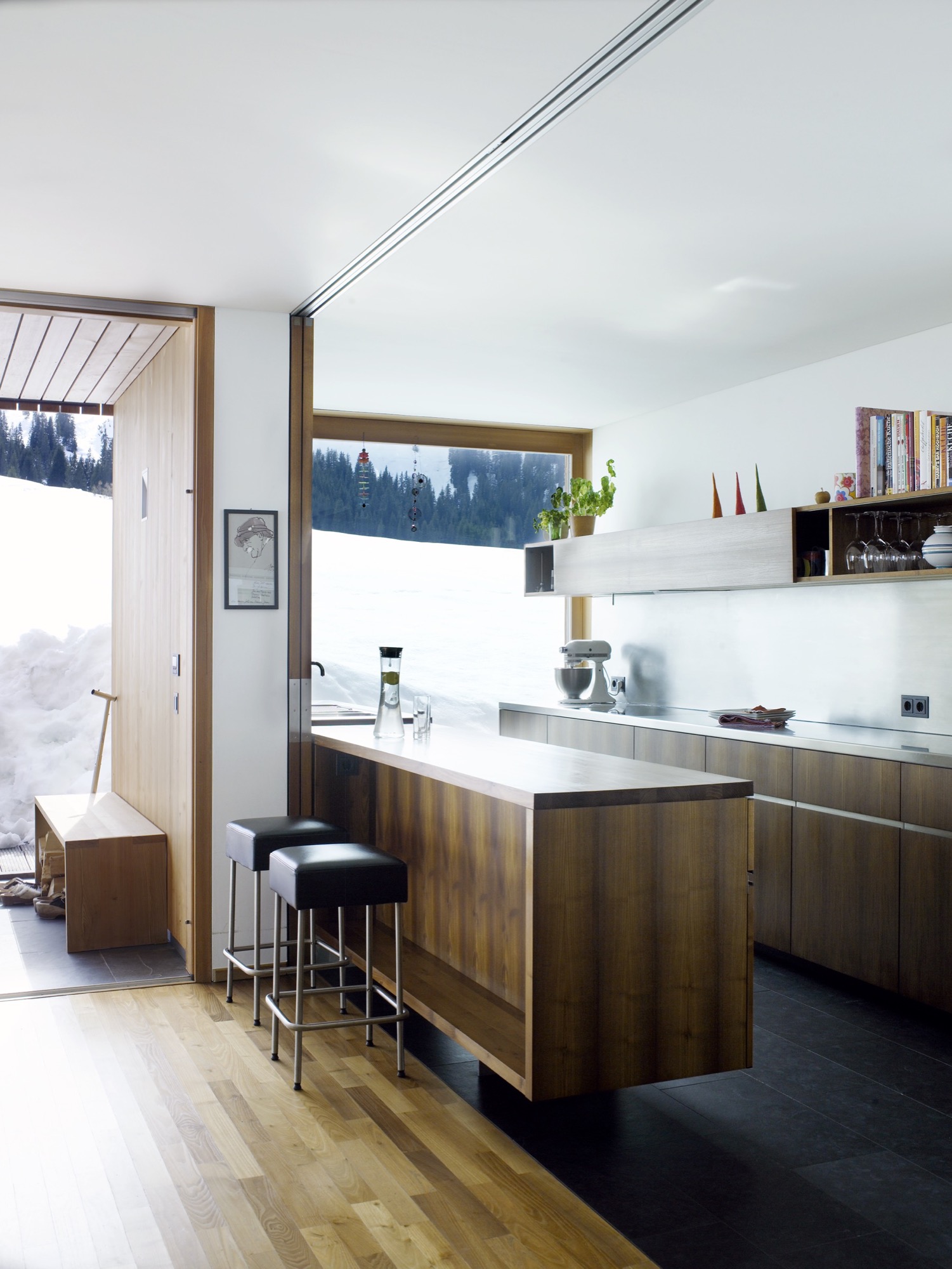
Flexible for family living
Flexibility was a key part of the design. Two separate apartments—one for rental and one for a nanny—are integrated into the building alongside the family’s two-story space. The main living area has an open plan leading out to the veranda, with bedrooms and a study on the floor above. All of the timber for the frame and cladding was sourced from sustainably managed forests.
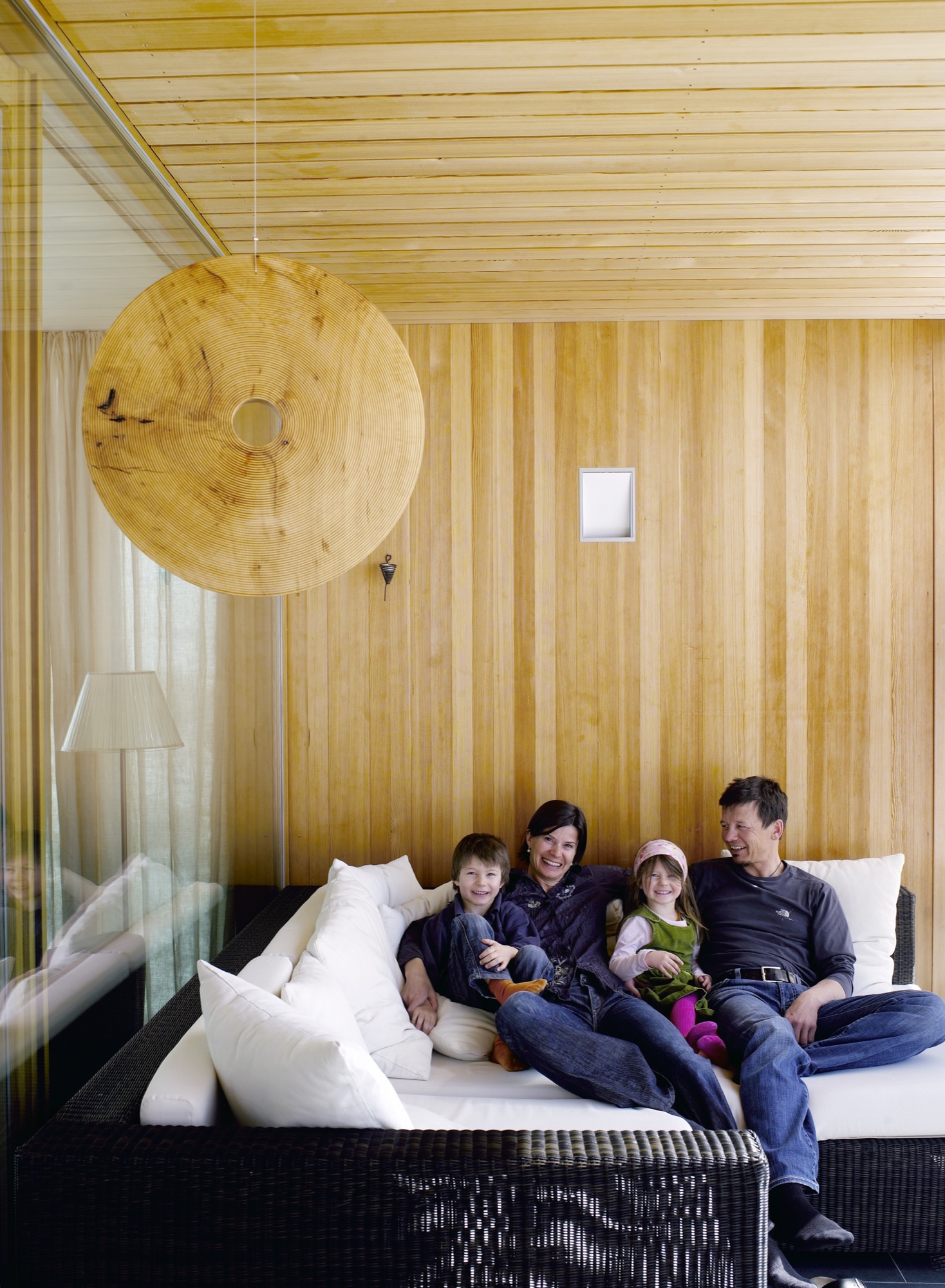
On the roof, Strolz installed solar panels, which are cleared of snow during the winter so that they can function year-round. “The house holds heat very well,” he says. In the summer, excess heat is mitigated through natural cross-ventilation. The shutters that protect the windows from damage double as sun shades, and some rooms of the house have additional internal blinds.
“Most of the new houses in the region address sustainability,” says Dietrich. “In Marcell’s case it was particularly important because of the climate in Lech, where there are long winters with cold temperatures. The house had to cope with the climate while using as little energy as possible.”
"The house had to cope with the climate while using as little energy as possible.”

Their power strategy was supported by one of Strolz’s earlier projects, the construction of a biomass plant for the town of Lech, which was completed ten years ago. Designed by architect Hermann Kaufmann, the plant is sited in a sleek timber-clad building on the road into the village. Its large industrial boilers supply heat and hot water to homes throughout the village.
Progressive architecture in Vorarlberg
The Strolz house is unusual in this rather conservative community, and some compromises were required in order to get the plans approved. “At first, I was told that the house was too long and too high and that the shape of the roof was wrong,” says Strolz.
“So we redesigned it to a certain point and then they said yes.” Despite the changes, the house sits well within the progressive architecture of the Vorarlberg region as a whole, which is famous for its approach to modern design.
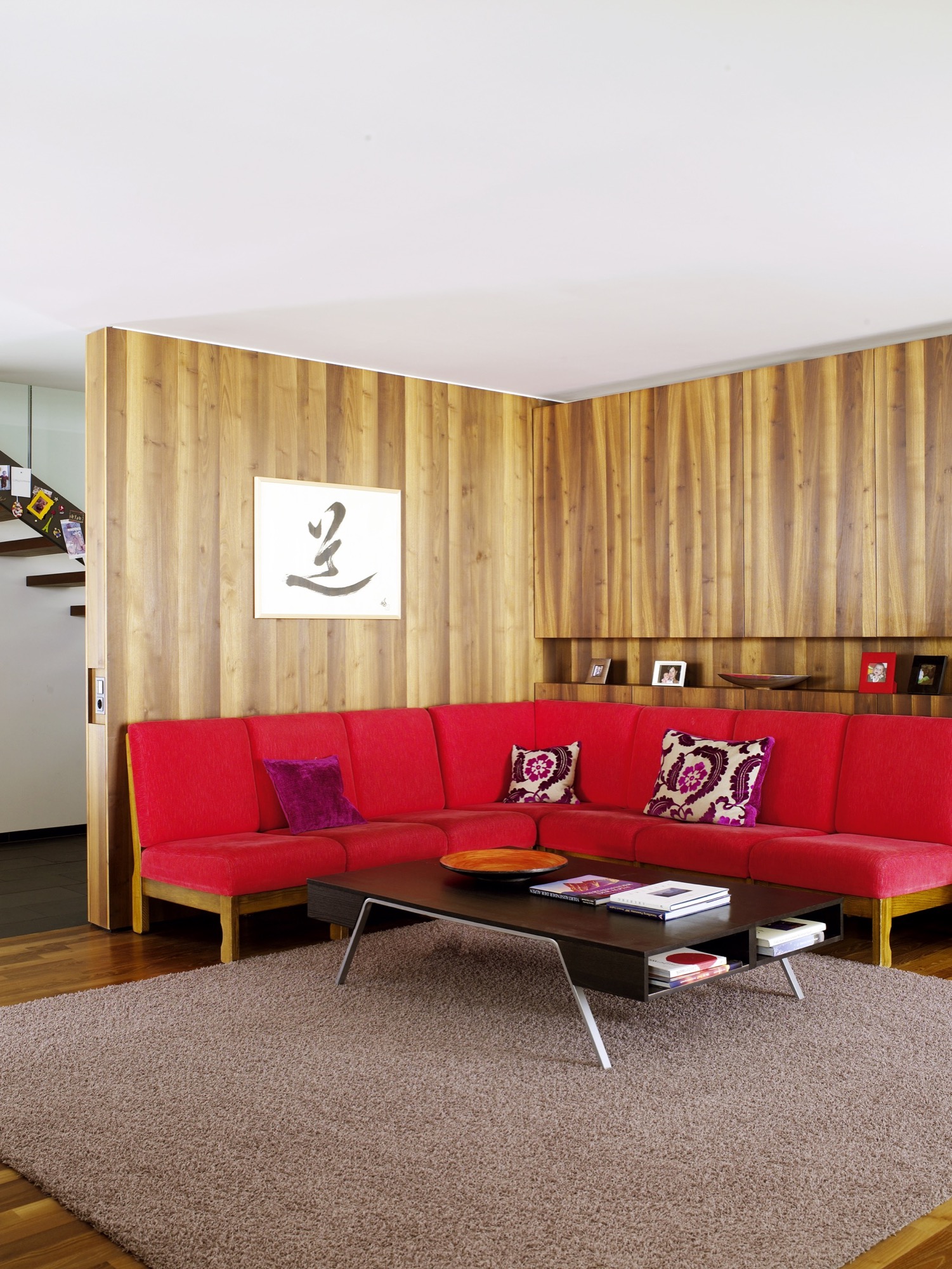
When the weather is fair and the shades are open, one would never know that this graceful house is capable of becoming a fortress. The light-filled building and stretches of open space beyond are ideal places for the kids to play. But when cold weather comes, the family takes comfort in a design that keeps them safe, even if the mountains shake loose a season’s worth of snow. △
Stable in the Landscape
An award-winning Austrian architect ennobles vernacular alpine building tradition to sophisticated minimalism
Austrian architect Thomas Lechner reduces the idea of vernacular alpine architecture to a design so consequentially essential in what is left that his minimalist structures become sophisticated and sexy.

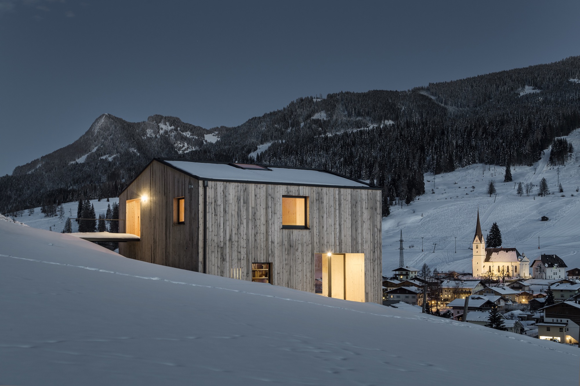
The Hochleitner house in Embach is no exception. The project’s objective was notably elemental: The client wanted a house for himself and his books; a building void of any status. “To realize this vision, we referenced the surrounding area’s simple Heustadln (hay barns) and conceived an honest wooden structure,” says Lechner, co-founder and principal at LP Architektur.
A modern mountain man of tradition
“The mountains mean a tremendous deal to me because they astonish me time and again, demand my respect, and give me a lot of energy.”

Lechner was Born in Altenmarkt in Austria’s Pongau region in 1970. After earning his architecture degree from the Technical University Graz and practicing at several firms in Salzburg and Berlin, he returned to his native alpine town to open his own atelier.
When I ask who is his idol in the architecture and design world, Lechner, whose firm is nominated for the Mies van der Rohe Award 2017, replies there is no reason to apotheosize anyone or anything—“But you can regard fellows in your field and their accomplishments with respect and joy.”
The architect is happiest when he is able to be self-aware and live in the present moment. “That’s the honest life—it feels good,” he says.
The surrounding peaks profoundly inspire Lechner as a man and architect: “The mountains mean a tremendous deal to me because they astonish me time and again, demand my respect, and give me a lot of energy,” he says. “They relativize much of everyday life to what is essential.”
The Hochleitner house
Extracting what is essential also drove his design of the Hochleitner house. Completed in 2016, the 105-square-meter (1130-sqare-foot) primary residence is set in a meadow that borders a neighborhood to the north but is largely undeveloped to the south.

“The site is somewhat exposed in the landscape and requires sensibility,” Lechner says. “The architecture refers to the surrounding landscape by referencing local vernacular building tradition—a wood construction with a weathered facade, pitched roof, etc.”

Looking back at the project, the architect is proud of how the house innately adapts to its bucolic setting, and that no secondary structures, such as a carport, obscure the architecture or unnecessarily bring the form into question.
House tour

The primary building material is wood, which was used in the construction and for all surfaces on the inside. “A central stairway and varying floor levels divide a sequences of spaces—rooms that flow into one another,” Lechner describes. “This creates living zones of different qualities and internal and external contexts reduced to the essential in their formulation. All furniture and storage areas are wall elements, and the central focus is reserved for the book collection.”

The project’s biggest challenge, reveals the architect, was “the proverbial tightrope walk between reduction and banality—to continually look at the challenges of construction and functionality in reference to the targeted solution, which was to model the functional architecture of the regions farmsteads.”
"[A] proverbial tightrope walk between reduction and banality."
Lechner mastered the balancing act. The house won him the Best Architects Award 2017.

“Perhaps there is such as thing as an ‘energy’ that brings together certain people for certain tasks,” the architect notes about the design process and close collaboration with the client. “This project represents an approach where architecture is not defined through a creative will but instead through a relevant response to the place and the purpose—a simple wooden house, no more yet no less.” △
“This project represents an approach where architecture is not defined through a creative will but instead through a relevant response to the place and the purpose—a simple wooden house, no more yet no less.”
An Aspen House Lives Up to LEED
Smart technology helps a house in Aspen, Colorado, stay on its sustainable course
 The Aspen residence of architects Sarah Broughton and John Rowland aims to leave the pristine local landscape intact.
“Every drop of water that lands on the property finds its way to the bocce ball court, which is our storm-water filtration system,” Rowland says. “By the time it leaves, and heads to the aquifer, it’s as pure as it can get.”
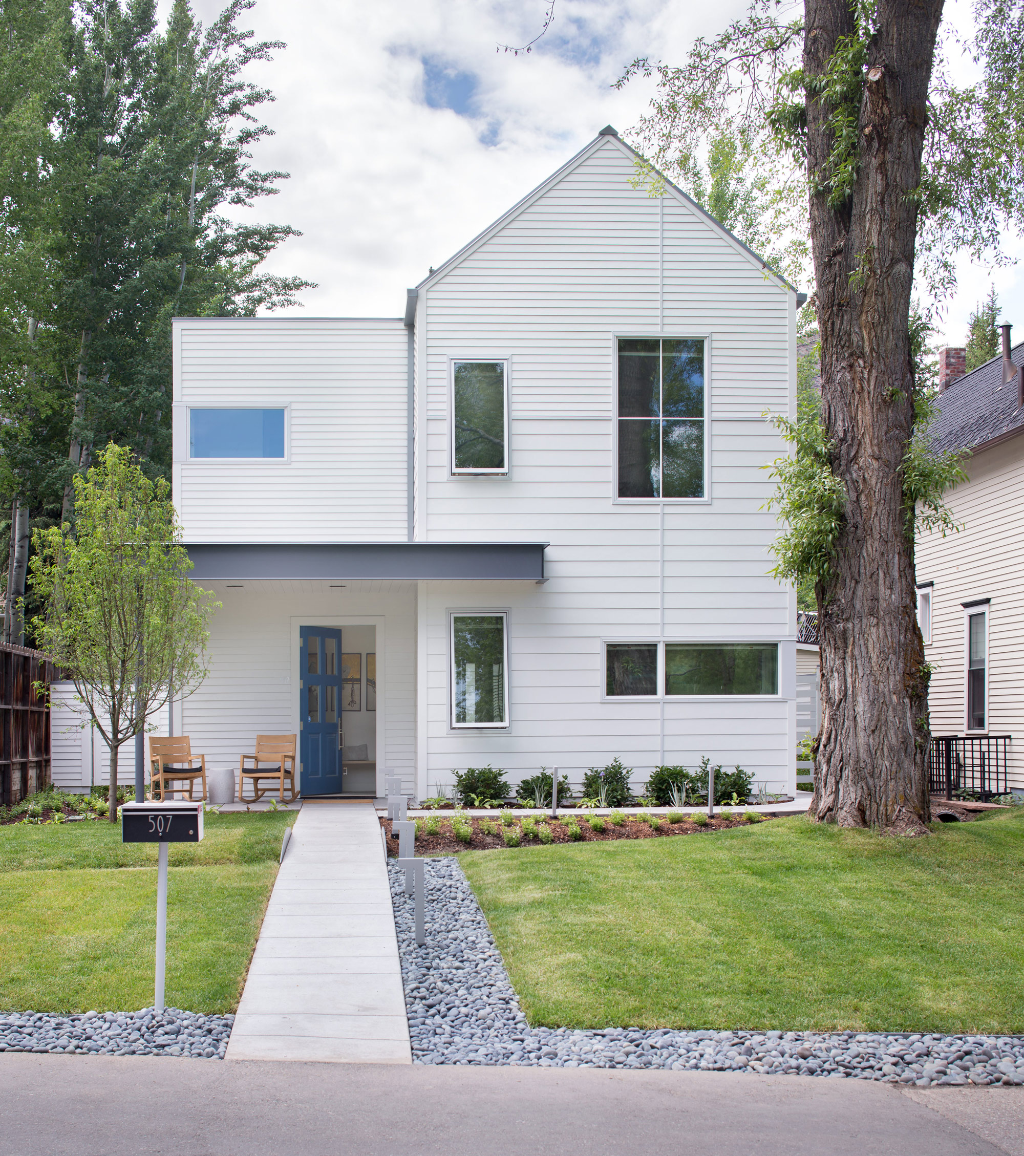
The couple’s house is LEED Gold certified, a rating they achieved by taking into account a number of considerations: They designed the structure so that a large tree in the front yard could be retained; construction was executed to minimize erosion and site impact; and the house itself has high-efficiency plumbing fixtures, among other features. Photovoltaic panels provide about 60 percent of the abode’s energy.
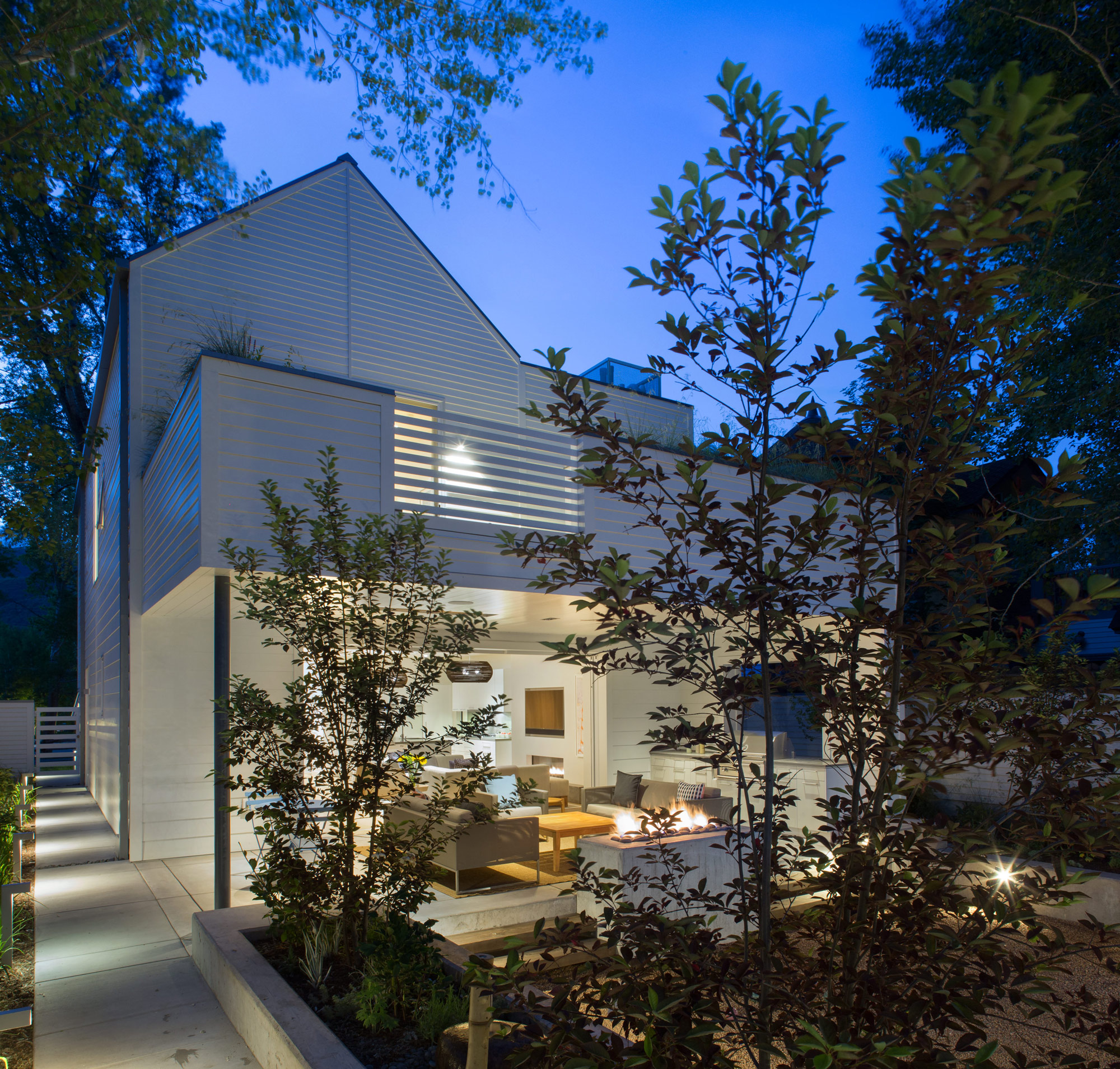
Outdoor entertaining is made possible by a wall of pocket doors from Weiland. “It really expanded the living room, because the doors just go away,” Broughton says. The couple use the Savant system to play music—two speakers are installed in the ceiling of the covered porch, and there are more in the garden. “The outdoor area rocks, literally,” Rowland says.
The residents have wired their mechanical room and solar technology to a Savant home automation system, which they use to keep an eye on the home’s performance. They’ve configured the system’s app to deliver a breakdown of the dwelling’s energy usage in a pie chart. “Last spring, when we were starting to open the windows, I looked at it and said, ‘Oh my gosh, the humidifier is running full-time, and it’s the largest energy hog right now,’ ” Rowland says. “It was time to turn it off.” He notes that they also closely monitor another culprit so it doesn’t run unnecessarily: The heat tape used in the gutters to prevent snow buildup is a big draw.
“The outdoor area rocks, literally.”
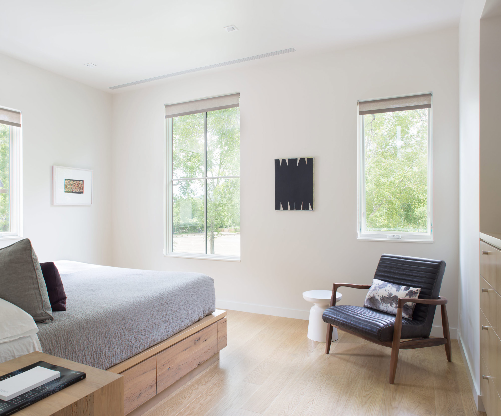
The house is optimized for gatherings. A guest apartment equipped with bunk beds sits under the garage, and a wall of sliding doors from Weiland enables indoor/outdoor functions—Broughton and Rowland once hosted a 25-person dinner party that seamlessly stretched from the dining room to the patio, thanks to tables set up in both places. Technology aids in the couple’s entertaining: Big music fans, they use the Savant system to stream audio across the property. Keyless door locks from Schlage hook up to the Savant setup, and the duo can assign visitors guest codes that will expire after they leave. But the couple purposely steered away from additional automation features—such as connected thermostats—to avoid confusing guests who aren’t familiar with the systems.
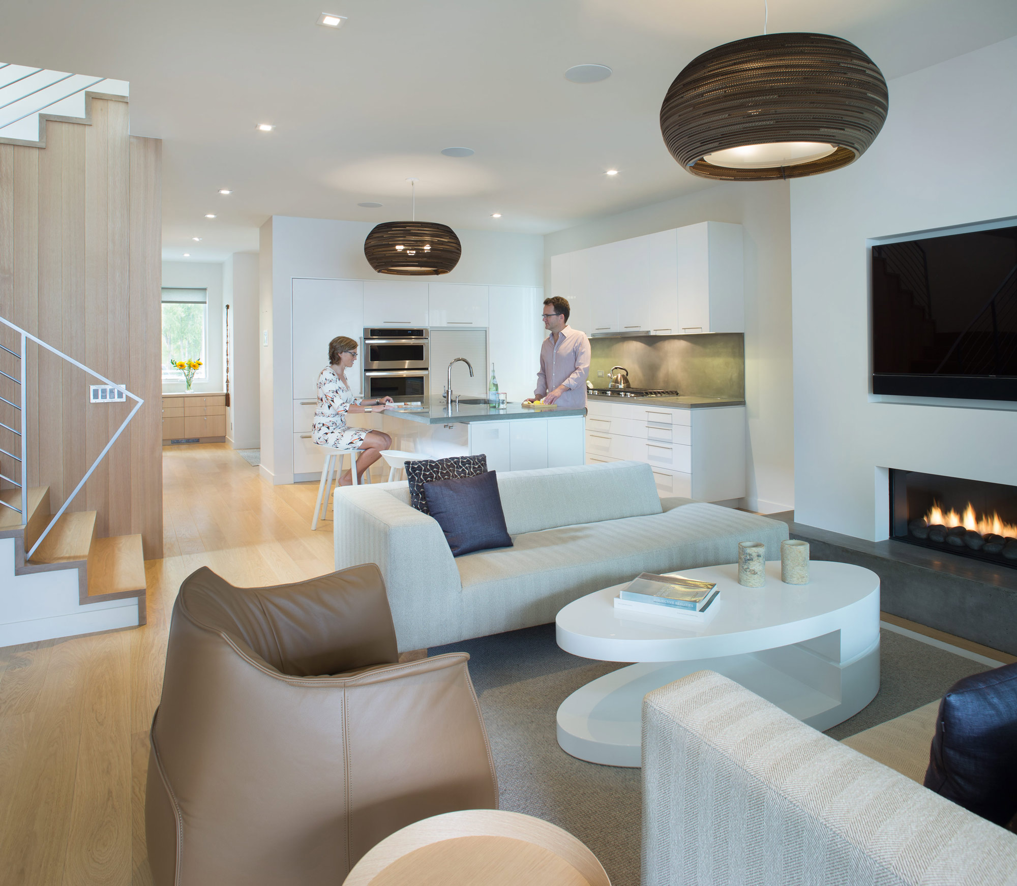
For themselves, though, Broughton and Rowland value the ability to ensure that their house is living up to its green rating. “I wish more of our clients would use tech to understand their consumption,” Rowland says. “A lot of people don’t even pay attention, and things are just running. As architects, we need to be in tune with that.”
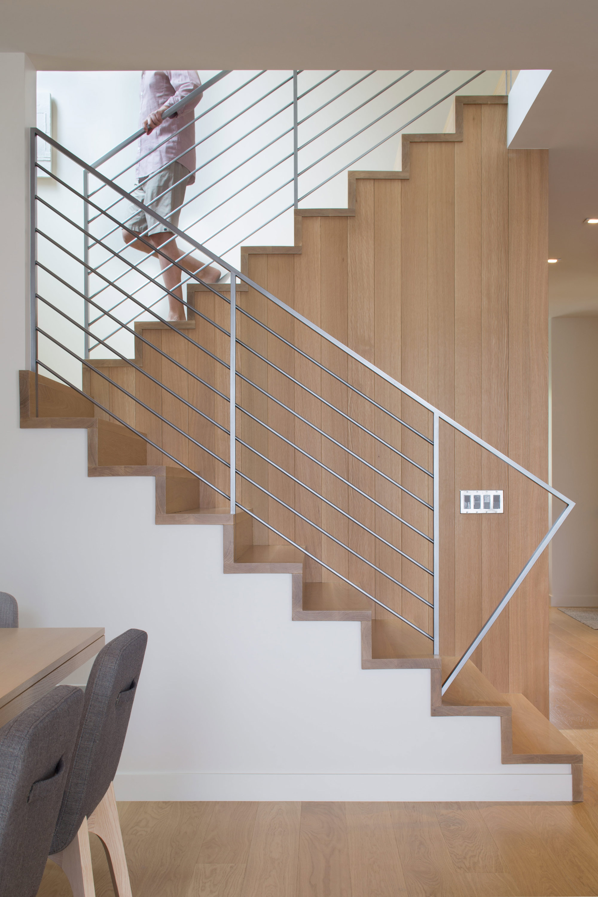
The materials are limited to white millwork and white oak. “When we come home, we want something serene,” Broughton says. △
“I wish more of our clients would use tech to understand their consumption. A lot of people don’t even pay attention, and things are just running. As architects, we need to be in tune with that.”
