Inspirations
Explore the elevated life in the mountains. This content debuted in 2015 with Alpine Modern’s printed quarterly magazine project.
Minimalist Pottery in the Kyoto Mountains
An intimate visit with husband-and-wife pottery artists Momoko and Tetsuya Otani at their home and studio in Japan
The Shinkansen bullet train from Tokyo to Kyoto departs not one minute late, travels almost 200 miles an hour, passes Mount Fuji on the way, and pulls into Kyoto’s vaulting modern station not one minute early. From there it’s 40 kilometers by car to Shigaraki, an industrial mountain town, where I’ve come to visit a ceramic artist whose work has transfixed me on Instagram for the past ten months.
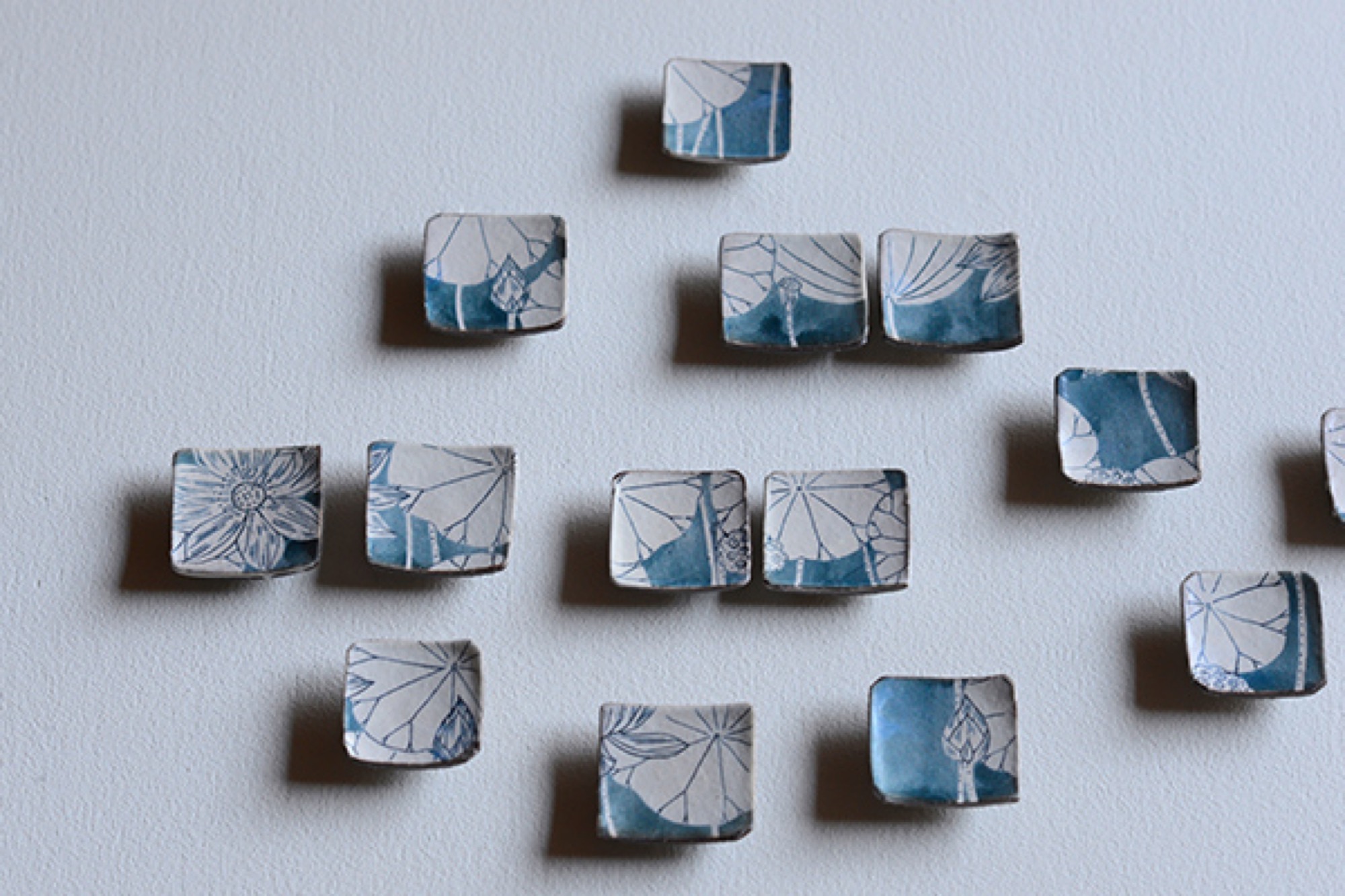
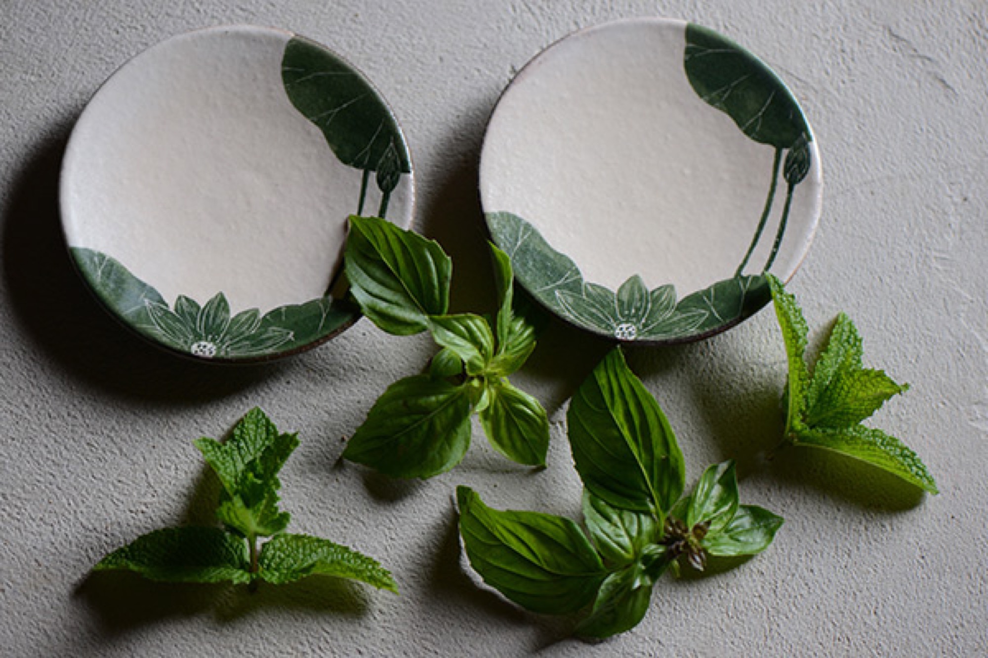
Shigaraki is home to one of Japan’s “six old kilns.” The most admired pottery here—tea bowls and sake cups made from local iron-rich clay—is often misshapen and haphazardly glazed. Much is left to the felicitous violence of earth and fire in wood-fueled kilns. These clay items, used in the exquisitely calibrated tea ceremony, are prized for their imperfections, reflecting the wabi-sabi philosophy in which earthiness, transience, roughness and decay reveal the essential nature of the world.
Such is Japan: hyper-curated, thrillingly modern, clockwork precise—then offering you a tea bowl that seems primeval.
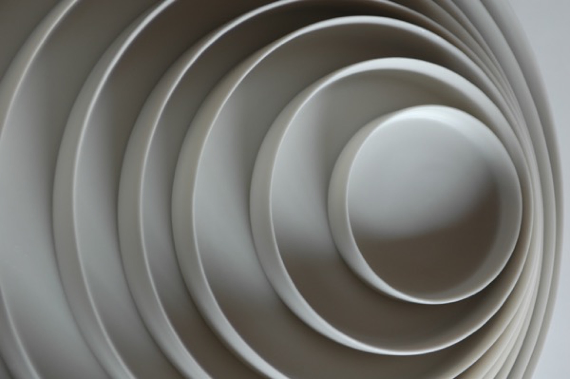
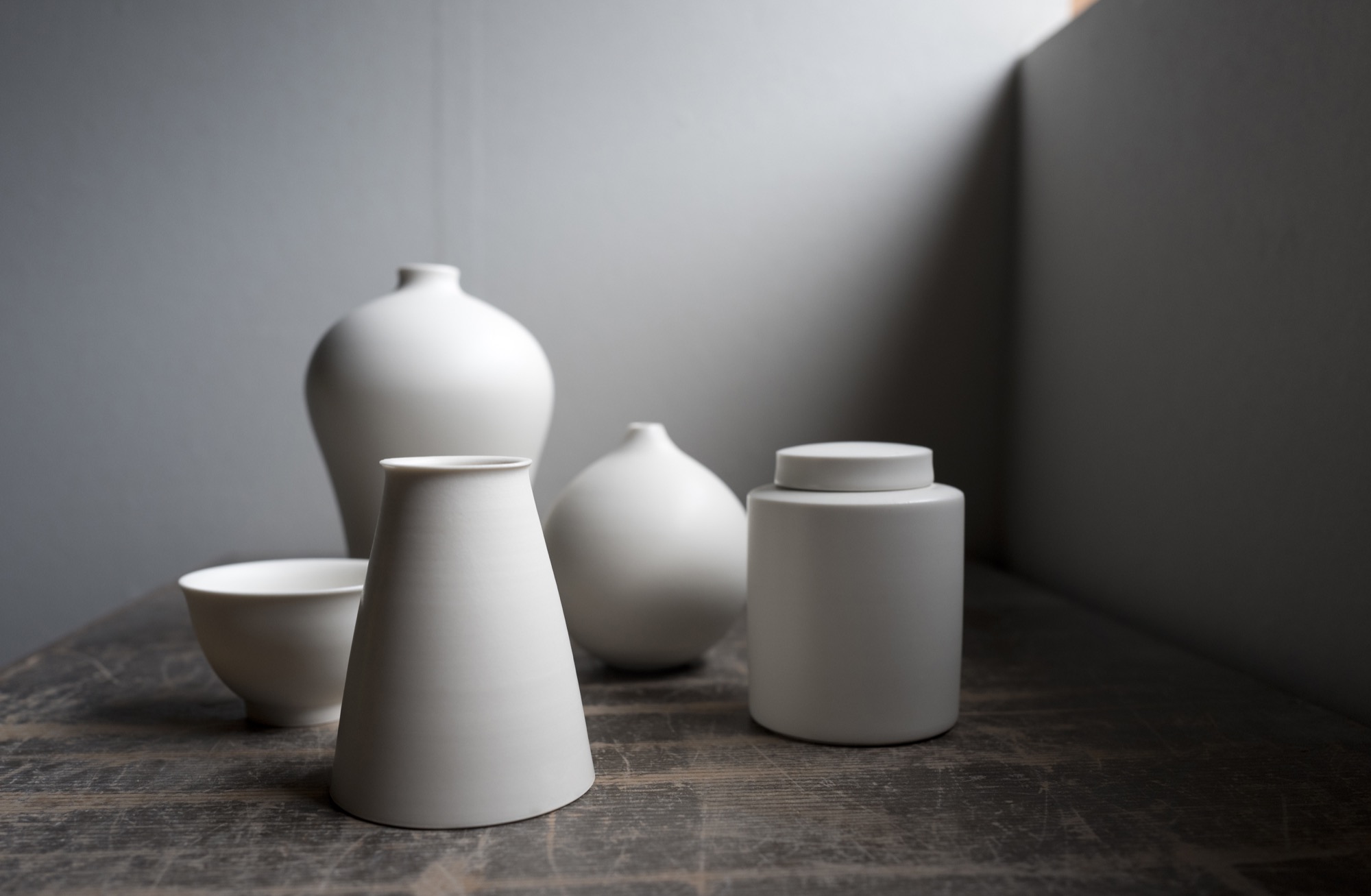
The ceramic artist I’ve come to see, however, is Tetsuya Otani, whose work departs so thoroughly from the Shigaraki style as to seem from another world. Otani’s hand-thrown porcelain chases the precision of machine manufacture. Its skin is smooth and naked, like that of a baby. I wanted to know why he was making such beautiful but plain stuff.
Right now, though, I have a few hours to kill, so I drive into the mountains to find the I.M. Pei-designed Miho Museum. The Miho is a kind of Japanese Getty, opened in 1997. It’s perched on a thick-forested mountain top like something a hermit might build if the hermit had several hundred million dollars. To reach it you walk through a hill via a gleaming, curving science-fiction-y pedestrian tunnel and emerge on a bridge that’s supported by a harp-string array of steel cables. The Miho was commissioned by an industrial-fortune heiress who also made time to found a sect in the 1970s, variously described as an art-centric religion and a sinister cult.
As traveler’s luck would have it, the museum is showing an astounding collection of ceramics by the 18th-century artist Ogata Kenzan, whose name means “northwest mountains.” His painted cups, bowls, and trays leave the viewer giddy, so varied and playful are they in style and form.
At home with Momoko and Tetsuya Otani
Five or so kilometers from the Miho is the home that Tetsuya Otani shares with his wife Momoko—also a gifted ceramic artist—and their three girls and a dog. It’s beautiful, with farmhouse mud walls and high wood beams that employ traditional temple joinery. Everything on the main floor revolves around the kitchen, which is far larger than usual in a Japanese house, reflecting the Otanis’ passion for communal cooking and eating with friends, many of whom also make pottery. The shelves, in the dining area and kitchen, are filled with both Tetsuya’s and Momoko’s pieces.
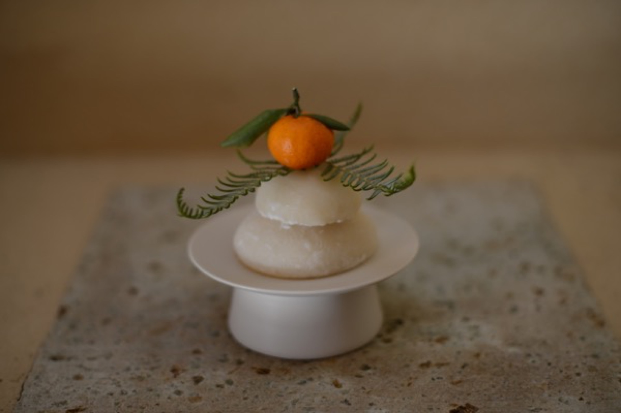
The work of Tetsuya Otani
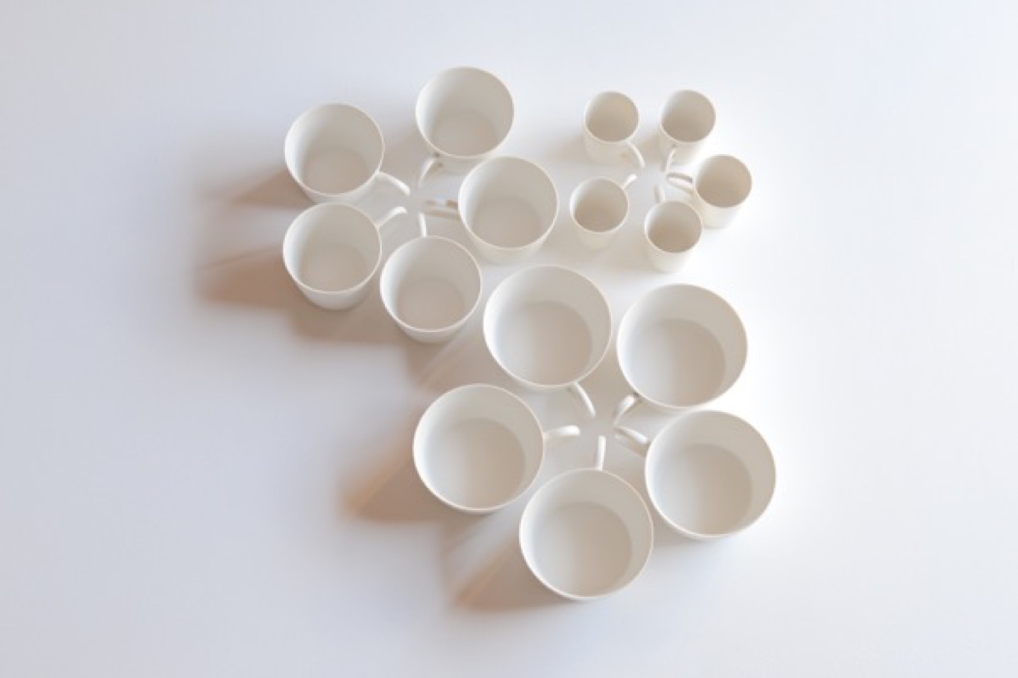
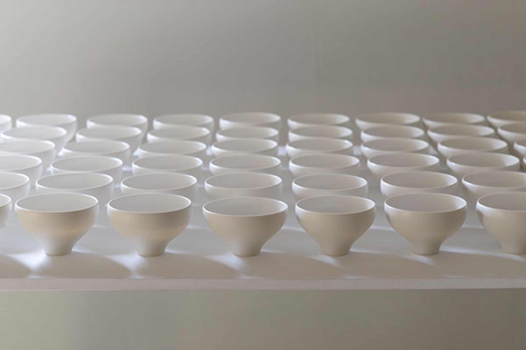
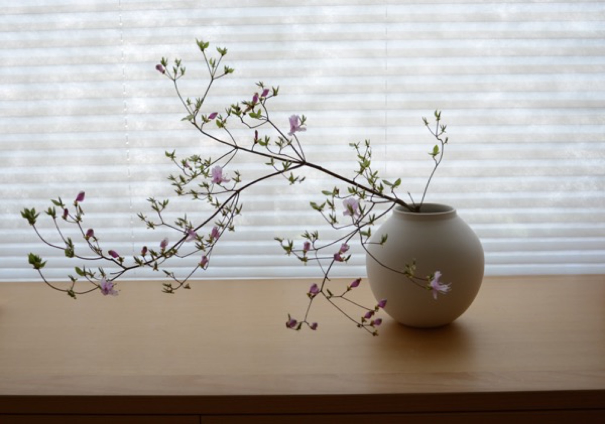
Lately attracting attention among collectors in Beijing, Shanghai, and Taiwan, Tetsuya shuns both wabi-sabi imperfection and Kenzan decorative exuberance. Everything he makes is to be used, mostly in the kitchen or at the table: tiny matcha urns with clinking lids, curved-belly flower vases, delicately spouted teapots, tiny soy dispensers, little round boxes. The pieces are finely lipped and polished to a supple smoothness; their creamy matte glaze begs to be caressed.
Tetsuya’s pottery has thrown off all temptation toward decoration. The potter’s goal, he says, is to remove as much information as possible from his ceramics, seeking pure functional forms, because “things that work give pleasure.”
"The potter’s goal, he says, is to remove as much information as possible from his ceramics, seeking pure functional forms, because 'things that work give pleasure.' ”
He studied in Kyoto, hoping to design cars, but when the economy skidded in the nineties, he shifted to graphics and ended up teaching product design (“how to make molds”) at the Ceramic Institute in Shigaraki, where he met Momoko and, on the side, learned throwing and glazing clay. By 2008, their house was built and he embarked on a ceramic career. He’s now in his late thirties.
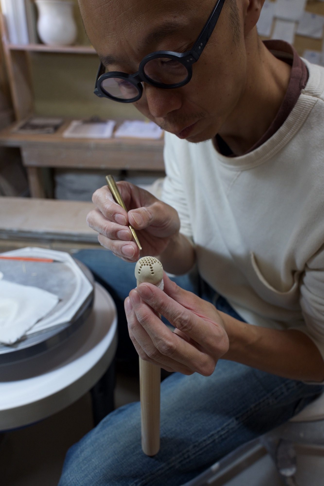
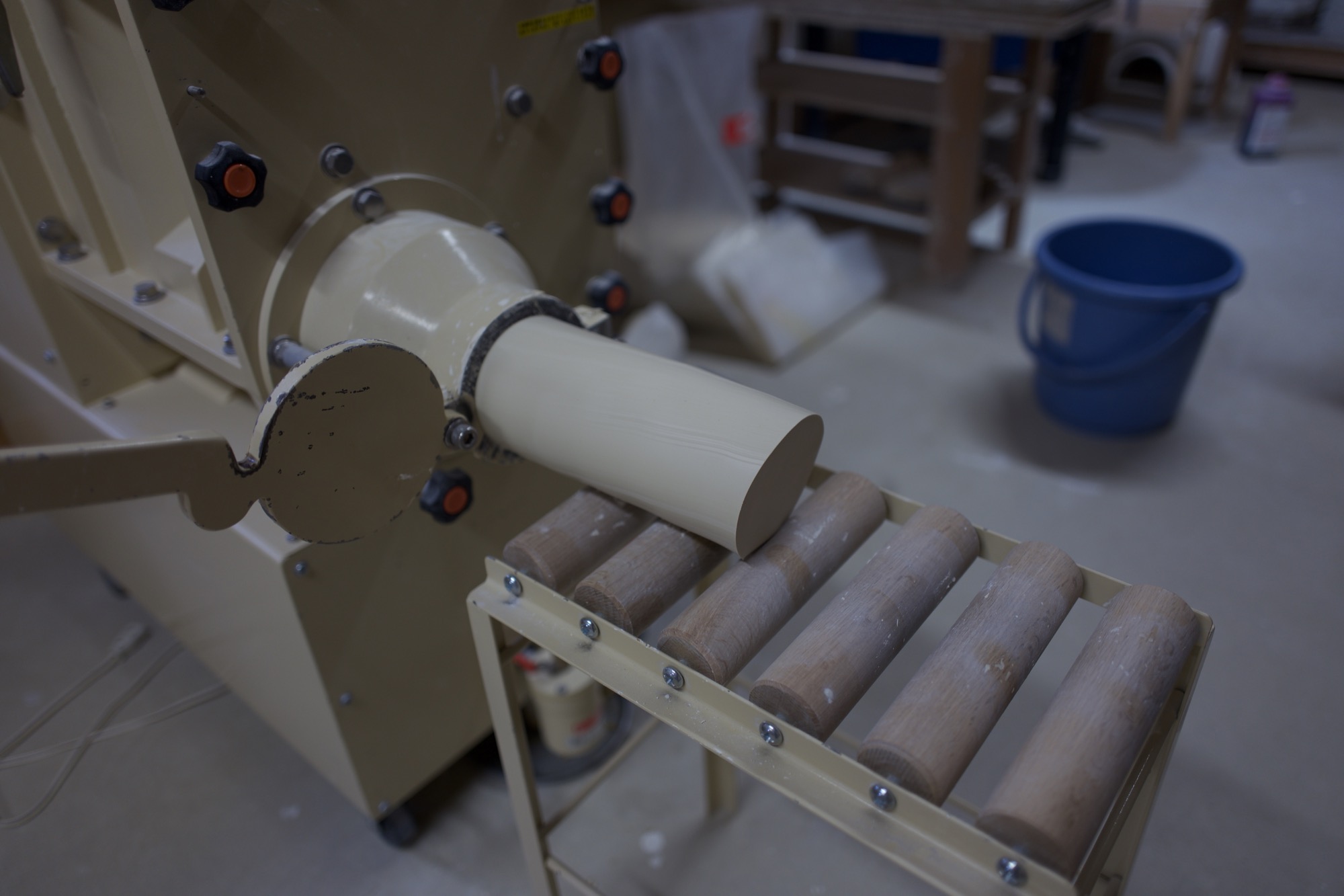
I watch him work in the studio, which has wheels for him and Momoko, as he forms and pokes a bit of clay that will become a tiny strainer inside a teapot. A few feet away, a large machine mixes clay while sucking air from it, then extrudes large, irresistibly smooth noodles of the stuff. The machine is close to the same color as the clay. Tetsuya grins and admits he had it custom-painted to obliterate the standard industrial green. A clue to his fastidious brain.
The pure cup and the pure bowl
Later, we sit at the long kitchen table and look at bowls and cups and teapots and plates and discuss this idea of removing information from one’s work.
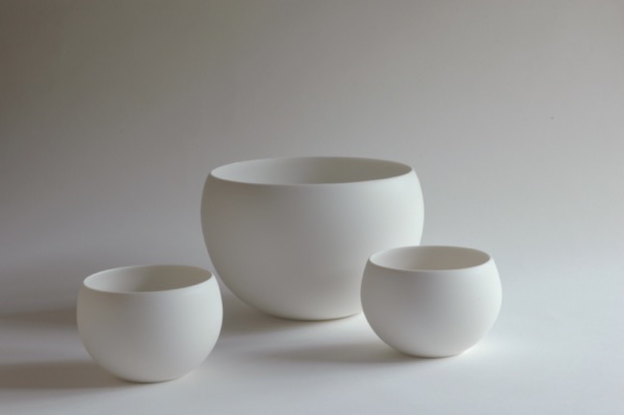
“The pure cup,” Tetsuya says, through Momoko’s translating, “and the pure bowl: They can accept anything, become a vessel for anything. Cultural information is eliminated. And then the cup or bowl can be applied to any culture.”
“The pure cup and the pure bowl: They can accept anything, become a vessel for anything. Cultural information is eliminated. And then the cup or bowl can be applied to any culture.”
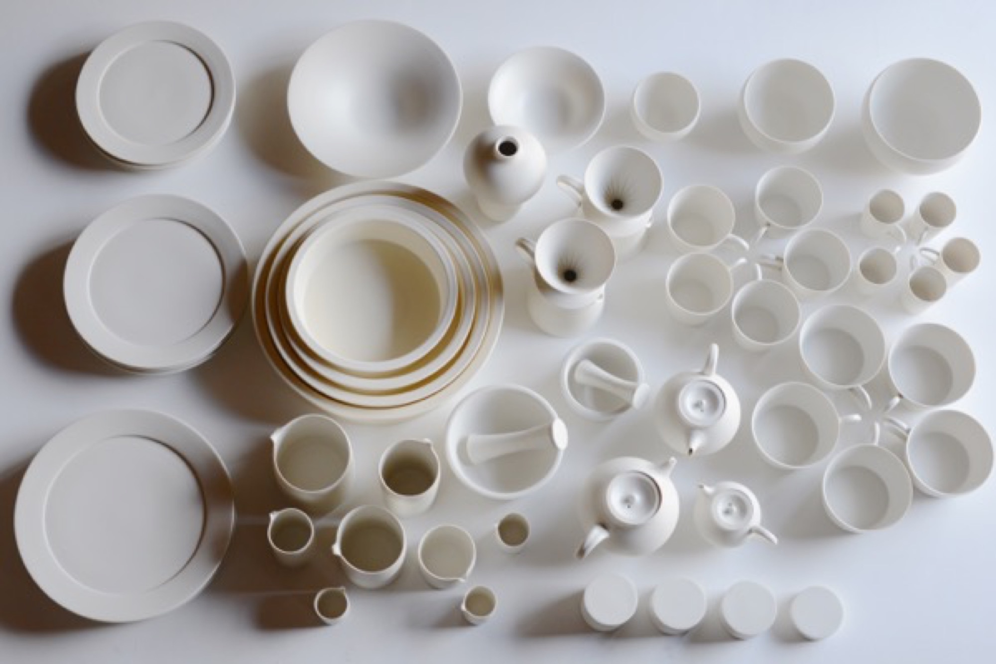
One may begin with the form of a traditional Japanese offering bowl. Decorative motifs are removed until it approaches neutrality. Eventually you “come down to the point where we can use it on our table, not for the gods’ offerings.”
Momoko adds: “Tetsuya strips the bowl of the divine.” He produces smooth dinner plates as blank canvasses for food—altars, really. They’re used in fancy Osaka and Kyoto restaurants to showcase chef art. His works are unsigned, unmarked.
“Tetsuya strips the bowl of the divine.”
But cultural negation negates a specific culture, and Tetsuya says he has lately realized, when showing his works in China, that they are in some way indelibly, irreducibly Japanese. “I now feel that,” he says, “but I don’t have the answer yet about why I feel that way.”
The potter approaches, but never finds, ideal functionality. Tetsuya tweaks the ancient teacup form a wee bit from batch to batch, always seeking the right feel of cup in hand, the right curve of handle against thumb and finger. This lonely, incremental search for ideal form, endlessly repeated, is itself very Japanese.
The motivation is pleasure, however, not denial. Tetsuya and Momoko are exuberant foodies, and have found that their table-centric philosophy resonates globally through their gorgeous Instagram feeds, @otntty and @otnmmk, with more than 20,000 followers between the two for their pictures of utensils and food.
Tetsuya is also funny. He calls the clay mixing machine Mr. Hiroshira, “my only employee.” What about the beautiful industrial kiln in the next room, I ask? “No,” he says, “I work for it.”
Return to Kyoto
A few nights later, in Kyoto, my wife and I visit a little chocolatier and bakery called Assemblages Kakimoto, near the Imperial Palace. In the minimalist showroom up front I buy a box of orange biscuits enrobed in dark chocolate, each biscuit not much bigger than a postage stamp. Beyond the front space is a narrow, pretty room with a half-dozen seats or so against a counter, facing a tiny kitchen. We order chocolates and cakes and glasses of thirty-year-old palo cortado sherry. Two women to our right—the only other customers in the café—have come for the chef’s omakase dinner. With each course they look gobsmacked, enraptured by the treats placed in front of them. It’s beautiful food, for that is the Kyoto style. Each composition sits on the pale canvass of an Otani plate.
The entanglement of much fuss and no fuss that lies at the heart of many things Japanese is hard to describe, but when I palm one of the Otani pieces that we brought back from Japan, it seems to embody that contradiction. My favorite is a little round vase, the size of a tennis ball, whose satin smooth sides curve up to a sharp-lipped hole that’s big enough to accommodate the stem of a single bud. In weight and delicacy and touch and every other aspect the vase seems, to me, as close to perfect as it can get. It holds a lot of information about Japan. △
Minimalist Metamorphosis: Cowshed turns cultural center
A local hotelier turns his family's old barn into a beautiful center of cultural life — the Allmeinde — in Lech, Austria
Most people must choose to live amongst urban intellect or natural beauty. Gerold Schneider and Katia Polletin, founders of Allmeinde Commongrounds cultural center, are proof that you can be surrounded by both.

Schneider grew up in the tiny Austrian mountain village of Lech, also known as the cradle of Alpine skiing. His parents owned and operated Almhof, one of the ski town’s top five-star hotels, and his childhood revolved around skiing and helping with the family business. Like many small town kids, Schneider fled the mountains for the city and moved to Vienna to study art, architecture, and philosophy. “A lot of people from rural areas move to cities and get a taste of art, music, design, food, and they never return,” he says. But the sudden death of his father and illness of his older brother drew Schneider—and his architect-wife Polletin—back home to help his mother, Hannelore, run the family hotel.
“A lot of people from rural areas move to cities and get a taste of art, music, design, food, and they never return.”
Old cowshed turns splendid cultural center
While Schneider never intended on becoming a hotelier, he did toy with the idea of one day doing something with the arts in Lech. As he and Polletin set about respectfully updating the hotel they also set their sights on a rustic, family-owned barn just up the road from the Almhof. The cosmopolitan couple’s plans to convert the old cowshed into a cultural center for exhibitions and artists in residence were met with small-town mentality suspicion. “There are many things I love about Lech, but locals have an aversion to change,” says Schneider. “They are stuck in the past.” Each winter, Lech attracts an international, discreet (compared to Courchevel or Aspen) jet set crowd that Schneider believed would welcome a dose of culture to complement the powder-dusted slopes and après-ski cocktails.
The barn—functional, minimalist Alpine design
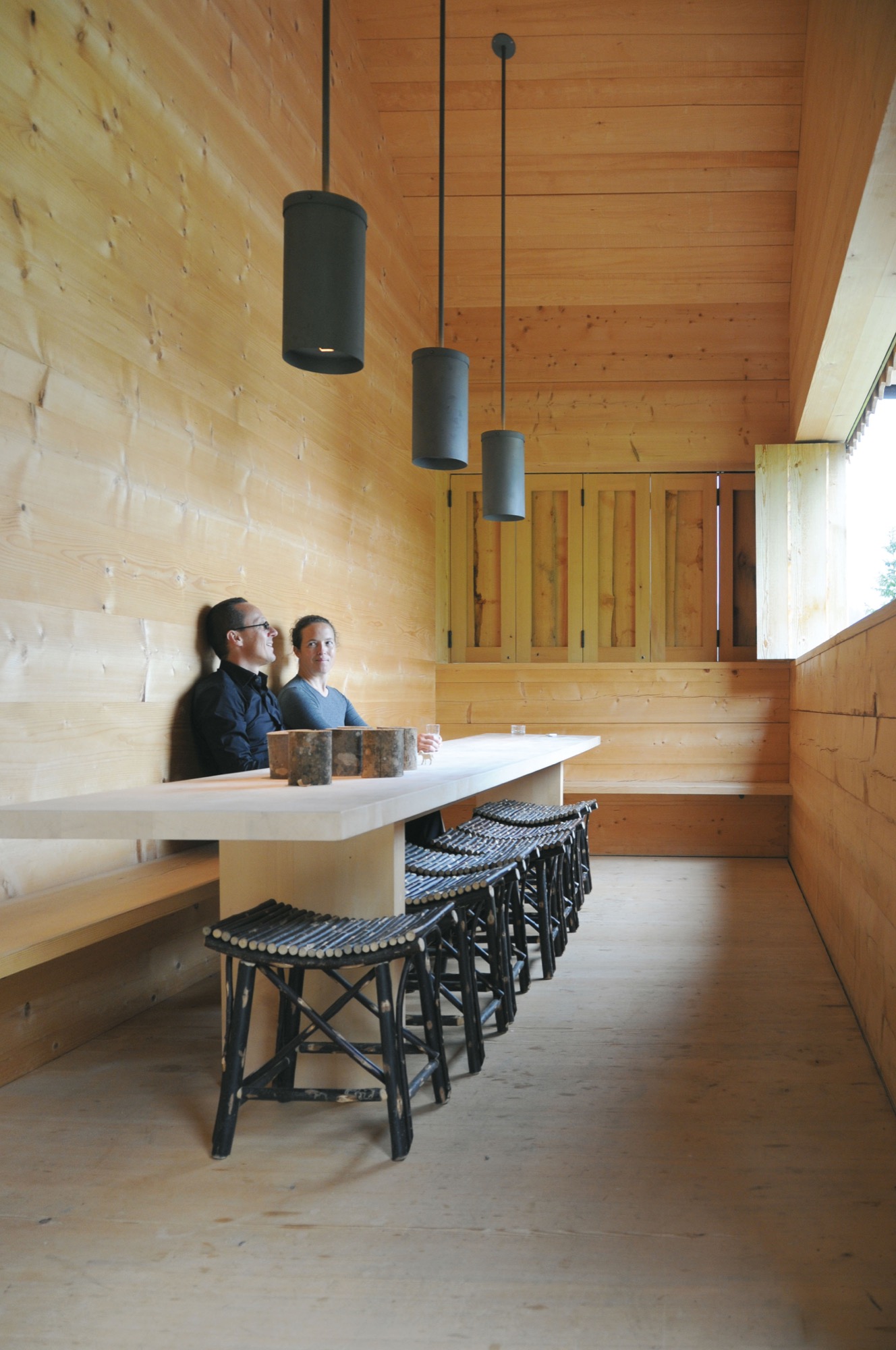
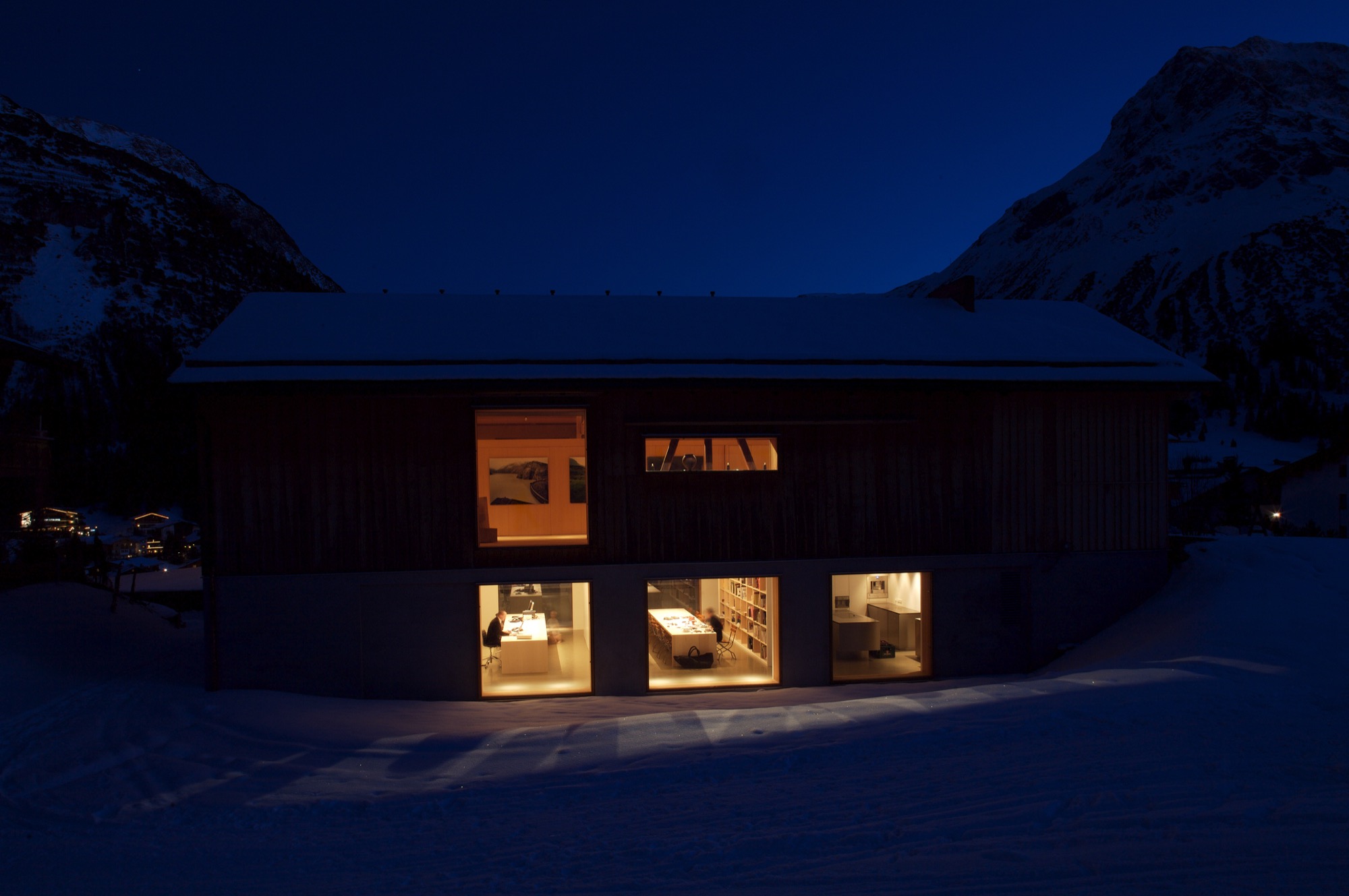
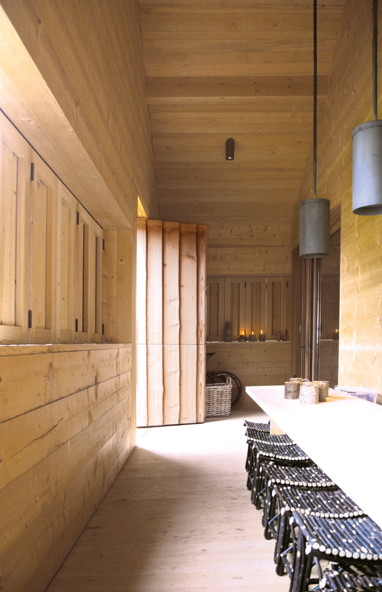
In 2000, Schneider and Polletin began transforming the two-story barn into the Allmeinde, an Austrian word that means a public, open pasture. Sensitive to the ski town’s postcard perfect landscape, the pine wood exterior of the Allmeinde is nearly indistinguishable from any other neighboring weathered barn. The only difference is the sliding barn doors have been turned into an enormous window that rolls open to views of the Schlegelkopf mountain ski runs. The interiors, however, are an ingenious example of minimalist Alpine design and functional, fluid living space. On the second floor, the original vaulted beams frame a 1,500-square-foot (ca. 140-square-meter) space divided by a birch cabinet unit. At first glance, it looks like a stark gallery space, sparsely decorated with a few rough-hewn wood chairs and framed alpine-inspired photographs. But, the cabinet unit is like a perfectly packaged gift that neatly unfolds like origami to reveal a studio apartment living space complete with a kitchen, bathroom, shelving, desk area, and Murphy bed.

The atelier-inspired downstairs space holds a private library curated with nearly 2,000 books on music, philosophy, travel, and art. There’s also an office and screening room as well as a kitchen and bedroom, which are used by the family in the summer and visiting artists in the winter. The Allmeinde hosts one exhibition per winter season—all free to the public. Past exhibitions have included British sculptor Antony Gormley, American artist James Turrell, and most recently Italian photographer Walter Niedermayer, whose images brilliantly dissect the landscape of alpine tourism.
An evolution of tradition
While some locals have viewed the Allmeinde as a threat to tradition, Schneider and Polletin see it as an evolution of tradition, bringing a fresh, international aesthetic to local materials and craft. “Just because you live in the mountains, does not mean you have to be cut off from the world,” says Polletin. “The Allmeinde is part of our identity in Lech. It’s important for us to have this outlet. It’s a celebration of the space we live in—manmade and natural.” △
“Just because you live in the mountains, does not mean you have to be cut off from the world.”
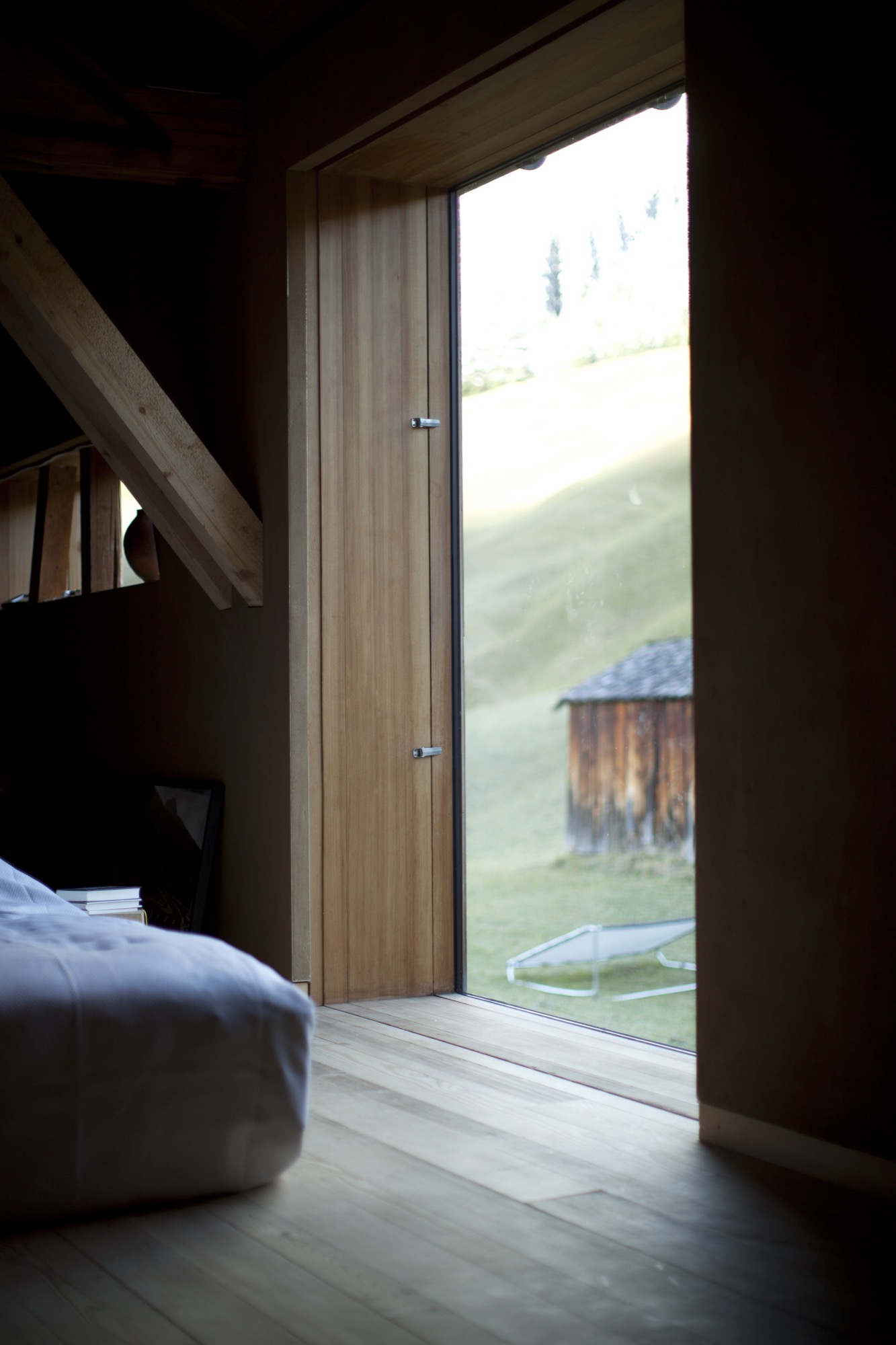
Sense of Place: Clean as in Whistler
Chad Falkenberg of Vancouver-based Falken Reynolds talks about modern interiors in Whistler's mountain homes and cabins
In the fourth and last installment of our "Sense of Place" series, we are talking with interior designer Chad Falkenberg of the Vancouver-based interior design studio Falken Reynolds about brining Whistler style home, no matter where you live. Whistler is rich in cedar and granite. So its natural that traditional mountain homes use a lot of both. While the wood in older homes may have a raw finish, you won’t see many log cabins in the mountains of British Columbia. The trees here are simply too massive. The granite boulders are enormous, too. People incorporate them into the structure of the house. Natural stones, in fact, are a classic element of both traditional and modern homes in the Canadian resort town.
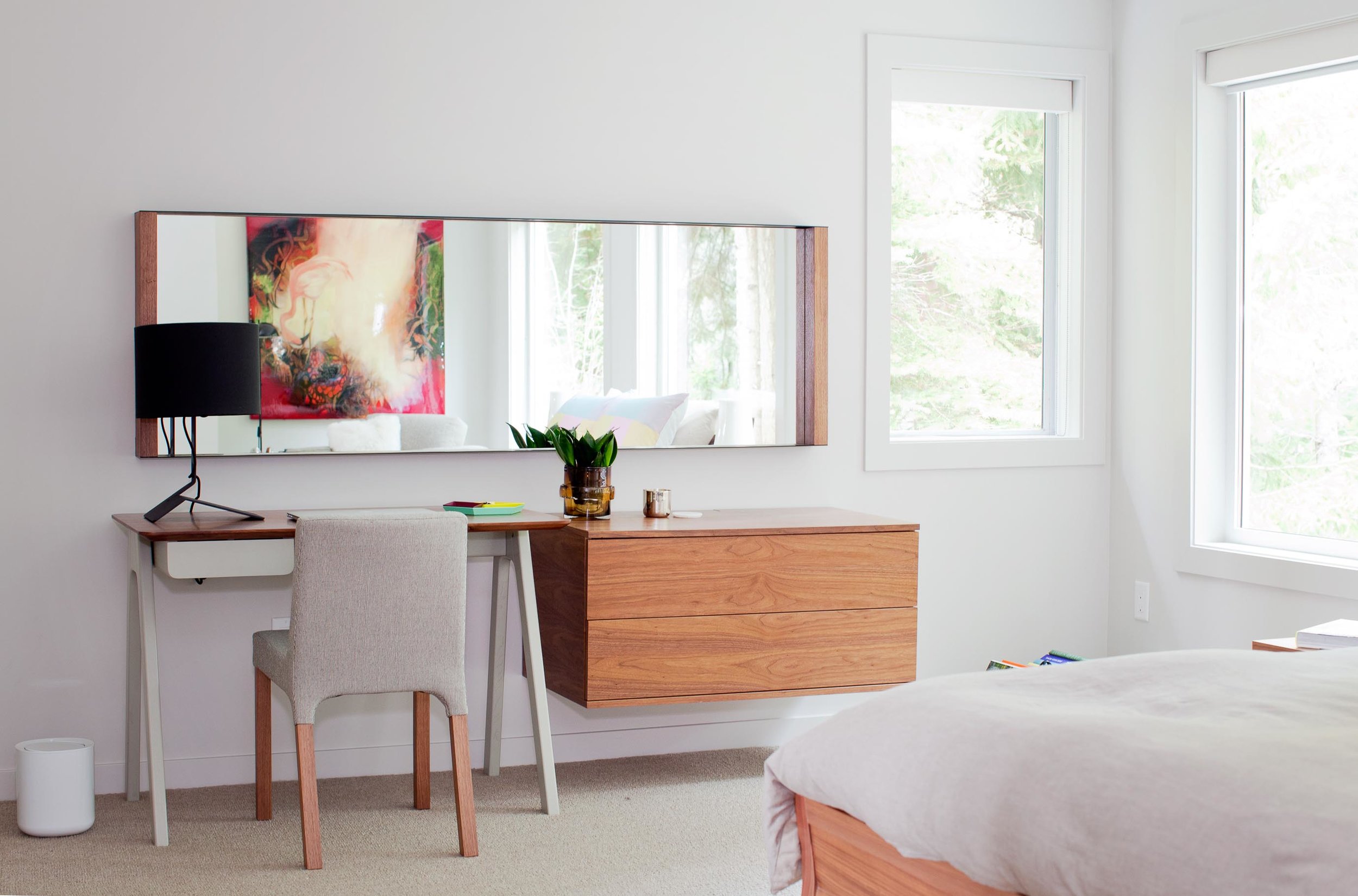
“We try to use a lot of natural materials when we are working in Whistler,” says Chad Falkenberg, one half of Falken Reynolds, a Vancouver-based interior design studio. “It feels more authentic, closer to the earth and to the outside, which is why people go up there, to get away from the city.”
Some of his projects involve sand-blasted Douglas fir to achieve very clean lines but give the wood extra texture. “The idea with all of this is that it patinas well,” says Falkenberg. “If the wood gets hit by a tree or by skis, it’s OK.”
The studio’s work in Whistler is particularly minimalistic and sophisticated yet still achieves the cozy feel of a mountain retreat. Hard textures are mixed with softer, textile surfaces. “In the bedroom of the Aspen Drive house, we used wood furniture, but we also used wool carpet, so the whole floor feels like a sweater,” Falkenberg tells about a recent project. “When you get out of bed, you shouldn’t have to put socks on.”
The designer, who draws inspiration from years of working and traveling in Scandinavia and Southern Europe, often relies on the visual warmth of the materials. “One of the easiest tricks is to mix grays and warm colors,” to achieve the clean-lined yet warm look and feel of some of the Whistler homes he has designed. Combine a warm natural wood with a gray countertop or fabric, for example. “The two things are almost juxtaposing each other,” Falkenberg says. “It’s almost like a wood next to the cool gray looks even warmer.”
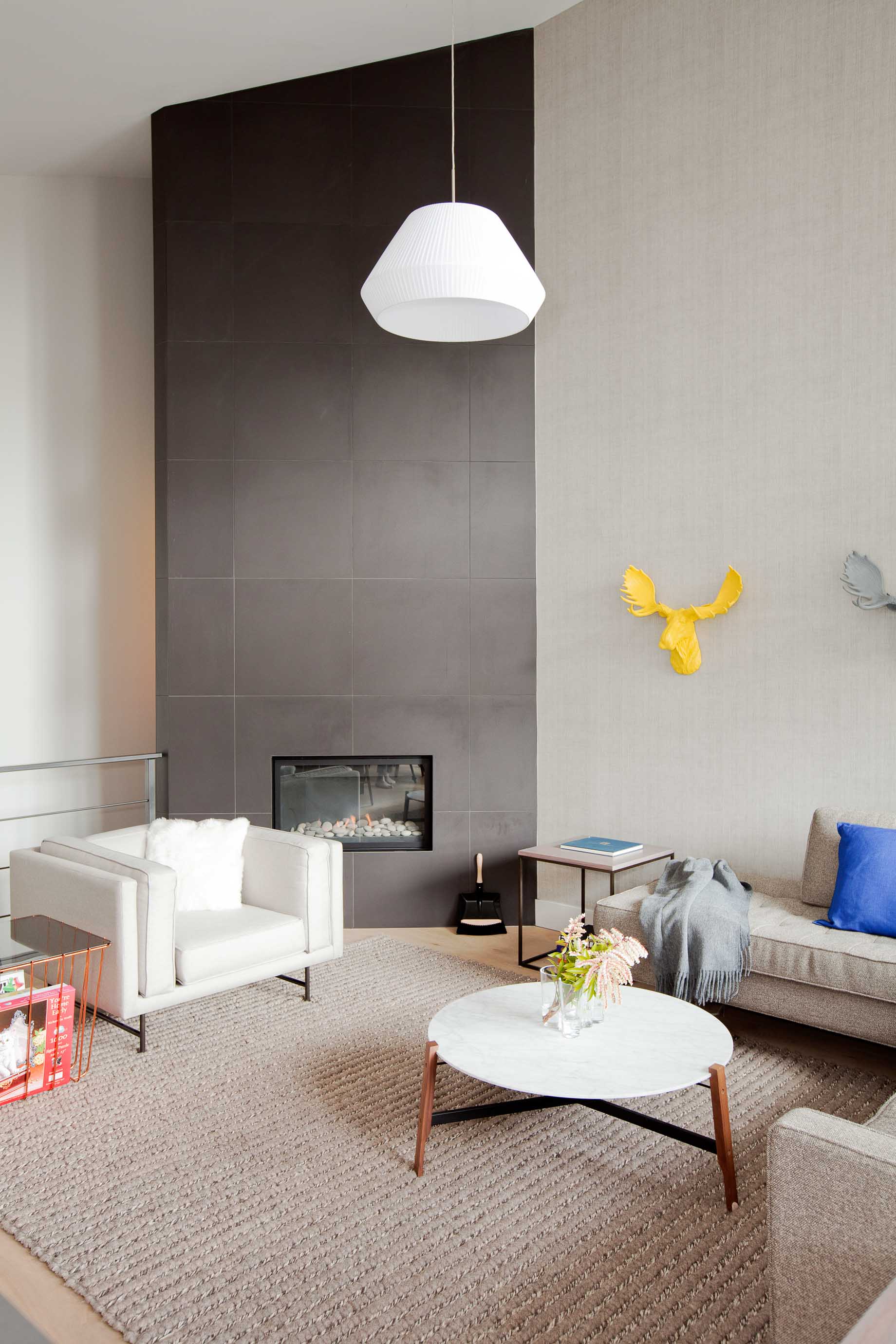
To accessorize your Whistler-inspired winter interior, go for copper and terra-cotta pots. The designer’s favorite textures are anything that feels like a sweater—the loop of a rug, wool blankets, pillows covered in chunky knits. A rougher texture, even on a hard surface like a co ee cup, also feels warmer. Leather is another great material that feels warm to the touch. It has a history to it. “Anything that evokes the natural world,” says Falkenberg.
He likes to keep things casual in a mountain retreat, as he expresses by using a wire taxidermy sculpture or resin moose heads on the wall. “I love anything that reminds me, OK I’m in a cabin, and I’m not supposed to take everything so serious.” △
Hillside Holidays
Near the Austrian border in Germany’s Allgäu, Haus P by Yonder boldly reinterprets the region’s traditional mountain architecture
Nestled into the hilly landscape of Southern Germany’s Allgäu, Haus P by Studio Yonder für Architektur und Design is a holiday home for a family of seven from Hamburg. The irregular shaped structure with a traditional 16-degree roof pitch embodies a thoroughgoing reinterpretation of the region’s farmhouse vernacular.

The supporting base of the 249-square-meter (2680-square-foot) home is made of core-insulated, exposed concrete. Above, black charred timber siding offsets the concrete and the gentle landscape. Clean lines and distinct angles are the dominant features of the home’s geometric design. The home comprises two separate buildings—the living area and a storage shed—united by a sheltered central courtyard, where the entrance is located. The orientation of the buildings lends privacy for the family while spending time outdoors.

Spaces
Open and bright, the interior has a harmonious flow of natural light wood and a wall of picture windows extending from floor to ceiling. These windows allow for majestic views of the mountain landscape.
The main level flows from room to room with no interruption except a wrap-around fireplace marking the beginning of the living and dining area off of the kitchen. The fireplace gives a feeling of warmth from every area on the main level.


An open staircase, which juts out of the side of the building to covers the exterior stairway beneath, ascends to the loft—simple in design, yet functional—above the kitchen. This is an area made to relax, unwind, and take in more of the surroundings, with deep-set ceiling windows letting in light and starry night views.
Set in the concrete base, the spacious lower level has two private bedrooms, a bathroom, and a sauna. △
Introducing Jennifer Rhode
Our new interior design contributor will share her insights on creating an alpine-modern home
Meet Jennifer Rhode, a fresh voice on Alpine Modern Editorial. Based in Boulder, Colorado, the cosmopolitan interior designer and writer will regularly share her insights on making your home alpine modern through considered, quiet design. Her thoughtful narratives and approachable decorating tips will inspire you to move past the idea of “more” and focus on creating beautiful spaces with less. The California native will curate elevated styles and objects from the international world of design that embody functionality and quality craftsmanship.

At home with Jennifer
One sunny afternoon this fall, Jennifer invited me into her bright, modern home in North Boulder. We instantly bonded over raising fifth-graders and missing life in Europe. The petite brunette exudes a warm intelligence that at once makes you trustfully open your mind to what she has to show and tell you. The self-proclaimed “nester” surprised me with a delightful spread of fruit and cheese... and a dining table covered in notes and visuals on inspiring ideas for upcoming interior design stories and roundups, which we can’t wait to share with you—beginning next week with a collection of chunkily knitted home goods that are equally cozy and modern.
Jennifer Rhode’s design background
Jennifer began her career in fashion and wardrobe styling, working on television commercials and shows in New York City and then moving into window design in San Francisco. The mother of two has spent the last ten years working on interior spaces in San Francisco, Amsterdam, and Boulder. The designer draws inspiration from the many cities and environments she has lived in. She loves the dichotomy of mixing antique and modern, blank areas with pops of color, simple structures with a striking piece. And she always loves some whimsy thrown in. △
Title image: Interior design by Jennifer Rhode / Photo by Bob Carmichael
Slow Architecture
Spawned by the slow food movement, slow architecture reflects a return to the roots of the master architect tradition
When Italy’s first McDonald’s poised to open in 1986—a stone’s throw from the fabled Spanish Steps in Rome, no less—it ignited not only a protest but a counter-revolution. Italians, so proud and protective of their exquisite centuries-old cuisine and culinary traditions, rebelled against not only the first McDonald’s in their iconic city but the decades of culinary collapse spawned by the “fast-food revolution” of the 1950s—that reduced food, along with its preparation and consumption, to its lowest common denominator. Political activist and journalist Carlo Petrini took part in the initial protest and is credited with the creation of the slow food movement. Three years later, in 1989, the manifesto of the International Slow Food Organization was signed in Paris by delegates from fifteen countries with the goal of promoting local foods and time-honored traditions of gastronomy and food production. It opposed fast food, industrial food production, and globalization, with the goal of preserving traditional and regional cuisine, and encouraging farming of plants, seeds, and livestock characteristic of the local ecosystem.
From slow food came the whole “slow” movement, with slow cities, slow living, slow travel, slow design, and slow architecture—a label credited to the Japanese.
“It is a cultural revolution against the notion that faster is always better. The Slow philosophy is not about doing everything at a snail’s pace. It’s about seeking to do everything at the right speed. Savoring the hours and minutes rather than just counting them. Doing everything as well as possible, instead of as fast as possible. It’s about quality over quantity in everything from work to food to parenting,” writes Carl Honoré in his 2004 book In Praise of Slowness, which has become the new-millennium bible of the movement.
"The Slow philosophy is not about doing everything at a snail’s pace. It’s about seeking to do everything at the right speed."
Environmental roots and “deep ecology”

So what is slow architecture? The Tvergastein Hut in the Hallingskarvet massif in Norway epitomizes the concept. It’s a simple wooden mountain cabin in harmony with its surroundings that took several years to build with appropriate, readily available local materials—think small carbon footprint. The idea of slow architecture includes proper context, materials, sustainability, and affordability while still retaining aesthetics.
A lifelong mountain climber and Norway’s most famous philosopher and a professor of philosophy at the University of Oslo, Arne Næss was influenced by the writings of seventeenth-century Dutch philosopher Spinoza and twentieth-century ecologist Rachel Carson, author of Silent Spring, the ground-breaking environmental science book published in 1960. Silent Spring documented pollution from the chemical industry and its detrimental effects on the environment, particularly birds, along with other negative human-caused environmental impacts. The book cartwheeled into scripture for the environmental movement of the 1960s.
Næss was convinced of the impending ecological disaster for planet Earth, and in 1969, he retired from his university position and built his Tvergastein Hut, where he lived and developed the philosophy of “deep ecology,” which sees the complex interconnection and web of all life-forms, objects, and events. Shallow ecology seeks solutions to economic problems through technological fixes; deep ecology demands fundamental economic, political, cultural—and spiritual—changes.

“It’s a whole different perspective of our place on Earth,” says Carolyn Strauss, a California-born, Columbia-educated architect who created the Amsterdam-based slowLab, a research platform for slow knowledge in design thinking and practice. “We work with individuals, architectural firms, architects, and students,” she says. “Næss’s hut isn’t an aestheticized version of anything. For him the beauty and quality comes from the environment. And understanding himself as one small part, and not a native of that ecosystem.
“It’s about understanding ourselves as part of larger systems and moving humans out of the center of things. We’re part of a much larger, complex system, which we can never fully understand. We tend to ignore that fact. And this leads to our fragmentation of the world, versus gestalt thinking—perception of the whole and interdependence. This type of human-centered thinking and fragmentation has generated a lot of the problems in the world,” Strauss says.
“[Arne] Næss’s hut isn’t an aestheticized version of anything. For him the beauty and quality comes from the environment....It’s about understanding ourselves as part of larger systems and moving humans out of the center of things.”
— Carolyn Strauss

Næss’s hut was built from 1937 to 1943, the pieces carried by horse and sled in sixty-two trips up the mountain. He also built a smaller climbing hut on the very edge of a cliff that required one to enter by climbing up through a trapdoor in the floor. Næss and his mountaineer companions climbed and dragged the planks and other materials up the mountain wall to build it. Næss died in 2009 at the age of 96. He lived at his cabin full time—this was no second home.
"The idea of slow architecture includes proper context, materials, sustainability, and affordability while still retaining aesthetics."
Spas and churches
On the opposite end of the slow-architecture spectrum is Therme Vals, a hotel/spa complex in Vals, Switzerland, built over the only thermal springs in the Graubünden canton. The architect was Peter Zumthor, who received the prestigious Pritzker Architecture Prize in 2009. Completed from 1993 to 1996, the building is made from stone taken from the mountain, plus concrete and glass. Designed to look like a cave or quarry-like structure, it has a turf roof and resembles the foundations of an archeological site, half buried into the hillside.

The locally quarried Valser quartzite was the driving inspiration for the design, and the building’s cladding is made from 60,000 one-meter-long thin slabs of the greenish-gray stone. Zumthor was fascinated by the mystic qualities of a world of stone within the mountain. He wanted to capture the light and darkness, the light reflections on the water and steam-saturated air, the unique acoustics of the bubbling water in a world of stone, the feeling of warm stones and naked skin—all to enhance the ritual of bathing. So that time would be suspended for those enjoying the baths, Zumthor wanted no clocks in the spa, but three months after the opening, he was pressured to install two small clocks. Zumthor carefully designed a path of circulation to lead bathers to certain predetermined points with areas and views to enjoy along the way. “The meander, as we call it, is a designed negative space between the blocks, a space that connects everything as it flows throughout the entire building, creating a peacefully pulsating rhythm. Moving around this space means making discoveries. You are walking as if in the woods. Everyone there is looking for a path of their own,” Zumthor explains.

A Spanish icon and UNESCO World Heritage Site, Barcelona’s extraterrestrial-looking Sagrada Familia basilica and Roman Catholic church is a classic and very literal example of slow architecture—still under construction 120 years after architect Antoni Gaudi first began it.

Urban and third-world slow architecture
Japan is among the leaders in slow architecture, and a renowned, award-winning example is Hillside Terrace in Tokyo’s trendy Daikanyama neighborhood. This internationally famous residential-commercial complex spanned three decades in its construction and evolution. Its creator, Japanese architect Fumihiko Maki, was awarded the Prince of Wales Prize in Urban Design for reflecting the changes of time and giving life to the urban scenery. He also received the Pritzker Architecture Prize in 1993—a year after completion of Hillside Terrace.

“The flow of time can be measured against its diverse buildings and their relationship to the city of Tokyo as it grew to envelop them,” writes Maki. “The singular sense of place that people strolling among the various buildings and outdoor spaces of Hillside Terrace feel is no accident. It is the result of a deliberate design approach that has created continuous unfolding sequences of spaces and views, taking advantage of the site’s natural topography and, indeed, enhancing it with subtle shifts in the architectural ground plane.”
Butterfly houses
From the Norwegian Alps to the rainy highlands of northern Thailand, the architectural firm TYIN tegnestue, based in Trondheim, Norway, performs humanitarian aid through architecture. Their slogan is “architecture of necessity,” but that still embodies aesthetics. Started by five architect students from the Norwegian University of Science and Technology, the firm’s third-world projects are financed by more than sixty Norwegian companies, as well as private contributions. TYIN has worked with planning and constructing small-scale projects in Thailand. “We aim to build strategic projects that can improve the lives for people in difficult situations. Through extensive collaboration with locals, and mutual learning, we hope that our projects can have an impact beyond the physical structures.” The architects use such readily available materials as old tires and locally grown bamboo.


“The Soe Ker Tie House is a blend between local skills and TYIN’s architectural knowledge. Because of their appearance, the buildings were named ‘The Butterfly Houses’ by the Karen workers [an ethnic group from southeast Myanmar]. The most prominent feature is the bamboo weaving technique, which was used on the side and back facades of the houses. The same technique can be found within the construction of the local houses and crafts. All of the bamboo was harvested within a few kilometres of the site,” write the architects on their website, tyinarchitects.com. “The majority of the inhabitants are Karen refugees, many of them children. These were the people we wanted to work for.” The architects hoped to foster a more sustainable building tradition for the Karen people in the future.
Form follows function
“Anybody who is practicing architecture right now, and has been practicing the last thirty years, has seen the profession become so much about style, form-making,” says Colorado architect ml Robles of Studio Points Architecture + Research in Boulder. “Form is the result of special interactions of space. If you start with form, it’s very limited.”
“Form follows function,” was the mantra of twentieth-century “starchitect” Louis Sullivan, who admired Henry David Thoreau and Roman architect Marcus Vitruvius Pollio (80–70 BC), who said a structure must be solid, useful, and beautiful. Sullivan’s assistant was Frank Lloyd Wright.
“Form is the result of special interactions of space. If you start with form, it’s very limited.”
— ml Robles
“You don’t start with the box and stuff everything in it,” says Robles, who explains that the three-dimensional modeling computer program SketchUp has become the fast food of architectural design for too many versus careful, thoughtful design.
“So much of what’s happened in the last thirty to forty years was about consumption,” says Robles. “What’s happened is that architecture has become a commodity. So you’ve got, sort of built in, this turnaround—anything that’s a style is going to be out of style...and that’s why we have the crazy environments that we have, and most people are so dissatisfied with their built environments. It’s because they have been designed for a little tiny space in time, with little regard for the past, or really, a long-term future. They’ve been designed for the moment.”
Given all that, Robles says, “Slow architecture, I think, was a pushback to architecture that was about a trend, a pushback to architecture or urban development that was about erasure, and it was a pushback to the commodification of interior finishes and furniture.”

Sustainability and sensibility
The other thing that happened, says Robles, was the sustainability movement, “which was trying to reground the built environment—to be responsible.” So there are LEED buildings, green buildings, and gold buildings. “I think what is happening—and slow architecture is illuminating this—the thoughtfulness of doing what architecture has always been doing is becoming important again. It’s kind of sad that that’s the way the profession has gone.
“The idea of thoughtful, responsible, meaningful—that’s what architecture is. That is the definition of architecture in the master tradition, period. That those things now show up under a label is an interesting reflection of our time, in that we need to be reminded of what architecture is. Those of us who practice architecture in this way have always known.
“The idea of thoughtful, responsible, meaningful—that’s what architecture is. That is the definition of architecture in the master tradition, period."
— ml Robles

“If you’ve ever entered a building and you catch yourself and realize you have slowed down just to be in that building; you’re in wonder, awe, you’re pulled through the space, usually by light, and you’re changed,” Robles says. “This happens to people when they go into cathedrals. Amazing places where people just, ‘Whoa.’ It happens when you go into a museum, or Union Station downtown in L.A., or Grand Central Station in New York. That’s the essence of slow architecture. What it does to the world. That’s what great architecture does. It causes you to pause and be present.” △
“If you’ve ever entered a building and you catch yourself and realize you have slowed down just to be in that building...that’s the essence of slow architecture.”
— ml Robles
Monolith on the Mountain
In the Slovenian Alps, Bivak Pavla Kemperla sticks up for alpinists
Bivak Pavla Kemperla, a black beacon for mountaineers in the rugged landscape of the Slovenian Alps, was designed by Slovenian architect and alpinist Miha Kajzelj of the firm MODULAR arhitekti in Ljubljana, Slovenia.
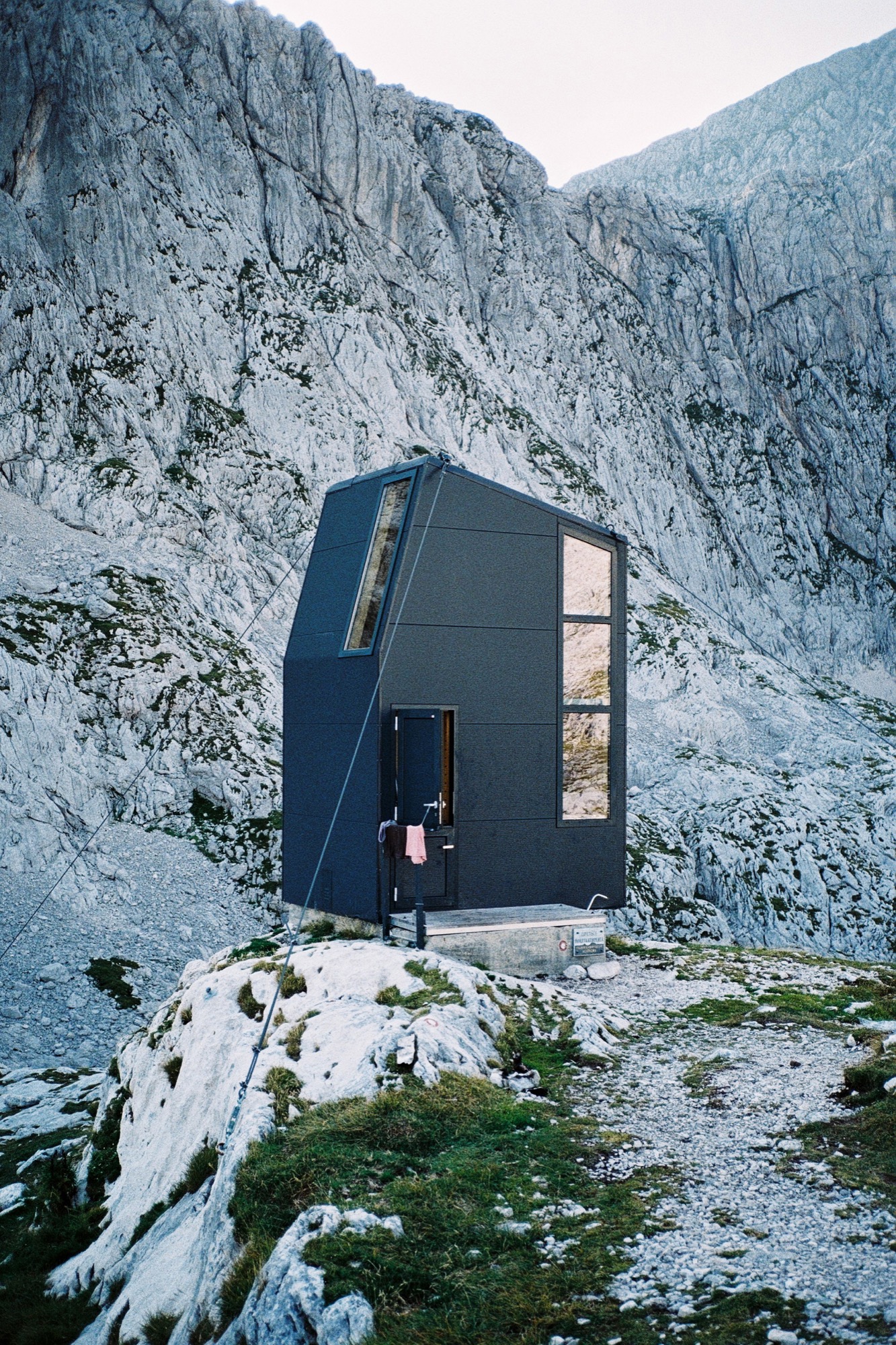
Situated at 2104 meters (6903 feet) above sea level in the Kamnik Alps north of Ljubljana, the bivouac under Grintovec was built in 2009 to replace an old shelter that stood there since 1973. The three-level structure is built on a concrete base. The long, vertical windows maximize the magnificent mountain views.
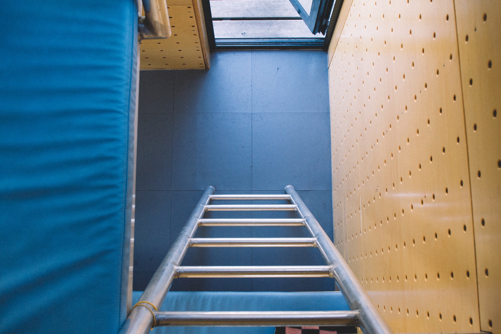
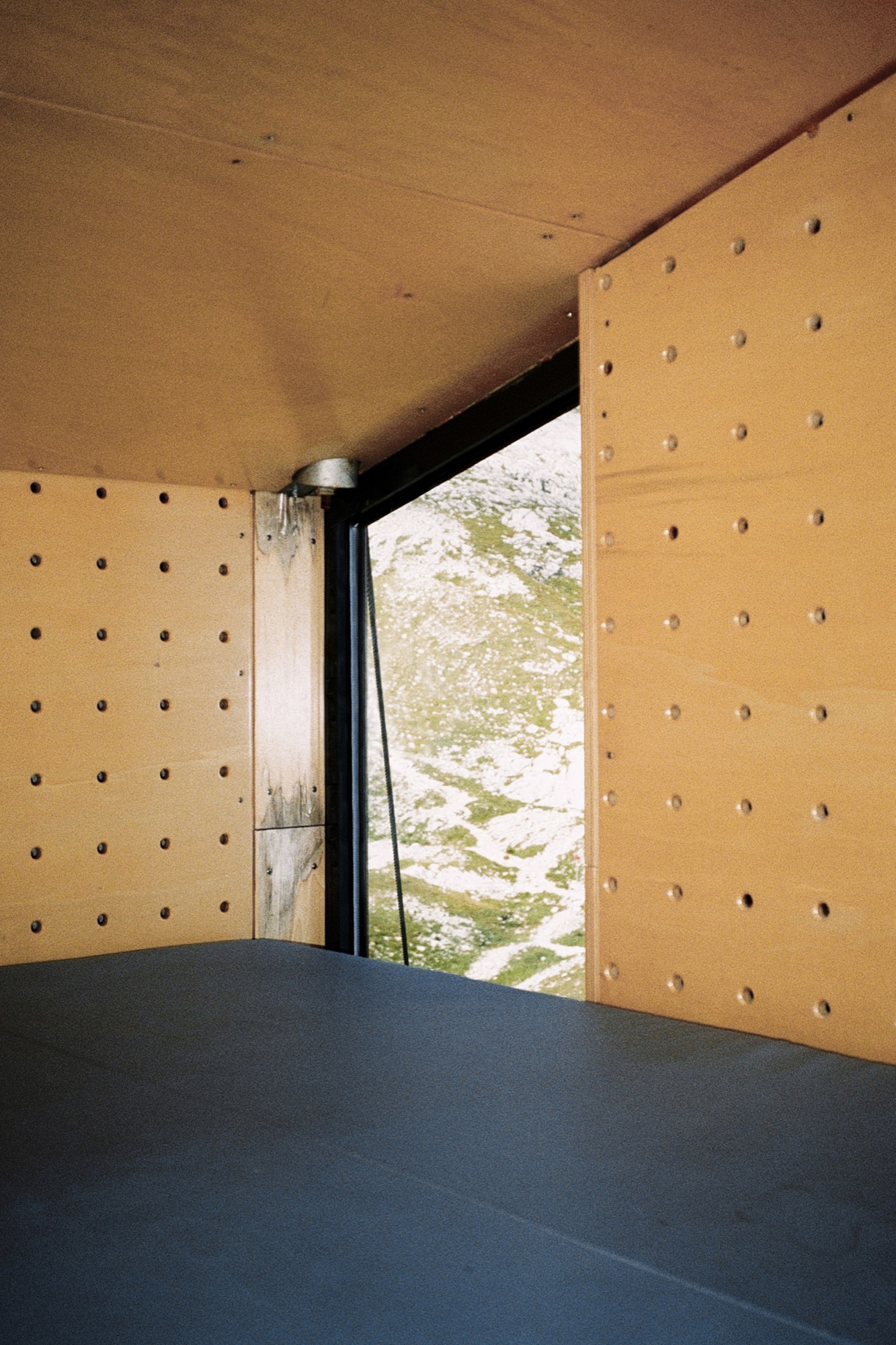
Its outer skin, made of aluminum isolating panels, is designed to prevent loss of the heat produced by the people inside. The inner skin is made of perforated wooden panels designed to wick body moisture out; so the interior always feels dry and warm. As a result of the vertical three-level concept, the upper sleeping level is warm, as the heat from below rises up.
The tiny, simple volume—2 × 3 × 4.5 meters (6.6 x 9.8 x 14.8 feet)—sleeps eight people.
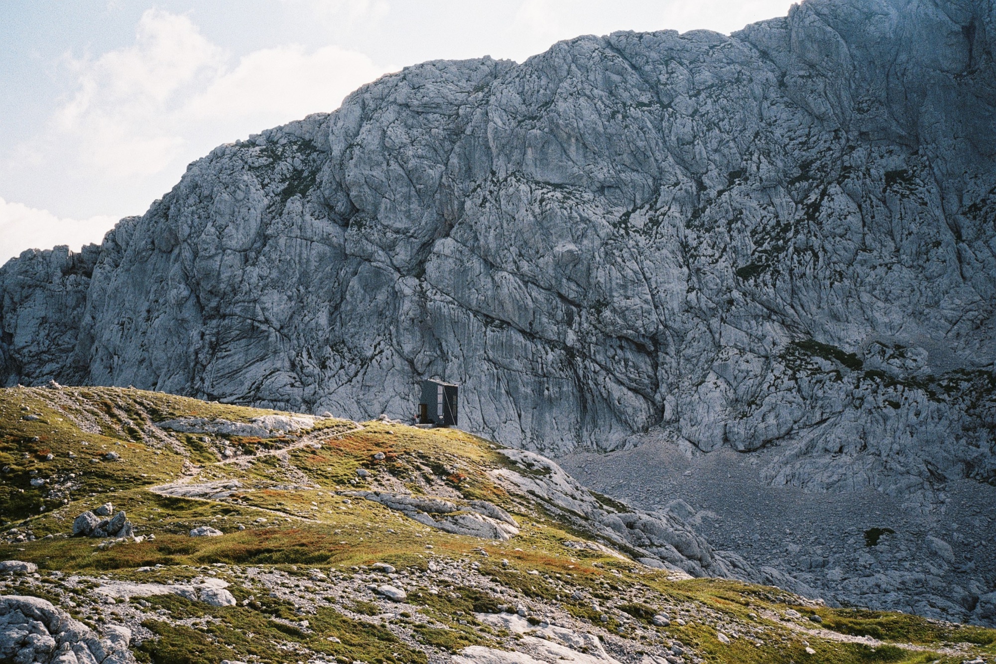
Bivak Pavla Kemperla is dedicated to Pavle Kemperle, a Slovenian alpinist.
Photographer Jaka Bulc (@jakabulc) discovered the bivouac for us with his lens
He writes about his experience:
The first part of the marked trail to this bivouac is usually very crowded, since it leads to a popular mountain hut on the Kokra Saddle and then onwards to Grintovec, one of Slovenia's most frequently visited mountains.
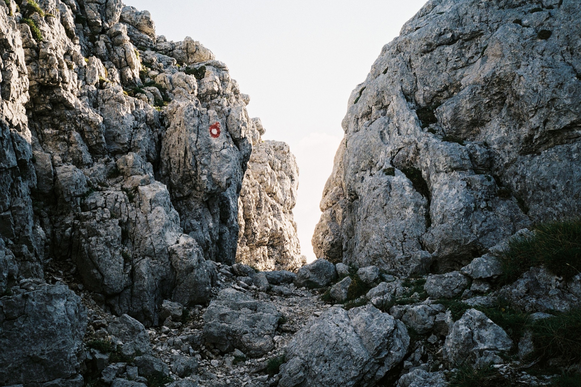
The trail to the bivouac gradually veers off and goes through an interesting passage to a scenic path that winds its way across the steep rocky slopes of Grintovec. We reached the bivouac late in the afternoon and bumped into two other hikers, who were just getting ready to summit a couple of nearby peaks.
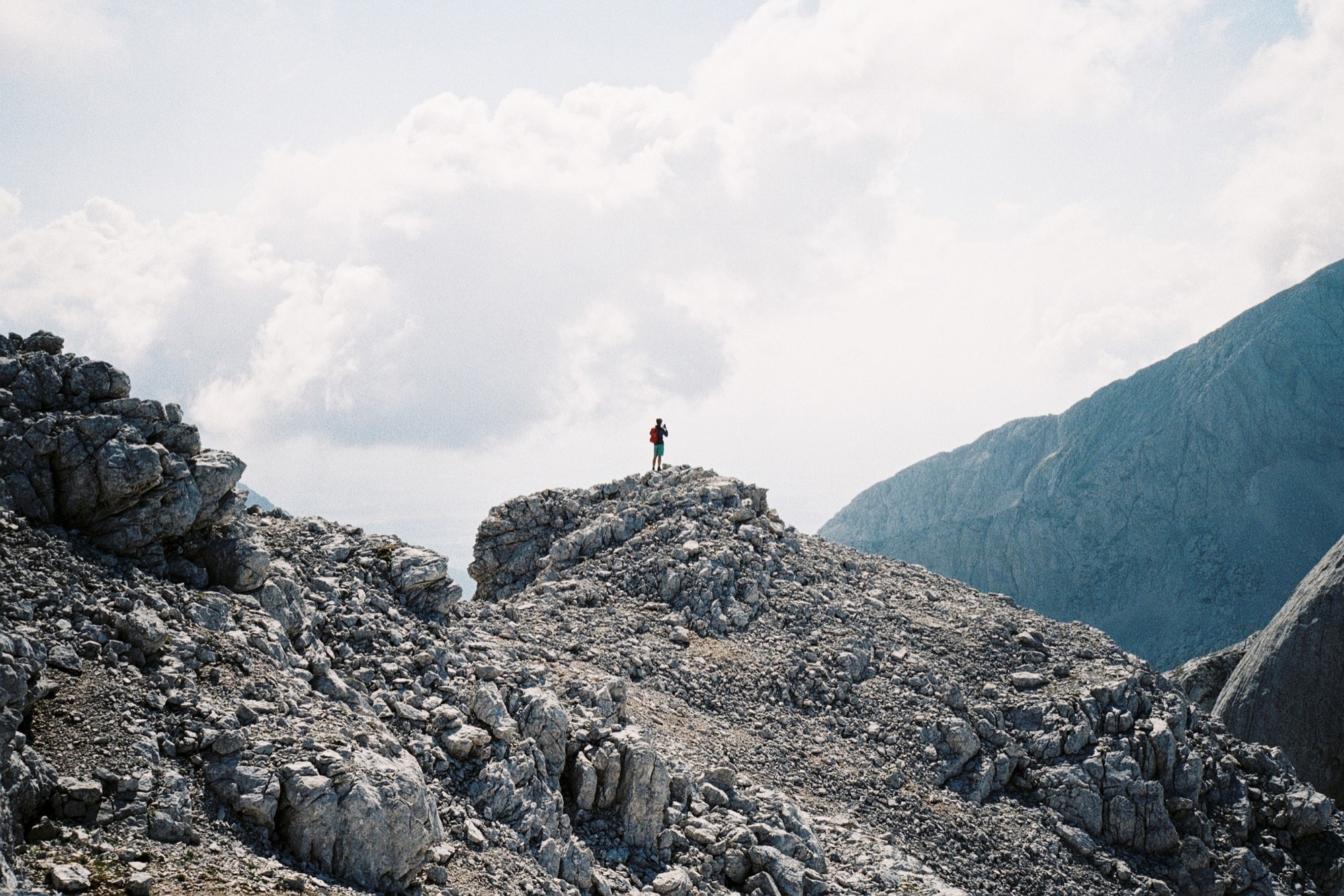
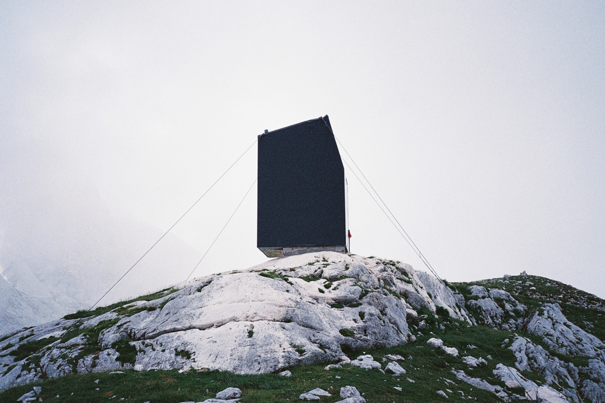
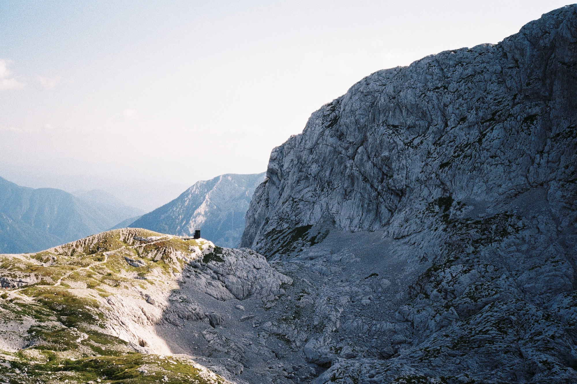
The monolithic building gives the impression of being sheltered by the natural amphitheatre of rock walls, although the bivouac sits on a knoll that gently rises over the surrounding landscape. △
Stable in the Landscape
An award-winning Austrian architect ennobles vernacular alpine building tradition to sophisticated minimalism
Austrian architect Thomas Lechner reduces the idea of vernacular alpine architecture to a design so consequentially essential in what is left that his minimalist structures become sophisticated and sexy.

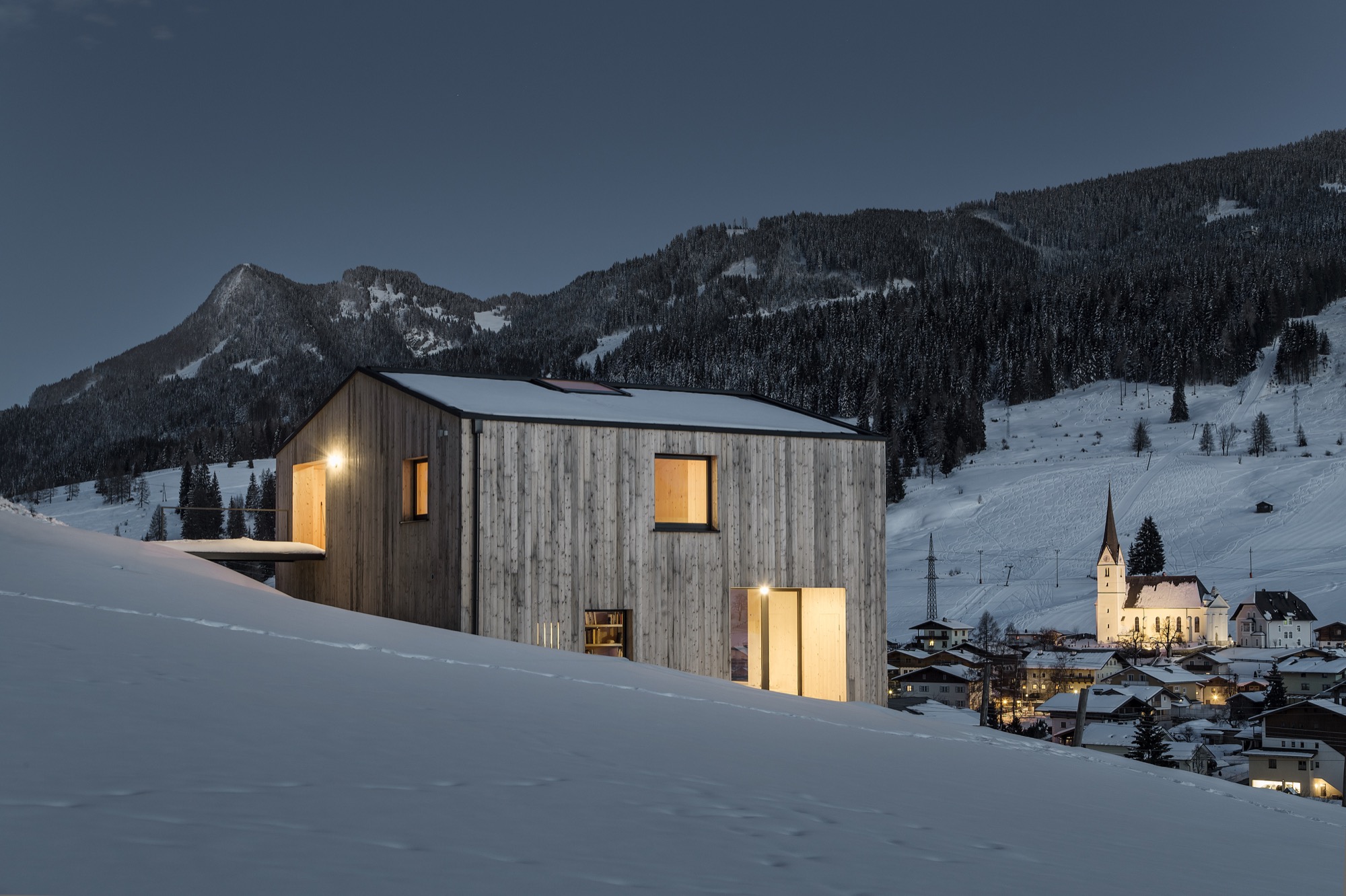
The Hochleitner house in Embach is no exception. The project’s objective was notably elemental: The client wanted a house for himself and his books; a building void of any status. “To realize this vision, we referenced the surrounding area’s simple Heustadln (hay barns) and conceived an honest wooden structure,” says Lechner, co-founder and principal at LP Architektur.
A modern mountain man of tradition
“The mountains mean a tremendous deal to me because they astonish me time and again, demand my respect, and give me a lot of energy.”

Lechner was Born in Altenmarkt in Austria’s Pongau region in 1970. After earning his architecture degree from the Technical University Graz and practicing at several firms in Salzburg and Berlin, he returned to his native alpine town to open his own atelier.
When I ask who is his idol in the architecture and design world, Lechner, whose firm is nominated for the Mies van der Rohe Award 2017, replies there is no reason to apotheosize anyone or anything—“But you can regard fellows in your field and their accomplishments with respect and joy.”
The architect is happiest when he is able to be self-aware and live in the present moment. “That’s the honest life—it feels good,” he says.
The surrounding peaks profoundly inspire Lechner as a man and architect: “The mountains mean a tremendous deal to me because they astonish me time and again, demand my respect, and give me a lot of energy,” he says. “They relativize much of everyday life to what is essential.”
The Hochleitner house
Extracting what is essential also drove his design of the Hochleitner house. Completed in 2016, the 105-square-meter (1130-sqare-foot) primary residence is set in a meadow that borders a neighborhood to the north but is largely undeveloped to the south.

“The site is somewhat exposed in the landscape and requires sensibility,” Lechner says. “The architecture refers to the surrounding landscape by referencing local vernacular building tradition—a wood construction with a weathered facade, pitched roof, etc.”

Looking back at the project, the architect is proud of how the house innately adapts to its bucolic setting, and that no secondary structures, such as a carport, obscure the architecture or unnecessarily bring the form into question.
House tour

The primary building material is wood, which was used in the construction and for all surfaces on the inside. “A central stairway and varying floor levels divide a sequences of spaces—rooms that flow into one another,” Lechner describes. “This creates living zones of different qualities and internal and external contexts reduced to the essential in their formulation. All furniture and storage areas are wall elements, and the central focus is reserved for the book collection.”

The project’s biggest challenge, reveals the architect, was “the proverbial tightrope walk between reduction and banality—to continually look at the challenges of construction and functionality in reference to the targeted solution, which was to model the functional architecture of the regions farmsteads.”
"[A] proverbial tightrope walk between reduction and banality."
Lechner mastered the balancing act. The house won him the Best Architects Award 2017.

“Perhaps there is such as thing as an ‘energy’ that brings together certain people for certain tasks,” the architect notes about the design process and close collaboration with the client. “This project represents an approach where architecture is not defined through a creative will but instead through a relevant response to the place and the purpose—a simple wooden house, no more yet no less.” △
“This project represents an approach where architecture is not defined through a creative will but instead through a relevant response to the place and the purpose—a simple wooden house, no more yet no less.”
Naked Naust
A dramatic cabin by Swedish architect Erik Kolman Janouch on Norway's wild Vega Island
Inspired by Norway’s traditional boathouses, Swedish architect Erik Kolman Janouch plants a cottage into Vega Island’s barren landscape—its design so minimal, it becomes dramatic.
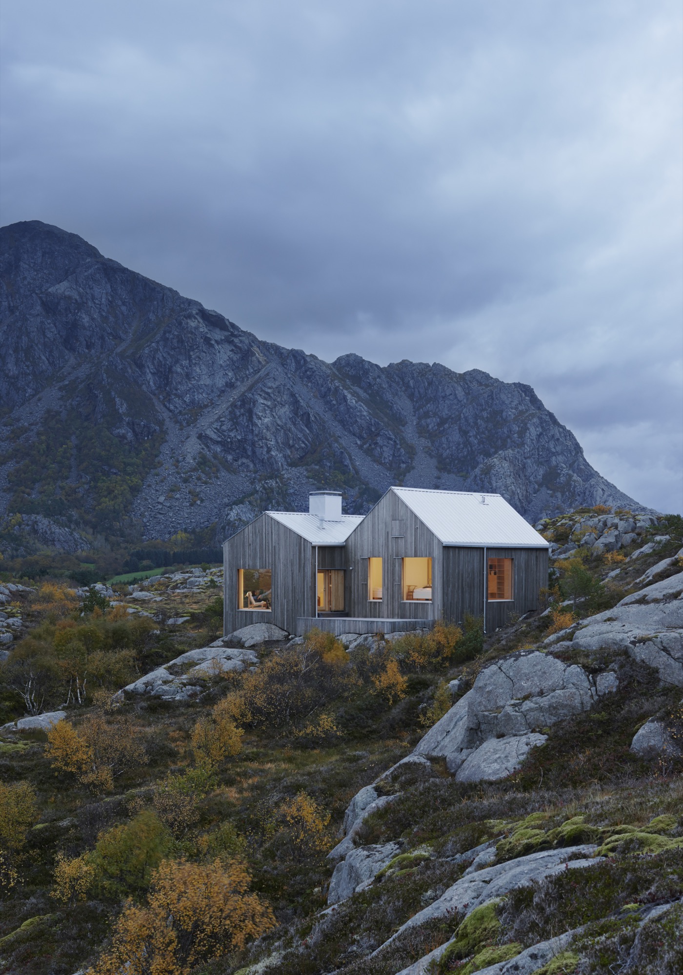
“It’s basically just two ordinary pitched roofs,” architect Erik Kolman Janouch describes the Vega Cottage on the namesake Norwegian island. But the simple elegance of this small wooden cottage that blends so perfectly with its wild and forbidding landscape is, in itself, spectacular—not to mention the boldness and care in siting it there. What’s more, it is exactly what could be expected in this coastal region of Norway.
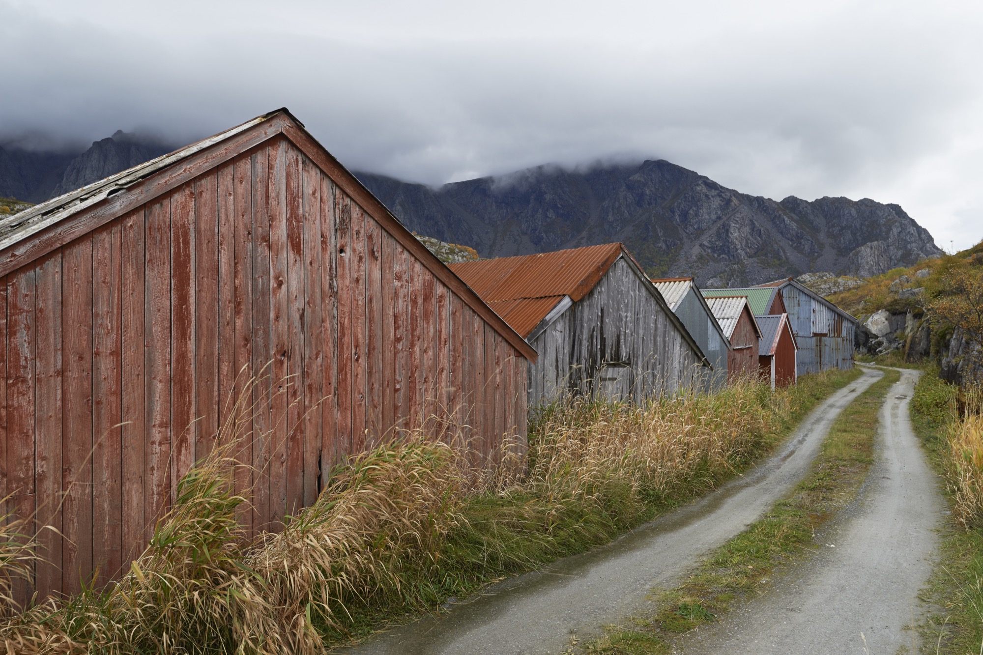
Not far from the house, by the seashore, stand a few of the colorful traditional boathouses—naust—found throughout Norway’s long Atlantic coast. With origins in the Viking era, this building type has withstood the test of time and weather with the island’s extremely rough climate. So, looking for another architectural typology for the Vega Cottage seemed like a futile enterprise for its Swedish architect of Kolman Boye Architects in Stockholm.
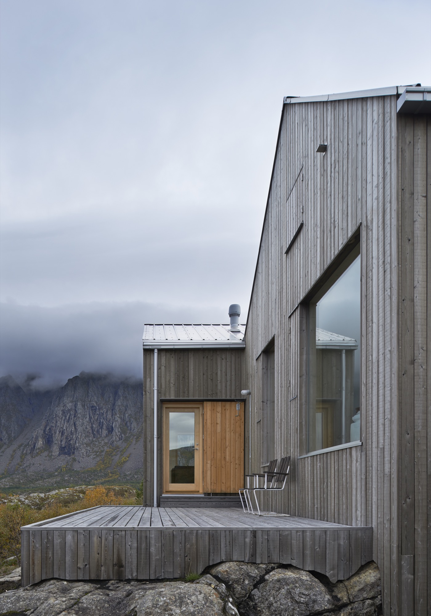
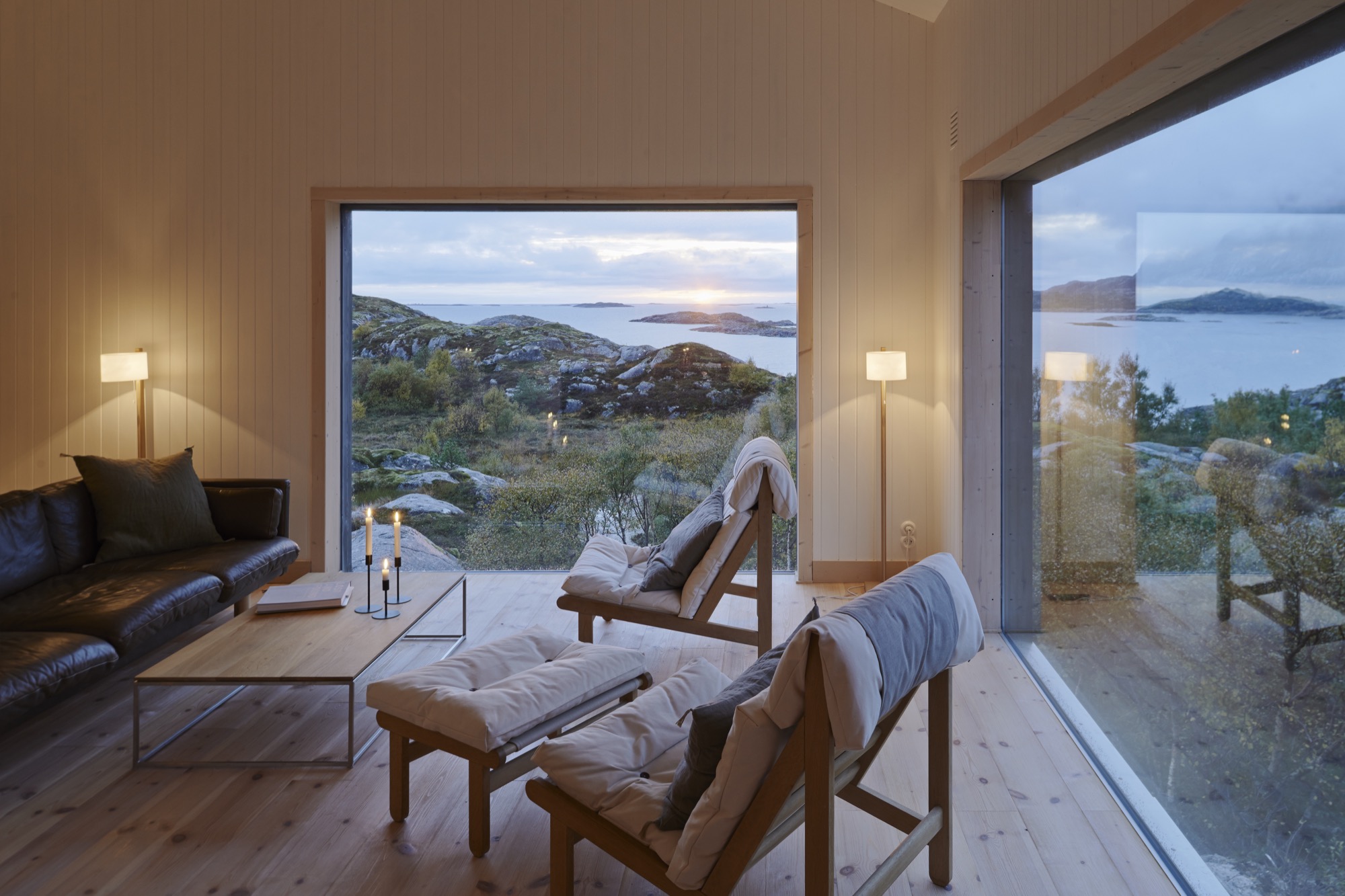
Casual observers might also miss the second most striking architectural feature of the Vega Cottage—its windows. At first, the house’s windows might appear like ordinary rectangular openings in a wall, covered with glass. But that’s just scale and perspective playing tricks, since the barren landscape of Vega Island offers little else of human scale for comparison. Standing directly in front of the house—where one’s cheeks quickly turn rosy from the cold Atlantic wind—an adult visitor can stand head to toe in the huge windows and absorb the majestic landscape. Buffeted by the wind and swept away with the dramatic views, one realizes that the windows are what this house is all about. They showcase the grandeur of the island.
"The windows are what this house is all about. They showcase the grandeur of the island."
A Place Apart
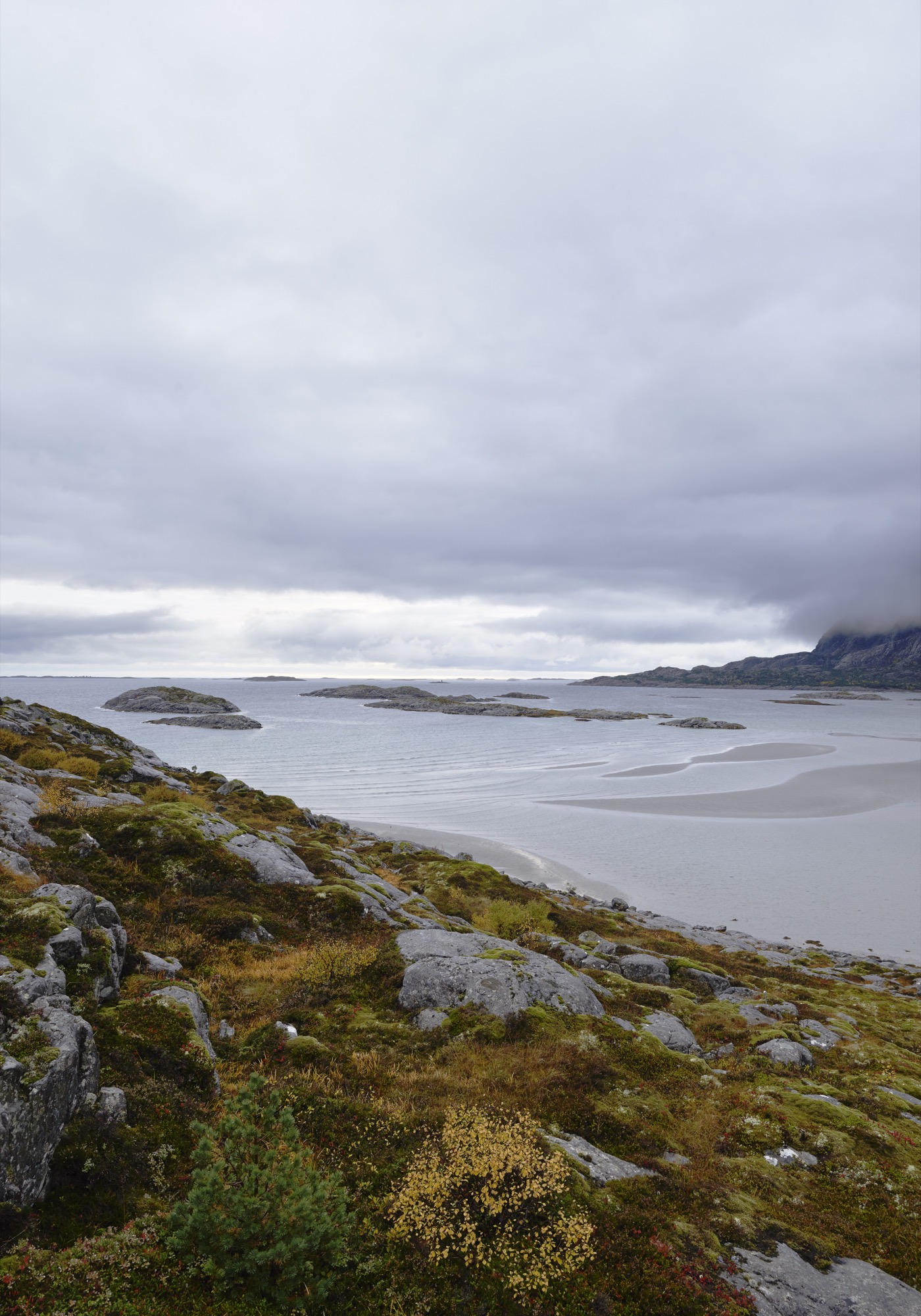
Vega is home to 1,200 people and lies roughly an hour by ferry out in the Atlantic from the tiny city of Brøn- nøysund on the west coast of Norway, just south of the Arctic Circle. The cottage’s site is not much more than a farmstead, marked on the map as Eidem.
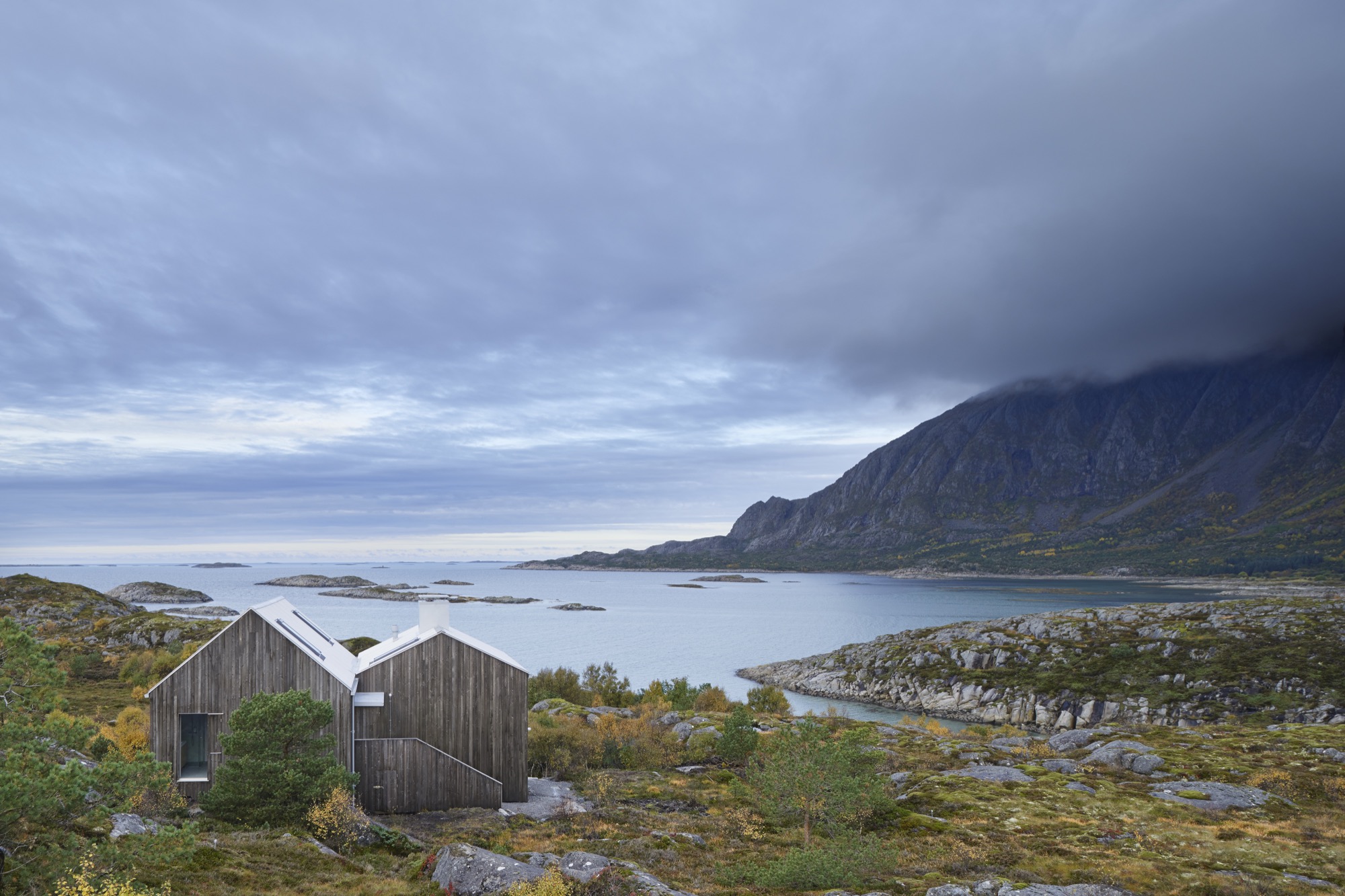
This is where the man who commissioned this house, Norwegian theatre director Alexander Mørk-Eidem, has his roots. Born on the island, he has lived most of his life on the mainland, and for the past ten years in Stockholm, Sweden. That is also where he met the architect. He approached Kolman with his idea for a country house or a cottage, commonly known in Norway as a hytte. A small and simple residence in the countryside where you go on weekends and during vacations to relax and enjoy nature... something with which Norwegians, blessed with a country of stunningly beautiful mountains and fjords, seem to be obsessed.
The end of the world, as Vega feels, seems like the obvious place for a director of the stage to seek peace and quiet and to find inspiration. Mørk-Eidem jointly owns the house with his siblings, a brother and a sister who now live in London and Oslo. The house is intended as a place for solitary retreats, but also for family gatherings, since an uncle and cousins still live on Vega.
“Inside, the house is neutrally furnished to allow for nature to...” Mørk-Eidem starts to explain when I visited the house, only to get interrupted by his architect: “It’s like three paintings. There is no need to adorn the walls.”
The Cast of Characters
What they mean is that the house is built to be a minor character—the lead is reserved for the surrounding landscape. It doesn’t take a stage director to reach that conclusion. Trying to cast this drama in any other way would have been pointless. On the other side of the windows of the combined living and dining room lies the mighty Trollvasstind mountain, 800 meters (2,625 feet) high with a ridge that’s hidden behind milky white clouds. In the other direction the Atlantic Ocean and open sea stretch all the way to Labrador in Canada.
“What they mean is that the house is built to be a minor character—the lead is reserved for the surrounding landscape... Trying to cast this drama in any other way would have been pointless.”
Kolman recalls the first time he came to the island and the site, after having accepted the challenge of designing the house: “I went there in January, which is the worst time of year, weatherwise. It was pitch dark and freezing. Shockingly freezing, really. I wasn’t prepared for how harsh the climate would be.”
But nature can be kind on Vega, too. At milder times of the year, when the tide comes in during the day, the sand at the shoreline that had previously been heated by the sun warms the shallow water, allowing for some appreciated beach life. But the weather changes quickly here: from calm to a wind you can lean against in a matter of minutes. It is wise never to leave the house without the proper attire: mittens, Wellingtons, and a decent raincoat.
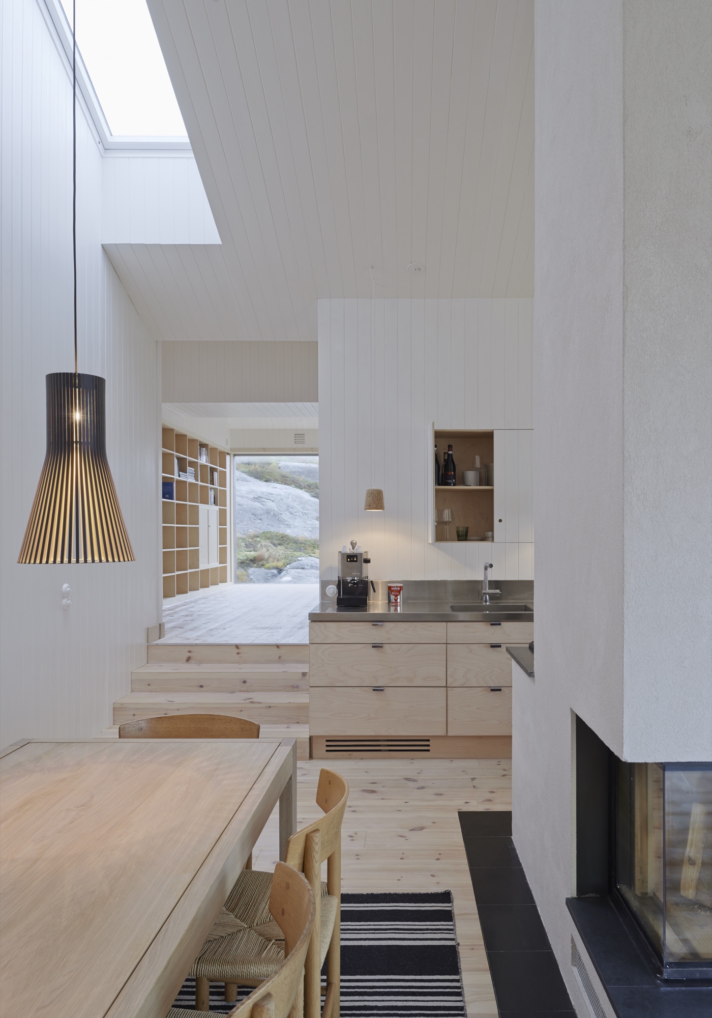
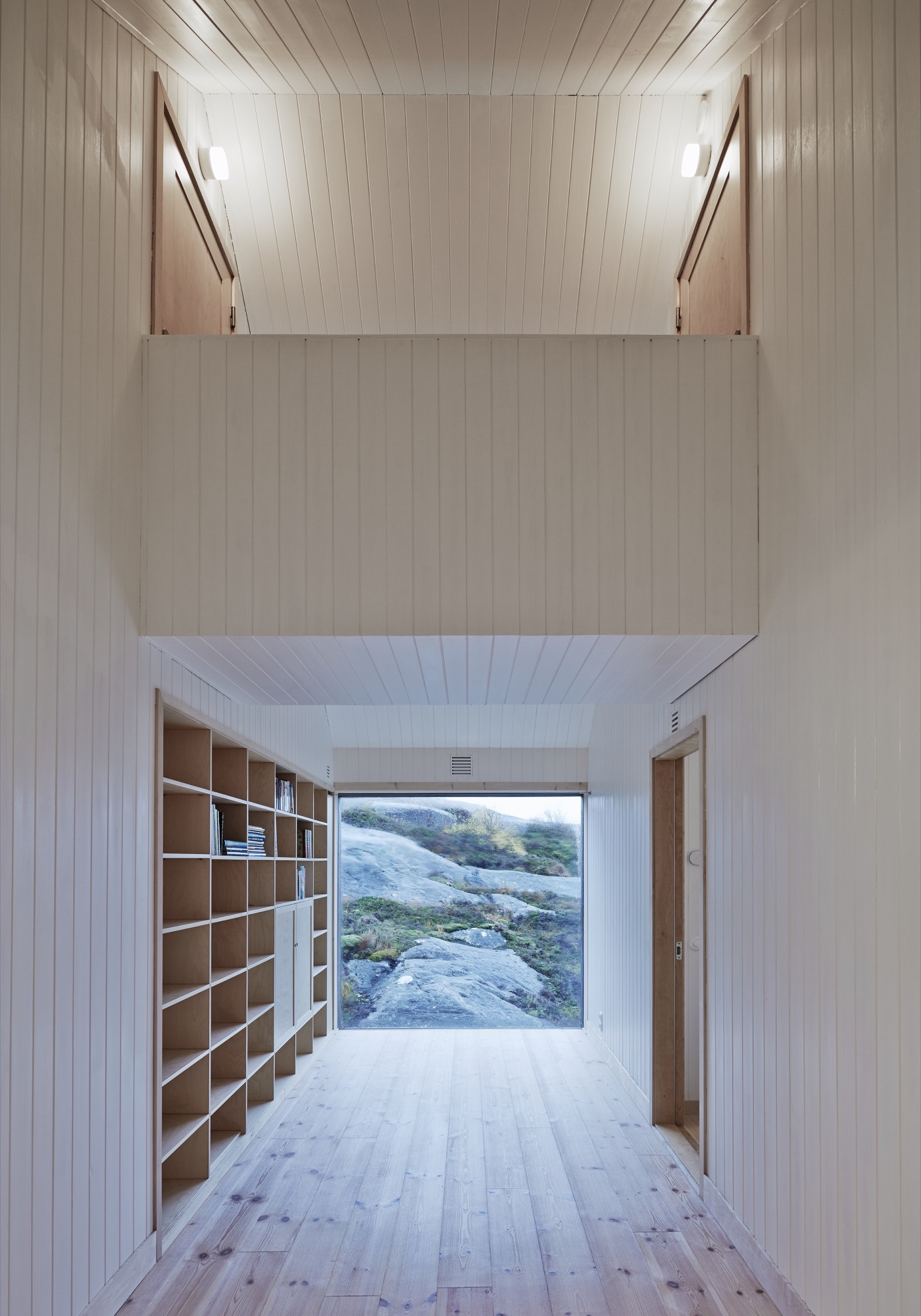
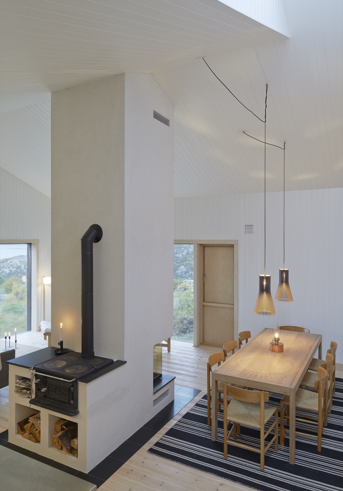
In contrast to the adventurous landscape and weather of Vega, the cottage interior is serene with a neutral color palette to enhance the tranquil atmosphere. Practically everything inside the house, from the walls to the bed linen, is white. The architect thinks it gives the house a hotel-like quality.
The Right Stuff
Kolman met his client through a mutual acquaintance in Stockholm. Mørk-Eidem had been looking for someone to build the house for quite some time. Realizing what a challenge it would be on this particular site, he pictured someone young, eager to take on the assignment for the experience, and Kolman fit the bill.
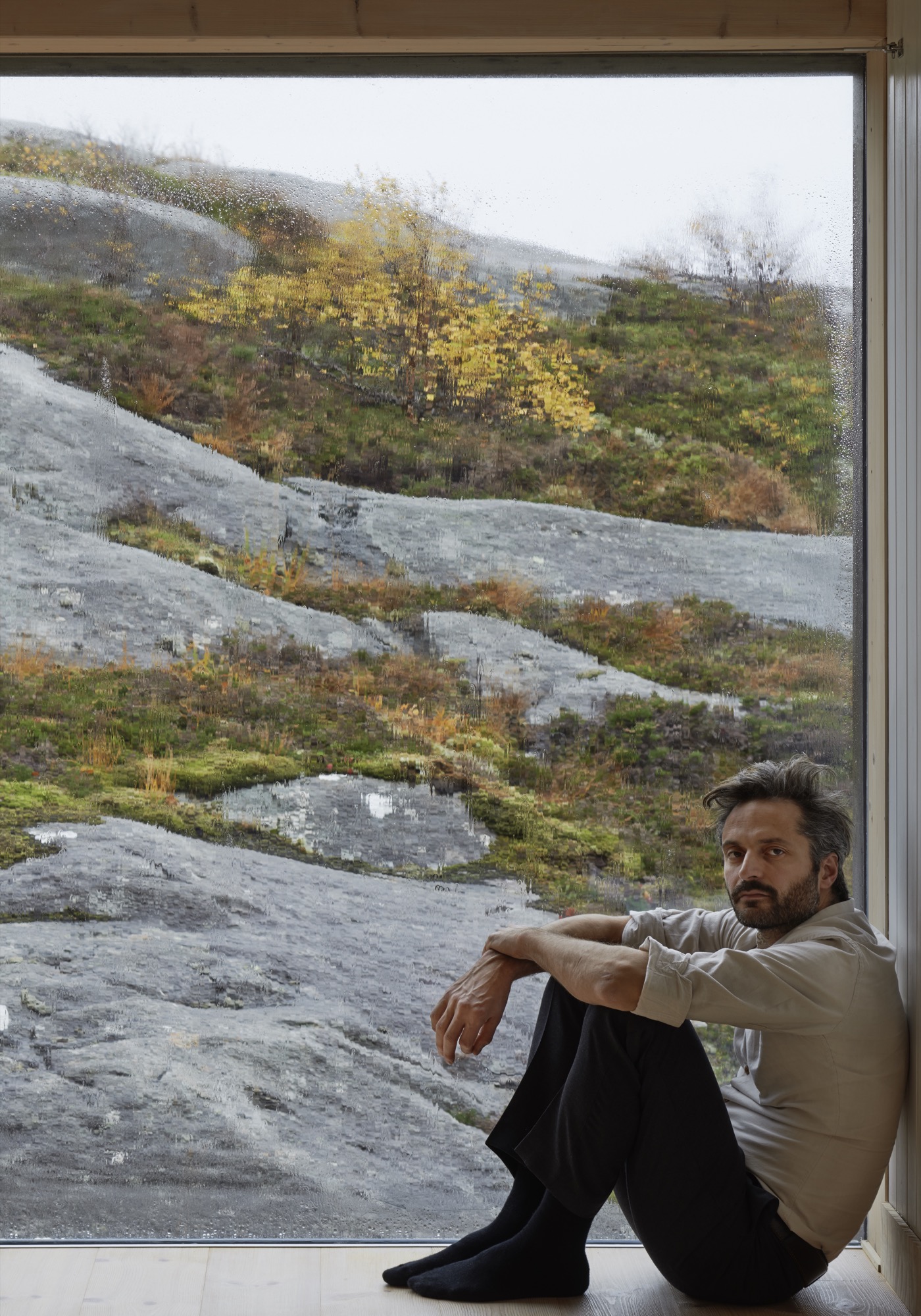
In addition to being one of the partners of Kolman Boye Architects, Kolman also runs a construction firm. A lucky combination since all the contractors Mørk-Eidem approached for a tender had simply refused to answer. “There was nobody who could see any joy in trying to do the impossible,” Mørk-Eidem explains.
Kolman proved to be different. In the Vega Cottage he saw nothing but an enticing challenge. Building the house on Vega was possible, but it took five years and twenty-three Stockholm-Vega round-trips by car for the architect. A total distance, he figures, that roughly equals a trip around the equator. True or not, one trip by car from Stockholm to Vega is long, time-consuming, and not very pleasant.
“It was really important to build the house without doing any damage to the landscape and to make it appear as if the house had always stood on this site,” Kolman says. “What fascinates most people who come here is that you get the feeling that it’s grown out of the bedrock.”
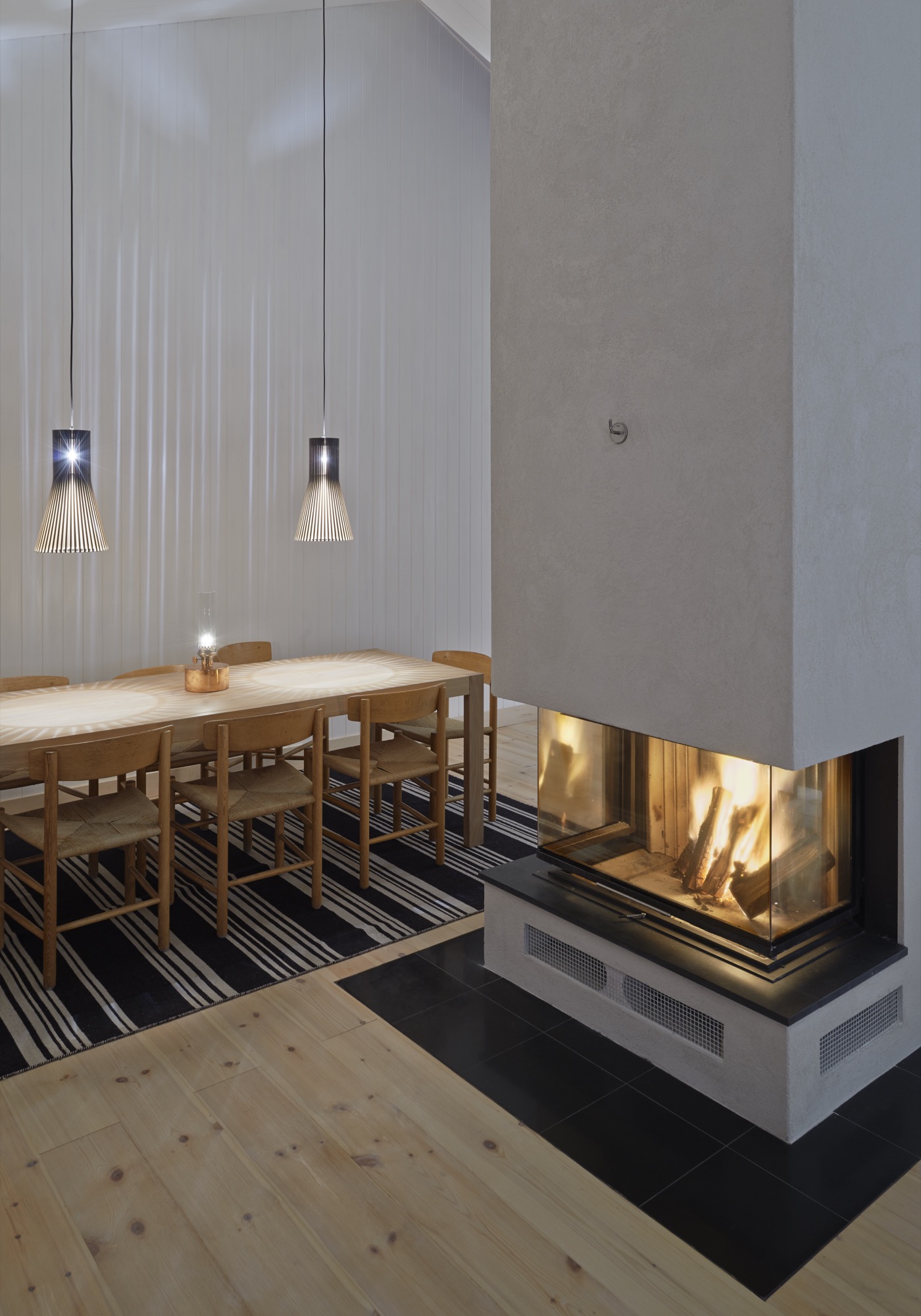
Building on the bedrock and being gentle with the landscape also made the construction difficult. A road had to be built to the site, and building material laboriously towed over the bedrock the house stands on—not to mention the efforts to transport and install the windows. The panes are 40 millimeters (1.57 inches) thick to withstand the storms and high winds that would shake and shatter thinner glass. Residents can enjoy the spectacle outside from a quiet, warm, and cozy house, cheered by the hearth that is the heart of the lower-level’s social area. “They’re not something you can break easily,” Kolman says about the windows. “In fact, you can jump on them and nothing will happen.” Staying at the Vega Cottage, I was glad the project was graced with such a persistent architect-builder—the landscape is beautiful, but I was happy to keep the elements of nature where they belong—on the other side of the glass.
“It was really important to build the house without doing any damage to the landscape and to make it appear as if the house has always stood on this site.”
Other than the pitched roof, this is a rather minimalistic house—or as Kolman says, “There is nothing that juts out, so there is nothing for the wind to grab on to.”
There is not even a railing around the terrace outside the lower level’s two bedrooms. “My sister wondered when they would be put in place,” Mørk-Eidem says. “They never will be,” he declares, adding, “This is a childproof house in the sense that nothing can be broken.”
If nothing can get broken, theoretically nothing will need to be fixed. To keep maintenance on the house to a minimum during holidays and vacations, Mørk-Eidem and his architect opted for weatherproof solutions for the house. At one stage in the project they considered black facades. But when I visited, a year after completion, the unpainted facades, which were only treated, already had their gray patina. Houses age fast on Vega.
“Houses age fast on Vega.”
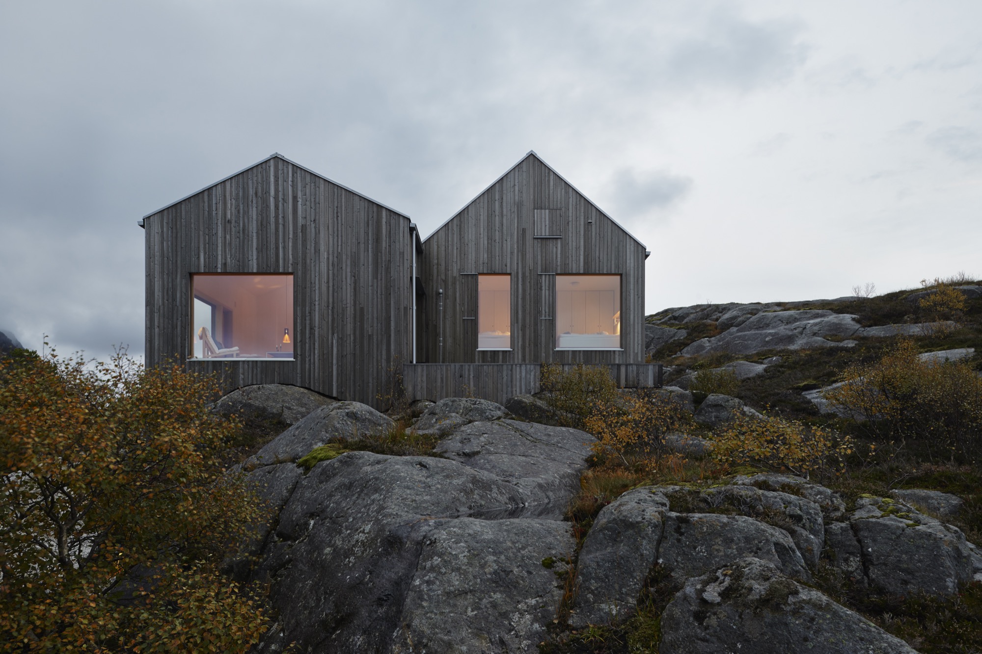
The cottage owes much to vernacular architecture, but the local building tradition has always emphasized protection from the elements of nature. The island’s old buildings, placed wherever there is shelter from the storms, all turn their backs to nature and to the extreme weather. “You get very unsentimental living out here,” Mørk-Eidem tells me. “You get used to this nature, and you look at it as a kind of antagonist.”
“You get very unsentimental living out here.”
He proceeds to tell how his father reacted when he first came to the house. As an adult, Mørk-Eidem senior moved to Oslo and hadn’t lived on the island for decades. “At first, he was suspicious,” Mørk-Eidem recalls, “because he’s never been used to sitting inside and just admiring the view. For him it was a really different experience to come to a place he knows so well but to see it from an entirely new perspective.”
Hearing that this outpost can give even natives new perspectives is a testament to the qualities of this house that makes the architect say, without the slightest hesitation, that he would gladly take on the logistical and psychological challenges of an assignment like this again. △
A Platform for Living
A weekend refuge in Japan's Chichibu mountain range consists of a simple larch wood structure and two North Face tents for bedrooms
A collaboration with Dwell.com
Setsumasa and Mami Kobayashi’s weekend retreat, two and a half hours northwest of Tokyo, is “an arresting concept,” photographer Dean Kaufman says, who documented the singular refuge in the Chichibu mountain range. “It’s finely balanced between rustic camping and feeling like the Farnsworth House.”
“It’s finely balanced between rustic camping and feeling like the Farnsworth House.”
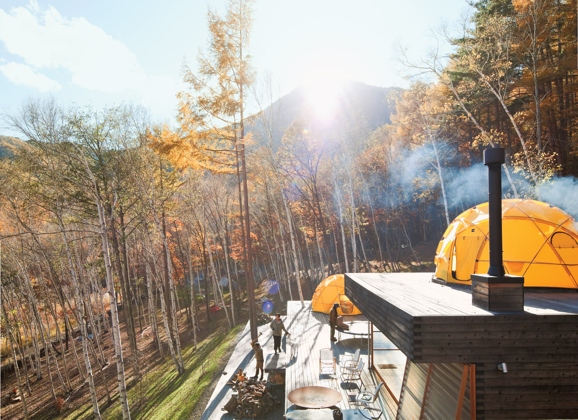
Designed by Shin Ohori of General Design, the structure—Setsumasa bristles at the word “house,” since his desire was for something that “was not a residence”—and its wooded surroundings serve as a testing ground for the Kobayashis, who design outdoor clothing and gear (as well as many other products) for their company, …….Research. The shelter is constructed from locally harvested larch wood and removable fiberplastic walls and is crowned with two yellow dome tents used as year-round bedrooms.
"His desire was for something that 'was not a residence.' "
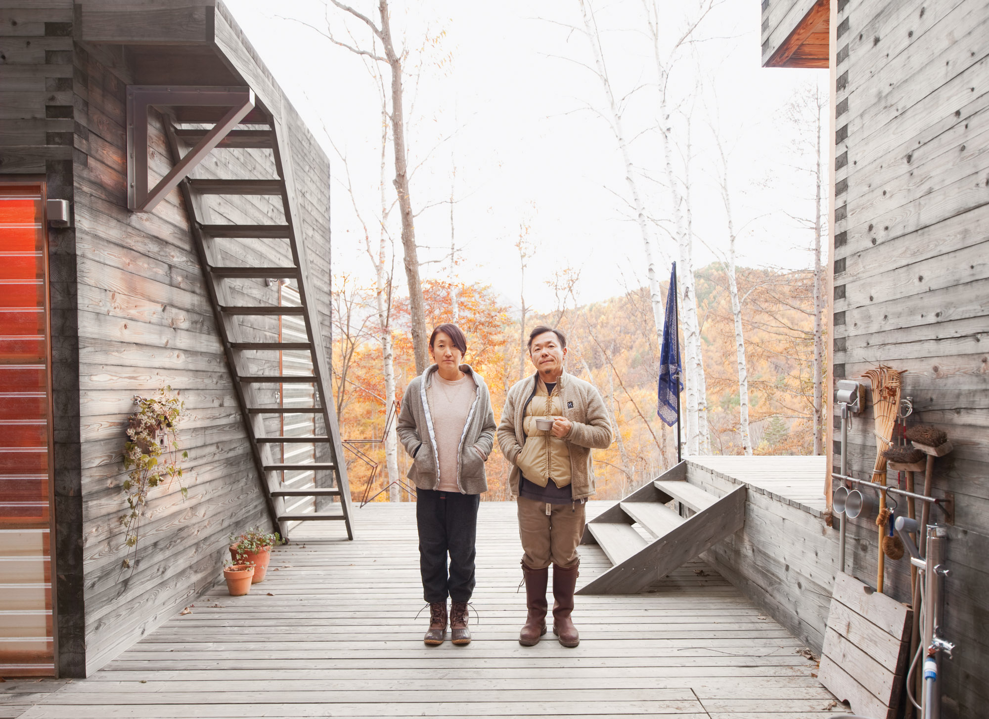 Setsumasa and Mami Kobayashi / Photo by Dean Kaufman
Still, this is no primitive lean-to. There’s electricity, hot water, and a kitchen—not to mention iPads, Internet, and a clawfoot tub. By day, the couple trims trees and chops firewood. At night, they sit around a campfire and eat Japanese curry, listen to Phish, and balance their laptops on their knees. This is what a modern back-to-the-land effort looks like.
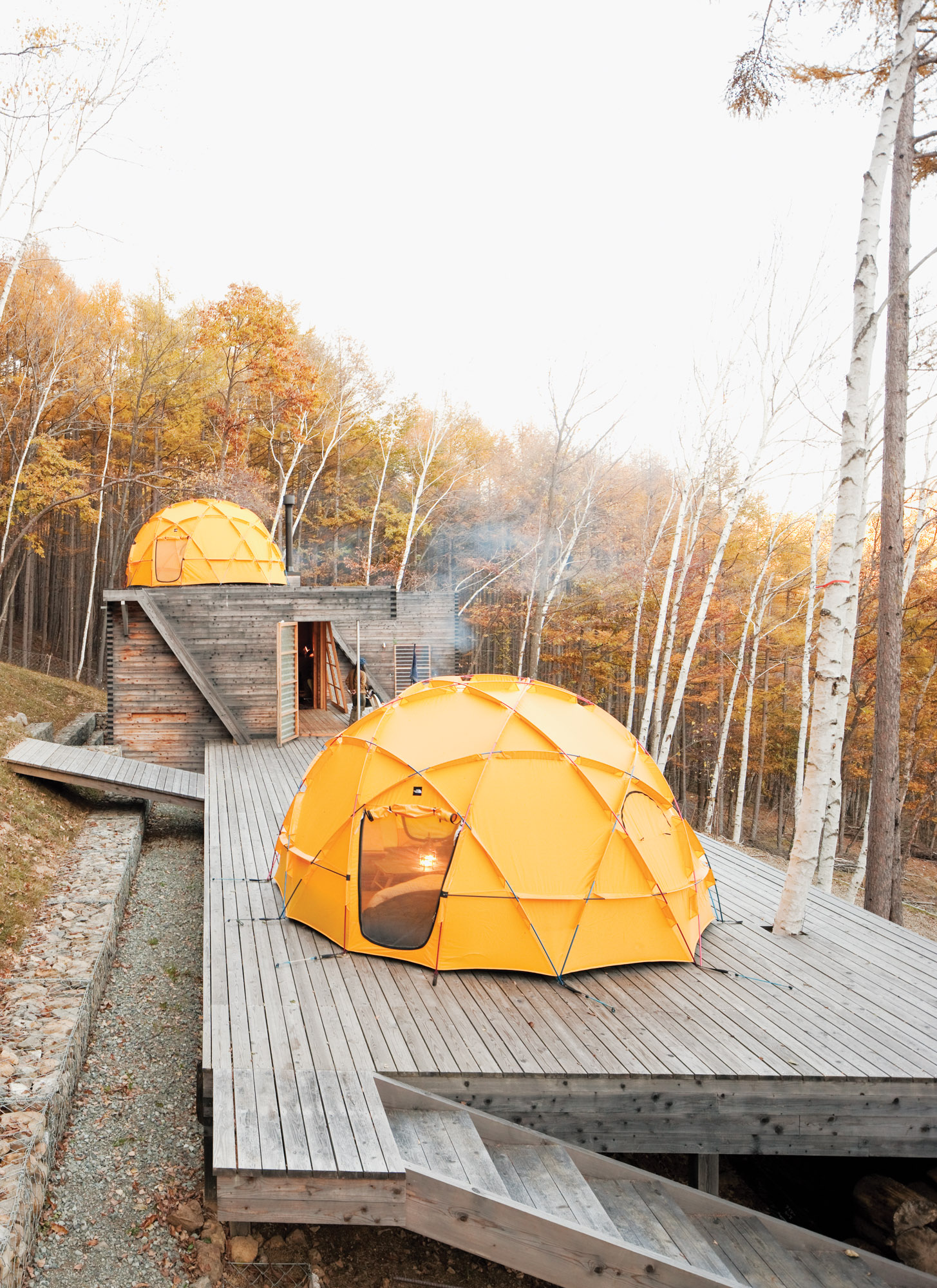
One North Face tent sits atop a deck; another caps the main building, which contains a kitchen and dining area.
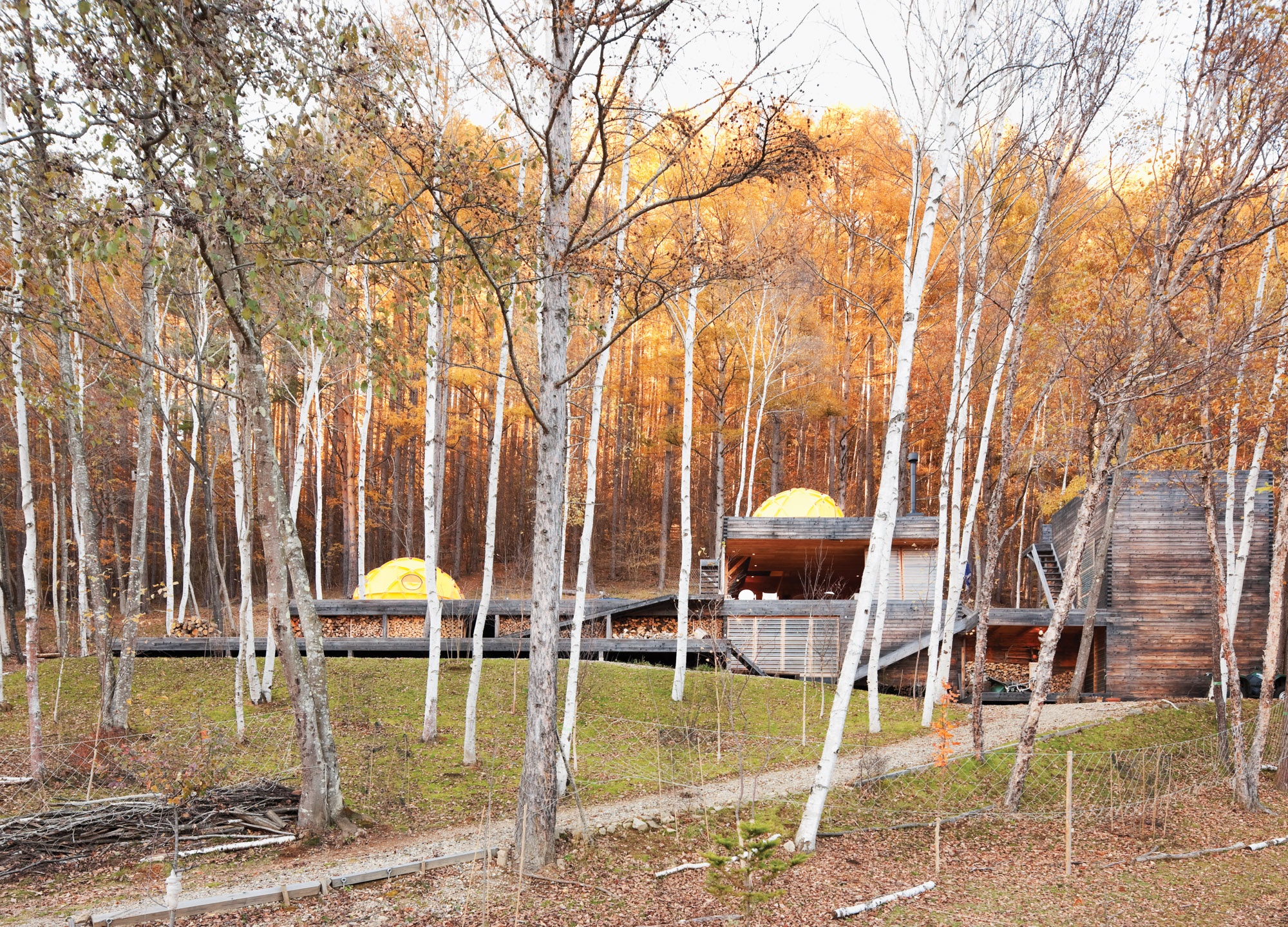
The long, lean Kobayashi complex includes a bathroom and storage room in the structure on the far right.
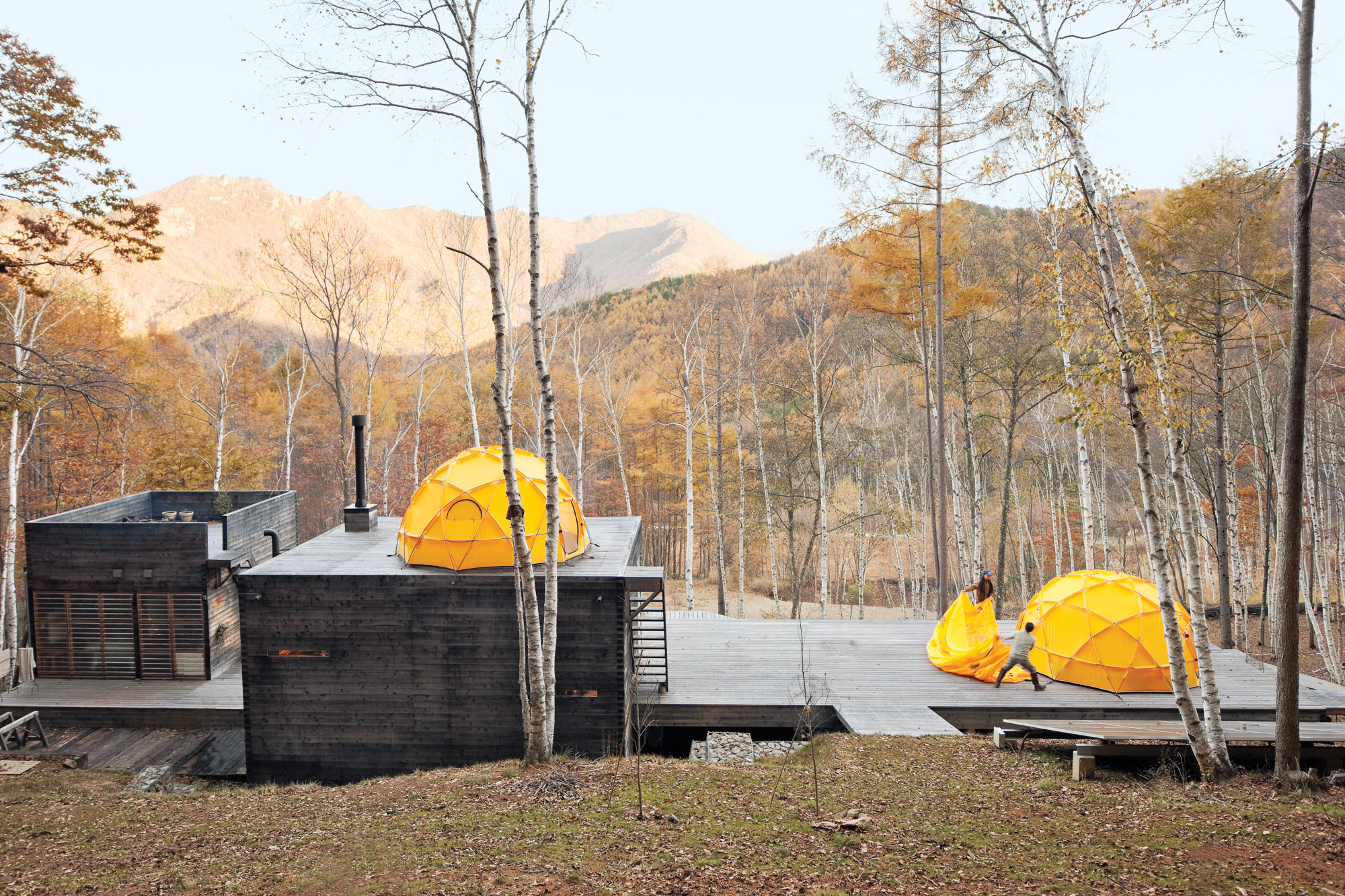
Setsumasa and Hideaki toss on the rain fly. The solar panel in the foreground supplies daytime electricity.
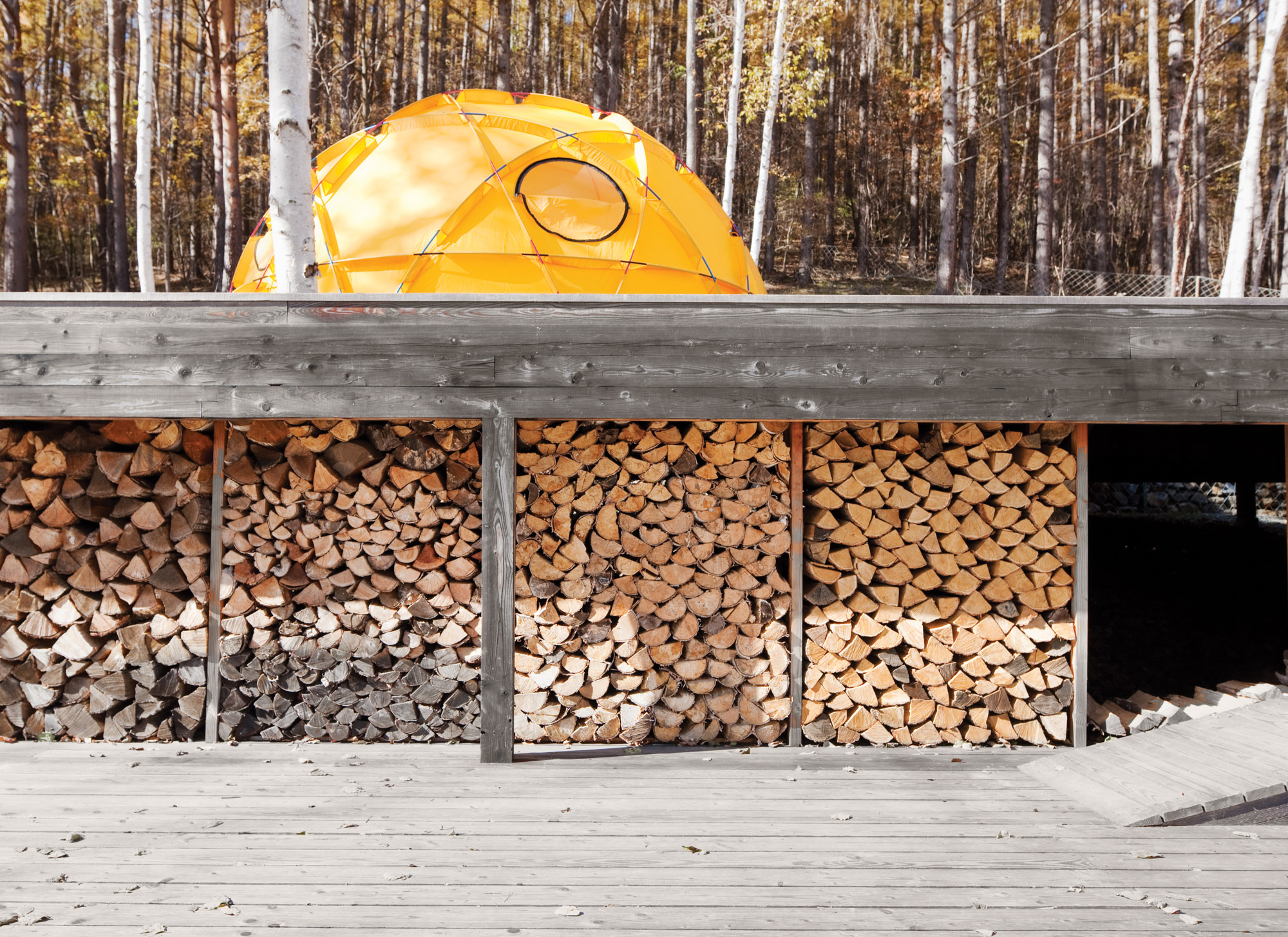
A stockpile of wood sheltered from the elements.
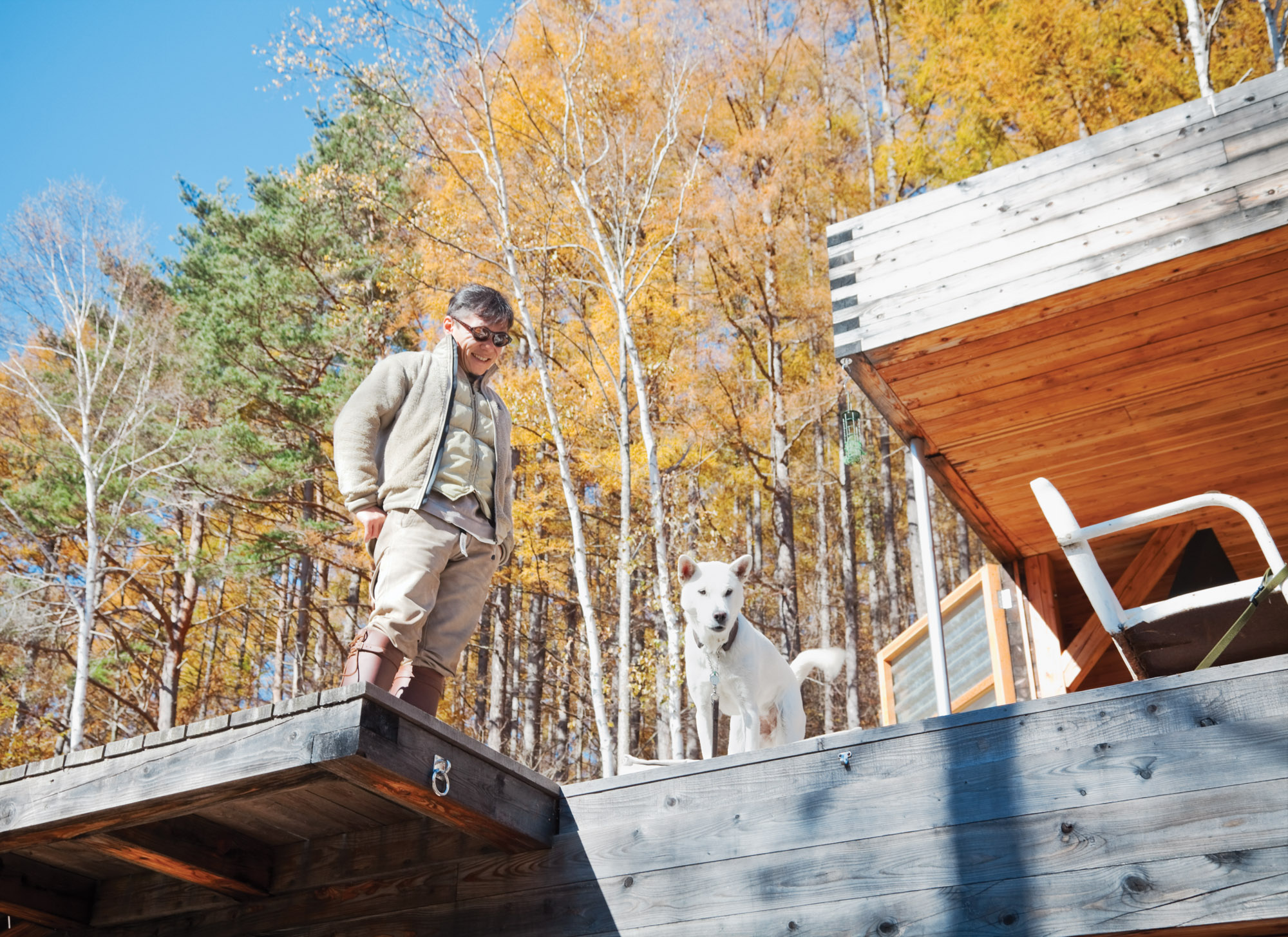
Setsumasa's desire was for something that “was not a residence”
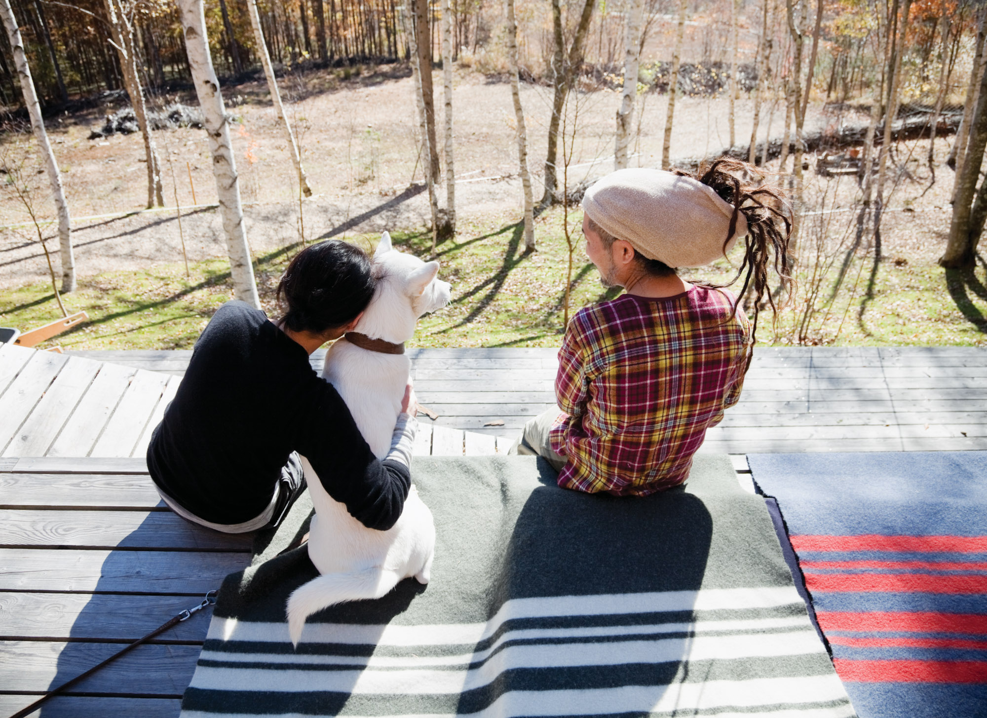
Scenes from a weekend in the woods feature many .......Research products, including camping cookware and striped wool blankets.
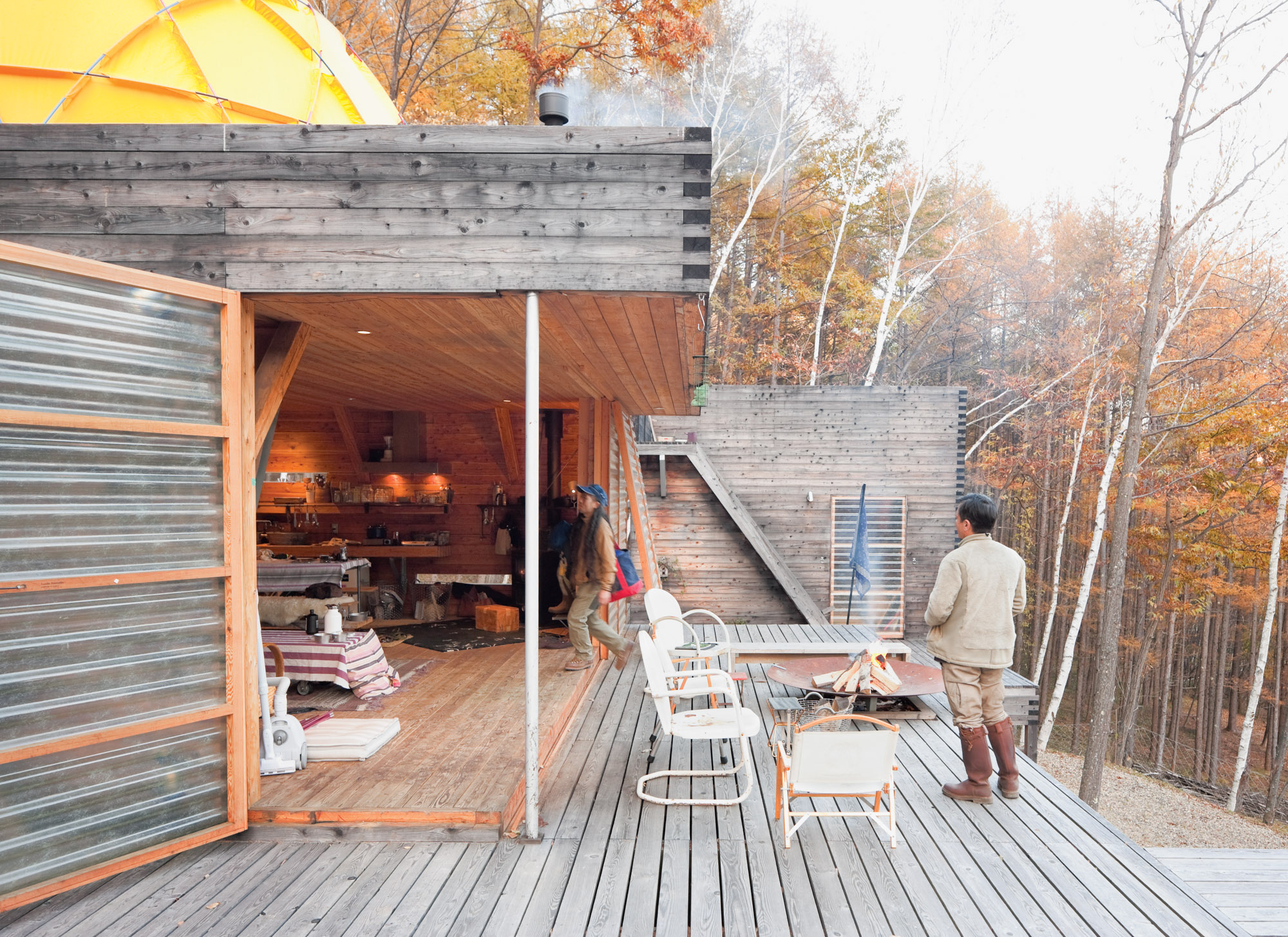
Translucent fiberglass panel walls form a permeable, fiber-reinforced plastic membrane between indoors and out.
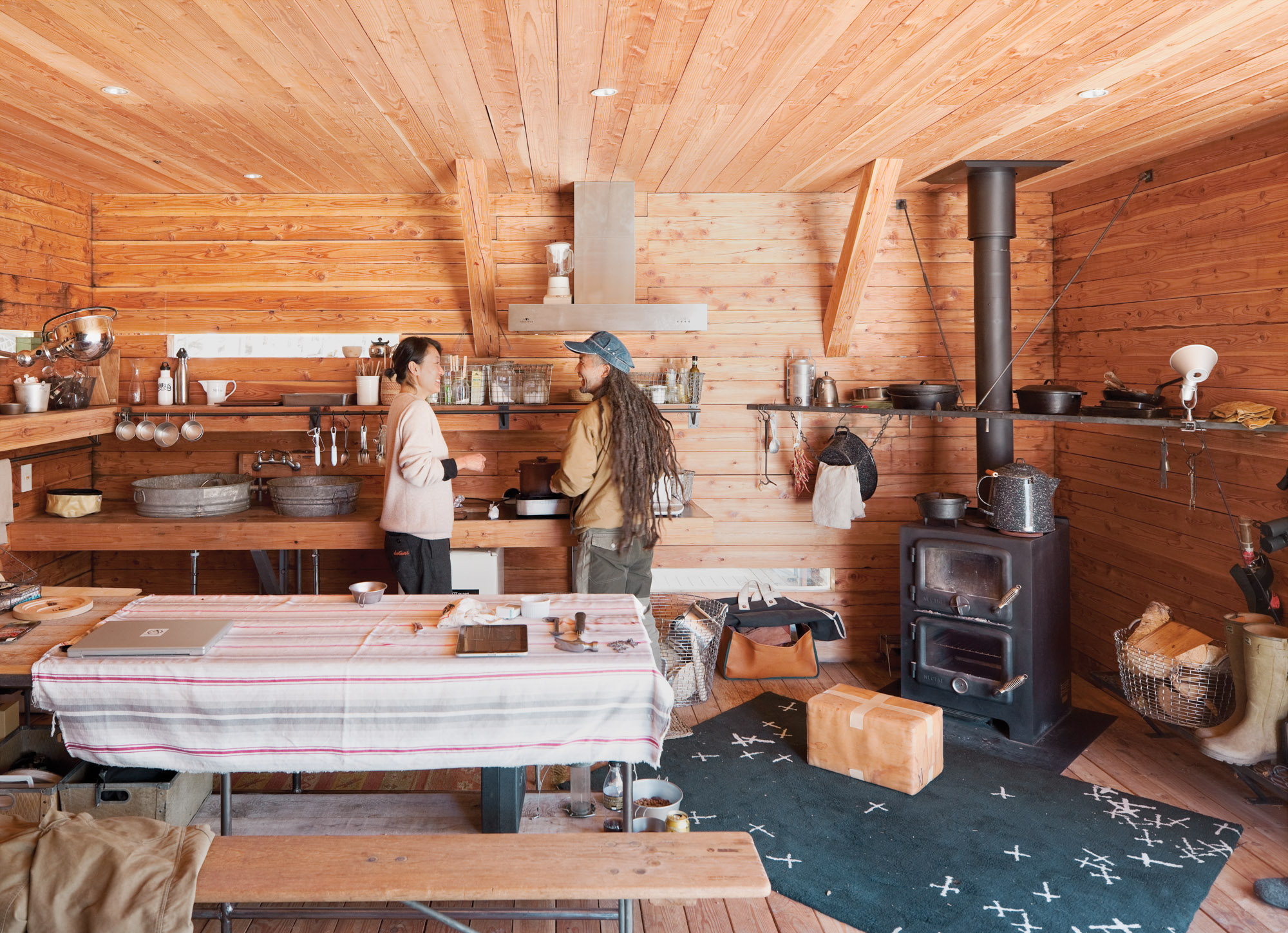
Mami and Ishii Hideaki (a friend and .......Research employee) prepare lunch in the cozy main building. The room is rustic and utilitarian, with a double-decker wood-burning stove, tons of open storage, and a sink fashioned from galvanized buckets. But there’s an underlying high-design ethos: The wire baskets are handmade classics from Korbo, a Swedish company, and what looks like a paper-wrapped box in front of the stove is actually a leather cushion by Japanese artist Nakano.
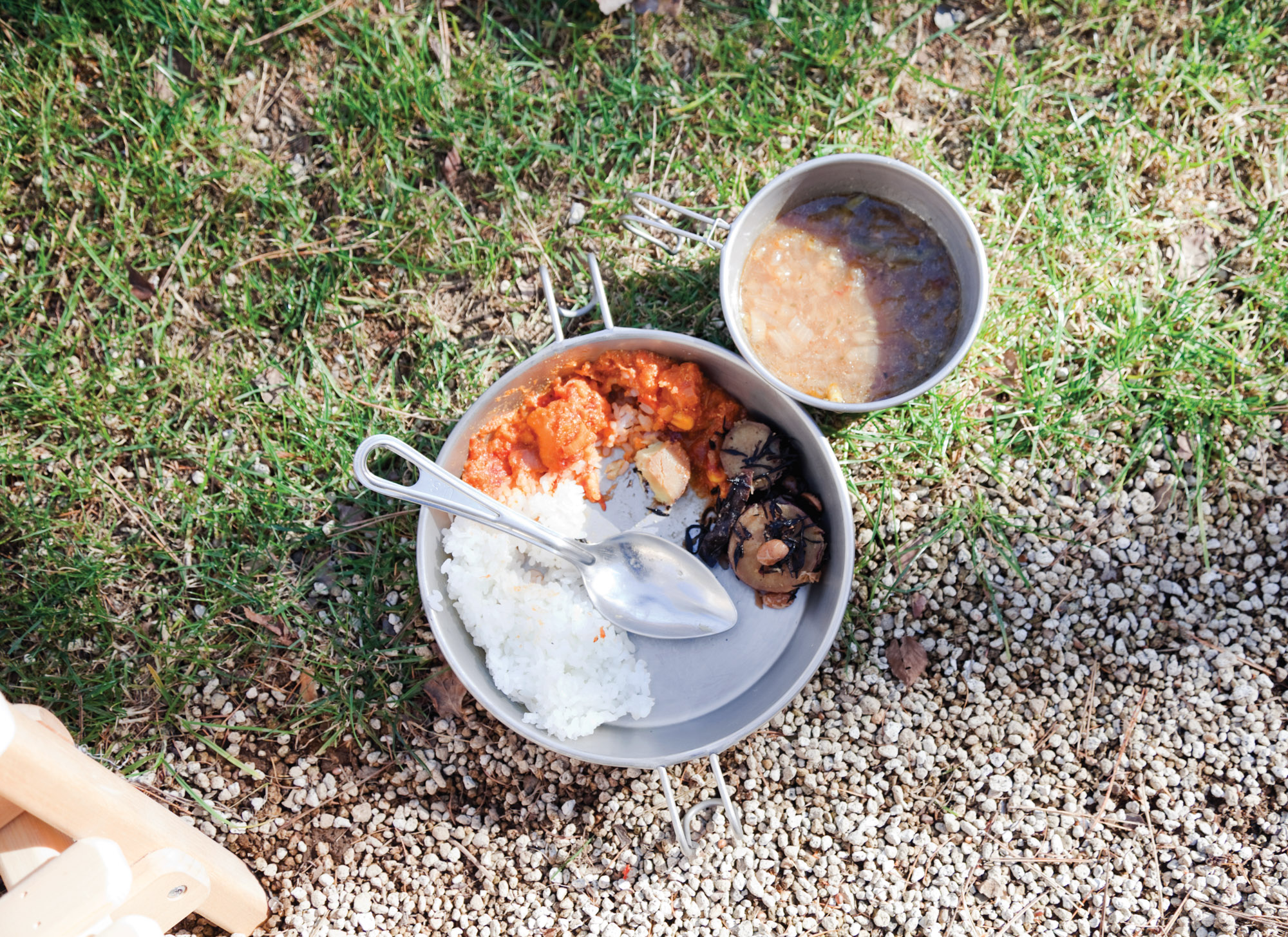
Food is served in traditional camping cookware.
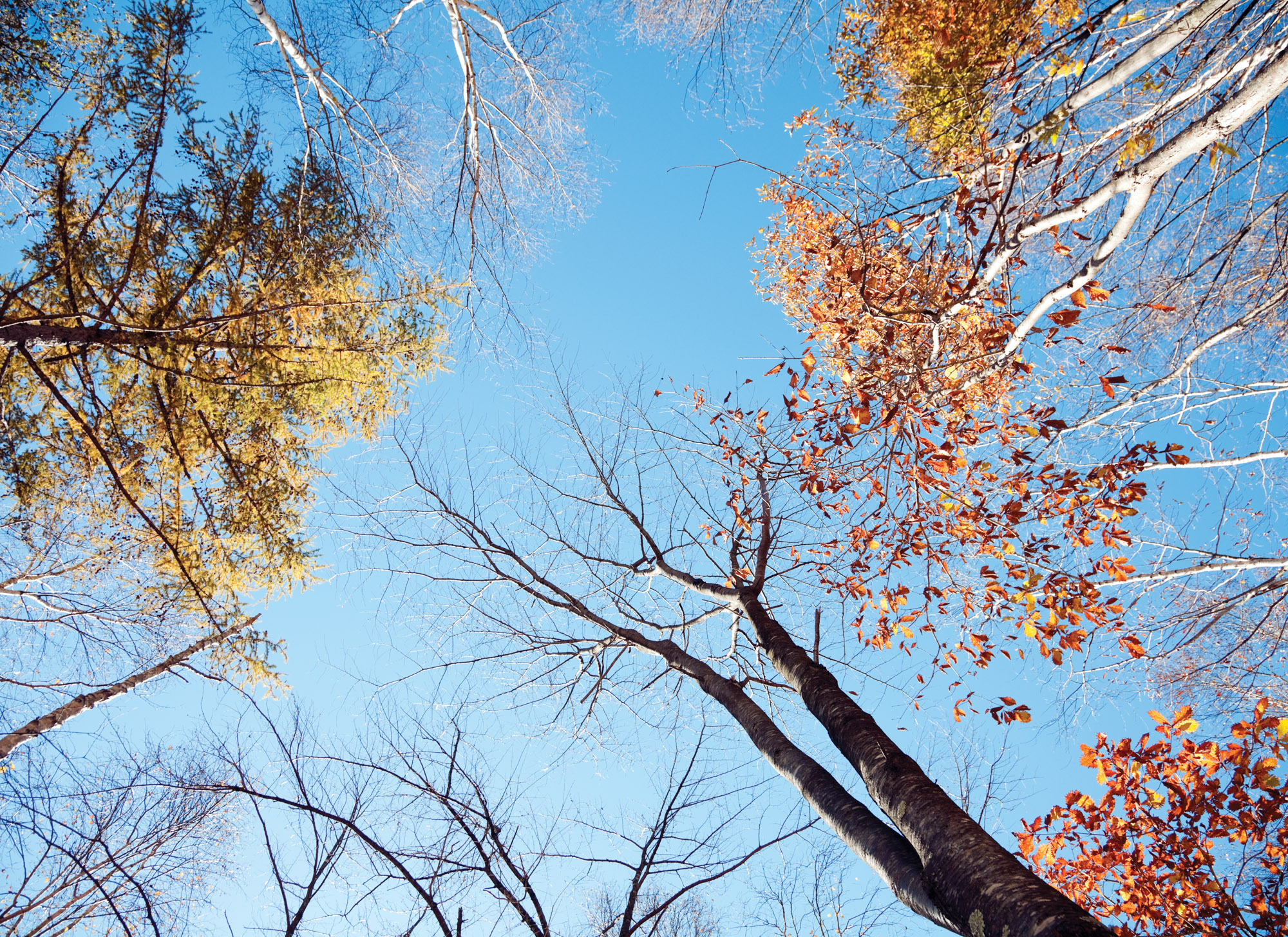
A view of the surrounding tree canopy.
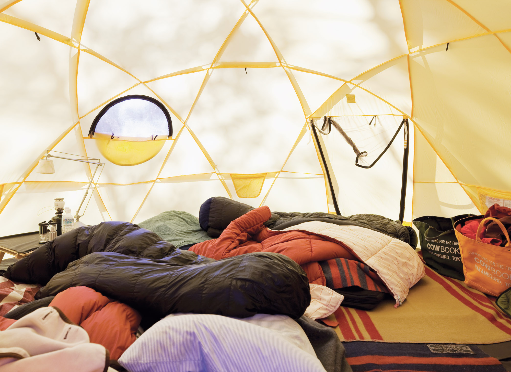
Inside one of the Kobayashis' North Face tents.
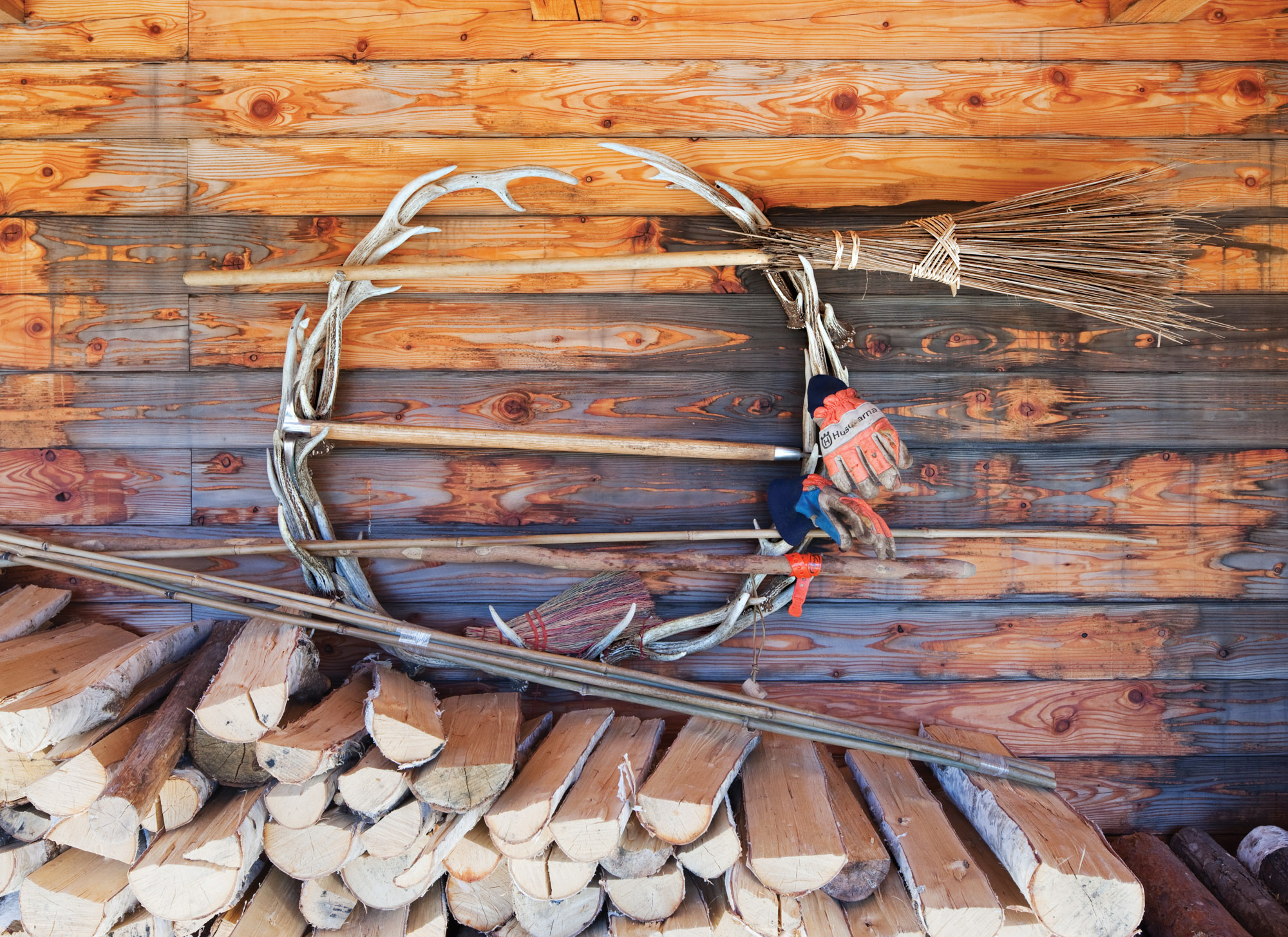
The couple stockpiles wood under the deck.
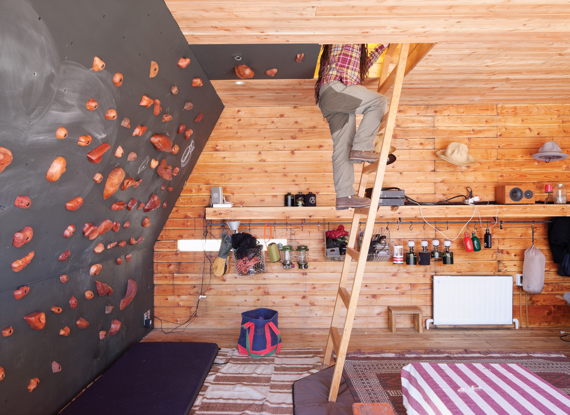
The rooftop tent can be accessed from the interior via a wooden ladder or—for the more athletic—via a series of wall-mounted climbing holds, made by Vock and carved from persimmon-tinted hardwood.
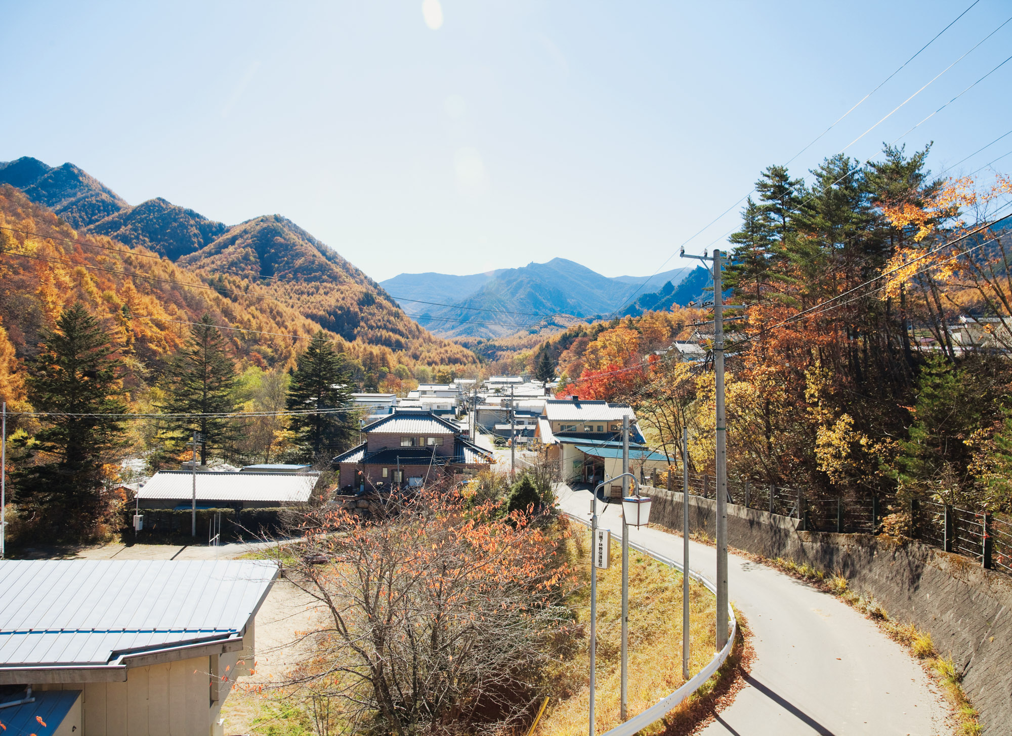
A view of the mountains from the village of Kawakami, en route to the Kobayashis’ property. △
Window to South Tyrol
An artist and sculptor returns home to South Tyrol to converts an old farmhouse
Artist and sculptor Othmar Prenner converts an old farmhouse in the mountains of his native South Tyrol and realizes his vision of an alpine dream home—between craftsman tradition and modern art.
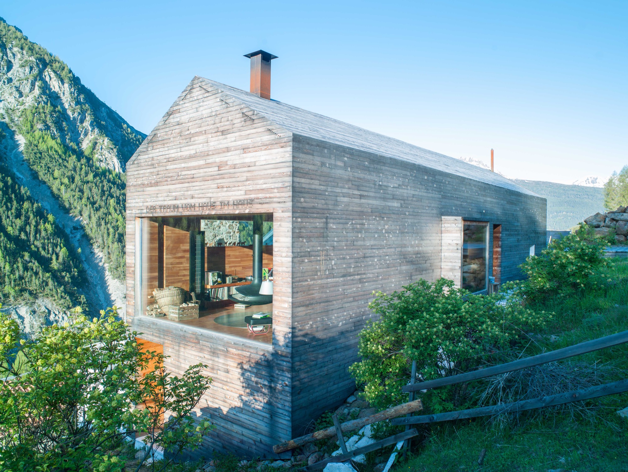
Othmar Prenner lounges by the spectacular panorama window, looking out into the pristine nature of South Tyrol. Modern fiberglass lines allow him to work up here, straight across from the massive, snow-capped peaks of Italy’s Vinschgau.
Technology and nature don’t contradict one another, if you ask the artist and sculptor. On the contrary. The Internet enables him to be in nature while developing new art projects and designing furniture and objects made of wood.
It is here, in his native South Tyrol, that Prenner found his way back to his craft and rediscovered the joy of creating something new with his own hands.
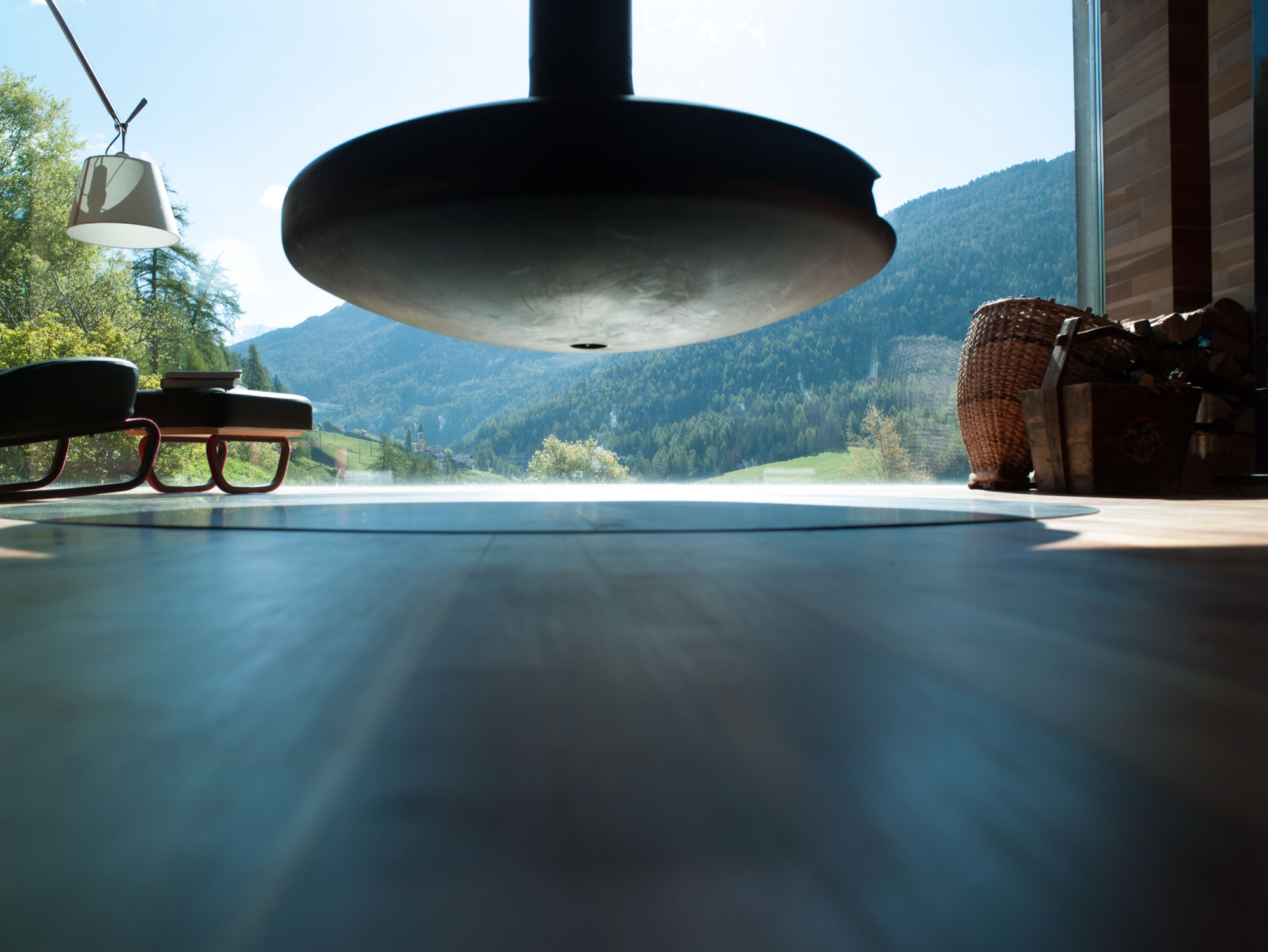
Every corner of his remodeled farmhouse, completed in 2011 and internationally published more than twenty times, is filled with tools, paintings, finished and unfinished pieces of furniture, and all sorts of arts and crafts. The home is vivid, and it’s cozy in front of the black steel fireplace—a focal point—suspended from the ceiling. Othmar Prenner loves the open flames, the feeling of sitting by a campfire in his living room. He dismisses ovens with glass doors and generally has his own and very clear ideas about architecture and interior design.
He helped build an atelier and gallery near Zurich, Switzerland. “I only do things I like 100 percent,” Prenner says. “That’s why I’m not interested in collaborating on big projects, where you have to make 1000 compromises.”
This was far from the case with his very personal project, the mountain retreat at home in South Tyrol. Here, the almost fifty year old was able to realize his design vision one to one and create a refuge that meanwhile has become his primary residence and studio. Rarely does he drive back to his apartment in Munich these days. “I never thought I would leave the city. I’ve lived there for twenty-two years,” he says. “My focus is here now. I love living in nature and don’t need the city.”
“My focus is here now. I love living in nature and don’t need the city.”
Art in the city, craft in the country
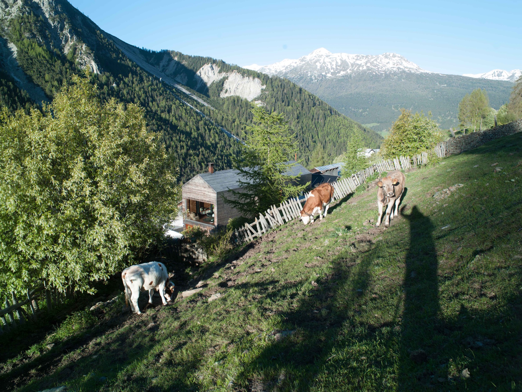
Prenner bought the old house in his native region near Mals twenty-five years ago. The property is part of a small hamlet that is still being farmed in a steep valley on the Reschen Pass near where Prenner grew up. In his stube, which is nontraditionally located on the second floor and combines the kitchen and dining room, he tells me he spent many childhood hours carving wood and that he has always wanted to become a sculptor since he was a young boy. His parents had little understanding for his artistic ambitions but agreed to a cabinetmaker apprenticeship. Prenner strived for more and afterward studied in Innsbruck and later in Munich. Today, his calling has become his profession, a mix of sculpture and designing furniture and objects for the home. “During my Munich years, it was definitely the arts, now I’m balancing both,” says Prenner, who recently returned from Salone Internazionale del Mobile, the furniture show in Milan where he introduced the lathed containers and boxes he sells under the brand Like a Box. The response to the boxes made from Swiss pine, the turned salt and pepper mills, and the forged knifes was incredibly positive, he reports. Even Vitra showed interest. Traditional craftsmanship is back in demand, and Milan showed it.
The dream of paradise
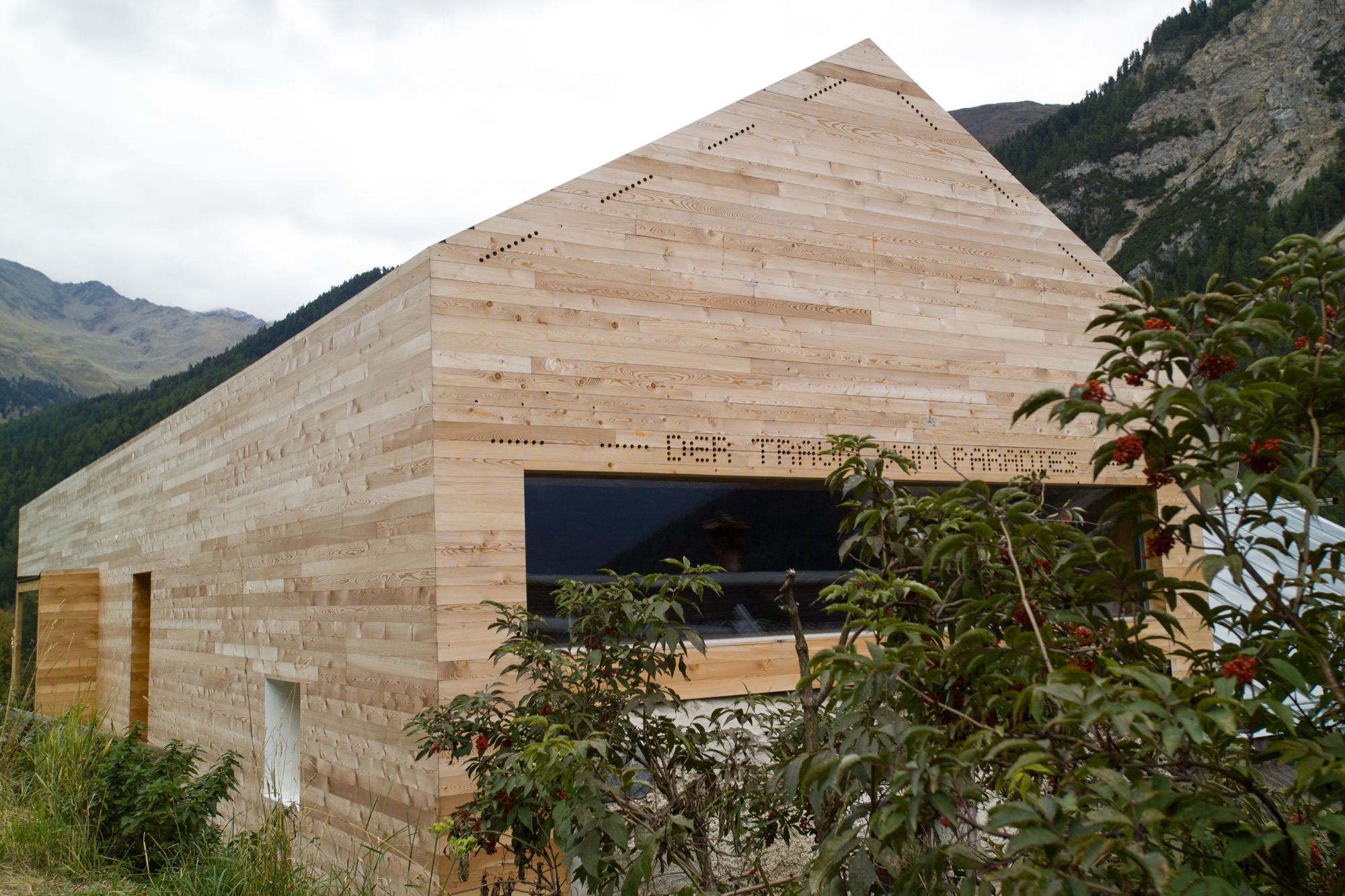
In his own alpine domicile, Prenner takes his love for wood to the extreme. The large window reflecting the mountain peaks pops out against the buildings homogenous, light exterior. The words “Der Traum vom Paradies” (the dream of paradise) are stamped into the minimalist fine wood facade. In the back of the small house, the roof was cut open to add a floor for the new living room. The house’s exterior as well as the interior of the grand stube are almost entirely clad in wood. A total of 250 square meters (2692 square feet) of finest parquet were installed. The larch wood came from the valley here and was specially cut so the pattern of annual rings would run ever so calmly and evenly. The wood was processed by Prenner’s brother, who still owned a carpentry shop at the time and was capable of delivering on Prenner’s discerning specifications: “Many craftsmen merely do custom Ikea nowadays, craft and industry become more and more intermingled. Unfortunately, the sense of artisanship gets lost.”
Wood as the central element was an obvious choice for Prenner. Many other details developed over the course of the building process, he tells. “It’s like working on a sculpture. Many people want to plan everything in advance and then execute one to one. That’s why I don’t like collaborating on other architecture projects.” Prenner likes to be inspired as his work unfolds. The entryway, for example, was so dark you could hardly find the doorknob. So Prenner, without hesitation, tore open the ceiling to create light, which now floods the hallway from the stube and living room above. The white marble floor brightens up the foyer still more. The stone was quarried 30 kilometers (ca. 19 miles) from here, in Laas, and counts among the hardest and whitest marble stones. “It should be self-evident to use materials from the region, and not stone from India,” Prenner notes. “There’s a new aspiration. People want to know where things come from, where materials are sourced. Things of permanence provide comfort in uncertain times.”
“There’s a new aspiration. People want to know where things come from, where materials are sourced. Things of permanence provide comfort in uncertain times.”
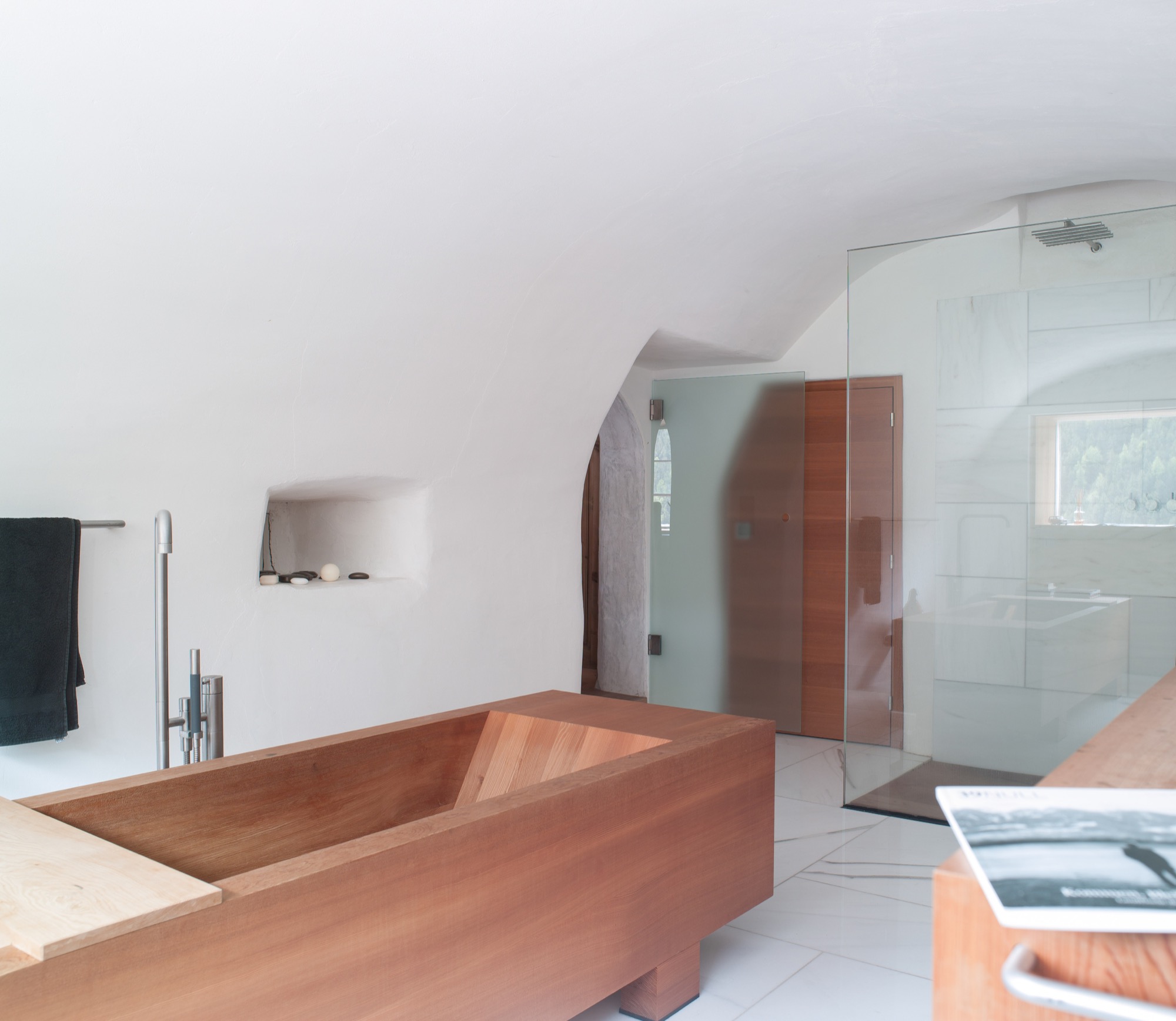
The former stube, where the original, 200-year-old wood paneling has been completely preserved, was converted to the master bedroom. After all, the house’s central theme is the view to the outside—and the ground floor affords prime views. Thus, the classic arrangement of stube downstairs and bedroom upstairs was simply flipped on its head. The master bedroom’s ensuite bathroom marvelously harmonizes the white marble and the larch wood. The freestanding wooden bathtub is the focal point.
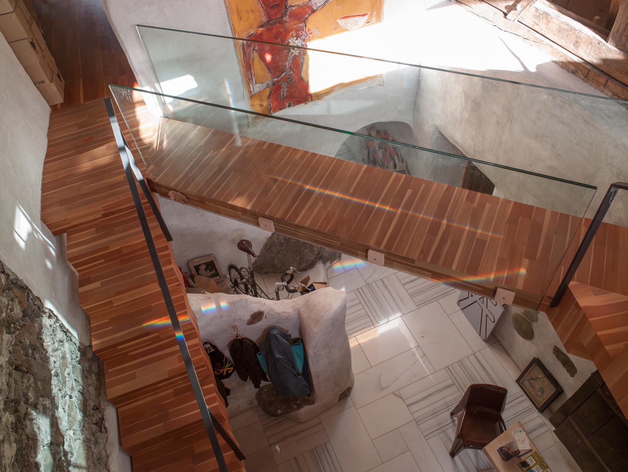
Prenner preserved the old stone staircase—or its remnants—as decorative element and a nod to the old structure of the farmhouse. The modern, floating wooden stairs and the bridge—or wooden walkway—to the living room on the second floor create the contrast. “During construction, a wood plank led across there, and I found the open crossing over the hallway interesting,” Prenner reveals.
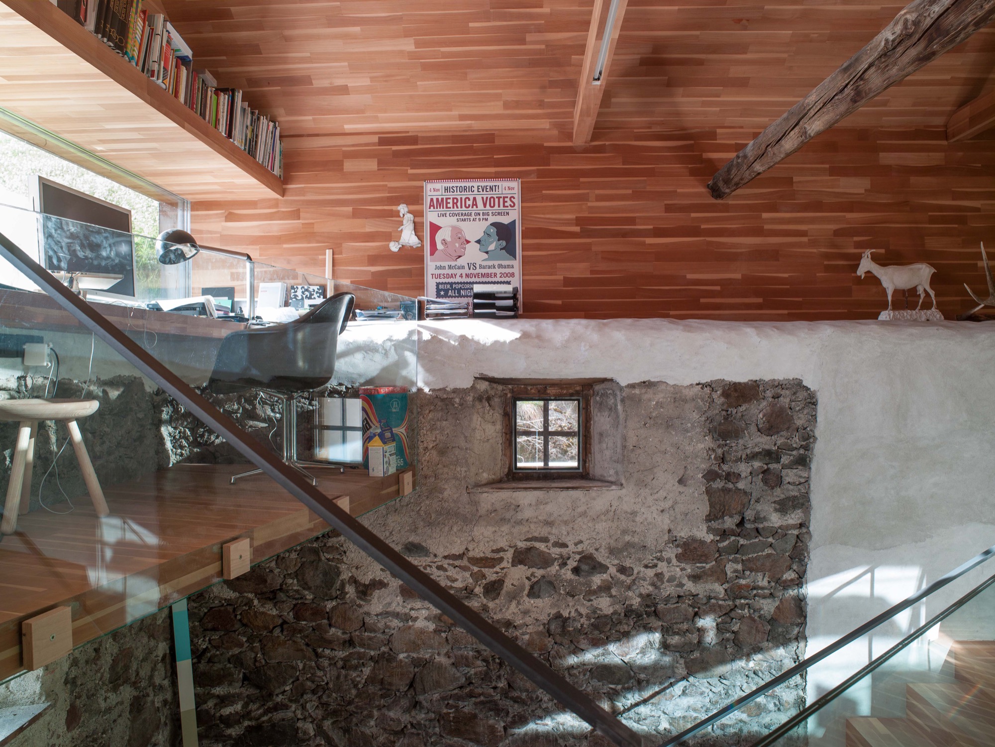
The old roof joists were preserved and support the pitch of the roof, where the living room is. Five steps lead to a narrow loft Prenner installed along the gable wall with a long panorama window, again providing spectacular views to the outside. From his desk, the artist can see the cows grazing on the lush meadow.
And the light. Prenner often missed the light when he was in Munich, particularly during the long, gray winters, he remembers. Blue skies and the special light only snow can create—here, in his house in South Tyrol, he integrates it, plays with it, lives with it.
Work and art live together
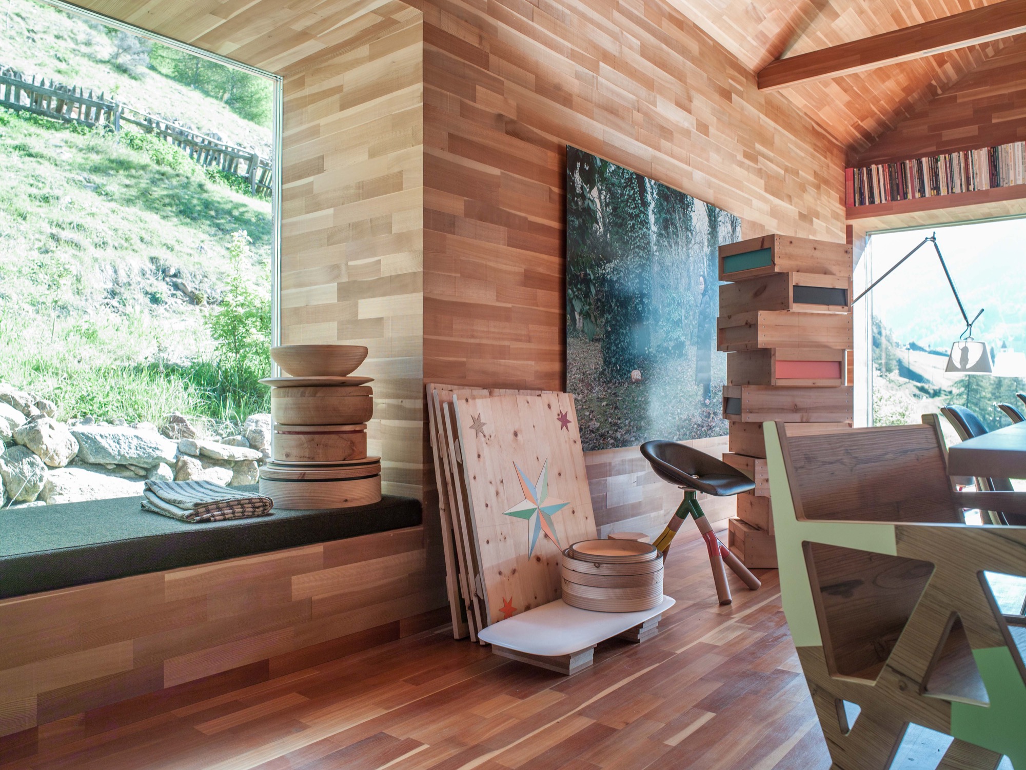
Paintings and other art objects are piled up in the living room. “This is intentional,” Prenner says. “I wanted work and art to mix. I cannot separate them anyway.” Still, he is currently building an atelier on the premises. Before, when he lived in the city, he primarily created prototypes. But now, he likes to be more hands-on in the production, together with his partner, Ingrid Seebacher. The wood for each container, which is blackened in the fire, comes from a particular tree Prenner photographed beforehand and numbered the wood sections. The photo of the marked spot from where the wood was cut is sold together with the respective object—one of the artist’s many ingenious ideas. You can discover them all over the house. Art objects made from wood waste. Leftovers from a series of chairs you assemble yourself from four pieces of wood, and which Prenner became known for. These clever chairs don’t require glue or screws. In Prenner’s home, they are part of a group of miss-matched chairs around the large dining table and around the cozy stube. “In the old days, there was no ugly furniture because it was all made from solid wood,” Prenner contemplates. “But a lot is happening now. People are sick of cheap stuff made in China.” Prenner regards sustainable and organic as standard, which shouldn’t need to be pitched on a label. Sitting by the fire, he talk about the region here around Mals, soon to be the largest community in South Tyrol that is completely pesticide free. He tells about a baker who has re-sown old spelt ears from the eighteenth century and is now selling spelt bread. Stories like this are fitting for the stube and the beautiful, pristine landscape. Looking out the window and at the mountains, I can appreciate that one man's dream of paradise has come true here. △
“In the old days, there was no ugly furniture because it was all made from solid wood.”
 Othmar Prenner was born in 1966 in Schlanders, South Tyrol, Italy. After an apprenticeship in carpentry, he studied sculpture at the HTL Innsbruck, Austria, and later at the Akademie der Bildenden Künste in Munich, Germany. The website Dinge und Ursachen lists Prenner’s many projects and exhibitions. You can purchase his Swiss pine boxes and containers from the online shop Like a Box.
Camera Lucida
An artist's atelier becomes a looking device into the Austrian landscape
The small studio Vienna architect Christian Tonko designed for an artist friend becomes a looking device into the landscape, set in the foothills of the Austrian Alps.

The minimalist studio in Austria’s Vorarlberg region is a visual device in itself that frames the surrounding alpine landscape in two directions. In addition to a single skylight in the roof, the bilevel space has two vertical openings: The tilted glazing to the southeast lets in optimum sunlight, modulated through exterior screens. On the lower northwest end, a system of weathering steel frames allows the artist, who works in traditional media, to hoist up bronze sculptures outside and suspend them in his direct sight in front of the glass. The sculptures also receive their natural patina this way. The artist uses the upper level for sketching and painting in watercolor and the lower level for working on larger canvases and for sculpting.

Architect Christian Tonko’s choice of raw and untreated materials contributes to the character of a workshop. The interior surfaces are raw concrete, raw steel, and untreated oak. On a tectonic level, the structure responds to the descending site.
A Conversation with Christian Tonko
For whom did you design Camera Lucida?
The artist is a family friend. He recently retired and now wants to concentrate on art. The wish for his own studio has been present for many years . . . until it finally happened.

How is the space being used?
His desire was to create a space that is focused on creating art, yet, at the same time is also suitable for reading a book and looking at the landscape. It’s a small studio for drawing, painting, and sculpting for one person. It’s also intended to be a space for retreat and contemplation.
"His desire was to create a space that is focused on creating art, yet, at the same time is also suitable for reading a book and looking at the landscape."
The structure’s design is inspired by an ancient optical device, the eponymous camera lucida. What's the story behind the name?
Historically, the “camera lucida” is an optical drawing aid. It enables the artist to look at an object and a piece of paper simultaneously and, thus, facilitates tracing the object. At the same time, the term can be literally translated to signify “bright chamber.”

What was your original vision for the design of the studio?
At the beginning was the idea to build a small factory. This is where the semi-industrial character of the design stems from.
"At the beginning was the idea to build a small factory."
How did that initial idea evolve into the final design?
This idea of the small factory influenced the design on various levels. It influenced our choice of materials and surface textures but also directly informed the form-finding process. The volume is basically a box with a skylight, just like an archetypical factory building. Then it is set into the hillside and, therefore, the final appearance comes into being.
What’s it like to be and to work in the space?
It is a calm and bright place. The landscape is very present, but it is easy to focus on work and tune out everything else.

What is the synergy between Camera Lucida and its gorgeous mountain setting?
The building itself acts as an optical framing device, so the views are very clearly framed. At the same time, the building is directed towards the sunlight. A great amount of light floods in through the south-facing tilted glazing, which demands exterior sun protection. So sometimes the building is completely closed and the view is blocked.
The Alps are very close, as the site sits at the end of the Lower Rhine Valley, which means it is at the foothills of the Alps. But the building intentionally looks away from the mountains towards Lake Constance. Moreover, the site next to it is inhabited by four Cameroon mountain goats. They are grazing right in front of the window, which is a great feature as it creates a calm and relaxed atmosphere.
What’s on your drawing board right now?
I am currently working on a building that serves as a base for ski tours. It’s located close to the Camera Lucida project, but at a much higher altitude, in a great mountain setting. △


Concrete Perspectives
Australian photographer Jake Weisz discovers the minimalist Amangiri Resort in Southern Utah
Through his lense and all his senses, Australian photographer Jake Weisz (@jakeling) experiences the calm luxe and the raw surrounding nature of Southern Utah’s Amangiri Resort, where minimalist architecture in monochromatic concrete lies below the buttes and mesas of Canyon Point.
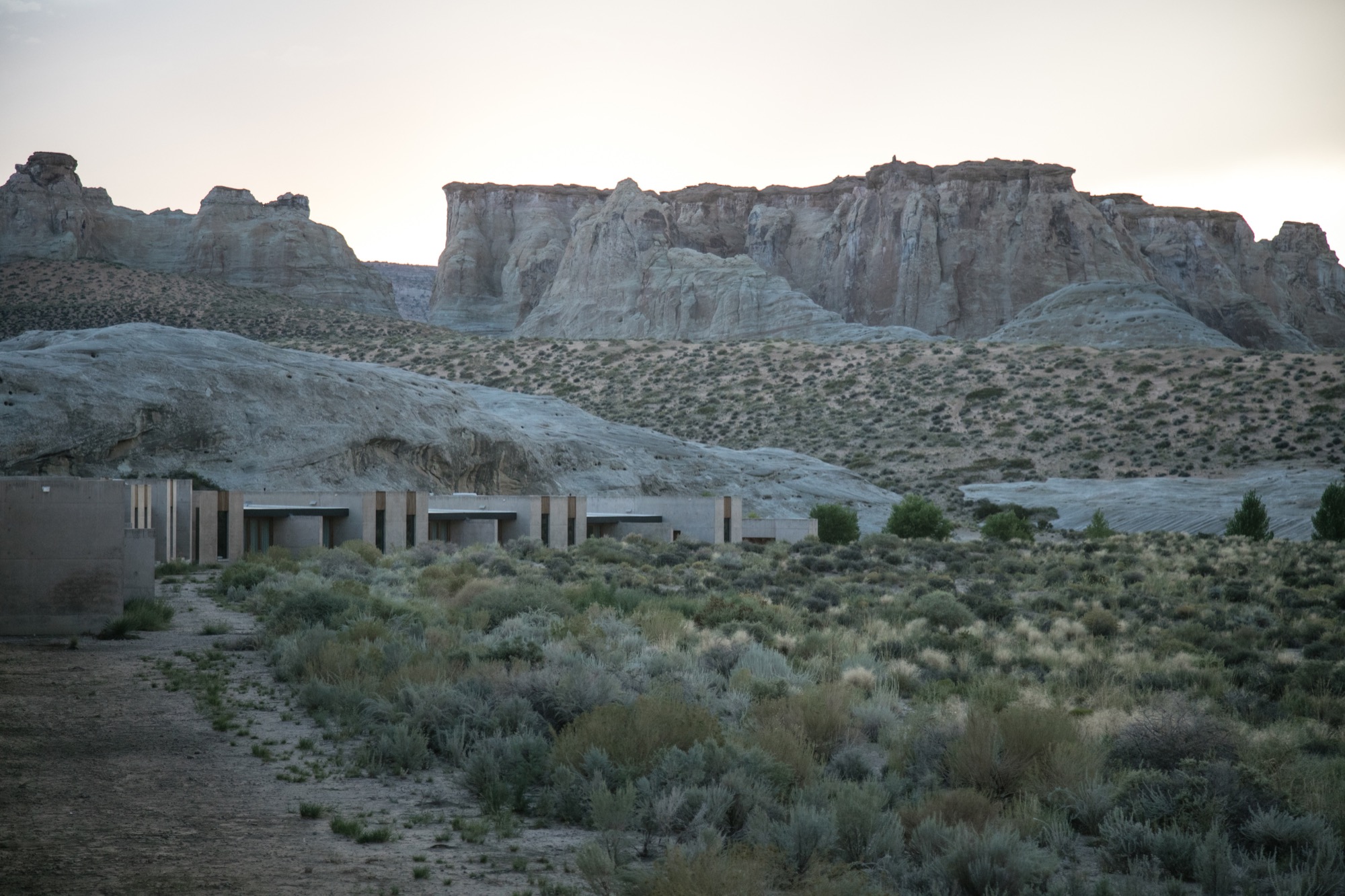
After an unforgettable, slow drive along a private, paved road between colossal ridges and across vast landscapes, we arrived at what I can only describe as a concrete castle hiding in the rocks of Southern Utah. Amangiri was and remains the greatest architectural experience of my life as a photographer. Minimalism, texture, silhouette... all unassuming until I wandered through this artistic haven of concrete walls.
A collaborative design by architects Rick Joy (Tucson, Arizona), Marwan Al-Sayed (Hollywood, California) and Wendell Burnette (Phoenix, Arizona), Amangiri spreads over 600 acres (243 hectares), with 34 suites and a four-bedroom mesa home, a lounge, several swimming pools, spa, fitness center and a central pavilion that includes a library, art gallery, and both private and public dining areas. The architects were commissioned by legendary hotelier Adrian Zecha, whose Aman Resorts have redefined luxury travel in epic proportions.
Arriving at the resort
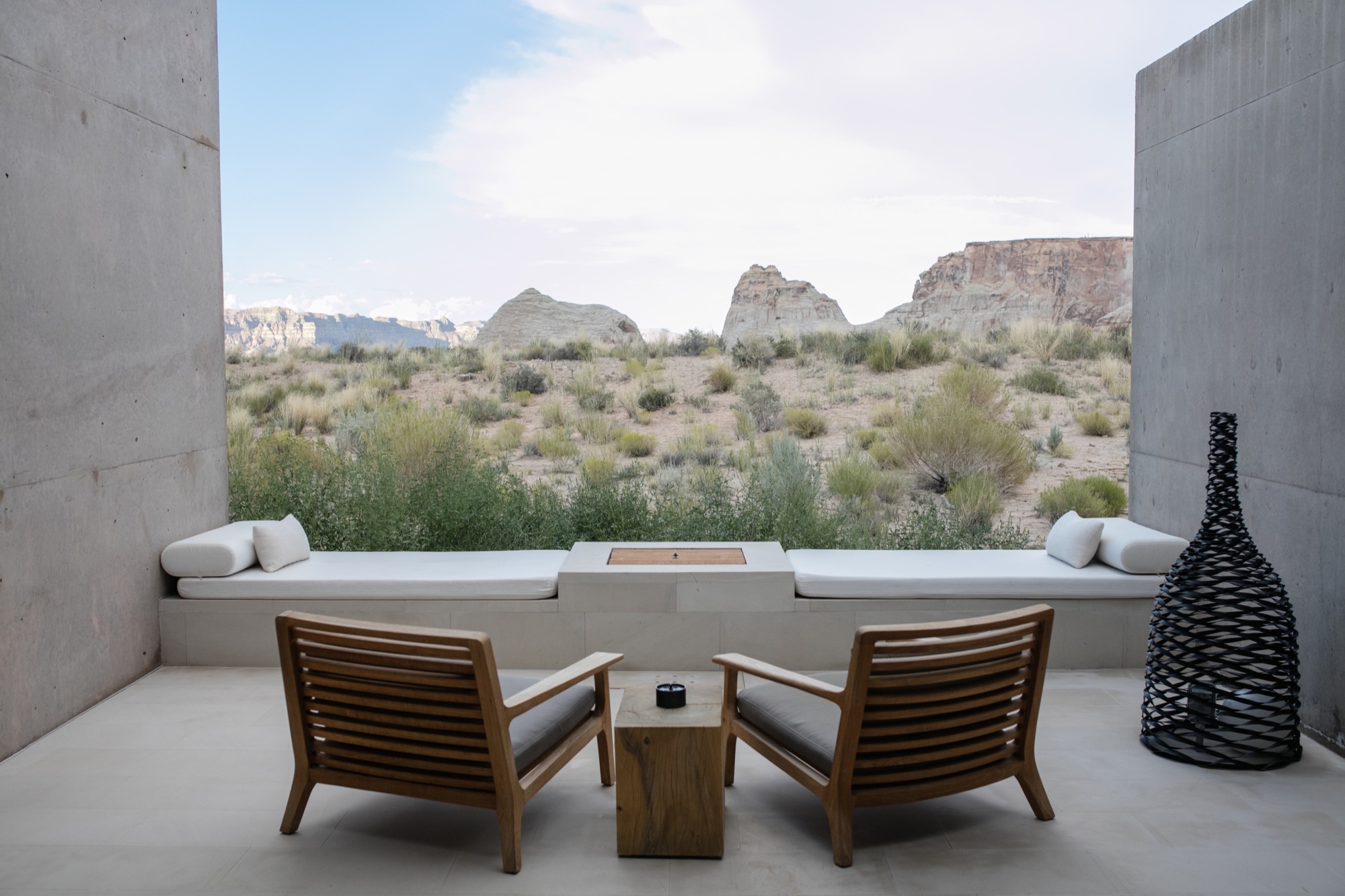
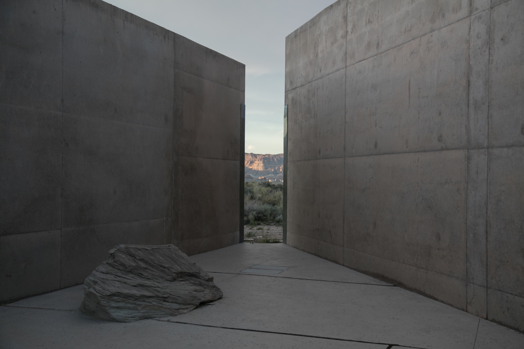
We wandered across the dramatic entrance, past the protruding canyon on the right and stepped into the first breezeway, one of numerous voluminous concrete corridors that connect each pavilion to the next, framing the valleys in the distance and creating different moments of awe every time you step inside. Throughout the day, the sun hits each breezeway at different angles, giving light and shadow new meaning, in a continuous cycle from dawn until dusk. Impressions of grandeur aside, with each stride deeper into these grand hallways, I felt closer to sublime serenity; this indescribable feeling of peace.
We were shown to our room, a one-bedroom suite on the edge of the property, backing to what at first glance reminded me of a set built for a spaghetti Western: rolling tumbleweeds, the squeaks of desert mice, expeditious hares scurrying about, the scene set against luminous canyons and a distant view of Broken Arrow Cave, an indigenous, spiritual sanctuary. Certainly the right place for a creative’s maniacal mind to softly seep into a slumber.
“Certainly the right place for a creative’s maniacal mind to softly seep into a slumber.”
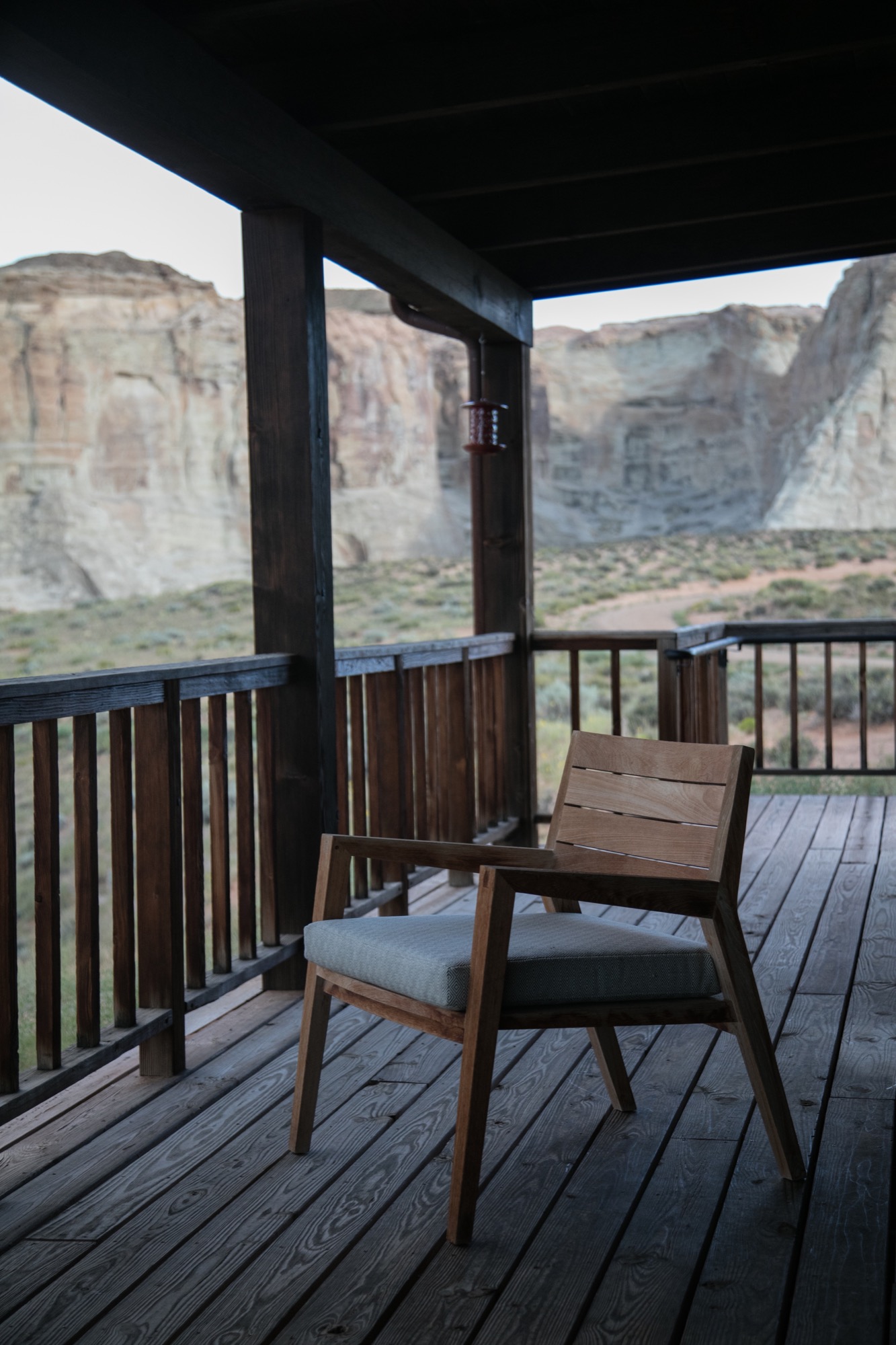
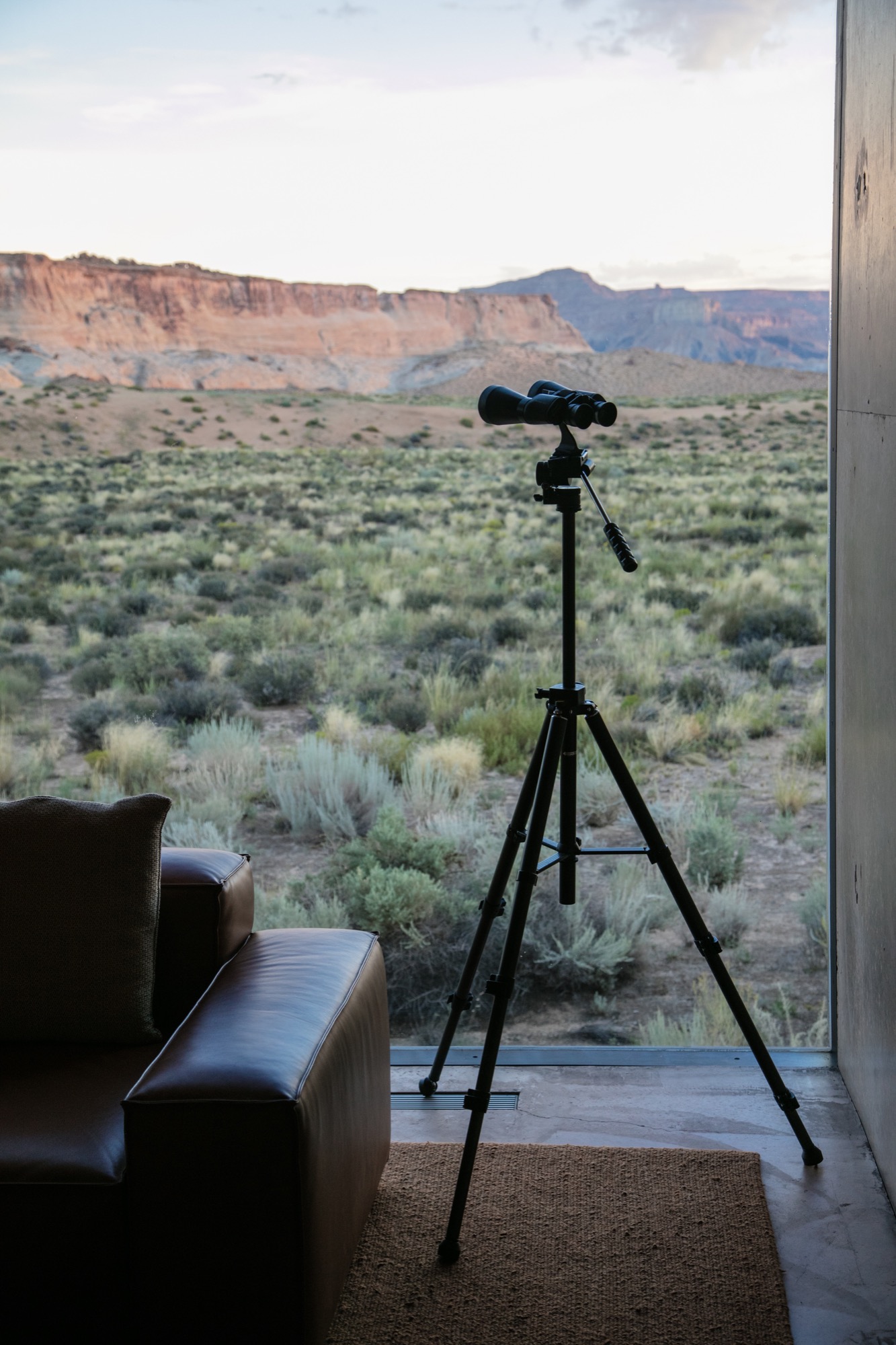
Exploring perspectives
After some rest in our noble lodgings, the photographer in me yearned to roam the grounds, Canon in hand, and to capture the tranquil austerity surrounding us. Being here, each of the architects’ decisions made sense. Moments of monotony broken by jagged slices of deep, sweeping pastel views. The polished concrete’s organic texture caressed by soft waterfalls cascading down the walls. Brief Edenic allusions in fruitful apple trees, ripe for the picking. To grasp we were only a couple hours’ drive from Las Vegas, Nevada, was almost impossible.
Perspective became an intriguing exploration. The architecture condenses expansive canyons into splinters of light and landscape between these grand, polished concrete walls. Rather than being clinical or cold, as unknowing observers might reckon from afar, the stark concrete structure’s monochromatic elegance creates harmonious balance between the arid landscape in a desolate summer climate and shadowed walkways affording gentle breezes of desert wind.
“Perspective became an intriguing exploration. The architecture condenses expansive canyons into splinters of light and landscape between these grand, polished concrete walls.”
Fortress of luxe
Stepping inside Amangiri superseded any notions I had of comfort and luxe. The main pavilion is a multipurpose common area scented by burning fresh sage and sunburned grain. On the walls, copious Ulrike Arnold artworks implement abstraction from the concrete’s silky texture. The interior seamlessly merges textures as if designed by rhythmic dictation. Soft leathers and animal hides, smooth oak and cement surfaces all amalgamate with the rough, rambling terrain that surrounds the resort.
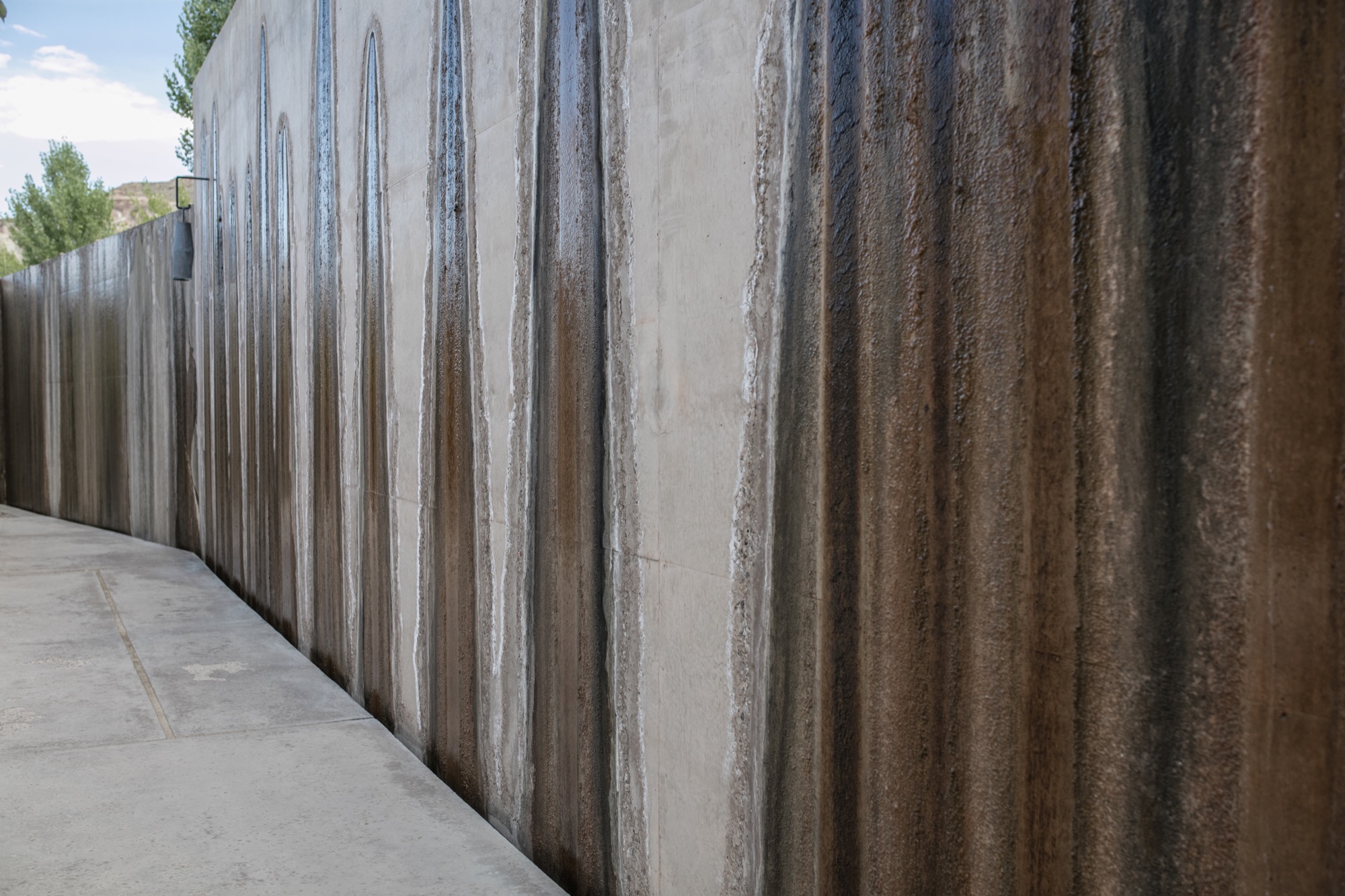
I experienced color in this place like never before—the perfectly blended gradient changes from earth tones to milky hues. The architects of Amangiri also designed all interior features; furnishings, lighting, signage… all the elements reflect the Southwestern landscape and culture with subtle, emblematic references to the Native American tribes that once inhabited Canyon Point.
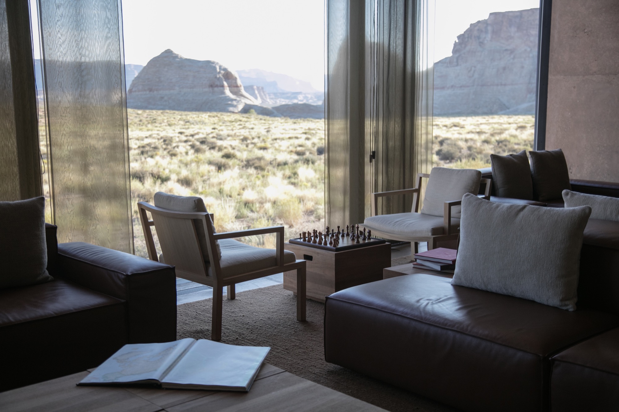
Dining at dusk
The Amangiri invited us to take our first meal alfresco in the Desert Lounge, a rather humbling setting for our dinner at dusk. Sitting across from my friend, charging our glasses of wine and looking out at the immense horizon, overcome with divine silence and calm, we couldn’t speak but simply look and listen. Within this celestial space, I discovered an understated romance in the combination of architecture, nature, and food. Amangiri presents a rather auspicious combination of locally sourced, farm-fresh produce and materials with modern interpretations of Southwestern traditions. Plate for plate, the decadent courses filled us, until we turned in for the night. First day, well spent.
“Within this celestial space, I discovered an understated romance in the combination of architecture, nature, and food.”
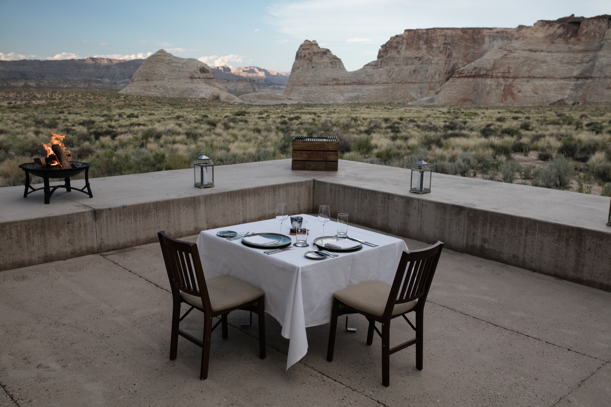
An early adventure
From the crack of dawn, Amangiri had been already awake and buzzing. We were informed to wear shoes suitable for an adventure and were later met by a car. Amangiri sits among some of the continent’s most grandiose, well-protected natural phenomena, and we were booked to experience one the resort is very proud to have on its land. At the foot of the largest of the canyons, they put us in climbing harnesses before we set off on a Via Ferrata, Italian for “Iron road.” This modern style of climbing journey involved steel cables and staples already in place for a more protected climb. The concept is to give inexperienced climbers the ability to enjoy rather dramatic and difficult peaks. And now, with my feet firmly back on the ground, I can say, the peak was indeed spectacular. Nerves aside, climbing to the top allowed me to truly experience the vastness of this beautiful place and the fragility of this natural ecosystem. I do, however, recommend taking an extra few breaths before crossing Amangiri’s signature suspension bridge between two peaks. Walking across with my camera was a rather nerve-racking experience.

After that intense climb and exploring more of the resort’s outdoor adventures, the best decision was to spend our afternoon at the Amangiri Spa. The minimalist design of this serene adults-only oasis manifested the very concepts of relief. Instead of receiving a massage treatment, I spent most of my time self-reflecting in the floating cave’s Persian salt pool. 30 minutes of pure and simple bliss, resting on the surface of tepid water, scored by meditation melodies has become my new idea of elegant content.
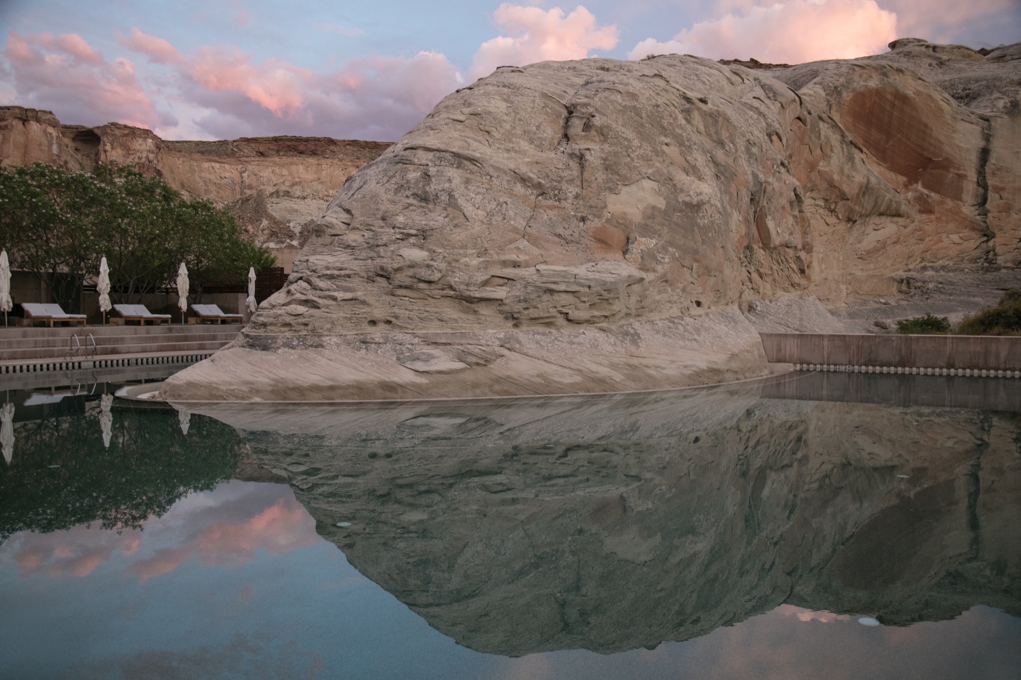
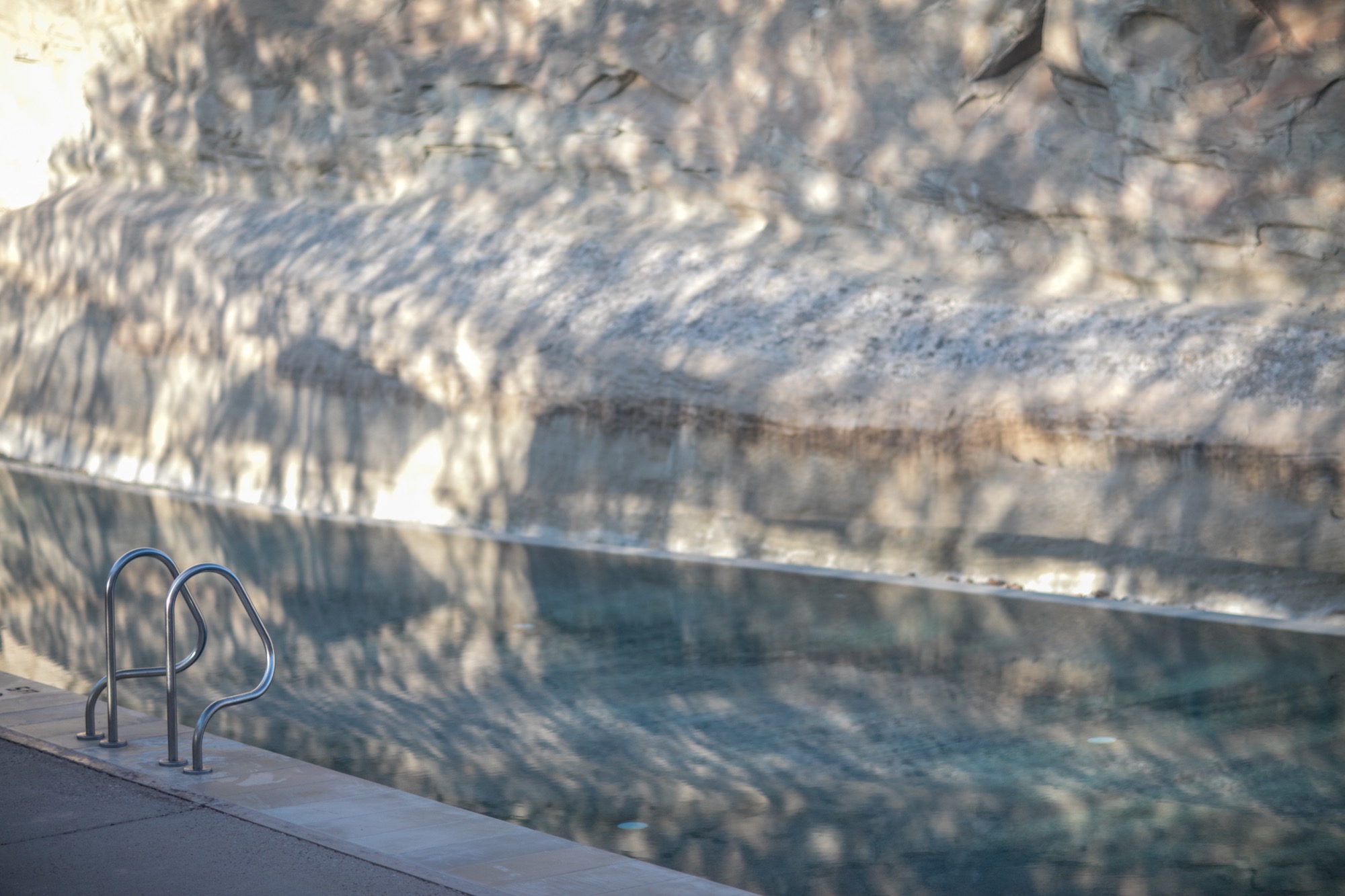
Departing to return
Our departure was suitingly emblematic of our entire experience at Amangiri. As we unhurriedly drove past the minimalist concrete marvel, through the resort’s expansive acreage and past a private plane landing nearby, I began to appreciate the sheer magnitude of my weeklong stay here. The space has inspired a newfound understanding of lines and light, and a greater comprehension of the relationship between nature and man-made creations. As I left, I already longed to return. △
Breakable Minimalism
Maker in the Catskill Mountains: Ceramics artist Kelli Cain creates earthy, minimalist tableware
As she creates earthy, minimalist tableware, Kelli Cain often muses on the people who will sip from her cups and slurp from her bowls. A visit with the many-talented maker in the Catskill Mountains, New York. What is a cup? Is it simply a container for our morning coffee or afternoon tea? Or is it a vessel for more ethereal brews as well—memories of hot chocolates past, aesthetic preferences, even our imagined ties to the person who shaped the cup and the patch of ground where its clay was dug?

These are questions that potter Kelli Cain ponders often as she sits in a sun-filled corner of her farmhouse in the Catskills, throwing cups and plates, coffee pour-overs, and lemon juicers. Cain is thirty-six and—though her earthy, comfortingly simple tableware belies it—just two-and-a-half years into a career as a commercial potter. Before that, she was (and still is) a video artist, composer, and industrial designer. With her husband, Brian Crabtree, she developed a highly successful line of electronic instruments, which the two manufacture under the name Monome from their eighty-year-old refurbished dairy barn. Pottery is one form of creation among many for Cain, and she probes it with the same intense inquiry she applies to them all.
Utilitarian beauty
“I do believe in utilitarian beauty,” she said on a recent afternoon, leaning her red-brown curls against the bank of windows behind her dining table and fixing her clear gray eyes on me. Beyond her, willows, apple trees, and meadow grass formed layer upon layer of green, ensconcing us in a private, summery world that felt much more than its three hours from New York City. “I think it’s really important that we have a respect for everyday objects, and I think the more energy put into a thing, generally the more we have respect for it.”
“I think it’s really important that we have a respect for everyday objects, and I think the more energy put into a thing, generally the more we have respect for it.”

I had driven up to the farm earlier that day, winding into the mountains on Highway 10 past the little town of Delhi with its peeling Victorians and weekend vacationers, and finally down a gravel drive into a valley where a man with buzzed hair and a long red beard stood knee-deep in garlic stalks, clipping off their spiraled tops (this turned out to be Crabtree). Cain was inside, boiling udon noodles and ladling broth into handmade bowls for our lunch.
“These are such magical little nuggets of flavor,” she announced, spooning a sweet-and-sour pickled shiitake from a Ball jar and slicing it into one of the bowls. She and Crabtree grew the mushrooms themselves in a stack of sugar-maple logs below the house. They also cultivate an apple and pear orchard for cider, grow vegetables, raise chickens, hold concerts, make music and art, and run their ceramics and electronic instrument businesses. On the wall of Crabtree’s workshop hangs a beach-towel-sized print by the Minneapolis-based artist Piotr Szyhalski that exclaims, “We are working all the time!” When I asked Cain if the slogan reflected her life with Crabtree, she replied, “If by work you mean doing things we enjoy, then yes.”

That life of shared creation stretches back almost to the day they met, in their first week of graduate school at the California Institute of the Arts. Cain was studying film and experimental animation, Crabtree, musical composition; they met at the library, where Cain was checking out a book on papier-mâché puppets. Very soon, she said, they became “everything”— friends, co-creators, romantic partners. Their first project together was a mechanical installation involving microsculptures and videos. Years later, a similar joint project led Cain to ceramics.
Finding ceramics
For that project, she and Crabtree wanted to make a group of tiny robots tap on clay sculptures inspired by bee and wasp architecture. Despite Cain’s complete lack of ceramic experience, she decided to make the sculptures herself—which, she noted as we slurped our noodles, “was a hilariously naïve thing to do.” Her three-month crash course in ceramics went forward, however, and it turned out Cain was a natural. An elderly classmate even commented that she should do it for a living. Cain brushed the comment off: She was just starting to build up Monome with Crabtree, and couldn’t imagine a life making cups.
Six years later, she reconsidered. By then she and Crabtree had fallen in love with the Catskills, bought their farm, and started to renovate its dilapidated buildings and plant its fallow fields. Around that time Cain fell seriously ill and was forced to spend an extended period in the hospital.
“When I came out,” she recalled, “I had a little bit of an epiphany that I needed to do something physical, to make things out of physical materials.” Encouraged by the comment from her former classmate, she decided to buy a wheel, kiln, and other equipment to set up a pottery studio.
“I had a little bit of an epiphany that I needed to do something physical, to make things out of physical materials.”

The first project she set for herself was throwing a series of bells. To get the tone right, she had to learn how to create continuous shapes with handles and walls of even thickness. From those she progressed to objects she wanted to use herself: deep, cone-shaped bowls to ladle her beloved udon noodles into, squat coffee pour-overs for her morning brew, glossy bottles to hold the milk from the goats she and Crabtree raised for several years.
The day I visited, her orderly studio was filled with projects at various stages of completion. On a large worktable sat two custom-order bowls (commissions from studio visitors account for the bulk of sales, she said), an assortment of juicers, cups, and bowls to restock inventory, and several prototypes for a line of candleholders. Finished tableware glazed mostly in whites and earth tones lined two large shelves.
Cain mixes her own glazes and combines them in her work with raw surfaces that rub pleasantly against the hand. Often, the farm’s landscape inspires her palettes. Cool whites evoke sky reflected off snow, and browns recall patches of bare earth (snow covers the farm for five months of the year). She told me she had recently tested sixty different shades of white, and had plans to try out more.
“I’m going back to white,” Cain said, taking a small corked vessel into her hands and rotating it to show me the gentle play of textures and tints. “I like minimalism. The variation of one color is such a beautiful thing.”
“I like minimalism. The variation of one color is such a beautiful thing.”
The ghost
Despite her current absorption in utilitarian beauty, Cain sees tableware production primarily as a way to acquire the skills she needs in order to incorporate ceramics more fully into her art. She has already begun to do so. Over the past two years she has created a series of ceramic spheres for use by the Stockholm-based master juggler Jay Gilligan. In performances filmed against the gorgeous frozen landscapes of Iceland and set to music by Cain, Gilligan lets the spheres drop and shatter, toying with the audience’s nervous hope that he will preserve the fragile objects. “My whole point was to inadvertently be in the room with him and almost choreograph his movement, because fear is now an element,” Cain said.
In a way, the concept echoes her fascination with ceramics as a secret bridge between herself and the people who use her cups and bowls in their daily lives. When I mentioned the parallel, she laughed. “Maybe it’s my obsession with being the invisible force in the room. I really think I might have a problem with needing to be the ghost,” she said. She was half joking, but as I said goodbye and drove away into the hills, I wondered: Perhaps the ghost was precisely what gave her objects their quiet, distinct beauty. △

