Inspirations
Explore the elevated life in the mountains. This content debuted in 2015 with Alpine Modern’s printed quarterly magazine project.
Editor's Choice: Concrete Beauty
5 brilliant examples of use of the quintessential building material that helped to define the aesthetics of modern architecture.
Where would modern construction be without concrete? The building material is not only an essential element of modern architecture, it helped to define it's aesthetic. Equally, the cabins, homes, and resorts in these stories—collected from the printed Alpine Modern magazine as well as this Editorial—are unique for their use of concrete.

Refuge in Concrete
Refugi Lieptgas is the negative imprint of its ancient predecessor. Read the story→
The Swiss Art of Alpine Luxury
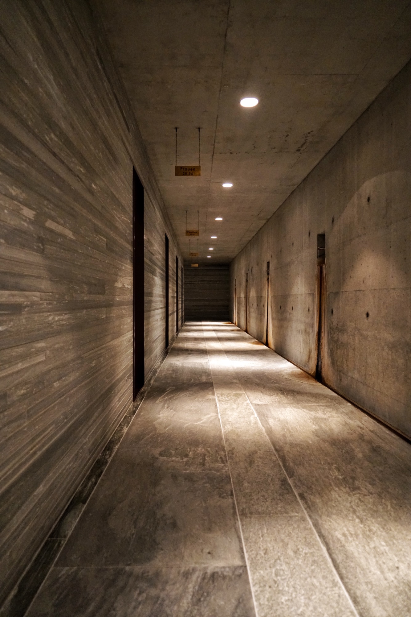
Jonathan Ducrest’s photo essay portrays the luxury hotel 7132 in Vals, Switzerland, with its iconic thermal baths designed by Pritzker Prize-winning Swiss architect Peter Zumthor. Read the story→
The Soul Catcher
Peter Haimerl’s progressive designs save derelict farmhouses. Read the story→
 Camera Lucida by Christian Tonko / Photo by Eduard Hueber
Camera Lucida
An artist’s atelier becomes a looking device into the Austrian landscape. Read the story→
Concrete Perspectives
Australian photographer Jake Weisz discovers the minimalist Amangiri Resort in Southern Utah. Read the story→ △
Camera Lucida
An artist's atelier becomes a looking device into the Austrian landscape
The small studio Vienna architect Christian Tonko designed for an artist friend becomes a looking device into the landscape, set in the foothills of the Austrian Alps.

The minimalist studio in Austria’s Vorarlberg region is a visual device in itself that frames the surrounding alpine landscape in two directions. In addition to a single skylight in the roof, the bilevel space has two vertical openings: The tilted glazing to the southeast lets in optimum sunlight, modulated through exterior screens. On the lower northwest end, a system of weathering steel frames allows the artist, who works in traditional media, to hoist up bronze sculptures outside and suspend them in his direct sight in front of the glass. The sculptures also receive their natural patina this way. The artist uses the upper level for sketching and painting in watercolor and the lower level for working on larger canvases and for sculpting.

Architect Christian Tonko’s choice of raw and untreated materials contributes to the character of a workshop. The interior surfaces are raw concrete, raw steel, and untreated oak. On a tectonic level, the structure responds to the descending site.
A Conversation with Christian Tonko
For whom did you design Camera Lucida?
The artist is a family friend. He recently retired and now wants to concentrate on art. The wish for his own studio has been present for many years . . . until it finally happened.

How is the space being used?
His desire was to create a space that is focused on creating art, yet, at the same time is also suitable for reading a book and looking at the landscape. It’s a small studio for drawing, painting, and sculpting for one person. It’s also intended to be a space for retreat and contemplation.
"His desire was to create a space that is focused on creating art, yet, at the same time is also suitable for reading a book and looking at the landscape."
The structure’s design is inspired by an ancient optical device, the eponymous camera lucida. What's the story behind the name?
Historically, the “camera lucida” is an optical drawing aid. It enables the artist to look at an object and a piece of paper simultaneously and, thus, facilitates tracing the object. At the same time, the term can be literally translated to signify “bright chamber.”

What was your original vision for the design of the studio?
At the beginning was the idea to build a small factory. This is where the semi-industrial character of the design stems from.
"At the beginning was the idea to build a small factory."
How did that initial idea evolve into the final design?
This idea of the small factory influenced the design on various levels. It influenced our choice of materials and surface textures but also directly informed the form-finding process. The volume is basically a box with a skylight, just like an archetypical factory building. Then it is set into the hillside and, therefore, the final appearance comes into being.
What’s it like to be and to work in the space?
It is a calm and bright place. The landscape is very present, but it is easy to focus on work and tune out everything else.

What is the synergy between Camera Lucida and its gorgeous mountain setting?
The building itself acts as an optical framing device, so the views are very clearly framed. At the same time, the building is directed towards the sunlight. A great amount of light floods in through the south-facing tilted glazing, which demands exterior sun protection. So sometimes the building is completely closed and the view is blocked.
The Alps are very close, as the site sits at the end of the Lower Rhine Valley, which means it is at the foothills of the Alps. But the building intentionally looks away from the mountains towards Lake Constance. Moreover, the site next to it is inhabited by four Cameroon mountain goats. They are grazing right in front of the window, which is a great feature as it creates a calm and relaxed atmosphere.
What’s on your drawing board right now?
I am currently working on a building that serves as a base for ski tours. It’s located close to the Camera Lucida project, but at a much higher altitude, in a great mountain setting. △


Concrete Perspectives
Australian photographer Jake Weisz discovers the minimalist Amangiri Resort in Southern Utah
Through his lense and all his senses, Australian photographer Jake Weisz (@jakeling) experiences the calm luxe and the raw surrounding nature of Southern Utah’s Amangiri Resort, where minimalist architecture in monochromatic concrete lies below the buttes and mesas of Canyon Point.
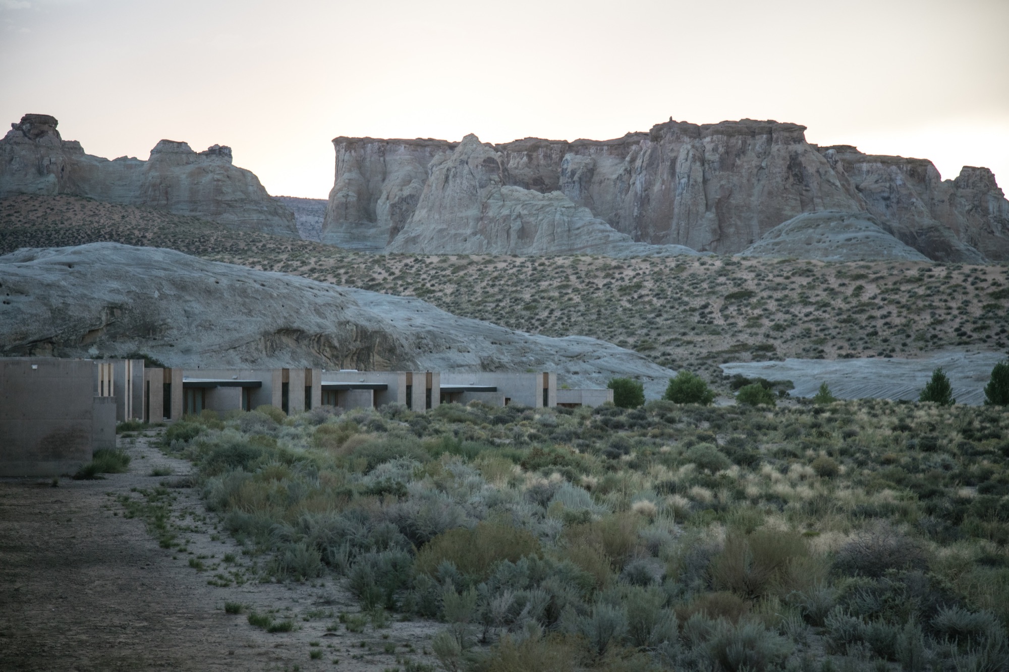
After an unforgettable, slow drive along a private, paved road between colossal ridges and across vast landscapes, we arrived at what I can only describe as a concrete castle hiding in the rocks of Southern Utah. Amangiri was and remains the greatest architectural experience of my life as a photographer. Minimalism, texture, silhouette... all unassuming until I wandered through this artistic haven of concrete walls.
A collaborative design by architects Rick Joy (Tucson, Arizona), Marwan Al-Sayed (Hollywood, California) and Wendell Burnette (Phoenix, Arizona), Amangiri spreads over 600 acres (243 hectares), with 34 suites and a four-bedroom mesa home, a lounge, several swimming pools, spa, fitness center and a central pavilion that includes a library, art gallery, and both private and public dining areas. The architects were commissioned by legendary hotelier Adrian Zecha, whose Aman Resorts have redefined luxury travel in epic proportions.
Arriving at the resort
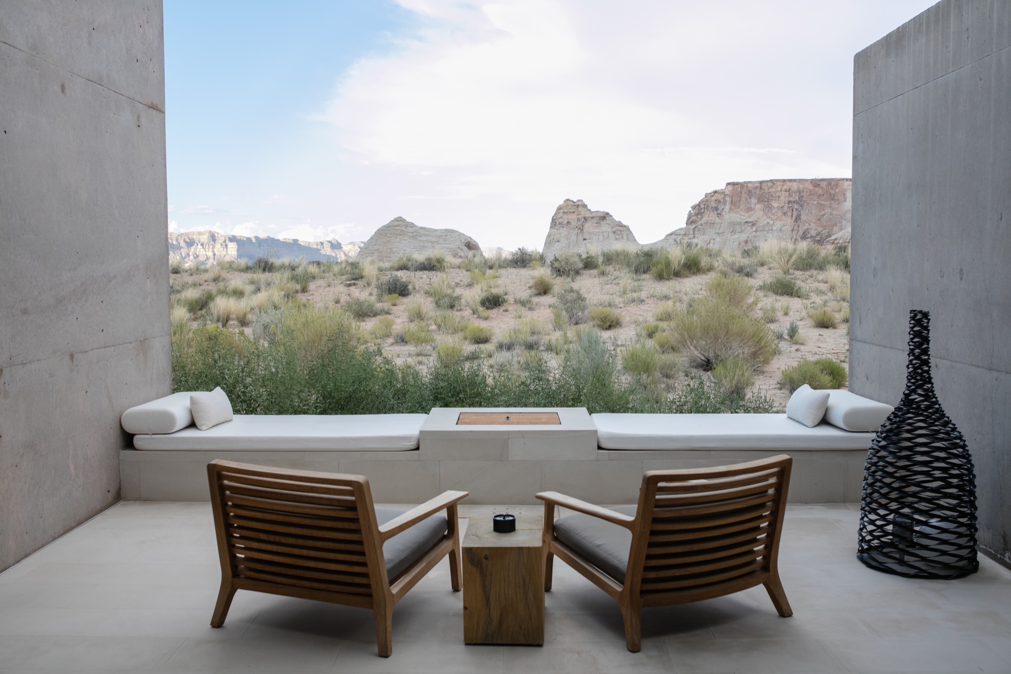
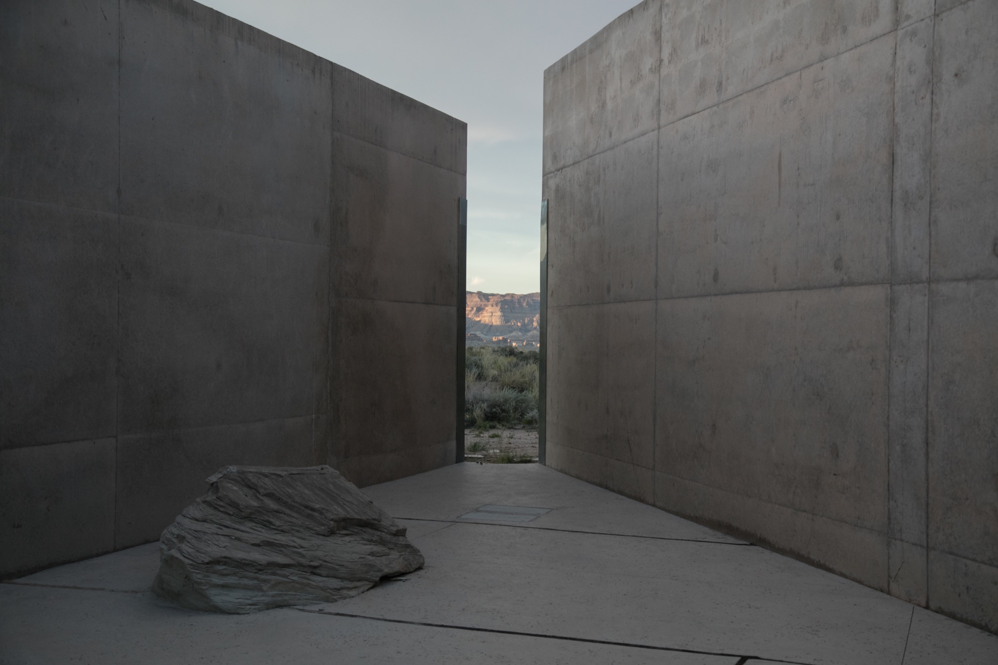
We wandered across the dramatic entrance, past the protruding canyon on the right and stepped into the first breezeway, one of numerous voluminous concrete corridors that connect each pavilion to the next, framing the valleys in the distance and creating different moments of awe every time you step inside. Throughout the day, the sun hits each breezeway at different angles, giving light and shadow new meaning, in a continuous cycle from dawn until dusk. Impressions of grandeur aside, with each stride deeper into these grand hallways, I felt closer to sublime serenity; this indescribable feeling of peace.
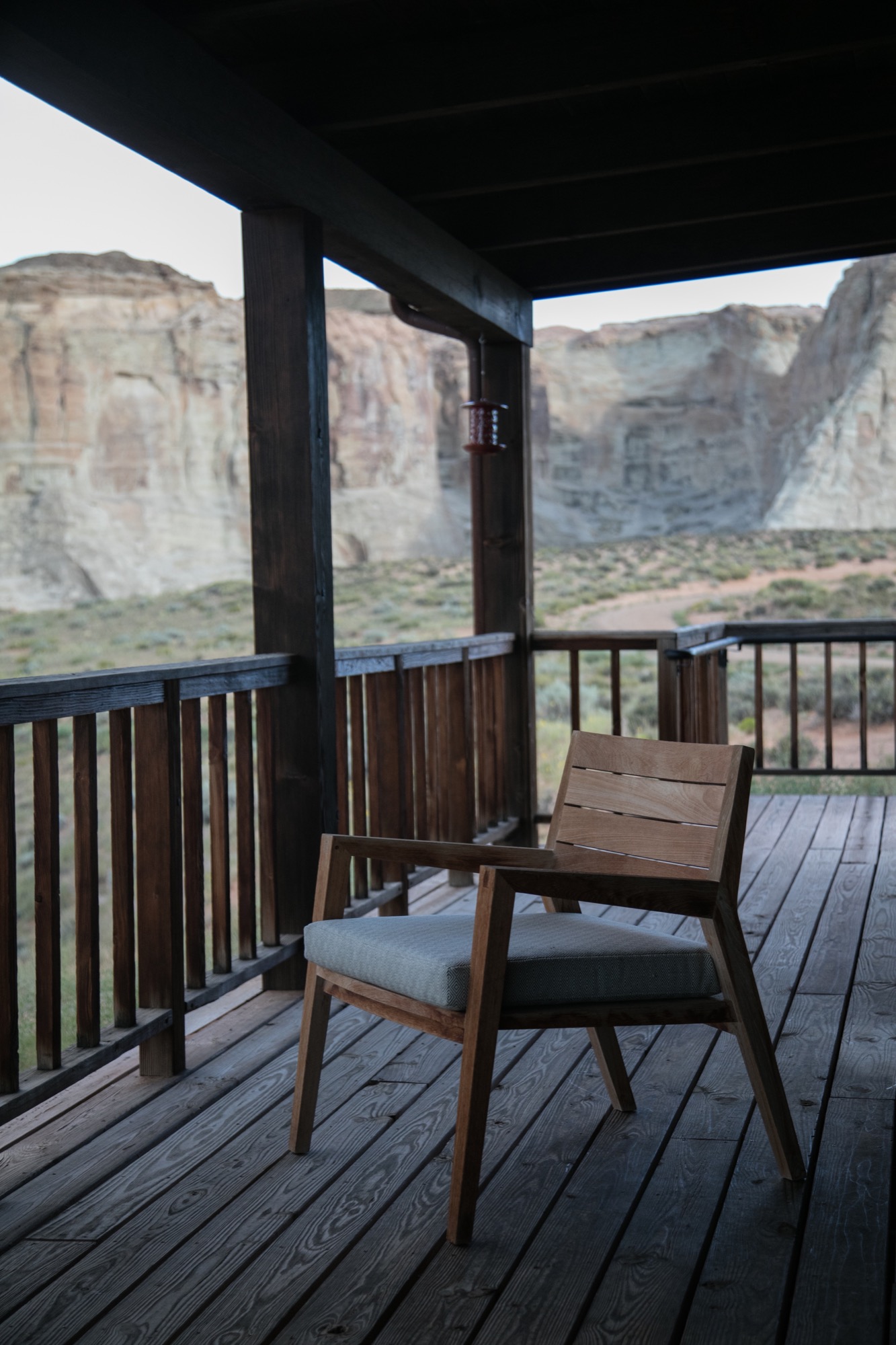
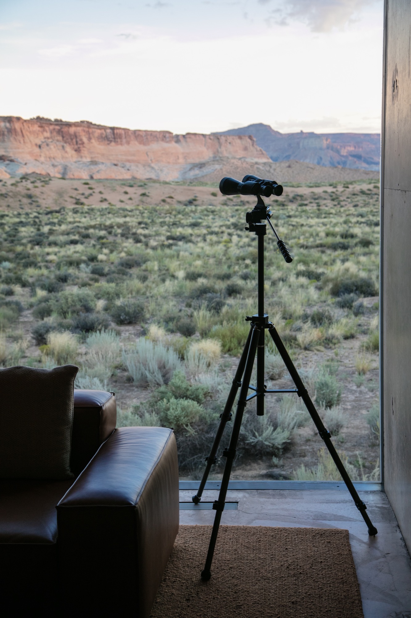
We were shown to our room, a one-bedroom suite on the edge of the property, backing to what at first glance reminded me of a set built for a spaghetti Western: rolling tumbleweeds, the squeaks of desert mice, expeditious hares scurrying about, the scene set against luminous canyons and a distant view of Broken Arrow Cave, an indigenous, spiritual sanctuary. Certainly the right place for a creative’s maniacal mind to softly seep into a slumber.
“Certainly the right place for a creative’s maniacal mind to softly seep into a slumber.”
Exploring perspectives
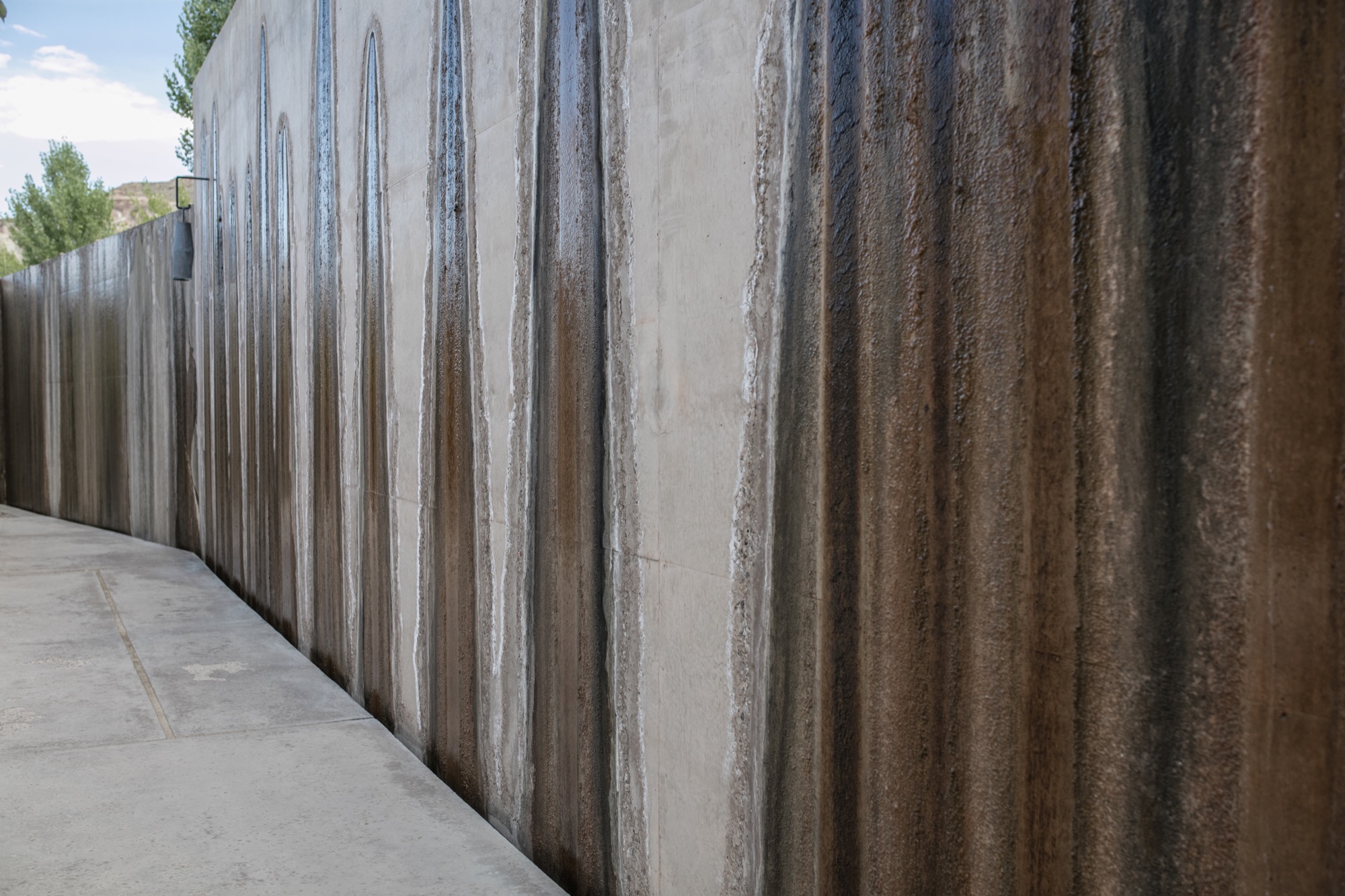
After some rest in our noble lodgings, the photographer in me yearned to roam the grounds, Canon in hand, and to capture the tranquil austerity surrounding us. Being here, each of the architects’ decisions made sense. Moments of monotony broken by jagged slices of deep, sweeping pastel views. The polished concrete’s organic texture caressed by soft waterfalls cascading down the walls. Brief Edenic allusions in fruitful apple trees, ripe for the picking. To grasp we were only a couple hours’ drive from Las Vegas, Nevada, was almost impossible.
Perspective became an intriguing exploration. The architecture condenses expansive canyons into splinters of light and landscape between these grand, polished concrete walls. Rather than being clinical or cold, as unknowing observers might reckon from afar, the stark concrete structure’s monochromatic elegance creates harmonious balance between the arid landscape in a desolate summer climate and shadowed walkways affording gentle breezes of desert wind.
“Perspective became an intriguing exploration. The architecture condenses expansive canyons into splinters of light and landscape between these grand, polished concrete walls.”
Fortress of luxe
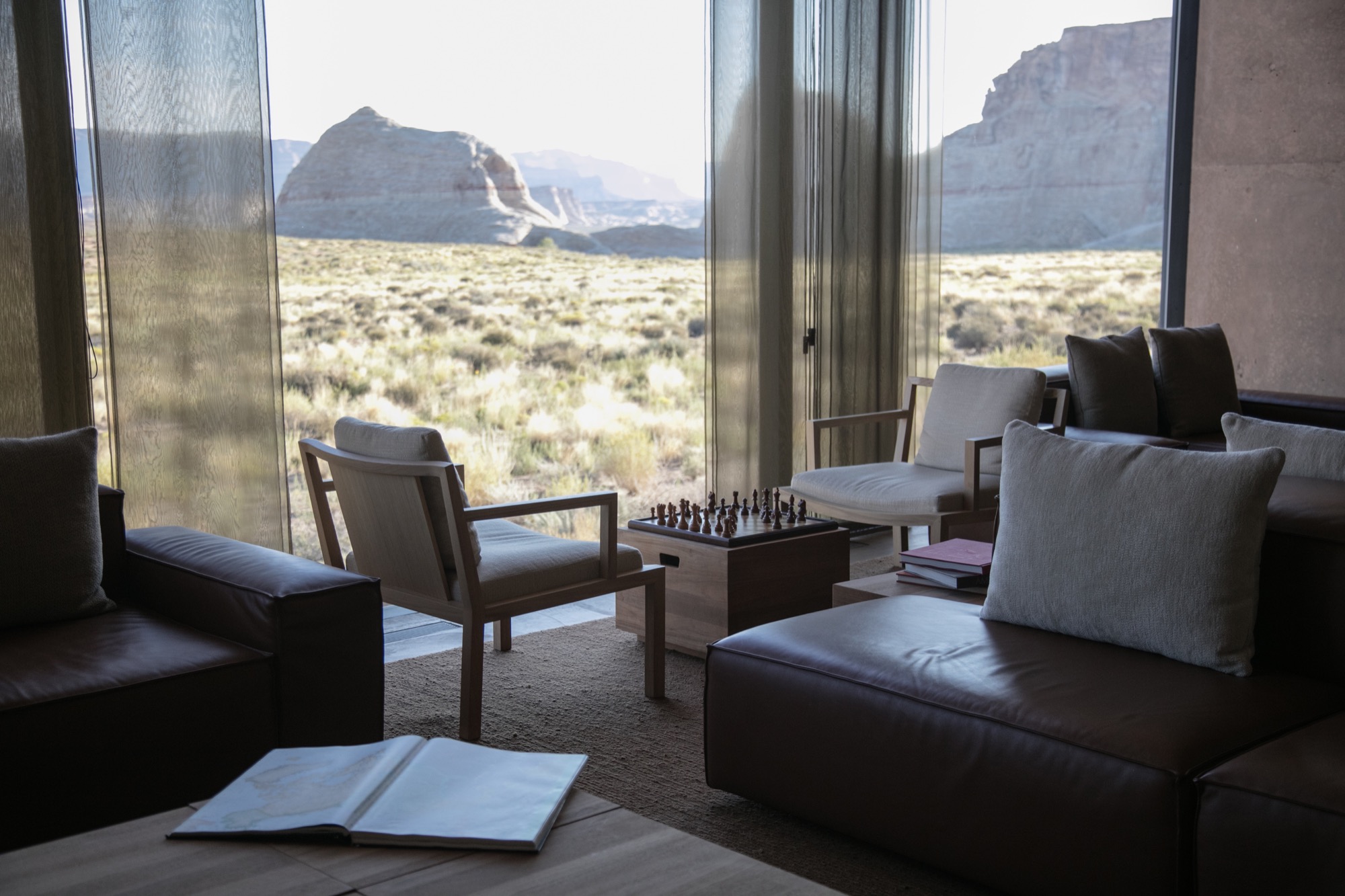
Stepping inside Amangiri superseded any notions I had of comfort and luxe. The main pavilion is a multipurpose common area scented by burning fresh sage and sunburned grain. On the walls, copious Ulrike Arnold artworks implement abstraction from the concrete’s silky texture. The interior seamlessly merges textures as if designed by rhythmic dictation. Soft leathers and animal hides, smooth oak and cement surfaces all amalgamate with the rough, rambling terrain that surrounds the resort.
I experienced color in this place like never before—the perfectly blended gradient changes from earth tones to milky hues. The architects of Amangiri also designed all interior features; furnishings, lighting, signage… all the elements reflect the Southwestern landscape and culture with subtle, emblematic references to the Native American tribes that once inhabited Canyon Point.
Dining at dusk
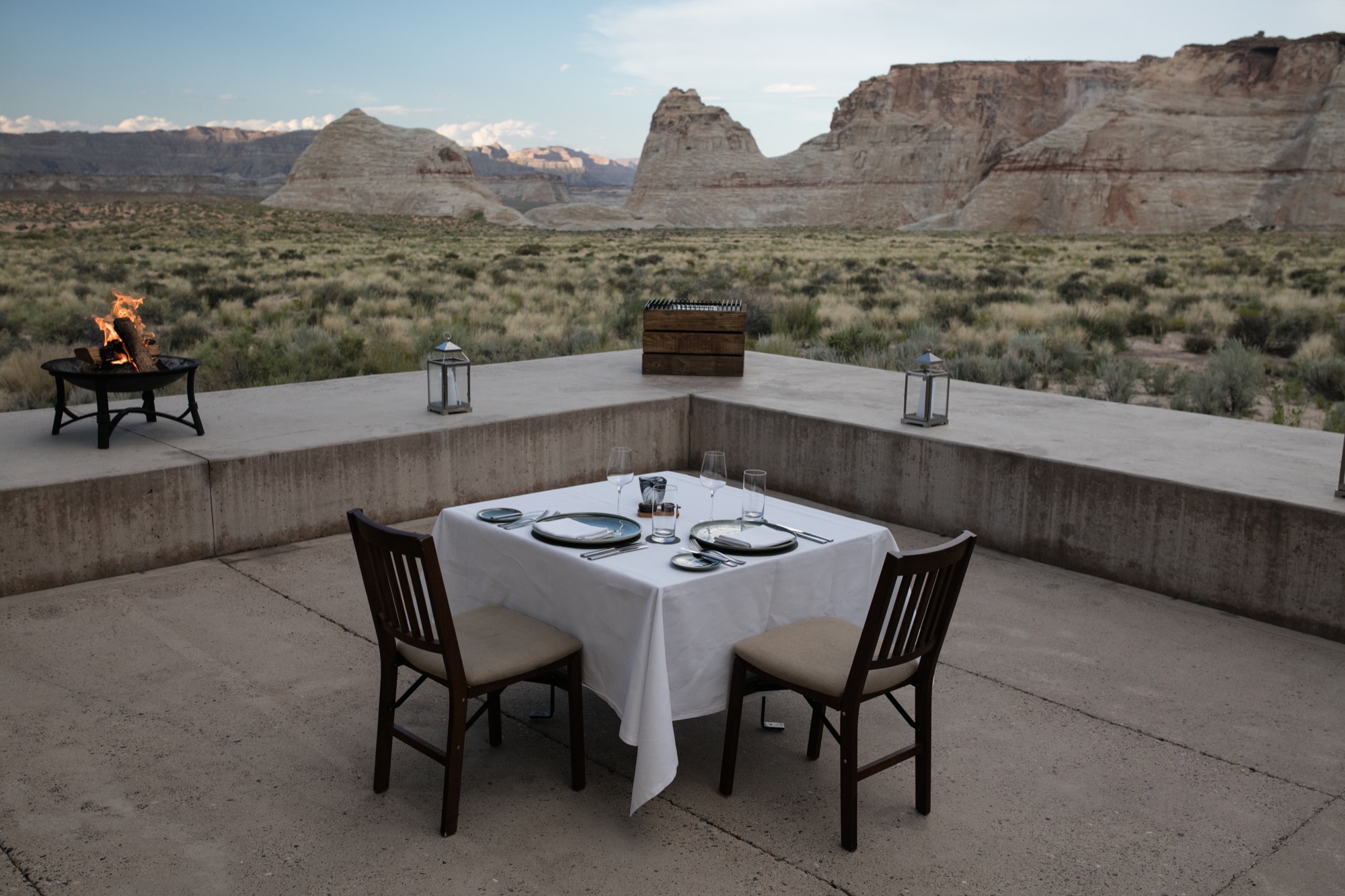
The Amangiri invited us to take our first meal alfresco in the Desert Lounge, a rather humbling setting for our dinner at dusk. Sitting across from my friend, charging our glasses of wine and looking out at the immense horizon, overcome with divine silence and calm, we couldn’t speak but simply look and listen. Within this celestial space, I discovered an understated romance in the combination of architecture, nature, and food. Amangiri presents a rather auspicious combination of locally sourced, farm-fresh produce and materials with modern interpretations of Southwestern traditions. Plate for plate, the decadent courses filled us, until we turned in for the night. First day, well spent.
“Within this celestial space, I discovered an understated romance in the combination of architecture, nature, and food.”
An early adventure
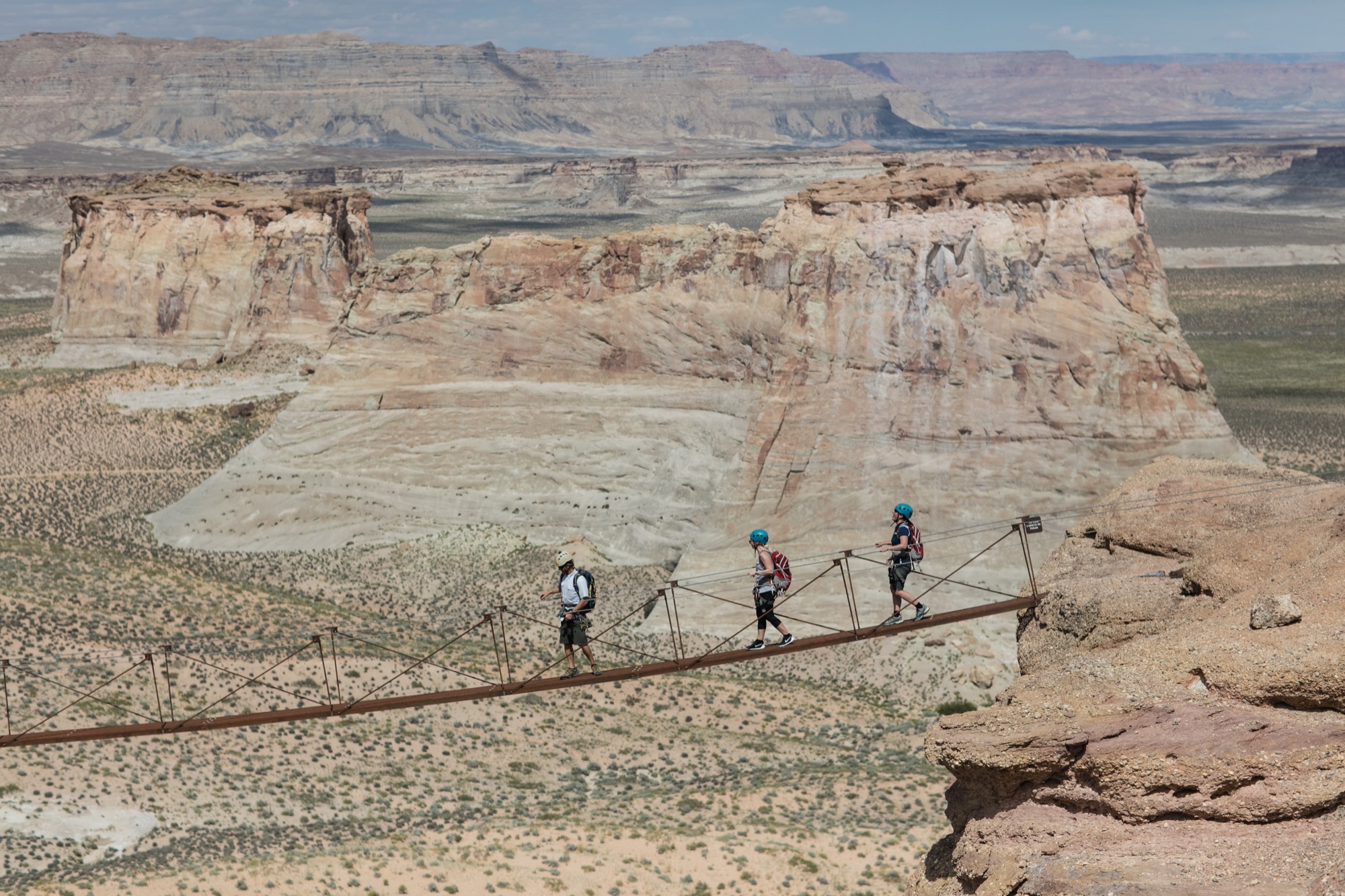
From the crack of dawn, Amangiri had been already awake and buzzing. We were informed to wear shoes suitable for an adventure and were later met by a car. Amangiri sits among some of the continent’s most grandiose, well-protected natural phenomena, and we were booked to experience one the resort is very proud to have on its land. At the foot of the largest of the canyons, they put us in climbing harnesses before we set off on a Via Ferrata, Italian for “Iron road.” This modern style of climbing journey involved steel cables and staples already in place for a more protected climb. The concept is to give inexperienced climbers the ability to enjoy rather dramatic and difficult peaks. And now, with my feet firmly back on the ground, I can say, the peak was indeed spectacular. Nerves aside, climbing to the top allowed me to truly experience the vastness of this beautiful place and the fragility of this natural ecosystem. I do, however, recommend taking an extra few breaths before crossing Amangiri’s signature suspension bridge between two peaks. Walking across with my camera was a rather nerve-racking experience.
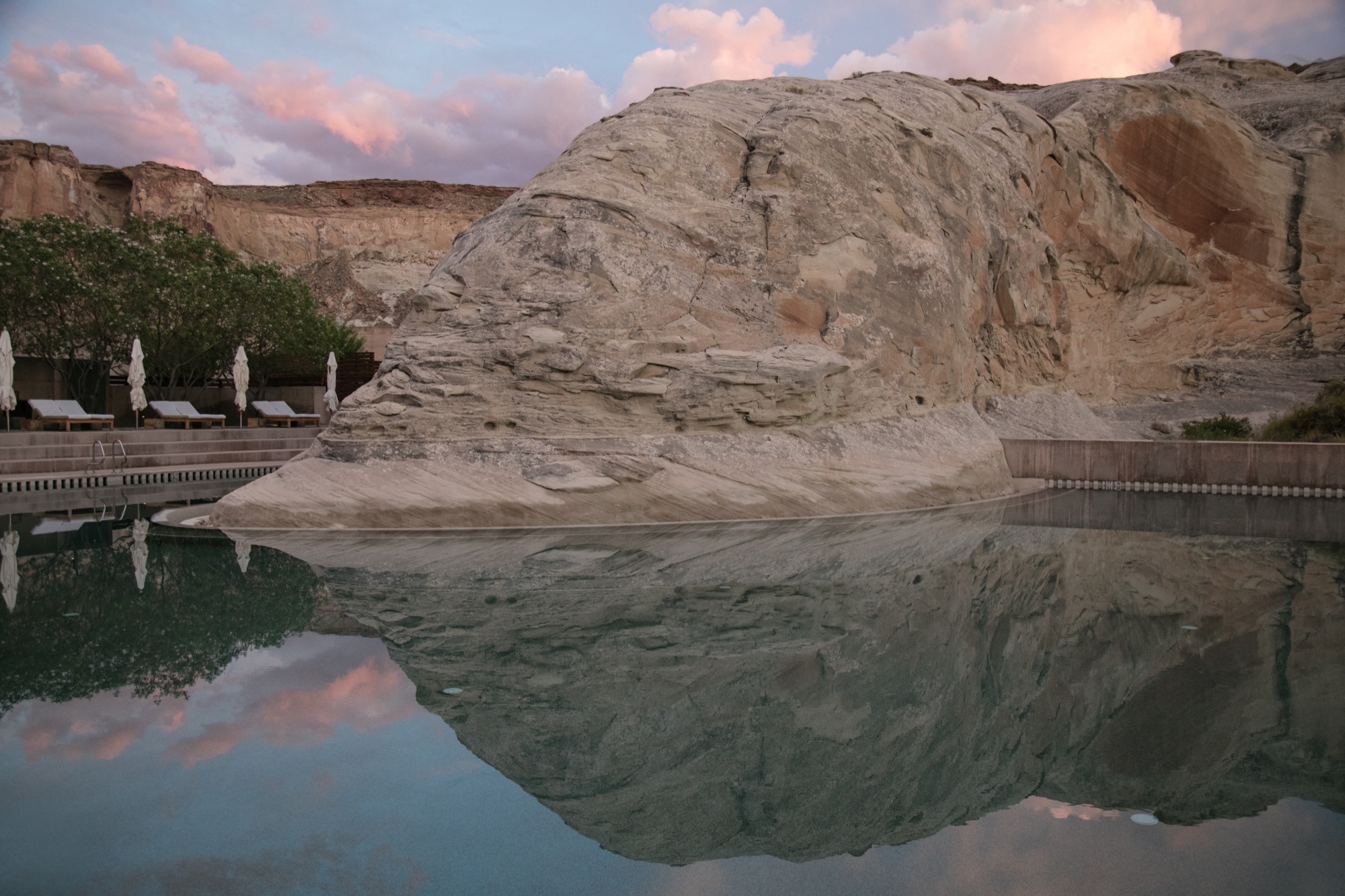
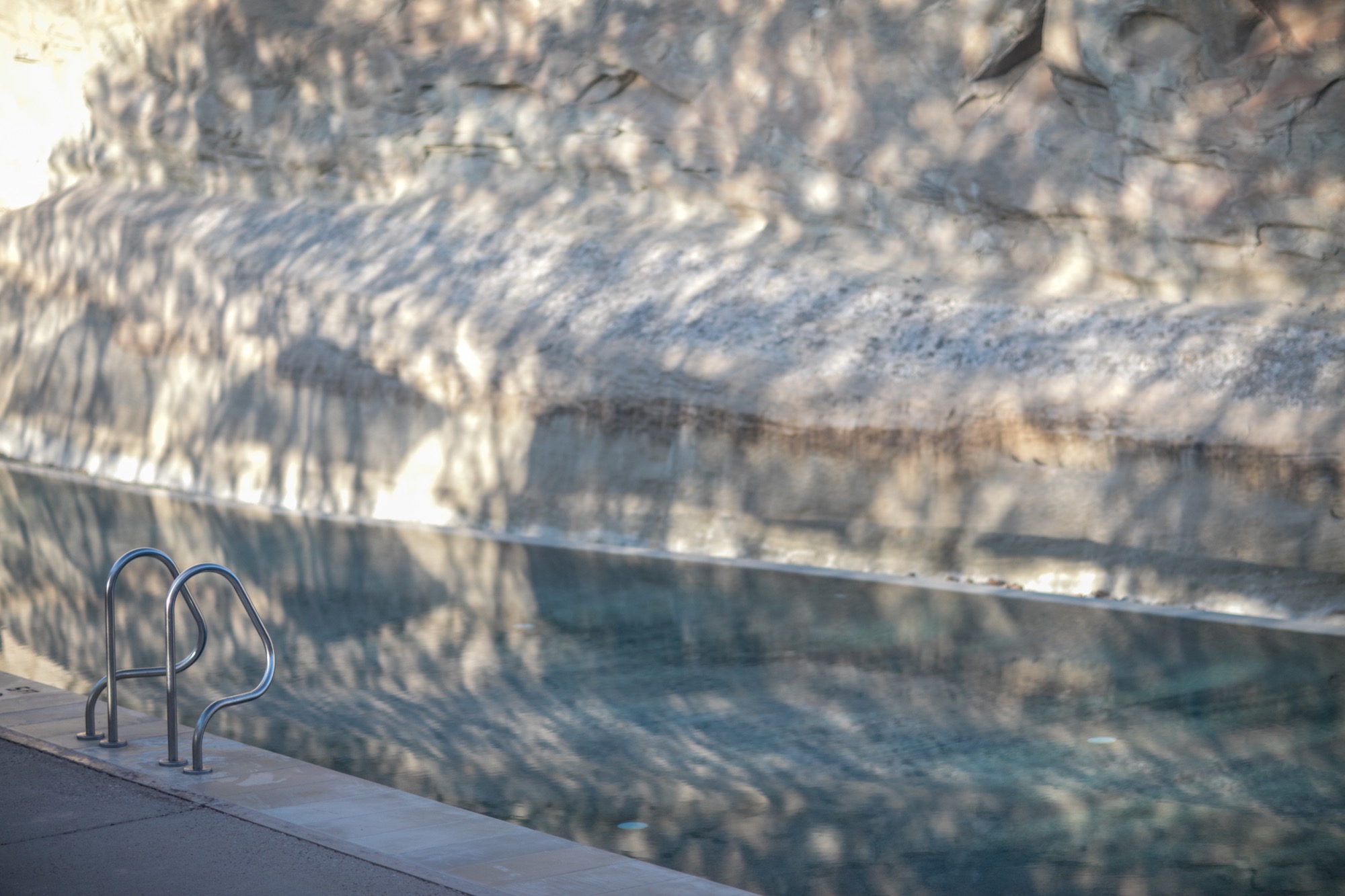
After that intense climb and exploring more of the resort’s outdoor adventures, the best decision was to spend our afternoon at the Amangiri Spa. The minimalist design of this serene adults-only oasis manifested the very concepts of relief. Instead of receiving a massage treatment, I spent most of my time self-reflecting in the floating cave’s Persian salt pool. 30 minutes of pure and simple bliss, resting on the surface of tepid water, scored by meditation melodies has become my new idea of elegant content.
Departing to return
Our departure was suitingly emblematic of our entire experience at Amangiri. As we unhurriedly drove past the minimalist concrete marvel, through the resort’s expansive acreage and past a private plane landing nearby, I began to appreciate the sheer magnitude of my weeklong stay here. The space has inspired a newfound understanding of lines and light, and a greater comprehension of the relationship between nature and man-made creations. As I left, I already longed to return. △
Refuge in Concrete
Refugi Lieptgas is the negative imprint of its ancient predecessor
Using the decrepit log cabin as mold, Swiss architect Selina Walder sculpts a minimalist mountain retreat in concrete, fossilizing the texture and character of the historic hut that once stood in its sylvan spot on the meadow. From the trail, hikers may mistake Refugi Lieptgas for the inconspicuous log cabin that had stood in this very spot for decades. Yet, at second glance, the tiny refuge tucked against boulders at the edge of the Flims forest in the Swiss Canton of Graubünden reveals itself as the negative imprint of the old structure. The stunning effect of the cabin cast in concrete is incongruously sublime; details like the wood grain, the cracks, the door lock set in stone are all true impressions of the past.

Stonewalled Design
The Maiensäss mouldering on the mountain meadow had long served its purpose of sheltering pastoralists during grazing season. Years back, Guido Casty, the 1974 bobsledding FIBT World-Championship silver medalist and local restaurateur who owns the property, had planned to replace the crumbling herder’s hut with a new cabin he could rent out to vacationers. The building permit was denied. The new design needed to somehow incorporate the existing structure. He gave it a rest.
When his itch to tackle the old cabin returned, Casty tasked an architect friend in Basel with a new plan that would comply with the community’s stipulations. Since the project was small and the architect was two and a half hours away, Casty asked Selina Walder of the local Nickisch Sano Walder Architekten to manage the construction. The Flims native had been waitressing for him for many years and graduated from the renowned Accademia di Architettura di Mendrisio, where she had studied architecture under Valerio Olgiati, one of Switzerland’s foremost modern architects.
Walder agreed but didn’t like the design she was handed from the Basel architect. The twist: The building authorities had miscommunicated the structure’s prescribed maximum footprint. As a quasi apology, the local architect was allowed to rebuild from scratch, as long as her plan adhered to the original square footage, and the new design portrayed the character of the old log cabin.
What did that mean? “I struggled with that provision,” Walder admits. “Did I need to rebuild with wood?” She inquired further but was discouraged from asking too many questions that would only have to be addressed with more rules.
Walder’s reluctance to use wood lingered. “The spot was mossy, woodsy, musty,” she remembers. “You could tell the old log cabin hadn’t taken well to sitting on the forest floor.” Besides, the original had been constructed from surrounding trees. And today’s way of driving to the lumber yard and transporting the wood back to this unspoiled spot at the forest’s edge didn’t seem appropriate to her.
“The spot was mossy, woodsy, musty. You could tell the old log cabin hadn’t taken well to sitting on the forest floor.”
Serenity set in stone
Thus, the fossilization idea was born. “I did love the sylvan setting back in there, where the old cabin cowered against the boulders,” Walder says. “I wanted to preserve that, not fuss about a new design. I wanted everything to be the way it was. Except, I didn’t want to rebuild in wood.” Her answer was to cast a negative imprint of what once was, from concrete, to create a simple refuge that—now literally—mirrored the character of the derelict log cabin.
The young architect intended to capture this special place, the woods she had loved since childhood. “I wanted people staying at the cabin to understand the forest in all its beauty, all its fascination, all its facets.” In fall, for example, the new cabin's round skylight gives view to the vermillion crowns of the beech trees above. The main room’s large window is purposefully set low to provide an ideal view over the clearing when sitting at the table. “Deer come out of the woods at dusk. It’s very fairytale-like.”
“I wanted everything to be the way it was. Except, I didn’t want to rebuild in wood.”

Concrete continuance
Walder knew of artists who sculpted works of art from the composite, and she had built countless concrete models in architecture school. While the material wasn’t completely foreign to her, she didn’t know what would happen on site. Casting a concrete shell from the mold of an existing log cabin was an experiment she and, luckily, the builder were curious to dare.
To visualize the construction process for herself and to be able to articulate the steps to her crew, the architect built a model from little sticks and cast it in concrete.
The real hut was set aside by a crane and stripped of anything that wasn’t part of the structure: small laths, twigs, and rocks that inhabitants had stuffed between the logs to chink the walls. The gaps between the logs were then filled with cut-to-fit slats to gain an even leading edge and prevent the concrete mixture from leaking out. Once the foundation was finished, the old-cabin-turned-mold was heaved back in place. The builders constructed the inside of the mold structure with standard form boards. The new cabin was poured in place. After the concrete hardened, the old log cabin was removed and deconstructed.

Poured patina
The original cabin not only lent the new structure its form but also gave it marvelous detailing, most notably a beautiful wood-grain pattern, now preserved in time and stone. The concrete was even the same shade of gray as the old cabin’s weathered wood. The logs left behind a relief ideal for moss to take root and flourish again as it once had.
Walder couldn’t have envisioned all the fascinating effects in advance. “We spent so much time worrying about the construction itself. Will the concrete cling to the cracks in the old logs? Will the corners crumble off?” she remembers wondering. “I was positively surprised and really happy how precise this sculpture turned out.”
Inside, two worlds
Walder decided early on to split the living space into two levels. “Sleeping and living in one room inevitably leads to a camping atmosphere,” she says. The architect aimed instead at designing a much more luxurious retreat with two distinct worlds, upstairs and downstairs.
She wanted guests to feel sheltered in the bedroom below, tucked away in a cave rather than feeling trapped. Thus, she added a large window above the bathtub and a door that leads directly into the forest. “The world of rocks and roots back there reminds me of Alice in Wonderland,” Walder says. “Another door into another kingdom.”

Warm concrete
Concrete may seem to be a debatable material for a cozy cabin in the woods. For Walder, it was the right choice. “The forest in Flims is scattered with the kind of boulders you see from the lower level of the cabin. It’s what makes this area so magical: the caves, the moss-covered rocks. Concrete is not much different. It’s man-made stone. To me, it fits quite well into the setting.”
In fact, some interior features are cast in concrete as well: a pedestal with bathtub and a lavabo on the lower level, and a solid bench along the entire wall beneath the large window on the main floor.
“People are always afraid concrete would be cold,” Walder says. The concrete inside Refugi Lieptgas is actually heated with an under-slab radiant heating system that even loops through the tub and the bench. The concept would not work for a private cabin that’s used only occasionally, because the concrete takes a long time to warm up. With the rental cabin booked solid, however, the stone can continually retain its warmth.

Taking refuge
Literally left without a roof over their heads during the remodel of their own house last fall, Walder and her partner, Georg Nickisch, took refuge at Refugi Lieptgas for a week with their infant daughter and the dog. The architect is pleased with her firsthand experience. “Living there feels very cozy, very protected and private—and at the same time elevated,” she reminisces. “Everything is tiny, but you don’t feel the smallness. You’re in your own small kingdom, separated from the world.” △
"Living there feels very cozy, very protected and private—and at the same time elevated.”

