Inspirations
Explore the elevated life in the mountains. This content debuted in 2015 with Alpine Modern’s printed quarterly magazine project.
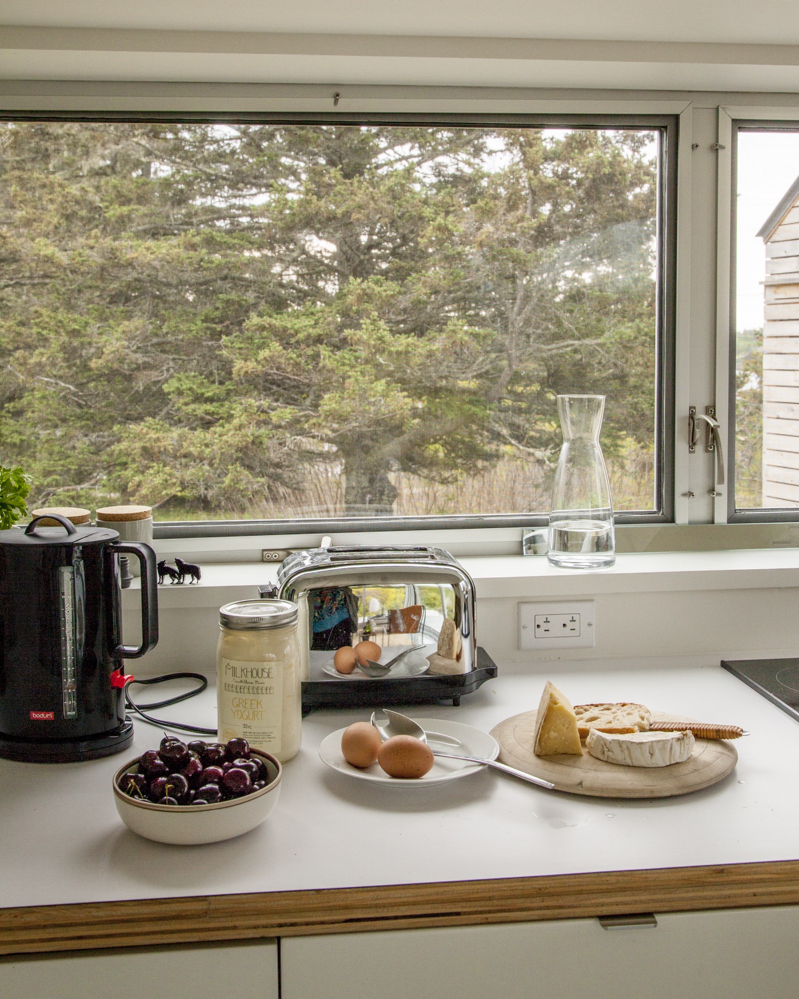
A Cabin Cluster in the Quarry
Three small pavilions connected by a deck form a summer retreat in Maine that balances privacy with a panoramic view—all in less than 900 square feet.
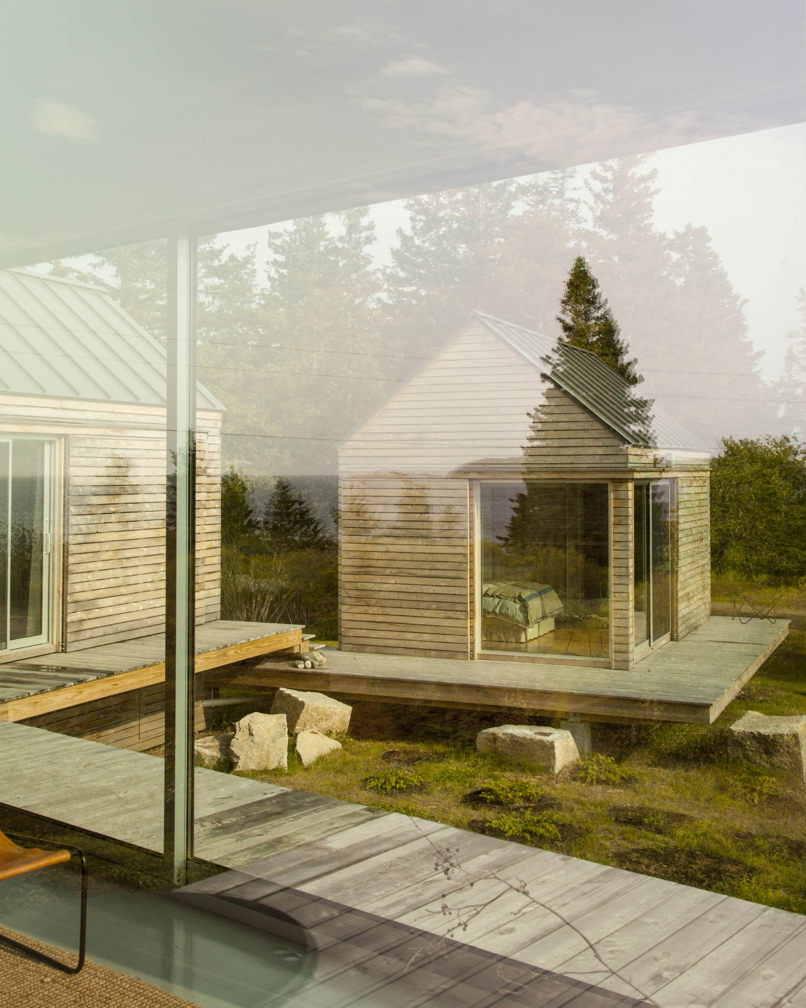
 It’s perhaps misleading to call three structures a summer house. But measuring 890 square feet (ca. 83 square meters) altogether, referring to them as a set of summer houses would imply something grander than three cabins tucked into a defunct granite quarry. From a distance, the buildings look like a cluster of bait shacks you might see on the harbor side of Vinalhaven, the island where they sit.
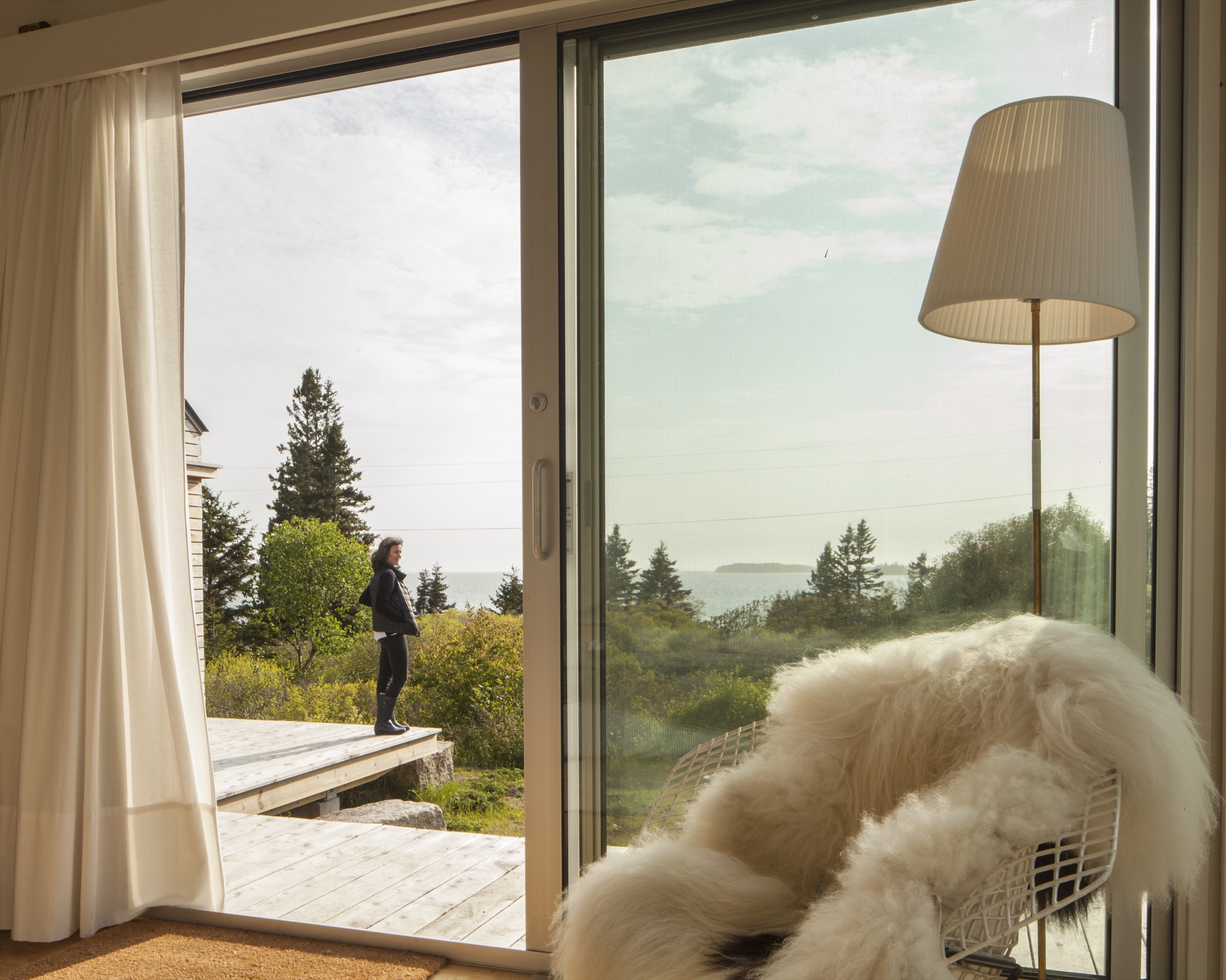
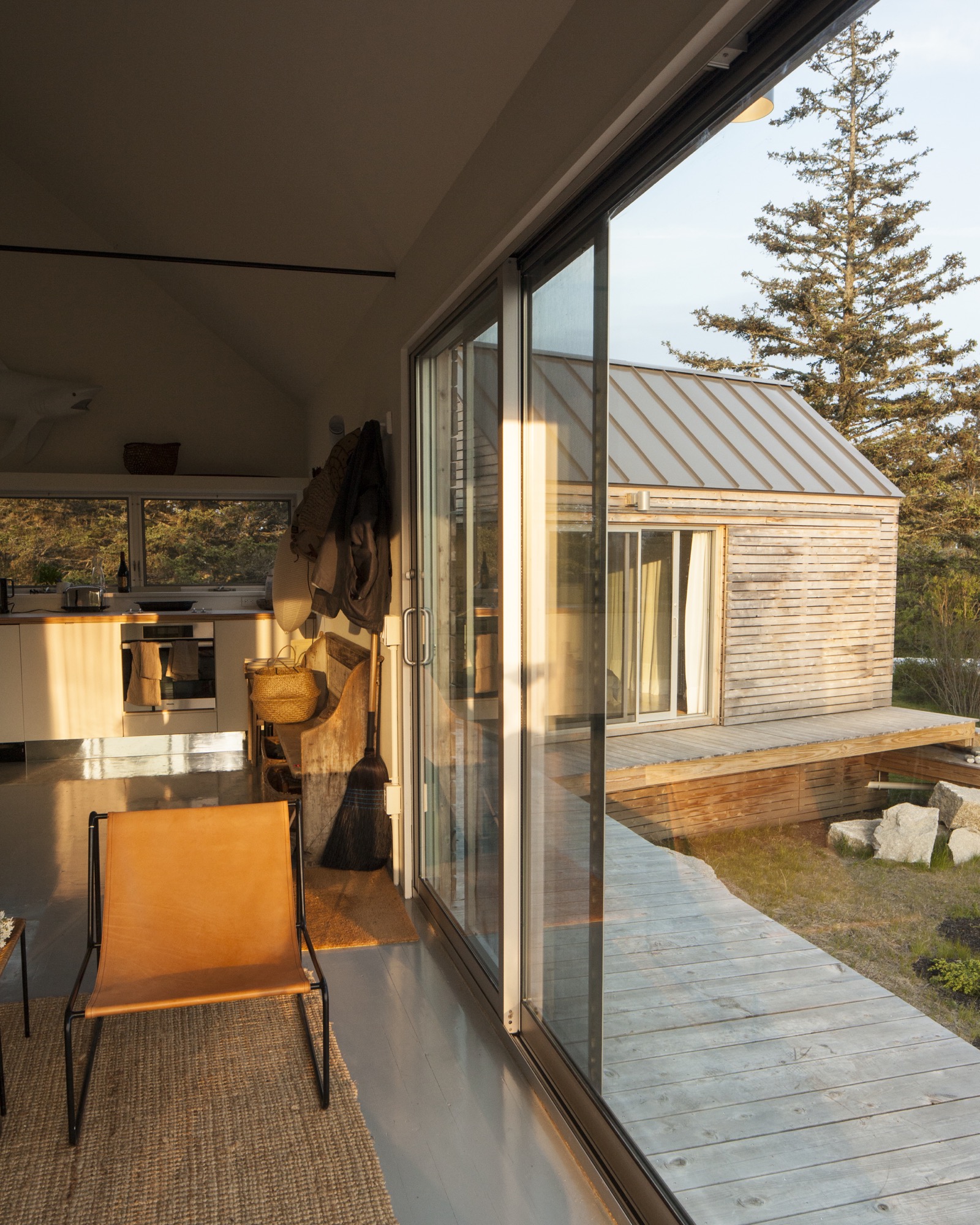
On a sloping site near a defunct rock quarry on the remote lobster-fishing island of Vinalhaven, Maine, a three-part summer home overlooks a framed view of Penobscot Bay. Working around the site’s unique topography, design-build firm GO Logic created each structure at varying elevations.
Fifteen miles offshore from the town of Rockland, Maine, the island is its own world, its very separateness a part of its magic: It can win people over in one visit, which is all it took for Nick and Nadja van Praag. Both expats—he from England, she from Austria—they’d only just arrived when a photo in a Realtor’s window caught Nick’s eye.
“We came to the island of Vinalhaven several years ago and immediately, totally fell in love.”—Nadja van Praag, resident
Restless in DC
At the time, Nick’s work with the World Bank had brought the couple to Washington, D.C., where they had a classic Georgetown house, yet felt a persistent sense of unrest. It drove Nadja crazy to be in America, where, as she says, "the inside/outside thing was invented!" Living like center-city Europeans in a four-floor building, the van Praags daydreamed about an open, single-story home, while Nadja kept close watch on a Richard Neutra house nearby, hoping a For Sale sign would go up.
A fateful trip to Vinalhaven
"Then we came to Maine, and didn’t expect anything like that," says Nadja. But there it was, for sale, a "little box" on Vinalhaven. "Nobody else wanted this house," she recalls. "They were all looking for the perfect New England shingled-whatever."
However, their tiny square overlooked a tiny rectangle: a 700-square-foot mobile home. The van Praags realized that if another family purchased the trailer to build a larger home facing the channel, the quiet setting of the disused quarry would significantly change character.
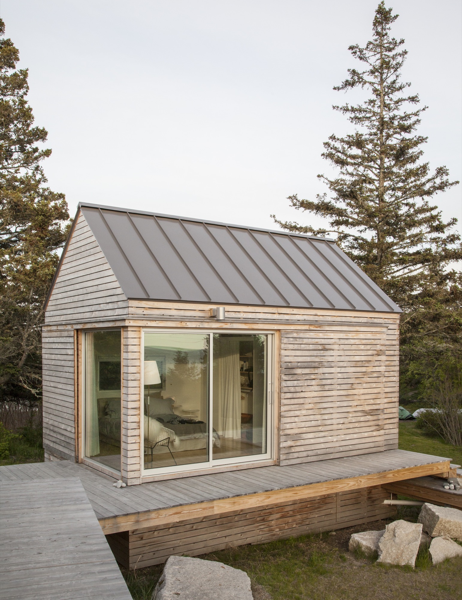
“We did our best to tuck the buildings into the site—the goal was to get up high on a perch. It was a matter of setting that elevation and working back down with the topography.”—Riley Pratt, architectural designer
Building over time
A few years passed, the van Praags made interior renovations to the home with local builder, caretaker, and lifelong resident Mont Conway, then—when it became available—they bought the plot of land where the mobile home once sat, less than 100 yards down the path. Around the same time, they met Riley Pratt, an architectural designer who summers up the road. Pratt, of the Belfast, Maine–based firm GO Logic, knew Conway from pickup soccer games on Vinalhaven but also by way of his reputation.
Inspired by Alvar Aalto sketches and the quirky quarry site
When the van Praags expressed interest in building a new structure on the extended property, Pratt mentioned Alvar Aalto sketches he had seen for a deconstructed summer cottage in Finland, where the rooms (and, of course, a sauna) were broken out as separate buildings focused around a courtyard. Nadja took to the idea of a peeled-apart, three-volume structure immediately: The design was an exploded version of their house, also a three-part structure, and building it would mean their three grown children could have a place to stay when they visited.
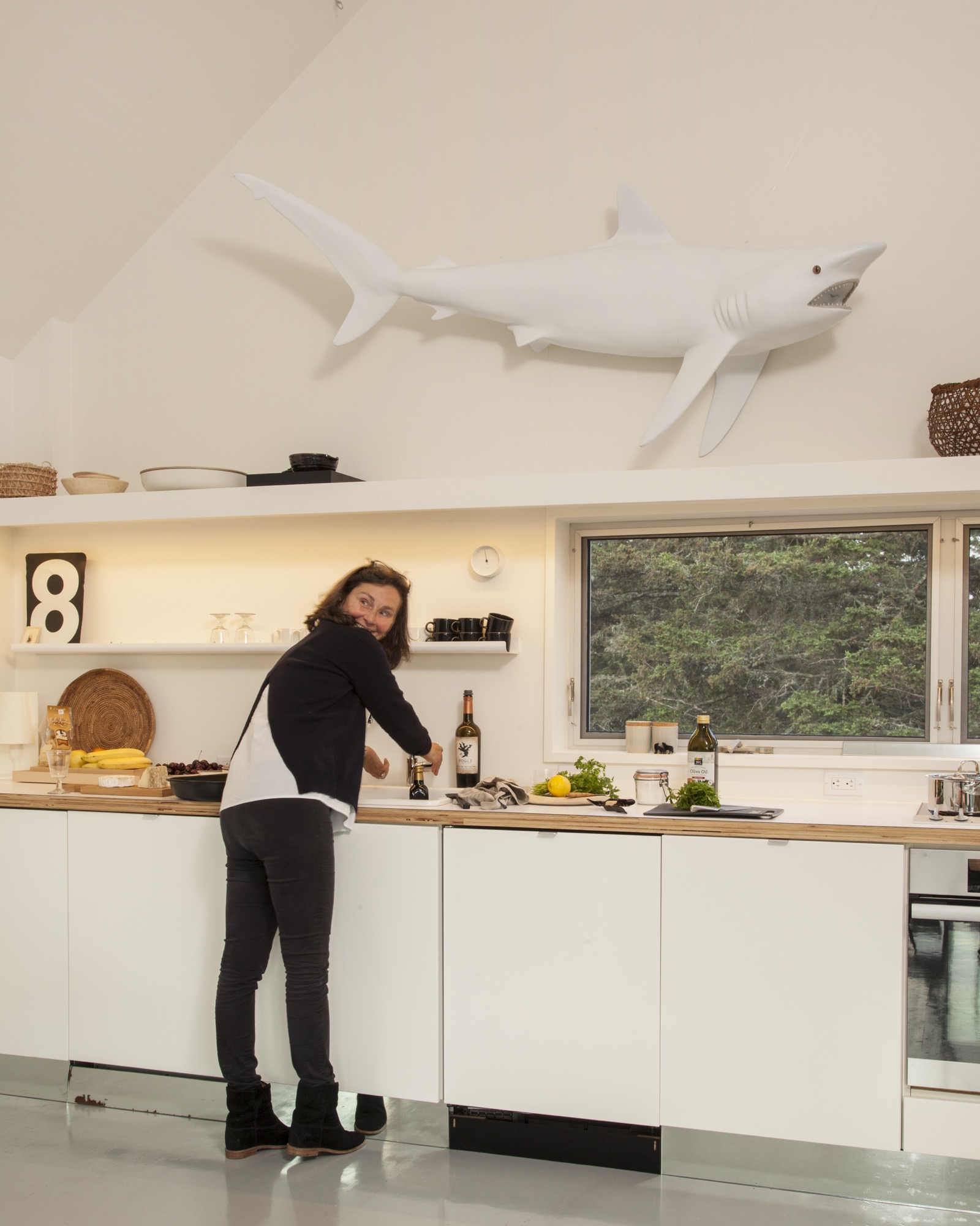
The town of Vinalhaven considered the lot, with its jumble of rejected granite scraps, "substandard" and therefore granted the Van Praags up to 30 percent more square footage and volume over the previous structure. While the site posed challenges, it also inspired. GO Logic paid special care to the topography and geometry of the quarry. Every angle—of both the structure and the interior lines of sight—is in purposeful alignment with the surrounding stone, trees, and water views.
The town approved the plan for multiple structures because a single deck connected them, and the van Praags were thrilled because the design maximizes both privacy for overnight visitors and a connection with the outdoors.
“We’re here for almost three months every summer—and it works so well that you never feel it’s a small space. The separation and steps between each perfect little box create a great flow.”—Nadja van Praag
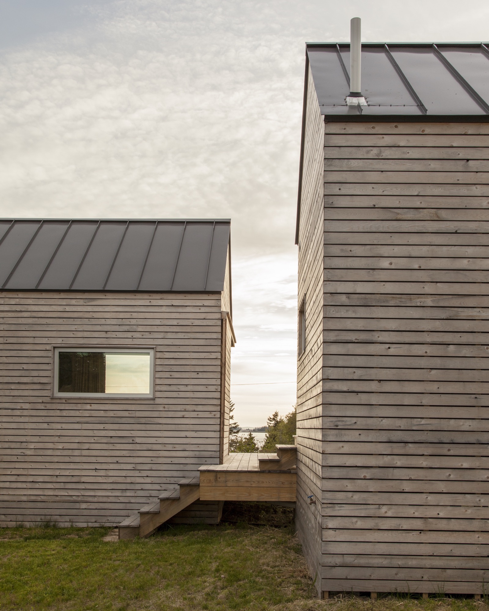
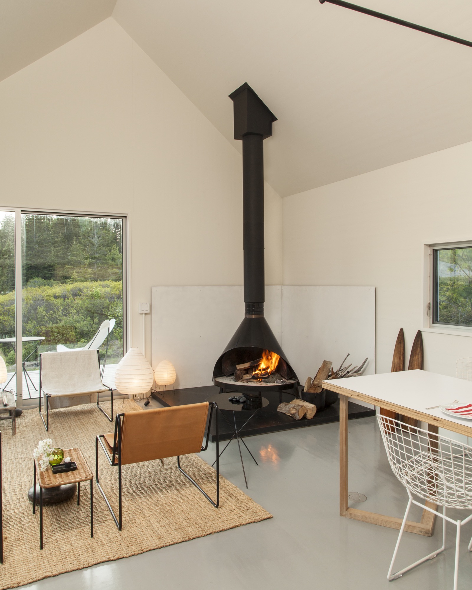
The spare aesthetic—inside and out—at once suits the austere island and reflects a judicious building process that was as much about choreography as construction. GO Logic used an emerging technology—cross-laminated timber (CLT)—to reduce waste and on-site labor. The design-build firm, working with Conway and his crew, carefully sequenced the packing, transport, and assembly of the black spruce panels shipped from Quebec. The panels form the entire enclosure—floors, walls, and roof—a practical and sustainable solution that provides both structure and finish. Conway’s crew sided the buildings with mitered white pine that will turn hoary with time, matching both the granite landscape and the local cottage vernacular. They also used white pine to create sliding barn doors that offer shade and privacy as needed in the summer, and protection in the off-season.
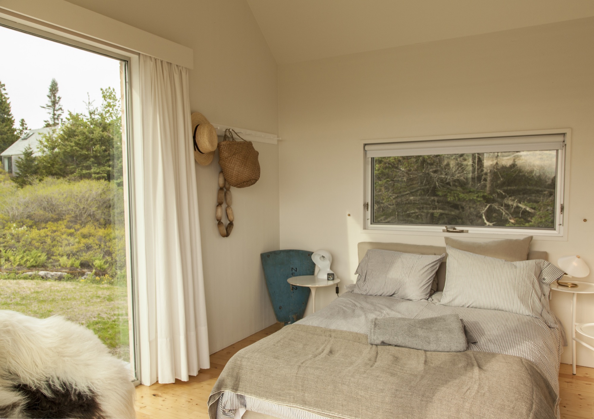
Clustered escape
Although they’re just a short walk from each other, the van Praags’ two homes—the "little box" and the new trio of cabins—feel worlds apart. "The old house looks over Old Harbor Bay, protected and speckled with boats. It’s sort of domesticated, in as much as the islands of Maine do domesticated," Nick says. "The new house is out there. It feels wild and remote, with the old quarry rising gently behind the house and the ocean stretching away in front."
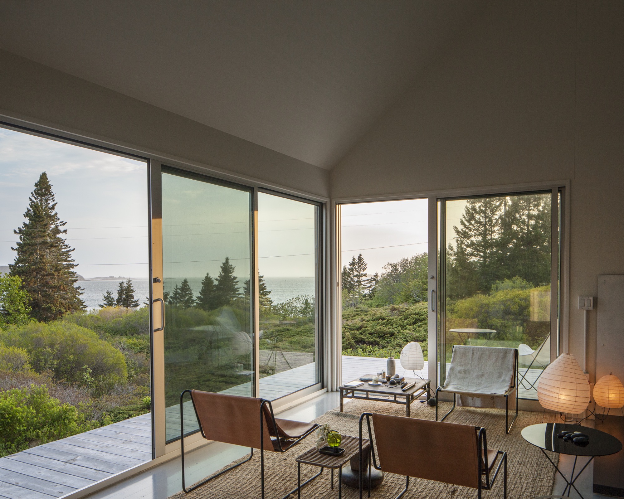
By day, the three connected pavilions sit lightly on the land. At night, they float above their concrete piers, a U-shaped harbor that beckons guests with its warm light, the platform at once a dock and a deck.
"For me, the most amazing thing is the way Riley sited the place," Nick says. "It was always a beautiful spot, but by raising and angling the buildings, it embraces the landscape and the ocean in a way that I could not have imagined." When guests ascend the stairs to the deck, popping up into a framed view of Penobscot Bay, they all stop in the same place. "I realize now that siting a building is a very special talent," he adds. △
Retreat in the Aspen Grove
Cottage Black by Colorado-based architecture and interior design practice Studio B counterbalances the grand main house in Aspen’s countryside
Studio B, a Colorado based architecture and interior design practice with offices in Boulder and Aspen, first designed the grandiose main residence in the backcountry a twenty-minute drive from Aspen, Colorado.

“We really wanted to explore a heightened experience of those aspen trees.”
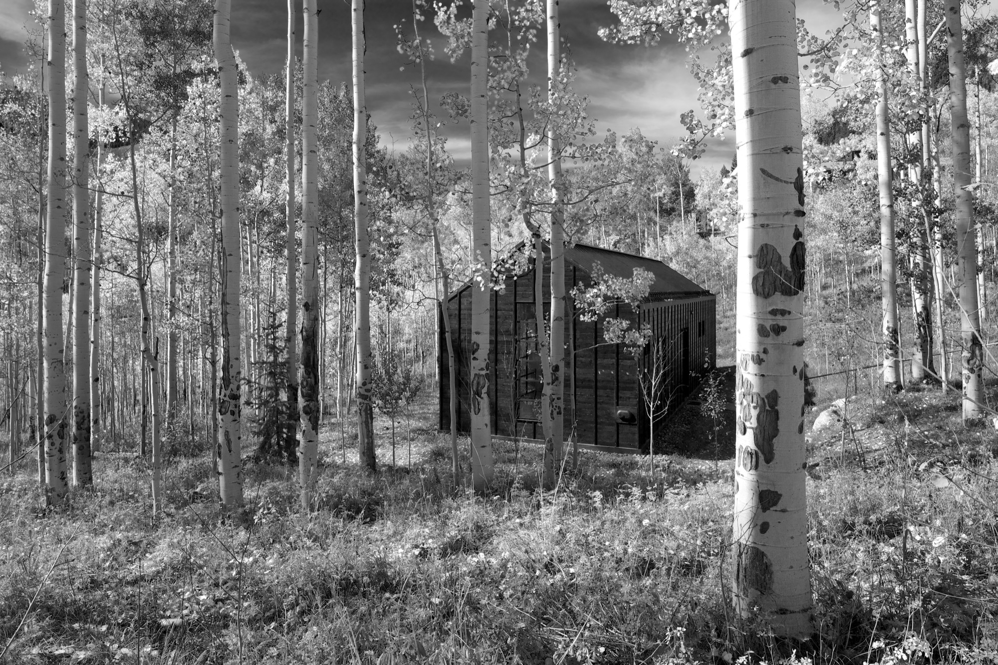
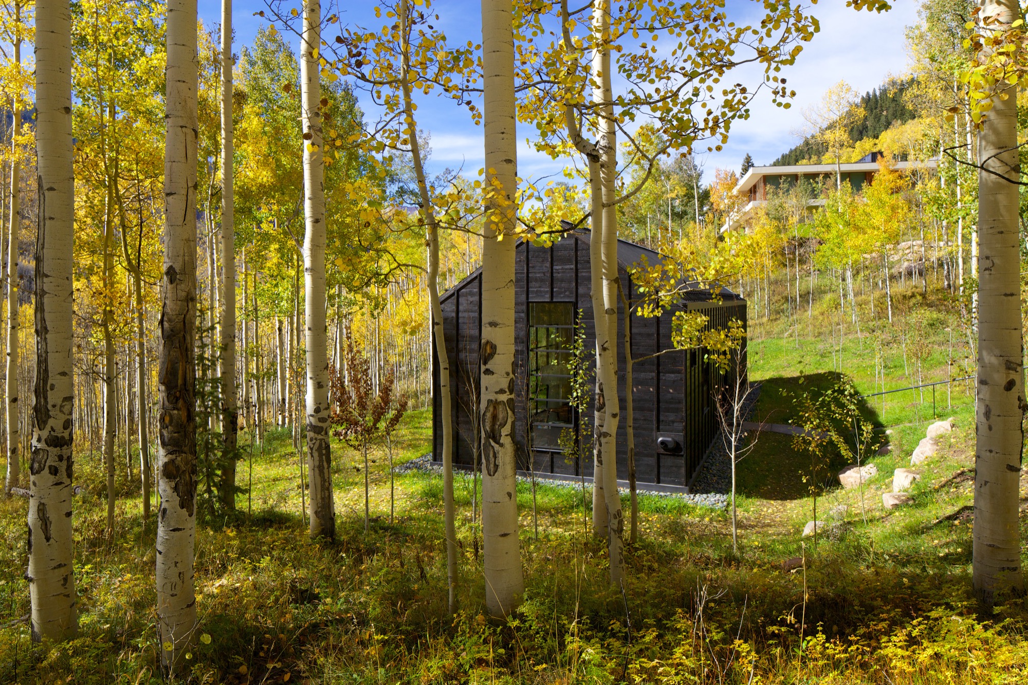
“The main house sits up on a ridge and is all about connecting to those long views, the big mountain views,” says Piché, describing what he calls a “more extroverted” approach, compared with the cabin down in the grove. “When we started working on the little guest retreat, we wanted to experience the trees in a completely different way. These views are much more embedded in the grove.” To better understand what design and placement would make the most out of Cottage Black’s distinct surroundings, Studio B took time to study how the aspen trees’ foliage changes with the seasons. “One thing we really liked about it was that the trunk feels really consistent throughout.”
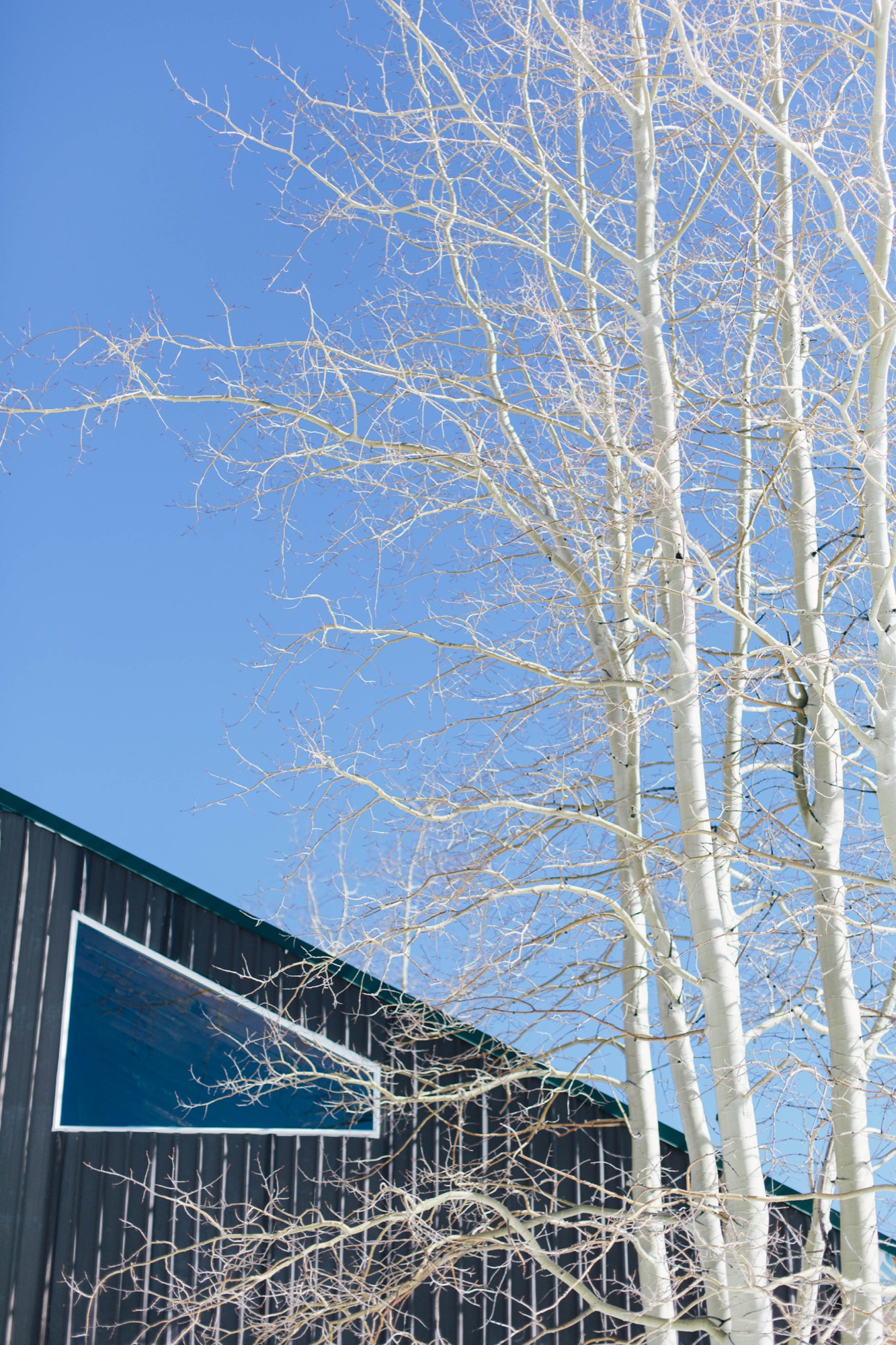
The monochromatic aspen tree bark ultimately inspired the intimate retreat’s all-black exterior and all-white interior.
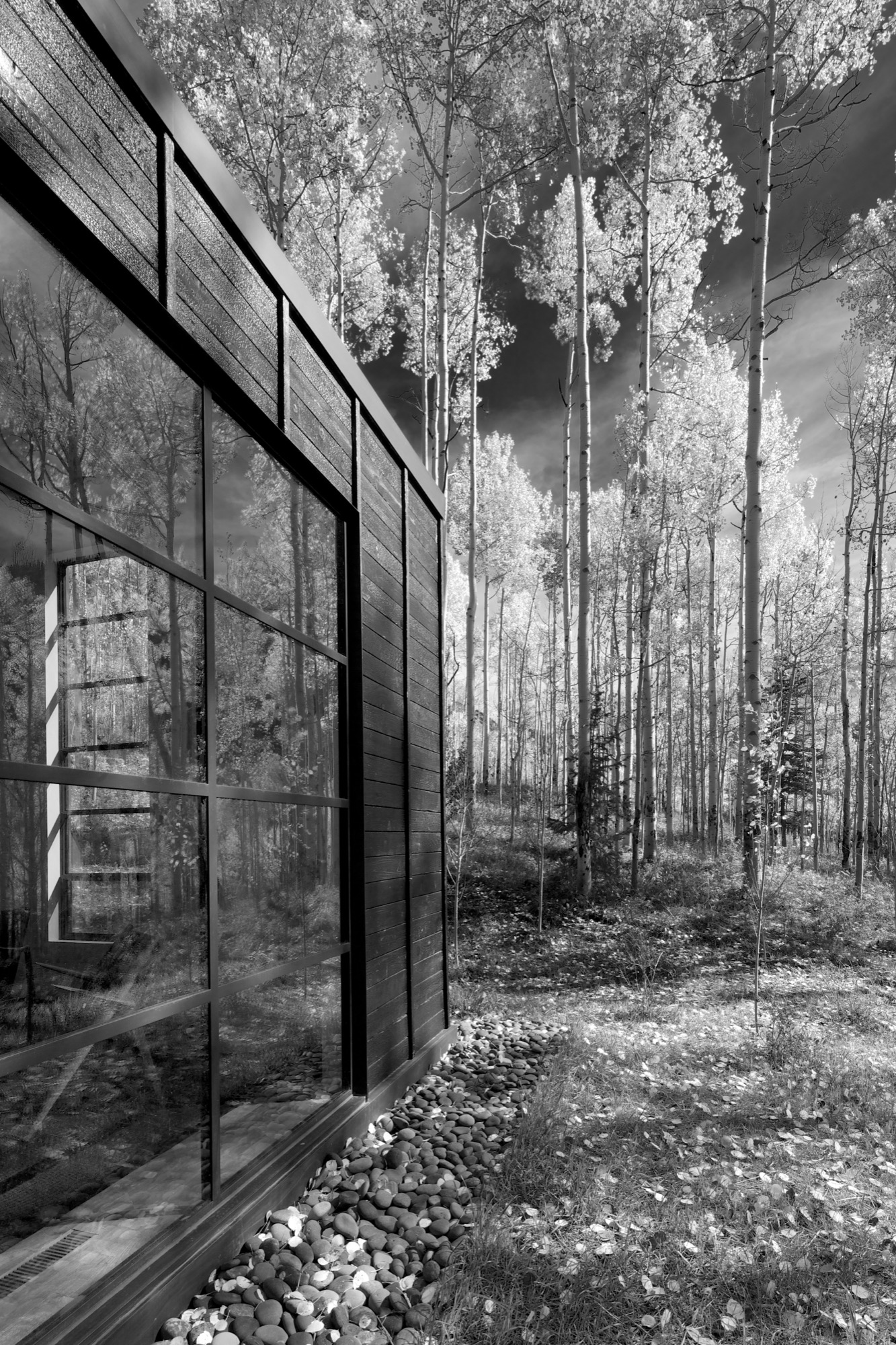
“The standing seams on the roof and the vertical joints of the interior wood ceiling were chosen to relate to the immense verticality established by the trees,” the placid architecture master notes. Approaching the house, simple stairs weave their way through the trees to the front door.
The black exterior
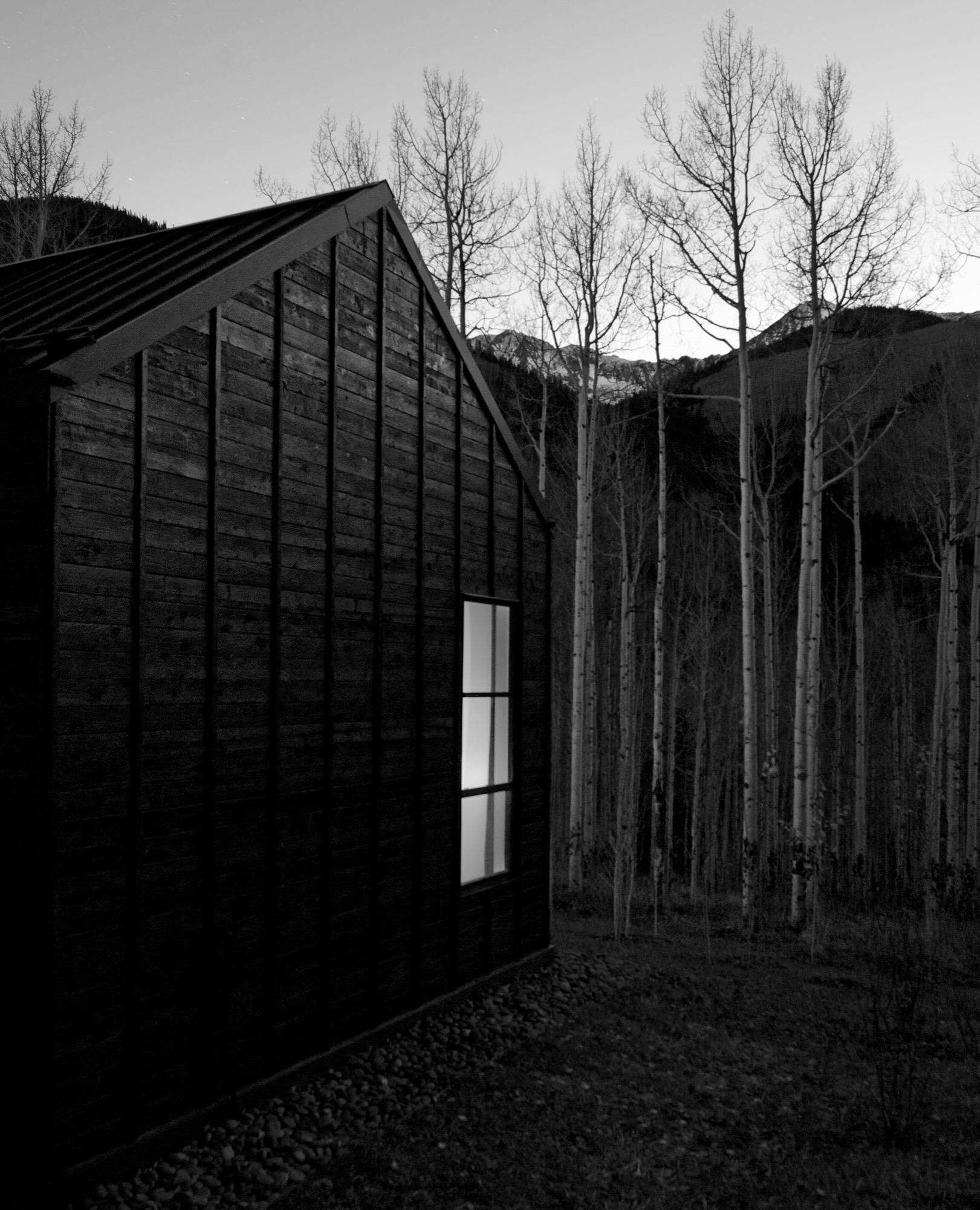
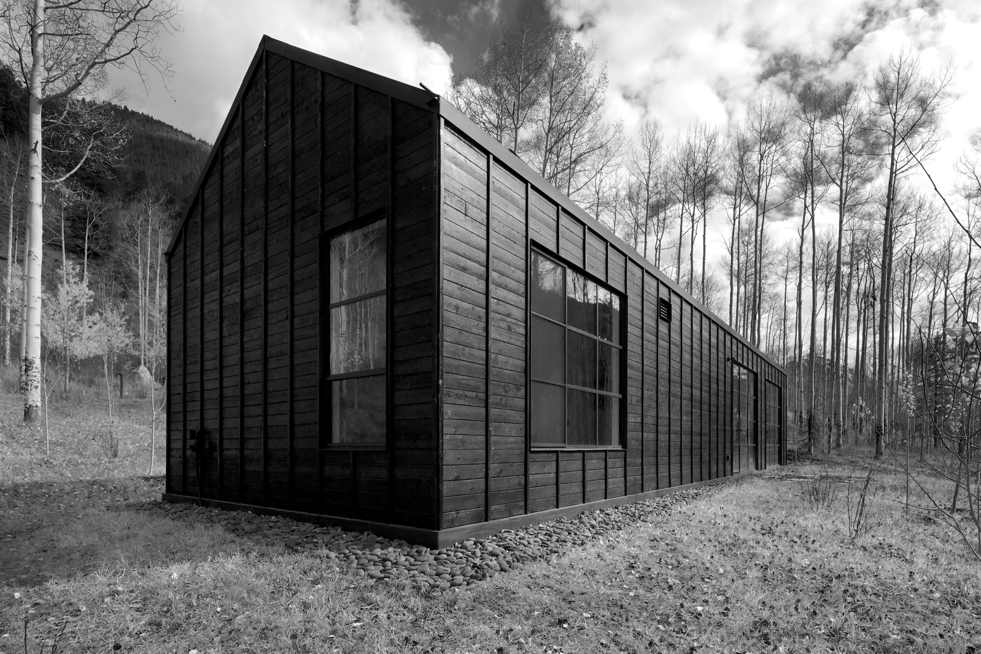
Heavily charred cedar wood gives the cottage’s exterior a rougher, bark-like texture. The orientation of the boards and the battens picks up on the verticality of the trees and the shadows. Looking at “that box” with its horizontal boards at one point during construction, Piché says they had an epiphany: “You wouldn’t think that black has the shadows and the depth that it does, but it seems it almost has more. When the sun hits, the black wood goes from gray to dark and it really feels like it transforms quite a bit.”
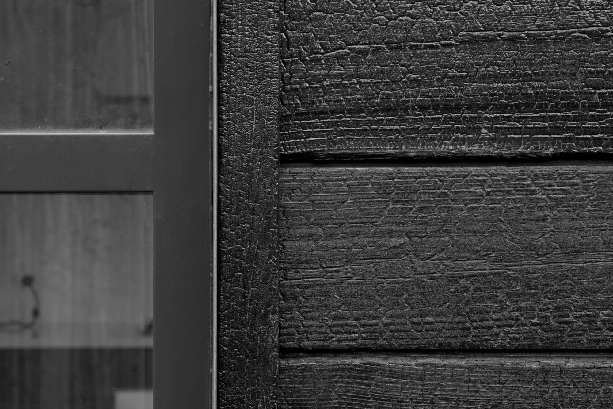
“You wouldn’t think that black has the shadows and the depth that it does.”
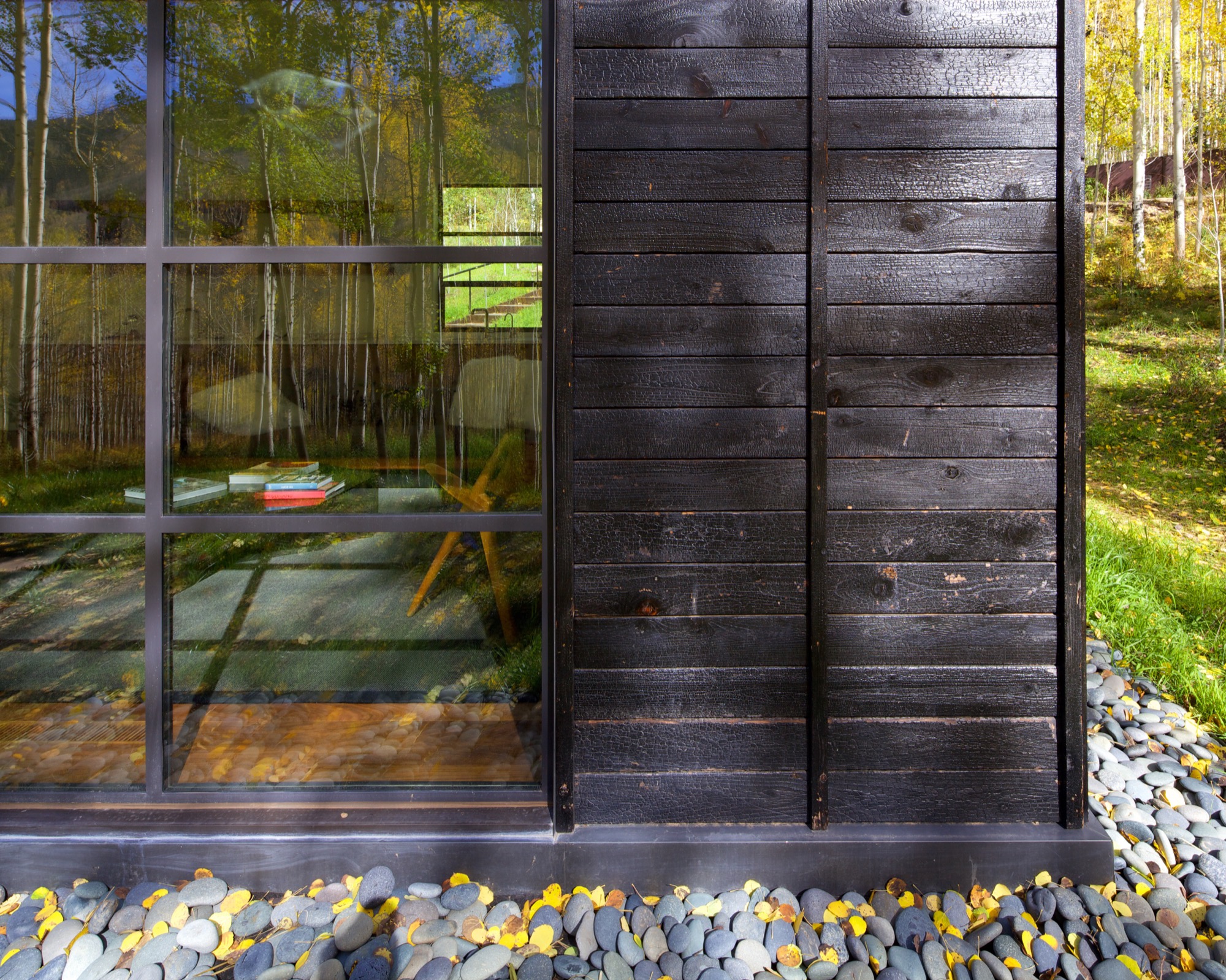
What’s more, the charred exterior gives Cottage Black the air of having been there for a long time. “And in spring and summer, when all the trees are fully leaved, people don’t even see the cottage. It disappears, and it reappears in the fall, too,” says the distinctly analytical architect, pointing out that no driveway leads to the retreat and guests cannot park right next to it. “The cottage is packed into the trees, and it’s kind of a journey down there.”
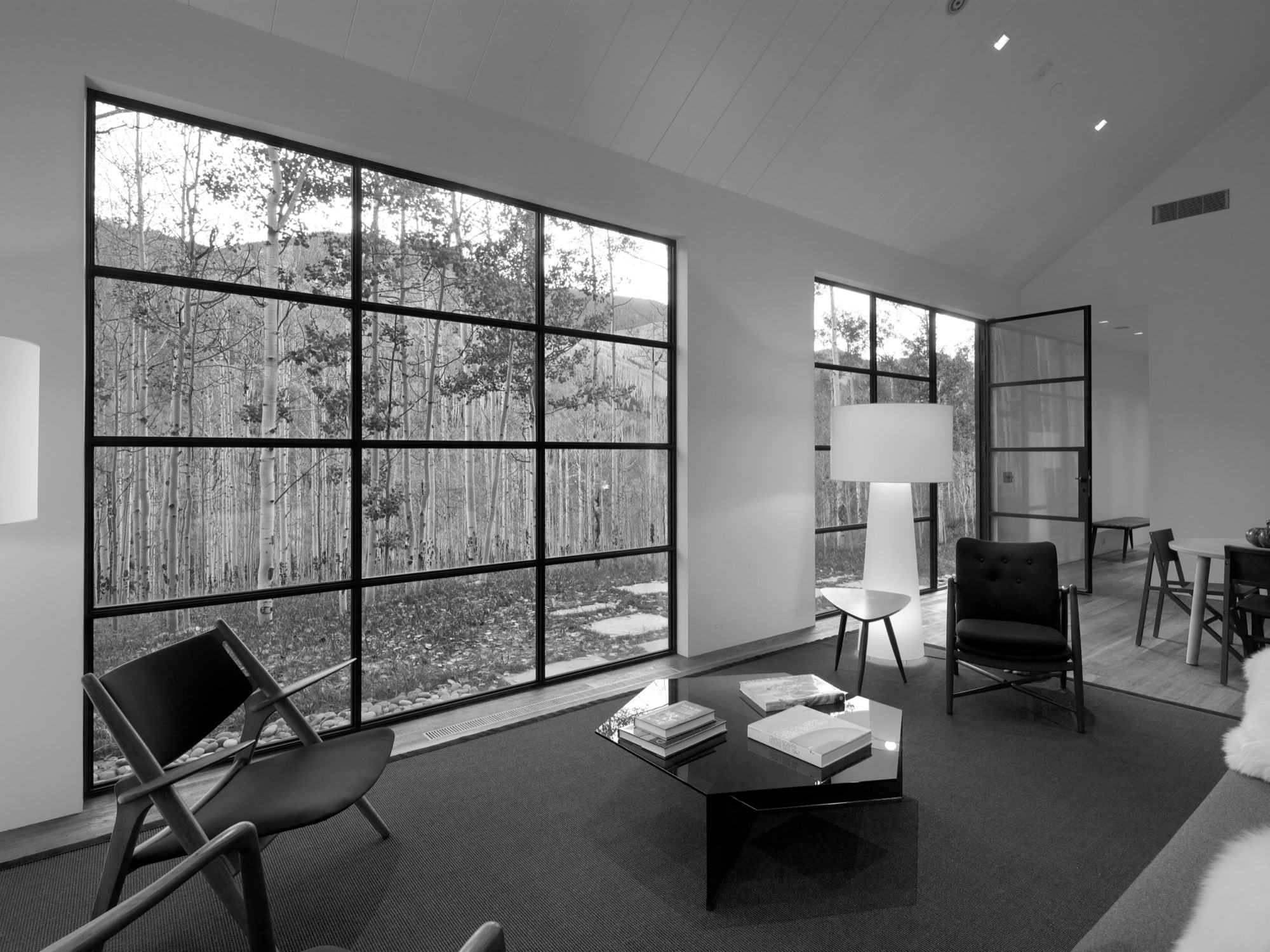
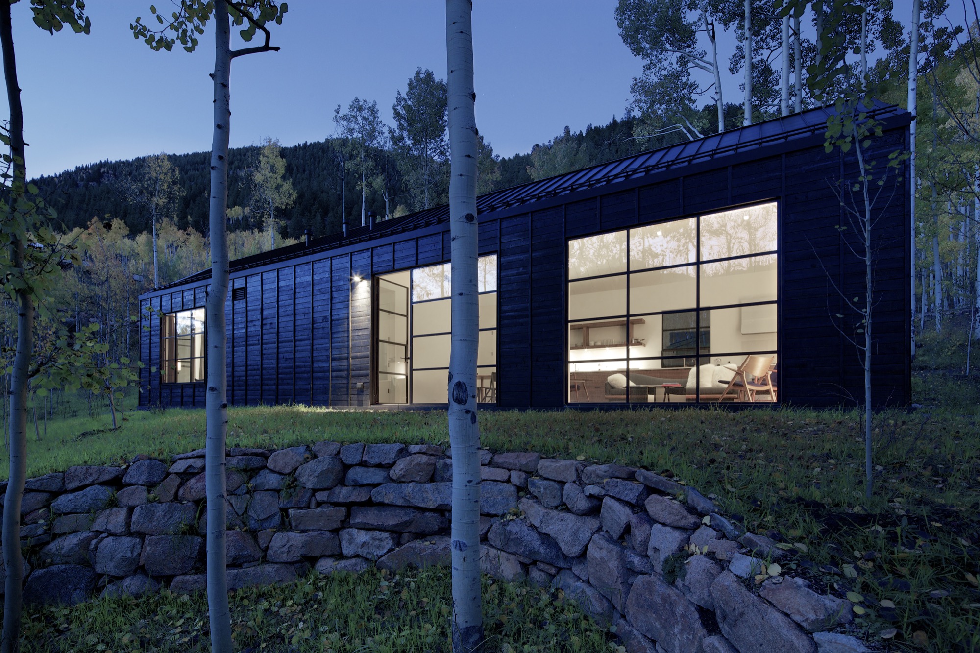
The Studio B team intently placed the steel windows to achieve a minimal sight line that only highlights a few select views. “We added a tall window that emphasizes some great trees on that side, a couple of little corner windows that just frame the tree trunks, and then one big window in the living room that is more about walking outside onto the patio and connecting to all the trees there,” the architect says. “But you are not getting those big mountain views. Just these little glimpses of the outside, which creates that more intimate feel when you walk up to the window. It is more about enclosure and intimacy than the broader expansive things. It is a little bit more inward than outward.”
"It is more about enclosure and intimacy than the broader expansive things. It is a little bit more inward than outward.”
The white interior
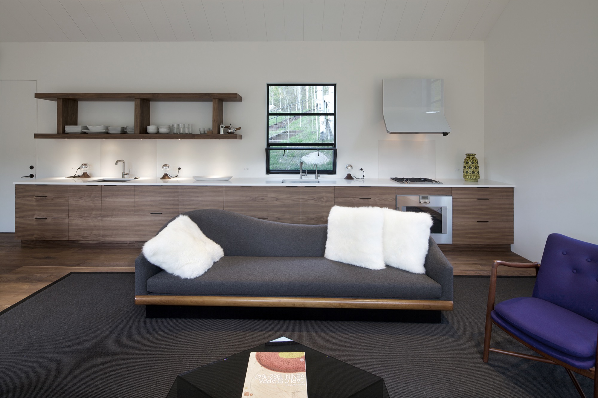
Walnut floors lend warmth to the primarily white, minimalistic inside. “The monochromatic interior, again, is a counterpoint to the main house, which has a lot more materiality coming through and more complicated detailing,” Piché says. Cottage Black, by contrast, is very simple, with much more subtle detailing: “There is the wood ceiling, for example, where each of the joints lines up with the joint on the exterior in a subtle inversion of it.”
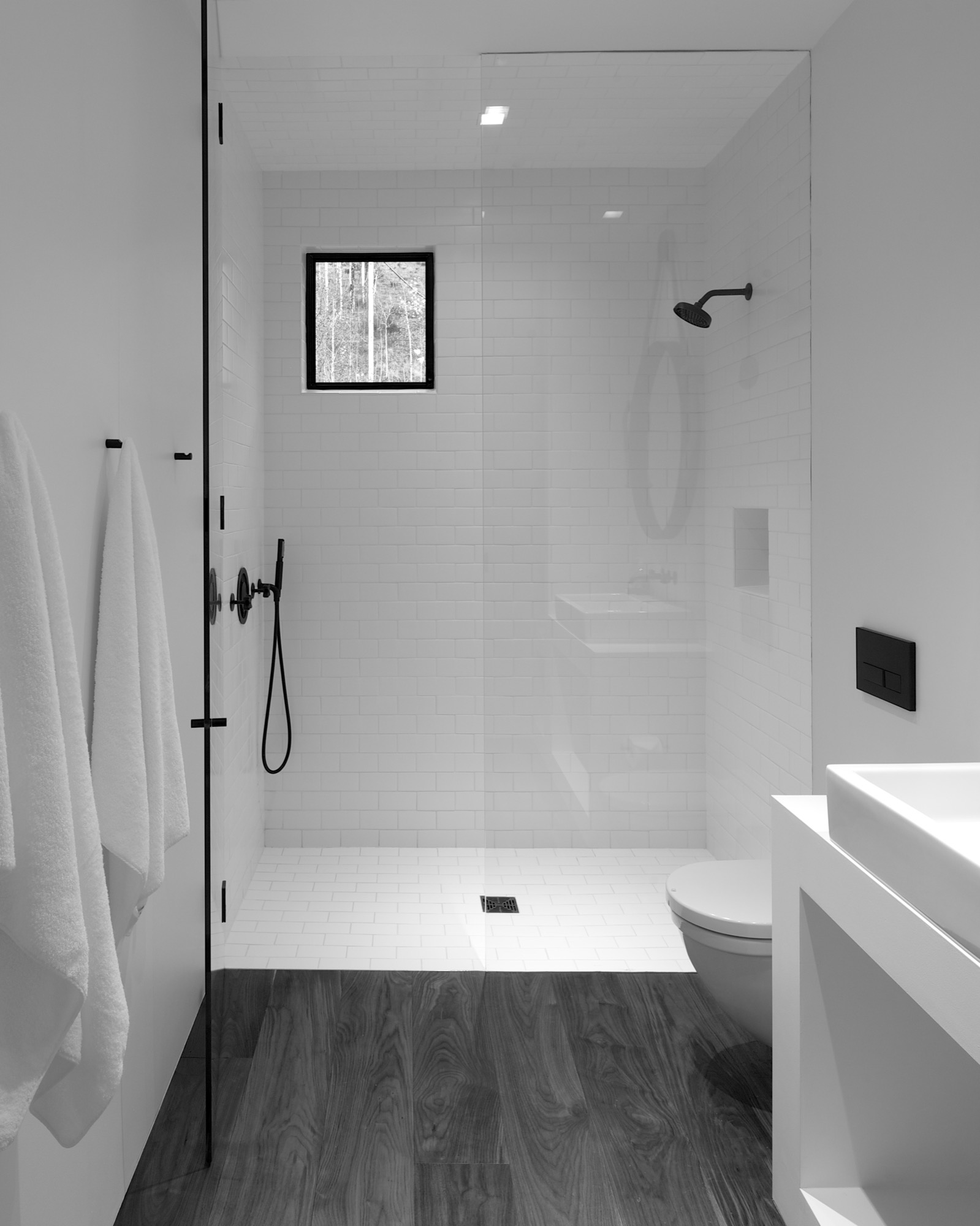
A bathroom at the center separates the sleeping area from the living space, which also includes a little kitchen to allow guests some autonomy, if they desire. “There isn’t any kind of door,” Piché says about the intimate studio layout.
A counterpoint for solitude
Should the guest retreat complement or rather juxtapose the main house? After much collaborative consideration, the design team and the client decided Cottage Black was to be a distinct counterpoint to the luxurious primary residence up above on the ridge. One consequential feature of this objective ended up being the orientation of the structure. “The one window that you see when you stand up in the living room lights up, and that’s it,” Piché says. “All the other things... we shifted it quite a bit to make sure you couldn’t see it from the main house—that there is that black object.”
Furthermore, the team had added transitional materials throughout the main house to add texture and interest in various places. Cottage Black’s architecture and interior design, on the other hand, are very much characterized by deleting details, according to the architect. “This house is a lot about editing,” he says in reference to the design process. “In the beginning, we had a lot more adventurous solutions, and we distilled it and made it into a better and more powerful piece of architecture. It doesn’t need to be a lot.” △
The Vindheim Cabin: Snowbound in Norway
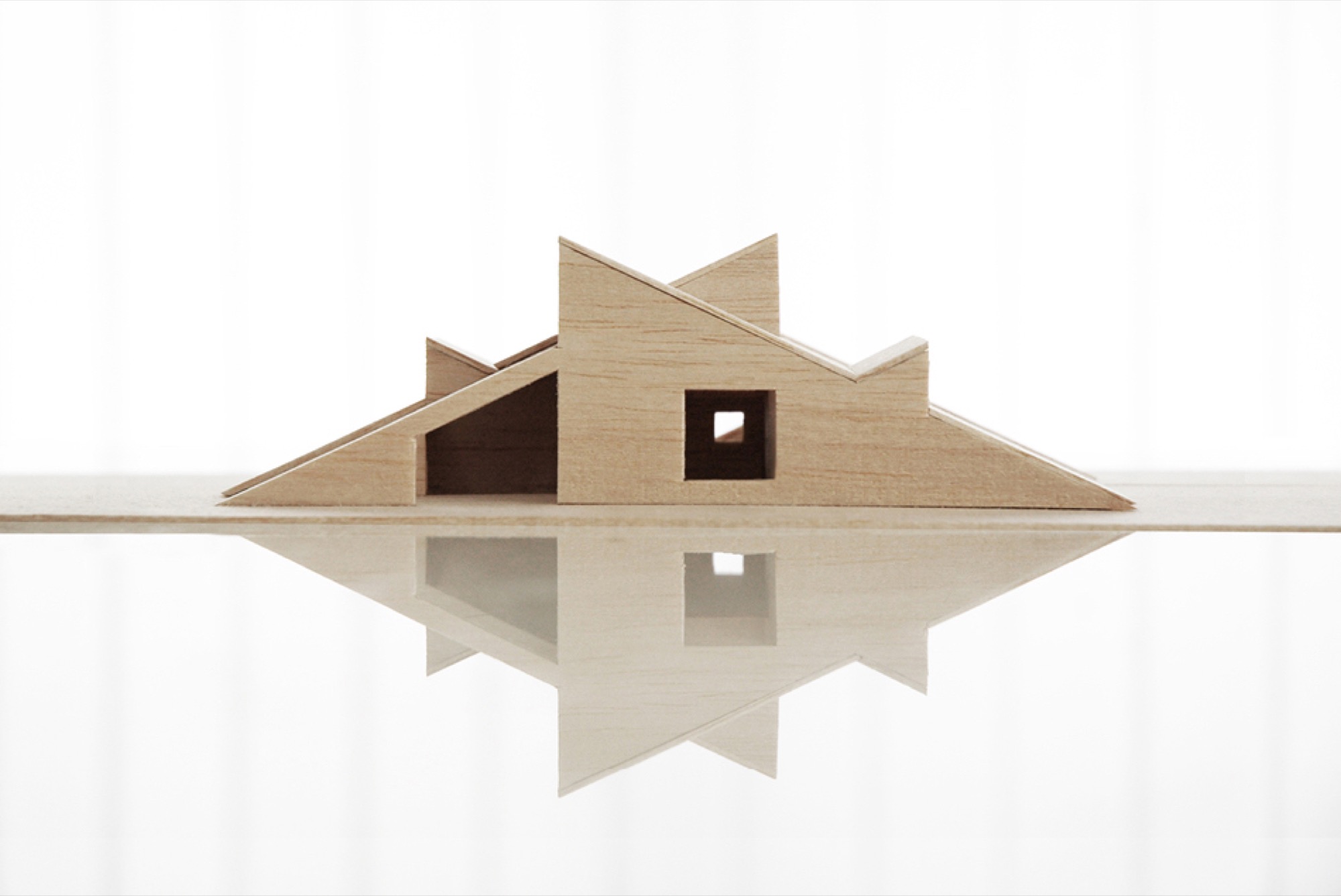
The Vindheim cabin in Lillehammer, Norway, is inspired by the classic motif of snowbound cabins, with only the roof protruding through the snow.
Architect Håkon Matre Aasarød, partner at Oslo-based studio Vardehaugen Architects, led the design of Cabin Vindheim, situated deep in the forest in the alpine landscape near Lillehammer, Norway. The cabin’s concept was simple: To create a cabin that is small and sparse yet spatially rich. The 55-quare-meter (592-square-foot) cabin, commissioned by a private client and completed in 2016, comprises a large living room, bedroom, ski room, and small annex with a utility room. It functions off the water and electricity grids.
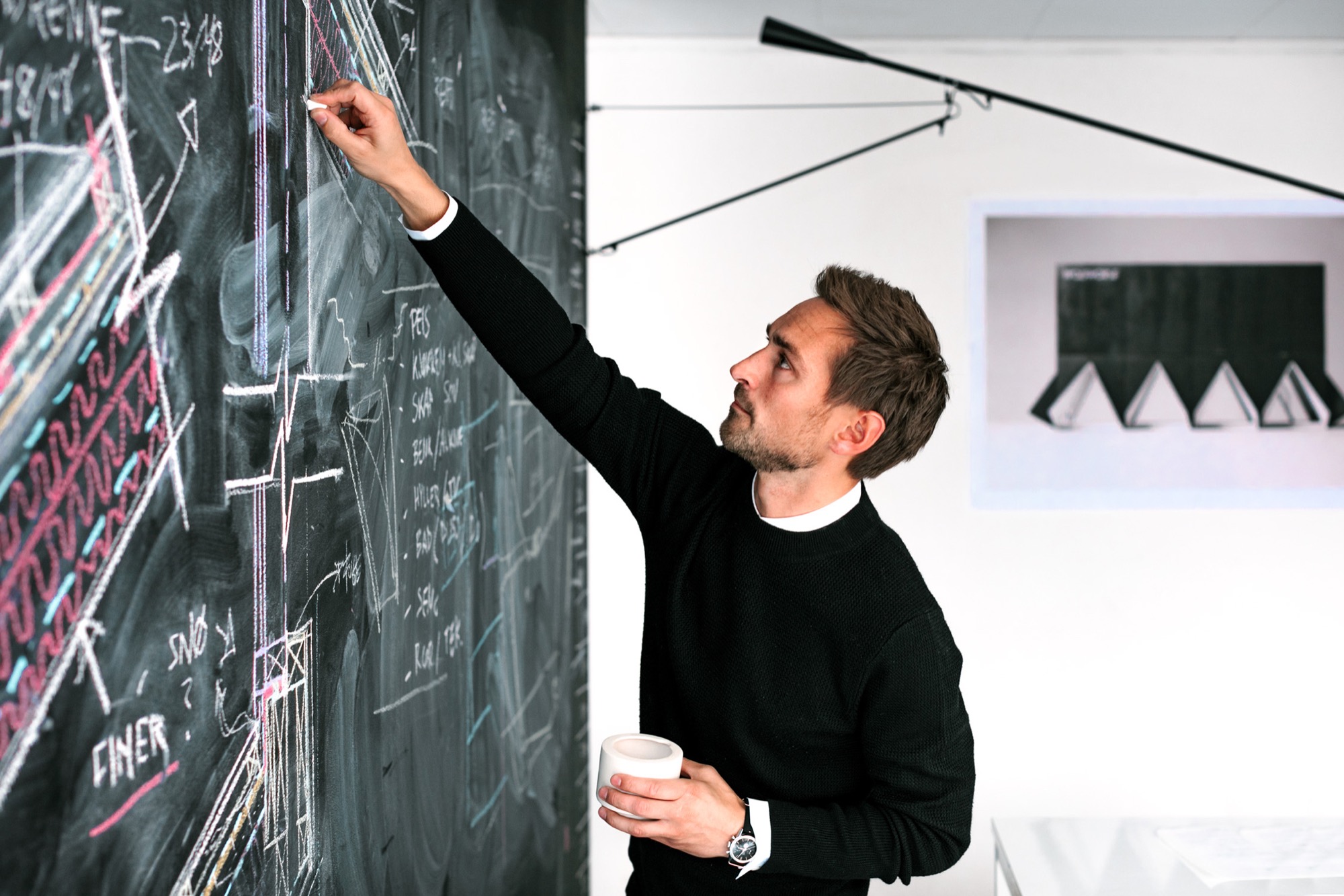
Håkon, who earned his master of architecture degree from the Oslo School of Architecture and Design, where he is also teaching today, has been telling us about this project from its very beginning, keeping us abreast of the building progress in emails and photos. What’s more, the Norwegian Broadcasting Corporation followed the design and construction of the cabin and documented it in a one-hour episode of the program “Grand Designs”. Thus, we are excited to finally show you the result and introduce you to its lead designer, who lives in Oslo, with his wife, Sigrid, and with his two boys, Syver and August.
A conversation with architect Håkon Matre Aasarød

AM When and how did you know you wanted to become an architect?
HMA I’ve always been passionate about drawing. I can easily recall the wonderful and almost hypnotic feeling I had while drawing Star Wars space ships for hours in my childhood. As soon as I got older and realized that drawing houses and objects was a real job, and not just a hobby, I knew I wanted to be an architect. Today, from time to time, I can still get that wonderful, almost meditative feeling while drawing.
“As soon as I got older and realized that drawing houses and objects was a real job, and not just a hobby, I knew I wanted to be an architect.”
AM What professional path led you to where you are today?
HMA Immediately after finishing architecture school, I started my first office, Fantastic Norway, together with my good friend Erlend Blakstad Haffner. Our studio was a red caravan. We drove from town to town for more than three years, giving architectural aid and inviting the locals to participate in creating new strategies and projects for their hometowns. We had a wonderful adventure and got a lot of attention and won many prices for our method of working. But life on the road was also a bit tiring, so in the end, we had to park our ambulant architectural office.
Then we were invited to make a TV series about architecture for the Norwegian Broadcasting Corporation (NRK) and worked as television hosts for a couple of years.
After spending so much time on the participation processes and communication, I felt the need to focus on the building part of our profession and, as a response to this, started Vardehaugen Architects.
AM What’s your design style?
HMA When starting a new project, I try hard not to have preconceived ideas about the style or looks of it. I try to focus on the client’s need and on creating interesting spaces and let the style evolve through this.
AM Where do you draw inspiration for your designs?
HMA Our greatest source of inspiration is our clients and the sites we work on. Every client is different; every place is in some way peculiar and unique. We aim to embrace this in all of our projects.
AM What does “home” mean to you?
HMA Home is the feeling of belonging somewhere. The feeling could be connected to a house, a specific landscape, a mountain, or even a group of people. Places where your story lives.
AM What makes you a mountain man?
HMA Growing up in Norway it’s hard not to have a close relationship to the mountains. Throughout my childhood, we spent a lot of our holidays hiking or skiing. Every Easter, my family still goes hiking in the mountains, and every autumn, we collect sheep for my parents-in-law in the mountains of Norway’s West Coast.
AM When are you the happiest?
HMA Nothing beats spending a day with my two kids at our small summerhouse on the West Coast of Norway.
AM What’s on your drawing board right now?
HMA We work with a fairly wide range of projects. In addition to some cabins and villas, we are currently designing a small chapel next to Norway’s second largest glacier, the Black Glacier, a coastal museum on the island of Frøya, and an observation deck at Norway’s most spectacular waterfall, the 280-meter-tall (ca. 920 ft.) Vettisfossen.
The Project: Cabin Vindheim
AM Who are the clients?
HMA A couple in their mid 50s, both of them passionately interested in architecture and design—in addition to skiing and hiking in the mountains.
AM Describe the design in your own words...
HMA The cabin is a basically a gabled roof where the edges of the roof stretch all the way down to the ground. The ceiling runs uninterrupted through the cabin and connects the different rooms. A series of uplifts creates a rich variety of spatial qualities underneath it.


AM What was the client’s premise at the beginning of the project?
HMA They wanted a small cabin that was sparse and compact but at the same time spatially rich and generous.
AM How did you translate the client’s vision into this design?
HMA With the ambition of creating a compact cabin that at the same time had exceptional spatial qualities, we focused a lot on the physical sensation of scale and space. When is a space too tight? When is it too big? We did this by creating real-scale mock-ups of our design solutions in our backyard to ensure a greater understanding of size and proportions in our project. This enabled us to simply take a stroll through our project and get a sense of dimensions and spatial sequences–even before the cabin was built.
AM What was your inspiration for this particular design?
HMA The external shape of the cabin is inspired by the classic motif of snowbound cabins that have only the roof protruding through the snow. When snow covers the structure, the contrast between architecture and nature becomes blurred.
AM What makes this cabin truly special?
HMA During winter, the roof becomes a man-made slope for ski jumping, toboggan runs, and other snow-based activities.

AM Take us there...
HMA The site is deep in the forest in the alpine landscape close to Lillehammer in Norway. The cabin sits between some tall spruce trees, with a nice view toward a lake. During winter, it’s extremely cold there and hard to get to by car, so you have to cross-country ski for a few kilometers to get there.
AM How did the setting and the site influence your design?
HMA The frosty forests in the region are both beautiful and mysterious, and they’re closely connected to traditional folklore and stories about trolls and other strange creatures. When snow covers the trees and stones, they morph into something new. They become characters, sometimes trolls, sometimes just a beautiful and unique sculpture. I find this notion truly inspirational.

“When snow covers the trees and stones, they morph into something new. They become characters, sometimes trolls, sometimes just a beautiful and unique sculpture.”
AM What are the main materials you used, and why?
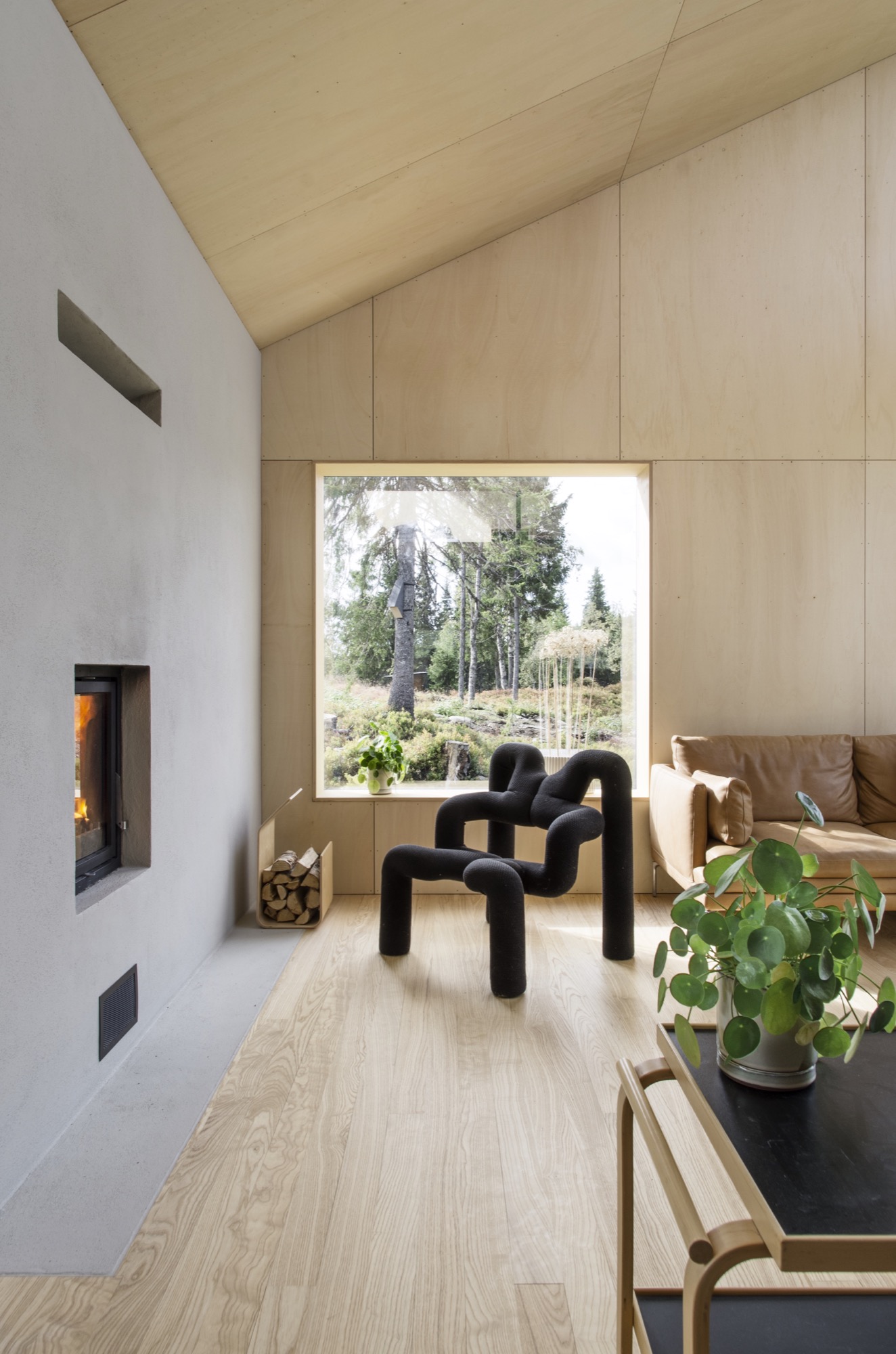
HMA The classic Norwegian mountain lodges are covered in dark wood, making them seem both solid and grounded. Inspired by this, the cabin is clad in black-stained ore pine. The interior is lighter, fully covered in waxed poplar veneer.

AM Take us inside...
HMA The sloping roof connects the different spaces, making the entire cabin feel more like one large room.
From the main bedroom and the mezzanine, you can even gaze up at the stars and enjoy the northern light, while lying in bed. When resting in the cabin's bedroom, a large 4-m-long (ca. 13 feet) window creates the impression of sleeping above the treetops and underneath the stars. The main living room is also small but has a ceiling height of 4.7 (ca. 15.4 feet) meters under the roof.
AM What was your biggest challenge with this project, and how did you overcome it?
HMA The site is very far off the grid, and simply getting the materials to the site was quite a challenge. But we managed by always planning with close consideration of the local weather forecast.
AM What is your favorite thing about the cabin, now that it is finished?
HMA Lying in bed watching the northern lights above the snowy spruce trees is a really nice experience.
AM What do the clients tell you, now that they have been living in your architecture for a while?
HMA They enjoy the cabin and spend time there every weekend. The only issue is that they’ve had problems with sheep climbing up the roof. However, I’m sure the sheep enjoy it.
AM Final impressions of the cabin?
HMA We designed a couple of birdhouses for the birds living next to the cabin. Local sparrows and starlings enter the nesting box from a small opening underneath the flexible top hatch. △
Geometric Cabins on the Steep
Reiulf Ramstad Architects' Røldal Cabin design preserves as much of the surrounding Norwegian landscape as possible
Anytime an email from Reiulf Ramstad Architects (RRA) shows up in our inbox that mentions the Oslo-based architect and "cabin" in the same sentence, we are all ears. He had us as "preserving the surrounding landscape"... again.

This time, RRA has designed a set of two cabins in Røldal, Norway. Once again, Ramstad's architecture stands simple yet bold. The Røldal family vacation home is recognizable for its compact, defined, and geometric shape. The objective of preserving as much of the surrounding landscape as possible resulted in the design of two volumes: a main cabin (63 square meters; 678 square feet) and a much smaller annex (11 square meters; 118 square feet) that keep a dialogue with the encompassing nature.

Dividing the structures also answers the need for the flexibility of being able to accommodate different family compositions in separate spaces. The articulated section is adapted to the steep terrain and is assigned to create interconnected floors and capture the views of both the forest and the hillside. △

Monolith on the Mountain
In the Slovenian Alps, Bivak Pavla Kemperla sticks up for alpinists
Bivak Pavla Kemperla, a black beacon for mountaineers in the rugged landscape of the Slovenian Alps, was designed by Slovenian architect and alpinist Miha Kajzelj of the firm MODULAR arhitekti in Ljubljana, Slovenia.
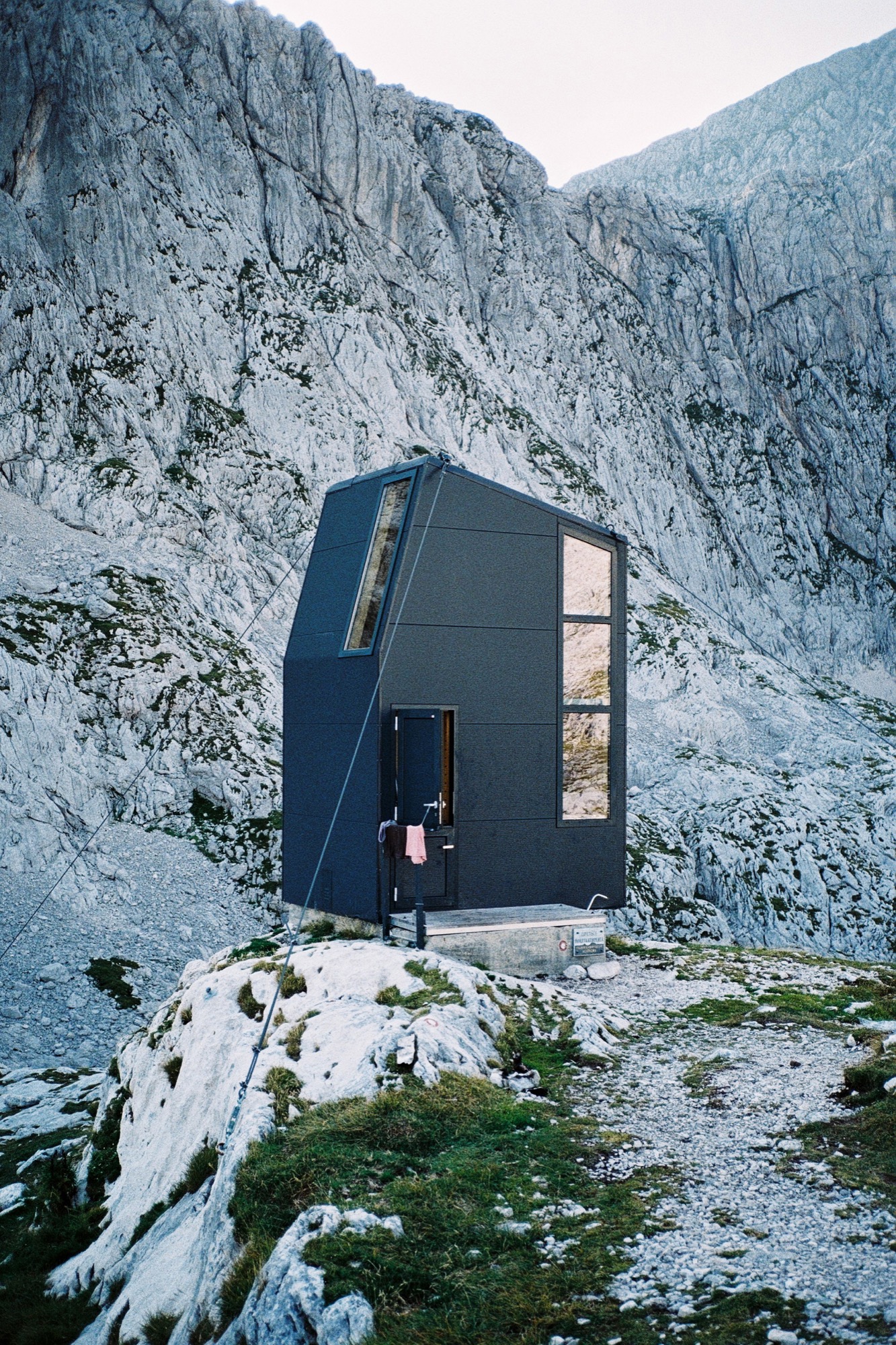
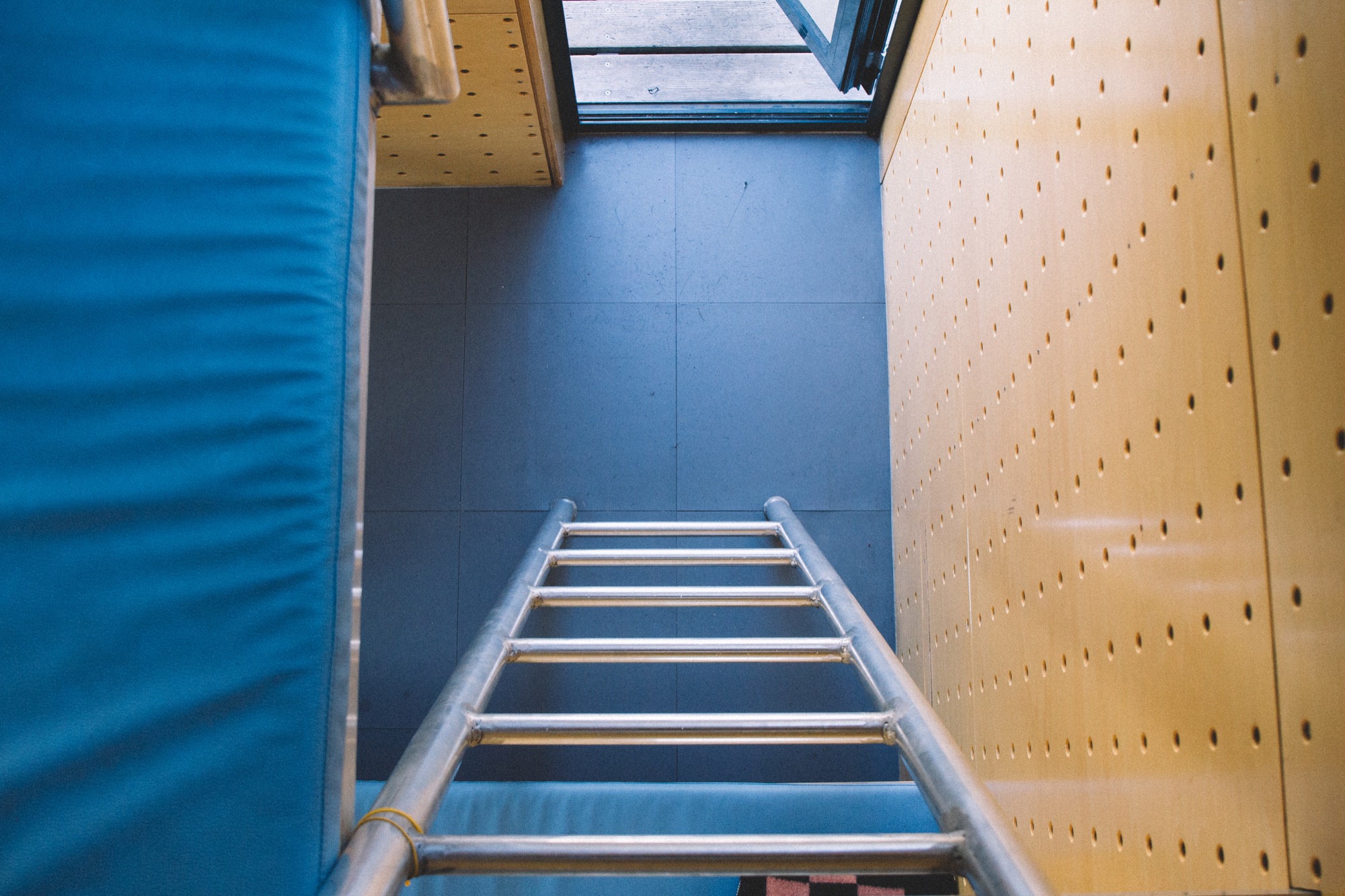
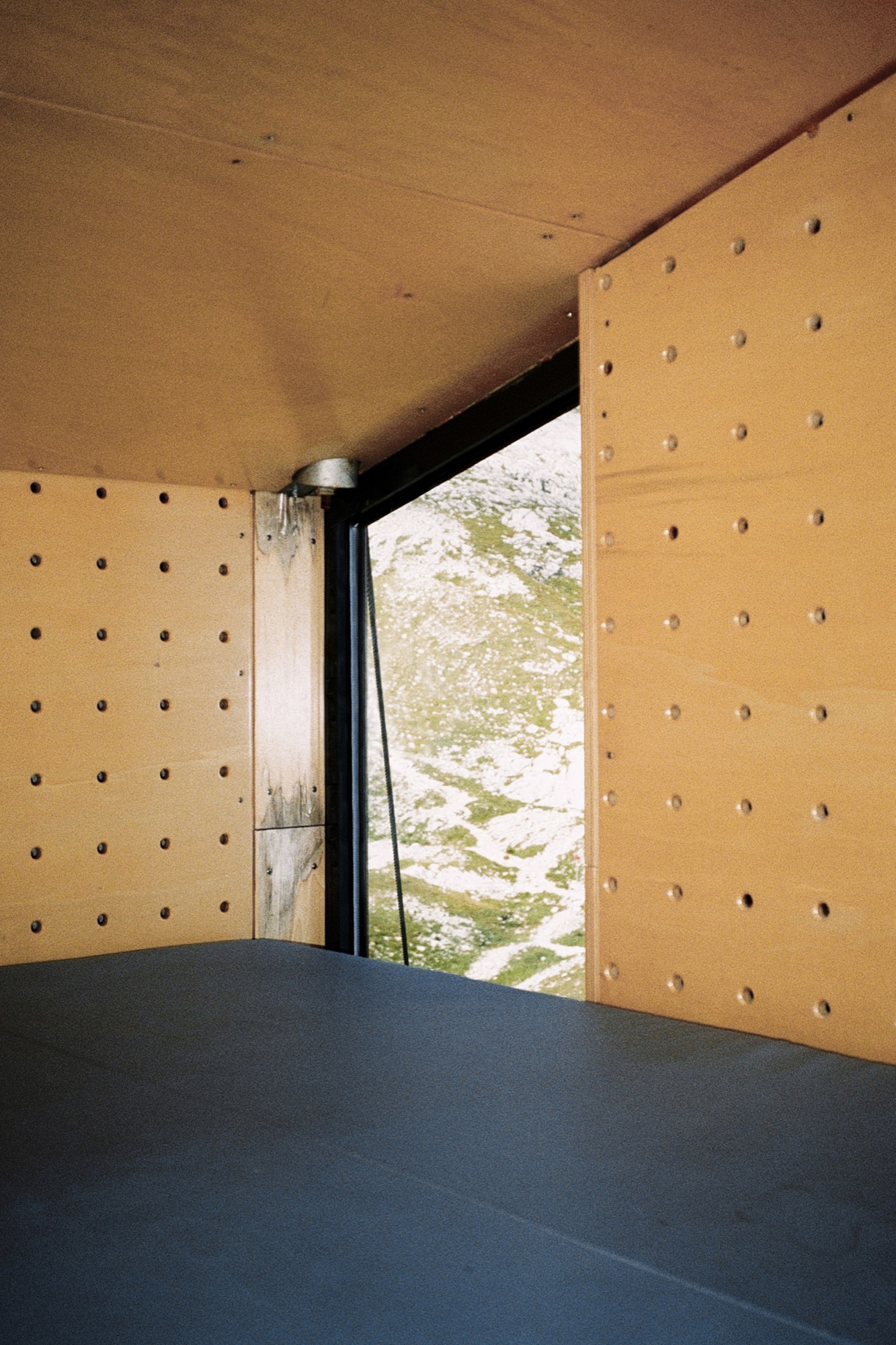
Situated at 2104 meters (6903 feet) above sea level in the Kamnik Alps north of Ljubljana, the bivouac under Grintovec was built in 2009 to replace an old shelter that stood there since 1973. The three-level structure is built on a concrete base. The long, vertical windows maximize the magnificent mountain views.
Its outer skin, made of aluminum isolating panels, is designed to prevent loss of the heat produced by the people inside. The inner skin is made of perforated wooden panels designed to wick body moisture out; so the interior always feels dry and warm. As a result of the vertical three-level concept, the upper sleeping level is warm, as the heat from below rises up.
The tiny, simple volume—2 × 3 × 4.5 meters (6.6 x 9.8 x 14.8 feet)—sleeps eight people.
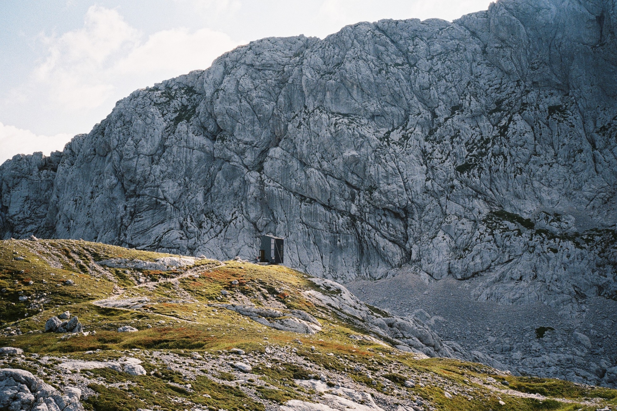
Bivak Pavla Kemperla is dedicated to Pavle Kemperle, a Slovenian alpinist.
Photographer Jaka Bulc (@jakabulc) discovered the bivouac for us with his lens
He writes about his experience:
The first part of the marked trail to this bivouac is usually very crowded, since it leads to a popular mountain hut on the Kokra Saddle and then onwards to Grintovec, one of Slovenia's most frequently visited mountains.
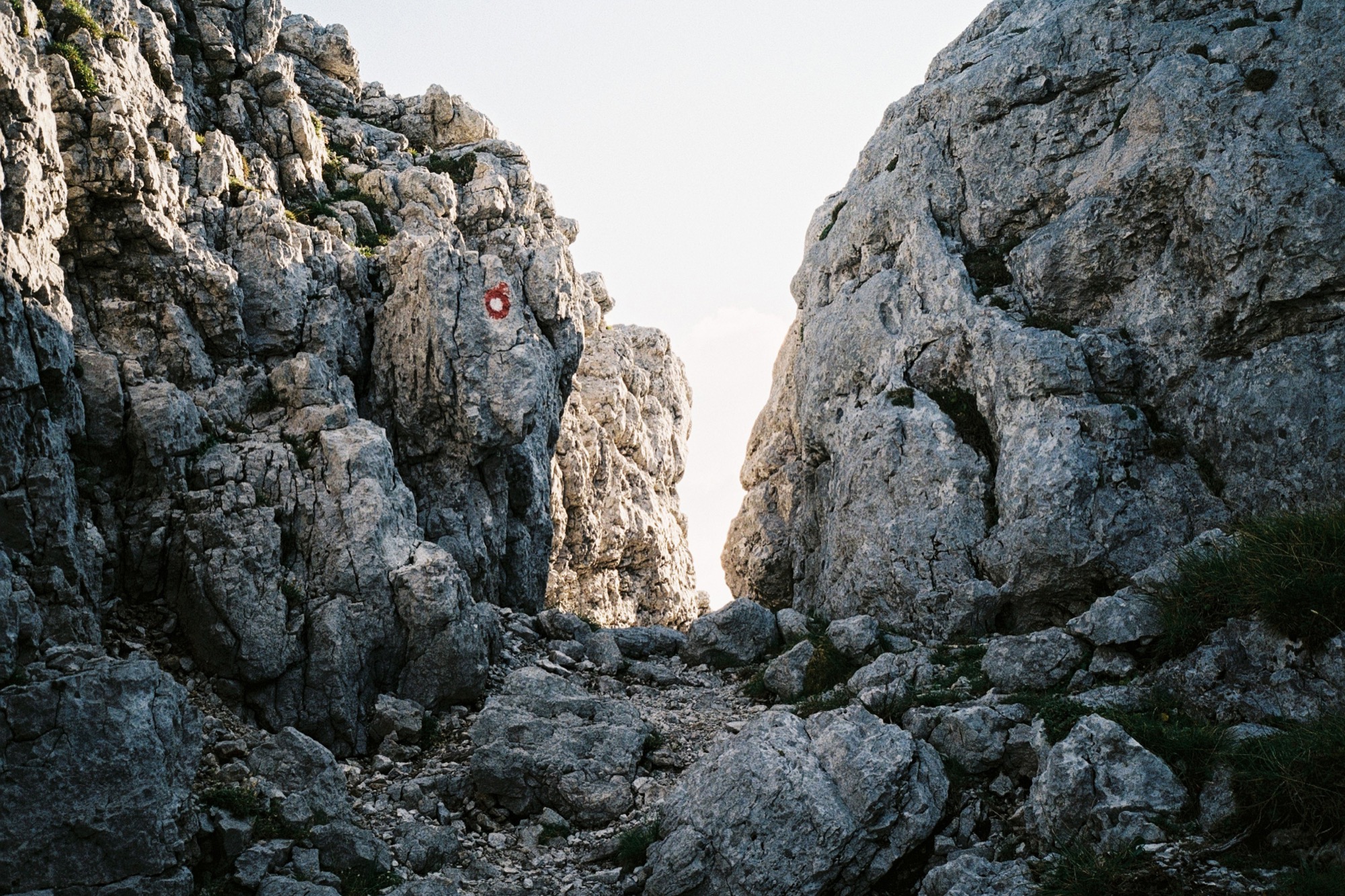
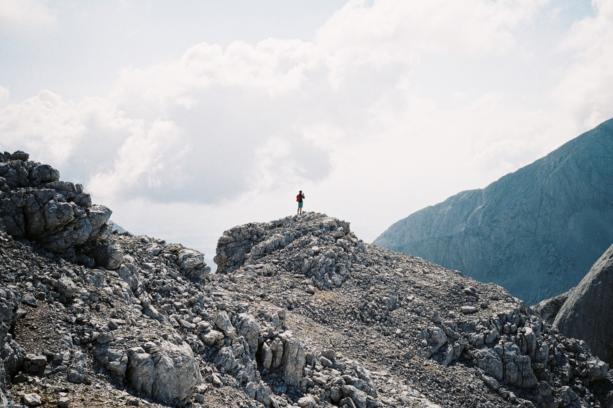
The trail to the bivouac gradually veers off and goes through an interesting passage to a scenic path that winds its way across the steep rocky slopes of Grintovec. We reached the bivouac late in the afternoon and bumped into two other hikers, who were just getting ready to summit a couple of nearby peaks.
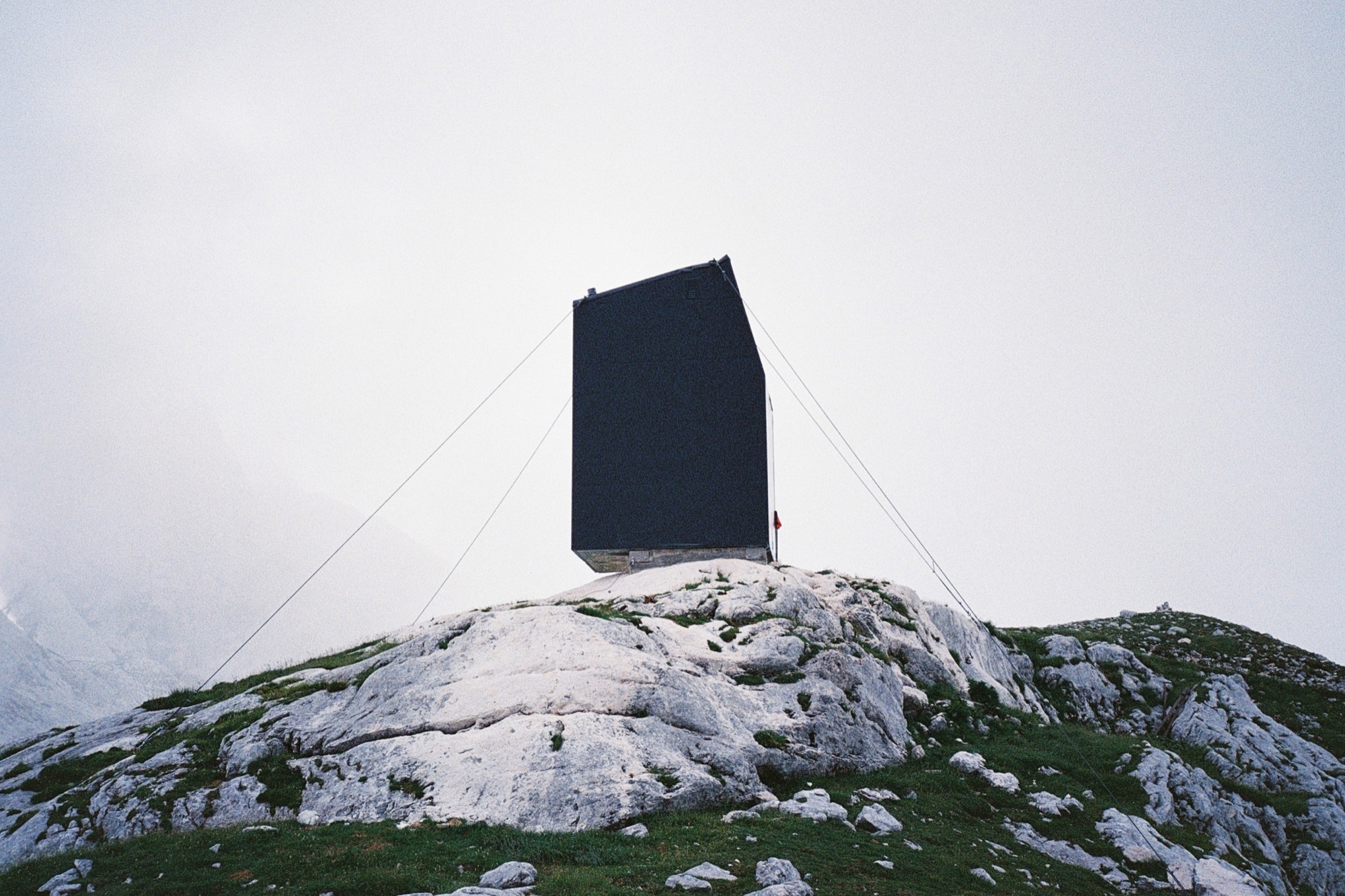
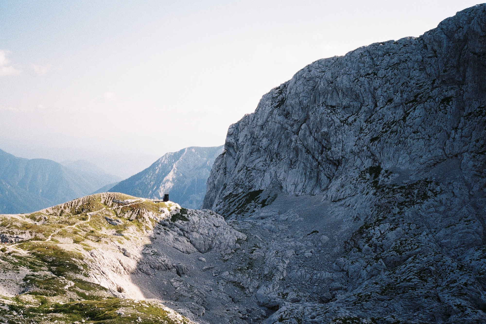
The monolithic building gives the impression of being sheltered by the natural amphitheatre of rock walls, although the bivouac sits on a knoll that gently rises over the surrounding landscape. △
Backcountry Haven
Professional snowboarders modernize a run-down cabin in Utah to access untracked powder out the front door
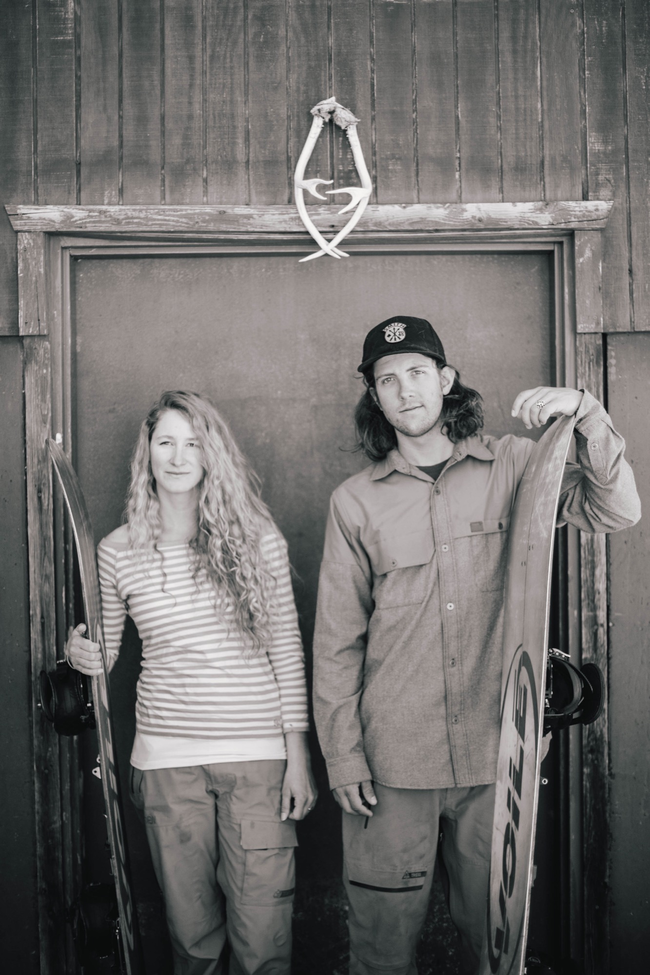
Professional backcountry snowboarders Zach and Cindi Lou Grant modernize a run-down A-frame cabin outside of Park City, Utah, to help them access untracked powder and follow their dreams.
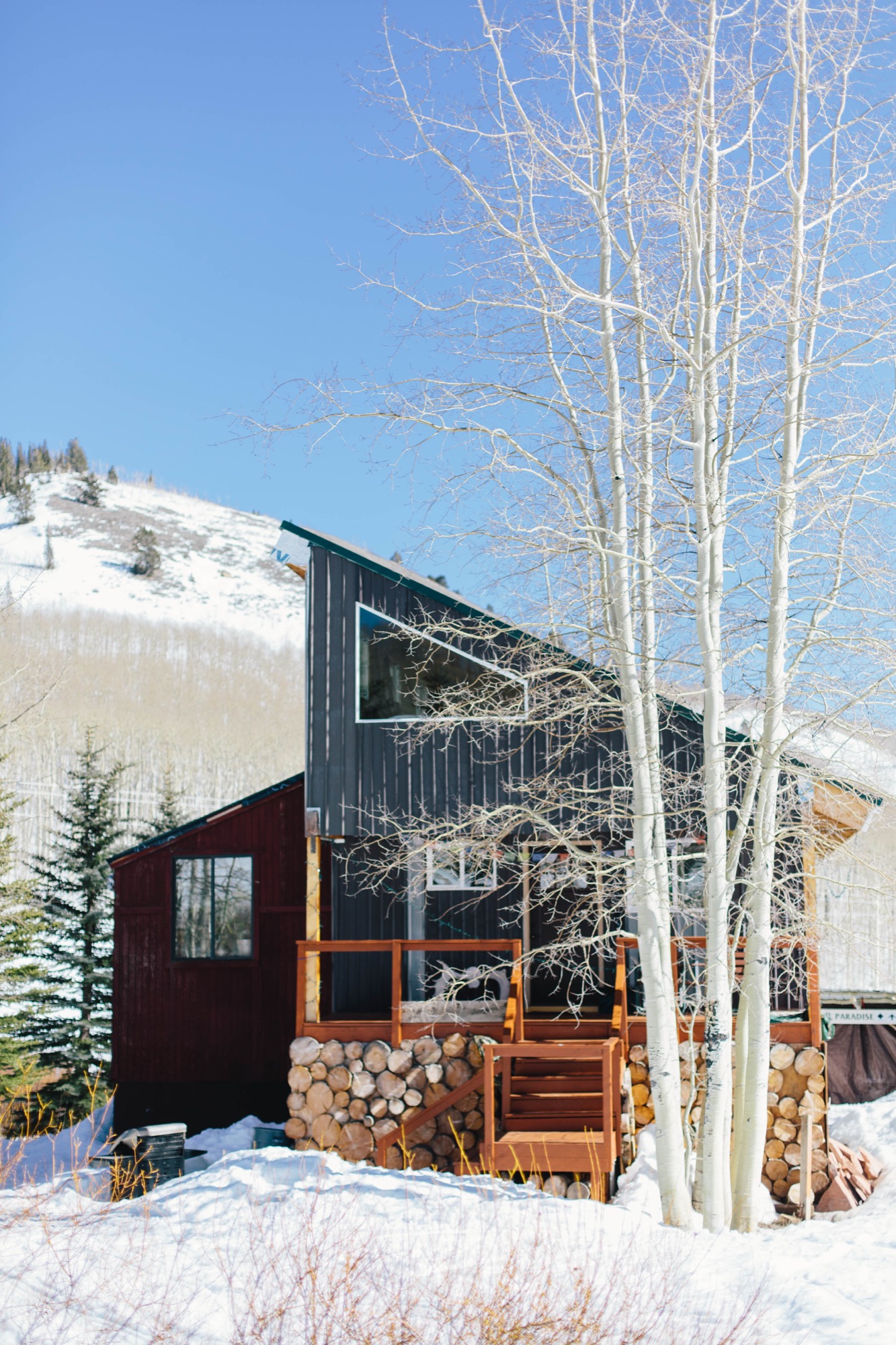
They spent as much time as possible up in the Wasatch Mountains east of Salt Lake City, Utah, and only came down for school, work, and sleep. Zach and Cindi Lou live for snowboarding, so it was only natural for them to buy their own alpine cabin to be as close as possible to their favorite backcountry terrain near Park City. Surrounded by snow six months of the year, their newly renovated cabin lets the pair follow their dreams and snowboard much of the year.
Backcountry education
After high school, Zach and Cindi Lou rented a small A-frame cabin in Big Cottonwood Canyon to be in the mountains. For the last decade, the couple has been honing their skills, taking avalanche safety courses, and learning all there is to know about backcountry snowboarding. They use special snowboards, called splitboards, which separate into two boards to allow for uphill travel. When they get to the top, they put the two halves together, spin the bindings to make it like a normal board, then click in to ride down. Safety is their number-one priority, though, and they work together as a team to ensure that at the end of the day they both get home in one piece.
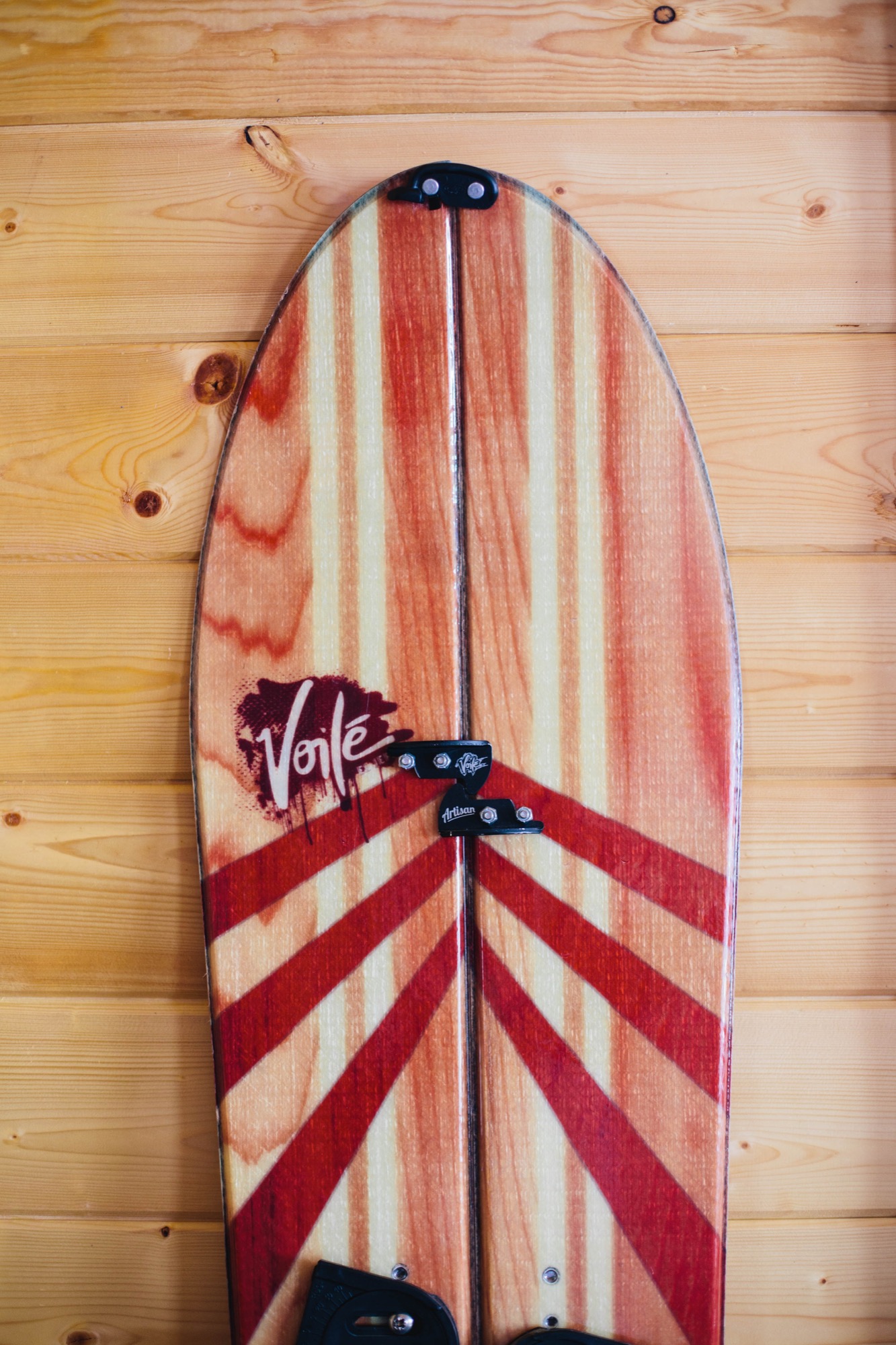
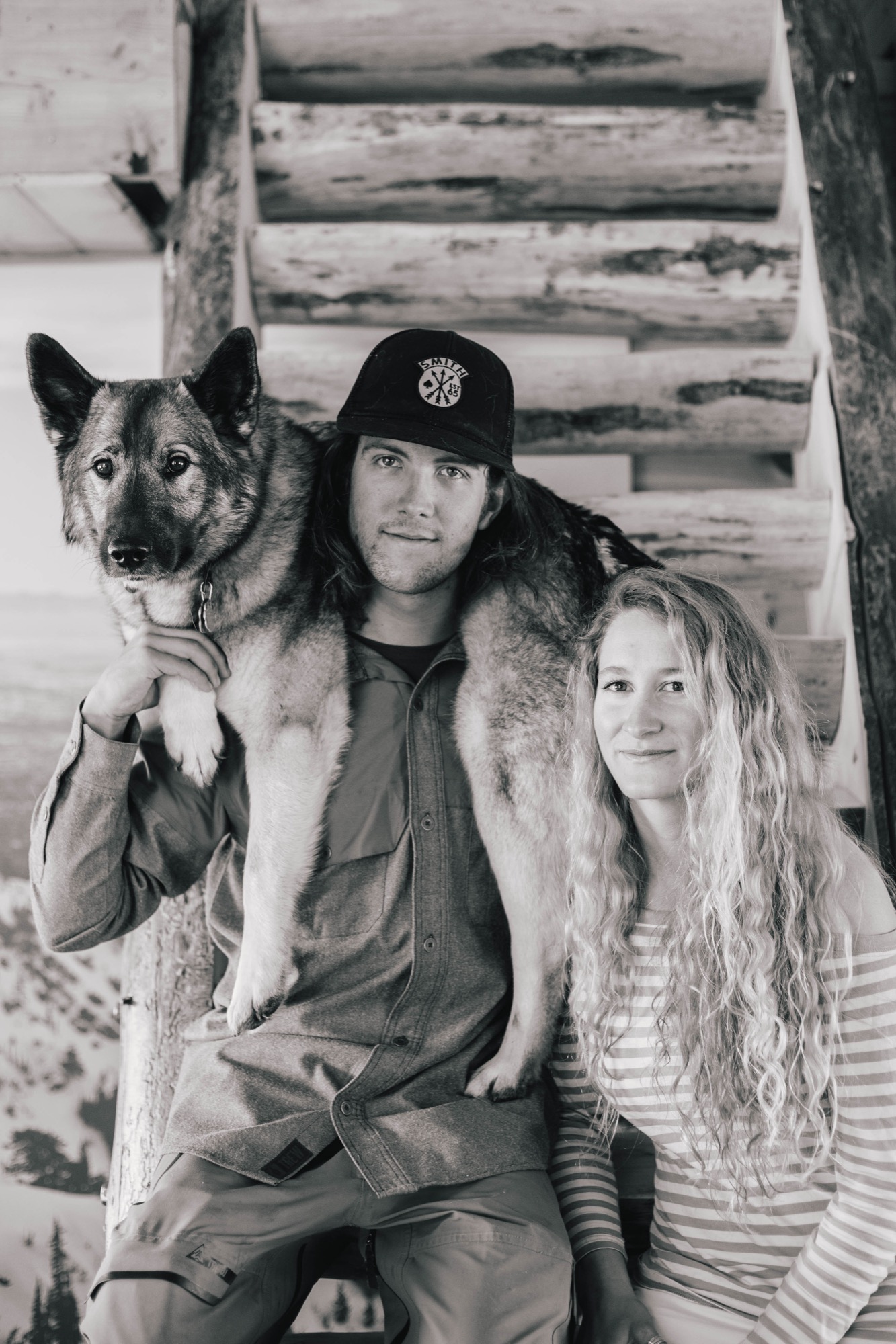
Over the years, the partners have gone on great adventures in Utah, Wyoming, Colorado, and Alaska. They have been featured in ski and snowboard magazines and movies, like Powderwhore Productions’ Some Thing Else. Their years of touring in the backcountry together only improved their relationship, and in 2011, the two got married. Soon, sponsors including Voilé, Smith Optics, and Gregory Mountain Products picked up the pair as team riders, turning their dreams of becoming professional backcountry splitboarders into a reality.
Finding heaven in the backcountry
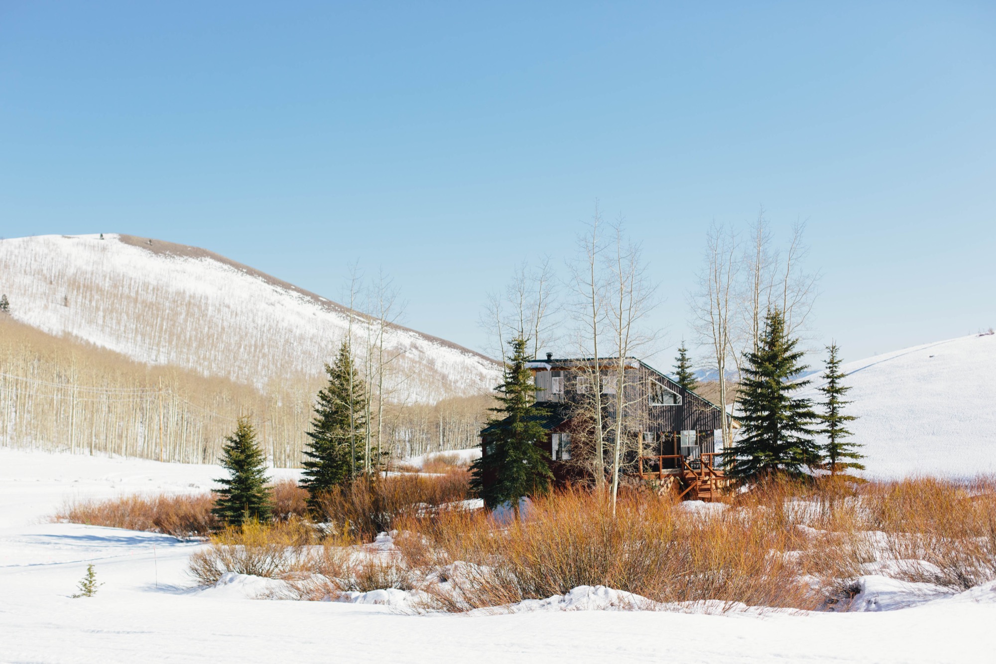
All the while the two knew they wanted a cabin of their very own from which to base their adventures. After searching for a couple of years, they found a run-down A-frame on the Wasatch Back in the Rocky Mountains of Utah that was within their budget. It was a fixer-upper, with the cabin barely standing, but on the plus side, it had great backcountry terrain close by and was just minutes outside of Park City.
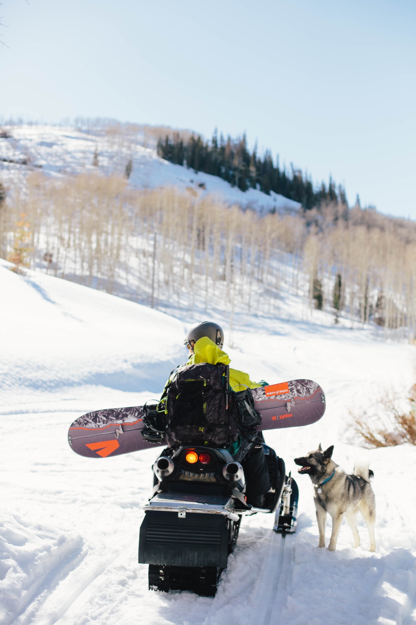
Technically, the cabin is located in Midway, but it’s closer to Park City. With all the snow in that area, they need a snowmobile to get back and forth during the winter. “It feels like you’re away from everything, but you’re really close to town,” says Zach. “The quality of living back here is top-notch. It’s so quiet and peaceful, and it’s really cool to be able to ski in and ski out.” Situated in a small valley, the cabin has a small seasonal stream running alongside it, enjoys full sun throughout the day, and also has great views of the mountains, aspen groves, and lots of wildlife nearby.
Building dreams
Unfortunately, what they thought would be a simple matter of some new insulation, plumbing, and sheetrock turned into a much bigger project. “It was like pulling a string on a sweater,” explains Cindi Lou. “Once we started, the whole thing just began to unravel.” After seeing holes in the roof and all the shoddy construction, they realized they would basically have to tear down almost everything.
Over the course of two years, with a lot of help from family and friends, the couple reconstructed and renovated their cabin, turning it into an open, 1,800-square-foot home. The previous owners had jacked up the original A-frame onto a taller foundation, added storage rooms underneath, and tacked on an addition to the north. Zach and Cindi Lou left the ground floor and the addition, but made them more structurally sound and weatherproof.
They tore down the A-frame structure and built a new space with straight walls and a south-sloping roof that mirrors the roof on the north addition. This transformation turned the home into a modern cabin and allowed for straight walls and more space inside while keeping the same footprint. The old roofing material was reused as the exterior cladding, giving it a rustic yet industrial look reminiscent of the old silver mines nearby.
Spray foam insulation helps create a tight, high-performance exterior to keep the home warmer. New energy-efficient windows bring in plentiful natural light so they don’t need to turn on lights during the day. “All the windows are definitely my favorite thing,” says Cindi Lou. “I love to look at the stars from my bed at night.”
“I love to look at the stars from my bed at night.”
Inside, the first floor has a large open-floor-plan kitchen and dining room, with the living room inside the original north section. Lofted above the bathroom, their bedroom’s tongue-and-groove wood paneling on walls and ceiling offers a warm and bright interior. Family heirlooms and vintage furniture fill the space, while giant black-and-white pictures of Zach and Cindi Lou snowboarding—a housewarming gift from Voilé— adorn their walls.
On the ground floor, an extra living space snugly surrounds a large woodstove that heats the entire home in the winter. Also downstairs are the laundry room and the couple’s gear-filled room of snowboards, boots, outerwear, camping gear, and biking, climbing, and shing gear for their summertime sports.
Living the dream
As it goes with most DIY homes, Zach and Cindi Lou’s cabin isn’t complete yet. It takes time to remodel a house, especially when you’re as dedicated to your passions as this couple is. Not to mention, they both have normal jobs in Park City that keep them busy. In the winter, Zach works as a snowcat operator at a local resort grooming ski runs, and in the summer, he switches to trail maintenance. Cindi Lou teaches yoga at Park City Yoga Adventures and buys gear for the local White Pine Touring shop.

In winter, they focus on splitboarding and being in the backcountry as many days as they can. In summer, they buckle down to work on their house, trying to complete whatever projects they can before the snow falls again. This next year, they plan to tile the kitchen and focus on finishing the downstairs, tricking out the gear room, and adding a second bathroom for guests. Eventually, they hope to add a photovoltaic system to take advantage of their great southern aspect.
The two have put a lot of hard work into their home, but say it’s all been worth it, plus a great learning experience. “It’s really rewarding now that it’s our own,” Zach says. “But I was surprised at what we were capable of.” Despite some real challenges, like building the water system or installing the roof rafters with a makeshift pulley system, the two got it done together and built their own backcountry heaven. Because working as a team, whether in the backcountry while snowboarding or renovating their cabin, is what the Grants do best. △
Minimal Design, Maximum Protection
Bivak Pod Skuto—an alpine shelter high up on Skuta Mountain in Slovenia
Icy, pelting rain, blinding snowstorms, radically shifting temperatures—Ljubljana-based OFIS Architects and structural engineers from London-based AKT II, in collaboration with students from the Harvard University Graduate School of Design and Rieder, designed Bivak Pod Skuto to withstand extreme weather conditions on Slovenia's Skuta Mountain.
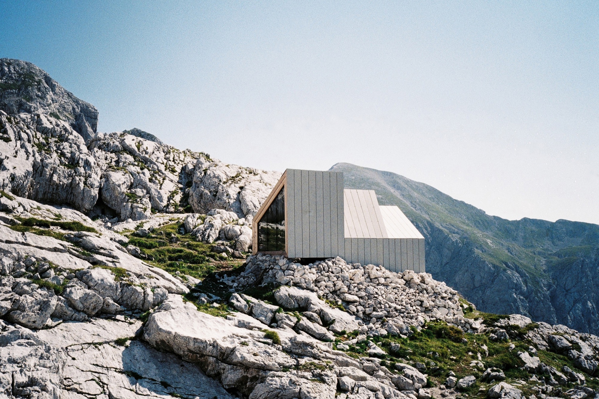
The remote bivouac's three modules allowed for helicopter transport up the mountain and functionally divide the space into entrance and storage, eating and socializing, and sleeping. The interior design bows to the function of sheltering up to eight mountaineers. With a nod to traditional alpine architecture and input from mountaineers, form and materials were chosen to respectfully respond to the extreme mountain conditions but also to provide panoramic views of the majestic wilderness.
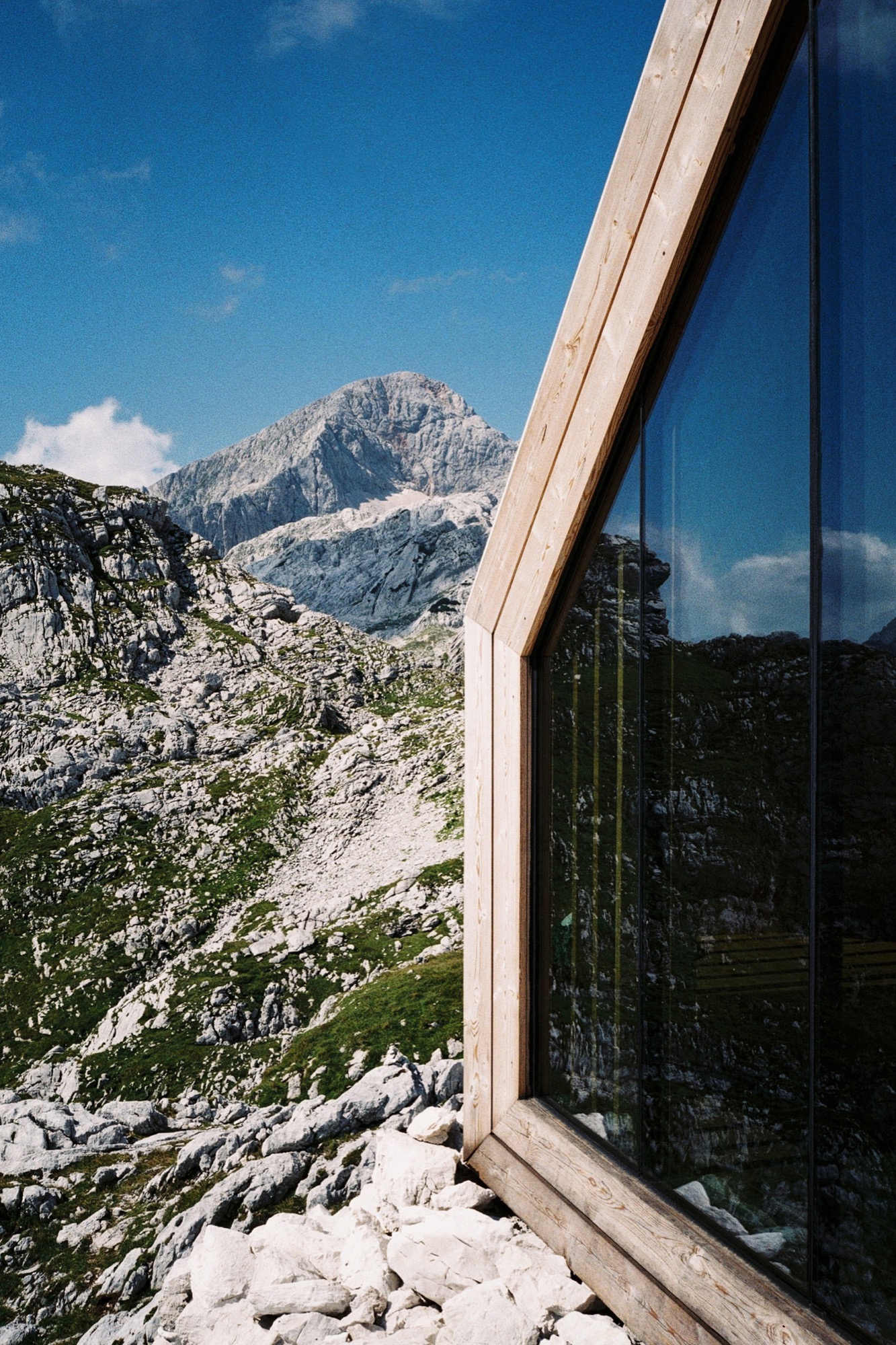
Constructing the frames off-site and fastening the structure onto pin connections allowed for a less invasive foundation (only the pins penetrate the rock) and left the mountain site as undisturbed as possible. The installation was completed in a single day. Although small, more than sixty people were involved in the demanding project, most of them volunteers and sponsors.
Photographer Jaka Bulc (@jakabulc) scaled the tremendously rugged terrain to discover the hauntingly cool bivouac
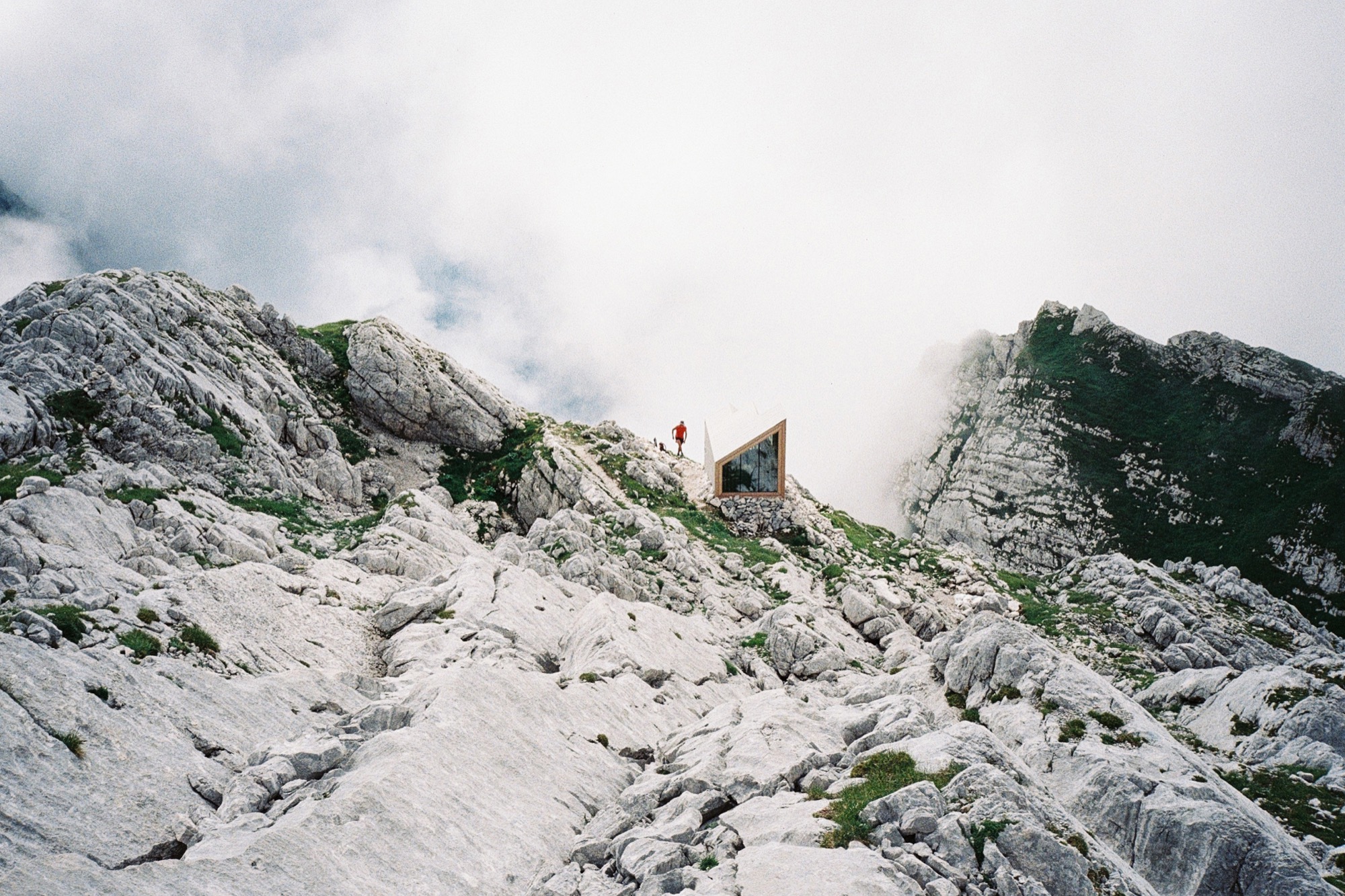
The hike up
The unmarked trail that leads to this bivouac starts in the Kamniška Bistrica valley, just a short drive from the Slovenian capital of Ljubljana.
The gravel road to the trailhead is bumpy and the trailhead itself is somewhat hard to find. The actual hike is not difficult technically, but it is very steep and relatively strenuous. The first part of the hike leads through a deciduous forest that eventually gives way to a sea of mountain pine. Above the tree line, the terrain mostly consists of scree and steep, grassy slopes. The last part of the hike is the prettiest: it winds its way through the alpine karst, full of interesting surface features.
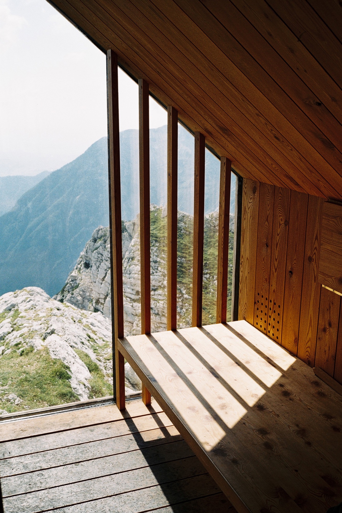
The bivouac was built in 2015 as a replacement for an older structure that occupied the same location in the previous decades. It is situated at 2045 meters (6709 feet) above sea level, underneath the southern walls of Skuta Mountain. The bivouac comprises three modules made out of glass, larch wood and various recycled materials that blend into its surroundings. It offers spectacular views of the Ljubljana Basin and the surrounding peaks, to which a couple of marked trails lead from the bivouac's vicinity.
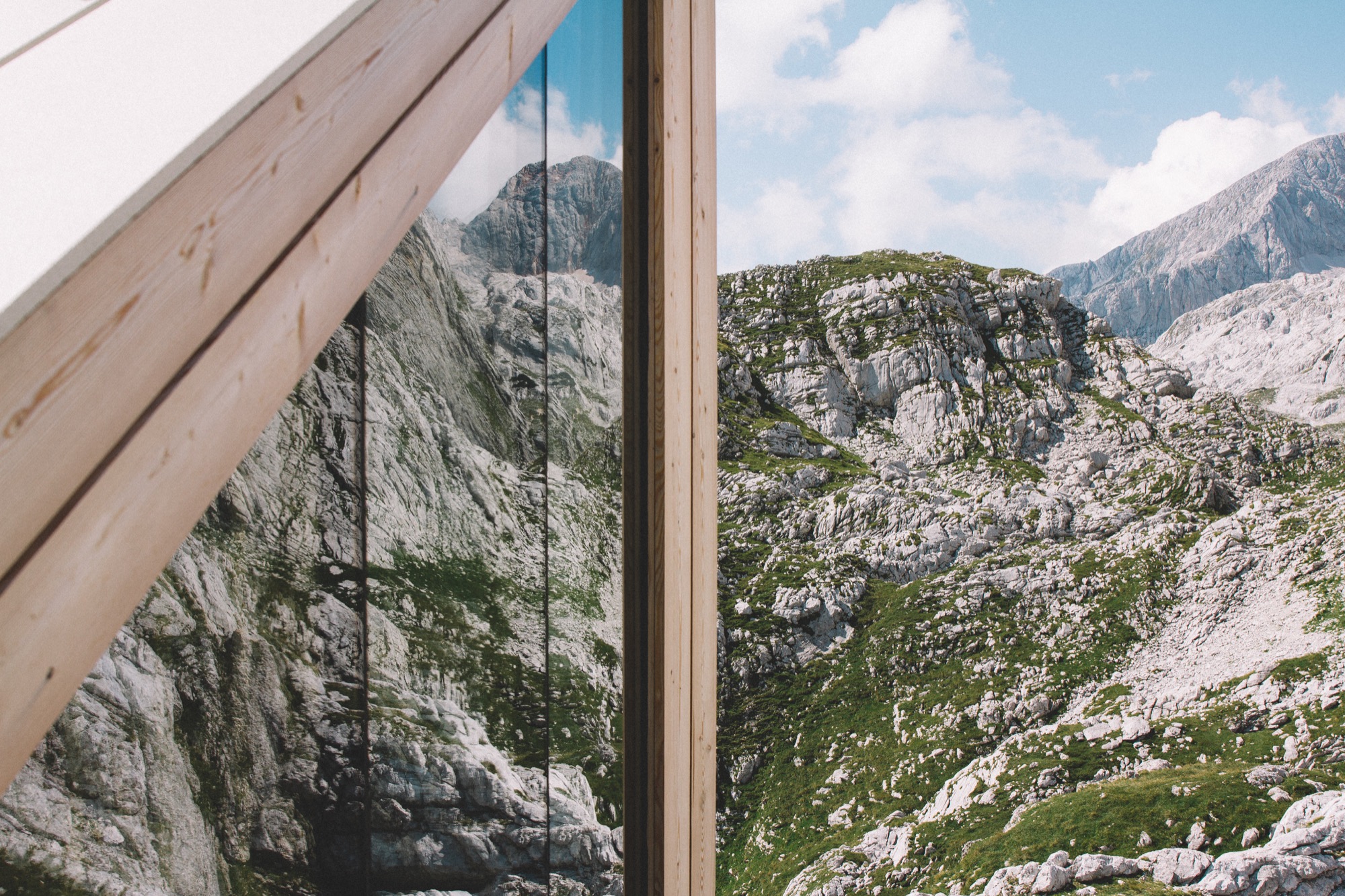
We hiked to the bivouac on a perfect September weekday, met very few people on the trail and even had the summit of Skuta all to ourselves. △
