Inspirations
Explore the elevated life in the mountains. This content debuted in 2015 with Alpine Modern’s printed quarterly magazine project.
Editor's Choice: Concrete Beauty
5 brilliant examples of use of the quintessential building material that helped to define the aesthetics of modern architecture.
Where would modern construction be without concrete? The building material is not only an essential element of modern architecture, it helped to define it's aesthetic. Equally, the cabins, homes, and resorts in these stories—collected from the printed Alpine Modern magazine as well as this Editorial—are unique for their use of concrete.

Refuge in Concrete
Refugi Lieptgas is the negative imprint of its ancient predecessor. Read the story→
The Swiss Art of Alpine Luxury
Jonathan Ducrest’s photo essay portrays the luxury hotel 7132 in Vals, Switzerland, with its iconic thermal baths designed by Pritzker Prize-winning Swiss architect Peter Zumthor. Read the story→
The Soul Catcher
Peter Haimerl’s progressive designs save derelict farmhouses. Read the story→
 Camera Lucida by Christian Tonko / Photo by Eduard Hueber
Camera Lucida
An artist’s atelier becomes a looking device into the Austrian landscape. Read the story→
Concrete Perspectives
Australian photographer Jake Weisz discovers the minimalist Amangiri Resort in Southern Utah. Read the story→ △
The Swiss Art of Alpine Luxury
Jonathan Ducrest’s photo essay portrays the luxury hotel 7132 in Vals, Switzerland, with its iconic thermal baths designed by Pritzker Prize-winning Swiss architect Peter Zumthor.
Jonathan Ducrest’s photo essay portrays the luxury hotel 7132 in Vals, Switzerland, with its iconic thermal baths designed by Pritzker Prize-winning Swiss architect Peter Zumthor. The moment we pulled up to the 7132 Hotel (named after the village’s postal code) in one of their chauffeured Mercedes, I thought I was in the latest Bond movie. The sleek redesigned entrance, dark lighting, and thick blue carpeting have this feeling of 1970s heydays, where James would meet one of his assets. The main building contrasts the square, monochrome design of the hotel’s famous thermal baths.
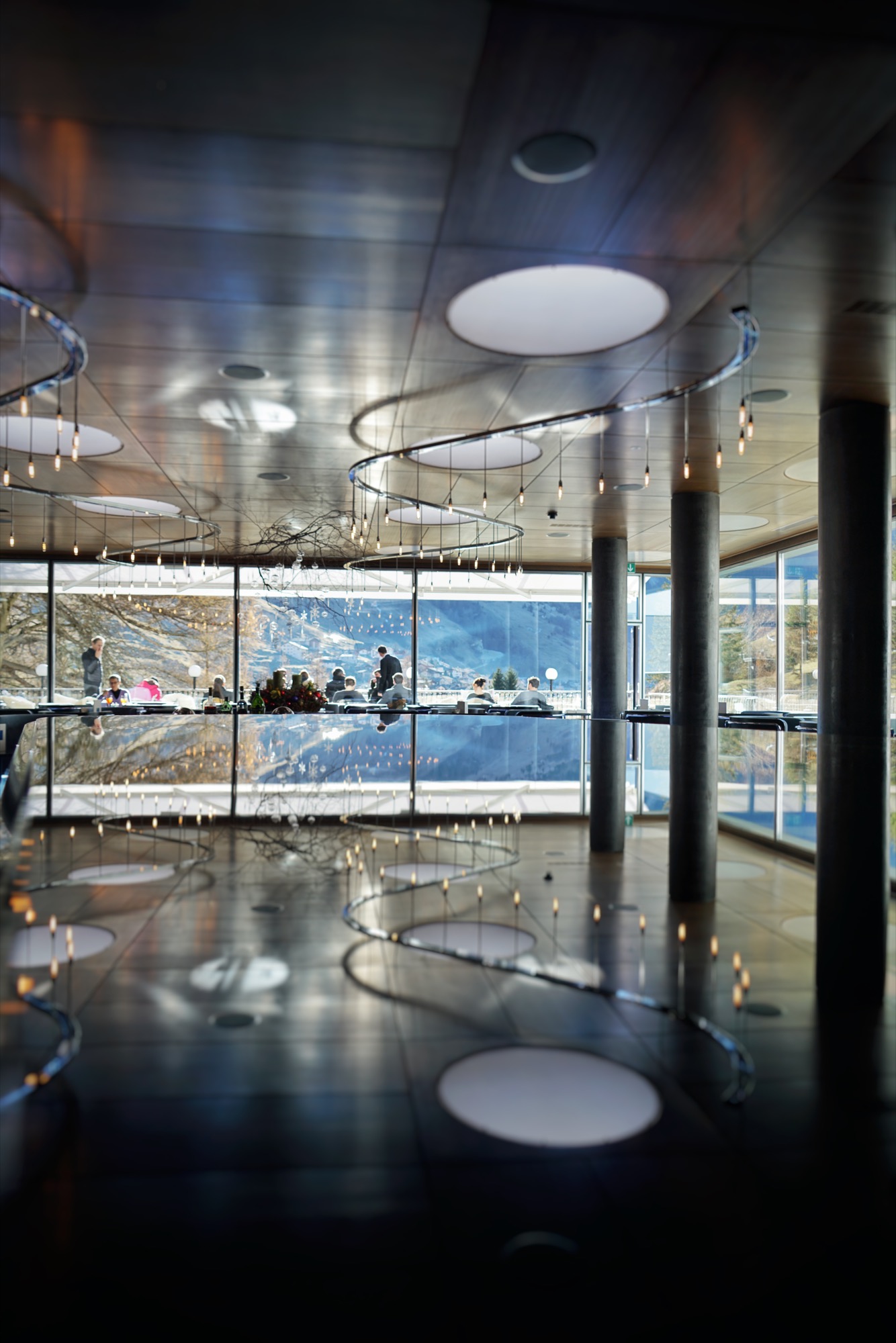
Zumthor’s thermal baths
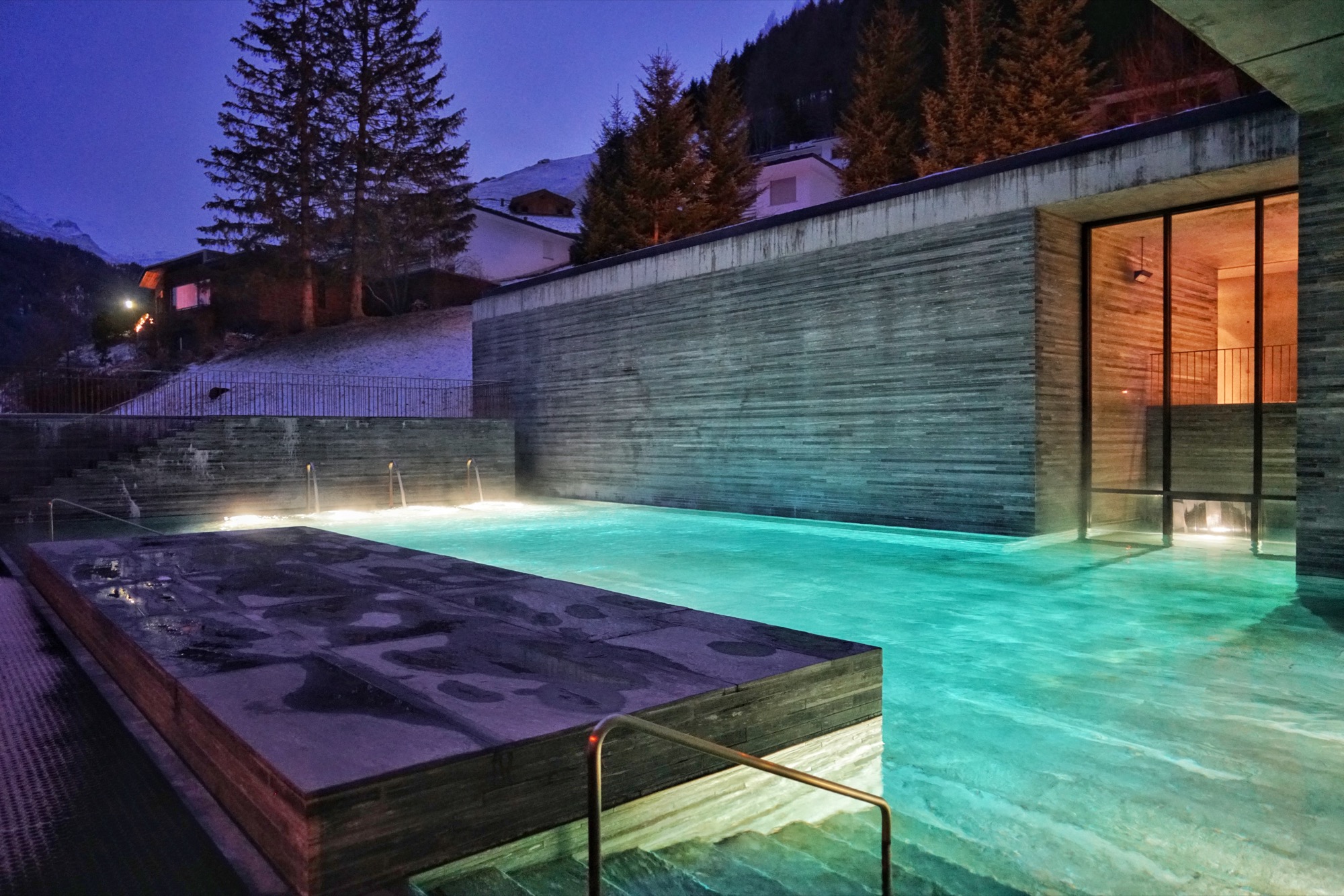
Nestled at the end of a small valley in the Swiss Canton of the Grisons, the village of Vals became a must-see destination in the late 90s, when the thermal baths designed by Peter Zumthor opened.
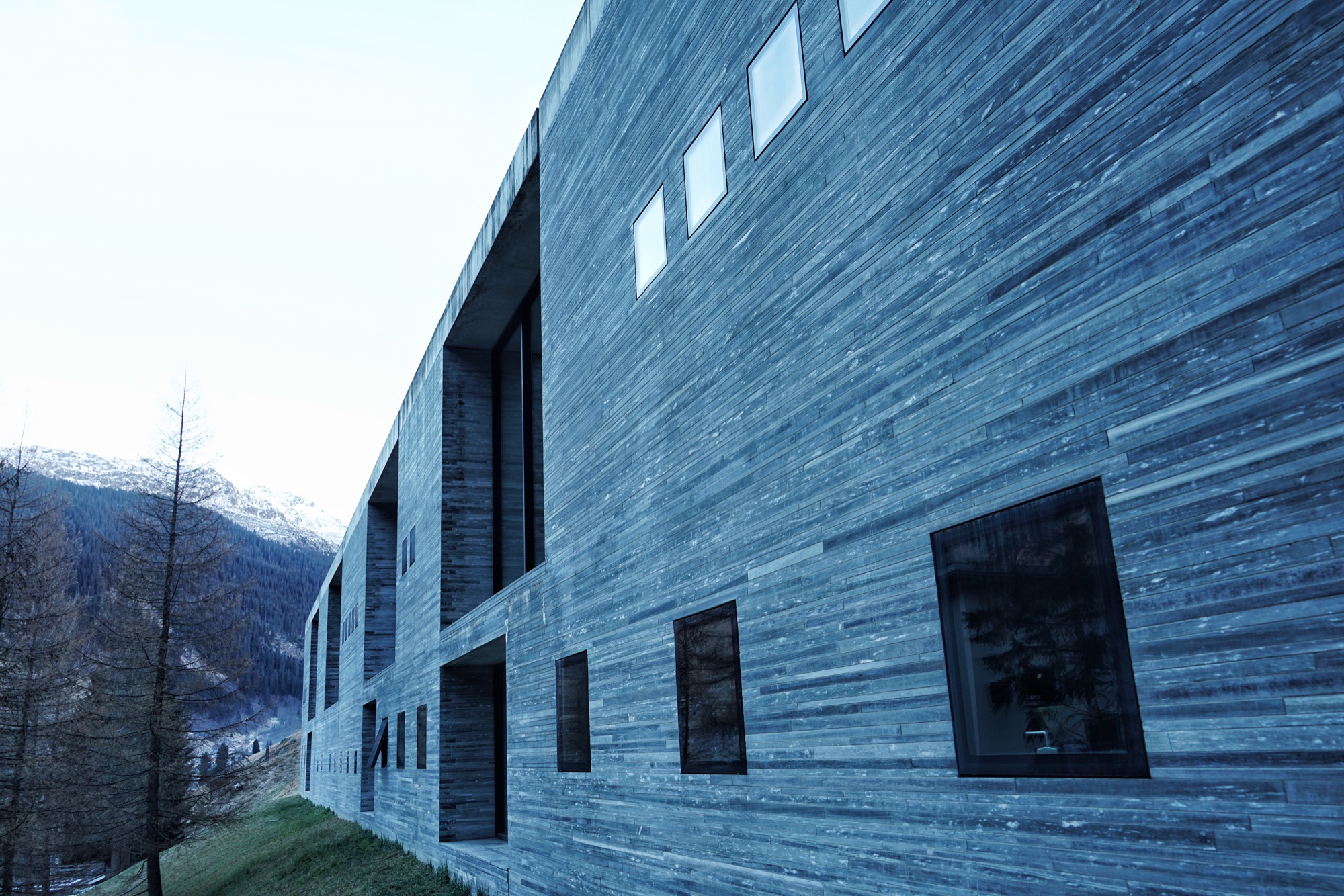
Built using only locally quarried slabs of quartzite, the minimalist spa evokes a cave and gives the impression to pre-date the hotel, which was originally built in the 60s.
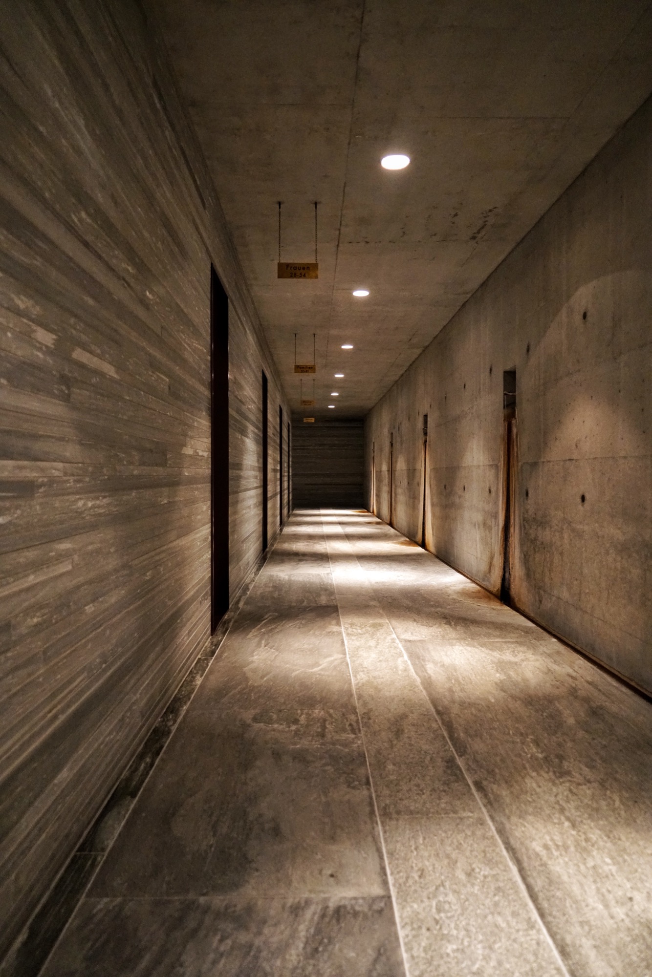
After walking through a dark, tunnel-like hallway and tapping the bracelet I was given at check-in onto the brass turnstile, I reached a larger concrete hall. On one side, thick leather tapestries curtain off the changing rooms with their glossy red lockers. On the other side, rusty pipes coming out of the wall are dripping water from the thermal spring.
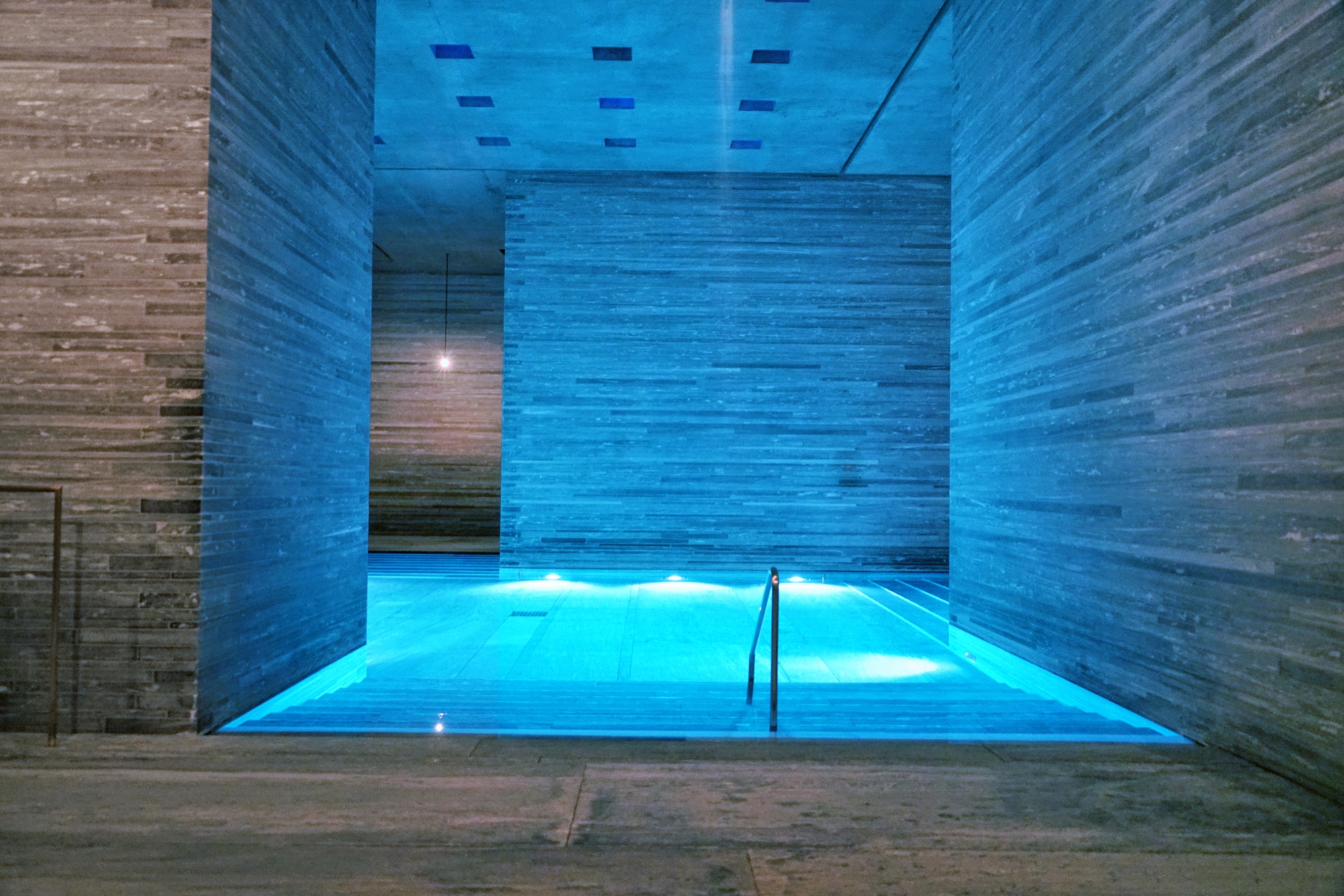
I stepped out on the other side of the changing room to find myself on the upper level, overlooking the main indoor pool in the center of the structure.
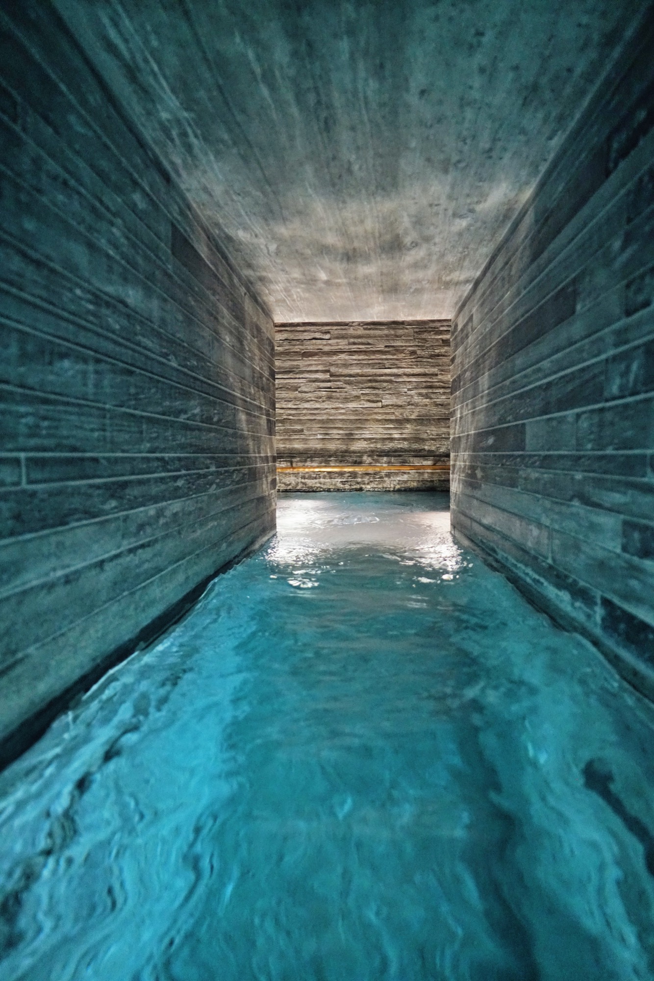
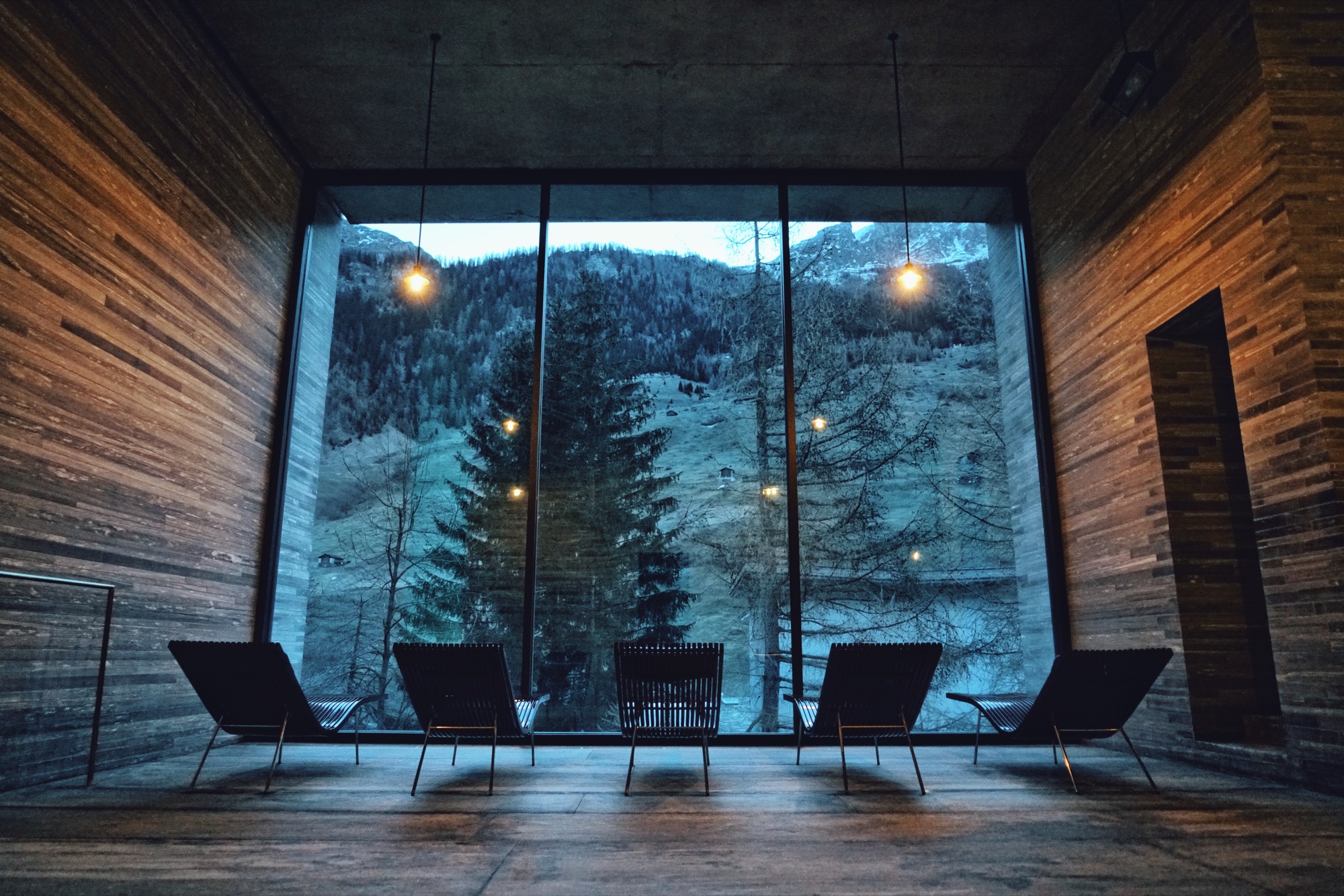
Smaller pools with different water temperatures, including one with floating flower petals, pushed me to explore every corner. An outdoor pool is accessible from the inside. Lounge chairs facing gigantic windows invited me to disconnect from my digital life and stare at the pine trees and the mountain across.
The hotel
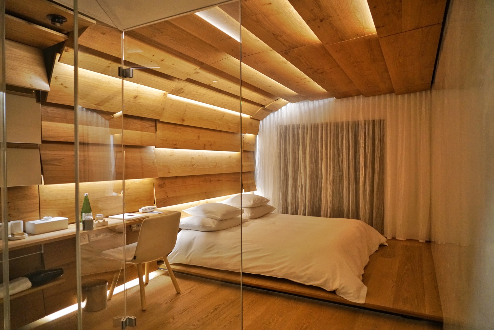
Since the village of Vals sold the hotel and spa to a private investor in 2012, many of the rooms have been redesigned, including a dramatic penthouse suite at the top of the main building. One of the luxury hotel’s five structures is called the House of Architects and features rooms designed by Tadao Ando, Kengo Kuma, Thom Mayne and, naturally, the master of Swiss minimalism himself, Peter Zumthor. The room I stayed in was designed by Japanese architect Tadao Ando. Its large Swiss oak panels enveloped me like a cocoon.
The lobby bar, where you can sip on an Aperol spritz, and the terrace, where you can take your afternoon tea cuddled under a thick sheepskin blanket, act as the hotel’s living room, where it’s easy to socialize with fellow guests.
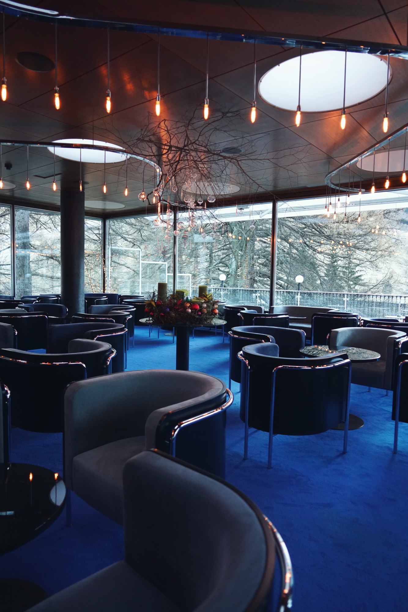
I devoured the regional cheeses and cured meats from the breakfast buffet after my swim in the outside pool under the stars at dawn.
The village is a quick stroll from the hotel. I had the opportunity to visit Vals both in winter and in summer. It’s a completely different experience. Do both, if you can. △
Alps // 40
An unfiltered, low-speed journey across Swiss peaks in words and images by Boulder photographer Jamie Kripke
Slowing down gives us more time to look. Having more time to look changes how we see. I wanted to slow down.
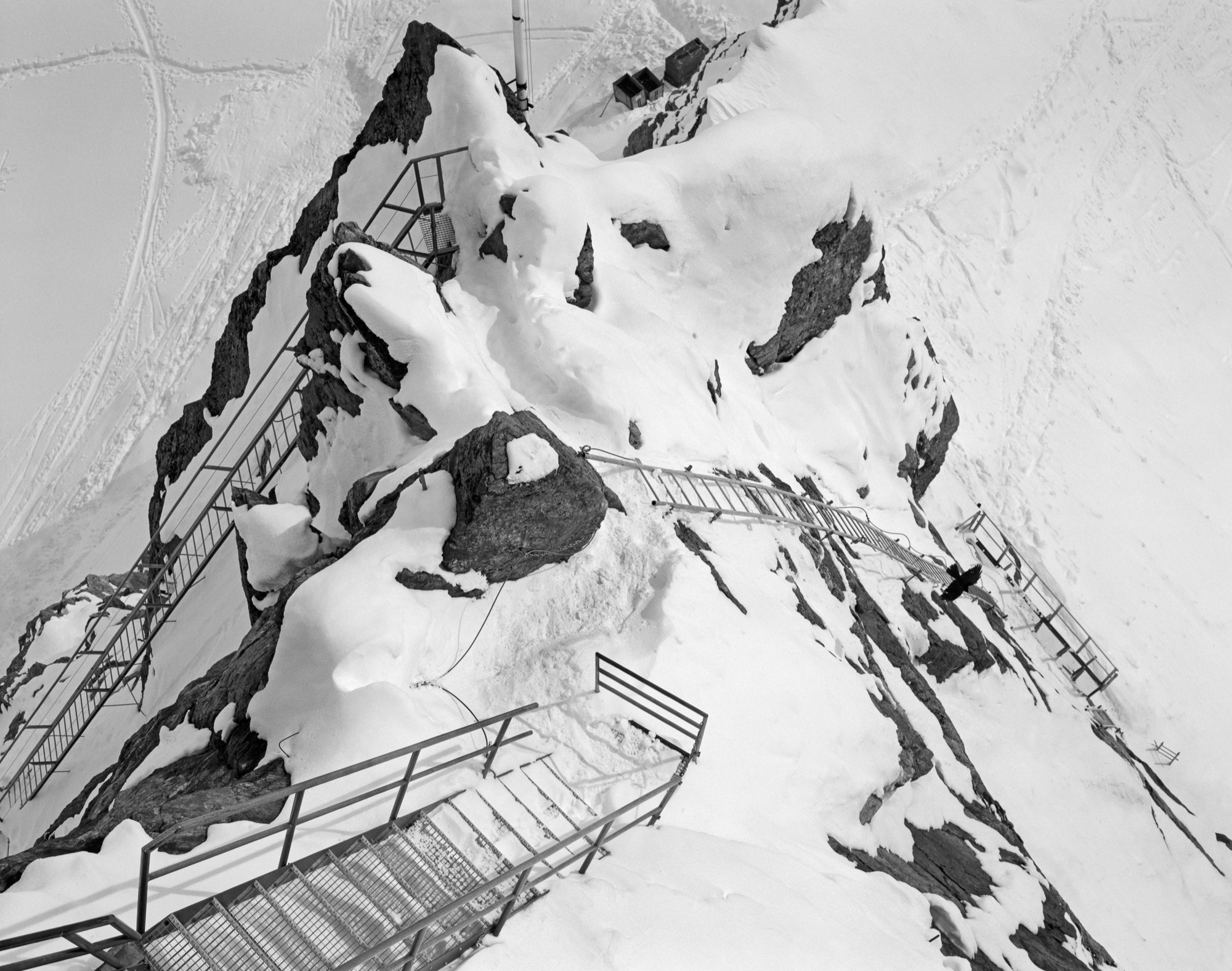
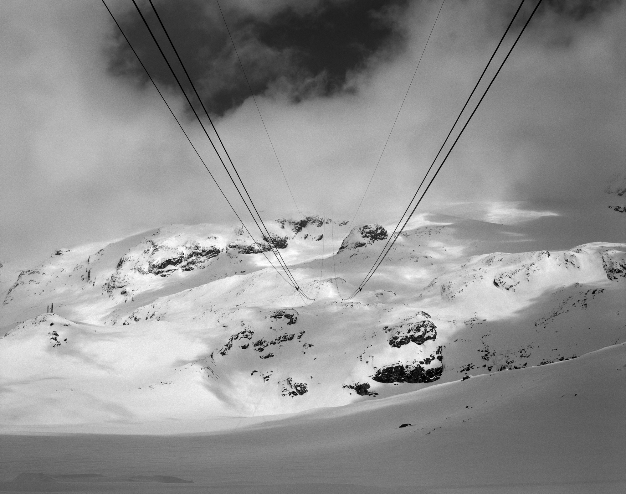
Using alpine touring skis, a small backpack, a folding medium-format camera, and twelve rolls of black-and-white film with ten exposures per roll, I set out to traverse and photograph a high route across the Alps. Each piece of equipment for this trip was chosen for its simplicity as well as its limitations—and for the extra time, attention, and patience it requires.
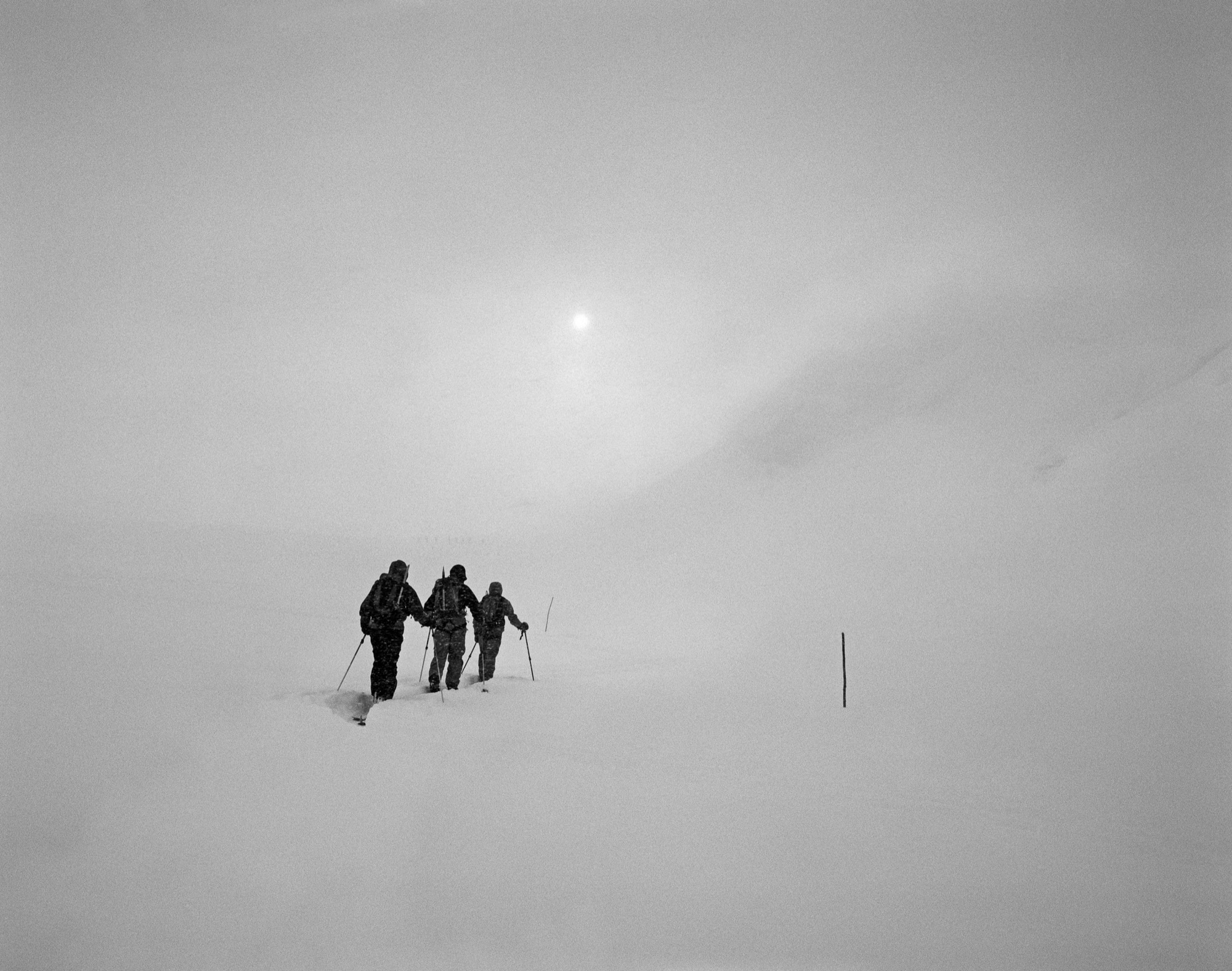
Traveling up and over mountains by skis has a way of shifting time away from something that is measured in minutes, hours, and days. Ascending one step at a time through untracked snow, the units become ski lengths, pole plants, breaths, sips of water, bites of food, daydreams, changes in weather or light.

The physical limitations of low-speed film in a mechanical camera call for a heightened attention to composition, exposure, and technique. Every frame becomes its own unique experience—one that builds gradually with each precise movement of the camera, each small adjustment for focus, aperture, or shutter speed.
"Every frame becomes its own unique experience."
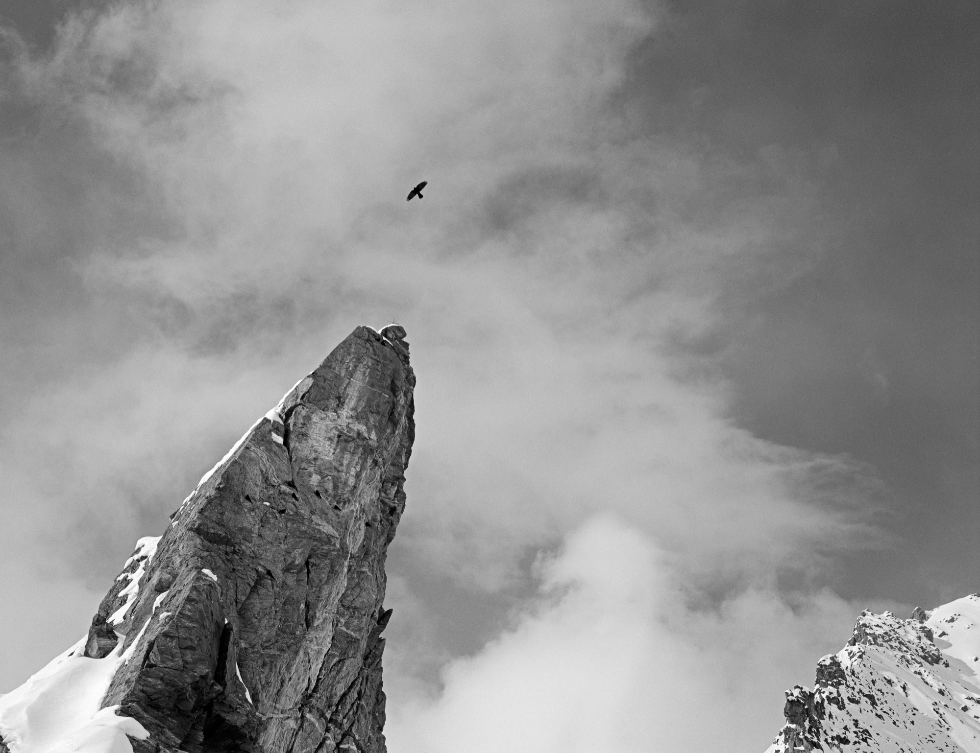
Once I’ve settled on an image, I take a deep breath and try to be as still as possible. High in the Swiss Alps, in the space between the breath and the click of the shutter, time slows to a stop.
"High in the Swiss Alps, in the space between the breath and the click of the shutter, time slows to a stop."
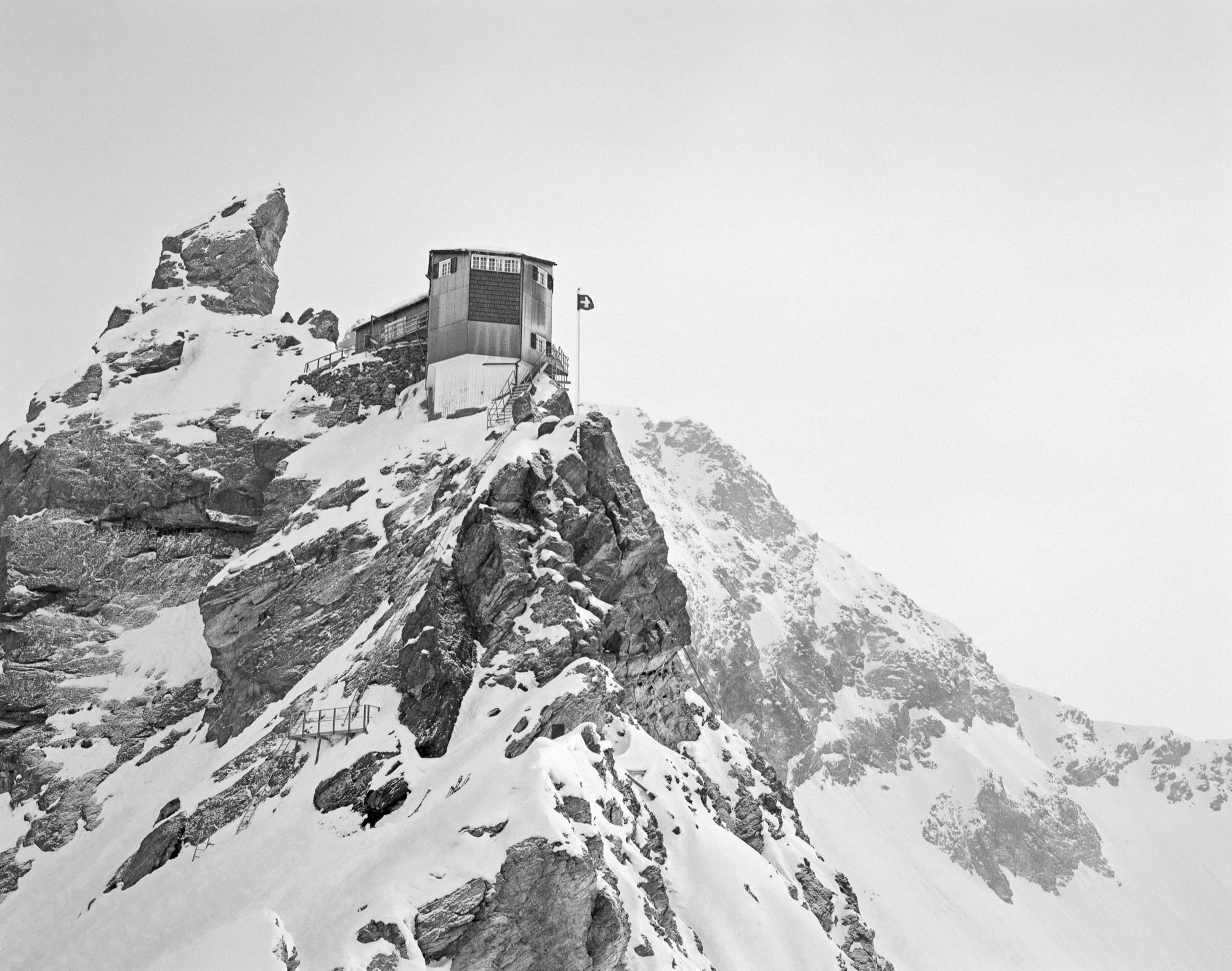
These images were made over the course of eight days, and selected from a total of 120 images, where just one exposure was allowed for each image. They have been minimally altered from their original form in order to stay true to the tonality of the film, and are the pure, unfiltered, timeless compositions that I’d been looking for. △
Your Highness: Chalet Zermatt Peak
Celebrities and royalty stay at this über luxurious chalet with majestic Matterhorn views
Zermatt / Canton of Valais / Switzerland A stay at Chalet Zermatt Peak with views of the majestic Matterhorn is pure indulgence, and that begins with the location: Zermatt is one of the most beautiful mountain resorts in Europe.
“Chalet Zermatt Peak was designed to make the most of its stunning surroundings,” says Sarah Hixon- Broad, head of sales and operations at Chalet Zermatt Peak. “Floor-to-ceiling windows offer guests unrivaled views, and the interior had no expense spared to make it the most luxurious chalet in the village.” Rated “five star plus,” the five-bedroom chalet comes with a personal chef, concierge, serving staff, housekeeping, and masseuse. Though Hixon-Broad won’t drop names, she says, “We have had members of several European royal families, celebrities, and sports personalities.”
Fire / Wood
His Nordic German upbringing, traditional Swiss carpentry training, and the Bauhaus Manifesto deeply influence Canada-based designer and furniture-maker Nicolas Meyer as a craftsman and intellectual
Nicolas Meyer’s approach to design and craftsmanship is firmly anchored in his traditional Swiss training as a furniture maker and balanced with his Bauhaus-influenced intellect.
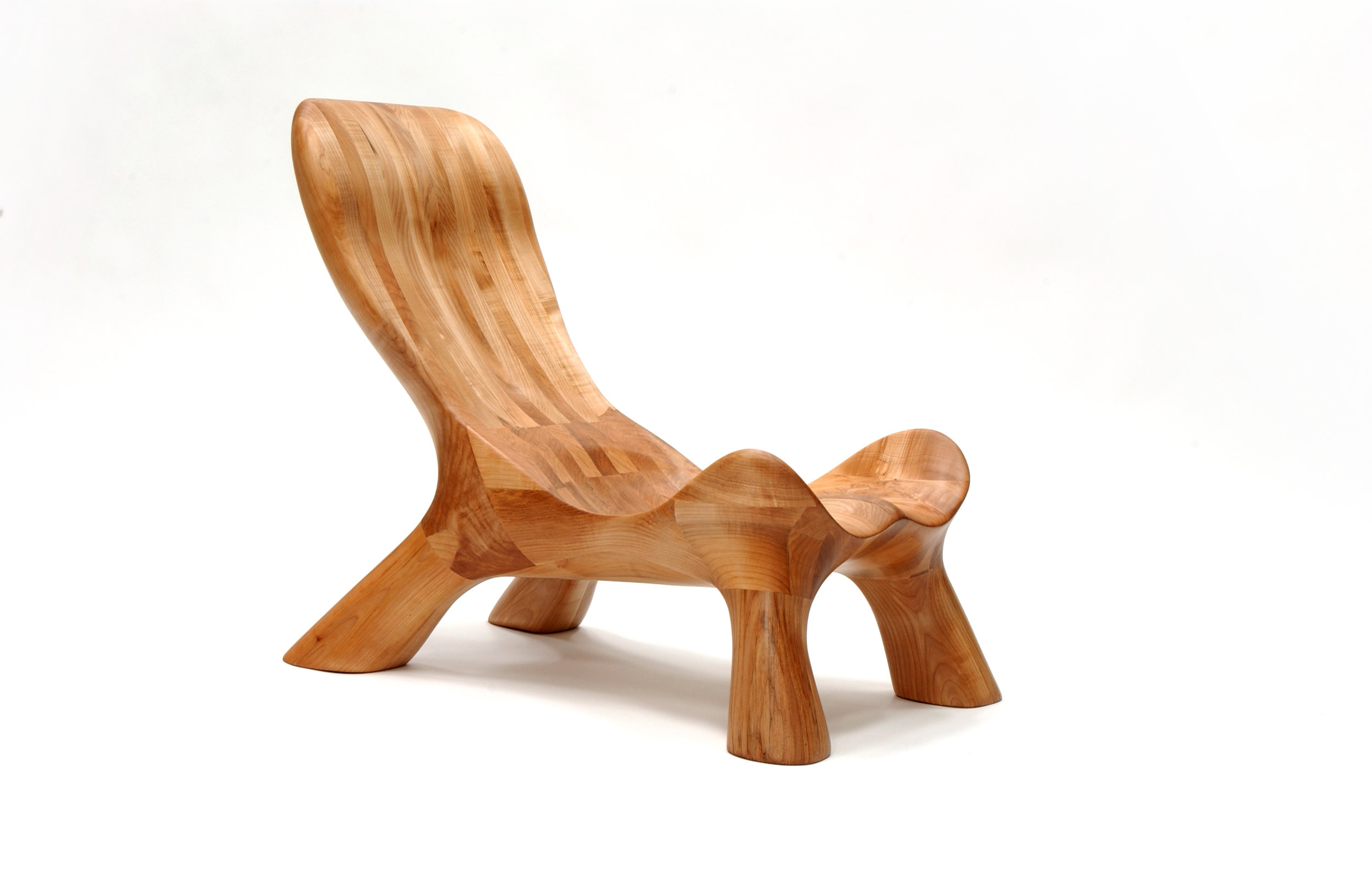
Nicolas Meyer is not one thing, not from one place. Born in Germany and raised in Switzerland, the multifaceted founder of Nico Spacecraft has put down roots as an artist, designer, woodworker, and furniture-maker in British Columbia, Canada.
A sincere dialogue about design and wood quickly reveals the man is at once both an intellectual and a craftsman. No surprise, he seeks balance in everything he does.
Meyer grew up in Hamburg, Northern Germany. With a real estate-developer father and an antique-collector mother, the boy was exposed to architecture, construction, and fine furniture throughout his childhood. The parents separated when he was ten, and he moved to Switzerland with his mother.
In 1991, Meyer lived in Vancouver for half a year to improve his English. He returned to Switzerland to complete a traditional four-year apprenticeship in furniture-making, which he finished a year early by virtue of prior education, excellent marks, and extraordinary talent. All this time, British Columbia remained on his mind.
The decision to return four years later to settle in Canada was spiritual as much as rational. “Things just feel right, and you find your place where you want to build your life,” Meyer reflects. Having spent the first ten years of his life in Hamburg, he was influenced by the ocean, water sports, the city’s harbor as “gate to the world,” the metropolitan lifestyle. In Switzerland, where he lived until age twenty-five, he later fell in love with the mountains and skiing. “Vancouver combines all of that. This is one of the few places where you can probably ski and kayak on the same day,” says the expat. “On top of that, this was my place. I grew up in this tension between Hamburg and Switzerland. As a kid who is constantly in between these two places, you wonder, what is your home.”
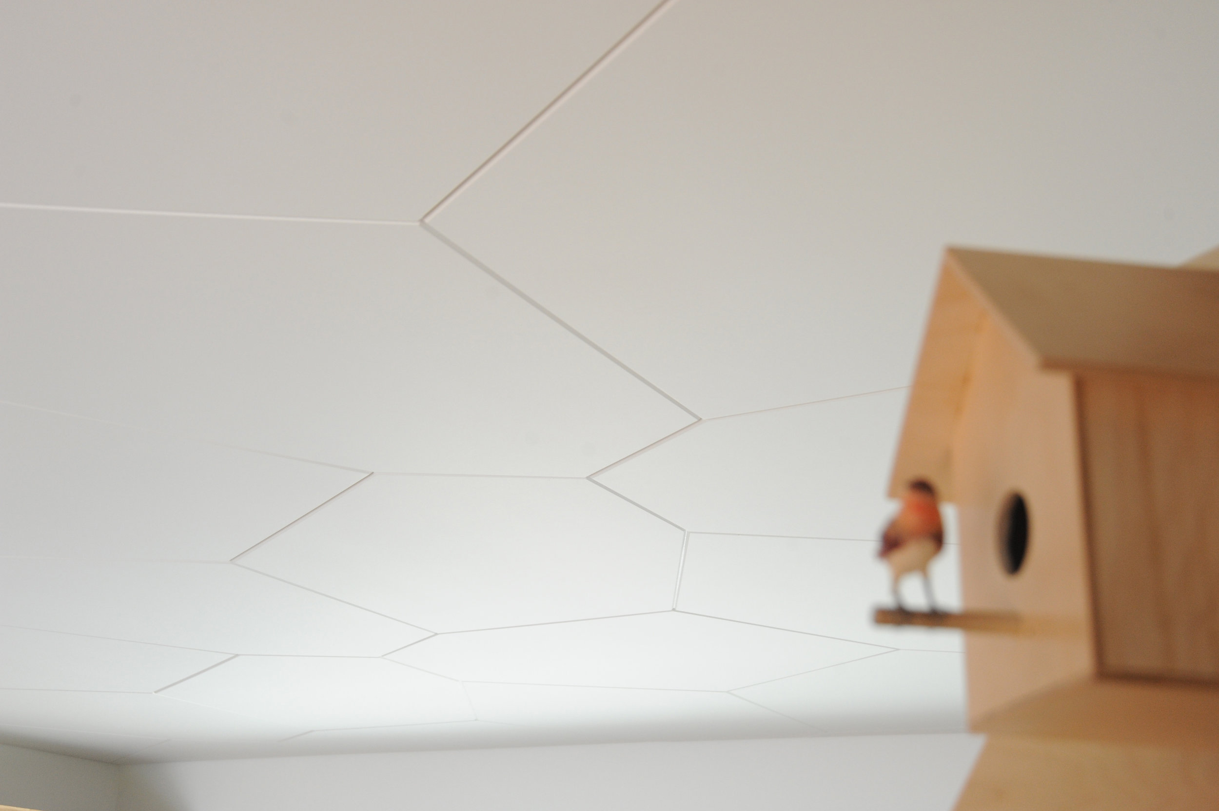
Today, Meyer is a designer, a woodworker, an artist—his creative drive the common thread. As child, he wanted to become an inventor, broke a lot of things, took them apart to understand them. In his later teens, he eventually began fixing things. “I also read a lot. I came to design and wanted to study architecture,” he says. He originally planned to study interior architecture in London after his apprenticeship in Switzerland. By that time, however, he’d already lost his heart to Vancouver. “I was too impatient and thought, I’ll go to Canada and find my way to design with what I have.”
His apprenticeship as well as the subsequent decision to practice, not study, were driven by his readings: the Bauhaus philosophy in particular—“Most of all, Walter Gropius and his manifesto, which expresses how the core of creativity can only come out of understanding a craft,” says Meyer.
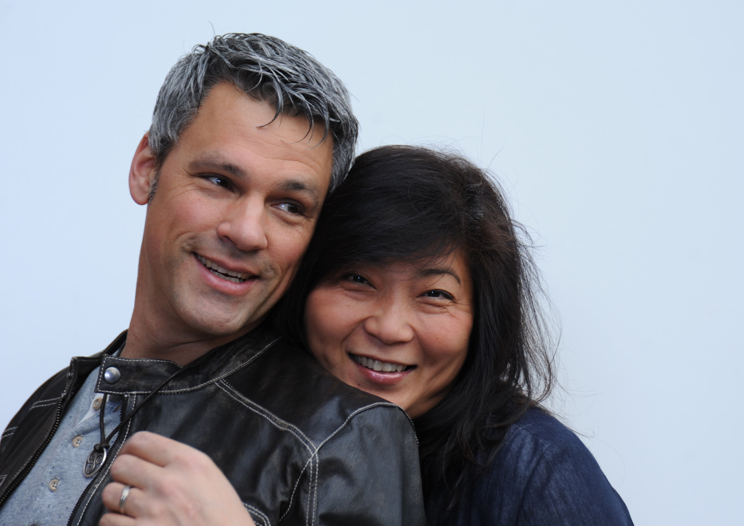
“For art is not a profession. There is no essential difference between the artist and the craftsman. The artist is an exalted craftsman.” — Walter Gropius, Bauhaus Manifesto, 1919
The Bauhaus Manifesto guides Meyer to this day, everyday. Together with his wife, Jess Meyer, he runs Nico Spacecraft, a small design studio with integrated wood workshop that produces kitchens and baths, furniture, custom spaces, and architectural elements. The company’s full-service design division has its own name: Baumhaus Atelier—presumably a nod both to Meyer’s enthusiasm for all things Bauhaus as well as to his passion for trees (Baumhaus is German for treehouse). “It’s about striking the balance between being in front of the computer screen or a sketchbook and actually being in the shop and working with materials,” he says. “When I spend too much time in the shop, building all the time, I itch to sit down and sketch out ideas, whereas when I’m in the office too much, I lose touch with the reality of structure, weight, and smell, and how things actually connect.” The creator admits he usually knows he has overextended himself at the drawing board when he starts designing things that don’t work in the real world.
“When I spend too much time in the shop, building all the time, I itch to sit down and sketch out ideas, whereas when I’m in the office too much, I lose touch with the reality of structure, weight, and smell, and how things actually connect.”
When the designer completely loses himself in the details—or, as he calls this foible, “taking the typical German-Swiss approach”—then his wife, who studied fashion design and now handles the company’s business side, provides the balance, telling him to take a step back. “When I get stuck, Jess looks at the entirety of the design perimeters and pulls my head out of my behind. We complete each other not just as life partners but also in our work.” Like her husband, Jess Meyer has called multiple places home before settling in Roberts Creek. She was born in Taiwan and brought up in Singapore and later in Tehran, Iran. The couple is raising their two children in the small beach town with a vibrant arts community on British Columbia's Sunshine Coast. Before, living in Vancouver had meant the parents missed out on all the babies’ firsts, which at the time the nanny got to experience in their place. Something needed to change. And after a one-year journey of searching for the right property, the Meyers found their home with five acres of land on which to built the shop and a garage they converted into the design studio. “Now we eat every meal together, and the kids come running to show their faces in the shop or in the office after school,” the father says.
The family also loves to travel together, often to Mexico or back to Europe. “I miss the mountains of Switzerland,” Meyer tells. “Aside from the skiing and the snow, the mountains provide me with tranquility. Sometimes, it helps to reconnect to your roots and the way you were raised.”
Wood Stock
“Look around, and it’s obvious—I love wood,” Meyer laughs. “Because you never really stop learning about it. Technically, when you cut down a tree, it’s dead. But wood itself continues living; it moves, it changes, it breathes, and you cannot apply any rigid rules, because no tree is like the other, and everything, everything influences its properties—where the tree grew, the minerals it fed into its system, the wind . . . If a tree sits in a wind corridor, it develops tensions on one side, and it can counterbalance these forces to find its equilibrium with the environment. All this is imprinted in the wood. Each piece you work with will react slightly differently. That teaches me humility.”
For all that, a wood whisperer he is not. Fellow woodworkers may profess driftwood, even a tree stump, speaks to them, revealing what it wants to become. The craftsmen are merely the tool. “I can respect that, but I am more intrigued by structure, structural integrity, and physics,” says Meyer. “Even a tree trunk never really inspires me to do anything. What I do want to do is cut this apart and reassemble it.” Meyer’s view of today’s common practice of kiln-drying wood is ambivalent. He understands the necessity of expediting the process and killing the creatures living inside the wood. In Switzerland, where he learned the craft, most wood is still naturally air-dried for many years, allowing the material to maintain its structural property. Meyer explains that “cooking” the wood extracts moisture at a speed that destroys the integral structure of the wood fibers, the cells collapse, and the wood becomes brittle. “I see these drawbacks when humans don’t work with the wood but force their will onto it because they have a schedule to keep, and they are pushing for high turnover, needing the cash flow.”
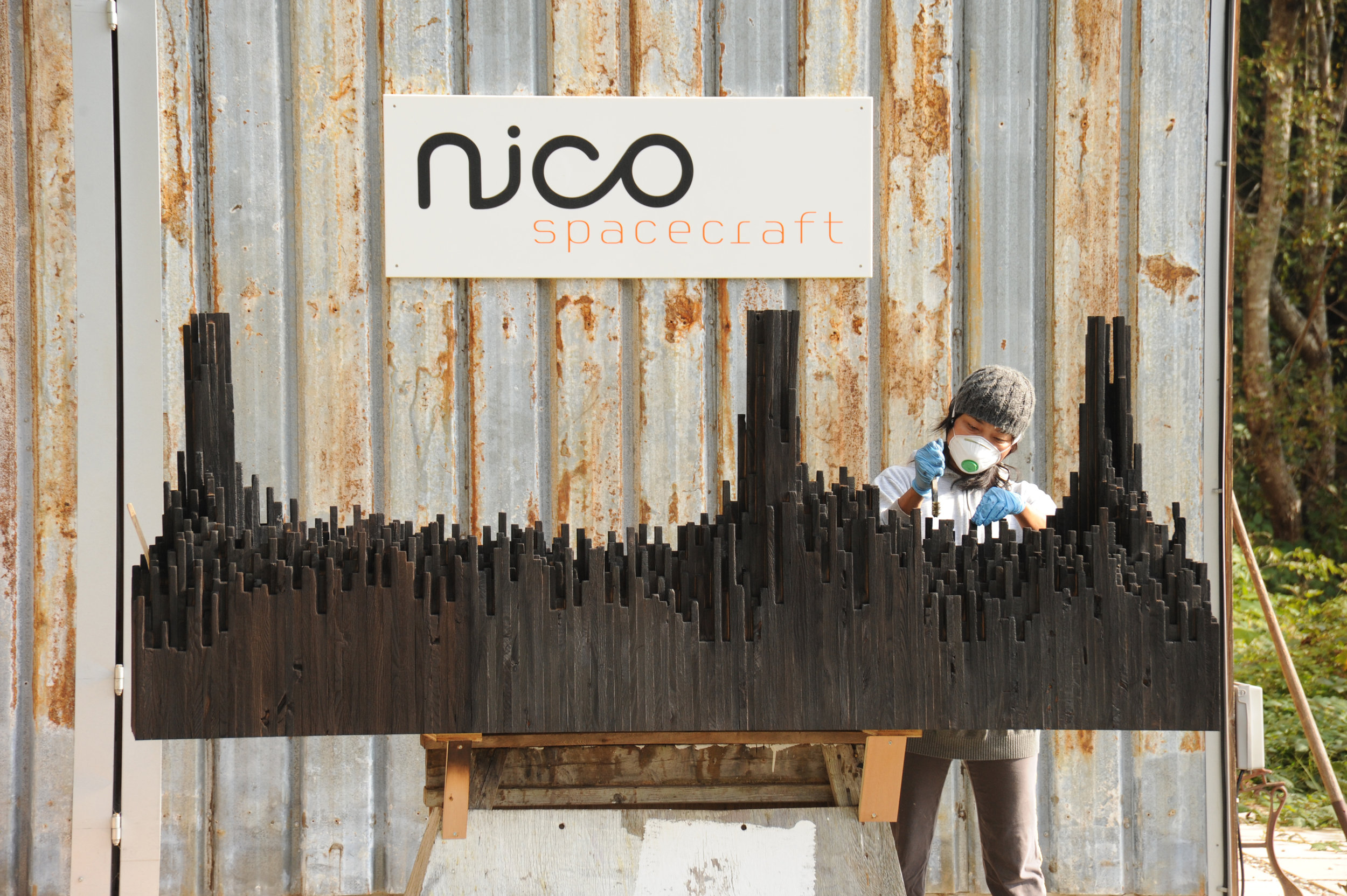
The advocate for responsible woodworking practices himself would prefer to exclusively use air-dried wood. “But it’s not feasible. It’s an ideology, and whenever I can, I do.” He also works with salvaged materials and appreciates a good story behind the wood—and so do his clients. For instance, “White oak is rare here on the West Coast,” Meyer begins a tale. “Ninety-some years ago, one of the first skippers planted this white oak tree here . . . ” Meanwhile, after splitting, the tree was deemed unsafe and destined for firewood. The community was in uproar about cutting down their heritage oak. Meyer and a miller friend arranged a crane, milled the wood, and air-dried it over the years, until a client emerged from Vancouver who appreciated the story and the historic value the tree represented.
Nordic-Swiss authenticity
His Hanseatic birthplace and Swiss training shaped not only Meyer’s design sensibility but also his work ethos, for better or worse. “When I first came to Canada, I was extremely rigid,” he reflects. His first gig was renovating a house—working out of a garage, with limited resources and tools. “In Switzerland, there is a machine for everything, and there is a way of doing everything. That’s how I was trained. But this rigidity of ‘This is how you do things, and there is no other way’ was initially hard for me to overcome.” In hindsight, that first Vancouver project taught him that there are many different practices. “That was a very valuable lesson I apply to this day and that has become an integral part of my approach. Once again, there is a fusion, a balance between the static world, the reality, and how you get to understand it. Only if I understand, I am suddenly able to discover all the different options of what this will allow me to do, and that’s where my creativity kicks in.”
“In Switzerland, there is a machine for everything, and there is a way of doing everything. That’s how I was trained. But this rigidity of ‘This is how you do things, and there is no other way’ was initially hard for me to overcome.”
The designs of Nico Spacecraft are exquisitely modern. Sustainability is essential in everything the family-run company does, even their two-story workshop received a Green Design Award from the Canadian Wood Council in 2010. But what Meyer keeps touching upon in discussing his work is authenticity, his clients’ shared yearning to connect with what is real. “People are going back to the craftsmen, back to working with the designer, and being involved and understanding the story.”
“People are going back to the craftsmen, back to working with the designer, and being involved and understanding the story.”
Storied Pieces
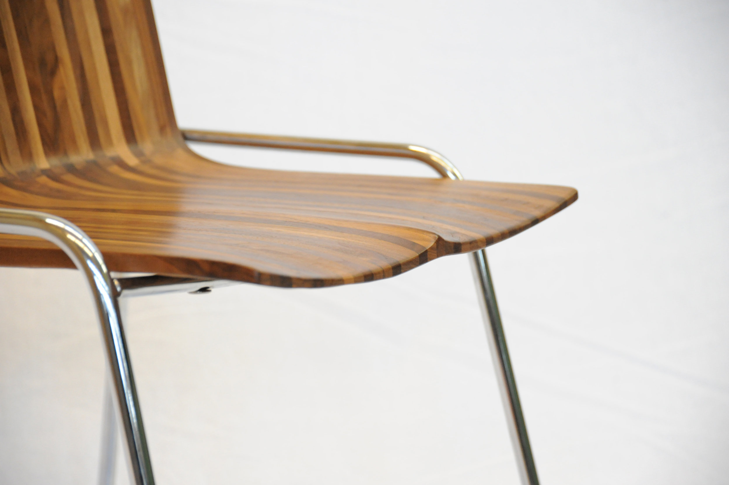
Indeed, there is a story behind all of Meyer’s works and usually to the wood he’s using, too. Take the CurveChair, a piece of sculptural furniture—as well as a piece of art. For endless hours, Meyer carved the sensuous lounger by hand after a clay model he made. “That chair, in many ways, represents everything I am doing,” he says. “There is an organic process involved, there is a structural process involved, and we know where the wood came from, there is a story.” The wood came from a development site at Simon Fraser University and was made available to woodworkers of British Columbia to provide a design for an exhibition. “It was a marketing thing for them, because they had to take down quite a few trees at that site,” Meyer remarks. “One of them was this huge maple, so we got the maple wood and submitted this chair. It was on display at the Pendulum Gallery in downtown Vancouver for three months.”
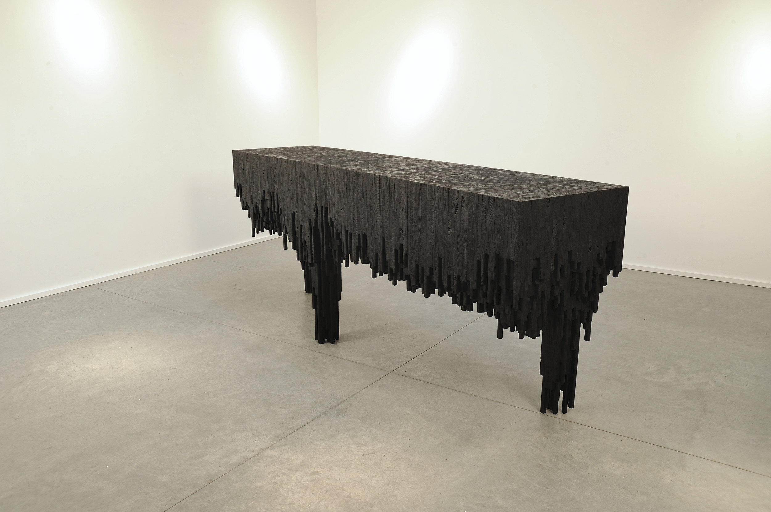
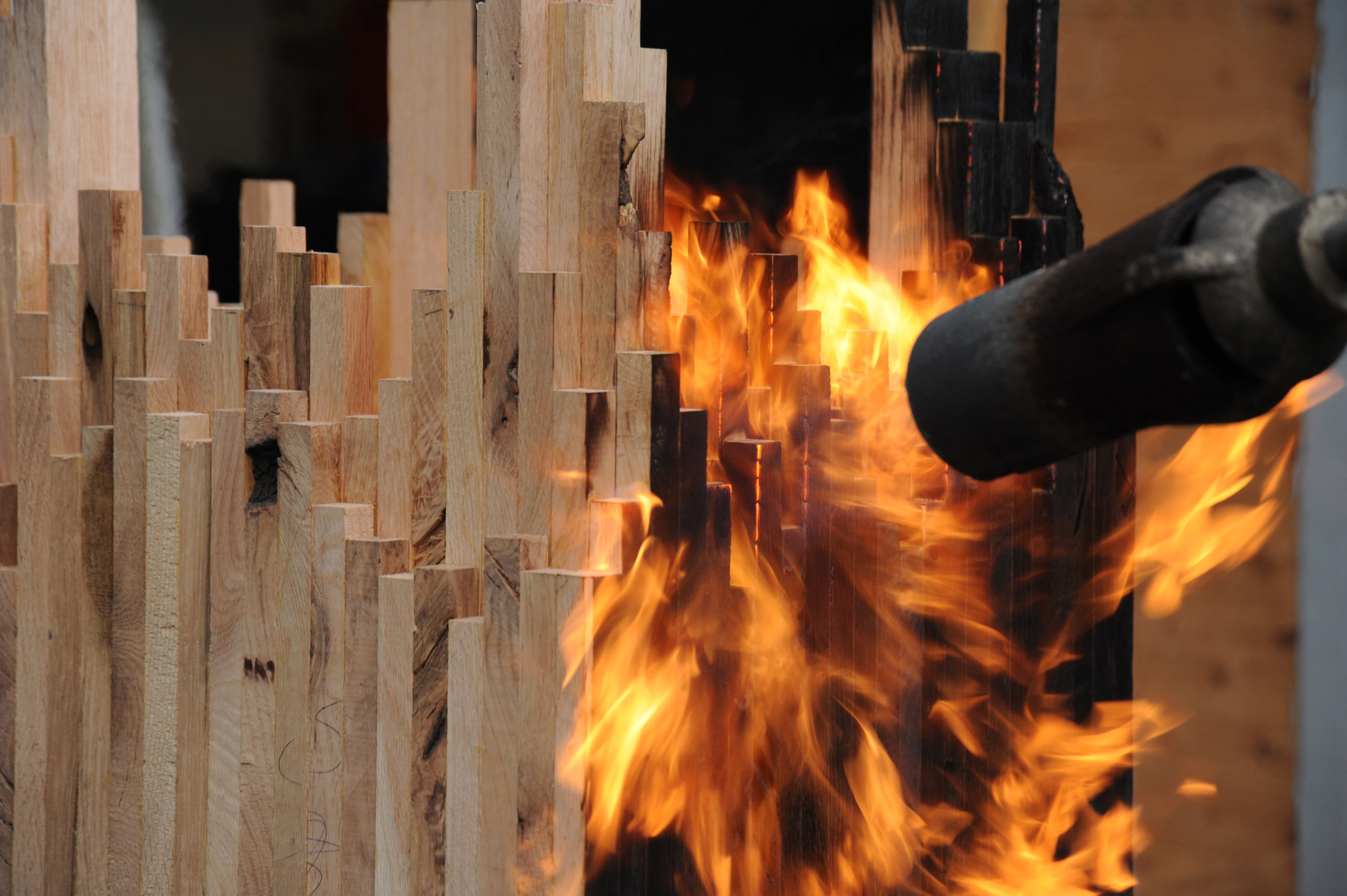
Meyer’s latest series—its cynosure a console table—is inspired by The Black Tusk, a stratovolcano and a pinnacle of rock at 2,319 meters (7,608 feet) above sea level near Whistler, British Columbia. “After a month of dynamics between Jess and me, we ended up with the Black Tusk console,” Meyer says. Individual solid sticks of oak wood were laminated to create different shapes, giving each a sculptural character. The assembled piece was then charred by flames, wire-brushed, and coated with oil. “It struck a nerve with people—and with me, because, again, there are the two elements I en- joy, a balance between art and then the design and craft.”
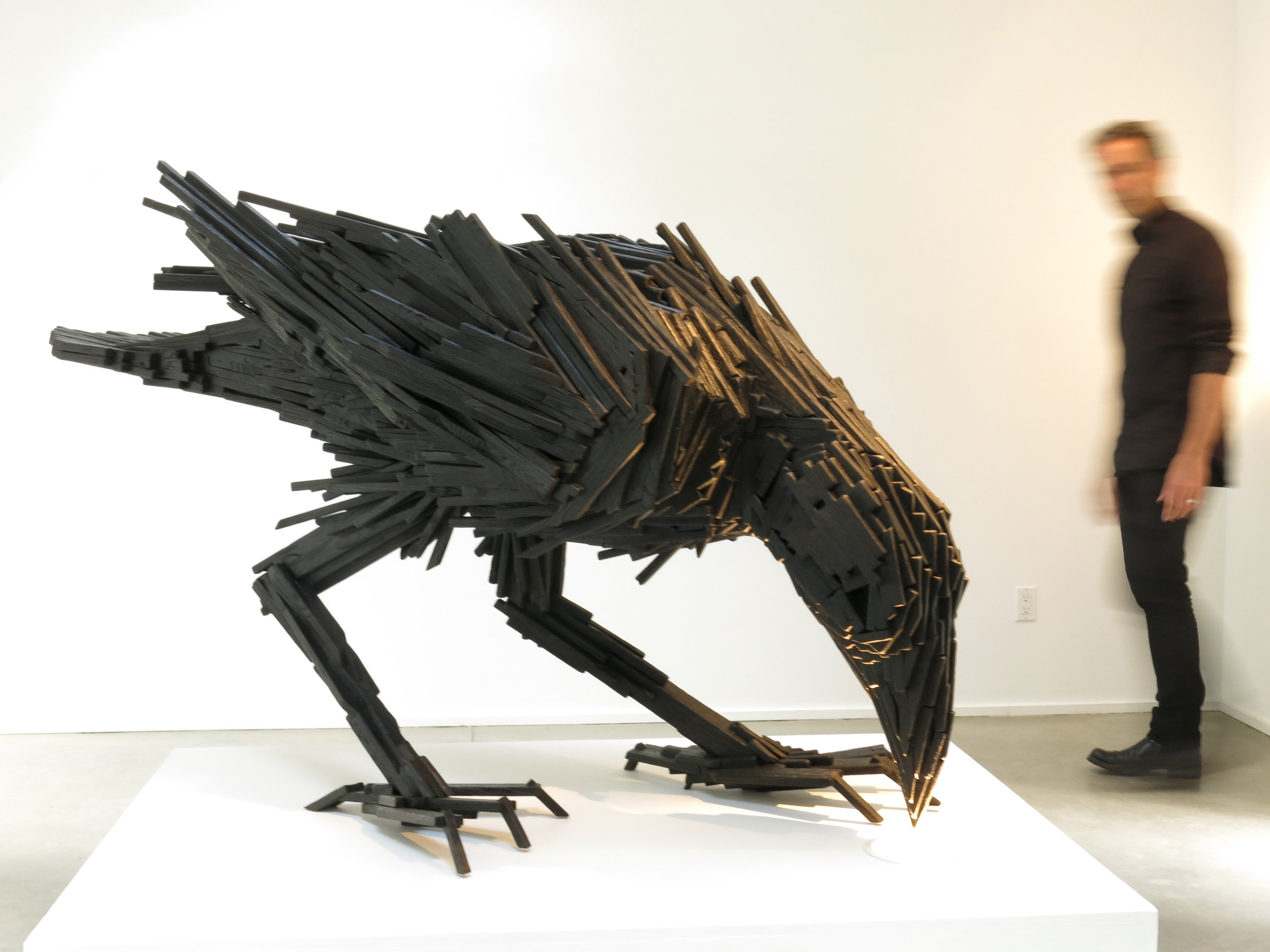
The Black Tusk console in turn inspired a collaboration with local graphic designer and artist Lee Roberts, who, after he saw the sculptural table at a photo shoot, sent Meyer a sketch of a raven, made from wooden sticks like the Black Tusk series. “I was inspired and challenged to take this technique I’ve applied to the Tusk and take that to another level to make this raven,” Meyer says. The resulting bird sculpture is titled “Sense of Silence.” △
The Figure Sculptor
Alpine Modern visits Swiss-born artist Roger Reutimann at his studio in Boulder
Inspired by the human form, Swiss-born artist Roger Reutimann found his way to sculpting for the rich and the royal via a classical music education, curating art fairs, and product design.
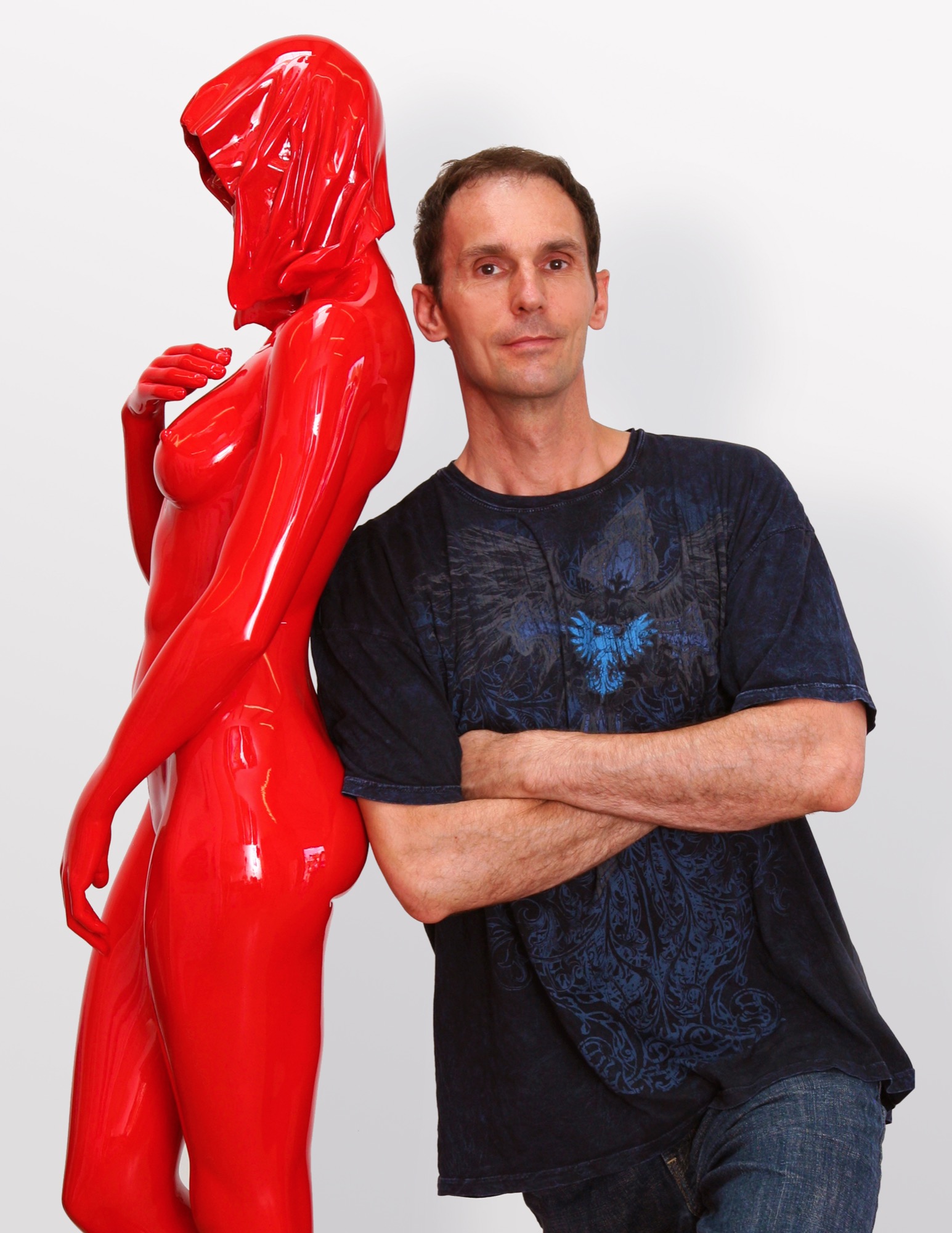
Roger Reutimann captures elegant sensuality in his sculptures of human figures. Born in a secluded village in Switzerland, the artist, a self-proclaimed Renaissance man, has devoted himself to pursuing and mastering many art forms. His evolution from classical pianist to figurative realism painter to internationally known sculptor has secured his place as one of America’s most sought-after contemporary artists.
Early Reutimann
As a young pianist, he found himself drawn to classical composers and music that stirred his soul. He studied at the Zurich Music Conservatory and was soon performing as a classical concert pianist throughout Europe and competing in international piano competitions. Traveling provided artistic influences at an early age as he experienced Europe’s rich cultural heritage.
His love of music flowed into a career as both a realist figurative painter and a co-owner in the Forum International Art Fairs in Zürich, Hamburg, and Düsseldorf. Galleries in Zürich, Milan, and London represented his paintings, and he received innumerable awards, honors, and recognitions. Relationships with gallery owners and collectors worldwide would follow him into his future calling as a sculptor and continue to advance his reputation as a world-class artist.
The Renaissance man emerged again as Reutimann turned his creativity to remodeling his first American home in Miami, Florida, with distinctive and extensive flourishes, from mosaic tiles to stained glass windows and Tudor-style ornamental plaster ceilings. The spectacular manor has been featured in architecture magazines and leased by production companies for films and commercials.
“In the midst of remodeling the house, one day I took a sculpture class to fill the time and loved it so much I gave up painting right then. To me, sculpting is like painting a thousand paintings. It has another dimension, and, therefore, it is so much more real than a two-dimensional image. A painting is only an image of life, but sculpture is life,” says Reutimann.
“To me, sculpting is like painting a thousand paintings... A painting is only an image of life, but sculpture is life.”
Coming to Colorado
Reutimann’s love of the mountains prompted a move to Boulder, Colorado, because of its similarity to Switzerland and the expansive open spaces. “I would rather sit on my back porch watching the sun set over the Rocky Mountains than in a high-rise flat in New York City,” shares Reutimann, for whom Colorado evokes memories of his native country.
Reutimann’s sculptures are unparalleled in craftsmanship and instantly recognizable worldwide. Though earlier works are relatively small, many today tower several meters high. Small sculptures weigh nearly 200 pounds, and the six- to seven-foot-high (up to two-plus-meters) sculptures weigh in at 1,600 to 1,800 pounds (726 to 816 kilograms). The internal structures of the lifelike sculptures are a complex network with steel beams for support to withstand the elements.
Rarer Reutimanns
Art galleries and private dealers from Santa Fe to New York City have represented Reutimann’s work, and his sleek, caressable, sculptures have been carefully packed and shipped to England, Switzerland, Italy, France, Hong Kong, Saudi Arabia, and South America. Today, he is represented by fewer galleries to ensure exclusivity for art patrons with his limited edition releases. Collectors include Sir Elton John, Anderson Cooper, countless private and corporate collectors worldwide, and Italian author Baroness Lucrezia de Domizio Durini, an art collector, curator, and publisher. “I see parallels between Rachmaninoff and my art. Rachmaninoff was a Russian composer and considered one of the finest pianists of all time. My art is much like music; there’s always something that can be refined,” says Reutimann. His recently completed commission for Colorado’s Arvada Center for the Arts and Humanities is a sixteen-foot (nearly five-meter) sculpture named Common Unity. It reflects the art center’s nature by presenting two identical figures who might appear to be engaged in a cultural discourse.
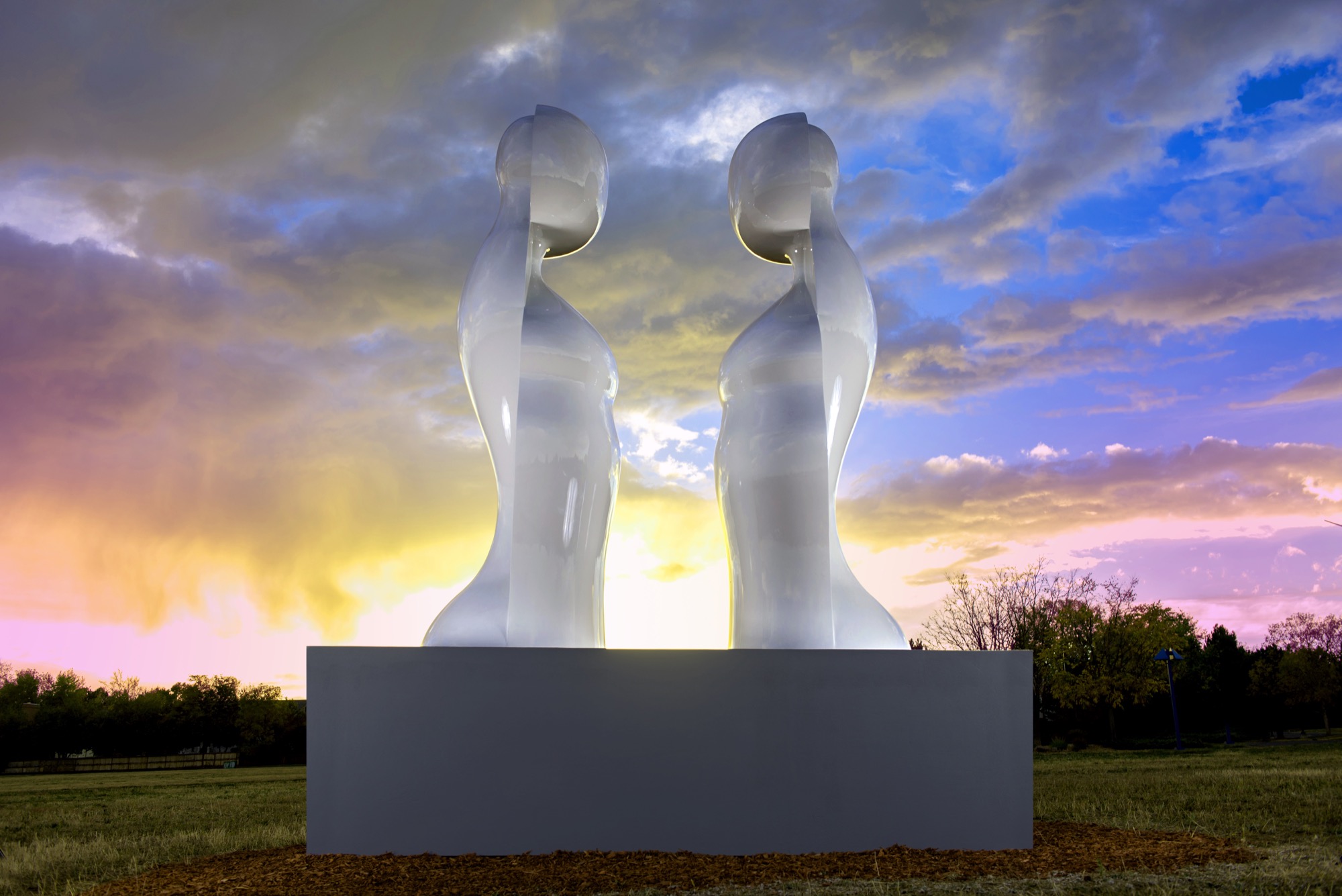
“My inspiration is the human figure, but the interpretation of it is somewhat abstract and reduced to the essential elements which help tell a story. The source of my work comes from the human body; people are drawn to that, I suppose, because we all have one. We can all relate to it in some way,” explains Reutimann. His fifteen-piece series, Dreams, was inspired by a wax mold that melted in Colorado’s hot sun and further inspired him to create sculptures that appear human at first glance, yet abstract from other angles.
“The source of my work comes from the human body; people are drawn to that, I suppose, because we all have one.”
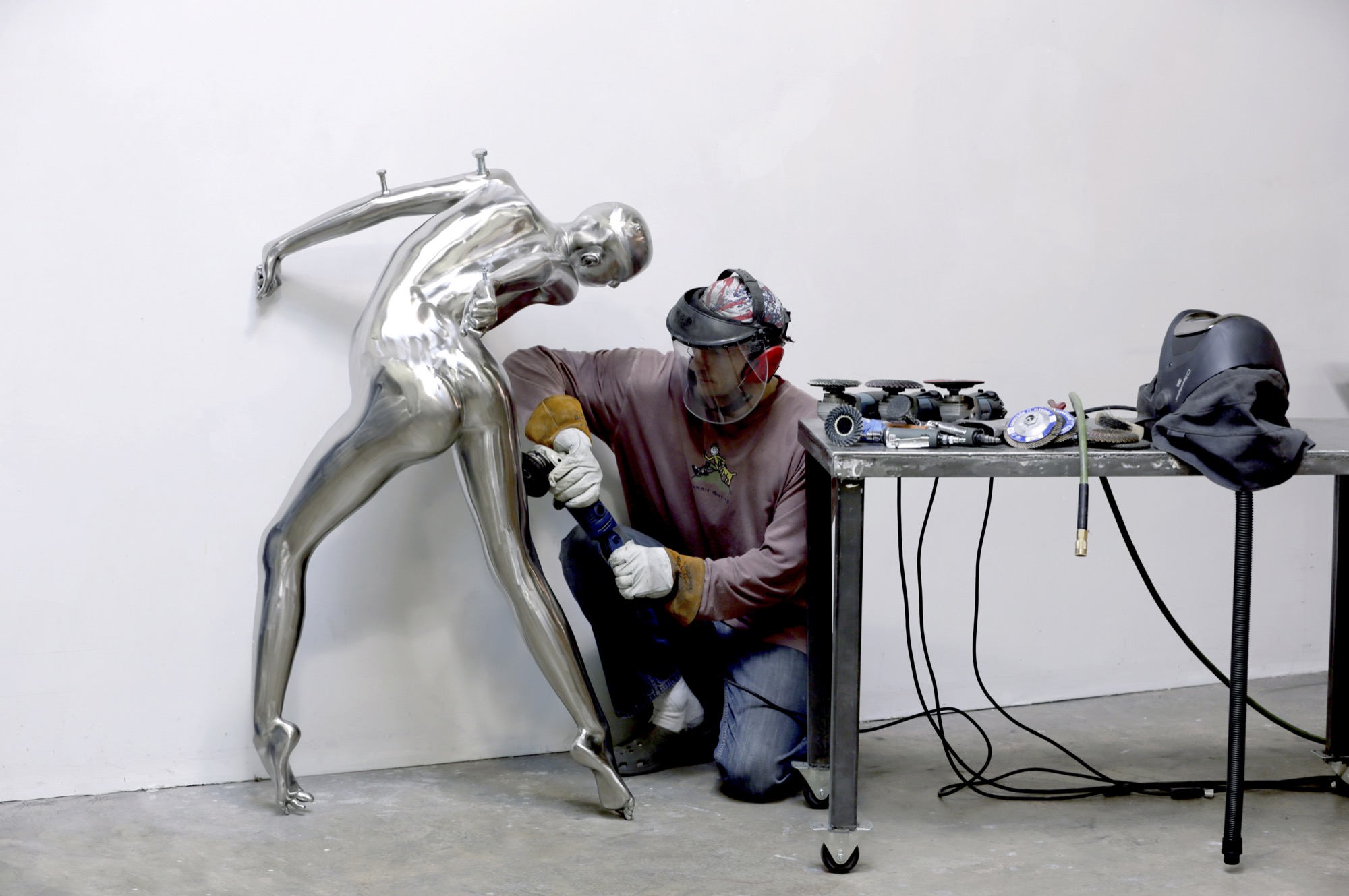
Body / art
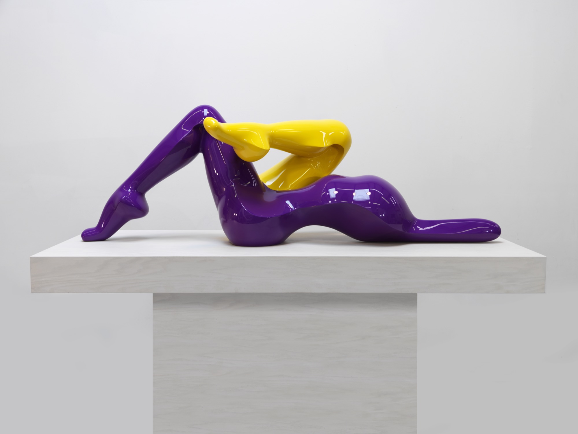
The immensely popular Dreams series is a surreal interpretation of human emotions as figures fling themselves into contorted poses and postures—often reminiscent of a melted-wax figure. Reutimann has placed heads, torsos, and arms backward creating a jarring, disturbing effect that evokes a strong, visceral response for the viewer. He juxtaposes nearly perfect, yet severely distorted bodies as if broken and reassembled incorrectly. Body parts erupt in every direction. Figures hang upside down, suspended or cantilevered in space, as if falling or floating. Cast entirely in sleek stainless steel, the homogenous heads of the sculptures lack facial features and expressions, much like mannequins. “The focus is directed away from the face toward the body, and the complex dreamlike state personified within,” Reutimann offers.
In a world where discerning art patrons purchase paintings ten-to-one over sculptures, Nick Ryan, Havu Gallery’s administrator, notes that long-time painting collectors are purchasing Reutimann’s unusual and evocative figures. Ryan says they choose Reutimann’s work based on his inimitable technique of combining abstract realism with figuration, particularly in the Death of Venus, a six-foot (almost two-meter) sculpture painstakingly cast in bronze with surfaces flawlessly covered with sleek Ferrari-red automotive paint. Death of Venus is Reutimann’s interpretation of Botticelli’s Birth of Venus. The spectral skull is representative of cultural shifts, and the highly saturated red paint reflects the glamour and lifestyles of modern society.
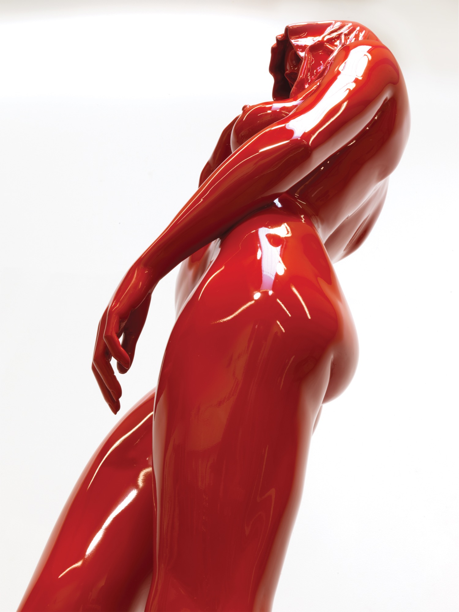
The Perception series was inspired by the artist’s visit to Egypt, and the entire series is cast in stainless steel, painted with automotive paint and buffed to a mirrorlike shine. “In keeping with abstract realism, the concept of the sculpture is about the duality of good and evil. The good has an angelic appeal and the evil has a darker character, wearing a cape with the head tucked in. My belief is that we all have these characteristics, and one can’t exist without the other,” Reutimann says.
“In keeping with abstract realism, the concept of the sculpture is about the duality of good and evil... We all have these characteristics and one can’t exist without the other.”
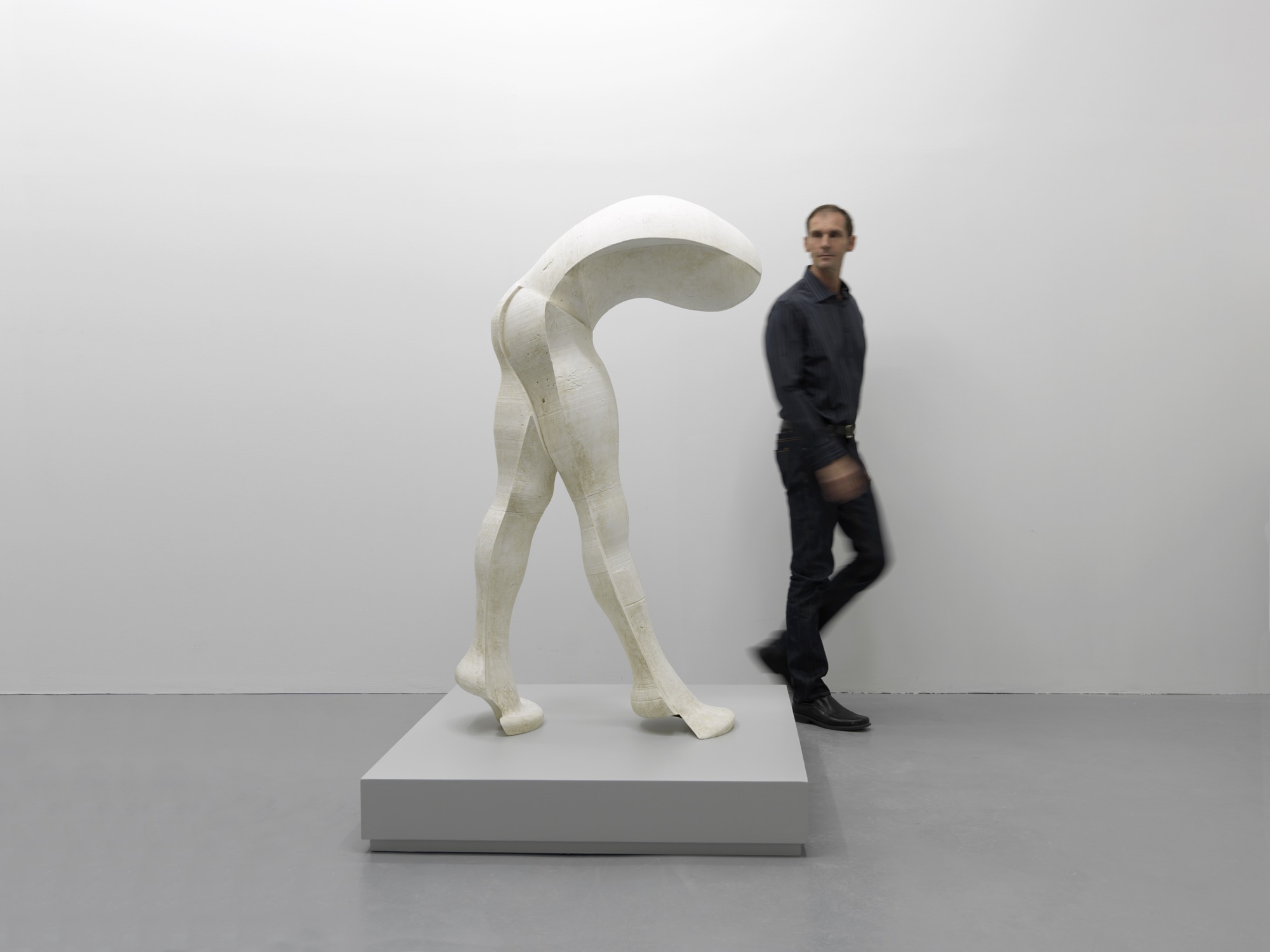
Reutimann’s fascination with automotive paint allows him innovations in the aesthetics of his creations. Automotive finishes require multiple paint layers buffed to a supersmooth polish until they shimmer and mirror one’s own reflection. The contemporary finish is extremely durable and lasts decades outdoors with only occasional buffing, whereas a traditional bronze sculpture with patina requires constant maintenance.
Reinterpreting americana
“My latest series is inspired by 1950s American automobiles. The fifties were all about space and speed and The Jetsons! The fantasy in concept cars goes wild; there are no limits, as there are none in art. The human body is much like a beautiful car—streamlined, organic, flowing like a dolphin in water—they’re imaginative. These sculptures have the shape of a woman but the spirit of a concept car. People see what they see and maybe it’s not my vision, which is perfectly fine. If someone is drawn to a sculpture, it’s a reflection of themselves and what their nature is, not that of the artist,” Reutimann says.
“These sculptures have the shape of a woman but the spirit of a concept car.”
The music man
Reutimann plays piano several hours daily and declares classical music to be his biggest inspiration due to its drama and emotional depth, which allow him to follow his moods. Sergei Prokofiev’s compositions were on tap the entire year Reutimann spent creating the sculptures for the Dreams series. “You need to be in a spiritual place when you create sculptures. When people talk about inspiration, what they really mean is ‘being in spirit’ so art is not a conscious act,” Reutimann points out. “You can’t learn to be inspired. Music is my subconscious inspiration.” △
“When people talk about inspiration, what they really mean is ‘being in spirit’ so art is not a conscious act. You can’t learn to be inspired.”
One Hundred Years of Swissness
A renovation of a 1912 chalet so beautiful it spawns an interior design company
In 2012, Virginie Confino, a photo editor, and her science journalist husband Bastien fall in love with a 100-year-old chalet in Val-d’Illiez, near the Portes du Soleil ski resort in the Swiss Alps. Without any prior knowledge in building or renovation, the couple abolishes their resolution not to entrap themselves in any kind of serious remodeling project and deconstructs the faded chalet. The result was so beautiful, it propelled Virginie into the new adventure of launching her own interior design business, Gris Souris.

The story in her own words...
We were looking for a holiday home for our family of four. We visited some chalets, but none of them felt right for us. Until we found this one. We fell in love with the balcony at first sight; its whimsical railing looks like lace.

Inside, the chalet was old and untouched since the 1960s. The walls lacked any sort of insulation, the house had no heat and a ladder in the living room was the only way to reach the upstairs, no stairs.

Intention out the window
Right away, we had a vision for how we would transform this chalet. Although, when we first began searching for a property, we had no intention to throw ourselves head-first into a renovation project. Our limited budget meant that we had to do almost all of the work ourselves. What’s more, neither of us had any experience even close to remodeling or construction — me a freelance photo editor for the press and my husband a science journalist. But Bastien has always believed, “Anything is possible.” And we did it!
My husband learned a lot from books, the Internet and YouTube videos, and I joined him at the chalet two days a week for a year and a half. We required professional help with the masonry in the entrance, because the rain was coming in, with the terrace outside, and with the heating and plumbing.
We virtually gutted the inside of the house. We just wanted to keep some of the old elements, such as the old wood floors, stairs and doors. Once we finished insulating the house from the bottom to the roof, we put the old wood back on the walls. We used a lot of wood on the inside, old wood, and slate for the bathroom floors.


1912 on the outside, Swiss modern on the inside
The chalet is a mix of old and modern. Because we have a big entrance, I wanted to do something special there. We chose a transparent door that gives view to the log wall, which is a decoy we created by cutting about 4000 logs of wood into five-centimeter pieces, 15 centimeters at the top. We dried the logs and fixed them together. The wall alone took ten days of work.

We remodeled the kitchen simply by changing the cabinet doors and painting the walls. Almost all of the furniture is from IKEA. We didn’t want to furnish the chalet with special pieces because we are renting it out when we are not using it.
Bastien built the dining room table himself, because we couldn’t find one that was three meters long and not too expensive. We painted the table top with chalkboard paint so we can write on it when we play games.
The dining chairs are old Tolix chairs that sat outside for a long time, which gave them the perfect rust-like patina for the chalet. Two Butterfly chairs and Tolomeo Artemide lights on the walls, not much else. We incorporated old sleds we found in the cellar into the decor.

Outside, we have a nice terrace with amazing mountain views of the Dents du Midi. We enjoy looking at this mountain range while we take a Swedish bath outside, even when it’s snowing.
Gris Souris
Chalet Le 1912 became my “business card.” Once the renovation was finished, friends started asking me for interior design advice and even wanted me to renovate their chalet. Soon, my new adventure began, and I created Gris Souris, my interior design company in Lausanne. △
Photos by Myriam Ramel Baechler / Lumière du jour
Head for Heights: Monte Rosa Hut
Where modern mountaineers stay happy in the Swiss Alps
Zermatt / Canton of Valais / Switzerland At an exposed 9,459 feet (2,883 m) above sea level, the Monte Rosa hut is indeed as remote and high up as it looks. Advanced mountaineering gear and skills are necessary to reach it. The strenuous four-hour trek up involves a 1,640-foot (500 m) gain in altitude, traversing a glacier, and conquering a 98-foot (ca. 30-meter) rock wall. However, hikers will be rewarded with a spectacular, untouched alpine landscape and an unforgettable view of the majestic Matterhorn.

“The Monte Rosa hut is not a hotel,” stresses Peter Planche from the Swiss Alpine Club. Rather than individual rooms, the high-alpine, 120-bed hut has group rooms, each with three to eight bunk beds. The Monte Rosa hut is a popular refuge among heli-skiers on their way down the Monte Rosa massif.
Stunning in its minimalism, the Monte Rosa Hut represents a milestone in off-the-grid, high-alpine modern architecture. △
Paradiesli
The other Swissness
As so often, my cameras were calling, and I had to go. I am lucky to have friends who, when not working, gladly accompany me on my excursions. “Let’s explore,” is my call to discovery. We usually end up in the mountains, hiking.
"My cameras were calling, and I had to go."
Up here, people’s individuality and way of life are more distinct and unseen than in the city. Ski-lift stations, military bunkers, snow fences, cabins, trailer parks . . . all these structures must conform to the mountain, thus take on a distinct form, often innately optimal. Set amidst glorious nature.
I was on the road with my friend Pascal Alexander that day. We eventually arrived in Flumserberg. It was fall. Everything seemed deserted; too chilly for hikers — ski season weeks away.
Wondrously weird
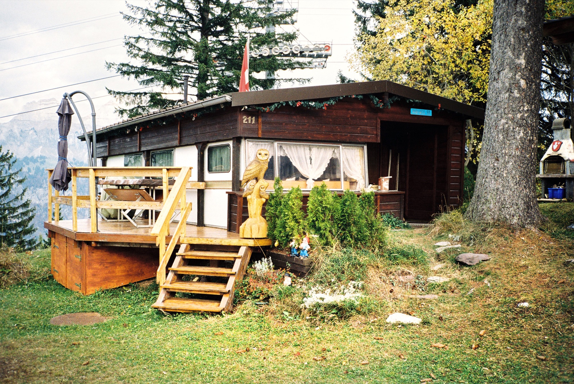
Past the first ski-lift station, we stumbled on a small settlement of what appeared to be a cluster of tiny houses, built closely together. But as we approached, we realized they were trailers, some of them encased in wood. The inhabitants had added roofs, porches, sunrooms, and other elements of a permanent home. A wondrously weird place. A mix of mobile and xed installations. We had never seen anything like it. Fascinating how humankind had once more found a way to settle, in their individual ways, with such adoration for detail.
"Fascinating how humankind had once more found a way to settle, in their individual ways, with such adoration for detail."
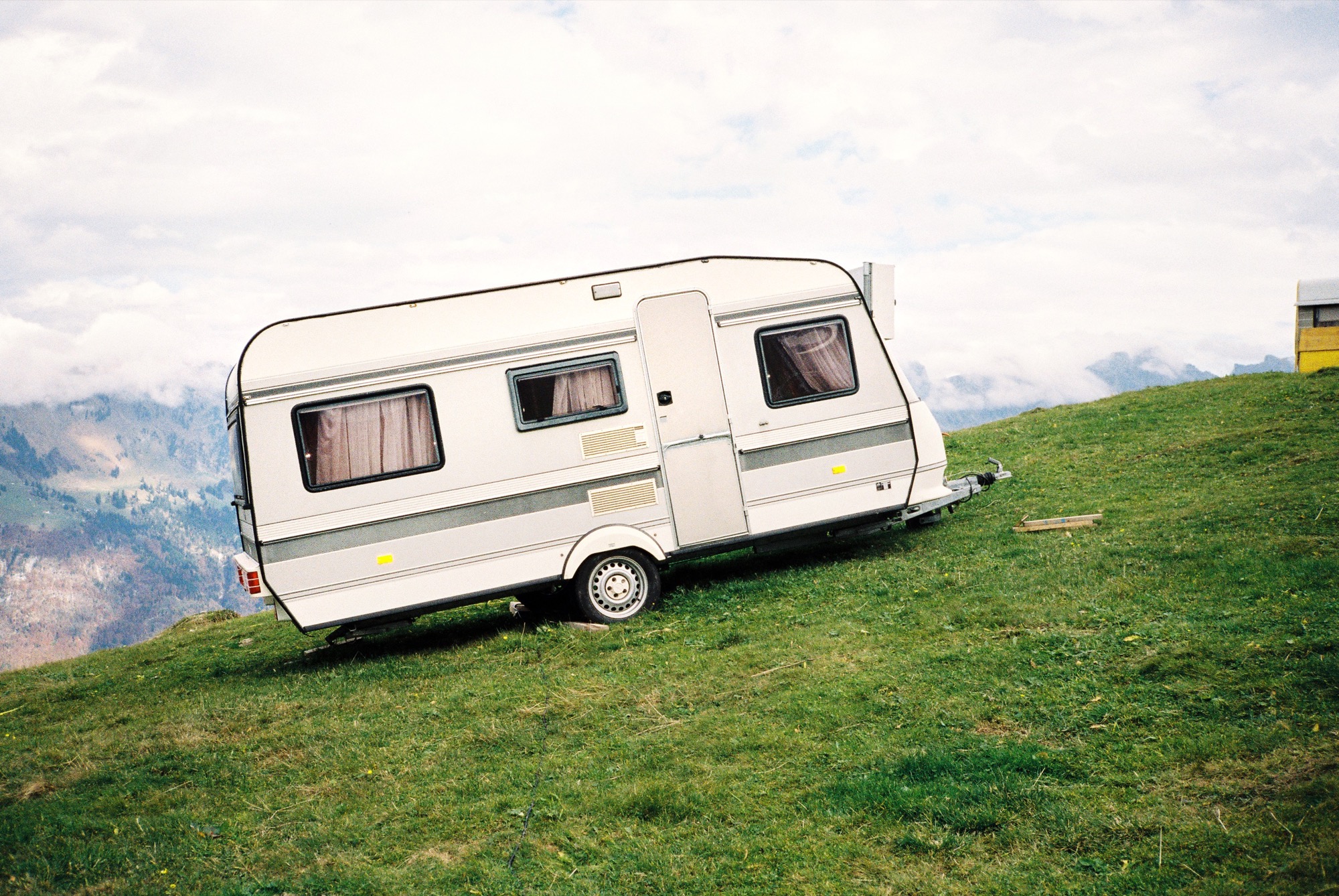
Walking up the hill, we came upon more trailers dotting the landscape. Because of the steep slope, the trailers needed to be raised up on scantlings, rocks, and boards to sit leveled.
The site didn’t look like a place one would (or could) haul a heavy vehicle up to. The trailers just stood there in the middle of the landscape. We strolled between the installations, not encountering a soul.
"The trailers just stood there in the middle of the landscape."
Un-Swiss
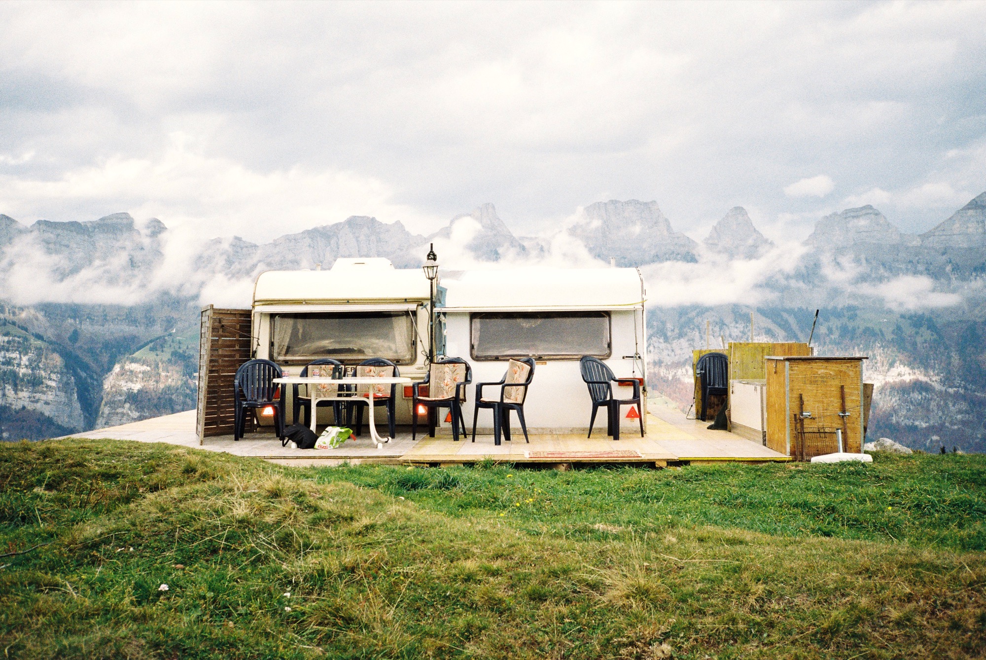
Trailer parks are not a Swiss thing. The whole setting felt surreal; eerie yet peaceful. They call it “Paradiesli” — small paradise. An unpretentious place of freedom and independence, with breathtaking views of the Churfirsten, one of Switzerland’s most impressive mountain ranges. △
"An unpretentious place of freedom and independence."
Saved Souls on Simplon Pass
A local mechanic comes into the picture
My buddy Morad and I ventured up snowy Simplon Pass in Switzerland on a road trip. We walked away from the car to take a few photographs. When we came back to the car and I started the engine, I couldn’t shift the gears. I had damaged the clutch when I put the vehicle in reverse to park. We were high up in the mountains, and night was about to fall. A snowstorm was moving in. Not a soul around to help us.
It’s crazy, but at the bottom left in the photo, you can see a car coming up the pass. A local from a nearby village who drives over the mountain pass once every two weeks.
Morad and I must be the luckiest guys alive. The dude was a mechanic and saved our asses. His name was Christian. I owe him for life. △

Refuge in Concrete
Refugi Lieptgas is the negative imprint of its ancient predecessor
Using the decrepit log cabin as mold, Swiss architect Selina Walder sculpts a minimalist mountain retreat in concrete, fossilizing the texture and character of the historic hut that once stood in its sylvan spot on the meadow. From the trail, hikers may mistake Refugi Lieptgas for the inconspicuous log cabin that had stood in this very spot for decades. Yet, at second glance, the tiny refuge tucked against boulders at the edge of the Flims forest in the Swiss Canton of Graubünden reveals itself as the negative imprint of the old structure. The stunning effect of the cabin cast in concrete is incongruously sublime; details like the wood grain, the cracks, the door lock set in stone are all true impressions of the past.

Stonewalled Design
The Maiensäss mouldering on the mountain meadow had long served its purpose of sheltering pastoralists during grazing season. Years back, Guido Casty, the 1974 bobsledding FIBT World-Championship silver medalist and local restaurateur who owns the property, had planned to replace the crumbling herder’s hut with a new cabin he could rent out to vacationers. The building permit was denied. The new design needed to somehow incorporate the existing structure. He gave it a rest.
When his itch to tackle the old cabin returned, Casty tasked an architect friend in Basel with a new plan that would comply with the community’s stipulations. Since the project was small and the architect was two and a half hours away, Casty asked Selina Walder of the local Nickisch Sano Walder Architekten to manage the construction. The Flims native had been waitressing for him for many years and graduated from the renowned Accademia di Architettura di Mendrisio, where she had studied architecture under Valerio Olgiati, one of Switzerland’s foremost modern architects.
Walder agreed but didn’t like the design she was handed from the Basel architect. The twist: The building authorities had miscommunicated the structure’s prescribed maximum footprint. As a quasi apology, the local architect was allowed to rebuild from scratch, as long as her plan adhered to the original square footage, and the new design portrayed the character of the old log cabin.
What did that mean? “I struggled with that provision,” Walder admits. “Did I need to rebuild with wood?” She inquired further but was discouraged from asking too many questions that would only have to be addressed with more rules.
Walder’s reluctance to use wood lingered. “The spot was mossy, woodsy, musty,” she remembers. “You could tell the old log cabin hadn’t taken well to sitting on the forest floor.” Besides, the original had been constructed from surrounding trees. And today’s way of driving to the lumber yard and transporting the wood back to this unspoiled spot at the forest’s edge didn’t seem appropriate to her.
“The spot was mossy, woodsy, musty. You could tell the old log cabin hadn’t taken well to sitting on the forest floor.”
Serenity set in stone
Thus, the fossilization idea was born. “I did love the sylvan setting back in there, where the old cabin cowered against the boulders,” Walder says. “I wanted to preserve that, not fuss about a new design. I wanted everything to be the way it was. Except, I didn’t want to rebuild in wood.” Her answer was to cast a negative imprint of what once was, from concrete, to create a simple refuge that—now literally—mirrored the character of the derelict log cabin.
The young architect intended to capture this special place, the woods she had loved since childhood. “I wanted people staying at the cabin to understand the forest in all its beauty, all its fascination, all its facets.” In fall, for example, the new cabin's round skylight gives view to the vermillion crowns of the beech trees above. The main room’s large window is purposefully set low to provide an ideal view over the clearing when sitting at the table. “Deer come out of the woods at dusk. It’s very fairytale-like.”
“I wanted everything to be the way it was. Except, I didn’t want to rebuild in wood.”

Concrete continuance
Walder knew of artists who sculpted works of art from the composite, and she had built countless concrete models in architecture school. While the material wasn’t completely foreign to her, she didn’t know what would happen on site. Casting a concrete shell from the mold of an existing log cabin was an experiment she and, luckily, the builder were curious to dare.
To visualize the construction process for herself and to be able to articulate the steps to her crew, the architect built a model from little sticks and cast it in concrete.
The real hut was set aside by a crane and stripped of anything that wasn’t part of the structure: small laths, twigs, and rocks that inhabitants had stuffed between the logs to chink the walls. The gaps between the logs were then filled with cut-to-fit slats to gain an even leading edge and prevent the concrete mixture from leaking out. Once the foundation was finished, the old-cabin-turned-mold was heaved back in place. The builders constructed the inside of the mold structure with standard form boards. The new cabin was poured in place. After the concrete hardened, the old log cabin was removed and deconstructed.

Poured patina
The original cabin not only lent the new structure its form but also gave it marvelous detailing, most notably a beautiful wood-grain pattern, now preserved in time and stone. The concrete was even the same shade of gray as the old cabin’s weathered wood. The logs left behind a relief ideal for moss to take root and flourish again as it once had.
Walder couldn’t have envisioned all the fascinating effects in advance. “We spent so much time worrying about the construction itself. Will the concrete cling to the cracks in the old logs? Will the corners crumble off?” she remembers wondering. “I was positively surprised and really happy how precise this sculpture turned out.”
Inside, two worlds
Walder decided early on to split the living space into two levels. “Sleeping and living in one room inevitably leads to a camping atmosphere,” she says. The architect aimed instead at designing a much more luxurious retreat with two distinct worlds, upstairs and downstairs.
She wanted guests to feel sheltered in the bedroom below, tucked away in a cave rather than feeling trapped. Thus, she added a large window above the bathtub and a door that leads directly into the forest. “The world of rocks and roots back there reminds me of Alice in Wonderland,” Walder says. “Another door into another kingdom.”

Warm concrete
Concrete may seem to be a debatable material for a cozy cabin in the woods. For Walder, it was the right choice. “The forest in Flims is scattered with the kind of boulders you see from the lower level of the cabin. It’s what makes this area so magical: the caves, the moss-covered rocks. Concrete is not much different. It’s man-made stone. To me, it fits quite well into the setting.”
In fact, some interior features are cast in concrete as well: a pedestal with bathtub and a lavabo on the lower level, and a solid bench along the entire wall beneath the large window on the main floor.
“People are always afraid concrete would be cold,” Walder says. The concrete inside Refugi Lieptgas is actually heated with an under-slab radiant heating system that even loops through the tub and the bench. The concept would not work for a private cabin that’s used only occasionally, because the concrete takes a long time to warm up. With the rental cabin booked solid, however, the stone can continually retain its warmth.

Taking refuge
Literally left without a roof over their heads during the remodel of their own house last fall, Walder and her partner, Georg Nickisch, took refuge at Refugi Lieptgas for a week with their infant daughter and the dog. The architect is pleased with her firsthand experience. “Living there feels very cozy, very protected and private—and at the same time elevated,” she reminisces. “Everything is tiny, but you don’t feel the smallness. You’re in your own small kingdom, separated from the world.” △
"Living there feels very cozy, very protected and private—and at the same time elevated.”
Stay Different: Whitepod Eco-Luxury Hotel
Go glamping in a geodesic-shaped tent in Switzerland
Les Gaieties / Canton of Valais / Switzerland The 430-square-foot (40-sq-m) pods at the Whitepod Hotel are equally eco-conscious and comfortable. At the foot of the Dents-du-Midi mountain range, a camp of fifteen large geodesic-shaped tents surrounds The Pod-House, which contains the breakfast room, a relaxation area, the bar, and the meeting rooms.
The individual spherical structures are composed of a network of triangles that create a self-bracing framework (you can figure out the architecture in detail as you lay in bed). Each cozy pod is uniquely decorated with local antiques and artifacts. The light-filled pods of various configurations each include a king-size bed, full bathroom, wood-burning stove, and even a terrace to sit outside and take in the breathtaking alpine views.
Sleep Elevated
7 alpine-modern places to stay in the Alps
From a remote minimalist hut to a decadent chalet fit for the royals, modern design lovers stay happy in these hotels and vacation rentals at — and high above — stunning mountain resorts in Switzerland, Austria, Italy and France.
Monte Rosa Hut / Switzerland
Modern mountaineers bunk at the 120-bed Monte Rosa Hut with grand views of the Matterhorn. More »

Wiesergut Design Hotel / Austria
Set against a bucolic backdrop of ski slopes and hiking trails, luxurious suites, a splendid spa and exquisite cuisine make Wiesergut a rare alpine retreat. More »

Whitepod Eco-Luxury Hotel / Switzerland
Sleep in a geodesic-shaped tent at the Whitepod Hotel for an entirely different vacation experience without sparing the comfort of a king-size bed and a full bathroom. More »


-
Feldmilla Design Hotel / Italy
The Feldmilla Design Hotel in South Tyrol offers panoramic views of the Dolomite mountains and uses clean energy from its own hydro-power plant. More »

Chalet Les Gentianes / France
Part of a quiet residence in the world's largest linked ski area of Les Trois Vallées, chalet Les Gentians has a swimming pool, Jacuzzi, massage room, and gym. More »


Kristallhütte / Austria
Hotel and hipster après-ski hangout of the moment, the Kristallhütte sits slope-side in the ski area of Hochzillertal Kaltenbach. More »
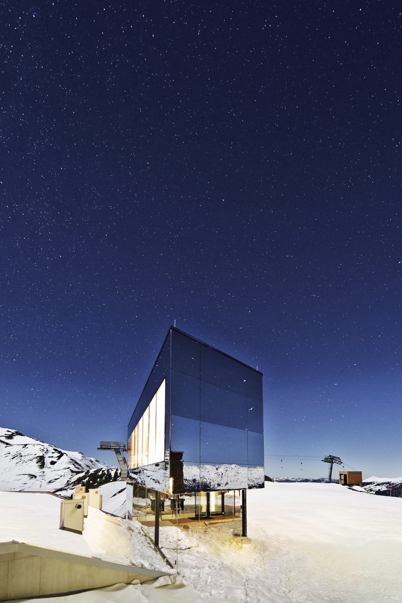

Chalet Zermatt Peak / Switzerland
Indulging in little extras, such as a personal chef and serving staff, the rich and the royals have stayed at Chalet Zermatt Peak in pure luxury, with grandiose views of the Matterhorn. More »


Quietly Swiss
A chalet shaped after the surrounding mountains of Les Jeurs
Local building nostalgia and the majestic surrounding mountains guide Geneva architect Simon Chessex in designing a young couple’s modern dream house, built on family land. Olivier Unternaehrer, a Geneva-based attorney, and Céline Gay des Combes Unternaehrer, a professional harpist, had long dreamed of a mountain retreat where they could spend weekends and holidays, someday raise a family, and eventually retire. So when the young couple had the opportunity to own a plot in the mountains of Les Jeurs—land that had been in Céline’s family since the 1800s—the decision to build there was obvious. A hamlet above the road to the Col de la Forclaz mountain pass in the Swiss Alps, Les Jeurs was the perfect place.

Adventures in architecture with Lacroix Chessex
Longtime friend Simon Chessex, a founding partner of the Geneva architecture firm Lacroix Chessex, was the natural choice as Olivier and Céline’s architect. The couple shared their requirements, nice-to-haves, and wildest dreams with Chessex and his team, and the collaborative design process was “a beautiful adventure,” Olivier says. “We believe—and we think they do, too—that we brought the best out of each other throughout.”
Simon Chessex founded Lacroix Chessex with fellow Swiss architect Hiéronyme Lacroix in 2005, based on their shared belief that good architecture is inspired by two factors: “a thorough analysis of the site, in which micro and macro scales are directly related, and a careful and critical reading of the brief that is given to us,” Chessex says. Both partners strive to approach design and construction without preconceived ideas of what a project should become. The role of the architect, says Chessex, “is that of a tailor who designs and realizes a client’s vision with care, passion, and accuracy.”
Roots on family land
The home’s spectacular location near Trient was destined. Céline’s ancestors were native to the region. As a child, her own father spent many holidays camping on the very land where Céline and Olivier would later build their chalet. Sharing the same dream of raising a family in these majestic mountains a generation earlier, Céline’s parents relocated from Geneva to Les Jeurs in the 1970s. And decades later, as a couple, Oliver and Céline spent weeks at a time, even one entire summer, vacationing in the mountains. When Céline’s father offered them a plot of the family land, their decision to build there was a simple one.
Like generations before them, committing to the family land for a lifetime felt timely. They pictured a mountain retreat where Céline could play the harp, where they could soon raise a family, and where they would eventually retire. “Our vision was to build a house that would be a place to welcome friends and family, that would fit well in the local and mountain landscape, yet that would be modern,” Olivier says. Chessex absorbed their hopes and dreams and presented plans for his reinterpretation of a traditional Swiss chalet.

The architect drew upon the region’s historical stone and wooden mountain homes for inspiration and let the alpine landscape guide his design. “It’s clearly a site-specific project,” Chessex notes. “The shape of the building comes from the profile of the surrounding mountains.” It was important to Olivier and Céline that the house was modern yet also fit into its “quite wild” setting. And Chessex’ design beautifully harmonized with the local village homes and the spectacular scenery. Aware that a closed, large volume would disturb the harmony of scale, the architect designed the structure as two parts forming a “V.” They are connected by the entrance on the mountainside and are separated by a forty-five-degree angle that opens toward the valley. “The numerous windows give many opportunities to just look outside and bring the outside to you, just as if you were looking at a painting,” says Olivier.
"The numerous windows give many opportunities to just look outside and bring the outside to you, just as if you were looking at a painting."
The landscape and the design are in “smooth and direct relationship,” he continues—inside the “cozy chalet atmosphere” and outside views of the “playground.” Reinterpreting the functional design of historical Swiss barns that were elevated from the ground to preclude mice from entering, Chessex situated the home on a cantilevered concrete plinth. He chose grey fir wood for the home’s exterior and natural fir for the inside because the material is both naturally weather-resistant and economical.
Bridging cultural integrity and modernity with stone and wood
Chessex used the same wood for the walls, ceilings, and floors so that the interior uniformly appears as a single unit of space. This element of the composition is unsurprisingly one of Olivier and Céline’s favorites. Olivier believes the house bridges cultural integrity and modernity by keeping things as simple as possible. The natural quality of the wood reminds him of older mountain dwellings marked by the years, wind, and snow.
At the same time, Chessex took the liberty to put an updated twist on traditional Swiss mountain architecture by designing the home as two connected wings: The main entryway is “folded where the two buildings unite,” creating a V-shaped front door and window. Olivier shares that abandoning tradition to incorporate modern eaves “clearly surprised some people at first,” but was ultimately very well received. The owners particularly enjoy the the roof’s geometry and the living room window that reaches down to the floor.

The rugged mountain location complicated the construction process. Inaccessible by truck, the site required helicopters to fly in prefabricated wooden pieces. Additionally, Chessex initially worried that the authorities and local population might find the house too radical for the village and feared he may be denied a building permit.
Despite the challenges, Olivier and Céline were able to move in exactly two years after hiring Chessex to design and build their home. Olivier describes the experience: “Quite simply, one day we could walk in, and the house was no longer the worksite it had been for the last year, but a complete house in which we could stay. It was quite an intense and beautiful moment.”
"Quite simply, one day we could walk in, and the house was no longer the worksite it had been for the last year, but a complete house in which we could stay. It was quite an intense and beautiful moment."
Olivier and Céline quickly fell in love with the mountain house and now spend their weekends there after a week’s work in Geneva, where they have been renting the same apartment for more than ten years. Olivier contemplates how the modern chalet is “majestic, like a quiet force, as the mountains can be.” From the exterior, “The house appears to be changing shape depending on the viewing angle,” he remarks. Inside, the home feels “peaceful, relaxing, and quiet” with direct views of nature and mountain wildlife.
Visiting friends often refer to the couple’s hideaway as their “nest,” given it’s high mountain perch—a dual meaning, since the couple hopes to raise a family in their “lifetime house,” as Olivier calls it. “We intend for our house to become a family home and at all times to remain a place where friends and guests can come and share good times with us.” What started as their self-admittedly “crazy” dream materialized into a beautiful sanctuary on the mountainside, a home daringly designed to mirror the innate artistry of the surrounding landscape and to nourish creativity and community.
"We intend for our house to become a family home and at all times to remain a place where friends and guests can come and share good times with us."


