Inspirations
Explore the elevated life in the mountains. This content debuted in 2015 with Alpine Modern’s printed quarterly magazine project.
Pictorial Road Trip—Peaks and Lakes in Colorado
Denver filmmaker and photographer Grant Lemons experiences seasonal Colorado landscapes from behind his lens
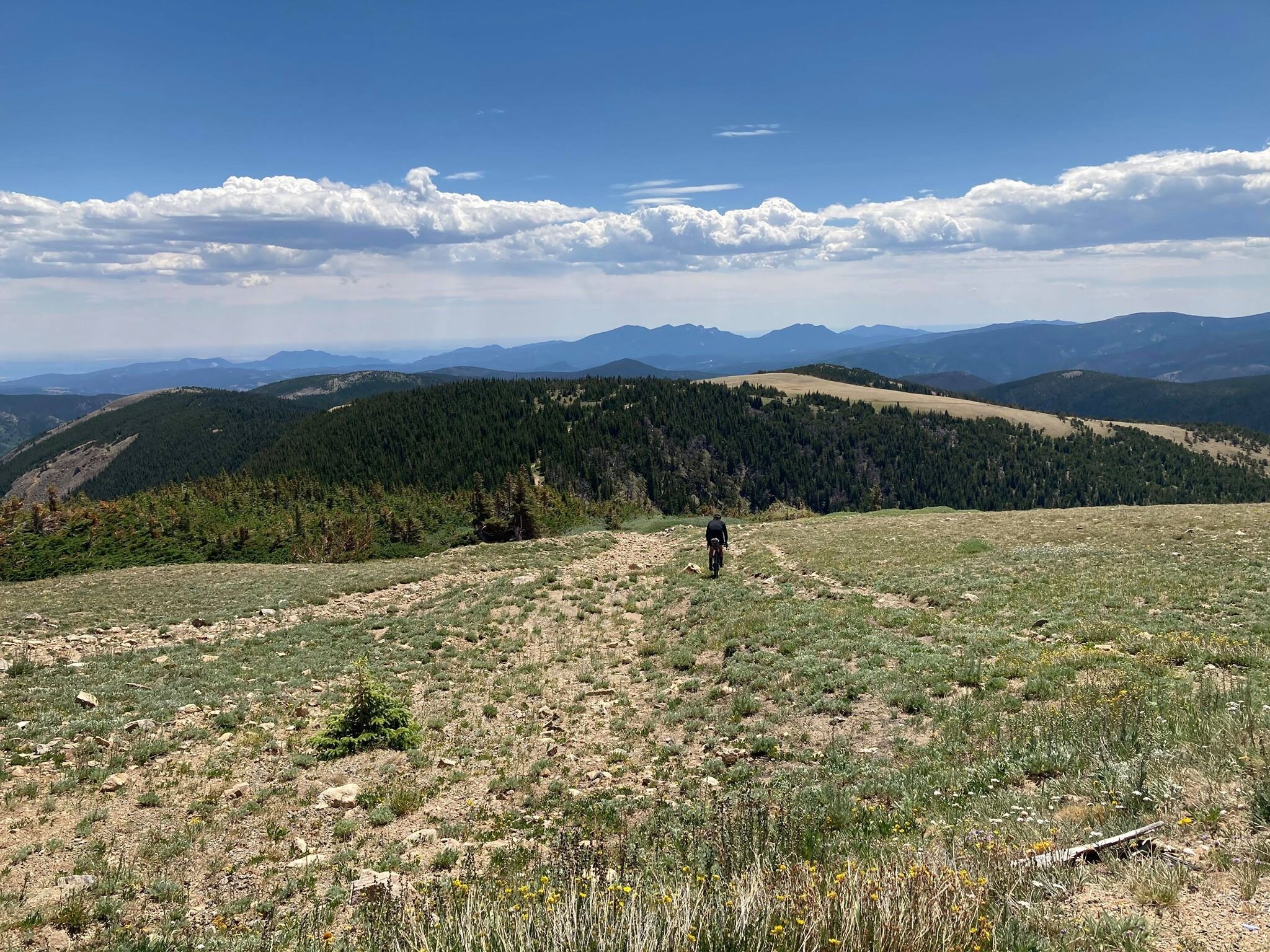
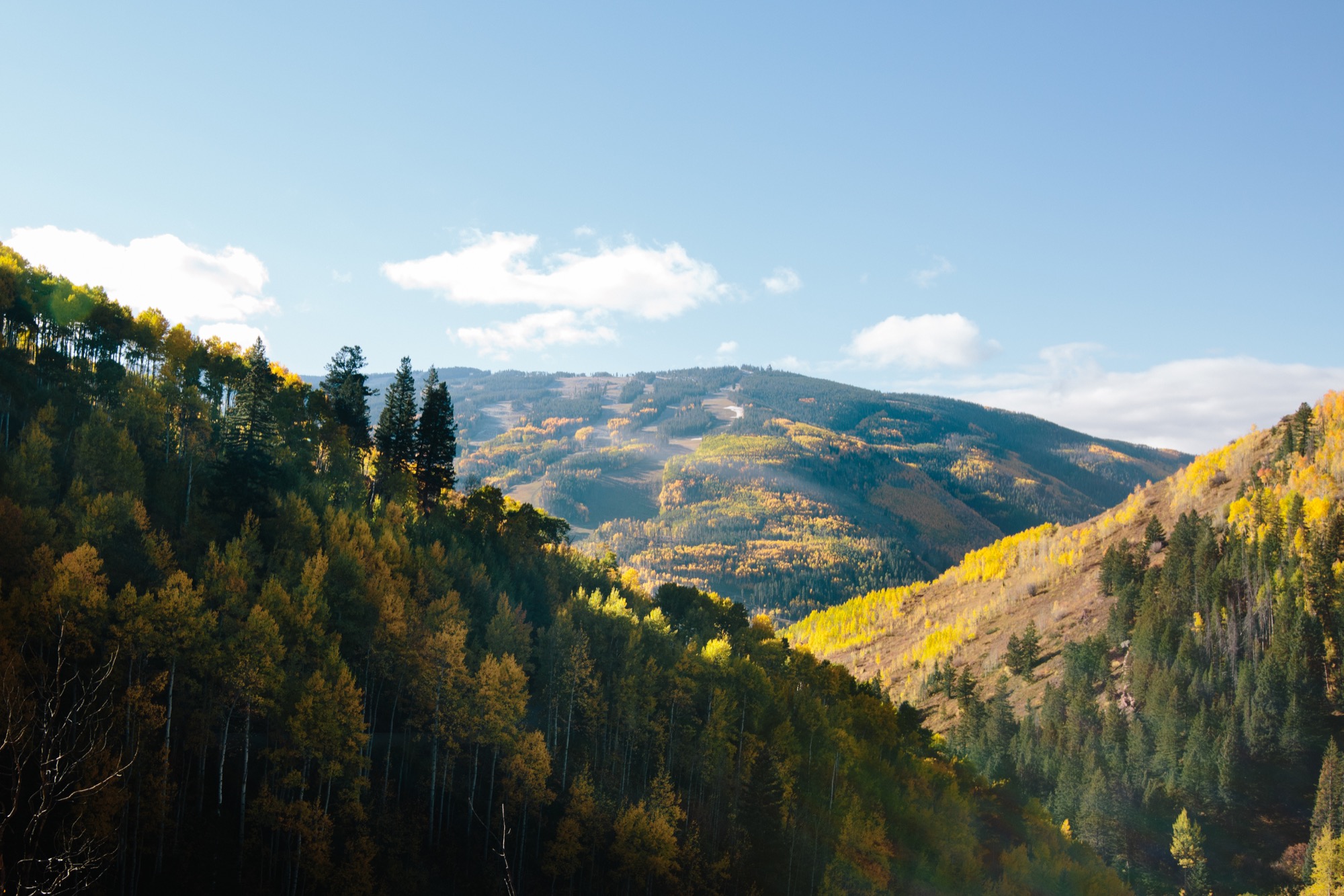
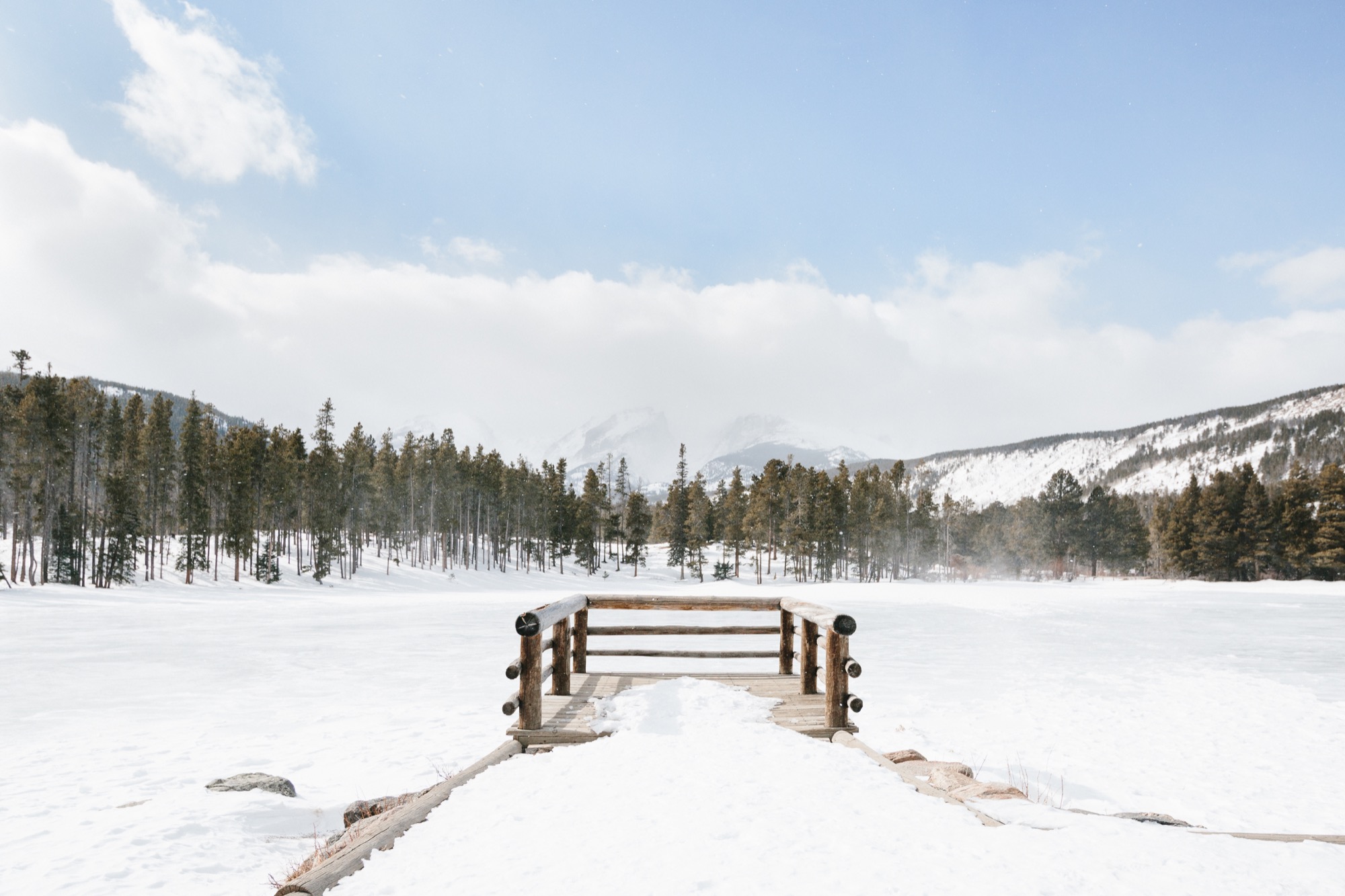
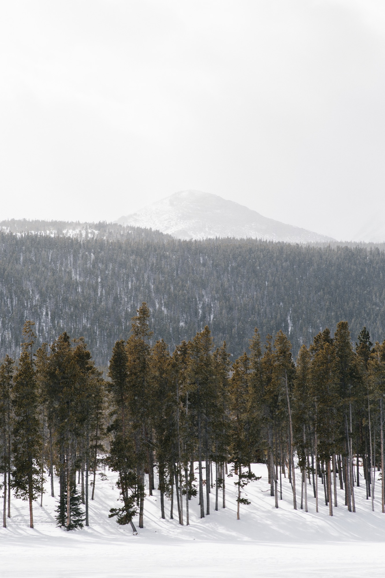
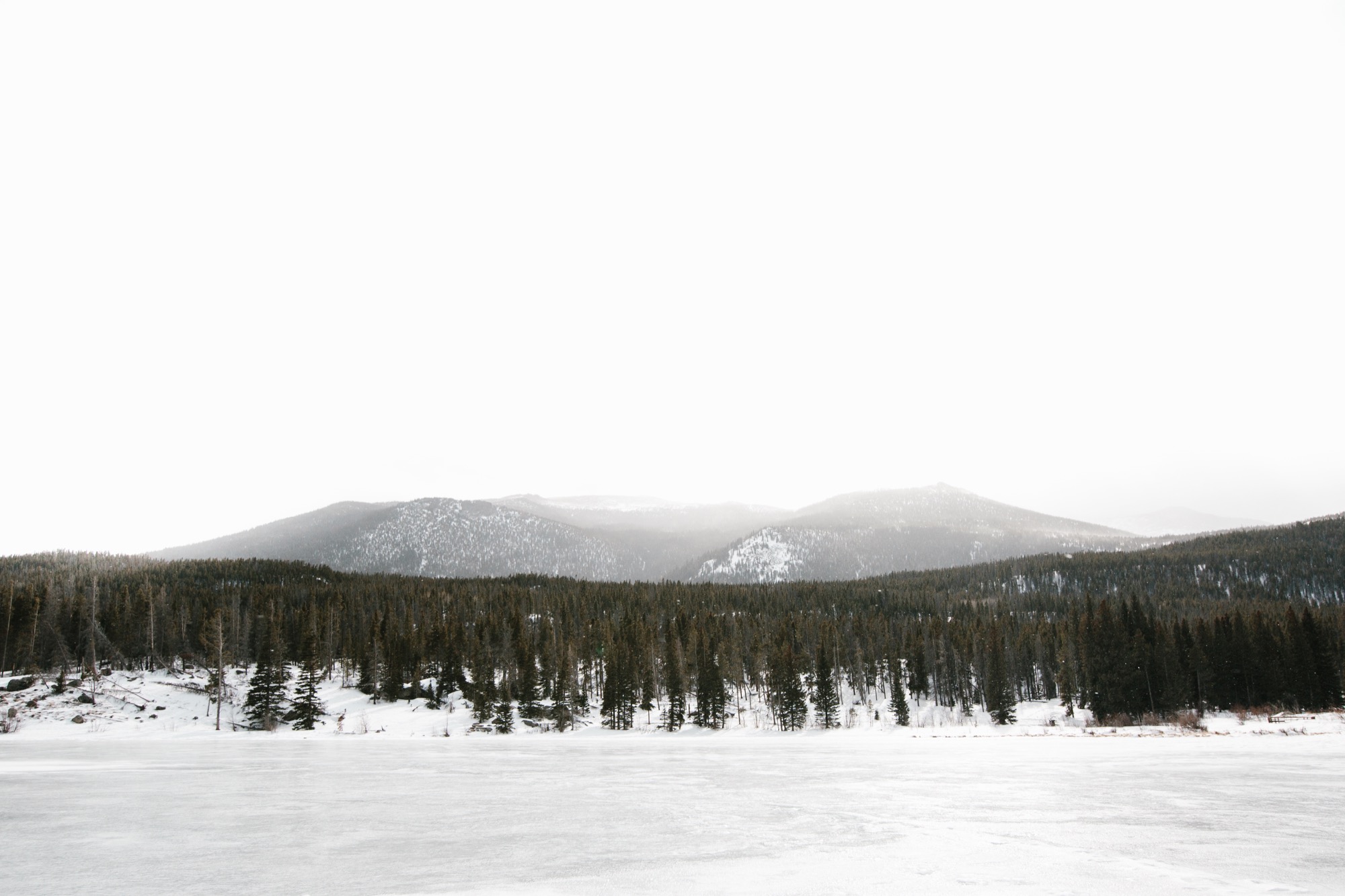
Born in Salem, the rainy capitol of Oregon, as he calls it, filmmaker and photographer Grant Lemons currently lives in Denver, Colorado, where his sense of adventure awakened. From here, he ventured out into Colorado’s beautiful—and at time mysterious—landscapes of fall and winter.
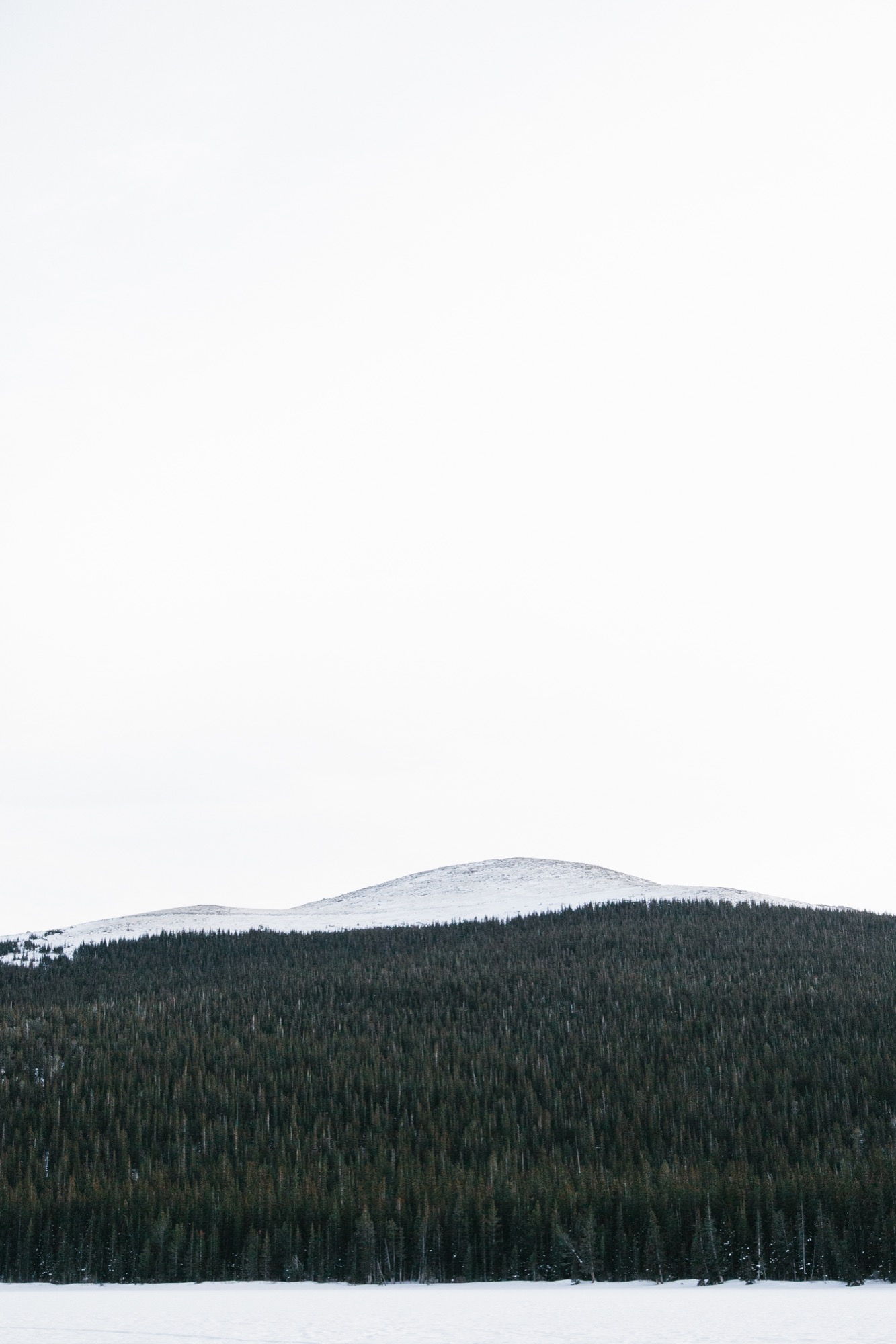
Lemons majored in journalism at the University of Oregon and plans move to Portland this summer.
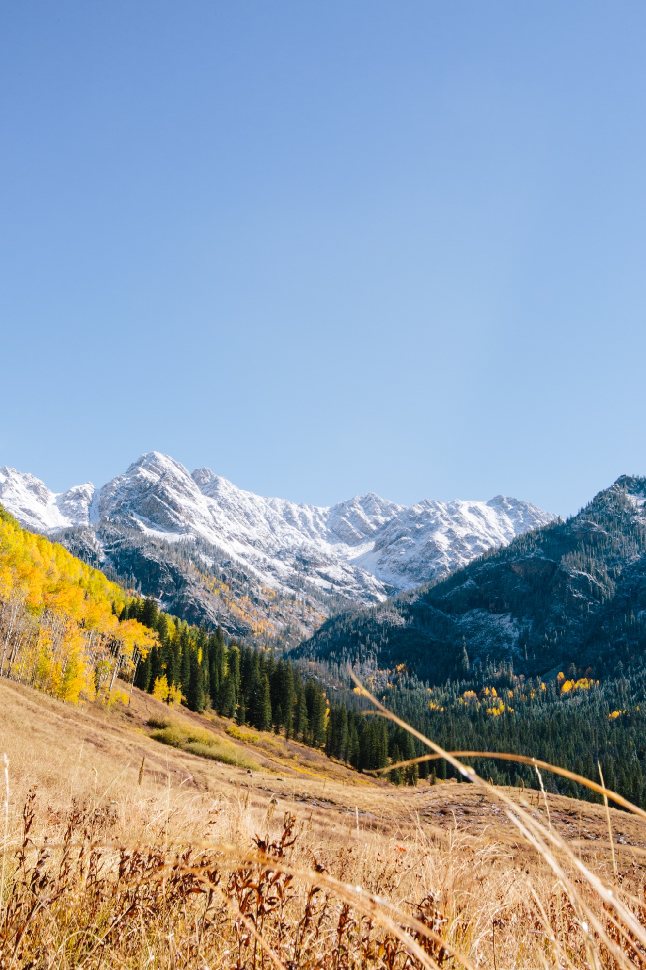
A conversation with filmmaker and photographer Grant Lemons
AM Who are you, in a nutshell?
GL I’m a high-energy guy who loves to capture new places and people... all while listening to hip-hop. I try to run whenever possible, too.
AM When and how did you know you wanted to pursue photography?
GL Simply put, making videos drove me to photography. Like many other people in my industry, I obsessed over telling stories with my camcorder at a young age. Over time, as new gear came and went, and I fell in love with the craft of making films and this passion for the technical aspects began to translate to photography. That initial pivot toward taking photos only happened a couple years ago, and now I find that I spend my days doing somewhere around 70% photo and 30% film. The photo bug bit me, and I've been hooked ever since.
AM How did you learn to be a photographer?
GL Ironically, I never took a photography class while in school. Instead, I learned about the documentary approach to film and to telling stories the entire time. I really learned photography by spending as much time as possible with people who are ten-times the photographer I am. I went on adventures with them and experienced their differing styles. I'm always looking for more opportunities like that. YouTube tutorials are a plus, too.
AM What inspires your work?
GL My friends, my family, and the everyday environments that I find myself in. I try to find inspiration at every possible turn. Additionally, moving to Colorado spurred a real yearning for adventure within me. It's a surreal feeling capturing all you can at 10,000 feet and above.
AM What do you hope people experience when they look at your photography?
GL Wanderlust is an overused word for the feeling many people get when looking through photographs. With that being said, what I hope people get out of my work is a sense of exploration in a really broad sense of the word. No matter where you are, there are interesting moments and places to capture. That's what I seek to do every day when I can, no matter what place I find myself in. I hope when people see my work, they feel motivated to do the same—whether it's in the city or the mountains.
AM What makes you an alpine modernist?
GL At my very core I am a simple person. I don't keep many possessions in my orbit, and I enjoy a strong cup of coffee every morning while the sun rises. As it stands right now, my ideal day is an early wake up at 5:00 AM, heading west to the Rockies, and snow-shoeing in fresh powder to capture the early morning light shining on the mountains.
AM What do the mountains mean to you?
GL Growing up in Oregon, we held the mountains we do have in the state with high esteem—and we do have some remarkable peaks. When I visited Colorado for the first time the enormity and sheer amount of peaks that surrounded me blew me away. Here in Colorado, the mountains represent everything that is good in life, and it would be hard to escape them. Having the wild right at my doorstep with the Rockies took things to the next level for me, and the mountains are a constant blend of fun, adventure, and wonderment.
AM What is special about photography in the mountains?
GL Unlike other environments or subjects, time moves differently in the mountains. On one hand, I feel acutely aware of time and its shifting presence on the landscape in front of me. On the the other hand, I have no grasp on how time is moving when I begin to get in the flow of it all. Hours peel away. It's both a calming and challenging experience when considering the conditions that can come up in the winter, too. A lot of paradoxes, to be certain. It's one of the most rewarding landscapes to conquer and capture.
AM What’s your favorite place in the world?
GL At this point in my life, Portland is my favorite place in the world. An energy kicks into my system every time I touch down there, and it's stacked to the brim with people creating cool things. I really feel like I'm a part of the city in every way. My hometown of Salem, Oregon, is on the come-up, so I have to give it a big shout out too.
AM What are you working on these days?
GL I'm prepping to capture a short music tour in Europe in March. Recently, I've been lucky enough to have extra time to work on passion projects, which coincidentally, leads me to the mountains. I'm trying to use every day as an opportunity to capture a different Coloradan moment as my time to move away approaches. I'm really thankful to be around for another (somewhat) snowy winter. △
Retreat in the Aspen Grove
Cottage Black by Colorado-based architecture and interior design practice Studio B counterbalances the grand main house in Aspen’s countryside
Studio B, a Colorado based architecture and interior design practice with offices in Boulder and Aspen, first designed the grandiose main residence in the backcountry a twenty-minute drive from Aspen, Colorado.

“We really wanted to explore a heightened experience of those aspen trees.”
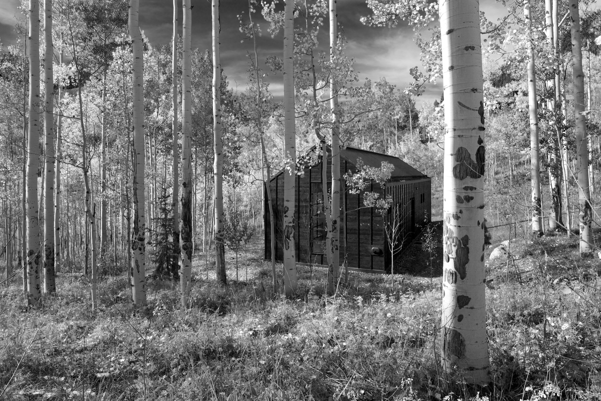
“The main house sits up on a ridge and is all about connecting to those long views, the big mountain views,” says Piché, describing what he calls a “more extroverted” approach, compared with the cabin down in the grove. “When we started working on the little guest retreat, we wanted to experience the trees in a completely different way. These views are much more embedded in the grove.” To better understand what design and placement would make the most out of Cottage Black’s distinct surroundings, Studio B took time to study how the aspen trees’ foliage changes with the seasons. “One thing we really liked about it was that the trunk feels really consistent throughout.”
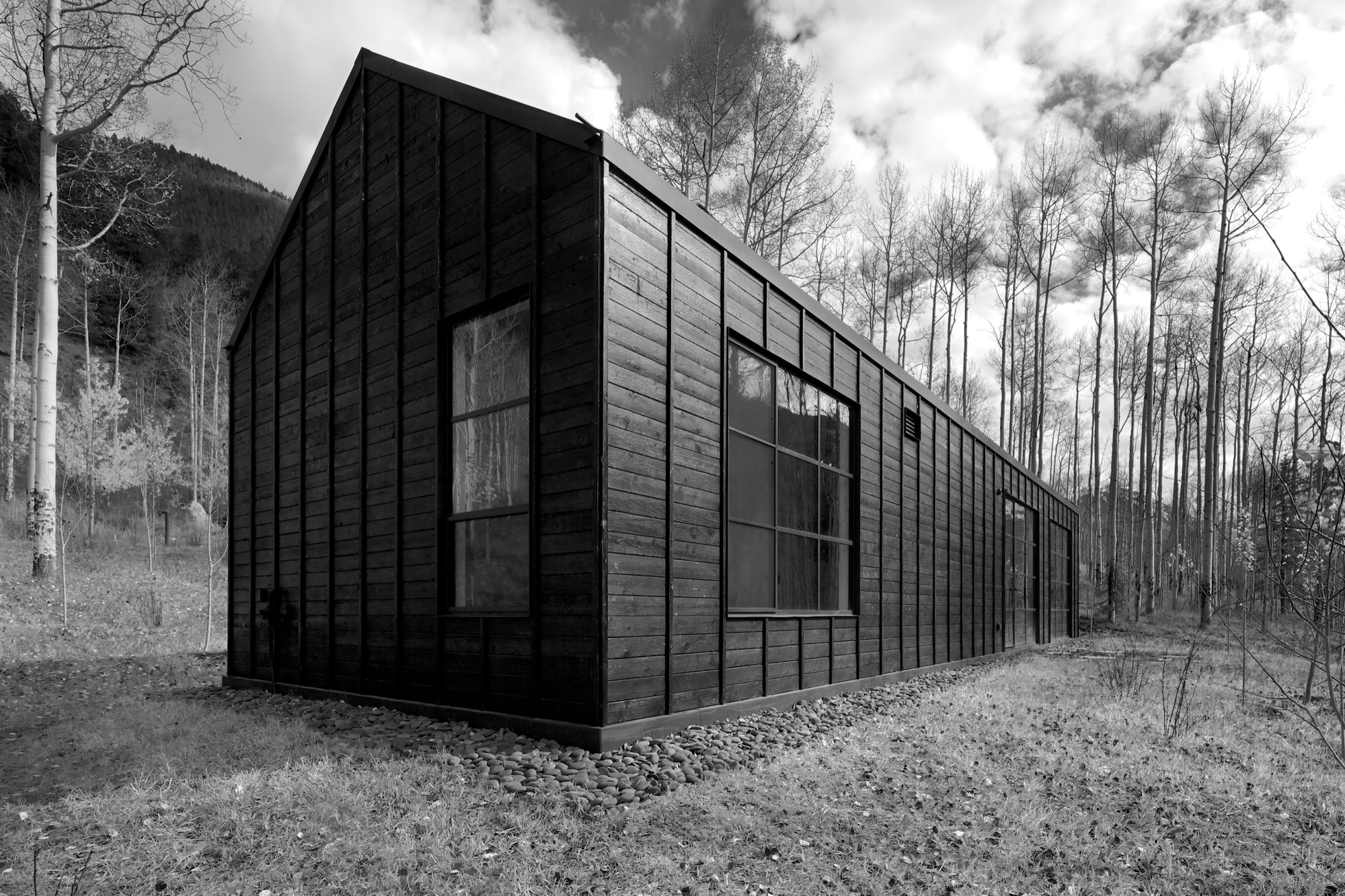
The monochromatic aspen tree bark ultimately inspired the intimate retreat’s all-black exterior and all-white interior.
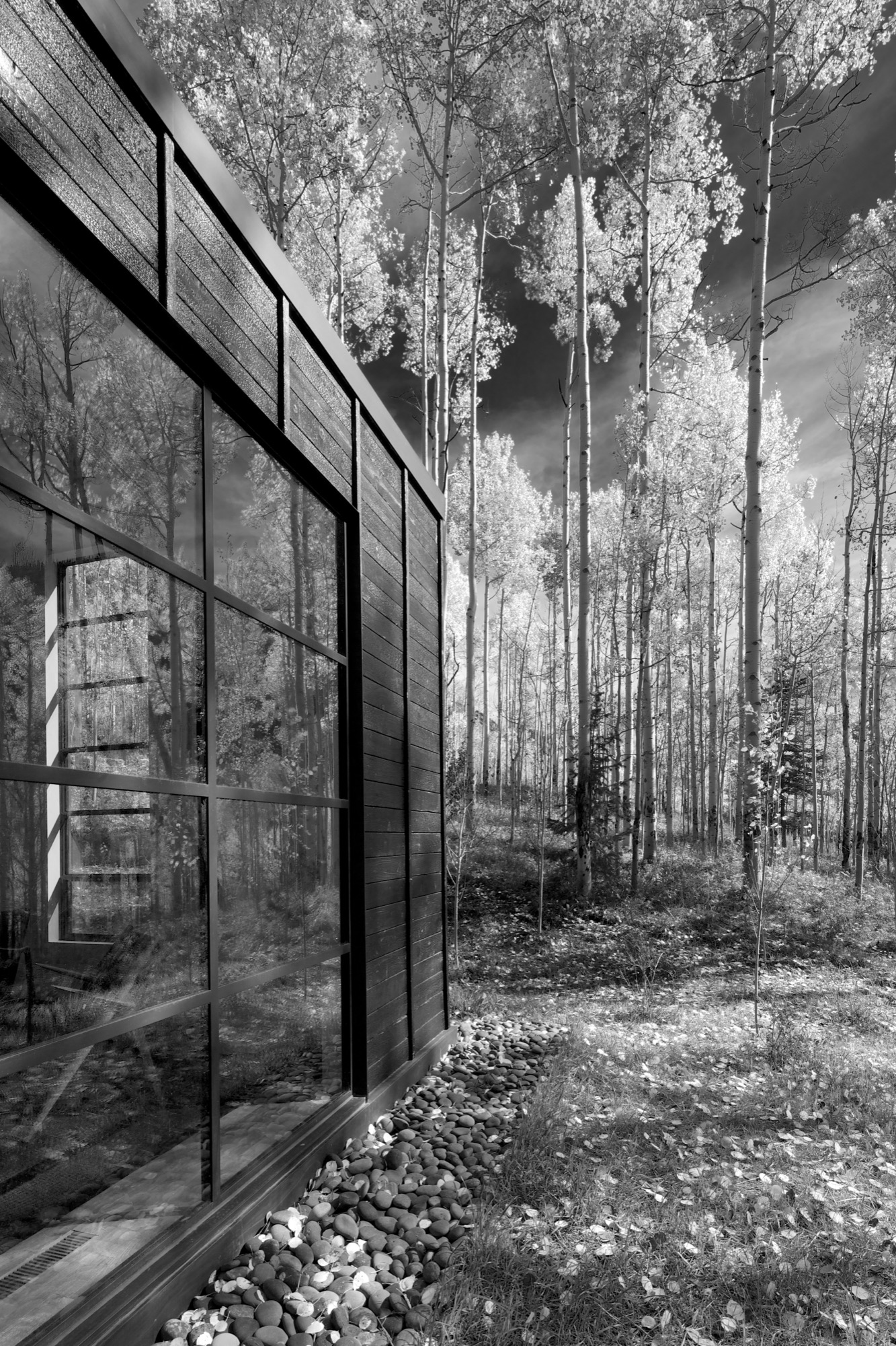
“The standing seams on the roof and the vertical joints of the interior wood ceiling were chosen to relate to the immense verticality established by the trees,” the placid architecture master notes. Approaching the house, simple stairs weave their way through the trees to the front door.
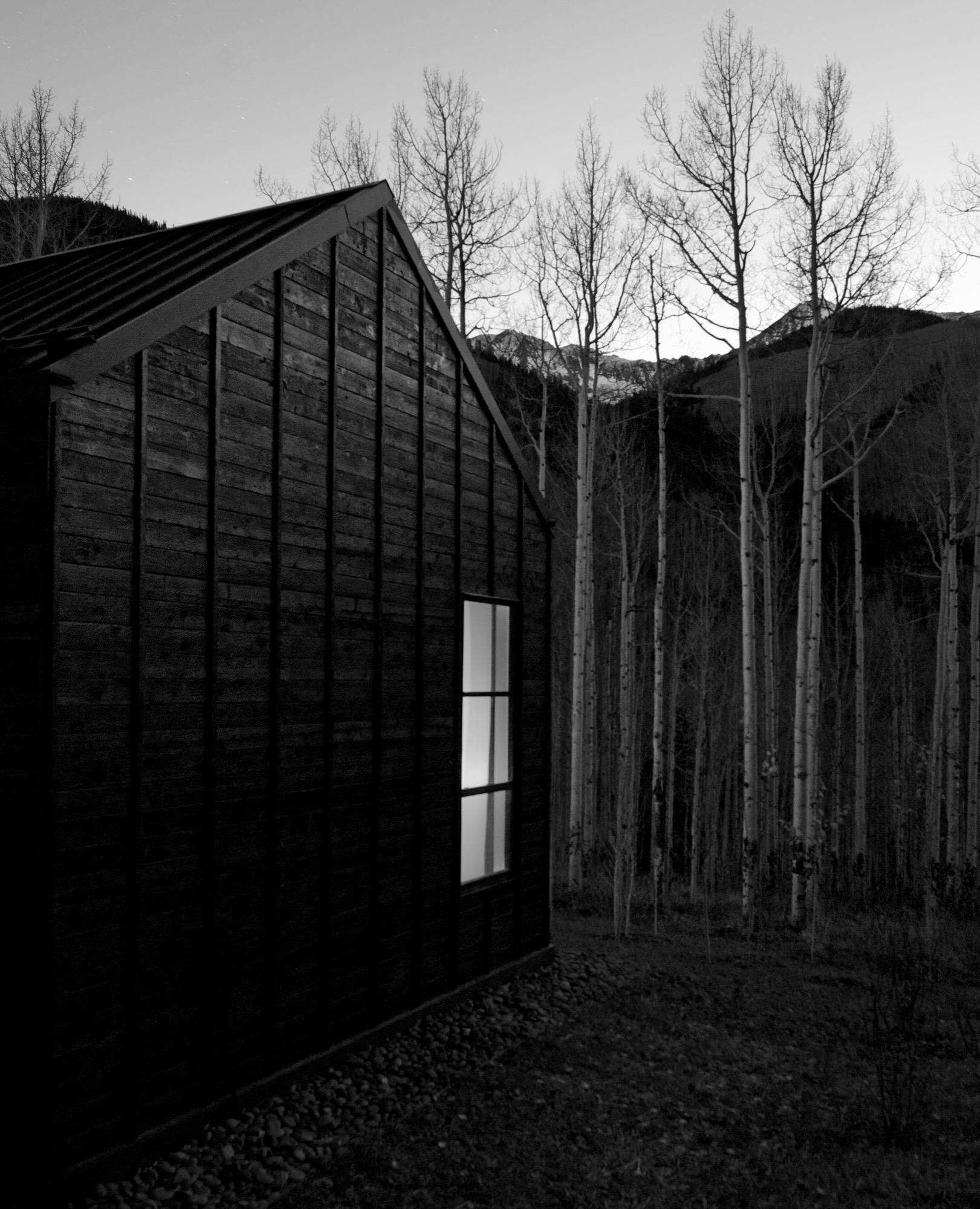
The black exterior
Heavily charred cedar wood gives the cottage’s exterior a rougher, bark-like texture. The orientation of the boards and the battens picks up on the verticality of the trees and the shadows. Looking at “that box” with its horizontal boards at one point during construction, Piché says they had an epiphany: “You wouldn’t think that black has the shadows and the depth that it does, but it seems it almost has more. When the sun hits, the black wood goes from gray to dark and it really feels like it transforms quite a bit.”
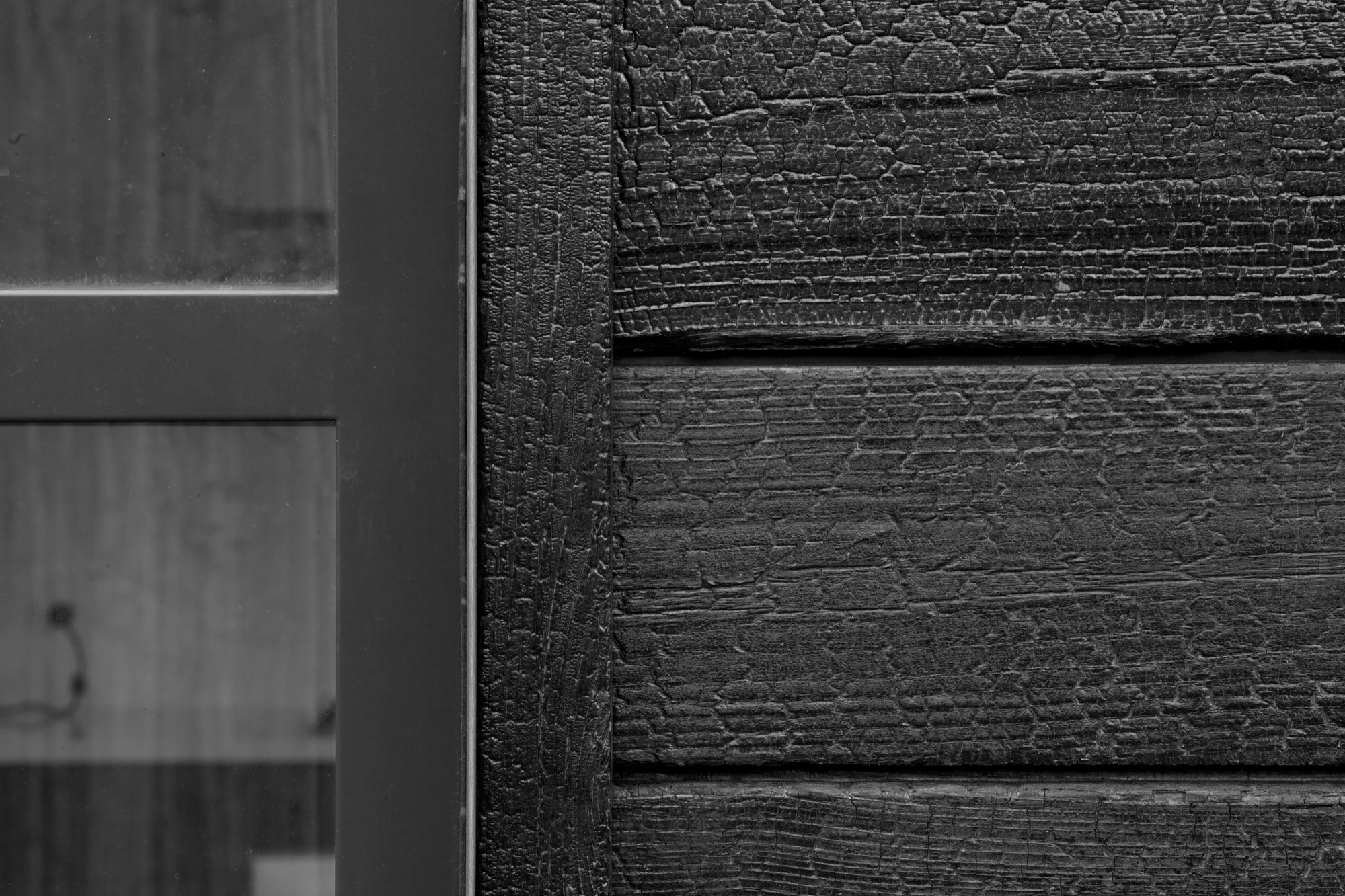
“You wouldn’t think that black has the shadows and the depth that it does.”
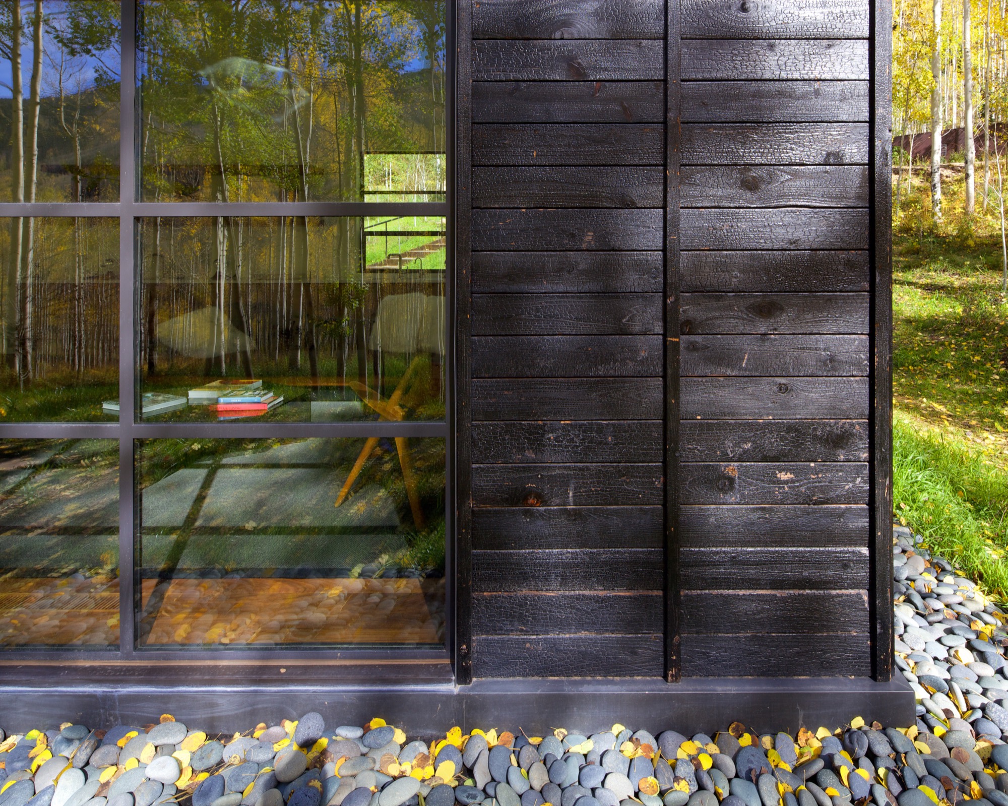
What’s more, the charred exterior gives Cottage Black the air of having been there for a long time. “And in spring and summer, when all the trees are fully leaved, people don’t even see the cottage. It disappears, and it reappears in the fall, too,” says the distinctly analytical architect, pointing out that no driveway leads to the retreat and guests cannot park right next to it. “The cottage is packed into the trees, and it’s kind of a journey down there.”
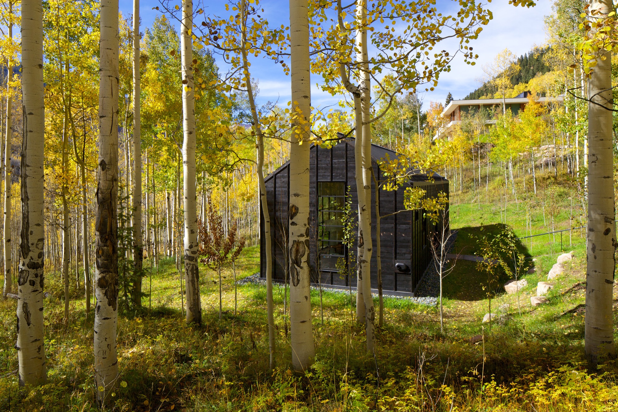
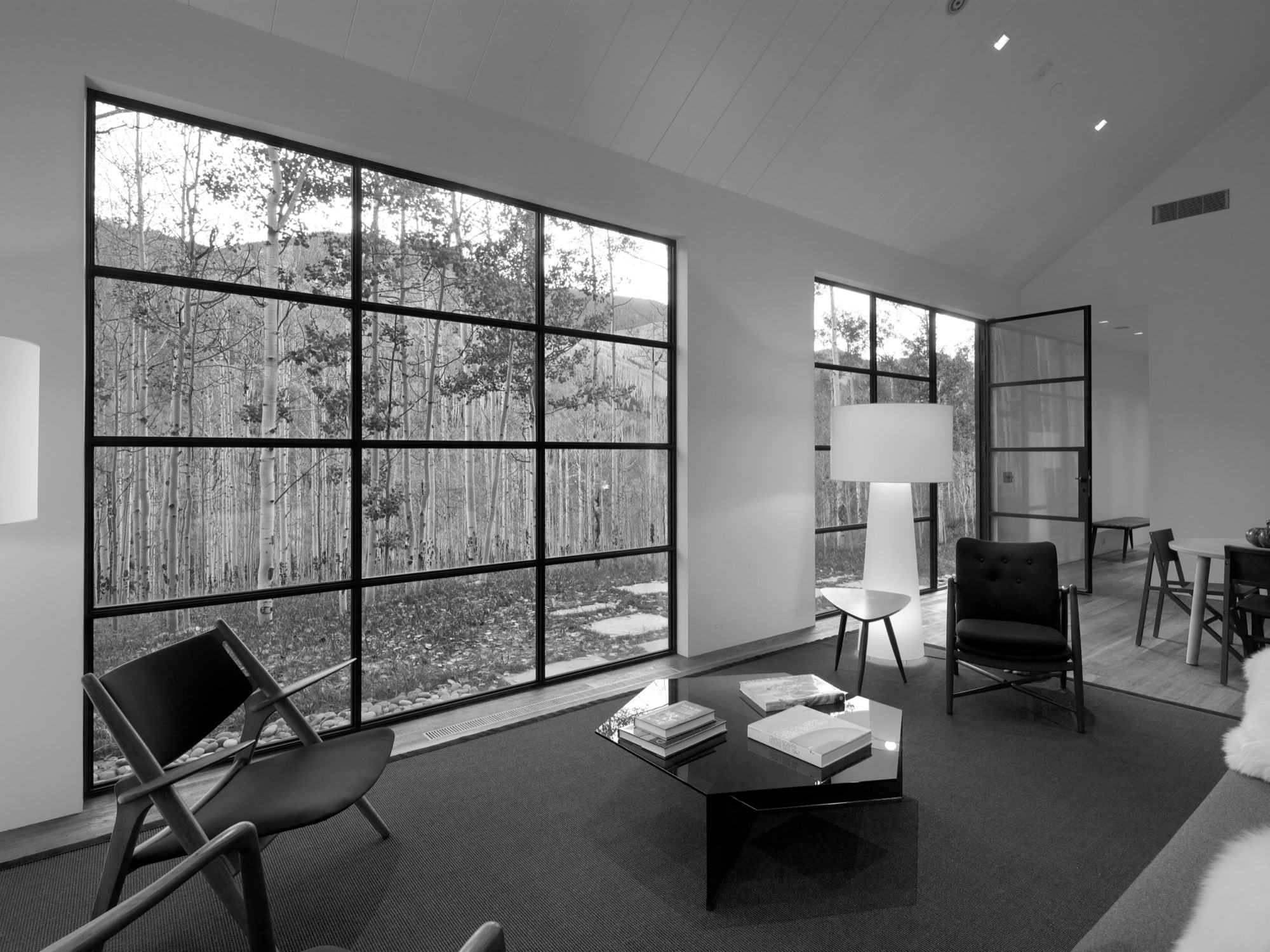
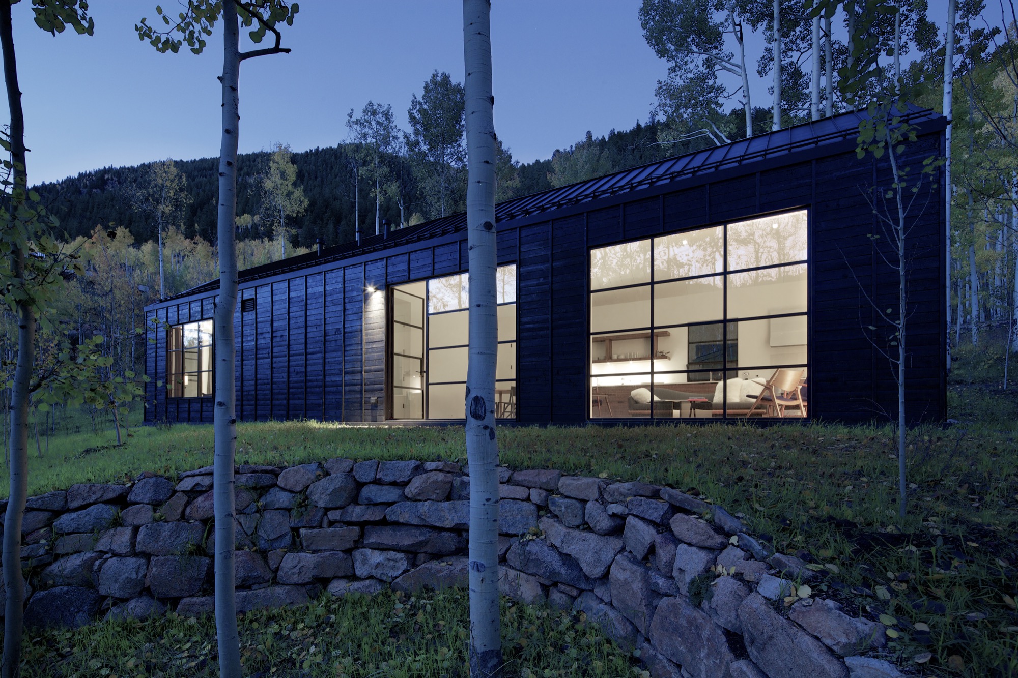
The Studio B team intently placed the steel windows to achieve a minimal sight line that only highlights a few select views. “We added a tall window that emphasizes some great trees on that side, a couple of little corner windows that just frame the tree trunks, and then one big window in the living room that is more about walking outside onto the patio and connecting to all the trees there,” the architect says. “But you are not getting those big mountain views. Just these little glimpses of the outside, which creates that more intimate feel when you walk up to the window. It is more about enclosure and intimacy than the broader expansive things. It is a little bit more inward than outward.”
"It is more about enclosure and intimacy than the broader expansive things. It is a little bit more inward than outward.”
The white interior
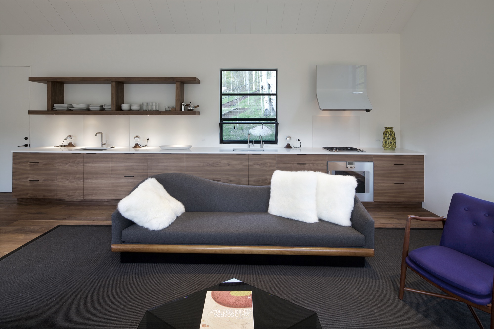
Walnut floors lend warmth to the primarily white, minimalistic inside. “The monochromatic interior, again, is a counterpoint to the main house, which has a lot more materiality coming through and more complicated detailing,” Piché says. Cottage Black, by contrast, is very simple, with much more subtle detailing: “There is the wood ceiling, for example, where each of the joints lines up with the joint on the exterior in a subtle inversion of it.”
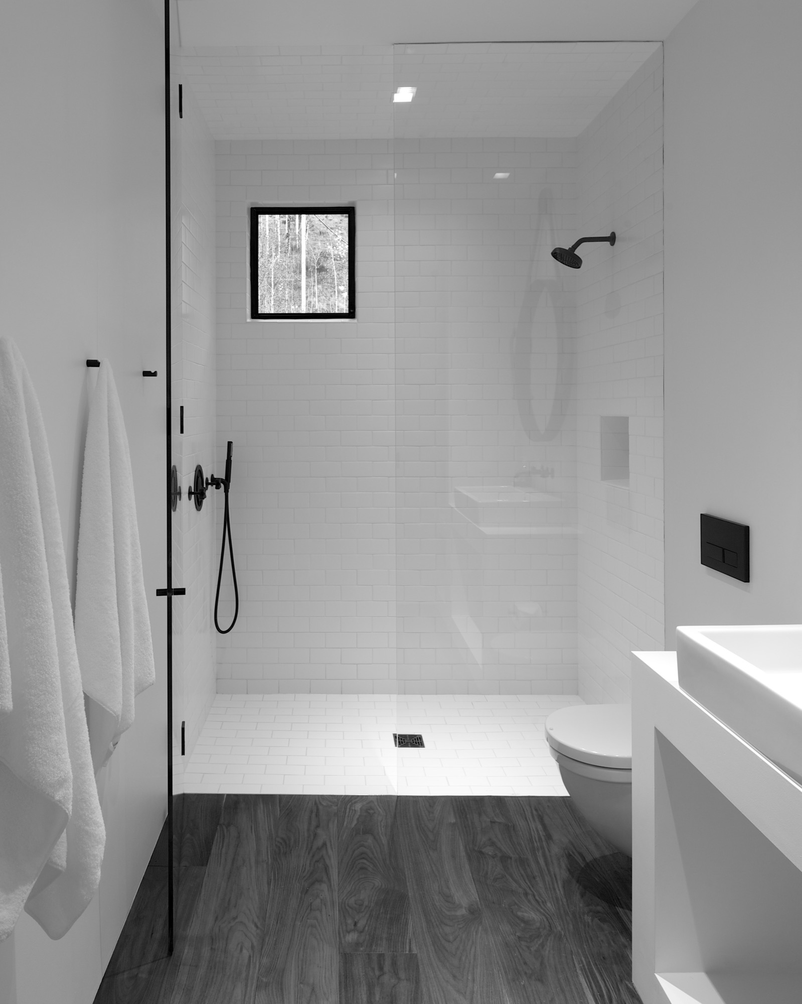
A bathroom at the center separates the sleeping area from the living space, which also includes a little kitchen to allow guests some autonomy, if they desire. “There isn’t any kind of door,” Piché says about the intimate studio layout.
A counterpoint for solitude
Should the guest retreat complement or rather juxtapose the main house? After much collaborative consideration, the design team and the client decided Cottage Black was to be a distinct counterpoint to the luxurious primary residence up above on the ridge. One consequential feature of this objective ended up being the orientation of the structure. “The one window that you see when you stand up in the living room lights up, and that’s it,” Piché says. “All the other things... we shifted it quite a bit to make sure you couldn’t see it from the main house—that there is that black object.”
Furthermore, the team had added transitional materials throughout the main house to add texture and interest in various places. Cottage Black’s architecture and interior design, on the other hand, are very much characterized by deleting details, according to the architect. “This house is a lot about editing,” he says in reference to the design process. “In the beginning, we had a lot more adventurous solutions, and we distilled it and made it into a better and more powerful piece of architecture. It doesn’t need to be a lot.” △
Fifteen and Focused on the World
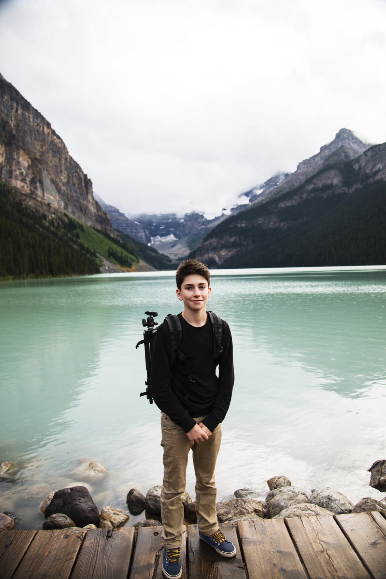
Only fifteen years old, Joe Goldberg travels to explore the world through his camera lens. The photographer hopes his photos will inspire others to get out and see for themselves.
Upon returning from a life-changing trip to Costa Rica when he was only eleven years old, Joe Goldberg (joe_goldberg on Instagram) decided to spend his bar mitzvah money on his first camera. Now fifteen, the high schooler, who lives with his parents in Washington, D.C., expresses his teenage self through the art of photography.

What’s more, the young adventurer wants to inspire others to travel and explore the world, too. At an age when his peers may search for their raison d'être on the Internet, this millennial gets out and uses photography to bring life into perspective.
A conversation with teen photographer Joe Goldberg
AM Who are you in a nutshell?
JG I am a fun and energetic fifteen year old who loves to travel to the wildest places, take photos, and explore.
AM How did you find your way to photography?
JG I was eleven years old when I went to Costa Rica and really discovered some of the most natural beauty in the world. I then realized capturing memories with photography is a really cool thing. I realized how passionate I am about photography, so I decided to purchase a camera with the money I received after my bar mitzvah.
"I then realized capturing memories with photography is a really cool thing."
AM What does being fifteen mean for your creative work?
JG I think the role my young age plays in my creative work is having this constant urge as a young kid to travel and see things most people won’t be able to see in a lifetime.
AM How do you balance school, teenage life, and your work as a pro photographer?
JG I attempt to get the best grades I can, so I can afford to miss a couple days of school here and there when I travel. I hang out with friends and family when I can. And when I get the chance to go out on an adventure, I will take the opportunity and then return to my normal, everyday life in Washington D.C.
AM What do the mountains mean to you?
JG The mountains play a big role in my photography. Probably, because I believe mountains make for the coolest photographs. My favorite activity also has to do with mountains, which is hiking. To see those insane views after a strenuous hike is one of the best feelings!
"I believe mountains make for the coolest photographs."

AM What inspires you in your work as photographer?
JG What inspires me is being able to share the beauty of the world with everyone. I love to capture memories and to look back on these incredible experiences I have been lucky enough to have. I love to hear how impressed people are with my work, which is a really big motivation to bring back the best work I can from these adventures I take. I also use my photos to try to encourage people to go out and explore.
AM What’s your favorite place in the world?
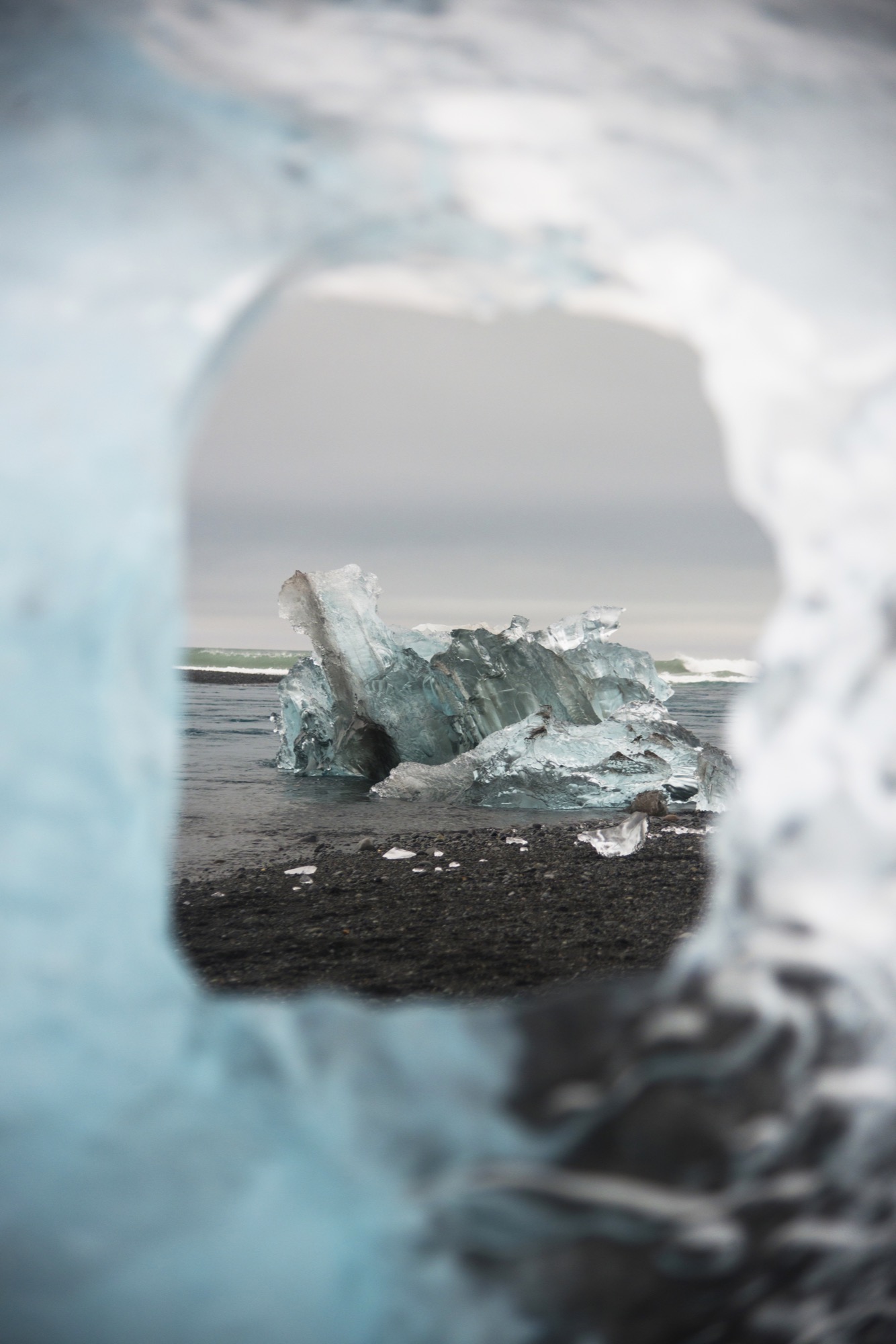
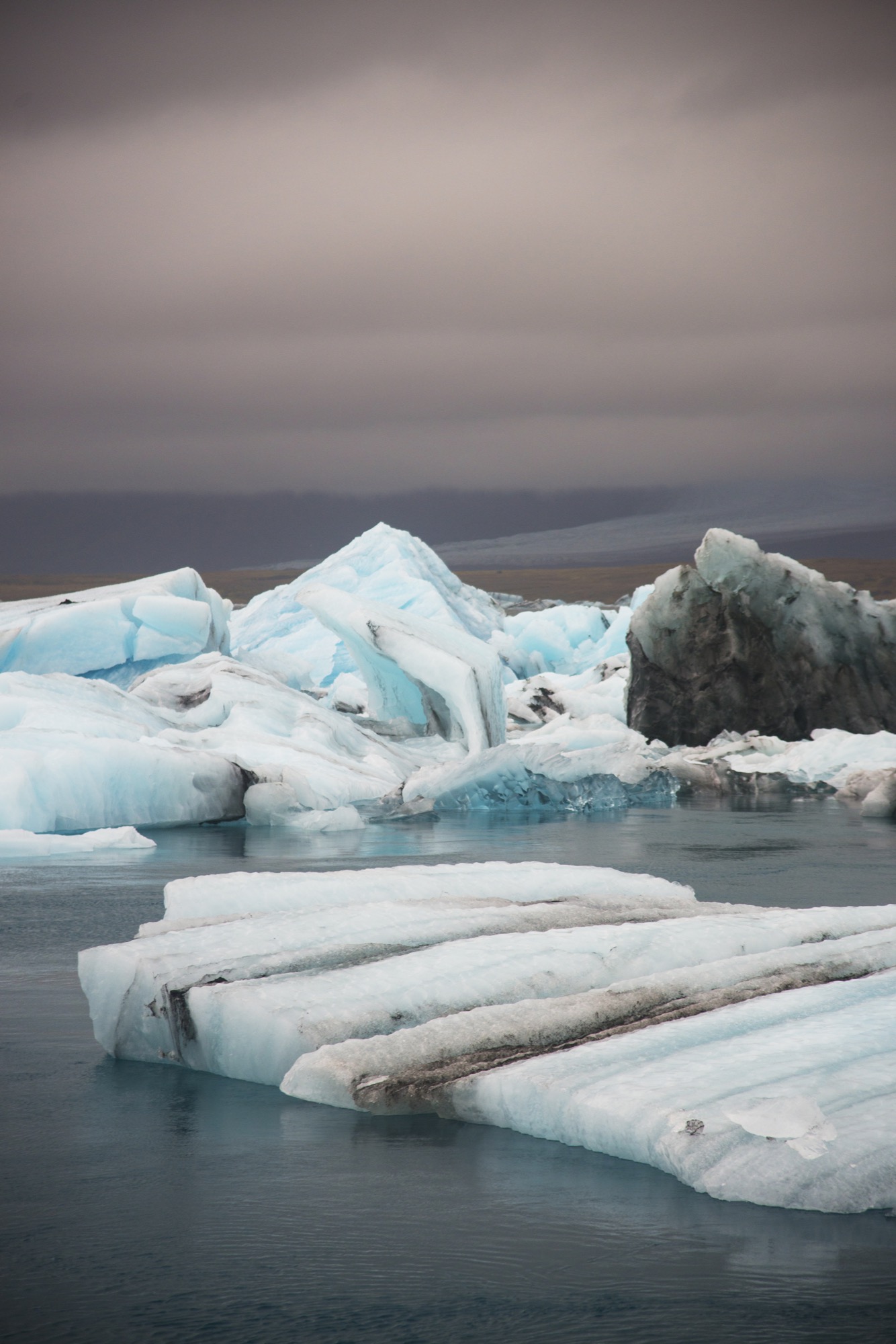
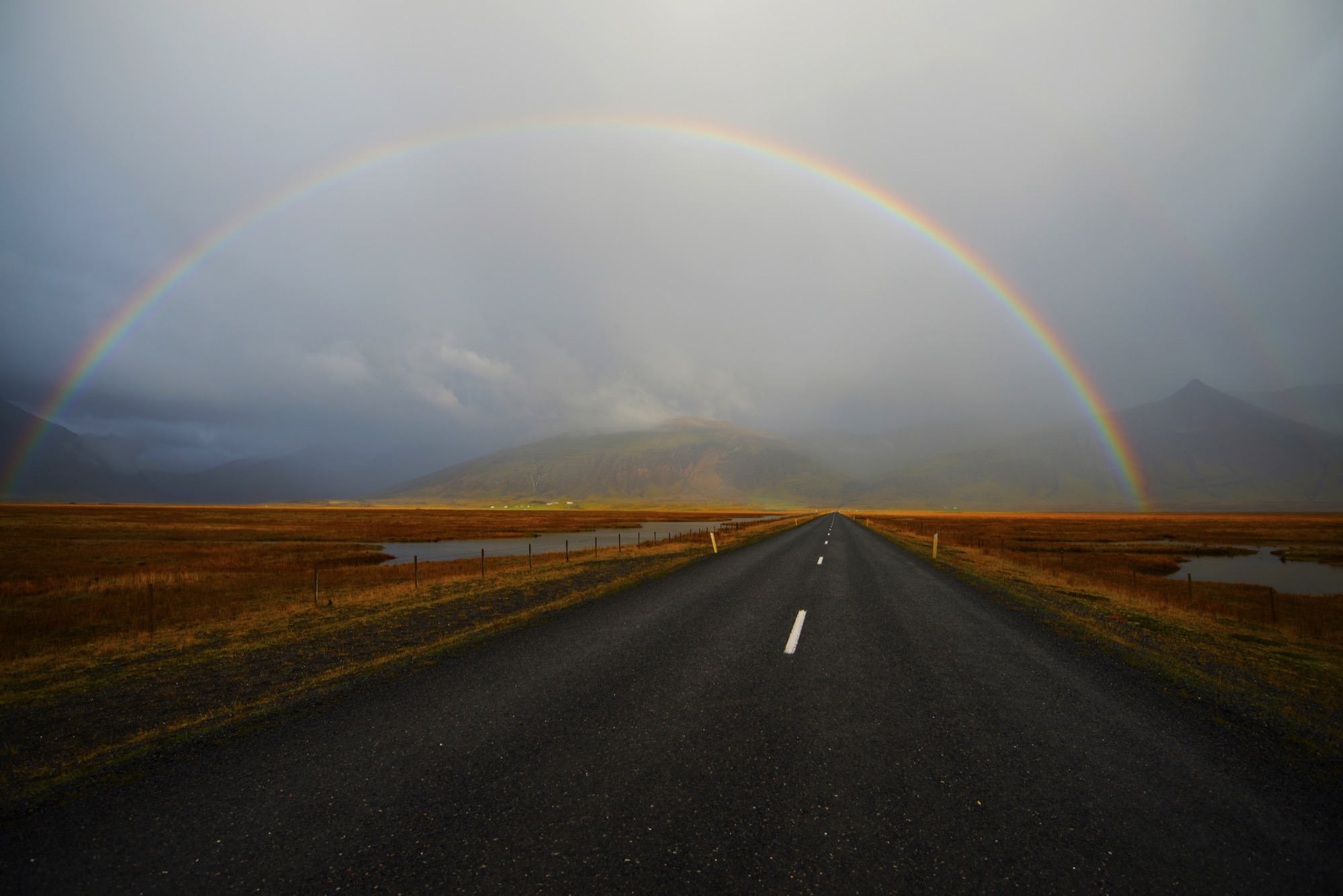
JG My favorite places I have been to have to be Iceland and Alberta. Alberta because the number of lakes and the abundant wildlife just blow my mind. You never know what to expect in the Canadian Rockies, and that is why I decided to go back over the summer after having gone during Spring Break. My other favorite place has to be Iceland. Every five minutes, you see a totally different landscape. I would love to return soon.
AM What’s most important to you in life?
JG The most important things in my life are my family and friends. However, being able to see the beauty in this world and pursue my dreams of being a the best professional photographer I can be is also something very important to me.
AM When are you the happiest?
JG I am the happiest when I am in nature, experiencing the amazing sights the world has to offer.
AM What are you up to next?
JG I just finished traveling to Iceland in October. Iceland is a place I wanted to go to for years now. The waterfalls, wildlife, volcanoes, glaciers, geysirs, unique landscapes, and the incredible Northern Lights are the reasons why it was on the top of my bucket list. △
The Building Friendship
Friends since preschool and sharing a love for design and the mountains, the founders of MTN Lab, an experimental furniture and art studio in Colorado, have always been building things together
Harris Hine and Rudy Unrau have been best friends since preschool. Now both 27 years old, they have founded MTN Lab, an experimental furniture and art studio in Colorado. Growing up in Boulder, Colorado, the lifelong friends have been building things together since they can remember—skis, bikes, random projects. But it wasn’t until spring 2015 that the idea for MTN Lab was born. Both back in Boulder, Hine and Unrau began showing sculptures at Studio Como in Denver’s RiNo art district at the time. “Getting in there is what really materialized the company,” Unrau recalls. “That’s when we came up with our name and went from just building stuff to actually focusing on a business.”
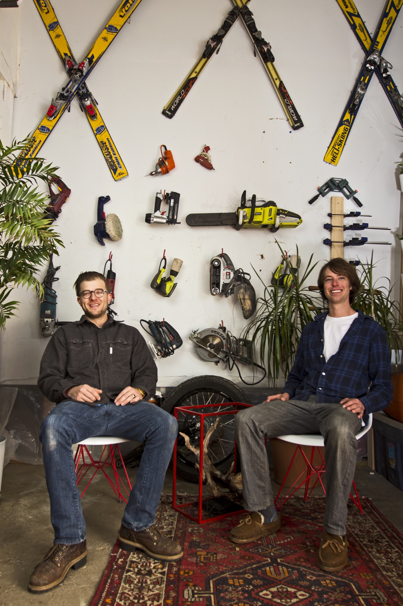
The two men, both quiet and reflective, share an ardent love for design and the mountains. Yet, they come together at MTN Lab—at the intersection of art and adventure—from opposite directions: Hine a trained designer and woodworker, Unrau a former professional mountain biker turned woodsman fighting wildfires for the Forest Service.
Harris Hine
Harris Hine grew up profoundly influenced by his father, Vienna-born modernist architect Harvey Hine, who founded HMH Architecture + Interiors in Boulder.
“I’ve always been torn between the design side of my personality and just wanting to be in the woods,” Hine shares. He went to school for design at Pratt Institute in Brooklyn before moving from New York City to Portland, Oregon, where he worked as industrial designer. “I didn’t find any fulfillment doing other people’s projects, and I didn’t really like the mass production side of product design,” he admits.
All those years, Hine pined for the woods, where his old friend was.
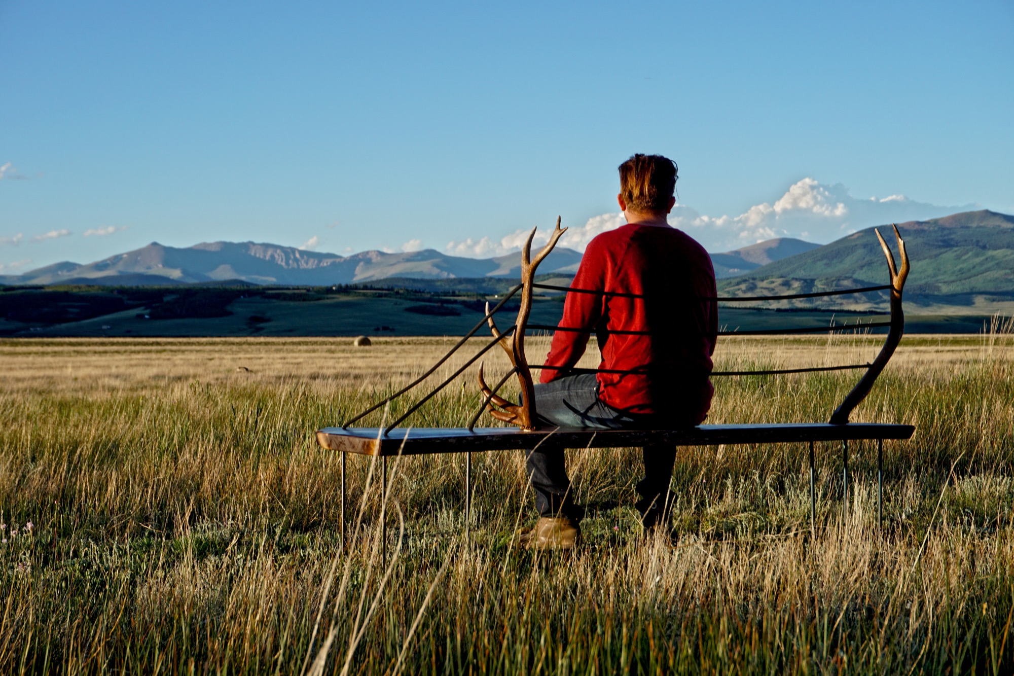
Rudy Unrau
Unrau, while attending college in Western Colorado, signed on with the United States Forest Service. “I was on track to becoming a smoke jumper, working for a helicopter crew down in Durango,” the long and lanky woodworker recounts. “It was a great setup because you work a ton in the summer, and then you get winter free to do whatever you want, like ski and move to Canada.”
Throughout those years, Unrau had been harboring the desire to return to making art. “Seeing the things you see when you get to fly around and travel the US and go to all of the mountain ranges... I had ideas emerge to work with the trees that had been burnt or partially burnt in fires because they get so twisted and cool.”
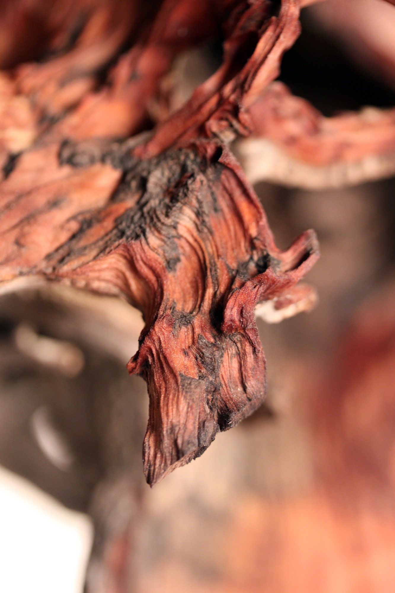
"I had ideas emerge to work with the trees that had been burnt or partially burnt in fires because they get so twisted and cool.”
Joint adventure up north
At last, one pivotal winter Hine and Unrau moved to British Columbia together to ski. Their close friendship and mutual influence would impact each man’s path. “Rudy was all in the woods,” Hine remembers, “Living together pulled him back into the design world and brought me back into the woods.”
Unrau agrees: “I’ve always been at home in the woods. Growing up, I really wanted to pursue mountain biking, so I raced mountain bikes professionally for quite a few years.” After the athlete got “a little bit tired” of mountain bike racing in world cups, he focused on skiing.
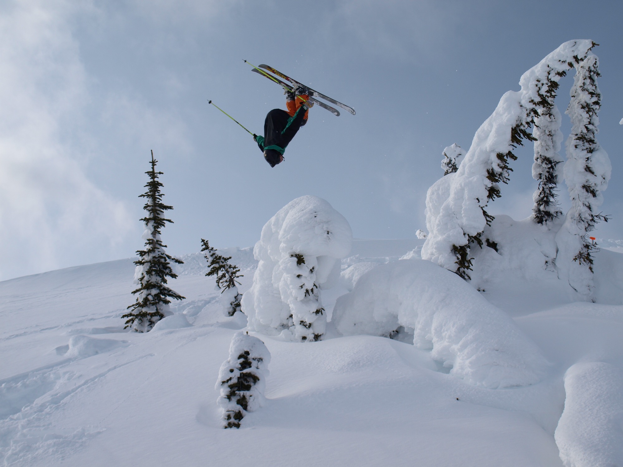
Skiing in Canada was good fun. Winter gone, however, Unrau planned to work another fire season. The outdoorsman envisioned himself carrying on that seasonal rhythm of demanding service and wild adventures in the snow for years until he had and his friend had their fill of youth and independence. “And... I crashed paragliding,” he tells, falling solemn all of a sudden. “I broke my back and almost died and spent half a year recovering.”
His loyal friend by his side, Unrau needed to reevaluate his future. “I realized, I wouldn’t be able to do fire again,” he says. “And then it was pretty natural the way MTN Lab came together—us getting our shop set up to where we could build.”
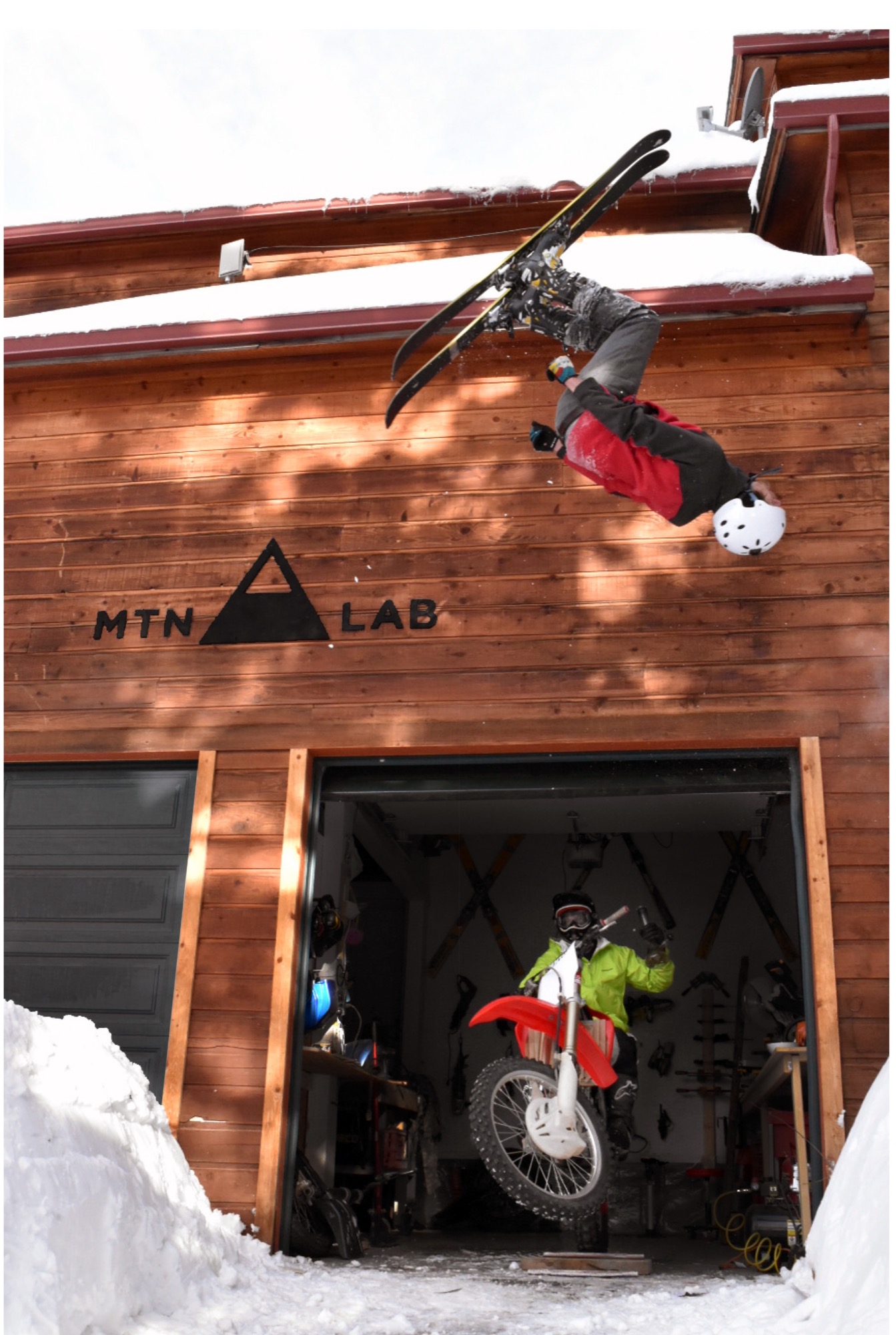
The MTN Lab process
Starting with sculptures, the duo soon began venturing into furniture. Their vision is to grow the Conifer studio into an art collective, with more creatives joining them. They are even planning to build a tiny house to accommodate visiting artists and designers.
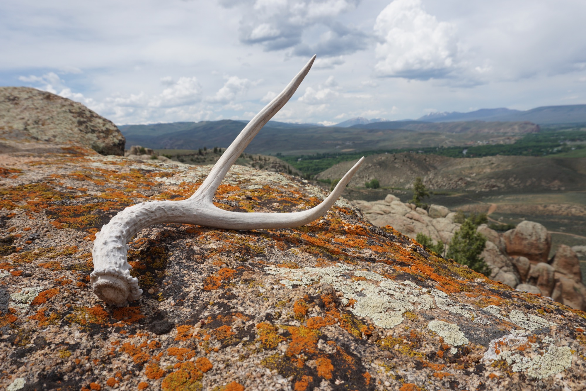
MTN Lab is as much a concept as it is a company. “Our process is the most indicative of what we make,” Hine explains. The founders source all of their materials themselves in the Colorado mountains. “We quarry our own stones to carve and collect our own wood.” Like it was for generations of makers in the mountains before them, MTN Lab’s workflow follows nature’s rhythmic swing. “Right now it’s the season for us to go get river stones because the flow just came down,” Hine tells me, when I sit down with him and his partner on that warm day in early September. “And we are doing antler stuff because we found a bunch of Elk sheds. That’s this flow that we follow.” Adds Unrau: “Our company is trying to do the whole process from sourcing, getting our materials, designing it, building it ourselves, photographing it ourselves.”
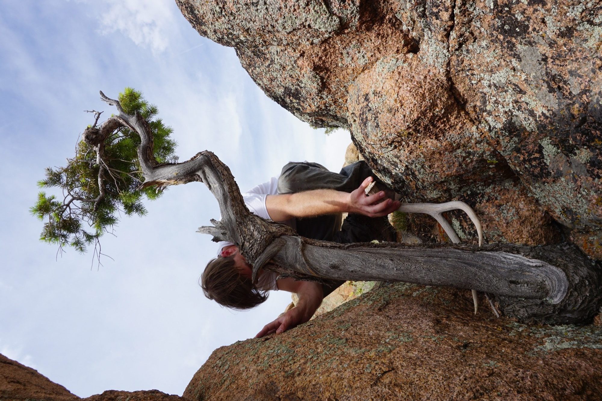
The friend believes having grown up in the mountains is what motivates them to see the entire process through, from beginning to end. “Spending all of your free time in the backcountry—you’re just so inspired by what you’re surrounded by,” Unrau says. “Initially, we were out there to ski, climbing to ski. We were dirt-biking. But when you spend that much time out there, it altered our perception of why we were there. And now it’s awesome because we get to ski, but that’s not the whole part of the process. The ski is the vessel for finding the materials—as well as the inspiration.”
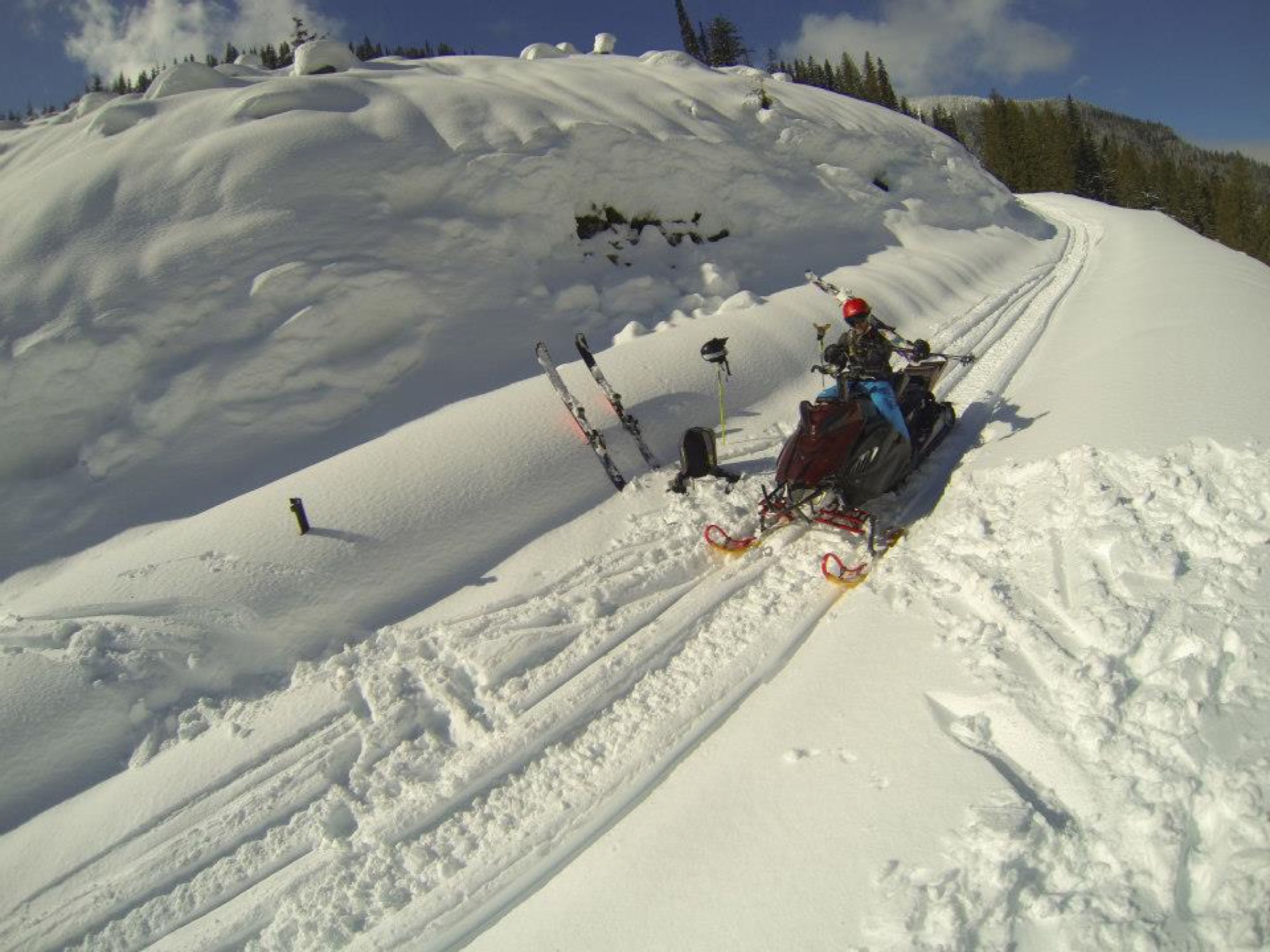
“The ski is the vessel for finding the materials—as well as the inspiration.”
Connecting nature and art
“I’ve always liked minimalist design, and I rarely see that done with natural materials,” Hine says. “You look at Bauhaus stuff, and it’s very industrialized. My dad being the modernist he is, half of me is always striving for that simplicity. But then there is the other part of me... the Colorado guy. And I see these cool pieces of wood and antlers and it naturally merged. In college, I was more on the industrial, clean-cut metal side of things, and my style has evolved more and more into a hybrid of rustic and modern.”
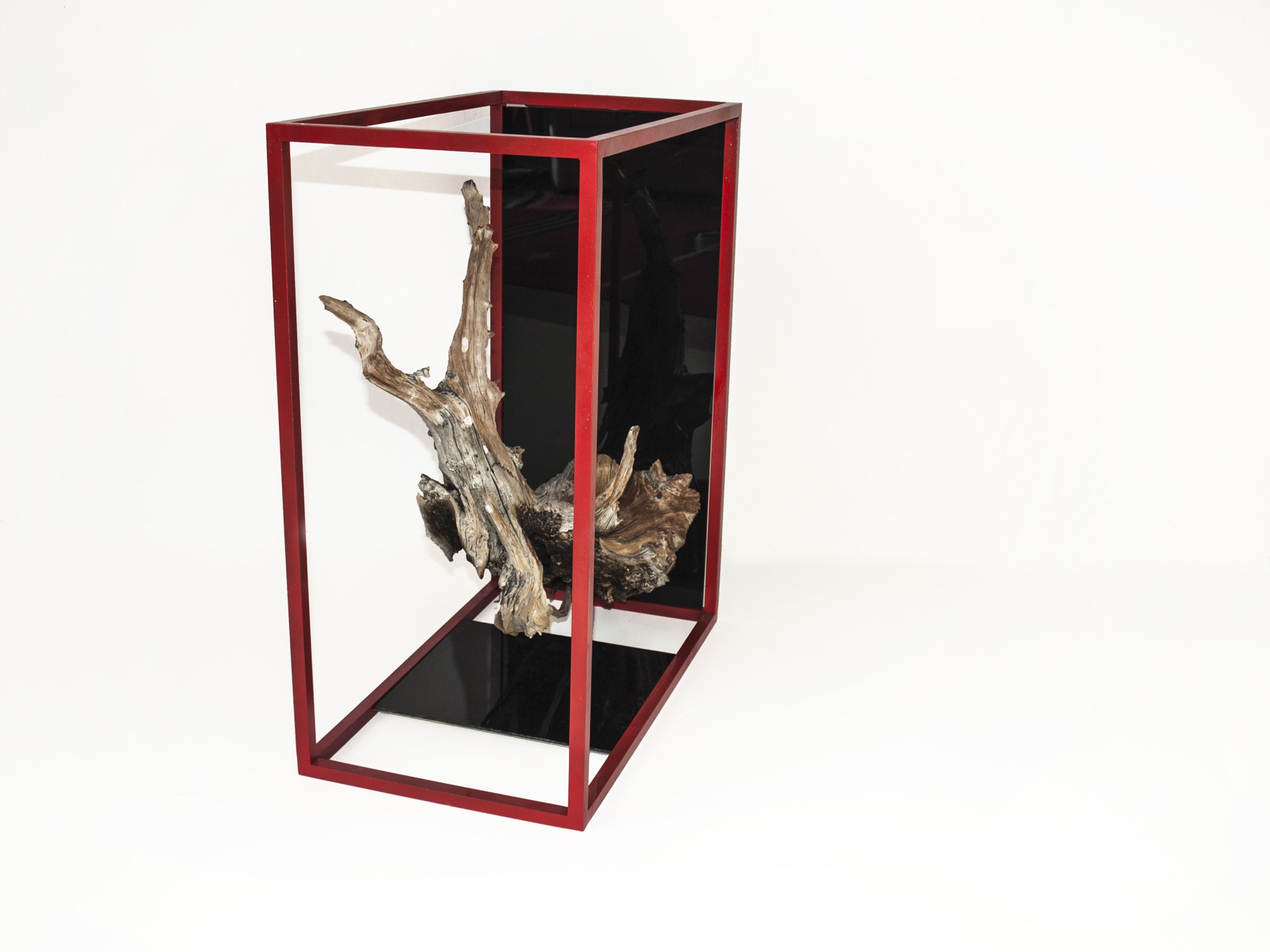
Unrau, for his part, never earned an art or design degree, nor does the lack of academic study in the field limit him in his current work. “We really do our designing when we’re out in the woods. We don’t sit down in an office to draw. We see the material, and the material almost dictates its design.”
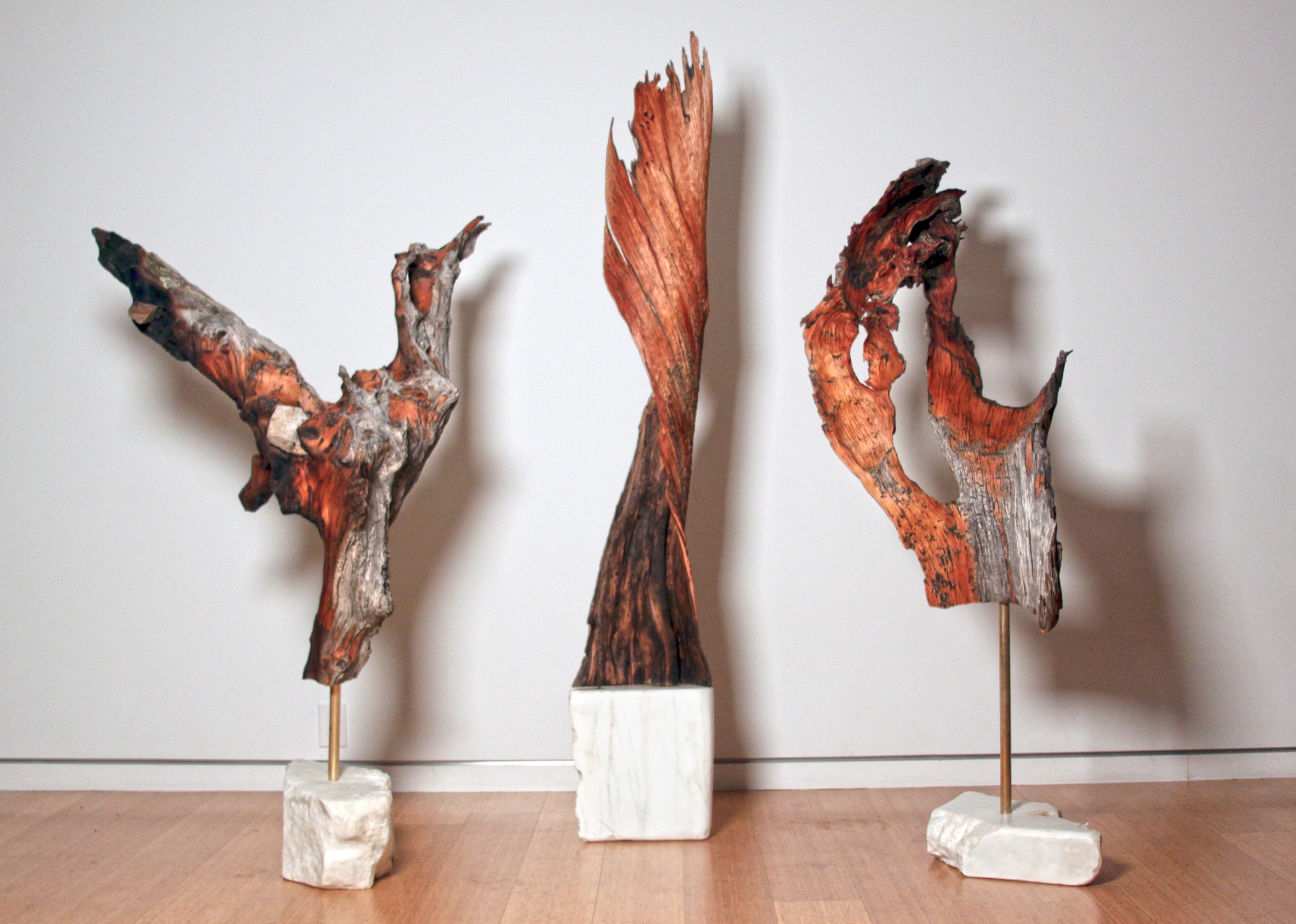
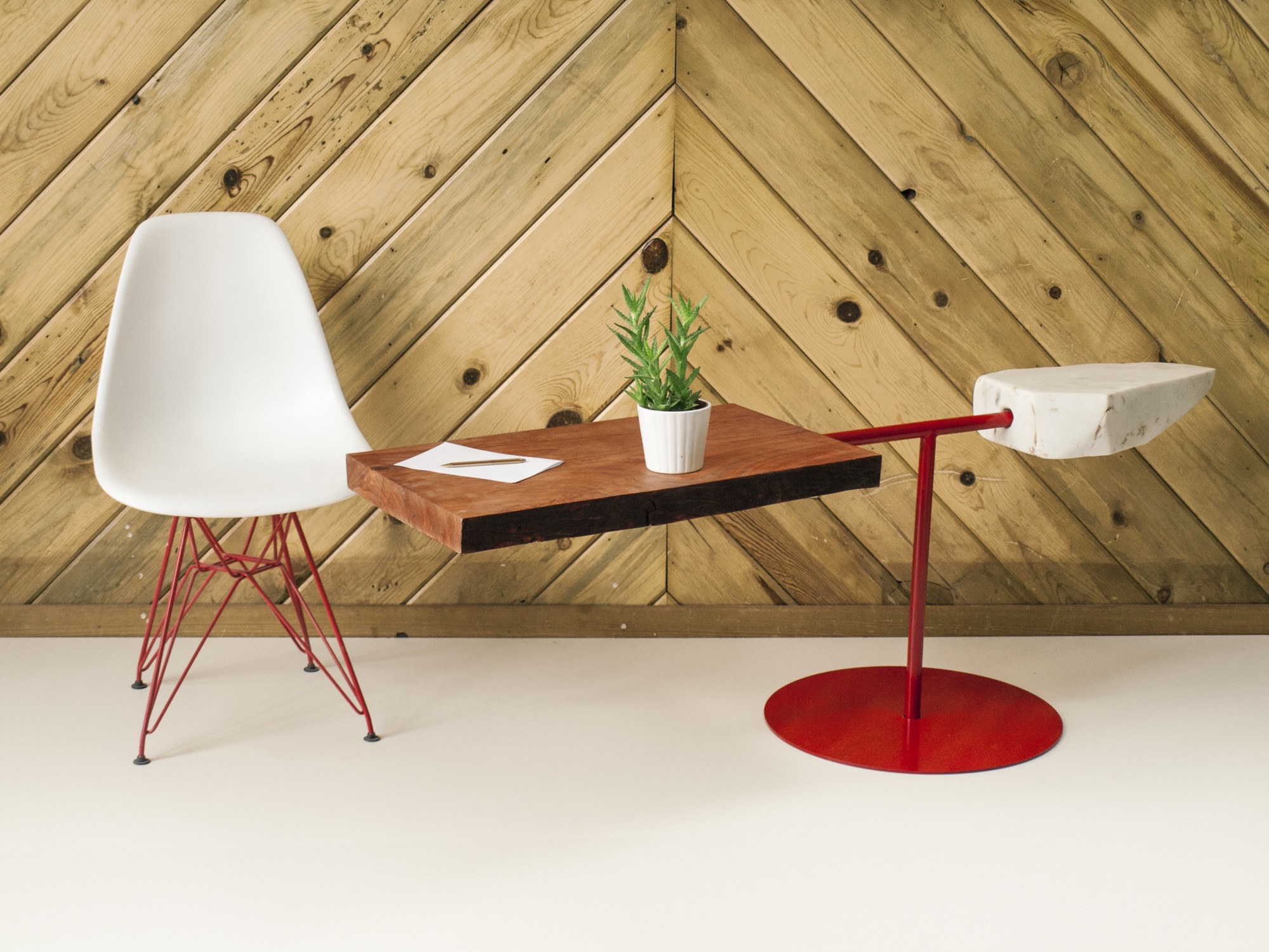
They usually know right away, if a piece of wood they come upon in the forest will transform into an art sculpture, a table, or something else entirely. Back at the studio, they combine found pieces of wood or elk shed with marble and often with contrasting metal. The final artwork or furniture piece comes together like a collage. While the sculptures are never drawn out, the furniture generally is. “We design our table bases, draw them by hand. Sometimes, we bring it into CAD.”
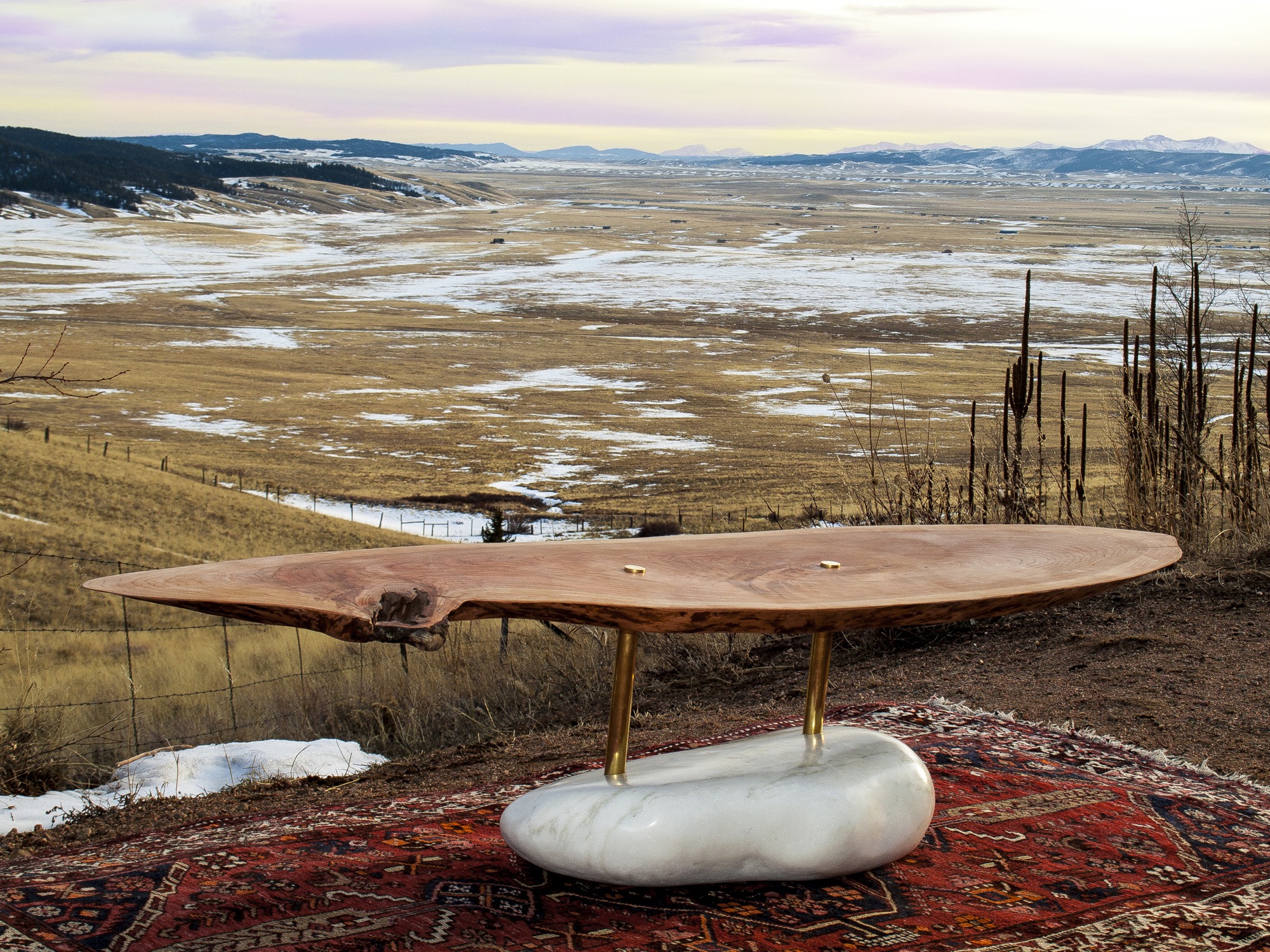
The day I met up with Unrau and Hine, they had come down from their studio above 8000 feet to deliver a piece of art they made for the Boulder Museum of Contemporary Art. “We had this mobile,” Hine begins, chuckling, “And then Rudy dropped it on the staircase, and we were like ‘Oh, no, we’re so crushed. And we had to quickly build it a second time yesterday, and it came out eight times better than the first. That process isn’t always easy to rely on, but sometimes when you make it again, it’s better. This is how we continuously design.”
Speaking about the synergy between Colorado’s magnificent nature, rich history and tradition, and progressive modern art, Hine notes that he is profoundly influenced by the stone carvings of American artist and landscape architect Isamu Noguchi. “It’s that blend of leaving these big natural boulders and polishing one face of it.”
Rustic designs with wood and stone are ubiquitous. “But it’s hard to find someone who has done them simple enough so that these materials individually speak for themselves,” hine says. “Antler furniture is really something we have been experimenting with, because it’s hard to find a simple antler-anything. All the chandeliers are the same hunter antler cluster. And all of a sudden, you are appreciating the simplicity of the singular antler as a sculptural element. That’s what makes it alpine modern, and not just alpine.”
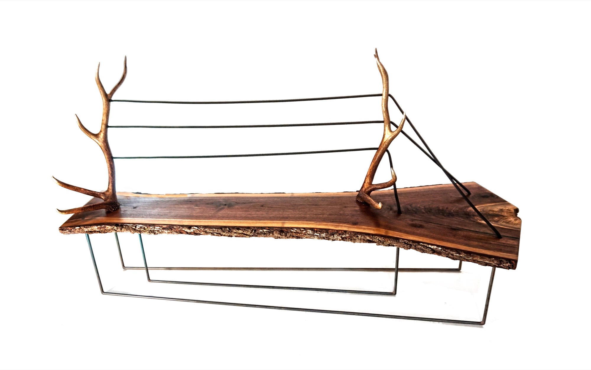
“And all of a sudden, you are appreciating the simplicity of the singular antler as a sculptural element. That’s what makes it alpine modern, and not just alpine.”
A modernists at heart, Hine still looks to the arts and crafts movement for inspiration. “Not stylistically but the whole concept of it is huge, especially since my education is in mass production and industrial design and product development. And going back to actually hand-building one-off pieces from the found materials we use, you can’t really build the same piece twice. It’s almost like we’re in an arts and crafts revival, which is weird for me because that’s the antithesis of the Bauhaus influence, of going from craft to industrial production.”
Our conversation later on reveals that the two 27 year olds are somewhat of an antithesis, too—to their fellow millennials. The Internet, they admit tittering, is their shortcoming. “Neither of us really enjoys social media, self promotion, or even doing the sales part,” Hine says. “It’s the cliché artist who doesn’t sell his stuff. We just are either in the woods or in the shop. It never feels like were working.”
MTN Lab projects
Each MTN Lab piece embodies a story of adventure and friendship.
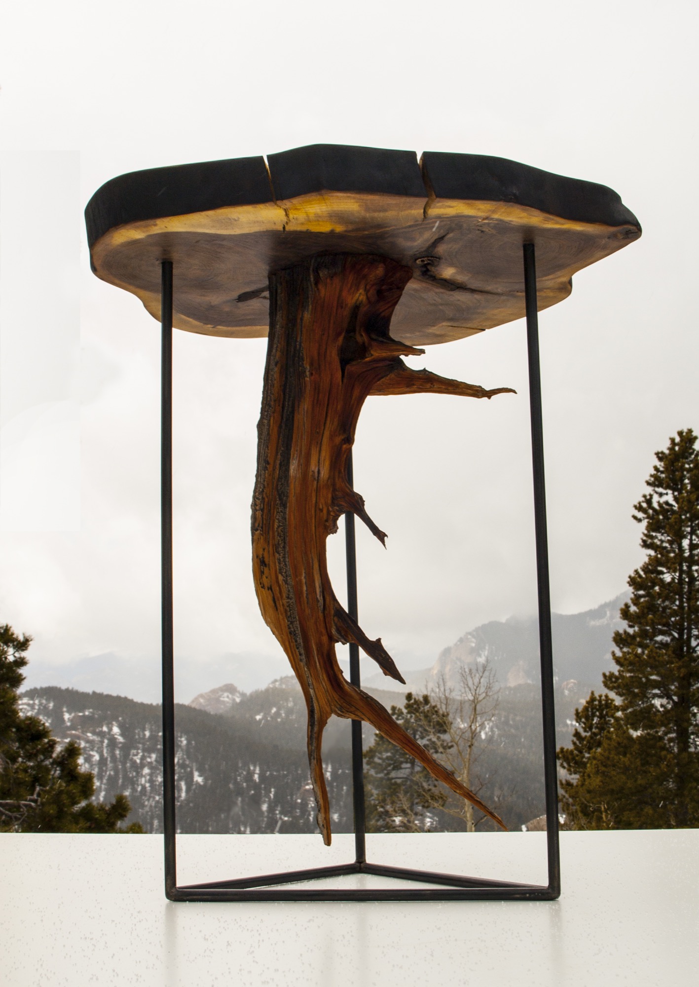
For example, Unrau says seventy years ago, many trees were cut down to make room for high-voltage lines to Fairplay, south of Breckenridge, Colorado. “The company just left them, so these big old-growth rounds have been drying up there all these years,” he says. MTN Lab milled the pine rounds into table tops. “That’s our next big design push, designing bases for those tables,” he says. “Or the motorcycle, which is a lifelong dream we’ve shared since we were little kids.”
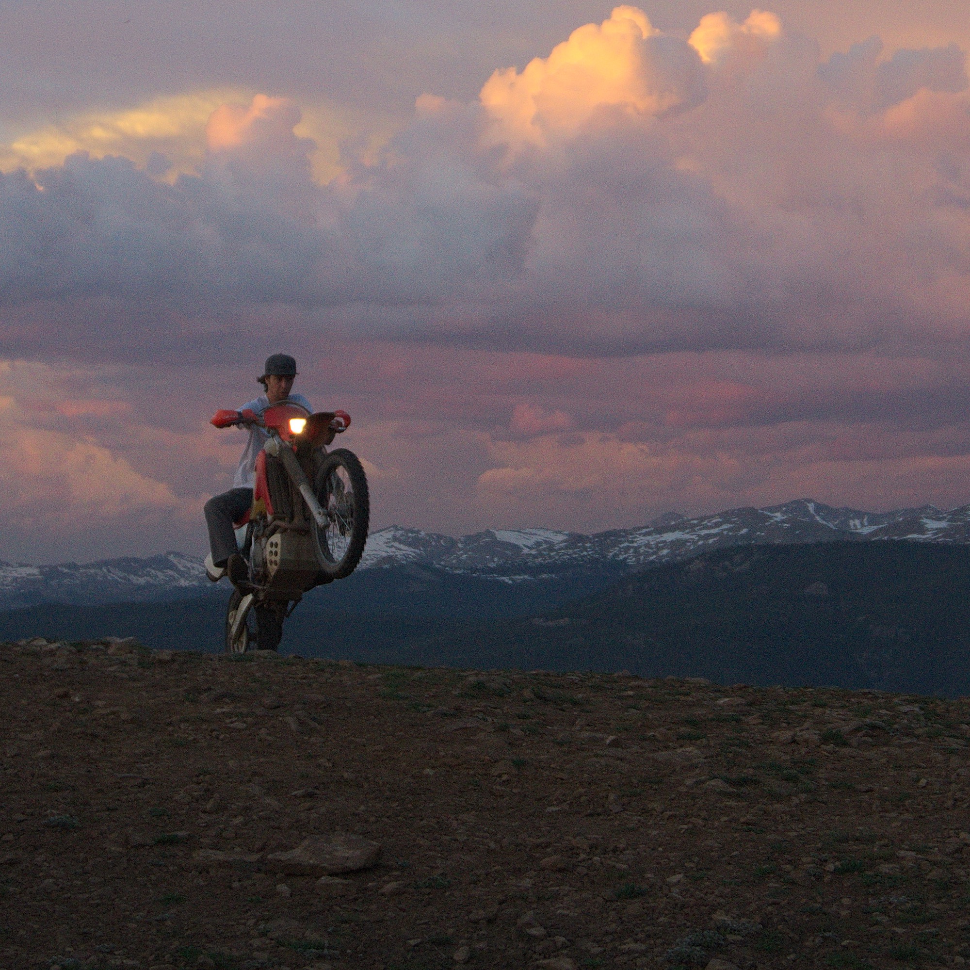
Indeed, Hine and Unrau want to build a motorcycle entirely from scratch, the back end made hand-carved in wood. Before winter, they even want to experiment with producing their our own steel, from mining the rock to crushing and melting it. Whether the resulting material will in fact be usable won’t matter as much: “At least we will be able to appreciate the process when we go to the store and buy steel.”
“The motorcycle is going to be very much like our furniture and our sculptures,” Unrau says. “I would describe it as an art bike. It’s going to be functional. It’s going to ride very well, but it’s not going to look like a conventional motorcycle. I don’t know if we’re going to be willing to sell it.” The business partners are also debating whether they will ever have the heart to sell the 1960s Airstream that once belonged to Unrau’s grandfather and they just finished restoring. “I never want to sell any of our stuff,” Unrau admits, laughing. “It’s hopeless.” △
A Drawn-Out Hike
Seemingly so cumbersome compared with instagramming your every adventure, contemplative sketching in nature slows you down enough to see all the details.
In times of Instagramming every outdoor adventure in, well, an instant, slowing down to sketch a nature scene, seemingly so cumbersome by comparison, becomes a contemplative process, the details more significant for the effort.
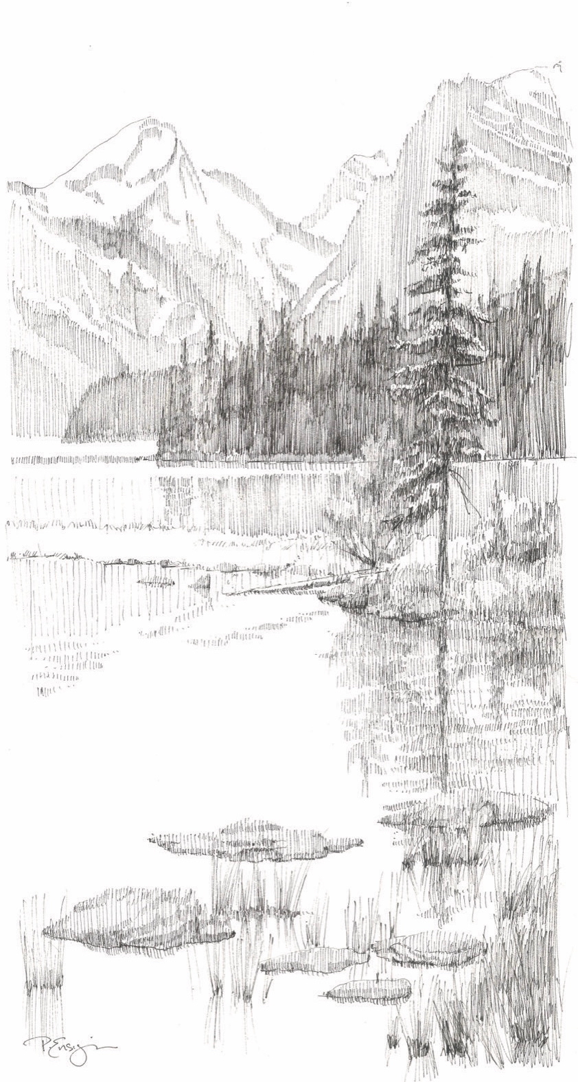
Down a short path to the water’s edge, I find a spot beneath a lodgepole pine. I sit down on my folding stool and take in the scene before me, rugged mountain peaks descending steeply, rimming Bow Lake in the Canadian Rockies. For a few moments, I simply look. It’s a powerful and grand view. While most people might take a series of photos to document the beauty of this vista, I prefer to draw.
Drawing is quiet work. It’s my favorite way to connect with the mountains. First, I study my subject carefully. I examine each ridge and crag. I study layers of rock and sand, discover the nooks and crannies and the remnants of snow. Looking intently, I seek out proportions and relationships, consider the depths and heights, and pay close attention to the movement of light and shadow. To draw effectively is to see, really see, what’s in view. But even more than seeing, drawing on location is a total experience. Sitting on this quiet bank, away from picnickers and tourists, I hear the gentle lap of water against the shore and the birds in nearby branches. I feel the soft breeze against my face and smell the damp ground at the water’s edge along with the sweet scent of pine needles. Immersing myself in my surroundings, as I begin to draw, I let my hand and my thoughts reflect the grace of the moment.
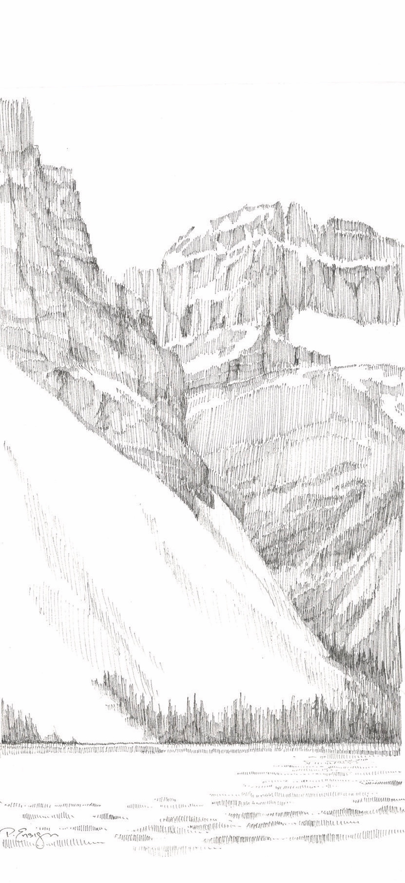
Splendor, line by line
No special talent is needed for this task. Drawing is simply putting marks on a surface to illustrate where one’s eye goes. Anyone can experience the joy of drawing a scene before them. All that’s needed is a paper, a pencil, and a little time. Today, I start with a line drawing that identifies the big shapes, the overlap of one ridge against another. Next, I look for dark and light areas—known as values. As my drawing develops, I stay focused on my subject, constantly verifying angles and details. Lastly, I take care not to overdo the minutiae and make a point to stop before too many lines spoil the intention.
Glacier-hopping
Earlier in the day, I stopped at a pullout on the Icefields Parkway with a fabulous view of Crowfoot Glacier. The parking lot was filled with cars, campers, and buses. Tourists hopped out of their vehicles, snapped a few pictures, then jumped back into their cars to speed down the road to the next viewpoint. How will they know one glacier from the next? What memories will linger long after they have left this grand landscape?
Yes, the quiet deliberation of drawing is slow and methodical. It takes time. What could be more valuable in our hurry-up world of instant everything than to open the senses and make a lasting imprint on the soul? Take just one hour to study, absorb, and look carefully at a scene, and you will never forget it. A relationship will form, a lasting memory will be etched in consciousness. I never forget a location where I have spent time sketching.
“What could be more valuable in our hurry-up world of instant everything than to open the senses and make a lasting imprint on the soul?”
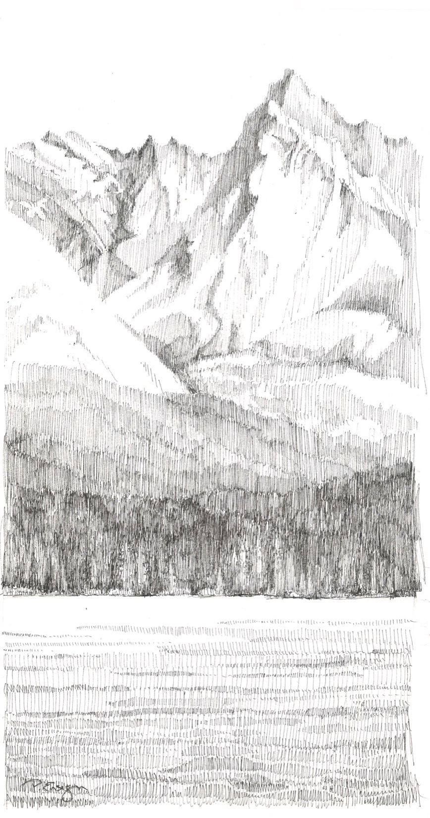
Drawing is a wonderful way to hold on to our travels and experiences. It’s never about the success or failure of the end result. It’s not about technique or individual style. It’s about the process. It’s about the time, the connection, and the quiet communion between artist and subject. △
“Drawing is a wonderful way to hold on to our travels and experiences.”
Backcountry Haven
Professional snowboarders modernize a run-down cabin in Utah to access untracked powder out the front door
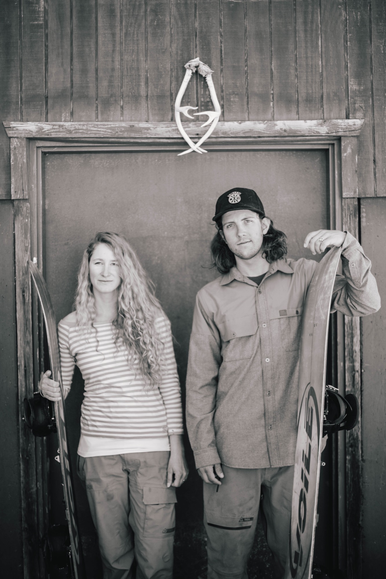
Professional backcountry snowboarders Zach and Cindi Lou Grant modernize a run-down A-frame cabin outside of Park City, Utah, to help them access untracked powder and follow their dreams.
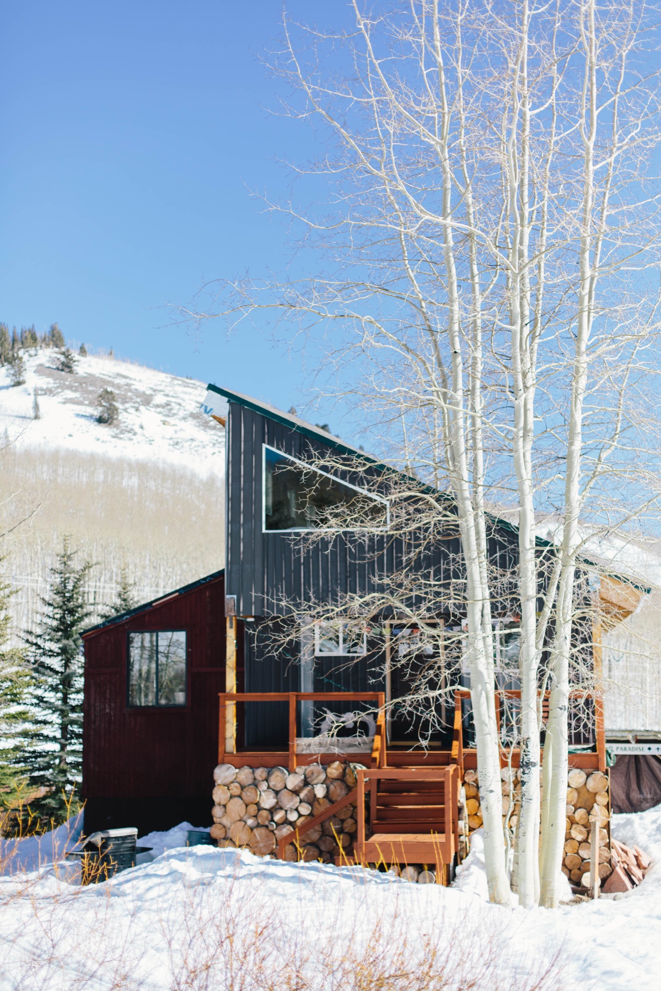
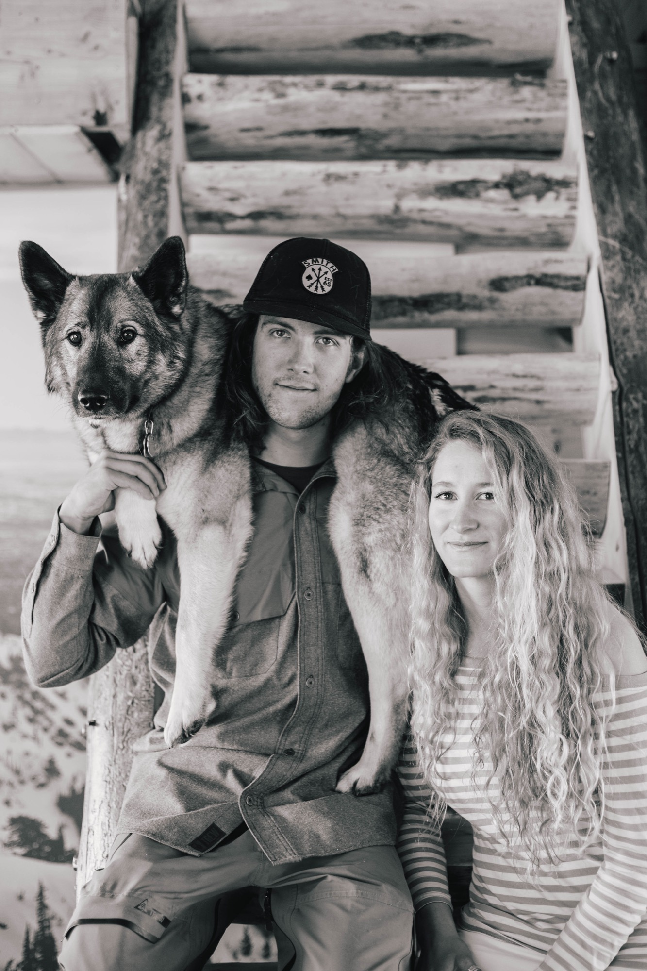
They spent as much time as possible up in the Wasatch Mountains east of Salt Lake City, Utah, and only came down for school, work, and sleep. Zach and Cindi Lou live for snowboarding, so it was only natural for them to buy their own alpine cabin to be as close as possible to their favorite backcountry terrain near Park City. Surrounded by snow six months of the year, their newly renovated cabin lets the pair follow their dreams and snowboard much of the year.
Backcountry education
After high school, Zach and Cindi Lou rented a small A-frame cabin in Big Cottonwood Canyon to be in the mountains. For the last decade, the couple has been honing their skills, taking avalanche safety courses, and learning all there is to know about backcountry snowboarding. They use special snowboards, called splitboards, which separate into two boards to allow for uphill travel. When they get to the top, they put the two halves together, spin the bindings to make it like a normal board, then click in to ride down. Safety is their number-one priority, though, and they work together as a team to ensure that at the end of the day they both get home in one piece.
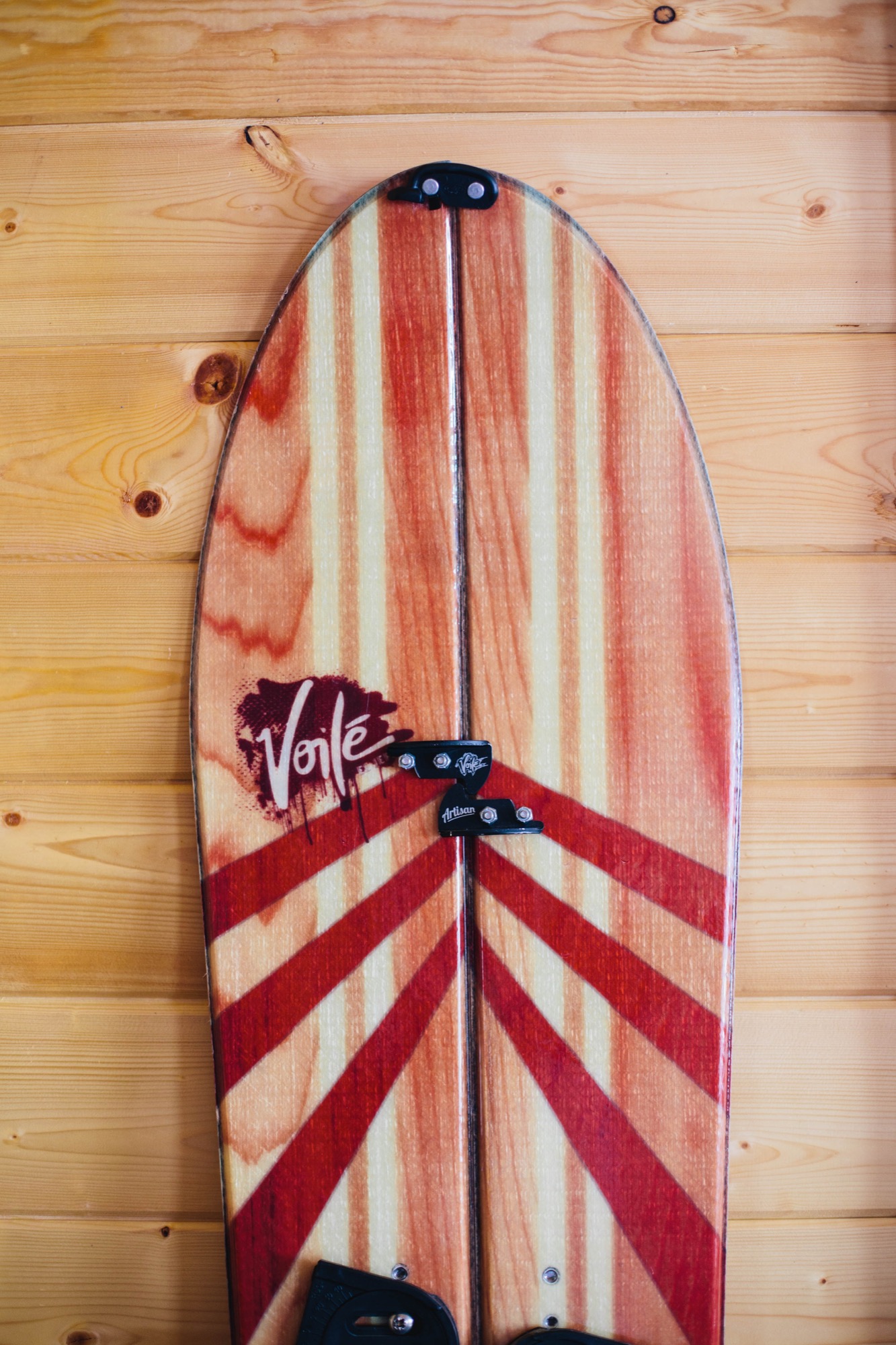
Over the years, the partners have gone on great adventures in Utah, Wyoming, Colorado, and Alaska. They have been featured in ski and snowboard magazines and movies, like Powderwhore Productions’ Some Thing Else. Their years of touring in the backcountry together only improved their relationship, and in 2011, the two got married. Soon, sponsors including Voilé, Smith Optics, and Gregory Mountain Products picked up the pair as team riders, turning their dreams of becoming professional backcountry splitboarders into a reality.
Finding heaven in the backcountry
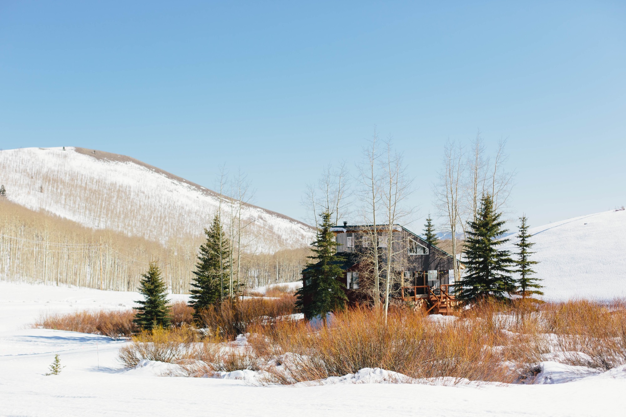
All the while the two knew they wanted a cabin of their very own from which to base their adventures. After searching for a couple of years, they found a run-down A-frame on the Wasatch Back in the Rocky Mountains of Utah that was within their budget. It was a fixer-upper, with the cabin barely standing, but on the plus side, it had great backcountry terrain close by and was just minutes outside of Park City.
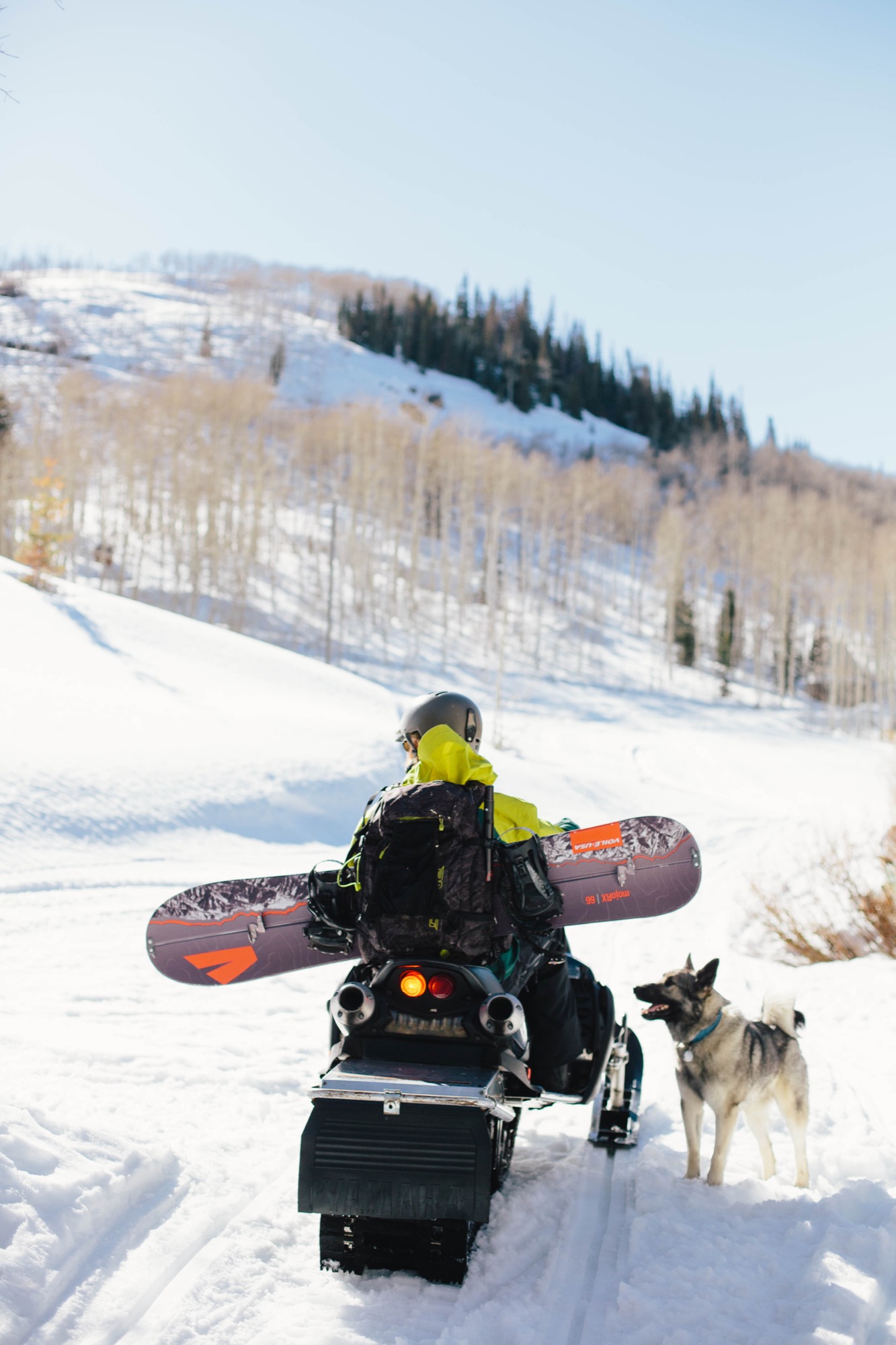
Technically, the cabin is located in Midway, but it’s closer to Park City. With all the snow in that area, they need a snowmobile to get back and forth during the winter. “It feels like you’re away from everything, but you’re really close to town,” says Zach. “The quality of living back here is top-notch. It’s so quiet and peaceful, and it’s really cool to be able to ski in and ski out.” Situated in a small valley, the cabin has a small seasonal stream running alongside it, enjoys full sun throughout the day, and also has great views of the mountains, aspen groves, and lots of wildlife nearby.
Building dreams
Unfortunately, what they thought would be a simple matter of some new insulation, plumbing, and sheetrock turned into a much bigger project. “It was like pulling a string on a sweater,” explains Cindi Lou. “Once we started, the whole thing just began to unravel.” After seeing holes in the roof and all the shoddy construction, they realized they would basically have to tear down almost everything.
Over the course of two years, with a lot of help from family and friends, the couple reconstructed and renovated their cabin, turning it into an open, 1,800-square-foot home. The previous owners had jacked up the original A-frame onto a taller foundation, added storage rooms underneath, and tacked on an addition to the north. Zach and Cindi Lou left the ground floor and the addition, but made them more structurally sound and weatherproof.
They tore down the A-frame structure and built a new space with straight walls and a south-sloping roof that mirrors the roof on the north addition. This transformation turned the home into a modern cabin and allowed for straight walls and more space inside while keeping the same footprint. The old roofing material was reused as the exterior cladding, giving it a rustic yet industrial look reminiscent of the old silver mines nearby.
Spray foam insulation helps create a tight, high-performance exterior to keep the home warmer. New energy-efficient windows bring in plentiful natural light so they don’t need to turn on lights during the day. “All the windows are definitely my favorite thing,” says Cindi Lou. “I love to look at the stars from my bed at night.”
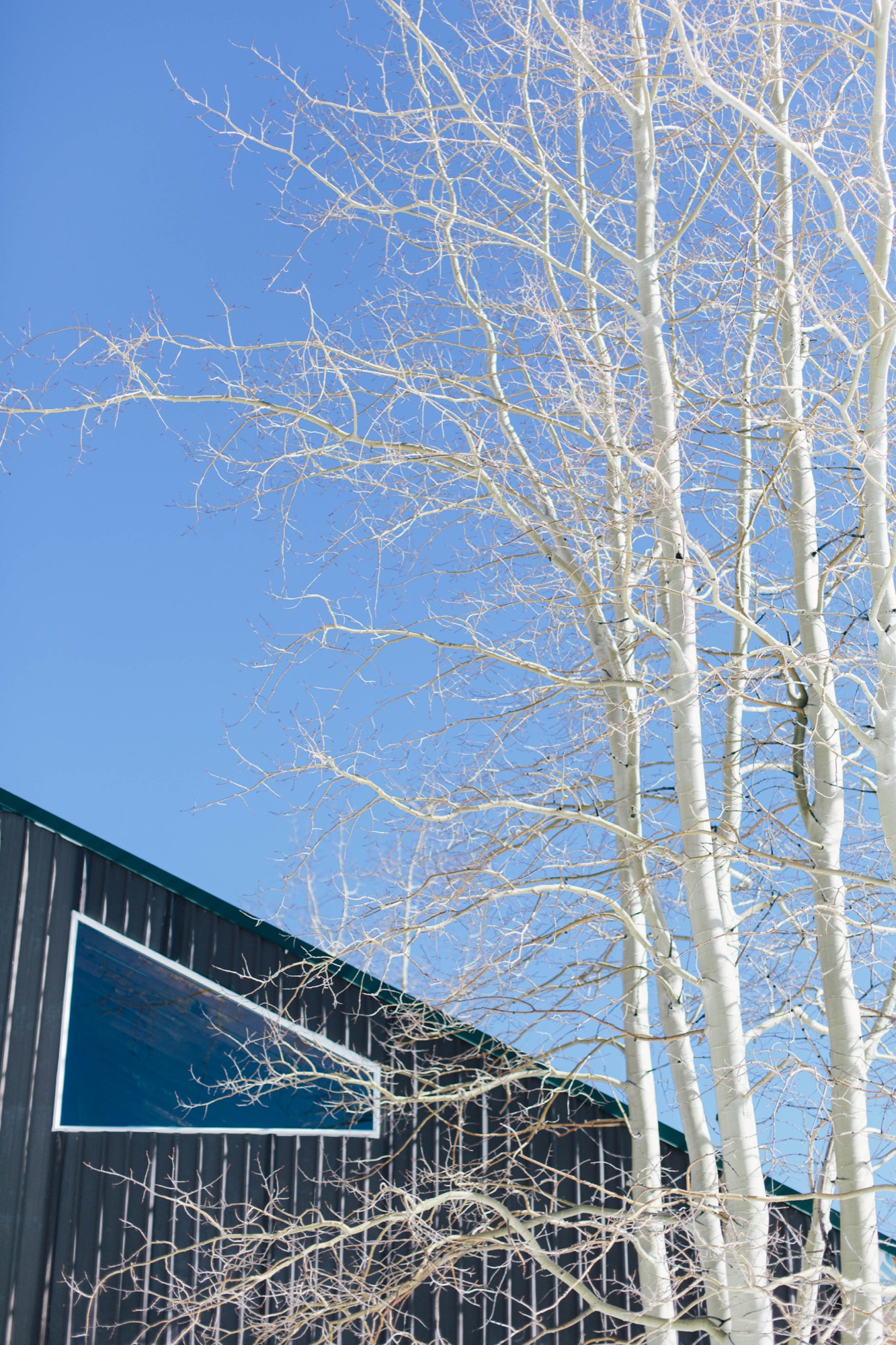
“I love to look at the stars from my bed at night.”
Inside, the first floor has a large open-floor-plan kitchen and dining room, with the living room inside the original north section. Lofted above the bathroom, their bedroom’s tongue-and-groove wood paneling on walls and ceiling offers a warm and bright interior. Family heirlooms and vintage furniture fill the space, while giant black-and-white pictures of Zach and Cindi Lou snowboarding—a housewarming gift from Voilé— adorn their walls.
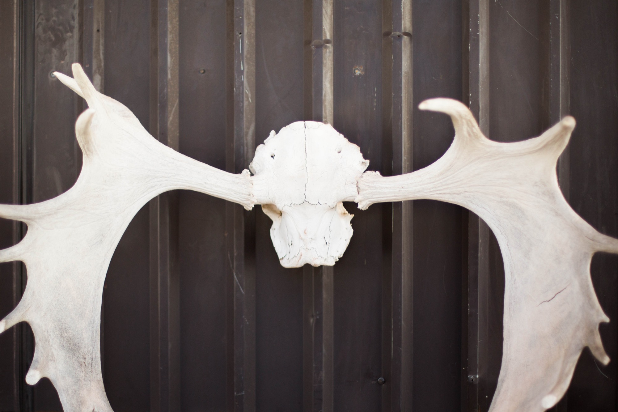
On the ground floor, an extra living space snugly surrounds a large woodstove that heats the entire home in the winter. Also downstairs are the laundry room and the couple’s gear-filled room of snowboards, boots, outerwear, camping gear, and biking, climbing, and shing gear for their summertime sports.
Living the dream
As it goes with most DIY homes, Zach and Cindi Lou’s cabin isn’t complete yet. It takes time to remodel a house, especially when you’re as dedicated to your passions as this couple is. Not to mention, they both have normal jobs in Park City that keep them busy. In the winter, Zach works as a snowcat operator at a local resort grooming ski runs, and in the summer, he switches to trail maintenance. Cindi Lou teaches yoga at Park City Yoga Adventures and buys gear for the local White Pine Touring shop.

In winter, they focus on splitboarding and being in the backcountry as many days as they can. In summer, they buckle down to work on their house, trying to complete whatever projects they can before the snow falls again. This next year, they plan to tile the kitchen and focus on finishing the downstairs, tricking out the gear room, and adding a second bathroom for guests. Eventually, they hope to add a photovoltaic system to take advantage of their great southern aspect.
The two have put a lot of hard work into their home, but say it’s all been worth it, plus a great learning experience. “It’s really rewarding now that it’s our own,” Zach says. “But I was surprised at what we were capable of.” Despite some real challenges, like building the water system or installing the roof rafters with a makeshift pulley system, the two got it done together and built their own backcountry heaven. Because working as a team, whether in the backcountry while snowboarding or renovating their cabin, is what the Grants do best. △
An Aspen House Lives Up to LEED
Smart technology helps a house in Aspen, Colorado, stay on its sustainable course
 The Aspen residence of architects Sarah Broughton and John Rowland aims to leave the pristine local landscape intact.
“Every drop of water that lands on the property finds its way to the bocce ball court, which is our storm-water filtration system,” Rowland says. “By the time it leaves, and heads to the aquifer, it’s as pure as it can get.”
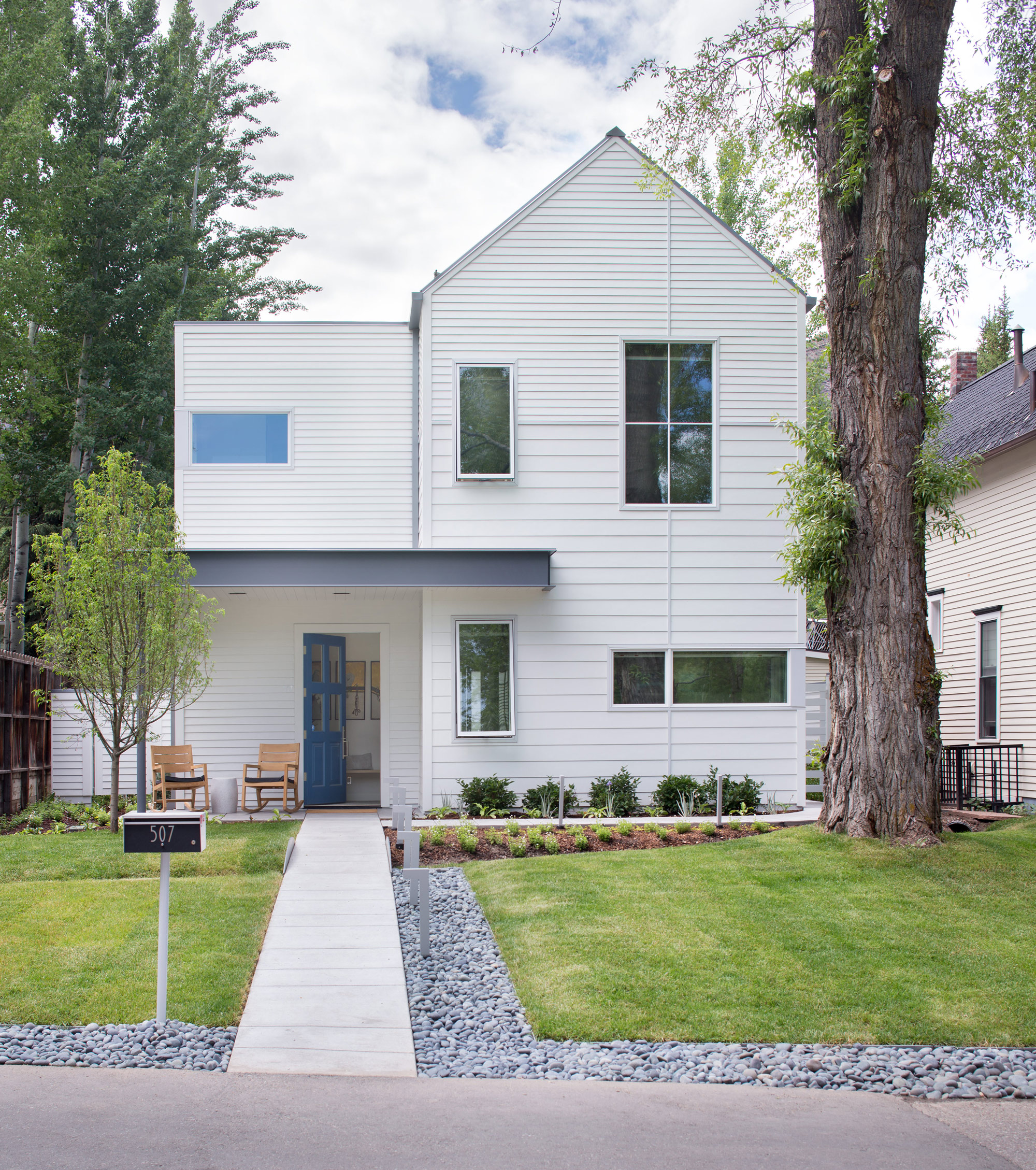
The couple’s house is LEED Gold certified, a rating they achieved by taking into account a number of considerations: They designed the structure so that a large tree in the front yard could be retained; construction was executed to minimize erosion and site impact; and the house itself has high-efficiency plumbing fixtures, among other features. Photovoltaic panels provide about 60 percent of the abode’s energy.
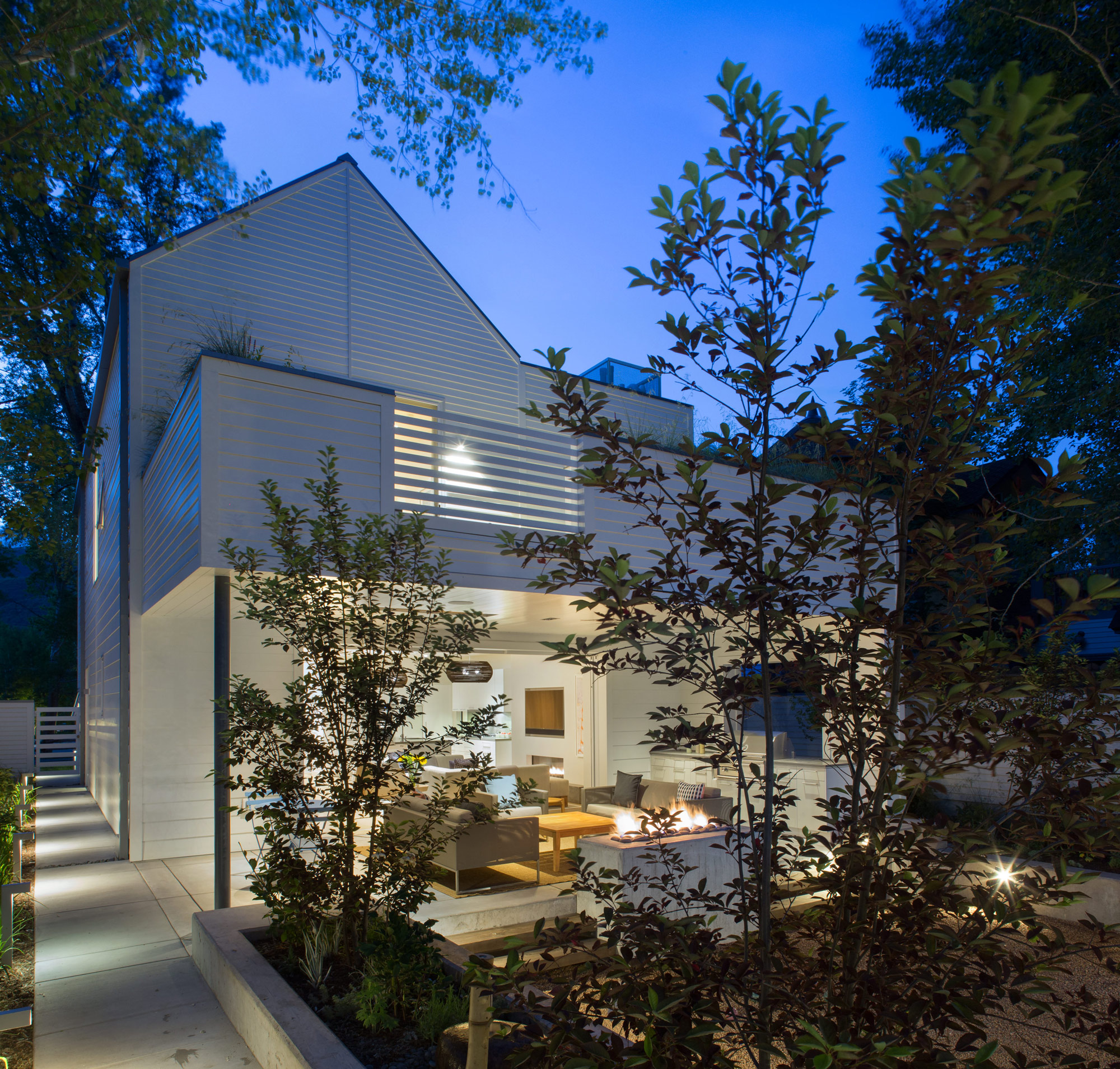
Outdoor entertaining is made possible by a wall of pocket doors from Weiland. “It really expanded the living room, because the doors just go away,” Broughton says. The couple use the Savant system to play music—two speakers are installed in the ceiling of the covered porch, and there are more in the garden. “The outdoor area rocks, literally,” Rowland says.
The residents have wired their mechanical room and solar technology to a Savant home automation system, which they use to keep an eye on the home’s performance. They’ve configured the system’s app to deliver a breakdown of the dwelling’s energy usage in a pie chart. “Last spring, when we were starting to open the windows, I looked at it and said, ‘Oh my gosh, the humidifier is running full-time, and it’s the largest energy hog right now,’ ” Rowland says. “It was time to turn it off.” He notes that they also closely monitor another culprit so it doesn’t run unnecessarily: The heat tape used in the gutters to prevent snow buildup is a big draw.
“The outdoor area rocks, literally.”
The house is optimized for gatherings. A guest apartment equipped with bunk beds sits under the garage, and a wall of sliding doors from Weiland enables indoor/outdoor functions—Broughton and Rowland once hosted a 25-person dinner party that seamlessly stretched from the dining room to the patio, thanks to tables set up in both places. Technology aids in the couple’s entertaining: Big music fans, they use the Savant system to stream audio across the property. Keyless door locks from Schlage hook up to the Savant setup, and the duo can assign visitors guest codes that will expire after they leave. But the couple purposely steered away from additional automation features—such as connected thermostats—to avoid confusing guests who aren’t familiar with the systems.
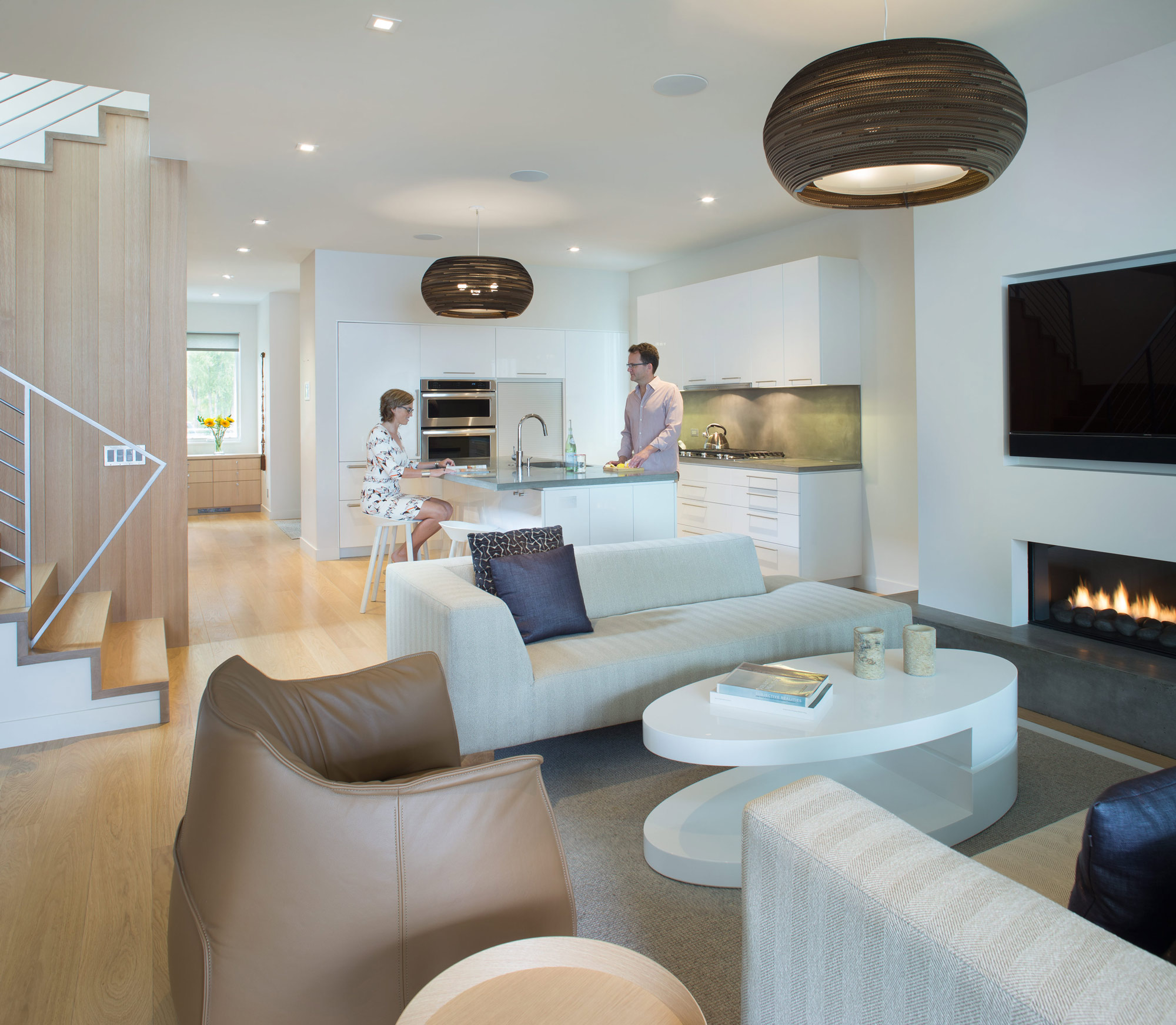
For themselves, though, Broughton and Rowland value the ability to ensure that their house is living up to its green rating. “I wish more of our clients would use tech to understand their consumption,” Rowland says. “A lot of people don’t even pay attention, and things are just running. As architects, we need to be in tune with that.”
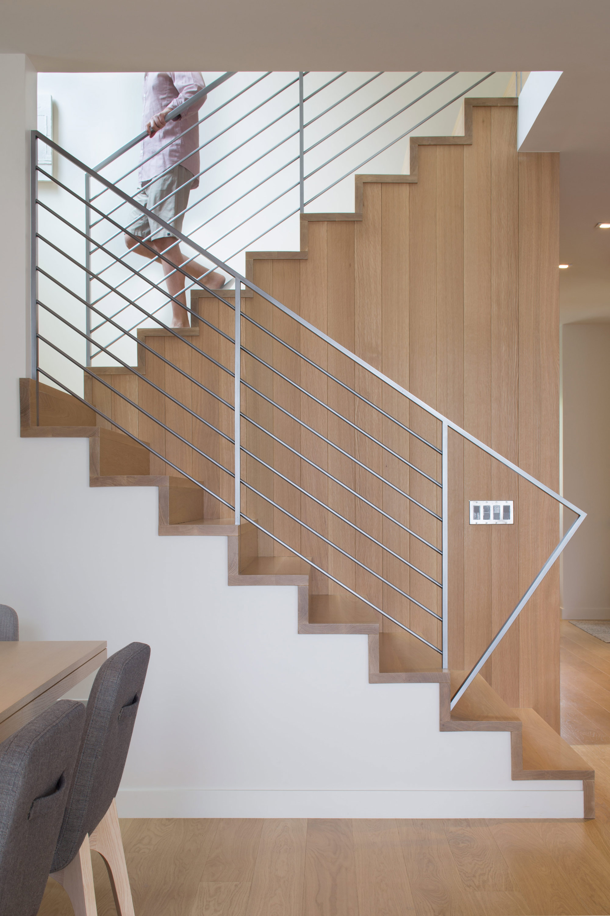
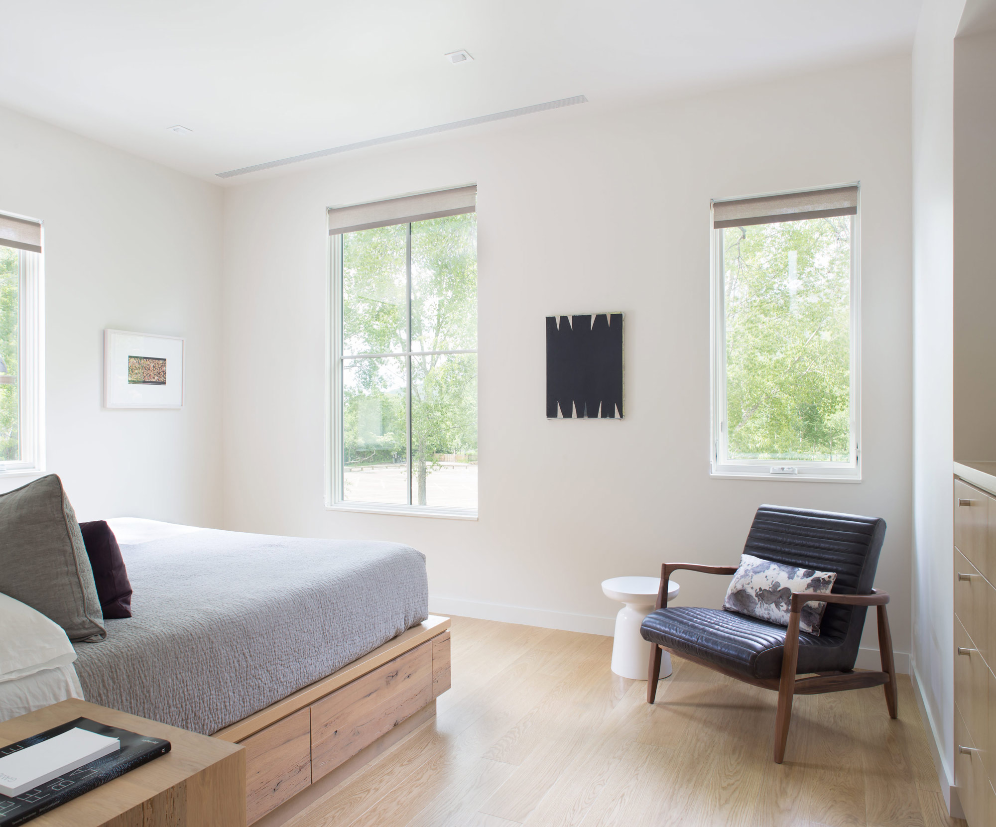
The materials are limited to white millwork and white oak. “When we come home, we want something serene,” Broughton says. △
“I wish more of our clients would use tech to understand their consumption. A lot of people don’t even pay attention, and things are just running. As architects, we need to be in tune with that.”
How American Modernism Came to the Mountains
A daughter of America's midcentury-modern movement remembers how Chicago’s design elite settled in Aspen, giving rise to modernism in the mountains of the West.
After World War II, Chicago’s design elite flocked to Aspen for ski and summer holidays, galvanizing the then-sleepy alpine village with modern mountain chalets and avant-garde public buildings that helped transform Colorado’s Roaring Fork Valley into the glamorous destination it is today. A memoir by artist Marcia Weese, daughter of Harry Weese, a central figure in the movement we now refer to as mid-century modern.
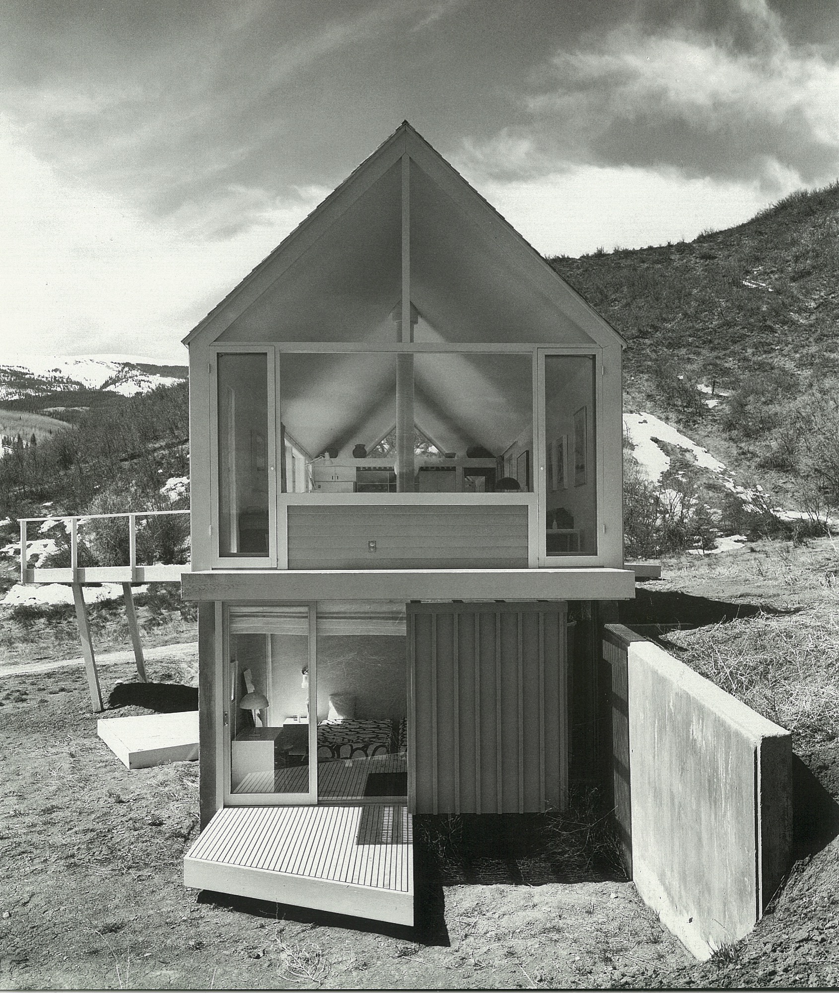
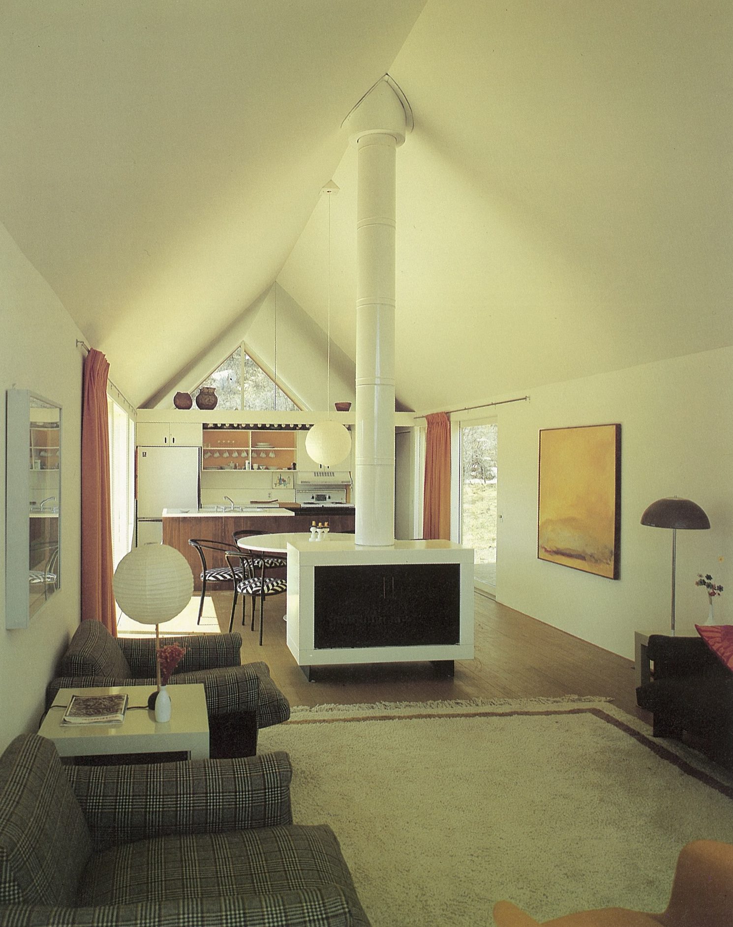
Someone recently remarked to me that I was “born to design.” Over the years, I have come to appreciate this birthright, as I realize I have tenaciously and (mostly) joyously cleaved to the creative life, and still do. I have my parents, Harry Mohr Weese and Kitty Baldwin Weese, to thank for this. The creative life is not for the faint of heart, but I wouldn’t trade it for anything.
Childhood in Chicago
It was the early 1950s in Chicago. As my mother told it,
“The war was over. No one had any money. No one had any furniture. Apartments to rent were scarce. We made do.”
When I was very young, we lived in a dim railroad flat in downtown Chicago. This was a typical inner-city apartment with a linear floor plan. The only natural light filtered through windows in the front and back. Chicago was a coal-burning city, and you could write your name on the window sills in the soot. I remember running down the dark hall that connected front to back, with crayon in hand. My parents encouraged my sisters and me to draw on the walls in that nondescript hall. What a great idea they had to spruce up the crepuscular gloom of the hallway, and how fun it was for us to break the rules.
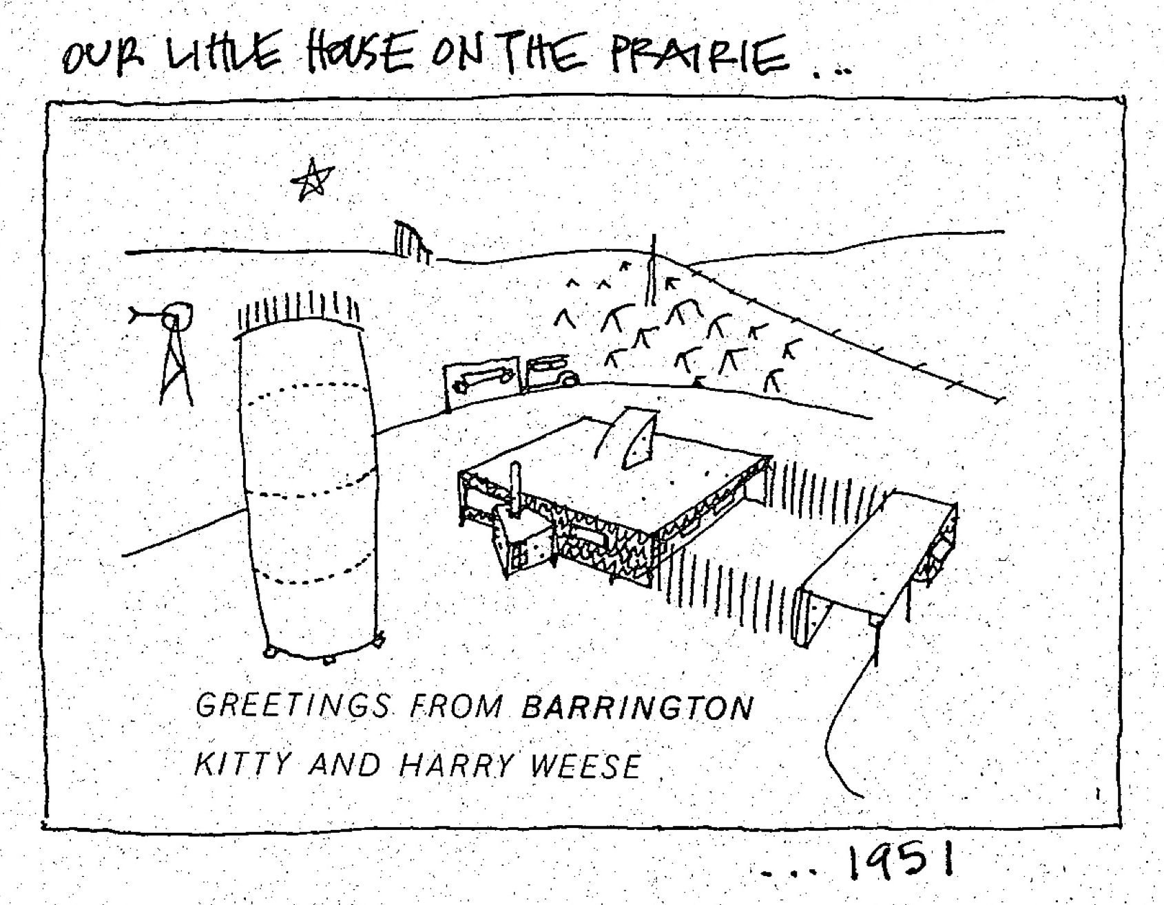
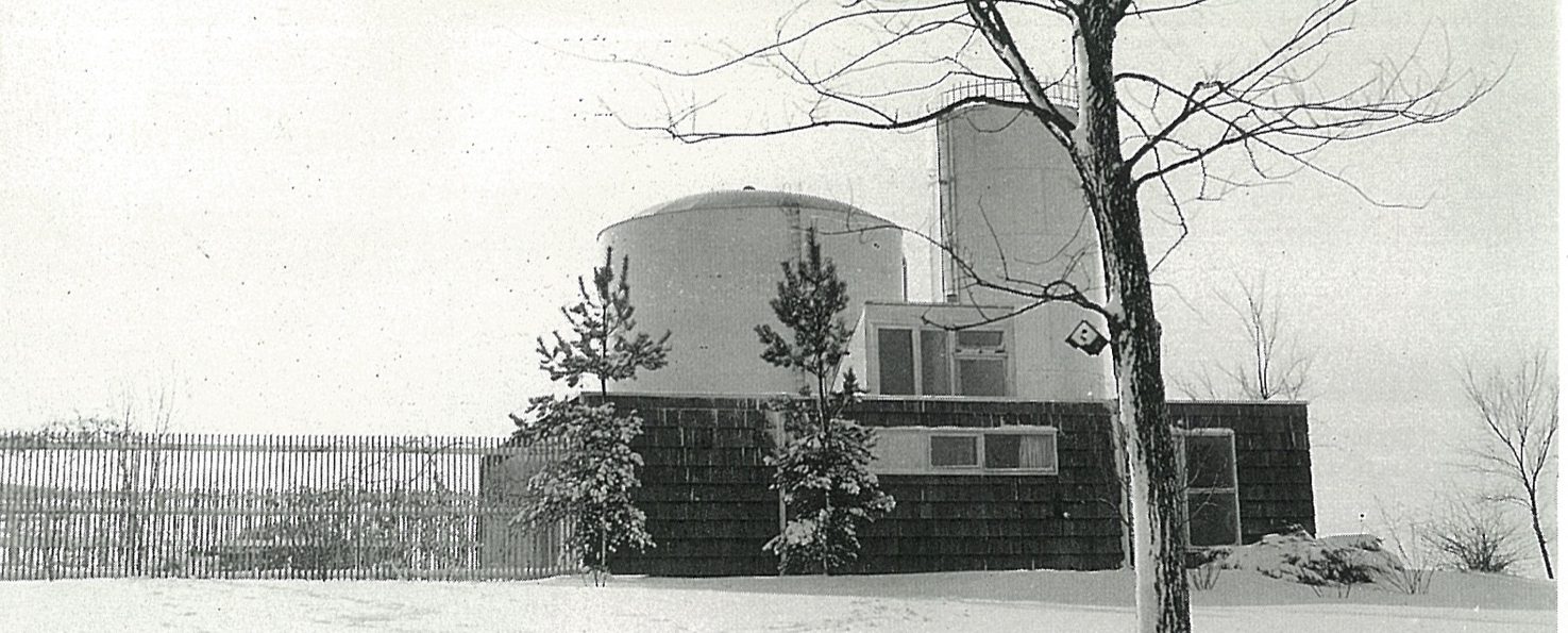
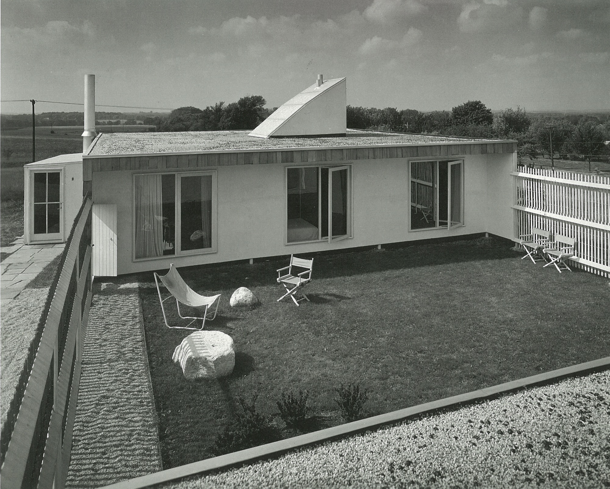
We spent weekends and summers in the country forty miles northeast of Chicago. Now it is wall-to-wall suburbia, but back then, we bundled our five-person family, one cat, two turtles, and several guinea pigs into the car and drove (pre-Kennedy expressway) through many stoplights to the little town of Barrington, Illinois. There, we lived in one of my architect father’s early houses. Built on a lot adjacent to two immense water towers belonging to the town, the house was modern and modest; a one-story house with a flat roof, carport, gravel driveway and a fenced-in garden the three bedrooms emptied into. It was sparsely furnished, and I will always remember the black-and-white linoleum floor. Mom found some dinner-plate-sized checkers pieces and we played checkers on that floor to our endless delight.
Some years later, my grandfather gave my father a nearby five-acre (two-hectare) plot of land, which consisted of a hill, many large oak and hickory trees, poison ivy everywhere, and a hand-dug lake topped off with a pet alligator. Here, my father built a wonderful and quirky house (prebuilding code) he named “The Studio.” We spent many years toggling between city and country. This was a refuge from the city for my parents, and for me, a secret garden of woodland flora and fauna.
Studying with the Eamses & Co.
After graduating from the Massachusetts Institute of Technology in architecture and engineering, Dad studied in Michigan at the Cranbrook Academy of Art with Charles and Ray Eames, Eero Saarinen, Ben Baldwin, and a host of others who were living and creating modern design at a time when the atmosphere was ripe for it.
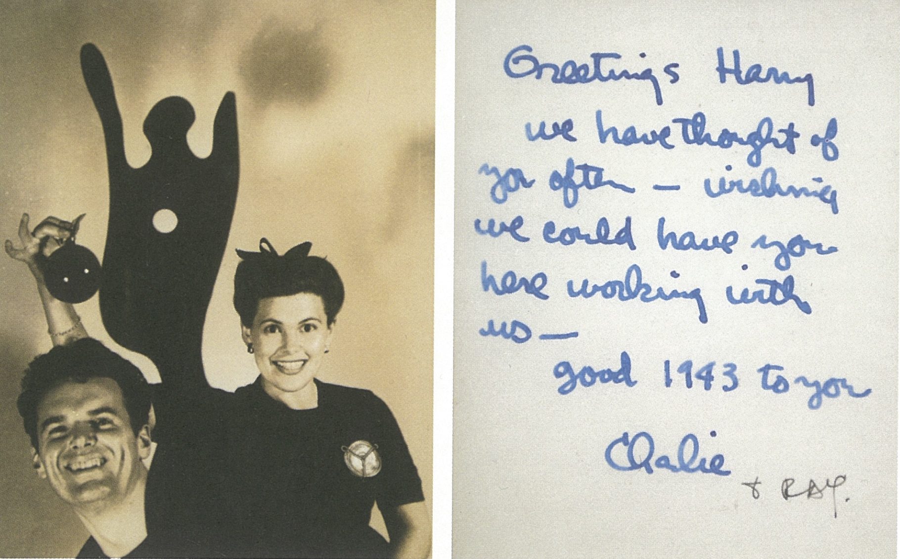
As history has revealed, many became household names, even demigods, in the movement we now refer to as mid-century modern. These people were some of my parents’ closest friends.
My father and Ben Baldwin had won a few industrial design awards from the Museum of Modern Art while at Cranbrook, so they decided after graduation to “hang a shingle”—Baldwin Weese—to practice architecture in New York City. They worked together for a year but decided to convivially go their separate ways; Ben stayed in New York, and Dad returned to his birthplace, Chicago. But first, Ben introduced my father to his sister Kitty.
When Harry met Kitty
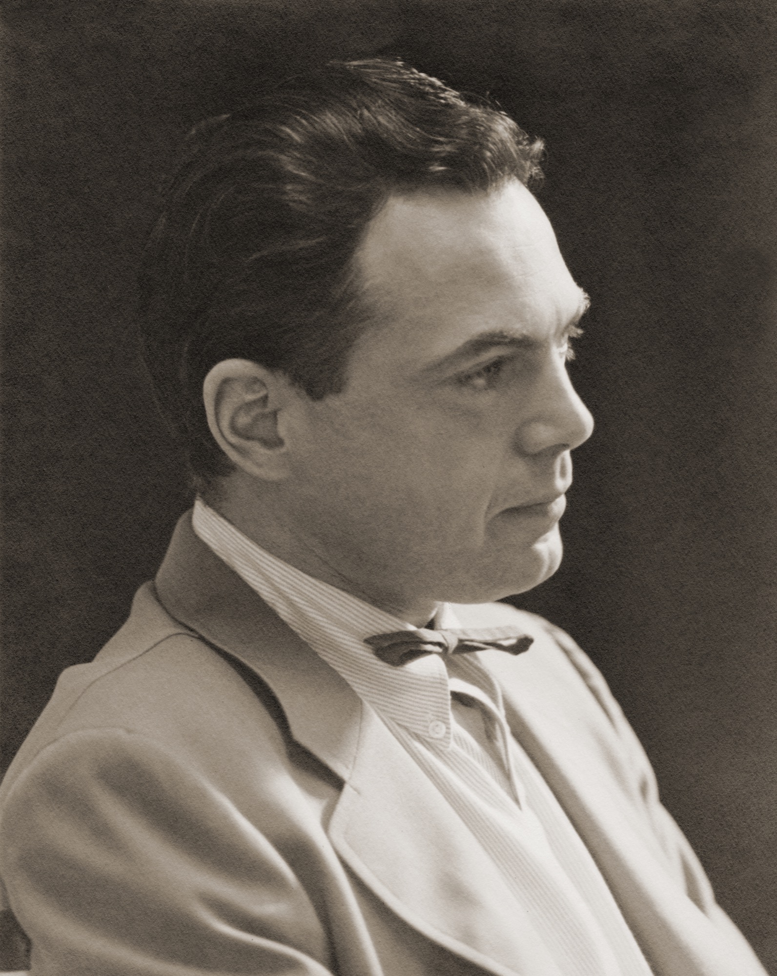
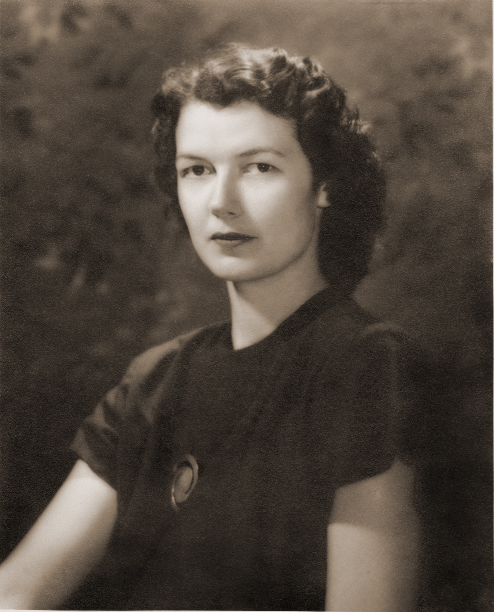
As my father approached the house to meet Kitty for the first time, she watched him jump over the fence rather than use the gate. That did it for her. He was a nonconformist, an inventor, a man who loved to use the path less traveled. He had no use for convention as it was, in the post WWII era. The overriding spirit was “rebuild,” therefore “build anew.” This was the perfect time for him to launch his architectural career in Chicago. He founded the architecture firm Harry Weese & Associates, which lasted for fifty illustrious years. My mother, who was southern, elegant, and graceful, was over the moon for this artistic, restless spirit. Not a typical match, but it worked; he needed her organized calm and “good eye for design” to manage his ambitions.
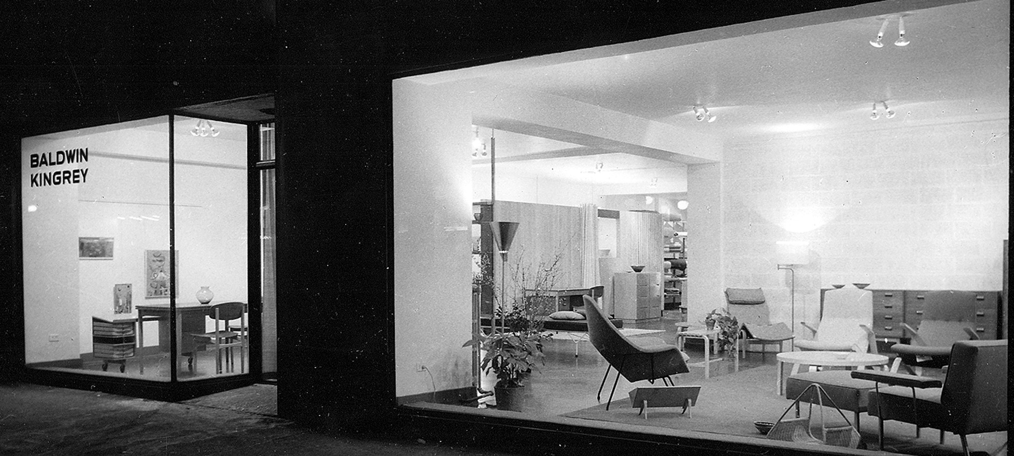
Baldwin Kingrey store in Chicago
In the early fifties, there was no modern anything to be found in the Midwest. So my mother with her partner Jody Kingrey opened a furniture store, prompted by my father. While in the navy for three long years he kept a journal that he scratched in during calmer moments at sea. Here is an excerpt describing his vision for a retail store, entered on May 26, 1943,
“Thought of the (retail furnishings salon) shop for gathering together all beautiful and useful modern objects, which could be termed ‘furnishings’... Anonymous discoveries and subcontracted and assembled pieces of my design: foam and webbed couch in church pew form, telescoping coffee tables of magnesium or plastic, ... fabrics ... grass matting to a special design ... restaurant adjacent, movies, bar, a small haven for those interested ... a trip abroad to buy imports first thing after peace.” “In the early fifties, there was no modern anything to be found in the Midwest. So my mother with her partner Jody Kingrey opened a furniture store, prompted by my father.”
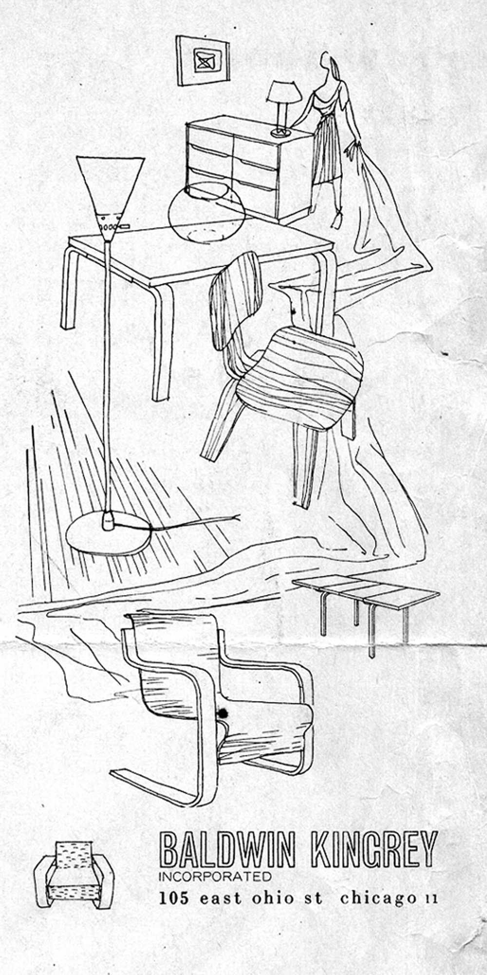
Wasting no time postwar, Dad got permission to handle the Midwestern franchise for Artek furniture from Scandinavia. Ben Baldwin designed fabrics and window displays. Harry Bertoia showed his jewelry, James Prestini sold his turned wooden bowls, artists queued up to exhibit in the space, and Baldwin Kingrey opened its doors to an eager audience hungry for modern design.
In words from John Brunetti, author of Baldwin Kingrey, Midcentury Modern in Chicago, 1947–1957,
“Baldwin Kingrey was more than a retail enterprise. It served as an informal gathering place for students and faculty from Chicago’s influential Institute of Design (ID) as well as the city’s architects and interior designers, who looked for inspiration from the store’s inventory of furniture by leading modernist designers such as Alvar Aalto, Bruno Mathsson, Charles Eames and Eero Saarinen.”
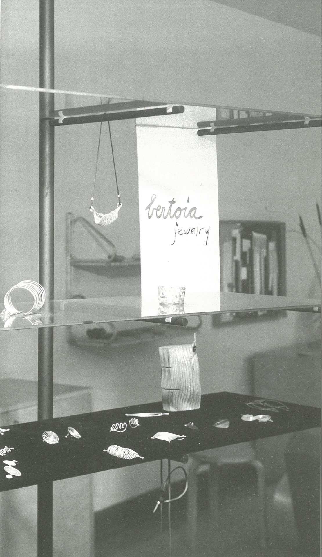
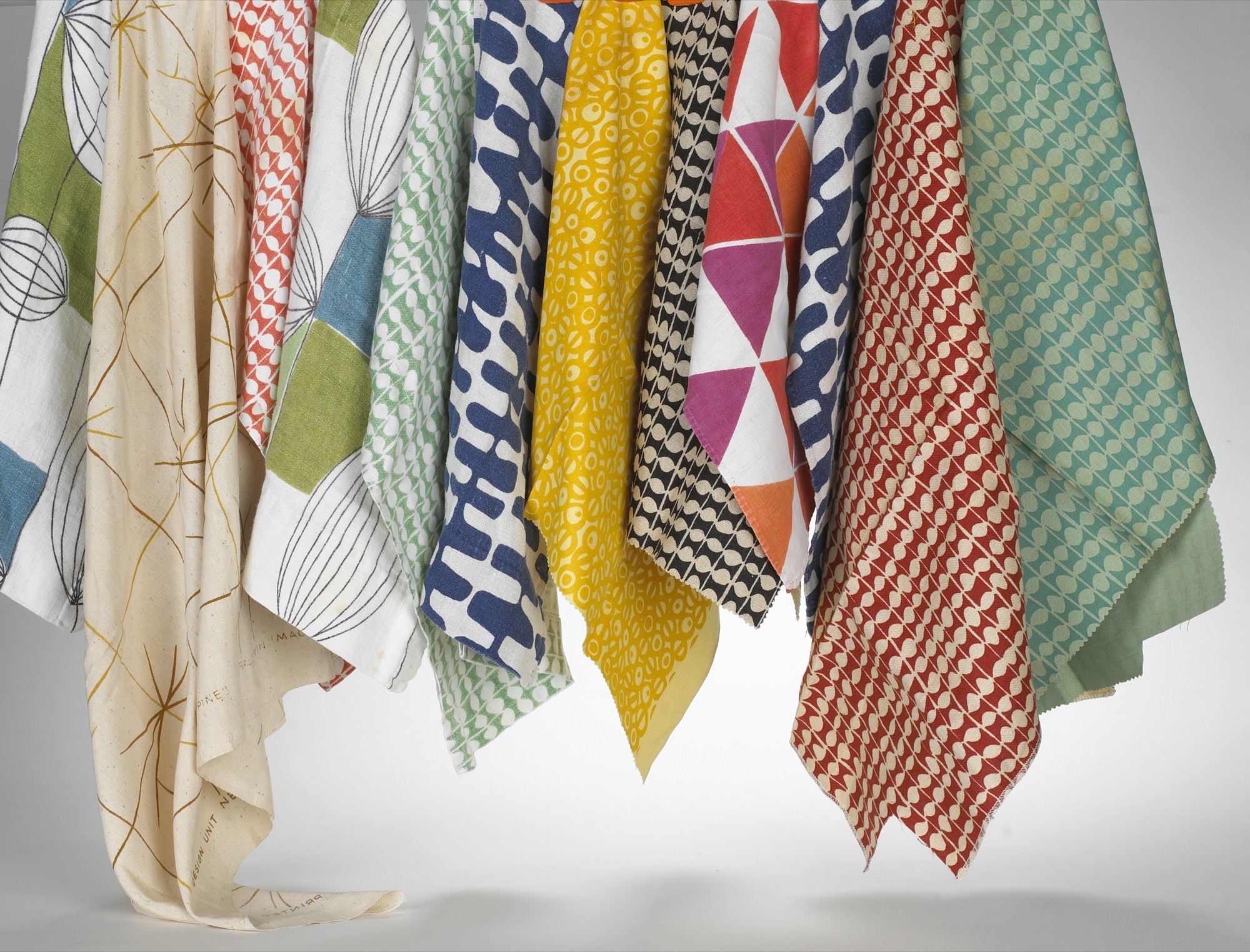
My father started his architectural practice at a drafting table in the back of the Baldwin Kingrey store. He did all the graphics for the store, designed a line of furniture and lighting he called BALDRY, designed open shelving of floating glass and steel poles to display Bertoia jewelry, Venini vases and “Chem Ware”—beakers and Petri dishes in simple, beautiful forms, that they found in the industrial section of the city. There was resourcefulness, an informality, and a frugality at play. In my mother’s words,
“Harry and I stopped at a place that sold Cadillacs on LaSalle Street. They were selling out their leather for automobiles, so we bought the whole batch. A lot of our furniture was covered in Cadillac leather! We were in a sense the precursor to Crate and Barrel. They came down to study us a lot. Carole Segal (founder of Crate and Barrel) was a friend of mine, and I gave her help. I gave her a lot of source material.”
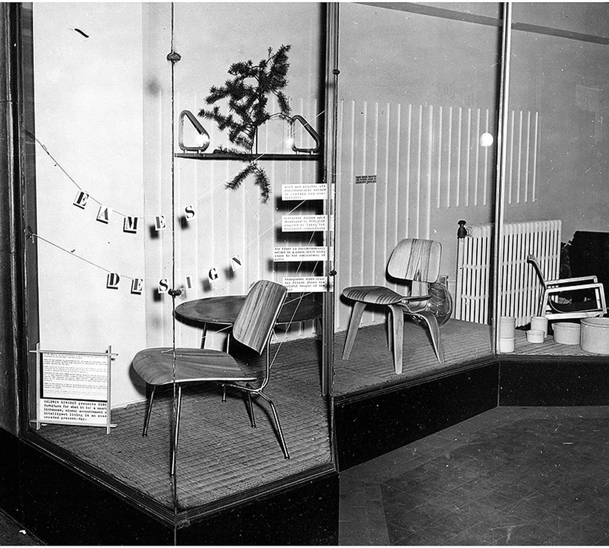
As I was growing up, there was a steady stream of visitors, all immersed in modern design. My mother reminisced,
“You couldn’t travel across the country without changing planes or trains in Chicago. Everyone would stop in Chicago. The people that rushed into Baldwin Kingrey were mostly from the city and they didn’t have much money. Instead, they had some sort of new outlook—a vision. They loved the simplicity of our ‘plain’ furniture.”
The road was unpaved, the waters uncharted, the possibilities endless. Many would visit our house to exchange ideas, talk about projects, drink a cocktail or two, even draw at the dinner table. One of these more salient meetings I remember clearly:

I must have been ten or eleven when a distinguished elderly gentleman came to visit us in Barrington. My father was notably excited to share our modern house with him. When it was time to leave, he escorted him down the walkway under the grape arbor to his car with me trailing behind. As he drove off, my father turned to me with tears streaming and whispered, “There goes my mentor. There goes the most important man in my life.” This was none other than Alvar Aalto, who had been Dad’s professor and was a great influence on his architecture and design philosophy.
First pitstop in Aspen
When peace came in 1945, Dad stepped off his ship in San Francisco and he and Mom drove eastward. On their way back to Chicago, they stopped in Aspen and took some black-and-white photographs of downtown. The town consisted of several stone and brick buildings—the Courthouse, the Wheeler Opera House, the church and Hotel Jerome. All other structures were small Victorians, a few storefronts, dirt roads, and occasional wooden lean-tos that sheltered a few dozing horses. Many of the houses had been plunked on rubble walls to speed construction for miners and their families in the boom of the late 1800s. Builders often used pattern books with a 12/12 pitch for snow load, imparting a human scale that has long since been lost.
Dad—an avid skier—fell in love with Aspen and began a tradition of visiting each winter and summer that lasted throughout his life. Luckily, he included us in this adventure, and, thus, I have precious memories of Aspen in those early days. It has been described as “the town Chicago built.”
“I have precious memories of Aspen in those early days. It has been described as ‘the town Chicago built.’ ”
In the 1940s in Chicago, my parents were friends with Walter Paepcke, a successful industrialist, philanthropist, and president of the Container Corporation of America. It was Walter’s remarkable wife Elizabeth, a notable influence on Chicago’s cultural life and one of Mom’s favorite people, who exposed Walter to modern design and artistic sensibilities. In this spirit, Paepcke consulted with Walter Gropius, brought Laszlo Maholy-Nagy to the Institute of Design, befriended Bauhaus artist and designer Herbert Bayer, and photographer Ferenc (Franz) Berko, also at ID at the time. Mom and Dad intersected with ID, as the campus was a hub for young and ambitious modernists.
In a memoir, Elizabeth Paepcke describes her first impression of Aspen after skinning up the mountain in 1939,
“At the top, we halted in frozen admiration. In all that landscape of rock, snow and ice, there was neither print of animal nor track of man. We were alone as though the world had just been created and we its first inhabitants.”
Walter Paepcke first visited Aspen in the spring of 1945 urged by Elizabeth. To him, this seemed the idyllic place to implement a new Chautauqua. The Aspen idea was to create a place, in Walter’s words, “for man’s complete life ... where he can profit by healthy, physical recreation, with facilities at hand for his enjoyment of art, music, and education.” Thus the Aspen Institute of Humanistic Studies was born. Herbert Bayer was brought in to oversee the design of the campus, and Franz Berko became the Institute’s in-house photographer. The pull to Aspen was magnetic, and as many of Chicago’s design elite began to relocate and vacation there, my parents were among them.
“The Aspen idea was to create a place, in Walter’s words, ‘for man’s complete life ... where he can profit by healthy, physical recreation, with facilities at hand for his enjoyment of art, music, and education.’ ”
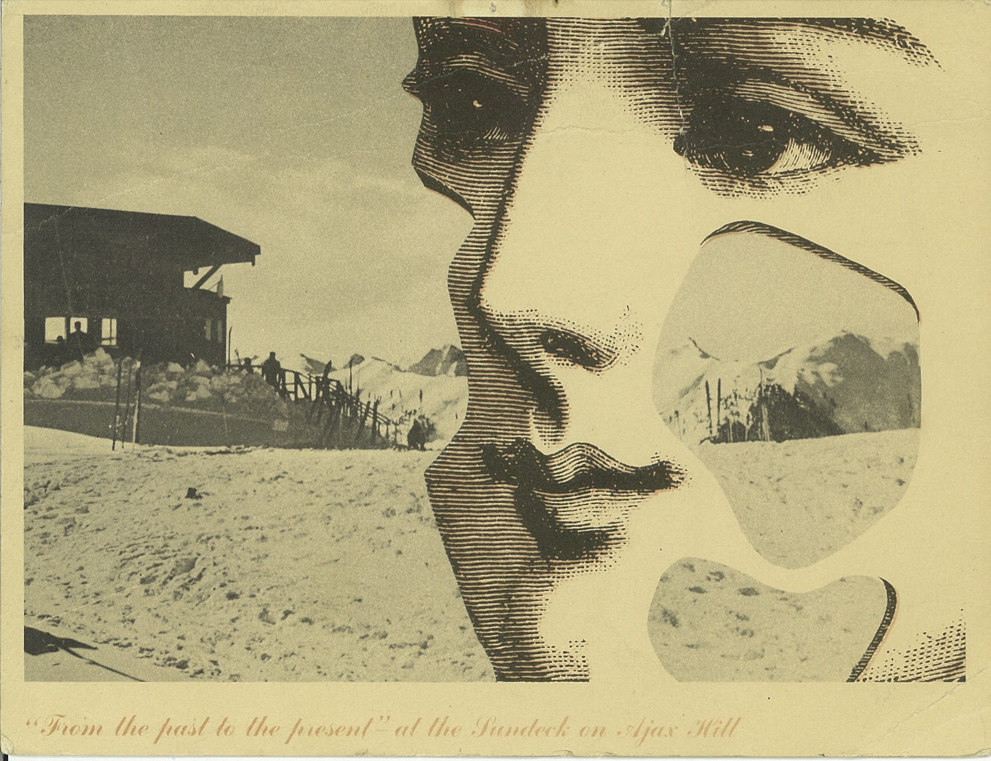
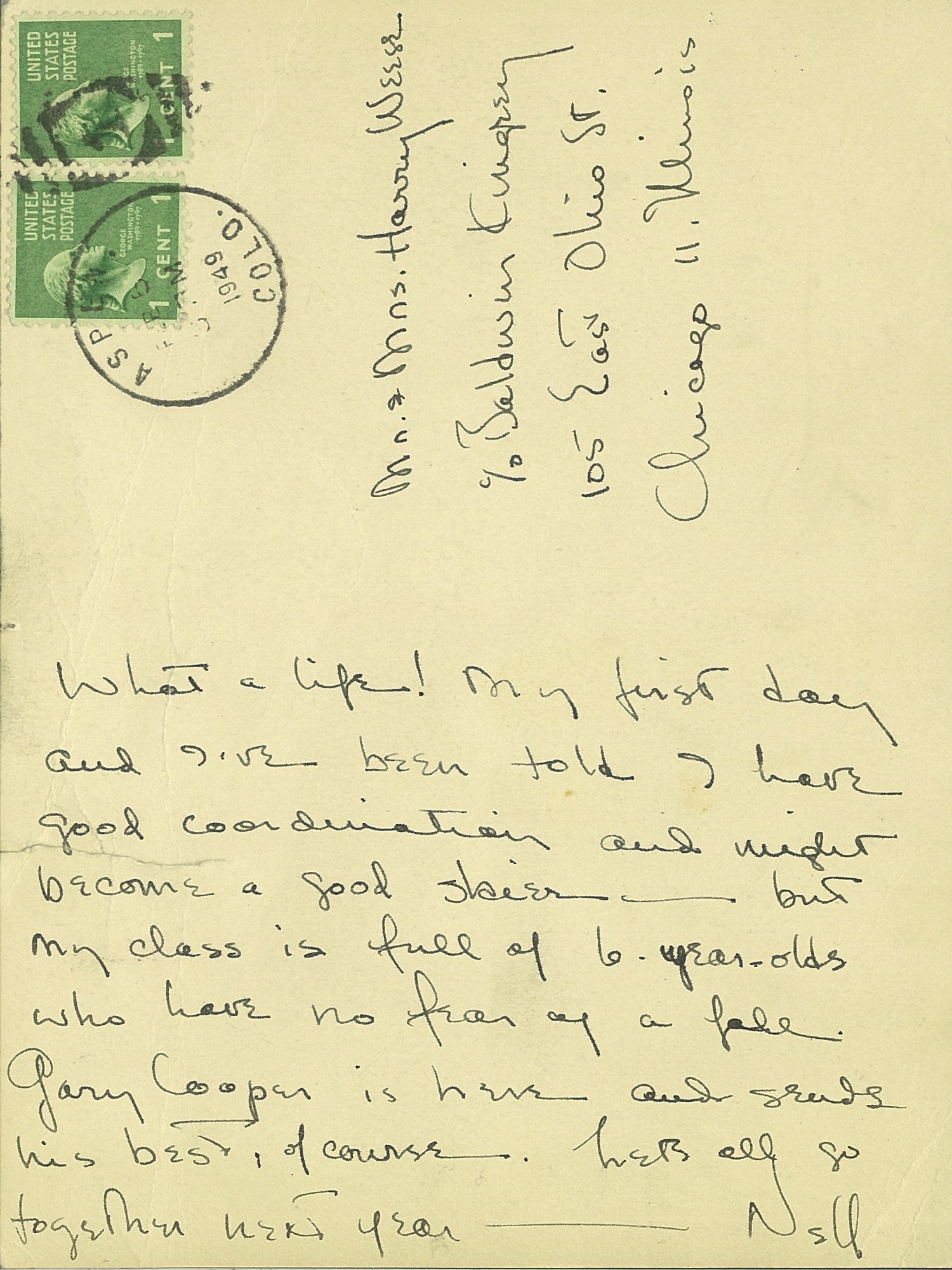
“The pull to Aspen was magnetic, and as many of Chicago’s design elite began to relocate and vacation there, my parents were among them.”

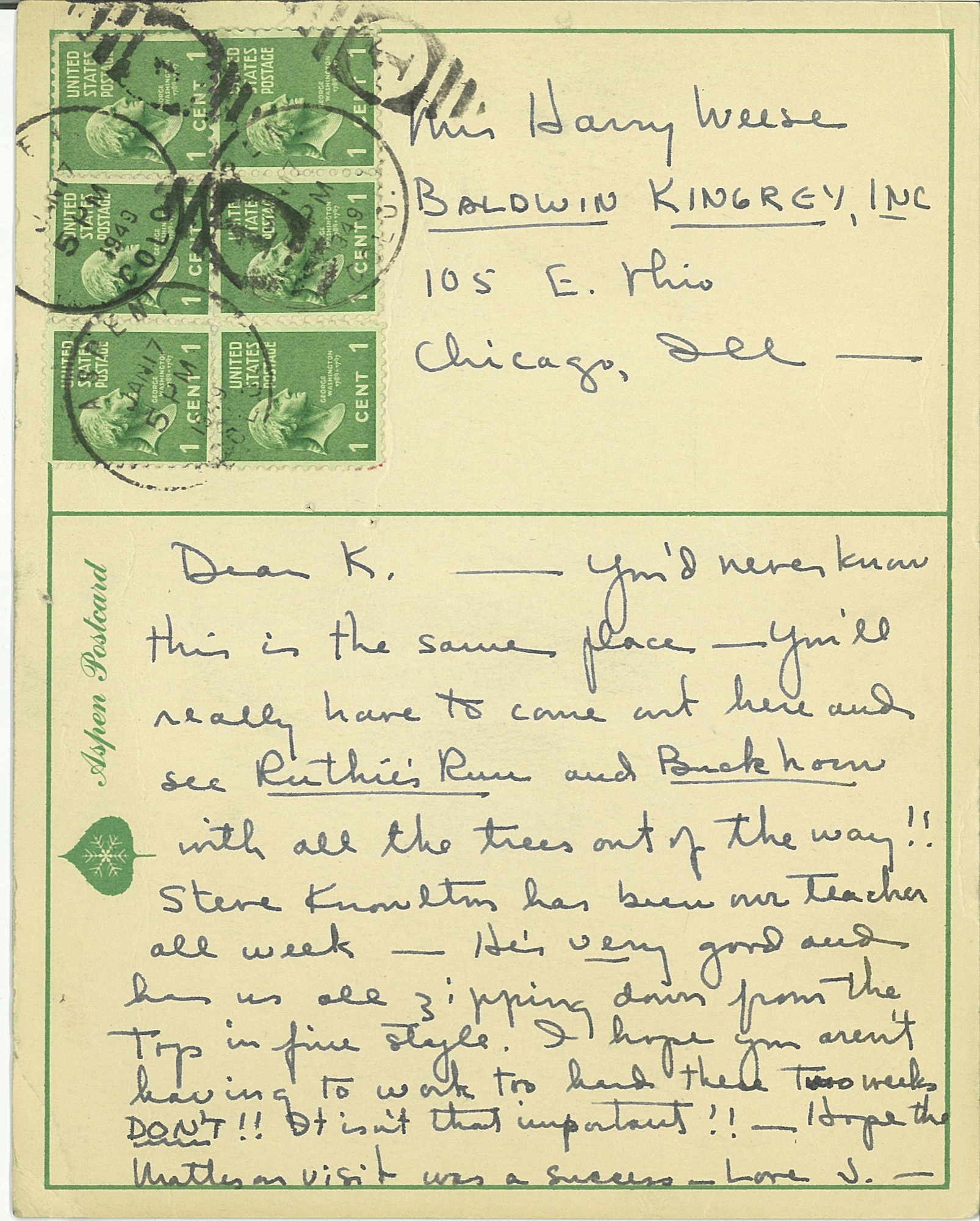
There was a palpable charm to Aspen in the fifties and sixties, which I feel so fortunate to have experienced first hand. Many Europeans returned to the town to settle after serving in the famed 10th Mountain Division during the war. Their training camp, Camp Hale, was nearby and enlisted men would often ski Aspen on the weekends. Friedl Pfeifer was one who started the Aspen Ski School; Fritz Benedict set up an architectural practice. After the war, many of these veterans taught skiing in winter and worked as carpenters in summer. Their wives typically ran the shops, bakeries, and clothing stores in town. Franz Berko stayed, continued his photographic career, and raised his family. His wife Mirte ran a toy shop that sold wooden toys from Europe. Herbert Bayer designed the early buildings at the Aspen Institute and settled in town with his wife Joella. Fritz Benedict, the noted local architect, married Joella’s sister Fabi, and he began developing Aspen. Joella and Fabi shared a famous mother—the poet Mina Loy. This was an illustrious and hearty group of early modernist settlers who loved the mountains and skiing and who brought Aspen out of its “quiet years.” My parents were in the midst of the action.
“This was an illustrious and hearty group of early modernist settlers who loved the mountains and skiing and who brought Aspen out of its ‘quiet years.’ ”
Christmases at the Hotel Jerome
Nora Berko, daughter of Franz and Mirte, remembers visiting us at the Hotel Jerome every Christmas. We always stayed in the southeast corner with full view through the Victorian lace curtains of Main Street and Ajax Mountain. As our collective parents went out to dinner and dancing, usually at the Red Onion, we had full run of the rickety hotel, much like Eloise at the Plaza. With its worn and dusty velvet furniture, Victorian floral wallpaper, and black-and-white photos of skiers sporting the reverse shoulder stance and the latest style of stretch pants, it was a far cry from our modern and minimal environment at home. We ran up and down the creaking stairs and played in the elevator—a novelty—as it was the only one in town. The rooms cost ten dollars per night, radiators clanked, and in some seasons ropes were ceremoniously draped across the room sinks warning of giardia in the water. But we loved the Jerome. It felt like an old comfortable shoe. The Paepckes leased the hotel as well as the Opera House so Elizabeth had license to paint the exterior white with light blue arches over the windows. The hotel looked like a grand Bavarian wedding cake in a perpetual wink; an impressive structure always easy to spot for a youngster finding her way home after ski school. It stayed this way for several decades.
Every Christmas we walked through snowy streets to the Berko’s for Christmas dinner. Their house was a modestly scaled and cozy Victorian in Aspen’s west end. Real candles burned on the Christmas tree, which was festooned with wooden ornaments from Mirte’s toy shop. Marzipan treats imported from Europe were served. There was no central heat. Brrrr. But for a young girl, I was sure that I was encompassed within a magical snow globe.
Aspen became our second home
In the late sixties, my mother bought a small Victorian in Aspen's west end for a mere pittance. We began to spend summers in the mountains, which was a blessed relief from the mugginess of the Midwest. My father worked on projects in and around Aspen. Many went unbuilt but some were realized, including the Given Institute. He had a plan for a new airport, and he wanted to bring light rail from Glenwood to Aspen to alleviate vehicular traffic. Always drawing, usually at the kitchen table, I rarely saw him without a pencil in hand. In 1969 Charles Moore (who taught at Yale), and Fritz Benedict lured a class of Yale architectural grad students to spend a summer in the nearby mountains and build experimental projects. When these young, handsome students appeared, they were eager to rub shoulders with my father at his kitchen table. (A few rubbed shoulders with his daughters as well!) One of these architects, Harry Teague, arrived and never left. Over four decades, he has made a significant imprint on the town, designing notable residences and many of Aspen’s most prestigious cultural buildings, including Harris Hall, the Aspen Music School campus, and the Aspen Center For Physics. He has become one of Aspen’s “own” by championing a humanist aesthetic that continues to raise the bar of modern architecture in the Roaring Fork Valley.
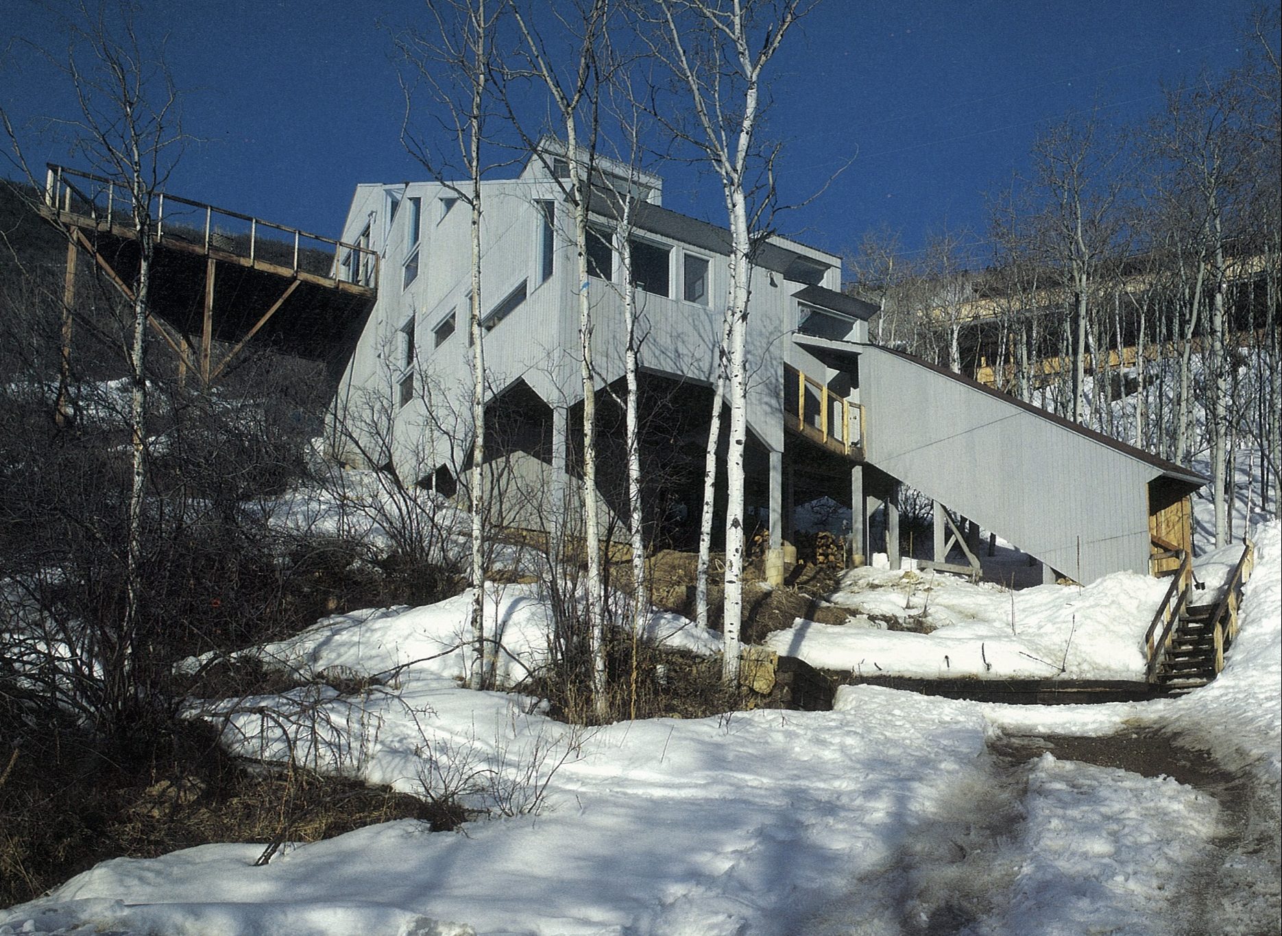
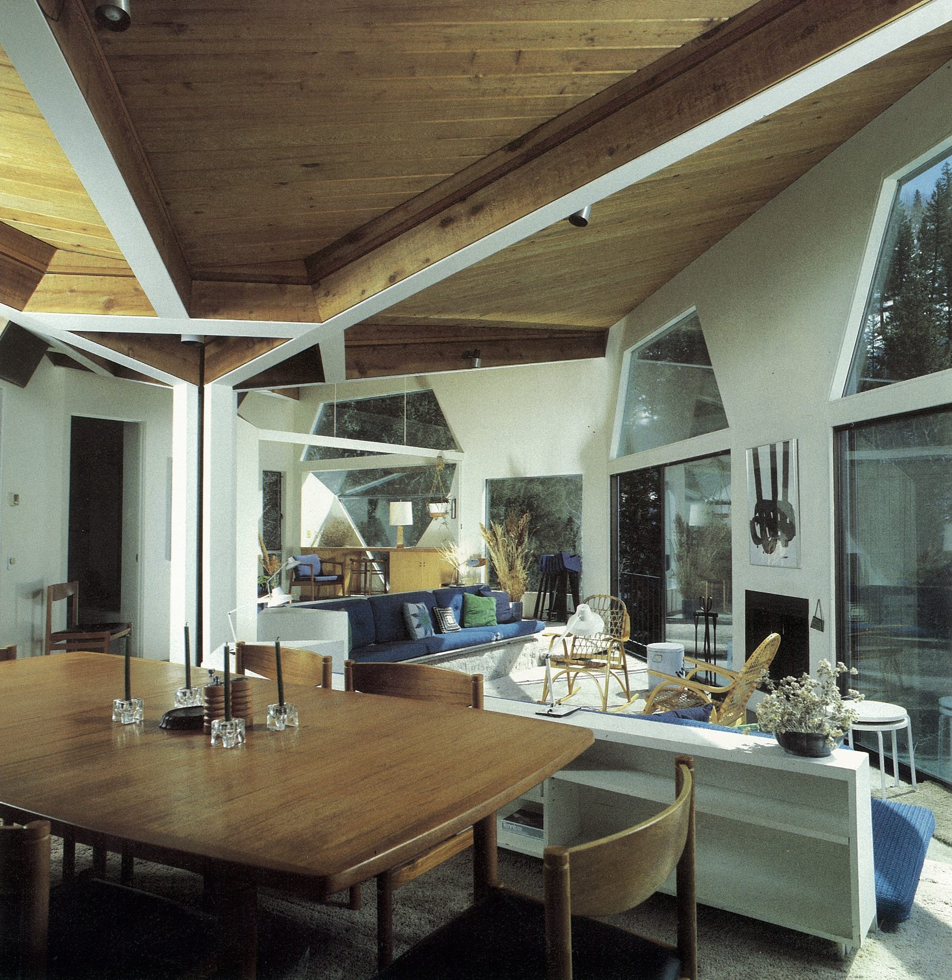
Aspen today
Though old Aspen is rapidly fading, thank goodness there are offspring. I am currently collaborating with Teague on a family compound for Nora Berko and her family that incorporates her father’s studio, now designated historic. Her daughter Mirte has dedicated much time and effort organizing her grandfather’s impressive archives of photographs for us to appreciate into perpetuity. The Aspen Institute carries on robustly while continuing to pay homage to its early founders and players. △
Read "Growing Up Weese" to find out what artist and designer Marcia Weese is up to today.
A Dream in Detail
Sharing a deep admiration of Frank Lloyd Wright’s work and a devotion to detail, a retired couple builds the mountain home each envisioned before they even married. An intimate look at a dream come true.
Bob and Judy met on a blind date . . . What sounds like the beginning of a romantic love story—which it is—also leads into the inspiring story of two people who, on that first night discovered they shared a passion for architecture, the work of Frank Lloyd Wright in particular, and a lifelong dream of someday living in the Vail Valley, in a warm, modern house overlooking the ski runs of Colorado’s famous winter resorts.
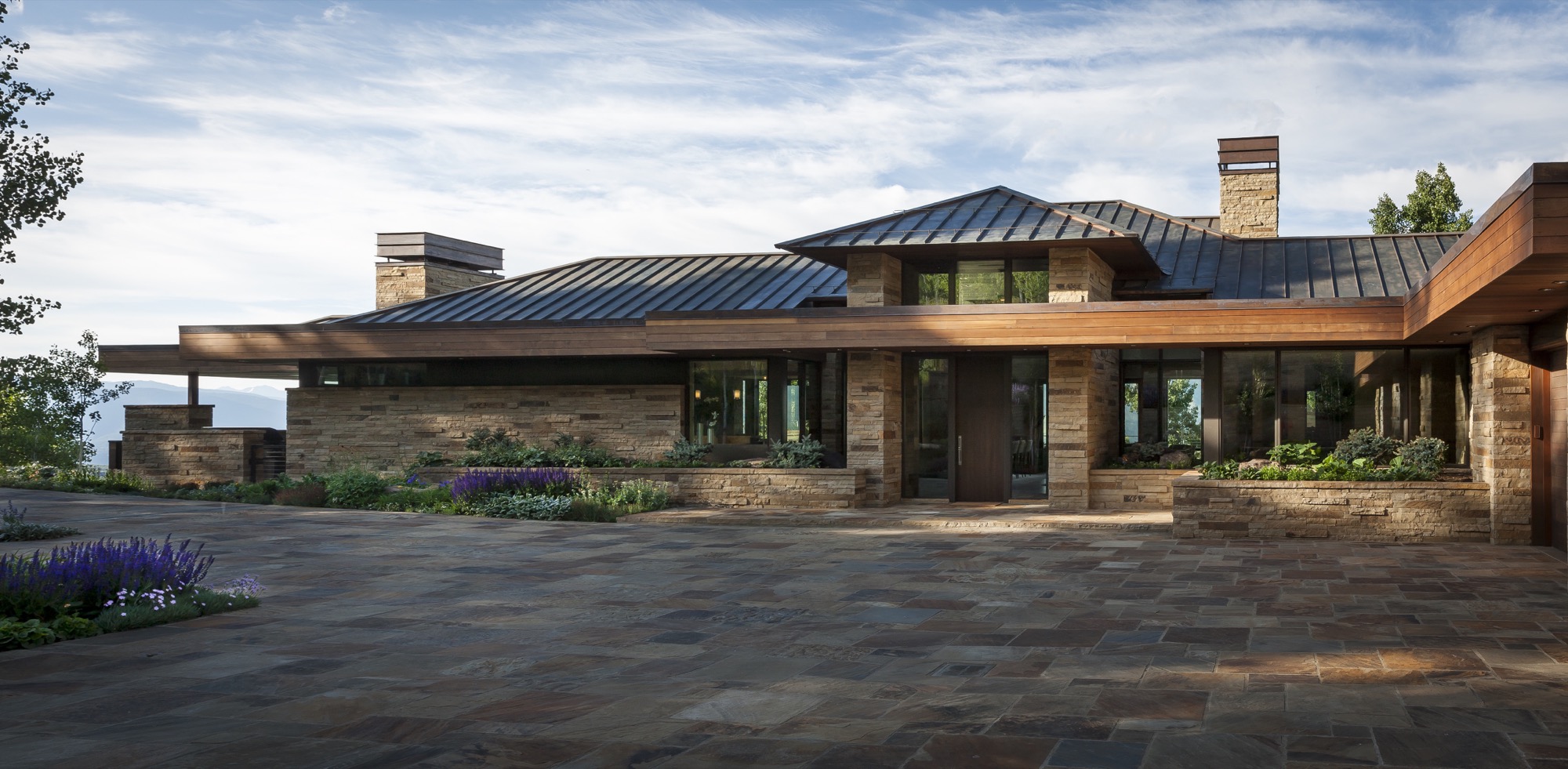
“We wake up every morning and can’t believe we get to live up here,” Bob says today. The Michigan native visited Colorado for the first time when he was seventeen, on a ski trip with his buddies. “I remember thinking, ‘Someday, I want to live out here. Not in a ski-in/ski-out place, where you are up close to the mountain, but in a house with great vistas of snowcapped mountains.”
Forty years later, the man, who spent a career traveling the world as an executive for global brands, stands behind his marble kitchen counter, looking out over Beaver Creek and some of the country’s highest peaks soaring more than 14,000 feet (4,267 meters) above sea level. The dream house he built with his wife of eleven years was carefully sited so the windows of the great room frame the ski runs across the valley perfectly. “We wanted this feeling of a life-size trail map.”
“We wanted this feeling of a life-size trail map.”
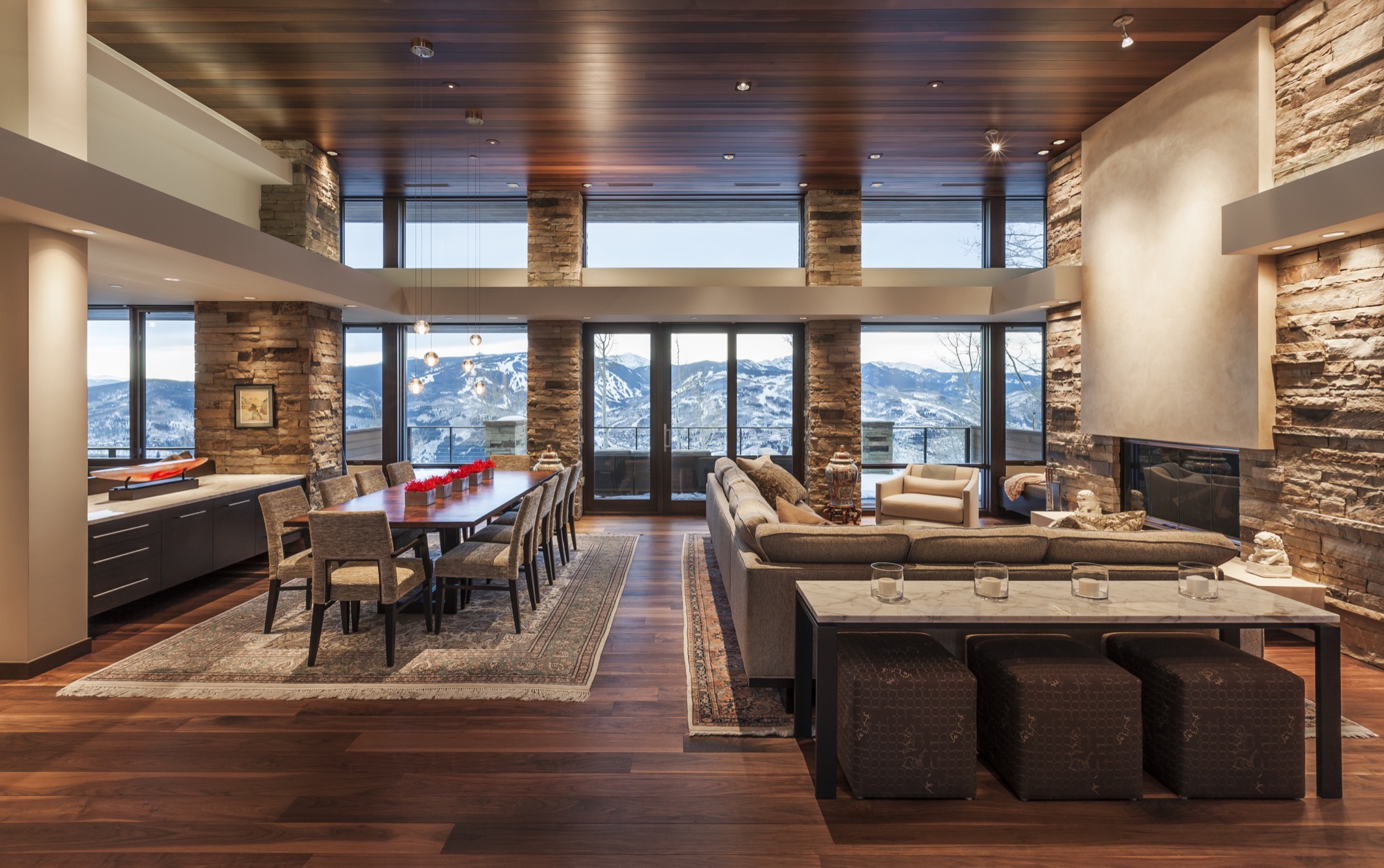
Judy, for her part, grew up in Minnesota and Wisconsin. Her mother and father, too, shared a love of Frank Lloyd Wright’s architecture. “Every month, my father took my brother, my sister, and me to see a different Frank Lloyd Wright house. That had a profound effect on me, and is something we continue to like to do,” she says. “It’s also one of the strong bonds that Bob and I have, because he used to ride around Michigan and go to Frank Lloyd Wright houses, knocking at the doors and asking if he could meet the people.”
“Every month, my father took my brother, my sister, and me to see a different Frank Lloyd Wright house. That had a profound effect on me.”

The perfect plot and a modern master
It took one year to find the perfect lot, 9,125 feet (2781 meters) above sea level, at the end of a winding, aspen-lined road above Avon, Colorado. For an entire ski season after they bought the lot, the two came up from Denver on weekends. “Instead of skiing, we’d sit on the site and envision what our life would be like up here, and how we wanted to live in the house,” Judy thinks back.
“Instead of skiing, we’d sit on the site and envision what our life would be like up here, and how we wanted to live in the house.”
Then the new landowners needed to find an architect who could put their dream on paper. They hit the bookstores. “We were going through architecture magazines, pulling out pictures of homes that looked interesting to us,” says Judy. “And then we realized, it’s all the same architect.” The modern master whose work jumped out at them time again was Charles Stinson of Charles R. Stinson Archi-tecture + Design in Minnesota.
The internationally acclaimed architect had never designed a mountain home before; but having seen his previous work, Bob and Judy were confident he was capable of helping them achieve their dream. “Rare clients I know of who are such students of architecture,” Stinson says about the pair. “We hiked their site together, and we all had a harmony in the way we saw the world and the potentiality of architecture.”
Good design takes time
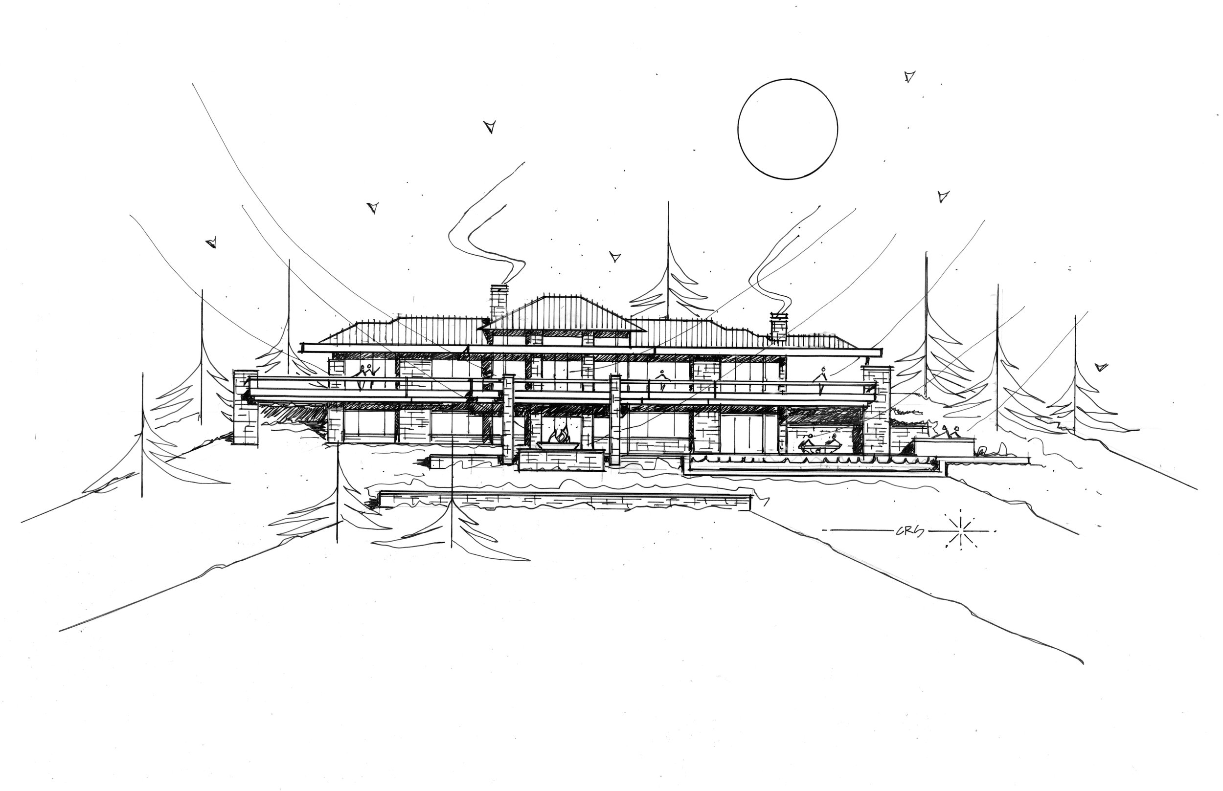
The couple as well as their architect appreciate Wright’s clean, horizontal lines, his strong sense of flow between indoors and outdoors, and the use of warm materials. Nonetheless, the design was not to be an imitation of a Frank Lloyd Wright house. “Bob and Judy’s house both integrates the materials and the geometry of Wright, but it also brings in a more modern aesthetic and materials and technology,” Stinson says. “We integrated the history of Wright’s contribution with a current, modern architecture.”

The two key design objectives were to maximize the views, and for the house not to pretend to be something it was not. The creative collaboration with Stinson took another four years before the clients felt the design was right. “Good design really does take time,” says Bob. “You get something laid out, and then it takes time to react to it.”
"Good design really does take time. You get something laid out, and then it takes time to react to it."
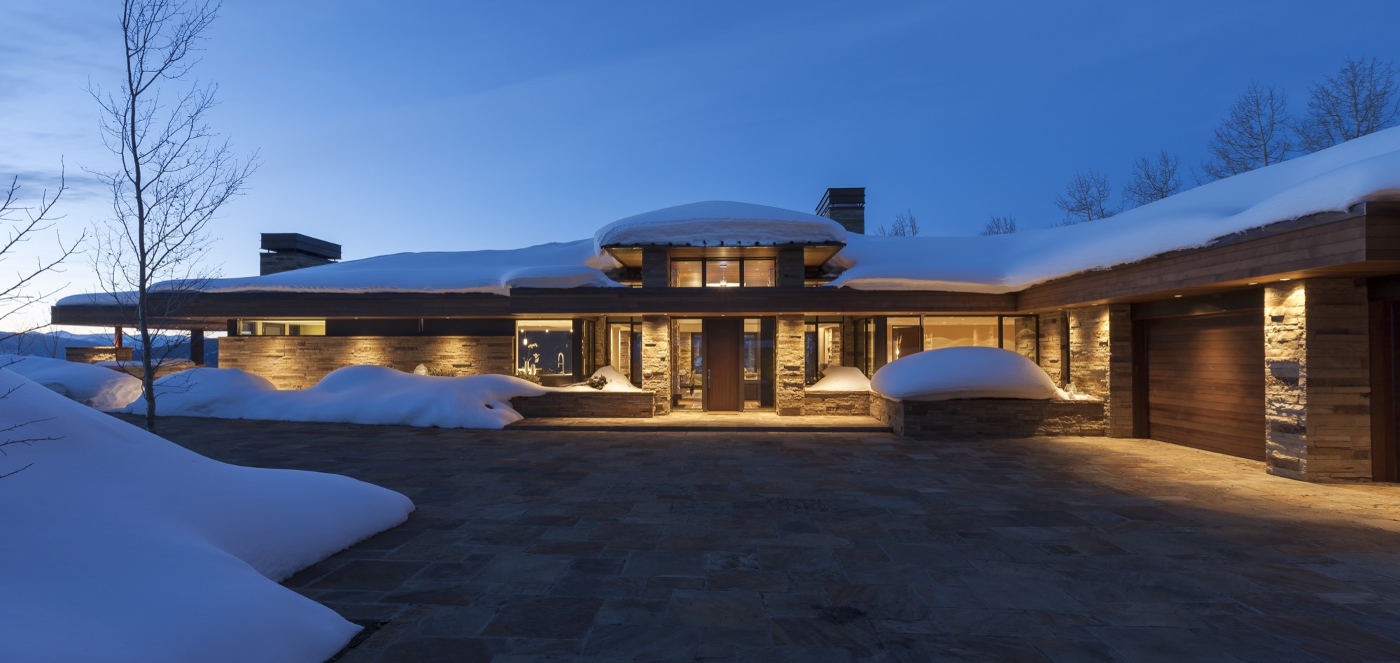
“I try not to think of it as obsessive compulsive,” says Bob, “but everything makes a difference in architecture.” He believes that paying attention to detail creates warmth and “zen-ness.” Good design is not for everyone to notice, but to recede behind form and function. Yet, a space that feels good and evokes an emotional reaction isn’t happenstance. “Attention to detail makes those details go away, and there is a calming feeling in that space,” says Bob.
Stone on stone
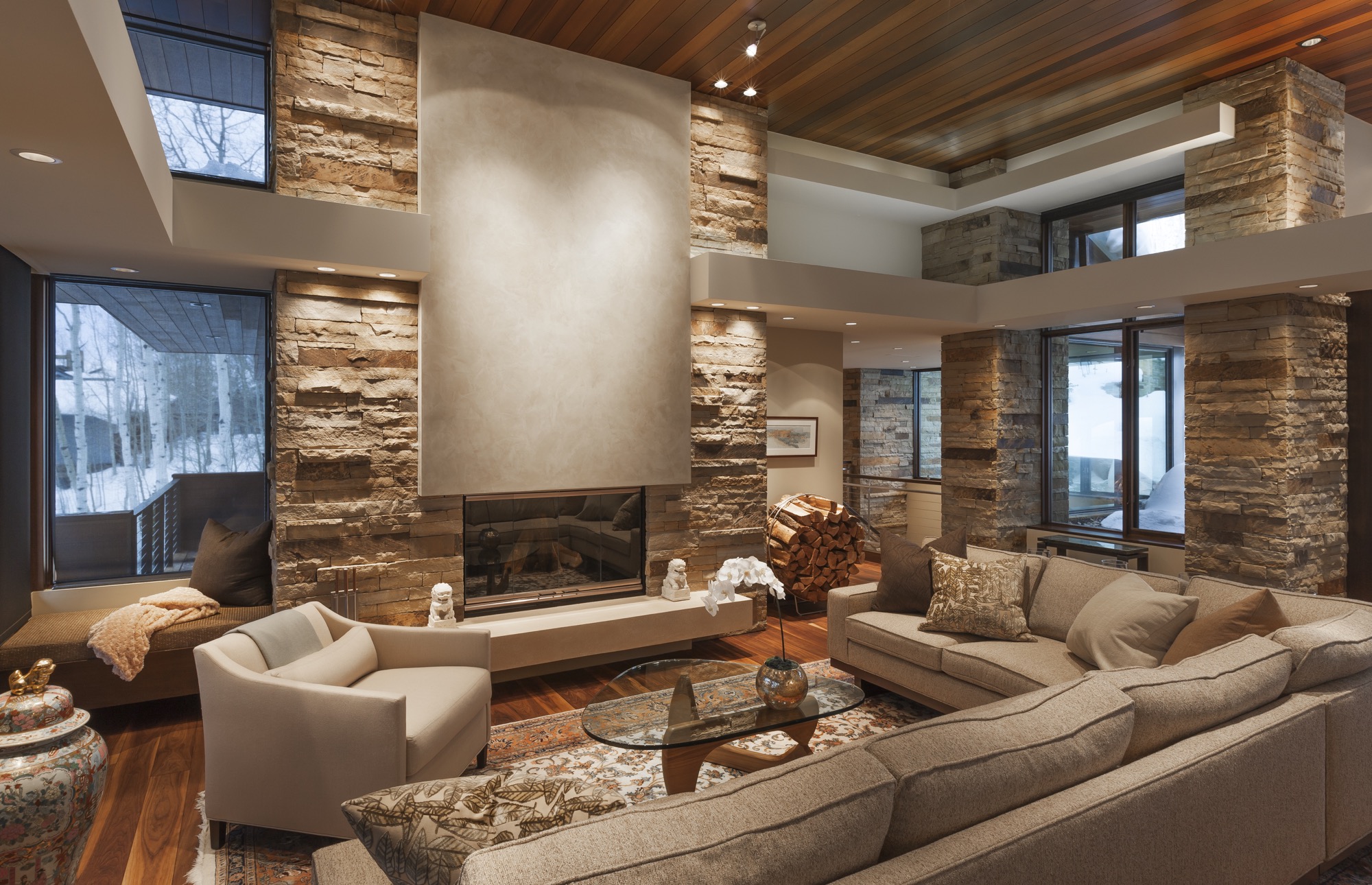
Stone is the protagonist among the house’s natural materials, both on the interior and the exterior. Devoted to detail, Bob and Judy wanted every stone on the interior to match the color and lines of its counterpart outside the glass panel to create unity between the outdoors and the indoors.
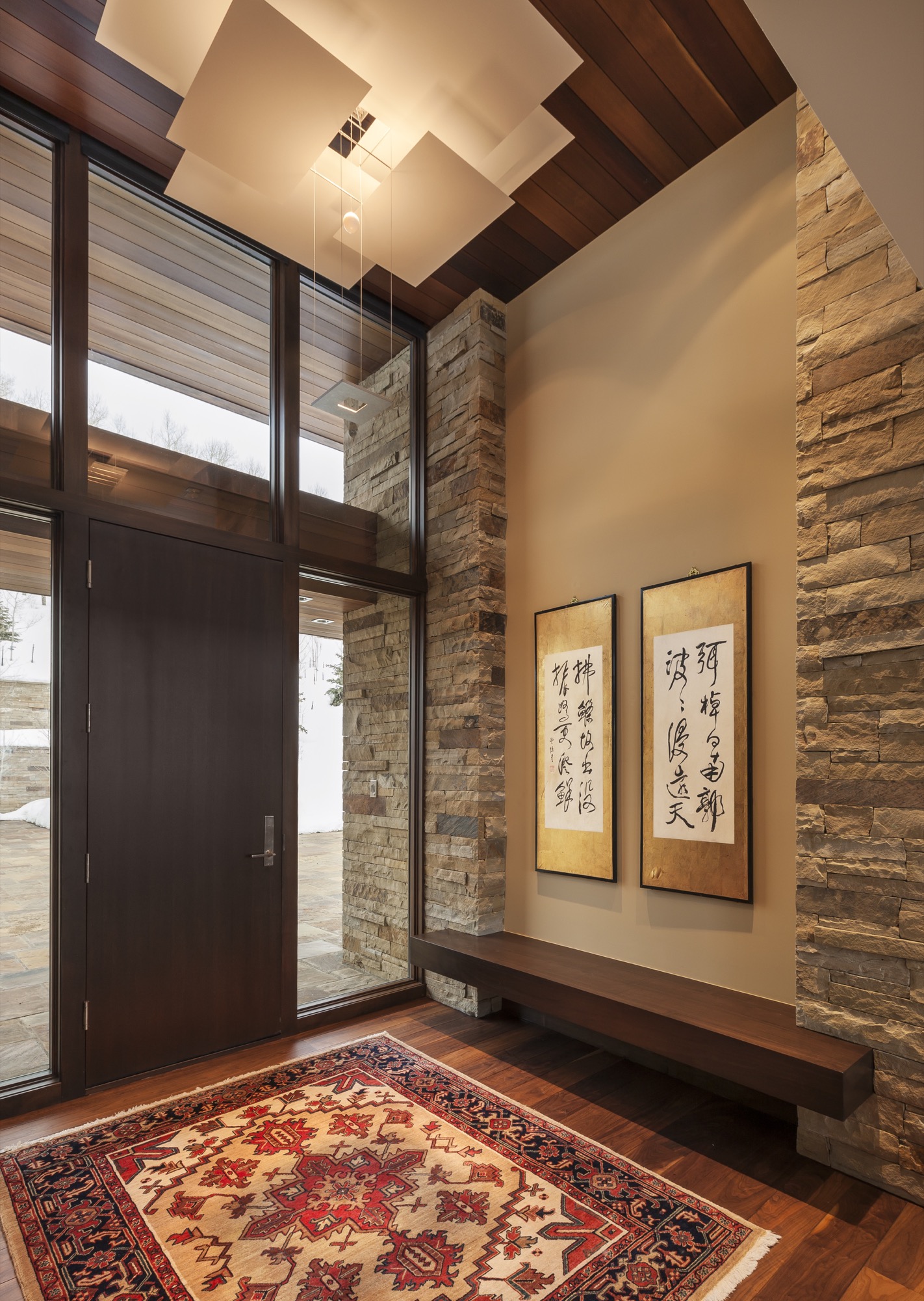
Every day for two years, up to ten stone masons worked onsite, hand-cutting and fitting hundreds of tons of stone brought in from Arkansas. “It really was a labor of love,” says Judy. “Three or four of them had been here the whole time, and they ended up being like family members.”
Adds Stinson: “All of us had such respect for each other, and for the site and materials, and a gratitude for the builders and artisans and their great workmanship.”
Of the hill
Constructed by Mark Fox of Fox Hunt & Partners, the 7,200 square-foot (669 square-meter) home sits on seven acres adjacent to thirty acres of open space to the south and east and borders the White River National Forest. Frank Lloyd Wright often spoke about building on the edge of the forest to achieve a sense of shelter.
The house is tucked into the steep mountainside to block the cold winds from the north. The south-facing indoor and outdoor living spaces reap warmth from the sun year round. Wrapping around the back of the house, the 125-foot upper deck over- looks the pool patio down below, providing covered and uncovered gathering spots. The resulting microclimates provide a comfortable place to sit outside, here or there, upstairs or downstairs, snow or shine.
Following Frank Lloyd Wright’s credo of not building on the hill but of the hill, the house is sited to descend down from an expansive flagstone auto court. “You literally feel more grounded with your environment,” Bob says. “The house would have felt completely different sitting up there.” Now, the home’s horizontal lines follow the horizontal ridge above.
“No house should ever be on a hill or on anything. It should be of the hill. Belonging to it. Hill and house should live together, each happier for the other.” — Frank Lloyd Wright
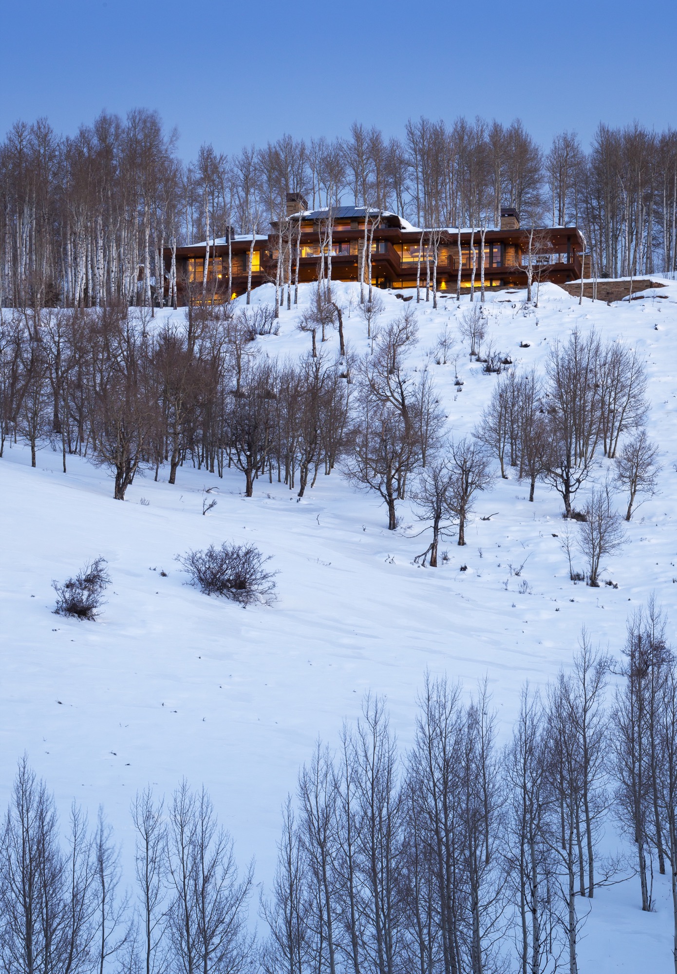
Mature aspen trees surrounding the house provide the Wrightian sense of protection and privacy at the forest’s edge.
The welcoming native Midwesterners share their land with Colorado wildlife. Mornings and evenings, deer trot along their natural path, which traverses the property. A pair of foxes likes to hang out by the pool. Because of the down-sloping landscape, birds of prey hover at eye level. “We look out and there will be this huge red-tailed hawk, just stationary, with his landing gear out,” Bob describes. “It’s amazing to watch them at eye level. Usually you only get to see these birds high up in the sky.”
Building into the side of the mountain made figuring out the approach to the house “very challenging,” according to Stinson. “We studied the grades from both directions, and Bob said, ‘Let’s flip the house around.’ It actually worked out better.” The transition from the driveway to the house, which descends down the mountain, now provides an intentional experience. The architect and his clients even climbed on a ladder before siting the house to see the views from where the main level would be. “We wanted to take advantage of a sequence of experiences, so when you are coming into the site up above, you have a glimpse of what the view is going to be,” Stinson says. “The view disappears when you are in the auto court, which is surrounded with nature—so the uphill side is a grounding experience. Then you walk into the house, and boom, the big views let the spirit soar. You see so far and down the valley that you needed that balance of shelter and release.”
Elevated living from the inside to the outside
Inside, the house offers a different experience and view corridor from nearly every room and angle. The elevated interior design reflects the warm colors and materials of the Rocky Mountains throughout.
The main level’s great room and hearth room truly maximize the expansive ski-slope views the owners hoped for. “I can’t tell you how much time we spent with the surveyor on the siting,” Bob says. “He had mapped out all the peaks and we’d literally stand with the footprint of the house, and we moved it three times before they dug the foundation.” The luxury of time and attention to detail once again paid off. “We’ll get ready to go skiing and put the local news on to see about the conditions, and I sit here and have my coffee and say, ‘Well, I can just look at the actual slopes.”
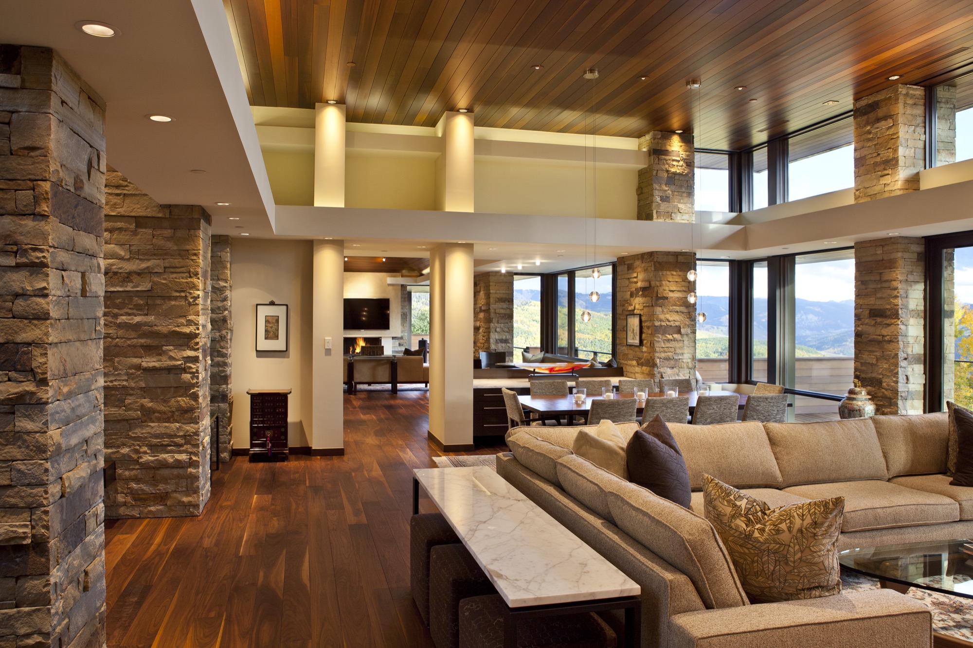
The overhangs of the roof above the main level’s south-facing windows provide architectural drama but are also part of the house’s passive solar design. “In winter, when the sun is low in the sky, the warming sunlight goes all the way to the back wall, whereas in the summer, when the sun is higher, you get a little bit of morning sun, but then it’s blocked,” Bob says. “We didn’t turn on the air conditioning at all last summer.” Roof solar panels already provided one-third of the electricity, and with the recent purchase of 100 more panels on a solar farm sixty-five miles away in Carbondale, Colorado, all the house’s electricity now comes from solar power.
Entertaining dinner guests and hosting out-of-town friends and family are an essential part of Bob and Judy’s new mountain lifestyle, now that they no longer work “crazy hours” in the city. Thus, Stinson designed the main level for the couple to live and entertain dinner guests. A floating buffet visually separates the dining room and breakfast room while maintaining an open flow so guests at both tables feel connected.
Overnight visitors are known to call the lower level “Bob and Judy’s retreat and spa.” Indeed, guests have their private quarters downstairs, with intimate suites named after the respective resort in view and decorated with vintage ski posters mirroring the very scenery outside the window.
The window seats in the downstairs living room, in fact, are Judy’s favorite spot in the house, as she says the ski slopes look even closer from down here. The communal space with an open kitchen opens up to the sweeping pool patio with an outdoor dining area in the center, a hot tub on one side, and another outdoor fire pit off to the other side, where the family loves to roast s’mores at night.
Integrated into the guest wing are also a massage room, an exercise room, and an exquisitely curated wine cellar. The opposite side of the lower level has a bunk room, where Bob and Judy’s nieces and nephews like to hang out when they come on vacation and occasionally bring along friends.
Beneath the garage and a concrete ceiling are Bob’s pride and joy: a movie theater with Whisper Walls and a high-end listening room that boasts a pair of enormous Genesis 1 speakers. Still, the window-less über-impressive “cool area for the loud things” (as Stinson calls the two rooms) are not where Bob spends most of his time. He likes to sit on the lower deck, looking out over the large saline pool and the ski slopes just beyond. This is, after all, his dream come true. △
At the request of Bob and Judy, we are not publishing their last name or identifiable details about their mountain home's location.
Narrow Escape
Falling in love with an impossibly narrow lot on a mountain village's main street, A Denver architects builds a 15-foot-wide weekend home for his adventurous family
Incited by a seemingly impossible building site in an old railroad town above Vail Valley, Colorado, a Denver architect designs a 15-foot-wide sustainable mountain getaway as a speculative investment for sale. Then his adventurous family falls in love with the home. It was an eyesore. Passersby merely saw a ramshackle trailer overstuffing the 25-by-100-foot (7.5-by-30-m) lot on Main Street in Minturn, Colorado. Yet, André Vite spotted an opportunity.
The campus architect at the University of Colorado Denver and his wife, Ginger Borges, an oncologist at the University’s medical school, have a weakness for obscure properties. That evening three winters ago, however, they maintain they were not scoping out a new venture at all. The couple and their preteen sons, René and Niko, were headed to the old railroad town up Eagle River for dinner after a day of skiing in Vail. “We drove through Main Street Minturn, which is a town we go to all the time, and there was a mobile home for sale that was just totally wedged in and awkward looking,” Vite remembers.
Even though he didn’t know what to do with it at the time, the architect wanted that piece of land. And he got it without difficulty because the city planners had been eager to get that blot off Main Street.
The draftsman went home and started sketching.
S(e)izing the Opportunity
The lot’s appeal was twofold: It was located right on the town’s main stretch and it was zoned for mixed use. “From a planning and zoning standpoint, it was a fantastic opportunity,” says the architect and urban designer, who also heads his own practice, the Vite Collaborative. (Or, as he describes it, “A bunch of friends working on unique projects together.”) If for nothing else, Vite purchased the property at a propitious time. The shops along Main Street had been expanding in that southern direction in recent years. Thus, Vite had originally designed the project as a residential spec home with the option for retail or commercial space on the ground floor.
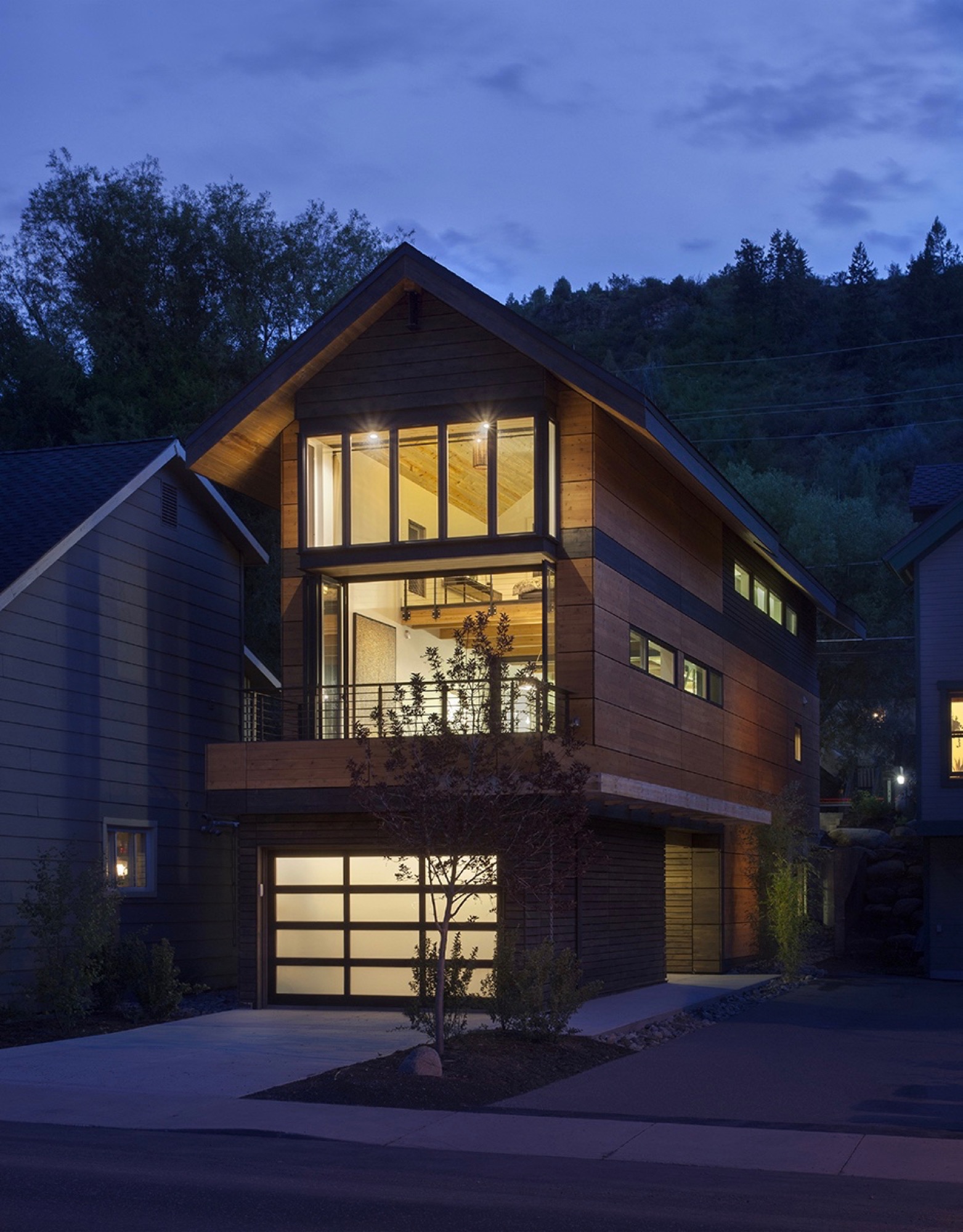
While the sliver of land overlooks the principal artery of town life on the Main Street side, the opposing end couldn’t have more different surroundings — a quiet residential street with community gardens across the way. “From an architectural design proposition, that was very exciting to see how you could work this with two faces of the building,” Vite recalls. “Both facades relate to the context of the side they are on.”
“From an architectural design proposition, that was very exciting to see how you could work this with two faces of the building.”
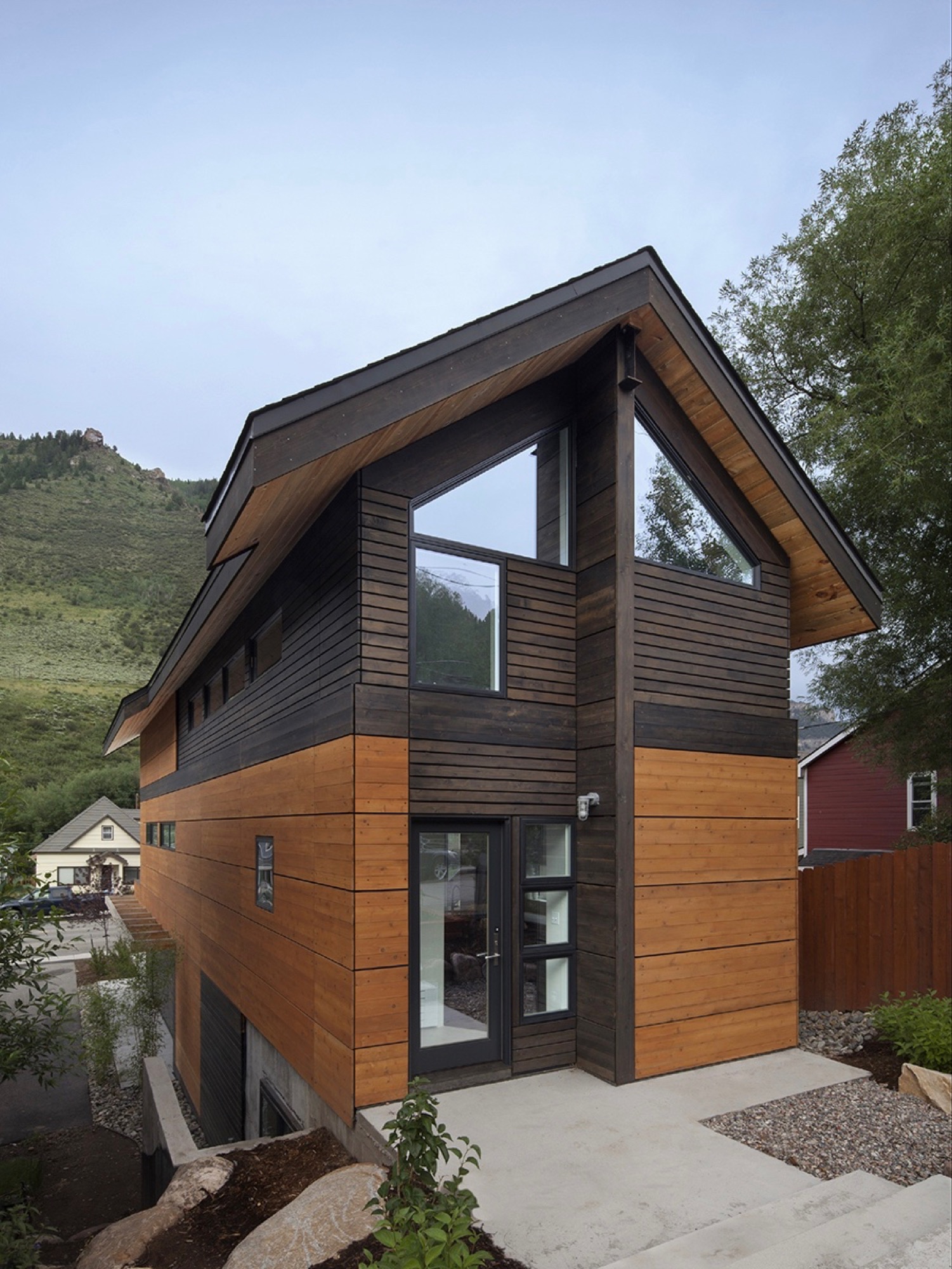
Yet another challenge the building site posed was the 10-foot grade change between the two frontages — an entire story difference, front to back. That was not all. The town’s zoning laws required a 5-foot setback from the property line. The house could be only 15 feet wide.
Fortunately, the neighbor’s garden to the south and a driveway next door to the north give the narrow site extra breathing room. “It’s true, it’s a very constricted site, and the response was a very long, narrow building, but it’s still flooded with light,” Vite says.
"It’s true, it’s a very constricted site, and the response was a very long, narrow building, but it’s still flooded with light."
Unconstrained creativity on 15 feet across
The building constraints — the narrowness, the contrasting major facades, the steep slope — only spurred Vite’s imagination and inspired innovative solutions. How did he create a modern living space — an entire three-story house — with 15 feet (4.6 m) across to work with? The architect’s answer was a structural steel frame, an element adopted from commercial construction, which gave him the structural freedom to engineer large open spaces on the inside. “It’s a steel moment frame structure with three beams that go all the way down the building. Then there is a steel beam across the top.”
The steel beams manifested what would become part of the narrow house’s legacy, and with it, a close relationship between Vite and the local builder, Brian Beckett. “When he was erecting the moment frames, Brian called me and said we can’t put the roof on tomorrow,” Vite says. One of the moment frames had been a quarter-inch off plum, which was still well within building tolerances. As might be expected from the sanguine architect, the holdup was anything but a point of contention; on the contrary. “To have a guy who takes this that seriously was just really important to me. I knew I was going to get a great building from him,” says Vite. “The main draw to this project was the relationship I developed with the builder. It became evident early on that he cared about craft. We’ve become great friends.”
“The main draw to this project was the relationship I developed with the builder. It became evident early on that he cared about craft. We’ve become great friends.”
Actually, there was one moment during construction that did stop the architect in his tracks. After Beckett put the roof on the now-perfect steel frame, he took a picture and sent it to his client in Denver. “It looked like a tube; like you wouldn’t ever want to live in anything like it,” Vite remembers his initial reaction. “It wasn’t until we started finishing it out that it turned into what we’ve got. But that was a scary point, because it was so narrow.”
Family first
By the time construction was completed, the next ski season was approaching. Vite and his family had frequently driven up from Denver to ski in the Vail Valley during previous winters. “We decided we would use the house for that ski season,” Vite says about the investment property he had just finished. “We spent that ski season there. After that, we didn’t want to lose it.”
“We spent that ski season there. After that, we didn’t want to lose it.”
The unique house itself wasn’t the only reason the family never wanted to move out. “We absolutely fell in love with Minturn. It’s the real authentic mountain community between Beaver Creek and Vail, where you have all these people who are transient and vacationing. The people in Minturn are really the ones who keep that valley going,” says Vite about the mountain town’s thousand or so residents.
What’s more, Borges not once considered her husband crazy for building this improbable house. “We’ve been married for twenty years,” Vite laughs. “She is used to that.” And attuned to narrow dwellings she was. The first home the couple restored and lived in together was a townhouse in Boston’s Beacon Hill neighborhood that was only 14 feet wide. “She’s getting an extra foot,” Vite exclaims, insisting his wife was thrilled about the idea to keep the Minturn house. Now the four escape up here nearly every weekend, year-round, to fish, drive their go-kart, hike — or ski in winter.
Open space to monkey around
Since completion, the house has evolved into a fun destination in its own right for the adventurous family. “The narrowness drove the whole architectural design in choosing a steel frame so that the interior could be completely open,” Vite says. Scarcely any interior walls partition intimate bedrooms and private bathrooms from the open, free-flowing floor plan. At the bottom, the concrete foundation encases a below-grade guest bedroom and bathroom on the dwelling’s Boulder Street side. Because of the steep slope, the opposite end is above ground, where the garage faces Main and can be extended out to the street for a future retail space.
“The narrowness drove the whole architectural design in choosing a steel frame so that the interior could be completely open.”
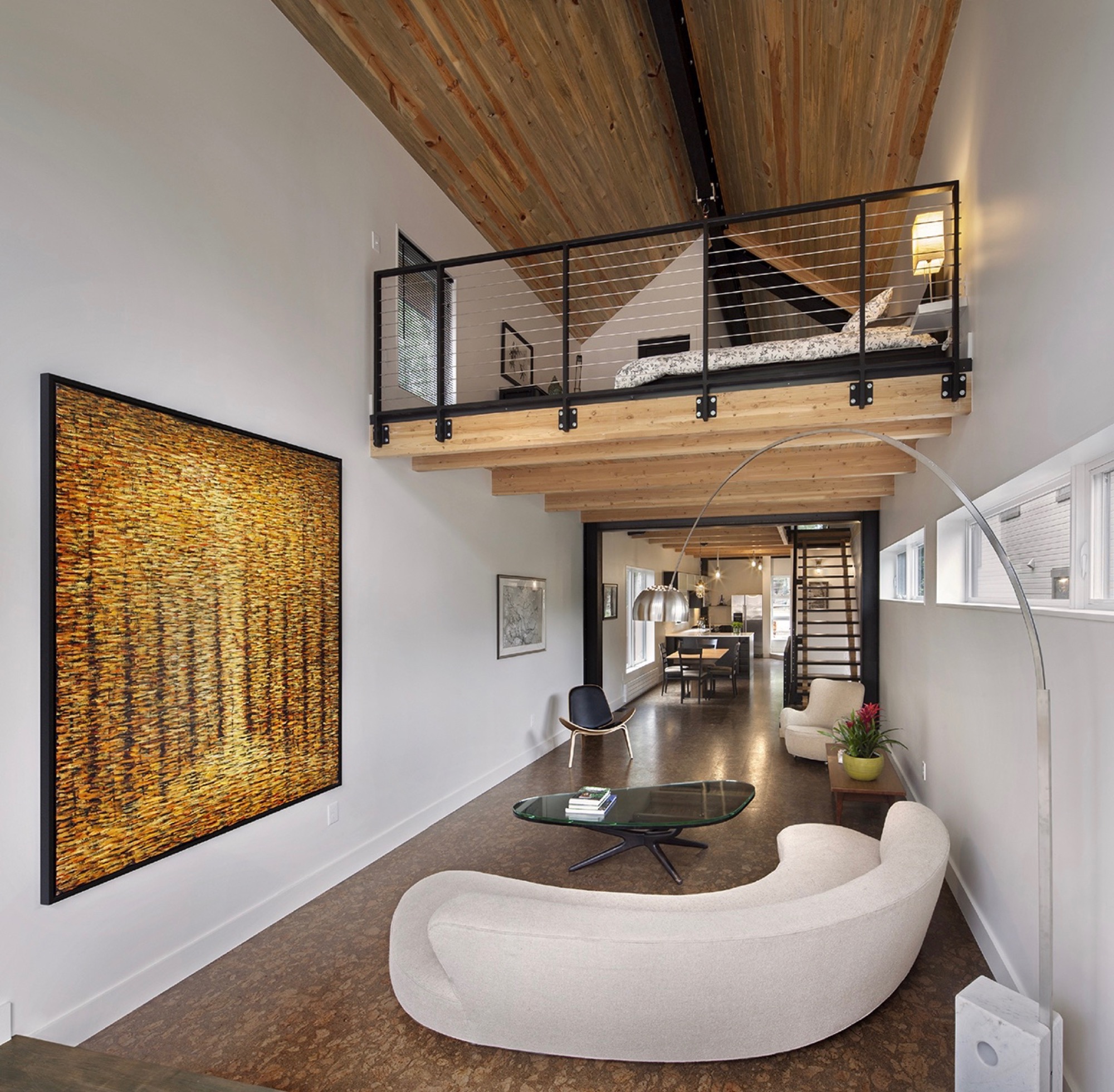
The ceiling of the modern living room on the second floor rises two stories with an overlooking loft, the parents’ open bedroom. The boys’ west-facing bedroom is tucked behind the “master” (or in front of it, depending on which frontage you interpret as the face of the house).
The family spends most of their time together in the open living space with the curved white couch. “We take this big picture off the wall and project movies onto the wall.” The cork-floored main living area flows outside through a folding glass and steel wall that opens up to the deck. A minimal dining area in the middle transitions into the kitchen, Vite’s favorite spot in the house.
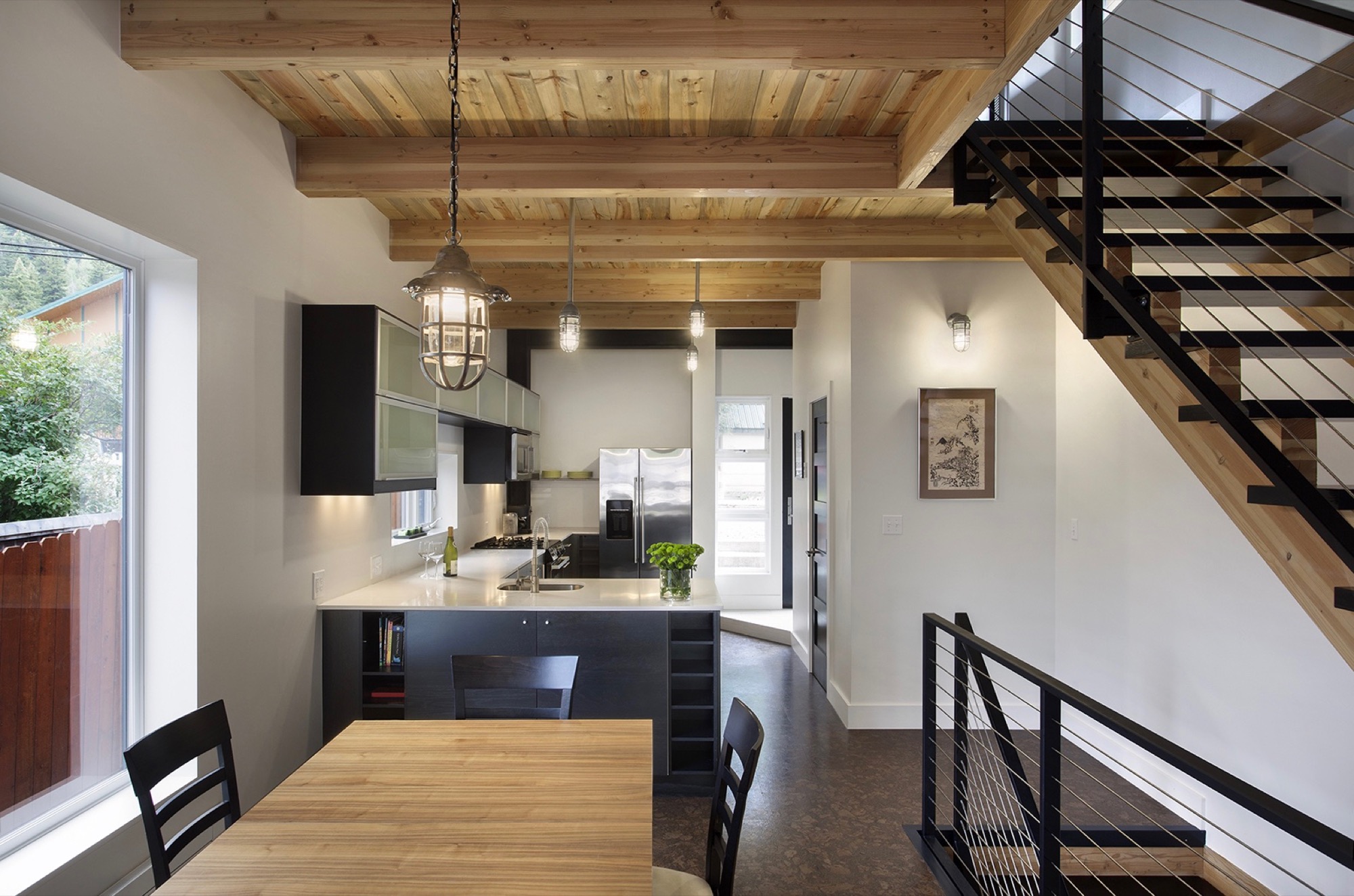
“But what the kids love is this 26-foot space here,” says Vite, pointing at the high living room ceiling, where he mounted a climbing rope. “They get to climb up this wall that’s all blocked with wood, ready to put in finger holes for a climbing wall.” Climbing is indeed the boys’ favorite indoor pastime. “They climb everything they can get to,” their father reveals, pointing to a trolley that runs down the steel beam under the roof above the master loft. “You can strap yourself onto here and then push off.”
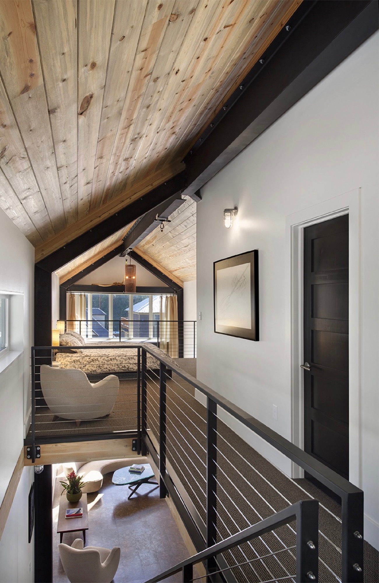
In addition to providing a place for the family to escape the city on weekends and holidays, Vite wanted to set the stage in the house for a few cherished vintage pieces he inherited from his late parents. “The interior design was all about finding a home for my father’s old furniture he had bought in the early sixties in New York. It’s all authentic midcentury-modern furniture, and I designed the interior around it.”
Sustainability as style
The LEED-accredited architect is reluctant to categorize the architectural style of his idiosyncratic house. “What they call it up here is a contemporary mountain home, because it very much has the feel of a timber frame, although it is done in steel,” he says. “But rather than talking about a style, the sustainability feature is more important to me.”
From the construction standpoint, the house is based on a standard wood module to limit material waste, which actually got Vite in trouble with one particular Minturn resident. “There is a guy up here who goes around the construction sites, picking up wood waste for his wood-burning stove at home. He would complain that we didn’t have enough wood waste and gave us a hard time.”
The carefully calculated use of exterior wood is to protect the building from driving rain in support of the actual weather barrier behind the wood. “All these gaps are open,” Vite shows. “It’s like the house is wearing this jacket. The wood is there for added protection, and the jacket breathes.” Air exchange is critical for a highly insulated house at this altitude, where the air is extremely dry. “You are living and cooking and doing all these things that increase the humidity inside the house,” he explains. Instead of trapping the warm, very moist air inside, the house can breathe it out. Vite also installed a heat recovery air exchanger that pushes warm, inside-air to heat colder air coming in to ventilate the house, without using the heating system.
“It’s like the house is wearing this jacket. The wood is there for added protection, and the jacket breathes.”
Vite received the 2013 Award of Citation from the American Institute of Architects for this project.
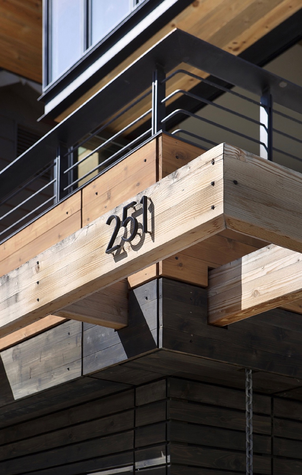
Tight house, tight Community
Being awarded such a significant professional accolade from AIA is nice, sure, but what truly warms the architect’s heart is how the locals perceive the standout structure they’ve come to call the “skinny house.” “We get compliments on it all the time. People are stopping by, saying they’ve watched it go up and want to look at the inside,” he says. “I love that the town loves the house.” △
“I love that the town loves the house.”
Sense of Place: Designed for legacy in Aspen
Mountain homes in Aspen, Colorado, are built to stay in the family for generations
Aspen is steeped in tradition. Generation after generation, families vacation at the posh resort to ski in winter and to celebrate the town's famous festivals in summer. Slope-side chalets and opulent second homes alike are built for legacy, as venues for extended family to gather and carry on traditions, season to season. A continuity that translates into architecture and decors of great depth and layering.
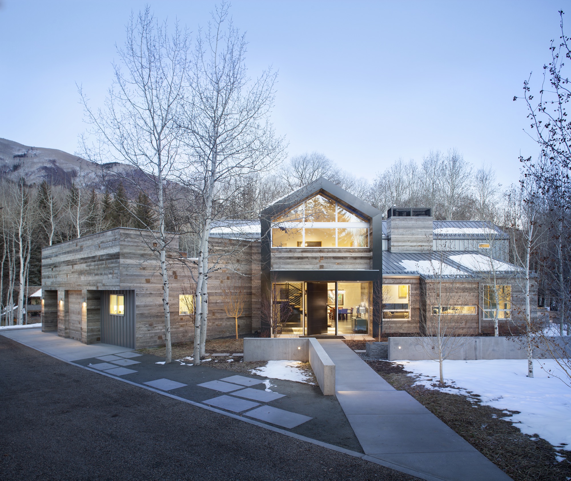
Nevertheless, even mountain folks for a fortnight must have functionality alongside style, beginning at the entry. “There is that sense of arrival at a mountain home,” says Sarah Broughton, co-owner of Rowland and Broughton (R+B), an architecture and interior design firm in Aspen and Denver. Aspen homes are planned with the understanding that one comes in from the elements. “People need to be able to knock snow off their boots.”
"Aspen homes are planned with the understanding that one comes in from the elements."
Style without borders
Many of R+B’s clients have primary homes on the beach or in big cities, all over the world. “One thing that is important to them is that they really feel they are in Aspen,” says Broughton, a modernist at heart. To achieve this sense of place, she relies on natural materials such as wood, grasscloth, and natural stone — “things you see when you look out the window.” What’s more, treating woods in surprising ways, such as planking or wire-brushing, brings out something special in a natural material.
Broughton complements mountain settings and modern, clean lines with cashmeres and wools in the furniture and textiles. She loves to add ample pillows and throws on beds and couches. “Hemp, wool, and cashmere textures and patterns can speak to a natural environment without being literal,” the award-winning architect says. The beauty of sunlight falling through an aspen forest’s canopies, for instance, can translate into a pattern. Twinkling lights become reminiscent of a starry winter night in the Rocky Mountains.
“Hemp, wool, and cashmere textures and patterns can speak to a natural environment without being literal.”
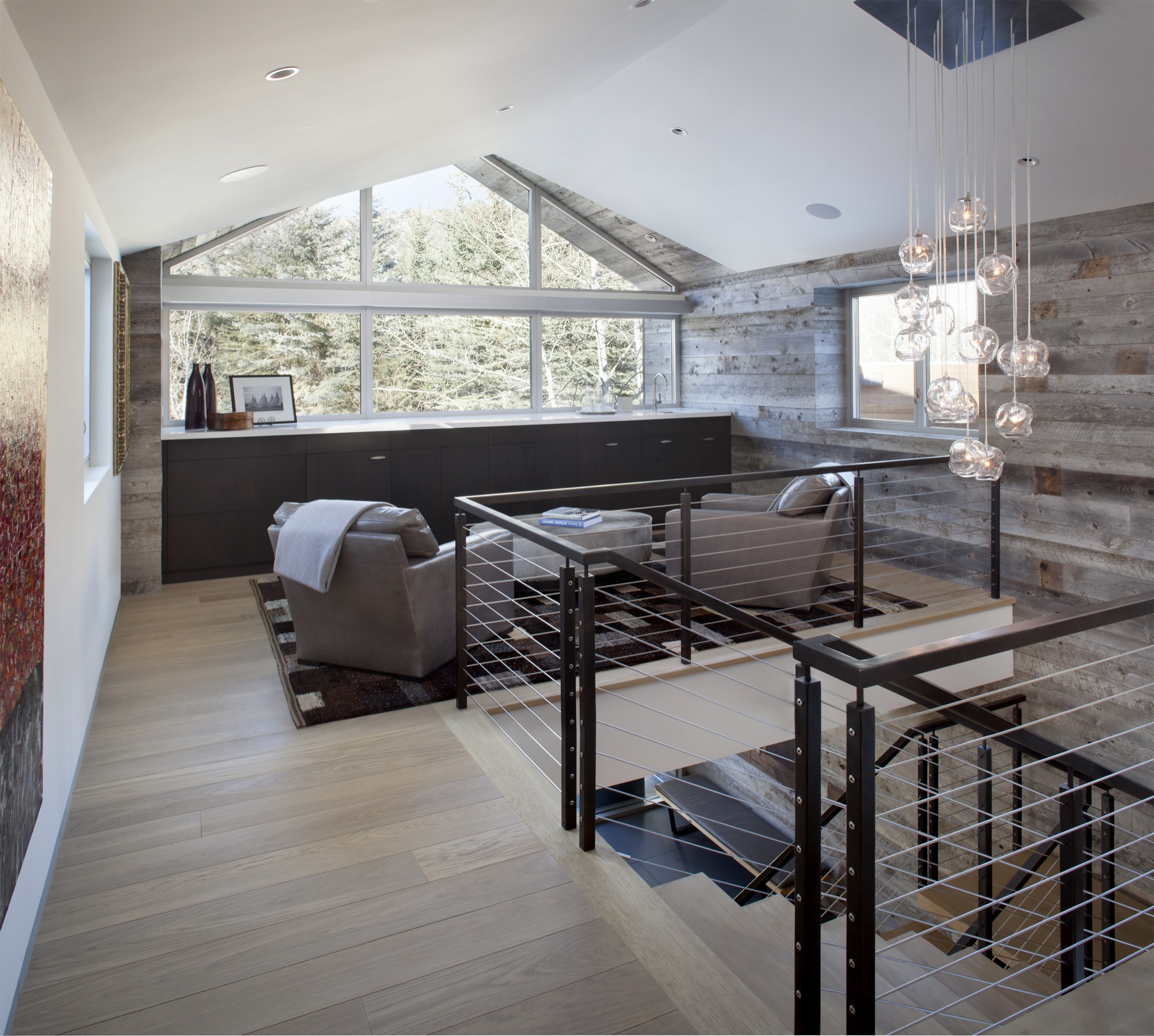
Black Birch Modern
With its clean-lined, minimal design, Black Birch Modern in Aspen is an example of a mountain retreat that not only boasts stunning alpine-modern architecture, but is warm and welcoming to boot. R+B achieved this balancing act by bringing outdoor materials inside. That, Broughton believes, is something anyone can do at home. “Carrying a material found around the outside of the house into the flooring, for example, is an effective way to blur that indoor-outdoor line, which is such a quintessential element of Aspen style.”
Bringing Aspen home
Give your home a touch of Aspen flair and make room for your own legacy. Create spaces where friends and family can gather to share food, drinks, and stories, while they sink deeper and deeper into your cashmere pillows and pull up their feet under a wool blanket.
Art from an Aspen gallery adds a fine finishing touch. “Bringing in local talent is a nice way to tie it to the place and a great way to modernize a home,” Broughton says. “Make it feel collected and not staged,” are her parting words of style wisdom. “Modern design has a lot of depth and layering to it. It’s not a one-hit wonder.” △
“Make it feel collected and not staged. Modern design has a lot of depth and layering to it. It’s not a one-hit wonder.”

