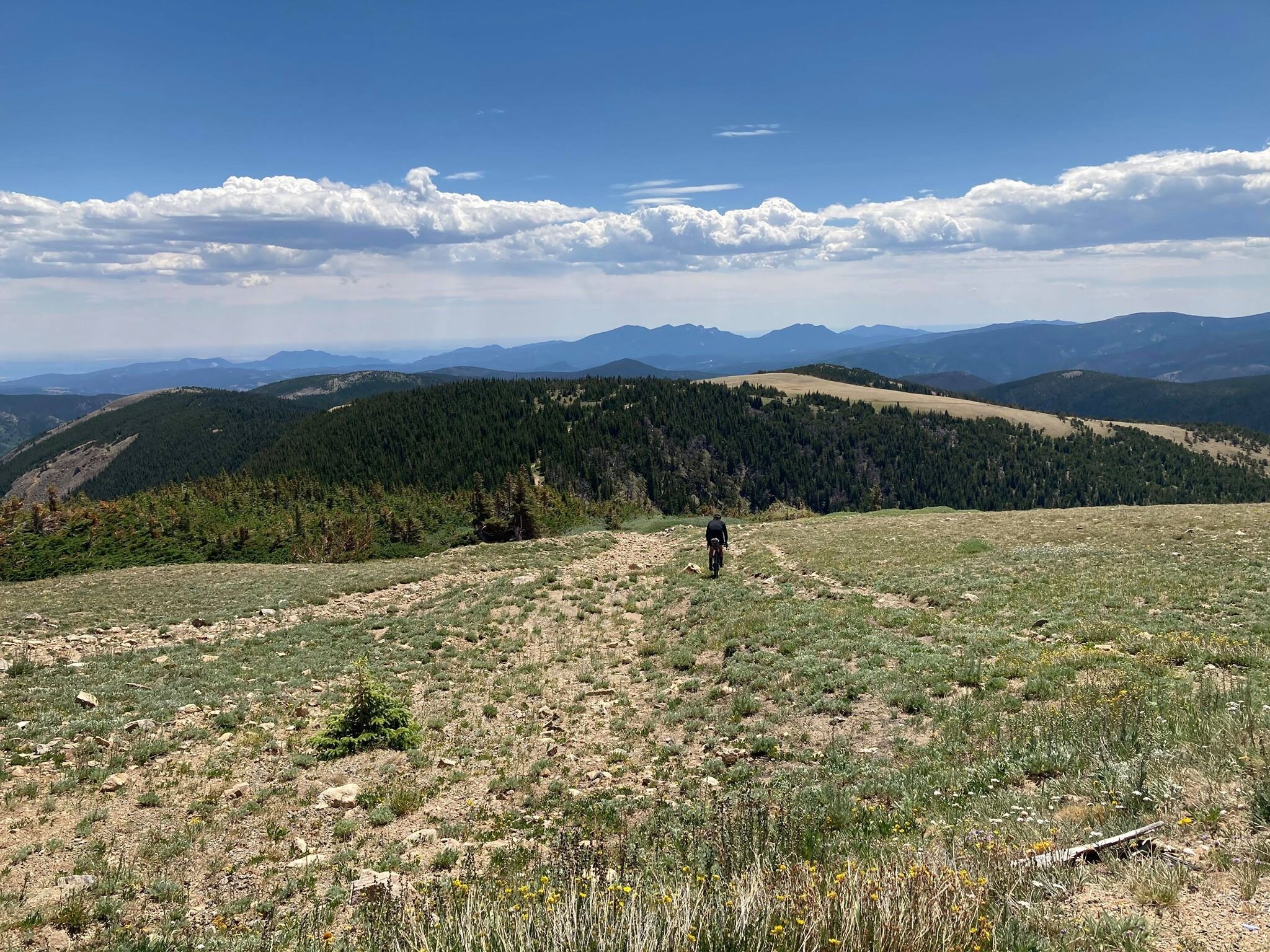
Inspirations
Explore the elevated life in the mountains. This content debuted in 2015 with Alpine Modern’s printed quarterly magazine project.
A Dream in Detail
Sharing a deep admiration of Frank Lloyd Wright’s work and a devotion to detail, a retired couple builds the mountain home each envisioned before they even married. An intimate look at a dream come true.
Bob and Judy met on a blind date . . . What sounds like the beginning of a romantic love story—which it is—also leads into the inspiring story of two people who, on that first night discovered they shared a passion for architecture, the work of Frank Lloyd Wright in particular, and a lifelong dream of someday living in the Vail Valley, in a warm, modern house overlooking the ski runs of Colorado’s famous winter resorts.
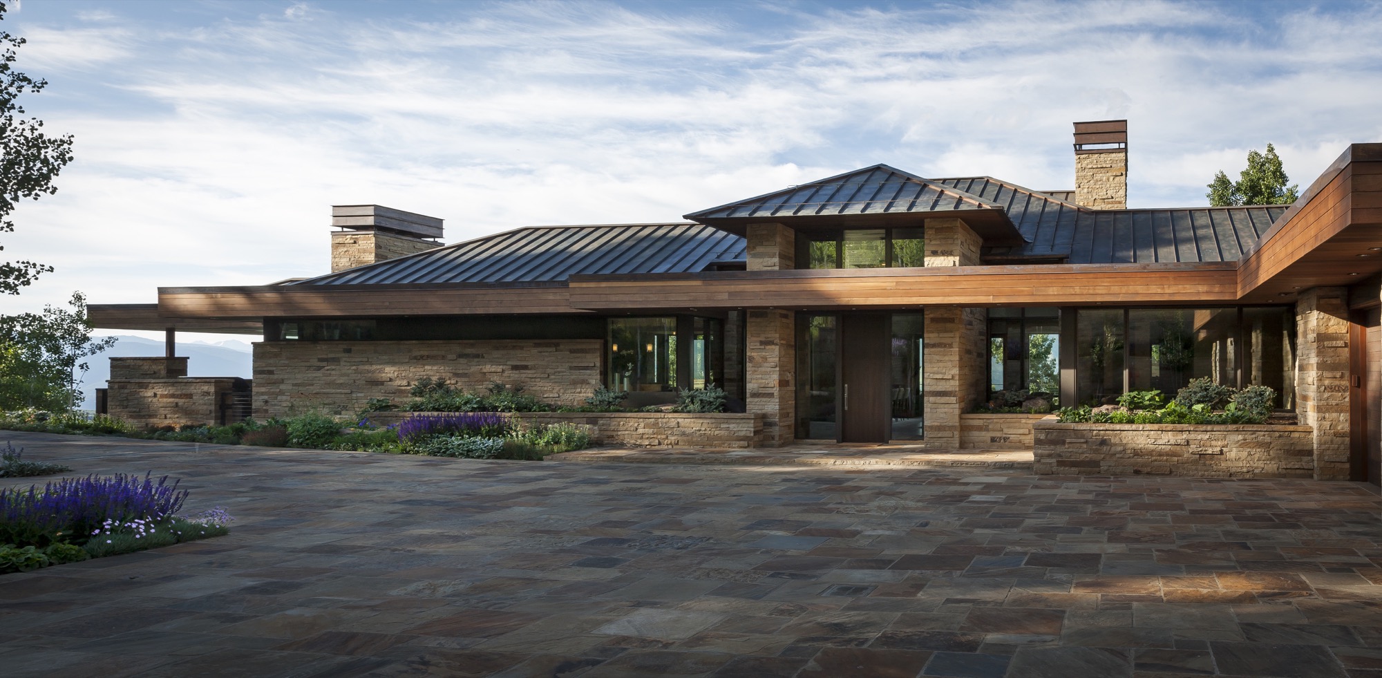
“We wake up every morning and can’t believe we get to live up here,” Bob says today. The Michigan native visited Colorado for the first time when he was seventeen, on a ski trip with his buddies. “I remember thinking, ‘Someday, I want to live out here. Not in a ski-in/ski-out place, where you are up close to the mountain, but in a house with great vistas of snowcapped mountains.”
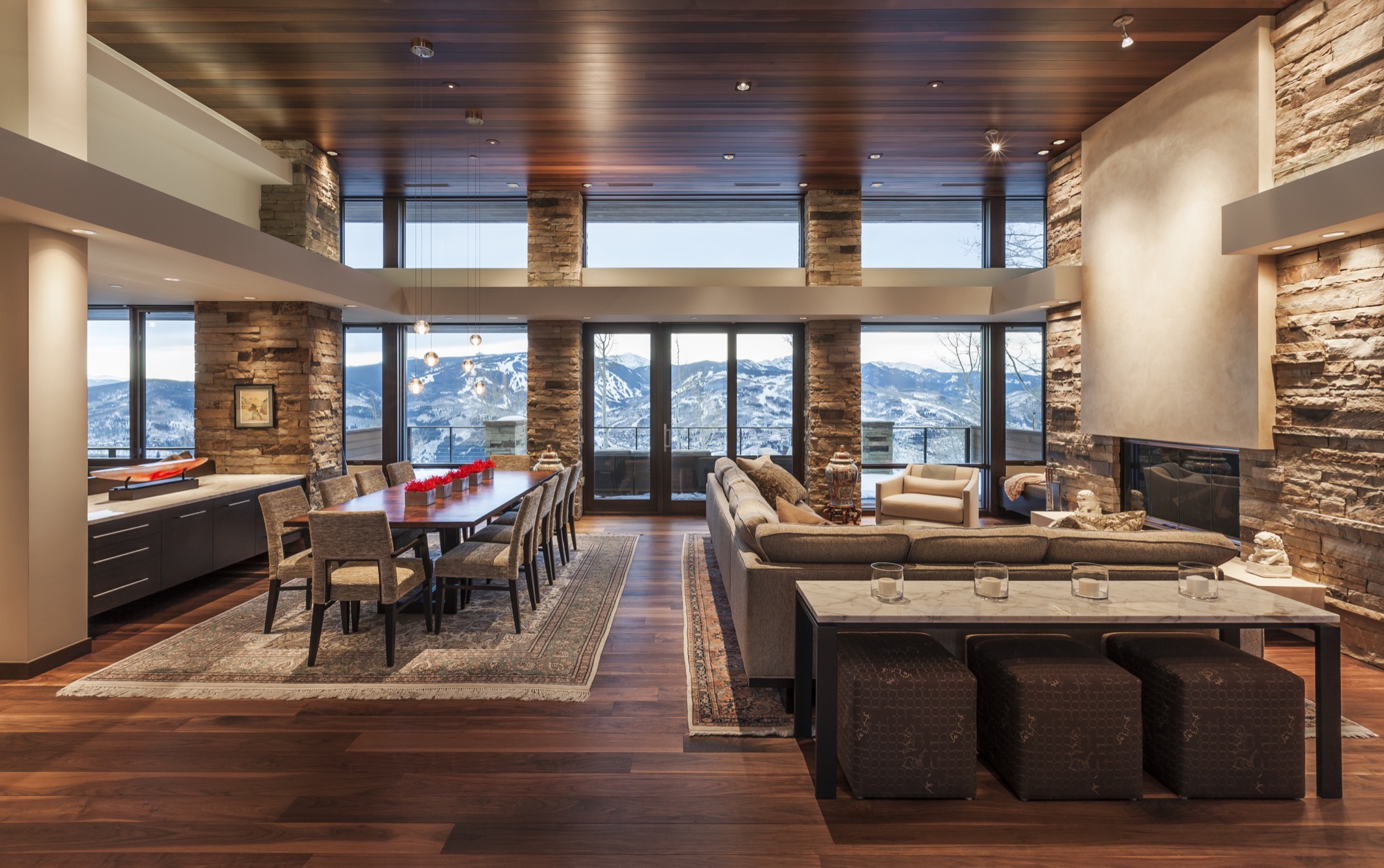
Forty years later, the man, who spent a career traveling the world as an executive for global brands, stands behind his marble kitchen counter, looking out over Beaver Creek and some of the country’s highest peaks soaring more than 14,000 feet (4,267 meters) above sea level. The dream house he built with his wife of eleven years was carefully sited so the windows of the great room frame the ski runs across the valley perfectly. “We wanted this feeling of a life-size trail map.”
“We wanted this feeling of a life-size trail map.”
Judy, for her part, grew up in Minnesota and Wisconsin. Her mother and father, too, shared a love of Frank Lloyd Wright’s architecture. “Every month, my father took my brother, my sister, and me to see a different Frank Lloyd Wright house. That had a profound effect on me, and is something we continue to like to do,” she says. “It’s also one of the strong bonds that Bob and I have, because he used to ride around Michigan and go to Frank Lloyd Wright houses, knocking at the doors and asking if he could meet the people.”
“Every month, my father took my brother, my sister, and me to see a different Frank Lloyd Wright house. That had a profound effect on me.”

The perfect plot and a modern master
It took one year to find the perfect lot, 9,125 feet (2781 meters) above sea level, at the end of a winding, aspen-lined road above Avon, Colorado. For an entire ski season after they bought the lot, the two came up from Denver on weekends. “Instead of skiing, we’d sit on the site and envision what our life would be like up here, and how we wanted to live in the house,” Judy thinks back.
“Instead of skiing, we’d sit on the site and envision what our life would be like up here, and how we wanted to live in the house.”
Then the new landowners needed to find an architect who could put their dream on paper. They hit the bookstores. “We were going through architecture magazines, pulling out pictures of homes that looked interesting to us,” says Judy. “And then we realized, it’s all the same architect.” The modern master whose work jumped out at them time again was Charles Stinson of Charles R. Stinson Archi-tecture + Design in Minnesota.
The internationally acclaimed architect had never designed a mountain home before; but having seen his previous work, Bob and Judy were confident he was capable of helping them achieve their dream. “Rare clients I know of who are such students of architecture,” Stinson says about the pair. “We hiked their site together, and we all had a harmony in the way we saw the world and the potentiality of architecture.”
Good design takes time
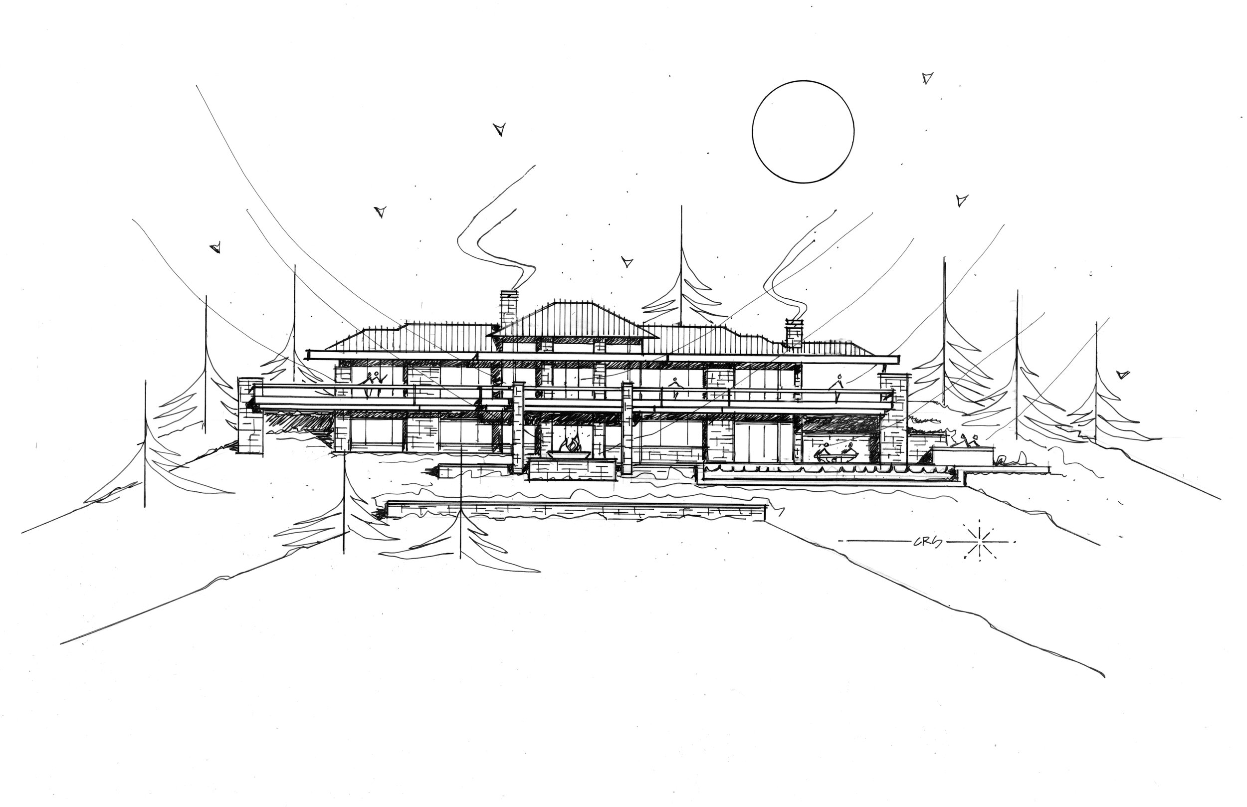
The couple as well as their architect appreciate Wright’s clean, horizontal lines, his strong sense of flow between indoors and outdoors, and the use of warm materials. Nonetheless, the design was not to be an imitation of a Frank Lloyd Wright house. “Bob and Judy’s house both integrates the materials and the geometry of Wright, but it also brings in a more modern aesthetic and materials and technology,” Stinson says. “We integrated the history of Wright’s contribution with a current, modern architecture.”

The two key design objectives were to maximize the views, and for the house not to pretend to be something it was not. The creative collaboration with Stinson took another four years before the clients felt the design was right. “Good design really does take time,” says Bob. “You get something laid out, and then it takes time to react to it.”
"Good design really does take time. You get something laid out, and then it takes time to react to it."
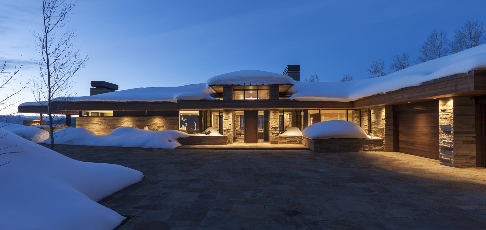
“I try not to think of it as obsessive compulsive,” says Bob, “but everything makes a difference in architecture.” He believes that paying attention to detail creates warmth and “zen-ness.” Good design is not for everyone to notice, but to recede behind form and function. Yet, a space that feels good and evokes an emotional reaction isn’t happenstance. “Attention to detail makes those details go away, and there is a calming feeling in that space,” says Bob.
Stone on stone
Stone is the protagonist among the house’s natural materials, both on the interior and the exterior. Devoted to detail, Bob and Judy wanted every stone on the interior to match the color and lines of its counterpart outside the glass panel to create unity between the outdoors and the indoors.
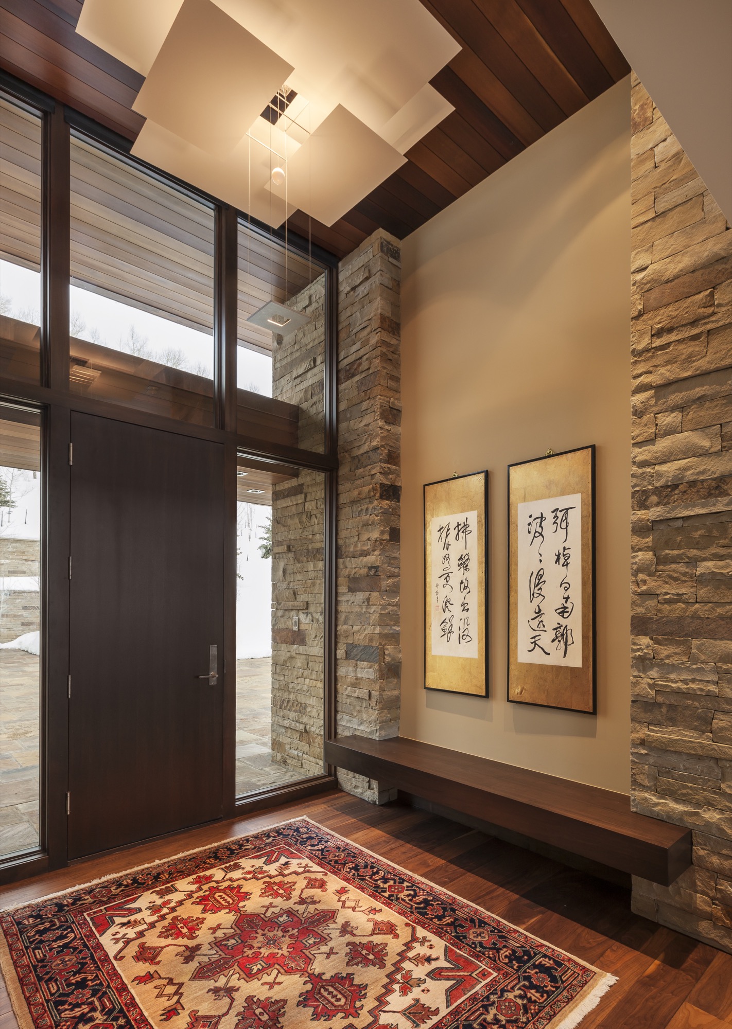
Every day for two years, up to ten stone masons worked onsite, hand-cutting and fitting hundreds of tons of stone brought in from Arkansas. “It really was a labor of love,” says Judy. “Three or four of them had been here the whole time, and they ended up being like family members.”
Adds Stinson: “All of us had such respect for each other, and for the site and materials, and a gratitude for the builders and artisans and their great workmanship.”
Of the hill
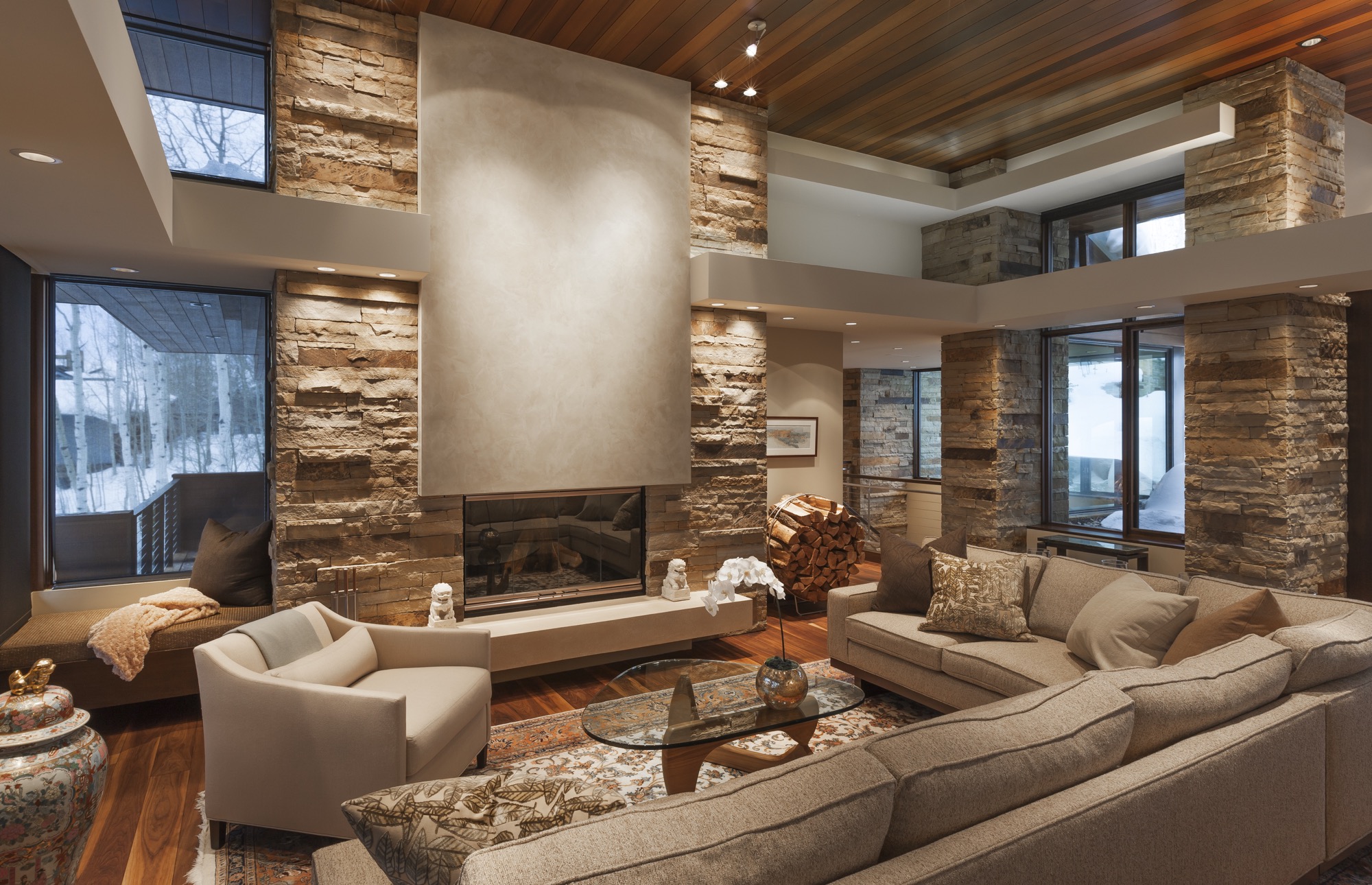
Constructed by Mark Fox of Fox Hunt & Partners, the 7,200 square-foot (669 square-meter) home sits on seven acres adjacent to thirty acres of open space to the south and east and borders the White River National Forest. Frank Lloyd Wright often spoke about building on the edge of the forest to achieve a sense of shelter.
The house is tucked into the steep mountainside to block the cold winds from the north. The south-facing indoor and outdoor living spaces reap warmth from the sun year round. Wrapping around the back of the house, the 125-foot upper deck over- looks the pool patio down below, providing covered and uncovered gathering spots. The resulting microclimates provide a comfortable place to sit outside, here or there, upstairs or downstairs, snow or shine.
Following Frank Lloyd Wright’s credo of not building on the hill but of the hill, the house is sited to descend down from an expansive flagstone auto court. “You literally feel more grounded with your environment,” Bob says. “The house would have felt completely different sitting up there.” Now, the home’s horizontal lines follow the horizontal ridge above.
“No house should ever be on a hill or on anything. It should be of the hill. Belonging to it. Hill and house should live together, each happier for the other.” — Frank Lloyd Wright
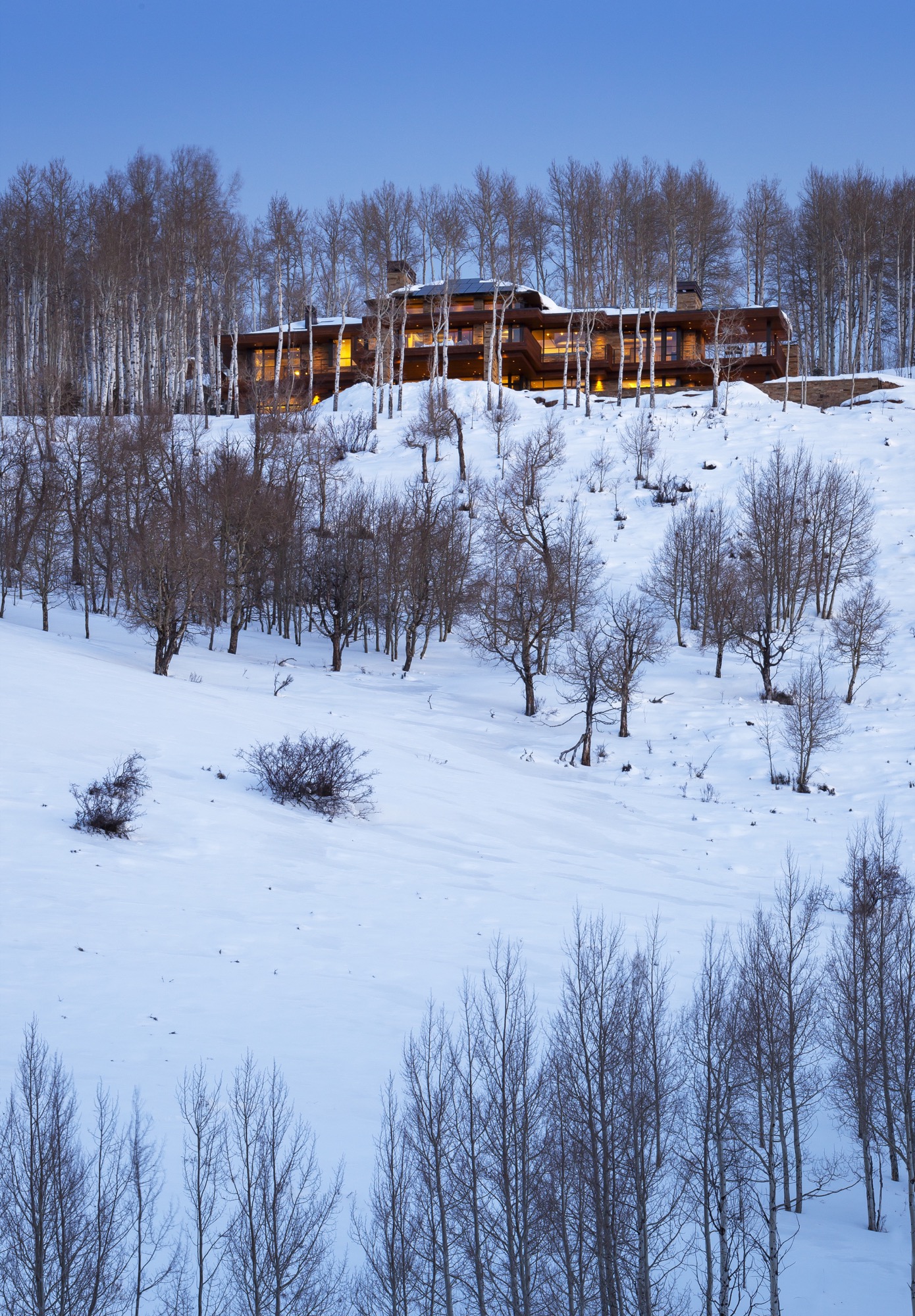
Mature aspen trees surrounding the house provide the Wrightian sense of protection and privacy at the forest’s edge.
The welcoming native Midwesterners share their land with Colorado wildlife. Mornings and evenings, deer trot along their natural path, which traverses the property. A pair of foxes likes to hang out by the pool. Because of the down-sloping landscape, birds of prey hover at eye level. “We look out and there will be this huge red-tailed hawk, just stationary, with his landing gear out,” Bob describes. “It’s amazing to watch them at eye level. Usually you only get to see these birds high up in the sky.”
Building into the side of the mountain made figuring out the approach to the house “very challenging,” according to Stinson. “We studied the grades from both directions, and Bob said, ‘Let’s flip the house around.’ It actually worked out better.” The transition from the driveway to the house, which descends down the mountain, now provides an intentional experience. The architect and his clients even climbed on a ladder before siting the house to see the views from where the main level would be. “We wanted to take advantage of a sequence of experiences, so when you are coming into the site up above, you have a glimpse of what the view is going to be,” Stinson says. “The view disappears when you are in the auto court, which is surrounded with nature—so the uphill side is a grounding experience. Then you walk into the house, and boom, the big views let the spirit soar. You see so far and down the valley that you needed that balance of shelter and release.”
Elevated living from the inside to the outside
Inside, the house offers a different experience and view corridor from nearly every room and angle. The elevated interior design reflects the warm colors and materials of the Rocky Mountains throughout.
The main level’s great room and hearth room truly maximize the expansive ski-slope views the owners hoped for. “I can’t tell you how much time we spent with the surveyor on the siting,” Bob says. “He had mapped out all the peaks and we’d literally stand with the footprint of the house, and we moved it three times before they dug the foundation.” The luxury of time and attention to detail once again paid off. “We’ll get ready to go skiing and put the local news on to see about the conditions, and I sit here and have my coffee and say, ‘Well, I can just look at the actual slopes.”
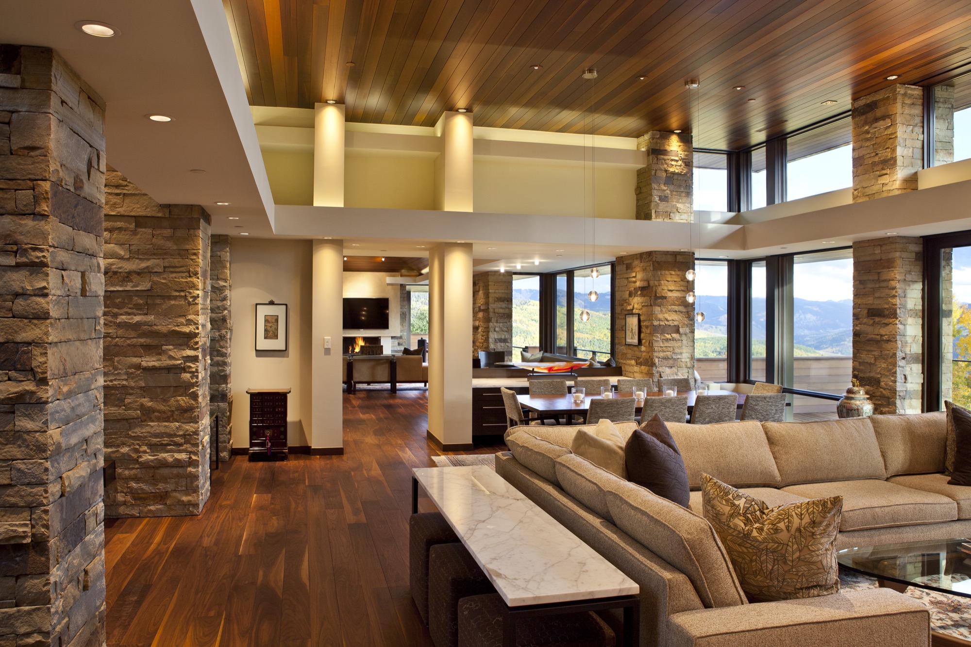
The overhangs of the roof above the main level’s south-facing windows provide architectural drama but are also part of the house’s passive solar design. “In winter, when the sun is low in the sky, the warming sunlight goes all the way to the back wall, whereas in the summer, when the sun is higher, you get a little bit of morning sun, but then it’s blocked,” Bob says. “We didn’t turn on the air conditioning at all last summer.” Roof solar panels already provided one-third of the electricity, and with the recent purchase of 100 more panels on a solar farm sixty-five miles away in Carbondale, Colorado, all the house’s electricity now comes from solar power.
Entertaining dinner guests and hosting out-of-town friends and family are an essential part of Bob and Judy’s new mountain lifestyle, now that they no longer work “crazy hours” in the city. Thus, Stinson designed the main level for the couple to live and entertain dinner guests. A floating buffet visually separates the dining room and breakfast room while maintaining an open flow so guests at both tables feel connected.
Overnight visitors are known to call the lower level “Bob and Judy’s retreat and spa.” Indeed, guests have their private quarters downstairs, with intimate suites named after the respective resort in view and decorated with vintage ski posters mirroring the very scenery outside the window.
The window seats in the downstairs living room, in fact, are Judy’s favorite spot in the house, as she says the ski slopes look even closer from down here. The communal space with an open kitchen opens up to the sweeping pool patio with an outdoor dining area in the center, a hot tub on one side, and another outdoor fire pit off to the other side, where the family loves to roast s’mores at night.
Integrated into the guest wing are also a massage room, an exercise room, and an exquisitely curated wine cellar. The opposite side of the lower level has a bunk room, where Bob and Judy’s nieces and nephews like to hang out when they come on vacation and occasionally bring along friends.
Beneath the garage and a concrete ceiling are Bob’s pride and joy: a movie theater with Whisper Walls and a high-end listening room that boasts a pair of enormous Genesis 1 speakers. Still, the window-less über-impressive “cool area for the loud things” (as Stinson calls the two rooms) are not where Bob spends most of his time. He likes to sit on the lower deck, looking out over the large saline pool and the ski slopes just beyond. This is, after all, his dream come true. △
At the request of Bob and Judy, we are not publishing their last name or identifiable details about their mountain home's location.
The Adventure House
Seattle’s Olson Kundig creates an extraordinary family outpost with views of the North Cascades
Like wagons circling a campfire, a home that consists of sleek, airy pavilions embodies the concept of gathering.
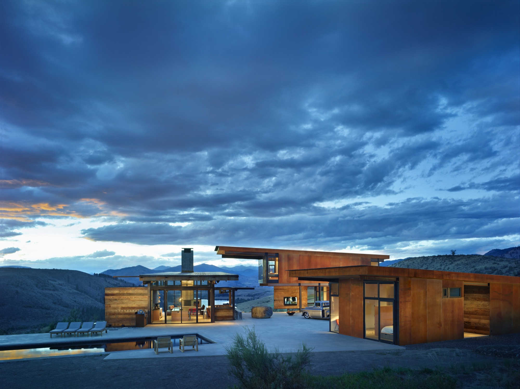
When it comes to second homes, adventure makes the heart grow fonder. At least that’s the premise—and the promise—upon which Tom Kundig, of Seattle-based Olson Kundig, based his design for the staggeringly beautiful Studhorse residence in Washington’s remote Methow Valley. “Second homes are about adventure, and they are the homes that leave the most indelible memories,” Kundig says. “The best way to do that is to make them unconventional.” And that’s when things get interesting. Because when an architect of Kundig’s caliber decides to steer design in an unconventional direction, all manner of daring surprises can occur.
These days, Tom Kundig is a much-heralded, multi-award-winning architect (fifty and counting from the American Institute of Architects alone) engaged in projects spanning the globe. Yet, despite his growing international artistic stature, Kundig’s inspiration remains rooted in the profound experiences of his mountain-climbing youth. “I can tell you from experience that while mountain climbing may seem romantic, it’s also uncomfortable and scary,” he confesses. “You’re cold, hot, and sore. Why would anyone do it, if they thought about it logically? But it’s about engaging life vigorously. So is all of my best work.”
“While mountain climbing may seem romantic, it’s also uncomfortable and scary. You’re cold, hot, and sore. Why would anyone do it, if they thought about it logically? But it’s about engaging life vigorously. So is all of my best work.”
One fearless family
Fortunately, the clients who invited Kundig to design a mountain getaway for their young family on the edge of the North Cascades a few hours north-east of Seattle had a bold spirit and zest for adventure themselves. In fact, sharing adventures was part of their deliberate and mindful approach to building family memories. So it made sense that a rural retreat from their city routines would provide plenty of opportunity for outside-the-box living.
Truly life-enriching adventures are awakened by extraordinary locations, and this home’s setting is spectacular—twenty sagebrush-and-wildflower-strewn acres of rolling terrain unfurling beside Studhorse Ridge and overlooking the towering North Cascades and a lush stretch of the Methow Valley and Pearrygin Lake. It’s a quiet and peaceful perch with 360-degree views of wild Washington beauty.
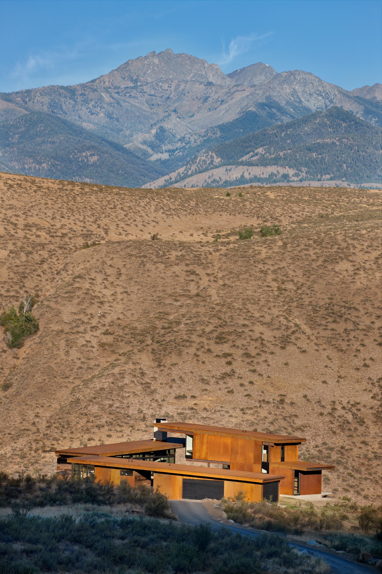
Not surprisingly, the homeowners intended to spend as much time as possible outdoors, and that suited Kundig just fine. “Many of my buildings, even the public ones, involve being exposed to the elements in some way,” he notes. “And sometimes, there is even an element of risk, or daring, which is desired on the client’s part and intentional on my part.” So this home was designed expressly to provide plenty of access to fresh-air freedom. “The clients wanted a central space where the family and guests could come together in the landscape,” Kundig recalls. “We came up with the concept of the house feeling like a vintage motel with a series of buildings around a courtyard. From there, the conversation evolved into the idea of exploring the tradition of circling wagons around a campfire.” This engaging idea became the seed from which the entire home grew.
One big boulder
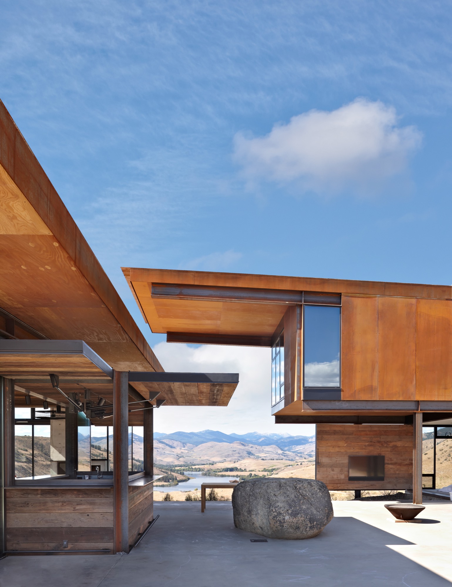
But first they had to deal with a rather large rock. “The site was actually completely empty when we began,” Kundig explains. “Except for the boulder that was positioned in what is now the courtyard area. It is a glacial erratic—a rock that a glacier drops as it recedes—and it was a driving element of the house composition, becoming the center point for the project.” So, in a gesture both timeless and eloquent, the home’s structural elements—and, by extension, the family’s activities—congregate around a literal and figurative touchstone. “I envisioned it as a large piece of furniture,” Kundig admits. Whatever you care to call it, the rock has become a much-loved feature of the home. “We loan the house to friends a lot, and we leave a Polaroid camera next to the guestbook,” says the homeowner. “That book probably has a hundred pictures taped inside by now, and I bet ninety of them show people on the rock. People see it and they say, ‘That’s amazing you put this rock here,’ but we say no, we built the house around the rock!”
An elegant assemblage
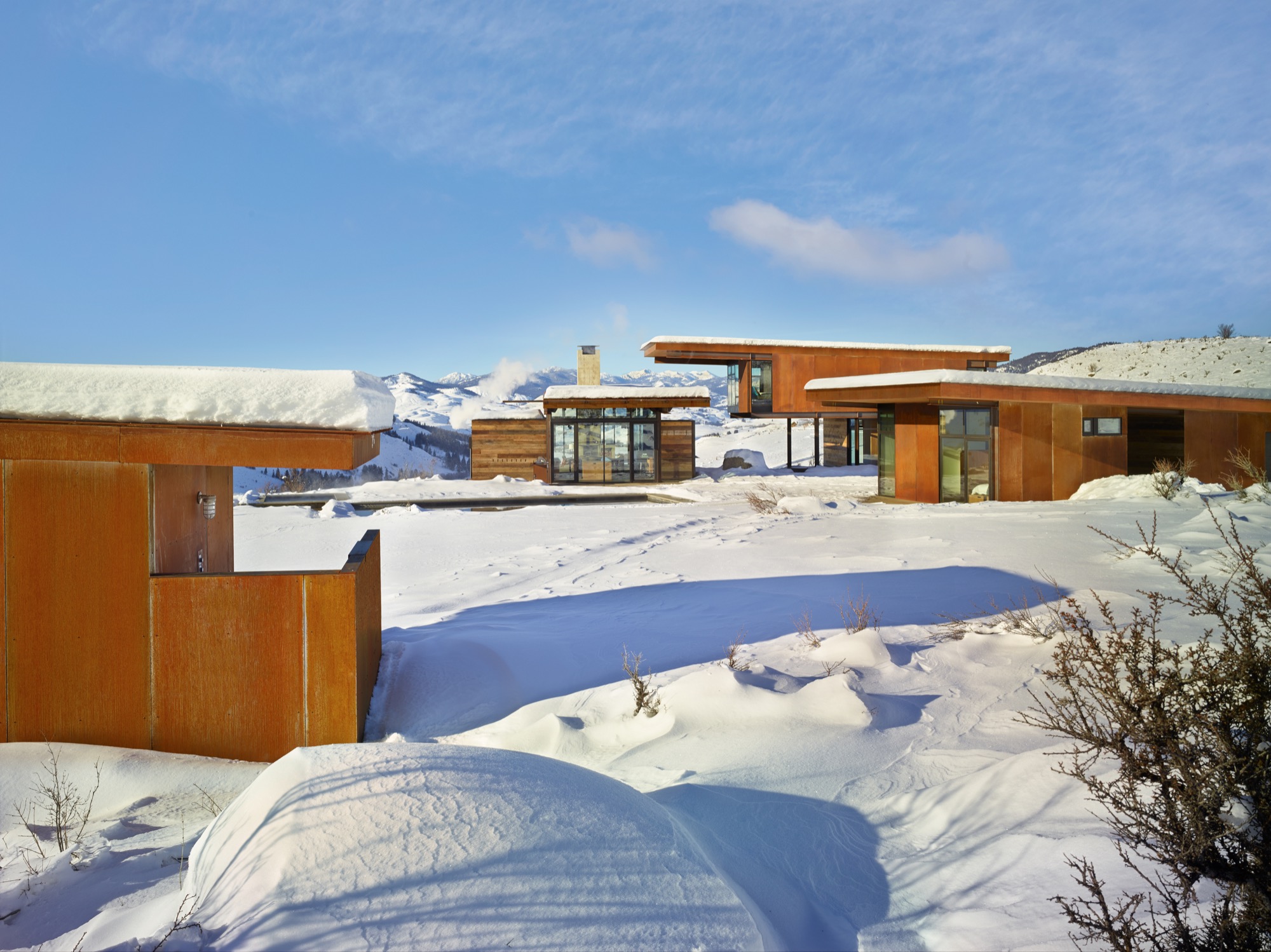
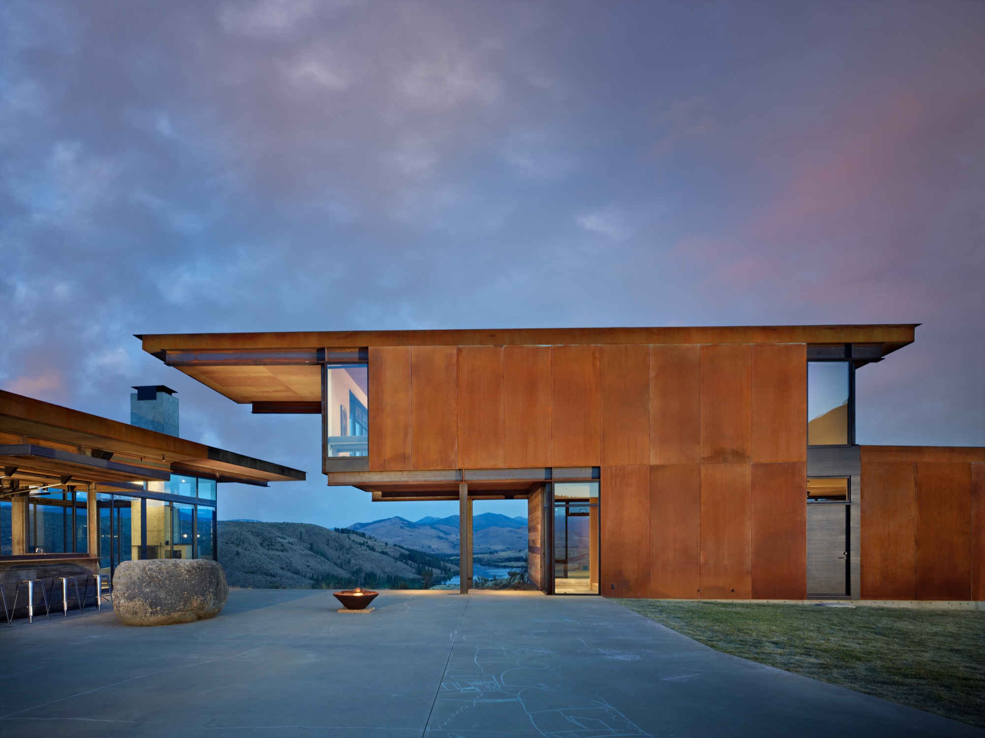
The home comprises a series of buildings clustered around a central courtyard. Viewed collectively from a distance, the constellation of structures has the striking presence of sculpture artfully arranged in a landscape, but each element is also simply practical. Each structure/pavilion has a defined purpose, and taken together they fulfill all of the family’s requirements, so residents and guests circulate among and between the buildings in daily paths dictated by their activities. The main structure is nearly entirely encased in glass. (Kundig calls it “lantern-like.”) Anchored by a massive concrete fireplace on one end, with a living room, dining area, kitchen, pantry, bar and bath—this is the main indoor gathering space. Another structure just beside it contains private family bedrooms upstairs and a guest bedroom and shared den below. Across the courtyard, a third structure offers space for the garage, storage and laundry facilities, and connects through a breezeway to an extra guest suite. The fourth and smallest building, set slightly apart and in a meadow, houses the sauna.
The structures were meticulously positioned to precisely frame gorgeous mountain and valley views, and the negative space (the open space between buildings) they create was considered with the utmost care. When vistas are framed from different angles, we perceive them in new ways, Project Manager Mark Olthoff explains, and this home’s design repeatedly plays with the idea of varying points of view. Olthoff notes that the moment of arrival is a particularly significant experience, so in this case it was important that the view greeting one’s eyes upon entering the complex from the parking area be pristine. Dazzling glimpses of landscape are framed cleanly by the built structures, with no overlapping edges of rooflines to mar the dramatic impact of the first impression.
Kundig explains that the strategic arrangement of the structures, which he refers to as “lean, geometric pavilions of steel, barn wood and glass,” also puts their extended rooflines to work—providing shade and natural cooling in the heat of summer and creating a covered passageway when rain and snow fall. The central courtyard, swimming and play zone become a natural focal point at the heart of the cluster of buildings, practical for a busy family with energetic children, ideal for entertaining a group of guests, and perfectly charming as an impromptu dance floor.
Simple and solid
Yet, while the home is certainly gracious, it is far from grand. “We relied on everyday building materials when possible and used the common materials in uncommon ways, such as exposed plywood for flooring or walls,” Kundig explains. “The materials—mostly steel, glass, concrete and reclaimed wood—were chosen for their resilience against the scorching summer sun and freezing, windy winters that define the region. The materials are expected to weather over time with their surroundings, and to blend in.” If the wood siding shows quirks of character and age, then that’s because it was salvaged from an old barn in Spokane, Washington. And plywood is more practical than precious. “The ceilings are ACX plywood,” Kundig says. “The rest (cabinets, floor, and walls) is AB marine-grade plywood, which we used because the edges would be exposed and marine grade has tighter laminations and holds an edge better.” With a gray-toned stain, the humble boards take on a refined appearance belying their usual orange-tinged reputation. For her part, the homeowner is delighted with the home’s unfussy durability and general livability. “It’s made to stand up to the occupants,” she says admiringly, noting that the family retreat is “worked hard.”
“We relied on everyday building materials when possible and used the common materials in uncommon ways.”
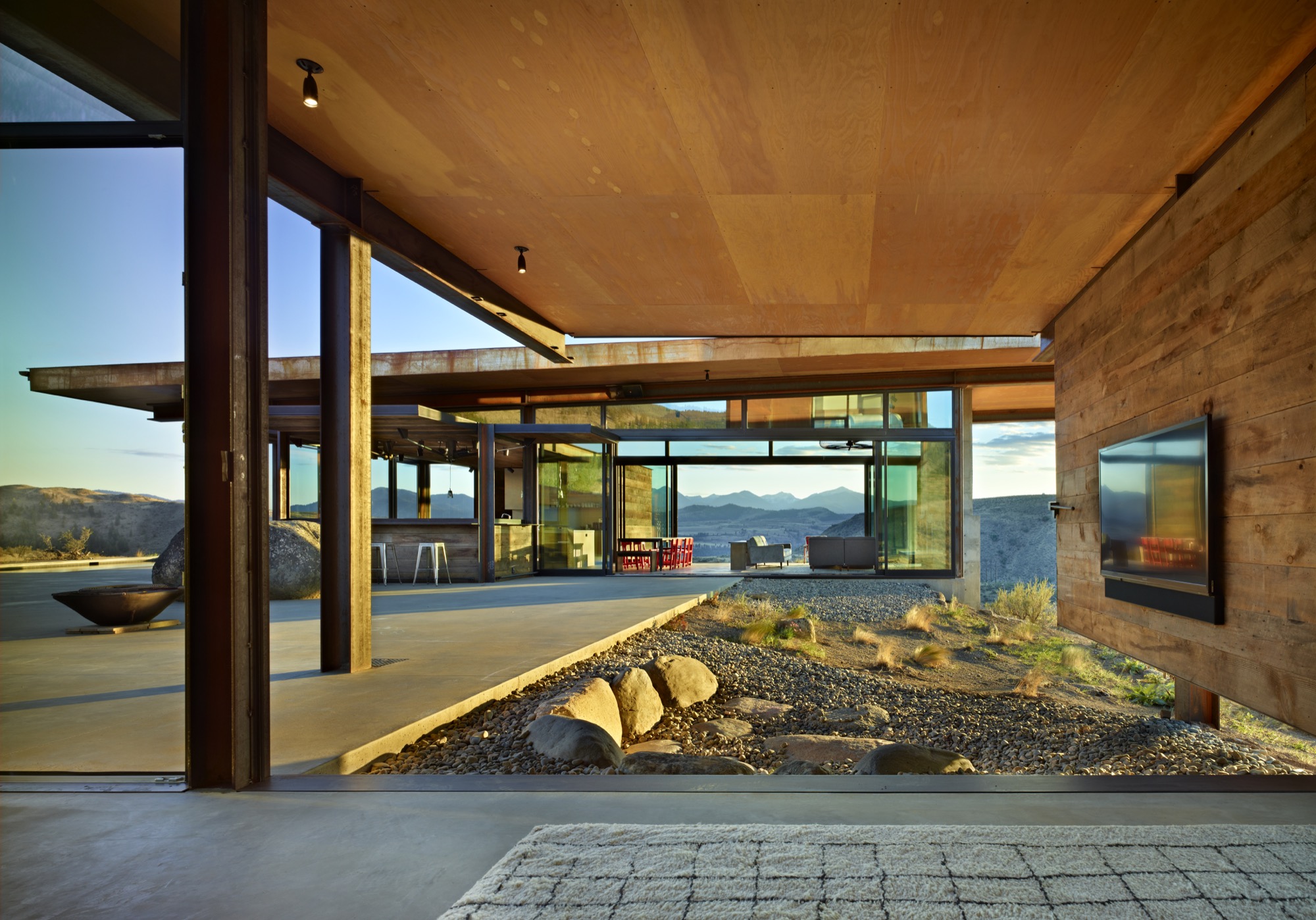
Four-season comfort is assured, thanks to a series of astute climate considerations. A geothermal heating system (with electrical backup) warms the home and its concrete floors. Air conditioning is unnecessary, given the home’s elevated location, which allows breezes to filter through the rooms. And giant, industrial-sized fans in the living room and bedrooms keep the air circulating. Moreover, many of the walls and windows were designed not merely to open but to essentially disappear, blurring interior-exterior boundaries as the home and its landscape intermingle.
Kinetic elements
And here’s where some of the home’s adventurous personality really comes out to play. Kundig has developed a reputation for buildings that incorporate kinetic elements (Olson Kundig even boasts an in-house “gizmologist”), and this house is no exception. Moving parts are built into the fabric of the home, adding a functional—and undeniably fun—versatility to the spaces. The main pavilion’s floor-to-ceiling windows and giant Fleetwood sliding doors enable the expansive room to completely open to the great outdoors. Nearby, the indoor bar converts to an al fresco watering hole when the steel-and-wood back wall flips open on hydraulic pistons. (Kundig likens the experience to Coney Island.) And in a bravura demonstration of crowd-pleasing cleverness, one entire reclaimed-wood-clad den wall is designed to swivel ninety degrees outwards, so that the big-screen television becomes an outdoor movie screen, and the courtyard—and a perfectly placed semi-circle of landscaped rock seating—becomes an open-air cinema.
[video width="640" height="360" mp4="http://www.alpinemodern.com/editorial/wp-content/uploads/2016/08/400983501.mp4" loop="true" autoplay="true"][/video]
Scandinavian style meets the mountain West
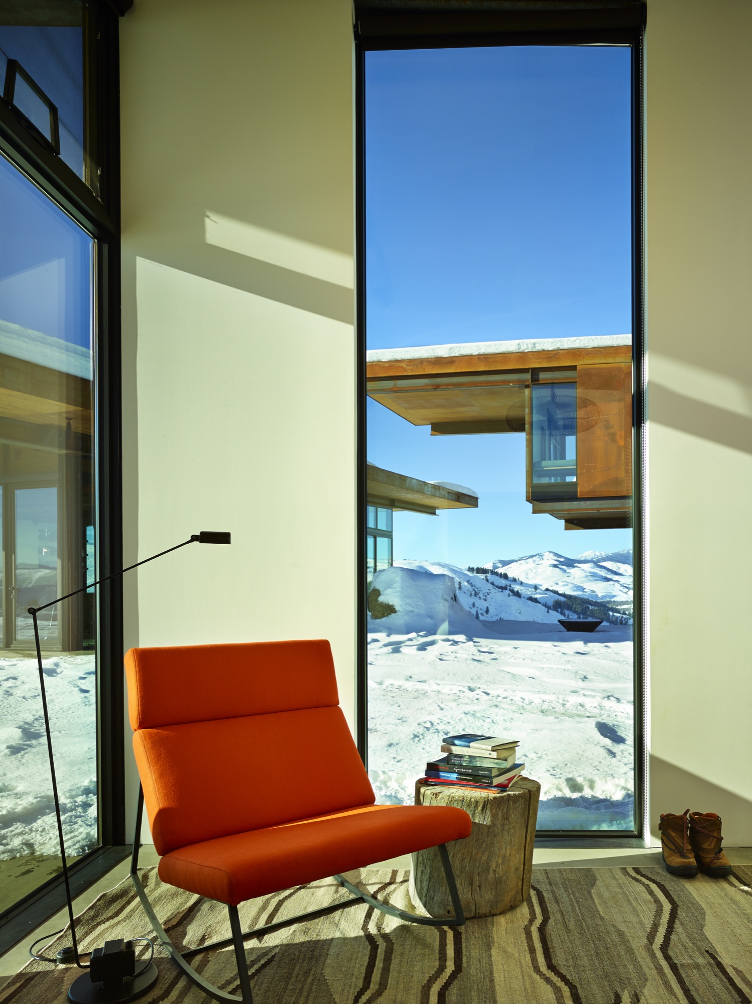
Debbie Kennedy, an interior designer with Olson Kundig, helped guide the creation and selection of furnishings and finishes for the home. “We wanted to stick to a very simple unpretentious palette of materials—materials that feel like they belong in the landscape and the interior,” she says. “Limiting the number of materials helps the spaces flow into one another.” Concrete, steel and reclaimed wood are major players both indoors and outdoors. “The clients are very drawn to Scandinavian design—both contemporary and vintage,” Kennedy explains. “In this instance, the goal was also to incorporate modern refined Western mountain references.” Kundig notes, “The focus was on beautiful yet practical pieces that would age as well as the buildings and, similarly, relate to the region and mountain landscape.”
The homeowners preferred a casual look and a welcoming feel, with occasional bright splashes. “The dining chairs presented a great opportunity to introduce a pop of color,” Kennedy notes. “And the client fell in love with a vintage-blanket chair by Maresa Patterson, so we asked her to work with us on a pair of chairs.” Kundig adds, “A few key pieces—such as the dining table, coffee table, fireplace screen, and built-in beds—were custom-designed by the team.” Kennedy singles out one example: “The folded steel console is from the Tom Kundig Collection and feels like it was ‘meant’ for the house.”
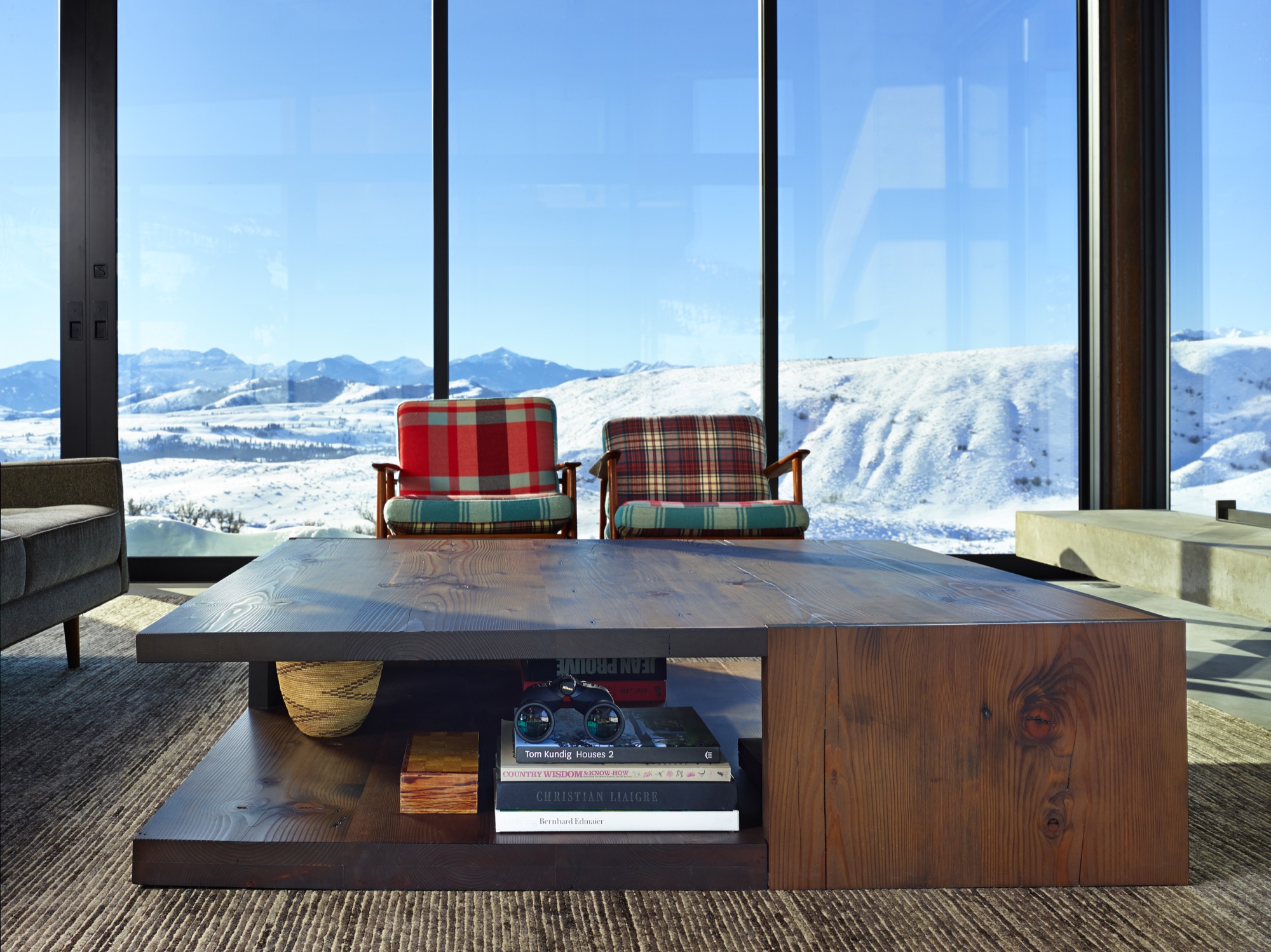
Defying easy categorization, the Studhorse residence is emphatically individual and entirely unforgettable. Perched on a prospect overlooking a breathtaking panorama, the clustered elements of the home manage to both embrace and enhance its incredible surroundings. As a hummingbird flits straight through the open walls of the living room and into the kitchen on a sunny spring afternoon, the allure of Tom Kundig’s vision is clear and complete. As he explains, “Architecture allowed me to have a foot in both places—the technical realm and the poetic realm—and in that magical intersection between the two.” △
“Architecture allowed me to have a foot in both places—the technical realm and the poetic realm—and in that magical intersection between the two.”
