Inspirations
Explore the elevated life in the mountains. This content debuted in 2015 with Alpine Modern’s printed quarterly magazine project.
Retreat in the Aspen Grove
Cottage Black by Colorado-based architecture and interior design practice Studio B counterbalances the grand main house in Aspen’s countryside
Studio B, a Colorado based architecture and interior design practice with offices in Boulder and Aspen, first designed the grandiose main residence in the backcountry a twenty-minute drive from Aspen, Colorado.

“We really wanted to explore a heightened experience of those aspen trees.”
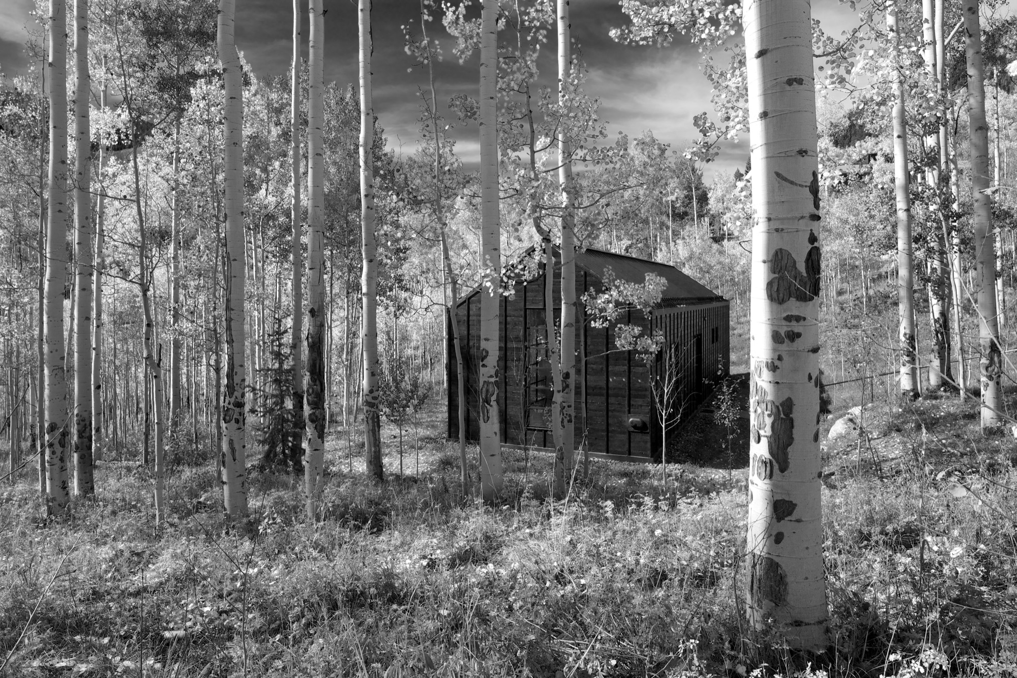
“The main house sits up on a ridge and is all about connecting to those long views, the big mountain views,” says Piché, describing what he calls a “more extroverted” approach, compared with the cabin down in the grove. “When we started working on the little guest retreat, we wanted to experience the trees in a completely different way. These views are much more embedded in the grove.” To better understand what design and placement would make the most out of Cottage Black’s distinct surroundings, Studio B took time to study how the aspen trees’ foliage changes with the seasons. “One thing we really liked about it was that the trunk feels really consistent throughout.”
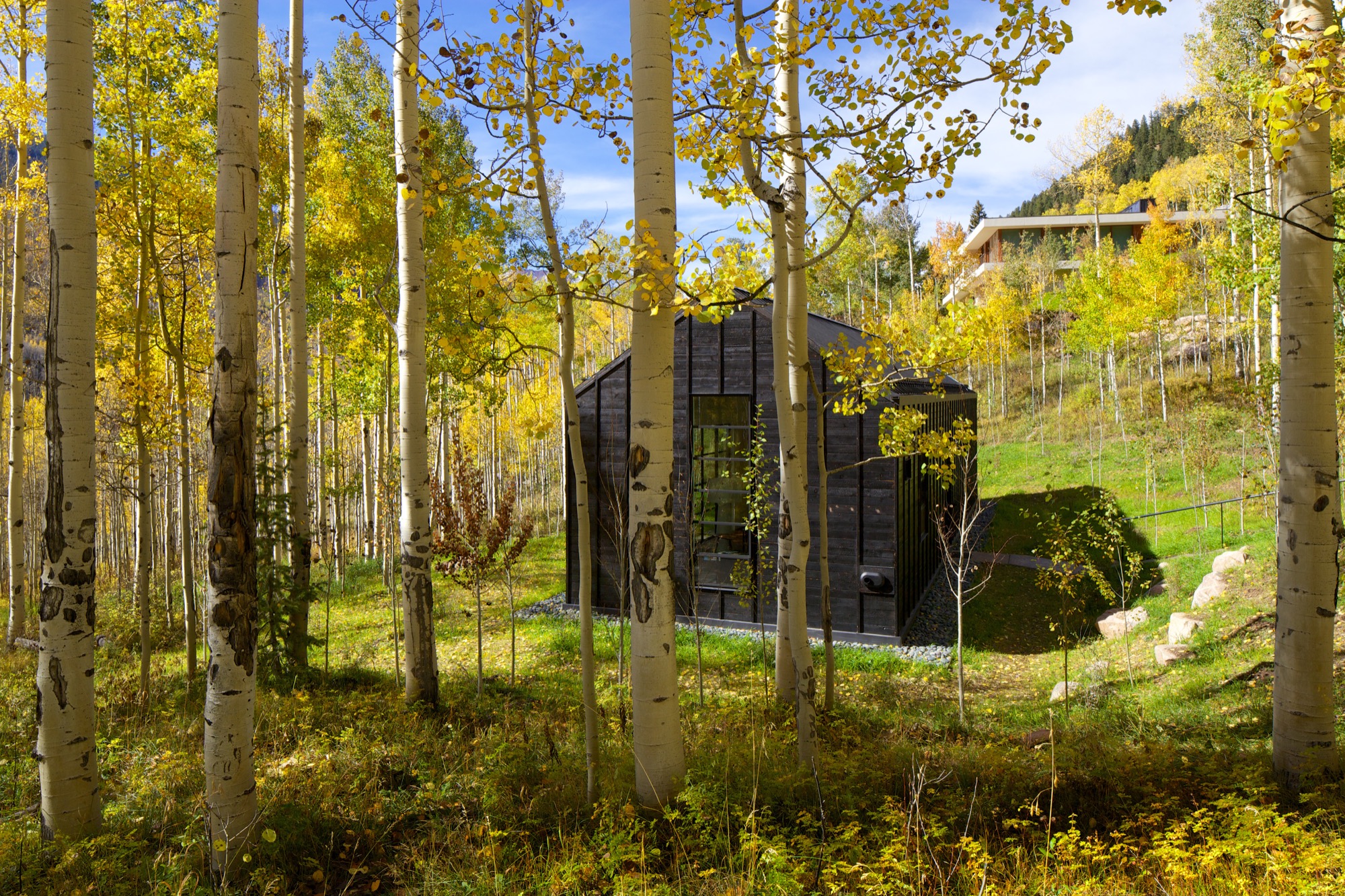
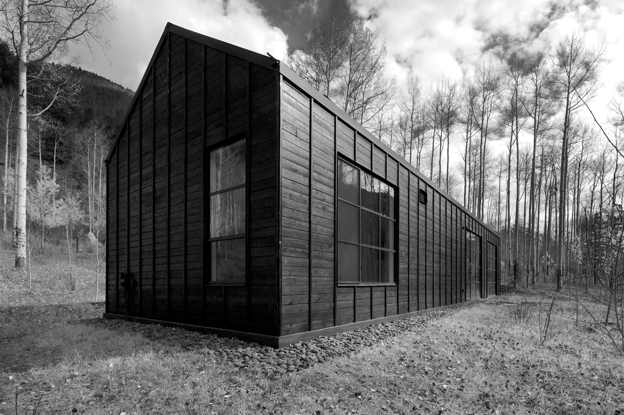
The monochromatic aspen tree bark ultimately inspired the intimate retreat’s all-black exterior and all-white interior.
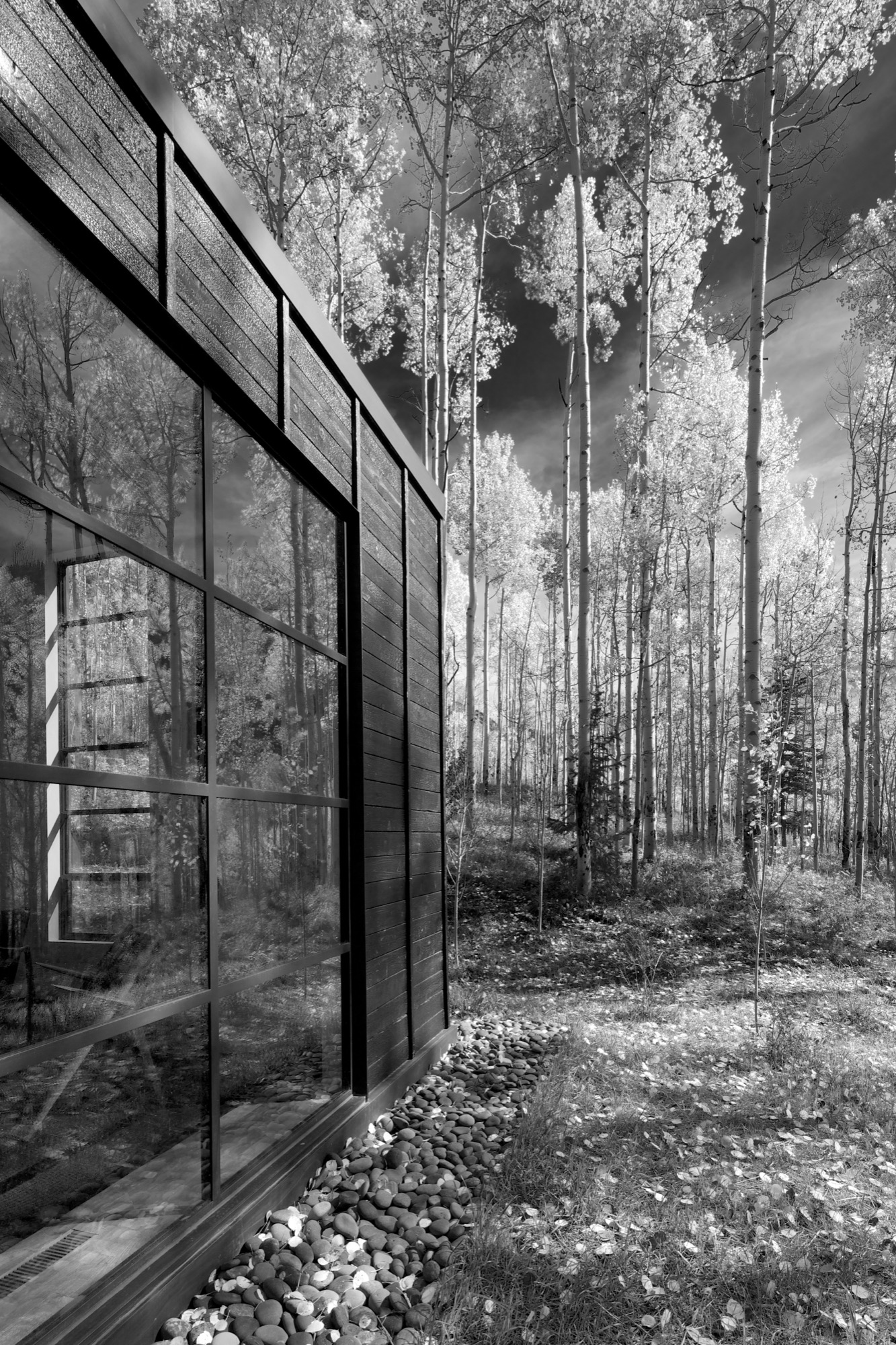
“The standing seams on the roof and the vertical joints of the interior wood ceiling were chosen to relate to the immense verticality established by the trees,” the placid architecture master notes. Approaching the house, simple stairs weave their way through the trees to the front door.
The black exterior
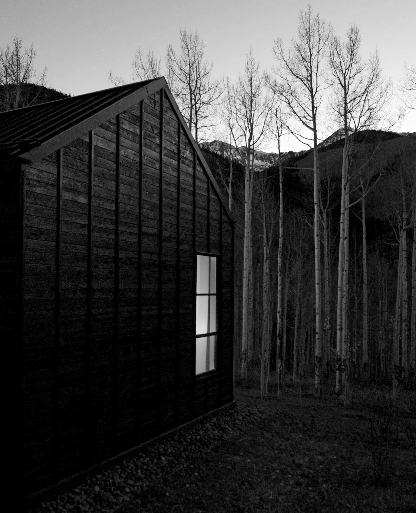
Heavily charred cedar wood gives the cottage’s exterior a rougher, bark-like texture. The orientation of the boards and the battens picks up on the verticality of the trees and the shadows. Looking at “that box” with its horizontal boards at one point during construction, Piché says they had an epiphany: “You wouldn’t think that black has the shadows and the depth that it does, but it seems it almost has more. When the sun hits, the black wood goes from gray to dark and it really feels like it transforms quite a bit.”
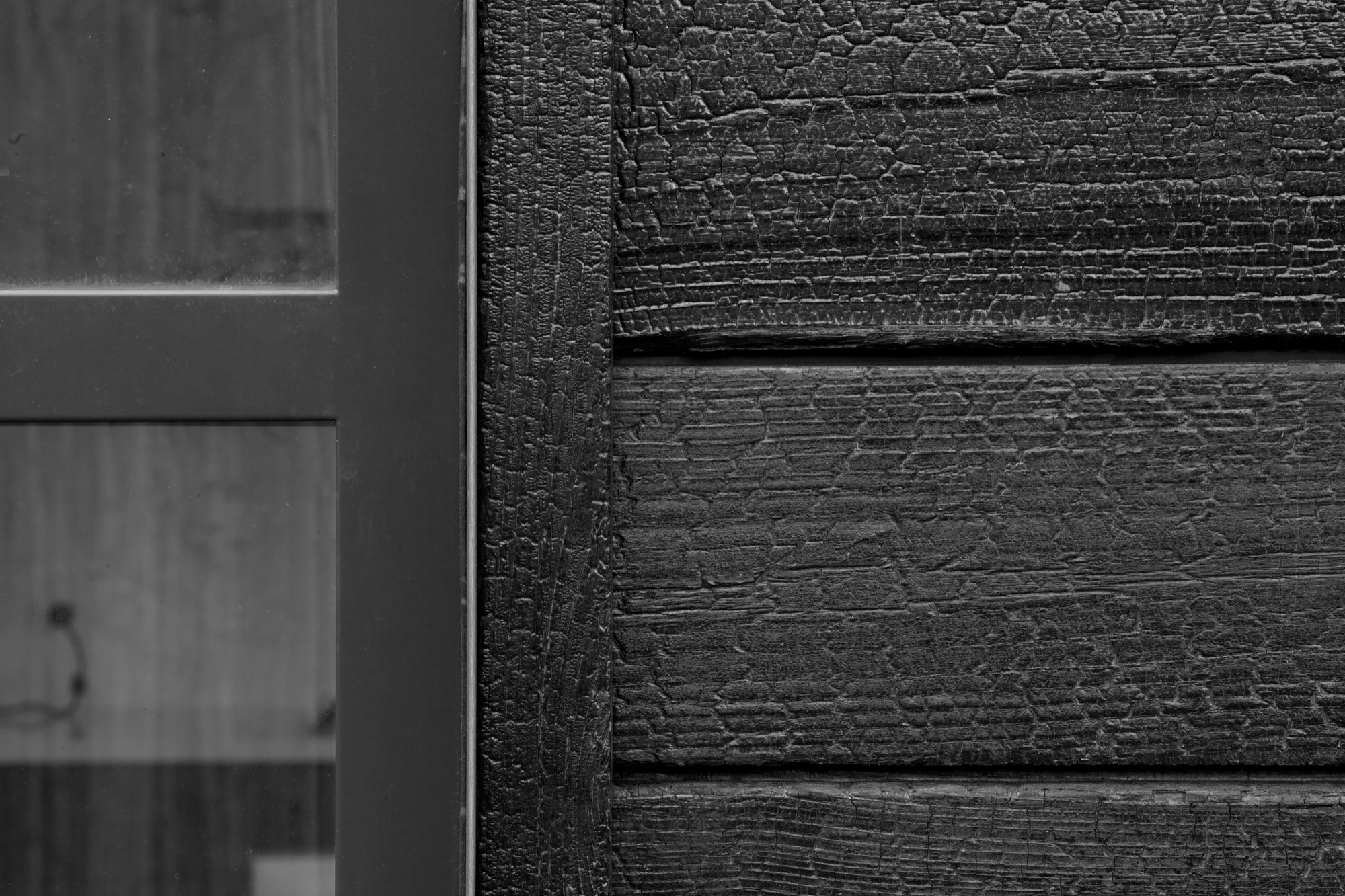
“You wouldn’t think that black has the shadows and the depth that it does.”
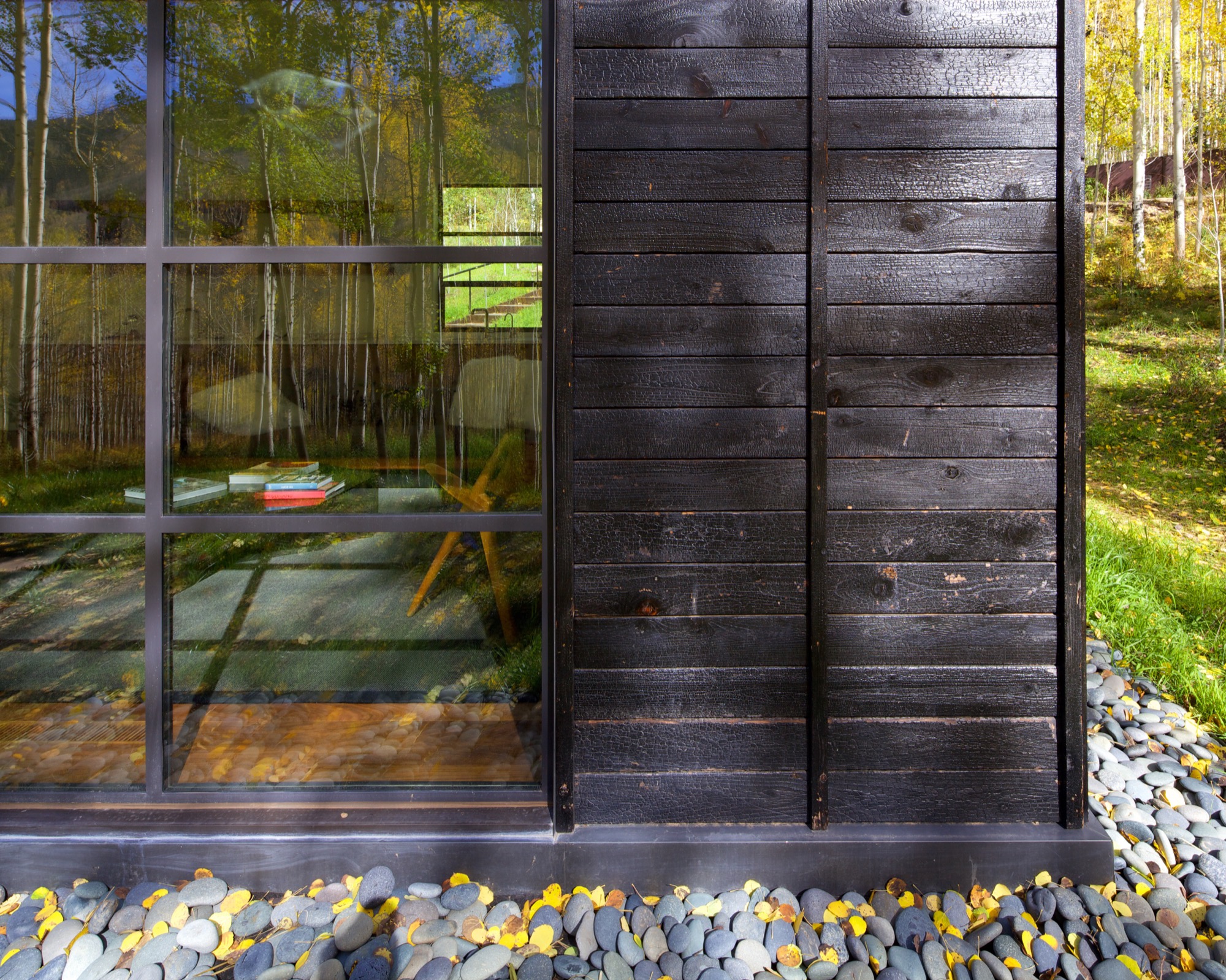
What’s more, the charred exterior gives Cottage Black the air of having been there for a long time. “And in spring and summer, when all the trees are fully leaved, people don’t even see the cottage. It disappears, and it reappears in the fall, too,” says the distinctly analytical architect, pointing out that no driveway leads to the retreat and guests cannot park right next to it. “The cottage is packed into the trees, and it’s kind of a journey down there.”
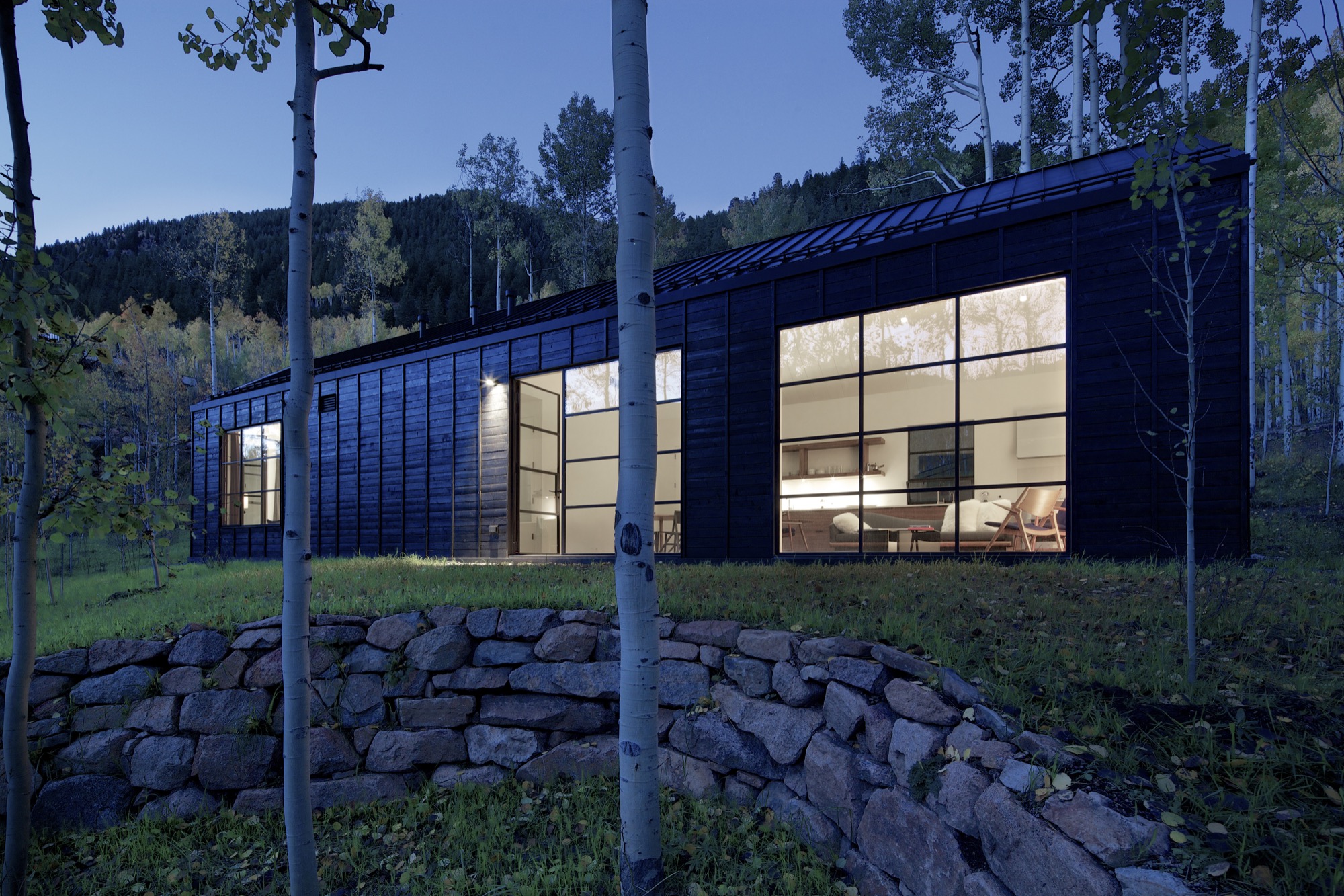
The Studio B team intently placed the steel windows to achieve a minimal sight line that only highlights a few select views. “We added a tall window that emphasizes some great trees on that side, a couple of little corner windows that just frame the tree trunks, and then one big window in the living room that is more about walking outside onto the patio and connecting to all the trees there,” the architect says. “But you are not getting those big mountain views. Just these little glimpses of the outside, which creates that more intimate feel when you walk up to the window. It is more about enclosure and intimacy than the broader expansive things. It is a little bit more inward than outward.”
"It is more about enclosure and intimacy than the broader expansive things. It is a little bit more inward than outward.”
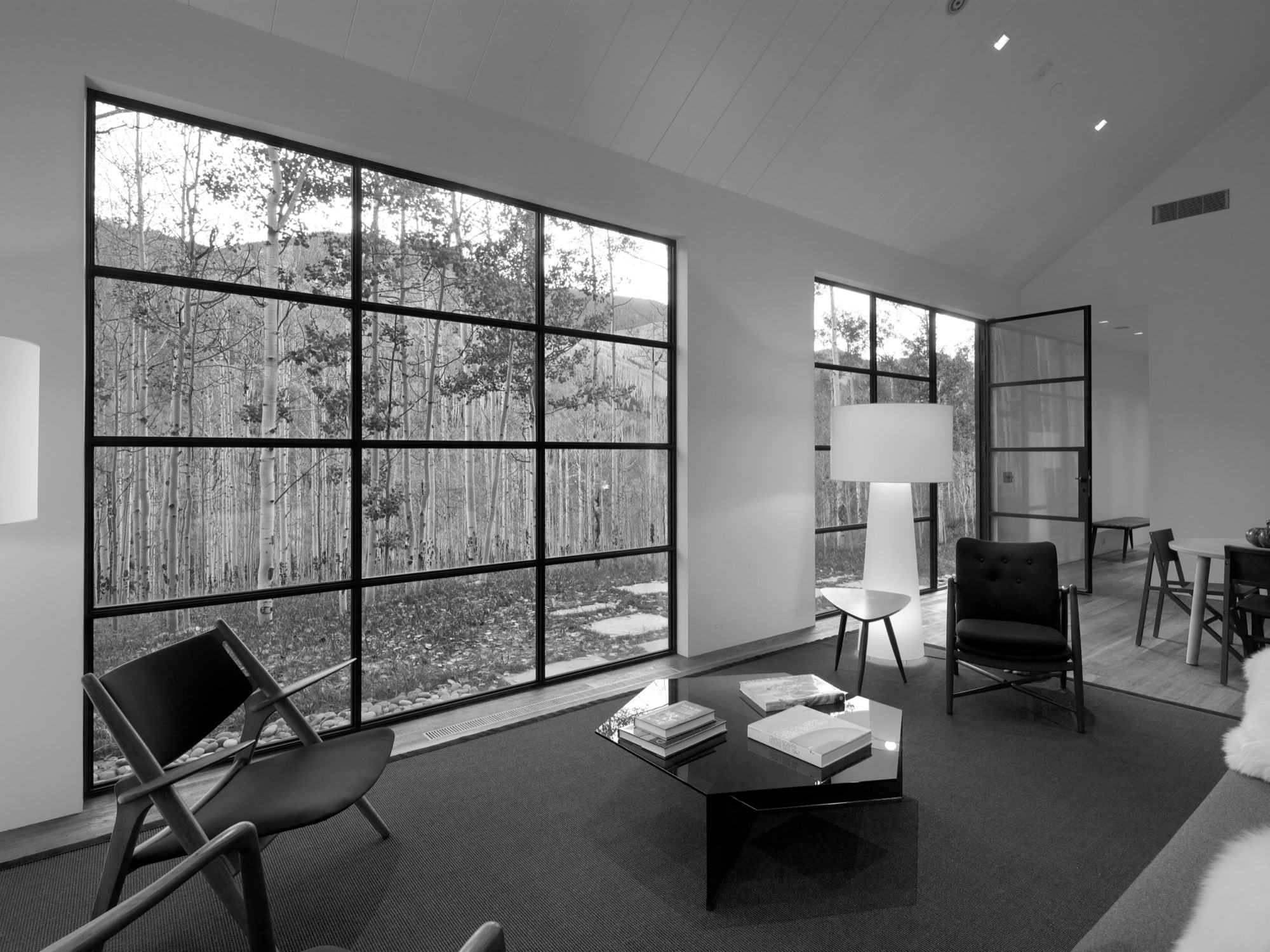
The white interior
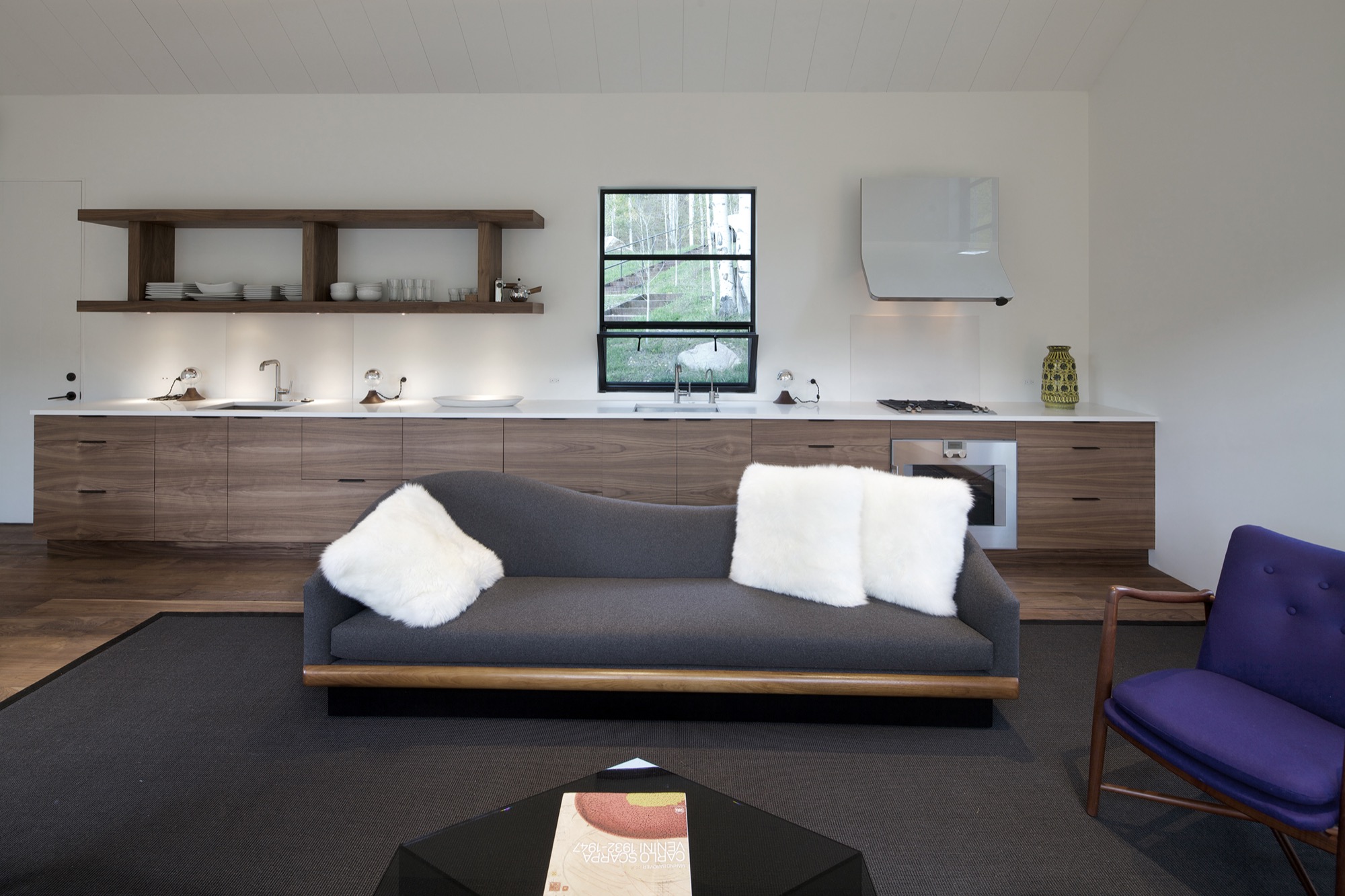
Walnut floors lend warmth to the primarily white, minimalistic inside. “The monochromatic interior, again, is a counterpoint to the main house, which has a lot more materiality coming through and more complicated detailing,” Piché says. Cottage Black, by contrast, is very simple, with much more subtle detailing: “There is the wood ceiling, for example, where each of the joints lines up with the joint on the exterior in a subtle inversion of it.”
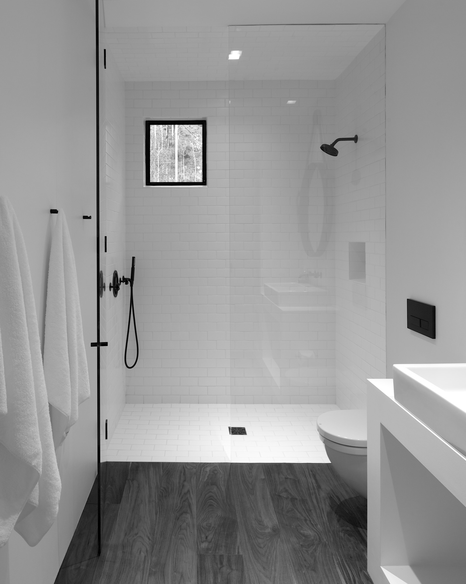
A bathroom at the center separates the sleeping area from the living space, which also includes a little kitchen to allow guests some autonomy, if they desire. “There isn’t any kind of door,” Piché says about the intimate studio layout.
A counterpoint for solitude
Should the guest retreat complement or rather juxtapose the main house? After much collaborative consideration, the design team and the client decided Cottage Black was to be a distinct counterpoint to the luxurious primary residence up above on the ridge. One consequential feature of this objective ended up being the orientation of the structure. “The one window that you see when you stand up in the living room lights up, and that’s it,” Piché says. “All the other things... we shifted it quite a bit to make sure you couldn’t see it from the main house—that there is that black object.”
Furthermore, the team had added transitional materials throughout the main house to add texture and interest in various places. Cottage Black’s architecture and interior design, on the other hand, are very much characterized by deleting details, according to the architect. “This house is a lot about editing,” he says in reference to the design process. “In the beginning, we had a lot more adventurous solutions, and we distilled it and made it into a better and more powerful piece of architecture. It doesn’t need to be a lot.” △
