
Inspirations
Explore the elevated life in the mountains. This content debuted in 2015 with Alpine Modern’s printed quarterly magazine project.
The Line between Everyday and Heirloom
A Visit to the Lake Tahoe Home of the Owners of Heath Ceramics
“In the winter, everything is dead, and in the spring, everything comes to life,” says Catherine Bailey as she looks out the window of the Tahoe home she shares with her husband, Robin Petravic, and son, Jasper.

Bailey and Petravic are the driving forces behind a reinvigorated Heath Ceramics, the Sausalito, California-based company that was started in midcentury by Edith Heath and given a dose of new energy by the couple in 2004.
When taking the tour of the Heath facility, the guide explains that, at its essence, the company aims “to straddle that line between the everyday and heirloom,” words that perfectly describe the experience of Bailey and Petravic’s Tahoe home in California’s Sierra Nevada.
Finding the house (or being found by the house)
The couple are avid winter sports enthusiasts—Bailey had consulted for many years as a product designer for a large snowboard manufacturer—and had been looking for a weekend escape for some time when their real estate agent called about a listing in their desired area of Alpine Village. They were so excited about its location and the fact that they could walk to the slopes of Alpine Meadows Ski Resort that they made an offer on the house sight unseen.
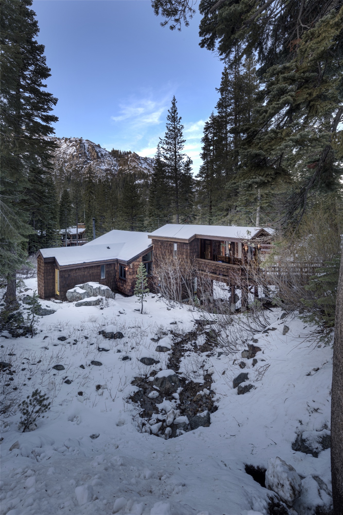
When they did finally see the house, they were immediately taken by its placement on the lot, how it cascaded down the hill to the creek below and was framed by the dramatic mountain peaks behind it.
At the same time, they were underwhelmed by some unfortunate interior decorating choices. “Everything was green—green carpeting, green cabinets, and green linoleum,” a design aesthetic Bailey laughs about. “I guess the former owners thought, ‘We’re in the mountains, so we should make things the colors of trees.’ ”
The couple was able to look beyond the green, however, and fell in love with the bones of the house, especially its beamed wooden ceilings and reclaimed wood doors.
Making it modern
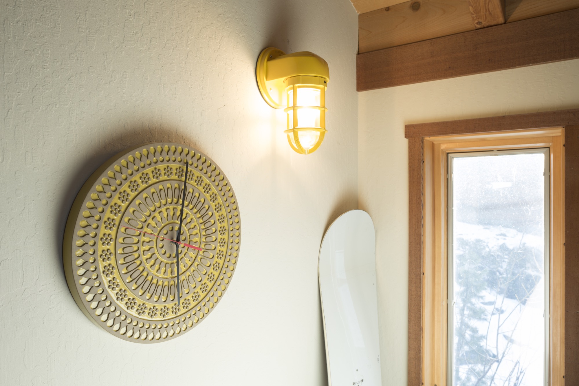
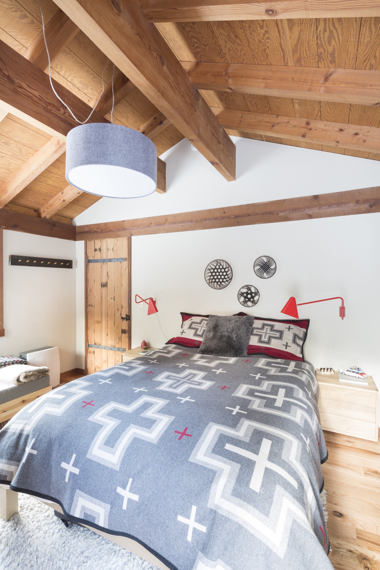
After purchasing the home in 2012, they embarked on what Bailey calls “a low-hanging-fruit” remodel. Her method was to “always look back to 1974, when the house was built, and not mask that, but make it feel nice for today. The brown of the wood beams and doors with bits of orange, yellow, and red resonate with the mood of that period,” she says. “The interior feels fresh and bright without having to paint everything white.”

It’s easy to draw a comparison between the house remodel and what Bailey has done with Heath as creative director. “We didn’t find it very interesting to just have a nostalgic company where you are just trying to recreate the past,” she says.
Instead, the past becomes inspiration for moving forward. “Our philosophy has been to look back to where you’ve been and what you’ve done and don’t ever run away from it, but to learn from it.”
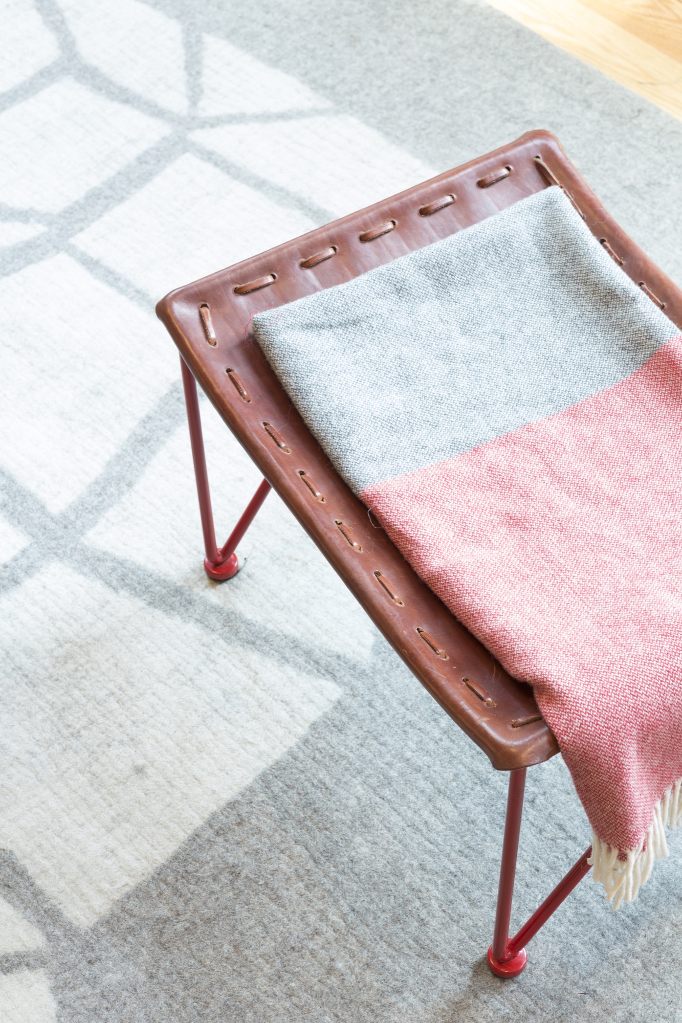
“Our philosophy has been to look back to where you’ve been and what you’ve done and don’t ever run away from it, but to learn from it.”
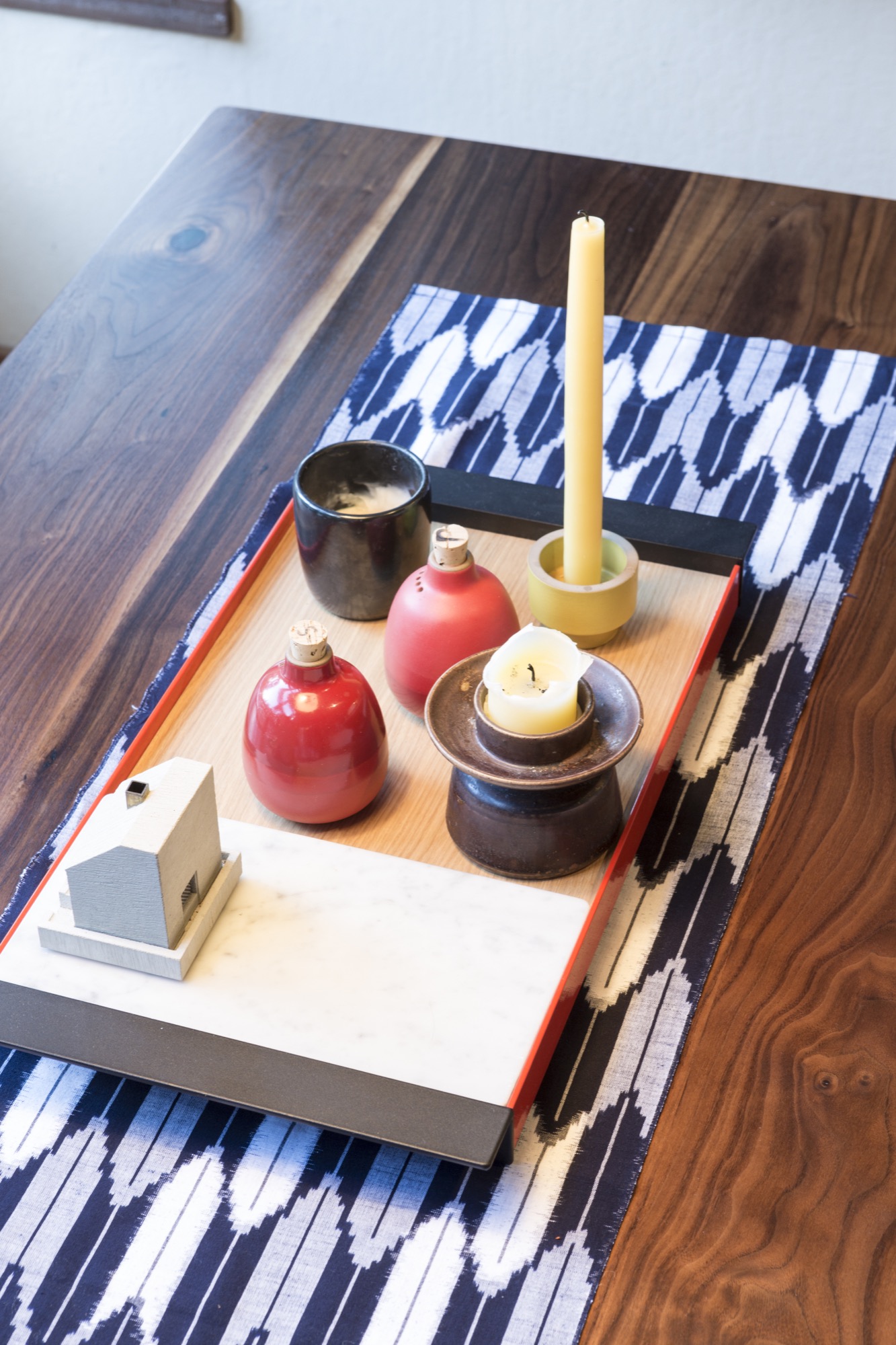
Heath ceramics
Heath was founded in 1948 by Edith and Brian Heath and is famous for its handcrafted stoneware and distinctive glazes. Under Bailey and Petravic, it continues to produce and design midcentury tableware and tile in its California factories, but the couple have expanded the company with a business model driven by “design-led manufacturing principles, and in the belief that responsible business practices lead to long-term viability.” Since purchasing the company, they have added new colors, opened a new tile manufacturing factory and showroom in San Francisco, and started up a Los Angeles studio and showroom. Most importantly, they have expanded the brand through successful collaboration with designers and ceramic artists from around the world.
“We are always looking for the next creative opportunity that fits with what we love to do: the materials we love to explore and the people we want to work with,” Bailey explains. Those successful collaborations run the gamut from the prolific Fresno-based ceramic artist Stan Bitters and the well-known type designers at House Industries to the Mexican artist and designer Carla Fernández.
Tahoe sleepover
This spirit of openness is also reflected in the Tahoe house.
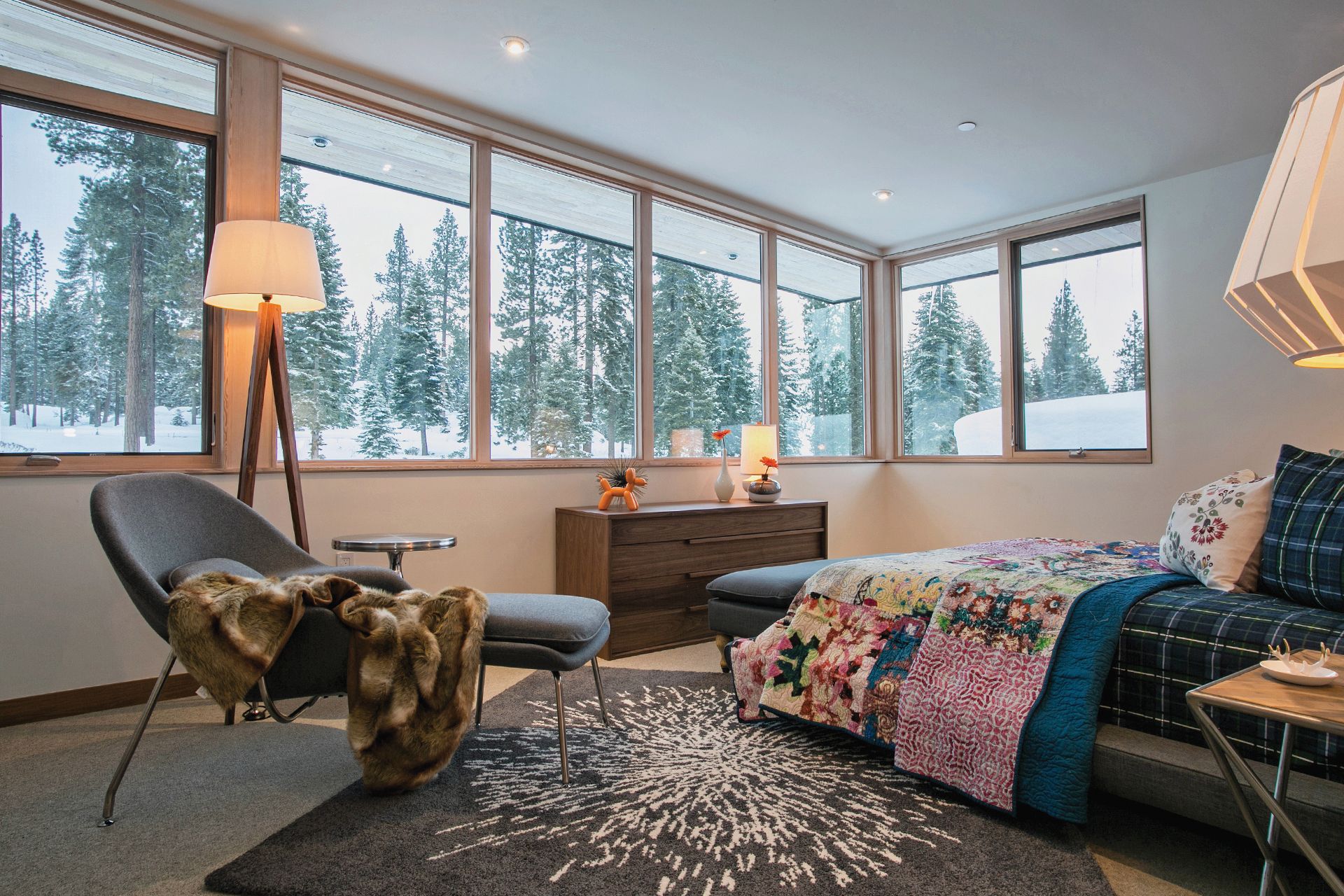
At 1,450 square feet (135 square meters), it’s a relatively small house with one big living area. But the couple was committed to finding a way to sleep a lot of people and their kids. Every bedroom has a loft with an additional place to sleep, so you can fit a family of three in each room. “We also turned the laundry room into a bedroom,” says Bailey. At times, there are three families staying at the house all at once. “That’s why we come here,” she says, “to spend time with people we want to spend time with. You don’t normally get to have your friends over to sleep at your house for the weekend.”

The couple also uses the house as a refuge and escape from the demands of running a hectic Bay Area business. The breathtaking living-room views of the Squaw Valley peaks provide the seclusion and isolation that they love. “You’re in a wonderful gem in the big outdoors—it’s kind of big out there—and there’s not a lot coming at you. That’s what makes it inspiring and special,” Bailey says.
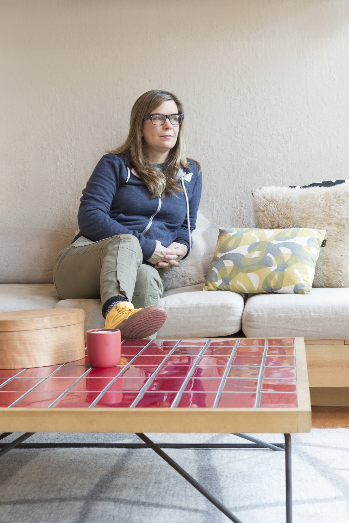
Her seat of inspiration in the house is the couch. The expansive view opens up from there. “In the afternoon the light comes in across the fireplace, and it really gives you this great sense of time of day because there is no direct light until late afternoon.” At that moment “you think, ‘Is my day going like it should have?’ It’s your last chance to get out and take a walk and make the most of your day. It’s like an alarm clock, and it’s the sun, and I’m reminded that I want to get outside.”
“That’s why we come here, to spend time with people we want to spend time with. You don’t normally get to have your friends over to sleep at your house for the weekend.”
A place of inspiration
This sense of place—Tahoe, the outdoors, the sun, the mountains, the sky, the colors—serves as creative inspiration for Bailey. “When you are in that environment, there are all these base colors that ground you—make you feel the whole place, and then there are little points of vibrancy.” It’s an environment that is not bright colors all the time. “It’s subtle,” she says, “and the granite of the mountains is part of that, at least where we are. Granite grounds it colorwise. We are not on the lake, which is that crazy vibrant blue color.”
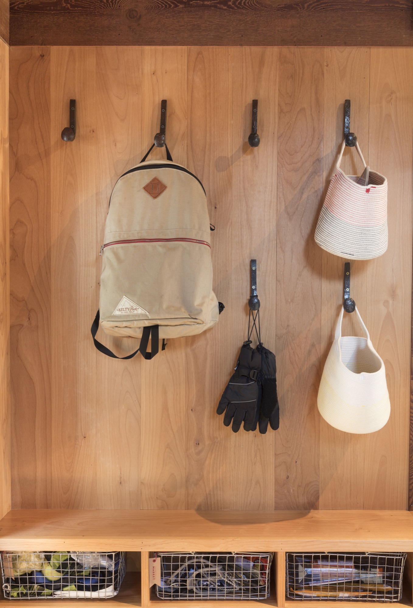
This play between vibrancy and calm, between old and new, between everyday and heirloom, is of particular interest to Bailey. “When I’m thinking of myself as a designer,” she says, “I think it’s important to create balance, and that can apply to everything. You’re trying to create a balance between a lot of different things—to make sure it’s making the right statement, the balance between doing something interesting and standing the test of time. Balancing utility with beauty—all those things you are trying to get right in the middle of, and if you do, then it does stand the test of time and meet its needs.” At the same time, “It is beautiful. To me, good design is taking all those things and striking the right balance.” △
iRetreat
The architects behind Apple stores worldwide design Lake Tahoe weekend homes for Silicon Valley's young tech elite
By creating a community of alpine-modern Lake Tahoe weekend homes, the architecture firm that designs Apple stores worldwide feeds the hunger of Silicon Valley’s young tech elite for authenticity and a real place. Gregory Mottola knows Silicon Valley's young tech elite. The principal leads Bohlin Cywinski Jackson’s San Francisco office, which designs the places where they shop (Apple), work (Square, Pixar), live (modern custom homes in the Bay Area), and play (Newport Beach Civic Center and Park).

The newly rich thirty-somethings working for technology, Internet, and media companies in California’s Bay Area are beginning to seek opportunities to invest their money. And they yearn for authenticity, for a real place, the mountains, the forest. “These folks work in very intense environments, focusing on something that is often very abstract—it’s technology, it’s writing code, it’s engineering things in a virtual space,” Mottola says. “Many of them have a desire to go back and to be connected to real things and to nature.”
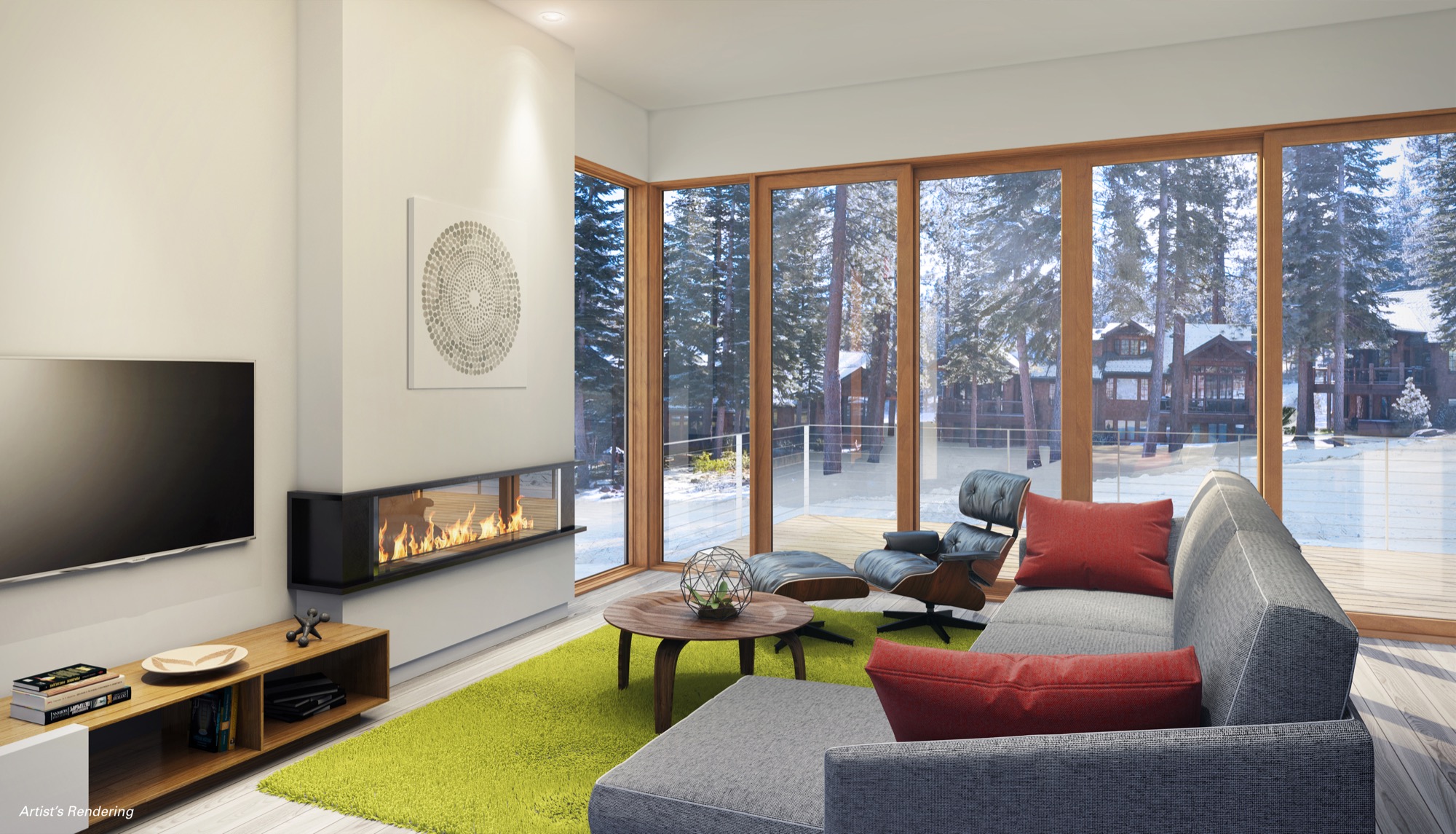
Lake Tahoe, California—watersports haven in the summer, snowsports paradise in the winter—is a desirable weekend and holiday destination for the Silicon Valley set. “Some of them are flying their own jets from San Jose to Truckee and are there in a matter of an hour and a half, and the drive isn’t so bad either,” Mottola says. The problem: These urban hipsters appreciate an aesthetic much more modern than the traditional mountain architecture that dominates the Lake Tahoe resorts—Mottola calls that referential chalet and log cabin look “relentless sticks and stones architecture . . . very heavy, overly articulated.”
Weekend-escapists with money
Mountainside Partners, a Tahoe-area developer specializing in resort construction, picked up on the new market need and called Mottola’s team in San Francisco. Why BCJ? That the architecture firm typically doesn’t work with developers didn’t matter. With a design portfolio that boasts Square, Inc. headquarters, Pixar Animation Studios, and Apple retail outlets worldwide, including the (literally) groundbreaking Fifth Avenue store in Manhattan, Mottola and his colleagues understood the target market and the developer's vision for a planned community of progressive luxury ski-in/ski-out residences. BCJ was the ideal partner in rethinking resort living for a new generation of weekend-escapists with money, pouring in from the Bay Area on Fridays after work. And the Stellar Collection at Northstar was born.
Mottola agrees with the developer’s calculation that there is a sizable target audience of young, urban professionals looking for meaningful ways to spend their cash. “With the economy here being so focused on advancing technology, there is the thirty-something crowd, very intelligent and hungry for a connection to a real place, a real landscape, and the recreational opportunities that go along with that,” says the Carnegie Mellon University graduate. The idea of designing not the usual super high-end custom home but a series of spec homes “sounded like fun” to him—“thoughtfully detailed and spatially powerful homes . . . that was a great challenge for us.”
The Mountainside setting
The Northstar resort looks to the north, Lake Tahoe at its back, behind the ski slopes. “It’s a remarkable setting,” says Mottola. “The two ski-in/ski-out sites we are working on flank this ski run, set in such a way that you get these fantastic views of the ski run, the short view of this wooded mountain’s side, and these amazing sunlit views of the Sierra Nevada Mountains and Martis Valley as your backdrop.” In siting each home on its parcel, much thought was given to the views and the connection to the landscape. The single-family residences descend down from the driveway—“You enter into this elevated world, you feel like you are perched up in the trees, in your own little world, your own connection to this beautiful Sierra mountainscape,” Mottola says. “Even though the structures are relatively close to each other, you get this little slice of the horizon.” Exit out the lower level, and you are on the ski slope.
“These folks work in very intense environments, focusing on something that is often very abstract... Many of them have a desire to go back and to be connected to real things and to nature.”

Elemental palette of materials
“We are satisfying this appetite for authenticity by using a really elemental palette of natural materials, detailed in a simple way,” Mottola says, describing the “tension” between the natural materials, such as stone floors and wood floors, bringing the outside cedar siding inside—and the contrasting glass and metal. What’s more, Mottola knows energy efficient design appeals to the target demographic. The Stellar Collection is going to be LEED Gold certified; BCJ even hopes for platinum. “Resource efficiency is really important to the folks we design for in the Bay Area.”
Designing spec homes for a developer was a very different process for Mottola's architecture practice, which typically works directly with homeowners. Relying on each others’ respective experience and market studies, BCJ and Mountainside chose the features and amenities they thought would sell. “When we work with a homeowner, it’s a very personal, very tangible connection to them and what’s interesting to them,” says Mottola, adding that yet again some design basics remain constant, such as celebrating the attributes of the landscape by organizing a structure to take advantage of the view and the sun. “All those basic design moves are the same,” the architect notes. “Where this diverges is when you have to assume what will be desirable by buyers whom you don’t know. So we design what we think is really appealing, spatially or architecturally, the detailing in the way the space comes together. The developer has parameters in terms of what they think the market demands, but they are looking to us, our vision for this to be a successful piece of architecture.”
That vision is informed by BCJ’s first-hand experience in working directly with the young tech elite of Silicon Valley. “We do have some insights, because not only are we designing some primary residences for certain individuals in that world, but we are also designing a lot of tech companies’ office spaces,” says Mottola. Seeing what his clients are interested in at work helps him understand what they may want in a primary or secondary home. “For instance, they all crave opportunities to collaborate and share ideas, so you want to design the social aspects of a home in a way that supports that same kind of thinking about how you interact.” A “more prosaic thing” Mottola has learned from creating office spaces for his clientele? “You make a big deal out of really good-quality coffee as the draw for people,” the architect reveals. “Single-source roasted beans, artisanal, handcrafted . . . that attention to detail and interest in the story behind the experience starts to inform the design.” Similarly, his Silicon Valley clients want to know the story behind a building material or interior finish—its source, why the designer chose it, how it relates to the place and makes a homeowner’s experience more authentic. “They care about that detail way more than other demographics seem to, interestingly.”
Designing Apple stores
BCJ has been designing Apple retail stores around the world for more than a dozen years. “The relationship started even before that, when my colleagues here were working with Steve Jobs, doing the Pixar Animation Studios headquarters in Emeryville here, that’s really why we ended up in California,” Mottola says. Steve Jobs purchased Lucasfilm's computer graphics division from George Lucas in 1986 and established an independent company that would later be named Pixar. “At the time, Steve was getting back involved with Apple, and they started this retail program,” Mottola recalls. “At the time, everybody was like, ‘That’s crazy. That’s never going to succeed.’ And you look back now, and you think it’s crazy that that was the prevailing wisdom at the time. But in those intervening years we have been able to collaborate with Apple, doing these remarkable stores in really diverse places, notably the one on Fifth Avenue in New York City, that’s a glass cube.”
According to the architect, who compares experiencing “these really amazing products” in an Apple retail store to “a museum-like setting,” the glass structures many Apple stores feature push the limits of construction through the innovative use of technology. “And then to take those ideas and put them into existing historic buildings all over the world, in places like London and South America and Spain and Italy . . . it’s been a unique experience for our practice, because most often we are hired to do one building for one client. It’s a one-time experience, and you kind of wish you had a chance to go back and do it again. And in the case of the Apple stores, we are constantly refining the design ideas. It’s almost more like product design.”
“In the case of the Apple stores, we are constantly refining the design ideas. It’s almost more like product design.”
Just designers
On the other hand, it seems important to Mottola, who has been with BCJ for almost a quarter of a century, to convey that his firm approaches each design assignment without preconceptions about what the final result should be and instead figures out what it wants to be once his team understands the context, the client, the site. “We want to make sure what we are designing really resonates with that place and with the clients and their dreams and their aspirations,” says Mottola, whose work has won numerous awards from the American Institute of Architects. “We don’t just want to be the Apple store architects or the people who do these great houses or the people who do these university buildings. We want to just be designers. At the end of the day, we are trying to make really compelling, emotionally powerful places for people, whether they are private homes or places where they are doing research or places where they are shopping, we want them to appeal to their hearts more than reason.”
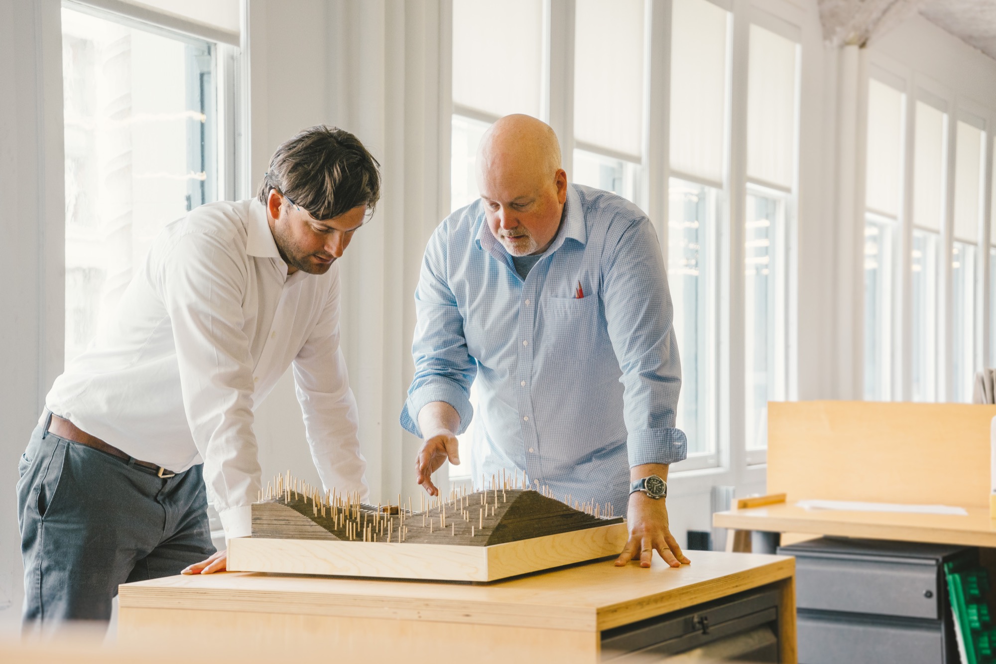
Asked how his experience with designing the Apple stores and workplaces for companies like Square, Inc. has influenced his approach to residential projects, such as the Mountainside Northstar Stellar Collection, Mottola falls contemplative. “It’s hard not to have your experiences influence what you do, absolutely, but the way we think about how a space feels and how you might put fenestration into a building . . . to me it’s just all design.” One thing he is sure his team has learned from designing Apple stores: “Using glass in some homes in remarkable ways we wouldn’t have known how to do without having the experience with Apple. And without a doubt, the research-driven investigation into materials and construction is something we have learned how to do much better, having worked with Apple.”
Designing for the heart
Mottola, who grew up just outside of New York City in Northern New Jersey, knew from a very young age that he wanted to become an architect. “I was fascinated with construction. And once I started to appreciate the way people build things, I began thinking about how do you design and shape space in a way that really resonates with people,” he says. “A lot of people are really good at doing well-considered, responsive buildings, but there is this other layer. Sometimes you walk into a space and you have an emotional reaction to it. You feel something in your heart. Those have always been the buildings I’ve been most drawn to.”
Is designing for the heart taught in design school, though? “You learn a lot in design school about multivariable problem solving, if you really want to get nerdy about it,” Mottola says. “But what I know today about this emotional aspect of design, I actually learned from my mentor here at the firm, Peter Bohlin,” Mottola says, designating the man who puts the “B” in BCJ “a master at creating space that elicits that emotional response.”
“Peter always talks about being inspired by the great Scandinavian modernists, so getting exposed to that work, too, is deeply embedded in the DNA of our practice,” Mottola says. “This idea that you make modern buildings, but you should do it in a way that they are not cold and sterile, but they are evocative and warm and livable and comfortable is something we aspire to do on every project.” △
