Inspirations
Explore the elevated life in the mountains. This content debuted in 2015 with Alpine Modern’s printed quarterly magazine project.
Family HQ in Alaska
In the shadow of Denali mountain, amid Alaska’s meadows and icy streams, a former teacher and a four-time Iditarod winner build a modernist cabin as expansive as the Last Frontier.
 In the shadow of Denali mountain, amid Alaska’s meadows and icy streams, a former teacher and a four-time Iditarod winner built a modernist cabin as expansive as the Last Frontier.
Tens of thousands of years ago, a glacier slid its way through southern Alaska and carved out the Matanuska-Susitna Valley. Bound by three massive mountain ranges and dotted with lakes, it’s an unabashedly wild place. Hundred-pound cabbages flourish in endless summer sunshine, caribou outnumber people, and towering Denali presides over it all. "You can go 1000 miles here without crossing a road," says Martin Buser. "Most people can’t grasp that kind of freedom." A four-time winner of the Iditarod—the grueling dogsled race from Anchorage to Nome—Buser spends his days crisscrossing the landscape with his dogs. So, for his dream home with his wife, Kathy Chapoton, there was no question that the spectacularly rugged setting needed to be the driving force behind the design.
"You can go 1000 miles here without crossing a road. Most people can’t grasp that kind of freedom."
An Alaskan story
The story of how the couple met and found the site is typically Alaskan. Chapoton moved from New Orleans to Anchorage in 1979, at a time when the state government let people claim land for pennies as a way of getting back tax dollars. Soon after relocating, she joined a group of friends one day in early January to stake out the five acres allowed to each person. "It was 50 below zero, my teeth were frozen, I didn’t even know how to read a compass, and I had to walk around and literally mark the parcel," she says. "It was hilarious." Registering her claim at the office in Anchorage, she bumped into Buser, a recent Swiss transplant, and the two married not long after.
The new House for a Musher
For 20 years, the growing family (sons Nicolai and Rohn are named after Iditarod checkpoints) lived in a large house that Buser built on the land, adjacent to the kennel where his hundred-odd dogs reside. In 1996, a wildfire swept through the area: "It was pretty ugly," remembers Chapoton. As a result, people started selling off their nearby plots, and the couple snatched up 25 additional acres—including a mountaintop site that they had been eyeing for years. "It was the primo lot," says Chapoton.
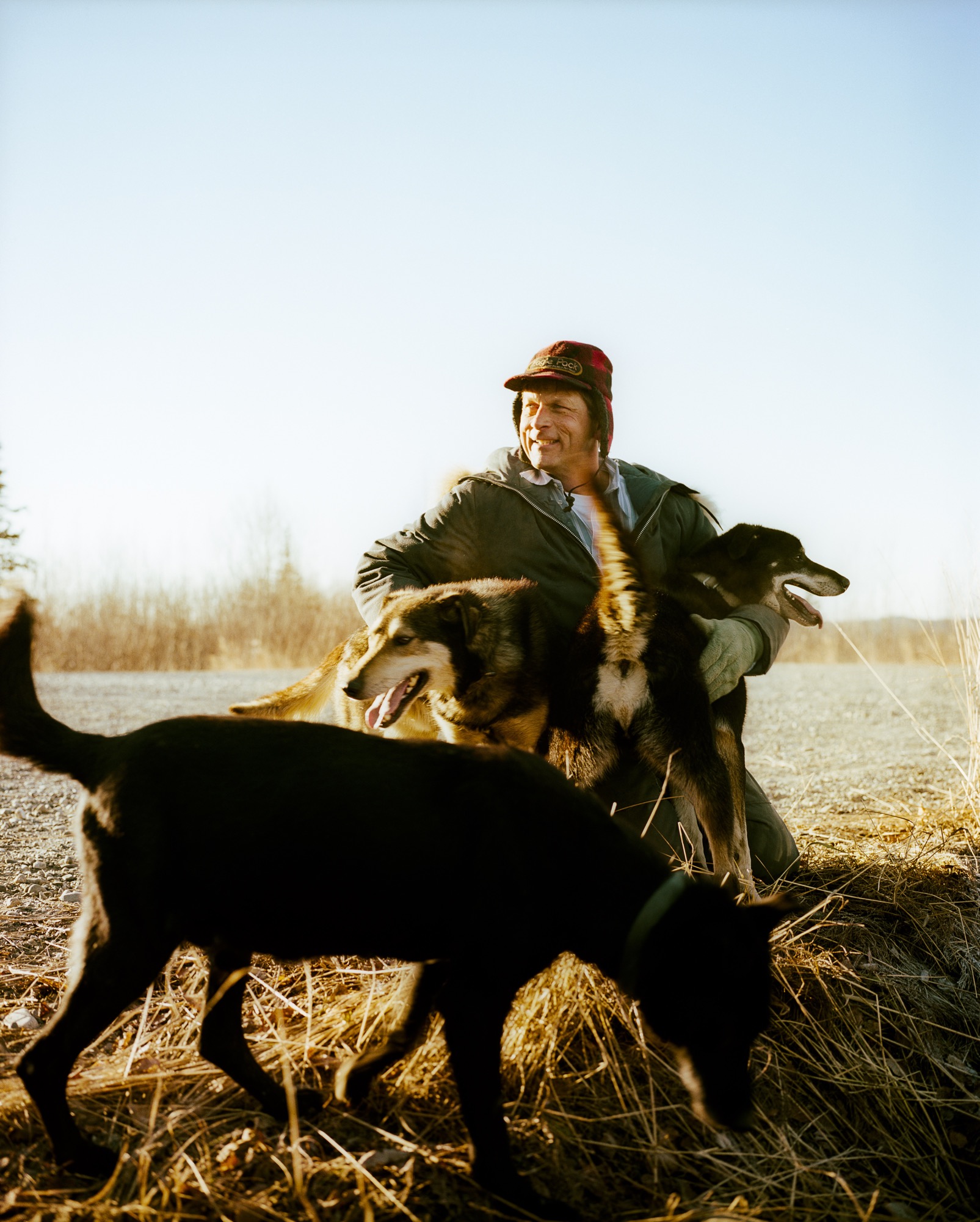
Buser built a little cabin on the top of the mountain as a weekend retreat, but the combination of killer views and the couple finding themselves empty nesters convinced the pair to make that site their permanent home. They moved the cabin by truck to a nearby site (son Rohn lives there now) and called on architects Petra Sattler-Smith and Klaus Mayer of Anchorage firm Mayer Sattler-Smith to design a house. Though Buser had built several homes, the couple knew this site deserved something special. "Because of the multitude of views, we couldn’t take advantage of the site ourselves. We knew our limitations," Chapoton says.
Denali in view
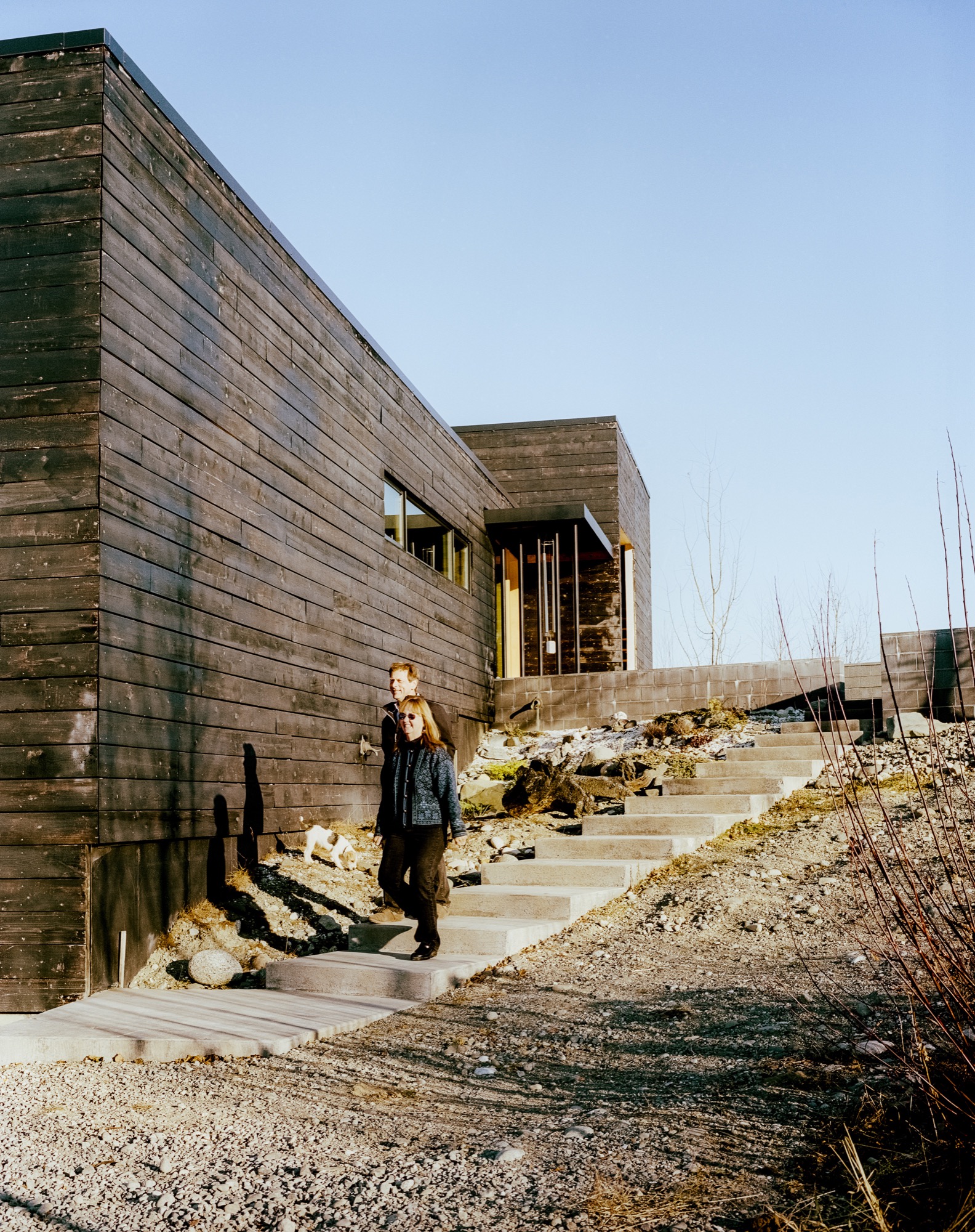
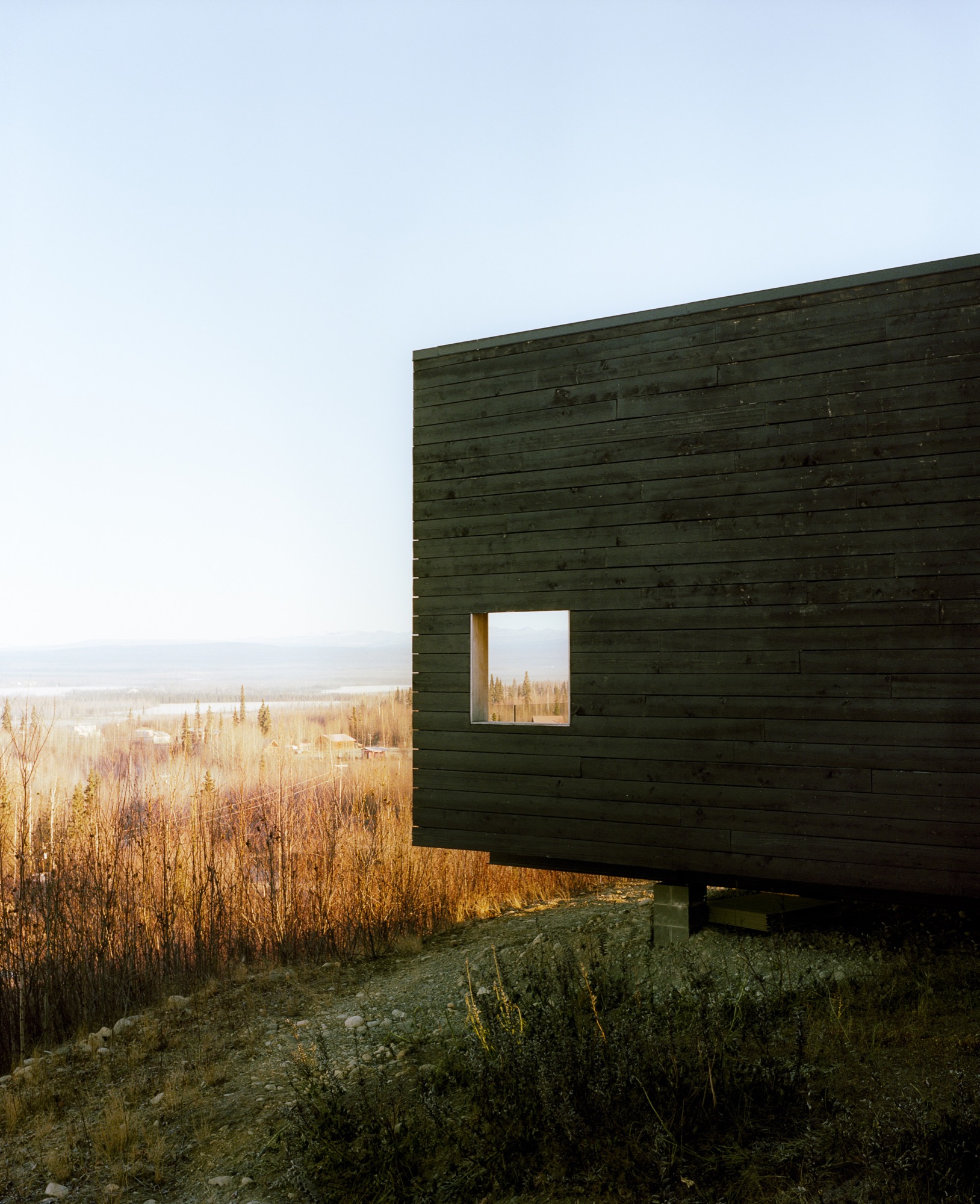
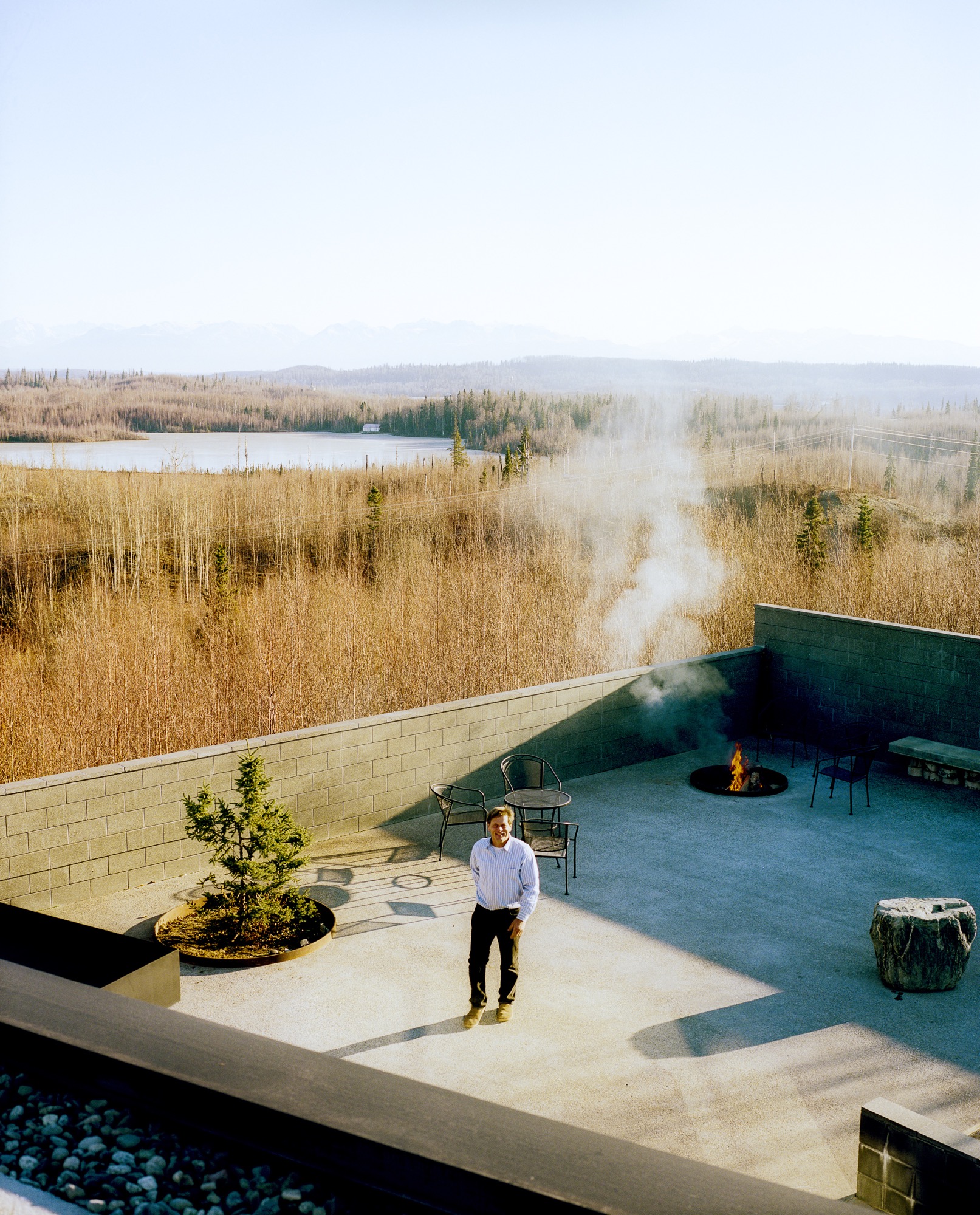
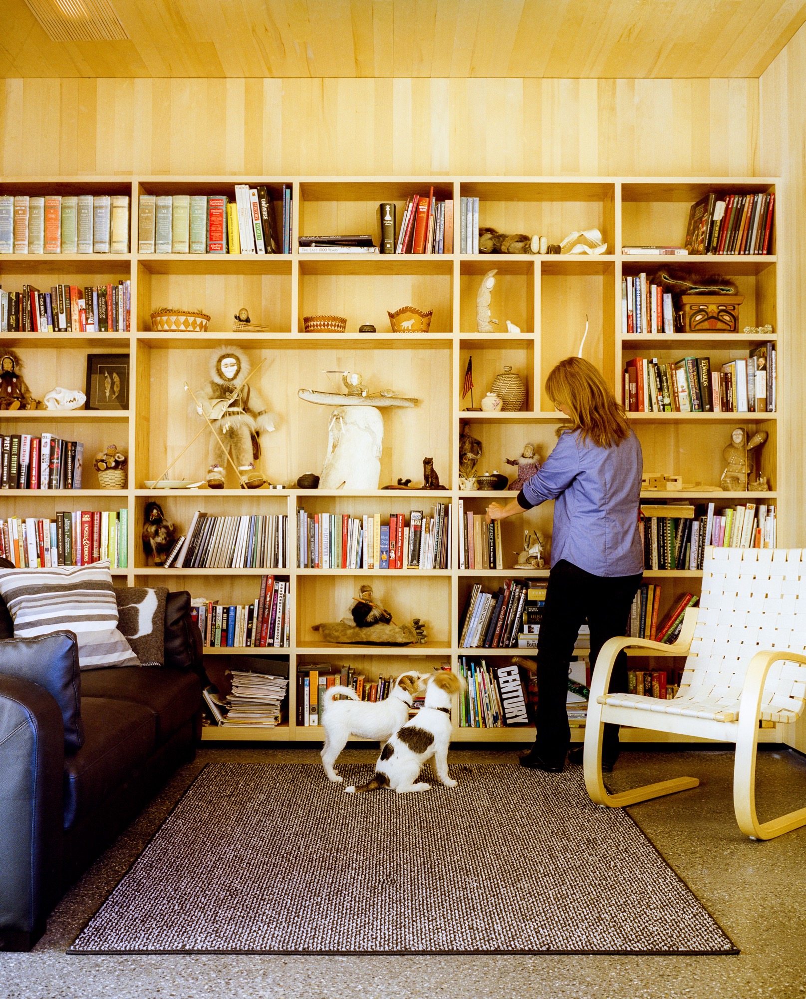
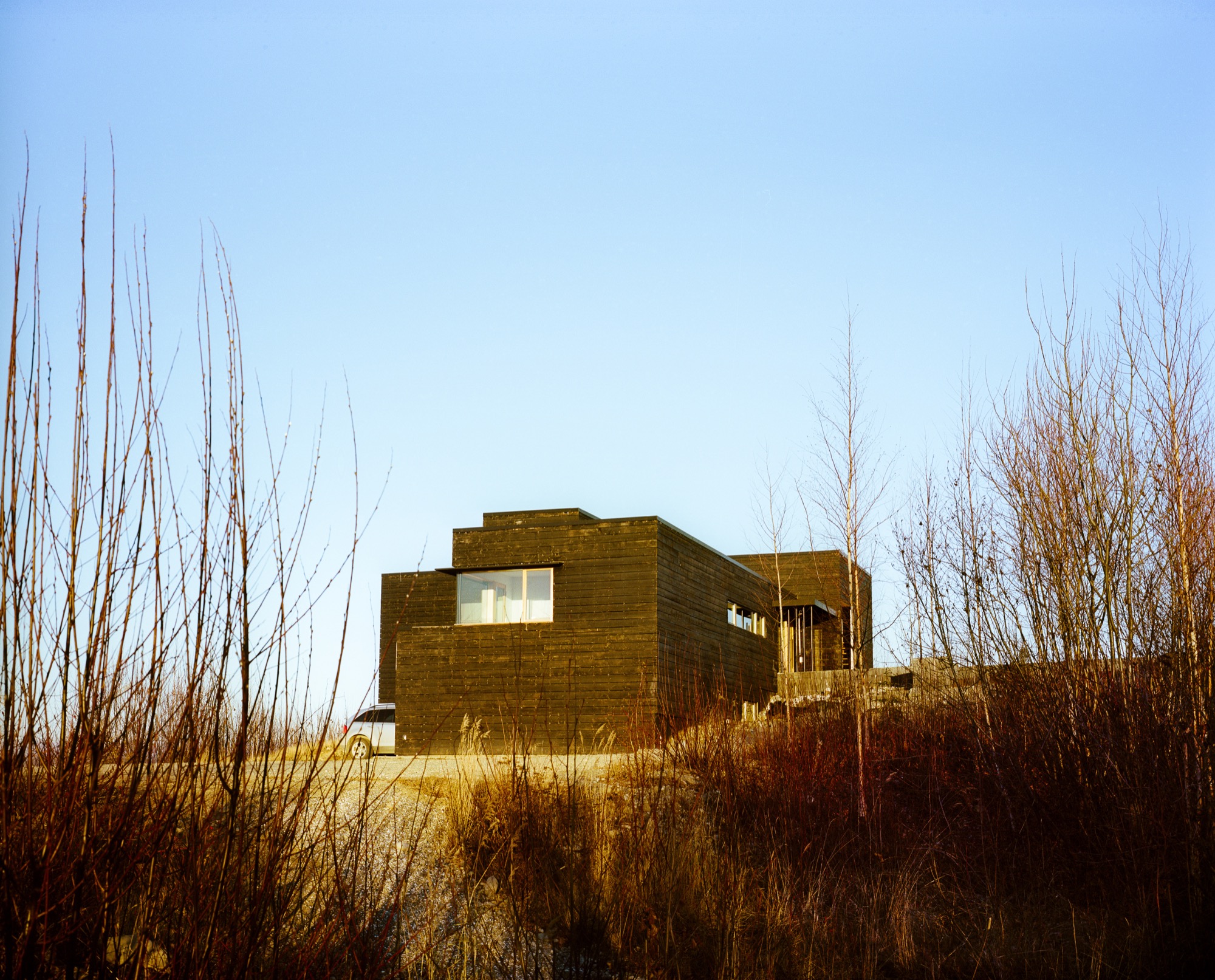
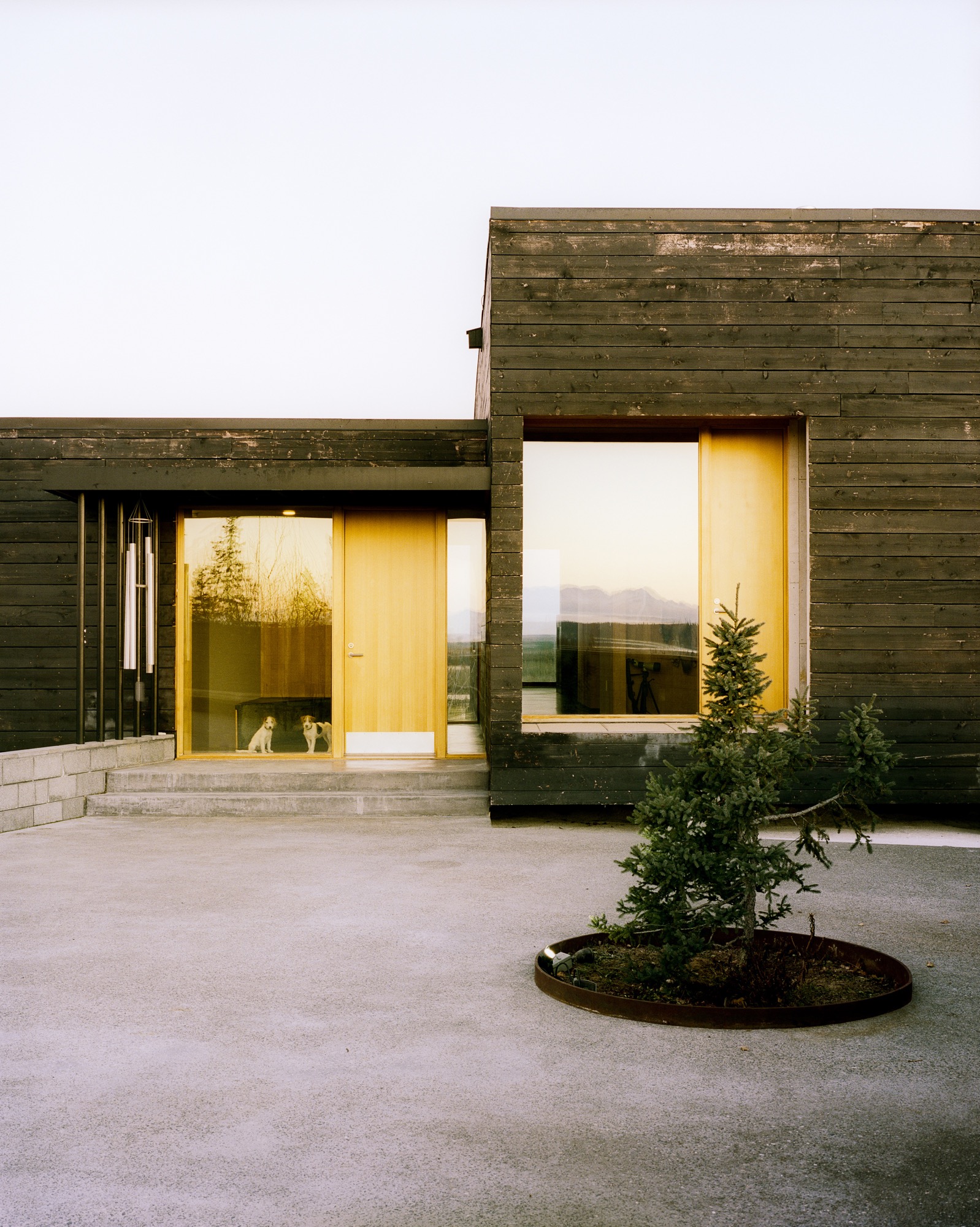
Everything about the 2,450-square-foot house centers on the natural setting. "It was important to have every room look to Denali, which is the ultimate view in Alaska," says Mayer. To do so, the architects created a long, lean, L-shaped house. The blackened, local spruce cladding pays homage to the area’s wildfire, while also mimicking a glacial erratic—a nonnative rock deposited by a moving glacier. The courtyard and part of the kitchen are slightly offset, following the lines of the site’s hilltop topography, while the rest of the house points directly to Denali National Park.
"It was important to have every room look to Denali, which is the ultimate view in Alaska."
Inside
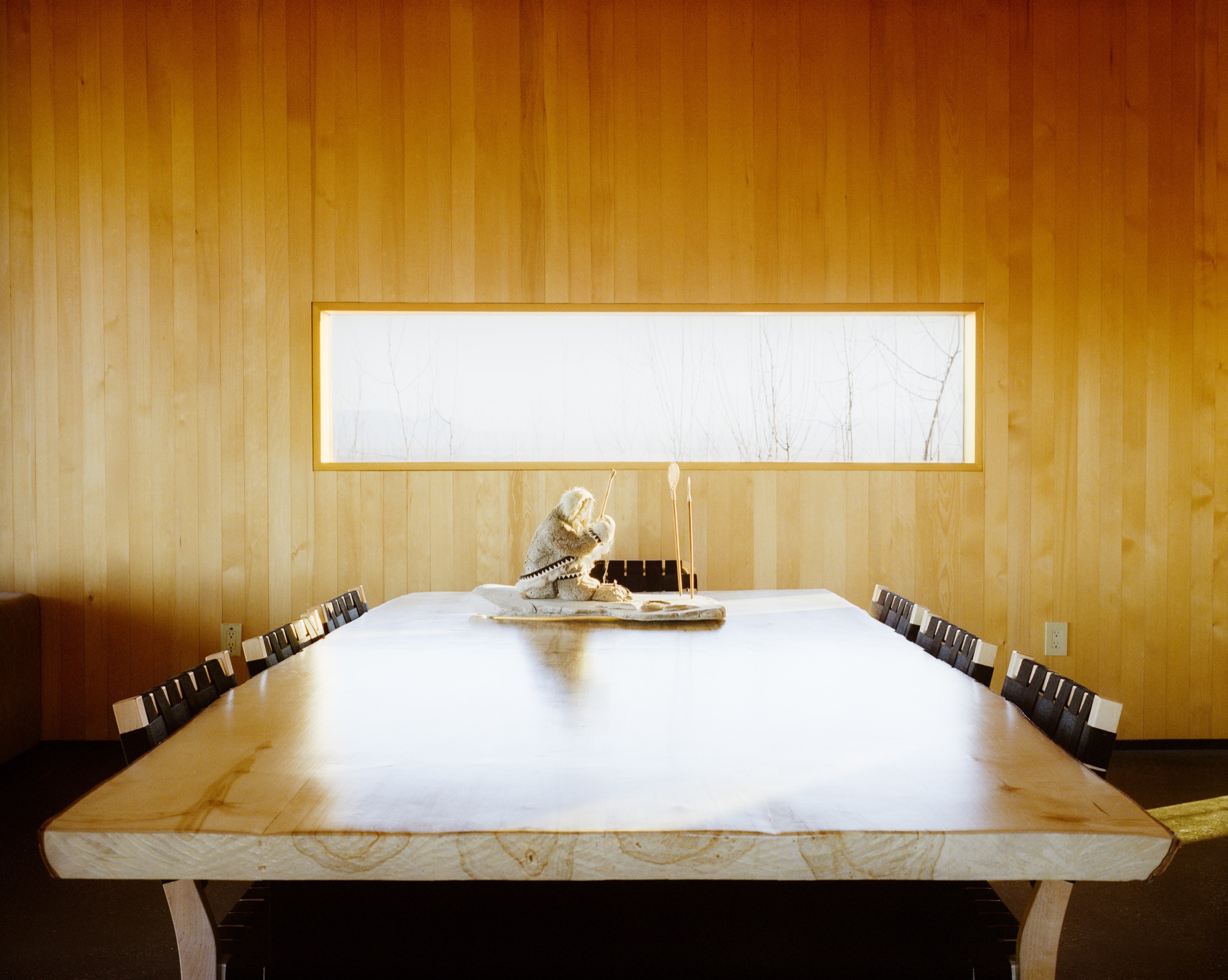
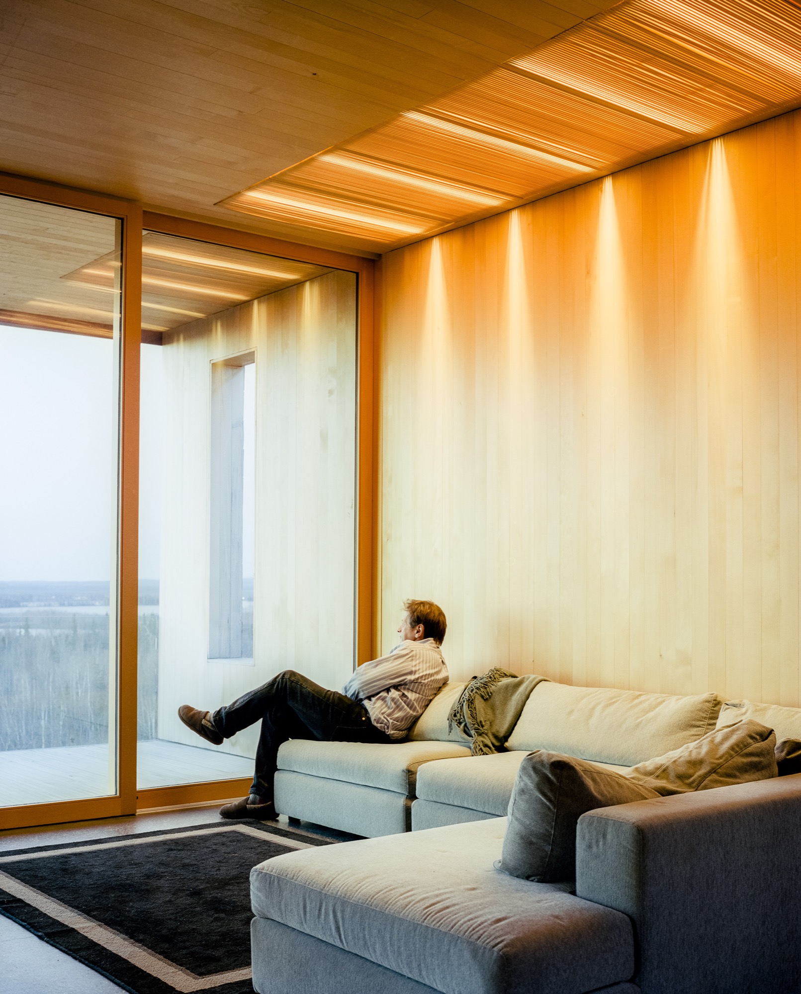
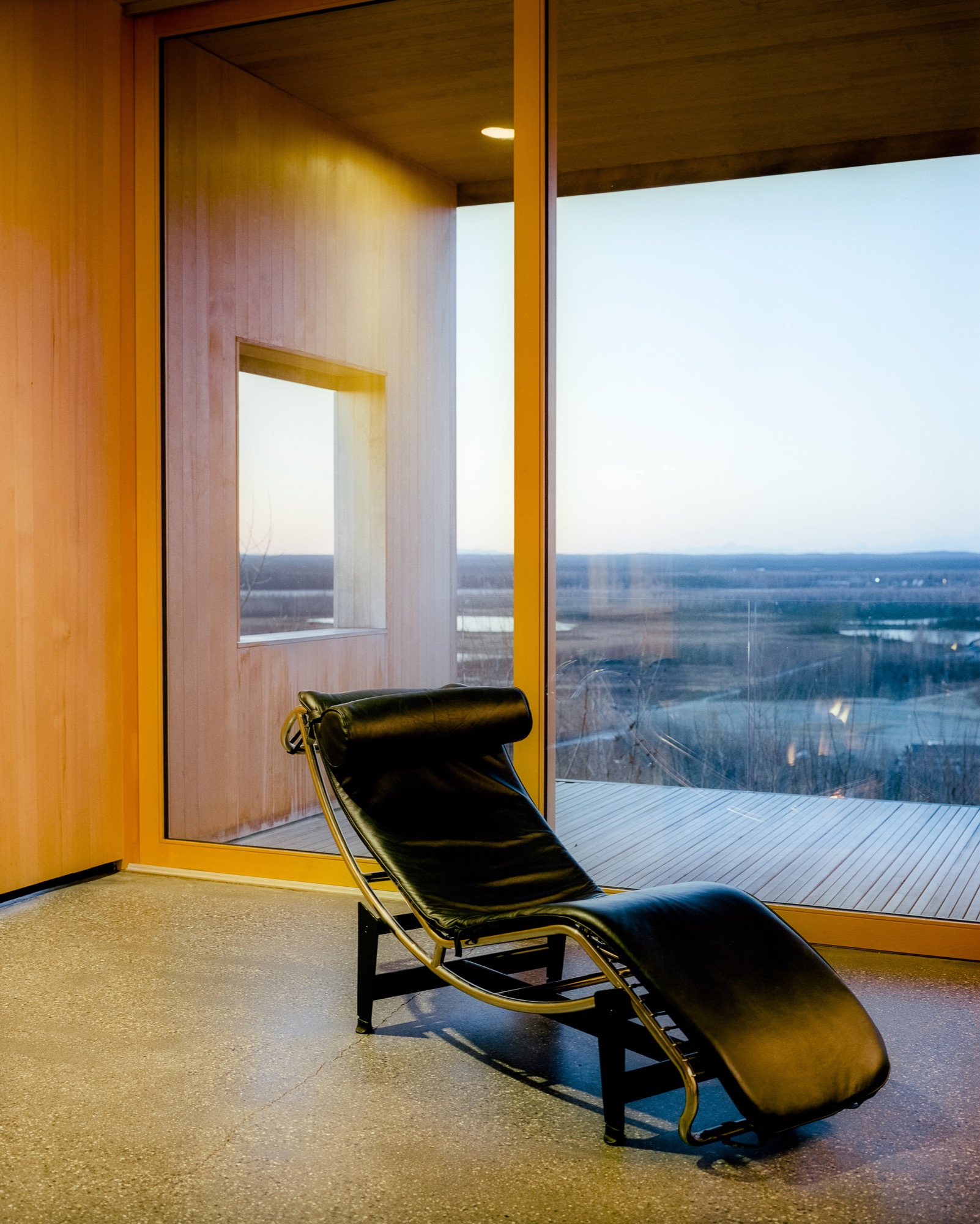
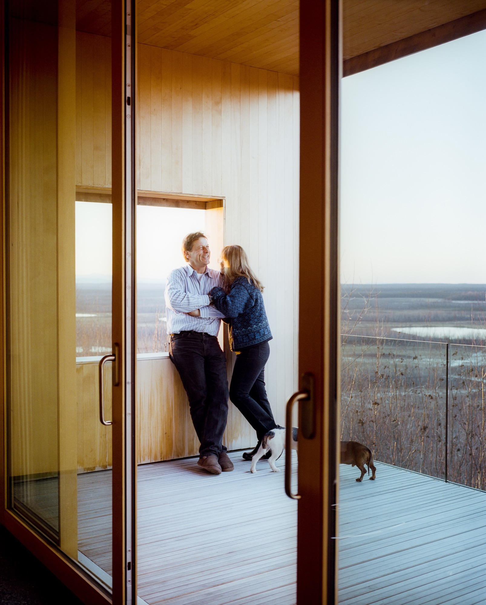
Inside, the walls are paneled in Alaskan yellow cedar, as if the charred exterior has been peeled back to reveal glowing, living wood inside. The public areas lie in one long sight line that starts in the courtyard outside, streams through the living and dining rooms and kitchen, and slips out onto the northern horizon through a wall of sliding glass. The other side of the L contains he bedrooms and bathrooms, each with its own framed outlook on Denali. Windows in the hallway and in the family room face south to let in extra sun during darker winter days. There’s also a rooftop deck, perfect for the family’s many parties—where friends grill mooseburgers and take in the star-filled sky and 360-degree views of the mountains.
Sweat equity
Lest the house seem too fancy for these frontier surroundings, it’s important to remember that Buser built the place himself over six years. Here, there are no construction codes in rural areas ("Building permit?" scoffs Buser. "What’s that?!"), and people prefer sweat equity to bank loans or subcontractors. "When Alaskans say they’re building a house, it means we’re swinging a hammer, digging in the dirt, and trimming it out," says Buser. Yet, this DIY ethos meant that Buser’s solutions were sometimes those of a would-be MacGyver. He and Chapoton charred the cladding using a weed burner and a garden hose; the 800-pound glass doors were lifted into place using Buser’s rigging of dogsled runners, pulleys, and brute strength; and he sliced open two birch trees to make the dining room table.
"When Alaskans say they’re building a house, it means we’re swinging a hammer, digging in the dirt, and trimming it out."
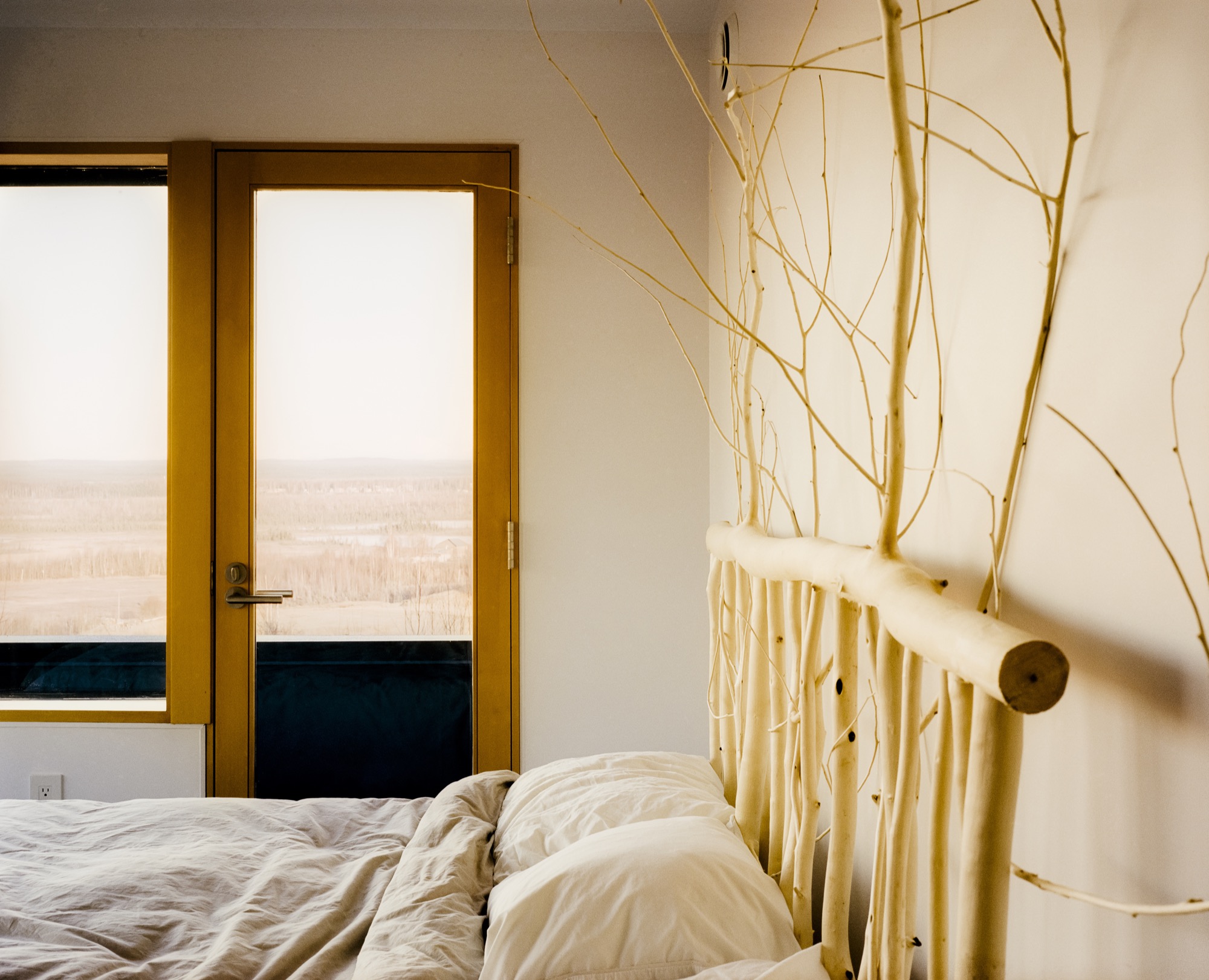
At the end of a typical day, Buser comes home from an 80-mile dogsled ride as the last rays of sun linger on the mountains. Inside, Chapoton (now retired from teaching) whips up a salmon meal for ten, and the gregarious couple shares wine with friends around a crackling fireplace. When everyone’s left, Buser and Chapoton will tuck into their bed, watching the vivid hues of the northern lights dance through the windows. Says Chapoton of her love of the house, "Maybe Einstein said it most simply: ‘Look deep into nature, and then you will understand everything better.’ " △
Up and Away: 10 dream tree houses
These ten small structures make childhood dreams come true.
Who says that grown-ups can’t have tree house goals? When the demands of daily life become too much to bear, a special hideout in the sky can be your place to escape, cool off, or brainstorm in peace. Just one look at these inspirational mini-getaways and you may find yourself looking for a sturdy tree to scale.
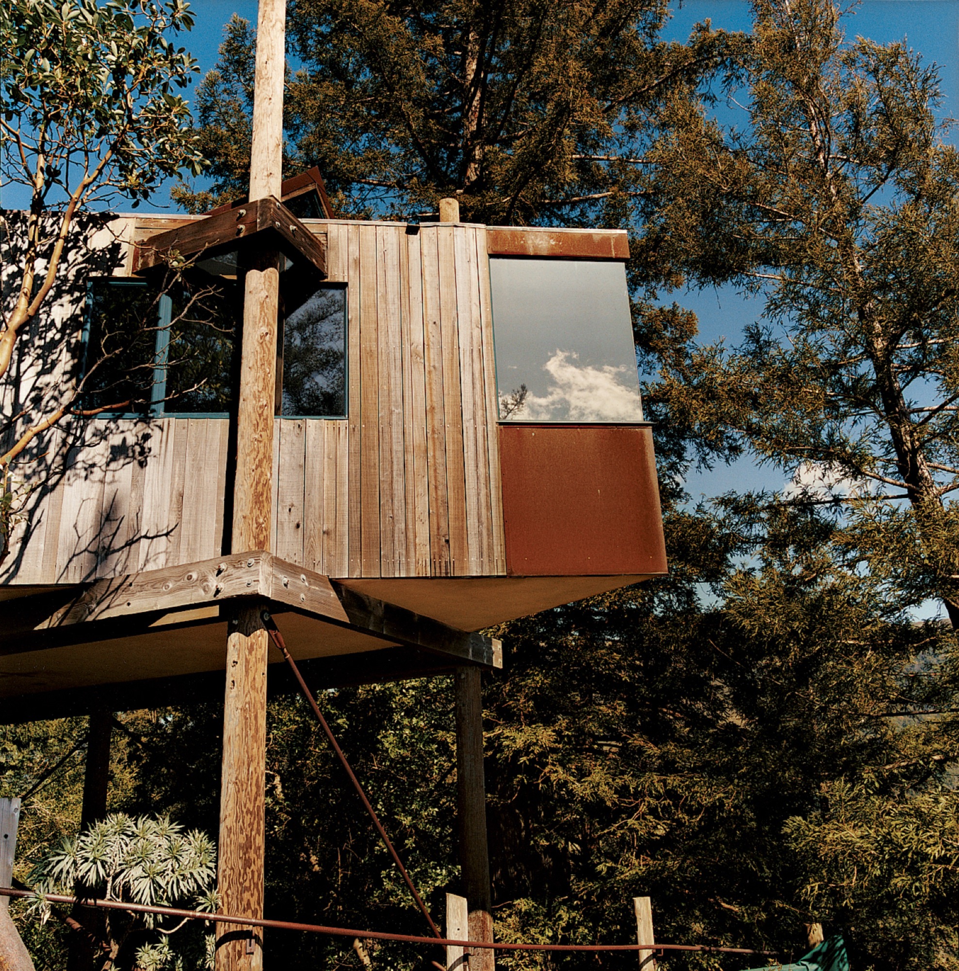
Designed by acclaimed Big Sur architect Mickey Muennig, The Post Ranch Inn consists of a series of freestanding units that showcase Muennig's contemporary organic vision. The tree houses feature Corten panels.
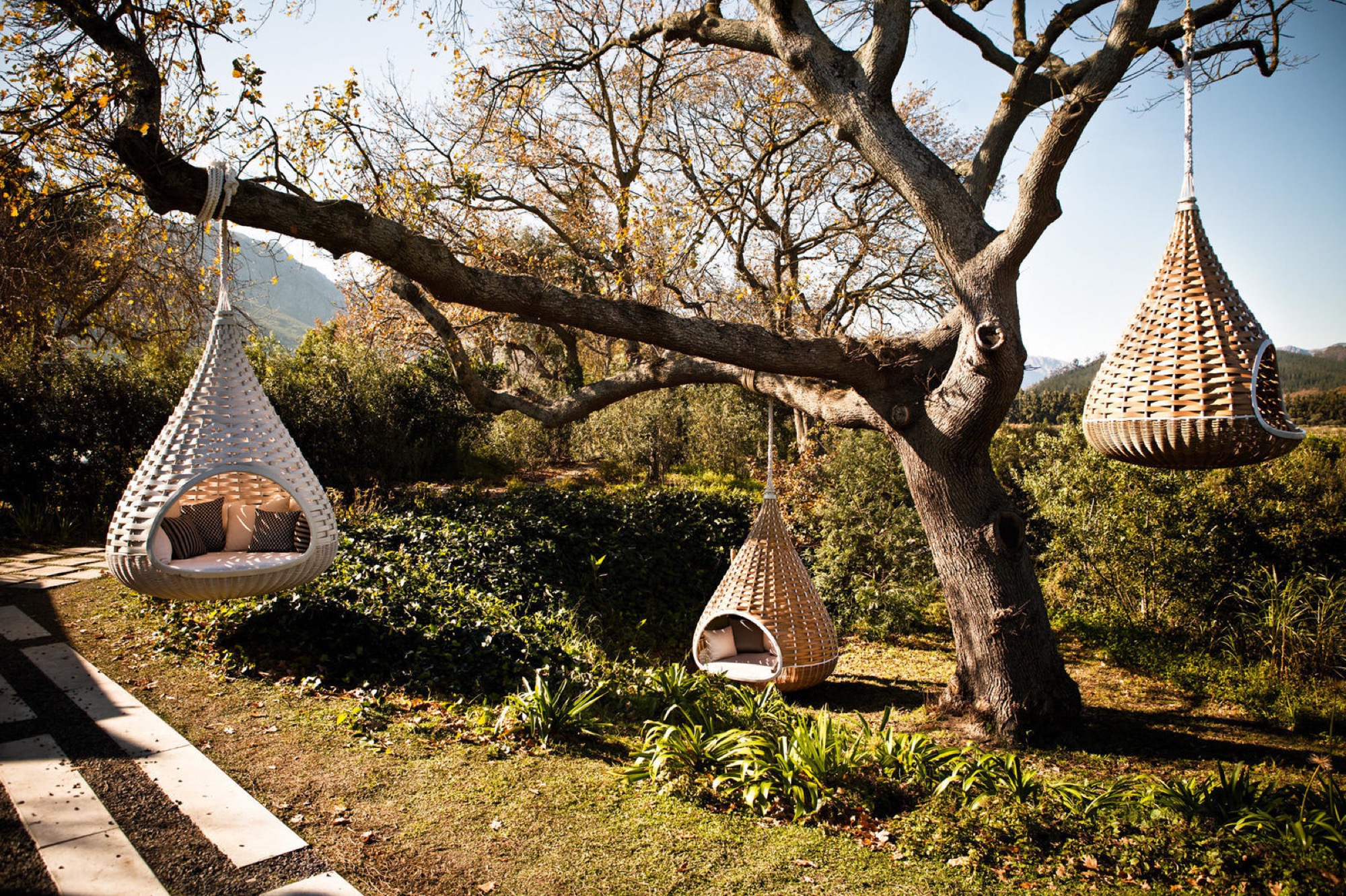
Dedon’s Hanging Lounger, designed by Daniel Pouzet and Fred Frety, can be an instant mini-tree house escape. All you need is the right tree to hang it from.
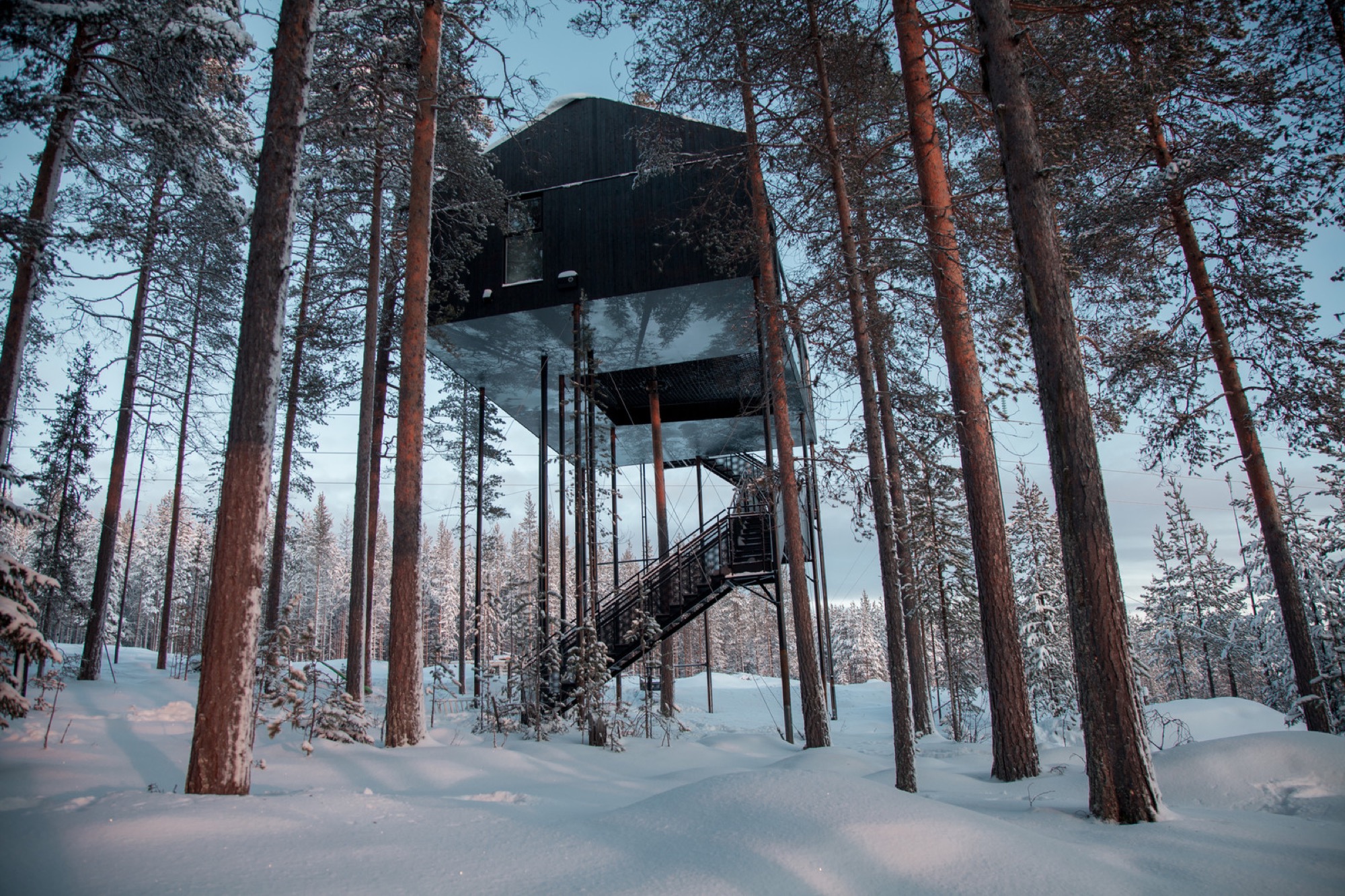
Treehotel’s 7th room in Sweden is a cabin that’s propped up in a pine canopy where guests can book a stay. To reduce the load of the trees and minimize the building's impact on the forest, 12 columns support the cabin. One tree stretches up through the net, emphasizing the connection to the outdoors.

Japanese architect Takashi Kobayashi of the Tree House People has been declared a "tree house master" by Design Made in Japan. Seamlessly integrating nature and design, this tiny tree house is certainly not just for children.

Inspired by the principle of biomimicry, Free Spirit Spheres’ goal is to "create new ways of living that are well-adapted to life on earth over the long haul." Based outside of Vancouver, the company specializes in tiny spherical tree houses that are works of art. You can even book an escape to spend the night in one at their forest hotels!
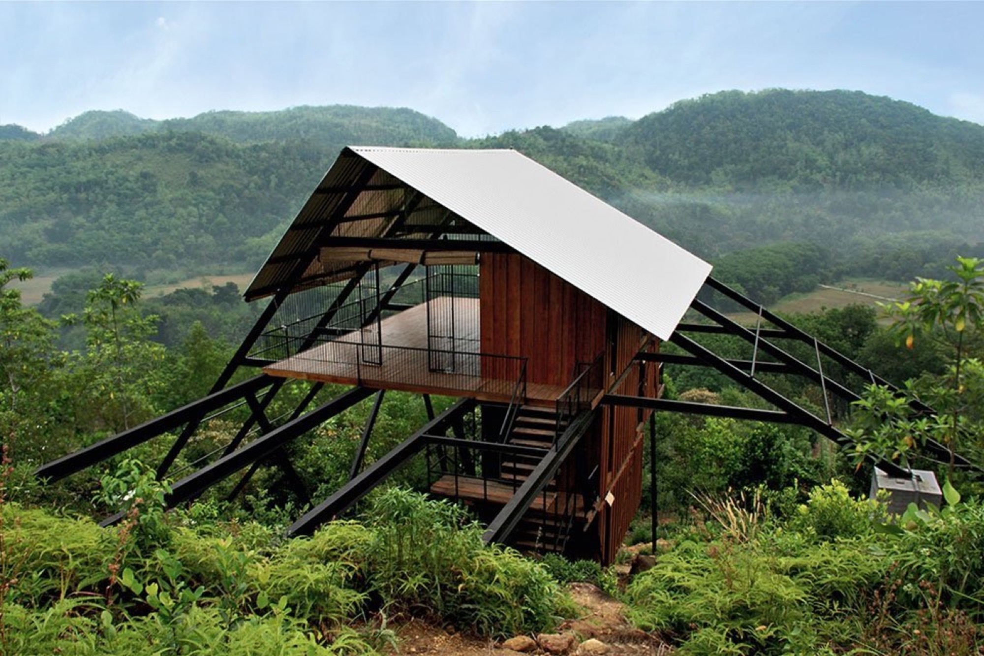
With the view from the Estate Bungalow in Matugama, Sri Lanka—designed by Narein Perara—you might just climb in and never want to leave.
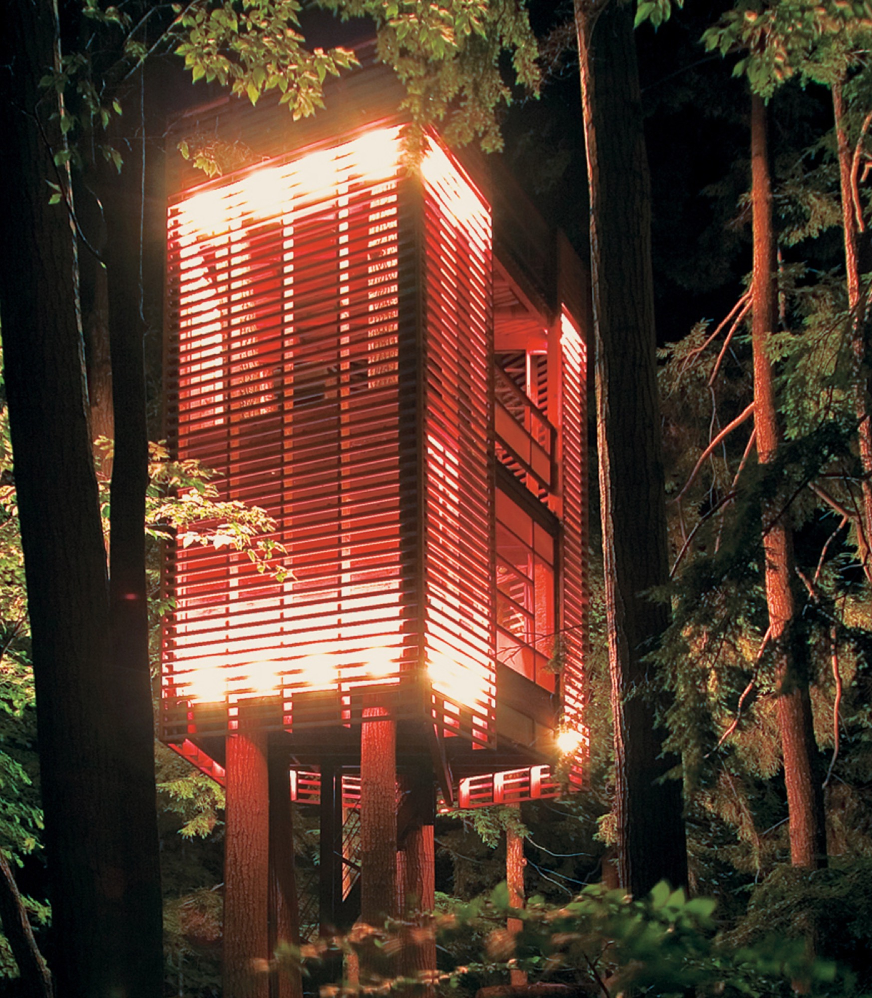
"I had to let the trees decide how the tree house would be," explains Lukasz Kos, a Toronto-based designer and cofounder of the architecture firm Testroom. The low-impact 4Treehouse is a lattice-frame structure that respects and responds to the nature surrounding it, appearing to levitate above the forest floor of Lake Muskoka, Ontario.

At only 172 square feet, this tiny tree house in the hills of Brentwood, California, was designed by Rockefeller Partners Architects and serves as a refuge, gallery, and guest cottage.

A little more on the traditional side, this tiny backyard tree house by Sticks and Bricks makes you want to disappear for a few hours with a pot of tea and a good book.
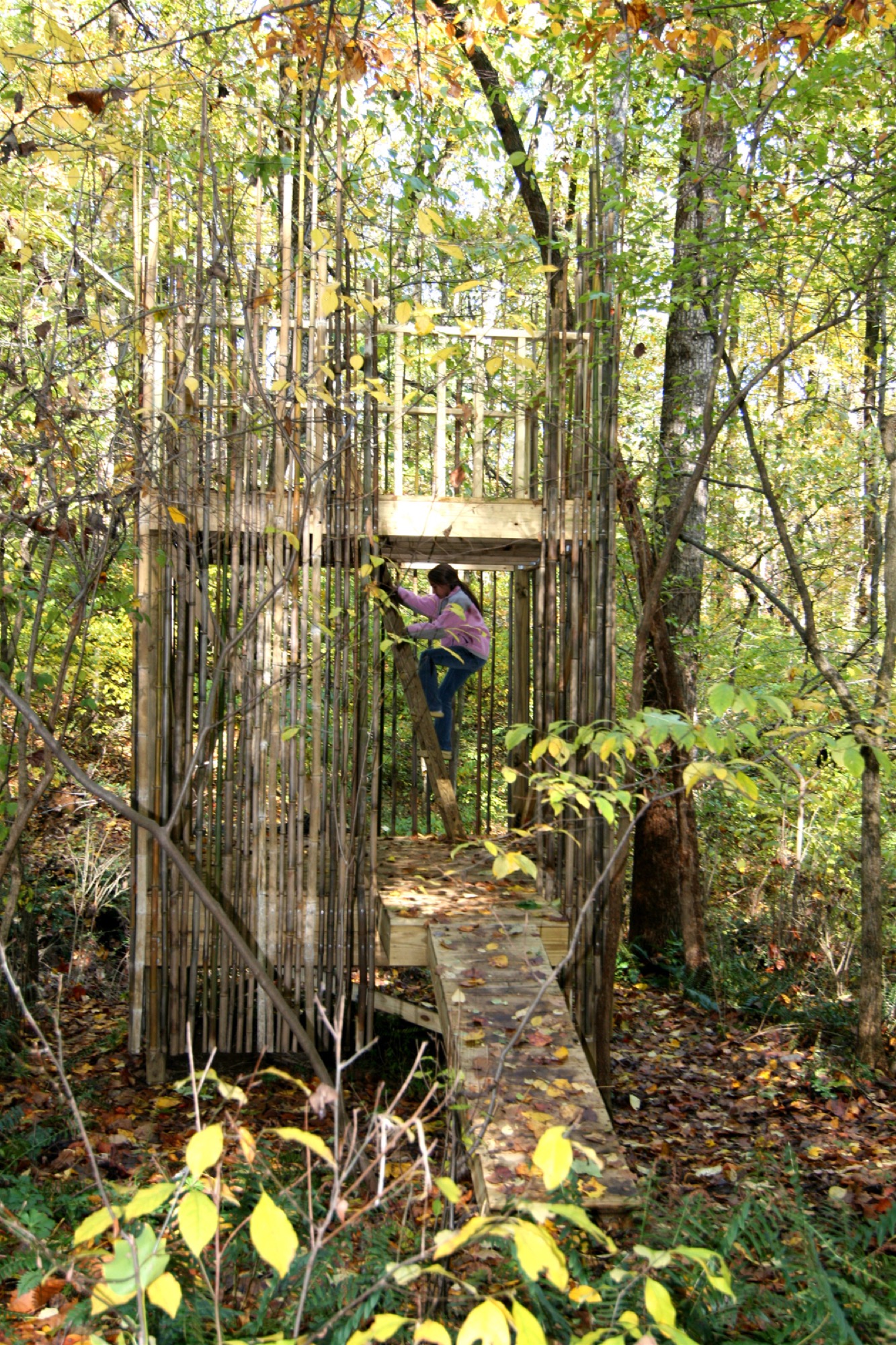
This 128-square-foot tree house outside Baltimore was designed by architects Laurie Stubb and her husband Peter. "The outdoors here are a big playground," she says. "We had always wanted to build something for the girls that looked natural." So, in the summer of 2008, they designed this structure both for the children and for themselves. "We wanted it to have a use after they're gone—a place we can sit in and read or have a drink and entertain company." △
A Cabin Cluster in the Quarry
Three small pavilions connected by a deck form a summer retreat in Maine that balances privacy with a panoramic view—all in less than 900 square feet.
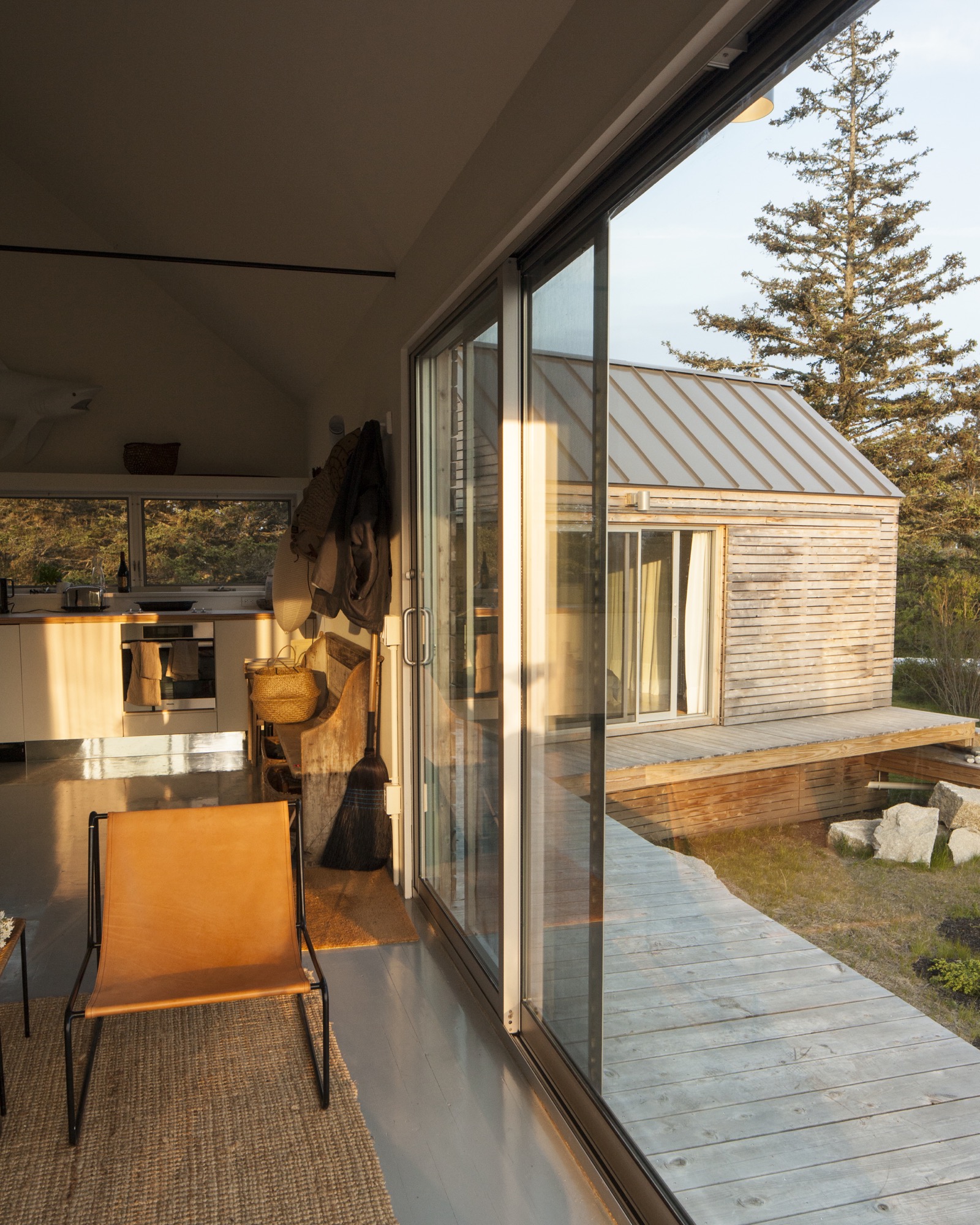
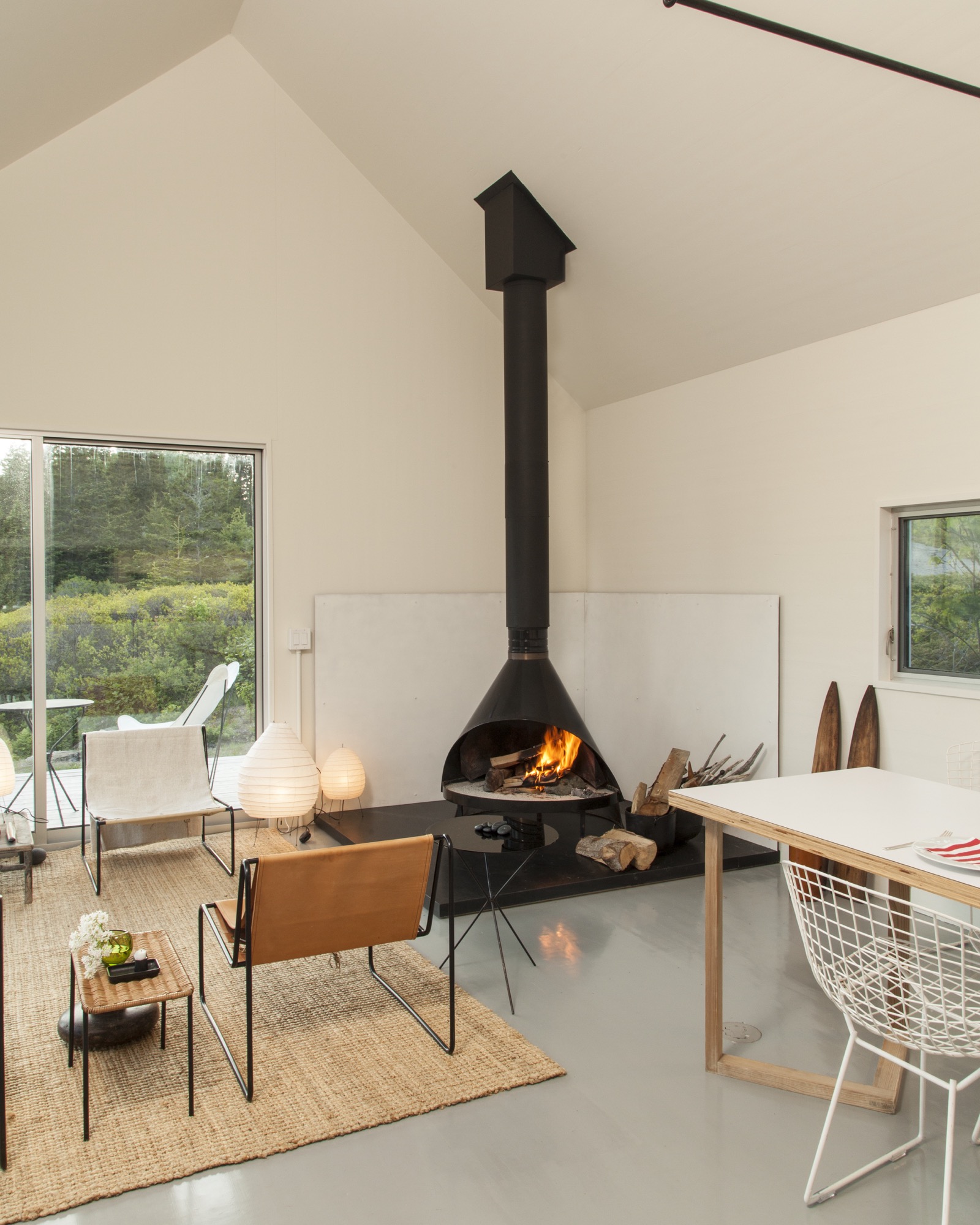
 It’s perhaps misleading to call three structures a summer house. But measuring 890 square feet (ca. 83 square meters) altogether, referring to them as a set of summer houses would imply something grander than three cabins tucked into a defunct granite quarry. From a distance, the buildings look like a cluster of bait shacks you might see on the harbor side of Vinalhaven, the island where they sit.
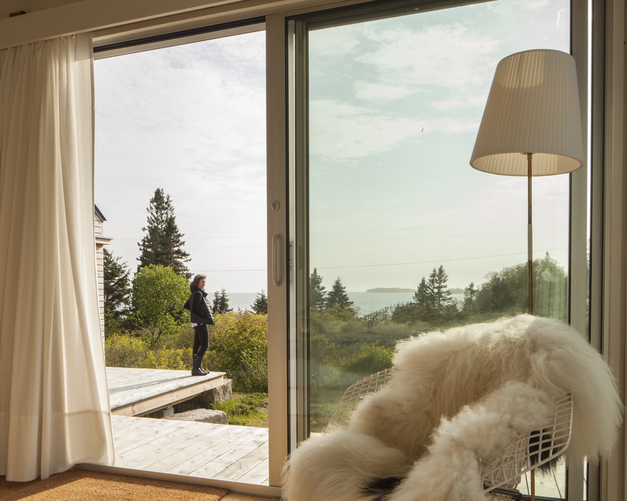
On a sloping site near a defunct rock quarry on the remote lobster-fishing island of Vinalhaven, Maine, a three-part summer home overlooks a framed view of Penobscot Bay. Working around the site’s unique topography, design-build firm GO Logic created each structure at varying elevations.
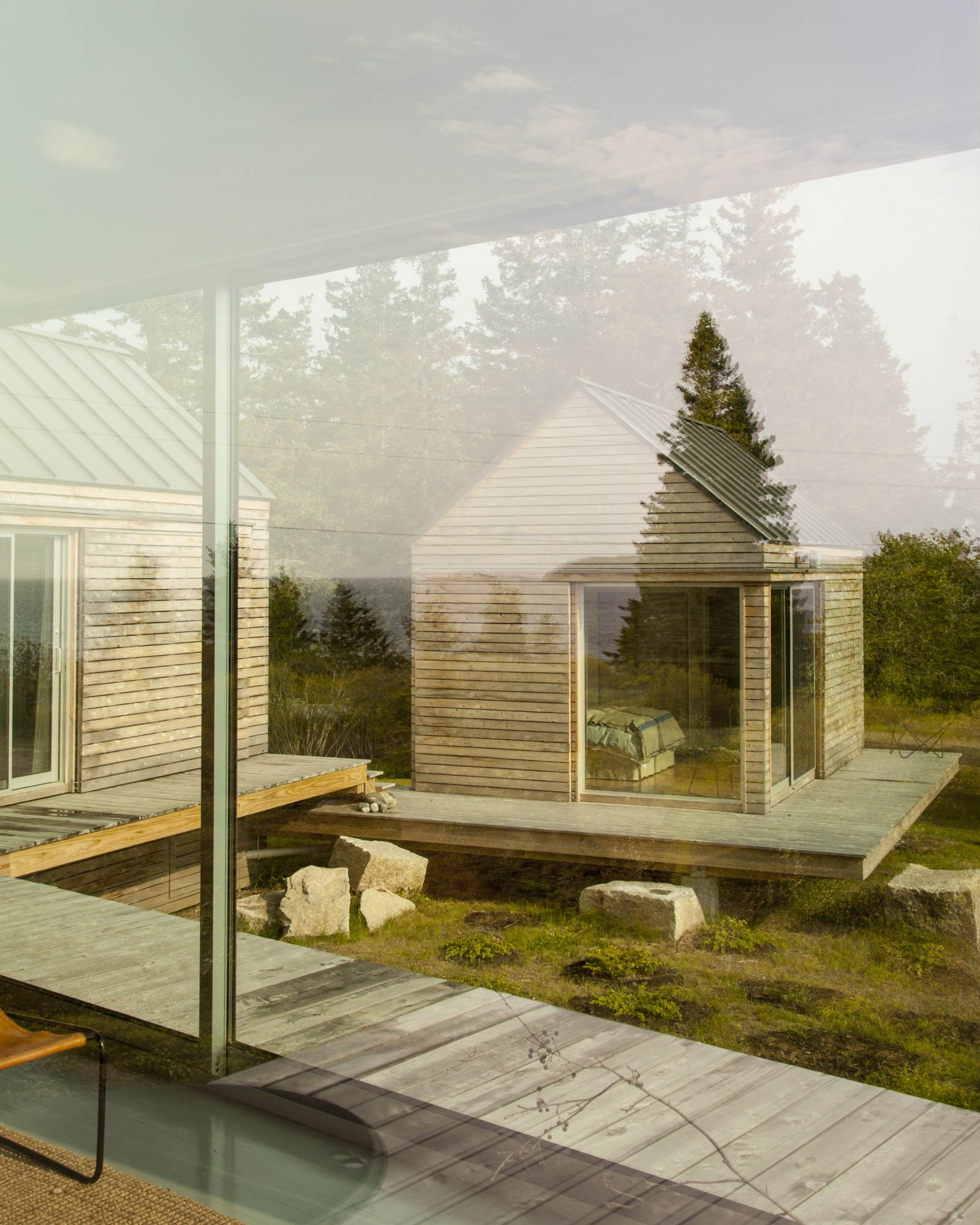
Fifteen miles offshore from the town of Rockland, Maine, the island is its own world, its very separateness a part of its magic: It can win people over in one visit, which is all it took for Nick and Nadja van Praag. Both expats—he from England, she from Austria—they’d only just arrived when a photo in a Realtor’s window caught Nick’s eye.
“We came to the island of Vinalhaven several years ago and immediately, totally fell in love.”—Nadja van Praag, resident
Restless in DC
At the time, Nick’s work with the World Bank had brought the couple to Washington, D.C., where they had a classic Georgetown house, yet felt a persistent sense of unrest. It drove Nadja crazy to be in America, where, as she says, "the inside/outside thing was invented!" Living like center-city Europeans in a four-floor building, the van Praags daydreamed about an open, single-story home, while Nadja kept close watch on a Richard Neutra house nearby, hoping a For Sale sign would go up.
A fateful trip to Vinalhaven
"Then we came to Maine, and didn’t expect anything like that," says Nadja. But there it was, for sale, a "little box" on Vinalhaven. "Nobody else wanted this house," she recalls. "They were all looking for the perfect New England shingled-whatever."
However, their tiny square overlooked a tiny rectangle: a 700-square-foot mobile home. The van Praags realized that if another family purchased the trailer to build a larger home facing the channel, the quiet setting of the disused quarry would significantly change character.
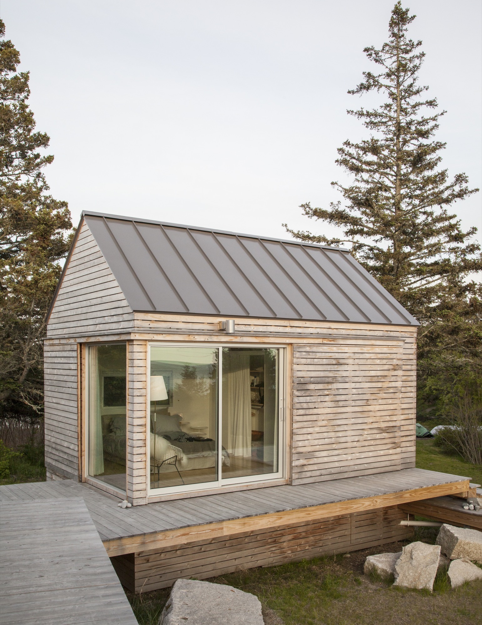
“We did our best to tuck the buildings into the site—the goal was to get up high on a perch. It was a matter of setting that elevation and working back down with the topography.”—Riley Pratt, architectural designer
Building over time
A few years passed, the van Praags made interior renovations to the home with local builder, caretaker, and lifelong resident Mont Conway, then—when it became available—they bought the plot of land where the mobile home once sat, less than 100 yards down the path. Around the same time, they met Riley Pratt, an architectural designer who summers up the road. Pratt, of the Belfast, Maine–based firm GO Logic, knew Conway from pickup soccer games on Vinalhaven but also by way of his reputation.
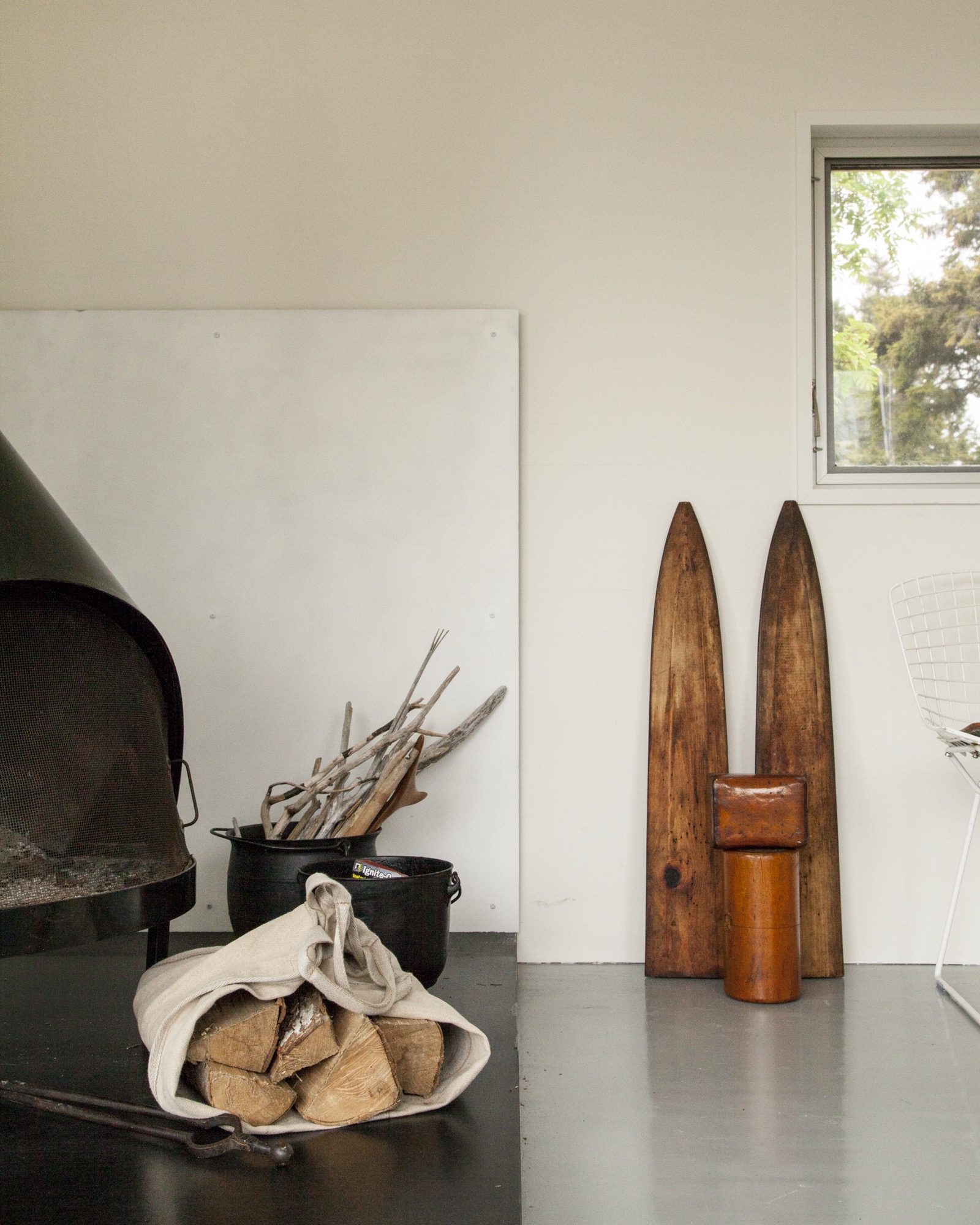
Inspired by Alvar Aalto sketches and the quirky quarry site
When the van Praags expressed interest in building a new structure on the extended property, Pratt mentioned Alvar Aalto sketches he had seen for a deconstructed summer cottage in Finland, where the rooms (and, of course, a sauna) were broken out as separate buildings focused around a courtyard. Nadja took to the idea of a peeled-apart, three-volume structure immediately: The design was an exploded version of their house, also a three-part structure, and building it would mean their three grown children could have a place to stay when they visited.
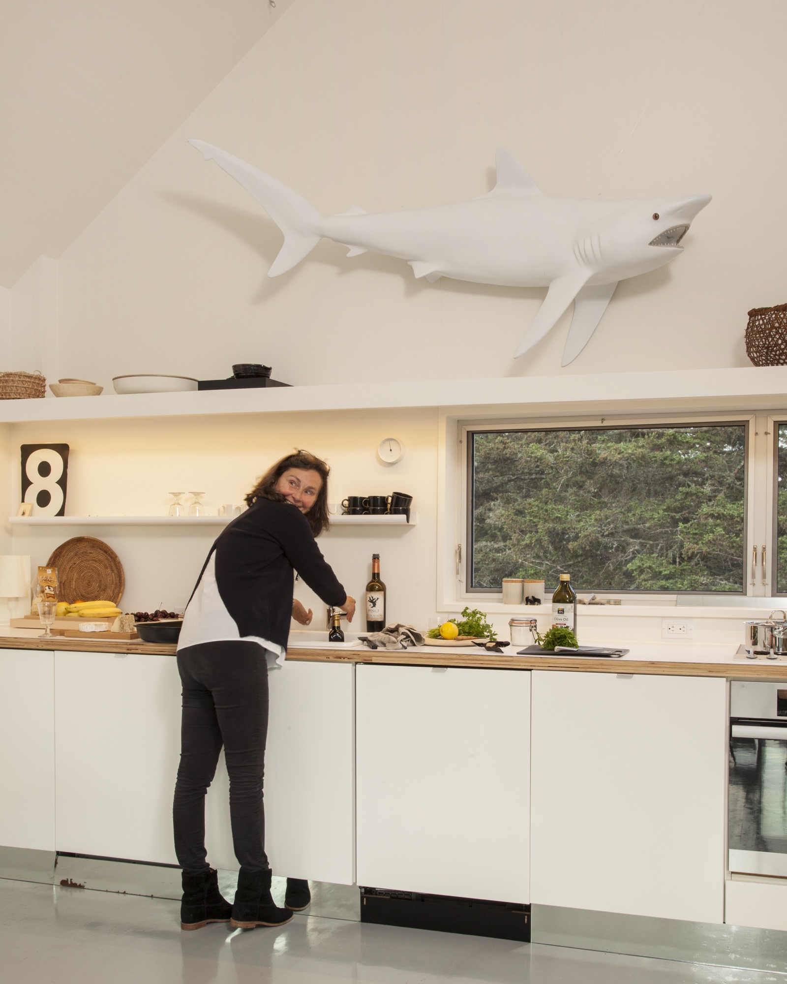
The town of Vinalhaven considered the lot, with its jumble of rejected granite scraps, "substandard" and therefore granted the Van Praags up to 30 percent more square footage and volume over the previous structure. While the site posed challenges, it also inspired. GO Logic paid special care to the topography and geometry of the quarry. Every angle—of both the structure and the interior lines of sight—is in purposeful alignment with the surrounding stone, trees, and water views.
The town approved the plan for multiple structures because a single deck connected them, and the van Praags were thrilled because the design maximizes both privacy for overnight visitors and a connection with the outdoors.
“We’re here for almost three months every summer—and it works so well that you never feel it’s a small space. The separation and steps between each perfect little box create a great flow.”—Nadja van Praag
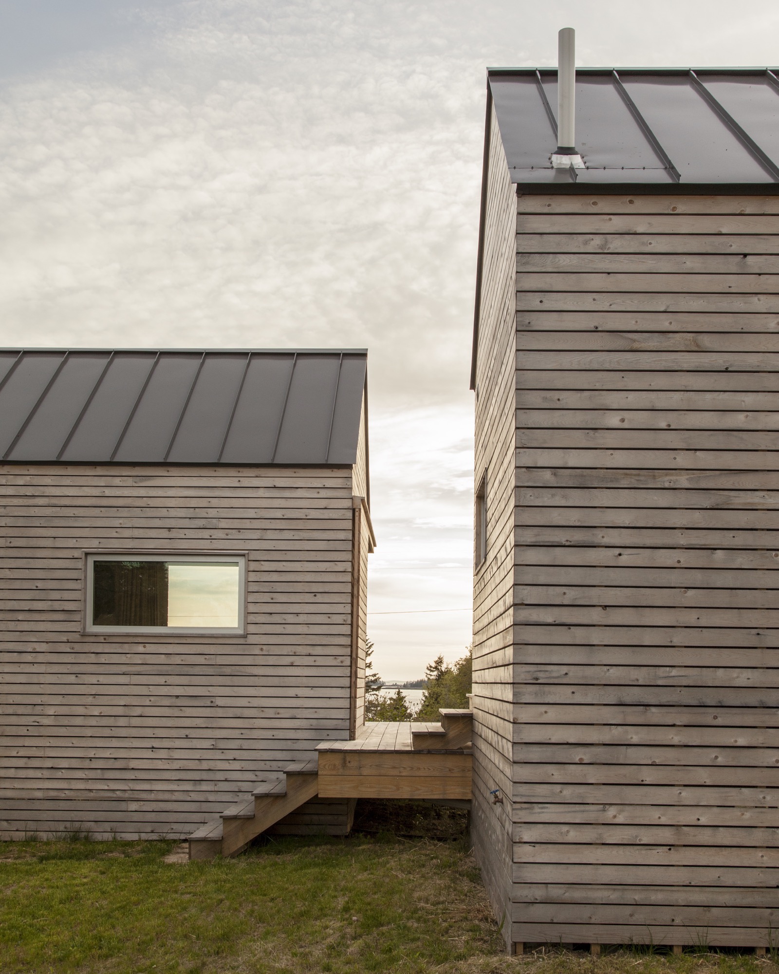
The spare aesthetic—inside and out—at once suits the austere island and reflects a judicious building process that was as much about choreography as construction. GO Logic used an emerging technology—cross-laminated timber (CLT)—to reduce waste and on-site labor. The design-build firm, working with Conway and his crew, carefully sequenced the packing, transport, and assembly of the black spruce panels shipped from Quebec. The panels form the entire enclosure—floors, walls, and roof—a practical and sustainable solution that provides both structure and finish. Conway’s crew sided the buildings with mitered white pine that will turn hoary with time, matching both the granite landscape and the local cottage vernacular. They also used white pine to create sliding barn doors that offer shade and privacy as needed in the summer, and protection in the off-season.
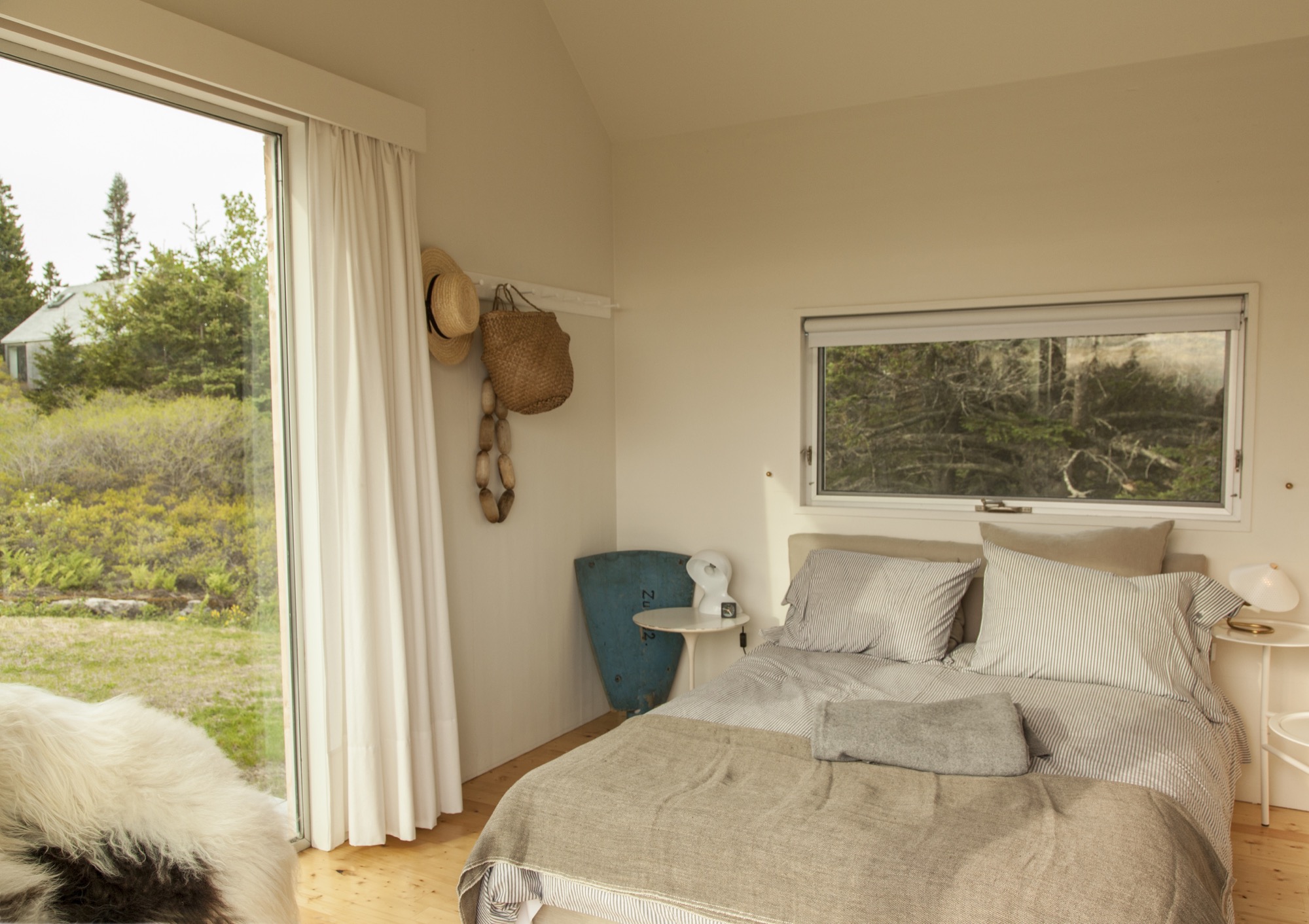
Clustered escape
Although they’re just a short walk from each other, the van Praags’ two homes—the "little box" and the new trio of cabins—feel worlds apart. "The old house looks over Old Harbor Bay, protected and speckled with boats. It’s sort of domesticated, in as much as the islands of Maine do domesticated," Nick says. "The new house is out there. It feels wild and remote, with the old quarry rising gently behind the house and the ocean stretching away in front."
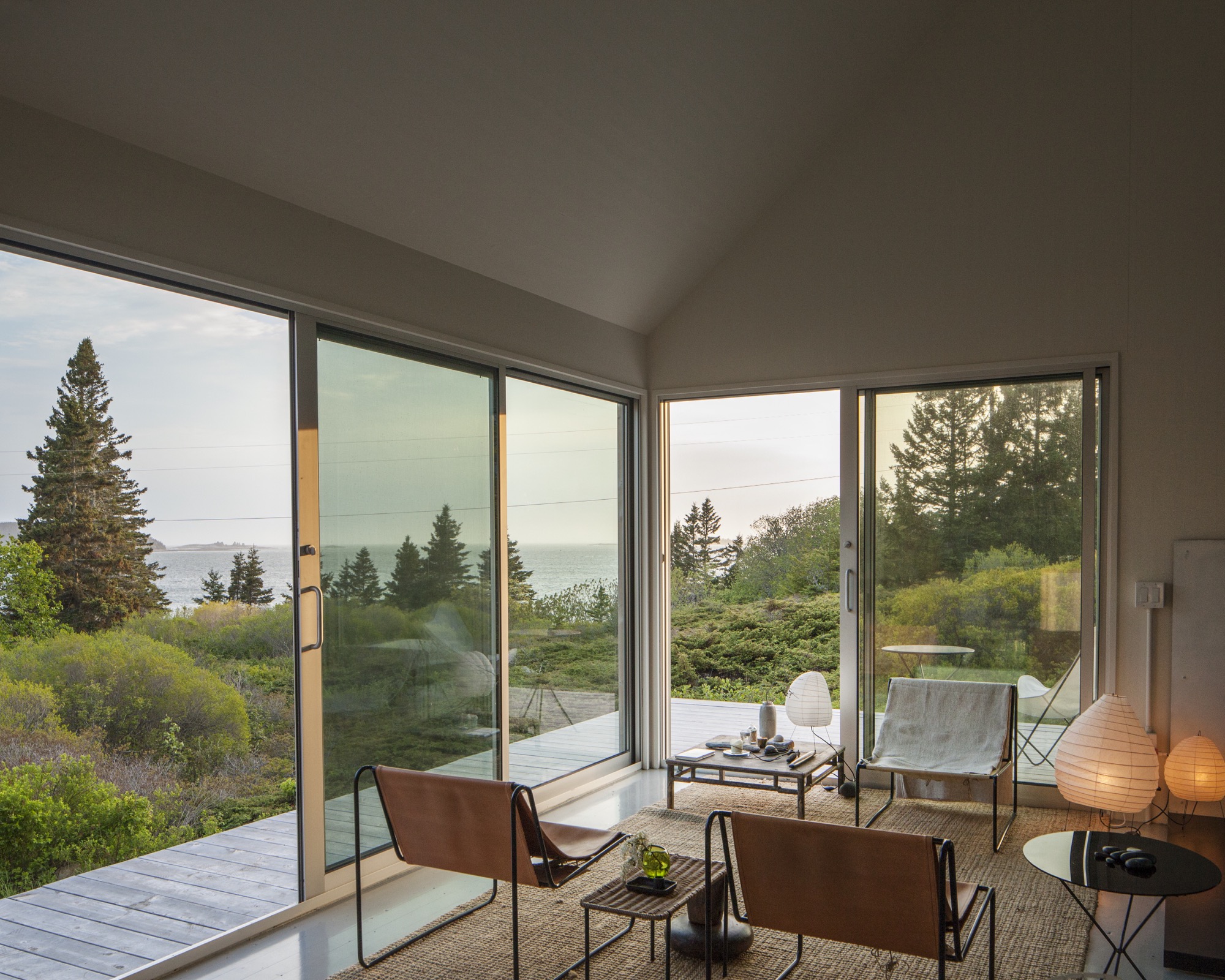
By day, the three connected pavilions sit lightly on the land. At night, they float above their concrete piers, a U-shaped harbor that beckons guests with its warm light, the platform at once a dock and a deck.
"For me, the most amazing thing is the way Riley sited the place," Nick says. "It was always a beautiful spot, but by raising and angling the buildings, it embraces the landscape and the ocean in a way that I could not have imagined." When guests ascend the stairs to the deck, popping up into a framed view of Penobscot Bay, they all stop in the same place. "I realize now that siting a building is a very special talent," he adds. △
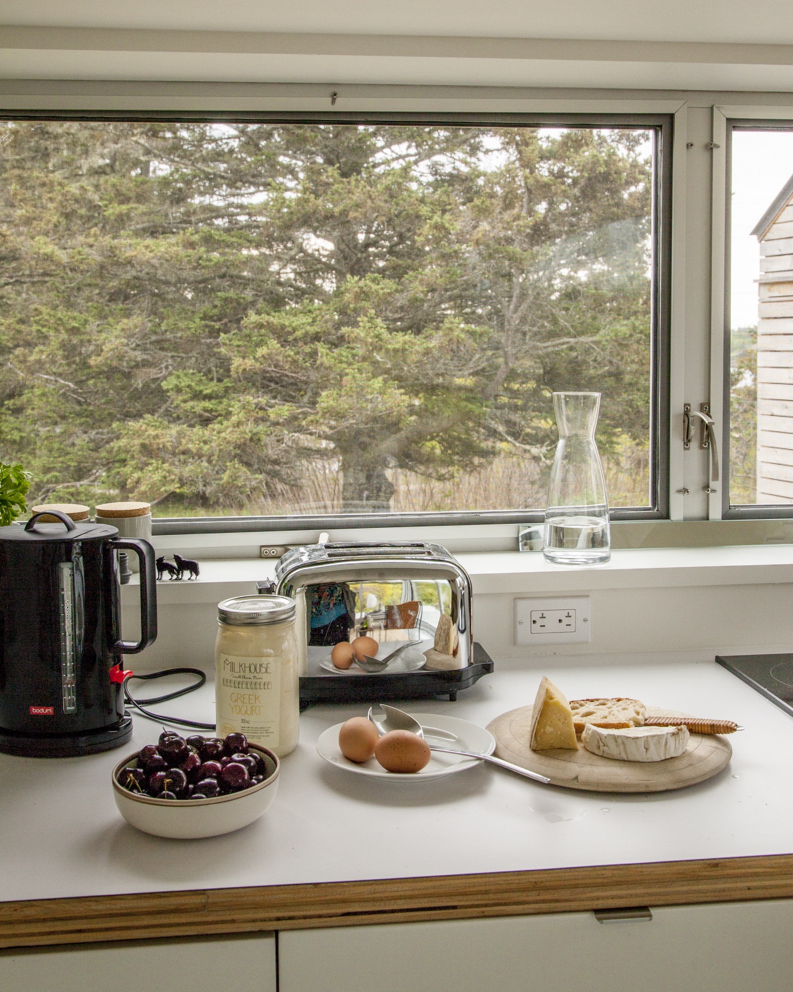
Alpine Modern Holidays
Alpine Modern editor in chief Sandra Henderson shares her guide to a Bavarian-Coloradan Holiday
 This holiday season, Dwell is handing over the mic to some of their publishers on the new Dwell.com. We are tremendously thrilled that our editor in chief, Sandra Henderson, got to share her favorite picks for the season with the Dwell community—and now we are sharing them with you.
Our editor's Guide to a Bavarian-Coloradan Season

I grew up in Bavaria, hiking, skiing, and loving the Alps. With masters degree in political science and sociology in my pocket, I began my journalistic career at a German women’s magazine. On a trip to Washington, DC, I fell in love with my now-husband and eventually moved to the US. I began dreaming about starting a magazine that combines my two passions: modern architecture and the mountains. Meanwhile, living in Colorado, I serendipitously connected with Lon McGowan, an entrepreneur who at the time already owned an impeccably curated design shop in Boulder and shared my vision for a similar publication. Three short months later, we launched Alpine Modern magazine. We printed six beautiful issues before taking our content entirely online.
"Being a minimalist, I love to give beautiful things that are also useful and wearable—or are a treat to eat or drink."
Give

Three Peak Mountain Pillow for $75 from Alpine Modern—Hug a mountain! The handcrafted cushions—inspired by the maker’s yearly summer trips to Bend, Oregon and Three Sisters Wilderness—add a whimsical touch, whether you live in a mountain cabin or an urban condo.

Glerups felt ankle boots for $125—Because you can’t get cozy when your feet are cold. These warm felt house shoes are made of 100 percent pure natural wool and come in all sizes—from baby to grandpa.

Santal Woods Candle for $30 from Alpine Modern—Handmade in the USA, this soy candle fills my house with a wonderful smell of the woods. At the same time, the aroma is elevated and lovely for a festive dinner party.

Keep Cups for $24—For the busy body. Everyone already has a travel mug for on-the-go, but these cute and practical glass cups with lids are made for running up and down the stairs at home without spilling your morning coffee.
Drink
My favorite bubbly and bourbon to share with friends...

Meinklang Pinot Noir Frizzante Rosé from Austria for $18.99—You can pick this up from Whole Foods or order online.

Breckenridge Distillery Whiskey for $45.99—Make your mountainman happy with a bottle of Breckenridge Blend of Straight Bourbon Whiskeys. It’s made with Rocky Mountain snowmelt.
Listen

If on a Winter’s Night by Sting from Amazon for $11.23—The album is a stirring collection of earthy winter songs, with a couple originals composed by Sting. The others include folk songs, lullabies, and hymns from decades and centuries past that were recorded with friends and guest musicians. The haunting sounds transport you deep into a snowy forest. My favorite tune on the album is “Soul Cake,” a traditional English beggar’s song.
Want
On my own wish list this year...

Transcendent Mitts by Outdoor Research for $59—I trust nature’s wisdom, so I usually choose wool or down to keep me warm. These puffy mittens are blissfully light and pack down perfectly in a bag.

Gold Ear Conch Cuff by Loren Stewart from Goop for $285—The idea of wearing an ear cuff is so ‘80s—I know—but this minimalist luxe version, designed by Loren Stewart, is definitely happening now. Beautiful and sophisticated. No piercing required.
Go

Home for the Holidays! What’s a more magical place to be for the Holidays than Bavaria? Lela Rose, my 10-year-old daughter, has never seen my native Germany in winter. I am beyond excited she finally gets to experience the Christmas market in my romantic home town of Dinkelsbühl in December.
And finally—our tree? Always real, with a vintage hand-blown glass top.
Do you have any suggestions on what else you'd need to create a cozy alpine-inspired holiday? Let us know in the comments!
Snow-Proofed Hillside Family Home in Austria
This house can weather even the fiercest winter storm and an avalanche
 Most homeowners would avoid living within striking distance of an avalanche, but Marcell Strolz and Uli Alber embrace alpine extremes. They built a house that could weather even the fiercest storm.
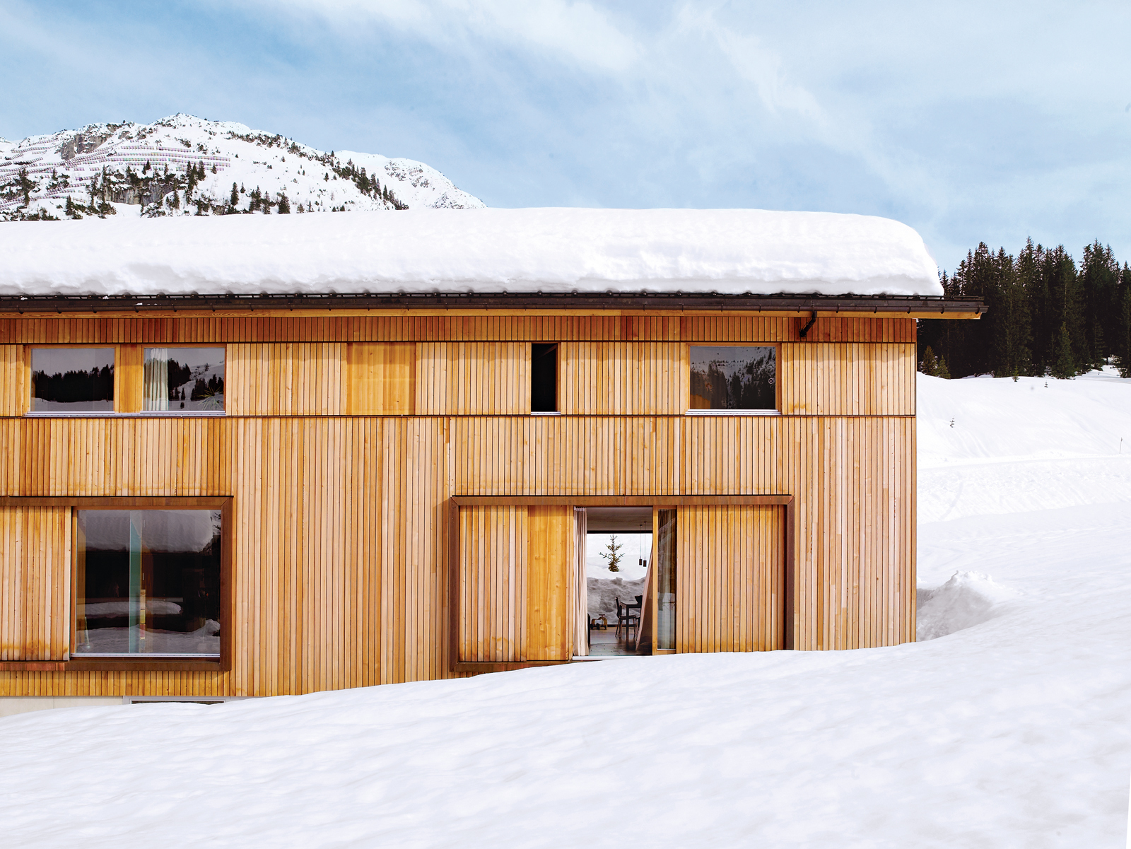
With its world-class skiing and picturesque alpine setting, the Austrian village of Lech seems ripe to become a buzzing tourist destination. But due to strict regulations against second homes and a high risk of winter avalanches, very little building takes place in this small community. Marcell Strolz and Uli Alber were aware of these limitations when they set out to build a family home, and they knew their modern tastes might be contentious in the slow-changing town. The site they chose at the edge of the village afforded them creative freedom with one inherent condition: The house would have to withstand the forceful blows of sliding snow.
Land slope-side
“It is very difficult to get land here for building,” says Strolz. “Beyond us is a pasture where there will never be any other homes.” Having grown up in Lech and having spent many winters volunteering in avalanche protection, Strolz, who works year-round as a project manager for engineering and building contracts around the village, was ready to live a stone’s throw from the ski runs. He and his wife, Uli, a physical therapist and sports trainer, took preparedness seriously as they designed a place to live with their young children, Felix and Emilia.
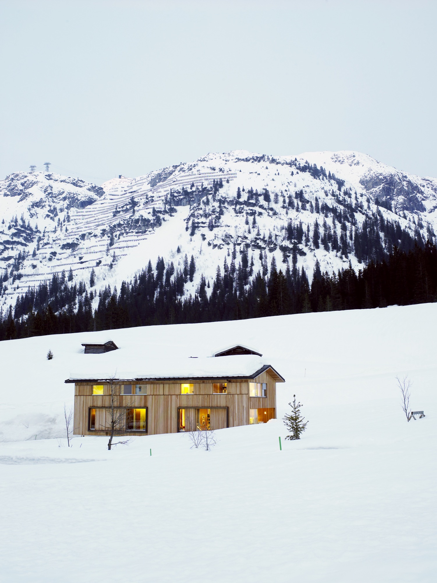
“We used some steelwork in addition to the timber frame to strengthen the house,” says Strolz. “A series of sliding wooden shutters protects the building, as does specially strengthened glass around the kitchen.” These shutters can be closed off to seal the windows against avalanches or during the annual “snow roll” fromthe nearby Omesberg mountain, when a controlled explosion shoots snow downhill past the house. There is also a retractable wooden wall, which disappears into the floor, to protect the open veranda.
Sustainably designed by Helmut Dietrich
The house was designed by Helmut Dietrich of Dietrich Untertrifaller Architekten, an Austrian practice known for its sustainable and sensitive approach to design. “It was very important to all of us that the house have a relationship to the mountains rather than other buildings,” says Dietrich. “It was the connections with nature—and framing the views—that interested me most. It was also important to us to be able to use timber construction, despite the avalanche risks.”
“It was very important to all of us that the house have a relationship to the mountains rather than other buildings."
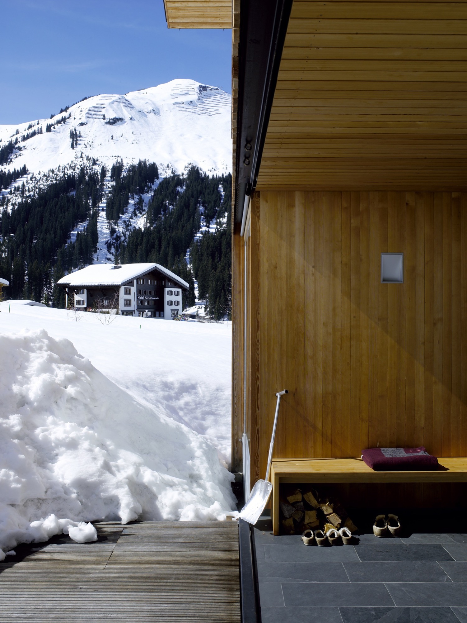
Strolz worked closely with Dietrich throughout the design process, and he managed and participated in the building’s construction. “I got very involved in the preparation of the site, the digging of the foundations, and the concrete base of the house,” he says. “The wooden frame was prefabricated by a local construction company and went up in two days. I also did the drywalling, the floors, some of the electrical—it was quite a lot of work.”
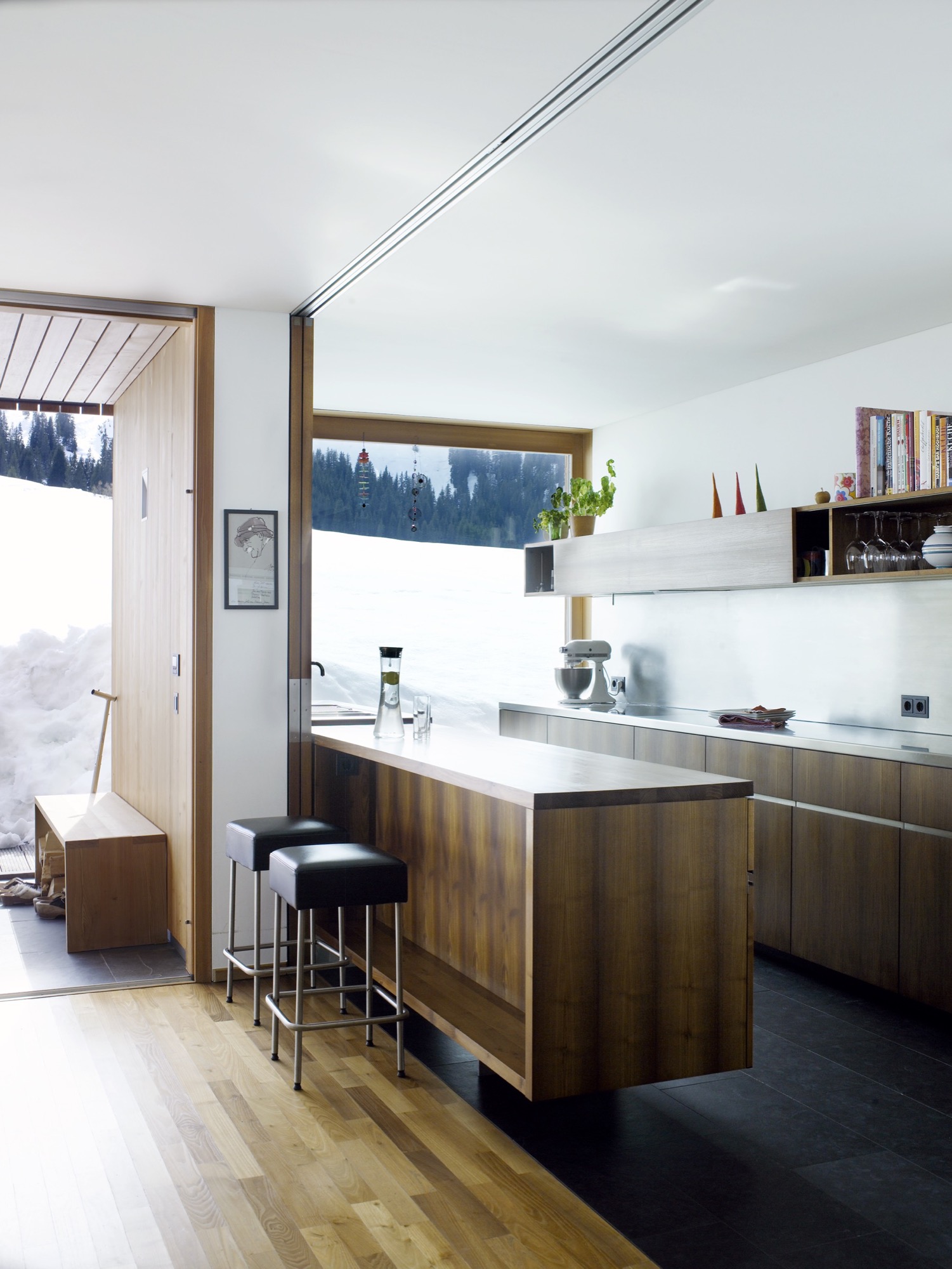
Flexible for family living
Flexibility was a key part of the design. Two separate apartments—one for rental and one for a nanny—are integrated into the building alongside the family’s two-story space. The main living area has an open plan leading out to the veranda, with bedrooms and a study on the floor above. All of the timber for the frame and cladding was sourced from sustainably managed forests.
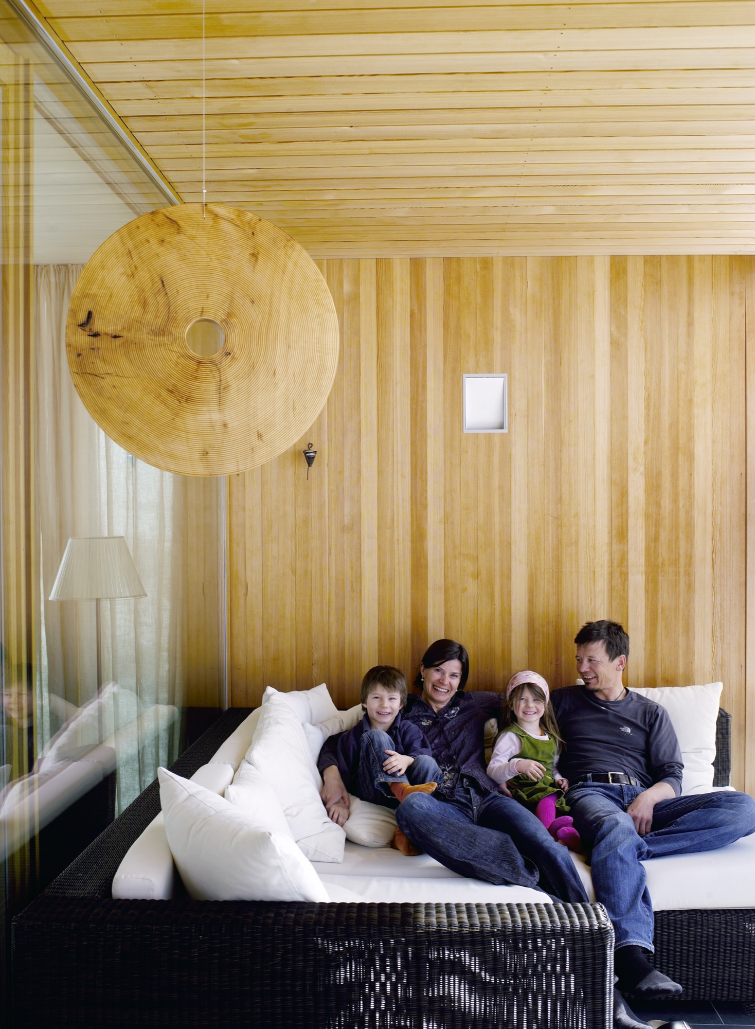
On the roof, Strolz installed solar panels, which are cleared of snow during the winter so that they can function year-round. “The house holds heat very well,” he says. In the summer, excess heat is mitigated through natural cross-ventilation. The shutters that protect the windows from damage double as sun shades, and some rooms of the house have additional internal blinds.
“Most of the new houses in the region address sustainability,” says Dietrich. “In Marcell’s case it was particularly important because of the climate in Lech, where there are long winters with cold temperatures. The house had to cope with the climate while using as little energy as possible.”
"The house had to cope with the climate while using as little energy as possible.”

Their power strategy was supported by one of Strolz’s earlier projects, the construction of a biomass plant for the town of Lech, which was completed ten years ago. Designed by architect Hermann Kaufmann, the plant is sited in a sleek timber-clad building on the road into the village. Its large industrial boilers supply heat and hot water to homes throughout the village.
Progressive architecture in Vorarlberg
The Strolz house is unusual in this rather conservative community, and some compromises were required in order to get the plans approved. “At first, I was told that the house was too long and too high and that the shape of the roof was wrong,” says Strolz.
“So we redesigned it to a certain point and then they said yes.” Despite the changes, the house sits well within the progressive architecture of the Vorarlberg region as a whole, which is famous for its approach to modern design.
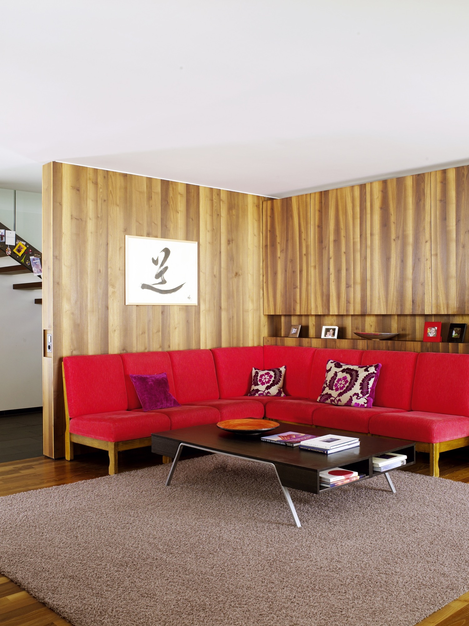
When the weather is fair and the shades are open, one would never know that this graceful house is capable of becoming a fortress. The light-filled building and stretches of open space beyond are ideal places for the kids to play. But when cold weather comes, the family takes comfort in a design that keeps them safe, even if the mountains shake loose a season’s worth of snow. △
An Aspen House Lives Up to LEED
Smart technology helps a house in Aspen, Colorado, stay on its sustainable course
 The Aspen residence of architects Sarah Broughton and John Rowland aims to leave the pristine local landscape intact.
“Every drop of water that lands on the property finds its way to the bocce ball court, which is our storm-water filtration system,” Rowland says. “By the time it leaves, and heads to the aquifer, it’s as pure as it can get.”
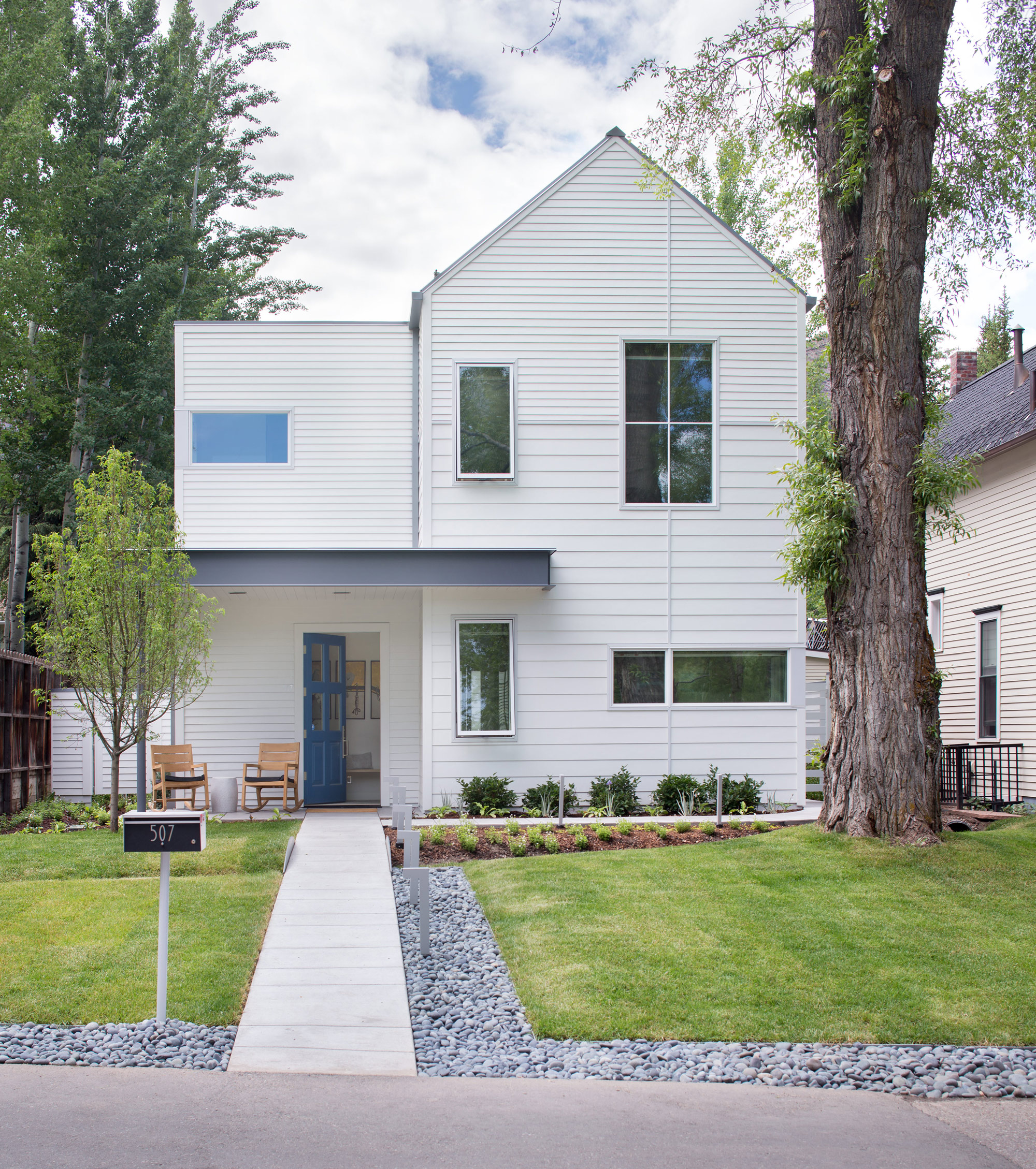
The couple’s house is LEED Gold certified, a rating they achieved by taking into account a number of considerations: They designed the structure so that a large tree in the front yard could be retained; construction was executed to minimize erosion and site impact; and the house itself has high-efficiency plumbing fixtures, among other features. Photovoltaic panels provide about 60 percent of the abode’s energy.
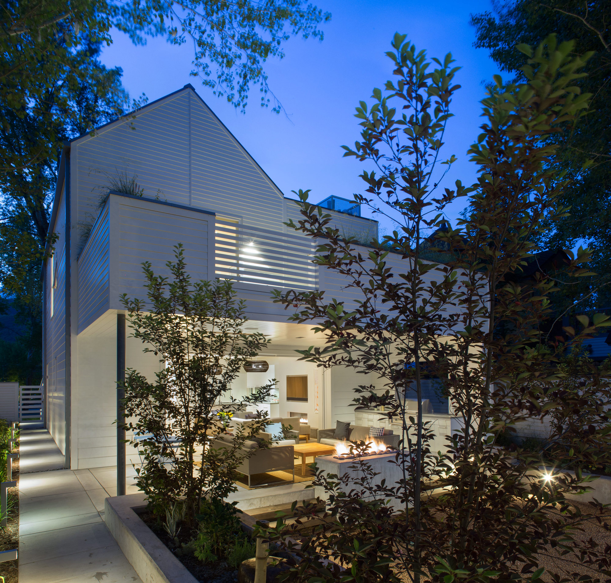
Outdoor entertaining is made possible by a wall of pocket doors from Weiland. “It really expanded the living room, because the doors just go away,” Broughton says. The couple use the Savant system to play music—two speakers are installed in the ceiling of the covered porch, and there are more in the garden. “The outdoor area rocks, literally,” Rowland says.
The residents have wired their mechanical room and solar technology to a Savant home automation system, which they use to keep an eye on the home’s performance. They’ve configured the system’s app to deliver a breakdown of the dwelling’s energy usage in a pie chart. “Last spring, when we were starting to open the windows, I looked at it and said, ‘Oh my gosh, the humidifier is running full-time, and it’s the largest energy hog right now,’ ” Rowland says. “It was time to turn it off.” He notes that they also closely monitor another culprit so it doesn’t run unnecessarily: The heat tape used in the gutters to prevent snow buildup is a big draw.
“The outdoor area rocks, literally.”
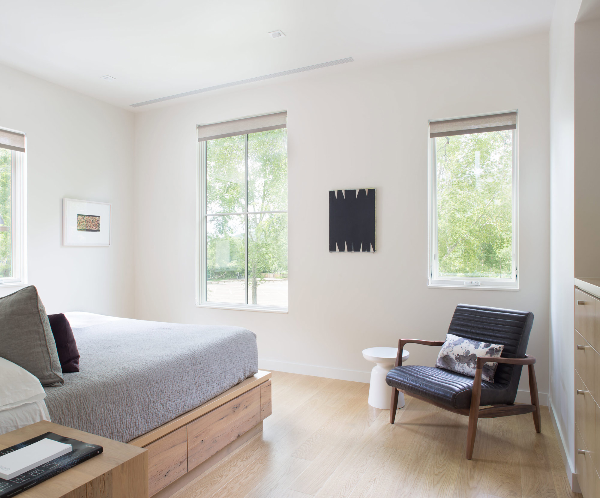
The house is optimized for gatherings. A guest apartment equipped with bunk beds sits under the garage, and a wall of sliding doors from Weiland enables indoor/outdoor functions—Broughton and Rowland once hosted a 25-person dinner party that seamlessly stretched from the dining room to the patio, thanks to tables set up in both places. Technology aids in the couple’s entertaining: Big music fans, they use the Savant system to stream audio across the property. Keyless door locks from Schlage hook up to the Savant setup, and the duo can assign visitors guest codes that will expire after they leave. But the couple purposely steered away from additional automation features—such as connected thermostats—to avoid confusing guests who aren’t familiar with the systems.
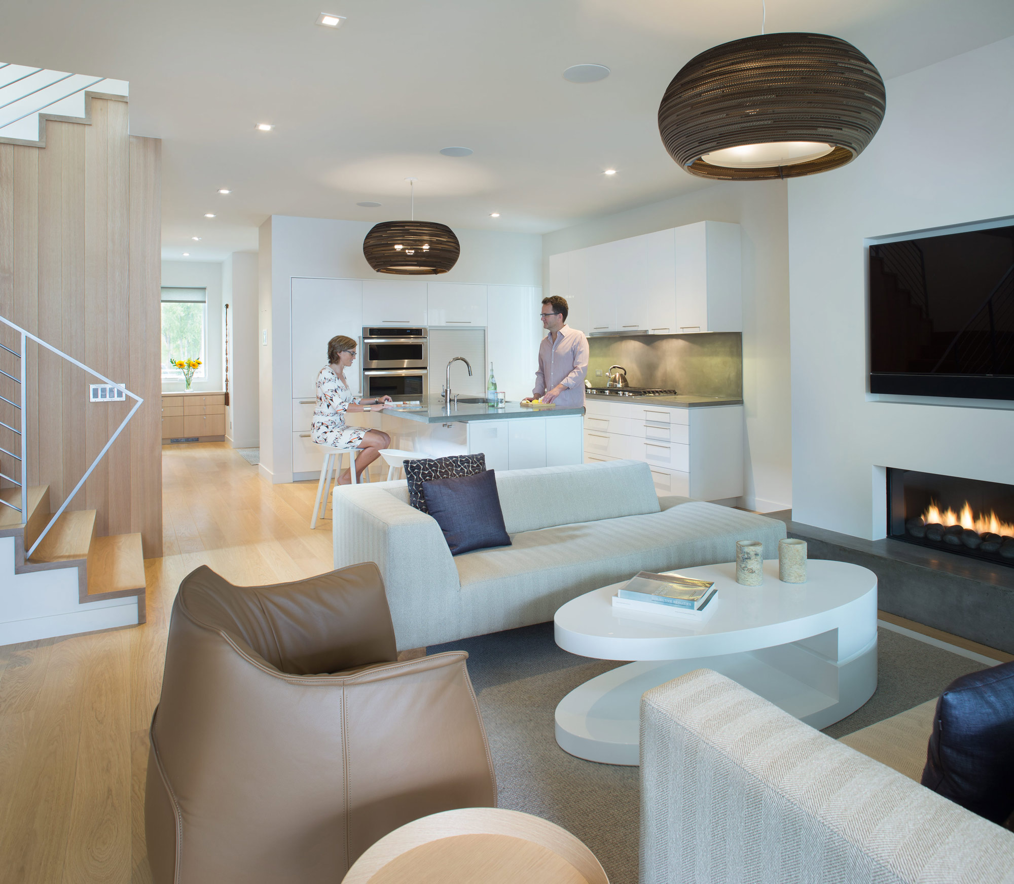
For themselves, though, Broughton and Rowland value the ability to ensure that their house is living up to its green rating. “I wish more of our clients would use tech to understand their consumption,” Rowland says. “A lot of people don’t even pay attention, and things are just running. As architects, we need to be in tune with that.”
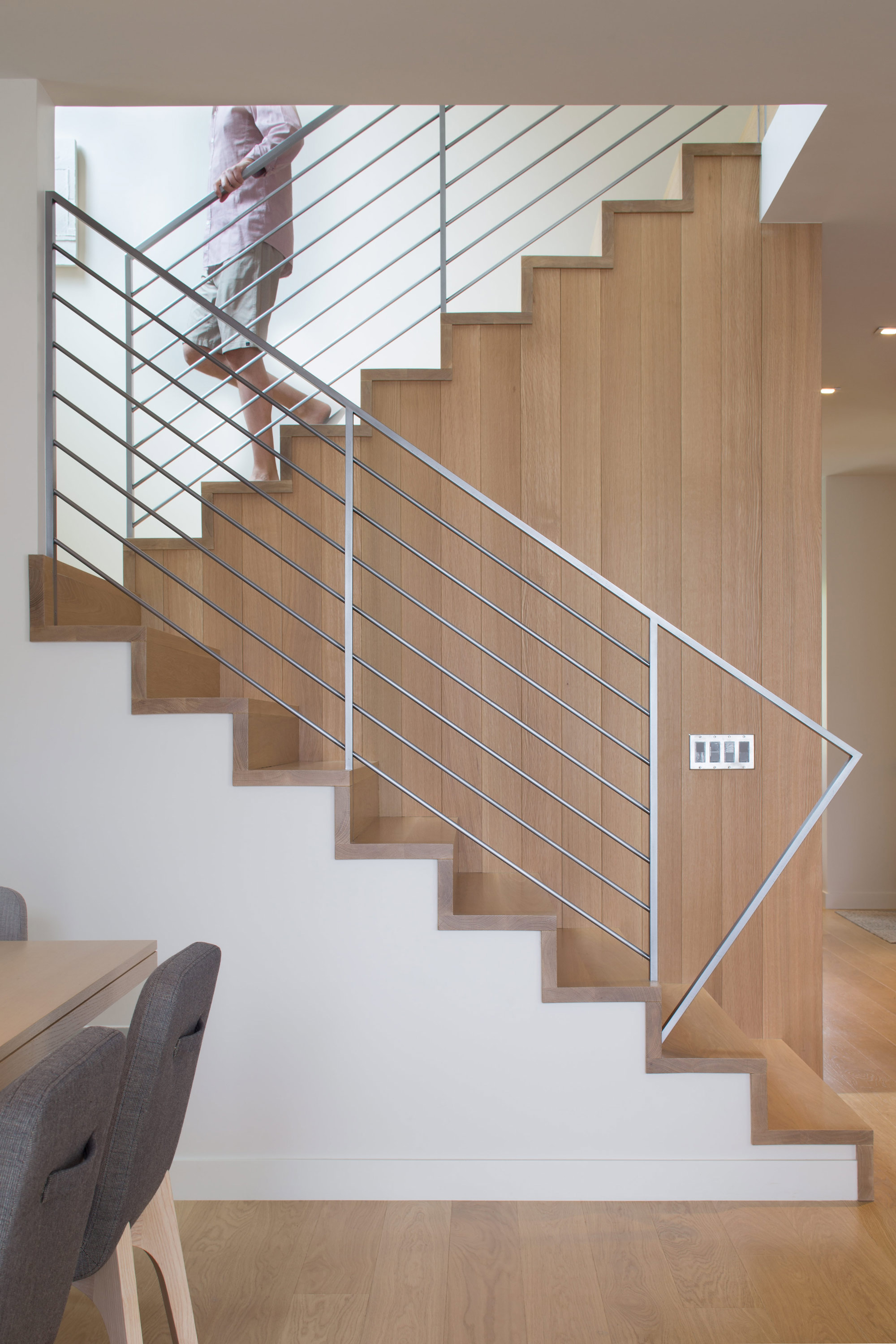
The materials are limited to white millwork and white oak. “When we come home, we want something serene,” Broughton says. △
“I wish more of our clients would use tech to understand their consumption. A lot of people don’t even pay attention, and things are just running. As architects, we need to be in tune with that.”
Dwell × Alpine Modern
We are incredibly excited to announce our partnership with Dwell
From the very beginning, as we imagined Alpine Modern to be a publication about modern architecture, design and elevated living in the mountains around the world, telling people about our vision has usually included something like "You know, like if Dwell and Cereal magazine had a lovechild in the mountains..." Dwell's authority in showcasing international modern architecture and design has inspired us in our own work. This is why we are incredibly proud to announce that today marks the beginning of our partnership with Dwell.
This means, you will see some of our editorial stories on the new (launched today!) Dwell.com, published under the banner of Alpine Modern. What's more, we will present Alpine Modern "Curations" — a new element of the redesigned Dwell.com. This can be anything from a product roundup from the Alpine Modern Shop to a themed collection of stories about cabins, art and journeys in Norway.
In return, you will read cherry-picked Dwell content on Alpine Modern Editorial.
Follow @alpine_modern along on Dwell.com as Dwell and Alpine Modern together kindle a longing for elevated living, through slow storytelling, amazing photography and tightly curated alpine-modern objects. △
