Inspirations
Explore the elevated life in the mountains. This content debuted in 2015 with Alpine Modern’s printed quarterly magazine project.
Minimalist Metamorphosis: Cowshed turns cultural center
A local hotelier turns his family's old barn into a beautiful center of cultural life — the Allmeinde — in Lech, Austria
Most people must choose to live amongst urban intellect or natural beauty. Gerold Schneider and Katia Polletin, founders of Allmeinde Commongrounds cultural center, are proof that you can be surrounded by both.

Schneider grew up in the tiny Austrian mountain village of Lech, also known as the cradle of Alpine skiing. His parents owned and operated Almhof, one of the ski town’s top five-star hotels, and his childhood revolved around skiing and helping with the family business. Like many small town kids, Schneider fled the mountains for the city and moved to Vienna to study art, architecture, and philosophy. “A lot of people from rural areas move to cities and get a taste of art, music, design, food, and they never return,” he says. But the sudden death of his father and illness of his older brother drew Schneider—and his architect-wife Polletin—back home to help his mother, Hannelore, run the family hotel.
“A lot of people from rural areas move to cities and get a taste of art, music, design, food, and they never return.”
Old cowshed turns splendid cultural center
While Schneider never intended on becoming a hotelier, he did toy with the idea of one day doing something with the arts in Lech. As he and Polletin set about respectfully updating the hotel they also set their sights on a rustic, family-owned barn just up the road from the Almhof. The cosmopolitan couple’s plans to convert the old cowshed into a cultural center for exhibitions and artists in residence were met with small-town mentality suspicion. “There are many things I love about Lech, but locals have an aversion to change,” says Schneider. “They are stuck in the past.” Each winter, Lech attracts an international, discreet (compared to Courchevel or Aspen) jet set crowd that Schneider believed would welcome a dose of culture to complement the powder-dusted slopes and après-ski cocktails.
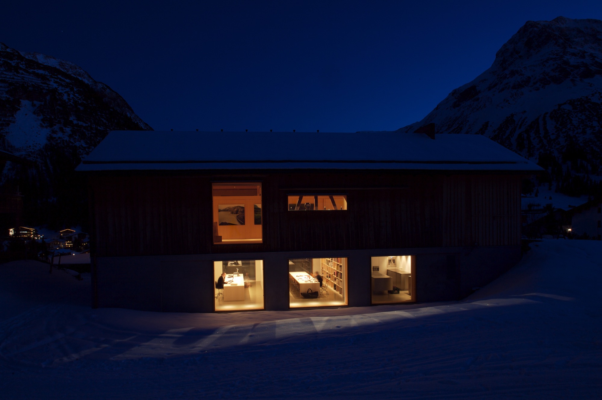
The barn—functional, minimalist Alpine design
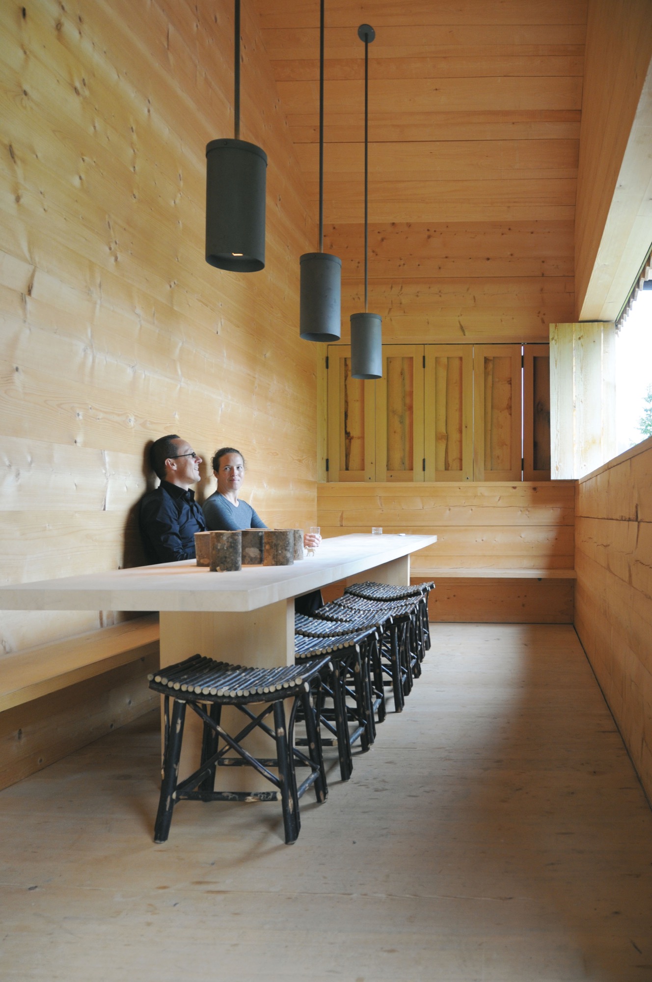
In 2000, Schneider and Polletin began transforming the two-story barn into the Allmeinde, an Austrian word that means a public, open pasture. Sensitive to the ski town’s postcard perfect landscape, the pine wood exterior of the Allmeinde is nearly indistinguishable from any other neighboring weathered barn. The only difference is the sliding barn doors have been turned into an enormous window that rolls open to views of the Schlegelkopf mountain ski runs. The interiors, however, are an ingenious example of minimalist Alpine design and functional, fluid living space. On the second floor, the original vaulted beams frame a 1,500-square-foot (ca. 140-square-meter) space divided by a birch cabinet unit. At first glance, it looks like a stark gallery space, sparsely decorated with a few rough-hewn wood chairs and framed alpine-inspired photographs. But, the cabinet unit is like a perfectly packaged gift that neatly unfolds like origami to reveal a studio apartment living space complete with a kitchen, bathroom, shelving, desk area, and Murphy bed.

The atelier-inspired downstairs space holds a private library curated with nearly 2,000 books on music, philosophy, travel, and art. There’s also an office and screening room as well as a kitchen and bedroom, which are used by the family in the summer and visiting artists in the winter. The Allmeinde hosts one exhibition per winter season—all free to the public. Past exhibitions have included British sculptor Antony Gormley, American artist James Turrell, and most recently Italian photographer Walter Niedermayer, whose images brilliantly dissect the landscape of alpine tourism.
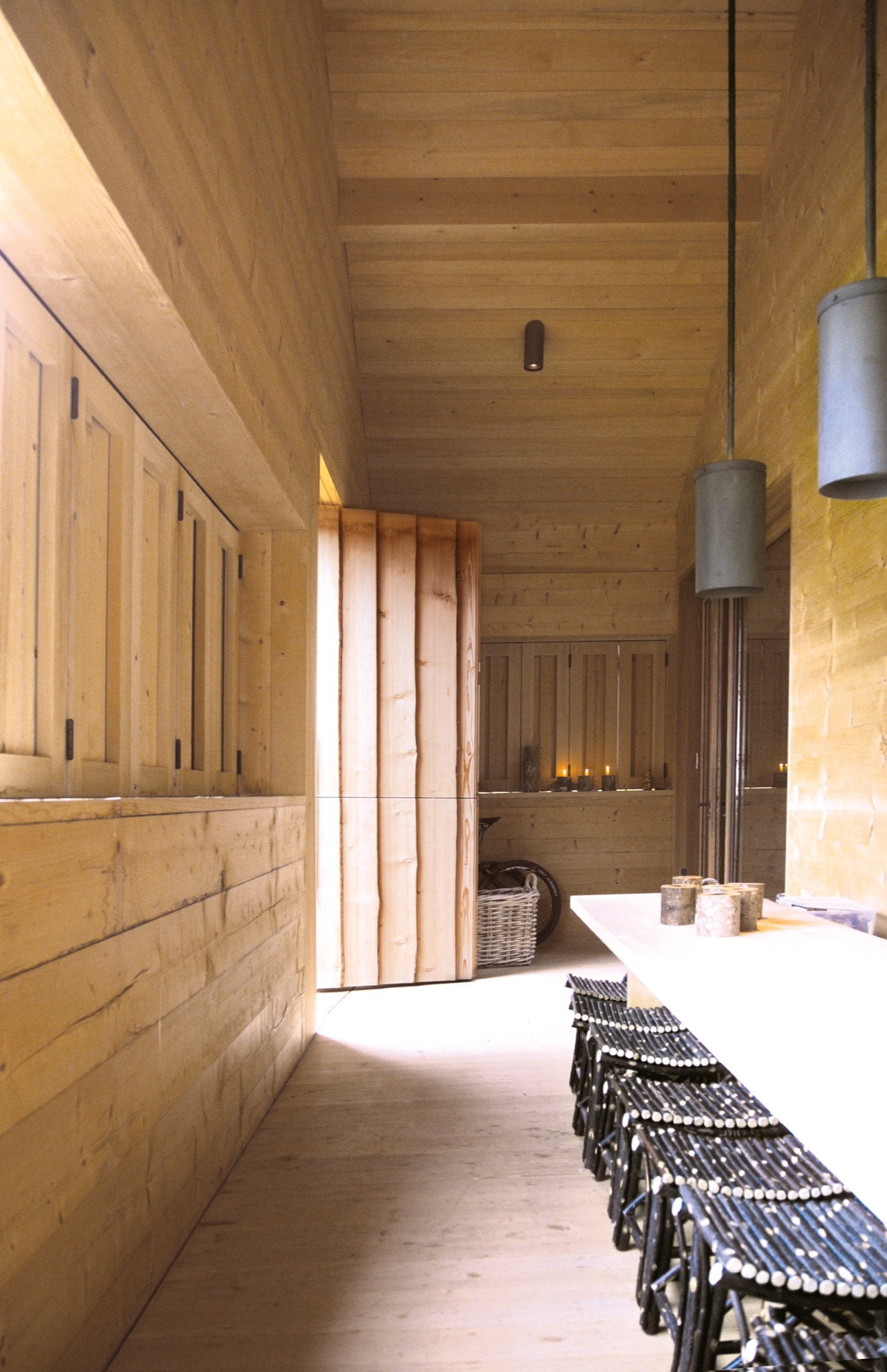
An evolution of tradition
While some locals have viewed the Allmeinde as a threat to tradition, Schneider and Polletin see it as an evolution of tradition, bringing a fresh, international aesthetic to local materials and craft. “Just because you live in the mountains, does not mean you have to be cut off from the world,” says Polletin. “The Allmeinde is part of our identity in Lech. It’s important for us to have this outlet. It’s a celebration of the space we live in—manmade and natural.” △
“Just because you live in the mountains, does not mean you have to be cut off from the world.”
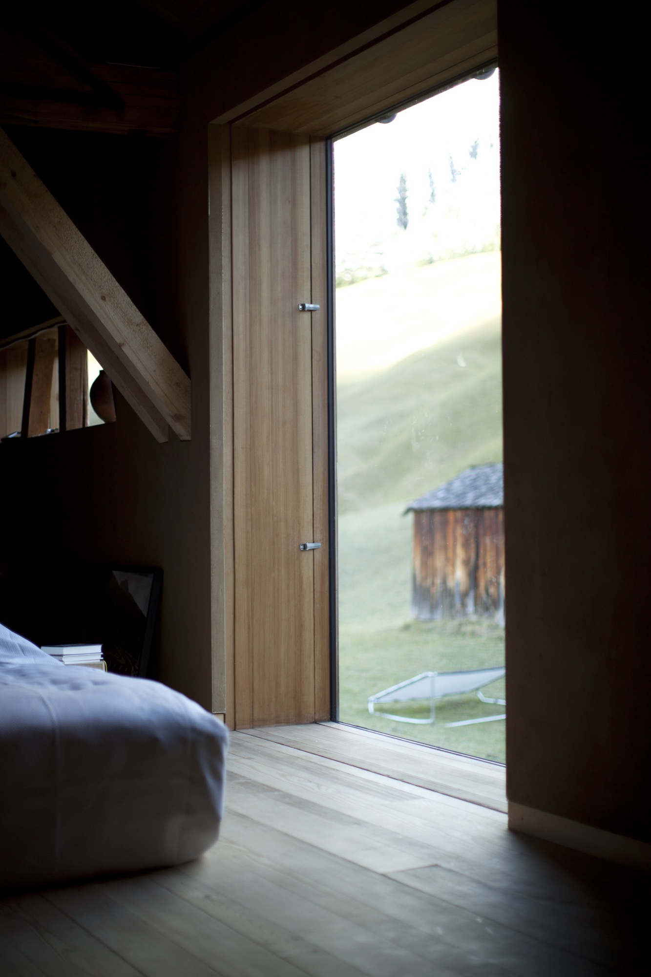
Editor's Choice: Modern design in the Austrian Alps
Stable in the Landscape
An award-winning Austrian architect ennobles vernacular alpine building tradition to sophisticated minimalism. Read more »
***
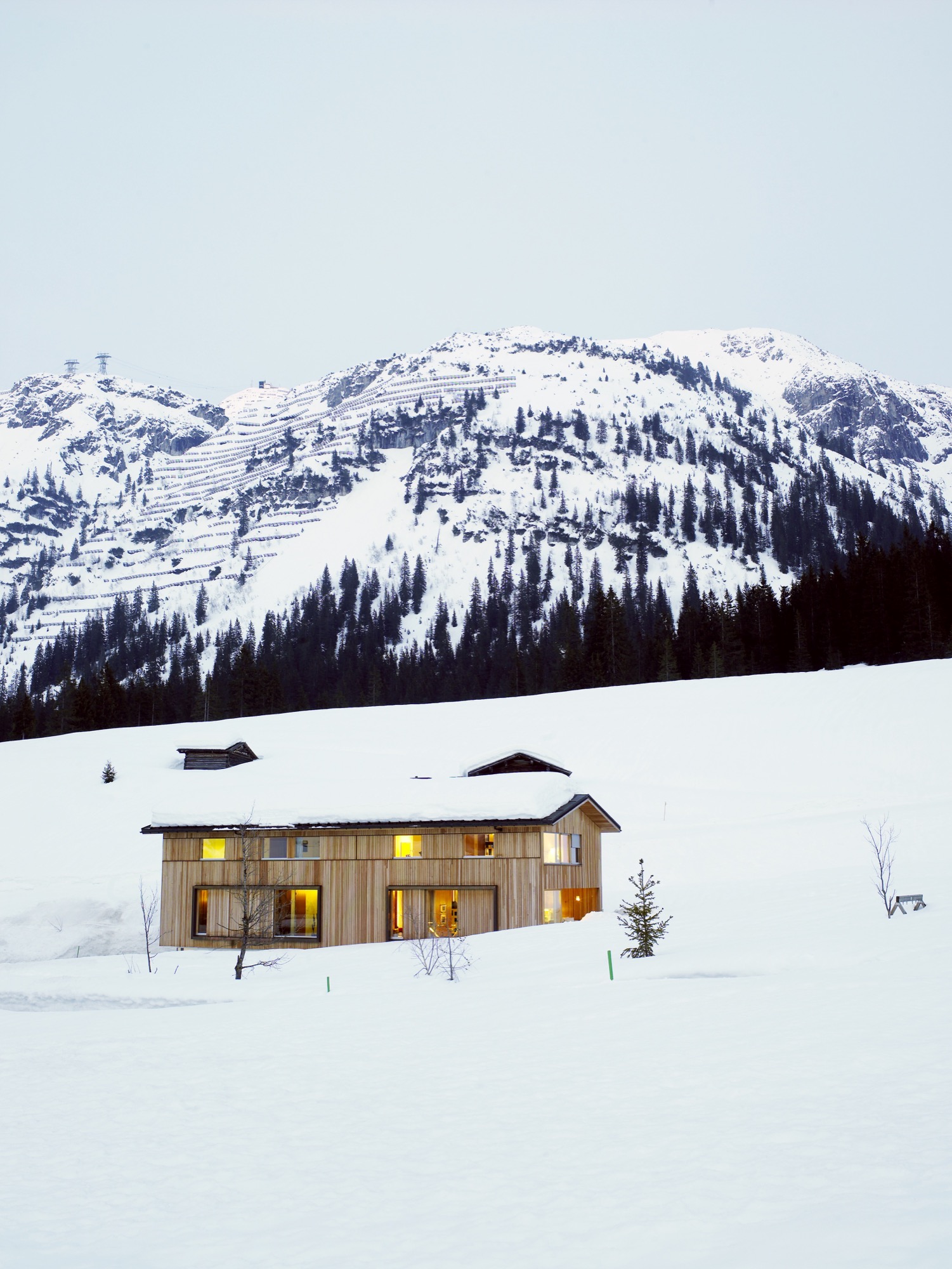
Snow-Proofed Hillside Family Home in Austria
This house can weather even the fiercest winter storm and an avalanche. Read more »
***
Context and Contrast in the Alps
An Austrian vacation home’s design references its mountainside setting and expansive views across the valley. Read more »
***
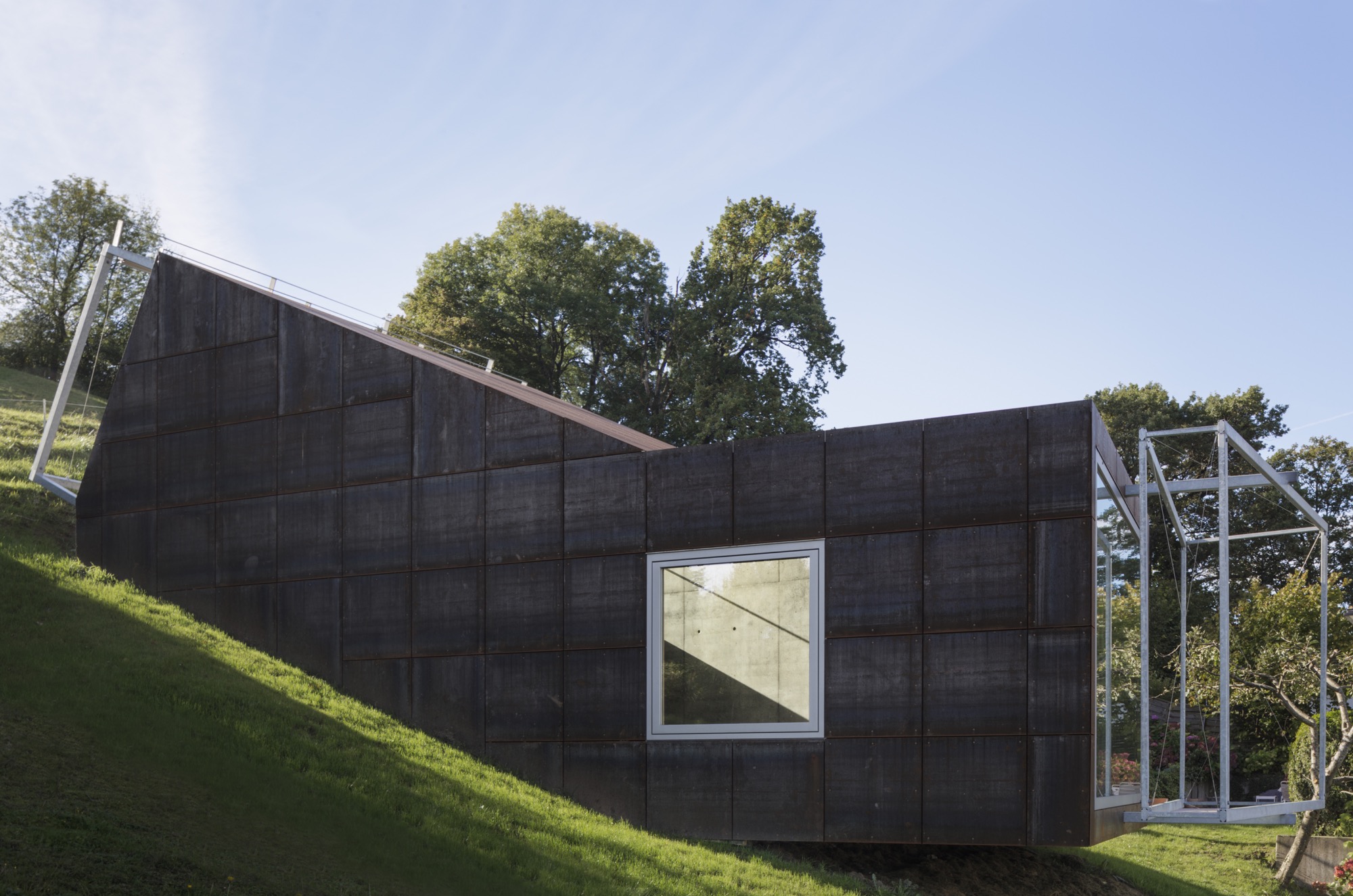
Camera Lucida
The small studio Vienna architect Christian Tonko designed for an artist friend becomes a looking device into the landscape, set in the foothills of the Austrian Alps. Read more »
***
They Call It Happiness: Hotel Wiesergut
A serene retreat in the Salzburger Land, set against ski slopes and hiking trails. Read more »
***
The Height of Hip: Kristallhütte
A slope-side hotel and hipster après-ski hangout in Austria’s Hochzillertal. Read more »
Recipe: Germknödel with Plum Filling
An Austrian ski hut favorite by Austrian top chef Martin Reiter of Hotel Kitzhof in Kitzbühl, Tyrol
Germknödel are a classic lunch favorite at ski huts in the Austrian alps. The fluffy, steamed yeast dumplings are so filling, this comfort food can be a main dish all on their own. The traditional filling is Powidl (a thick spiced plum mousse), which can easily be substituted with plum jam. Germknödel are topped with melted butter and a generous heaping of a mixture of ground poppy seeds and powdered sugar. Recipe by Austrian top chef Martin Reiter, Hotel Kitzhof, Kitzbühl,Tyrol
INGREDIENTS
Makes 6 Germknödel
250 gr flour, divide 15 gr fresh yeast 25 gr butter, softened 1/8 liter warm milk 25 gr powdered sugar 2 egg yolks 1 tsp vanilla sugar (if you can’t get the little sachets, substitute with 1 tsp sugar mixed with 1/4 tsp vanilla extract) lemon zest a dash of salt 6 tbsp plum jam for filling
Topping
90 gr melted butter 90 gr ground poppy 50 gr powdered sugar
STEPS
Dissolve yeast in warm milk, stir in 50 gr of the flour, then sprinkle some flour on top, cover, and let rest in a warm place. This is called the Dampfl.
Heat water in double boiler pot set.
Add softened butter, powdered sugar, vanilla sugar, egg yolk, lemon zest, and salt into double boiler and beat until foamy and warm.
Knead Dampfl with the remaining flour and butter mixture into a smooth dough.
Divide dough into 6 parts, form balls, cover with cloth, and let rest for 30 minutes.
Once the dough has risen, flatten each ball and set 1 tbsp plum jam in the middle. Fold edges up and pinch together so dough closes around the plum filling. Set on floured surface with pinched closure facing down, cover with cloth, and let rest once more until dumplings have risen by half of their volume.
Meanwhile, bring water to a simmer in large pot.
Carefully drop dumplings in the water and simmer for 15 minutes with the pot lid half on, flipping the dumplings over half way through.
Meanwhile, mix ground poppy seeds and powdered sugar for topping.
Place each hot dumpling on a plate and top with melted butter and poppy seed/powdered sugar mixture (the locals heap it on).
For a less traditional yet heavenly delicious variation, top Germknödel with warm vanilla sauce instead of the melted butter, sprinkle with poppy seeds and sugar.
An Guadn!
Snow-Proofed Hillside Family Home in Austria
This house can weather even the fiercest winter storm and an avalanche
 Most homeowners would avoid living within striking distance of an avalanche, but Marcell Strolz and Uli Alber embrace alpine extremes. They built a house that could weather even the fiercest storm.
With its world-class skiing and picturesque alpine setting, the Austrian village of Lech seems ripe to become a buzzing tourist destination. But due to strict regulations against second homes and a high risk of winter avalanches, very little building takes place in this small community. Marcell Strolz and Uli Alber were aware of these limitations when they set out to build a family home, and they knew their modern tastes might be contentious in the slow-changing town. The site they chose at the edge of the village afforded them creative freedom with one inherent condition: The house would have to withstand the forceful blows of sliding snow.
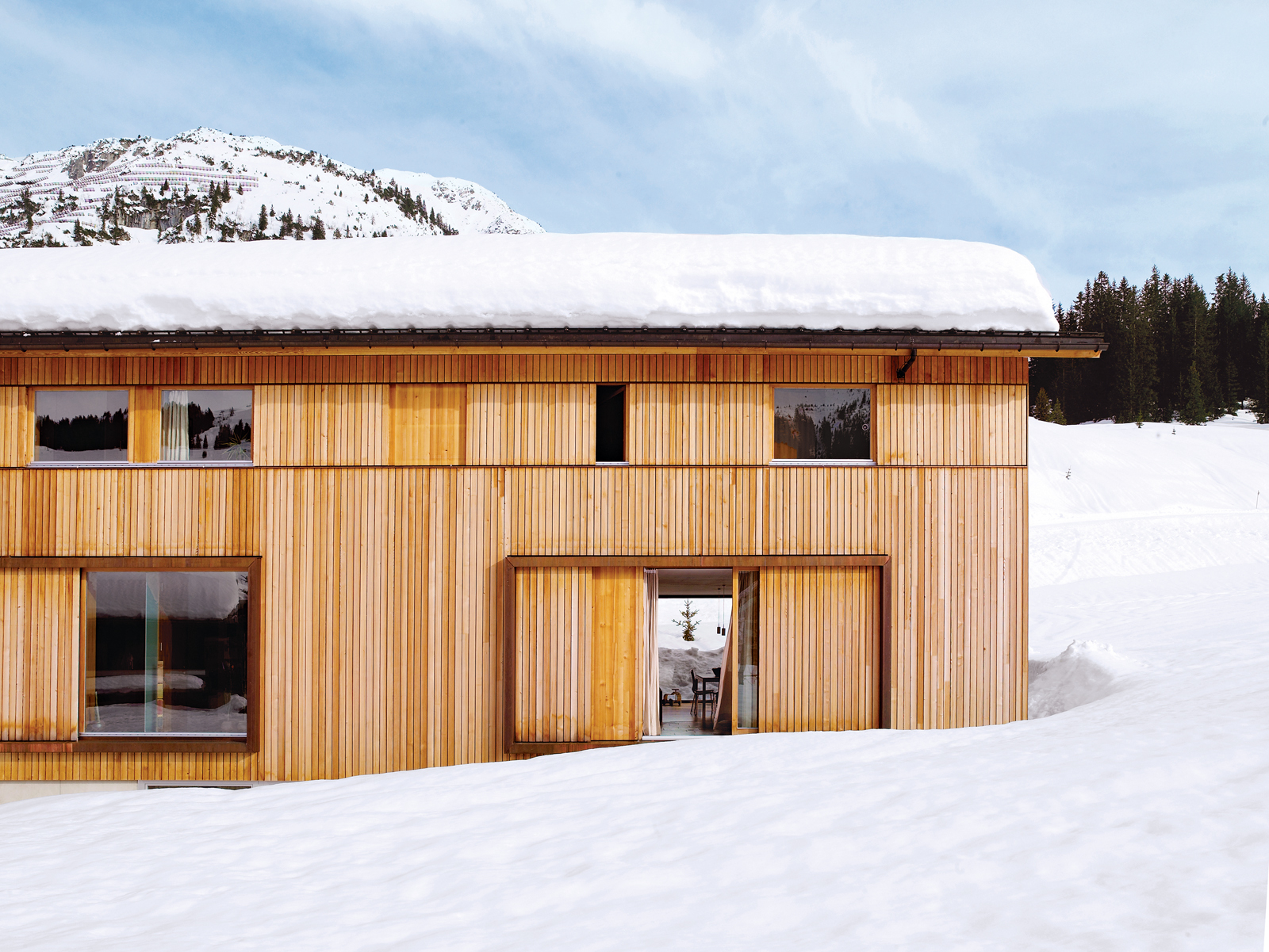
Land slope-side
“It is very difficult to get land here for building,” says Strolz. “Beyond us is a pasture where there will never be any other homes.” Having grown up in Lech and having spent many winters volunteering in avalanche protection, Strolz, who works year-round as a project manager for engineering and building contracts around the village, was ready to live a stone’s throw from the ski runs. He and his wife, Uli, a physical therapist and sports trainer, took preparedness seriously as they designed a place to live with their young children, Felix and Emilia.
“We used some steelwork in addition to the timber frame to strengthen the house,” says Strolz. “A series of sliding wooden shutters protects the building, as does specially strengthened glass around the kitchen.” These shutters can be closed off to seal the windows against avalanches or during the annual “snow roll” fromthe nearby Omesberg mountain, when a controlled explosion shoots snow downhill past the house. There is also a retractable wooden wall, which disappears into the floor, to protect the open veranda.

Sustainably designed by Helmut Dietrich
The house was designed by Helmut Dietrich of Dietrich Untertrifaller Architekten, an Austrian practice known for its sustainable and sensitive approach to design. “It was very important to all of us that the house have a relationship to the mountains rather than other buildings,” says Dietrich. “It was the connections with nature—and framing the views—that interested me most. It was also important to us to be able to use timber construction, despite the avalanche risks.”
“It was very important to all of us that the house have a relationship to the mountains rather than other buildings."
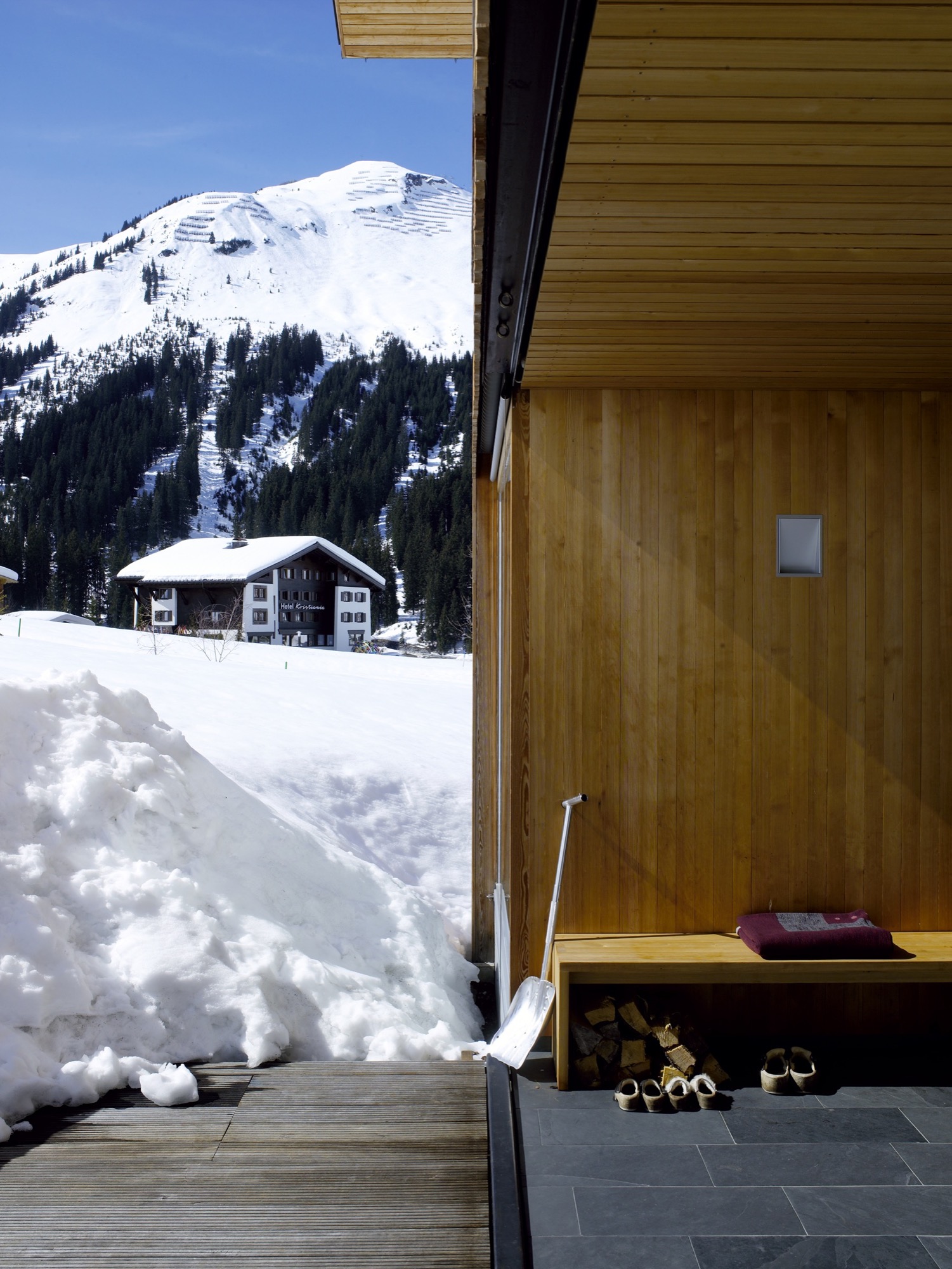
Strolz worked closely with Dietrich throughout the design process, and he managed and participated in the building’s construction. “I got very involved in the preparation of the site, the digging of the foundations, and the concrete base of the house,” he says. “The wooden frame was prefabricated by a local construction company and went up in two days. I also did the drywalling, the floors, some of the electrical—it was quite a lot of work.”
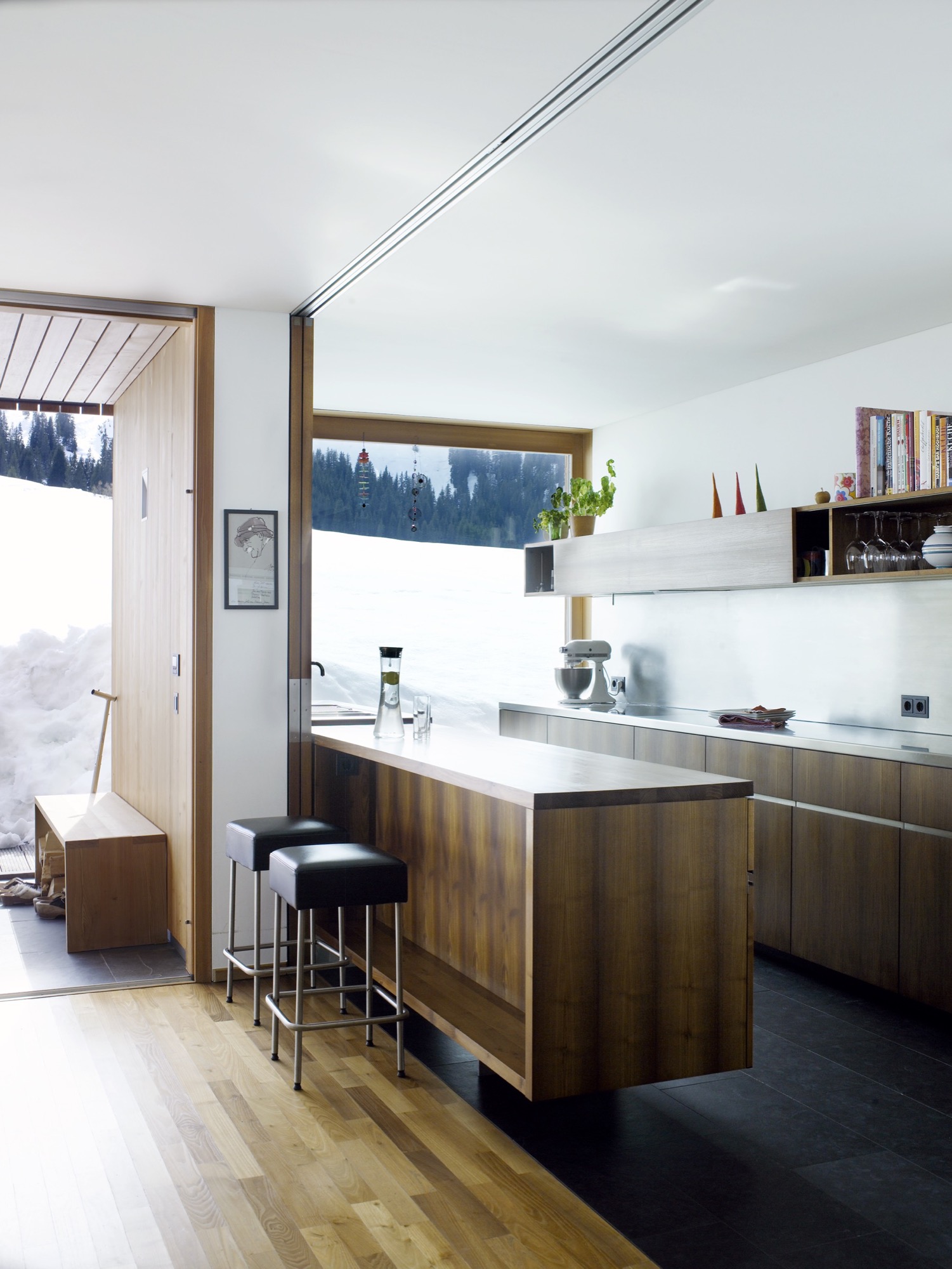
Flexible for family living
Flexibility was a key part of the design. Two separate apartments—one for rental and one for a nanny—are integrated into the building alongside the family’s two-story space. The main living area has an open plan leading out to the veranda, with bedrooms and a study on the floor above. All of the timber for the frame and cladding was sourced from sustainably managed forests.
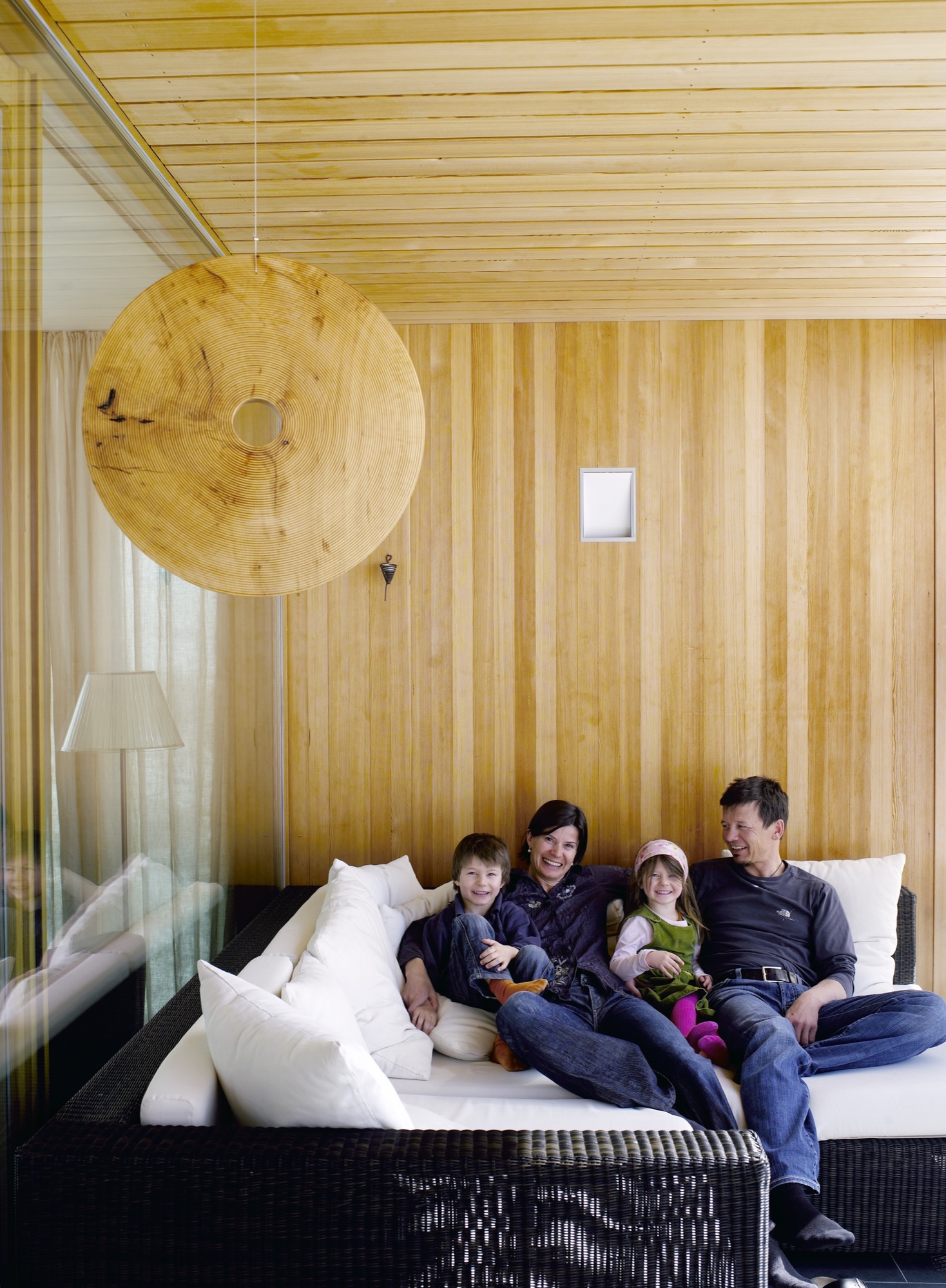
On the roof, Strolz installed solar panels, which are cleared of snow during the winter so that they can function year-round. “The house holds heat very well,” he says. In the summer, excess heat is mitigated through natural cross-ventilation. The shutters that protect the windows from damage double as sun shades, and some rooms of the house have additional internal blinds.
“Most of the new houses in the region address sustainability,” says Dietrich. “In Marcell’s case it was particularly important because of the climate in Lech, where there are long winters with cold temperatures. The house had to cope with the climate while using as little energy as possible.”
"The house had to cope with the climate while using as little energy as possible.”

Their power strategy was supported by one of Strolz’s earlier projects, the construction of a biomass plant for the town of Lech, which was completed ten years ago. Designed by architect Hermann Kaufmann, the plant is sited in a sleek timber-clad building on the road into the village. Its large industrial boilers supply heat and hot water to homes throughout the village.
Progressive architecture in Vorarlberg
The Strolz house is unusual in this rather conservative community, and some compromises were required in order to get the plans approved. “At first, I was told that the house was too long and too high and that the shape of the roof was wrong,” says Strolz.
“So we redesigned it to a certain point and then they said yes.” Despite the changes, the house sits well within the progressive architecture of the Vorarlberg region as a whole, which is famous for its approach to modern design.
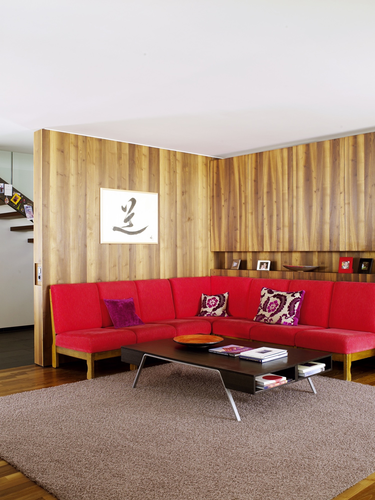
When the weather is fair and the shades are open, one would never know that this graceful house is capable of becoming a fortress. The light-filled building and stretches of open space beyond are ideal places for the kids to play. But when cold weather comes, the family takes comfort in a design that keeps them safe, even if the mountains shake loose a season’s worth of snow. △
Stable in the Landscape
An award-winning Austrian architect ennobles vernacular alpine building tradition to sophisticated minimalism
Austrian architect Thomas Lechner reduces the idea of vernacular alpine architecture to a design so consequentially essential in what is left that his minimalist structures become sophisticated and sexy.

The Hochleitner house in Embach is no exception. The project’s objective was notably elemental: The client wanted a house for himself and his books; a building void of any status. “To realize this vision, we referenced the surrounding area’s simple Heustadln (hay barns) and conceived an honest wooden structure,” says Lechner, co-founder and principal at LP Architektur.
A modern mountain man of tradition
“The mountains mean a tremendous deal to me because they astonish me time and again, demand my respect, and give me a lot of energy.”

Lechner was Born in Altenmarkt in Austria’s Pongau region in 1970. After earning his architecture degree from the Technical University Graz and practicing at several firms in Salzburg and Berlin, he returned to his native alpine town to open his own atelier.
When I ask who is his idol in the architecture and design world, Lechner, whose firm is nominated for the Mies van der Rohe Award 2017, replies there is no reason to apotheosize anyone or anything—“But you can regard fellows in your field and their accomplishments with respect and joy.”
The architect is happiest when he is able to be self-aware and live in the present moment. “That’s the honest life—it feels good,” he says.
The surrounding peaks profoundly inspire Lechner as a man and architect: “The mountains mean a tremendous deal to me because they astonish me time and again, demand my respect, and give me a lot of energy,” he says. “They relativize much of everyday life to what is essential.”
The Hochleitner house
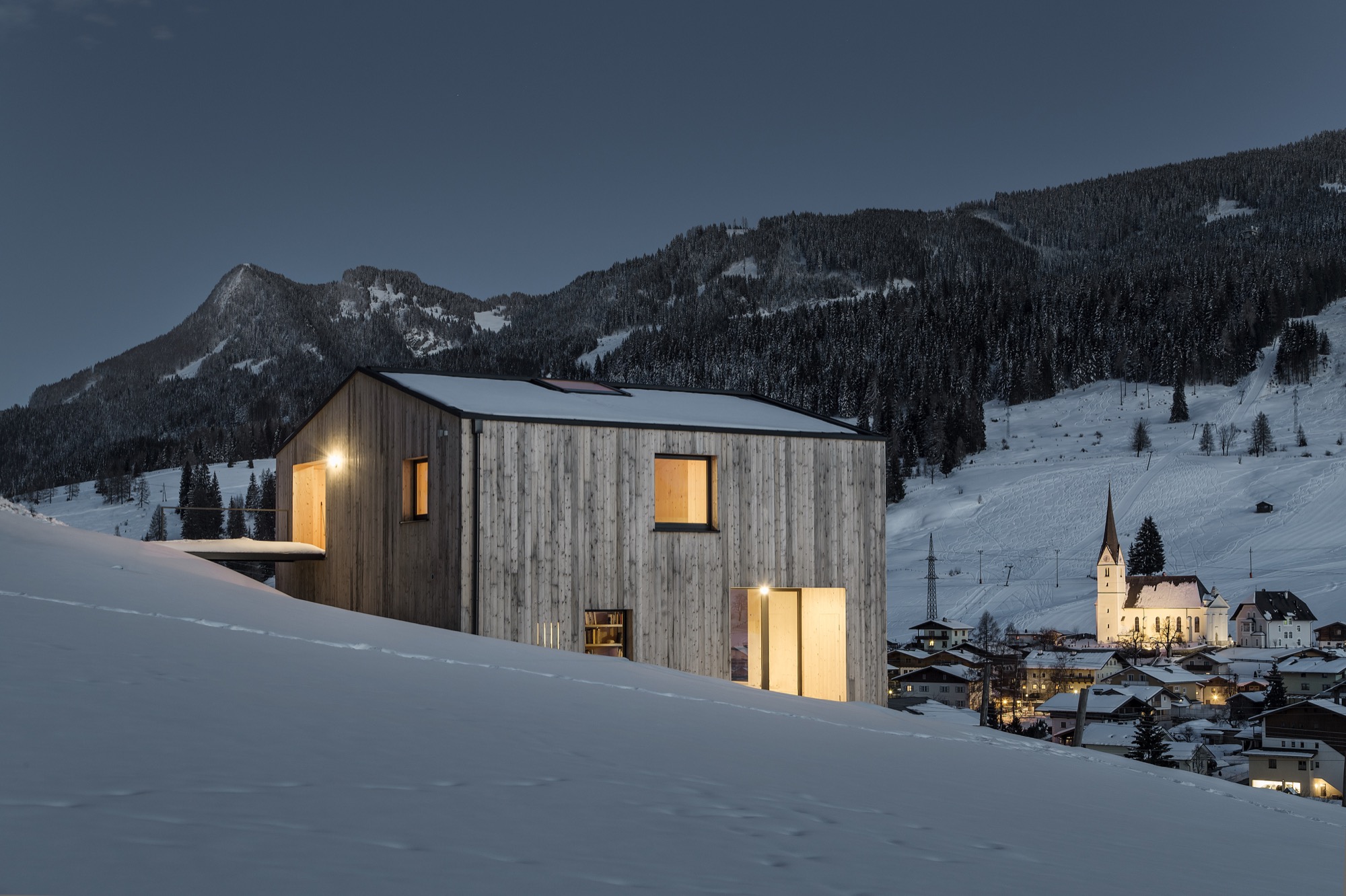
Extracting what is essential also drove his design of the Hochleitner house. Completed in 2016, the 105-square-meter (1130-sqare-foot) primary residence is set in a meadow that borders a neighborhood to the north but is largely undeveloped to the south.

“The site is somewhat exposed in the landscape and requires sensibility,” Lechner says. “The architecture refers to the surrounding landscape by referencing local vernacular building tradition—a wood construction with a weathered facade, pitched roof, etc.”

Looking back at the project, the architect is proud of how the house innately adapts to its bucolic setting, and that no secondary structures, such as a carport, obscure the architecture or unnecessarily bring the form into question.
House tour

The primary building material is wood, which was used in the construction and for all surfaces on the inside. “A central stairway and varying floor levels divide a sequences of spaces—rooms that flow into one another,” Lechner describes. “This creates living zones of different qualities and internal and external contexts reduced to the essential in their formulation. All furniture and storage areas are wall elements, and the central focus is reserved for the book collection.”

The project’s biggest challenge, reveals the architect, was “the proverbial tightrope walk between reduction and banality—to continually look at the challenges of construction and functionality in reference to the targeted solution, which was to model the functional architecture of the regions farmsteads.”
"[A] proverbial tightrope walk between reduction and banality."
Lechner mastered the balancing act. The house won him the Best Architects Award 2017.

“Perhaps there is such as thing as an ‘energy’ that brings together certain people for certain tasks,” the architect notes about the design process and close collaboration with the client. “This project represents an approach where architecture is not defined through a creative will but instead through a relevant response to the place and the purpose—a simple wooden house, no more yet no less.” △
“This project represents an approach where architecture is not defined through a creative will but instead through a relevant response to the place and the purpose—a simple wooden house, no more yet no less.”
Camera Lucida
An artist's atelier becomes a looking device into the Austrian landscape
The small studio Vienna architect Christian Tonko designed for an artist friend becomes a looking device into the landscape, set in the foothills of the Austrian Alps.

The minimalist studio in Austria’s Vorarlberg region is a visual device in itself that frames the surrounding alpine landscape in two directions. In addition to a single skylight in the roof, the bilevel space has two vertical openings: The tilted glazing to the southeast lets in optimum sunlight, modulated through exterior screens. On the lower northwest end, a system of weathering steel frames allows the artist, who works in traditional media, to hoist up bronze sculptures outside and suspend them in his direct sight in front of the glass. The sculptures also receive their natural patina this way. The artist uses the upper level for sketching and painting in watercolor and the lower level for working on larger canvases and for sculpting.

Architect Christian Tonko’s choice of raw and untreated materials contributes to the character of a workshop. The interior surfaces are raw concrete, raw steel, and untreated oak. On a tectonic level, the structure responds to the descending site.
A Conversation with Christian Tonko
For whom did you design Camera Lucida?
The artist is a family friend. He recently retired and now wants to concentrate on art. The wish for his own studio has been present for many years . . . until it finally happened.

How is the space being used?
His desire was to create a space that is focused on creating art, yet, at the same time is also suitable for reading a book and looking at the landscape. It’s a small studio for drawing, painting, and sculpting for one person. It’s also intended to be a space for retreat and contemplation.
"His desire was to create a space that is focused on creating art, yet, at the same time is also suitable for reading a book and looking at the landscape."
The structure’s design is inspired by an ancient optical device, the eponymous camera lucida. What's the story behind the name?
Historically, the “camera lucida” is an optical drawing aid. It enables the artist to look at an object and a piece of paper simultaneously and, thus, facilitates tracing the object. At the same time, the term can be literally translated to signify “bright chamber.”

What was your original vision for the design of the studio?
At the beginning was the idea to build a small factory. This is where the semi-industrial character of the design stems from.
"At the beginning was the idea to build a small factory."
How did that initial idea evolve into the final design?
This idea of the small factory influenced the design on various levels. It influenced our choice of materials and surface textures but also directly informed the form-finding process. The volume is basically a box with a skylight, just like an archetypical factory building. Then it is set into the hillside and, therefore, the final appearance comes into being.
What’s it like to be and to work in the space?
It is a calm and bright place. The landscape is very present, but it is easy to focus on work and tune out everything else.

What is the synergy between Camera Lucida and its gorgeous mountain setting?
The building itself acts as an optical framing device, so the views are very clearly framed. At the same time, the building is directed towards the sunlight. A great amount of light floods in through the south-facing tilted glazing, which demands exterior sun protection. So sometimes the building is completely closed and the view is blocked.
The Alps are very close, as the site sits at the end of the Lower Rhine Valley, which means it is at the foothills of the Alps. But the building intentionally looks away from the mountains towards Lake Constance. Moreover, the site next to it is inhabited by four Cameroon mountain goats. They are grazing right in front of the window, which is a great feature as it creates a calm and relaxed atmosphere.
What’s on your drawing board right now?
I am currently working on a building that serves as a base for ski tours. It’s located close to the Camera Lucida project, but at a much higher altitude, in a great mountain setting. △


Traditionally Modern
At home with Markus Meindl, the modern mountain man behind Bavaria's traditional maker of lederhosen for the new alpine lifestyle between the forest and the city.
The luxury label Meindl—known for fine, handmade lederhosen—and its CEO, Markus Meindl, deftly move between alpine costumes and fashion, between city and country, between tradition and modernity.
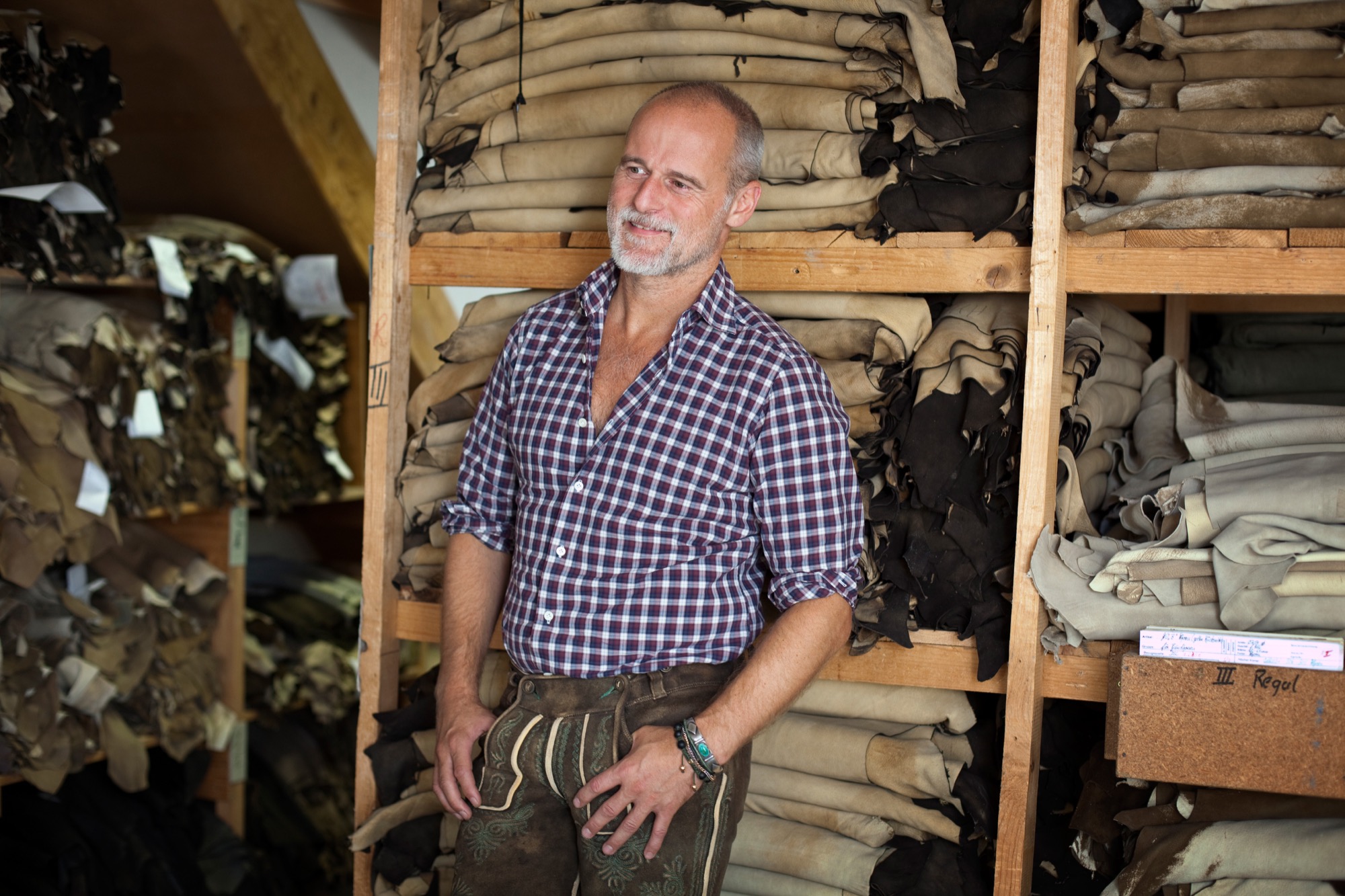
When he was only eight years old, Markus Meindl stitched himself a leather satchel for school. In all likelihood, the result was extraordinary and made the young lad stand out among his classmates. Today, in his mid-forties, the head of Meindl Fashions continues to stand for new ideas, for modernism, for innovation, although or perhaps because he works—and lives—for one of Germany’s best-known companies of tradition.
The urban country home Meindl built for his family near the Austrian border reflects his desire to blend modern and traditional. The minimalist house primarily makes use of natural materials, such as wood and leather, but also a lot of glass and concrete, contrasting with the row of picturesque houses across the River Salzach, on the Austrian side.
The man’s fervent passion for craftsmanship and natural materials is also at the core of the Meindl brand. Along with its traditional lederhosen, the Bavarian family enterprise has long built a multifaceted portfolio of well-crafted leather garments.
The first Meindl lederhosen
It all began when Lukas Meindl, a local cobbler in the idyllic village of Kirchanschöring in Upper Bavaria, tailored his first pair of lederhosen in 1935. Even then, uncompromising quality and the highest form of handcraft were paramount, an art form. The name Meindl dates back even farther, to the year 1683, when Petrus Meindl was officially documented as shoemaker. Markus Meindl is particularly proud of the long family tradition. After he graduated from high school, trained as garment engineer, and apprenticed as couturier, young Meindl didn’t have to be asked twice to join the family company. On the contrary. “That has always been the matter of course for me,” Meindl says. “I practically grew up in the company and have developed a passion for leather material and leather garments at a young age.”
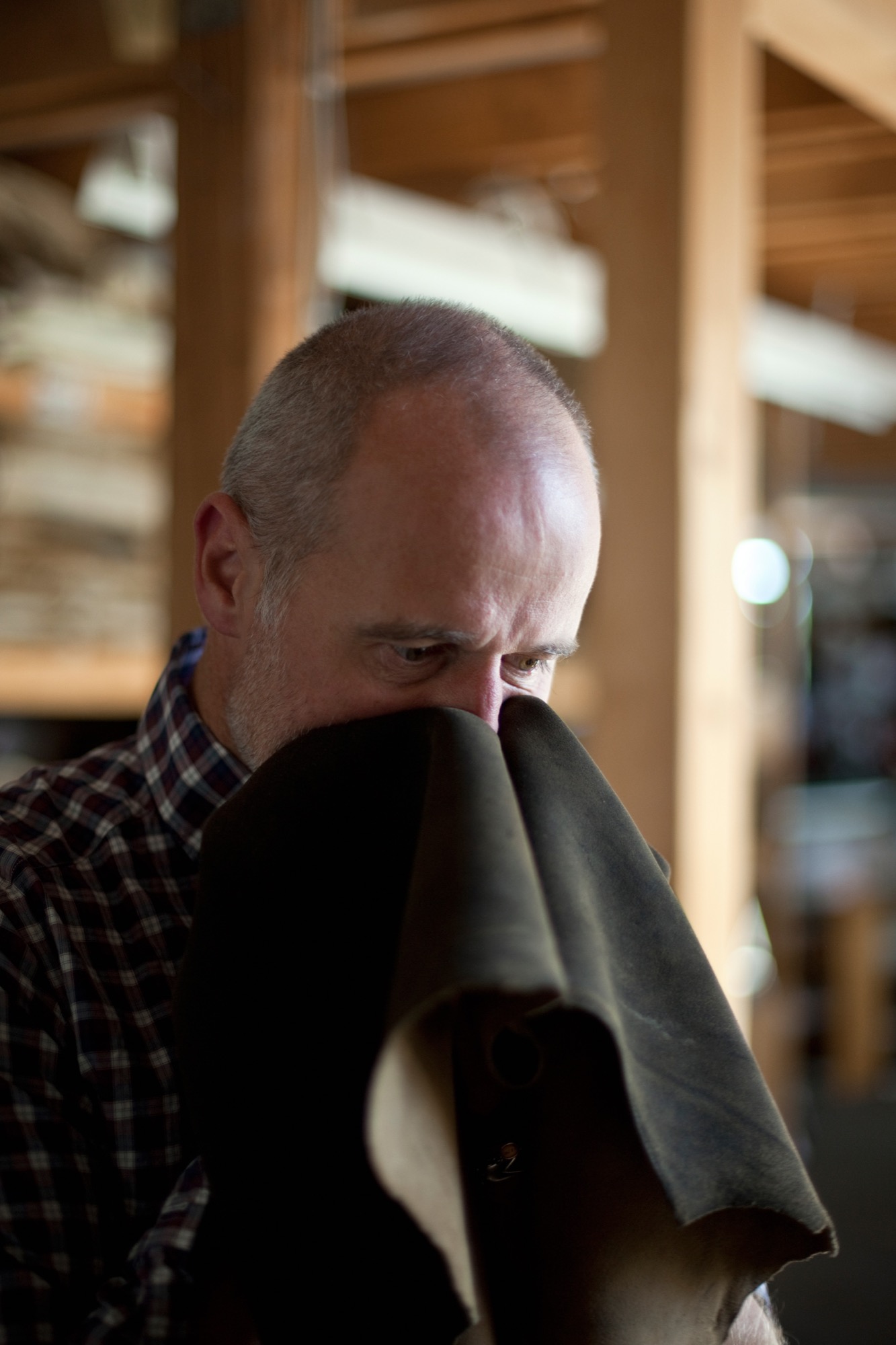
His zeal for creating something new comes from deep within. He has always wanted to develop products he loved himself. Father Hannes Meindl gave Markus the creative freedom and the space to let his youthful zest flourish. “If I’ve learned one thing from him, it’s his free-spiritedness. His honesty in working with the product. But also his honesty in leading his employees,” Meindl says of his father.
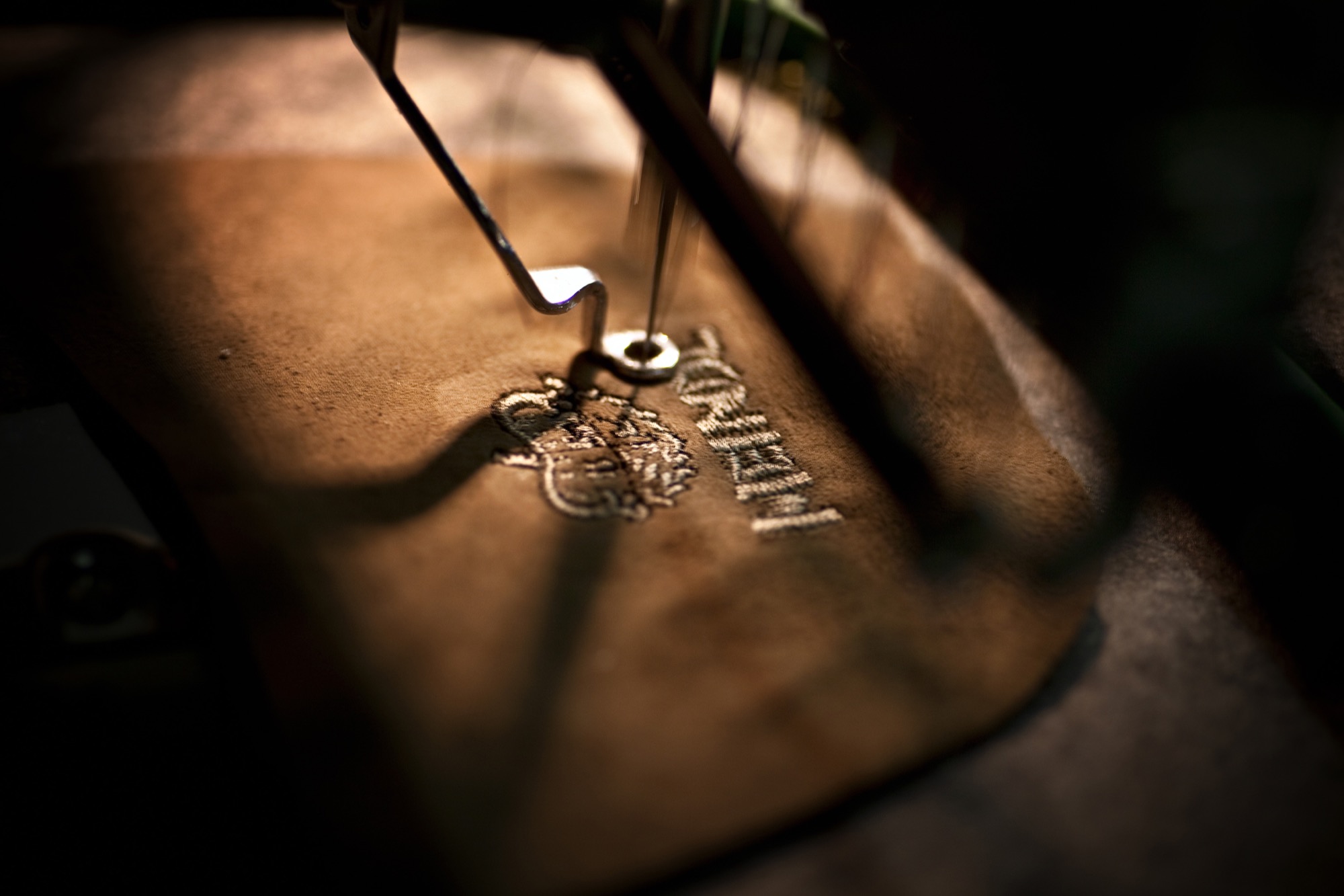
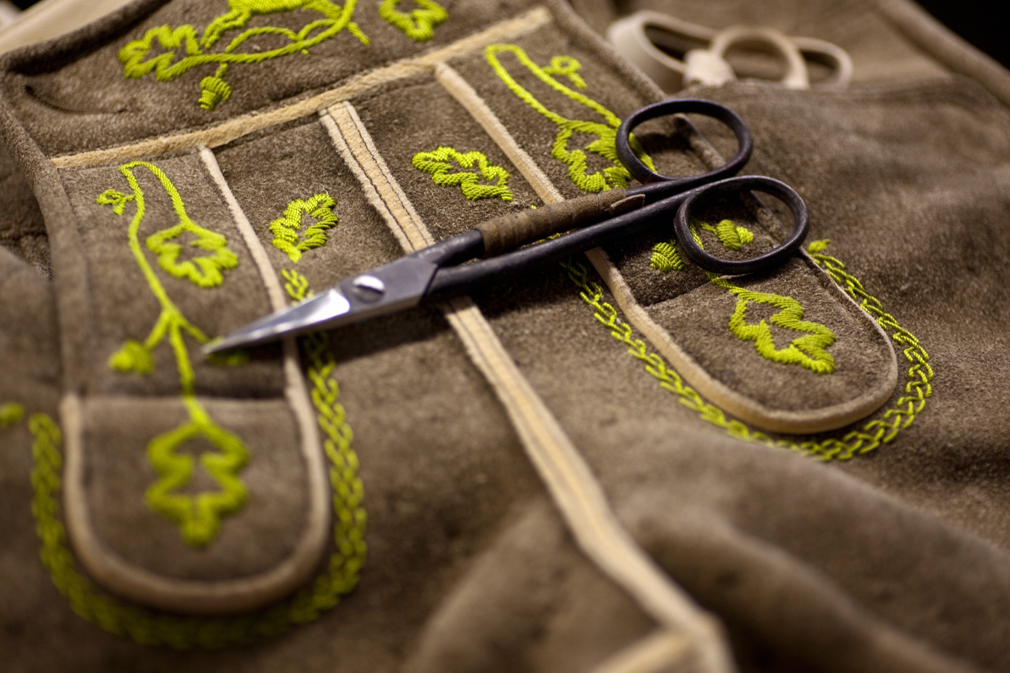
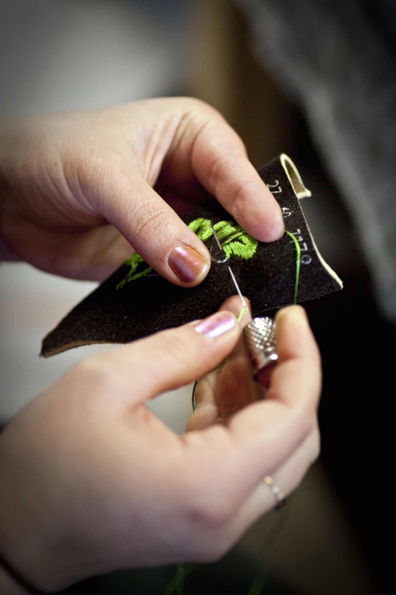
At age seventy-four, Hannes is still actively involved in the company wherever an extra hand is needed, whether that’s in sales, in production, or in design. The traditional embroidery, however, is Hannes’s favorite component. Meindl Fashions is famous for its chamois-tanned buckskin lederhosen with lavish hand-embroidered motifs, especially in the Alps, in Austria and southern Germany with their large festivals, such as the Oktoberfest in Munich. Up to sixty hours of manual labor go into handcrafting a pair of Meindl lederhosen. The work is partially done onsite by Meindl’s 120 employees and partially at production sites in nearby European countries, such as Hungary or Croatia. “Every product is designed by us; the know-how all resides in-house,” Markus Meindl says. “We have the most talented team here, the most expensive equipment, and, most importantly, the shortest distances.”
The advantages of in-house, local production are particularly valuable in the development of new products. The Meindl company has long expanded from singularly specializing in lederhosen—albeit traditional alpine costumes are currently experiencing a revival among all ages. “Lederhosen are not a trendy piece of fashion. They span the seasons and are not merely worn to folk festivals and special occasions,” Meindl says. “Lederhosen afford reliability and a sense of security. They rise above time and represent a symbol against calamitous mass production and the consumer society.”
The new alpine lifestyle
Meindl Fashions, with Meindl Jr. at the helm, embodies that pinpoint propensity for this sensibility, the longing for tradition, and for significance. Markus has helped establish the term “alpine lifestyle” in the European Alps; at the very least he has fueled it with products that can be worn on the mountain and in the city: high-quality leather jackets, blazers, sports coats, knickers. Twenty-four years old at the time, Meindl got his breakthrough in 1994 with the creation of a collection for the rebel folk singer-songwriter Hubert von Goisern. It charged the label, the entire fashion industry. A new, modern style conquered the world of traditional alpine garments and found a home at fashion shows like Bread & Butter in Berlin.
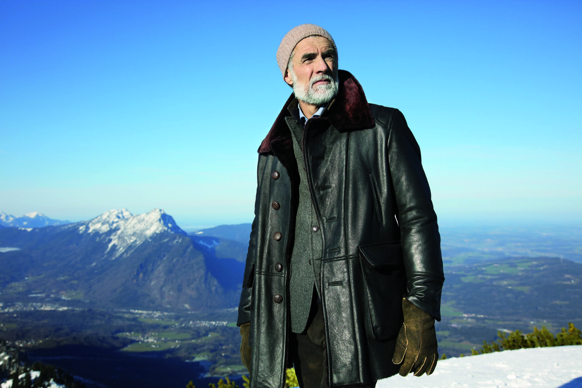
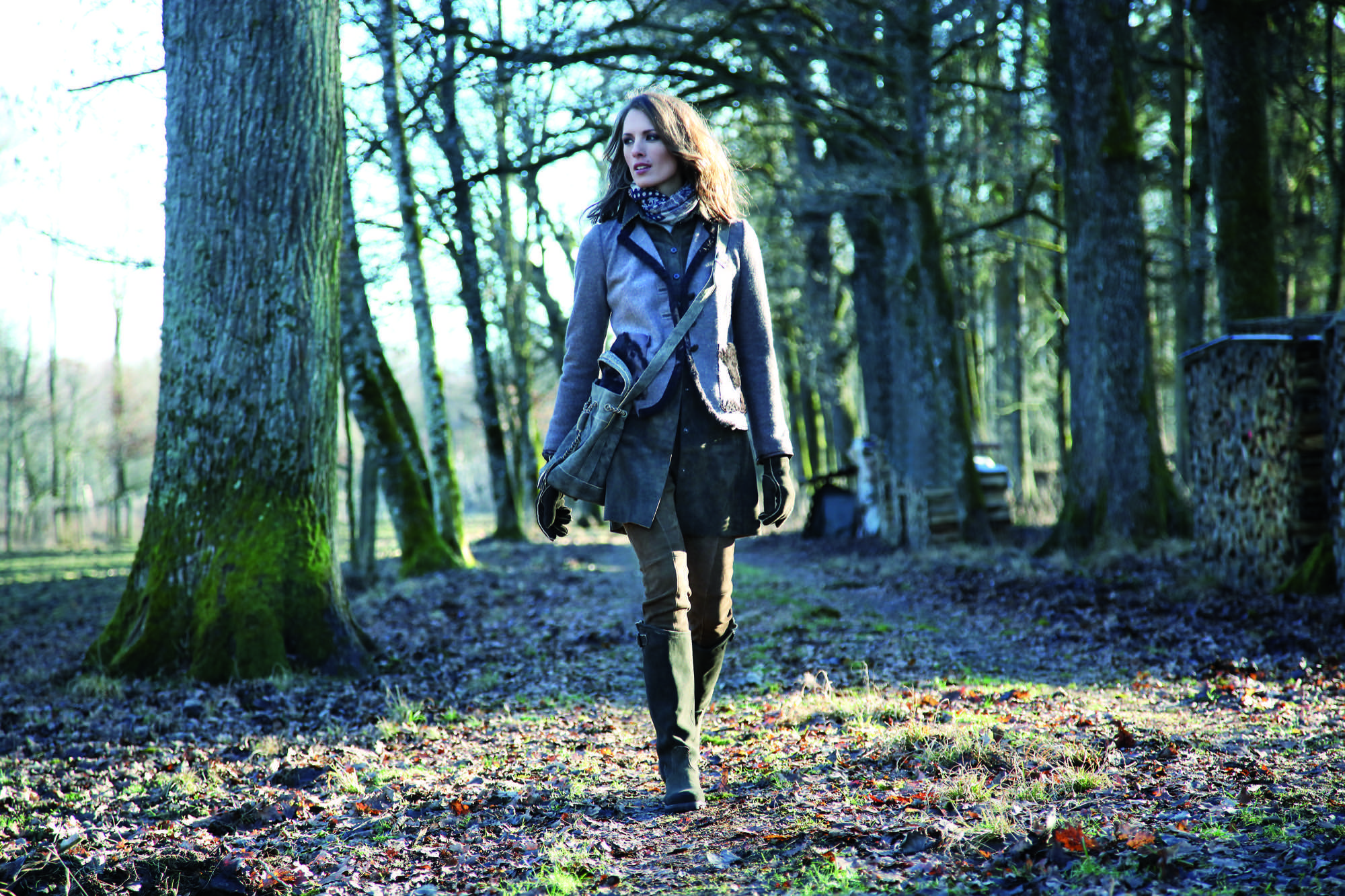
Meindl calls his style “authentic luxury”—his own language of design that derives from the combination of craftsmanship and tradition with modern fits and cuts. “Our products are authentic yet also luxurious, because they can never be mass-produced,” says Meindl. “Out of season” is Meindl’s motto. Transcending the seasons, Meindl garments can be worn in winter or on a cool summer night, adding value to each piece.
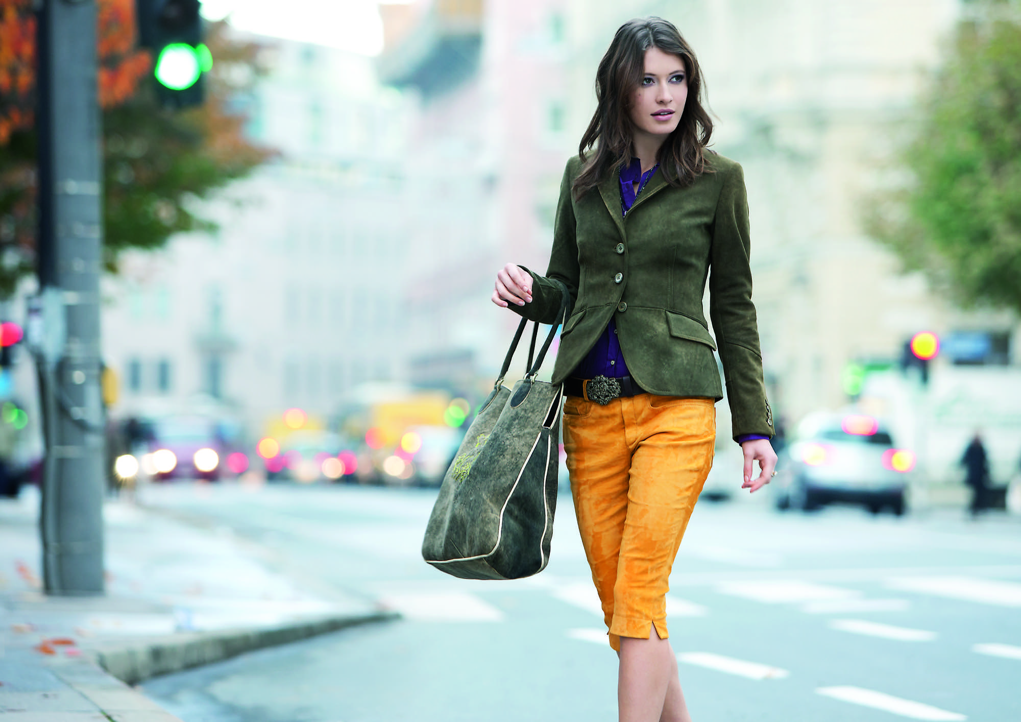
His message rings true in a fashion world that increasingly appreciates value, sustainability, and timelessness.
Nevertheless, few people really know how multifaceted Markus Meindl truly is. For instance, he designs and produces functional and innovative motorsports clothing in very limited editions for BMW. His leather jodhpurs are worn at the Spanish Riding School as well as by mounted police in Germany. His cousins run the local shoe manufactory, which makes quality mountain footwear and traditional costume shoes. A diverse product portfolio has always been the brand’s strength.
Country refuge for an urban mountain man
Quality stands above all. Timelessness, longevity—and Meindl sought to embody these values in the design and construction of his private home. “I’ve thought long and hard about how I want to design the house,” he says. “It was supposed to withstand time and still be as attractive twenty years from now as it is today.”

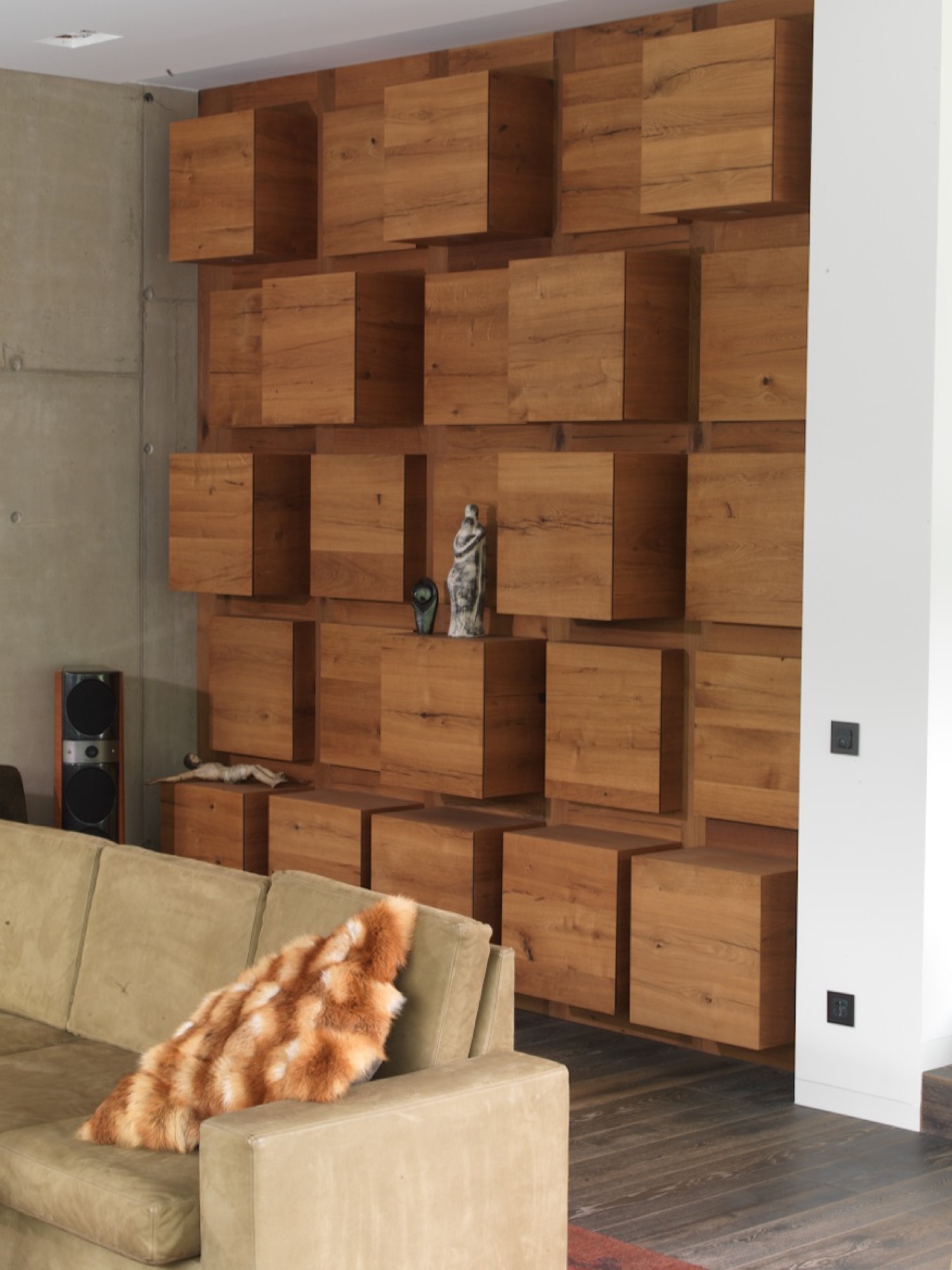
His friend Robert Blaschke of Raumbau Architekten in Salzburg, Austria, realized the project. Wood wherever you look, heated Swedish oak floors. Ceilings and walls are covered in 300-year-old oak wood reclaimed from Bavarian barns. The 3.9-meter-high (almost 13 feet) ceiling in the living room and the ceiling in the spa are lined in wooden cubes. The same element serves as armoire and shelving units in the living room and along the facade. The length of the pool—16.83 meters (55 feet)—reflects the year the Meindl company was born; a whimsical reference to tradition interrupted by modern elements. Tradition, lived modernly—that is Meindl’s philosophy. “I grew up here in the mountains. I respect the traditional way of life. I love simplicity, the value of things,” Meindl says. “But I am not a conservative man. You have to continue to develop things further, keep playing with things. That’s the only way tradition stands a chance of surviving over time.”
“I grew up here in the mountains. I respect the traditional way of life. I love simplicity, the value of things. But I am not a conservative man. You have to continue to develop things further, keep playing with things. That’s the only way tradition stands a chance of surviving over time."
Markus Meindl regards himself an “urban mountain man” who lives between the antithetical realms of an urban and a bucolic world. You work in the city during the week. And on weekends, you live in the mountains, where you go skiing, go hiking. “Clothing has to work for a meeting in the city but also be functional in the mountains and in the woods. In all of life’s circumstances. That’s the language Meindl speaks most clearly.” △
“Clothing has to work for a meeting in the city but also be functional in the mountains and in the woods. In all of life’s circumstances. That’s the language Meindl speaks most clearly.”
More from Meindl's collections...
The Height of Hip: Kristallhütte
A slope-side hotel and hipster après-ski hangout in Austria's Hochzillertal
Hochzillertal / Tyrol / Austria
The Kristallhütte’s slogan — “Lifestyle on the mountain” — comes to life when locals and guests from around the world chill to hip DJ acts on the tremendous sun terrace with 360-degree views. The hotel and hipster après-ski hangout sits above 7,000 feet (2,147 m), slope-side, and offers eight Panorama guest rooms and four Alpine Lodge Suites.
“Cool like a hotspot for the in-crowd, cozy like a ski lodge, and posh like a luxury hotel,” owner Stefan Eder describes the Kristallhütte.
Love and Loam
An Austrian artist family makes rammed-earth architecture, stoves and raku tiles
Earthen materials bond an Austrian family of artists: The applied-artist father builds with rammed earth and the ceramicist mother and graphic-designer son create tiles using an ancient Japanese pottery firing process. All their work is deeply rooted in ancient techniques, yet their designs are expressively modern.
“Never.”
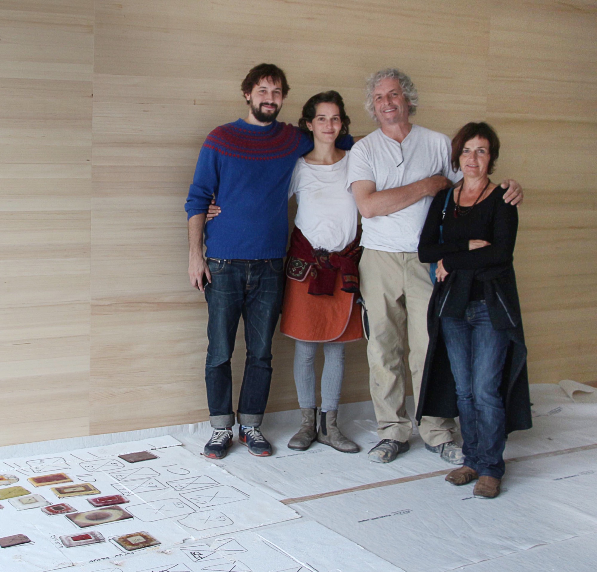
Trotting behind his father around countless construction sites, a teenage Sebastian Rauch convinced himself he would never follow in his artist parents’ footsteps.
Born this way
Now thirty and his hormone levels long balanced, Sebastian has succumbed to the truth: The love for elemental design, form, and earthen materials is in his DNA. His parents are ceramic artist Marta Rauch-Debevec and artist-builder Martin Rauch. She runs the tile label Karak; he heads Lehm Ton Erde (Loam Clay Earth). Together, they share a studio space in Schlins in western Austria’s Vorarlberg region, tucked between the German and Swiss borders and known for supreme skiing.
“Both my parents have art degrees and chose art as their livelihood,” Sebastian tells. “Somehow, it rubbed off on the children.” Today, he works as a graphic designer in Vienna. His sister, Anna Pia, is currently taking a maternity break from earning her degree in art pedagogy.
The son of two artisans admits that neither the material loam nor his father’s building sites interested him as a child. “I was all thumbs in construction, which led to a lot of tension between my father and me during puberty.” To his parents’ chagrin, young Sebastian preferred to spend his days in front of the computer. “I was engrossed in anything to do with science fiction and Japan, whereas my parents are much more down to earth, literally.”
Rammed earth
Sharing a studio compels the elder Rauchs to amalgamate their crafts. “Marta and I have been working in the same space together for more than thirty years,” Martin says. “In terms of materials and processing techniques, there are many synergies between ceramics and building with loam, which help us both realize our work.”
To the family, loam, clay, and earth symbolize the holistic philosophy inherent in their art: Loam represents craftsmanship and technology, clay stands for art and design, and earth embodies the sustainability of building with loam.
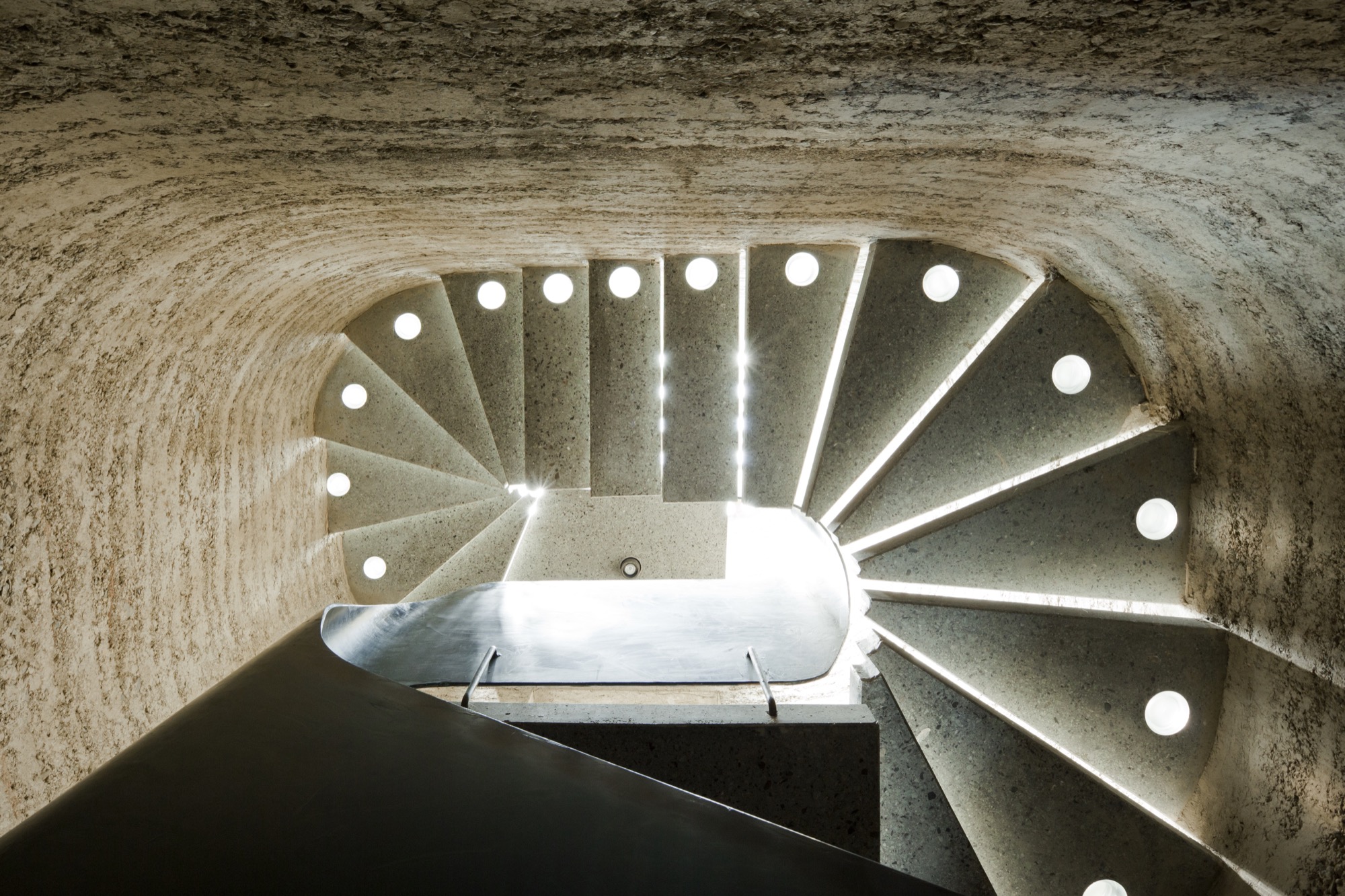
Martin, who sees himself as an applied artist rather than an architect or designer, is known beyond the Vorarlberg region for practicing the ancient technique of compressing loam into a distinctive building material as sturdy as concrete. His desire to architecturally design with earth grew from his early work as a ceramicist, oven builder, and sculptor. Today, he focuses on the aboriginal rammed-earth technique, which he approaches with innovation. He builds entire buildings from loam as well as indoor components, such as wood-burning stoves, flooring, and interior walls.
The process of compressing soil is time tested. Parts of the Great Wall of China were constructed from rammed earth. “Being able to create solid, bearing walls from such elemental materials fascinates me,” Martin says. “It requires careful study of the material but also courage. For example, one has to be able to allow the erosion.” External rammed-earth walls facing the elements will lose some surface, exposing stones and leaving a pebbled pattern. “Once we can accept the erosion, we can recognize its many benefits,” Martin explains. “We must recognize that its water solubility is really the most valuable virtue of loam as a building material.” His structures are 100 percent recyclable, often using ground dug up during a building’s own construction phase.
“Being able to create solid, bearing walls from such elemental materials fascinates me.”
His building materials and techniques are deeply rooted in tradition, yet Martin’s designs are expressively modern. “This very juxtaposition inspires me,” he says. “With the emergence of modern building methods in the last two centuries, building with loam was rarely considered, downright superseded, and degraded to the poor man’s building material.”
The Austrian artisan, who is currently cladding Saudi Arabia’s King Abdulaziz Center for World Culture in rammed loam, is confident that quality modern rammed-earth architecture with progressive, adapted techniques can once again valorize the image of building with loam.
Climate control
Breaking new ground in sustainable building spurs Martin’s creativity as artist and craftsman. “I love developing new ways of contributing to an anthroposphere that is more conscious of the environment and mankind,” he says. “Loam as building material is pure inspiration.”
Loam is available as local material almost anywhere in the world, meaning short, to no, hauling. “About 80 percent of our own home’s building material, for instance, came from its excavation pit,” Martin says. High efficiency and low primary energy are further benefits inherent in rammed-earth buildings. Locals identify with his work for these sensibilities. “It’s not unusual for our projects that the principal or the villagers join in building.”
Bringing the rammed-earth technique into the twenty-first century is a challenge the builder approaches from a business standpoint. “In Europe, it is important to react to the rationalized and industrialized building sector,” he explains. “For us, the prefabrication of rammed-earth components plays an integral role. It allows us to build much more efficiently and according to today’s construction timelines.”
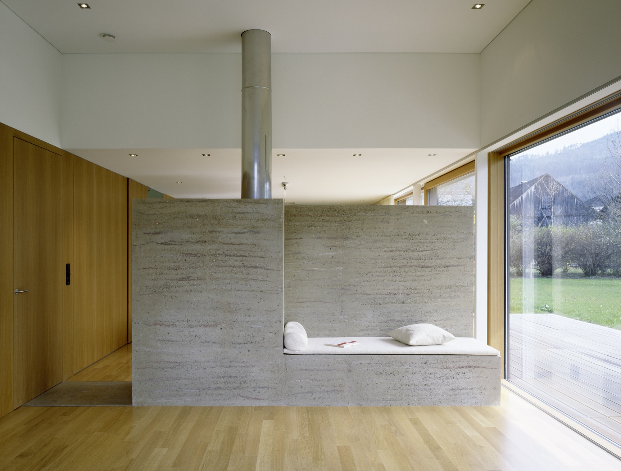
Rammed-earth interior walls promote a well-tempered indoor climate. The enormous mass abates temperature extremes and superbly regulates humidity. If you have eaten a Ricola herbal cough drop, you have a connection to Martin’s work. He collaborated with Pritzker prizewinners Jacques Herzog and Pierre de Meuron, founders of the Swiss architecture firm Herzog & de Meuron Basel, on the Ricola Herb Center near Basel. Martin’s loam walls promote ideal humidity levels for storing and processing the herbs.
Haus Rauch
Though Martin has been working with rammed earth for more than three decades, the home he built for his own family was a test bed for further adapting and refining his technique.
The 200-square-meter (2,150-square-foot) home built into a steep southern hillside above Martin’s native town of Schlins was completed in 2008. The design was a collaboration with Zürich architect Roger Boltshauser.
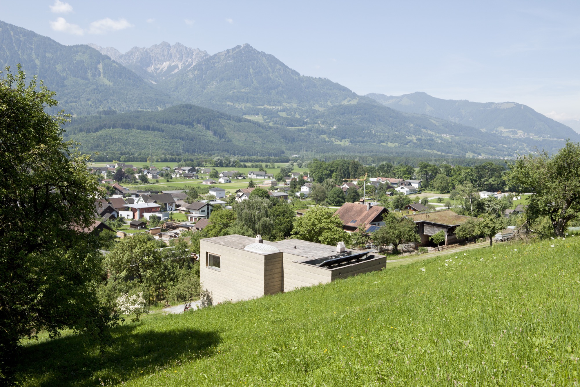
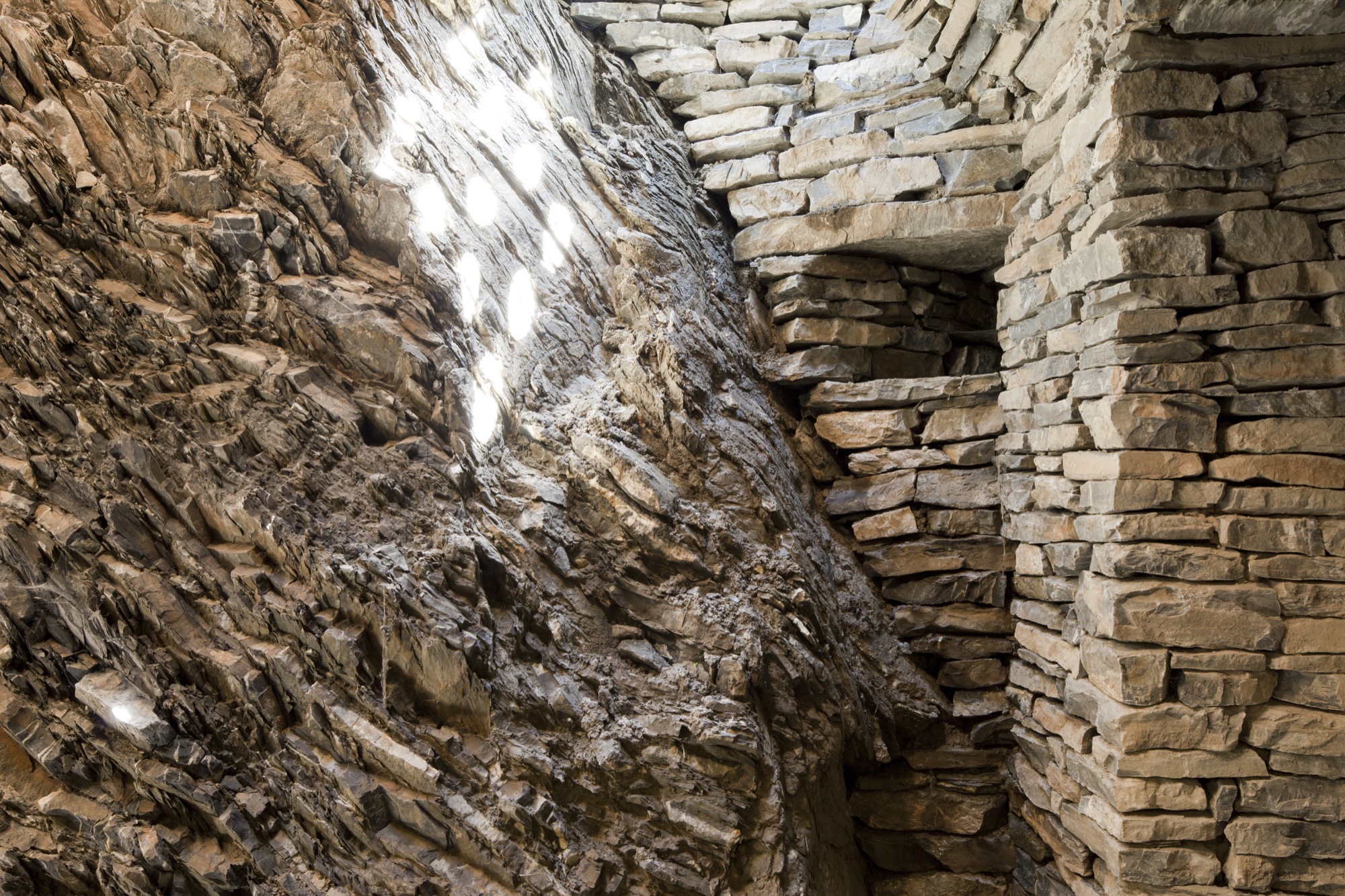
In its orientation and form, the house directly speaks to the topographic flow of the site and the context of the landscape: A monolithic structure like a sculptural block is literally pushed out of the earth. The use of solid rammed-earth walls combines this architectural intention with the desire to construct an ecological building exclusively made of natural materials.
The mother of creativity
Marta, who was born in Ljubljana, Slovenien, and studied ceramics and product design at the University of Applied Arts Vienna, never urged her son or her daughter to work with her. “Simply following in your parents’ footsteps doesn’t bring you happiness. I wanted them to cultivate their own dreams and visions, so I never thought that one of my children would one day work with me.”
Having been an independent artist working on theme-based projects for exhibitions and sculptural ceramic objects, Marta herself hadn’t planned on specializing in tiles. But she knew she wanted to incorporate ceramic art in the new house.
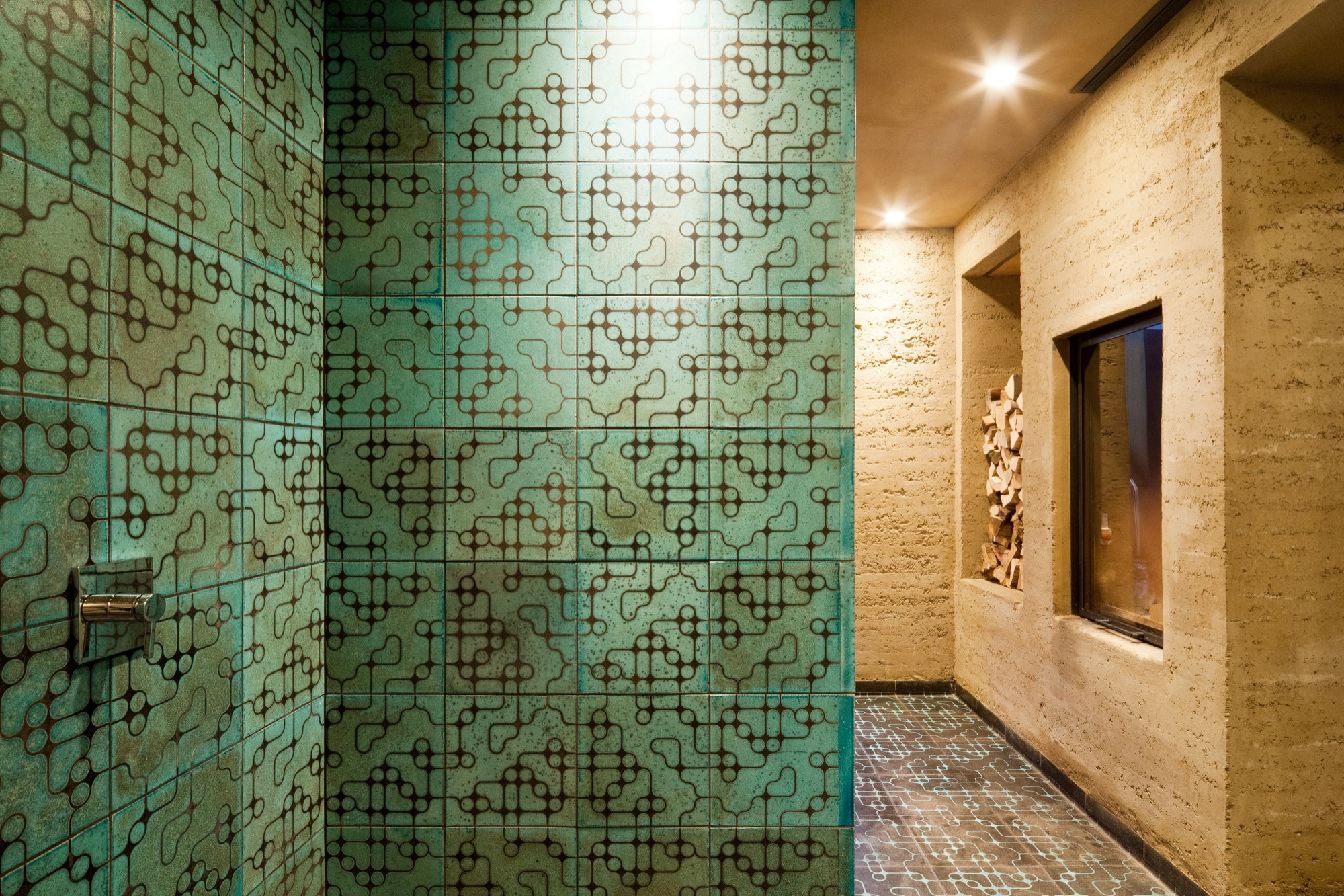
After working with a low-fired technique known as raku, a traditional Japanese pottery process, for twenty years, Marta wanted to explore tiles as medium. “I was looking for a tile design for the house when I discovered the beautiful patterns Sebastian was creating on his computer,” she remembers. He says he created the designs “just for fun.” Marta wondered how she could transfer her son’s digital doodling to her tiles and began experimenting with screen printing. “When I created the first samples, we were all surprised how stunning the combination of the raku tiles and Sebastian’s patterns truly was.”
“I was looking for a tile design for the house when I discovered the beautiful patterns Sebastian was creating on his computer.”
Karak tiles
The Karak brand was born. Marta and Sebastian’s Karak tiles—each a unicum—embody the elementary relationship between the Eastern and the Western world. Captivating geometric ornaments, the result of repeating, digitally created design patterns, are married with the century-old Japanese raku technique that gives the tiles an inimitable air of chance.
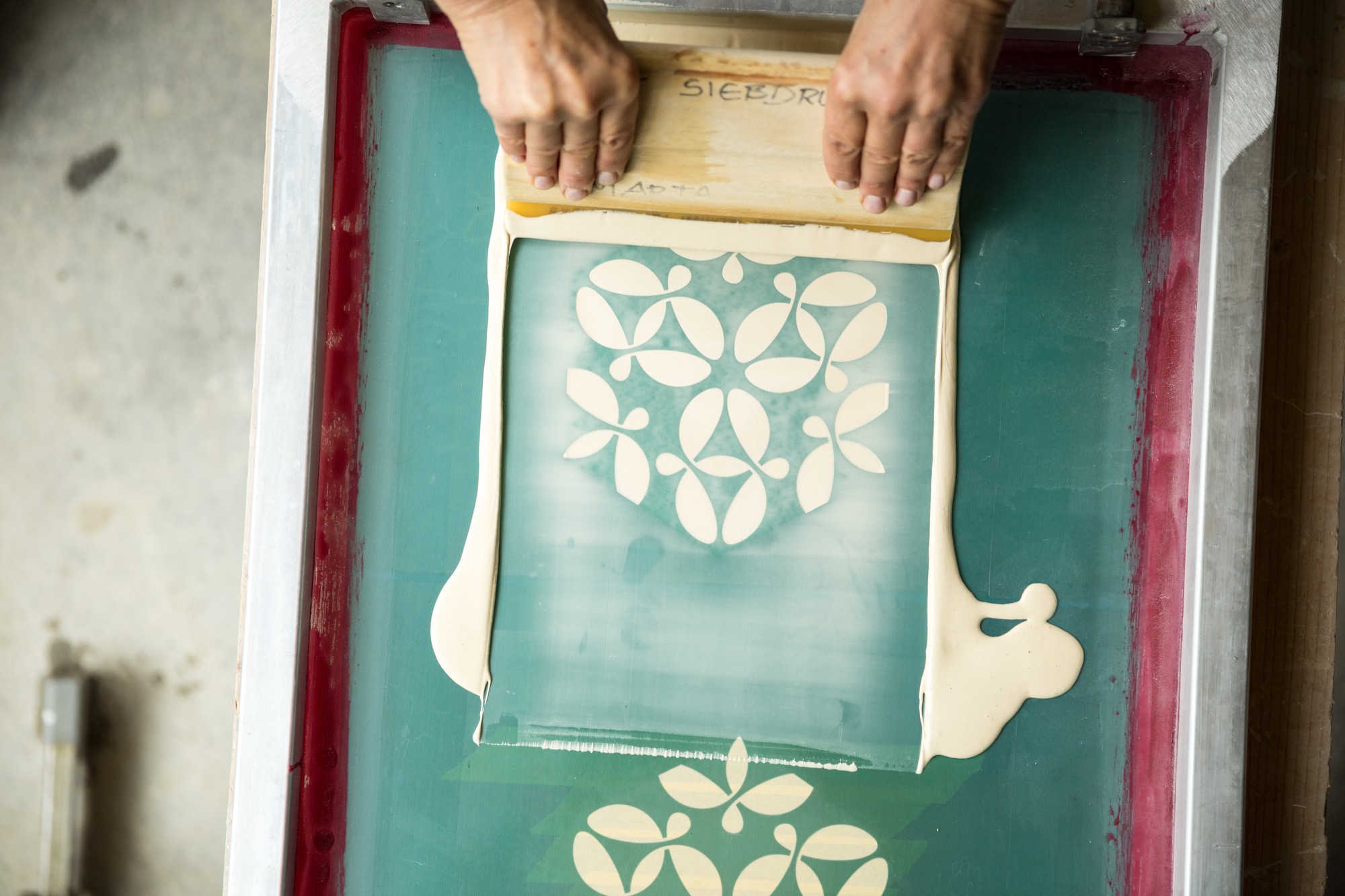
The tile material is a combination of different kinds of clay and loam mixed with quartz sand and fireclay. Pressed into shape, each tile is retouched by hand, the designs applied by silk-screening.
As the tile is red at about 1,000 degrees Celsius (ca. 1,830 degrees Fahrenheit), the material’s transforma- tion becomes palpable—the low-fired technique makes it porous and gives the final product a deep, organic sound at the touch and a warm haptic.
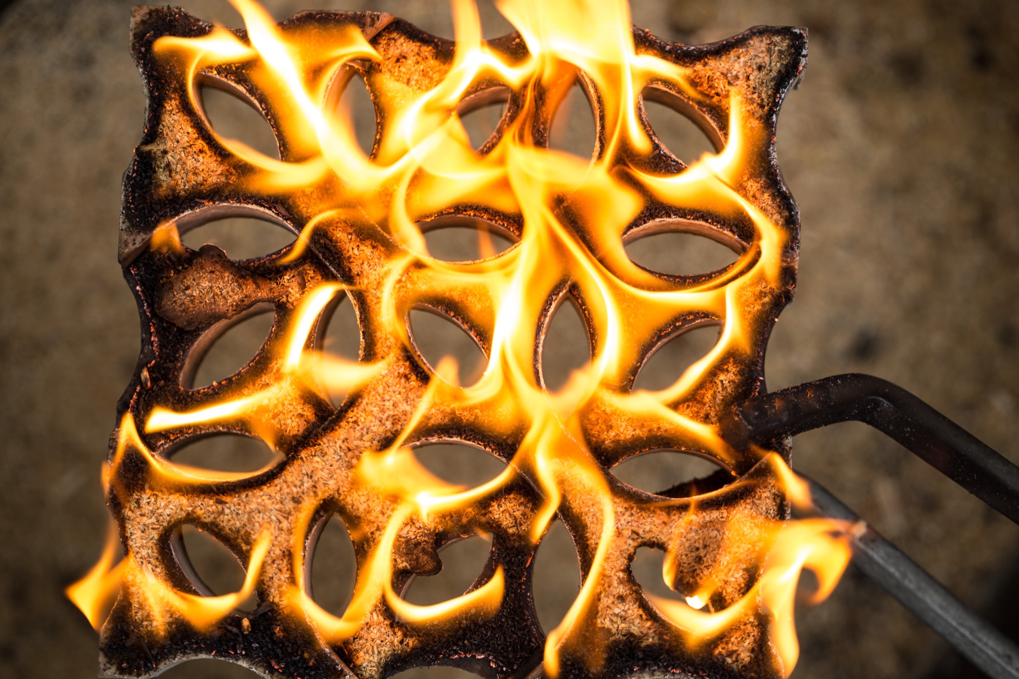
Still glowing, the tiles are removed from the kiln one at a time and immediately hermetically buried in sawdust. The void of oxygen and the smoke have an intense effect on the surface that varies for every piece. The color changes with the glaze; hair-thin cracks are blackened.
Finally, dunking each tile in water reveals its finished character. Transformed by the temperature shock, the glazed surface is brushed off, evincing a craquelure—like a fine net tying everything together.
Starting Karak wasn’t a conscious decision but rather a mother-son collaboration that grew organically. At first, the two intended to create the tiles only for the family’s villa. Then a book was published about the unique house. “On occasion, people began talking not about the Rauch house but about that house with the beautiful tiles,” Sebastian remembers. “People were asking us where we got those tiles...that’s when orders began coming in.”
“When we created the tiles for the house, I suddenly knew the charm of these tiles,” Marta says. “After all these years, I am still excited every time I walk in the door.”
Futuristic fantasy meets ancient technique
Sebastian’s passion for science fiction inspires the patterns he designs for the tiles. “I love to connect antipodes, things that seemingly don’t go together, the interplay between contrasts...that tipping effect.” His KuQua design, for instance, combines spheres (Kugeln in German) and squares (Quadrate). “When you deconstruct these two shapes and recombine them, they become almost unrecognizable in an entirely new shape. However, there is an underlying geometrical clarity and calmness that makes me feel like I didn’t design this shape; rather, I found it. At the same time, there is constant movement as the eye meets the pattern, like a deep mantra lancing the universe, like yin and yang.”
His mother is no less fascinated by the repetitive geometric patterns’ tipping effect. “Depending on how the eye focuses in, the design can suddenly appear three-dimensional,” she says. “In fact, we created a three-dimensional tile, the TaOk tile, a tantalizing combination of modern geometrical design and something Oriental. Then, the ancient technique adds something very primordial...a beautiful enrichment.”
The raku process gives a brand-new tile the patina of a long life. “I am intrigued by something that looks so archaic, yet you can’t really assign the object to an epoch,” Sebastian says. “I like to envision an archeological excavation site where they dig out a temple and find patterns and artifacts that don’t have a place in our past, in the human past...so you may have discovered an alien temple.” The precise patterns, the exact geometry combined with the serendipitous process make Sebastian optimistic for the future. “In science fiction the future is often depicted as extremely slick and clinical, as measured and constructed. I rather like the thought of a future that is still sensual and vivid.”
The geometric patterns are calculated and carefully designed, with precise lines. But the firing process, the smoke passing through the tile, and finally the quenching in water is so incalculable that what was once smooth becomes structured, what was once superficial gains depths. “It is a movement between order and happenstance, between repetition and uniqueness,” Marta adds.
“It is a movement between order and happenstance, between repetition and uniqueness.”
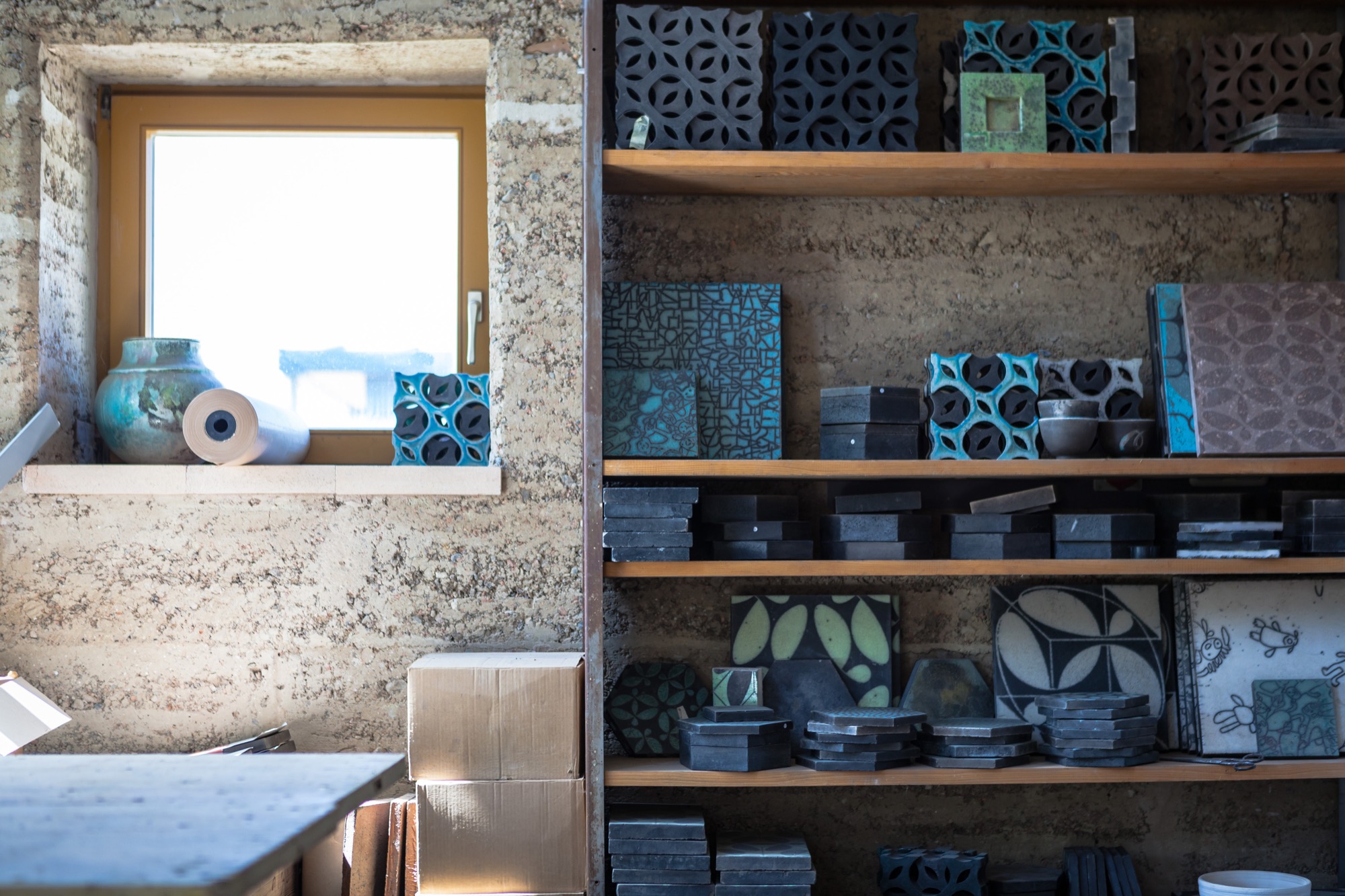
Both Marta and Sebastian appreciate the synergies and new opportunities that come with sharing the workshop and resources with Lehm Ton Erde, particularly Martin’s tinkerer skills and powerful imagination.
“Growing up, I was pretty sure I wanted nothing to do with loam,” Sebastian admits. “Funny how I found my way back to the material.” In the end, he’s grateful his parents laid the groundwork. “I couldn’t imagine working like this if it weren’t for being a family.” △
“I couldn't imagine working like this if it weren't for being a family.”
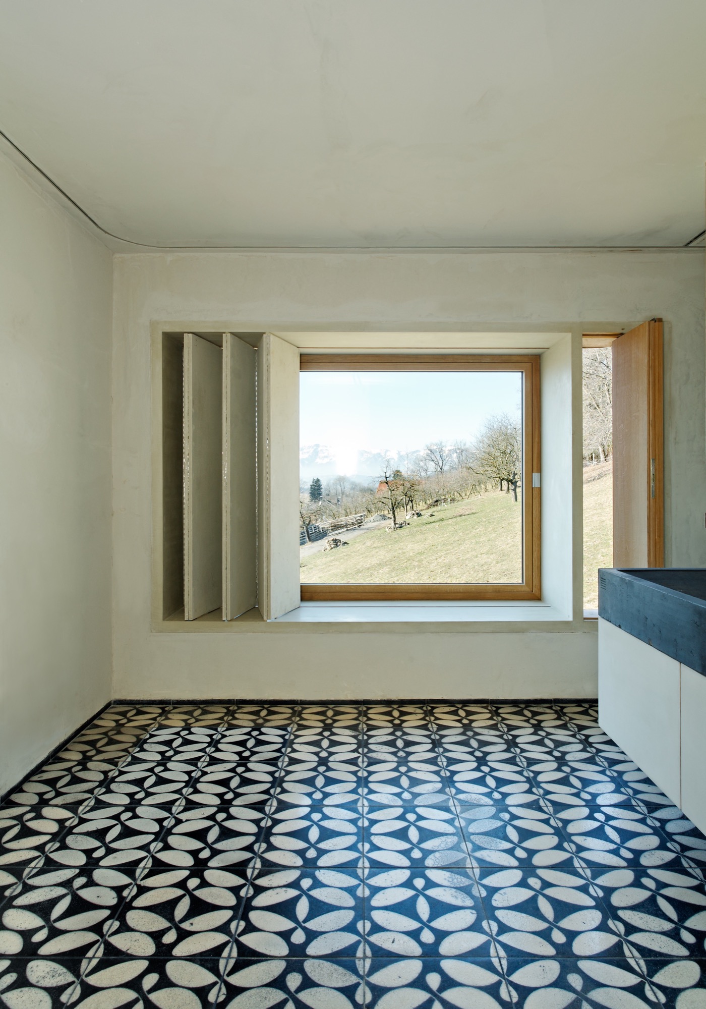
Context and Contrast in the Alps
An Austrian vacation home’s design references its mountainside setting and expansive views across the valley
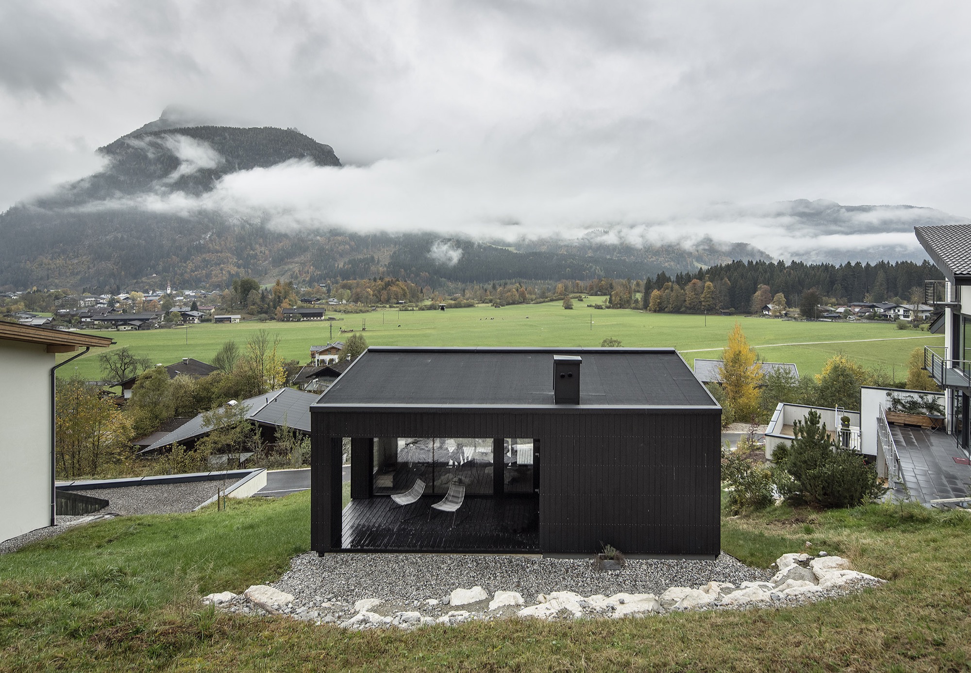
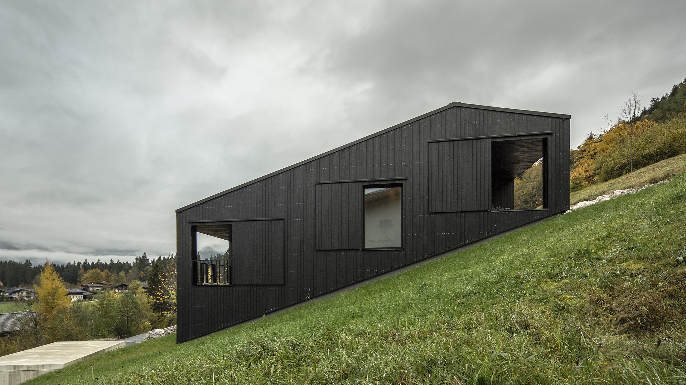
The 106-square-meter (1141 square-foot) home’s design is based on a flow of rooms that follows the terrain’s slope and an open floor plan organized on three levels. Covered loggias extend the living levels upslope and downslope, creating interfaces with the alpine surrounding. The black wood structure confidently makes its mark in a heterogenous setting.
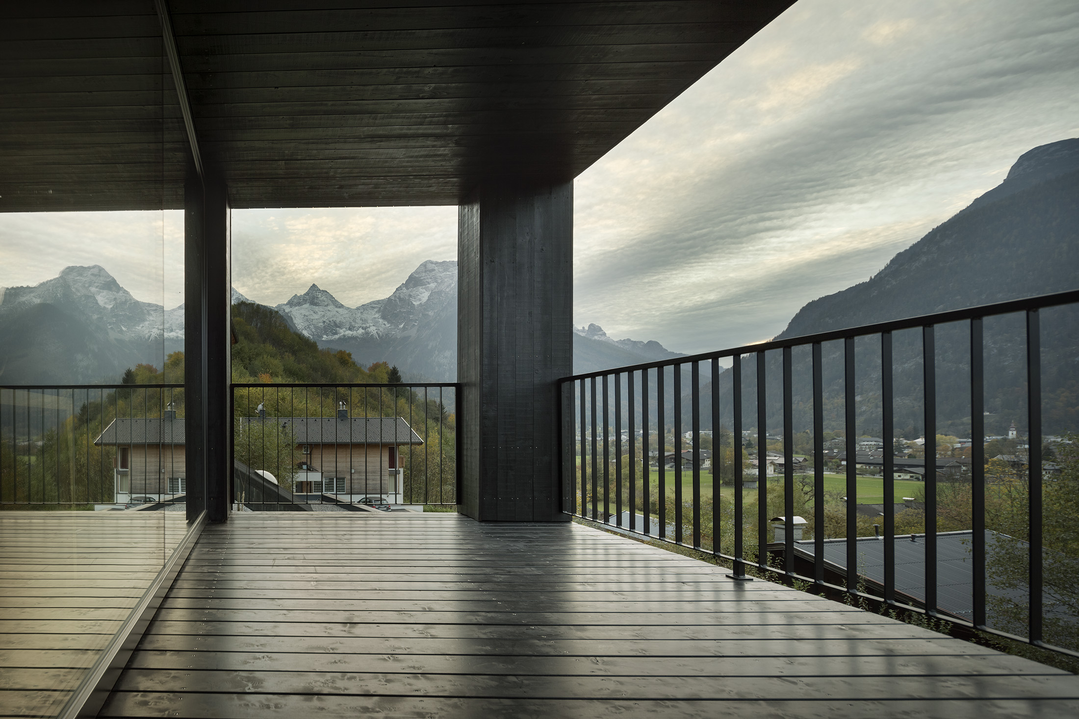
The client’s program for this vacation home near Zell am See in the Austrian state of Salzburg was simple: a great room with integrated kitchen and dining, sleeping quarters with an en-suite bathroom for each bedroom, a guest suite, and a covered outdoor space that offers mountain views from morning until evening. A carport and practical storage spaces were to round out the project.
Design trilogy
The design by architect Thomas Lechner, principal and founder of LP Architektur, is organized in three areas: arrival, function and living. Positioning the house in the context of building on a mountainside with majestic views as “counterpart” was of the essence.
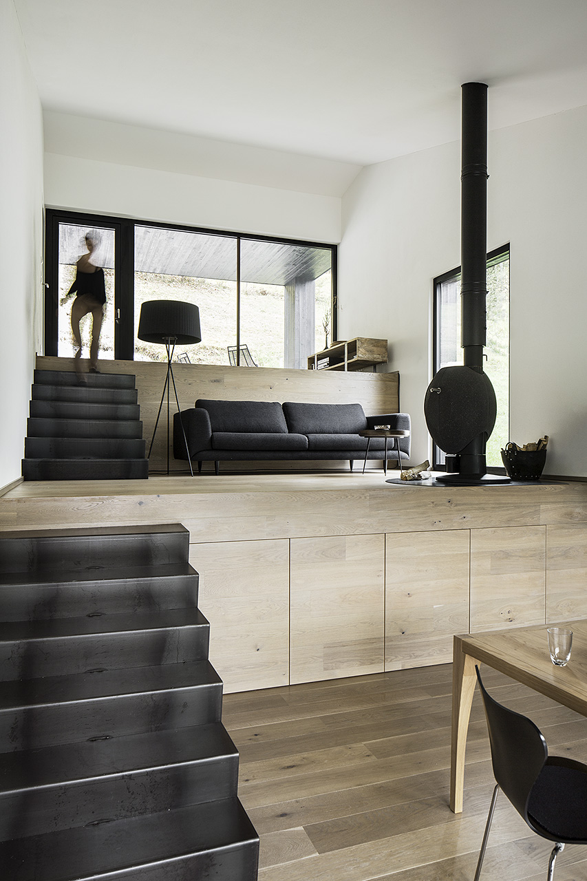
The first area — arrival — is situated directly down by the street, with a carport plus storage room as prelude. Ascending to the vacation domicile, long stairs coil near the top and reorient the visitor toward the valley and the surrounding mountains.
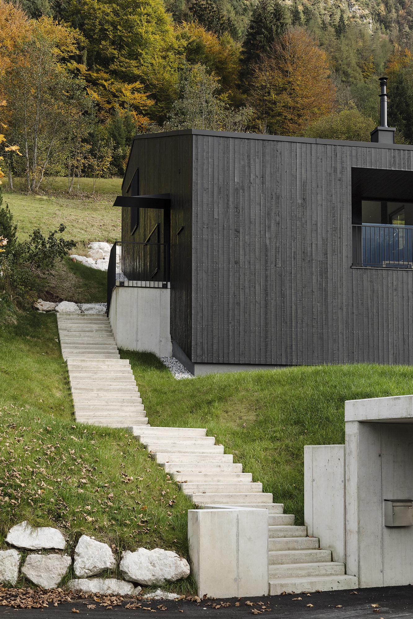
The entrance to the house creates the interface to the second area — function — with functional spaces on one level. One has arrived, may want to hang up his or her coat and perhaps use the powder room.
Passing through the space dedicated to the arrival, the interior opens to the third area, the great room, which is arranged and organized in three levels that follow the slope of the mountainside. Single flights of stairs connect the living levels. Kitchen and dining are in the center, a fireplace area below and a space to read above. The grading creates each area’s back, providing a sense of security. Despite the spaces’ connectedness, each level is differentiated by its distinct formulation. The center area is dominated by the view out the window dominates, with the mountains as theme, like in a painting on the wall. The levels above and below, however, can be interpreted as interfaces to the outside, with covered loggias extended each respective room to the outside and opening it up into nature. The open-sided rooms offer a protected space for being outdoors during its assigned time of day. The level with the fireplace thematizes the relationship to the surrounding mountains and the panoramic views, while the reading level signifies retreating to a confined space in reference to the immediate surroundings.
The main living area leads to the north-east-facing bedrooms, each with its en-suite bathroom, which then also belongs to the house’s function part.

Compress and release
The house’s overall concept comprises a variety of spaces and rooms, each offering distinct individual qualities. Depending on needs and mood, one can retreat, disappear, feel snug. Yet the home also offers opportunity to experience the expanse and freedom of the alpine landscape unfolding outside.
This contrast, the polarity, is also reflected in the choice of materials. Painted black on the exterior, the timber structure confidently claims its space within its surroundings. By contrast, the light, warm interior affords a comfortable environment where one can relax and recharge. △
Sense of Place: Alpine-modern style in Tyrol
The elevated ruggedness of interior design in Austria's Zillertal
Alpine Modern talks with local interior design expert Martin Wetscher about the quintessential style of modern mountain homes in Tyrol. Wetcher is the president of the namesake interior architecture firm, carpentry workshop and furniture store his great-grandfather founded in 1912 in Fügen, Austria.
Traditional mountain living in Tyrol was simple. The Bavarian-style homes were built from materials the alpine farmer could source around the site. Dyes and paints were made from herbs and flowers; the color red derived from ox blood. Design was determined by practicality and durability. “Everything we perceive as ‘sustainable’ today inevitably gave those traditional homes a distinctly local style,” says Wetscher.
"Everything we perceive as ‘sustainable’ today inevitably gave those traditional homes a distinctly local style."
Vacation architecture in Tyrol is highly exaggerated to give visitors an immediate sense of place. “At home, that’s different,” Wetscher says. “A home has to reflect the person, with reference to where you are.” Hence, a ski chalet that dramatizes Kitzbühel — the legendary winter sports town in Tyrol, Austria — would quickly become kitschy as a permanent home.
Celebrating craftsmanship
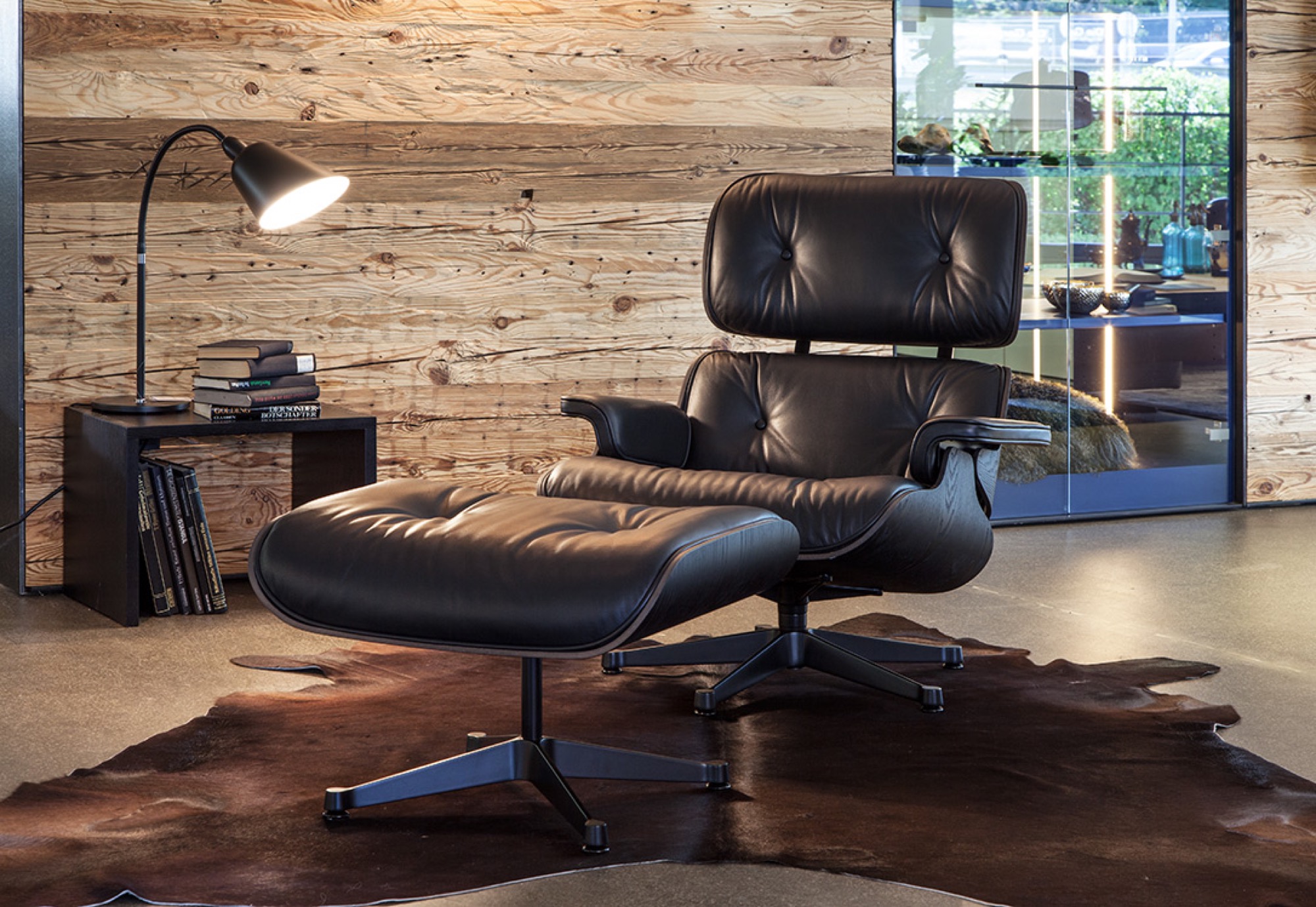
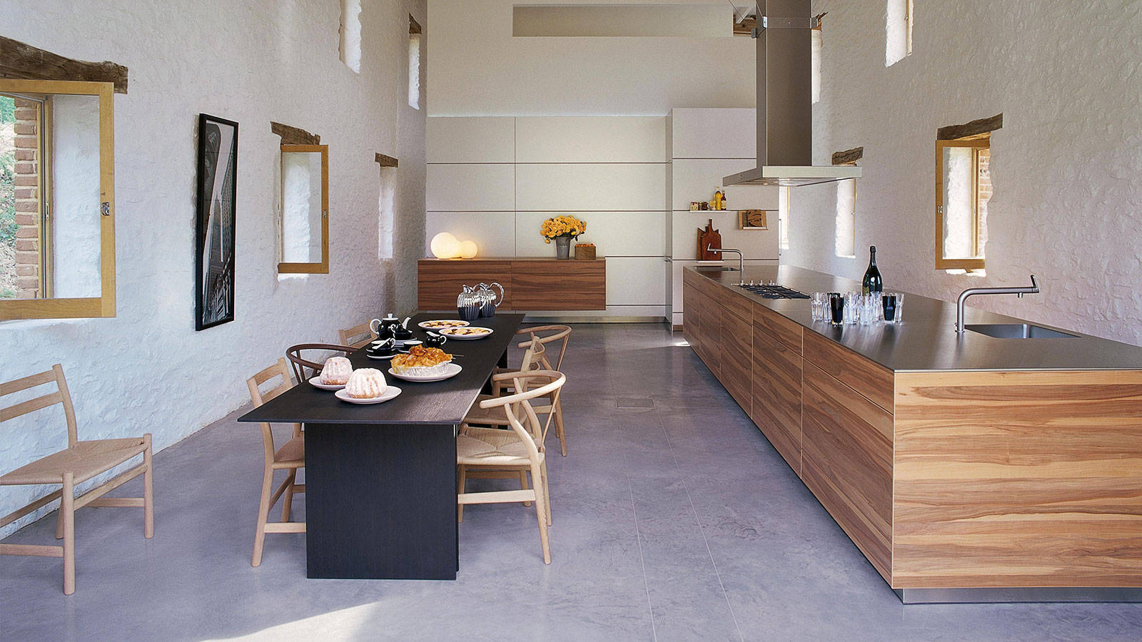
The interior concept Wetscher Chalet celebrates the Tyroleans’ ruggedness without being crude. While the craftsmanship is very much refined, materials such as oak wood (which is characteristic for the area) retain a pastoral touch. “People here in the Alps love to see that it doesn’t have to be either or, rather, that Wetscher Chalet is rich and clever, modern yet authentic,” says the head of Austria’s oldest independent furniture retailer.
In Tyrol, generations of families live in the same house for hundreds of years. Thus, it is particularly important to balance modern design with authenticity by integrating heirlooms, such as antique rugs or artisanal art, and found natural objects from the surrounding environment, such as driftwood from a nearby creek. Moreover, after an era of booming industrial manufacturing, quality craftsmanship is back in Tyrol, once again coveted and elevated.
“One has to begin where the alpine farmer left off,” Wetscher says about creating a sensible modern Tyrolean interior. To him, a beautiful mountain home has little to do with new furniture and a lot with bringing in shapes and materials found around the outside.
“One has to begin where the alpine farmer left off."
Mixing materials and eras
Mixing natural stone with oak is big right now at Wetscher. The contrast makes it chic. “Then, add deftness by bringing the present moment and the season into your home with flowers and accessories,” he says. Easily interchangeable objects, such as a coffee table or curtains, offer balance between consistency and change. In the current Wetscher Chalet line, for example, furry textiles represent that transient element. Prints, on the other hand, are passé. “We find them rather tacky.” Instead, Wetscher likes to play with materials like natural stone as patterns.
His Chalet concept is further characterized by exceedingly loungy seating furniture one can lay back and stretch out in. Various seating areas with low tables encourage conversation. Furniture low to the ground is more sophisticated and comfortable, while higher furniture can exude stiffness.
Understatement is key. A backdrop in Wetscher’s showroom, for example, is paneled in softwood reclaimed from an old corral. However, a smoothed surface adds calmness to the rustic wall. After all, Wetscher knows, “Jump too far into the Tyrol, and it will actually look like a cow stable.” △
“Jump too far into the Tyrol, and it will actually look like a cow stable.”
They Call It Happiness: Hotel Wiesergut
A serene Austrian retreat set against ski slopes and hiking trails
Saalbach Hinterglemm / Salzburger Land / Austria Owners Martina and Josef Kröll traveled the world in search of inspirations for their Wiesergut Design Hotel and returned to create space for their vision. “We wanted to give our hotel a modern identity and, at the same time, honor the values and traditions of a family business,” they say.
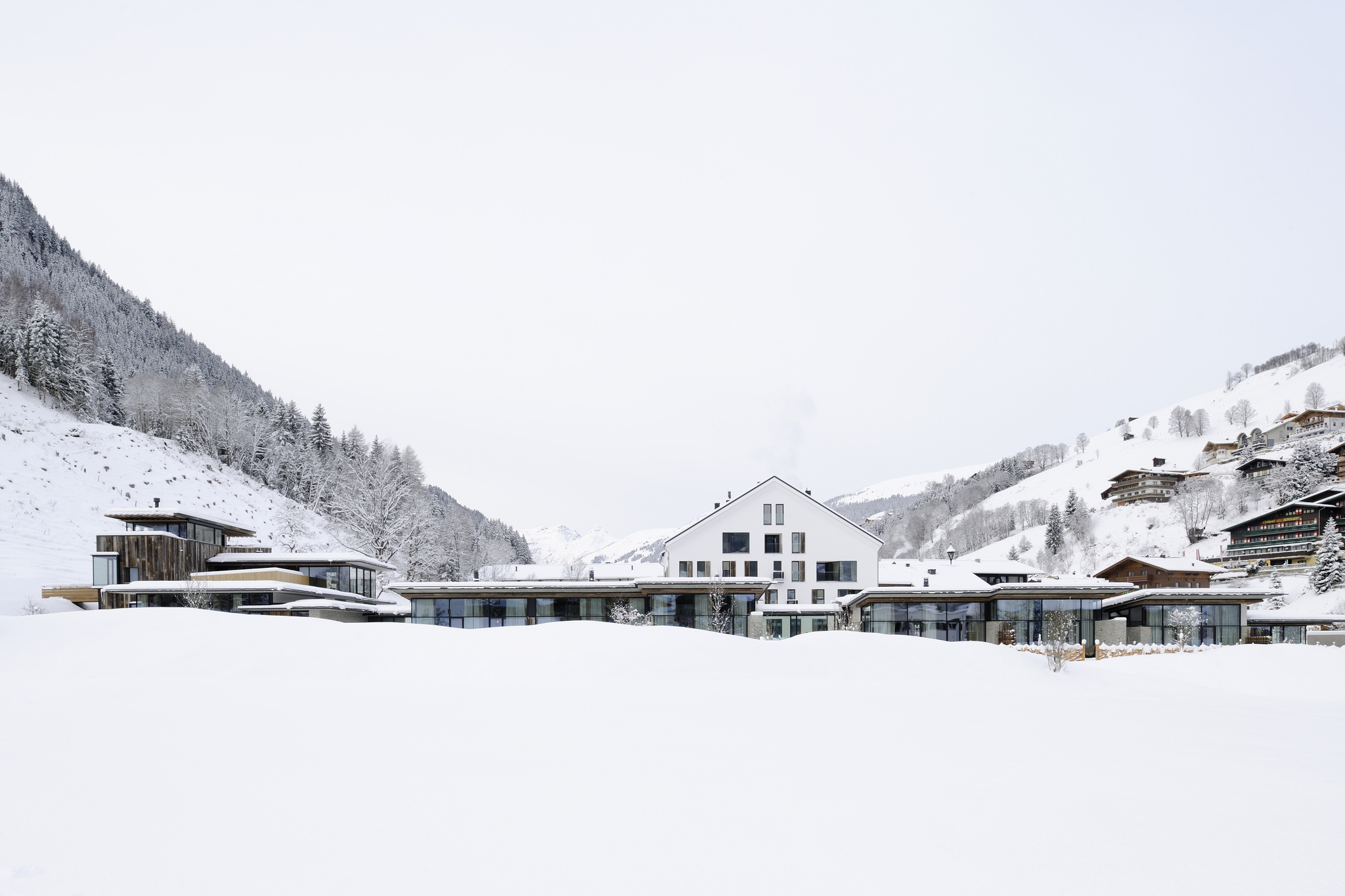
Designing the twenty-four luxury suites, the Krölls relied on tried and trusted authentic materials such as natural stone, oak wood, and cast iron, combined with elements of nature and a calming color scheme of earth tones.
The Wiesergut is situated directly on the ski slopes (valley station Zwölferkogelbahn) of one of the best ski resorts in the Austrian Alps.
Room for Gemütlichkeit
The "Stube" — a special place in the alpine homes of Bavaria and Austria
In the Bavarian and Austrian Alps, a Stube is a gathering place to slow down for sustenance and storytelling. In the German-speaking mountain regions, the Stube has traditionally been and still is today the heart of an alpine home. The parlor. It’s where the family eats, socializes, solves problems, celebrates birthdays, raises children, laughs, and cries together. In this room, “family” in truth can morph into any iteration bonded by a chosen connectedness that trumps blood and wedding bands. Neighbors playing cards on a dark winter’s night. A knitting circle looping yarn in silence. A clique of youngsters bantering at one friend’s house before a night out around the village.
“The table is a meeting place, a gathering ground, the source of sustenance and nourishment, festivity, safety, and satisfaction. A person cooking is a person giving: Even the simplest food is a gift.”
— Laurie Colwin

The Stube typically has a large wooden table to gather around—such as this sublimely simple exemplar by Fraai Berlin—and a woodstove. The traditional seating setup is an L-shaped wooden bench built into the focal corner of the Stube. If the family celebrates the region’s inveterate traditions and customs of the prevalent Catholic religion, a carved Jesus Christ looks down over that table from his wooden cross high up in the nook the locals call Herrgottswinkel—God’s corner.
A namesake style of alpine folklore—sylvan songs accompanied often by zither and guitar—fills the Stube... Stubenmusik. △
Sleep Elevated
7 alpine-modern places to stay in the Alps
From a remote minimalist hut to a decadent chalet fit for the royals, modern design lovers stay happy in these hotels and vacation rentals at — and high above — stunning mountain resorts in Switzerland, Austria, Italy and France.
Monte Rosa Hut / Switzerland
Modern mountaineers bunk at the 120-bed Monte Rosa Hut with grand views of the Matterhorn. More »

Wiesergut Design Hotel / Austria
Set against a bucolic backdrop of ski slopes and hiking trails, luxurious suites, a splendid spa and exquisite cuisine make Wiesergut a rare alpine retreat. More »

Whitepod Eco-Luxury Hotel / Switzerland
Sleep in a geodesic-shaped tent at the Whitepod Hotel for an entirely different vacation experience without sparing the comfort of a king-size bed and a full bathroom. More »


-
Feldmilla Design Hotel / Italy
The Feldmilla Design Hotel in South Tyrol offers panoramic views of the Dolomite mountains and uses clean energy from its own hydro-power plant. More »

Chalet Les Gentianes / France
Part of a quiet residence in the world's largest linked ski area of Les Trois Vallées, chalet Les Gentians has a swimming pool, Jacuzzi, massage room, and gym. More »


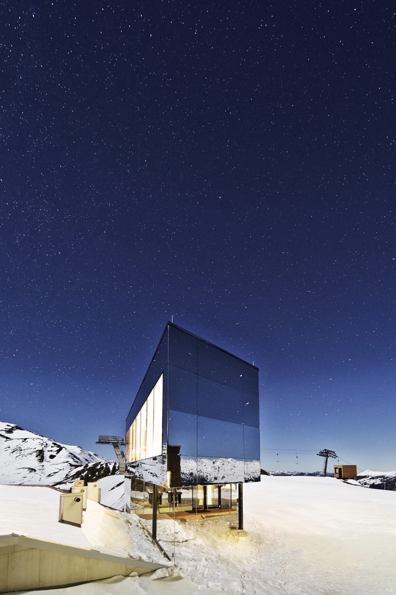
Kristallhütte / Austria
Hotel and hipster après-ski hangout of the moment, the Kristallhütte sits slope-side in the ski area of Hochzillertal Kaltenbach. More »

Chalet Zermatt Peak / Switzerland
Indulging in little extras, such as a personal chef and serving staff, the rich and the royals have stayed at Chalet Zermatt Peak in pure luxury, with grandiose views of the Matterhorn. More »


