Inspirations
Explore the elevated life in the mountains. This content debuted in 2015 with Alpine Modern’s printed quarterly magazine project.
Retreat in the Aspen Grove
Cottage Black by Colorado-based architecture and interior design practice Studio B counterbalances the grand main house in Aspen’s countryside
Studio B, a Colorado based architecture and interior design practice with offices in Boulder and Aspen, first designed the grandiose main residence in the backcountry a twenty-minute drive from Aspen, Colorado.

“We really wanted to explore a heightened experience of those aspen trees.”
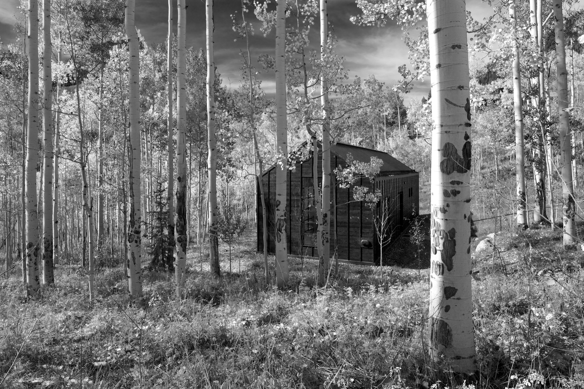
“The main house sits up on a ridge and is all about connecting to those long views, the big mountain views,” says Piché, describing what he calls a “more extroverted” approach, compared with the cabin down in the grove. “When we started working on the little guest retreat, we wanted to experience the trees in a completely different way. These views are much more embedded in the grove.” To better understand what design and placement would make the most out of Cottage Black’s distinct surroundings, Studio B took time to study how the aspen trees’ foliage changes with the seasons. “One thing we really liked about it was that the trunk feels really consistent throughout.”
The monochromatic aspen tree bark ultimately inspired the intimate retreat’s all-black exterior and all-white interior.
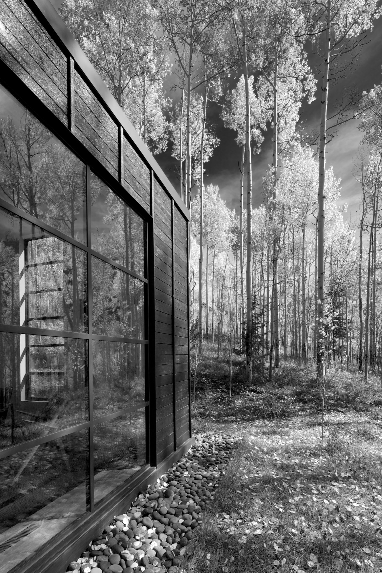
“The standing seams on the roof and the vertical joints of the interior wood ceiling were chosen to relate to the immense verticality established by the trees,” the placid architecture master notes. Approaching the house, simple stairs weave their way through the trees to the front door.
The black exterior
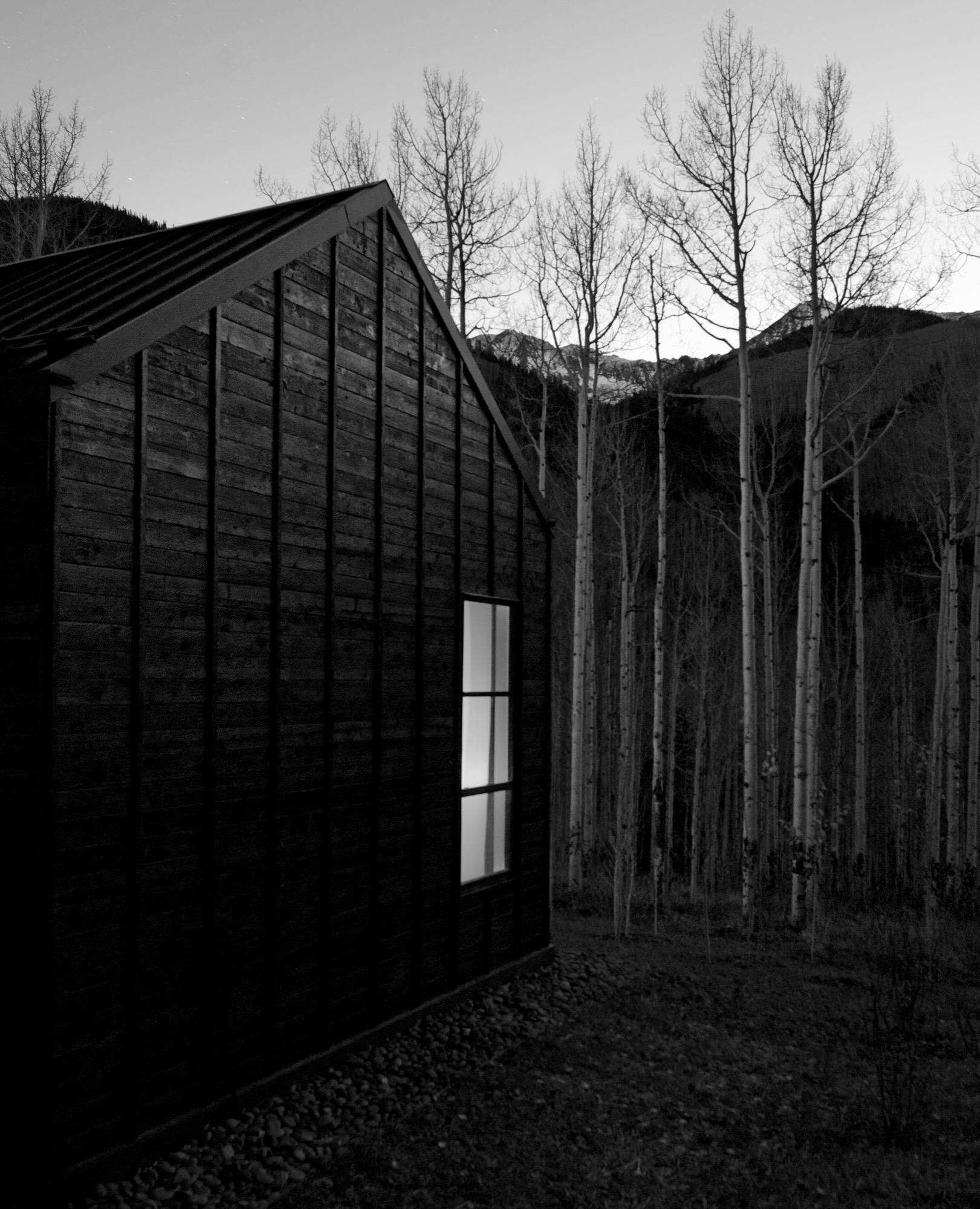
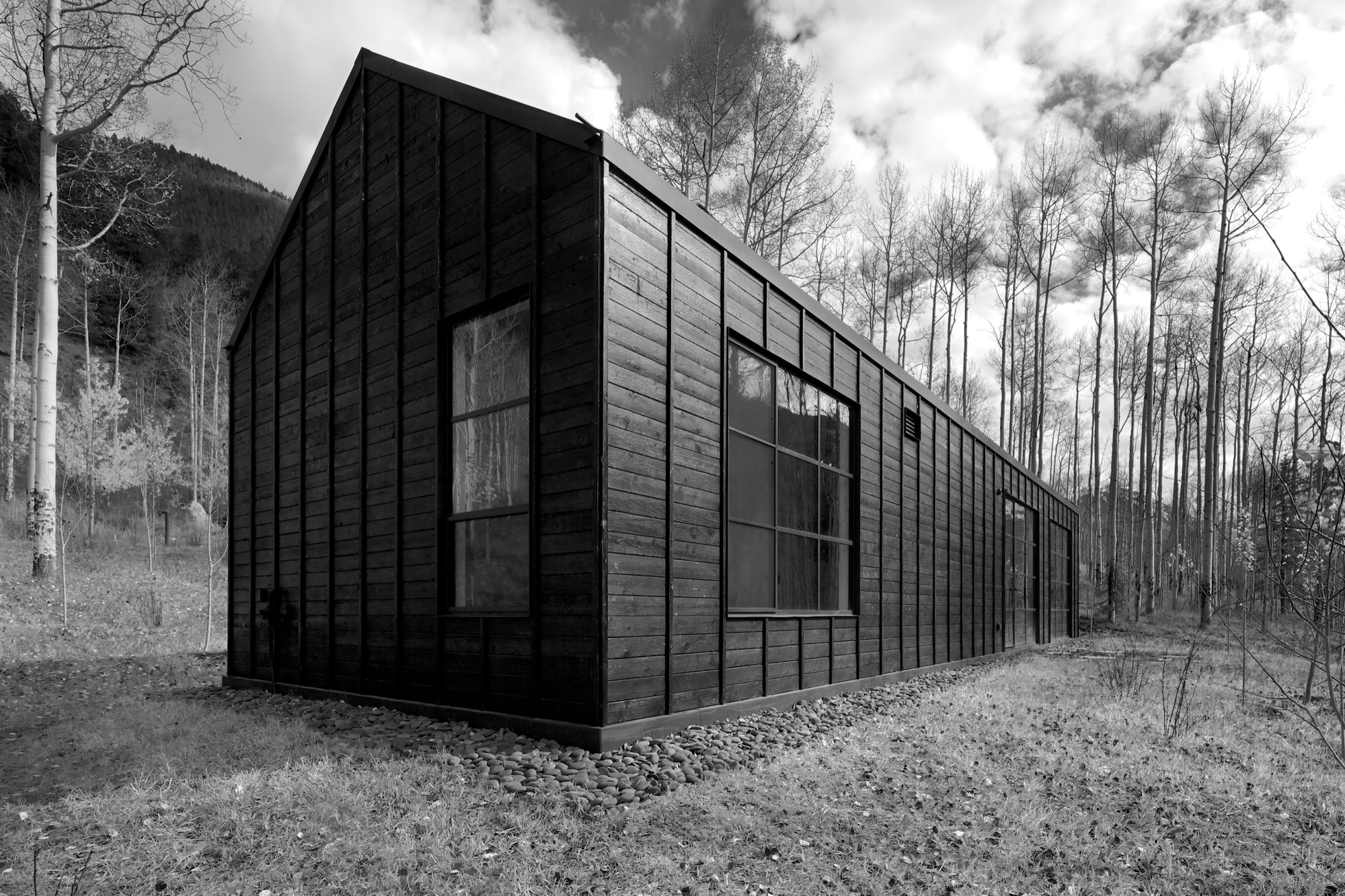
Heavily charred cedar wood gives the cottage’s exterior a rougher, bark-like texture. The orientation of the boards and the battens picks up on the verticality of the trees and the shadows. Looking at “that box” with its horizontal boards at one point during construction, Piché says they had an epiphany: “You wouldn’t think that black has the shadows and the depth that it does, but it seems it almost has more. When the sun hits, the black wood goes from gray to dark and it really feels like it transforms quite a bit.”
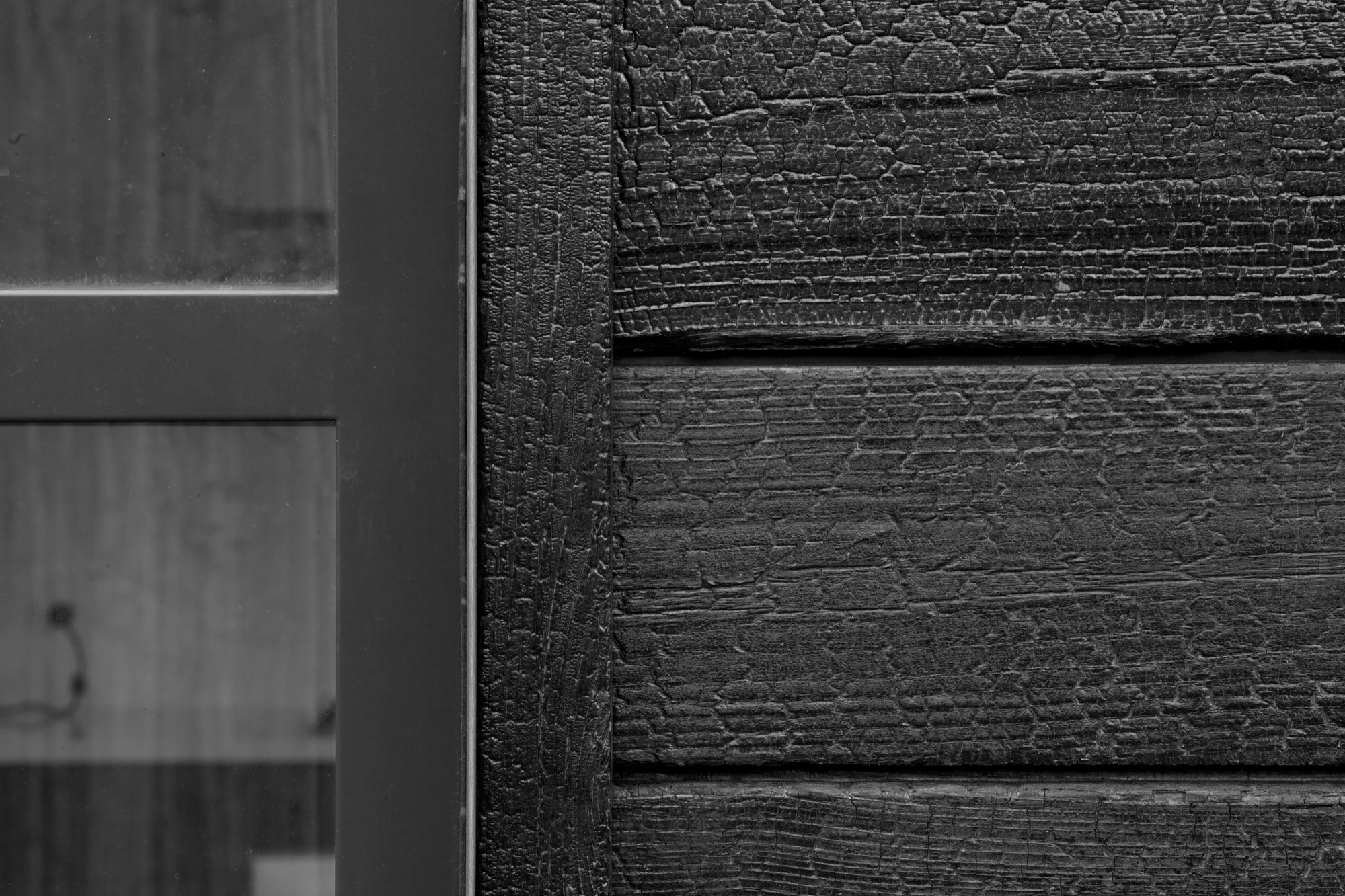
“You wouldn’t think that black has the shadows and the depth that it does.”
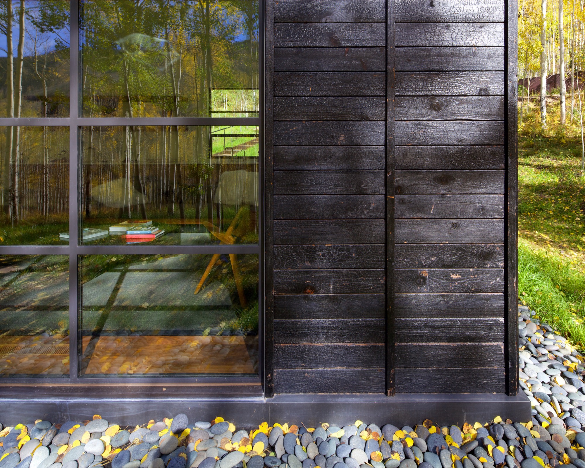
What’s more, the charred exterior gives Cottage Black the air of having been there for a long time. “And in spring and summer, when all the trees are fully leaved, people don’t even see the cottage. It disappears, and it reappears in the fall, too,” says the distinctly analytical architect, pointing out that no driveway leads to the retreat and guests cannot park right next to it. “The cottage is packed into the trees, and it’s kind of a journey down there.”
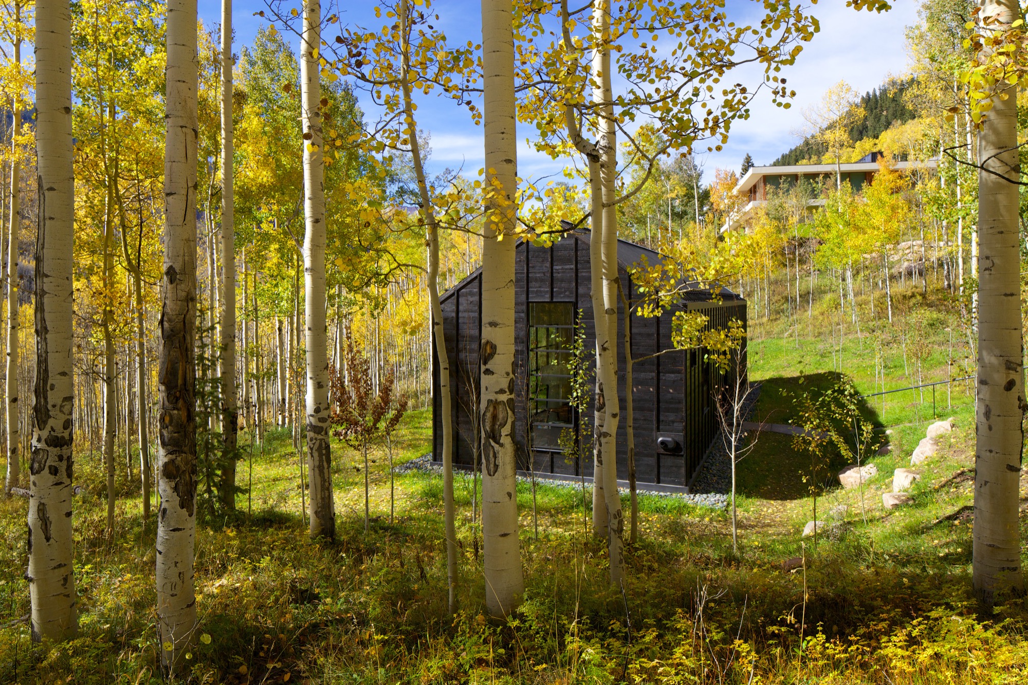
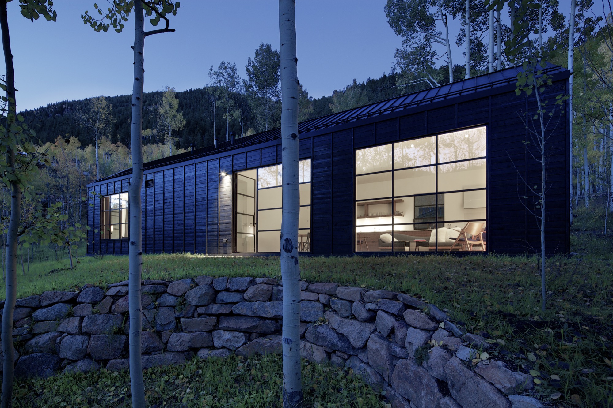
The Studio B team intently placed the steel windows to achieve a minimal sight line that only highlights a few select views. “We added a tall window that emphasizes some great trees on that side, a couple of little corner windows that just frame the tree trunks, and then one big window in the living room that is more about walking outside onto the patio and connecting to all the trees there,” the architect says. “But you are not getting those big mountain views. Just these little glimpses of the outside, which creates that more intimate feel when you walk up to the window. It is more about enclosure and intimacy than the broader expansive things. It is a little bit more inward than outward.”
"It is more about enclosure and intimacy than the broader expansive things. It is a little bit more inward than outward.”
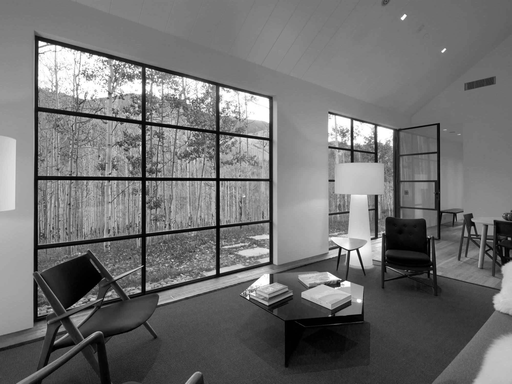
The white interior
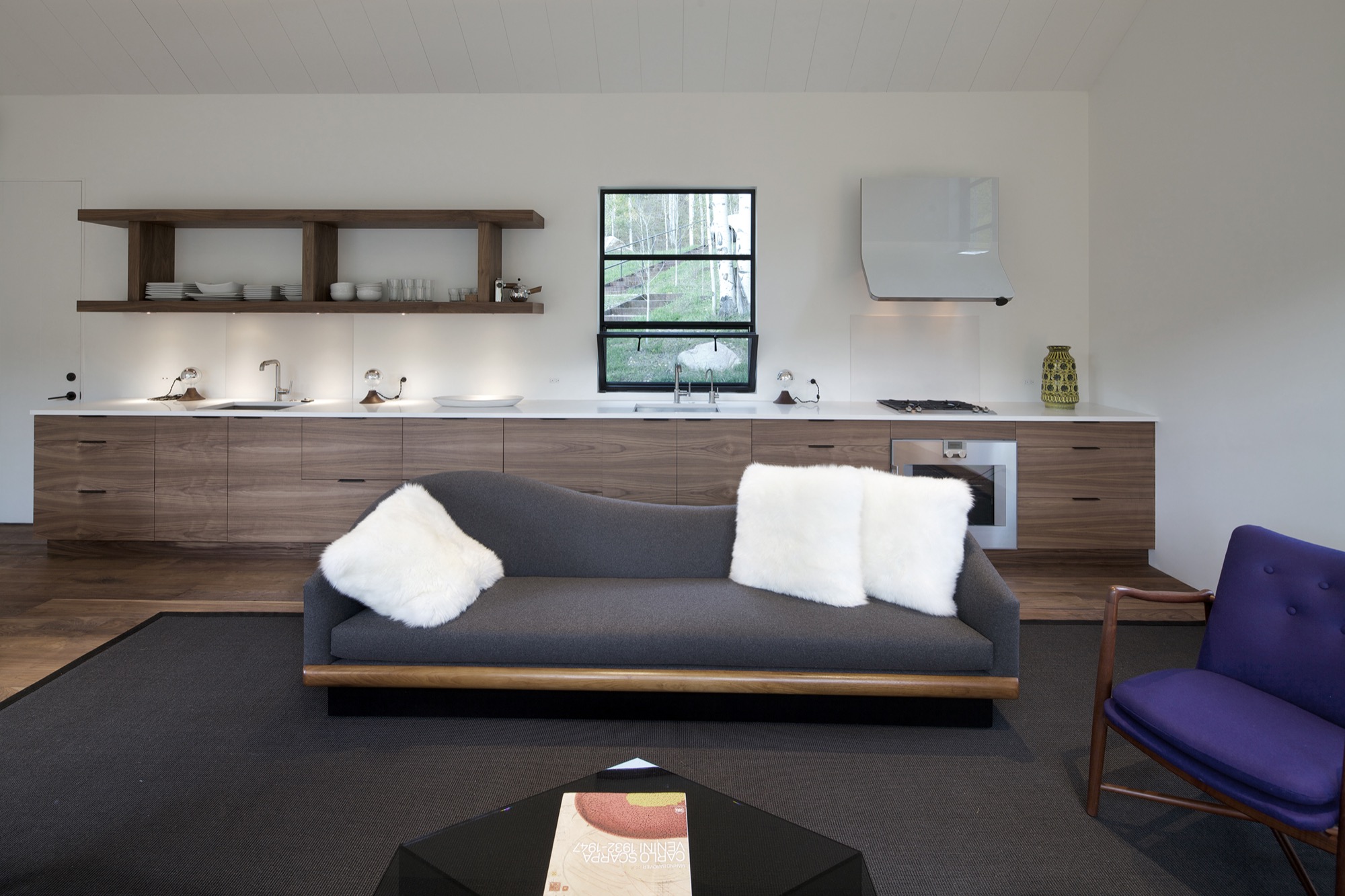
Walnut floors lend warmth to the primarily white, minimalistic inside. “The monochromatic interior, again, is a counterpoint to the main house, which has a lot more materiality coming through and more complicated detailing,” Piché says. Cottage Black, by contrast, is very simple, with much more subtle detailing: “There is the wood ceiling, for example, where each of the joints lines up with the joint on the exterior in a subtle inversion of it.”
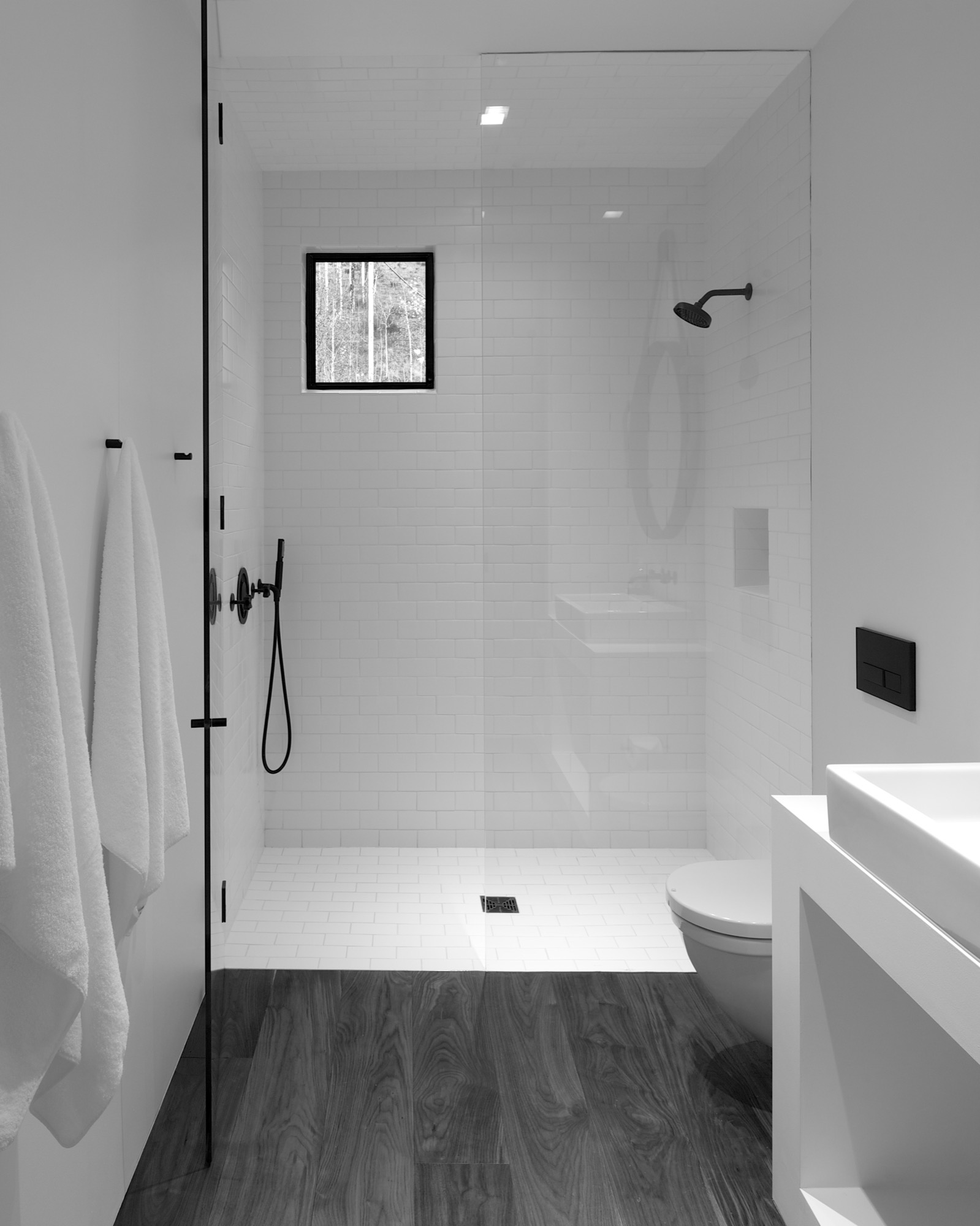
A bathroom at the center separates the sleeping area from the living space, which also includes a little kitchen to allow guests some autonomy, if they desire. “There isn’t any kind of door,” Piché says about the intimate studio layout.
A counterpoint for solitude
Should the guest retreat complement or rather juxtapose the main house? After much collaborative consideration, the design team and the client decided Cottage Black was to be a distinct counterpoint to the luxurious primary residence up above on the ridge. One consequential feature of this objective ended up being the orientation of the structure. “The one window that you see when you stand up in the living room lights up, and that’s it,” Piché says. “All the other things... we shifted it quite a bit to make sure you couldn’t see it from the main house—that there is that black object.”
Furthermore, the team had added transitional materials throughout the main house to add texture and interest in various places. Cottage Black’s architecture and interior design, on the other hand, are very much characterized by deleting details, according to the architect. “This house is a lot about editing,” he says in reference to the design process. “In the beginning, we had a lot more adventurous solutions, and we distilled it and made it into a better and more powerful piece of architecture. It doesn’t need to be a lot.” △
An Aspen House Lives Up to LEED
Smart technology helps a house in Aspen, Colorado, stay on its sustainable course
 The Aspen residence of architects Sarah Broughton and John Rowland aims to leave the pristine local landscape intact.
“Every drop of water that lands on the property finds its way to the bocce ball court, which is our storm-water filtration system,” Rowland says. “By the time it leaves, and heads to the aquifer, it’s as pure as it can get.”
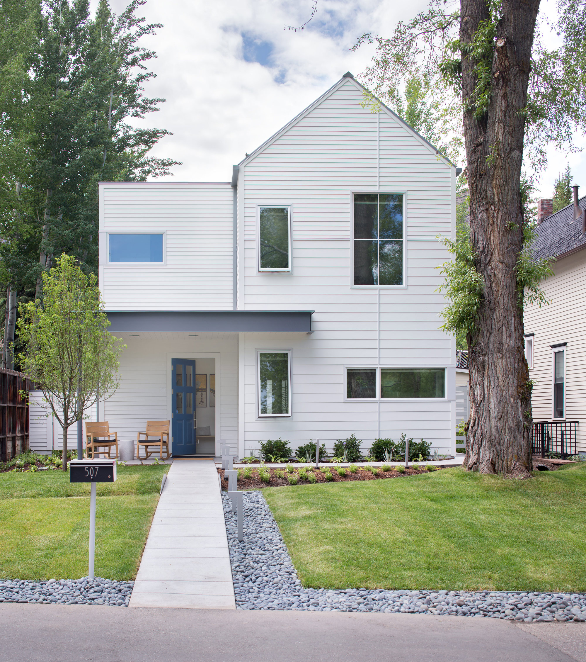
The couple’s house is LEED Gold certified, a rating they achieved by taking into account a number of considerations: They designed the structure so that a large tree in the front yard could be retained; construction was executed to minimize erosion and site impact; and the house itself has high-efficiency plumbing fixtures, among other features. Photovoltaic panels provide about 60 percent of the abode’s energy.
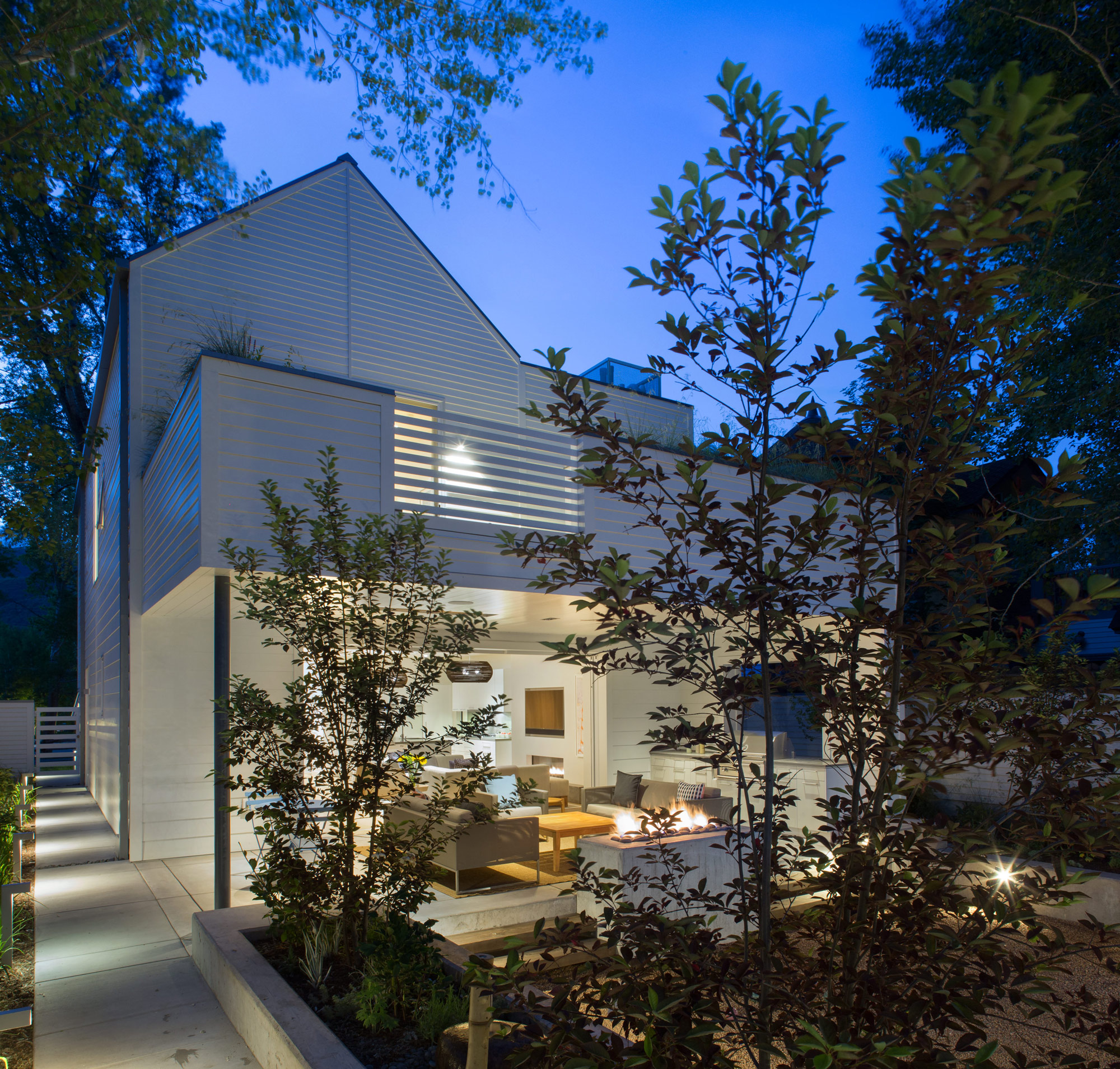
Outdoor entertaining is made possible by a wall of pocket doors from Weiland. “It really expanded the living room, because the doors just go away,” Broughton says. The couple use the Savant system to play music—two speakers are installed in the ceiling of the covered porch, and there are more in the garden. “The outdoor area rocks, literally,” Rowland says.
The residents have wired their mechanical room and solar technology to a Savant home automation system, which they use to keep an eye on the home’s performance. They’ve configured the system’s app to deliver a breakdown of the dwelling’s energy usage in a pie chart. “Last spring, when we were starting to open the windows, I looked at it and said, ‘Oh my gosh, the humidifier is running full-time, and it’s the largest energy hog right now,’ ” Rowland says. “It was time to turn it off.” He notes that they also closely monitor another culprit so it doesn’t run unnecessarily: The heat tape used in the gutters to prevent snow buildup is a big draw.
“The outdoor area rocks, literally.”
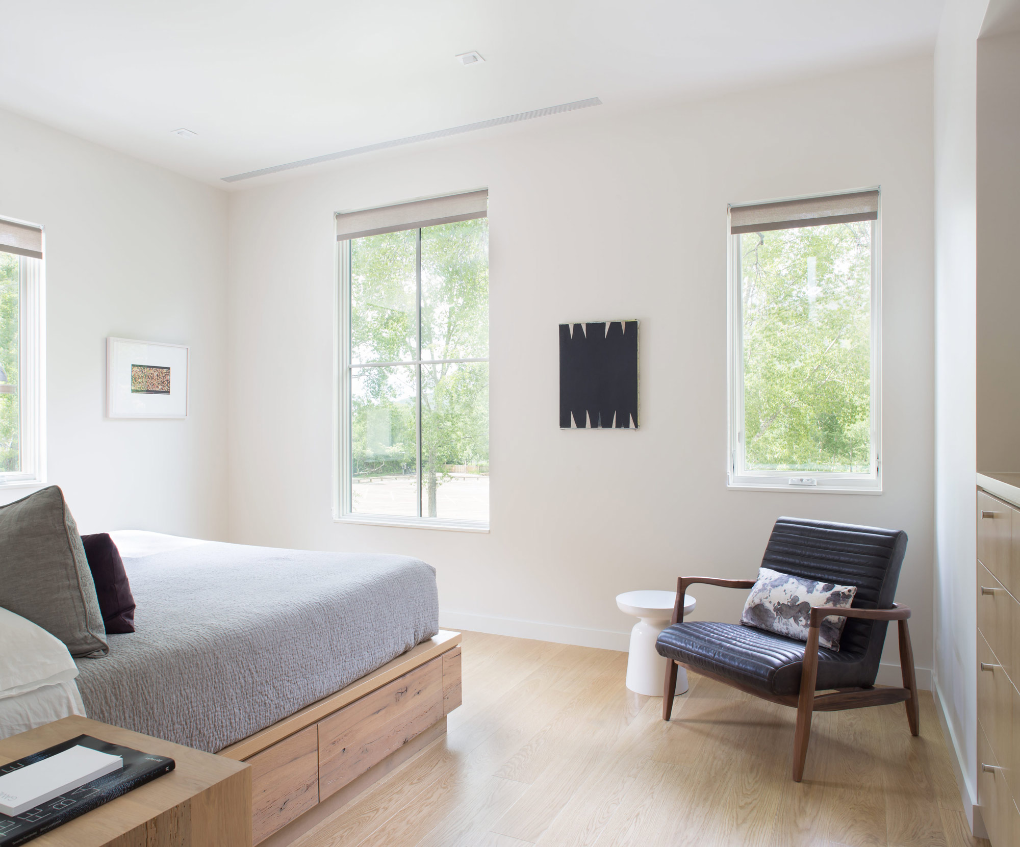
The house is optimized for gatherings. A guest apartment equipped with bunk beds sits under the garage, and a wall of sliding doors from Weiland enables indoor/outdoor functions—Broughton and Rowland once hosted a 25-person dinner party that seamlessly stretched from the dining room to the patio, thanks to tables set up in both places. Technology aids in the couple’s entertaining: Big music fans, they use the Savant system to stream audio across the property. Keyless door locks from Schlage hook up to the Savant setup, and the duo can assign visitors guest codes that will expire after they leave. But the couple purposely steered away from additional automation features—such as connected thermostats—to avoid confusing guests who aren’t familiar with the systems.
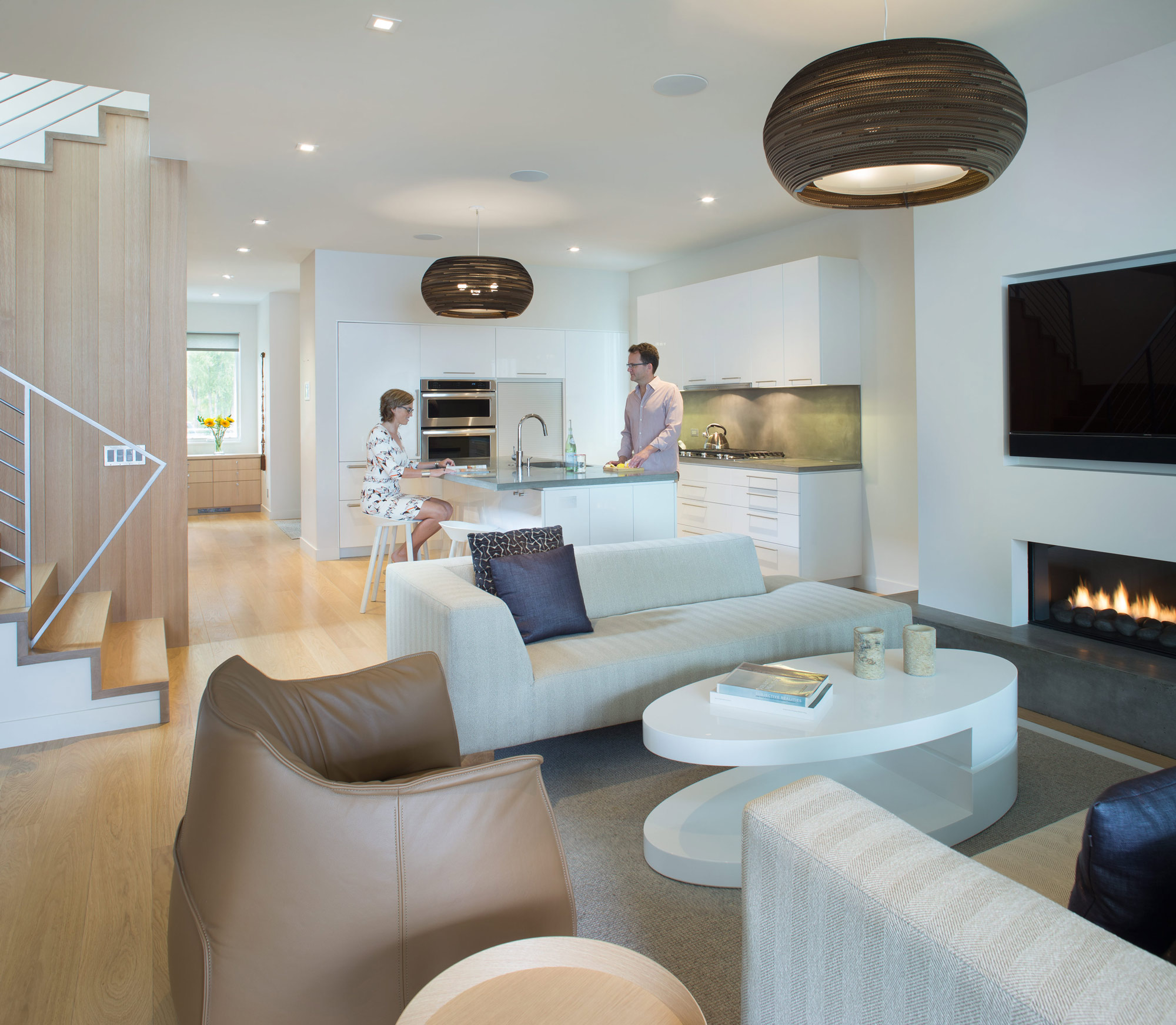
For themselves, though, Broughton and Rowland value the ability to ensure that their house is living up to its green rating. “I wish more of our clients would use tech to understand their consumption,” Rowland says. “A lot of people don’t even pay attention, and things are just running. As architects, we need to be in tune with that.”
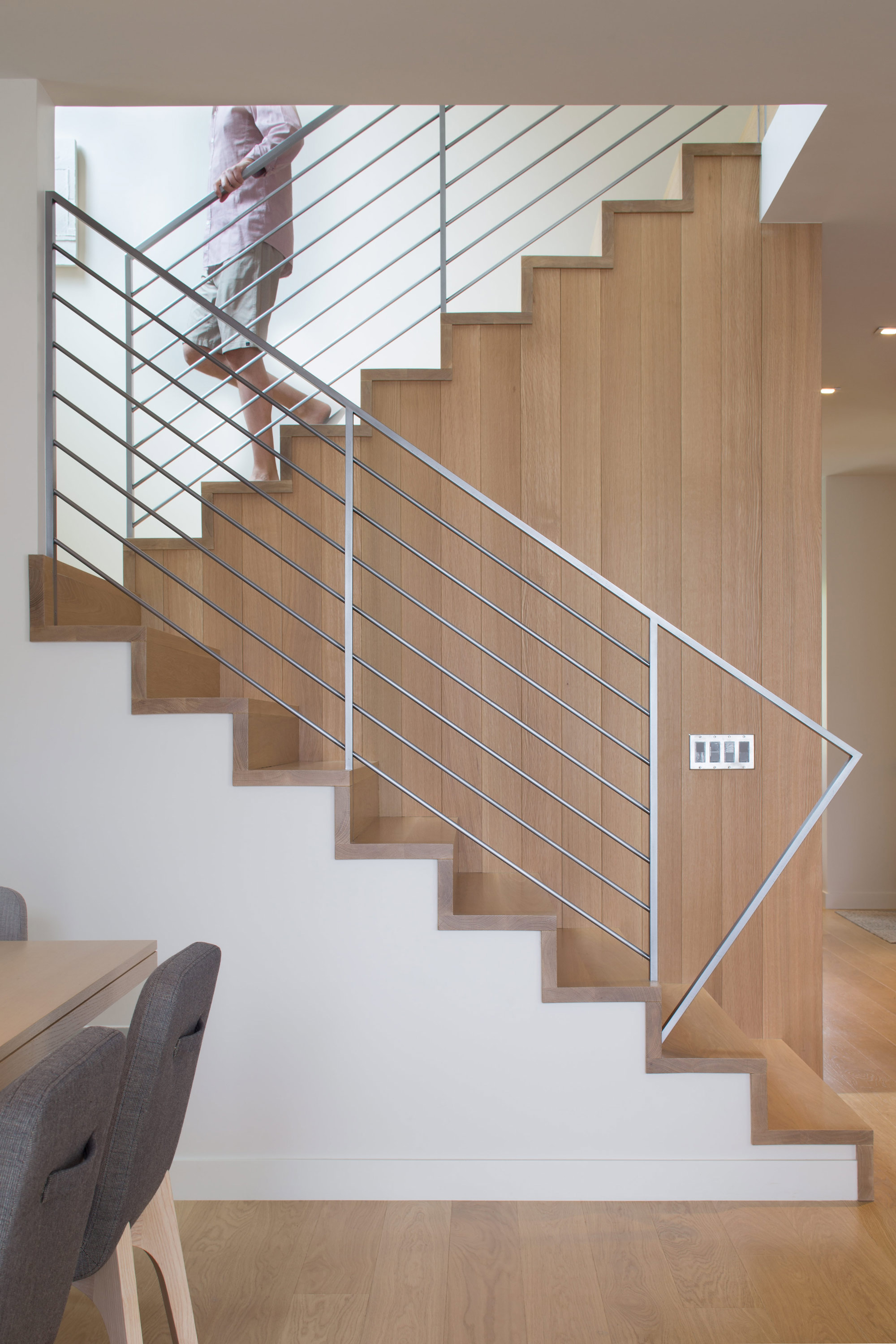
The materials are limited to white millwork and white oak. “When we come home, we want something serene,” Broughton says. △
“I wish more of our clients would use tech to understand their consumption. A lot of people don’t even pay attention, and things are just running. As architects, we need to be in tune with that.”
How American Modernism Came to the Mountains
A daughter of America's midcentury-modern movement remembers how Chicago’s design elite settled in Aspen, giving rise to modernism in the mountains of the West.
After World War II, Chicago’s design elite flocked to Aspen for ski and summer holidays, galvanizing the then-sleepy alpine village with modern mountain chalets and avant-garde public buildings that helped transform Colorado’s Roaring Fork Valley into the glamorous destination it is today. A memoir by artist Marcia Weese, daughter of Harry Weese, a central figure in the movement we now refer to as mid-century modern.
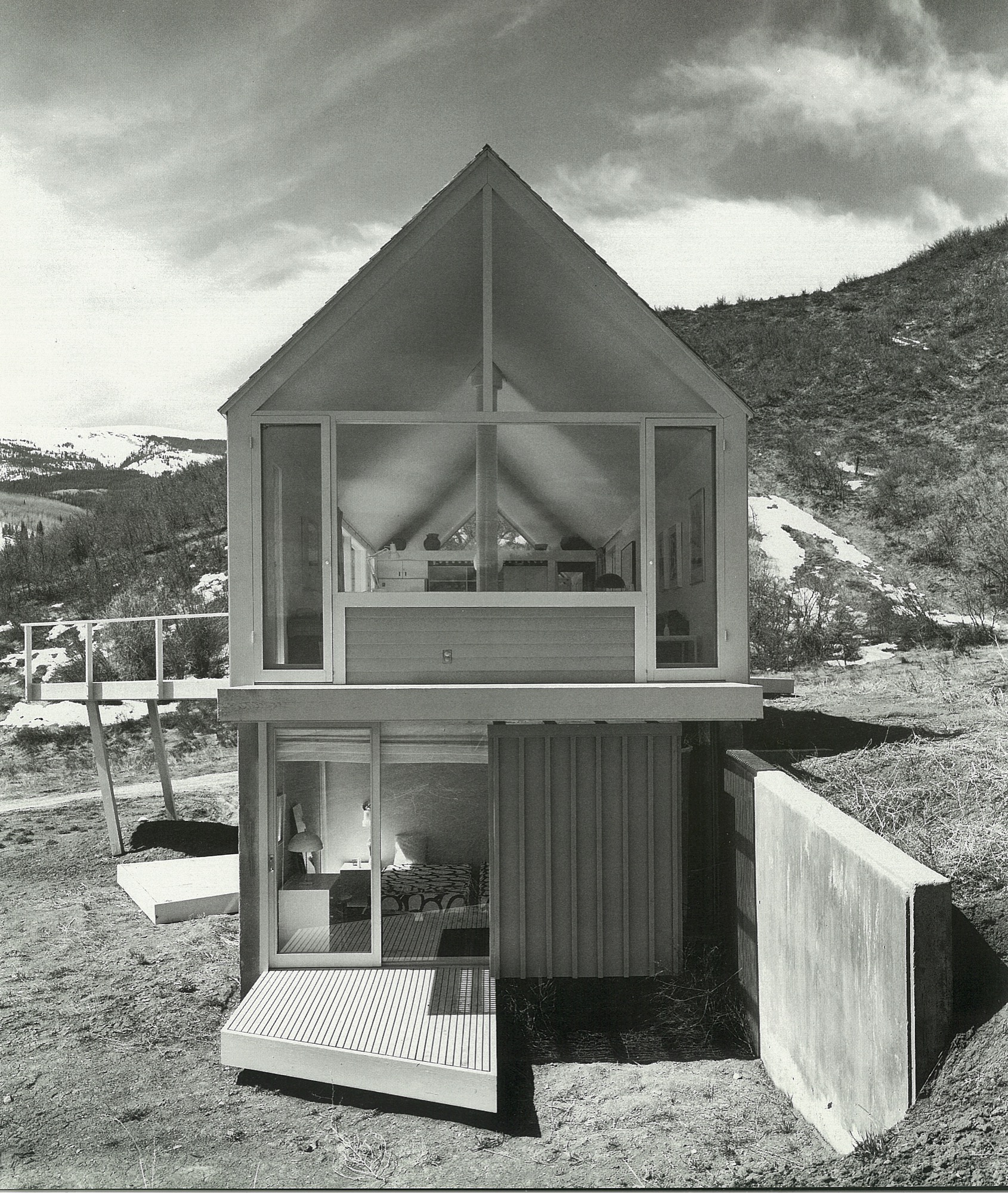
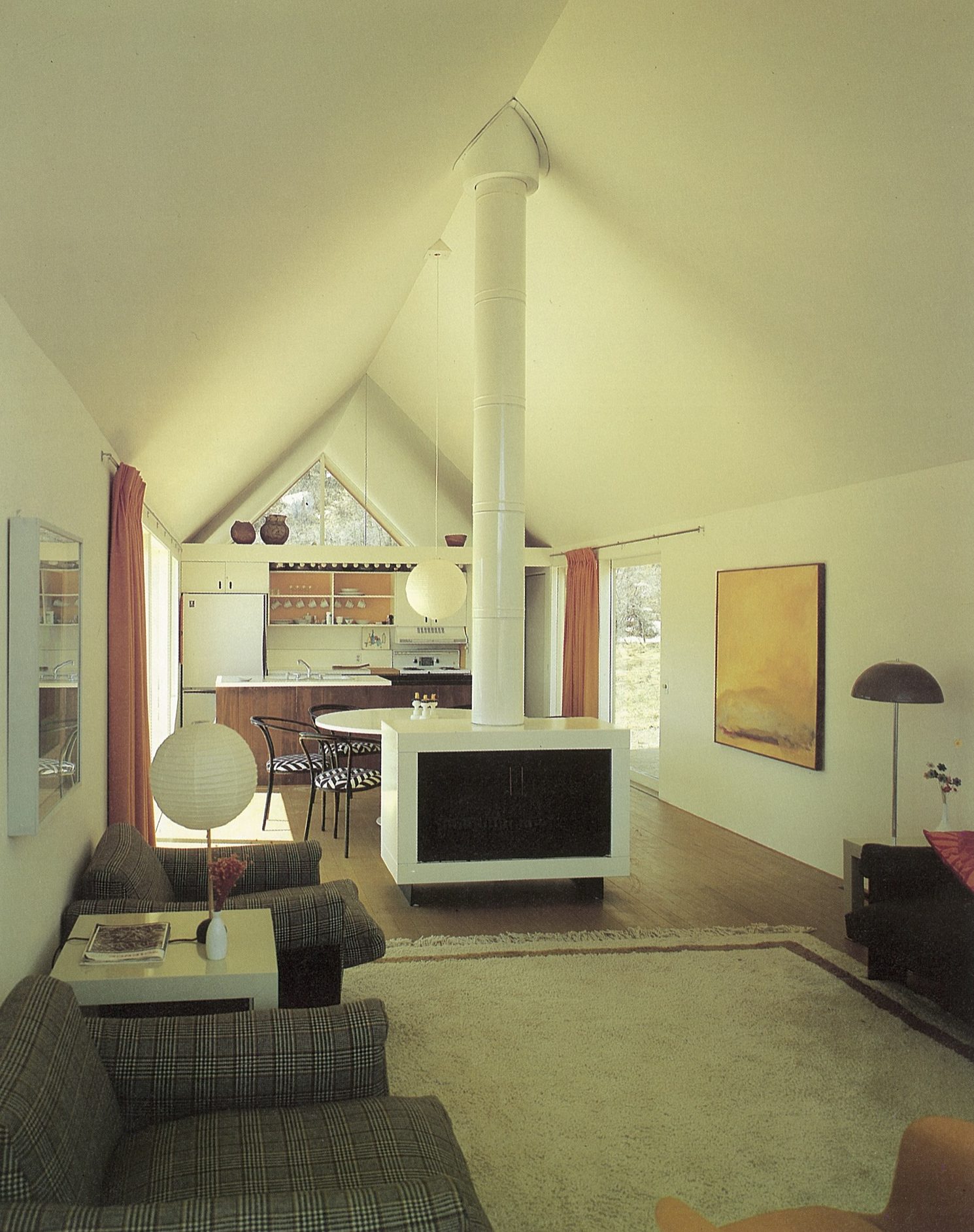
Someone recently remarked to me that I was “born to design.” Over the years, I have come to appreciate this birthright, as I realize I have tenaciously and (mostly) joyously cleaved to the creative life, and still do. I have my parents, Harry Mohr Weese and Kitty Baldwin Weese, to thank for this. The creative life is not for the faint of heart, but I wouldn’t trade it for anything.
Childhood in Chicago
It was the early 1950s in Chicago. As my mother told it,
“The war was over. No one had any money. No one had any furniture. Apartments to rent were scarce. We made do.”
When I was very young, we lived in a dim railroad flat in downtown Chicago. This was a typical inner-city apartment with a linear floor plan. The only natural light filtered through windows in the front and back. Chicago was a coal-burning city, and you could write your name on the window sills in the soot. I remember running down the dark hall that connected front to back, with crayon in hand. My parents encouraged my sisters and me to draw on the walls in that nondescript hall. What a great idea they had to spruce up the crepuscular gloom of the hallway, and how fun it was for us to break the rules.
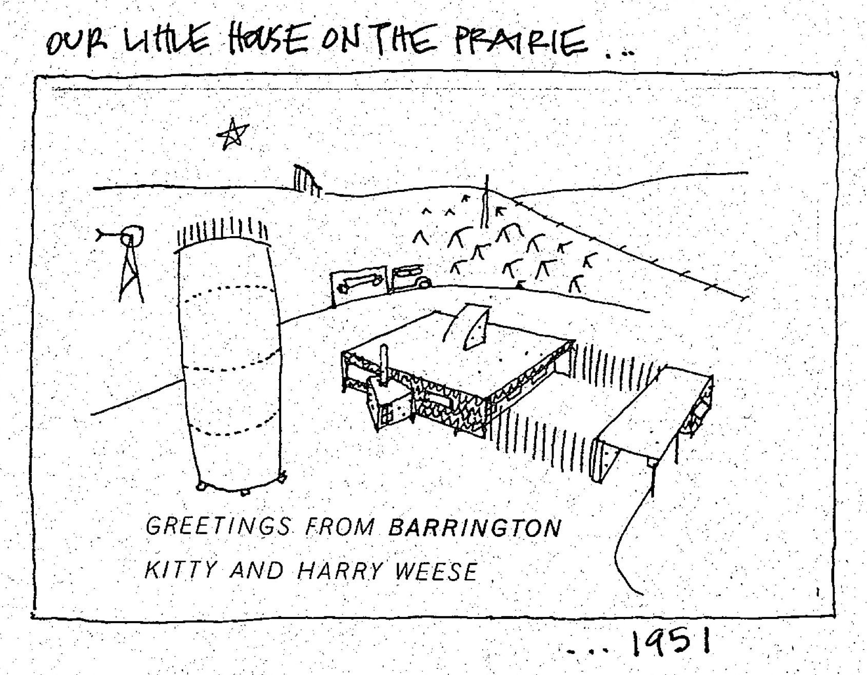
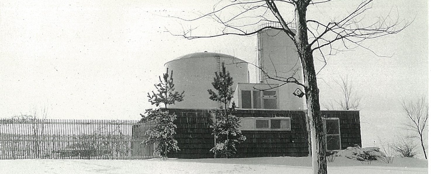
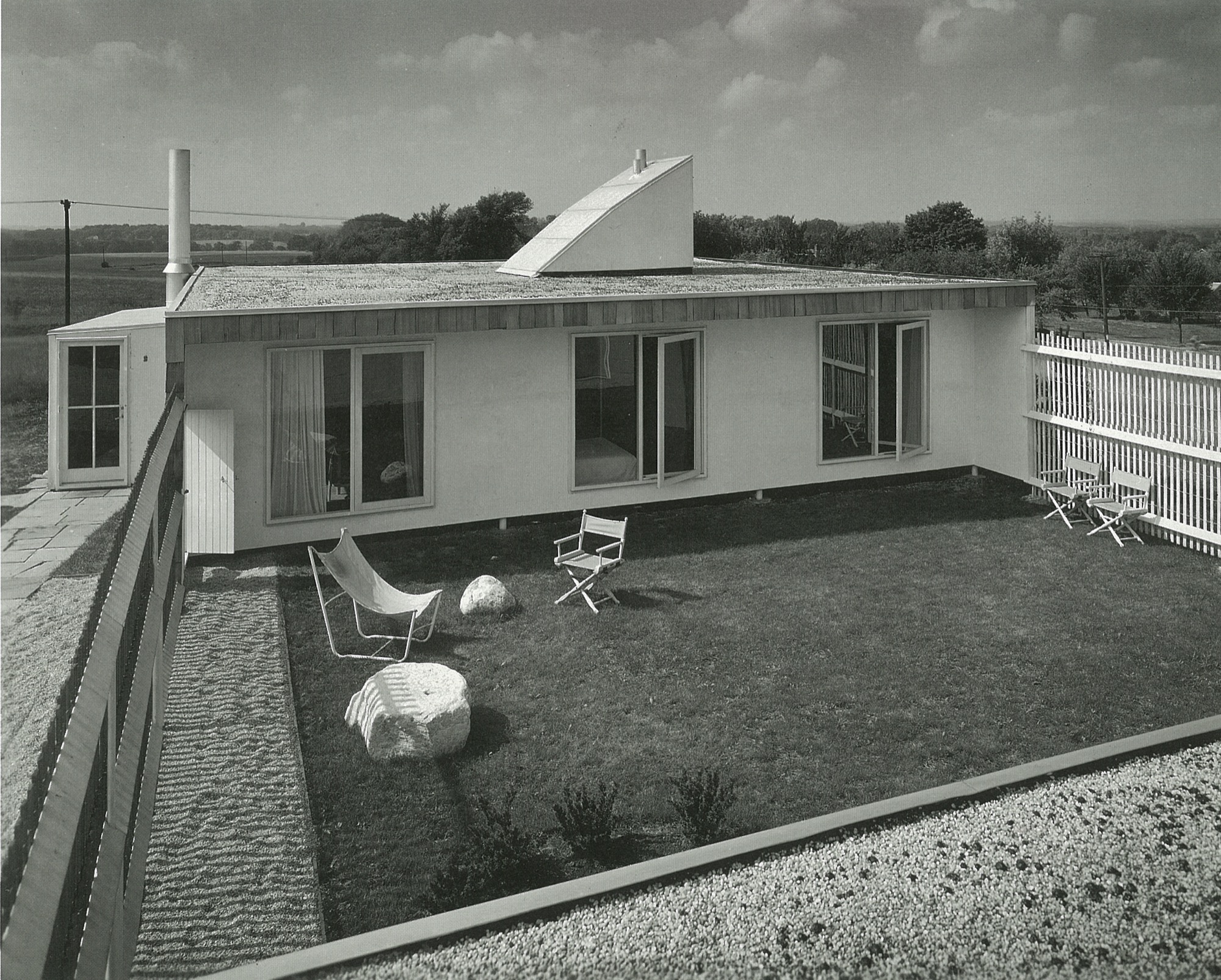
We spent weekends and summers in the country forty miles northeast of Chicago. Now it is wall-to-wall suburbia, but back then, we bundled our five-person family, one cat, two turtles, and several guinea pigs into the car and drove (pre-Kennedy expressway) through many stoplights to the little town of Barrington, Illinois. There, we lived in one of my architect father’s early houses. Built on a lot adjacent to two immense water towers belonging to the town, the house was modern and modest; a one-story house with a flat roof, carport, gravel driveway and a fenced-in garden the three bedrooms emptied into. It was sparsely furnished, and I will always remember the black-and-white linoleum floor. Mom found some dinner-plate-sized checkers pieces and we played checkers on that floor to our endless delight.
Some years later, my grandfather gave my father a nearby five-acre (two-hectare) plot of land, which consisted of a hill, many large oak and hickory trees, poison ivy everywhere, and a hand-dug lake topped off with a pet alligator. Here, my father built a wonderful and quirky house (prebuilding code) he named “The Studio.” We spent many years toggling between city and country. This was a refuge from the city for my parents, and for me, a secret garden of woodland flora and fauna.
Studying with the Eamses & Co.
After graduating from the Massachusetts Institute of Technology in architecture and engineering, Dad studied in Michigan at the Cranbrook Academy of Art with Charles and Ray Eames, Eero Saarinen, Ben Baldwin, and a host of others who were living and creating modern design at a time when the atmosphere was ripe for it.
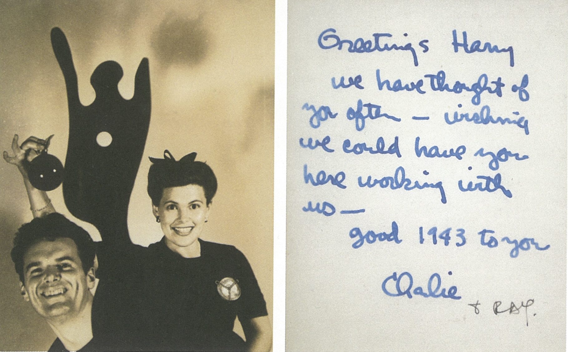
As history has revealed, many became household names, even demigods, in the movement we now refer to as mid-century modern. These people were some of my parents’ closest friends.
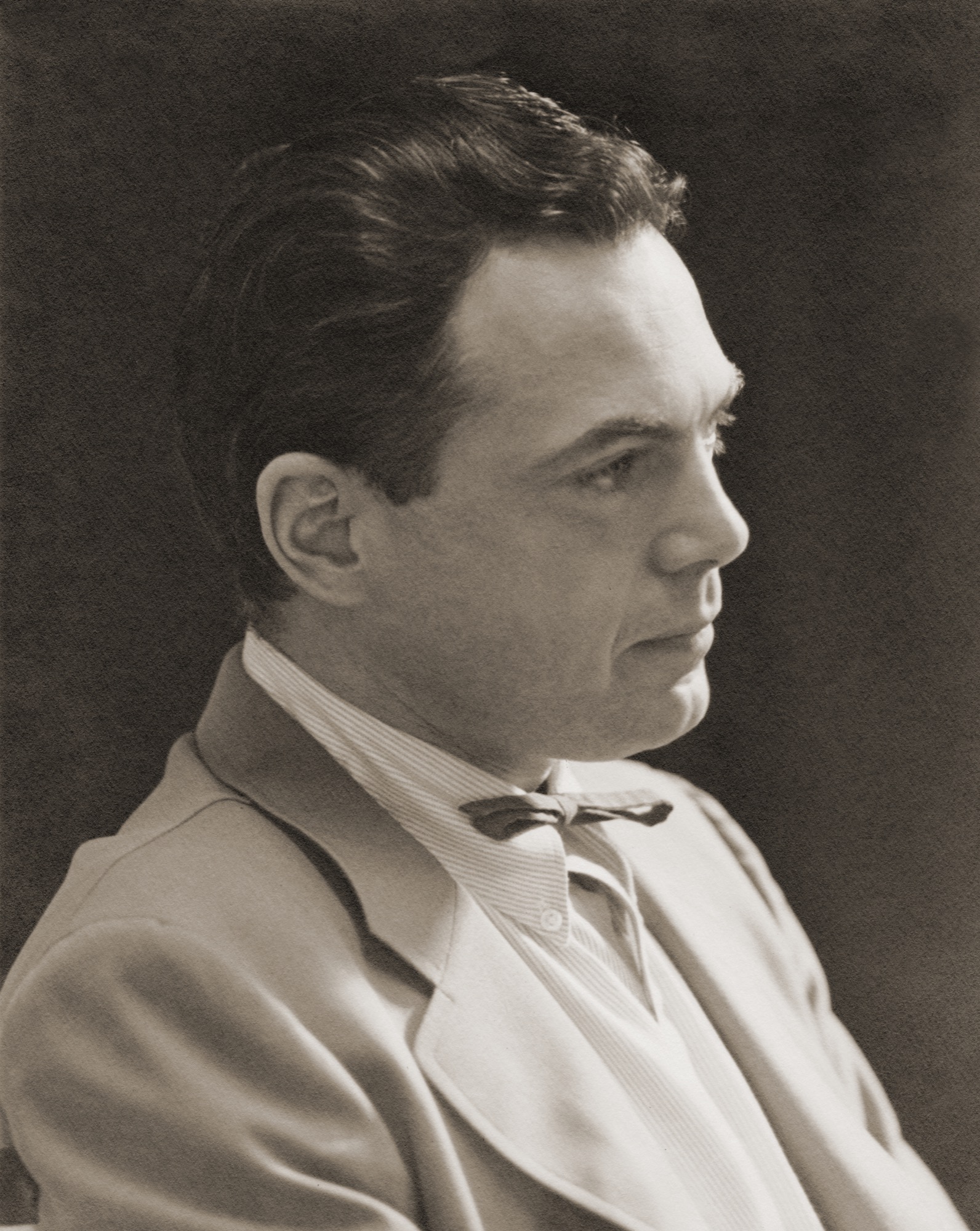
My father and Ben Baldwin had won a few industrial design awards from the Museum of Modern Art while at Cranbrook, so they decided after graduation to “hang a shingle”—Baldwin Weese—to practice architecture in New York City. They worked together for a year but decided to convivially go their separate ways; Ben stayed in New York, and Dad returned to his birthplace, Chicago. But first, Ben introduced my father to his sister Kitty.
When Harry met Kitty
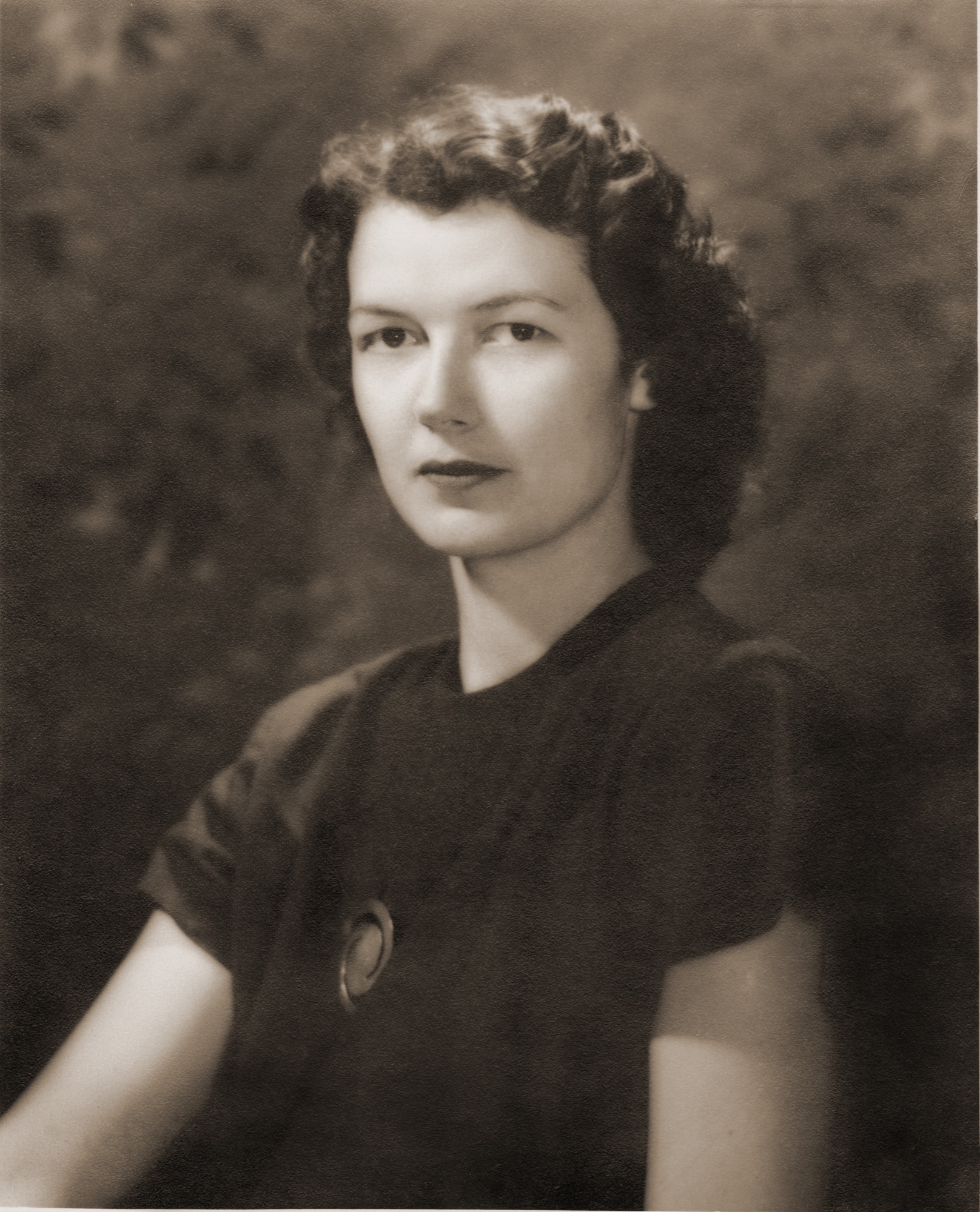
As my father approached the house to meet Kitty for the first time, she watched him jump over the fence rather than use the gate. That did it for her. He was a nonconformist, an inventor, a man who loved to use the path less traveled. He had no use for convention as it was, in the post WWII era. The overriding spirit was “rebuild,” therefore “build anew.” This was the perfect time for him to launch his architectural career in Chicago. He founded the architecture firm Harry Weese & Associates, which lasted for fifty illustrious years. My mother, who was southern, elegant, and graceful, was over the moon for this artistic, restless spirit. Not a typical match, but it worked; he needed her organized calm and “good eye for design” to manage his ambitions.
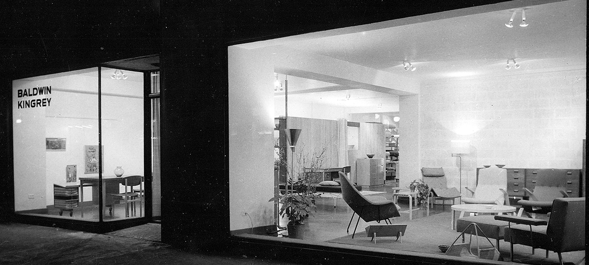
Baldwin Kingrey store in Chicago
In the early fifties, there was no modern anything to be found in the Midwest. So my mother with her partner Jody Kingrey opened a furniture store, prompted by my father. While in the navy for three long years he kept a journal that he scratched in during calmer moments at sea. Here is an excerpt describing his vision for a retail store, entered on May 26, 1943,
“Thought of the (retail furnishings salon) shop for gathering together all beautiful and useful modern objects, which could be termed ‘furnishings’... Anonymous discoveries and subcontracted and assembled pieces of my design: foam and webbed couch in church pew form, telescoping coffee tables of magnesium or plastic, ... fabrics ... grass matting to a special design ... restaurant adjacent, movies, bar, a small haven for those interested ... a trip abroad to buy imports first thing after peace.” “In the early fifties, there was no modern anything to be found in the Midwest. So my mother with her partner Jody Kingrey opened a furniture store, prompted by my father.”
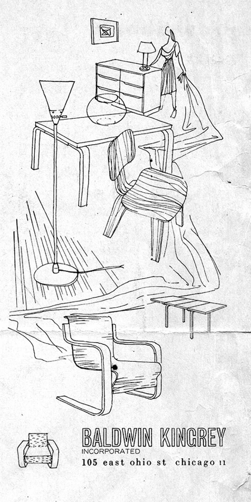
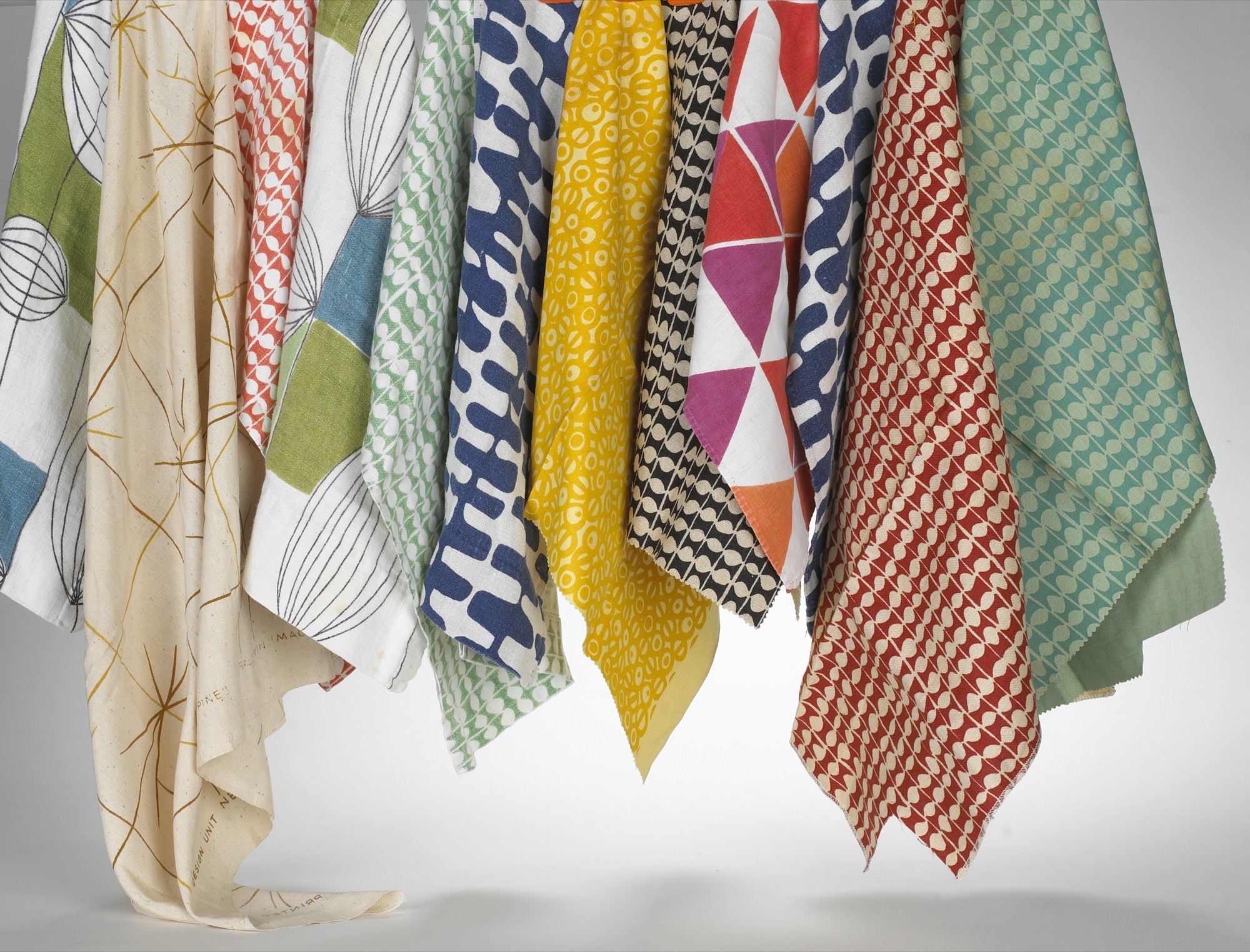
Wasting no time postwar, Dad got permission to handle the Midwestern franchise for Artek furniture from Scandinavia. Ben Baldwin designed fabrics and window displays. Harry Bertoia showed his jewelry, James Prestini sold his turned wooden bowls, artists queued up to exhibit in the space, and Baldwin Kingrey opened its doors to an eager audience hungry for modern design.
In words from John Brunetti, author of Baldwin Kingrey, Midcentury Modern in Chicago, 1947–1957,
“Baldwin Kingrey was more than a retail enterprise. It served as an informal gathering place for students and faculty from Chicago’s influential Institute of Design (ID) as well as the city’s architects and interior designers, who looked for inspiration from the store’s inventory of furniture by leading modernist designers such as Alvar Aalto, Bruno Mathsson, Charles Eames and Eero Saarinen.”
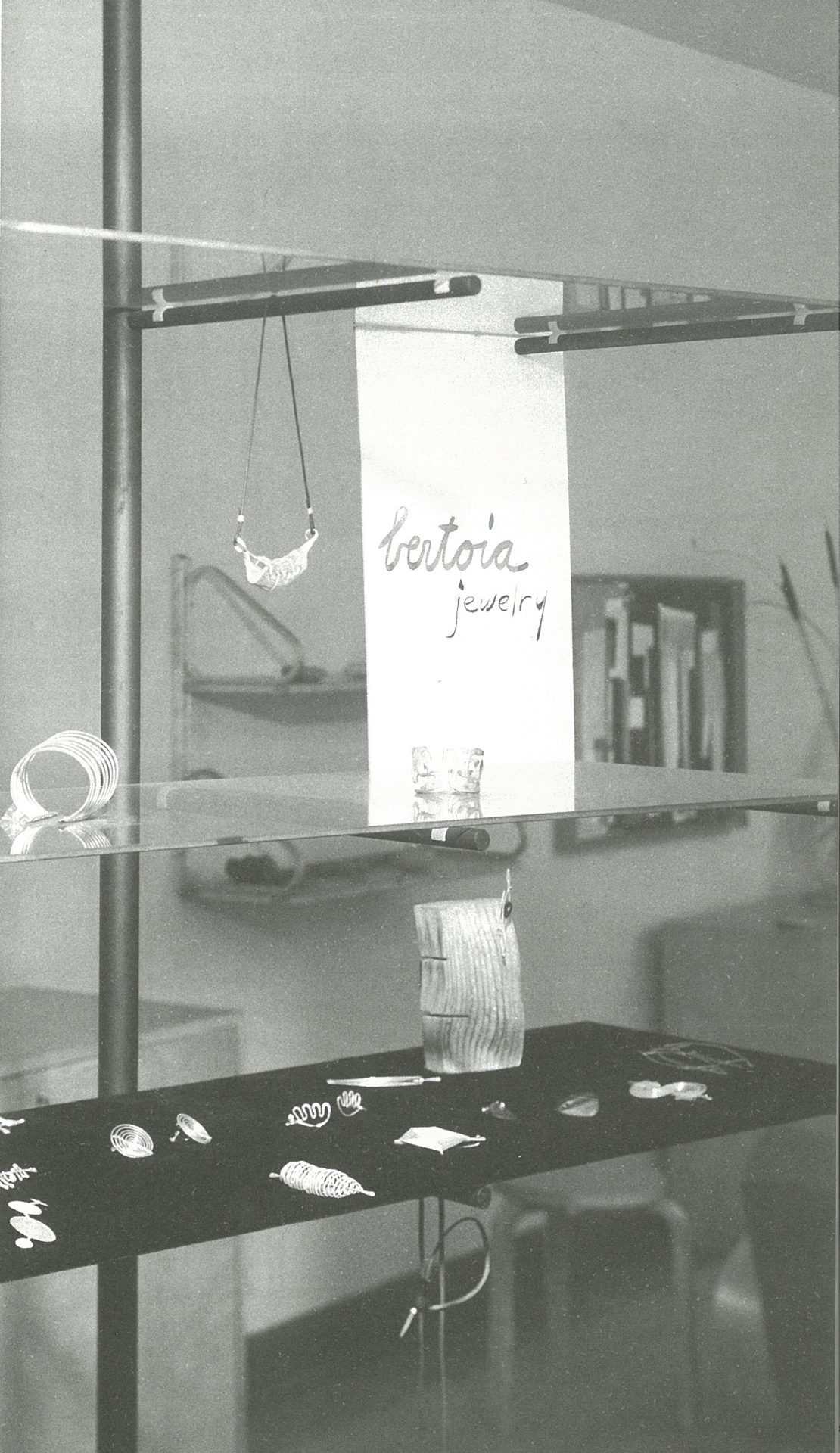
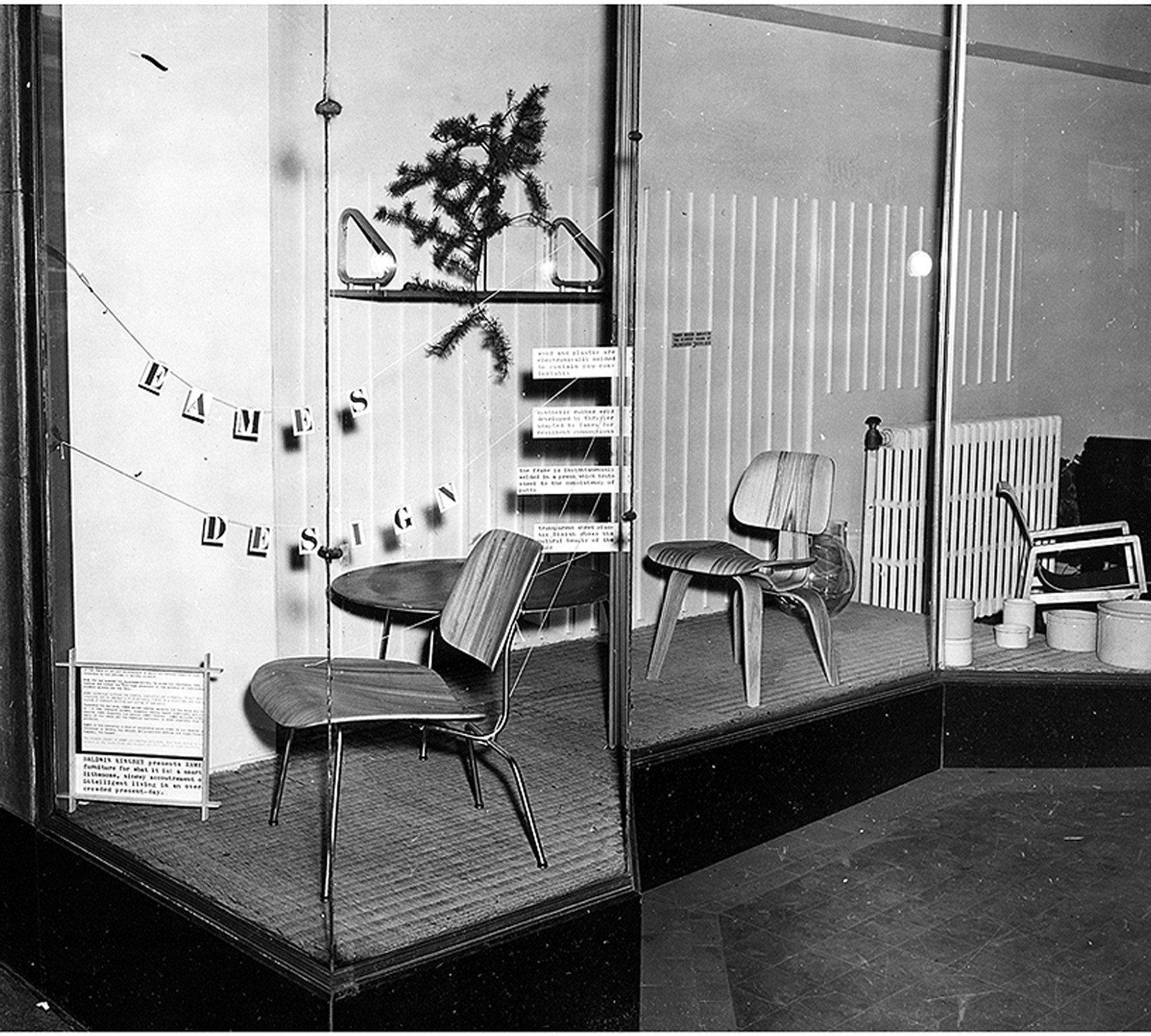
My father started his architectural practice at a drafting table in the back of the Baldwin Kingrey store. He did all the graphics for the store, designed a line of furniture and lighting he called BALDRY, designed open shelving of floating glass and steel poles to display Bertoia jewelry, Venini vases and “Chem Ware”—beakers and Petri dishes in simple, beautiful forms, that they found in the industrial section of the city. There was resourcefulness, an informality, and a frugality at play. In my mother’s words,
“Harry and I stopped at a place that sold Cadillacs on LaSalle Street. They were selling out their leather for automobiles, so we bought the whole batch. A lot of our furniture was covered in Cadillac leather! We were in a sense the precursor to Crate and Barrel. They came down to study us a lot. Carole Segal (founder of Crate and Barrel) was a friend of mine, and I gave her help. I gave her a lot of source material.”
As I was growing up, there was a steady stream of visitors, all immersed in modern design. My mother reminisced,
“You couldn’t travel across the country without changing planes or trains in Chicago. Everyone would stop in Chicago. The people that rushed into Baldwin Kingrey were mostly from the city and they didn’t have much money. Instead, they had some sort of new outlook—a vision. They loved the simplicity of our ‘plain’ furniture.”
The road was unpaved, the waters uncharted, the possibilities endless. Many would visit our house to exchange ideas, talk about projects, drink a cocktail or two, even draw at the dinner table. One of these more salient meetings I remember clearly:

I must have been ten or eleven when a distinguished elderly gentleman came to visit us in Barrington. My father was notably excited to share our modern house with him. When it was time to leave, he escorted him down the walkway under the grape arbor to his car with me trailing behind. As he drove off, my father turned to me with tears streaming and whispered, “There goes my mentor. There goes the most important man in my life.” This was none other than Alvar Aalto, who had been Dad’s professor and was a great influence on his architecture and design philosophy.
First pitstop in Aspen
When peace came in 1945, Dad stepped off his ship in San Francisco and he and Mom drove eastward. On their way back to Chicago, they stopped in Aspen and took some black-and-white photographs of downtown. The town consisted of several stone and brick buildings—the Courthouse, the Wheeler Opera House, the church and Hotel Jerome. All other structures were small Victorians, a few storefronts, dirt roads, and occasional wooden lean-tos that sheltered a few dozing horses. Many of the houses had been plunked on rubble walls to speed construction for miners and their families in the boom of the late 1800s. Builders often used pattern books with a 12/12 pitch for snow load, imparting a human scale that has long since been lost.
Dad—an avid skier—fell in love with Aspen and began a tradition of visiting each winter and summer that lasted throughout his life. Luckily, he included us in this adventure, and, thus, I have precious memories of Aspen in those early days. It has been described as “the town Chicago built.”
“I have precious memories of Aspen in those early days. It has been described as ‘the town Chicago built.’ ”
In the 1940s in Chicago, my parents were friends with Walter Paepcke, a successful industrialist, philanthropist, and president of the Container Corporation of America. It was Walter’s remarkable wife Elizabeth, a notable influence on Chicago’s cultural life and one of Mom’s favorite people, who exposed Walter to modern design and artistic sensibilities. In this spirit, Paepcke consulted with Walter Gropius, brought Laszlo Maholy-Nagy to the Institute of Design, befriended Bauhaus artist and designer Herbert Bayer, and photographer Ferenc (Franz) Berko, also at ID at the time. Mom and Dad intersected with ID, as the campus was a hub for young and ambitious modernists.
In a memoir, Elizabeth Paepcke describes her first impression of Aspen after skinning up the mountain in 1939,
“At the top, we halted in frozen admiration. In all that landscape of rock, snow and ice, there was neither print of animal nor track of man. We were alone as though the world had just been created and we its first inhabitants.”
Walter Paepcke first visited Aspen in the spring of 1945 urged by Elizabeth. To him, this seemed the idyllic place to implement a new Chautauqua. The Aspen idea was to create a place, in Walter’s words, “for man’s complete life ... where he can profit by healthy, physical recreation, with facilities at hand for his enjoyment of art, music, and education.” Thus the Aspen Institute of Humanistic Studies was born. Herbert Bayer was brought in to oversee the design of the campus, and Franz Berko became the Institute’s in-house photographer. The pull to Aspen was magnetic, and as many of Chicago’s design elite began to relocate and vacation there, my parents were among them.
“The Aspen idea was to create a place, in Walter’s words, ‘for man’s complete life ... where he can profit by healthy, physical recreation, with facilities at hand for his enjoyment of art, music, and education.’ ”
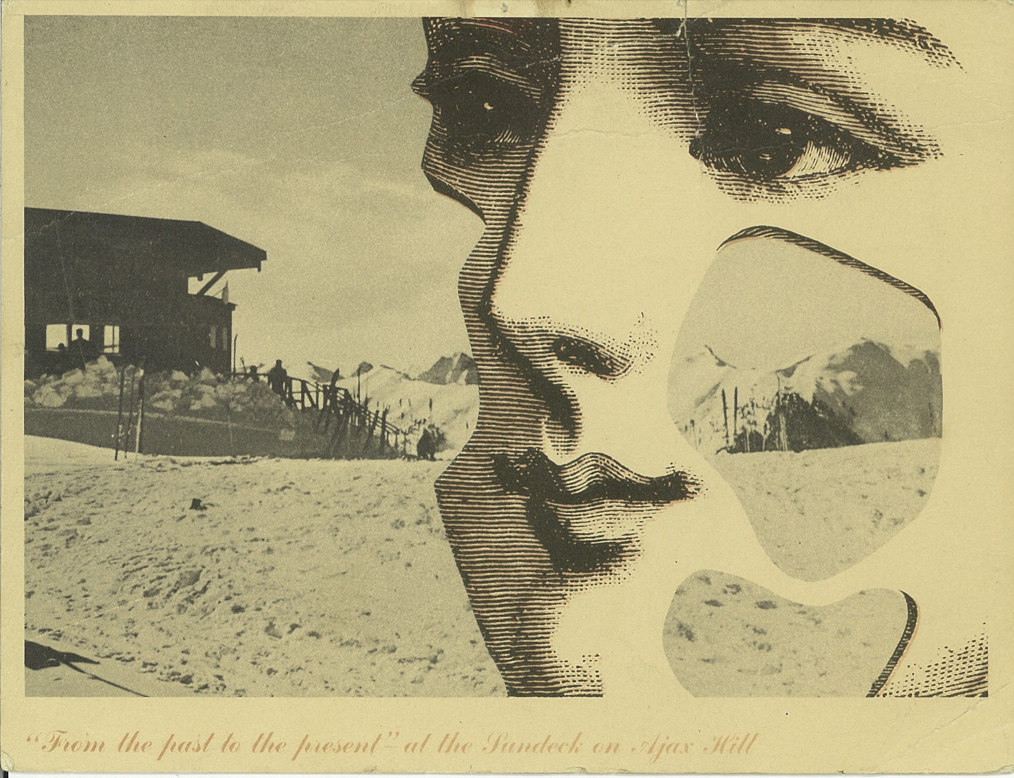
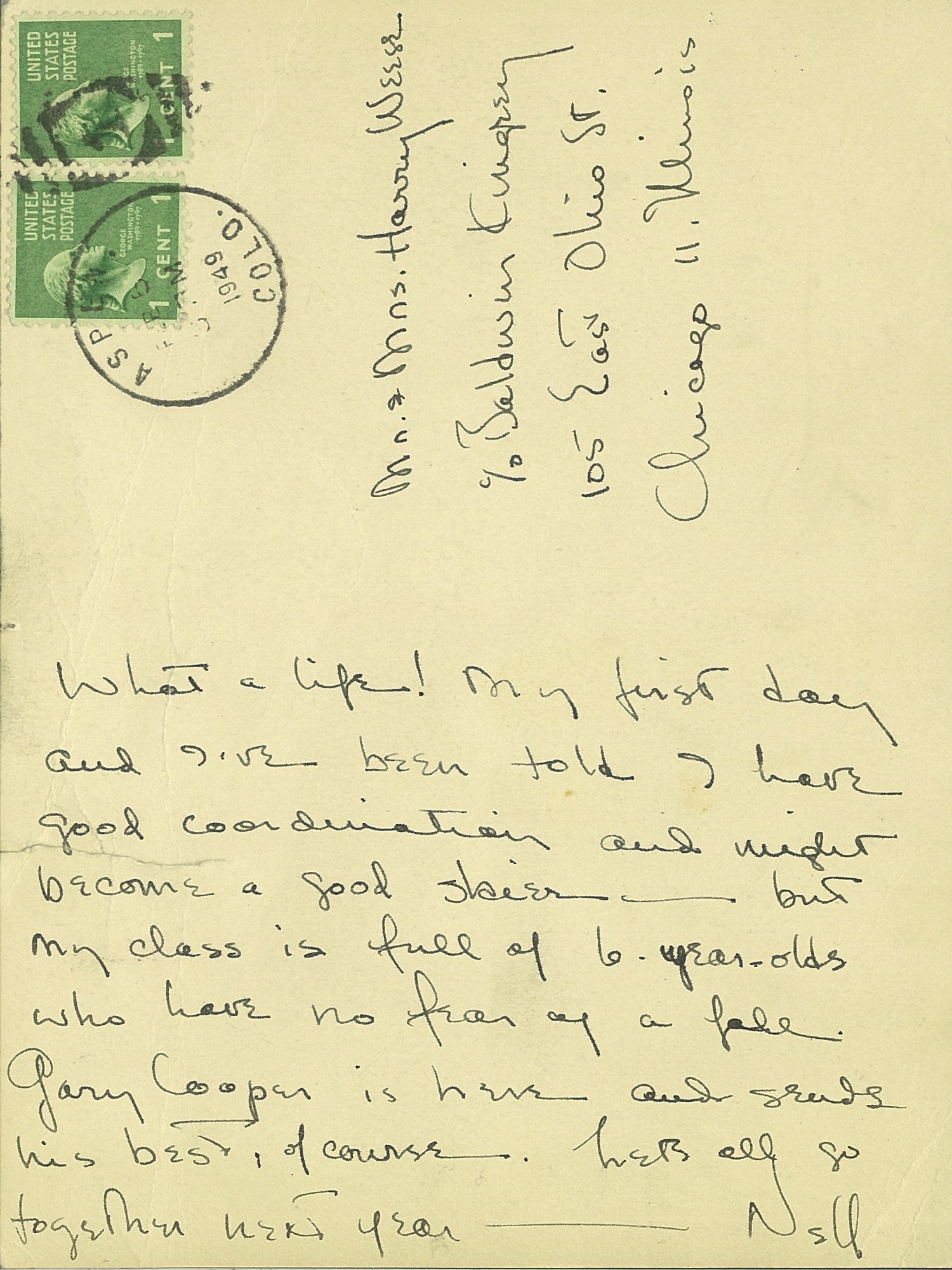
“The pull to Aspen was magnetic, and as many of Chicago’s design elite began to relocate and vacation there, my parents were among them.”

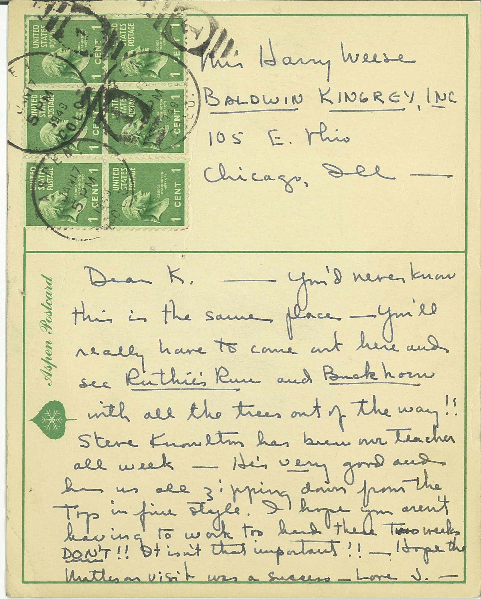
There was a palpable charm to Aspen in the fifties and sixties, which I feel so fortunate to have experienced first hand. Many Europeans returned to the town to settle after serving in the famed 10th Mountain Division during the war. Their training camp, Camp Hale, was nearby and enlisted men would often ski Aspen on the weekends. Friedl Pfeifer was one who started the Aspen Ski School; Fritz Benedict set up an architectural practice. After the war, many of these veterans taught skiing in winter and worked as carpenters in summer. Their wives typically ran the shops, bakeries, and clothing stores in town. Franz Berko stayed, continued his photographic career, and raised his family. His wife Mirte ran a toy shop that sold wooden toys from Europe. Herbert Bayer designed the early buildings at the Aspen Institute and settled in town with his wife Joella. Fritz Benedict, the noted local architect, married Joella’s sister Fabi, and he began developing Aspen. Joella and Fabi shared a famous mother—the poet Mina Loy. This was an illustrious and hearty group of early modernist settlers who loved the mountains and skiing and who brought Aspen out of its “quiet years.” My parents were in the midst of the action.
“This was an illustrious and hearty group of early modernist settlers who loved the mountains and skiing and who brought Aspen out of its ‘quiet years.’ ”
Christmases at the Hotel Jerome
Nora Berko, daughter of Franz and Mirte, remembers visiting us at the Hotel Jerome every Christmas. We always stayed in the southeast corner with full view through the Victorian lace curtains of Main Street and Ajax Mountain. As our collective parents went out to dinner and dancing, usually at the Red Onion, we had full run of the rickety hotel, much like Eloise at the Plaza. With its worn and dusty velvet furniture, Victorian floral wallpaper, and black-and-white photos of skiers sporting the reverse shoulder stance and the latest style of stretch pants, it was a far cry from our modern and minimal environment at home. We ran up and down the creaking stairs and played in the elevator—a novelty—as it was the only one in town. The rooms cost ten dollars per night, radiators clanked, and in some seasons ropes were ceremoniously draped across the room sinks warning of giardia in the water. But we loved the Jerome. It felt like an old comfortable shoe. The Paepckes leased the hotel as well as the Opera House so Elizabeth had license to paint the exterior white with light blue arches over the windows. The hotel looked like a grand Bavarian wedding cake in a perpetual wink; an impressive structure always easy to spot for a youngster finding her way home after ski school. It stayed this way for several decades.
Every Christmas we walked through snowy streets to the Berko’s for Christmas dinner. Their house was a modestly scaled and cozy Victorian in Aspen’s west end. Real candles burned on the Christmas tree, which was festooned with wooden ornaments from Mirte’s toy shop. Marzipan treats imported from Europe were served. There was no central heat. Brrrr. But for a young girl, I was sure that I was encompassed within a magical snow globe.
Aspen became our second home
In the late sixties, my mother bought a small Victorian in Aspen's west end for a mere pittance. We began to spend summers in the mountains, which was a blessed relief from the mugginess of the Midwest. My father worked on projects in and around Aspen. Many went unbuilt but some were realized, including the Given Institute. He had a plan for a new airport, and he wanted to bring light rail from Glenwood to Aspen to alleviate vehicular traffic. Always drawing, usually at the kitchen table, I rarely saw him without a pencil in hand. In 1969 Charles Moore (who taught at Yale), and Fritz Benedict lured a class of Yale architectural grad students to spend a summer in the nearby mountains and build experimental projects. When these young, handsome students appeared, they were eager to rub shoulders with my father at his kitchen table. (A few rubbed shoulders with his daughters as well!) One of these architects, Harry Teague, arrived and never left. Over four decades, he has made a significant imprint on the town, designing notable residences and many of Aspen’s most prestigious cultural buildings, including Harris Hall, the Aspen Music School campus, and the Aspen Center For Physics. He has become one of Aspen’s “own” by championing a humanist aesthetic that continues to raise the bar of modern architecture in the Roaring Fork Valley.
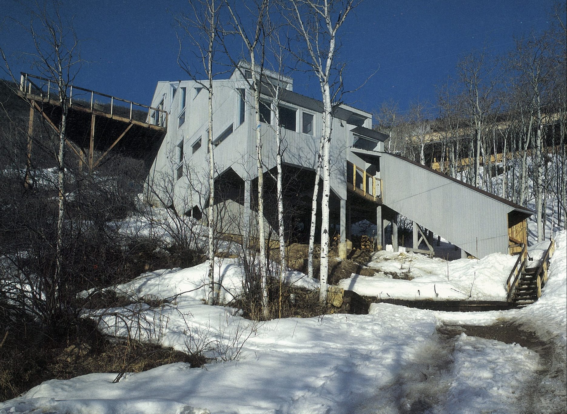
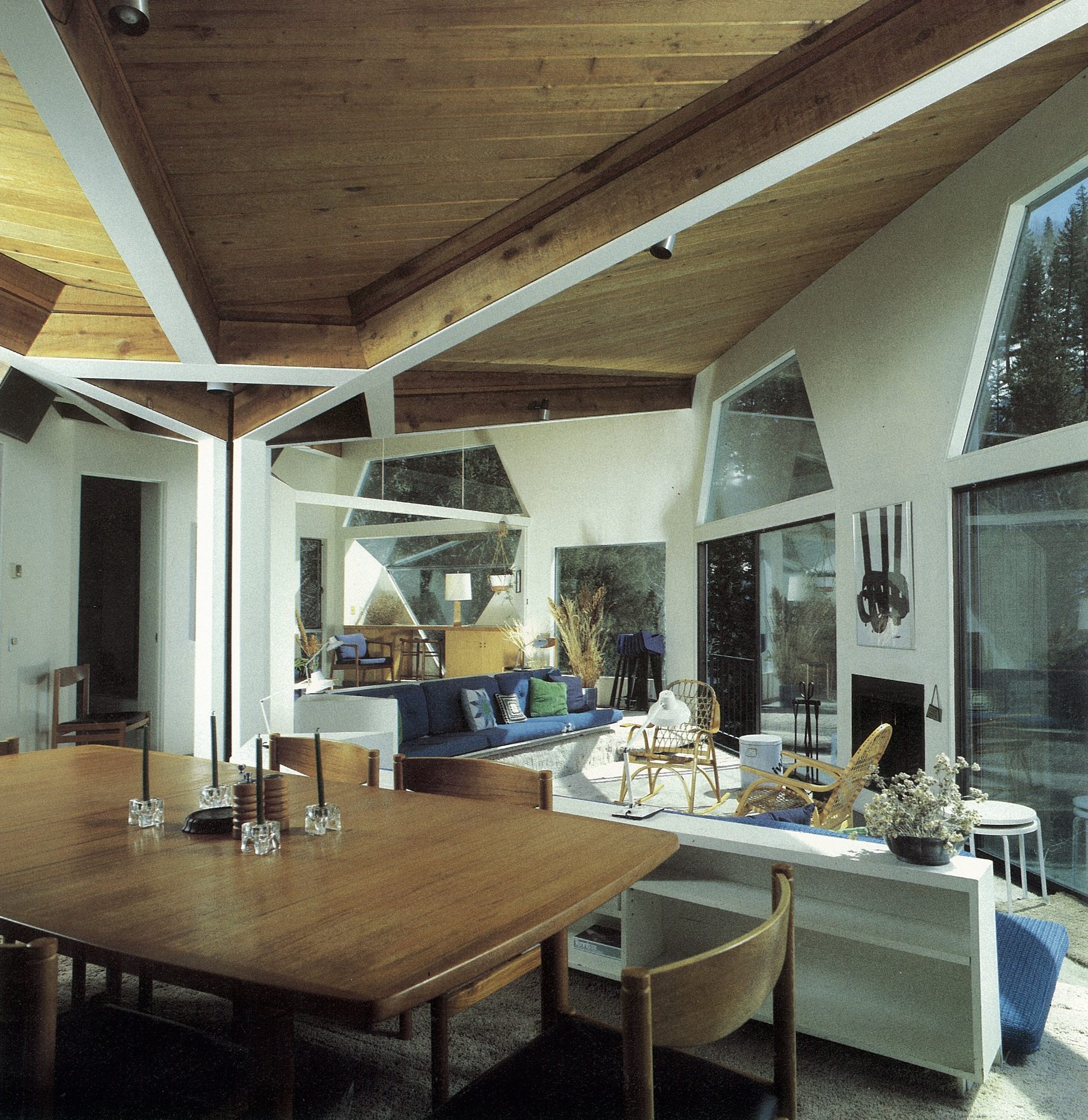
Aspen today
Though old Aspen is rapidly fading, thank goodness there are offspring. I am currently collaborating with Teague on a family compound for Nora Berko and her family that incorporates her father’s studio, now designated historic. Her daughter Mirte has dedicated much time and effort organizing her grandfather’s impressive archives of photographs for us to appreciate into perpetuity. The Aspen Institute carries on robustly while continuing to pay homage to its early founders and players. △
Read "Growing Up Weese" to find out what artist and designer Marcia Weese is up to today.
The Architect Explorer
Colorado architect Larry Yaw interviewed by his journalist daughter
Colorado architect Larry Yaw, a Fellow of the American Institute of Architects, has nudged modernism forward in Aspen and beyond. An intimate conversation with his journalist daughter...
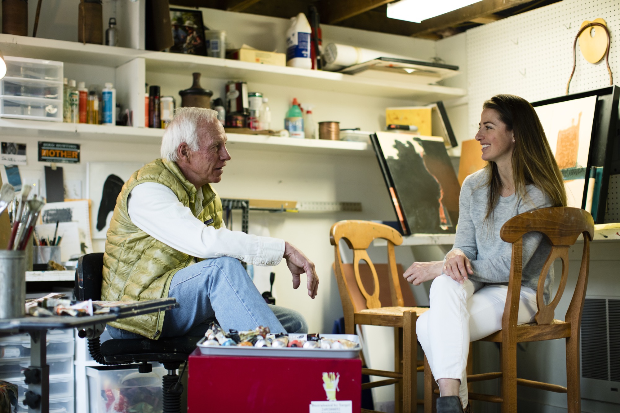
Sitting on a mossy rock in a tall stand of aspens next to my dad, a couple of hours into trying to find our way from Willow Lake back to the Maroon Bells parking lot, I started gnawing on my mom’s teriyaki beef jerky from my backpack. We had left the trail long ago, and I was convinced we were lost. I must have been about eight years old at the time.
“We’re not lost, we’re exploring,” is probably how my dad, architect Larry Yaw, responded—a claim that would echo through my young years as I followed him through the backcountry of the Elk Mountains in Colorado, across Kashmir in India, and through The Wind Rivers, The French Alps, New Zealand, and beyond, along with my mom and three siblings.
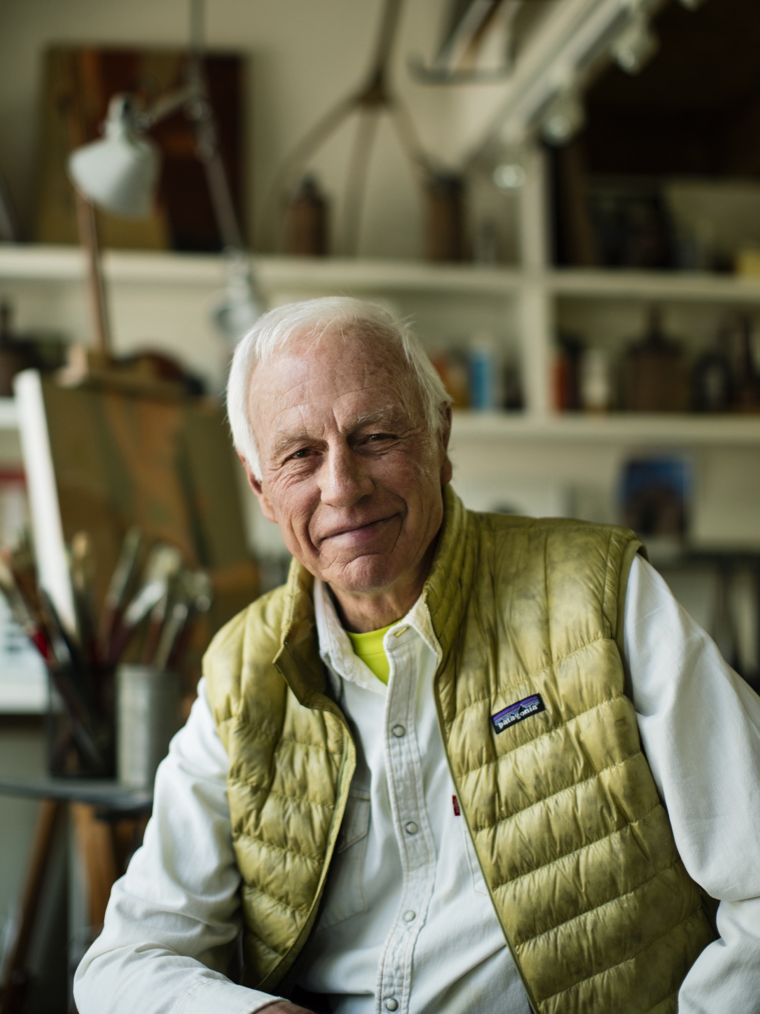
We got lost a lot, sort of on purpose, in the mountains. Yet never once did I see my dad flinch in these moments. Getting lost in the woods, in the place he calls his chapel, was merely another form of sublime and creative adventurism for him—much like his career as an architect and artist—and it fed his cowboy-style soul. I’d watch as he’d get this shrewd sparkle of excitement in his voice as he strategized on which ridge to follow, or which drainage would lead us back to the tent, all the while managing his family on the verge of the fearful discovery that our dad, really, had no idea where we were. Yet, now, as I bring my own young family into the woods to play and discover, I realize that my dad’s resourceful and poetic confidence that has intrigued me over the years has penetrated my own psyche deeply, and I strive to encourage that sensibility to seep into my kids’ sense of adventure. And, just as he did for our family, my dad has left an indelible impression on the contemporary design ethos of the Roaring Fork Valley, as well as countless alpine communities across the Mountain West.
“Getting lost in the woods, in the place he calls his chapel, was merely another form of sublime and creative adventurism for him—much like his career as an architect and artist—and it fed his cowboy-style soul.”
Since 1970, his iconic passion has manifested in his projects as he nudged modernism forward in Aspen and beyond, with an exceptional roster of clients and creative business partners as his co-conspirators; and he propelled them towards the outer edges of what’s possible. If I were to guess, his clients might sum up his character with a story similar to mine, yet the chapel would be his drafting table, and the map would be the radical ideas he has hand-sketched on camel-colored paper for the artfully crafted architecture he has envisioned. Sure, during his forty-six years creating innovative designs in the mountains, his aesthetic has shifted and grown, but his passion for the rawness of the backcountry, and for the purity of connecting people to place and to nature has remained firmly in tact.
“Since 1970, his iconic passion has manifested in his projects as he nudged modernism forward in Aspen and beyond.”
As his youngest daughter, I knew all of this, sort of, but it wasn’t until we had this conversation that I truly understood the gravity of how particular vignettes throughout his life have justified, and even come to imprint themselves, on his design, his spirituality, and his personal approach of getting lost—before finding a path.

Herein lies our recent sit-down at the kitchen table, an intimate chat between an architect and his daughter:
LYR How has living in the mountains influenced your design?
LY I’m the guy who can’t stop myself from climbing up and looking to see what’s on the other side of the ridge, or from going up to the end of a valley to see what’s there. If there’s some association with exploring, and innovating beyond the expected, I’m in. Therefore, my lifestyle has been defined by, and inspired by, active outdoor living, and attached to that is the adventure of it. Adventure is a part of everything I love to do—physical, intellectual, and spiritual adventure. And, therefore, I’ve begun to regard the artform of architecture as a basecamp for this; a basecamp that is sustainable, economic in scale, but very much connected to nature as that is so much a part of the adventure of being alive and in the now, wherever here is.
“Adventure is a part of everything I love to do ... I’ve begun to regard architecture, or habitation anyway, as a basecamp for this.”
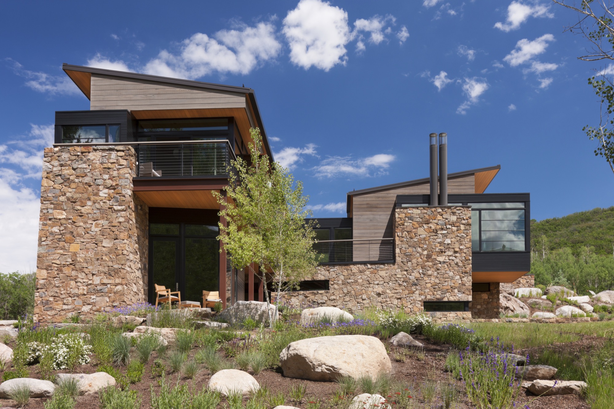
LYR Who influenced you as an architect?
LY First, the biggest influencers have been great clients of a contemporary persuasion, who relish the process of exploration and testing. There are other architects also, such as Romaldo Giurgola (“Aldo”), The Dean of Columbia School of Architecture, where I completed my Master’s studies. He would sit down and talk in these simplistic terms about the choreography that you create architecture through; the path you take and how that enriches you, and enriches the purposes of design. Louis Kahn—his work and writings inspired me.
And, the firm Morphosis Architects creates fabulous, courageous, contemporary, sculptural, and adventuresome architecture. As you traverse their spaces, you’re taken through them with this marvelous, layered, spatial experience that therefore inspires the choreography of getting from here to there.
LYR What’s your experience of being a modern architect in the Roaring Fork Valley, where opulent traditional mountain architecture is so dominant?
LY There’s opulence of thought and opulence of material—and those are two different things. Even though I’ve been involved with opulence, I design around the expectation that you don’t let the house own you. And, now, there is a cultural shift toward an awareness that we have to be stewards of the land, and be mindful of not writing out a big order for the resources. That shift has brought clients who want thoughtfully crafted, understated, simple in form, and more directly responsive design.
"There’s opulence of thought and opulence of material—and those are two different things."
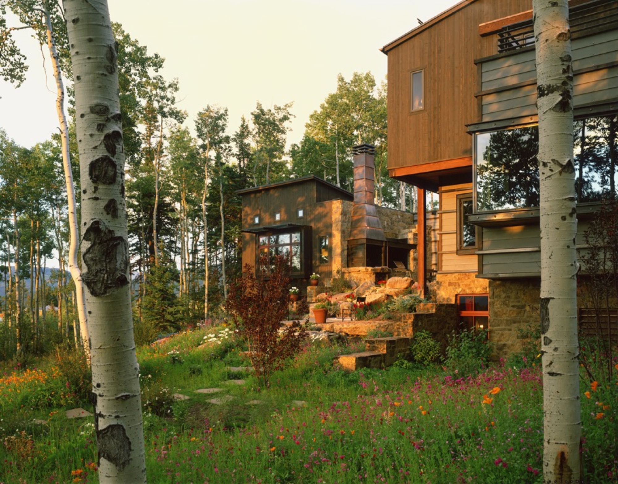
Also, a townscape is really a library of cultural expressions over time. Given that historic perspective, a log cabin is part of the miner’s time. Hopefully, what I do is an expression of my times and this culture, and doesn’t grab a crutch out of architecture’s past. Because the work of my firm significantly influenced the evolving character of architecture in the New West, I was elevated to the prestigious College of Fellows (FAIA) by the American Institute of Architecture. Our working mantra of design is that of “place-making” where architecture and nature are seamlessly integrated to the betterment of both.
“A townscape is really a library of culture preferences over time. Given that historic perspective, a log cabin is part of the miner’s time.”
LYR You were raised in rural Montana. What did that upbringing impart to you?
LY Growing up in Montana, I really experienced these rural ranch and farm compounds that were formed over generations. They were always designed by the simplest means, in simple forms, and they seemed to sit respectfully on the earth. When I started studying these things, I discovered that they were really forms that described contemporary architecture in their simplicity. They were formed in protective surrounds, and were organized around working proximities, yet there was always a place for enrichment, like a little garden near the front porch. Then, these compounds grew organically—out of inelegant purpose, and rural rationality. I didn’t appreciate it then, but as I studied architecture, I started pulling out of my experiential self, and those things all matched up—that is contemporary architecture. It did not tread heavily on the land; it embodied economy of means; it had simple forms and echoed its context—all things that are generationally taught or experientially taught. They solved problems there, out of their own devices and their own means.
LYR How has design carried into, and impacted, other areas of your life?
LY It has opened my eyes. When I travel, I see different things; I wonder about them; I take them in. And, what I’ve learned is that I like evocative things. Evocative means you hate it or you love it but it nevertheless stirs emotion in you, and takes the lethargy out of your mind. And, that’s true in architecture. The creative process and everything associated with it; the people you work with and the collaborations—they fuel my worthwhileness and my sense of adventure.
“I like evocative things…. You hate it or you love it but it stirs something in you, and takes the lethargy out of your mind.”
LYR Tell me about the Blackfeet Indians, a tribe you became close to when you were young, and their impact on you, your design, and your art.
LY When I was twelve years old, I went to Browning, Montana, in the middle of the Blackfeet reservation, and there sat this gorgeous little Indian girl. She was about my age, dressed in a traditional beaded, white doeskin dress, and I was enchanted. Her name was Virginia Home Gun. That enchantment turned into a friendship with her. It turns out that her father was the chief of the Blackfeet Tribal Council. Over time, through traditional ancient ceremony, they made me an honorary member. That really stirred me. It continued beyond that, and I started reading and studying about the rituals and legends that were the spiritual glue of their life. The Blackfeet regarded themselves as a creature of the earth, and they understood the balance of their needs with earth phenomena. They would give thanks to the buffalo, and honor a slain enemy for valor. For me, it went from the idealistic warrior image when I was young, to understanding their spiritual nourishment that kept them who they are. That translated to me later on into a series of paintings that I call “Once Proud.” That’s my way at this point in life of telling the story of westward movement and how it maimed the spirit and freedoms of our native inhabitants of this place. This made us feel sort of culturally guilty and I was inspired to tell that story.
LYR What is the status of modern architecture in the Roaring Fork Valley, and what role did you play in getting modern design where it is today?
LY Aspen has always been a place that embraced aesthetic adventurism, or tolerated it anyway, and has always fostered intellectual and artistic courage. My firm, my partners, a highly talented thirty-some staff, and our clients have allowed us to be one of the forerunners of the movement here. Personally, I haven’t pushed modernism [in the valley] for recognition; we have had clients and circumstances that permitted that kind of solution and character. But within my firm, I’m known for pushing beyond the expected, and going to a higher level of art form and different level of expression; questioning, pushing, improvising, and going beyond even what clients want. Straight competency in architecture is a mid-level solution—I advocate for artfully courageous and innovative solutions that are bigger than the problem.
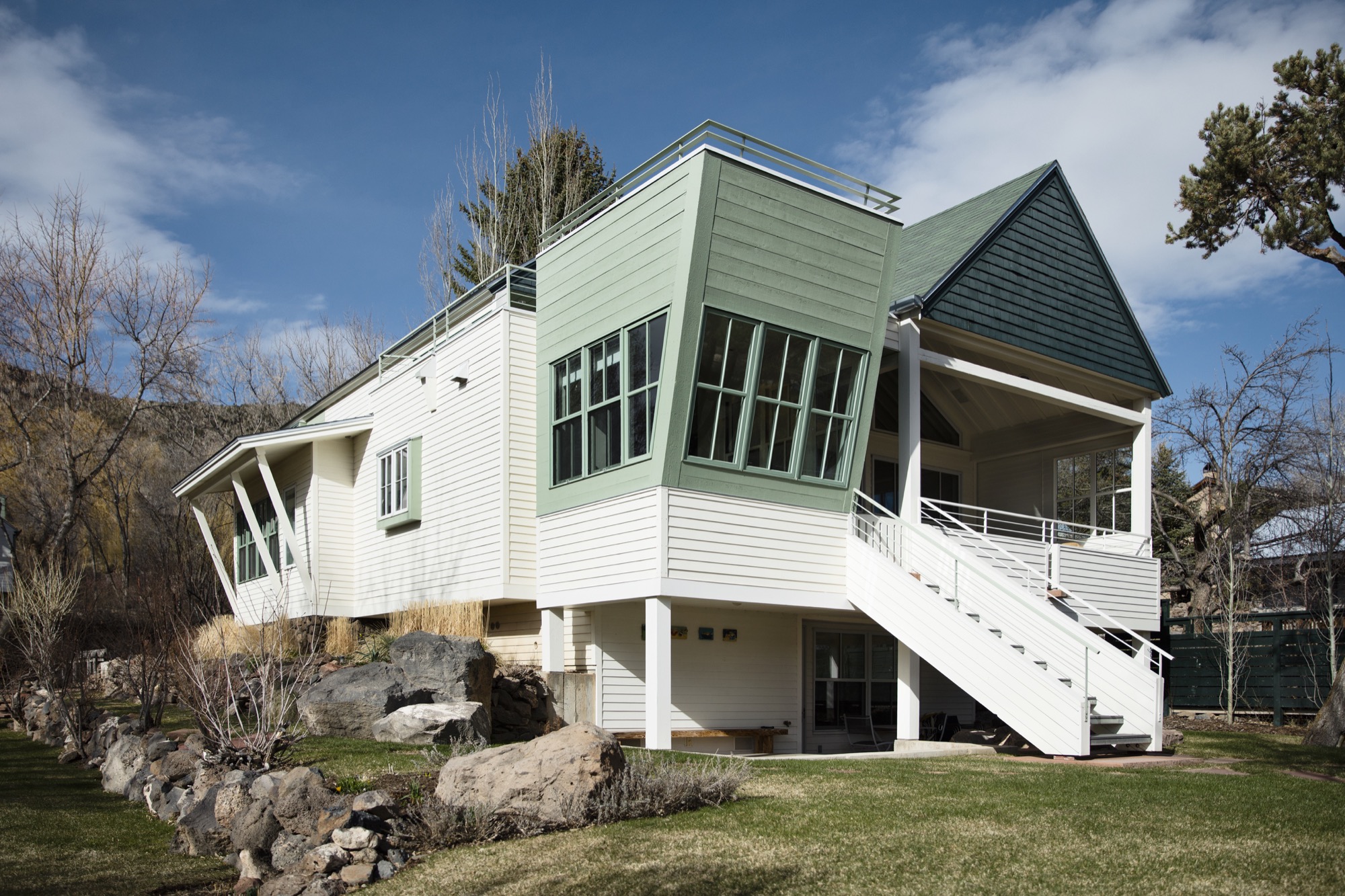
LYR Who are the people who want modern architecture in the mountains? What makes them different from the “typical” client who wants that enormous heavy log mansion that says, “I have a lot of money, and I live in Aspen?”
LY Some people are here because it is a new bar on their reputation epaulette. The people who I gravitate towards, or who gravitate towards our firm, are here for reasons I’ve sorted out—for the adventure, the backcountry, and things that support our minds, bodies, and spirits. These are all truly good characterizations of our lives, and our personal culture. To put it into context, I’m not going to design three little sitting areas around the master bedroom so you can sit inside all day. You get out of bed, you have breakfast, and you go ski; you get out there.
In that, a question I always ask is: Is architecture derived of context, or does architecture create context? The answer is both depending on where you are, but it's a question I ask of it because its one of the beginning points that I use to align my sensibilities with those of a client or a place.
“Is architecture derived of context, or does architecture create context?”
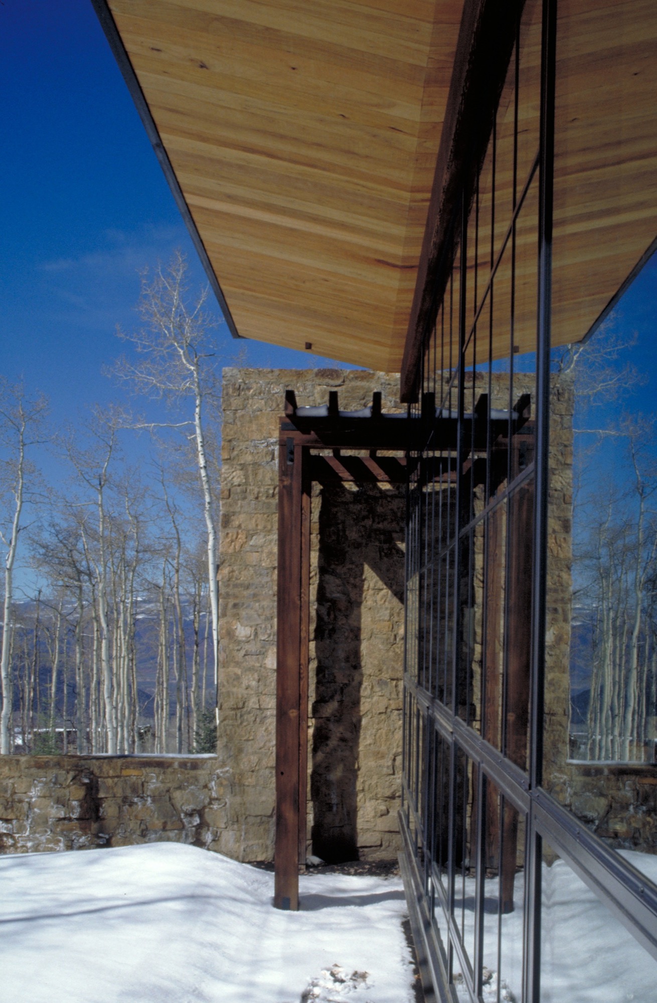
LYR You get lost on purpose, in a way, right? How has this personal quality informed your design sensibility?
LY Freud said that problems couldn’t be solved by a consciousness that created them. In other words, you cannot solve problems where there are too many givens; otherwise you just spin inside the givens. Part of the creative process is being lost, disoriented; you are seeking an answer in a way. Therefore, I never feel lost, I just feel like I entered another chapel as it engages another form of creativity, curiosity, and adventure in me. Being lost is inspiring too—when I was really young, out hiking and going to crazy places I’d never been, I marveled at earth forms, the magic to them, what got them there. As I went on, I studied geomorphology, and it all boiled down to tectonics of eruption, erosion, accumulation, weather, and all of nature’s will upon those things. It’s really compelling, and asks compelling questions, and I found some answers that I’ve portrayed in my painting.
“Part of the creative process is being lost, disoriented; you are seeking an answer in a way. Therefore, I never feel lost.”
Nature can also help you appreciate your existence, be a stimulus for enlightenment, and fuel lifelong curiosities. As architects, we must embrace that kind of creativity and spirituality, the kind that enhances who we are, so as to create well being.
And, Lindsay, I can find my way back from anywhere.
A founding partner of Cottle Carr Yaw Architects, Larry Yaw has designed many of the firm’s award-winning projects—from resort and community design to corporate buildings and private mountain homes. In 1993, Yaw was named to the American Institute of Architects College of Fellows, the highest award given to the profession’s most respected architects. His projects are regularly published in architectural books and national design magazines.
Yaw received his Master’s Degrees in both Architecture and Urban Design from Columbia University and has since been a lecturer and design critic at several western universities. Believing in the importance of civic involvement, Yaw is also a founding board member of the Aspen Art Museum.
Sense of Place: Designed for legacy in Aspen
Mountain homes in Aspen, Colorado, are built to stay in the family for generations
Aspen is steeped in tradition. Generation after generation, families vacation at the posh resort to ski in winter and to celebrate the town's famous festivals in summer. Slope-side chalets and opulent second homes alike are built for legacy, as venues for extended family to gather and carry on traditions, season to season. A continuity that translates into architecture and decors of great depth and layering.
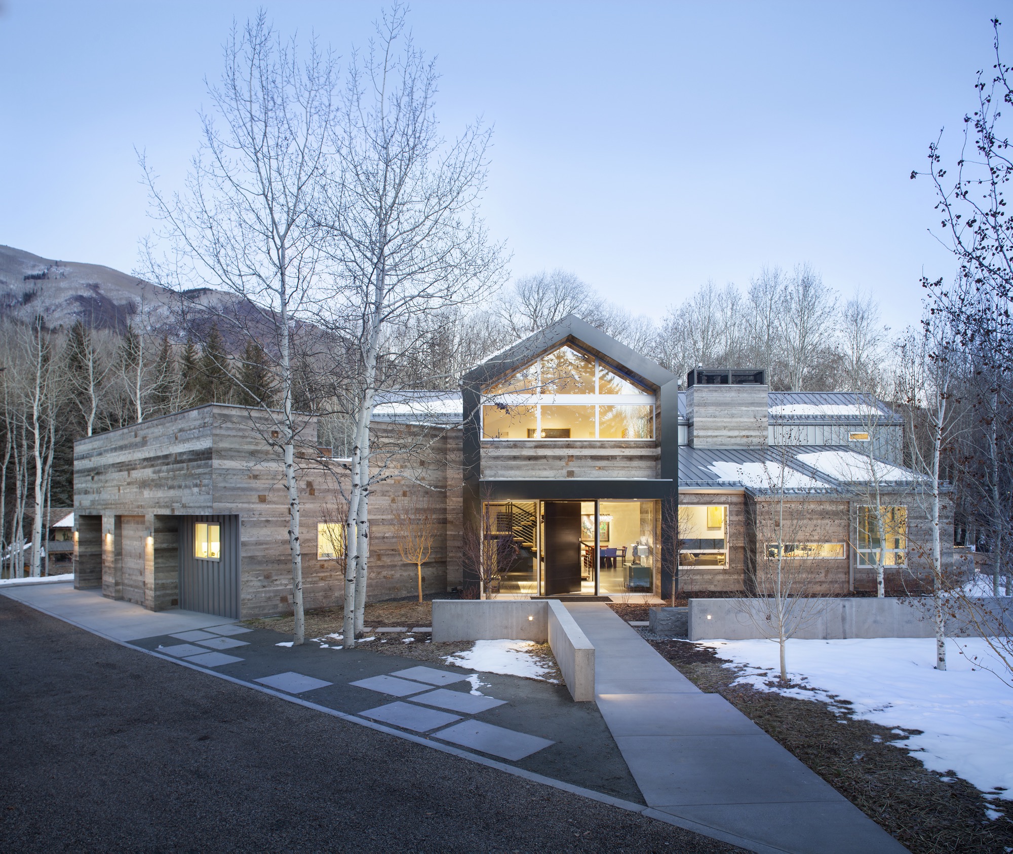
Nevertheless, even mountain folks for a fortnight must have functionality alongside style, beginning at the entry. “There is that sense of arrival at a mountain home,” says Sarah Broughton, co-owner of Rowland and Broughton (R+B), an architecture and interior design firm in Aspen and Denver. Aspen homes are planned with the understanding that one comes in from the elements. “People need to be able to knock snow off their boots.”
"Aspen homes are planned with the understanding that one comes in from the elements."
Style without borders
Many of R+B’s clients have primary homes on the beach or in big cities, all over the world. “One thing that is important to them is that they really feel they are in Aspen,” says Broughton, a modernist at heart. To achieve this sense of place, she relies on natural materials such as wood, grasscloth, and natural stone — “things you see when you look out the window.” What’s more, treating woods in surprising ways, such as planking or wire-brushing, brings out something special in a natural material.
Broughton complements mountain settings and modern, clean lines with cashmeres and wools in the furniture and textiles. She loves to add ample pillows and throws on beds and couches. “Hemp, wool, and cashmere textures and patterns can speak to a natural environment without being literal,” the award-winning architect says. The beauty of sunlight falling through an aspen forest’s canopies, for instance, can translate into a pattern. Twinkling lights become reminiscent of a starry winter night in the Rocky Mountains.
“Hemp, wool, and cashmere textures and patterns can speak to a natural environment without being literal.”
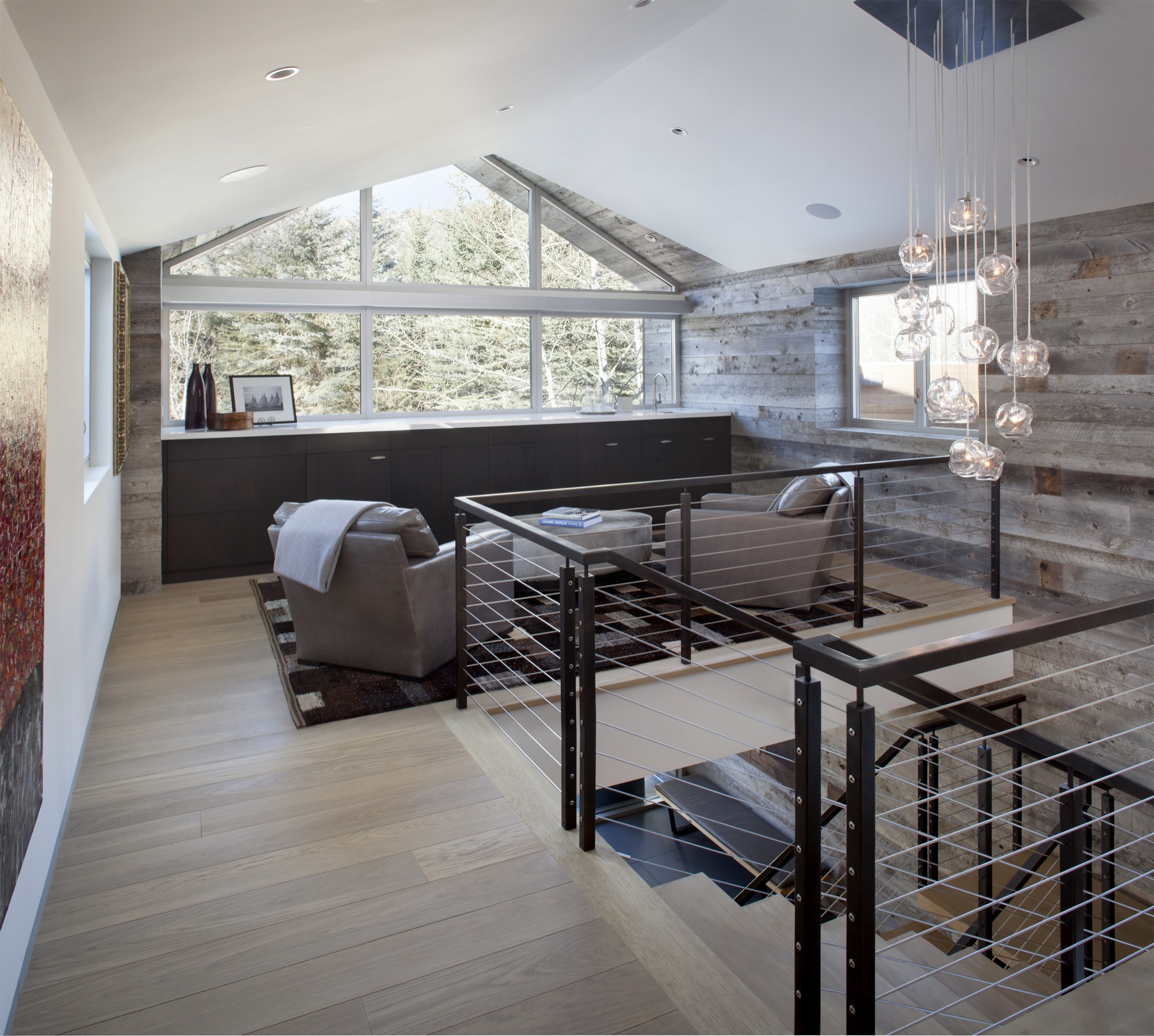
Black Birch Modern
With its clean-lined, minimal design, Black Birch Modern in Aspen is an example of a mountain retreat that not only boasts stunning alpine-modern architecture, but is warm and welcoming to boot. R+B achieved this balancing act by bringing outdoor materials inside. That, Broughton believes, is something anyone can do at home. “Carrying a material found around the outside of the house into the flooring, for example, is an effective way to blur that indoor-outdoor line, which is such a quintessential element of Aspen style.”
Bringing Aspen home
Give your home a touch of Aspen flair and make room for your own legacy. Create spaces where friends and family can gather to share food, drinks, and stories, while they sink deeper and deeper into your cashmere pillows and pull up their feet under a wool blanket.
Art from an Aspen gallery adds a fine finishing touch. “Bringing in local talent is a nice way to tie it to the place and a great way to modernize a home,” Broughton says. “Make it feel collected and not staged,” are her parting words of style wisdom. “Modern design has a lot of depth and layering to it. It’s not a one-hit wonder.” △
“Make it feel collected and not staged. Modern design has a lot of depth and layering to it. It’s not a one-hit wonder.”
Modern Architecture Ascends in Aspen
Architect Shigeru Ban's dramatic design of the Aspen Art Museum
Inspired by the up-and-down movements of the skiers on Aspen Mountain, the Pritzker Architecture Prize laureate Shigeru Ban takes modern building design to dramatic heights with the new Aspen Art Museum.
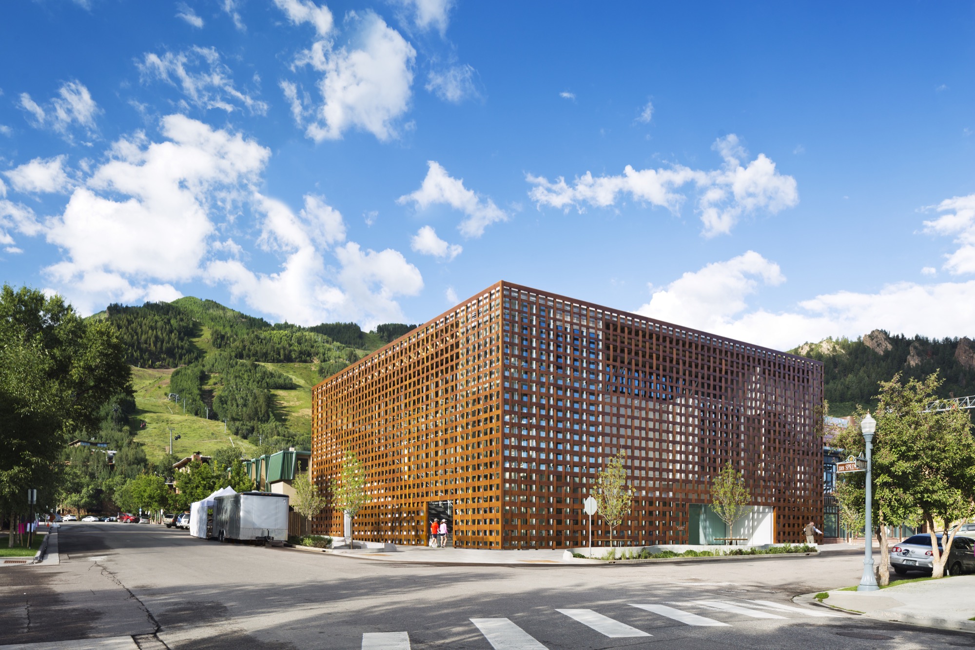
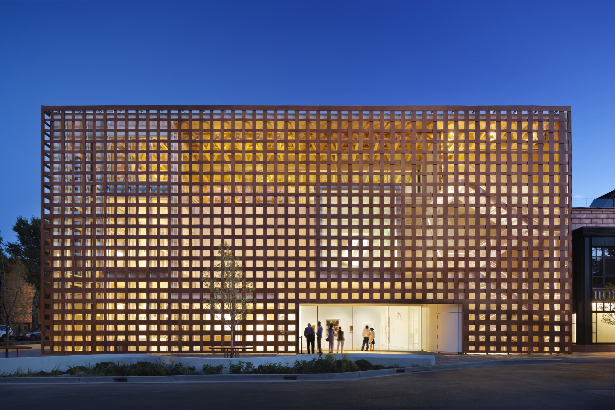
The new Aspen Art Museum, which opened in August 2014, became an instant, if controversial, landmark in the precious Colorado mountain town and beyond. Architect Shigeru Ban’s building is like no other in Aspen — or anywhere else. Think of it as a box within a box. The blocky three-story glass interior box is wrapped within an outer box made of wide strips of resin-impregnated paper woven into a grid, permitting light and air to filter in and people to look out. In daylight, the strips have a wood tone. The texture relates to old bricks, the dominant building material in downtown Aspen. The strong vertical and horizontal lines play off the glass in an ever-changing succession of light and dark, bright and shadow.
Up and down — like the skiers
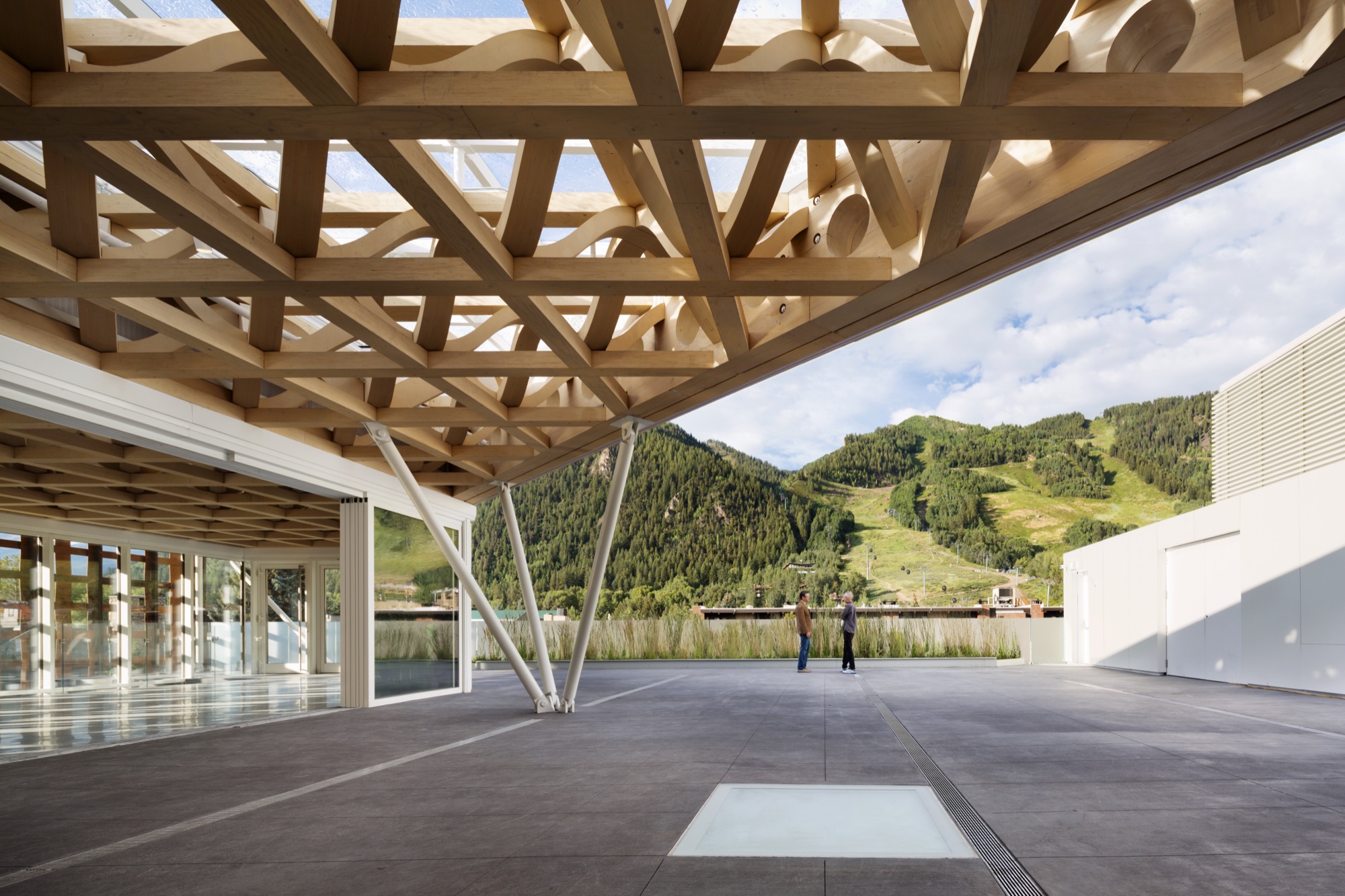
Ban’s concept was to echo Aspen Mountain, the commanding presence just south of downtown. At the ski area, skiers ride lifts to the top and then make their way down. So it is at the museum. Visitors first ascend the stairs or ride a room-sized glass elevator to the only public rooftop space in Aspen, with its open sculpture garden, grand view of Aspen Mountain’s lower slope, and an indoor/outdoor café where visitors linger over a cup of coffee, a light bite, or lunch. The menu changes frequently, appropriate for a museum whose exhibitions change every few months. Then visitors work their way down. Six galleries, three above ground and three on the basement level, have already showcased the works by painters, sculptors, installationists, and multimedia artists. A show in Aspen has a way of increasing an artist’s visibility and renown.
Curating the new
The new building replaced the 7,500-square-foot (ca. 700-square-meter) former hydro-electric plant that had housed the museum since 1979. While it was of nostalgic value to the Aspen community, it had long since outlived its usefulness as a museum that showcases contemporary art and also hosts workshops, classes, music programs, lectures, and films. In this global art world, the call for design ideas was broad, but from concept to opening involved an eight-year process. Heidi Zuckerman, the museum’s visionary director, CEO, and chief curator, says that when it was time to choose an architect, the only two requirements provided to a selection consultant were that the architect had previously designed a museum and also spoke English.
Shigeru Ban came with both. As for museums, he had designed the Centre Pompidou-Metz, a regional branch of the famous Georges Pompidou Arts Centre of Paris. The Metz outlier contains exhibitions from Europe’s largest collection of twentieth- and twenty-first-century arts. He also did the Nomadic Museum to house “Ashes and Snow,” Gregory Colbert’s groundbreaking video/photo work, that launched in Venice, then traveled to New York, Santa Monica, Tokyo, and Mexico City, ending in 2008, largely due to the global recession. As for language, Tokyo-born Ban had studied at the Southern California Institute of Architecture and New York’s Cooper Union, and he now divides his time between Tokyo, New York, and also Paris.
The selection consultant had put out the call without revealing the specific client and came back with pictures submitted by thirty-six firms — “no names, no words, just pictures,” Zuckerman says. Sixteen firms were then told that the Aspen Art Museum was the client, and fourteen of those submitted plans. A committee narrowed those to five and visited three. “Shigeru came in with the highest score at every round,” Zuckerman continues. She was already familiar with Ban from his Paper Arch, erected in the courtyard of New York’s Museum of Modern Art as part of its millennium celebration.
"Shigeru came in with the highest score at every round."
Ban’s Backstory
Time magazine named Ban the 2001 Innovator of the Year for his pioneering disaster relief designs that used simple materials to build housing in afflicted areas. Ban is known for innovative and distinct designs, of course, but also for the humanitarian and sustainable aspects to his work. He has made his reputation on using simple materials, from paper and cardboard to crates and shipping containers, to help people, communities, and countries rebuild their lives after headline-making disasters.
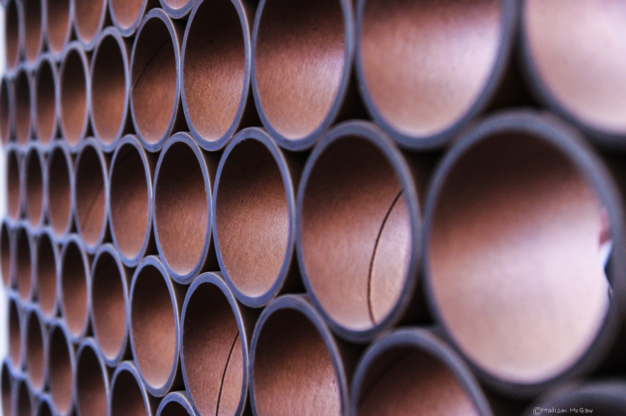
Projects included using sandbag-filled beer crates as the foundation for quick-to-build, low-cost housing after the 1995 earthquake that devastated Kobe, Japan. Sixteen years later, following the massive quake and tsunami (think Fukushima Nuclear Plant) that left 300,000 people homeless, Ban designed homes crafted from shipping containers with cardboard tubing for interior walls. He expanded on this concept with his “cardboard cathedral” that rose from the rubble of the quake-damaged Catholic basilica in Christchurch, New Zealand. With cardboard tubing as the visible structural element, it stands as a symbol of hope and inspiration while the city contemplates whether or not to reconstruct the copper-domed classic. The cardboard tubing tradition lives modestly at the Aspen Art Museum in the form of benches.
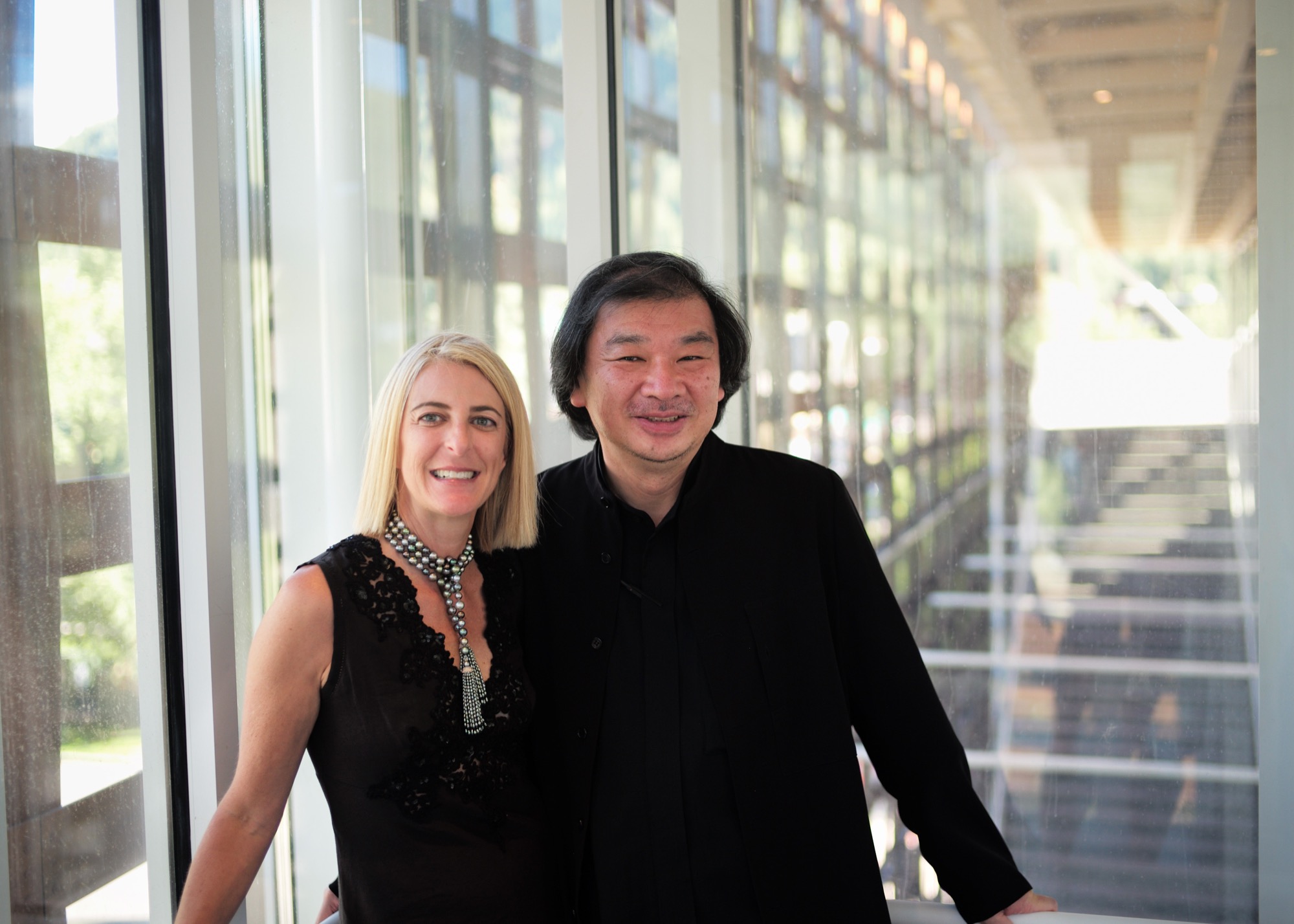
For fifty-seven-year-old Shigeru Ban, 2014 was a landmark year. Even as his $45-million USD Aspen Art Museum was in the final stages of construction, he was awarded the prestigious Pritzker Architecture Prize, considered the most important honor in the field. It rocketed him to “starchitect” status and made the museum’s twenty-four-hour grand opening the place for well-heeled Aspenites and the art-world elite to see and be seen.
In presenting Ban with the coveted prize, Tom Pritzker, president of the sponsoring Hyatt Foundation, said: “He is an outstanding architect who, for twenty years, has been responding with creativity and high-quality design to extreme situations caused by devastating natural disasters. His buildings provide shelter, community centers, and spiritual places for those who have suffered tremendous loss and destruction.”
It may seem counterintuitive that an architect known for creating housing for refugees and disaster victims did his first U.S. building in one of the country’s priciest towns, and Zuckerman is clearly relieved that her museum snagged him pre-Pritzker. It makes sense, actually. Ban is disinterested in monumental buildings, and as one of only a handful of noncollecting museums in this country, the AAM did not require massive space. It is a mere 33,000 square feet (3,065 square meters), with three stories at and above street level and one below.
"Ban is disinterested in monumental buildings."
Not for everyone
The Aspen Art Museum is built to the sidewalk line, like the nearby late nineteenth- and early twentieth-century buildings, meaning that it is not out of scale with its neighbors. But the exterior materials and the see-through grid are what turned heads and shocked some locals. People love it, detest it, or are merely puzzled by it, but everyone knows it is an extraordinary community resource, especially since admission and many of its programs are free.
Zuckerman’s uncanny instinct for identifying the next hot new contemporary talent makes the Aspen Art Museum a coveted venue, even though each exhibition lasts only about three months. “I feel fortunate to have as a platform this incredible museum,” says Zuckerman, who, mindful of the controversy surrounding the design, adds, “It can be for anyone, even if it is not for everyone.” In its first six weeks, the new museum drew some 35,000 visitors — as many as the old museum did in a year.
“I feel fortunate to have as a platform this incredible museum. It can be for anyone, even if it is not for everyone."
Aspen and modernism
While it values its Victorian core, Aspen has had an ambivalent relationship with modern architecture. Eero Saarinen’s original music tent for the Aspen Music Festival was replaced twice, most recently by a permanent structure designed by Aspen’s Harry Teague, and the modest concrete Given Institute by Chicago modernist architect Harry Weese was demolished in 2011.
The pure Bauhaus-era Aspen Meadows Resort on the city’s east end remains a living icon with low-slung buildings designed by Austrian-American architect Herbert Bayer. It is the home of the Aspen Institute, a humanistic think tank for leaders, artists, musicians, and thinkers. It also operates as a hotel with spacious accommodations and a fine restaurant on a forty-acre campus. Sections of the ground have been sculpted into little hills, a gentle serpentine trench to replicate a watercourse and pebbled paths plus carefully selected rocks and sculptures placed here and there. With much change in the valley, Aspen Meadows is a keeper, and so is the Aspen Art Museum. △
